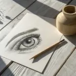
When you want to level up fast, pencil shading is the sweet spot where simple subjects suddenly look seriously three-dimensional. I pulled together a mix of classic and fresh shading drawing ideas so you can practice smooth gradients, texture, and lighting without getting stuck on complicated line work.
Apple Study With Soft Edge Transitions
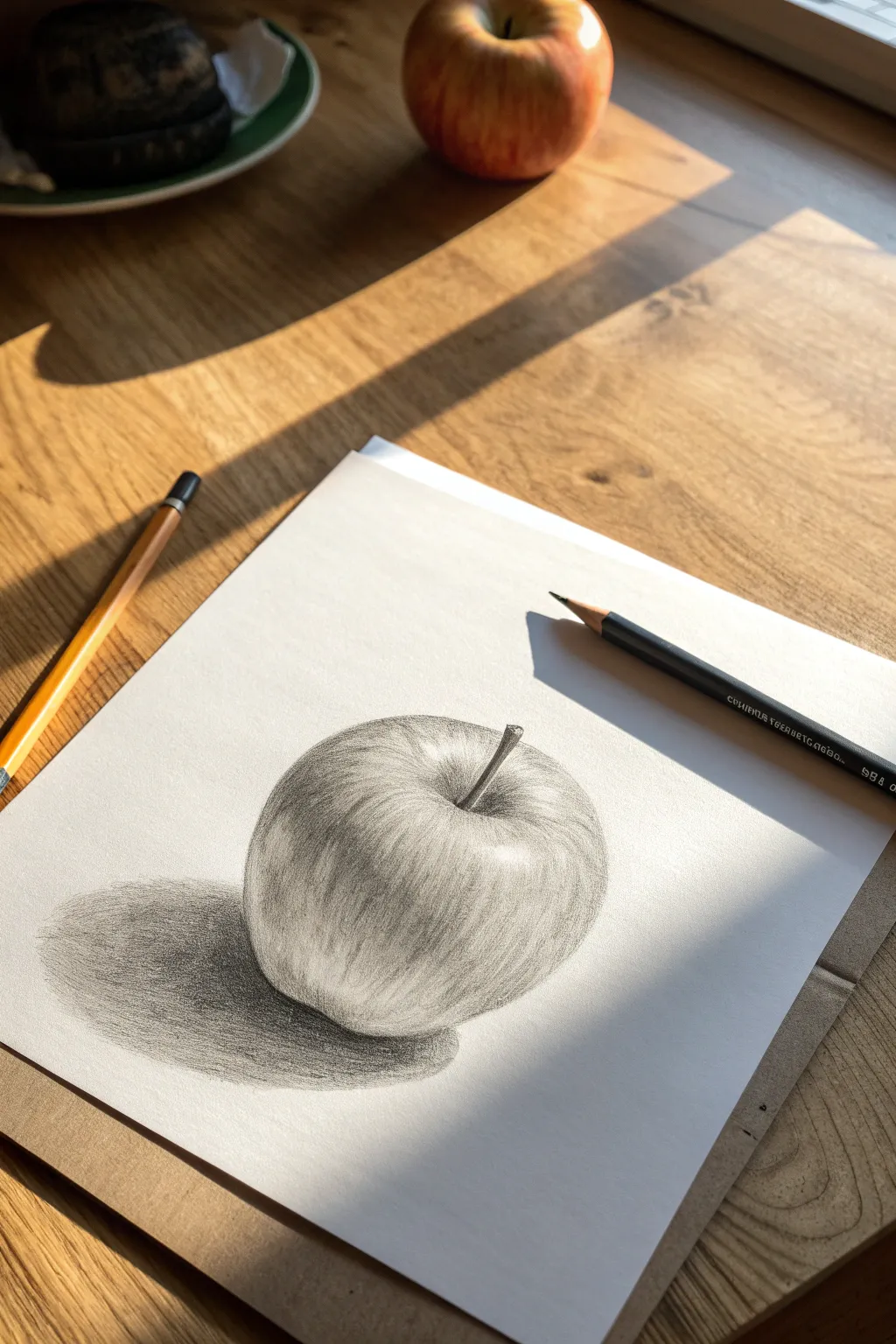
Capture the delicate textures and subtle gradients of a fresh apple with this tonal pencil study. By focusing on smooth blending and directional strokes, you’ll create a drawing that feels three-dimensional enough to pick right off the page.
How-To Guide
Materials
- Smooth bristol or drawing paper (heavyweight)
- Graphite pencils (HB for sketching, 2B and 4B for shading)
- Black colored pencil or charcoal pencil (for deepest blacks)
- Kneaded eraser
- Paper blending stump or torture
- Pencil sharpener
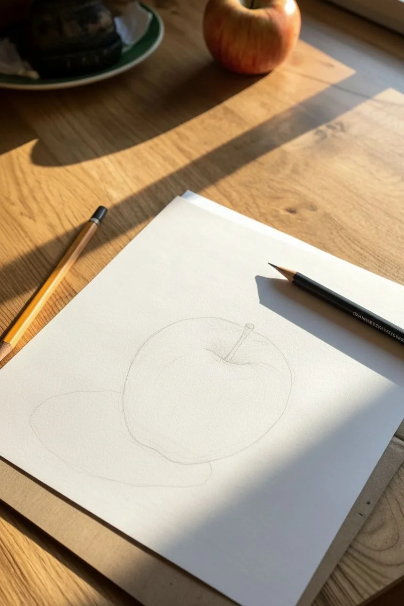
Step 1: The Contour Framework
-
Establish the Basic Shape:
Begin with a sharpened HB pencil. Lightly sketch a circle that is slightly wider at the top than the bottom, observing the natural asymmetry of your reference apple. Keep your pressure extremely light so these lines can disappear later. -
Define the Stem Well:
Mark the depression where the stem sits at the top center. Draw the stem emerging from this dip at a slight angle, giving it a bit of thickness rather than a single line. -
Map the Shadow Shapes:
Very faintly outline where the highlight hits the shoulder of the apple and where the core shadow (the darkest part of the form) begins. Also, map out the cast shadow shape underneath the fruit.
Troubleshooting: Flat Apple?
If the apple looks flat, your mid-tones are likely too uniform. Darken the core shadow significantly and ensure your curved strokes wrap fully around the ‘equator’ of the form.
Step 2: Building Form and Tone
-
First Layer of Tone:
Using the side of a 2B pencil, apply a soft, even layer of graphite over the shadowed side of the apple, leaving the highlight area pristine white. -
Directional Shading:
Begin adding curved strokes that follow the contour of the apple’s skin. Imagine wrapping the lines around the sphere. I find this helps reinforce the roundness immediately. -
Deepen the Crease:
Switch to a 4B pencil to darken the stem well. Gradate the value upwards and outwards so it looks like a deep recess, not a flat hole. -
Render the Stem:
Detail the stem with short, dark strokes (using the black pencil or 4B) to show its woody texture. Add a tiny highlight on one edge to give it cylindrical form. -
Develop the Core Shadow:
Identify the darkest band on the fruit itself—the core shadow. Build up layers of graphite here, pressing firmer but maintaining smooth transitions into the lighter areas. -
Mid-tone Blending:
Use your HB pencil to connect the highlight area to your darker shadows. These mid-tones should be wispy and light, creating a smooth gradient.
Step 3: Refining Texture and Edges
-
Add Skin Texture:
Sharpen your pencil to a fine point. Add vertical, slightly curved striations coming down from the stem well and up from the base. These shouldn’t be solid lines, but broken, organic marks that mimic the apple’s skin pattern. -
Softening with a Blender:
Use a blending stump to gently smudge the mid-tones and shadows. Use small circular motions to push the graphite into the paper tooth for that smooth, photo-realistic look. -
Lifting Highlights:
Take your kneaded eraser and pinch it into a small point. Dab—don’t rub—areas near the highlight to create subtle speckles and light reflections on the skin. -
The Cast Shadow Base:
Using a 4B or black pencil, fill in the cast shadow underneath the apple. The darkest point should be directly where the fruit touches the surface. -
Fading the Shadow:
As the cast shadow moves away from the apple, let it become lighter and the edges softer. A hard edge creates an unnatural cutout look. -
Final Contrast Check:
Step back and assess your values. Use your darkest pencil to re-emphasize the occlusion shadow (the contact point) and the deepest part of the stem well to make the form pop.
Pro Tip: Hand Guard
Place a scrap piece of clean paper under your drawing hand. This prevents the oils in your skin from smudging your work and keeps the white paper surrounding the apple crisp.
Enjoy the satisfaction of seeing a simple shape transform into a realistic fruit right before your eyes

Realistic Eye With Wet Shine
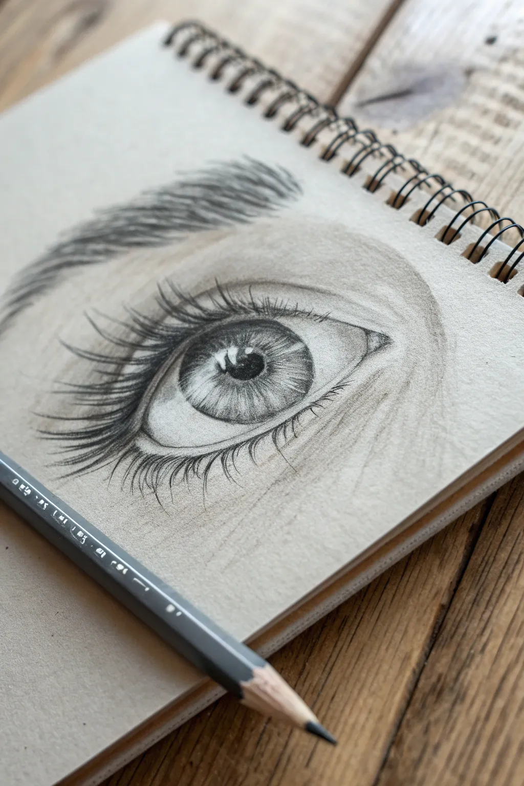
This striking eye study uses the natural warmth of toned paper to act as a mid-tone skin color, allowing your white highlights to really pop. By focusing on deep contrast and careful layering, you’ll create a lifelike gaze with a convincing wet shimmer.
Detailed Instructions
Materials
- Toned tan or grey sketchbook paper
- 2B graphite pencil (for initial sketching)
- 4B or 6B graphite pencil (for dark shading)
- White charcoal pencil or white pastel pencil
- Blending stump (tortillon)
- Kneaded eraser
- Pencil sharpener
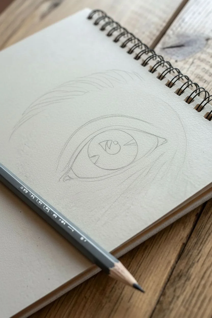
Step 1: Basic Structure & Outline
-
Lightly sketch the shapes:
Begin by pressing very lightly with your 2B pencil to map out the almond shape of the eye. Draw the iris as a perfect circle, slightly cut off by the upper eyelid. -
Mark the highlight zones:
Before you do any shading, gently outline the shapes of the reflection ‘windows’ inside the pupil and iris. These areas must remain untouched by graphite to look glossy later. -
Outline the tear duct and crease:
Sketch the small, fleshy tear duct in the corner. Then, draw the arched line of the eyelid crease above the eye, following the curve of the upper lid. -
Define the eyebrow shape:
Lightly outline the general shape of the eyebrow arch above the crease, keeping the lines faint so they won’t show through the hair strokes later.
Step 2: Shading the Iris & Pupil
-
Darken the pupil:
Switch to your darker 4B or 6B pencil. Fill in the center pupil completely black, being extremely careful to work strictly around your mapped-out highlight shapes. -
Add radial lines to the iris:
Using the sharp tip of your pencil, draw stick-straight lines radiating from the pupil outward toward the edge of the iris, like spokes on a wheel. -
Darken the iris rim:
Thicken the outer ring of the iris (the limbal ring). Shade inwards slightly from this ring to create depth. -
Blend the iris:
Use a blending stump to gently smudge the radial lines, softening the texture while keeping the center pupil pitch black.
Keep it Clean
Place a piece of scrap paper under your drawing hand. This prevents your palm from smudging your work or transferring oils to the toned paper.
Step 3: Skin & Form
-
Shade the whites of the eye:
Usually, the ‘whites’ aren’t perfectly white. Lightly shade the corners of the eyeball with your 2B pencil to show its spherical curvature, leaving the center area the color of the paper. -
Add depth to the crease:
Lay down graphite in the eyelid crease and smudge it upwards with your blending stump to create the soft shadow of the orbital bone. -
Contour the tear duct:
Add subtle shading to the tear duct area, defining the small ridges of skin. -
Create the eyebrow:
Using sharp, quick strokes, flick your pencil upward and outward to simulate brow hairs. Layer them over each other, making the hairs denser in the middle of the brow.
Muddy Highlights?
If your white pencil looks grey, you likely overlapped graphite. Erase the spot completely to bare paper before reapplying the white charcoal.
Step 4: Lashes & Highlights
-
Draw upper lashes:
With a very sharp 4B/6B pencil, create long, sweeping curves for the upper lashes. Start pressure heavy at the root and flick delicately at the tip. Group some lashes together for a natural, slightly clumpy look. -
Add lower lashes:
Draw the lower lashes, making them shorter, thinner, and more spaced out than the upper ones. Remember they sprout from the outer ridge of the lower lid, not inside the eye. -
Cast lash shadows:
Lightly draw reflections of the upper lashes onto the highlight area in the eye itself to enhance realism. -
Apply the white highlights:
Take your white charcoal or pastel pencil and fill in the preserved highlight shapes in the pupil/iris. Add a touch of white to the tear duct and a few strokes on the brow bone for skin sheen. -
Add skin texture:
Finally, add faint, microscopic creases under the eye and blend them out to make the skin look organic rather than plastic.
Now you have a stunning, emotive eye drawing that jumps right off the toned page

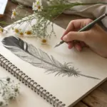

Feather With Layered Soft Values
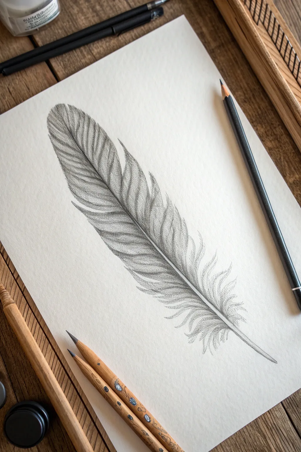
This study captures the delicate weightlessness of a feather through careful pencil work and smooth tonal transitions. By building layers of graphite slowly, you will create a realistic texture that feels soft to the touch.
Step-by-Step Guide
Materials
- H or HB pencil (for initial outlines)
- 2B and 4B graphite pencils
- High-quality drawing paper (smooth or vellum finish)
- Kneaded eraser
- Fine-point mechanical pencil (optional for details)
- Blending stump or tortillon
Step 1: Structural Foundation
-
Establish the rachis:
Begin by lightly drawing a long, slightly curved diagonal line across your page to represent the rachis (the central shaft). Let the line taper gently toward the tip, thicker at the base where the quill would be. -
Outline the silhouette:
Using an H pencil, sketch the outer boundaries of the feather vanes. Don’t make this a perfect oval; allow for natural irregularities, indentations, and splits along the edges to suggest a natural form. -
Mark the splits:
identify where the major separations in the feather barbs will occur. Draw V-shaped or U-shaped notches cutting into the main shape toward the shaft, particularly near the top third and the bottom fluffier sections.
Step 2: Layering Values
-
Base shading:
Switch to a 2B pencil and apply a very light, even layer of graphite across the entire feather shape, avoiding the central shaft. Use the side of your lead for a broad, soft application. -
Define the direction:
Start adding directional strokes that flow from the central shaft outward toward the edge. These lines should curve slightly upwards, following the natural growth pattern of feather barbs. -
Deepen the shadows:
Identify the areas where the feather curves or overlaps. Using a 4B pencil, darken the area immediately adjacent to the central shaft to create depth, making the shaft appear raised. -
Create separation:
Where you marked the splits earlier, darken the edges of the individual vane sections. This cast shadow effect gives the illusion that one grouping of barbs is sitting slightly above or behind another. -
Blend the mid-tones:
Take your blending stump and gently smudge the graphite strokes you’ve laid down. Move the stump in the direction of the barbs—outward from the center—to maintain the textual grain while softening the harsh lines.
Fixing “Flat” Feathers
If the feather looks flat, your contrast is too low. Don’t be afraid to press harder near the shaft and under the splits. Deep shadows make highlights appear brighter.
Step 3: Textural Details
-
Sharpen the barbs:
Switch to a freshly sharpened 2B or a mechanical pencil. Draw fine, distinct lines over your blended layer, reinforcing the individual barbs. These should not be perfectly parallel; allow them to cross slightly for realism. -
Refine the shaft:
Add shading to the central rachis. Keep the center of the shaft light (a highlight) and shade the sides to make it look cylindrical. I usually add a tiny cast shadow on the paper next to the quill base. -
Create the downy base:
At the bottom of the feather, change your stroke style. Instead of straight, organized lines, use loose, curly, and chaotic strokes to mimic the soft, fluffy down feathers near the quill. -
Lift highlights:
Mold your kneaded eraser into a fine point. Press and lift graphite along the curves of the feather vanes to create highlights where the light hits the ‘ridges’ of the texture. -
Final contrast check:
Use your darkest pencil (4B) to re-emphasize the deepest crevices and the point where the feather meets the paper. This high contrast is what makes the feather pop off the page.
Level Up: Color Accents
Once the graphite drawing is done, lightly glaze over the dark bands with a blue or brown watercolor pencil to add a subtle iridescent sheen to the finished piece.
Step back and admire the soft, tactile quality of your finished drawing


Old Boot With Soft Flowers
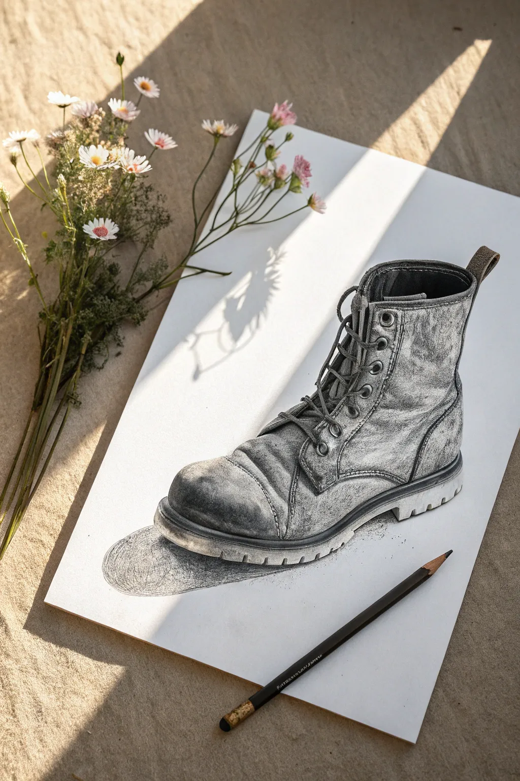
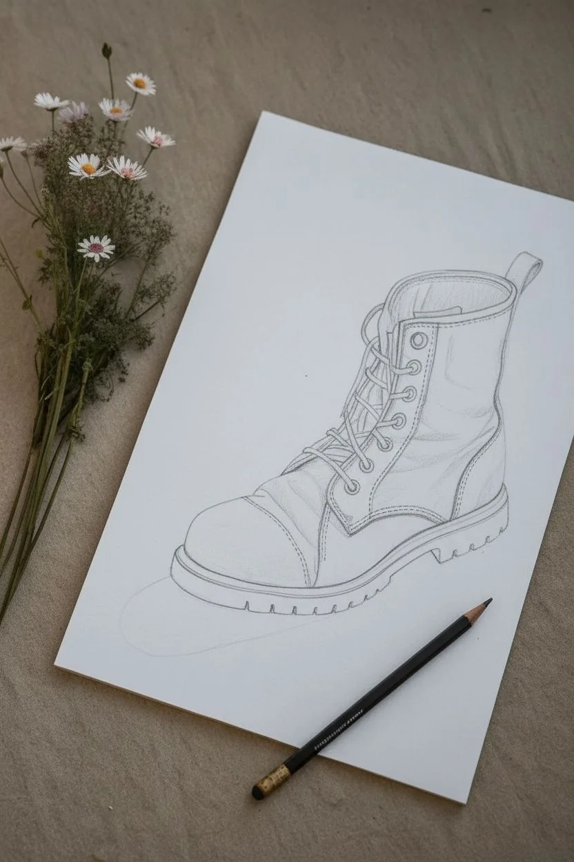
Capture the rugged charm of a well-traveled boot with this detailed graphite study. This project focuses on texture, contrasting the tough leather grain against a crisp white background, perfect for practicing depth and shading.
Step-by-Step Tutorial
Materials
- High-quality drawing paper (smooth or vellum finish)
- Graphite pencils (HB, 2B, 4B, 6B)
- Mechanical pencil (0.5mm, HB or 2B)
- Kneaded eraser
- Blending stump or tortillon
- Paper tissue for smoothing
- Pencil sharpener
Step 1: The Framework
-
Drafting the Outline:
Begin with a light HB pencil. Sketch the basic footprint of the boot first, establishing the sole’s angle. Then, build the upper shape, paying attention to the ankle curve and the rounded toe cap. Keep lines faint so they can be erased later. -
Refining Structure:
Add the specific structural details: the eyelets for the laces, the pull-tab at the back, and the distinct stitching lines that define the toe cap and side panels. -
Sketching the Laces:
Draw the laces loosely. Notice how they cross over and tuck under eyelets. Don’t worry about shading yet, just get their path and thickness correct.
Too Smudged?
If your drawing gets muddy, you’re likely pressing too hard too soon. Layer graphite slowly. Use a clean sheet of paper under your hand to prevent palm smudges.
Step 2: Base Shading & Texture
-
First Layer of Tone:
Using a 2B pencil on its side, lay down a soft, mid-tone grey over the darker areas of the leather. Leave the toe highlight and the upper ankle rim brighter white for now. -
Creating Leather Creases:
Switch to a sharper 4B pencil. Identify where the boot naturally creases—usually across the toe box and ankle. Draw these folds with confident, slightly jagged lines, then shade the ‘valleys’ of the creases dark, fading out as you move up the ‘ridge.’ -
Developing the Sole:
Outline the heavy treads of the sole. Shade the underside darkly with a 6B, but leave the side edge of the rubber lighter to show its thickness and matte texture. -
Shading the Toe Cap:
The toe is often the most worn part. Use a blending stump to smooth out your graphite here, creating a dirty, scuffed look. Add tiny, erratic marks with a mechanical pencil to simulate scratches.
Add a Prop
To mimic the photo’s vibe, place real wildflowers on your paper next to the finished drawing. It creates a beautiful interplay between 2D art and 3D reality.
Step 3: Detailing & Contrast
-
Darkening the Interior:
Where the boot opens at the top, press firmly with your 6B pencil to create a deep, shadowy void. This contrast makes the rim of the boot pop forward. -
Lacing Details:
Sharpen your mechanical pencil. Define the edges of the laces. Shade underneath them where they rest on the tongue to create a drop shadow, which lifts them off the surface visually. -
Adding Stitching:
I find it best to use a very sharp HB for stitching. Draw tiny dashes along the seams. If you accidentally went too dark earlier, use the edge of your kneaded eraser to lift out tiny highlights for the threads. -
Metal Eyelets:
Give the metal ringlets structure by leaving a tiny white highlight on the rim of each one, shading the rest dark grey.
Step 4: Final Polish
-
Enhancing Texture:
Take a tissue and lightly rub the main leather panels to unify the tone. Then, go back in with an unexpected tool—your eraser—to dab at the leather, creating a mottled, worn-out texture. -
The Drop Shadow:
Ground the boot by drawing the cast shadow underneath the toe. Use a unified horizontal hatching stroke here to distinguish it from the texture of the boot itself. -
Clean Up:
Use your kneaded eraser to clean up any smudges on the white background space, ensuring the silhouette of the boot remains crisp.
Step back and admire the rugged history you’ve captured in a simple shoe

PENCIL GUIDE
Understanding Pencil Grades from H to B
From first sketch to finished drawing — learn pencil grades, line control, and shading techniques.
Explore the Full Guide
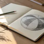
Silhouette in a Shaded Circle Portal
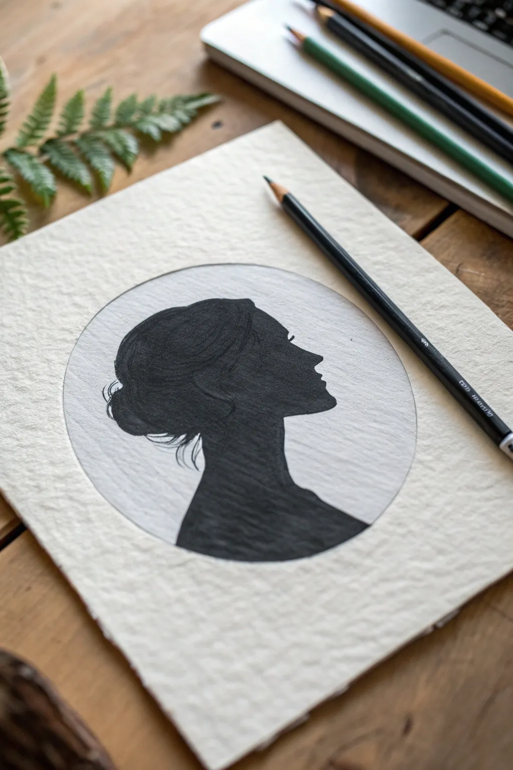
Capture the elegance of a classic silhouette with this striking pencil drawing project. By framing a deep black profile within a softly shaded circle, you’ll create a dimensional portal effect that pops beautifully off textured paper.
Step-by-Step
Materials
- Heavyweight textured drawing paper (cold press watercolor paper works well)
- H pencil (for light outlines)
- 2B pencil (for initial shading)
- 6B or 8B graphite pencil (for deep blacks)
- Compass or circular object (approx. 4-5 inches diameter)
- Kneadable eraser
- Blending stump or tortillon
- Tissue or chamois cloth
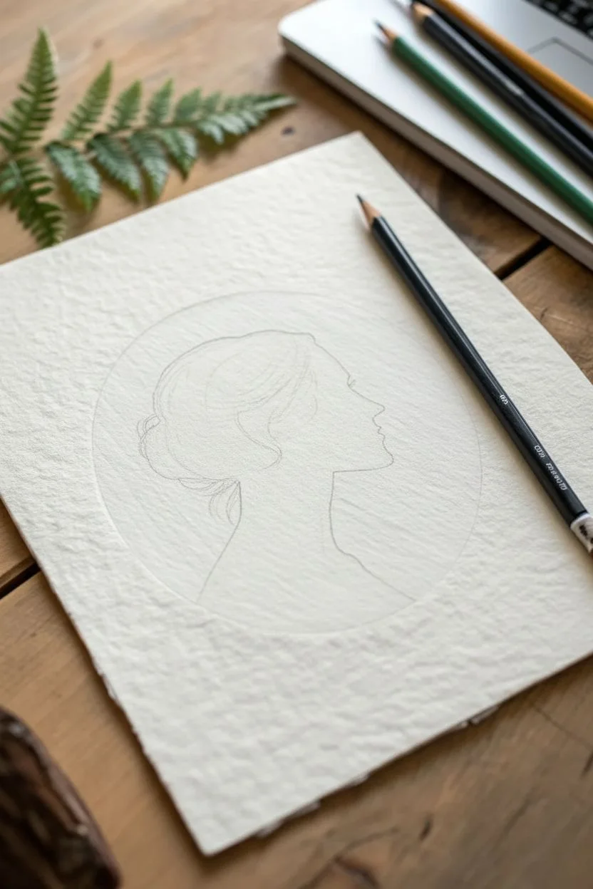
Step 1: Setting the Stage
-
Prepare your paper:
Begin with a sheet of high-quality, textured paper. The texture adds character to the final piece, especially in the lighter shaded areas. Tape down the corners if you want to keep it perfectly flat while working. -
Draw the boundary:
Use a compass or trace around a circular object to lightly draw a perfect circle in the center of your page using your H pencil. Keep this line faint so it disappears later. -
Sketch the silhouette:
Lightly sketch the outline of the woman’s profile inside the circle. Start with the forehead, nose, and chin, then flow down into the neck and shoulders. Don’t worry about details inside the shape yet; focus purely on the outer contour lines. -
Refine the hair:
Add the shape of the hair, including the bun at the back and loose strands near the neck. Ensure the silhouette’s base curves naturally to suggest shoulders without cutting off abruptly.
Clean Edges Trick
Place a piece of clean scrap paper under your hand while you shade. This prevents your palm from smudging the graphite you’ve already laid down into the textured paper.
Step 2: Creating the Deep Black
-
Outline protection:
Go over your final contour line with a slightly sharper 2B pencil to define exactly where the black area begins. Be precise here—this edge is critical for readability. -
Base layer:
Start filling in the silhouette using your 2B pencil. Apply even strokes in a single direction to cover the white of the paper. This doesn’t need to be pitch black yet; it’s just a foundation. -
Deepen the values:
Switch to your softest pencil (6B or 8B). I like to work in small circular motions to really pack the graphite into the paper’s tooth, ensuring a solid, velvety black tone. -
Create hair texture:
While filling the hair area, leave extremely subtle, faint lines or press slightly harder in curves to suggest the flow of hair strands within the black mass. It adds just a hint of dimension without breaking the silhouette style. -
Wisps and flyaways:
Use a freshly sharpened tip to draw delicate stray hairs escaping the bun and at the nape of the neck. These tiny details make the silhouette feel life-like rather than like a cutout.
Patchy Blacks?
If your black silhouette looks shiny or uneven, layer cross-hatching strokes in different directions. This fills the paper grain more thoroughly than shading one way.
Step 3: The Shaded Portal
-
Background shading strategy:
The goal now is to shade the ‘portal’ circle behind the silhouette. You want a soft gray that contrasts with both the white paper outside the circle and the black silhouette inside. -
Apply light graphite:
Lightly rub a 2B pencil on a scrap piece of paper to create a graphite reservoir. Pick up this graphite with your blending stump or a tissue. -
Buff the background:
Gently buff the graphite into the empty space inside the circle. The tone should be uniform and light gray. Be very careful near the silhouette’s edge to keep the boundary crisp. -
Define the circle edge:
Use your H pencil to crisp up the outer edge of the circle. You can add a tiny bit more shading right at the inner edge of the circle’s perimeter to give it a slight recess or ‘lens’ effect. -
Clean up edges:
Use your kneadable eraser to dab away any graphite that smudged outside the circle. The transition from the gray circle to the white paper needs to be sharp. -
Final contrast check:
Step back and look at the drawing. If the silhouette looks patchy, add another layer of 6B graphite. If the background is too dark, lift some graphite with the kneadable eraser.
Now you have a timeless piece of art that balances stark contrast with delicate shading
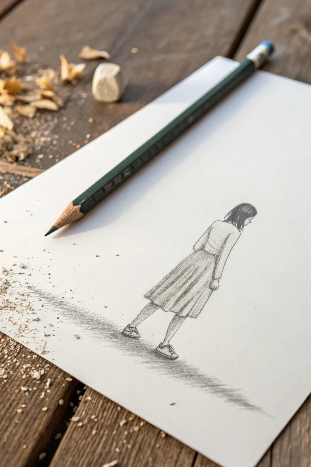
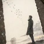
Figure Dissolving Into Shaded Fragments

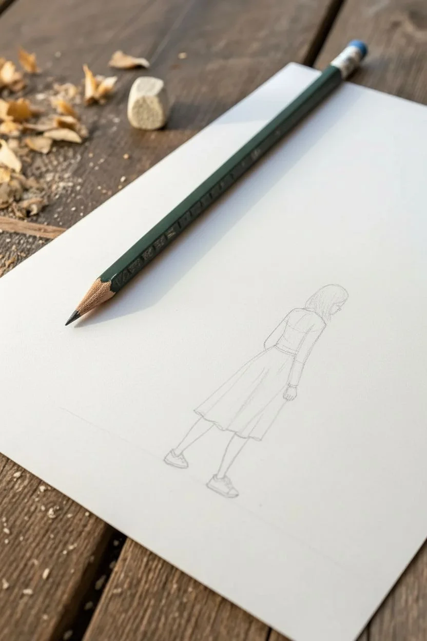
Capture the quiet introspection of a walking figure with this delicate pencil study. By focusing on the folds of clothing and elongated shadows, you’ll learn to suggest movement and weight without needing to draw a complex face.
Step-by-Step Tutorial
Materials
- High-quality white drawing paper (smooth or medium tooth)
- HB graphite pencil (for initial sketching)
- 2B and 4B graphite pencils (for shading)
- Pencil sharpener (manual is best for long points)
- Kneaded eraser
- Ruler (optional, for shadow alignment)
Step 1: Planning the Posture
-
Establish the Spine:
Start with your HS pencil using very light pressure. Draw a gentle C-curve to represent the spine and the forward lean of the figure. This single line dictates the entire posture. -
Draft the Head and Torso:
Sketch a simple oval at the top of your curve for the head, tilting it slightly downward. Block in a trapezoid shape for the upper torso, angling the shoulders to match the walking motion. -
Map the Legs:
Draw simple stick-figure lines to determine where the legs go. The left leg should be trailing back (pushing off), while the right leg is stepping forward, bearing the weight.
Uneven Shading?
If your skirt folds look messy, try shading in one direction only. Use a piece of scrap paper under your hand to prevent smudging your previous work while you refine the pleats.
Step 2: Clothing and Contour
-
Outline the Sweater:
Define the shape of the long-sleeved top. Draw the right sleeve hanging relatively straight but curving slightly at the elbow. Note how the fabric bunches slightly at the waist. -
Form the Skirt Volume:
Sketch the A-line shape of the skirt. Instead of a flat triangle, use curved lines at the hem to show the fabric has volume and is wrapping around her legs. -
Add Pleat Guidelines:
Lightly draw vertical lines running down the length of the skirt. These don’t need to be perfectly straight; let them follow the sway of the fabric to suggest the skirt is pleated or gathered. -
Refine the Limbs:
Flesh out the legs and feet. The shoes are simple sneakers; focus on the general silhouette rather than tiny details like laces. Ensure the ankles look slim compared to the shoes. -
Detail the Hair:
Sketch the hair falling around the shoulders. Since she is looking down, the hair should curtain the side of her face, obscuring facial features. Use long, flowing strokes.
Add an Environment
To dissolve the figure into fragments as mentioned in the section theme, extend the cast shadow into abstract geometric shards that float away, breaking the realism.
Step 3: Shading and Depth
-
Switch to Softer Lead:
Pick up your 2B pencil. Begin darkening the hair, leaving a small highlight near the crown of the head to show sheen. Use strokes that follow the direction of the hair strands. -
Shadow the Sweater:
Apply light shading to the side of the torso furthest from the light source. I usually add a bit of shading under the armpit and along the inner sleeve to create cylindrical form. -
Define the Skirt Pleats:
This is the most crucial step for texture. Shade the ‘valleys’ of the skirt folds darker than the ridges. The contrast between light and dark strips creates the 3D pleated effect. -
Deepen the Creases:
Use your 4B pencil to add the darkest accents. Place these in the deepest shadow areas: under the hem of the skirt, the back of the knee, and the darkest parts of the hair. -
Clean Up Edges:
Use the kneaded eraser to lift off any stray sketch lines. Sharpen the outline of the figure where the light hits it, keeping the line work crisp.
Step 4: Grounding the Figure
-
Establish the Horizon:
Lightly sketch a horizontal path or ground line. In this drawing, we use a textured shadow to imply the ground rather than drawing a distinct floor line. -
Draft the Cast Shadow:
Using the side of your 4B pencil lead, create a long, stretched shadow extending to the left. The shadow should be darker near the feet and fade out as it gets further away. -
Add Ground Texture:
Instead of a solid block of grey, use horizontal hatch marks for the shadow. This directional shading mimics the texture of pavement or a road surface. -
Final Contrast Check:
Step back and assess your values. If the figure looks too flat against the white paper, darken the shoes and the cast shadow slightly more to anchor her firmly to the ground.
You have realized a poignant moment of movement with just a few simple tools


Have a question or want to share your own experience? I'd love to hear from you in the comments below!