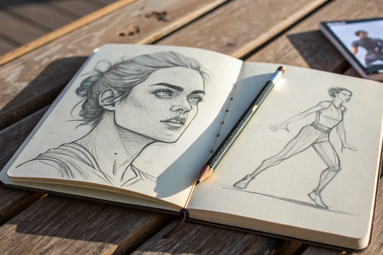
If you’ve been craving fresh people drawing ideas, you’re in the right headspace—drawing humans is basically endless inspiration. I pulled together my favorite go-to prompts and practice pages that help you get better at faces, poses, and all those little human details that make a sketch feel alive.
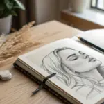
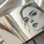
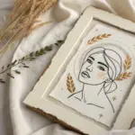
Classic Portrait Sketch from a Front View
This project captures the delicate balance of light and shadow in a realistic graphite portrait featuring a young subject with short hair in a three-quarter view. The textured paper and soft shading techniques create a timeless, ethereal quality reminiscent of academic studies.
Step-by-Step
Materials
- Heavyweight textured drawing paper (deckled edge optional)
- Graphite pencils (HB, 2B, 4B, 6B)
- Mechanical pencil (0.5mm HB) for fine details
- Kneaded eraser
- Blending stumps (tortillons) or soft tissue
- Fixative spray
Step 1: Planning and Structure
-
Establish the Head Angle:
Begin with a loose HB sketch to place the head on the paper. Since this is a three-quarter view, draw a central axis line that curves slightly to the right, indicating the direction the face is turning. -
Map Facial Features:
Lightly mark the horizontal guidelines for the eyes, nose base, and mouth. Note that the eye on the far side will appear slightly narrower due to foreshortening, and the nose will project past the distant cheek line. -
Outline the Hair Mass:
Sketch the general shape of the hair without drawing individual strands yet. I like to treat the hair as solid blocks of volume first to ensure it sits correctly on the skull. -
Refine the Contours:
Clarify the jawline, the curve of the neck, and the ear placement. The ear should sit low, roughly between the eye and nose lines, but pushed back on the side of the head.
Step 2: Developing the Features
-
The Eyes and Brows:
Switch to a sharpened 2B pencil. detailed the iris and pupil, leaving a tiny white spot for the catchlight. Draw the eyebrows with short, directional strokes that follow the hair growth outward. -
Sculpting the Nose:
Avoid outlining the bridge of the nose harshly. Instead, use soft shading on the side plane and underneath the tip to define its shape. Darken the nostril, but keep the edges soft. -
Defining the Lips:
Draw the center line of the mouth first, emphasizing the corners. Shade the upper lip slightly darker than the lower lip. Use vertical, curved hatching lines to mimic the texture of the lip skin. -
The Ear Detail:
Carefully draw the complex cartilage folds of the visible ear. Add a small stud earring detail if desired for a touch of realism.
Master the Values
Make your darkest darks (pupils, nostrils) truly black using a 6B pencil. High contrast is what makes a pencil drawing look three-dimensional rather than flat and grey.
Step 3: Shading and Form
-
First Pass of Tone:
Using an HB pencil held at a low angle, apply a light wash of graphite over the shadowed areas of the face: the eye socket, under the nose, under the lower lip, and the neck. -
Deepening Shadows:
Switch to a 4B pencil to push the darker values. Focus on the occlusion shadows—the darkest spots inside the ear, the nostril, and the crease of the eyelid. Use a blending stump to smooth these transitions gently. -
Cheek and Jaw Definition:
Build up the shading on the cheekbone and along the jawline. Leave the high points of the cheek and the bridge of the nose the color of the paper to act as highlights. -
Neck and Clothing:
Keep the clothing sketch very loose and gestural to focus attention on the face. Shade the neck firmly under the jaw to create depth, making the head pop forward.
Paper Choice Matters
Try using cotton rag or cold-press watercolor paper for this sketch. The heavy tooth captures graphite grain beautifully, adding an artistic, old-world texture to your shading.
Step 4: Hair and Texture
-
Grouping Hair Strands:
Using a 4B or 6B pencil, draw the darker areas between clumps of hair. Don’t draw every hair; instead, draw the shadows *between* the locks to define the shapes. -
Adding Flow:
With a sharp mechanical pencil, add fine, sweeping strokes over the base shading to suggest texture and direction. Pay attention to the crown where the hair parts and flows in different directions. -
Flyaway Hairs:
Add a few loose, erratic hairs escaping the main shape, particularly around the temples and back/top of the head. This adds immense realism and stops the hair from looking like a solid helmet. -
Background Tone:
Use the side of a 2B pencil to create a soft, hatched background block behind the head. This negative space helps define the light side of the face without needing a hard outline. -
Final Highlights:
Use a kneaded eraser to lift out pigment for bright highlights on the nose tip, lower lip, and the sheen on the hair.
Seal your finished portrait with a light mist of fixative to protect those delicate graphite layers from smudging


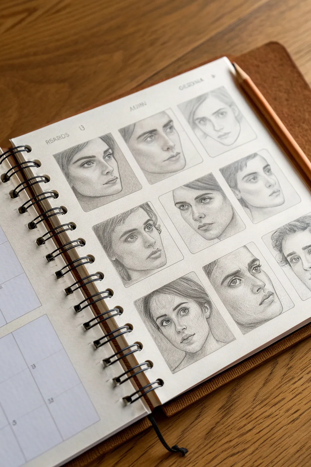
Eight-Panel Facial Expressions Cheat Sheet
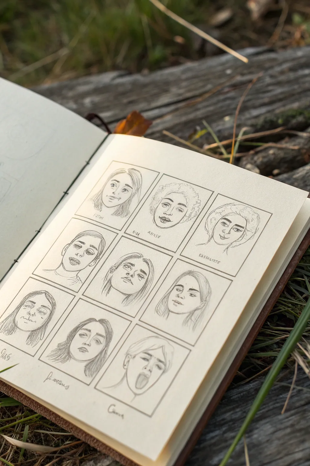
This sketching exercise breaks down complex emotions into a manageable grid of nine unique portraits. It’s a fantastic way to practice consistency while exploring a wide range of facial features and expressions on a single page.
Step-by-Step
Materials
- Sketchbook with cream or off-white paper
- HB or 2B graphite pencil
- Fine liner pen (optional)
- Ruler
- Kneaded eraser (for lifting lines)
- Blending stump (optional)
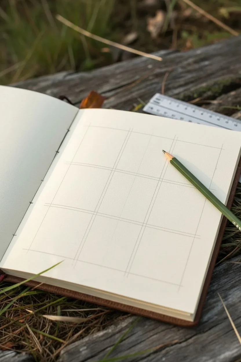
Step 1: Planning the Layout
-
Measure the Grid:
Start by measuring the usable space on your sketchbook page. You need to fit a 3×3 grid, so divide the width and height by three to determine the size of each square. -
Draw the Frame:
Using your ruler and a light pencil touch, draw the outer boundary of your large square first. Leave a comfortable margin from the edge of the paper to let the drawing breathe. -
Create the Subdivisions:
Lightly mark the thirds on your outer box. connect these marks vertically and horizontally to create nine equal sub-panels. Keep these lines very faint as they act as frames, not the artwork itself.
Step 2: Drafting the Faces
-
Initial Face Shapes:
In each square, lightly sketch a basic oval or egg shape. Vary the width and jawlines slightly between panels—some rounder, some more angular—to ensure you don’t draw the exact same person nine times. -
Guidelines for Features:
Draw faint cross-hairs on the faces to position eyes, noses, and mouths. Shift these guidelines in different directions (looking up, down, or slightly sideways) to create dynamic angles rather than nine straight-on portraits. -
The Center Portrait:
Start with the center square as an anchor. Creating a slightly upward-looking expression here, perhaps with a neutral or contemplative gaze, sets a nice midpoint for the surrounding emotions. -
Top Row Expressions:
For the top left, sketch a soft, slight smile. For the middle top, try a wider face with distinct curly hair. On the top right, incline the head slightly and add a headwrap or hat to break the visual repetition of hair. -
Middle Row Variations:
Since the center is done, move left. Draw a head tilted back with heavy lids, suggesting tiredness or arrogance. To the right of center, tilt a head the opposite way with a soft, downward gaze.
Pro Tip: Symmetry Check
Turn your sketchbook upside down periodically. This trick exposes skewed features or asymmetrical eyes instantly, allowing you to correct drawing errors you’ve become blind to.
Step 3: Adding Details & Shading
-
Refining Eyes and Brows:
Go back to the top left. Darken the lash line and add pupils. The expression really lives in the eyebrows—arch them for surprise or flatten them for annoyance. -
Defining Noses:
Avoid drawing hard outlines for noses. Instead, suggest the shape by shading the nostrils and the underside of the tip. This keeps the faces looking realistic rather than cartoony. -
Mouths and Lips:
Work on the bottom row now. For the bottom right character, try an open mouth expression, like a yawn or a shout, to practice teeth and tongue placement. -
Hair Texture:
Add hair last. Use long, sweeping strokes for straight hair (like the bottom left) and tight, small loops for textured hair (like the top center). Allow some strands to break the frame borders for a more organic look. -
Final Line Art:
Once happy with your pencil sketch, press harder to create the final lines. I prefer to keep the style loose and sketchy rather than inking it perfectly solid. -
Subtle Shading:
Add light shading under the chins, inside the ears, and in the eye sockets using the side of your pencil lead. Use a blending stump to soften these shadows if they look too harsh. -
Captions:
Add distinct, tiny handwritten names or emotion labels under specific portraits. Use a very sharp point for this text to keep it delicate. -
Cleanup:
Use your kneaded eraser to lift up the initial construction lines of the grid, but leave the frame outlines visible to maintain the storyboard aesthetic.
Troubleshooting: Smudging
If you’re right-handed, start drawing from the top-left square and work your way right and down. This prevents your hand from resting on and smearing completed graphite work.
Flip through your sketchbook and enjoy seeing a whole range of human emotion captured on a single spread
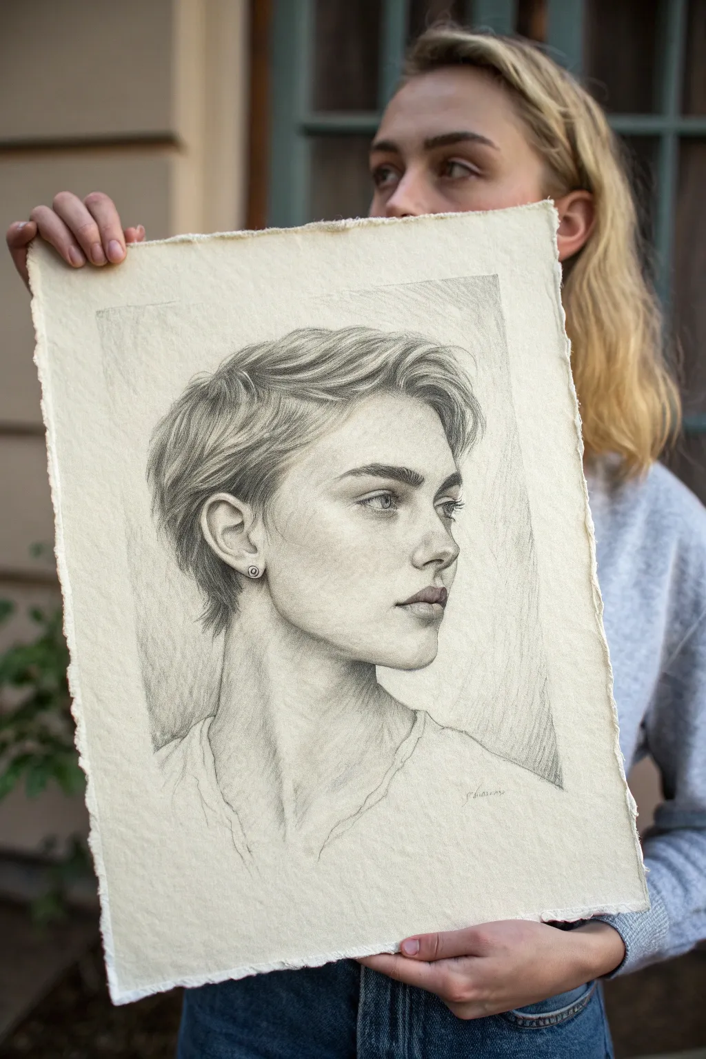
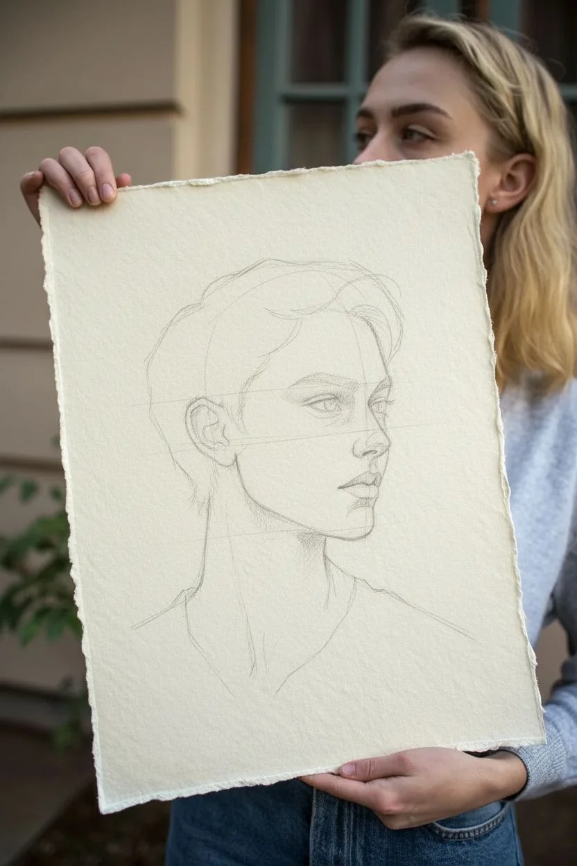
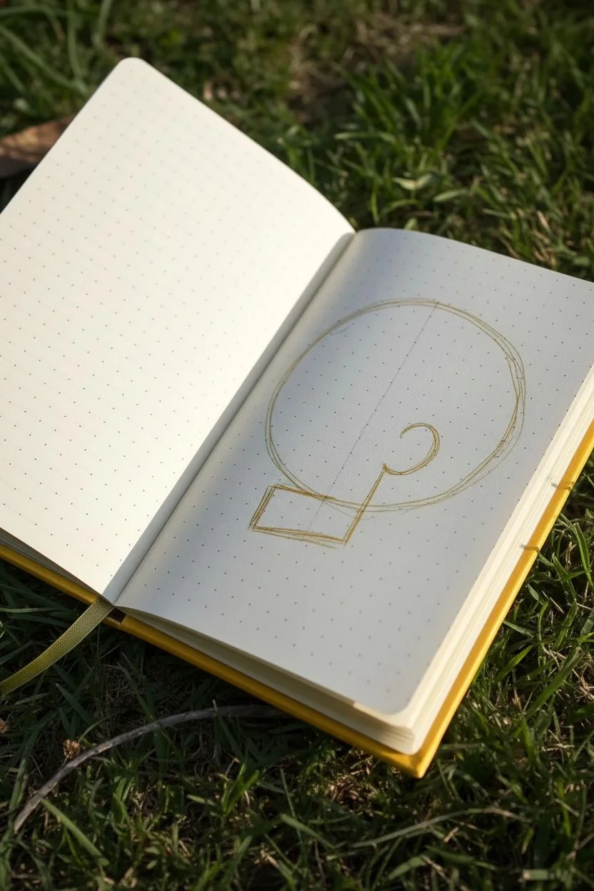
Clean Side Profile Head Studies
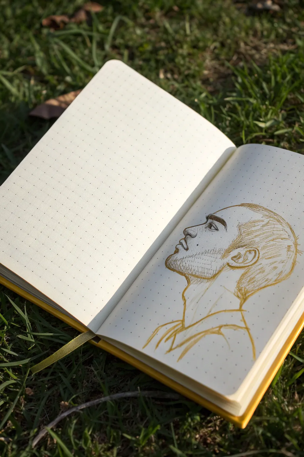
Capture the thoughtful expression of a male subject with this minimalist side profile study. Using a warm, golden-brown ink on dotted grid paper creates a striking contrast that feels both vintage and modern.
How-To Guide
Materials
- Dotted grid sketchbook (A5 size recommended)
- Fine liner or drawing pen (Golden-brown or Ochre ink)
- HB Pencil (optional for under-drawing)
- Kneaded eraser (optional)
- Reference photo of a side profile
Step 1: Setting the Proportions
-
Map the cranium:
Start by lightly sketching a circle for the main part of the skull. This will form the back and top of the head. Don’t worry about being perfect; the loose style is part of the charm. -
Define the jawline:
From the bottom front of your circle, draw a line angling down and forward to mark the jaw. Curve it up towards where the ear will sit. -
Mark the facial plane:
Draw a vertical line down the front of the circle to indicate where the forehead, nose, and chin will align. This helps keep the features centered on the profile view. -
Place the ear:
Locate the ear towards the back of the jawline, roughly in the lower middle quadrant of your initial circle. Sketch a simple oval or C-shape as a placeholder.
Use Negative Space
Focus on the empty shapes *outside* the face (like the angle between chin and neck) to double-check your proportions.
Step 2: Refining the Features
-
Sculpt the forehead and nose:
Switch to your golden-brown pen if you were using pencil, or press slightly firmer. Trace the forehead down into the bridge of the nose. Give the nose a distinct bump or shape based on your reference. -
Draft the nostril:
Add the curve of the nostril wing and the darker recess of the nostril itself. Keep these lines fairly fluid. -
Draw the lips:
Sketch the upper lip protruding slightly, curving back in. Create the mouth opening with a small downward tick and define the fuller lower lip underneath. -
Form the chin:
Continue the line from the lower lip down around the chin, connecting it naturally back to your initial jawline sketch. -
Detail the eye:
Draw the eye socket first as a subtle shadow shape. Place the eye itself within this, focusing on the side view of the eyelids and the iris. Add a thicker line for the eyebrow above.
Add a Color Wash
Once the ink is dry, use a waterbrush to bleed the ink slightly for shading, or add a pale watercolor wash over the skin.
Step 3: Shading and Texture
-
Add facial hair texture:
Using very short, quick hatching strokes, simulate stubble along the jawline, chin, and upper lip area. Vary the density to show shadow and thickness. -
Detail the ear structure:
Refine the ear shape, drawing the inner cartilage folds (the helix and antihelix) with organic, curving lines. -
Sketch the hair:
Use long, sweeping strokes to indicate the flow of the hair on top of the head. Don’t draw every strand; instead, group the hair into tufts or sections to suggest volume. -
Fade the hairline:
Where the hair meets the skin at the temples and back of the neck, use lighter, sparser strokes to create a natural fade rather than a hard line. -
Define the neck:
Draw the front of the neck, including the Adam’s apple bump. Add the back of the neck muscle (trapezius) extending down from the skull.
Step 4: Final Touches
-
Suggest clothing:
Sketch the collar of a shirt loosely at the base of the neck. Let these lines be the loosest of the whole drawing, fading out at the bottom. -
Reinforce key shadows:
Go back over areas like the nostril, the corner of the eye, and under the jawline with a second pass of line work to deepen the contrast. -
Clean up:
If you used an under-drawing, gently erase any visible pencil marks once the ink is completely dry to leave a crisp, clean finish.
Now you have a dynamic profile sketch that beautifully utilizes the simplicity of your notebook page


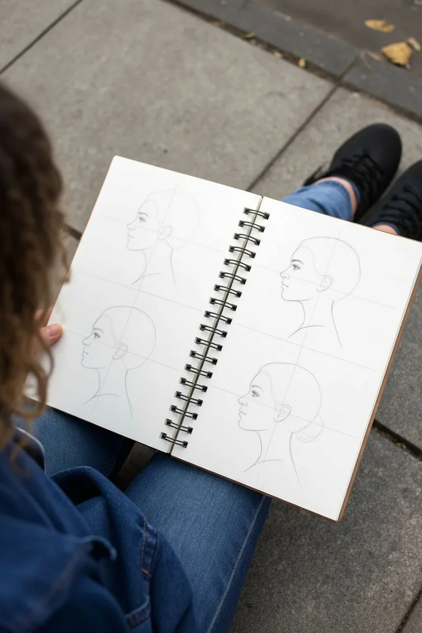
Facial Feature Studies: Eyes, Noses, and Lips

This project focuses on capturing the subtle nuances of human expression through a structured series of portrait vignettes. Using graphite pencils, you will create a grid of soft, realistic facial studies that emphasize smooth shading and proportional accuracy.
Detailed Instructions
Materials
- High-quality sketchbook or drawing paper (medium tooth)
- Set of graphite pencils (HB, 2B, 4B, 6B)
- Mechanical pencil (0.5mm HB) for fine details
- Kneadable eraser
- Blending stump or tortillon
- Ruler
- Tissues for hand rest
Step 1: Setting the Structure
-
Grid Layout:
Begin by lightly measuring out a 3×3 or 3×4 grid on your sketchbook page using a ruler and an HB pencil. Leave generous margins between the squares to give each portrait room to breathe. -
Soft Outlines:
Draw faint square frames for your portraits. Keep these lines incredibly light so they don’t distract from the artwork later; you just need a boundary to work within. -
Choosing Subjects:
Selected your reference photos. Aim for variety in angles: straight on, three-quarter view, and profile. Having a mix keeps the page dynamic and challenging.
Step 2: Constructing the Features
-
Basic Shapes:
Start the first portrait by blocking in the basic head shape using a mechanical pencil. Focus on the oval of the face and the centerline to determine the direction of the gaze. -
Placement Lines:
Lightly mark horizontal lines for the eyes, nose base, and mouth. Correct placement is crucial here before you commit to any details. -
Defining the Eyes:
Sketch the outline of the eyes first. Pay attention to the shape of the eyelids and the distance between the eyes. Mark the iris but don’t shade it yet. -
Nose and Mouth:
Indicate the nose using soft suggestions of shadow rather than hard outlines. Sketch the line between the lips, emphasizing the corners of the mouth.
Fixing “Flat” Faces
If a face looks flat, your mid-tones are likely too uniform. Don’t be afraid of the extremes! Darken the shadows under the jaw and brighten the highlights on the nose bridge.
Step 3: Shading and Depth
-
Initial Tone:
Switch to a 2B pencil. Apply a very light layer of graphite over the shadowed areas of the face—usually under the brow, beside the nose, and under the chin. -
Deepening Shadows:
Use a 4B pencil to deepen the darkest areas: the pupils, the lash line, and the corners of the mouth. I find that building up contrast slowly prevents the drawing from looking muddy. -
Smoothing the Skin:
Take your blending stump and gently soften the graphite transitions on the skin. Move in the direction of the underlying facial muscles to keep the form look realistic. -
Defining the Iris:
Sharpen your pencil to a fine point and add the intricate details of the iris, leaving a tiny pure white spot for the catchlight to bring the eyes to life. -
Detailed Hair:
Using a 2B or 4B pencil, draw the hair in clumps rather than individual strands. Focus on the flow and direction, adding darker strokes where the hair tucks behind the ear or overlaps.
Smudge Prevention
Place a blank sheet of paper under your drawing hand. This acts as a shield, preventing your palm from smearing the graphite of finished portraits while you work on new ones.
Step 4: Refining and Repeating
-
Highlighting:
Use a kneadable eraser to lift graphite from high points like the tip of the nose, the cheekbones, and the forehead. This subtractive drawing technique adds incredible volume. -
Clean Edges:
Go back over the square frame border if it has been smudged. A crisp border contrasts beautifully with the soft shading of the face. -
Repeat the Process:
Move to the next square in your grid. Try a different angle or gender for this one to practice different facial structures. -
Final Contrast Check:
Once the grid is full, step back and look at the page as a whole. Use a 6B pencil to darken the deepest shadows across all portraits to ensure a consistent value range. -
Protecting the Work:
Since this page has a lot of soft graphite, spray it with a workable fixative to prevent the facing page from smudging your hard work.
Fill your sketchbook with these expressive studies to see rapid improvement in your portraiture skills

PENCIL GUIDE
Understanding Pencil Grades from H to B
From first sketch to finished drawing — learn pencil grades, line control, and shading techniques.
Explore the Full Guide
Hair Texture and Hairstyle Sampler Page
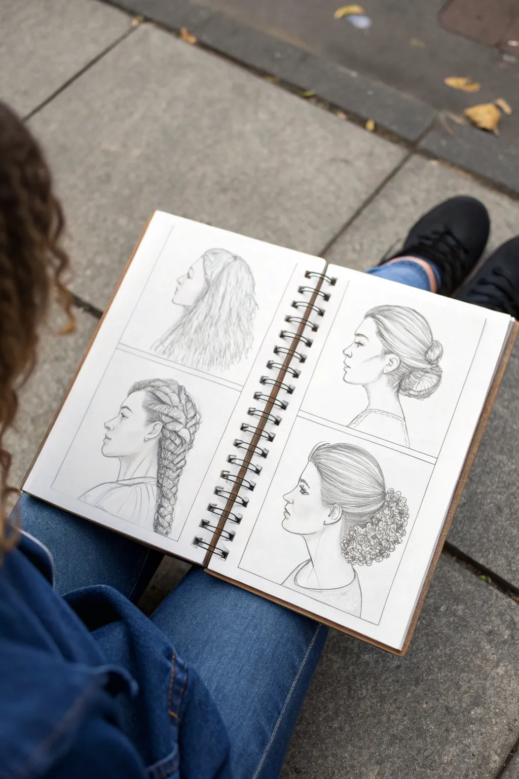
This project focuses on capturing the beauty of different hair textures and styles through four distinct profile studies. You’ll create a sampler page that explores various techniques for rendering braids, loose waves, and structured updos with pencil.
Step-by-Step Tutorial
Materials
- Spiral-bound sketchbook (A4 or roughly 9×12 inches)
- Graphite drawing pencils (HB, 2B, 4B)
- Kneaded eraser
- Fine-tip mechanical pencil (0.5mm) for details
- Ruler
- Blending stump (optional)
Step 1: Planning and Layout
-
Divide the page:
Start by lightly drawing a large cross in the center of your sketchbook pages (or a single page if working on one sheet) to create four equal quadrants. This grid will keep your sampler organized and balanced. -
Sketch the base profiles:
In the center of each quadrant, lightly outline four idential female profiles facing left. Focus on the forehead, nose, lips, chin, and neck curves. Keep these outlines faint, as they serve only as mannequins for the hair. -
Refine facial features:
Go back over the profiles with an HB pencil to define the eyes, eyebrows, and ears. The ears are particularly important as landmarks for where the hair will tuck or flow.
Step 2: Top Left: Loose Waves
-
Outline the volume:
Draw the general shape of the hair, allowing it to flow down past the shoulders. Keep the crown slightly lifted to suggest volume. -
Add directional flow:
Using long, wavy S-curves, map out the primary locks of hair. Start from the parting at the top and flow downward. -
Details and texture:
Switch to a 2B pencil to add darker values in the crevices between waves. Use quick, lifting strokes at the ends to create a realistic, slightly frizzy texture rather than solid lines.
Fixing Flat Hair
If the hair looks like a helmet, add ‘flyaways’—tiny, faint stray hairs escaping the main shape. This breaks the solid outline and adds instant realism.
Step 3: Bottom Left: The French Braid
-
Map the segments:
Sketch the path of the braid starting from the temple and curbing down the back of the head. Draw overlapping heart or ‘Y’ shapes to construct the braid segments. -
Tightening the weave:
Define the individual strands within each braid segment. Specifically, draw curved lines that follow the roundness of each section, showing how the hair is pulled tight. -
Shading for depth:
I like to use a 4B pencil here to deepen the shadows where the strands tuck under each other. This high contrast is essential for making the braid look three-dimensional.
Shading Secret
Always shade in the direction the hair grows. Never shade across the strands, or you will ruin the illusion of texture and flow.
Step 4: Top Right: The Smooth Low Bun
-
Establish the silhouette:
Draw the hair pulled back tightly against the skull, ending in a twisted bun shape at the nape of the neck. Ensure the scalp line is clean. -
Create smooth texture:
Use long, continuous strokes with a mechanical pencil or sharpened HB to simulate sleek hair. These lines should follow the curve of the skull from the forehead back to the bun. -
Render the bun:
Draw the bun as a series of wrapped sections. Add shadows at the bottom of the bun and where the hair gathers at the nape to give it weight.
Step 5: Bottom Right: The Textured Ponytail
-
Draw the sleek front:
Similar to the bun style, draw the front section of hair pulled back smoothly. However, leave the back section loose and voluminous. -
Add the curly texture:
For the gathered hair at the back, use small, repetitive circular or squiggly motions. Don’t draw individual strands; focus on the mass of curls. -
Refine the contrast:
Darken the area where the hair is tied to show density. Keep the outer edges of the curls lighter and softer to suggest fluffiness.
Step 6: Final Touches
-
Frame the drawings:
Use a ruler and a darker pencil to firm up the quadrant lines you drew in the beginning, creating neat boxes around your portraits. -
Clean up:
Erase any stray construction lines or smudges around the profiles. Verify that the necklines and shoulders are lightly indicated to ground the figures.
You now have a beautiful reference sheet that demonstrates the versatility of hair textures through simple pencil strokes
Full-Body Figure Proportions in a Neutral Stance
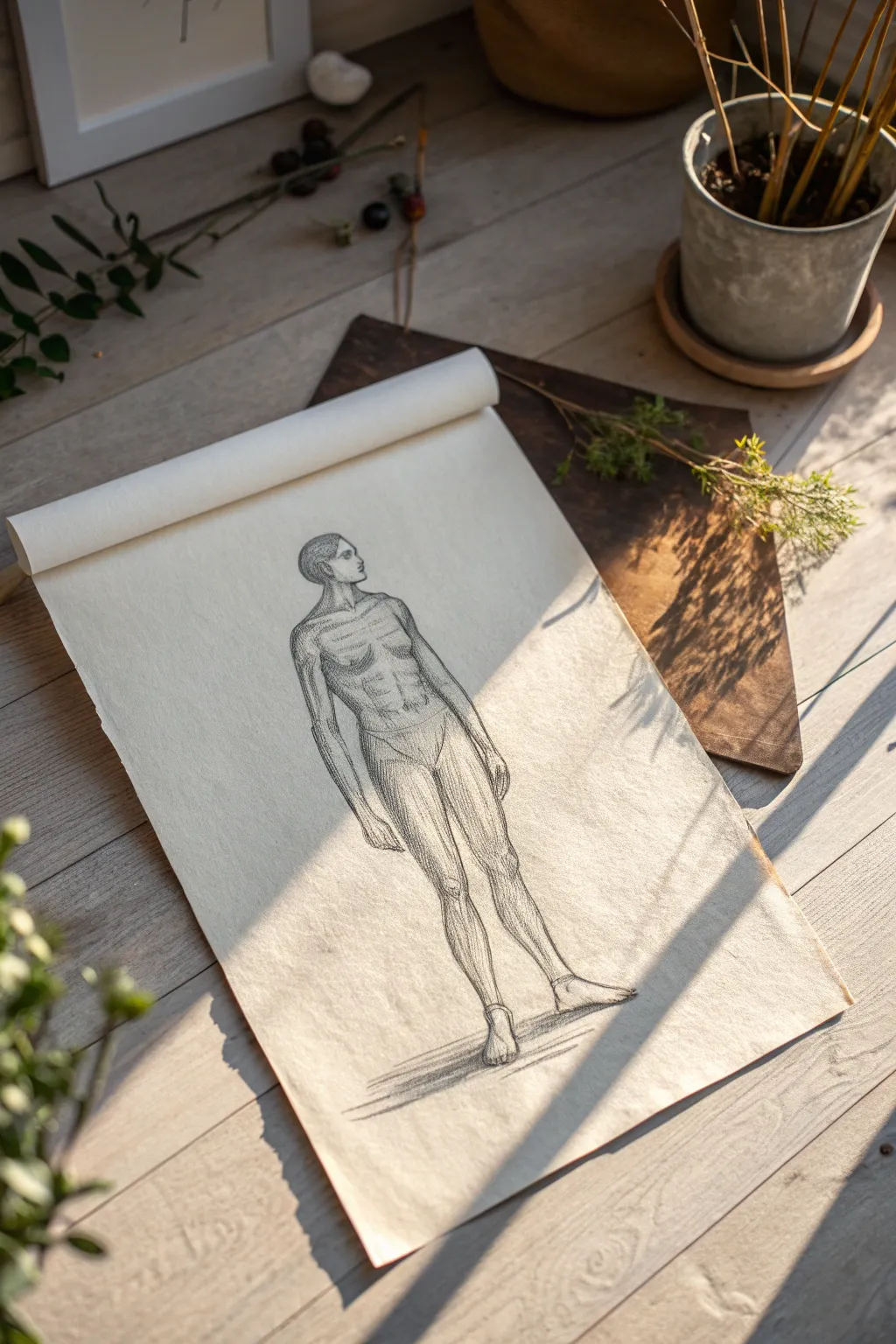
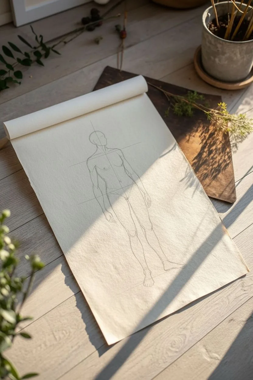
Master the fundamentals of human proportion with this classical figure study. Using a slightly textured paper akin to parchment rolls adds a timeless, scholarly feel to your anatomical sketch.
Step-by-Step
Materials
- Textured sketch paper (light cream or rice paper roll)
- Graphite pencils (HB, 2B, 4B)
- Kneaded eraser
- Blending stump (tortillon)
- Drawing board or hard surface
- Pencil sharpener
Step 1: Drafting the Framework
-
Establish the Head Height:
Begin by lightly marking the top and bottom of your figure. Draw a small oval for the head at the top; this head height will serve as your unit of measurement for the rest of the body. -
Mark the Vertical Axis:
Drop a faint vertical line straight down from the center of the head to the feet. This ‘plumb line’ helps ensure your figure is standing securely and not falling over. -
Measure Seven Heads Down:
Using your pencil tip to measure the head size, mark off roughly seven to seven-and-a-half additional head lengths down the central line to establish the proportions for shoulders, hips, knees, and feet. -
Shoulder and Hip Angles:
Sketch a horizontal line for the shoulders (about two head-widths wide) and a slightly narrower one for the hips. In this neutral pose, keep them relatively parallel, perhaps with a slight contrapposto tilt if you want a relaxed look.
Don’t stiffen up
Even in a ‘neutral’ stance, humans rarely stand like rigid soldiers. Slight curves in the spine and relaxed knees make the drawing feel organic.
Step 2: Blocking the Anatomy
-
Construct the Torso:
Connect the shoulders to the hips using a tapered, box-like shape for the ribcage and a cylindrical form for the pelvis. Notice how the pectorals sit high on the chest plate. -
Outline the Limbs:
Use cylindrical tubes to map out the arms and legs. Draw the upper arm stopping at the elbow (waist level) and the forearm extending to the wrist (crotch level). -
Refine the Head Shape:
Return to your initial oval. Define the jawline and the back of the skull. Add a simple cross-contour line to indicate where the eyes and nose will sit, facing slightly to the side. -
Define the Knees and Calves:
Sketch the knee joints as small blocky shapes. Curve the lines for the calves outward slightly to show muscle bulk, tapering down toward the ankles. -
Place Hands and Feet:
Block in the hands as mitten-like shapes hanging naturally. Sketch triangular wedges for the feet, ensuring they are planted firmly on your imaginary ground plane.
Old Master Aesthetic
Try using a sanguine or sepia-toned pencil instead of graphite. The reddish-brown hue mimics Renaissance anatomical studies beautifully.
Step 3: Shading and Definition
-
Contour the Muscles:
Switch to a 2B pencil. Begin to darken the outlines, interpreting the cylinders as actual muscles—deltiods, biceps, and quadriceps. Use flowing lines that overlap slightly to suggest muscle insertion points. -
Add Core Shadows:
Determine your light source (coming from the left in this example). Shade the right side of the torso, the inner legs, and underneath the neck using hatched lines. -
Define the Abdominals:
Lightly sketch the abdominal grid. Don’t outline every ‘pack’ heavily; instead, use soft shading to suggest the undulating surface of the stomach muscles. -
Detail the Face:
Using a sharp HB pencil, add the small details of the profile—the nose bridge, the eye socket, and the ear placement. Keep features simple to maintain the focus on body structure. -
Strengthen the Line Weight:
Go over the shadowed side of the figure with a 4B pencil. Making the outline thicker and darker on the shadow side gives the figure weight and volume. -
Ground the Figure:
Sketch a horizontal shadow pooling underneath the feet. This cast shadow is crucial for making the figure look like it is standing on a floor rather than floating in space. -
Blend Softly:
Use your blending stump to gently smudge the hatched shadows on the thighs and torso. I prefer to leave some texture visible so it doesn’t look too polished or plastic.
Keep practicing these proportions daily and soon constructing a figure will become second nature to you
BRUSH GUIDE
The Right Brush for Every Stroke
From clean lines to bold texture — master brush choice, stroke control, and essential techniques.
Explore the Full Guide
60-Second Gesture Drawing Warm-Ups
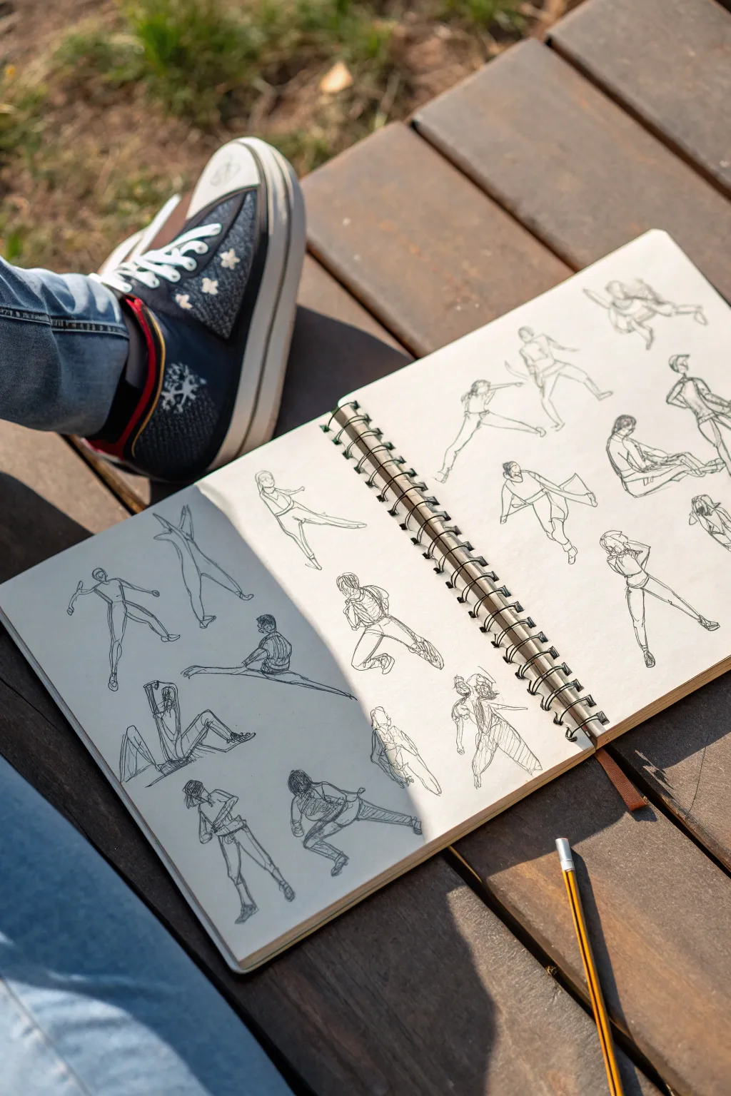
Loosen up your artistic muscles with this lively double-page sketchbook spread focused on capturing human movement. These quick, energetic figure studies are perfect for honing your observation skills and filling your pages with life.
Step-by-Step Guide
Materials
- Sketchbook (spiral bound, medium grain paper)
- Graphite pencil (HB or 2B)
- Pencil sharpener
- Reference images or a live setting (park, cafe)
Step 1: Setting the Pace & Structure
-
Warm up your arm:
Before putting pencil to paper, shake out your wrist and make some loose circular motions in the air. This project relies on fluid lines, so stiffness is the enemy here. -
Establish a time limit:
Set a timer for 60 seconds per pose. This constraint forces you to look at the ‘whole’ rather than getting bogged down in details like buttons or shoelaces. -
Observe the line of action:
Select your first reference pose. Identify the primary curve that runs through the spine—the ‘line of action.’ Draw this single, sweeping line lightly on your page to establish direction.
Keep Moving
Don’t use an eraser! If you make a mistake, just draw the correct line right over it. The ‘messy’ lines add energy and show your thinking process.
Step 2: Building the Stick Figure
-
Place the head and torso:
Sketch a simple oval for the head at the top of your action line. Add a rough shape (like a box or a tapered bean) for the ribcage and pelvis, keeping the pencil pressure light. -
Suggest the limbs:
Draw single lines for the arms and legs. Focus entirely on the angles—is the knee higher than the hip? Is the elbow bent acutely? Capture the gesture, not the anatomy yet. -
Mark the joints:
Add small circles or dots to verify where shoulders, elbows, knees, and ankles sit. This helps visualize the mechanics of the pose before you add volume.
Try Continuous Line
For a challenge, try drawing an entire figure without lifting your pencil from the paper. It forces you to connect every shape physically.
Step 3: Adding Volume and Form
-
Flesh out the limbs:
Go back over your stick lines and add cylindrical forms for the thighs, calves, and forearms. Keep your lines loose and scratchy; this is a sketch, not a polished portrait. -
Refine the torso connection:
Connect the ribcage and pelvis. If the figure is twisting, show that torque with a few lines wrapping around the form like a rubber band. -
Sketch hands and feet:
Don’t draw fingers or toes. Instead, use wedge shapes for feet and simple mitten shapes for hands to suggest direction without slowing you down.
Step 4: Clothing and Details
-
Suggest clothing folds:
Identify tension points where clothes stretch (like knees or armpits). Add a few quick C-curves or zigzag lines to indicate fabric bunching, which enhances the sense of movement. -
Darken key lines:
I rarely erase during gesture drawing; instead, press harder to reinforce the ‘correct’ lines. Darken the side of the figure that is in shadow or touching the ground to add weight. -
Clarify the hair:
Block in the general shape of the hair as a single mass. Don’t draw individual strands; just capture the silhouette. -
Add contextual hints:
If a figure is sitting, draw a simple line for the chair or floor. This grounds the figure so they don’t look like they are floating in white space.
Step 5: Filling the Spread
-
Rotate your orientation:
Draw the next figure. Vary the size and placement on the page. Don’t be afraid to overlap slightly if you run out of room; it creates an energetic collage effect. -
Vary the poses:
Ensure you have a mix of standing, sitting, crouching, and stretching poses. Try to draw at least 15 figures across the two pages. -
Review negative space:
Look at the white space between your figures. If there’s a large gap, fill it with a smaller, crouching figure or a detail study of a hand or foot. -
Final emphasis:
Scan the whole spread. Use your pencil to add a few final dark accents on the underside of shoes or deep folds to make the sketches pop off the page.
You have now filled a sketchbook spread with lively energy that captures the essence of human movement
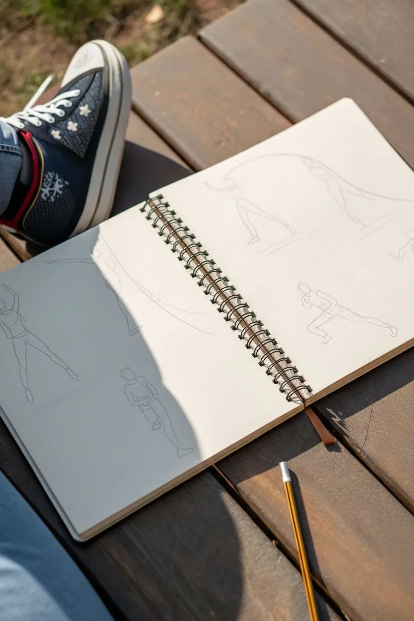
Dynamic Action Poses (Run, Jump, Reach)
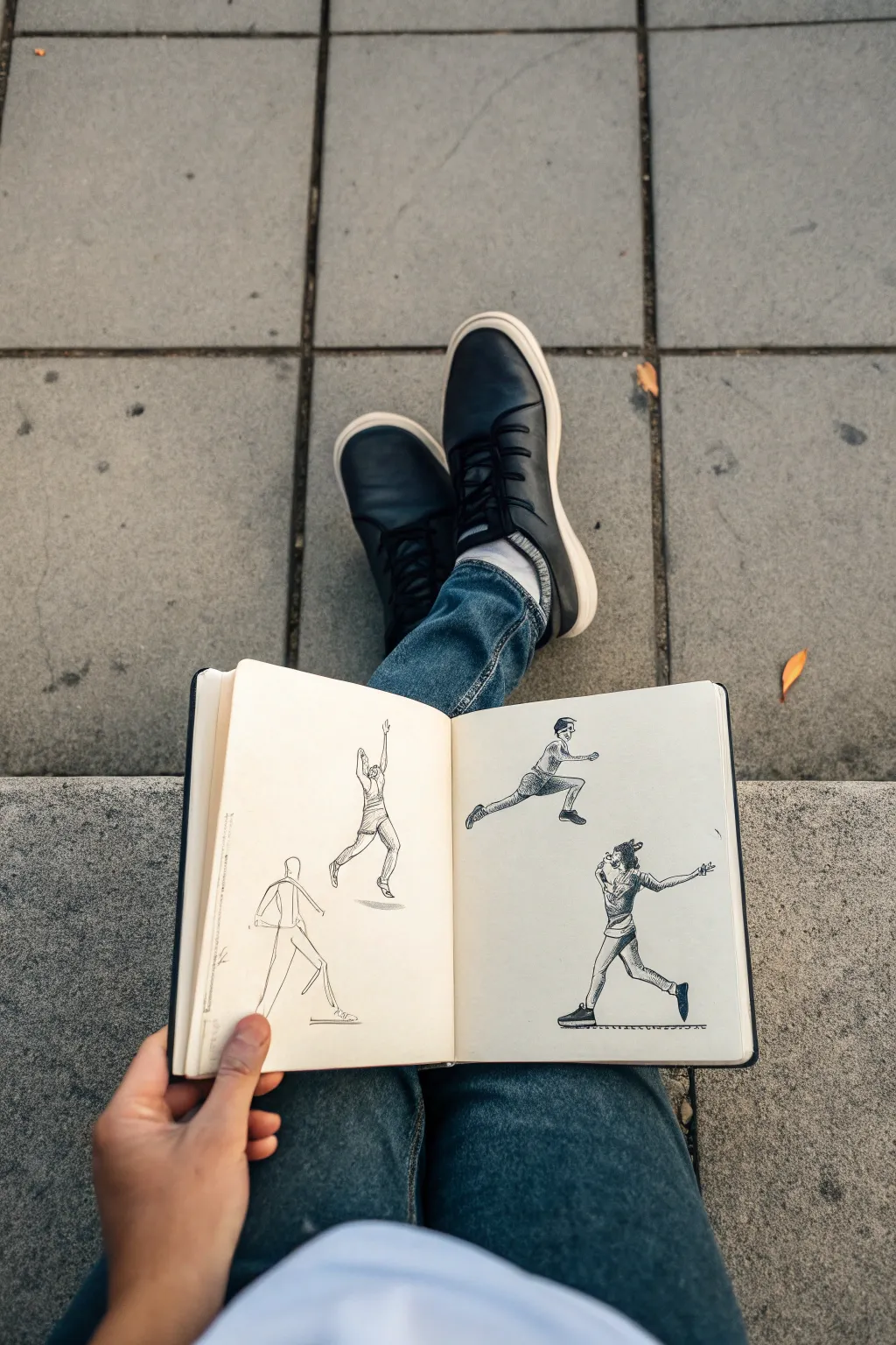
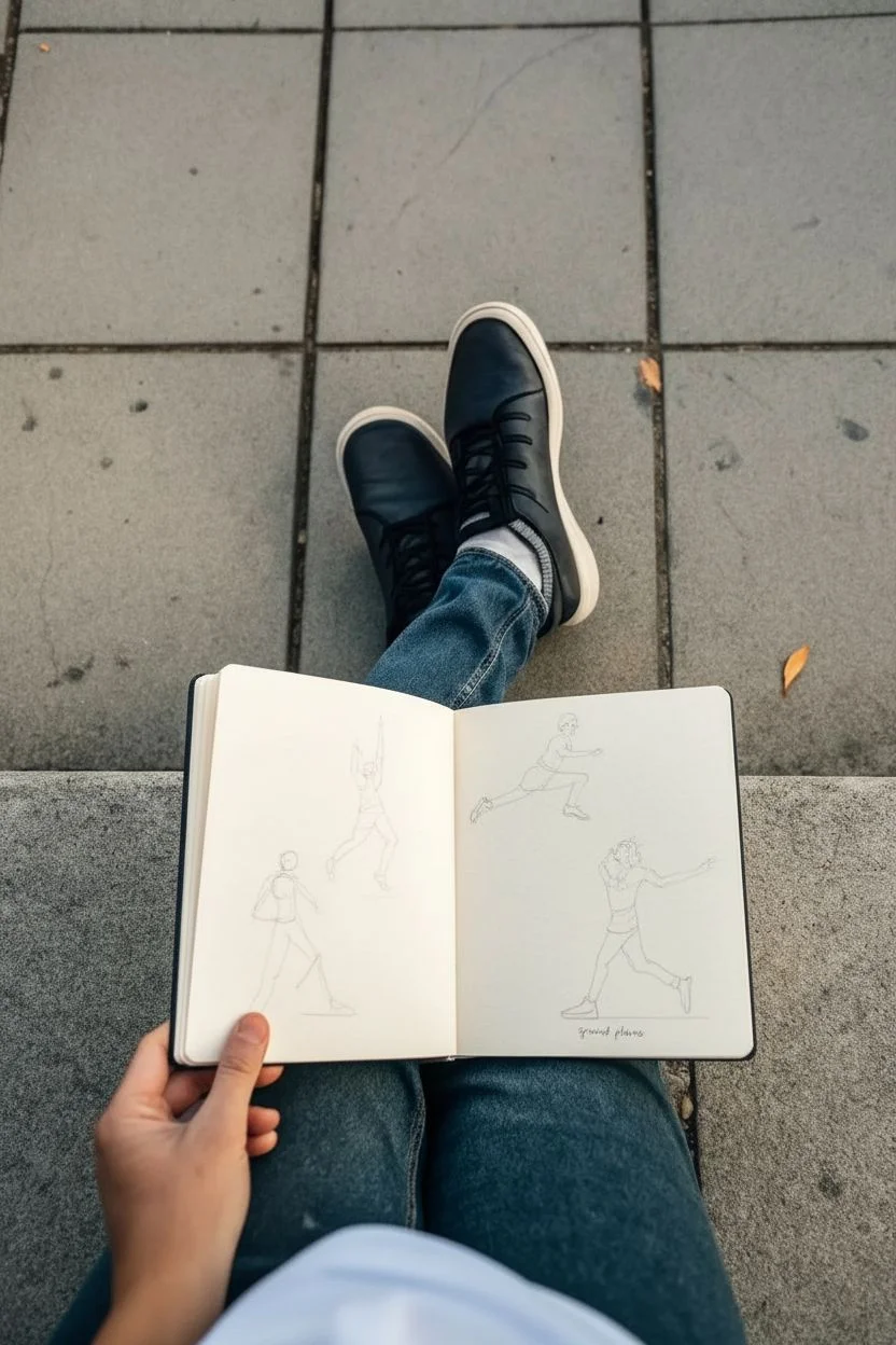
Capture the energy of movement with these four distinct action poses, ranging from a simple walking stride to a high-flying leap. This sketchbook spread focuses on breaking down complex human anatomy into gestural lines and confident cross-hatching to create a sense of life and weight.
Step-by-Step
Materials
- Hardcover sketchbook (hot press or mixed media paper preferred)
- H or HB graphite pencil for underdrawing
- Kneadable eraser
- Fine liner pens (sizes 0.1, 0.3, and 0.5)
- White gel pen (optional for corrections)
Step 1: Conceptualizing the Page Layout
-
Define the Composition:
Visualize the placement of your four figures. Plan to have two figures on the left page and two on the right. Keeping the ‘leaping’ figure on the top right creates a nice diagonal flow across the spread. -
Establish Gentle Guidelines:
Using your graphite pencil very lightly, sketch the ground planes for the walking figure (bottom left) and the dancing figure (bottom right) to ensure they feel grounded.
Stiff Figures?
If your poses look robotic, try drawing the ‘line of action’ first—a single swooping curve that represents the spine’s movement—before adding any limbs or details.
Step 2: The Walking Figure (Bottom Left)
-
Construct the Skeleton:
Start with a simple stick figure framework. Draw a vertical line for the spine, an oval for the ribcage area, and map out the legs in mid-stride using simple lines. -
Flesh Out the Form:
Add loose, contour lines around your stick frame to suggest clothing. Keep the jacket baggy and the pants loose to emphasize the casual walk. -
Inking the Outline:
Take your 0.3 pen and trace the final lines. Don’t close every shape; leave gaps in the lines, especially around the shoulders and knees, to keep the sketch looking airy and unfinished.
Add Motion Blur
Use a nearly dry marker or very light hatching lines trailing behind the moving limbs (like the kicking foot) to create a subtle speed effect or ‘whoosh’ visual.
Step 3: The Basketball Jumphot (Top Left)
-
Capture the Line of Action:
Draw a strong, curved C-shape line representing the spine arching backward as the figure reaches up. -
Draft the Limbs:
Sketch the arms reaching high above the head. One leg should be straight down for propulsion, while the other is bent at the knee, adding dynamic tension. -
Refine the Anatomy:
Lightly pencil in muscle definition on the calves and arms. Define the shorts and tank top, noting how the fabric pulls with the movement. -
Add Texture with Ink:
Switch to your 0.1 pen for detailing. Use short, parallel hatching lines on the shorts to suggest shadow and fabric texture.
Step 4: The Horizontal Leap (Top Right)
-
Block in the Torso:
Draw a tilted torso shape leaning forward. This figure is all about speed and horizontal momentum. -
Extend the Legs:
Draw the back leg fully extended and the front leg bent sharply at the knee, as if hurdling or parkour jumping. -
Detailing the Face and Clothes:
Sketch a profile view of the face looking forward. Add stripes to the pants and shading under the bent leg to show depth. -
Solidifying the Shape:
Use the 0.5 pen to outline the shoes and the main contour of the pants, grounding the figure despite it floating in air.
Step 5: The Expressive Dancer (Bottom Right)
-
Determine the Balance Point:
Draw a center line from the head down to the weighted foot. This figure is twisting, so the torso should be turned slightly. -
Gesture Drawing:
Sketch one arm flung out to the side and the other near the face. Draw the free leg kicked back playfully. -
Adding Personality:
Sketch loose, curly hair and a patterned shirt. I find that focusing on the folds of the shirt where the torso twists really sells the motion. -
Cross-Hatching Shadows:
Use cross-hatching (crisscrossed lines) on the pants legs and under the arms with your 0.1 pen to create deep contrast and volume.
Step 6: Final Touches
-
Eraise Construction Lines:
Once the ink is fully dry (wait at least 5 minutes to avoid smearing), gently use your kneadable eraser to lift all the pencil marks. -
Ground Shadows:
Add a few horizontal scribbles or hatched lines underneath the feet of the standing and landing figures to place them firmly in space. -
Enhance Contrast:
Go back with your 0.5 pen and re-darken the undersides of shoes, the deep folds of clothing, and hair to make the figures pop off the page.
Now you have a dynamic spread that studies the human form in four distinct states of energy


Seated People in Natural Slouches
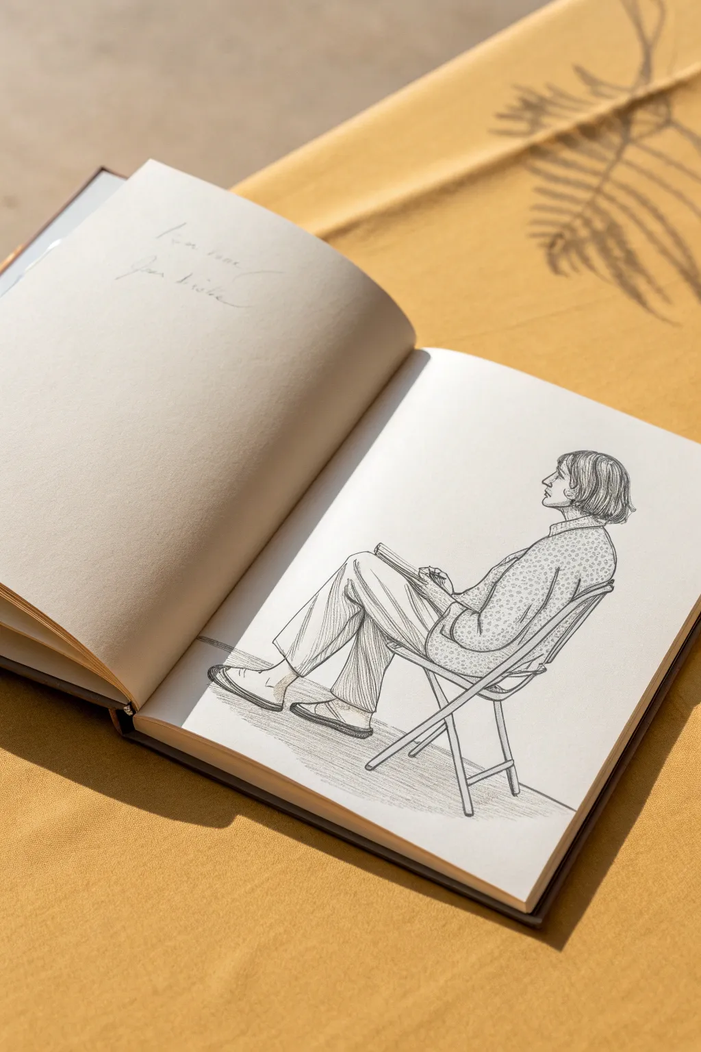
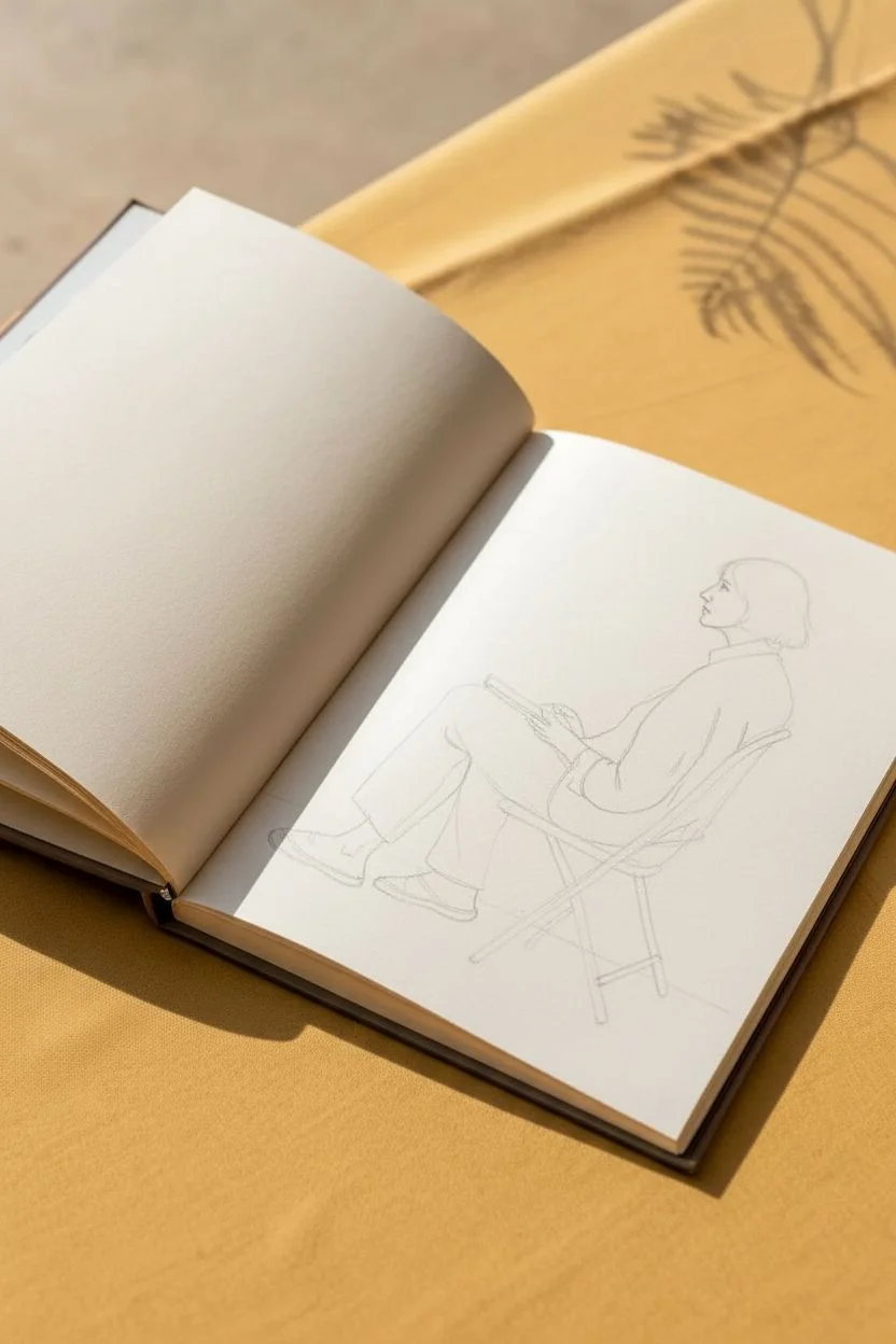
This tutorial guides you through drawing a relaxed figure seated in a folding garden chair, focusing on capturing the natural slouch and the texture of clothing folds. The style is illustrative and delicate, emphasizing clean lines and subtle shading to create a sense of leisure.
Step-by-Step Tutorial
Materials
- HB or H graphite pencil for initial sketching
- Fine liner pen (01 or 03 tip, black or dark sepia)
- Graphite pencil (2B or 4B) for softer shading
- Quality sketchbook with slightly textured paper
- Kneaded eraser
Step 1: Establishing the Structure
-
Define the chair’s foundation:
Start by lightly sketching the skeletal structure of the folding chair. Draw the two crossed legs forming an ‘X’ shape and the back support bar angled slightly backward. Keep these lines very faint as they act as a guide. -
Block in the torso:
Visualize the torso as a slumped oval shape resting against the chair back. The spine should curve gently, indicating the relaxed posture. -
Position the legs:
Sketch the upper legs extending forward from the hip, then angle the lower legs down. Notice how the figure’s left leg is crossed over the right, creating a distinct angle at the knee. -
Place the head and arm:
Draw an oval for the head in profile, looking slightly upward. Sketch the arm bent at the elbow, resting comfortably on the lap, possibly holding a book or small object.
Wonky Proportions?
If the figure looks stiff, check the spine curve. A straight back kills the ‘slouch.’ Round the shoulders more exaggeratedly to emphasize relaxation.
Step 2: Refining the Figure
-
Contour the face:
Using your pencil, refine the profile of the face. Focus on the nose, chin, and ear placement. Add the hair with simple flowing lines that tuck behind the ear. -
Draft the clothing shapes:
Outline the shirt and trousers over your stick figure structure. Ensure the clothes look loose-fitting rather than skin-tight. -
Detail the hands and shoes:
Lightly sketch the hands clasping the object in the lap. Outline the shoes, paying attention to the flat sole and the way the foot rests inside.
Level Up: Pattern Play
Instead of stippling only the shirt, try a striped pattern on the socks or a plaid texture on the trousers to practice mixing fabric renders.
Step 3: Inking and Texturing
-
Ink the main outlines:
Switch to your fine liner pen. Carefully go over your pencil lines for the profile, hair, and clothing outlines. Use a steady hand but allow for slight organic variations in line weight. -
Add folds to the trousers:
Draw vertical crease lines along the pant legs. These lines should follow the curve of the leg and bunch slightly at the hips and knees to suggest fabric tension and gravity. -
Create the shirt pattern:
For the shirt texture, use a stippling technique or tiny, irregular circles. Fill the shirt area with this pattern, keeping it denser in shadow areas (like under the arm) and lighter on the shoulder. -
Refine the chair drawing:
Ink the chair legs, adding thickness to the bars. Draw the slats or fabric seat texture visible under the thigh. -
Erase guidelines:
Once the ink is completely dry, gently run your kneaded eraser over the entire drawing to remove the initial graphite structure, leaving only clean ink lines.
Step 4: Shading and Finishing Touches
-
Apply graphite shading:
Switch to a 2B or 4B pencil. Lightly shade the side of the pants away from the light source (usually the underside of the thigh and calf) to create volume. -
Shadow the chair:
Add deeper pencil shading to the chair legs and the small cast shadow on the ground beneath the legs to ground the drawing. -
Enhance hair depth:
Add a few darker graphite strokes within the inked hair lines to give it sheen and dimension. -
Final assessment:
Check the balance of ink and graphite. I sometimes like to add a tiny bit more texture to the shoes or the collar if the drawing feels too bottom-heavy.
With these steps, you now have a serene study of a figure at rest to add to your sketchbook collection
Back View People: Neck, Shoulders, and Weight
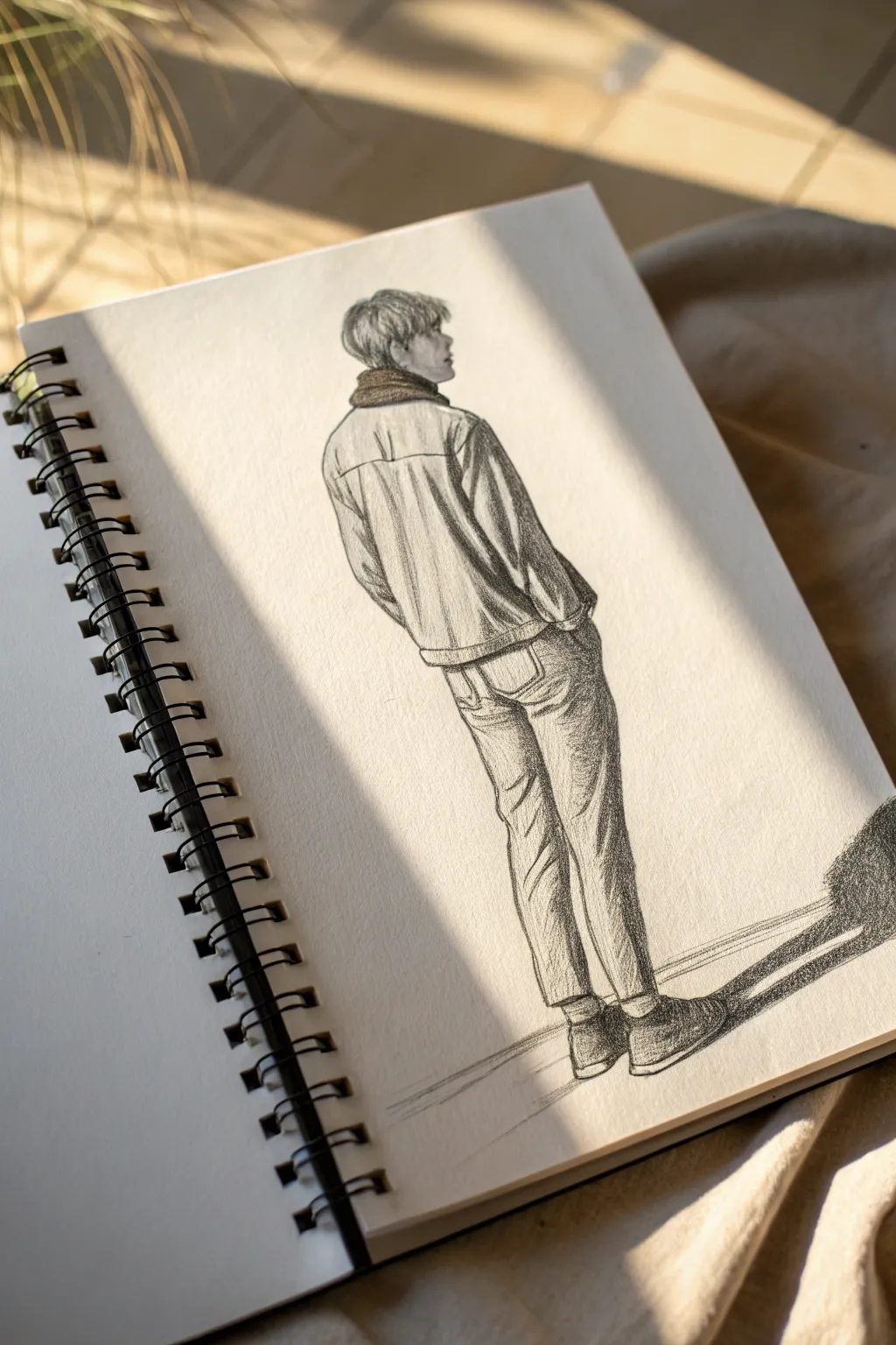
Capture the relaxed vibe of a figure illustrated from the rear, focusing on the subtle shifts in fabric and posture. This pencil sketch explores textural shading and distinct outline work to create a sense of weight and presence.
Step-by-Step Tutorial
Materials
- Spiral-bound sketchbook (medium grain)
- Graphite pencils (HB, 2B, 4B)
- Kneaded eraser
- Fine-point mechanical pencil (optional for details)
- Blending stump or cotton swab
Step 1: Establishing the Pose
-
Gesture line:
Begin with a very faint vertical line to establish the center of balance. This line should represent the spine and continue down to where the weight rests between the feet. -
Blocking shapes:
Sketch an oval for the head, titled slightly forward. Draw a horizontal line for the shoulders, keeping them relaxed and slightly rounded, not stiffly straight. -
Torso and legs:
Outline a trapezoid shape for the jacket body, tapering slightly at the waist. Extend long, rectangular forms for the legs, observing how the fabric will eventually bunch around the knees and ankles.
Step 2: Defining the Jacket
-
Neck and collar:
Draw the back of the neck connecting to the head. Add the thick collar of the jacket, making it look like it’s wrapping snugly around the neck area. Use short, hatched lines to suggest a knit or heavy fabric texture. -
Shoulder details:
Define the yoke of the denim jacket—the horizontal panel across the upper back. Add vertical seams dropping down from this yoke. -
Sleeve folds:
Sketch the arms. Since the hands are in the pockets, the elbows will push out slightly. Add ‘V’ shaped wrinkles at the elbow inner bend and near the armpits where the fabric crinkles. -
Waistband:
Draw the jacket’s waistband, showing the adjustment tabs or buttons if you want that level of detail, though a simple band helps ground the torso.
Stiff Pose?
If the figure looks robotic, check the shoulders. Sloping them downward slightly, rather than drawing a straight horizontal line, instantly relaxes the posture.
Step 3: Pants and Shoes
-
Rear pockets:
Sketch the back pockets of the jeans. Position them realistically—not too high, sitting right on the curve of the glutes to suggest the body underneath. -
Jean contours:
Harden the outlines of the legs. Jeans are stiff fabric, so draw angular, sharp folds behind the knees and bunching around the ankles where the pant leg hits the shoe. -
Foot placement:
Draw the shoes from the rear perspective. You’ll mostly see the heel and the sole. Keep the ankles close together to emphasize the casual, standing-still posture.
Fabric Weight
Remember: Denim is heavy. Draw folds that are angular and jagged (like crumpled paper) rather than soft and curvy loops, which look more like silk or cotton.
Step 4: Shading and Texture
-
Hair texture:
Using a 2B pencil, stroke downwards from the crown of the head. Leave the top slightly lighter to suggest overhead lighting and darken the area near the nape of the neck. -
Vertical hatching:
Apply vertical hatching strokes to the jacket. Keep your pencil pressure medium. This mimics the vertical weave of denim and adds form to the back. -
Deepening shadows:
Switch to a 4B pencil. Darken the creases in the sleeves and the deepest folds behind the knees. This contrast is what gives the figure volume. -
Leg shading:
Shade the sides of the legs, leaving the center of the thigh and calf lighter. This cylindrical shading makes the legs look round and three-dimensional. -
Cast shadow:
Draw a long, stretched shadow extending to the right of the figure’s feet. Use firm, dark horizontal strokes to anchor the figure to the ground so they don’t look like they are floating. -
Final outlines:
Go over the main outer contours one last time with a sharp pencil or mechanical pencil. A crisp, confident outline creates a clean, finished illustration style.
Now you have a stylish figure study that perfectly captures a quiet moment of observation
Two-Person Interaction Sketches (Overlap and Contact)
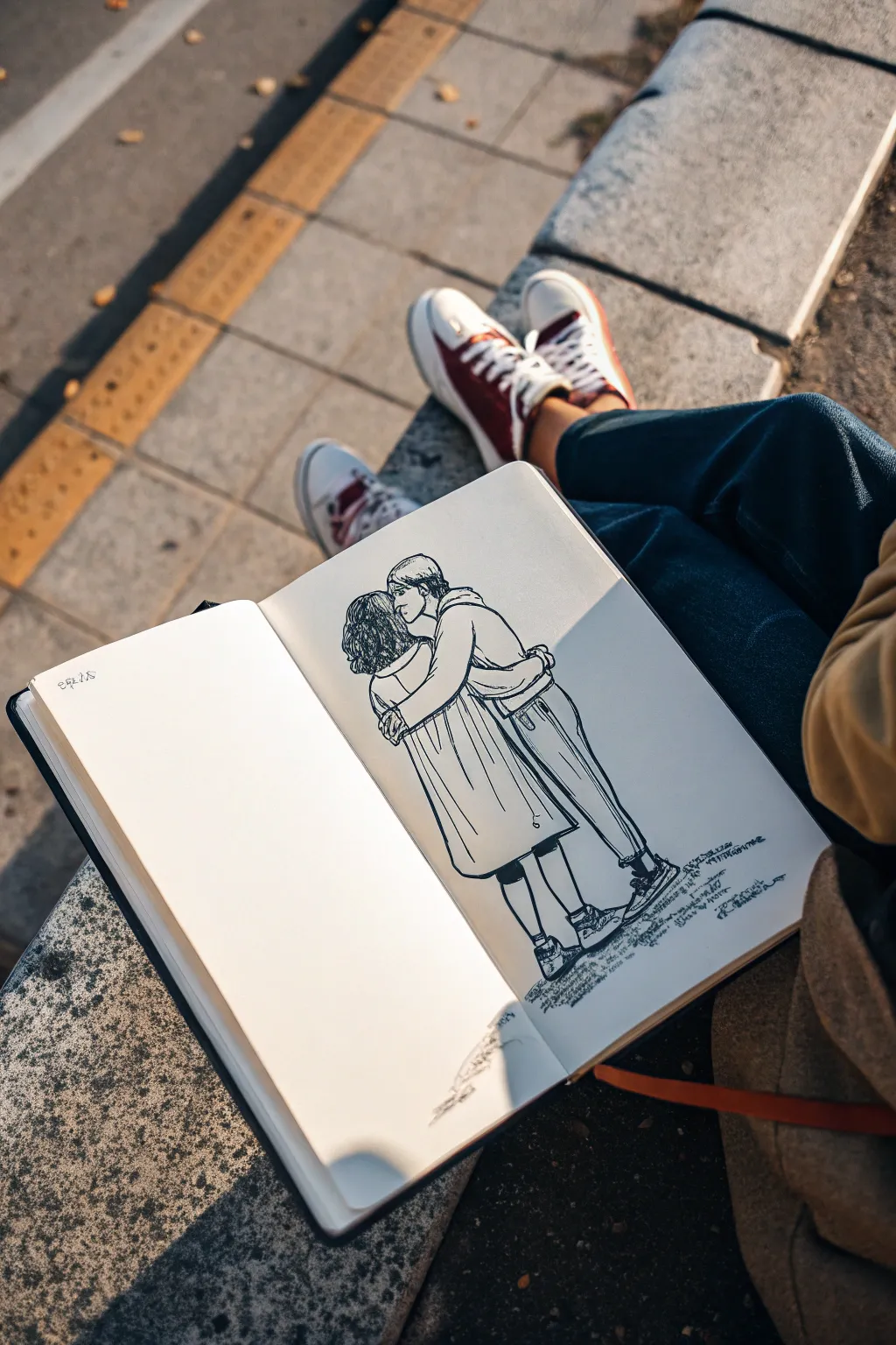
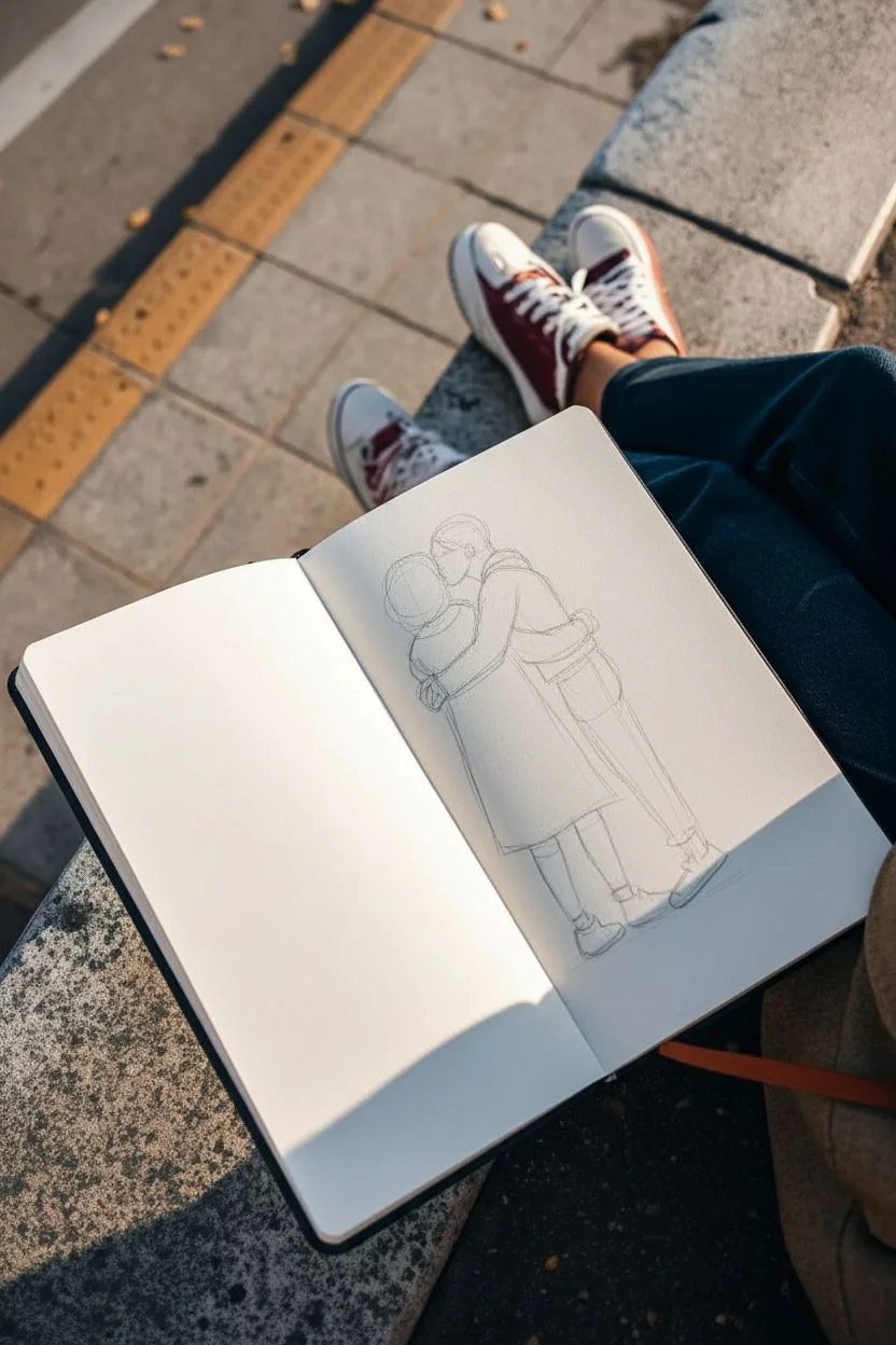
Capture a tender moment of connection with this clean-line illustration of two figures embracing. This project focuses on drawing overlapping forms and natural clothing folds, perfect for practicing figure interaction in your sketchbook.
Step-by-Step
Materials
- Hardcover sketchbook (A5 or similar size)
- Pencil (HB or 2B for initial sketching)
- Fine liner pen (0.3mm or 0.5mm, black ink)
- Kneaded eraser
- Ruler (optional for checking proportions)
Step 1: Drafting the Basic Forms
-
Establish the height:
Begin by lightly marking the top of the heads and the bottom of the feet to ensure both figures fit comfortably on the page. Leave a little white space at the bottom for grounding shadows. -
Rough in the torsos:
Sketch two vertical rectangular shapes close together to represent the torsos. The figure on the right is slightly taller, leaning in, while the figure on the left stands straighter. -
Position the heads:
Draw the head on the left first as a simple oval. Place the right head slightly overlapping it, indicating the closeness of the embrace and the kiss. -
Map the arms:
Sketch the arms as simple tubular shapes. The arm of the taller figure needs to wrap around the shorter figure’s shoulders, while the shorter figure’s arms wrap around the waist. -
Define the legs:
Draw simple lines for the legs. The figure on the left is wearing a skirt or long coat, so just outline the outer shape. For the figure on the right, sketch two cylinders for pant legs.
Uneven Proportions?
If one figure looks too big, check head sizes first. Heads are your unit of measurement; usually, the torso should be about 3 heads long. Adjust the legs to match.
Step 2: Refining the Details
-
Interlocking the embrace:
Focus on where the bodies meet. Erase the overlapping lines of the torsos so the figures merge naturally. Ensure the arm of the taller figure looks like it has weight resting on the other’s shoulders. -
Detailing the hair:
For the left figure, sketch curly, textured hair that falls to the shoulders. For the right figure, draw shorter, straighter hair swept back. -
Adding clothing structure:
Draw the collar of the coat on the left figure. Add the hoodie detail and waistband for the figure on the right to differentiate their outfits. -
Drafting clothing folds:
Add vertical lines on the long coat/skirt to suggest fabric draping. On the pants, add small creases near the knees and ankles where fabric bunches naturally. -
Refining footwear:
Sketch the shoes. I usually keep these simple—just basic sneaker shapes with laces indicated by quick zigzag lines.
Add Atmosphere
Use a light gray marker to add a single cast shadow stretching away from the feet. This instantly places your figures in a real environment with a light source.
Step 3: Inking and Finishing
-
Start the ink outlines:
Using your fine liner, carefully trace over your refined pencil lines. Start from the top (heads) and work your way down to avoid smudging the ink with your hand. -
Emphasize the overlap:
When inking the arms, ensure the lines clearly show which arm is ‘in front’ of the other. The arm wrapping around the shoulder should clearly obscure the back of the neck. -
Inking the hair texture:
Use short, squiggly strokes for the curly hair to give it density. Use longer, smoother strokes for the straight hair. -
Adding weight to folds:
When inking the clothing, vary your pressure slightly. Make the bottom edges of the coat and pants slightly thicker to suggest gravity and fabric weight. -
Grounding the figures:
Add a very loose, scribbled texture beneath the feet. This abstract hatching suggests a shadow or sidewalk without needing a full background. -
Erasure:
Wait until the ink is completely dry—give it a full minute. Gently erase all remaining pencil marks with your kneaded eraser to leave a clean, crisp illustration. -
Final touches:
Look for any gaps in your line work. Add tiny bits of shading (hatching) under the chin or where the arms overlap to add a touch of depth.
Now you have a touching moment captured forever in your sketchbook, ready for your next observational drawing session

Have a question or want to share your own experience? I'd love to hear from you in the comments below!