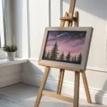
When I’m craving a painting session that feels instantly dreamy, I reach for pink and purple every time. These ideas are all about bold blends, soft glows, and satisfying contrast you can pull off without overthinking it.
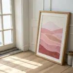
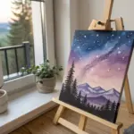
Pink-to-Purple Sunset With Mountain Silhouette
Capture the serene beauty of twilight with this layered watercolor landscape, featuring soft mountain silhouettes fading into a pink and purple sky. This project explores the wet-on-wet technique to create dreamy transitions and atmospheric depth perfect for a calming piece of wall art.
Step-by-Step Guide
Materials
- Cold press watercolor paper (140lb/300gsm)
- Watercolor paints (Ultramarine Blue, Alizarin Crimson, Payne’s Gray, Burnt Umber)
- Large flat wash brush
- Medium round brush (size 8 or 10)
- Small detail brush (size 2 or 4)
- Masking tape
- Drawing board or sturdy backing
- Two jars of water
- Paper towels
- Pencil for sketching
Step 1: Setting the Scene
-
Prepare your surface:
Begin by taping down all four edges of your watercolor paper to a board. Ensure the tape is pressed firmly to prevent warping and to create a crisp white border for that professional frame-ready look. -
Sketch the horizon:
Lightly sketch the main horizon line about one-third of the way up from the bottom. This will separate your water from the mountains. -
Outline the peaks:
Draw faint, overlapping triangular shapes for your mountain ranges. You want three distinct layers: a distant range, a middle range, and a closer, darker range.
Atmospheric Depth
To make mountains look further away, use more water and less pigment. As you move to closer layers, decrease water and increase paint for darker values.
Step 2: Painting the Sky & Water
-
Pre-wet the sky:
Using your large flat brush, apply clean water to the entire sky area above the mountains. The paper should be glisten but not have standing puddles. -
Apply the purple wash:
Mix a watery wash of Ultramarine Blue and Alizarin Crimson to make a soft lavender. Paint the top of the sky, letting the color naturally diffuse downwards. -
Blend in the pink:
While the top is still wet, introduce a diluted Alizarin Crimson (pink) starting from just above the mountain line, blending it upward into the purple to create a smooth gradient. -
Mirror the water:
Clean your brush and repeat this gradient in the water section at the bottom. Start with pink near the horizon and fade into purple closer to the foreground. Leave white gaps for the crashing waves. -
Let it dry completely:
Before moving to the mountains, the paper must be bone dry to keep the edges crisp. You can use a hairdryer on a low setting to speed this up.
Unwanted Blooms?
If cauliflower-like textures appear in your sky, you likely added water to a section that was already half-dry. Let it dry completely, then do a second glaze.
Step 3: Layering the Mountains
-
First mountain layer:
Mix a pale, watery blue-violet. Using your medium round brush, paint the furthest mountain range. Keep the wash light to suggest atmospheric perspective. -
Second mountain layer:
Once the first layer is dry, mix a slightly stronger, darker version of your purple-blue. Paint the middle range overlapping the first, ensuring the top edge is sharp and distinct. -
Third mountain layer:
deepen your mixture with a touch of Payne’s Gray. Paint the closest large mountain shapes on the left and right, creating more contrast. -
Darkest tree line:
Mix a dense, dark color using Payne’s Gray and a tiny bit of blue. With a smaller brush, paint the low, jagged treeline that sits directly on the horizon line.
Step 4: Foreground & Details
-
Rocks base layer:
Mix Burnt Umber with some purple for a dark, earthy tone. Paint the rocky outcrop in the bottom left corner, leaving rugged, uneven edges. -
Adding rock texture:
While the rock shape is damp, drop in pure Payne’s Gray or dark brown into the shadowed crevices to give the rocks dimension and weight. -
Defining waves:
I like to use a small detail brush with a diluted blue-grey to paint faint, horizontal lines in the white water gaps you left earlier, suggesting movement in the waves. -
Final touches:
Check your contrast levels. If the water looks too flat, add very subtle horizontal streaks of darker purple to suggest ripples reflecting the sky. -
Reveal the frame:
Once the painting is completely dry, slowly peel away the masking tape at a 45-degree angle to reveal your clean white borders.
Place your finished piece in a white frame to highlight the delicate pastels of your sunset landscape

Dreamy Seascape With Magenta Reflections
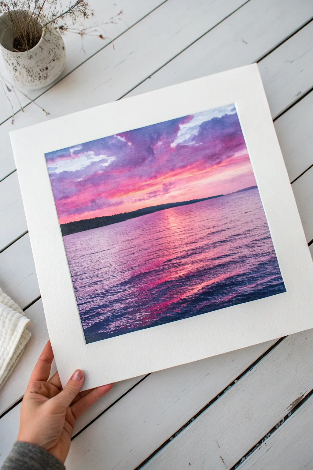
Capture the serene beauty of twilight with this vibrant watercolor seascape, featuring a dramatic sky bleeding into calm waters. The interplay of violet clouds and magenta reflections creates a stunning sense of depth and tranquility.
How-To Guide
Materials
- Cold press watercolor paper (140 lb / 300 gsm)
- Watercolor paints (Ultramarine Blue, Alizarin Crimson, Quinacridone Magenta, Burnt Sienna, Payne’s Gray)
- Large flat wash brush
- Medium round brush (size 8 or 10)
- Small round detail brush (size 2 or 4)
- Masking tape
- Clean water jars
- Paper towels
- White gel pen or gouache (optional for highlights)
Step 1: Preparation and Sky Layer
-
Secure the paper:
Tape down all four edges of your watercolor paper to a board using masking tape. This prevents buckling and creates a crisp white border. -
Sketch the horizon:
Using a pencil, very lightly draw the horizon line about 1/3 of the way up from the bottom. Keep it straight, but faint enough that it won’t show through the paint. -
Wet the sky:
With your large flat brush, apply clean water to the entire sky area above the horizon line. The paper should be glisten, but the water shouldn’t be pooling excessively. -
Initial sky wash:
Mix a vibrant pink using Quinacridone Magenta and a touch of water. Drop this color into the lower part of the wet sky, letting it naturally bleed upwards. -
Add violet drama:
While the paper is still damp, mix Ultramarine Blue with Alizarin Crimson to make a deep violet. Paint sweeping, diagonal strokes in the upper corners to form heavy clouds. -
Soft transitions:
Use a clean, slightly damp brush to soften the edges where the violet clouds meet the pink sunset area, creating a dreamy, blurred transition. -
Deepen the contrast:
Drop darker purple (add a tiny bit of Burnt Sienna to your violet mix) into the tops of the clouds while wet-on-wet to add volume and shadow. -
Dry the sky:
Let the sky layer dry completely before moving forward. This is crucial so the horizon line stays sharp.
Muddy Purple Prevention
If your purples look brown, check your red. Use a cool red (like Alizarin) with blue. Warm reds (like Cadmium) contain yellow, which browns the mix.
Step 2: Water and Silhouette
-
Paint the water base:
Using the medium round brush, apply a wash of Quinacridone Magenta and Alizarin Crimson to the water area, keeping the strokes horizontal. -
Reflect the sky:
While the magenta wash is wet, introduce streaks of the violet mixture from the sky into the lower corners of the water, mimicking the sky’s darkness. -
Create ripples:
Keep the center of the water—directly under the brightest part of the sky—lighter and more saturated pink to represent the sun’s reflection path. -
Paint the landmass:
Once dry, mix Payne’s Gray with a bit of green or blue to get a near-black hue. Paint the distant tree line along the horizon using the tip of your brush, varying the height slightly to suggest trees. -
Add water texture:
Now for the meditative part: using a smaller round brush and a darker purple-blue mix, paint thin, horizontal ripple lines over the dried water layer. -
Define the reflection:
As you paint ripples near the bottom foreground, make the lines thicker and darker blue. As you move toward the horizon, make them thinner and lighter. -
Breaks in the water:
Leave gaps in your dark ripple lines to let the bright pink underlayer shine through, especially down the center vertical axis. -
Final highlights:
If you lost too much brightness, you can use a touch of white gouache or a gel pen to add tiny sparkles on the ripple crests in the center. -
Reveal the border:
Once the painting is 100% dry to the touch, slowly peel away the masking tape at a 45-degree angle to reveal your clean edges.
Soft Cloud Edges
To keep clouds fluffy, paint them while the paper is damp. If edges get hard, run a clean, damp brush along the edge to diffuse the pigment.
This vibrant piece adds a lovely splash of color to any room and looks particularly professional once matted and framed

Cotton-Candy Clouds in a Violet Sky
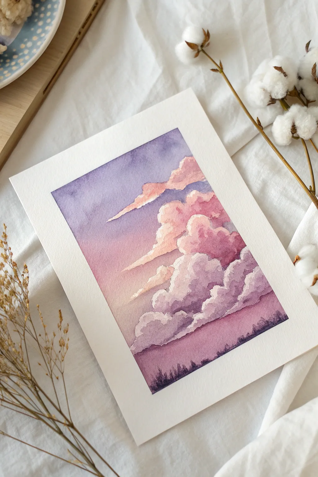
Capture the fleeting magic of twilight with this serene watercolor landscape, featuring billowing pink clouds drifting through a soft violet atmosphere. This project focuses on wet-on-wet blending and layering to create depth and a dreamlike quality.
Step-by-Step
Materials
- Cold press watercolor paper (300 gsm)
- Watercolor paints (Ultramarine Violet, Quinacridone Rose or Magenta, Indigo, White Gouache or white watercolor)
- Masking tape
- Round watercolor brushes (sizes 4, 8, and 12)
- Two jars of water
- Paper towels
- Palette
Step 1: Preparation and Sky Gradient
-
Tape the edges:
Secure your paper to a hard board using masking tape on all four sides. This prevents warping and creates that crisp, clean white border when you finish. -
Mix your colors:
Prepare a watery mix of Ultramarine Violet and a separate mix of pink (Quinacridone Rose). You want these to be quite diluted for the initial sky wash. -
Pre-wet the paper:
Using your largest clean brush, apply a layer of clear water to the entire upper three-quarters of the paper, ending roughly where the horizon line will be. -
Paint the upper sky:
While the paper is glistening wet, drop the violet mix into the top left corner and along the top edge. Let it bleed downwards naturally, tilting the paper slightly if needed. -
Blend the sunset transition:
Introduce the pink mix just below the violet, allowing the two colors to touch and merge on the wet paper. I like to keep the pink area lighter near the bottom right to suggest a light source. -
Let the base dry:
Allow this initial gradient layer to dry completely. The paper should be flat and room temperature to the touch before proceeding.
Muddy Clouds?
If your pinks and purples are turning brown/gray where they mix, wait for the first layer to dry completely before glazing the second color over it.
Step 2: Painting the Clouds
-
Sketch the cloud shapes:
Lightly sketch the outlines of your cloud formations with a pencil. Focus on irregular, fluffy shapes that sweep diagonally upwards from the right. -
Base layer for clouds:
Mix a stronger, less diluted concentration of your pink and violet. Using a size 8 brush, paint the body of the largest cloud clusters, leaving the top edges unpainted or very pale to represent caught light. -
Soften the edges:
Quickly rinse your brush and blot it damp. Run this clean, damp brush along the bottom edges of your wet cloud shapes to soften them into the sky background. -
Add violet shadows:
While the pink cloud bodies are still damp, drop in a deeper violet mix into the bottom and left sides of the clouds to create volume and shadow. -
Define the smaller clouds:
Paint the thin, wispy clouds floating above the main formation. Use a smaller round brush (size 4) and lighter strokes, ensuring they direct the eye toward the center. -
Enhance cloud highlights:
If you lost the bright white edges, mix a tiny bit of white gouache with pale pink. Carefully line the top ‘rims’ of the clouds to make them pop against the darker violet sky. -
Deepen the cloud contrast:
Once the clouds are dry, glaze a very thin, transparent layer of violet over the shadowed parts of the clouds to push them further back in space.
Step 3: The Horizon and Foreground
-
Paint the lower sky:
Beneath the cloud layer, apply a wash of deep pink fading into purple as you move toward the bottom edge of the paper. -
Create the distant forest:
Mix a dark, saturated color using Indigo and purple. You want a very thick, creamy consistency. -
Paint the treeline:
Using the tip of your smallest brush, stipple tiny vertical strokes along the very bottom edge of the painting. Vary the heights to suggest pine trees in a distant forest silhouette. -
Connect the foreground:
Fill in the rest of the bottom strip with this dark indigo-purple mix, ensuring it’s solid and opaque to ground the ethereal sky above. -
Final reveal:
Wait until the painting is 100% bone dry. Slowly peel away the masking tape at a 45-degree angle away from the painting to reveal your crisp borders.
Soft Cloud Edges
Use the “thirsty brush” technique: clean and dry your brush, then lift excess paint off the wet paper to create soft, white fluffy highlights.
Frame this piece in a simple white mat to let those vibrant twilight colors truly shine


Glowing Full Moon Over Magenta Hills
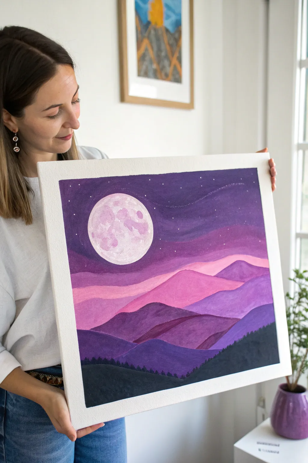
This serene acrylic landscape captures a dreamy night scene where a textured, glowing moon watches over rolling layers of mountains. Using a monochromatic palette of purples and pinks creates a soothing depth that draws the eye from the bright sky down to the shadowy forest floor.
Detailed Instructions
Materials
- Canvas or canvas panel (square format recommended)
- Acrylic paints (Titanium White, Magenta, Violet, Ultramarine Blue, Black)
- Set of paintbrushes (1-inch flat brush, medium synthetic filbert, small round detail brush)
- Circular object for tracing (like a roll of tape) or a compass
- Pencil
- Palette for mixing
- Cup of water and paper towels
Step 1: Setting the Scene
-
Trace the moon:
Begin with your blank canvas. Place your circular object in the upper left quadrant of the canvas, slightly off-center. Lightly trace around it with a pencil to define the shape of your full moon. -
Sketch the mountain layers:
Lightly sketch four or five wavy, overlapping lines across the canvas below the moon. These will be your mountain ranges. Make the top lines smoother and flatter, and the bottom ones more jagged and peaked. -
Block in the sky:
Mix a deep purple using violet and a touch of ultramarine blue. Using your large flat brush, paint the entire sky area around the moon circle. Don’t worry about perfect coverage yet; a slightly streaky texture can look like night air. -
Add subtle sky gradients:
While the purple paint is still wet, blend in a slightly lighter purple (mixed with a tiny bit of white) just above the highest mountain line. This creates a gentle glow on the horizon.
Uneven Gradients?
If your mountain colors look too flat, wait for them to dry, then dry-brush a slightly lighter shade on the peaks to create instant volume and separation between layers.
Step 2: Painting the Moon
-
Base coat the moon:
Paint the entire circle of the moon with a mix of Titanium White and a very small drop of Magenta to create a pale, dusty pink base. -
Create lunar texture:
Using a small filbert brush or even your finger, dab splotches of slightly darker pink and pure white onto the wet surface of the moon. Use a tapping motion to create craters and texture rather than smooth strokes. -
Refine the edges:
Once the sky and moon are dry, use a small round brush with your sky color to clean up the edges of the circle if you painted over the line.
Add Sparkle
Mix a tiny amount of iridescent medum or fine silver glitter into the white paint used for the stars and moon highlights to give the piece a magical shimmer.
Step 3: Layering the Mountains
-
Paint the furthest range:
For the most distant mountain layer (the one touching the sky), mix plenty of white into your magenta paint to create a soft, pale pink. Fill in this top strip completely. -
Paint the second range:
Mix a slightly darker shade using more magenta and less white. Paint the second strip of mountains, ensuring a crisp edge where it overlaps the pale pink range above it. -
Paint the middle range:
Transition into purples now. Mix magenta with a little violet. Paint the third mountain layer, letting the brushstrokes follow the curve of the hills. -
Paint the foreground mountains:
For the lowest large mountain shapes, use a deep purple mixed with a touch of blue. This darker value brings these hills visually closer to the viewer. -
Add highlights:
To give the mountains dimension, mix a lighter version of each layer’s color. Paint a subtle highlight on the top left slope of each peak, suggesting the moonlight is hitting them.
Step 4: Final Details
-
Paint the forest silhouette:
For the very bottom section, mix black with a tiny bit of purple (to keep it cohesive). Fill in the bottom area solidly. -
Add tree tops:
Using your smallest detail brush, paint tiny vertical strokes along the top edge of the black section to resemble tiny pine trees silhouetted against the purple hills. -
Add the stars:
Dilute a bit of white paint with water until it’s thin. Dip a small brush in it and gently tap the handle against another brush over the sky area to splatter tiny stars. Alternatively, dot them on individually for more control.
Step back and admire how the layers create a deep, peaceful distance in your landscape.
BRUSH GUIDE
The Right Brush for Every Stroke
From clean lines to bold texture — master brush choice, stroke control, and essential techniques.
Explore the Full Guide
Purple Hour City Skyline in Silhouette
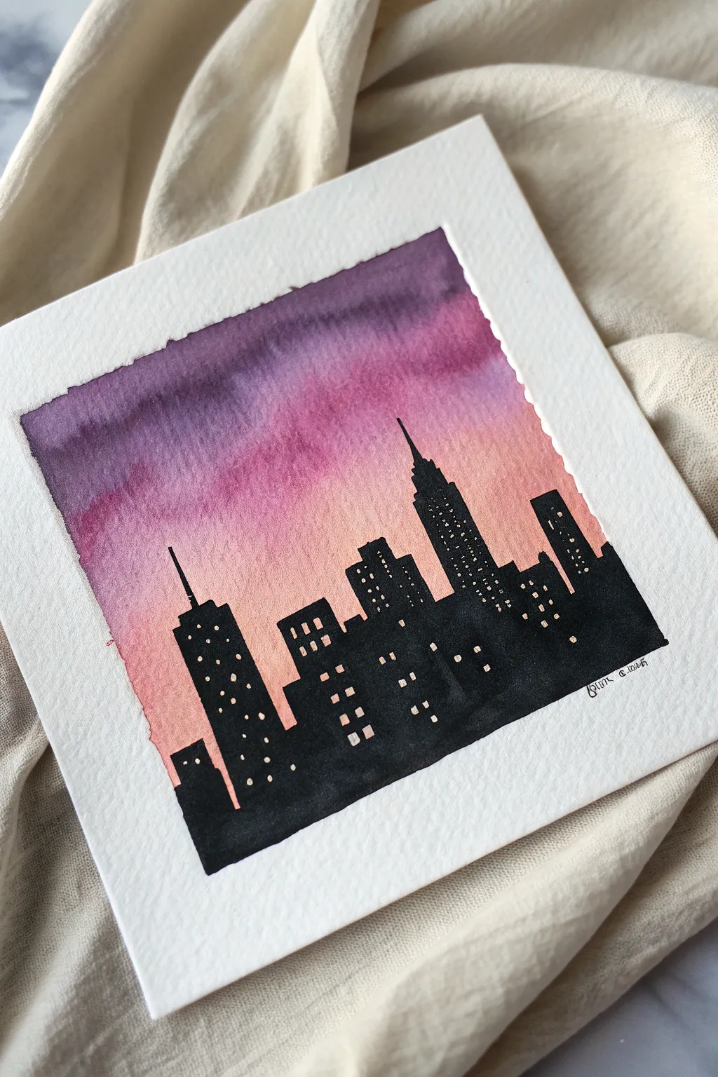
Capture the magic of twilight with this stunningly simple watercolor cityscape, featuring a gradient sky that melts from deep plum to soft peach. The stark black silhouette creates a dramatic contrast, making those tiny window lights truly sparkle.
How-To Guide
Materials
- Cold press watercolor paper (square format, approx. 6×6 inches)
- Painter’s tape or washi tape
- Watercolors (Purple/Violet, Magenta/Deep Pink, Peach/Light Orange)
- Black waterproof ink or gouache
- Large round watercolor brush (size 10 or 12)
- Small detail brush (size 0 or 00) or fine tip black liner pen
- White gel pen (Signo Broad or Gelly Roll 10)
- Clean water jar
- Paper towels
- Pencil and eraser
Step 1: Setting the Scene
-
Prepare your canvas:
Cut your watercolor paper to your desired square size. Tape down all four edges securely to a hard backboard or table using painter’s tape. Press the edges of the tape firmly with your fingernail to ensure a crisp, clean border later. -
Draft the skyline:
Lightly sketch the outline of your city buildings along the bottom third of the paper. Keep the shapes blocky and varied in height, adding a spire or two for interest. Don’t worry about windows yet; just focus on the overall profile.
Uneven Sky Gradient?
If you get ‘cauliflowers’ or hard edges in the sky, re-wet the entire sky area very gently with a large soft brush and drop more pigment into the wet areas to smooth it out.
Step 2: Painting the Sunset Sky
-
Wet on wet base:
Using your large round brush and clean water, gently wet the entire sky area above your pencil line. You want the paper glistening but not swimming in puddles. -
Apply the darkest tone:
Load your brush with a rich purple or violet mix. Start at the very top edge of the sky and paint a horizontal band, letting the pigment flow into the wet paper. -
Transition to pink:
Clean your brush slightly and pick up your magenta or deep pink. Apply this directly below the purple, allowing the wet edges to touch and bleed together naturally. -
Finish with peach:
Rinse your brush and load it with a soft peach or light orange color. Paint the bottom section of the sky, bringing it right down to (and slightly over) your pencil outline. This lightest color represents the fading sun. -
Blend the gradient:
If the transition lines look too harsh, dry your clean brush on a paper towel and gently run it horizontally across the meeting points of the colors to soften the blend. I find tilting the board slightly helps the colors merge. -
Full dry time:
This is crucial: Let the sky dry completely. The paper must be room temperature to the touch before moving on, or the black silhouette will bleed into the sky.
Step 3: Creating the Silhouette
-
Outline the buildings:
Using black ink, gouache, or a very opaque black watercolor, carefully outline the tops of your buildings against the dry sky. Steady your hand to get sharp, architectural corners. -
Fill in the mass:
Switch to a slightly larger brush if needed and fill in the entire body of the buildings with solid black. Ensure the coverage is opaque and even, hiding any pencil marks or underlying sky color. -
Add architectural details:
While you have the black paint out, use your finest brush to add thin antennas or spires to the tallest skyscrapers. These delicate lines add realism and scale. -
Let the city dry:
Wait for the black layer to dry thoroughly. Ink and gouache dry faster than heavy watercolor, but patience ensures you won’t smudge the stark black area.
Pro Tip: Glowing Windows
Tap your white gel pen onto a scrap paper first to get the ink flowing. For brighter windows, wait for the first white dot to dry and add a second dot right on top.
Step 4: Finishing Touches
-
Illuminate the windows:
Take your white gel pen and start dotting in windows. Vary the patterns—some buildings might have grids of windows, others might have just a few scattered lights. -
Vary the window sizes:
Make some dots slightly larger than others to suggest different distances or window types. Don’t make them too uniform; randomness looks more organic. -
Sign and reveal:
Add your signature in the corner with a fine pen. Once you are certain everything is dry, slowly peel away the painter’s tape at a 45-degree angle to reveal the crisp white frame.
Step back and admire your beautiful miniature city at dusk
Galaxy Sky With Pink and Purple Nebula
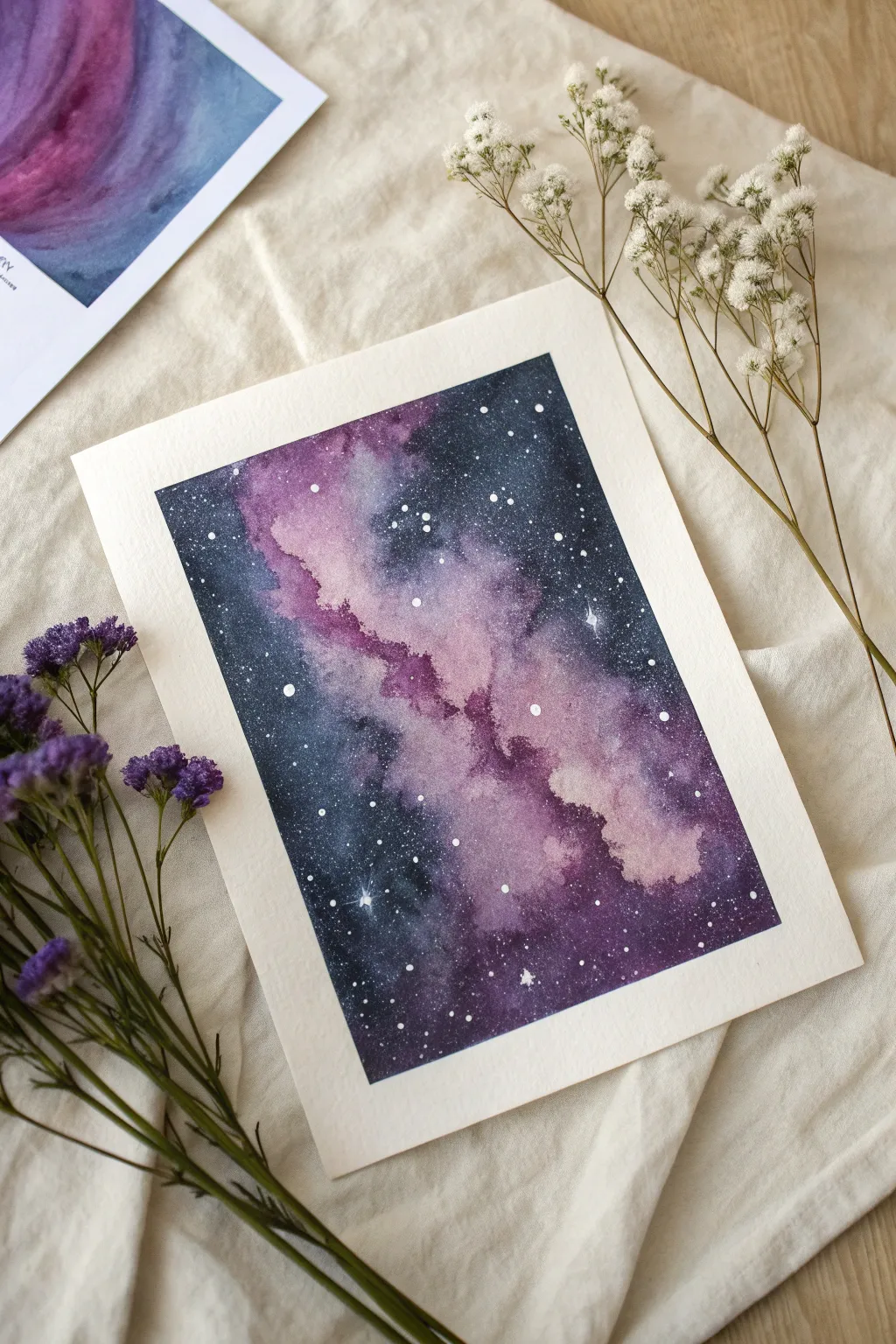
Capture the ethereal beauty of deep space with this watercolor tutorial featuring a vibrant pink and purple nebula. Using wet-on-wet techniques, you’ll blend deep indigos with soft violets to create a dreamy, starlit masterpiece.
Step-by-Step Guide
Materials
- Cold press watercolor paper (300 gsm)
- Masking tape
- Watercolor paints (Indigo, Prussian Blue, Payne’s Grey, Magenta, Purple, White Gouache or Opaque White)
- Round brushes (sizes 8 and 4)
- Clean water jar
- Paper towels
- Old toothbrush or stiff fan brush (for splattering)
- White gel pen (optional)
Step 1: Setting the Stage
-
Secure the paper:
Tape down all four edges of your watercolor paper to a board or table using masking tape. This creates that crisp white border seen in the photo and prevents the paper from buckling under heavy washes. -
Prepare the colors:
Pre-mix your colors on the palette so they are ready to go. You want a very concentrated, dark puddle of Indigo and Payne’s Grey for the outer space, and vibrant, semi-diluted puddles of Magenta and Purple for the nebula. -
Wet the paper:
Using your largest clean brush, apply a generous layer of clean water over the entire rectangular area inside the tape. The paper should glisten evenly but not have standing puddles.
Bloom Control
To get those cauliflower-like textures in the nebula, drop clean water into semi-dry paint. It pushes pigment away, creating soft edges.
Step 2: Creating the Nebula Flow
-
Lay the foundation:
Start with the lightest pinks. Drop the diluted Magenta into the wet paper, creating a diagonal, irregular band stretching from the top left-center down towards the bottom right. -
Deepen the cloud:
While the paper is still wet, drop the darker Purple paint into parts of the pink band. Let the colors bleed naturally into each other, creating soft, cloud-like transitions. -
Leave white gaps:
I like to leave a few tiny patches of the paper almost white within the nebula band; this adds luminosity and makes the gas clouds look brighter.
Silhoutte Upgrade
Once dry, paint a solid black silhouette of a pine forest or mountains at the very bottom to ground your cosmic scene.
Step 3: Adding the Deep Space
-
Start the darkness:
Load your brush with the dark Indigo mix. Begin painting the corners and edges of the paper, working your way inward toward the pink nebula band. -
Blend the edges:
Carefully touch the dark blue wet paint against the wet pink/purple edges. Don’t brush over them too much; just let them repel and blend slightly to create a soft, hazy border. -
Intensify contrast:
While the paint is still damp, drop concentrated Payne’s Grey or black into the very corners to achieve true depth. -
Add texture:
Tilt the board slightly if needed to encourage the pigment to settle into the paper’s texture, creating that grainy, atmospheric look. -
Dry partially:
Let this first layer dry completely. If the colors look too faded (watercolors dry lighter), re-wet the dark areas carefully and add a second layer of Indigo for richness.
Step 4: The Starfield
-
Prepare the stars:
Once the painting is bone dry, squeeze out some white gouache or opaque white watercolor. Mix it with just enough water to reach a creamy, splatter-able consistency. -
Splatter stars:
Load an old toothbrush or stiff brush with the white mix. Run your thumb over the bristles to flick tiny speckles across the dark and purple areas. Cover the center nebula lightly. -
Paint major stars:
Using a fine detail brush (size 0 or similar) or a white gel pen, manually dot a few larger, brighter stars in the dark blue areas to create variety. -
Create the sparkle:
Choose 2-3 of the largest white dots and gently pull four tiny points outward from the center (up, down, left, right) to create a twinkling starburst effect. -
Final reveal:
Wait until every drop of paint is completely dry. Slowly peel off the masking tape at a 45-degree angle to reveal the clean, sharp frame.
Step back and admire the depth of your personal slice of the universe

PENCIL GUIDE
Understanding Pencil Grades from H to B
From first sketch to finished drawing — learn pencil grades, line control, and shading techniques.
Explore the Full Guide
Aurora-Inspired Pink and Purple Night Bands
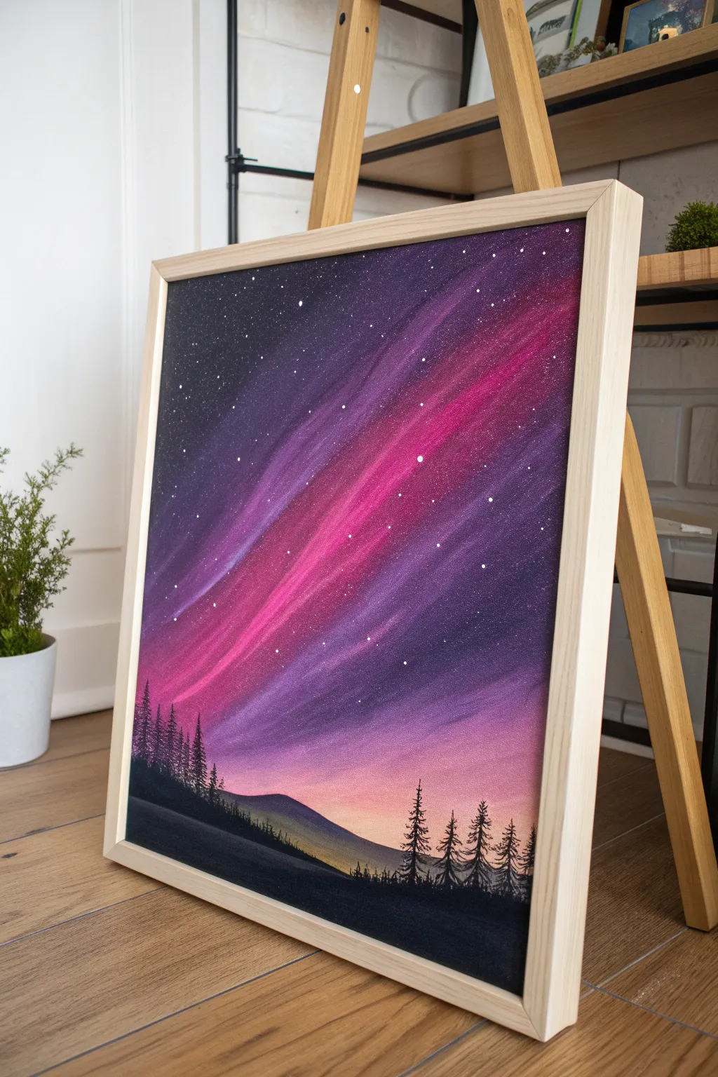
Capture the ethereal beauty of the northern lights with this stunning acrylic landscape featuring vibrant sweeps of magenta and deep purple against a starry night. This tutorial guides you through blending techniques to create a glowing sky that transitions seamlessly into a silhouette forest.
Detailed Instructions
Materials
- Square stretched canvas (approx. 16×16 or 20×20 inches)
- Acrylic paints: Titanium White, Mars Black, Dioxazine Purple, Quinacridone Magenta, Ultramarine Blue
- Large flat brush or wash brush
- Medium angle brush
- Small round brush
- Fan brush (optional, for trees)
- Fine liner brush
- Palette for mixing
- Cup of water
- Paper towels
- Old toothbrush (for the stars)
Step 1: Setting the Sky Foundation
-
Prime the background:
Begin by covering your entire canvas with Mars Black paint. Ensure you paint the sides of the canvas as well for a polished, professional look if you plan to display it unframed later. -
Establish the horizon line:
While the black is drying, visualize where your horizon will be. The sky dominates this composition, so aim for the bottom quarter of the canvas to be reserved for land. -
Mix your base colors:
Prepare a gradient palette. Mix Dioxazine Purple with a touch of Mars Black for the darkest sky sections. Then, mix pure Dioxazine Purple, a purple/magenta blend, and a pure Quinacridone Magenta.
Step 2: Creating the Aurora
-
Apply the first purple layer:
Using your large flat brush, apply the dark purple mix to the upper left and right corners. Use long, diagonal strokes that sweep from top-left to bottom-right to establish the movement. -
Introduce the magenta band:
Load your brush with the Quinacridone Magenta. Paint a bold, diagonal stripe through the center of the dark purple, following the same directional angle. -
Blend wet-on-wet:
While both paints are still wet, use a clean, slightly damp brush to gently feather the edges where the purple and magenta meet. I like to wipe my brush on a paper towel frequently to keep the colors muddying. -
Add the central highlight:
Mix a small amount of Titanium White into your magenta to create a bright, neon pink. Apply this strictly to the center of your magenta band to create a glowing core. -
Soften the transitions:
Use a dry, soft brush to lightly sweep over the entire sky in the direction of your aurora. This blurs harsh lines and creates that misty, atmospheric gas effect. -
Create the lower sky glow:
Near the horizon line on the right side, blend a lighter pinkish-orange tone (mix magenta, a tiny dot of yellow or orange if you have it, and white) to suggest the sun is just below the horizon or distant city lights.
Trouble with Blending?
If your acrylics are drying too fast to blend smoothly, mix in a ‘slow drying medium’ or retarder. This keeps the paint workable longer, allowing for that soft, misty aurora look.
Step 3: Starry Night Details
-
Prepare the star paint:
Thicken some Titanium White paint with a few drops of water until it has an ink-like consistency. -
Splatter the stars:
Dip an old toothbrush into the thinned white paint. Hold it over the canvas and run your thumb across the bristles to spray fine mist-like stars across the dark upper sections. -
Add major stars:
Using your fine liner brush or the tip of a toothpick, dot a few larger, brighter stars in the darkest purple corners to add depth and constellational variety.
Pro Tip: Depth Check
Make your stars only appear in the sky, not on the trees. If you splatter stars everywhere, paint over the ones on the trees with black to bring the forest ‘forward’ in the scene.
Step 4: The Silhouetted Landscape
-
Paint the distant hills:
Mix a dark grey-purple (Black + Purple). Using a medium brush, paint a rolling hill shape along the horizon line. The slight purple tint makes it look distant due to atmospheric perspective. -
Block in the foreground:
Switch to pure Mars Black. Paint a darker, closer hill shape in front of your purple hill, covering the bottom edge of the canvas completely. -
Start the pine trees:
Using a small round brush, draw vertical lines where you want your trees to stand. Vary the heights—some tall ones on the sides frame the image nicely. -
Foliage technique:
With a fan brush turned vertically or a small detail brush, tap horizontal zig-zag motions starting from the top of the tree line down. Keep the taps narrow at the top and wider at the base. -
Detail the tree line:
Add tiny trees along the crest of the distant purple hill using just the tip of your smallest brush to emphasize how far away that ridge is. -
Final touches:
Review the composition. If the foreground looks too flat, add a slightly lighter black-grey highlight to the tops of the closest ground to suggest moonlight hitting the terrain.
Once dry, you can frame your piece in a light wood frame to contrast beautifully with the deep cosmic colors
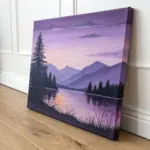
Fantasy Forest With Purple Shadows and Pink Light
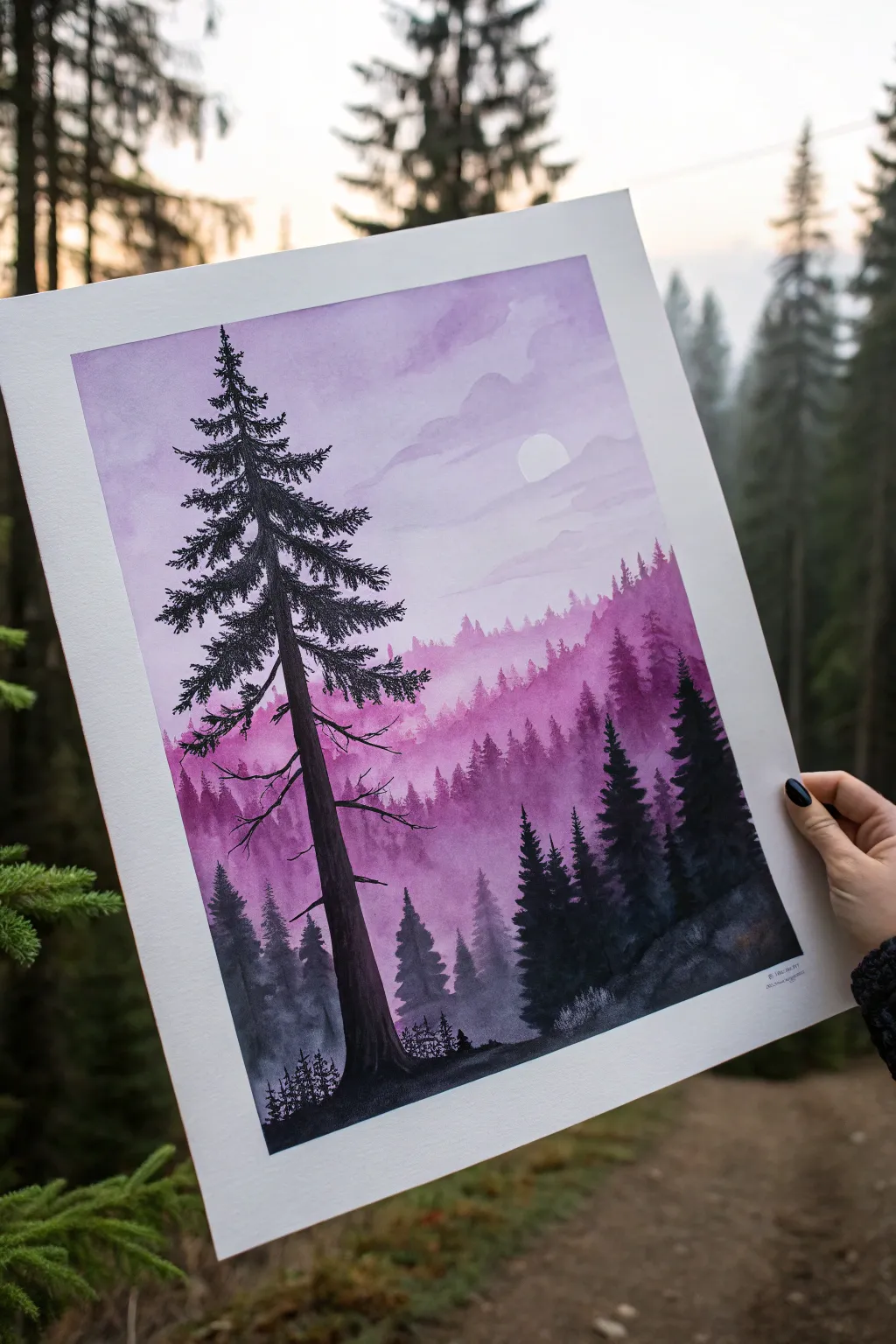
Capture the ethereal beauty of twilight with this atmospheric painting, blending soft watercolor washes with crisp silhouette details. You will learn to layer translucent mountains in shades of violet and rose to create incredible depth before anchoring the scene with a striking foreground pine.
Step-by-Step Tutorial
Materials
- Cold press watercolor paper (140lb/300gsm)
- Watercolor paints (Indigo, Dioxazine Purple, Magenta/Rose, White Gouache)
- Black ink or black gouache for foreground details
- Round brushes (large size 10 or 12, medium size 6, detail liner brush)
- Flat wash brush (optional)
- Masking fluid (optional) or white gouache
- Palette
- Two jars of water
- Paper towels
Step 1: Setting the Scene
-
Prepare the moon:
Before laying down any paint, decide where your moon will sit. You can either use a circle of masking fluid to protect the white paper or plan to paint it in later with thick white gouache. For this look, a masked moon often yields the cleanest edge. -
Wet the sky:
Using your largest brush, apply clean water to the upper two-thirds of your paper. You want an even sheen, not puddles, to prepare for the wet-on-wet technique. -
Paint the initial sky wash:
Mix a watery, pale purple using Dioxazine Purple and plenty of water. Sweep this across the top, leaving some white spaces for clouds. While wet, drop in hints of Magenta near the horizon line to create a soft sunset glow. -
Suggest soft clouds:
While the paper is still damp but losing its sheen, use a slightly thicker mix of purple to gently dab in cloud shapes. Soften the edges with a clean, damp brush so they blend dreamily into the background. -
Let it dry completely:
This is crucial. The sky must be bone dry before you start layering the mountains, or everything will bleed together into a muddy mess.
Mist Mastery
To get that perfect foggy fade between mountain layers, use two brushes: one loaded with paint for the ridge line, and a clean damp one to immediately soften the bottom edge downward.
Step 2: Layering the Mountains
-
First mountain range:
Mix a very diluted purple-pink wash. Paint the silhouette of the furthest mountain ridge roughly one-third down the page. The top edge should be crisp, but you can drag clear water along the bottom edge to fade it into white nothingness. -
Second mountain range:
Once the previous layer is dry, mix a slightly darker, more saturated violet. Paint a second ridge of trees and hills slightly lower than the first. Again, keep the top edge sharp and distinct, representing distant tree tops. -
Creating mist:
Immediately after painting the second ridge’s top edge, rinse your brush and touch the bottom of that wet paint to pull the pigment down. This creates the illusion of fog settling in the valleys. -
Third mountain range:
Repeat the process with an even darker mix, perhaps adding a touch of Indigo to your purple. Paint this layer lower down. You should see a gradient forming: light and pink at the back, dark and cool near the front. -
Adding texture:
For this third layer, use the tip of a size 6 round brush to stipple tiny vertical lines along the ridge. This mimics the look of distant pine forests rather than just smooth hills. -
Dry and prepare for foreground:
Allow all your mountain layers to dry completely. If you used masking fluid for the moon, rub it away gently to reveal the bright white paper.
Make it Sparkle
Once the painting is completely dry, splatter tiny flecks of white gouache or diluted white acrylic ink over the darkest tree areas to simulate fireflies or magical dust.
Step 3: Foreground Details
-
Mix your darkest dark:
Combine Indigo and Black ink (or concentrated watercolor) to create a near-black hue. The foreground needs to pop against the soft background. -
Paint the right-side forest:
On the bottom right, paint the silhouette of a nearby hill and a cluster of pine trees. Use the tip of your brush to create sharp, jagged branches. These trees should be significantly darker than your mountain layers. -
Establish the main tree trunk:
Now for the focal point. Using a steady hand and your darkest mix, paint a tall, slender trunk on the left side, extending almost to the top of the paper. It should be slightly thicker at the base. -
Adding main branches:
Switch to a liner or detail brush. Paint branches extending outward from the main trunk. Remember that pine branches often droop slightly due to weight and then curve upward at the tips. -
Detailing pine needles:
Using a dry-brush technique or very precise stippling, add the needles to the branches. Focus the density near the trunk and leave the tips wispy to let the pink sky peek through. -
Grounding the tree:
Paint the ground beneath the main tree, adding small grassy textures and tiny shrub silhouettes to anchor it to the landscape. -
Final touches:
If your moon needs shading, use a very watery grey wash to add subtle craters. You can also spot opaque white gouache stars in the darker parts of the sky if you want a night scene.
Step back and admire your serene landscape, where the interplay of light and shadow brings the forest to life.


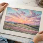
Lavender Field With Pink Sunset Glow
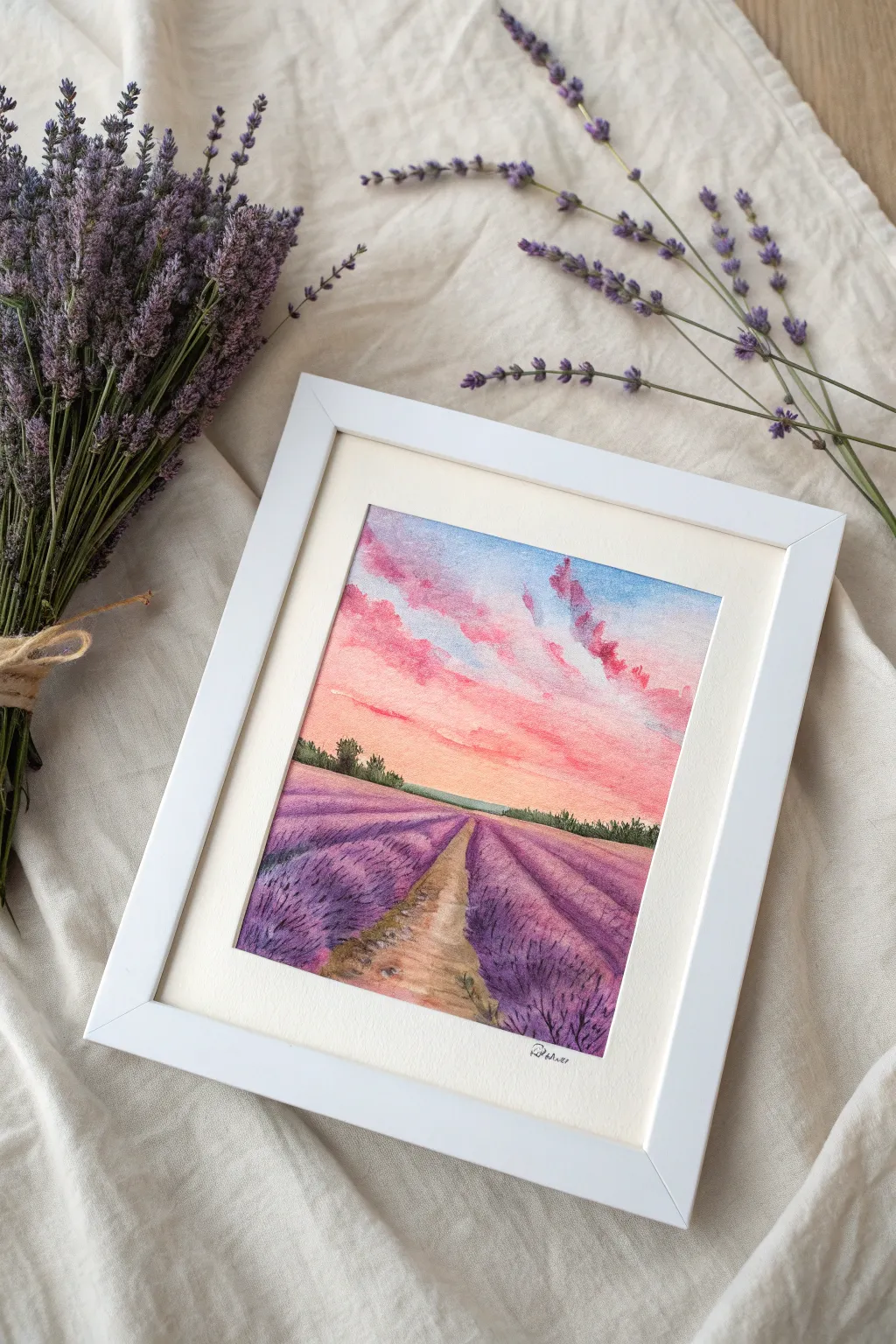
Capture the serene beauty of Provence in this watercolor painting, featuring rows of vibrant purple lavender leading toward a breathtaking pink sunset. This project combines soft wet-on-wet sky techniques with textured botanical details for a romantic, dreamy finish.
Step-by-Step Guide
Materials
- Cold press watercolor paper (300 gsm)
- Watercolor paints (Ultramarine Blue, Alizarin Crimson, Sap Green, Burnt Sienna, Lemon Yellow)
- Masking tape
- Flat wash brush (¾ inch)
- Round brushes (sizes 4 and 8)
- Jar of clean water
- Paper towels
- Pencil and eraser
- White or cream picture frame with mat (for display)
Step 1: Preparation and Sketching
-
Secure the paper:
Tape down all four edges of your watercolor paper to a hard board using masking tape. This creates a crisp border and prevents the paper from buckling when wet. -
Establish the horizon:
Using a pencil, lightly draw a horizontal line about one-third of the way up from the bottom of the paper. This will separate your sky from the field. -
Map the perspective:
Sketch a central dirt path that starts wide at the bottom and narrows significantly as it reaches the horizon line. Add diagonal guidelines radiating from a central vanishing point on the horizon to represent the rows of lavender.
Muddy Purple?
If your purple looks dull, you may be over-mixing on the paper. Let the blue and pink pigments mix naturally on the wet paper for a vibrant, luminous violet.
Step 2: Painting the Sunset Sky
-
Wet the sky area:
Dip your large flat brush in clean water and evenly wet the entire sky area above the horizon line. The paper should glisten but not have puddles. -
Lay in the blue:
While the paper is wet, drop in a light wash of Ultramarine Blue at the very top of the sky, letting it fade out as you move downward. -
Add the sunset glow:
Mix a soft wash of Alizarin Crimson and Lemon Yellow to create a warm coral pink. Apply this near the horizon line, blending it upwards towards the blue. -
Create cloud textures:
While the pink layer is still damp, load a round brush with a more concentrated pink-purple mix. Gently dab in cloud shapes, letting the wet paper soften the edges for a fluffy look. -
Let it dry:
Allow the sky section to dry completely before moving on to avoid the horizon line bleeding into the land.
Level Up: Sparkle
Use a white gel pen or gouache to add tiny highlights to the tips of the nearest lavender stems, suggesting sun catching the flowers.
Step 3: The Lavender Field
-
Base layer for the rows:
Mix a light wash of Ultramarine Blue and Alizarin Crimson to make a soft violet. Fill in the diagonal rows on either side of the path, leaving the path itself unpainted. -
Deepen the shadows:
While the base layer is still slightly damp, mix a darker, more saturated purple. Paint along the bottom edge of each lavender row to create depth and roundness. -
Texture the lavender:
Using the tip of your size 4 round brush and a fairly dry purple mix, stipple small dots and short vertical strokes on top of the dried lavender rows. This mimics the texture of individual flower spikes. -
Focus on the foreground:
Make the texture strokes larger and more distinct at the very bottom of the paper (closer to the viewer) and tiny and indistinct near the horizon.
Step 4: Path and Details
-
Basing the path:
Paint the central path with a dilute wash of Burnt Sienna. I sometimes add a touch of blue to the brown to dull it down slightly for a more natural earth tone. -
Adding path texture:
Once the path is dry, use a darker brown mix to add small pebbles and ruts in the dirt, concentrating these details in the foreground. -
Paint the horizon trees:
Mix Sap Green with a little Ultramarine Blue for a deep forest green. Using the small round brush, paint a jagged line of distant trees right along the horizon line, covering the transition between sky and land. -
Refine the edges:
Add a few stray sprigs of lavender overlapping onto the dirt path to make the scene look organic and less rigid. -
Final touches:
Check your sky clouds; if they dried too light, you can add a precise glaze of pink to emphasize their undersides. -
Reveal:
Once the painting is 100% dry to the touch, carefully peel away the masking tape at a 45-degree angle to reveal the crisp white edges.
Now you have a tranquil landscape ready to be framed and displayed to bring a sense of calm to any room
Koi Pond in Pink and Purple Water
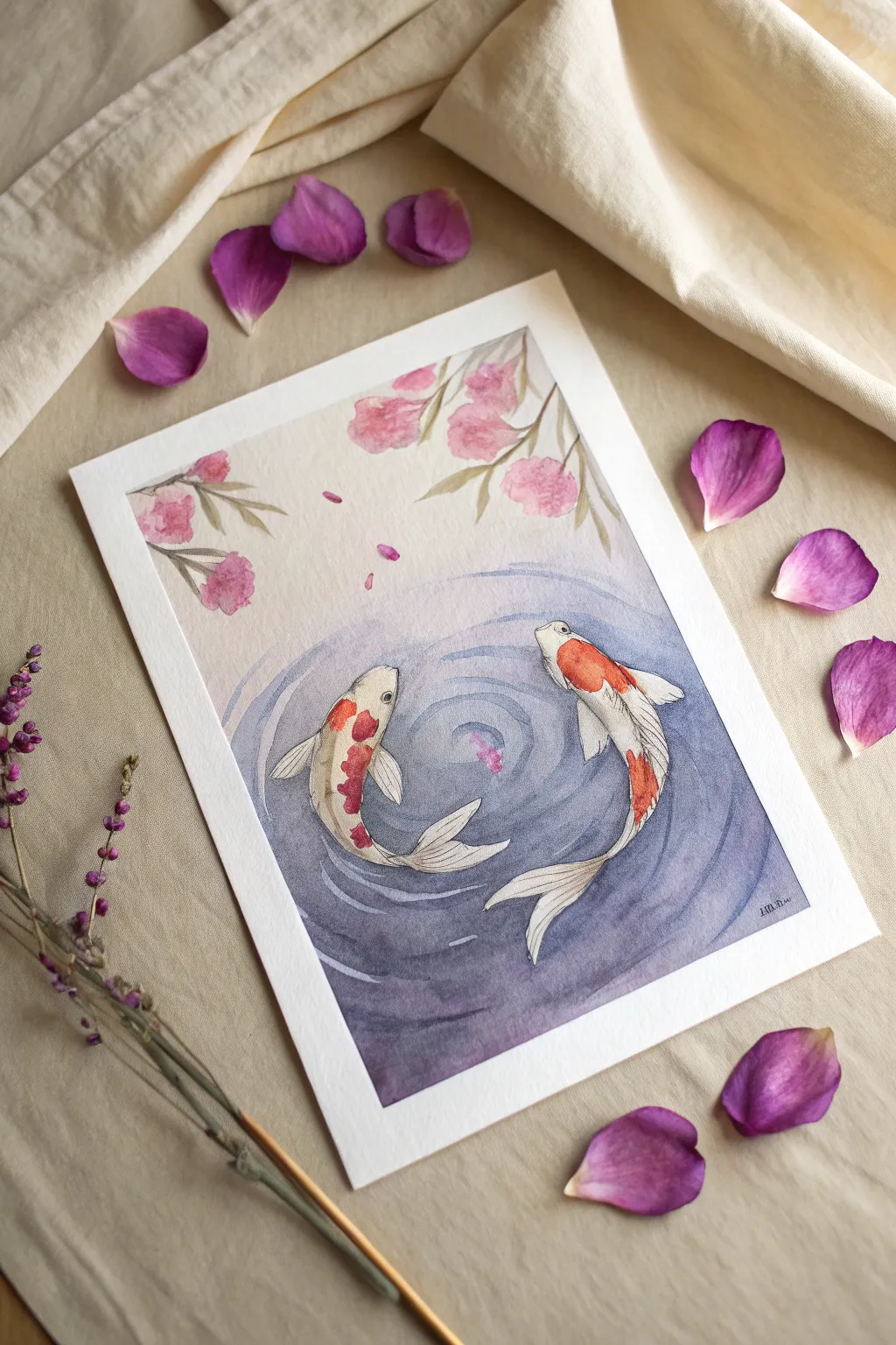
This serene watercolor painting captures the graceful movement of two koi fish circling in a delicate dance among pink cherry blossoms. The soft purple water ripples and floating petals create a tranquil atmosphere that is perfect for honing your wet-on-wet technique.
Step-by-Step
Materials
- Cold press watercolor paper (300 gsm)
- Watercolor paints (Indigo, Purple Lake, Cadmium Red, Orange, Sap Green, Rose Madder)
- Round watercolor brushes (sizes 2, 6, and 10)
- Fine liner or micron pen (sepia or dark grey)
- Pencil (HB) and kneaded eraser
- Masking fluid (optional, but helpful for the fish)
- Two jars of water
- Paper towels
Step 1: Sketching and Preparation
-
Light Outline:
Begin by lightly sketching the two koi fish in a circular formation, almost like a yin-yang symbol. Keep lines faint so they won’t show through the transparent paint later. -
Adding Florals:
Sketch a few branches of cherry blossoms draping down from the top corners. Keep the shapes organic and loose; perfect circles aren’t necessary for the flowers. -
Masking the Subjects:
If you are worried about painting around the fish, carefully apply masking fluid to the fish bodies and the cherry blossom petals. Let this dry completely before touching the paper again.
Clean Water Reminder
Change your water jars often! Dirty water will turn your delicate pinks and purples into a muddy grey color instantly.
Step 2: Painting the Water
-
Wet the Surface:
Using your largest brush, apply clean water to the area surrounding the fish, focusing on the bottom two-thirds where the water will be deepest. -
Initial Wash:
Mix a diluted wash of Indigo and Purple Lake. Drop this color into the wet paper, keeping it darker at the bottom and fading it out to almost clear water as you disappear toward the top of the page. -
Creating Ripples:
While the wash is still damp but not swimming, take a slightly more concentrated purple-blue mix. Using size 6 brush, paint curved, concentric lines radiating from the center of the fish circle to suggest ripples. -
Softening Edges:
Clean your brush and use it damp (not dripping) to soften the hard edges of your ripple lines, blending them into the background wash for a smooth, watery effect. -
Drying Time:
Allow the background layer to dry completely. If you used masking fluid, now is the time to gently rub it away with your finger or an eraser.
Step 3: Bringing the Koi to Life
-
Base Shadows:
Mix a very watery pale grey or diluted indigo. Paint subtle shadows on the white parts of the koi bodies to give them volume, particularly along the sides and under the fins. -
Adding Markings:
While the bodies are dry, mix a vibrant orange using Cadmium Red and Orange. Paint the distinct patches on the koi—focus on the head of the right fish and the spotted back of the left fish. -
Fin Details:
With your smallest brush, use a diluted grey to paint delicate lines on the fins and tails, following the direction of movement to make them look translucent and flowing. -
The Eyes:
Using a tiny dot of black or dark sepia, paint the eyes. Leave a minuscule speck of white paper unpainted for the highlight, which gives the fish life.
Don’t Overwork The Ripples
Paint water ripples quickly and stop. Going back into drying paint creates “cauliflower” blooms and ruins the smooth illusion.
Step 4: Floral Details and Finishing Touches
-
Blossom Petals:
Mix a soft Rose Madder pink. Paint the cherry blossoms using a loose, dabbing motion. Keep the edges soft and vary the intensity of pink to show light and shadow. -
Leaves and Branches:
Use a mix of Sap Green and a touch of brown for the stems and leaves. Paint the leaves with single, confident strokes of the brush, pressing down and lifting up to create the tapered shape. -
Falling Petals:
Add a few small, pink dabs in the water area and floating in the air to suggest falling petals. This connects the top and bottom of the composition. -
Ink Outlining:
Once the paint is bone dry, take your fine liner pen. Very gently outline the fish and the floral elements. Keep your line broken and organic rather than solid and cartoonish. -
Detailed Texture:
Add final ink details, such as scales on the koi or veins on the leaves, using very light pressure on the pen.
Step back and admire the peaceful movement you’ve captured in your own slice of a koi pond
Abstract Pink-Purple Acrylic Pour Cells
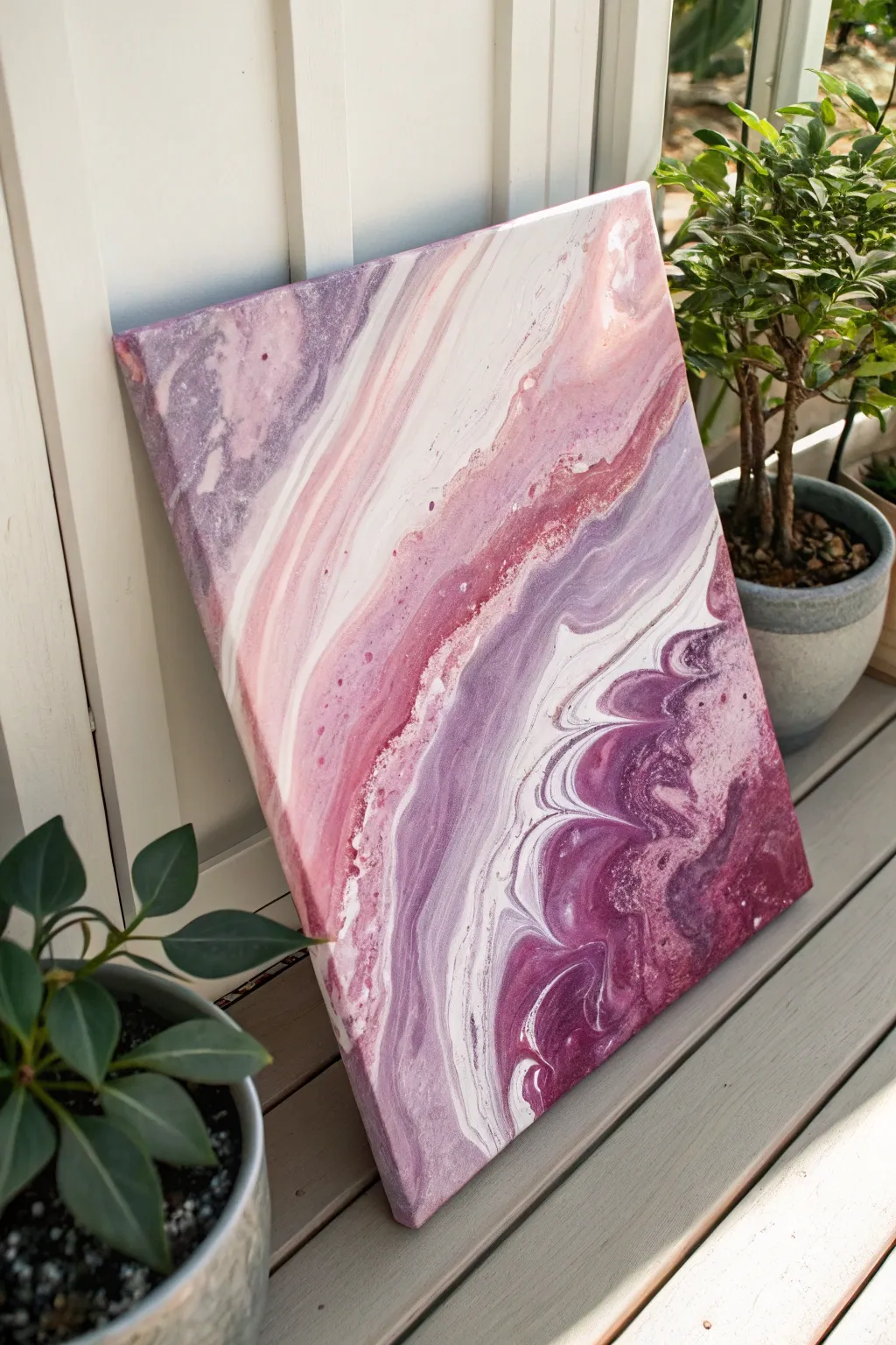
This fluid art project captures the dreamy elegance of agate stone with sweeping ribbons of dusty rose, deep plum, and soft white. The result is a calming, organic composition that adds a sophisticated pop of color to any modern space.
How-To Guide
Materials
- Stretched canvas (11×14 or similar)
- Acrylic paints (Titanium White, Dusty Rose/Pink, Deep Purple, Lavender/Lilac)
- Pouring medium (Floetrol or Liquitex)
- Plastic cups (one for each color, plus one large cup)
- Wooden craft sticks for stirring
- Water (distilled is best)
- Drop cloth or large trash bags
- Push pins or painting pyramids (to elevate canvas)
- High-gloss varnish (optional)
Step 1: Mixing the Paints
-
Prepare your workspace:
Cover your entire work surface with a drop cloth or plastic bags to catch drips. Elevate your canvas by inserting push pins into the four corners of the back frame or placing it on painting pyramids. -
Set up mixing cups:
Layout four small plastic cups. In each cup, pour a generous amount of one of your acrylic paint colors: White, Dusty Rose, Deep Purple, and Lavender. -
Add pouring medium:
Add your pouring medium to each cup. A standard ratio is roughly 1 part paint to 2 parts medium, but check your specific product’s instructions. Stir thoroughly until fully combined. -
Check consistency:
Lift your stirring stick out of the paint. The mixture should flow like warm honey—smooth and continuous, not clumpy or watery. If it’s too thick, add a few drops of water and stir again.
Clean Edges Pro-Tip
Tape the underside of your canvas with painter’s tape before pouring. When the painting is dry, peel off the tape for pristine, professional-looking back edges free of drips.
Step 2: Building the Pour Cup
-
Start the layering:
Take your clean, large pour cup. This is where the magic begins. Pour a small amount of White into the bottom to act as a base helps the other colors flow. -
Layer your colors:
Gently pour the Lavender color down the side of the cup, layering it over the white. Do not mix them. I find pouring down the side preserves the distinct bands of color better. -
Continue building layers:
Follow with the Deep Purple, then the Dusty Rose. Repeat this layering process—White, Lavender, Purple, Pink—until your large cup is about three-quarters full. -
The final layer:
Top off the cup with a splash of White. This will often end up being the first color to hit the canvas, creating those soft edges.
Step 3: Creating the Swirls
-
The ribbon pour:
Start pouring the paint onto the canvas in a slow, steady stream. Move your hand in a gentle zig-zag or wavy motion from the top left corner diagonally down to the bottom right. -
Create variation:
Vary the speed slightly as you pour to create thicker and thinner bands of color, mimicking the natural striations seen in the reference image. -
Empty the cup:
Continue until the cup is empty. You should have a meandering river of paint diagonally across your canvas with lots of negative space still visible. -
Initial tilting:
Gently lift the canvas and tilt it slowly towards one corner. Watch how the paint stretches. The goal is to cover the canvas without losing the definition of your color bands. -
Covering the corners:
Tilt the canvas in the opposite direction to help the paint reach the other corners. If the paint is moving too slowly, you can add a little plain white paint to the corners to help ‘grease’ the path. -
Refining the composition:
Look for the diagonal flow seen in the original photo. Manipulate the tilt so the bands run primarily from the top-left to bottom-right, keeping the lines fluid and wavy. -
Check the edges:
Ensure the paint has flowed over all four edges. Use a gloved finger to dab paint onto any bare spots on the sides of the canvas canvas.
Level Up: Metallic Veins
Mix a small amount of metallic gold or silver paint into your layering cup. It will create shimmering veins that catch the light beautifully alongside the matte pinks.
Step 4: Drying and Finishing
-
Removing bubbles:
If you see tiny air bubbles on the surface, you can pass a kitchen torch quickly over the surface (keep it moving!) or simply pop them gently with a toothpick. -
Let it cure:
Place the painting in a dust-free area to dry. Acrylic pours take time; allow at least 24 to 48 hours for the paint to fully set. -
Optional varnish:
Once fully cured (wait 2-3 weeks for absolute safety), apply a coat of high-gloss varnish to make the purple and pink tones really pop and shimmer.
Enjoy the soothing process of watching your custom berry-toned artwork come to life.
Geometric Mountains in Magenta and Violet Blocks
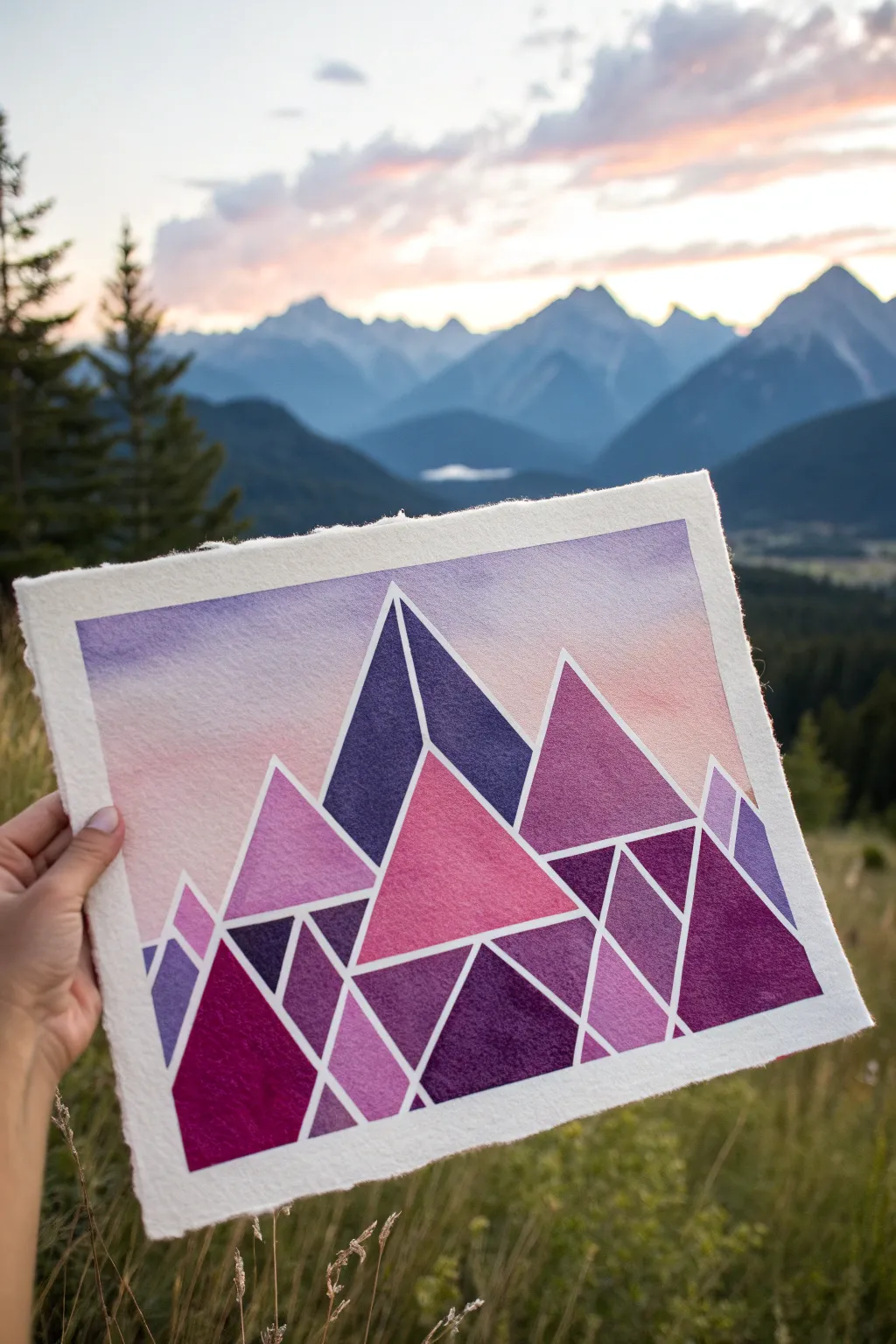
Capture the jagged beauty of a mountain range with a modern twist using this geometric watercolor technique. By breaking down complex peaks into simple triangles and trapezoids, you’ll create a striking landscape filled with vibrant blocks of violet, magenta, and deep indigo.
Step-by-Step Tutorial
Materials
- Heavyweight cold-press watercolor paper (300gsm or higher)
- Masking tape or painter’s tape (various widths)
- Watercolor paints (Indigo, Purple Lake, Magenta, Payne’s Grey, Alizarin Crimson)
- Flat shader brushes (size 6 and 10)
- Round brush (size 4 for details)
- Pencil and eraser
- Ruler
- Clean water and mixing palette
- Liquid masking fluid (optional but recommended)
Step 1: Planning the Peaks
-
Paper selection:
Begin by selecting a high-quality, heavyweight watercolor paper. A sheet with a deckle edge gives a lovely, rustic finish that contrasts beautifully with the sharp geometric lines we are about to paint. -
Drafting the skeleton:
Using a ruler and a light pencil touch, draw a series of large, overlapping triangles to form the main mountain range. Vary the heights to create visual interest. -
Subdividing shape:
Break these large mountain triangles down further. Use your ruler to draw internal lines that slice the mountains into smaller triangles, trapezoids, and shards. This creates the ‘faceted’ look. -
Masking the lines:
This is the most crucial step for crisp edges. Carefully apply thin masking tape or drawing gum (liquid masking fluid) over every pencil line. If using tape, you may need to cut it into thin strips with a craft knife first. -
Seal the edges:
Run a bone folder or your fingernail firmly over the tape edges to ensure they are sealed tight. This prevents paint from bleeding underneath and ruining your clean white lines.
Crisp Line Secrets
To prevent bleed-under, paint a layer of clear water or white acrylic medium over your tape edges first to seal them before applying color.
Step 2: Painting the Sky
-
Preparing the wash:
Mix a watery puddle of pale violet and another of soft peach or watered-down magenta. The goal is a very transparent, ethereal look for the background. -
Wet-on-wet technique:
Brush clean water across the entire sky area above your tape mountain line. While the paper is glistening but not soaking, touch your violet mix to the top edge. -
Creating the gradient:
Quickly introduce the peach color near the horizon line where the mountains will be. Tilt your paper slightly to encourage the violet to flow down and meet the peach, blending softly in the middle. -
Drying time:
Let this sky layer dry completely. If the paper feels cool to the touch, it’s still wet. Patience here ensures the sky won’t bleed into your mountains later.
Metallic Accent
Once dry, fill a few random geometric facets with gold leaf or metallic gold watercolor paint for a luxurious, shimmering detailed finish.
Step 3: Filling the Facets
-
Color strategy:
Plan a color scheme that mimics light and shadow. Designate one side of your mountain peaks for lighter ‘sunlit’ colors (magentas, pinks) and the other for ‘shadow’ tones (deep purples, indigos). -
Painting the first block:
Select a geometric segment. Load your flat brush with vibrant magenta and fill the shape. Paint right over the masking tape boundaries to ensure the shape is fully filled. -
Adding texture:
While a segment is still wet, drop in a tiny touch of a darker purple or clean water. This creates a subtle ‘bloom’ texture that mimics the rough surface of rock. -
Working non-adjacently:
To prevent colors from bleeding into each other if your tape isn’t perfect, paint non-touching sections first. I prefer to hop around the painting, doing a purple section on the left, then a pink one on the right. -
Deepening shadows:
For the base of the mountains, mix your darkest indigo and violet. Fill these lower geometric shards to ground the composition and give it visual weight. -
Layering for opacity:
If a section dries too pale, wait for it to dry completely and apply a second coat (glaze) of the same color to boost vibrancy.
Step 4: The Big Reveal
-
Final drying:
Ensure the entire painting is bone dry. This might take an hour or more depending on how much water you used. Do not rush this step. -
Removing the mask:
Gently peel away the masking tape or rub off the masking fluid. Pull the tape at a 45-degree angle away from the painted area to minimize paper tearing. -
Checking the lines:
Inspect your white lines. If faint pencil marks are still visible in the white gaps, carefully erase them with a kneadable eraser. -
Evaluating the composition:
Step back and look at the whole piece. If the white lines look too stark, you can soften them slightly, but usually, the high contrast is exactly what makes this style pop.
Enjoy the satisfaction of peeling back the tape to reveal your clean, modern mountain masterpiece
Negative-Space Botanicals on a Pink-Purple Gradient
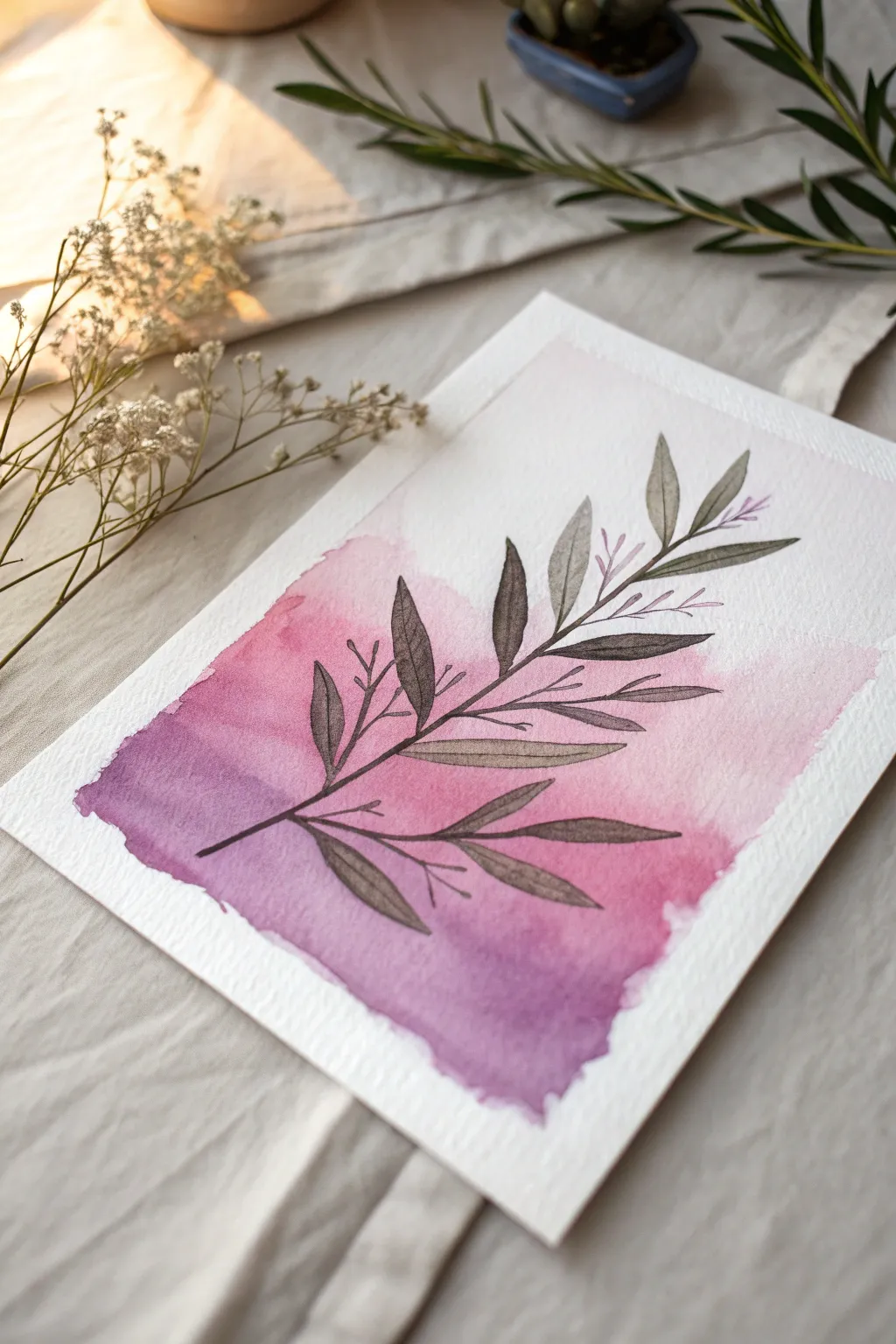
This project combines loose, watery washes with crisp botanical lines for an elegant contrast. The soft bleed of pink into purple creates a dreamy backdrop for the structured olive branch design.
Step-by-Step
Materials
- Cold press watercolor paper (300 gsm)
- Watercolor paints (Alizarin Crimson, Purple Lake, or similar)
- Flat shader brush (size 10 or 12)
- Round detail brush (size 2) or fine liner brush
- Pencil (HB) if sketching first
- Palette
- Water cups
- Paper towels
- Masking tape
Step 1: Preparation & Gradient Base
-
Secure the paper:
Tape down all four edges of your watercolor paper to a board or table. This prevents buckling when we apply the wet wash and creates a clean border. -
Mix your colors:
Prepare two puddles of paint on your palette: a soft rosy pink and a mid-tone purple. Ensure they are quite watery for a translucent effect. -
Map the wash area:
Lightly visualize or mark a rectangular area in the center of the paper where your color will live. You don’t need tape for this internal shape; rough edges add charm. -
Start with pink:
Using your flat brush, load up the pink mixture. Paint the upper left section of your imagined rectangle using broad, horizontal strokes. -
Transition to purple:
While the pink is still wet, pick up the purple paint. Use your brush to pull the pink down into the lower right corner, blending the new purple tone in as you go. -
Create the rough edges:
Don’t worry about perfect lines. Let the brush naturally create jagged, organic edges at the bottom of the wash, giving it that distinct watercolor look. -
Let it bloom:
If I feel the transition is too harsh, I like to drop a tiny bit of clean water or extra pigment into the damp intersection to encourage natural blooming. -
Thorough drying:
This step is crucial: let the background wash dry completely. The paper must be bone-dry and warm to the touch before adding details, or the lines will bleed.
Muddy Gradient?
Work quickly while the paper is wet! If the pink dries before adding purple, you’ll get a hard line. Rewet the edge slightly to soften it if needed.
Step 2: Illustrating the Botanicals
-
Mix the leaf color:
Create a dark, desaturated olive or brownish-grey. You can mix your purple with a touch of yellow ochre or green to achieve this earthy tone. -
Paint the main stem:
Using your fine detail brush, paint a thin, sweeping diagonal line starting from the bottom left purple area and extending up toward the top right corner. -
Add primary branches:
Paint smaller stems branching off the main line. Keep them angled upwards and spaced somewhat evenly. -
Outline the leaves:
Start painting the leaf shapes. These are elongated ovals with pointed tips. Draw the outline first with the very tip of your brush. -
Fill the leaves:
Gently fill in the leaf outlines with a semi-transparent wash of your dark mixture. Leaving a tiny speck of white paper occasionally can add sparkle. -
Add dainty twigs:
Between the larger leaves, use the very tip of your brush to add tiny, hair-thin twigs that don’t have full leaves on them. -
Accent with buds:
On these tiny twigs, dab incredibly small dots or dashes of pink (diluted from your original wash mix) to represent tiny buds. -
Refine the center vein:
Once the filled leaves are dry, you can paint a very fine, dark line down the center of each leaf for added definition. -
Final drying:
Allow the botanical layer to dry completely before removing your tape. -
Remove tape:
Peel the tape away from the paper slowly and at an angle to reveal your crisp white border.
Go Metallic
For a glamorous touch, use metallic gold watercolor or a gold pen to add the veins inside the leaves or outline the edges.
Frame your piece simply to let the delicate color transition shine
Palette-Knife Texture in Bold Pink and Purple
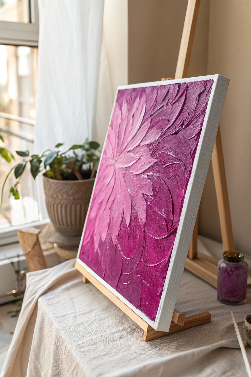
Capture the drama and movement of a blooming flower using thick, luscious impasto techniques. This project focuses on building dimension with palette knives to create a tactile surface where light dances off the peaks of pink and purple paint.
Step-by-Step Tutorial
Materials
- Stretched canvas (approx. 16×20 inches)
- Modeling paste or thick texture medium
- Heavy body acrylic paints (Titanium White, Magenta, Deep Violet)
- Set of palette knives (including a trowel shape and a long, thin blade)
- Plastic or paper mixing palette
- Pencil for sketching
- White acrylic paint for base coat (optional)
- Paper towels
Step 1: Preparation & Base Texture
-
Prime the Surface:
Begin by ensuring your canvas is clean. If you want a brighter base, apply a quick coat of Titanium White acrylic paint over the entire surface and let it dry completely. This ensures the pinks pop later. -
Map the Composition:
Using a pencil, very lightly sketch a focal point off-center to the left. Draw curved lines radiating outward from this point to suggest the flow of petals, creating a sunburst-like guide. -
Mix Modeling Paste:
Scoop a generous amount of modeling paste onto your palette. Divide it into three piles. Keep one white, mix a small amount of Magenta into the second for a pale pink, and mix Deep Violet into the third for a dark base.
Step 2: Background & Dark Tones
-
Apply Dark Violet:
Starting at the outer right edges of the canvas, use a larger trowel-shaped palette knife to spread the dark violet paste mixture. Don’t smooth it out; apply it thickly. -
Create Texture:
As you apply the dark violet, use the edge of the knife to create ridges that curve toward your focal point. This establishes the directional flow of the background petals. -
Transition Zone:
Mix a bit of your Magenta mixture into the remaining violet on the palette to create a mid-tone purple. Apply this next to the dark violet areas, blending slightly where they meet on the canvas. -
Work Inward:
Continue working inward toward the focal point, gradually lightening your mixture by adding more pink or white paste as you get closer to the center left area.
Clean Swipes
Wipe your palette knife clean with a paper towel after every 2-3 strokes. Dried or muddy paint on the knife prevents crisp, clean petal ridges.
Step 3: Sculpting the Petals
-
Mix the Pink Highlight:
Prepare a fresh pile of modeling paste mixed with Magenta and a touch of Titanium White. You want a bright, bold pink for the main petals. -
Form the Central Petals:
Switch to a smaller, long-blade palette knife. Load the underside of the knife with the bright pink paste. -
The Press and Drag Technique:
Place the knife near the focal point and press down gently, then drag outward in a curve, lifting the knife at the end to create a tapered petal tip. I find this creates the most natural petal shape. -
Layering Petals:
Repeat this motion, radiating outward from the center. Overlap these pink strokes slightly over the dried or tacky purple background to create depth. -
Adding Highlights:
Mix a very pale pink—mostly White with a dot of Magenta. Use the very tip of your knife to add highlights to the tops of the pink petals, focusing on the ones closest to the ‘light source’ or center. -
Refining Edges:
Use a clean knife edge to sharpen the distinction between petals if they have blended too much. You want distinct ridges that cast shadows.
Metallic sheen
Once fully dry, dry-brush a tiny amount of iridescent pearl medium over the highest peaks of the texture to catch the light.
Step 4: Finishing Touches
-
Check for Balance:
Step back and look at the gradient. Determine if you need more deep purple at the edges or brighter pinks in the center to heighten the contrast. -
Adjust Textures:
If any area looks too flat, apply a dab of the appropriate color paste and sculpt it back into a ridge or peak. -
Final White Frame:
Carefully paint the edges of the canvas white if paint spilled over, or leave them messy for a raw look. Alternatively, this style looks great in a floating frame. -
Dry Time:
Allow the painting to dry flat for at least 24-48 hours. The thick modeling paste needs significant time to cure completely before hanging.
This vibrant, textured piece brings a splash of energetic color to any room
Mini Canvas Series Using One Pink-Purple Scene
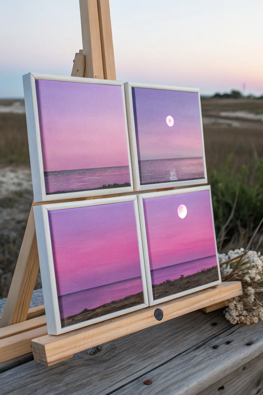
Capture the serene beauty of a coastal dusk with this four-part mini canvas series. By using a limited palette of soft pinks and deep purples, you’ll create a cohesive set of landscapes that explore subtle shifts in light and moon placement.
Detailed Instructions
Materials
- 4 mini square canvases (approx. 4×4 or 6×6 inches)
- Acrylic paints: Titanium White, Magenta, Dioxazine Purple, Ultramarine Blue, Black
- Set of acrylic brushes (flat wash brush, medium filbert, small round detail brush)
- Palette or mixing plate
- Cup of water and paper towels
- Easel (optional, for display)
- Masking tape (optional for horizon lines)
Step 1: Preparation and Base Gradients
-
Prepare the workspace:
Set up your four canvases side-by-side. This helps you maintain color consistency across the series as you mix your paints. -
Mix the sky colors:
Create a gradient palette. Mix a large amount of Titanium White with a touch of Magenta for a pale pink. In a separate spot, mix Magenta with a tiny bit of Dioxazine Purple for a mid-tone. -
Paint the upper sky:
On all four canvases, use a flat brush to paint the top third with your purple-pink mix. Don’t worry about perfect smoothness yet; just get the color down. -
Paint the lower sky:
While the top is still wet, apply the pale pink mix to the middle third of the canvas, blending upwards into the darker purple area to create a soft, ombre transition. -
Refine the blend:
I like to use a clean, dry brush to gently sweep back and forth across the transition line where the two colors meet. This softens the gradient and removes brushstrokes. -
Establish the horizon:
Decide where your water line will be. Painting slightly below the center line usually looks best. Bring the pale pink sky color down to this line.
Step 2: Water and Land Features
-
Mix the water color:
Combine your Dioxazine Purple with a touch of Ultramarine Blue and a little White. You want a color that is darker and cooler than the sky but still harmonious. -
Paint the sea:
Use a flat brush to paint the water area from the horizon line down to the bottom edge. Keep your brushstrokes strictly horizontal to mimic the calm surface of the sea. -
Add distant horizon details:
Mix a very dark purple (Purple + a tiny dot of Black). Using a small round brush or the edge of a flat brush, paint a thin, straight line at the horizon to separate sky and water. -
Create variation:
On two of the canvases, paint a slightly thicker, uneven dark strip at the very bottom or along the horizon to represent distant land or a shoreline in the foreground. -
Texture the foreground:
For the canvases with foreground land, stipple the dark purple paint with an old, rough brush to simulate grass or rocky texture along the bottom edge.
Uneven Gradients?
If your sky blending looks streaky, clean your brush, dampen it slightly (don’t soak it), and lightly sweep horizontally over the transition area while the paint is still tacky.
Step 3: The Moon and Reflections
-
Position the moon:
Choose two canvases to feature the moon. Place a small dot of pure Titanium White in the upper sky area of these chosen panels. -
Shape the moon:
Using your smallest detail brush, carefully expand the white dot into a clean circle. If paint builds up, wipe your brush and smooth it out. -
Add a glow:
Mix a very translucent glaze of pale pink (mostly water). Gently paint a small ring around the white moon to give it a hazy, atmospheric glow. -
Paint water reflections:
Directly beneath the moon, add a few thin, horizontal dashes of white on the water’s surface. Make them wider near the bottom and narrower near the horizon. -
Final touches:
Check the edges of your canvases. Paint the sides white or continue the painting around the edges for a gallery-wrapped look.
Metallic Magic
Mix a tiny amount of iridescent medium or pearl white paint into your moon color. It will catch the light beautifully when viewed from different angles.
Now you have a tranquil, matching gallery wall ready to display on a desk or shelf


Have a question or want to share your own experience? I'd love to hear from you in the comments below!