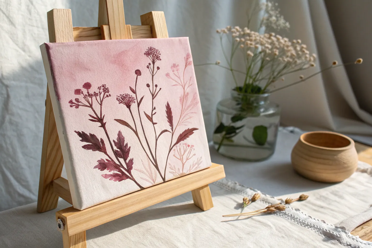
If you’re craving something cute, calming, and totally doable, pink painting is the sweetest place to start. These easy pink painting ideas are all about simple shapes, dreamy color, and quick wins that still look gorgeous on your wall.
Soft Pink Ombre Sunset Sky
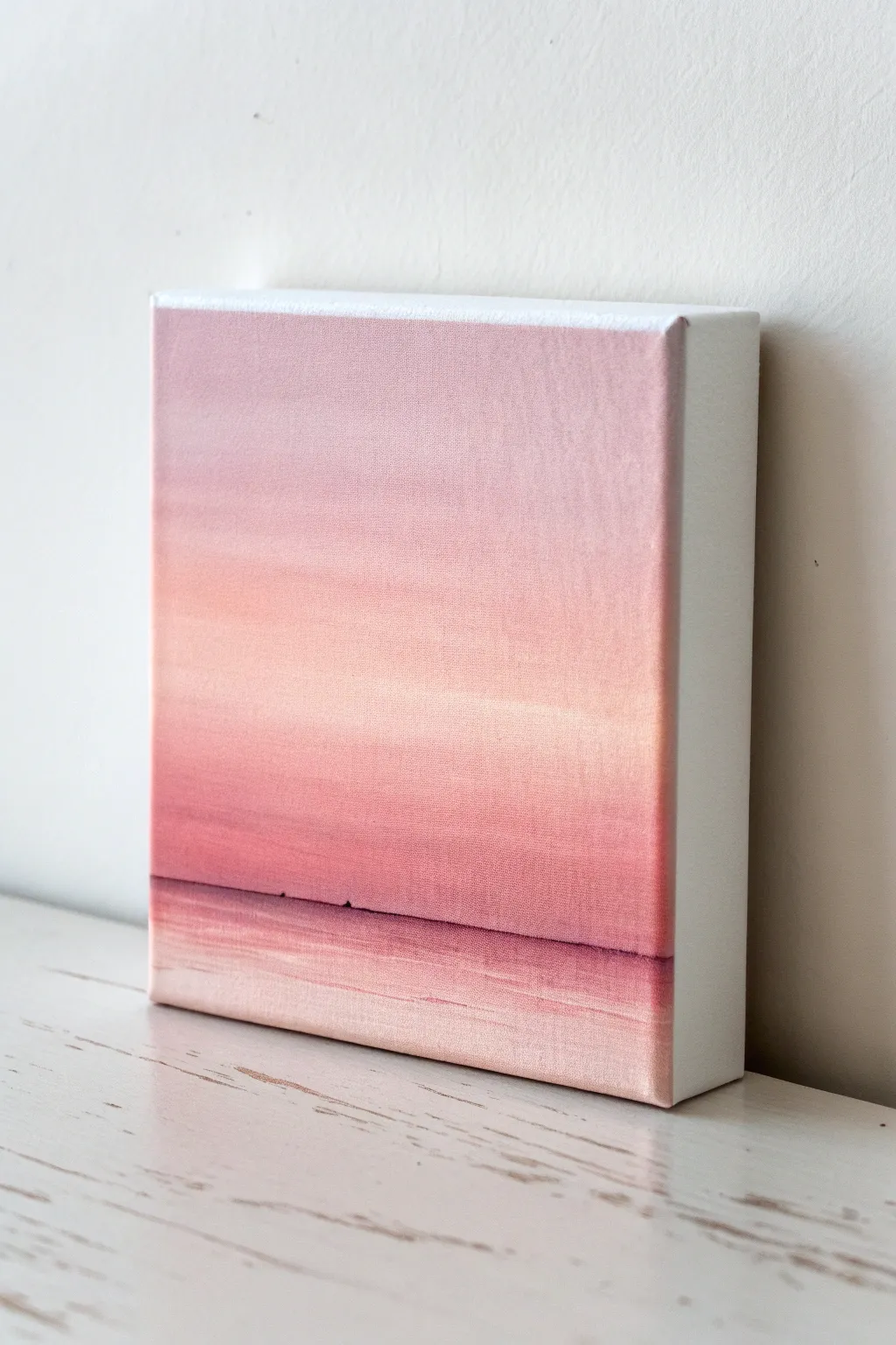
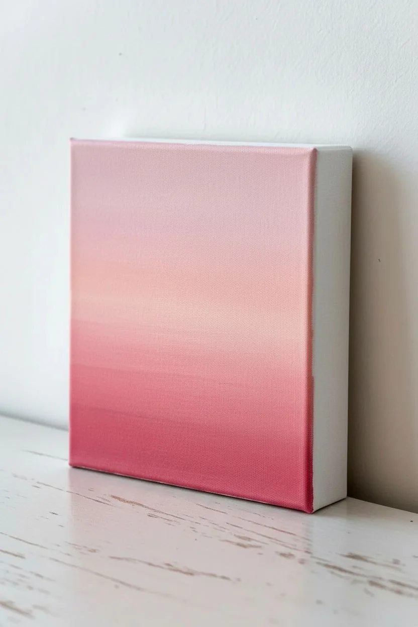
Capture the serene beauty of twilight with this incredibly soft ombre sunset painting. The gentle transition from pale rose to deep blush creates a dreamy, minimalist atmosphere that fits perfectly on a small square canvas.
Step-by-Step Tutorial
Materials
- Small square stretched canvas (e.g., 6×6 or 8×8 inches)
- Acrylic paints: Titanium White, Portrait Pink (or a pale fleshy pink), Magenta or Deep Rose
- Large flat paintbrush (1 inch or wider)
- Medium flat paintbrush
- Fine liner brush
- Cup of water and paper towels
- Palette or paper plate for mixing
Step 1: Setting the Background Gradient
-
Prepare your palette:
Squeeze out generous amounts of Titanium White and Portrait Pink, plus a smaller amount of your darker Magenta or Rose color. -
Mix the lightest shade:
Combine a large amount of White with a tiny dot of Portrait Pink to create a very pale, barely-there dusty rose color. -
Establish the sky:
Using your large flat brush, paint horizontal strokes across the top third of the canvas with your lightest mixture. Ensure the paint is wet and fluid for blending later. -
Mix the mid-tone:
Add a bit more Portrait Pink to your white mixture to create a medium pink tone. -
Apply the middle band:
Paint the middle section of the canvas with this medium pink, overlapping slightly with the lighter section above. -
Blend the sky:
While both sections are still wet, use the large brush to gently sweep back and forth over the seam where the two colors meet. Use long, uninterrupted horizontal strokes to create a seamless fade. -
Create the horizon tone:
Mix your darkest color by adding a touch of Magenta to the Portrait Pink. It should be noticeably deeper but still harmonious. -
Paint the lower sky:
Apply this darker pink band just below the middle section. This will be the area of intensity right before the horizon line. -
Final sky blend:
Clean your brush, wipe it slightly dry, and blend the transition between the medium pink and darker pink, keeping your strokes perfectly horizontal.
Uneven Blending?
If the paint dries too fast while blending, spritz the canvas lightly with water or use a ‘slow-dry’ medium to keep the acrylics workable for longer.
Step 2: Creating the Horizon and Water
-
Define the horizon line:
About 1/4 of the way up from the bottom, use the edge of your flat brush or a ruler to create a very faint, straight line. Everything below this will be the water. -
Paint the water base:
Mix a soft, light pink (similar to your top sky color) and fill in the bottom section below the horizon line. -
Add reflection depth:
While the water base is wet, take a tiny amount of your darkest pink on the brush and add horizontal streaks just below the horizon line. -
Blend the reflections:
Gently stroke back and forth to soften these dark streaks into the lighter water, mimicking the reflection of the intense sunset on the surface. -
Sharpen the horizon:
Load a fine liner brush with a slightly thicker consistency of your darkest pink mix. Carefully paint a thin, straight line across the horizon. -
Add subtle details:
I like to add one or two very imperceptible tiny bumps on the horizon line to suggest distant land or waves, but keep them extremely subtle. -
Highlight the water:
Using pure Titanium White on a clean brush, add a few very faint horizontal highlights right in the center of the water area to suggest sheen. -
Finish the edges:
Since this is a gallery-wrapped canvas, paint the sides white or extend the gradient around the edges for a finished look. -
Let it cure:
Allow the painting to dry completely in a dust-free area for at least 24 hours.
Add Texture
Mix a bit of modeling paste into the white paint for the bottom water reflections to create actual physical ripples that catch the light.
Now you have a tranquil piece of art that brings a soft glow to any room


Fluffy Pink Clouds on a Blush Background
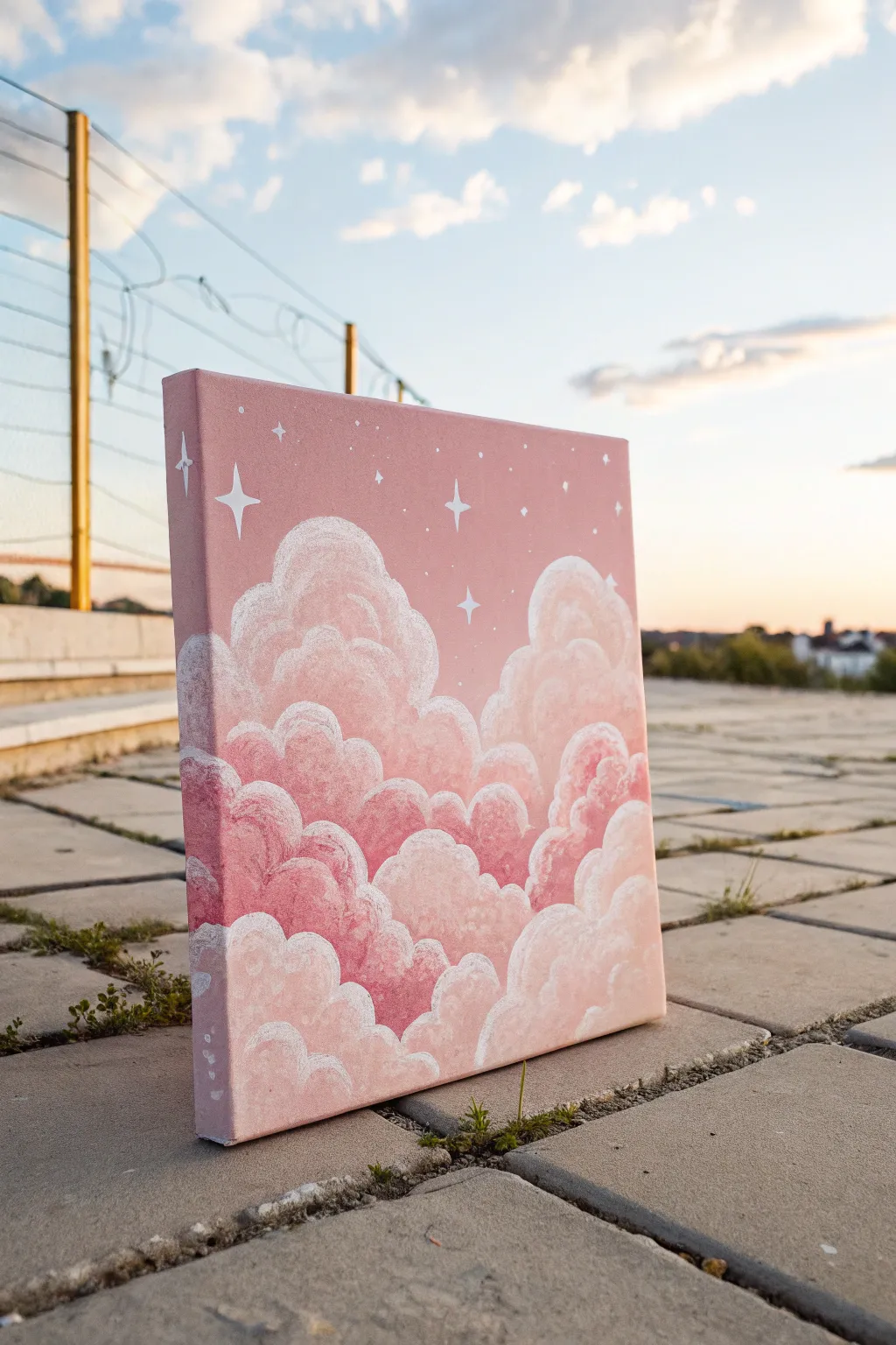
Capture the dreamy softness of the sky with this charming acrylic painting that features billowy clouds in shades of rose and blush. The addition of dainty white stars creates a magical, celestial vibe perfect for adding a touch of whimsy to any room.
Step-by-Step
Materials
- Square stretched canvas (approx. 10×10 or 12×12 inches)
- Acrylic paints (Titanium White, Primary Red, Crimson, Portrait Pink or Blush)
- Medium flat brush (for background)
- Round brushes (flats sizes 4 and 8 for clouds)
- Small detail brush (size 0 or 00 for stars)
- Palette for mixing
- Cup of water
- Paper towels
Step 1: Setting the Scene
-
Mix the background color:
Start by mixing a uniform ‘dusty rose’ shade. Combine a generous amount of Titanium White with a small dot of Primary Red and a tiny touch of Crimson to deepen it slightly. Aim for a matte, medium-pink tone. -
Paint the base coat:
Using your medium flat brush, cover the entire canvas with your mixed pink color. Ensure you use smooth, horizontal strokes for an even finish. -
Cover the edges:
Don’t forget to paint the sides of the canvas with the same background mixture so the artwork looks polished from every angle. -
Let it dry completely:
Allow this base layer to dry fully before moving on. If the paint looks streaky or transparent, add a second coat and let it dry again.
Fixing Muddy Colors
If your pinks are blending into one muddy blob, stop and let the current layer dry fully. Acrylics layer best when dry; wet-on-wet can sometimes over-mix unexpectedly.
Step 2: Building the Clouds
-
Outline the cloud shapes:
Mix a lighter shade of pink by adding more white to your base color. With a round brush, lightly sketch the bumpy, curved outline of your clouds. Create two main formations: a taller one on the left and a slightly lower one on the right, leaving the center somewhat open. -
Fill in the cloud base:
Using a slightly darker pink (add a tiny bit more red to your mixture), paint the bottom portions of the clouds. This acts as a shadow layer that will add volume later. -
Create the mid-tone volume:
Load a round brush with a medium-light pink. Using a dabbing or stippling motion rather than long strokes, fill in the middle sections of the clouds. This texture creates that fluffy, cotton-like appearance. -
Highlight the tops:
Mix a very pale pink, almost white. Apply this to the uppermost curves of the cloud formations, dabbing gently to blend the bottom edge of the highlight into the mid-tone below. -
Define the cloud edges:
While the paint is still slightly tacky, use a smaller round brush with pure Titanium White to paint distinct, rounded borders along the very tops of the clouds. This crisp edge makes them pop against the background. -
Scumble technique:
To make the inside of the clouds look soft, take a clean, dry brush with a tiny amount of white paint. Gently rub or ‘scumble’ circular motions inside the cloud bodies to create misty transitions between your pink shades.
Step 3: Adding Celestial Details
-
Paint the four-point stars:
Using your smallest detail brush and pure Titanium White, paint a few large stars in the open sky area. Draw a vertical line crossed by a horizontal line, pulling the paint outward to make the tips pointy. -
Add curved accents:
For the largest star on the left, gently curve the lines inward toward the center point to give it a stylized, ‘sparkle’ shape. -
Dot small stars:
Dip the handle end of your brush into white paint and dot it strategically around the sky to create tiny, distant stars. -
Vary the dot sizes:
Create visual interest by making some dots slightly larger than others. I like to cluster a few tiny ones together near the larger painted stars. -
Review edges:
Check the sides of the canvas again. If your cloud shapes wrap around the edge, extend the painting onto the sides for a gallery-wrap effect. -
Final dry:
Let the thick white highlights and star details dry completely, preferably overnight, to ensure the texture sets properly.
Add Moonlight Glow
Mix a tiny drop of iridescent or pearl medium into your white paint for the stars and cloud highlights. It adds a subtle shimmer that catches the light beautifully.
Hang this lovely piece on your wall and enjoy your personal sunset view every day


Simple White Daisies on Solid Pink
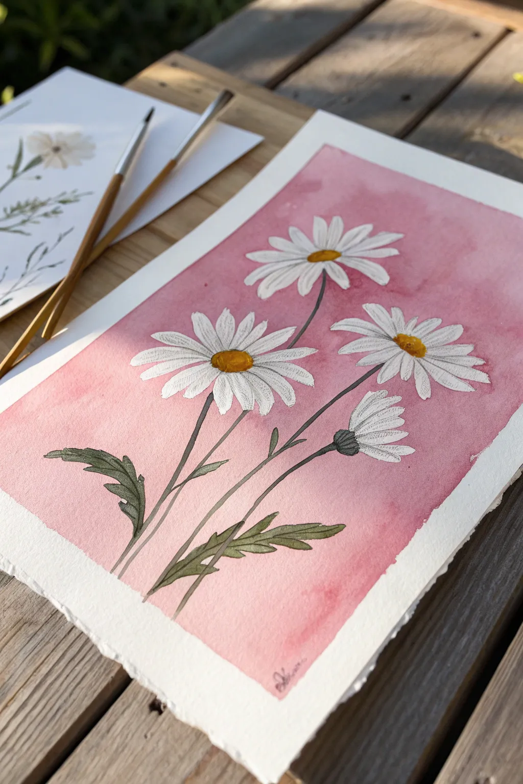
Capture the delicate charm of simple white daisies against a vibrant pink wash in this beginner-friendly painting project. The contrast between the cheerful petals and the soft, rosy background creates a piece that feels both modern and romantic.
Detailed Instructions
Materials
- Cold press watercolor paper (approx. 9×12 inches)
- Masking fluid (drawing gum) and old brush or ruling pen
- Watercolor paints (Alizarin Crimson or Opera Pink, Sap Green, Paine’s Grey, Yellow Ochre, Cadmium Yellow)
- Round watercolor brushes (Size 4, Size 8, and a very fine liner brush for details)
- Pencil (HB) and eraser
- Painter’s tape
- Jar of water and paper towels
Step 1: Preparation and Sketching
-
Secure the Paper:
Begin by taping down all four edges of your watercolor paper to a board or table. This creates that crisp white border you see in the final piece and keeps the paper flat when wet. -
Outline the Composition:
Using a light hand, sketch three open daisy heads and one closed bud. Place the largest flower lower left, one mid-way up on the right, and one near the top center for balance. -
Add Stems and Leaves:
Draw slender, slightly curved stems connecting to the flower heads. Add jagged, lance-shaped leaves near the bottom base, making sure they look organic and not too stiff. -
Protect the Whites:
Apply masking fluid carefully over all the flower petals, the yellow centers, and the stems and leaves. I prefer using an old, cheap brush for this since masking fluid can ruin bristles. Let it dry completely until it’s gummy to the touch.
Step 2: The Pink Background
-
Mix the Pink Wash:
Dilute your pink watercolor (like Opera Pink or a watery Alizarin Crimson) with plenty of water. You want a consistent, semi-transparent puddle of paint ready to go. -
Wet on Dry Application:
Start painting the background area around your masked flowers. Work securely from the top down, keeping a wet edge to avoid harsh streaks. -
Create Texture:
While the pink wash is still wet, drop in tiny bits of more concentrated pink in random areas or sprinkle a drop of water to create ‘blooms’ and variation in the background. -
Let it Dry:
Allow the background to dry completely. If the paper feels cool to the touch, it is still damp; wait until it is room temperature. -
Reveal the White:
Gently rub off the masking fluid with your finger or a rubber cement pickup tool. You should now have stark white silhouettes against a pink field.
Sticky Situation?
If masking fluid tears your paper upon removal, it wasn’t dry enough or the paper quality is too low. Next time, wait longer or try gently warming it with a hair dryer before peeling.
Step 3: Painting the Daisies
-
Base Tone for Centers:
Paint the round centers of the daisies with a bright Cadmium Yellow. For the bud, paint the sepal (the cup part) a light green. -
Shadowing the Petals:
Mix a very watery, pale grey (Paine’s Grey + lots of water). Paint thin, delicate lines on the white petals to indicate separation and shadows, mostly near the yellow center. -
Refining the Centers:
Once the yellow is dry, dab a mix of Yellow Ochre and a tiny bit of brown on the bottom edge of the yellow discs to give them a 3D dome shape.
Add Subtle Sparkle
Mix a tiny amount of iridescent medium or pearlescent watercolor into your pink wash. It won’t be obvious, but the background will shimmer beautifully when the light hits it.
Step 4: Stems and Final Details
-
Paint the Stems:
Using your greens, carefully paint the stems. Use one long, continuous stroke for each stem if possible to keep them looking fluid. -
Paint the Leaves:
Fill in the sketched leaves with Sap Green. While wet, drop a darker green (mixed with a little blue or grey) into the veins or bases of the leaves for depth. -
Detailing the Bud:
Use a fine liner brush to add texture to the green base of the unopened bud, creating small vertical strokes. -
Final Outline:
For a stylized botanical illustration look, use a very fine brush or a grey fine-liner pen to add extremely thin outlines to select petals and leaves, bringing them into focus. -
Remove the Tape:
Wait until everything is bone dry, then peel the tape away slowly at a 45-degree angle to reveal your clean white border.
Sign your name in the corner and frame your lovely floral study for a touch of year-round spring


Black Silhouette Trees Against a Pink Sky
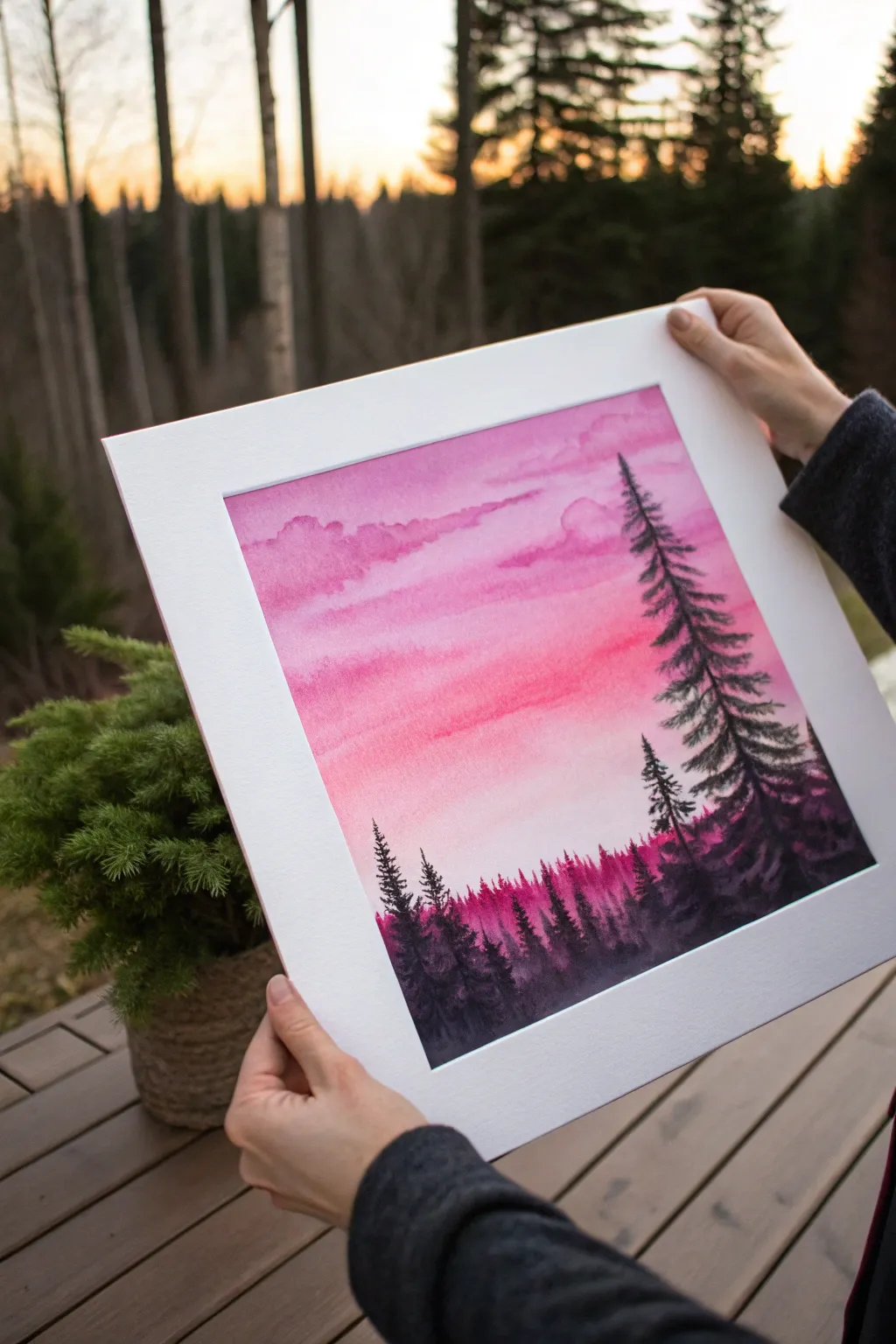
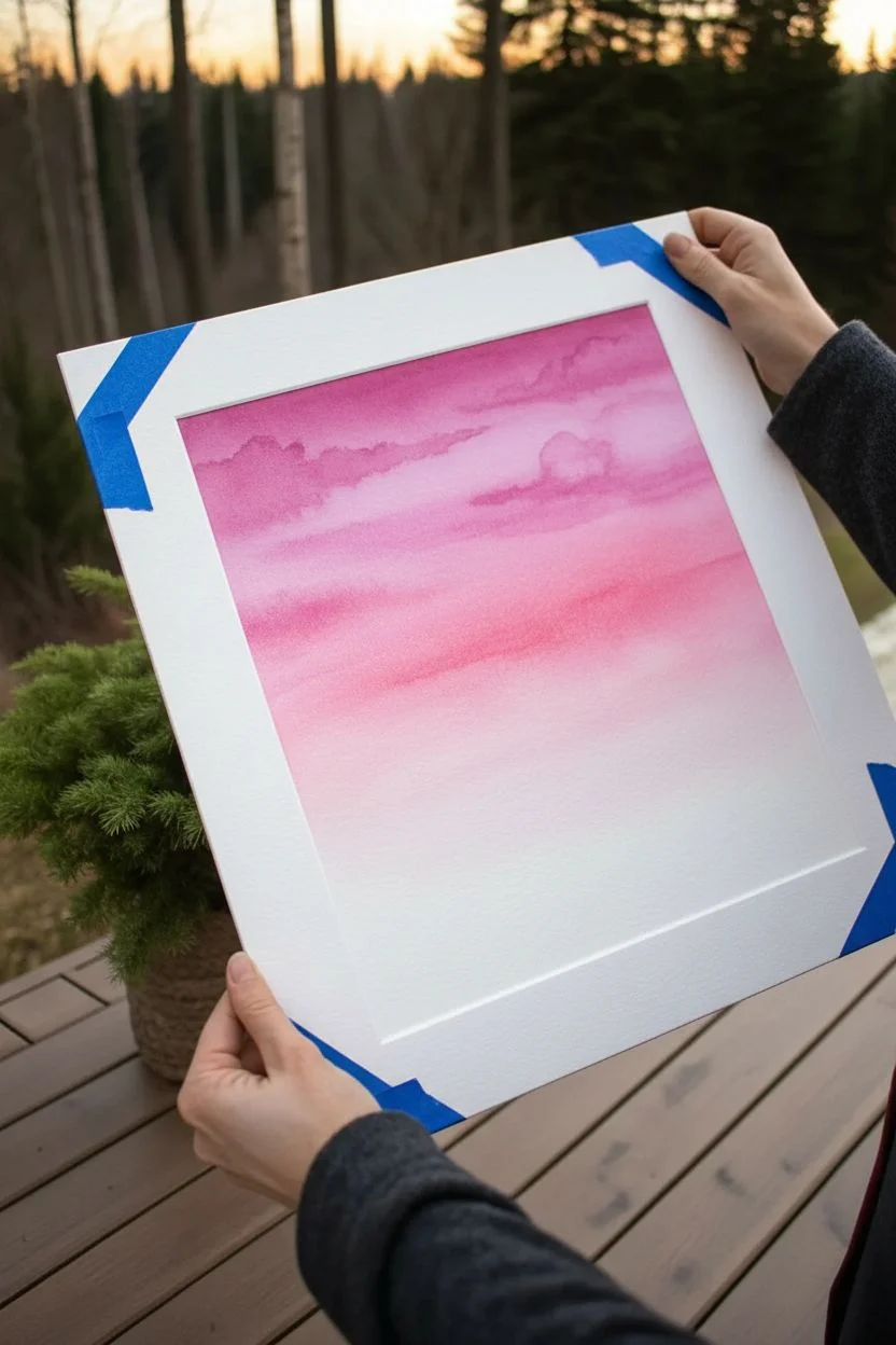
Capture the serene beauty of twilight with this atmospheric watercolor landscape. You’ll layer soft pink washes to create a glowing sky before grounding the scene with striking black pine tree silhouettes.
Step-by-Step
Materials
- Cold Press Watercolor paper (140lb/300gsm)
- Watercolor paints: Rose Madder, Alizarin Crimson, Purple Lake, and Lamp Black (or black gouache)
- Flat wash brush (1 inch)
- Round brushes (size 4 and size 0/liner)
- Masking tape
- Jar of clean water
- Paper towels
- Mixing palette
- White mat board (optional for display)
Step 1: Painting the Sky
-
Prepare the paper:
Begin by taping down all four edges of your watercolor paper to a board or table. This prevents buckling and creates a crisp white border for later framing. -
Mix your pinks:
On your palette, prepare two main pools of color: a watery, pale Rose Madder for the light areas and a slightly more saturated mix of Rose Madder with a touch of purple for the clouds. -
Wet the sky area:
Using your large flat brush and clean water, thoroughly wet the top two-thirds of the paper. You want the surface to be glistening but not forming puddles. -
Apply the base wash:
Load the flat brush with your palest pink mix. Start near the top and apply horizontal strokes, letting the color bleed softly down the wet paper. Leave the bottom third of the paper dry for now. -
Create soft clouds:
While the paper is still wet, switch to a size 4 round brush. Dip into your slightly darker pink-purple mix. Gently touch the tip to the wet paper to suggest cloud shapes near the top, allowing the movement of the water to soften the edges naturally. -
Deepen the horizon paint:
As you move lower towards the horizon line, wash your brush and use very dilute pink, almost fading to white. This creates the illusion of distance and atmospheric glow. -
Let it dry completely:
This is crucial. The sky must be bone-dry before you add the trees, or the black paint will bleed into the pink sky. Use a hair dryer on a low setting if you’re impatient.
Fixing “Blooms”
If water drops create cauliflower-like blooms in your sky, don’t panic. Gently lift the pigment with a damp brush, or turn it into a cloud by darkening the area slightly.
Step 2: Creating the Forest
-
Mix the darkest shadow:
Prepare a rich, opaque black on your palette. If your watercolor black feels too transparent, mix in a little purple or blue to deepen it, or switch to black gouache for a matte finish. -
Paint the distant tree line:
Using the size 4 brush and a slightly diluted black-purple mix, tap in a jagged, uneven line about one-third up from the bottom. These are the distant trees, so they shouldn’t be too detailed or too dark. -
Begin the large foreground tree:
Load your brush with the thickest black paint. On the right side of the paper, draw a vertical line for the trunk of the main pine tree. It should extend high into the sky. -
Add pine branches:
Starting from the top of the trunk, use quick, downward flicking strokes to create the needle texture. Make the branches wider as you move down the tree to create a triangular shape. -
Add secondary trees:
Paint a shorter, thinner tree next to the main one, using the same flicking motion. Variation in height makes the forest look natural. -
Fill the dense forest floor:
For the bottom section of the painting, use the flat brush loaded with black to fill in the area beneath the trees. Blend this upward into the bottoms of your individual trees to create a shadowed mass. -
Detail with the liner brush:
Switch to your smallest brush (size 0 or liner). Add tiny, distinct tips to the very tops of the distant trees and add fine definition to the outer branches of the large foreground pines. -
Final touches:
Look for any gaps in the foreground that need darkening. I like to ensure the contrast between the blackest trees and the brightest pink sky is as sharp as possible. -
Reveal the border:
Once the black paint is completely dry, slowly peel away the masking tape at a 45-degree angle to reveal your clean edges. Place it in a white mat to complete the look.
Level Up: Birds
To add life to the empty space on the left, use your finest liner brush to add 2-3 tiny, V-shaped birds flying toward the horizon.
Now you have a stunning, high-contrast landscape ready to frame and display.
BRUSH GUIDE
The Right Brush for Every Stroke
From clean lines to bold texture — master brush choice, stroke control, and essential techniques.
Explore the Full Guide
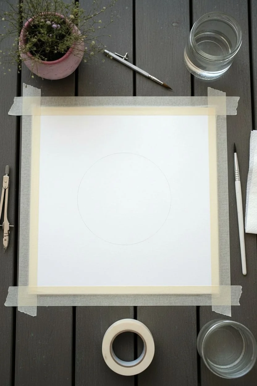
Pink Moon and Tiny Stars
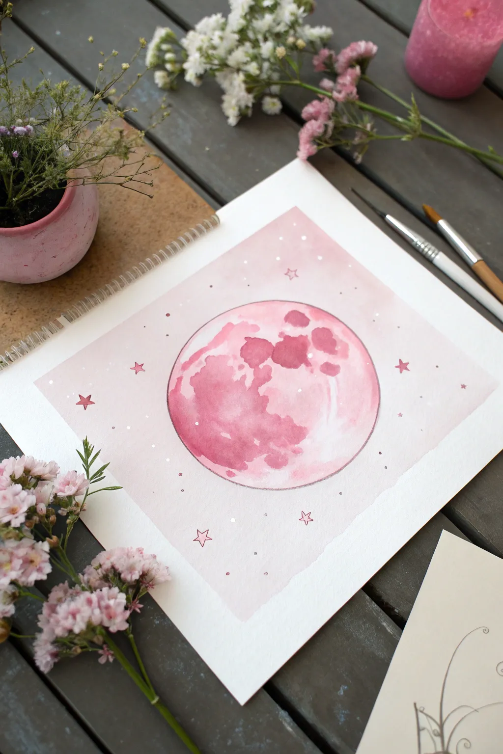
Capture the celestial beauty of a fantasy night sky with this soft, monochromatic watercolor piece. The project focuses on layering techniques and wet-on-wet application to create a glowing pink moon surrounded by delicate stars.
How-To Guide
Materials
- Watercolor paper (cold press, 300gsm)
- Watercolor paints (Alizarin Crimson, Rose Madder, or similar pinks)
- White opacity marker or white gouache
- Pencil and compass (or circular object to trace)
- Masking tape
- Round watercolor brushes (size 6 and size 2)
- Jar of clean water
- Paper towels
Step 1: Preparation and Sketching
-
Prepare the paper:
Begin by taping down the edges of your watercolor paper to a board or table using masking tape. This prevents the paper from buckling when it gets wet and creates that crisp white border seen in the final piece. -
Draw the moon:
Use a compass or trace a circular object (like a jar lid or roll of tape) to lightly pencil a perfect circle in the center of the page. Keep the pencil lines very faint so they don’t show through the paint later.
Step 2: Painting the Background
-
Mix the wash:
Dilute a small amount of pink watercolor with plenty of water on your palette. You want a very pale, transparent wash for the background sky. -
Apply the background:
Using your larger round brush, paint the square area around the moon circle. Be careful to paint up to the pencil line without crossing into the moon itself. Let the edges be slightly ragged if you prefer an organic look, or keep them sharp. -
Let it dry completely:
Wait until the background wash is bone dry. If the paper is cool to the touch, it’s still damp. I usually give this about 10-15 minutes.
Bloom Control
If your crater paint spreads too much, your paper is too wet. Lift excess water with a thirsty, dry brush and wait a minute before trying again.
Step 3: Painting the Moon
-
Wet the circle:
Clean your brush thoroughly. Paint clear water inside the moon circle, ensuring the entire inner area is damp but not forming a puddle. -
First layer of color:
Drop a light pink wash into the wet circle. Let the color flow naturally to the edges. This establishes the moon’s base glow. -
Adding texture:
While the moon is still damp, pick up a more concentrated, darker pink mixture. Gently dab this color into areas where you want craters or shadows to appear. -
Refine the craters:
Focus the darker pigment on the left side and top areas, leaving the right side lighter to suggest highlights. Allow the paint to bloom and bleed for that signature watercolor texture. -
Dry the moon layer:
Allow this layer to dry completely before adding any sharp details. -
Deepen the shadows:
Using a smaller brush (size 2) and a fairly dry mix of deep pink or pale red, paint specific hard-edged crater shapes over the dry wash. This creates the ‘seas’ of the moon. -
Outline the edge:
Take a very fine brush or a pink fineliner and carefully trace the outer circumference of the moon to give it a sharp, defined edge against the pale background.
Make it Sparkle
Mix a tiny amount of iridescent medium or metallic watercolor into your pink paint for a moon that shimmers when the light hits it.
Step 4: Stars and Details
-
Draw large stars:
Using a deeper pink paint or a colored pencil, manually draw small five-pointed stars scattered around the moon in the background area. -
Add white highlights:
Using a white gel pen or white gouache and a tiny brush, add small dots inside the painted moon to suggest glimmering peaks or light reflection. -
Create background stars:
Dot the background sky with the white pen to create distant stars. Vary the spacing to keep it looking natural. -
Outline larger stars:
If your hand-drawn pink stars need definition, carefully outline them with a very fine dark pink line. -
Remove tape:
Once you are certain every drop of paint is dry, slowly peel away the masking tape at a 45-degree angle to reveal your clean edges.
Hang your celestial creation in a spot that needs a touch of calm magic
Easy Pink Rose Made With Spiral Strokes
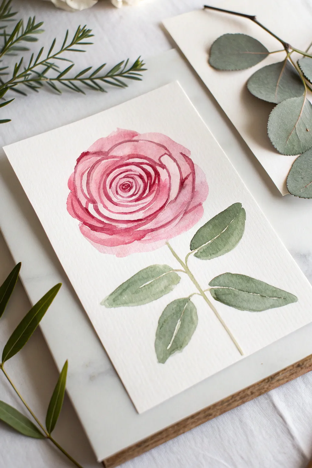
This charming watercolor project captures the delicate beauty of a pink rose using simple, loose spiral motions. The result is a soft, romantic botanical illustration that looks impressive but is surprisingly beginner-friendly to create.
How-To Guide
Materials
- Cold press watercolor paper (A5 size or greeting card)
- Watercolor paints (Alizarin Crimson or Rose Madder, Sap Green)
- Round watercolor brushes (size 6 for petals, size 2 or 4 for details)
- Jar of clean water
- Paper towel or cloth
- Pencil (optional for light sketching)
Step 1: Painting the Rose Bloom
-
Mix your pinks:
Prepare two puddles of pink paint on your palette. Make one a very watery, pale tea-consistency wash, and the other a creamy, more saturated mix for the darker details. -
Start the center:
With your size 6 brush and the saturated pink mix, paint a tiny, tight ‘C’ shape in the center of where you want your flower head to be. -
Expand the spiral:
Paint another curved line hugging the first one. Continue adding these overlapping curved strokes, working outward in a spiral fashion. Leave tiny gaps of white paper between the strokes to define the petals. -
Soften the edges:
As you move away from the center, dip your brush in water to dilute the pigment slightly. The strokes should become lighter and broader as they represent the outer petals. -
Create the outer shape:
Switch to your palest pink wash. Paint large, scallop-shaped strokes around the tightly detailed center to form the full, round body of the rose. -
Blend selectively:
While the paint is still damp, I like to touch the edge of a wet brush to some of the harsh lines to soften them, letting the color bleed gently into the white spaces. -
Define the layers:
Once the first layer is semi-dry, take your darker pink mix again. Add a few thin, confident crescent lines on top of the outer petals to suggest overlapping layers and shadow.
Wet-on-Wet Magic
For softer petals, pre-wet the paper in a circle shape with clean water before dropping in your pink pigment. The color will bloom naturally.
Step 2: Adding Stem and Leaves
-
Mix your green:
Create a natural green shade. If your Sap Green feels too bright, touch a tiny bit of your red/pink paint into it to mute it down to an olive tone. -
Paint the stem:
Using the smaller size 4 brush, draw a thin, slightly curved line extending downward from the base of the flower head. Don’t make it perfectly straight; a little wobble looks more organic. -
Outline the first leaf:
About halfway down the stem, paint a thin stem branching out slightly. From this branch, press the belly of your brush down and lift up to create a teardrop leaf shape. -
Add more leaves:
Repeat this process to create four leaves in total—two on each side of the main stem. Vary their angles slightly so they don’t look too symmetrical. -
Leave highlights:
When painting the leaves, try to leave a tiny sliver of white paper running down the center or along one side. This negative space acts as a highlight or vein. -
Refine the leaf shape:
While the green is wet, you can drop in a slightly darker green near the base of the leaf for depth. -
The calyx touch:
Add tiny little triangular green strokes right where the pink flower meets the stem to represent the sepals (the green base of the flower).
Step 3: Final Touches
-
Check balance:
Step back and look at your composition. If the rose feels too heavy, you might want to darken the leaves slightly with a second glaze of green once the first layer is dry. -
Final dry:
Let the painting dry completely flat to prevent the paper from buckling. Once dry, you can erase any visible pencil marks if you used them.
Blooms & Backruns?
If you get ‘cauliflower’ marks where paint dries unevenly, don’t panic. These textures add organic character to botanical watercolor art.
Frame this delicate piece in a simple white frame or gift it as a handmade card to brighten someone’s day

PENCIL GUIDE
Understanding Pencil Grades from H to B
From first sketch to finished drawing — learn pencil grades, line control, and shading techniques.
Explore the Full Guide
Pink Mountain Landscape in Two Tones
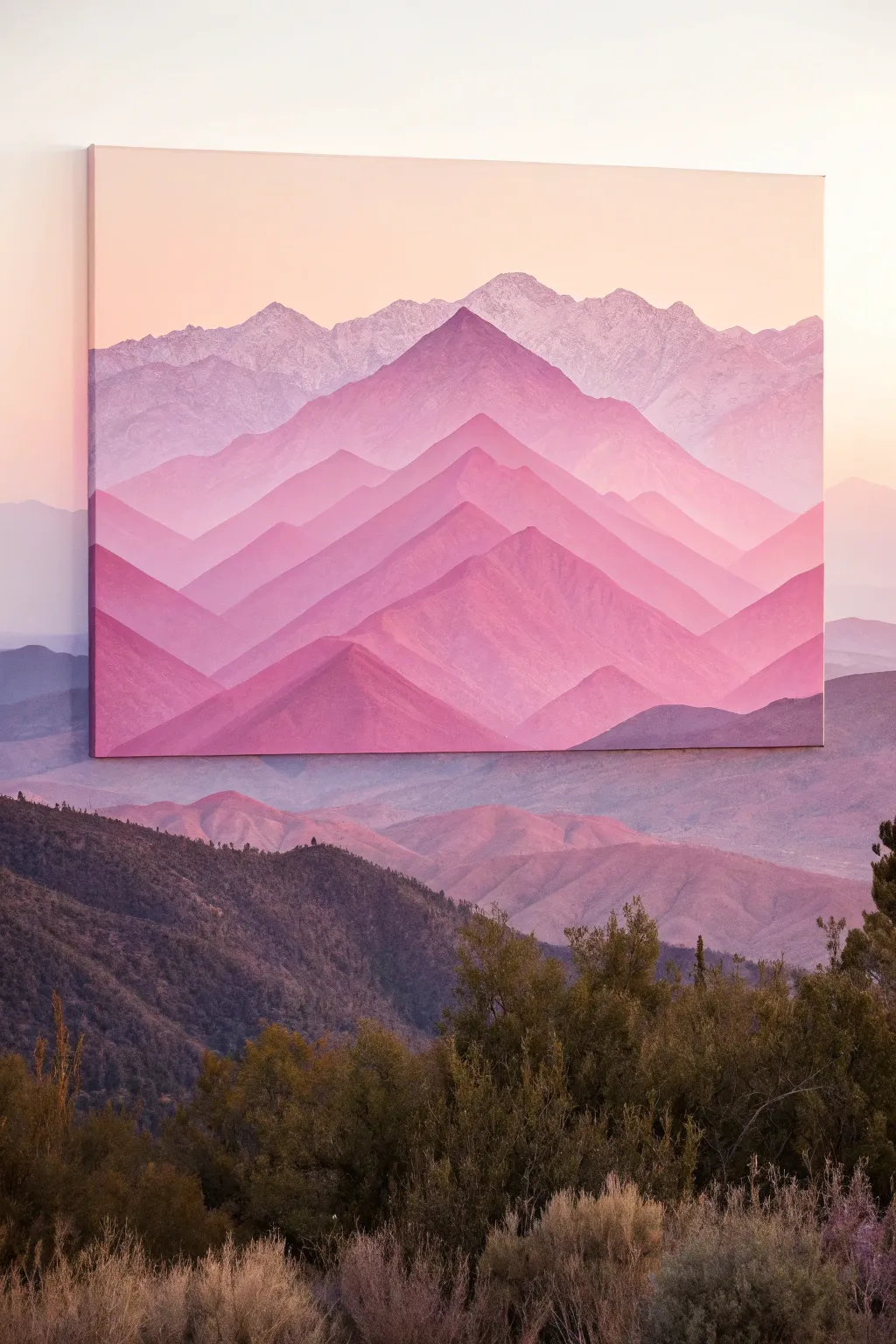
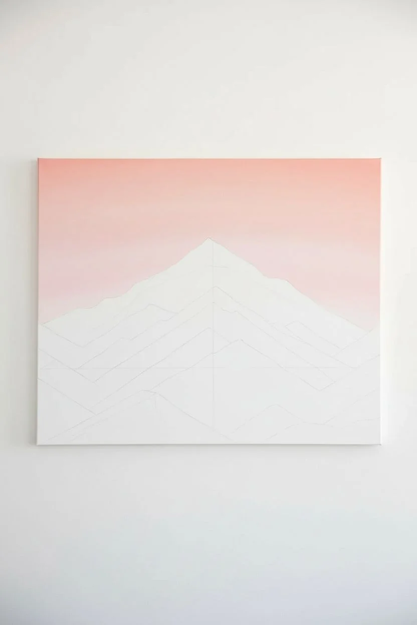
Capture the serene beauty of distant mountains with this atmospheric acrylic painting project. By layering shades of pink and purple, you’ll create a stunning depth that draws the eye toward the horizon.
Step-by-Step Tutorial
Materials
- Square canvas (16×16 or similar size)
- Acrylic paints: Magenta, Titanium White, Violet, Burnt Umber (tiny amount)
- Flat shader brushes (various sizes: 1 inch, 1/2 inch)
- Small round brush for details
- Palette or mixing plate
- Cup of water
- Paper towels
- Pencil for sketching
- Ruler (optional)
Step 1: Planning and Sky
-
Sketch the horizon:
Start by lightly sketching your mountain ranges directly onto the canvas with a pencil. Draw about 5-6 distinct layers of peaks, starting from the horizon line near the top and working your way down. The peaks should crisscross and overlap. -
Mix the sky color:
Create a very pale, warm pink for the sky. Mix a generous amount of Titanium White with just a tiny dot of Magenta and perhaps a speck of yellow if you want a sunrise glow. -
Paint the gradient:
Paint the top quarter of the canvas with your sky mixture. While the paint is still wet, blend in a slightly darker pink near the bottom of the sky area to create a soft, seamless transition where the furthest mountains will sit.
Uneven Blending?
If your sky gradient looks streaky, wait for it to fully dry. Then, apply a second thin coat using a slightly damp wide brush or sponge to smooth out the transition.
Step 2: Atmospheric Layers
-
Mix the furthest range color:
The key to depth is atmospheric perspective things get lighter and cooler further away. Mix a very pale lavender-grey using White, a touch of Violet, and the tiniest bit of Magenta. -
Paint the top mountains:
Fill in the most distant mountain range with this pale lavender mix. Use a flat brush to keep the top edges crisp against the sky. -
Create texture:
While that layer is wet, dab a slightly lighter version of the color on the sun-facing slopes (usually the right side) to hint at rugged terrain without painting specific rocks. -
Darken the mix slightly:
For the second layer of mountains, take your lavender mix and add a bit more Magenta and a dot of Violet. It should still be pastel but clearly distinct from the layer behind it. -
Paint the second range:
Apply this new color to the next range down. Ensure you overlap the base of the previous mountains to hide where they end. -
Add detail to ridges:
Use the edge of your flat brush to pull faint, diagonal streaks down the mountain slopes. This mimics erosion and ridges.
Add Sparkle
Mix a tiny amount of iridescent medium or pearl white paint into your lightest mountain color. This gives the distant snow-capped peaks a magical shimmer in the light.
Step 3: Foreground Intensity
-
Increase saturation:
As you move forward, the colors should get warmer and richer. For the middle layers, mix Magenta with less White and a touch of Burnt Umber to ground the pinks. -
Paint the central peaks:
Fill in the large central mountain shapes. These should be the most prominent triangles in your composition. I find keeping the paint slightly fluid here helps with sharp edges. -
Enhance the shadows:
Mix a darker version of your current pink by adding a little more Violet. Paint the shadowed side of the peaks (the left side) to give them 3D volume. -
Mix the darkest shade:
For the closest, bottom-most mountains, create your deepest color. Use Magenta, a touch of Violet, and Burnt Umber. Minimal white is needed here. -
Paint the foreground:
Fill in the bottom zig-zag shapes with this deep, rich hue. This anchors the painting and provides a strong contrast to the pale sky. -
Refine the edges:
Go back with a small round brush and tidy up any mountain peaks that look muddy or uneven. Sharp, clean peaks make the image feel majestic. -
Final blending check:
If any layers look too flat, dry brush a little lighter pigment on the very tips of the peaks to simulate sunlight catching the summit.
Step back and admire your serene mountainscape
Pink Ocean With a Simple Wave Line
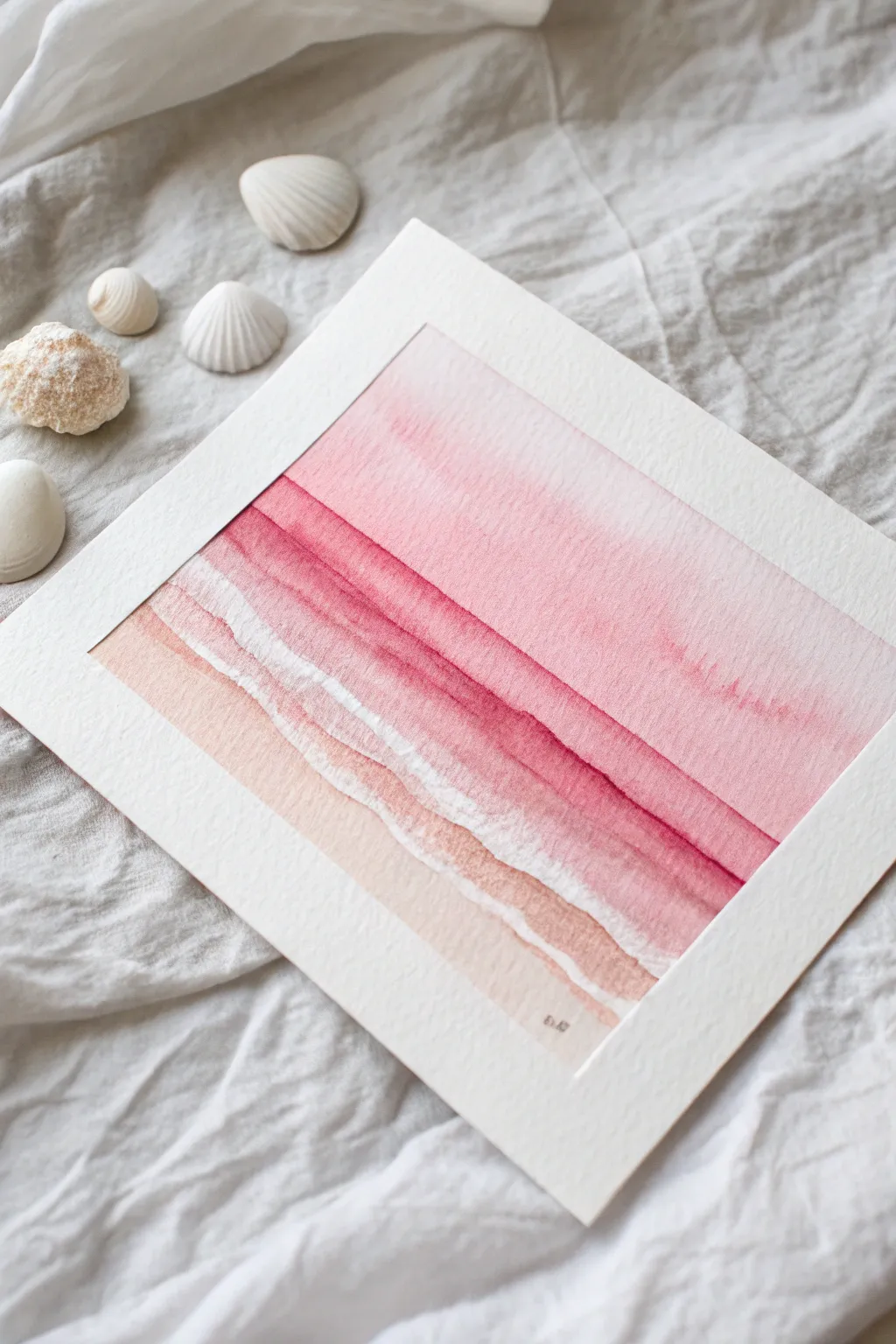
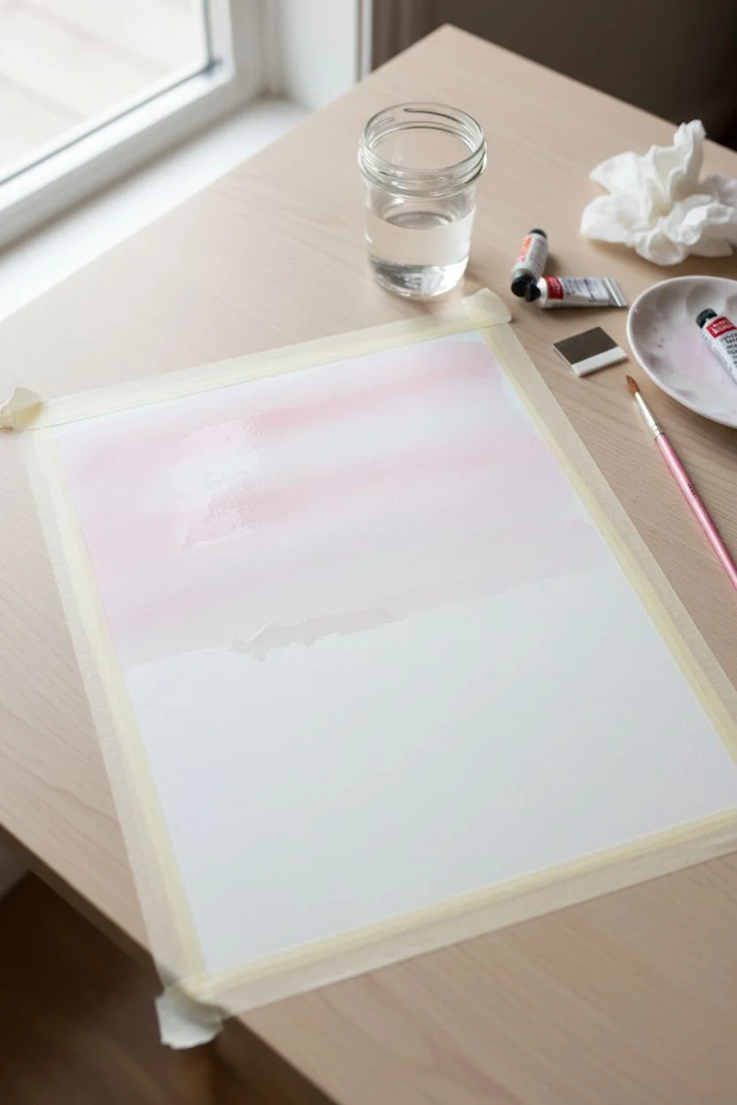
Capture the serene beauty of a sunset ocean with this gentle monochromatic watercolor study. Using layers of soft peach, vibrant rose, and deep crimson, you will create a soothing gradient that mimics the rhythm of rolling waves.
Step-by-Step Guide
Materials
- Cold press watercolor paper (140lb/300gsm)
- Watercolor paints (Alizarin Crimson, Rose Madder, Yellow Ochre or Naples Yellow)
- Flat shader brush (3/4 inch)
- Round brush (size 6 or 8)
- Masking fluid or white gouache (optional)
- Two jars of water
- Paper towels
- White mat board for framing
- Painter’s tape
Step 1: Preparation and Sky
-
Tape it down:
Begin by securing your watercolor paper to a board or table with painter’s tape on all four sides. This creates a clean border and prevents buckling when the paper gets wet. -
Mix the sky wash:
Dilute a small amount of Rose Madder with plenty of water to create a very pale, translucent pink wash for the sky area. -
Wet-on-wet sky:
Lightly wet the top half of your paper with clean water using your large flat brush. -
Apply the gradient:
While the paper is still damp, stroke the pale pink wash across the top, letting it naturally diffuse and fade as it moves downward toward the horizon line. -
Allow to dry:
Let this initial sky layer dry completely before moving on to the ocean. If the paper is cool to the touch, it’s still damp.
Preventing Blooms
If you see cauliflower-like backruns, your brush was too wet when adding new paint. Dry your brush on a towel before touching damp paper.
Step 2: Painting the Waves
-
Mix ocean colors:
Prepare three concentrations of paint: a light peach (Yellow Ochre mixed with a touch of pink), a medium rose, and a deeper crimson mix. -
Define the first wave:
About halfway down the paper, use your round brush to paint a horizontal, slightly undulating line with the medium rose color. This establishes the horizon. -
Soften the edge:
Immediately rinse your brush and use clean water to drag the bottom edge of that rose line downward, creating a soft fade. -
The second wave layer:
Slightly below the previous wash, paint a stronger, more jagged line using your deeper crimson mix. Let the line wobble to mimic water movement. -
Preserve the white:
As you move closer to the foreground (the bottom), leave thin, irregular strips of dry white paper between your bands of color. This negative space represents the white sea foam. -
Deepen the contrast:
While the crimson wave is damp, drop in a tiny bit more pigment right at the top edge of the wave line to create a shadow effect under the crest. -
Fade out the wave:
Just like before, pull the color from the crimson wave downward with a damp brush, letting it fade into a lighter pink. -
The sandy shore:
For the bottom-most section, switch to your peach mixture. Paint a broad stroke at the bottom, mimicking the wet sand. -
Connect to foam:
Bring the peach color up to meet the white paper ‘foam’ line, leaving a hard edge where the sand meets the froth.
Step 3: Finishing Touches
-
Enhance texturing:
I like to take a nearly dry brush with faint pink pigment and lightly dry-brush over the white foam areas to give them texture without filling them in completely. -
Review contrast:
Step back and assess your waves. If the deep red lines have faded too much upon drying, carefully re-line the tops of the waves with a thin brush and concentrated paint. -
Sign and peel:
Once fully dry, sign your work at the bottom right in pencil. Gently peel away the tape at a 45-degree angle. -
Add the mat:
Place your white mat board over the painting to crop it perfectly, highlighting the contrast between the pink waves and the crisp border.
Sparkle Effect
Splatter tiny drops of clean water or white gouache over the drying waves to create the illusion of sea spray and mist.
Enjoy the calm atmosphere your new pink seascape brings to the room


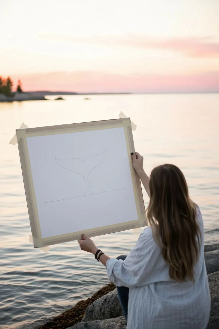
Whale Tail Silhouette in Pink Water
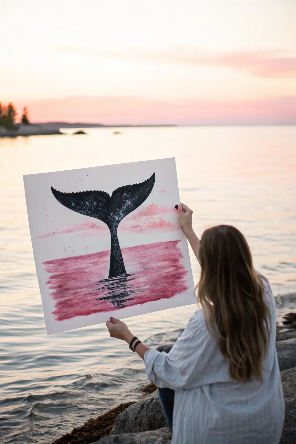
This serene painting combines the bold silhouette of a whale’s tail with a soft, dreamy pink seascape. The contrast between rigid black ink and flowing watercolor washes creates a striking piece that captures the magic of an ocean sunset.
How-To Guide
Materials
- heavyweight watercolor paper (140lb/300gsm)
- masking tape
- watercolor or gouache paint (crimson, magenta, rose)
- black India ink or black acrylic paint
- flat wash brush (1-inch)
- round detail brush (size 4 or 6)
- pencil
- palette or mixing tray
- cup of water
- paper towels
- old toothbrush (optional)
Step 1: Preparation & Sketching
-
Secure the paper:
Begin by taping down all four edges of your watercolor paper to a hard board or table surface using masking tape. This prevents the paper from buckling when it gets wet and creates a clean white border. -
Outline the horizon:
Lightly sketch a horizontal line across the lower third of the paper to represent the horizon where the sky meets the water. It doesn’t need to be perfectly straight; a natural wobble adds character. -
Draft the tail shape:
In the center of the paper, sketch the outline of the whale tail. Start with a narrow vertical stem that widens into the classic fluke shape. Aim for organic curves rather than sharp geometry.
Bleeding Lines?
If the black ink bleeds into the pink background, your base layer wasn’t dry enough. Let it dry fully, then use white gouache to correct the edges before reapplying black.
Step 2: Painting the Background
-
Mix your pinks:
On your palette, prepare a watery mix of rose and magenta. You want a translucent wash, not a thick opaque layer, so be generous with the water. -
Paint the water:
Using your flat wash brush, apply the pink wash below the horizon line using horizontal strokes. Allow the color to be uneven—darker in some spots and lighter in others—to mimic the movement of waves. -
Add sky clouds:
Clean your brush slightly so it holds less pigment. Dab faint, irregular pink patches in the sky area above the horizon. Keep these very soft and subtle compared to the water. -
Splatter texture:
While the pink paint is strictly wet, dip a small brush or an old toothbrush into slightly darker red paint. Flick the bristles to send tiny speckles onto the pink sky area for an artistic, weathered look. -
Let it dry completely:
This is crucial: do not proceed until the pink background is bone dry to the touch. Using a hairdryer on a low setting can speed this up if you are impatient.
Step 3: The Silhouette & Details
-
Fill the tail:
Switch to your round detail brush and loading it with black India ink or fluid black acrylic. Carefully paint the whale tail silhouette. I find it easiest to outline the shape first, then fill in the middle. -
Create texture on the tail:
Before the black ink dries fully, you can dab it with a paper towel to lift a tiny bit of color, creating a mottled, skin-like texture rather than a flat black block. -
Add water ripples:
Using the very tip of your brush with black paint, create horizontal, scratchy lines directly underneath the base of the tail where it meets the water. -
Extend reflections:
Continue painting zigzagging black lines downward into the pink water area to simulate the reflection of the tail. These lines should be wider at the top and taper off as they go lower. -
Add sky specks:
Load your brush with a small amount of black ink. Flick tiny droplets near the top of the tail and into the sky to represent spray or distant birds. -
Final touches:
Assess the silhouette edges. If they look too ragged, smooth them out with one final pass of black ink to ensure a crisp contrast against the light background.
Metallic Magic
Once everything is dry, add thin highlights to the water ripples using a silver or gold metallic pen. This makes the water look like it’s glistening in the sun.
Peel off the tape carefully to reveal your crisp edges and enjoy your serene ocean artwork
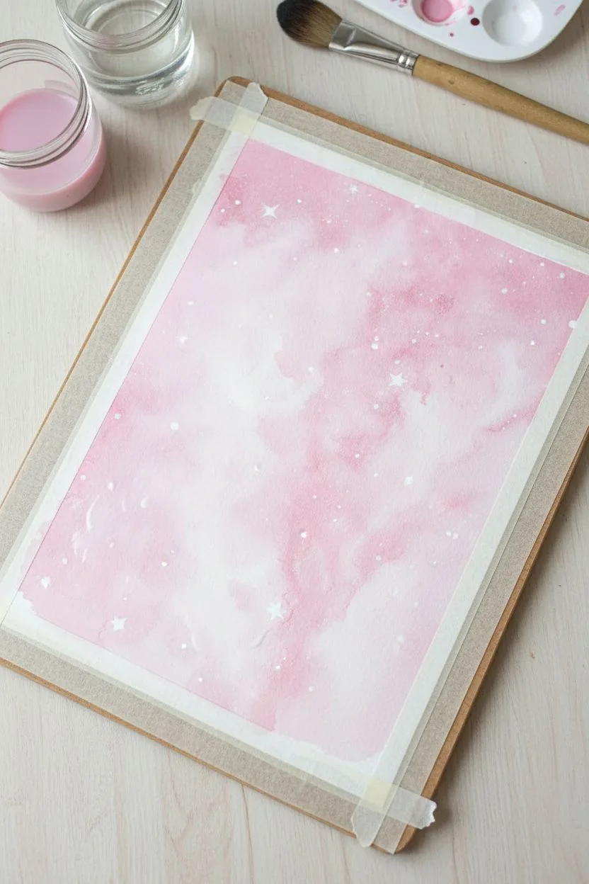
Cotton-Candy Pink Galaxy Splatter
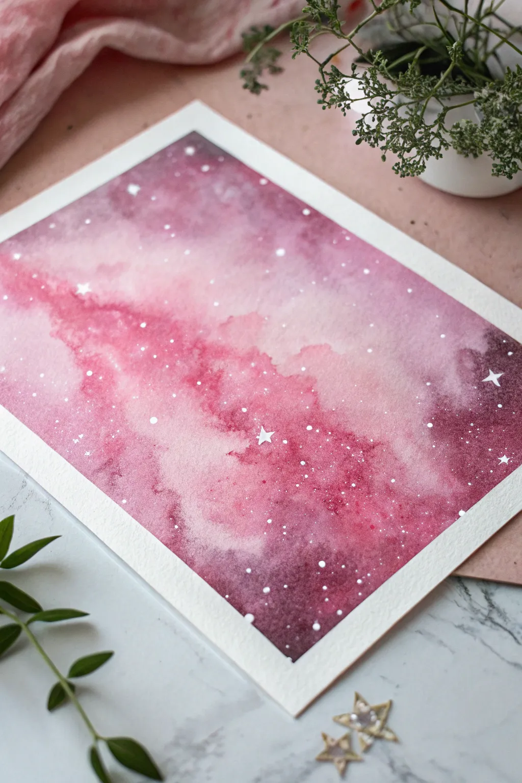
This dreamy watercolor project captures the ethereal beauty of a pink nebula using simple wet-on-wet techniques. The soft transitions between blush pink and deep magenta create a celestial glow that looks complex but is wonderfully beginner-friendly.
Detailed Instructions
Materials
- Cold press watercolor paper (300gsm)
- Painter’s tape or artists’ masking tape
- Watercolor paints (Alizarin Crimson, Opera Pink, Indigo, Purple)
- White gouache or white gel pen
- Large round brush (size 10 or 12)
- Small detail brush (size 0 or 1)
- Two jars of water
- Paper towels
- Old toothbrush (optional for splattering)
- Hairdryer (optional)
Step 1: Preparation and Base Layer
-
Secure the Paper:
Begin by taping down all four edges of your watercolor paper to a hard board or table. Press the tape edges firmly to ensure a crisp, clean border later. -
Pre-wet the Surface:
Using your large clean brush, apply a coat of clean water over the entire paper surface. You want the paper to look glossy and damp, but not so wet that puddles form. -
Mix Your Pink:
Dilute your Opera Pink or a bright rose color with plenty of water. You want a very light, almost pastel wash for the initial layer. -
Create the Nebula Core:
Drop the light pink paint diagonally across the center of the wet paper. Let the pigment bloom naturally into the water, keeping the center irregular and cloud-like.
Step 2: Building Depth
-
Introduce Mid-Tones:
While the first layer is still damp, pick up a slightly stronger mix of Alizarin Crimson. Dab this color around the edges of your light pink center, leaving some of the lightest areas untouched. -
Blend the Edges:
Clean your brush slightly and soften any hard lines where the two pinks meet, encouraging a smooth gradient. -
Mix Deep Purple:
Create a dark, moody mixture using Purple and a touch of Indigo. The Indigo helps desaturate the purple for a realistic space look. -
Define the Corners:
Apply this dark purple mixture to the outer corners and edges of the paper. This creates a vignette effect that draws the eye toward the glowing pink center. -
Connect the Colors:
Allow the dark purple to touch the wet pink areas. Watch as they bleed together to create new, interesting maroon shades. -
Intensify Shadows:
If the corners look too pale as they dry, drop in more concentrated Indigo pigment while the paper is still moist. -
Add Texture:
I like to tilt the board slightly to let the pigments flow and create natural-looking cloudy streaks. -
Dry Completely:
Let the painting dry fully. It must be bone-dry before the next step to prevent the stars from blooming. Use a hairdryer on low heat if you’re impatient.
Blooms & Cauliflowers?
If weird textures appear, you likely added water to a drying section. Next time, wait until that area is totally dry before adding another wet layer.
Step 3: Celestial Details
-
Prepare White Pigment:
Mix white gouache with a tiny drop of water until it reaches a milky, creamy consistency. -
Splatter Stars:
Load a brush or old toothbrush with the white mix. Tap the handle against another brush over the painting to create a spray of fine white dots. -
Vary Star Sizes:
Focus some heavier splatters diagonally along the pink nebula cloud to suggest a dense star cluster. -
Paint Major Stars:
Using your smallest detail brush or a white gel pen, manually paint a few distinct four-pointed stars or larger dots for visual interest. -
The Reveal:
Once the white paint is totally dry, slowly peel away the masking tape at a 45-degree angle to reveal your crisp white border.
Add Gold Accents
For a magical twist, use metallic gold watercolor for the largest stars. The shimmer catches the light beautifully against the matte dark background.
Now you have a stunning piece of the cosmos captured right on your paper
String Lights Over a Pink Twilight Sky
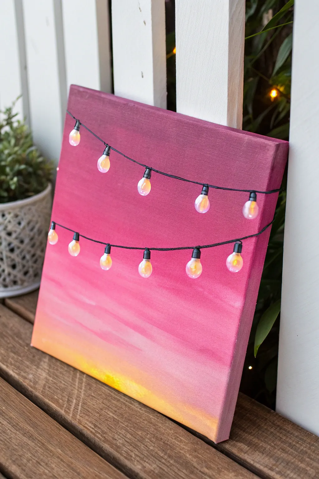
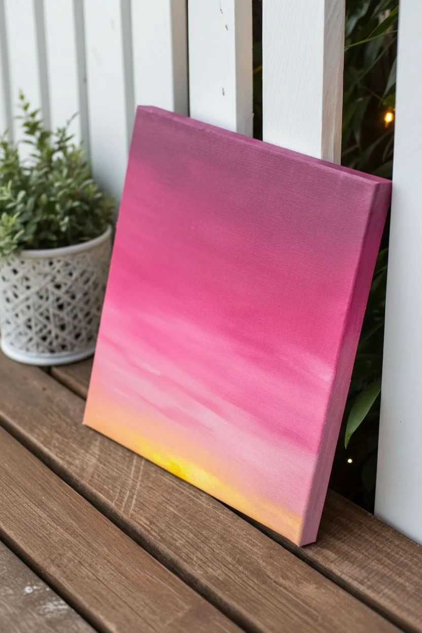
Transform a simple gradient sky painting into a 3D masterpiece by adding a touch of real illumination. This project combines beginner-friendly blending techniques with mixed media to create a cozy, glowing piece of decor.
Step-by-Step
Materials
- Square stretched canvas (approx. 12×12 inches)
- Acrylic paints: Titanium White, Bright Yellow, Magenta, Deep Purple
- Large flat paintbrush (1-2 inch width)
- Medium round brush
- Battery-operated fairy string lights (bulb style)
- Craft knife or Awl
- Masking tape or duct tape
- Pencil
- Palette or paper plate
- Water cup
Step 1: Painting the Sunset Gradient
-
Prepare the Gradient Colors:
Squeeze out your four main colors onto the palette: yellow, magenta, purple, and a generous amount of white. -
Start with the Horizon:
Load your large flat brush with yellow mixed with a large amount of white. Paint a horizontal strip across the bottom 2 inches of the canvas. -
Blend Upwards:
Without cleaning the brush entirely, pick up a tiny bit of magenta. Blend this into the yellow band while it’s still wet to create a soft peachy-orange transition. -
Intensify the Pink:
Clean your brush. Pick up pure pink/magenta and paint the middle section of the canvas, brushing horizontally back and forth. -
Create the Gradient Seam:
Where the pink meets the peach/yellow section, use long, smooth horizontal strokes to feather the colors together. If the paint feels too dry, dip just the tip of your brush in water. -
Add the Midnight Purple:
Paint the top third of the canvas with the deep purple. I like to add a tiny touch of magenta to this purple so it harmonizes better with the middle section. -
Final Blending Pass:
Work the transition between the purple top and the pink middle until smooth. Let the canvas dry completely—this usually takes about 30 minutes to an hour.
Step 2: Planning the Light Struts
-
Sketch the Wires:
Using a pencil very lightly, draw two swooping curved lines across the canvas where your light strands will hang. Make sure the curves dip naturally. -
Mark Bulb Placements:
Decide where you want your lights to sit along the lines. Mark these spots with small dots. Aim for roughly 5 bulbs per strand for a balanced look. -
Paint the Wiring:
Using your medium round brush and thin black paint (or a black paint marker), trace over your pencil lines to create the electrical cords. Add small black rectangles at each marked dot to represent the light sockets.
Loose Canvas?
If poking holes makes the canvas fabric sag, spray the back lightly with water and let it dry. It will shrink slightly and tighten like a drum.
Step 3: Installing the Illumination
-
Create Entry Holes:
Carefully poke a small hole through the canvas right in the center of each black painted socket using a craft knife or awl. -
Insert the Lights:
Working from the back of the canvas, push the individual LED bulbs through the holes so they poke out the front. -
Secure the Wiring:
Flip the canvas over. Tape the wires flat against the back of the wooden frame or canvas fabric using masking tape to hold the bulbs firmly in place. -
Hide the Battery Pack:
Tape the battery pack to the back lower corner of the frame, ensuring the switch is accessible but hidden from the front view.
Starry Night Effect
Before adding lights, flick a toothbrush loaded with watered-down white paint over the purple section for a galaxy of distant stars.
Flip the switch and enjoy the warm ambiance of your interactive twilight sky
Streetlamp Casting a Heart-Shaped Pink Glow
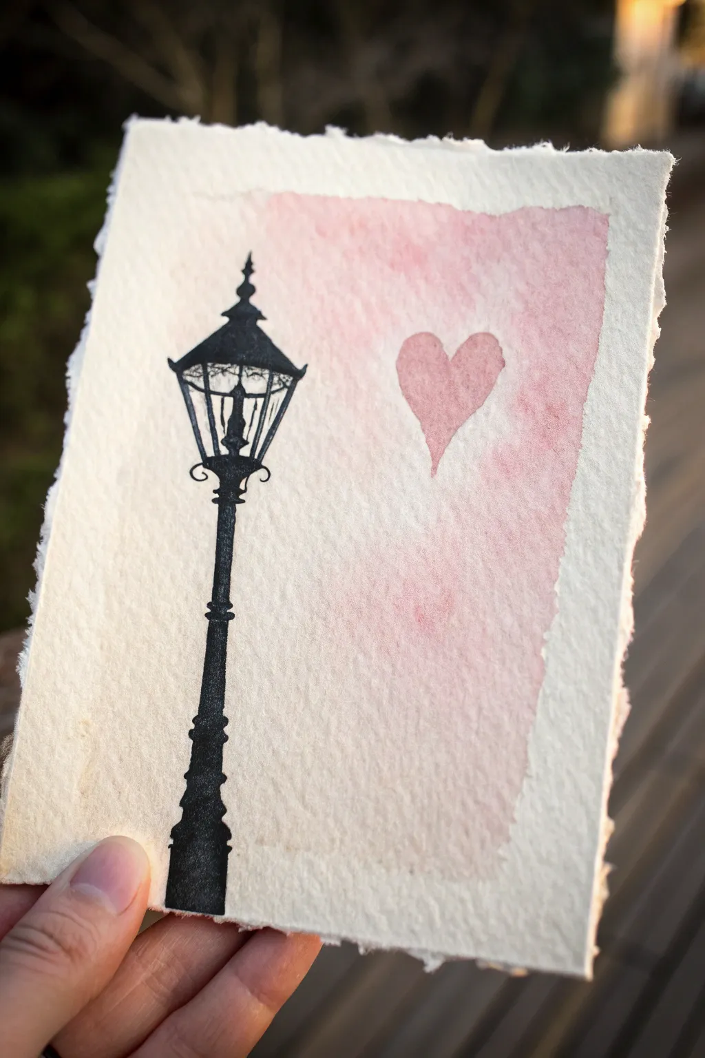
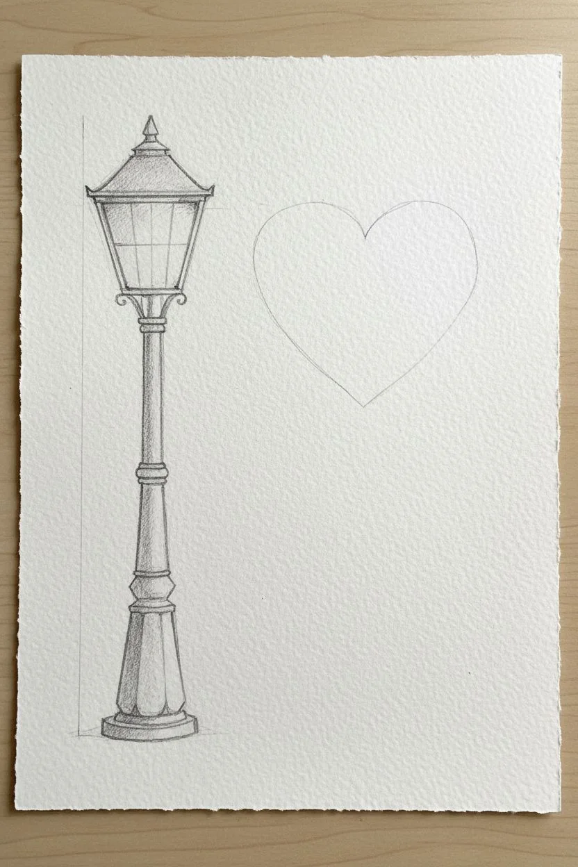
This charming mixed-media piece combines the sharp elegance of a vintage streetlamp silhouette with the soft, romantic glow of watercolor. Using roughly textured handmade paper adds an antique feel that perfectly complements the whimsical concept of a lamp casting a heart-shaped light.
How-To Guide
Materials
- Heavyweight cold-press watercolor paper or handmade cotton rag paper (roughly 5×7 inches)
- Black waterproof fine liner pen (0.5mm and 0.8mm)
- Black India ink or high-flow acrylic paint
- Small round watercolor brush (size 2 or 4)
- Pink watercolor paint (e.g., Rose Madder or Alizarin Crimson)
- Pencil and eraser
- Ruler
- Paper towel
- Jar of water
Step 1: Sketching the Layout
-
Define the ground line:
Start by lightly marking where the base of the lamp post will sit. I like to place it in the bottom left corner, leaving about an inch of space from the bottom edge. -
Draft the post:
Use a ruler to draw a faint vertical line up the left side of the paper to act as your center guide. Sketch the segmented shape of the lamp post along this line, making the base wider and tapering slightly as you go up. -
Outline the lantern head:
At the top of your post, sketch the lantern housing. Drawing a trapezoid shape with a pointed finial top creates that classic Victorian look. -
Mark the heart glow:
To the right of the lantern, lightly sketch a floating heart shape. Position it so it looks like the light is projecting it, slightly higher than the lantern bulb itself.
Ink Smudging?
If your black ink bleeds when you add watercolor, the pen wasn’t waterproof. Fix it by sealing the black silhouette with a thin layer of clear matte medium before painting.
Step 2: Inking the Silhouette
-
Outline the black forms:
Using your 0.5mm waterproof pen, carefully trace over your pencil lines for the lamp post and lantern. Add decorative scrolls or brackets under the lantern head for extra detail. -
Add internal details:
Draw the grid lines (muntins) inside the lantern glass. Add a small, solid shape in the center to represent the lightbulb or gas flame fixture. -
Fill the silhouette:
Switch to your thicker pen, India ink, or black paint to fill in the entire lamp post structure. Be careful to leave the ‘glass’ panes of the lantern clear, only filling the frame and the central bulb fixture. -
Refine the edges:
Once the main filling is done, use the fine pen to sharpen any corners or decorative points on the finial and base. -
Let the ink cure:
Allow the black ink to dry completely. This is crucial—if it’s still wet, the next watercolor step will smudge the black into the pink.
Make It Sparkle
Mix a tiny pinch of gold mica powder or iridescent medium into your pink watercolor wash. The ‘light’ will shimmer beautifully when the card catches the sun.
Step 3: Adding the Radiant Glow
-
Prepare the wash:
Dilute your pink watercolor with plenty of water to create a very pale, transparent tea-like consistency. -
Paint the background wash:
Paint a loose, rectangular wash of this pale pink on the right side of the paper, starting near the lamp and fading out toward the right edge. Keep the edges ragged and organic rather than perfect. -
Create the heart:
While the background wash is damp (but not swimming), load your brush with slightly more concentrated pink paint. Paint the heart shape you sketched earlier inside the pink wash area. -
Soften the transition:
If the heart edges look too sharp, clean your brush, dab it on a paper towel, and gently run the damp bristles along the edge of the heart to blend it slightly into the background. -
Add texture:
For a vintage look, create a bloom effect. Drop a tiny amount of clean water into the wettest part of the pink background and let it push the pigment outward as it dries. -
Dry and erase:
Let the paper dry completely flat. Once bone dry, gently erase any visible pencil marks, being careful around the textured watercolor area.
This sweet illustration makes a perfect Valentine’s card or a gentle reminder to look for the light in everyday places
Pink Checkerboard Background With One Cute Accent
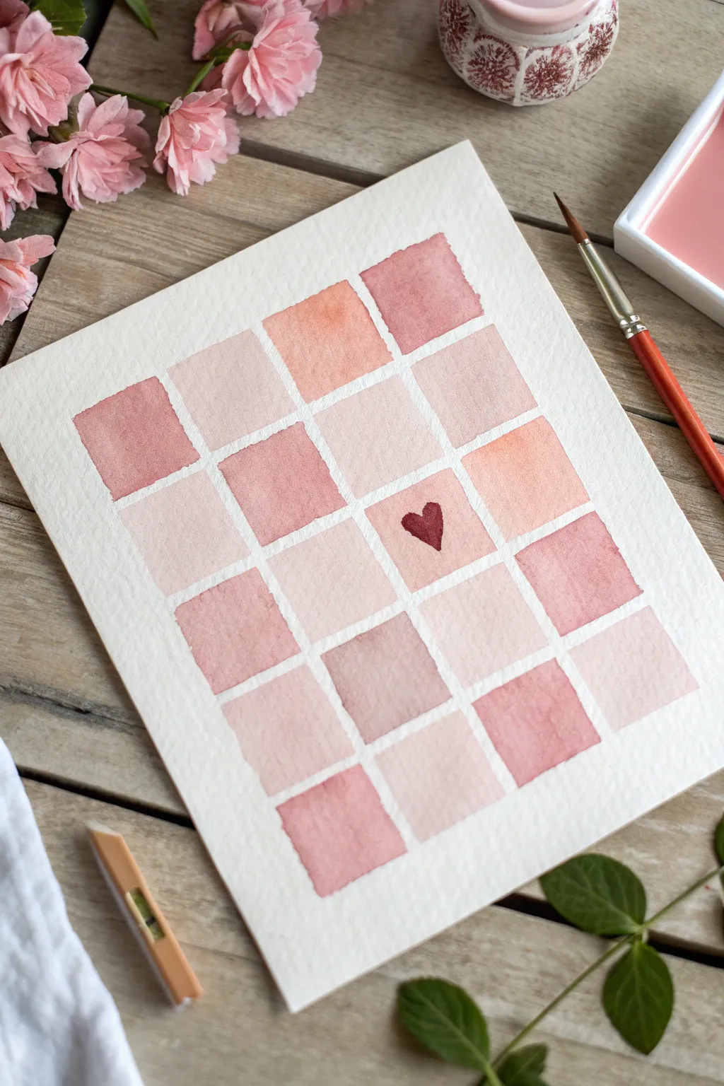
This charming watercolor project features a soft grid of alternating pink tones, creating a cozy patchwork quilt effect. With a sweet little heart accent tucked into one square, it makes for a simple yet lovely piece of wall art or a handmade card.
Detailed Instructions
Materials
- Cold press watercolor paper (A5 or roughly 5×7 inches)
- Watercolor paints (shades of red, crimson, and ochre)
- Small round paintbrush (size 4 or 6)
- Palette or small dish for mixing
- Painter’s tape or masking tape (optional)
- Pencil and ruler
- Water jar and paper towels
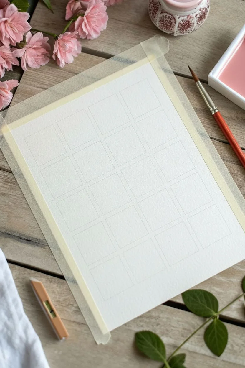
Step 1: Preparation & Drawing
-
Prepare your workspace:
Clear a flat surface and tape down your watercolor paper if you want perfectly crisp edges, though leaving it loose creates a more organic look like the example. Have your water and paints ready. -
Measure the grid:
Using a ruler and a very light pencil hand, mark out a grid on your paper. You will need a layout of 4 squares across and 5 squares down. -
Draw the squares:
Lightly connect your marks to draw the grid of 20 squares total. Ensure there is a small gap (about 2-3mm) between each square to create that white gutter that separates the colors. Keep your pencil lines faint so they disappear later.
Step 2: Mixing Colors
-
Create a base pink:
Start by mixing a watery wash of red or crimson. You want a very transparent, light value for your lightest squares. -
Mix a warm salmon tone:
On another spot on your palette, mix a bit of yellow ochre or orange into your red to create a warmer, peachy-pink ‘salmon’ shade. -
Prepare a dusky rose:
For a third variation, add a tiny touch of brown or a complementary green to your red to dull it slightly, creating a muted, dusty rose color.
Uneven Drying?
If you get ‘cauliflower’ blooms in your squares, it means you added water to semi-dry paint. Wait for layers to completely dry before touching them up to keep the color flat.
Step 3: Painting the Patchwork
-
Start the first row:
Load your brush with the dusty rose mixture. Paint the first square in the top left corner. Use the tip of the brush to carefully trace the edges of your pencil box first, then fill in the center. -
Vary the colors:
Move to the next square. Dip your brush into the water to dilute the paint on your bristles, creating a lighter, paler version for the second square. -
Continue the pattern:
Proceed to the third square, perhaps dipping into the warm salmon mixture this time. The goal is random variation, so don’t overthink the pattern. -
Paint the fourth square:
Finish the top row with a slightly more saturated pink, ensuring the edges are neat but not mechanically perfect. -
Paint the middle rows:
Work your way down the grid, row by row. I usually like to skip around slightly to ensure two identical colors don’t end up right next to each other. -
Manage the ‘Heart Square’:
When you reach the third row down, keep the third square from the left quite light. This will be the background for your heart accent later. -
Watch the water control:
If a puddle forms in a square, dry your brush on a towel and touch the tip to the puddle to soak up excess water. This prevents uneven drying marks. -
Finish the grid:
Complete the remaining bottom rows. Try to keep the gaps between squares clean and white. If you accidentally paint over a gap, don’t worry—it adds hand-painted charm. -
Let it dry completely:
This is crucial. The background squares must be 100% dry before you add the detail, or the heart will bleed into the background.
Level Up: Texture
Sprinkle a tiny pinch of salt onto a few of the wet squares while painting. When dry, brush the salt off to reveal a beautiful, starry texture in the pigment.
Step 4: Adding the Final Detail
-
Mix a deep berry red:
Take your original red paint and mix it to a much thicker, creamy consistency with less water. Add a touch of blue or purple to get a deep berry or wine color. -
Paint the heart:
In that light square you saved in the third row, carefully paint a small, elongated heart shape use the very tip of your round brush. -
Erase pencil lines:
Once the entire painting is bone dry—give it extra time just to be safe—gently go over the white gaps with a clean eraser to remove any visible pencil grid marks.
This gentle grid is a perfect practice in color mixing and brush control.
Negative Space Cherry Blossoms on Pink
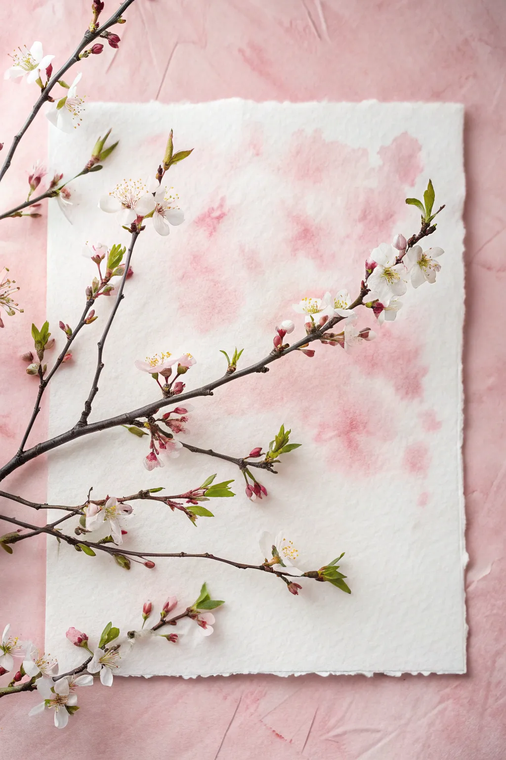
Capture the ephemeral beauty of spring with this mixed-media project that combines soft watercolor textures and natural botanical elements. By layering a real flowering branch over hand-painted paper, you create a dimensional piece perfect for seasonal decor or photography backdrops.
Step-by-Step Tutorial
Materials
- Heavyweight handmade cotton paper (deckle edge recommended)
- Pink watercolor paint (Rose Madder or Quinacridone Rose)
- Clean water jar
- Large round watercolor brush (size 10 or 12)
- Paper towels
- Real or high-quality silk cherry blossom branch
- Pink textured background board or fabric
- Spray bottle with water (optional)
- Matte spray sealant (optional)
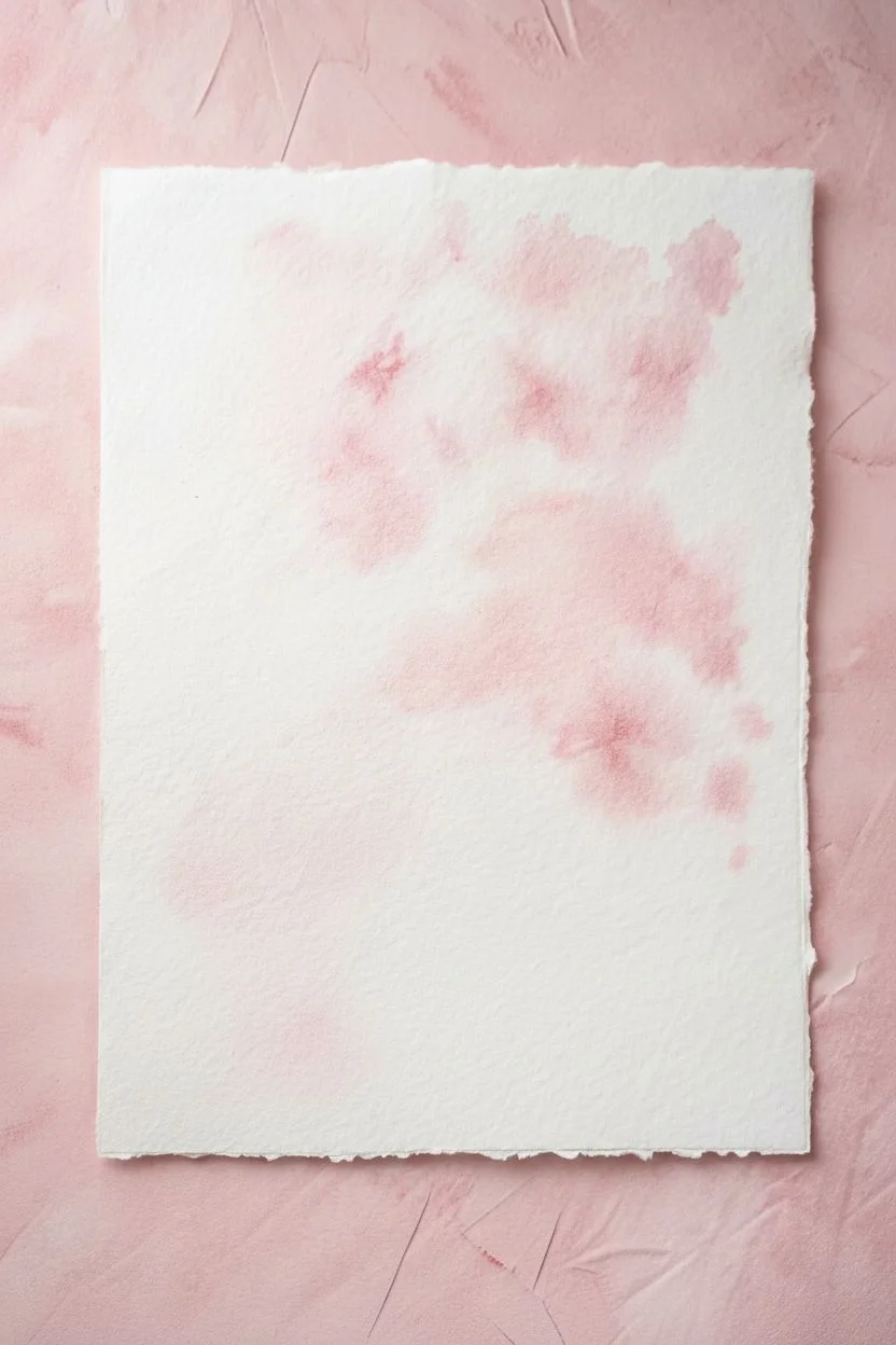
Step 1: Preparing the Background
-
Select your canvas:
Begin with a sheet of high-quality handmade paper. The rough texture and deckled edges are essential for achieving the organic look shown in the photo. -
Lightly wet the paper:
Use a clean brush or a light mist from a spray bottle to dampen the center of the paper randomly. You don’t want it soaking wet, just enough to help the pigment travel. -
Mix a watery wash:
Dilute your pink watercolor paint generously with water. You want a very pale, transparent tea-like consistency, not a thick opaque color. -
Apply the first layer:
Drop the pink wash onto the dampened areas of the paper using a large round brush. Dab the color on loosely rather than painting straight lines. -
Create blooms of color:
While the first layer is still wet, drop in slightly more concentrated pink pigment into random wet spots. Watch the color expand and create soft, cloud-like blooms. -
Soften the edges:
Rinse your brush and use clean water to feather out any hard edges. The goal is an abstract, cloudy pink effect that fades naturally into the white of the paper. -
Adding texture:
For added interest, you can splatter a tiny amount of clean water onto the drying paint, which will push the pigment away and create subtle texture variations. -
Let it dry completely:
Allow the paper to dry flat. Handmade paper can buckle, so you might need to place a heavy book on it once it’s fully dry to flatten it back out.
Step 2: Assembling the Composition
-
Set the scene:
Place your pink textured background board or fabric on a flat surface. This creates the border color seen in the final image. -
Position the paper:
Center your dry, painted handmade paper on top of the pink background. Ensure the deckled edges are visible against the pink surface beneath. -
Prepare the branch:
Select a cherry blossom branch that has an interesting shape. Trim any excess twigs that might make it lay unevenly, aiming for a relatively flat profile. -
Arrange the botanical:
Lay the branch diagonally across the paper. The stem should start near the bottom left, reaching up towards the top right, creating a dynamic line. -
Refine the placement:
Adjust the branch so the flowers and buds interact nicely with the pink painted areas. I like to make sure some blooms sit over the white space and others over the pink wash for contrast. -
Secure slightly (optional):
If you plan to display this vertically, use tiny loops of clear fishing line or small dabs of floral adhesive to secure the main stem to the paper. -
Final check:
Step back and look at the composition. Prune any stray leaves or petals that clutter the visual flow or cover too much of your watercolor work.
Paper Buckling?
If your paper warps too much after painting, mist the backside lightly with water and iron it between two clean cotton towels on a low heat setting.
Add Subtle Depth
Mix a tiny drop of purple or blue into your pink wash for shadowed areas. Drop this darker mix into the wettest parts of the pink clouds for instant depth.
This serene combination of watercolor artistry and natural forms brings a refreshing breath of spring into your home
Abstract Pink Brushstroke Swatches and Dots
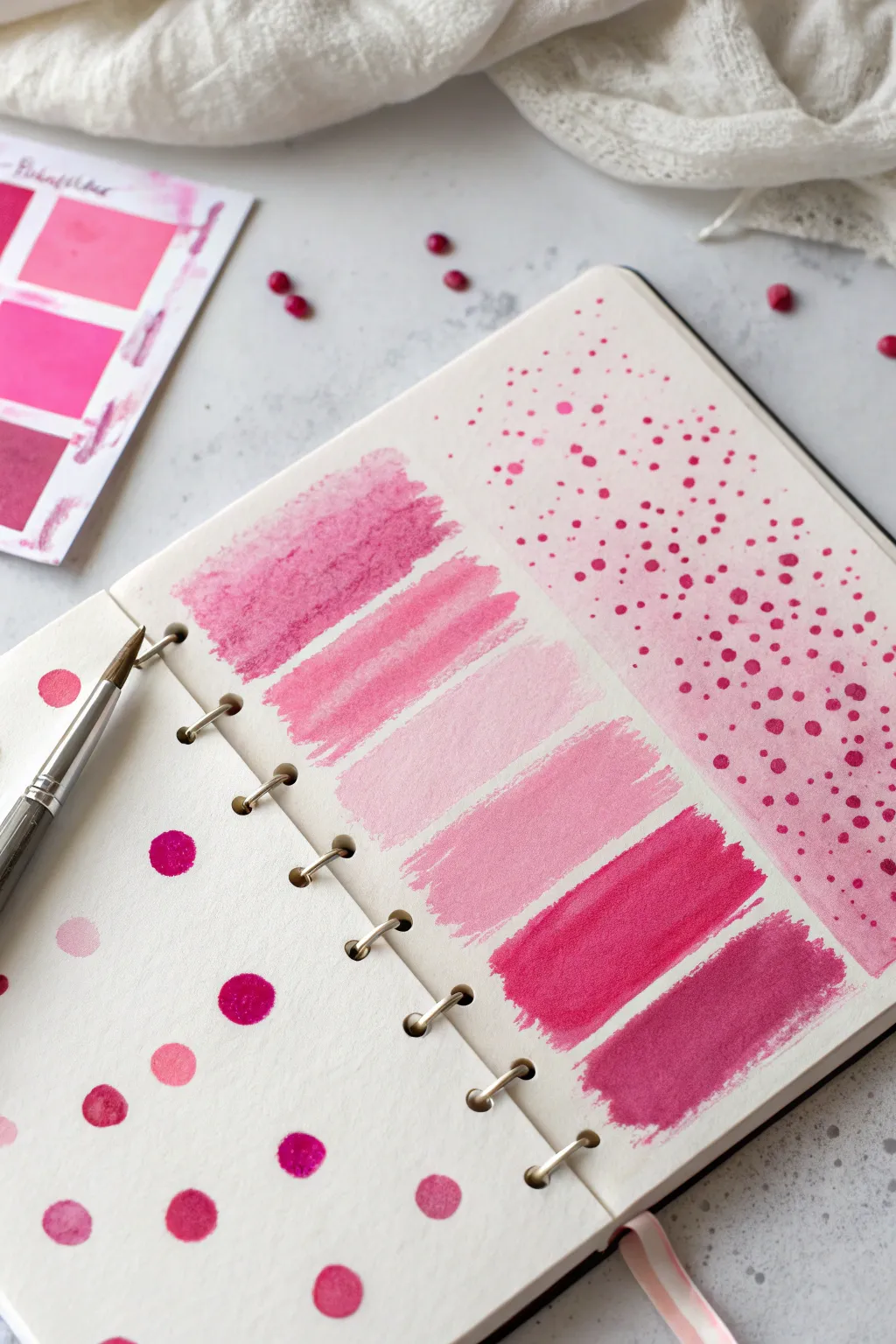
This delightful watercolor study explores the versatility of pink through a combination of playful polka dots, structured gradient swatches, and delicate stippled textures. It is a perfect way to test your paints while creating an aesthetically pleasing spread in your sketchbook.
Step-by-Step Guide
Materials
- Spiral-bound watercolor sketchbook (cold press paper recommended)
- Round watercolor brush (size 6 or 8)
- Small detail brush (size 0 or 2)
- Watercolor paints (various shades of pink, magenta, and rose)
- mixing palette
- Water cups (one for rinsing, one for clean water)
- Paper towel or rag
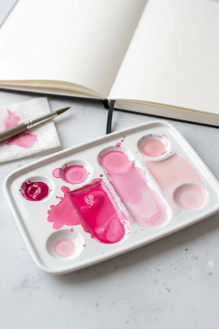
Step 1: Preparation & Color Mixing
-
Prepare your palette:
Begin by squeezing out or wetting your pink watercolor pans. You will need a range of tones, so prepare a deep magenta, a bright bubblegum pink, and a softer pastel pink. -
Create watered-down mixes:
On your mixing palette, create three distinct puddles of paint: one highly saturated (less water), one medium tone, and one very pale wash (lots of water).
Step 2: Left Page: Polka Dot scatter
-
Start with large dots:
On the left page of your open sketchbook, dip your round brush into the medium-tone pink. Paint a few scattered circles about the size of a pencil eraser. -
Vary the saturation:
While the first dots are drying, dip into your darker magenta mix. Paint a few more circles randomly placed among the first set, keeping them spaced out. -
Add pale accents:
Clean your brush thoroughly and pick up the very pale, watery pink wash. Fill in some of the empty white spaces with these lighter dots. -
Review the composition:
Step back and look at the spacing. The goal is a random, confetti-like distribution, so add a tiny dot or two if a specific area feels too empty.
Brush Control Tip
For the crispest rectangles on the swatches, use a flat brush if you have one, or carefully drag the belly of your round brush sideways rather than using the tip.
Step 3: Right Page: Gradient Swatches
-
Paint the first swatch:
Move to the left side of the right-hand page. Load your brush with a mid-tone textured pink and paint a horizontal rectangle, about 2 inches wide. -
Create the second swatch:
Clean your brush slightly so it holds less pigment. Paint a second rectangle directly below the first, leaving a small gap of white paper between them. -
Paint the lightest swatch:
Rinse your brush almost completely, leaving just a tint of color. Paint the third rectangle below the second; this should be your palest, sheerest pink. -
Transition to darker tones:
Below the pale swatch, paint a fourth rectangle using a slightly more saturated medium pink to start darkening the gradient again. -
Apply the deepest hues:
For the final two rectangles at the bottom, use your most concentrated magenta and deep rose mixtures to anchor the column with visual weight.
Level Up: Metallic Accents
Once the paint is bone dry, use a metallic gold or silver gel pen to outline a few of the random polka dots or add tiny stars within the swatch gradients.
Step 4: Right Page: Stippled Texture
-
Prepare the background wash:
On the remaining right side of the page, paint a large, very light rectangular wash of pale pink. Let this dry completely before moving on. -
Begin large stippling:
Switch to your smaller detail brush. Using a medium pink, tap the tip of the brush vertically onto the paper to create a cluster of small dots at the top of the section. -
Build the density:
Continue tapping dots down the page. As you move lower, start grouping the dots closer together to create a denser appearance. -
Introduce darker stipples:
Load the detail brush with your darkest magenta. Add tiny, sharp dots interspersed throughout the texture area, focusing more density near the bottom right corner. -
Fade out the edges:
Allow the dots to become sparser as they move toward the top left of this section, creating a fading or ‘ombre’ effect with the texture.
Now you have a beautiful reference page for your pink palette that looks like a piece of art on its own
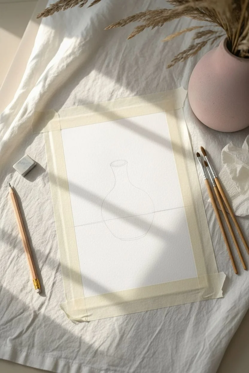
Monochrome Pink Still Life With Simple Shapes
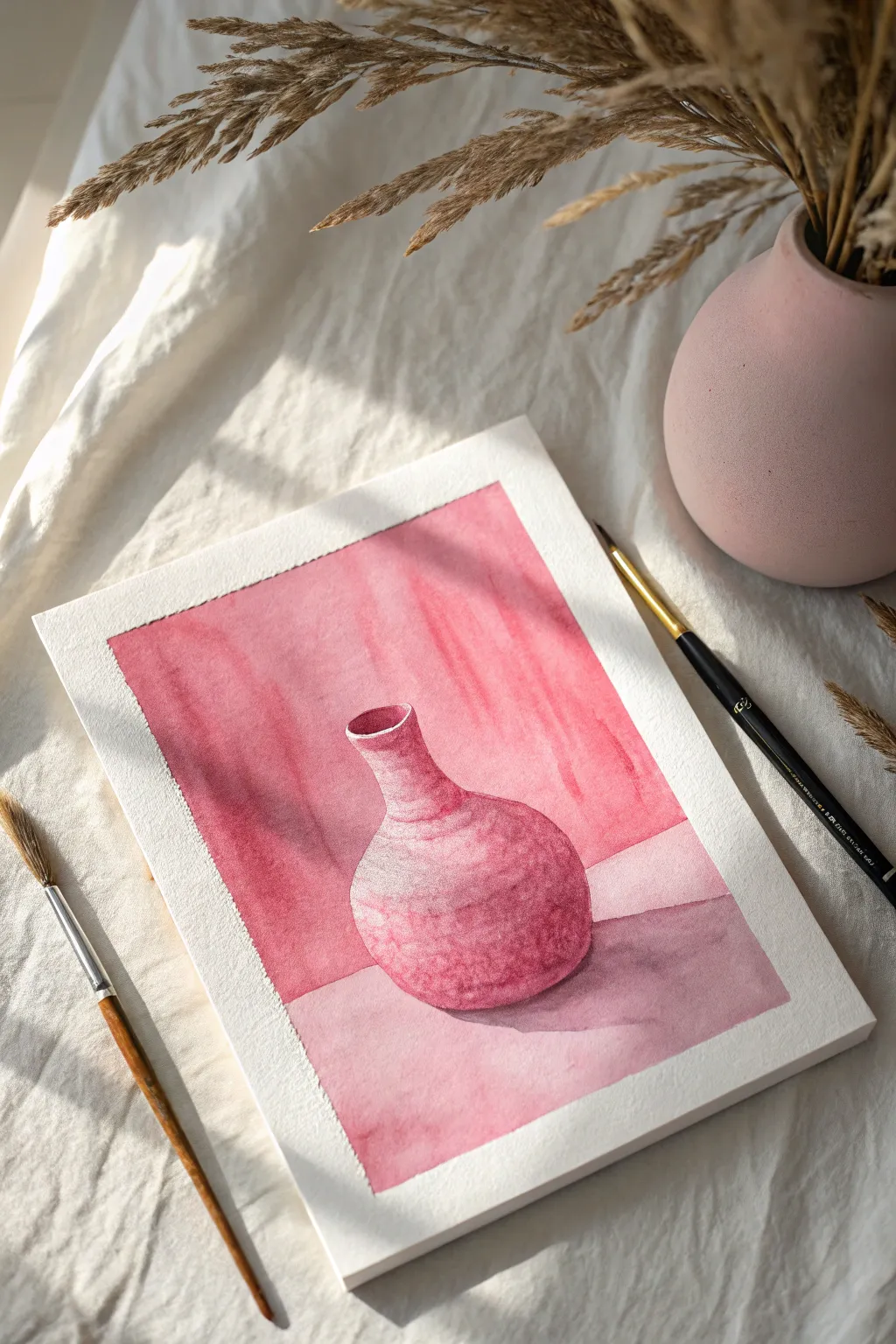
This elegant watercolor study relies on a single hue to create depth and volume through light and shadow. By focusing on tonal values rather than color mixing, you can capture the rounded form of a ceramic vase with soft, harmonious gradients.
How-To Guide
Materials
- Cold-pressed watercolor paper (300 gsm)
- Masking tape
- Pencil (HB or H)
- Kneaded eraser
- Watercolor paint (Alizarin Crimson or Quinacridone Rose)
- Round watercolor brushes (size 4, 8, and 12)
- Jar of water
- Paper towels
- Palette for mixing
Step 1: Preparation and Sketching
-
Secure the paper:
Tape your watercolor paper down to a board or table on all four sides. This creates that crisp white collection border seen in the final piece and prevents the paper from buckling when wet. -
Sketch the horizon:
Lightly draw a horizontal line about one-third of the way up from the bottom of the page to separate the wall from the table surface. -
Outline the vase:
Draw the outline of the vase in the center. Start with a simple oval for the base, taper it up into a narrow neck, and flare it slightly at the rim. Keep your pencil lines very faint so they don’t show through the transparency of the paint. -
Clean up the sketch:
Use a kneaded eraser to lift any excess graphite. You want to see the guide just enough to paint, but no darker.
Clean Highlights
For the brightest highlight on the vase rim, you can use white gouache at the very end if you accidentally painted over the white of the paper.
Step 2: Painting the Background
-
Mix your washes:
Prepare a puddle of your chosen pink paint with plenty of water for a light tea-consistency wash. Prepare a second puddle with clearer pigment for darker shadows. -
Paint the upper wall:
Using your largest brush, apply the lighter wash to the background area behind the vase. Use vertical strokes to suggest a subtle texture, leaving the paint slightly uneven to create interest. -
Add a shadow shape:
While the background is still slightly damp, drop a stronger vertical shadow to the left of the vase. This helps ground the object in space immediately. -
Let it dry completeley:
Wait until the background is bone dry before proceeding to the foreground or the vase itself to prevent colors from bleeding into each other.
Add Dried Florals
Once the vase is painted, use a fine rigger brush to paint delicate, thin brown lines coming out of the vase to represent dried twigs or wheat.
Step 3: Painting the Vase
-
Base layer for the vase:
Fill the entire shape of the vase with a very pale, watery pink wash. This establishes the local color. -
Define the form:
While the base layer is wet-on-wet, drop slightly more concentrated pigment onto the right side and bottom curve of the vase. This creates the rounded 3D effect. -
Carve out the neck:
Switch to a smaller brush (size 4) and add a darker band of pink right where the neck meets the body of the vase, softening the edge with clean water. -
Add texture:
Once the vase is semi-dry, use a fairly dry brush to stipple delicate texture on the main body of the vase. I find this creates a nice ceramic stone look. -
Deepen the interior:
Paint the inside of the rim with your darkest value of pink to show depth, leaving a tiny sliver of white paper on the edge for a highlight.
Step 4: Foreground and Shadows
-
Paint the table surface:
Wash the foreground area (the table) with a medium-strength pink mix. It should generally be lighter than the vase shadow but darker than the wall. -
Cast the main shadow:
Create a distinct cast shadow on the table surface to the right of the vase. Use a mix of pink and a tiny touch of contrasting color (like green or blue) to dull it slightly into a purplish-pink shadow tone. -
Connect shadow and object:
Ensure the darkest part of the shadow touches the bottom of the vase directly so the object doesn’t look like it’s floating. -
Soften edges:
Use a damp, clean brush to soften the outer edges of the cast shadow so it fades naturally into the table surface. -
Final touches:
Once everything is dry, evaluate your darkest darks. You may need to glaze one final layer of deep pink on the shadowed side of the vase to increase contrast. -
Reveal the border:
Gently peel away the masking tape at a 45-degree angle away from the painting to reveal clean edges.
Enjoy the calming process of working with a single beautiful color and watching the forms emerge


Have a question or want to share your own experience? I'd love to hear from you in the comments below!