A good pop art background is like flipping the switch on a scene—suddenly everything feels louder, bolder, and ready for a headline. If you’re building backdrops for drawings, paintings, or text overlays, these ideas will help you nail that punchy comic-book vibe fast.
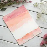
Classic Halftone Dots Fade
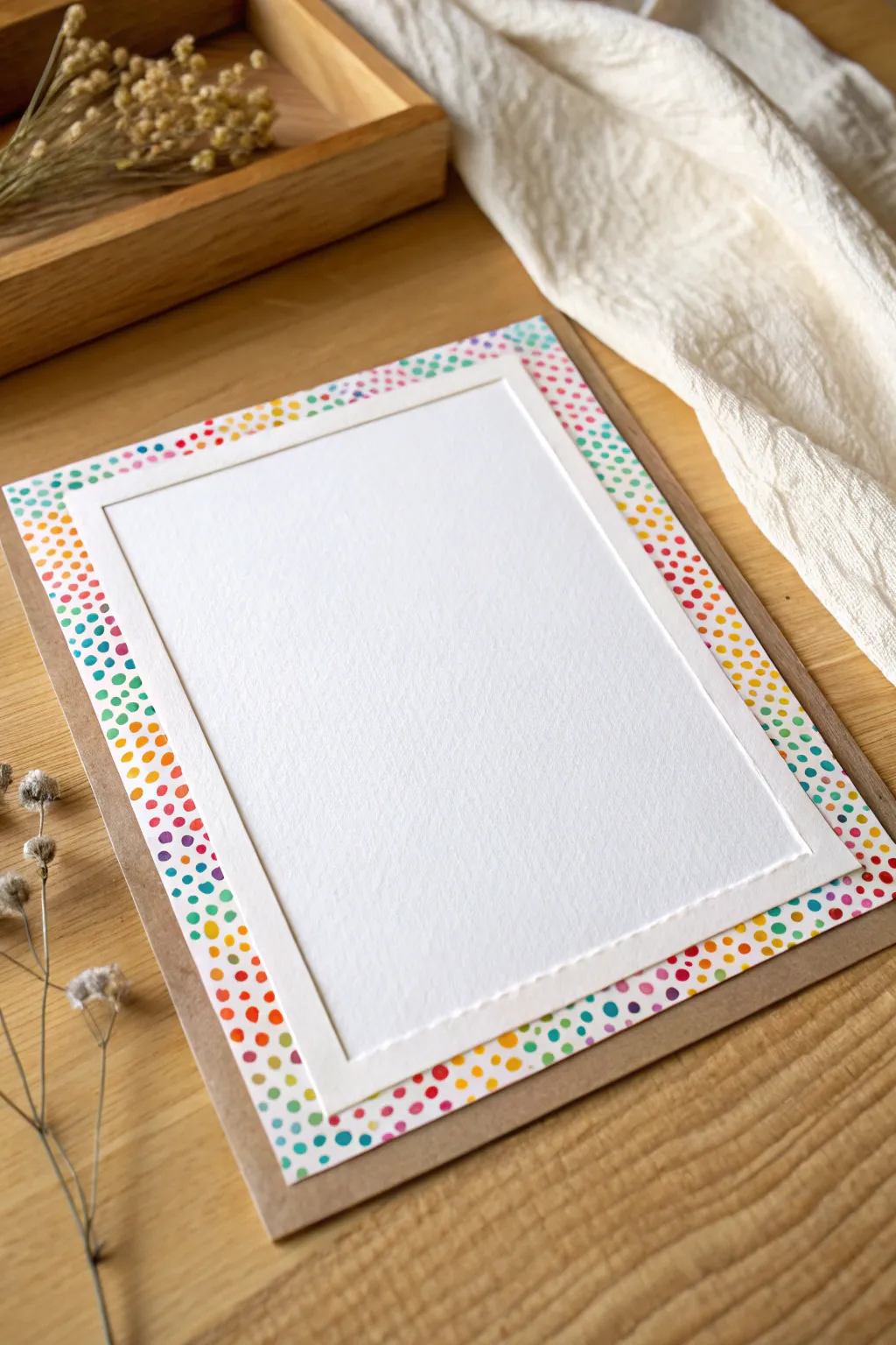
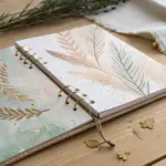
Brighten someone’s day with this cheerful, pop-art inspired greeting card featuring a border of vibrant, hand-painted dots. The contrasting layers of kraft paper and crisp white cardstock give this project a polished, dimensional look that feels professional yet personal.
Step-by-Step Tutorial
Materials
- Heavyweight white cardstock (watercolor paper or mixed media paper recommended)
- Kraft paper card base (A5 folded to A6 or similar standard size)
- Watercolor paints or water-based markers (rainbow palette)
- Round paintbrush (size 2 or 4)
- Paper trimmer or craft knife and ruler
- Double-sided foam tape or foam squares
- Pencil
- Eraser
- Bone folder (optional)
- Glue tape or glue stick
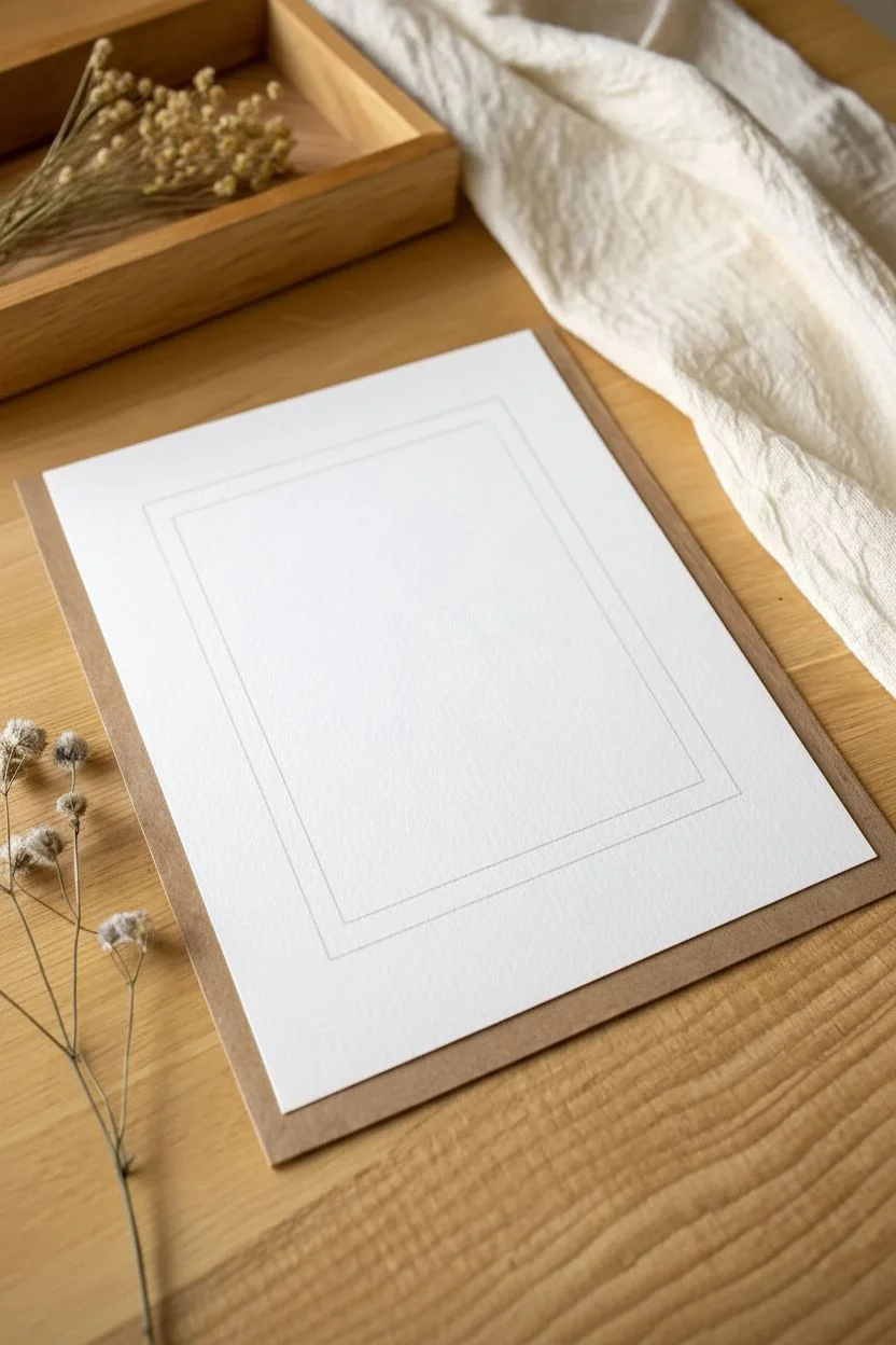
Step 1: Preparing the Layers
-
Cut the base layer:
Start by cutting a piece of white cardstock or watercolor paper. This piece needs to be slightly smaller than your kraft card front so a nice border of brown shows around the edges. -
Create the top panel:
Cut a second, smaller rectangle from the same white cardstock. This will be the center focal point. It should be about 1 inch smaller in both width and height than your first white layer to allow the dotted border to show clearly. -
Mark the boundaries:
Lightly center your smaller white panel on top of the larger white layer. Use a pencil to trace a very faint outline of the smaller rectangle onto the larger one. -
Remove the center:
Set the smaller top panel aside for now. You now have a ‘frame’ marked on your larger paper where you know the dots need to go.
Step 2: Painting the Pop Art Dots
-
Select your palette:
Prepare your watercolors or markers. You want a bright, saturated rainbow spectrum: teal, purple, red, orange, yellow, and green. -
Start the first color:
Begin with one color, perhaps teal, and paint small, irregular circles within the border area. Don’t worry about perfect circles—wobbly edges add charm. -
Vary dot placement:
Scatter the teal dots randomly. Some can touch the edge of the paper, while others should drift inward toward your pencil line. -
Add the second color:
Switch to purple (or your next chosen hue) and fill in some of the empty spaces between the teal dots. Keep the spacing fairly tight but not crowded. -
Continue the spectrum:
Work through your reds, oranges, and yellows next. As you add colors, aim for an even distribution so no single area looks too heavy in one shade. -
Fill with green:
Use green to fill in remaining small gaps. I find that saving the smallest dots for the last color helps balance the overall texture. -
Overlap the line:
Ensure your painted dots extend just slightly *past* the pencil line toward the center. This ensures no white gaps will sneak out from under the top panel later. -
Let it dry:
Allow the paint or ink to dry completely. If using watercolors, wait until the paper is cool to the touch. -
Erase guidelines:
Once totally dry, gently erase the visible pencil line from the center. Be careful not to smudge the paint.
Uneven Dots?
If your painted dots look too messy, go over them with a fine-tip waterproof pen to give them defined outlines, turning the ‘mess’ into a deliberate illustrated style.
Step 3: Assembly & Finishing
-
Mount the dot layer:
Using glue tape or a glue stick, adhere the painted dotted layer to the front of your folded kraft card base. Center it to leave an even brown border. -
Prep the focal panel:
Flip your smaller, plain white rectangle over. Apply foam tape or foam squares to the back, placing them near the corners and one in the center for support. -
Attach the focal panel:
Peel off the backing of the foam tape and carefully center this panel over the dotted background. The foam tape creates a lovely shadow and depth. -
Press and secure:
Gently press down on the corners of the top panel to secure the adhesive without crushing the foam definition. -
Final check:
Inspect the edges to ensure the dots peek out evenly all around the raised center panel.
Level Up: Texture
Use embossing powder on the dots before they dry (if using pigment ink) or add drops of Glossy Accents over the dry dots to make them shiny and raised.
Now you have a vibrant, dimensional card ready for a personal message


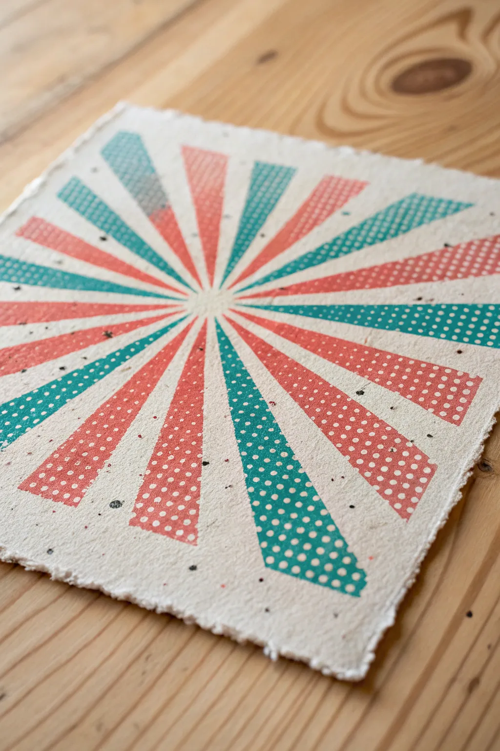
Radial Energy Burst From Center
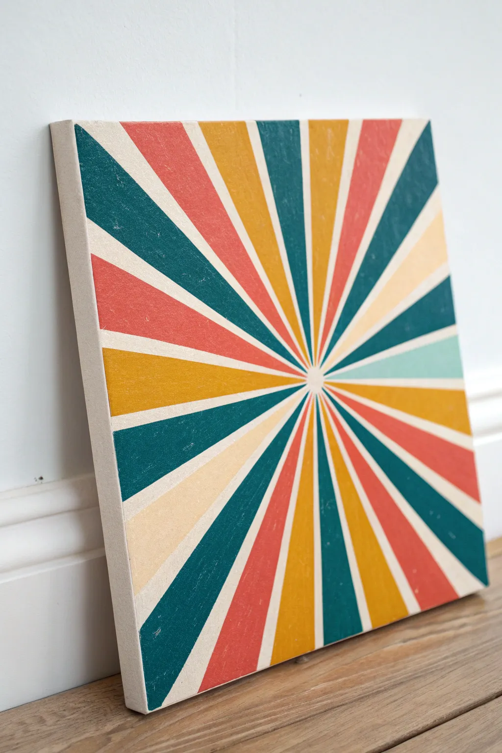
Capture the vibrant energy of mid-century pop art with this striking sunburst painting. Using a simple geometric layout and a warm, vintage-inspired palette, you’ll create a dynamic focal point that feels nostalgic yet modern.
Detailed Instructions
Materials
- Square stretched canvas (e.g., 12×12 or 16×16 inches)
- Acrylic paints: Deep teal, coral red, mustard yellow, and cream/off-white
- Painter’s tape (multiple widths: 0.5 inch and 1 inch)
- Ruler or straight edge
- Pencil
- Flat synthetic paintbrushes (medium and small)
- Fine grit sandpaper (220 grit)
- Matte sealant spray or varnish
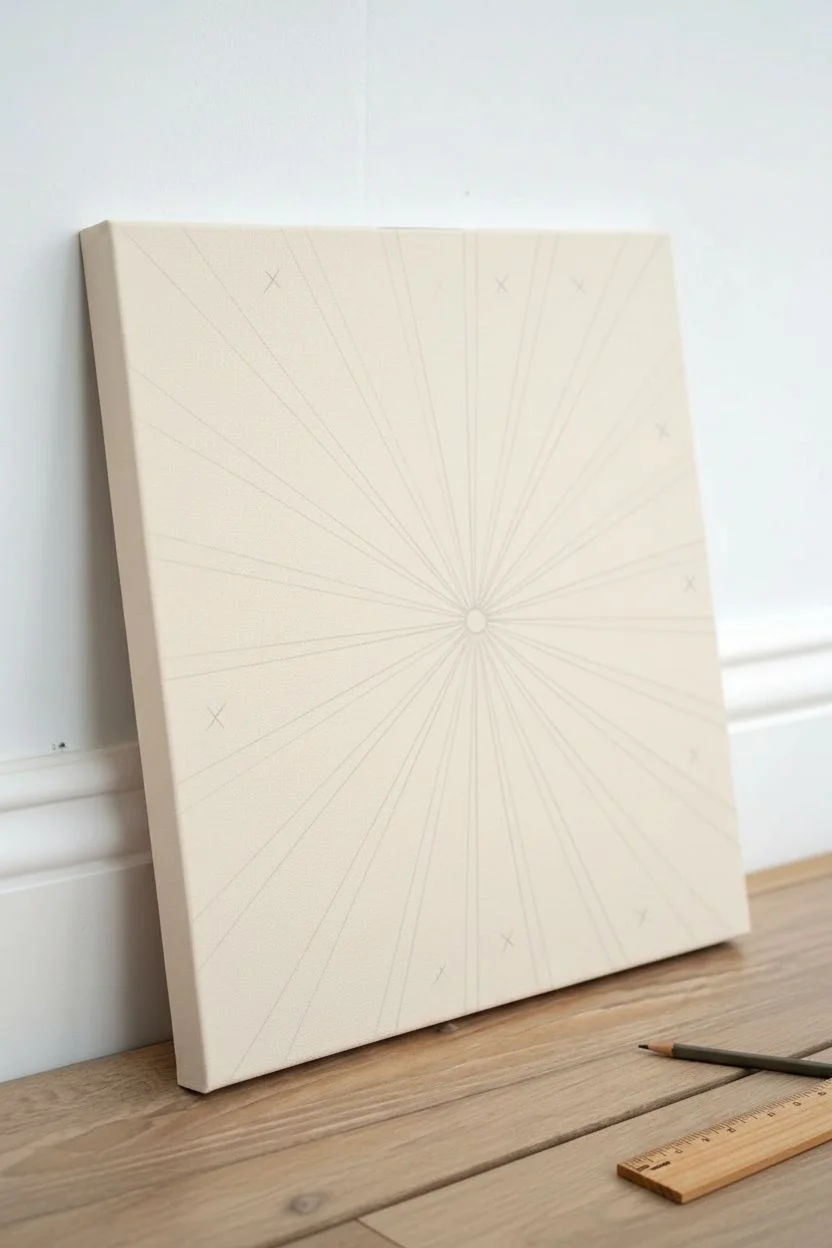
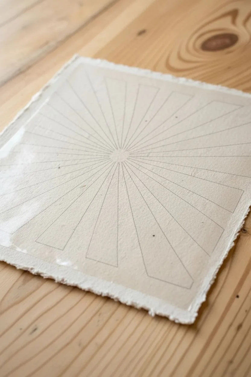
Step 1: Preparation & Mapping
-
Prime the Surface:
Begin by painting your entire canvas with the cream or off-white acrylic paint. This will serve as your base color and the alternating stripes between the colored rays. -
Ensure Full Coverage:
Don’t forget to paint the sides of the canvas for a professional, wrap-around finish. Apply a second coat of cream if the canvas texture is still showing through too much. -
Let it Cure:
Allow this base layer to dry completely—I like to give it at least an hour—to prevent the tape from peeling up the paint later. -
Find the Center:
Using your ruler, lightly mark the exact center point on the canvas with a pencil. -
Draw the Rays:
Place your ruler on the center dot and draw faint lines radiating outward to the edges. Space them to create roughly equal wedges, but don’t worry about mathematical perfection; a slight variance adds character. -
Establish the Pattern:
Decide which wedges will be colored and which will remain cream. Mark the sections to be painted with a small ‘x’ so you don’t lose track of your pattern.
Crisp Line Hack
Before painting your color, brush a thin layer of the BASE cream color over the tape edge first. This seals the gap, so any bleed is invisible.
Step 2: Painting the Colors
-
Tape the First Batch:
Start applying painter’s tape along the pencil lines of your first chosen color sections. You won’t be able to tape every section at once because the tape strips will overlap at the center. -
Seal the Edges:
Press the tape edges down firmly with your fingernail or a credit card to prevent paint bleed. -
Apply Teal Sections:
Fill in the specific wedges designated for the deep teal color. Use a flat brush and stroke away from the tape edge inward to keep lines crisp. -
Apply Coral Sections:
While the first batch of tape is still down (if spacing allows), paint the coral red sections. If the tape overlaps the coral zone, wait for the next round. -
Remove and Dry:
Carefully peel back the tape while the paint is still slightly tacky to avoid pulling up dried flakes. Let these sections dry to the touch. -
Tape the Second Batch:
Once the first colors are dry, apply new tape over the painted lines to expose the remaining unpainted wedges. -
Apply Mustard Sections:
Paint the mustard yellow wedges, ensuring opaque coverage. You may need two coats depending on the transparency of your yellow pigment. -
Final Tape Removal:
Gently remove the final strips of tape to reveal the complete radial burst pattern. -
Touch Ups:
Use a small detail brush and your cream paint to carefully correct any spots where color might have bled under the tape.
Step 3: Finishing Touches
-
Create Texture:
Once the painting is 100% dry, lightly sand the surface with 220-grit sandpaper. Focus on the edges and erratic spots across the face to give it a weathered, printed look. -
Dust Off:
Wipe the canvas down with a dry microfiber cloth to remove all paint dust. -
Seal the Work:
Spray the entire piece with a matte varnish. This unifies the sheen of the different paint colors and protects that lovely distressed finish.
Level Up: Retro Tint
Mix a tiny drop of brown into a clear glazing medium and wipe it over the finished painting to simulate an aged, tea-stained vintage poster effect.
Hang your new retro masterpiece in a bright spot where the geometric lines can truly shine

Corner Speed-Line Explosion
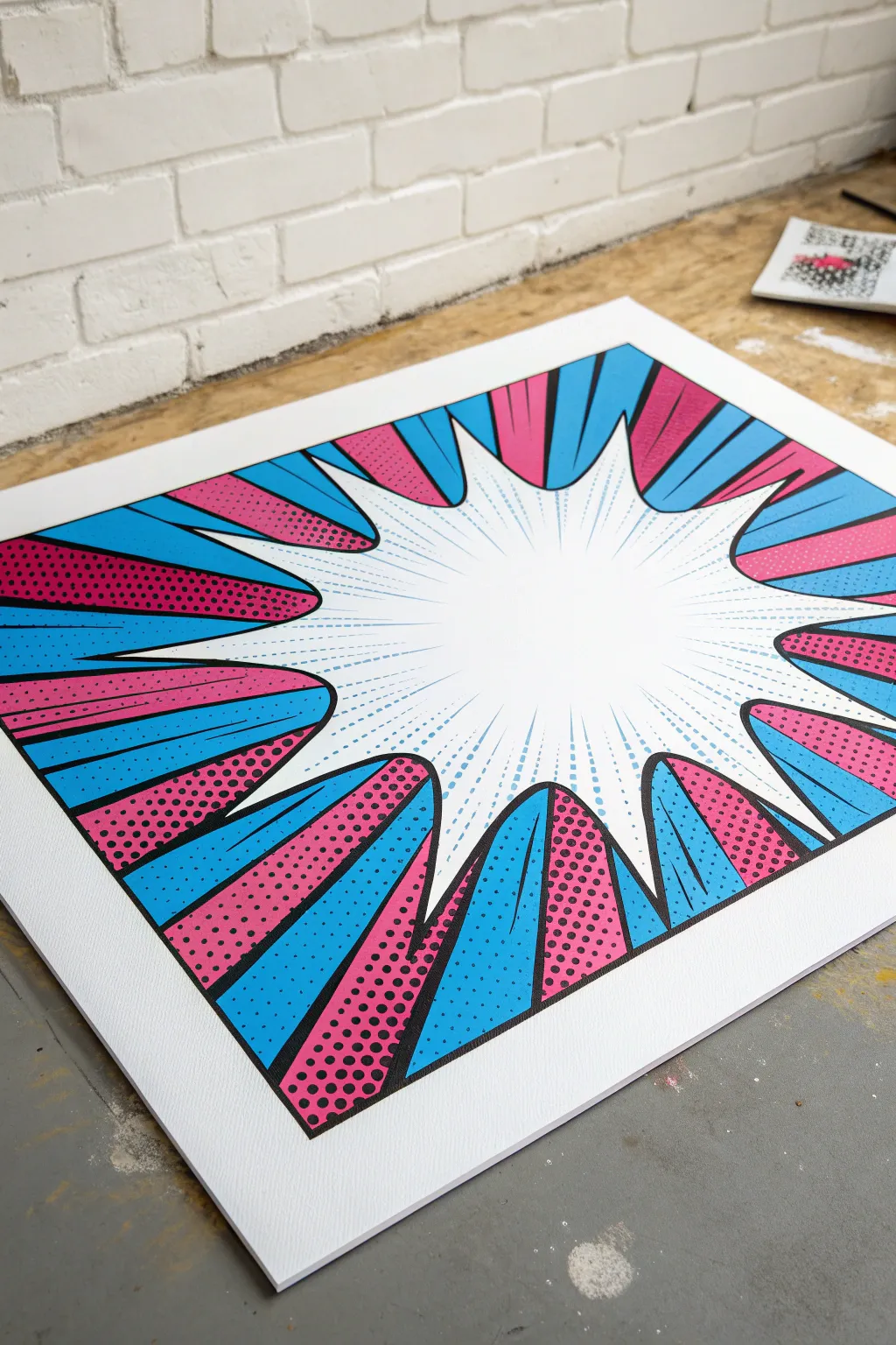
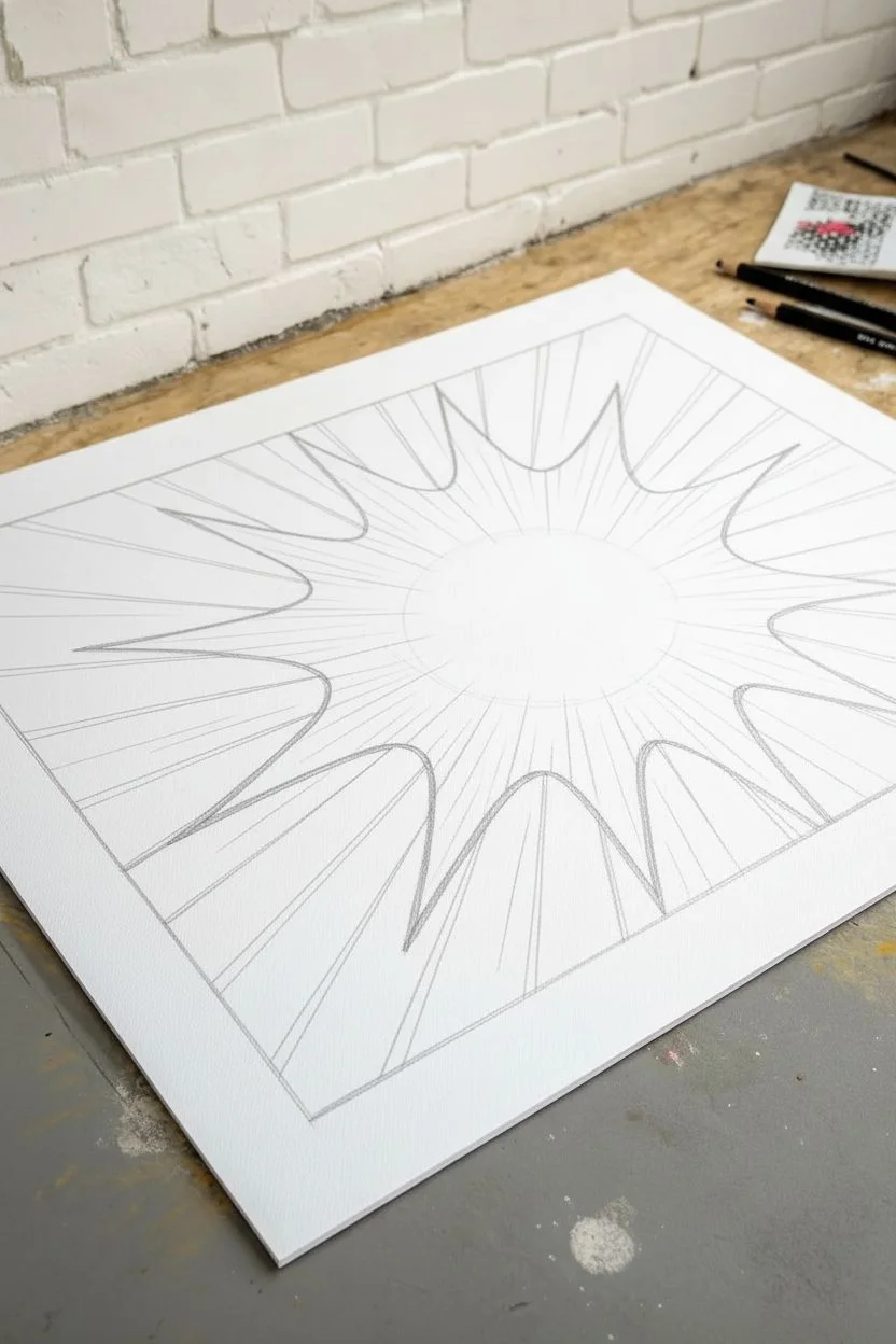
Capture the classic comic book aesthetic with this dynamic pop art piece featuring a bold explosion burst and iconic Ben-Day dots. The striking blue and pink contrast against clean white space creates a high-energy focal point perfect for any room.
Step-by-Step Guide
Materials
- High-quality white cardstock or illustration board (A3 or larger)
- Pencil and eraser
- Ruler or straight edge
- Black fine-liner pens (0.3mm and 0.8mm)
- Black permanent marker or brush pen (for thick outlines)
- Posca paint pens or acrylic markers (Cyan Blue and Magenta/Hot Pink)
- Dot stencil plate or circle template (optional)
- Masking tape
Step 1: Drafting the Design
-
Establish the center:
Begin by lightly marking a vanishing point slightly off-center to the right. This doesn’t need to be exact, but it will serve as the invisible anchor for all your radiating lines. -
Sketch the burst shape:
Draw a jagged, explosive shape in the middle of your paper using a pencil. Make the spikes vary in length and width to create a sense of chaotic energy, leaving a large white open space in the very center. -
Define the radiating segments:
Using your ruler, lightly draw lines extending from your central vanishing point out to the edges of the paper. These lines should align generally with the valleys of your central burst shape, creating wedge-like sections. -
Refine the segments:
Go back over your wedges and curve the outer edges slightly where they meet the central burst. This eliminates the rigid mathematical look and makes the explosion feel more organic and illustrative.
Step 2: Inking the Framework
-
Outline the main shapes:
Take your thicker black marker or brush pen and trace over your final pencil lines. I prefer to use quick, confident strokes here to keep the lines looking sharp rather than wobbly. -
Thicken the definition:
To get that comic book print look, go back and thicken the lines that separate the colored wedges. A variation in line weight adds depth, so make the outer boundaries of the wedges slightly heavier. -
Clean up:
Once the ink is completely dry—give it a few minutes to be safe—erase all your visible pencil guides to leave a clean black-and-white framework.
Clean Circles
If free-handing dots is intimidating, use a piece of pegboard or plastic mesh as a guide. Lay it over the paper and simply mark through the holes.
Step 3: Adding Color & Pattern
-
Paint the solid blue sections:
Select alternating wedges to be your solid color sections. Use your cyan paint pen to fill these shapes in completely, working carefully along the black edges to avoid bleeding. -
Prepare the pink sections:
The remaining wedges will feature the dot work. If you aren’t using a stencil, lightly sketch a grid within these white spaces to keep your dot pattern aligned. -
Applying Ben-Day dots:
Using your magenta paint pen, carefully dot the remaining wedges. Start from the wide outer edge and work inward toward the specific burst point. -
Varying dot density:
For a true retro shading effect, you can make dots slightly larger or closer together near the outer corners of the paper, graduating to smaller dots as you get closer to the center white burst. -
Filling the secondary dots:
Some of the blue sections in the reference image also utilize dots near the tips. Add small cyan dots extending into the white burst area for a seamless transition.
Make it 3D
Cut out the central white burst shape on a separate piece of paper and mount it on top using foam tape for a literal pop-out effect.
Step 4: Final Explosive Details
-
Drawing speed lines:
Using your finest black pen and a ruler, draw thin, sharp lines radiating from the center of the white space outward. These shouldn’t touch the colored wedges but should float in the white space to suggest movement. -
Adding directional dashes:
Intersperse your solid speed lines with broken, dashed lines. Varies the lengths of the dashes to enhance the feeling of rapid expansion. -
Layering blue accent lines:
If you have a very fine blue pen, add a few subtle speed lines alongside the black ones in the center. This ties the central white space visually to the outer blue wedges. -
Review and touch up:
Step back and look for any uneven edges in your solid blue fill. Apply a second coat of paint if the coverage looks streaky. -
Final black pass:
Sometimes the paint can overlap your nice black outlines. Do one final pass with your thickest marker to re-establish those bold, comic-book boundaries.
Hang your masterpiece on the wall and enjoy the energetic punch it adds to your space
Jagged Starburst Caption Shape
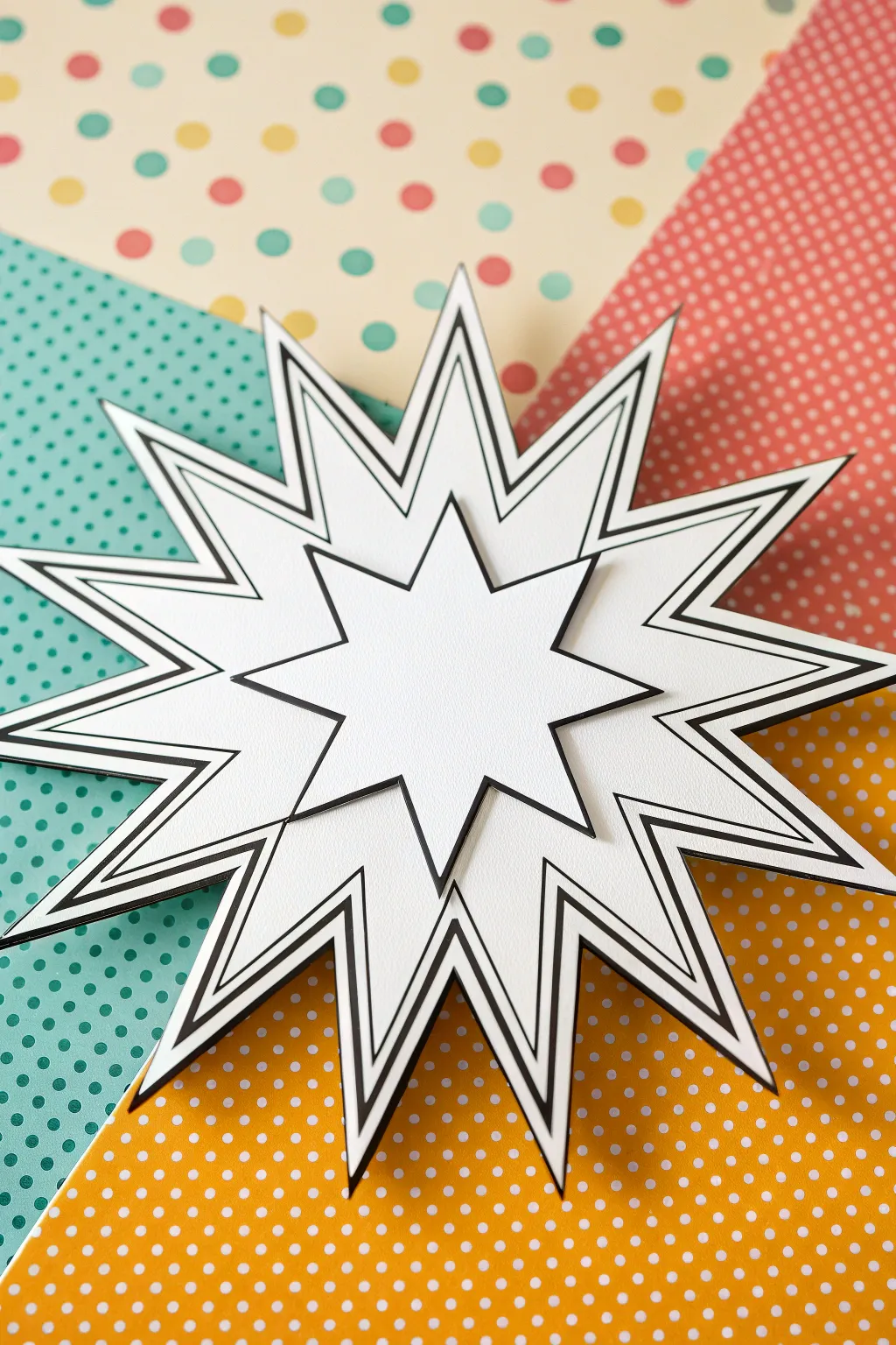
Create a striking comic-book style caption bubble that literally pops off the page with this layered paper craft. By stacking multiple jagged shapes and playing with bold black outlines, you’ll achieve a dynamic 3D effect perfect for scrapbooking, party decor, or fun wall art.
How-To Guide
Materials
- Heavy white cardstock (80lb or higher)
- Black fine-point marker or pen
- Thicker black permanent marker
- Pencil and eraser
- Ruler
- Foam adhesive dots or squares (various thicknesses)
- Craft knife or precision scissors
- Cutting mat
- Patterned background paper (polka dot prints in teal, yellow, red, and cream)
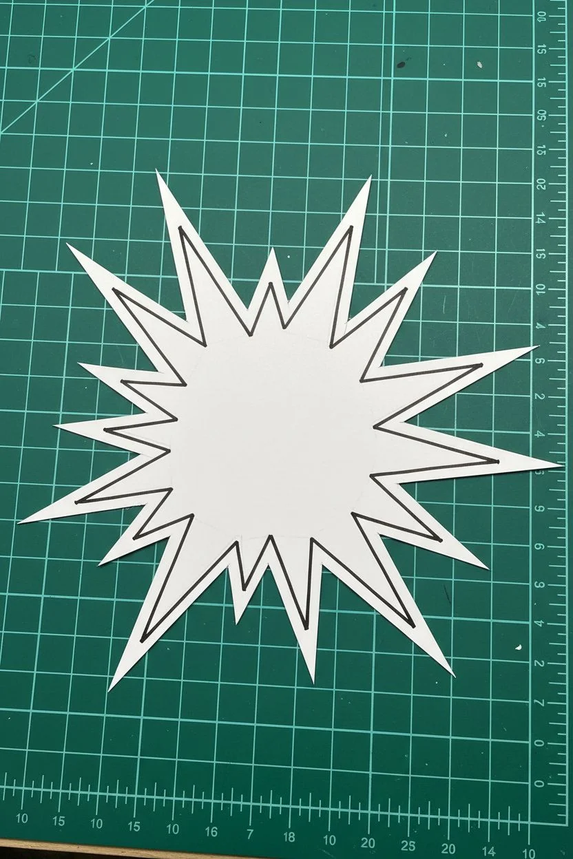
Step 1: Designing the Base Layer
-
Sketch the large burst:
Begin with a large sheet of white cardstock. Use a pencil to lightly sketch a large, explosive starburst shape. Aim for about 12-15 points, making them irregular in length—some long and sharp, others shorter and wider—to create kinetic energy. -
Refine the lines:
Go over your sketch with a ruler to separate the jagged points into sharp, straight lines. Erase any curved or wobbly sketch marks so you have a crisp geometric guide. -
Add the first outline:
Using your thicker black marker and a ruler, trace the pencil lines to create the main perimeter of the starburst. Keep the line weight consistent and bold. -
Create the inner frame:
Switch to your fine-point marker. Draw a second continuous line inside the first one, mirroring the jagged shape precisely. Leave about an 1/8-inch gap between the thick outer line and this thinner inner line. -
Cut out the shape:
Place the cardstock on your cutting mat. carefully cut along the very outer edge of the thick black border using a craft knife for the sharpest points.
Step 2: Creating the Upper Layer
-
Draft the smaller burst:
On a fresh piece of cardstock, sketch a smaller starburst shape. This one should be roughly 60% the size of your base layer. I like to make the points slightly less aggressive here, closer to a traditional star. -
Outline the top layer:
Ink this smaller shape with the thick black marker, just like the first step of the base layer. Ensure the corners meet sharply without bleeding over. -
Detail the perimeter:
Add a thin inner borderline parallel to the thick edge using the fine-point pen. This double-line details mimic the printing style of vintage comics. -
Cut the second shape:
Cut this smaller star out precisely along the outer black edge. Take your time around the tight inner corners to avoid tearing the paper.
Uneven Lines?
If your hand shakes while inking, don’t worry. Just thicken the line slightly to hide the wobble. The ‘sketched’ look fits the comic aesthetic perfectly.
Step 3: Assembly & Background
-
Prepare the background canvas:
Arrange your four different patterned papers (teal, red, yellow, and cream polka dots) to meet at a central point. You can cut them into large triangles to form a rectangle, mimicking a comic panel background. -
Apply foam adhesive:
Flip the large base starburst over. Apply foam adhesive dots to the center and the tips of the longer points to ensure it doesn’t sag. -
Mount the base:
Press the large starburst onto the center of your patterned background, right where the four papers meet. The elevation from the foam creates a subtle shadow. -
Stack the top layer:
Apply a second layer of foam dots to the back of the smaller starburst. For extra height and drama, you can stack two foam dots on top of each other. -
Center and secure:
Position the small starburst directly in the center of the large one. Rotate it slightly so the points don’t align perfectly with the layer below; offsetting the points adds visual interest and depth. -
Final press:
Gently press down on the center to secure the adhesive without crushing the foam. Your 3D caption bubble is now ready for text or to stand alone as art.
Add Action Words
Use vinyl letters or stencils to add classic comic onomatopoeia like ‘BAM!’ or ‘ZAP!’ to the white center space before gluing the layers together.
Now you have a dynamic centerpiece that brings comic book energy to any project
BRUSH GUIDE
The Right Brush for Every Stroke
From clean lines to bold texture — master brush choice, stroke control, and essential techniques.
Explore the Full Guide
Comic Speech Bubbles Pattern
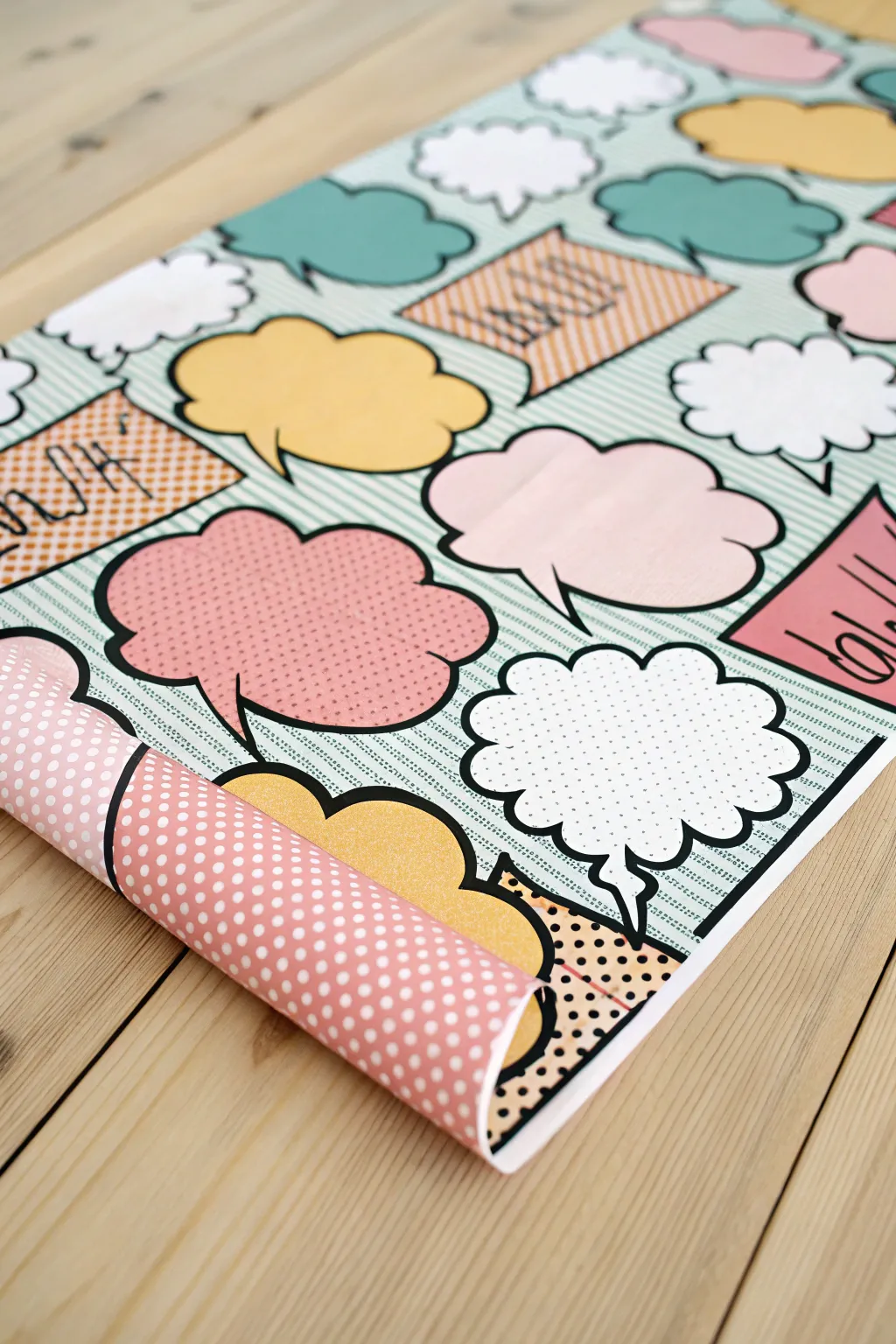
Transform plain paper into a vibrant pop art masterpiece with this custom speech bubble pattern. Featuring classic comic book elements like Ben-Day dots and bold outlines, this handmade wrapping paper adds a punch of personality to any gift.
Step-by-Step Tutorial
Materials
- Large roll of white or light blue butcher paper
- Acrylic paints (pastel pink, mustard yellow, teal, white)
- Black paint marker (broad tip) or permanent marker
- Fine tip black liner pen
- Medium flat paintbrush
- Round sponge pouncers (small size)
- Ruler or straight edge
- Pencil and eraser
- Scrap cardboard for stencils (optional)
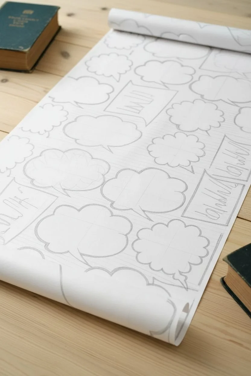
Step 1: Planning the Layout
-
Prepare your surface:
Unroll a long section of your butcher paper on a flat, clean surface. Weigh down the corners with books or heavy objects to keep it from curling back up while you work. -
Draft the background:
Using a ruler and a pencil, lightly draw diagonal lines across the entire sheet spaced about half an inch apart. This creates the dynamic background texture typical of comic panels. -
Sketch the bubbles:
Lightly sketch various speech bubble shapes scattered across the paper. Mix up the styles—use classic ovals, jagged ‘shout’ bubbles, and fluffy ‘thought’ clouds. Vary their sizes and orientations to keep the eye moving. -
Add square captions:
Interperse a few rectangular caption boxes among the bubbles. Tilt them at slight angles to maintain the energetic, unplanned feel of the layout.
Stamp Method
To speed up the process, cut bubble shapes out of craft foam and glue them to wood blocks. Dip these DIY stamps in paint to quickly populate the paper.
Step 2: Adding Color
-
Paint the background stripes:
Mix a very watery wash of teal or light blue paint. Carefully paint between every other diagonal line you drew earlier to create a subtle striped background. Let this dry completely before moving on. -
Block in solid colors:
Select several bubbles to be solid colors. Fill them in with your pastel pink, mustard yellow, and white acrylics using a flat brush. I find two thin coats often look better than one thick, gloopy coat. -
Create the halftone effect:
Dip a small round sponge pouncer into your pink paint. On a few of the larger white bubbles, stamp a grid of dots. Keep the spacing consistent to mimic the retro Ben-Day dot printing style. -
Paint the caption boxes:
Fill the rectangular shapes with orange or a contrasting shade. You can create a texture here too by painting thin diagonal hatch lines instead of a solid fill if you prefer more detail. -
Let it cure:
Allow all the paint to dry thoroughly. Acrylics dry fast, but give it at least 20-30 minutes so you don’t smudge anything during the outlining phase.
Smudged Ink?
If your marker drags wet paint, stop immediately. Clean the nib on a paper towel and switch to a permanent marker, which handles textured surfaces better than paint pens.
Step 3: Outlining and Details
-
Outline the shapes:
Take your broad-tip black paint marker and trace the outer edge of every speech bubble and rectangle. The line should be bold and confident to capture that comic book aesthetic. -
Add shadow accents:
On the bottom right side of each bubble, thicken the black line significantly. this simple trick gives the bubbles a 3D sticker-like appearance. -
Draw text lines:
Inside the rectangular orange boxes, used a finer tip pen to draw scribbled text or straight lines to represent narration, rather than writing actual words. -
Refine the dots:
If your sponge dots looked a little faded, you can carefully go over them again or outline a few of them with a fine tip pen for extra definition. -
Erase guidelines:
Once the black ink is 100% dry, gently erase any visible pencil marks from your initial background grid sketch. -
Final inspection:
Check for any gaps in your coloring or shaky lines. Touch up small mistakes with white paint or by thickening the black outline slightly to cover the error.
Now you have a roll of custom, high-energy wrapping paper ready to make your gifts pop
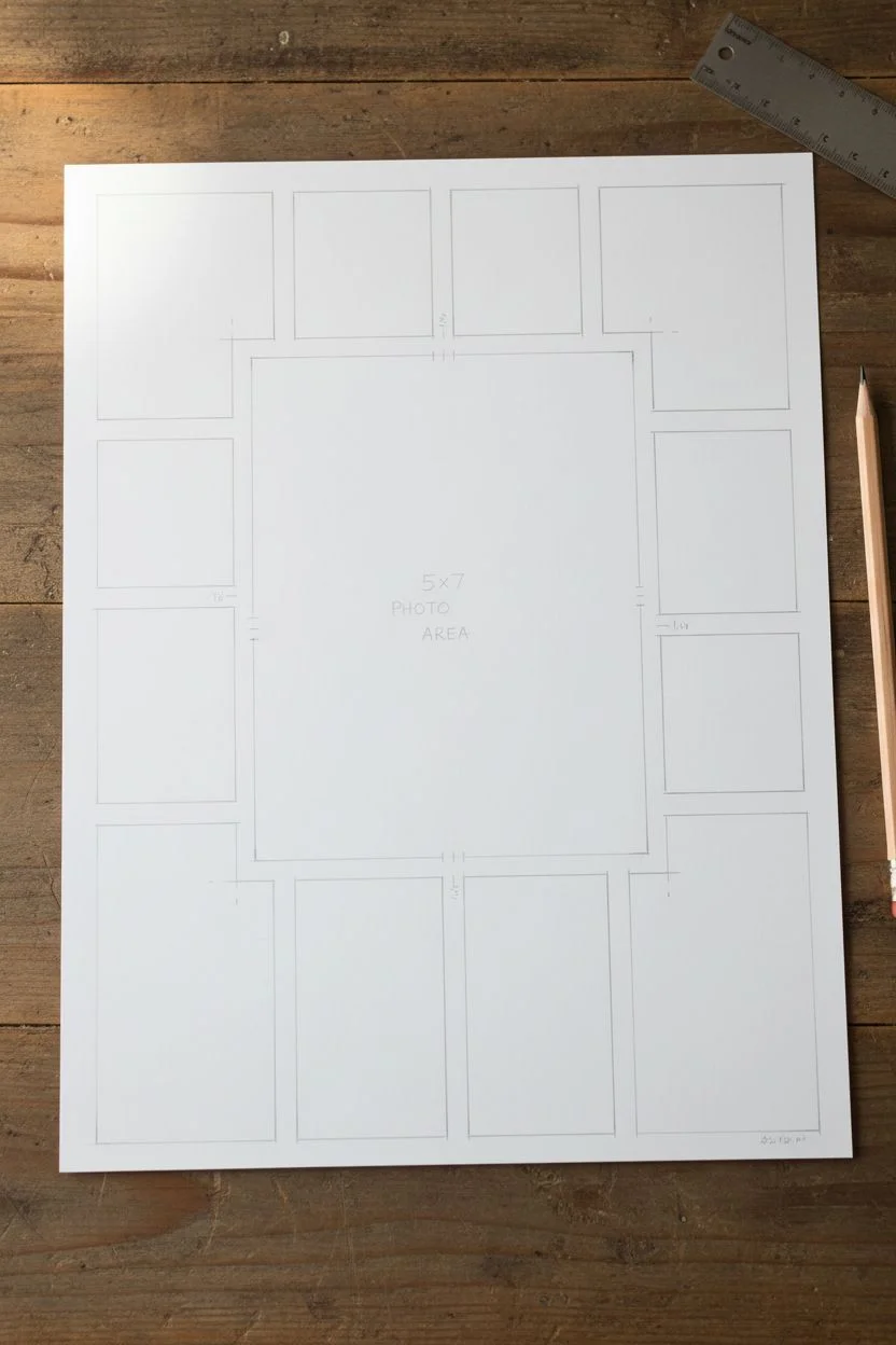
Bold Panel Grid Like a Comic Page
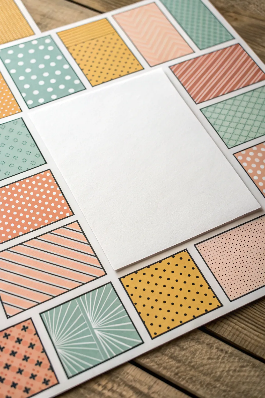
Create a vibrant and structured backdrop for your photos or notes with this pop-art inspired grid layout. By combining varied geometric patterns like polka dots, stripes, and chevrons in a cohesive pastel palette, you evoke the playful energy of a comic book page.
How-To Guide
Materials
- Large sheet of white heavy cardstock or poster board (base)
- Assorted patterned scrapbook paper pads (pastel yellows, pinks, teals, and corals)
- Paper trimmer or guillotine cutter
- Ruler
- Pencil
- Double-sided tape runner or craft glue stick
- Plain white cardstock (for the center panel)
- Foam adhesive squares (optional, for dimension)
Step 1: Planning the Layout
-
Determine Dimensions:
Begin by deciding the overall size of your background. Standard scrapbook size (12×12 inches) works well, or you can go larger depending on your base material. -
Draft the Grid:
Sketch a rough layout on scratch paper. Aim for a large central focal point surrounded by smaller rectangular blocks rather than perfect squares to mimic comic panels. -
Measure the Center:
On your base white cardstock, lightly mark the center area where the focal photo or note will go. A 5×7 or 6×8 inch rectangle usually provides good balance. -
Calculate Surroundings:
Measure the remaining border space. Divide this area into smaller zones—roughly 2×3 inches or 3×4 inches—ensuring you leave about a 1/8th inch gap between everything for that classic white grid line effect.
Uneven Gaps?
If your white spacing gets wonky, use a strip of washi tape as a temporary spacer between blocks while gluing to keep every gap identical.
Step 2: Cutting the Papers
-
Select Patterns:
Choose your patterned papers. Look for a mix of densities: some tight polka dots, some wide stripes, and some abstract geometric lines to keep the eye interested. -
Cut Rectangles:
Using your paper trimmer, cut out the small rectangular pieces according to your measurements. Precision is key here to keep the grid looking sharp. -
Organize by Color:
I find it helpful to lay cut pieces out on a table first. Shuffle them around so you don’t have two pink patterns or two stripe patterns touching each other. -
Cut the Centerpiece:
Cut a large rectangle from plain white cardstock that is slightly smaller than the allocated center space, or simply reserve that space if you prefer a flush look.
Step 3: Assembling the Grid
-
Start at the Corner:
Apply adhesive to the back of your first corner piece. Place it on the base sheet, leaving an even white margin on the outer edges. -
Work Outward:
Adhere the next piece, using a ruler as a spacer to ensure the white gap between panels remains consistent—usually about 1/8 to 1/4 inch. -
Check Alignment:
Periodically step back to check that your rows resemble a straight grid. If a piece looks crooked, gently adjust it before the glue sets permanently. -
Frame the Center:
Continue gluing patterns until the entire border around your central planned empty space is filled. -
Add the Focal Panel:
Take your large white centerpiece rectangle. Apply double-sided tape and center it in the middle of your patterned frame. -
Optional Elevation:
For a true pop-art feel, you can mount this center white panel on foam adhesive squares to make it literally pop off the background. -
Secure Edges:
Run your hand firmly over all the glued paper pieces to ensure no corners are lifting. -
Clean Up:
Erase any visible pencil marks from your initial layout planning using a white vinyl eraser to avoid smudging.
Make it Pop
Use a fine-tip black marker to draw distinct outlines around each paper rectangle and the center panel for a bold, illustrated comic book aesthetic.
You now have a dynamic, structured background ready to highlight your favorite memory or message

PENCIL GUIDE
Understanding Pencil Grades from H to B
From first sketch to finished drawing — learn pencil grades, line control, and shading techniques.
Explore the Full Guide
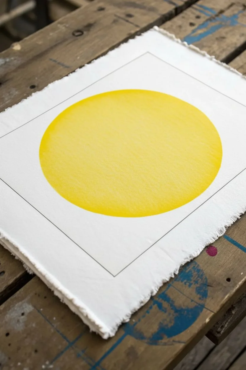
CMYK Blocks With Overprint Look
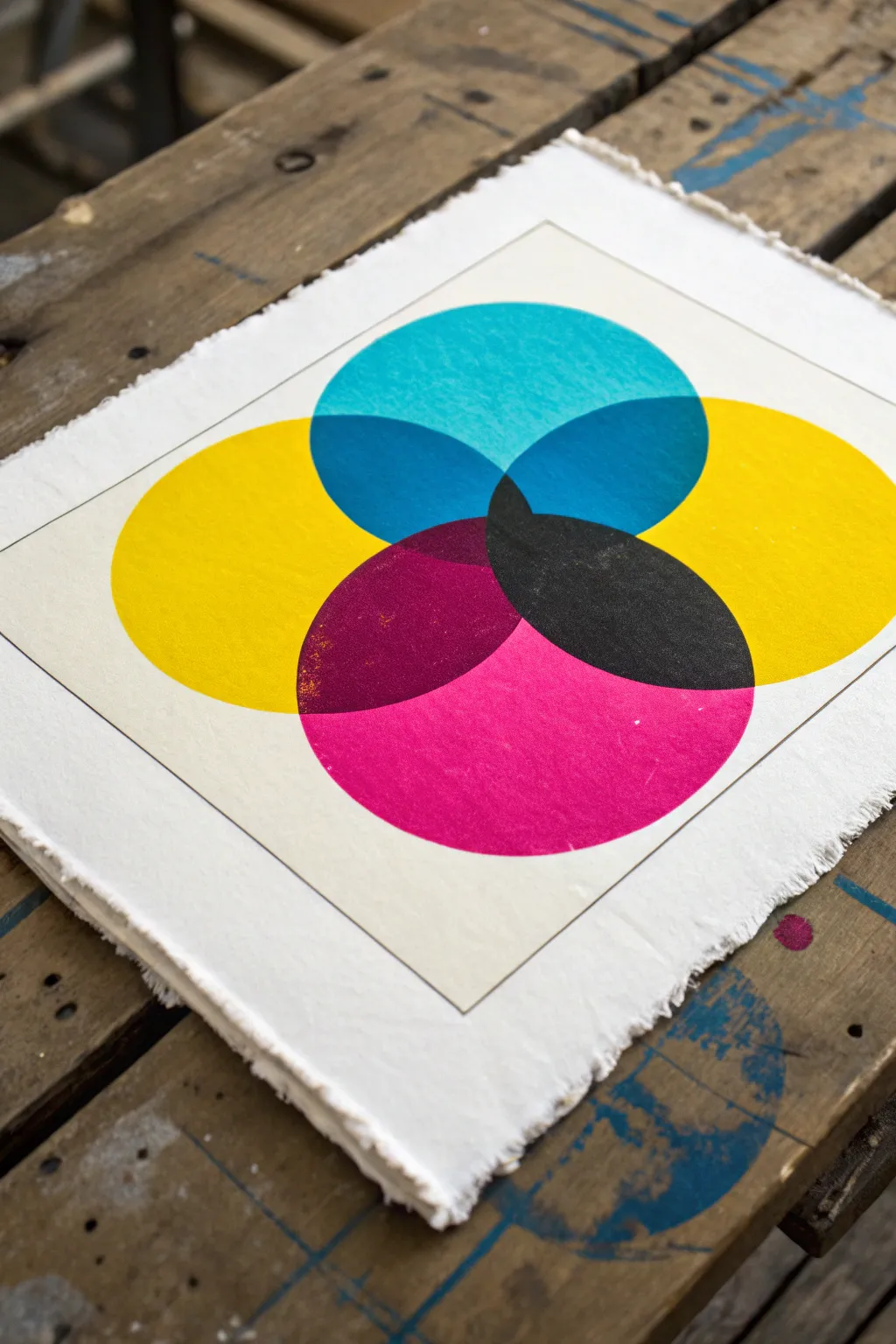
Recreate the classic aesthetics of commercial printing using a handmade block printing technique. This project highlights the magic of subtractive color mixing by layering translucent cyan, magenta, and yellow circles to reveal a spectrum of secondary hues.
Step-by-Step Tutorial
Materials
- Heavyweight printmaking paper (deckled edge preferred)
- Lino block or Soft-Cut carving block
- Lino cutter tool with V-gouge blade
- Compass or circular object (approx. 4-5 inches)
- Pencil
- Ruler
- Block printing ink extender (transparent base)
- Block printing inks (Process Cyan, Process Magenta, Process Yellow)
- Brayer (rubber roller)
- Inking plate or piece of glass
- Baren or wooden spoon for burnishing
Step 1: Preparing the Block
-
Draw the circle shape:
Using a compass or by tracing a circular object like a lid, draw a perfect circle onto your carving block. Aim for a diameter between 4 and 5 inches for a balanced composition. -
Define the boundary:
Use a pencil and ruler to draw a square crop box around your circle if you want sharp registration corners, or simply plan to cut the block into a circle shape itself. -
Carve the negative space:
With your V-gouge lino cutter, carefully carve away everything *outside* the circle. You want the circle itself to remain raised and flat to accept the ink. -
Refine the edges:
Take extra care smoothing the outer edge of the circle. Any jagged cuts will show up clearly in the final print. -
Clean the block:
Wipe away any carving debris with a soft cloth or brush to ensure no stray crumbs interfere with the ink application.
Step 2: Registration and Planning
-
Mark your paper:
Lightly mark pencil guidelines on your printmaking paper to determine where the three circles will be placed. They needs to overlap significantly toward the center to create the secondary colors. -
Create a registration jig:
I find it helpful to tape down a piece of scrap paper and mark the exact positions of the three circles on it. You can place your good paper on top of this guide if your paper is thin enough, or use it to sight your alignment.
Muddy Overlaps?
If your secondary colors (green, orange, purple) look dull or opaque, you likely didn’t add enough transparent extender base. The bottom layers must shine through the top layers.
Step 3: Printing the Layers
-
Mix the first color:
Mix a small amount of Yellow block printing ink with the transparent extender base. The ratio should be roughly 70% extender to 30% ink; translucency is crucial for the overprint effect to work. -
Ink the block:
Roll your brayer into the ink until it makes a sticky, sizzling sound. Apply a thin, even layer of yellow ink to your circular block. -
Print the Yellow layer:
Place the block onto your first marked position (usually bottom left or right). Apply firm pressure with a baren or the back of a wooden spoon in circular motions. -
Reveal the print:
Slowly peel the paper back from the block. Let this yellow layer dry completely—this is vital to prevent muddy colors later. -
Clean and prepare Cyan:
Wash your block thoroughly and dry it. Mix your Cyan ink with the extender, using the same ratio as before to maintain consistent transparency. -
Print the Cyan layer:
Ink the block with Cyan and align it for the top center position. Ensure it overlaps a large portion of the dried yellow circle. Press firmly and peel to reveal the green overlap. -
Dry the second layer:
Allow the cyan layer to dry completely. If you rush this step, the ink from the third layer might lift the previous colors. -
Prepare the Magenta:
Clean the block again. Mix the Process Magenta ink with the extender base. I usually test the transparency on a scrap piece of paper first to make sure it’s not too opaque. -
Print the final layer:
Align the block for the final position combined with the previous two. Press and burnish well. -
Final reveal:
Peel the block away to see the magic: where all three overlap, you should see a deep, rich black or dark brown, with orange and purple appearing at the two-color intersections.
Pro Tip: Texture
Don’t aim for ‘perfect’ solid ink coverage. Slightly under-inking the block allows the paper’s tooth to show through, creating that salty, distress texture seen in the photo.
Once fully dry, you can frame your print to showcase the beautiful interactions of pure color
Diagonal Stripes for Instant Drama
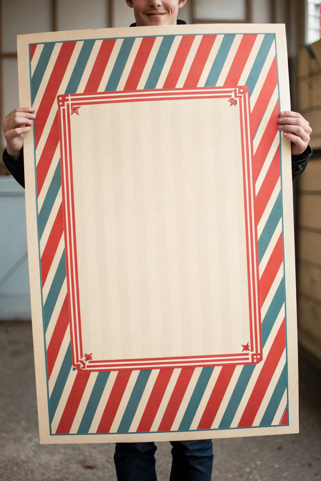
Bring the nostalgic charm of an old-world circus to your space with this striking hand-painted signboard. Featuring bold diagonal stripes in retro red and teal framing a pinstriped center, this piece is a perfect blank canvas for your favorite quote or menu.
Detailed Instructions
Materials
- Large wooden board or heavy-duty art board (approx. 24×36 inches)
- Acrylic paints: Cadmium Red, Teal (or Phthalo Green mixed with white), and Cream/Off-White
- Painter’s tape (various widths: 1-inch and 1/4-inch)
- Ruler or T-square
- Pencil
- Flat paintbrushes (1-inch and small detail brush)
- Matte varinish or sealant
- Sandpaper (fine grit)
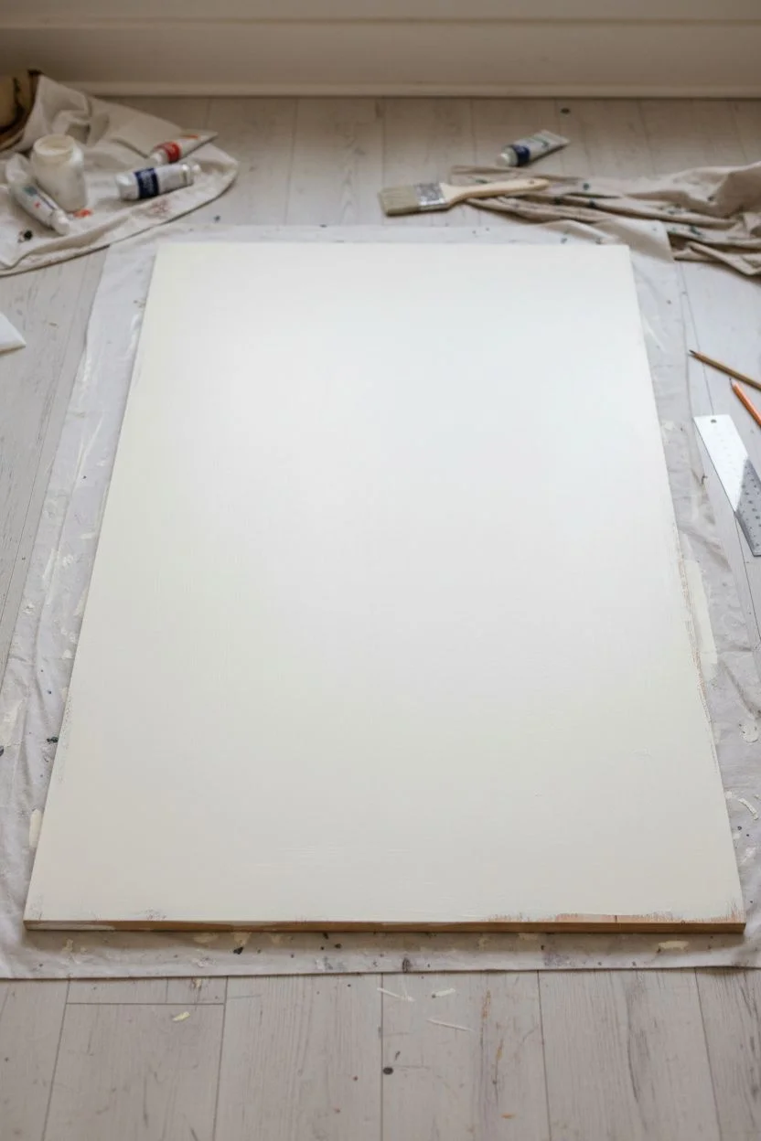
Step 1: Preparation & Base Coat
-
Prepare the surface:
Begin by sanding your wooden board lightly to ensure a smooth painting surface. Wipe away any dust with a tack cloth or slightly damp rag. -
Prime the board:
Apply a coat of gesso or white primer if you are using raw wood. This prevents the paint from soaking in too much and keeps colors vibrant. -
Apply the base color:
Paint the entire board with your cream or off-white acrylic paint. You’ll want a solid, opaque coverage here, so apply two to three thin coats rather than one thick one, letting each dry completely in between.
Step 2: Drafting the Layout
-
Measure the margins:
Using your ruler and pencil, lightly draw a large rectangle in the center of the board. This separates your central writing area from the thick striped border. Leave a border width of about 4-5 inches around the edges. -
Mark the diagonal stripes:
along the outer edge and the inner rectangle line, mark intervals of roughly 1.5 inches. Connect these marks diagonally with your pencil to create the guidelines for your candy-cane stripes. -
Add corner details:
Sketch small square notches at the four corners of your inner rectangle. These will become the decorative corner brackets later.
Clean Lines Secret
Before painting your stripes, apply a thin layer of the *base color* (cream) over the tape edge. This seals the tape so any bleed is invisible!
Step 3: Painting the Stripes
-
Masking for color 1:
Use painter’s tape to mask off the areas that will remain cream or become teal. Only leave the ‘Red’ stripe sections exposed. -
Paint the red stripes:
Fill in the exposed diagonal sections with your Cadmium Red. I find that brushing from the tape inward helps prevent paint bleed. -
Remove and dry:
Carefully peel the tape while the paint is still slightly tacky to get a crisp edge. Allow the red stripes to dry fully before moving on. -
Masking for color 2:
Once the red needs is bone dry, tape over the red stripes and the cream areas, leaving the ‘Teal’ sections exposed. -
Paint the teal stripes:
Apply your Teal paint to these sections. Ensure the color density matches the red for a balanced look. Remove tape carefully and let everything dry.
Weathered Look
Once dry, lightly sand the entire surface with fine-grit sandpaper to distress the paint and give it an authentic vintage signboard feell.
Step 4: Inner Details & Finishing
-
Create the inner border:
Outline your central rectangle with a thin layer of red paint to create a frame. You want a double-line effect here, so use a steady hand or 1/4 inch tape to create two parallel thin red lines. -
Add decorative corners:
At each corner where lines meet, paint small geometric brackets or star motifs using a fine detail brush and red paint. -
Paint the subtle pinstripes:
Mix a tiny amount of brown or grey into your cream base color to create a shade just slightly darker than the background. Use a long ruler to paint extremely faint, thin vertical lines inside the central rectangle. -
Final touch-ups:
Inspect your lines. If any paint bled under the tape, use a small brush and your cream base paint to tidy up the edges. -
Seal the artwork:
Finish the piece with a coat of matte varnish to protect the paint and give it a professional, finished look.
Hang your new retro masterpiece proudly and enjoy the pop art flair it adds to the room


Wavy Retro Color Bands
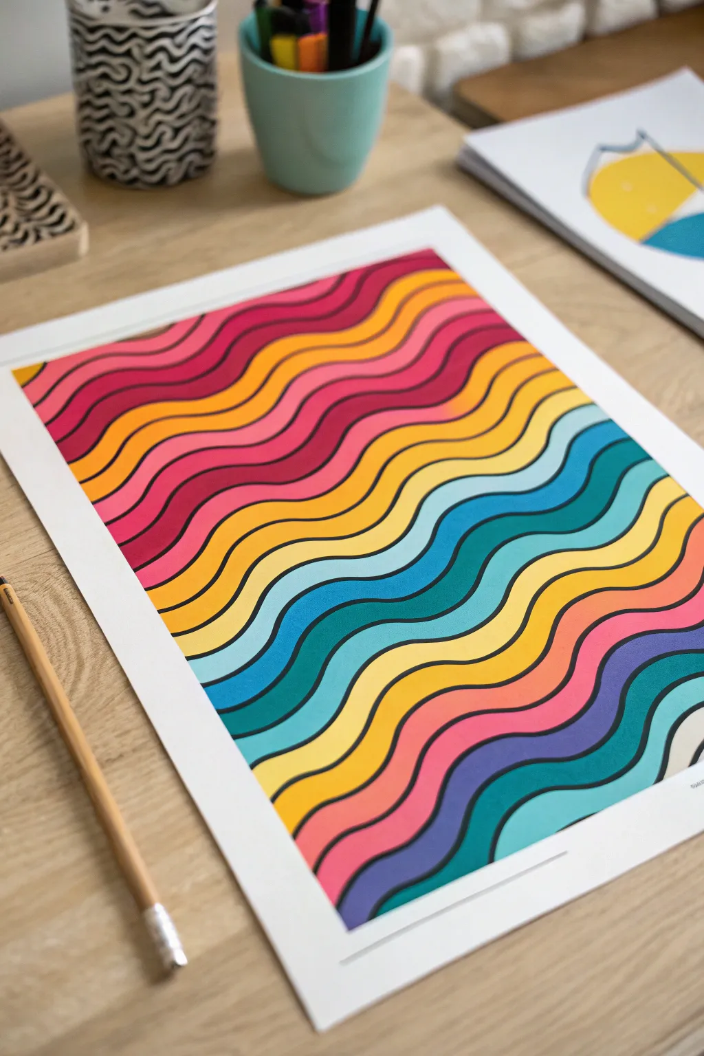
Recapture the vibrant energy of the 1970s with this bold, undulating wave pattern featuring a striking sunset-to-ocean gradient. The clean black outlines make the colors pop, creating a satisfying visual rhythm that works beautifully as wall art or a custom card design.
How-To Guide
Materials
- High-quality mixed media paper or Bristol board (A4 or A3)
- Pencil (HB)
- Eraser
- Fine liner pen (black, 0.5mm or 0.8mm)
- Alcohol markers or acrylic paint pens (various colors: pinks, reds, oranges, yellows, teals, blues, purples)
- Flexible curve ruler or French curve (optional)
- Masking tape
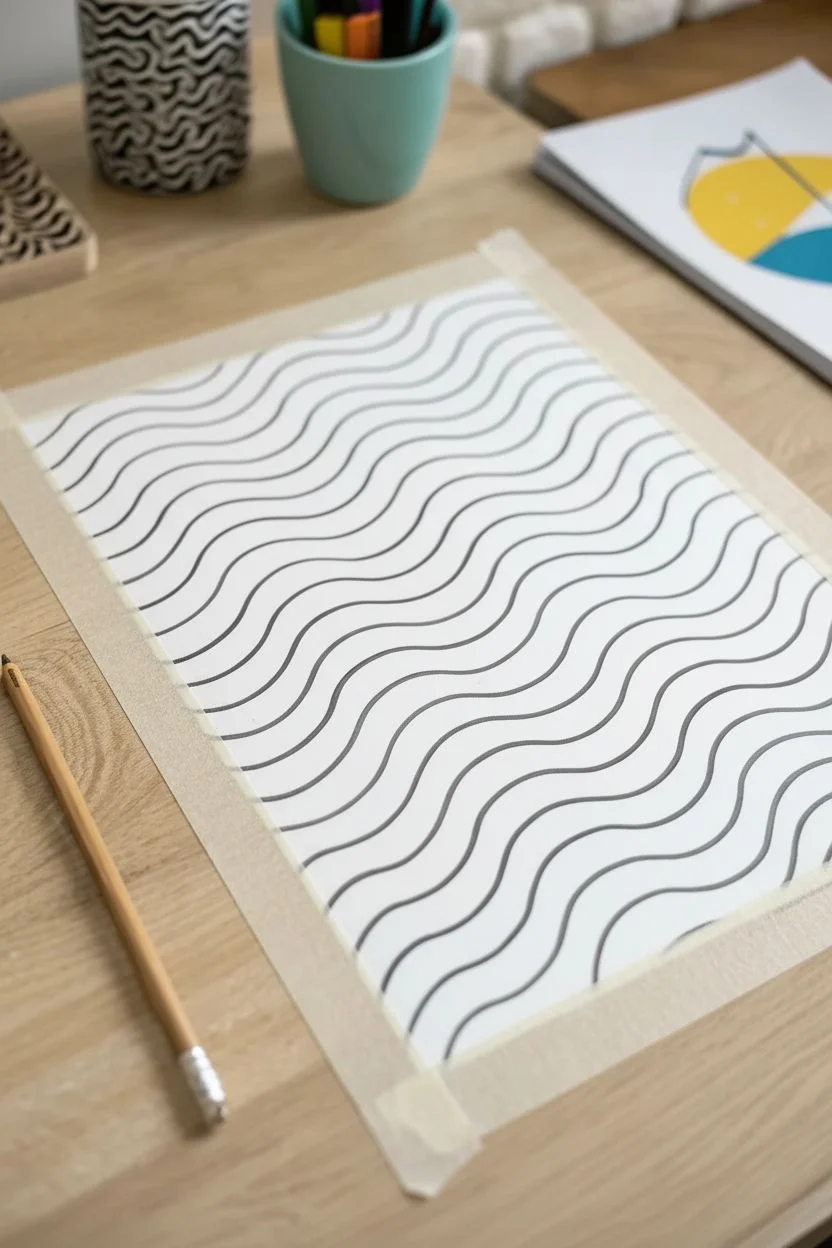
Step 1: Drafting the Waves
-
Prepare your canvas:
Begin by taping down the edges of your paper to a flat work surface. This creates a clean white border around your artwork and prevents the paper from shifting while you work. -
Establish the first wave:
Using your pencil, draw a single, flowing wave line diagonally across the paper. Start from the top left area and curve gently down towards the middle right. Keep the curves smooth and not too jagged. -
Build the pattern:
Draw parallel lines following exactly the same curve as your first line. Space them evenly, about 1 to 1.5 cm apart. Don’t worry about perfect geometric precision; a hand-drawn feel adds character. -
Fill the page:
Continue adding these parallel wavy lines until the entire page is covered from top to bottom. You should have a series of stripes that look like a rippling flag. -
Refine the lines:
Look over your pencil draft. Erase and redraw any sections where the gaps between lines become too narrow or too wide, aiming for a relatively consistent width for each color band.
Smooth Strokes
Work quickly with alcohol markers to blend strokes before they dry. If using paint pens, wait for each band to dry to avoid bleeding.
Step 2: Applying Color
-
Plan your palette:
Arrange your markers or paint pens in a spectrum order. I find it helpful to lay them out physically: start with deep pinks/reds, transition to oranges and yellows, then teals, blues, and finally purples. -
Start from the top:
Begin coloring the top-most band with your darkest pink or red shade. Use long, smooth strokes to ensure even coverage and avoid streakiness. -
Transitioning colors:
Move to the next band down, switching to a slightly lighter pink or orange-red. The goal is to create a gradient effect, but broken into distinct blocks of solid color. -
Work through the warm tones:
Continue painting adjacent bands, moving through your oranges and gold yellows. Ensure the ink or paint is fully opaque; apply a second layer if you can see the paper grain through it. -
Into the cool tones:
Once you pass the yellow middle section, switch to your teals and light blues. This shift creates a beautiful contrast that vibrates visually against the warm top half. -
Finish with deep blues:
Complete the bottom bands with your darkest blues, purples, and perhaps a final splash of turquoise. Let the color dry completely before moving on.
Step 3: Defining the Lines
-
Outline the waves:
Take your black fine liner or a thin black paint marker. Carefully trace over your original pencil lines that separate the color bands. Use a steady hand and pull the pen towards you for better control. -
Thicken the borders:
Go over the black lines a second time to thicken them slightly. A bolder black line enhances the pop-art look and hides any slight unevenness where the colored sections meet. -
Clean up:
Once the black ink is totally dry, gently erase any visible pencil marks remaining underneath or near the borders. -
Remove the tape:
Slowly peel away the masking tape at a 45-degree angle to reveal your crisp white border. This is always the most satisfying part.
Digital Twist
Scan your finished line art before coloring. Import it into a tablet app to test unlimited color palettes before committing to ink.
Now you have a stunning, colorful piece that brings a groovy retro atmosphere to any room
Polka-Dot Pop Pattern With Giant Dots
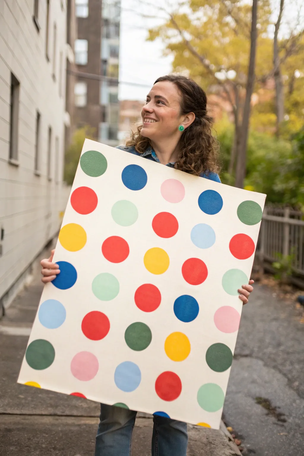
Bring a burst of playful energy into any room with this large-scale polka dot art piece. Featuring crisp, vibrant circles on a clean background, this project captures the essence of Pop Art simplicity and makes a striking statement on any wall.
Step-by-Step
Materials
- Large stretched canvas (approx. 24×36 inches or similar)
- White or cream acrylic gesso (optional base coat)
- Acrylic craft paints (Red, Cobalt Blue, Yellow, Forest Green, Light Pink, Baby Blue, Teal, Mint Green)
- Circular stencil or sturdy cardboard to make one (approx. 3-4 inch diameter)
- Pencil
- Ruler or yardstick
- Medium flat synthetic paintbrush
- Small detail paintbrush
- Painter’s tape (optional)
- Paper plate or palette
- Cup of water and paper towels
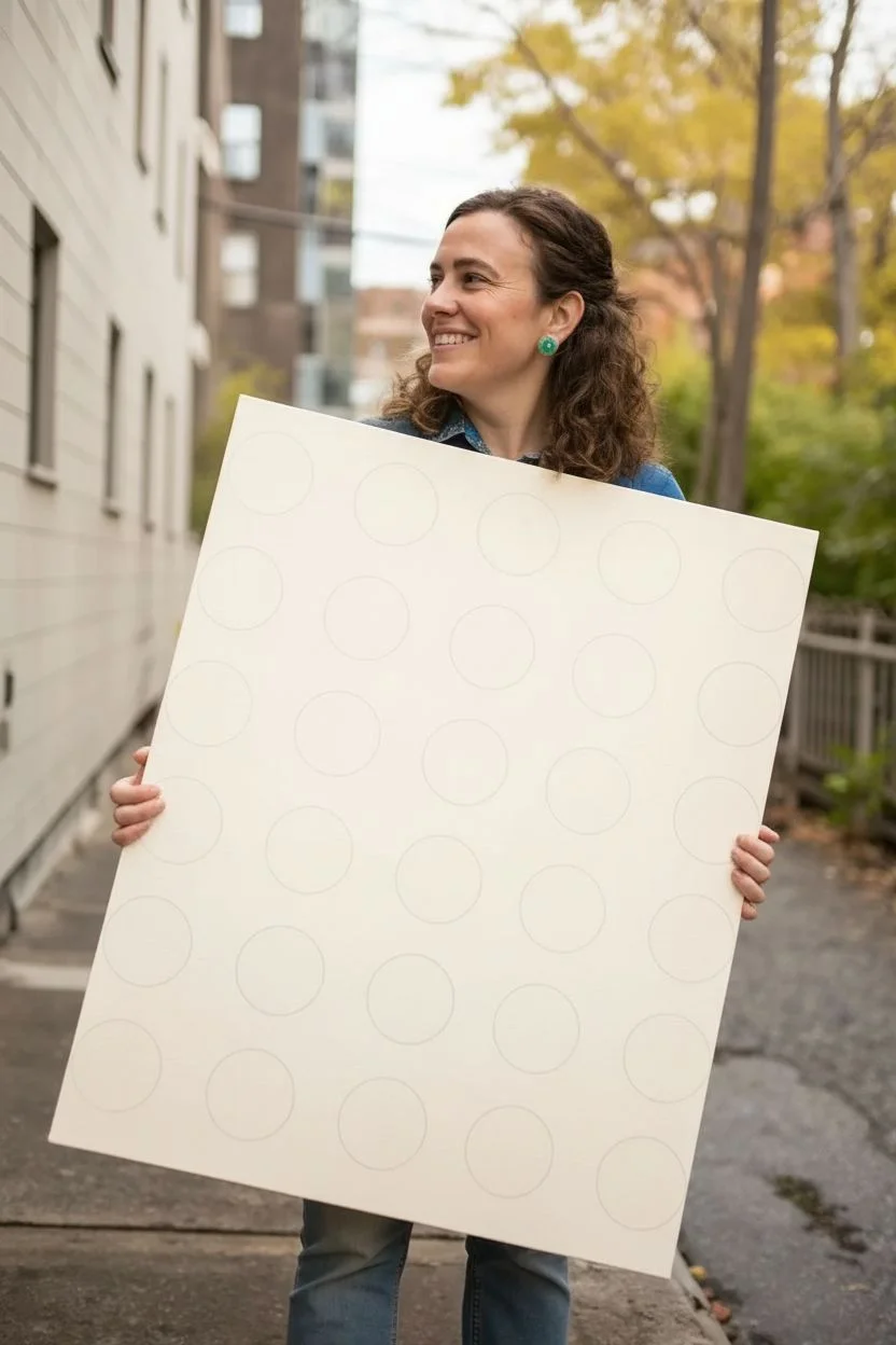
Step 1: Planning the Layout
-
Prime the Surface:
If your canvas isn’t pre-primed, or if you want a specific off-white background color, apply a coat of acrylic paint or gesso to the entire surface. Let this base layer dry completely before moving on. -
Create a Template:
Find a circular object the size you want your dots to be—a jar lid or a small bowl works perfectly. Trace this onto stiff cardboard and cut it out to create a sturdy stencil tool. -
Measure the Grid:
Using a ruler and a pencil, lightly mark a grid on your canvas to guide where the center of each circle will go. Aim for equal spacing between the dots, perhaps leaving 2-3 inches of negative space between them. -
Trace the Dots:
Place your circular template over each grid mark you made. Trace lightly around the template with a pencil. Make sure to keep the template steady to ensure perfect circles. -
Erase Grid Lines:
Once all your circles are traced, go back and carefully erase the faint grid reference marks you made earlier. You only want the circular outlines to remain visible for painting.
Wobbly circles?
If painting freehand circles is tough, use circular sponge pouncers in your desired size. Dip in paint and press down firmly for an instant, perfect dot without outlining.
Step 2: Painting the Dots
-
Select Your Palette:
Squeeze out small amounts of your acrylic colors onto a palette. This design relies on a mix of primary colors (red, yellow, blue) and softer pastels (pink, mint, light blue) for contrast. -
Fill the First Color:
Start with one color, for example, the bright red. Choose specific circles scattered randomly across the canvas to paint red. Using a random distribution helps the pattern feel balanced but not rigid. -
Outline the Edge:
I find it helpful to use a smaller detail brush to carefully paint the outline of the circle first. This creates a crisp edge preventing the paint from going outside the pencil line. -
Fill the Center:
Switch to your medium flat brush to fill in the rest of the circle. Apply the paint in smooth, even strokes. If the coverage looks streaky, don’t worry—you can add a second coat later. -
Repeat for All Colors:
Wash your brush thoroughly and move on to the next color (e.g., cobalt blue). Repeat the outlining and filling process for the next set of scattered circles. -
Add Pastel Tones:
Now introduce your lighter shades like pink and mint green. Use these to fill in some of the remaining empty circles, creating a nice visual break from the darker primary colors. -
Complete the Pattern:
Continue painting until every traced circle is filled with color. Step back occasionally to ensure no two adjacent circles are the same color, keeping the ‘random’ look effective.
Go metallic
Replace one or two of the matte colors with gold or silver leaf paint. The metallic shimmer adds a modern, chic twist to the classic retro pattern.
Step 3: Finishing Touches
-
Apply Second Coats:
Acrylics, especially yellows and light blues, can be translucent. Once the first layer is dry to the touch, apply a second coat to any dots that look patchy to get that solid, opaque pop-art look. -
Touch-Up Edges:
Inspect the edges of your circles. If you went outside the lines, use a tiny bit of your background color (white or cream) on a small brush to clean up the mistake and reshape the circle. -
Erase Stray Marks:
Check for any visible pencil marks around the edges of the paint. Gently erase them once the paint is 100% dry to avoid smudging the color. -
Paint the Sides:
Decide if you want the pattern to wrap around the sides of the canvas or if you prefer a solid color edge. Painting the sides white gives a clean, gallery-wrapped finish. -
Seal (Optional):
If you want to protect your work and even out the sheen, apply a layer of clear acrylic varnish over the entire painting. A matte or satin finish usually looks best for this style.
Hang your new masterpiece and enjoy the fun, retro vibe it adds to your space
Pop Collage Layered Paper Look
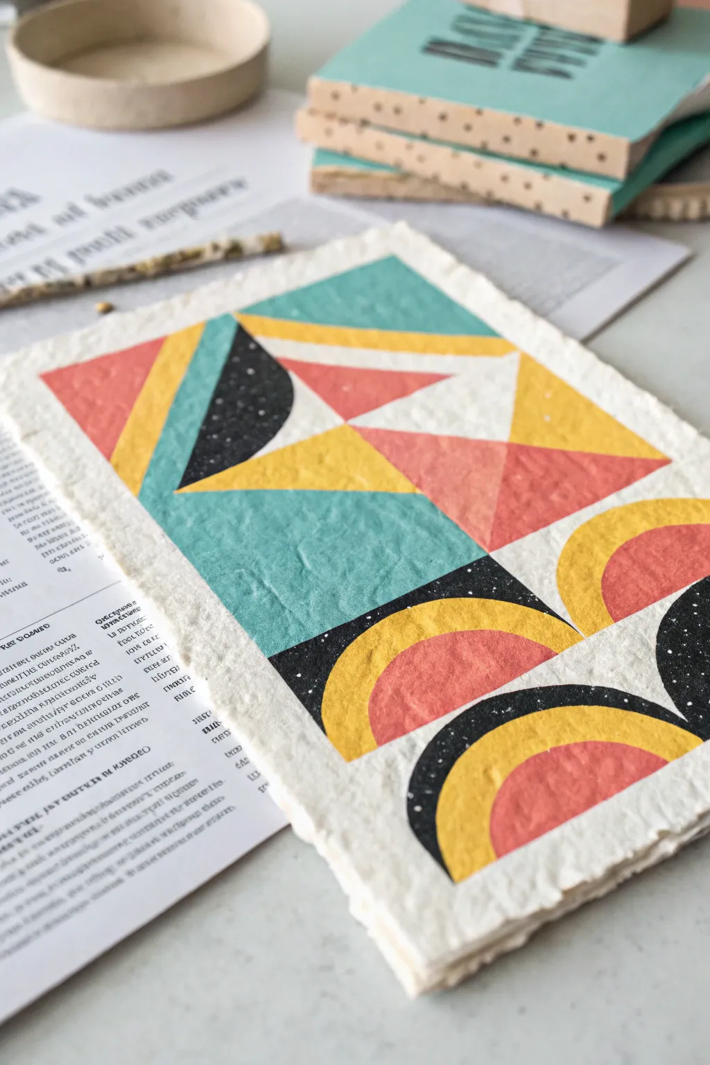
Embrace the tactile charm of handmade paper with this geometric art piece that mimics the look of a layered collage. You’ll create bold, colorful shapes on heavily textured deckle-edge paper, resulting in a modern design with an artisanal, vintage feel.
Detailed Instructions
Materials
- Heavyweight handmade paper with deckle edges (cotton rag or watercolor paper)
- Acrylic paints (teal, mustard yellow, coral/salmon, black)
- Painter’s tape (low tack)
- Flat shader brushes (medium and small sizes)
- Ruler
- Pencil
- Old toothbrush or stiff bristle brush (for speckling)
- White acrylic ink or watered-down white paint
- Paper towels
- Water cup
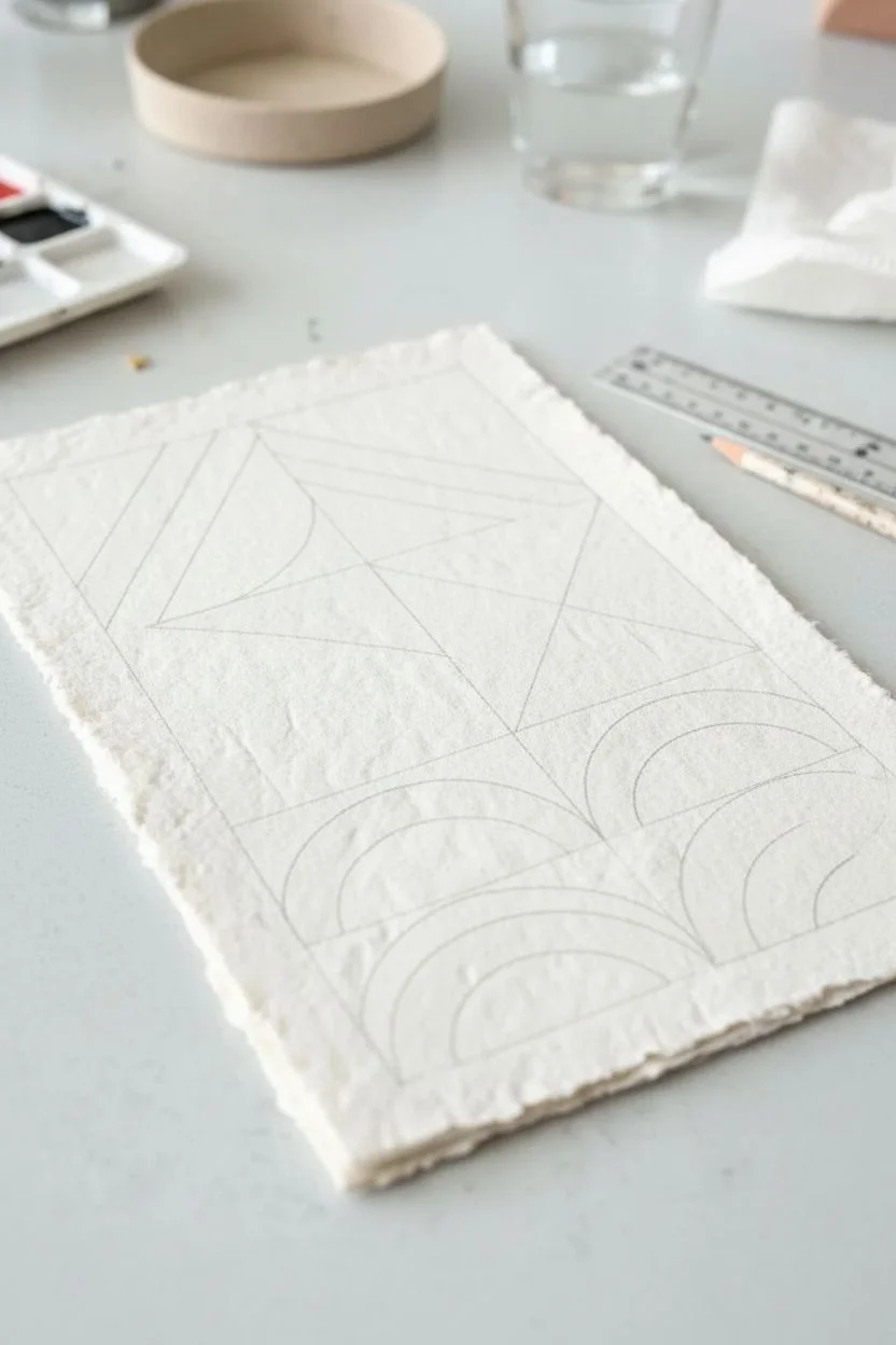
Step 1: Preparation & Layout
-
Prepare the surface:
Lay your handmade paper on a clean, flat surface. If the paper is very textured, tape the corners down gently to keep it stable while you work. -
Map out the grid:
Using a ruler and a pencil with a very light touch, lightly sketch a rectangular boundary for your main design, leaving a generous border of raw paper around the edges. -
Sketch the geometric forms:
Divide your rectangle into sections. Sketch the top half with intersecting diagonal lines to create triangles, and the bottom half with a grid for the semi-circle arches. -
Draft the curves:
For the arches in the bottom section, you can trace a small cup or geometry compass to get clean semi-circles, ensuring they nest inside one another.
Step 2: Painting the Colors
-
Tape the first shapes:
Start with your straight-edged shapes. Apply painter’s tape along the pencil lines of the teal sections first involving the large rectangle and top triangle. -
Apply the teal layer:
Load your flat brush with teal paint. Since the paper is textured, use a dabbing motion near the tape edge to prevent bleeding, then fill in the rest. -
Reveal and dry:
Gently peel back the tape while the paint is still slightly tacky to keep crisp lines. Let this color dry completely before moving to the next. -
Tape for yellow:
Once the teal is dry, tape off the areas designated for mustard yellow, specifically the bold diagonal strips and the outer rings of the arches. -
Paint the yellow sections:
Apply the mustard yellow paint. For the curved sections of the arches, you may need to hand-paint the curve carefully with a smaller flat brush rather than taping. -
Add the coral accents:
Next, fill in the remaining triangular facets and the inner semi-circles with the coral or salmon color. I find two thin coats work better than one thick one here.
Bleed Prevention
On heavy textured paper, paint a thin layer of clear matte medium over the tape edge before applying color. This seals the gap and ensures a razor-sharp line.
Step 3: Black Accents & Texture
-
Paint the black voids:
Using a steady hand and a small brush, carefully fill in the remaining negative spaces with black paint. These dark areas provide high contrast against the bright pop colors. -
Create the splatter effect:
Cover the colored sections of your painting with scrap paper, leaving only the black areas exposed. Dip a toothbrush into white ink or watered-down white paint. -
Speckle the black:
Run your thumb across the bristles to flick tiny white speckles onto the black paint. This mimics a terrazzo or starry night texture. -
Erase guidelines:
Once absolutely everything is bone dry, gently erase any visible pencil marks around the borders.
Fixing Wobbly Arches
If your hand-painted curves look shaky, use a Posca paint marker in the same color to refine the edge. The firm tip offers more control than a soft brush.
Step 4: Finishing Touches
-
Assess the edges:
If the textured paper caused any paint to look rugged ragged, go back in with a very fine detail brush to sharpen the intersection points between colors. -
Flatten if necessary:
If the water in the acrylics caused the paper to buckle, place the drying artwork under a heavy book overnight between two sheets of clean wax paper.
Now you have a striking piece of geometric art that combines clean pop aesthetics with rustic textures
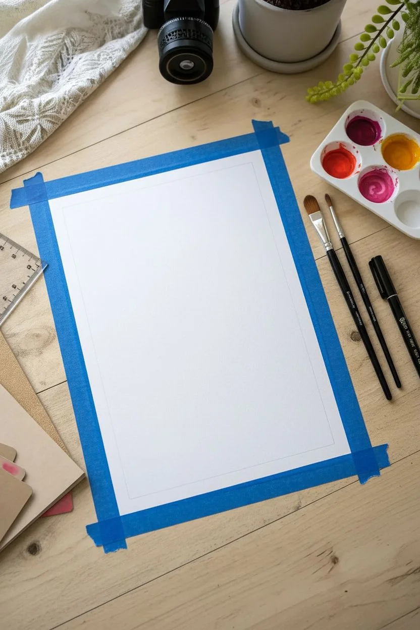
Neon Pop Gradient With Black Ink Outlines
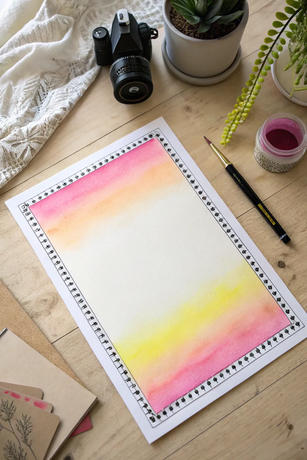
This project combines the soft, bleeding beauty of watercolor gradients with the crisp contrast of ink doodles. By framing negative space with vibrant sunrise hues, you create a striking backdrop perfect for hand-lettering or photos.
Step-by-Step
Materials
- Heavyweight watercolor paper (300gsm recommended)
- Watercolor paints (magenta, crimson, orange, yellow)
- Flat shader brush (size 10 or 12)
- Round detail brush (size 2)
- Fine-liner pen (black, waterproof, 0.5mm or 0.8mm)
- Washi tape or masking tape
- Jar of clean water
- Ruler
- Pencil
Step 1: Setting the Stage
-
Draft the frame:
Start by lightly sketching a rectangle on your watercolor paper using a pencil and ruler. Leave about an inch of margin from the edge of the paper. This line will guide where your painted border begins and ends. -
Secure the paper:
Tape your paper down to a flat surface or drawing board. This is crucial because we will be using a wet-on-wet technique, and taping prevents the paper from buckling too severely while it dries. -
Prepare your palette:
Pre-mix your colors in a palette. You will need a vibrant magenta, a warm crimson, a bright orange, and a sunshine yellow. Ensure they are quite fluid but heavily pigmented for that ‘pop’ effect.
Uneven Gradients?
If you get hard lines between colors, your paper was likely too dry. Next time, re-wet the edge of the previous color slightly before adding the next hue.
Step 2: Painting the Gradient
-
Dampen the top section:
Using your flat brush and clean water, gently wet the top third of the rectangular area you sketched. The paper should be glistening but not holding puddles. -
Apply the top magenta:
Load your brush with the magenta paint and apply a horizontal stroke right at the top edge of your rectangle. Let the color flow downward slightly into the wet paper. -
Blend in orange:
Clean your brush quickly, pick up the orange, and paint a stroke just below the magenta, slightly overlapping them so they bleed together. I like to tilt the board slightly to help gravity blend them naturally. -
Fade to yellow:
Add a strip of yellow below the orange. Using a damp, clean brush, pull the yellow pigment downward until it fades completely into the white of the paper. Stop before you reach the middle of the page. -
Repeat for the bottom:
Now, repeat the process on the bottom third of the rectangle, but in reverse order. Start with the magenta at the very bottom edge, blend upwards into orange, then yellow, and finally fade out into the white center. -
Let it dry completely:
Walk away and let the artwork dry. The paper must be bone-dry before you add ink, or the pen lines will bleed and ruin the crisp effect. A hair dryer on a low setting can speed this up.
Step 3: Inking the Border
-
Outline the rectangle:
Once dry, take your black fine-liner pen. Draw a straight line over your initial pencil marks to create a sharp rectangular border around your gradient. -
Draw the inner border:
Draw a second rectangle inside the first one, spacing it about 3-4 millimeters inward. This creates a narrow channel for your doodle pattern. -
Add vertical dividers:
Inside the double-line border you just created, draw small vertical lines periodically to create a ladder-like effect. Spacing doesn’t need to be perfect; unevenness adds charm. -
Ink the doodle details:
In the spaces between your ladder rungs, draw small, simple shapes. Little semi-circles, dots, or leaf shapes work perfectly to give it that henna-inspired or bohemian look. -
Thicken the outer edge:
Go back over the very outer line of the rectangle to thicken it slightly, or add tiny decorative loops on the outside corners to soften the harsh geometry. -
Erase pencil marks:
After giving the ink a few minutes to settle, gently use an eraser to remove any visible pencil guidelines that weren’t covered by the ink.
Vibrant Colors
To get that ‘neon’ pop, use colors directly from the tube or pan with minimal water dilution, only adding water to the paper itself for blending.
Peel off the tape carefully to reveal your stunning, vibrant frame ready for a quote or photo
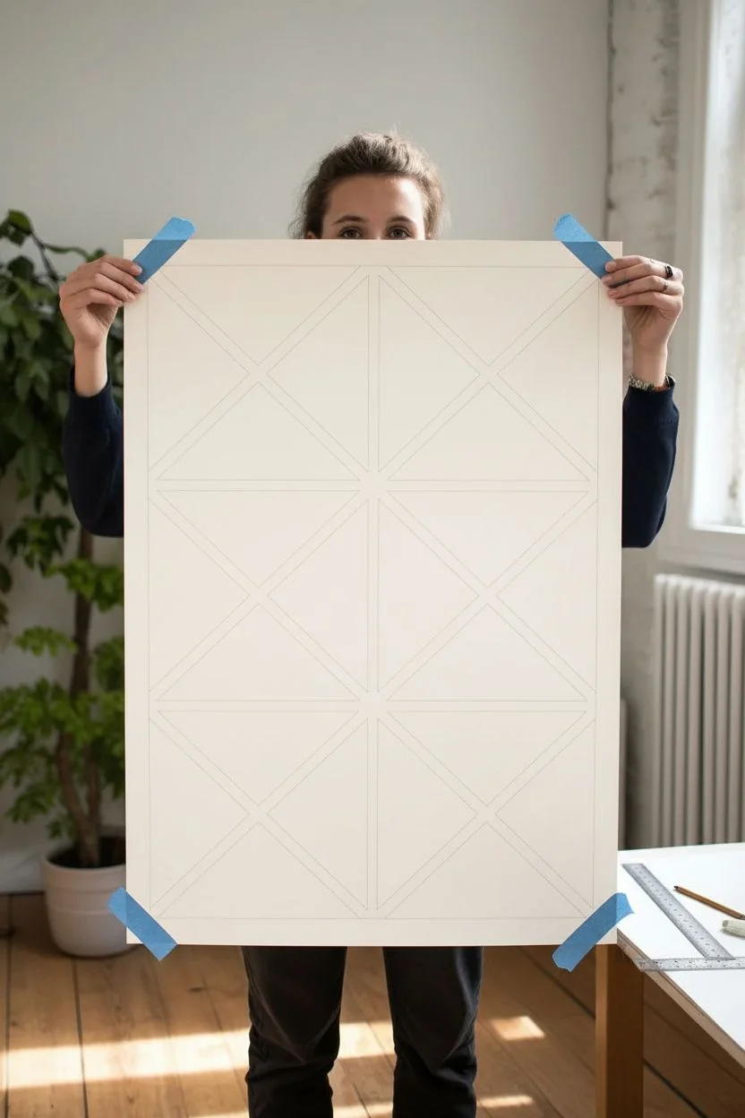
Ben-Day Dots Inside Geometric Shapes
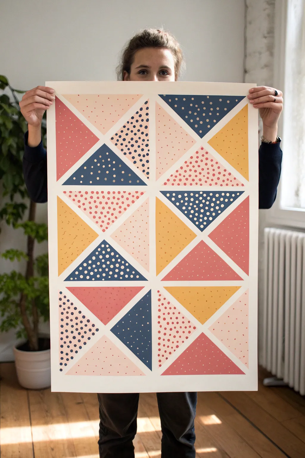
This striking wall art combines the clean lines of modern geometry with the retro charm of pop art textures. By filling simple triangular sections with a mix of solid colors, speckles, and classic Ben-Day dots, you’ll create a dynamic visual puzzle that feels both structured and playful.
Detailed Instructions
Materials
- Large sheet of heavyweight watercolor paper or bristol board (approx. A2 size)
- Painter’s tape or masking tape (low tack)
- Acrylic paints (navy blue, coral red, mustard yellow, blush pink, white)
- Flat paintbrushes (medium size)
- Small round paintbrush for speckles
- Pencil and eraser
- Long ruler or T-square
- Dotting tool, cotton swabs, or the back of a paintbrush handle
- Palette or paper plate for mixing colors
Step 1: Drafting the Grid
-
Measure the canvas:
Start by finding the center of your paper. Secure the corners with tape to your work surface to keep it flat. -
Draw the main quadrants:
Using your long ruler, lightly draw a vertical line straight down the middle and a horizontal line across the center, creating four large, equal rectangles. -
Create the diagonal framework:
Within each of the four main rectangles, draw two large diagonal lines connecting the corners to form an ‘X’ shape. This will immediately break your page into the primary triangular zones. -
Subdivide the triangles:
Look at the composition carefully. Some large triangles are split in half again. Use your ruler to bisect specific triangles according to the reference image, creating a mix of larger and smaller geometric fields.
Bleeding Lines?
If paint seeps under the tape, wait for it to dry completely. Then, scrape the excess gently with an X-Acto knife or paint over the mistake with opaque white acrylic for a clean fix.
Step 2: Blocking in Color
-
Tape the first borders:
Choose a few non-adjacent triangles to start with. Apply painter’s tape along the pencil lines that define their borders. Press the edges of the tape down firmly to prevent paint bleed. -
Mix your base palette:
Prepare your acrylics. You’ll need a deep navy, a muted coral red, a warm mustard yellow, and a soft blush pink. I like to keep a good amount of white nearby to adjust opacity. -
Paint the solid foundations:
Paint the base color for your selected triangles. Applying two thin coats is better than one thick coat for a smooth, matte finish. Let the first coat dry to the touch before adding the second. -
Remove and rotate:
Once the paint is tacky but not fully dry, carefully peel away the tape at a 45-degree angle. Let these sections dry completely before taping off and painting the neighboring triangles.
Clean Edges Pro Tip
After applying tape, paint a thin layer of the transparent medium or the *background* color over the tape edge first. This seals the gap, ensuring your next color line is razor sharp.
Step 3: Adding the Pop Art Details
-
Prepare for dots:
Select a triangle that needs the Ben-Day dot treatment. The key here is contrast—use white dots on dark blue, or dark blue dots on pink. -
Apply the dots:
Dip your dotting tool (or the flat end of a brush handle) into the paint. Press it gently onto the dried base color. Try to maintain a consistent grid pattern for that mechanical pop-art look. -
Vary dot sizes:
For some sections, use a smaller tool (like a toothpick or small brush tip) to create tiny, delicate dots, while other sections can handle bolder, larger spots. -
Create the speckled texture:
Some triangles feature a random splatter or speckle rather than a grid. For these, thin your paint slightly with water. -
Flick the paint:
Load a toothbrush or stiff brush with the thinned paint. Run your thumb over the bristles to flick a fine mist of spray onto the target triangle. Mask off surrounding areas with scrap paper to protect them. -
Hand-painted speckles:
If flicking feels too risky, you can use a fine-tip brush to manually tap small, irregular dashes and spots onto the surface for a controlled ‘terrazzo’ effect.
Step 4: Finishing Touches
-
Check for gaps:
Inspect the white negative space between triangles. If any paint bled or lines look wobble, use a small brush with white paint (or the color of your paper) to sharpen the edges. -
Erase guidelines:
Once the artwork is 100% dry—give it a few hours just to be safe—gently erase any visible pencil lines in the unpainted borders. -
Seal the work:
For longevity, you can apply a clear matte spray varnish over the entire piece. This unifies the sheen of the different paint colors and protects the surface.
Hang your new geometric masterpiece in a spot with good natural light to let those textures really pop
Faux Print Texture and Ink Speckle Grit
Capture the nostalgic charm of vintage screen printing with this textured pop art sunburst. By combining handmade paper with stenciled halftone patterns and ink speckles, you’ll create a piece that feels like it was pulled straight from a 1960s print shop.
Step-by-Step Guide
Materials
- Heavyweight cold-press watercolor paper or handmade cotton rag paper (deckle edge preferred)
- Acrylic paints (Teal/Turquoise and Coral/Salmon)
- Matte medium or clear gesso
- Self-adhesive stencil film or low-tack masking tape
- Halftone dot stencil
- Stencil brushes (flat top)
- Old toothbrush
- Black ink or watered-down dark grey acrylic
- Ruler
- Pencil
- X-Acto knife and cutting mat
- Paper towels
Step 1: Preparing the Surface
-
Select your paper:
Choose a paper with deep texture. A handmade cotton rag paper with a rough deckle edge is ideal for that authentic, aged look. -
Size the paper:
If using a large sheet, tear the paper against a ruler rather than cutting it with scissors to create a soft, fibrous edge. -
Mark the center point:
Find the approximate center of your paper and mark it very lightly with a pencil. This will be the origin point for your sunburst rays. -
Draft the rays:
Using a ruler, lightly draw radiating lines from the center point to the edges. Space them so the rays widen as they extend outward.
Clean Lines, Retro Vibe
Don’t wash your stencil brush with water mid-project. Water thins the paint too much and causes bleeding under the stencil. Wipe excess paint on a cloth instead.
Step 2: Masking & Creating the Sunburst
-
Apply masking film:
Cover the entire paper surface with a sheet of low-tack self-adhesive stencil film. Smooth it down firmly to prevent paint bleed. -
Cut the stencils:
Using your X-Acto knife, carefully cut along your pencil lines through the film. You want to remove only the film for the rays you intend to paint first (e.g., all the teal rays). -
Seal the edges:
Brush a very thin layer of matte medium over the exposed paper edges of the stencil. This invisible barrier prevents color from creeping under the tape. -
Establish the dot pattern:
Place your halftone dot stencil over the exposed ray areas. Secure it with tape so it doesn’t shift. -
Stipple the first color:
Load a stencil brush with teal paint, then offload most of it onto a paper towel until the brush is almost dry. Use an up-and-down pouncing motion to apply the paint through the dot stencil. -
Remove first mask:
Carefully lift the dot stencil, then peel away the masking film for the painted teal rays. Let this dry completely before proceeding.
Go Misaligned!
Deliberately offset your dot stencil slightly for the second color or let the colors overlap a tiny bit. This mimics ‘misregistration,’ a printing error common in old comics.
Step 3: The Second Color Layer
-
Mask the second distinct area:
Once the teal paint is fully dry, apply fresh masking film over the entire piece again. This protects your finished work while you target the coral rays. -
Cut and reveal coral zones:
Cut and remove the film for the alternating ray sections. Leave a small gap of negative space (the raw paper color) between the new coral rays and the existing teal ones. -
Apply the coral dots:
Position your halftone stencil again. Using a clean brush and the dry-brush technique, stipple the coral paint into the exposed areas. -
Vary opacity:
I like to intentionally press lighter in some areas and heavier in others. This unevenness mimics the imperfections of vintage printing. -
Reveal the full design:
Remove the stencil and peel off all remaining masking film. You should now have alternating rays of teal and coral dots radiating from the center.
Step 4: Adding Grit & Finish
-
Prepare the splatter mix:
Dilute a small drop of black ink or dark grey acrylic paint with water until it has a milky consistency. -
Test the splatter:
Dip an old toothbrush into the mixture and run your thumb across the bristles over a scrap piece of paper to test the spray pattern. -
Apply the grit:
Gently flick the toothbrush bristles over your artwork to create tiny, random specks. Focus slightly more on the edges or the center for a weathered effect. -
Add larger imperfections:
Dip the back end of a paintbrush into the ink and dot a few larger, deliberate ‘printing errors’ onto random spots. -
Final dry:
Allow the speckles to dry completely. If the paper has buckled slightly from moisture, press it under a heavy book overnight.
Frame your textured pop art piece in a simple wood frame to let the jagged paper edges stand out against the matboard
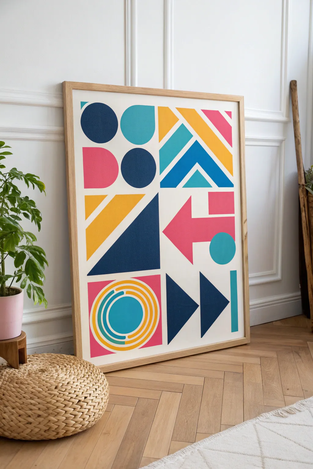
Pop Art City Lights With Abstract Sign Shapes

Bring the energy of city signage into your home with this bold, geometric artwork featuring clean lines and a vibrant color palette. This project uses hard-edge painting techniques to create a professional-looking graphic design that feels both modern and retro.
How-To Guide
Materials
- Large watercolor paper or primed canvas board (approx. 24×36 inches)
- Acrylic paints (Navy Blue, Cyan, Mustard Yellow, Magenta)
- Painter’s tape (various widths, including fine line tape)
- Ruler and pencil
- Compass for drawing circles
- Flat shader brushes (various sizes)
- Round detail brush
- Palette or mixing tray
- Eraser
- Natural wood frame
Step 1: Grid and Sketching
-
Establish the grid:
Begin by lightly measuring and marking a 2×3 grid on your paper or canvas. This will create six distinct zones for your different geometric motifs, ensuring the composition feels balanced. -
Map out the top left:
In the top left quadrant, use your compass to sketch a full circle near the top left corner, a semi-circle to its right, a semi-circle below the first, and a full circle in the center. Refer to the image to get the spacing just right. -
Draw the chevrons:
Move to the top right quadrant. Use your ruler to draw a series of diagonal lines creating nested chevrons pointing upward. This section mimics directional road signs. -
Sketch the triangles:
For the middle left section, draw a large right-angle triangle taking up the bottom right corner. Add a diagonal stripe above it that runs parallel to the triangle’s hypotenuse. -
Outline the arrow:
In the middle right section, lightly sketch a bold arrow pointing left. Add a separated circle shape beneath the arrow’s tail to break up the negative space. -
Draft the concentric rings:
In the bottom left, use your compass to draw a central circle, then create three or four surrounding rings. You’ll paint these in alternating colors later to create a target effect. -
Finalize geometric play:
Finish the bottom right with two large triangles pointing right (like a ‘fast forward’ symbol) and a vertical pill shape on the far right edge.
Step 2: Painting and Refining
-
Tape the straight edges:
Apply painter’s tape along the straight lines of your triangles, chevrons, and arrows. Press the edges of the tape down firmly with a fingernail or spoon to prevent paint bleed. -
Paint the Navy Blue shapes:
Start with your darkest color. Fill in the top-left circle, the central triangle, and the ‘fast forward’ triangles at the bottom right with navy blue acrylic. Apply two coats for opacity. -
Apply the Magenta:
Once the blue is dry, move to the pink tones. Paint the semi-circle in the top left, the arrow in the middle right, and the background square behind the target shape in the bottom left. -
Add the Mustard Yellow:
Fill in the diagonal stripes in the top right and the triangle details in the middle left. I find that yellow often needs an extra coat to look truly solid and vibrant. -
Detail with Cyan:
Paint the remaining teal accents, including the chevrons and the isolated circles. Use a steady hand or a circle stencil if you aren’t taping these curved edges. -
Tackle the concentric rings:
For the target on the bottom left, carefully paint the rings using a fine liner brush. You can mask these with flexible tape if you have it, but freehanding slowly often works best for small curves. -
Remove tape and touch up:
Peel off your tape slowly at a 45-degree angle while the paint is just slightly tacky. If any paint bled through, use a tiny brush and white acrylic (or your background color) to clean up the edges. -
Erase guidelines:
Wait until the painting is completely bone-dry—give it at least a few hours. Gently erase any visible pencil marks remaining in the white negative spaces. -
Frame your work:
Place your finished piece into a light, natural wood frame. The neutral tone of the wood helps ground the vibrant colors without competing for attention.
Crisp Edge Secret
Before painting your color, brush a thin layer of matte medium over the tape edge. This seals the gap, ensuring absolutely perfect, razor-sharp lines when you peel it.
Circle Troubleshooting
If painting perfect curves is difficult, try cutting the circular shapes out of colored cardstock or vinyl and adhering them to the canvas for a mixed-media finish.
Hang your new geometric masterpiece in a well-lit spot to let those bold colors pop

Have a question or want to share your own experience? I'd love to hear from you in the comments below!