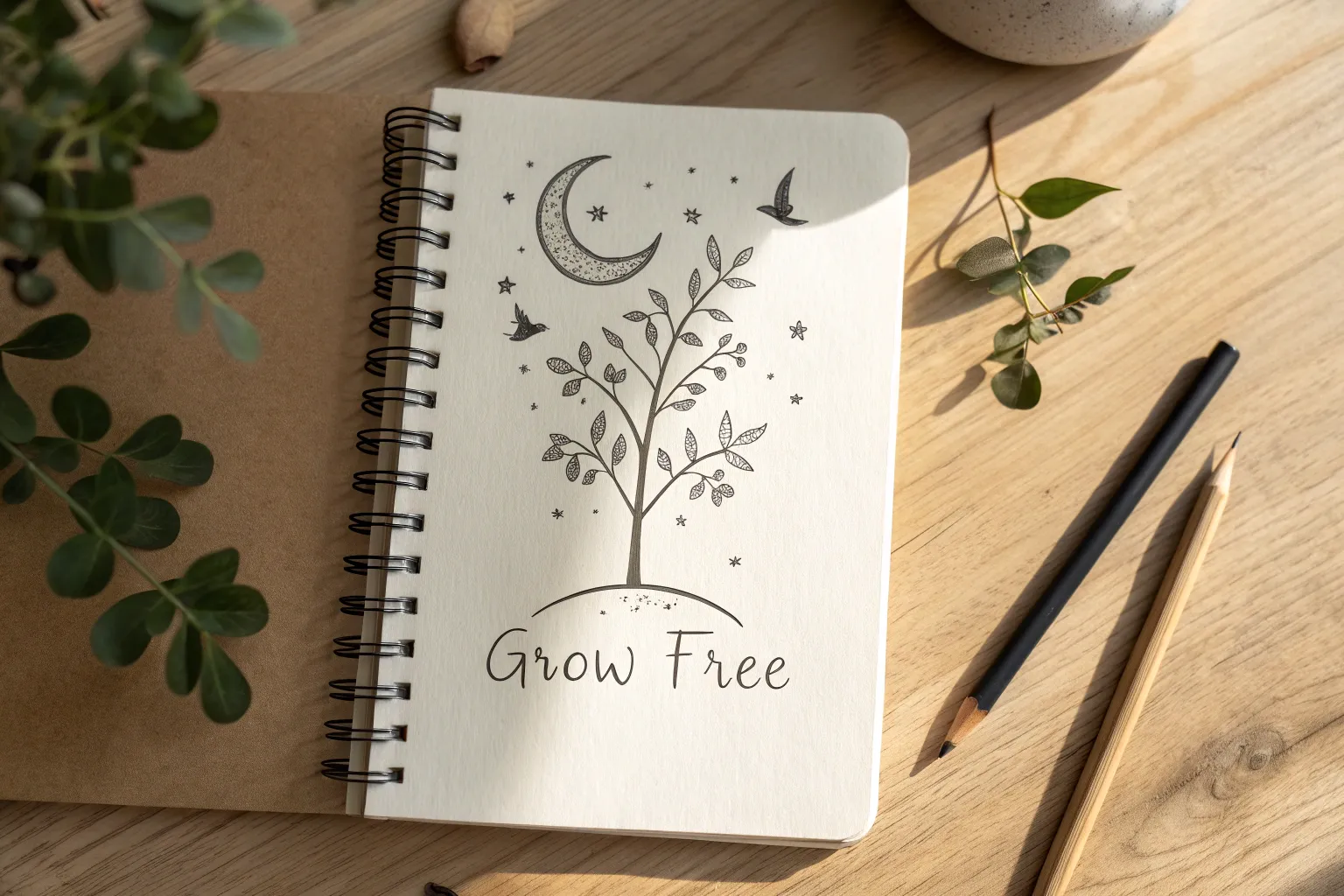
Whenever I need a mood lift, I reach for my sketchbook and draw something that gently nudges my brain toward optimism. These positive drawing ideas are meant to feel simple, soothing, and personal—like a little pep talk you make with pencil lines.
Sunshine And Soft Clouds
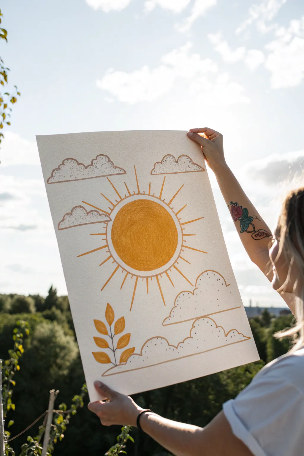
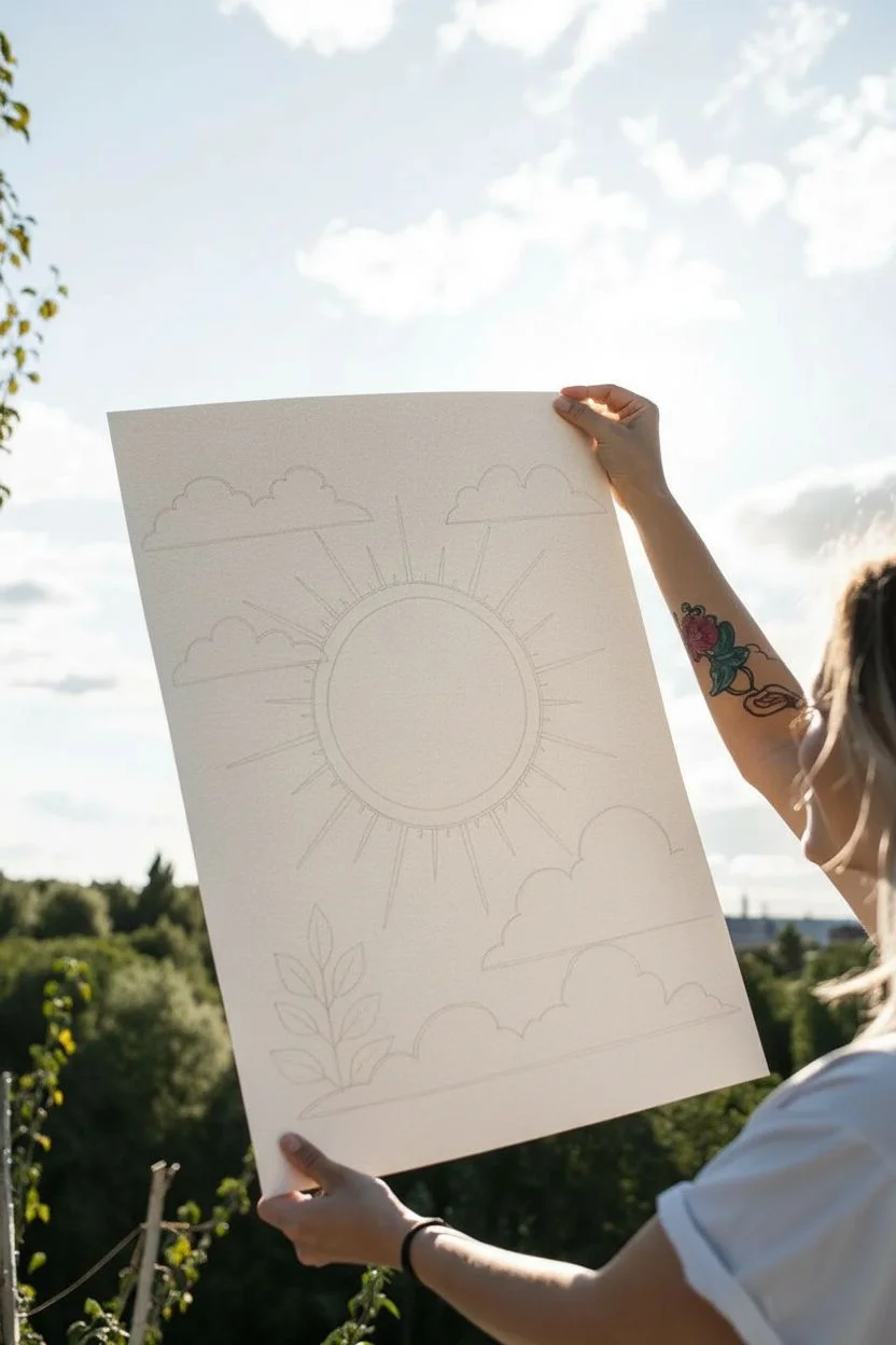
Bring warmth to any room with this minimalist, boho-inspired sun drawing featuring clean lines and earthy tones. The simple composition of a radiant sun, fluffy clouds, and a botanical sprig creates a peaceful, uplifting piece of art.
Detailed Instructions
Materials
- Large sheet of textured off-white or cream drawing paper (A3 or 11×14 size)
- Pencil (HB or lighter)
- Eraser
- Golden-yellow colored pencil or art marker
- Brown or terracotta colored fine-liner pen (0.5mm or 0.8mm)
- Ruler or straight edge
- Circular object for tracing (like a bowl or large lid)
Step 1: Sketching the Layout
-
Center the sun:
Begin by placing your circular object in the center of the paper. Use your pencil to lightly trace a perfect circle. This will form the core of your sun. -
Draft the rays:
Lightly sketch the sun rays radiating outward using a ruler. Alternate between longer rays and shorter rays to create a dynamic burst effect. Aim for an uneven, organic spacing rather than perfect geometry. -
Add floating clouds:
Sketch two cloud formations above the sun. Draw them with flat bottoms and bumpy, rounded tops. Keep the lines soft and the shapes simple. -
Ground the composition:
Draw three larger cloud shapes near the bottom of the page to ground the image. Vary their sizes slightly, stacking them or letting them overlap for depth. -
Include botanical element:
On the bottom left, sketch a simple stem with five to six leaves rising up from behind the bottom clouds. This adds a nice vertical element to balance the round sun.
Sunbeam Tip
Don’t stress about perfect symmetry for the sun rays. Varying the thick and thin lines makes the sun look more organic and energetic.
Step 2: Coloring the Sun
-
Fill the core:
Take your golden-yellow colored pencil or marker. Start filling in the main circle of the sun. If using colored pencil, use a small circular motion to get even coverage without harsh streaks. -
Layer for density:
Apply a second layer of color to the sun to make it bold and opaque. I like to press a little harder on this pass to really saturate the paper. -
Fill the leaves:
Use the same yellow tone to fill in the leaves on your bottom-left sprig. Keep the coloring solid and consistent with the sun.
Try This Twist
Instead of yellow, try a metallic gold paint marker for the sun and leaves. It will catch the light beautifully when hung on a wall.
Step 3: Inking the Details
-
Outline the sun:
Switch to your brown or terracotta fine-liner. Carefully trace over the pencil outline of the sun’s circle. A steady hand is key here, but slight wobbles add handmade charm. -
Define the rays:
Trace the sun rays with the fine-liner. Instead of just single lines, draw very narrow, long ‘V’ shapes or thin rectangles that taper at the ends, so the rays have a bit of weight to them. -
Ink the clouds:
Go over your cloud pencil lines with the brown pen. Emphasize the flat bottoms with a confident, straight line and use curved strokes for the billowy tops. -
Trace the vine:
Outline the stem and the leaves of your botanical sprig. Draw a line down the center of each leaf for a simple vein detail. -
Erase guidelines:
Once the ink is completely dry—give it a few minutes to be safe—gently erase all visible pencil marks to clean up the drawing.
Step 4: Final Textures
-
Add cloud texture:
To give the clouds that speckled, illustrated look, use your fine-liner to add tiny dots inside the cloud shapes. Focus the dots near the edges or tops of the curves. -
Check the balance:
Step back and look at your composition. If any areas feel too empty, you can add a few extra stray dots or extend a sun ray slightly to fill the space.
Now you have a radiant piece of custom art ready to brighten your wall


Blooming Wildflowers Up Close
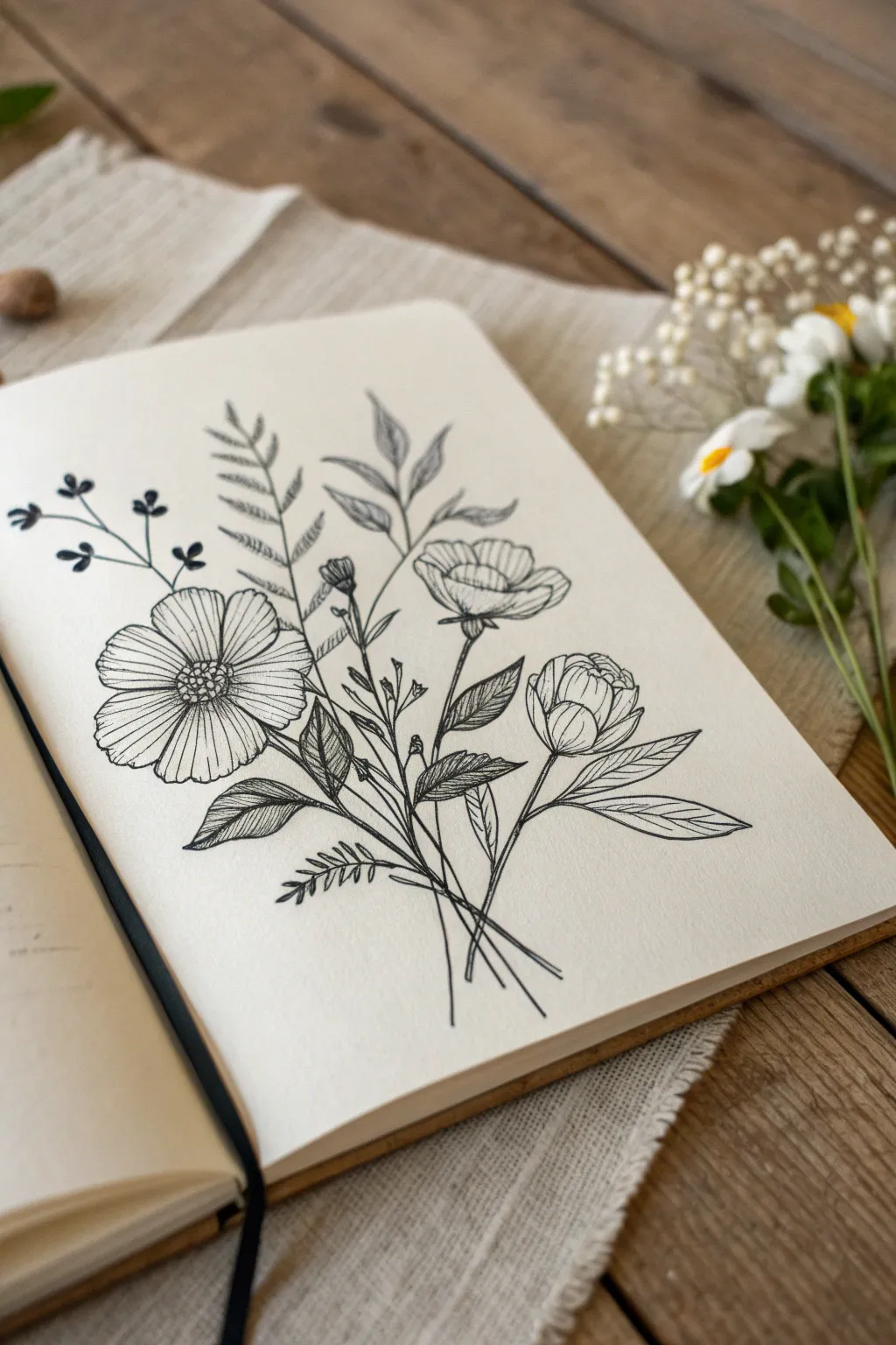
Capture the delicate beauty of a garden gathering with this simple black ink illustration. Using fine line work and stippling, you’ll create a timeless botanical study perfect for your sketchbook.
Step-by-Step Tutorial
Materials
- Fine-grain sketchbook paper
- HB pencil for sketching
- Kneaded eraser
- Black fineliner pens (sizes 0.1mm, 0.3mm, and 0.5mm)
- Ruler (optional for stem alignment)
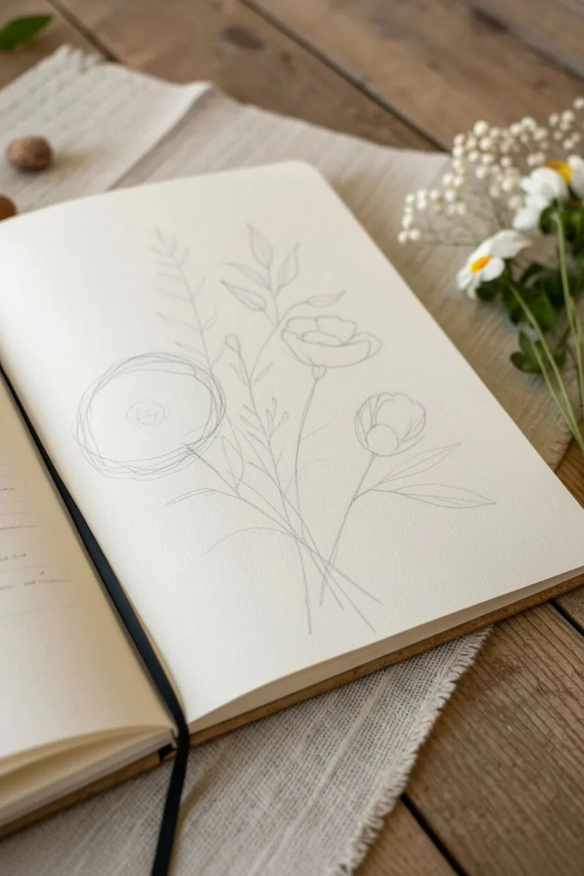
Step 1: Pencil Structure
-
Establish the focal point:
Begin lightly with your HB pencil by drawing a circle for the main open flower on the left side of the page. This will be your anchor. -
Map the stems:
From that main circle, draw a few thin, intersecting lines converging at a central point near the bottom. Fan them out slightly as if they are being held in a hand. -
Place secondary blooms:
Sketch a smaller, cup-shaped oval on the right side for the semi-open bud, and a smaller, tighter oval slightly below it for the closed bud. -
Add structural foliage lines:
Draw sweeping, curved lines extending upward—one in the center for the fern-like leaves, and one branching to the left for the delicate berry sprig.
Ink Confidence
Don’t worry if your lines aren’t perfectly straight. A slight wobble or variation in line weight actually makes botanical drawings look more organic and natural.
Step 2: Inking the Blooms
-
Outline the main cosmos:
Switch to a 0.3mm fineliner. Draw the petals of the large left flower, ensuring they have slightly wavy, organic edges rather than perfect curves. Leave a circular gap for the center. -
Detail the center:
Fill the center of the main flower with small, tight circles to create texture. You can darken the very middle slightly more to create depth. -
Petal texture:
Using the 0.1mm pen, draw very fine lines radiating from the center of each petal outward. These lines should stop about halfway up the petal to show the vein structure. -
Ink the buds:
Move to the cup-shaped flowers on the right. Draw overlapping, scalloped shapes to form the tight petals of the buds. These should look like layers of an onion or a rosebud. -
Shade the buds:
Add hatching lines at the base of these bud petals using the 0.1mm pen. This suggests the curvature where the petals tuck into the stem.
Vintage Touch
Try drawing this on kraft paper or coffee-stained paper instead of white. Use a white gel pen to add highlights on the petal tips for a stunning high-contrast look.
Step 3: Foliage & Finishing
-
Create the fern leaf:
For the tall central leaf, draw a central spine first. Then, add small, pointed leaflets in pairs all the way up the stem, getting smaller toward the tip. -
Draw the smooth leaves:
Surrounding the flower stems, draw larger, smoother leaves with a central vein. These should look slightly glossy, so keep the outlines clean. -
Leaf details:
Fill these smooth leaves with diagonal hatching on just one side of the central vein. I find this gives a lovely stylized shadow effect without needing full shading. -
Add the berry sprig:
On the far left, draw thin branches ending in small, solid black circles for berries or buds. -
Thicken the stems:
Go over your main stem lines with the 0.5mm pen to give them weight. Where the stems cross at the bottom, ensure the lines clearly pass over or under one another. -
Texture the background leaves:
For the fern-like leaf behind the main flower, use stippling (tiny dots) or very light hatching to push it visually into the background. -
Clean up:
Wait at least five minutes for the ink to fully cure, then gently erase all pencil guidelines with your kneaded eraser. -
Final check:
Look for any gaps in your line work. Add a few extra distinct lines at the bottom of the stem cluster to suggest movement.
Close your sketchbook knowing you’ve captured a permanent piece of the garden


Smiling Faces In Different Styles
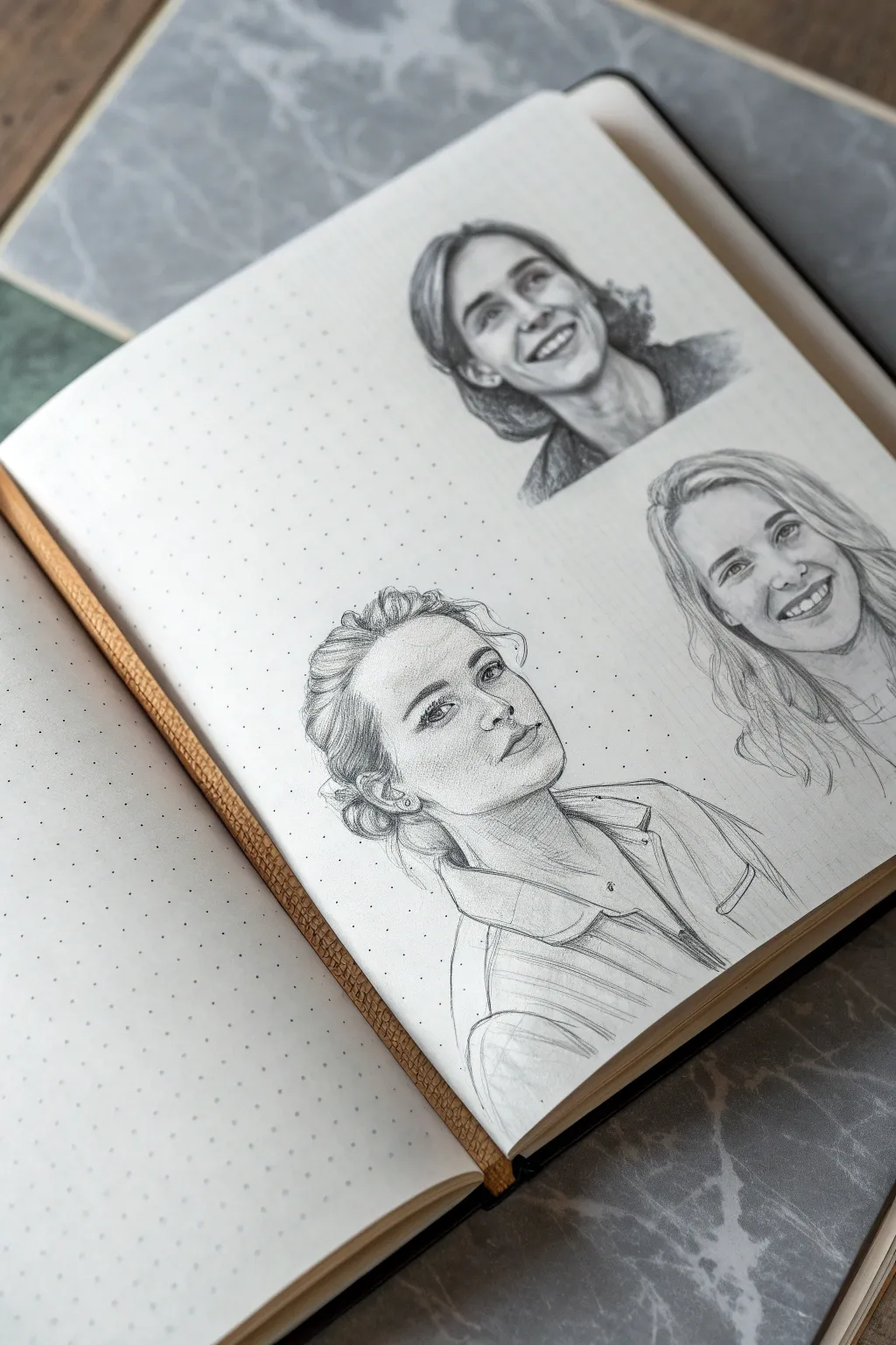
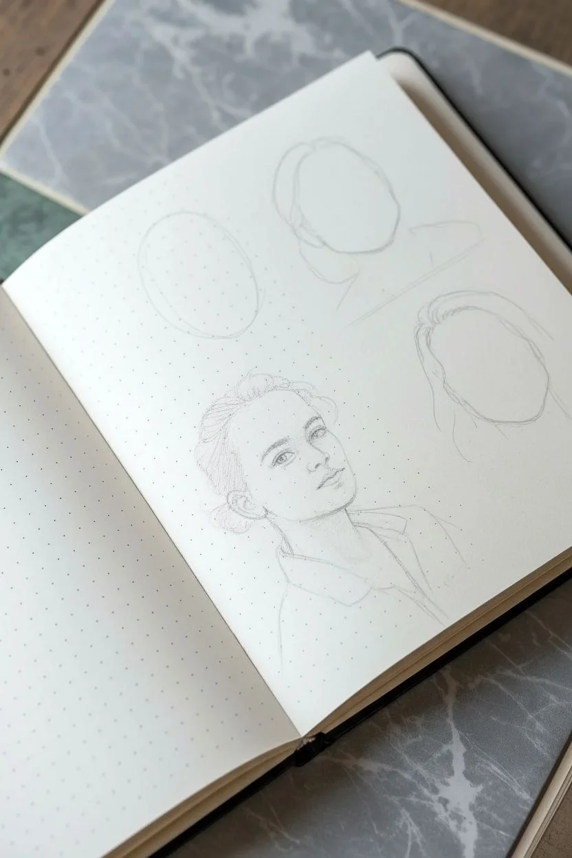
Capture the nuance of human expressions with this study of three distinct faces on dotted paper. This project blends photorealistic shading with sketchy, loose strokes to create a lively sketchbook page that feels both polished and spontaneous.
How-To Guide
Materials
- Dot grid sketchbook (A5 or similar size)
- Graphite pencils (HB, 2B, 4B)
- Mechanical pencil (0.5mm, HB lead)
- Kneaded eraser
- Precision eraser (stick or mono zero)
- Blending stump or tortillon
- Tissue or scrap paper (for hand rest)
Step 1: Layout & General Composition
-
Map the placements:
Visualize the page layout. Place two smaller portraits in the top right quadrant and one larger, focal portrait in the bottom left-center. Use the dot grid to lightly mark the boundaries of each head to ensure they fit comfortably without crowding. -
Determine angles:
Sketch faint center lines for the faces. The top portrait looks upward slightly, the middle-right portrait tilts broadly, and the main bottom portrait is a three-quarter view looking up and to the right.
Eyes look uneven?
In a 3/4 view, the far eye is tricky. Check that the inner corner of the far eye aligns horizontally with the near eye, even if the shape is compressed. Use a mirror to check your drawing’s symmetry.
Step 2: Top Portrait: The Upward Gaze
-
Construct the features:
Using an HB pencil, lightly block in the eyes, which are narrowed in a smile, and the open mouth. The teeth should be suggested rather than outlined individually. -
Add hair volume:
Sketch the hair pulled back, focusing on the dark values behind volume at the ears. Use a 2B pencil to darken the area under the chin and around the neck to push the face forward. -
Refine the expression:
Deepen the laugh lines around the mouth and eyes using a mechanical pencil for precision. Keep the shading light on the forehead to suggest bright lighting.
Step 3: Middle Portrait: The Broad Smile
-
Draft the smile:
Position this face slightly below the first but to the right. Focus on the wide, toothy smile. Draw the upper lip curve first, then the bottom lip, leaving the teeth area largely white. -
Flowing hair texture:
Draw long, sweeping strokes for the hair cascading down. Unlike the first portrait, keep the hair lines looser and lighter at the ends to fade into the page. -
Soft shading:
Use a 2B pencil to shade the hollows of the cheeks and the side of the nose. Blend gently with a stump to make the skin look smooth compared to the textured hair.
Level Up: Tone Paper
Instead of white dotted paper, try this on toned gray or tan paper. Use a white charcoal pencil or gel pen to add striking highlights that pop off the page.
Step 4: Main Portrait: Detailed Three-Quarter View
-
Establish the head shape:
Sketch a large oval for the head, tilting it back. Mark the ear placement low on the left side to emphasize the upward chin tilt. -
Drafting the eyes and nose:
Draw the eyes looking upward. The far eye (right) will appear slightly smaller and more compressed due to perspective. Define the nostrils clearly, as the angle exposes them more. -
Sculpting the jawline:
Use a confident, darker line to define the sharp jawline and the neck muscle (sternocleidomastoid) stretching as the head turns. -
Detailed hair rendering:
This figure has an intricate updo. Use short, curved strokes to show hair pulled back from the forehead. Darken the bun area behind the ear with a 4B pencil to create depth and contrast. -
Clothing contours:
Sketch the collar of a button-down shirt. Don’t over-detail the fabric pattern; use directional hatching to suggest the stripes and folds of the shirt, letting the lines fade out at the bottom. -
Layering shadows:
Focus shading on the left side of the face (the ‘short’ side of the lighting). Shade under the eyebrow ridge, the side of the nose, and cast a strong shadow under the collar bone. -
Refining highlights:
Take your kneading eraser and lift graphite from the bridge of the nose, the forehead, and the top of the cheekbones. This subtraction creates the glowing highlight effect. -
Final touches:
Go back over all three portraits with your sharpest mechanical pencil. Add tiny flyaway hairs, darken the pupil centers, and clean up any smudges on the white space.
Now you have a dynamic page of expressions that captures personality with just a few pencils


Uplifting Quote With Hand-Lettering

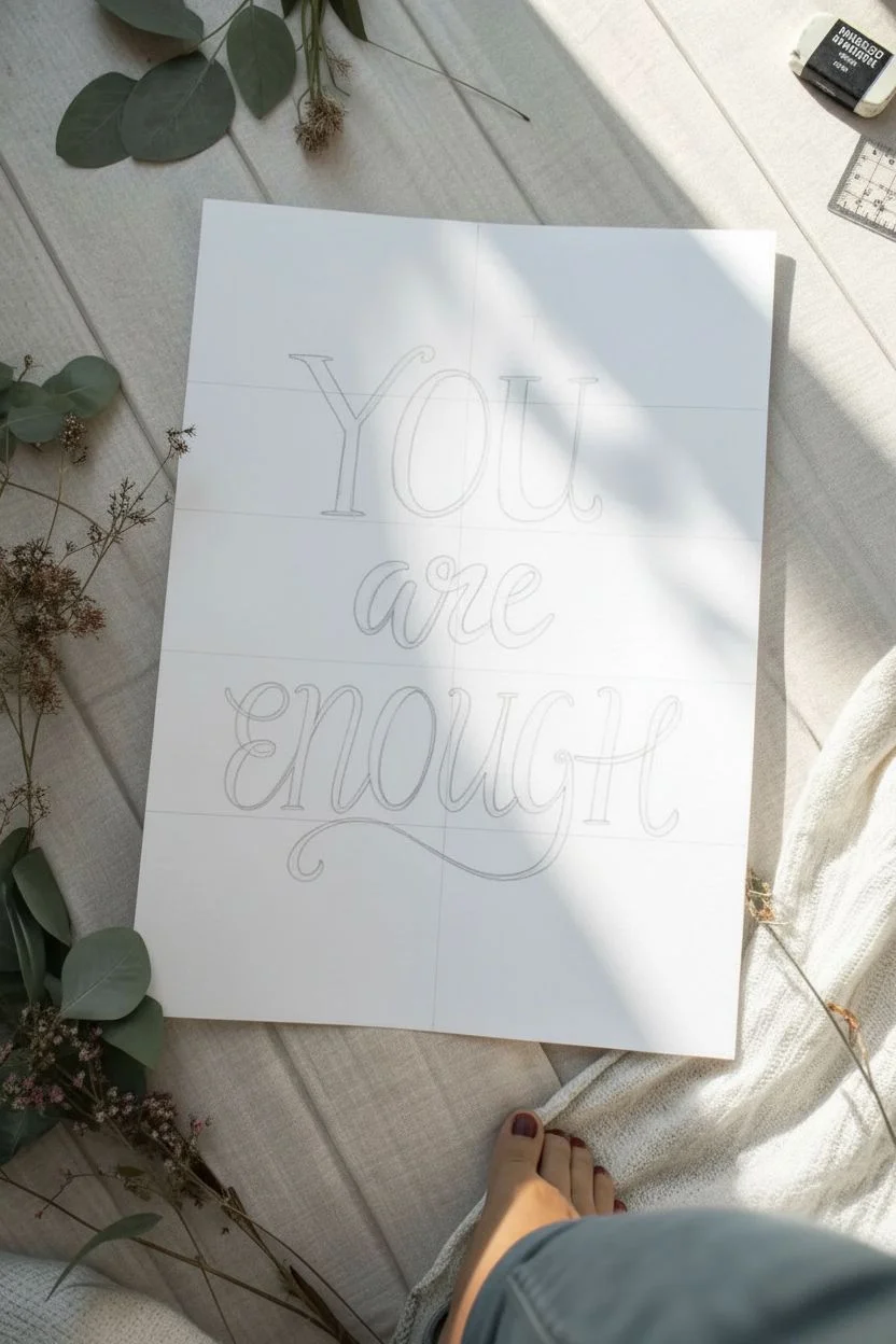
This soothing hand-lettered piece combines elegant typography with earthy autumn tones and celestial accents for a truly grounding reminder. The clean layout balances bold lettering with delicate botanical details, making it a perfect addition to a bedroom or workspace wall.
Detailed Instructions
Materials
- Hot press watercolor paper or smooth Bristol board (9×12 inches)
- Black brush pen (medium firm tip)
- Fine tip drawing pens (Sizes 01 and 05, black and dark blue)
- Watercolor paints or gouache (Burnt Sienna, Yellow Ocher, Sap Green)
- Small round paintbrush (Size 2 or 4)
- HB pencil
- Kneaded eraser
- Ruler
Step 1: Layout and Drafting
-
Find your center:
Begin by finding the vertical center of your paper. Lightly draw a vertical line down the middle with your ruler and HB pencil to act as your anchor for the text alignment. -
Mark your baselines:
Determine where each of the three words will sit. Draw three light horizontal guidelines. Leave generous spacing between them—about 2-3 inches—so the descending loops of the letters don’t crash into the words below. -
Sketch the letters:
Using a very light touch, sketch the words ‘You are enough’. For ‘You’, use a classic serif style with vertical stress. For ‘are’ and ‘enough’, use a flowing cursive script. Don’t worry about thicks and thins yet; just focus on spacing and centering. -
Refine the script:
Go back over your pencil sketch and thicken the downstrokes of the letters to simulate calligraphy. This ‘faux calligraphy’ technique helps you visualize the final weight before committing with ink.
Smooth Moves
If your hand shakes on long curves, exhale slowly as you draw the line. Moving your arm from the shoulder rather than just moving your wrist creates smoother strokes.
Step 2: Inking the Text
-
Ink the top word:
Start with ‘You’. Use your black brush pen or a thick drawing pen to outline the serif letters. Fill them in carefully, ensuring the edges are crisp and the serifs have sharp points. -
Letter the middle:
Move to ‘are’. Using the brush pen, apply pressure on the downstrokes to create thickness and lift up for hairline upstrokes. The transition between thick and thin should be smooth. -
Finish the quote:
Ink the word ‘enough’. Pay special attention to the flourish on the ‘g’—let the loop sweep generously to the left, underlining the word. While inking, I find it helpful to rotate the paper slightly to get the best angle for those long curves. -
Erase guidelines:
Wait at least 10-15 minutes for the black ink to dry completely. Gently use your kneaded eraser to lift the pencil guidelines so you don’t smudge the fresh lettering.
Step 3: Botanical and Celestial Details
-
Sketch the leaves:
Lightly sketch a curved stem flanking the word ‘are’ on the left and right sides. Add individual leaf shapes sprouting outward, varying their sizes slightly for a natural look. -
Paint the left branch:
Mix a diluted Burnt Sienna watercolor. Carefully fill in the leaves on the left branch. While the paint is still damp, you can drop a tiny bit of darker brown near the stem for depth. -
Paint the right branch:
For the right branch, use a Yellow Ocher shade to create a warm, autumnal contrast. Paint these leaves using the same technique, keeping the edges neat. -
Add leaf veins:
Once the watercolor is bone dry, take your fine tip pen (size 01) and draw a central vein line through each leaf for added definition. -
Draw the stars:
Using a dark blue fine liner, draw an eight-point star (a cross with a smaller ‘x’ through it) above the ‘u’ in ‘You’. Add a similar star below the flourish of the ‘g’. Add a third small star to the bottom left for balance. -
Sprinkle the magic:
Dip the tip of your brush or a toothpick into Yellow Ocher or gold paint. Dot small circles randomly around the text to fill the negative space, creating a magical dust effect.
Metallic Magic
Swap the yellow ocher paint for metallic gold watercolor or gold leaf paint on the dots and right-side leaves. It catches the light beautifully.
Step back and admire your handiwork, knowing you’ve created a piece that radiates positivity
BRUSH GUIDE
The Right Brush for Every Stroke
From clean lines to bold texture — master brush choice, stroke control, and essential techniques.
Explore the Full Guide
Gratitude Doodle Grid


This minimalist bullet journal layout turns daily gratitude into a visual practice, featuring twelve neat frames filled with charming, simple icons. The mix of clean black ink lines and soft touches of color creates a calming, organized aesthetic perfect for reflection.
Step-by-Step Tutorial
Materials
- Dotted grid notebook (A5 size recommended)
- Fine liner pen (black, 0.3mm or 0.5mm)
- Ruler
- Pencil and eraser
- Colored pencils or mild markers (orange, green, blue, brown)
Step 1: Setting the Structure
-
Map out the grid:
Start by counting the dots on your page to find the center. Using a pencil, lightly mark out a 3×4 layout of squares. Ideally, leave 1-2 dot spaces between each square to give the doodles room to breathe. -
Draw the frames:
Once you are happy with the spacing, use your ruler and black fine liner to ink the squares. Keep your hand steady and lift the pen cleanly at the corners to avoid ink pooling. -
Add the header:
In the top left corner above the first box, write ‘Small dreams’ or your chosen title in a loose, cursive script. Keep the lettering playful and slightly slanted to contrast with the rigid grid.
Step 2: Doodling: Top Row
-
The fluffy cloud:
In the first box, draw a bumpy, irregular cloud shape. Add a few small curved lines inside for volume. Color the main body with a soft peach or light orange marker. -
Simple mountains:
For the second box, draw two jagged peaks with a single continuous line. Add a secondary, slightly lower jagged line behind the first peak to create depth without shading. -
Potted sprout:
In the third box, sketch a small trapezoid pot. Draw two tiny leaves emerging from the dirt. Color the pot brown and use a tiny dab of green for the leaves. -
Empty space:
Leave the fourth box (or whichever box you prefer) blank for now, or add a simple dotted texture if you want to indicate a space for future thoughts.
Smudged Ink?
If you smudge a line while erasing, turn it into a shadow or texture. Use a white gel pen to clean up small mistakes on the framing lines.
Step 3: Doodling: Middle Row
-
List format:
In the next box, draw three short horizontal lines. To the left of each line, add a tiny spiral or flower shape to act as bullet points. -
Moon face:
Draw a circle in the center of the box. Add a small crescent line for a nose and two dots for eyes. I like to add a tiny swirl on the cheek for character. -
Weather icons:
Create a vertical column of tiny symbols: a sun at the top, a cloud in the middle, and a squiggle (representing wind or water) at the bottom. -
Shopping cart:
Sketch a simple wire basket shape on wheels. This can represent errands or wishlist items. Keep the lines thin and geometric.
Grid Consistency
Cut a square of cardstock the size of one grid box. Use this as a tracing template to ensure every square is identical without measuring each time.
Step 4: Doodling: Bottom Row
-
Blue basket:
Draw an inverted trapezoid. Add a horizontal line near the top for the rim and crosshatch the body to look like a weave. Fill it in with a light blue color. -
Abstract plants:
In the next box, draw a few swirling calligraphy-like strokes that resemble vines or Arabic script for an artistic, abstract touch. -
Radiant sun:
Draw a solid orange circle in the center. Use your black pen to draw lines radiating outward. Alternate between short lines and longer lines ending in small arrows. -
Leafy plant:
For the final box, draw a small brown pot. Add a taller stem with three or four distinct, textured leaves. Color the leaves a muted sage green.
Step 5: Finishing Touches
-
Erase pencil guides:
Wait until the ink is completely dry—give it a full minute—then gently erase the pencil grid marks from the first phase. -
Review and refine:
Check your doodles for any gaps in the lines. If a color looks too faint, add a second layer to make it pop against the cream paper.
Start filling your new grid with small drawings of things that make you smile today
Peaceful Landscape With A Path
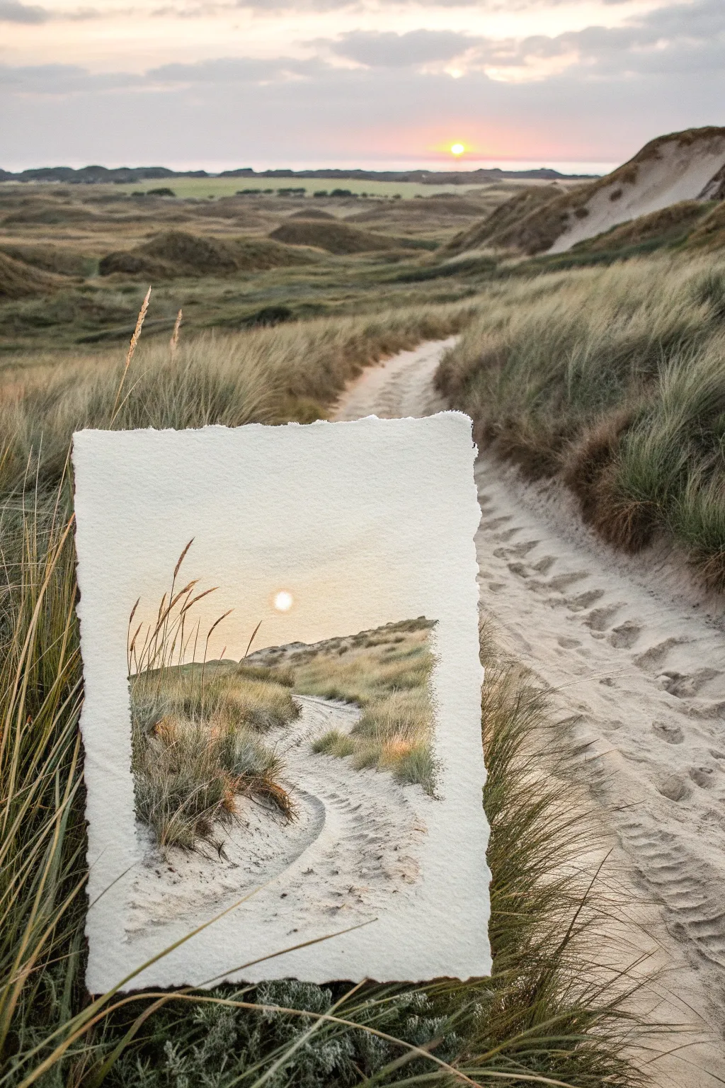
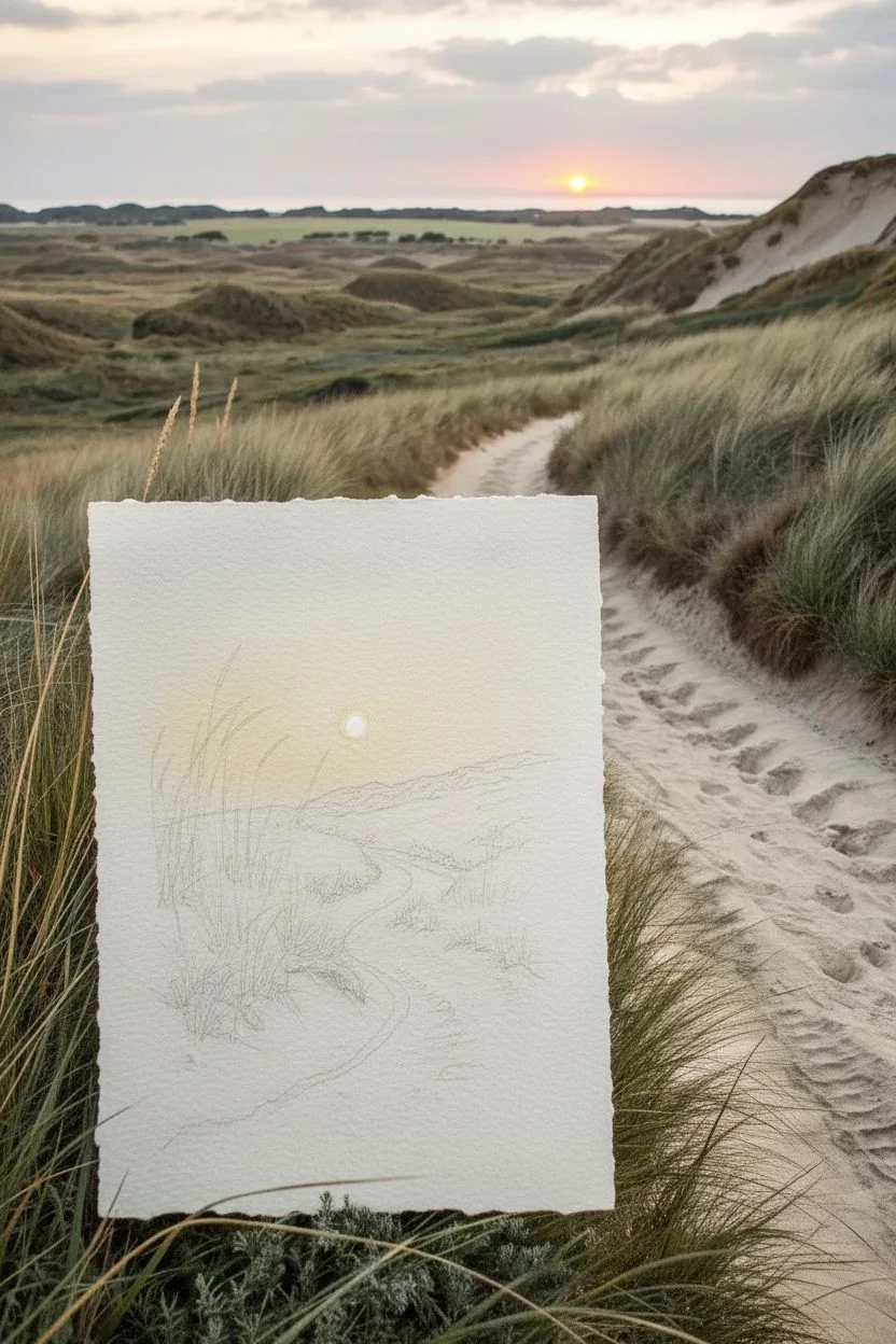
Capture the serenity of a coastal evening with this watercolor landscape featuring a winding sandy path through swaying beach grass. The composition focuses on the warm glow of a setting sun and the soft textures of sand dunes.
Step-by-Step Guide
Materials
- Cold-press watercolor paper (300gsm, preferably with deckled edges)
- Watercolor paints (Yellow Ochre, Burnt Sienna, Payne’s Gray, Sap Green, Cadmium Yellow)
- Round watercolor brushes (sizes 4, 8, and a rigger or line brush)
- Masking fluid (optional)
- Pencil (HB) and kneaded eraser
- Paper towels
- Two jars of water
- Painter’s tape or a board
Step 1: Sketch and Sky
-
Outline the Composition:
Begin by lightly sketching the horizon line just below the halfway point of your paper. Draw the winding borders of the sandy path, letting it curve from the bottom left toward the center horizon. Keep your pencil marks faint so they don’t show through the final wash. -
Mark the Sun:
If you want a crisp white sun, use a small dot of masking fluid or simply draw a small circle for the sun position and be careful to paint around it. This negative space will become the brightest part of your sunset. -
Wet the Sky Area:
Using your size 8 brush and clean water, dampen the sky area above the horizon. The paper should glisten but not have puddles. This prepares the surface for a wet-on-wet technique. -
Paint the Glow:
Drop a very watery mix of Cadmium Yellow around the sun area. As you move outward, blend it gently into the damp paper to create a soft halo effect. -
Darken the Upper Sky:
While the paper is still damp, mix a very pale grey using a touch of Payne’s Gray diluted with plenty of water. Paint the top corners of the sky, letting it bleed down toward the yellow horizon to suggest fading daylight.
Step 2: Dunes and Shadows
-
Base Layer for Dunes:
Once the sky is dry, mix Yellow Ochre with a tiny touch of Sap Green. Apply this wash to the grassy hill areas on either side of the path. Let the color vary in intensity—lighter near the top where the sun hits, and darker near the bottom. -
Define the Path:
The path should remain mostly the white of the paper. However, to show shadows and footprints, mix a very pale purple-grey (Payne’s Gray + Burnt Sienna + lots of water). Lightly dab marks onto the path to suggest uneven sand, focusing on the dips and tire tracks. -
Build Dune Depth:
Mix Sap Green with a little burnt Sienna to get a muted, earthy olive color. Using a size 4 brush, paint the shadowed sides of the dunes, particularly on the right side where the light wouldn’t reach directly. -
Add Texture:
I like to use a ‘dry brush’ technique here. Load your brush with slightly thicker pigment (less water) of the olive mix, blot it on a paper towel, and drag it sideways across the dunes to mimic the roughness of grass clumps.
Muddy Colors?
If your greens look too brown or muddy, let the first layer dry completely before adding the next. Wet layers mixing unintentionally creates mud.
Step 3: Grasses and Details
-
Paint Distant Grass:
Mix a darker green-brown. Using the tip of your size 4 brush, make small, vertical flicking motions along the crests of the dunes. These should be very small to indicate distance. -
Foreground Grasses:
Switch to your rigger brush or the very tip of the size 4 brush. Mix a strong Burnt Sienna and Green. In the bottom left corner, paint long, sweeping blades of grass that overlap the sky area slightly. -
Vary the Tones:
Add some yellow to your green mix and paint shorter clumps of grass along the edges of the path. Varying the color adds realism so it doesn’t look flat. -
Enhance Path Shadows:
Strengthen the shadows in the tire tracks or footprints on the path with a slightly darker grey wash. This helps guide the viewer’s eye into the painting. -
Final Highlights:
If you used masking fluid for the sun, gently rub it away now to reveal the bright white paper underneath.
Add Sparkle
Splatter tiny drops of white gouache or masking fluid before painting the foreground to create the look of sand grains catching the light.
Step back and admire your peaceful sunset path, ready to be framed or gifted to a nature lover

PENCIL GUIDE
Understanding Pencil Grades from H to B
From first sketch to finished drawing — learn pencil grades, line control, and shading techniques.
Explore the Full Guide
Calm Place Imagination Sketch
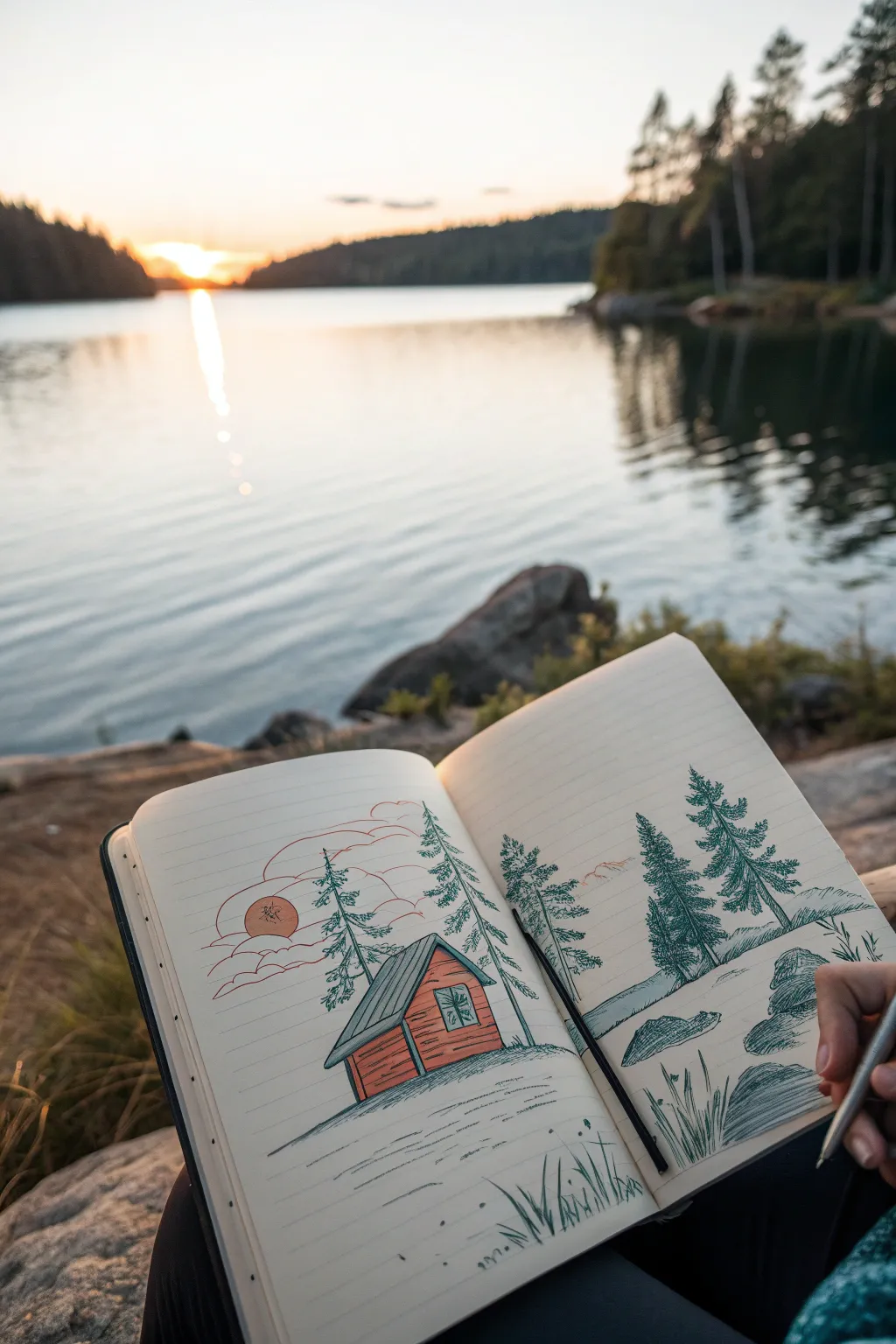
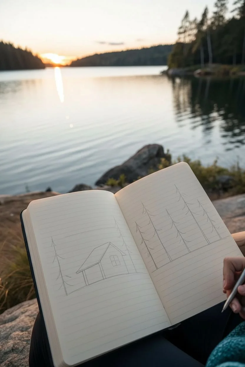
Capture the serenity of a lakeside evening with this charming line drawing of a rustic cabin nestled among tall pines. Using simple ink lines and a touches of muted colour, you’ll create a cozy scene that feels like a peaceful escape right on the page.
Step-by-Step
Materials
- Lined notebook or sketchbook
- Fine-tipped black drawing pen (0.3mm or 0.5mm)
- Coloured pencils or markers (muted red, slate blue, sage green, soft orange)
- Pencil for sketching
- Eraser
Step 1: Setting the Scene
-
Sketch the horizon:
Start by lightly sketching a horizontal line about one-third of the way up the page spread. This establishes the ground level where your trees and cabin will sit. -
Outline the cabin shape:
On the left-hand page, draw a simple boxy shape for the cabin base, slightly angled to show two sides. Add a pitched roof on top, letting the eaves overhang a little for that rustic look. -
Establish tree positions:
Lightly mark vertical lines where you want your pine trees to stand. I like to place a couple framing the cabin on the left and a larger cluster on the right page to balance the composition.
Loose Lines
Don’t try to make your straight lines perfect. A slightly wobbly, hand-drawn line adds character and fits the rustic theme much better than a ruler’s edge.
Step 2: Inking the Details
-
Ink the cabin structure:
Using your black pen, go over the cabin’s outline with confident strokes. Add horizontal lines on the walls to mimic wooden siding, keeping them roughly parallel to the roofline. -
Draw the roof and window:
Fill the roof with vertical lines to suggest corrugated metal or wood planks. Draw a small rectangular window on the side wall, adding a cross for the pane dividers. -
Create the pine trees:
Starting from the top of your tree guidelines, use short, jagged scribbles to create the pine needles. Widen the strokes as you move down the trunk to give the trees their classic conical shape. -
Add texture to the trees:
Don’t fill the trees in completely solid; leave some white space between branches to keep the drawing looking airy and illustrative. -
Define the foreground rocks:
On the right page, draw rounded, bumpy shapes near the bottom to represent large boulders along the shore. Add quick hatching lines on one side of each rock to suggest shadow and volume. -
Sketch the water’s edge:
Draw loose, horizontal lines extending from the shore into the ‘water’ area on the right page. These broken lines suggest ripples and the reflection of the land. -
Add grassy details:
In the immediate foreground at the bottom of the pages, flick your pen upward rapidly to create tufts of tall grass and reeds.
Step 3: Atmosphere and Colour
-
Draw the sun and clouds:
On the left page above the cabin, draw a small circle for the sun. Surround it with wavy, horizontal cloud lines that stretch across the sky. -
Colour the cabin:
Take a muted red or rust-coloured pencil and gently fill in the cabin walls. Press lightly so the black ink lines still show clearly through the colour. -
shade the roof:
Use a slate blue or grey pencil to color the cabin roof. Add a little extra pressure on the side furthest from the sun to create depth. -
Tint the sun and sky:
Color the sun circle with a soft orange. You can lightly trace some of the cloud lines with red or orange to reflect the sunset light. -
Add greenery:
Use a sage or forest green pencil to add subtle color to the pine trees. Instead of coloring them solidly, just add scribbles of green over your black ink work to enhance the texture. -
Final shading touches:
add a touch of grey or blue to the shadow side of the large rocks on the right page to ground them in the scene.
Level Up: Reflection
Use a white gel pen to add tiny highlights to the water ripples or the window pane after your colors are dry to make the scene sparkle.
Enjoy the peaceful feeling of your portable lakeside retreat whenever you flip to this page
Kindness Moment Mini-Illustration
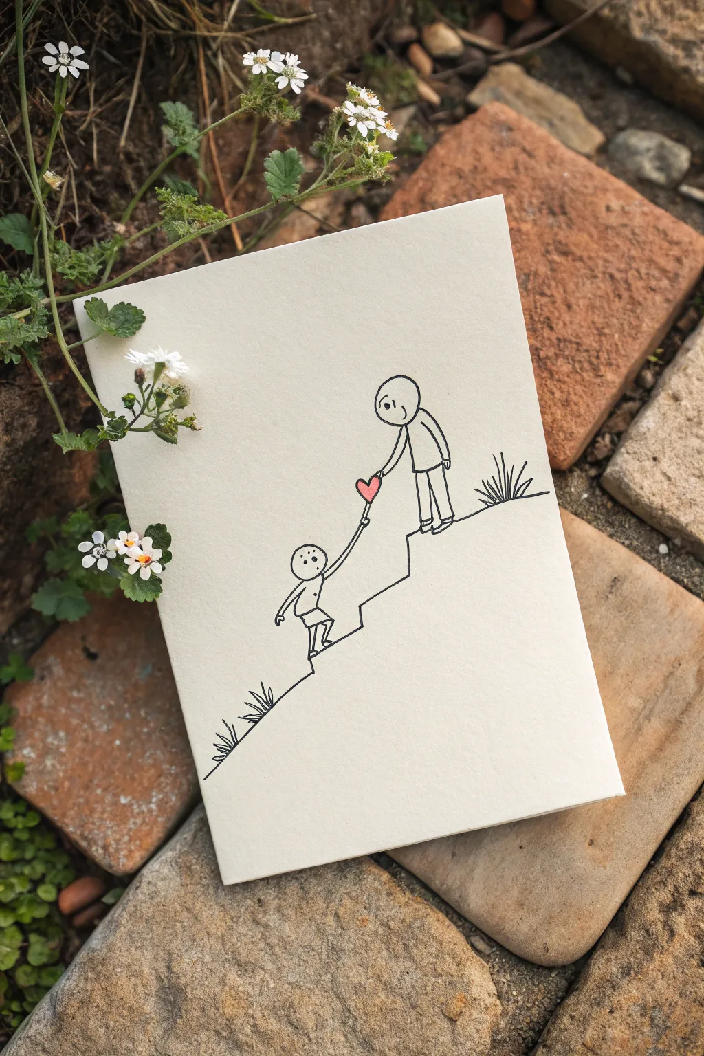
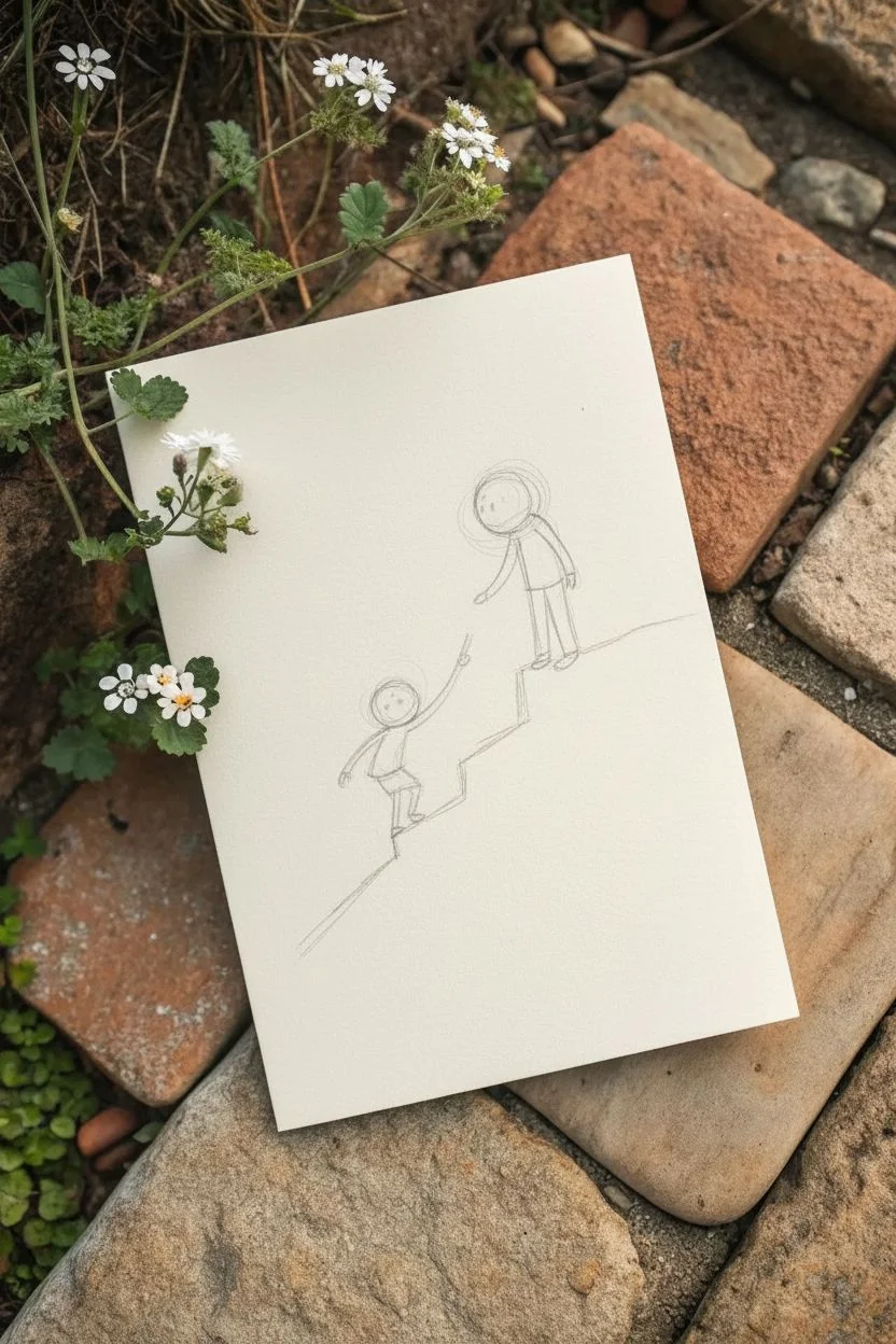
This minimalist line drawing captures a tender moment of connection and support, perfect for a greeting card or small framed print. Using simple black ink lines and a single pop of color, you will create a heartfelt scene of two figures navigating an uphill climb together.
Step-by-Step Tutorial
Materials
- Heavyweight cream or off-white cardstock (A5 folded or 5×7 sheet)
- Fine-point black drawing pen (0.3mm or 0.5mm)
- Pencil (HB or H)
- High-quality eraser
- Pink colored pencil or watercolor marker
- Ruler (optional, but helpful for the slope)
Step 1: Planning the Composition
-
Set the Stage:
Begin by lightly sketching your slope with a pencil. Start from the bottom left corner and draw a diagonal line rising toward the middle right. Instead of a straight line, add a distinct ‘step’ or jagged ledge about two-thirds of the way up where the upper figure will stand. -
Position the Figures:
Lightly sketch two circles for heads. Place the first head lower on the slope, leaning slightly backward. Place the second head higher up on the ledge, positioned as if looking down at the first figure. -
Draft the Bodies:
Draw simple stick-figure outlines to establish the poses. Sketch the lower figure’s body leaning back as if climbing or slipping, with one leg bent. Sketch the upper figure standing firmly, leaning forward slightly to reach down.
Ink Confidence
Don’t stress about shaky lines. Slight wiggles add charm and humanity to this style, making it feel more authentic and heartfelt than a digital print.
Step 2: Inking the Landscape
-
Draw the Slope:
Using your fine-point black pen, trace over your pencil line for the hill. Keep the line clean and deliberate. When you reach the ‘step’ in the middle, create a sharp vertical rise followed by a horizontal plateau for the upper figure. -
Add Texture:
To give the ground some character, add small tufts of grass. Draw three or four short, spiky strokes clustered together near the bottom left slope and another small cluster behind the upper figure on the right.
Step 3: Inking the Figures
-
Outline the Upper Figure:
Ink the head of the standing figure first. Instead of a perfect circle, allow for a slightly organic, hand-drawn round shape. Draw the torso as a long, thin rectangle or oval that connects to the hips. -
Legs and Feet:
Draw the legs of the upper figure as simple parallel lines ending in small rounded rectangles for feet, heavily planted on the flat part of the ledge. -
The Reaching Arm:
Draw the arm extended downwards. Use a simple line that curves gently toward the lower figure. I find it helpful to stop the line just before where the hands will meet to leave room for the heart. -
Outline the Lower Figure:
Ink the head of the lower figure. Add two small dots for eyes, positioned high on the face to suggest they are looking upward. -
Dynamic Pose:
Ink the lower body, showing movement. One leg should be extended back planting against the slope, while the other knee is bent forward as if stepping up. Add a small indication of shorts or a shirt hem for detail. -
The Reaching Up:
Draw the arm of the lower figure reaching straight up toward the upper figure’s hand. Again, stop the line just short of connection.
Make it Personal
Customize the figures to match the recipient! Add small details like glasses, a ponytail, a hat, or a specific shirt pattern to make the characters recognizable.
Step 4: The Heart Connection
-
Draw the Heart:
Right in the gap between the two reaching arms, draw a small, simple heart shape. Orient it so the bottom point aligns with the lower arm and the top curves align with the upper arm. -
Connect the Hands:
Carefully extend the ink lines of the arms so they ‘hold’ the heart. The lines should touch the very tips of the heart shape, creating the illusion that they are linked by this symbol. -
Color the Heart:
Using your pink colored pencil or marker, carefully fill in the heart. If using pencil, press firmly to get a saturated, vibrant pink that stands out against the cream paper.
Step 5: Details and Cleanup
-
Facial Features:
Go back to the upper figure and add facial details. Draw two small dots for eyes and a tiny curved line for a smile. Position the eyes so they appear to be looking down at the friend below. -
Erase Sketches:
Wait at least 5-10 minutes for your ink to be fully dry. Then, gently erase all underlying pencil marks. Hold the paper taut to avoid crumpling it while erasing.
Now you have a touching piece of art that speaks volumes with just a few simple lines


Self-Love: Hugging A Heart


This tender illustration captures the essence of self-compassion with a simple figure embracing a large, warm heart. The minimalist black lines contrast beautifully with the soft, textured copper-toned watercolor wash, creating a comforting piece of art.
How-To Guide
Materials
- Cold press watercolor paper (A5 or similar small format)
- Black waterproof fine liner pen (0.5mm or 0.8mm)
- Watercolor paints (Terracotta, Burnt Sienna, or Copper)
- Round watercolor brush (size 6 or 8)
- Pencil (HB)
- Kneaded eraser
- Water cup
- Paper towel
Step 1: Sketching the Outline
-
Map out the composition:
Begin by lightly sketching the large heart shape in the center of your watercolor paper. Tilt it slightly to the right so it looks like it’s being held. -
Add the figure’s head:
Draw an oval shape resting on top of the left curve of the heart. This will be the character’s head. -
Sketch the arms:
Draw the right arm curving over the top of the heart, ending with hand fingers resting near the center. -
Complete the embrace:
Sketch the left arm emerging from behind the heart on the left side, with the hand curving upward to meet the other hand in the middle. -
Define the face:
Add small C-shaped ears on the sides of the head. Draw two curved downward lines for closed, peaceful eyes and a small upward curve for a smile. -
Draw the body:
Extend simple lines downward from under the arms to suggest a torso that fades off the bottom of the page.
Bleeding Ink?
If your black lines smudge when you paint, your pen isn’t waterproof. Let the ink dry for at least 24 hours, or paint first and ink last.
Step 2: Inking the Drawing
-
Trace the primary lines:
Using your waterproof fine liner, carefully trace over your pencil sketch. I prefer a slightly thicker nib here, like an 0.8mm, to give the drawing a bold, illustrative feel. -
Refine the details:
Ink the facial features carefully. Ensure the lines for the fingers are distinct against the heart shape. -
Erase guidelines:
Wait a moment for the ink to set completely, then gently use the kneaded eraser to lift away all visible pencil marks.
Texture Tip
For that grainy, vintage look seen in the photo, specifically use ‘granulating’ watercolor pigments or cold-press paper with a rougher tooth.
Step 3: Adding Color
-
Prepare your paint:
Mix a warm, earthy red or terracotta watercolor tone. Dilute it with enough water so it remains transparent but vibrant. -
Paint the heart base:
Apply a wash of color to the heart shape. Don’t worry about perfect coverage; a little texture adds character. -
Add depth to the heart:
While the paint is still damp, drop a slightly more concentrated amount of pigment near the bottom point of the heart for a subtle gradient. -
Color the body:
Using the same color mix but perhaps slightly more diluted, paint the torso area below the heart. -
Create the fade effect:
As you paint down the torso, dip your brush in clean water to fade the color out into the white of the paper at the bottom. -
Let it dry:
Allow the watercolor to dry naturally. The slight buckling of the paper and pooling of pigment is part of the charm.
Display this piece freely to remind yourself of the importance of self-kindness
Mind As A Flower Garden
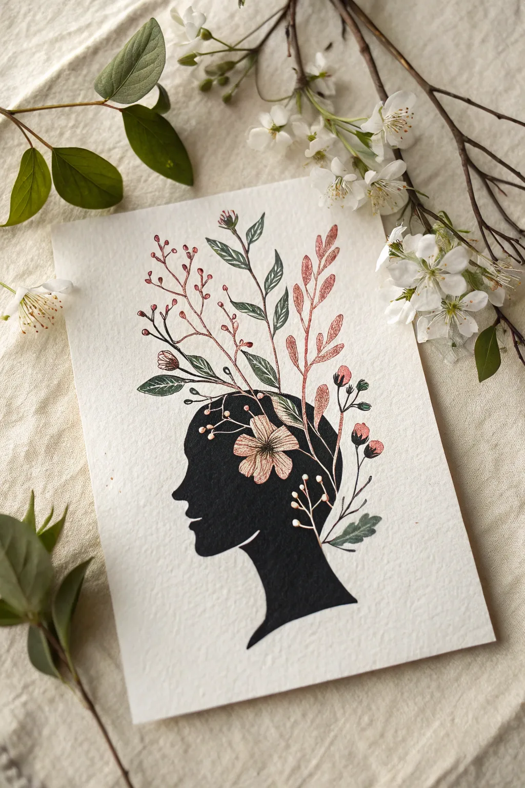
This elegant mixed-media piece combines a bold, dark silhouette with delicate botanical illustrations blooming from the mind. It is a beautiful metaphor for growth and creativity, rendered in striking ink and watercolor pencil.
Step-by-Step Guide
Materials
- High-quality watercolor paper (cold press or textured)
- Black India ink or black gouache
- Fine liner pens (black, 0.1mm and 0.3mm)
- Watercolor pencils or fine markers (shades of sap green, olive, blush pink, coral, and metallic copper/gold)
- Small round brushes (size 0 and 2)
- Pencil (HB for sketching)
- Eraser
- Reference photo of a side profile (optional)
- Masking tape
Step 1: Sketching the Foundations
-
Prepare your paper:
Tape down your watercolor paper to a sturdy board to prevent buckling. Lightly mark the center of the page to ensure your composition is balanced. -
Outline the silhouette:
Using an HB pencil, very lightly sketch the outline of a human head in profile. Focus on the curve of the forehead, nose, lips, and chin. The neck should taper off elegantly at the bottom. Keep the top of the head open where the flowers will emerge. -
Sketch the botanical placement:
Visualize where your ‘garden’ will grow. Lightly draw faint guidelines for the main stems rising from the crown of the head. Don’t draw every leaf yet, just the flow of movement upward.
Fixing Smudges
If black ink touches the paper where it shouldn’t, wait for it to fully dry. Then, use white gouache or a white gel pen to carefully paint over the mistake.
Step 2: Inking the Silhouette
-
Outline with ink:
Take your black India ink or gouache and a size 2 brush. Carefully outline the pencil profile you drew. Keeping your hand steady here is crucial for a crisp edge. -
Fill the form:
Fill in the entire head shape with solid black. Ensure the coverage is opaque; you may need a second coat if using gouache. Leave the very top edge slightly uneven or integrated with where the stems will begin. -
Refine the edges:
Switch to a smaller brush or even a black fine liner to sharpen the details of the nose, lips, and eyelashes if you included them. Let the black ink dry completely before moving on to prevent smudging.
Step 3: Growing the Garden
-
Drafting the main stems:
With your watercolor pencils or colored fine liners, draw the skeleton of your plants. Use a dark green for the leafy stems and a reddish-brown for the berry branches. -
Adding the central flower:
Draw the focal flower sitting right at the ‘hairline’ or inside the silhouette’s upper curve. Use a peach or coral pencil to outline five simple petals and detail the center with fine lines. -
Drawing green foliage:
Add leaves to your green stems. Vary their sizes—larger leaves near the base and smaller ones at the tips. I like to shade one half of the leaf slightly darker to create a sense of dimension. -
Adding fern-like textures:
Create some variety by drawing a fern frond or two with quick, short strokes. Use a varied olive tone here to distinguish it from the other leaves. -
Creating berry sprigs:
Using a coral or pinkish-red pencil, draw small circles at the ends of the branching stems you drew earlier. These represent buds or berries.
Add Real Texture
Level up by gluing actual dried pressed flowers or small skeleton leaves onto the branches for a stunning 3D mixed-media effect.
Step 4: Adding Details & Shimmer
-
Color shading:
If using watercolor pencils, you can lightly activate them with a barely damp brush for a soft washed look, or leave them dry for texture. Add a touch of darker pink to the base of the flower petals for depth. -
Metallic accents:
Use a metallic copper or gold gel pen (or paint) to add veins to the pinkish leaves and highlights on the berries. This gives the drawing that magical, illustrative quality. -
White highlights:
On the black silhouette, if you want a subtle interaction, you can draw a thin white stem crossing over the black area, tying the mind and the garden together visually. -
Final erase:
Once you are absolutely certain all ink and paint is dry, gently erase any visible pencil sketch lines from the beginning. -
Review and refine:
Step back and look at the balance. If the top feels too heavy, add a small floating leaf or petal to the side. Ensure the black silhouette is solid and patch-free.
Display your artwork in a simple frame to let the contrast between the dark mind and the colorful growth speak for itself
Ladder Reaching For The Stars
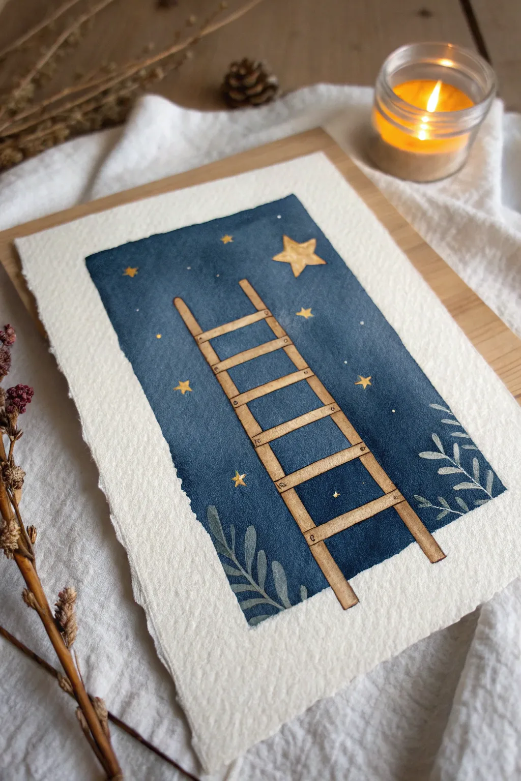
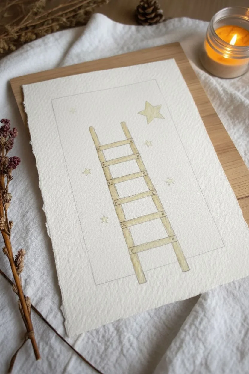
This whimsical watercolor painting features a humble wooden ladder stretching upward into a deep, celestial blue sky. It’s a simple yet powerful visual metaphor for ambition and dreams, rendered on beautiful deckle-edged paper.
Step-by-Step
Materials
- Cold press watercolor paper (deckle edge preferred)
- Watercolor paints (Indigo, Prussian Blue, Burnt Sienna, Yellow Ochre, Paynes Grey)
- White gouache or white gel pen
- Gold watercolor or metallic marker (optional)
- Painters tape or masking fluid
- Pencil and eraser
- Round brushes (size 4 and size 0 or 1)
- Jar of water
- Paper towels
Step 1: Sketching and Masking
-
Sketch the outline:
Begin by lightly sketching a tall, rectangular boundary in the center of your paper. Leave plenty of white space around the edges to frame the artwork. -
Draw the ladder:
Inside the rectangle, draw a simple ladder slightly tilted to the right. Make the rails slightly uneven to give it a rustic, wooden look rather than a perfect geometric shape. -
Map out the elements:
Sketch a large, five-pointed star near the top right, just above the ladder. Add a few vague leaf shapes at the bottom corners. -
Protect the details:
Using masking fluid or very carefully cut masking tape, block out the ladder, the large star, and the larger leaves. This preserves the white paper for later.
Step 2: Painting the Night Sky
-
Mix the sky color:
Create a deep, moody blue by mixing Indigo with a touch of Paynes Grey. You want a saturated, dark value. -
Apply the wash:
With your larger round brush, fill in the rectangular background. Start from the top and work your way down. I find keeping the paper slightly damp helps the color spread evenly. -
Create texture:
While the wash is still wet, you can drop in hints of darker blue or slightly lighter blue to create a subtle atmospheric effect, but keep it mostly uniform. -
Wait for drying:
Let the background dry completely. This is crucial; if you peel the masking too early, you’ll tear the paper.
Clean Lines Trick
If you struggle with wobbly edges on the main rectangle, apply washi tape around the border before painting. Peel it off when the paint is 100% dry for crisp lines.
Step 3: The Ladder and Stars
-
Reveal the white space:
Gently rub away the masking fluid or peel the tape to reveal the crisp white paper underneath. -
Paint the wood:
Dilute Burnt Sienna with plenty of water to get a light tan color. Wash this over the ladder rails and rungs. -
Add wood grain:
Once the tan base is dry, use a very fine brush (size 0) and a more concentrated Burnt Sienna or brown mix to add tiny lines for wood grain and small dots for nail heads. -
Paint the main star:
Fill the large star with a mix of Yellow Ochre and a tiny bit of brown to make it look warm and glowing. -
Add dimension to the star:
Paint one half of each star point slightly darker to give it a faceted, 3D appearance.
Make it Glow
Dilute white gouache heavily with water and glaze it lightly around the main yellow star. This creates a soft ‘halo’ effect, making the star look like it’s shining.
Step 4: Botanicals and Final Details
-
Paint the leaves:
For the bottom foliage, mix a muted blue-grey (or add a tiny bit of green to your sky mix). Paint the leaves directly over the dark background using an opaque mix or gouache if needed. -
Add shadows:
Use a diluted black or dark grey to add a thin shadow line to the right side of the ladder rungs, giving them depth against the sky. -
Create the constellations:
Mix a creamy consistency of white gouache or use a gel pen. Dot tiny stars throughout the blue background. -
Add golden touches:
If you have gold paint, adding tiny flecks near the main star creates a magical shimmer. -
Textural details:
Finally, use your fine brush to add faint veins to the leaves at the bottom for extra realism.
Now you have a serene reminder that even the highest goals are reachable, one rung at a time
Tiny Hummingbird Of Joy
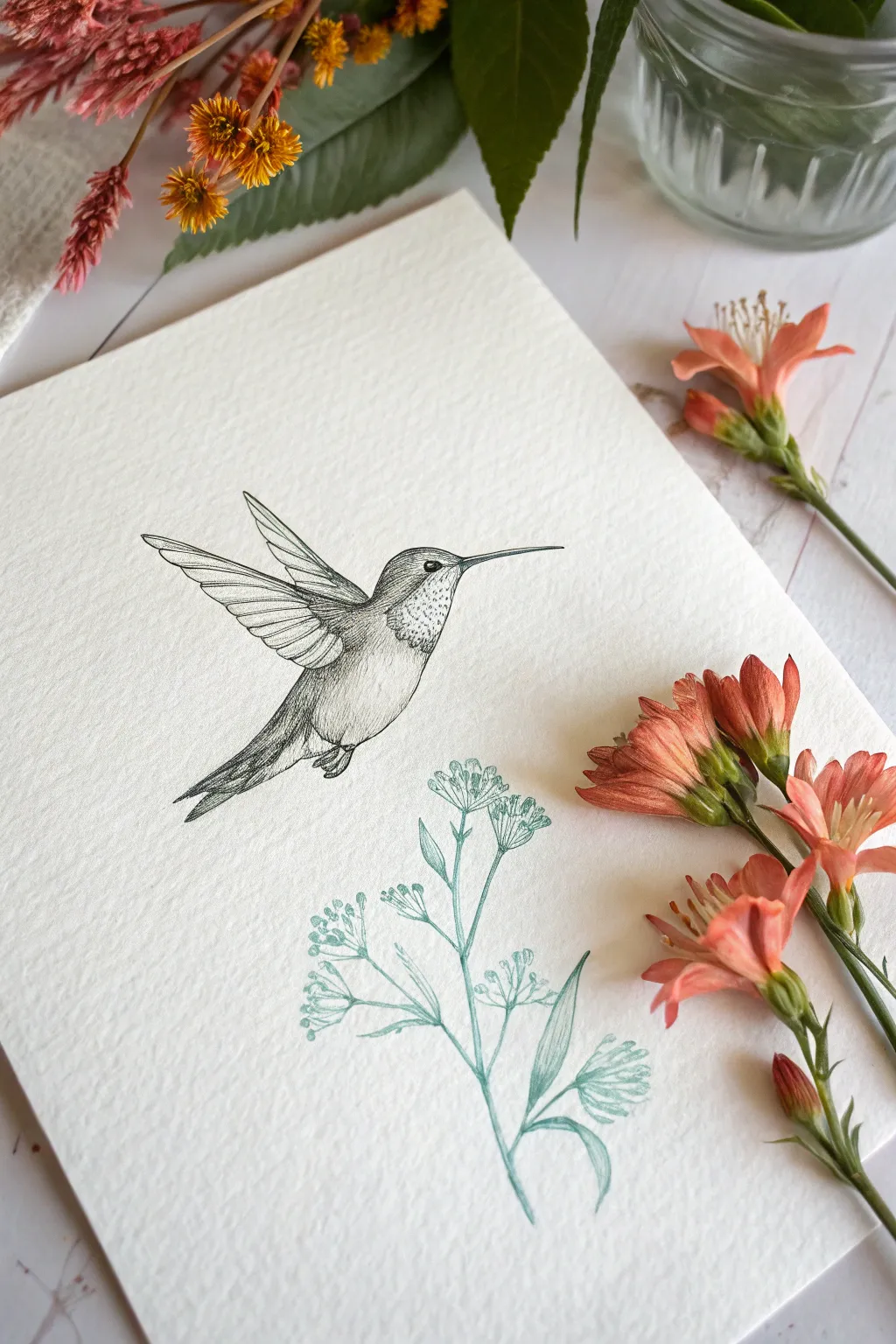
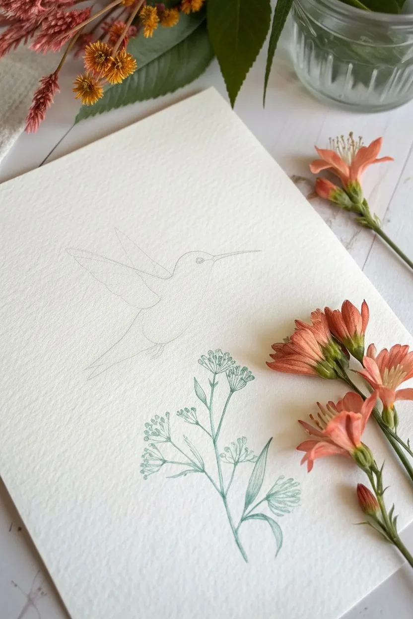
Capture the delicate energy of nature with this fine-line hummingbird illustration paired with a soft botanical accent. Using stippling and hatching techniques on textured paper creates a timeless, elegant piece perfect for a greeting card or framed miniature.
Step-by-Step
Materials
- Cold press watercolor paper (approx. 300gsm for texture)
- Fine liner pen (0.05mm and 0.1mm, black pigment ink)
- Colored pencil or fine marker (sage green or teal)
- Graphite pencil (HB or 2H for sketching)
- Kneaded eraser
Step 1: Planning and Sketching
-
Establish the composition:
Begin by lightly marking the placement of your subjects. Position the hummingbird in the upper left-center area, angling its body upwards as if hovering. Leave space in the lower right for the botanical element to curve upwards, creating a visual flow between the two. -
Outline the bird’s form:
Using your graphite pencil, sketch the basic shapes of the hummingbird. Start with an oval for the body and a smaller circle for the head. Add the long, thin beak pointing straight ahead. -
Draft the wings and tail:
Sketch the wings in an uplifted position. The near wing should look larger and fully extended, while the far wing peeks out from behind. Add a triangular shape for the tail pointing downwards and slightly back. -
Sketch the botanical sprig:
Draw a thin, curving stem originating from the bottom right. Branch it out into smaller stems with clusters of tiny buds or flowers at the tips. Keep this sketch very faint.
Ink Smearing?
If your hand accidentally smudges wet ink, turn it into a shadow or texture. In the future, place a scrap piece of paper under your drawing hand to protect the surface.
Step 2: Inking the Hummingbird
-
Outline the main features:
Switch to your 0.1mm fine liner. carefully trace the outline of the bird, but keep the lines distinct. Use a solid line for the beak and the smooth curve of the back, but use broken or lighter strokes for the belly to suggest softness. -
Detail the eye and beak:
Fill in the eye, leaving a tiny white speck for the highlight to give it life. Draw a line down the center of the beak to separate the upper and lower mandibles. -
Structure the wings:
Draw the primary feathers on the wings. Start with the long, rigid feathers on the outer edge, layering shorter, softer feathers closer to the body. Ensure the tips are rounded but distinct. -
Add texture with hatching:
Using the 0.05mm pen, start shading the body. Use fine, parallel lines (hatching) along the back and under the wings to create shadow and volume. I find that following the curve of the bird’s form with your strokes makes the body look rounder. -
Stipple the throat:
To mimic the iridescent gorget feathers on the throat, use stippling (tiny dots). Cluster the dots densely under the chin and spread them out as you move down the chest. -
Feather the tail:
Ink the tail feathers with longer strokes. Darken the areas where feathers overlap to create depth, making the tail look layered and aerodynamic. -
Finalize bird shading:
Deepen the contrast by adding cross-hatching to the darkest areas, such as where the wing meets the body and the underside of the belly.
Step 3: Drawing the Botanicals
-
Outline the stems:
Switch to your sage green colored pencil or fine marker. Trace over your pencil sketch for the main stem and branches. Keep the pressure light to maintain a delicate look. -
Detail the buds:
Draw the small clusters of buds at the ends of the stems. Use simple oval shapes or tiny fan-like strokes to represent the flower heads. -
Add leaves:
Draw a few elongated leaves near the base of the stem. Shade one side of each leaf slightly more heavily to suggest a fold or light source. -
Cleanup:
Once the ink is completely dry—wait at least five minutes to be safe—gently erase all underlying pencil sketch lines with the kneaded eraser. This reveals the crisp contrast between the black ink and the colored botanical.
Add a Splash
Watercolor works beautifully on this paper. Try adding a single, very watery drop of bright pink or orange to the bird’s throat for a subtle pop of iridescent color.
Now you have a serene little moment of nature captured permanently on your page
Support System Map With Warm Lines
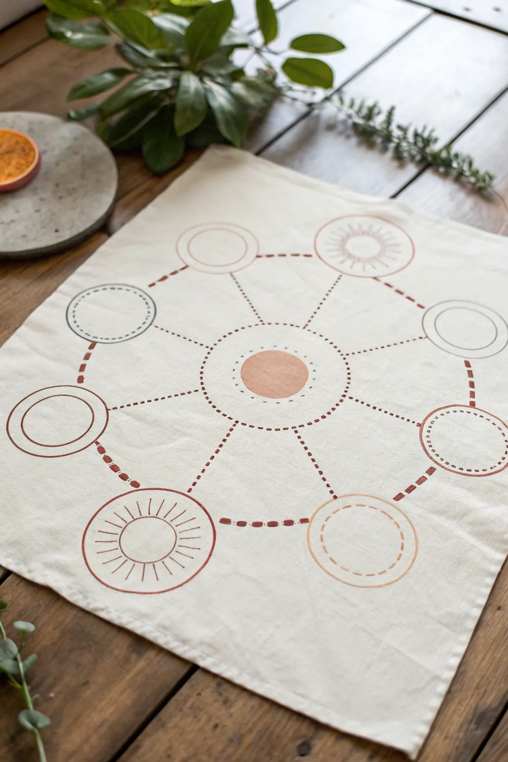
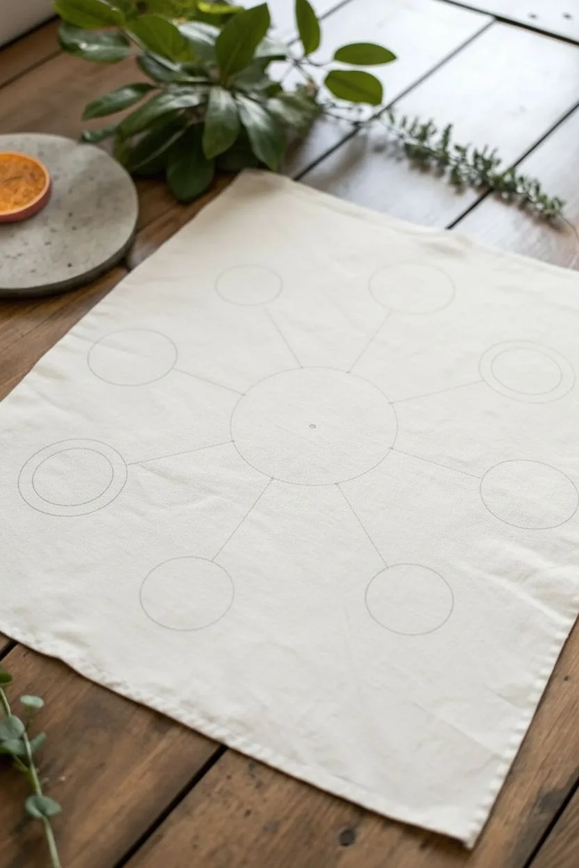
This grounding fabric project transforms a simple cloth into a visual map of your support system using warm, earthy tones and radial symmetry. The design features a central anchor point surrounded by connected circles, creating a minimalist piece that feels both structured and organic.
How-To Guide
Materials
- Square cotton or linen napkin (off-white or oatmeal)
- Fabric stencils (circle shapes in 2-3 sizes)
- Fabric paint or markers (terracotta, dusty pink, mustard, sage grey)
- Fine-tip fabric marker (rust or brown)
- Ruler
- Pencil (for light sketching)
- Iron (for setting the ink)
- Stencil brush or sponge dabber
- Paper plate or palette
Step 1: Planning the Layout
-
Prepare the surface:
Start by ironing your fabric napkin completely flat. wrinkles will distort your geometric lines, so a smooth surface is essential. -
Find the center:
Lightly fold the napkin in half and then in half again to find the exact center point. Mark this tiny spot with a pencil. -
Draft the perimeter:
Using your ruler, lightly mark eight points in a circle around the center, spacing them equidistant from the middle and from each other. -
Sketch the connections:
Very faintly draw straight lines connecting your outer eight points to the center, creating a wheel-spoke effect to guide your painting later.
Step 2: Creating the Focal Points
-
Paint the core:
Place your medium-sized circle stencil over the center mark. dab a solid circle of terracotta or dusty pink paint here using your sponge brush. -
Create the outer ring:
Identify the eight pencil marks you made for the outer circle. You will create a variety of circle styles here. -
Stencil solid outlines:
For 2-3 of the outer points, use a stencil to paint just the *outline* of a circle in a contrasting color like sage grey or deep rust. -
Draw dashed circles:
For another 2-3 points, use your fine-tip fabric marker to hand-draw a dashed or stitched circle outline. This adds texture and variety. -
Add sunburst details:
Select two opposing circles and add radiating lines inside them, resembling a sunburst. Use a fine liner for these delicate strokes. -
Mix fill styles:
Leave most outer circles empty, but feel free to lightly shade one or two with a very pale wash of color to keep the visual weight balanced.
Bleeding Lines?
If ink bleeds into the fabric grain, switch to a finer tip marker or apply a clear fabric medium first to seal the fibers before drawing.
Step 3: Connecting the Map
-
Draw the central orbit:
Using a dotted line technique with your fabric marker, draw a large ring that encases the central solid circle but creates a buffer zone before the connecting lines start. -
Draw radial connectors:
Following your pencil guides, draw dashed lines connecting the central orbital ring to each of the eight outer circles. -
Connect the outer ring:
Create a path between the outer circles by drawing dashed lines that connect them to their neighbors, forming a large octagon shape. -
Vary the line weight:
I prefer to make the radial lines (spokes) slightly thicker or darker than the perimeter lines to emphasize the connection to the core.
Pro Tip: Grid Work
Use a piece of paper cut into an octagon as a template for the outer ring placement to ensure perfect symmetry without complex measuring.
Step 4: Finishing Touches
-
Erase guidelines:
Once the paint and ink are completely dry to the touch, gently erase any visible pencil marks. -
Heat set the design:
Place a scrap piece of cloth over your design and iron it on a high, dry setting (no steam) for 3-5 minutes to make the design permanent.
Now you have a beautifully mapped representation of connection ready to display or use
Strengths As Friendly Characters


Capture positive vibes with this charming doodle spread featuring friendly characters and symbols of time and light. The simple line art combined with soft touches of color makes for a relaxing and achievable journaling project.
Detailed Instructions
Materials
- A5 dotted or blank notebook
- Fine liner pen (0.3mm or 0.5mm, black)
- Colored pencils (yellow, orange, pinkish-red, soft brown)
- Pencil and eraser for sketching
Step 1: Planning and Sketching
-
Light outlines:
Begin by lightly sketching the placement of your five main elements with a pencil. Place the sun on the left, the speech bubble in the center-top, the hourglass on the right, the character at the bottom, and the lightbulb on the opposite page’s corner. -
Character structure:
For the character at the bottom, sketch a rounded triangular shape for the body and top it with a simple Santa-style hat. Give it a round tummy area. -
Hourglass geometry:
Sketch the hourglass using two triangles meeting at the points. Add flat ovals for the top and bottom bases to give it a 3D perspective.
Smudged Ink?
If your fine liner smudges when coloring, let the ink cure for at least 15 minutes before applying colored pencil, or switch to waterproof ink pens.
Step 2: Inking the Lines
-
Cheery Sun:
Using your fine liner, draw a bouncy circle for the sun’s face. Unlike a perfect circle, let the line overlap slightly for a hand-drawn feel. Add a simple smiley face inside. -
Sun rays:
Draw the rays around the sun using a mix of short straight lines and small drop-shapes or open triangles to create variety. -
Flower thoughts:
Ink an irregular oval shape for the speech bubble. Inside, draw clusters of small, five-petaled flowers floating around. Don’t connect the speech tail to any character yet; just let it point downwards. -
Text details:
Write ‘Kreativität’ near the sun and the phrase ‘Ganze wie warme’ (or your own chosen quotes) near the speech bubble using a loose, cursive handwriting style. -
Hourglass details:
Ink the hourglass frame. Add a double line for the glass thickness. Draw a pile of sand at the bottom and a stream falling from the top section. -
Friendly creature:
Ink your character. Give it closed, peaceful eyes. Detail the hat with a pom-pom. Draw vertical stripes on its tummy area to suggest a sweater or pattern. -
Small hearts:
Draw three or four small hearts floating around the creature to emphasize the ‘friendly character’ theme. -
Bright Idea:
On the right page, ink the lightbulb. Draw a classic bulb shape with a filament inside. Add radiating lines and two small stars nearby.
Step 3: Adding Soft Color
-
Sun warmth:
The coloring is very minimal here. Take a yellow pencil and lightly shade just the outer rim of the sun’s face, leaving the center white for a highlight. -
Floral pinks:
Color the tiny flowers in the speech bubble with a soft pink or coral pencil. I prefer to keep the pressure light so the black ink stands out. -
Sands of time:
Use a light brown or ochre pencil to color the sand in the hourglass and the wooden top and bottom bases. -
Character colors:
Color the character’s hat red and the tummy area with the same light brown used for the hourglass. You can add a soft pink shadow underneath the creature to ground it. -
Lightbulb glow:
Gently color the interior of the lightbulb yellow, fading out towards the glass edges. -
Cleanup:
Once all ink feels completely dry to the touch, gently erase any visible pencil sketch lines to clean up the page.
Creative Twist
Make the speech bubble interactive by writing a daily positive affirmation inside it instead of drawing flowers.
Enjoy flipping back to this cheery page whenever you need a little boost of positivity
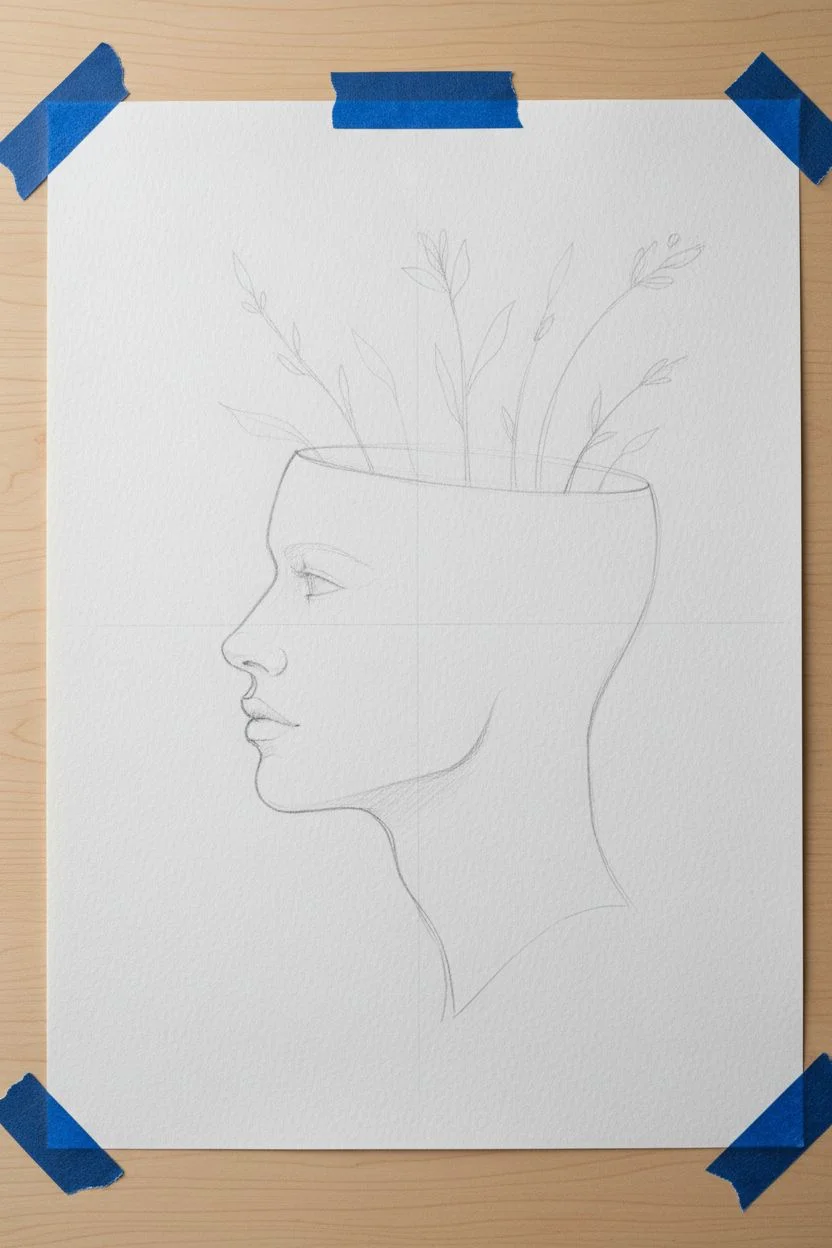
Future Self Portrait With Affirmations

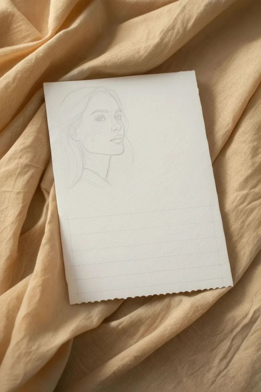
Manifest your future self with this elegant combination of realistic portraiture and typography on textured paper. The soft graphite shading contrasts beautifully with the crisp, modern text, all framed by a handmade deckled edge that gives the piece a timeless, keepsake quality.
How-To Guide
Materials
- Heavyweight watercolor paper or printmaking paper (300gsm+)
- Graphite pencils (HB, 2B, 4B, 6B)
- Blending stump or tortillon
- Kneaded eraser and precision eraser pen
- Metal ruler
- Water
- Small paintbrush
- Printer (inkjet preferable for texture) or fine-tip black ink pens
- Computer with photo editing software (optional)
Step 1: Preparation & Layout
-
Select your reference:
Choose a photo of yourself that represents the energy you want to embody, or use a reference photo that resembles your ideal future self. A 3/4 profile view works particularly well for showing character while maintaining mystery. -
Format the paper:
Cut your heavyweight paper to your desired size, distinctively smaller than a standard A4 sheet to make it feel like an art card. Leave generous negative space at the bottom for your text. -
Create the deckled edge:
Instead of cutting with scissors, place your metal ruler where you want the edge to be. Run a wet paintbrush along the line to soften the fibers, wait thirty seconds, and gently tear the paper against the ruler’s edge for that ragged, handmade look. -
Pencil in the layout:
Lightly map out the composition with an HB pencil. Ensure the head is positioned in the upper portion, leaving the bottom third completely clear for your affirmation text.
Tearing Trick
Use a water-filled brush pen for the tear lines. It controls the moisture perfectly, preventing water from bleeding into the drawing area while weakening the paper just enough to rip cleanly.
Step 2: Drawing the Portrait
-
Establish facial structure:
Using an HB pencil, lightly sketch the outlines of the face, paying close attention to the angle of the jawline and the placement of the eyes. Keep these lines faint so they can be erased later. -
Shade the skin tones:
Switch to a 2B pencil and begin shading the face using light, circular motions. Build up layers slowly rather than pressing hard. Focus on the shadow under the cheekbone to create dimension. -
Refine the features:
Use a 4B pencil to darken the pupils, nostrils, and the line between the lips. Sharp, distinct features are key here. I often use a precision eraser to lift out small highlights in the eyes at this stage. -
Blend for softness:
Take a blending stump and gently smooth out your graphite shading on the skin. This mimics the smooth texture seen in the reference image. Be careful not to over-blend suitable texture areas like eyebrows. -
Render the hair:
Using a 4B and 6B pencil, draw the hair in long, confident strokes that follow the direction of growth. Leave some areas white for highlights and darken the areas behind the neck to push the face forward.
Uneven Shading?
If your pencil shading looks patchy, don’t press harder. Instead, lightly cross-hatch over the uneven area with a harder pencil (H or HB), then blend again to unify the texture.
Step 3: Text & Final Touches
-
Plan the typography:
You have two options here: print directly on the paper or hand-letter. If lettering, lightly draw guidelines centered in the bottom space. The font in the example is a classic serif style. -
Printing method (Option A):
If your paper is printer-compatible, tape it to a standard carrier sheet of copy paper and run it through your printer. Ensure your digital file layout matches your paper size exactly. -
Hand-lettering method (Option B):
If drawing by hand, use a fine-tip black pigment liner. Keep the letters varying in size—make the keywords like ‘THE PAPER’ or ‘CENTEED’ slightly larger or tracked out wider for emphasis. -
Clean up context:
Use a kneaded eraser to lift any stray graphite smudges from the white space around the portrait and text. The background needs to be pristine to contrast with the drawing. -
Add subtle color (optional):
The reference image shows extremely faint touches of warmth on the cheeks. You can achieve this by lightly rubbing a very small amount of blush-colored pastel dust onto the cheekbone with a clean cotton swab. -
Style the presentation:
To fully recreate the aesthetic, place your finished artwork on a piece of wrinkled beige or tea-dyed linen fabric. Gently fold the fabric to create shadows that lead the eye toward the drawing.
Now you have a timeless self-portrait that serves as a daily reminder of the future you are building
Breath Lines: Inhale, Exhale Waves
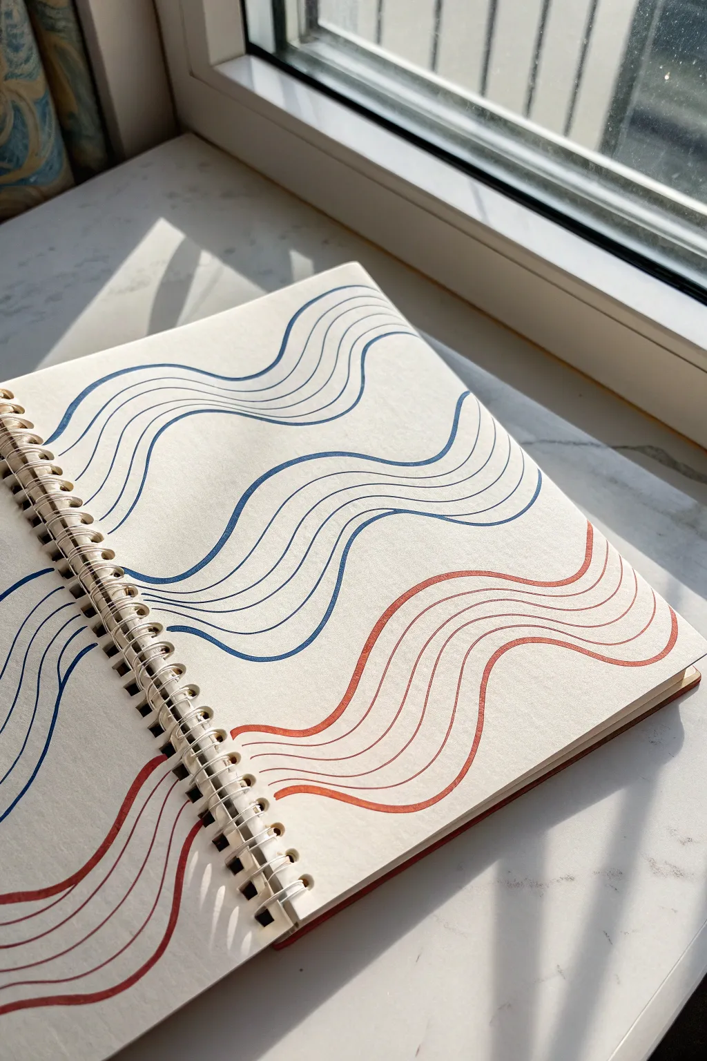
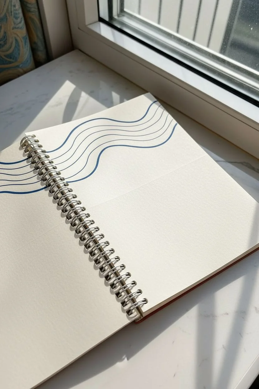
Capture the rhythm of your own breathing with this calming, meditative drawing exercise. By simply guiding your pen in flowing, parallel waves of cool blue and warm red, you create a visual anchor for mindfulness that looks elegant on the page.
Detailed Instructions
Materials
- Spiral-bound sketchbook (heavyweight paper preferred)
- Fine-liner pen (Blue, approx. 0.4mm or 0.5mm)
- Fine-liner pen (Red or Rust, approx. 0.4mm or 0.5mm)
- Flat, clean surface with good lighting
Step 1: Setting the Flow
-
Find your space:
Place your sketchbook on a flat surface. Positioning it near natural light, like a windowsill, can cast gentle shadows that make the process feel even more serene. -
Observe your breath:
Before uncapping your pen, take three deep breaths. Notice the natural rise and fall—this rhythm will dictate the shape of your lines. -
Start the first blue wave:
Using the blue pen, start near the top left of the left-hand page. Draw a single, continuous wavy line that crosses the spiral binding and flows somewhat horizontally across to the right page. -
Cross the gap:
When your pen hits the metal spiral, lift it briefly and visually ‘jump’ the gap, continuing the line on the same trajectory on the opposite page so it looks like one long thread. -
Create the first band:
Draw three to four more blue lines directly underneath the first one. Try to echo the curves of the original line, keeping the spacing consistent but not mechanically perfect.
Pro Tip: Breath Syncing
Try to sync your drawing speed with your actual breathing. Draw the upward curve on your inhale and the downward slope on your exhale for true relaxation.
Step 2: Building the Rhythm
-
Vary the wave:
Move your hand down about an inch or two. Start a new set of blue lines, but change the frequency of the wave—perhaps make the peaks higher or the valleys deeper. -
Follow the leader:
Once the ‘leader’ line of this second group is established, add your following parallel lines underneath it. I find that focusing on the gap between the lines rather than the line itself helps keep them steady. -
Fill the top half:
Continue adding bands of blue waves until you reach the middle of the page. Let the white space between the bands serve as a pause, just like the pause between breaths. -
Switch to red:
Cap your blue pen and switch to the red or rust-colored liner. This color shift represents a change in energy or perhaps the warmth of an exhale. -
Mirror the motion:
Start your first red band just below the last blue one. Let the curves interact gently; if the blue lines dip down, your red lines can curve up to meet them, or flow in parallel.
Step 3: Completing the Pattern
-
Navigate the spiral:
As you work lower on the page, play close attention to the spiral binding. Ensure your lines don’t get snagged on the wire loops; lift your hand completely to maintain smooth curves. -
Establish the lower bands:
Create 2-3 distinct bands of red waves on the bottom half of the pages. Allow the lines to flow off the edge of the paper naturally. -
Review the density:
Look at your composition. If a band feels too thin, add one final parallel line to the bottom of that group to give it more visual weight. -
Connect the pages:
Double-check the alignment across the spiral gutter. If any lines look disconnected between the left and right pages, you can subtly extend them to bridge the visual gap. -
Reflect:
Put the pen down. Don’t worry about wobbles or imperfections; the beauty of this piece lies in the human quality of the lines.
Troubleshooting: Shaky Lines
If your lines are jittery, you might be moving too slowly. A slightly faster hand movement often smooths out the wobble and creates more confident curves.
Now you have a visual record of a moment of calm that you can revisit whenever you open your book


Have a question or want to share your own experience? I'd love to hear from you in the comments below!