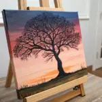
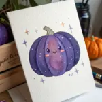
When I need instant drawing inspiration, Puerto Rico is one of my favorite subjects because the island is packed with bold shapes, color, and symbolism. Here are some Puerto Rico drawing ideas you can sketch in a quick sitting or build into a full-on finished piece.
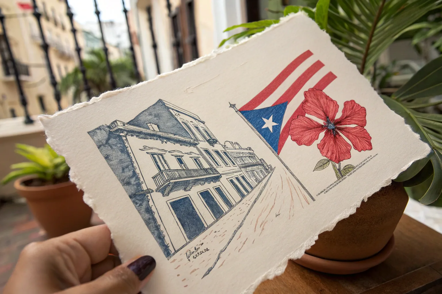
Old San Juan Balcony Streetscape
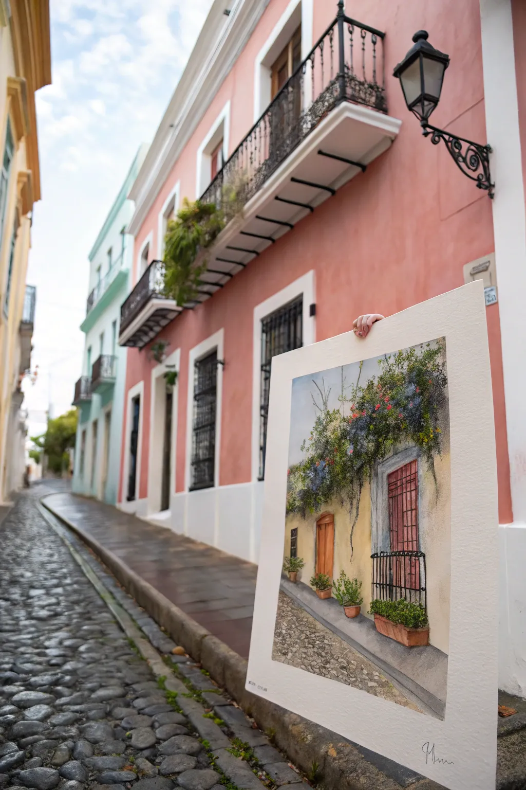
Capture the romantic charm of Puerto Rico’s historic district with this detailed watercolor and ink streetscape. This project brings together the warmth of sun-washed walls with the cool texture of cobblestones and cascading bougainvillea.
Detailed Instructions
Materials
- Hot Press Watercolor Paper (large format, heavy weight)
- Watercolor Paint Set (Yellow Ochre, Burnt Sienna, Payne’s Grey, Sap Green, Ultramarine)
- Fine Liner Pens (Waterproof, sizes 0.1, 0.3, and 0.5)
- Round Watercolor Brushes (Sizes 4, 8, and a rigger brush)
- Flat Wash Brush (1-inch)
- Pencil (HB) and Kneaded Eraser
- Masking Fluid (optional)
- Salt (for texture)
Step 1: Sketching the Architecture
-
Establishing the Perspective:
Begin by lightly sketching the horizon line about a third of the way up the paper. Draw a diagonal line receding from the bottom left to the center right to establish the street’s slope. -
Blocking the Building Facade:
Sketch the main vertical wall on the right side. Mark out the placement of the tall window and the arched doorway further back. -
Detailing the Ironwork:
Use a light hand to map the intricate iron railing on the lower window (the ‘balconet’). Don’t draw every bar yet, just the bounding box. -
Adding Organic Shapes:
loosely sketch the massive bougainvillea canopy hanging over the doorway. Avoid rigid lines here; use scribbly, cloud-like shapes to suggest volume.
Muddy Greens?
If your plant life looks dull, let the green layer dry completely before adding flower colors. Wet-on-wet can sometimes turn red and green into brown mud.
Step 2: Inking the Structure
-
Defining the Contours:
Switch to your 0.3 waterproof pen. Ink the strong vertical lines of the door frames and window shutters. Use a ruler if you want crisp architectural lines. -
Drawing the Ironwork:
Carefully draw the vertical bars of the window railing using the 0.1 pen. Add the small scroll details at the top and bottom of the railing. -
Texture on the Shutters:
Add vertical hatching on the red window shutters and the wooden door to simulate wood grain and shadow depth. -
Cobblestone Outline:
Sketch irregular, rounded shapes for the cobblestones in the foreground. I prefer to only outline a few distinct stones and leave others suggestion to avoid clutter.
Step 3: Layering Watercolor
-
The Base Wash:
Mix a watery Yellow Ochre. Using the large flat brush, apply a wash over the entire wall area, keeping it lighter near the top where the sun hits. -
Painting the Wood:
Once the wall is dry, paint the door with Burnt Sienna mixed with a touch of orange. For the window shutters, use a muted mix of Alizarin Crimson and Burnt Umber. -
Shadows and Depth:
Mix purple and grey to create a shadow wash. Apply this under the eaves of the roof and under the bougainvillea mass to pop the yellow wall forward. -
Creating the Greenery:
Dab various shades of Sap Green and darkened Hookers Green onto the vine area. Keep the brush wet and loose. -
Adding Blooms:
Drop in concentrated spots of red, pink, and violet into the wet green paint to create the bougainvillea flowers. Allow them to bleed slightly for a soft look.
Add Realism
Use a white gel pen at the very end to add highlights to the iron railings and the edges of the brightest bougainvillea leaves for extra sparkle.
Step 4: Finishing Touches
-
The Cobblestone Street:
Wash the street area with a dilute gray. While wet, drop in darker gray and brown spots to create the uneven stone coloration. -
Planter Details:
Paint the terracotta pots with pure Burnt Sienna. Use the tip of your rigger brush to add tiny leaves spilling out of the pots. -
Final Contrast:
Use your darkest ink or paint to deepen the shadows inside the open door frame and behind the window bars to create mystery. -
Splatter Texture:
Lightly splatter a bit of clean water or dark paint over the street area to enhance the gritty, worn texture of the stones.
Frame your piece with a wide white mat to let the vibrant colors of San Juan breathe
Garita Over the Ocean
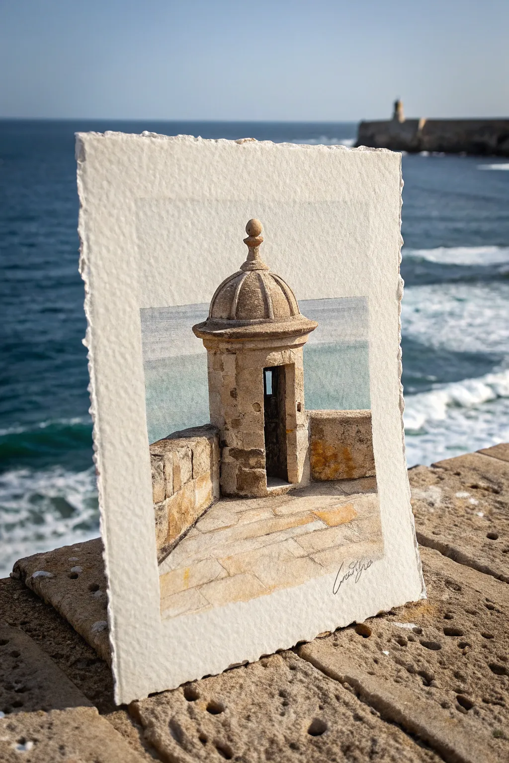
Capture the iconic architecture of Puerto Rico with this detailed watercolor study of a garita, or sentry box. The painting utilizes deckle-edged paper to create a rustic, artifact-like quality that perfectly complements the historic stone textures.
Step-by-Step Tutorial
Materials
- Heavyweight watercolor paper (300lb cold press ideal)
- Watercolor paints (Yellow Ochre, Burnt Sienna, Raw Umber, French Ultramarine, Cerulean Blue)
- White Gouache (for opacity)
- Round watercolor brushes (sizes 2, 6, and 8)
- Masking tape
- Pencil (HB) and kneaded eraser
- Ruler
- Paper towels
- Board or easel
Step 1: Sketch and Sky
-
Prepare the paper:
Begin by tearing the edges of your heavy watercolor paper to create a ‘deckle’ edge. This gives the finished piece a vintage, handmade feel. Tape the paper down to your board, leaving the ragged edges exposed if possible, or tape carefully inside them. -
Draft the structure:
Using an HB pencil, lightly sketch the garita. Start with a vertical centerline to ensure symmetry. Draw the dome, the finial on top, and the cylindrical body. Add the rectangular doorway and the surrounding stone wall. -
Mark the horizon:
Use a ruler to draw a faint straight line for the horizon behind the garita. Keep your perspective consistent; the lines on the floor of the fort should vanish towards a point on this horizon line to create depth. -
Paint the ocean base:
Mix a watery wash of Cerulean Blue and a touch of French Ultramarine. Paint the sea area behind the sentry box, keeping the color light near the horizon and slightly darker as it moves down. Paint around the stone structure carefully. -
Soften the water:
While the blue paint is still damp, lift out a few horizontal streaks with a thirsty brush or paper towel to suggest distant waves or sea foam.
Step 2: Stone Textures
-
Base stone color:
Mix a warm, sandy beige using Yellow Ochre and a lots of water. Apply this wash over the entire garita and the stone walls. Let the colors pool slightly in some areas for natural variation. -
Adding age and shadow:
Once the base is dry, mix Burnt Sienna with a little Raw Umber. Paint the shadowed side of the sentry box (usually the left or right depending on your light source). Soften the edge where the shadow meets the light with a damp brush to create a rounded form. -
Define the masonry:
Switch to your size 2 brush. Using a darker mix of Raw Umber, outline individual stone blocks on the walls and the base of the garita. Don’t outline every single stone; focus on the corners and areas of high contrast. -
Texture the dome:
The dome has vertical ribs. Paint shadow lines curving from the top finial down to the rim using a grey-brown mix. Add a stippling effect (small dots) on the sunlit parts of the dome to mimic the porous texture of sandstone. -
Deepen the doorway:
The interior of the sentry box should be very dark. Mix Ultramarine Blue with Burnt Sienna to create a near-black. Paint the inside of the door, leaving a tiny sliver of light or blue sky visible through the rear window/slit if desired.
Muddy Colors?
If your stone shadows look dull, avoid using prepared black paint. Instead, mix complementary colors like Burnt Sienna and Ultramarine Blue to create rich, vibrant dark greys and browns.
Step 3: Foreground and Details
-
Paint the flagstones:
For the floor, use a pale wash of Raw Sienna. Use a ruler to guide your brush for the grout lines between the stones, making sure they follow the perspective lines you established earlier. -
Enhance the weathering:
I like to splatter a tiny bit of watery brown paint onto the dry paper to simulate the pitting found on old limestone. Cover the sky area with a paper towel before doing this to keep it clean. -
Add mossy tones:
Mix a subtle olive green using Yellow Ochre and a touch of blue. Glaze this lightly over the lower parts of the walls where moisture would collect near the sea spray. -
Highlights with gouache:
Using a small detail brush and white gouache, add sharp highlights to the tops of the stones and the edge of the dome finial catch the sun. -
Refine the ocean:
If the ocean dried too light, add a second glaze of blue, darkening the water closer to the bottom of the section to suggest depth. -
Final touches:
Erase any remaining stray pencil lines once the paint is bone dry. Sign your name near the bottom right, perhaps following the angle of the floor stones for a cohesive look.
Photo Match Magic
To get the ‘transparent’ photo effect, take your unfinished paper to the location. Hold it up and trace the real horizon line directly onto the paper so it aligns perfectly with the background.
Prop your finished painting against a textured surface to photograph it and complete the illusion
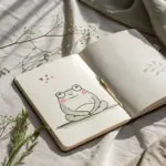
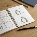
Coquí Frog Mini Sketch Series
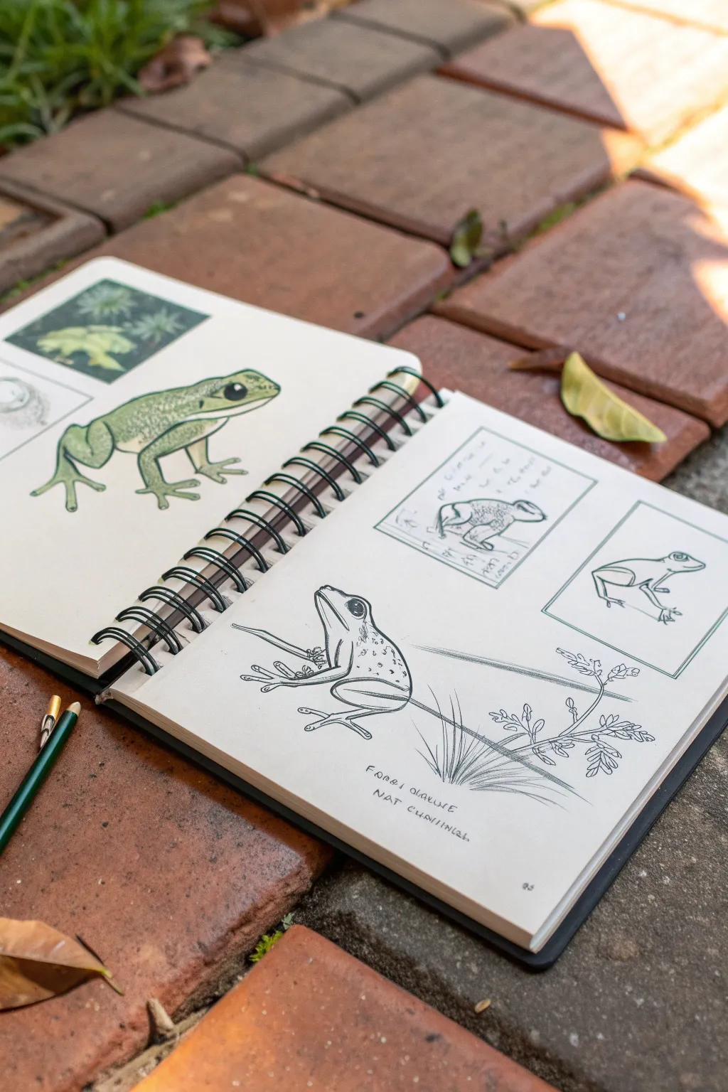
Capture the charm of Puerto Rico’s beloved mascot with this naturalist-style double-page spread featuring the Coquí frog in various stages of detail. This project combines loose, gestural sketching with refined ink work and selective watercolor coloring to create a beautiful field-study aesthetic.
Step-by-Step
Materials
- Spiral-bound mixed media or watercolor sketchbook
- HB or 2B graphite pencil
- Fine liner pens (sizes 0.1, 0.3, and 0.5, black ink)
- Watercolor paints (Sap Green, Olive Green, Yellow Ochre, Burnt Umber)
- Small round watercolor brush (size 2 or 4)
- Eraser (kneaded preferred)
- Ruler (optional for framing sketches)
Step 1: Page 1: The Full-Color Study
-
Establish the Subject:
On the left-hand page, roughly sketch the outline of a large frog in a crouching position. Focus on the triangular head shape and the distinct curve of the back legs. -
Refine the Anatomy:
Lightly draw the large, protruding eyes and the distinct toe pads that Coquís are famous for. Keep your pencil lines light so they can be erased later. -
Add Insets:
In the top left corner, sketch two small square frames. Inside the top one, draw a faint botanical pattern of ferns. In the lower one, sketch a simple egg mass or close-up detail. -
Apply Base Color:
Using a diluted wash of Sap Green, paint the body of the main frog. Leave the belly and throat area unpainted or very pale. -
Build Shadows:
While the first layer is still slightly damp, drop in Olive Green or a touch of brown along the spine and the folds of the legs to create volume. -
Detail the Skin:
Once fully dry, use a 0.3 pen to outline the frog. Use stippling (small dots) on the back to mimic the textured skin, and add a solid black pupil to the eye with a small white highlight reserved. -
Complete the Insets:
Paint the background of the top botanical inset with a dark green, leaving the fern shapes lighter. Leave the second inset pencil-only for contrast.
Step 2: Page 2: Anatomical Breakdown
-
Layout Planning:
On the right page, visualize the composition: a large central line drawing at the bottom and two framed sketches near the top. -
Draft the Top Frames:
Draw two rectangular boxes at the top of the page. These will house quick posture studies. -
Sketch the Postures:
In the left box, sketch a frog in a tucked, resting position. In the right box, draw a side profile showing the leg extension. -
Start the Main Figure:
In the lower half of the page, sketch a large frog facing upward, resting on a diagonal plant stem. The diagonal line helps lead the eye across the page. -
Ink the Frames:
Use a 0.1 pen to ink the borders of your top boxes. For the frogs inside, keep the ink lines loose and sketchy, perhaps doubling up lines to show movement. -
Ink the Central Frog:
Switch to a 0.5 pen for the main bottom frog to give it more visual weight. Use confident, smooth lines for the contour of the body. -
Add Texture Details:
Using a finer 0.1 pen, draw the small spots and texture on the frog’s back. Don’t shade fully; just suggest the texture. -
Draw the Environment:
Sketch the plant stem simply. Add a few sprigs of leaves or grass at the bottom right to ground the composition without overwhelming the frog. -
Lettering:
Hand-letter the scientific name (Eleutherodactylus coqui) or notes below the main sketch. Use all-caps in a slightly messy, architectural style for that authentic field-notes look.
Ink Smudge Savior
If you smudge fresh ink, don’t wipe it! Turn it into a shadow or texture spot by adding stippling around it to blend the mistake into the skin pattern.
Field Note Flair
Use a diluted tea wash over the paper before drawing to give the pages a weathered, vintage naturalist journal appearance.
Close your book and admire a spread that looks like it came straight from a biologist’s expedition


Flor de Maga Botanical Close-Up
Capture the delicate beauty of Puerto Rico’s national flower with this botanical watercolor study. Soft, layered petals and crisp green foliage come together on textured cold-press paper to create an elegant and lifelike tribute.
Step-by-Step Tutorial
Materials
- Cold-press watercolor paper (300gsm)
- Watercolor paints (Alizarin Crimson, Sap Green, Burnt Umber, Yellow Ochre)
- Round brushes (sizes 2, 4, and 8)
- Hard pencil (HB or 2H) for sketching
- Kneadable eraser
- Mixing palette
- Two jars of water
- Paper towels
Step 1: Sketching the Structure
-
Establish the center:
Begin by lightly marking the center of your paper where the flower’s stamen will sit. Draw a small, rough oval here as your anchor point. -
Map the petals:
Around the center oval, sketch five large, overlapping petal shapes. Keep the lines incredibly faint; the Flor de Maga has wide, open petals that curl slightly at the edges. -
Add the stem and leaves:
Draw a slender stem extending downward from the flower base to the right. Attach two leaf shapes—one near the flower head and a larger one further down the stem. -
Refine the details:
Go back over your petals, adding slight ruffles to the edges to mimic organic growth. Lighten your graphite lines with a kneadable eraser until they are barely visible guidelines.
Step 2: Painting the Petals
-
First wash:
Mix a very watery wash of Alizarin Crimson. Using your size 8 brush, apply this pale pink to one petal at a time, leaving tiny white gaps for highlights near the center. -
Building saturation:
While the first layer is still slightly damp, drop in a slightly more concentrated crimson mix at the base of the petals and along the outer edges to create depth. -
Layering the bloom:
Continue this wet-on-wet process for all petals. Ensure adjacent petals are dry before painting the next one to prevent colors from bleeding into each other. -
Defining the texture:
Switch to a size 4 brush. With a stronger red mix, paint fine, directional lines radiating from the flower center outward to simulate the delicate veins of the hibiscus. -
Deepening shadows:
Mix a touch of Burnt Umber into your crimson. Paint thin glazes where the petals overlap to create separation and shadow, giving the flower a three-dimensional form.
Fixing Blooms
If paint bleeds between petals, wait for it to dry completely. Then, use a damp, clean stiff brush to gently ‘scrub’ and lift the excess pigment away from the edge.
Step 3: Stamen and Foliage
-
Painting the center:
Fill the center oval with a base of Yellow Ochre. Once dry, stipple small dots of Burnt Umber on top to create the pollen texture. -
Stem base layer:
Paint the stem with a mix of Sap Green and a hint of Burnt Umber for a woody look. Keep the application loose and linear. -
Leaf foundation:
Apply a diluted wash of Sap Green to the leaf shapes. I like to drop in a tiny bit of red while it’s wet to dull the green and make it look more natural. -
Vein details:
Let the leaves dry completely. Using the size 2 brush and a dark green mix, paint the central vein and branching side veins with crisp, confident strokes. -
Final touches:
Review your painting for contrast. Add a final dark glaze under the petal overlaps and verify that the stem connects naturally to the flower head.
Add Dew Drops
To level up, lift a tiny circle of paint off a petal using a clean, damp brush. Add a dark crescent shadow on the bottom and a pure white highlight dot at the top.
Now you have a stunning botanical study ready to be framed or gifted.
BRUSH GUIDE
The Right Brush for Every Stroke
From clean lines to bold texture — master brush choice, stroke control, and essential techniques.
Explore the Full Guide
Jíbaro Portrait With Pava Hat
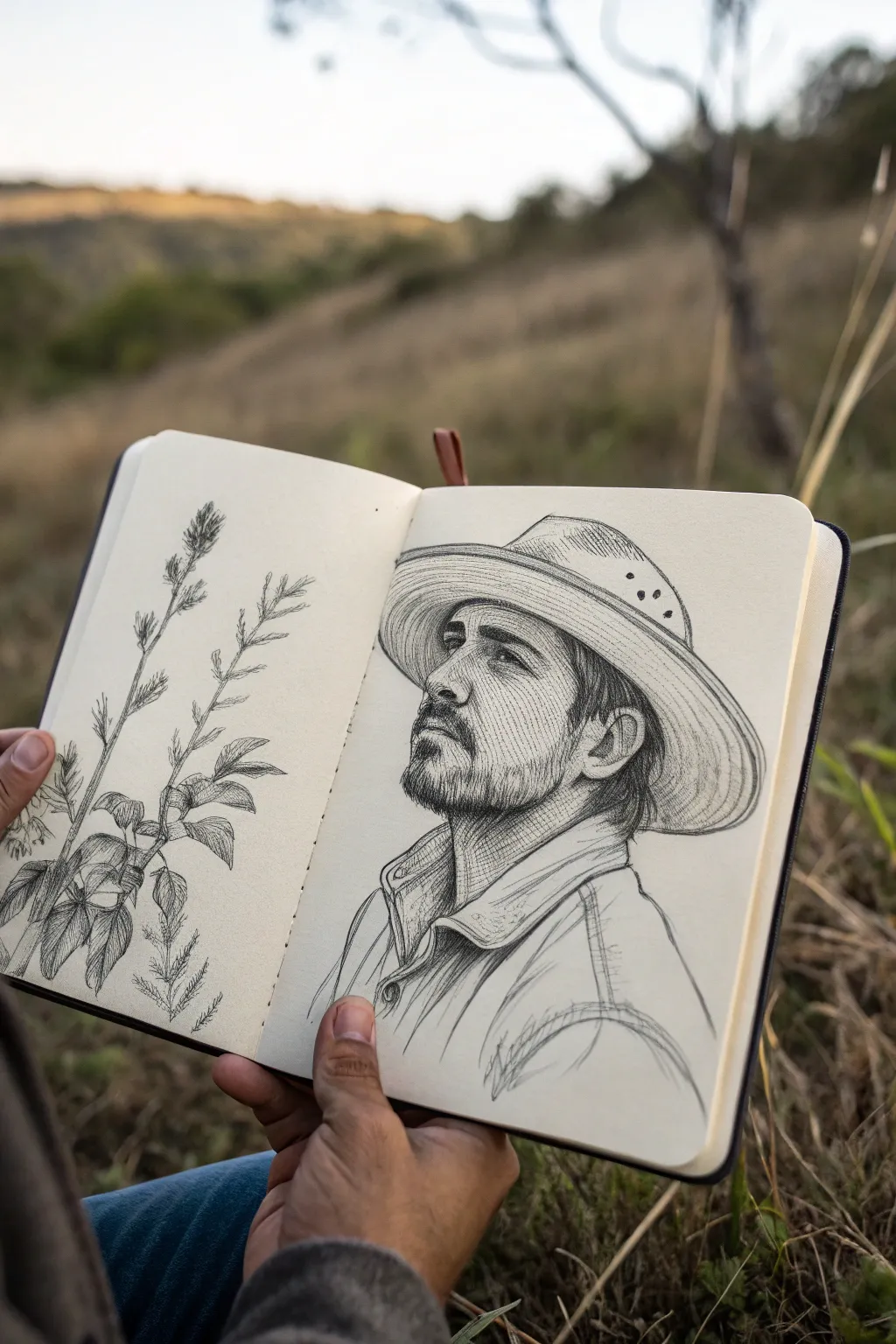
Capture the stoic dignity of a traditional Puerto Rican Jíbaro in this detailed pencil study. This project focuses on rendering facial structure, realistic facial hair, and the distinct texture of the iconic woven Pava hat using classic cross-hatching techniques.
Step-by-Step Guide
Materials
- Hardbound sketchbook (smooth or vellum finish paper)
- Graphite pencils (HB for layout, 2B and 4B for shading)
- Mechanical pencil (0.5mm, 2B lead for fine details)
- Kneaded eraser
- Precision eraser (stick or mono zero)
- Blending stump (paper tortillon)
- Reference photo of a side profile
Step 1: Laying the Foundations
-
Establish the Head Shape:
Begin with a loose HB pencil to sketch a basic oval for the head and a intersecting curved line indicating the eye level. Keep these lines incredibly faint so they disappear later. -
Block in the Pava Hat:
Sketch the large elliptical shape of the hat’s brim, tilting it slightly back on the head. Add the dome of the hat fitting snugly over the skull line. -
Map Facial Features:
Mark the position of the ear, nose bridge, and jawline. Use simple geometric shapes—a triangle for the nose, a rectangle for the ear—to ensure the proportions feel right before adding detail. -
Outline the Collar:
Draw the rough shapes of the shirt collar and shoulders. The collar should look slightly stiff and raised, framing the neck and jaw.
Fixing Flat Faces
If the face looks flat, your mid-tones are likely too light. Don’t be afraid to shade the entire side of the face; only the nose bridge and cheekbone usually catch pure white highlights.
Step 2: Defining the Features
-
Refine the Profile:
Switch to your mechanical pencil. Carefully trace the contour of the nose, the dip of the philtrum, and the shape of the lips. Pay attention to the subtle curve of the nostril. -
Detail the Eye:
Draw the eye shape, ensuring the upper lid creates a shadow over the iris. Add the eyebrow with short, directional strokes that follow the brow bone. -
Construct the Ear:
Flesh out the ear’s anatomy. Sketch the helix and anti-helix curves, remembering that ears are complex structures of cartilage and shadow, not just flat shapes. -
Draft the Hat’s Weave:
Lightly draw concentric circles around the brim of the hat to guide your texture later. Mark the ventilation holes on the side of the hat’s crown.
Step 3: Shading and Texture
-
Establish Core Shadows:
Using a 2B pencil, lightly shade the darkest areas: under the hat brim, beneath the jaw, and inside the ear. This establishes your light source. -
Render the Skin:
Use fine hatching lines to sculpt the cheekbone and neck muscles. I find that following the curvature of the skin with your pencil strokes creates the most realistic volume. -
Create the Facial Hair:
For the beard and mustache, use short, flicking strokes with the mechanical pencil. Vary the direction slightly to avoid it looking like stiff bristles. Build layers to create density. -
Texture the Pava Hat:
This is a key step. Use long, curved hatching lines along the brim to mimic the straw fiber. Keep the lines closer together in shadowed areas and further apart where the light hits. -
Detail the Clothing:
Add folds to the shirt collar. Use broader, softer strokes here to differentiate the fabric texture from the skin and straw hat. -
Deepen the Contrast:
Switch to a 4B pencil. Darken the pupil, the deepest folds of the ear, and the shadow cast by the hat onto the forehead. This high contrast brings the drawing to life. -
Final Cleanup:
Use your kneaded eraser to lift off any smudges on the cheek or forehead to create highlights. Clean up the edges of the drawing, but leave some loose sketch lines for artistic character.
Pro Tip: Hat Texture
Don’t draw every single strand of straw on the hat. Suggest the texture with concentrated hatching in the shadows and let the viewer’s eye fill in the details in the highlighted areas.
Step 4: Bonus: Botanical Companion
-
Sketch the Stems:
On the opposite page, draw two vertical, slightly wavering lines for plant stems. -
Add Leaves and Texture:
Attach jagged, lance-shaped leaves. Use quick, scribbly shading to give them an organic, field-sketch appearance that complements the portrait’s rustic theme.
Close your sketchbook knowing you’ve preserved a beautiful piece of cultural heritage on the page
Taíno Petroglyphs Icon Sheet
Create a striking visual library of indigenous symbolism by drafting a clean grid of Taíno-inspired petroglyphs on warm-toned paper. This project combines precise linework with flowing organic shapes, resulting in a page that feels like an artifact from a historical study.
How-To Guide
Materials
- Tan or kraft paper sketchbook (smooth texture preferred)
- Fine-liner pens (black, sizes 0.3mm and 0.5mm)
- Ruler (clear acrylic is best for visibility)
- Pencil (HB or H for light lines)
- White eraser (kneaded or plastic)
- Reference sheet of Taíno petroglyphs (digital or printed)
Step 1: Drafting the Grid
-
Measure margins:
Begin by deciding on the size of your grid. Measure an equal margin from the left and right edges of your sketchbook page to center your workspace, making light tick marks with your pencil. -
Draw vertical guides:
Using your ruler, lightly draw vertical lines to define the columns. For the layout shown, you’ll need four distinct columns. Ensure they are evenly spaced, roughly 1.5 to 2 inches wide each. -
Draw horizontal guides:
Measure down the page to create your rows. Mark off five rows of equal height to match the width of your columns, essentially creating a grid of 20 perfect squares. -
Define the boundaries:
With your 0.3mm fine-liner, carefully trace over your pencil grid lines. Keep your ruler firm against the paper to prevent ink bleeding under the edge. I prefer to do all vertical lines first, let them dry for a moment, and then do the horizontal ones to avoid smudging intersections.
Clean Lines Tip
When erasing the pencil grid, hold the paper taut with one hand and erase in one direction only. This prevents the paper from buckling or crinkling under the eraser.
Step 2: Sketching the Symbols
-
Select your icons:
Choose 20 distinct Taíno symbols from your reference materials. Look for common motifs like the coiled snake, the sun (specifically the sun with happy eyes), the swaddled baby (represented by a triangular shape), and the coquí frog. -
Draft the suns:
Lightly sketch your sun motifs in scattered squares to balance the composition. Taíno suns often have distinctive rays—some are simple lines, others form triangles or loops. -
Add spirals and nature:
In the remaining squares, pencil in spiral motifs (representing cosmic energy or wind) and nature elements like leaves or the moon crescent. -
Sketch geometric figures:
Fill the last empty squares with geometric representations of everyday life, such as the triangular ‘bohios’ (huts) or simple stick-figure representations of zemí spirits.
Make it Antique
Before drawing, lightly stain your paper with a damp tea bag or diluted coffee. Let it dry completely under a heavy book to flatten it. This gives the page an aged, historical document feel.
Step 3: Inking and Refining
-
Outline main shapes:
Switch to your 0.5mm pen for the boldest lines. Trace the primary shapes of each symbol—the circle of the sun, the main curve of the spiral, or the outline of the hut. -
Thicken the strokes:
To mimic the look of rock carvings (petroglyphs), go back over your lines to thicken them slightly. The lines shouldn’t be perfectly uniform; a little variation adds to the hand-carved aesthetic. -
Add fine details:
Switch to the smaller 0.3mm pen. Add the delicate rays on the suns, the eyes on the faces, or the smaller decorative dots within the circles. -
Fill solid areas:
Some symbols, like the triangular mountain or certain leaves, look best with solid black fill. Carefully color these areas in, using small circular strokes to ensure solid coverage without tearing the paper. -
Erase guidelines:
Wait at least 10 to 15 minutes to ensure the ink is completely curred. Gently erase all visible pencil marks from your initial grid drafting and icon sketching. -
Review and touch up:
Scan the page for any faint areas. If a line looks too thin compared to its neighbors, thicken it carefully to maintain consistent visual weight across the whole grid.
You now have a beautifully organized reference sheet that honors ancient Caribbean artistry

PENCIL GUIDE
Understanding Pencil Grades from H to B
From first sketch to finished drawing — learn pencil grades, line control, and shading techniques.
Explore the Full Guide
Vejigante Mask Character Design
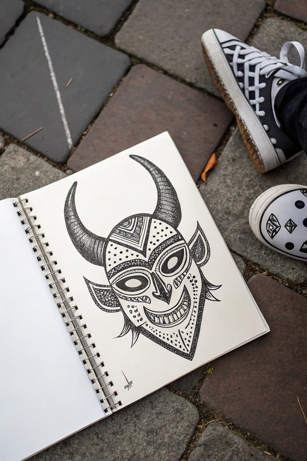
Capture the spirit of Puerto Rican folklore with this striking black ink illustration of a Vejigante mask. This sketchbook project focuses on strong line work, geometric patterns, and detailed stippling to create a character full of personality and texture.
Step-by-Step Guide
Materials
- Spiral-bound sketchbook (heavyweight paper recommended)
- Pencil (HB or 2B for sketching)
- Good quality eraser
- Fine liner pens (sizes 0.1, 0.3, and 0.5)
- Design marker or thicker black pen (0.8 or 1.0)
Step 1: Pencil Framework
-
Establish the curve:
Begin by lightly sketching a central vertical curve that bows slightly outward; this will define the centerline of the mask and give the face a subtle 3D contour. -
Outline the face shape:
Around your centerline, sketch an inverted teardrop or shield shape. Make the chin area pointed and the forehead area wider to accommodate the horns. -
Draft the horns:
Sketch two large, curved horns emerging from the top corners of the forehead. They should curve inward toward the center, tapering to sharp points. -
Place features:
Lightly mark large almond shapes for the eyes and a triangular shape for the nose. Sketch a wide, U-shaped mouth at the bottom, leaving room for teeth. -
Add sensory details:
Draw pointed ear-like shapes on the sides of the mask and add a few small, spike-like protrusions near the jawline to give the mask a fringed appearance.
Pro Tip: Dot Density
When stippling, don’t just tap randomly. Group dots tightly where you want shadows or ‘dark’ colors, and spread them out for highlights. It creates a gradient effect.
Step 2: Defining the Lines
-
Main outline:
Switch to your 0.5 fine liner. Carefully trace over your pencil outlines for the main facial shape and the horns, making these lines confident and solid. -
Facial features:
Ink the eyes, drawing a double rim to create thickness for the mask’s eye holes. Ink the nose and the grinning mouth, drawing individual rectangular teeth inside. -
Geometric zones:
Using a 0.3 pen, divide the face into sections. Draw a chevron (V-shape) on the forehead and contour lines around the eyes and cheeks to separate the different patterning areas. -
Erase pencil:
Once the main ink lines are completely dry, gently erase all underlying pencil sketch marks to reveal a clean framework.
Step 3: Detailing and Texture
-
Stippling the horns:
This is where patience pays off. With a 0.1 pen, add texture to the horns using stippling (tiny dots). Concentrate more dots at the base and underside of the horns to create shadows and volume. -
Lines on the horns:
Add horizontal curved lines across the horns to make them look segmented or ribbed, enhancing their curve. -
Forehead patterns:
Fill the forehead chevron area with tight, geometric designs. You can wiggle lines or use small triangles to create contrast against the open areas. -
Eye patterning:
Decorate the area around the eyes with small dots. I find that varying the density of these dots helps the eyes pop forward visually. -
Cheek details:
Draw curved lines underneath the eyes to emphasize the cheekbones. Fill the side ‘ears’ with dense stippling to make them appear recessed or shadowed. -
Jaw and chin texture:
On the lower jaw area, use a mix of dots and small circles to create a rougher texture, distinguishing it from the smooth forehead. -
Darkening the shadows:
Use your 0.5 or 0.8 pen to darken deep recesses, specifically the inside of the nostrils and the corners of the mouth. -
Final touches:
Review your drawing for balance. Add a few stray ‘spike’ lines near the chin for a beard-like effect and sign your work creatively near the bottom.
Troubleshooting: Smudpocalypse
Ink takes longer to dry on heavy paper than you think. Place a clean scrap sheet under your drawing hand to prevent oils and friction from smearing your wet lines.
Close your sketchbook knowing you’ve preserved a piece of vibrant culture in black and white
Bomba Drum and Dancer Gesture
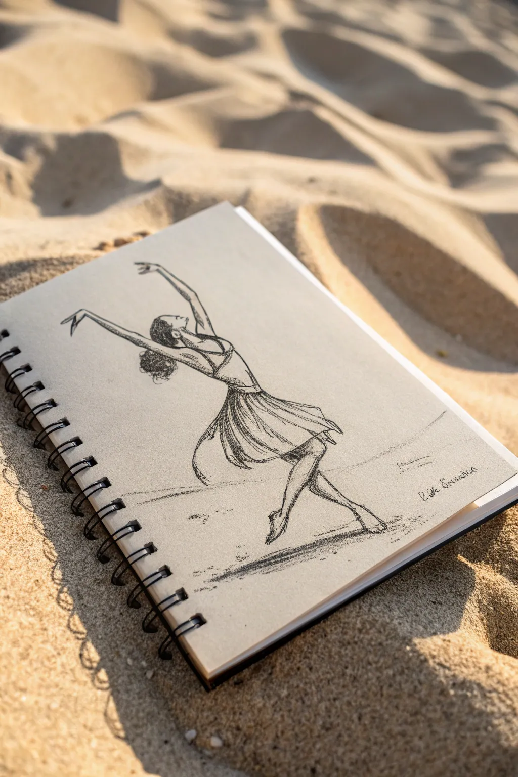
Capture the spirited movement of a traditional Bomba dancer with this dynamic charcoal sketch. The contrasting textures of the rough paper and the smooth charcoal create a lively, energetic figure that seems to dance right off the page.
How-To Guide
Materials
- Spiral-bound sketchbook with toned paper (tan or light brown)
- Soft charcoal stick or pencil (4B or 6B)
- Hard charcoal pencil (HB or 2B) for details
- Kneaded eraser
- Blending stump (tortillon) or tissue
- White pastel or white charcoal pencil (optional for highlights)
Step 1: Establishing the Gesture
-
Find the line of action:
Start by lightly sketching a long, curved line representing the dancer’s spine and extended leg. This ‘C’ curve will guide the entire pose, flowing from the head down to the back foot. -
Block in the torso and hips:
Using your soft charcoal very lightly, draw an oval for the ribcage and a tilted oval for the pelvis. Connect them along your line of action, making sure the upper body arches backward slightly. -
Map the limbs:
Sketch stick-figure guidelines for the arms and legs. Extend both arms upward and outward in a joyful celebration. Place the front leg bent at the knee as if lifting, and the back leg extended straight to support the weight. -
Refine the head position:
Draw the simplified shape of the head, tilting it back to look upward towards the hands. This emphasizes the emotional expression of the dance.
Step 2: Adding Form and Volume
-
Cylinder construction:
Flesh out the stick figure by drawing cylinders over the limb guidelines. Think about the muscles in the calves and forearms to give the dancer a strong, athletic appearance. -
Define the clothing silhouette:
Sketch the outline of the bodice and the flowing skirt. The skirt should balloon out around the hips, suggesting the centrifugal force of a spin. -
Add hair volume:
Roughly block in the hair shape, likely pulled back or in a natural style that moves with the head’s motion. -
Erase initial guides:
Take your kneaded eraser and gently dab away the initial ‘stick figure’ lines and construction shapes so they don’t distract from the final drawing.
Keep it Loose
Hold your charcoal pencil near the end, away from the tip. This forces you to draw with your shoulder rather than your wrist, keeping lines fluid.
Step 3: Refining Details and Clothing
-
Draw the bodice:
Switch to your harder charcoal pencil for cleaner lines. Darken the straps and the neckline of the dancer’s top, using short strokes to suggest fabric tension. -
Create skirt folds:
Use loose, sweeping strokes to draw the folds of the skirt. Start from the waist and flick your wrist outward. The lines should look quick and energetic to simulate movement. -
Detail the hands and feet:
Carefully define the fingers, keeping them graceful but minimal. For the feet, ensure the back foot is arched and the toes are pointed or firmly planted depending on the step. -
Texture the hair:
Use small, circular scumbling motions with the charcoal to create the texture of curly hair, darkening the area behind the neck.
Make it Pop
Use a white erratic pencil or white pastel to add highlights to the shoulders, skirt folds, and tops of the arms. This makes the figure leap off toned paper.
Step 4: Shading and Atmosphere
-
Establish the light source:
Decide where your light is coming from—likely above and to the front. This means shadows will fall on the back of the dancer and under the skirt. -
Apply core shadows:
Using the side of your soft charcoal, lay down broad strokes of shadow on the dancer’s back, the underside of the arms, and the back leg. -
Add cast shadows:
I prefer to anchor the figure by adding a horizontal scribble of shadow under the feet. Smudge this horizontally to simulate the ground plane. -
Blend for softness:
Use your blending stump to gently soften the skin tones on the arms and legs. Leave the dress strokes rougher to maintain that fabric texture. -
Deepen the darks:
Revisit the deepest shadow areas—creases in the skirt, the hair, and under the feet—and press harder with the charcoal to create high contrast. -
Final touches:
Sign your work with a flourish near the bottom right, perhaps adding a small, faint horizon line in the distance to place the dancer in a space.
Now you have a dynamic sketch that celebrates the rhythm of Puerto Rico through visual art


Island Map With La Estrella Solitaria
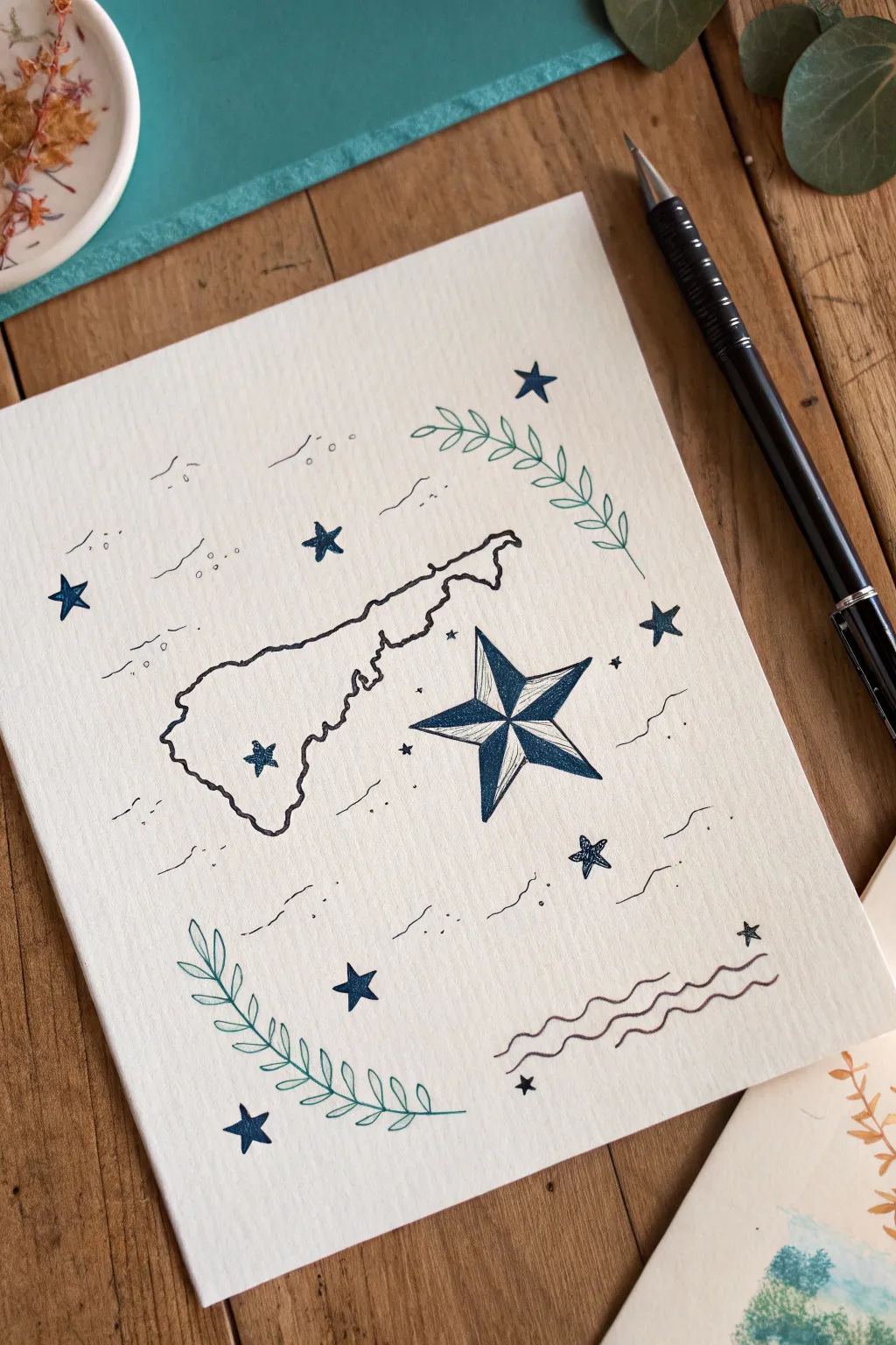
This elegant line drawing captures the spirit of Puerto Rico with a delicate map outline and celestial motifs. Using fine-tipped pens on textured paper, you will balance clean cartography with whimsical, nautical details.
Step-by-Step Guide
Materials
- Heavyweight textured paper (watercolor or mixed media paper)
- Fine-liner pen (black or very dark blue, 0.3mm or 0.5mm)
- Pencil (HB or H)
- Eraser
- Ruler
- Reference map of Puerto Rico
Step 1: Planning and Sketching
-
Create the structural guides:
Begin by lightly sketching a horizontal rectangle in the center of your paper to define the boundaries of the island. This helps ensure the map stays centered and proportioned correctly. -
Draft the island outline:
Looking at your reference map, lightly sketch the contour of Puerto Rico within your guide box. Focus on getting the general ‘rectangular’ shape first, then add the distinctive bumps of the coastline. -
Refine the geography:
Pay special attention to the southwestern cape (Cabo Rojo) and the northeastern corner near Fajardo to make the silhouette recognizable. -
Place the main star:
To the right of the island, draft a large five-pointed star. Draw a line from each point to the center to create the facets for the nautical ‘La Estrella Solitaria’ look. -
Sketch decorative elements:
Lightly draw curving vines in the top-right and bottom-left corners to frame the composition. Add small scatter stars and gentle wavy lines around the main subjects.
Clean Lines Pro Tip
For the straight lines inside the nautical star, use a small clear ruler. It keeps the facets geometric, which contrasts beautifully with the organic, wiggly line of the coastline.
Step 2: Inking the Map
-
Outline the coast:
Using your fine-liner pen, trace over your pencil map sketch. Use a slightly shaky or organic hand rather than a ruler-straight line to mimic the natural ruggedness of a coastline. -
Mark the capital:
Draw a small star inside the map on the northeastern coast to represent San Juan. -
Ink the western star:
Adding a small star on the western interior adds balance; ink this carefully, keeping the points sharp. -
Erase map guidelines:
Once the map ink is fully dry, gently erase the pencil guide box and the initial sketch lines from the island interior to keep the work clean.
Step 3: Detailing the Star
-
Define the big star:
Go over the outline of the large star on the right. Draw the straight lines connecting the tips to the center point with confidence. -
Add shading:
To create dimension, select every other facet of the star to fill in. Instead of solid black, use closely spaced parallel lines (hatching) to give it texture and a slightly vintage engraving look. -
Refine the edges:
Go over the outer perimeter of the star one more time to make the shape pop against the white paper.
Level Up: Gold accents
Once the black ink is dry, use a metallic gold gel pen or gold watercolor paint to fill in the small scatter stars or the leaves for a magical, illuminated manuscript effect.
Step 4: Atmosphere and Embellishments
-
Draw the leafy vines:
Ink the vines in the corners. Start with the central stem, then add pairs of small, pointed leaves, ensuring they curve gracefully to hug the imaginary frame of the drawing. -
Create wind and waves:
Scatter groups of small, wavy lines around the empty spaces. These should look like gentle ocean currents or breezes. Keep them thin and delicate. -
Add floating stars:
Fill in the remaining negative space with various sizes of solid five-pointed stars. I try to vary the angles so they look like they are twinkling randomly. -
Anchor the bottom:
In the bottom right corner, draw three distinct stacked wavy lines to represent the sea, grounding the composition. -
Final cleanup:
Wait at least 10 minutes to ensure all ink is completely set. Then, thoroughly erase every remaining pencil mark to reveal the crisp contrast of the ink on the textured paper.
Now you have a sophisticated piece of art celebrating Puerto Rico that looks beautiful framed or as a greeting card

Have a question or want to share your own experience? I'd love to hear from you in the comments below!