Red Ribbon Week is such a perfect time to use art to say something positive, loud, and clear. Here are my favorite Red Ribbon Week drawing ideas that feel school-appropriate, easy to personalize, and genuinely fun to create.
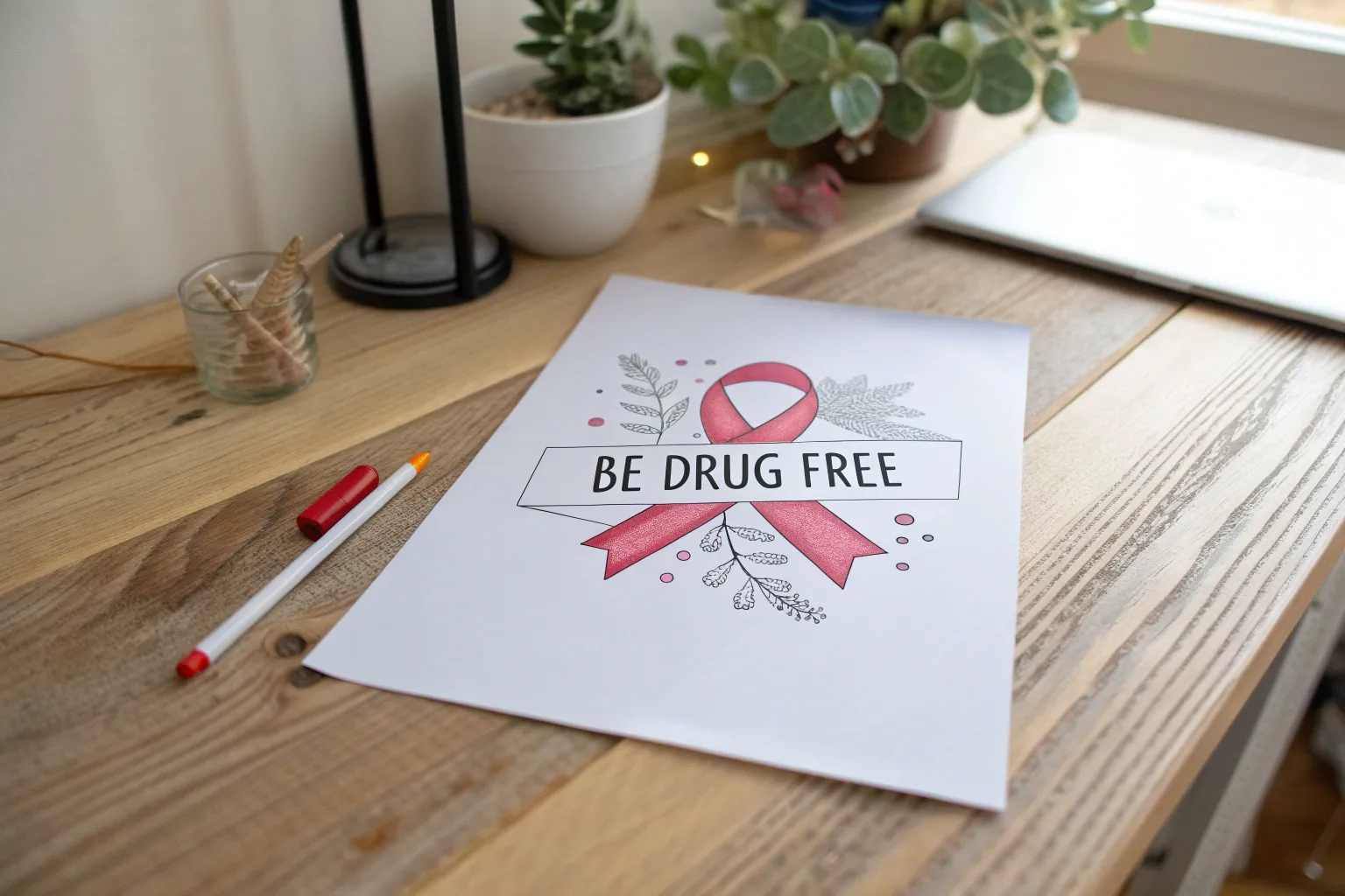
Classic Red Ribbon With Bold Drug-Free Slogan
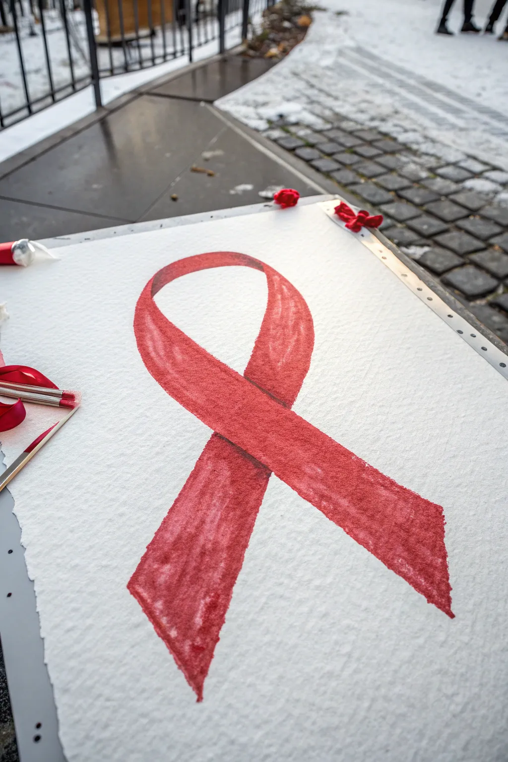
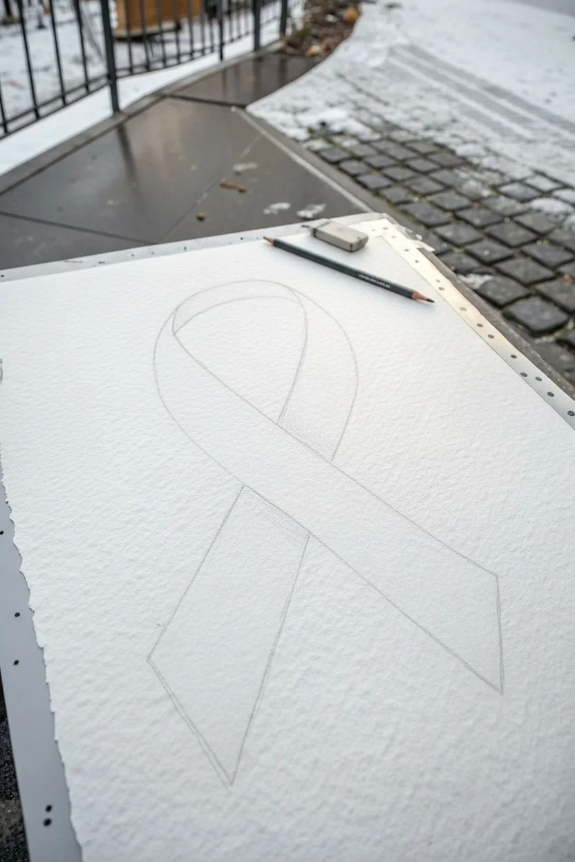
This project centers on painting a large, striking red ribbon on heavy textured paper, perfect for making a bold visual statement during Red Ribbon Week. The beauty lies in the simple, sweeping curves and the rich variations of red pigment that give the symbol depth and life.
Detailed Instructions
Materials
- Heavyweight cold-press watercolor paper (300 gsm or heavier)
- Red watercolor paint (tube preferred for richness)
- Small amount of burnt sienna or darker red for shading
- Large round watercolor brush (size 10-12)
- Fine liner brush (optional for edges)
- Pencil for sketching
- Eraser
- Cup of water
- Paper plate or palette
- Paper towels
- Masking tape (for securing paper edges)
Step 1: Preparation & Sketching
-
Secure the paper:
Begin by taping your textured watercolor paper down to a rigid board or table. This prevents buckling when the paper gets wet. -
Map the loop:
Using a pencil very lightly, draw the prominent top loop of the ribbon. Aim for a wide, open curve that sits near the upper third of your page. -
Cross the lines:
Sketch the legs of the ribbon crossing over each other. Decide which side overlaps; usually, the left leg crosses over the right leg to create a standard ribbon shape. -
Define the width:
Go back over your single line sketch and add the second edge to create thickness. Keep the width consistent throughout the entire loop and legs. -
Finish the tails:
Draw the V-shaped cuts or angled edges at the bottom of the ribbon tails. Make sure they extend down comfortably to the bottom third of the page. -
Clean up lines:
Gently erase any stray marks or double lines. You want the faintest possible guide so the graphite doesn’t muddy your red paint later.
Wet Edge Control
To prevent ‘blooms’ or water back-runs, don’t add dripping wet paint into a drying area. Keep your brush moisture consistent as you work down the paper.
Step 2: Painting the Base Layer
-
Mix your red:
Squeeze a generous amount of red watercolor onto your palette. Add just enough water to make it flow like heavy cream; you want strong opacity for this symbol. -
Start at the top:
Load your large round brush. Begin painting at the top arch of the loop, pulling the brush smoothly along the curve. -
Work wet-on-dry:
Apply the paint directly to the dry paper. This technique, combined with the textured paper, will create those lovely slightly rough edges visible in the example. -
Fill the length:
Continue painting down the legs of the ribbon. Don’t worry if the color isn’t perfectly even; the variation adds character and visual interest. -
Mind the overlap:
When you reach the crossing point, paint right up to the line where the ribbons overlap but don’t cross it just yet. It helps to leave a microscopic gap to keep the sections distinct while wet.
Step 3: Adding Depth & Detail
-
Add shadow depth:
While your base red is still slightly damp, mix a tiny dot of brown or darker red into your main puddle. Paint this slightly darker shade right where the ribbon folds over itself. -
Soften the gradient:
Clean your brush and leave it barely damp. Gently run it along the edge of your darker section to blend it outward into the bright red, creating a soft shadow. -
Crisp up edges:
I like to switch to a finer brush here to tidy up the outer perimeter. Run a clean, saturated line of red along the very edges to define the shape against the white background. -
Layer for richness:
Once the first layer is touch-dry, lightly glaze a second coat of red over the center of the ribbon legs. This intensifies the color without losing the paper’s texture. -
Texture check:
Let the natural grain of the paper show through in some spots. These ‘holidays’ (tiny white speckles) make the artwork feel handcrafted and authentic. -
Add the slogan (optional):
If you are adding a slogan as mentioned in the section title, wait until the paint is bone dry. Then, use a black marker or white gel pen to write your message over the ribbon or in the background. -
Final drying:
Allow the entire piece to dry completely before removing the tape. Peel the tape away slowly at a 45-degree angle to ensure a crisp border.
Make It Sparkle
While the red paint is still wet, sprinkle super-fine red glitter onto the darkest shadowed areas. It adds subtle dimension and catches the light beautifully.
Display your vibrant artwork proudly to spark important conversations during Red Ribbon Week

Heart-Shaped Red Ribbon Drawing

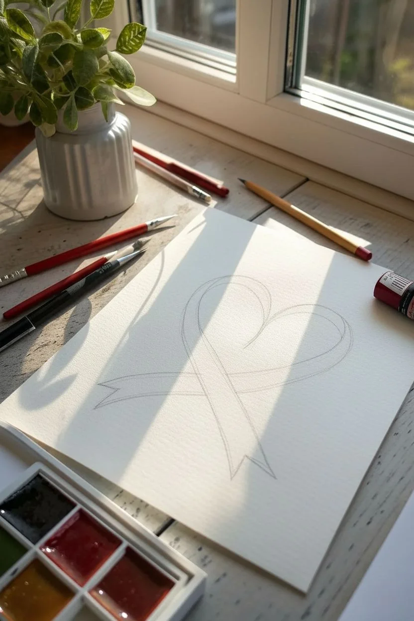
This elegant project combines the symbol of the red ribbon with a classic heart shape, creating a softness that only watercolor can achieve. The result is a graceful, flowing design perfect for awareness campaigns or heartfelt cards.
Step-by-Step Tutorial
Materials
- Cold press watercolor paper (300 gsm recommended)
- HB graphite pencil
- Kneaded eraser
- Red watercolor paint (Alizarin Crimson or similar cool red)
- Round watercolor brush (size 4 or 6)
- Small detail brush (size 0 or 2)
- Two jars of water
- Paper towels
Step 1: Sketching the Shape
-
Establish the curve:
Begin by lightly drawing the left side of a heart shape. Instead of checking it off at the bottom, extend the line downward and slightly inward to form the hanging tail of the ribbon. -
Draw the crossover:
Sketch the right side of the heart so that it crosses over the left tail section near the bottom point of the heart. -
Define the ribbon width:
Draw parallel inner lines to give the ribbon thickness. Aim for a consistent width of about 0.5 to 0.75 inches throughout the loop. -
Refine the tails:
Shape the ends of the ribbon tails with ‘V’ cuts to look like trimmed fabric. Ensure the right tail (the one crossing over) looks like it sits physically ‘on top’ of the left tail. -
Lighten the guidelines:
Roll your kneaded eraser gently over the entire sketch. You want the graphic lines to be barely visible—just ghost lines to guide your brush without showing through the translucent paint.
Fixing Blooms
If cauliflower-like ‘blooms’ appear in your paint, it means you added wet paint into damp paint. Let it dry completely, then gently scrub the rough edge with a damp stiff brush to smooth it out.
Step 2: Painting the Base Layer
-
Propare your wash:
Mix a generous amount of red watercolor with water on your palette. You want a tea-like consistency that flows easily. -
Start at the top curve:
Load your size 4 or 6 round brush. Begin painting at the top left curve of the heart, carefully following your pencil lines. Keep the edges crisp. -
Work wet-on-dry:
Continue bringing the wash down the left side toward the tail. Try to maintain a ‘bead’ of wet paint at the edge of your brush stroke to avoid uneven drying lines. -
Paint the right loop:
Reload your brush and paint the right curve of the heart. As you approach the intersection where the ribbon crosses itself, stop just short of the line to keep the sections distinct for now. -
Fill the tails:
Finish filling in both tail ends with your base red wash. Ensure the wash remains flat and even. -
Let it dry extensively:
Wait for this first layer to be bone dry. If the paper feels cool to the touch, it is still wet deep in the fibers.
Step 3: Adding Depth and Shadow
-
Mix a shadow tone:
Take your existing red mix and add a tiny touch of contrasting green or a deeply saturated red to create a darker, richer version of your base color. Do not use black. -
Define the overlap:
Where the right ribbon crosses over the left, carefully paint a small shadow on the ‘underneath’ section. This visual trick instantly creates 3D depth. -
Deepen the curves:
I like to add a second layer of the original red color along the inner edges of the heart curves. Blend this outward with a clean, damp brush to create a soft gradient. -
Enhance the tips:
Add a little of the darker red mix to the very tips of the ribbon tails to give them weight and dimension. -
Clean up edges:
Use your smallest detail brush to sharpen any wobbly edges along the outline of the ribbon.
Make it Sparkle
Once the painting is completely dry, use a metallic gold gel pen or fine liner to outline just the outer edge of the ribbon for an elegant, decorative finish suitable for greeting cards.
Now step back and admire the gentle flow of your watercolor creation


Shield And Stars “Protect Your Mind” Ribbon Design
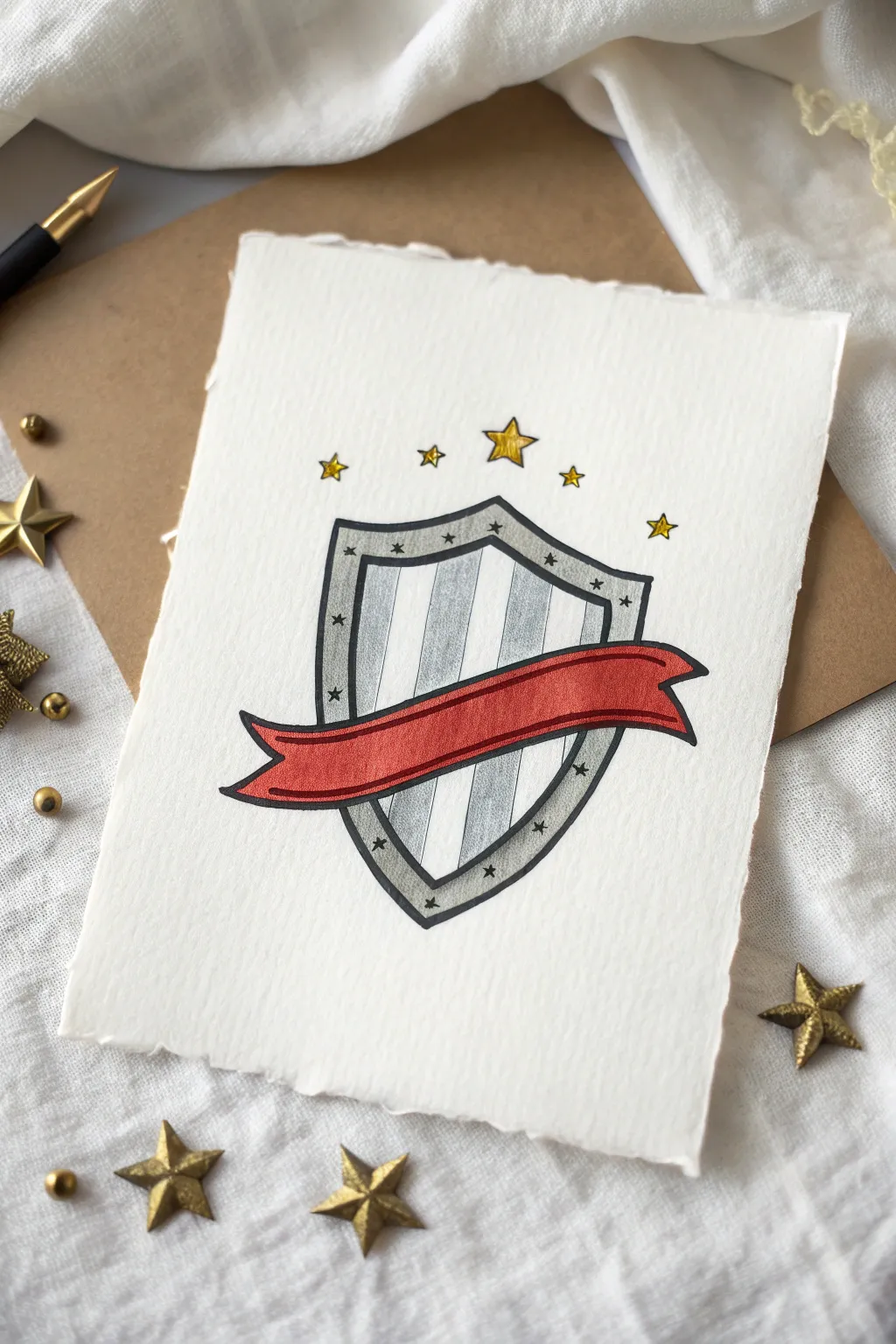
This striking design combines a classic heraldic shield with the powerful symbolism of the red ribbon, perfect for conveying a message of protection and strength. The result is a clean, illustrative piece featuring metallic accents and bold lines on beautifully textured paper.
Step-by-Step
Materials
- Heavyweight textured paper (watercolor or mixed media, ideally with deckle edge)
- Pencil (HB or H)
- Good quality eraser
- Fine liner pen (black, 0.3mm and 0.5mm)
- Alcohol markers or color pencils (Cool Grey, Red, Dark Red)
- Metallic gold paint pen or gel pen
- Ruler
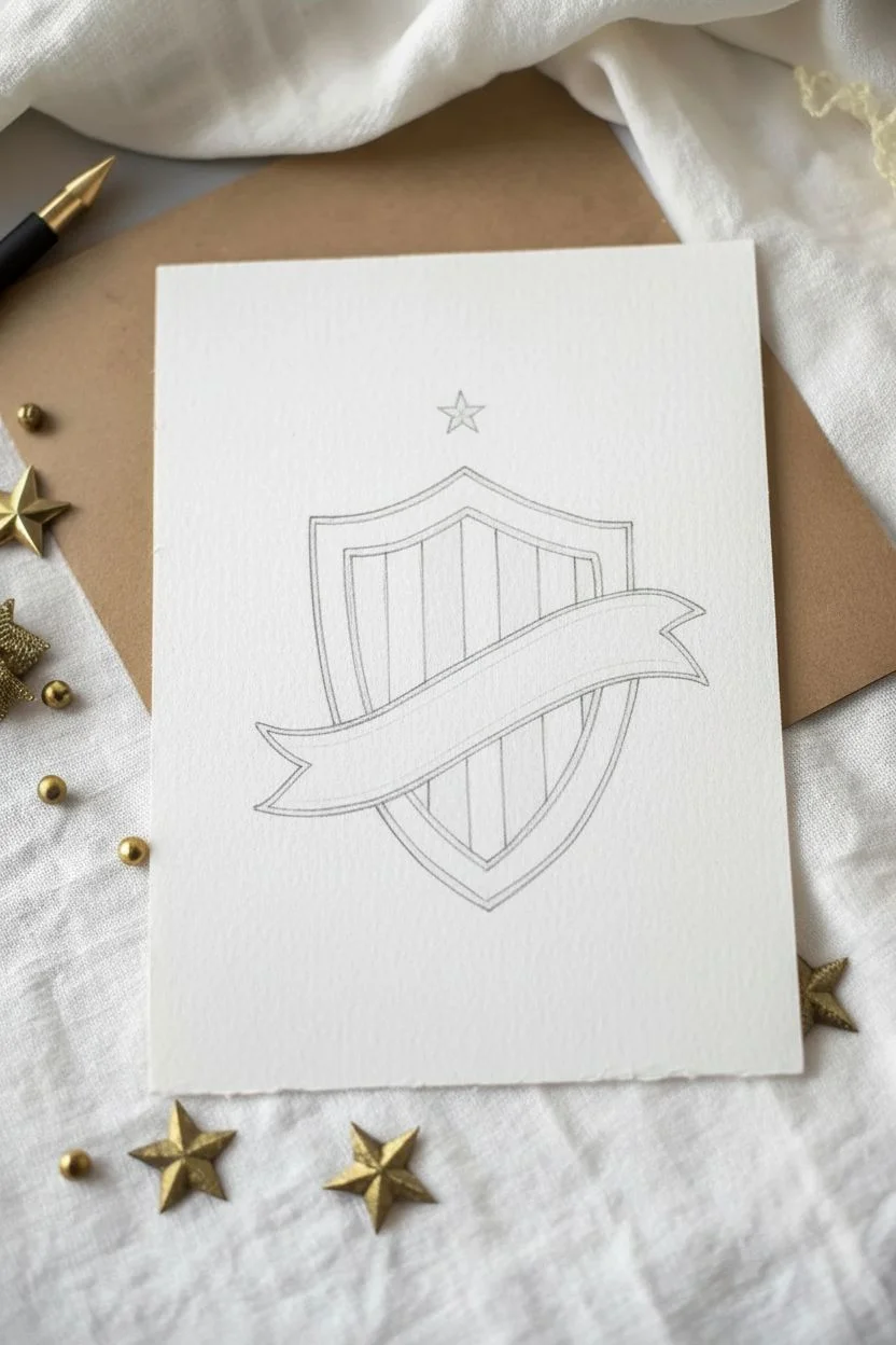
Step 1: Drafting the Structure
-
Center layout:
Begin by finding the center of your paper. Lightly sketch a vertical line to help keep your shield symmetrical. -
Outline the shield:
Draw the basic shield shape around your center line. Start with a flat top, curve the sides gently inwards, and bring them to a sharp point at the bottom. -
Add the border:
Sketch a second line inside the shield shape, about a quarter-inch from the edge, to create a thick border frame. -
Draw the banner:
Sketch a waving banner across the lower third of the shield. It should curve slightly upward in the middle. Make sure the ends of the ribbon fold back and extend past the shield’s edges. -
Vertical stripes:
Using your ruler, lightly draw vertical lines inside the central part of the shield (behind the banner) to create the stripes.
Step 2: Inking and Definition
-
Refine the lines:
Once you are happy with the sketch, trace over your pencil lines with a 0.5mm black fine liner. Use confident, steady strokes. -
Add border details:
Inside the thick shield border, draw small, evenly spaced stars all the way around. A finer 0.3mm pen works best for these tiny details. -
Erase pencil marks:
Wait for the ink to dry completely to avoid smudging, then gently erase all visible pencil guidelines.
Uneven Stripes?
If your hand-drawn vertical stripes look wobblier than intended, thicken the dividing black lines slightly to hide imperfections and straighten the appearance.
Step 3: Adding Color
-
Base grey tones:
Color every other vertical stripe inside the shield with a light cool grey marker. Let the texture of the paper show through slightly if you can. -
Shading the border:
Color the thick border frame with a slightly darker grey. I like to leave the tiny stars white for now so they pop against the grey background. -
Color the ribbon:
Fill in the banner with a vibrant red marker. Use smooth, horizontal strokes to mimic the flow of fabric. -
Banner shadows:
To give the ribbon depth, use a darker red or add a second layer of the same red along the bottom edge and where the ribbon folds back.
Level Up: Lettering
The red banner is the perfect spot for a message. Use a white gel pen to write ‘Be Brave’ or ‘Stay Safe’ directly onto the red ribbon once the ink is fully dry.
Step 4: Celestial Accents
-
Floating stars:
Draw five stars in an arc above the shield. Make the center one the largest, with the ones on the sides getting progressively smaller. -
Gold application:
Fill these floating stars with your metallic gold paint pen. This adds a lovely shine that catches the light. -
Outline coordinates:
Once the gold is dry, carefully outline these floating stars with your black fine liner. -
Final border touches:
Go back to the tiny stars inside the grey shield border. You can leave them white or add a tiny dot of black ink in the center of each for contrast.
Now you have a powerful symbol of protection ready to display or gift during red ribbon week
Doodle Border Coloring Page Around A Red Ribbon
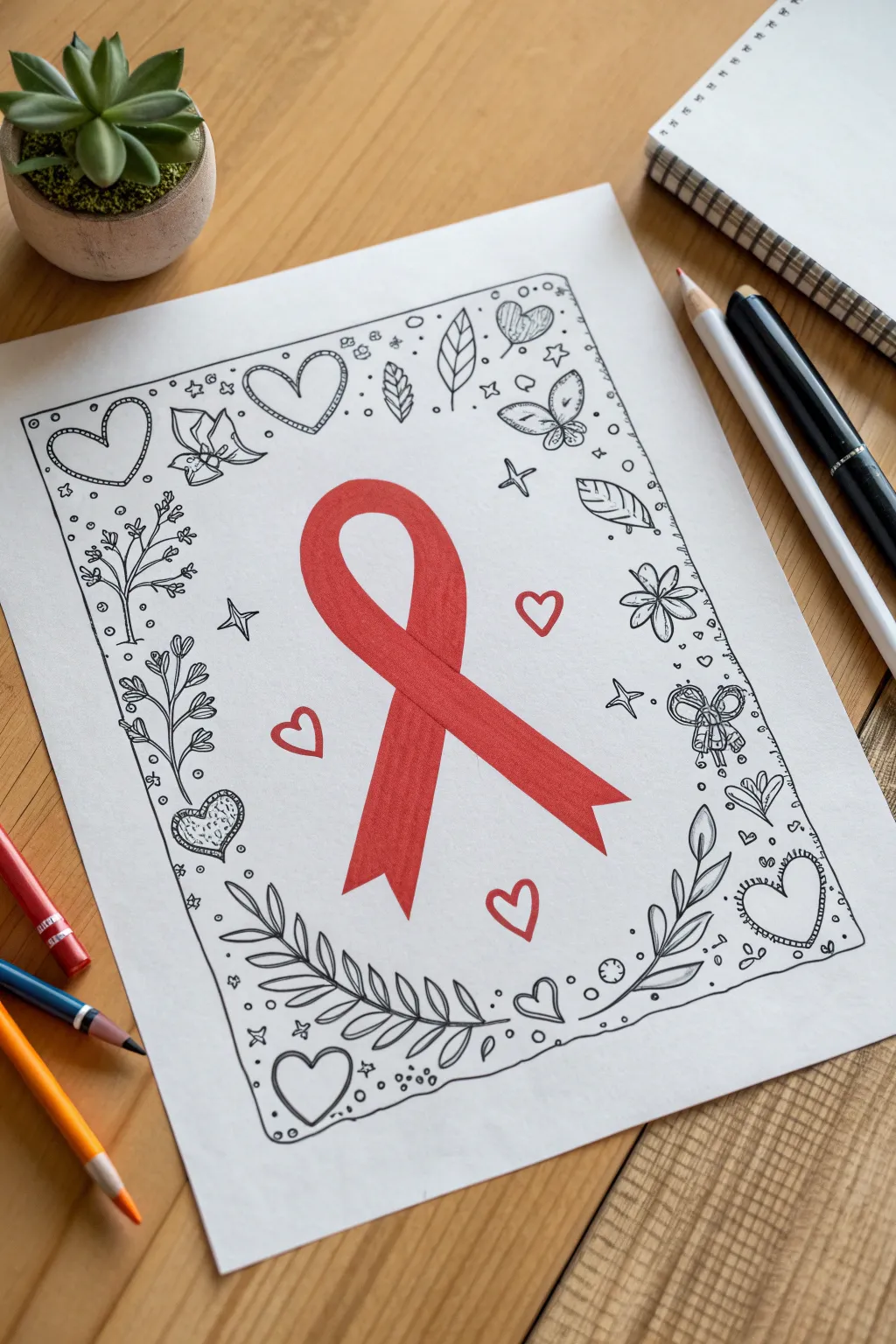
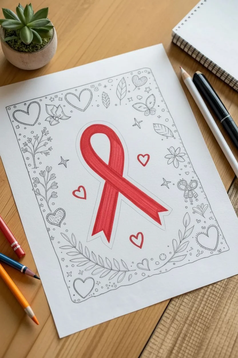
This project combines mindfulness with advocacy by creating an intricate, hand-doodled border around a bold Red Ribbon focal point. The black-and-white ink sketching makes the red marker pop beautifully, creating a striking piece of awareness art that feels personal and handcrafted.
Step-by-Step Tutorial
Materials
- White mixed-media paper or heavy cardstock (8.5 x 11 inches)
- Red alcohol-based marker (chisel tip preferred for even coverage)
- Fine-liner pen (0.5mm, black ink)
- Thinner fine-liner pen (0.1mm or 0.3mm, black ink)
- Graphite pencil (HB or 2H)
- Soft white eraser
- Ruler
Step 1: Sketching the Foundations
-
Map out the border:
Begin by lightly tracing a rectangle about one inch inward from the edge of your paper using your ruler and pencil. This will serve as the boundary for your doodle frame. -
Draft the central ribbon:
Find the center of the page inside your rectangle. Lightly sketch the outline of a large awareness ribbon. Draw the top loop first, then bring the two legs down, crossing them over each other. Add a distinct ‘V’ shape at the bottom of each leg for the cut ends. -
Place anchor doodles:
Before inking, lightly sketch a few large shapes in the corners and midpoints of your border to balance the design. Sketch a heart in the top left, a leafy vine in the bottom right, and perhaps a bow on the right side. This ensures your composition isn’t lopsided.
Step 2: Coloring the Ribbon
-
Fill the ribbon base:
Using your red alcohol marker, carefully fill in the ribbon shape. I like to use long, vertical strokes to minimize streak marks. Go slowly near the pencil edges to keep the shape crisp. -
Add subtle shading (optional):
If you have a slightly darker red marker or want to layer the same marker, apply a second coat just where the ribbon crosses over itself. This creates a tiny shadow that adds dimension. -
Let it dry:
Allow the red ink to dry completely before you start doodling near it. This prevents the black fineliner from bleeding into the red ink later.
Ink Control Tip
Work from the center outwards or top to bottom (if you’re right-handed) to avoid smudging fresh ink with your hand as you doodle the frame.
Step 3: Inking the Doodle Frame
-
Outline the border:
Switch to your 0.5mm fine-liner. Trace over your pencil border rectangle, but don’t use a ruler this time. A slightly wavering hand-drawn line looks more organic and fits the doodle style better. -
Draw the main corner elements:
Ink the larger corner designs first. For the top left, draw a double-outlined heart. For the bottom right, create a sprawling laurel branch with individual leaves branching off a central stem. -
Add the botanical details:
Along the left side, draw a vertical stem with small leaves sprouting outward. On the right side, add floral elements like a five-petal flower or a simple butterfly shape. -
Incorporate smaller hearts:
Scatter 3-4 medium-sized hearts around the inner white space near the ribbon. Keep these simple outlines to maintain focus on the solid red ribbon. -
Fill with whimsical shapes:
Look for empty patches in your border. Draw small bows, swirling wind lines, or geometric stars. Vary the size of these elements to keep the eye moving around the page. -
Create texture with patterns:
Go back inside some of your larger shapes. Add stripes inside the hearts, veins inside the leaves, or polka dots inside the butterfly wings using your thinner 0.1mm pen.
Make It 3D
Use a light gray marker to add drop shadows underneath the red ribbon and along one side of the doodle border for a pop-up sticker effect.
Step 4: Finishing Touches
-
Add ‘confetti’ filler:
The secret to a dense doodle look is tiny filler. Use your 0.1mm pen to add tiny circles, dots, and asterisks in the gaps between your larger drawings. This connects everything into a cohesive unit. -
Protect the red ribbon:
Ensure you don’t draw over your red ribbon. The doodles should float around it, leaving a small halo of white space between the red ink and the nearest black lines. -
Erase pencil lines:
Wait at least 5-10 minutes for the black ink to cure fully. Then, gently rub your soft eraser over the entire page to remove the graphite guide lines. -
Strengthen the outer line:
If the border feels too light, go over the main rectangular frame one more time to thicken the line weight, framing your artwork boldly.
Display your artwork proudly on a bulletin board or fridge to spark conversation about Red Ribbon Week
BRUSH GUIDE
The Right Brush for Every Stroke
From clean lines to bold texture — master brush choice, stroke control, and essential techniques.
Explore the Full Guide
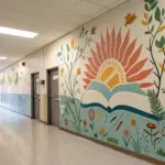
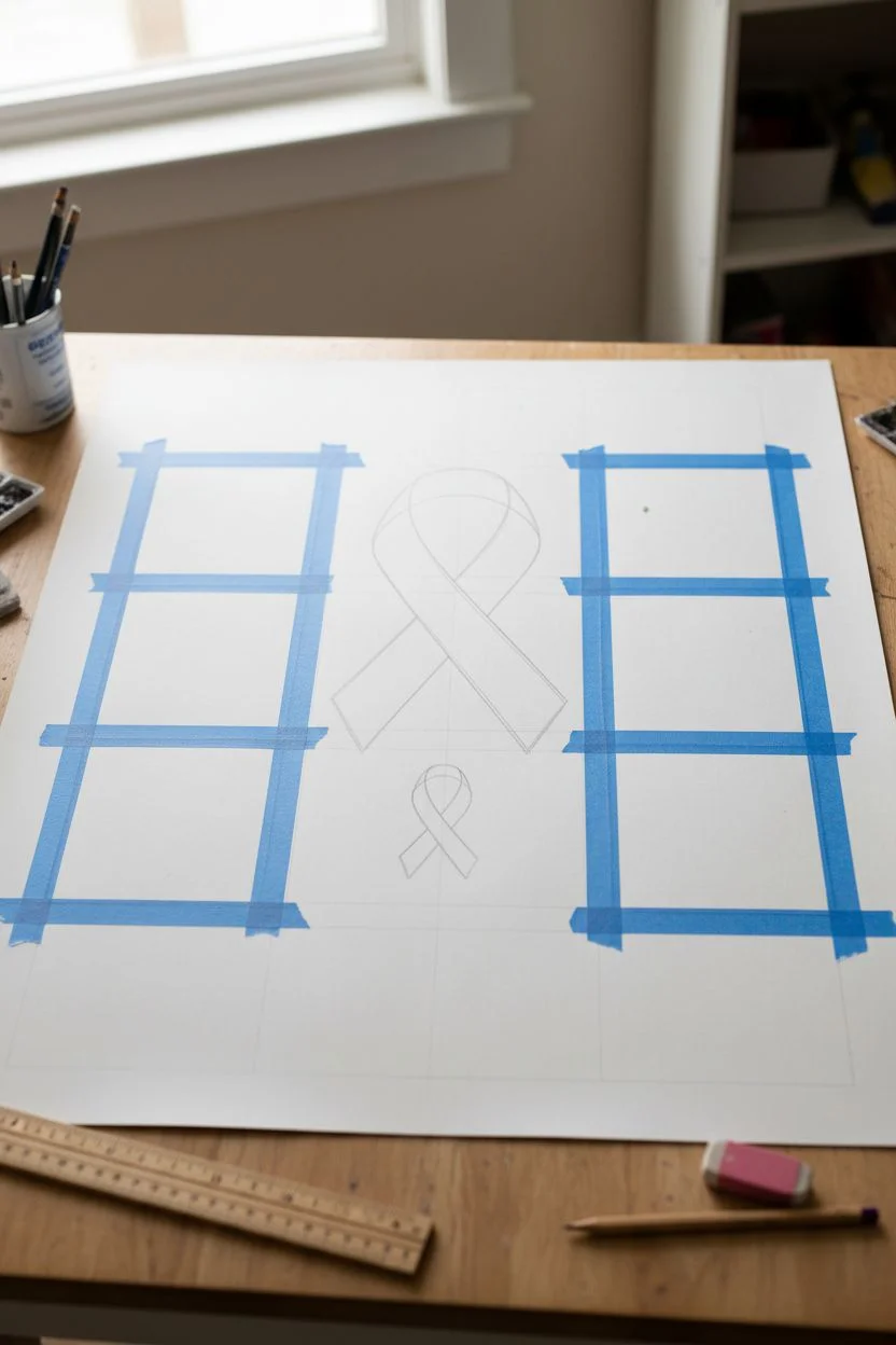
Collaborative Mural Grid With A Giant Red Ribbon
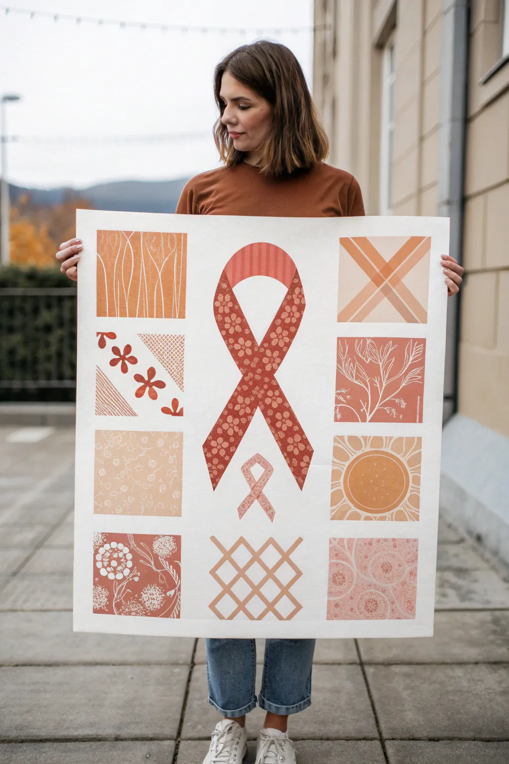
This striking collaborative poster features a stylized, patterned red ribbon surrounded by a grid of intricate, monochrome squares in warm earth tones. It combines blocked-out shapes with delicate white-line detailing to create a cohesive piece that looks beautiful from a distance and fascinating up close.
Step-by-Step Guide
Materials
- Large sheet of heavy white poster paper or watercolor paper (approx. 24×36 inches)
- Acrylic paints (terracotta, burnt orange, rust red, coral)
- White acrylic paint or white gouache
- Pencil and eraser
- Ruler
- Painter’s tape or drafting tape
- Flat shader brushes (medium and large)
- Fine liner brushes (size 0 or 00)
- White gel pen (optional, for fine details)
- Mixing palette
Step 1: Drafting the Layout
-
Prepare the grid:
Begin by measuring the total dimensions of your large paper. You’ll need to mark out a grid structure; visualize a 3×3 layout, but leave the center column open for the ribbon. Lightly sketch squares on the left and right columns, leaving about an inch of white space between them as borders. -
Center the ribbon:
In the central vertical space, sketch the outline of the large awareness ribbon. Make the loop wide at the top and let the legs cross elegantly near the bottom third. Ensure the ribbon is wide enough to hold a pattern later. -
Add the mini ribbon:
Below the main ribbon crossing, sketch a much smaller, secondary ribbon. This acts as visual punctuation and fills the negative space at the bottom center. -
Tape the borders:
To get crisp, professional edges on your square panels, apply painter’s tape along the pencil lines of your grid boxes. This protects the white borders while you paint the backgrounds.
Clean Lines?
If paint bleeds under your tape, wait for it to dry completely, then use a small stiff brush with white paint (or white gouache, which is more opaque) to touch up the edges.
Step 2: Blocking in Color
-
Mix your palette:
Prepare several shades of warm reddish-orange. I like to mix burnt sienna with a touch of white for a soft terracotta, and keep a pure rust red for contrast. You want variety between the squares, not uniformity. -
Paint the square backgrounds:
Fill in the taped-off squares with your mixed colors. Alternate the shades so no two adjacent squares are exactly the same tone. Apply the paint smoothly and opaque. -
Paint the main ribbon:
Carefully paint the base color of the large central ribbon. Use a deep rust or terra cotta shade. Since you can’t tape the curves easily, use a steady hand and a flat brush to define the edges. -
Paint the small ribbon:
Fill in the small bottom ribbon with a lighter shade, perhaps a soft coral or peach tone, to distinguish it from the main one. -
Let it dry completely:
Wait until the paint is fully dry to the touch. This is crucial because the next step involves fine line work that will smudge if the base is wet.
Level Up
Instead of painting the white details, try using linocut stamps or block printing for some of the squares to give the mural an authentic, textured printmaking aesthetic.
Step 3: Adding the Patterns
-
Design the ribbon pattern:
Using a fine liner brush with slightly watered-down white acrylic (or a white gel pen), draw a repeating floral pattern inside the legs of the main ribbon. Leave the top loop relatively plain or frame it with a simple border. -
Detail the ribbon loop:
For the top loop of the main ribbon, paint vertical stripes in a slightly darker or lighter shade of red to create a ‘ribbed’ fabric effect. -
Square 1: Organic lines:
In the top-left square, paint wavy, vertical white lines that resemble tall grass or wood grain. Vary the thickness slightly for a natural look. -
Square 2: Diagonal florals:
In the middle-left square, paint a diagonal band of five-petal flowers in a dark red tone, contrasting against a lighter background. Add a mesh texture in the corner using white cross-hatching. -
Square 3: Geometric X:
For the top-right square, paint a large ‘X’ shape. Make the lines translucent by watering down white paint, creating an overlapping effect where the bars cross. -
Square 4: Botanical sketch:
In the middle-right square, use your finest brush to draw delicate, branching white twigs or coral shapes. Keep the lines very thin and elegant. -
Square 5: Sunburst:
On the bottom-right middle panel, draw a large circle and fill the surrounding space with petal-like loops or sun rays reaching the corners. -
Square 6: Lattice work:
In the bottom center area (below the ribbons), paint a bold diagonal lattice or diamond grid using thick lines of a beige or light tan color. -
Final touches:
Fill the remaining squares with textures like stippling (dots), circular cells, or leaf prints. Once dry, carefully peel off the painter’s tape to reveal the crisp white borders.
Hang this mural in a well-lit hallway to showcase the intricate patterns and unified message of support
Sidewalk Chalk Style Red Ribbon Week Message Layout

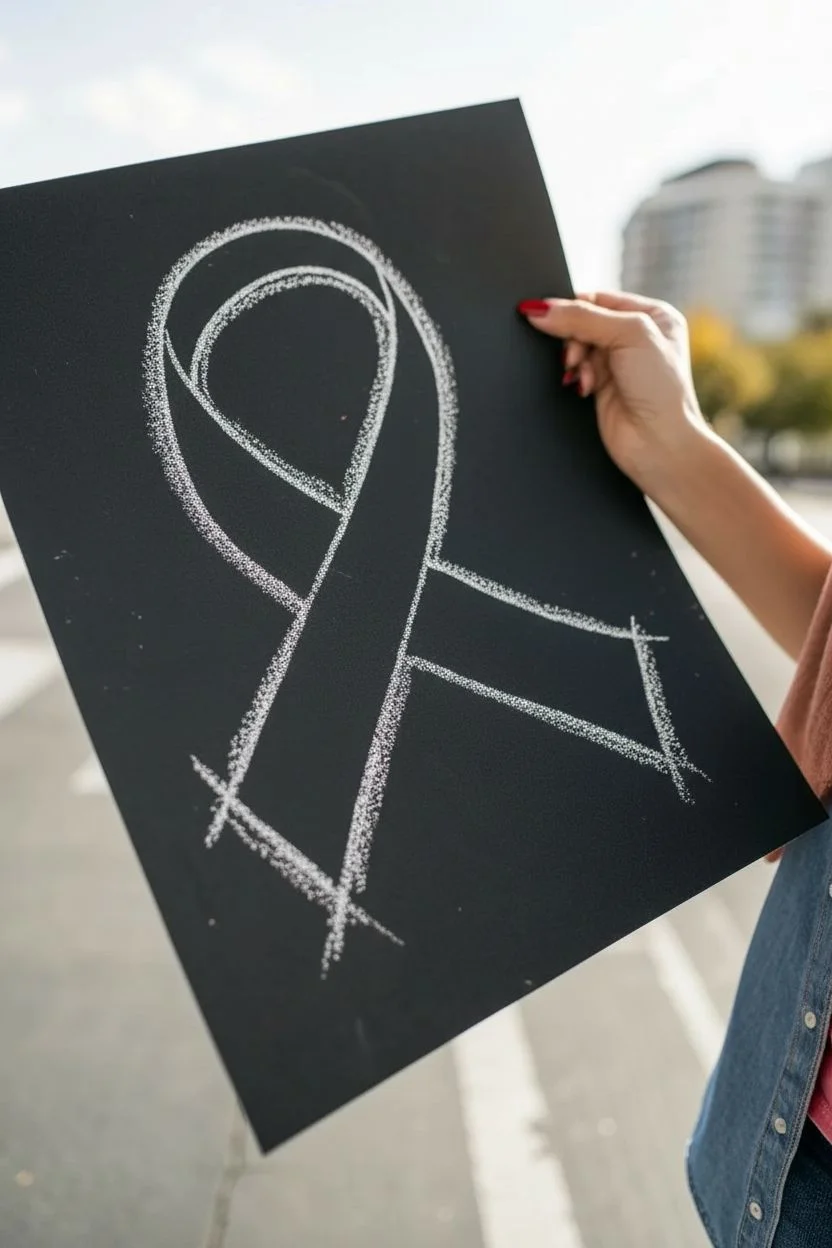
Capture the iconic Red Ribbon Week symbol with a textured, sidewalk-chalk aesthetic on sturdy black paper. This project uses the contrast between bright red pastels and deep black cardstock to make your message pop with a hand-drawn, authentic feel.
Step-by-Step Guide
Materials
- Black poster board or black foam core (cut to approximately 11×14 or similar)
- White soft pastel or chalk
- Red oil pastel or soft pastel (oil pastel gives a richer sheen)
- Pencil (optional for initial sketch)
- Ruler (optional)
- Paper towel or blending stump (optional)
- Fixative spray (optional)
Step 1: Drafting the Outline
-
Prepare the surface:
Begin with a clean piece of black poster board. Wipe away any dust so your drawing materials adhere properly. -
Visualize the loop:
Imagine a large teardrop shape in the center of your board. The top loop needs to be wide and round, occupying the upper third of your space. -
Lightly sketch the loop top:
Using your white chalk or pastel very lightly, draw the top curve of the ribbon loop. Don’t press hard yet; you just want a faint guide line. -
Cross the ribbon legs:
Draw the two legs of the ribbon extending downward. The left leg should cross over the right leg (or vice versa, depending on preference), creating an ‘X’ shape near the bottom. -
Define the width:
Now, draw the inner edge of the ribbon parallel to your first line. Keep the width consistent—about 1.5 to 2 inches thick—all the way around the loop. -
detail the ends:
Finish the bottom of the ribbon legs with diagonal cuts rather than straight horizontal lines to give it a classic ribbon look.
Clean Lines Hack
Keep a damp cloth nearby to wipe your fingers immediately if you touch the red pastel. This prevents accidental red fingerprints on the black background.
Step 2: Creating the Chalk Effect
-
Apply the white outline:
Take your white soft pastel or chalk and trace over your sketch lines. Use the side of the pastel stick rather than the sharp point to create a thick, fuzzy line. -
Add texture to the edges:
Go back over the white lines, deliberately making them sketch-like and imperfect. Allow the grain of the paper to show through to mimic the look of chalk on asphalt. -
Extend the strokes:
At the corners (like the tips of the ribbon legs), let your white strokes extend slightly past the intersection points. This ‘overdraw’ technique enhances the rough, artistic style. -
Smudge slightly (optional):
If distinct lines look too clean, tap them gently with your finger to blur the chalk dust just a tiny bit into the black background.
Make It Sparkle
For extra flair, apply a thin layer of spray adhesive over the red section only, then sprinkle red glitter over it to make the ribbon catch the light.
Step 3: Adding the Color
-
Select your red medium:
Choose a bright red pastel. An oil pastel works best here because it coats the paper thickly and won’t mix muddy with the white chalk as easily as dry pastels might. -
Fill the center:
Start coloring inside the white lines. Apply the red in diagonal strokes, moving from top left to bottom right to keep the texture uniform. -
Layer for density:
Go over the red area a second time to build up opacity. You want the red to be vibrant against the black, but leave tiny specks of black showing through for texture. -
Mind the gap:
Try to leave a microscopic gap—just a hair’s width—between the red fill and the white outline. This separation keeps the colors crisp and prevents pink smudging. -
Add highlights:
On the top curve of the ribbon, lightly stroke a lighter shade of red or a very faint touch of white to suggest a highlight where the light hits. -
Darken the crossover:
Where the ribbon legs cross over each other, press a little harder with the red (or add a touch of maroon) on the bottom leg to create a shadow effect, showing depth. -
Clean up stray dust:
blow away any loose chalk dust. If you have thumbprints on the black background, use a kneaded eraser to lift them off without smearing. -
Seal the artwork:
If you want to preserve the drawing, take it outside and give it a light coat of fixative spray to prevent the chalk from rubbing off on clothes.
Now you have a bold, striking symbol ready to display for Red Ribbon Week


Have a question or want to share your own experience? I'd love to hear from you in the comments below!