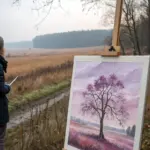
When I want to unwind, I reach for painting ideas that feel soft, simple, and almost meditative while I’m making them. These relaxing painting ideas are all about easy shapes, soothing color, and the kind of brushwork that lets your mind exhale.
Soft Sunset Gradient Sky
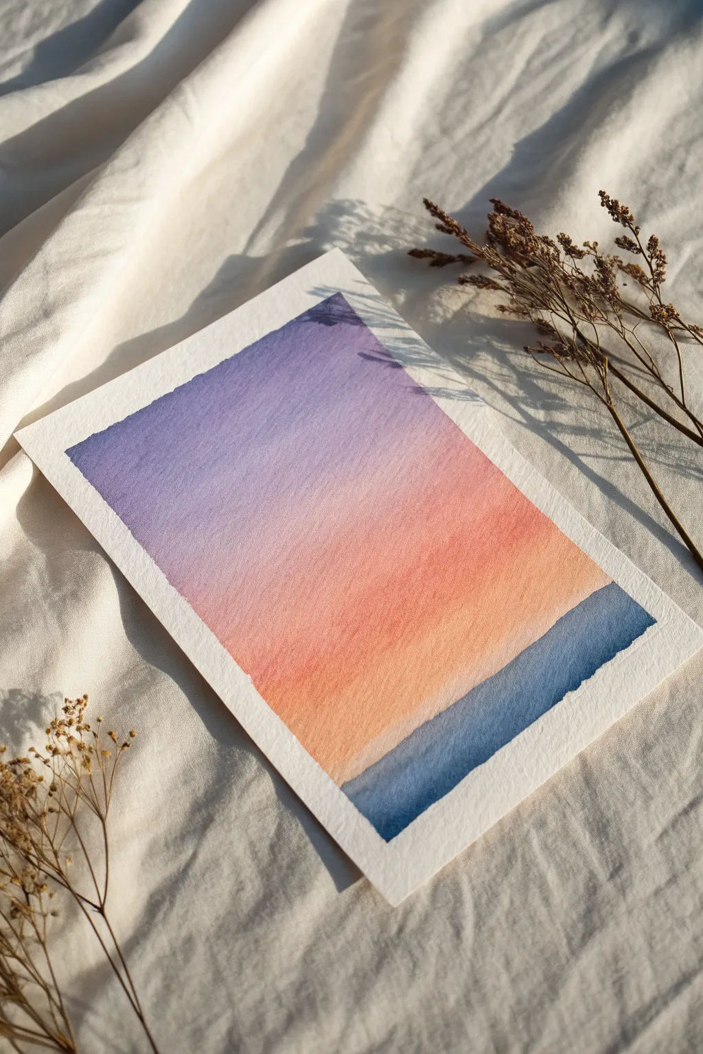
Capture the tranquil beauty of dusk with this minimalist watercolor project featuring a seamless gradient sky. The textured paper adds depth to the soft transition from twilight purple to warm peach before meeting the deep indigo water.
Detailed Instructions
Materials
- Cold-press watercolor paper (300gsm/140lb)
- Painter’s tape or masking tape
- Flat wash brush (3/4 inch or 1 inch)
- Round brush (size 6 or 8)
- Watercolor paints: Indigo, Violet/Purple, Rose/Pink, Orange/Peach
- Two jars of clean water
- Paper towels
- Mixing palette
Step 1: Preparation & Sky Gradient
-
Secure Your Paper:
Begin by taping down all four edges of your watercolor paper to a hard board or table. This prevents buckling and creates that crisp, clean white border seen in the final piece. -
Pre-mix Your Palette:
Prepare puddles of your sky colors: a medium-strength violet, a soft rose pink, and a warm peach or light orange. Having these ready before you start painting is crucial for a smooth blend. -
Wet the Sky Area:
Using a clean flat brush and clear water, wet the upper 3/4 of your paper evenly. You want the paper to glisten with a sheen but not have standing puddles of water. -
Apply the Purple:
Load your flat brush with the violet mix. Start at the very top edge of the wet area and paint horizontal strokes across. -
Transition to Pink:
While the purple is still wet, rinse your brush slightly and pick up the rose pink. Apply it just below the purple, letting the bottom edge of the purple bleed naturally into the pink. -
Blend the Middle:
Use gentle back-and-forth horizontal strokes where the colors meet to encourage a soft gradient, but don’t overwork it or the paper might pill. -
Add the Warmth:
Rinse your brush again and load it with the peach or light orange. Paint this below the pink section, bringing the wash down nearly to where your horizon line will be. -
Fade the Bottom:
Clean your brush and use just damp bristles to soften the bottom edge of the peach, letting it fade into white paper. This creates a hazy atmosphere near the horizon. -
Tilt for Flow:
I like to tilt the board slightly upward at the top for a moment, allowing gravity to pull the pigments down and blend them even more seamlessly. -
Let the Sky Dry:
Allow this layer to dry completely. The paper must be bone dry before you add the dark water, or the sharp horizon line will bleed.
Fixing Blooms
If you see cauliflower-like blooms in your sky, it means you added water to drying paint. Don’t touch it! Let it dry completely, then gently scrub with a damp stiff brush to soften edges.
Step 2: The Deep Water
-
Mix Deep Indigo:
Create a concentrated mix of Indigo. You want a creamy consistency, not too watery, to achieve that rich, dark contrast against the light sky. -
Define the Horizon:
Using a round brush or the edge of your flat brush, carefully paint a straight line across the paper where the peach fade ends. -
Fill the Water Layer:
Working quickly downwards from that horizon line, fill in the rest of the bottom section with your dark indigo mix. -
Create Texture:
While the indigo is wet, you can lift out tiny horizontal streaks with a thirsty (damp but clean) brush to suggest subtle waves or light reflection. -
Adding Depth:
Drop a tiny bit of darker pigment into the bottom corners while wet to create a vignette effect, drawing the eye toward the center. -
Check Edges:
Ensure the side edges where the paint meets the tape are fully covered so your final border is perfectly rectangular. -
Final Dry:
Let the painting sit until completely dry. If the paper feels cold to the touch, it is still damp inside. -
The Reveal:
Peel the tape away slowly at a 45-degree angle, pulling away from the painted area to avoid tearing the paper surface.
Make it Sparkle
Mix a tiny amount of iridescent medium or metallic watercolor into the peach layer while wet. It adds a magical, almost invisible shimmer that only catches the light at certain angles.
Now you have a peaceful gradient landscape perfect for framing or gifting


Calm Ocean Horizon
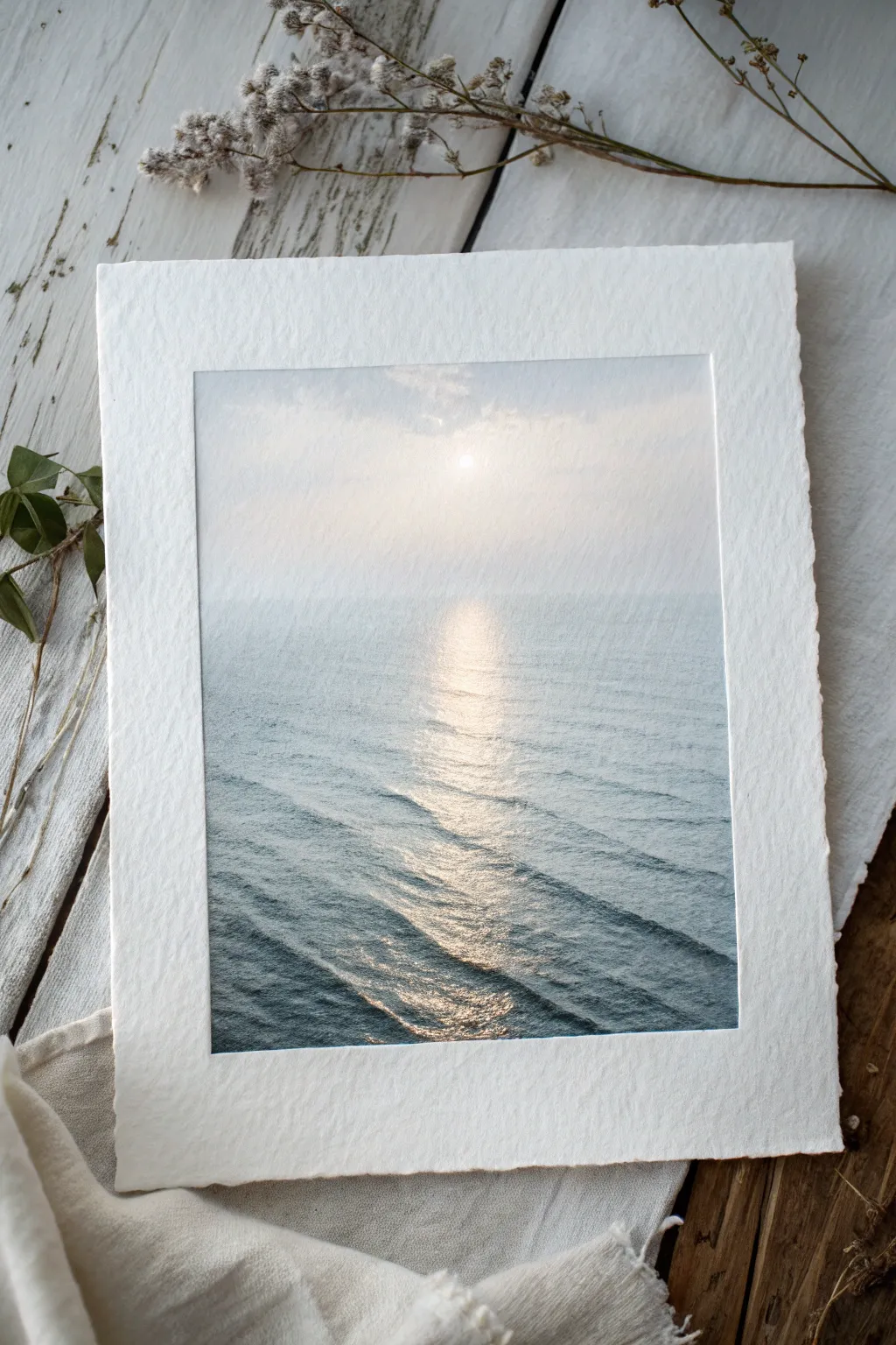
Capture the serenity of a hazy morning sunrise over the ocean with this soft, atmospheric watercolor project. The focus is on subtle gradients and preserving the white of the paper to create a shimmering path of light across gentle waves.
Step-by-Step Tutorial
Materials
- Cold press watercolor paper (minimum 300lb or heavy weight with deckle edge)
- Watercolor paints (Indigo, Payne’s Grey, Cerulean Blue, a touch of Yellow Ochre)
- Masking fluid (optional but helpful)
- Flat wash brush (1 inch)
- Round brushes (sizes 4 and 8)
- Jar of clean water
- Paper towels
- Painter’s tape or a board for mounting
Step 1: Preparation and Sky
-
Prepare your paper:
Since we are using heavy washes, secure your paper to a board if it isn’t a block. If you have beautiful deckle edges like the example, tape just the corners or use gummed tape carefully on the back to keep it flat without covering the edges. -
Establish the horizon line:
Lightly sketch a very faint horizon line about halfway up the page. It doesn’t need to be perfect, as this painting relies on a soft transition between sky and sea. -
Reserve the sun:
Identify where your sun will be—high and central. You can either carefully paint around a small circle or apply a tiny drop of masking fluid to preserve the pure white of the paper until the end. -
Wet the sky area:
Using your large flat brush, wet the entire area above the horizon line with clean water. You want the paper glistening but not creating puddles. -
Apply the sky wash:
Mix a very dilute wash of Indigo and a hint of Cerulean Blue. The sky is extremely pale, almost white near the sun. Stroke gently from the top down, letting the pigment fade as it nears the horizon. -
Warm the light:
While the sky is still damp, drop an incredibly faint amount of Yellow Ochre near the sun area to give it a warm glow, blending it softly into the cool blue-greys.
Fixing Hard Edges
If your water reflections look too stripey, gently scrub the hard edges with a damp, stiff brush (like a hog bristle) to blur them back into the paper.
Step 2: Creating the Ocean
-
Paint the distant water:
Switch to your size 8 round brush. Mix a slightly stronger version of your sky blue—perhaps adding a touch of Payne’s Grey. Paint the water right at the horizon line, keeping it horizontal and soft. -
Define the light path:
As you move down the paper towards the foreground, leave a central vertical column unpainted or very lightly painted. This negative space will become the sun’s reflection on the water. -
Start the wave ripples:
Using a mix of Indigo and Payne’s Grey, start painting horizontal, undulating lines on either side of the light path. Keep these lines thin and close together near the horizon to suggest distance. -
Widen the waves:
As you move toward the bottom of the paper, make your brushstrokes thicker and slightly more spaced out. This change in scale creates the perspective of waves coming closer to the viewer. -
Soften edges:
I like to take a damp, clean brush and gently run it along the edges of the light path, softening the transition so the water doesn’t look like solid stripes against the light.
Step 3: Details and Contrast
-
Deepen the foreground:
Load your brush with a richer, darker mix of Indigo. Add contrast to the waves at the very bottom of the page. The darker the water here, the brighter the reflection will appear. -
Enhance the shimmer:
Mix a medium-tone grey-blue. Add small, disconnected horizontal dashes inside the central column of light. These suggest the tops of waves catching shadows even within the brightness. -
Refine the sun:
If you used masking fluid for the sun, rub it off gently once the paper is bone dry. Then, use a damp brush to soften the hard edges of the circle so it glows rather than looking like a sticker. -
Dry brush texture:
For the sparkle on the water, take a mostly dry brush with dark pigment and drag it lightly over the textured paper surface in the foreground. The rough paper grain will catch the paint, leaving tiny white speckles that look like glitter. -
Final assessment:
Step back and look at the values. If the horizon line feels too sharp, wet it slightly and lift some pigment. The sea and sky should almost merge in the misty distance.
Add Metallic Touches
Once fully dry, glaze a tiny amount of iridescent pearl medium over the sun path. It adds a literal shimmer that changes as you walk past the art.
Let your painting dry completely before framing to enjoy the peaceful atmosphere you have created
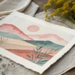

Misty Mountain Layers
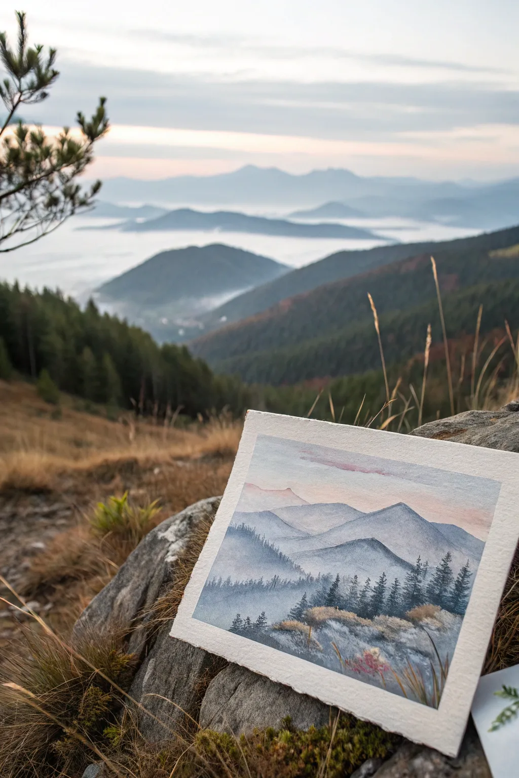
Capture the serene beauty of a mountain sunrise with this watercolor landscape that focuses on soft gradients and atmospheric depth. You’ll layer translucent washes to build a scene where distant peaks fade gently into the mist while sharp foreground pines add striking contrast.
Detailed Instructions
Materials
- Cold press watercolor paper (300 gsm)
- Watercolor paints: Indigo, Payne’s Gray, Ultramarine Blue, Alizarin Crimson, Burnt Sienna, Yellow Ochre
- Flat wash brush (3/4 inch)
- Round brushes (size 6 and size 2 for details)
- Two jars of water
- Paper towels
- Masking tape
- Mixing palette
Step 1: Setting the Atmosphere
-
Prepare your paper:
Tape your watercolor paper down to a board on all four sides. This ensures a clean border and prevents buckling when we apply heavy washes. -
Mix the sky colors:
Create a very dilute wash of Alizarin Crimson with a touch of Yellow Ochre for a warm sunrise glow. In a separate well, mix a pale Ultramarine Blue. -
Paint the sky:
Wet the entire sky area with clean water first. Drop in the pinkish mix near the horizon line and blend the pale blue into the top third of the paper. Let the colors bleed softly together, keeping everything pastel and light. -
Add a cloud hint:
While the sky is still damp but not soaking, streak a slightly stronger horizontal line of diluted purple (mix blue and red) across the upper sky to suggest a soft cloud bank. -
First mountain layer:
Once the sky is bone dry, mix a very pale, watery blue-grey. Paint the outline of the furthest mountain range. Keep the edge crisp but fill the body of the mountain with plenty of water so it fades to almost nothing at the bottom.
Fixing Hard Lines
If your misty fade-outs dry with a hard line instead of a blur, re-wet the area gently with a clean, damp brush and blot with a tissue to lift the pigment edge.
Step 2: Building the Ranges
-
Second mountain tier:
Darken your grey mixture slightly by adding a tiny bit of Payne’s Gray. Paint the second ridge line slightly lower than the first to create depth. -
Creating the mist:
Immediately after painting the top edge of this second range, rinse your brush and use clean water to soften the bottom edge of the shape, creating a gradient that disappears into white paper. -
Third layer variation:
Mix a slightly cooler, bluer tone for the next range. I find varying the color temperature slightly between layers makes the scene vibrate with life. Paint this ridge closer to the foreground. -
Add shape variety:
Ensure your mountain peaks don’t look like perfect triangles. Give them rolling, organic shapes, overlapping the previous layers to enhance the illusion of distance. -
Darker mid-ground:
For the closest large mountain shape, mix a significantly stronger wash of Indigo and Payne’s Gray. Paint this layer with more pigment and less water, defining a stronger silhouette against the misty background. -
Texture the slopes:
While this dark layer is wet, drop in tiny hints of pure Indigo to suggest shadows or wooded areas on the slopes.
Step 3: Foreground Details
-
Mix the pine color:
Create a rich, dark mixture using Indigo and a touch of Burnt Sienna to warm it up. This needs to be a creamy consistency, not watery. -
Paint distant trees:
Using the size 6 round brush, dab vertical, jagged strokes along the ridgeline of the closest mountain layer to suggest a dense forest of fir trees. -
Foreground trees:
Switch to your size 2 brush for greater control. Paint individual pine trees in the immediate foreground on the right and left sides. Use a stamping motion—start with a fine tip at the top and widen your strokes as you move down the tree trunk. -
Immediate foreground base:
Paint the very bottom section of the paper with a textured wash of grey-blue mixed with a little dirty yellow to simulate rocky, grassy terrain. -
Grassy textures:
While the bottom area is semi-dry, use a dry-brush technique with Yellow Ochre and Burnt Sienna to create the sensation of dry autumn grass catching the light. -
Final highlights:
Use a small brush to flick a few sharp, dark grass blades over the lighter patches and add tiny touches of red or rust among the rocks for floral interest.
White Gel Pen Magic
Once fully dry, use a white gel pen to add tiny highlights to the foreground grass tips or to restore a bit of mist between the darkest tree layers.
Peel off the tape carefully to reveal your crisp borders and enjoy your tranquil mountain view

Quiet Pine Forest Silhouettes
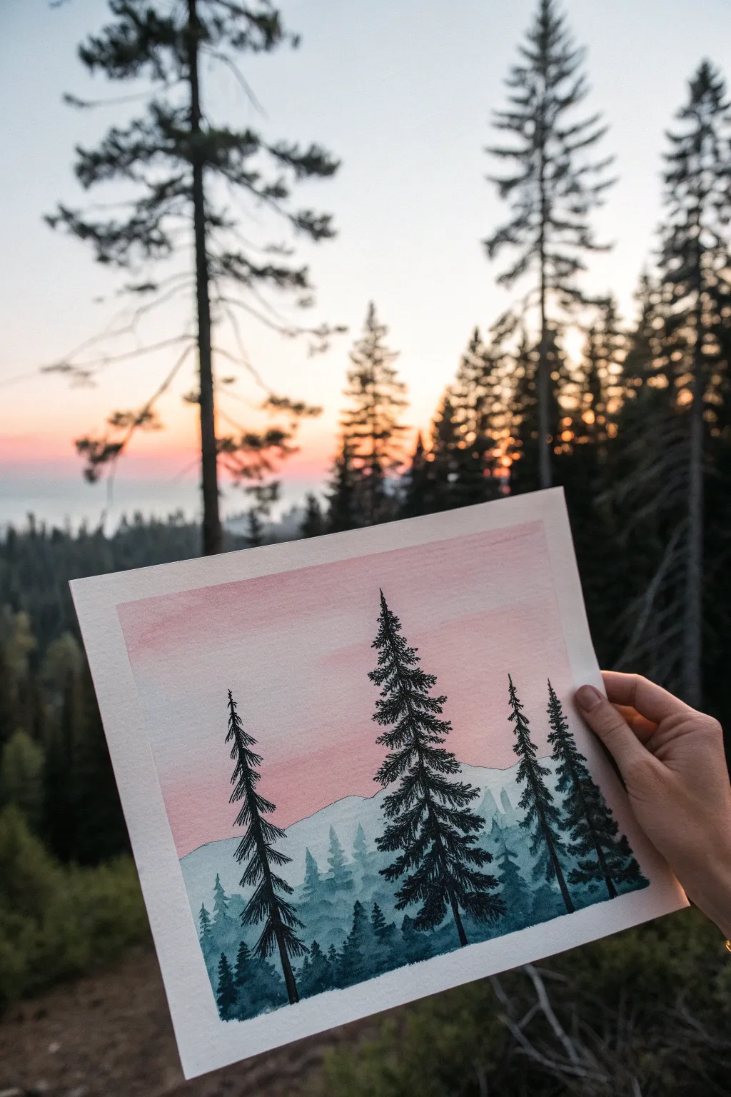
Capture the serene transition from day to night with this layered watercolor landscape. You will build depth using fading washes of blue mountains against a soft, pink sky, finished with striking black tree silhouettes.
Step-by-Step Tutorial
Materials
- Cold press watercolor paper (140lb/300gsm)
- Watercolor paints (Indigo, Prussian Blue, Payne’s Gray, Rose Madder or Opera Pink)
- Masking tape
- Flat wash brush (3/4 inch)
- Round brushes (sizes 6 and 2)
- Two jars of water
- Palette for mixing
- Paper towels
Step 1: Setting the Sky
-
Prepare the paper:
Begin by taping down all four edges of your watercolor paper to a board or table. This creates a clean white border and prevents the paper from buckling during the heavy washes. -
Wet-on-wet start:
Using your large flat brush, apply a layer of clean water to the top two-thirds of your paper. You want the surface to be glistening but not forming puddles. -
Apply the pink wash:
Mix a watery, pale wash of Rose Madder or Opera Pink. Gently sweep this across the damp sky area, starting stronger at the top and letting it fade to almost white as you move downward. -
Adding atmospheric haze:
While the pink is still damp, you can touch in just a hint of very pale purple or diluted indigo at the very bottom edge of the sky for a transition color, but keep it subtle. -
Complete drying:
This is crucial: let the sky layer dry completely before moving on. The paper should feel warm to the touch, not cool.
Uneven is Better
Don’t try to make your pine trees perfectly symmetrical. Nature is random. Making one side sparse or having a crooked top actually adds realism to the silhouette.
Step 2: Layering the Mountains
-
Mix the lightest blue:
Prepare a puddle of very diluted indigo or teal. It should be transparent and light in value. -
First mountain ridge:
Paint an uneven, jagged line across the middle of the paper (overlapping the bottom of the pink sky) to create the farthest mountain range. Fill the area below this line with the same pale wash. -
Dry the first layer:
Let this first mountain layer dry. I find using a hair dryer on low heat speeds this up significantly if you’re impatient. -
Second mountain ridge:
Add a slightly more pigmented blue to your mix to darken the value. Paint a second mountain ridge slightly lower than the first, creating an overlapping effect. -
Detailed treetops:
On this second ridge, use the tip of your round brush to dab tiny, vertical uneven marks along the top edge, simulating the look of distant trees. -
Fill opacity:
Fill the space below this second ridge with your medium-blue mix. The layering is starting to build distance. -
Third mountain layer:
Create an even darker, richer blue mix. Paint a third ridge lower down, making the tree shapes on the top edge slightly larger and more distinct than the previous layer. -
Final drying time:
Allow all the mountain layers to dry fully. The paper must be bone-dry for the final crisp silhouettes.
Starry Night
Before painting the black trees, flick a toothbrush loaded with white gouache or opaque white watercolor over the dry sky to add a subtle dusting of stars.
Step 3: Foreground Silhouettes
-
Mix the darkest heavy pigment:
Mix a very saturated dark color using Payne’s Gray and Indigo. It should have a creamy consistency, with very little water. -
Map the main trees:
Using your smallest round brush (size 2), paint thin vertical lines to act as the trunks for your main foreground pine trees. Vary their heights for interest. -
Painting pine branches:
Starting at the top of a trunk, use a stippling motion to dab branches outward. Keep the top branches very short and angled slightly upward. -
Building tree volume:
Work your way down the trunk, making the branches wider and heavier as you descend. Leave small gaps between branches to let the background sky peek through. -
Texturing the base:
At the very bottom of the paper, use the dark mix to paint jagged, grassy textures and smaller shrub-like tree shapes to unite the large trees. -
Final reveal:
Once the black paint is completely dry, slowly peel away the masking tape at a 45-degree angle to reveal your crisp white border.
Step back and admire the peaceful depth you have created in your misty forest landscape
BRUSH GUIDE
The Right Brush for Every Stroke
From clean lines to bold texture — master brush choice, stroke control, and essential techniques.
Explore the Full Guide
Still Lake Reflection
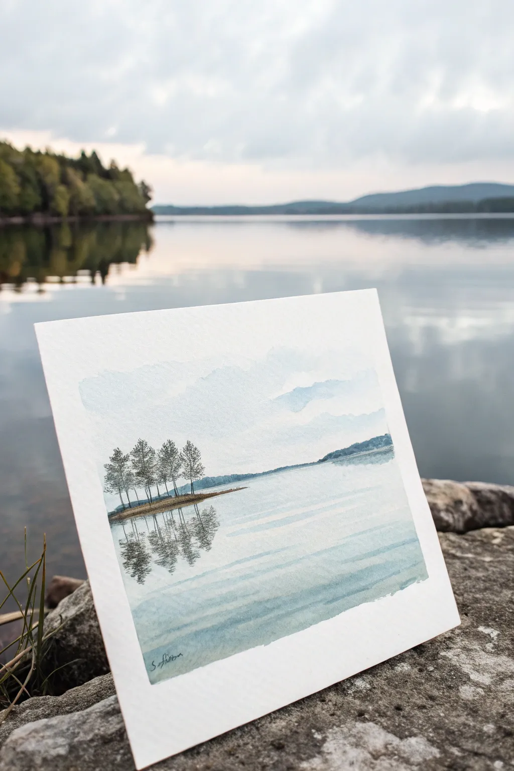
Capture the stillness of a quiet morning with this minimalist watercolor landscape. Using soft washes and careful wet-on-wet techniques, you will create a tranquil scene featuring a small island clump of trees and their mirror-like reflection in calm water.
Step-by-Step Guide
Materials
- Cold-pressed watercolor paper (300gsm/140lb)
- Painter’s tape or masking tape
- Drawing board or thick cardboard
- Watercolor paints: Indigo (or Payne’s Gray), Burnt Umber, Hooker’s Green Dark, Ultramarine Blue
- Round brushes: Size 8 (for washes), Size 4, and Size 0 or 1 (for details)
- Clean water jar
- Paper towels
- HB pencil for light sketching
Step 1: Preparation and Sketching
-
Secure the Paper:
Tape all four edges of your watercolor paper down to your board using painter’s tape. This prevents the paper from buckling when wet and creates a clean, crisp border for your finished piece. -
Find the Horizon:
Lightly sketch a horizontal line about two-thirds of the way down the page to mark your horizon. Keep this line very faint as watercolor is transparent and heavy pencil marks will show through. -
Sketch the Land:
Draw the silhouette of the distant hills on the right side of the horizon. Then, on the left side, sketch a narrow, elongated oval shape slightly below the horizon to represent the small island.
Step 2: Painting the Sky and Distance
-
Wet the Sky Area:
Using your largest brush and clean water, thoroughly wet the paper above the horizon line. Avoid the area reserved for the distant hills for now. -
Apply the Sky Wash:
Mix a very dilute wash of Indigo or Ultramarine Blue. While the paper is still glistening wet, drop this color into the upper sky area, letting it bloom downward naturally to create soft clouds. -
Create Cloud Forms:
While damp, lift out pigment using a clean, thirsty brush or the corner of a paper towel to create white, fluffy cloud shapes. Let the sky wash fade almost to white as it nears the horizon. -
Paint the Distant Hills:
Once the sky is dry to the touch, mix a pale, cool blue-grey tone. Paint the distant hills on the right, keeping the color flat and desaturated to push them into the background.
Muddy Reflections?
If your water reflections look like a blob, you likely overworked the paint while it was wet. Lay down the vertical strokes once, let the pigment settle, and don’t touch it again until dry.
Step 3: Creating the Water
-
Wet the Water Area:
Wet the area below the horizon line with clean water, skipping over the small island shape you sketched earlier. -
First Water Wash:
Using the same dilute blue mix from the sky, paint horizontal strokes across the water area. Leave horizontal gaps of white paper unpainted to suggest light shimmering on the surface ripples. -
Adding Depth in Foreground:
While the wash is still wet, add slightly more pigment to the very bottom of the paper. This darkens the near foreground, helping draw the viewer’s eye into the scene. -
Dry Completely:
Allow the entire painting to dry completely. If the paper feels cold to the back of your hand, it is still damp; wait until it is room temperature.
Add Texture
Use a tiny bit of salt on the wet paint of the island mass before it dries. When you brush the salt off later, it leaves a grainy texture that looks like rocks and scrubby bushes.
Step 4: The Island and Reflections
-
Paint the Island Base:
Mix Burnt Umber with a touch of Green. With your Size 4 brush, paint the narrow strip of land for the island. Keep the edges relatively rough to suggest grass and rocks. -
Suggesting Trunks:
Using the smallest liner or detail brush and a darker mix of Burnt Umber and Indigo, paint five to six vertical lines extending upward from the island for tree trunks. -
Stippling Foliage:
Switch to a dry-brush technique with a dark green-grey mix. Gently stipple foliage onto the tree trunks, keeping the shapes vertical and somewhat sparse to imitate pine or birch silhouettes. -
Starting the Reflection:
Before the island paint is fully set, dampen the area immediately below the island. Drag the darker island colors vertically downward into the wet water area to start the reflection. -
Defining the Reflection:
Wait for the initial drag to dry slightly. Then, using vertical strokes, paint the inverted shapes of the trees into the water. Keep these strokes looser and wavier than the real trees. -
Breaking the Reflection:
While the reflection paint is wet, take a clean, slightly damp bright brush and swipe horizontally across the reflection once or twice. This ‘cuts’ the image, creating the look of gentle ripples.
Step 5: Final Details
-
Enhance Contrast:
Add a few touches of your darkest Indigo mix to the base of the island trees to ground them. -
Remove Tape:
Wait until the painting is bone dry. Peel the tape away slowly at a 45-degree angle, pulling away from the artwork to prevent tearing the paper.
Sign your work subtly in the corner and enjoy the peaceful atmosphere you have created
Moonlight Over Water
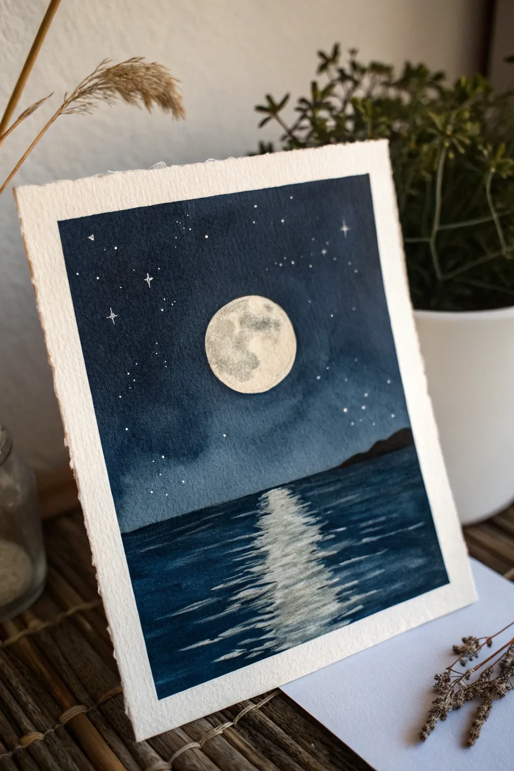
Capture the stillness of a midnight ocean with this moody watercolor piece. You’ll layer deep indigo washes to create a velvety night sky that contrasts beautifully with a bright, textured moon and its shimmering reflection.
How-To Guide
Materials
- Cold press watercolor paper (deckled edge optional)
- Watercolor paints (Indigo, Payne’s Grey, Lamp Black, Burnt Umber)
- White Gouache or white gel pen
- Masking fluid
- Round brushes (sizes 2, 6, and 10)
- Old toothbrush (optional for stars)
- pencil
- painter’s tape
- water jars and paper towels
Step 1: Preparation & Masking
-
Tape the edges:
Begin by taping down your paper to a hard board. Since this piece uses heavy washes for the sky and water, securing the paper prevents buckling and ensures you get that crisp, clean border. -
Sketch the layout:
Lightly draw a horizon lineup from the bottom third of the paper. Then, execute a circle for the moon in the center of the sky area—using a small cup or compass can help you get a perfect circle. -
Mask the moon:
Apply masking fluid carefully to the entire moon circle. This protects the white paper underneath so you can paint the dark sky freely without worrying about painting around the edge. -
Mask the reflection:
For the water reflection, apply thin, horizontal zig-zag lines of masking fluid directly below the moon, getting wider as they come closer to the bottom edge. Let the fluid dry completely before painting.
Step 2: Painting the Night Sky
-
Wet the sky area:
Use your largest brush to apply clean water to the entire sky area, stopping exactly at the horizon line. The paper should be glisten, but not pose puddles. -
Apply the first wash:
Load your brush with a diluted Indigo. Drop the color into the wet sky, letting it flow naturally. Keep the color slightly lighter near the moon and darker at the top corners. -
Deepen the darkness:
While the paper is still damp, mix Indigo with a touch of Payne’s Grey or Black to create a deep midnight blue. Apply this concentrated mix to the top of the sky, blending it downwards to create a gradient. -
Dry and repeat:
Let the first layer dry completely. I find that a second layer is almost always needed for night scenes; repeat the process to get a truly opaque, deep blue, ensuring the horizon line stays straight.
Bleeding Horizon?
If your sky paint bleeds into the water area, your paper was too wet. Let the sky dry 100% before starting the water. You can hide small mistakes by lifting the distinct mountain range slightly higher.
Step 3: The Ocean & Horizon
-
Paint the water base:
Once the sky is dry, wet the water section below the horizon. Apply a medium wash of Indigo, painting right over the masked reflection lines. Use horizontal brushstrokes to mimic the movement of water. -
Darken the water:
Add darker blue-black paint to the bottom corners and sides of the water area, leaving the center area slightly lighter where the reflection sits. -
Create distant land:
Mix a very dark, thick consistency of Payne’s Grey and Burnt Umber. With a size 6 brush, paint an uneven, bumpy silhouette along the right side of the horizon line to represent distant mountains or an island.
Pro Tip: Glowing Moon
After removing the mask, use a clean, damp brush to gently scrub and lift a tiny bit of the dark blue sky paint immediately surrounding the moon. It creates a soft, hazy atmospheric glow.
Step 4: Details & The Reveal
-
Splatter stars:
Cover the water area with a scrap piece of paper. Load a toothbrush or stiff brush with white gouache and flick it over the dry sky to create a field of tiny stars. -
Paint larger stars:
Use a white gel pen or a size 0 brush with gouache to add a few distinct, larger stars. Draw small cross-shapes for twinkling stars to add variety. -
Remove masking fluid:
Ensure the entire painting is bone dry. Gently rub away the masking fluid from the moon and the water reflection using your finger or a rubber cement pickup tool. -
Texture the moon:
Mix a very watery, pale grey. Dab this lightly onto the moon to create craters and shadows, leaving some areas bright white to make it glow. -
Refine the reflection:
Soften the stark white lines of the water reflection by glazing a very diluted blue over parts of them. Use a damp brush to feather the edges where the reflection meets the dark water.
Peel off your tape carefully to reveal those crisp edges and enjoy the calm of your midnight seascape

PENCIL GUIDE
Understanding Pencil Grades from H to B
From first sketch to finished drawing — learn pencil grades, line control, and shading techniques.
Explore the Full Guide
Simple Rainy Window Washes
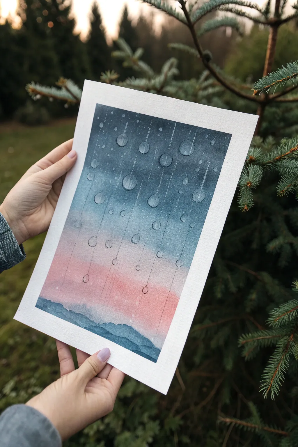
Capture the cozy, melancholy beauty of a rainy evening by painting this stylized window view. This project combines a smooth, dreamy sunset gradient with the crisp details of water droplets sliding down the glass.
Step-by-Step Tutorial
Materials
- Cold Press Cotton Watercolor Paper
- Pencil (HB or H)
- Masking Tape
- Watercolor Paints (Indigo, Phthalo Blue, Rose Madder or Quinacridone Rose, Payne’s Gray)
- Round Brushes (Size 6 or 8 for washes, Size 0 or 1 for details)
- White Gouache or White Gel Pen
- 2 Jars of Water
- Paper Towels
- Ruler (optional)
Step 1: Preparation and Background Wash
-
Tape details:
Begin by taping down all four edges of your watercolor paper to a board. This creates the crisp white border seen in the example and keeps the paper flat during the heavy wet-on-wet wash. -
Outline the hills:
Lightly sketch the rolling hills at the very bottom of the paper. Keep these lines faint as the paint will eventually cover most of them. -
Wet the sky:
Using your larger brush and clean water, thoroughly wet the entire sky area, stopping just above your pencil line for the hills. The paper should glisten but not have standing puddles. -
Apply the dark sky:
Load your brush with Indigo or a deep mix of Phthalo Blue and Payne’s Gray. Start painting at the very top edge, letting the pigment flow freely in the water. I like to tilt the board slightly so gravity helps pull the color down. -
Create the gradient:
As you move down the paper, clean your brush slightly and pick up more water to dilute the blue, creating a mid-tone blue that fades lighter as it approaches the middle of the page. -
Blend in the sunset:
While the paper is still wet, switch to a clean brush with Rose Madder. Apply it to the bottom section of the sky, carefully blending it upward into the fading blue to create a soft violet transition where they meet. -
Let it dry completely:
This step requires patience. Allow the background wash to dry 100% before moving on. The paper must be bone dry, or the next layers will bleed.
Clearer Droplets
If lifting paint doesn’t make the drops light enough, paint over the dry circle with a very milky, semi-transparent layer of white gouache before adding shadows.
Step 2: Painting the Hanging Drops
-
Sketch the rain paths:
Very lightly sketch vertical lines using a ruler to mark where your main rain trails will be. Draw circles of varying sizes along these paths to represent the heavy droplets. -
Lift the highlight:
This is a key technique for the translucent look: take a clean, damp (not wet) stiff brush. Gently scrub the inside of each pencil-drawn circle to lift away the background pigment, making the ‘glass’ inside the droplet appear clearer. -
Add drop shadows:
Using a small detail brush and a diluted mix of your dark blue/grey, paint a thin shadow crescent on the *left* side of each droplet circle. This gives them spherical volume. -
Define the edges:
Outline the right side of the circles very thinly with a slightly darker version of the background color to define the edge of the water. -
Paint the trails:
Using a very fine brush or even a drawing pen, create the dotted lines trailing upward from the drops. These shouldn’t be solid lines; broken, stippled marks look more like water residue.
Urban Glow
Swap the hills for a jagged city skyline and change the pink sunset to a glowing orange for a ‘city rain at night’ vibe.
Step 3: Foreground and Finishing Touches
-
Paint the distant hills:
Mix a watery blue-grey shade. Paint the furthest layer of hills, overlapping slightly with the pink sky. Let this dry. -
Paint the foreground hills:
Mix a more concentrated, darker Indigo or Payne’s Gray. Paint the closest hill layer right at the bottom, creating depth through value contrast. -
Add subtle highlights:
Using white gouache or a white gel pen, add tiny reflection dots to the upper right curve of your largest water droplets to make them look wet and shiny. -
Flicker stars or dust:
If desired, you can gently tap a brush loaded with white gouache to create very faint specks on the window pane, adding texture to the glass surface. -
Remove the tape:
Wait until every part of the painting is completely dry to the touch. Peel the masking tape away slowly at a 45-degree angle to reveal your clean borders.
Step back and enjoy the peaceful atmosphere you’ve captured through the rain-streaked glass
Loose Wildflower Meadow Dots
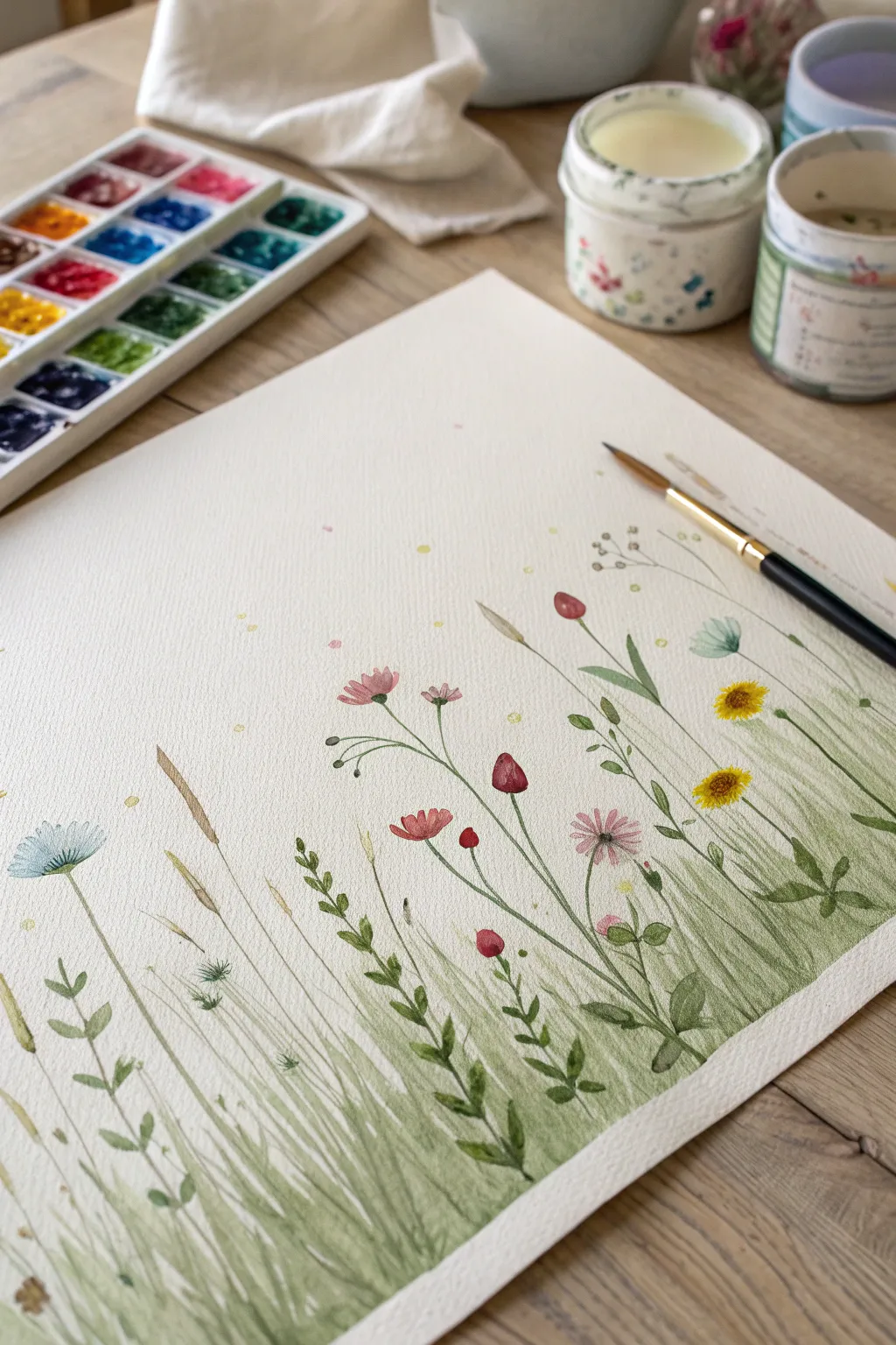
Capture the delicate beauty of a summer field with this loose, airy watercolor painting. Using gentle upward strokes and soft dots of color, you’ll create a serene meadow landscape full of movement and life.
Detailed Instructions
Materials
- Cold press watercolor paper (300gsm)
- Watercolor paints (various greens, yellow, red, pink, blue)
- Round brushes (sizes 2, 4, and 6)
- Clean water jar
- Paper towels
- Palette for mixing
Step 1: Painting the Grass Foundation
-
Prepare your greens:
Mix three distinct shades of green on your palette: a pale, watery yellow-green for the background, a medium sap green, and a deeper olive or forest green for contrast. -
Lay the base wash:
With your largest brush and the palest green mix, paint a very loose, uneven wash at the bottom third of the paper. Use upward strokes to mimic the direction of growing grass, but keep it soft and blurry. -
Add initial texture:
While the base layer is still damp, switch to a size 4 brush. Load it with your medium green and flick quick, upward strokes into the wet paper. The paint will bleed slightly, creating a soft, out-of-focus background effect. -
Define the tall grasses:
Once the paper is mostly dry, use the same medium green on a dry brush. Start from the bottom edge and pull long, thin lines upward, varying the height. Curve some blades gently to the left or right to make them look natural. -
Create depth with layers:
Using your darkest green and a smaller brush (size 2), paint sparse patches of grass near the bottom edge. These darker lines anchor the painting and suggest fullness near the roots. -
Paint broad leaves:
Mix a muted olive green. Press the belly of your brush down and lift as you pull upward to create broader, leafier shapes among the thin blades. Add small, alternating leaves up a central stem for variety.
Step 2: Adding the Wildflowers
-
Paint the yellow centers:
Dilute a warm yellow paint. Dot small, rough circles or ovals floating at different heights above the grass. These will be the centers of your daisies or sunflowers. -
Create red poppies:
Load your brush with a watery red or deep pink. Press the brush tip down to form teardrop shapes that meet at a point. Group two or three of these shapes together to form a tulip or poppy bud. -
Add pink cosmos:
Using a soft pink, paint loose petals radiating from a central point. Keep the paint varied in intensity—some petals transparent, some saturated—to give the flower dimension. -
Detail the blue cornflower:
With a dilute blue, paint a fan shape or semi-circle. Add tiny, darker blue lines radiating outward from the base of the flower to define the petals. -
Connect the stems:
Using your thinnest brush and a very light touch, draw thin green lines connecting your floating flower heads down into the grassy base. It’s okay if the lines break or disappear into the dense grass.
Wet-on-Dry Texture
For crisp grass blades, ensure the paper is bone dry. If the paper is cool to the touch, it’s still damp. Painting on damp paper makes lines fuzzy.
Step 3: Dry Accents and Finishing Details
-
Paint dried wheat stalks:
Mix a sandy ochre or light brown color. Paint simple lines with slightly thicker, textured heads to represent dried grasses or wheat stalks poking through the greenery. -
Add whimsical dots:
Dip a small brush into pale yellow, pink, and green. Gently dot the paper in the empty white space above the flowers to represent pollen, distant buds, or fireflies. -
Enhance flower centers:
Return to your yellow flower centers. If they are dry, dab a tiny bit of brown or dark orange in the middle to give them a realistic, textured eye. -
Refine the foreground:
Look at the very bottom edge of your paper. Add a few very dark, sharp blades of grass here to bring the foreground into sharp focus against the softer background.
Splatter Magic
Load a toothbrush with paint and flick the bristles to create a mist of tiny speckles. This adds organic texture and energy to the empty sky area.
Step back and admire your gentle field of flowers as the final touches dry completely


Soothing Leaf Pattern Repeats
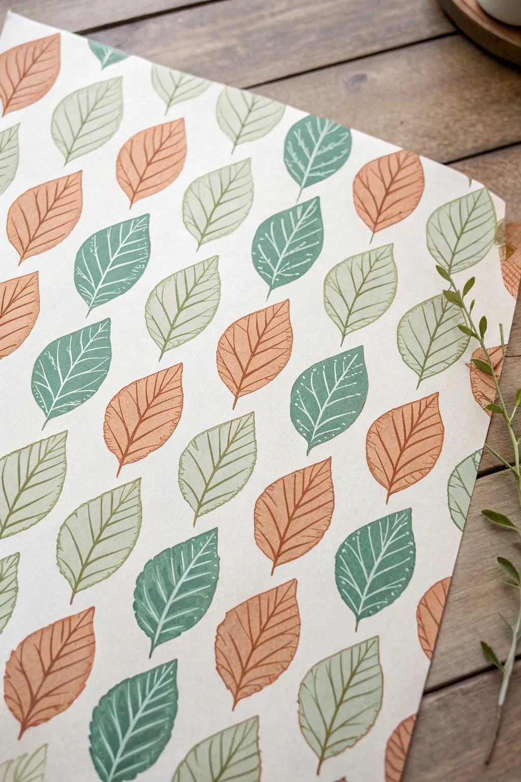
Embrace the meditative rhythm of creating your own patterned paper with simple hand-carved stamps. This project results in a gorgeous sheet of dancing leaves in earthy tones of rust, sage, and forest green, perfect for wrapping paper or wall art.
Step-by-Step
Materials
- Soft-cut block printing rubber (or specialized eraser block)
- Linoleum cutter tool with V-gouge and U-gouge blades
- Pencil and tracing paper
- Ink pads (Rust orange, sage green, deep forest green) OR acrylic paint and a brayer
- Heavyweight mixed-media paper or cardstock (off-white or cream)
- Craft knife
- Scrap paper for testing
Step 1: Carving Your Leaf Stamps
-
Draft the leaf shape:
Begin by sketching a simple, pointed oval leaf shape on a piece of paper. You want a classic shape that is symmetrical but slightly organic. Aim for about 1.5 to 2 inches in length. -
Refine the design:
Draw a center vein line down the middle of your leaf sketch, stopping just short of the tip. Add 4-5 diagonal veins branching off each side. Keep the lines simple, as these will be the white space in your print. -
Transfer to the block:
Place tracing paper over your sketch and trace it with a soft pencil. Flip the tracing paper onto your rubber carving block and rub the back firmly to transfer the graphite design. -
Carve the outline:
Using your linoleum cutter with the fine V-gouge blade, carefully carve along the outer perimeter of your leaf shape first. Always cut away from your body for safety. -
Carve the details:
Still using the V-gouge, carve out the center vein and the side veins. Remember, the parts you carve away will not hold ink and will reveal the paper color underneath. -
Clear the background:
Switch to a wider U-gouge blade to remove the excess rubber around your leaf shape. Trim the rubber block close to the design with a craft knife so you can easily see where you are placing the stamp. -
Create a second variant:
For a more dynamic pattern like the photo, repeat these steps to create a second, slightly smaller or differently shaped leaf stamp. This adds lovely variety to the final composition.
Uneven Ink Coverage?
If your prints look patchy, your table might not be perfectly flat. Place a craft foam sheet or a mousepad under your paper. This cushion helps the stamp make full contact for a solid, crisp image.
Step 2: Printing the Pattern
-
Prepare your workspace:
Lay out your high-quality paper on a flat surface. If you are worried about ink bleeding through, place a scrap sheet underneath. -
Test your print:
Ink up your stamp using the sage green ink pad. Press it firmly onto scrap paper to check your carving. If there are stray ridges picking up ink where there shouldn’t be, use your cutter to trim them down. -
Start with the dominant color:
Begin with your darker forest green ink. Stamp a few leaves randomly across the paper. Orient them on a diagonal tilt, pointing roughly towards the top right corner to create movement. -
Add the second color:
Clean your stamp (or switch to the second stamp) and use the rust-orange ink. Fill in open spaces between the green leaves, maintaining that same diagonal flow but varying the angle slightly so they don’t look like soldiers in a row. -
Incorporate the lightest tone:
Finally, come in with the sage/light green ink. Look for the largest gaps in your pattern and fill them. It is okay if the spacing isn’t mathematically perfect; the organic placement is part of the charm. -
Handle the edges:
Don’t be afraid to stamp off the edge of the paper. Seeing only half a leaf at the border makes the pattern feel continuous and professionally printed. -
Check balance:
Step back and look at the overall composition. If you see a large empty spot, add a leaf. I sometimes squint my eyes to blur the details, which helps me spot uneven areas in the color distribution. -
Dry deeply:
Let the paper sit undisturbed. Ink from pads dries relatively quickly on matte paper, but give it at least 30 minutes to prevent smudging before handling.
Step 3: Adding Details (Optional)
-
Touch up lines:
If some of your vein lines are too faint because the ink filled them in, you can scratch them gently with a clean, dry clay tool or toothpick while the ink is tacky, or fix it with a white gel pen once dry. -
Flatten the paper:
If the heavy inking caused the paper to curl slightly, wait until it is fully 100% dry, then place it under a heavy book overnight to flatten it out perfectly.
Stamp Cleaning Tip
Between color changes, clean your rubber stamp by dabbing it repeatedly on a damp paper towel or use a baby wipe. Avoid running it under water, which can loosen the glue if your rubber is mounted on wood.
Enjoy the rhythmic satisfaction of watching your blank page transform into a lush garden of falling leaves
Minimal Botanical Line Art With Wash
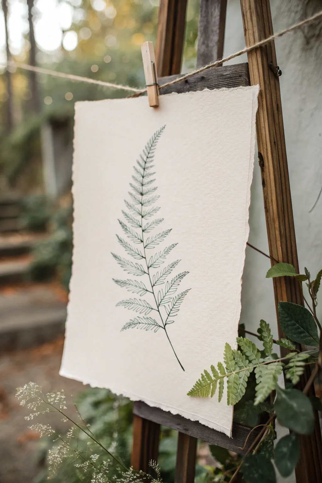
Capture the delicate beauty of the forest floor with this minimal fern study on textured paper. The interplay of crisp ink lines and the soft, organic edge of the paper creates a stunning piece of nature-inspired decor.
How-To Guide
Materials
- Heavyweight cold-press watercolor paper or handmade cotton rag paper (deckle edge recommended)
- Fine liner pen (0.1mm or 0.3mm) with archival green ink
- Pencil (HB or H)
- Kneaded eraser
- Watercolor paint (Sap Green or Olive Green)
- Small round watercolor brush (size 2 or 4)
- Ruler (optional)
- Reference image of a fern (optional but helpful)
Step 1: Preparation & Sketching
-
Select your paper:
Choose a piece of paper that has some character. Handmade cotton rag paper with rough, deckled edges works perfectly for this organic subject, adding instant texture and charm. -
Identify the central vein:
Using your pencil, lightly draw a single, curved line starting from the lower third of the paper and arching gently upward. This will be the rachis, or the main stem of your fern. -
Map the width:
Sketch a very faint triangular shape around your central line to define the overall boundaries of the frond. It should differ in width, being widest at the bottom and tapering to a sharp point at the top. -
Placement of pinnae:
Lightly mark small ticks along the central stem to indicate where each leaflet (pinna) will branch off. I find it helpful to stagger them slightly rather than placing them perfectly opposite each other for a more natural look. -
Sketching the leaflets:
Draft the basic shape of each leaflet. Start larger at the bottom and gradually make them smaller and more curved as you ascend the stem.
Step 2: Inking the Lines
-
Begin the stem:
Switch to your green fine liner pen. Trace the main central stem first, giving it a slightly wobbly, organic quality rather than a ruler-straight line. -
Outline the lower leaves:
Starting at the bottom left, outline the first leaflet. Create small serrations or zig-zag patterns on the edges of the leaf to mimic the fern’s texture. -
Add the central rib:
Draw the central vein of that individual leaflet, extending it almost to the tip but stopping just short to keep it delicate. -
Repeat for the opposite side:
Move to the bottom right leaflet and repeat the outlining and veining process. Work your way up the stem, alternating sides to avoid smudging your fresh ink. -
Adjust the scale:
As you move higher up the frond, simplify the details. The serrated edges should become less pronounced and the leaves significantly smaller. -
Finalize the tip:
Draw the very top few leaves as simple, small curves that merge directly into the tip of the stem. -
Erase guidelines:
Wait at least 15 minutes to ensure the ink is totally dry. Gently roll your kneaded eraser over the sketch to lift the graphite without damaging the paper surface.
Deckle Edge DIY
Can’t find handmade paper? Tear standard watercolor paper against a ruler’s edge, then distress the torn fibers with a wet brush to mimic the look.
Step 3: Adding the Wash
-
Prepare the wash:
Dilute your green watercolor paint with plenty of water. You want a very transparent, tea-like consistency, not a thick opaque color. -
Apply the first wash:
Using your size 4 brush, loosely paint over the ink lines. Don’t worry about staying perfectly inside the lines; a little spillover adds to the artistic, relaxed feel. -
Add depth:
While the first layer is still damp, dab a slightly more concentrated green near the central stem where the leaves attach. This creates a natural shadow effect. -
Final drying:
Let the paper dry completely flat. If the paper buckles slightly from the water, you can press it under a heavy book overnight once it is bone dry.
Level Up: Earth Tones
Mix a tiny drop of burnt sienna into your green wash. This desaturates the brightness, giving the fern a distinctively vintage, botanical study vibe.
Hang your artwork with a simple wooden clip to complete the rustic aesthetic
Soft Abstract Color Fields
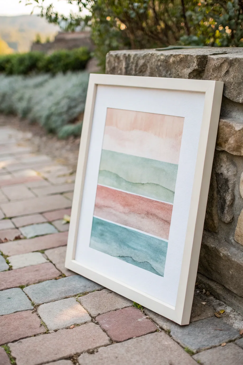
This calming project captures the essence of a tranquil landscape through simplified, horizontal bands of soft watercolor. By layering washes of peach, sage, rust, and teal, you’ll create a modern abstract piece that evokes the feeling of distant hills or geological layers.
Detailed Instructions
Materials
- Cold press watercolor paper (140lb/300gsm)
- Watercolor paints (Peach, Sap Green, Burnt Sienna, Prussian Blue, White gouache optional)
- Large flat wash brush (3/4 inch or 1 inch)
- Medium round brush (size 6 or 8)
- Painter’s tape or masking tape
- Pencil and ruler
- Two jars of water
- Paper towels
- White or light wood frame with distinct matting
Step 1: Preparation & Layout
-
Tape the paper:
Secure your watercolor paper to a flat, sturdy board using painter’s tape on all four sides. This creates a crisp border and prevents the paper from buckling when wet. -
Grid the sections:
Using a ruler and a light pencil touch, mark four equal vertical sections on your paper. Don’t draw harsh lines across; just make small tick marks on the tape or the very edge of the paper to guide you. -
Prepare your palette:
Mix your four main colors in your palette wells. You want them quite watery and transparent. Create a peach (mix orange with plenty of water), a sage green, a muted rust/terracotta, and a deep teal.
Bleeding edges?
If colors run into each other, you didn’t wait long enough! Use a clean, damp brush to ‘drink’ up the mistake, blot with tissue, and let it dry fully before trying again.
Step 2: Painting the Layers
-
Start with the sky:
Begin with the top section using your peach mixture. Load your large flat brush with clean water first and wet the top rectangular area, stopping at your imaginary line. -
Apply the first wash:
Drop the peach pigment into the wet paper. I like to let the color bloom naturally here. Tilt the board slightly to encourage the pigment to settle toward the bottom of this section. -
Soft edge technique:
While the paint is still damp, use a clean, slightly wet round brush to soften the bottom edge of this peach strip, creating a gentle, wavy line rather than a hard straight one. -
First drying phase:
Let this first section dry completely. If you tough it while it’s damp, the colors from the next section will bleed uncontrollably into the peach. -
The sage layer:
Move to the second section. Using the flat brush, paint a horizontal band of the sage green mixture just below the peach. Leave a tiny sliver of white paper between them if you want distinct separation. -
Add landscape details:
While the green layer is wet, load your round brush with slightly more concentrated green pigment. Draw a faint, rolling hill line within the wet paint to suggest depth. -
The rust layer:
Once the green is dry to the touch, apply the rust/terracotta color in the third section. Paint this band slightly unevenly to mimic earth layers. -
Create texture:
Dab a paper towel lightly into the wet rust paint in random spots to lift color, creating a textured, stony appearance. -
The final teal layer:
Apply the teal mixture to the bottom section. This should be your darkest value to weigh down the composition visually. -
Define the horizon:
Use your round brush to add a darker, thin line of teal along the top edge of this bottom section, suggesting a distant mountain ridge or water line.
Step 3: Finishing Touches
-
Evaluate and adjust:
Step back and look at your color balance. If a section looks too pale after drying (watercolor lightens as it dries), you can gently glaze a second layer of the same color over top. -
Flatten the paper:
Wait until the paper is bone dry—cool to the touch usually means it’s still damp. Once dry, carefully peel off the tape at a 45-degree angle away from the painting. -
Framing:
Place the artwork behind a crisp white mat. The wide white border is crucial for giving these soft colors room to breathe and look professional.
Pro Tip: Hard Lines
For that crisp, layered look seen in the photo, let faint ‘tide lines’ form. Don’t overwork the drying puddle; the natural drying edge creates beautiful contour lines.
Hang your finished piece in a well-lit spot where the natural light can enhance the transparency of the layers
Salt Texture Night Sky Sparkle
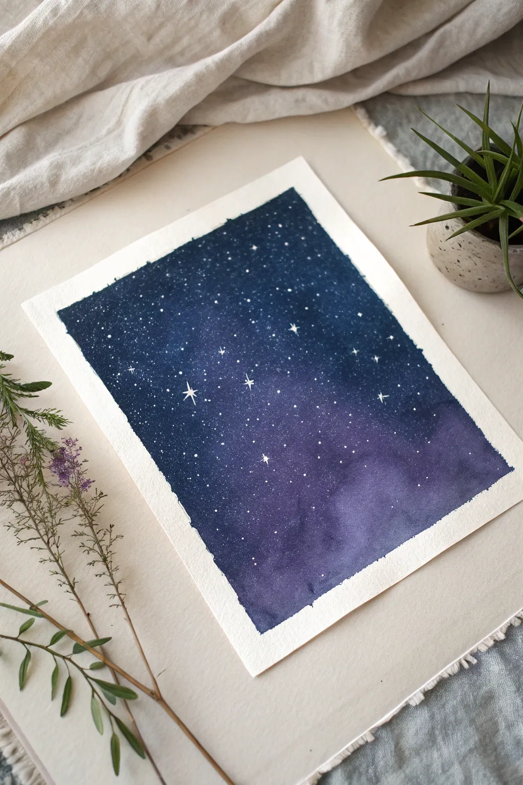
Capture the ethereal beauty of the cosmos with this beginner-friendly watercolor project that uses everyday salt to create stunning, organic nebula textures. The result is a deep, moody piece filled with sparkling stars and soft, galactic clouds.
Step-by-Step Guide
Materials
- Cold press watercolor paper (300 gsm recommended)
- Painter’s tape or masking tape
- Watercolor paints: Indigo, Prussian Blue, Violet or Purple Lake, Black (optional)
- Table salt or sea salt (coarse grain works best)
- White opacity medium: White gouache or white gel pen
- Large round brush or flat wash brush
- Small detail brush (size 0 or 1)
- Two cups of water
- Paper towels
- Old toothbrush (optional for splatter)
Step 1: Preparation and Base Layer
-
Secure your canvas:
Tape down all four edges of your watercolor paper onto a flat board or your table. Press the tape edges firmly to ensure clean, crisp borders later. -
Pre-wet the paper:
Using your large brush and clean water, apply a generous wash over the entire taped area. The paper should be glisten with a sheen but not have standing puddles. -
Start with lighter tones:
Load your brush with watery violet or purple paint. Drop this color randomly into the wet surface, focusing on the lower right and center areas to suggest swirling galaxy clouds. -
Introduce deep blues:
While the purple is still wet, mix a heavy concentration of Prussian Blue. Apply this around the violet sections, letting the colors bleed naturally into one another.
Step 2: Deepening the Sky
-
Add the darkest value:
Mix Indigo with a touch of black for an intense midnight hue. Paint this into the corners and the top of the painting to create a vignetted effect that draws the eye inward. -
The salt technique:
While the paint is still damp—the crucial ‘shiny but not soaking’ stage—sprinkle a pinch of salt over the purple and blue transition areas. -
Strategic texture:
Let the crystals sit; as they absorb moisture, they will push the pigment away, creating those unique, starry starburst textures seen in the reference. -
The waiting game:
Allow the painting to dry completely. This is the hardest part, but necessary! The salt needs time to work its magic. I usually step away for at least 30 minutes to an hour. -
Remove the salt:
Once the paper is bone dry and warm to the touch, gently rub off the salt crystals with your fingers or a clean, dry cloth.
Salt Dissolving?
If the salt dissolves instead of creating texture, your paper was too wet. Wait until the sheen turns to a satin finish before sprinkling next time.
Step 3: Starlight and Details
-
Prepare the stars:
Dilute a small amount of white gouache with water until it reaches a milk-like consistency. If using a gel pen, get it flowing on a scrap paper first. -
Splatter method:
Dip an old toothbrush or stiff brush into the white gouache. Hold it over the paper and tap the handle (or flick the bristles) to create a fine mist of distant stars. -
Painting large stars:
Using your smallest detail brush or gel pen, manually place a few larger, brighter dots among the splatters. -
Adding the twinkle:
Select 3 to 5 of your larger dots to turn into twinkling stars. Gently pull a vertical line up and down from the center dot. -
Complete the cross:
Pull a horizontal line through the same center point, making it slightly shorter than the vertical line for a classic twinkle shape. -
Review and refine:
Step back to look at the composition. If a splatter landed in a weird spot, you can carefully lift it with a damp brush or turn it into a larger star.
Pro Tip: Bloom Control
Use different salt grains! Table salt creates tiny, subtle stars, while coarse sea salt makes large, dramatic blooming craters.
Step 4: Finishing Touches
-
Reveal the edges:
Slowly peel away the painter’s tape. Pull it away from the painting at a 45-degree angle to prevent ripping the paper. -
Sign your work:
Add your signature or initials in the corner using a fine liner or your small brush.
Enjoy the peaceful process of watching your own galaxy unfold as the colors dry and blend together
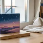
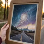
Dreamy Aurora Ribbons
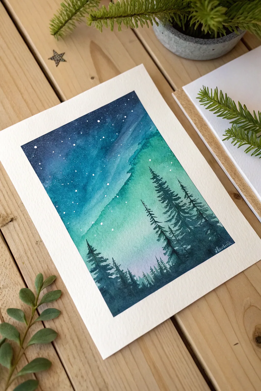
Capture the magic of the polar sky with this luminous watercolor project featuring sweeping aurora ribbons in teal and indigo. The blend of wet-on-wet washes creates a soft, glowing atmosphere, perfectly grounded by crisp, silhouetted pine trees in the foreground.
Step-by-Step
Materials
- Cold press watercolor paper (140lb/300gsm), taped down
- Watercolor paints (Indigo, Phthalo Blue, Emerald Green, Turquoise, Lavender/Light Pink)
- White gouache or white ink
- Large flat wash brush or mop brush
- Medium round brush (size 6-8)
- Small liner or detail brush (size 0-1)
- Two jars of water
- Paper towels
- Painter’s tape
- Old toothbrush or stiff fan brush (for splatters)
Step 1: Setting the Sky
-
Prepare the Paper:
Tape your watercolor paper down securely on a board using painter’s tape to create a clean white border and prevent buckling during the wet stages. -
Pre-wet the Paper:
Using your large clean brush, apply an even coat of clean water over the entire paper surface. Wait about 30 seconds until the sheen turns satin-like rather than soaking wet. -
Establish the Glow:
Load your brush with a very diluted Emerald Green or bright Turquoise. Paint a diagonal, sweeping band across the middle of the paper, starting lower left and pushing toward the upper right to form the main aurora channel. -
Add Secondary Light:
While the paper is still wet, drop in a small amount of pale Lavender or very diluted pink near the bottom center, just below where your green band fades. -
Deepen the Sky:
Mix a strong concentration of Phthalo Blue and Indigo. Start painting the upper left corner, working your way down toward the green band, being careful not to completely overrun the light areas. -
Blend the Transition:
Clean your brush and wipe it slightly dry. Gently soften the edge where the deep blue meets the turquoise light, allowing the colors to bleed naturally without creating a hard line. -
Darken the Edges:
Add pure Indigo to the very top corners and the far sides of the sky to create a vignette effect, making the central lights appear brighter by contrast.
Pro Tip: Lifting Out
If your dark blue sky encroach too much on the aurora, use a thirsty (clean, damp) brush to gently lift pigment off the paper while it’s still wet to restore the glow.
Step 2: Creating the Stars
-
Dry Completely:
It is crucial to let the background dry 100% before proceeding. Use a hairdryer on a low setting or wait patiently; if the paper is damp, your stars will fuzz out. -
Prepare the Splatter:
Dilute a small amount of white gouache or white ink with water until it reaches a milky consistency. -
Flick the Stars:
Dip an old toothbrush or stiff brush into the white mix. Run your thumb across the bristles to flick tiny speckles across the upper dark blue section of the sky. -
Add Major Stars:
Using your smallest detail brush or a white gel pen, manually dot a few slightly larger stars in the darkest indigo areas to create visual variety in the constellation.
Level Up: Metallic Touch
Mix a tiny amount of iridescent medium or silver watercolor into your white splatter mix. The stars will catch the light and shimmer when viewed from different angles.
Step 3: Silhouetted Forest
-
Mix the Tree Color:
Create a very dark, saturated mix using Indigo and a touch of green or black. The paint should be thick, like heavy cream, to ensure opacity. -
Paint the Trunks:
With a thin round brush or liner, paint vertical lines of varying heights for the tree trunks. Place the tallest ones on the right side and shorter ones toward the left to create depth. -
Start the Foliage:
Starting at the top of a trunk, use the tip of your brush to tap small, downward-sloping branches. Keep the top branches very short and sparse. -
Widen the Trees:
As you move down the trunk, make your brushstrokes wider and more erratic. Leave tiny gaps between branches so the aurora background peeks through. -
Fill the Canopy:
Continue adding layers of branches, making the trees dense near the bottom. I find it helpful to vary the pressure, creating a jagged, natural silhouette rather than perfect triangles. -
Anchor the Bottom:
Paint a solid dark mass at the very bottom edge of the paper to connect the trees and simulate the dense forest floor. -
Add Tiny Details:
Use your finest brush to add a few very faint, tiny tree tops peaking out from the bottom center to suggest distant trees in the valley. -
Reveal the Border:
Once the trees are fully dry, carefully peel away the painter’s tape at a 45-degree angle to reveal the crisp white edge.
Enjoy the serene wintry mood your new painting brings to the room
Peaceful Koi Pond Ovals
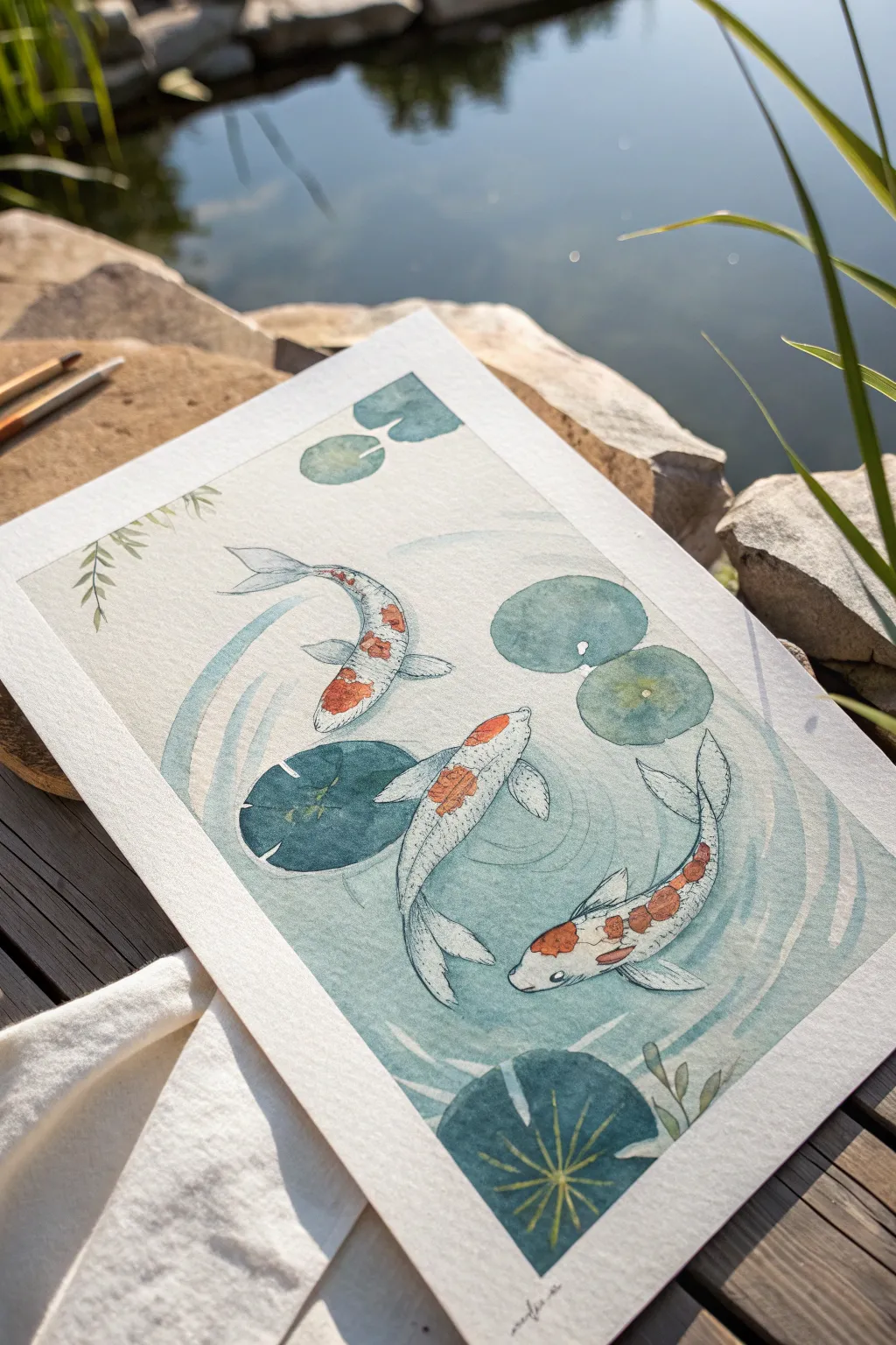
Capture the serenity of a sunlit garden pond with this delicate watercolor and ink painting, featuring three graceful koi fish swimming amongst lily pads. Using layered washes and fine linework creates a sense of movement in the water without needing complex realistic shading.
Detailed Instructions
Materials
- Cold-press watercolor paper (300 gsm)
- Watercolor paints (Indigo, Sap Green, Vermillion, Burnt Sienna, Payne’s Grey)
- Round watercolor brushes (Size 6 for washes, Size 2 for details)
- Fine liner pen (black, 0.1mm or 0.2mm) or waterproof ink
- HB Pencil and eraser
- Masking tape
- Two jars of water
- Paper towels
Step 1: Sketching and Preparation
-
Secure the paper:
Begin by taping down all four sides of your watercolor paper to a hard board or table. This prevents buckling when we apply the wet washes later. -
Outline the composition:
Lightly sketch three oval shapes for the koi bodies, arranging them so they appear to circle each other. One should be swimming upwards, one downwards, and one curving in the center. -
Add lily pads:
Sketch several circular lily pads of varying sizes around the fish. Place some near the edges and a couple floating centrally to create depth. -
Refine the fish:
Detail your koi sketches by adding flowing fins and tails. Keep the movement fluid; the tails should curve gently to mimic swimming motion.
Step 2: Painting the Water
-
Mix the water color:
Create a very watery, pale wash using a mix of Indigo and a tiny touch of Sap Green. You want a soft, cool teal color that remains transparent. -
Apply the first wash:
Using your size 6 brush, paint around the fish and lily pads, filling the background. It doesn’t need to be perfectly flat; slight blotchiness adds to the organic water texture. -
Create ripples:
While the background is still damp but not soaking, drop in slightly concentrated teal pigment in concentric circular motions around the fish to suggest ripples. -
Let it dry:
Allow the background layer to dry completely. If the paper feels cool to the touch, it’s still damp inside.
Control the Dry Time
Keep a hairdryer handy. If you are impatient between layers, a quick blast of warm air speeds up the process and prevents colors from bleeding into muddy messes.
Step 3: Bringing the Koi to Life
-
Base shadow layer:
Mix a very light grey using a dot of Payne’s Grey and water. Paint a faint shadow along one side of each fish (usually the right or bottom side) to give them volume. -
Adding the orange markings:
Once the shadow is dry, use Vermillion mixed with Burnt Sienna to paint the classic koi patches. Dab the color onto the head and back, letting the edges be slightly irregular. -
Painting the lily pads:
Fill in the lily pads with varying shades of green. I like to use a blue-green for the shadowed pads and a yellower green for those catching the light. -
Add plant details:
Using a darker, cooler green, paint the veins on the large foreground lily pad and add delicate leafy stems peeking in from the corners.
Metallic Magic
Add a touch of gold watercolor or metallic ink to the edges of the scales or the lily pads. When the light hits the artwork, it will shimmer like sun on water.
Step 4: Inking and Final Details
-
Outline the fish:
Switch to your fine liner pen or a very fine brush with black ink. Carefully trace the outline of the fish bodies, breaking the line occasionally for a lighter look. -
Detail the scales:
Draw small, scalloped ‘C’ shapes along the backbone of the fish to suggest scales, fading them out as you move toward the belly. -
Define the fins:
Add thin, radiating lines inside the fins and tails to show their delicate, ribbed texture. -
Enhance water movement:
Use the pen or fine brush to draw very thin, loose white or pale blue gouache lines (if you have it) or dark ink lines following the ripple patterns you painted earlier. -
Final touches:
Add tiny eyes to the fish using black ink, leaving a microscopic white dot for the reflection to make them look alive. -
Remove tape:
Wait until everything is absolutely bone dry, then peel the masking tape away slowly at a 45-degree angle to reveal a crisp white border.
This peaceful composition brings a splash of zen to your sketchbook and reminds us to go with the flow
Monochrome Fog Landscape
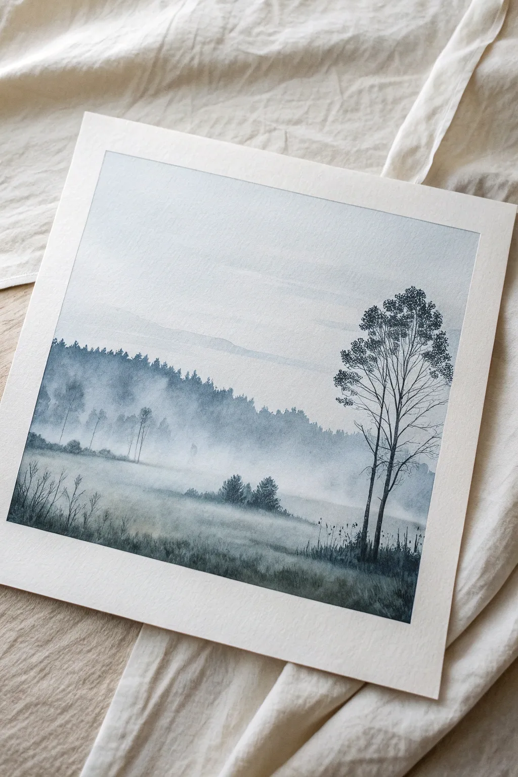
Capture the serene stillness of dawn with this monochromatic watercolor fog landscape. By using just one color—Payne’s Gray—you will master tonal values and atmospheric depth to create a scene that feels both expansive and intimate.
Step-by-Step Tutorial
Materials
- Cold Press Watercolor Paper (140lb/300gsm, square format)
- Watercolor Paint: Payne’s Gray (or Indigo)
- Flat Wash Brush (1 inch)
- Round Brushes (Size 6 and 2)
- Rigger or Liner Brush
- Two jars of water (clean and dirty)
- Paper towels
- Masking tape
- Palette
Step 1: Setting the Atmosphere
-
Tape down your paper:
Begin by taping the edges of your watercolor paper to a hard board using masking tape. This creates that clean, crisp white border seen in the image and prevents buckling. -
Prepare your initial wash:
Mix a very watery, pale puddle of Payne’s Gray. You want this to be barely tinted water for the sky. -
Paint the sky gradient:
Using your large flat brush, wet the entire upper two-thirds of the paper with clean water first. Drop in your pale gray mix at the top and let it naturally fade out as you move downward toward the horizon line, keeping the bottom area nearly white. -
Establish the distant hills:
While the sky is still slightly damp but not soaking, mix a slightly stronger value of gray. Paint a faint, soft-edged silhouette of a distant mountain or hill range in the middle of the page. The damp paper will help blur the edges, creating a faraway look.
Mist Master
To get the softest fog, use two brushes: one with pigment and one that is just damp with clean water to immediately soften hard edges.
Step 2: Creating the Misty Middle Ground
-
Dry the paper:
Allow the sky and distant hills to dry completely. If the paper is cold to the touch, it’s still wet. -
Paint the distant tree line:
Mix a medium-value gray. Using the size 6 round brush, paint a jagged tree line below the distant hills. Vary the heights to suggest different treetops. -
Diffuse the tree line:
Before the tree line dries, quickly rinse your brush and run clear water along the bottom edge of these trees. I really enjoy this part—pulling the pigment downward creates that essential ‘fog’ effect where the trees disappear into the mist. -
Add a second layer of trees:
Once the previous layer is semi-dry, add a slightly darker, shorter row of trees in front of the foggy area. Repeat the softening technique at the bottom to blend them into the mist. -
Suggest field texture:
With a very dilute wash, add horizontal, sweeping strokes in the foreground field to suggest uneven ground, leaving plenty of white space for the fog.
Step 3: Foreground Details
-
Darken the immediate foreground:
Mix a stronger, darker value of Payne’s Gray. Use horizontal strokes at the very bottom of the paper to ground the painting. -
Add mid-ground shrubs:
Using a relatively dry brush (texture is good here), dab in the small cluster of bushes sitting in the middle of the field. Soften their bases slightly so they don’t look like stickers. -
Sketch the main tree structure:
Load your rigger or size 2 brush with a creamy, dark consistency of paint. On the right side, paint the main trunk of the focal tree. Keep the line naturally shaky; straight lines look artificial. -
Branch out:
Extend branches upward and outward from the main trunk. Remember that branches get thinner as they move away from the center. Let some lines cross over each other. -
Add foliage texture:
Use the tip of your round brush to stipple small dots and clusters of leaves on the upper branches. Keep these sparse to maintain the wintery, barren feel. -
Paint secondary saplings:
To the left of the main tree, paint a smaller, thinner companion tree using the same technique but with slightly less detail. -
Add foreground grasses:
Using your rigger brush and very dark paint, flick quick, upward strokes along the bottom edge to create tall grasses and reeds. -
Finalize faint details:
If needed, add very faint, thin vertical lines in the background fog to suggest bare tree trunks peeking through the mist. -
Reveal the border:
Once the painting is 100% bone dry, carefully peel away the masking tape at a 45-degree angle to reveal your crisp white frame.
Level Up: Salt Texture
While the foreground wash is still wet, sprinkle a tiny pinch of table salt into the dark grass area. As it dries, it creates mesmerizing blooming textures.
Step back and admire how a single color can create such a deep, silent world on your paper
Have a question or want to share your own experience? I'd love to hear from you in the comments below!