
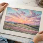
When I’m craving that cozy, lived-in vibe, I reach for ideas that celebrate weathered wood, soft earth tones, and a little bit of farm life. Here are my favorite rustic artwork ideas you can paint, draw, or build up with texture—each one meant to feel charming, imperfect, and totally you.
Weathered Barn Landscape Painting
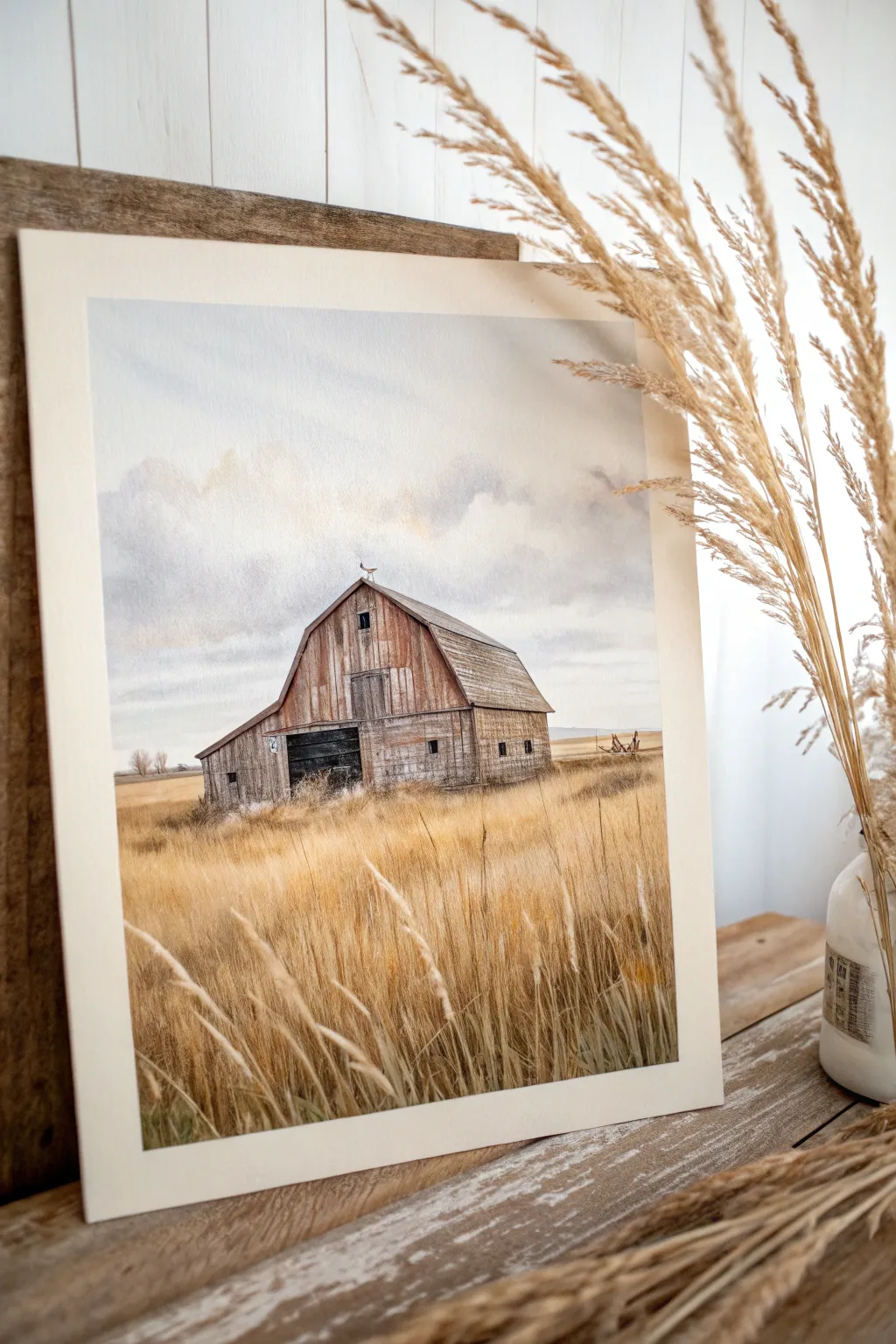
Capture the serene beauty of rural life with this barn landscape, featuring soft, realistic textures and a muted, earthy color palette. The combination of watercolor washes and fine detail work creates a piece that feels both nostalgic and timeless.
How-To Guide
Materials
- Cold press watercolor paper (140lb or 300gsm)
- Watercolor paints (Payne’s Gray, Burnt Umber, Yellow Ochre, Burnt Sienna, Raw Sienna, Ultramarine Blue, Alizarin Crimson)
- White gouache paint
- Pencil (HB or 2H) and kneadable eraser
- Masking fluid
- Assorted brushes: 1 inch flat wash, sizes 4, 6, and 8 rounds, and a fine rigger brush
- Two water containers
- Paper towels
- Mixing palette
- Artist tape
Step 1: Preparation and Sketching
-
Tape down the paper:
Secure your watercolor paper to a board using artist tape on all four sides. This prevents buckling when the paper gets wet and creates a crisp, clean border for framing later. -
Outline the horizon:
Using your HB pencil, lightly draw the horizon line about a third of the way up from the bottom of the paper. Keep the line faint so it doesn’t show through the final paint. -
Draft the barn structure:
Sketch the main shape of the barn in the center. Focus on the gambrel roof angles and the lean-to addition on the left side. Don’t worry about individual planks yet; just get the proportions right. -
Protect the highlights:
Apply masking fluid to the few brightest spots where the sun catches the grass tips in the foreground and the thin lightning rod or weathervane atop the roof. Let it dry completely.
Mastering the Weathered Look
For realistic old wood, don’t mix your colors thoroughly on the palette. Let the browns, grays, and blues swirl together directly on the paper.
Step 2: Painting the Sky and Background
-
Wet-on-wet sky wash:
Wet the entire sky area with clean water using your flat brush. While damp, drop in a very dilute wash of Ultramarine Blue mixed with a touch of Payne’s Gray for a moody, overcast feel. -
Create cloud variety:
Before the sky dries, lift out pigment with a clean, thirsty brush or paper towel to create soft white clouds. Add slightly darker gray shadows to th bottom of the cloud formations for volume. -
Paint the distant horizon:
Once the sky is dry, mix a faint purple-grey using Ultramarine and Alizarin Crimson. Paint a thin, hazy band along the horizon line to suggest distant hills or trees.
Step 3: The Barn Details
-
Base layer for the barn:
Mix a wash of Burnt Sienna and a little Payne’s Gray to get a weathered wood color. Apply this evenly over the barn shape, avoiding the dark door opening. -
Add roof texture:
For the roof, use a cooler gray mix. Use dry brush techniques—dragging a brush with very little paint across the paper’s tooth—to mimic the texture of age-worn shingles. -
Define the wooden planks:
Switch to a size 4 round brush. With a darker mix of Burnt Umber, paint vertical lines to suggest the wooden siding. I prefer to break these lines up so they aren’t perfectly straight, which adds character. -
Darken the shadows:
Paint the main barn door opening with a concentrated mix of Payne’s Gray and Burnt Umber to create a deep, receding shadow. Add shadows under the eaves and along the left side of the building.
Muddy Field Colors?
If your grass looks muddy, let the layers dry fully between washes. Patience is key; wet-on-wet rubbing causes dull, overworked colors.
Step 4: Golden Grass Foreground
-
Underpainting the field:
Wash the foreground area with Yellow Ochre and Raw Sienna. While wet, drop in touches of Burnt Sienna near the bottom corners to create depth. -
Texture the mid-ground:
Once the initial wash is dry, use a fan brush or a splayed round brush with dryer paint to flick upward strokes, simulating clusters of grass in the middle distance. -
Detail foreground stalks:
Using your rigger brush, paint individual tall grass stalks in the immediate foreground. Use a mix of Burnt Umber for shadowed stalks and pure Yellow Ochre for sunlit ones. -
Enhance with gouache:
Mix white gouache with a tiny bit of Yellow Ochre. Paint fine, opaque highlights on the tips of the grass closest to the viewer to make them pop against the darker barn tones. -
Final touches:
Remove the masking fluid. Soften any harsh white edges with a damp brush, and add the final dark detail for the window opening and the Weathervane silhouette.
Peel off the tape to reveal your crisp edges and frame this peaceful rural scene for a touch of rustic charm.
Vintage Lantern and Tool Sketch
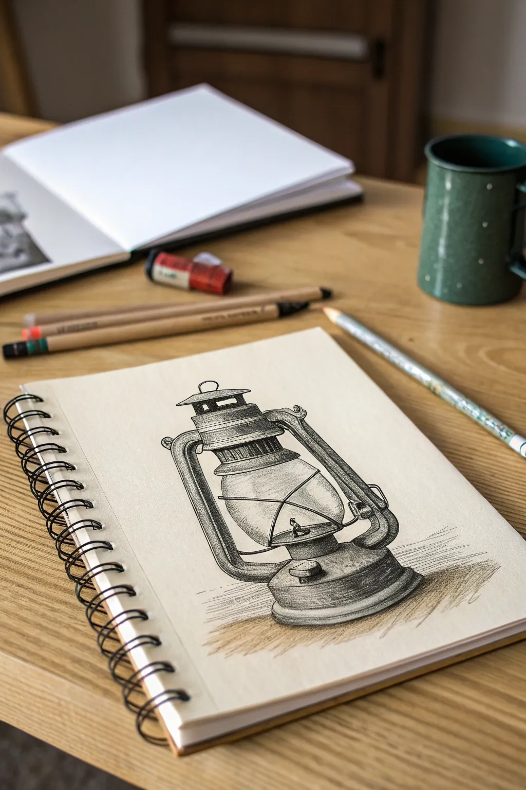
Capture the nostalgic charm of a vintage oil lamp with this detailed graphite pencil study. By focusing on glass transparency and metallic textures, you will create a rustic piece that feels both sturdy and delicate.
How-To Guide
Materials
- Spiral-bound sketchbook (heavyweight paper)
- Graphite pencils (HB, 2B, 4B, 6B)
- Kneaded eraser (gray)
- Precision vinyl eraser or eraser pen
- Paper blending stump (tortillon)
- Pencil sharpener
Step 1: Drafting the Structure
-
Establish center line:
Begin lightly with an HB pencil by drawing a vertical line down the center of your page to ensure symmetry. -
Block general shapes:
Sketch a large rectangle for the main body and an oval near the top for the chimney cap. Don’t press hard; these are just guide marks. -
Define the glass globe:
Draw a bulbous, pear-like shape in the center. This will be the glass chimney, the focal point of the lantern. -
Add side tubes:
Sketch two curved tubes extending from the top chimney section down to the base, hugging the glass globe shape without touching it. -
Construct the base:
Draw flattened ovals at the bottom to form the fuel tank and the wider base rim, ensuring the perspective matches the top ovals. -
Detail the handle and cap:
Refine the top section with the vented cap and sketch the thin wire handle bail resting against the glass or crossing in front.
Smudge Control
Graphite loves to smear. Place a spare sheet of paper under your drawing hand while you work to keep the oils from your skin off the paper and prevent accidental smudging.
Step 2: Building Tone and Texture
-
First shading pass:
Switch to a 2B pencil. Gently shade the metal components—the side tubes and base—leaving white highlights where the light hits the curve. -
Render the glass top:
For the glass globe, keep your lines incredibly faint. Only darken the very edges and add small, sharp reflections to suggest transparency. -
Darken the chimney vents:
Use a 4B pencil to fill in the dark slots of the upper chimney cap. This high contrast immediately makes the metal look solid. -
Shade the side tubes:
Deepen the shading on the right side of the tubes (assuming light comes from the left). Build layers slowly rather than pressing hard. -
Create metallic texture:
Use vertical hatching lines on the metal parts to simulate brushed steel or tin. Cross-hatch slightly in the darkest shadow areas. -
Define the burner:
Draw the small turning knob and the internal wick mechanism inside the glass. Keep these distinct but slightly softer to show they are behind glass.
Aged Patina
To make the lantern look old and rusted, stipple small dots with a dull pencil over the shaded metal areas. This breaks up the smooth shine and adds a weathered texture.
Step 3: Refining and Anchoring
-
Deepen shadows:
Take your 6B pencil and target the deepest crevices: under the rim of the base, inside the top vent, and right where the tubes meet the tank. -
Blend for smoothness:
Use a blending stump to soften the graphite on the metal surfaces, making them look uniform. Avoid blending the glass area too much to keep it crisp. -
Lift highlights:
I find using a precision eraser here really brings it to life; erase sharp lines down the center of the side tubes and on the curve of the glass to mimic light hitting metal. -
Add the wire guard:
Draw the thin protective wires that cross over the glass globe. Make these lines dark and confident, erasing any glass lines that shouldn’t be visible behind them. -
Ground the object:
Use the side of a 4B pencil to add a cast shadow underneath and behind the lantern. Scribble loosely horizontally to suggest a wooden table surface. -
Final touches:
Check your contrast one last time. Reinforce the darkest darks to ensure the drawing pops off the page.
Now you have a beautifully rendered piece of history captured in your sketchbook, ready to be admired.
Reclaimed Wood Panel Mini Abstracts
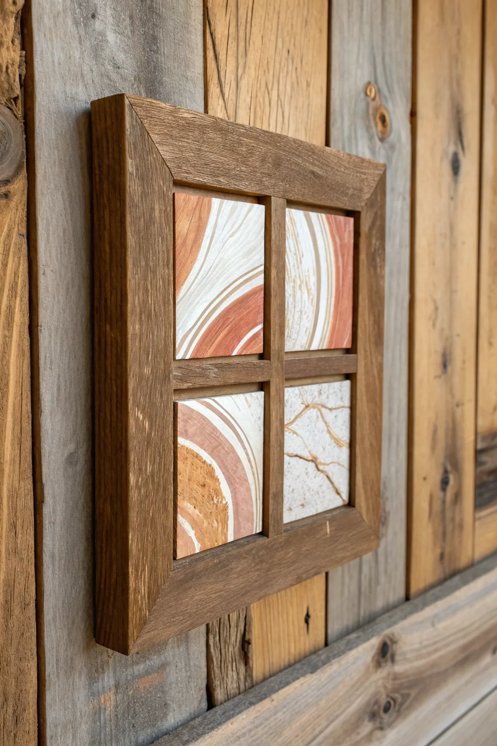
This striking wall art combines the warmth of rustic woodworking with the fluid elegance of acrylic pour techniques. By framing four distinct mini-abstracts in a window-pane style, you create a cohesive gallery feel that effortlessly blends modern art with farmhouse charm.
Step-by-Step Tutorial
Materials
- 4 small ceramic tiles or wooden art panels (4×4 inches recommended)
- Acrylic pouring paints (terracotta, white, beige, metallic gold)
- Pouring medium
- Plastic cups and stirring sticks
- Silicone oil (optional for cells)
- Reclaimed wood or stained pine strips (1×2 inch)
- Wood glue
- Miter saw (or miter box)
- Pin nailer or finishing nails
- Medium grit sandpaper
- Dark walnut wood stain
- Backing board (thin plywood)
- Clear varnish or resin (for tiles)
- Hanging hardware
Step 1: Creating the Abstract Tiles
-
Prepare the workspace:
Since acrylic pouring can be messy, cover your work surface with a drop cloth or plastic sheet. Elevate your four tiles on upturned cups to allow excess paint to drip off freely. -
Mix your palette:
In separate cups, mix your acrylic paints with the pouring medium according to the bottle instructions. Aim for a consistency similar to warm honey. I usually mix a slightly larger batch of white as a base. -
Prepare the dirty pour cups:
For this project, we want cohesive but distinct patterns. Layer small amounts of your terracotta, beige, gold, and white paints into a single cup. Do not stir them; let the colors sit on top of one another. -
Pour the first tile:
Gently pour the contents of your layered cup onto the first tile. You can use a ‘ring pour’ technique by moving your wrist in small circles, or simply pour a straight ribbon across the center. -
Tilt and stretch:
Pick up the tile and slowly tilt it in various directions. Let the paint slide toward the corners, stretching the rings and ribbons of color until the entire surface is covered. -
Variations for cohesion:
Repeat the process for the remaining three tiles. Try slightly different movements for each—maybe a diagonal flow for one and a marbled swirl for another—so they look related but not identical. -
Cure the tiles:
Allow the tiles to dry completely in a dust-free area. This usually takes at least 24-48 hours. Once fully cured, apply a coat of clear varnish or resin to protect the surface and make the colors pop.
Step 2: Building the Window Frame
-
Measure the layout:
Lay your dried tiles on a flat surface in a 2×2 grid. Measure the total width and height, accounting for the thickness of the divider strips (crossbars) you plan to place between them. -
Cut the outer frame:
Using your miter saw, cut four pieces of the reclaimed wood or pine strip to frame the perimeter. Cut the ends at 45-degree angles to create precise mitered corners. -
Cut the crossbars:
Measure the interior vertical and horizontal distance. Cut two thinner strips of wood to act as the window pane dividers. One will likely need to be cut in half to fit around the central intersection, or you can use a half-lap joint. -
Distress and stain:
Sand the wood pieces to remove sharp edges. Use the dark walnut stain to achieve that aged look, wiping off excess quickly so the wood grain shows through. -
Assemble the outer frame:
Glue the mitered corners of the outer frame together and secure them with pin nails or clamps until dry. Ensure the frame remains square during this process. -
Attach the backing:
Cut a piece of thin plywood to the exact dimensions of your outer frame. Nail or staple this to the back of the frame, creating a solid recessed box.
Earth Tone Harmony
To match the reference, stick to a tight palette. Use warm terracotta and beige as primaries, with white for negative space and gold only for thin accent veins.
Step 3: Final Assembly
-
Test fit the grid:
Place your tiles into the frame to ensure they fit comfortably. If the fit is tight, you may need to lightly sand the edges of the tiles (if wood) or the inside of the frame. -
Install the dividers:
Glue the crossbar pieces into the frame. Start with the long central bar, then fit the smaller perpendicular pieces. Let this structure set firmly. -
Secure the art:
Apply a strong construction adhesive or wood glue to the back of each tile. Press them firmly into their designated quadrants within the frame. -
Final touches:
Inspect the joints and touch up any raw wood edges with a little extra stain. Attach a sawtooth hanger to the back of the plywood.
Uneven Grid?
If your tiles don’t fit perfectly after building the frame, simply use the crossbars to hide the gaps. Glue the tiles centered, leaving wiggle room under the dividers.
Hang your new rustic quartet in a well-lit spot to catch the subtle shimmer of the metallic accents


Country Road in Autumn Tones
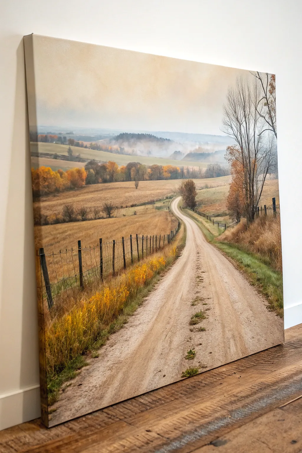
Capture the serene beauty of a rural fall afternoon with this detailed acrylic landscape painting. The warm golden hues and misty blue distance create a depth that feels like you could walk right into the canvas.
Step-by-Step Guide
Materials
- Large stretched canvas (at least 24×36 inches)
- Acrylic paints (Titanium White, Burnt Umber, Yellow Ochre, Cadmium Yellow, Sap Green, Ultramarine Blue, Alizarin Crimson, Raw Sienna)
- Gesso (if canvas is unprimed)
- Large flat brush (2 inch)
- Medium filbert brushes (size 8 and 10)
- Small round brush (size 2)
- Fan brush
- Palette knife
- Water container and paper towels
- Easel or flat work surface
Step 1: Setting the Scene
-
Prepare the canvas:
Begin by priming your canvas with a layer of gesso if it isn’t pre-primed. Let it dry completely, then lightly sketch the main composition lines with a pencil: the horizon line about two-thirds up, the winding shape of the road starting wide at the bottom and narrowing to a point, and the rolling hills in the background. -
Paint the sky:
Mix a very pale wash of Titanium White with a tiny touch of Yellow Ochre and Alizarin Crimson. Apply this to the upper sky using the large flat brush, blending it downwards. As you reach the horizon, mix in a faint bit of Ultramarine Blue to suggest atmospheric haze, keeping the overall tone creamy and soft. -
Block in distant hills:
For the furthest hills, create a muted blue-grey using Ultramarine Blue, White, and a dot of Burnt Umber. Use a worn filbert brush to scrub this color in lightly. The key here is low contrast—these hills should look misty and far away, so keep the edges soft and blurry.
Step 2: The Middle Ground
-
Lay down the fields:
Mix Yellow Ochre, Raw Sienna, and plenty of White. Using a medium filbert brush, block in the rolling fields in the middle distance. Use horizontal strokes to emphasize the landscape’s flatness. vary the mixture slightly with touches of Sap Green in the shadows to show undulation. -
Add the tree line:
Along the mid-ground horizon, stipple in the shapes of distant trees. Use a mix of Burnt Umber, Cadmium Yellow, and a touch of orange. Don’t worry about individual leaves; focus on the rounded shapes of the canopies and the variation in fall colors. -
Create the misty valley overlay:
To achieve that morning fog look in the valley, dilute some Titanium White with water or glazing medium until it’s translucent. Gently dry-brush this over the lower jagged edge of the distant blue hills and the top of your tree line to simulate rising mist.
Atmospheric Perspective
Cooler, lighter colors recede; warmer, darker colors advance. Adding a touch of blue to your background mixes instantly pushes them into the distance.
Step 3: The Road and Foreground
-
Underpaint the road:
Mix a light beige using White and a tiny bit of Burnt Umber. Fill in the road shape, following the perspective lines you sketched earlier. Brush vertically and slightly diagonally to mimic the direction of travel. -
Add road texture:
Once the base is tacky, use a darker mix of Raw Sienna and Burnt Umber on a smaller brush to add the tire tracks and ruts. Keep these strokes loose and mostly vertical. I find lightly dragging a dry brush over the wet paint creates a great dusty dirt texture. -
Paint the roadside grass:
For the grassy verges, initially lay down a base of Sap Green mixed with Burnt Umber. While wet, stroke upwards with a fan brush using lighter greens and yellows to create the look of tall, dry autumn grass lining the road. -
Add the fence posts:
Use a small round brush and dark Burnt Umber (almost black) to paint the fence posts. Remember perspective: posts further away should be smaller, thinner, and closer together. The posts in the foreground should show more detail and thickness. -
String the wire:
With an extremely fine liner brush and thinned dark grey paint, draw the fence wires. Keep your hand loose; a shaky line actually looks more realistic for old farm fencing than a perfectly straight ruler line.
Muddy Colors?
If your autumn oranges get muddy, let the brown under-layers dry completely before applying bright yellows. Wet-on-wet mixing can sometimes turn grey.
Step 4: details and Highlights
-
Detail the foreground trees:
On the right side, paint the trunk and branches of the large foreground tree. Use dark browns for the bark, highlighting the right side with lighter grey-brown where the light hits. Use a stippling motion with the corner of a brush to add spare, dry leaves clinging to the branches. -
Add goldenrod accents:
Using pure Cadmium Yellow and Yellow Ochre, dab small clusters of flowers along the fence line in the immediate foreground. This bright pop of color draws the eye into the painting. -
Refine the road surface:
Add small touches of green and brown in the center of the road where grass grows between the tire tracks. Use a palette knife to scrape a few tiny stones or texture highlights into the dirt road surface using thick white paint. -
Cast shadows:
Glaze thin layers of transparent Burnt Umber diagonally across the road from the right side, suggesting shadows cast by the trees and fence posts. This anchors the objects to the ground. -
Final atmosphere check:
Step back and check your values. If the background looks too sharp, apply another very thin glaze of white/blue mist. Add final bright highlights to the tops of the fence posts and the brightest patches of the road.
Hang your finished landscape in a well-lit spot to enjoy those warm autumn vibes year-round
BRUSH GUIDE
The Right Brush for Every Stroke
From clean lines to bold texture — master brush choice, stroke control, and essential techniques.
Explore the Full Guide
Cabin in the Pines Watercolor
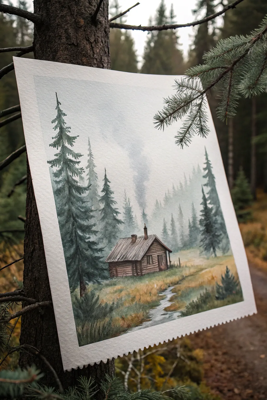
Capture the serene solitude of the deep woods with this atmospheric watercolor piece. Using subtle washes and layered greens, you’ll create a moody scene featuring a lonely cabin tucked among towering firs.
Step-by-Step Tutorial
Materials
- Cold press watercolor paper (300 gsm)
- Painter’s tape or masking tape
- Watercolor paints (Payne’s Grey, Indigo, Sap Green, Burnt Sienna, Burnt Umber)
- Round brushes (sizes 4, 8, and 12)
- Small detail brush (size 0 or 1)
- Two jars of water
- Paper towels
- Pencil (HB or 2B) and kneaded eraser
Step 1: Sketching and Sky
-
Secure the paper:
Tape down all four edges of your watercolor paper to a board. This prevents buckling and creates that clean, professional white border shown in the final piece. -
Draft the scene:
Lightly sketch the horizon line about a third of the way up the paper. Draw the basic shape of the cabin slightly off-center and faintly mark the vertical lines where the prominent foreground trees will stand. -
Wet-on-wet sky:
Using your largest brush, wet the entire sky area with clean water, avoiding the cabin sketch. You want the paper glistening but not swimming. -
Create the mist:
Drop in a very dilute mix of Payne’s Grey and a touch of Indigo near the top, letting it fade naturally as it moves down towards the horizon to create a misty, foggy effect. -
Distant trees:
While the paper is still damp (but losing its sheen), mix a watery, pale grey-green. Paint vague, vertical shapes in the background to suggest a distant forest line disappearing into the fog.
Muddy Greens?
If your forest looks brown rather than lush, you’re over-mixing. Let the green and indigo mix on the paper naturally rather than blending them fully on the palette.
Step 2: Middle Ground and Cabin
-
Defining the mid-ground:
Once the sky is completely dry, mix a slightly stronger value of Sap Green and Indigo. Paint the secondary layer of pine trees behind the cabin, using jagged, downward strokes to mimic pine boughs. -
Cabin base layers:
Apply a wash of Burnt Sienna mixed with a little grey to the cabin walls. Keep it loose; distinct planks come later. -
Roof texture:
Paint the roof with a diluted grey-brown mix. While damp, I like to drop in darker pigment near the chimney to suggest weathering and soot. -
Adding the shadows:
Mix a dark brown using Burnt Umber and Indigo. Paint the shadowy side of the cabin and the deep doorway to give the structure dimension. -
Smoke signal:
With a clean, damp brush, gently scrub a small vertical line above the chimney to lift distinct colour, or lightly paint a wisp of grey to create the rising smoke.
Step 3: Foreground and Details
-
The prominent pines:
Using a size 8 brush and a saturated mix of Indigo and Sap Green, paint the large foreground trees on the left. Start with a thin line for the trunk, then use the tip of the brush to flick branches outward and downward. -
Grass and terrain:
Wash the ground area with varied tones of Yellow Ochre and Burnt Sienna. Let colors bleed into each other to simulate uneven, dry grass. -
Carving the stream:
Leave a winding path of unpainted white paper for the stream. If you accidentally painted over it, use opaque white gouache later, or lift the paint now with a thirsty brush. -
Stream reflections:
Glaze very light blue-grey horizontal strokes across the stream area to make it look like water reflecting the overcast sky. -
Architectural details:
Switch to your smallest detail brush. Use a dark, almost black mix to draw the logs of the cabin, the window frame, and the texture on the roof. -
Final foliage:
Add small, dark tufts of grass and baby pine trees in the foreground using the tip of your brush to ground the composition. -
The reveal:
Wait until the painting is bone dry—touch it with the back of your hand to check. Carefully peel away the masking tape at a 45-degree angle to reveal the crisp edges.
Deckle Edge Effect
For the vintage look shown in the photo, recreate the postage-stamp edge by trimming your finished border with pinking shears or decorative edge scissors.
Now you have a peaceful woodland scene ready to frame or display.
Rustic Wreath and Print Mixed Media
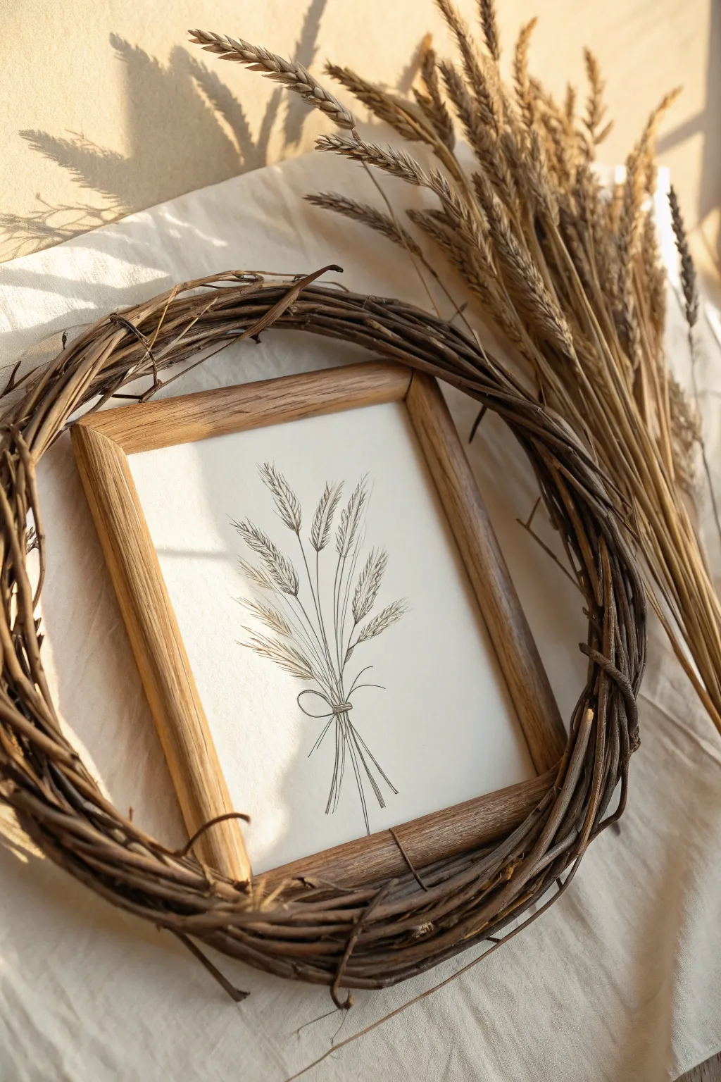
Embrace the simplicity of rustic decor with this charming mixed-media project that combines a minimalist botanical illustration with the raw texture of natural vine. The warm wood tones and delicate line work create a serene farmhouse aesthetic perfect for any wall.
How-To Guide
Materials
- Textured cream or off-white art paper (heavyweight)
- Fine-point micron pen (0.3mm or 0.5mm, black or sepia)
- Graphite pencil (HB) and quality eraser
- Light wood or oak photo frame (approx. 5×7 or 8×10)
- Natural grapevine wreath (slightly larger than frame dimensions)
- Brown floral wire or twine
- Ruler
- Scissors
Step 1: Drafting the Botanical Sketch
-
Prepare your paper:
Cut your textured art paper to fit perfectly inside your wooden frame. Remove the glass from the frame for now so you can test the fit without damaging the edges. -
Mark the center:
Using a ruler, lightly find the vertical center of your paper. This will serve as the anchor for the central stem of your wheat bouquet. -
Sketch the stems:
With your HB pencil, lightly sketch five to seven long, intersecting lines starting near the bottom center and fanning out slightly as they move upward. Keep the lines loose and imperfect. -
Outline the grain heads:
At the top of each stem, draw elongated oval shapes to represent the wheat heads. Vary their angles slightly—some straight up, some tilting left or right—to mimic natural movement. -
Add the bow rough:
Where the stems intersect near the bottom third of the composition, lightly sketch a simple bow shape with two loops and two trailing tails.
Ink Choice Matters
Use sepia or dark brown archival ink instead of harsh black for a softer, more vintage look that complements the natural wood tones.
Step 2: Inking and Detailing
-
Trace the main lines:
Switch to your fine-point pen. I prefer using a 0.3mm nib for the initial stems to keep them delicate. Trace over your pencil lines with a confident, continuous stroke. -
Create the grain texture:
For the wheat heads, use short, angled dashing marks (like localized hatching) pointing upward and outward from the center of the oval. This mimics the prickly texture of the grain. -
Add the awns:
Draw long, fine whisker-like lines extending from the top and sides of the grain heads. These ‘awns’ give the wheat its signature spiky silhouette. -
Detail the bow:
Ink the bow, doubling the line thickness slightly around the knot to show dimension. Ensure the tails drape naturally over the lower stems. -
Erase guidelines:
Once the ink is completely dry (wait at least 15 minutes to avoid smudging), gently erase all underlying pencil marks.
Step 3: Assembly and Framing
-
Frame the artwork:
Place your finished drawing into the wooden frame. You can choose to use the glass for protection or leave it off for a more tactile, matte look. -
Prepare the wreath:
Lay your grapevine wreath flat on a table. Place the framed artwork in the center to check the fit. The frame corners should gently touch or slightly overlap the inner vines. -
Create wire anchor points:
Cut four pieces of floral wire, each about 6 inches long. -
Secure the frame:
Flip both the wreath and frame face down. Thread the wire through the hanging hardware or corner joints of the frame and twist it securely around the thickest vines of the wreath. -
Tighten and trim:
Ensure the frame doesn’t wobble inside the wreath. Twist the wire ends tightly with pliers and trim any excess sharp edges so they don’t scratch your wall. -
Final adjustment:
Hang the piece and gently fluff the vines around the frame edge slightly to integrate the wood and twigs visually.
Add Real Texture
Tuck a few sprigs of real dried lavender or wheat into the grapevine wreath itself to echo the drawing inside the frame.
Now you have a beautifully layered piece of rustic art ready to bring warmth to your home

PENCIL GUIDE
Understanding Pencil Grades from H to B
From first sketch to finished drawing — learn pencil grades, line control, and shading techniques.
Explore the Full Guide
Woven Basket Texture Rubbing Art
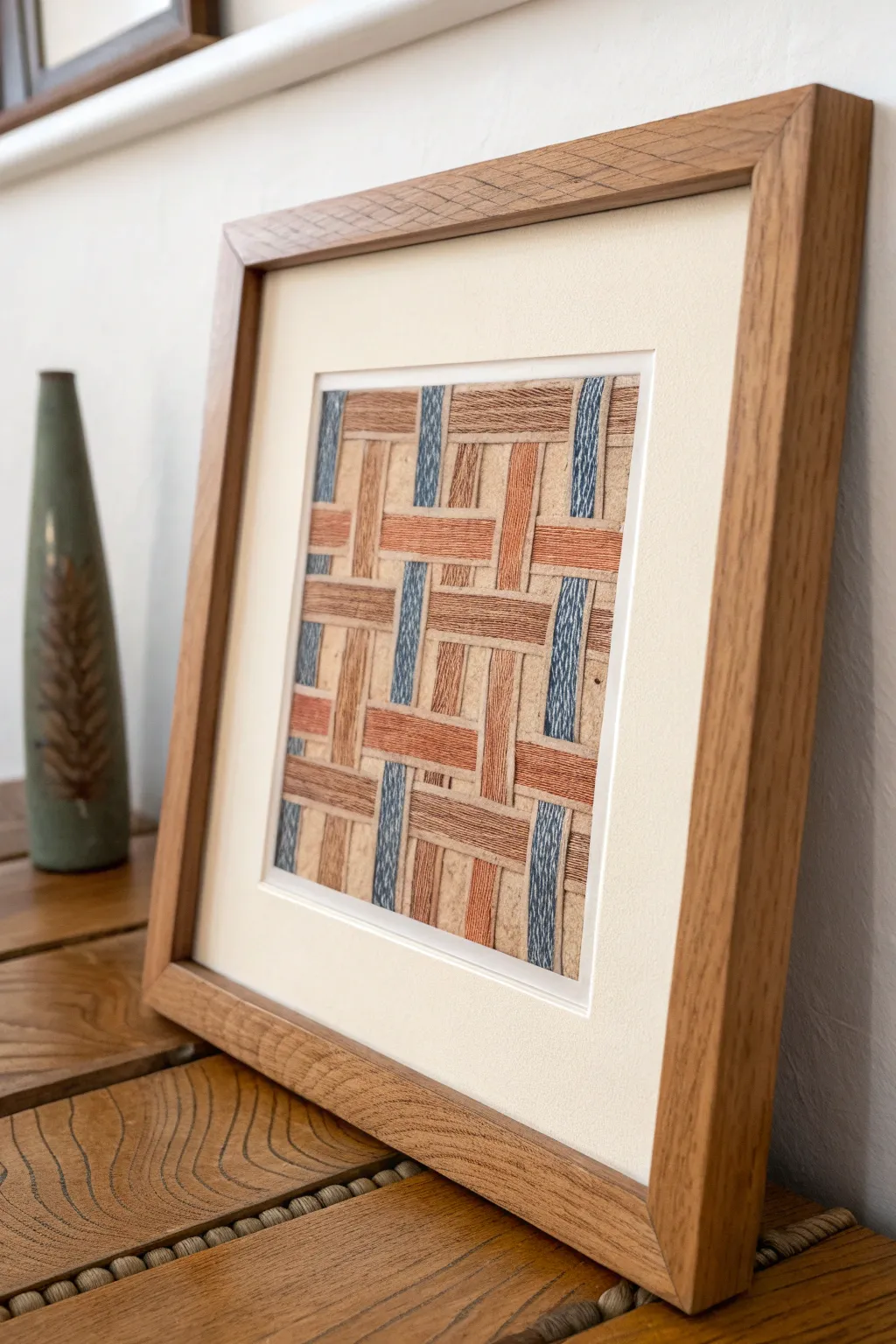
Capture the intricate beauty of basketry without weaving a single reed. This technique uses oil pastels and a textured rubbing method to create a stunning, dimensional trompe l’oeil effect that looks just like the real thing.
Detailed Instructions
Materials
- Heavyweight textured drawing paper (beige or tan)
- Flat woven basket or placemat (for texture source)
- Oil pastels (terracotta, light brown, denim blue, cream)
- Ruler
- Light pencil (HB or 2H)
- Scissors or craft knife
- Cutting mat
- Spray fixative (matte)
- Square oak frame with cream mount
Step 1: Preparation & Grid Layout
-
Select your source texture:
Find a flat woven basket, placemat, or trivet with a distinct, chunky weave pattern. Use your fingers to feel the ridges; the more pronounced the weave, the better the final rubbing will look. -
Prepare the paper:
Cut your beige drawing paper to a size slightly larger than your intended frame opening. Tape the corners down to your work surface to prevent shifting. -
Lightly mark the grid:
Using a ruler and a very light pencil, draw a faint grid pattern that mimics the weave structure you want to create (e.g., over-two, under-two). These lines will guide where you apply specific colors. -
Identify color zones:
Decide on your pattern. In the example, we have vertical blue strips and a mix of horizontal terracotta and brown strips. Lightly mark ‘B’ for blue or ‘T’ for terracotta in the grid squares so you don’t lose track of the pattern.
Step 2: Creating the Texture Rubbing
-
Position the texture source:
Place your chosen woven basket or mat directly underneath your drawing paper. Ensure the weave of the object aligns nicely with the grid lines you just drew. -
Apply the first color:
Start with the denim blue oil pastel. Peel the paper wrapper back so you can use the broad side of the pastel stick. -
Rub the vertical strips:
Rub the side of the blue pastel strictly within the marked vertical columns. Apply moderate pressure to pick up the high points of the basket texture underneath. You want the paper grain and the basket texture to interact. -
Add the terracotta tones:
Switch to the terracotta pastel. Using the same side-rubbing technique, fill in the specific horizontal sections according to your pattern. Be careful to stop neatly where the ‘weave’ would go under a vertical strip. -
Fill the neutral areas:
Use the light brown pastel for the remaining woven sections. I like to vary the pressure slightly here to create depth—pressing harder on the edges of the strip and lighter in the center. -
Define the edges:
Take a slightly darker brown pastel or colored pencil and very gently outline the sides of each ‘strip’ to enhance the illusion that they are overlapping.
Keep it Sharp
Use a straight edge (like a thick piece of card stock) as a mask while rubbing. Move it around to cover areas you want to keep clean, ensuring crisp edges for every strip.
Step 3: Detailing & Assembly
-
Add subtle highlights:
Take a cream or white pastel and lightly graze the very center of the ‘upper’ strips. This mimics light hitting the curve of the weave. -
Clean up the lines:
If any pastel smudged outside the intended lines, use a kneadable eraser or a craft knife to gently scrape away the excess pigment for a sharp look. -
Seal the artwork:
Take the artwork to a well-ventilated area and apply a light coat of matte spray fixative. This prevents the oil pastel from smearing against the glass later. -
Trim to size:
Once the fixative is dry, use your ruler and craft knife to trim the paper to the exact dimensions needed for your mount. -
Mount the artwork:
Center the artwork behind the cream window mount. Use acid-free artistic tape to secure the top edge of the paper to the back of the mount board. -
Final framing:
Clean the glass of your square oak frame thoroughly to remove dust. Assembling the frame, glass, mount, and backing board to complete the rustic look.
Level Up: Mixed Media
After the rubbing is done, use fine embroidery floss to stitch real X’s or small knots onto the paper at the intersections of the ‘weave’ for added 3D texture.
Hang your framed texture rubbing in a well-lit spot to let the trompe l’oeil effect truly shine
Bark and Leaf Impression Texture Painting

Transform a plain wooden panel into a stunning piece of dimensional art that mimics the look of hand-carved limestone. This project uses joint compound or modeling paste to build up a raised botanical design, capturing the organic beauty of leaves and branches with incredible texture.
Step-by-Step Guide
Materials
- Large wooden panel or MDF board (sized to preference)
- PVA glue or wood primer
- Lightweight Joint Compound or Heavy Modeling Paste (large tub)
- Pencil for sketching
- Palette knives (assorted sizes)
- Sculpting tools (or old dental tools, clay loop tools)
- Sandpaper (medium and fine grit)
- Spray bottle with water
- Matte sealer or varnish
- Optional: Antique white or cream acrylic paint
Step 1: Preparation and Sketching
-
Prime the Surface:
Begin by ensuring your wooden panel is clean and dust-free. Apply a coat of PVA glue diluted with a little water, or a standard wood primer, to seal the surface. This prevents the wood from sucking the moisture out of the plaster too quickly. -
Map the Design:
Once the primer is dry, lightly sketch your botanical design directly onto the board. Draw a central, curving branch structure stem that reaches from the bottom to the top. -
Outline the Leaves:
Add the outlines of your leaves. Vary their sizes, placing larger, maple-like leaves near the bottom and smaller, simple oval leaves towards the top to create a sense of growth and perspective.
Crack Control
If you see hairline cracks as the thick plaster dries, don’t panic. Mix a small amount of fresh compound with a drop of water and smooth it into the cracks with your finger.
Step 2: Building the Relief
-
Apply the Base Layer:
Using a wide palette knife, scoop up a generous amount of joint compound. Apply a roughly 1/4-inch to 1/2-inch thick layer over the area of your central branch. Don’t worry about detailing yet; just build the mass. -
Form the Branch:
While the compound is wet, use a smaller knife to shape the branch, rounding the edges so it looks cylindrical rather than flat. If the compound is too stiff, I like to mist it lightly with a spray bottle to make it workable. -
Rough in the Leaves:
Working one section at a time, apply dollops of compound within your leaf outlines. Spread the material towards the edges of your sketch, keeping the center of each leaf slightly thicker than the edges to create a domed effect. -
Define the Edges:
Use the edge of a clean palette knife to scrape away excess compound around the leaves, sharpening the outline against the background board. This crisp edge is crucial for the ‘carved’ look.
Antique Stone Look
After painting cream, apply a watered-down brown glaze (umbrous wash) and immediately wipe it off with a rag. The dark color will stay in the veins and textures.
Step 3: Sculpting Details
-
Wait for Partial Cure:
Let the compound set for about 30-45 minutes. It should be firm enough to hold a shape but soft enough to carve into—think the consistency of cold butter or firm cheese. -
Carve the Veins:
Using a sharp sculpting tool or a toothpick, press firmly into the semi-dry leaf shapes to create the central vein. Draw the tool from the stem connection to the leaf tip. -
Add Secondary Veins:
Carve angled lines radiating from the central vein to the leaf edges. Make these grooves deep and distinct, as they will create the shadows that define the artwork. -
Texture the Background:
While the main elements dry, decide on your background. For a rustic look, use a damp sponge or stiff brush to stipple a thin layer of compound on the empty negative space, giving it a rough, stone-like grit. -
Refine the Branch:
Return to the main branch and scratch in vertical, irregular lines to mimic rough bark texture. Join the branch seamlessly to the leaf stems by smoothing the clay with a wet finger. -
Dry Completely:
Allow the entire piece to dry thoroughly. This is critical—thick sections may take 24 to 48 hours. The plaster will turn stark white and feel room temperature (not cold) when fully dry.
Step 4: Finishing Touches
-
Sand for Smoothness:
Gently sand the high points of the leaves with fine-grit sandpaper. You want to smooth out any unintentional sharp ridges while leaving the deep vein grooves intact. -
Dust Off:
Use a soft brush or vacuum with a brush attachment to remove all sanding dust from the crevices. Accumulating dust can ruin the final finish. -
Seal or Paint:
If you like the natural white plaster look, seal it with a clear matte varnish. If you want a uniform stone color like the reference, paint the entire piece with a creamy, off-white acrylic paint.
Hang your new relief artwork in a space with side lighting to dramatically highlight the deep textures you’ve created


Coffee-Stained Sketchbook Rustic Studies
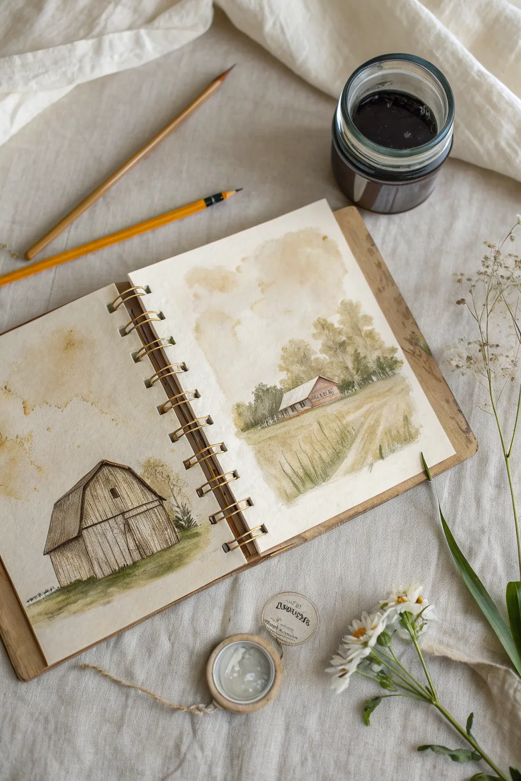
Capture the essence of nostalgia with these sepia-toned rustic studies, created using a unique blend of coffee staining and precise pencil work. This project transforms a simple sketchbook into a weathered artifact, featuring a close-up architectural study alongside a distant pastoral scene.
How-To Guide
Materials
- Heavyweight mixed-media or watercolor sketchbook (spiral bound)
- Strong brewed coffee or walnut ink
- Flat wash brush (¾ inch)
- Round watercolor brush (size 4 or 6)
- Graphite pencils (HB, 2B, 4B)
- Fine-liner pen (brown or sepia, optional)
- Paper towels
- Small spray bottle with water
Step 1: Preparing the Aged Surface
-
Brew the medium:
Prepare a very strong cup of coffee (double the grounds you’d normally drink) or pour out a small amount of walnut ink. Let the coffee cool completely before using it to prevent warping the paper excessively. -
First wash application:
Using a flat wash brush, apply a generous layer of the coffee or ink to both open pages of your sketchbook. Don’t worry about evenness; pooling is desirable here. -
Creating texture:
While the page is still wet, splatter clean water droplets onto the surface using your fingers or a spray bottle. This pushes the pigment away, creating the cloud-like blooms seen in the sky areas. -
Drying and layering:
Allow this base layer to dry completely. To get that rich, dark border effect seen in the example, apply a second, more concentrated layer of stain just around the edges of the pages and let it dry again.
Too Much Buckling?
If your pages curl heavily from the coffee wash, lay a clean sheet of paper over your dry artwork and iron it on a low, non-steam setting to flatten it out safely.
Step 2: Left Page: The Barn Study
-
Outline the structure:
With an HB pencil, lightly sketch the gambrel roof shape of the barn. Focus on the angles of the roofline and the vertical lines of the siding. -
Add wood texture:
Switch to a 2B pencil to draw the vertical planks. Instead of ruling straight lines, use slightly wavering, broken strokes to suggest aged timber. -
Deepen the shadows:
Use a 4B pencil to heavily shade the shadowed side of the barn and under the eaves. This high contrast against the coffee background makes the subject pop. -
Grounding the barn:
Mix a tiny bit of green watercolor or gouache into your coffee stain (or use a muted olive pencil) to create a grassy wash at the base of the barn. -
Final foliage details:
Sketch a small, scraggly bush to the right of the barn using quick, scribbly loops to contrasting the straight lines of the wood.
Depth Perception
Make foreground grass strokes darker and thicker, and background trees lighter and fuzzier. This simple trick instantly creates a sense of vast distance.
Step 3: Right Page: The Pastoral Landscape
-
Establish the horizon:
Lightly mark a horizon line about one-third up from the bottom of the page. Sketch a small, simple house in the middle distance. -
Blocking in trees:
Dip your round brush into the coffee stain. Using a stippling motion (tapping the brush tip vertically), create the soft, leafy shapes of the tree clusters behind the house. -
Adding atmospheric depth:
While the tree shapes are damp, drop in a slightly darker pigment concentration at their bases to suggest shadow and volume. -
Foreground grasses:
For the field in the foreground, use a dry-brush technique. Wipe most of the moisture off your brush and sweep it upwards quickly to create wispy, grass-like textures. -
Defining the path:
Leave a slightly lighter, negative space winding from the bottom right toward the house to suggest a dirt road or walking path. -
Architectural details:
Once the background wash is dry, use your mechanical pencil or fine liner to add windows and roof details to the small house. -
Refining the field:
Use a sharp pencil to add individual tall stalks of grass in the immediate foreground, pressing harder at the bottom of the stroke and flicking upward.
Step 4: Finishing Touches
-
Enhancing the stains:
Look at the sky areas on both pages. If they look too empty, add a few intentional ‘coffee ring’ stains by dipping the bottom of a small cup in ink and stamping it lightly. -
Softening edges:
I like to take a clean, slightly damp brush and soften any pencil lines that look too harsh, blending the graphite slightly into the paper’s tooth. -
Adding text (Optional):
If you have vintage-style stamps, add a small circular stamp or a date in the corner to enhance the field-journal aesthetic.
Close your sketchbook knowing you’ve preserved a moment of quiet, rustic beauty on paper

Have a question or want to share your own experience? I'd love to hear from you in the comments below!