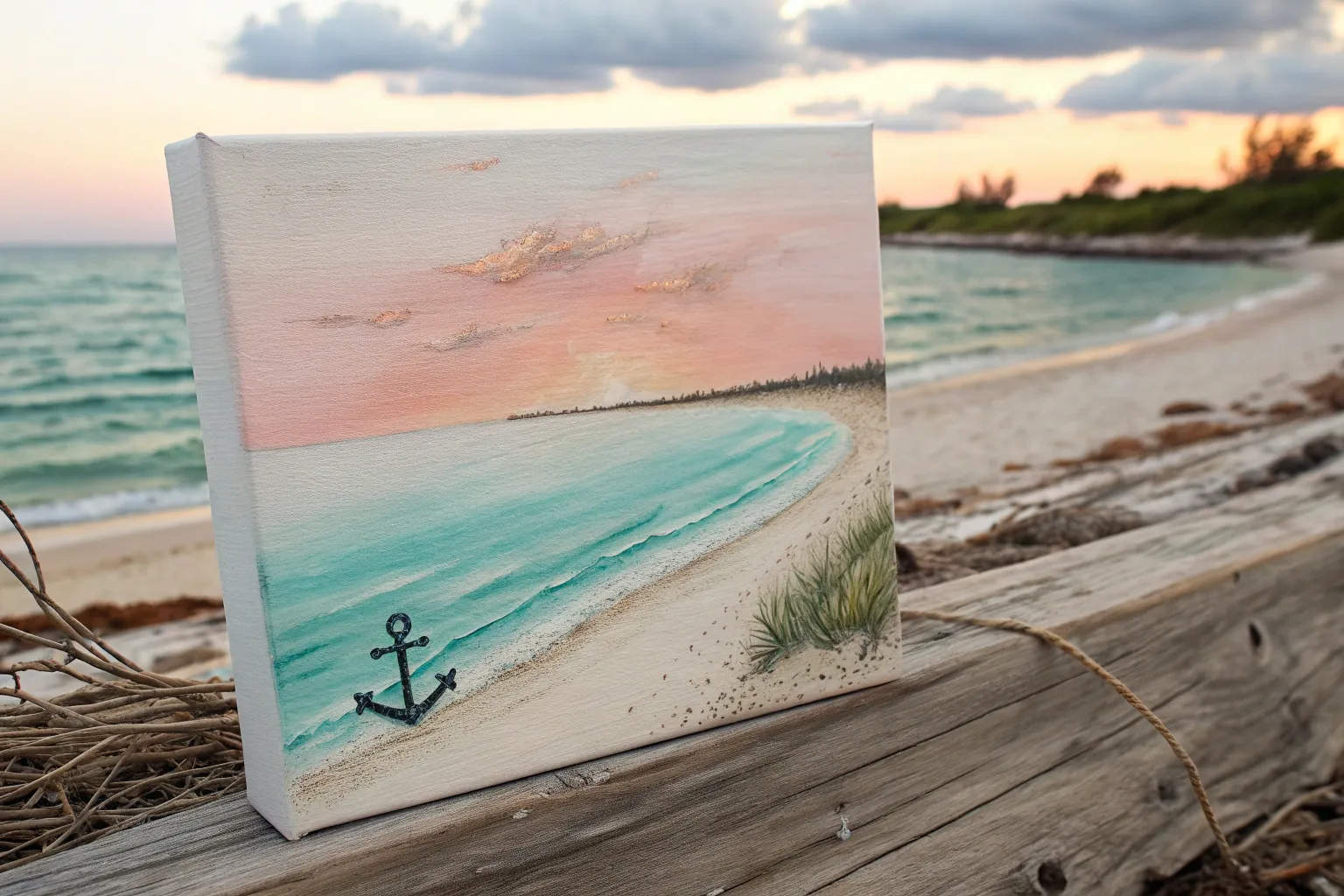
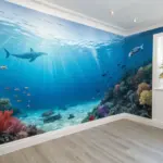
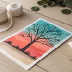
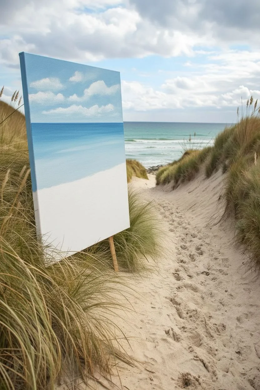
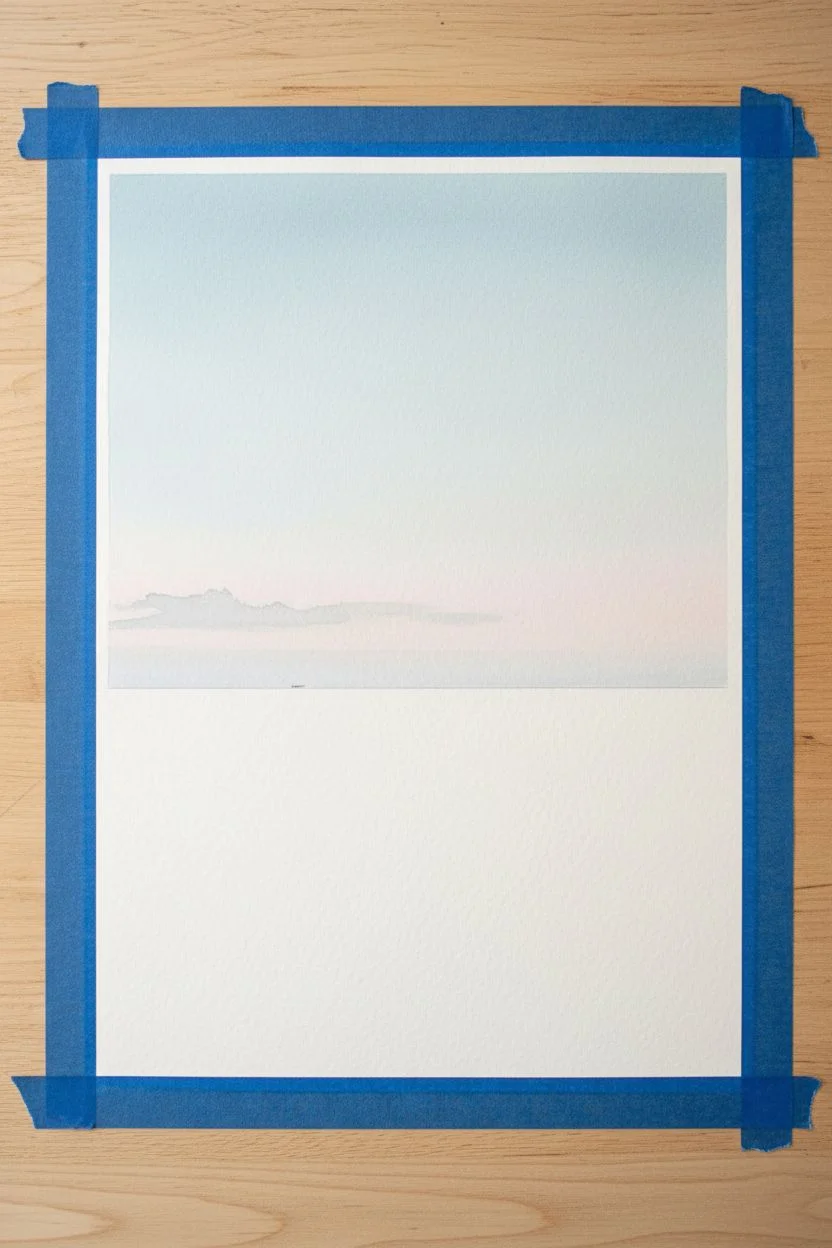
Whenever I need an instant mood boost, I paint the ocean—it’s basically endless inspiration in one big, shimmery line. Here are my go-to seascape painting ideas, starting with the classics and gradually getting a little more playful and unexpected.
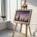
Classic Sunset Over Calm Water
Capture the serene beauty of a setting sun casting a golden path across calm waters with this soft pastel tutorial. This project focuses on subtle blending techniques to create atmospheric perspective and the gentle warmth of evening light.
Step-by-Step Guide
Materials
- Pastel paper (sanded or textured surface, light grey or tan)
- Soft pastels (various shades of pink, peach, orange, violet, and blue)
- Hard pastel or pastel pencil (dark grey or brown for the foreground)
- Blending stumps or tortillons
- Soft cloth or chamois for blending
- Masking tape
- Workable fixative (optional)
- Easel or drawing board
Step 1: Setting the Scene
-
Prepare your surface:
Begin by taping your pastel paper to a drawing board or easel. Using masking tape on all four edges not only secures the paper but also creates a clean, crisp border once the painting is finished. -
Establish the horizon:
Lightly sketch the horizon line about two-thirds of the way up the paper using a neutral-colored hard pastel. Keep this line perfectly straight, as a tilted ocean can ruin the illusion of calm water. -
Map the sun:
Place a small circle for the sun just above the horizon line, slightly off-center to create a dynamic composition. I find placing it here draws the eye naturally into the distance.
Step 2: The Atmospheric Sky
-
Base sky colors:
Starting at the top of the paper, apply broad strokes of pale violet and soft blue. As you move downward, transition into warmer pinks and peaches near the horizon line. -
Create the glow:
Around the sun area, use your brightest pale yellow and white pastels. Radiate this color outward, blending it softly into the surrounding pinks to create a hazy, light-filled atmosphere. -
Blend the sky:
Use a soft cloth or your fingers to gently blend the sky colors. Use horizontal strokes to mimic the stretching of clouds. Don’t over-blend; leaving some texture adds visual interest. -
Add cloud details:
Using a slightly darker violet-grey pastel, scumble in soft, horizontal cloud formations near the top and middle of the sky. Keep edges soft and diffused to maintain the dreamy feel.
Muddy colors?
If your sky starts looking muddy, stop blending immediately. Apply a fixative spray, let it dry completely, and then layer fresh, clean color on top to restore vibrance.
Step 3: The Shimmering Ocean
-
Reflect the sky:
Mirror the sky colors onto the water surface. Use the same violets and pinks, but apply them with slightly more pressure to create a denser color application. -
The sun path:
Directly below the sun, apply vertical strokes of bright orange, yellow, and white. This forms the ‘glitter path’ reflecting on the water. -
Create ripples:
Instead of blending the water smooth like the sky, use short, horizontal strokes. Interlace the dark blues and violets with the bright reflection colors to suggest movement and ripples. -
Darken the water’s edge:
As the water approaches the bottom foreground, deepen the colors with dark violets and navy blues. This helps anchor the painting and pushes the horizon further back.
Make it sparkle
For extra dimension, use a sharp white pastel pencil to add tiny, distinct dots or dashes in the water’s reflection path. This mimics the sparkle of light hitting individual waves.
Step 4: Foreground and Finishing Touches
-
Block in the land:
In the bottom right corner, sketch the rough shape of the grassy cliff edge. Use a dark brown or deep grey pastel to establish a solid silhouette against the water. -
Add grassy texture:
Using a hard pastel or sharp edge of a soft pastel, make quick, upward flicking motions to create individual blades of grass. Vary the direction and length for a natural, wind-swept look. -
Highlight the foreground:
Catch the light on the grass by adding touches of olive green and warm ochre on the tips of the blades that are facing the sunset. -
Final highlights:
Add pure white highlights to the center of the sun and the brightest points of the water reflection to make the artwork pop. -
Clean up:
Carefully peel away the masking tape to reveal your clean edges. Sign your work subtly in the corner.
Now you have a tranquil seascape ready to frame and display

Bright Midday Beach With Turquoise Water
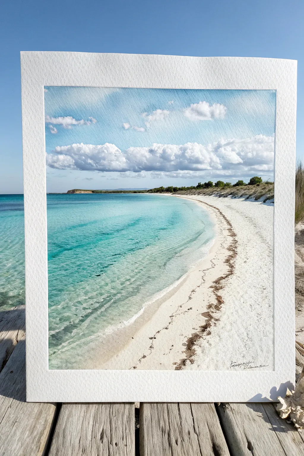
Capture the essence of a perfect summer day with this vibrant seascape painting, featuring crystal-clear turquoise waters and soft, rolling clouds. By layering transparent glazes over textured paper, you’ll recreate the gentle motion of the tide and the brilliance of white sand.
Step-by-Step Tutorial
Materials
- Cold press watercolor paper (140lb/300gsm)
- Masking tape or painter’s tape
- Watercolor paints: Phthalo Blue, Turquoise, Cerulean Blue, Sap Green, Burnt Sienna, Payne’s Grey
- White gouache (optional involved for highlights)
- Round brushes (sizes 4, 8, and 12)
- Flat wash brush (1 inch)
- Masking fluid
- Drawing pencil (HB) and eraser
- Two jars of water
- Paper towels or cloth
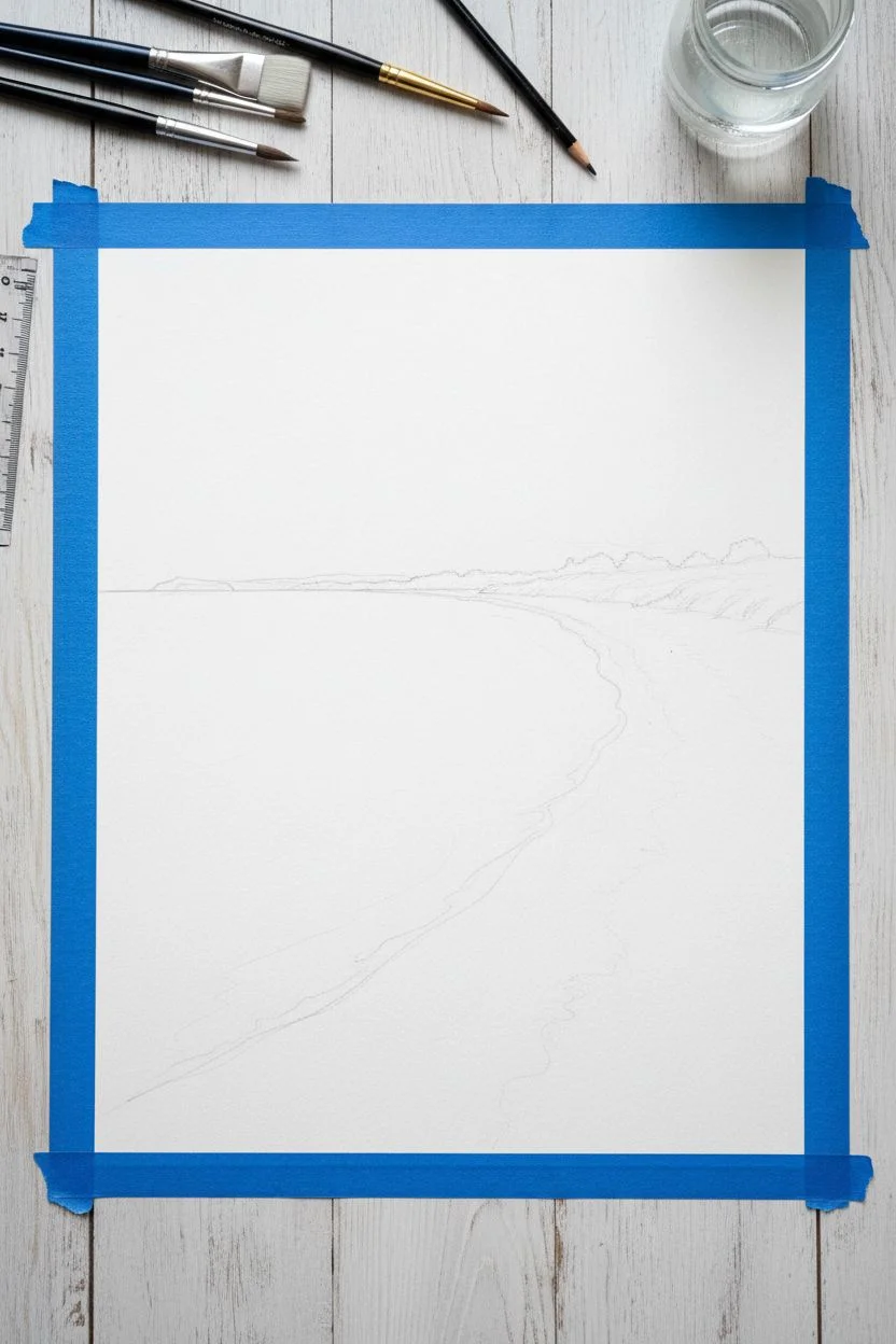
Step 1: Preparation and Sketching
-
Secure the paper:
Tape down all four edges of your watercolor paper onto a board using masking tape. This creates the crisp white border seen in the final piece and prevents the paper from buckling when wet. -
Establish the horizon:
Using a ruler, lightly draw the horizon line about one-third down from the top. Ensure it is perfectly straight. -
Map the shoreline:
Sketch a gentle, C-shaped curve starting from the distant land on the left and sweeping down towards the bottom right corner to define the water’s edge. -
Outline land features:
Lightly sketch the low-lying hills on the horizon and mark the area for the sandy dunes and vegetation on the right side.
Step 2: Painting the Sky and Horizon
-
Wet the sky area:
Use your clean flat brush to apply a layer of clear water to the sky area, stopping just above the horizon line. -
Paint the upper sky:
Drop in a wash of Cerulean Blue mixed with a touch of Cobalt at the very top, letting it fade slightly as it moves downward. -
Create cloud shapes:
While the sky is still damp, lift out pigment using a thirsty clean brush or a crumbled tissue to form the soft, fluffy white cumulus clouds across the middle sky. -
Shadow the clouds:
Mix a very dilute Payne’s Grey with a hint of purple and paint the undersides of the clouds to give them volume and weight. -
Paint the distant land:
Once the sky is dry, mix Sap Green, Blue, and a little Burnt Sienna for a muted, distant color. Paint the strip of land on the horizon, keeping the edges slightly soft to suggest atmospheric perspective.
Tape Tearing Paper?
Warm the masking tape gently with a hair dryer for a few seconds before peeling. This softens the adhesive and prevents it from ripping your beautiful clean edges.
Step 3: The Turquoise Water
-
Start the shallow water:
Wet the water area. Near the shore, apply a very dilute, watery wash of Turquoise or light Aqua Green, keeping it almost transparent over the white paper to mimic shallow clear water. -
Deepen the hues:
As you move deeper into the ocean (towards the left and horizon), gradually introduce stronger Phthalo Blue and Turquoise mixtures. Blend these seamlessly into the lighter wash. -
Add wave movement:
While the paint is slightly setting but still damp, use a smaller round brush with slightly thicker pigment to make horizontal streaks in the deeper water. This suggests gentle currents and ripples. -
Refine the shoreline edge:
Let the first layers dry. Then, carefully paint the very edge of the water where it meets the sand. I like to leave tiny slivers of dry white paper here to look like sea foam.
Level Up: Texture
Sprinkle a pinch of salt onto the wet sand area or the shallow water while it dries. The salt pushes pigment away, creating incredible sandy or foamy textures automatically.
Step 4: Sand and Vegetation
-
Paint the sand base:
For the beach, keep the paper mostly white. Add extremely faint washes of Yellow Ochre or diluted Burnt Sienna in shadow areas to suggest the slope of the beach. -
Add seaweed details:
Mix Burnt Sienna with Payne’s Grey to create a dark, brownish-black. Using a fine detail brush or a rigger brush, stipple a jagged, irregular line of dried seaweed along the high-tide mark on the sand. -
Create texture in debris:
Add smaller, scattered dots and dashes of this dark mixture further up the beach to represent scattered organic debris. -
Paint the dunes:
Using a dry-brush technique with Sap Green and darker earth tones, scumble paint onto the dune area on the right. The rough texture will look like coastal grass and scrub. -
Final highlights:
If needed, use a tiny amount of opaque white gouache to add sparkles on the water or re-establish definitive white foam at the water’s edge. -
The Reveal:
Allow the painting to dry completely—checking that the paper is room temperature to the touch—before slowly peeling off the masking tape at a 45-degree angle.
Step back and admire your sunny coastal escape, framed perfectly by those crisp white edges


Rocky Coast With Crashing Waves
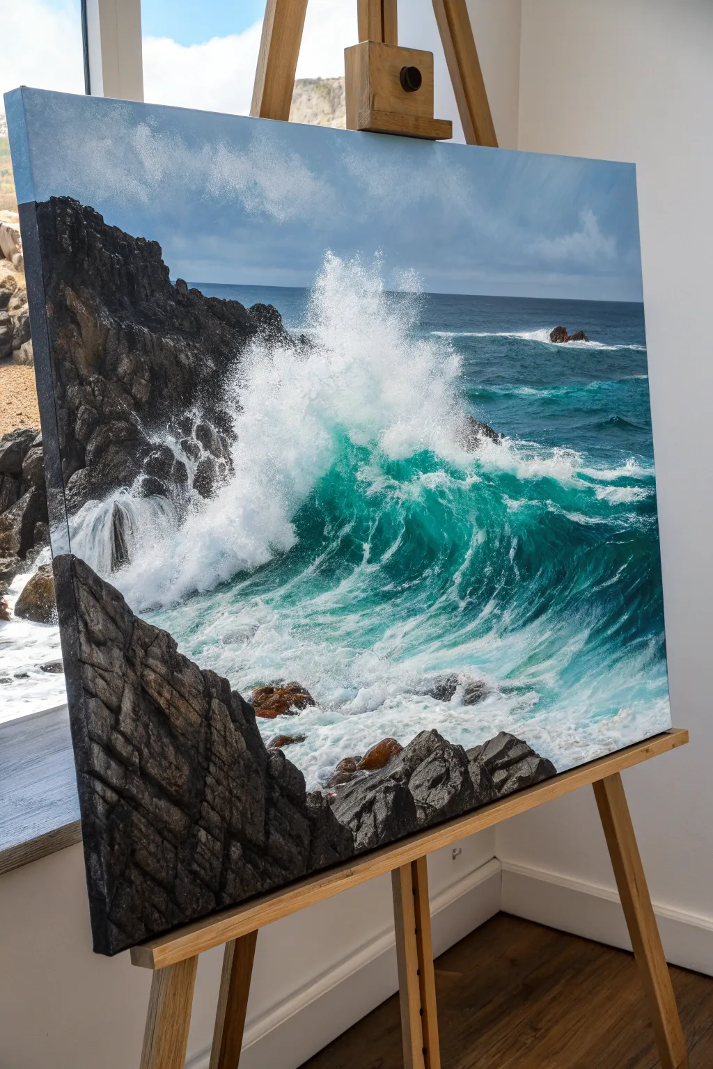
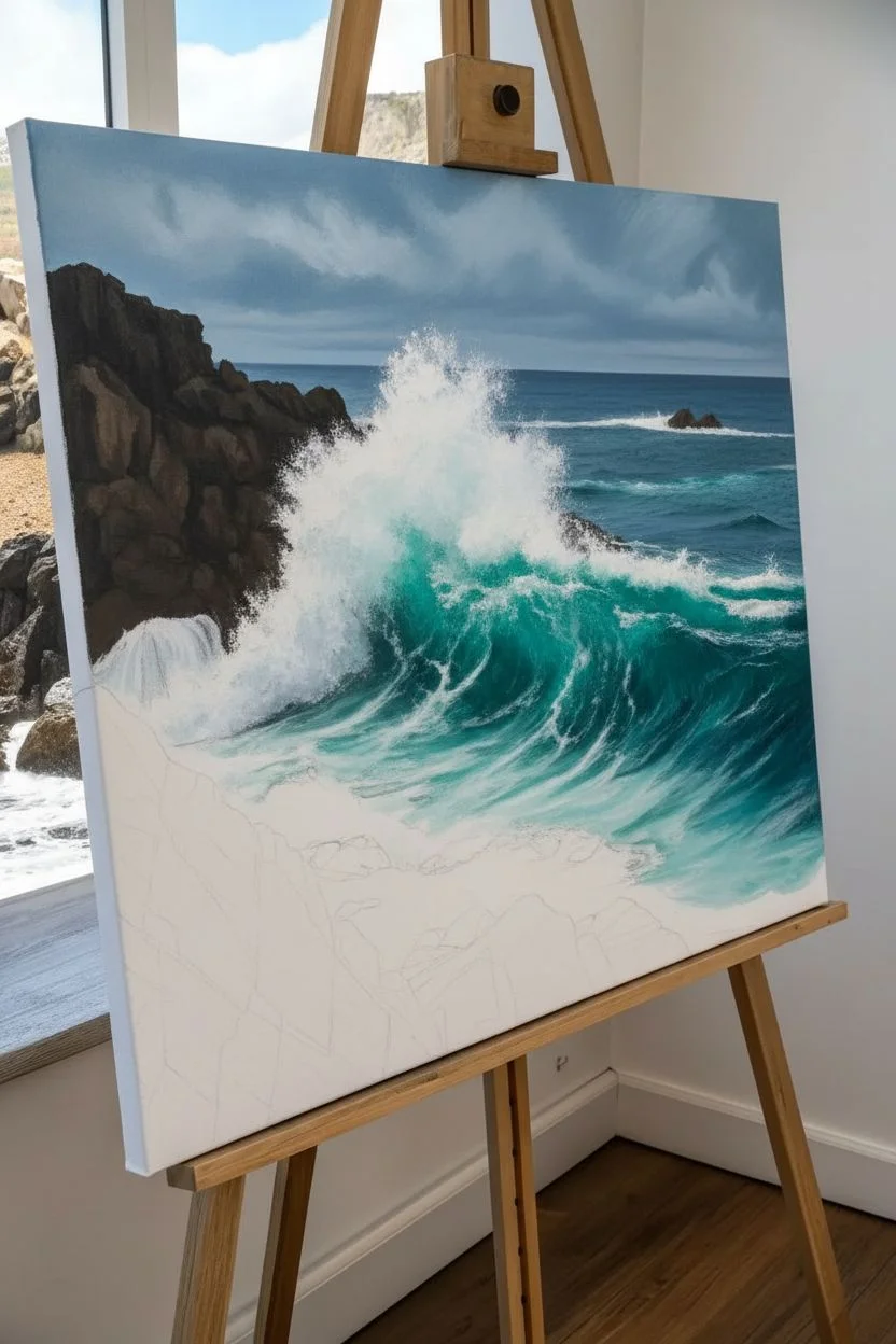
Capture the raw power of the ocean with this dynamic seascape painting, featuring forceful waves colliding against dark, textured cliffs. This project emphasizes the interplay between deep turquoise waters and brilliant white sea foam, creating a striking contrast that brings the canvas to life.
Step-by-Step Tutorial
Materials
- Large stretched canvas (at least 24×30 inches)
- Acrylic or Oil paints: Titanium White, Phthalo Blue, Phthalo Green, Burnt Umber, Payne’s Grey, Mars Black, Ultramarine Blue
- Large flat brushes (for blocking in)
- Palette knives (medium and small diamond shape)
- Fan brush (stiff bristles)
- Round detail brushes
- Spray bottle with water (if using acrylics)
- Slow-drying medium (optional but recommended for acrylics)
- Clean rags or paper towels
Step 1: Setting the Scene
-
Prime and sketch:
Ensure your canvas is well-primed. Lightly sketch the major compositional elements: the large cliff face on the left, the horizon line about two-thirds up the canvas, and the general shape of the crashing wave. -
Block in the sky:
Mix Titanium White with a touch of Payne’s Grey and Phthalo Blue. Paint the sky area, keeping it somewhat moody and cloudy. Soften the edges of any clouds with a dry brush to make them look distant. -
Establish the ocean base:
For the distant water, mix Ultramarine Blue with a little Phthalo Green. As you move closer to the foreground wave, transition to a brighter turquoise using Phthalo Blue, Phthalo Green, and White. -
Underpaint the rocks:
Using a large flat brush, block in the rocky cliff areas with a dark mixture of Burnt Umber and Mars Black. Don’t worry about texture yet; just establish the dark silhouette.
Use a Palette Knife
For the rocks, rely heavily on a palette knife rather than a brush. The metal edge creates organic, sharp breaks and natural-looking geological textures that are hard to replicate with bristles.
Step 2: Developing the Water
-
Deepen the wave transparency:
In the curl of the main wave, apply a glaze of Phthalo Green mixed with medium. You want this area to look translucent, like light is passing through the water. -
Create the crashing splash:
Load a large brush or a sea sponge with Titanium White. Stipple the paint vigorously where the wave hits the rocks to create the main explosion of foam. Keep the edges ragged and irregular. -
Paint the foam patterns:
Using a smaller round brush, paint the web-like foam patterns stretching across the surface of the teal water. Follow the curve of the wave to suggest movement and swelling. -
Add the mist:
Dry brush a very thin layer of white mist rising from the crash zone. I find using a worn-out fan brush works perfectly for this soft, airy effect. -
Define the distant waves:
Paint thin, horizontal strokes of white and light blue near the horizon to suggest rolling swells far out at sea.
Step 3: Texturing the Rocks
-
Apply rock texture:
Switch to your palette knife. Mix varied shades of grey using Black, White, and a touch of Burnt Umber. Scrape the paint over the dried dark underpainting to create jagged, rocky surfaces. -
Highlight the ridges:
Add lighter grey highlights to the edges of the rocks that are catching the light. Use the edge of the palette knife to keep these lines sharp and geometric. -
Add wet reflections:
Where the water recedes near the bottom rocks, paint dark, glossy reflections. Use vertical strokes of the dark rock color pulled downwards into the white foam areas. -
Introduce warm tones:
Glaze a small amount of Burnt Sienna or warm brown onto a few rock areas to break up the monochromatic grey and suggest mineral deposits.
Muddy Water Fix
If your white foam is turning blue/green and looking muddy, let the underlying water layer dry completely first. Apply the white foam over dry paint to keep it crisp and bright.
Step 4: Final Details
-
Enhance the splash droplets:
Flick a stiff bristle brush loaded with watered-down Titanium White to create tiny spray droplets flying off the main crash. -
Refine the foreground:
Paint the churning, foamy water in the immediate foreground. Use swirls of white and light grey, blending them slightly into the dark water underneath. -
Adjust contrast:
Step back and check your values. Deepen the darkest shadows in the rock crevices and brighten the highlights on the wave crests to ensure maximum drama. -
Final glaze:
Once fully dry, you may want to apply a very thin gloss varnish to the water areas to make them look permanently wet.
Now step back and admire the powerful coastal energy you have captured on your canvas


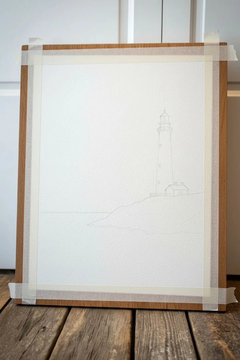
Lighthouse on a Windy Point
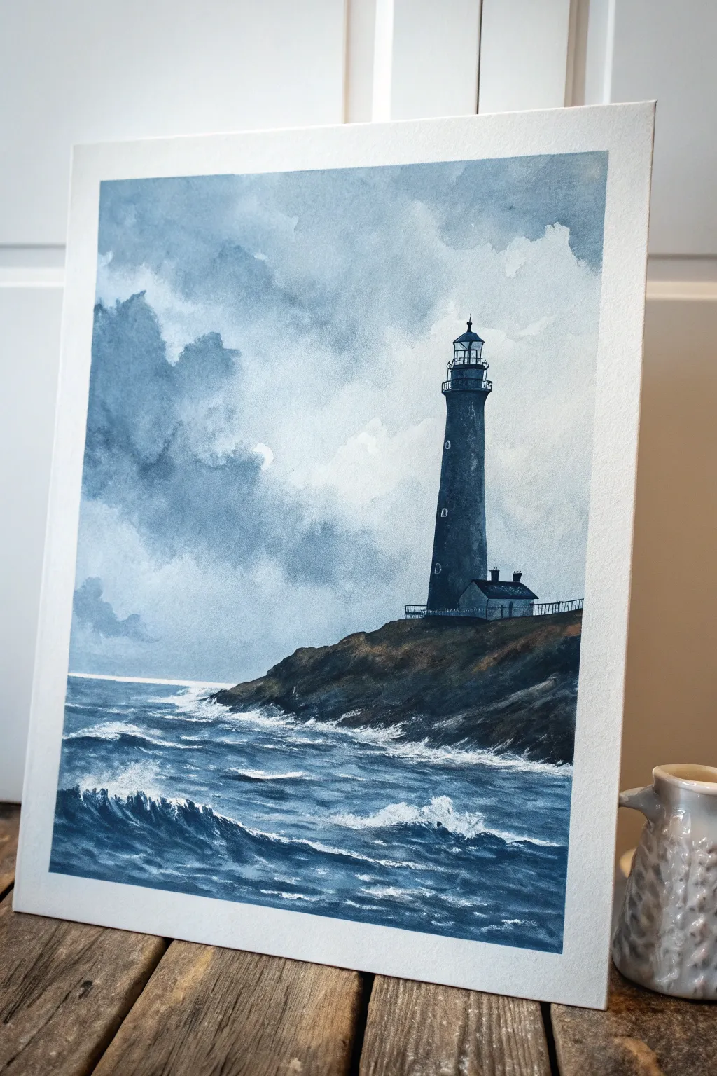
Capture the moody drama of a coastal storm with this atmospheric watercolor painting. You’ll layer distinct washes of indigo and Payne’s grey to build a turbulent sky and choppy seas surrounding a stoic lighthouse.
Detailed Instructions
Materials
- Cold Press Watercolor Paper (140lb/300gsm)
- Watercolor Paints: Payne’s Grey, Indigo, Prussian Blue, Burnt Umber, White Gouache
- Flat Wash Brush (1 inch)
- Round Brushes (Size 4, 8, and 12)
- Rigger Brush or very fine liner brush
- Masking Tape
- Pencil (HB or H)
- Paper Towels
- Two Water Containers
Step 1: Preparation and Sketching
-
Secure the paper:
Tape down all four sides of your watercolor paper to a board. Ensure the tape is pressed firmly to prevent paint from seeping underneath and to create a crisp white border. -
Sketch the horizon:
Using an H pencil, lightly draw the horizon line about one-third of the way up from the bottom. Keep this line extremely faint. -
Outline the headland:
Sketch the rough shape of the rocky cliff jutting in from the right side. It should slope upwards, providing a base for the lighthouse. -
Draft the lighthouse structure:
Draw the lighthouse on top of the cliff. Focus on the tall, slight taper of the tower and the small cottage attached to its base. Don’t worry about tiny details like railings yet, just get the proportions right.
Cloud Control
If your clouds look too uniform, dab a crumpled paper towel onto the damp wash to lift color out. This reclaims white areas and adds a natural, organic texture.
Step 2: Painting the Sky
-
Wet the sky area:
Using your large flat brush, wet the paper thoroughly above the horizon line and around your pencil sketch of the lighthouse. The paper should glisten but not have puddles. -
Lay in the first wash:
Mix a diluted wash of Indigo and Payne’s Grey. Drop this color into the wet paper, starting from the top left corner and letting it diffuse downwards. -
Build storm clouds:
While the paper is still damp, charge your brush with more concentrated pigment. Dab in darker patches to suggest heavy cloud formations, leaving white paper showing through for the brighter cloud edges. -
Soften edges:
Use a clean, damp round brush to soften any hard edges in the clouds, blending the moody greys into the white areas to create a misty, atmospheric look. -
Dry completely:
Let the sky dry fully. I usually wait until the paper is cool to the touch before moving on, ensuring the next layers won’t bleed.
Step 3: The Lighthouse and Cliff
-
Paint the lighthouse base tone:
Mix a strong, dark value using Indigo and a touch of Burnt Umber. Use a size 8 round brush to paint the main body of the lighthouse tower, leaving small negative spaces for windows. -
Add the lantern room:
Switch to a smaller size 4 brush to carefully paint the lantern room at the top. Be precise with the glass panes and the domed roof, using your darkest pigment. -
Paint the house:
Fill in the small cottage structure. Use a slightly lighter grey for the walls to distinguish them from the dark tower, and a dark charcoal tone for the roof. -
Establish the cliff form:
Mix Burnt Umber with Indigo to create a rocky, earth tone. Paint the cliff face, using rough vertical strokes to mimic the texture of craggy rocks. Make the area closest to the water darker to show wet stone. -
Add railings:
With a rigger brush or fine liner, carefully paint the delicate black railings around the lantern room and the cottage. Keep your hand steady and use quick, confident strokes.
Pro Tip: Perspective
Make the lighthouse appear taller by slightly curving the bottom edge of the tower downward and the top railing lines upward. This mimics looking ‘up’ at the structure.
Step 4: Painting the Sea
-
Define the horizon:
Paint a sharp, dark blue line across the horizon. This separates the stormy sky from the turbulent water. -
Create wave forms:
Using Prussian Blue mixed with Payne’s Grey, paint horizontal strokes for the water. Leave significant strips of white paper unpainted to represent the foam of crashing waves. -
Depict the trough of waves:
Add darker values under the white foam areas to give the waves volume and height. The contrast between deep blue and white paper creates the movement. -
Detail the foreground:
In the immediate foreground, use larger, looser strokes to show chaotic water movement. Let the brush skip across the paper texture (dry rubbing) to create sparkle on the water.
Step 5: Final Highlights
-
Enhance the crash:
Take a small amount of White Gouache. Scumble (dry brush) it where the waves hit the cliff base to create the look of spraying mist and foam. -
Highlight the waves:
Add tiny touches of white gouache to the tops of the foreground waves for extra crispness and drama. -
Remove tape:
Once the painting is 100% bone dry, slowly peel the tape away at a 45-degree angle to reveal your clean edges.
Now step back and enjoy the powerful atmosphere you have created in this seascape
BRUSH GUIDE
The Right Brush for Every Stroke
From clean lines to bold texture — master brush choice, stroke control, and essential techniques.
Explore the Full Guide
Sand Dunes Framing the Ocean View
Capture the serene beauty of the coastline where grassy dunes give way to rolling turquoise waves. This acrylic painting project focuses on layering techniques to create depth, from the distant horizon to the textured beach grass in the foreground.
Detailed Instructions
Materials
- Stretched canvas (16×20 inches or larger)
- Acrylic paints (Titanium White, Phthalo Blue, Ultramarine Blue, Yellow Orche, Burnt Sienna, Sap Green, Chromium Oxide Green)
- Large flat brush (1-2 inch)
- Medium filbert brush
- Small round brush
- Fan brush
- Palette and palette knife
- Water container and rags
- Easel (optional)
Step 1: Sky and Horizon
-
Prime the Surface:
Start by ensuring your canvas is clean. If it isn’t pre-primed, apply an even coat of gesso and let it dry completely. -
Establish the Horizon:
Mix a very light blue using Titanium White and a tiny touch of Phthalo Blue. Paint the top third of the canvas with sweeping horizontal strokes to create the sky. -
Add Cloud Textures:
While the sky is still slightly wet, use a clean rag or a dry brush to lift off some paint or swirl in pure white to create soft, fluffy clouds. -
Define the Water Line:
Use painter’s tape or a steady hand to draw a straight horizon line about two-thirds down the canvas. Paint the distant ocean using a deep mix of Ultramarine Blue and a hint of Phthalo Blue.
Step 2: The Rolling Ocean
-
Gradient the Water:
As you move closer to the foreground water, mix more Titanium White and a touch of Phthalo Green into your blue to create that vibrant turquoise color. -
Blend the Transition:
I like to use a damp, clean brush to softly blend the darker deep water into the lighter turquoise shallows so there are no hard lines. -
Create Waves:
Using a small flat brush and pure Titanium White, paint horizontal, slightly jagged lines to represent the breaking wave crests. -
Add Seafoam:
Scrub the white paint slightly below the crest lines to mimic the frothy, churning foam of the waves rolling in.
Wave Motion Trick
When painting foam, use a dry brush with very little paint. Scrub in a circular motion to make the water look aerated and misty rather than solid.
Step 3: Sandy Dunes and Grass
-
Base Coat the Sand:
Mix Yellow Ochre, Titanium White, and a tiny dot of Burnt Sienna. Paint the bottom right corner and slope it upwards to the left to form the dune shape. -
Shadowing the Sand:
Add more Burnt Sienna and a touch of blue to your sand mix to create a shadow color. Apply this to the lower slopes of the dunes to give them volume. -
Base Texture for Grass:
Use an old, splayed bristle brush or a fan brush. Dip it into a dark mix of Sap Green and Burnt Sienna and tap it along the top ridge of the sand dune. -
Highlighting the Foliage:
Clean your brush and pick up a lighter green mixed with yellow. Lightly flicks upward strokes over the dark base to mimic sunlit grass blades. -
Varying Grass Lengths:
Ensure some grass strokes are tall and sweeping while others are short and tufted to create a natural, wild appearance. -
Refining the Path:
If you want a path through the dunes, stroke a lighter sand color (mostly white with a tint of ochre) through the middle of the dune section. -
Final Touches:
Add tiny details like distant sailboats on the horizon using a fine liner brush and dark blue paint.
Texture Booster
Mix modeling paste into your acrylics for the sand dunes and closest waves. This adds physical 3D texture that catches the light beautifully.
Step back and admire how your canvas now holds a permanent, peaceful day at the beach
Tropical Shoreline With Palm Silhouettes
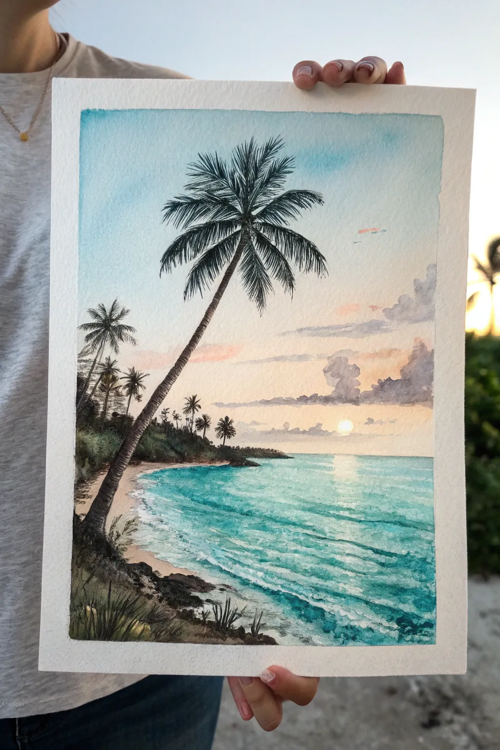
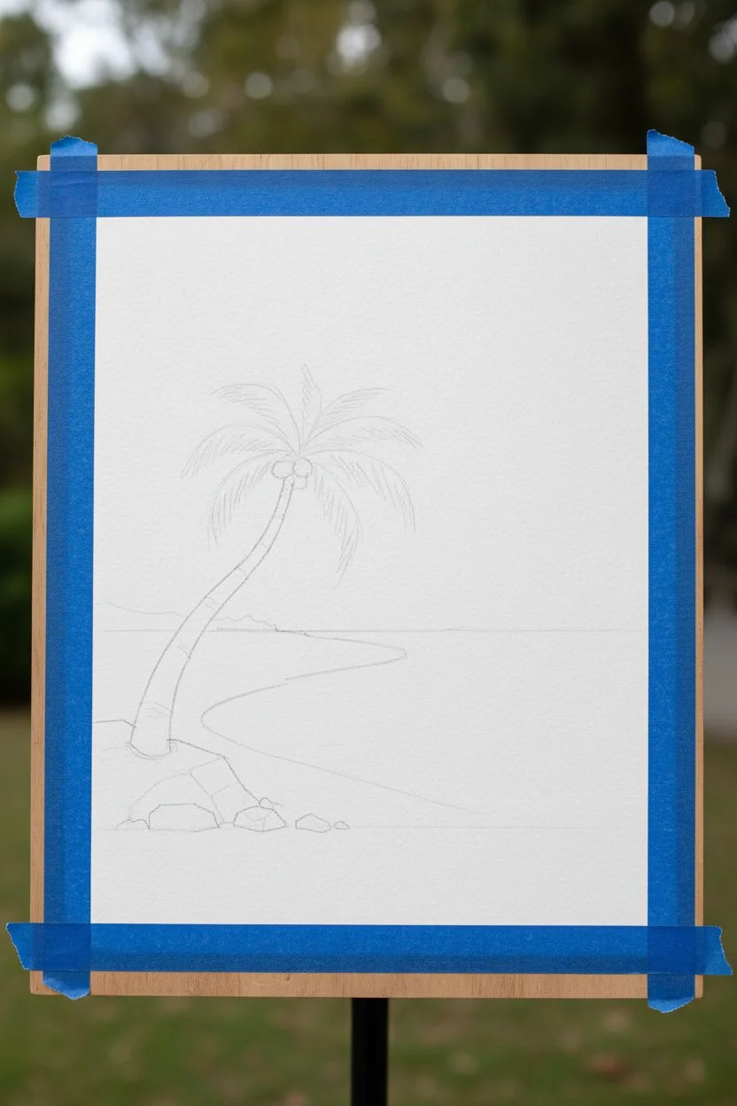
Capture the serene beauty of a tropical paradise with this vibrant watercolor tutorial featuring a leaning palm silhouette against a soft sunset. You’ll layer turquoise waters and pastel skies to build a sense of depth and tranquility.
Step-by-Step Tutorial
Materials
- Cold press watercolor paper (300 gsm)
- Watercolor paints (Turquoise, Phthalo Blue, Indigo, Burnt Umber, Payne’s Grey, Rose Madder, Yellow Ochre, Cadmium Yellow)
- Round brushes (sizes 2, 6, and 10)
- Fine liner brush or rigger brush
- Pencil and eraser
- Masking fluid (optional)
- White gouache
- Painter’s tape
- Water jars and paper towels
Step 1: Preparation and Sketching
-
Tape the edges:
Begin by taping down all four edges of your watercolor paper to a board. This creates a crisp white border and prevents the paper from buckling when wet. -
Sketch the composition:
Using a light pencil hand, draw the horizon line about one-third up from the bottom. Sketch the shoreline curing in from the left. Mark the position of the main leaning palm tree and the rocky foreground, but keep details minimal.
Muddy Clouds?
If your clouds turn grey or muddy when mixing with the blue sky, wait for the blue layer to dry completely. Rewet the specific area slightly before adding the pink/purple cloud tones.
Step 2: Painting the Sky and Sun
-
Wet the sky area:
With a large clean brush, wet the entire sky area ranging from the top edge down to the horizon line, being careful to paint around the sun if you aren’t using masking fluid. -
Apply the blue gradient:
Drop a diluted wash of Turquoise or Cerulean Blue at the very top of the paper. Let it fade naturally as you move downward, keeping the area around the horizon clear for warmer tones. -
Add sunset warmth:
While the paper is still damp, introduce soft streaks of Rose Madder and a touch of Cadmium Yellow near the horizon. Let these colors bleed slightly into the blue for a soft, atmospheric transition. -
Paint the distant clouds:
Mix a soft purple-grey using Payne’s Grey and a tiny bit of red. Dab in fluffy cloud shapes on the right side above the horizon while the paper is semi-wet to create soft edges. Ensure the sun remains a bright white circle.
Add Life
Silhouette a tiny sailboat on the horizon or add a few V-shaped birds in the sky near the palm tree to give the scene a sense of scale and life.
Step 3: Creating the Ocean
-
Base ocean layer:
Mix a vibrant Turquoise with plenty of water. Paint the sea area, starting darker at the horizon and becoming lighter and more transparent as you approach the shoreline. -
Define the horizon:
Use a straight line of slightly darker blue (Phthalo Blue mixed with Turquoise) to create a sharp, distinct horizon line against the sky. -
Add wave depth:
Once the base layer is dry, use a size 6 brush to paint horizontal ripples. Use darker concentrations of Turquoise and Phthalo Blue in the foreground water to suggest motion and depth. -
Sunlight reflection:
Lift out some pigment directly under the sun using a damp brush, or leave vertical gaps in your blue wash to simulate the sparkling path of sunlight on the water.
Step 4: The Shoreline and Vegetation
-
Paint the sand:
Apply a very pale wash of Yellow Ochre and Burnt Umber for the sandy beach. While wet, drop in slightly darker brown near the vegetation line to show shadow. -
Foreground rocks and grass:
Mix a dark, earthy tone using Burnt Umber and Indigo. Paint the rocky mound in the bottom left corner. Use flicking motions with a small brush to create grassy textures growing from the rocks. -
Distant palms:
Using a diluted mix of green and grey, paint the silhouette of the distant tree line and smaller palm trees on the left side. These should be less detailed than the foreground to push them into the background.
Step 5: The Hero Palm Tree
-
Paint the trunk:
Mix a dark, opaque color using Burnt Umber and Payne’s Grey. Paint the long, curving trunk of the main palm tree, making it thicker at the base and tapering near the top. Add texture with small horizontal lines. -
Draft the fronds:
Switch to a liner or rigger brush. Paint the central spines of the palm fronds first, exploding outward from the center point of the tree top. -
Add the leaves:
With quick, flicking strokes, pull paint from the central spines outward to create the individual leaves of the fronds. Leave some gaps to make the tree look airy and realistic.
Step 6: Final Details
-
Sea foam highlights:
Using white gouache directly from the tube or a white gel pen, add crisp white lines along the shoreline to represent crashing waves and sea foam. -
Enhance texturing:
Add final touches of white gouache to the water’s surface for high-contrast sparkles, and deepen the shadows under the foreground rocks with pure Indigo. -
Remove tape:
Wait until the painting is bone dry. Carefully peel the tape away at a 45-degree angle to reveal your clean edges.
Frame your new tropical escape and enjoy the warmth it brings to your space

PENCIL GUIDE
Understanding Pencil Grades from H to B
From first sketch to finished drawing — learn pencil grades, line control, and shading techniques.
Explore the Full Guide
Dramatic Storm Clouds and Choppy Sea
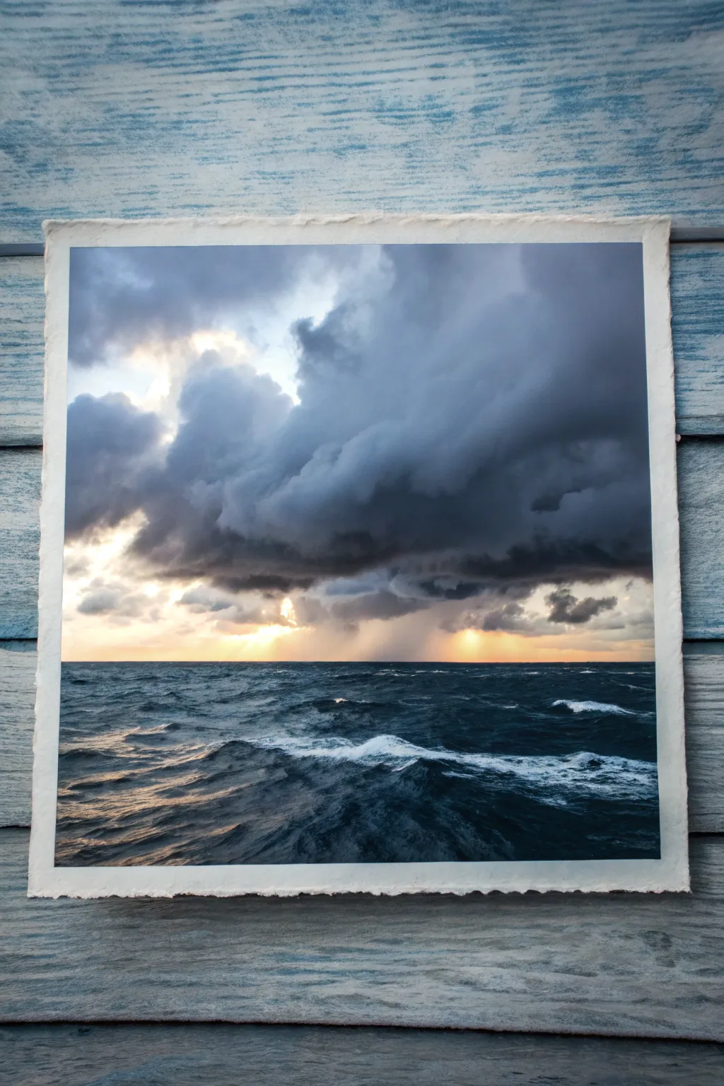
Capture the raw power of nature with this dramatic seascape featuring billowing storm clouds and restless waves. The contrast between the dark, moody atmosphere and the piercing light on the horizon creates a stunning focal point.
How-To Guide
Materials
- Heavyweight watercolor paper (300gsm or higher)
- Watercolor paints (Payne’s Grey, Indigo, Prussian Blue, Burnt Umber, Yellow Ochre, Cadmium Yellow)
- Painter’s tape
- Flat wash brush (1 inch)
- Round brushes (sizes 4, 8, and 12)
- Clean water jars
- Paper towels or rag
- Spray bottle with water
- White gouache (optional highlights)
Step 1: Setting the Scene
-
Tape down your paper:
Secure your watercolor paper to a board using painter’s tape on all four sides. This prevents buckling when we apply heavy washes later. -
Establish the horizon:
Lightly sketch a straight horizontal line about one-third of the way up from the bottom of the paper. This separates the sky from the sea. -
Wet the sky area:
Using your large flat brush, apply a generous coat of clean water to the entire sky area above the horizon line. The paper should be glisten, but not hold puddles.
Pro Tip: Cloud Control
Tilt your drawing board while the sky is wet. Letting gravity pull the paint downward can create natural-looking rain effects without brushwork.
Step 2: Painting the Stormy Sky
-
Underpainting the light:
While the paper is wet, drop in a very dilute mix of Yellow Ochre and a tiny touch of Cadmium Yellow right along the center of the horizon line where the sun breaks through. -
Building the clouds:
Mix a dark, stormy grey using Payne’s Grey and a touch of Burnt Umber. With a size 12 round brush, start dropping this color into the upper corners of the wet sky. -
Adding cloud volume:
Use a rolling motion with your brush to create the fluffy, billowing shapes of the cumulus clouds. Let the dark paint bleed naturally into the wet paper, but keep the area around the yellow sun lighter. -
Deepening shadows:
While the first layer is still damp, mix a more concentrated Indigo and Payne’s Grey. Apply this to the bottom edges of the clouds to give them weight and dimension. -
Softening edges:
If any cloud edges look too harsh, use a clean, damp brush to gently soften them. You want a seamless transition between the dark storm and the light center. -
Rain curtains:
With a slightly drier brush, drag some faint grey vertical streaks down from the clouds towards the horizon on the right side to suggest distant rain.
Troubleshooting: Muddy Colors
If your yellow sunlight mixes with the blue-grey clouds and turns green, wait for the yellow layer to dry completely before painting the clouds around it.
Step 3: Creating the Choppy Sea
-
Base ocean layer:
Once the sky involves drying, mix Prussian Blue with a little Indigo. Paint horizontal strokes across the sea area, leaving some white paper showing for the foaming waves. -
Darkening the foreground:
Add more Indigo and Payne’s Grey to your mix. Apply this darker tone to the bottom third of the painting (the foreground) to create depth and draw the viewer in. -
Refining wave shapes:
Switch to a size 8 round brush. Use jagged, rhythmic strokes to define the choppy wave peaks. Remember that waves closer to you appear larger and more detailed. -
Adding the sun’s reflection:
Glaze a very thin layer of your yellow mix on the water directly below the light source in the sky. I like to keep this subtle so it doesn’t overpower the waves. -
Lifting highlights:
While the sea paint is damp, use a thirsty (clean and dry) brush or a twisted paper towel to lift out pigment on the tops of the waves to enhance the foam.
Step 4: Final Touches
-
Enhancing contrast:
Evaluate your painting. If the dark clouds dried too light, glaze another layer of Payne’s Grey over the darkest areas to restore the drama. -
Opaque highlights:
For the brightest sea foam, you can use a touch of white gouache on the very tips of the foreground waves. -
Removing tape:
Wait until the painting is completely bone-dry. Carefully peel away the painter’s tape at a 45-degree angle to reveal crisp white borders. -
Optional deckled edge:
To match the reference photo look, you can tear the edges of the paper against a ruler instead of cutting them for a rustic feel.
Step back and admire the powerful atmosphere you have captured in your stormy seascape
Misty Morning Seascape in Cool Grays
Capture the serene mood of a foggy coastline with this atmospheric acrylic painting. Using a restricted palette of slate blues and cool grays, you’ll learn to blend soft horizons and create the rhythmic motion of crashing waves.
Step-by-Step Tutorial
Materials
- Stretched canvas (vertical orientation, approx. 18×24 inches)
- Acrylic paints: Titanium White, Mars Black, Phthalo Blue, Burnt Umber, Payne’s Gray
- Large flat brush (2-inch)
- Medium filbert brush
- Small round detail brush
- Palette knife
- Water spray bottle
- Jar of water
- Paper towels
- Acrylic glazing medium (optional, for translucency)
Step 1: Setting the Atmosphere
-
Prime the canvas:
Begin by applying a thin wash of Payne’s Gray mixed with plenty of water over the entire canvas. This kills the stark white and provides a cool undertone that will peek through later. -
Establish the horizon:
Mix Titanium White with a tiny touch of Payne’s Gray to create a very light, foggy gray. Using your large flat brush, paint the upper third of the canvas, using horizontal strokes. -
Create the mist:
While the paint is still wet, blend a slightly darker gray into the middle section. Use a clean, dry brush to gently feather the transition between the sky and the distant water, making the horizon line soft and indistinct to mimic heavy fog. -
Paint the distant water:
Mix Phthalo Blue with a little Burnt Umber and White to get a muted teal-gray. Apply this below your misty horizon, keeping your strokes strictly horizontal to suggest calm water in the distance.
Misty Trouble?
If your fog looks too streaky, use a dry, soft makeup brush to gently swirl over the wet paint. This circular buffing motion blends acrylics seamlessly for a soft-focus look.
Step 2: Building the Waves
-
Block in the main swells:
Switch to a darker mix of Phthalo Blue and Payne’s Gray. Using the medium filbert brush, map out the dark bodies of the two main waves—one breaking in the mid-ground and one closer to the shore. -
Add transparency:
For the top of the breaking wave, mix a translucent teal color using Phthalo Blue and a lot of glazing medium or water. Apply this just under the crest where the light shines through the water. -
Create the wave crests:
Load your brush with pure Titanium White. Use a rolling, dabbing motion to paint the foamy top of the breaking wave, dragging the paint slightly downward to show gravity pulling the water. -
Define the wave shadow:
Under the white foam, paint a deep, dark line using Payne’s Gray and a touch of Black. This contrast makes the white foam pop and gives the wave volume. -
Paint the background swells:
In the water behind the main wave, use a lighter gray-blue to paint thin, horizontal lines. These suggest smaller ripples and swells moving toward the shore without competing for attention.
Add Texture
Mix a little modeling paste or sand into your dark beach paint before applying it. This physical texture creates a realistic gritty contrast against the smooth, blended sky.
Step 3: The Shoreline and Foreground
-
Paint the wet sand:
Mix Burnt Umber, Mars Black, and a touch of Blue for the sand. Paint the bottom diagonal section of the canvas. Make the sand darker near the water’s edge to look wet and reflective. -
Add sand reflections:
While the dark sand color is wet, drag a little bit of the sky color vertically down into it. This creates the subtle reflection of the gray sky on the wet beach. -
Layer the sea foam:
Using a worn-out brush or a sponge, stipple Titanium White along the edge where the water meets the sand. I create uneven, organic shapes here to mimic the lacy pattern of sea foam. -
Detail the wash:
For the receded water on the sand, mix a very watery white. Paint thin, veiny patterns over the dark sand to show the leftover foam sliding back into the ocean. -
Add foreground foliage:
In the bottom right corner, use a small round brush or a fan brush with deep green and brown tones mixed from your palette. Use quick, upward flicking motions to create beach grass. -
Highlight the grass:
Mix a lighter ochre or pale green and add a few highlights to the tips of the grass blades where the diffuse light hits them. -
Final adjustments:
Step back from the painting. Use a clean, dry brush to soften any hard edges in the mist or water, and add final touches of pure white to the brightest points of the crashing wave.
Allow your finished piece to dry completely before hanging it in a spot that needs a touch of calm


Sea Birds as Distant Sky Accents
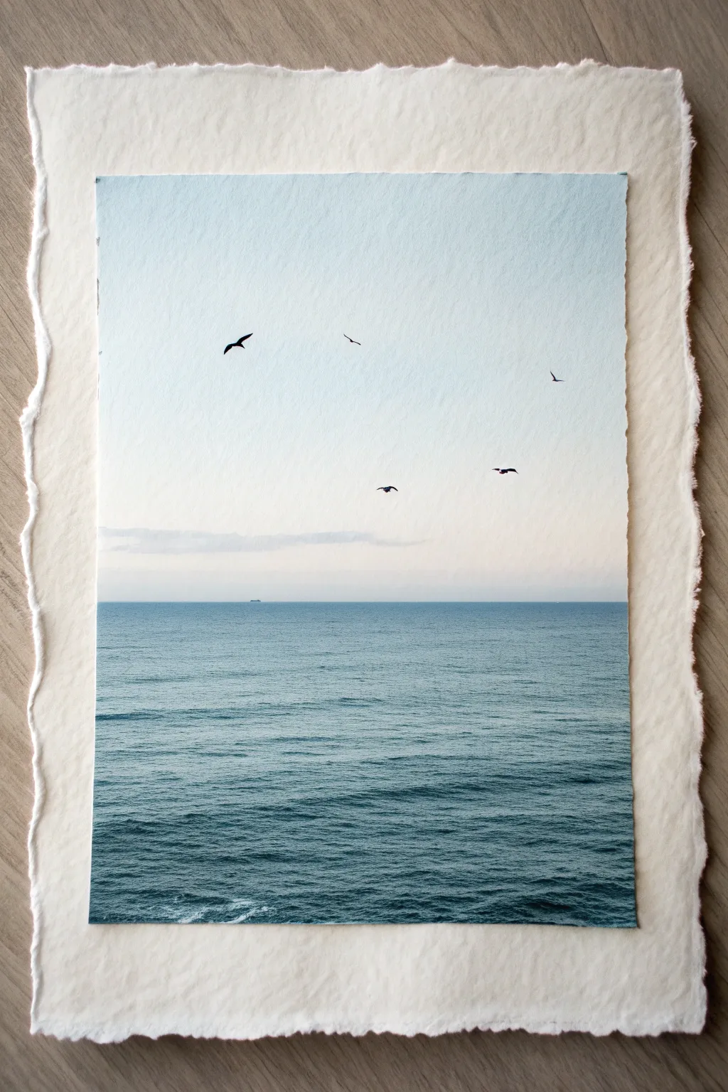
This serene project captures the vastness of the ocean with a simple, horizon-focused composition. You will learn to blend soft gradients for the sky and create textured ripples associated with calm waters, finishing with delicate bird silhouettes.
Detailed Instructions
Materials
- Cold Press Watercolor Paper (heavyweight, 300gsm)
- Larger Handmade Deckle-Edge Paper (for backing)
- Watercolor Paints (Phthalo Blue, Cerulean Blue, Payne’s Grey, Alizarin Crimson, Titanium White gouache)
- Painter’s Tape
- Flat Wash Brush (3/4 inch)
- Round Detail Brush (Size 0 or 1)
- Pencil (HB)
- Archive-safe glue or mounting tabs
- Clean Water & Palette
Step 1: Preparation & Sky
-
Secure the Paper:
Tape down your watercolor paper on all four sides to a hard board. This prevents buckling when wet and creates a clean, crisp border for the painting. -
Mark the Horizon:
Using a ruler, very lightly draw a straight horizontal line just below the halfway point of your paper. This will separate the sky from the sea. Keep the pencil pressure extremely light so it doesn’t show through the paint later. -
Wet-on-Wet Sky Base:
With your large flat brush and clean water, dampen the entire sky area above the horizon line. The paper should glisten but not have standing puddles. -
Initial Blue Gradient:
Mix a very watery Cerulean Blue. Start painting at the very top edge and pull the color down. As you move lower, dip your brush in clean water to dilute the paint, fading it into white as you approach the horizon. -
Adding Warmth:
While the paper is still slightly damp near the horizon, mix a microscopic amount of Alizarin Crimson with plenty of water to create a barely-there pink wash. Glaze this gently right above the horizon line to simulate hazy atmospheric distance. -
Distant Clouds:
Mix a soft, pale grey using Cobalt Blue and a touch of orange or brown. With a smaller brush, dab in a thin, horizontal strip of cloud just above the horizon. Soften the top edges with a damp brush so they melt into the sky. -
Allow to Dry:
Let the sky section dry completely. I usually give this at least 20 minutes because we need a crisp, hard edge for the horizon line in the next phase.
Uneven Horizon?
If your horizon line wobbles, re-tape strictly along the line once the sky is 100% dry. Paint the sea color over the tape edge for razor-sharp perfection.
Step 2: Ocean & Texture
-
Deep Blue Horizon:
Mix Phthalo Blue with a touch of Payne’s Grey for a deep, oceanic teal. Using your flat brush, paint a straight, sharp line exactly along your pencil mark. Using tape here can help ensure it is perfectly straight. -
Ocean Gradient:
Continue painting downward from the horizon. As you move toward the bottom of the page, add slightly more Phthalo Blue and less water to make the color richer and darker in the foreground. -
Creating Ripples:
While the ocean wash is wet but starting to lose its sheen, use a dry, clean brush to lift out tiny horizontal streaks. This ‘thirsty brush’ technique reveals the lighter paper underneath, looking like light catching the waves. -
Adding Darker Swells:
Reload your brush with a more concentrated blue-grey mix. Painting wet-on-dry in the lower foreground, add short, horizontal dashes to suggest the deeper troughs of the waves closer to the viewer. -
Whitecaps (Optional):
If you want more texture, take a tiny bit of white gouache on your smallest brush. Add extremely subtle, thin white lines on the tops of a few foreground waves for foam.
Level Up: Texture
Use coarse salt on the wet foreground paint. Sprinkle it sparingly and brush it off once dry to create organic, foamy textures in the nearest water.
Step 3: Details & Mounting
-
Tiny Silhouettes:
Ensure the sky is bone dry. Mix a strong, opaque black or dark Payne’s Grey. Using your size 0 or 1 detail brush, paint the sea birds. Vary their wingspans—some V-shapes, some flatter lines—to show different flight angles. -
The Distant Ship:
Place a minuscule rectangular dash on the horizon line using the same dark grey. It should be barely visible, just a speck to give the viewer a sense of immense scale. -
Remove Tape:
Once the painting is completely dry, slowly peel off the painter’s tape at a 45-degree angle to reveal your clean edges. -
Deckle Edge Ripping:
If you want the painting itself to have rough edges like the backing paper, place a metal ruler along the white border and tear the paper upward against the ruler’s edge. -
Mounting:
Center your finished painting on the larger sheet of handmade deckle-edge paper. Use archival glue or photo corners to secure it, leaving a generous, even border of the textured paper visible.
The final result brings a calming, atmospheric focal point to any room you choose to display it in
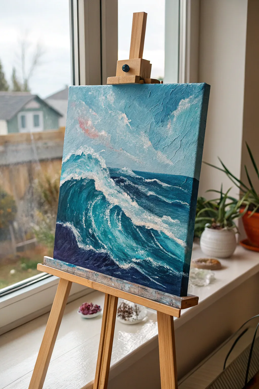
Study of a Single Curling Wave
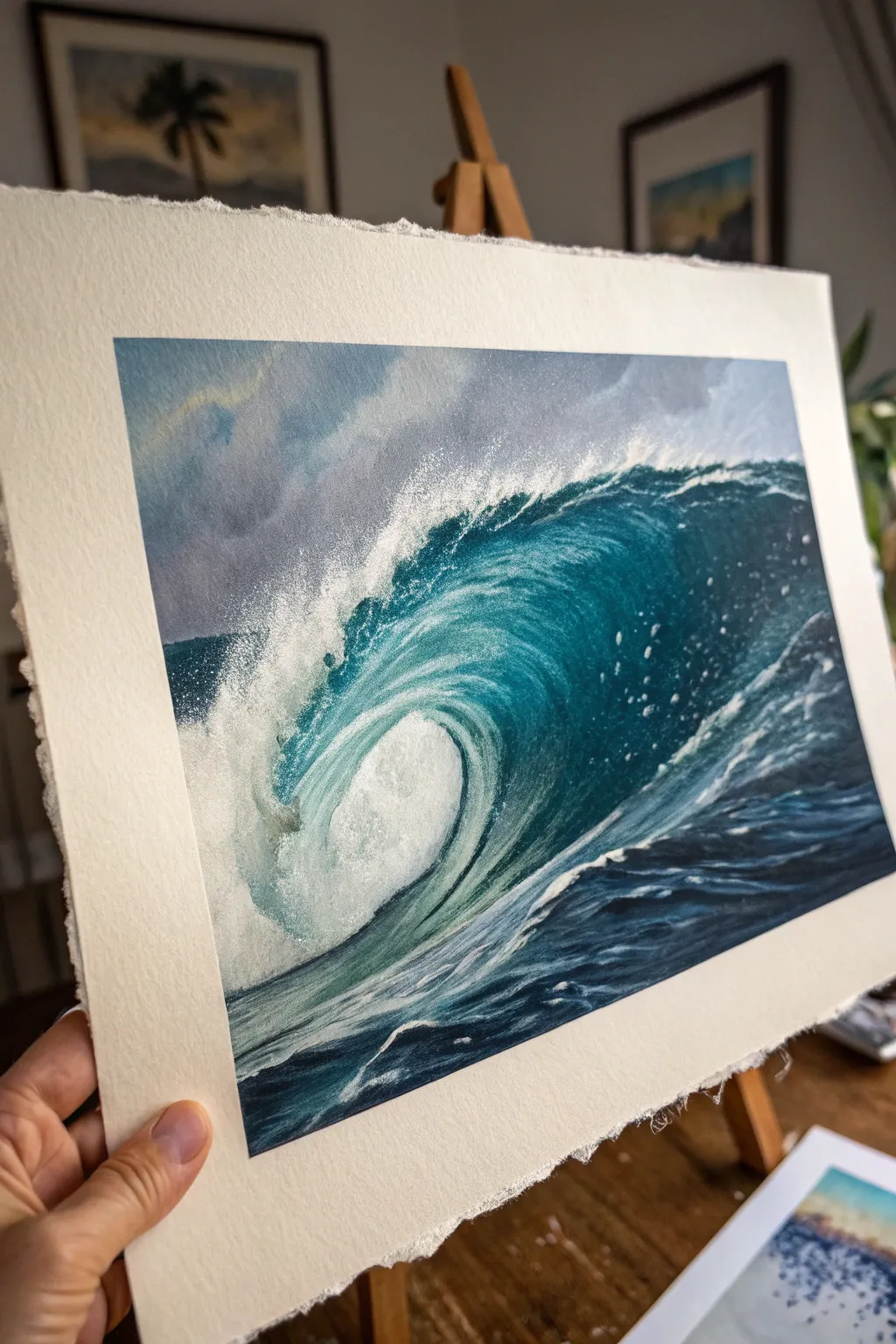
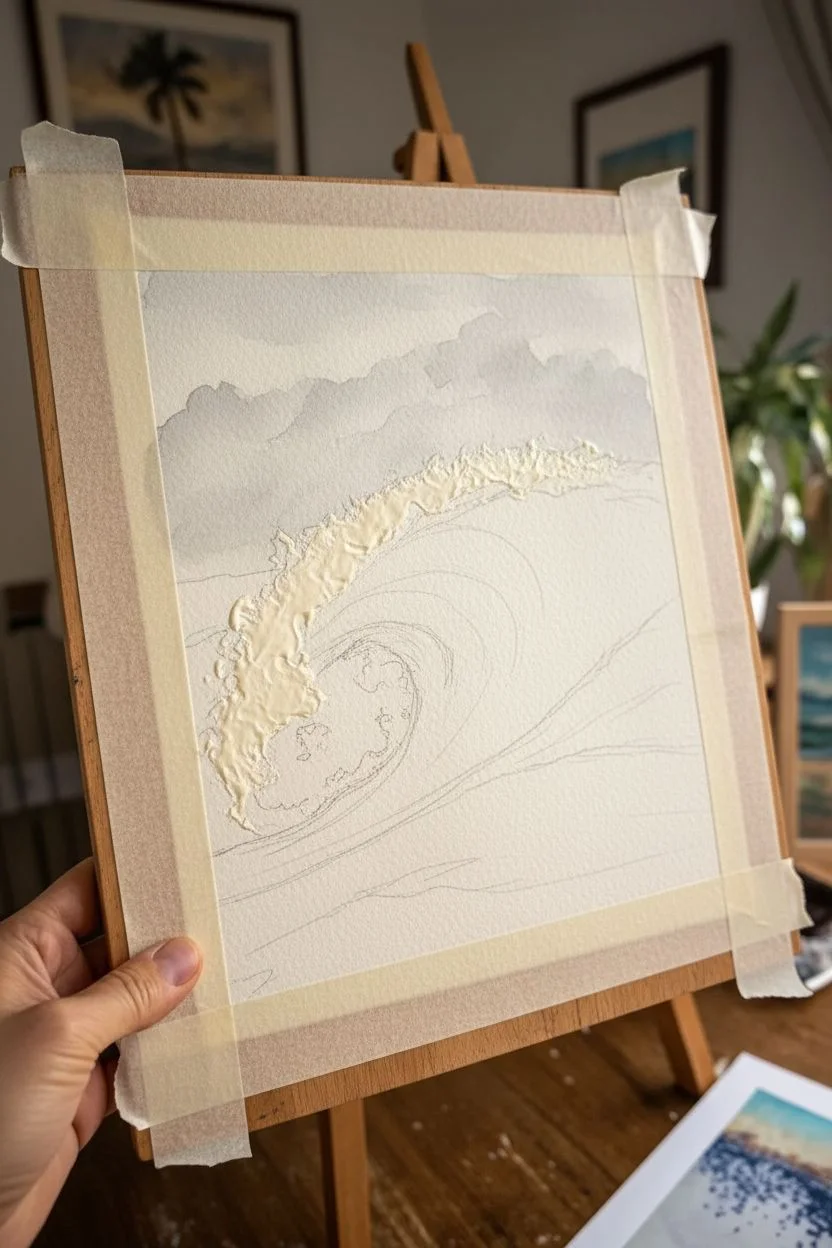
Capture the raw energy and translucency of the ocean with this focused study of a breaking wave. By mastering wet-on-wet blending and careful masking, you will create a stunning piece featuring deep teal depths and crashing white foam.
Step-by-Step Tutorial
Materials
- Cold-pressed watercolor paper (300 gsm or heavier, rough grain preferred)
- Masking fluid (drawing gum) and an old brush
- Watercolor paints: Phthalo Blue, Prussian Blue, Viridian Green, Indigo, Payne’s Grey, Burnt Sienna
- Flat wash brush (1 inch)
- Round brushes (sizes 4, 8, and 12)
- White gouache or white gel pen (for finishing touches)
- Two jars of water
- Paper towels
- Board and masking tape
Step 1: Preparation and Sky
-
Secure the paper:
Tape your watercolor paper down firmly to a board. For this project, leave a wide margin to frame the painting like a Polaroid, or use paper with deckled edges for a classic look. -
Sketch the wave:
Lightly sketch the outline of the wave using a hard pencil (H or HB). Focus on the curve of the barrel and the lip where the water breaks. Don’t press too hard; you want the lines to disappear later. -
Preserve the whites:
Using an old brush or silicone tool, apply masking fluid to the areas that will be the brightest white foam—the top crest of the wave and the chaotic splash zone at the base. Let this dry completely. -
Wet the sky area:
With a large clean brush, wet the paper only in the sky section above the wave. It should be glistening but not forming puddles. -
Paint the stormy atmosphere:
Mix a diluted wash of Payne’s Grey with a tiny touch of Burnt Sienna to warm it up. Drop this into the wet sky, letting the colors bloom softly to create clouds. Keep the value relatively light as the wave needs to be the focal point.
Step 2: Building the Wave
-
Base layer of the barrel:
While the sky dries, mix a light wash of Viridian Green and Phthalo Blue. Paint the interior curve of the wave (the ‘eye’), leaving it very pale near the center where the light shines through the thinnest water. -
Deepening the blues:
While the first layer is still damp, charge in a stronger mix of Phthalo Blue and Prussian Blue towards the top of the curve. Tilt your board slightly to help the paint flow downward, following the natural curve of the water. -
Defining the shadow line:
Under the lip of the wave where it curls over, paint a strong, dark line using Indigo mixed with Prussian Blue. Clear water can be used to soften the bottom edge of this line so it blends into the lighter barrel color. -
Painting the foreground water:
For the flat water in the foreground, use horizontal strokes of Indigo and Phthalo Blue. Leave small slivers of dry white paper showing between strokes to suggest ripples and movement on the surface. -
Strengthening the contrast:
Once the previous layers are dry, go back into the darkest part of the barrel with your darkest Indigo mix. High contrast is what makes the water look wet and glassy.
Don’t Overwork It
If the water starts looking muddy instead of translucent, stop. Let that layer dry 100% before adding more paint. Waiting prevents the dreaded ‘cauliflower’ blooms.
Step 3: Texture and Foam
-
Remove the mask:
Ensure the paper is bone dry. Gently rub away the masking fluid with your finger or a rubber cement pickup to reveal the stark white paper underneath. -
Soften the foam edges:
The masked edges will be very sharp. Use a damp, stiff brush to gently scrub and soften the bottom edges of the white foam areas so they mist into the wave face. -
Shadowing the foam:
Mix a very watery pale grey-blue. Paint the underside of the crashing foam clusters to give them volume and 3D form, rather than leaving them flat white. -
Dry brush texture:
Load a round brush with thick, barely damp white gouache. Drag it lightly over the blue face of the wave to create the effect of sea spray and spindrift catching the wind. -
Splatter details:
Cover the main blue part of the wave with a scrap of paper. Load a stiff brush with white gouache and flick the bristles to create a fine mist of spray over the top crest and the crash zone. -
Final highlights:
Use a white gel pen or a fine brush with gouache to add the sharpest, tiniest highlights on the foreground ripples and the very edge of the curling lip.
Add a Human Element
To show the massive scale of the wave, paint a tiny silhouette of a surfer paddling over the shoulder or riding inside the barrel using pure Indigo.
Peel off your tape carefully to reveal those crisp edges and enjoy the refreshing view of your finished seascape
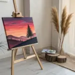
Color-Layered Abstract Ocean Bands
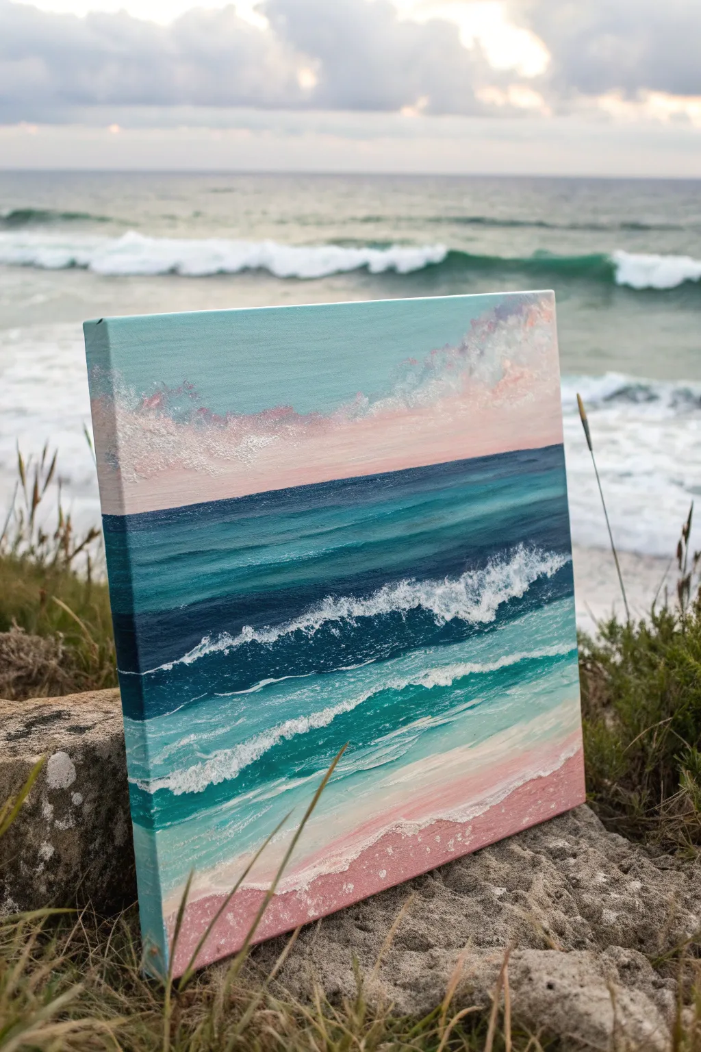
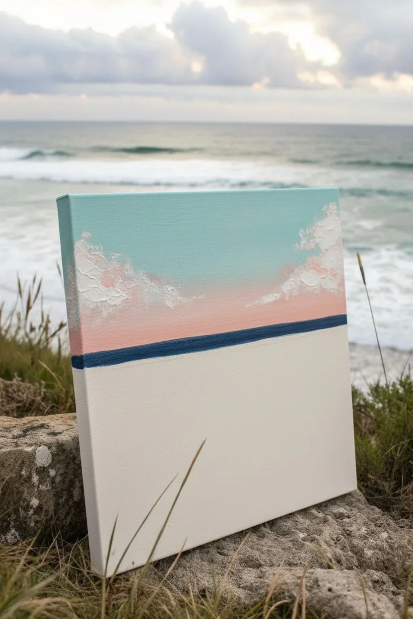
Capture the serene beauty of a pastel sunset meeting the sea in this layered acrylic painting. Distinct bands of color create a sense of depth, moving from a soft pink shoreline to deep teal waters and a fluffy, cloud-filled sky.
Step-by-Step
Materials
- Square stretched canvas (e.g., 12×12 inches)
- Acrylic paints (Titanium White, Phthalo Blue, Turquoise, Payne’s Grey, Alizarin Crimson, Unbleached Titanium)
- Flat synthetic brushes (large 1-inch, medium 1/2-inch)
- Small round detail brush
- Palette knife
- Palette likely paper or plastic for mixing
- Cup of water and paper towels
- Texture medium or modeling paste (optional)
Step 1: Sky and Horizon
-
Prime the sky:
Begin by mixing Titanium White with a tiny touch of Turquoise to create a very pale, cool blue. Apply this using your large flat brush to the top third of the canvas, brushing horizontally. -
Add warmth:
While the sky is still slightly damp, mix White with a dot of Alizarin Crimson and Unbleached Titanium to make a soft peachy-pink. Blend this into the lower part of the sky area, creating a gradient that warms up as it approaches the horizon line. -
Texture the clouds:
Mix a thicker batch of white and light pink paint. Using the tip of a smaller brush or a palette knife, dab irregular, fluffy shapes into the upper right and left corners to suggest soft, drifting clouds. Leave texture visible here. -
Establish the horizon:
Using masking tape can help here if you have an unsteady hand, or just use the edge of a flat brush. Mix Phthalo Blue with a little Payne’s Grey for a deep, dark ocean line. Paint a straight horizontal line across the canvas just below your pink sky.
Use Heavy Body Paint
For the white foam, use heavy body acrylics or mix in a gel medium. The physical bumps of paint catch the light, making the waves look real.
Step 2: Deep Waters
-
Paint the deep sea band:
Below the dark horizon line, switch to a pure Turquoise mixed with a little Phthalo Blue. Paint a horizontal band about two inches wide. Use long, smooth strokes to distinguish the calm, deep water from the turbulent waves coming later. -
Transition lighter:
Mix Titanium White into your Turquoise to lighten it significantly. Paint the next band down, overlapping the darker blue slightly. I like to use a clean, dry brush to feather the seam where these two colors meet for a softer transition. -
Create the first wave break:
Load a medium flat brush with dark Payne’s Grey and Phthalo Blue. Paint a jagged, uneven band below your lighter turquoise section. This dark underlayer will serve as the shadow for the main crashing wave.
Step 3: Shallows and Shore
-
Paint the translucent shallows:
Mix a bright, minty teal using Turquoise and plenty of White. Apply this below the dark wave shadow, sweeping the brush in curved strokes that mimic the water pulling toward the beach. -
Create the sandy beach:
For the sand, mix White, Alizarin Crimson, and a touch of Unbleached Titanium to create a dusty rose color. Paint the bottom section of the canvas, curving the top edge to look like a shoreline. -
Build the foam texture:
This step brings the painting to life. Load a small round brush or a palette knife with pure Titanium White (mixed with modeling paste if you have it). Tap the paint aggressively over the boundary between the deep dark blue and the minty shallows to create the crashing wave foam. -
Add seafoam trails:
Rinse your brush and use watered-down white paint. Drag thin, broken lines horizontally through the minty shallow water area to look like residual foam floating on the surface. -
Detail the shoreline:
Apply a thick, textured line of white where the water meets the pink sand. Use a stippling motion (rapid tapping) to create the bubbly look of sea foam washing up on the beach. -
Refine the sand:
Add a few streaks of lighter pink and white into the sand area to show wetness and reflection. Ensure the bottom corners are fully covered. -
Paint the edges:
Don’t forget the sides of your canvas! Wrap the corresponding colors (sky blue, deep blue, pink sand) around the edges of the frame for a finished, professional look without needing a frame.
Muddy colors?
If your turquoise and pink mix into a dull grey, let the layers dry completely between steps. Wet-on-wet blending is risky with complementary colors.
Let the final white highlights dry completely and enjoy your peaceful, rose-tinted seascape.
Minimalist Two-Tone Horizon
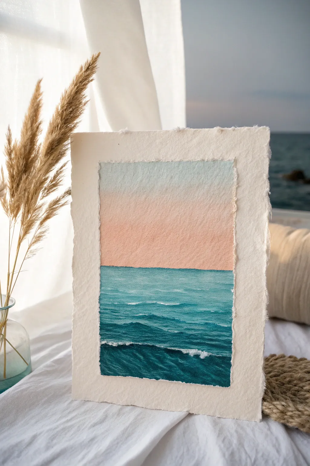
Capture the serene beauty of a quiet ocean horizon with this minimalist watercolor project on textured paper. The soft gradient sky meets deep, rolling waves to create a calming piece that looks beautiful displayed simply on a shelf or desk.
Detailed Instructions
Materials
- Cold press watercolor paper (300 gsm or heavier)
- Watercolor paints (Cerulean Blue, Peach or Naples Yellow, Phthalo Blue, Payne’s Gray, White Gouache)
- Ruler and tearing tool (or metal ruler)
- Artist masking tape
- Flat wash brush (3/4 inch)
- Round brushes (sizes 4 and 8)
- Small detail brush (size 0 or 1)
- Jar of clean water
- Paper towels
- Mixing palette
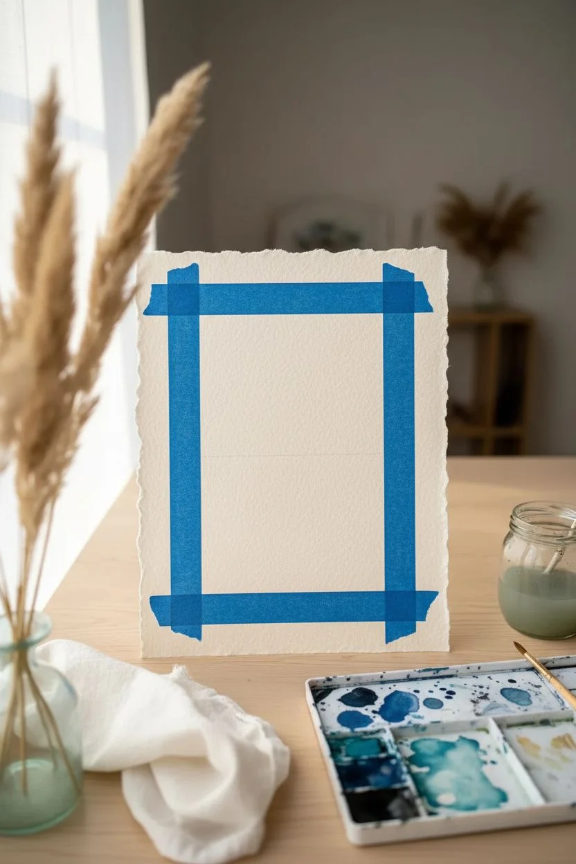
Step 1: Preparing the Surface
-
Create the rough edge:
Begin by tearing your watercolor paper to size rather than cutting it. Place a heavy ruler firmly against the paper and pull the edge upward and toward the ruler to create a distinct, feathery ‘deckled’ edge. -
Mask the border:
Tape your paper down to a board, but leave a wide margin of about 1.5 to 2 inches between the tape and the actual edge of the paper. This generous border frames the painting within the deckled edges. -
Define the horizon:
Use a ruler to lightly draw a straight horizon line just slightly below the center of the taped-off area. Keep this line very faint so it doesn’t show through the final paint layers.
Keep it Clean
When painting the sky gradient, tilt your board slightly so gravity pulls the pigment down. This prevents “cauliflowers” or back-runs where the water pools settles unevenly.
Step 2: Painting the Sky Gradient
-
Pre-wet the sky:
With your flat wash brush and clean water, gently wet the entire sky area above the horizon line. The paper should be glisten but not have puddles. -
Apply the top blue:
Load the brush with a very watery mix of Cerulean Blue. Apply it starting at the top edge, brushing horizontally back and forth. -
Introduce the warmth:
While the blue is still damp, clean your brush and pick up a soft Peach or dilute Naples Yellow. Start painting from the horizon line upward. -
Blend the transition:
Where the pale blue meets the peach, gently run your damp (clean) brush horizontally across the boundary to create a seamless, soft purple-grey transition. -
Let it dry completely:
Allow the sky section to dry fully before moving on. I usually give this at least 15 minutes or use a hairdryer on low heat to ensure the horizon stays crisp.
Add Sparkle
For a magical touch, lightly spatter the dry ocean area with diluted white gouache using a toothbrush to simulate sea spray mist rising from the waves.
Step 3: Creating the Ocean Depth
-
Base ocean layer:
Mix a vibrant teal using Phthalo Blue and a touch of green. Apply this color evenly from the horizon line down to the bottom tape edge. -
Darkening the foreground:
While the base layer is wet, drop in a darker mix of Phthalo Blue and Payne’s Gray into the bottom third of the water to suggest depth and proximity. -
Adding wave structure:
Once the base ocean layer is dry, switch to your size 8 round brush. using the dark blue-gray mix, paint horizontal, slightly wavy lines to represent the shadows of rolling waves. -
Refining wave shapes:
Make the wave shadows thicker and more pronounced at the bottom of the page, and very thin and straight near the horizon to simulate perspective. -
Soften the edges:
Use a damp, clean brush to soften the bottom edge of some of your dark wave lines, leaving the top edge of the line crisp. This makes the wave look like it has volume.
Step 4: Highlights and Finishing
-
Mix the highlights:
Squeeze out a small amount of white Gouache. You want this fairly thick, like heavy cream, so it stands out against the dark water. -
add distant caps:
With your smallest detail brush, tap tiny dots and thin dashes of white along the dark wave lines near the middle section of the water. -
Create crashing foam:
For the nearest large wave at the bottom, use a slightly scumbled (dry brush) technique to drag white paint along the crest, mimicking airy sea foam. -
Final contrast check:
Step back and look at your painting. If the foreground needs more drama, add one final glaze of dark blue to the deep troughs between the white foam. -
Reveal the masterpeice:
Once the paper is bone dry, slowly peel away the masking tape at a low angle to reveal the crisp inner edges contrasting with the torn outer edges.
Place your finished piece in a floating frame to show off those beautiful edges you created
Split-View Above and Below the Surface
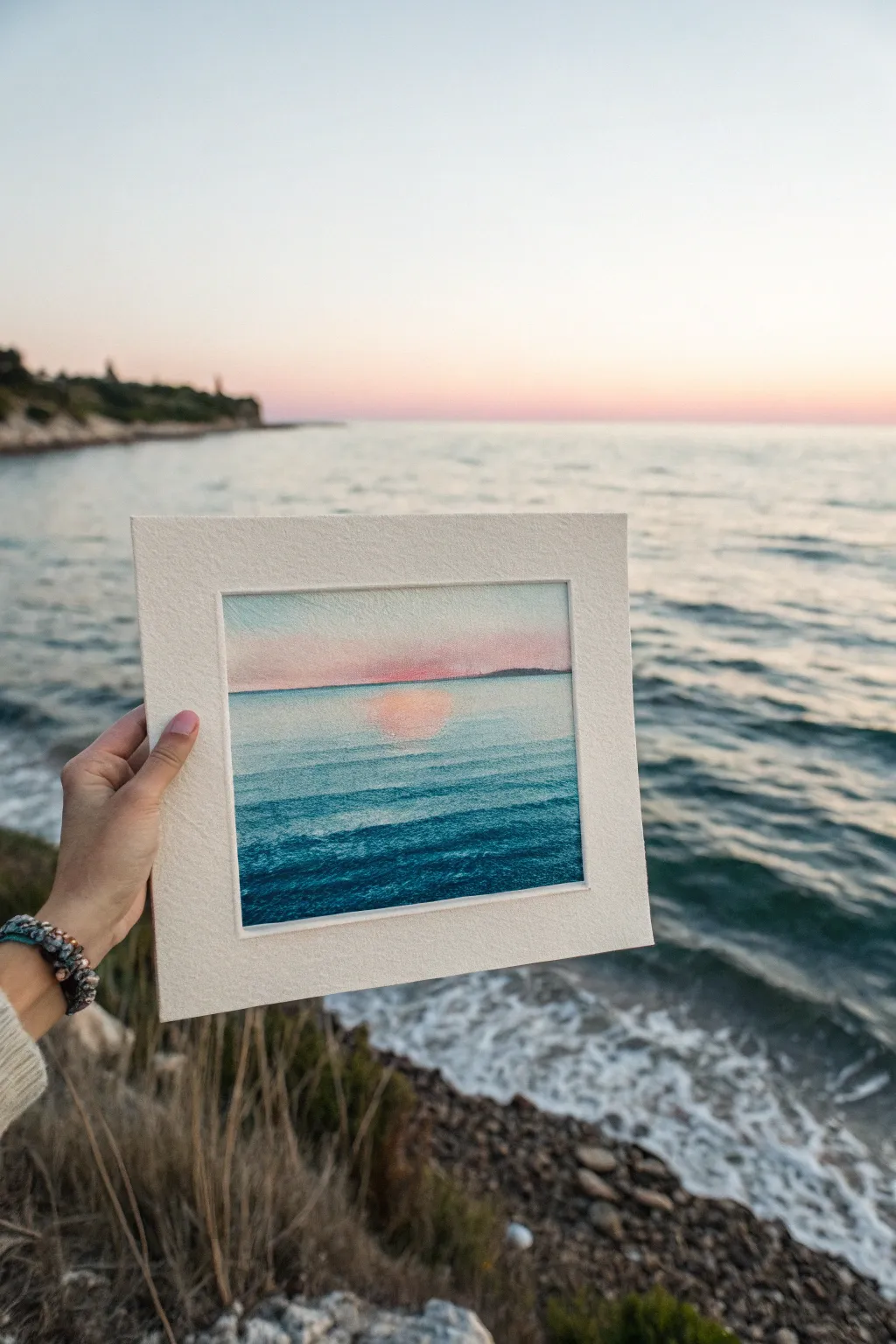
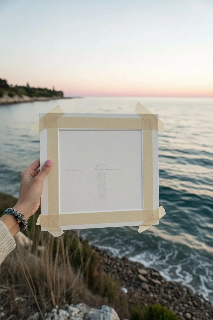
Capture the serene beauty of a coastal twilight with this soft, atmospheric watercolor study. By focusing on the interplay between a pink-hued sky and deep turquoise waves, you will create a small window into a peaceful evening at the beach.
How-To Guide
Materials
- Cold press watercolor paper (300 gsm), cut to a square (approx. 6×6 inches)
- White mat mount with a square opening
- Painter’s tape or washi tape
- Watercolor paints (Alizarin Crimson, Cobalt Blue, Viridian Green, Yellow Ochre, Paynes Grey)
- Round watercolor brushes (size 4 and 8)
- Flat wash brush (1/2 inch)
- Two jars of water
- Paper towels
- Pencil (HB) and kneaded eraser
Step 1: Preparation and Sketching
-
Secure the paper:
Tape your square watercolor paper down to a hard board on all four sides. This prevents buckling and leaves you with a crisp white border later. -
Establish the horizon:
Use a ruler to draw a very light, straight horizon line about one-third of the way down the paper. Keep this line faint so pencil graphite doesn’t muddy your sky colors later. -
Mark the sun:
Lightly sketch a small semi-circle or soft shape right at the horizon line where the sun is setting, and mark a vague vertical column below it where the reflection will sit.
Muddy colors?
If your ocean green looks dull, you may have dragged the brush over damp paint too many times. Let the layers dry fully between washes to keep the turquoise crisp.
Step 2: Painting the Sky
-
Wet-on-wet sky base:
Using your flat brush and clean water, dampen the entire sky area above the horizon line. The paper should glisten but not have standing puddles. -
Apply the glow:
Dilute a tiny amount of Alizarin Crimson to make a pale pink wash. Drop this color into the wet sky, concentrating the pigment just above the horizon line to mimic the sunset’s afterglow. -
Add atmospheric depth:
While still wet, mix a very watery, pale purple-grey using Cobalt Blue and a touch of Alizarin Crimson. Sweep this across the very top of the sky, letting it bleed down naturally into the pink. -
Soften the edges:
Use a clean, damp brush to gently lift any harsh edges or to lighten the area directly around where the sun would be setting. -
Let it dry completely:
Wait for the sky section to be bone dry before moving on to the sea. If you rush this, the ocean horizon will bleed upward into your beautiful pink sky.
Sparkle effect
For extra shimmer on the water, leave tiny horizontal slivers of dry white paper untouched when painting the blue ocean layers. It mimics sunlight hitting wave crests.
Step 3: Creating the Ocean
-
First ocean wash:
Mix a light turquoise using Viridian Green and a lot of water. Paint a horizontal wash starting right at the horizon line and pulling it down to the bottom of the page. -
Reserve the reflection:
As you paint this first wash, carefully lift your brush or paint around the vertical column below the sun, leaving the white of the paper or a very pale tint exposed for the sun’s reflection. -
Add the reflection color:
While the surrounding water is damp, drop a faint wash of your pink sky color into that reserved reflection area so the light on the water matches the sky. -
Layering the waves:
Once the base wash is semi-dry, mix a slightly stronger teal using Viridian Green and Cobalt Blue. Use your size 8 round brush to paint distinct horizontal bands across the water. -
Building depth:
Paint thinner, closer lines near the horizon to suggest distance, and thicker, more spaced-out strokes near the bottom to represent closer waves. -
Deepening the foreground:
Mix Paynes Grey into your teal mixture for a dark, moody blue-green. Apply this primarily to the bottom third of the painting to anchor the scene and create the shadow side of the waves.
Step 4: Defining Details
-
Paint the distant land:
Using a mix of Paynes Grey and purple, paint a tiny, low silhouette of land right on the horizon line. Keep the edges soft so it looks far away. -
Refine the reflection:
Take a damp, stiff brush and gently scrub horizontal lines across the pink reflection column to suggest ripples breaking up the light. -
Add wave texture:
With a nearly dry brush (dry brush technique) and dark blue paint, skim loosely across the very top of the foreground waves to create texture. -
Final assessment:
Step back and see if you need to deepen the blue at the bottom or lift more highlights. I like to add one last very dark glaze to the bottom corners for a vignette effect. -
Remove tape and mount:
Once 100% dry, peel the tape away slowly at a 45-degree angle. Place your finished painting behind the mount to frame your seaside view.
Now you have a tranquil piece of the coast captured forever to enjoy at home
Experimental Texture Seascape With Impasto
Capture the raw power of the ocean with this highly textured impasto painting that makes waves literally leap off the canvas. Using a palette knife and heavy body acrylics, you’ll sculpt swirling crests and deep troughs to create a dynamic, tactile seascape.
Detailed Instructions
Materials
- Stretched canvas (12×16 or similar)
- Heavy body acrylic paints (Phthalo Blue, Ultramarine, Teal/Turquoise, Titanium White, Paynes Grey, Hint of Magenta)
- Modeling paste or thick gel medium
- Set of palette knives (including a large trowel shape and a thin detail knife)
- Large flat brush (for underpainting)
- Mixing palette
- Rags or paper towels
Step 1: Setting the Foundation
-
Rough Horizon Line:
Begin by marking a horizon line slightly above the center of the canvas using a diluted mix of Phthalo Blue and white. It doesn’t need to be perfectly straight, as waves will interrupt it. -
Color Blocking the Sky:
Mix a light, icy blue using Titanium White and a dot of Teal. Apply this to the upper section with a large flat brush, keeping the strokes messy and multidirectional to suggest wind. -
Blocking the Ocean:
Fill the lower section with your mid-tone blues. Use Teal for the middle area where the light hits the water and deepen it with Ultramarine and Paynes Grey towards the bottom corners. -
Introducing Texture:
While the underlayer is still tacky, mix modeling paste with Titanium White. Use a palette knife to scrape rough, diagonal patches across the sky to create cloud structures. -
Subtle Sky Warmth:
While the sky texture is wet, mix a tiny amount of Magenta with white. lightly smudge this into a few cloud areas to suggest reflected dawn or dusk light.
Muddy Colors?
If your white foam is turning blue, the underlying layer is too wet. Let the blue wave structure dry for 20 minutes before applying the white highlights on top.
Step 2: Sculpting the Waves
-
Mixing the Deep Water:
Prepare a thick mixture of heavy body Phthalo Blue and Paynes Grey. I like to add a little gel medium here to maintain the peaks created by the knife. -
Establishing the Wave Shape:
Using a large palette knife, load the dark mixture and carve out the main curve of the crashing wave. Start from the bottom left and swoop upwards towards the right, pressing firmly to leave ridges of paint. -
The Translucent Curl:
Mix a vibrant Teal with a little white. Apply this to the inner curve of the wave (the ‘barrel’) where the sun would shine through the thinning water. Use a curving motion with the knife to follow the water’s flow. -
Background Swells:
Using a smaller knife and a mid-tone blue, create horizontal, choppy strokes near the horizon line to represent distant, rolling swells. -
Initial Foam Layer:
Load the edge of your knife with pure Titanium White. Gently graze the canvas along the top of your wave shape. Don’t press hard; let the texture of the canvas and previous paint layers verify where the paint deposits.
Step 3: Refining the Details
-
Deepening Shadows:
Go back in with your darkest blue-black mix (Paynes Grey + Blue). Reinforce the shadowed trough at the very bottom of the wave to increase contrast against the bright foam. -
Crashing Foam:
Mix white with a touch of modeling paste for extra height. Apply generous dollops where the wave is breaking, using a stippling motion with the knife tip to mimic splashing water. -
Sea Spray:
Using an old bristle brush or a dry brush technique, flick or scumble tiny amounts of white mist above the crest of the wave into the sky area. -
Veining:
Use the thin edge of your smallest palette knife with thinned white paint to draw delicate, spider-web lines of foam dragging up the face of the teal wave. -
Final Highlights:
Assess the painting from a distance. Add pure, thick white highlights to the absolute highest points of the foam and the clouds to make them pop.
Knife Control
Clean your palette knife between every single color change. Dried acrylic builds up fast on the metal blade and will ruin your ability to get clean, sharp edges.
Step back and admire how the light catches the ridges of your textured ocean scene

Have a question or want to share your own experience? I'd love to hear from you in the comments below!