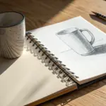
If you’ve ever stared at a sketch and thought, “Why does this feel flat?”, shading is the little switch that turns on depth. Here are my favorite shading drawing ideas to help you practice value, edges, and texture in a way that actually feels doable.
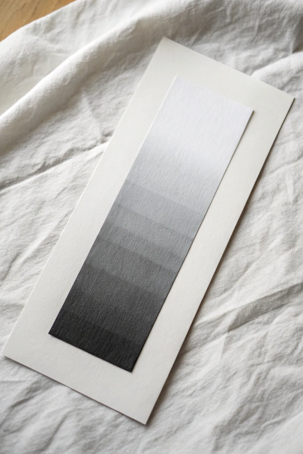
Value Scale Ladder
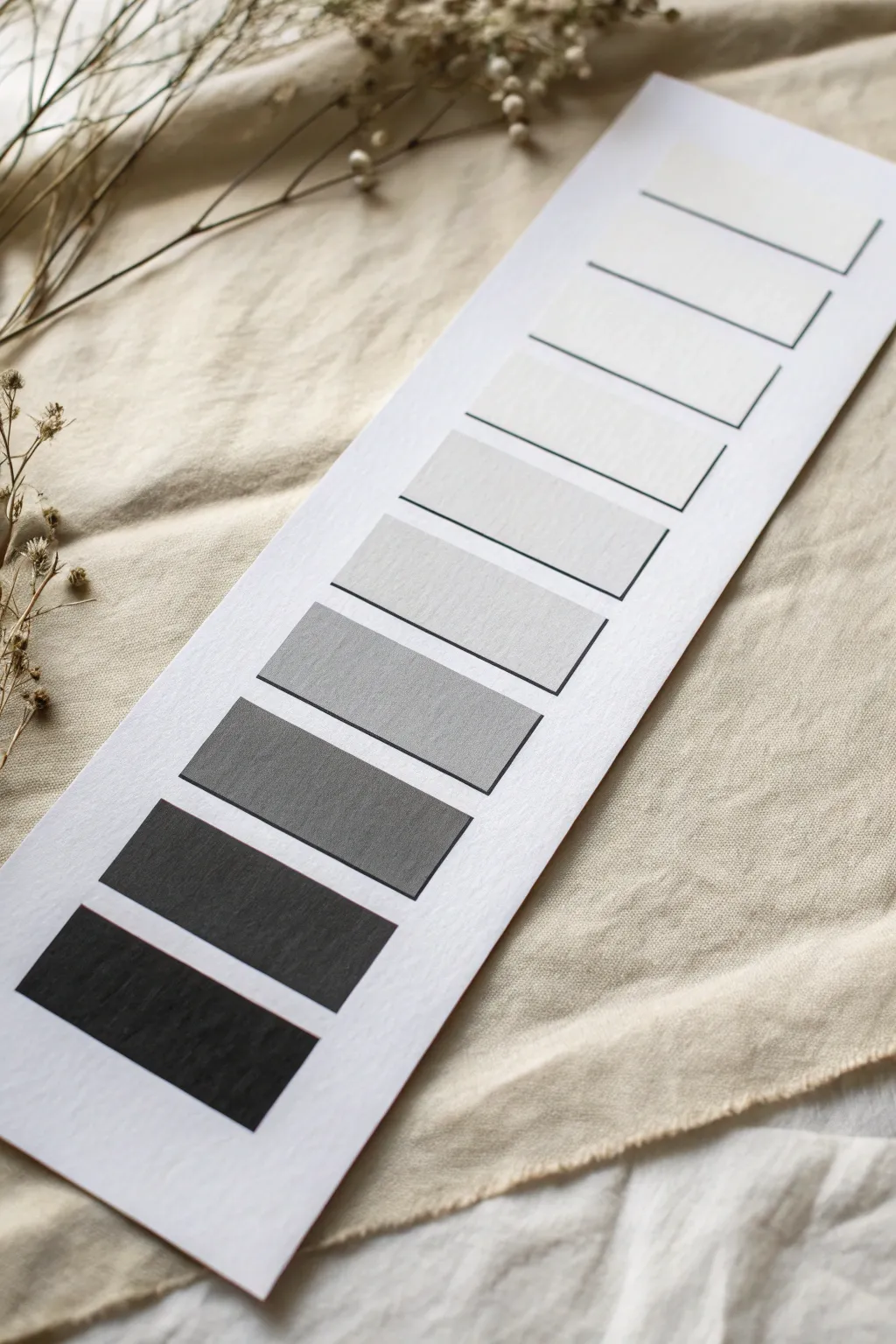
This elegant value scale ladder is a fundamental exercise for artists, breaking down the spectrum from white to black into distinct, digestible steps. By creating this clean, structured chart, you will sharpen your eye for tonal shifts and gain control over your shading materials.
Step-by-Step
Materials
- Heavyweight drawing paper or cold-press watercolor paper
- Ruler
- HB or 2B Graphite pencil (for layout)
- Graphite pencils (4H to 8B range) OR Black gouache/ink and water
- Mixing palette (if using paint)
- Flat shader brush (size 6 or 8) (if using paint)
- Masking tape or Artist’s tape
- Fine-liner pen (optional, for outlines)
- Eraser
Step 1: Preparation & Layout
-
Paper Selection:
Choose a sturdy strip of paper. I prefer using a strip about 4 inches wide and 12 inches long, cut from a larger sheet of Bristol or watercolor paper to prevent buckling. -
Marking the Center:
Using your ruler and a light pencil, draw a faint vertical line down the center of your paper strip to guide the placement of your boxes. -
Measuring the Ladder:
Decide on nine distinct steps. Mark out nine equal rectangles, roughly 2 inches wide by 1 inch tall. Leave a small gap (about 1/8th inch) between each rectangle to keep the values distinct. -
Drawing the Grid:
Lightly draw the outlines of your nine rectangles. Keep your pencil pressure very minimal here; you don’t want deep grooves or dark lines that will show through the lighter values later. -
Cleaning Edges:
Optionally, apply strips of artist’s tape along the vertical sides of your column of boxes. This ensures perfectly crisp edges when you start shading or painting.
Step 2: Applying Values
-
Identify the Extremes:
Start by identifying your lightest and darkest points. The top box will remain the pure white of the paper. The bottom box will be your absolute darkest black. -
The Darkest Value:
Fill in the bottom-most rectangle first. If using pencil, use your softest lead (6B or 8B) and layer heavily. If using paint, apply pure black directly from the tube. -
The Middle Value:
Locate the middle rectangle (the 5th one down). This needs to be a perfect 50% gray. Mix black and white paint, or use a medium HB pencil, aiming for a tone that feels exactly halfway between your white top and black bottom. -
Filling the Upper Range:
Move to the rectangle just below the glossy white top. This should be a barely-there whisper of gray. Use a hard lead (4H) or highly diluted watery gray paint. -
Gradating Downward:
Fill the next two boxes between the lightest whisper and your middle gray. Each step should be visibly darker than the one above it but lighter than the middle tone. -
Filling the Lower Range:
Now address the boxes between the middle gray and the bottom black. These are your dark grays. Increase the pencil pressure or the ratio of black paint significantly for these steps. -
Refining the Steps:
Step back and squint your eyes at the ladder. Look for any jumps that seem too sudden or two neighbors that look too similar. -
Adjusting Tones:
If two steps look identical, darken the lower one slightly. If a jump is too big, try to lighten the darker block with a kneaded eraser or by lifting paint with a damp clean brush. -
Crisping the Edges:
Once the values are set and dry, peel away the masking tape carefully. If you didn’t use tape, use a ruler and a very fine pen or sharp pencil to re-line the edges for a sharp, graphic look. -
Final Clean Up:
Erase any stray layout lines or smudges on the white paper surrounding the ladder. The contrast of the clean white border is crucial for the scale to read correctly.
Uneven Steps?
If a value looks patchy, don’t press harder. Instead, apply multiple light, cross-hatched layers (pencil) or thin washes (paint) to build density slowly without damaging the paper tooth.
Go Digital
Take a photo of your finished scale and turn it black & white on your phone. If the steps disappear into each other, you know exactly which values need more contrast.
Now you have a reliable reference tool to help determine accurate lighting in your future drawings
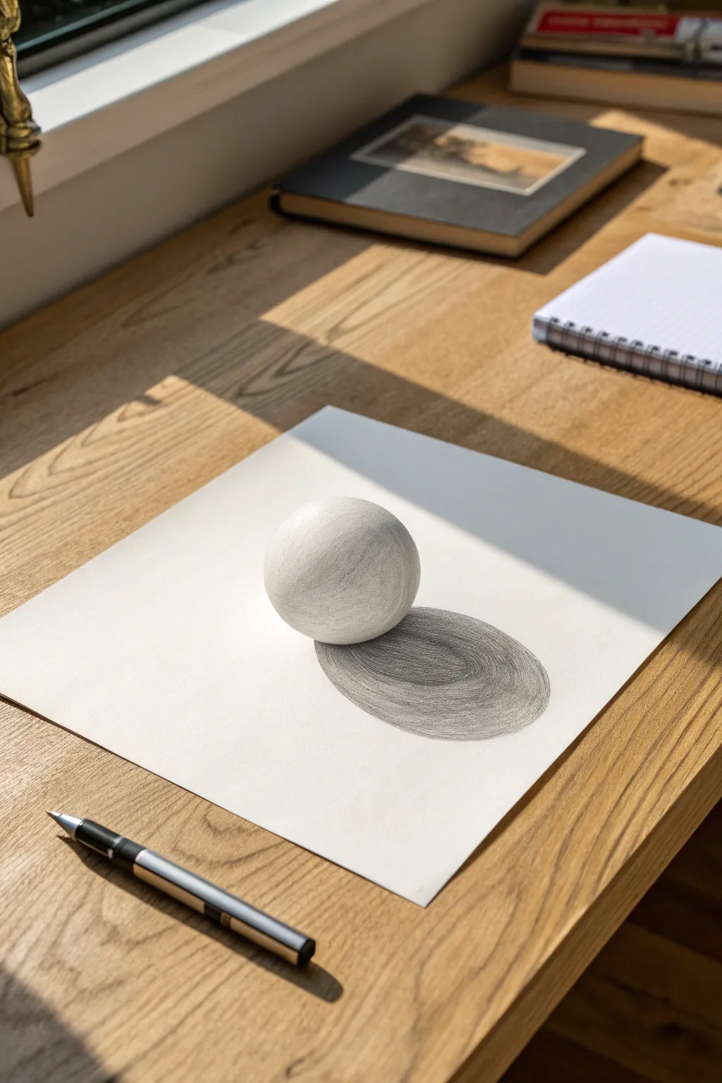
Classic Shaded Sphere
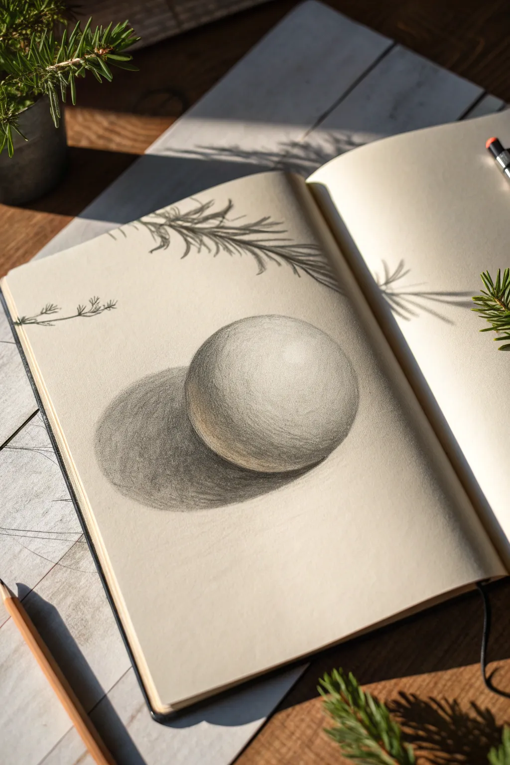
This fundamental lesson in shading transforms a simple circle into a convincing three-dimensional form using just graphite and pressure control. The result is a soft, beautifully rendered sphere that demonstrates how light interacts with round objects.
Detailed Instructions
Materials
- High-quality sketchbook or drawing paper
- HB graphite pencil (for initial sketching)
- 2B and 4B graphite pencils (for shading)
- Kneaded eraser
- Pencil sharpener
Step 1: Laying the Groundwork
-
Establish the outline:
Begin by lightly drawing a perfect circle in the center of your page using your HB pencil. Keep your wrist loose and don’t press hard; these lines should be barely visible guides. -
Determine the light source:
Decide where your light is coming from—in this example, it’s hitting from the top right. Lightly mark a small oval area on the upper right side of your sphere to reserve as the highlight. -
Map the cast shadow:
Draw an elongated oval shape extending from the bottom left of the sphere. This oval will become the cast shadow, anchoring the object to the surface so it doesn’t look like it’s floating.
Control Your Pressure
Don’t smudge with your finger to blend; it pushes oils into the paper. Instead, overlap layers of pencil using circular strokes—building up layers creates a smoother gradient.
Step 2: Building the Form
-
Start the core shadow:
Switch to your 2B pencil. Begin shading the side of the sphere opposite the light source (bottom left). Avoid shading all the way to the very edge—leave a thin rim of white space for reflected light. -
Identify the terminator:
Darken the area where light transitions into shadow. This strip, called the ‘core shadow’ or ‘terminator line’, should curve along the form of the sphere, roughly following the shape’s contour. -
Establish the darkest point:
Using a 4B pencil, go into the cast shadow right underneath the sphere. This area, where the object touches the ground (the occlusion shadow), must be the absolute darkest part of your drawing. -
Fill the cast shadow:
Shade the rest of the cast shadow oval. Make it darker closer to the object and let it gradually fade and soften as it moves further away to the left. -
Blend the mid-tones:
Return to the sphere body. Use light, circular pencil strokes to bridge the gap between your dark core shadow and the lighter top area. I find that holding the pencil further back helps keep the pressure gentle.
Texture Study
Once comfortable with the smooth sphere, try rendering different textures using the same lighting setup. Stipple with dots for an orange peel look, or use sharp, jagged lines for a rock.
Step 3: Refining and Polishing
-
Smooth the transitions:
Layer more graphite over your mid-tones to eliminate scratchy lines. You want a seamless gradient from the dark shadow side up toward the bright highlight area. -
Pop the highlight:
Ensure the reserved highlight area remains pure white paper. If you accidentally smudged it, use your kneaded eraser to tap it back to clean white. -
Enhance reflected light:
Check that thin rim of light on the shadow side you left earlier. If it’s too bright, lightly glaze over it with an HB pencil so it’s darker than the highlight but lighter than the core shadow. -
Darken the background edge:
To make the lit side of the sphere pop, you can very lightly shade the background specifically around the bright edge, creating contrast without outlining. -
Add texture details:
For a subtle realistic touch, use the side of your pencil lead to create extremely faint surface texture across the mid-tones, mimicking the grain of smooth stone or eggshell. -
Clean up edges:
Use your kneaded eraser to lift away any graphite dust or smudges outside the main drawing area, keeping the surrounding paper pristine. -
Optional accent:
If you wish to match the reference completely, lightly sketch delicate pine sprigs near the top border using quick, flicking strokes with your HB pencil.
You have now successfully captured volume and weight on a flat piece of paper

Cube Planes and Angles
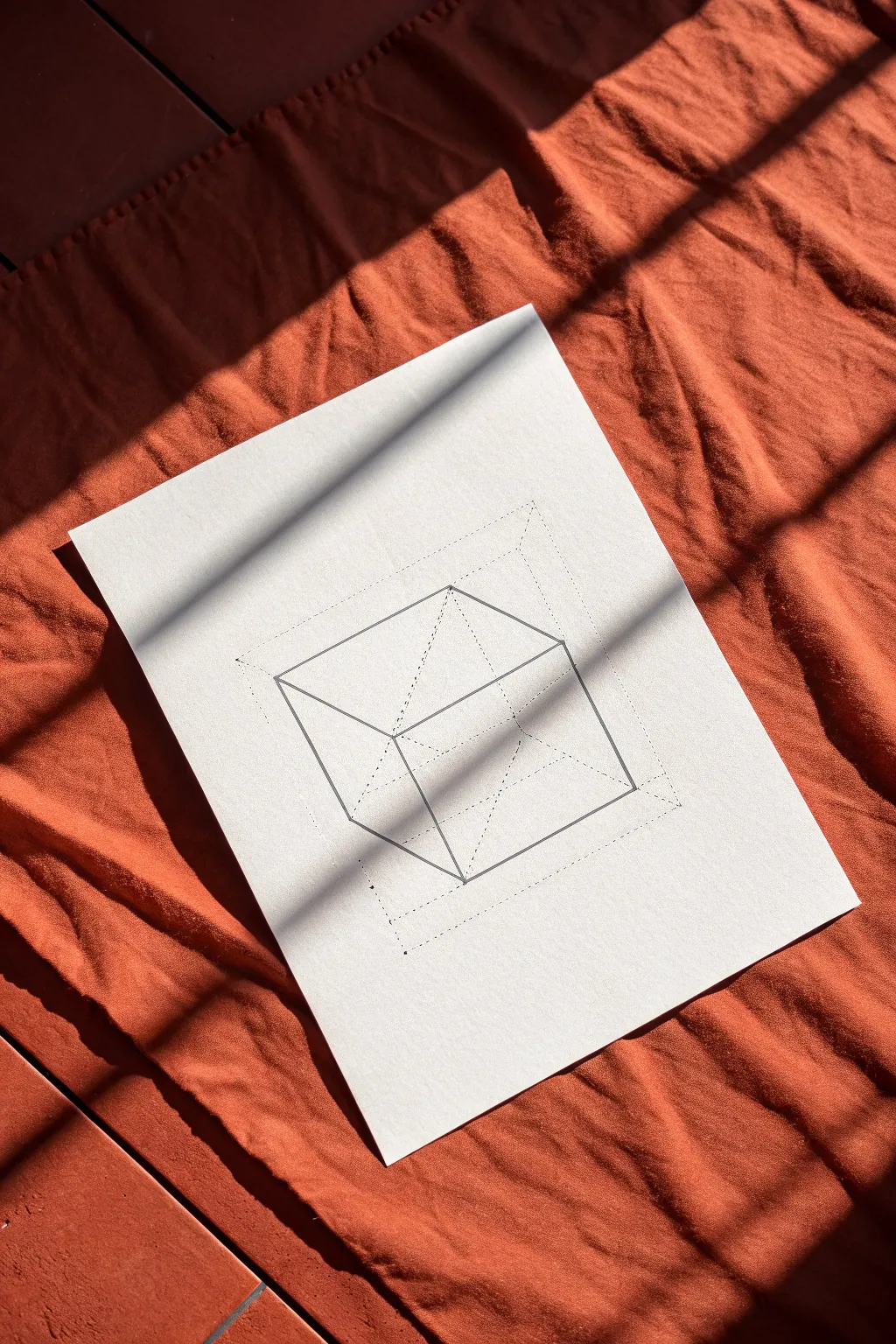
This technical drawing exercise focuses on understanding spatial relationships through transparency and structure. The result is a clean, geometric line art piece that reveals the hidden ‘skeleton’ of a three-dimensional form.
Step-by-Step Tutorial
Materials
- High-quality white drawing paper (heavyweight sketching or Bristol paper)
- Hard graphite pencil (2H or 4H) for construction lines
- Softer graphite pencil (HB or B) or fine liner pen for final lines
- Clear ruler (12-inch or longer)
- Kneaded eraser
- Protractor or triangle ruler (optional, for precise angles)
Step 1: Establishing the Foundation
-
Prepare your workspace:
Tape your paper down to a flat surface using masking tape or drafting dots to prevent it from shifting while you measure and draw. -
Mark the outer boundary:
Using your 2H pencil and ruler, lightly draw a large square or rectangle that will serve as the outer boundary for your perspective grid. Keep these lines very faint as they act merely as a guide. -
Define the inner boundary:
Measure inward from your outer boundary about one inch on all sides and lightly mark points to create a smaller, inner rectangle. Connect these points with dotted lines. -
Connect the corners:
Draw diagonal dotted lines connecting the corners of the inner rectangle to the corresponding corners of the outer boundary. This helps establish the depth field for your central shape.
Step 2: Constructing the Cube
-
locate the front face:
Visualize where the front face of your cube will sit. Draw a square skewed in perspective—a rhombus shape—slightly off-center within your guide box, using light solid lines. -
Project the receding lines:
From each of the three visible corners of your front face, draw lines extending backward towards a vanishing point. Since this is an abstract study, you can follow the angles suggested by your outer boundary guide. -
Establish the back face:
Draw lines parallel to your front face’s edges to close off the shape, creating the back plane of the cube. Make sure these lines intersect correctly with your receding lines. -
Check the internal geometry:
Lightly sketch the ‘hidden’ lines of the cube—the edges that would be blocked from view if the object were solid. This transparency is key to the study.
Wobbly Lines?
If your ruler slips, don’t erase immediately. Wait until you are inking, then correct the line slightly with the pen. The wobbly pencil mark can be erased later.
Step 3: Refining and Inking
-
Reinforce the primary edges:
Switch to your darker pencil (HB) or a fine liner. Go over the outer edges of the main cube shape with a confident, solid line. -
Define the internal structure:
Trace the internal ‘hidden’ lines of the cube. You can choose to make these solid (like a wireframe) or keep them slightly thinner than the outer contour for visual hierarchy. -
Add construction details:
Using a dotted or dashed line style, ink the initial construction box you drew in the first phase. This adds a technical, architectural feel to the drawing. -
Draw the connecting vertices:
Add dotted lines connecting the vertices of your central cube to the corners of the outer construction box. This visually anchors the object in space. -
Clean up stray marks:
Once your ink or dark graphite is perfectly stable, use a kneaded eraser to gently lift away any unwanted smudge marks or initial guide lines that shouldn’t be visible. -
Final assessment:
Step back and check your line weights. I usually like to darken the lines closest to the viewer just a tiny bit more to emphasize depth.
Line Weight Magic
Use a thicker pen (0.5mm) for the outer cube create and a thinner pen (0.1mm) for the dotted construction lines. This creates instant visual depth.
Now you have a precise geometric study that captures the elegance of pure form

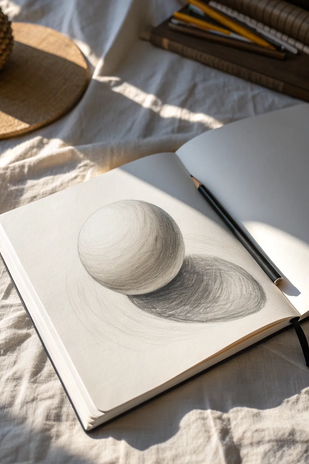
Two-Value Shadow Map Study
Master the art of trompe-l’œil with this study of a simple sphere that appears to pop right off the page. By carefully observing light and creating a precise two-value shadow map, you will create a convincing three-dimensional illusion.
Step-by-Step Tutorial
Materials
- High-quality drawing paper (smooth bristol or similar)
- Graphite pencils (H, HB, 2B, 4B)
- White plastic eraser
- Kneaded eraser
- Blending stump or tortillon
- Compass or circular object (for tracing)
- Ruler
Step 1: Planning and Outline
-
Prepare your surface:
Begin with a clean sheet of high-quality drawing paper on a flat surface. Ensure your lighting source is consistent, ideally coming from the top left if you are right-handed to avoid smudging your work as you draw. -
Draw the circle:
Using a compass or by lightly tracing a circular object, draw a perfect circle near the center of your page. Keep this outline extremely faint using an H pencil; you want it just visible enough to guide you, but light enough to disappear later. -
Map the cast shadow:
Lightly sketch an elongated oval shape extending from the bottom right of the sphere. This represents the cast shadow. The shape should be slightly wider than the sphere itself and stretch out to the right, mimicking late afternoon light. -
Define the terminator line:
Inside the sphere, lightly sketch a curved line that separates the light side from the shadow side. This is the ‘terminator’ or bedbug line. It should curve along the form of the sphere, leaving the top-left area open for the highlight.
Don’t Outline
Avoid hard outlines on the lit side of the sphere. Let the white of the paper define the edge against the background for a true 3D look.
Step 2: Shading the Sphere
-
Establish the core shadow:
Using a 2B pencil, begin shading the dark side of the terminator line you just drew. This band of shadow—the core shadow—is the darkest part of the form itself. Apply the graphite in soft, circular motions to build up texture. -
Create the mid-tones:
Switch to an HB pencil and gently shade outward from the core shadow toward the light source. I find that lifting the pressure gradually helps create a seamless gradient as you approach the highlighted area. -
Preserve the highlight:
Leave the area at the top left completely white for now. This untouched paper will serve as the specular highlight, the point where the light hits the object most directly. -
Add reflected light:
At the very bottom edge of the sphere, where it meets the shadow, lightening your touch significantly or gently tap with a kneaded eraser. This represents light bouncing off the table back onto the sphere, crucial for the 3D effect. -
Smooth the transitions:
Use a blending stump to gently smudge the graphite on the sphere. follow the curve of the ball with your strokes to reinforce the roundness. Don’t over-blend; a little texture adds realism.
Make it Pop
Cut the top half of the paper away, following the upper curve of the sphere. This trick makes the ball look like it’s rising out of the flat surface.
Step 3: Developing the Cast Shadow
-
Block in the shadow base:
Take a 4B pencil to the cast shadow area on the table surface. The shadow should be darkest right underneath the sphere where the object touches the ground surface. -
Gradient the shadow:
As the shadow extends away from the ball, allow it to become slightly lighter and the edges softer. Close to the ball, the edges should be sharp; further away, they should be more diffuse. -
Layering for depth:
Go back over the darkest part of the shadow (the occlusion shadow) directly under the sphere. Press firmly to get a rich, deep black. This high contrast anchors the ball to the page. -
Refining the edge:
Check the edge where the sphere meets the cast shadow. This transition shouldn’t be a hard black line but rather a meeting of dark values. Ensure the sphere feels like it is sitting *in* the shadow, not hovering above it.
Step 4: Final Touches
-
Clean up highlights:
Use your kneaded eraser to lift out any graphite that may have strayed into your highlight zone. You can also tap the mid-tones to create subtle texture variations resembling a stone or matte surface. -
Erase guidelines:
Gently erase any visible parts of your initial outline circle, especially on the light side. real objects don’t have outlines; their edges are defined by the contrast against the background. -
Final assessment:
Step back from your drawing. If the sphere looks flat, darken the core shadow. If it looks like it’s floating, darken the contact point on the ground shadow.
With your shading complete, you now have a deceptive 3D object sitting quietly on your 2D page

PENCIL GUIDE
Understanding Pencil Grades from H to B
From first sketch to finished drawing — learn pencil grades, line control, and shading techniques.
Explore the Full Guide
Hatching That Follows Form
Master the art of volume with this deceptively simple sphere study. By curving your hatching lines to follow the shape’s form, you’ll transform a flat circle into a three-dimensional object that seems to pop off the page.
Detailed Instructions
Materials
- Sketchbook with slightly textured paper (medium tooth)
- Graphite pencils (HB for outlines, 2B and 4B for shading)
- Pencil sharpener
- Kneaded eraser
Step 1: Planning the Form
-
Light Outline:
Begin by drawing a perfect circle in the center of your page. Use your HB pencil with very light pressure; this guideline should be barely visible. -
Mark the Highlight:
Visualize a light source coming from the top left. Roughly sketch a small ellipse near the top left quadrant of your sphere to reserve space for the brightest highlight. -
Map the Shadow:
Lightly sketch the shape of the cast shadow extending to the bottom right. It should be an elongated oval that starts directly under the sphere.
Wrist Control
Draw the curves using your whole arm or wrist as a pivot point. This creates smoother, natural arcs compared to using just your fingers.
Step 2: Building Volume with Contour Hatching
-
Initial Curves:
Switch to your 2B pencil. Starting from the shadowed side (bottom right of the sphere), begin drawing curved hatching lines. These lines must follow the imaginary surface of the ball, wrapping around it like lines of longitude on a globe. -
Establishing the Core Shadow:
Identify the ‘terminator’ line where the light stops hitting the form. Focus your hatching here, layering curved strokes to create a darker band that curves across the sphere’s belly. -
Cross-Contouring:
Add a second layer of hatching lines going in a slightly different direction, but still curving with the form. This cross-hatching builds density in the darker areas without losing the sense of roundness. -
Mid-tone Transition:
Use lighter pressure to extend your curved lines toward the highlight. Space the lines slightly further apart as you move into the light to create a soft gray gradient. -
Reflected Light:
Be careful not to darken the very bottom edge of the sphere too much. Leave a sliver of lighter value near the rim to represent light bouncing up from the table surface.
Step 3: The Cast Shadow
-
Base Shadow Tone:
Fill in the cast shadow shape you outlined earlier using broad, consistent strokes. I usually keep these strokes somewhat horizontal to differentiate the flat table surface from the round object. -
Deepening the Core:
Switch to your 4B pencil. Darken the area of the shadow directly underneath the sphere—this ‘occlusion shadow’ should be the darkest value in your entire drawing. -
Softening Edges:
While the shadow is sharpest near the object, let your pencil strokes fade and soften slightly as the shadow stretches further away to the right.
Level Up: Texture Study
Change the texture by altering your stroke length. Short, choppy contour lines can make the sphere look like a fuzzy tennis ball or fruit.
Step 4: Refining and Finishing
-
Textural Touches:
Go back over the sphere with the 2B pencil to smooth out patchy areas, adding more delicate curved lines where needed to bridge the gap between light and dark. -
Highlight Cleanup:
Take your kneaded eraser and gently dab the highlight area to ensure it remains paper-white. You can also clean up the outer edge of the sphere if your shading spilled over. -
Final Contrast Check:
Assess the drawing from a distance. If the sphere looks flat, darken the core shadow band with your 4B pencil to increase the contrast against the reflected light.
Now you have a solid, dimensional sphere that sits convincingly on the page
Super Smooth Gradient Blend
This project is a study in value control and patience, resulting in a striking, minimalist piece of art that looks deceptively simple but requires precision. You will create a seamless transition from deep charcoal black to pristine white, mounted cleanly for a gallery-ready presentation.
Step-by-Step Tutorial
Materials
- High-quality drawing paper (medium tooth/vellum finish)
- Graphite pencils (4H to 8B range) or Charcoal pencils
- Cardstock or mat board for backing (cream or off-white)
- Ruler
- Artist tape or masking tape
- Blending stump (tortillon) or soft tissue
- Kneaded eraser
- X-Acto knife or craft knife
- Self-healing cutting mat
- Double-sided tape or adhesive roller
Step 1: Preparation and Mapping
-
Prepare your workspace:
Clear a flat surface and lay down your cutting mat. Ensure good lighting, preferably daylight or a bright daylight lamp, so you can accurately judge the subtle value shifts. -
Cut the drawing paper:
Using your ruler and X-Acto knife, cut a strip regarding your desired dimensions. For the look in the image, aim for a long, narrow rectangle, roughly 2.5 inches wide by 8 inches tall. -
Secure the paper:
Tape the paper down to your work surface. Since we want a borderless look eventually, you can just tape the very corners or use a small loop of tape underneath to hold it steady without obstructing the edges. -
Map the zones:
Very lightly, using a harder pencil like a 2H, mark horizontal guides every inch or so up the strip. These won’t be hard borders, but rather mental checkpoints to help you pace your transition from dark to light.
Layering Secret
Don’t try to get pitch black in one pass. Build up 3-4 layers of graphite, blending between each. This creates a velvety depth that a single heavy coat can’t achieve.
Step 2: Building the Dark Value
-
Establish the deepest black:
Start at the very bottom using your softest, darkest pencil (6B or 8B). Apply distinct, firm pressure to create a solid band of black, covering the bottom inch completely. -
Begin the transition:
Switch to a slightly harder pencil, like a 4B. Work upwards from your black zone into the next section, overlapping the previous layer slightly to marry the tones. -
First blend:
Take your blending stump or a folded tissue and rub the graphite firmly. Circular motions work best to push the pigment into the paper’s tooth. Notice how the texture softens immediately. -
Layering the mid-tones:
Move up to the middle section with a 2B or HB pencil. Shade horizontally, lightening your hand pressure as you ascend. I find it helpful to squint my eyes here to see the value masses rather than individual pencil strokes.
Step 3: Refining the Transition
-
Approach the light:
Switch to your harder pencils (H or 2H) for the upper third of the gradient. The strokes here should be whisper-light, barely grazing the paper surface. -
Fade to white:
Leave the top inch and a half completely untouched. The goal is for the graphite to disappear seamlessly into the white of the paper before it reaches the top edge. -
Secondary blending:
Use a cleaner part of your blending tool to work on the mid-to-light transition. Be very careful not to drag dark pigment from the bottom up into your pristine white zone. -
Correcting bands:
Identify any ‘stripes’ where the transition looks abrupt. Go back in with the intermediate pencil grade for that area and lightly cross-hatch over the line to break it up. -
Lift highlights:
Take your kneaded eraser and gently dab (don’t rub) any areas in the upper half that became too grey. You want the fade to be incredibly gradual.
Fixing Smudges
If you accidentally smudge the white top section, don’t use a regular eraser which might smear it. Press a clean kneaded eraser straight down to lift the graphite cleanly.
Step 4: Mounting and Finishing
-
Clean edges:
If your edges got smudged during the process, place a ruler over your drawing aligned with the edge and use a clean eraser to scrub away the excess graphite on the table side. -
Prepare backing board:
Cut your cream cardstock or mat board. It should be larger than your drawing strip, leaving a generous margin (about 2 inches) on all sides to frame the gradient. -
Check alignment:
Lay the drawing on the backing board. Use a ruler to ensure it is perfectly centered laterally and visually balanced vertically. -
Final mount:
Apply double-sided tape or adhesive to the back of your drawing. Press it firmly onto the backing board, using a clean piece of scrap paper over the top to protect your gradient from finger oils.
Step back and admire the calming, velvety transition you’ve created with your new gradient skills
BRUSH GUIDE
The Right Brush for Every Stroke
From clean lines to bold texture — master brush choice, stroke control, and essential techniques.
Explore the Full Guide
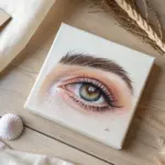
Eye Study With Micro-Shading
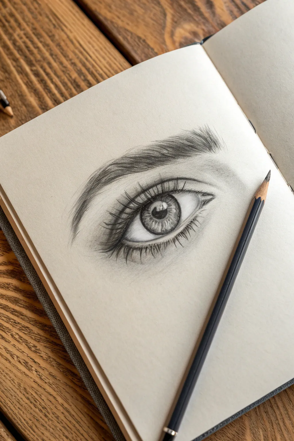
Capture the soul of a subject with this hyper-realistic eye drawing that focuses on depth and texture. By mastering micro-shading techniques, you will learn to build up the intricate details of the iris and the soft, feathery quality of eyelashes.
Step-by-Step
Materials
- Sketchbook or drawing paper (medium tooth)
- Graphite pencils (HB, 2B, 4B, 6B)
- Mechanical pencil (0.5mm)
- Kneaded eraser
- Blending stump or tortillon
- Precision eraser or eraser pen
Step 1: Structural Outline
-
Light Guidelines:
Begin with a very faint HB pencil to sketch the basic almond shape of the eye. Don’t press hard; these lines are just guides. Add a circle in the center for the iris and a smaller circle inside that for the pupil. -
Define the Crease:
Sketch a curved line above the eye shape to mark the upper eyelid crease. Capture the subtle arch of the eyebrow well above the crease, focusing on the general direction of hair growth. -
Highlight Placement:
Before you start any heavy shading, lightly outline a small, irregular shape within the iris (usually overlapping the pupil slightly). This will be your bright reflection or ‘catchlight’—it’s crucial to keep this paper-white.
Keep it Sharp
A distinct iris requires a very sharp point. Constantly rotate your pencil while drawing to maintain a sharp edge, or use fine mechanical leads for the tiniest iris fibers.
Step 2: The Iris and Pupil
-
Darken the Pupil:
Use a 4B or 6B pencil to fill in the pupil. Make this the darkest part of your drawing, pressing firmly to get a deep black, but be careful not to smudge it into the highlight area. -
Iris Spokes:
With a sharp 2B pencil, draw radiating lines from the pupil outward toward the edge of the iris, like spokes on a wheel. Vary the length and pressure to create a natural, organic texture. -
Outer Ring Definition:
Darken the outer edge of the iris (the limbal ring) with a 4B pencil. Shade inward slightly to soften this ring so it doesn’t look like a harsh cartoon outline. -
Mid-tone Shading:
Lightly shade the rest of the iris using an HB pencil. Use a blending stump to smooth out your spoke lines slightly, creating a cloudy, realistic depth within the eye color. -
Adding Contrast:
Go back in with your mechanical pencil to add sharp, dark detailed lines within the iris fibers for extra definition. I find that layering these sharp lines over the blended graphite makes the eye look wet and glassy.
Smudge Control
If you notice graphite smearing onto the clean paper, place a scrap piece of paper under your drawing hand. This acts as a shield to protect your shading while you work.
Step 3: Shading the Sclera and Skin
-
Shadowing the White:
The ‘white’ of the eye isn’t actually pure white. Use an HB pencil to lightly shade the corners of the eyeball and underneath the upper eyelid. This casts a shadow that makes the eye look spherical. -
Tear Duct Detail:
Sketch the small, fleshy tear duct in the inner corner. Shade it lightly with soft curves to show its moist, organic shape, leaving tiny highlights to suggest wetness. -
Eyelid Crease Depth:
Deepen the shading in the eyelid crease using a 2B pencil. The line should be darkest in the deepest fold and fade out softly upwards toward the brow bone. -
Soft Skin Texture:
Use a dirty blending stump (one with graphite already on it) to gently shade the skin around the eye. This creates a smooth skin tone without harsh pencil strokes.
Step 4: Lashes and Brows
-
Eyebrow Foundation:
Start the eyebrow with light HB strokes following the direction of hair growth. Brows usually grow upward near the nose and sweep outward toward the temples. -
Building Brow Density:
Layer darker 2B and 4B strokes over your foundation. Group hairs together slightly rather than drawing them all distinct and parallel; this looks more natural. -
Lash Preparation:
Ensure your pencil is extremely sharp. Eyelashes are thickest at the root and taper to a fine point. Visualize a ‘J’ curve for the upper lashes. -
Drawing Upper Lashes:
Draw the upper lashes starting from the rim of the eyelid, sweeping down slightly and then curving sharply up. Vary the lengths and let some lashes cross over each other. -
Reflected Lashes:
If you look closely at the reference, you can see tiny reflections of the lashes in the highlight of the eye. Lightly sketch these inverted reflections for an ultra-realistic touch. -
Lower Lashes:
Draw the lower lashes with a lighter touch. These should come out of the lower rim (the waterline), not directly from the eyeball. Keep them shorter and sparser than the top ones. -
Final Highlights:
Use a precision eraser or the sharp edge of a generic eraser to lift out tiny highlights on the lower waterline and the brow bone to make the drawing pop.
Take a step back to admire the lifelike depth you have achieved in your study
Fur Texture Swatch Strip
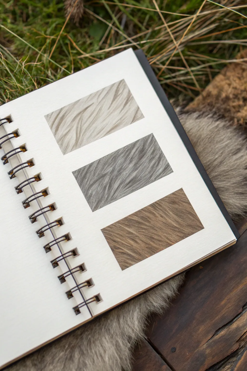
Mastering the flow and density of animal fur is a crucial skill for realism, and this swatch strip study breaks it down into manageable blocks. By isolating the textures into clean rectangles, you can focus purely on stroke direction and layering without the distraction of a full animal form.
Step-by-Step Tutorial
Materials
- Spiral-bound sketchbook (heavyweight mixed-media or drawing paper)
- Graphite pencils (HB, 2B, 4B)
- Colored pencils (Warm Grey, Cool Grey, Burnt Umber/Ochre)
- Ruler
- Kneaded eraser
- Fine-point mechanical pencil (0.5mm or 0.3mm)
- Blending stump (optional)
- Drafting tape or masking tape (low tack)
Step 1: Setting strict boundaries
-
Measure the layout:
Open your sketchbook to a fresh page. Using a ruler, lightly mark out three identical horizontal rectangles. Space them evenly down the vertical center of the page, leaving about an inch of breathing room between each box. -
Create crisp borders:
To achieve the sharp edges seen in the example, apply strips of low-tack drafting tape around the perimeter of your first rectangle. This allows you to draw strokes off the edge without worrying about staying in the lines.
Don’t Over-Blend
Avoid overusing smudge tools. Fur texture relies on the visible separation of lines. If you blend too much, it looks like skin, not hair.
Step 2: Swatch 1: The Light Coat
-
Establish direction:
For the top swatch, we are creating a light, cream-colored fur. Using a very hard pencil like a 2H or a light warm grey colored pencil, draw faint guide lines to indicate the flow of the hair. Notice how the fur clumps and waves rather than standing straight up. -
Layering the base:
Start shading with long, tapered strokes using the side of your pencil lead. Keep the pressure very light to create a soft, underlying tone that suggests depth beneath the top hairs. -
Defining clumps:
Switch to a sharper HB pencil or a slightly darker beige. Begin drawing distinct groups of hairs. Instead of individual strands, think of ‘V’ shapes where the hairs converge at the tips. -
Adding shadows:
Identify where one clump of fur overlaps another. Darken the ‘valley’ underneath the top clump to make it pop forward. This negative shading is the secret to fluffy textures.
Step 3: Swatch 2: The Grey Wolf Texture
-
Prep the middle box:
Move your tape mask to the second rectangle. For this grey texture, we need a denser look. Start with a mid-tone cool grey pencil to lay down a solid, cloudy base layer. -
Short, dense strokes:
Unlike the wavy top swatch, this fur is straighter and coarser. Use a mechanical pencil to flick thousands of short, consistent lines following a diagonal flow from top-left to bottom-right. -
Building contrast:
Layer a 2B graphite pencil over your grey base. Focus on the roots of the hairs. Press harder at the start of the stroke and lift quickly at the end to create a tapered, needle-like point. -
Highlight recovery:
I like to take a kneaded eraser, shape it into a fine wedge, and stamp it into the graphite to lift out thin, white highlights. This creates the illusion of sleek, shiny guard hairs sitting on top.
Go Digital or Ink
Try this same exercise with fine liner pens for a cross-hatched look, or replicate the boxes in Procreate using custom bristle brushes.
Step 4: Swatch 3: The Warm Brown Coat
-
Base warmth:
For the final rectangle, mask the edges and lay down a wash of light brown or ochre colored pencil. Keep the texture smooth; you can use a blending stump here to rub the pigment into the paper tooth. -
Adding texture flows:
Using a Burnt Umber or Dark Brown pencil, start drawing the texture. This swatch features a ‘cowlick’ or swirling pattern. Draw curved strokes that radiate slightly, rather than running perfectly parallel. -
Deepening values:
Go back in with a 4B graphite pencil to add the deepest shadows. Apply these sparingly, only in the deepest crevasses between the waves of fur, to render maximum volume. -
Final detailing:
Sharpen your darkest pencil to a needle point. Add flyaway hairs that cross over the main directional flow. These ‘messy’ hairs add realism, preventing the texture from looking too manufactured. -
Reveal:
Gently peel away the tape from your final swatch. Review all three boxes and erase any smudges in the white space of the paper to ensure that gallery-clean presentation.
Now you have a reference sheet of textures ready to apply to your next animal portrait


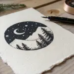
Landscape Inside a Cube
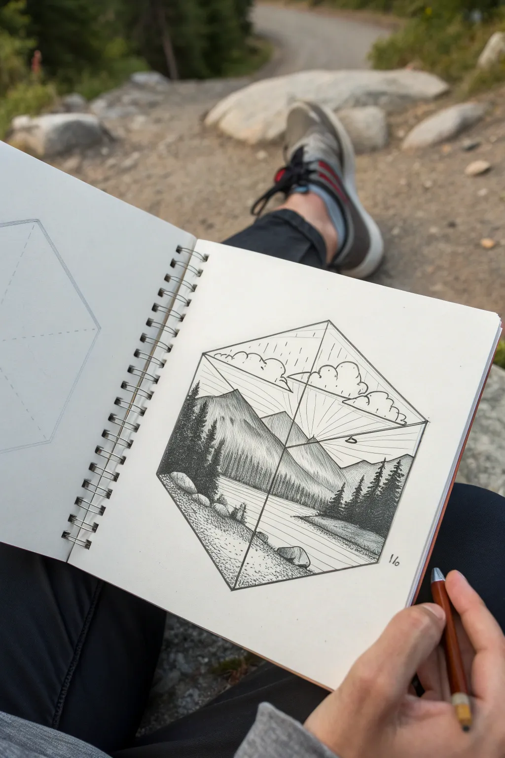
This project combines the clean lines of geometry with the organic textures of nature, capturing a serene mountain scene inside a 3D isometric cube. Using ink stippling and hatching, you’ll create depth and contrast, making the landscape feel like a tiny world waiting to be explored.
Step-by-Step Tutorial
Materials
- Fine liner pens (0.1mm, 0.3mm, 0.5mm)
- Pencil (HB or H for light sketching)
- Good quality sketchbook paper
- Ruler
- Eraser
Step 1: Constructing the Cube
-
Draw the central axis:
Begin by using your ruler to draw a vertical line in the center of your page. This will be the spine of your cube. -
Create the isometric Y:
From the bottom of your vertical line, draw two lines angling upwards and outwards at roughly 30 degrees. From the top of the vertical line, do the same but angling downwards. They should meet to form a Y shape inside a hexagon. -
Complete the hexagon outline:
Connect the tips of the Y-shape lines to form the outer perimeter, resulting in a perfect hexagon that looks like a transparent cube. -
Define the inner planes:
Lightly draw lines connecting the center point to the three outer corners. This divides your hexagon into three diamond-shaped faces: a top ‘ceiling’, and two side walls.
Uneven Cube?
If your cube looks wonky, use a protractor. The internal angles of the ‘Y’ shape should be exactly 120 degrees apart for a perfect isometric look.
Step 2: Sketching the Landscape
-
Outline the mountains:
In the left and right lower sections, lightly sketch the jagged peaks of a mountain range. Let the highest peak dominate the left panel, crossing over the central vertical line slightly to create continuity. -
Add the water line:
Draw a horizontal shoreline across the bottom third of the cube. This will separate your foreground rocks from the calm lake surface. -
Position the trees:
Sketch rough triangles to indicate where the pine trees will go. Place a dense cluster on the left slope and a few on the right to frame the valley. -
Draft the clouds:
In the upper ‘ceiling’ section of the cube, draw fluffy, rounded cloud shapes floating above the mountain peaks.
Step 3: Inking and Shading
-
Outline the frame:
Switch to a 0.5mm pen to firmly outline the main hexagon shape and the internal Y-axis lines. This solidifies the ‘container’ for your landscape. -
Ink the mountains:
Use a 0.3mm pen to trace your mountain ridges. Add texture by using vertical hatching lines that start at the peaks and fade downwards, defining the rocky slopes. -
Detail the pine trees:
With a 0.1mm pen, fill in your tree outlines. Use tight scribbles or short, horizontal zig-zags to mimic pine needles. Make the trees in the foreground darker and denser than those in the distance. -
Create the stippled foreground:
For the rocky shore in the bottom left, use stippling (lots of little dots). Cluster the dots tightly near the bottom edge for shadow and spread them out as you move toward the water. -
Draw the rocks:
Outline the large stones on the shore. Shade their undersides with hatching to ground them, making them feel heavy against the pebbled beach. -
Render the water:
Use long, horizontal lines across the water surface with your finest pen. Keep the lines closer together near the shoreline for shadow and further apart in the center to suggest a reflection. -
Add cloud volume:
Outline the clouds with a bumpy line. Add just a few tiny hatch marks or dots on the undersides of the clouds to give them volume without making them look heavy. -
Sun rays effect:
Using a ruler and a very light touch (or a mostly dried-out pen), draw straight lines radiating from a hidden sun point behind the mountains, extending up toward the clouds. -
Final clean up:
Once the ink is completely dry—give it a good few minutes—erase all your pencil guidelines to reveal the crisp, final drawing.
Depth Perception
Make foreground objects (like the front rocks and trees) significantly darker with denser ink. Let distant mountains be lighter with fewer lines.
Keep practicing your hatching technique and soon you’ll be filling all sorts of shapes with little worlds
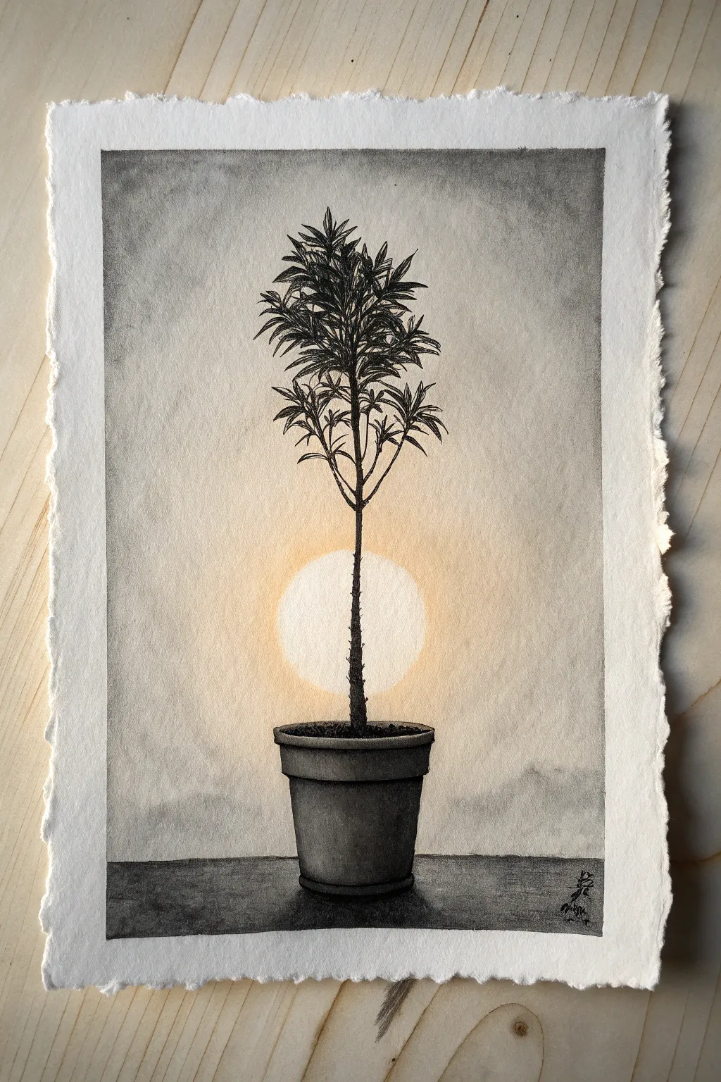
Backlit Silhouette Shading Scene

Capture the stark beauty of a potted sapling against a luminous sun using simple shading techniques. Ideally suited for charcoal or soft graphite, this project explores dramatic contrast and the illusion of light on textured paper.
Step-by-Step Guide
Materials
- Heavyweight textured paper (watercolor or printmaking paper with deckle edge)
- Graphite pencils (HB, 2B, 4B)
- Charcoal pencils or sticks (soft and medium)
- Blending stumps or tortillons
- Compressed charcoal or black pastel for deepest darks
- Kneaded eraser
- Circle template or compass
- Fixative spray
Step 1: Planning and Background
-
Establish the horizon:
Begin by lightly drawing a straight horizontal line near the bottom quarter of your page to represent the surface the pot sits on. Keep this line faint as it will be covered later. -
Outline the circle:
Using a compass or a circular object, lightly trace a perfect circle in the center of the composition. This will be your glowing light source (sun or moon). Position it so the eventual stem of the plant will bisect it. -
Sketch the pot:
Draft the basic shape of the flower pot sitting on the horizon line. Use simple geometry: an oval for the rim, a trapezoid for the band, and a tapered cylinder for the body. Ensure it is centered. -
Map the plant structure:
Lightly sketch the vertical central stem rising from the pot, passing directly through the center of your circle. Add main branches radiating outward near the top, creating a tree-like shape. -
Create the atmospheric sky:
Using powdered graphite or a dirty blending stump, gently shade the area outside the circle. Start darker at the top corners of the page and fade to white as you approach the circle’s edge to create a glow effect.
Fixing Smudges
If you accidentally smudge inside the bright sun, create a stencil by cutting a circle out of scrap paper. Place it over your drawing and erase through the hole to clean the edge perfectly.
Step 2: Shading the Pot and Ground
-
Base tone for the pot:
Fill in the pot with a medium-gray graphite tone. Use vertical strokes to follow the form of the pot. -
Deepen the shadows:
Switch to a softer pencil (4B) or charcoal to shade the right side and bottom of the pot’s rim, giving it volume. The light is behind the object, so the front face should be relatively dark. -
Ground the object:
Fill in the surface beneath the pot using charcoal or a dark pencil. Make this area quite dark and textured to contrast with the smooth sky. Extend this dark tone horizontally to the edges. -
Cast shadow:
Add a subtle, darker cast shadow directly underneath the pot to anchor it firmly to the table surface.
Step 3: Detailing the Plant
-
Darken the stem:
Using a sharp charcoal pencil, go over the main stem. Since it is backlit, this should be nearly solid black to create a strong silhouette effect. -
Texture the trunk:
Add small, jagged bumps along the sides of the stem to suggest rough bark or nodes, rather than drawing a perfectly smooth line. -
Draft the leaves:
Start drawing the leaf clusters at the top. Use short, tapered strokes radiating from the branches. These leaves should look spiky and somewhat dense. -
Build leaf density:
Layer more leaf strokes over your initial ones. Vary the pressure—press harder for leaves in the center of the cluster to create depth, and use lighter touches for the outer tips. -
Refine the silhouette:
Ensure the leaves and branches crossing in front of the glowing circle are sharply defined and very dark. This high contrast is crucial for the backlit illusion.
Make It Golden
Swap the white paper for a cream or tan toned paper. Use white charcoal for the sun and black charcoal for the silhouette to create an automatic vintage, golden-hour look.
Step 4: Final Touches
-
Enhance the glow:
Use a clean kneaded eraser to lift any graphite smudges from inside the circle, ensuring it remains the brightest part of the paper. I like to dab rather than rub to keep the texture. -
Add warmth (optional):
If you want the subtle warm glow seen in some references, lightly glaze the area immediately around the circle with a very pale yellow pastel or pencil, blending it smoothly into the gray. -
Check contrast:
Step back and evaluate your values. The plant and ground should be the darkest elements, while the sun remains paper-white. Darken the top corners of the sky if needed to frame the subject. -
Seal the work:
Lightly mist the drawing with a fixative spray to prevent the heavy charcoal areas from smearing or transferring.
Now you have a striking, atmospheric piece that masters the drama of backlighting


Have a question or want to share your own experience? I'd love to hear from you in the comments below!