
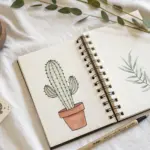
When I need to loosen up my hand, I reach for simple doodles—tiny line art drawings that feel like a deep breath. Here are my go-to doodle ideas you can copy in minutes and sprinkle anywhere you’ve got a little blank space.
Tiny Heart Doodles

Fill a sketchbook page with a charming collection of heart doodles, ranging from solid silhouettes to playful patterns. This relaxing exercise uses simple black ink to create a cohesive but varied composition that looks effortlessly artistic.
Step-by-Step
Materials
- Sketchbook with smooth paper
- Fine liner pen (0.3mm or 0.5mm)
- Thicker black marker or brush pen (optional for filling)
- Pencil (optional for sketching placement)
- Eraser
Step 1: Planning the Layout
-
Visualize the spacing:
Before putting pen to paper, look at your blank page and imagine an even scatter of shapes. You want them to feel random but balanced, leaving plenty of white space between each heart so the page breathes. -
Optional pencil sketch:
If you’re nervous about placement, lightly sketch faint circles or rough heart shapes with a pencil to map out where your doodles will go. This isn’t about detail, just checking the rhythm of the layout.
Step 2: Drawing the Outline Hearts
-
Standard single outlines:
Start by drawing several classic, simple heart outlines scattered across the page. Vary the sizes slightly, making some tall and narrow and others wide and round. -
Create gestural hearts:
Draw a few hearts using a loose, double-loop motion where the lines overlap slightly at the top or bottom. This gives a sketchy, hand-drawn feel rather than a perfect icon. -
Add offset outlines:
For a bit of dimension, draw a few larger hearts and then add a disjointed second line inside or outside one edge. It creates a subtle 3D pop without needing shading.
Ink Flow Secret
Use a thicker felt-tip marker for the solid black hearts and a fine liner for the detailed patterns to create instant depth.
Step 3: Adding Solid Elements
-
Fill small accents:
Choose a few spots—particularly in the gaps between larger doodles—to draw tiny hearts that are completely filled in with black ink. These act as visual anchors. -
Create floating pairs:
Draw tiny solid hearts next to some of your outline hearts. This contrast between the heavy black and the delicate line work adds visual interest. -
Varied orientation:
Don’t draw them all perfectly straight. Tilt some hearts slightly left or right to make the hearts look like they are tumbling or floating.
Smudge Alert
If you are right-handed, work from the top-left corner to the bottom-right so your hand doesn’t drag across wet ink.
Step 4: Pattern and Texture
-
Polka dot fill:
Select three or four medium-sized hearts and fill them with pattern instead of solid ink. Draw an outline, then fill the inside with tiny, evenly spaced dots. -
Inverted polka dots:
For a darker look, draw an outline, add small circles inside, and then color the space *around* the circles black. This creates white polka dots on a black background. -
Sunburst heart:
Draw a small circle or heart shape and add little radiating lines coming off it, like a tiny sun or a dandelion puff. This breaks up the repetitive shape language. -
Wheel spoke pattern:
Draw a small circle (or round heart) and divide it with intersecting lines like a pizza or wheel spokes. It adds geometric variety to the page.
Step 5: Final Touches
-
Review the balance:
Step back and look at your composition. If there are large empty voids, fill them with tiny hearts, dots, or small circles. -
Erase guidelines:
If you used pencil for your initial layout, wait until the ink is completely dry—I usually give it at least five minutes just to be safe—and gently erase the pencil marks. -
Clean up lines:
Go over any lines that look too faint or broken to make sure your black ink looks crisp and intentional against the white paper.
Now you have a delightfully filled page that serves as a perfect practice in composition and line control


Simple Stars and Sparkles
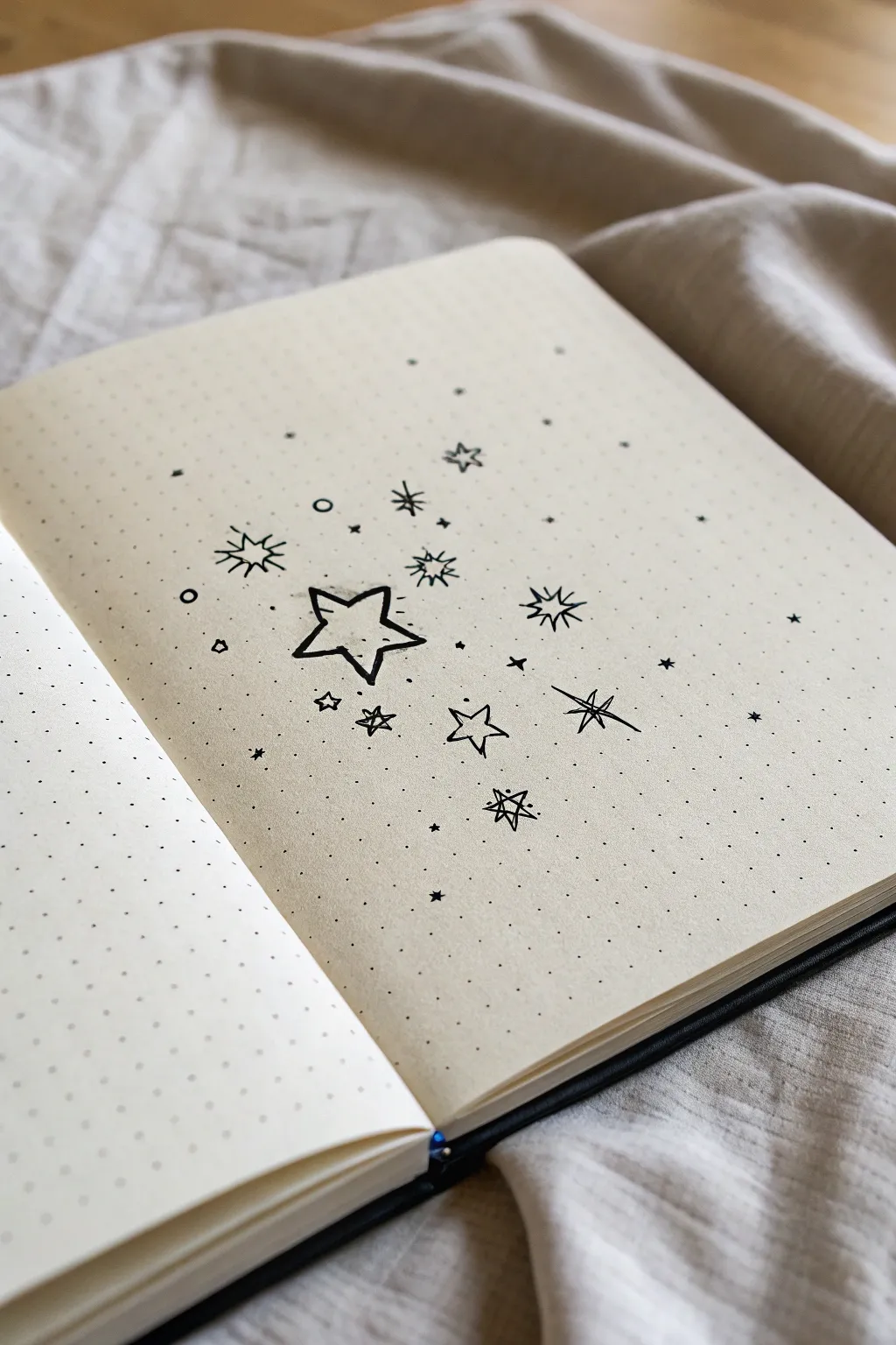
Transform a plain journal page into a dreamy night sky with this collection of simple, hand-drawn stars and sparkles. The minimalist black-on-cream aesthetic is perfect for adding a touch of magic to your bullet journal spreads without needing complex supplies.
Step-by-Step Tutorial
Materials
- Dotted grid notebook or journal (cream/ivory paper recommended)
- Fine tip black drawing pen (0.3mm to 0.5mm)
- Pencil (optional, for sketching placement)
- Eraser
Step 1: Planning the Layout
-
Open your journal:
Start by laying your dotted notebook flat. Locate the center of the right-hand page, as this design radiates outward from a central point rather than following straight lines. -
Visualize the cluster:
Imagine an loose, invisible oval shape in the middle of the page. This is where your densest stars will live. The design will then scatter outwards towards the edges, getting sparser as it goes. -
Lightly sketch placeholders (optional):
If you are nervous about placement, use a pencil to mark tiny dots where your three or four biggest stars will go. Keep them somewhat close to the center but not perfectly aligned.
Ink Flow Secret
Keep your wrist loose and don’t press too hard. A light, quick hand creates sharper points on your stars and keeps the ink lines looking delicate rather than blobby.
Step 2: Drawing the Primary Stars
-
Draw the main star:
Create the focal point: a standard five-point star in the lower-middle area. Draw the outline first, allowing the lines to be slightly playful and imperfect rather than ruler-straight. -
Add a second open star:
To the right of your main star, draw a slightly smaller five-point star. Leave this one open (unfilled) as well. Vary the angle slightly so it looks like it’s dancing. -
Create the ‘spark’ stars:
Near the top of the cluster, draw a star that consists only of lines radiating from a center point. Draw four long lines (up, down, left, right) and four shorter diagonal lines in between them to create a burst effect. -
Add the cross-hatch star:
On the far right, draw a simple cross shape with long, thin strokes. Add a diagonal X through the center to create a sleek, eight-point sparkle.
Smudge Alert
If you’re left-handed or checking your work, place a scrap piece of paper under your hand. Dotted journal paper can be less absorbent, meaning ink stays wet longer.
Step 3: Adding Secondary Elements
-
Draw mini geometric stars:
Scatter 2-3 tiny five-point stars around the edges of your main cluster. These should be much smaller than your focal star. -
Create the ‘triangle’ sparkle:
Near the bottom, draw a variation that looks like two triangles overlapping (a Star of David shape) or a playful, scribbled six-point star. This adds geometric variety. -
Add floating circles:
Draw three or four small, hollow circles (like tiny bubbles) in the open spaces between the larger stars. Keep these sparse to avoid crowding the design. -
Include diamond sparkles:
Draw a few small diamond shapes. These act as distant, twinkling stars and help bridge the gap between the large drawings and the tiny dots you’ll add later.
Step 4: Detailing and Texturing
-
Fill the gaps with dots:
This is where the magic happens. Using the very tip of your pen, tap small dots around the stars. Concentrate them more heavily near the center of the cluster. -
Disperse the stardust:
As you move away from the main stars towards the page edges, space your dots further apart. -
Mix dot sizes:
Vary your pressure slightly. Some dots should be tiny pinpricks, while others can be bold little specks. This variety creates depth. -
Add tiny ‘x’ marks:
Sprinkle in a few extremely small ‘x’ marks or crosses among the dots. These represent the furthest stars that are just barely twinkling. -
Review the balance:
Step back and look at the whole page. If a spot looks too empty, add a single dot or a tiny diamond shape. -
Erase pencil lines:
Once you are certain the ink is completely dry—I usually give it a full 5 minutes just to be safe—gently erase any initial pencil sketches so only the crisp black ink remains.
Now you have a sparkling constellation captured right on your page to inspire your next entry


Easy Flower Minis
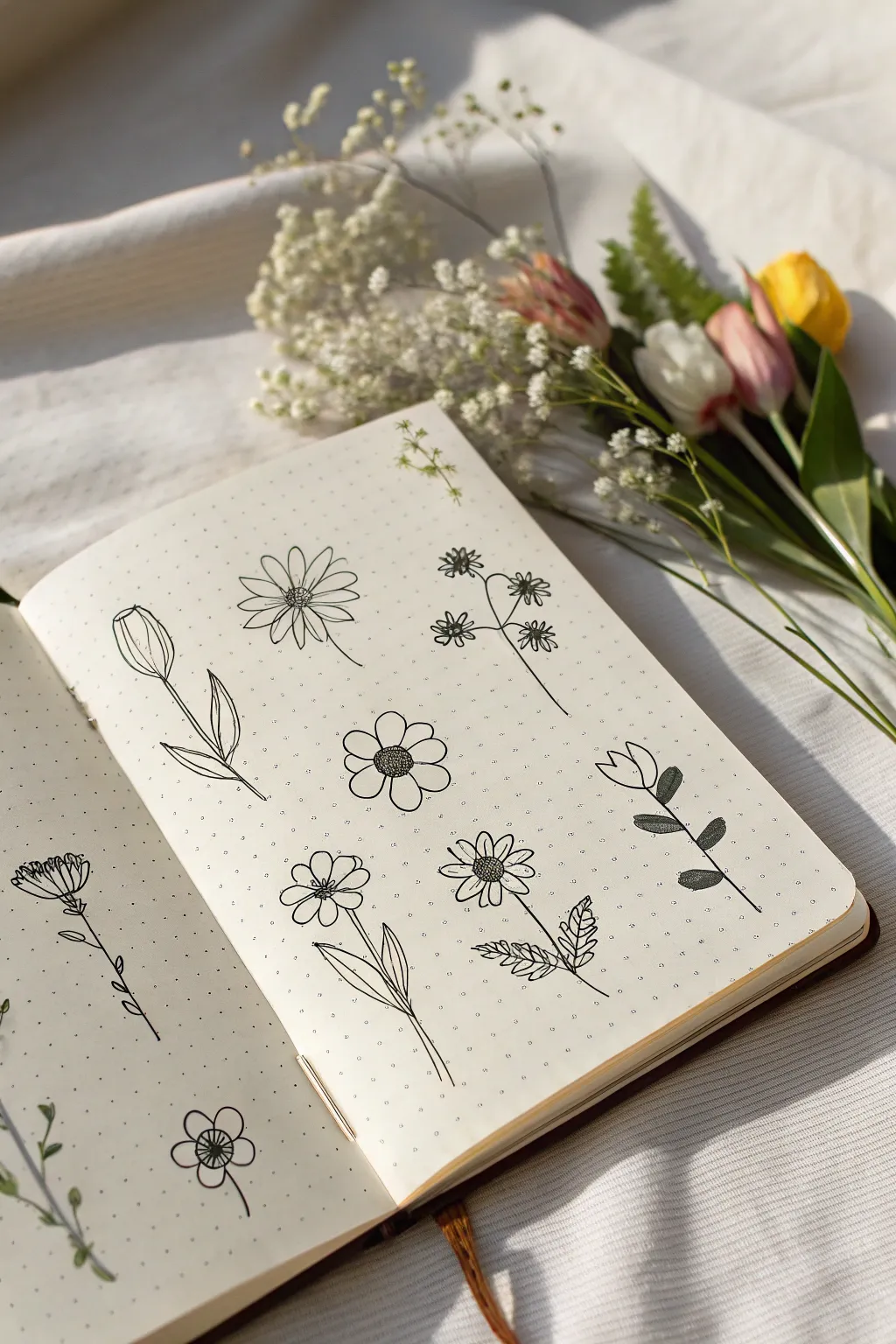
Capture the delicate beauty of a spring garden with these charming botanical line drawings. This spread features a variety of simple flower minis, including tulips, daisies, and wildflowers, all rendered in crisp black ink on dotted paper.
Step-by-Step
Materials
- Dotted notebook or bullet journal
- Fine liner pen (0.3mm or 0.5mm, black)
- Pencil (optional for sketching)
- Eraser
Step 1: Drawing the Main Blooms
-
Start the Tulip Bud:
Begin on the left side of the page. Draw an elongated egg shape that is slightly pointed at the top. Add two curved lines inside the shape, meeting at the top point, to suggest overlapping petals. -
Stem and Leaves:
From the base of your tulip bud, draw a single straight line downwards for the stem. Add two leaves near the bottom: one curving up to the left and another to the right, keeping them slender and pointed. -
Daisy Center:
Move to the top middle area. Draw a small circle for the center of a daisy. Inside this circle, add a few tiny dots for texture. -
Daisy Petals:
Surround the center with long, narrow oval petals. They can overlap slightly or have small gaps. Draw a thin, slightly curved stem descending from between the bottom petals. -
Five-Petal Flower:
Below the daisy, draw a rounder flower. Start with a larger center circle. Draw a grid pattern inside it to create a textured, almost sunflower-seed look. -
Rounding the Petals:
Draw five wide, rounded petals around this textured center. Try to keep them roughly equal in size for a balanced, cheerful look. -
Sprig of Wildflowers:
To the right of the daisy, draw a thin main stem. Branch off two or three smaller stems. At the end of each, draw a tiny flower shape with 5-6 radiating lines or small loops to mimic small wildflower heads.
Ink Control
Keep your wrist loose but your pen grip steady. If you hesitate mid-line, you might get a blotch, so aim for confident, sweeping strokes.
Step 2: Adding Details and Filler Flowers
-
Stylized Tulip:
On the far right, draw a U-shape for a simple tulip cup. Add a zigzag line across the top to close it. Draw a straight stem down and add two stiff, oval leaves filled with diagonal shading lines for contrast. -
Textured Cone Flower:
Below the five-petal flower on the left side, draw a small oval. Add a semi-circle of petals on just the top half, pointing upwards. This creates a playful profile view. -
Detailed Daisy:
In the lower middle section, draw another daisy center, but leave it empty for now. Draw shorter, more numerous petals around it. Add a textured stem with small, jagged leaves that look like mint or fern leaves. -
Left Page Accent:
On the left page, draw a single flower head in profile. Start with a semi-circle base and draw petals fanning upward. Add a long stem with small spur-like leaves periodically down the length. -
Bottom Corner bloom:
In the bottom left corner, draw a simple five-petal flower. Instead of a solid center, draw a tiny spiral or wheel-spoke pattern. Keep the stem simple and curved. -
Review and Refine:
Look over your spread. If any lines look too thin or shaky, go over them carefully once more to bold them up. I like to add tiny dots or stippling on the petals near the centers to add depth. -
Erase Guidelines:
If you used a pencil for initial placement, wait until the ink is completely dry, then gently erase any visible graphite marks to leave a clean, crisp finish.
Add Pop
Use a grey brush pen to add a quick shadow line to the right side of stems and leaves. It instantly lifts the drawings off the page.
Fill the rest of the page with tiny scattered dots or stars to complete your botanical garden layout
Cloud Faces in Two Strokes
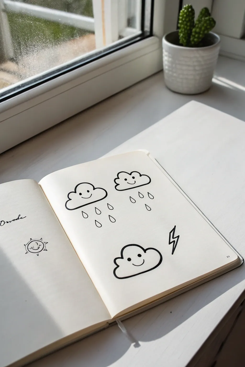
Brighten up your sketchbook pages with these delightfully simple cloud characters, each expressing a different weather mood. Using bold lines and minimalist features, this tutorial guides you through drawing three distinct cloud personalities: a happy drizzle, a rainy day friend, and a striking storm cloud.
Detailed Instructions
Materials
- Sketchbook or quality drawing paper
- Thick black marker or fine-point pen (0.5mm or 0.8mm recommended)
- Pencil (optional for sketching)
- Eraser
Step 1: The Drizzling Duo
-
Start the first cloud:
Begin on the upper left side of your page. Draw the bottom line of the cloud first, keeping it flat but slightly curved at the ends. -
Add the fluffy top:
Connect the ends of your bottom line with a series of three connected humps. Make the middle hump slightly larger than the two side ones for a balanced look. -
Create the second cloud:
To the right of your first cloud, draw a similar shape. This time, try making the humps slightly wider or flatter to give it a distinct character. -
Draw the eyes:
Inside each cloud, place two small, solid black dots for eyes. Position them fairly wide apart to create a cute, ‘kawaii’ aesthetic. -
Give them smiles:
Draw a tiny, simple curve between the eyes for a mouth. A small upward curve creates a gentle, happy expression. -
First rain drops:
Under the left cloud, draw three teardrop shapes falling downward. Keep the pointed end at the top and the rounded part at the bottom. -
Second rain shimmer:
For the right cloud, draw three similar teardrops. I like to vary the height of these slightly so they don’t look too uniform.
Step 2: The Thunder Cloud
-
Position the storm:
Move to the bottom center of the page. Draw the outline for your third cloud, perhaps making this one slightly wider or puffier than the top two. -
Add a friendly face:
Even though this is a storm cloud, keep the style consistent. Add two solid dot eyes and a curved smile just like the others. -
Draw the bolt structure:
To the right of this bottom cloud, start the lightning bolt. Draw a sharp diagonal line going down and to the left. -
Create the zig-zag:
From the bottom of that first line, draw a short horizontal line cutting back to the right. -
Finish the bolt:
From the end of that horizontal line, draw a final sharp diagonal line pointing down and to the left again to complete the classic lightning shape. -
Outline reinforcement:
Go over the main outlines of your clouds one more time if you want a bolder look, similar to a sticker design. -
Clean up:
If you started with pencil sketches, wait a moment for the ink to fully set, then gently erase any visible graphite marks.
Wobbly Lines?
Don’t stress about perfect curves. If a line goes astray, thicken the entire outline slightly to hide the bump. Irregularity adds charm.
Make it Shine
Use a white gel pen to add tiny reflection dots in the eyes or on the raindrops to make the doodle pop off the page.
Now you have a trio of weather friends ready to decorate your journals or notes

PENCIL GUIDE
Understanding Pencil Grades from H to B
From first sketch to finished drawing — learn pencil grades, line control, and shading techniques.
Explore the Full Guide
Quick Sun and Sunset Icons
Fill your bullet journal with sunny warmth using these twelve distinct celestial icons. This spread explores various ways to depict suns, flowers, and dreamy sky elements using simple line work on dot grid paper.
Step-by-Step Tutorial
Materials
- Dot grid notebook or loose dot grid paper
- Fine liner pen (black, approx. 0.3mm or 0.5mm)
- Pencil (optional, for sketching)
- Eraser
Step 1: Setting the Scene
-
Top outline:
Start at the very top of your page. Draw a straight horizontal line across the width of your working area to frame the doodles. Just above the line, add a tiny, jagged range of mountains using simple triangles and peaks. -
First column anchor:
Visualize two columns for your doodles. In the left column, begin by drawing a standard lightbulb shape. Add vertical lines inside the bulb and a zig-zag base to represent the screw threads. -
Dotted circle:
To the right of the lightbulb, draw a small central circle. Surround it with a ring of small dots, then a second, wider ring of slightly larger open circles. This creates a radiant, atomic-style sun. -
Classic sun:
Below the dotted motif, draw a simple circle. Add straight lines radiating outward, alternating between long and short strokes for a classic sunburst effect.
Uneven circles?
If freehand circles are tricky, I like to use a standard stencil or trace a small bottle cap. It keeps the core of each sun uniform.
Step 2: Complex Floral Suns
-
Petal sun:
Back in the left column, under the lightbulb, draw a small circle. Surround it with pointed, leaf-like triangles instead of straight rays, making it look like a sunflower. -
Sawtooth sun:
In the right column, beneath the classic sun, draw another central circle. Add a layer of sharp, zig-zag teeth around the edge. Make sure the points follow the curvature of the circle. -
Crescent night:
Return to the left column. Draw a crescent moon shape. Surround it with tiny asterisks and dots to represent a starry night sky. -
Double-layer burst:
Moving down the right column, draw a circle. Add a row of curved petals first, then tuck a layer of sharp triangles between the petals for a complex, mandala-like sun. -
Simple ray sun:
In the left column, draw a circle and add simple straight lines radiating strictly outward. Keep the lines spaced evenly apart for a clean, minimalist look. -
Lotus flower:
To the right of the simple ray sun, sketch a floral icon. Start with a central vertical petal, then add two side petals curving outward, and two lower petals curving downward, meeting at a central point.
Add some sparkle
Use a gold gel pen or metallic marker to fill in the centers of the suns or trace over the rays for a magical, shining effect.
Step 3: Finishing the Grid
-
Eclipse sun:
In the left column, draw a circle but interrupt the line on the left side with a smaller circle biting into it to create a crescent eclipse effect. Surround with jagged, flame-like rays. -
Sawtooth burst:
To the right, create another sawtooth sun similar to the earlier one, but this time add straight lines extending from the tip of every zig-zag point. -
Layered flame sun:
Bottom left: Draw a circle. Add a row of small triangles touching the circle’s edge. Then, draw a larger, secondary ring of triangles behind the first layer to create depth. -
Star flower:
Bottom right: Draw a small dot. Extend six to eight long, narrow loops outward like daisy petals. Draw a straight line down the center of each petal for detail. -
Cleanup:
Once ink is fully dry, gently erase any pencil guidelines you might have used to keep your columns straight.
Your page is now filled with a collection of unique celestial symbols ready to brighten your week
Crescent Moons and Planets
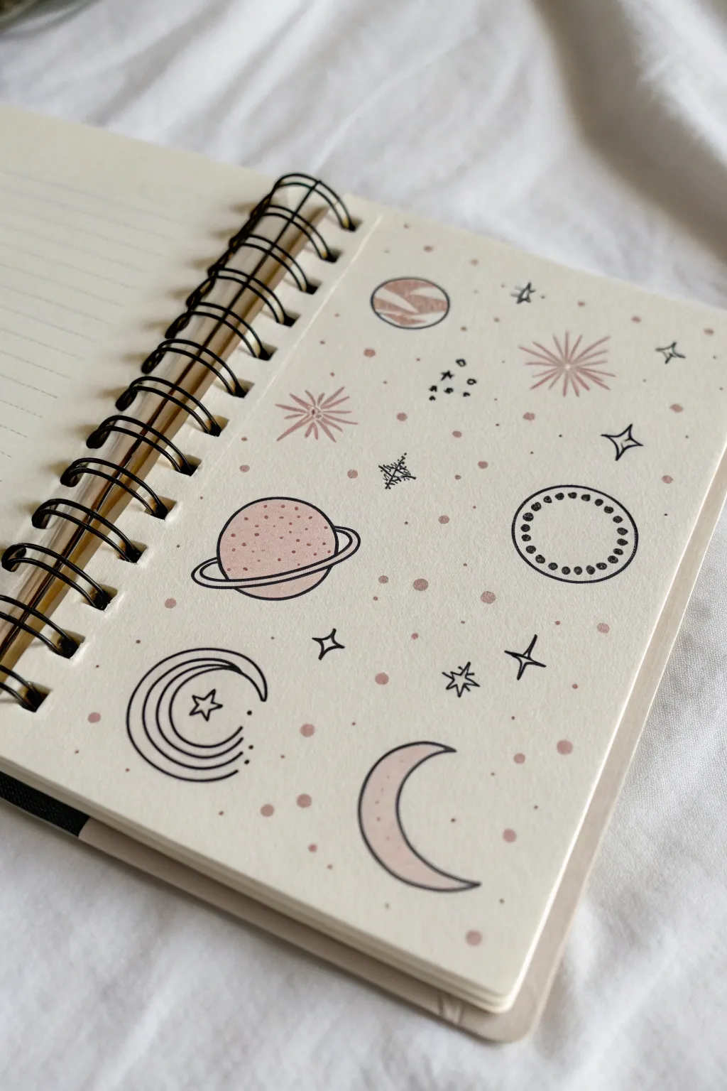
Transform a blank page into a serene, space-themed pattern using simple line work and soft color accents. This minimalist layout combines celestial bodies like planets and moons with delicate stars for a calming aesthetic that feels both whimsical and organized.
Step-by-Step Guide
Materials
- Spiral-bound notebook or sketchbook (cream or ivory paper recommended)
- Fine liner pen (black, 0.3mm or 0.5mm)
- Mildliner or pastel highlighter (dusty pink or beige)
- Pencil (optional for sketching)
- Eraser
Step 1: Drawing the Moons
-
Outline the crescent shape:
Start near the bottom right of the page. Draw a standard crescent moon shape using your black fine liner, leaving the inside empty for now. -
Add the stylized moon:
Move to the bottom left area. Draw a similar crescent shape, but add internal parallel lines following the curve. Include a small five-pointed star nestled inside the curve of this moon for extra detail. -
Color the simple crescent:
Using your dusty pink marker, gently fill in the entire shape of the first plain crescent moon you drew.
Ink Smudging?
If your black lines smear when adding pink highlighter, stop. Draw the pink color shapes first, let them dry completely, and then draw the black outlines on top.
Step 2: Creating the Planets
-
Draw the ringed planet:
In the middle-left section, draw a circle about the size of a quarter. Add an elliptical ring around it, making sure the lines connect behind the planet to give it dimension. -
Detail the planet surface:
Use the pink marker to fill the upper half of the planet circle. While the ink is drying, add tiny black stippling dots over the pink area to create texture. -
Create the striped planet:
Near the top center, draw a smaller circle. Fill it with jagged, horizontal zigzag patterns using the pink marker to simulate gas giant bands. -
Design the decorative orb:
On the right side of the page, draw two concentric circles. Fill the space between the inner and outer circles with small, evenly spaced black dots to create a border effect.
Step 3: Adding Starts and Sparkles
-
Draw starbursts:
Scatter two or three large starbursts across the page. Create these by drawing a central point and flicking lines outward in a radial pattern. -
Highlight the starbursts:
Take your pink marker and carefully trace over the black lines of the starbursts, or draw pink lines in between the black rays for a layered effect. -
Add four-pointed stars:
Draw several four-pointed stars (diamond shapes with curved sides) in the empty spaces. Keep these purely black line art. -
Include geometric sparkles:
Find a small gap and draw a cluster of three tiny diamonds or squares. I personally like to group these closely together to mimic distant constellations. -
Draw hollow stars:
Sketch a few loose, hand-drawn five-pointed stars. Imperfect lines add to the doodle charm here.
Style Variation
Try using a metallic gold or silver pen instead of black for the star accents to give the page a true galaxy shimmer when it catches the light.
Step 4: Filling the Void
-
Create background atmosphere:
Using the pink marker, dot the page randomly with small circular spots. Vary the pressure to make some dots slightly larger than others. -
Add micro-details:
With the black pen, add very tiny dots in clusters of two or three around the larger planetary elements. -
Assess the balance:
Look for any large empty white spaces. Fill them with either a single faint pink dot or a tiny black plus sign. -
Final touches:
Go back over your black lines if any look too faint against the cream paper. Ensure the ring on the main planet looks continuous and bold.
Your page is now filled with a charming, customized galaxy that makes even a simple notebook look magical
BRUSH GUIDE
The Right Brush for Every Stroke
From clean lines to bold texture — master brush choice, stroke control, and essential techniques.
Explore the Full Guide
Leaf Shapes You Can Repeat
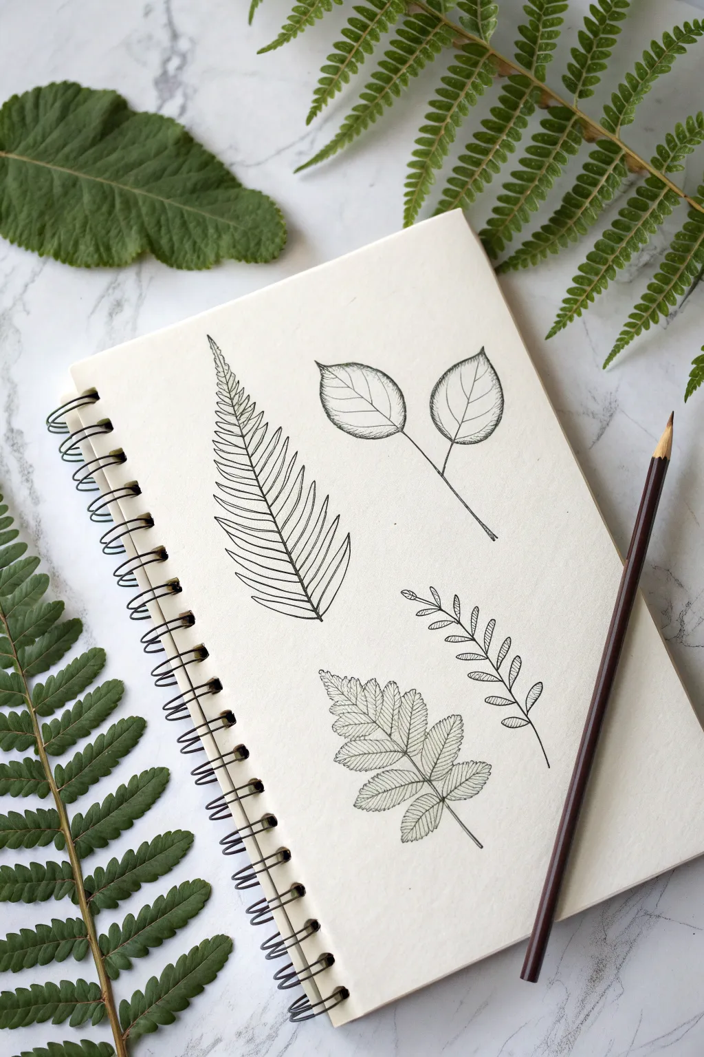
This project explores four distinct leaf shapes, ranging from simple rounded forms to intricate, fern-like structures. Using basic line work and subtle shading, you will create a botanical study page that feels both technical and organic.
How-To Guide
Materials
- Spiral-bound sketchbook or drawing paper
- Fine-tipped black drawing pen (0.3mm or 0.5mm)
- Graphite pencil (HB or 2B) for sketching
- Eraser
- Natural leaves for reference (optional)
Step 1: Planning and Layout
-
Lightly Pencil the Skeletons:
Start by lightly sketching the central veins (stems) for your four main leaf doodles. Place a large curved line on the left for the fern, a Y-shape at the top right for the broad leaves, a small curved sprig below that, and a central stem for the bottom leaf. -
Outline the Basic Shapes:
Still using your pencil, sketch the rough perimeter of the leaves. For the top right, draw two large teardrop shapes. For the fern, map out a long, tapering triangle. This helps ensure your composition fits before committing to ink.
Step 2: Drawing the Broad-Leaf Sprig (Top Right)
-
Ink the Stems:
Switch to your pen. Draw the main Y-shaped stem, adding a slight thickness where the two branches diverge. -
Outline the Leaves:
Trace over your pencil guides to create two full, oval-shaped leaves with pointed tips. Keep the line weight consistent. -
Add Veining:
Draw a central vein down the middle of each leaf. Then, add thin, diagonal veins branching outward. I like to curve these slightly toward the tip to show dimension. -
Apply Shading:
Add very fine hatching lines along one side of the central vein and near the base of the leaves to suggest a slight curve or shadow.
Fixing Smudges
If you accidentally smudge wet ink, turn it into a deliberate shadow! Use heavier hatching or stippling (dots) in that area to mask the blur and add contrast.
Step 3: Creating the Fern Frond (Left)
-
Draw the Spine:
Ink the long, central spine of the fern, starting thick at the bottom and tapering off to a fine point at the top. -
Draw the Leaflets:
Starting from the bottom, draw individual leaflets extending from the spine. These should be long, narrow, and curve slightly upward. -
Refine the Tips:
As you move up the spine, make the leaflets gradually shorter. Near the very top, they should be tiny bumps merging into the tip. -
Detail the Interior:
Draw a single line down the center of each leaflet. Add tiny hatching marks at the base of each leaflet where it meets the spine to create depth.
Add Watercolor
Once the waterproof ink is dry, gently wash translucent green watercolor over the leaves. Keep the color loose and flowing outside the lines for an artsy look.
Step 4: Sketching the Compound Leaf (Bottom)
-
Structure the Leaflets:
Along the bottom central stem, draw pairs of small, jagged-edged oval leaflets. They should sit opposite each other, with one single leaflet at the very tip. -
Add Serrated Edges:
When inking the outline, use small zigzag motions to give the edges a ‘toothed’ or serrated look, rather than a smooth line. -
Internal Texture:
Draw the veins. For this leaf type, use very closely spaced parallel lines (hatching) across the entire leaflet surface to mimic a ribbed texture.
Step 5: Finishing the Small Sprig (Middle Right)
-
Draw Tiny Leaves:
For the final small sprig, draw pairs of very small, simple oval leaves along the stem. These don’t need distinct veins. -
Add Decorative Hatching:
Fill each tiny leaf with simple diagonal lines. This stylistic choice separates it visually from the more realistic leaves nearby. -
Clean Up:
Let the ink dry completely for at least a few minutes. Gently erase all visible pencil guidelines to reveal the crisp black ink work.
Enjoy filling your pages with these organic shapes as your confidence with botanical lines grows
Little Mushroom Caps
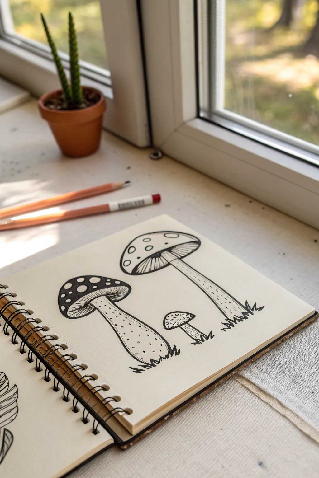
Capture the charm of the forest floor with this minimalist ink drawing of three distinctive mushrooms. Using bold outlines and delicate stippling, you’ll create a graphic, botanical illustration that pops against cream-colored paper.
Detailed Instructions
Materials
- Sketchbook with cream or off-white paper (spiral bound)
- Fine liner pen (black, size 05 or 08 for outlines)
- Ultra-fine liner pen (black, size 01 or 005 for details)
- Pencil (HB for sketching)
- Kneaded eraser
Step 1: Pencil Structure
-
Plan the composition:
Visualize three invisible vertical lines to space out your mushrooms. The tallest one goes on the right, a medium, chunkier one on the left, and a tiny sprout in the middle. -
Sketch the right cap:
Start with the tallest mushroom on the right. Draw a wide, flattened semi-circle for the cap. It should look like an open umbrella. -
Add the tall stem:
Drop two long, parallel lines down from the center of the cap. Let the stem widen slightly at the very bottom where it meets the ground. -
Sketch the left mushroom:
For the left mushroom, draw a rounder, deeper cap shape, almost like a burger bun. Angle it slightly so you can see underneath. -
Draw the left stem:
Add a thick, sturdy stem that curves just a little bit. Make the base bulbous and grounded. -
Add the baby mushroom:
In the center space, sketch a tiny, button-like mushroom. It needs just a small, rounded cap and a short, straight stem.
Wobbly Lines?
Don’t stress over perfect curves. Slightly shaky lines actually make organic subjects like mushrooms look more natural and earthy.
Step 2: Inking the Outlines
-
Outline the caps:
Switch to your thicker fine liner (05 or 08). Trace the top curves of all three caps with a confident, continuous line. -
Define the gills:
Draw the bottom rim of the caps. For the two larger mushrooms, add a second inner curve under the rim to indicate where the gills will be. -
Ink the stems:
Trace the vertical lines of the stems. When you reach the ground, use jagged, zigzag strokes to simulate grass blades covering the base of the stems. -
Erase pencil marks:
Wait a moment for the ink to settle, then gently lift away your graphite guidelines with a kneaded eraser.
Add Color
Use a single watercolor wash or a colored pencil in burnt orange or moss green to tint just the caps for a vintage botanical look.
Step 3: Detailing and Texture
-
Draw the gills:
Using your ultra-fine pen (01), draw closely spaced lines radiating from the top of the stem to the edge of the cap under the two larger mushrooms. I find it easiest to start from the center and fan outward. -
Spot the tall mushroom:
On the top of the right-hand mushroom cap, draw several varying sizes of circles. Leave these white to look like markings on the skin. -
Spot the left mushroom:
For the left mushroom, fill the cap in with solid black ink, but leave careful circles of white paper showing through to create negative-space spots. -
Texture the tiny cap:
For the little center mushroom, stipple tiny dots all over the cap to give it a speckled texture. -
Stipple the stems:
Switch back to the thinner pen. Add speckles of dots running down the stems, concentrating them more heavily near the top shadows and the bottom base. -
Add stem lines:
On the tall right mushroom, draw a few broken, vertical dashed lines down the stem to suggest a fibrous texture. -
Ground the scene:
Extend the zigzag grass tufts slightly at the base of each stem with the thin pen to firmly plant your fungi in the soil.
You now have a charming little patch of fungi ready to adorn your sketchbook pages


Loop-and-Wing Butterflies
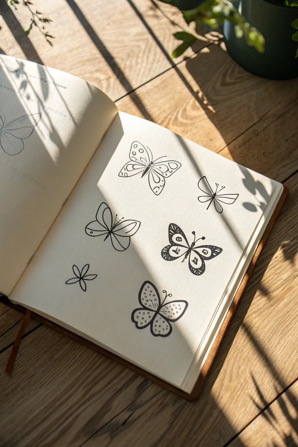
Capture the delicate charm of garden visitors with this study in simple lines and patterns. By focusing on varied wing shapes and decorative infill, you’ll create a sketchbook page full of personality that celebrates nature in black and white.
How-To Guide
Materials
- Sketchbook with cream or off-white paper (smooth texture preferred)
- Fine liner pen (01 or 03 size, black)
- Medium liner pen (05 or 08 size, black)
- Pencil (HB or 2H)
- Eraser
Step 1: Planning the Layout
-
Visualize the spacing:
Before putting pen to paper, lightly visualize where your five main butterflies will sit on the page. Aim for a staggered layout that doesn’t feel too rigid—place one near the top left, one top right, two in the middle, and one at the bottom, leaving breathing room between them. -
Sketch the skeletons:
Using your pencil with very light pressure, draw simple vertical lines or slight curves to represent the bodies of each insect. These will serve as anchors for the wings.
Step 2: The Top-Left Spotted Butterfly
-
Draw the wing outline:
For the first butterfly, draw four distinct wing sections. The top wings should be triangular with rounded corners, and the bottom wings smaller and more oval. Keep a small gap between the wings and the body. -
Add the body details:
Switch to your fine liner. Draw a slender, segmented body over your pencil line and add two long, curving antennae. -
Decorate with circles:
Inside the wings, draw a second, smaller outline to create a border. Fill this border space with small, evenly spaced circles. Leave the center of the wings empty or add a simple vein line.
Wobbly Lines?
Don’t stress over perfect symmetry. In nature, wings are rarely identical. If a line goes rogue, thicken the outline or turn it into a double-line pattern.
Step 3: The Top-Right Geometric Minimalist
-
Create sharp angles:
Move to the top right. Draw a very geometric butterfly using straight lines and sharp angles. The top wings should extend outward like trapezoids, and the bottom wings should be narrower triangles. -
Bisect the wings:
Draw a straight line right through the middle of each wing mechanism, meeting at the body. This gives it a mechanical, modern look. -
Inking the lines:
Go over these lines with a steady hand. I find doing the straight lines quickly helps keep them from wobbling. Add a simple straight line for the body and two V-shaped antennae.
Add Dimension
Use a light grey marker or a diluted black watercolor wash to add a shadow under just one side of the wings. This lifts the doodles off the page instantly.
Step 4: The Center-Left Roundwing
-
Form looped wings:
For the butterfly on the middle left, focus on curves. Draw two large, almost circular teardrops for the top wings and two perfectly round circles for the bottom wings. -
Add internal loops:
Inside each wing, draw a smaller matching shape (a teardrop inside the teardrop) to create a double-line effect. Connect the inner loop to the body with a small stroke. -
Simple body:
Ink a thin, straight body line and add tiny dots at the end of the short antennae.
Step 5: The Center-Right Patterned Moth
-
Draw heavy outlines:
This one is the boldest. Draw thick, rounded triangular wings using your thicker (05 or 08) pen. Make the lines deliberate and heavy. -
Add the eye-spots:
Inside each of the four wing sections, draw a circle with a dot in the center. These ‘eye-spots’ add character. -
Fill the texture:
Use hatching (closely spaced parallel lines) to fill the tips of the wings, fading out as you move toward the body. This adds shading and weight.
Step 6: The Bottom Dotted & The Flower
-
Create the bottom butterfly:
Draw a classic butterfly shape at the bottom center with four rounded wings. Keep the outline thickness consistent. -
Stipple the interior:
Instead of lines, fill the wings entirely with tiny dots. Cluster them densely near the body and spread them out toward the wingtips for a gradient effect. -
Sketch the flower accent:
In the remaining empty space (bottom left), draw a simple six-petaled flower shape. Keep the loops narrow and meeting at a central point. -
Final erase:
Wait at least 5 minutes to ensure all ink is totally dry. Gently erase all your pencil guides to reveal the crisp black lines.
Now you have a charming collection of winged creatures ready to fly off the page
Peekaboo Cat Doodles

Transform the blank corners of your journal into a playful scene with these minimalist peekaboo cats. This project uses simple lines and the dot grid structure to create a clean, adorable border that frames your page without cluttering it.
Step-by-Step Tutorial
Materials
- Dotted or blank journal
- Fine liner pen (black, 0.3mm or 0.5mm)
- Pencil (HB or standard mechanical)
- Eraser
Step 1: Planning the Layout
-
Locate the horizon:
Visualize the bottom edge of your right-hand page as the ‘ground’ from which your cats will peek out. -
Rough placement:
Using your pencil very lightly, mark where the two cat heads will sit. Place one slightly to the left of the center of the right page, and the other closer to the right corner. -
Drafting the ears:
Sketch two triangles for each cat head. Make the outer lines of the ears slightly curved rather than perfectly straight for a softer, organic look. -
Connecting the head:
Draw a gently curved line connecting the two ears for the top of the head. I like to keep this line fairly flat to suggest the cat is peeking just over the edge.
Ink Confidence
If you wobble a line, don’t restart. Just thicken the line slightly in that spot to hide the mistake. It adds character.
Step 2: Drawing the Faces
-
Positioning eyes and nose:
Lightly sketch the internal features. The eyes should be closed arcs (like little rainbows) to show a happy expression, and the noses should be small triangles pointing down. -
Adding the mouth:
From the bottom point of the nose triangle, draw a standard anchor shape (a ‘J’ and a backwards ‘J’) to create the mouth smile. -
Inking the outlines:
Once you’re happy with the pencil placement, switch to your fine liner. Trace over the ears and head shape with smooth, confident strokes. -
Detailing the ears:
Draw a smaller triangle inside each ear to add depth. Fill in these inner triangles completely with black ink to anchor the drawing. -
Inking the face:
Carefully trace the closed eyes and the nose-mouth combination. Keep your hand steady here, as these lines determine the expression.
Make it Yours
Give each cat a different personality by changing the eyes—try open circles for a surprised look or straight lines for a sleepy cat.
Step 3: Adding Character & extras
-
Whiskers:
Add three whiskers on each side of the face. Start the stroke near the cheek and flick the pen outward quickly so the line tapers off at the end. -
Center details:
In the gap between the two cats, lightly sketch a small fish silhouette and a simple five-point star. -
Inking the details:
Go over the star and fish with your pen. You can color the fish in solid block, or leave it hollow like a simple line drawing. -
Paw print trail:
On the opposite (left) page, visualize a diagonal line coming from the bottom corner. Sketch three or four paw prints here. -
Constructing the paws:
Each paw print consists of one larger variety of oval for the pad, and four smaller dots for the toes arranged in an arc above it. -
Filling the paws:
Ink the paw prints. Fill them in solid black to match the inner ears of the cats, creating a visual balance across the page spread. -
Clean up:
Wait at least five minutes to ensure the ink is completely dry. Gently erase all underlying pencil marks to reveal your crisp, clean doodles.
Now you have a charming little scene to greet you every time you open your journal to write
Animal Faces Made of Circles
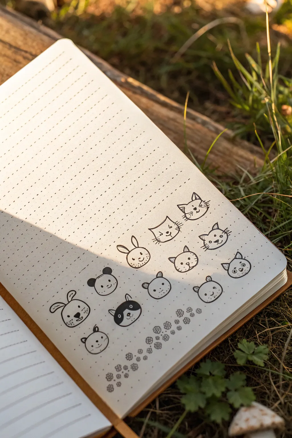
Transform simple geometric shapes into a charming menagerie of cats, bunnies, pandas, and bears. This tutorial guides you through creating playful, minimalist animal faces perfect for bullet journals, planners, or simply practicing your drawing skills.
How-To Guide
Materials
- Dotted or grid notebook (A5 size recommended)
- Black fineliner pen (0.3mm or 0.5mm)
- Black brush pen or thicker marker (for filling dark areas)
- Pencil (HB or 2B)
- Eraser
Step 1: Planning and Layout
-
Define the grid:
Start by identifying the structure of your dotted journal page. You will generally be working within a 2×2 or 3×3 square grid for each head to keep sizes consistent. -
Sketch basic circles:
Using your pencil, lightly sketch a series of circles across the page. aim for roughly the size of a large coin. Don’t worry about perfect roundness; a slightly organic shape adds character. -
Row arrangement:
Create three rows of faces. To match the example, place four circles in the top row, four in the middle, and four in the bottom row, leaving enough vertical space between rows for ears.
Expression Variation
Change the eye shapes to alter expressions. Use inverted arcs for happy sleeping faces, straight lines for annoyance, or > < symbols for excitement.
Step 2: Adding Animal Features
-
Cat cars (Top Row):
On the top row circles, pencil in triangular ears. Vary them slightly—some can be pointy equilateral triangles, while others might tilt outward for variety. -
Bear and bunny ears (Middle Row):
For the middle row, mix your shapes. Draw long, oval loops for a bunny, small semicircles for bears, and pointed triangles for cats. I like to alternate the species to keep the visual rhythm interesting. -
Rounded ears (Bottom Row):
The bottom row features mostly rounded ears. Sketch small semicircles on the top corners for bears, pandas, or even a dog. For the folded-ear dog, draw floppy triangles pointing down. -
Face guidelines:
Lightly mark a horizontal line slightly below the center of each circle. This is where the eyes and nose will generally align.
Ink Smudging?
If your fineliner smudges when erasing pencil lines, wait longer for the ink to set, or switch to a faster-drying sketching pen like a Micron.
Step 3: Inking the Outlines
-
Trace the head shapes:
Switch to your black fineliner. Carefully trace over your pencil circles. For a looser feel, break the line slightly at the top where the ears connect rather than drawing a continuous closed circle. -
Ink the ears:
Go over the ear shapes. For the cats, add tiny inner triangles. For the bunny, trace the long loops. If you sketched a panda, ink the outer ear shape but leave the inside ready for filling later. -
Erase pencil marks:
Once the ink is completely dry—give it a solid minute—gently erase the pencil sketches underneath to reveal clean outlines.
Step 4: Drawing Faces and Details
-
Simple dot eyes:
Using the fineliner, place two small dots for eyes on the guide line you imagined earlier. Keep them relatively wide apart for a cute ‘kawaii’ look. -
Noses and mouths:
Draw tiny triangles or ovals for noses between the eyes. Connect the nose to a small ‘w’ shape or a simple curved line to verify the mouth. -
Whiskers and cheeks:
Add three short horizontal lines on each cheek for the cats. For the other animals, you can add tiny ellipses for blush marks or freckles. -
Panda details:
For the panda face, draw outlines around the eyes for patches. Using your thicker marker or brush pen, fill in these eye patches and the ears completely black. -
Spotty dog details:
If drawing a spotted dog, outline a patch over one eye or ear and fill it in with the thicker marker, leaving a small white circle for the eye if the patch covers it. -
Texture details:
Add tiny dashes or dots on the chins of the bunnies or bears to suggest fur texture without cluttering the simple design.
Step 5: Decorative Border
-
Paw print guide:
Beneath the final row of faces, lightly sketch a wavy guideline with your pencil for the decorative border. -
Drawing paws:
Along the wavy line, draw small paw prints. Each print consists of one larger central circle/oval and three or four smaller dots curved above it. -
Flower accents:
Interperse the paw prints with simple five-petal flower doodles to fill the gaps and create a cohesive border pattern.
Now you have a lively page of characters ready to brighten up your daily notes
Smiley Fruit Slices

Capture the fresh essence of summer with this spread of bold, illustrative fruit sketches. These charming line drawings use confident ink strokes to create a series of recognizable and playful produce designs, perfect for decorating your bullet journal or sketchbook.
Detailed Instructions
Materials
- A5 dotted or blank notebook (cream paper recommended)
- Black brush pen or fineliner (0.5mm tip)
- Pencil for sketching
- Eraser
Step 1: Planning the Layout
-
Visualize the spread:
Begin by imagining where your fruit doodles will sit on the open pages. You want a scattered, organic feel rather than a rigid grid, allowing plenty of negative space between each element. -
Lightly sketch placements:
With your pencil, lightly draw loose circles or triangles to mark the general location for each fruit. Place a tomato-like shape on top left, a watermelon wedge below it, and a large citrus slice on the right page.
Uneven Circles?
Don’t stress if your circles aren’t perfect! The organic, wobbly nature of fruit actually looks better with imperfect, hand-drawn lines rather than compass-perfect geometry.
Step 2: Drawing the left page
-
Outline the tomato:
Start the tomato shape on the top left. Draw a distinct, leafy starburst for the stem first, then curve a rounded, slightly organic circle underneath it to form the body. -
Add tomato details:
Add a small highlight curve inside the tomato skin to suggest shine. -
Draw the branch:
To the right of the tomato, sketch a small branch with three simple oval leaves on each side. -
Create the tomato slice:
Below the branch, draw a smaller circle. Add a double outline for the rind, and then sketch small seed pockets inside to create a cross-section view. -
Outline the watermelon:
Move to the bottom section. Draw a large triangle with a curved bottom edge. Add a second curved line parallel to the bottom to create the rind thickness. -
Seed the watermelon:
Fill the watermelon slice with small, solid black dots for seeds, grouping them slightly toward the center. -
Add decorative flourishes:
Draw small, curly vine tendrils near the tomato and simple curved motion lines near the watermelon to give the page energy.
Step 3: Drawing the right page
-
Draw the large citrus slice:
On the upper right page, draw a large distinct circle. I find it helps to rotate the book slightly to get a smoother curve with the pen. -
Create the segments:
Draw a smaller circle inside the first one. Find the center point and draw straight lines radiating outward like wheel spokes to create the fruit segments. -
Detail the spiral:
Below the citrus, draw a tight, concentric spiral shape to represent a hard candy or a snail shell flourish. -
Sketch the leaf stem:
To the right of the spiral, draw a long, slightly curved line for a stem. Add pairs of small, pointed leaves going all the way up the stem. -
Outline the strawberry:
At the bottom of the page, draw a rounded triangle shape for the berry body. Top it with a wild, spiky set of leaves that flare outward. -
Texture the strawberry:
Fill the berry with small, uncolored circles to represent the seeds on the surface.
Add a Splash of Color
Use watercolor markers or colored pencils to fill only the ‘meat’ of the fruit, leaving the rinds white for a fresh, high-contrast illustrative look.
Step 4: Finishing Touches
-
Ink the lines:
Go over your pencil sketches with your black pen. Use a confident hand; slight wobbles add to the hand-drawn charm. -
Vary line weight:
Go back and thicken the outer edges of the fruits slightly to make them pop off the page. -
Erase guidelines:
Wait for the ink to become completely dry to the touch, then gently erase all remaining pencil marks to leave a clean, crisp finish.
Now you have a refreshing layout of fruit doodles ready to brighten your journal.
Donuts and Sprinkles

Capture the cozy vibe of a coffee shop sketching session with this set of delightful donut doodles. Using simple pen lines, these illustrations range from basic outlines to detailed, sprinkle-covered treats that pop off the page.
Step-by-Step Tutorial
Materials
- Spiral-bound sketchbook or drawing paper
- Fine-liner pen (black, 0.5mm or 0.8mm)
- Pencil (HB or 2B) for initial sketching
- Eraser
Step 1: Basic Shapes & Outlines
-
Position your page:
Start by orienting your sketchbook to a fresh, blank page. Visualize where your three main donut drawings will go: one large one in the center-bottom, one medium one above it, and a smaller partial one at the top left. -
Sketch the main donut ellipses:
Using your pencil lightly, draw a large, slightly flattened oval (ellipse) in the bottom third of the page. This will become the most detailed donut. -
Add the upper donut shape:
Above the first shape, sketch another slightly smaller oval. Keep the lines faint so they are easy to erase later. -
Draw the center holes:
Inside each of your main ovals, draw a smaller, concentric oval. For the bottom donut, make the hole larger to show off more detail; for the top one, keep it tighter. -
Sketch the partial donut:
In the top left corner, draw just the edge of a donut, like a ‘C’ shape facing downwards, implying a donut that is partially off the page.
Wobbly Lines?
Embrace the imperfection! Donut dough isn’t perfectly round. If your hand shakes, it actually makes the pastry look fluffier and more realistic.
Step 2: Inking the Details
-
Ink the top donut outline:
Switch to your fine-liner pen. Carefully trace the outer edge of the upper donut. Use a slightly shaky or organic line to make it look like dough rather than a perfect geometric shape. -
Add the frosting line:
On the top donut, draw a wavy line inside the outer edge. This creates the illusion of frosting poured over the top. -
Texture the top donut:
Stipple tiny dots all over the frosting area of this upper donut. This gives the appearance of sugar or a textured glaze. Add a few small curved lines at the bottom curve of the donut for depth. -
Ink the bottom donut’s frosting:
Moving to the large bottom donut, draw a very bold, wavy line along the bottom half. Let the ‘drips’ of frosting extend down significantly, creating a thick glaze look. -
Detail the inner hole:
Ink the center hole of the large donut. Draw a second curved line inside the hole to show the thickness of the dough (the 3D wall of the donut). -
Add sprinkles:
Scatter small, open circles across the frosting of the large bottom donut. These represent ring-shaped cereal or candy toppings. -
Ink the rest of the bottom donut:
Complete the outer edge of the bottom donut with your pen, connecting the frosting drips to the rest of the dough shape. Add light hatching lines on the bottom right for shadow. -
Ink the partial donut:
Trace over your top-left corner pencil sketch. Add a simple curved line in the middle to suggest the hole, keeping it minimalist.
Pop of Dimension
Add tiny hash marks or thin curved lines on the un-frosted parts of the donut (the bottom edges) to suggest shadows and rounded volume.
Step 3: Fillers & Finishing Touches
-
Draw the pencil doodle:
In the space between the two main donuts, draw a stylized pencil. Use two parallel lines for the body, a cone for the tip, and fill the tip with black ink. Add stripes for the ferrule. -
Add floating elements:
Draw a few small circles and a tiny triangle shape (like a pizza slice or pie wedge) on the right side of the page to balance the composition. -
Incorporate small geometric fillers:
Scatter a couple of small circles with dots inside them (like buttons or small candies) near the pencil and the bottom donut. -
Erase pencil guides:
Wait a moment for the ink to dry completely. Gently run your eraser over the whole page to remove the initial graphite structural lines. -
Final line weight check:
Look over your drawing. If you want the frosting to look thicker, go over the drip lines one more time to darken them slightly.
Now you have a charming page of confectionery art ready to be admired
Lightbulb Idea Doodles

These charming lightbulb illustrations transform simple shapes into symbols of bright ideas and heartfelt inspiration. Using clean black ink on cream cardstock creates a classic, minimalist look perfect for greeting cards or journal pages.
How-To Guide
Materials
- Cream or off-white cardstock (heavyweight)
- Black fine-liner pen (0.3mm or 0.5mm)
- Pencil (HB)
- Soft eraser
- Ruler (optional)
Step 1: Drafting the Shapes
-
Outline the top bulb:
Begin by sketching a circle lightly in pencil near the upper third of your paper. This doesn’t need to be perfect; a loose circle works fine. -
Form the base connection:
Draw two short, parallel lines extending downward from the bottom of your circle, angling them slightly inward. -
Add the screw base:
Below the connecting lines, sketch a small rectangle with rounded corners for the metal screw base, tapering slightly at the very bottom. -
Sketch the bottom bulb:
Repeat the process for the second bulb near the bottom right, but incline this one slightly so it looks like it’s resting on its side. -
Add decorative elements:
Lightly pencil in a heart shape between the two bulbs and scatter a few five-pointed stars around the open spaces to balance the composition.
Step 2: Inking the Details
-
Trace the glass outlines:
Switch to your black fine-liner. Carefully trace the outer circular part of the top bulb, but leave a small gap or break in the line to suggest a reflection on the glass. -
Draw the filament:
Inside the top bulb, draw a heart-shaped filament. Connect the bottom of this heart to the base with a zig-zag or coiled line to look like a spring. -
Ink the screw base:
Draw the metal base using curved horizontal lines to mimic the screw threads. Darken the very tip of the base completely black for contrast. -
Add the radiance:
Draw short, straight lines radiating outward from the top bulb to show it is ‘glowing’ or turned on. Vary the lengths slightly for a natural look. -
Outline the bottom bulb:
Ink the outline of the lower bulb. For this one, draw a simpler, standard wire filament inside—just two wires holding a zig-zag line. -
Detail the second base:
Finish the bottom bulb’s base with similar curved thread lines and a solid black tip. -
Ink the scattered shapes:
Go over your pencil stars. Draw them with a continuous line if you can, or build them with small Vs. -
Texture the heart:
Outline the central heart shape. Fill the interior with closely spaced vertical hatching lines to make it stand out against the open bulbs.
Reflection perfection
When drawing the glass curve, lift your pen abruptly to create a gap. This negative space mimics a light reflection and makes the glass look shiny.
Step 3: Finishing Touches
-
Erase pencil guides:
Wait at least five minutes to ensure the ink is completely dry, then gently erase all visible pencil marks. -
Enhance line weight:
I like to go back and thicken the outer edges of the glass bulbs just slightly to make them pop off the page. -
Review contrast:
Check your hatched heart and the black tips of the bulbs. If necessary, go over them again to ensure the black is deep and solid.
Wobbly lines?
Embrace the imperfection! If your circles aren’t perfect, it adds to the hand-drawn ‘doodle’ charm. Don’t restart; just keep drawing.
Your bright idea is now ready to share or frame
Mini Houses and Windows
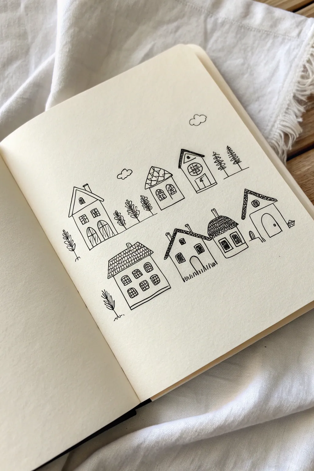
Create a charming two-tiered street scene using simple geometric shapes and confident ink lines. This sketchbook page features a variety of tiny, quirky homes nestled among stylized trees, perfect for practicing architectural details and relaxation.
Step-by-Step
Materials
- Sketchbook or drawing paper (cream or white)
- Black fineliner pen (0.3mm or 0.5mm)
- Pencil (HB)
- Eraser
Step 1: Setting the Slopes
-
Draft the hill lines:
Using your pencil, lightly draw two parallel, sloped lines across your page. These don’t need to be perfectly straight; a slight diagonal angle from bottom-left to top-right adds visual interest. -
Block in house shapes:
Sketch basic rectangles and squares along these lines. Vary the heights and widths to create a diverse neighborhood. Place three houses on the top row and three on the bottom row, leaving gaps between them for trees. -
Add roof outlines:
Top each rectangle with a different roof style. Try a classic triangle, a flattened trapezoid, or a rounded dome shape. Don’t worry about details yet; just get the silhouette right.
Wobbly Lines?
Don’t stress over mistakes. If a line goes crooked, go over it again to thicken it intentionally, making it a stylistic choice rather than an error.
Step 2: Inking the Top Row
-
Outline the first house:
Starting with the top-left house, trace your pencil lines with the fineliner. Draw the main body and a triangular roof with a chimney. Add a small ‘V’ inside the gable for architectural depth. -
Detail the first windows and doors:
Draw two tall, arched doors at the bottom and two square windows above them. Add a tiny diamond window near the roof peak. Use simple grid lines inside the windows for panes. -
Draw the center house:
Available next is the middle house. Ink the walls and a rounded, textured roof. To mimic shingles, draw small ‘U’ shapes or a loose scale pattern across the roof area. -
Add arched windows:
Give this middle house character with two arched windows featuring grid panes. Keep your lines loose; they don’t need to be ruler-straight. -
Finish the top row house:
For the third house on the right, draw a tall, narrow structure with a deeply pitched roof. Add a large circular window with cross-hatching and a simple rectangular door. -
Plant the top trees:
Fill the gaps between these houses with stylized trees. Draw vertical sticks for trunks and use loops or zig-zags for leaves. I like to add two tall pine trees on the far right using stacked horizontal dashes.
Step 3: Inking the Bottom Row
-
Create the large brick house:
Move to the bottom left. Draw a wider house with a large rectangular roof. Fill the roof with a grid pattern to suggest tiles or slate. -
Add the window grid:
Draw four square windows arranged in a 2×2 layout on the façade. Give them rounded tops for a softer look. -
Draw the tiny cottage:
Next to it, draw a smaller, quaint house with a simple peaked roof. Add a single arched door and a small attic window. -
Create the grass texture:
At the base of this small cottage, draw short vertical strokes to represent grass growing up against the foundation. -
Ink the dome house:
Draw the next house with a rounded, dome-like roof. Cross-hatch the roof heavily to make it look thatched or textured. Add a chimney poking out the top. -
The final house:
On the far right, draw a house with an asymmetrical, sloped roof. Give it a large arched doorway and a small circular window. -
Add final foliage:
Draw a small sapling on the far left and a few minimal details like clouds (simple scallop shapes) floating in the sky above the village.
Add a popup color
Use a single watercolor wash or a colored pencil in a muted tone (like terracotta or sage green) to fill just the doors or roofs for a minimal splash of color.
Step 4: Clean Up
-
Erase guidelines:
Wait at least five minutes to ensure the ink is completely dry. Gently erase all the underlying pencil sketches to reveal the crisp black lines.
Now you have a cozy little street scene ready to be expanded or colored
Simple Keys and Charms

Learn to sketch a charming trio of vintage-inspired keys and a heart lock using simple fine-line drawing techniques. This minimalist black ink illustration relies on clean lines and subtle hatching to create depth without needing complex shading.
Detailed Instructions
Materials
- Sketchbook or drawing paper (smooth bristol or mixed media)
- HB or 2H graphite pencil
- Kneaded eraser
- Fine liner pen (size 01 or 03), black
- Thicker fine liner (size 05 or 08) for filling
- Ruler (optional)
Step 1: Sketching the Foundations
-
Map the placements:
Visualize a triangle on your page. Lightly mark the positions for the two keys at the top and the heart lock centered below them with your pencil. -
Draft the left key head:
For the left key, draw a heart shape on its side as the handle. Sketch a smaller heart inside it to create the open loop. -
Extend the left shaft:
Draw straight parallel lines extending downward and slightly right from the heart handle. Add a small ‘neck’ detail where the handle meets the shaft. -
Draft the right key head:
For the second key simply draw a rounded heart shape. This one stands vertically. -
Detail the right shaft:
Draw a long, thin cylinder coming down from the second heart. Add two small rings near the top of the shaft for decoration. -
Add the bit and tag:
Sketch the rectangular ‘teeth’ at the bottom of both keys. For the right key, draw a wavy guideline extending from the handle to a rectangular tag shape that hangs down. -
Outline the lock:
Draw a plump, simple heart shape at the bottom. Place a keyhole shape—a circle with a triangle beneath it—in the center.
Chain Reaction
When drawing the chain links, draw every other link first as a full oval, then connect them with half-ovals to create a realistic interlocking look.
Step 2: Inking the Outlines
-
Trace the left key:
Using your 01 or 03 fine liner, carefully go over your pencil lines for the first key. Keep your hand steady for the long shaft lines. -
Add the feather charm:
Draw a thin string hanging from the left key’s handle. Sketch a central spine, then add quick, short strokes outward to create the fletching of a feather. -
Ink the right key:
Outline the second key. When you reach the chain, draw tiny, interlocking oval loops along your wavy guideline. -
Define the tag:
Ink the rectangular tag. Draw a small circle at the top for the hole, and sketch a small heart shape in the center of the tag. -
Complete the lock:
Go over the bottom heart shape with confident curves. Make sure the points of the heart are sharp.
Step 3: Creating Texture and Depth
-
Fill solid areas:
Switch to a thicker pen (05 or 08) or carefully use your fine liner to color in the keyhole on the bottom heart and the main body of the tag, leaving the small heart white. -
Hatch the left key:
Add very fine diagonal lines (hatching) on the shadowed side of the left key’s shaft to make it look cylindrical. -
Texture the right key:
Add small horizontal curved lines at the top and bottom of the shaft rings to suggest roundness. -
Shade the heart lock:
I find that adding vertical curved hatching lines on the left side of the heart gives it a nice rounded volume. Keep the lines close together near the edge and spread them out as you move inward. -
Refine the feather:
Go back to the feather and add a few darker strokes near the spine to give it depth and softness. -
Erase guidelines:
Wait until the ink is completely dry to avoid smudges, then gently erase all remaining pencil marks. -
Final touches:
Assess your drawing. If any lines look too thin or broken, re-trace them carefully to thicken the outline slightly.
Golden Touch
Use a metallic gold gel pen to outline just the heart shapes or the key teeth for a subtle, magical pop of mixed-media shine.
Now you have a timeless set of keys ready to unlock some creativity in your journal
Fish and Bubbles
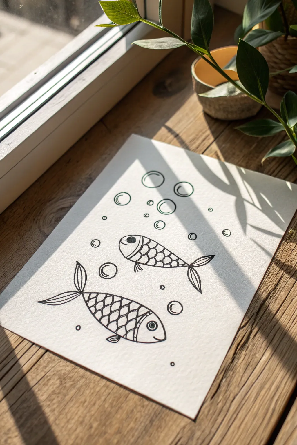
Capture the simple joy of underwater life with this minimalistic line art doodle. Creating these stylized fish with their distinct scale patterns and floating bubbles is a relaxing exercise in basic shapes and repetition.
Step-by-Step Guide
Materials
- High-quality white drawing paper or cardstock
- Fine-liner pen (black, 0.5mm or 0.8mm)
- Pencil (HB or 2B)
- Eraser
Step 1: Sketching the Foundations
-
Outline the bodies:
Begin by lightly sketching two elongated oval shapes with your pencil. Place one higher up on the right and the second lower down on the left, angled slightly to suggest movement. -
Add the tails:
For each fish, draw a forked tail at the rear end of the oval. Make the tails flow elegantly, curving slightly outward like the leaves of a plant. -
Define the heads:
Draw a curved vertical line at the front of each oval to separate the head from the body. This creates the ‘face’ area where the eye will go. -
Sketch the fins:
Add small, triangular fins to the top and bottom of the fish bodies. Keep them simple and streamlined.
Wobbly lines?
Don’t stress if your circles aren’t perfect! The organic wobbly look adds charm. If a line goes astray, just thicken it slightly to blend the mistake.
Step 2: Inking the Details
-
Ink the main outlines:
Switch to your black fine-liner pen. Carefully trace over your pencil outlines for the bodies and tails, making the lines smooth and continuous. -
Draw the eyes:
Inside the head section of the top fish, draw a large circle with a filled-in pupil. For the bottom fish, place the eye lower down to give them different personalities. -
Create the scale grid:
On the body of each fish (behind the head line), draw a series of curved, diagonal lines crossing each other to form a diamond grid pattern. -
Round out the scales:
Inside each diamond shape you just created, draw a small curve or ‘u’ shape. This softens the grid and makes it look like overlapping fish scales. -
Detail the tails:
Add a few internal lines to the tails and fins to suggest texture and ribbing, following the curve of the outer shape.
Step 3: Atmospheric Additions
-
Draw large bubbles:
Scatter 4-5 large circles around the fish. I like to group a couple together near the top to balance the composition. -
Add bubble reflections:
Inside each large bubble, draw a smaller crescent or oval shape near the edge to indicate a shiny reflection. -
Add medium bubbles:
Draw slightly smaller circles floating between the large ones and the fish. -
Sprinkle tiny bubbles:
Fill the empty spaces with tiny circular dots or very small rings. This adds density and makes the water feel fizzy.
Make it Splash
Use watercolor paints to fill the bubbles with pale blue washes, or add a pop of gold ink to specific scales for a magical, shimmering underwater effect.
Step 4: Finishing Touches
-
Thicken key lines:
Go back over the outer contours of the fish and the larger bubbles to slightly thicken the line weight, making them pop against the background. -
Erase pencil marks:
Wait until the ink is completely dry to avoid smudging. Then, gently erase all the underlying pencil sketches. -
Review and refine:
Check for any gaps in your lines or uneven scales and touch them up with your pen for a crisp, clean finish.
You have now created a charming underwater scene perfect for a greeting card or sketchbook page
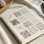
Easy Patterns for Filler Space
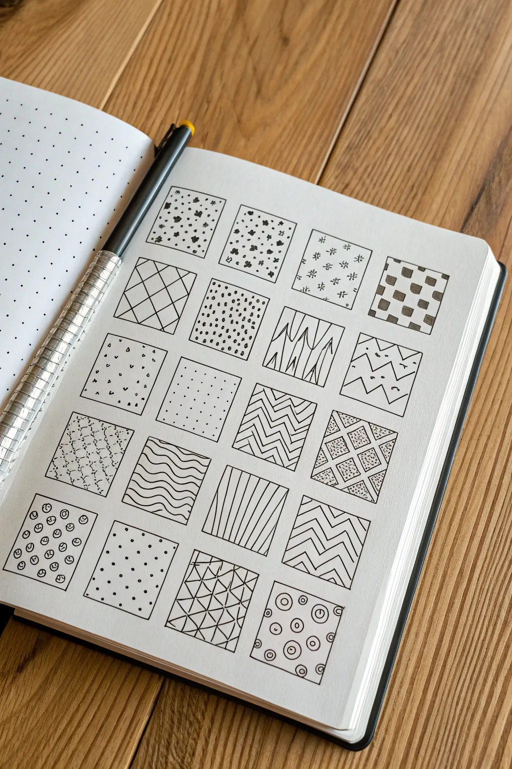
Transform a blank page into a sampler of Zen-like textures with this satisfying grid of doodle patterns. This project is a fantastic way to practice steady line work and discover your favorite filler designs for future journaling spreads.
Step-by-Step Tutorial
Materials
- A5 Dot Grid Notebook (or dotted paper)
- Black Fineliner Pen (0.3mm or 0.5mm)
- Ruler or straight edge
- Pencil (optional, for drafting grid lines)
Step 1: Setting the Grid
-
Draw the main structure:
Begin by drawing a grid of twenty squares on your dot grid paper. Arrange them in a layout of 4 columns by 5 rows. -
Size the boxes:
Use the dots as a guide to ensure every square is identical in size; a 6×6 dot spacing (creating a 5-unit square) usually works perfectly on standard journals. -
Ink the outlines:
Once your layout is planned, carefully ink the borders of all twenty squares with your fineliner and a ruler for crisp, clean edges.
Pro Tip: Pen Pressure
Keep your hand relaxed. Tense muscles lead to shaky lines. Rotating the entire notebook is often easier than contorting your wrist for awkward angles.
Step 2: Row 1: Organic & Geometric Basics
-
create speckles:
In the first square, fill the space with small, irregular ink blobbles and dots. Keep them random but evenly distributed. -
Add floral clusters:
For the second box, draw tiny clusters of three distinct dots or ‘petals’ to mimic small flowers, rotating them slightly as you fill the area. -
Draw star sparks:
Fill the third square with simplified asterisk shapes or six-pointed stars, leaving plenty of white space between them. -
Make a checkerboard:
Draw a traditional grid inside the fourth square, then color in alternating squares to create a classic checkerboard pattern.
Step 3: Row 2: Lines & Density
-
Create a diamond grid:
Draw diagonal lines going one way, then cross them perpendicularly to create large diamonds. Inking this freehand gives it a charming look. -
Stipple density:
Fill the next box entirely with simple dots. Vary the density slightly to keep it interesting, but try not to let them touch. -
Sketch bamboo stalks:
Draw vertical lines that split and intersect slightly, adding small triangular shapes where lines meet to resemble bamboo or grass. -
Draw zig-zags:
Create horizontal zig-zag lines across the square. Add a small dot or ‘v’ shape in the valleys and peaks for extra detail.
Oops! Uneven Spacing?
If a pattern looks uneven, add a few tiny dots in the larger empty gaps. This ‘filler’ technique visually balances the density without ruining the design.
Step 4: Row 3: Minimalist Textures
-
Scatter confetti:
Draw tiny triangles, small circles, and single dots scattered randomly like falling confetti. -
Use a simple dot grid:
Recreate the dot grid of your paper but emphasize it by re-dotting over the existing guide marks to make a bold, orderly pattern. -
Draw herringbone chevrons:
Draw vertical columns of tightly packed zig-zags. I find it helps to draw faint vertical guidelines first to keep the columns straight. -
Cross-hatch diamonds:
Draw a large diamond grid, but fill alternating diamonds with a dense stippling or ‘sand’ texture.
Step 5: Row 4: Waves & Stripes
-
create scallop scales:
Starting from the bottom, draw rows of small ‘U’ shapes or scallops that overlap like fish scales as you move upward. -
Alternate waves:
Draw horizontal bands, alternating between straight lines and wavy lines. -
Draw uneven vertical stripes:
Fill the square with vertical lines, but vary the spacing intentionally so some are close together and others are wider apart. -
Make chunky chevrons:
Draw thick, bold zig-zag lines horizontally across the box, repeating the pattern from top to bottom.
Step 6: Row 5: Circles & Triangles
-
Draw circle clusters:
Fill the space with small circles. Inside each circle, add a tiny line, dot, or curve to make them look like beads or buttons. -
Make a polka dot grid:
Draw rows of small, solid black circles, arranging them in a strictly aligned grid pattern. -
Create geometric shards:
Draw random straight lines intersecting across the box to create many small triangles. Add a second line inside some triangles for depth. -
Sketch bullseyes:
Finish the last square with scattered ‘bullseye’ shapes—a small circle with a dot in the center.
Now you have a library of patterns ready to decorate any future page layout
One-Line Doodle Challenge
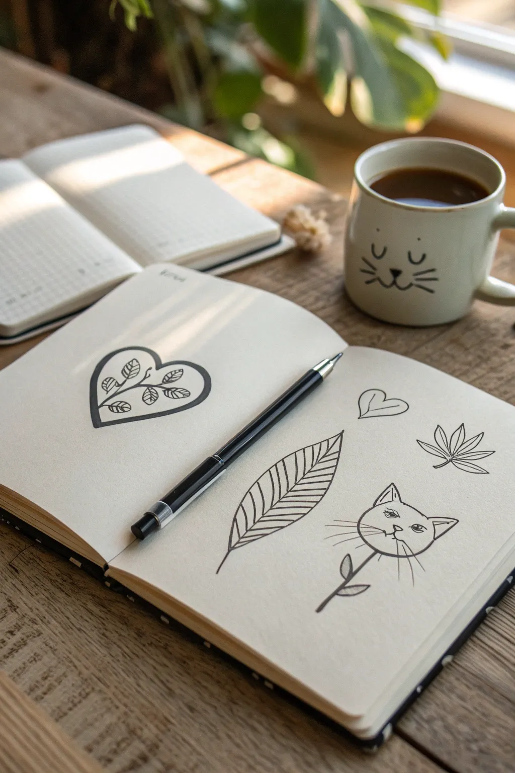
Create a charming set of simple line art illustrations featuring a botanical heart, a structured leaf, and a playful cat-flower hybrid. These clean, black-ink sketches rely on confident lines and minimal shading to create a modern, quirky aesthetic perfect for journaling.
How-To Guide
Materials
- Blank notebook or sketchbook (cream or off-white paper recommended)
- Black fineliner pen (0.5mm or 0.8mm)
- Pencil (HB or H for light sketching)
- Soft styling eraser
- Ruler (optional, but helpful for symmetry)
Step 1: Drawing the Botanical Heart
-
Outline the heart:
Begin on the left page by drawing a large, rounded heart shape. Keep the lines relatively thick and bold. It doesn’t need to be perfectly symmetrical; a slight tilt adds character. -
Add the inner outline:
Draw a second, thinner line just inside the main heart outline. This creates a frame effect that makes the central design pop. -
Create the central stem:
Starting from the bottom point of the heart, draw a curved line extending upwards and slightly to the right, stopping just before the top dip. -
Sketch the leaves:
Add small, oval-shaped leaves branching off the central stem. Place about three on the left and two on the right to balance the negative space. -
Detail the leaf veins:
Inside each tiny leaf, draw a center line and tiny diagonal dashes to represent veins. This adds texture without overcomplicating the simple design.
Ink Flow Tip
For smooth, consistent lines like these, hold your pen slightly more upright than usual. This prevents ink pooling at the start and end of strokes.
Step 2: Creating the Structured Leaf
-
Draw the midrib:
On the right page, start with a long, gently curved line for the leaf’s center spine. Make it lean slightly to the left. -
Form the leaf shape:
Draw the outer contour of the leaf. It should be wide at the bottom and taper to a sharp point at the top, resembling a beech or birch leaf shape. -
Add the veins:
Beginning at the bottom, draw parallel diagonal lines extending from the spine to the outer edge on both sides. Keep the spacing consistent. -
Refine the line weight:
Go over the outer edge of the leaf again to make it slightly bolder than the internal vein lines, giving the doodle more visual weight.
Shaky Lines?
If your long lines (like the leaf stem) come out wavy, don’t restart. Thicken the line deliberately to hide the wobble or turn it into a textured stem.
Step 3: Sketching the Cat-Flower
-
Draw the head shape:
In the bottom right corner, draw a circle for the cat’s head. It acts as the ‘blossom’ of this whimsical flower. -
Add the ears:
Sketch two triangles on top of the circle. Draw a smaller triangle inside slighty to the side to give the ears depth. -
Draw the stem:
Extend a single straight line downwards from the center of the cat’s chin. This serves as the flower stem. -
Add stem leaves:
Draw two simple teardrop shapes on opposite sides of the stem to act as leaves. For contrast, fill the left leaf in completely with black ink. -
Give it a face:
Draw two almond shapes for eyes with heavy upper lids. Add a tiny triangle nose and a classic ‘w’ mouth. Don’t forget the long whiskers extending past the face outline.
Step 4: Final Flourishes
-
Add the floating heart:
Draw a small, simple heart floating above the leaf doodle. Add a swift inner line on one side to suggest depth or reflection. -
Sketch the cannabis-style leaf:
To the right of the main leaf, draw a smaller, five-pointed jagged leaf. This balances the composition with a sharper geometric shape. -
Erase pencil guides:
Wait at least five minutes to ensure the ink is completely dry. I always check by lightly touching a heavy ink area before erasing any underlying pencil sketches.
Now you have a page filled with charming, personalized doodles ready to brighten your day

Have a question or want to share your own experience? I'd love to hear from you in the comments below!