When you want to draw but don’t want a big, complicated project, simple drawing ideas are the best kind of creative shortcut. I like using quick, recognizable subjects and easy patterns to get that satisfying “I made something!” feeling fast.
Easy Cat Face Doodle
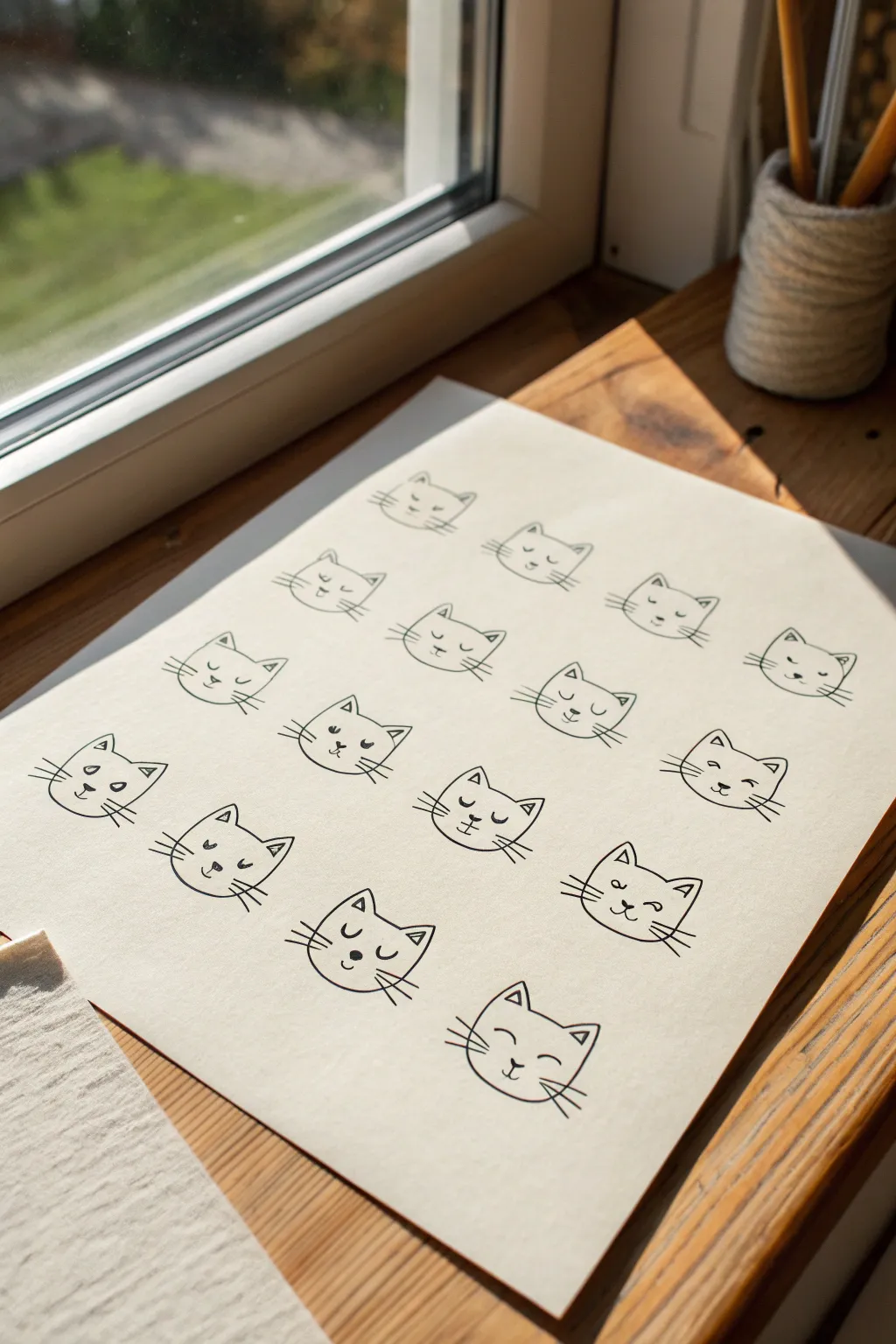
Brighten up your sketchbook or bullet journal with this adorable collection of minimalist cat faces. Using just a few simple lines and shapes, you’ll create a repetitive yet charming pattern that celebrates varied feline expressions.
Step-by-Step
Materials
- High-quality white drawing paper or cardstock (A4 or letter size)
- Fine-liner pen (black, size 03 or 05)
- Pencil (HB or 2B for sketching guide lines)
- Eraser
- Ruler
Step 1: Planning the Layout
-
Prepare the grid:
Start by lightly drawing a grid on your paper using your pencil and ruler. You want to aim for roughly four columns and five or six rows to match the reference, leaving generous margins around the edges. -
Space the faces:
Within your grid, mark the center point of each cell. This is where the nose of each cat will eventually go, ensuring your doodles are evenly spaced rather than clustered together. -
Sketch the outlines:
Before committing with ink, lightly pencil in the basic head shapes for each spot. Think of a soft, rounded trapezoid shape or a flattened oval top with pointed ears.
Step 2: Drawing the Base Shapes
-
Inking the ears:
Switch to your black fine-liner. Starting with the top left cat, draw two small triangles for ears. Keep them slightly rounded at the tips for a softer, cuter look. -
Connect the forehead:
Draw a smooth, slightly curved line connecting the inner corners of the two ear triangles. This forms the top of the head. -
Shape the cheeks:
From the outer base of each ear, draw a curved line moving downward and inward. Do not connect them at the bottom just yet; leave the chin area open or very subtly suggested. -
Repeat across the row:
Continue this process for the entire first row of cats. I find it easier to draw all the head shapes first before adding details, as it helps maintain a consistent size. -
Fill the page:
Proceed down the page, inking the head outlines for the remaining rows. Don’t worry if they aren’t identical; slight variations add character.
Uneven Faces?
If your cats look lopsided, try drawing a very faint vertical center line through each head shape during the pencil phase to help align the nose and eyes perfectly.
Step 3: Adding Features & Expressions
-
Draw the noses:
Place a small, solid black triangle or a tiny heart shape in the lower middle of each face. This anchors the expression. -
Add the mouth:
From the bottom point of the nose, draw a small joining line downwards, then split it into a ‘w’ shape or two upward curves to create the classic cat smile. -
Create the eyes:
This is where you can have fun. For some cats, draw simple dots for open eyes. For others, draw curved upside-down ‘U’ shapes for sleeping or blinking eyes. -
Vary the expressions:
Try adding straight horizontal lines for ‘unimpressed’ eyes or small angled lines above the eyes for eyebrows on a few cats to mix up the moods. -
Detail the ears:
Add a small triangle inside each ear outline to give them depth. You can make these floating triangles or connect them to the outer line. -
Add whiskers:
Draw three straight lines fanning out from each cheek. Keep these lines quick and confident so they taper naturally at the ends.
Make it a Pattern
Scan your finished drawing and duplicate it digitally to create your own custom wrapping paper, or color in the cats with watercolor washes for a vibrant art print.
Step 4: Finishing Touches
-
Let the ink dry:
Give your drawing a few minutes to ensure the fine-liner ink is completely set. Smudging at this stage is heartbreaking. -
Erase guidelines:
Gently erase your pencil grid and any sketch lines that are still visible underneath the ink. Hold the paper taut with one hand to prevent wrinkling. -
Check for gaps:
Look over the sheet for any missed whiskers or uncolored noses and touch them up with your pen.
Now you have a charming sheet of feline expressions ready to display or gift to a cat lover


Quick Puppy With Floppy Ears
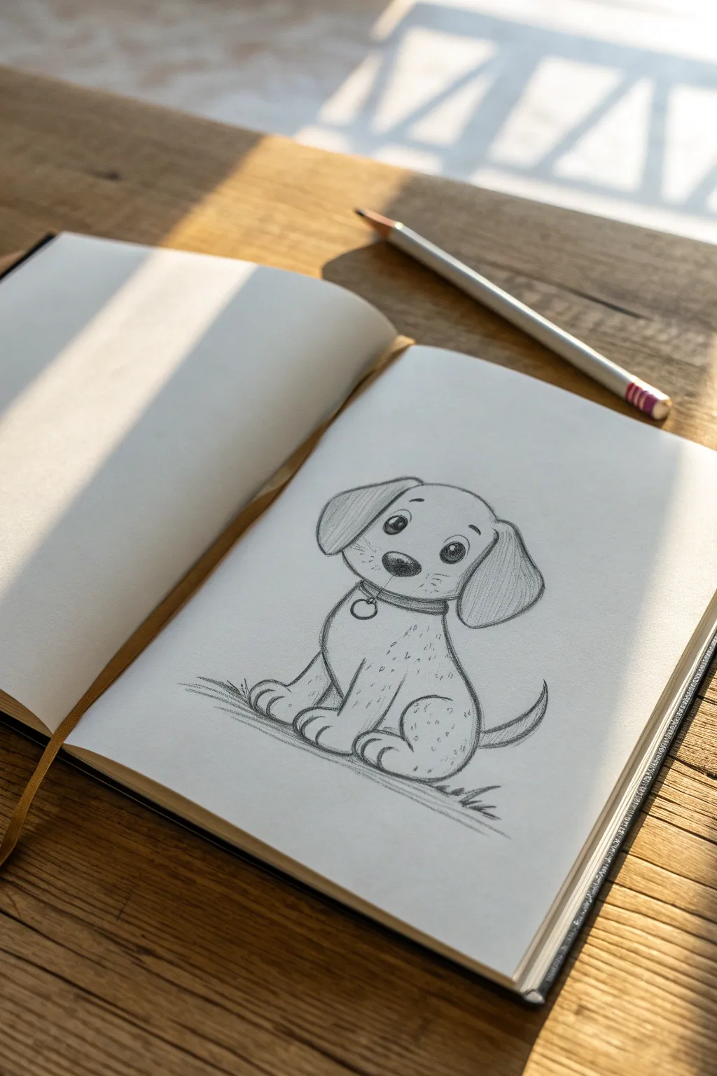
Learn to draw this adorable sitting puppy with expressive eyes and floppy ears using just a pencil. This characterful sketch captures a sweet, waiting pose that is perfect for filling a page in your sketchbook with cuteness.
Step-by-Step Tutorial
Materials
- HB or 2B Graphite Pencil
- Sketchbook or Drawing Paper
- Eraser (kneaded or vinyl)
Step 1: Creating the Framework
-
Head shape:
Begin by lightly sketching a rounded, slightly flattened circle for the head. Keep your pressure light so you can erase guidelines later. -
Body curve:
Draw a smaller, pear-shaped curve directly below the head for the body. The top of the pear should tuck slightly under the head shape. -
Center lines:
Add a faint vertical line down the center of the face and a horizontal line halfway down the head to help place the features symmetrically.
Step 2: Drawing the Face
-
Nose placement:
Draw a soft, rounded triangle for the nose right at the intersection of your face guidelines. -
Muzzle definition:
Sketch a small curve under the nose for the mouth, and add two upward curves on either side to suggest cheeks. -
Eye outlines:
Place two large ovals above the nose line, spacing them evenly apart. These should be relatively tall to give that cute, eager look. -
Adding life to eyes:
Inside each oval, draw a smaller circle for the pupil, leaving a tiny white circle near the top for a highlight. Fill in the pupil dark, but keep the highlight pure white. -
Eyebrows:
Float two small, short curved lines above the eyes to create a surprised or attentive expression.
Keep it Sharp
For the fur texture dots and eye highlights, ensure your pencil is freshly sharpened. A dull point will make the details look muddy instead of crisp.
Step 3: Ears and Collar
-
Left ear:
Draw a large, teardrop-shaped flap hanging down from the left side of the head. Let it curve slightly outward before dropping down. -
Right ear:
Repeat the shape on the right side, making sure it mirrors the left but feels natural. -
Neck collar:
Draw a curved band around the neck area where the head meets the body. -
Dog tag:
Hang a small circle or heart shape from the center of the collar for a tag.
Make it Yours
Try changing the ear shape to pointed triangles for a terrier look, or make them extra long for a basset hound vibe. Adjust the spots to patches too.
Step 4: Body and Limbs
-
Front legs:
Sketch two vertical columns coming down from the chest area. At the bottom, widen them into rounded paws. -
Paw details:
Add two small lines on each paw to separate the toes. -
Back leg:
On the right side of the body, draw a curved line resembling a haunch or chicken drumstick shape that sits behind the front leg. -
Tail:
Draw a short, pointy tail wagging upward from the rear of the body on the right side.
Step 5: Refining and Shading
-
Outline confidence:
Go over your main lines with a slightly firmer pressure to define the final shape. I like to keep the lines slightly loose to maintain that sketched feel. -
Adding spots:
Lightly stipple small dots and flecks across the chest, ears, and haunch to suggest a speckled coat or texture. -
Grounding shadow:
Sketch some quick, horizontal zig-zag lines underneath the puppy to create a patch of grass or shadow so it doesn’t look like it’s floating. -
Final shading:
Add gentle shading inside the ears and under the chin to give the drawing some volume.
Now you have a charming little puppy sketch ready to greet anyone who opens your notebook


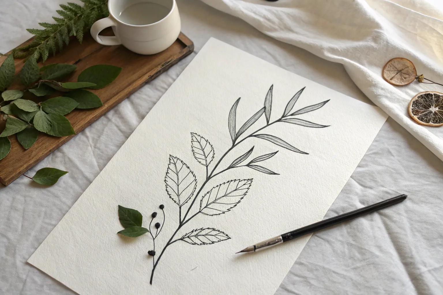
Simple Flower Doodles
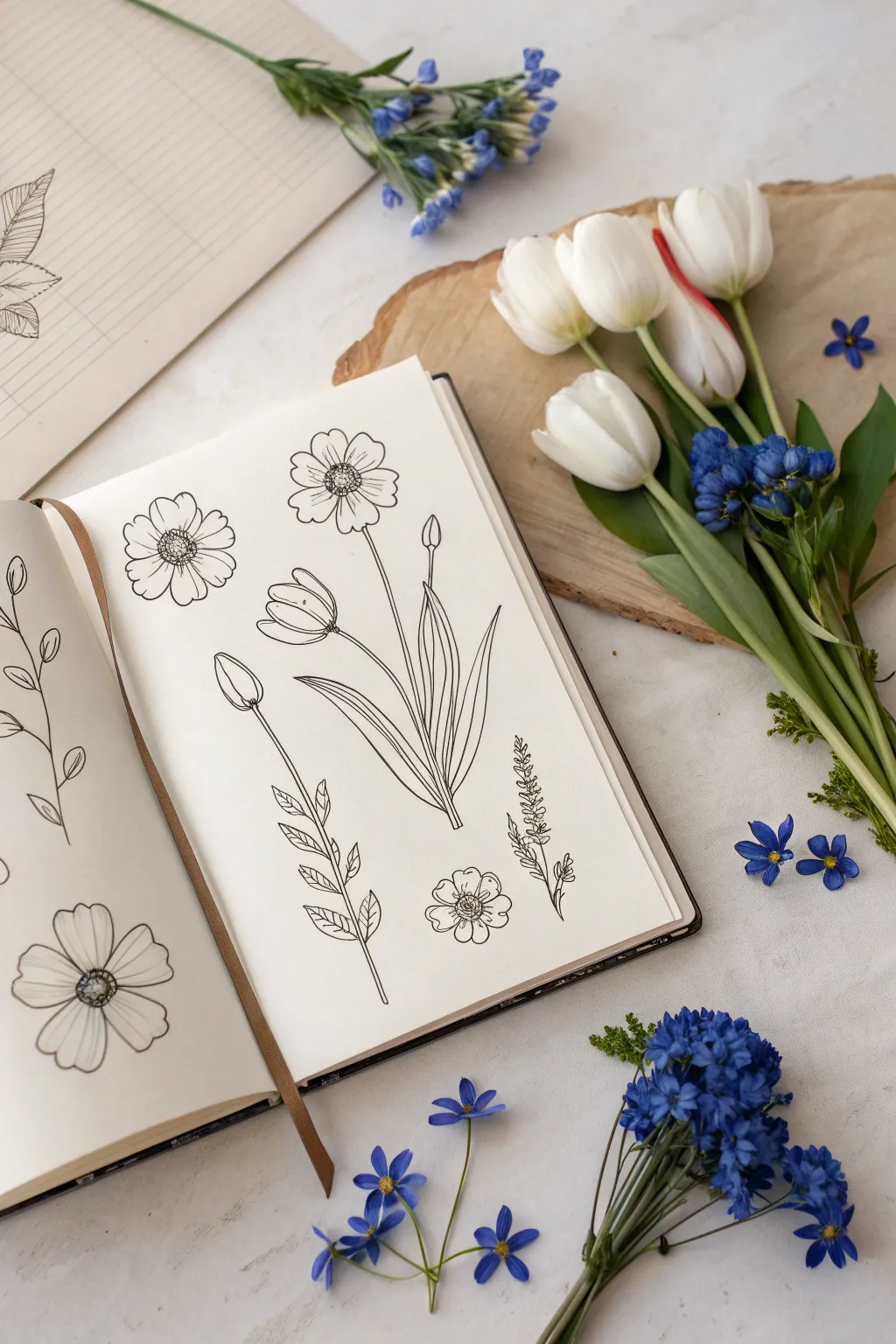
Capture the delicate beauty of spring with this elegant sketchbook spread featuring simple line art florals. Using clean lines and minimal shading, you’ll create a garden of tulips, cosmos, and wildflowers that feels both structured and organic.
Step-by-Step
Materials
- Sketchbook or drawing paper (smooth texture preferred)
- Fine liner pen (black, 0.3mm or 0.5mm)
- Pencil (HB for preliminary sketching)
- Soft eraser
- Ruler (optional for layout)
Step 1: Planning the Layout
-
Light pencil framework:
Begin by observing the open spread of your sketchbook. On the right-hand page, visualize the central composition. Use your pencil to very lightly mark the positions for the main tulip cluster in the middle, floating blooms at the top, and smaller sprigs at the bottom. -
Left page placement:
On the left page, mark the position for a large, single trailing vine along the left margin and a solitary prominent bloom in the bottom corner. Keep these marks faint so they’re easy to erase later.
Natural Lines
When inking long stems, pull the pen toward you rather than pushing it away. This helps maintain a consistent line weight and reduces shakiness.
Step 2: Drawing the Main Tulip Cluster
-
Central stems:
Starting near the bottom center of the right page, draw three stems rising upward. Make the center one the tallest and straightest, while the side stems curve gently outward. -
Tulip heads:
At the top of these stems, sketch the tulip heads. Draw simple U-shapes for the base, then add the petals curving inward. Keep the petals slightly open to show depth. -
Adding leaves:
At the base where the stems meet, draw long, lance-shaped leaves. Let them curve and fold over slightly. Draw a central vein down each leaf to give it dimension. -
Bud detail:
Add a small, closed bud on a thin stem to the right of the main flowers, giving the bouquet a natural, asymmetrical look.
Step 3: Adding Cosmos and Wildflowers
-
Cosmos outline:
Above the tulips on the right page, draw two circle centers. Around these centers, sketch 7-8 rounded petals for each flower. I like to make the petal edges slightly wavy for a natural feel. -
Inner details:
Inside the center circles of the cosmos, draw tiny scribbles or stippling dots to represent the pollen texture. Draw short lines radiating from the center into each petal. -
Bottom wildflower:
Below the tulips on the right, draw a small, robust flower head. Give it a textured center and five distinct, slightly heart-shaped petals. -
Lavender sprig:
To the right of the tulip leaves, sketch a vertical stem. Add tiny, teardrop-shaped buds growing upward in clusters to resemble lavender or salvia. -
Leafy branch:
To the left of the tulips, draw a thin stem. Add pairs of small, oval leaves moving up the stem, spacing them out evenly.
Scientific Study
Add small, neat handwritten labels in Latin or cursive next to each plant to turn your doodle page into a faux-botanical scientific illustration.
Step 4: Completing the Left Page
-
Trailing vine:
On the left page, draw a long, wavy line extending from the bottom to the top. This is your main vine. -
Vine leaves:
Add simple almond-shaped leaves alternating sides along the vine. Draw a single line down the center of each leaf. -
Corner bloom:
At the bottom right of this page, draw a large flower head similar to the cosmos. Draw a detailed center with cross-hatching and large, open petals.
Step 5: Inking and Refining
-
Outline with pen:
Take your fine liner pen and carefully trace over your pencil lines. Use confident, steady strokes. Don’t worry if lines aren’t perfectly straight; organic wobbles add character. -
Adding texture:
Use very fine lines to add shading. Add vertical hatching lines on the tulip petals and leaves where shadows would naturally fall. -
Erase and clean:
Once the ink is completely dry (test a small corner first), take your soft eraser and gently remove all the underlying pencil sketches.
Close your sketchbook knowing you’ve preserved a little piece of a garden forever on paper


Balloon Bunch With Strings
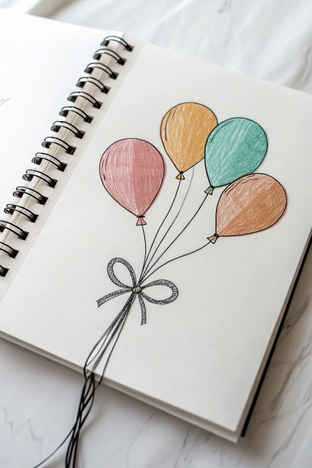
This charming sketch captures the simple joy of a balloon bouquet using soft colored pencils and fine line work. The muted, vintage color palette gives it a cozy, hand-drawn feel that looks perfect in any sketchbook.
Step-by-Step Guide
Materials
- Sketchbook with smooth white paper
- HB graphite pencil
- Eraser
- Fine liner pen (black, 0.3mm or 0.5mm)
- Colored pencils (muted pink, mustard yellow, teal green, warm brown)
Step 1: Sketching the Shapes
-
Position the first balloon:
Start by drawing a light oval shape slightly to the left of the center of your page. This will be the pink balloon. Tilt it slightly to the left so it looks like it’s floating naturally. -
Add the central balloon:
Draw a second oval slightly higher and to the right of the first one. This mustard-colored balloon should be the highest point of your composition. -
Draw the third balloon:
Place a third oval to the right of the central one, overlapping just slightly or touching its edge. This will be the teal balloon. -
Place the final balloon:
Draw the last oval (the brown one) lower down on the right side, creating a balanced cluster arrangement. -
Add the balloon knots:
At the base of each oval, sketch a small triangle shape for the tied mouthpiece of the balloon where the string attaches. -
Mock up the strings:
Lightly draw curved lines extending from each knot downwards. Aim for them to all converge at a single point lower on the page. -
Sketch the bow:
At the convergence point, draw a simple bow shape with two loops and two tails hanging down.
Highlight Hack
Draw the highlight shape (a small curved line) lightly in pencil first, then color around it. This keeps the white paper pure nicely.
Step 2: Inking the Outline
-
Outline the balloons:
Using your fine liner pen, carefully trace over your pencil lines for the balloons. Don’t worry if the lines aren’t perfectly smooth; a little texture adds character. -
Detail the knots:
Ink the small triangular knots at the bottom of each balloon. -
Draw the strings:
Trace the string lines down to the bow. Use a confident, single stroke for each string if you can, as this keeps the line work clean. -
Ink the bow:
Outline the bow loops and tails. Inside the loops and tails, add a secondary inner line to give the ribbon a bit of dimension. -
Add the loose strings:
Draw several wavy lines extending from the bottom of the bow off the bottom edge of the page. I like to let these look a bit tangled for realism. -
Erase pencil marks:
Wait a moment for the ink to dry completely, then gently erase all the underlying graphite sketch lines.
Step 3: Adding Color
-
Color the pink balloon:
Take your muted pink colored pencil and fill in the left-most balloon. Use vertical strokes to mimic the curvature of the balloon. -
Color the yellow balloon:
Fill the top center balloon with a mustard yellow pencil. Apply slightly more pressure on the left side to suggest a subtle shadow. -
Color the teal balloon:
Use a teal or sea-green pencil for the third balloon. Leave a tiny sliver of white or lighter color near the top right curve to act as a highlight. -
Color the brown balloon:
Fill the final balloon with a warm brown or terracotta color. -
Fill the knots:
Don’t forget to fill in the small triangle knots with the corresponding color for each balloon. -
Shade the bow:
Use your black fine liner or a grey pencil to add diagonal hatch marks inside the ribbon for a textured, fabric-like effect. -
Add final highlights:
Review your coloring. If the highlights aren’t visible enough, use an eraser to lift a small streak of pigment from the upper curve of each balloon to make them look shiny.
Uneven Ovals?
Balloons naturally change shape when floating. If your ovals are slightly wonky or asymmetric, it actually makes the drawing look more realistic.
Now you have a festive, colorful drawing that seems to lift right off the page
BRUSH GUIDE
The Right Brush for Every Stroke
From clean lines to bold texture — master brush choice, stroke control, and essential techniques.
Explore the Full Guide
Bird Silhouettes and V-Flight Marks
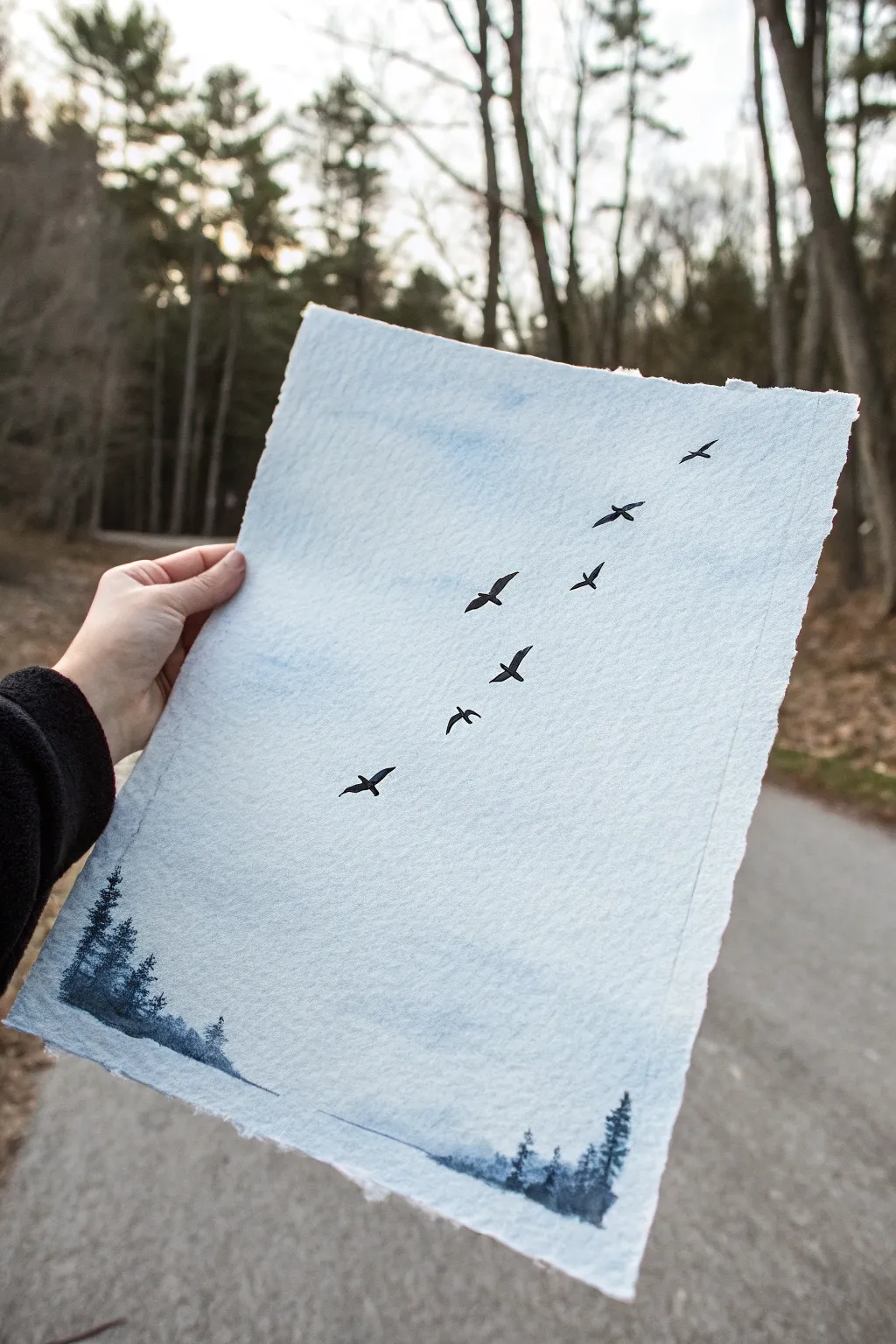
Capture the serene beauty of a flock in flight with this minimalist watercolor project. Using textured paper and simple monochromatic tones, you’ll create a misty, atmospheric scene that feels both vast and intimate.
How-To Guide
Materials
- Heavyweight cold-press watercolor paper or handmade cotton paper (deckled edge preferred)
- Watercolor paints: Indigo, Payne’s Gray, and a diluted Cerulean Blue
- Small round brush (size 2 or 4) for details
- Medium flat brush for washes
- Clean water jar
- Paper towels
- Pencil (optional for light sketching)
Step 1: Setting the Atmosphere
-
Prepare the paper:
If you are using a standard sheet of watercolor paper, you might want to tear the edges against a ruler to create a soft, deckled look similar to handmade paper. This adds to the rustic charm. -
Create a sky wash:
Mix a very watery puddle of diluted Cerulean Blue. You want this to be barely there—just a hint of color to kill the stark white of the paper. -
Apply the background:
Use your flat brush to sweep this pale blue mix across the upper two-thirds of the paper. Use broad, horizontal strokes. -
Soften the edges:
While the wash is still wet, dip your brush in clean water and run it along the bottom edge of the blue area to fade it out seamlessly into the white paper below. -
Dry completely:
Let this base layer dry entirely before moving on. The paper should be cool to the touch but not damp.
Bleeding Birds?
If your sharp bird silhouettes are turning into fuzzy blobs, your background paper is still too damp. Wait until the paper is bone dry before painting sharp details.
Step 2: Painting the Forest Floor
-
Mix the tree color:
Create a mix of Indigo and a touch of Payne’s Gray. You want a cool, deep blue-grey tone, diluted enough to look like distant mist. -
Paint the horizon line:
along the very bottom edge of your paper, paint a broken, uneven horizon line. Don’t make it straight; let it dip and rise naturally. -
Add tree suggestions:
Using the tip of your small round brush, pull tiny vertical lines up from your horizon wash to suggest tree trunks. -
Stipple the foliage:
With a slightly drier brush, tap tiny dots of color along those vertical trunks to create the look of pine branches. Keep these loose and somewhat blurry. -
Vary the heights:
Make sure some trees are taller and some are shorter to create a natural forest rhythm. Leave plenty of white space between groups of trees.
Golden Hour Glow
Add a touch of warmth by glazing a very diluted yellow ochre or pale pink over the bottom horizon line once the blue trees have fully dried.
Step 3: Taking Flight
-
Prepare detailed paint:
Mix a saturated, creamy consistency of pure Payne’s Gray or Black. This needs to be opaque enough to stand out against the sky. -
Plan the formation:
Visualize a diagonal line stretching from the bottom left toward the top right. You can lightly dot the positions with a pencil if you feel unsure. -
Paint the first bird body:
Start with a bird near the middle. Paint a tiny, elongated oval for the body using the very tip of your small brush. -
Add the wings:
Flick the brush outwards from the body to create wings. For a gliding look, make the wings long and slightly curved. -
Vary the wing positions:
As you paint the other birds in the line, change their wing angles. Some should have wings up (V-shape), some flat, and some dipping down. -
Adjust the sizes:
I find it helps the perspective to make the birds at the top of the line slightly smaller than the ones closer to the bottom. -
Refine the shapes:
Check your silhouettes. Add tiny points for heads or beaks on a few birds to give them direction. -
Final assessment:
Step back and look at the composition. If there’s a gap that feels too large, add a small dot or a tiny distant bird to balance the flock.
Frame your piece in a floating frame to show off those beautiful deckled edges
Tiny Boat on Gentle Waves
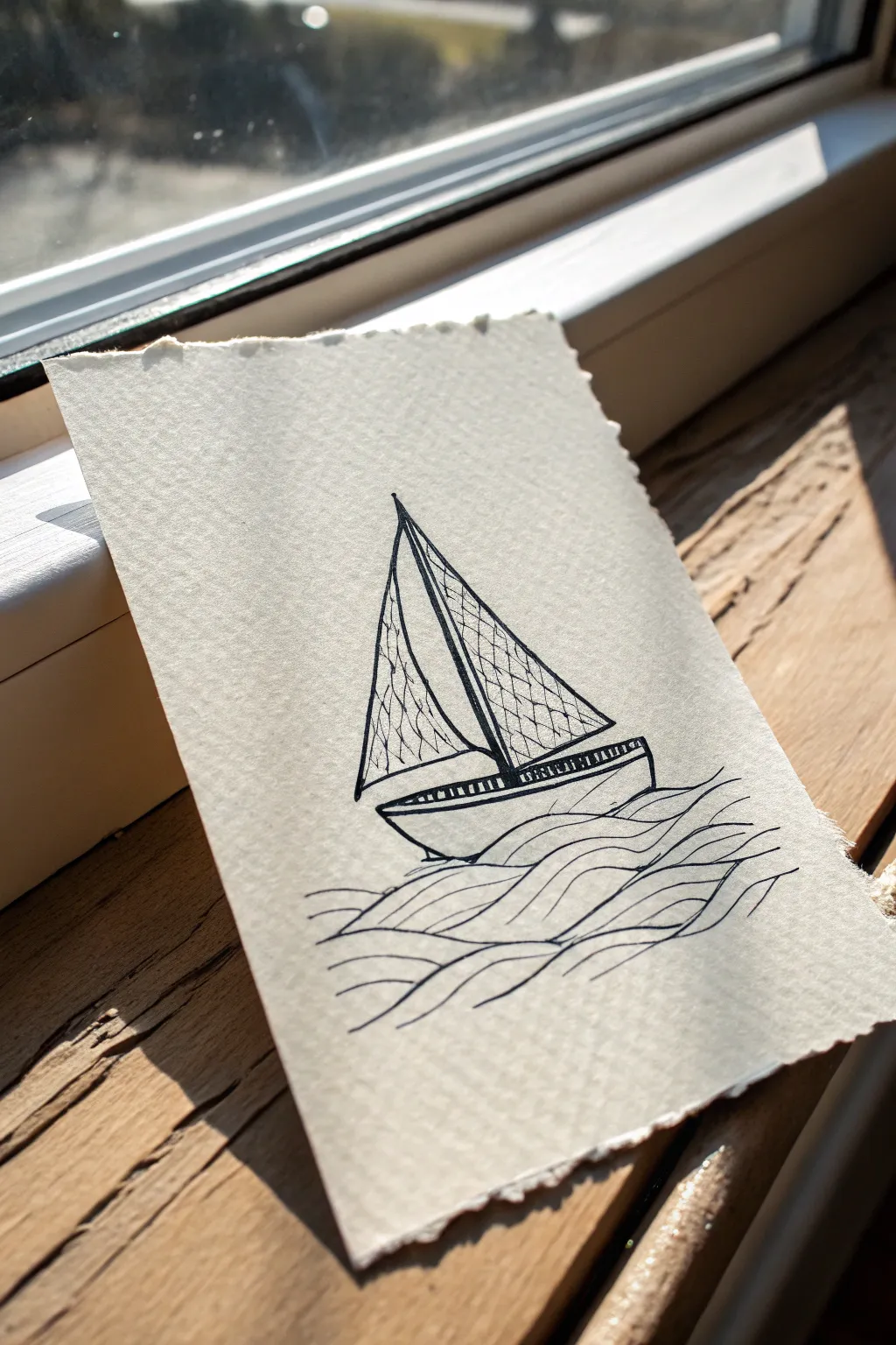
Capture the calm of the sea with this minimalist ink sketch of a sailboat riding gentle swells. The charm lies in the contrast between the crisp, geometric lines of the boat and the fluid, organic curves of the ocean, all set against beautifully textured paper.
Step-by-Step Guide
Materials
- Heavyweight textured paper (cold press watercolor or handmade cotton paper with deckled edges)
- Fine liner pen (01 or 03 size, black pigment ink)
- Pencil (HB or 2B)
- Kneaded eraser
- Ruler (optional)
Step 1: Drafting the Structure
-
Set the hull:
Begin with a pencil to lightly sketch the base of the boat. Draw a shallow, curved u-shape for the bottom of the hull, and top it with a relatively flat line that curves up slightly at the ends. -
Raise the mast:
From the center of your hull, draw a straight vertical line extending upward. Lean it ever so slightly backward if you want to imply movement, or keep it perfectly straight for a static look. -
Outline the sails:
Sketch two triangles attached to the mast. The larger triangle should be on the right (the mainsail), reaching from the top of the mast down to just above the hull. The smaller one (the jib) goes on the left. -
Curve the wind:
Soften the hypotenuse (the long outer edge) of both triangles by giving them a slight outward curve. This makes the sails look like they are filled with wind rather than rigid boards. -
Sketch the sea:
Beneath the boat, lightly pencil in a series of flowing, wavy lines. Let them overlap and intertwine to create a sense of depth without needing perfect realism.
Master the Texture
When using textured watercolor paper, move your pen slowly. Fast strokes might skip over the ‘valleys’ of the paper grain, resulting in broken lines.
Step 2: Inking the Vessel
-
Define the mast:
Switch to your fine liner pen. Trace the mast line first, making it bold and confident. I find it helpful to start from the top and pull the pen toward me for a steadier line. -
Draw the sail borders:
Ink the outer outlines of both sails. Keep your hand loose on the curved parts to maintain that wind-blown effect you sketched earlier. -
Add texture to safety:
Inside the sails, draw a loose cross-hatching pattern. Use thin, slightly wavy diagonal lines going one way, then cross them with lines going the opposite direction. Keep the spacing uneven for a rustic feel. -
Detail the hull:
Ink the outline of the boat’s body. Add a second parallel line just inside the top edge of the hull to create a rim or railing. -
Fill the railing:
Between the two rim lines you just drew, add tiny vertical dashes all the way across. This creates a simple decorative detailed strip along the side of the boat.
Add a Splash
Dilute a single drop of blue watercolor paint with plenty of water. Use a soft brush to add a very faint, loose wash just over the wave lines for a pop of color.
Step 3: Creating the Ocean
-
Start the waves:
Begin inking the water directly under the hull. The lines should touch the boat to ground it in the scene. -
Flow outward:
Continue drawing wavy lines extending downwards and outwards. Vary the length of the lines—some long and sweeping, others shorter to fill gaps. -
Vary line weight:
If you have a thicker pen, you might trace a few of the foreground wave crests to bring them forward visually. -
Connect the currents:
Ensure the waves feel like a cohesive body of water by letting the lines converge and diverge naturally, rather than distinct stacked rows. -
Clean up:
Once the ink is completely dry (give it a few minutes to be safe), gently use your kneaded eraser to lift away any visible pencil guidelines.
Now you have a serene maritime sketch ready to be framed or gifted as a thoughtful card

PENCIL GUIDE
Understanding Pencil Grades from H to B
From first sketch to finished drawing — learn pencil grades, line control, and shading techniques.
Explore the Full Guide
Mountains Inside a Circle Frame
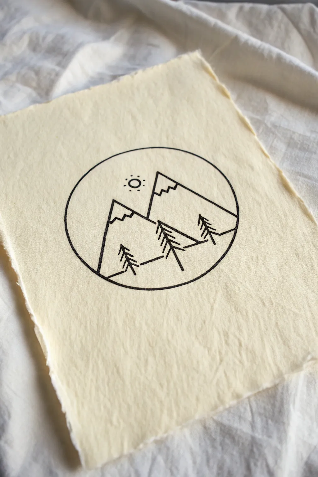
This elegant line drawing uses stark black ink against textured cream paper to create a serene alpine scene contained within a perfect circle. It is a fantastic beginner project that focuses on clean lines, balance, and the beauty of simplicity.
Step-by-Step Tutorial
Materials
- Cream-colored handmade paper (with deckle edge)
- Fine liner pen (Black, 0.5mm or 0.8mm)
- Pencil (HB or 2H)
- Eraser
- Compass or a circular object to trace (approx. 3-4 inches diameter)
- Ruler
Step 1: Setting the Stage
-
Paper Selection:
Begin by selecting a high-quality, textured paper. The handmade paper with a deckle (torn) edge shown in the image adds a lovely rustic feel that complements the nature theme. -
Draw the Boundary:
Using a compass or by tracing a round object like a jar lid or coaster, lightly sketch a perfect circle in the center of your paper with your pencil. -
Establish the Horizon:
Lightly sketch a horizontal line across the lower third of the circle. This doesn’t need to be perfectly straight; a slight jaggedness mimics the ground.
Clean Curves
Struggling to ink a perfect circle freehand? Use a plastic circle stencil or carefully trace a lid directly with the pen instead of drafting with pencil first.
Step 2: Drafting the Mountains
-
First Peak:
Draw a large triangle for the main mountain on the right side. The peak should reach up to the top third of the circle, and the right slope should extend all the way to the circle’s edge. -
Second Peak:
Add a slightly smaller mountain on the left side, overlapping behind the first one. Its peak should be lower than the main mountain to create depth. -
Snow Caps:
Near the top of each triangle, sketch a zig-zag line to define the snow-capped peaks. Keep these lines angular and irregular for a rocky appearance.
Stippling Shadows
Add texture by using tiny dots (stippling) on the shaded side of the mountains or under the tree branches for a more detailed, engraved look.
Step 3: Adding the Forest
-
Tree Placement:
Mark the positions for three pine trees along the uneven ground line created by the mountain bases. Place the largest in the center foreground, one to the left, and one smaller one higher up on the right slope. -
Tree Structures:
Sketch a simple vertical line for each trunk. Then, add downward-slanting branches in a triangular shape, getting wider at the bottom. -
The Sun:
In the sky area on the upper left, draw a small circle. Add small dots around it to represent rays.
Step 4: Inking the Design
-
Trace the Circle:
Take your black fine liner pen. Carefully trace over your pencil circle first. Go slowly to maintain a smooth curve. I find rotating the paper as I draw the curve helps keep my hand steady. -
Inking Mountains:
Ink the outlines of the mountains. Stop your line where the trees overlap the mountains so you don’t draw through the foliage. -
Defining Snow:
Go over the zig-zag snow lines. You can make these lines slightly thinner or lighter if you have a smaller pen nib available. -
Inking Trees:
Draw the vertical trunks and the branches. Use quick, confident strokes for the branches to make them look like pine needles. -
Sun Details:
Ink the small sun circle and carefully dot the rays around it. -
Final Cleanup:
Once the ink is thoroughly dry (wait at least 5 minutes to prevent smudging), gently erase all remaining pencil marks.
Now you have a serene piece of mountain art that looks beautiful framed or gifted as a card
Sunset Scene With Simple Silhouettes
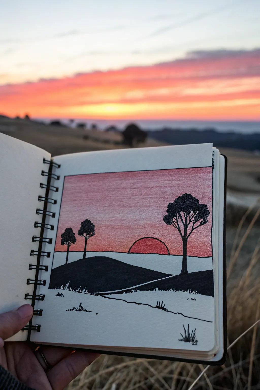
Capture the calm of dusk with this minimalist landscape that contrasts bold black ink against a soft, blended sky. This sketchbook project is perfect for practicing controlled gradients and confident ink work.
How-To Guide
Materials
- Sketchbook or drawing paper
- Pencil (HB or 2B)
- Eraser
- Ruler
- Red colored pencil
- Orange colored pencil
- Pink colored pencil
- Black felt-tip pen (fine liner)
- Black marker (chisel tip or brush pen)
Step 1: Setting the Scene
-
Define the boundaries:
Use a ruler and pencil to draw a perfect square in the center of your page. This frame will contain your entire landscape. -
Sketch the horizon lines:
Lightly sketch a horizontal line about one-third up from the bottom of the square. This will be your distant horizon. Below that, draw a gently sloping, curved line for the foreground hill. -
Add a path:
Draw two converging lines cutting across the foreground hill, creating a simple path that disappears behind the slope. -
Position the sun:
Place a large semi-circle sitting directly on the distant horizon line. It should be slightly offset from the center. -
Plan the trees:
Mark the positions for three trees. Place two smaller ones on the left side of the hill and a large, prominent one on the right side.
Uneven Sky Grading?
If your gradient looks scratchy, try drawing small, tight circles rather than straight back-and-forth lines. This layers the wax pigment more evenly for a smoother blend.
Step 2: Creating the Sunset Gradient
-
Start with the darkest sky hue:
Take your red colored pencil and begin shading the very top section of the sky inside your square frame. Press firmly for a saturated color. -
Transition to pink:
Gradually lighten your pressure as you move down. Switch to a pink pencil and blend it into the red, filling the middle section of the sky. -
Fade to the horizon:
Ease into an orange drawing pencil near the horizon line. I like to layer this lightly over the bottom of the pink area to create a smooth, glowing transition. -
Color the sun:
Fill the semi-circle sun with a solid, medium pressure using the red or dark orange pencil. It should look slightly darker than the sky directly around it to stand out. -
Smooth the blend:
Go back over the transition areas with a lighter color (like the pink) to smooth out any harsh lines between the red and orange zones.
Use A Bridge
Place a scrap piece of paper under your hand while coloring and inking. This acts as a bridge to prevent oils from your hand smudging the colored pencil work.
Step 3: Inking the Silhouettes
-
Outline the frame:
Using a ruler and a fine black pen, carefully ink over the pencil square border. -
Ink the horizon and sun:
Draw the straight horizon line with your ruler, stopping where the trees will be. Trace the curve of the sun carefully by hand. -
Fill the dark hills:
Switch to a thicker black marker. Fill in the hill shape in the mid-ground completely solid black. Be careful to preserve the white space of the path cutting through it. -
Detail the main tree:
With the fine liner, draw the trunk and branches of the large tree on the right. Create the foliage by stippling or drawing tight, scribbly loops to mimic leaves in silhouette. -
Ink the smaller trees:
Repeat the process for the two smaller trees on the left. Keep their shapes simple and recognizable. -
Add foreground tufts:
In the white space at the very bottom (the closest foreground), draw small, jagged ink strokes to represent tufts of grass poking up. -
Define the path edges:
Use the fine liner to draw shaky, organic lines along the edges of the path to suggest uneven ground.
Step 4: Final Touches
-
Erase pencil guides:
Once the ink is completely dry, gently erase any visible graphite lines from your initial sketch. -
Refine edges:
Check the edges of your black silhouettes. If any white paper shows through the marker strokes, touch them up for a solid, opaque look.
Now you have a striking sunset scene that perfectly captures the golden hour mood in simple lines


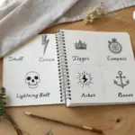
Mini Grid of Mix-and-Match Doodles
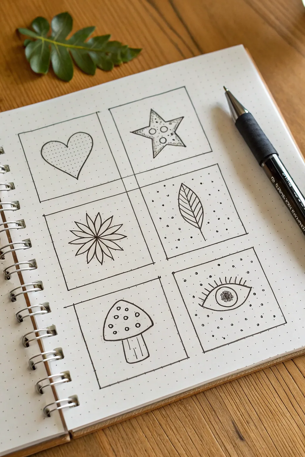
This charming project breaks the blank page barrier by creating six manageable mini-canvases within your sketchbook. Each square features a simple, classic motif brought to life with delicate stippling and line work.
Detailed Instructions
Materials
- Dotted grid notebook (bullet journal style)
- Black fineliner pen (0.3mm or 0.5mm)
- Pencil
- Eraser
- Ruler
Step 1: Setting the Grid
-
Define the grid:
Count out the dots in your notebook to create six equal squares arranged in two columns of three. A size of 6×6 grid squares or 8×8 grid squares works well for each box. -
Draw the frames:
Using your fineliner and a ruler, carefully ink the outlines of your six boxes. Allow the ink to dry completely to avoid smudging. -
Erase guidelines:
If you sketched the grid in pencil first, gently erase those lines now so you have a clean slate for your doodles.
Step 2: Top Row: Hearts & Stars
-
Outline the heart:
In the top-left box, draw a simple heart shape. Try to center it, leaving generous breathing room around the edges. -
Texture the heart:
Fill the inside of the heart with tiny, evenly spaced stippling dots. This adds immediate texture without needing color. -
Star outline:
In the top-right box, draw a five-pointed star. It doesn’t need to be geometrically perfect; a hand-drawn look adds character. -
Star details:
Draw three small circles in the center of the star. Then, add tiny stippling dots to the star’s points, focusing the density near the tips for a shaded effect.
Uneven Grid Fix
If your hand-drawn boxes look wobbly, go over the corners again with a slightly thicker line. This deliberate ‘accent’ disguises uneven edges beautifully.
Step 3: Middle Row: Flora & Leaves
-
Draw the flower center:
In the middle-left box, place a small dot in the exact center to guide your petals. -
Add petals:
Draw eight long, thin tear-drop shaped petals radiating from the center dot. Keep the lines clean and simple. -
Inner petal details:
Draw a single straight line down the center of each petal, starting from the middle and stopping just short of the tip. -
Leaf outline:
For the middle-right box, draw a single, large leaf shape with a stem extending downwards. -
Vein details:
Draw a central vein through the leaf, then add diagonal veins branching off. Surround the outside of the leaf with scattered dots to make the white space pop.
Add Dimension
Use a light gray brush pen or a watered-down black watercolor wash to add a drop shadow to one side of each doodle for an instant 3D pop.
Step 4: Bottom Row: Mushrooms & Mystic Eyes
-
Mushroom cap:
In the bottom-left box, draw a rounded triangle shape for the mushroom cap. -
Stem and gills:
Add a thick stalk underneath the cap using vertical lines. Draw a few lines inside the stalk for texture. -
Cap spots:
Decorate the mushroom cap with several small circles of varying sizes to mimic the classic toadstool look. -
Mystic eye shape:
In the final bottom-right box, draw a wide almond shape for an eye, including a large circle for the iris. -
Eye details:
Fill the pupil with dense scribbles or stippling. Add eyelashes to the upper lid. -
Surrounding atmosphere:
Fill the empty space around the eye with scattered dots to give it a mystical, floating energy.
Once the ink is fully dry, erase any lingering pencil marks to reveal your crisp, miniature art collection
Repeating Wave Pattern अभ्यास
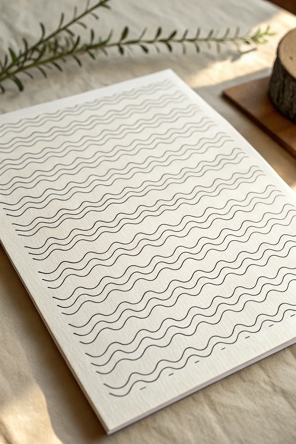
This calming repetitive line art exercise transforms a simple blank page into a rhythmic sea of waves. It’s a perfect mindfulness practice that requires minimal supplies but yields a satisfyingly textured and organic result.
Step-by-Step Tutorial
Materials
- High-quality textured paper (like cold-press watercolor paper or mixed media vellum)
- Fine liner pen (size 0.5 or 0.8, archival black ink)
- Pencil (HB or H)
- Ruler
- Kneaded eraser
- Masking tape or painter’s tape
Step 1: Preparation & Grid
-
Secure the paper:
Start by taping down your paper to a flat surface. This prevents it from shifting while you draw and keeps your lines steady. -
Mark vertical guides:
Using your pencil and ruler, lightly mark dots along the top and bottom edges of the paper. Space them about 1.5 to 2 inches apart. -
Draw faint vertical columns:
Connect the top and bottom dots with very faint vertical lines. These pencil lines will serve as invisible ‘walls’ to help guide the width of your waves, though you won’t trace them directly. -
Mark horizontal spacing:
Along the left edge, mark small ticks every quarter-inch (or roughly 5-7mm). This establishes the vertical gap between your wave rows so the pattern remains consistent.
Wobbly Lines?
Don’t stress over shakes. If a line goes rogue, just use the next line to ‘correct’ the spacing visually. The aggregate effect hides individual mistakes.
Step 2: Drawing the first waves
-
Start the first row:
Switch to your fine liner pen. Starting at the top left tick mark, draw a continuous undulating line across the page. -
Establish the rhythm:
Aim for a gentle sine wave shape—up, down, up, down. Try to make the peaks hit the center of your imaginary columns or spaces. -
Draw the second line:
Move to the next tick mark down. Draw a second wave line directly below the first. The goal is to mirror the curve above it, maintaining parallel spacing. -
Check your parallel flow:
Ensure the ‘valleys’ of the second line sit directly under the ‘valleys’ of the first line. If they drift slightly, correct the path gently as you move across the page.
Add Dimension
Use a slightly thicker pen (0.8mm) for every 5th wave to create a bold, striped rhythm, or use dark blue ink for a nautical aesthetic.
Step 3: Building the Pattern
-
Continue downwards:
Repeat this process for the next 5-10 lines. Focus on your breathing as you draw; the motion should come from your elbow, not just your wrist, for smoother curves. -
Grouping lines (optional):
Notice how some waves naturally group together visually. You can intentionally draw 3-4 lines slightly closer together, then leave a fraction more space before the next group to create subtle banding. -
Adjusting ink pressure:
Maintain consistent pressure on the pen. I find that lifting the pen too quickly at the end of a stroke can leave a tapered tail, so try to end right at the paper’s edge. -
Filling the middle section:
As you reach the center of the page, fatigue might set in. Take a moment to stretch your hand. Consistency is key here. -
Handling the edges:
Let your lines run directly off the edge of the paper (or onto the tape). This makes the pattern look like a swatch cut from a larger fabric.
Step 4: Finishing Touches
-
Completing the bottom:
Continue the pattern until you reach the final mark at the bottom of the page. -
Breaking the line:
For the very last few rows, you can occasionally lift your pen to create a broken line effect, adding a dash of variety to the texture, as seen near the bottom right. -
Ink drying time:
Let the artwork sit for at least 15 minutes. Archival ink dries fast, but thick pressed paper can hold moisture longer than you expect. -
Erase guidelines:
Gently roll your kneaded eraser over the page to lift the faint pencil guidelines you drew in the first phase. Do not scrub, or you might fade the ink. -
Remove tape:
Peel the masking tape away slowly at a 45-degree angle to reveal the clean paper edges.
Enjoy the calm satisfaction of seeing your page filled with rhythmic, flowing texture


Have a question or want to share your own experience? I'd love to hear from you in the comments below!