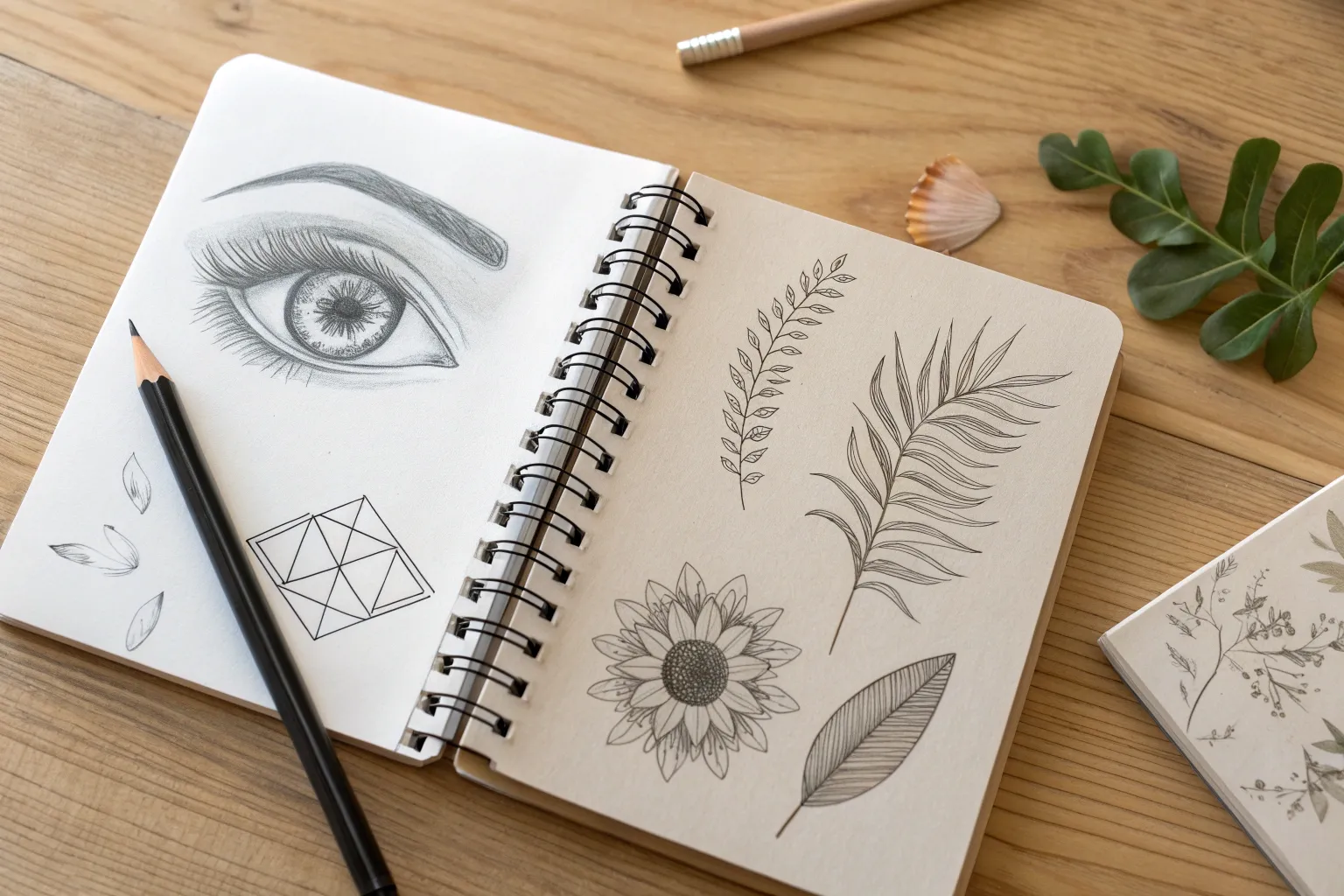
When I’m stuck staring at a blank page, a good list of sketch ideas is the fastest way to get my hand moving again. Here are my go-to prompts—from classic practice staples to delightfully weird twists—so you can fill your sketchbook without overthinking it.
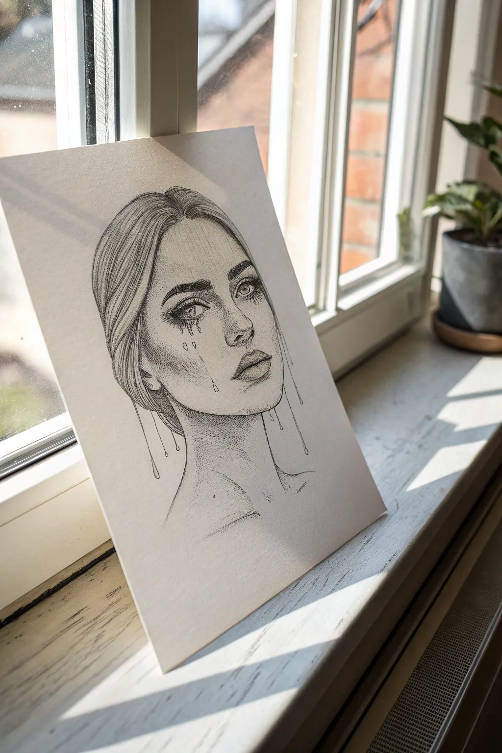
Realistic Eye Study From Reference
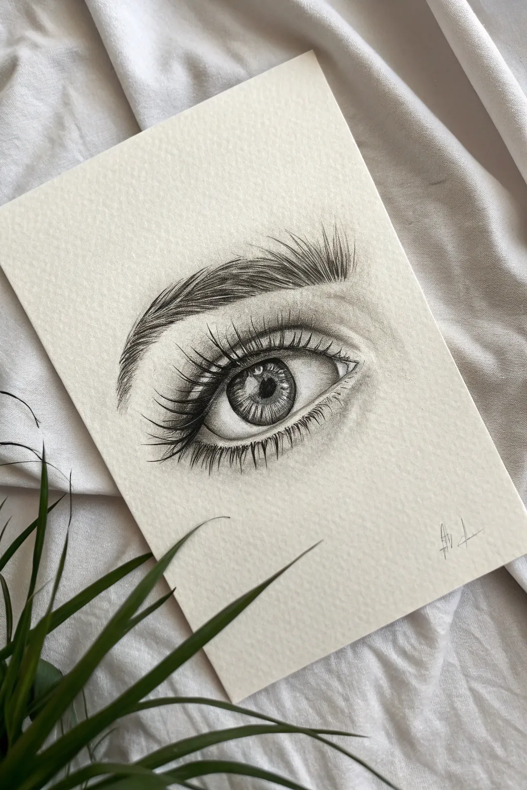
Capture the soul of your subject with this detailed graphite pencil study of a human eye. This project focuses on building realistic textures, from the fibrous iris to the delicate sweep of eyelashes, all on a lovely textured paper.
Detailed Instructions
Materials
- High-quality textured sketch paper (e.g., cold press watercolor paper or textured cartridge paper)
- Graphite pencils (HB, 2B, 4B, and 6B)
- Mechanical pencil (0.5mm HB or 2B) for fine details
- Kneaded eraser
- Precision eraser (rendering stick or mono zero)
- Blending stump or tortillon
- Soft tissue or cotton swab
- Reference photo of an eye
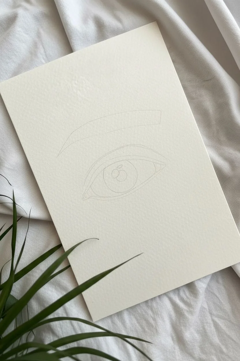
Step 1: Laying the Foundation
-
Outline the basic shapes:
Begin with an HB pencil using very light pressure. Draw the almond shape of the eye, the circle for the iris, and the smaller circle for the pupil. Don’t forget to lightly mark the crease of the eyelid above the eye and the shape of the eyebrow ridge. -
Map out highlights:
Before adding any dark values, lightly outline the reflections (catchlights) inside the pupil and iris. These areas must stay stark white to make the eye look wet and alive, so mark them clearly now to avoid shading over them later. -
Establish the darkest values:
Switch to a 4B or 6B pencil to fill in the pupil perfectly black, being careful to skirt around your mapped highlights. This anchor of dark value will help you judge the rest of your shaving values accurately.
Step 2: Detailing the Iris
-
Create the iris spokes:
Using a sharp 2B pencil or mechanical pencil, draw lines radiating outward from the pupil toward the outer edge of the iris like wheel spokes. Vary the length and pressure; some should be dark and distinct, others faint. -
Rim the iris:
Darken the outer ring of the iris (the limbal ring) with a 4B pencil. Following the curve, blend this dark edge slightly inward so it doesn’t look like a harsh cartoon outline but rather a soft shadow. -
Add depth to the iris:
Lightly shade the upper third of the iris underneath the eyelid line. The upper lid casts a shadow on the eyeball, and adding this gradient is crucial for realism. Use a blending stump to soften the spoke lines you drew earlier.
Smudgy Paper?
To prevent your hand from smudging your work while you draw, place a piece of scrap paper under your drawing hand. This protects the pristine white textured paper from graphite transfer and oils.
Step 3: Shading the Whites and Skin
-
Shade the sclera:
The ‘white’ of the eye is rarely pure white because it is a sphere. Use an HB pencil to lightly shade the corners of the eyeball and under the upper lid, blending carefully with a clean tissue so the texture of the paper still shows through. -
Form the tear duct:
On the inner corner, draw the fleshy tear duct. Keep the shading uneven here to represent moist, bumpy skin. Use your precision eraser to lift out tiny highlights that suggest moisture. -
Sculpt the skin folds:
Use a 2B pencil to shade the crease of the upper eyelid. The line should be darkest in the fold and fade upwards. Add soft shading under the lower lash line to suggest the volume of the lower lid.
Pro Tip: Eraser Tricks
Cut a standard white eraser with a craft knife to create a sharp wedge edge. Use this ‘knife edge’ to lift out incredibly fine white hairs in the eyebrows or lashes for added texture.
Step 4: The Eyebrow and Lashes
-
Draft the eyebrow base:
Lay down a soft, light gray wash of graphite where the eyebrow sits to act as a base tone. I find this prevents the brow from looking like floating hairs on white paper. -
Draw individual brow hairs:
With a freshly sharpened 2B or mechanical pencil, draw quick, short strokes for the eyebrow hairs. Notice the direction changes: inner hairs grow upward, middle hairs angle sideways, and outer tail hairs slant downward. -
Layer the lashes:
Start the upper eyelashes. Place your pencil at the eyelid rim, press down, and flick upward and outward in a quick, curved motion. The lashes should be thicker at the base and taper to a point. -
Build lash density:
Use a 4B pencil to go over the lash line again, adding clumps of lashes. Eyelashes rarely stand perfectly straight alone; they cross over each other and group together slightly. -
Add lower lashes:
Draw the lower lashes using a lighter touch and shorter stroke than the upper ones. Ensure they originate from the outer edge of the lower water line, not from inside the eye itself. -
Draw lash reflections:
If your reference shows it, draw the reflection of the upper lashes in the highlights of the eye. This subtle detail adds incredible realism.
Step 5: Final Adjustments
-
Deepen contrast:
Take a step back and look at the drawing. Use your 6B pencil to darken the pupil, the darkest parts of the iris, and the base of the upper lashes one last time to make the image pop. -
Clean up highlights:
Use your precision eraser or the sharp edge of a kneaded eraser to pick out ‘pores’ or skin texture highlights on the upper lid and brow bone, and ensure the catchlight in the eye is pure white. -
Sign the work:
Add your initials or signature in the corner with a fine point pencil to complete the study.
Take a moment to admire the lifelike depth you’ve created with just a few pencils.


Hands in Different Poses
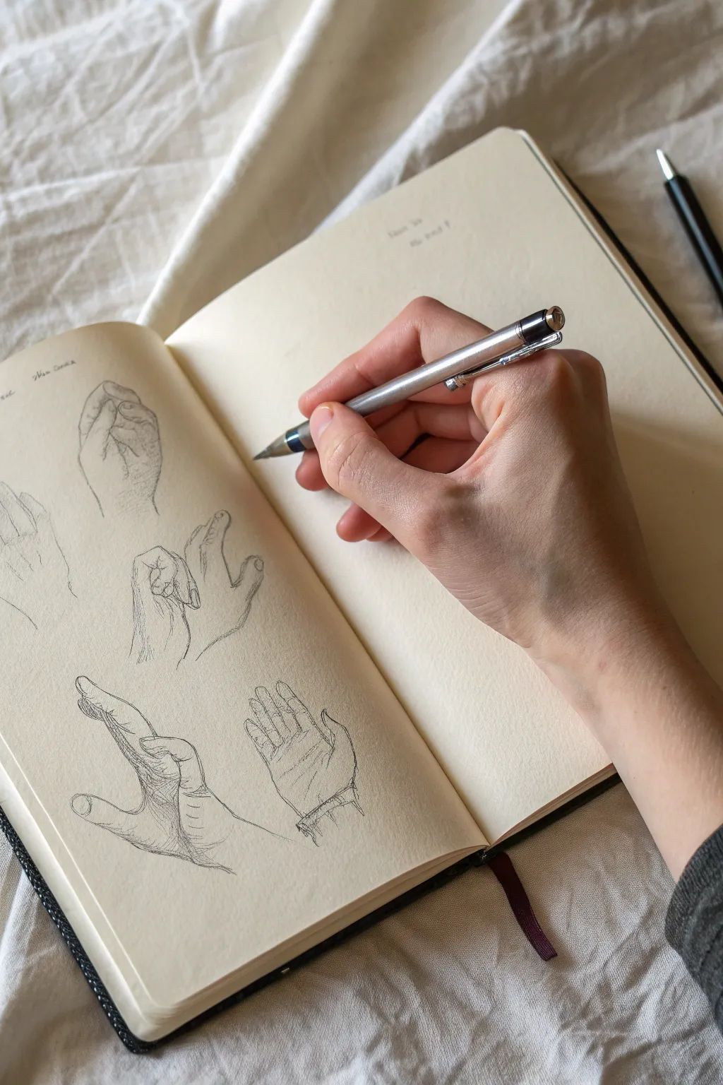
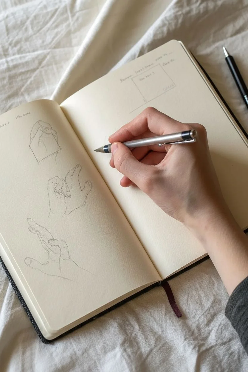
Hands are notoriously difficult to draw, but breaking them down into simple shapes makes them approachable and fun. This study page captures the subtlety of different gestures, from relaxed grips to outstretched fingers, using delicate linework and soft shading.
Step-by-Step
Materials
- Cream-colored sketchbook (smooth paper)
- Mechanical pencil (0.5mm or 0.7mm lead)
- HB or 2B lead refills
- Kneaded eraser
- Pencil sharpener (if using traditional pencils)
- Your own hand (for reference)
Step 1: Setting the Foundations
-
Layout Planning:
Visualize your sketchbook page. We will fit four or five hand studies on the left page. Mentally divide the space into quadrants so your drawings don’t overlap. -
Drawing the Palm Block:
For the first study (top left), start with a simple square or trapezoid shape to represent the palm. This anchors the fingers. -
Finger Guidelines:
Draw light distinct lines extending from the palm block to indicate where the fingers will go. Keep these very faint so they can be erased or drawn over later. -
Knuckle Placement:
Mark small circles or dots along your guidelines where the knuckles bend. This ensures the fingers have growing logical segments rather than looking like rubber tubes.
Step 2: Developing the Forms
-
Fleshing Out the Fist:
Sketch the outline of the curled fingers for the top-left hand. Notice how the pinky tucks in tightly while the index finger creates a larger curve. -
Adding Thumb Definition:
Draw the thumb wrapping over the curled index finger. Pay attention to the nail bed angle; it helps define the direction the thumb is pointing. -
Refining Contours:
Go over your light sketch with a slightly firmer definitive line. I like to add tiny breaks in the line art where the skin folds or knuckles protrude to create realistic texture. -
Shading the fist:
Add light hatching on the side of the palm and under the fingers. Keep the strokes parallel and light to suggest volume without overpowering the outline.
Fixing Stiffness
Hands looking robotic? Check the webbing space between fingers. It’s curved, not a sharp V-shape. Softening these connections adds realism.
Step 3: Complex Poses
-
The Pinching Gesture:
Move to the middle drawing. Start with the thumb and index finger making contact. Sketch the negative space between them first—it often looks like a teardrop shape. -
Extending the Fingers:
Draw the remaining three fingers extended slightly upward. Note that the middle finger is usually the longest, creating a tiered look alongside the ring finger. -
Wrist Connection:
Don’t forget the wrist! Sketch the lines leading down from the palm, indicating the tendons that appear when the hand is flexed back.
Handy Model Tip
Take photos of your own non-drawing hand in complex lighting. Drawing from a 2D photo is often easier than drawing a moving 3D subject when starting.
Step 4: Open Hand Study
-
Bottom Left Reach:
For the bottom-left hand, focus on the foreshortening of the thumb. Draw the thumb reaching towards the viewer, making the base look wider than the tip. -
Wrist Wrinkles:
Add the horizontal skin folds at the wrist. These lines anchor the hand and show the tension of the backward flex. -
Detailing the Palm:
Sketch the major palm lines (lifeline and head line) very lightly. These shouldn’t be dark scars, but subtle grooves in the surface.
Step 5: Final Touches
-
The Relaxed Palm:
Draw the final hand (bottom right) showing the full open palm. Keep the fingers slightly curved inward; fingers rarely stick straight out when relaxed. -
Reviewing Proportions:
Look at all your sketches. Are the fingers too long? Too thick? Use your kneaded eraser to gently lift graphite and correct any jarring proportions. -
Accent Lines:
Darken the deepest shadows—usually between pressed fingers or right under the thumb base. This high contrast makes the drawing pop off the page. -
Cleaning Up:
Erase any remaining stray guidelines around your finished hands to leave the page looking crisp and intentional.
Now you have a dynamic reference page that captures the versatility and expression of human hands


Simple Still Life: Mug, Fruit, and Spoon
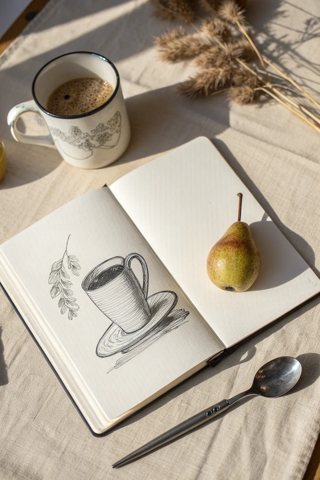
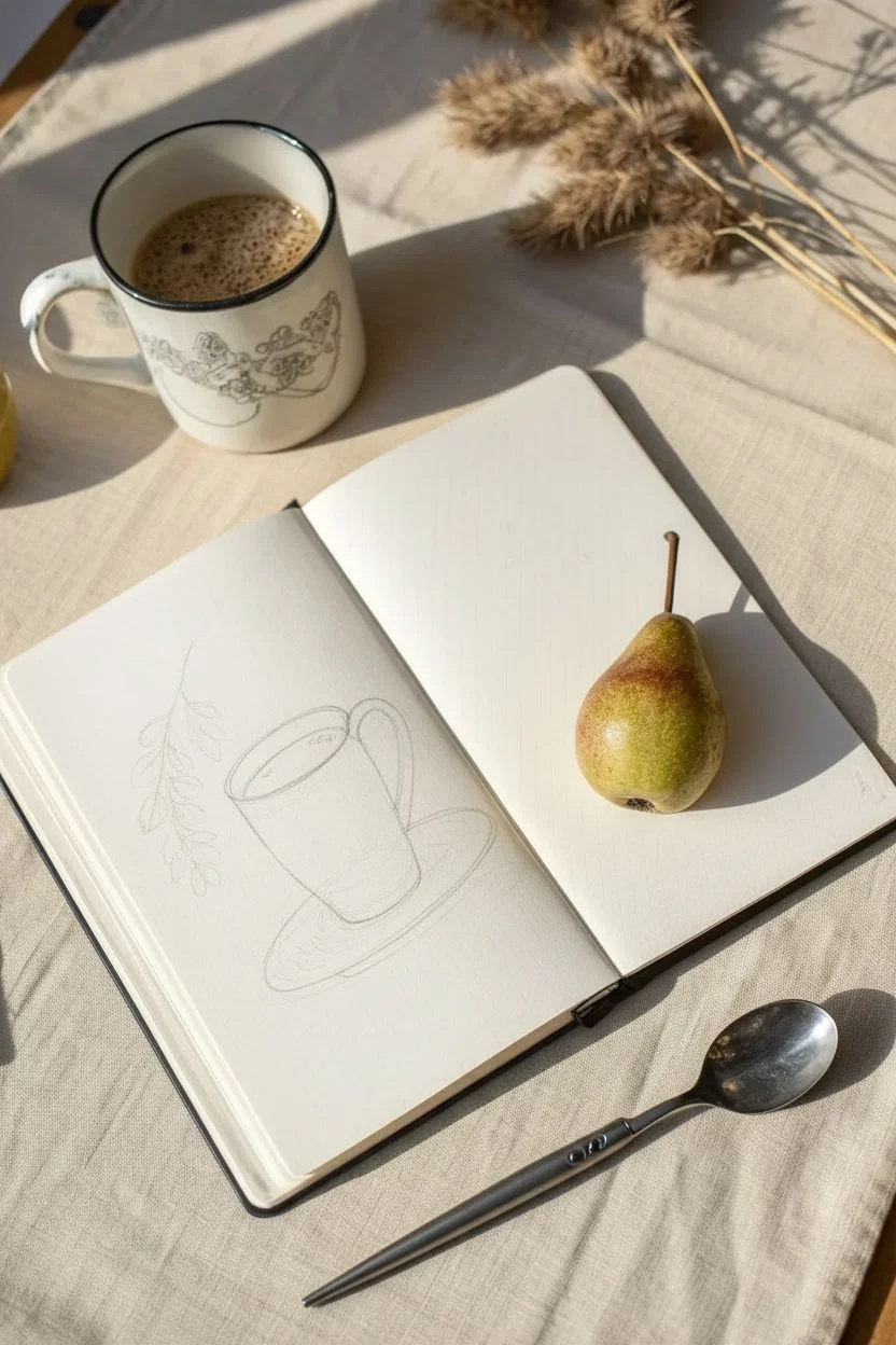
Capture the cozy essence of a quiet morning with this elegant line drawing of a coffee cup. Using simple pen strokes and cross-hatching techniques, you’ll create a charming illustration that pairs perfectly with your daily caffeine ritual.
How-To Guide
Materials
- Sketchbook with smooth, off-white paper
- HB Drawing pencil
- Kneaded eraser
- Fine liner pen (Black, 0.3mm or 0.5mm)
- Fine liner pen (Black, 0.1mm for details)
- Ruler (optional)
Step 1: Basic Structure
-
Define the cup shape:
Start by lightly sketching a slightly tilted cylinder in the center of your page with your HB pencil. Draw an oval for the top rim and a matching curve for the bottom edge. -
Add the saucer:
Sketch a larger, flatter oval underneath the cup to form the saucer. The back line of the saucer should be hidden behind the cup’s base. -
Attach the handle:
Draw an ear-like curve on the right side of the cup. Make sure to draw both the inner and outer lines to give the handle some thickness. -
Block in the foliage:
To the left of the cup, lightly draw a graceful, drooping line for the stem of the dried plant. Add rough oval shapes where the leaves or seed heads will go. -
Check proportions:
Take a moment to step back and look at your sketch. Ensure the cup isn’t leaning too much and the saucer sits flat beneath it.
Wobbly Ellipses?
Draw through the object! Sketch the entire oval of the saucer lighty, even the part hidden by the cup. This ensures the curve emerging on the other side aligns perfectly.
Step 2: Inking the Outlines
-
Trace the rim:
Switch to your 0.5mm pen. Carefully trace the top oval of the cup. Double this line slightly on the near side to show the width of the ceramic. -
Ink the coffee level:
Draw an inner curved line just below the rim to indicate the surface of the coffee. -
Complete the cup body:
Trace the vertical sides of the cup and the bottom curve. Keep your hand relaxed to avoid shaky lines. -
Define the handle and saucer:
Go over your pencil lines for the handle and the saucer. Notice how the saucer has a double rim; include that thickness in your ink work. -
Detail the plant:
Using the finer 0.1mm pen, trace the delicate stem and draw the texture of the dried seed heads, using small, jagged strokes to mimic their fluffy texture.
Step 3: Shading and Texture
-
Shade the liquid:
Fill in the coffee liquid with dark, dense strokes or solid black, leaving a small sliver of white near the edge for a reflection highlight. -
Start cross-hatching:
On the body of the mug, start drawing horizontal curved lines that follow the shape of the cup. Keep them closer together on the left side to indicate shadow. -
Layering shadows:
Add vertical hatching lines over the horizontal ones on the darkest side of the cup (the left side) to create deep contrast. -
Handle depth:
Add tiny hatching lines to the underside and inner curve of the handle to make it look three-dimensional. -
Saucer shadows:
Add curved hatching lines to the saucer, specifically right under where the cup sits, to ground the object. -
Cast shadow:
Draw bold, horizontal hatch marks extending to the right of the saucer’s base. This cast shadow anchors your drawing to the surface. -
Leaf details:
Add very light stippling or tiny lines to the leaves with your finest pen to give them volume without making them too dark. -
Clean up:
Once the ink is completely dry—I usually wait at least five minutes—gently erase all the underlying pencil marks with your kneaded eraser.
Variation: Steam
To imply hot coffee, add three wavering, broken lines rising from the liquid surface. Keep them very faint and vertical, fading out as they go up.
Now you have a timeless still life sketch captured in your book to remember this moment by


Quick Landscape Thumbnails
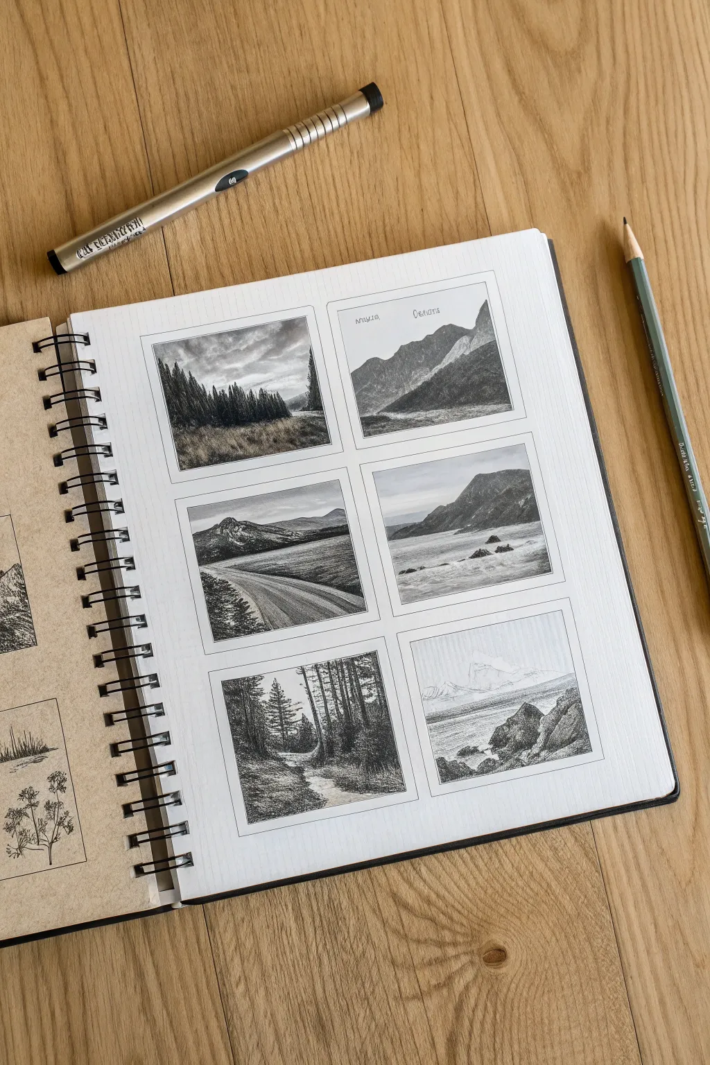
Capture the grandeur of nature on a tiny scale with these detailed landscape thumbnails. This project practice involves creating six distinct scenes in a neatly organized grid, perfect for refining your composition skills and tonal control.
Step-by-Step
Materials
- Spiral-bound sketchbook (smooth or vellum finish)
- Mechanical pencil (0.5mm HB or 2B)
- Wood-cased graphite pencil (HB or B)
- Ruler or straight edge
- Fine-point black liner pen (optional, for borders)
- Eraser (kneaded preferred)
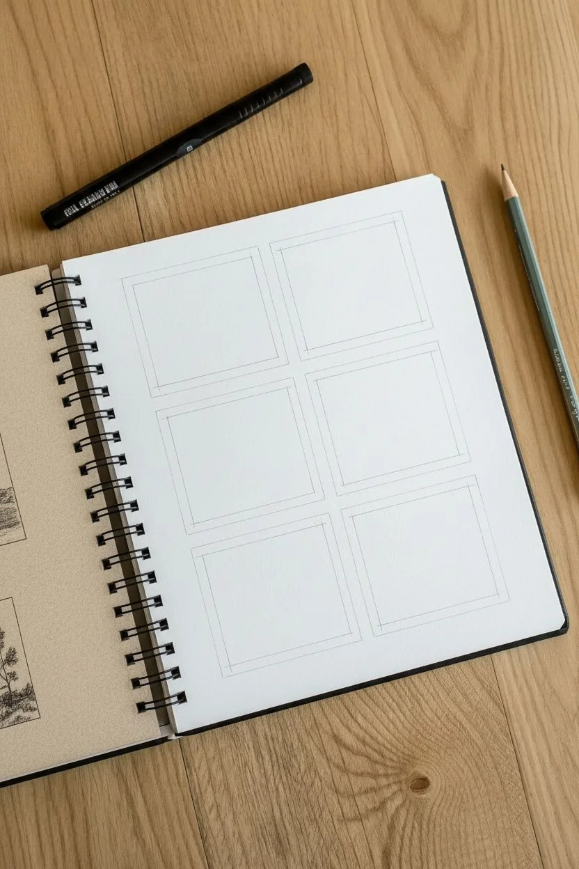
Step 1: Setting the Stage
-
Assess your layout:
Open your sketchbook to a fresh, right-hand page. Visualize a 2×3 grid layout that leaves comfortable margins around the edges and distinct spacing between each frame. -
Draw the frames:
Using your ruler and a light pencil touch, measure out six equal rectangles. A size of roughly 2×3 inches per box works well. Ensure the gaps between them are consistent to maintain that clean, gallery-like aesthetic. -
Ink the borders (optional):
For a crisper look like the example, trace over your pencil rectangles with a fine liner pen or press firmly with a sharp graphite pencil. Let the ink dry completely before erasing any stray guide lines.
Step 2: Top Row: Mountains & Valleys
-
Sketch the treeline:
In the top-left box, lightly sketch a horizon line about one-third up from the bottom. Outline a dense row of pine trees sweeping from left to right, varying their heights to create organic rhythm. -
Fill the forest:
Shade the trees darkly, using vertical strokes to mimic pine needles. Leave the foreground lighter, suggesting a grassy field with softer, horizontal hatching. -
Outline the slopes:
Move to the top-right box. Draw two major diagonal slopes intersecting to form a valley. The background mountain should lean right, while the foreground slope cuts in from the left. -
Add atmospheric depth:
Shade the foreground slope quite darkly to bring it forward. Keep the distant mountain lighter and hazier to simulate atmospheric perspective.
Keep it Clean
Place a scrap piece of paper under your drawing hand. This prevents your palm from smudging previous sketches while you work on the lower rows.
Step 3: Middle Row: Water & Roads
-
Draft the winding road:
In the middle-left box, draw a road starting wide at the bottom right and curving narrowed toward the left mid-ground. Place a mountain range in the distance. -
Texture the terrain:
Use cross-hatching to darken the land around the road, making the road itself pop by keeping it the paper’s white. Darken the mountain peaks for drama. -
Compose the seascape:
For the middle-right frame, draw a high horizon line. Sketch a large rocky headland on the right side and scatter a few small rocks in the water. -
Render the water:
Use horizontal, rhythmic strokes for the ocean. Leave small white gaps to represent foam and waves breaking against the rocks.
Add a Wash
If you used waterproof ink for the frames, try adding a light wash of gray watercolor or diluted ink over the graphite for a moody, mixed-media effect.
Step 4: Bottom Row: Forests & Shores
-
Create a forest path:
In the bottom-left square, draw a vertical path winding through tall trees. Emphasize the verticality of the trunks on both sides to frame the composition. -
Refine the foliage:
Stipple or scribble dense darks for the canopy leaves. Keep the path light, adding just a few horizontal scratches to suggest dirt or roots. -
Sketch the cliffside:
In the final bottom-right box, draw a rocky foreground on the right and a distant, faint mountain range across the water on the left. -
Detail the rocks:
I particularly enjoy this step: use sharp, angular shading on the foreground rocks to give them weight and texture, contrasting them against the smooth, faint shading of the distant mountains. -
Final polish:
Review all six drawings. Deepen the blackest shadows to increase contrast and erase any smudges from the white margins to keep the presentation professional.
You now have a beautiful collection of miniature worlds captured on a single sketchbook page

PENCIL GUIDE
Understanding Pencil Grades from H to B
From first sketch to finished drawing — learn pencil grades, line control, and shading techniques.
Explore the Full Guide
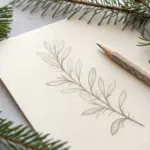
Leaf and Flower Line Studies
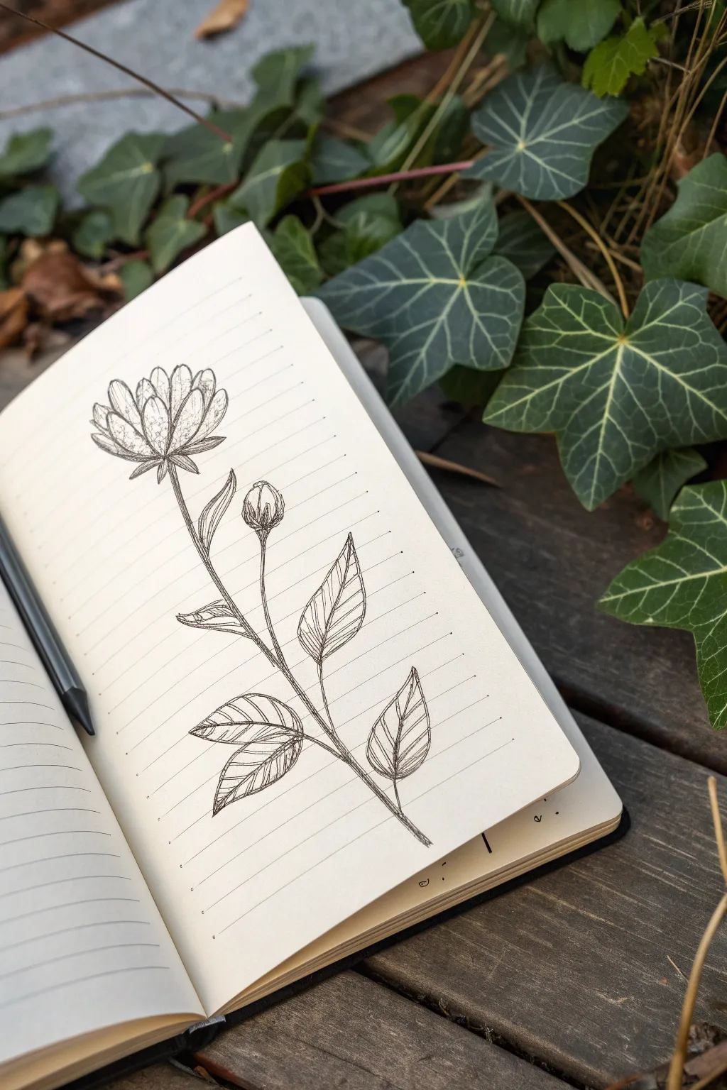
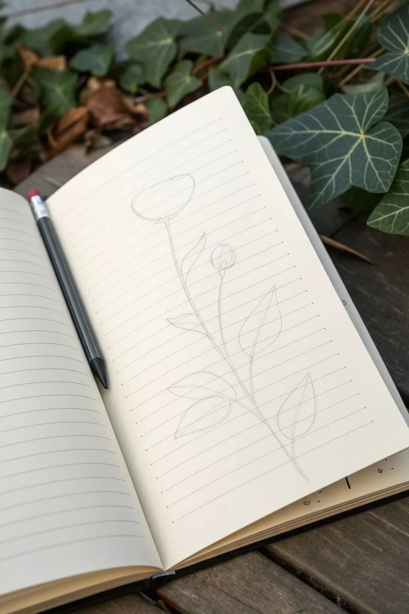
Capture the delicate beauty of nature with this simple yet expressive pen-and-ink wildflower study. Using bold lines and carefully placed hatching, you’ll create a charming botanical illustration right on the pages of your lined journal.
Detailed Instructions
Materials
- Lined journal or notebook (cream or ivory paper specificially gives a vintage feel)
- Fine liner pen (0.3mm or 0.5mm, black ink)
- Pencil (HB for initial sketching)
- Eraser
- Ruler (optional, if you want perfectly straight stems)
Step 1: Structural Basics
-
Map the Main Stem:
Begin with your pencil to lightly sketch the central curve of the flower stem. Start from the bottom third of the page and draw a gentle, S-shaped curve reaching upward. This line anchors your entire composition. -
Position the Flower Head:
At the very top of your stem, lightly sketch a flattened oval or shallow ‘U’ shape. This will serve as the base (the receptacle) for your main flower head. -
Add the Branching Stems:
Draw three smaller offshoot stems attached to the main line. Place one near the top right for a bud, one in the middle left for leaves, and two lower down on opposite sides for the bottom foliage. Keep these lines fluid.
Clean Lines Only
If your hand shakes, try pulling the pen toward you rather than pushing it away. Pivot from your elbow, not your wrist, for smoother long curves.
Step 2: Petals and Bud
-
Draft the Petal Shapes:
On your top oval, sketch a series of upright, elongated oval shapes for petals. Arrange them so some are in the foreground and others peek from behind. Think of them like a crown resting on the stem. -
Draw the Sepals:
underneath the petals, add small, pointed leaf-like shapes (sepals) that curve downward, connecting the flower head to the stem. -
Sketch the Bud:
Move to the upper right offshoot stem. Draw a tight, teardrop shape. Add lines to indicate tightly closed petals and small sepals hugging the base of the bud.
Step 3: Leaf Construction
-
Outline Leaf Shapes:
On the remaining offshoot stems, sketch broad, pointed oval shapes for the leaves. They should look like typical rose or hibiscus leaves with pointed tips. -
Add Central Veins:
Draw a central line down the middle of each leaf shape, curving slightly to follow the direction of the leaf. -
Refine the Edges:
Go over your leaf outlines and give them slightly jagged or serrated edges for a more natural, realistic look compared to a smooth curve.
Add a Splash
Use a watercolor brush pen to add a single wash of sheer color—like sage green or dusty pink—over the ink for a soft, mixed-media effect.
Step 4: Inking and Detailing
-
Ink the Main Outlines:
Switch to your fine liner pen. Trace over your pencil lines with a confident hand. I like to start with the petals to define the focal point first. -
Thicken the Stems:
Go over the stem lines again to add a bit of weight. You can double the line very closely to make the stem appear thicker and more robust. -
Texture the Flower Center:
Inside the flower petals, add some stippling (small dots) near the base of each petal. This creates depth and suggests a shadow where the petals bunch together. -
Add Petal Veins:
Draw very faint, thin vertical lines inside the petals. Don’t let them touch the top edge; start from the base and flick the pen upward for a tapered look. -
Hatch the Leaves:
This is the signature style of this piece. Fill one half of each leaf with diagonal hatching lines. Keep the lines parallel and evenly spaced. -
Shadow the Stem Junctions:
Add tiny bits of dark shading or extra lines right where the smaller stems join the main stem to create a sense of connection and dimness. -
Erase Guidelines:
Wait at least five minutes for the ink to dry completely to avoid smudging. Then, gently erase all your underlying pencil sketches.
Step 5: Final Touches
-
Deepen Contrast:
Look at the bud and the underside of leaves. Add a few more ink strokes to the darkest areas to make the drawing pop off the page. -
Review Balance:
Check the overall composition. If a stem looks too thin or floating, anchor it with a touch more line weight at the bottom.
Now you have a timeless botanical sketch that turns a simple notebook page into a piece of art
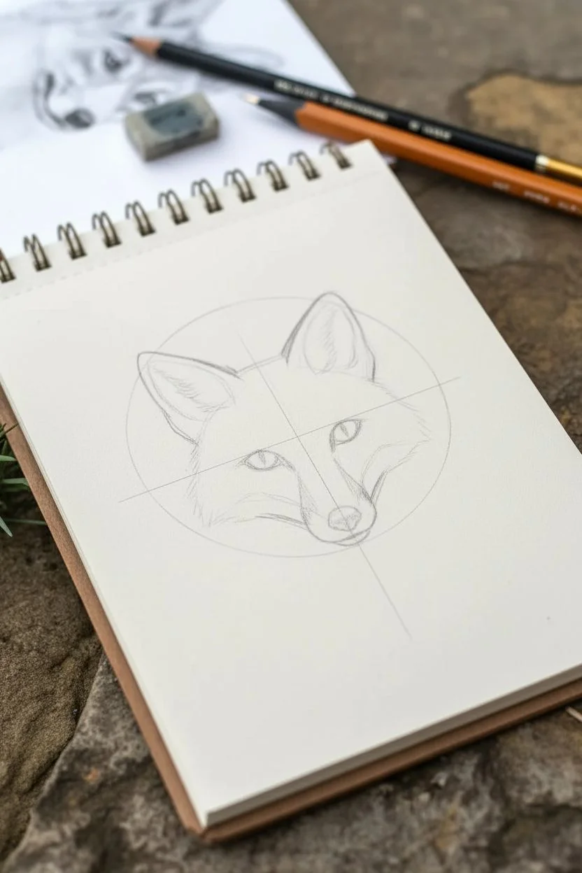
Pet Portrait Sketches
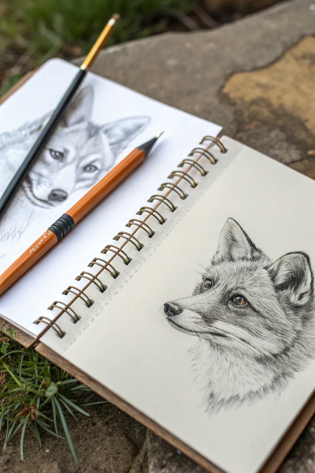
Capture the alert expression and soft fur texture of a fox in this detailed graphite pencil study. By focusing on layering strokes and building contrast slowly, you’ll create a lifelike pet portrait that pops from the page.
Step-by-Step Tutorial
Materials
- Heavyweight sketch paper or Bristol board
- Set of graphite pencils (HB, 2B, 4B, 6B)
- Mechanical pencil (0.5mm HB or 2B) for fine details
- Kneaded eraser
- Blending stump or tortillon
- Reference photo of a fox
Step 1: Laying the Foundation
-
Basic Shapes:
Start with a light HB pencil to block out the basic geometry of the fox’s head. Draw a circle for the cranium and a triangular wedge protruding for the muzzle. Add two large triangles for the ears. -
Refining the Contour:
Connect your shapes to create a smooth outline. Pay attention to the angle of the jawline and the slope of the nose. Keep these lines very faint so they can be erased or drawn over later. -
Placement of Features:
Draw a horizontal guideline across the face for the eyes. Sketch the almond shape of the eye, positioning the pupil towards the front. Mark the triangular nose tip and the line of the mouth. -
Mapping the Shadow:
Lightly shade the darkest areas first to establish your light source. This will likely be inside the ears, under the chin, and around the nose. This map helps guide your texture work later.
Fur Texture Tip
Don’t draw every single hair. Focus on ‘clumps’ and shadows between tufts. The negative space between fur strokes is just as important as the pencil lines themselves.
Step 2: Creating Texture and Detail
-
The Eye:
Switch to a 4B pencil or mechanical pencil to define the eye. This is the focal point, so it needs sharp contrast. Leave a tiny white circle for the highlight reflection to bring it to life. -
Fur Direction:
Before committing to dark lines, study your reference. Lightly directional strokes with an HB pencil show which way the fur grows—typically radiating outward from the nose and sweeping back along the cheeks. -
Short Fur on the Muzzle:
Using a mechanical pencil or a very sharp HB, create short, ticking strokes along the bridge of the nose. The fur here is very short and dense, so keep your pencil marks tight and controlled. -
Building Eye Depth:
Darken the rim around the eye and adding shading to the iris. Foxes often have amber eyes, so keep the iris a mid-tone grey rather than black, darkening only near the upper eyelid. -
Cheek Fluff:
Transition to longer strokes as you move down the cheek. Use a 2B pencil and flick your wrist at the end of each stroke to taper the hair, making it look soft rather than wiry. -
Ear Details:
Draw the fluffy interior of the ears using long, curved strokes that overlap. Darken the deep recesses of the ear with a 6B pencil to create depth, leaving the outer edges lighter to suggest thickness.
Add a Pop of Color
Use a burnt sienna or ochre colored pencil just on the iris of the eye. This subtle addition makes the monochrome sketch feel surprisingly vibrant and alive.
Step 3: Refining and Layering
-
Darkening the Nose:
Fill in the nose pad with a 4B or 6B pencil. Texture is crucial here; create a stippled or rough texture rather than colouring it in perfectly smooth. Leave a small highlight on the top ridge. -
Layering the Coat:
Go back over your initial fur strokes with darker pencils (2B and 4B). Don’t cover every lighter stroke; letting the under-layers show through creates the illusion of thick, multi-layered fur. -
Adding Whiskers:
Identify where the whisker pads are on the muzzle. Make small dots in rows, then use quick, confident strokes with a mechanical pencil to draw long whiskers. Press hard for a clean line. -
Neck Ruff:
The fur around the neck is thick and luscious. Use looser, longer strokes here. I find it helpful to group tufts together rather than drawing individual hairs to show volume. -
Final Contrast Check:
Step back and squint at your drawing. Deepen the darkest shadows—usually the pupil, nostrils, and inner ear—with your softest 6B pencil to ensure the full range of values is present. -
Cleanup:
Use a kneaded eraser to lift off any smudges on the background paper. You can also press the eraser into the fur to lift out clean ‘white’ hairs for extra highlight.
Now you have a stunning, realistic fox portrait that captures the wild spirit of the animal.
BRUSH GUIDE
The Right Brush for Every Stroke
From clean lines to bold texture — master brush choice, stroke control, and essential techniques.
Explore the Full Guide
Shoes and Everyday Wearables
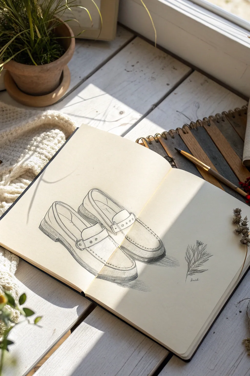
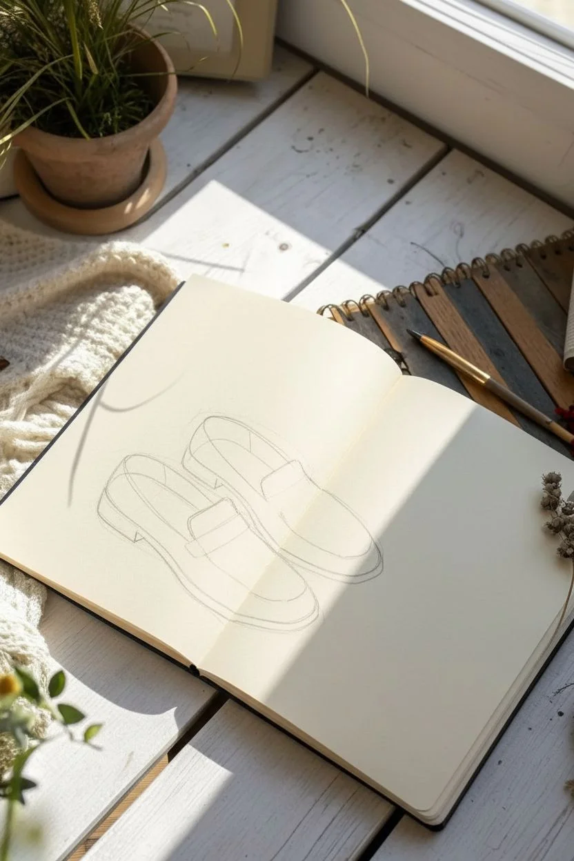
Capture the relaxed elegance of a favorite pair of loafers with this detailed pencil study. This sketch focuses on clean contour lines and gentle shading to bring out the leather texture and stitching details, accompanied by a small botanical accent.
Detailed Instructions
Materials
- Sketchbook with smooth, off-white paper (approx. A4 size)
- H pencil for initial layout
- HB or B pencil for detailing and contouring
- 2B pencil for darker shadows and soles
- Kneadable eraser
- Fine liner pen (optional, for final definition)
- Ruler (optional, to check perspective alignment)
Step 1: Laying the Foundation
-
Establish the Composition:
Begin by lightly marking the placement of the two shoes on your page. Position them slightly diagonally, with the left shoe appearing closer to the viewer and the right shoe tucked slightly behind it. -
Block in Basic Shapes:
Using an H pencil and very light pressure, draw two elongated oval shapes to represent the footprint of each shoe. Keep these loose; they are just guides for the overall volume. -
Define the Upper Curves:
Sketch the top opening of the shoes where the foot would go. Think of this as a modified ‘U’ shape that curves inward towards the heel. Ensure the angle matches the diagonal flow you established earlier. -
Add the Sole Guidelines:
Draw faint parallel lines beneath the main body of each shoe to indicate the thickness of the soles and the slight lift of the heel.
Step 2: Constructing the Details
-
Draw the Loafer Strap:
Across the instep of each shoe, sketch the distinctive penny loafer strap. It should look like a rectangular band with a small cutout in the center. Give it a bit of dimension by drawing the thickness of the leather edges. -
Refine the Stitching Lines:
Switch to your HB pencil. Draw the prominent stitching line that runs around the toe box (the ‘apron’ of the shoe). Use short, consistent dashes or a slightly broken line to mimic the look of sewn thread. -
Shape the Heel Cup:
Refine the back of the shoes, ensuring the curve hugs the imaginary heel. Add the vertical stitching detail often found on the back of loafers. -
Detail the Hardware:
On the side of the strap, draw the small circular rivets or metallic details. Keep these crisp and distinct against the softer leather texture. -
Solidify the Soles:
Darken the outline of the soles. Pay attention to the welt (the stitching where the sole meets the shoe) by adding a secondary, thinner line just above the bottom edge.
Uneven Shoes?
If one shoe looks much larger than the other, check your perspective. Objects further away should be slightly smaller. Use a ruler to align the heels and toes horizontally to catch size discrepancies early.
Step 3: Shading and Texture
-
Establish Light Source:
Identify where your light is coming from (in this reference, it seems to be coming from the top left). This means shadows will fall to the bottom right and inside the shoe. -
Shade the Interiors:
With a 2B pencil, darken the interior of the shoe opening. Use vertical hatching strokes to suggest depth, making it darkest deep inside the toe and heel area. -
Add Form Shadows:
Lightly shade the side of the shoes facing away from the light. I like to use soft diagonal hatching here to curve the form without making the leather look dirty or scuffed. -
Create Cast Shadows:
Add a decisive shadow beneath each shoe using the 2B pencil. This grounds the drawing so the loafers don’t look like they are floating. Soften the edges of this shadow as it moves away from the shoe. -
Highlight the Leather:
Use your kneadable eraser to lift off graphite on the ‘high points’ of the leather—specifically the top of the toe box and the curve of the strap. This creates a sheen effect.
Pro Tip: Line Weight
Vary your line weight for realism. Use thicker, darker lines for the bottom of the sole (where weight is carried) and thinner, lighter lines for top edges catching the light.
Step 4: Final Touches
-
Sketch the Botanical Element:
To the right of the shoes, sketch a simple dried sprig. Use quick, jerky lines for the stem and small, clustered shapes for the dried buds or leaves to contrast with the smooth shoes. -
Cross-Hatching Accents:
Add subtle cross-hatching on the darkest part of the heel and the shadow side of the strap to deepen the contrast. -
Clean Up Edges:
Erase any stray construction lines from the H pencil that are still visible. Re-define the outer contours with a sharp B or 2B pencil for a professional finish. -
Sign and Date:
Add your small signature near the botanical sketch to balance the composition.
Now you have a stylish study of footwear that captures both structure and style, ready for your portfolio
Urban Crowd Gesture Sketching
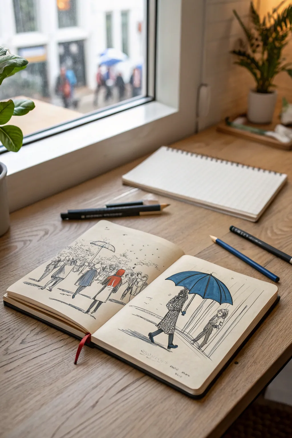

This project captures the cozy, melancholy mood of a rainy city street using loose ink lines and selective pops of color. The focal point is contrasting figure gestures against the backdrop of weather, creating a lively yet serene urban sketch spread.
Step-by-Step Guide
Materials
- A5 Sketchbook (heavyweight cream paper works best)
- Fine liner pens (0.1mm, 0.3mm, 0.5mm)
- Alcohol-based markers (colors: muted blue, bright red, cool grey)
- Colored pencils (blue, red, grey for texture)
- Graphite pencil (HB or 2B)
- Kneaded eraser
Step 1: Planning the Composition
-
Light scaffolding:
Begin by lightly sketching the horizon line across both pages with your graphite pencil. Keep it roughly one-third of the way up from the bottom edge to ground your figures. -
Positioning key figures:
On the right page, block in two large shapes for the main figures using simple ovals and rectangles. On the left page, sketch smaller, more abstract shapes to represent the crowd. -
Umbrella placement:
Sketch the prominent umbrella shape on the right page first, ensuring it arcs protectively over the main figure. Then, scatter smaller arcs throughout the left page crowd to create rhythm. -
Refining the poses:
Flesh out your stick figures. For the main figure on the right, focus on the angle of the walk—leaning forward slightly into the imaginary wind.
Step 2: Inking the Scene
-
Outline the main umbrella:
Using a 0.5mm fine liner, draw the ribs of the large umbrella on the right page first, then connect them with curved lines for the fabric. -
Clothing textures:
Switch to a 0.3mm pen. For the figure under the blue umbrella, draw a patterned coat using small, repetitive loops or circles to suggest a heavy wool texture. -
Define the legs:
Ink the legs of the main figure with solid, confident strokes. Block in the boots with solid black ink to anchor the character to the ground. -
The secondary figure:
Ink the smaller figure facing the main one. Use lighter, broken lines here to push them slightly into the ‘mid-ground’ visually. -
Inking the crowd:
Move to the left page. Use the 0.1mm pen here. Keep the figures loose and gesture-based, focusing on the shapes of coats and the tilts of umbrellas rather than faces. -
Varied line weights:
Go back over the foreground figures on the left page with a 0.3mm pen to separate them from the background crowd. -
Erase pencil lines:
Once the ink is fully dry—I like to wait at least five minutes to be safe—gently sweep your kneaded eraser over the page to remove the graphite guides.
Ink Smearing?
If your fine liner runs when you apply marker, switch the order. Apply the marker color first, let it dry completely, and then draw your ink lines on top for crisp edges.
Step 3: Adding Color and Atmosphere
-
The blue umbrella:
Take your blue marker and fill in the large umbrella on the right page. Leave tiny slivers of white paper along the top of each rib to simulate wet, reflective fabric. -
Spot color: Red:
On the left page, choose one central figure to highlight. Color their coat with the bright red marker. This draws the eye across the spread. -
Spot color: Muted Blue:
Color the coat of a figure near the red one with a muted blue or grey marker to balance the palette without overpowering the red focal point. -
Shadows and ground:
Use a cool grey marker to add cast shadows underneath the feet of the main figures. Keep the strokes horizontal and jagged to mimic wet pavement. -
Rain texture:
With a fine 0.1mm pen, draw vertical, slightly angled lines in the background. Don’t cover the whole page; just suggest rain in patches behind the figures. -
Colored pencil overlay:
Lightly shade over the blue marker umbrella with a blue colored pencil to add grain and depth. Do the same with a grey pencil over the patterned coat. -
Reflective details:
Use a white gel pen or opaque white pencil to add a few final streaks on the wet pavement areas and the very top of the umbrellas.
Creative Twist
Instead of rain, turn the vertical lines into falling snow by using masking fluid dots before you start coloring, then rub them away at the end for white snowflakes.
Now you have a dynamic urban spread that perfectly captures the feeling of a rainy commute


Doorways and Windows Perspective Practice
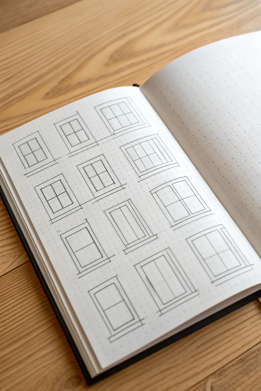
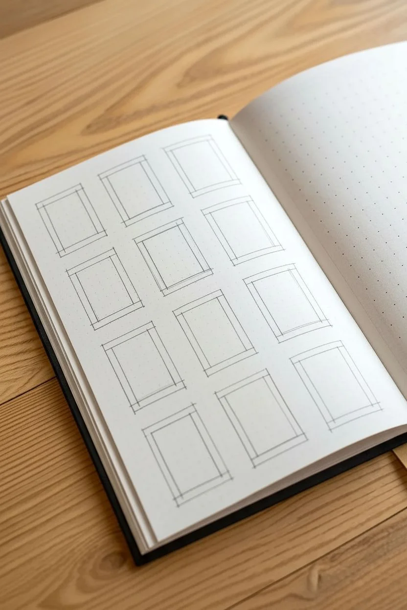
This sketching exercise focuses on drafting twelve distinct window designs using the structure of a dot grid journal to keep proportions neat and consistent. The result is a clean architectural study sheet that explores various frame styles and muntin configurations with precise pencil work.
How-To Guide
Materials
- A5 Dot grid notebook or sketchbook
- B or HB Graphite pencil
- Fine-point mechanical pencil (0.5mm or 0.3mm)
- Small transparent ruler (6-inch)
- Eraser
Step 1: Setting the Layout
-
Define the grid structure:
Begin by counting the available dots on your page to determine the spacing. You will need to fit three columns and four rows of windows. I find it helpful to leave at least 2 empty dot spaces between each window vertically and horizontally to prevent the page from looking cluttered. -
Mark the corners:
Lightly mark the four corners of each window box with your pencil. Aim for a standard size for all frames, such as 6 dots wide by 8 dots high, to maintain consistency across the page. -
Draft the outer frames:
Using your ruler and a light touch, connect your corner marks to create simple rectangular boxes for all twelve windows. Keep these initial lines very faint so they can be adjusted or erased if necessary.
Grid Misalignment?
If your windows look crooked, rely heavily on the dot grid. Count ‘2 dots over, 1 dot down’ for every internal line to ensure perfect symmetry without measuring.
Step 2: Designing the Top Row
-
First window: classic four-pane:
For the top-left window, draw a smaller rectangle inside your first box to create the frame thickness. Then, bisect the inner rectangle with one vertical line and one horizontal line to create a standard four-pane window. -
Second window: single hung style:
Move to the middle window. Create the inner frame, then draw a horizontal line slightly above the center point. Add a vertical line only in the top section to suggest a two-over-one sass arrangement. -
Third window: six-pane grid:
For the top-right window, divide the inner space into six equal sections by drawing one vertical line down the center and two equally spaced horizontal lines across.
Step 3: Developing the Middle Rows
-
Fourth window: double frame:
On the second row, left side, draw a standard four-pane window but add an extra outline around the perimeter to suggest a thick, decorative casing or trim. -
Fifth window: tall casement:
For the center window of the second row, create a tall, narrow look. Divide the pane vertically into two long rectangles. -
Sixth window: multi-pane picture:
On the right of the second row, try a more complex grid. Create a 3×3 grid layout (nine panes) or a large central pane bordered by smaller square panes. -
Seventh window: sliding sash:
Moving to the third row, draw a standard rectangular frame. Split it horizontally in the middle. Add a slight second line to the bottom half’s top edge to show where the sash overlaps the top glass. -
Eighth window: vertical panels:
In the middle of the third row, draw a large window divided into three narrow vertical strips, perfect for capturing a modern aesthetic.
Pro Tip: Line Weight
Use a 0.5mm lead for the main outer frames and a lighter 0.3mm lead for the internal window panes. This contrast makes the drawing pop instantly.
Step 4: Bottom Row & Detailing
-
Ninth window: basic two-pane:
For the final row, start on the left with a simple design: a frame divided by a single horizontal bar. -
Tenth window: tall feature:
In the bottom center, draw a frame with a single vertical mullion going all the way down, keeping the design clean and minimal. -
Eleventh window: classic cross:
For the last sketched window on the right, return to a simple cross shape (four panes), but extend the sill lines slightly past the frame width on the bottom. -
Add window sills:
Go back to every window and add a small, protruding rectangle at the bottom of each frame to represent the sill. Extend the lines just a millimeter or two past the frame width for realism. -
Thicken the frame lines:
Using your mechanical pencil or pressing harder with the graphite, go over the outer frame lines and the inner sash lines. The lines separating the glass panes should be thinner than the structural frame lines. -
Add extension lines:
For a sketchy, architectural look, allow your vertical and horizontal stroke lines to extend slightly past the corners where they intersect. This ‘over-drawing’ adds character to the sketch. -
Clean up:
Gently erase any construction marks or initial layout dots that distract from the final forms, being careful not to smudge your crisp detailing.
Now you have a reference sheet of architectural elements ready for your next urban sketch or building study
Zentangle-Style Pattern Page
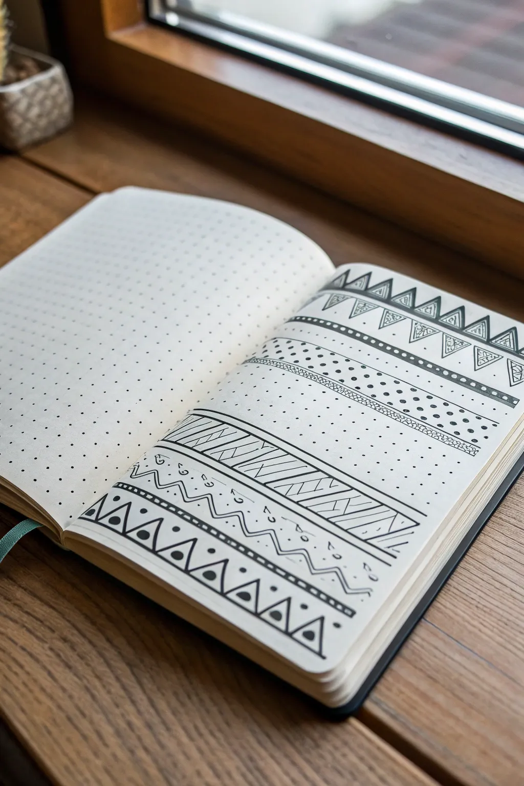
This project features a series of repeating geometric bands drawn on dot-grid paper, creating a structured yet decorative page layout. The design combines simple shapes like triangles, lines, and dots to build complex-looking borders perfect for bullet journal dividers or sketchbook practice.
Detailed Instructions
Materials
- A5 dot grid notebook (or loose dot grid paper)
- Fine liner pen (black, size 0.3mm or 0.5mm)
- Ruler (clear plastic is helpful)
- Pencil (HB or lighter)
- Eraser
Step 1: Planning the Layout
-
Assess your grid:
Open your notebook to a fresh spread. Take a moment to look at the dot grid spacing; you’ll be using these dots as anchor points for every line you draw, so get comfortable with counting spaces. -
Pencil guidelines (optional):
If you’re nervous about freehanding with ink immediately, lightly sketch horizontal lines across the page with a pencil and ruler to define where your separate pattern bands will sit. Leave about 3-4 dot rows of empty space between each major band.
Step 2: Drawing the Top Triangle Band
-
Base triangles:
Starting near the top of the page, draw a row of upward-pointing triangles. Let the base of each triangle span two dot units, and the tip reach up two units. They should touch side-by-side. -
Add inner details:
Inside each large triangle, draw a smaller, parallel triangle. This creates a double-lined effect. -
Decorative fill:
In the small gap between the inner and outer triangle lines on the right side of each shape, draw tiny vertical hatching lines for shading. Then, draw small inverted triangles in the spaces *between* the main triangles to complete the band.
Smudge Alert
If you are left-handed, place a scrap piece of paper under your hand as you move across the page to prevent smearing wet ink.
Step 3: Creating the Dotted Divider
-
Top distinct solid line:
Skip about two rows of dots down from your triangle band. Use your ruler to draw a bold, thick horizontal line across the entire page width. -
Main dotted section:
Below the thick line, you’ll create a wide textured area. Draw two parallel horizontal lines about four dot-rows apart. Fill this space with randomly placed, tiny stippling dots. Keep them light and airy. -
Bottom border line:
Finish this middle section by drawing another thin horizontal line right below your stippling area to box it in.
Add Pop
Use a grey mildliner or watercolor marker to add drop shadows behind the bands for a 3D effect.
Step 4: Diagonal Hatching Band
-
Define the boundaries:
Move down another two or three rows. Draw two parallel horizontal lines that span the width of the page, creating a strip about three dot-units tall. -
Draw the zig-zags:
Inside this strip, draw a large zig-zag line that touches the top and bottom borders. This divides the strip into a series of triangles pointing up and down. -
Fill with hatching:
Fill every *other* triangle with diagonal hatching lines. I find it easiest to keep the angle consistent for a cleaner look. Leave the alternating triangles blank white.
Step 5: The Bottom Geometric Mix
-
Wavy line element:
Below the diagonal band, draw a wavy or zig-zag line that floats freely without a border box. Add a small dot or circle floating in each upper ‘valley’ of the wave. -
Base triangle row:
For the final anchor pattern at the bottom, draw a row of large triangles similar to the first step, but slightly wider. -
Bold details:
Inside each of these bottom triangles, draw a solid black circle (or heavy dot) in the center. This adds visual weight to the bottom of the page. -
Final touches:
Add a dashed line or a line with small circles interrupting it just above the bottom triangle row to tie the lower section together. -
Erase and clean:
Wait at least 5-10 minutes for the ink to dry completely. Gently erase any visible pencil guidelines to leave a crisp, stark black-and-white design.
Now you have a beautifully patterned page ready to serve as a divider or simply as a satisfying sketchbook accomplishment
Feather and Fur Texture Swatches
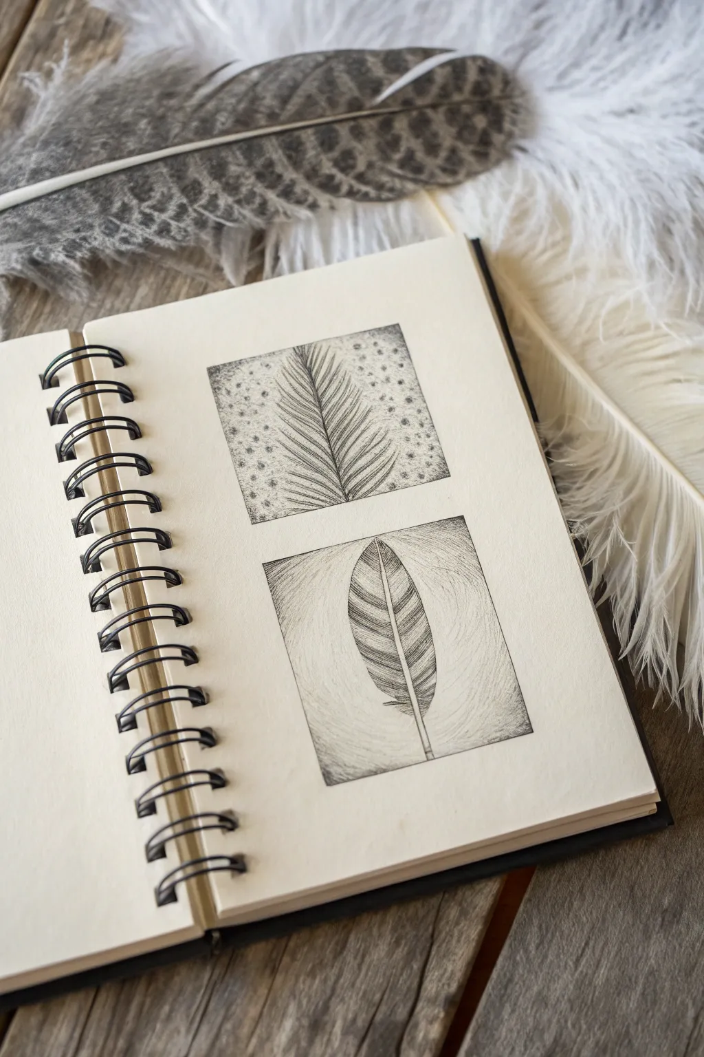
Master the intricate details of nature with these two distinct feather studies, exploring contrasting textures through stippling and hatching. This project focuses on capturing the delicate barbs and patterns found in avian plumage using fine-line ink techniques.
Step-by-Step
Materials
- Spiral-bound sketchbook with smooth, heavyweight paper (min 100gsm)
- Fine liner pens (sizes 0.05, 0.1, and 0.3)
- HB or 2H graphite pencil
- Kneaded eraser
- Ruler
- Reference feathers (optional)
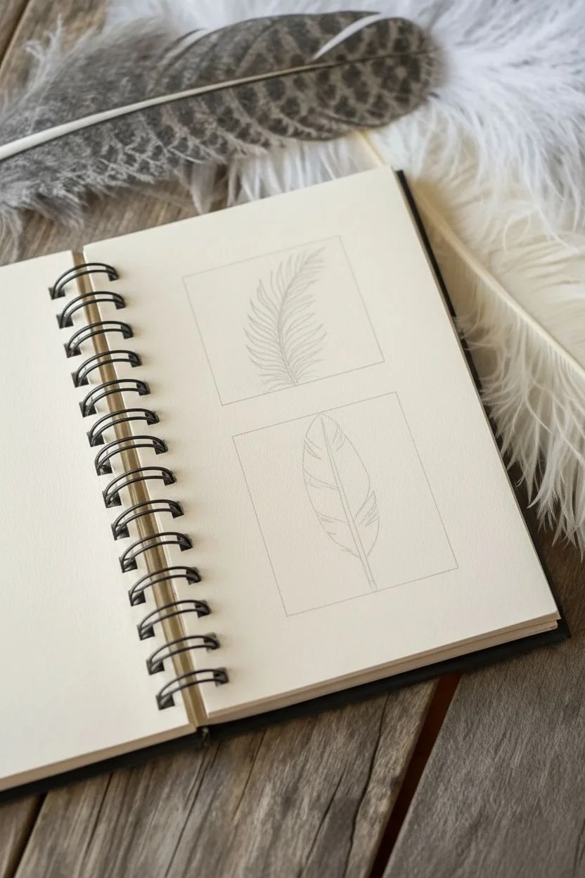
Step 1: Preparation and Layout
-
Define the boundaries:
Using your ruler and pencil, lightly draw two identical squares on your sketchbook page, stacking them vertically with about an inch of space between them. -
Draft the top feather:
In the top square, sketch a diagonal, curved line for the rachis (center shaft) starting from the bottom left corner extending toward the top right. -
Add basic volume:
Lightly outline the overall shape of the feather vanes around the shaft. For this study, shape it somewhat like a palm frond or a fern, with distinct, separate sections. -
Draft the bottom feather:
In the bottom square, draw a vertical, slightly curved shaft. Draw a simple, oval-shaped perimeter for the vane, keeping the edges smooth for now. -
Detail the bottom stripes:
Sketch curved horizontal bands across the bottom feather to indicate where the color patterns will change.
Step 2: Top Study: Stippling and Fern Texture
-
Ink the shaft:
Switch to a 0.1 fine liner. Carefully trace the central shaft, making it slightly thicker at the base and tapering to a hairline at the tip. -
Draw the barbs:
Using a 0.05 pen, draw the individual barbs extending outward. Unlike a solid feather, treat these like separate, fine hairs or fern leaves that curve gently upward. -
Build overlapping density:
Go back over the center area where the barbs meet the shaft. Add more strokes here to create a sense of density and shadow. -
Begin the background:
For the background texture, use the 0.1 pen to start stippling. Place dots randomly around the feather shape. -
Refine the stippling:
Increase the density of the dots near the edges of the feather to make the white subject pop against the background, fading the dots out as you reach the square’s border.
Ink Smearing?
If your hand drags ink across the page, place a scrap piece of paper under your drawing hand. Always work from left to right (if right-handed) to keep the area clean.
Step 3: Bottom Study: Hatching and Banding
-
Outline the shape:
With the 0.1 pen, outline the main shape of the feather. I prefer to use broken, jagged lines rather than a smooth continuous line to mimic the texture of the edges. -
Create the bands:
Fill in the dark bands of the feather using diagonal hatching lines. Keep the strokes close together for the dark stripes and leave the alternating stripes white. -
Add directional flow:
Ensure your hatching lines follow the direction the barbs would naturally grow—upward and outward from the shaft. -
Create the background halo:
For this square, use a hatching technique for the background. Start drawing fine lines that radiate away from the feather. -
Soften the background:
Curving these background lines slightly creates a ‘halo’ effect. Keep the lines lighter and further apart as they move away from the feather to create depth. -
Define the quill:
Use the 0.3 pen to darken the very bottom of the quill tip to ground the drawing. -
Final cleanup:
Once the ink is completely dry (give it at least 5 minutes), gently erase your pencil guidelines with the kneaded eraser.
Pro Tip: Line Weight
Vary your pressure. Pressing harder at the base of a barb and lifting up quickly (‘flicking’) creates a natural tapered line that mimics real hair or feather texture.
Now you have a pair of intricate nature studies ready to enhance your portfolio
Portrait With Botanical Crown
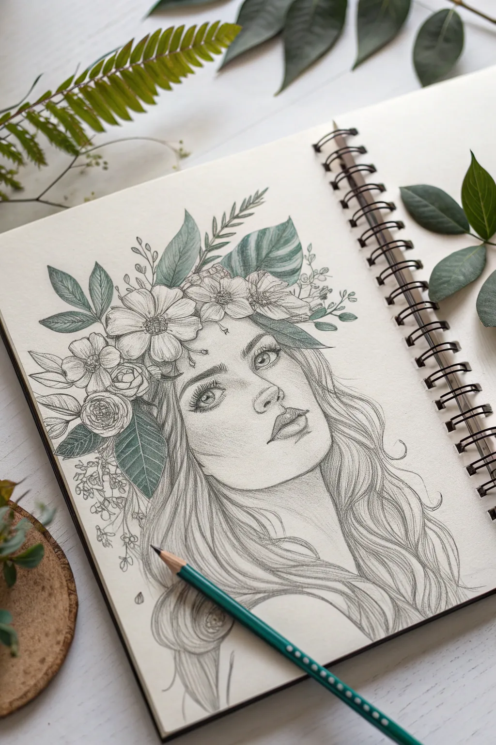
Blend the elegance of portraiture with the organic beauty of nature in this delicate sketchbook study. You’ll combine detailed graphite shading with selective pops of soft green to create a whimsical character crowned in flora.
How-To Guide
Materials
- Spiral-bound sketchbook (smooth or vellum finish)
- Graphite pencils (HB, 2B, 4B)
- Green colored pencil (teal or sage tone)
- Kneaded eraser
- Fine-tip eraser stick (optional)
- Blending stump or tortillon
- Pencil sharpener
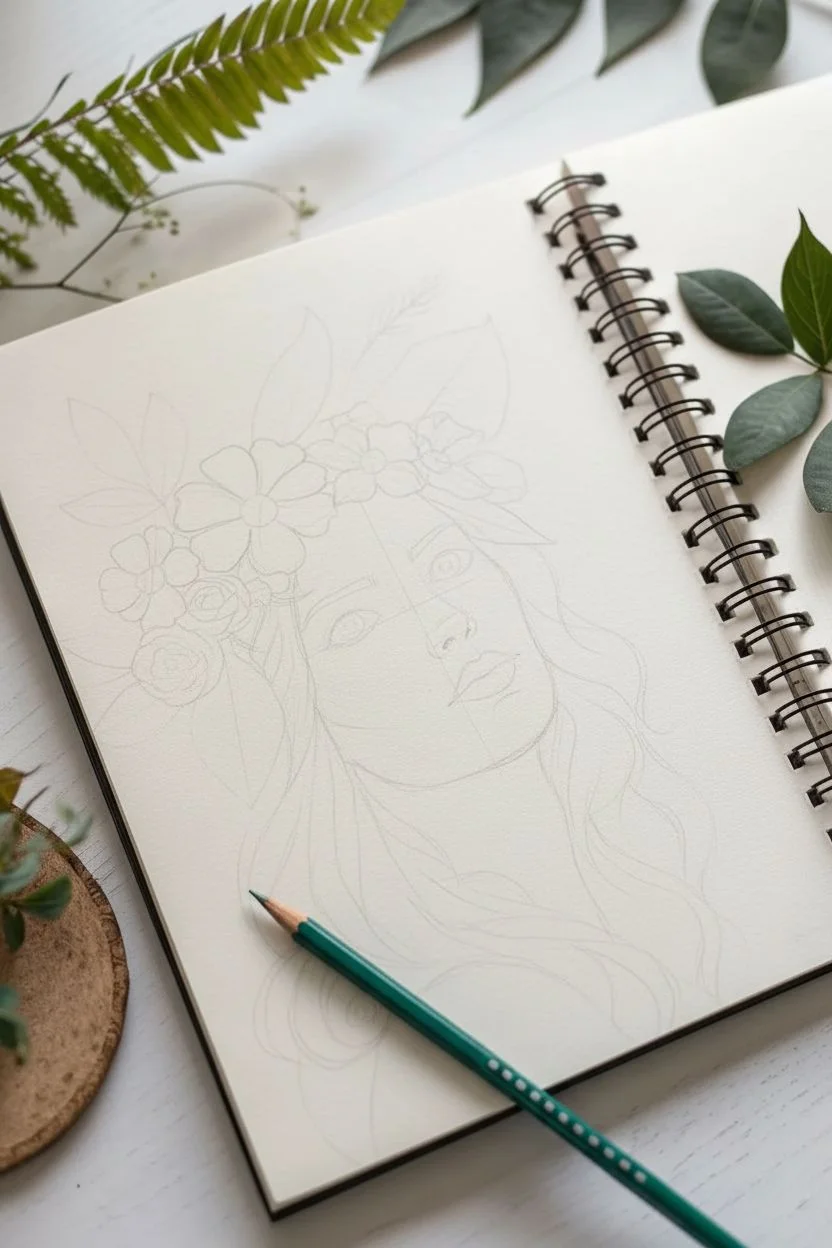
Step 1: Laying the Framework
-
Establish the Head Shape:
Begin with a faint oval shape in the center of your page to represent the head. Add a vertical center line down the middle and a horizontal eye line just below the halfway mark to guide your proportions. -
Draft Facial Features:
Sketch the placement of the eyes on the horizontal line, spacing them about one eye-width apart. Mark the nose tip halfway between the eyebrows and chin, and the mouth line halfway between the nose and chin. -
Outline the Hair Volume:
Draw loose, sweeping curves around the face to indicate where the hair will flow. Don’t detail strands yet; just focus on the overall mass and the wave pattern falling over the shoulders. -
Block in the Crown:
Lightly sketch the general shapes of the flowers and leaves atop the head. Think of this as a halo sitting securely on the skull, slightly overlapping the hairline.
Natural Texture Tip
When coloring the leaves, use the side of your pencil lead rather than the tip. This picks up the paper’s grain, creating an organic, leafy texture instantly.
Step 2: Bringing the Face to Life
-
Define the Eyes:
Using a sharpened HB pencil, define the almond shape of the eyes. Draw the irises and pupils, leaving a small white circle in each for a highlight. Add upper lash lines with slightly darker strokes. -
Refine Nose and Lips:
Sketch the nostrils and the curve of the nose tip, avoiding hard outlines for the bridge. Define the lips, emphasizing the shadow between them and the bow shape of the upper lip. -
Shade the Skin:
Switch to a 2B pencil to add light shading under the eyebrows, along the side of the nose, and under the chin. Keep your strokes incredibly light and use a blending stump to smooth the graphite into a soft skin texture. -
Deepen Facial Contrast:
Darken the pupils and the upper lash line with a 4B pencil. Gently reinforce the eyebrows with short, hair-like strokes.
Step 3: Drawing the Botanical Crown
-
Detail the Forehead Flowers:
Focus on the two large blooms on the left side. Draw five to six petals radiating from a textured center for each. Keep lines clean but varied in weight. -
Add Leaf Structures:
Fill the spaces around the flowers with different leaf shapes. I like to include a mix of long fern-like fronds and broad, tropical-style leaves for visual interest. -
Incorporate Tiny Filler Blooms:
On the right side and lower left, sketch clusters of tiny buds or baby’s breath to balance the composition and soften the transition to the hair. -
Apply Green Accents:
Take your green colored pencil and gently fill in the leaves. Don’t color solidly; use directional strokes to mimic veins, leaving small white gaps for highlights. -
Shade the Botanicals:
Go back over the green areas with a graphite pencil to add shadows where leaves overlap, deepening the sense of depth within the crown.
Adding Mystique
Try dotting small freckles across the nose and cheeks using a sharp 4B pencil, or add tiny floating petals falling from the crown to create movement.
Step 4: Detailing Hair and Finishing Touches
-
Create Flowing Strands:
Using long, continuous strokes with a 2B pencil, define the waving locks of hair. Follow the S-curves you established earlier, pressing harder in the valleys of the waves to create depth. -
Add Volume with Shadows:
Darken the hair behind the neck and under the floral crown. This pushes the hair backward and makes the face pop forward. -
Refine the Edges:
Clean up any stray guidelines with your kneaded eraser. Add a few loose ‘flyaway’ hairs around the perimeter to make the portrait feel natural and less stiff. -
Final Highlights:
Use a fine eraser to lift pigment from the center of the lower lip, the tip of the nose, and the highest points of the flower petals for a crisp finish.
Step back and admire drawings that brings the serenity of the garden onto the page
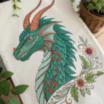
Mythical Creature Design: Dragon in Motion
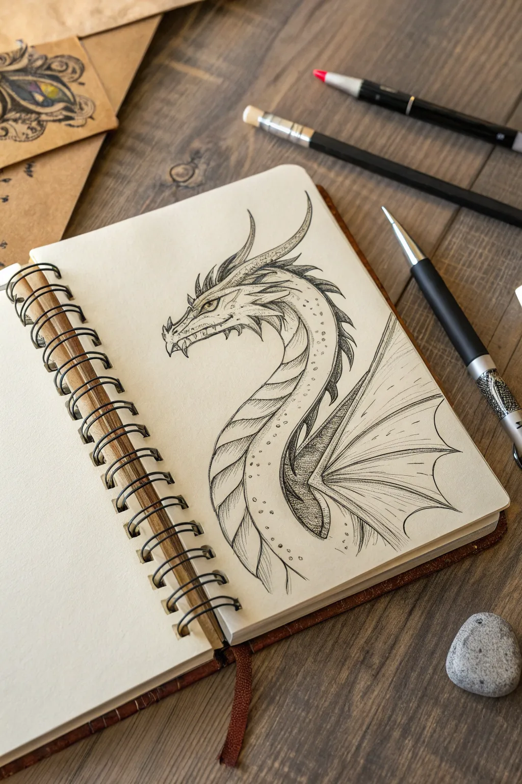
Capture the fluid grace of a mythical beast with this detailed dragon study, focusing on the curvature of the neck and intricate scale work. This project blends clean line art with careful shading to create a creature that feels both ancient and alive.
Step-by-Step
Materials
- Acid-free sketchbook or drawing paper (medium tooth)
- HB or 2B graphite pencil for sketching
- Fine liner pens (sizes 005, 01, and 03)
- Kneaded eraser
- Mechanical pencil (optional for details)
- Blending stump (paper tortillon)
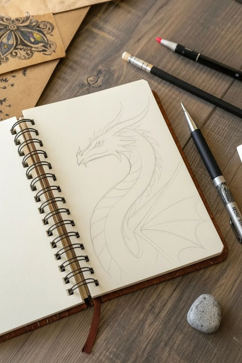
Step 1: Laying the Foundations
-
Map out the gesture:
Start with a light HB pencil to draw a sweeping ‘S’ curve. This line will serve as the spine of your dragon, guiding the flow of the neck down into the chest area. -
Define the head shape:
At the top of your curve, sketch a roughly triangular wedge shape for the head. Add a smaller rectangular protrusion at the front for the snout. -
Establish the neck volume:
Draw lines on either side of your initial ‘S’ curve to give the neck thickness. Taper it so it is thicker near the base of the chest and slightly narrower as it meets the skull. -
Sketch the wing placement:
To the right of the body, lightly indicate the triangular framework of a wing. Draw the primary bone extending outward and then angling down, suggesting a folded or resting position.
Step 2: Designing the Features
-
Detail the snout and jaw:
Refine the snout shape, adding a jagged line for the mouth. Sketch a small, curved horn shape at the tip of the nose and define the lower jaw with a few spikes. -
Add the eye and brow:
Place the eye in the upper third of the head wedge. Give it a heavy, angled brow ridge to create a fierce, focused expression. -
Create the head horns:
Draw two long, backward-curving horns extending from the back of the skull. Add smaller spikes along the jawline and top of the head for texture. -
Map the underbelly plates:
Down the front constraint of the neck curve, draw horizontal curved lines spaced evenly apart. These represent the ventral scales or belly plates.
Smudged Ink?
If you accidentally smudge wet ink, turn it into a shadow or a dark scale pattern. Dragons are rugged creatures, so imperfections often add character.
Step 3: Inking and Outline
-
Outline the silhouette:
Switch to your 03 fine liner. Carefully go over the main outline of the head, horns, and neck. Use confident strokes to keep the lines smooth. -
Ink the belly plates:
Using a slightly thinner 01 pen, ink the segmented belly plates. Allow the lines to overlap slightly at the edges to show how the plates stack. -
Define the wing webbing:
Draw the stretched skin of the wing. Use long, sweeping lines that radiate from the ‘hand’ of the wing bone out to the scalloped edge. -
Erase pencil guides:
Once the ink is completely dry—I usually wait at least five minutes to be safe—gently sweep your kneaded eraser over the page to remove the initial graphic sketch.
Dragon Age
To make your dragon look ancient, add tattered edges to the wing membrane and more ‘cracked’ lines on the horns and larger scales.
Step 4: Shading and Texture
-
Hatching the horns:
Use your 005 fine liner to add faint diagonal hatching marks along the length of the long horns, suggesting a ridged, bone-like texture. -
Stippling the scales:
Instead of drawing individual scales on the neck, use stippling. Dot clusters of ink along the upper side of the neck to suggest a pebbly texture. -
Shade the neck depth:
Add hatched shading lines along the right side of the neck (the back), just behind the belly plates. This separates the smooth belly from the scaly back. -
Darken the recessed areas:
Locate the deep shadow where the neck meets the wing base. Use cross-hatching here to create a dark value, pushing that area back in space. -
Detail the wing webbing:
Add very fine, broken lines running parallel to the wing bones. This gives the membrane a thin, papery appearance. -
Refine the eye:
Darken the pupil and add a tiny bit of shading around the iris, leaving a small white speck for the highlight. -
Final touches:
Review the drawing for balance. If the underbelly looks too flat, add a few curved hatching lines on the bottom edge of each plate to give them volume.
Now you have a dynamic creature ready to fly off the page
Surreal Melting Face Expression
This striking pencil illustration combines a classic portrait with surreal, melting elements created through precise stippling and line work. The high-contrast dotwork gives the piece a gritty, textured feel while maintaining the softness of the facial features.
Detailed Instructions
Materials
- Heavyweight drawing paper (smooth bristol or hot press watercolor paper)
- Graphite pencils (HB for sketching)
- Fine liner pens (sizes 0.05, 0.1, 0.3, and 0.5mm)
- Kneaded eraser
- Ruler (optional for proportions)
Step 1: Planning and Base Sketch
-
Establish the Head Shape:
Begin with a light HB pencil to draw an oval for the head. Add a vertical center line to help align the features later. Keep your pressure extremely light so these lines can be erased cleanly. -
Position the Features:
Mark horizontal guidelines for the eyes, nose, and mouth. The eyes should sit roughly in the middle of the head vertically. Sketch almond shapes for the eyes, a soft curve for the nose tip, and full lips. -
Outline the Hair:
Draw the general flow of the hair pulled back from the face. Don’t focus on individual strands yet; just map out the large shapes and the hairline. -
Refine the Expression:
Tighten up your sketch. Define the heavy eyelids and the specific tilt of the eyebrows that gives the portrait its melancholy look. Add the outline of the neck and shoulders. -
Add Surreal Elements:
This is where the ‘melting’ effect starts. Lightly sketch teardrop shapes falling from the eyes and long, fluid drip lines extending from the jawline, chin, and hair strands down toward the bottom of the page.
Step 2: Inking and Outlining
-
Initial Inking:
Switch to a 0.1mm fine liner. carefully trace over your pencil lines for the main facial features—eyes, nose, and lips. Use broken or thinner lines for delicate areas like the bridge of the nose. -
Weighting the Lines:
Use a slightly thicker pen, like a 0.3mm, to outline the face shape, jawline, and the main contours of the hair. This line weight hierarchy helps separate the form from the details. -
Define the Drips:
Ink the melting drips with a smooth, continuous motion to ensure they look fluid. Vary the thickness slightly at the bottom of the drops to suggest liquid weight. -
Erase Pencil Guidelines:
Once the ink is completely dry—wait at least 15 minutes to be safe—gently run your kneaded eraser over the entire drawing to lift all graphite marks, leaving a clean ink outline.
Uneven Dots?
If your stippling looks patchy, don’t rush to fill holes. Step back five feet. Stippling relies on optical mixing; often, what looks uneven up close blends perfectly from a normal viewing distance.
Step 3: Shading with Stippling
-
Start the Stippling Process:
Using your smallest pen (0.05mm), begin adding shading to the darkest areas first: inside the nostrils, the pupils (leaving a white highlight), and the corners of the mouth. -
Contour the Face:
Apply dots along the cheekbones, jawline, and sides of the nose. To create gradients, cluster dots densely in shadow areas and space them out as you move toward the highlights. -
Deepen the Shadows:
Switch to a 0.1mm pen to add density to deeper shadows, particularly under the chin, inside the ear, and beneath the eyebrows. I find that layering different pen sizes adds nice depth. -
Texture the Forehead and Cheeks:
Add very sparse stippling across the forehead and cheeks. This shouldn’t look like a shadow, but rather like skin texture to prevent the face from looking too stark white. -
Shade the Neck:
Concentrate a heavy density of dots on one side of the neck to indicate a light source coming from the opposite side. Let the dots fade out gradually as they move down the chest.
Gold Leaf Accent
For a stunning mixed-media twist, apply a tiny amount of gold leaf to the melting ‘tears’ or drips. The metallic shine contrasts beautifully with the matte black ink.
Step 4: Hair and Final Details
-
Render Hair Texture:
Instead of dots, use long, sweeping hatching lines for the hair. Follow the curve of the skull. Leave bands of white space where the light hits the curve of the head to create a glossy sheen. -
Darken Hair Roots:
Go back into the roots and the nape of the neck with your 0.5mm pen to create deep contrast. This anchors the hair and makes the highlights pop more. -
Enhance the Eyes:
Add final details to the eyes, including the eyelashes. Draw lashes in quick, curved strokes rather than straight lines. Add a few dots to the iris for texture. -
Final Contrast Check:
Step back and look at the drawing. Strengthen the darks in the ‘melting’ drips and add a few final stray dots around the drips to integrate them with the rest of the shading style.
Now you have a moody, textured piece of art that balances realism with a touch of the surreal
One-Line Object Challenge
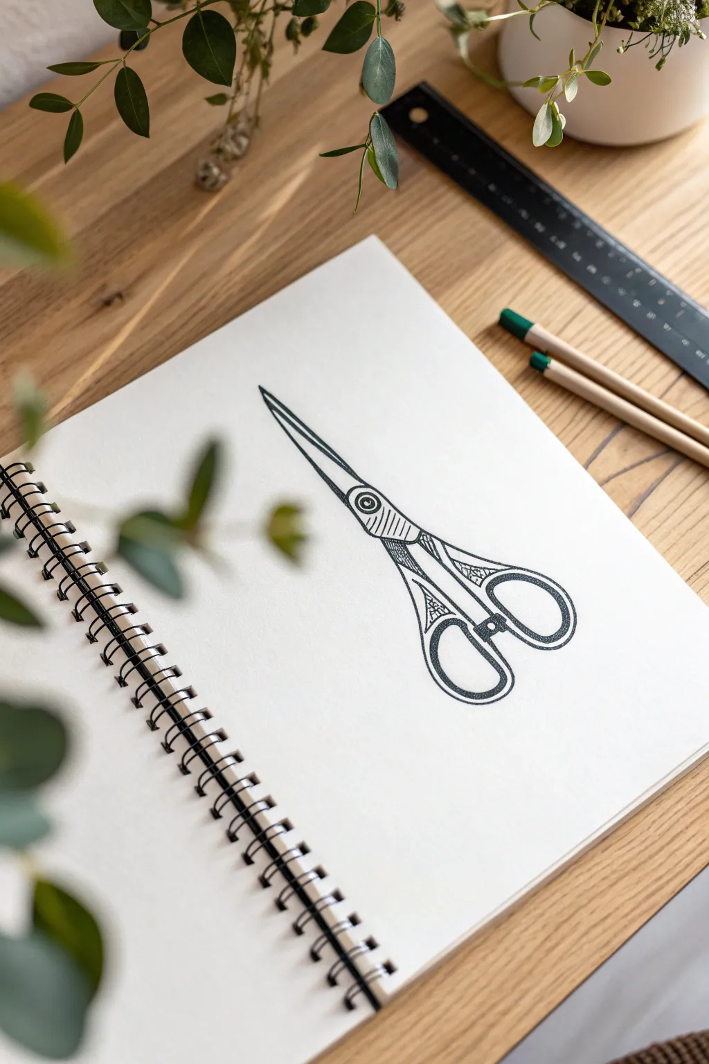
Capture the everyday elegance of a household tool with this graphic ink illustration of vintage-style scissors. Clean lines meet subtle hatching details to create a piece that feels both modern and classically sketched.
Step-by-Step
Materials
- Spiral-bound sketchbook (smooth or mixed media paper)
- Fine liner pen (0.5mm or 0.8mm for outlines)
- Ultra-fine liner pen (0.1mm or 0.3mm for details)
- Pencil (HB or 2B)
- Soft jagged eraser
- Ruler (optional, for blade straightness)
Step 1: Drafting the Structure
-
Establish the axis:
Begin by lightly drawing a faint diagonal line across your page with your pencil. This will serve as the central spine for your scissors, ensuring the blades and handles align correctly. -
Mark the pivot point:
About halfway down your diagonal guide, draw a small circle. This represents the screw or pivot point where the two scissor blades join. -
Sketch the blade shapes:
Extend two long, tapering triangles upwards from the pivot point. Keep them close together, almost touching, to show the scissors in a closed position. The top blade should be slightly thicker than the bottom edge visible behind it. -
Outline the handle shanks:
Below the pivot, draw the metal shanks curving outwards. These are the necks of the scissors that lead into the finger loops. Think of an hourglass shape diverging from the center. -
Form the finger loops:
At the end of each shank, sketch the oval finger loops. The loop on the right is traditionally slightly larger and more oval, while the left one might be rounder, mimicking classic fabric shears. -
Refine the silhouette:
Go over your pencil sketch to smooth out any wobbles. Ensure the connection between the blades and the handles flows naturally.
Steady Hands
For the long, straight lines of the blades, lock your wrist and move your whole arm from the elbow. This creates a much straighter line than just moving your fingers.
Step 2: Inking the Outlines
-
Trace the main contour:
Switch to your thicker fine liner (0.5mm). Carefully trace the outer perimeter of the scissors first. Use confident, steady strokes rather than short, scratchy ones. -
Define the inner loops:
Ink the inside edges of the finger loops. Keeping the line weight consistent here helps the object pop off the page. -
Detail the blade separation:
Draw the line separating the two blades. Start from the tip and bring it down to the pivot point screw. -
Ink the pivot screw:
Outline the small circle in the center. Add a tiny dot or smaller circle inside it to represent the screw head details. -
Erase pencil guides:
Wait at least five minutes for the ink to fully set. Using your soft eraser, gently remove all underlying pencil marks to reveal a clean black-and-white graphic.
Step 3: Adding Texture & Detail
-
Hatch the pivot area:
Switch to your ultra-fine liner (0.1mm). On the metal area just below the screw, add a series of closely spaced diagonal lines (hatching) to suggest shadow or a textured grip. -
Decorate the shanks:
I like to add visual interest here by drawing small geometric triangles or crisscross patterns inside the neck of the handles, giving them an ornate, vintage feel. -
Shade the handle curves:
Add curved hatching lines along the inner side of the handle loops. This gives the flat illustration a sense of volume and rounds out the form. -
Darken key intersections:
Where the handles overlap or join, thicken the black lines slightly. This creates ‘line weight’ variation that adds depth to the drawing. -
Final assessment:
Step back and look for any gaps in your lines. Strengthen the outer contour one last time if needed to make the image bold and crisp against the white paper.
Smudge Alert
If your ink smears when erasing pencil marks, you likely didn’t wait long enough. Test the dryness by lightly tapping a heavy ink area with a clean fingertip first.
Now you have a sharp, stylish illustration ready to cut through the noise of your sketchbook pages.
Tiny 5-Minute Sketch Series (Grid Page)
Embrace the constraints of small spaces with this grid-based sketching exercise. By dividing your page into tiny, manageable frames, you can experiment with various natural elements like mountains, trees, and weather patterns without the pressure of filling a large canvas.
Step-by-Step Tutorial
Materials
- Grid or graph paper notebook (A5 size works well)
- Fine liner pen (0.3mm or 0.5mm, black)
- Ruler or straight edge
- Pencil (optional, for drafting layouts)
Step 1: Setting the Framework
-
Layout the grid:
Begin by drawing a series of square borders using your black fine liner. These boxes don’t need to be perfectly identical, but aiming for roughly 4×4 or 5×5 grid squares per frame creates a nice uniform look. -
Spacing matters:
Leave a buffer of one or two grid squares between each frame to keep the compositions distinct and uncluttered. -
Establish the horizon lines:
In several of your empty boxes, draw a simple horizontal line to separate land from sky. Vary the height—some low for big skies, some high for foreground focus.
Ink Bleeding?
If your pen bleeds through the paper, skip the back of that page. Alternatively, adhere two pages together with glue tape to create a thicker sheet suitable for heavy ink.
Step 2: Sketching the Elements
-
Draw simple mountains:
In the top-left box, sketch two triangular peaks. Use vertical hatching lines on one side of the mountains to suggest shadow and volume. -
Create a cloud study:
In the box below the mountains, draw two fluffy cloud shapes. Add a few simple tufts of grass on the horizon line to ground the scene. -
Design a abstract grid:
For the second box in the top row, draw an internal grid on the bottom half to represent a tiled floor or field, and add a single floating cloud above. -
Focus on circles:
In the center panel, draw a single circular sun or moon with concentric rings around it. Place a small hill below it with tiny ‘x’ marks to suggest stars or flowers. -
Winter tree silhouette:
Find a central box and draw a bare tree. Start with a vertical trunk line and branch out into smaller V-shapes, keeping the lines thin and stark. -
Textured rain patterns:
Select a box for a weather study. Draw a simple droplet shape or cloud, then fill the bottom section with distinct dots or dashes to represent rain or soil texture. -
Evergreen tree study:
In a lower box, draw a classic pine tree. Start with a pointed top and stack triangles that get progressively wider as you move down, adding a vertical trunk at the base. -
Mushroom cluster:
In the bottom right corner, sketch a tall mushroom with a wide cap. Add vertical gills underneath the cap and draw a smaller, rounder mushroom beside it for variety.
Daily Diary
Turn this into a visual journal by dedicating one small square to a single highlight from your day, filling the page over the course of two weeks.
Step 3: Adding Detail & Texture
-
Hatch the mountains:
Return to your mountain sketches. Add diagonal or vertical hatching to the shaded sides of the peaks to create contrast against the white paper. -
Stipple the snow:
For a snowy scene, use tiny circles or dots falling from the top of the frame. Keep them loose and scattered rather than uniform. -
Define the water:
If you have a seascape box, use short, horizontal dashes that get closer together as they move toward the horizon to simulate waves and distance. -
Darken key lines:
Go back over the perimeter of your main subject matter (like the pine tree or the mushroom cap) with a slightly heavier line weight to make them pop. -
Add nature debris:
Sprinkle small dots or tiny dashes on the ground areas of your sketches to look like fallen leaves, rocks, or uneven terrain. -
Optional color accent:
I sometimes like to add just a tiny touch of color, like the red on the mushroom cap seen here, to create a singular focal point on the page.
Enjoy watching your collection of tiny landscapes grow one square at a time


Have a question or want to share your own experience? I'd love to hear from you in the comments below!