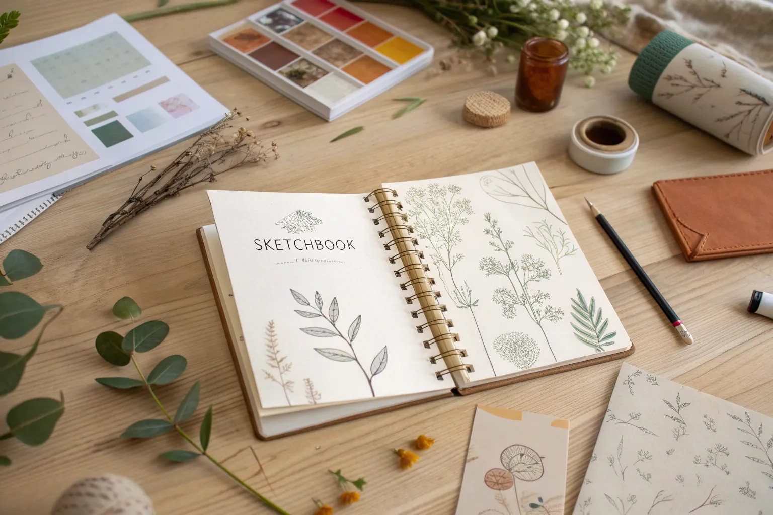
When my sketchbook is staring back at me with blank pages, I lean on a handful of go-to sketchbook ideas that make starting feel easy and fun. Here are my favorite page prompts and spread concepts for building a playful daily practice, trying mixed media, and kicking creative block to the curb.
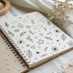
Daily Doodle Dump Page
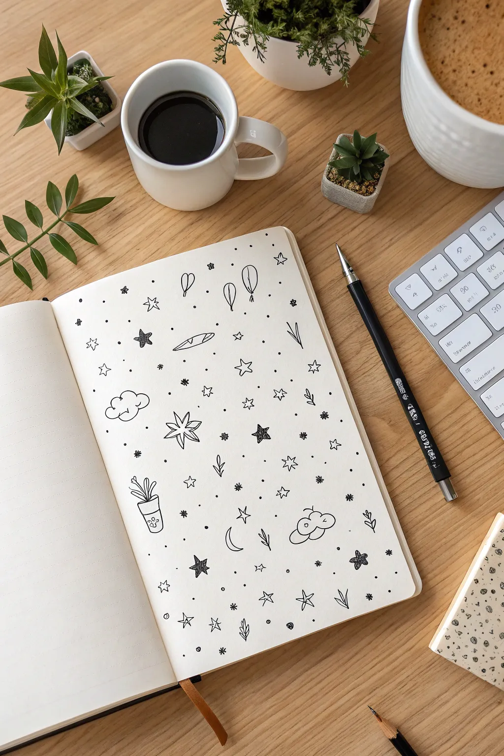
Transform a chaotic mind into a charming galaxy of miniature sketches with this doodle dump technique. Using simple black ink on a dotted journal page, you’ll create a scattered pattern of stars, clouds, and tiny icons that feels both random and cohesive.
Step-by-Step Tutorial
Materials
- Dotted or blank sketchbook
- Fine liner pen (0.3mm or 0.5mm, black)
- Pencil (optional, for sketching)
- Eraser
Step 1: Setting the Scene: Primary Elements
-
Start with clouds:
Begin by drawing two or three small, fluffy clouds dispersed across the page. Outline them with scalloped edges; add a tiny spiral or curve inside one of them to give it volume. -
Draw the starbursts:
Identify a few open spaces and draw large, six-pointed starbursts. Draw these by crossing three lines at a central point and connecting the tips with V-shapes, or simply as radiating petals. -
Add nature icons:
Introduce organic shapes by sketching a small potted plant near the bottom left. Draw a simple trapezoid for the pot and three or four long, slender leaves reaching upward. -
Include botanical sprigs:
Scatter three or four small sprigs of leaves around the page. Keep them simple—just a curved central stem with two or three oval leaves attached. -
Sketch the moon:
Near the bottom center, draw a thin crescent moon shape facing left to balance the celestial theme.
Space Management
Work from largest items to smallest. Place clouds and big stars first, then fit smaller icons in the gaps, finally using dots as ‘glue’ to connect everything.
Step 2: Filling the Void: Secondary Doodles
-
Draw floating balloons:
Near the top, add two or three balloon shapes. Make them look like upside-down teardrops with tiny triangles at the bottom, and draw squiggly strings hanging down. -
Add shooting stars:
Draw one or two shooting stars by creating a standard five-point star shape and adding three trailing lines behind it to suggest motion. -
Create solid accents:
To add visual weight, draw a few solid black five-point stars. Scatter these evenly so the page doesn’t feel heavy in one corner. -
Incorporate geometric stars:
Draw several open five-point stars. These should be simple line drawings, not filled in, acting as lighter counterparts to your solid stars. -
Sketch a tiny object:
Add a touch of whimsy with a random object like a baguette or a surfboard shape near the center to break up the celestial pattern.
Step 3: The Galactic Dust: Finishing Details
-
Sprinkle miniature stars:
Fill the gaps between your larger drawings with tiny, four-pointed sparkles. I prefer doing this by just crossing two small lines. -
Add the stardust dots:
This is the most crucial step for the ‘constellation’ look. Take your pen and gently tap dots throughout the entire negative space. -
Vary dot density:
Place some dots singly and others in small clusters of two or three to make the pattern look organic and less like a grid. -
Review vertical flow:
Stand back and look at the page. If a vertical section looks empty, add a small leaf sprig or a tiny circle to bridge the gap. -
Finalize ink work:
Go over any lines that look too faint. Ensure your solid black stars are fully opaque with no white paper showing through.
Uneven Spacing?
If one area looks too crowded, balance it by adding a similar density of tiny dots or small sparkles to the opposite side of the page to even out the visual weight.
Now you have a lively page of doodles that invites you to keep adding whenever inspiration strikes


Botanical Mini Studies
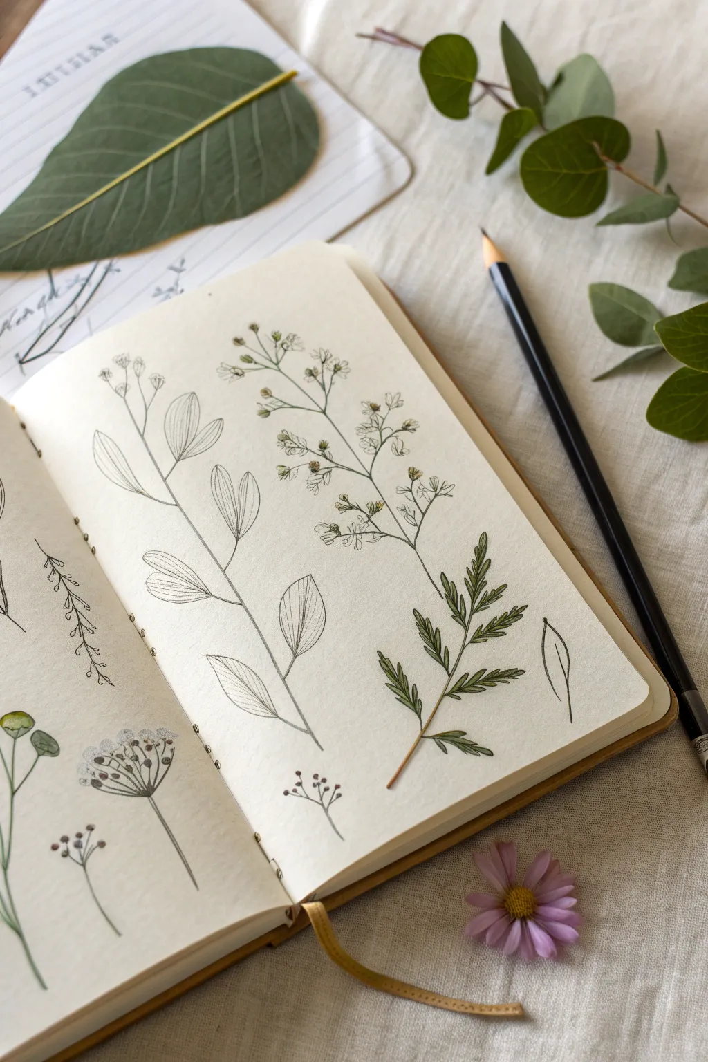
Capture the fragile beauty of wildflowers and leaves with these precise, scientific-style illustrations. This study combines fine line work with subtle washes of watercolor to create an elegant record of nature’s details.
Step-by-Step
Materials
- Sketchbook with heavy-weight or mixed media paper (smooth texture preferred)
- Mechanical pencil (HB or H lead)
- Fine liner pens (0.05mm and 0.1mm, waterproof black ink)
- Watercolor paints (Sap Green, Olive Green, Yellow Ochre, Burnt Umber)
- Small round watercolor brush (size 0 or 2)
- Kneaded eraser
- Fresh or dried plant specimens for reference
Step 1: Pencil Structure
-
Plan the Layout:
Visualize your page composition before making a mark. Aim for three to four distinct plant specimens, arranging them vertically to mimic a scientific plate. Leave generous negative space between each stem to keep the look clean and airy. -
Establish the Main Stems:
Using your mechanical pencil with a very light touch, draw the primary vertical lines for your stems. Don’t make them perfectly straight rulers; give them a slight, natural curve or wobble to reflect organic growth. -
Mark Node Points:
Lightly tick off where leaves or smaller branches will diverge from the main stem. Observing real plants helps here—notice if the leaves grow directly opposite each other or alternate up the stem. -
Draft the Leaf Shapes:
Sketch the basic geometric shapes of the leaves. For the plant on the left, use elongated ovals or almond shapes. For the fern-like specimen on the right, sketch rough triangular guidelines where the fronds will sit. -
Refine the Flowers:
For the flowering plant in the center, sketch tiny circles at the ends of your branch lines. These will become the seed pods or small buds. Keep these initial marks very faint so they are easy to erase later.
Natural Imperfections
Don’t fix broken leaves or bent stems in your drawing. Including these ‘flaws’ makes your botanical study look authentic and observed from life, rather than generic clip art.
Step 2: Inking the Details
-
Outline the Stems:
Switch to your 0.1mm fine liner. Trace over your pencil stem lines, but break the line occasionally where a leaf joins the stem. This prevents the drawing from looking like a coloring book and adds a sense of dimension. -
Detail the Broad Leaves:
On the left specimen, ink the leaf outlines. Instead of a solid line, use a slightly broken or varying weight line to suggest the thinness of the leaf edge. Add a central vein line that stops just short of the leaf tip. -
Add Leaf Venation:
Swap to the ultra-fine 0.05mm pen. Draw very delicate veins radiating from the center line of the broad leaves. I like to curve these lines slightly toward the leaf tip to show the form’s contour. -
Ink the Tiny Buds:
For the central plant, draw the small, clustered flowers or seed heads. Use small, stippled dots or tiny ‘c’ shapes to give them texture rather than drawing perfect circles. -
Define the Fern Fronds:
On the right-hand specimen, use short, quick strokes to create the needle-like leaves. Let the ink taper off at the end of each stroke to create sharp, natural-looking points. -
Erase Guidelines:
Once the ink is completely dry—give it a few minutes to be safe—gently roll your kneaded eraser over the page to lift all the graphite, leaving only the crisp ink work.
Step 3: Watercolor Wash
-
Mix Your Greens:
On your palette, create a transparent mix of Sap Green with a touch of Yellow Ochre for a fresh, spring look. For a moodier tone, mix Olive Green with a tiny bit of Burnt Umber. -
Apply the First Wash:
Using a size 2 brush, paint the fern-like specimen on the right. Use the tip of the brush to dab color onto the small leaves, allowing the white of the paper to show through in tiny gaps for highlights. -
Glaze the Stems:
With a very dilute mix of greenish-brown, run a single stroke down the stems of the other plants. You don’t need to stay perfectly inside the lines; a little looseness adds artistic character. -
Add Depth to Seed Heads:
Dip your smallest brush into a slightly darker brown-green mix. Touch just the bottoms of the tiny seed pods on the central plant to give them weight and shadow. -
Suggest Shadow on Leaves:
For the broad leaves on the left, don’t color them in fully. Instead, paint a swathe of pale green only along one side of the central vein or near the base. This ‘white space’ technique suggests light hitting the surface. -
Final Contrast:
Once the first layers are dry, mix a deeper green using less water. Add tiny accents to the junction points where leaves meet stems to anchor the illustration visually.
Label Your Finds
Use a light pencil or vintage-style cursive ink to write the Latin or common name of the plant next to each stem. It instantly elevates the scientific aesthetic.
Now you have a serene page of botanical studies that captures the quiet elegance of the natural world.


Quick Gesture Figure Warm-Ups
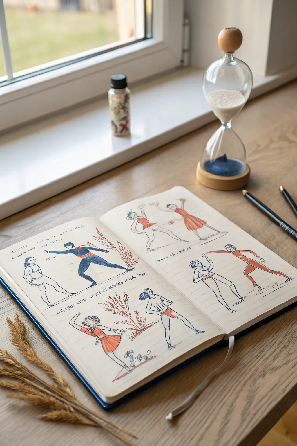
Capture the energy of movement with these lively, dual-figure sketches that study interaction and flow. Using a simple palette of red and blue, these warm-ups focus on the relationship between two bodies in motion, perfect for loosening up your hand before a longer drawing session.
Detailed Instructions
Materials
- A5 or A4 sketchbook (smooth or mixed media paper)
- Blue ballpoint pen or fine liner
- Red colored pencil or marker
- Blue colored pencil or marker
- Graphite pencil (HB or 2B) for initial lines
- Reference photos of dancers or fencers
Step 1: Planning the Page Layout
-
Divide the space:
Visualize your open sketchbook spread as a grid. Aim to fit two main scenes on the left page and two corresponding scenes on the right page to maintain balance. -
Mark ground lines:
Lightly sketch faint horizontal lines across the pages using a graphite pencil. These don’t need to be perfectly straight; they just provide a baseline so your figures aren’t floating in emptiness.
Keep it Loose
Don’t connect every line. Leaving small gaps in the outline lets the viewer’s eye complete the shape, making drawings feel more dynamic.
Step 2: Drafting the Left Page
-
Establish the first pose:
Starting in the top left quadrant, use your graphite pencil to sketch a figure in a deep lunge. Focus on the ‘line of action’—the main curve running through the spine. -
Add the partner:
Draw a second figure standing opposite the lunging one. Keep the forms simple—ovals for heads, cylinders for limbs. They should look like they are interacting, perhaps in a fencing or dance stance. -
Create the bottom scene:
Move to the bottom left quadrant. Sketch a new pair of figures. Try a more fluid pose here, like a dancer curving backward with arms raised, while a partner mirrors or supports the movement. -
Refine the outlines:
Once satisfied with the pencil roughs, trace over the main body contours with a blue ballpoint pen or fine liner. Keep your lines loose and scratchy rather than perfect and solid.
Step 3: Adding Color to the Left Page
-
Color blocking the lead figure:
Select your blue colored pencil or marker. Fill in the full jumpsuit or clothing of the ‘active’ figure (the one lunging). You don’t need perfect coverage; visible strokes add energy. -
Accent the partner:
For the standing partner, use just the outline, or perhaps add a tiny garment detail. The contrast between a filled figure and an outlined one creates visual separation. -
Warm accents:
Switch to your red pencil. Color the dress or tunic of the dancing figure in the bottom scene. Add small red details, like a sash or belt, to the blue figure above to tie the color palette together. -
Vegetative flourishes:
Between the two scenes on the left page, sketch a stylized plant or bush using red ink or pencil. This vertical element acts as a creative divider between the vignettes.
Switch It Up
Try using a brush pen instead of colored pencils for the clothing to get distinct, painterly shapes with variable line weight.
Step 4: Executing the Right Page
-
Top right composition:
Sketch two figures at the top of the right page. Try poses that extend upwards, like arms reaching high, to contrast with the lunging figures on the left page. -
Bottom right interaction:
For the final quadrant, draw two figures connecting physically, like holding hands or touching shoulders. This physically connects the ‘narrative’ of the pose. -
Ink and define:
Go over your pencil lines with the blue pen again. I like to let the ink sit for just a moment to prevent smudging before erasing the underlying graphite. -
Reverse the focal colors:
On this page, switch your dominance. Make red the primary clothing color for the top figures. Use swift diagonal shading strokes for the skirts or pants. -
Blue accents:
Use the blue coloring tool to fill in the pants or shorts of the bottom-right figure. This checkerboard pattern of red-dominant and blue-dominant figures across the spread keeps the eye moving.
Step 5: Final Touches
-
Adding text:
Scribble some loose, illegible writing or genuine notes near the figures. This ‘asemic writing’ technique adds texture and makes the page feel like a true study without needing perfect calligraphy. -
Grounding shadows:
Add quick, horizontal hatched lines underneath feet with your blue pen to ground the figures so they don’t look like they are flying.
Now you have a lively spread of gesture drawings that capture the essence of movement and interaction


Patterns and Texture Sampler
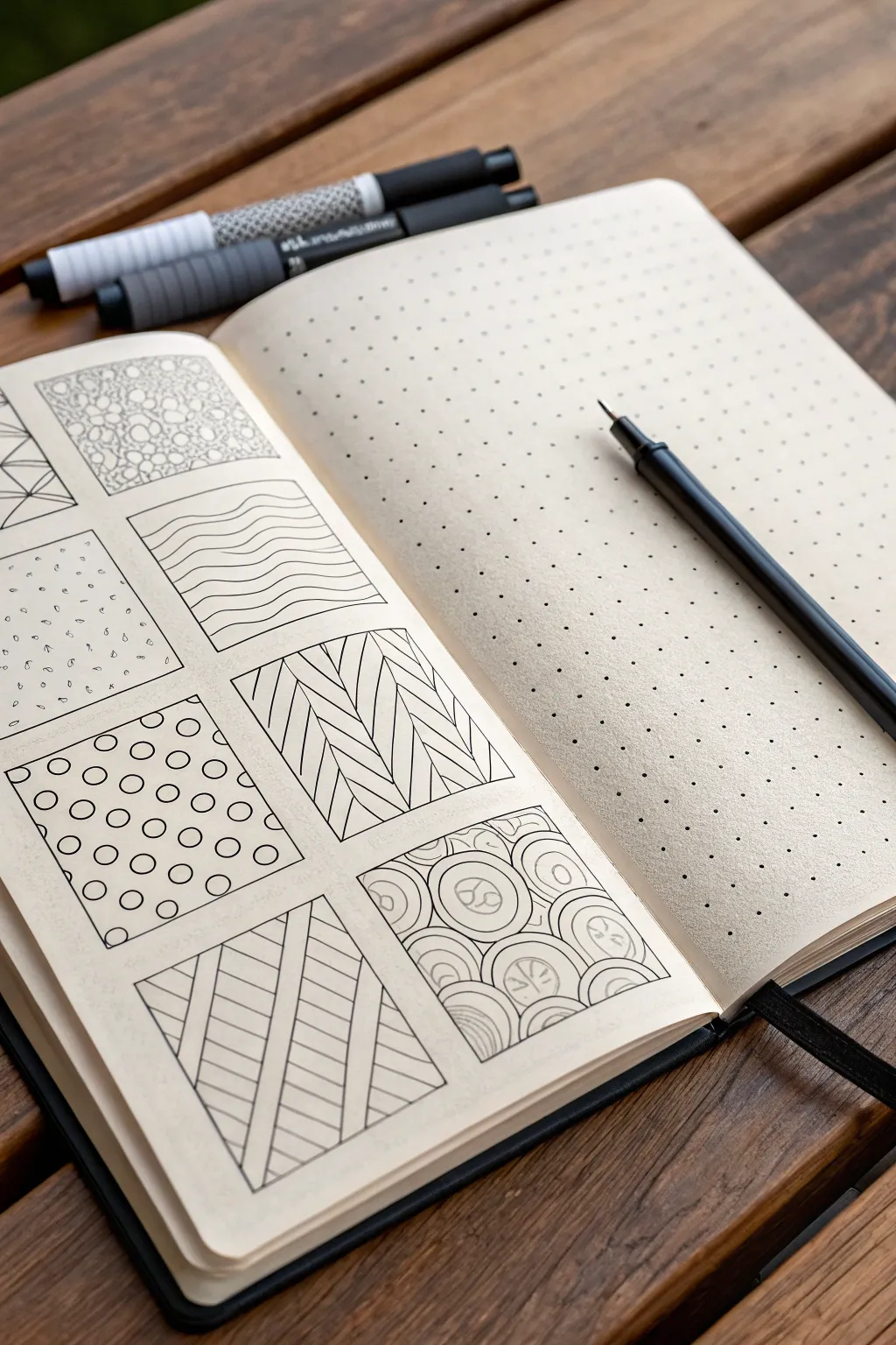
This project is the perfect warm-up exercise for getting comfortable with ink drawing, featuring a grid of unique, repetitive patterns. The clean layout contrasts beautifully with the organic and geometric doodles, creating a satisfying reference page for future texture ideas.
Step-by-Step Guide
Materials
- Dot grid notebook or sketchbook
- Fine liner pen (black, 0.3mm or 0.5mm)
- Ruler
- Pencil
- Eraser
Step 1: Setting the Grid
-
Measure and mark:
Begin by deciding on the size of your squares. For a standard A5 journal, 4x4cm or 1.5×1.5 inch squares work well. Use your ruler to lightly mark out a grid layout with a pencil. Leave a small, consistent gap (about 5mm) between each square to let the designs breathe. -
Draw the frames:
Once your spacing looks even, use your fine liner pen to draw the actual square outlines. Move slowly to keep the lines straight, using the dot grid of the paper as a guide if you have one. Don’t worry if lines aren’t machine-perfect; a little wobble adds character. -
Clean up:
Wait a moment for the ink to dry completely to avoid smearing. Then, gently erase the visible pencil guidelines so you have a clean set of empty frames ready to be filled.
Step 2: Filling the Patterns
-
Pebble texture:
Start with the top-center square. Draw small, irregular circles tightly packed together. Vary the sizes slightly—some tiny, some medium—to mimic a stone path. Fill the entire box without leaving large gaps. -
Wavy lines:
In the square below the pebbles, draw horizontal wavy lines. Try to keep the ‘wavelength’ consistent so they stack neatly, like ripples on water. Keep the spacing even between each wave. -
Geometric zig-zags:
For the square below the waves, draw vertical stripes. Inside each stripe, draw diagonal lines that meet in the middle to form a herringbone or chevron pattern. Alternating the direction of the diagonals creates a woven look. -
Stippling seeds:
In the square to the left of the waves, create a scattered pattern. Draw tiny, random dots mixed with small, teardrop-shaped ‘seeds’ facing different directions. Keep the density light and airy. -
Polka dot grid:
In the square below the seeds, draw rows of small circles. Try to align them in a grid, but offset every other row (brick-pattern style) to make the pattern more dynamic. Keep the circles uniform in size. -
Diagonal stripes:
Moving to the bottom-left square, draw diagonal lines across the box. Then, draw perpendicular diagonal lines to create large, intersecting sections, or simply fill alternating bands with straight hatch marks as shown in the reference. -
Nested circles:
For the bottom-right design, draw several medium circles scattered around the box. Surround each circle with concentric rings that radiate outward until they bump into rings from neighboring circles. This creates a topographical or ‘onion rain’ effect.
Uneven Lines?
If your hand shakes, try ‘ghosting’ the line in the air before touching pen to paper. Also, pulling the pen toward you rather than pushing it away often yields straighter strokes.
Step 3: Styling the Page
-
Add a partial design:
To make the page feel spontaneous, you can start a pattern on the far left edge that ‘bleeds’ off the page, like the geometric spiderweb design shown partially cut off. -
Final check:
Look over your squares. If any lines look too thin or faint, go over them once more to ensure the black ink pops against the paper. I find that deepening the frame borders slightly makes the textures stand out more.
Add Depth
After the ink dries, use a light gray marker or a soft pencil to add subtle drop shadows inside the boxes or along one side of certain shapes to give them a 3D effect.
Now you have a fantastic reference sheet for adding texture to future illustrations
BRUSH GUIDE
The Right Brush for Every Stroke
From clean lines to bold texture — master brush choice, stroke control, and essential techniques.
Explore the Full Guide
Ink and Wash Linework
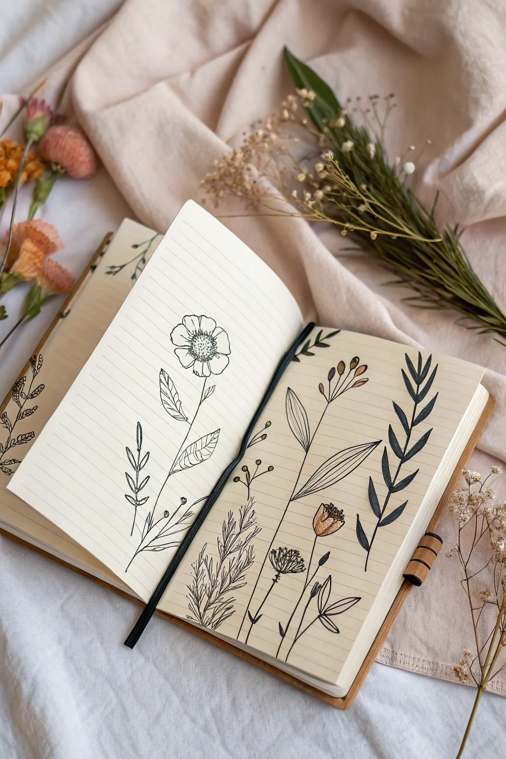
Capture the delicate beauty of a dried bouquet with this botanical spread layout that balances negative space with intricate line art. This project focuses on drawing various wildflower stems using fine liners, perfect for practicing organic shapes and subtle textures.
Step-by-Step Tutorial
Materials
- A5 lined paper sketchbook
- Fine liner pens (sizes 0.1, 0.3, and 0.5)
- Pencil (HB or 2H)
- Eraser
- Colored pencils or brush pens (muted orange, deep green)
- Real or reference botanical stems
Step 1: Planning the Composition
-
Lightly sketch the flower placement:
Begin with a sharpened pencil to map out the general flow of your stems. Draw a tall, central flower on the left page, and plan for three to four distinct stems on the right page, angling them slightly inward as if they are part of a loose bouquet. -
Define stem structures:
Refine your pencil lines to mark where leaves will branch off. Vary the heights of the flowers on the right page to create visual interest—keep the far right stem tall and leafy, while the middle stems can be shorter and more delicate.
Smudge Prevention
If you are left-handed or find your hand dragging through wet ink, place a scrap piece of paper under your drawing hand to act as a shield while you work.
Step 2: Inking the Left Page
-
Outline the main bloom:
Using a 0.3 fine liner, trace the petals of the prominent flower on the left page. Keep the lines slightly wobbly to mimic natural petals, rather than making them perfectly geometric. -
Add center details:
Switch to a 0.1 pen to stipple the center of the flower. Use tiny dots clustered tightly in the middle and spreading out loosely to suggest pollen and texture. -
Draw the stem and leaves:
Draw the main stem with a steady hand. Add two large leaves branching out midway, adding a center vein to each. Use short, angled hatching lines on one side of the leaves to suggest shadow and depth. -
Add lower foliage:
Near the bottom of this stem, add smaller, vine-like leaves using simple loop shapes. This grounds the drawing and fills the negative space at the bottom of the page.
Step 3: Inking the Right Page
-
Draw the fern-like foliage:
On the far right, use a 0.5 pen (or a brush pen for line width variation) to create the dark, leafy stem. Draw the leaves as solid, filled-in shapes reminiscent of rosemary or fern fronds to create heavy contrast. -
Create the delicate central stems:
For the middle stems, switch back to your finest 0.1 pen. Draw very thin, long stems. At the top of one, add small oval buds; on another, draw a wide, cone-shaped flower head. -
Add the ‘feather’ texture:
For the bottom-left plant on this page (the wispy one), use quick, upward flicking motions to create a feathery, grass-like texture. Don’t overthink these lines; speed helps them look organic. -
Incorporate broad leaves:
Draw the large, lance-shaped leaves that crisscross behind the other stems. Keep these outlines clean and simple, perhaps adding a single distinct vein down the center.
Creative Twist
Try pressing a real flower from your garden between the pages for a few days, then trace its flattened silhouette directly onto the page for an ultra-realistic shape.
Step 4: Finishing Touches
-
Erase pencil guides:
Wait until the ink is completely dry—I usually give it at least five minutes to be safe—then gently erase all your initial pencil sketches. -
Add color accents:
Select a muted orange or terracotta colored pencil. With a light touch, fill in just the seed pods and the single cone-shaped flower on the right page. Leave some white space for highlights. -
Detailed shading:
Use the 0.1 pen to add final hatching details to the colored flower to give it volume. Add a few extra tiny dots around the buds for a ‘pollen’ effect. -
Review and refine:
Look at the spread as a whole. If any area looks too empty, add a small floating petal or a tiny detached leaf to balance the composition.
Your botanical sketchbook spread is now a permanent garden you can revisit anytime
Blind Contour Challenge
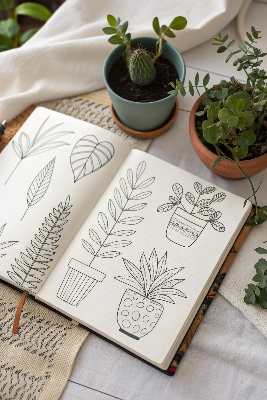
This sketchbook spread focuses on the delicate shapes and patterns found in indoor greenery. By isolating leaves and potted plants with crisp black ink, you can create a satisfying collection of botanical illustrations that feels both modern and organic.
Step-by-Step
Materials
- A5 Sketchbook (heavyweight or mixed media paper)
- Black fine liner pen (01 or 03 size)
- Pencil (HB or 2B)
- Eraser (kneaded preferred)
- Real or reference houseplants (Monstera, Aloe, ZZ plant)
Step 1: Planning the Layout
-
Divide the space:
Visualize your open sketchbook spread as two distinct canvases. On the left page, you’ll focus on individual leaf studies. On the right page, you will draw three complete potted plants. -
Sketch the left page:
Using a very light pencil touch, map out the placement of three large leaf stems. Place one angling from the top left, a broad heart-shaped leaf near the top center, and a long, fern-like frond taking up the bottom half. -
Sketch the right page:
Lightly draw three geometric shapes to represent pots on the right page. Place a tall pot on the left, a rounded pot in the top right, and a shorter, patterned pot in the bottom center. Add gestural lines for the plant stems growing out of them.
Step 2: Inking the Leaf Studies
-
Outline the palm frond:
Starting with the top left drawing, use your fine liner to trace the central stem. Draw long, slender leaves radiating outward. Keep your lines confident and continuous rather than sketchy. -
Detail the Monstera leaf:
Move to the heart-shaped leaf. Outline the perimeter first, then add the central vein. Draw curved veins extending to the edges, keeping them evenly spaced to emphasize the leaf’s volume. -
Draw the fern structure:
For the bottom fern, draw a long, slightly curved central spine. Begin adding small leaflets on either side, starting large at the base and getting smaller toward the tip. -
Add texture to the fern:
Inside each small leaflet of the fern, add a tiny central vein line. This simple addition gives the drawing instant dimension without overcomplicating the clean look.
Wobbly Lines?
Don’t stress if your lines aren’t laser-straight. Slight wobbles add organic charm to botanical drawings. If a line goes astray, thicken it slightly to disguise the error intentionally.
Step 3: Drawing the Potted Plants
-
Outline the first pot:
On the right page, ink the tall pot on the left side. Give it a simple rim and draw vertical stripes down the body of the pot to suggest a ribbed texture. -
Draw the ZZ plant stem:
Growing from that first pot, draw a tall, vertical stem. Add oval-shaped leaves in pairs all the way up the stem. I like to add a subtle centerline to each leaf for consistency. -
Ink the top pot:
For the top right plant, draw a simple rounded pot. Decorate it with horizontal bands—try a mix of straight lines and zig-zags to create visual interest. -
Create the rounded foliage:
Draw stiff, branching stems emerging from this pot. At the end of each branch, draw clusters of round, coin-shaped leaves with simple vein patterns. -
Draw the bottom succulent pot:
Ink the final pot at the bottom. Give this one a fun, dotted pattern by drawing small, varying circles across its surface. -
Draw the spiky aloe:
From the dotted pot, draw thick, triangular leaves pointing upward and outward. Make the leaves overlap slightly to create depth. -
Add spikes and texture:
Use careful stippling (dots) or short dashes along the edges of the aloe leaves to mimic small thorns. Add a few lines inside the leaves to show their concave shape.
Level Up: Wash
Once the ink is waterproof-dry, use a watercolor brush to add a very pale wash of sage green or terracotta over the pots for a splash of soft, minimal color.
Step 4: Refining the Spread
-
Erase pencil guides:
Wait at least 5-10 minutes to ensure the ink is bone dry. Gently erase all your underlying pencil sketches with a kneaded eraser to leave crisp black lines. -
Assess line weight:
Look over the spread. If any outer contour lines feel too thin, go over them a second time to thicken them up, which helps pop the plants off the page.
Now you have a beautifully composed botanical spread that captures the essence of indoor gardening.

PENCIL GUIDE
Understanding Pencil Grades from H to B
From first sketch to finished drawing — learn pencil grades, line control, and shading techniques.
Explore the Full Guide
Continuous Line Object Studies
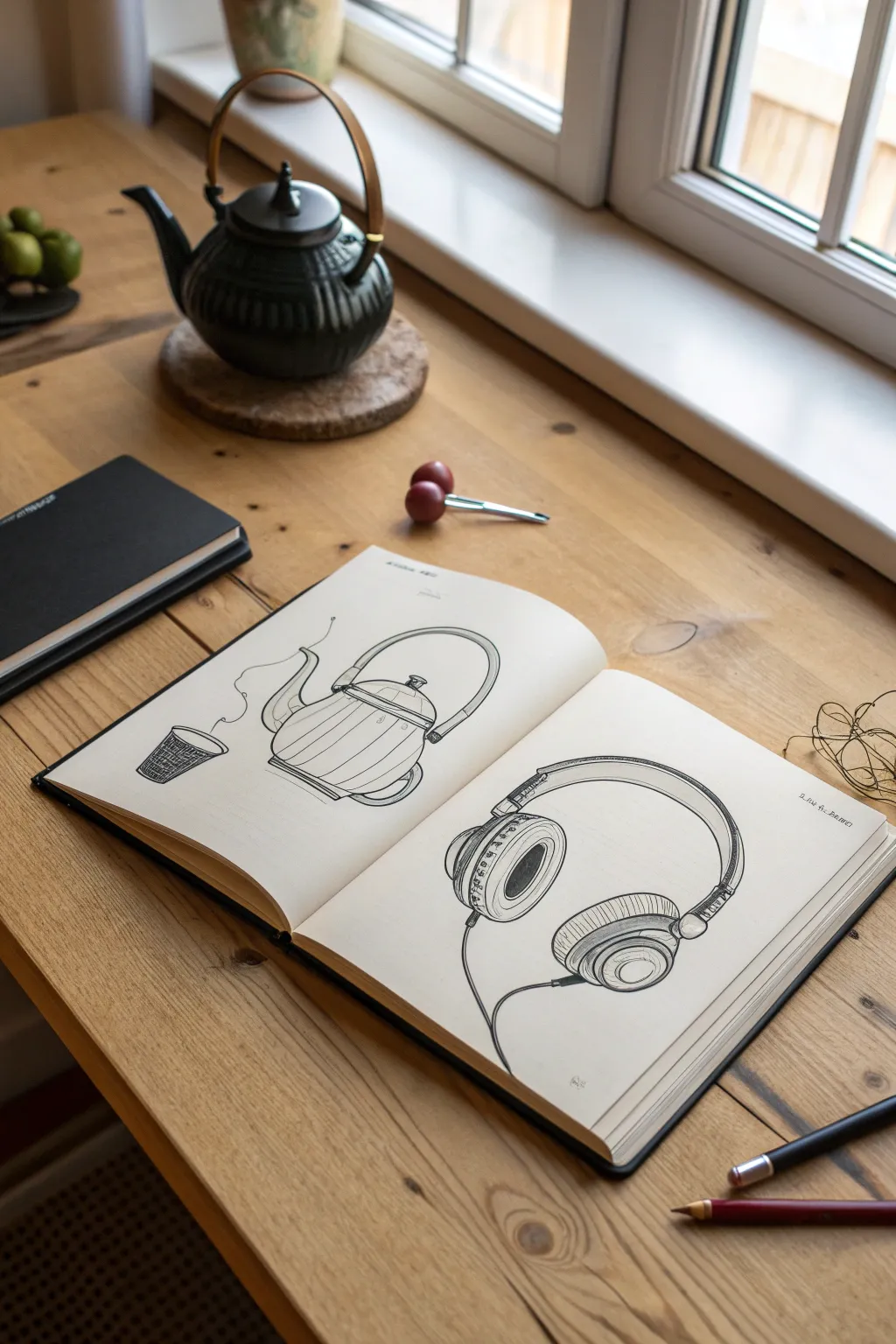
Capture the beauty of daily life by sketching common objects like a teapot and headphones directly into your sketchbook. This project focuses on confident line work and capturing distinctive shapes without getting bogged down in perfect realism.
Step-by-Step Tutorial
Materials
- A5 or similar sized sketchbook (smooth cartridge paper is ideal)
- Black fineliner pens (sizes 0.3mm and 0.5mm)
- Graphite pencil (HB or 2B) for under-drawing
- Soft eraser
- Real-life reference objects (teapot, cup, headphones)
Step 1: Preparation & Layout
-
Set the scene:
Place your sketchbook flat on a comfortable surface. Arrange your reference objects nearby so you can see them clearly. For this spread, plan for two distinct compositions: the tea set on the left page and the headphones on the right. -
Left page: Teapot foundation:
Using your pencil very lightly, sketch a large oval for the body of the teapot in the center of the left page. Add a sweeping arch above it for the handle. -
Refine the teapot shape:
Sketch the spout curving upwards on the left side of the body. Add a small lid knob on top. Don’t press hard; these guide lines will be erased later. -
Add the cup:
To the left of the teapot, draw a small, slightly tapered cylinder for the tea cup. Keep it simple and relatively small to maintain visual balance. -
Right page: Headphone structure:
Moving to the right page, lightly sketch a large letter ‘C’ shape facing downwards. This will be the headband of your headphones. -
Ear cup placement:
At the ends of the ‘C’ shape, draw two ovals for the ear cups. Angle them slightly inward to show perspective, making the one on the left slightly more visible than the right.
Step 2: Inking the Teapot
-
Outline the body:
Switch to your 0.5mm fineliner. Trace over your pencil lines for the teapot body. Use confident, sweeping strokes rather than short, scratchy ones. -
Detail the handle and lid:
Draw the double-line thickness of the handle. Ink the lid, carefully defining the small knob. I find it helps to rotate the book slightly to get a better angle for curved lines. -
Add vertical texture:
Using the thinner 0.3mm pen, draw vertical, slightly curved contour lines down the body of the teapot. These stripes suggest volume and roundness. Space them unevenly for a hand-drawn feel. -
Ink the cup and steam:
Outline the cup with the 0.5mm pen. Add a cross-hatch texture pattern on the cup using the 0.3mm pen. Finally, draw a wavy, organic line rising from the cup to represent steam.
Wobbly Lines?
Don’t stress over shakes. If a line goes astray, thicken it slightly or add a parallel line. These ‘mistakes’ often add character and movement to sketchbook drawings.
Step 3: Inking the Headphones
-
Define the headband:
Back to the right page with the 0.5mm pen. Outline the headband, adding a second inner line to show thickness and padding. -
Detail the ear cups:
Ink the oval ear cups. Draw concentric circles inside the left ear cup to represent the cushion and speaker mesh. This adds depth and technical detail. -
Connect the parts:
Draw the small hinges connecting the band to the cups. Accuracy isn’t crucial here; just capturing the mechanical feel is enough. -
Add the cable:
Draw a free-flowing line extending from the bottom of the left ear cup. Let it loop naturally to the bottom of the page, grounding the drawing. -
Shading and texture:
Use the 0.3mm pen to add simple hatching on the headband padding and the side of the ear cups to suggest shadows.
Pro Tip: Line Weight
Use the thicker 0.5mm pen for outer contours and the 0.3mm pen for internal details like texture or mesh. This creates instant visual hierarchy.
Step 4: Finishing Touches
-
Erase pencil lines:
Wait at least five minutes to ensure the ink is completely dry. Gently erase all your initial pencil guides to reveal the crisp ink drawing. -
Assess and refine:
Look over the spread. If any lines look too thin or disconnected, go over them again with the 0.5mm pen to add line weight variation.
Now you have a charming, everyday object study that documents the quiet moments of your day
Thumbnail Composition Playground
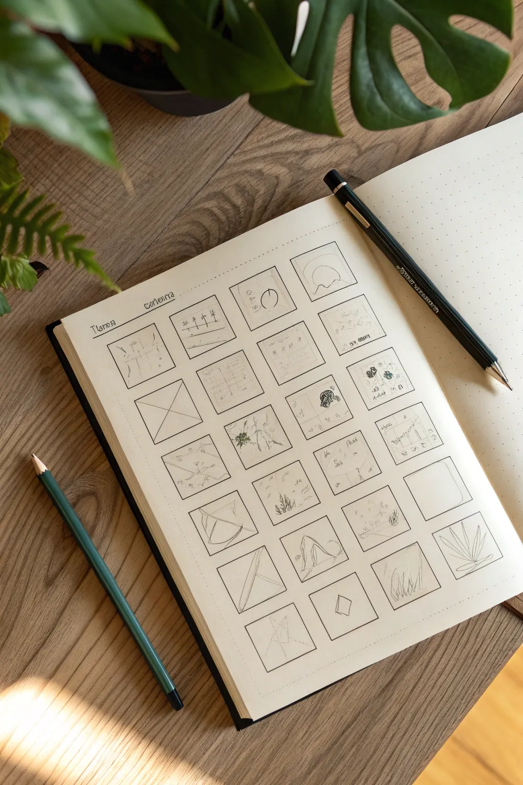
This project is a fantastic exercise to break free from creative block by focusing on small, low-stakes composition studies. The result is a visually satisfying grid of miniature landscape and abstract ideas, drawn cleanly with fine ink lines.
Detailed Instructions
Materials
- Dotted or blank sketchbook (A5 or similar size)
- Fine liner pen (black, 0.3mm or 0.5mm)
- Ruler or straight edge
- Pencil (HB or similar for initial guides)
- Green colored pencil (optional, for shading)
- Eraser
Step 1: Setting the Grid
-
Assess the page layout:
Begin by looking at your blank page. You want to create a balanced grid of squares. For a standard A5 journal, a 4×5 or 4×6 grid usually works best, leaving a comfortable margin around the edges. -
Mark the boundaries:
Using your pencil and ruler, lightly mark the top, bottom, and side margins. These don’t need to be huge, just enough to frame the grid so it doesn’t fall off the page. -
Draw the grid lines:
Lightly sketch out your grid using the pencil. Aim for squares that are roughly 1.5 to 2 inches in size. If you’re using a dotted notebook, use the dots as guides to ensure perfect square dimensions without needing to measure every single line. -
Define the borders:
Once satisfied with the pencil layout, trace over the square borders with your fine liner pen. Use the ruler here to keep the lines crisp and professional. Let the ink dry for a moment before erasing the underlying pencil marks to avoid smudging. -
Add a header:
At the very top left, lightly pencil in a title or date. In the example, a simple evocative word or project title works well. Trace this with your pen for a finished look.
Grid Stability
Use dot-grid paper rather than blank pages. It makes drawing perfectly spaced, consistent squares effortless without needing to measure every gap.
Step 2: Filling the Thumbnails
-
Start simple:
Pick the first square. Don’t overthink it. Draw a simple horizon line. Maybe add a small circle for a sun or moon. The goal is to experiment with where these elements sit within the frame. -
Play with perspective:
In the next few squares, try drawing converging lines to represent a road or a path disappearing into the distance. Move the vanishing point around—try it in the center, then off to the deep left or right. -
Introduce organic shapes:
Switch gears for a few squares and draw organic forms like rolling hills, jagged mountain peaks, or simplistic tree outlines. Use loose, sketchy lines to differentiate these from the rigid box borders. -
Experiment with the rule of thirds:
For a row of sketches, divide the box mentally into thirds. Place your focal point—a tree, a house, or a rock—on one of the intersections. This is a classic way to test composition viability. -
Abstract compositions:
Not every box needs to be a landscape. Try filling a few with abstract geometric shapes like intersecting triangles, circles, or parallel lines. This breaks up the visual rhythm of the page. -
Add texture details:
Go back into some of your simpler sketches and add tiny dots (stippling) or small hatch marks to suggest grass, water ripples, or rocky textures. Keep it minimal; these are just thumbnails. -
Incorporate negative space:
Leave one or two boxes completely empty or very sparse, perhaps with just a single line. This white space allows the eye to rest when viewing the full page. -
Add subtle color:
If you have a colored pencil (like the green one shown), very lightly shade just one or two elements in a handful of squares. Don’t color the whole thing; just an accent on a tree or a hill adds depth. -
Review and refine:
As you near the bottom of the page, look at the grid as a whole. If the top looks too ‘heavy’ with dark ink, add some darker shading to the bottom sketches to balance the visual weight of the page.
Step 3: Finishing Touches
-
Final erase:
Do one last pass with your eraser to remove any stray pencil construction lines from your initial grid setup. -
Clean up borders:
If any lines inside the boxes accidentally crossed over the border, you can thicken the border line slightly to hide the mistake. It’s a sneaky fix I use often.
Level Up: Theme It
Instead of random doodles, choose a theme for the whole page, like ‘mountains at different times of day’ or ‘variations on a single tree shape.’
You now have a completed study sheet that serves as both a beautiful artwork and a reference for future larger paintings


Learn-and-Label Study Page
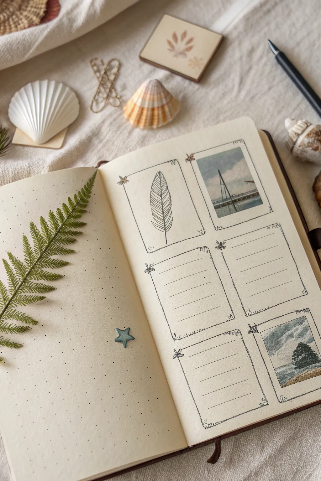
This elegant sketchbook spread combines pressed botanicals with a structured grid for recording observations or memories. The layout features delicate hand-drawn frames populated with sketches, scenic cutouts, and lined sections for study notes, all set on a classic dot-grid background.
Step-by-Step Guide
Materials
- A5 dot grid notebook or sketchbook
- Fine liner pen (black, 0.1mm and 0.3mm)
- Real fern leaf (pressed)
- Small star sticker or embellishment
- Ruler
- Pencil and eraser
- Scissors
- Glue stick or double-sided tape
- Printed photos of coastal scenes (or personal photos)
- Optional: Watercolor paints or colored pencils for the feather sketch
Step 1: Planning the Layout
-
Define the grid structure:
Begin on the right-hand page of your spread. Using a pencil and ruler, lightly map out a 2×3 grid. You want two columns and three rows of rectangular boxes. Leave comfortable margins between each box so they don’t feel crowded. -
Sketch the frames:
Once you are happy with the spacing, use your pencil to draw the final outlines of the six rectangles. Don’t worry about them being perfectly rigid boxes; a little hand-drawn character is perfect for this aesthetic.
Sticky Situation
If your pressed leaf is brittle and won’t stick with glue, try using small strips of clear washi tape or matte transparent tape over the stem to secure it without breakage.
Step 2: Inking the Frames
-
Draw the frame borders:
Switch to your 0.3mm fine liner. Go over your pencil lines, but instead of straight lines, try a slightly wavy or double-line effect to mimic a vintage decorative border. You can make the corners slightly rounded or embellished. -
Add corner details:
At the corners of each frame, draw tiny decorative elements like small flowers, leaves, or swirls. This softens the grid and ties it into the botanical theme. -
Erase guidelines:
Let the ink dry completely for a minute to prevent smudging. I usually wait a bit longer just to be safe. Then, gently erase all your underlying pencil marks.
Aged Aesthetic
Distress your paper edges with distress ink or strong tea before drawing to give the entire spread a weathered, vintage field-guide appearance.
Step 3: Filling the Content
-
Prepare your image inserts:
Select two small scenic images—perhaps a seascape, a sailboat, or a landscape. Crop them into squares or rectangles that fit neatly inside the top-right and bottom-right frames. -
Mount the images:
Using a glue stick, adhere these images into their designate frames. Press them down firmly from the center outward to avoid air bubbles. -
Draw the botanical study:
In the top-left frame, use your 0.1mm pen to sketch a simple botanical item, like a feather or leaf. Keep the lines light and focused on texture, hatching gently to show the vanes of the feather. -
Create writing spaces:
For the remaining three frames (middle-left, middle-right, and bottom-left), use a ruler and the 0.1mm pen to draw horizontal lines. These will serve as spaces for your notes, dates, or labels.
Step 4: Creating the Left Page Feature
-
Position the fern:
Turning to the left page, take your pressed fern leaf. Arrange it diagonally so it sweeps in from the left edge towards the center of the page. -
Secure the botanical:
Apply a very thin layer of glue to the back of the fern stem. Carefully press it onto the page. You can place a heavy book on top for a few minutes to ensure it sticks flat. -
Add the star accent:
Place a small star-shaped sticker or embellishment in the lower right area of this page. This tiny detail balances the visual weight of the fern.
Now you have a structured yet organic space to document your nature finds and favorite memories
Limited Palette Mini Series
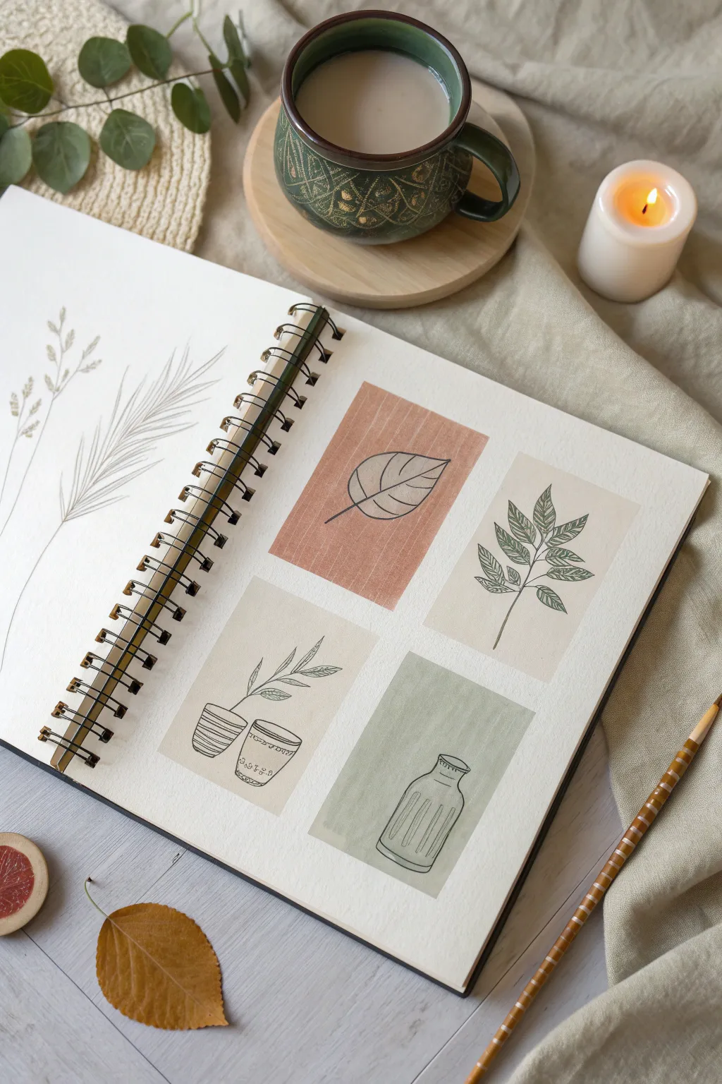
This minimalist sketchbook spread combines geometric blocks of muted color with delicate, fine-line botanical illustrations. It’s an exercise in balancing negative space and limited color palettes to create a cohesive and calming visual series.
Detailed Instructions
Materials
- Spiral-bound sketchbook (heavyweight paper)
- Watercolors or gouache (muted terracotta, olive green, sandy beige)
- Flat shader brush (size 6 or 8)
- Fine liner pen (black, 0.3mm or 0.5mm)
- Pencil and eraser
- Ruler
Step 1: Planning the Layout
-
Grid creation:
Begin on the right-hand page by lightly sketching four distinct rectangles. Aim for a 2×2 grid layout, but keep them slightly separated to allow for breathing room. -
Sizing:
Make each rectangle roughly 2.5 inches by 3.5 inches, similar to a playing card size. Use a ruler if you want sharp edges, or sketch them freehand for a looser feel. -
Left page composition:
On the facing left page, envision a large, single focal point. Lightly mark the stem line for a tall grass or reed that will span nearly the entire height of the page.
Step 2: Applying Color Blocks
-
Mixing the terracotta:
Mix a muted terracotta shade using burnt sienna and a touch of white gouache or plenty of water. Paint the top-left rectangle on the grid page, keeping the edges relatively crisp. -
Painting the beige study:
Clean your brush and pick up a sandy beige or unbleached titanium color. Fill in the top-right rectangle. Apply the paint evenly to avoid heavy streaking. -
Second beige block:
Using the same beige mixture, paint the bottom-left rectangle. I like to let this dry briefly before checking if a second coat is needed for opacity. -
Olive green accent:
Mix a soft olive green using sap green and a little yellow ochre or gray to desaturate it. Fill in the final bottom-right rectangle. -
Drying time:
Allow all paint blocks to dry completely. If the paper feels cold to the touch, it’s still wet.
Clean Edges
For perfectly crisp rectangles, apply washi tape or masking tape around your grid lines before painting and peel it off slowly once the paint is dry.
Step 3: Inking the Botanicals
-
Leaf details (Terracotta):
Once dry, take your fine liner pen to the terracotta block. Draw a single, large leaf shape with a central vein and simple side veins. Keep the lines continuous and smooth. -
Branch study (Top Beige):
In the top-right beige block, draw a vertical stem with alternating serrated leaves. Focus on leaf texture by adding tiny diagonal hatching or vein lines inside each leaf. -
Pottery outlines (Bottom Beige):
Moving to the bottom-left beige block, draw two small potted plant outlines. Sketch a simple cylindrical pot and a textured bowl, adding wispy, upward-reaching stems. -
Glassware contour (Green):
On the olive green block, draw the outline of a vintage glass bottle or vase. Use vertical dashed lines inside to suggest the ridges or fluting of the glass.
Level Up
Use gold ink or a metallic gel pen for the botanical drawings instead of black fineliner to add a subtle, luxurious shimmer to the project.
Step 4: The Large Botanical
-
Main stem:
Return to the blank left page. Using your fine liner, draw the long, central stem of a wild grass, curving it slightly for a natural look. -
Adding texture:
Draw long, thin strokes radiating from the stem to create the feathery head of the grass. Group these lines in clusters. -
Secondary stems:
Add a second, smaller stem on the far left side with smaller seed heads to balance the composition. -
Finishing touches:
Erase any visible pencil grid lines from the painted page once the ink is totally set.
Now you have a serene, gallery-style spread in your sketchbook that explores shape and form


Have a question or want to share your own experience? I'd love to hear from you in the comments below!