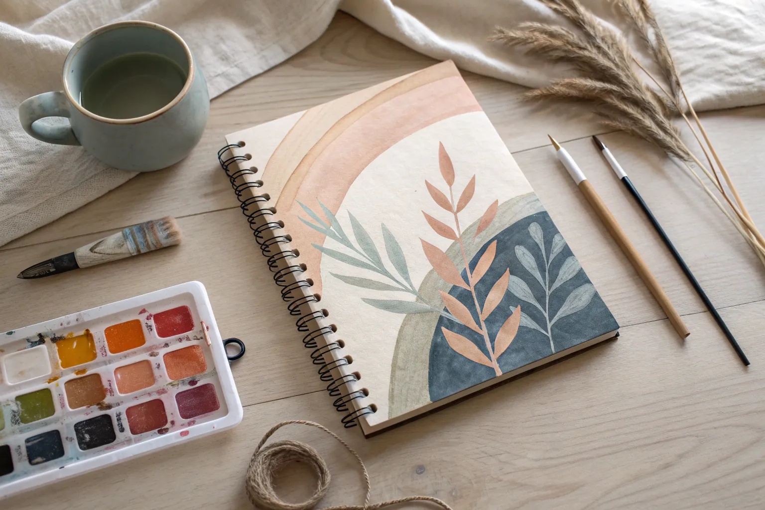
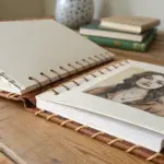
Whenever my sketchbook is open and my brain goes blank, I lean on a handful of go-to sketchbook painting ideas that feel small enough to start right now. Here are my favorite pages to paint when you want quick momentum, playful practice, and that satisfying “I made something today” feeling.
Try a Tiny Sunset Gradient Study
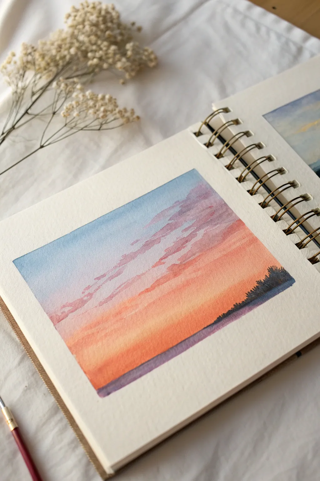
Capture the fleeting beauty of twilight with this delicate watercolor study, focusing on smooth transitions and soft clouds. The vibrant gradient from cool blue to warm orange creates a stunning backdrop for a simple silhouette landscape.
Step-by-Step Guide
Materials
- Cold Press Watercolor Paper (sketchbook or loose sheet)
- Masking Tape or Washi Tape
- Watercolor Paints (Cerulean Blue, Violet, Alizarin Crimson, Cadmium Orange, Cadmium Yellow, Payne’s Grey or Indigo)
- Round Brushes (Size 6 for washes, Size 2 for details)
- Clean Water
- Paper Towels
- Mixing Palette
Step 1: Preparation & Sky Base
-
Frame the scene:
Begin by taping off a small rectangle in your sketchbook using masking tape. Press the edges down firmly with your fingertip to ensure clean, crisp borders later. -
Pre-mix your gradient palette:
Before wetting your paper, prepare puddles of your sky colors on the palette. You’ll need a watery mix of Cerulean Blue, a soft Violet, a pinkish-orange (Alizarin Crimson mixed with a touch of Cadmium Orange), and a vibrant Orange. -
Wet the sky area:
Using your larger round brush and clean water, apply an even coat of water to the entire rectangular area. The paper should glisten but not have standing puddles. -
Apply the top blue layer:
Load your brush with the Cerulean Blue mix and paint a strip across the top third of the wet paper. Tilt your sketchbook slightly so the pigment flows downward naturally. -
Transition to violet:
Clean your brush quickly, pick up the Violet mix, and apply it just below the blue while the paper is still wet. Let the colors touch and bleed slightly into each other for a soft blend. -
Blend in the warmth:
Move immediately to your pinkish-orange mix. Apply this below the violet, blending upwards gently to soften the transition between the cool and warm tones. -
Finish the gradient:
Fill the bottom third with your strongest Cadmium Orange, perhaps touched with a bit of yellow for brightness near the horizon line. Ensure the gradient flows smoothly from top to bottom. -
Let it dry completely:
This is crucial. Let the paper dry until it is flat and room temperature to the touch. Speeding this up with a hairdryer is fine, but be careful not to push the wet paint around.
Step 2: Clouds & Horizon
-
Mix the cloud color:
Create a muted purple color for the clouds. Mix Violet with a tiny touch of Payne’s Grey to desaturate it slightly so it stands out against the bright sky without being too harsh. -
Paint wispy clouds:
Using the tip of your brush, paint horizontal, fragmented strokes across the middle section where the sky transitions from blue to pink. Keep the shapes irregular and organic. -
Soften edges selectively:
While the cloud paint is still damp, I like to take a clean, slightly damp brush and run it along the bottom edge of some clouds to soften them into the background sky. -
Add lower cloud layers:
Add a few thinner, fainter streaks of the same purple mix lower down in the orange section to create depth and perspective. -
Dry the cloud layer:
Allow the cloud layer to dry completely before starting the foreground. -
Mix the silhouette color:
Prepare a very dark, opaque mixture for the horizon. Indigo or Payne’s Grey works beautifully here; avoid pure black as it can look flat. -
Paint the distant tree line:
With your smaller Size 2 brush, paint an uneven line across the bottom of the orange section. Use tiny, vertical dabbing or stippling motions to simulate the texture of distant treetops. -
Vary the height:
Make the tree line slightly higher on the right side, as seen in the reference, tapering down towards the left. This asymmetry makes the composition more interesting. -
Anchor the foreground:
Fill in the area below the tree line solidly with your dark paint mix to ground the image. -
The reveal:
Once the painting is 100% dry, slowly peel off the masking tape at a 45-degree angle away from the painting to reveal those satisfying crisp edges.
Bleeding Edges?
If paint bled under the tape, try using a slightly thicker paint consistency next time, or ensure the tape is burnished down firmly with a bone folder or fingernail before painting.
Add Some Magic
Once dry, use a white gel pen or opaque white gouache to add a tiny crescent moon or a few sparkling stars in the blue section of the sky for a night-time feel.
Enjoy seeing your colorful sunset captured forever in your sketchbook pages


Paint Quick Cloud Studies in Rows
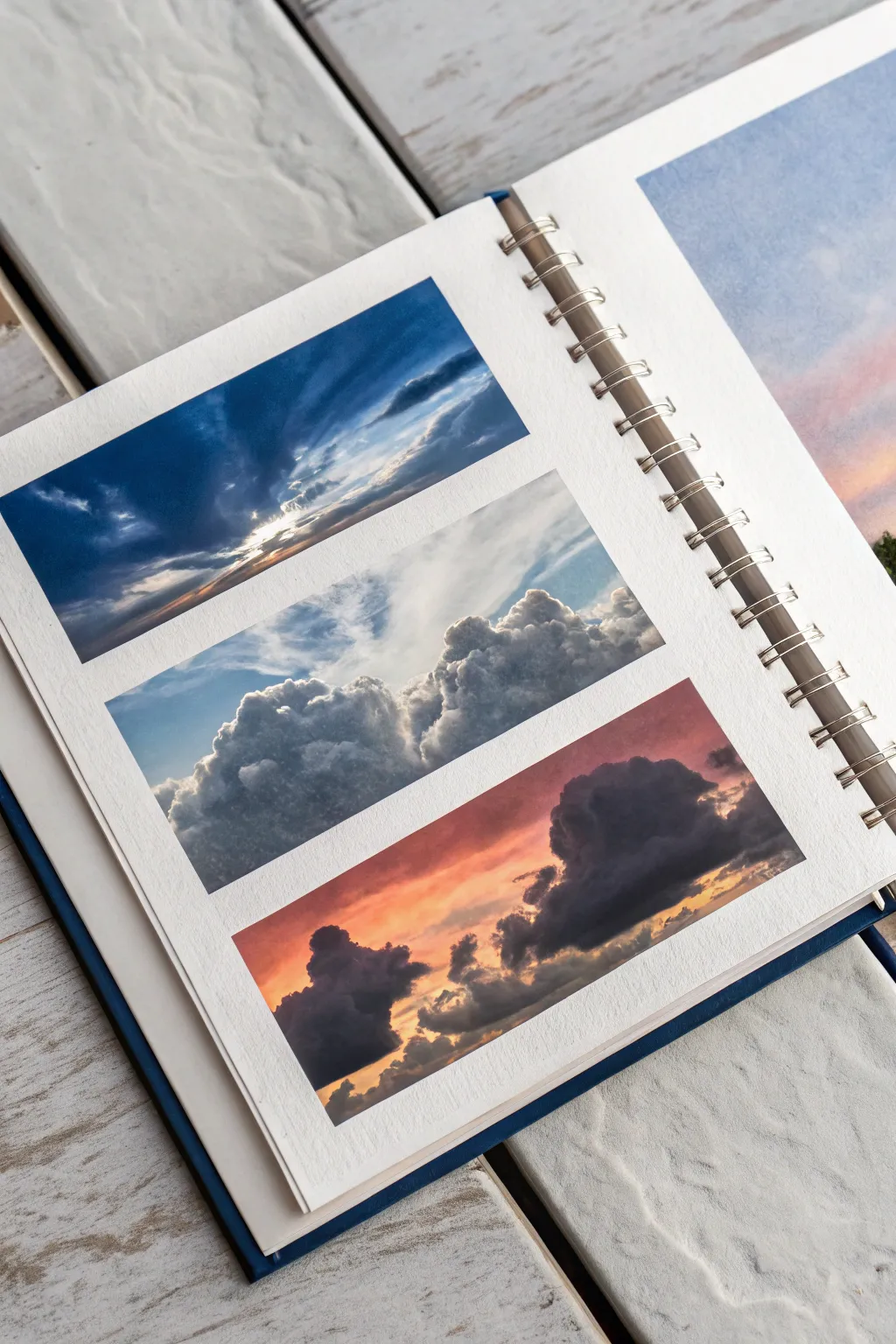
Capture the ever-changing moods of the sky with this compact layout featuring three distinct atmospheric moments stacked vertically. This project is perfect for practicing cloud anatomy and lighting effects in manageable, bite-sized rectangles.
Step-by-Step
Materials
- Spiral-bound landscape sketchbook (approx. A5 or A4 size)
- Artist masking tape or washi tape (approx. 1/2 inch width)
- Watercolor paints (Ultramarine Blue, Prussian Blue, Burnt Sienna, Alizarin Crimson, Yellow Ochre, Lamp Black)
- White gouache (essential for the opaque highlights)
- Round synthetic brushes (Size 2, 4, and 8)
- Flat brush (1/2 inch)
- Two jars of water
- Paper towels
- Mixing palette
Step 1: Preparation & Layout
-
Tape the borders:
Begin by placing a strip of masking tape vertically along the left and right edges of your sketchbook page to create clean margins. -
Create the rows:
Place horizontal strips of tape across the page to divide the painting area into three equal rectangular sections. Ensure you press the tape edges down firmly to prevent paint seepage. -
Pre-wet the paper:
Lightly brush clean water over all three rectangular spaces. The paper should be damp but not glistening with puddles.
Bleeding Edges?
If paint seeps under the tape, use white gouache (or opaque white gel pen) to carefully paint over the bleed and restore the straight line once fully dry.
Step 2: Top Panel: Dramatic Sunburst
-
Lay the dark base:
Mix a strong concentration of Prussian Blue with a touch of Lamp Black. Apply this to the top left corner, sweeping diagonally downwards. -
Reserve the light:
Leave the bottom right area mostly unpainted or very pale. While the blue is wet, lift out diagonal streaks towards the theoretical light source using a clean, damp brush to create ‘rays’. -
Deepen contrast:
Once the initial wash is damp-dry, add darker, almost indigo strokes around the light source to intensify the drama of the breaking light.
Step 3: Middle Panel: Fluffy Cumulus
-
Sky gradient:
For the middle strip, paint a soft gradient of Ultramarine Blue starting darker at the top and fading to near-white at the horizon line. -
Form the cloud shapes:
While the sky is drying, mix a soft grey using Ultramarine and a tiny touch of Burnt Sienna. Paint the shadow sides of the clouds, keeping the shapes rounded and clustered. -
Add dimension:
Drop simpler, darker grey pigment into the bottom of the cloud clusters while they are still wet to create volume and weight. -
Brighten edges:
I prefer to use a touch of white gouache mixed with water to crisp up the top edges of the clouds against the blue sky, making them pop.
Soft Edges vs. Hard Edges
For realistic clouds, keep edges soft! Blot your brush on a towel periodically; a slightly dry brush creates wispy, feathered textures perfect for vapor.
Step 4: Bottom Panel: Fiery Sunset
-
Warm underpainting:
Start with a wash of Alizarin Crimson transitioning into Yellow Ochre and Burnt Sienna towards the left side. Let these warm tones blend freely on the paper. -
Paint the silhouette:
Mix a dark, heavy grey-purple using Alizarin Crimson and Prussian Blue. Paint the large, looming cloud shape on the right side, blocking out the light. -
Backlit details:
Use the dark mix to add smaller, fragmented clouds on the lower left. Soften their bottom edges with a damp brush to help them sit in the atmosphere. -
Gilded edges:
Mix a tiny amount of yellow with white gouache. Carefully paint thin, glowing lines along the edges of the dark clouds where the setting sun would hit them.
Step 5: Finishing Touches
-
Final highlights:
Review all three panels. Use pure white gouache to add the absolute brightest points: the sunburst center in the top panel and the fluffiest peaks in the middle panel. -
Complete dry:
Ensure the paper is bone dry. If it feels cool to the touch, it is still damp. -
The reveal:
Slowly peel the masking tape away at a 45-degree angle, away from the painted area, to reveal crisp white borders between your atmospheric studies.
Peeling that tape reveals a satisfying trio of skies that turns a simple practice page into a polished display


Make a Mini Landscape Thumbnail Page
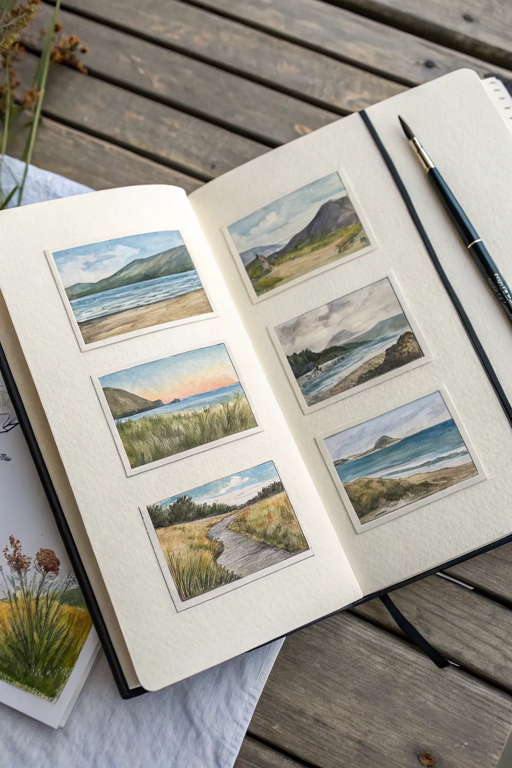
Transform a single sketchbook spread into a curated gallery of six distinct landscape scenes. This project uses masking tape to create crisp, clean borders around tiny watercolor studies, perfect for experimenting with composition and atmosphere without the pressure of a full page.
Detailed Instructions
Materials
- Watercolor sketchbook (mixed media or cold press paper)
- Artist’s masking tape or washi tape (low tack)
- Watercolor paints (pan set or tubes)
- Small round brushes (size 0, 2, and 4)
- Fine liner pen (waterproof, brown or black, optional)
- Pencil and eraser
- Paper towel and water cup
Step 1: Preparation & Layout
-
Plan the layout:
Visualize three evenly spaced rectangles on each page of your open sketchbook. You want them to be uniform in size, oriented horizontally, with plenty of white space between them to frame the art. -
Mask the borders:
Cut strips of low-tack masking tape to create the six rectangular windows. Apply the tape firmly, running your fingernail along the inner edges to ensure a tight seal that will prevent paint from seeping underneath. -
Sketch the scenes:
Lightly sketch a different simple landscape in each box using a pencil. Keep details minimal—just mark the horizon lines, major mountain shapes, coastlines, or pathways.
Tearing Paper?
If the tape is ripping your paper, blast it with a warm hair dryer for a few seconds before peeling. The heat softens the adhesive for a smoother release.
Step 2: Painting the Skies
-
Wet-on-wet technique:
Start with the top-left box. Lightly wet the sky area with clean water, then drop in a pale wash of Cerulean or Ultramarine Blue, leaving white patches for clouds. -
Varying times of day:
For the middle-left box, try a sunset palette. Wet the paper and blend a soft pink near the horizon into a pale blue at the top to create a gentle gradient. -
Moody atmospheres:
On the right page, create a stormy sky in one box by using greys and Payne’s Grey, dabbing the paint to suggest heavy, rain-filled clouds. -
Complete all skies:
Finish the sky sections for all six frames before moving on. This allows the first layers to dry completely, preventing the horizon line from bleeding.
Pro Tip: Color Harmony
Limit your palette to 3-4 colors for the entire spread. Mixing all your greens and greys from the same few tubes ensures all six paintings look cohesive together.
Step 3: Layering the Landscapes
-
Distant mountains:
Mix a cool, diluted violet or blue-grey. Paint the distant mountain ranges in the background. Keep the edges soft to simulate atmospheric perspective. -
Middle ground tones:
As you move forward in the scene, warm up your greens. Mix Sap Green with a touch of Yellow Ochre for grassy hills or dunes in the middle ground. -
Water features:
For the seascapes, use horizontal strokes of varied blues (Turquoise for shallow water, Indigo for deep). Leave slivers of white paper to represent foam or light reflecting on waves. -
Foreground textures:
Use a thicker mixture of paint for the foreground elements like rocks or tall grass. I like to use a ‘dry brush’ technique here, dragging a mostly dry brush across the paper to create the rough texture of sand or dirt paths.
Step 4: Refining Details
-
Deepen shadows:
Once the initial landscape washes are dry, mix a darker version of your existing colors. Add shadows to the craggy side of mountains or the underside of waves to give the scenes dimension. -
Add vegetation:
Using your smallest brush (size 0), paint tiny vertical strokes in the foreground to suggest tall beach grass or reeds. Vary the green shades so it doesn’t look flat. -
Optional ink work:
If you want clearer definition, use a waterproof fine liner to gently outline the mountain ridges or sketch in extra grass textures. Keep the lines broken and organic rather than solid. -
Final highlights:
If you lost any white highlights in the water or clouds, you can add tiny touches of white gouache or a white gel pen to bring back the sparkle.
Step 5: The Reveal
-
Dry completely:
Wait until the paper is bone dry. If the paper is cold to the touch, it’s still damp inside. -
Peel the tape:
Slowly peel the masking tape away at a 45-degree angle not towards the painting, but away from it. This reveals the crisp white borders that make these thumbnails look so professional.
Enjoy your collection of tiny worlds and the satisfaction of those perfect, clean edges


Paint a Simple Leaf and Stem Study
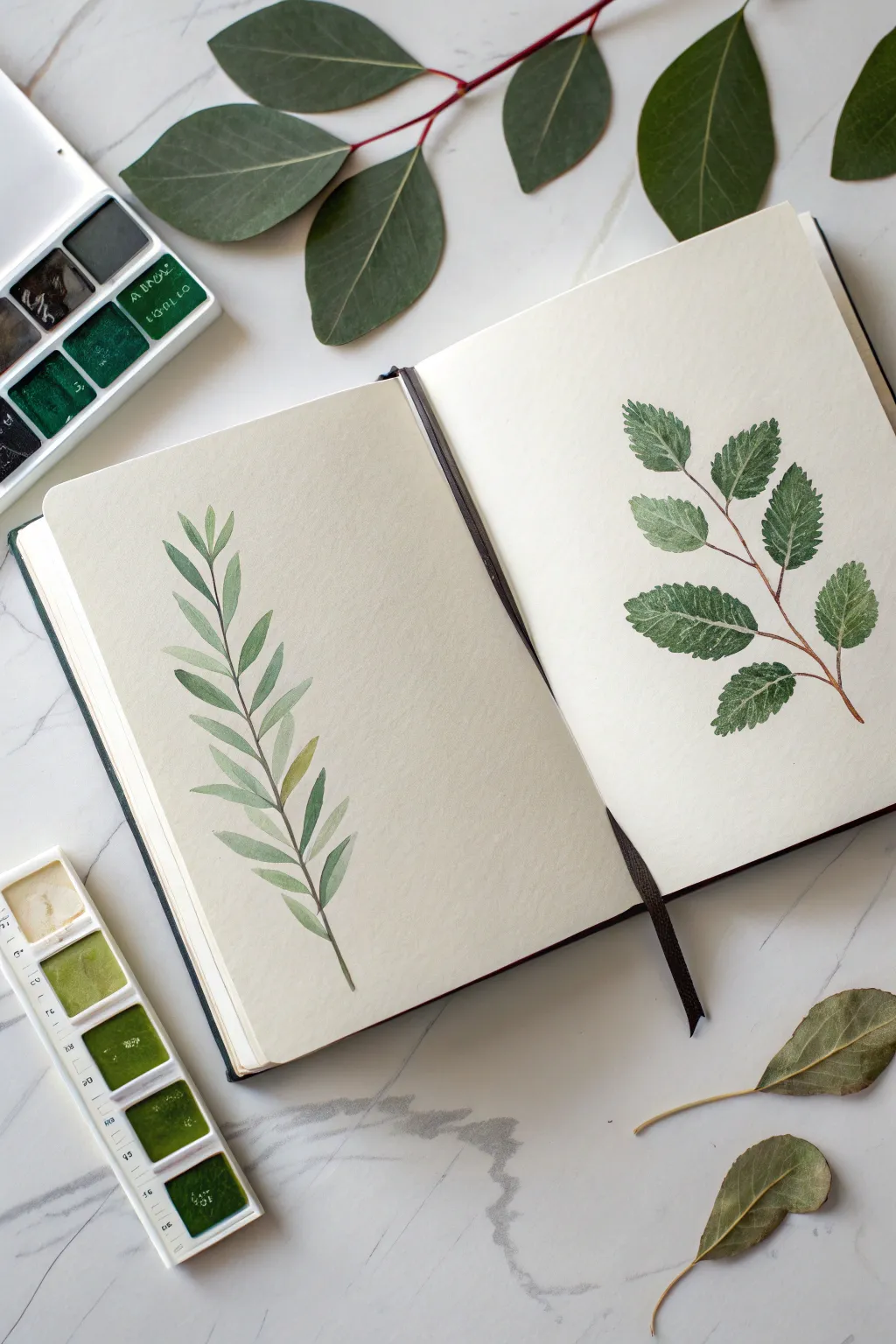
Capture the delicate beauty of nature directly in your sketchbook with these two distinct botanical studies. This dual-page spread explores contrasting leaf shapes—slender and elegant versus broad and serrated—using translucent watercolor layers for a fresh, organic look.
Step-by-Step Guide
Materials
- Watercolor sketchbook (cold press paper recommended)
- Watercolor paint set (focus on sap green, olive green, and burnt sienna)
- Round watercolor brushes (sizes 2 and 4)
- Pencil (HB or 2H)
- Clean water jar
- Paper towel
Step 1: Left Page: The Slender Branch
-
Sketch the spine:
Begin by lightly drawing a gently curved vertical line with your pencil to represent the central stem. Draw it slightly off-center to allow room for the leaves extending outward. -
Outline the leaves:
Along the stem, sketch pairs of narrow, elongated oval shapes (lanceolate leaves). Angle them upwards as if they are reaching for the sun, keeping the spacing somewhat irregular for a natural feel. -
Mix a soft olive:
create a watery mix of olive green with a touch of yellow ochre. You want a very transparent, tea-like consistency for the initial wash. -
Paint the first layer:
Using your size 4 round brush, fill in the leaf shapes. Start at the base of each leaf, press the belly of the brush down to widen the stroke, and lift as you reach the tip to create a sharp point. -
Add stem definition:
While the green is on your palette, mix a small amount of burnt sienna into it to darken the color. Use the very tip of your size 2 brush to trace the main stem, connecting the leaves. -
Apply shadows:
Once the first layer is touch-dry, paint a second layer on the lower half of selected leaves. This creates a sense of depth and curvature. -
Create variation:
For a few random leaves, drop in a slightly more yellow-green hue while the paint is still wet, letting the colors bleed together softly.
Step 2: Right Page: The Serrated Stem
-
Draw the structure:
On the opposite page, sketch a branching stem structure. Draw a main diagonal line with smaller off-shoot stems alternating on either side. -
Sketch serrated outlines:
Draw broader, egg-shaped leaves at the end of each stem. Instead of smooth lines, use small jagged strokes to indicate serrated edges, mimicking leaves like beech or elm. -
Darker green base:
Mix a deeper sap green or hooker’s green. I find that starting with a slightly more saturated color helps distinguish this specimen from the first one. -
Paint texture:
Fill in the leaves with the size 4 brush. As you paint the edges, carefully dap the brush tip to emphasize those serrated teeth you sketched earlier. -
Paint the veins:
While the paint is wet, you can lift out pigment with a thirsty (damp, clean) brush to suggest veins, known as the ‘lifting’ technique. -
Alternative veining:
Alternatively, let the green base dry completely. Then, mix a white gouache or a very opaque light green and paint thin, diagonal lines for the veins on top. -
Final stem details:
Mix a reddish-brown using burnt sienna and a tiny dot of red. With your smallest brush (size 2), paint the woody stems, tapering them as they reach the leaves. -
Refine the edges:
Check your serrated edges. If some look too smooth, you can add tiny touches of darker green to the ‘valleys’ of the leaf edge to sharpen the look.
Wet-on-Dry Precision
For crisp serrated edges on the right page, ensure your paper is completely dry before painting. Wet paper will cause the tiny jagged details to bloom and blur.
Pencil Lines Shows?
If your pencil sketches are showing through the transparent watercolor too clearly, gently roll a kneaded eraser over the sketches before painting to lighten the graphite.
Close your sketchbook only after the pages are fully dry to preserve your miniature garden study.
BRUSH GUIDE
The Right Brush for Every Stroke
From clean lines to bold texture — master brush choice, stroke control, and essential techniques.
Explore the Full Guide
Fill a Page With Wildflower Minis
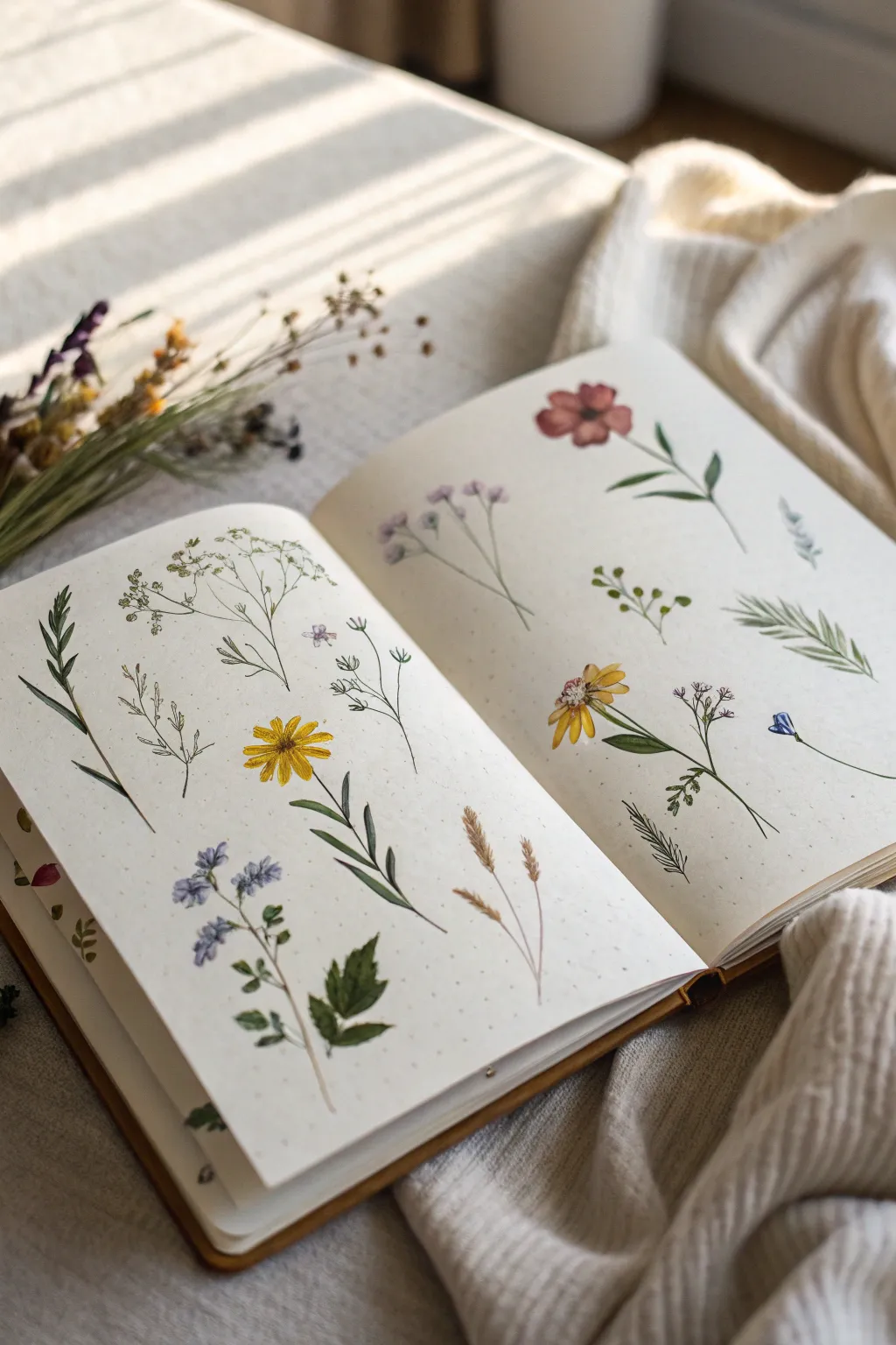
Capture the delicate beauty of a meadow by scattering small, individual wildflower studies across a two-page spread. This loose, airy layout mimics a botanical field guide but with a softer, more whimsical artistic touch.
Detailed Instructions
Materials
- Watercolor sketchbook (A5 or similar size)
- Watercolor paints (pan set or tubes)
- Fine detail brushes (sizes 0, 1, and 2 round)
- Pencil (HB or 2H)
- Kneaded eraser
- Jar of clean water
- Paper towel
- Fine liner pen (optional, sepia or black)
Step 1: Planning the Scatter
-
Visualize the layout:
Open your sketchbook to a clean double spread. Instead of drawing a single scene, imagine dropping a handful of flowers onto the paper. You want plenty of white space between each element. -
Lightly sketch stems:
Using your HB pencil with very light pressure, draw faint curved lines to establish the main stems. Vary the heights and angles—have some leaning left, others right, and curve some gently. -
Mark flower heads:
Add simple circles or ovals at the top of your stems to mark where the blooms will go. This helps you balance the composition before committing to paint. -
Add leaf guidelines:
Sketch quick, gestural lines for leaves. For fern-like plants, draw a central spine; for leafy plants, outline distinct leaf shapes near the base or along the stem.
Muddy colors?
If your greens bloom into your flower petals, you’re painting too fast. Let the flower heads dry completely before attaching the green stems.
Step 2: Painting the Blooms
-
Mix your palette:
Prepare watery puddles of earthy floral colors: mustard yellow, dusty pink, violet, and a deep reddish-brown. Keep the mixes transparent. -
Paint the yellow daisy:
On the left page, use your size 2 brush to pull yellow paint outward from a center point to create thin petals. Leave a tiny gap in the middle for the center detail later. -
Add the red cosmos:
On the right page, paint five or six broad, teardrop-shaped petals using the reddish-brown mix. Keep the edges soft and slightly uneven for a natural look. -
Create tiny purple clusters:
For the lavender or lilac-style flowers, use the tip of a size 1 brush to dab irregular dots of violet near the top of a stem. Let the dots touch slightly so colors bleed together. -
Detail the filler flowers:
Use a barely-there wash of grey-blue or pale pink to create the ‘ghost’ flowers in the background—these are the airy baby’s breath or dried grasses.
Step 3: Stems and Greenery
-
Mix diverse greens:
Avoid using a single tube green. Mix sap green with a touch of red for an olive tone, and viridian with yellow for a fresher spring green. -
Line the stems:
Switch to your size 0 or 1 brush. Load it with the olive mix and trace over your pencil lines with a confident, swift stroke. Shaky hands actually make stems look more organic. -
Paint long leaves:
For the grass-like specimen on the far left, create long, sweeping strokes that taper at the end. Press down to widen the stroke, then lift as you pull away. -
Add intricate foliage:
For the fern-like plant (right page), use the very tip of your smallest brush to make tiny dashes outward from the main stem. -
Ground the flowers:
Add small caloyx details (the green cup at the base of a flower head) where the stems meet the colorful blooms.
Variation is key
Avoid making every stem the same thickness. Dilute your paint for background stems to make them look further away, creating depth.
Step 4: Final Details
-
Add flower centers:
Once the yellow petals are dry, drop a concentrated dot of brown or dark orange into the center. Do the same for the red flower. -
Draw dried wheat textures:
For the wheat-like stalks at the bottom, use a dry-brush technique with light ochre paint to create a scratchy, textured look. -
Erase pencil marks:
Wait until the paint is bone dry—if it feels cool to the touch, it’s still wet. Gently roll your kneaded eraser over the page to lift any visible graphite. -
Add subtle splatters (optional):
I sometimes like to tap a wet brush against a finger to add microscopic speckles of green or brown around the page, adding to that field-guide texture.
Now you have a serene little garden preserved forever in your sketchbook
Do a One-Object Kitchen Sketch Painting
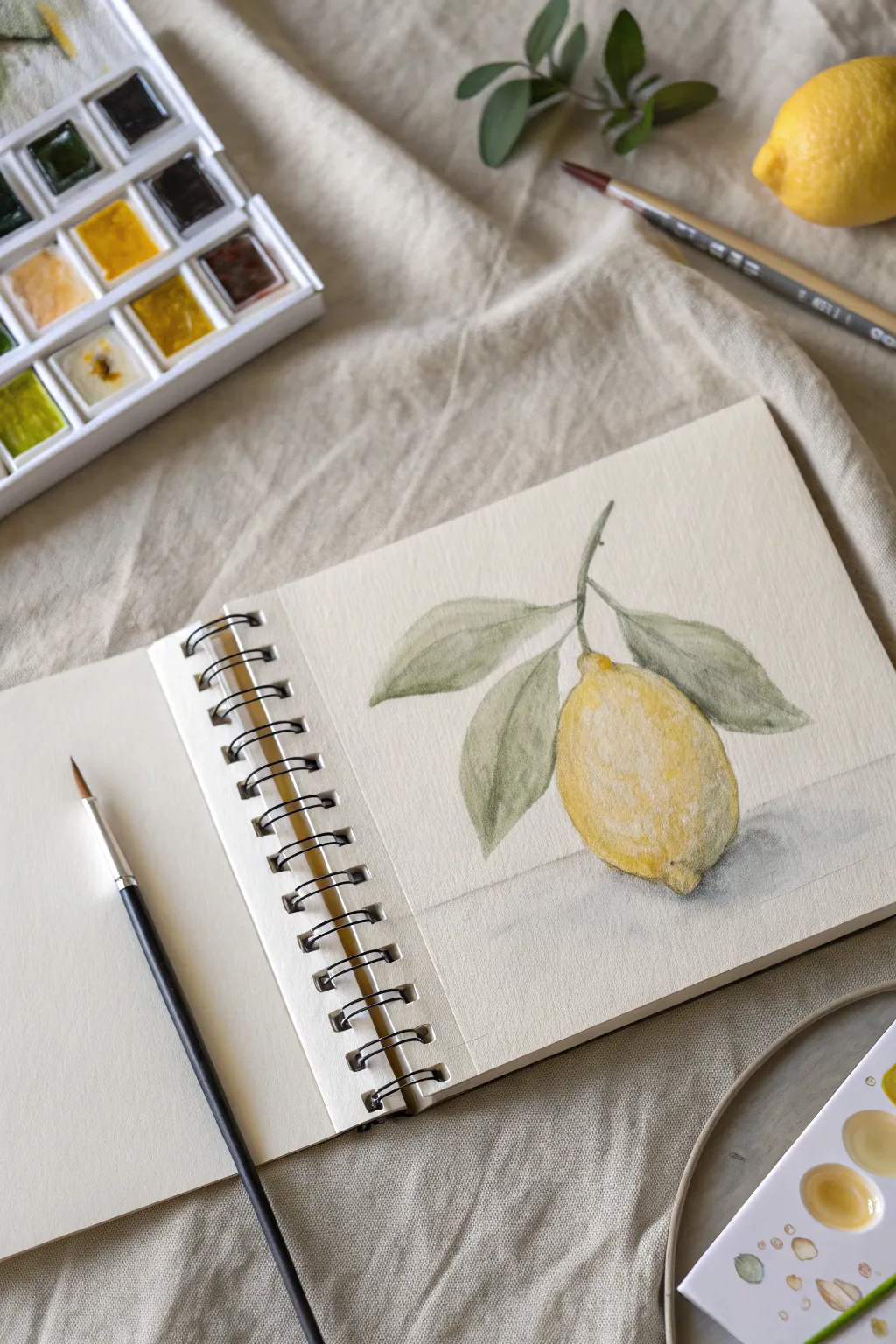
Capture the zest and freshness of a lemon in this delicate watercolor sketchbook study. This project focuses on building translucent layers to create a realistic, textured fruit accompanied by soft, muted foliage.
Step-by-Step Tutorial
Materials
- Spiral-bound watercolor sketchbook (cold press paper recommended)
- Watercolor paints (Yellow Ochre, Lemon Yellow, Sap Green, Burnt Umber, Neutral Tint)
- Round watercolor brushes (Size 4 and Size 8)
- HB Graphite pencil
- Kneaded eraser
- Clean water jar
- Paper towel or rag
Step 1: Sketching the Composition
-
Observe the shape:
Begin by lightly sketching the main oval shape of the lemon in the center of your page. Notice how a lemon isn’t a perfect circle; give it that characteristic slightly elongated form with a small protrusion at the bottom. -
Add the stem and leaves:
Draw a central stem extending upwards from the top of the fruit. From this stem, sketch three main leaves: one dropping to the left, one tucked slightly behind the fruit, and one extending to the right. Keep your pencil lines faint so they don’t show through the paint later. -
Refine the outline:
Clean up your sketch with a kneaded eraser, lifting excess graphite until only a ghost of the image remains. This ensures your final watercolor looks crisp and professional.
Muddy colors?
If your yellow looks dirty near the shadows, you likely mixed the purple/grey shadow tone while the yellow was still too wet. Let layers dry completely between color temperature shifts.
Step 2: Painting the Lemon
-
First wash of yellow:
Load your size 8 brush with a watery mix of Lemon Yellow. Paint the entire body of the lemon, but leave small, irregular white patches near the top center to represent the highlight where the light hits the skin. -
Add depth while wet:
While the first layer is still damp, drop in a slightly more concentrated Lemon Yellow mixed with a touch of Yellow Ochre along the bottom curve and the sides to start building roundness. -
Let it dry completely:
Wait for the yellow layer to be fully dry to the touch. If you rush this, the colors will bleed muddily into the leaves in the next steps. -
Building texture:
Using the tip of a smaller brush (size 4), use a stippling motion with a mix of Yellow Ochre and a tiny dot of Burnt Umber. Apply this texture to the shadow areas (bottom and sides) to mimic the pitted texture of lemon peel. -
Deepening the shadows:
Glaze a very thin, watery layer of Neutral Tint or dilute purple over the bottom-most edge of the lemon. This cool tone contrasts with the warm yellow to create volume.
Step 3: Foliage and Details
-
Base green layer:
Mix Sap Green with a little Burnt Umber or red to desaturate it; we want a natural, olive-toned green rather than a bright artificial one. Paint the leaves with a light wash of this mix. -
Define the veins:
While the leaves are still slightly damp, use a more concentrated version of your green mix to paint the center vein line. Allow the color to bleed slightly for a soft look. -
Painting the stem:
Use a mix of Green and Brown to carefully paint the thin stem connecting the leaves to the fruit. I find a rigger brush or just the very fine tip of your size 4 works best here for control. -
Cast shadow:
Mix a watery grey using Neutral Tint or a mix of blue and brown. Paint a soft, diffuse shadow underneath the lemon on the ‘table’ surface to ground the object so it doesn’t look like it’s floating. -
Final touches:
Assess your painting. If the lemon needs more punch, add a final glaze of pure yellow to the mid-tones. Use a white gel pen or gouache if you lost your highlights and need to reclaim a few sparkles on the peel.
Enhance the narrative
Paint a sliced wedge of lemon next to the whole fruit or add a few loose lemon seeds scattered on the invisible table surface to make the composition feel more candid.
Close your sketchbook knowing you’ve preserved a little bit of summer sunlight on the page

PENCIL GUIDE
Understanding Pencil Grades from H to B
From first sketch to finished drawing — learn pencil grades, line control, and shading techniques.
Explore the Full Guide
Paint a Loose Self-Portrait Study
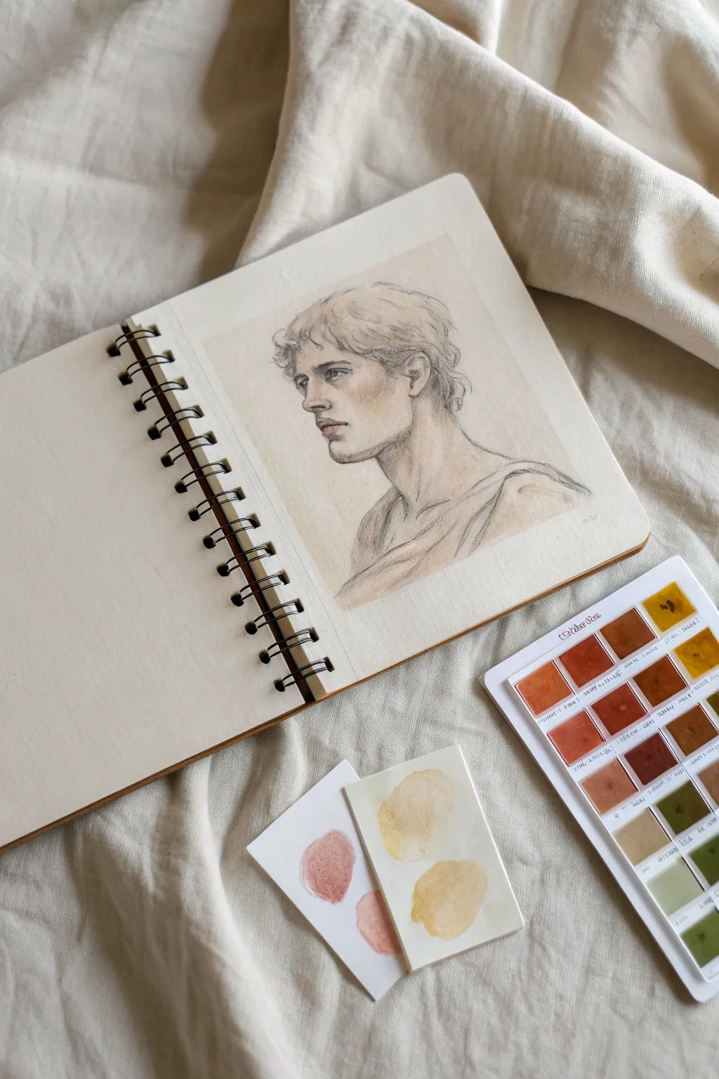
This project captures the timeless elegance of a classical bust using delicate line work and soft watercolor washes. By combining precise sketching with muted earth tones, you’ll create a sketchbook page that feels like a treasured study from an old master’s atelier.
Step-by-Step
Materials
- Spiral-bound sketchbook (heavy mixed-media or watercolor paper)
- Graphite pencil (HB or B for initial lines)
- Black colored pencil or fine charcoal pencil (for final definition)
- Watercolor pan set (focusing on earth tones: Burnt Sienna, Yellow Ochre, Umber, Red Oxide)
- Small round watercolor brush (size 2 or 4)
- Paper towel
- Water cup
- Scrap paper for color testing
Step 1: Constructing the Head
-
Establish the angle:
Begin with a loose oval for the head, slightly tilted. Draw a curved vertical centerline to establish a three-quarter view, where the subject is looking off to the left. -
Mark feature placement:
Lightly sketch horizontal guidelines for the eyes, nose base, and mouth. Keep these lines faint as they are just architectural support for the final drawing. -
Define the jawline:
Carve out the jawline with strong, angular strokes. Aim for a masculine, statuesque look by emphasizing the corner of the jaw and the chin. -
Sketch the neck and shoulders:
Extend two lines down for the thick neck, connecting them to the sloping line of the shoulders. Indicate the collarbone and the sweep of a toga-like drape across the chest. -
Detail the features:
Refine the profile. Draw the nose with a straight bridge, deep-set eyes with heavy lids, and full lips. Ensure the ear is aligned between the eye and nose lines. -
Add hair texture:
Sketch the hair in clumps rather than individual strands. Use wavy, rhythmic lines to suggest curls framing the face and covering the ears slightly.
Pro Tip: Paper Harmony
To get that ‘old master’ look, tint your entire background rectangle first with a weak tea or coffee wash. Let it dry completely before drawing your sketch on top.
Step 2: Refined Lines & Background
-
Reinforce with darker pencil:
Switch to your black colored pencil or charcoal pencil. Go over your key lines—specifically the eyelids, nostrils, lips, and under the chin—to create contrast. -
Create a localized background:
Mix a very watery wash of raw umber or beige. Paint a soft, rectangular ‘halo’ around the head, leaving the edges uneven and organic. This frames the portrait without filling the whole page. -
Soften the edges:
Before the background wash dries completely, use a clean, damp brush to feather the edges outward, ensuring there are no harsh lines where the paint meets the white paper.
Troubleshooting: Muddy Skin Tones
If your shadows look dirty, you likely overworked the wet paper. Let layers dry fully before glazing new color, or lift excess pigment gently with a clean paper towel.
Step 3: Adding Skin Tones & Depth
-
Mix a base flesh tone:
On your palette or scrap paper, mix Yellow Ochre with a tiny touch of Burnt Sienna and plenty of water. You want a very pale, tea-stained color. -
Apply the first shadow wash:
Paint this mix into the shadow areas: under the brow bone, the side of the nose, under the cheekbone, and the neck shadow. Avoid painting the highlighted areas like the forehead and nose bridge. -
Deepen the cheeks:
While the first layer is still slightly damp, drop in a slightly more saturated mix of Burnt Sienna on the cheek and ear to bring warmth to the face. -
Define hair volume:
Use a diluted greyish-brown mix to paint the shadow shapes within the hair. Don’t paint the whole head of hair; just fill the gaps between curls to suggest depth. -
Warm up the features:
Use a small brush with a hint of Red Oxide or a reddish-brown to carefully touch the lips, the corner of the eye, and the nostril. This adds life to the stone-like palette. -
Shade the drapery:
Add simple, broad strokes of your shadow color to the folds of the clothing at the bottom. Keep this very loose to maintain focus on the face. -
Final pencil texture:
Once the paint is bone dry, return with your dark pencil. Add gentle hatching marks in the deepest shadow areas (neck, hair, under the nose) to unify the drawing with the paint.
Step back and appreciate how the combination of loose washes and structured lines gives your study a sense of history and character
Capture a Quick Street Scene Spread
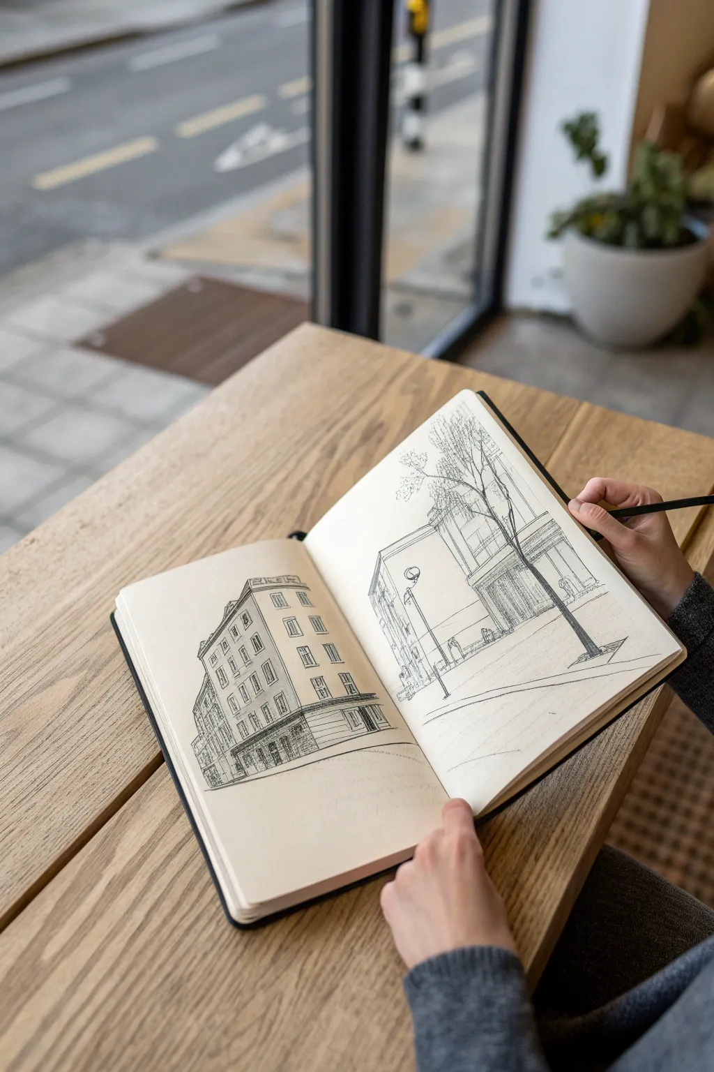
Transport yourself to a quiet street corner with this immersive two-page sketchbook spread. By separating building details from lighter street elements across the fold, you’ll create a dynamic composition that captures the feeling of looking up and down a city block.
How-To Guide
Materials
- Hardbound sketchbook (A4 or similar size, heavyweight paper)
- Fine liner pens (0.1, 0.3, and 0.5 sizes)
- Graphite pencil (HB or 2B)
- Kneaded eraser
- Ruler (optional, strict straight lines detract from the charm)
Step 1: Setting the Scene
-
Establish the horizon line:
Open your sketchbook wide. Lightly sketch a continuous horizon line running across the bottom third of both pages with your pencil. -
Block in major shapes:
On the left page, sketch a large, tall rectangle for the main corner building. Angle the top and bottom lines slightly downward toward a vanishing point off the page to establish perspective. -
Outline the right page elements:
On the right page, lightly draw a vertical line for the tree trunk and a smaller rectangle for the background building facade. Keep these lines very faint.
Step 2: Detailed Architecture (Left Page)
-
Define the roofline:
Using your 0.3 pen, ink the top edge of the main building, adding small details for the cornice or roof tiles. Let the line wobble slightly for character. -
Grid the windows:
Lightly pencil in a grid for the windows. Notice how the vertical lines get closer together as the building moves away from you in perspective. -
Ink the windows:
Switch to a 0.1 pen to outline the window frames. Keep the details minimal—just enough to suggest glass and frames without drawing every pane. -
Add the storefront:
Draw the ground floor arcade or shop windows with heavier lines using the 0.5 pen. Darken the interiors of the doorways to ground the structure. -
Connect the side building:
Sketch the receding wall of the attached building on the far left, using tighter hatching to suggest it sits further back in the shadows.
Wonky Perspective?
If lines look wrong, don’t erase! Add a ‘correction’ line over it and leave the mistake. This adds energy and motion to urban sketches, making them feel raw and authentic.
Step 3: Atmospheric Street Life (Right Page)
-
Draw the foreground tree:
With a 0.3 pen, draw the tree trunk on the right page. Use jagged, organic lines for the branches reaching up towards the top of the page. -
Position the street lamp:
Place a street lamp to the left of the tree. Use a simple circle for the bulb and a thin vertical line for the post. -
Sketch the background facade:
Draw the building behind the tree with lighter pressure. I prefer using a 0.1 pen here to make it look distinct from the foreground tree. -
Create depth with hatching:
Add vertical hatching lines on the shaded side of the background building to give it volume without overpowering the scene.
Add a Splash of Life
Use a light gray alcohol marker or a diluted watercolor wash to add simple shadows on one side of the buildings. This instantly turns a flat drawing into a 3D space.
Step 4: Bringing it Together
-
Enhance spatial separation:
Evaluate the empty space between the left building and the right street scene. This ‘negative space’ is crucial—don’t fill it; let it act as the open sky and street. -
Add ground details:
Draw a few horizontal lines suggesting the curb and sidewalk that connect both pages visually at the bottom. -
Populate with suggestions:
Add tiny, scribbly outlines of figures or street furniture near the base of the buildings to give a sense of scale. -
Texturize the tree:
Use loose stippling or small scribbles in the tree branches to suggest leaves without drawing individual ones. -
Erase guidelines:
Once the ink is completely dry, gently erase all pencil marks with your kneaded eraser to reveal the crisp linework. -
Final heavy touches:
Review the drawing and use the 0.5 pen to re-line the bottom-most edges and closest corners. This ‘line weight’ variation adds immediate professional polish.
Close your book knowing you’ve captured a timeless architectural moment in ink


Paint an Animal Mark-Making Study
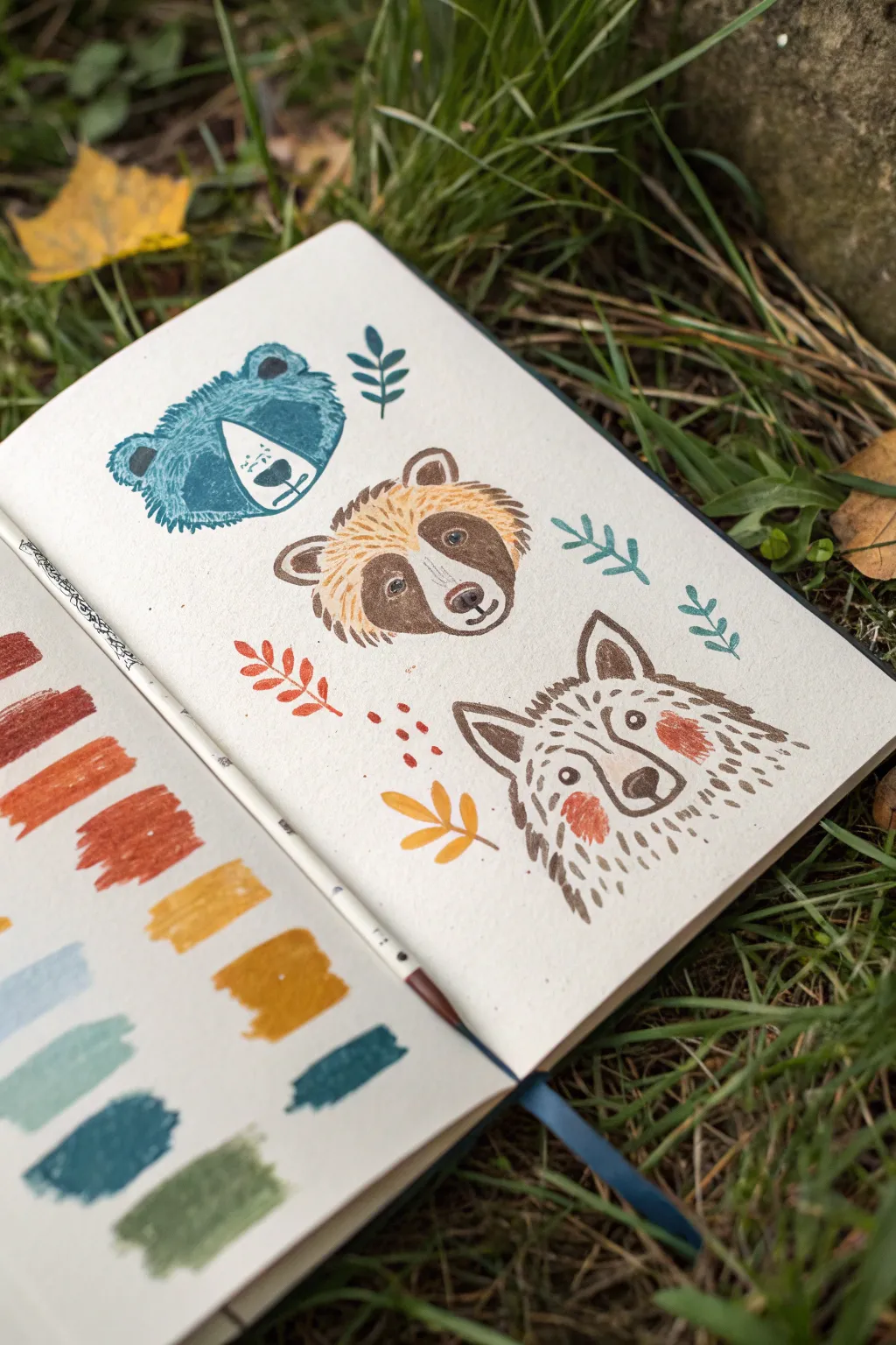
Embrace the imperfect charm of mark-making with this stylized study of forest animals. Using opaque gouache and simple brushstrokes, you’ll create a lively trio of a bear, a raccoon, and a wolf surrounded by autumnal foliage.
Detailed Instructions
Materials
- Sketchbook with mixed-media or watercolor paper
- Gouache paints (Teal, Burnt Sienna, Yellow Ochre, Black, White, Red Oxide)
- Small round brushes (size 2 and 4)
- Fine liner brush (size 0 or 00)
- Palette for mixing
- Water jar and paper towel
Step 1: Preparation & Palettes
-
Test your colors:
Begin on the left page of your spread by swatching your main colors. Paint rectangular blocks of teal, reddish-brown, orange-ochre, yellow-ochre, light blue, mint green, dark teal, and olive green to ensure your opacity is creamy and consistent. -
Plan the layout:
On the right-hand page, lightly sketch three rough circles in a vertical arrangement to place your animal heads: top left for the bear, center for the raccoon, and bottom right for the wolf.
Gouache Consistency Tip
Gouache should be the consistency of heavy cream. If your brush dry-drags too much, add a drop of water. If it’s too transparent, add more paint.
Step 2: The Blue Bear
-
Paint the base shape:
Mix a deep teal with a touch of white. Paint a rounded, slightly triangular shape for the bear’s head, leaving the distinct texture of the paper showing through slightly. -
Create the texture:
While the paint is wet or just tacky, use a drier brush to drag the edges outward, creating a ‘furry’ effect. -
Add the muzzle:
Mix white with a tiny dot of teal to create a very pale blue. Paint a rounded spade shape in the lower center of the head for the muzzle. -
Refine features:
Using your darkest teal or a black mix, use the fine liner to paint a simple nose, a vertical line for the mouth, and tiny dots for eyes. Add small strokes around the ears to define them.
Level Up: Seasonal Shifts
Change the mood by altering the palette. Try cool blues and greys for a winter version, or bright pinks and greens for spring animals.
Step 3: The Raccoon
-
Block in the mask:
Using a dark brown mix, paint the distinct ‘bandit mask’ shape across the eyes, angling downwards slightly. -
Paint the golden fur:
Mix yellow ochre with white. With a small round brush, use short, dashing strokes to paint the forehead and cheeks, letting these strokes overlap the brown mask slightly to simulate fur texture. -
Define the face:
Fill in the muzzle area with a creamy off-white. Add a dark brown nose and a small mouth line. -
Add details:
Use the fine liner and dark brown paint to add whisker spots and small eyes within the dark mask. Paint small, rounded ears with a lighter brown outline.
Step 4: The Wolf
-
Outline the shape:
Start with a diluted brown-grey mix. Instead of a solid block, build the wolf’s head shape entirely using short, dashed strokes to mimic rough fur. -
Add the cheeks:
Paint two distinct, rosy patches on the cheeks using a reddish-orange clay color. Make these shapes slightly irregular and organic. -
Draw the features:
Switch to a dark sepia or black. Paint a prominent triangular nose, almond-shaped eyes, and the inner ear triangles. -
Final fur details:
Layer small, darker dashes over the lighter fur areas to create depth and volume around the neck and forehead.
Step 5: Botanical Accents
-
Paint simple leaves:
Using your teal and olive green mixes, paint simple stems with paired oval leaves floating between the animal heads. -
Add warm foliage:
Use the burnt orange and yellow ochre to add small sprigs and fallen leaves near the raccoon and wolf. Paint these with single, confident brush presses. -
Include berries:
Dot in small clusters of red berries near the center of the composition to tie the color palette together. -
Final touches:
Review the spread and add tiny dots or dashes of color to fill any awkward negative spaces, keeping the overall feel loose and playful.
Close your sketchbook once the paint is fully dry to preserve your charming woodland study
Use a Limited Palette for One Scene
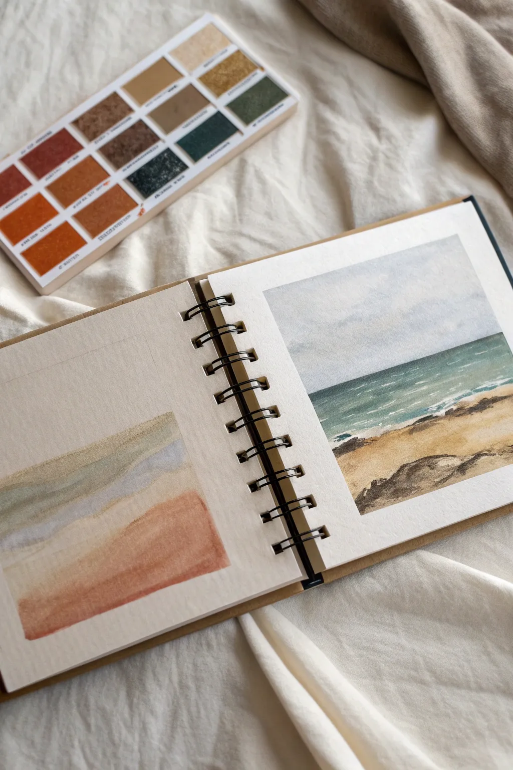
Capture the calm of a coastal landscape using a restricted set of earthy tones and cool blues. This project focuses on exploring how a few carefully chosen colors can work together to create a cohesive and atmospheric seascape.
How-To Guide
Materials
- Wire-bound watercolor sketchbook (cold press paper recommended)
- Watercolor paints (Payne’s Grey, Burnt Sienna, Yellow Ochre, Deep Green, Indigo)
- Round watercolor brushes (size 4 and 8)
- Flat shader brush (optional, for washes)
- Clean water jar
- Paper towel or rag
- Pencil (HB or 2B) and eraser
- Masking tape (optional, for crisp edges)
Step 1: Preparation and Color Testing
-
Swatching the Palette:
Before tackling the main painting, use the left page of your sketchbook to test your color harmony. Mix a muted blue-grey using Payne’s Grey and a touch of Indigo. -
Adding Earth Tones:
Next to your blue mix, lay down swatches of Yellow Ochre and Burnt Sienna. Observe how the warm earth tones contrast against the cool blues. -
Creating a Gradient Test:
On the same test page, paint a rectangular gradient. Start with your blue-grey at the top, blend into a muted green middle section, and finish with Burnt Sienna at the bottom to mimic the landscape’s transition.
Palette Harmony
To ensure your colors look cohesive, try mixing a tiny amount of your ‘sand’ color into the sky mix. It warms up the grey and links the two distinct areas together
Step 2: Sketching the Seascape
-
Establishing the Horizon:
On the right-hand page, lightly draw a horizontal line about two-thirds down the page. This will separate the sky from the ocean. -
Mapping the Shoreline:
Sketch a gentle, diagonal curve starting from the bottom right corner, moving upwards toward the left to define the sandy beach. -
Adding Rock Details:
Draw faint, irregular shapes along the bottom edge and slightly into the water area to represent the coastal rocks.
Step 3: Painting the Sky and Ocean
-
Sky Wash:
Wet the sky area with clean water using your larger brush. Drop in a very dilute wash of your blue-grey mix, keeping the top slightly darker and fading to almost white near the horizon. -
Defining the Horizon:
While the sky is drying, mix a stronger, deeper version of your ocean color using Deep Green and a touch of Indigo. -
Painting the Water:
Apply this deep green-blue mix right along the horizon line for a sharp edge. Drag the color downward, adding a little water to lighten it as you approach the shore. -
Creating Waves:
While the ocean layer is still damp (but not soaking), lift out horizontal streaks with a clean, thirsty brush to suggest whitecaps or light reflecting on the waves.
Muddy Water?
If your ocean green looks muddy against the sand, you likely let them touch while wet. Let the ocean dry completely before painting the beach next to it
Step 4: The Sandy Shore
-
Base Sand Color:
Mix Yellow Ochre with a tiny amount of Burnt Sienna. paint the beach area, ensuring you leave a small gap of white paper between the water and the sand for sea foam. -
Adding Texture:
While the sand wash is wet, drop slightly more concentrated Burnt Sienna into the foreground area to create depth and shadow near the rocks. -
Dry Brush Details:
Once the sand layer is dry, I find a dry brush helpful here to drag some texture across the paper, simulating grains of sand.
Step 5: Finishing Details
-
Painting the Rocks:
Mix a dark, muddy grey using Burnt Sienna and Payne’s Grey. Paint the rock shapes, allowing the edges to be rough and organic. -
Shadows and Contrast:
Add a second, darker layer to the bottom-right corners of the rocks to ground them. -
Sea Foam:
Define the white gap between the ocean and sand with a very faint, watery shadow of grey-blue to give the foam some volume. -
Final Assessment:
Step back and check the balance. If the horizon line faded too much, carefully re-establish it with a thin line of your darkest blue.
Enjoy the peaceful process of bringing this quiet coastal scene to life in your sketchbook
Go Monochrome Wash With Bold Values
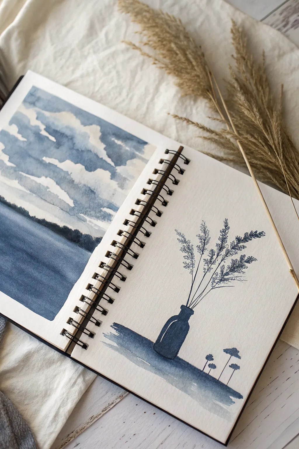
Explore the power of a single color with this dual-page sketchbook spread that balances soft wash techniques with crisp line work. By limiting yourself to one deep indigo hue, you’ll learn to control water-to-paint ratios to create atmospheric landscapes and striking botanical silhouettes.
Detailed Instructions
Materials
- Watercolor paper sketchbook (spiral bound)
- Indigo or Payne’s Grey watercolor paint
- Flat wash brush (medium)
- Round brush (size 4 or 6)
- Fine liner brush or dipping pen with indigo ink
- Clean water jar
- Paper towel or rag
- Masking tape (optional for borders)
Step 1: The Cloudy Landscape (Left Page)
-
Define the Horizon:
Visualize a line about one-third of the way up from the bottom of the page. This will be your horizon line separating the sky from the water. -
Wet-on-Dry Sky Technique:
Load your round brush with a medium-strength mix of indigo paint. Instead of wetting the paper first, you’ll paint around the shapes of the clouds. -
Carve Out the Clouds:
Start at the top of the page. Paint the negative space of the sky, leaving jagged, irregular white shapes of unpainted paper to represent the bright white clouds. -
Soften the Edges:
Before the paint dries completely, rinse your brush and use slightly damp bristles to soften the bottom edges of the cloud formations, letting them blur slightly into the white paper. -
Gradate the Sky:
As you move closer to the horizon line, add more water to your mixture to make the blue lighter, creating atmospheric perspective. -
Paint the Water:
For the bottom third, apply a broad, even wash of diluted blue to represent the water. Keep this wash fairly flat but slightly darker at the very bottom edge of the page. -
Let it Dry:
Wait for both the sky and water sections to be completely dry to the touch. This is crucial for the next step to prevent bleeding. -
Add the Treeline:
Mix a very concentrated, dark value of indigo—almost black. Using the tip of your round brush, dab a jagged line right across the horizon where the sky meets the water to imply distant trees.
Step 2: The Botanical Study (Right Page)
-
Ground the Composition:
Near the bottom of the right page, paint a loose, horizontal wash using medium-strength blue. This acts as the table or surface for your vase. -
Paint the Bottle Shape:
Using the heavy pigment concentration again, paint the silhouette of a small glass bottle or vase centered on your ground wash. Leave a tiny sliver of white paper on the shoulder of the bottle to mimic a highlight. -
Draw the Stems:
Switch to your fine liner brush or a dipping pen. Draw three to four thin, straight lines extending upward from the bottle’s neck, fanning them out slightly. -
Add Texture to Stems:
Using very delicate, stippling motions or tiny dashed lines, create the texture of dried grasses or wheat at the ends of the stems. Keep these marks airy and not too dense. -
Create Smaller Elements:
To the right of the main bottle, paint three small, mushroom-like or seed-pod shapes ‘growing’ out of the ground wash using the same dark silhouette style. -
Refine the Ground:
Add a second layer of wash to the ground shadow, making it darker directly under the bottle and the small plants to anchor them to the surface. -
Review Values:
Step back and check the balance. If the sky on the left looks too pale, you can glaze another layer of blue over the blue parts once dry, but keep those white clouds bright.
Hard Lines?
If your cloud edges are drying too hard and look like cutouts, use a clean, damp brush to gently scrub and feather the edge while the paint is still slightly tacky.
Try Sepia Tone
While indigo creates a moody storm vibe, try recreating this exact spread using a warm Sepia or Burnt Umber for a vintage, nostalgic photograph aesthetic.
Now you have a cohesive spread that showcases how much range you can get from just a single tube of paint
Try Ink and Wash With Lots of White Space
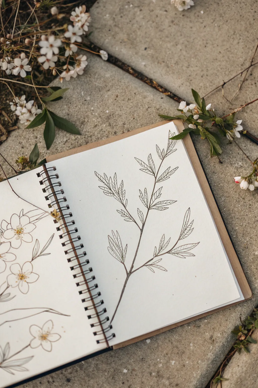
Embrace the beauty of simplicity with this minimalist botanical illustration, focusing on clean lines and negative space. This project captures the fragile elegance of a budding branch using fine ink work to create a serene and airy composition.
Step-by-Step Guide
Materials
- Spiral-bound sketchbook with smooth, heavyweight paper
- Fine liner pens (sizes 0.05, 0.1, and 0.3)
- H or HB pencil for initial sketching
- Kneaded eraser
- Real plant branch for reference (optional)
Step 1: Observation and Sketching
-
Analyze your subject:
Before putting pencil to paper, take a moment to look at the structure of your branch. Notice how the smaller stems branch off the main stalk at alternating angles and how the leaves tend to cluster in groups of three or pairs. -
Mark the main stem:
Using your pencil very lightly, draw a single, slightly curved line diagonally across the page to establish the central spine of the branch. Keep this line faint, as it’s just a guide. -
Map out the offshoots:
Sketch short, thin lines branching off the main spine. Place them at irregular intervals to mimic nature—some higher, some lower, and never perfectly symmetrical. -
Block in leaf shapes:
Lightly outline the general shape of the leaves. Don’t worry about the serrated edges yet; just focus on getting the size and direction of the ellipses correct relative to the stem.
Steadier Hands
Rest your wrist on a clean scrap sheet of paper while drawing. This prevents smudging the pencil lines and gives you a smoother range of motion for detailed ink work.
Step 2: Inking the Structure
-
Start the main stem:
Switch to a 0.1 or 0.3 fineliner. Begin tracing your pencil line for the main stem, but avoid a single, rigid stroke. Instead, use a slightly broken or uneven line to suggest organic texture. -
Thicken the joints:
Wherever a smaller branch meets the main stem, add a tiny bit of extra ink weight. This subtle thickening reinforces the connection points and adds realism. -
Draw the leaf outlines:
Use your finest pen (0.05) for the leaves. Create the jagged, serrated edges of the leaves with small, confident zig-zag motions, following your pencil guides. -
Connect leaves to stems:
Draw the petioles (the tiny stems connecting the leaf to the branch). Ensure these lines flow smoothly into the main branch structure without awkward angles.
Step 3: Adding Detail and Texture
-
Define the central veins:
Draw a single, thin line down the center of each leaf. I prefer to stop the line just short of the leaf tip to keep the look airy and delicate. -
Add secondary veins:
From the central vein, draw very fine diagonal lines moving outward toward the leaf edges. Keep these extremely light; you don’t need to connect them all the way to the edge. -
Check for balance:
Step back and look at the composition. If a section looks too sparse, adding a tiny, unopened bud or a small partial leaf can help balance the visual weight. -
Erase pencil marks:
Once the ink is completely dry—give it a few minutes to be safe—gently roll your kneaded eraser over the drawing to lift the graphite guidelines.
Add a Pop of Color
For a modern twist, use a diluted green or sepia ink for the initial wash instead of gray, or touch just the tips of the buds with a faint pink watercolor glaze.
Step 4: Optional Wash (The “Ink and Wash” Element)
-
Prepare a very dilute wash:
If you wish to add the subtle shading seen in similar studies, dilute a tiny drop of grey watercolor or ink with plenty of water until it is almost transparent. -
Apply shadow to the stem:
Using a small round brush (size 2), paint a thin line of the wash only along the shadowed side (usually the bottom or right side) of the main stem. -
Tint the leaves lightly:
Add a whisper of the wash to the base of the leaves where they meet the stem. Keep the tips white to maintain that high-contrast, airy aesthetic.
You now have a clean, elegant botanical study that celebrates the beauty of negative space
Paint First, Then Draw on Top
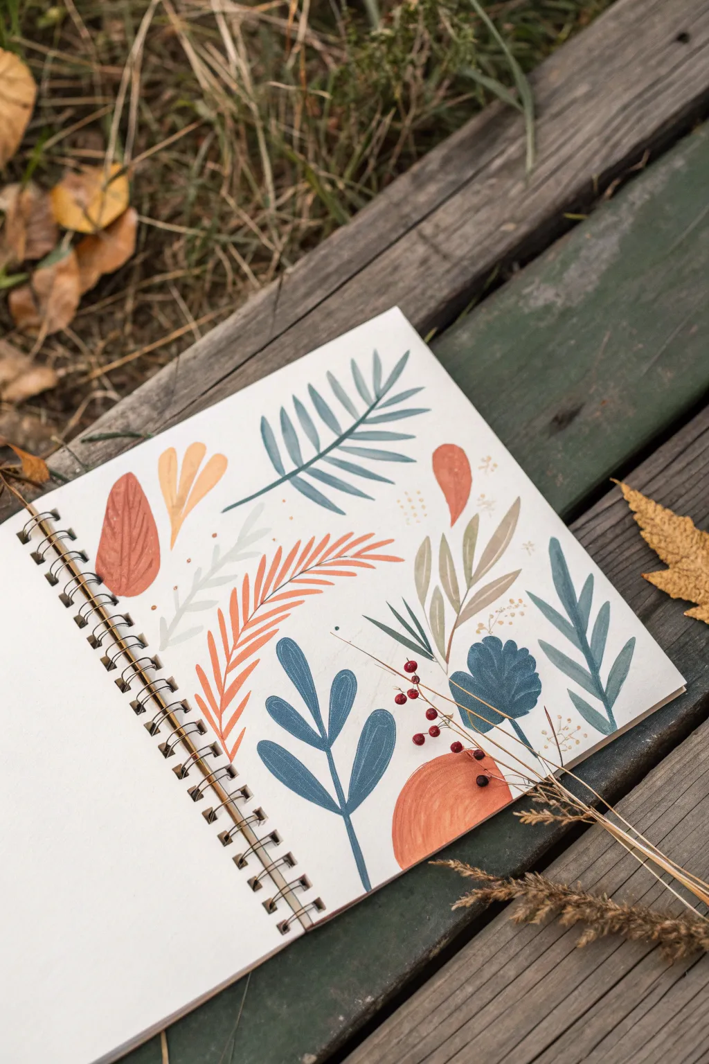
This project explores the satisfying process of painting loose, organic leaf shapes and botanical forms directly onto a sketchbook page. The result is a vibrant, earthy collection of flora that feels more like a modern pattern study than a strict realistic rendering.
Step-by-Step
Materials
- Spiral-bound sketchbook (mixed media or watercolor paper)
- Gouache paints (rust orange, sage green, teal blue, navy, warm yellow)
- Round paintbrushes (size 4 and 6)
- Fine liner brush (optional for stems)
- Mixing palette
- Water cup
- Paper towels
Step 1: Planning the Layout
-
Visualize the composition:
Before putting brush to paper, look at your blank page. Imagine an invisible grid or scatter pattern. You want to place your botanical elements so they fill the space evenly without touching, leaving plenty of white space between them. -
Mix your palette:
Prepare your colors beforehand. Gouache dries fast, so having four or five distinct puddles ready is key. Mix a deep rust orange (like terracotta), a muted sage green, a deeper olive tone, a cool teal blue, and a dark navy.
Chalky Finish?
If your dried gouache looks too dusty or cracks, you likely didn’t use enough water or binder. Mix in a tiny drop of gum arabic to your paint puddle for a smoother, stronger finish.
Step 2: Painting the Ferns and Fronds
-
Start with the large fern:
Using your teal blue mix and a size 6 brush, paint a long, curved central stem near the top center of the page. This sets the anchor for your first element. -
Add the leaflets:
With the same teal color, press the belly of the brush down and flick outward to create the leaflets on either side of the stem. Let them be slightly uneven for a natural look. -
Create the orange feathery frond:
Switch to your rust orange. Below the teal fern, paint a long, arching stem sweeping upwards. Paint long, slender leaves radiating from just one side of this stem, creating a sweeping, comb-like appearance. -
Paint the bottom blue sprig:
Near the bottom center, use a darker blue or teal to paint a vertical stem. Add simplified, rounded leaves growing upward in pairs. This shape is bolder and less delicate than the ferns.
Step 3: Adding Broad Leaves & Accents
-
Paint the textured broad leaf:
On the left side, paint a large, single oval leaf shape using a diluted rust or terracotta color. While the paint is still wet, you can lift a little pigment or add a tiny stroke of darker paint to suggest veins, though keeping it flat is also lovely. -
Add the multi-colored sprig:
On the right side, create a cluster of leaves using a mix of olive and sage tones. Paint a central stem and attach long, pointed leaves. Vary the pressure to make the tips sharp. -
Insert the navy focal point:
Towards the bottom right, paint a rounded, fan-like leaf shape in deep navy blue. This dark value helps ground the lighter colors around it. -
Fill gaps with small elements:
Look for empty white spaces. Add a small yellow-orange cluster of three leaves near the top left, and a single abstract rust-colored petal shape near the top right.
Pro Tip: Texture
Don’t overmix your paints on the palette. Leaving streaks of unmixed white or yellow in your green puddle creates beautiful, natural variegation when you lay down a leaf stroke.
Step 4: Details and Finishing Touches
-
Layering the abstract arch:
At the very bottom right corner, paint a solid semi-circle or arch using your rust orange. This adds weight to the bottom of the composition. -
Adding delicate stems:
Switch to your smallest brush or use the very tip of your round brush. Paint incredibly thin lines for stems on the navy leaf and the lighter sage leaves to connect them to the page. -
Adding subtle dots:
Dip a toothpick or the end of a paintbrush into deep olive or rust paint. Add tiny clusters of dots around the orange frond and the olive leaves to mimic pollen or seeds. -
Evaluate and let dry:
Check the balance of the page. Does one side feel too heavy? If so, painting a small ghost leaf (very watered down paint) can balance it out without adding clutter. Let the page dry completely before closing the book.
Now you have a lively botanical study that captures the essence of autumn without needing to be perfectly realistic
Design a Balanced Sketchbook Spread Layout

This project transforms a simple sketchbook spread into a harmonious blend of structured notes and a curated mini-gallery. By combining neat journaling with a grid of small, distinct sketches, you create a layout that feels both organized and creatively expressive.
Step-by-Step Tutorial
Materials
- Spiral-bound sketchbook with grid or dot-grid paper
- Fine liner pen (black, 0.3mm or 0.5mm)
- Watercolor paints or colored pencils
- Small round paintbrush (size 0 or 2)
- Ruler
- Pencil and eraser
- Reference images (landscapes, botanical elements, geometric shapes)
Step 1: Planning the Layout
-
Define the grid:
Start on the right-hand page. Use your ruler and a light pencil touch to mark out a 2×4 grid of squares. These will be the frames for your miniature artworks. Aim for squares that are roughly 1.5 to 2 inches on each side. -
Add spacing:
Ensure there is consistent breathing room between each square. Using the grid lines on your paper as a guide makes keeping these gaps uniform much easier. -
Sketch the left page structure:
On the left page, lightly pencil in where your text blocks will go. Plan for a header at the top and a few sections for bullet points or notes below to balance the visual weight of the right page.
Step 2: Creating the Mini-Gallery
-
Draft the miniatures:
Lightly sketch a different subject into each square on the right page. Mix up your subjects: try a botanical spring, a simple landscape, a geometric pattern, or a closeup texture. -
Ink the frames:
Use your fine liner to draw the final borders of your squares. You can make these lines distinct and sharp, or slightly broken for a more organic feel. -
Paint the first layer:
If using watercolors, apply a light wash to the background of your landscapes or shapes. I like to keep these washes very pale initially so the paper’s texture shows through. -
Add details to the sketches:
Once the base washes are dry, go back in with stronger colors to define the subjects. For the pine branch, use short, flicking strokes for needles. For the seascape, layer darker blues for the horizon line. -
Refine with pen:
After the paint is completely dry, use your fine liner to add tiny details. Outline the botanical elements or add small dots and texture marks to the geometric shapes to make them pop. -
Label the art:
underneath each square, or vertically beside it, write a very small caption or date. This adds a scientific or catalog-like aesthetic to the page.
Bleed-Through Blues?
If your markers bleed through the page, glue a clean sheet of paper on the back of the page, or stick to colored pencils which are safer for thin sketchbook paper.
Step 3: The Journaling Page
-
Write the header:
On the left page, write your main title at the top using a slightly larger or bolder hand. You might want to use a faux-calligraphy style here. -
Fill in the text:
Using your normal handwriting, fill in the planned text blocks. Keep your writing aligned with the grid lines of the paper for a clean look. -
Add emphasis:
Use a colored pencil or a very light highlighter to underscore key words or the header notes. Keep the color palette consistent with the paintings on the right page. -
Create bullets:
Use simple dots or tiny dashes for your bullet points. If you have extra space, you can add a tiny doodle that matches one of the right-page miniatures.
Theme It Up
Create a unified color theme for the spread. Use only warm earth tones (ochre, burnt sienna, olive) for all sketches and text highlights to make it look cohesive.
Step 4: Finishing Touches
-
Erase guidelines:
Wait until all ink and paint are absolutely dry to the touch. Then, gently erase all your initial pencil grid lines to clean up the spread. -
Review contrast:
Step back and look at the spread as a whole. If the drawings look too faint, darken the borders or add a little more shading to the text side to balance the weight.
You now have a beautifully organized spread that captures both your thoughts and your artistic experiments


Have a question or want to share your own experience? I'd love to hear from you in the comments below!