
When you’re staring at a blank page, you don’t need a “perfect” idea—you just need a spark that gets your pencil moving. These sketching ideas are the kind I lean on in my studio when I want quick momentum, stronger skills, and a little creative joy.
Portrait Studies With Simple Light and Shadow
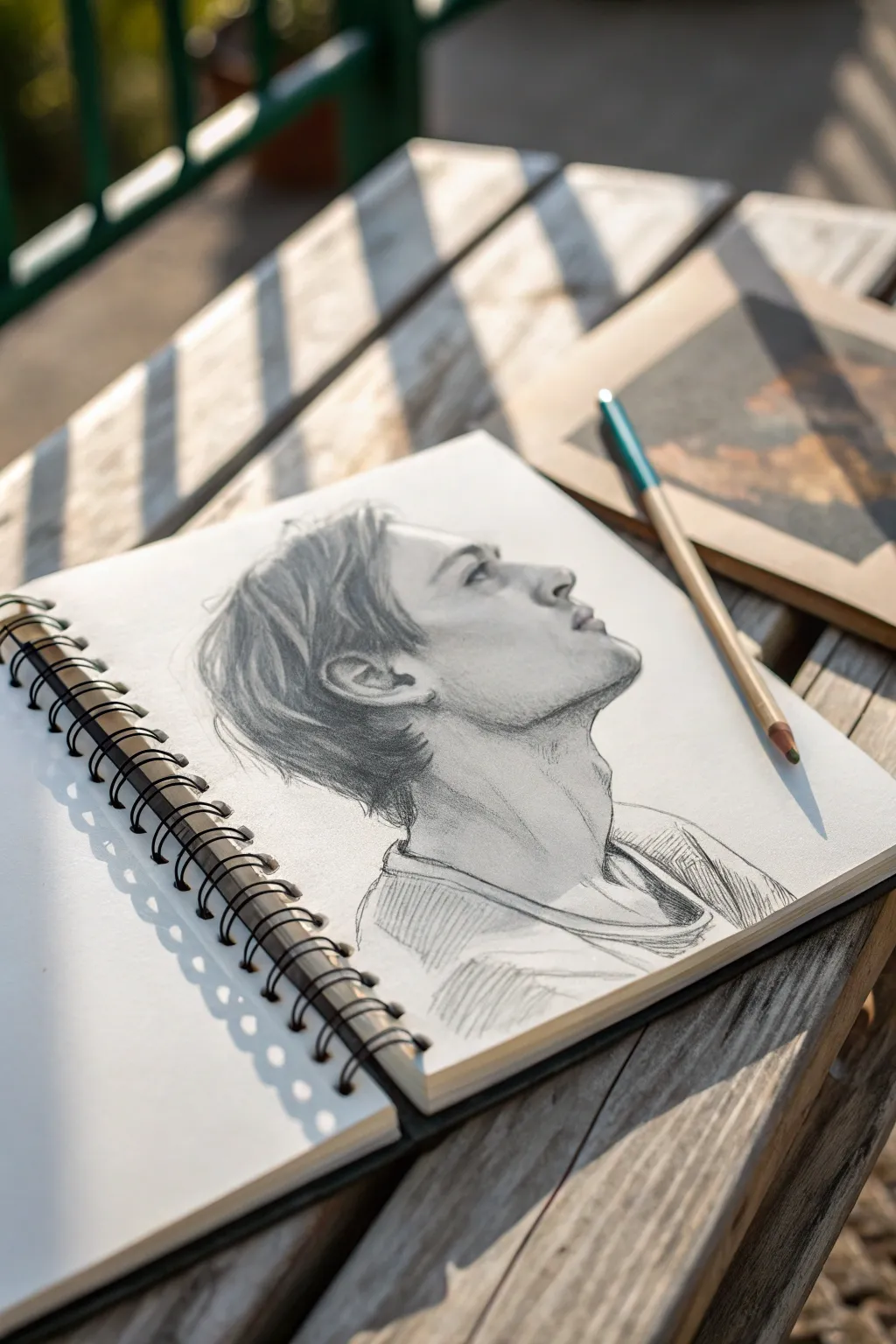
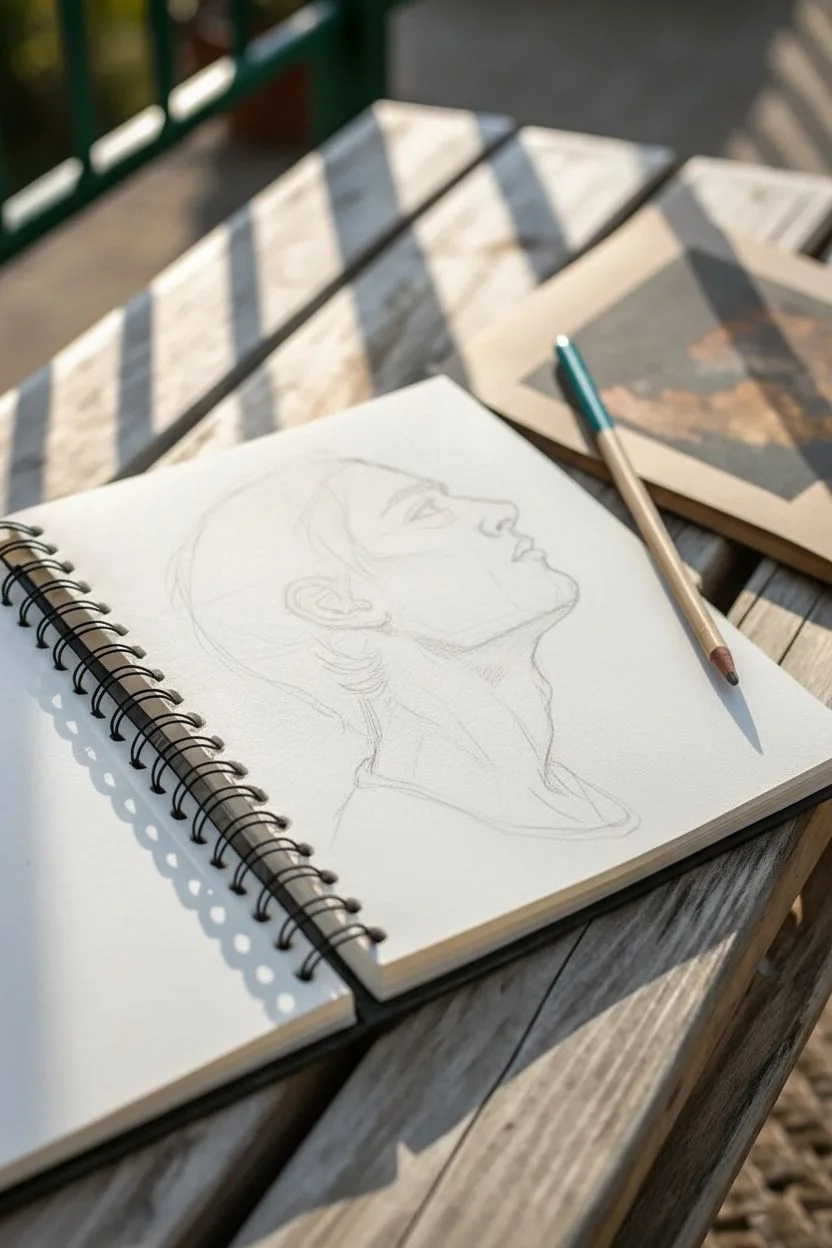
This study focuses on the delicate balance of capturing a male profile with an upward gaze, using simple graphite shading to suggest form and emotion. It’s a perfect exercise for understanding jawline structure and the way light interacts with hair and skin textures.
How-To Guide
Materials
- Spiral-bound sketchbook (medium tooth paper)
- Graphite pencils (HB, 2B, 4B)
- Kneaded eraser
- Pencil sharpener or craft knife
- Blending stump (optional)
Step 1: Laying the Foundation
-
Establish the Head Angle:
Start with a light HB pencil to draw a loose circle for the cranium. Add a curved line extending downwards and forwards to indicate the jaw, ensuring the angle tilts upward to suggest the subject is looking skyward. -
Map Facial Features:
Draw faint guidelines for the eye line, nose base, and mouth. Because the face is tilted up, these lines should curve slightly over the form of the face rather than being straight. -
Profile Outline:
Lightly sketch the profile contour. Pay attention to the bridge of the nose, the slight dip above the lip, and the protrusion of the chin. Keep these lines very faint so they can be adjusted. -
Refine the Neck:
Sketch the neck muscles, specifically the sternocleidomastoid, which extends from behind the ear down toward the collarbone. This muscle is crucial for showing the strain of the upward tilt.
Don’t Over-Blend
Avoid smudging everything. Visible pencil strokes add texture and energy. Keep hatching lines clean, especially in the hair and clothing, to maintain the ‘sketch’ aesthetic.
Step 2: Defining Features
-
The Eye and Brow:
Detail the eye. Since it’s a profile, the eye will look triangular. Darken the upper lash line and add the eyebrow with short, directional strokes. -
Nose and Mouth Structure:
Define the nostril wing and the tip of the nose. Sketch the lips, keeping the upper lip slightly darker and the corner of the mouth soft to avoid a rigid look. -
Ear Placement:
Place the ear between the eye and nose level lines, but shifted further back on the head. Sketch the basic C-shape and inner cartilage details. -
Hair Guidelines:
Outline the general shape of the hair, noting how it falls over the forehead and tucks behind the ear. Don’t draw individual strands yet; just map the main clumps.
Try Colored Graphite
For a subtle twist, use a dark brown or sanguine pencil for the shadows instead of standard grey graphite. It warms up the portrait instantly.
Step 3: Shading and Texture
-
Identify Light Source:
Decide on your light direction. In this study, the light hits the front of the face, leaving the back of the jaw and neck in shadow. -
Initial Shading:
Switch to a 2B pencil. Apply light hatching to the shadowed side of the face—under the jawline, behind the ear, and the hollow of the cheek. -
Detailing the Hair:
Using the 2B and 4B pencils, draw the hair strands. Use long, sweeping strokes that follow the hair’s growth direction. Darken the areas near the roots and where hair layers overlap. -
Deepening Facial Shadows:
Darken the area under the chin and jaw to separating the head from the neck. This contrast is vital for defining the strong bone structure. -
Refining the Neck:
Add shading to the neck muscles. Use vertical hatching lines that follow the cylindrical form of the neck, letting the pencil strokes fade out as they move toward the light. -
Clothing Suggestion:
Loosely sketch the collar of the t-shirt. Use quick, diagonal cross-hatching to suggest shadows in the fabric folds without over-detailing them.
Step 4: Final Touches
-
Contrast Check:
Take a 4B pencil and hit the darkest points: the pupil, the deepest hair shadows, and the crease of the collar. I find this creates the necessary ‘pop’ in the image. -
Softening Edges:
Use a kneaded eraser to pick up graphite highlights on the cheekbone, nose bridge, and forehead. Lightly soften any harsh transitions with a stump or your finger if needed. -
Atmospheric Hatching:
Add some very loose, angled hatching marks around the shoulder area to give the drawing a sketchy, artistic finish rather than a polished photo-realistic edge.
Step back and admire how a few simple pencil strokes have captured a moment of contemplation


Realistic Eye Sketches for Emotion and Texture
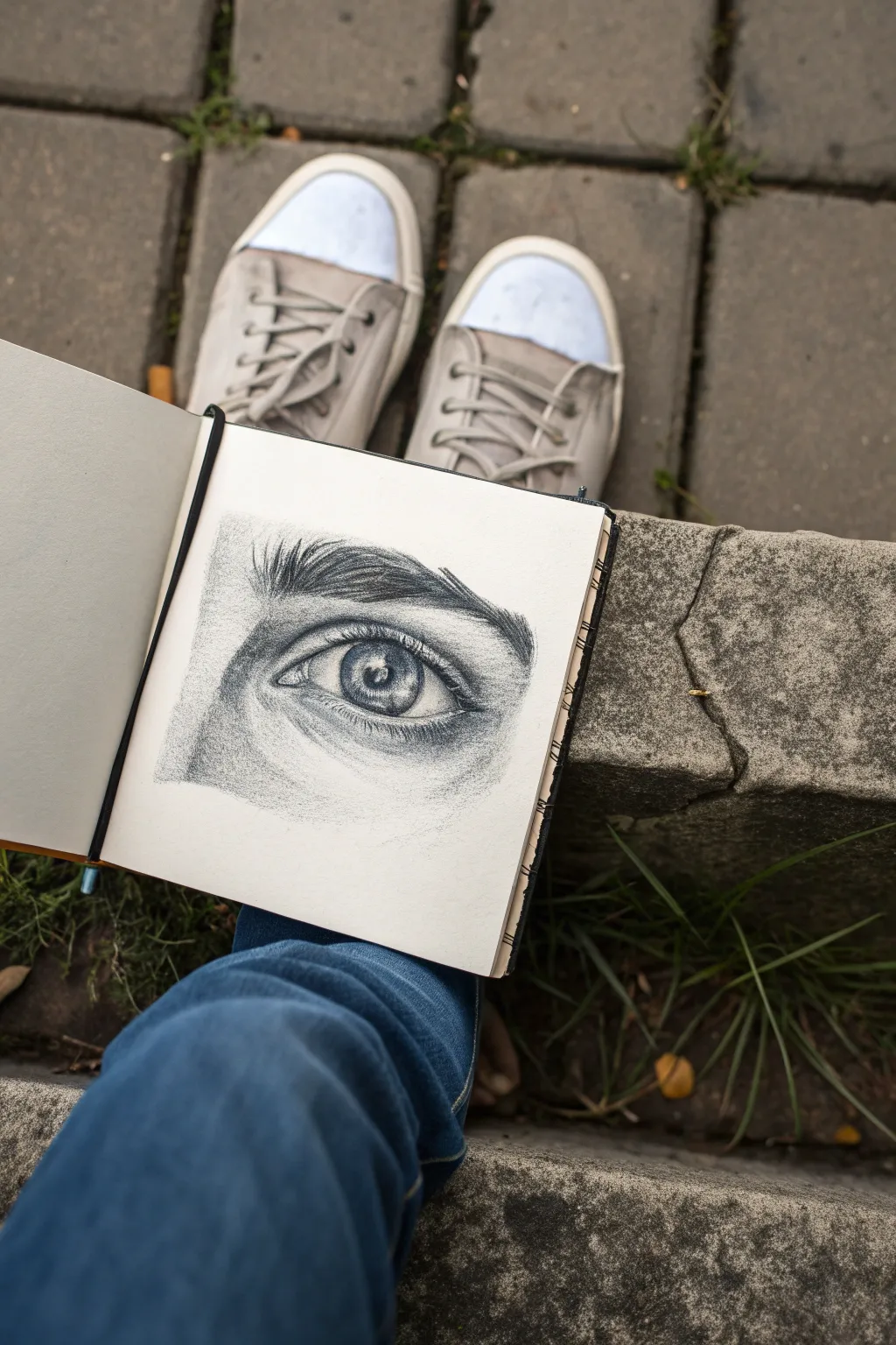
Capture the delicate textures and emotional depth of the human eye with this focused graphite study. This project explores subtle shading gradations, the sparkle of a highlight, and the intricate details of the iris, resulting in a sketch that feels alive on the page.
Step-by-Step Guide
Materials
- Sketchbook or drawing paper (medium tooth)
- H pencil (harder lead for light sketching)
- HB pencil (balanced lead)
- 2B and 4B pencils (softer leads for darks)
- Kneaded eraser
- Paper blending stump or tortillon
- Fine mechanical pencil (optional for details)
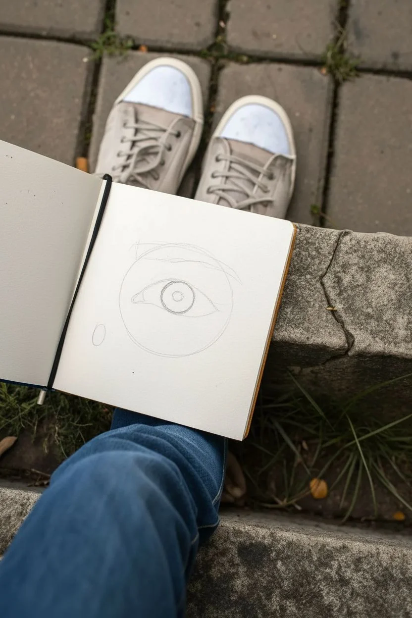
Step 1: Constructing the Framework
-
Initial outline:
Begin with your H pencil, using very light pressure. Draw a rough circle for the eyeball itself, though much of it will be covered by eyelids. -
Tear duct placement:
Mark the position of the tear duct on the inner corner (left side). It should sit slightly lower than the outer corner of the eye. -
Eyelid contours:
Sketch the upper eyelid curve, having it cut across the top third of your initial circle. Follow with the lower lid, creating a softer, shallower curve along the bottom. -
Iris definition:
Draw the iris as a perfect circle within the opening. Crucially, unless the eye is wide with surprise, the top of the iris should be slightly obscured by the upper lid. -
Pupil and highlight:
Center the pupil within the iris. Before shading anything, lightly outline a small, irregular shape for the highlight (ref lection) overlapping the pupil and iris. Protecting this white space is vital.
Fixing Flat Eyes
If the eyeball looks flat, darken the shading in the corners of the sclera (white part). Increase the contrast of the shadow the upper lid casts on the iris.
Step 2: Developing the Iris
-
Darkest points:
Switch to a 4B pencil. Fill in the pupil with a solid, rich black, carefully working around your mapped-out highlight. -
Iris rim:
Use the 2B pencil to darken the outer ring of the iris. I like to keep this line slightly soft rather than harsh. -
Radiating lines:
With a sharp HB pencil, draw fine lines radiating from the pupil outward like bicycle spokes. Vary their lengths and leave some lighter gaps between them. -
Upper shadow:
Shade the top portion of the iris (under the eyelid) quite darkly with a 2B pencil. This shadow cast by the lid gives immediate depth and realism.
Level Up: Moisture
Make the eye look teary or glassy by adding tiny, sharp highlights along the lower waterline using a white gel pen or opaque white gouache.
Step 3: Shaping the Skin
-
Eyelid crease:
Draw the deep crease above the upper eyelid. This should be a fairly dark, thick line that tapers off at the ends. -
Under-eye blending:
Apply soft graphite (HB) to the area beneath the eye. Use your blending stump to smooth this into a gentle shadow that suggests the curve of the lower orbital bone. -
Inner corner detail:
Detail the tear duct (caruncle) with soft, organic shapes. Leave a tiny highlight in this fleshy area to make it look wet. -
Sclera shading:
Shadow the ‘white’ of the eye. It is never pure white; shade the corners lightly with an H pencil, blending towards the iris to show the eyeball’s roundness.
Step 4: Final Textures
-
Eyebrow foundation:
Lightly block in the shape of the eyebrow. Notice how the hair grows: upward near the nose, then turning outward and downward as it moves to the temple. -
Drawing hairs:
Using a sharp 2B or mechanical pencil, draw rapid, short flicks for the eyebrow hairs. Layer them over each other to build density, keeping the base darker. -
Upper lashes:
Add the eyelashes last. Start at the root on the eyelid line, press down, and flick upward in a curve. These lashes should clump slightly rather than looking like a perfect picket fence. -
Lower lashes:
Draw the lower lashes shorter and more sparse than the upper ones. Ensure they originate from the outer edge of the lower lid rim, not the inner waterline. -
Final pop:
Use your kneaded eraser to lift barely-there highlights on the skin of the brow bone and the lower lid rim to enhance the textural contrast.
Step back and appreciate the intensity of the gaze you have captured on paper


Hand Gesture Sketches in 60 Seconds
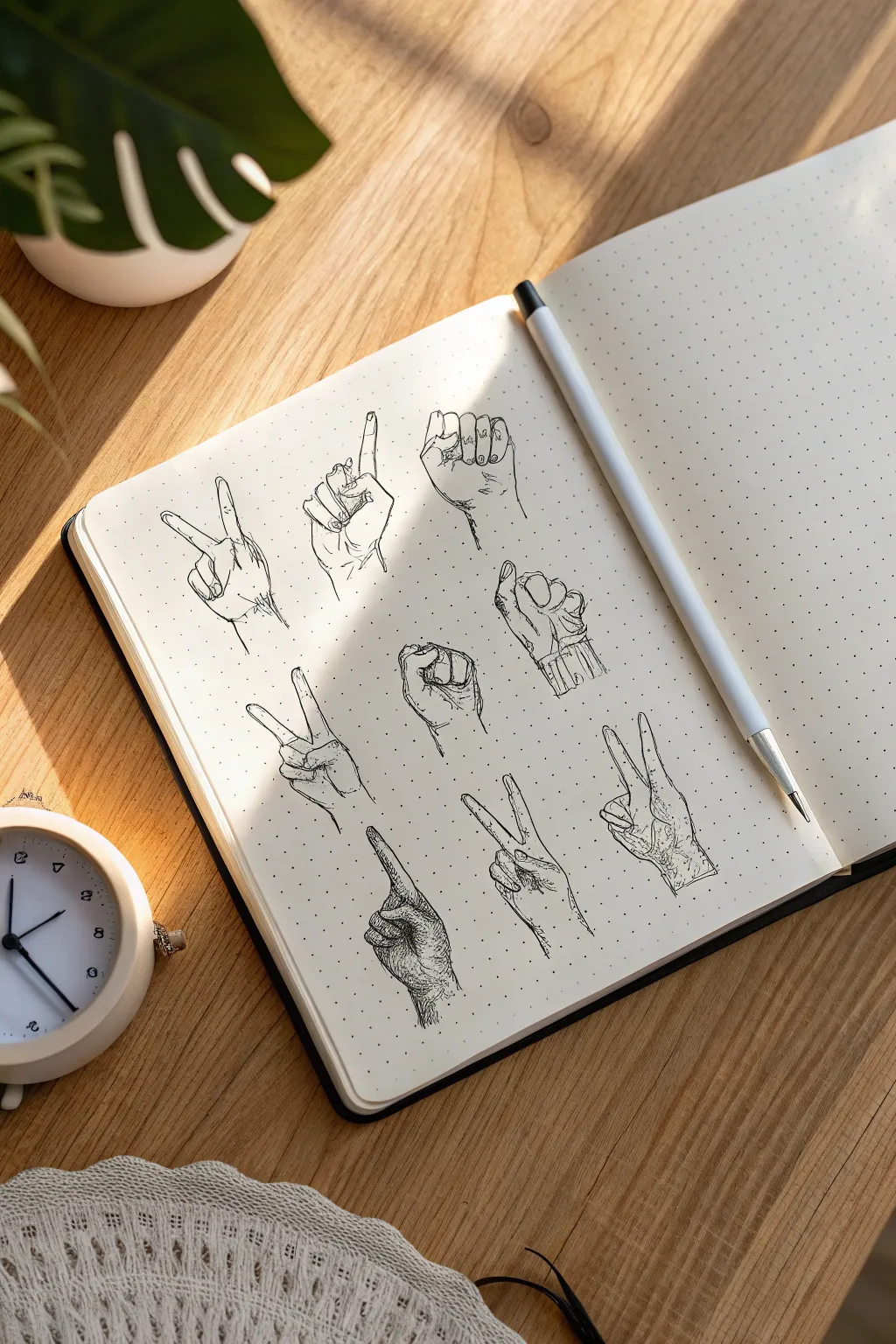

Master the art of expressive hands with this compilation of nine distinct gestures, all captured in crisp black ink on a dotted grid page. This exercise focuses on contour lines and hatching techniques to bring volume and personality to simple hand poses.
Step-by-Step
Materials
- Dotted grid sketchbook or journal (A5 size recommended)
- Mechanical pencil (HB lead)
- Fine liner pen (0.3mm or 0.5mm, black)
- Rubber eraser
- Reference photos of hands (optional, but helpful)
Step 1: Planning the Page Layout
-
Grid structure:
Visualize a 3×3 invisible grid on your blank page. You want to space out nine drawings evenly, leaving enough breathing room between each hand so the page doesn’t look cluttered. -
Light pencil blocking:
Using your mechanical pencil with very light pressure, sketch rough circles or oval shapes to mark the position where the palm of each hand will go. This ensures your composition is balanced before you commit to details.
Ink Smudge Savior
If you accidentally smudge wet ink, transform it into a shadow! Extend your hatching lines over the smudge to camouflage the mistake into the drawing’s shading.
Step 2: Sketching the Gestures (Pencil)
-
Top row gestures:
For the top left, sketch a classic ‘peace’ sign with the index and middle fingers slightly spread. In the center, draw a hand pointing straight up. On the right, sketch a clenched fist facing the viewer. Focus on the main shapes like cylinders for fingers and a block for the palm. -
Middle row gestures:
Move to the second row. Sketch another peace sign on the left, but angle it differently. In the center, draw a fist where the thumb is tucked over the fingers. On the right, sketch a hand loosely gripping an invisible object, showing the side of the palm. -
Bottom row gestures:
For the bottom row, draw a peace sign again on the left but tilted sideways. In the center, sketch a hand pointing diagonally upwards. Finally, on the bottom right, draw one more peace sign with the palm facing slightly away. Varying similar poses helps you practice different perspectives. -
Refining the anatomy:
Go back over your rough shapes and define the knuckles and joints. Observe how fingers taper at the ends and where the skin folds at the wrist. Don’t worry about perfection; sketchy lines add character.
Add Dimensions
Make the hands interact with the page! Draw simple geometric shapes or lines that the hands are holding, pushing, or resting on to create a sense of space.
Step 3: Inking the Outlines
-
Confident contours:
Switch to your fine liner pen. Start tracing your pencil lines, but instead of one continuous, stiff line, use slightly broken or overlapping strokes in areas like the knuckles to suggest skin texture. -
Detailing fingernails:
Add small, curved lines at the tips of the fingers to indicate fingernails. Keep these subtle; outlining the entire nail can sometimes make it look like a glued-on distinct object rather than part of the finger. -
Wrist indication:
I like to extend the lines just slightly past the wrist to ground the drawing, rather than having floating hands.
Step 4: Adding Volume with Hatching
-
Identify light sources:
Imagine a light source coming from the top left. This means shadows will fall on the right side of the fingers and under the palm folds. -
Hatching technique:
Use short, parallel ink strokes (hatching) to create these shadows. Apply these marks along the curved sides of the fingers to emphasize their cylindrical shape. -
Cross-hatching for depth:
For deeper shadows, such as the spaces between clenched fingers or sharply bent knuckles, cross your hatching lines perpendicularly. This creates darker values and visual weight. -
Texture lines:
Add tiny, faint sets of lines around the knuckles and palm creases. These little ‘crows feet’ marks make the hands look realistic and aged, rather than plastic.
Step 5: Final Touches
-
Erase pencil marks:
Wait at least five minutes to ensure the ink is completely dry. Gently erase all the underlying pencil sketches to reveal the crisp black ink work. -
Final assessment:
Look at the overall balance. If a hand looks too light or flat compared to the others, go back in with your pen and add a few more hatching lines to deepen the contrast.
Flip through your sketchbook to see your progress and enjoy the gallery of gestures you have created


Everyday Objects as Quick Still-Life Sketches


This charming, rustic sketch captures the cozy simplicity of a striped teacup using basic drawing tools. With subtle shading and warm terracotta tones, you’ll learn to render volume and texture directly into your sketchbook.
Step-by-Step Guide
Materials
- Spiral-bound sketchbook (medium textured paper)
- HB graphite pencil for initial outline
- Fine liner pen (black, 0.3mm or 0.5mm)
- Colored pencils (Warm Terracotta/Red-Brown, Dark Brown, Cream/Beige)
- Eraser
- Pencil sharpener
Step 1: Drafting the Form
-
Establish the Rim:
Begin with your HB pencil, drawing an oval slightly above the center of the page. This will be the opening of the mug. Keep your lines light and loose so they are easy to adjust. -
Shape the Body:
Draw two vertical lines curving slightly inward from the sides of the oval. Connect them at the bottom with a curve that mirrors the front curve of the rim, creating a cylindrical shape that tapers slightly toward the base. -
Add the Handle:
Sketch a ‘C’ shape on the right side of the body. Pay attention to where it attaches; usually just below the rim and near the bottom third. Give the handle thickness by drawing an inner curve. -
Define the Liquid Line:
Inside the top oval, draw a smaller inner curve that follows the rim’s shape but sits slightly lower. This indicates the surface of the coffee or tea within the cup. -
Map the Stripes:
Lightly sketch vertical curved lines down the body of the mug. These should follow the contour of the cup’s form—curving outward slightly—to emphasize its roundness rather than looking like flat stripes.
Step 2: Inking and Outline
-
Trace Main Lines:
Switch to your fine liner pen. Carefully trace over your pencil outlines for the rim, body, and handle. Keep your hand relaxed to achieve a slightly organic, sketchy line quality. -
Detail the Handle:
Ink the handle shape. I like to add a few small, broken hatch marks near the connection points to suggest shadow and depth right away. -
Ink the Stripes (Optional):
You can leave the stripe boundaries as pencil guides for a softer look, or lightly ink them with broken, delicate lines if you prefer a more defined graphic style. -
Erase Guidelines:
Once the ink is completely dry (wait at least a minute to prevent smearing), gently erase all visible graphite construction lines.
Curve Continuity
Ensure the bottom curve of your mug matches the curvature of the top rim. If the bottom is flat, the mug won’t look three-dimensional.
Step 3: Adding Color and Texture
-
Base Color for Stripes:
Take your terracotta or red-brown colored pencil. Fill in alternating stripes. Use a consistent diagonal hatching stroke instead of solid coloring to give it that sketched, artistic vibe. -
Layering Shadow:
Go back over the colored stripes on the left and right edges with a little more pressure. This darkening at the edges helps the mug look round and 3D. -
Coloring the Liquid:
Use a dark brown pencil to fill in the liquid surface. Press harder near the back rim to create depth, and leave the front area slightly lighter or even white to suggest a reflection. -
Shading the White Stripes:
Even the white stripes act as shadows. Use your HB pencil or a very light grey pencil to add faint shading to the white stripes on the far left and right sides of the cup. -
Grounding the Object:
Using the fine liner or pencil, add quick, horizontal scribble lines underneath the cup. This ground shadow anchors the object so it doesn’t look like it’s floating. -
Final Touches:
Review your sketch. Reinforce the darkest areas—like the inside rim and under the handle—with a second pass of fine liner ink hatching to boost the contrast.
Uneven Stripes?
If stripes look flat, you likely drew them straight. Curve the vertical lines to follow the cup’s rounded belly to instantly fix the volume.
Close your sketchbook knowing you’ve captured a quiet moment of your day

PENCIL GUIDE
Understanding Pencil Grades from H to B
From first sketch to finished drawing — learn pencil grades, line control, and shading techniques.
Explore the Full Guide
Loose Landscape Thumbnails in Tiny Frames
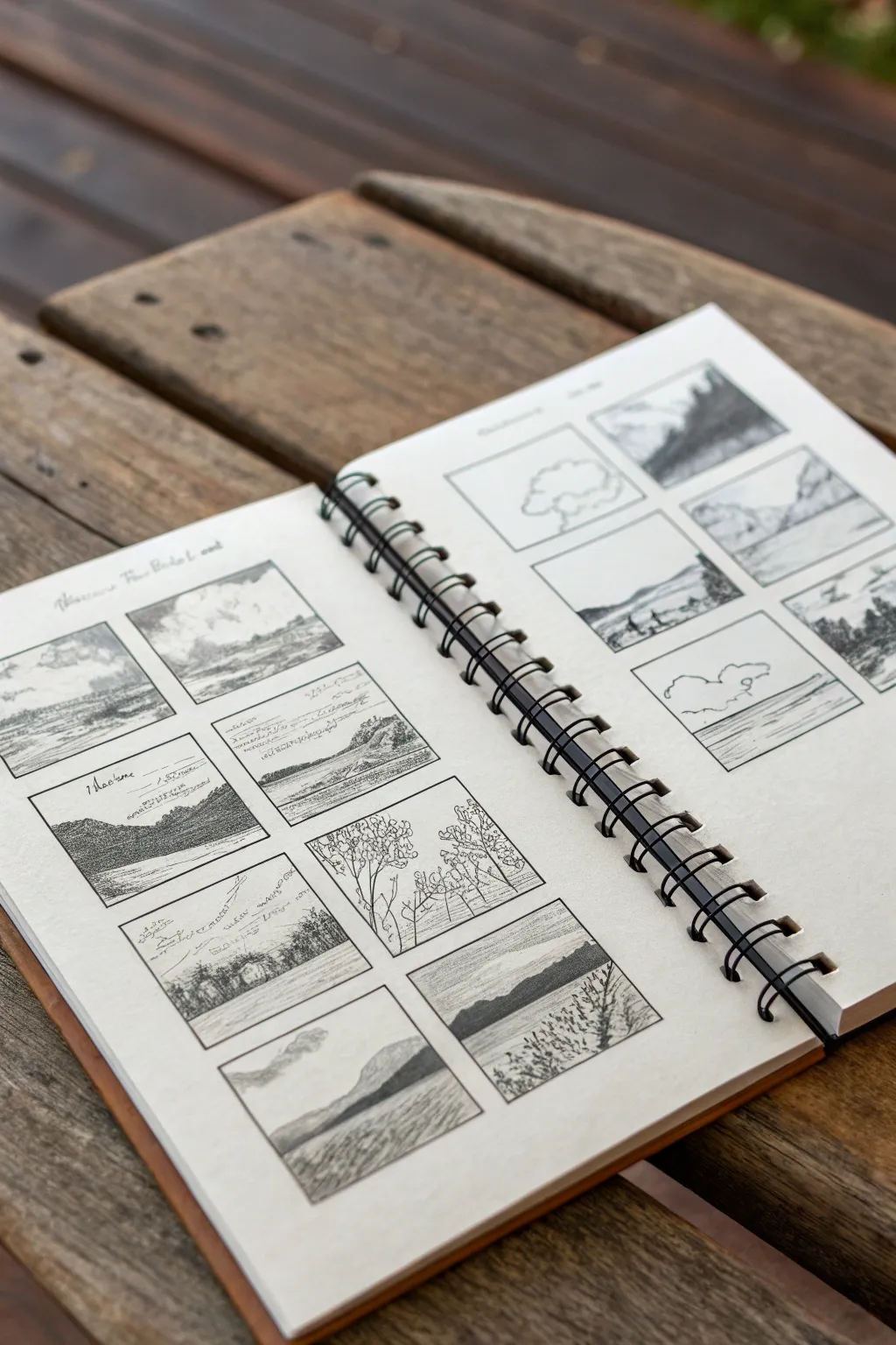

This sketching exercise focuses on rapid composition and tonal values by confining vast landscapes into tiny, manageable frames. The result is a visually satisfying spread of miniature worlds, combining loose line work with delicate shading to capture mood rather than intricate detail.
Step-by-Step Tutorial
Materials
- Spiral-bound sketchbook (medium weight paper)
- Fine-liner pen (0.1 or 0.3mm nib preferred)
- Graphite pencil (HB or 2B)
- Small ruler or straight edge (optional, freehand is fine)
- Eraser
Step 1: Setting the Stage
-
Grid layout:
Begin by drawing a series of small, uniform rectangles on your sketchbook page. Use a ruler if you prefer crisp edges, but freehand boxes add a charming, organic feel. Aim for about six to eight frames per page, leaving generous white space borders between them. -
Sizing the frames:
Keep your frames small, roughly 2×3 inches or business card size. This constraint prevents you from getting bogged down in unnecessary details later. -
Adding notation lines:
In the spaces above or beside a few frames, lightly sketch some horizontal lines or scribble faint text. These will serve as spots for notes about location, time of day, or lighting conditions, adding to the ‘field study’ aesthetic.
Step 2: Sketching Boundaries
-
Horizon lines:
Move through your empty frames and place horizon lines in varying positions. Place some low for big skies, some high for dominant foregrounds, and sketch a few diagonal slopes to suggest hills. -
Basic contours:
Using a graphite pencil, lightly map out the major shapes within the frames. Think in simple masses: a triangle for a mountain, a blob for a tree line, or a winding ‘S’ curve for a river. -
Foreground elements:
In the frames closest to the bottom of the page, pencil in closer details like tall grasses or a fence line to establish depth. Keep these shapes loose and gestural.
Smudged it?
If graphite smudges where you want crisp white paper (like clouds), use a kneaded eraser to lift the graphite without damaging the paper surface.
Step 3: Inking and Defining
-
Outlining dominant shapes:
Switch to your fine-liner pen. Go over your pencil contours, but don’t just trace. Use broken lines for distant hills to suggest atmosphere and solid, darker lines for foreground objects. -
Cloud formations:
In frames with low horizon lines, sketch large, billowy cloud shapes. Keep the pen pressure very light here to ensure the clouds feel airy compared to the ground. -
Suggesting foliage:
For tree lines or bushes, use a scribbling or stippling motion rather than drawing individual leaves. The goal is to create texture that reads as vegetation without overworking it. -
Water reflections:
If a frame includes a lake or river, draw horizontal, slightly wavy lines across the water surface. Leave gaps of white paper to represent light reflecting off the ripples.
Add Color
Use a waterbrush and a single color of watercolor (like Payne’s Grey or Sepia) to fill the shadows instead of pencil for a painterly wash look.
Step 4: Shading and Atmosphere
-
Graphite wash effect:
Return to your pencil to add tonal value. Gently shade the sides of mountains or the underside of cloud masses. I like to keep the stroke direction consistent—usually diagonal—to unify the sketches. -
Darkest darks:
Identify the deepest shadows in your composition—perhaps the base of a tree line or the side of a rock face—and press harder with the pencil or cross-hatch with ink to create contrast. -
Textural details:
In the foregrounds, add vertical ticks for grass or rough hatching for rocky terrain. These small marks give the eye something to focus on against the simpler background shapes. -
Smudging for softness:
Use your finger or a blending stump to lightly smudge the graphite in the sky areas or distant mountains. This creates a hazy, atmospheric perspective distinct from the sharp ink lines.
Step 5: Final Touches
-
Adding notes:
Fill in those notation lines you created earlier with illegible scribbles or actual notes about the scene (like ‘storm approaching’ or ‘golden hour’). The messy handwriting adds texture to the overall page composition. -
Reviewing contrast:
Step back and look at the spread as a whole. If a thumbnail looks too flat, go back in with the pen and darken the frame border or the nearest object to make it pop. -
Cleaning up:
Once the ink is completely dry, gently erase any stray pencil guidelines that distract from the image, though leaving some construction lines can add to the sketchbook charm.
You now have a beautiful collection of miniature landscapes that capture the essence of the outdoors without the pressure of a full masterpiece
Botanical Line Studies of Leaves and Stems
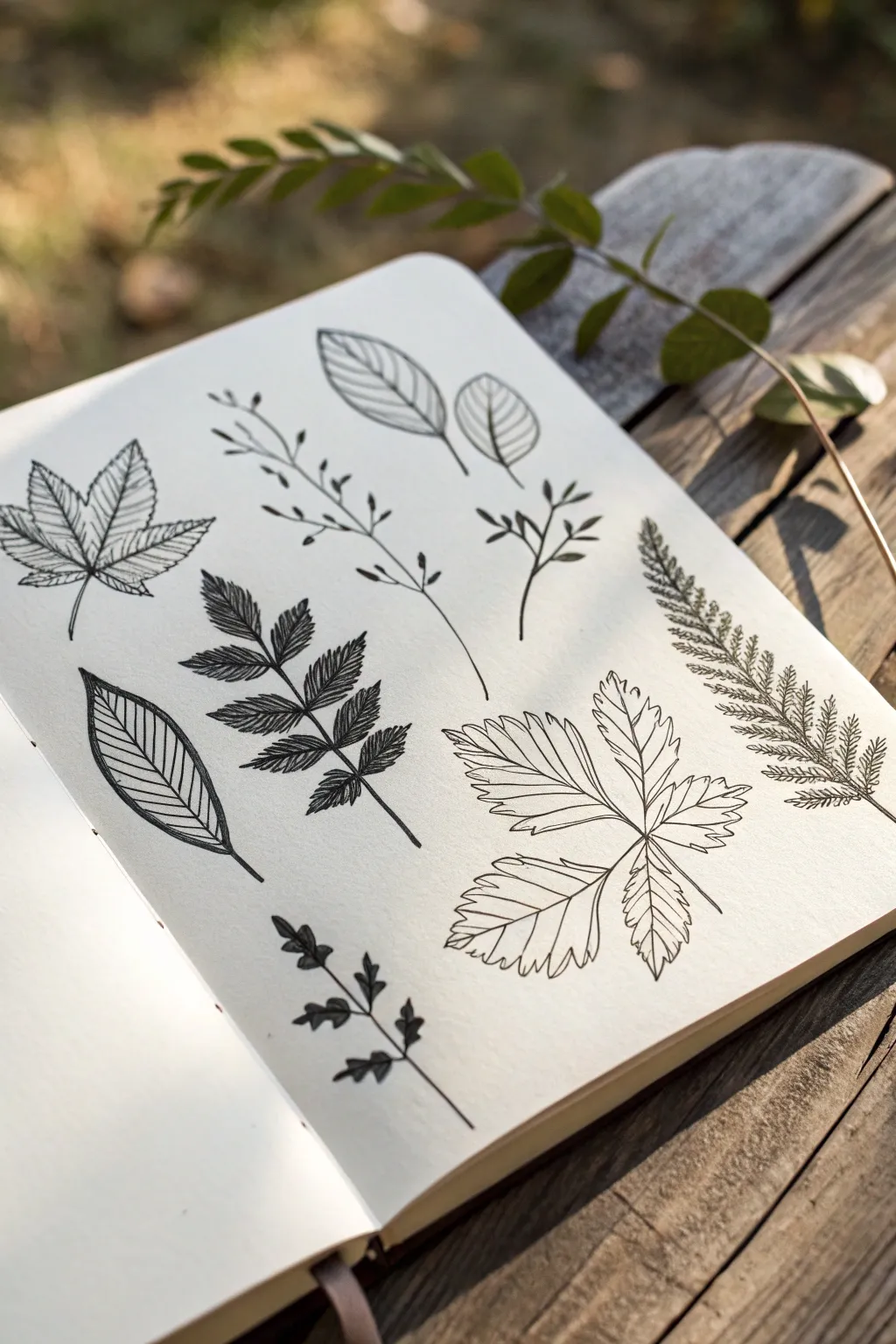
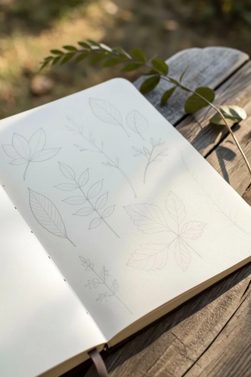
Capture the delicate details of foliage with this collection of nine distinct botanical line drawings. Using simple fine liners, you’ll practice capturing various leaf shapes, vein structures, and organic textures on a single sketchbook page.
Step-by-Step
Materials
- Sketchbook with smooth, heavy paper (mixed media or bristol)
- HB pencil
- Kneaded eraser
- Fine liner pens (sizes 0.1, 0.3, and 0.5)
- Ruler (optional, for spacing)
Step 1: Planning and Layout
-
Map out the composition:
Begin by lightly sketching the placement of nine different botanical specimens on your page using an HB pencil. Aim for a balanced grid-like arrangement without being too rigid; leave plenty of white space between each element. -
Draft the basic spines:
Draw the central stem or spine for each plant. Curve them slightly to give them a natural, organic feel rather than perfectly straight lines.
Step 2: Simple Leaf Structures
-
Sketch the top center ovals:
For the top center sketch, draw two simple oval leaf shapes attached to thin stems. Add a central vein line down the middle of each. -
Ink the oval leaves:
Switch to a 0.3 pen to outline the leaves. Inside, draw diagonal parallel lines from the center vein to the edge to represent the ribbing. -
Create the bottom left lanceolate leaf:
In the bottom left, sketch a single large, lance-shaped leaf. Outline it firmly with your 0.3 pen. -
Add vein details:
Draw a thick central vein, then add curved parallel veins extending to the edges. I find drawing these lines quickly helps keep them smooth and confident.
Wobbly Lines?
Don’t stress about perfect straightness. Natural forms are rarely perfect. A slightly shaky line can actually make a botanical drawing look more organic and realistic.
Step 3: Complex & Compound Leaves
-
Draft the maple-like leaf:
On the top left, sketch a five-pointed leaf shape similar to a maple. Ensure the edges are jagged and serrated. -
Detail the maple veins:
Outline the serrated edges with a 0.1 pen. Fill the interior with a network of fine veins, radiating from the base of the leaf to the tips of each lobe. -
Draw the fern frond:
For the long specimen on the far right, draw a long curved spine. Add tiny, repetitive leaflets all the way up the stem, getting smaller toward the tip. -
Texture the fern:
Use short, quick hatching strokes with a 0.05 or 0.1 pen to give the fern leaflets a feathery, dense texture. -
Construct the compound pinnate leaf:
In the center-left area, draw a stem with pairs of serrated leaflets extending outward. These should look like ash or rowan leaves. -
Shade the pinnate leaf:
Use dense hatching on one side of each leaflet to suggest shadow and depth. This high-contrast look makes the drawing pop.
Add a Wash
Once the ink is waterproof and dry, lightly brush a diluted watercolor wash in sage green or sepia over the leaves for a vintage field-guide aesthetic.
Step 4: Delicate Stems and Berries
-
Sketch the delicate sprigs:
In the spaces between larger leaves (top center and bottom center), sketch thin, branching stems. Add tiny buds or small rounded leaves at the tips. -
Ink the fine stems:
Use your finest pen (0.05 or 0.1) to trace these stems. Keep the lines broken or very thin to emphasize their fragility compared to the heavier leaves. -
Draw the palmate cluster:
For the large bottom-right drawing, sketch a cluster of three large, serrated leaflets joining at one point. -
Add surface texture:
Instead of rigid veins, use wavy, organic lines to suggest the crinkled surface texture of a sprawling leaf like a grapevine or strawberry leaf.
Step 5: Final Touches
-
Erase pencil guides:
Wait until the ink is completely dry—give it at least 5-10 minutes to prevent smudging—then gently erase all underlying pencil sketches with your kneaded eraser. -
Refine line weights:
Go back over the main stems or the shadowed sides of leaves with a 0.5 pen to add weight and visual hierarchy to the page.
Now you have a beautifully composed page of nature studies ready to be filled with more varieties found on your next walk
BRUSH GUIDE
The Right Brush for Every Stroke
From clean lines to bold texture — master brush choice, stroke control, and essential techniques.
Explore the Full Guide
Flower Sketch Variations From One Simple Shape
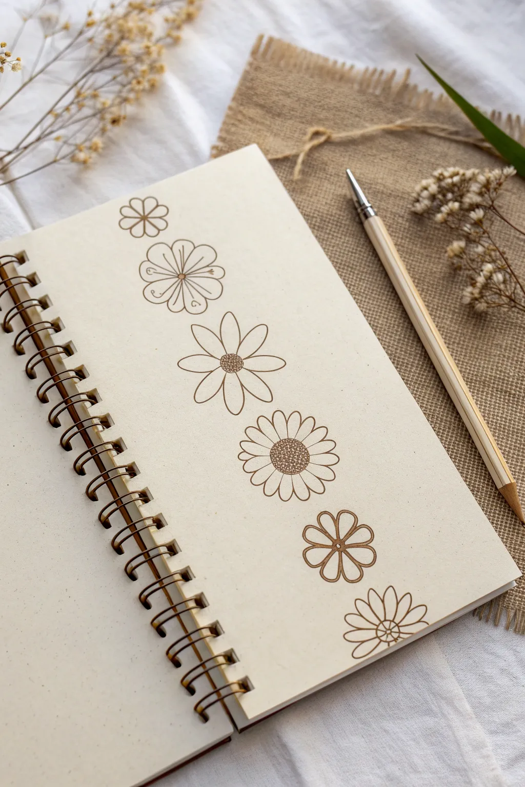

Learn to interpret a basic floral shape in multiple ways with this minimalist sketching exercise. Using just a single fine-liner, you’ll create a vertical column of six distinct flower designs that demonstrate how simple alterations to petals and centers can completely change the look.
How-To Guide
Materials
- Spiral-bound sketchbook or drawing paper
- Fine-liner pen (brown or sepia, approx. 0.3mm to 0.5mm)
- Pencil (HB or H)
- Eraser
- Ruler
Step 1: Preparation & First Flower
-
Set vertical guides:
Begin by lightly drawing a vertical pencil line down the center of your page to keep your flower column straight. -
Mark spacing:
Use your ruler to mark six evenly spaced dots along that vertical line—these will be the centers of your flowers. -
First Flower: Simple Radiating Petals:
For the top flower, draw a small circle at your first mark. -
Add first petals:
Draw six simple, rounded petals radiating outward. They should look like disconnected loops that don’t quite touch the center circle. -
Add inner details:
Draw a straight line from the center circle outward into the middle of each petal to give them definition.
Keep it Loose
Don’t try to make every petal identical. Tiny irregularities in size and shape make the botanical sketches feel more organic and charming.
Step 2: Second & Third Variations
-
Second Flower: Rounded & Decorative:
Move to the second mark. Draw a small center circle, then draw six wider, fan-shaped petals that are connected to the center. -
Detail the second flower:
Inside each of these wide petals, add a decorative swirl or curlicue near the outer edge and a straight line extending from the center. -
Third Flower: Daisy Style:
At the third mark, draw a textured center by tightly packing small circles together. -
Extend daisy petals:
Draw longer, thinner elliptical petals radiating from this textured center. Space them out slightly so they don’t overlap. -
Finish daisy details:
Add a simple straight line down the length of each petal to suggest a central vein.
Ink Bleeding?
If your fine-liner bleeds into the paper, switch to a pen with archive-quality ink or move your hand faster. Sketchbook paper quality varies greatly.
Step 3: Fourth & Fifth Variations
-
Fourth Flower: The Sunflower Style:
For the fourth design, create a large, prominent center filled with dense stippling (tiny dots) to mimic seeds. -
Layering petals:
Draw a row of rounded petals around the center. Then, draw the tips of a second row of petals peeking out from behind geometric gaps of the first row. -
Add petal veins:
Draw a single line down the center of just the front row of petals. -
Fifth Flower: Heart-Shaped Petals:
At the fifth mark, draw a small, simple ring for the center. -
Shape the petals:
Draw five or six petals that are wider at the outer edge, giving them a slight heart shape or indentation at the very tip. -
Connect the center:
Draw lines connecting the center circle to the outer dips of the petals, creating a segmented, wheel-like appearance.
Step 4: Final Flower & Cleanup
-
Sixth Flower: Half-Daisy:
For the final design at the bottom, draw a small center circle. -
Create pointed petals:
Draw petals that are slightly pointed at the tips, similar to the daisy but shorter and wider. -
Final detailing:
Add a line down the middle of each petal, extending from the center almost to the tip. -
Inking:
Go over your pencil sketches with the brown fine-liner. Keep your hand steady and maintain a consistent line weight. -
Erase guidelines:
Wait for the ink to dry completely to avoid smudging. Once dry, gently erase the vertical guide line and center marks.
Now you have a charming reference page of floral variations ready to incorporate into journal spreads or greeting cards
Butterfly Symmetry Sketches for Pattern Practice
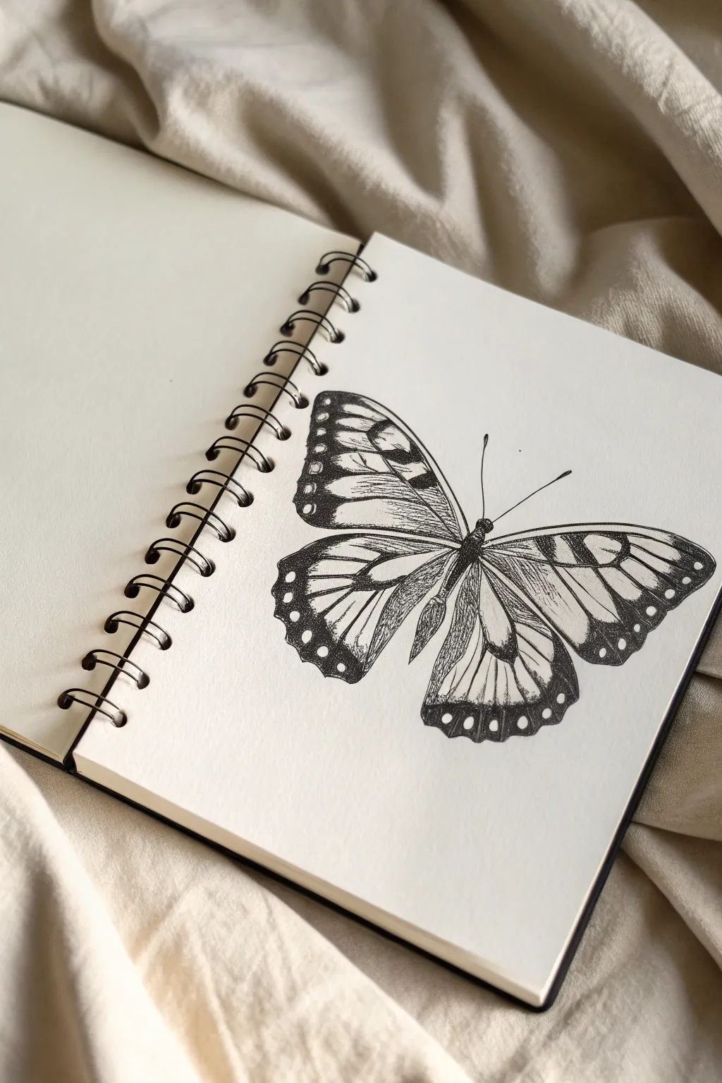
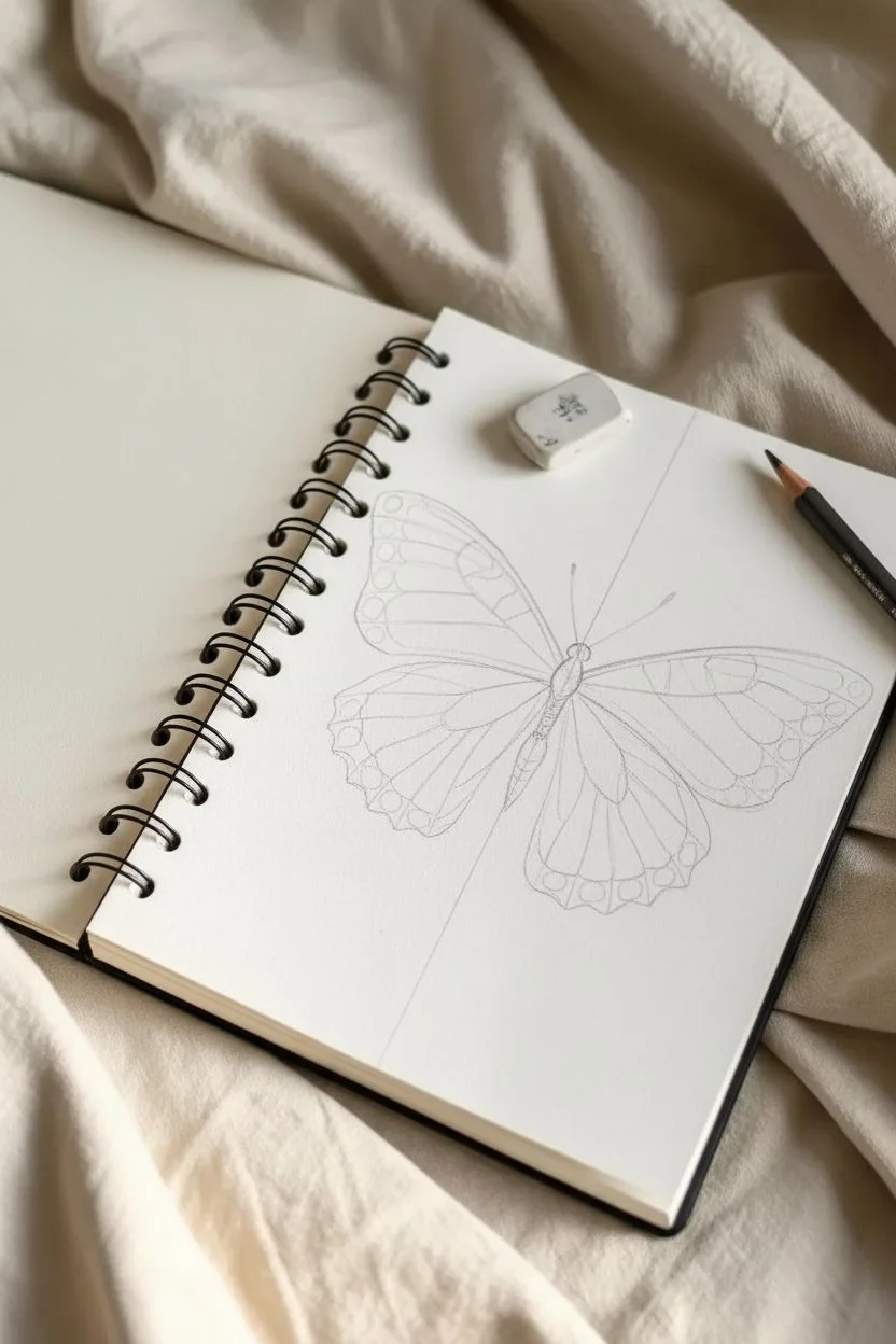
This pen-and-ink butterfly sketch captures the delicate patterns of insect wings using fine liners and varied shading techniques. It’s a wonderful exercise in symmetry and texture, rendered beautifully in a spiral-bound sketchbook.
Step-by-Step Tutorial
Materials
- Spiral-bound sketchbook (smooth or mixed media paper, approx. A5)
- H or HB graphite pencil for outlining
- Kneaded eraser
- Fine liner pens (sizes 0.05, 0.1, 0.3, and 0.5mm)
- Ruler (optional, for symmetry guidelines)
Step 1: Drafting the Structure
-
Central Axis:
Begin by lightly drawing a vertical line down the center of your page with an H pencil. This will serve as the anchor for the butterfly’s body and ensure symmetrical wings. -
Body Placement:
Sketch a long, narrow oval along the center line for the abdomen. Add a smaller, rounded shape at the top for the thorax and a tiny circle for the head. -
Wing Skeleton:
Draw two diagonal lines extending upward from the thorax for the forewings and two lines angling downward for the hindwings. Keep these symmetrical on both sides. -
Wing Contour:
Connect the ends of your skeletal lines to form the rough outer shape of the wings. The forewings should have a triangular feel, while the hindwings are more rounded and scalloped. -
Vein Map:
Lightly sketch the internal vein structure. These lines should radiate outward from the body to the wing edges, dividing the wings into cells similar to a stained glass window.
Ink Flow Tip
Keep a scrap piece of paper under your hand while stippling to prevent oils from your skin transferring to the page, which can cause ink to skip or smudge.
Step 2: Inking the Outline
-
Initial Inking:
Using a 0.3mm fine liner, carefully go over your pencil outlines. Start with the body segments, making them dark and solid. -
Defining the Wings:
Outline the outer edges of the wings with the 0.3mm pen. Uses slightly shaky or organic lines rather than perfect curves to mimic the natural texture of an insect wing. -
Vein Definition:
Switch to a 0.1mm pen to ink the internal veins. These lines should be thinner than the outer border to create depth. -
Clean Up:
Once the ink is completely dry—give it a few minutes to be safe—gently erase all the visible pencil guidelines with your kneaded eraser.
Step 3: Detailing and Texture
-
The Dark Margins:
Using a 0.5mm pen, fill in the thick, dark borders along the outer edges of the wings. Leave small, circular gaps empty to represent the iconic white spots found on many butterfly species. -
Filling the Body:
Darken the body completely, or use dense cross-hatching to make it look fuzzy. Add two thin, curved antennae extending from the head using the 0.1mm pen. -
Adding Hatching:
To create dimension, add hatching lines inside the wing cells near the body. Use a 0.05mm pen and draw quick, short strokes that follow the direction of the veins. -
Stippling Shadows:
I find that adding tiny dots (stippling) near the wing roots adds a lovely velvety texture. Concentrate dots near the body and let them fade out as you move toward the wing tips. -
Vein Thickening:
Go back over the main veins with a 0.3mm pen, thickening them slightly where they join the body and tapering them as they reach the edge. -
Final Contrast Check:
Look at the overall balance. If the wings look too flat, add more hatching layers to the inner sections to deepen the contrast against the white paper.
Level Up: Color Wash
Once the waterproof ink is fully set, wash over the wings with diluted watercolor or ink. Try a gradient of orange to yellow for a Monarch butterfly effect.
Now you have a striking, highly detailed butterfly illustration ready to fly off the page


Bird Silhouettes and Quick Anatomy Breakdowns
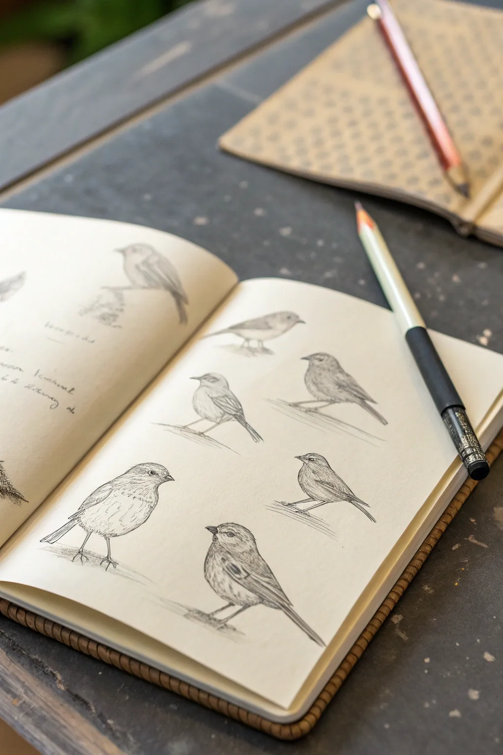
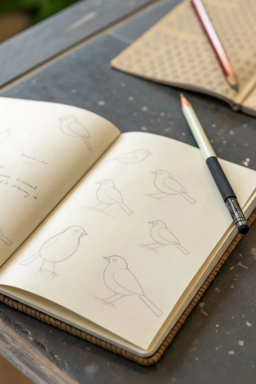
Capture the delicate charm of small songbirds with this series of pencil studies, focusing on varied poses and soft shading. This project mimics the look of a naturalist’s field diary, building up forms from simple shapes into lively, textured sketches.
Detailed Instructions
Materials
- A smooth grain sketchbook (A5 or similar)
- Graphite pencils (HB for outlines, 2B and 4B for shading)
- A fine mechanical pencil (0.5mm, optional for details)
- Kneaded eraser
- Pencil sharpener or craft knife
Step 1: Planning and Basic Shapes
-
Page Layout:
Begin by visualizing the layout on your right-hand page. You want to fit about five birds comfortably without them crowding each other. Think of an invisible grid or a loose zigzag pattern to keep the composition dynamic. -
Gesture Lines:
Using your HB pencil with a very light hand, draw a simple ‘line of action’ for each bird. This is just a stick-figure curve representing the spine and the angle of the tail. Vary the angles so some birds look left and others look right. -
Oval Construction:
On top of each gesture line, sketch a tilted oval for the body and a smaller circle for the head. Connect these shapes with a short, curved neck area. Keep these construction lines extremely faint so they can be erased or hidden later. -
Beak and Tail Placement:
Add small triangles for the beaks and longer, rectangular shapes extending from the body ovals for the tails. This establishes the basic silhouette for each bird before you commit to details.
Step 2: Refining the Form
-
Contour Drawing:
Switch to a slightly sharper point. Go over your construction shapes to define the actual contour of the birds. Smooth out the connection between the head and back, and soften the belly curve. -
Wing positioning:
Sketch the wing shapes tucked against the bodies. Pay attention to how the wing feathers layer; usually, there’s a group of shorter coverts near the shoulder and longer flight feathers extending toward the tail. -
Eye Placement:
Place the eye on the head, usually lined up with the corner of the beak. Draw a small circle, but leave a tiny speck of white paper untouched for the highlight—this brings the bird to life immediately. -
Legs and Perch:
Draw thin, wiry lines for the legs. Remember bird legs have a backward-bending ‘knee’ (actually the heel) hidden up in the feathers. Add a simple diagonal line under the feet to suggest a branch or perch.
Clean Slates
Smudging graphite is common. Place a scrap piece of paper under your drawing hand as a guard sheet. This protects lower drawings while you work on upper ones.
Step 3: Shading and Texture
-
Initial Tone:
Using the side of a 2B pencil, lay down a soft, light grey tone over the darker areas—usually the wings, the tail, and the area under the belly. Leave the chest and throat lighter to suggest volume. -
Detailing Feathers:
Sharpen your pencil or use a mechanical pencil here. Draw short, directional strokes that follow the curve of the bird’s body. These shouldn’t be individual feathers, but clusters of texture that suggest plumage. -
Darkening the Eye and Beak:
Use a 4B pencil to punch up the darkest blacks. Fill in the pupil of the eye (preserving that white highlight!) and the separation line of the beak. This high contrast draws the viewer’s focus to the face. -
Wing Patterns:
Add specific markings to the wings. Many small birds have ‘wing bars’ or lighter edges on their flight feathers. Create these by pressing harder between the feathers to create shadows, lifting the pressure for the edges. -
Grounding Shadows:
Add a small patch of scribbly shadow underneath the bird where it sits on the branch line. This weights the figure so it doesn’t look like it’s floating in mid-air.
Life in Motion
Try drawing the same bird from three slightly different angles in a row (profile, 3/4 view, back view) to create a sense of movement across the page.
Step 4: Final Polish
-
Cleanup:
Take your kneaded eraser and dab away any original construction ovals that are still visible and distracting. You don’t need to erase everything perfectly; leaving some faint lines adds to the ‘field study’ aesthetic. -
Highlight Recovery:
If your shading got too muddy, shape your eraser into a fine point and lift out pigment on the chest or the top of the head to regain the light source. -
Annotation (Optional):
To enhance the naturalist vibe, you can scribble some illegible text or notes near the birds, mimicking field observations about behavior or color.
Now you have a page full of lively avian studies ready to be filled with more observations
Simple Animal Sketches Using Basic Forms First
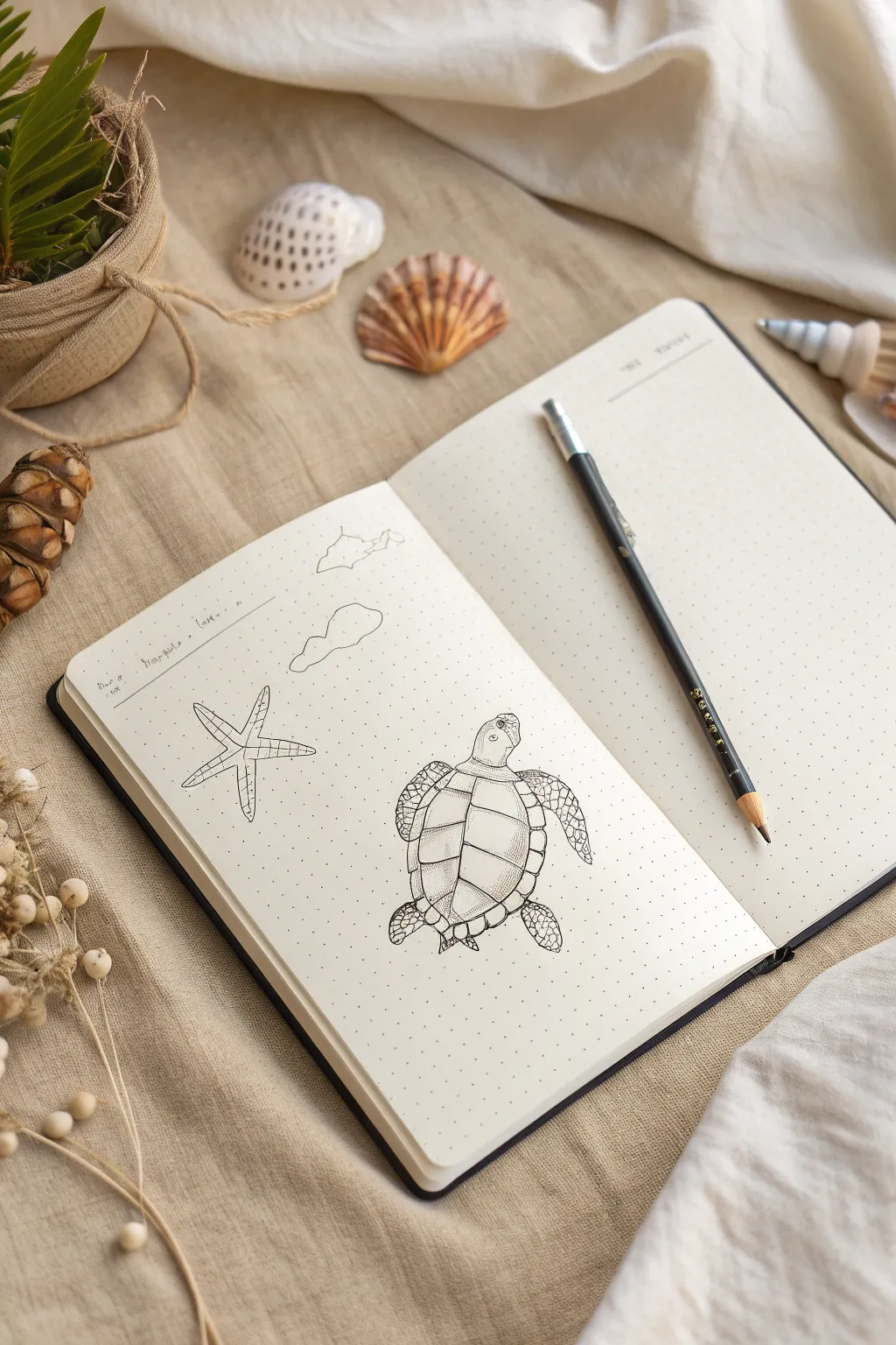
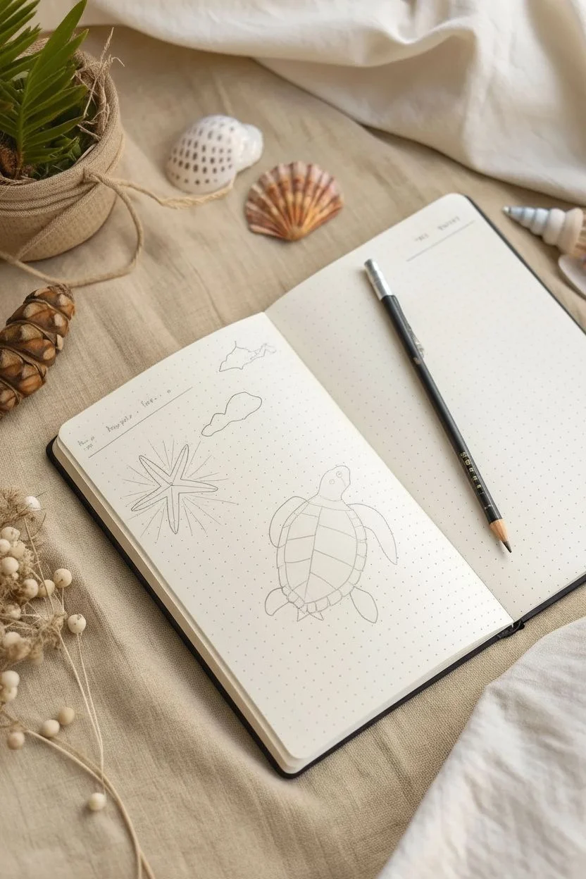
Capture the calm of the ocean with this delicate pen-and-ink study featuring a detailed sea turtle and a simple starfish. Using a dot-grid notebook as your guide, you’ll learn to build up these marine creatures from basic shapes into textured, finished drawings.
How-To Guide
Materials
- Dot-grid sketchbook or journal
- Pencil (HB or H for light lines)
- Fine liner pen (black, 0.1mm or 0.3mm)
- Eraser
- Reference images of sea turtles and starfish
Step 1: Planning and Basic Shapes
-
Set the scene:
Begin by opening your dot-grid journal. The dots will help with proportion without being intrusive. Visualize where your two main subjects will go: the turtle on the bottom right and the starfish on the middle left. -
Outline the turtle’s shell:
For the turtle, start by lightly sketching an oval shape in pencil. This will become the main carapace (shell). Make it slightly narrower at the bottom to suggest the turtle’s anatomy. -
Add head and flippers:
Draw a smaller, rounded shape at the top of the oval for the head. Add two large, sweeping curves extending from the front sides for the front flippers, and two smaller, rounded shapes at the back for the rear flippers. -
Starfish structure:
Move to the left page area. Lightly draw a small pentagon (five-sided shape) as the center point. From each flat side of the pentagon, extend a line outward to determine the length of the five arms. -
Flesh out the starfish:
Outline the arms around your guide lines, making them wider at the base and tapering to a rounded point. Give the arms a slight waviness to make the starfish look organic and not too stiff.
Pro Tip
Keep your wrist loose when drawing organic shapes like rocks or clouds. A shaky line often looks more natural than a rigid, straight one.
Step 2: Inking the Turtle
-
Define the shell pattern:
Switch to your fine liner pen. On the turtle’s shell, draw a central column of hexagonal plates (scutes). They don’t need to be perfect geometric shapes; slight irregularity adds realism. -
Complete the shell design:
Draw the surrounding plates that radiate from the center column to the edge of the shell. Follow the curve of the oval you sketched earlier to give the shell a three-dimensional, doomed look. -
Detail the head:
Ink the outline of the head. Add a small circle for the eye and a tiny curve for the beak-like mouth. I like to add a few small spots or scales on the top of the head for texture. -
Texture the flippers:
Outline the flippers with a confident line. Inside the flippers, draw a mosaic of small, irregular shapes to represent the scales. Make the scales smaller near the edges and larger in the center. -
Shading the shell:
Use a technique called stippling (lots of little dots) or very fine hatching to add shadow. Focus on the edges of the shell plates where they overlap, and the bottom right side of the shell to suggest a light source coming from the top left.
Leve Up Your Art
Use a white gel pen to add tiny highlights on the turtle shell or starfish bumps to make them pop against the stippling.
Step 3: Inking the Starfish & Finishing Touches
-
Outline the starfish:
Go over your pencil lines for the starfish with the fine liner. You can use a slightly broken or jittery line here to mimic the rough texture of a starfish’s skin. -
Add central detail:
Draw a small five-pointed star shape or a cluster of circles in the very center of the starfish body. -
Create texture:
Fill the body of the starfish with stippling. Place the dots more densely near the center and along the edges of the arms to create a rounded, cylindrical form. Keep the top centers of the arms lighter. -
Background elements:
If you wish, add a few loose, organic shapes above the starfish to represent distant islands or clouds. Keep these very simple and faint to ensure they don’t distract from the main animals. -
Clean up:
Wait at least five minutes for the ink to dry completely. This is crucial to avoid smudges. Once dry, gently erase all visible pencil guidelines. -
Final assessment:
Look over your sketch. If any areas look too flat, add a few more dots or hatched lines to deepen the shadows, particularly where the flippers meet the shell.
Now you have a serene ocean study to remind you of the beach every time you open your notebook
Urban Sketching Ideas: People With Umbrellas
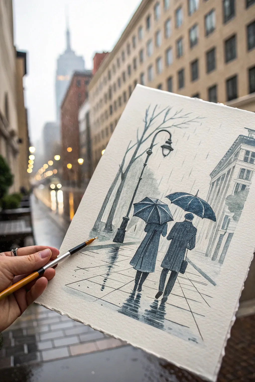
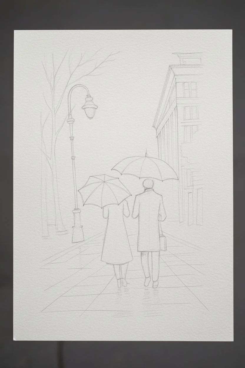
Capture the mood of a rainy city stroll with a monochromatic watercolor and ink sketch that emphasizes reflection and silhouette. This project focuses on two figures walking away under umbrellas, framed by loose architecture and wet pavement reflections.
Step-by-Step Guide
Materials
- Cold Press Watercolor Paper (approx. 300gsm, textured)
- Pencil (HB or 2B) for sketching
- Kneaded Eraser
- Watercolor Paint: Payne’s Grey or Indigo
- Round Watercolor Brushes (Size 4 and Size 8)
- Fine Liner Pen (Waterproof, Black or Dark Grey) or Fountain Pen with waterproof ink
- Jar of Water
- Paper Towels
- Masking Tape
Step 1: Sketching the Framework
-
Establish the horizon:
Begin by lightly drawing a horizon line about one-third up from the bottom of your page. This will anchor your perspective lines for the sidewalk and buildings. -
Place the figures:
Center-right in the composition, sketch the basic shapes of two figures walking away. Don’t worry about details yet; focus on the oval shapes of the umbrellas and the rectangular drape of their coats. -
Outline the environment:
On the left, lightly sketch a tall, slender street lamp and a bare tree curving over the scene. On the right, block in the perspective lines of a building façade. -
Refine the sketch:
Go back over your pencil lines to define the folds in the coats, the handle of the umbrella, and the segments of the sidewalk pavement. Keep the pencil marks faint, as we want the paint to do the heavy lifting.
Angle the Rain
Keep all your rain streaks and reflections consistent. If the rain falls at a slight angle, the reflections on the ground should mirror that direction.
Step 2: Layering the Wash
-
Mix your washes:
Prepare three puddles of your chosen blue-grey paint: a very watery, pale tea consistency; a medium milk consistency; and a thick, dark cream consistency. -
Background wash:
Using the size 8 brush and your palest wash, lightly paint the sky area and the distant building shapes. Keep this loose and uneven to look like misty rain. -
Building structure:
While the background is damp but not soaking, use the medium wash to paint the building on the right, leaving small strips of white paper for window ledges. -
The figures’ coats:
Switch to your medium wash and paint the coats of the two figures. Let the paint pool slightly at the bottom hems to create a natural gradient. -
Darkest values:
Once the coats are semi-dry, use your darkest paint mix for the umbrellas. I like to leave tiny slivers of white paper along the ribs of the umbrella to show tension and sheen. -
Defining the lamp post:
carefully paint the street lamp and the tree trunk on the left with the dark wash. Use the tip of the brush to create thin, delicate branches reaching across the top.
Bleeding Lines?
If your fine lines are blurring into the wash, stop immediately. The paper must be bone-dry before adding crisp ink or fine grid lines on top.
Step 3: Creating Atmosphere
-
Wet reflections:
This is the crucial step for rain. Take a damp, clean brush and drag the dark pigment from the figures’ feet downwards. -
Distorting the reflection:
Before that dragged paint dries, make horizontal zigzag motions with your brush to break up the reflection, mimicking ripples on wet pavement. -
Shadows and depth:
Add the darkest pigment to the pants and shoes of the figures, and deepen the central core of their reflections. -
Pavement grid:
Using a very fine liner brush or pen, draw the perspective lines of the sidewalk grid right over the painted wash. -
Texture details:
Use a dry brush technique (minimal paint on the brush) to scumble some texture onto the coats, suggesting heavy wool fabric. -
Raindrops:
Use a pen or very fine brush to add vertical, slightly angled dashes throughout the sky and background to physically depict the falling rain. -
Final touches:
Deepen the contrast on the umbrella edges and the lamp post details. Evaluate the overall values and make sure the figures stand out against the background.
Enjoy the moody atmosphere you’ve created with just a single color and some water
Transparent and Shiny Things: Glass, Water, and Metal
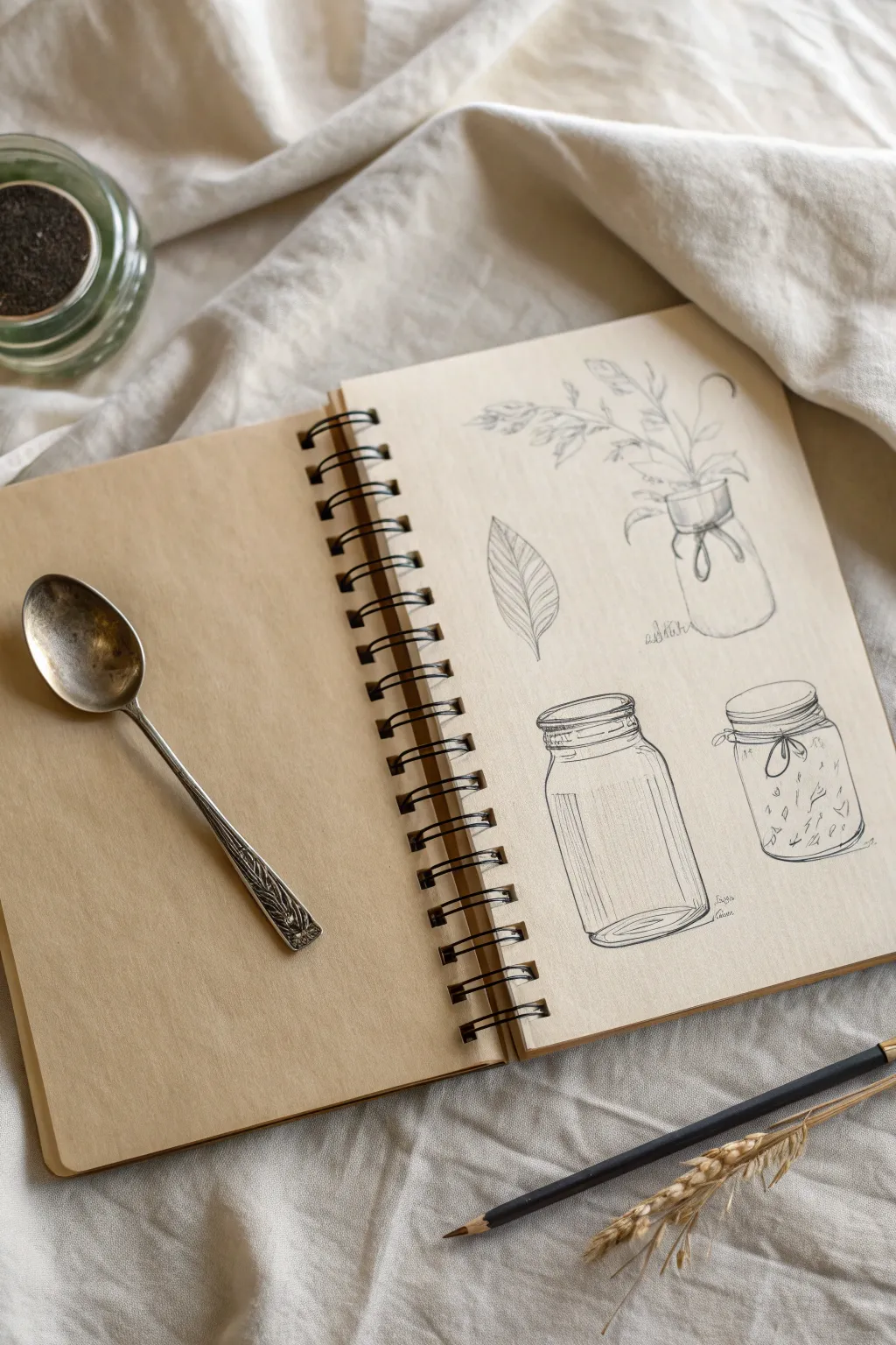
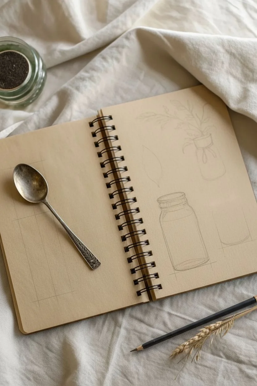
Capture the delicate transparency of glass and the organic forms of dried botanicals in this focused sketchbook study. Using fine lines and subtle shading, you’ll practice rendering reflective surfaces alongside natural textures on warm-toned paper.
Step-by-Step
Materials
- Spiral-bound sketchbook with tan or kraft paper
- Fine liner pens (sizes 0.1 and 0.3, black ink)
- Graphite pencils (H for sketching, 2B for shading)
- Kneaded eraser
- Silver spoon (for reference)
- Glass jars (for reference)
Step 1: Planning the Layout
-
Visualize the composition:
Begin by observing the right-hand page of your sketchbook. You will be creating four distinct elements: a single leaf, a tall jar, a medium preserve jar, and a vase with sprigs. Mentally divide the page into quadrants to ensure each drawing has enough breathing room. -
Sketch basic wireframes:
Using a light H pencil, draw faint vertical center lines for where your jars will sit. This helps keep the symmetry accurate. Lightly box in the general height and width of the jars and the leaf shape.
Wobbly Ellipses?
Drawing perfect ovals is hard. Try ‘ghosting’ the motion—hovering your hand over the paper and making the oval movement several times before lowering the pen to draw.
Step 2: Drawing the Botanicals
-
Outline the leaf:
Start with the single leaf in the middle-left area. Draw a simple almond shape with a slight curve to suggest movement. Add a central vein down the middle. -
Add leaf veins:
With your 0.1 fine liner, ink the outline. Then, draw diagonal veins branching from the center line. Keep your hand loose; these lines don’t need to be perfectly straight. -
Block in the bouquet:
Move to the top right. Sketch a small, wide-mouthed jar shape first. Then, loosely draw sprouting stems coming out of the top, extending upwards and slightly to the left. -
Detail the plant life:
Refine the stems and add small, seed-like tufts to the ends of the branches to mimic dried grasses. Use short, flicking strokes with your pen to create texture.
Step 3: Rendering Glass Jars
-
Define the tall jar:
On the bottom left, focus on the tall cylindrical jar. Draw the opening first—a flattened oval (ellipse). Then, draw straight vertical lines down for the sides, connecting them with a curved line at the bottom that matches the curvature of the top ellipse. -
Add the rim detail:
Glass jars often have a thick, threaded rim. Draw a second, slightly wider oval around the top opening, adding horizontal lines to suggest the screw threads for a lid. -
Create reflections:
This is crucial for glass. Instead of shading the whole jar, use vertical hatching lines on the sides to suggest roundness, but leave the center of the cylinder mostly empty to represent transparency. -
Draw the bottom curve:
Thicken the line at the very base of the jar. Add a small inner crescent shape at the bottom to show the thickness of the glass base. -
Sketch the preserve jar:
Move to the bottom right. Draw a shorter, squatter jar using the same ellipse method. This one has a slightly wider opening compared to its body. -
Add decorative elements:
Tie a small string or ribbon around the neck of this jar in your drawing. A simple bow adds a nice contrast to the rigid glass structure. -
Fill the jar:
Inside the preserve jar, draw small, loose scribbles or geometric shapes to suggest contents, like seeds or dried herbs. Don’t overwork it; keep it abstract.
Add Highlights
Use a white gel pen or a white pastel pencil to add sharp, vertical highlights on the glass jars. This works beautifully on tan paper to make the glass look shiny.
Step 4: Refining and Shading
-
Inking the jars:
Go over your pencil sketches with the 0.3 pen for the main outlines. Use the 0.1 pen for delicate details like the threads on the jar necks and the textual reflections. -
Erase guidelines:
Once the ink is completely dry—I usually wait a full five minutes just to be safe—gently erase the graphite guidelines with your kneaded eraser. -
Deepen the contrast:
Return with your 2B pencil to add subtle shading. Focus on the edges of the glass and underneath the rims. Light shading behind the glass helps the transparency ‘pop’ against the paper tone. -
Final touches:
Review your composition. If the jars feel too floating, add a tiny cast shadow underneath them with diagonal hatching to ground them on the page.
Now you have a page of elegant studies that masterfully captures the essence of clear glass and organic forms
Micro-Patterns for No-Pressure Sketching Warmups
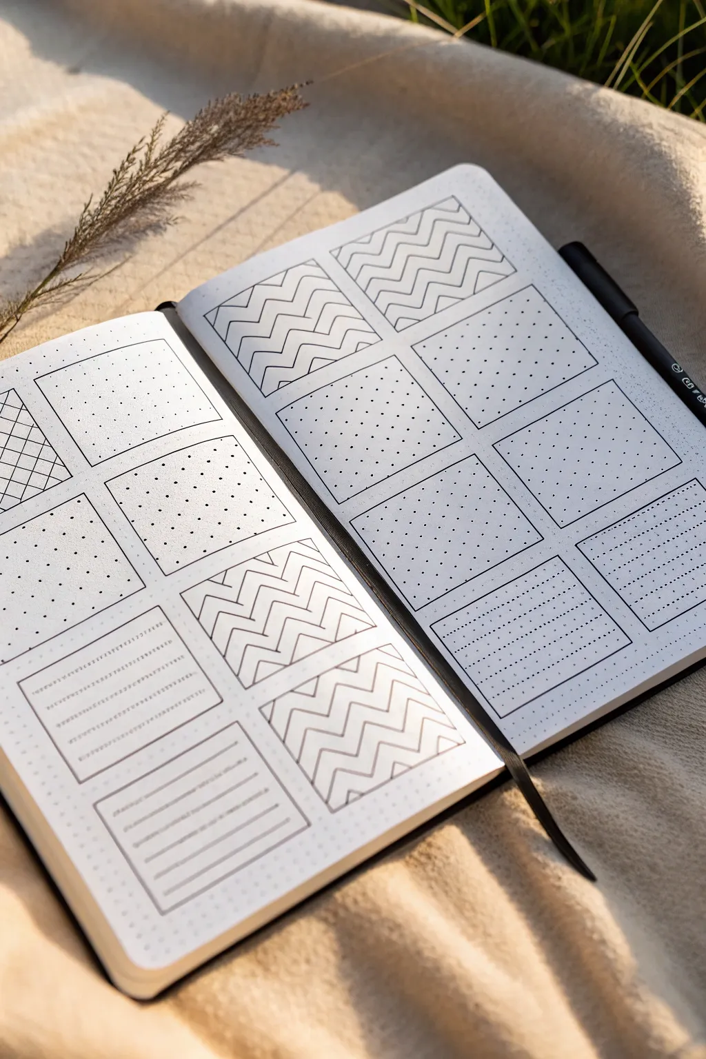
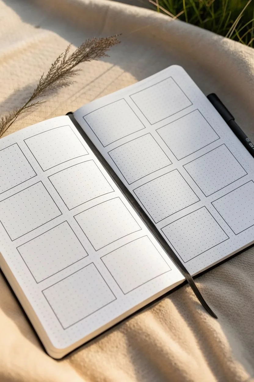
This calming warmup exercise transforms a blank dot-grid notebook spread into a series of tidy, repetitive patterns. It combines the structure of grids with the freedom of simple line work, creating a satisfying visual texture that helps steady your hand before a bigger drawing session.
Step-by-Step Guide
Materials
- A5 Dot grid notebook (smooth, bright white paper)
- Black fine liner pen (0.3mm or 0.5mm)
- Ruler or straight edge
- Pencil (HB or H for light guidelines)
- Eraser
Step 1: Setting the Stage
-
Define the grid:
Begin by counting the dots on your open spread to determine the layout. You want to create eight square frames on each page, arranged in two columns of four. -
Draft the frames:
Using your pencil and ruler, lightly draw the sixteen squares. Leave a margin of 1-2 dots between each square to separate the patterns clearly. -
Ink the outlines:
Once you are satisfied with the spacing, go over your pencil lines with the black fine liner. Use the ruler for crisp, sharp edges. -
Clean up guidelines:
Wait a moment for the ink to set, then gently erase the pencil marks so you have clean, empty frames ready to be filled.
Pro Tip: Pen Pressure
Keep your wrist loose and apply very light pressure. Pressing too hard can cause the ink to bleed or the paper to dimple.
Step 2: Creating the Zig-Zags
-
Start the chevron pattern:
Focus on the top two squares of the right page and the bottom middle squares of the left page. These will feature the bold zig-zag (chevron) design. -
Draw the first jagged line:
Starting at the bottom left corner of a frame, draw a continuous zig-zag line all the way to the right side. Use the dot grid to ensure each peak and valley is identical in height and width. -
Stack the lines:
Draw a second zig-zag line directly above the first, maintaining an even spacing of about 2-3mm. Parallel lines are key here. -
Fill the frame:
Continue stacking these chevron lines until you reach the top of the square. Repeat this process for all four intended chevron frames.
Step 3: Simple Dot Density
-
Select dot frames:
Move to the middle squares on the right page and the upper squares on the left. These will remain minimalist. -
Reinforce the grid:
For these squares, simply use your fine liner to carefully darken existing dots from the notebook’s grid. I find skipping every other dot creates a lighter, airier texture. -
Vary the density:
On adjacent frames, you can ink every single dot to create a denser, darker field compared to the alternating pattern.
Troubleshooting: Smudges
If you notice smudging, place a scrap piece of paper under your drawing hand. This acts as a shield between your skin oils and the fresh ink.
Step 4: Adding Linear Details
-
Create horizontal lines:
Locate the bottom two squares on the right page. These will be filled with horizontal lines. Use your ruler to draw straight lines connecting the dots horizontally. -
Add detail to the lines:
Instead of solid lines, try drawing them as dotted lines or dashed lines for texture variety, using the grid dots as start and stop points. -
Draft the text boxes:
On the bottom left of the left page, draw two rectangular boxes within the frames. These mimic small note-taking areas. -
Add faux text lines:
Inside these small rectangles, draw very faint, straight horizontal lines to represent writing space.
Step 5: The Cross-Hatch Accent
-
Draw diagonal lattice:
On the very first square at the top left, draw diagonal lines spaced evenly apart. -
Complete the cross-hatch:
Draw a second set of diagonal lines perpendicular to the first set to create a diamond or lattice effect. -
Final review:
Scan over the entire spread. If any lines look too faint or gaps appear inconsistent, carefully touch them up with the pen.
Enjoy the rhythmic nature of filling these squares and treat it as a meditation rather than a test of perfection
Constraint Challenges: Sketch Using Only Five Lines
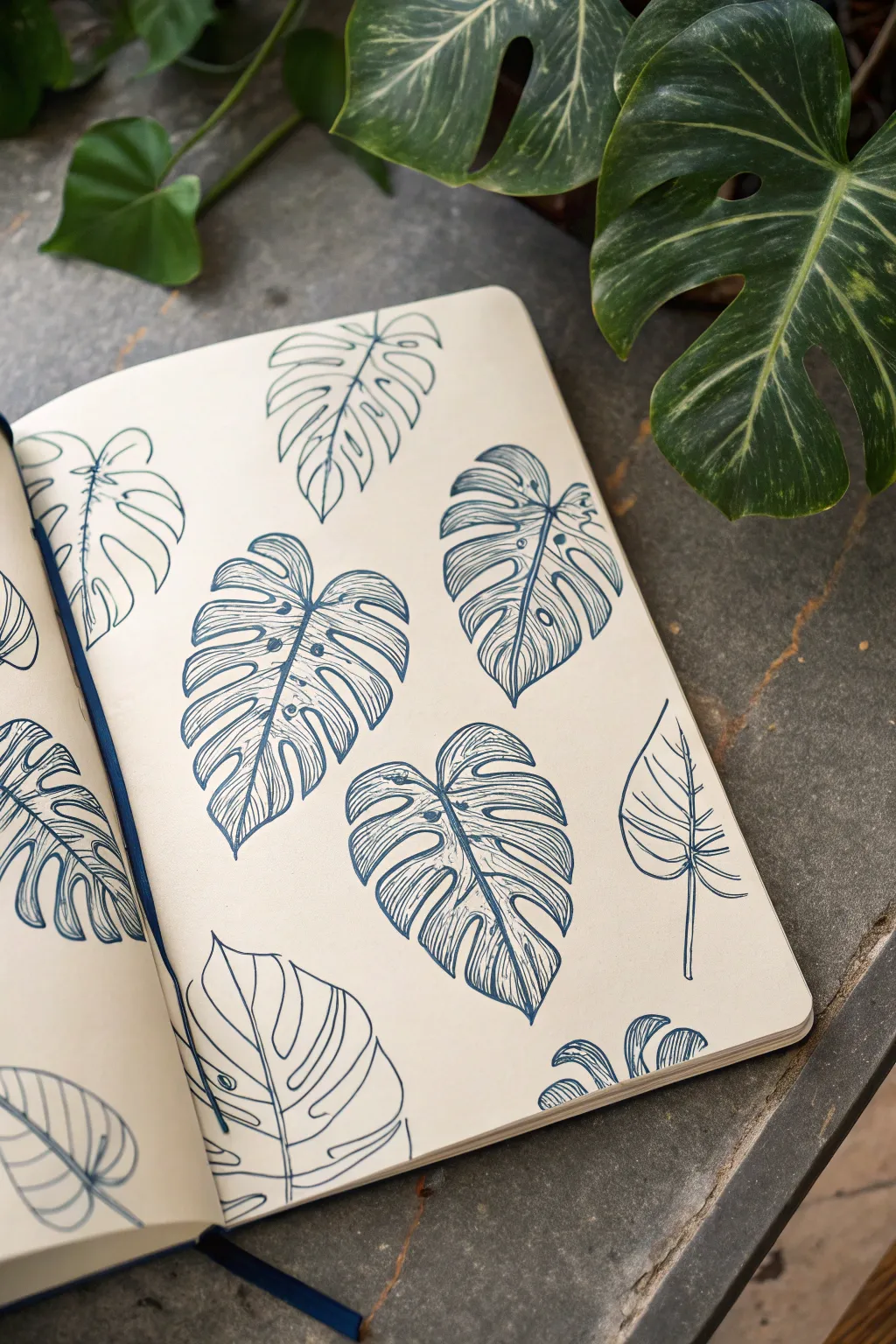
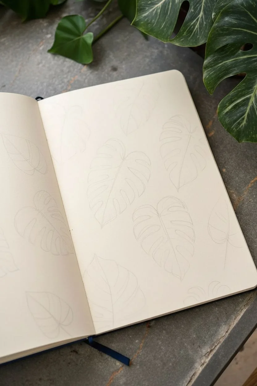
Capture the organic beauty of tropical foliage with this sketchbook spread dedicated to Monstera leaves. Using a single blue fine liner, you’ll practice line weight and contour drawing to create a collection of botanical studies that feel both structured and free-flowing.
Step-by-Step Tutorial
Materials
- Sketchbook with cream or off-white paper (heavyweight, smooth grain)
- Blue fine liner pen (0.3mm or 0.5mm)
- Pencil (HB or 2H) for light layout
- Soft eraser
- Real or reference photo of a Monstera leaf
Step 1: Planning the Composition
-
Observe the subject:
Begin by closely studying your Monstera leaf reference. Notice the characteristic heart shape, the central vein, and the deep fenestrations (the holes and splits) that give the leaf its iconic look. -
Lightly block in placement:
Using your pencil very lightly, draw rough oval shapes scattered across the page to determine where each leaf will sit. Angle them differently—some pointing up, some diagonal, some upside down—to create a dynamic pattern. -
Sketch the central spines:
Draw curved lines through the center of your ovals to represent the main midrib of each leaf. Let these lines curve gently to suggest movement and flexibility in the leaves.
Step 2: Drawing the Outlines
-
Draft the leaf silhouettes:
Still using pencil, flesh out the leaf shapes around your central spines. Draw the outer edges, incorporating the deep splits. Don’t worry about perfection; organic shapes are naturally irregular. -
Refine the fenestrations:
Add the smaller, enclosed holes near the center spine on some of the larger leaves. This adds realism and variety to the pattern. -
Commit to ink:
Switch to your blue fine liner. Starting with one leaf, trace over your pencil lines with a confident, steady hand. I like to break the line slightly where the leaf segments meet the spine to keep it feeling airy. -
Vary line weight:
As you ink the outer contours, try pressing slightly harder on the shadowed sides of the leaf segments to create a subtle sense of depth. -
Erase pencil guides:
Once the ink is completely dry—give it a minute or two to avoid smudging—gently erase all the underlying pencil marks.
Ink Smearing?
If your hand drags ink across the page, place a clean scrap piece of paper under your drawing hand. It acts as a shield, protecting your work while you move across the spread.
Step 3: Adding Texture and Detail
-
Draw the main veins:
Inside each leaf segment, draw a primary vein branching out from the central midrib towards the edge. Keep these lines thinner than your outline if possible. -
Start linear shading:
Begin adding texture using parallel hatching lines. Focus these lines on one side of each leaf segment to suggest a light source. -
Follow the form:
Ensure your hatching lines curve slightly to follow the contour of the leaf surface. This ‘contour hatching’ technique makes the leaf look three-dimensional rather than flat. -
Deepen the shadows:
Go back over the darkest areas—usually near the central spine or where a leaf curls—with a second layer of hatching lines at a slight angle to the first set. -
detail the midribs:
Add a second parallel line to the central spine of the larger leaves to give the stem some thickness. Fill this narrow gap with tiny, dense lines for contrast. -
Vary drawing styles:
Leave one or two leaves purely as outlines without shading. This ‘unfinished’ look adds visual interest and prevents the page from feeling too heavy. -
Check balance:
Look at the overall spread. If a particular area feels empty, add a small partial leaf peeking in from the edge of the page. -
Final touches:
Strengthen any outer lines that feel too weak. You want the silhouette to pop clearly against the cream paper.
Vary Your View
Don’t just draw flat leaves. Try drawing one leaf simplified into just basic geometric shapes or ‘folded’ in half to practice different perspectives on the same subject.
Fill the rest of the page with smaller details or leave the negative space open for a breathable botanical layout


Have a question or want to share your own experience? I'd love to hear from you in the comments below!