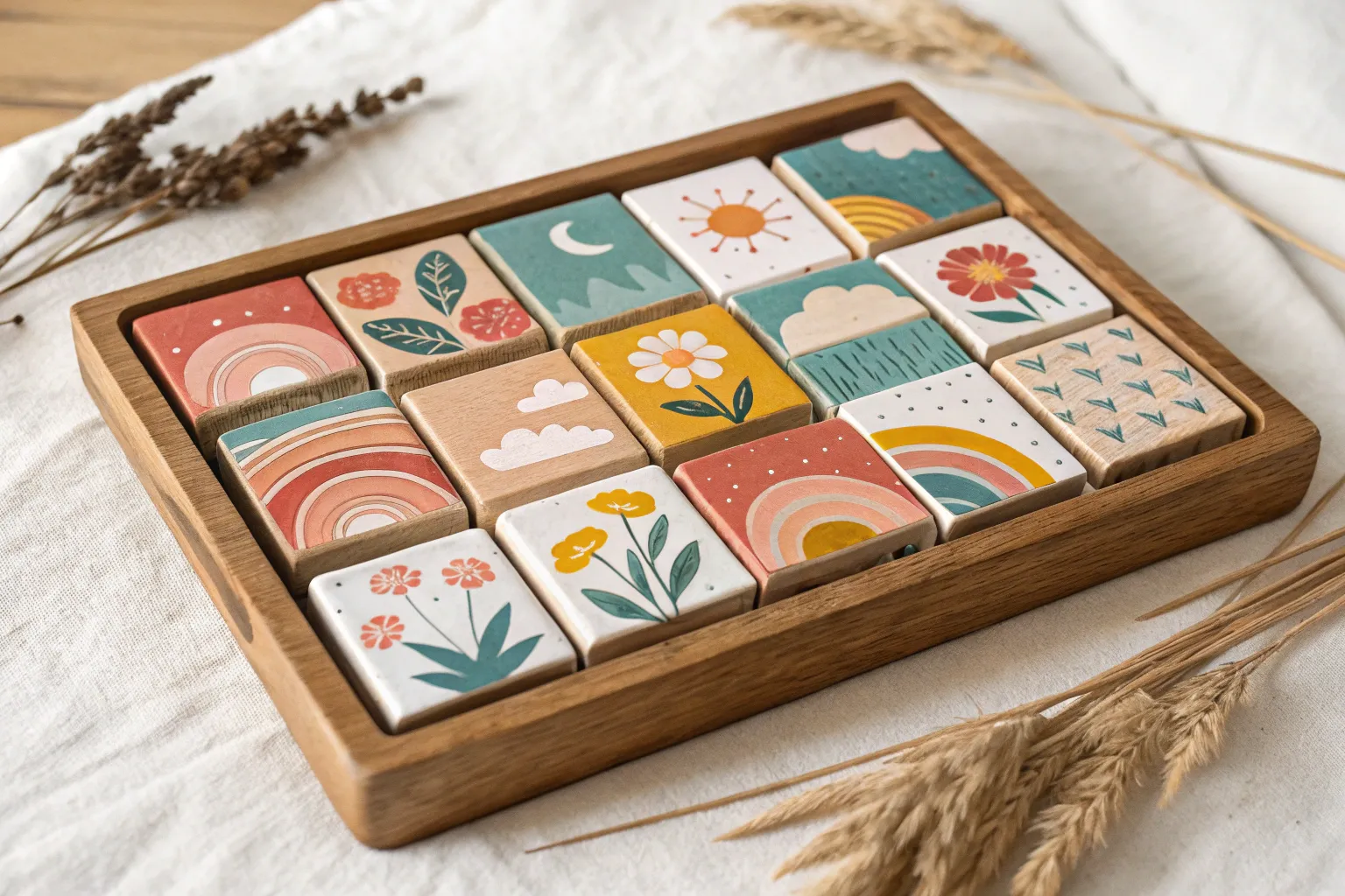
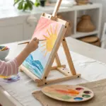
Whenever I feel stuck or short on time, I go smaller—because tiny art lets you play without the pressure of a “big masterpiece.” These small art ideas are designed for quick wins on mini canvases, little cards, or sketchbook boxes, so you can experiment and finish something in one sitting.
Tiny Sunset Silhouettes
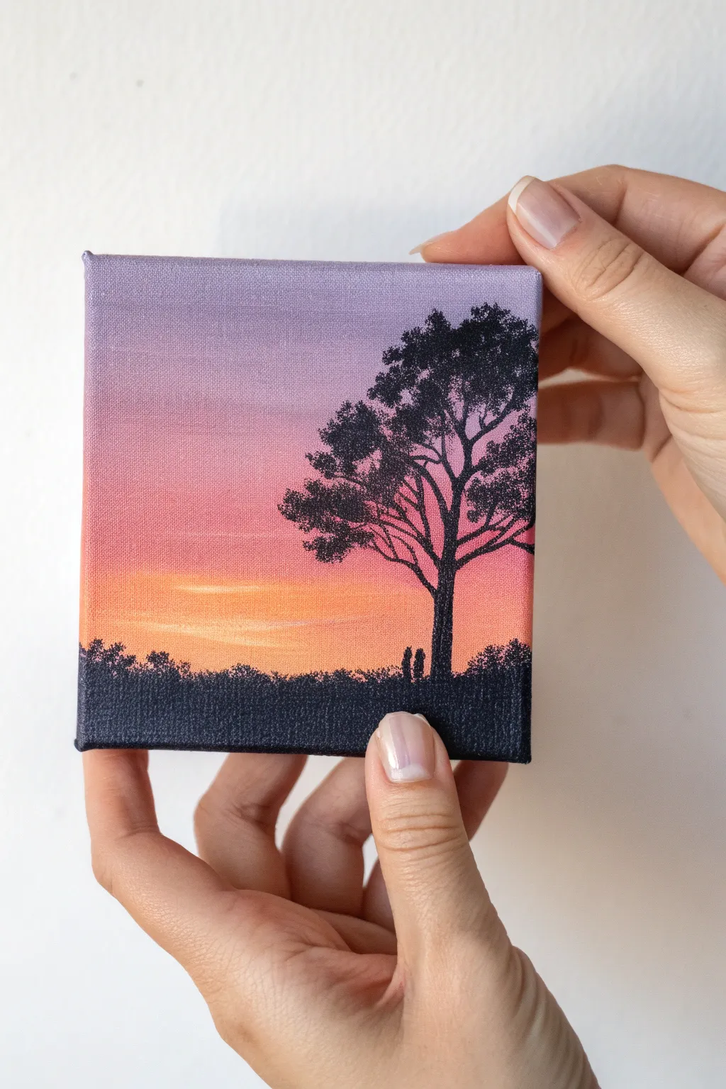
Capture the serene transition of twilight on a miniature scale with this gradient sunset painting. The soft blend of purple, pink, and orange provides a glowing backdrop for a striking black silhouette of a lonely tree and distant figures.
Step-by-Step
Materials
- Miniature square canvas (4×4 or 5×5 inches)
- Acrylic paints: Dioxazine Purple, Quinacridone Magenta, Cadmium Orange, Titanium White, Mars Black
- Flat synthetic brush (1/2 inch) for blending
- Small round detail brush (size 0 or 00)
- Palette or mixing plate
- Cup of water
- Paper towels
Step 1: Painting the Gradient Sky
-
Prepare the Sky Colors:
Squeeze out your purple, magenta, orange, and white onto the palette. You’ll need slightly more white than the other colors to create the soft, pastel look of the sky. -
Start with the Horizon:
Mix a touch of orange with a generous amount of white to make a pale peach. Using your flat brush, paint a horizontal strip across the bottom third of the canvas. -
Add the Mid-Tone:
Without cleaning the brush fully, pick up some pink and a bit more white. Paint directly above the peach strip, overlapping slightly while the paint is still wet to encourage blending. -
Introducing Purple:
Mix a light lavender using purple and white. Apply this to the top third of the canvas, bringing it down to meet the pink layer. The goal is a seamless transition, so work quickly while the acrylics are damp. -
Smooth the Gradient:
Wipe your flat brush clean on a paper towel. With a slightly damp (but not wet) brush, gently sweep back and forth horizontally across the transition lines where colors meet to blur them together. -
Brighten the Sunset:
If the horizon area looks too dull, mix a tiny bit of pure orange with white and carefully add a brighter streak right where the sun would have just set, blending it softly upwards. -
Paint the Edges:
Don’t forget the sides of your mini canvas. Wrap the gradient colors around the edges so the artwork looks finished from every angle. Let the background dry completely before moving on.
Muddy Gradient?
If your sky colors turn brown or gray where they meet, let the first layer dry completely. Then apply fresh, thin glazes of color on top to smooth the transition without over-mixing.
Step 2: Adding the Silhouettes
-
Establish the Ground:
Switch to Mars Black. Paint a solid, uneven strip along the very bottom of the canvas. This represents the dark, grassy ground in shadow. -
Create Texture:
Use the tip of a small brush or stipple with an old, dry brush along the top edge of the black strip. Dab tiny dots to simulate the look of distant bushes, tall grass, or treetops. -
Outline the Tree Trunk:
Using your smallest detail brush (size 0 or 00) and thinned black paint (add a drop of water for better flow), paint a vertical line for the tree trunk on the right side. Make the base slightly wider than the top. -
Branching Out:
Extend main branches from the trunk, reaching upwards and outwards. Remember that tree branches generally get thinner as they move away from the center. I find a slightly shaky hand actually helps make branches look organic. -
Adding Foliage:
Instead of painting individual leaves, use a stippling motion. Load your small brush with black paint and gently dab clusters of dots at the ends of the branches to form the canopy. -
Refining the Tree Shape:
Create gaps in the foliage clouds so the beautiful sunset colors peek through. This negative space is crucial for making the tree look realistic and airy rather than like a solid blob. -
Adding Tiny Details:
If you are feeling steady, paint two extremely small vertical dashes near the base of the tree to represent figures enjoying the view. Keep them simple and abstract. -
Final Inspection:
Check your silhouette against the light background. If the black looks patchy or transparent in areas, apply a second coat of black specifically on the trunk and ground once the first layer is dry.
Starry Night Twists
Once the sky is dry but before painting the tree, flick a toothbrush with thinned white paint to create tiny stars in the purple section for a night-time shift.
Place your tiny masterpiece on a mini easel or display shelf to enjoy a permanent golden hour
Simple Flower Head Studies
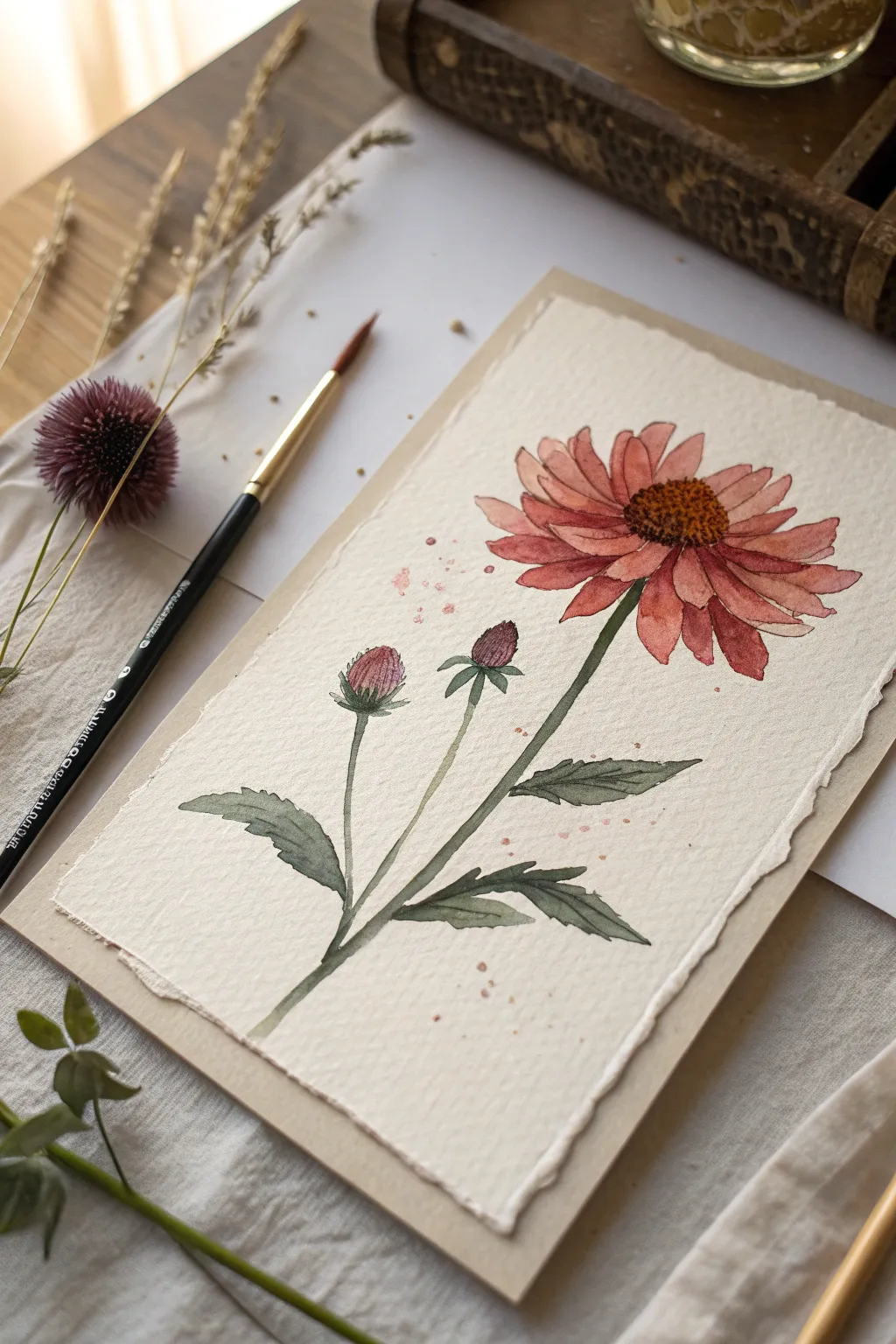
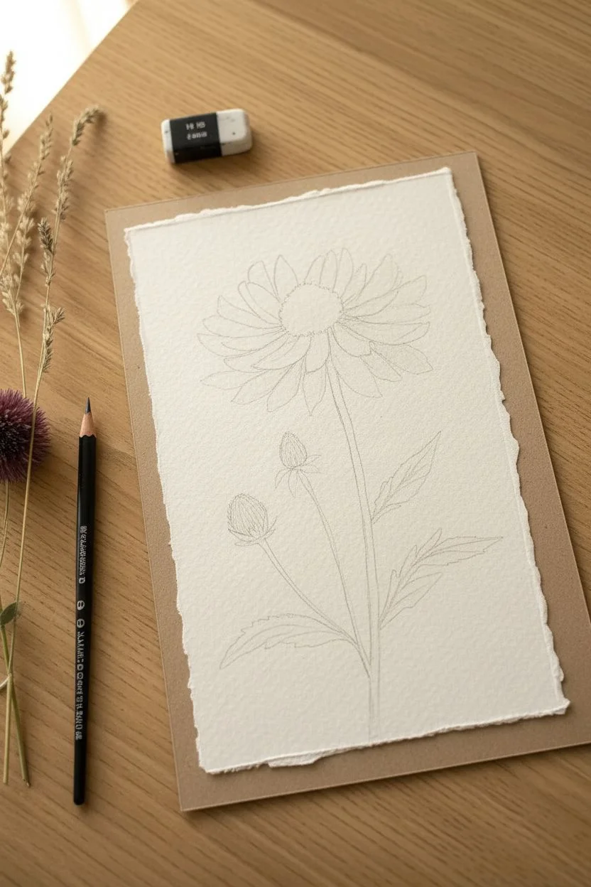
Capture the rustic elegance of a purple coneflower in watercolor, focusing on the interplay between the prominent central cone and drooping petals. This project uses textured paper to enhance the organic feel of the botanical subject.
Step-by-Step Guide
Materials
- Cold press watercolor paper (deckle edge preferred)
- Watercolor paints (Alizarin Crimson, Burnt Sienna, Sap Green, Yellow Ochre, Ultramarine Blue)
- Round watercolor brushes (Size 2 and 6)
- HB Pencil
- Kneaded eraser
- Jar of clean water
- Paper towels or cloth
- Masking tape (optional for securing paper)
Step 1: Sketching the Structure
-
Establish the stem lines:
Begin by lightly tracing a long, slightly curved central stem line rising from the bottom third of the paper. Add two smaller offshoot lines on the left side for the buds. -
Outline the flower head:
At the top of the main stem, sketch an oval for the flower’s cone center. Surround this with loose, elongated petal shapes that droop downward slightly, characteristic of Echinacea. -
Add buds and leaves:
Draw small, tear-drop shapes at the tips of the side stems for the buds. Sketch lance-shaped leaves with serrated edges along the lower stem sections. -
Refine the drawing:
Clean up your sketch with a kneaded eraser, lightening the graphite until it is barely visible so it won’t show through the transparent paint.
Muddy colors?
If your petals look brown instead of pink, ensure you let the green stems dry 100% before painting the petals that touch them. Patience prevents bleeding.
Step 2: Painting the Cone and Petals
-
Base coat for the cone:
Mix Yellow Ochre with a touch of Burnt Sienna. Using the size 6 brush, paint the central cone, keeping the wash fairly light. -
Texturizing the center:
While the center is still slightly damp, drop in concentrated Burnt Sienna along the bottom edge of the cone to create shadow and volume. -
First petal wash:
Create a dilute mix of Alizarin Crimson and a tiny bit of Burnt Sienna for a dusty pink hue. Paint every other petal to prevent them from bleeding into each other, letting them dry before painting the neighbors. -
Layering petal details:
Once the first layer is dry, mix a slightly stronger version of your red-pink. I like to add thin lines along the length of each petal to suggest veins and texture. -
Finishing the cone details:
Use the size 2 brush and a dark brown mix (Burnt Sienna + Ultramarine) to stipple tiny dots onto the cone, clustering them densely at the bottom right for a 3D effect.
Step 3: Stems, Buds, and Leaves
-
Painting the stems:
Mix Sap Green with a touch of red to dull it down. Paint the stems with a confident, single stroke where possible to keep the line fluid. -
Coloring the buds:
Paint the small cones of the buds with your pink mix, keeping the top lighter. Use the green mix to paint the small bracts (leafy bits) at the base of the buds. -
Leaf base layer:
Fill in the leaf shapes with a light wash of Sap Green. Let this dry completely before moving to the next step. -
Shading the leaves:
Mix a darker green by adding more blue or a tiny bit of red to your green. Paint one half of each leaf or along the veins to create depth and interesting variation.
Edge Control
To get crisp edges on your petals like the example, paint on dry paper (wet-on-dry) rather than wetting the whole flower shape first.
Step 4: Final Touches
-
Deepening shadows:
Look for areas where petals overlap or where the stem meets the flower. Glaze a tiny amount of cool purple or dark red in these crevices to increase contrast. -
Adding subtle splatter:
Load a wet brush with diluted pink paint. Tap the handle against your finger to gently splatter a few droplets around the flower head for a loose, artistic vibe.
Step back and admire the delicate balance of color and line in your botanical study


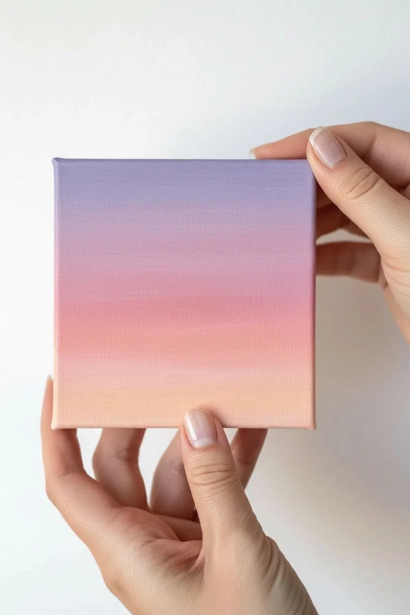
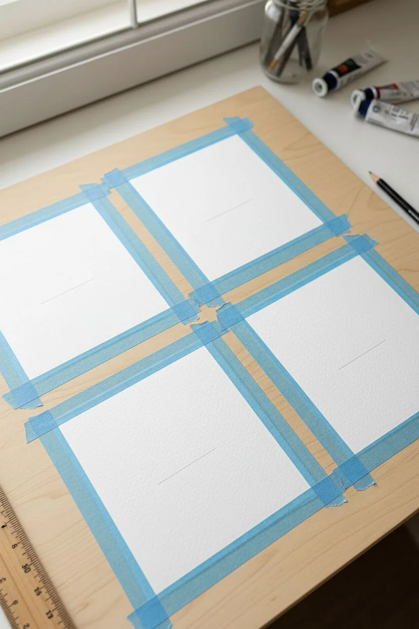
Mini Abstract Color Gradients
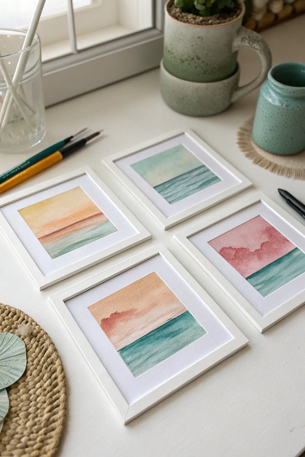
These four miniature abstract color gradients capture the calming essence of the horizon where the sky meets the sea. Using gentle watercolor washes, this project creates a serene gallery wall collection perfect for adding a touch of coastal tranquility to small spaces.
Step-by-Step Tutorial
Materials
- Cold-pressed watercolor paper (140 lb / 300 gsm)
- Four mini white square frames (approx. 4×4 inches)
- White matting board to fit frames
- Watercolor paints (Sea Green, Indigo, Indigo, Peach, Rose, Yellow Ochre)
- Round watercolor brushes (sizes 4 and 6)
- Flat wash brush (1/2 inch)
- Washi tape or masking tape
- Jar of clean water
- Paper towels
- Pencil and ruler
Step 1: Preparation
-
Cut the Paper:
Begin by measuring the opening of your frame mats. Cut four square pieces of watercolor paper slightly larger than these openings so you have room to tape them down. -
Tape the Borders:
Use washi tape or painter’s tape to secure your paper squares to a hard board or table. Tape off a clean border around the edges; this creates that crisp, professional white margin when you peel it away later. -
Define the Horizon:
Lightly sketch a single horizontal line across each paper square using a pencil. You can vary the placement slightly—some higher, some lower—but generally keep it near the bottom third to emphasize the ‘sky’ portion.
Pro Tip: Wet-on-Wet
For the smoothest gradients, tilt your board slightly. Gravity pulls the wet pigment down, doing the blending work for you without over-brushing.
Step 2: Painting the Sky Gradient
-
Pre-wet the Sky Area:
Dip your clean wash brush in water and apply a thin, even layer of moisture to the paper area *above* your horizon line. The paper should glisten but not have standing puddles. -
Apply the Top Color:
For the first piece, load your brush with a diluted mix of soft blue or teal. Touch the brush to the very top edge of the wet paper and let the pigment flow downward naturally. -
Blend the Transition:
Rinse your brush slightly and pull that color down. While the paper is still wet, introduce a second color, like a soft peach or pale yellow, starting just above the horizon line and blending upward into the blue. -
Repeat for All Sketches:
Continue this process for the other three squares, varying your palette. Try a rose-to-green gradient for a sunset look, or an all-blue palette for a midday seascape. I find it helpful to paint all skies first to ensure consistent dampness. -
Creating Clouds (Optional):
If you want the textured cloud effect seen in the reddish paintings, dab a scrunched-up paper towel into the wet wash to lift pigment, or drop in a slightly concentrated darker red while the wash is still wet. -
Dry Completely:
Let the sky sections dry completely before moving on. The paper must be bone-dry, or the horizon line will bleed.
Level Up: Salt Texture
While the ocean wash is still wet, sprinkle a few grains of table salt on the paper. Once dry, brush it off for a stunning, bubbly seafoam texture.
Step 3: Painting the Ocean
-
Establish the Water Line:
Using a smaller round brush (size 4), carefully paint a crisp line of Sea Green or deep teal right along the pencil horizon mark. -
Wash Downward:
Dampen get brush and pull that pigment down toward the bottom tape edge. The color should naturally lighten as you go lower, mimicking the transparency of shallow water. -
Add Texture:
While the ocean layer is still drying, use a barely damp brush (dry brush technique) to sweep horizontal strokes of darker indigo across the water area to suggest gentle waves. -
Dry and Remove Tape:
Allow the bottom half to dry completely. Once safe, slowly peel the tape away at a 45-degree angle to reveal your crisp white edges.
Step 4: Framing
-
Clean the Glass:
Wipe down the glass of your mini frames to remove fingerprints or dust specks. -
Mount artwork:
Center your dry paintings behind the mat board. Use a small piece of tape on the back to secure the paper to the mat so it doesn’t slip. -
Assemble Frames:
Place the matted art into the frames and secure the backing. Arrange them in a grid or line to see how the colors interact.
Now you have a serene little gallery that brings the calm of the coast right to your desk


Doodle-Filled Micro Panels
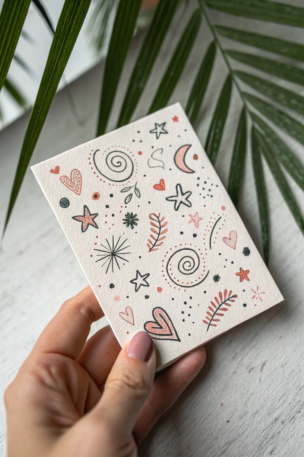
This charming mini art project features a delightful scatter pattern of celestial and botanical doodles. Using just two colors—a stark black and a warm terra cotta—you’ll create a balanced composition perfect for greeting cards or framed micro-art.
Detailed Instructions
Materials
- Heavyweight watercolor paper or mixed media cardstock (approx. 4×6 inches)
- Black archival fineliner pen (0.3mm or 0.5mm)
- Terra cotta or soft pink paint marker (fine tip) or watercolor paint
- Small round paintbrush (if using watercolor)
- Pencil and soft eraser
- Ruler (optional, if cutting paper to size)
Step 1: Setting the Stage
-
Paper selection:
Begin by selecting a high-quality, textured paper. Heavyweight watercolor paper works beautifully because its texture adds character to the simple lines. -
Sizing:
Cut your paper to your desired size. The example shows a small postcard format, roughly A6 size, which is manageable and perfect for this dense doodle style. -
Brainstorming motifs:
Before marking the paper, sketch a few tiny motifs on a scrap piece. Think simple: swirls, stars, hearts, moons, and leaves. This helps you get in the flow.
Ink Confidence
Don’t stress over wobbly lines. The handmade imperfection is part of the aesthetic. If a line goes astray, just thicken it slightly to hide the slip.
Step 2: Building the Composition
-
Drawing the first spiral:
Start with your black fineliner. Draw a loose, double-spiral shape near the center-bottom. It doesn’t need to be perfect; a hand-drawn wobble adds charm. -
Adding texture dots:
Using your terra cotta marker or paint, add tiny stippling dots following the curve of your spiral to give it dimension and color. -
Top spiral feature:
Repeat a similar spiral motif near the top left. Balance is key here, so try to keep them diagonal from each other rather than stacked directly. -
Drawing key anchors:
Draw three to four main ‘anchor’ shapes in black ink to establish the layout: a large star, a crescent moon outline, and a prominent heart. -
Botanical elements:
Add a few leafy sprigs. Draw a fern-like leaf with a central black stem and terra cotta leaves, and perhaps a simple black outline leaf elsewhere. Varying the style keeps the eye moving.
Metallic Magic
Trace over just a few of the stars or dots with a gold gel pen. The subtle shimmer will catch the light and add a magical quality to the piece.
Step 3: Filling the Spaces
-
Adding starbursts:
In the larger empty gaps, draw radiating starbursts or simple five-point stars. I like to mix open outlined stars with single-line asterisks for variety. -
Heart details:
Sketch a few small hearts. Fill some solid terra cotta, outlay others in black, or use a scribbled texture inside an outline for a playful look. -
Dash and dot fillers:
Look for the awkward white spaces between your main drawings. Fill these with clusters of three dots, tiny circles, or short directional dashes. -
Curved movement lines:
Add some gentle, curved lines consisting of dots or dashes that snake through the shapes. This simulates flow and connects the isolated doodles. -
Reviewing balance:
Hold the card at arm’s length. If an area looks too white, add a tiny terra cotta dot or a black speck to balance the visual weight.
Step 4: Finishing Touches
-
Color accents:
Go back in with your color tool. Color in a single petal of a flower, half of a heart, or the inside of a moon to create focal points. -
Contrast check:
Ensure your black lines are crisp. If the paper texture caused a skipped line, carefully re-trace it to make it bold and intentional. -
Drying time:
Let the ink and paint dry completely to avoid smudging, especially if you used a wetter paint marker. -
Erase guidelines:
If you used any pencil sketches underneath, gently erase them now, being careful not to rub over the painted areas too vigorously.
You now have a lovely piece of hand-drawn art ready to send to a friend or display on your desk
BRUSH GUIDE
The Right Brush for Every Stroke
From clean lines to bold texture — master brush choice, stroke control, and essential techniques.
Explore the Full Guide
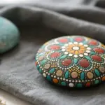
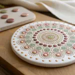
Dot-by-Dot Mini Mandalas
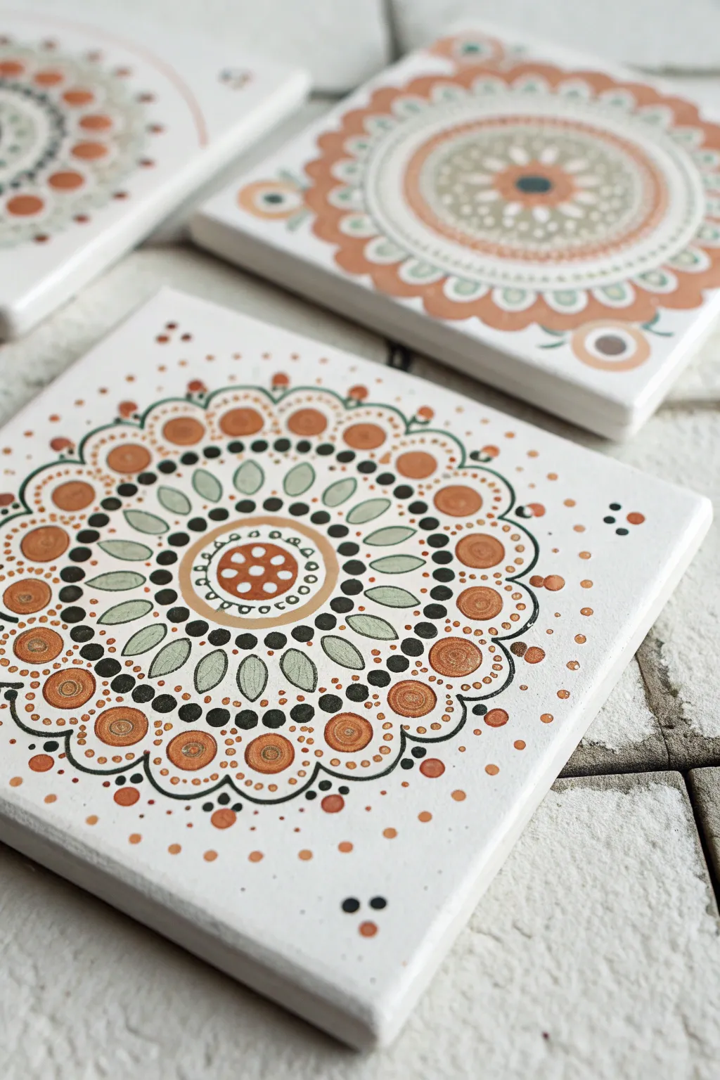
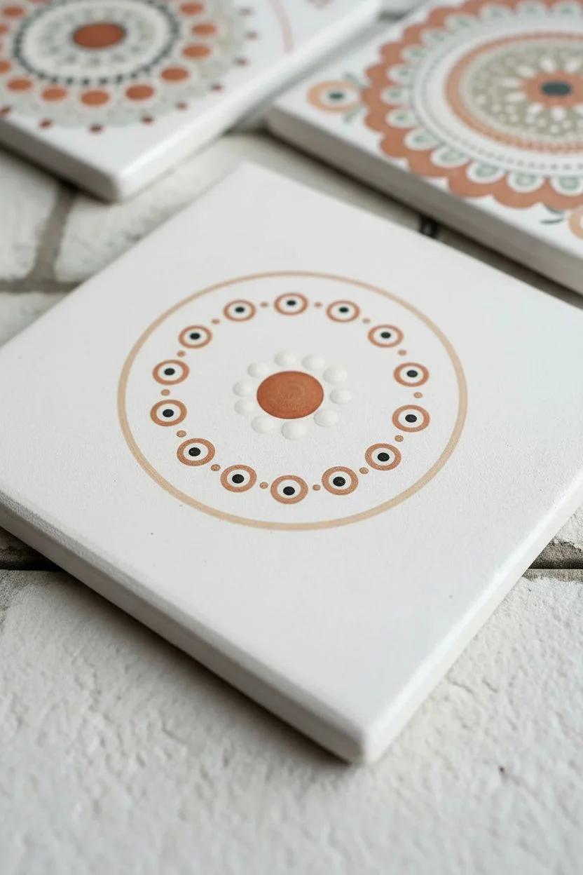
Transform simple ceramic tiles into stunning, functional art pieces with these dot-painted mandala coasters. Using a warm palette of terracotta, sage green, and earthy black, you’ll build intricate radial patterns that are as relaxing to make as they are beautiful to behold.
How-To Guide
Materials
- 4×4 inch white ceramic tiles (glazed or unglazed)
- Acrylic paints (Terracotta, Sage Green, Black, White, Deep Gold)
- Dotting tools (various sizes, or improvised tools like dowels, pencil erasers, toothpicks)
- Small fine-point paintbrush
- Palette or paper plate
- Damp paper towel for cleaning tools
- Clear acrylic sealer (spray or brush-on)
Step 1: Setting the Foundation
-
Clean the surface:
Before you begin, wipe your tile down with rubbing alcohol or a damp cloth to remove any dust or oils. Let it dry completely to ensure the paint adheres properly. -
Find the center:
Visualize the exact center of your tile. Dip a medium-sized dotting tool into the terracotta paint and place a single, perfect dot right in the middle. This central anchor point determines the symmetry of the entire design. -
The first ring:
Using a smaller tool, dip it into white paint and create a ring of six to eight small dots evenly spaced around your central terracotta dot. Keep them tight but not touching. -
Adding contrast:
Take a very small tool or toothpick with black paint. Carefully place a tiny dot in the center of the previous white dots to create a ‘bullseye’ effect. -
The holding ring:
Mix a light beige by combining a touch of terracotta with white. Paint a solid fine circle line around your dot cluster using a fine paintbrush to enclose the center motif.
Step 2: Building the Petals
-
Sage petal layer:
Load a small flat brush or use a teardrop-shaped tool with sage green paint. Create a ring of petal shapes radiating outward from your beige circle. Aim for about 12-16 petals depending on size. -
Defining the petals:
Once the green petals are slightly tacky or dry, outline each one carefully with tiny black dots. Use your smallest tool for this to keep the look delicate. -
Inner details:
Add a small white dot at the base of each green petal to brighten the design and add depth to the leafy shapes. -
Spacing dots:
In the V-shaped gaps between the tips of the green petals, place a medium-sized black dot. I find this creates a nice sharp contrast against the lighter colors.
Perfect Consistency
If your paint leaves stiff peaks when you lift the tool, mix in a drop of pouring medium or water. You want soft, fluid mounds.
Step 3: The Outer Expansion
-
Terracotta ring:
Using a larger dotting tool, place bold terracotta circles above each black spacer dot you just created. These should be the largest elements in your design so far. -
Walking the dots:
This is a classic technique: dip a small tool in black paint. Place a dot at the top of a terracotta circle, then ‘walk’ the dots down the side without re-dipping, making them get progressively smaller. Repeat on the other side. -
Gold accents:
Add a swirl of deep gold paint inside the large terracotta circles for a subtle shimmer. A simple spiral or concentric dot works beautifully here. -
Scalloped edge:
Use a fine liner brush and black paint to draw scalloped lines connecting the outer edges of your design, framing the ‘walking dots’ sections. -
Final border dots:
Along the scalloped black lines, add tiny terracotta and sage dots to fill the negative space and soften the hard edges.
Wobbly Hand?
Rest your wrist on a book or block of wood that is the same height as your tile. This stabilizes your hand for precise dot placement.
Step 4: Finishing Touches
-
Corner accents:
The corners of square tiles can feel empty. Add a small cluster—perhaps three dots in a triangle formation using terracotta and black—in each corner to balance the composition. -
Scattered texture:
Take your smallest tool and add tiny, random ‘dust’ dots of terracotta around the outer perimeter of the mandala for an organic, boho feel. -
Correction check:
Look over your work. If a dot is misshapen, wait for it to dry completely, scratch it off gently with a tool, or paint over it with white first before re-doing the color. -
Sealing the work:
Allow the tile to cure for at least 24 hours. Once fully hard, apply a clear acrylic sealer or resin topcoat to protect your work from moisture and scratches.
Enjoy using your new handcrafted coasters or wrapping them up as a thoughtful gift
Scratch-Through Painted Layers
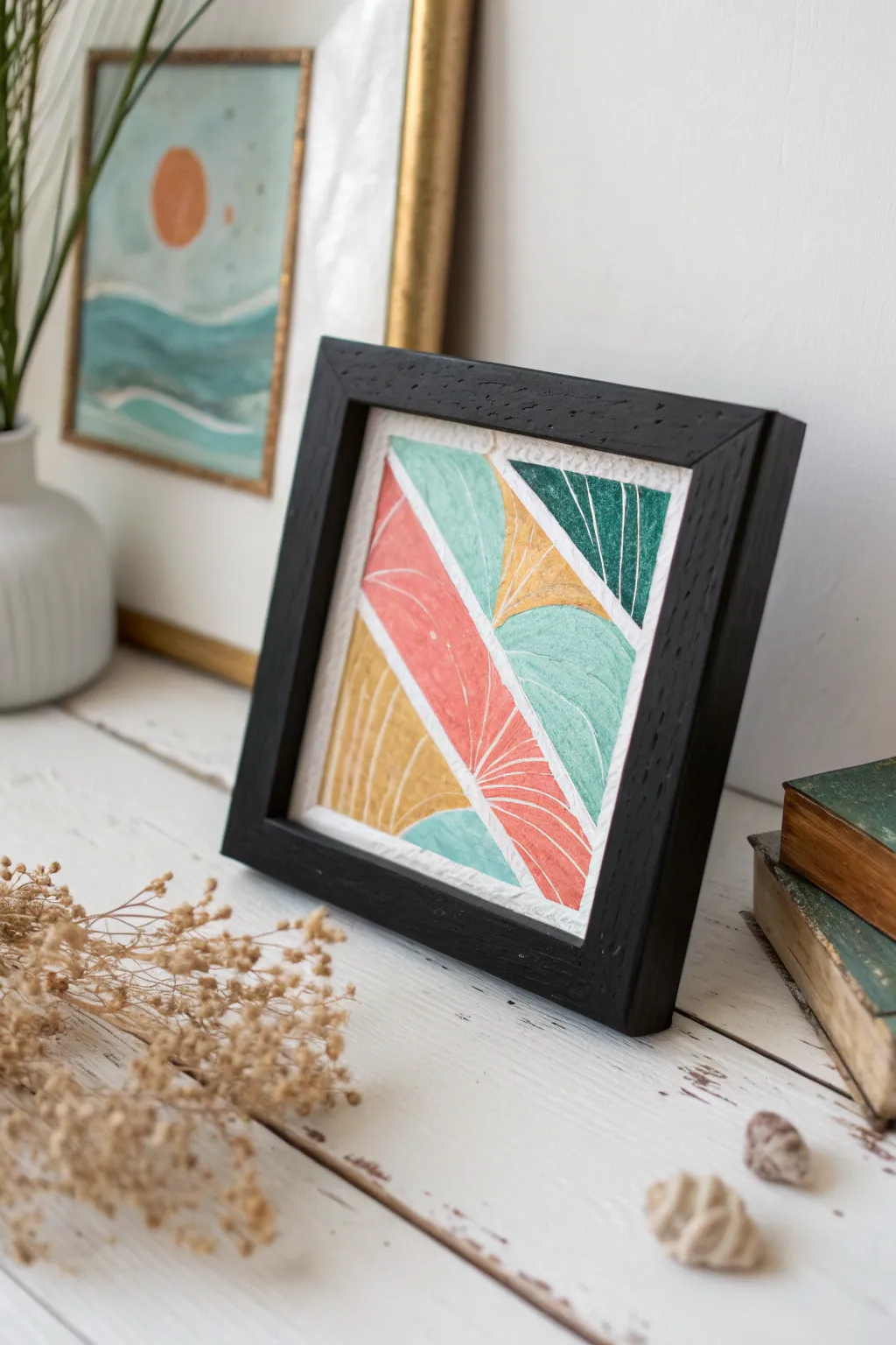
This charming mini-artwork combines color blocking with satisfying scratch-through textures to create a piece that feels both modern and handmade. The technique reveals the white paper beneath layers of paint, adding delicate white line-work without needing a fine-tip brush.
Step-by-Step Guide
Materials
- Heavyweight watercolor paper or mixed media cardstock
- Acrylic paints (salmon pink, teal, sage green, mustard yellow, dark hunter green)
- Flat shader brush (approx. size 6 or 8)
- Narrow masking tape or painter’s tape (1/4 inch width)
- Stylus tool, empty ballpoint pen, or a pointed toothpick
- Ruler
- Pencil
- Small black wooden frame (square)
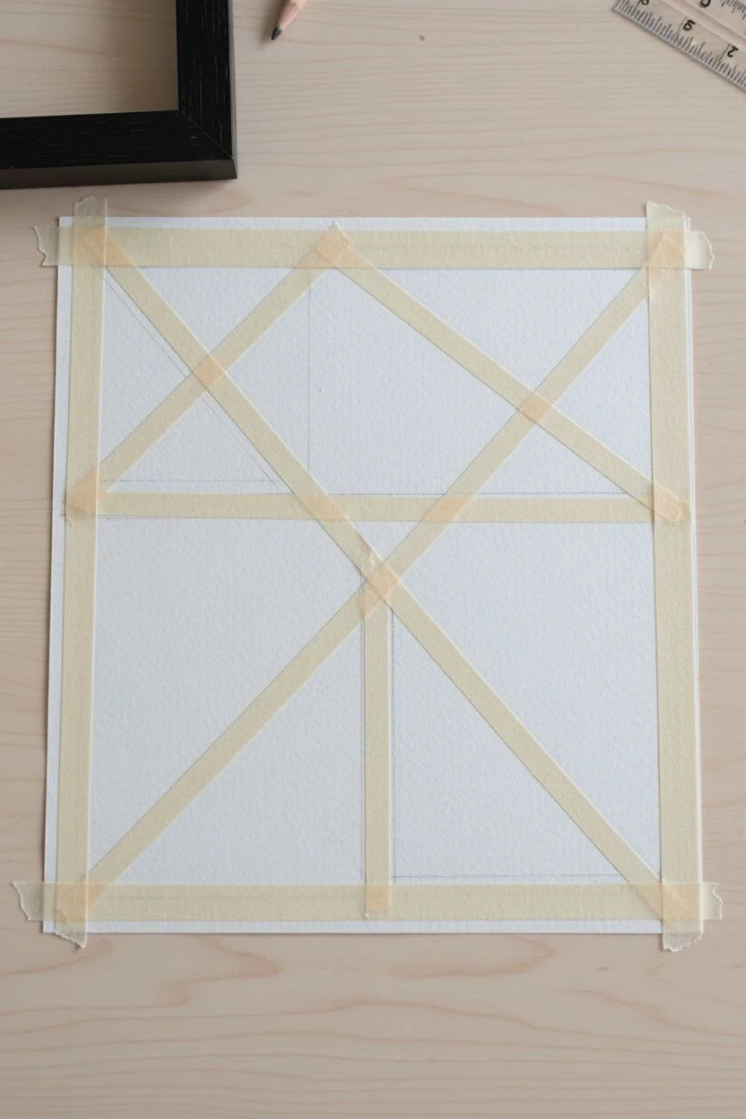
Step 1: Preparation and Layout
-
Size the Paper:
Begin by measuring the opening of your frame. Cut your heavyweight paper to these exact dimensions to ensure a perfect fit later. -
Draft the Design:
Using a ruler and a light pencil touch, draw a series of intersecting diagonal lines across the paper. Aim to create various triangular and trapezoidal shapes. You don’t need a specific pattern, but try to balance large and small shapes. -
Tape the Boundaries:
Apply thin masking tape over your pencil lines. The tape will preserve the white paper between your colored sections, creating that crisp, separated look seen in the final piece. -
Seal the Edges:
Run your fingernail or a burnishing tool firmly along the edges of the tape. This is crucial to prevent paint from bleeding underneath and spoiling your clean white lines.
Step 2: Painting and Sgraffito
-
Mix Your Palette:
Prepare your acrylic colors. If your paints are too bright, mix in a tiny touch of white or grey to achieve the soft, matte pastel look shown in the photo. -
Paint the First Section:
Starting with the large central triangle, apply a thick, even coat of salmon pink paint. You want the paint opaque enough to cover the paper fully. -
Scratch Early:
While the pink paint is still wet (do not let it dry!), take your stylus or toothpick and gently scratch a fan pattern into the paint. Press hard enough to reveal the white paper, but not so hard that you tear the fibers. -
Add Adjacent Colors:
Move to a neighboring section, perhaps the teal triangle. Apply the paint generously. -
Vary the Texture:
For this teal section, scratch curved lines that mimic the flow of a leaf or a hill. Changing the direction of your scratches adds visual interest. -
Apply the Sage Green:
Paint another section in sage green. I find it helpful to wipe my scratching tool on a paper towel between every few strokes to keep the lines crisp. -
Introduce Contrast:
Paint one of the smaller corner sections with the dark hunter green. This deep color helps anchor the lighter pastels. -
Scratch the Dark Section:
Use the sgraffito technique on the dark green area. The white lines will pop vividly against this darker background. -
Fill Remaining Shapes:
Continue painting the remaining shapes with mustard yellow and any repeated colors to balance the composition. -
Final Textures:
Complete the scratching on these last sections. Ensure every colored shape has some form of line work before the paint sets.
Pro Tip: Tool Choice
An empty ballpoint pen is the perfect tool for sgraffito. The ball rolls smoothly over the paper without tearing it, creating consistent, clean furrows in the wet paint.
Step 3: Finishing Touches
-
Let it Cure:
Allow the entire piece to dry completely. Acrylics dry fast, but give it at least 20-30 minutes to ensure the edges aren’t tacky. -
The Reveal:
Slowly and carefully peel away the masking tape. Pull the tape at a 45-degree angle away from the painted areas to minimize the risk of ripping the paper. -
Touch Up:
If any paint bled under the tape, you can gently scrape it away with a craft knife or cover it with a tiny dab of white gouache or a white gel pen. -
Frame It:
Place your finished artwork into the black wooden frame. No glass is needed if you want to highlight the tactile texture, but glass will protect it long-term.
Troubleshooting: Drying Too Fast
If the paint dries before you can scratch it, mix in a drop of acrylic retarder or glazing medium. This keeps the paint ‘open’ and workable for much longer.
Place your framed mini-masterpiece on a shelf or desk where the light can catch the unique textures you created


Have a question or want to share your own experience? I'd love to hear from you in the comments below!