When I want fast color and instant texture, I grab a sponge brush—it’s basically my shortcut to paintings that look way more complex than they are. Here are my go-to sponge brush painting ideas that you can try on paper, canvas, or even a big roll of kraft paper.
Foam Sponge Brush Sunset Gradients
Capture the magic of twilight with this striking gradient study that transitions seamlessly from bright yellow to deep violet. Using a foam sponge brush allows you to sweep broad, even bands of color across the paper to create the serene layered look of a setting sun.
Step-by-Step Guide
Materials
- Heavyweight watercolor paper or mixed media paper (at least 300gsm)
- Painter’s tape or masking tape (1 inch width)
- Wide foam sponge brush (2-3 inches)
- Watercolor paints or fluid acrylics (Yellow, Orange, Magenta/Pink, Violet)
- Palette or mixing tray
- Clean water container
- Paper towels for blotting
- Ruler (optional)
Step 1: Preparation
-
Tape the Board:
Begin by securing your watercolor paper to a flat, hard surface. Use painter’s tape to create a border around all four edges. Press the tape down firmly, especially the inner edge, to ensure crisp white margins when you peel it off later. -
Wet the Surface:
Dip your foam sponge brush into clean water and lightly drag it across the entire paper surface. You want the paper to be damp and cool to the touch, but not swimming in puddles of water. -
Prepare Your Palette:
Squeeze out generous amounts of your four colors: yellow for the top, followed by orange, magenta, and violet. Having these ready to go is crucial because you’ll need to work somewhat quickly while the paper is receptive.
Keep the Glow
Always work from light colors (yellow) to dark colors (purple). If you drag purple paint up into the yellow, it will turn brown and dull the sunset effect immediately.
Step 2: Painting the Gradient
-
Start with Sunlight:
Load your damp foam brush with the yellow paint. Starting just below the top tape line, sweep the brush horizontally across the paper. Apply two or three strokes, moving slightly downward to cover the top third of your painting area. -
Add the Orange:
Rinse your sponge slightly (or flip to a clean side) and pick up the orange paint. Apply this directly below the yellow section. While the paint is still wet, gently overlap the bottom edge of the yellow with your orange stroke to encourage a soft blend where they meet. -
Introduce Magenta:
Clean your brush thoroughly and load it with magenta or deep pink. Paint the next band horizontally below the orange. Allow the foam texture to naturally create faint streaks, which mimics cloud layers in the sky. -
Anchor with Violet:
Finally, load the brush with deep violet. Apply this to the bottom section of the paper. This dark tone grounds the image and creates the ‘horizon’ line of the landscape. -
Smooth the Transitions:
With a slightly damp (but clean) sponge brush, very lightly run the tool horizontally across the transition zones between colors. Do this only once or twice per section to avoid muddying the hues together too much.
Step 3: Creating Texture and Depth
-
The Backwash Technique:
As the paint begins to settle but isn’t dry yet, dip the very edge of your sponge in clean water. Drag it swiftly across the purple section to lift a little pigment, creating a faint, lighter band that suggests a distant cloud or mist. -
Intensify Colors:
If I notice the colors fading as they dry, I like to go back in with a second layer. Add concentrated paint to the very top (yellow) and very bottom (purple) to boost the contrast of the gradient. -
Salt Texture (Optional):
For a bit of organic texture, you can sprinkle a tiny pinch of salt into the wet purple area. This creates interesting blooms that look like distant waves or terrain. -
Let it Dry:
Allow the painting to dry completely. This is critical—if the paper is cool to the touch, it is still wet. Patience here prevents the paper from tearing in the final steps.
Add Silhouettes
Once the background gradient is fully dry, use black ink or acrylic to paint a simple silhouette—like pine trees or a mountain range—along the bottom violet edge.
Step 4: Finishing Touches
-
The Reveal:
Once bone dry, slowly peel off the painter’s tape. Pull the tape away from the painting at a 45-degree angle to keep the paper surface intact. -
Evaluating Edges:
The tape should leave a rough, deckled-edge look where the paint seeped slightly under the texture of the paper. This is a desirable effect for this style! -
Flattening:
If the paper has buckled from the water, place the finished artwork under a heavy book overnight to flatten it out perfectly for framing.
Now you have a stunning, minimalistic sunset piece ready to display or gift.


Sponge-Stamped Flower Petals
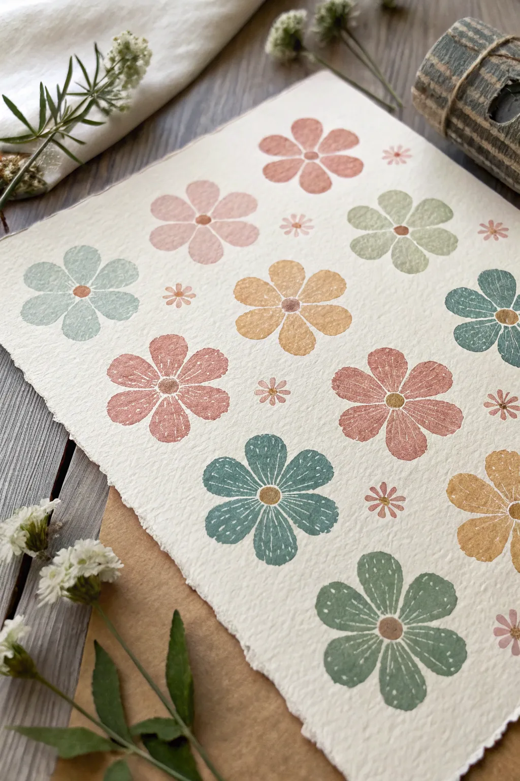
Embrace a warm, vintage aesthetic with this simple sponge-stamping technique that creates charmingly imperfect blooms. The texture of the sponge mimics a retro print style, especially when paired with high-quality deckled paper.
Detailed Instructions
Materials
- High-density crafting sponges or makeup wedges
- Heavyweight watercolor paper (rough texture, deckle edge preferred)
- Acrylic craft paints (muted earth tones: sage green, terracotta, mustard, pale blue, dusty pink)
- Small round detail brush
- Gold or brown acrylic paint for centers
- White gel pen or fine liner brush with white ink
- Scissors
- Pencil
- Paper plate or palette
Step 1: Prepping the Stamps
-
Sketch the petal shape:
On the flat side of a high-density sponge or makeup wedge, draw a simple teardrop or oval shape. This will be your single petal stamp. It should be about 0.5 to 0.75 inches long. -
Cut the sponge:
Carefully cut out your teardrop shape using sharp scissors. Try to keep the edges as clean as possible so the stamp impression is distinct. -
Create a center stamp:
Cut a much smaller circle or octagon from a scrap piece of sponge. This tiny piece, roughly the size of a peppercorn, will be used for the flower centers. -
Make a mini stamp:
If you want to create the tiny filler flowers shown in the background, cut a very small petal shape (micro-sized) from a sponge remnant.
Step 2: Stamping the Blooms
-
Prepare your palette:
Squeeze dime-sized amounts of your muted acrylic colors onto a paper plate. A warm palette works best here—think terracotta, sage, and mustard yellow. -
Load the sponge:
Dip the flat face of your teardrop sponge into the first paint color. Dab off excess paint on a clean part of the plate so the texture remains porous and not gloopy. -
Stamp the first flower:
Press the sponge onto the paper to create one petal. Rotate the paper slightly and stamp four or five more petals in a circular arrangement, leaving a small negative space in the very center. -
Continue the pattern:
Clean your sponge or switch to a fresh one for the next color. Repeat the process across the paper, spacing the large flowers out randomly. I like to rotate the angle of the flowers so they don’t all look uniform. -
Fill the gaps:
Using your tiniest ‘micro’ petal stamp and a soft pink or beige, stamp tiny star-shaped flowers in the empty spaces between the large blooms. -
Add the centers:
Dip your small circle sponge into gold or brown paint. Press it firmly into the center of each large flower. It’s okay if it overlaps the petals slightly; that adds to the handmade charm.
Sponge Texture Tip
Don’t oversaturate the sponge with paint. A ‘dry brush’ amount of paint creates that lovely, speckled vintage porosity seen in the example.
Step 3: Refining Details
-
Let it dry completely:
Wait for all paint layers to be fully dry to the touch. The acrylic needs to be settled so the next step doesn’t smear. -
Add white accents:
Using a white gel pen or a very fine liner brush with thinned white paint, draw delicate lines on the petals. Keep them simple—just a few dashed lines or a central vein radiating from the center helps define the shape. -
Detail the centers:
If your center dots look too flat, add a tiny highlight or stipple a few darker dots on top of the gold/brown centers for extra dimension. -
Check the edges:
Review the entire composition. If any petals look too faint, you can carefully re-stamp over them or touch them up with a brush, though the faded look is part of the style.
Variation Idea
Try layering two similar shades on one sponge (like dark and light pink) before stamping to create a subtle ombré effect on each petal.
Now you have a piece of artwork with a lovely tactile quality perfect for framing or gifting


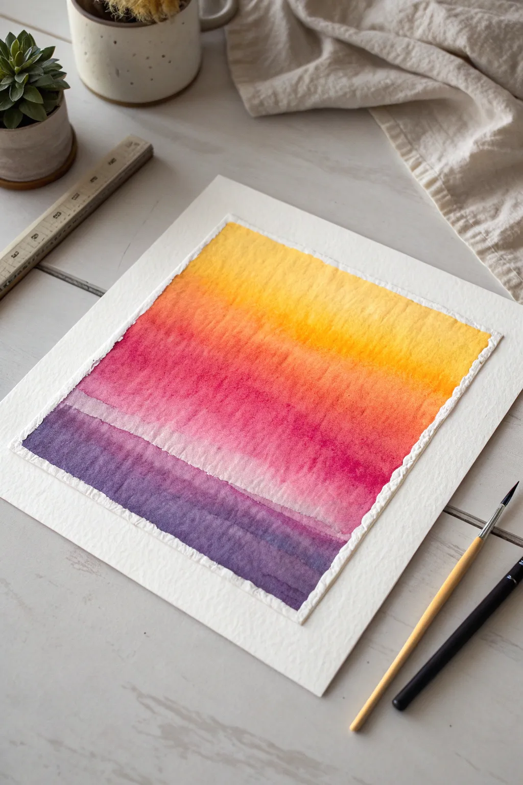
Vertical Sponge Ombre Stripes
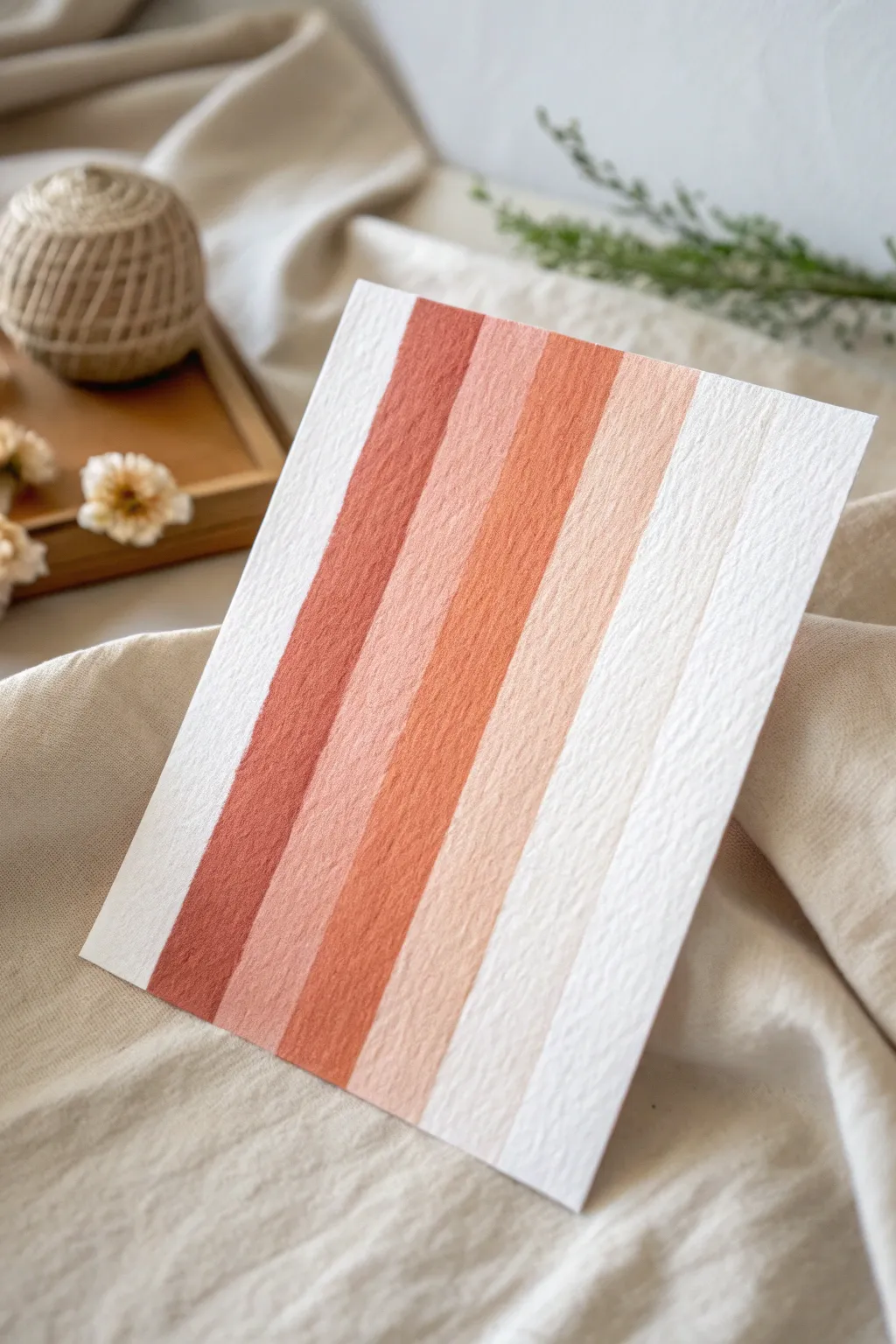
Capture the warmth of desert hues with this minimalist vertical stripe project. Using sponge brushes creates a unique, soft texture that blends distinct bands of color into a cohesive, soothing gradient.
Detailed Instructions
Materials
- Heavyweight textured watercolor paper (cold press creates the best finish)
- Acrylic paints (Burnt Sienna, Terra Cotta, Unbleached Titanium, White)
- Set of foam sponge brushes (1-inch width)
- Painter’s tape or low-tack artist tape
- Ruler
- Pencil
- Palette or paper plate for mixing
- Paper towels
Step 1: Preparation
-
Paper selection:
Choose a high-quality watercolor paper with visible tooth or texture. The texture is crucial here because the foam brush will skip slightly over the valleys, giving that organic, weathered look. -
Measure and mark:
Decide on the width of your stripes. For the look in the photo, you will want five colored stripes and two white (unpainted) borders. -
Pencil guidelines:
Use your ruler to very lightly mark the vertical lines where your color bands will go. Don’t press hard; you just need faint guides so you don’t drift while painting.
Step 2: Mixing the Palette
-
Base color:
Squeeze out your darkest color, the Deep Terracotta or Burnt Sienna, onto one side of your palette. -
Creating the gradient:
Squeeze out a large amount of White or Unbleached Titanium on the other side. -
Pre-mixing tones:
Create four distinct puddles of paint. The first is your pure dark terracotta. For the second, mix in a little titanium white. -
Lightening up:
For the third puddle, mix about 50/50 terracotta and white. For the fourth and lightest stripe, use mostly white with just a tiny dot of the terracotta to create a pale sandy peach. -
Test swatches:
Test your four colors on a scrap piece of paper to ensure the step-down in lightness is even between them.
Uneven Texture?
If paint fills the paper texture too much, your brush is too wet. Dab the sponge deeply into a paper towel before painting to keep the ‘dry brush’ look distinct.
Step 3: Painting the Stripes
-
Loading the sponge:
Dip your foam brush into the darkest paint color. Don’t overload it; dab the excess off onto a paper towel. You want the paint to be “dry” enough to catch the paper’s texture. -
First stripe:
Starting from the top left (leaving a white margin at the very edge), pull the sponge brush firmly straight down to the bottom. Try to do this in one confident stroke. -
Refining the edge:
If the coverage is too light, go over it again, but be careful not to oversaturate the paper into a solid block of color; let the grain show through. -
Second stripe:
Switch to a clean foam brush or thoroughly wash and dry the previous one. Load it with your second darkest color. -
Placement:
Paint the next vertical stripe immediately to the right of the first one. I like to leave a hairline gap—almost invisible—between stripes to keep the colors crisp, but touching is fine too. -
Third and fourth stripes:
Continue this process with the medium tone and then the lightest peach tone, moving towards the right side of the paper. -
The final band:
For the last stripe on the right, you can either paint a pure white/cream stripe or simply leave the paper bare if it matches your lightest tone well.
Add Metallic Flair
Mix a tiny drop of gold heavy body acrylic into your third or fourth stripe color for a subtle, shimmering warm highlight that catches the light.
Step 4: Finishing Touches
-
Clean up edges:
If any paint bled or the edges look messy, you can use a small detail brush with white paint to tidy up the vertical lines while the paint is still damp. -
Drying:
Let the piece dry flat completely. Acrylics dry fast, but the thick paper might hold moisture longer. -
Flattening:
If the paper buckled slightly from the moisture, place the dry artwork under a heavy book overnight to crisp it up.
Once framed, this piece adds a beautiful, modern earthy touch to any wall

Wide Sponge Brush Rain Streaks
Capture the abstract beauty of heavy rainfall with these bold, sweeping strokes of deep blue. This technique emphasizes the natural texture of watercolor paper, allowing speckles of white to show through for a distressed, organic look.
Step-by-Step
Materials
- Cold press watercolor paper (heavyweight, 140lb or 300gsm)
- Wide flat bristle brush or wide sponge brush (1-inch width)
- Deep indigo or Prussian blue watercolor paint
- Mixing palette
- Jar of water
- Paper towels
Step 1: Preparation and Mixing
-
Select your paper:
Choose a heavyweight cold press watercolor paper. The rough texture is essential for achieving the dry-brush effect seen in the streaks. -
Prepare your workspace:
Lay your paper on a flat, solid surface. If your paper tends to buckle, you can tape down the edges with masking tape. -
Mix the pigment:
Squeeze a generous amount of deep indigo or Prussian blue onto your palette. You want a strong, saturated color. -
Dilute slightly:
Add just a tiny drop of water to the paint. The consistency should be thick and creamy, not watery or runny.
Too Solid?
If your streaks lack texture and look like solid blocks, your paint is too wet. Blot your brush thoroughly on a paper towel before your next stroke.
Step 2: Creating the Streaks
-
Load the brush:
Dip your wide brush into the paint mixture. Ensure the bristles are coated but not dripping wet. Use a paper towel to blot off any excess moisture if needed. -
Test the consistency:
Do a quick test swipe on a scrap piece of paper. You’re aiming for a stroke that breaks up at the edges, revealing the paper grain. -
Position your hand:
Hold the brush at a low angle relative to the paper, almost parallel, to encourage the pigment to skip over the paper’s valleys. -
Paint the first streak:
Start at the top left corner. Apply firm pressure initially, then drag the brush diagonally downward in a swift, confident motion. -
Lift off gradually:
As you reach the end of the stroke, lighten your pressure to let the paint naturally fade and break apart. -
Reload sparingly:
Go back to your palette. I prefer not to fully reload for every single stroke to create varying levels of transparency. -
Paint the second streak:
Place your brush parallel to the first stroke, leaving a gap of white space in between. Repeat the diagonal dragging motion. -
Vary individual strokes:
Allow some strokes to be darker and more solid, while others can be lighter and more textured. This variety adds depth to the composition. -
Overlap slightly:
If a stroke feels too isolated, you can lightly brush edge-to-edge with a neighboring streak, but try to maintain distinct white channels.
Step 3: Refining and Drying
-
Review the texture:
Look closely at the edges of your lines. If they look too solid, you can dry your brush completely and lightly drag it over the wet edge to lift pigment. -
Enhance the dry brush effect:
With a nearly dry brush containing very little paint, add a few faint, ghost-like streaks between the bold ones. -
Check density:
Ensure the blue density is heaviest at the top left and fades out slightly toward the bottom right. -
Air dry completely:
Let the artwork sit undisturbed. Because the paint was applied thickly, give it extra time to dry to prevent smudging. -
Flatten the paper:
Once fully dry, if the paper has curled, place it under a heavy book overnight to flatten it out.
Direction Matters
Paint quickly! A fast hand movement creates better ‘skipping’ effects on the textured paper than a slow, careful stroke will.
Step back and admire the simple yet striking rhythm of your rain-streaked abstract art
BRUSH GUIDE
The Right Brush for Every Stroke
From clean lines to bold texture — master brush choice, stroke control, and essential techniques.
Explore the Full Guide
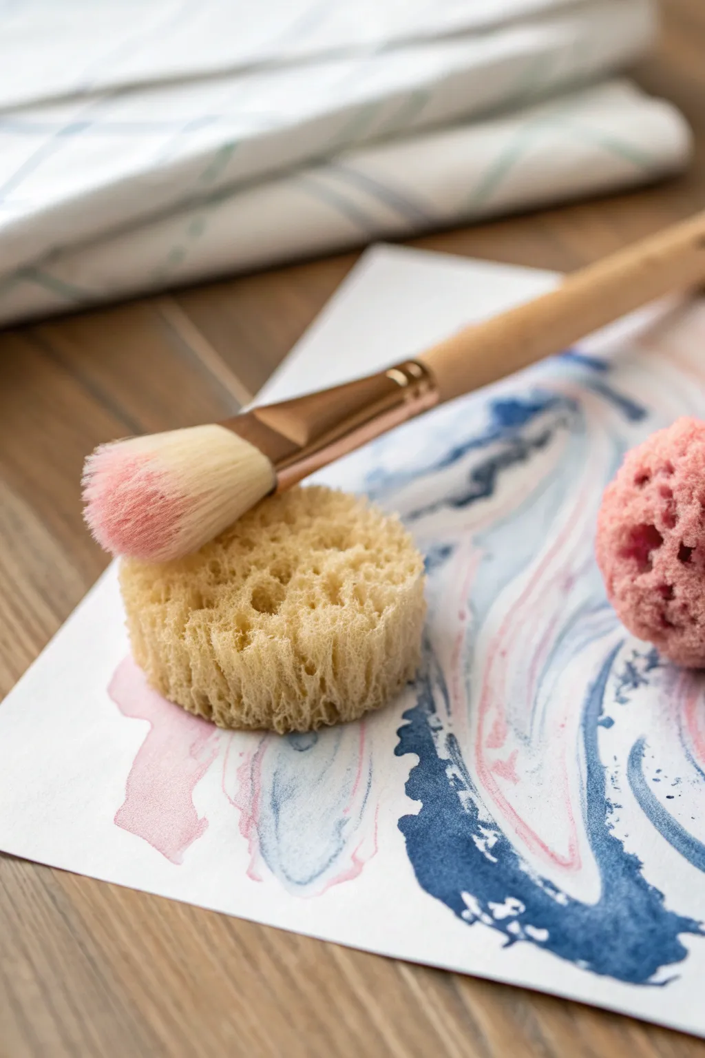
Two-Color Sponge Marble Swirls

Create sophisticated, fluid patterns that mimic the natural veins of marble using just two colors and a simple sponge technique. This project results in a dreamy, airy composition where deep navy blues and soft pastel pinks dance together on the page.
Step-by-Step Guide
Materials
- Heavyweight watercolor paper or mixed media paper
- Watercolor paints or fluid acrylics (Navy Blue, Soft Pink)
- Round natural sea sponge (medium porosity)
- Small synthetic cosmetic sponge (for softer textures)
- Soft bristle paintbrush (filbert or round shape)
- Palette or small dishes for mixing
- Water container
- Paper towels
Step 1: Preparation and Pigment
-
Paper Selection:
Begin by selecting a heavyweight paper, preferably cold-press watercolor paper, which has a slight texture that grips the sponge marks beautifully. -
Dampen the Sponge:
Take your round natural sea sponge and submerge it fully in water until it expands. Squeeze it out thoroughly so it is damp but not dripping. -
Prepare the Colors:
On your palette, prepare two puddles of paint: a deep, rich navy blue and a delicate pastel pink. Dilute them slightly with water to achieve an inky, fluid consistency. -
Brush Loading:
Instead of dipping the sponge directly, load your soft bristle paintbrush with the diluted navy blue paint.
Muddy Colors?
If blue and pink are turning purple/gray, let the blue layer dry for 5 minutes before adding pink overlapping strokes.
Step 2: Creating the Swirls
-
Applying Paint to Sponge:
Paint the pigment directly onto the textured surface of the damp sea sponge in a curved, irregular line. This gives you more control than dipping. -
The First Press:
Gently press the painted area of the sponge onto the paper, rolling your wrist slightly to create a curved, organic shape rather than a flat stamp. -
Dragging Technique:
While the sponge is still in contact with the paper, drag it lightly across the surface to elongate the mark, mimicking the flow of marble veins. -
Building the Blue:
Repeat this process with the blue paint, creating a loose pathway of swirls that generally flow in the same diagonal direction across the page. -
Leaving Negative Space:
Crucially, leave plenty of white space between your blue veins. This breathing room prevents the design from becoming muddy.
Step 3: Adding the Pink Accent
-
Cleaning Tools:
Rinse your brush thoroughly. You can use a clean side of the same sponge or a second clean sponge for the next color to keep the hues distinct. -
Loading the Pink:
Load your brush with the pastel pink mixture and apply it to the sponge, just adjacent to where the blue was applied if using the same tool. -
Layering Colors:
Press the pink sponge sections gently into the white spaces and slightly overlapping the edges of the blue swirls. -
Softening Edges:
Where the two colors meet, use the natural texture of the sponge to blur the boundary, allowing the wet paints to bleed into each other slightly. -
Creating Depth:
I like to go back in with a slightly more saturated pink on the tip of the brush and dab it directly into the wettest areas for a pop of intensity. -
Checking Balance:
Step back and assess your composition. The goal is a balanced interaction where the blue creates structure and the pink adds softness.
Natural Veining Tip
Twist your wrist while dragging the sponge across the paper to create realistic, unpredictable marble-like veins.
Step 4: Finishing Touches
-
Refining Texture:
If any edges look too hard or harsh, take a clean, slightly damp corner of the sponge and gently dab the perimeter to diffuse the paint. -
Adding Splatters (Optional):
For extra texture, you can flick a tiny amount of watery blue paint off the bristles of your brush onto the paper. -
Final Drying:
Allow the piece to dry completely on a flat surface. Depending on how much water you used, this may take up to an hour.
Now you have a unique piece of abstract art ready to be framed or used as custom stationery background


Have a question or want to share your own experience? I'd love to hear from you in the comments below!