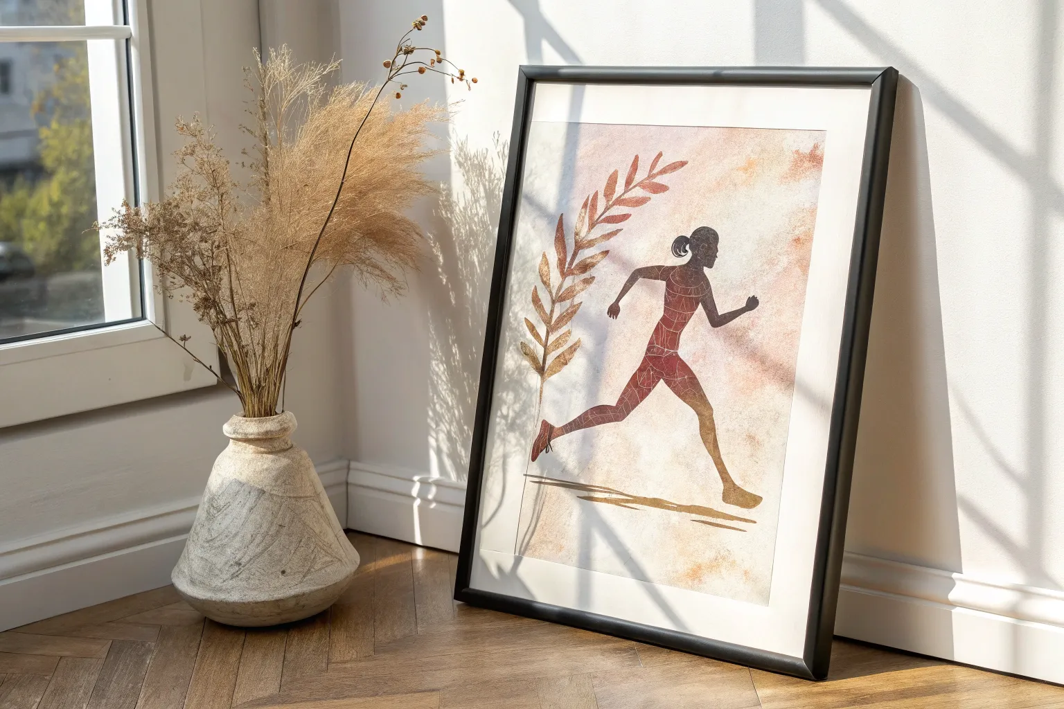
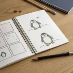
If you’re craving fresh sports painting ideas, you’re in the right mindset—sports are basically built-in drama, motion, and color. I love how one good action moment can turn into a painting that feels loud, fast, and full of heart.
Baseball Windup and Throw
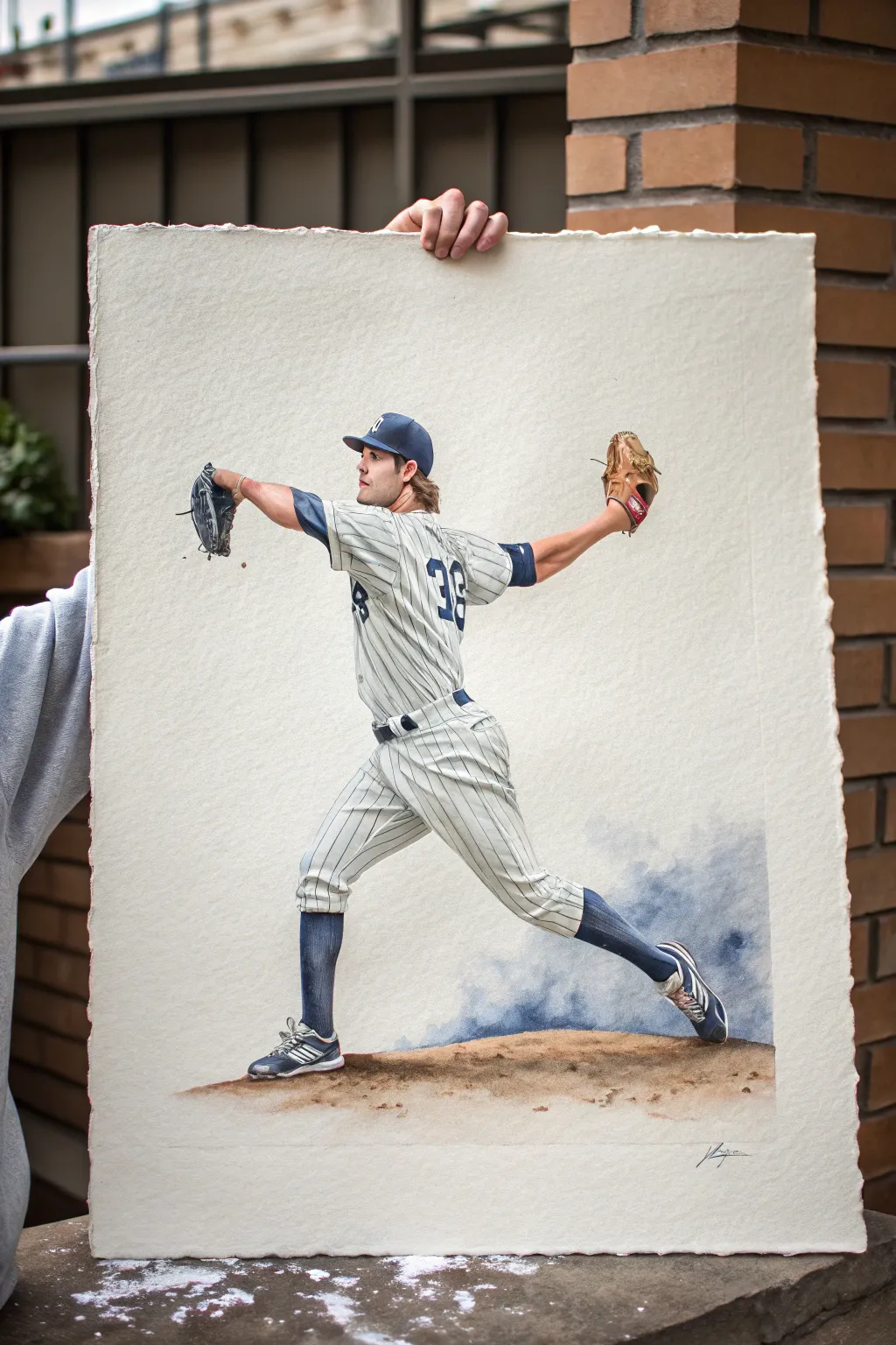
Capture the dynamic tension of a baseball pitch with this detailed watercolor study on textured paper. This project balances precise figure drawing with loose, expressive washes to create a sense of motion and dust on the mound.
Step-by-Step Guide
Materials
- Large sheet of rough-texture watercolor paper (300lb cold press ideal)
- Pencil (HB or 2H for light sketching)
- Kneaded eraser
- Masking fluid
- Watercolor paints: Indigo, Burnt Sienna, Yellow Ochre, Ultramarine Blue, Alizarin Crimson, Sepia
- Brushes: Round sizes 2, 6, and 12
- Small flat brush for lifting
- Palette for mixing
- Water containers and paper towels
Step 1: Drawing and Preparation
-
Establish the pose:
Begin by lightly sketching the pitcher’s basic gesture. Focus on the long diagonal line stretching from the back foot to the glove hand to capture the momentum. -
Refine the anatomy:
Flesh out the figure’s forms, paying close attention to the twist of the torso and the extension of the throwing arm. Keep your pencil pressure light so the graphite doesn’t show through later. -
Detail the uniform:
Draw the signature pinstripes and folds in the fabric. Notice how the stripes curve around the body’s volume; don’t just draw straight lines. -
Protect the highlights:
Apply masking fluid to the brightest white areas, specifically the white lettering on the jersey, the shoe highlights, and the brightest glints on the glove.
Step 2: Painting the Figure
-
Base shadow tones:
Mix a diluted wash of Indigo and a touch of Sepia for the white uniform’s shadows. Paint the shaded areas of the folds first, keeping the edges soft. -
Painting the pinstripes:
Using your smallest round brush (size 2) and concentrated Indigo, carefully paint the pinstripes. Break the lines where the fabric folds to create realistic depth. -
Skin tones:
Mix Burnt Sienna with a tiny amount of Alizarin Crimson for the skin. Apply a base wash, then drop in darker mixtures while wet to define the muscles in the arm and neck. -
Navy details:
Paint the undershirt, socks, and cap using a rich mixture of Indigo and Ultramarine. Leave tiny gaps of white paper for fabric texture if possible. -
The glove:
Use Burnt Sienna mixed with Yellow Ochre for the leather glove. Layer darker Sepia tones into the webbing and palm to show wear and shadow.
Muddy Uniform Shadows?
If your white uniform looks dirty instead of shadowed, your grey mix is too warm. Use more blue/violet in your shadow mix to keep the fabric looking crisp and cool.
Step 3: The Mound and Atmosphere
-
Grounding the figure:
Mix Burnt Sienna and Sepia for the dirt mound. Apply this quite dryly near the feet to create texture that resembles kicked-up clay. -
Creating dust:
While the mound color is still wet, splatter clean water into it to create ‘blooms’ that look like dust texture. -
Atmospheric background:
Mix a very watery wash of Indigo and Ultramarine. Apply this loosely behind the pitcher’s legs and lower torso, fading it out to white as you move away from the figure. -
Softening edges:
Take a clean, damp brush and soften the edges of the background wash so it looks like a cloud of dust or steam rising from the mound. -
Shoe details:
Paint the cleats with a dark grey mix, leaving the white stripes clean. Add a touch of the ‘dirt’ color to the soles to integrate them with the ground.
Texture Trick
Sprinkle a pinch of salt onto the wet paint of the pitcher’s mound. When it dries and you brush it off, it creates a perfect gritty, dirt-like texture.
Step 4: Final Touches
-
Remove masking:
Once the paper is completely bone-dry, gently rub away the masking fluid to reveal the crisp whites underneath. -
Refine highlights:
If the revealed whites are too stark, soften them with a very faint grey wash or clean water. -
Deepen contrast:
I like to go back with my darkest Indigo mix and re-establish the deepest shadows in the uniform folds and under the brim of the cap for maximum pop. -
Deckle the edges:
If your paper doesn’t have a natural deckle, you can tear the edges against a ruler to give it that classic, rough-hewn artistic look shown in the reference.
Now step back and admire the motion you’ve captured in this timeless piece of sports art
Football Catch at Full Stretch
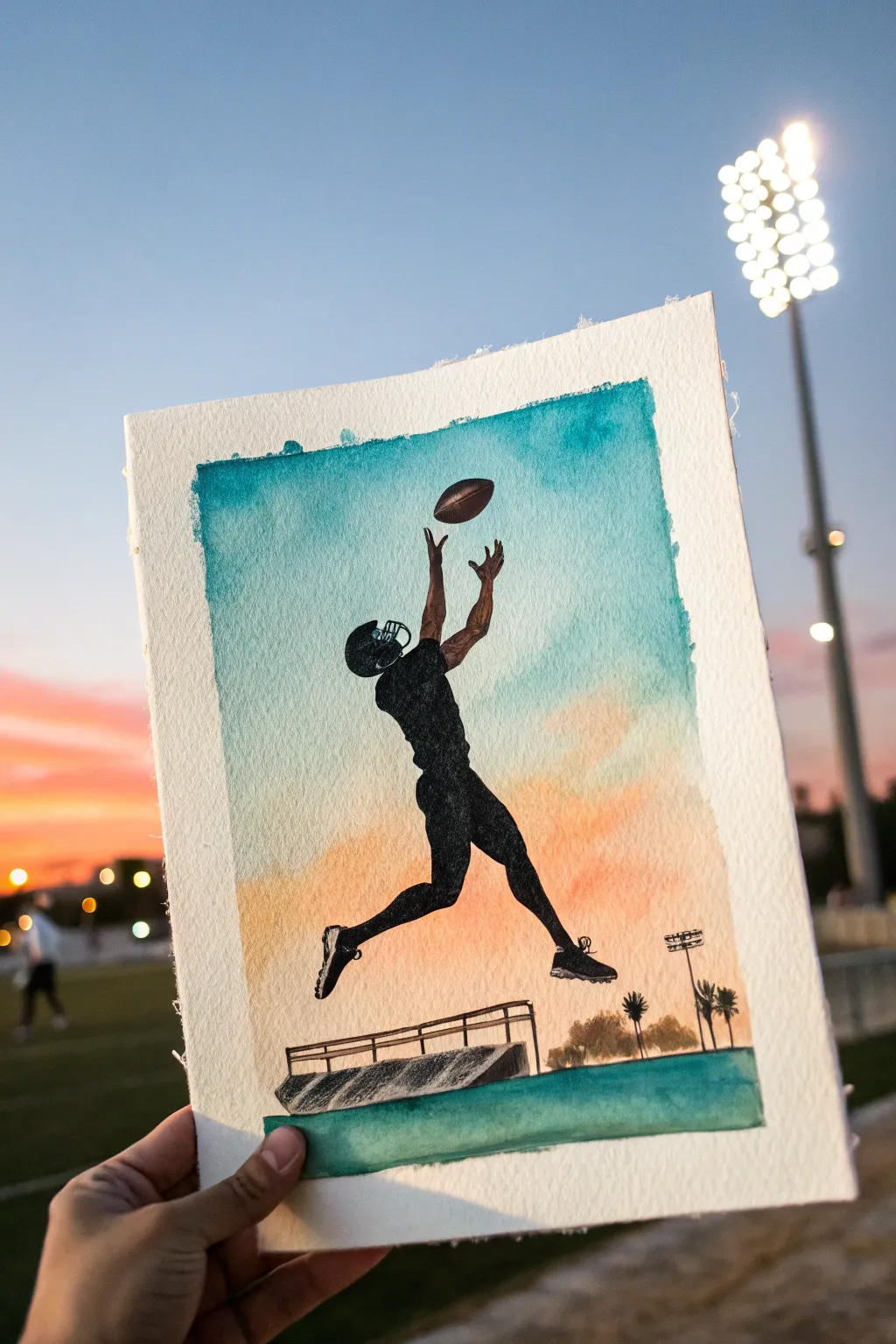
Capture the athletic grace of a wide receiver mid-air with this vibrant watercolor and ink silhouette painting. The project features a stark black figure leaping against a soft, blended sunset gradient that transitions from teal to warm orange.
Detailed Instructions
Materials
- Cold press watercolor paper (140lb/300gsm)
- Painter’s tape or masking tape
- Watercolor paints (Turquoise/Teal, Cadmium Orange, Yellow Ochre)
- Black India ink or black acrylic paint
- Fine liner pens (0.1mm and 0.5mm)
- Flat wash brush (3/4 inch)
- Round detail brushes (size 0 and 2)
- Graphite pencil (HB or 2H)
- Bowl of water and paper towels
Step 1: Preparing the Sky
-
Tape the Edges:
Secure your watercolor paper to a board using painter’s tape on all four sides. Leave about a half-inch border creates that crisp, professional white edge seen in the final piece. -
Wet the Paper:
Using your large flat brush, apply a layer of clean water across the main rectangular area where the sky will be. The paper should be glisten, but not hold puddles. -
Paint the Upper Sky:
Load your brush with a rich turquoise or teal watercolor. Apply this to the top third of the wet paper, letting the pigment flow naturally downwards. The wet-on-wet technique will help create soft, ragged edges. -
Create the Sunset Band:
Rinse your brush thoroughly. Pick up a mix of cadmium orange and yellow ochre. Paint the bottom third of the sky area, gently brushing upward to meet the blue. -
Blend the Transition:
While both sections are still damp, use a clean, slightly wet brush to encourage the teal and orange to meet in the middle. Be careful not to overmix, or you might get a muddy brown; let them touch and diffuse naturally. -
Add the Ground:
Once the sky wash is mostly dry, paint a solid, straight strip of teal or dark green at the very bottom to represent the turf or sideline area.
Fixing “Muddy” Skies
If blue and orange mix into gray in the middle, wait for it to dry totally. Then, glaze a very thin wash of clear water and lift the muddy pigment with a paper towel.
Step 2: Sketching the Action
-
Dry Completely:
Wait until the watercolor background is bone dry. If the paper is cool to the touch, it’s still damp. I use a hairdryer on a low setting to speed this up carefully. -
Outline the Figure:
Lightly sketch the silhouette of the football player. Focus on the C-shape arch of the back and the extended arms reaching upward. Keep your pencil pressure very light so mistakes are easy to erase. -
Add Equipment Details:
Refine the sketch by adding the distinct shape of the football helmet, the shoulder pads, and the cleats on the feet. Sketch the football floating just above the fingertips. -
Sketch the Bleachers:
At the bottom, just above the green ground strip, draw a simple outline of a bleacher ramp or fence structure, keeping the perspective linear.
Level Up: Texture
Sprinkle a pinch of salt onto the wet teal sky while painting. When it dries and you brush the salt off, it creates a starry or textured effect perfect for dusk.
Step 3: Inking the Silhouette
-
Fill the Figure:
This is the boldest step. Using a size 2 round brush and black India ink (or acrylic), carefully fill in the player’s body. Start with the outline to get crisp edges, then fill the center. -
Detail the Helmet:
Switch to a 0.1mm fine liner pen for the helmet’s facemask. These delicate lines are too tricky for a brush. Leave tiny negative spaces (unpainted areas) if you want to suggest light hitting the helmet. -
Paint the Football:
Paint the football shape. You can use a very dark brown instead of pure black to give it slight separation from the player’s hands, or stick to the silhouette style with black. -
Define the Shoes:
Use your fine pen to draw the spikes on the bottom of the cleats. Crisp, sharp triangles maximize the feeling of motion and traction. -
Anchor the Scene:
Fill in the bleacher structure at the bottom with a lighter touch—perhaps a dark grey or a sketched black line rather than a solid fill—so it doesn’t distract from the player. -
Add Background Elements:
Using your finest pen, sketch tiny light poles and palm trees on the right horizon line. Keep them small to emphasize the height of the jump. -
Final Reveal:
Once the ink is fully cured, slowly peel away the masking tape at a 45-degree angle to reveal your clean white borders.
Frame this dynamic piece to remind yourself to always reach for your goals
Tennis Serve With Motion Trails
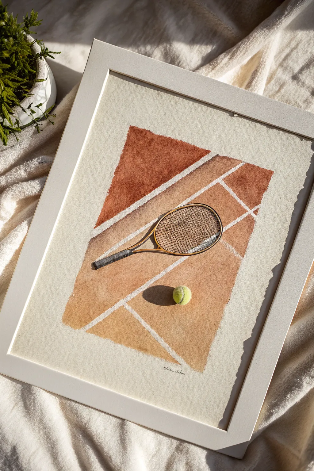
Capture the nostalgic warmth of a clay court with this stylized watercolor painting. Featuring a vintage racket and ball against geometric terracotta segments, this piece combines precise masking with loose, textured washes for a modern athletic aesthetic.
Step-by-Step
Materials
- Heavyweight cold-press watercolor paper (140lb/300gsm)
- Watercolor paints (Burnt Sienna, Yellow Ochre, Burnt Umber, Payne’s Grey, Sap Green, Lemon Yellow)
- Masking tape or painter’s tape (various widths)
- Flat wash brush (3/4 inch)
- Round detail brushes (sizes 2 and 4)
- Pencil and eraser
- Ruler
- Paper towels
- White or light wood frame (optional)
Step 1: Drafting and Masking
-
Sketch the layout:
Begin by lightly sketching a large rectangle in the center of your paper, leaving a generous white border. Use a ruler to ensure the edges are straight. -
Map the court lines:
Inside your rectangle, draw the white court lines. Create dynamic angles by drawing diagonal lines that intersect, mimicking the perspective of a tennis court corner. -
Outline the equipment:
Lightly sketch the tennis racket in the center, placing the handle diagonally across the court lines. Draw a simple circle for the tennis ball near the bottom right. -
Protect the borders:
Apply masking tape firmly over the outer borders of your rectangle to create a crisp, clean edge for the painting area. -
Mask the court lines:
Carefully apply thin strips of masking tape (or cut wider tape into strips) directly over your penciled court lines. Press down firmly to prevent paint from seeping underneath.
Step 2: Painting the Clay Court
-
Mix your clay colors:
Create a rich terracotta hue by mixing Burnt Sienna with a touch of Burnt Umber. Prepare a second, lighter wash using Yellow Ochre and a hint of the first mixture. -
Paint the first segment:
Starting with the top geometric section, apply the darker terracotta mix. Use a flat brush and let the water create natural blooms and texture as it dries. -
Vary the tones:
For the lower segments, switch to your lighter ochre-based wash. This variation suggests sun-bleached clay or light hitting different parts of the court. -
Create texture:
While the wash is still damp, dab it gently with a crumpled paper towel in a few spots to lift pigment and mimic the grainy texture of a clay surface. -
Paint around the objects:
Be very careful to paint around your racket and ball sketches. It’s okay if the ‘clay’ wash touches the outline, but try to keep the interiors of the objects clean. -
Dry thoroughly:
Allow the background washes to dry completely. If the paper feels cool to the touch, it’s still wet.
Clean Lines Secret
Before painting over masking tape, paint a layer of clear water or white acrylic over the tape edges first. This seals the edge so no color bleeds under.
Step 3: Details and Finishing
-
Paint the racket frame:
Mix a warm wood tone using Burnt Umber and Yellow Ochre. Using a size 4 round brush, carefully fill in the rim and throat of the racket. -
Add the handle grip:
Paint the handle with a dark Payne’s Grey. Once dry, use a slightly darker mix to add diagonal lines representing the grip tape wrapping. -
String the racket:
Using your smallest brush (size 2) and a very diluted grey-brown mix, paint fine, cross-hatching lines inside the racket head to represent the strings. -
Paint the tennis ball:
Mix Lemon Yellow with a tiny dot of Sap Green. Paint the ball, leaving the white curved seam unpainted if you have a steady hand, or paint solid and add the seam later with white gouache. -
Add shadows:
Mix a diluted purple-grey wash. Paint a soft shadow specifically under the ball and along one side of the racket handle to ground the objects to the surface. -
Reveal the lines:
Once absolutely everything is bone dry, slowly peel away the masking tape from the court lines and the border. Pull the tape away at a 45-degree angle to avoid tearing the paper. -
Erase guidelines:
Gently erase any remaining pencil marks visible in the white spaces. -
Sign and frame:
Sign your name small at the bottom, perhaps following the angle of the court line, and place your artwork in a simple white frame to let the colors pop.
Level Up: 3D Strings
Instead of painting the racket strings, use a needle and thread to actually sew through the paper for real texture. Use a gold or metallic thread for a vintage vibe.
Now you have a framed piece of vintage sports history ready to hang on your wall

Swimming Lanes and Water Reflections
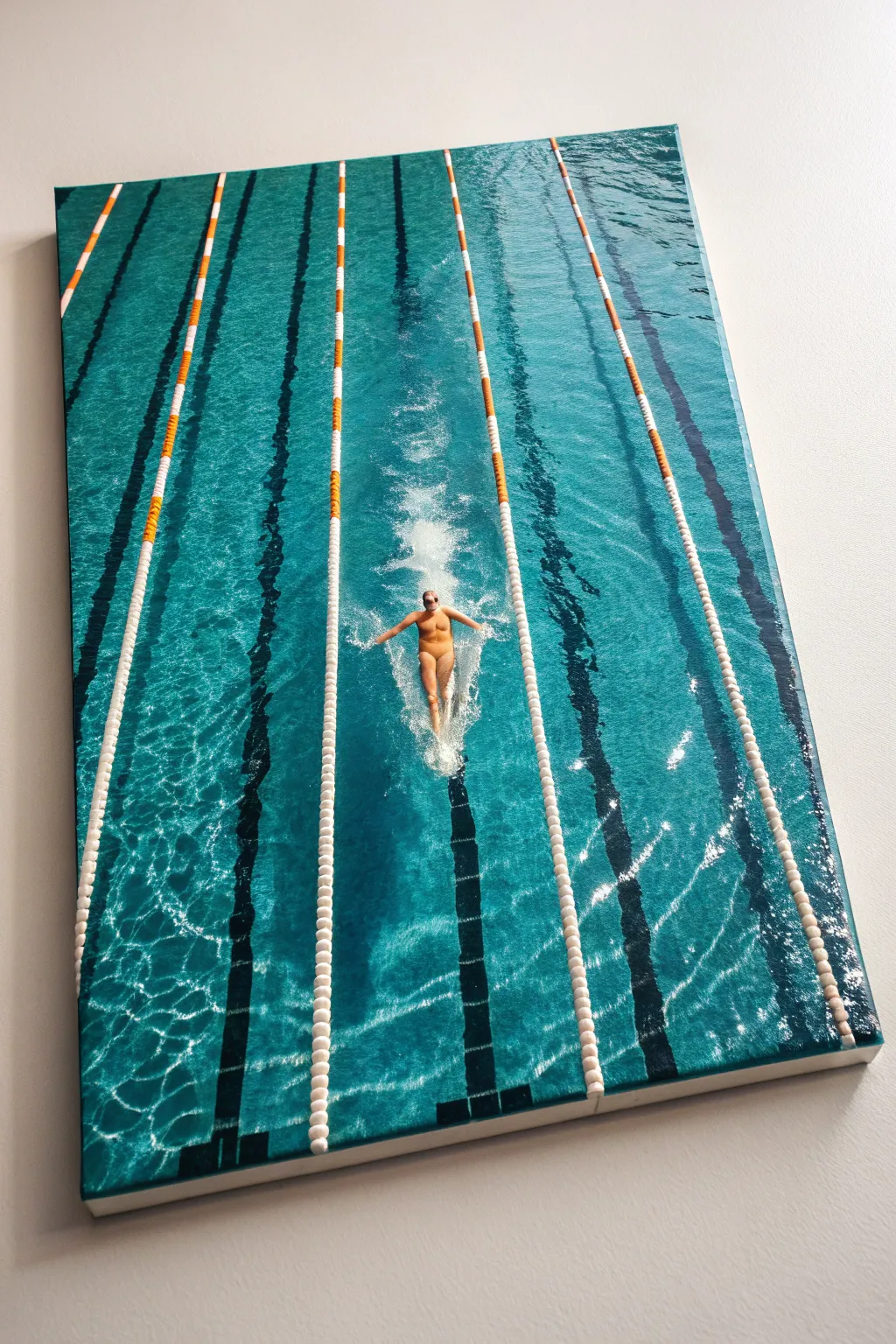
Capture the dynamic energy and serene blue tones of competitive swimming with this detailed acrylic painting project. You’ll master the art of painting refracted water and creating realistic movement on a large stretched canvas.
How-To Guide
Materials
- Large stretched canvas (24×36 or similar)
- Heavy body acrylic paints (Phthalo Blue, Phthalo Green, Titanium White, Carbon Black, Cadmium Orange, Burnt Sienna, Yellow Ochre)
- Set of flat brushes (1-inch, 1/2-inch)
- Round brushes (sizes 2, 4, 6)
- Detail liner brush
- Painter’s tape or masking tape
- Ruler or straight edge
- Water spray bottle
- Palette and palette knife
- Glazing medium
Step 1: Planning and Underpainting
-
Prepare the canvas:
Start by priming your canvas with gesso if it isn’t pre-primed. Once dry, lightly sketch the composition using a pencil or diluted blue paint. Mark the vertical lane lines first using a long ruler to ensure they are perfectly straight and converge slightly if you want a perspective effect, or keep them parallel for a top-down view. -
Position the swimmer:
Sketch the swimmer in the center lane. Focus on the butterfly stroke shape—arms extended outward, torso lifting from the water. Don’t worry about tiny details yet; just get the proportions of the body and the splash zone correct. -
Base coat the water:
Mix a deep teal using Phthalo Blue, a touch of Phthalo Green, and a little Black. Paint the entire water surface with this dark base color. This creates the ‘depth’ of the pool that will peek through the lighter ripples later. -
Block in lane lines:
While the water dries, paint the base stripes for the lane markers. Use a dark grey for the submerged black lines on the pool floor and a brighter under-layer (white mixed with a tiny bit of blue) for the floating lane ropes.
Pro Tip: Liquid Look
Use a ‘slow-drying medium’ with your acrylics. This keeps the paint workable longer, allowing you to blend the water gradients smoothly for a soft, realistic liquid appearance.
Step 2: Water Texture and Depth
-
Layering the turquoise:
Mix a mid-tone turquoise using Phthalo Blue, Phthalo Green, and White. Using a flat brush, apply this over the dark base using horizontal, choppy strokes. Leave gaps so the dark underpainting shows through—this mimics the shadows in the ripples. -
Adding the sunlit grid:
To create the ‘caustics’ (light reflecting on the pool bottom), mix a very pale, watery turquoise. Use a smaller round brush to paint the wobbly, net-like patterns found on the pool floor. These should look distorted and broken by the water’s movement. -
Deepening shadows:
Go back in with a glaze of Phthalo Blue and glazing medium. Apply this over areas where the water looks too flat; the transparency adds instant realism and makes the water look ‘wet’ rather than solid.
Troubleshooting: Flat Water
If your water looks too one-dimensional, you likely lack contrast. Don’t be afraid to use nearly black paint for the deepest ripple shadows and pure white for the highest highlights.
Step 3: Painting the Swimmer
-
Flesh tones base:
Mix your skin tone using White, Yellow Ochre, and a touch of Cadmium Orange and Burnt Sienna. Paint the swimmer’s back and arms. Since the figure is wet and partially submerged, keep the edges slightly soft rather than crisp. -
Shadows on the body:
Mix a darker version of your flesh tone with a tiny bit of blue (to reflect the water color). Paint the shadows under the arms and along the sides of the torso to give the figure volume. -
Swimsuit details:
Paint the swimmer’s suit using a dark, opaque color like charcoal or navy to contrast with the bright skin and water. -
The splash zone:
Using pure Titanium White on a scruffy or hog bristle brush, stipple the paint around the swimmer’s arms and kick. This creates the foamy, chaotic white water generated by the butterfly stroke.
Step 4: Refining the Lane Lines
-
Detailing the ropes:
Paint the individual floats on the lane lines. Alternate distinct segments of white and orange (or red). Remember that these are small plastic discs, so use small, rhythmic dabs of paint. -
Submerged distortion:
For the black lines painted on the pool floor, distort them slightly as they pass under ‘ripples.’ They shouldn’t be ruler-straight lines anymore; wiggle your brush slightly to show refraction. -
Highlights on the ropes:
Add tiny dots of pure white on the top of the floating lane markers where the sun hits the plastic. This makes them pop out of the water.
Step 5: Final Highlights and Polish
-
Surface shimmer:
Mix a semi-transparent white glaze. Dry-brush this lightly over the blue water areas to suggest surface tension and the sun hitting the very top of the ripples. -
Sparkle effects:
I like to take a detail liner brush with thick Titanium White to place the brightest sparkles. Place these on the wettest parts of the swimmer’s back and the crests of the water splashing around them. -
Canvas edges:
Don’t forget the sides of your canvas! Paint the edges a solid dark teal or continue the painting wrap-around style for a professional gallery finish. -
Varnish:
Once the painting is fully cured (usually a few days for acrylics), apply a high-gloss varnish. The gloss finish is crucial here—it mimics the natural shine of water perfectly.
Hang your finished masterpiece in a bright room and enjoy the refreshing splash of color it brings to your space.
BRUSH GUIDE
The Right Brush for Every Stroke
From clean lines to bold texture — master brush choice, stroke control, and essential techniques.
Explore the Full Guide
Skating Speed Lines and Ice Spray
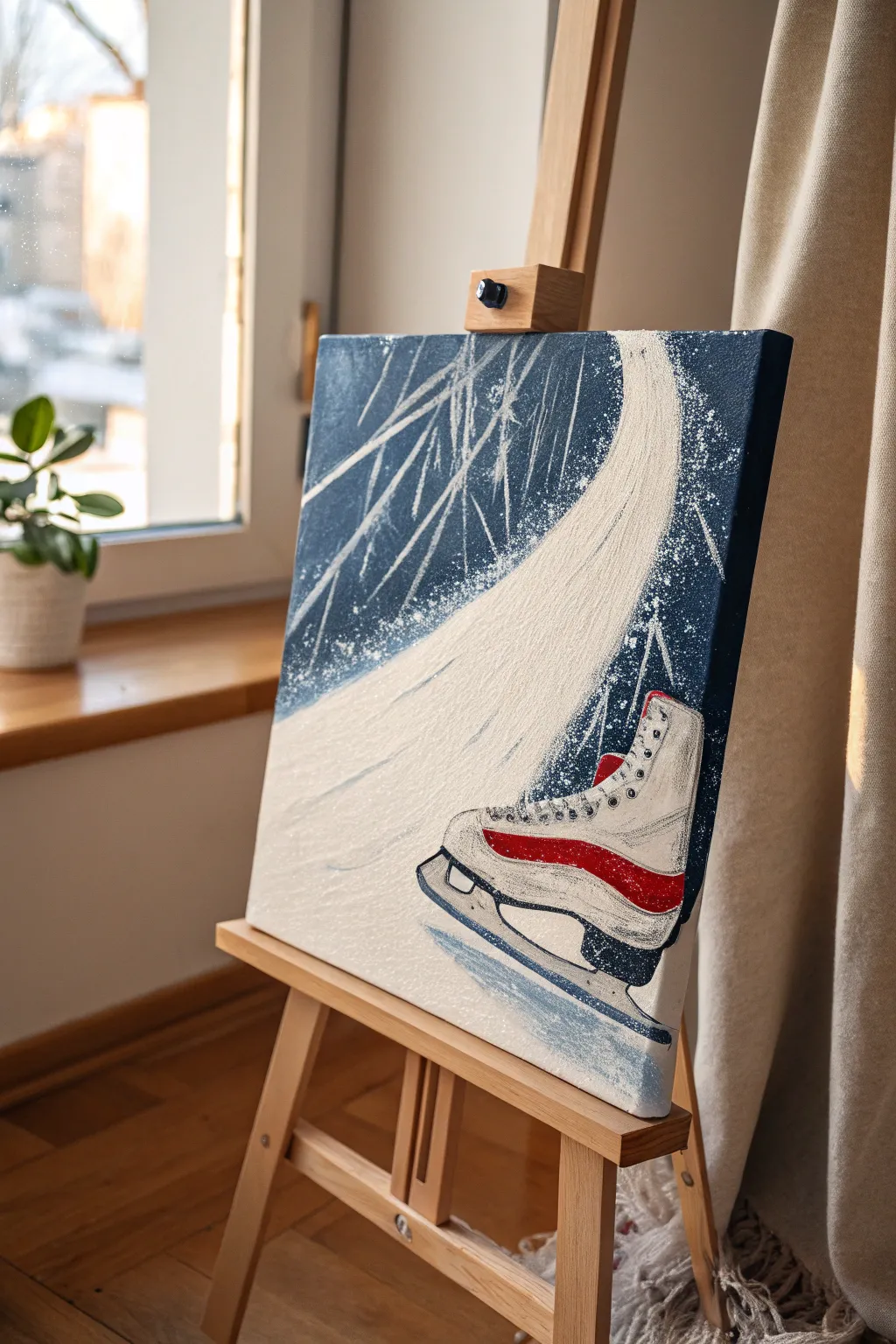
Capture the rush of cold air and the satisfying crunch of ice with this dynamic acrylic painting. By combining sharp, graphic lines with splatter techniques, you will create a sense of movement that feels like a snapshot of a perfect spin.
Step-by-Step Guide
Materials
- Stretched canvas (e.g., 12×16 or 16×20 inches)
- Acrylic paints: Navy blue, titanium white, bright red, black, silver (optional)
- Flat shader brushes (large and medium)
- Round detail brush (size 1 or 2)
- Old toothbrush or stiff bristle brush
- Palette knife (optional for texture)
- Chalk or pastel pencil for sketching
- Water cup and paper towels
Step 1: Setting the Frozen Stage
-
Prime the background:
Begin by covering the entire canvas with a deep navy blue acrylic paint. Use a large flat brush and long, horizontal strokes to ensure even coverage. -
Add depth:
While the navy is still slightly wet, mix a tiny drop of black into a corner of your blue pile. Paint the upper left and bottom right corners with this darker shade to create a subtle vignette effect. -
Let it cure:
Allow the background layer to dry completely. This is crucial because you want sharp white lines later, not muddy light blue smears. -
Sketch the composition:
Using a piece of chalk or a pastel pencil, lightly sketch the large swooping curve of the ice path first. It should start narrow at the top right and widen as it sweeps down towards the left. -
Outline the skate:
Sketch the boot shape in the bottom right foreground. Focus on the main shapes: the ankle support, the heel, and the long blade holder. Don’t worry about the laces yet.
Step 2: Painting the Skate
-
Block in the boot:
Fill the main shape of the boot with titanium white. You might need two coats to make it opaque against the dark background. -
Shadow and form:
Mix a very light grey (white with a touch of navy/black). Paint a curved line along the heel and under the ankle area to give the boot roundness and dimension. -
The signature stripe:
Once the white is dry, paint a bold, curved red stripe running from the heel to the middle of the foot. This graphic element really pops against the blue. -
Blade runner:
Paint the blade holder and the blade itself using a mix of white and silver, or just light grey. Use your small round brush to keep the edges crisp. -
Blade details:
Add a thin line of navy blue along the bottom edge of the blade to separate it from the ice reflection, and outline the mounting points in black. -
Lacing up:
Use a detail brush and grey paint to create small dots or X-shapes up the front of the boot for eyelets. Thread thin white lines between them to represent laces.
Splatter Control
Before flicking paint for the ice spray, shield the boot area with a piece of scrap paper. This keeps your skate design clean while you add the messy snow effects around it.
Step 3: Movement and Ice Effects
-
Create the ice path:
Load a medium flat brush with white paint. Starting from the top of your swoosh sketch, pull the brush down in long, confident strokes following the curve. Let the paint run a bit dry at the end of the stroke for a textured look. -
Add speed lines:
Using the edge of a flat brush or a liner brush, paint thin, sharp white lines radiating from the top left corner downward. These abstract lines mimic the blur of passing scenery. -
Refine the path edges:
Feather the edges of your main white ice path. I find that dry-brushing slightly over the navy background makes the ice look powdery and broken. -
The spray technique:
Dip an old toothbrush or stiff brush into watery white paint. Hold it near the canvas along the curve of the ice path and flick the bristles with your thumb to create a spray of fine dots. -
Concentrate the snow:
Focus more splatter near the blade and the outer curve of the path where the skate would be carving up the ice. This creates the energy of a sharp turn. -
Final highlights:
Add pure white highlights to the top of the boot cuff and the shiniest part of the red stripe to make them look glossy.
Add Metallic Flair
Use metallic silver paint for the skate blade or mix iridescent medium into the white ice path paint. Under gallery lights, the ‘ice’ will actually shimmer.
Step back and admire the energetic motion you’ve captured on canvas, frozen in time
Surf Action With Big Wave Shapes
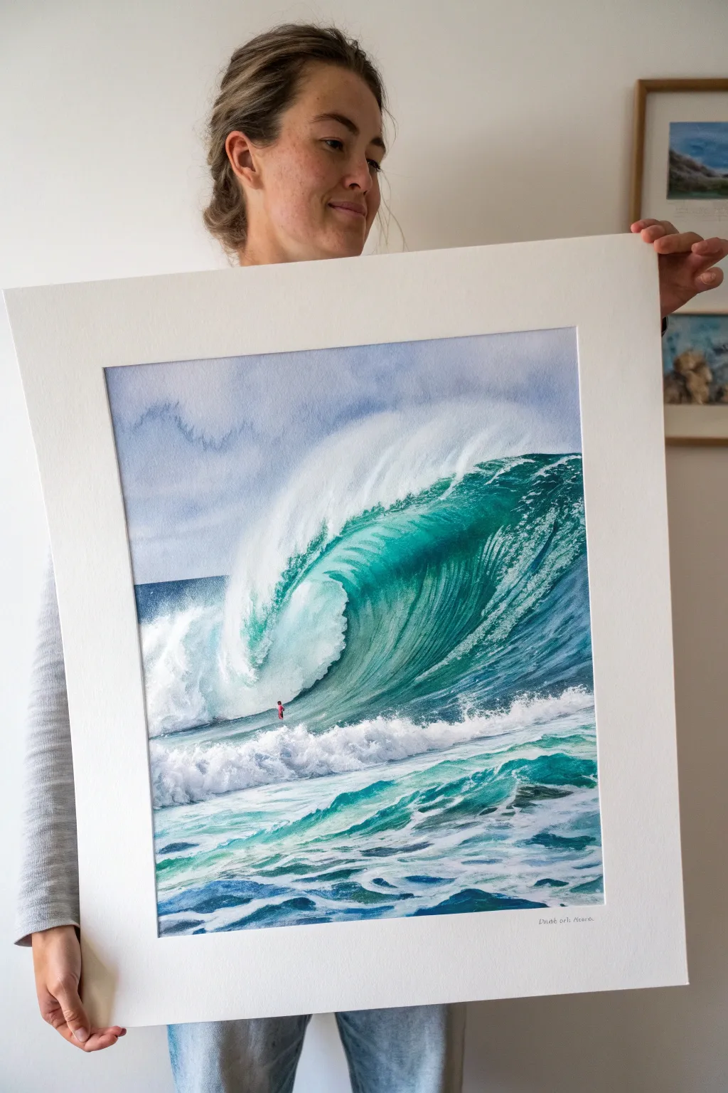
Capture the raw power and translucent beauty of the ocean with this dynamic watercolor painting. You’ll master wet-in-wet techniques to create the glowing teal barrel and sharp dry-brushing for the explosive sea spray.
Step-by-Step Guide
Materials
- High-quality watercolor paper (300gsm, cold press, large format approx 16×20 inches)
- Watercolor paints: Phthalo Blue, Viridian Green, Prussian Blue, Payne’s Gray, Titanium White (gouache or watercolor)
- Masking fluid (drawing gum) and old brush
- Large flat wash brush (1-2 inch)
- Round brushes (flats and rounds, sizes 4, 8, and 12)
- Sea sponge or crumpled paper towel
- Pencil (HB) and kneaded eraser
- Masking tape and drawing board
- Two jars of water
Step 1: Planning and Preservation
-
Secure the paper:
Tape your large watercolor paper securely to a board on all four sides. This prevents buckling when we add heavy washes of water later. -
Sketch the wave anatomy:
Lightly sketch the main curve of the wave. Pay attention to the ‘lip’ where it turns over and the chaotic foreground water. Mark a tiny spot for the surfer to establish the massive scale. -
Mask the brightest whites:
Use an old brush to apply masking fluid to the absolute whitest areas: the very top lip of the wave spray and the thickest foam trails in the foreground. Let this dry completely before touching it with paint.
Muddy Waters?
If your greens look dull, stop mixing too many colors. Stick to Phthalo Blue and Lemon Yellow (or Viridian) for that tropical glow. Let layers dry fully before glazing.
Step 2: Sky and Base Layers
-
Paint the sky:
Wet the sky area above the wave horizon line. Drop in a very dilute mix of Prussian Blue and Payne’s Gray to create a moody, cloudy sky. Let the paint bloom naturally, but keep it lighter near the horizon. -
Establish the horizon:
Once the sky is damp (not soaking), run a straight line of dark blue (Phthalo + Payne’s Gray) across the horizon line to separating sea from sky. -
Underpainting the barrel:
For the translucent face of the wave, wet the paper and apply a wash of Viridian Green mixed with a touch of Phthalo Blue. I like to keep this layer quite light and luminous, as it represents light shining through the water.
Level Up: Salt Texture
Sprinkle coarse sea salt onto the wet foreground paint. Let it dry completely, then brush it off. This creates unique, organic blooms that look exactly like sea foam.
Step 3: Building Depth and Volume
-
Darkening the deep water:
While the wave face is still slightly damp, drop in stronger, darker greens and blues near the base of the wave and under the curling lip. This gradient creates the 3D curve effect. -
Adding texture to the face:
Using a smaller round brush with a darker teal mix, paint quick, curved strokes following the shape of the wave. These striations mimic the water being pulled up the face of the swell. -
The shadow of the barrel:
Mix a dark, nearly black color using Prussian Blue and a little Burnt Umber or Purple. Paint the deep shadow inside the curling tube to create contrast against the light mist. -
Foreground choppy water:
Paint the foreground sea with horizontal strokes of blue-green. Leave plenty of white paper showing for foam. You can use a ‘scumbling’ technique here, dragging a semi-dry brush across the paper’s texture.
Step 4: Drama and Details
-
Creating the spray:
Once the main wave is dry, wet the area just above the crashing lip. Drop in clear water to soften the hard edges, creating a misty look. -
Splatter technique:
Load a stiff brush with white gouache or thick white watercolor. Flick the bristles to spray fine white dots over the crashing area and foreground to simulate airborne salty mist. -
Refining the foam:
Use Titanium White (gouache works best here for opacity) to paint the specific shapes of the foam climbing up the wave face and the boiling water in the foreground. -
Remove masking fluid:
Gently rub away the masking fluid you applied in the beginning. This reveals pristine white paper. Soften any edges that look too harsh with a clean, damp brush. -
The surfer:
Paint the tiny surfer silhouette with a fine detail brush. Use a bright color like red or pink for their wetsuit or board to make them pop against the green wall of water. -
Final highlights:
Add final touches of bright white to the crest of the wave and the most turbulent foam patches in the front to maximize contrast.
Now mount your masterpiece in a wide white mat to give it a professional gallery finish

PENCIL GUIDE
Understanding Pencil Grades from H to B
From first sketch to finished drawing — learn pencil grades, line control, and shading techniques.
Explore the Full Guide
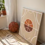
Abstract Court Lines in Bold Color
Transform the dynamic energy of sports court markings into a sophisticated piece of wall art. This project uses bold blocking and crisp white lines to create a striking design that feels both retro and modern.
Step-by-Step Tutorial
Materials
- Large square canvas (e.g., 24×24 or 30×30 inches)
- Acrylic paints (Teal/Dark Blue, Mustard Yellow, Rust Red, Burnt Orange, Titanium White)
- White or clear gesso (optional)
- Painter’s tape or fine line masking tape (1/4 inch or 1/8 inch width)
- Wide flat paintbrushes
- Small round brush for touch-ups
- Pencil
- Large compass or string and tack for drawing curves
- Ruler or T-square
- Palette or paper plates
- Water cup and paper towels
Step 1: Preparation & Layout
-
Prime the Surface:
If your canvas isn’t pre-primed, apply two coats of white gesso. This ensures your colors will pop and creates a smoother surface for your tape lines. -
Map the Intersections:
Visualize the canvas as a grid. Using a pencil and ruler, lightly mark a horizontal line roughly two-thirds of the way down the canvas. This will be the main baseline for your semicircles. -
Sketch the Curves:
To get those perfect basketball-style arcs, create a makeshift compass using a string tied to a pencil. Pin the string at various points outside or on the edge of the canvas to swing large, clean arcs across your surface. -
Refine the Design:
Intersect your arcs to create distinct ‘shards’ or zones. The design relies on overlapping circles, so ensure you have a mix of large open spaces and smaller, tighter intersections.
Clean Curves Pro Tip
Use ‘vinyl’ tape or automotive detailing tape instead of standard painter’s tape. It is flexible and stretches around curves without buckling.
Step 2: Taping
-
Apply the Masking:
Using your fine line tape, carefully cover all your pencil lines. These taped areas will eventually become the crisp white negative space between colors. -
Smooth the Edges:
Run your fingernail or a credit card firmly over all the tape edges. This is crucial to prevent paint from bleeding underneath. -
Seal the Tape:
For razor-sharp lines, I like to brush a very thin layer of white paint or matte medium over the tape edges first. This seals any microscopic gaps.
Step 3: Adding Color
-
Plan Your Palette:
Assign your colors to specific sections before painting to ensure a balanced composition. You want adjacent shapes to have contrasting colors. -
Apply the Deep Blue:
Start with the dark teal/blue. Fill in the largest bottom right section and the smaller top left curve. Use a wide flat brush and paint away from the tape edge to minimize bleed. -
Paint the Mustard Yellow:
Move on to the large upper right quadrant. Apply your mustard yellow in smooth, even strokes. This lighter color may need two coats for full opacity. -
Fill the Rust Red:
Paint the curved shard in the upper left with the dark rust red tone. This connects the blue and yellow sections visually. -
Add Burnt Orange Accents:
Fill the remaining lower left sections with burnt orange. This vibrant tone balances the darkness of the teal. -
Second Coat:
Assess your coverage once the first layer is touch-dry. Apply a second coat to any areas that look streaky or transparent.
Bleeding Lines?
If paint seeps under the tape, wait for it to dry completely. Then, use a white paint marker or a steady hand with a liner brush to re-establish the white border.
Step 4: Finishing Touches
-
The Reveal:
Wait until the paint is tacky but not fully cured. Slowly peel the tape back at a 45-degree angle to reveal your crisp white lines. -
Clean Up Edges:
If any paint bled through, use a small flat brush and a tiny bit of white paint to tidy up the lines. You can also carefully scrape away minor bleeds with an X-Acto knife if the paint is dry. -
Paint the Sides:
Don’t forget the canvas edges. For a gallery-wrapped look, continue the geometric shapes over the sides, or simply paint the edges a solid white or neutral beige. -
Varnish:
Once fully dry (give it 24 hours), apply a coat of matte or satin varnish to protect the surface and unify the sheen of the different paint colors.
Hang your new abstract masterpiece and enjoy the athletic yet artistic vibe it brings to the room
Mixed-Media Fan Moment Collage
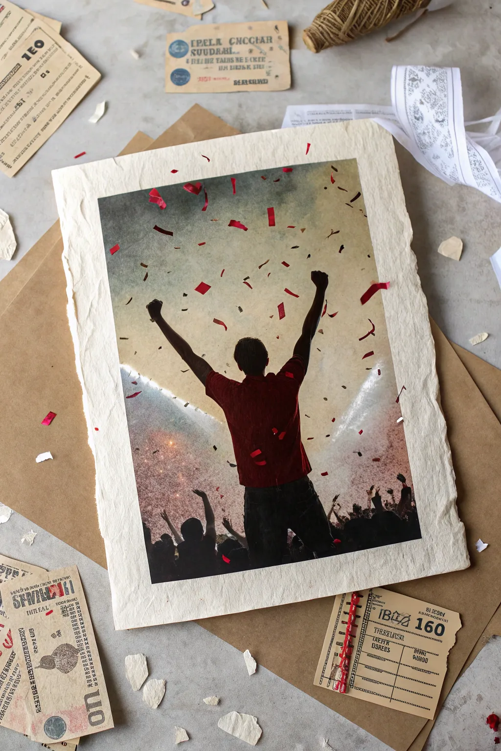
Capture the electric energy of a winning moment with this textured mixed-media collage that blends photography with vintage aesthetics. By combining a high-contrast action shot with deckle-edged paper and distressed ephemera, you’ll create a timeless tribute to pure fan euphoria.
How-To Guide
Materials
- High-resolution sports photo (digital file)
- Heavyweight textured watercolor paper (300gsm or higher)
- Home inkjet printer or laser transfer Medium
- Kraft paper sheets
- Vintage receipt or ticket ephemera (replicas work well)
- Red metallic confetti or red paper scraps
- Mod Podge or matte gel medium
- Small craft scissors
- Brown distress ink pad
- Ruler (metal edge preferred)
- Foam brush
- Bone folder or credit card
Step 1: Preparing the Base
-
Select your paper:
Choose a thick, heavyweight watercolor paper or handmade cotton rag paper as your substrate; the heavy texture is crucial for the final look. -
Create the deckle edge:
Place your metal ruler along the edge of the paper where you want the tear to happen. -
Tear the borders:
Dip a brush in water and run it along the ruler’s edge to soften the fibers, then gently pull the paper away to create a soft, ragged ‘deckle’ edge on all four sides. -
Dry the paper:
Ensure the paper is bone dry before moving to the printing phase, as damp paper will jam most printers.
Pro Tip: Digital Haze
Before printing, add a ‘multiply’ layer of warm beige in your photo editor. This integrates the modern photo with the creamy tone of the art paper.
Step 2: Applying the Image
-
Edit the photo:
Increase the contrast and grain of your digital photo slightly; this helps it stand out against the textured paper surface. -
Print the image:
Feed your textured paper manually into your inkjet printer, or if the paper is too thick, print the photo on standard tissue paper first for a transfer method. -
Alternative mounting:
If printing directly isn’t an option, print firmly on standard paper, apply a thin layer of gel medium to the textured paper, and press the image face down. Let it dry completely, then rub away the paper backing with a damp cloth. -
Add confetti details:
If the printed confetti isn’t vibrant enough, use a tiny drop of glue to attach real red metallic confetti or hand-cut red paper scraps over the printed areas for a 3D pop.
Troubleshooting: Ink Bleeding
If the ink bleeds into the soft paper fibers, spray the paper with a matte fixative or hairspray and let it dry before running it through the printer.
Step 3: Layering the Montage
-
Prepare the backing:
Cut a sheet of brown kraft paper slightly larger than your main art piece to act as a framing mat. -
Distress the kraft paper:
Crumple the kraft paper slightly and smooth it back out, or lightly brush the edges with brown distress ink to age it. -
Mount the artwork:
Use double-sided tape or a few dots of glue to center your main deckle-edged print onto the kraft paper, leaving a loose, unglued border for a relaxed feel. -
Gather ephemera:
Select pieces of vintage-style paper, such as old tickets, foreign receipts, or torn book pages. -
Arrange the composition:
Scatter the ephemera around the border of the main image, focusing on corners to anchor the composition without overwhelming the central figure. -
Adhere elements:
Glue the vintage scraps down using matte medium, allowing edges to curl up slightly for dimension. -
Final textures:
Tear small bits of white textured paper and scatter them near the bottom edge to mimic stadium debris or confetti on the ground.
Display your collage in a shadow box to preserve the beautiful dimensional textures you have created

Have a question or want to share your own experience? I'd love to hear from you in the comments below!