
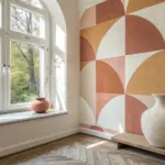
I love how the square format instantly makes an artwork feel balanced, modern, and kind of satisfying to look at. If you’re craving fresh square art ideas, here are some fun directions to try—starting classic and getting delightfully weird as we go.
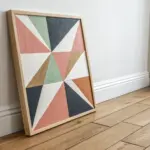
Geometric Quilt-Block Design
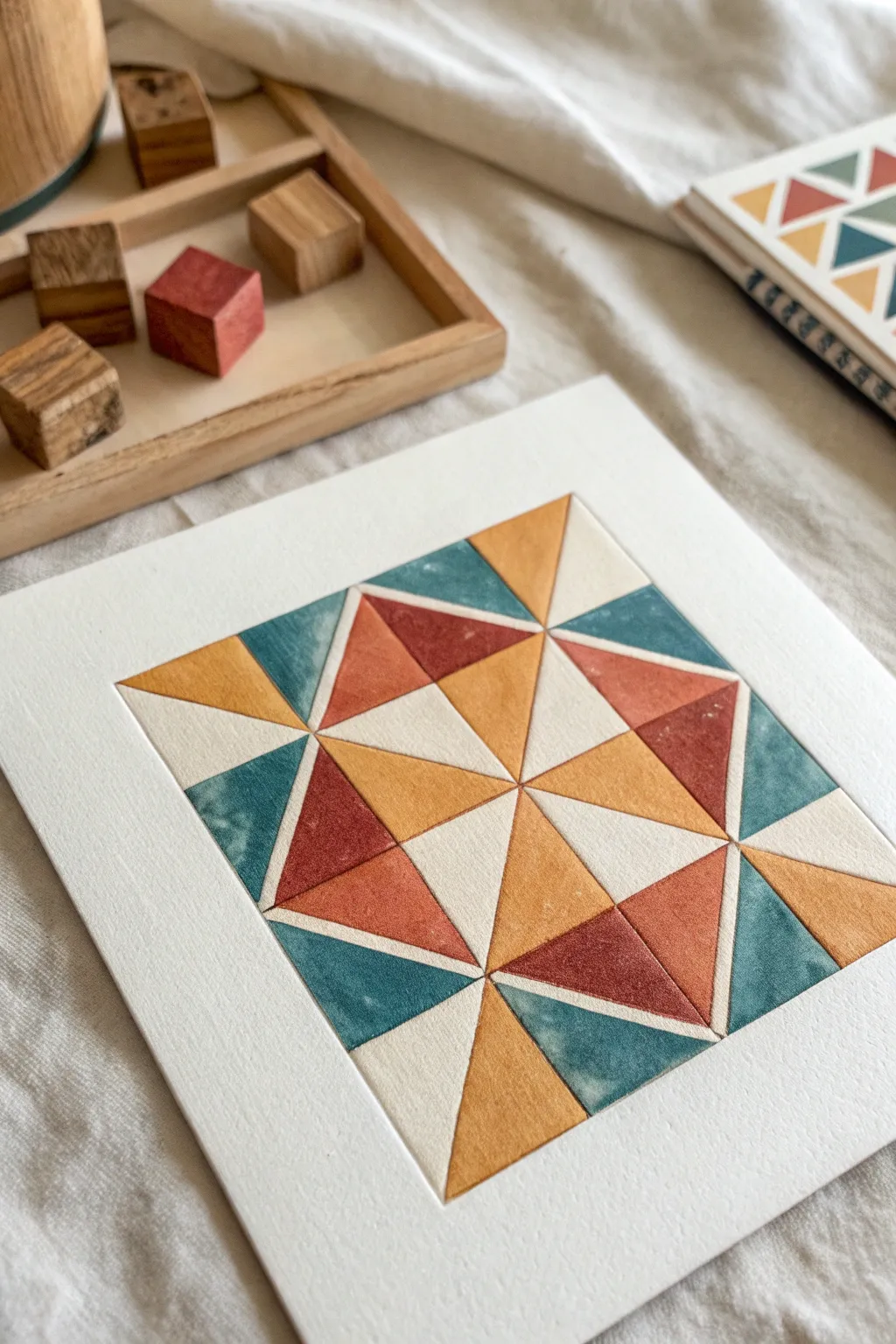
Bring the cozy charm of textile art to your walls with this geometric paper project that mimics the look of a traditional quilt block. By scoring and depressing the paper, you’ll create a dimensional, tactile effect that looks deceptively soft and textured.
Step-by-Step Tutorial
Materials
- Heavyweight watercolor paper (300gsm or higher)
- Pencil and eraser
- Ruler
- Watercolor paints (terracotta, mustard, teal/slate blue)
- Small flat or angle paintbrushes
- Bone folder or an embossing stylus
- X-acto knife (optional, for masking)
- Masking tape or painter’s tape
- Mixing palette
- Paper towels
Step 1: Planning and Grid
-
Draft the layout:
Begin by determining the size of your square. A 6×6 inch square works beautifully for this level of detail. Lightly mark the four corners on your heavyweight paper. -
Draw the grid:
Using your ruler and a very light pencil touch, divide your square into a 4×4 grid of smaller squares. This will serve as the foundation for the quilt block pattern. -
Add diagonal lines:
Connect the corners of your smaller grid squares to form ‘X’ shapes within them. This creates the classic half-square triangle units used in quilting. -
Refine the star pattern:
Referencing the image, sketch the final star design. Notice how the central four diamonds form a smaller star, surrounded by larger triangular points. Erase any grid lines that aren’t part of the final design to keep things clean.
Bleeding Lines?
If paint jumps the groove, let it dry deeply. Then, use a damp, stiff brush (almost like an eraser) to gently scrub the excess pigment out of the neighboring section.
Step 2: Creating Texture
-
Score the lines:
This is the secret sauce. Take your bone folder or embossing stylus and firmly trace over every single pencil line of your pattern. You want to create a deep groove or ‘channel’ in the paper. -
Deepen the grooves:
Go over the lines a second time. The goal is to compress the paper fibers so the shapes puff up slightly in between the lines, mimicking the pillowy look of batting in a quilt. -
Prepare the palette:
Mix your watercolors. Aim for earthy, muted tones rather than bright primaries. I mix a touch of brown into my blues and reds to get that vintage, stone-washed look. -
Test opacity:
On a scrap piece of paper, test your colors. You want them translucent enough to look like stained paper but saturated enough to show clear geometry.
Add Stitching Details
Use a white gel pen or a very fine micron pen to draw tiny ‘stitch’ dashes inside the shapes alongside the grooves for a hyper-realistic textile look.
Step 3: Painting the Block
-
Start with the center:
Begin painting the central star points. Use a small flat brush to carefully fill in the triangle shapes. The scored lines act as a barrier, helping stop the paint from bleeding into neighbors. -
Alternate sections:
To avoid wet paint touching wet paint, work in a checkerboard fashion. Paint non-adjacent triangles first and let them dry completely before moving to the ones touching them. -
Create variation:
When painting a shape, let the pigment pool slightly in one corner or along one edge. This unevenness mimics the texture of fabric or hand-dyed materials. -
Apply the teal tones:
Fill in the outer corner triangles and alternating star points with your slate blue/teal mixture. Keep your brush fairly dry to maintain control near the edges. -
Add the terracotta:
Paint the warm red sections. If you accidentally go over a groove, quickly dab it with a clean, dry corner of a paper towel to lift the paint out of the trench. -
Finish with mustard:
Fill the remaining colored sections with the yellow-ochre tone. Leave specific triangles unpainted (white) according to the pattern to create negative space and contrast. -
Re-score if needed:
Once the paint is bone dry, the paper might have swelled slightly. Gently run your bone folder through the grooves one last time to crisp up the edges and enhance the quilted effect.
Frame your piece in a simple wood shadowbox to highlight the beautiful texture you’ve created

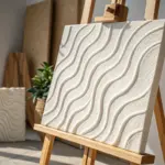
Concentric Squares Color Study
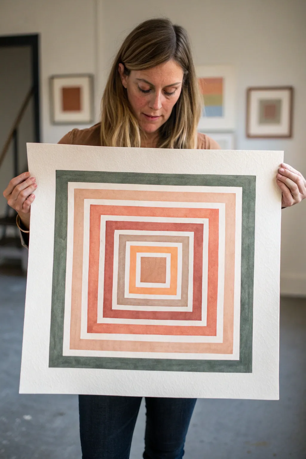
This geometric color study explores the relationship between warm earth tones and cool greens through a series of nested squares. The beauty lies in the crisp negative space between the bands, creating a rhythmic, vibrating effect that draws the eye inward.
Step-by-Step Guide
Materials
- Large square watercolor paper (cold press, heavy weight, approx. 18×18 inches)
- Gouache or high-pigment watercolor paints (Opaque Green, Terracotta, Peach, Burnt Sienna, Orange/Yellow Ochre)
- Flat shader brushes (sizes 1/2 inch and 1 inch)
- Ruler or quilting square
- Pencil (H or HB)
- Painter’s tape or low-tack artist tape
- Mixing palette
- Water cups and paper towels
- Large drawing board or flat surface
Step 1: Planning and Grid Layout
-
Secure the paper:
Tape your large square paper down to a drawing board or table. This prevents buckling when we apply paint later and gives you a clean outer edge. -
Find the center:
Using your ruler, lightly measure and mark the exact center point of the paper. This will be the anchor for every square you draw. -
Draft the central square:
Measure outward from your center point to draw the smallest, innermost square. It should be roughly 3-4 inches wide. Use a very light hand with your pencil so lines can be erased later. -
Mark the spacing:
From the edge of that first square, mark regular intervals outward. You need to account for both the colored band (about 1-1.5 inches wide) and the white gap (about 0.25-0.5 inches wide). -
Draw the remaining squares:
Complete the grid by drawing the concentric squares based on your marks. You should end up with 6 distinct bands, separated by thin channels of negative space. -
Erase guidelines:
If you drew diagonal ‘X’ lines to find the center, erase them now. You only want the square outlines visible before you start painting.
Step 2: Applying the Color
-
Mix the outer green:
Prepare a deep, forest green gouache. Aim for a consistency like heavy cream—opaque enough to cover, but fluid enough to glide. I prefer gouache here because it dries matte and opaque. -
Paint the border:
Using the 1-inch flat brush, carefully fill in the outermost band. Keep your brush edges sharp against the pencil lines. Rotate the board as you work to keep your hand position comfortable. -
Mix the second layer:
Clean your brush thoroughly. Mix a soft, warm peach or light terracotta color. This band sits just inside the green border, separated by the white gap. -
Fill the second band:
Paint the peach band. Take extra care at the corners to ensure they are crisp 90-degree angles, as rounded corners will disrupt the geometric effect. -
Create the third color:
Mix a vibrant terracotta or salmon pink shade. This should be slightly darker and richer than the previous peach tone to create depth. -
Paint the third band:
Fill in the third square ring. If you wobble into the white space, don’t panic; wait for it to dry and verify if you can gently lift it with a damp clean brush or cover it with white gouache later. -
Mix the fourth color:
Prepare a darker, muted brick red or deep rust color. This adds a visual ‘weight’ to the middle of the composition. -
Paint the fourth band:
Apply the rust color to the fourth ring. Watch the consistency of your paint; if it’s too watery, the paper might ripple, distorting your straight lines. -
Mix the fifth color:
Create a neutral beige or taupe shade. This acts as a ‘breather’ between the intense warm tones and the center. -
Finish the inner squares:
Paint the fifth band beige. Finally, mix a bright orange-yellow ochre for the center square and fill it in solid.
Wobbly Lines?
If freehand painting is too stressful, use painter’s tape to mask off the edges of each band. Paint one ring, let dry, remove tape, and re-tape for the next.
Step 3: Final Touches
-
Let it cure:
Allow the entire piece to dry completely flat for at least an hour. Gouache can smudge easily if damp. -
Clean up lines:
Once bone dry, use a soft kneaded eraser to gently lift any visible pencil marks remaining in the white gaps. -
Remove tape:
Peel the tape away slowly at a 45-degree angle to reveal your clean paper edge.
Pro Tip: Flat Brushes
Use a high-quality synthetic flat shader brush. It holds a crisp ‘chisel’ edge better than natural hair, making those straight geometric lines much easier to pull.
Step back and admire how the colors vibrate against each other in this modern, meditative piece

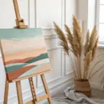
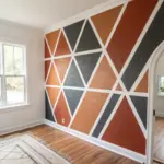
Square Skyline Silhouette
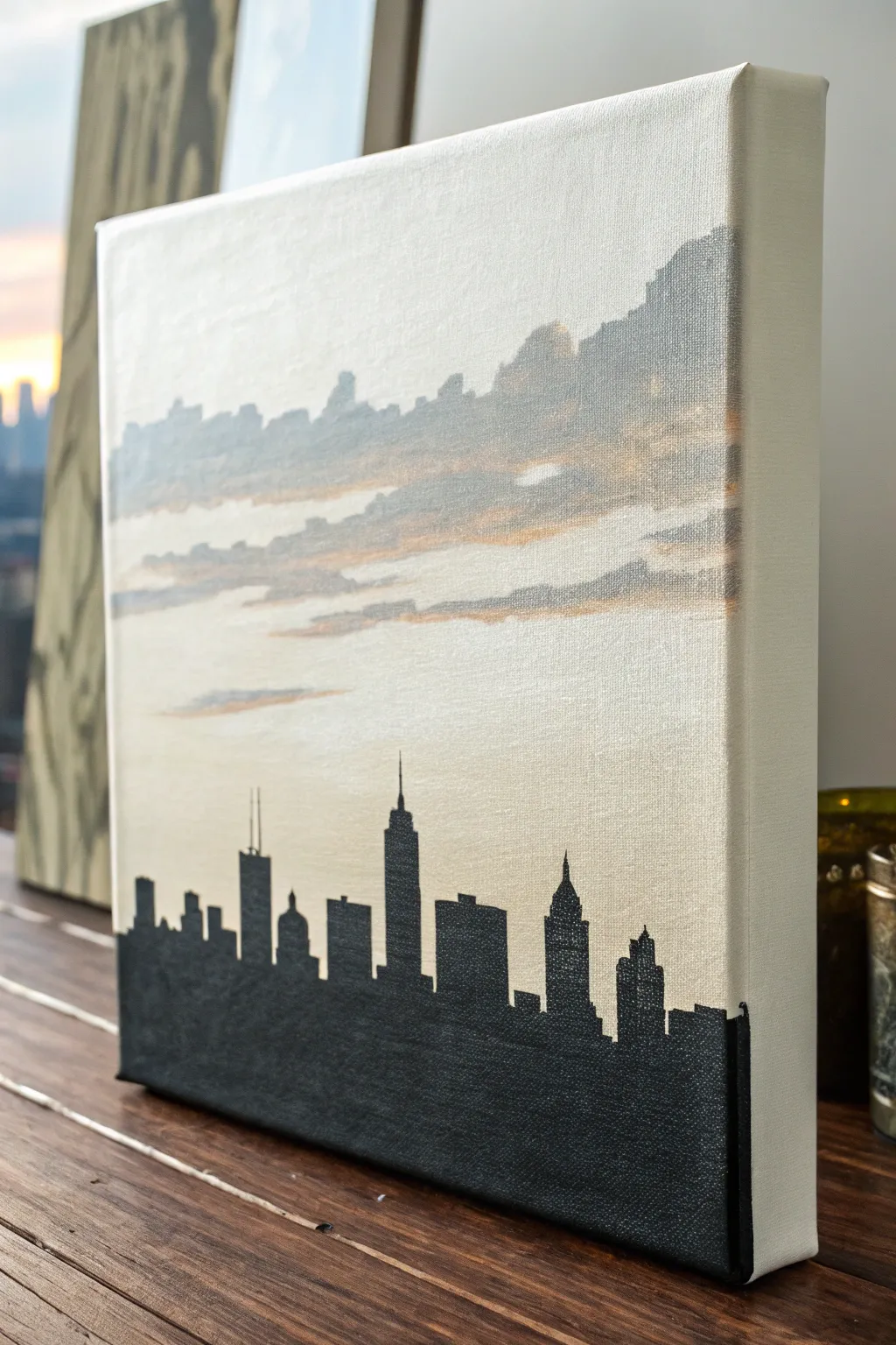
Capture the magic of a city sunset with this minimalist acrylic painting on a square canvas. The sharp, dark silhouette of the skyline contrasts beautifully against a soft, abstracted background of drifting clouds and gentle light.
Detailed Instructions
Materials
- Square stretched canvas (e.g., 12×12 inches)
- Acrylic paints: Titanium White, Mars Black, Payne’s Grey, Yellow Ochre, Burnt Sienna
- Flat shader brushes (medium and large)
- Fine detail brush or liner brush
- Graphite pencil and eraser
- Ruler or straight edge
- Reference photo of a city skyline
- Palette for mixing
- Water cup and paper towels
Step 1: Setting the Scene
-
Prime the Surface:
Even if your canvas is pre-primed, applying a fresh coat of Titanium White creates a smooth, receptive surface. Use a large flat brush to cover the entire front and sides, brushing horizontally to minimize texture. -
Light Base Color:
Mix a large amount of Titanium White with a tiny dot of Yellow Ochre. You want a very pale, warm off-white. Apply this over the entire canvas once the primer is dry, blending it out smoothly to create an atmospheric glow. -
Mixing Grey Tones:
Prepare a soft grey mixture using White and a touch of Payne’s Grey. You want this to be semi-transparent, so you can mix in a little water or glazing medium if your paint is heavy body. -
Painting Distant Clouds:
Using a medium flat brush, paint irregular horizontal bands across the upper half of the canvas. These represent distant clouds or a mountain range. Keep the edges soft and organic, not crisp. -
Adding Warmth:
While the grey is still slightly workable or just after it dries, mix a little Burnt Sienna with White and Yellow Ochre to create a soft peach tone. Gently brush this color along the bottom edges of your grey cloud shapes. -
Softening Transitions:
Use a clean, dry brush to gently sweep over the areas where the clouds meet the sky. This ‘dry brushing’ technique blurs the lines and creates that hazy, atmospheric look seen in the reference.
Wobbly Lines?
If you struggle painting straight building edges, use painter’s tape or masking tape to block out the vertical sides of the skyscrapers. Peel it off while the paint is still wet for crisp lines.
Step 2: Building the Skyline
-
Establish the Horizon:
Once your background is completely dry to the touch, use a ruler and pencil to draw a faint horizontal line across the bottom third of the canvas. This ensures your buildings stand straight. -
Draft the Shapes:
Lightly sketch the outline of your chosen buildings. Focus on the distinct heights and roof shapes—some flat, some pointed like the Empire State Building. Don’t worry about windows; we only need the outer shape. -
Outline in Black:
Load a fine liner brush with slightly watered-down Mars Black paint. Carefully trace the top edges of your pencil sketch. Getting these lines crisp is crucial for the silhouette effect. -
Fill the Mass:
Switch to a medium flat brush loaded with solid Mars Black. Fill in the bodies of the buildings below your outline. Paint carefully along the edges but feel free to be quicker in the center sections. -
Extend to the Bottom:
Carry the black paint all the way down to the bottom edge of the canvas. Ensure the coverage is opaque; you may need a second coat of black once the first dries to eliminate any streakiness.
Step 3: Finishing Touches
-
Refine the Details:
Go back in with your smallest detail brush and sharpen the architectural antennas or spires on the tallest buildings. These tiny lines add a sense of scale and realism to the silhouette. -
Paint the Edges:
Don’t forget the sides of your canvas to give it a professional finish. Continue the cloud colors around the top sides and the solid black around the bottom sides, matching where the horizon line hits. -
Clean Up:
Inspect the sky area for any accidental black smudges. If you find one, let it dry completely, then carefully touch it up with your sky color mix. -
Final Varnish:
Allow the painting to cure for at least 24 hours. Apply a coat of matte or satin varnish to protect the surface and unify the sheen of the different paint layers.
Sharper Spires
For ultra-thin antennas on buildings, try using a black ultra-fine point permanent marker or a paint pen instead of a brush. It gives you much more control over the delicate lines.
Hang your new cityscape on the wall and enjoy the view of the skyline every day

Mosaic Made of Painted Squares
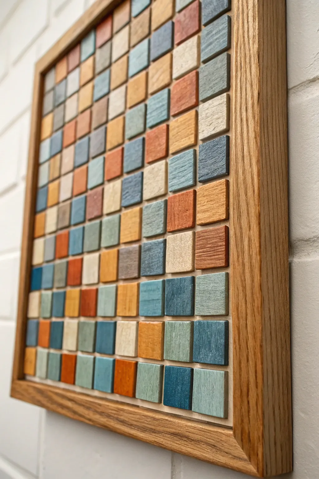
This striking wall art combines the charm of woodworking with the simplicity of geometric design. By arranging dozens of small, painted wood squares into a random grid, you create a textured masterpiece that feels both modern and handmade.
Step-by-Step Tutorial
Materials
- Plywood backing board (e.g., 18×18 inches)
- Square dowels or thin wood strips (1×1 inch or similar)
- Saw (miter box or chop saw recommended)
- Sandpaper (120 and 220 grit)
- Acrylic or chalk paints (muted blues, oranges, creams, slate gray)
- Wood stain (optional, for some blocks)
- Wood glue
- Hardwood boards for the frame (e.g., Oak 1×2)
- Foam brushes or small flat paintbrushes
- Ruler or spacer guide
- Clear matte sealer spray
- Microfiber cloth
Step 1: Preparing the Tiles
-
Cut the backing:
Cut your plywood backing board to your desired final dimensions. Ensure the corners are perfectly square, as this will guide your entire layout. -
Cut the wood squares:
Using your saw, slice your square dowel or wood strips into individual tiles. For this project, you’ll need around 100-144 tiles depending on size. Aim for consistent thickness, about 1/4 to 1/2 inch thick. -
Sand the edges:
Sand the cut faces of each tile to remove splinters. I like to slightly round over the sharp corners just a touch to give them a softer, tumbled look. -
Clean the dust:
Wipe down all your wood pieces with a microfiber cloth or tack cloth to ensure the surface is completely free of sawdust before painting.
Step 2: Coloring the Elements
-
Plan your palette:
Select 5-7 distinct colors. The example use a mix of muted teal, slate blue, burnt orange, cream, and natural wood tones. Pour small amounts of each paint onto a palette. -
Paint the tiles:
Paint the front face of your tiles. Don’t worry about the sides too much, as the ‘shadow’ between tiles adds depth, but ensure the top is fully covered. -
Create variation:
Leave about 15-20% of your tiles unpainted (raw wood) or lightly stained to add organic warmth to the composition. -
Distress (optional):
Once the paint is dry, you can lightly sand the edges of the painted tiles to let a bit of wood show through, enhancing the rustic aesthetic. -
Paint the background:
Paint the plywood backing board a neutral color, usually a dark grey or black, so that any gaps between the tiles recede visually.
Depth Trick
Cut your tiles at slightly varying thicknesses (e.g., 3mm to 6mm variances). This creates an uneven, undulating surface that catches light dramatically.
Step 3: Assembly and Framing
-
Dry fit the layout:
Before gluing, arrange your tiles on the backing board. Shuffle the colors around until you have a balanced distribution without large clumps of a single color. -
Begin gluing:
Start at one corner. Apply a small dab of wood glue to the back of a tile and press it firmly into place. -
Use a spacer:
To keep your grid straight, use a thin piece of cardstock or a metal ruler as a temporary spacer between rows. This ensures consistent gaps. -
Continue grid work:
Work row by row across the board. Check your alignment frequently to ensure the pattern isn’t drifting diagonally. -
Let the glue cure:
Allow the adhesive to dry fully according to the manufacturer’s instructions, usually overnight, before handling. -
Cut frame pieces:
Measure the outside dimensions of your tiled board. Cut your hardwood frame pieces (oak works beautifully) with mitered 45-degree corners to fit snugly around the artwork. -
Attach the frame:
Glue and clamp the frame pieces around the backing board. You can reinforce framing with brad nails from the outside if you have a nail gun. -
Seal the piece:
Finish by spraying the entire artwork with a clear matte sealer. This protects the wood and unifies the sheen of the different paints.
Level Up: Gradient Flow
Instead of random placement, arrange your colors to create a subtle ombre effect, transitioning from dark blues at the bottom to light creams at the top.
Hang your new textured art piece in a spot that receives side lighting to truly highlight the dimension of the tiles
BRUSH GUIDE
The Right Brush for Every Stroke
From clean lines to bold texture — master brush choice, stroke control, and essential techniques.
Explore the Full Guide
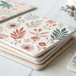
Four-Quadrant Mood Board Square
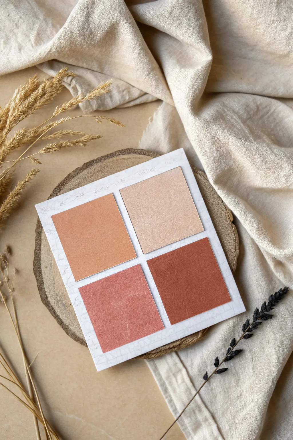
This minimalist project creates a lovely visual anchor for your workspace or journal, featuring a harmonious gradient of warm, earthy tones arranged in a classic four-square grid. The textured paper backdrop adds a subtle layer of sophistication without overwhelming the rich color swatches.
Step-by-Step Tutorial
Materials
- White cardstock or heavy watercolor paper (approx. 6×6 inches)
- Four sheets of colored paper (beige/cream, light tan, terracotta/dusty rose, rust/burnt orange)
- Ruler
- Pencil
- Precision craft knife or sharp scissors
- Double-sided tape or adhesive roller
- Fine-tip grey pen (optional, for faux texture)
- Reclaimed wood slice (prop base, optional)
- Dried pampas grass or wheat stems (for styling)
Step 1: Preparing the Base
-
Cut the foundation:
Begin by measuring and cutting your white cardstock into a perfect square. A size of about 6×6 inches works well, providing enough negative space around your inner squares. -
Create faux texture:
If your cardstock is plain, lightly draw very faint, erratic veining lines with a fine-tip grey pen to mimic a marble surface. Keep the pressure incredibly light so it barely registers as texture. -
Measure the grid:
Using a ruler and a very light pencil touch, mark out a centered 2×2 grid on the white cardstock. You want a consistent margin around the outer edge and a small, equal gap between the four inner quadrants. -
Calculate inner square sizes:
Determine the size for your colored squares. For a 6-inch base, four 2.25-inch squares usually allow for pleasing spacing.
Alignment Woes?
If spacing is tricky, cut a scrap piece of cardstock to the exact width of your desired gap (e.g., 1/4 inch) and use it as a physical spacer between squares while gluing.
Step 2: Creating the Color Swatches
-
Select your palette:
Choose four papers that form a cohesive gradient. I like to start with a very pale beige and deepen the tones progressively to a rich rust color. -
Mark the cuts:
On the back of your colored papers, measure out your chosen square dimensions (e.g., 2.25 x 2.25 inches) to ensure your cuts will be precise. -
Cut the squares:
Use a metal ruler and a precision craft knife on a self-healing mat to cut out the four squares. Scissors can work, but a knife ensures perfectly crisp 90-degree corners. -
Check the layout:
Place the cut squares onto your white base without glue first. Arrange them from lightest (top right) to darkest (bottom right) to verify the gradient flows nicely. -
Add texture (optional):
If your colored paper is too smooth, you can scuff the surface very gently with fine-grit sandpaper or a dry stiff brush to give it a more tactile, fabric-like appearance.
Step 3: Assembly and Finishing
-
Apply adhesive:
Flip your first square (the lightest beige) over. Apply a strip of double-sided tape or a swipe of adhesive roller near the top edge only. This mimics the look of a sticky note. -
Position the first square:
Carefully align the square with your pencil guidelines in the top right quadrant. Press down firmly along the top edge. -
Place the second square:
Take the medium tan square. Apply adhesive similarly and place it in the top left quadrant, ensuring the gap between the two top squares is perfectly even. -
Mount the bottom row:
Repeat the process for the bottom left (dusty rose) and bottom right (rust) squares. The vertical and horizontal gaps should form a perfect cross in the center. -
Erase guidelines:
Once all squares are secured, gently erase any visible pencil marks from the white background, being careful not to snag the edges of the paper. -
Add detail text:
For a technical feel, use a pencil to write tiny, illegible header text or color codes above the top row of squares. Keep it faint and understated. -
Style the scene:
To match the reference photo, place your finished artwork on a round wood slice or rustic coaster to elevate it from the table surface. -
Final touch:
Arrange dried wheat stalks or pampas grass stems around the left and bottom edges to frame the composition organically.
Make it Functional
Turn this into a functional memo board by using actual sticky note pads in these colors instead of single paper squares, allowing you to jot real notes on them.
Now you have a serene, structured color study that brings a sense of calm organization to your desk
Op-Art Tunnel in a Square
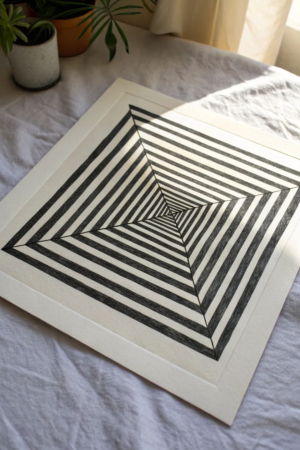
Create a mesmerizing optical illusion with nothing more than a ruler and a pen. This black-and-white geometric design uses simple perspective tricks to make a flat piece of paper look like an infinite tunnel or a rising pyramid.
How-To Guide
Materials
- Square sheet of heavy drawing paper or bristol board (e.g., 10×10 inches)
- Pencil (HB or H)
- Eraser
- Long ruler (clear acrylic is helpful)
- Fine liner pen (01 or 03 size)
- Thicker black marker (sharpie or brush pen) for filling
- Masking tape or painter’s tape
Step 1: Drafting the Grid
-
Define the boundaries:
Begin by taping down the corners of your paper to a flat work surface so it doesn’t shift. Using your ruler, lightly draw a perfect square border centered on your paper, leaving a pleasing margin of white space around the edges. -
Find the vanishing point:
Lightly mark the exact center of your square. An easy way to do this is to align your ruler corner-to-corner diagonally and make a tiny mark in the middle, then check the other diagonal. -
Draw the diagonals:
Draw distinct straight lines connecting each of the four corners of your large square directly to that center point. These ‘X’ lines will serve as the guides for the corners of every smaller square you draw. -
Plot the concentric squares:
Starting from the outer border, make small tick marks along one of diagonal lines. Space them evenly—for example, every half-inch or centimeter—until you get close to the center. The closer the marks, the deeper the tunnel will look. -
Connect the squares:
Using your tick marks as guides, draw the inner squares. Ensure your ruler is perfectly parallel to the main border lines each time. You are essentially drawing a series of smaller and smaller boxes nested inside each other.
Step 2: Inking and Coloring
-
Outline the structure:
Switch to your fine liner pen. Carefully trace over all your pencil lines: the main square border, the four diagonal ‘spokes,’ and every single nested square. -
Erase pencil marks:
Wait a moment for the ink to dry completely to avoid smudging. Then, gently erase all the underlying graphite lines so you have a clean, crisp grid. -
Plan the alternating pattern:
Look at one of the four triangle sections created by the diagonals. You will be filling in every *other* strip. Mark the stripes you intend to color with a tiny dot so you don’t lose your place later. -
Check the checkerboard effect:
Ensure the pattern alternates correctly. If a strip is black in the top triangle, the adjacent strip in the right-side triangle should be white. They should meet at the diagonal line like a checkerboard. -
Start filling with ink:
Begin filling in the marked strips. I prefer to outline the specific shape first with a slightly thicker pen to create a barrier, then fill the inside. -
Fill the larger outer sections:
For the wide outer bands, use your thick marker. Use long, confident strokes to get solid coverage without streakiness. -
Handle the corners:
Pay extra attention where the black sections meet the diagonal lines. The corners must be sharp and touch exactly tip-to-tip with the black section in the neighboring triangle. -
Work towards the center:
As you move inward, the strips get narrower. Switch back to your finer pen to fill these smaller areas so you don’t accidentally bleed ink into the white sections. -
Detail the center point:
The very center can be tricky. You might need your finest 0.05 or 01 pen here. If it gets too small to detail, filling the absolute center distinct square entirely black often looks neatest. -
Final clean up:
Inspect the drawing for any white specks in your black areas and touch them up. If you have any stray ink marks on the white paper, you can sometimes carefully scratch them away with a craft knife or cover them with white gel pen.
Uneven Squares?
If your squares look crooked, don’t just rely on the tick marks. Measure from the outer border inward for every single line to ensure they remain perfectly parallel.
Use a Paper Guard
Place a clean scrap sheet of paper under your drawing hand. This prevents skin oils from getting on the paper and stops you from smearing wet ink across the finished design.
Step back and enjoy the dizzying depth of your new geometric masterpiece

PENCIL GUIDE
Understanding Pencil Grades from H to B
From first sketch to finished drawing — learn pencil grades, line control, and shading techniques.
Explore the Full Guide
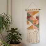
Paper Weave Checker Square
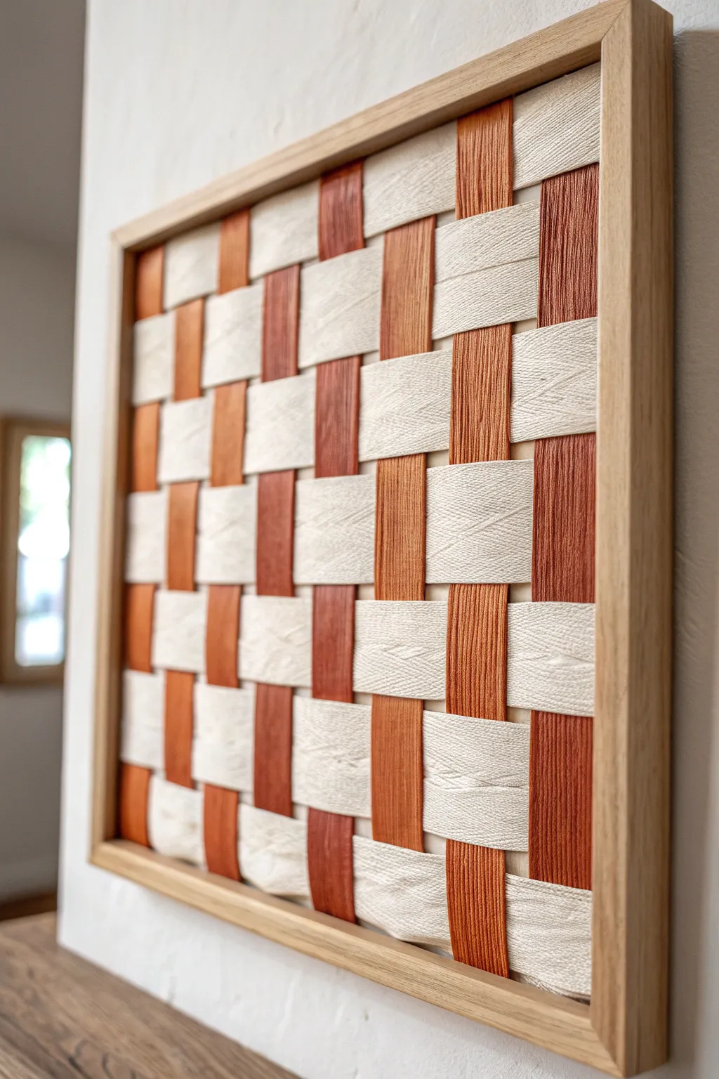
This striking woven wall hanging combines the rustic warmth of texture with modern geometric lines. By alternating smooth linen strips with yarn-wrapped bands, you create a tactile checkerboard pattern that feels organic yet structured.
Step-by-Step Guide
Materials
- Square wooden shadow box frame (approx. 12×12 inches, frame back removed)
- Rigid cardboard or foam board (cut to fit inside the frame frame)
- Cream-colored linen or heavy cotton fabric strips (2 inches wide)
- Rust/Terracotta colored cotton yarn
- Stiff cardstock or plastic canvas strips (2 inches wide, for the yarn core)
- Hot glue gun and glue sticks
- Fabric scissors
- Masking tape or painter’s tape
- Ruler
Step 1: Preparing the Weaving Strips
-
Cut the Base Strips:
Begin by measuring the inside dimension of your frame. Cut your stiff cardstock or plastic canvas into strips that are 2 inches wide and about 2 inches longer than your frame dimension to allow for securing them later. -
Prepare the Fabric Strips:
Cut your cream linen fabric into long strips, roughly 4-5 inches wide. Fold the raw edges inward to meet in the center and iron them flat so you have a clean, finished 2-inch wide strip with no frayed edges showing. -
Create the Yarn Strips:
Take a cardstock strip and secure the end of your rust-colored yarn to the back with a dab of hot glue. Begin wrapping the yarn tightly around the width of the cardstock. -
Continue Wrapping:
Keep wrapping the yarn, ensuring each loop sits flush against the previous one so no cardstock shows through. I find it helpful to push the yarn strands together every few inches to keep it dense. -
Finish the Yarn Strip:
Once you reach the end of the strip, cut the yarn and glue the tail to the back. Repeat this process until you have enough yarn-wrapped strips for your vertical columns (likely 4-5 depending on frame size).
Uneven Gaps?
If gaps appear between rows, gently use a wide comb or ruler edge to pack the weft strips tighter together before gluing the ends.
Step 2: Setting the Warp
-
Prepare the Backing Board:
Take your rigid backing board (foam board works great here) and lay it flat. This will serve as the structure for your weave. -
Arranging Vertical Strips:
Lay your yarn-wrapped strips vertically across the board. Arrange them so they are evenly spaced, with gaps that perfectly match the width of your horizontal fabric strips (2 inches). -
Secure the Verticals:
Fold the excess length of the yarn strips over the top and bottom edges of the backing board. Secure them firmly to the back of the board using hot glue or strong tape.
Step 3: Weaving the Pattern
-
Begin the Weave:
Take a prepared linen strip and lay it horizontally across the top. Weave it ‘under’ the first yarn strip, ‘over’ the second, and repeat across the board. -
Secure the First Row:
Pull the linen strip tight and wrap the ends around to the back of the board. Glue or tape them down securely. -
Second Row Placement:
Place the next linen strip directly below the first. This time, reverse the pattern: go ‘over’ the first yarn strip and ‘under’ the second. -
Tighten the Weave:
Gently push the second linen strip up against the first row so there are no gaps. The tension should keep them snug, but handle carefully to keep the yarn aligned. -
Continue Down:
Repeat this alternating over-under process for the remaining horizontal rows until the entire board is covered. -
Final Adjustments:
Before gluing the final row, check your alignment. Make sure the vertical and horizontal lines are straight and not bowing in the center.
Level Up
Try using leather strips for the horizontal weave instead of linen for a richer, more rugged texture contrast.
Step 4: Assembly
-
Secure All Ends:
Double-check the back of your mounting board. Reinforce any loose ends with extra hot glue to ensure nothing slips over time. -
Insert into Frame:
Place the woven board face down into your wooden frame. It should be a snug fit. -
Close the Frame:
Use the frame’s flexible points or add glazing points to hold the backing board in place. Since the weave adds thickness, you might need to leave out the glass.
Now hang your textured geometric masterpiece and enjoy the modern warmth it brings to your space
Have a question or want to share your own experience? I'd love to hear from you in the comments below!