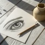
If you love the look of dotwork but don’t know what to draw first, stippling is the perfect playground for practicing texture, shading, and patience all at once. Here are my favorite stippling art ideas—starting with the classics and sliding into some fun, weirder experiments once you’re warmed up.
Shade a Simple Sphere With Smooth Dot Gradients
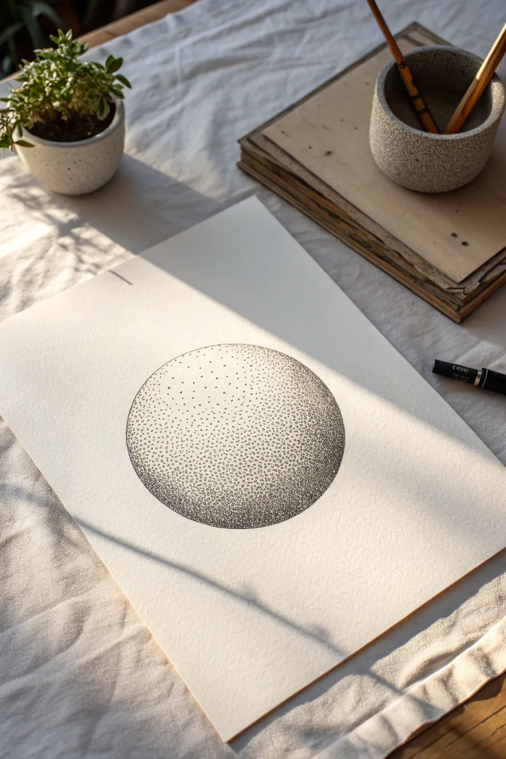
This project explores the meditative art of stippling by creating a perfectly shaded sphere using only simple dots. The result is a stunningly textured, three-dimensional form that relies on density rather than lines to convey depth and light.
How-To Guide
Materials
- High-quality white drawing paper or Bristol board (smooth surface preferred)
- HB or 2H graphite pencil
- Compass or circular object (like a roll of tape) for tracing
- Fine liner pens (sizes 0.1mm, 0.3mm, and 0.5mm)
- Kneadable eraser
- Ruler (optional)
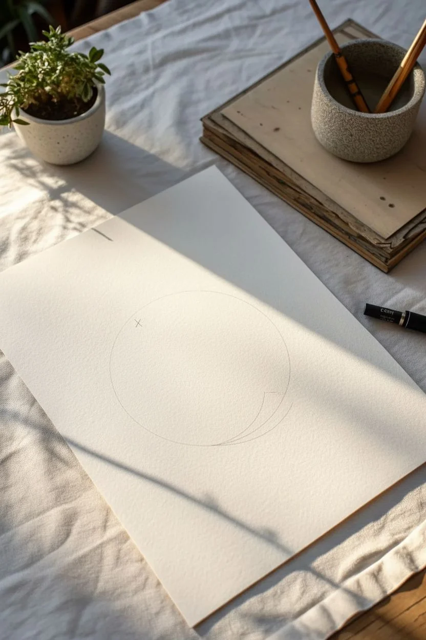
Step 1: Preparation and Outline
-
Prepare your workspace:
Set yourself up in a well-lit area. Stippling requires patience and good visibility, so natural light coming from the side (as seen in the photo) is ideal for keeping track of your texture. -
Draw the main circle:
Using a compass or by lightly tracing around a circular object, draw a perfect circle in the center of your paper. Keep your pencil pressure extremely light so the graphite can be easily erased later. -
Mark the light source:
Visualize where your light is coming from. For this project, the light hits the upper-left quadrant. You can lightly mark a small ‘X’ or oval there to remind yourself that this area needs to remain nearly white. -
Map the shadow zones:
Very faintly sketch a crescent shape inside the bottom right of the sphere. This will represent the core shadow—the darkest part of the object. Drawing these faint guide lines helps prevent getting lost in the dots later.
Step 2: Building the Foundation
-
Start with the mid-tones:
Pick up your finest pen (0.1mm). Begin placing dots sparingly around the center of the sphere, moving outward. Don’t worry about density yet; just establish a light field of texture. -
Establish the highlight boundary:
Work carefully around your designated highlight area in the upper left. The dots here should be very sparse, perhaps millimeters apart, fading into pure white paper as you get closer to the brightest spot. -
Fill the base layer:
Continue covering the entire circle (except the highlight) with this first layer of widely spaced dots. Keep your hand relaxed and try to tap vertically to create round dots, not dashes. -
Define the edge:
Go around the perimeter of the circle with your dots. You don’t want a solid outline, so instead of drawing a line, just place dots closer together right along the pencil mark to define the shape’s boundary.
Uneven Dots?
If your dots start looking like dashes or commas, your hand angle is too low. Hold the pen perpendicular to the paper (straight up and down) and slow your tapping rhythm slightly.
Step 3: Creating Depth and Gradient
-
Deepen the shadows:
Switch to your 0.3mm pen. Focus on the bottom right crescent area. Begin adding more dots in the spaces between your existing ones. The goal is to reduce the amount of white paper visible in this zone. -
Blend the transition:
As you move from the dark bottom right toward the lighter upper left, gradual spacing is key. I like to step back every few minutes to check that the gradient looks smooth rather than having harsh bands of density. -
Intensify the core shadow:
Use the 0.5mm pen for the very darkest part of the shadow at the bottom right curve. Pack these dots tightly (but distinct from one another) to create a visual ‘weight’ at the bottom of the sphere. -
Refine the mid-tones:
Go back to the 0.1mm or 0.3mm pen to smooth out the transition area between the light and dark sides. Add tiny dots in any ‘gaps’ that look too white, creating a creamy, unified grey tone. -
Check the reflected light:
Leave a very thin, lighter strip right at the very bottom edge of the sphere. This represents reflected light bouncing off the table, which adds crucial realism to the 3D effect.
Level Up: Cast Shadow
To ground the object, add a cast shadow on the surface below the sphere. Elongate the dot density horizontally to the right, fading it out as it moves away from the object.
Step 4: Final Touches
-
Assess the contrast:
Look at the overall form. Does it look round? Usually, you’ll need to darken the shadow side slightly more than you think. Add another pass of dots to the lower right quadrant if it feels flat. -
Clean up:
Once the ink is completely dry (give it at least 15 minutes to be safe), take your kneadable eraser and gently lift off the initial pencil circle and guide marks. -
Refine the perimeter:
Without the pencil line, the edge might look fuzzy. Use your smallest pen to add tiny, precise dots along the very edge to sharpen the circle’s silhouette without drawing a hard line.
Step back and admire how a simple collection of points has transformed into a convincing three-dimensional volume
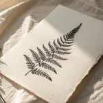


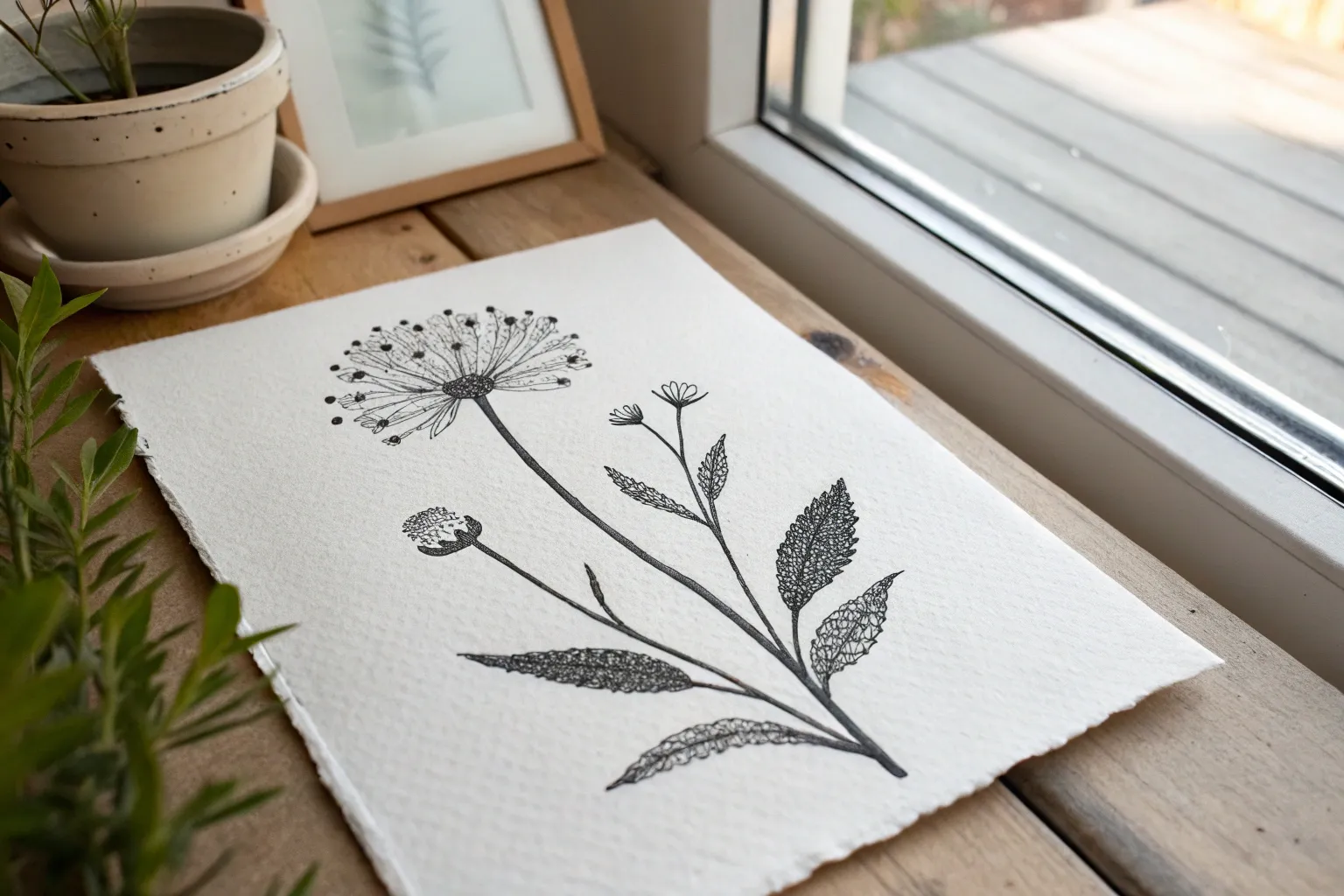
Stipple a Leaf Study to Practice Veins and Texture
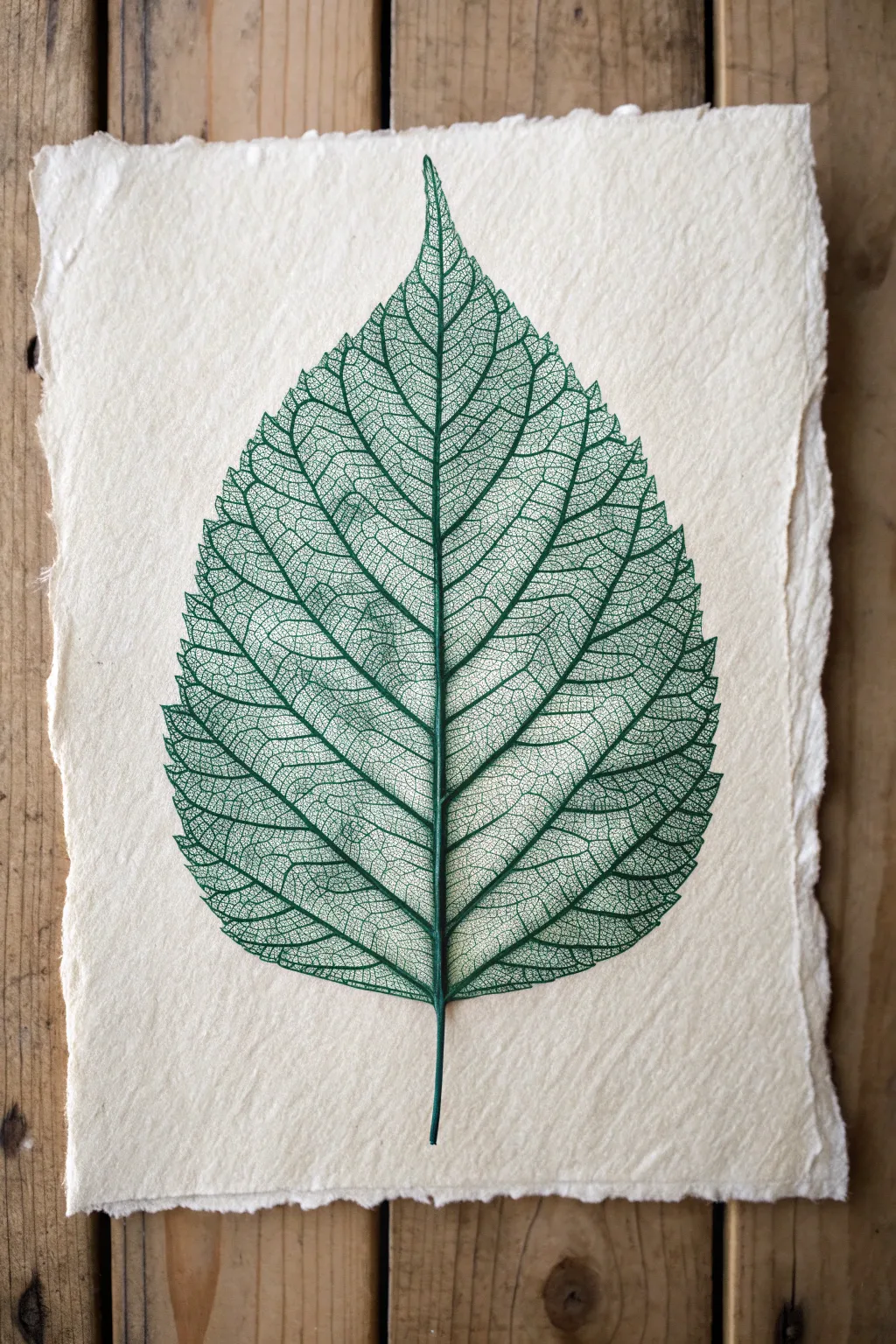
Capture the intricate beauty of nature by recreating this delicate leaf skeleton study using fine stippling and line work. The contrast of the vivid green ink against the rough, handmade paper creates a stunning organic specimen that looks almost real enough to touch.
How-To Guide
Materials
- Handmade cotton rag paper (deckled edge)
- Fine liner pen (Green, 0.05mm)
- Fine liner pen (Green, 0.1mm)
- Fine liner pen (Green, 0.3mm)
- Pencil (HB or 2H)
- Soft kneaded eraser
- Ruler
- Reference photo of a skeletal leaf
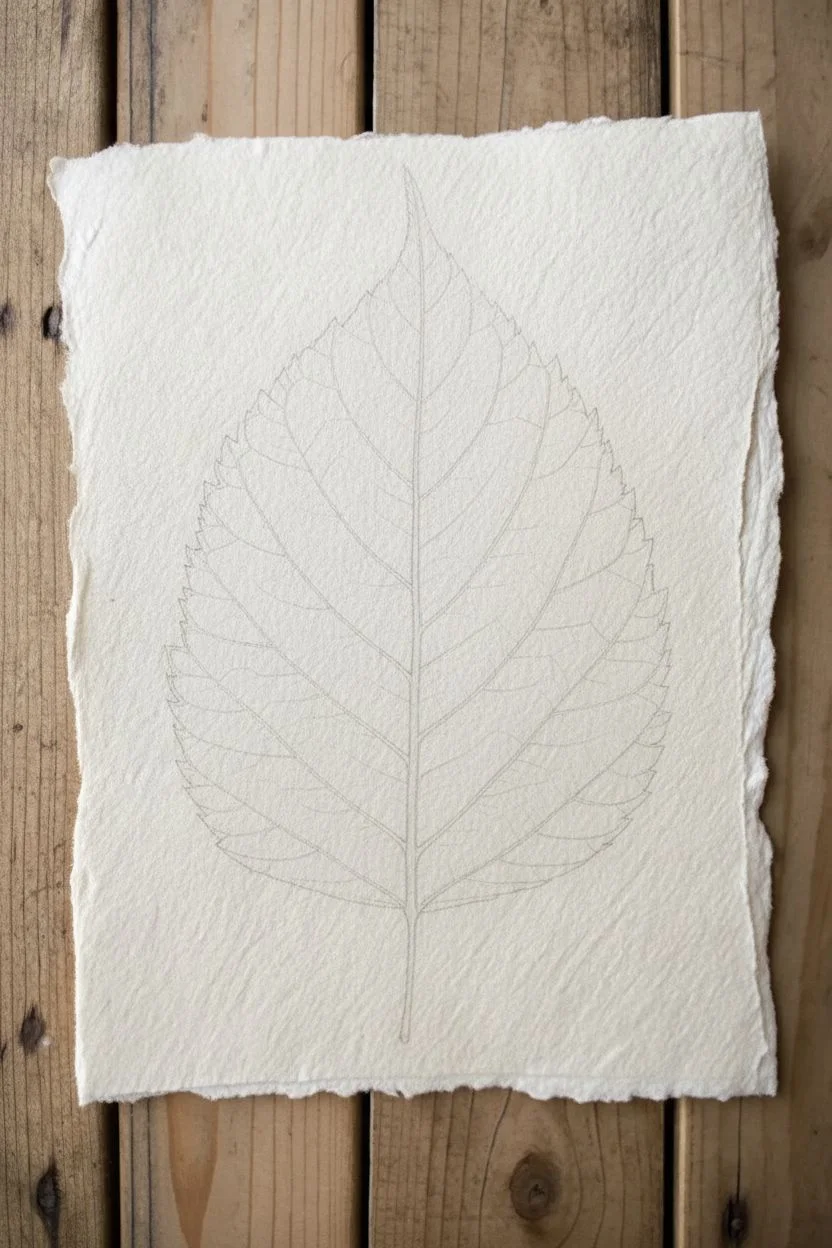
Step 1: Planning and Outline
-
Prepare your surface:
Select a piece of textured, handmade cotton rag paper. The uneven surface adds character, but make sure it’s flat enough to draw on. Tape the corners down lightly if it tends to curl. -
Mark the center vein:
Using your ruler and a very light pencil touch, draw a faint vertical line down the center of the paper to serve as the main midrib of the leaf. Curve it slightly at the bottom for the stem. -
Sketch the leaf shape:
Lightly sketch the outer perimeter of the leaf. Aim for a classic ovate shape with a pointed tip and a slightly rounded base. Keep these lines incredibly faint as you’ll want them to disappear later. -
Map primary veins:
From the center midrib, sketch the primary lateral veins branching out towards the edges. They should angle upwards slightly. Ensure they are somewhat symmetrical but retain natural irregularities.
Paper Choice Matters
Using paper with visible fibers or ‘deckled’ edges mimics the organic nature of the leaf. If your pen snags, slow down and use a dotting motion.
Step 2: Inking the Skeleton
-
Draw the midrib:
Switch to your thickest pen (0.3mm). Trace over your pencil line for the central stem and midrib. Make the line slightly thicker at the base and taper it to a razor-thin point at the very top tip of the leaf. -
Ink the primary veins:
Using the 0.1mm pen, ink the lateral veins you sketched earlier. Let your hand tremble slightly; perfectly straight lines look artificial in botanical art. Connect them firmly to the midrib. -
Create the secondary network:
Switch to your finest pen (0.05mm). Begin drawing the secondary veins that connect the primary ones. These should look like a chaotic yet organized net, forming irregular polygon shapes between the main lines. -
Refine the edge:
Go around the perimeter of the leaf with the 0.1mm pen. Instead of a smooth line, create a tiny, serrated edge. Use small, jagged strokes that connect the tips of your lateral veins.
Try Autumn Hues
Instead of green, try using a sepia or burnt orange fine liner. Create a gradient by switching pens halfway down the leaf for a fading autumn effect.
Step 3: Stippling and Texturing
-
Start the stippling process:
To give the veins depth and that ‘skeleton’ look, we won’t color them in solidly. Instead, use the 0.05mm pen to place tiny dots (stippling) along the sides of the major veins. This creates a shadow effect. -
Fill the intersections:
Concentrate your dots where veins intersect. Darkening these ‘V’ shapes adds significant volume to the drawing. I find this step really makes the structure pop off the page. -
Add tertiary webbing:
Inside the larger open spaces of the leaf, draw faintly visible tertiary veins using extremely light, broken lines or very sparse dots. This mimics the microscopic webbing found in real desiccated leaves. -
Deepen the shadows:
Return to the midrib with your 0.1mm pen. Add more density to your stippling on just one side of the vein to clear a directional light source. -
Refine the stem:
Darken the stem at the bottom. Use vertical hatching lines combined with stippling to make it look round and cylindrical rather than flat. -
Check balance:
Step back and look at the overall density. If some areas look too open or ’empty compared to others, add a few more delicate cross-veins to balance the visual weight. -
Cleanup:
Allow the ink to dry completely—give it at least 20 minutes to prevent smudging. Then, gently roll a kneaded eraser over the drawing to lift any remaining pencil graphite without damaging the paper surface.
Now you have a permanent botanical specimen that captures the fragile beauty of a leaf skeleton.


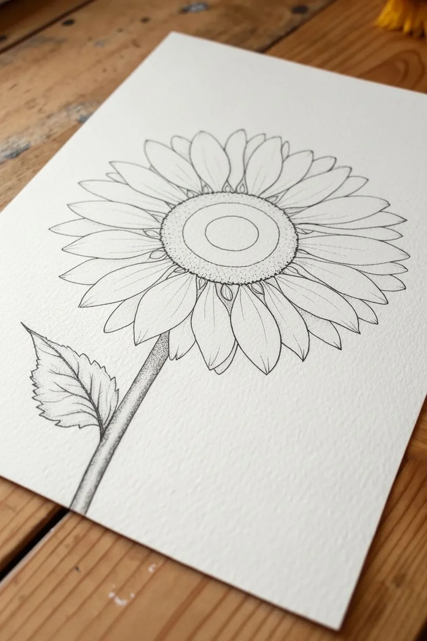
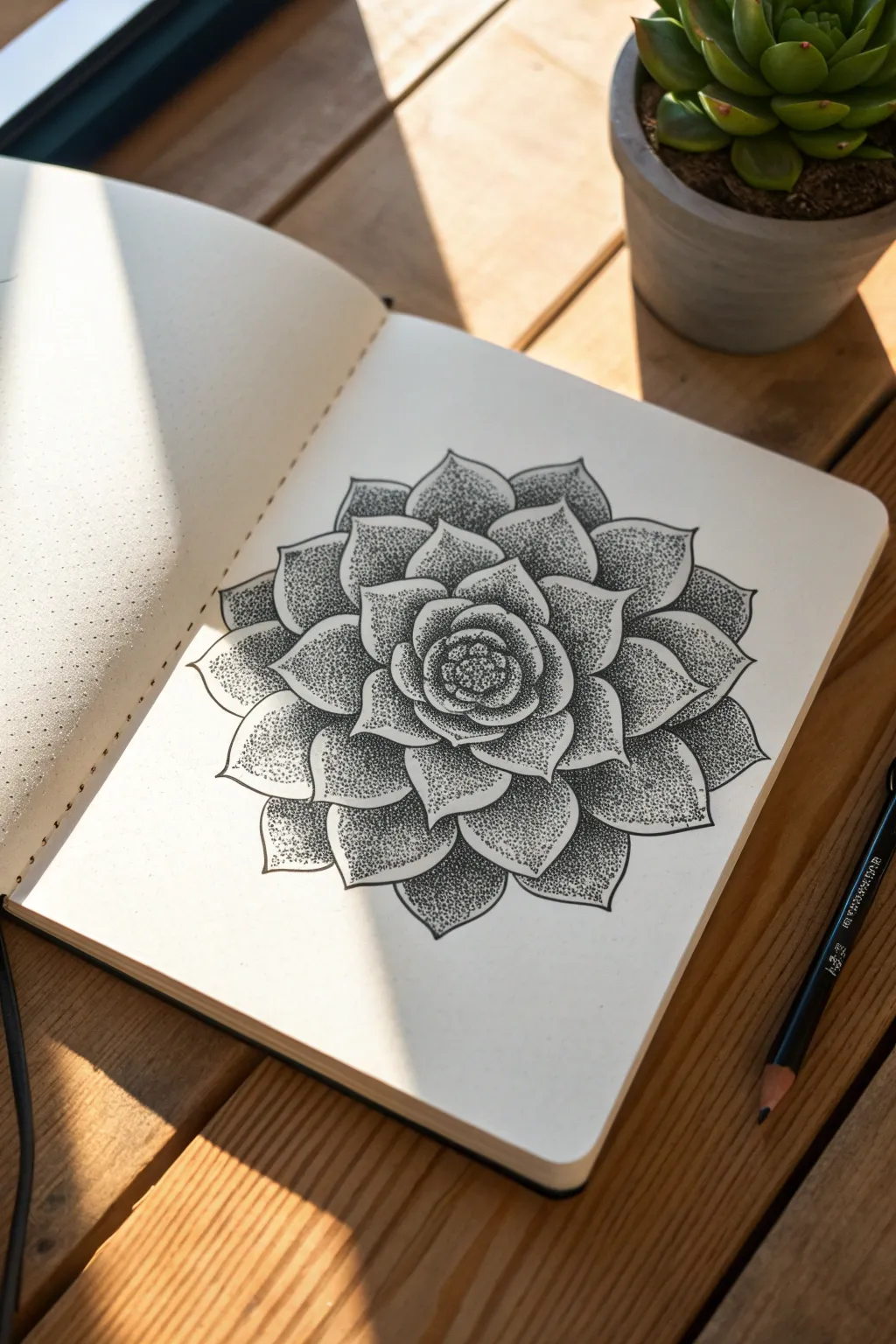
Create a Sunflower Petal Gradient With Dot Density
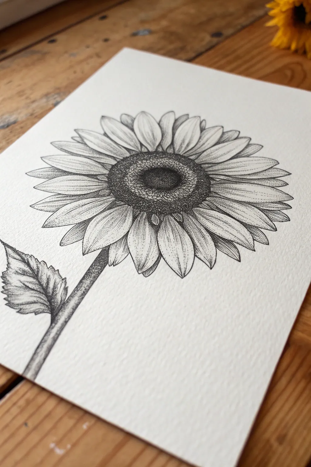
Capture the delicate gradations of a sunflower using nothing but tiny dots and precise lines. This project teaches you how to build dimension petal by petal, resulting in a striking black and white botanical illustration.
Step-by-Step Tutorial
Materials
- Textured watercolor paper or bristol board
- HB pencil
- Kneaded eraser
- Fine liner pens (sizes 0.05, 0.1, and 0.5)
- Ruler (optional)
Step 1: Planning the Flower Head
-
Draft the central disc:
Start by drawing a large circle in the upper third of your paper using your HB pencil. Inside this circle, draw a slightly smaller concentric circle to create a rim where the petals will attach. -
Add the stem:
Sketch a thick stem extending from the bottom left of the flower head, angling down towards the bottom left corner of the page. Keep the lines light so they can be erased later. -
Map out the leaf:
Draw one jagged, spade-shaped leaf branching off the left side of the stem. Ensure the tip points outward and downward to balance the composition. -
Sketch the petal shapes:
Draw two layers of petals around the central disc. Start with the front layer of large, teardrop-shaped petals, then fill the gaps behind them with smaller petal tips for depth. -
Refine the outlines:
Go over your pencil sketch with a 0.1 fine liner pen to create the final outlines. Use a steady hand but don’t worry about perfection; organic wobbles add character. -
Clear the guides:
Wait for the ink to dry completely, then gently erase all pencil marks with your kneaded eraser to reveal a clean framework.
Step 2: Stippling the Center
-
Establish the darkness:
Using a 0.5 pen, fill the very center of the flower disc with dense dots. These dots should be so close they almost merge into solid black, creating a deep recess. -
Create the gradient ring:
Switch to a 0.1 pen and move outward from the dark center. Space your dots slightly further apart as you move toward the rim, creating a gradient from dark charcoal to light gray. -
Texture the outer rim:
For the outer ring of the flower head (where seeds develop), use distinct, individual dots. Keep them sparse in the middle of this band and denser at the edges to make the ring look rounded.
Dot Control
Hold your pen vertically, perpendicular to the paper. Slanted strokes create tiny dashes instead of clean round dots.
Step 3: Shading Petals and Stem
-
Base shading on petals:
Start shading the petals using a 0.05 pen. Place dots heavily at the base of each petal (where it meets the center) and fade them out as you move toward the tip. -
Define the veins:
Draw faint lines running down the center of each petal. Stipple along these lines to give the petals a concave, folded appearance. -
Shadow overlap areas:
Identify where petals from the front layer cast shadows on the back layer. I find focusing on these small triangular shadows with dense stippling instantly adds 3D pop. -
Stipple the stem:
Use the 0.1 pen to shade the stem. Concentrate dots on the right side of the stem to act as a shadow, leaving the left side lighter to simulate a light source. -
Detail the leaf:
Outline the veins of the leaf with dots rather than solid lines. Then, fill the spaces between veins with a medium density of dots to make the leaf appear darker than the bright yellow petals. -
Final contrast check:
Step back and look at your drawing. If the center doesn’t look deep enough, add another layer of dots with the 0.5 pen. If the petals look flat, add a few more dots near their attachment points.
Golden Glow
For a subtle mixed-media effect, use a yellow watercolor wash over the petals once the waterproof ink is totally dry.
Your patient stippling has blossomed into a detailed sunflower that feels both textured and full of life


Draw Succulents for Overlapping Shapes and Shadow Pockets
This project explores the meditative art of stippling to create a highly detailed, dimensional succulent. By using thousands of tiny dots to build up shadows, you will capture the smooth, fleshy texture of the leaves and the deep pockets of shadow between them.
Detailed Instructions
Materials
- Fine liner pens (sizes 0.05, 0.1, and 0.3)
- Pencil (HB or 2B)
- Eraser (kneaded preferred)
- Sketchbook or smooth bristol paper
- Reference photo of a rosette succulent
Step 1: Sketching the Structure
-
Establish the center:
Begin lightly with your pencil. Mark a small central point on your page which will serve as the tight inner cluster of the succulent rosette. -
Draw the inner petals:
Sketch a few small, tight overlapping triangular shapes around your center point. These should look like closed buds huddling together. -
Add the middle layers:
Moving outward, draw a ring of slightly larger leaves. Ensure these leaves alternate with the previous row so the tip of a new leaf sits between two inner leaves. -
Expand the rosette:
Continue adding concentric rings of leaves, making them progressively larger and wider as you move away from the center. -
Finalize leaf shapes:
Refine the points of each leaf. Succulents often have a characteristic sharp tip, so make sure your curves meet at a distinct point. -
Ink the outlines:
Switch to your 0.3 or 0.1 pen depending on how bold you want your line work. Carefully trace over your pencil lines to create crisp boundaries for the leaves. -
Erase guidelines:
Once the ink is completely dry—give it a minute or two to be safe—gently erase all underlying pencil marks to reveal a clean line drawing.
Save Your Wrist
Stippling takes time! Don’t jab the paper hard; let the pen tip barely kiss the surface. Take frequent breaks to stretch your hand to keep your dots precise.
Step 2: Stippling the Shadows
-
Start at the core:
Using your finest pen (0.05), begin placing dots in the very center of the rosette. The shadows here are deepest, so your dots should be dense and close together. -
Identify shadow pockets:
Observe where one leaf overlaps another. The leaf roughly underneath will cast a shadow on the one below it. This is where your stippling needs to be heaviest. -
Apply base stippling:
Work leaf by leaf. Start placing dots at the base of a leaf (where it tucks under the one above it). Cluster the dots tightly near the overlapping line. -
Create gradients:
As you move from the base of the leaf toward the tip, spread your dots further apart. This transition from dense to sparse creates the illusion of curvature. -
Leave highlights clear:
Keep the tips and center ridges of the leaves almost entirely free of dots. This negative space represents where the light hits the smooth surface. -
Darken the crevices:
Switch back to your 0.1 pen if you need faster coverage in the darkest areas. Go back into the deepest nooks between leaves and add more dots to push the contrast. -
Refine the edges:
Add a very light scattering of dots along the very outer edges of some leaves to show they aren’t perfectly flat, giving them a subtle 3D quality. -
Review contrast balance:
Take a step back. I usually find I need to darken the innermost layers more than I initially thought to make the center recede properly. -
Final touches:
Do a final pass with your 0.05 pen to smooth out any gradients that look too abrupt, blending the shadow areas gently into the highlights.
Add Color Dimension
Instead of black ink, try using a dark green or purple fine liner for the stippling. It adds a subtle vibrancy while keeping the monochrome feel.
Now you have a striking botanical study that showcases the power of patience and simple ink dots

PENCIL GUIDE
Understanding Pencil Grades from H to B
From first sketch to finished drawing — learn pencil grades, line control, and shading techniques.
Explore the Full Guide
Stipple a Mushroom Cluster for Speckled Caps and Soft Gills
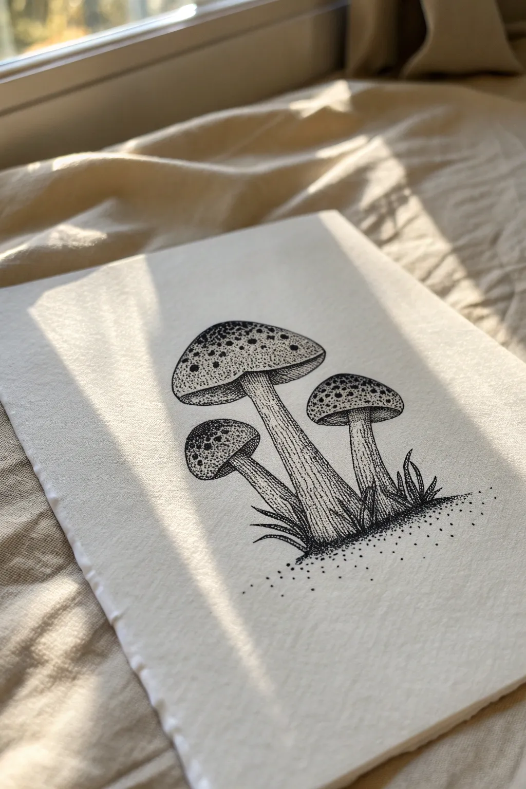
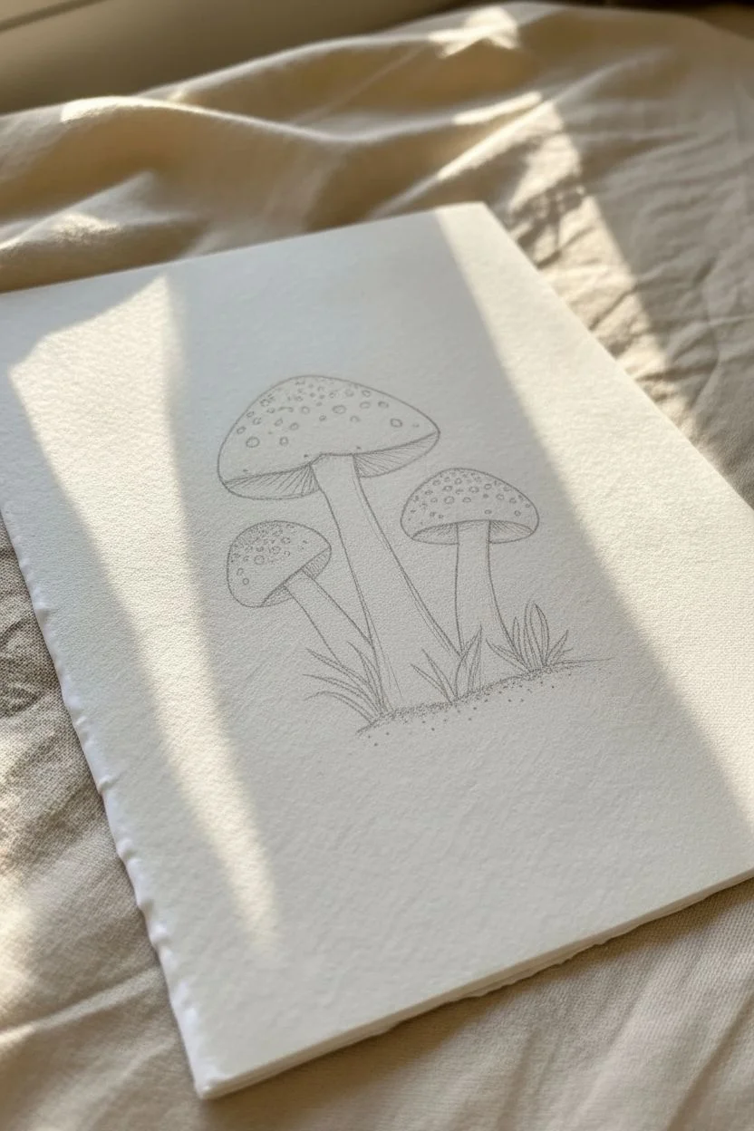
Create a charming woodland scene using the delicate art of stippling to bring three distinct mushrooms to life. This project focuses on using density of dots to create texture on speckled caps and shadow along the stems.
Step-by-Step Tutorial
Materials
- High-quality bright white cardstock or Bristol paper (approx. 5×7 inches)
- Fine liner pens (sizes 005, 01, and 03)
- HB Pencil
- Soft eraser
- Ruler (optional)
Step 1: Sketching the Outline
-
Draft the central mushroom:
Begin by lightly sketching the largest mushroom in the center of your page. Draw a wide, domed cap and a long, slightly curved stem that widens at the base. -
Add flanking mushrooms:
To the right, sketch a slightly smaller mushroom with a flatter cap. On the left, draw a small, young mushroom tucked slightly behind the main stem. -
Detail the gills and skirts:
Under the caps, lightly draw the curved lines indicating the gills. Add a small ring or skirt on the stems if desired, though the reference keeps the stems smooth. -
Sketch the ground:
Draw loose, jagged lines at the base of the stems to represent grass blades and outline an oval-shaped patch of dirt around the base.
Uneven Dotting?
If your dots start turning into tiny dashes or commas, you are moving your hand too fast. Slow down your tapping rhythm and keep the pen strictly vertical.
Step 2: Stippling the Caps
-
Outline with dots:
Using your 01 pen, gently trace over your pencil lines for the caps, but instead of a solid line, use a series of closely spaced dots to define the edge. -
Create the spots:
Inside the caps, draw several irregular circle shapes lightly with pencil. Fill the space *around* these circles with dense stippling using the 03 pen, leaving the spots themselves white or very lightly dotted. -
Build cap gradients:
Switch to the 005 pen. Concentrate your dots heavily at the very top of each cap to create a shadow, gradually spacing them out as you move toward the rim. -
Define the rim:
Add a slightly denser row of dots right at the bottom edge of the cap where it meets the gills to give the cap volume and thickness.
Step 3: Inking Stems and Gills
-
Line the gills:
For the gills under the cap, switch from stippling to very fine hatching. Use the 005 pen to draw thin, curved lines radiating from the stem to the cap edge. -
Texture the stems:
Outline the stems with a solid, thin line using the 01 pen. To create roundness, stipple heavily along the left and right edges of the stem, leaving the center bright white. -
Add vertical grain:
I like to add very faint, broken vertical lines up the length of the stem with the 005 pen to suggest a fibrous texture. -
Darken the stem tops:
Add extra dots right where step meets the cap to cast a shadow, anchoring the cap visually so it doesn’t look like it’s floating.
Level Up: Paper Deckling
To match the reference photo perfectly, tear the edges of your paper against a ruler for a rustic ‘deckled’ edge look before you start drawing.
Step 4: Grounding and Final Details
-
Draw grassy textures:
Ink the grass blades with solid, sharp lines at the base. Fill the area between the blades with dense black stippling to create deep shadows. -
Disperse the ground:
Stipple the dirt patch beneath the mushrooms. Make the dots dense near the stems and grass, and let them scatter loosely as they move outward, fading into the white paper. -
Erase pencil marks:
Wait at least 15 minutes for the ink to fully cure, then gently erase all remaining pencil sketches to reveal the stark black-and-white contrast. -
Final contrast check:
Step back and look at your drawing. If the caps look too flat, add more dots to the shadowed areas to deepen the contrast.
Now you have a timeless botanical illustration ready to be framed or gifted.
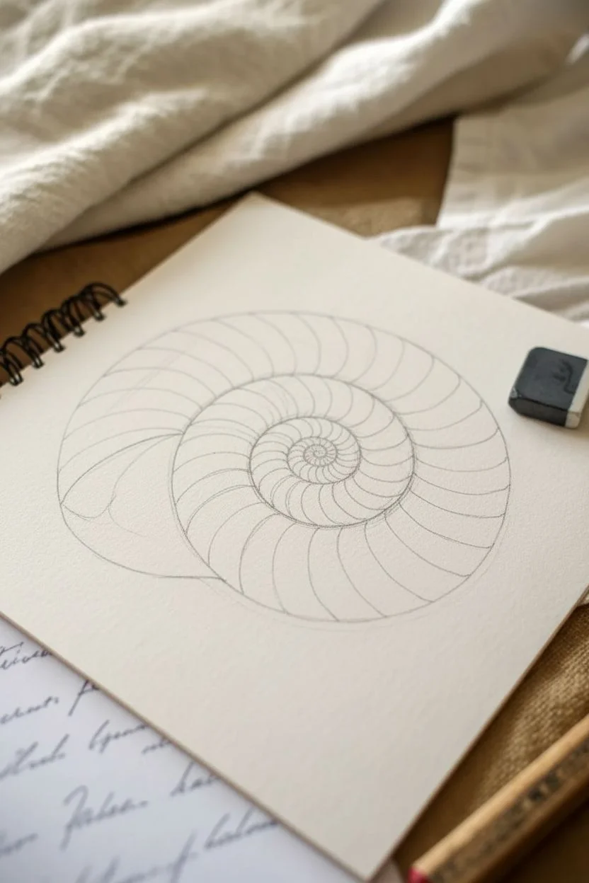
Build a Seashell With Spirals, Ridges, and Highlight Gaps
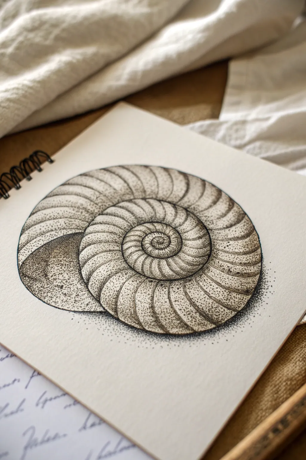
Capture the timeless elegance of a fossilized shell using nothing but tiny dots of ink. This project teaches you how to build volume and texture through the patient art of stippling, resulting in a strikingly realistic monochrome illustration.
Detailed Instructions
Materials
- Fine liner pens (sizes 0.05, 0.1, and 0.3mm)
- Pencil (HB or 2H)
- Eraser (kneaded preferred)
- Smooth bristol board or sketchbook paper
- Compass (optional, for the initial spiral)
- Ruler
Step 1: Drafting the Structure
-
Map the spiral:
Begin by lightly sketching a logarithmic spiral in pencil. If you struggle with freehanding this, use a compass to draw concentric circles that get progressively smaller, then connect them to form the coil. -
Define the chambers:
Draw curved lines radiating from the center of the spiral outward to the edge. These lines define the individual segments or ‘chambers’ of the shell. They should curve gently in the direction of the spiral’s flow. -
Establish the opening:
Sketch the large, open mouth of the shell on the left side. This area should look like a deep scoop, curving underneath the main spiral body. -
Refine the outline:
Go over your pencil sketch to ensure the curves are smooth and organic. The shell consists of a continuous curve, so avoid sharp angles.
Step 2: First Pass: Defining Edges
-
Outline with dots:
Switch to your 0.1mm fine liner. Instead of tracing the pencil lines with a solid stroke, begin tapping a line of dots along the main spiral and the segment dividers. Keep these dots fairly close together. -
Erase the graphite:
Once the foundational dot-lines are completely dry, gently erase the pencil guidelines so you are left with a faint, dotted ghost of the shell. -
Anchor the shadows:
Identify the darkest areas: the deep crevices between the spiral rings and the bottom of the shell opening. Use a 0.3mm pen here to place a high density of dots, creating a solid black appearance in the deepest recesses.
Uneven Gradients?
If your shading looks choppy, don’t rush to add more ink. Switch to your smallest pen size (0.05mm) and fill the gaps with very faint, widely spaced dots to blend the transition seamlessly.
Step 3: Building Volume
-
Gradient basics:
Work on one segment at a time. The goal is to make each chamber look rounded. Place more dots near the edges of the segment lines and fewer dots near the center of the segment. -
Stippling the curve:
Using the 0.05mm pen, fill the edges of each segment with a fine mist of dots. Let the density fade out as you move toward the middle of the segment, leaving the very center almost white. -
Deepening the spiral groove:
Return to the main spiral line that separates the coils. Build up a second layer of dots on the ‘inner’ side of the line to show that the shell curves inward there. -
Shading the mouth:
The large opening on the left requires a smooth transition. Start with dense stippling inside the curve (the shadow side) and gradually disperse the dots as you move outward toward the light. -
Texture variation:
I like to vary the pressure slightly here. Some dots can be bolder, while others are barely whisks of ink, mimicking the porous nature of calcium.
Keep it Vertical
Hold your pen completely vertical (perpendicular) to the paper. Angling the pen creates small dashes or commas instead of perfect round dots, which ruins the texture.
Step 4: Final Contrast & details
-
Intensify the core:
The very center of the spiral needs to be sharp. Use your finest pen to add tiny, precise dots to define the smallest inner chambers. -
Add the drop shadow:
To ground the object, add a patch of stippling underneath the shell. Keep these dots very dense right against the shell’s edge, fading rapidly outward into the white paper. -
Highlight check:
Step back and squint at your drawing. The white gaps running down the center of the segments should look like a continuous highlight. If an area looks too flat, darken the edges around the highlight to increase the contrast. -
Final smooth out:
Look for any jarring transitions where the dots go from thick to thin too quickly. bridge these gaps with a few medium-spaced dots to soften the gradient.
With thousands of tiny points of ink, you’ve now sculpted a three-dimensional form on a flat page
BRUSH GUIDE
The Right Brush for Every Stroke
From clean lines to bold texture — master brush choice, stroke control, and essential techniques.
Explore the Full Guide
Stipple a Feather Using Directional Dot Clusters
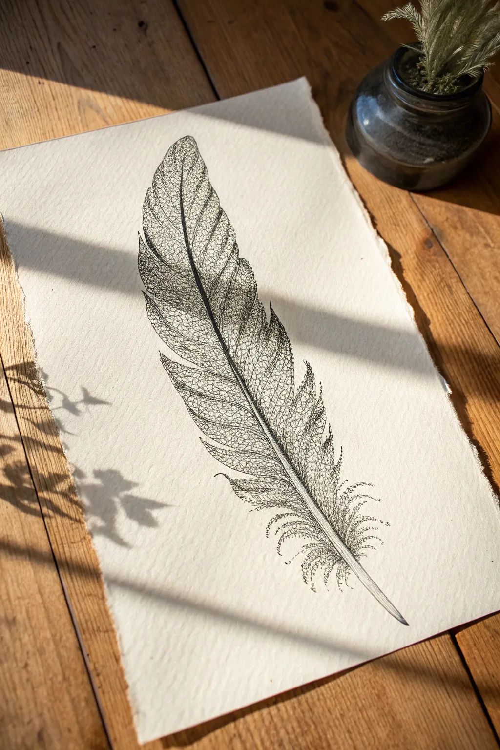
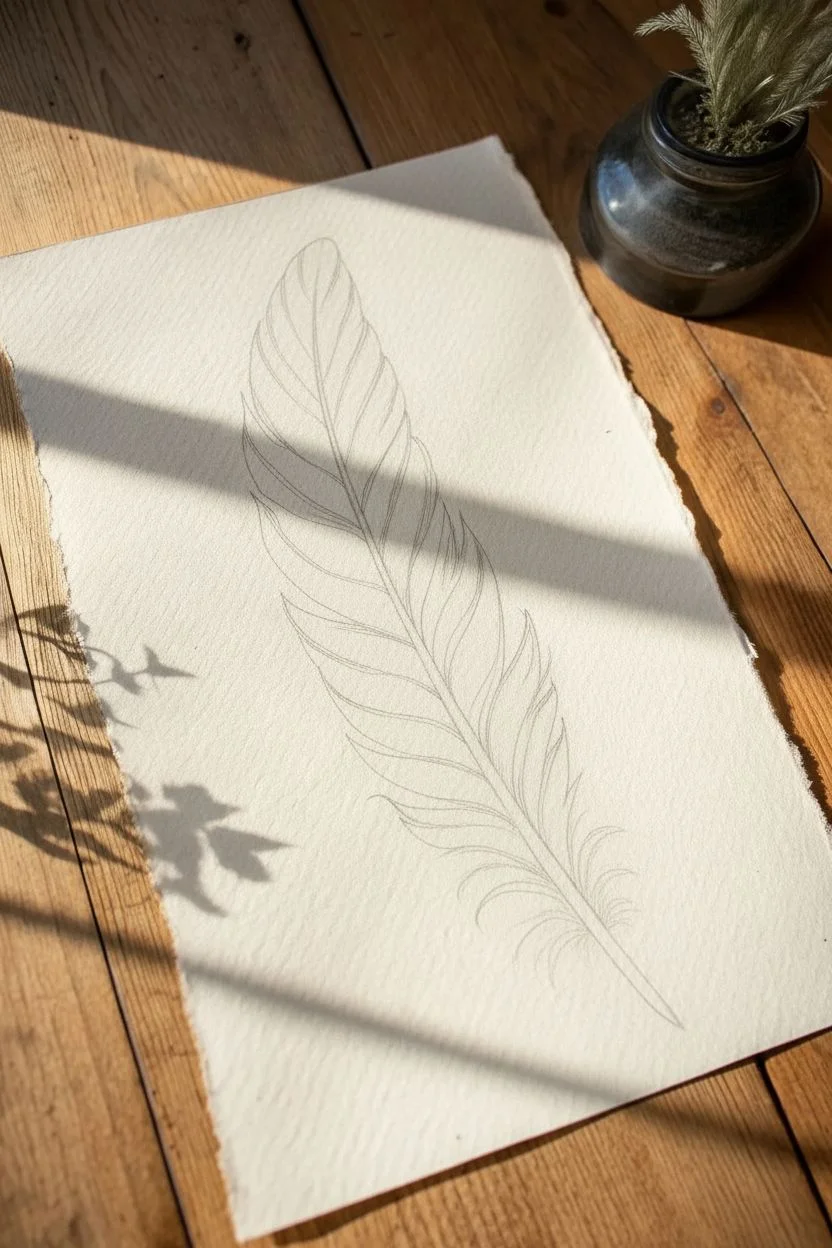
Capture the fragile beauty of a skeletal feather using precise stippling techniques to create intricate, lace-like textures. This project relies on directional dot placement to mimic the complex network of veins found in nature.
How-To Guide
Materials
- High-quality watercolor paper or bristol board (deckle edge optional)
- Fine liner pens (sizes 005, 01, and 03)
- HB graphite pencil
- Kneaded eraser
- Ruler (optional)
- Reference photo of a skeleton leaf or feather
Step 1: Planning the Structure
-
Draft the central quill:
Begin by lightly sketching the central rachis (the main stem) of the feather using your HB pencil. Give it a gentle curve to add a natural, organic feel rather than a rigid straight line. -
Outline the silhouette:
Lightly sketch the outer boundary of the feather. It doesn’t need to be perfect; irregular edges often look more realistic for a skeletal subject. -
Map the primary veins:
Sketch the main barbs branching off the central quill. These should angle upwards toward the tip of the feather, creating the primary framework for your stippling.
Ink Smearing?
If dots are smearing, your hand might be resting on wet ink. Place a scrap piece of clean paper under your drawing hand as a shield while you work across the page.
Step 2: Establishing the Skeleton
-
Ink the main stem:
Using your 03 fine liner, carefully trace the central quill. Use a stippling motion rather than a solid line, placing dots very close together to create a dark, solid-looking stem that still retains texture. -
Define the primary barbs:
Switch to a 01 pen. Stipple along your pencil guides for the main branches. Keep the dots relatively tight here to ensure the main structure is visible against the finer details later. -
Start the webbing:
This is where the ‘skeletal’ look emerges. Use the 005 pen to begin creating the small, irregular geometric shapes between the primary barbs. Think of it like drawing a cracked windshield or a dry riverbed. -
Erase pencil guides:
Once your initial ink structure is completely dry—I usually give it a full five minutes to be safe—gently roll a kneaded eraser over the paper to lift the graphite lines.
Add Antique Flair
Before drawing, lightly stain your paper with tea or diluted coffee and let it dry flat. This gives the finished skeletal feather a vintage, botanical specimen look.
Step 3: Detailed Stippling
-
Fill the geometric gaps:
Inside each little ‘cell’ of the intricate webbing you drew, add faint stippling. Concentrate dots near the lines and let them fade out toward the center of each cell to create depth. -
Darken the intersections:
Go back with your 01 pen and add extra dots wherever two vein lines intersect. This slight darkening adds visual weight and makes the structure look three-dimensional. -
Create directional flow:
Ensure your dots follow the curve of the feather. Even though they are individual points, arranging them in slight arcs helps the eye follow the natural bend of the object. -
Texture the quill:
Return to the central quill with the 005 pen. Add very sparse dots on the highlighted side (usually the top or left) and dense dots on the shadowed side to create a cylindrical volume.
Step 4: Refining the Edges
-
Frill the bottom:
At the base of the feather, where the ‘afterfeather’ or downy part would be, switch to looser, more scattered stippling. Create curving, tendril-like shapes that break away from the main form. -
Soften the perimeter:
Inspect the outer edge of your feather. If it looks too solid, add tiny, stray dots floating just outside the main shape to suggest microscopic fibers or frazzled edges. -
Deepen the shadows:
Look at your reference. Identify the darkest areas and layer more dots there using the 01 pen. Contrast is key to making the white paper look like delicate lace. -
Final assessment:
Step back from the work to view it as a whole. Fill in any areas that look unintentionally bald or sparse with very light 005 stippling to balance the composition.
Now you have a stunning, intricate illustration that captures the fragile elegance of nature
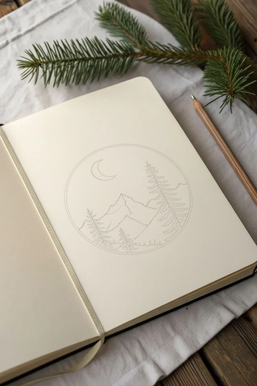
Frame a Mountain Scene Inside a Circle Composition
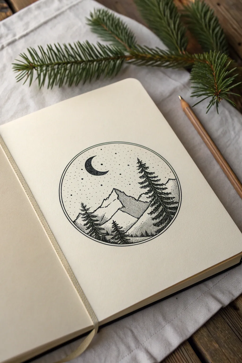
Capture the serene beauty of a moonlit forest using nothing but tiny dots and precise lines. This circular composition combines clean geometric borders with organic textures, making it a perfect exercise in patience and shading.
Step-by-Step
Materials
- Fine-grit drawing paper or sketchbook (heavier weight is best)
- Black fineliner pens (sizes 0.05, 0.1, and 0.3mm)
- Compass or a circular object to trace (approx. 3-4 inches diameter)
- HB Pencil
- Soft eraser
- Ruler
Step 1: Setting the Composition
-
Draw the boundary:
Begin by placing your compass in the center of the page. Draw a perfect circle about 3.5 inches in diameter lightly in pencil to establish your frame. -
Add the inner border:
Adjust your compass radius slightly smaller—about 2-3mm less—and draw a second, concentric circle inside the first. This creates a double-line border that looks very professional. -
Sketch the mountains:
Using your pencil, lightly sketch two overlapping triangle shapes in the lower half of the circle to form the main mountain range. The peak in the center should be higher than the one on the right. -
Outline the treeline:
Sketch rough, vertical zig-zag shapes for the trees. Place a large, dominant pine tree on the right side, extending from foreground to just below the sky, and smaller trees on the left and center foreground. -
Place the moon:
In the upper left quadrant of the sky, lightly draw a crescent moon shape.
Step 2: Inking the Outlines
-
Ink the border:
Switch to your 0.3mm fineliner. Carefully trace the two circular border lines. Rotate your sketchbook as you draw to maintain a smooth curve without lifting your hand too often. -
Define the moon:
With a 0.1mm pen, outline the crescent moon. Fill the inside of the crescent completely solid black for high contrast. -
Ink the mountain ridges:
Use the 0.1mm pen to trace the mountain peaks. Instead of straight lines, use slightly jagged, broken strokes to mimic rock texture.
Hold Vertical
Keep your pen completely vertical when stippling. Slanted hold creates commas instead of round dots, ruining the texture.
Step 3: Stippling and Shading
-
Start the sky gradient:
Using a 0.05mm pen (the finest tip), begin placing dots in the sky area. Cluster the dots more densely near the top edge of the circle and gradually space them out as you move downward, creating a fading effect. -
Add celestial details:
Disperse a few slightly larger dots throughout the sky to represent distant stars. -
Shade the mountains:
Decide on a light source (the moon is top-left, so shadows fall on the right). On the right face of the mountain peaks, apply a dense collection of dots using the 0.1mm pen. Keep the left faces mostly white with very sparse stippling. -
Build the distant textures:
For the lower, back mountains, use a uniform, medium-density stipple pattern. This differentiates them from the stark white snowcaps of the main peaks.
Ink Smearing?
If dots are smudging as you work, place a scrap piece of paper under your drawing hand to protect the fresh ink from skin oils and friction.
Step 4: Details and Trees
-
Texture the pine trees:
Switch to the 0.1mm pen for the trees. Instead of individual dots, use tiny, scratchy hatching lines combined with stippling to create the dense pine needles. -
Deepen tree shadows:
Layer more ink on the underside of the tree branches. The trees should be the darkest element in the drawing, serving as a silhouette against the mountains. -
Ground the scene:
Add stippling along the very bottom curve of the circle where the ground meets the frame. Make this area quite dark to visually weigh down the composition. -
Refine contrast:
Step back and look at the whole piece. If the mountains blend too much into the sky, add a very faint line of dots just outside the mountain edge to separate the planes. -
Erase guidelines:
Once you are absolutely certain the ink is dry (I usually wait at least 15 minutes to be safe), gently erase all underlying pencil marks.
Now you have a tranquil miniature landscape captured forever in your sketchbook


Turn a Planet Into a Shaded Sphere With Bands and Rings
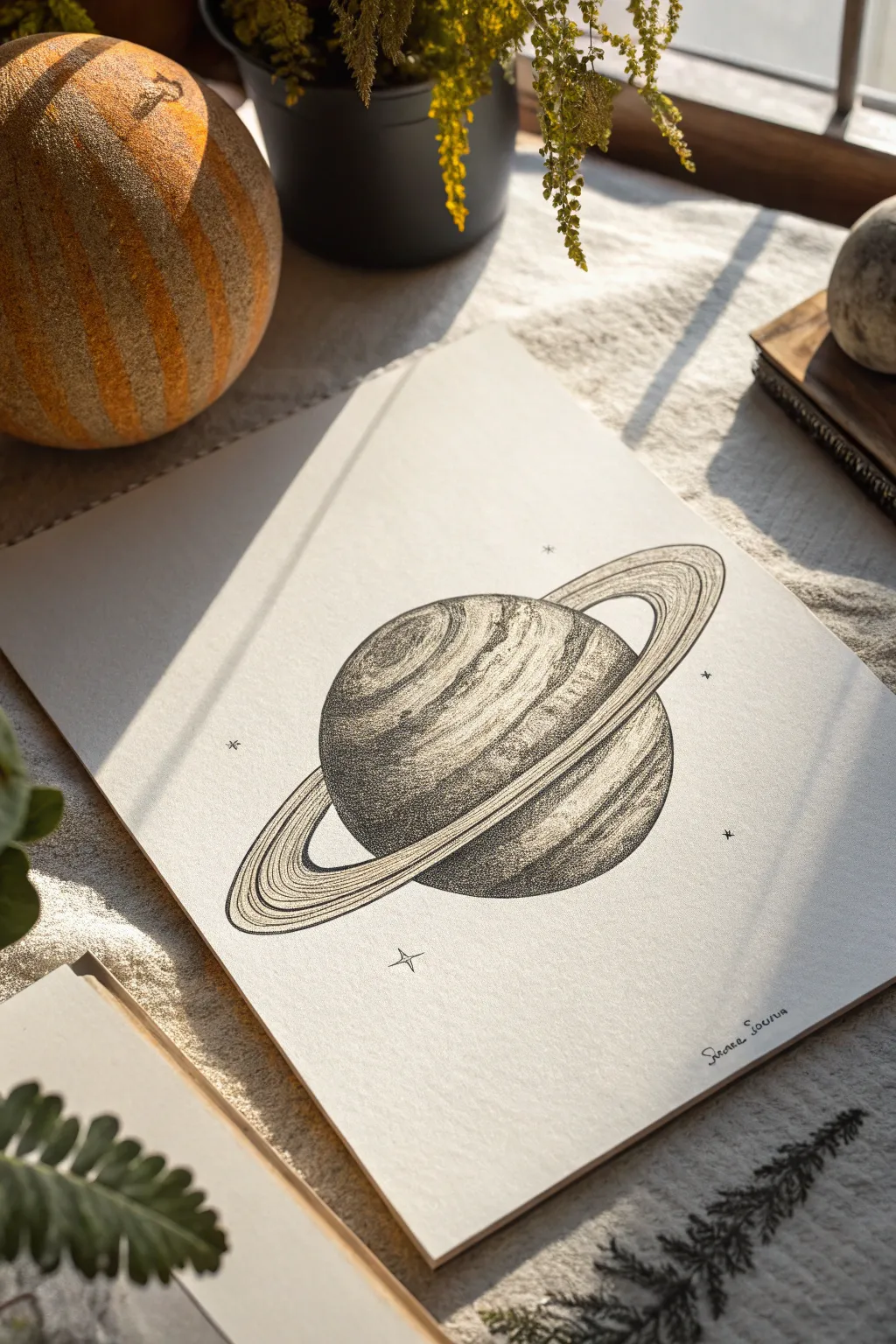
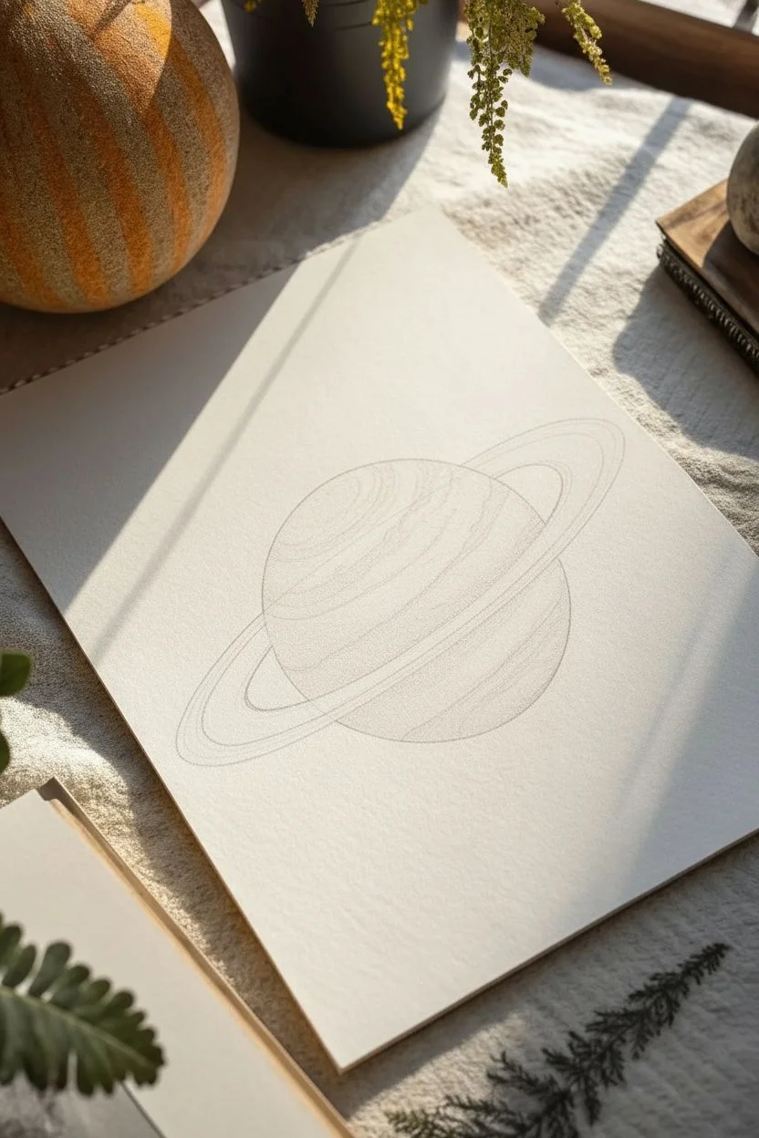
Create a mesmerizing celestial drawing using nothing but patience and ink. This project captures the dynamic surface of a gas giant through thousands of tiny dots, blending meticulous stippling with bold planetary rings for a stunning monochrome effect.
Step-by-Step
Materials
- High-quality smooth bristol or cardstock paper
- Pencil (HB or H)
- Eraser (kneaded preferred)
- Compass or circle template
- French curves (optional)
- Black fineliner pens (sizes 005, 01, and 03)
- Ruler
Step 1: Drafting the Celestial Body
-
Draw the main sphere:
Begin by finding the center of your paper. Using a compass, lightly draw a perfect circle approximately 3-4 inches in diameter to serve as the planet’s body. -
Map out the rings:
Sketch a large, thin ellipse that wraps around the sphere. The ellipse should be significantly wider than the planet itself, creating that classic Saturn-like silhouette. Use a ruler to ensure the axis of the ellipse is tilted, giving the planet a dynamic angle. -
Define the ring thickness:
Inside the first ellipse, draw a second, slightly smaller inner ellipse. Then, add a third line even closer to the planet’s surface to define the gap between the rings and the planet. These guide lines create the ‘width’ of the ring system. -
Hide the obscured lines:
Erase the parts of the ring that go ‘behind’ the planet sphere, and erase the part of the sphere that is covered by the front section of the rings. This establishes the 3D relationship immediately. -
Sketch the atmospheric bands:
Lightly sketch curved lines across the face of the planet. These should follow the curvature of the sphere, bowing downward slightly to match the spherical form. Create varying widths for these bands to mimic gas giant storms.
Step 2: The Art of Stippling
-
Outline the main shapes:
Switch to your 01 fineliner. Very carefully trace the main outlines of the planet and the rings. Keep your hand steady for a clean, continuous line. -
Begin the darkest shadows:
Using your 03 pen (the thickest one), start placing dots in the darkest area of the planet—typically the bottom left curve or the side opposite your light source. Pack the dots densely so they almost merge into solid black. -
Create the first gradient:
As you move away from the shadow edge towards the center of the planet, space your dots further apart. Switch to the 01 pen here to make the transition smoother. -
Texture the bands:
Work on the atmospheric bands one by one. Some bands should be darker (denser dots), and some lighter (fewer dots). I like to use a directional flow with my dots here, following the curve of the band to enhance the roundness. -
Highlight the sphere:
Leave the upper right area of the sphere (or wherever your light source hits) mostly empty, with very sparse stippling. This negative space is crucial for creating the highlight effect.
Hold it Vertical
Keep your pen as vertical as possible while stippling. Slanted strokes create tiny dashes instead of perfect round dots, which can ruin the texture illusion.
Step 3: Detailing the Rings and Finishing
-
Outline the ring tracks:
Use your 005 pen (the finest tip) to draw fine, concentric lines within the rings. These act as guides for your shading and imitate the ‘grooves’ of planetary rings. -
Shade the rings:
Stipple the rings carefully. The part of the ring passing in front of the planet often casts a shadow on the planet itself—add a band of dark stippling on the sphere just below the ring line. -
Add dimension to the rings:
Darken the inner and outer edges of the rings with denser dots, leaving the centers of the ring tracks lighter. This makes the rings look like rounded bands of rock and ice rather than flat paper. -
Cast the planet’s shadow:
Don’t forget the shadow the planet casts onto the rings behind it. Look at where the sphere blocks the light path and darken that specific section of the back rings significantly. -
Add cosmic sparkles:
Using your 01 pen, draw a few small four-pointed stars or simple dots around the planet to represent distant stars. -
Final clean-up:
Wait at least 15 minutes to ensure the ink is totally dry. Then, gently erase all your pencil guides to reveal the crisp ink work. -
Sign your work:
Add your signature in a small, unobtrusive spot near the bottom corner.
Cosmic Color
Once the black ink is dry, use a watercolor wash in pale blues or ochres over the stippling for a vintage astronomy map aesthetic.
Now you have a timeless piece of space art that rewards close inspection.
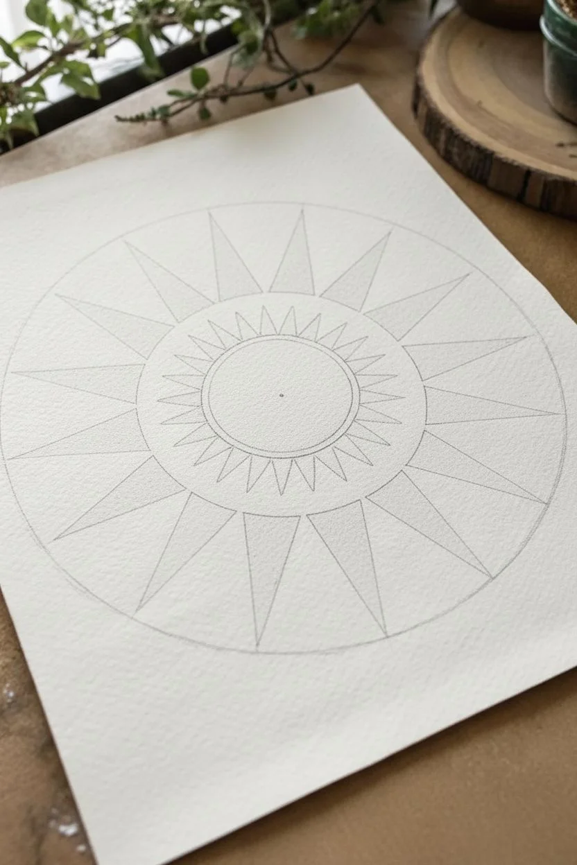
Design a Bold Sun With High-Contrast Stippled Rays
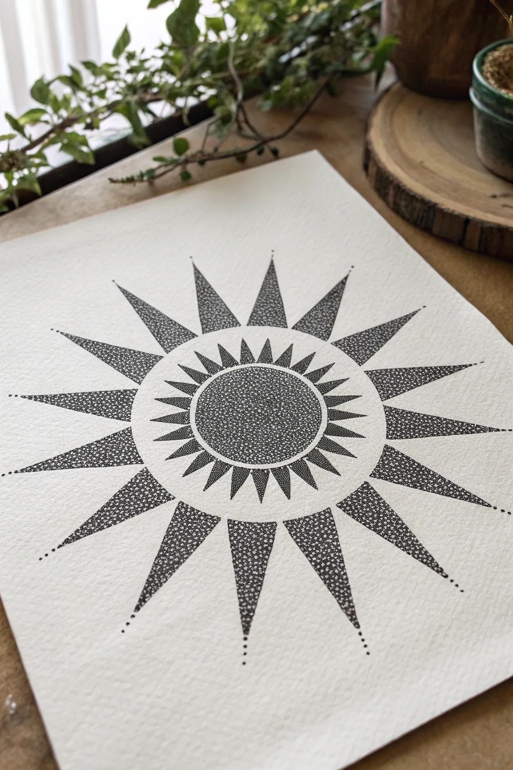
Capture the warmth and energy of the sun with this meticulous ink drawing that focuses on balance and texture. By using negative space and dense stippling, you will create a stunning radial design that feels both modern and timeless.
Step-by-Step Tutorial
Materials
- High-quality, heavy-weight drawing paper (smooth or light texture)
- Fine liner pens (sizes 0.1, 0.3, and 0.5)
- Compass
- Protractor
- Ruler
- Pencil (HB or 2H for light lines)
- Eraser (kneaded eraser preferred)
Step 1: Drafting the Geometry
-
Establish center:
Begin by finding the exact center of your paper. Make a tiny, faint mark here, as every part of the sun will radiate from this single point. -
Draw the core circles:
Using your compass set to the center point, draw the smallest inner circle (the core of the sun). Then, draw a second, slightly larger concentric circle around it to create a ring of negative space. -
Draft the inner rays:
Draw a third concentric circle lightly to mark the tips of the smaller, inner rays. Use your protractor to mark even intervals around the circumference—aim for about 24 points to create a dense inner starburst. -
Draft the outer rays:
Expand your compass significantly to mark the boundary for the long, dramatic outer rays. You will need fewer of these; align them so the points of the large rays fall exactly between every second inner ray. -
Connect the points:
With a ruler, connect your marked points back to the base circles to form the triangular ray shapes. Keep these pencil lines extremely light, as the ink needs to stand out.
Wrist Fatigue?
Stippling is repetitive! If your hand cramps, try holding the pen more vertically and tapping from the elbow rather than just flicking your wrist.
Step 2: Inking the Core & Inner Ring
-
Outline the center:
Switch to a 0.5 fineliner and carefully trace the very inner circle. Unlike a standard sketch, you don’t need a heavy solid line here; you can actually use tiny, dense dots to create the outline itself for a softer edge. -
Fill the core:
Using a 0.3 pen, begin stippling the entire inner circle. Start with widely spaced dots to get a feel for the area. -
Build density:
Go back over the center core and add more dots until the circle looks dark gray or nearly black. Leave tiny specks of white paper showing through to maintain that signature stippled texture. -
Outline the inner rays:
Trace the triangular shapes of the small inner starburst ring. I like to keep these outlines very crisp to contrast with the textured interior. -
Shade the inner rays:
Fill these small triangles with stippling. Aim for a gradient effect: make the dots denser near the base of the triangle (closest to the center) and slightly more sparse toward the tips.
Pro Tip: Dot Size
Use a larger pen (0.8mm) for the darkest shadow areas. It covers ground faster and adds textural variety compared to using only a 0.1mm pen.
Step 3: Creating the Outer Rays
-
Outline the large rays:
Using your 0.5 pen again, trace the long, outer triangular rays. Ensure the points are sharp and the lines are straight. -
Begin the outer fill:
Switch to your finest pen (0.1 or 0.05). This larger surface area requires patience. Start stippling at the wide base of one ray. -
Create a gradient:
As you move toward the tip of the ray, space your dots out more. The base should look heavy and shadowed, while the tip should appear lighter and airier. -
Repeat the process:
Work your way around the sun, filling each large ray one by one. Try to maintain consistent dot density across all rays so the sun looks uniform. -
Detail the tips:
At the very sharpest point of each large ray, add a linear trail of 3-5 distinct dots extending outward into the white space. This small detail adds elegance and extends the visual reach of the sun. -
Refine contrast:
Step back and look at the whole piece. If the center doesn’t look dark enough compared to the rays, add another layer of dots to the core.
Step 4: Final Touches
-
Dry completely:
Let the ink sit for at least 30 minutes. Stippling creates pools of ink that take longer to dry than lines. -
Erase guidelines:
Gently erase your pencil structure. Use a kneaded eraser and dab rather than rub to avoid smearing any ink or damaging the paper surface. -
Assess negative space:
Check the white ring between the core and the rays. If any stray dots landed there, you can carefully scratch them away with a craft knife or cover them with white gel pen, though leaving them adds character.
Now you have a striking geometric sun that radiates energy from your wall
Try a Geometric Animal Filled With Different Dot Densities
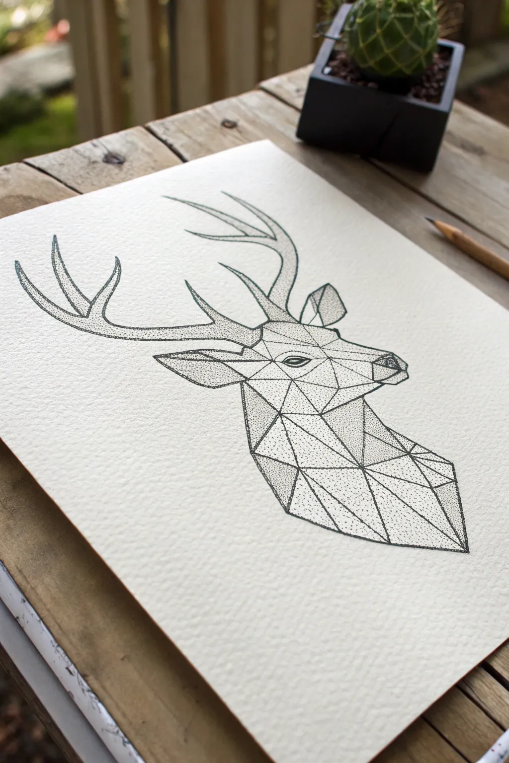
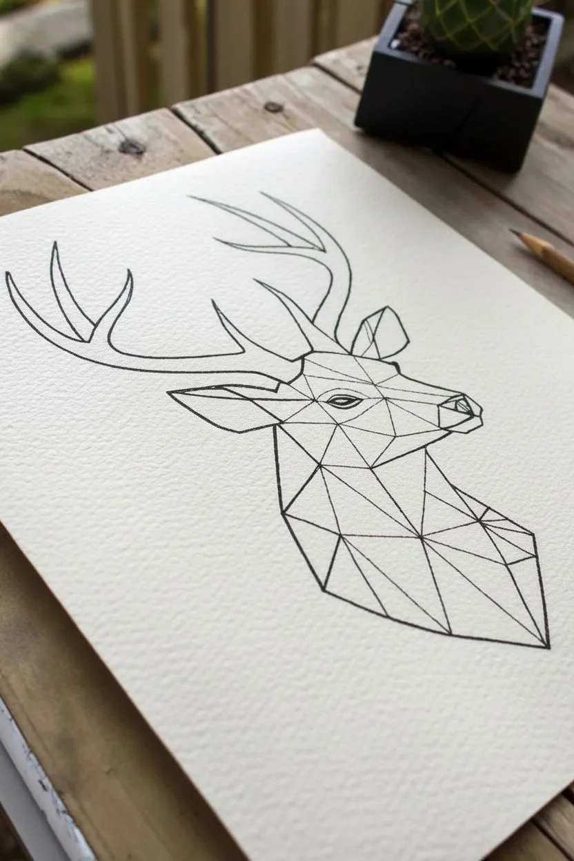
Combine the modern edge of low-poly geometry with the timeless detail of stippling in this striking stag portrait. By varying the space between your dots, you will create depth and shading without drawing a single solid line for shadows.
How-To Guide
Materials
- High-quality watercolor paper or smooth Bristol board
- HB pencil
- Eraser (preferably kneaded)
- Ruler or straight edge
- Fine liner pens (sizes 005, 01, and 03)
- Printed reference photo of a geometric deer
Step 1: Drafting the Framework
-
Sketch the outline:
Begin by lightly sketching the general silhouette of the deer using your HB pencil. Focus on the main shapes first: the long snout, the strong neck, and the sweeping curves of the antlers. -
Establish anchor points:
Mark key points where lines will intersect, specifically around the eye, the cheekbone, the jawline, and the base of the neck. These dots will help you connect your geometric mesh later. -
Draw the geometric mesh:
Using a ruler, connect your anchor points with straight lines to create the triangular ‘low-poly’ facets. Pay close attention to the face; smaller triangles here will create more detail. -
Refine the antlers:
Unlike the face, keep the antlers more organic rather than strictly geometric, outlining their smooth curves to contrast with the sharp angles of the head. Lightly erase any stray sketch lines that fall outside your final contour. -
Finalize pencil work:
Review your mesh. Ensure your triangles look balanced and not too cluttered. Once happy, lighten the graphite lines with a kneaded eraser so they are barely visible guides.
Wrist Relief
Stippling can be repetitive. To avoid hand cramps, hold the pen vertically and tap using a gentle motion from your wrist, not your fingers. Take breaks every 10 mins.
Step 2: Inking the Skeleton
-
Select your outlining pen:
Pick up your 03 or 05 fine liner. We want the structural lines of the polygons to be bold and distinct. -
Trace the polygon lines:
Carefully trace over your pencil ruler lines, creating the crisp geometric web on the deer’s face and neck. Keep your hand steady and lift the pen cleanly at each vertex to avoid ink pooling. -
Outline the head:
Continue with the thicker pen to outline the entire perimeter of the head and the main neck shape. This creates a strong container for the delicate stippling to come. -
Ink the antler contours:
Switch to a slightly thinner 01 pen for the antler outlines. This subtle change in line weight pushes them slightly back visually compared to the bold geometric face. -
Let the ink set:
Wait at least 5 to 10 minutes for the ink to dry completely. I prefer to give it a bit extra time here to avoid smudging. -
Erase pencil guides:
Gently erase all remaining pencil marks. You should now have a clean, white geometric framework ready for shading.
Metallic Accent
For a stunning modern twist, fill in just one or two small triangles—perhaps near the eye or antlers—with metallic gold ink instead of stippling.
Step 3: Stippling for Depth
-
Choose your shading pen:
Switch to your finest pen, the 005. This allows for the most delicate gradients and precise control over dot density. -
Start with darkest facets:
Identify the triangles that represent deep shadow, such as under the chin or the back of the neck. Fill these areas with tightly packed dots, leaving very little white paper showing. -
Create mid-tones:
Move to the adjacent triangles. Reduce the density of your dots here. Space them out slightly to create a grey tone that contrasts with your dark shadows. -
Highlight the form:
For the areas where light hits—like the top of the nose and the cheekbones—use very few dots or leave the center of the triangle completely white. -
Texture the antlers:
Apply stippling to the antlers not in geometric shapes, but following the curve of the bone. Concentrate dots on the underside of each tine to create roundness and volume. -
Define the eye:
The eye is the focal point. Use dense stippling or even solid black ink for the pupil, leaving a tiny crisp white circle as a catchlight to bring the deer to life. -
Blend the edges:
Inside each triangle, you can create a mini-gradient. Stipple more densely near the edges where lines meet to make the geometry feel slightly dimensional. -
Assess contrast:
Step back and look at the overall value structure. If a shadow looks too light, go back in and add another layer of dots to deepen the black. -
Final clean up:
Check for any rogue pencil marks or smudges and gently clean them up, ensuring your sharp geometric lines remain crisp.
Now you have a sophisticated piece of geometric art that looks complex but was built one simple dot at a time
Practice Metallic Reflection Using Sharp Highlights and Dot Gradients
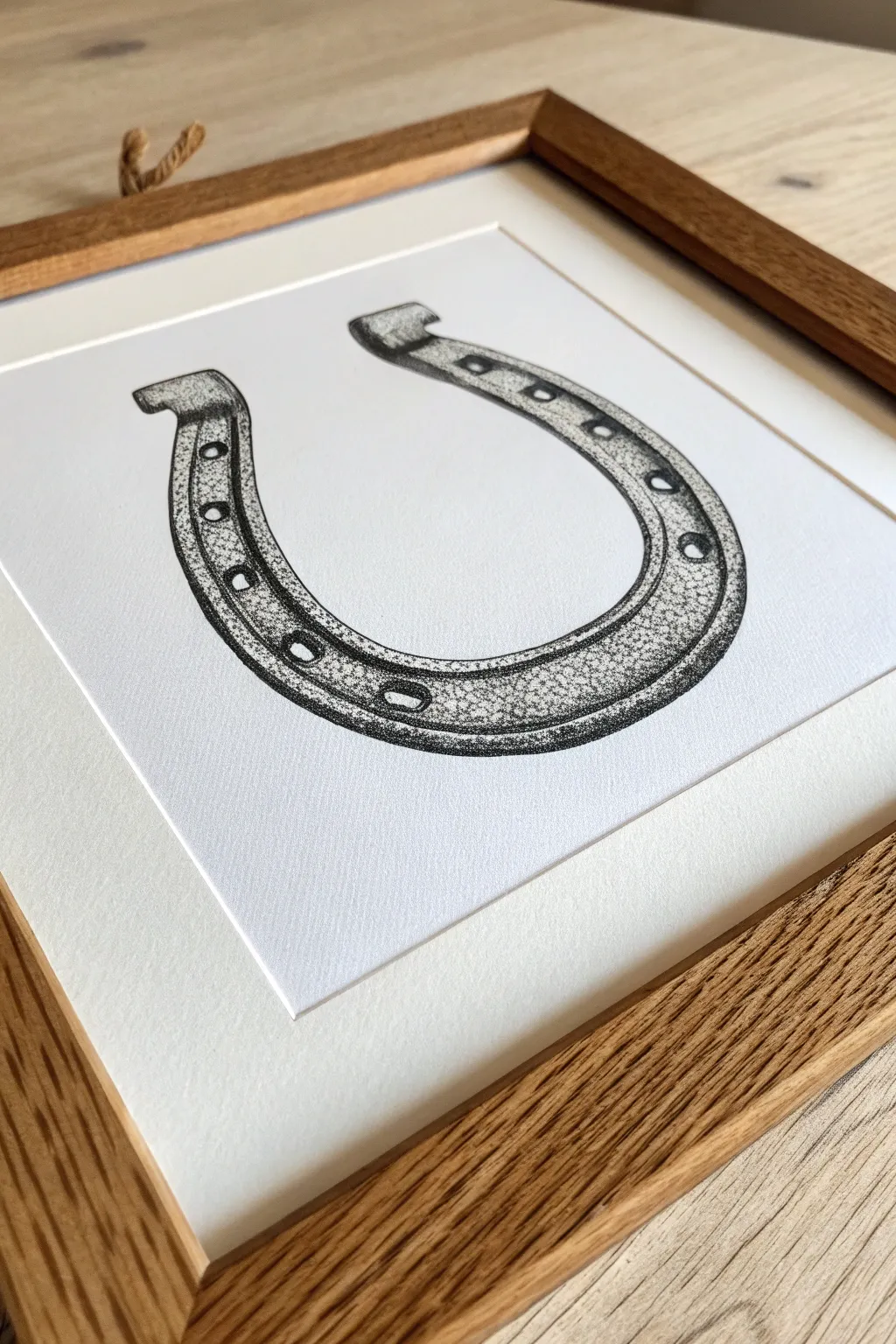
This project explores the technique of creating a realistic, weathered metallic texture using only dots. By carefully controlling dot density, you’ll render the curves and shine of a classic horseshoe, capturing both its weight and its highlights.
How-To Guide
Materials
- High-quality Bristol board or hot-press watercolor paper (smooth surface)
- Fine liner pens (sizes 0.05mm, 0.1mm, and 0.3mm)
- HB or 2H graphite pencil
- Soft kneaded eraser
- Ruler
- Reference photo of a horseshoe
Step 1: Planning and Sketching
-
Draft the basic shape:
Begin with a light pencil sketch on your paper. Draw a large ‘U’ shape, ensuring the arms are symmetrical. Use your ruler to verify the width is consistent on both sides. -
Add dimension:
To give the horseshoe depth, draw a parallel inner line that follows the curve of your initial ‘U’. Add the heel calks (the little rectangular tabs) at the very ends of the horseshoe arms. -
Detail the fullering:
Sketch the groove (fullering) running through the center of the horseshoe’s curve. Inside this groove, mark out the positions for the rectangular nail holes. -
Define highlight zones:
Lightly outline the areas where the metal shines brightest. These will be your ‘negative space’ zones where you will place almost no dots, which is crucial for the metallic effect.
Step 2: Establishing the Base Values
-
Start with the darkest shadows:
Using your 0.3mm pen, begin stippling the darkest areas. Focus on the underside of the curve and the deep shadows inside the nail holes. Keep your dots close together so they almost merge into solid black. -
Outline definition:
Instead of drawing a solid line for the outline, use a series of tightly packed dots with a 0.1mm pen to define the edge. This keeps the look consistent with the stippling style rather than looking like a coloring book outline. -
Fill the groove:
Work inside the fullering groove. The bottom of this channel should be quite dark, graduating to a medium density as it rises to the surface edge. -
Create the mid-tones:
Switch to a 0.1mm pen. Start filling in the main body of the horseshoe. I find it helpful to work in small circular patches, spreading dots evenly but not too densely yet.
Dotting Patience
Keep your wrist loose and lift the pen straight up after each dot. ‘Tails’ or dashes happen when you drag the pen slightly, ruining the crisp stipple effect.
Step 3: Refining Texture and Shine
-
Build the gradient:
The key to metal is high contrast. Gradually increase the dot density as you move away from your highlighted areas. The transition from the dark edge to the bright highlight needs to be smooth but rapid. -
Texture the surface:
To mimic cast iron, avoid making the dot pattern too uniform. Allow some random clustering of dots in the mid-tone areas to suggest pitting and age on the metal surface. -
Enhance the highlights:
Using your finest 0.05mm pen, place very sparse, delicate dots into the highlight zones you marked earlier. You don’t want these stark white; just a few specks soften the glare and make it look realistic. -
Deepen the edges:
Go back with the 0.3mm pen and darken the very outer rim of the horseshoe again. This ‘rim lighting’ effect separates the object from the paper and adds volume. -
Detail the nail holes:
Ensure the nail holes have sharp, dark edges. Add a tiny gradient inside them to show they go through the metal, rather than just being black spots.
Make It Lucky
Traditionally, horseshoes serve as good luck charms when hung with ends pointing up. Add a stippled nail or leather cord at the top to ‘hang’ your art.
Step 4: Final Touches and Cleanup
-
Assess the contrast:
Step back and squint at your drawing. If the metal looks flat, add more dots to the darks. If the highlights look dull, you may have over-stippled—unfortunately hard to fix, but good to note for next time. -
Clean up pencil lines:
Once the ink is completely dry (give it at least 20 minutes to be safe), gently erase your initial pencil sketch with the kneaded eraser. Roll the eraser rather than scrubbing to protect the paper surface. -
Final polish:
Inspect the drawing for any uneven patches in your gradients. Use the 0.05mm pen to fill any accidental gaps that disrupt the smooth visual flow of the metal surface.
Now step back and admire how thousands of tiny points have come together to create solid, heavy iron
Go Abstract With a Stippled Gradient That Morphs Into Patterns
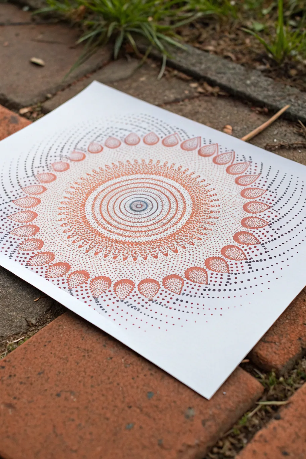
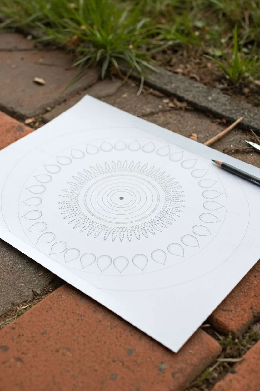
This mesmerizing circular design uses the power of simple dots to create complex layers of depth and movement. By transitioning from dense clusters to airy spacing, you’ll build a radiating sunburst pattern that feels both organic and structured.
Step-by-Step
Materials
- Heavyweight white drawing paper or cardstock (smooth bristol is ideal)
- Fine liner pens (sizes 0.1, 0.3, and 0.5)
- Colors: Orange, rust/terracotta, light brown, dark grey/black
- Compass
- Pencil (HB or lighter)
- Eraser (kneaded is best)
- Ruler
Step 1: Setting the Foundation
-
Find your center:
Mark the exact center of your paper with a small pencil dot. This pivot point is crucial for the symmetry of the entire piece. -
Draw the central rings:
Using your compass, draw a very small circle (about 1cm diameter) in the center. Continue drawing concentric circles moving outward, spacing them closely together—about 3-4mm apart—until you have roughly 8-10 rings. -
Draft the petal layer:
Draw a larger guide circle about 2 inches from your central rings. Lightly sketch a ring of evenly spaced teardrop or petal shapes resting on this guideline. They should point outward like distinct rays of the sun. -
Create the outer guides:
Draw two faint, large circles beyond your petal layer. These will guide the spiral dot trails that fade off near the paper’s edge.
Uneven Circles?
If your concentric rings look wobbly, don’t panic. Stippling is forgiving. Just add a few extra dots to the ‘thinner’ side of the ring to visually balance the weight without redrawing.
Step 2: Stippling the Core
-
Dot the bullseye:
Start with your 0.3 pen in dark grey or black. Fill the innermost circle with dense stippling. Keep the very center slightly lighter to create a spherical 3D effect. -
Transition to color:
Switch to your fine rust or terracotta pen. Begin stippling the next few rings. Place dots heavily on the pencil lines to define the rings, and space them out slightly as you fill the gap between lines. -
Create the gradient bands:
As you move through the concentric circles, alternate between orange and light brown pens. For each band, concentrate dots on the inner and outer edges, leaving the middle of the band lighter to simulate a rounded, tube-like volume. -
Build the texture:
In the fourth or fifth ring, try varying your dot size. If you have a thicker 0.5 pen, mix in a few larger dots among the fine ones to add texture to the gradients.
Pen Pressure Pro-Tip
Keep your pen vertical! Holding the pen at an angle while stippling can damage the nib and create oval dashes instead of round dots. Up-and-down motion gives crisp results.
Step 3: Forming the Radiance
-
Define the sunburst edge:
Just outside your last concentric ring, switch to a bright orange. Create a jagged, starburst effect by stippling triangles that point inward toward the center. -
Fill the teardrops:
Move to the large petal shapes you sketched earlier. Outline them not with a solid line, but with a tight row of rust-colored dots. This keeps the edges soft. -
Gradient the petals:
Fill the inside of each teardrop with orange stippling. Make the dots very dense at the pointed tip and slowly fade them out toward the rounded base, creating a sense of direction. -
Connect the layers:
Use a light brown pen to stipple loose, scattering patterns between the central rings and the outer petal ring. This negative space needs just a whisper of texture to bridge the two zones.
Step 4: Final Flourishes
-
Start the spirals:
Using a dark grey or black pen, begin trails of dots starting from the tip of each orange petal. Curve them gently to the left, following the logic of a spiral. -
Fade the trails:
As your grey dot trails extend toward the edge of the paper, increase the space between each dot significantly. You want them to look like they are dissolving into the background. -
Add inter-petal details:
Go back to the spaces between the large orange petals. Add tiny, secondary triangular shapes or small clusters of dots in a contrasting color like dark brown to add complexity. -
Erase guidelines:
Wait at least 20 minutes to ensure all ink is totally dry. Gently erase all your pencil compass lines. I find creating a circular motion with the eraser prevents paper buckling. -
Check density:
Step back and look at your mandala. If the center feels too flat, go back in and add a second layer of dots to the shadowed areas to punch up the contrast.
Now step back and admire how thousands of tiny points have come together to form a unified, radiating masterpiece


Have a question or want to share your own experience? I'd love to hear from you in the comments below!