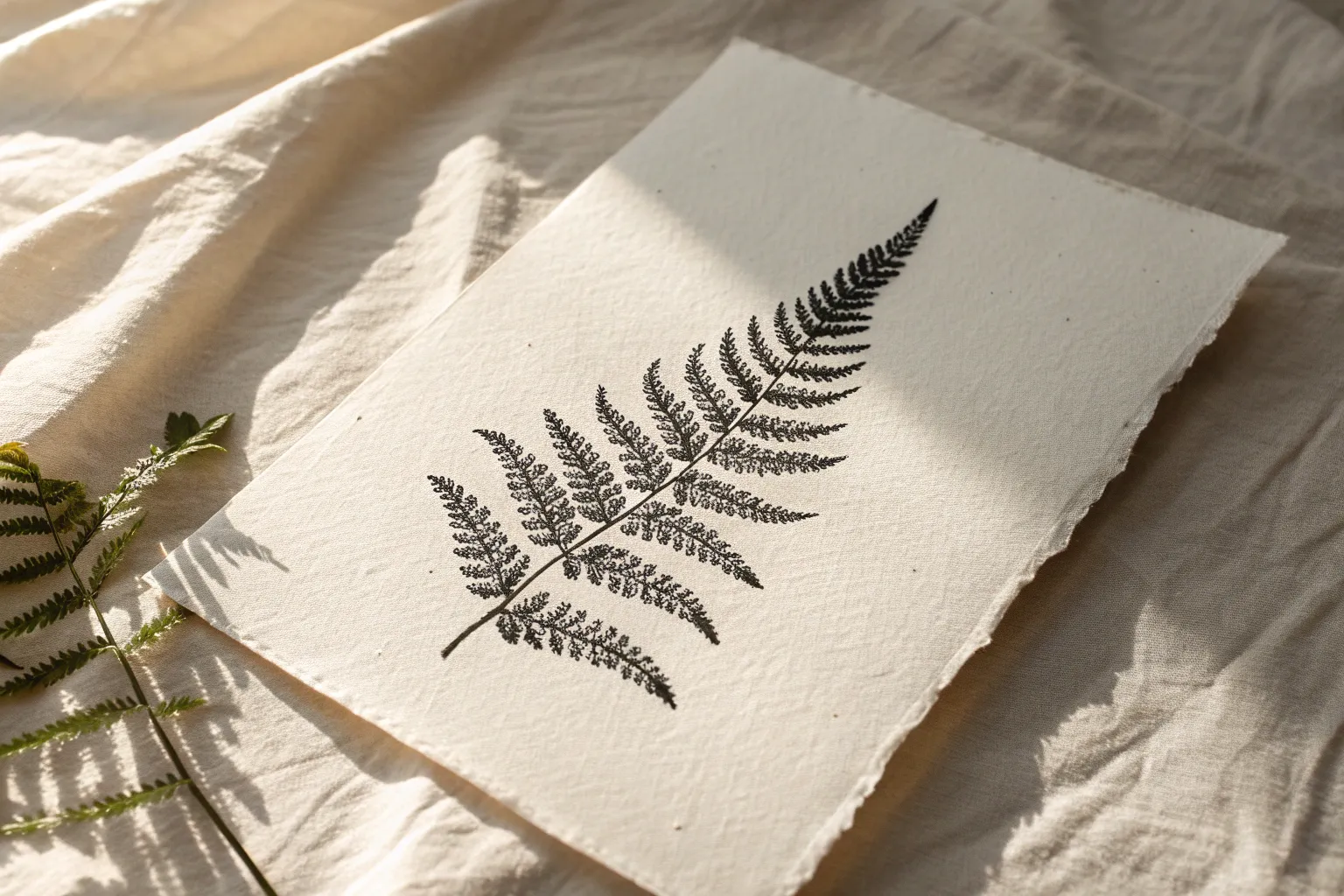
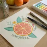
If you’ve been craving a relaxing way to build shading and texture, stippling is such a satisfying rabbit hole to fall into. With nothing but dots and a little patience, you can create surprisingly smooth gradients, crisp edges, and all kinds of juicy texture.
Stippled Sphere With a Soft Shadow
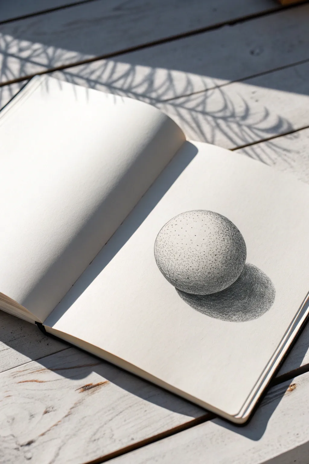
Master the art of patience and precision with this stippled sphere study, a perfect introduction to pointillism techniques. Using only black ink and varying dot densities, you will transform a flat circle into a three-dimensional object with realistic volume and cast shadow.
How-To Guide
Materials
- Fine liner pen (0.1mm or 0.05mm)
- Medium liner pen (0.3mm or 0.5mm)
- Smooth bristol or mixed media sketchbook
- Compass or circular object (for tracing)
- HB Pencil
- Kneaded eraser
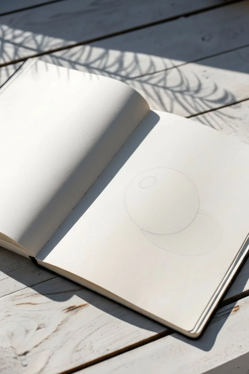
Step 1: Preparation and Outline
-
Draw the base circle:
Begin by lightly tracing a perfect circle onto your sketchbook page using a compass or by tracing around a small bowl. Keep your pencil pressure very light so the graphite won’t smudge later. -
Map the shadow:
Lightly sketch an oval shape extending from the bottom right of your sphere. This will be your cast shadow. It should be slightly wider than the sphere itself to look natural. -
Mark the highlight:
Identify where your light source is coming from (top left in this example). Lightly draw a small circle or oval in that area to remind yourself to keep it completely white.
Uneven Gradients?
If your shading looks blotchy, don’t panic. Simply go back and add filler dots in the lighter ‘gaps’ within your patch. Uniform randomness is key to smooth shading.
Step 2: Building the Form
-
Initial outline stippling:
Take your finest pen (0.05mm or 0.1mm). Instead of drawing a solid line, go around the pencil edge of your sphere with very light, spaced-out dots to define the boundary without creating a harsh rim. -
Base layer of dots:
Start adding a sparse layer of dots across the entire sphere, avoiding only your marked highlight area. Keep the spacing wide and random to avoid creating recognizable patterns. -
Establishing the core shadow:
Begin concentrating your dots on the bottom right side of the sphere, opposite the light source. This crescent-shaped area typically forms the darkest part of the object itself. -
Creating the gradient:
Work outward from your core shadow towards the highlight. As you move closer to the light, space your dots further apart. I find it helpful to rotate the sketchbook occasionally to keep my hand position comfortable. -
Refining the mid-tones:
Go back over the transition areas—the grey zones between shadow and light. Add more dots here to make the gradient smoother. Smooth transitions are the secret to convincing roundness.
Step 3: The Cast Shadow
-
Outline the shadow:
Similar to the sphere, use dots to define the outer edge of the cast shadow shape. Do not use a solid line, as cast shadows often have softer edges. -
Deepening the darkness:
Switch to your slightly thicker pen (0.3mm) for the cast shadow if you want faster coverage. Concentrate dots heavily right underneath the sphere where it touches the ground; this is the oscillation shadow. -
Fading the edges:
As the shadow stretches away from the object, let the dots disperse. The shadow should be darkest near the object and slightly lighter and fuzzier generally further away. -
Connecting object and shadow:
Ensure there is no white gap between the bottom of the sphere and the start of the shadow. Fill this junction with dense stippling to ground the object firmly.
Level Up: Colored Ink
Try this same exercise using colored fineliners. Use blue for the shadow and yellow for the light, stippling them over each other to mix a green mid-tone optically.
Step 4: Final Details
-
Erase pencil guides:
Wait at least 15 minutes for the ink to fully cure. Gently roll a kneaded eraser over the drawing to lift the initial graphite lines without smudging the ink. -
Review contrast:
Step back and squint at your drawing. Does the sphere look round? If it looks flat, add more dots to the darkest shadow areas to increase the contrast range. -
Enhance the texture:
For a stone-like texture, add a few clusters of tiny dots randomly in the mid-tone areas. This suggests a slightly porous surface rather than polished plastic. -
Final polish:
Add just a few stray dots fading into the highlight area purely to soften the transition so it doesn’t look like a cut-out hole.
With thousands of tiny dots coming together, you have built a convincing form that pops right off the page
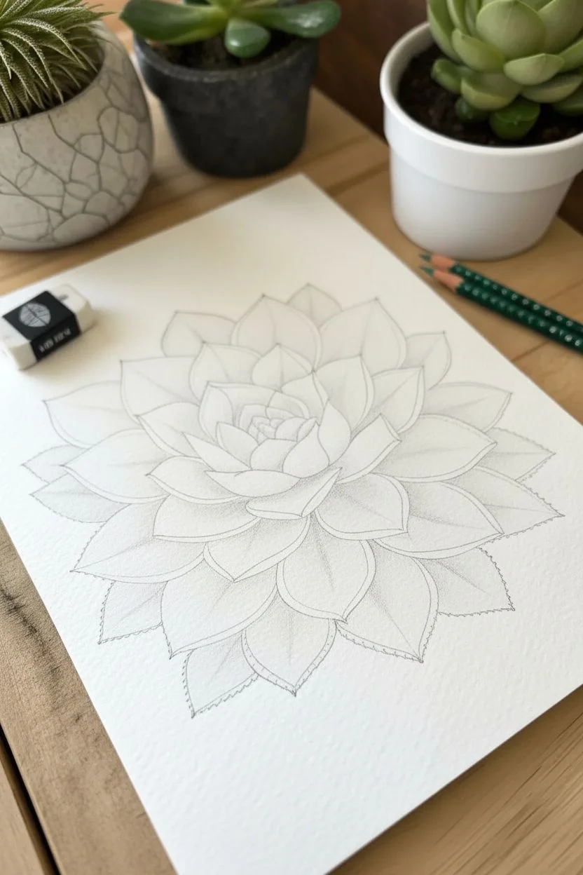
Textured Flower Petals With Dot Gradients
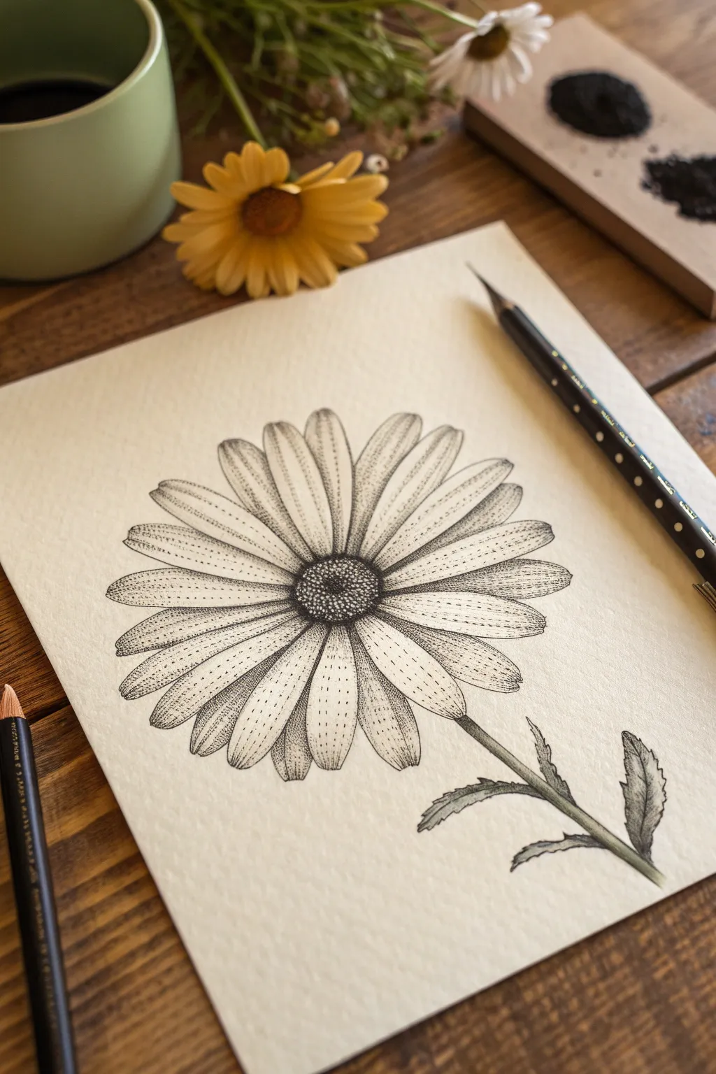
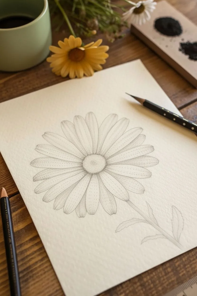
This tutorial guides you through creating a botanical illustration that relies on the patience of stippling to build depth and texture. By layering thousands of tiny ink dots, you will transform a simple line drawing into a dimensional daisy with soft, gradient-shaded petals.
Step-by-Step Guide
Materials
- Heavyweight textured paper (watercolor or mixed media paper works best)
- H or HB pencil for initial sketching
- Fine liner pens (sizes 0.05, 0.1, and 0.3mm)
- Kneaded eraser
- Ruler (optional for stem alignment)
- Reference photo of a daisy or similar composite flower
Step 1: Structural Sketching
-
Mark the center:
Begin by lightly drawing a small oval in the center of your page to represent the flower’s disk (the center part). This doesn’t need to be a perfect circle; an organic oval shape feels more natural. -
Map the petals:
Lightly sketch the petals radiating outward from the center disk. Draw them long and slender, with slightly rounded or notched tips. Make sure they overlap slightly to create a sense of fullness rather than having gaps between each one. -
Add the stem and leaves:
Draw a sturdy stem extending from the bottom of the flower head, angling it slightly for movement. Add two small, jagged leaves branching off near the bottom of the stem. -
Refine outlines:
Go over your pencil sketch to refine the shapes. Ensure the petals have a natural flow and slight curvature. Once you are happy with the composition, use your kneaded eraser to lift most of the graphite, leaving only the faintest guide lines visible.
Step 2: Defining the Center
-
Outline the disk:
Switch to your 0.1mm fine liner. Carefully ink the outline of the center disk using very small, broken lines or dots rather than a solid hard line to keep edges soft. -
Base stippling:
Using the 0.3mm pen, begin placing dots densely around the outer edge of the center disk. This area should be the darkest to show depth where the petals meet the center. -
Gradient filling:
Continue filling the center disk with dots, spreading them out slightly as you move toward the very middle. The center should look textured and bumpy, resembling the tiny florets of a real daisy.
Uneven Dots?
If your dots start turning into little dashes or commas, your hand is getting tired or moving too fast. Pause, rotate your paper, and slow down your tapping rhythm to regain round dots.
Step 3: Texturing the Petals
-
Ink the petal outlines:
Using the finest 0.05mm pen, trace the perimeter of each petal. Keep your hand relaxed to avoid stiff lines; a little wobble adds organic character. -
Central veins:
Draw a faint, broken line or a series of spaced-out dots down the center of each petal to indicate the main vein. This helps orient your shading later. -
Shadows at the base:
Switch to the 0.1mm pen. Start stippling at the base of each petal where it tucks under the center disk. Densely pack the dots here to create a deep shadow, fading out as you move about 1/4 of the way up the petal. -
Edge gradients:
Add a lighter gradient of dots along the side edges of the petals. I find it helpful to concentrate dots on one side of a petal more than the other to suggest a consistent light source. -
Linear details:
Intersperse very fine, short dashed lines among your dots running parallel to the petal’s length. This mimics the striations found on real flower petals and adds linear texture. -
Tip shading:
Add a very light dusting of dots at the tips of the petals, just enough to give them form so they don’t look completely flat white.
Pro Tip: Depth Control
Work darkest to lightest. Establish your deepest blacks first (like under the center disk). It is much easier to fade a gradient out into white space than to guess how dark to go initially.
Step 4: Stem and Finishing
-
Ink the stem:
Outline the stem and leaves with the 0.1mm pen. Use short, overlapping strokes to give the stem a slightly fibrous or hairy texture typical of poppies or daisies. -
Shade the greens:
Stipple one side of the stem heavily to create a cylindrical 3D form. Do the same for the leaves, darkening the areas where the leaves attach to the stem and the undersides of any folds. -
Add texture to leaves:
Use directional stippling on the leaves, following the direction of growth. You can be a bit looser here than with the delicate petals to show a different surface texture. -
Wait and erase:
Allow the ink to dry completely for at least 15 minutes. Taking this break is crucial to avoid smudges. Then, gently erase any remaining pencil guidelines with your kneaded eraser. -
Final contrast check:
Step back and look at your drawing. If the center doesn’t pop enough, go back in with your 0.3mm pen and add more black dots to the darkest shadow areas to increase the contrast.
Step back and admire how thousands of tiny individual marks have come together to form a soft, organic flower on your page


Succulent Leaves With Overlapping Shadows
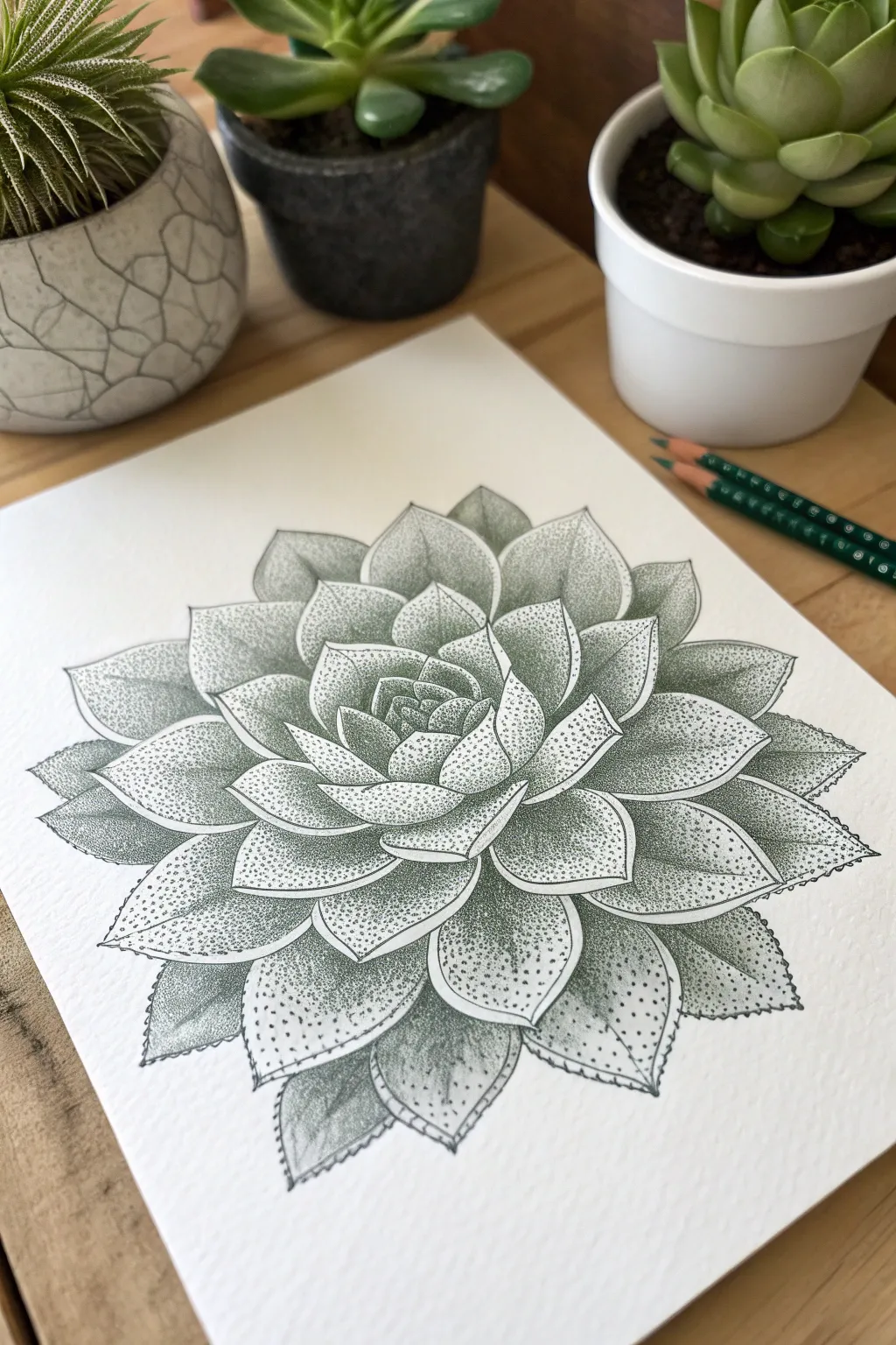
Master the art of patience with this intricate succulent study, where texture is built entirely through thousands of tiny dots. This project combines clean line work with gradient stippling in varied green tones to create a realistic, three-dimensional rosette effect.
Step-by-Step
Materials
- High-quality hot press watercolor paper or smooth Bristol board
- HB graphite pencil
- Kneaded eraser
- Fine liner pens (sizes 005, 01, and 03) in dark green or black
- Colored pencils or fine markers in sage green and dark forest green
- Ruler (optional, for centering)
Step 1: Drafting the Structure
-
Establish the center:
Begin by lightly marking a small central point on your paper. This will be the anchor for the entire rosette spiral. -
Map out the core:
Sketch a small, tight cluster of overlapping U-shapes around your central point. These represent the youngest, most tightly curled leaves in the middle. -
Expand the spiral:
Draw the next layer of leaves slightly larger, curving around the center. Make sure each new leaf emerges from behind two previous ones, creating that classic alternating succulent pattern. -
Draw outer leaves:
Continue expanding outward, drawing broader, pointed petal shapes. As you get to the outer edges, flatten the leaves slightly to suggest perspective. -
Refine the outlines:
Go over your sketch, ensuring the leaf tips have a slight point and the edges curve naturally. Use your kneaded eraser to lighten these guide lines until they are barely visible.
Wrist Saver Tip
Stippling takes time. Don’t grip the pen tightly. Instead, let the pen’s weight do the work and take breaks every 15 minutes to stretch your hand.
Step 2: Inking and Definition
-
Outline the shapes:
Using a 005 or 01 fine liner in dark green or black, carefully trace the outline of each leaf. Keep the line weight consistent but very thin. -
Double the edge:
For a stylized look, add a very faint second line just inside the perimeter of the larger outer leaves to create a ‘rim’ effect often seen on Echeveria plants. -
Erase pencil marks:
Once the ink is completely dry, gently erase all remaining graphite guidelines so your workspace is clean for stippling.
Fixing “Tails”
If your dots look like tiny comets, you’re moving your hand too fast while lifting the pen. Slow down and prioritize vertical up-and-down motion.
Step 3: Stippling the Shadows
-
Start at the core:
Begin stippling in the very center. Place dots densely where the leaves tuck under one another. The darkest areas should be almost solid color, fading out as you move toward the leaf tip. -
Define the overlaps:
For the middle layers, focus your dots heavily at the base of each leaf where it disappears behind the leaf in front of it. This contrast creates depth. -
Gradient technique:
As you move away from the shadow areas, space your dots further apart. I find it helpful to lift the pen vertically to ensure round dots rather than dashes. -
Add leave texture:
On the broad surfaces of the leaves, create a very sparse dusting of dots. This isn’t for shadow, but to give the leaf surface a realistic, organic texture. -
Deepen the crevices:
Switch to a slightly thicker pen (03 size) if needed, or just increase density, to darken the deepest crevices between the leaf layers. -
Edge detailing:
For the outer leaves, add stippling along the very edges and tips to suggest a slight curl or color variation common in succulents. -
Evaluate contrast:
Step back and look at the drawing. If the individual leaves look too flat, add more dots to the ‘under’ side of the overlaps to push those areas back in space.
Step 4: Final Touches
-
Introduce color (optional):
If using colored pencils instead of colored ink, lightly glaze over the stippled areas with a sage green pencil to unify the dots. -
Sharpen the tips:
Use your finest pen to add tiny, serrated details or a sharp point to a few key leaf tips for visual interest. -
Final clean up:
Check for any stray pen marks or smudges and gently clean the paper edges if necessary.
Now you have a stunning botanical illustration that proves great art is made one point at a time


Leaf Veins and Speckled Botanicals Study
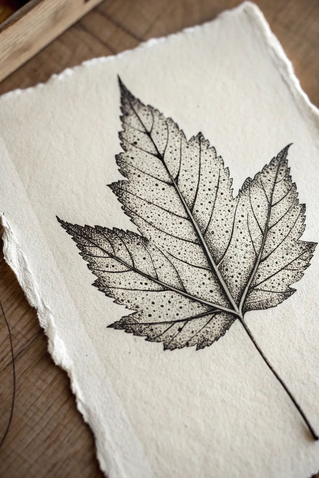
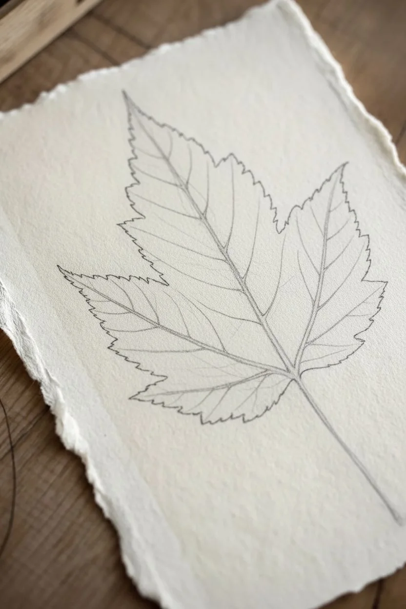
Capture the delicate decay of autumn with this intricate stippling study. You’ll use fine ink dots to build shading and texture, creating a realistic maple leaf that pops against rustic, deckled-edge paper.
Step-by-Step Tutorial
Materials
- High-quality cotton rag paper (deckled edge)
- Pencil (HB or H)
- Kneadable eraser
- Fine liner pens (sizes 0.05, 0.1, and 0.3)
- Reference photo of a maple leaf
- Smooth work surface
Step 1: Planning and Outline
-
Light sketch:
Begin by lightly sketching the main structure of the maple leaf with your pencil. Focus on the central vein and the large primary veins branching out to the five lobes. -
Define the edges:
Sketch the perimeter of the leaf. Maple leaves have jagged, sharp teeth, so keep your pencil lines loose and irregular rather than smoothing them out too much. -
Map the veins:
Add the secondary veins branching off the main ones. Draw these lightly as channels—double lines that are close together—rather than single sticks, as we want to leave the veins white later. -
Ink the perimeter:
Using your 0.1 fine liner, trace the outer jagged edge of the leaf. Use broken, shaky lines to mimic the dry, crispy texture of a fallen leaf. -
Erase pencil marks:
Once the ink is fully dry, gently roll your kneadable eraser over the outline to lift the graphite, leaving just the faint pencil veins inside for guidance.
Wrist Relief
Stippling can be tiring! Keep your hand loose and rely on the weight of the pen rather than pressing down hard. Take breaks every 10 minutes.
Step 2: Stippling the Texture
-
Base layer of dots:
Switch to a 0.05 pen for the finest details. Start placing dots sparsely across the entire leaf surface, avoiding the vein channels you sketched earlier. -
Define the veins:
Concentrate your dots along the edges of the pencil veins. By creating a higher density of dots right next to the vein lines, you create a negative space effect that makes the veins look white and distinct. -
Shadowing the lobes:
Identify where the leaf might curve or overlap. Increase the density of your stippling in the valleys between the lobes to create depth and a sense of three-dimensionality. -
Gradient building:
Work on the gradients from the veins outward. The dots should be tightest against the vein and gradually spread out as they move toward the center of the leaf tissue panels. -
Adding dark spots:
Real leaves have imperfections. Use a 0.3 pen to add a few larger, singular dots scattered randomly to represent sun spots or natural decay. -
Darkening the tips:
Return to the 0.1 pen and cluster dots heavily at the sharp tips of the leaf lobes. This ‘burnt’ edge effect adds realism and frames the shape beautifully.
Vintage Vibe
Stain your paper with weak tea or coffee before starting. Once dry, the ink will sit on top of the warm, aged background for an antique botanical look.
Step 3: Refining and Finishing
-
Main stem work:
Draw the stem extending from the base. Use the 0.1 pen to draw the outline, then fill one side with dense stipling to give it a cylindrical, rounded form. -
Connect the veins:
Ensure the main veins meet the stem naturally. I like to use very faint dots to bridge any gaps without drawing solid lines across the vein channels. -
Contrast check:
Step back and look at the overall value. If the leaf looks too flat, go back into the darkest areas near the center and add another layer of dots with the 0.05 pen. -
Texture the edges:
Add tiny, stray stipples just outside the main outline in a few spots. This softens the hard ink line and makes the leaf feel more integrated with the textured paper. -
Final clean up:
Do a final pass with the eraser to remove any remaining graphite from the vein channels, leaving them crisp and white against the stippled shading.
Now you have a timeless botanical study ready to be framed or gifted to a nature lover

PENCIL GUIDE
Understanding Pencil Grades from H to B
From first sketch to finished drawing — learn pencil grades, line control, and shading techniques.
Explore the Full Guide
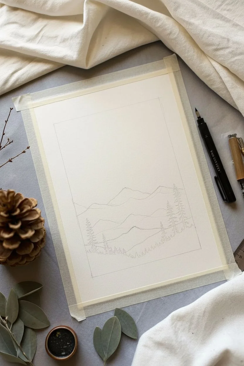
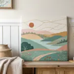
Circular Landscape With Atmospheric Stippling
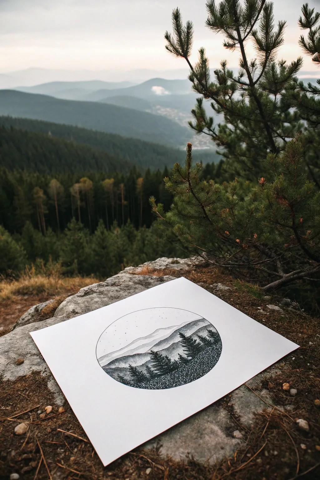
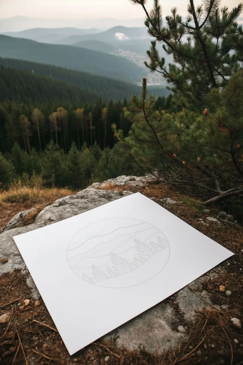
Capture the serene beauty of a mountain range using nothing but tiny ink dots and careful patience. This circular landscape uses atmospheric perspective to create depth, fading from heavy, dark foregrounds to light, misty peaks in the distance.
Step-by-Step Tutorial
Materials
- Fine liner pens (sizes 0.05, 0.1, 0.3, and 0.5)
- White smooth Bristol paper or high-quality cardstock
- Compass
- Pencil (HB or 2H)
- Eraser
- Ruler
Step 1: Planning the Composition
-
Draw the boundary:
Begin by setting your compass to a radius of about 3–4 inches. Place it centrally on your paper and draw a clean, light circle to define your workspace. -
Sketch the horizon lines:
Using your pencil, lightly sketch three distinct layers of mountains. Draw the furthest range near the top third, a middle range slightly lower, and a foreground hill at the bottom. -
Outline the trees:
Sketch the triangular silhouettes of pine trees on the bottom-most foreground layer. Make sure they vary in height and overlap slightly for a natural look. -
Ink the structural lines:
Switch to a 0.1 fine liner to trace the circular border and the main ridge lines of the mountains. Do not outline the individual trees yet; we want those to be defined by texture.
Step 2: Stippling the Sky and Distance
-
Create the sky:
With your smallest pen (0.05), dot the sky very sparsely. Keep the dots concentrated slightly more near the top curve of the circle and fade them out completely as you approach the first mountain ridge. -
Add stars:
Randomly place a few tiny clusters of dots or very small circles to represent distant stars or constellations in the upper sky area. -
Shade the distant mountains:
For the furthest mountain range, use the 0.05 pen again. Apply a light, even stipple. The density should be very low to make the mountains look hazy and far away. -
Gradient effect:
Darken the peaks of this distant range slightly, letting the dots become fewer as you move down toward the base of that specific mountain layer.
Wrist Saver
Stippling can be tiring! Hold the pen vertically and use the bounce of the tip rather than forcing it down. Take frequent breaks to stretch your hand.
Step 3: The Middle Ground
-
Intensify the middle range:
Switch to the 0.1 pen for the middle mountain layer. Increase your dot density significantly here compared to the background layer. -
Define the ridge:
Concentrate your dots heavily right along the top edge of this middle ridge to create a sharp contrast against the pale mountain behind it. -
Create texture:
As you stipple down the slope of the middle mountain, group dots to suggest crags or valleys, rather than a perfectly smooth gradient.
Add a Moon
Before inking the sky, use a coin to trace a circle. Leave this circle completely empty of dots while stippling around it for a glowing full moon effect.
Step 4: Foreground and Trees
-
Start the foreground base:
For the closest hill, use a 0.3 pen. This area needs to be much darker. Begin stippling the ground below the tree line with high density. -
Form the trees:
Using the 0.5 pen, start filling in your pencil tree sketches. Instead of outlining them, build the tree shapes using tight clusters of dots. -
Detailing tree branches:
I like to use a motion that flicked outward slightly with the dots to mimic pine needles. Ensure the centers of the trees are almost solid black. -
Grounding the trees:
Merge the bottom of the trees with the dark foreground ground. The transition should be seamless, created by a very dense field of stippling. -
Final contrast check:
Step back and look at the tonal values. The trees should be the darkest elements (almost black), the middle ground medium grey, and the distance very light grey. -
Cleanup:
Once the ink is completely dry—give it at least 20 minutes to be safe—gently erase all remaining pencil marks, including the circle guide if you inked over it.
Frame your circular landscape or scan it to create a beautiful custom sticker design
Night Sky Gradient and Star Field in Dots
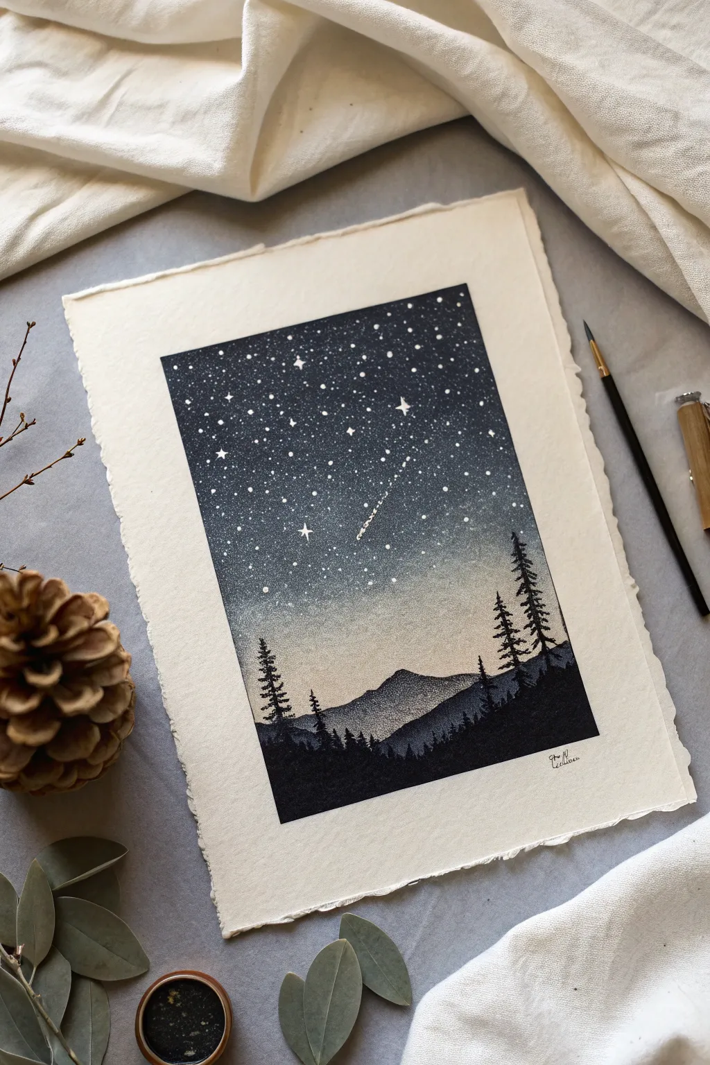
This captivating project captures the serene beauty of a mountain night using the delicate art of stippling. By varying the density of your dots, you’ll create a seamless gradient from the deep, velvety cosmos down to a soft, glowing horizon.
Step-by-Step
Materials
- High-quality cotton watercolor paper or mixed media paper (deckled edge optional)
- Black drawing ink or high-pigment India ink
- Fine-tipped technical pens (sizes 0.05, 0.1, and 0.3)
- White gel pen or white gouache with a fine brush
- Pencil (HB or 2H)
- Kneaded eraser
- Ruler
- Masking tape (low tack)
Step 1: Setting the Scene
-
Define the boundaries:
Begin by taping down your paper to a flat surface. Using your ruler and pencil, lightly draw a rectangular border in the center of the page. This will act as the frame for your night sky scene. -
Establish the horizon:
About one-quarter of the way up from the bottom of your rectangle, sketch the rough outlines of the lower mountain range. Don’t worry about perfect details yet; just establish the primary shapes. -
Sketch the distant peaks:
Just above the first range, lightly draw a second, slightly taller mountain peak. This mountain will eventually be lighter in value to create atmospheric perspective. -
Mark tree placement:
Indicate where your foreground pine trees will stand. Place a few tall silhouettes on the right side and a shorter cluster on the left to balance the composition, overlapping the mountain lines.
Step 2: Stippling the Gradient Sky
-
Begin the dark abyss:
Start at the very top of your rectangle with your 0.3 pen or a brush dipped in black ink. Create an extremely dense field of dots. In the uppermost corners, the dots should be so close they almost merge into solid black. -
Transitioning downwards:
As you move about an inch down, switch to a 0.1 pen. Continue stippling, but begin to space the dots slightly further apart. You want to maintain a dark value, but let a tiny bit of paper show through. -
Creating the mid-tone:
Work your way toward the middle of the sky. Here, the spacing increases. The goal is a smooth transition, so avoid creating distinct ‘bands’ of density by randomly moving your hand back up into the darker areas occasionally. -
Approaching the horizon:
Switch to your finest 0.05 pen for the area just above the mountains. The dots here should be sparse, like a fine mist, allowing the white of the paper to dominate. This creates the ‘glow’ of the horizon. -
Blend the shooting star:
Before the ink dries fully or you lose your place, use a very sparse trail of dots to suggest the tail of the shooting star in the center-right area, leaving a small negative space for the streak itself.
Wrist Saver
Stippling can be tiring! Hold the pen perpendicular to the paper and dot gently. You don’t need to press hard; let the ink flow do the work to prevent hand cramping.
Step 3: Forming the Landscape
-
Define the distant mountain:
For the central, distant mountain peak, use a medium density of stippling. It should be darker than the horizon sky, but significantly lighter than the foreground. Focus the dots on the shadowed side of the peak for volume. -
Darken the lower hills:
Move to the lower mountain range. Increase your dot density here to create a darker grey value. This contrast pushes the central mountain into the background. -
Silhouette the foreground:
For the absolute bottom section of the rectangle (the ground and tree bases), switch back to solid black ink or your 0.3 pen. Fill this area almost completely solid black, merging dots until no paper shows. -
Detail the pines:
Using a fine pen, carefully draw the branches of the pine trees. Use tiny, jagged strokes and overlapping dots to give the branches a textural, organic needle look.
Starry Depth
Make your stars varying sizes. Group small clusters of tiny white dots together to mimic the Milky Way, rather than spacing them all perfectly evenly.
Step 4: Celestial Details
-
Add the bright stars:
Once the black ink is completely dry, use your white gel pen or white gouache. Place random dots throughout the dark upper sky to represent distant stars. -
Create major stars:
Select 3-5 spots to create larger, brighter stars. Draw a small four-pointed cross or a slightly larger white dot to make these stand out as the ‘constellation’ anchors. -
Highlight the shooting star:
Accentuate the shooting star you left space for earlier. Draw a crisp white line for the head and let it break up into a dotted white trail as it fades. -
Final touches:
Erase any remaining pencil lines gently. If needed, go back with your black pen to refine the edge of the rectangle, ensuring the border is crisp and clean.
Step back and admire how thousands of tiny points of ink have come together to form a peaceful, silent night scene
BRUSH GUIDE
The Right Brush for Every Stroke
From clean lines to bold texture — master brush choice, stroke control, and essential techniques.
Explore the Full Guide
Low-Poly Animal Facets Filled With Stippling
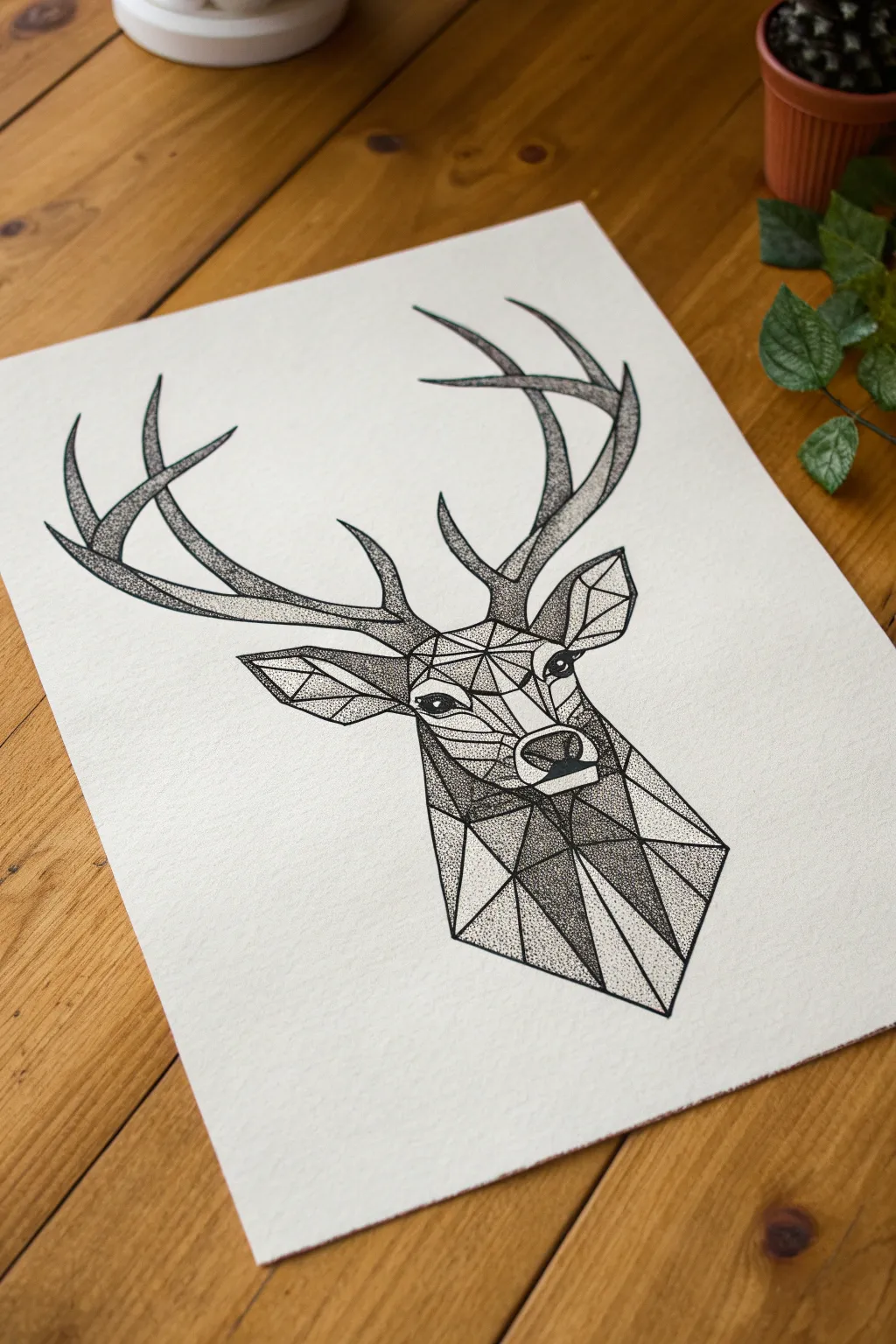
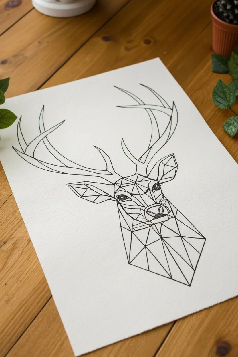
This striking artwork combines the sharp, modern aesthetic of low-poly geometry with the timeless, classic texture of stippling. By breaking a deer’s features into triangular facets and filling them with thousands of tiny dots, you create incredible depth and contrast without harsh lines.
Step-by-Step Tutorial
Materials
- High-quality fineliner pens (sizes 005, 01, and 05)
- Smooth bristol board or heavy cardstock
- HB pencil
- Ruler or straight edge
- Good quality eraser
- Tracing paper (optional)
Step 1: Drafting the Geometric Structure
-
Outline the silhouette:
Begin by lightly sketching the general outline of the deer’s head and antlers using your HB pencil. Focus on getting the proportions right first—the neck should be sturdy, and the antlers need to curve naturally upward and outward. -
Map the face geometry:
Using a ruler, start breaking the face down into angular shapes. Draw a vertical line down the center of the face to ensure symmetry, then create triangles and quadrilaterals that follow the natural contours of the brow, nose, and cheeks. -
Facet the neck:
Extend your geometric shapes down the neck. These shapes should be larger and more elongated than the facial features, suggesting the broader planes of muscle and fur. -
Outline the antlers:
Unlike the face, leave the antlers organic with smooth curves rather than sharp angles. However, you can lightly mark where major shadows will fall to guide your stippling later. -
Ink the structural lines:
Once you are happy with your pencil grid, take your 05 fineliner and carefully ink over the straight lines of the geometric mesh on the face and neck. Use the ruler to keep them crisp. -
Ink the organic outlines:
Switch to a 01 pen to trace the outline of the antlers and the ears. These lines can be slightly softer. Let the ink dry completely, then gently erase all pencil marks.
Wrist Saver
Stippling takes time! Hold the pen vertically and use a gentle tapping motion rather than pressing down hard. This protects your nibs and saves your wrist from fatigue.
Step 2: The Stippling Process
-
Establish the light source:
Decide on a light direction (in the example, light is coming from the top left). This means facets on the right and bottom will be darker, requiring denser dots. -
Start with the darkest facets:
Select a facet on the shadowed side of the neck. Using an 05 pen, place dots very close together, almost touching, to create a deep, near-black value. I prefer to start here to establish my darkest darks immediately. -
Create gradients in the mid-tones:
Move to the facets on the cheeks and snout. Switch to an 01 pen. Start stippling densely at the edges where the facet meets a shadow, then gradually space the dots further apart as you move toward the light source within that specific triangle. -
Detail the eyes:
The eyes need to be sharp. outline the eye shape firmly, then fill the pupil solid black (or very dense stippling). Stipple the iris carefully, leaving a tiny pure white circle for the highlight. -
Stipple the antlers:
The antlers require a different approach since they aren’t faceted. Use the 01 pen to create a gradient that follows the curve—dense dots on the underside of the antler tines, fading into white on the top edges to simulate rounded volume. -
Texture the lighter facets:
For the illuminated areas on the forehead and nose bridge, use your finest 005 pen. Apply dots very sparsely. You just want enough texture to show it’s part of the animal, but keep it mostly white paper. -
Refine the edges:
Check the boundaries between your geometric shapes. If two adjacent shapes have similar values, darken the edge of one slightly to ensure the ‘low poly’ look remains distinct. -
Balance the composition:
Step back and look at the whole piece. If the neck looks too heavy, add a bit more density to the antlers to balance the visual weight.
Add a Pop of Color
Try inking the geometric grid lines in gold or copper metallic ink instead of black. It adds a sophisticated, industrial contrast to the stippled texture.
Now you have a stunning piece of geometric wildlife art that looks incredibly complex but was built one simple dot at a time
Portrait Fragment: An Eye Rendered in Micro-Stippling
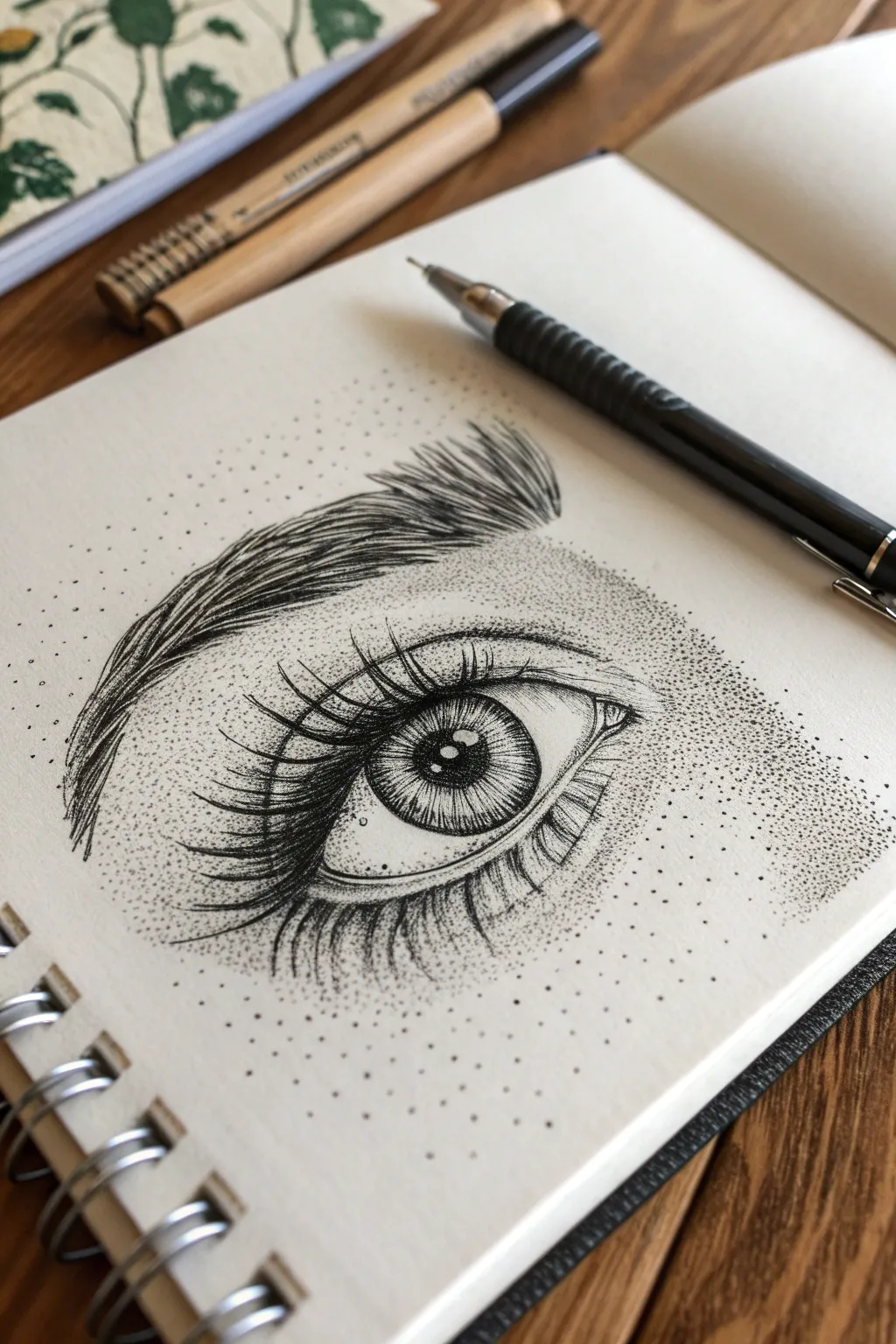
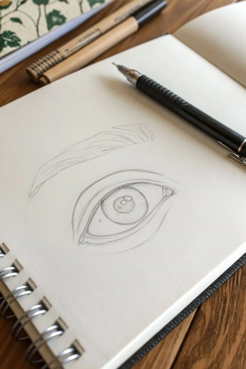
Capture the delicate intensity of the human gaze with this detailed pen and ink study, combining precise linework with soft, stippled shading. This project teaches you to balance sharp definition in the lashes with a gentle gradient of dots to create realistic skin texture and depth.
Detailed Instructions
Materials
- Smooth sketchbook paper (bristol or hot press watercolor paper works best)
- H or HB graphite pencil for sketching
- Fine liner pens (sizes 0.05, 0.1, and 0.3mm)
- Kneaded eraser
- Mechanical pencil (optional, for propping as shown in image)
- Reference photo of an eye
Step 1: 1. Laying the Foundation
-
Outline the basics:
Begin with a very light pencil sketch. Draw the almond shape of the eye, marking the tear duct at the inner corner. Lightly sketch the circular iris and the pupil in the center. -
Map the highlights:
Draw small shapes within the iris to represent light reflections. These areas must remain pure white, so outlining them now ensures you don’t accidentally fill them in later. -
Define the lids and brow:
Sketch the crease of the upper eyelid, following the arch of the eye shape. Above that, lightly outline the general shape of the eyebrow, indicating the direction the hairs will flow.
Hold the pen correctly
Hold your pen vertically, perpendicular to the paper. If you hold it at an angle, your dots will look like tiny dashes or commas instead of perfect circles.
Step 2: 2. Inking the Details
-
Start with the pupil:
Switch to your 0.3mm fine liner. Carefully fill in the pupil, leaving your mapped highlight shapes completely empty. This establishes your darkest value immediately. -
Detail the iris:
Using a 0.05mm pen, draw fine radial lines extending from the pupil outward and from the outer rim inward. Use stippling (lots of tiny dots) near the top of the iris to simulate the shadow cast by the eyelid. -
Draw the upper lashes:
Take the 0.1mm pen and draw the upper eyelashes. Start from the lash line and flick your wrist upward and outward for a tapered look. These should be thickest and clumped slightly at the base. -
Add lower lashes:
Draw the lower lashes with shorter, sparser strokes. Notice how they curve downward before curling slightly up. Keep these lines delicate. -
Define the crease:
Go over the upper eyelid crease with a clean, continuous line, thickening it slightly in the middle to show depth. -
Building the eyebrow:
Use short, directional strokes to build the eyebrow hairs. Start at the bottom of the brow and flick upward. Layer these strokes to create density, making the hair darker at the bottom edge.
Uneven shading?
If a stippled area looks blotchy, don’t add more ink immediately. Step back and squint at the drawing to see the overall values, then fill in the lighter patches gently.
Step 3: 3. The Stippling Technique
-
Begin shallow shading:
Switch to your finest pen (0.05mm). Start placing dots very close together right under the eyebrow arch and in the inner corner where the nose bridge begins. Density equals darkness here. -
Create the skin gradient:
Disperse your dots as you move away from the shadowed areas. The dots should become sparse and scattered as they reach the highlight areas of the brow bone and cheek. -
Shade the under-eye:
Add a concentration of stippling directly under the lower lash line to create the small roll of skin there. Fade this out into the cheek area. -
Deepen the contrast:
Go back into the darkest corners (like the crease and corners of the eye) with a 0.1mm pen. Add a second layer of dots to deepen the shadows without losing the texture. -
Connect the elements:
Add a few stray dots around the very outer edges of the drawing. This ‘vignette’ style helps the drawing blend softly into the white paper rather than ending abruptly. -
Clean up:
Once the ink is completely dry—give it a few minutes to be safe—gently erase all your original pencil guidelines with the kneaded eraser.
With your final dots placed, you have created a striking study of vision and texture on the page
Have a question or want to share your own experience? I'd love to hear from you in the comments below!