When the days get long and the light turns golden, I reach for watercolor to bottle up that easy, breezy summer feeling on paper. Here are 20 summer watercolor ideas you can try right away, from classic sunshine scenes to playful, unexpected little studies.
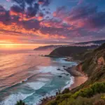
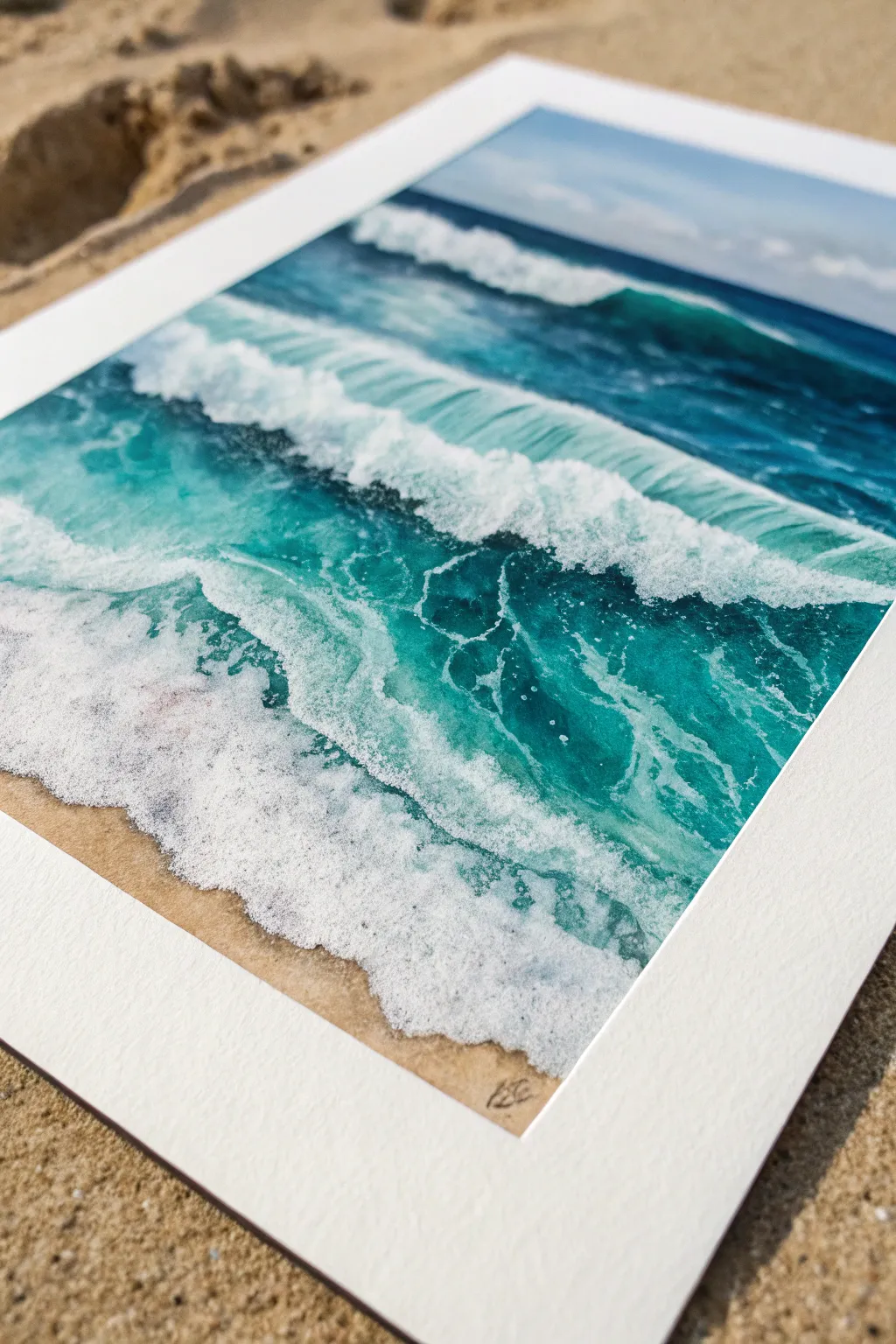
Sunlit Beach Horizon
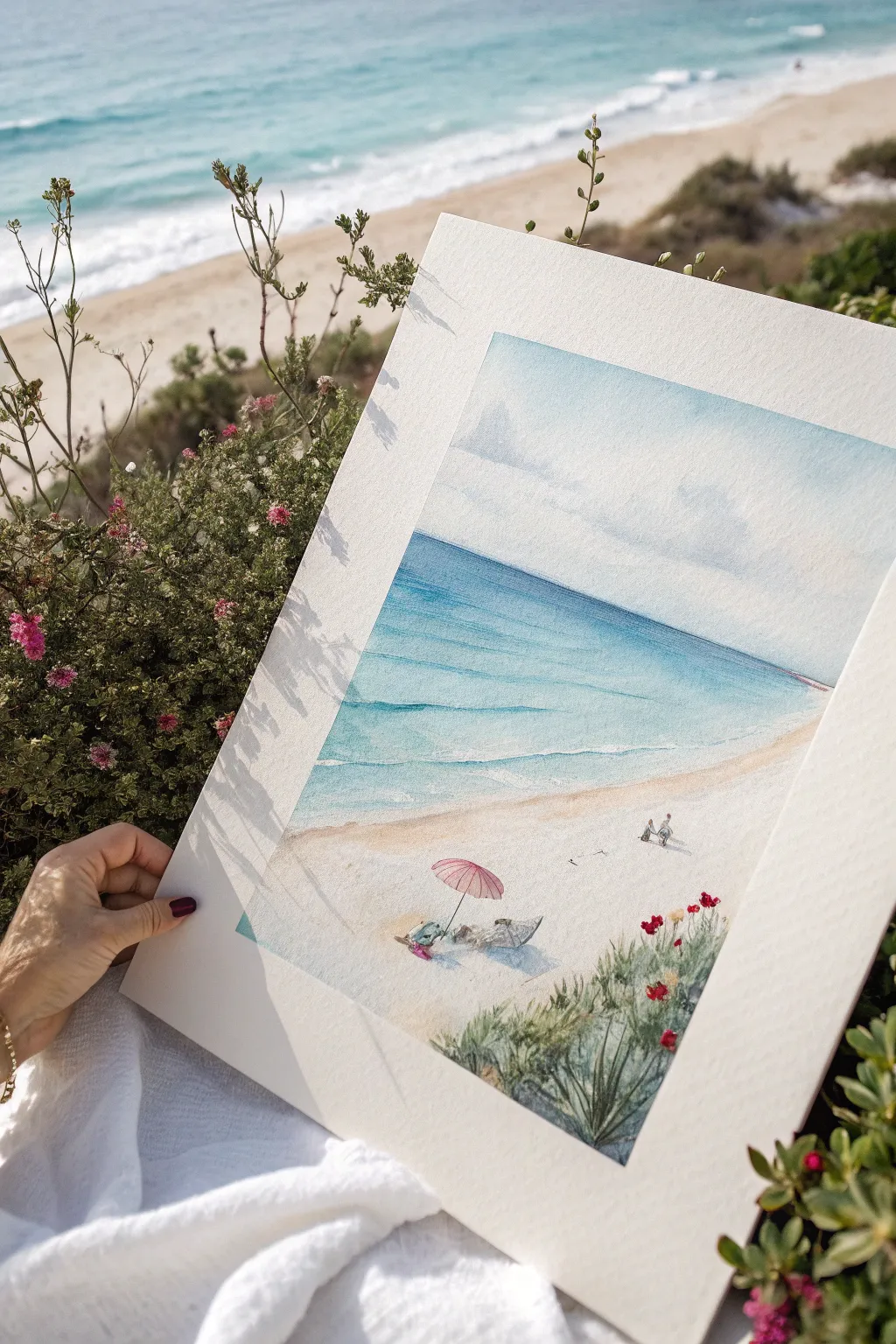
Capture the peaceful essence of a summer day by the sea with this light and airy watercolor painting. This project focuses on soft washes for the sky and ocean, contrasted with delicate dry-brush details for the sandy foreground and vegetation.
Step-by-Step Guide
Materials
- Cold press watercolor paper (300 gsm or 140 lb)
- Watercolor paints (Cerulean Blue, Cobalt Blue, Ultramarine, Yellow Ochre, Burnt Sienna, Sap Green, Alizarin Crimson)
- Masking fluid
- Large flat wash brush
- Round brushes (sizes 4, 8, and a fine liner brush)
- Painter’s tape or board
- Paper towels
- Two jars of water
Step 1: Preparation and Initial Washes
-
Tape and sketch:
Secure your paper to a board with painter’s tape to prevent buckling. Lightly sketch the horizon line about two-thirds up the page, the curve of the shoreline, the placement of the umbrella, and the general shape of the foreground bushes using a hard pencil (H or 2H). -
Protect highlights:
Apply masking fluid carefully to the umbrella shape, the figures beneath it, the bright white caps of the waves, and the tiny distant figures walking along the water’s edge. Let this dry completely before painting. -
Sky wash:
Wet the sky area with clean water. Load your large flat brush with a very dilute mix of Cobalt Blue and a touch of gray. Use a wet-on-wet technique to create soft, fluffy clouds, leaving some areas white for the brightest clouds. Soften any hard edges with a clean, damp brush. -
Horizon definition:
While the sky is drying, mix a deeper blue for the horizon line. Carefully paint a straight line across where sky meets water, softening the color as you pull it down towards the shore.
Creating Distance
Make distant figures cooler and paler than foreground objects. I mix a lot of water into my pigments for the far-away walkers to push them back into the perspective.
Step 2: Painting the Ocean
-
Far ocean gradation:
Start at the horizon with a mix of Ultramarine and Cobalt Blue. Paint downwards, gradually adding more water and a touch of turquoise or Cerulean as you get closer to the shore to mimic shallower water. -
Adding waves:
While the ocean wash is still damp but not soaking wet, lift out horizontal streaks with a thirsty (clean, dry) brush to suggest rolling waves. Add faint shadow lines under these lifted areas using a slightly darker blue mix. -
Shoreline transition:
As you reach the sand, dilute the blue almost to transparency. The transition from water to sand should be seamless and gentle.
Step 3: The Sandy Beach
-
Base sand layer:
Mix a warm, sandy tone using Yellow Ochre with a tiny hint of Burnt Sienna. Apply a light wash across the beach area, going right over the masked foreground elements. -
Creating texture:
While the sand wash is wet, you can splatter a tiny bit of darker brown paint or clean water onto it to create granular texture. Let the painting dry completely. -
Shadows on sand:
Mix a cool violet-gray (Ultramarine and a touch of Burnt Sienna). glaze in soft shadows stretching from the vegetation and under the umbrella area to ground your objects.
Warped Paper Fix
If your paper buckles during the wash stages, don’t panic. Tape it down firmly while drying. If it stays warped, lightly mist the back and press it under heavy books overnight.
Step 4: Details and Foreground
-
Remove masking:
Once the paper is bone dry, gently rub off the masking fluid with your finger or a rubber pick-up tool. -
Umbrella and figures:
Paint the umbrella with a light wash of Alizarin Crimson or a soft pink. Add shadows to the folds with a slightly darker red. Use tiny touches of skin tone and colorful clothing colors for the figures underneath. -
Vegetation base:
For the foreground bushes, mix Sap Green with a little burnt sienna for an earthy olive tone. Using a round brush, dab in the foliage shapes, keeping the edges loose and organic. -
Grassy textures:
Switch to your fine liner brush. With a darker green mix, flick upwards rapidly to create individual blades of grass and stems growing out of the bushes. -
Floral accents:
Dot in the bright red flowers amongst the green foliage using concentrated red paint. Vary the size of the dots to create depth. -
Final touches:
Add tiny drop shadows under the distant walking figures and the dog. Review the white wave caps; if they are too stark, soften them with a damp brush.
This serene beach scene is now ready to frame and bring a touch of summer warmth to your wall
Glowing Summer Sunset Wash
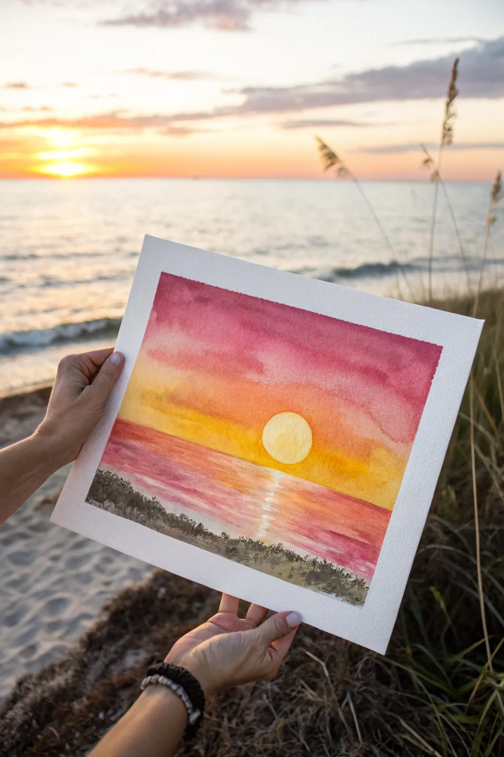
Capture the magic of a summer evening with this vibrant watercolor sunset painting. You’ll layer warm washes of magenta and golden yellow to create a radiant sky that melts seamlessly into a shimmering water reflection.
Step-by-Step
Materials
- Cold press watercolor paper (140 lb/300 gsm)
- Watercolor paints (Alizarin Crimson, Cadmium Yellow, Yellow Ochre, Burnt Umber, Indigo)
- Masking fluid or white gouache (optional)
- Clean water jars (two)
- 1-inch flat wash brush
- Round brushes (size 6 and 10)
- Painter’s tape or Washi tape
- Drawing board or hard surface
- Paper towels
Step 1: Preparation and The Sun
-
Tape edges:
Begin by taping down all four edges of your watercolor paper to a hard board. This creates the crisp white border seen in the example image and prevents the paper from buckling during the heavy washes. -
Sketch the horizon:
Lightly draw a straight horizontal line across the lower third of the paper to separate the sky from the water. Keep your pencil pressure very light so the graphite doesn’t show through the paint later. -
Define the sun:
Draw a perfect circle in the center, just hovering above your horizon line. You can trace a coin or small lid to get it perfectly round. -
Protect the sun:
Carefully paint the inside of the sun circle with a very pale, diluted wash of Cadmium Yellow. Let it dry completely. If you are worried about painting over it, you can apply masking fluid over the dry yellow circle now.
Step 2: The Sky Gradient
-
Wet the sky:
Using your large flat brush, apply clean water to the entire sky area, stopping right at the horizon line. Be careful to paint around your sun circle if you didn’t use masking fluid. -
Apply the top layer:
While the paper is wet, load your brush with a rich mix of Alizarin Crimson. Paint the top third of the sky, letting the color bleed downwards naturally. -
Blend the middle:
Rinse your brush slightly and pick up a mix of Cadmium Yellow and a touch of Crimson for an orange hue. Blend this into the bottom edge of the red layer, working your way down. -
Add the horizon glow:
Finish the sky near the horizon with pure Cadmium Yellow. Ensure the transition from red to orange to yellow is smooth by tilting the board slightly if needed to help the paints merge. -
Let it dry completely:
Allow the sky section to dry fully before moving on. The paper must be bone-dry to prevent the sky colors from bleeding into the water area in the next steps.
Sun Strategy
If you don’t have masking fluid, you can paint the sky normally and lift out the paint with a damp paper towel while wet, or paint a white gouache circle over the sky later.
Step 3: The Water and Reflection
-
Paint the water base:
Switch to your medium round brush. Start painting horizontal strokes below the horizon line using the same colors as the sky but in reverse order—yellow near the horizon, transitioning to pinkish-red at the bottom. -
Create the sun path:
As you paint the water, leave a vertical column of white paper directly beneath the sun unpainted. This negative space will become the bright reflection on the water. -
Refine the reflection:
While the surrounding paint is still damp, take a clean, slightly damp brush and gently soften the edges of your white column. You can drag tiny horizontal lines of pale yellow across the white space to suggest ripples. -
Deepen the water color:
Add a slightly stronger concentration of Alizarin Crimson to the bottom corners of the water area to create depth and frame the light source.
Make it Sparkle
Once dry, use a white gel pen to add tiny, sharp highlights on the water ripples inside the reflection path to make the water look like it is truly glistening.
Step 4: Foreground Silhouette
-
Mix dark pigment:
Create a dark, shadowy mixture using Indigo and a touch of Burnt Umber. Avoid using plain black, as this rich dark mixture looks more natural. -
Paint the dunes:
Once the water layer is totally dry, use the tip of your size 6 brush to paint an uneven, organic shape along the very bottom edge to represent sand dunes or a shoreline. -
Add texture:
While the dune shape is wet, dab in a little more pigment in random spots to create a textured, uneven ground appearance. -
Detail the grass:
Using the very fine point of your brush or a rigger brush, flick quick, upward strokes from the dune line to create silhouette grasses. -
Vary sizes:
Make sure your grass strokes vary in height and direction—some leaning left, some right—to make the foliage look wild and natural. -
Reveal the border:
Wait until the painting feels cool to the touch (indicating it is completely dry), then peel off the tape slowly at a 45-degree angle to reveal your crisp white edges.
Frame your new masterpiece in a simple white mat to let those sunset colors truly shine


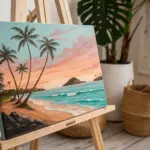
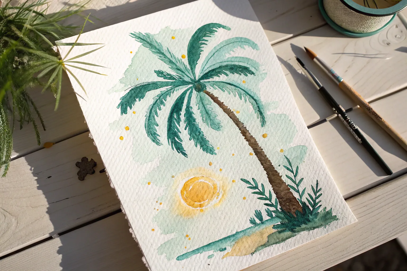
Palm Trees Against the Sky
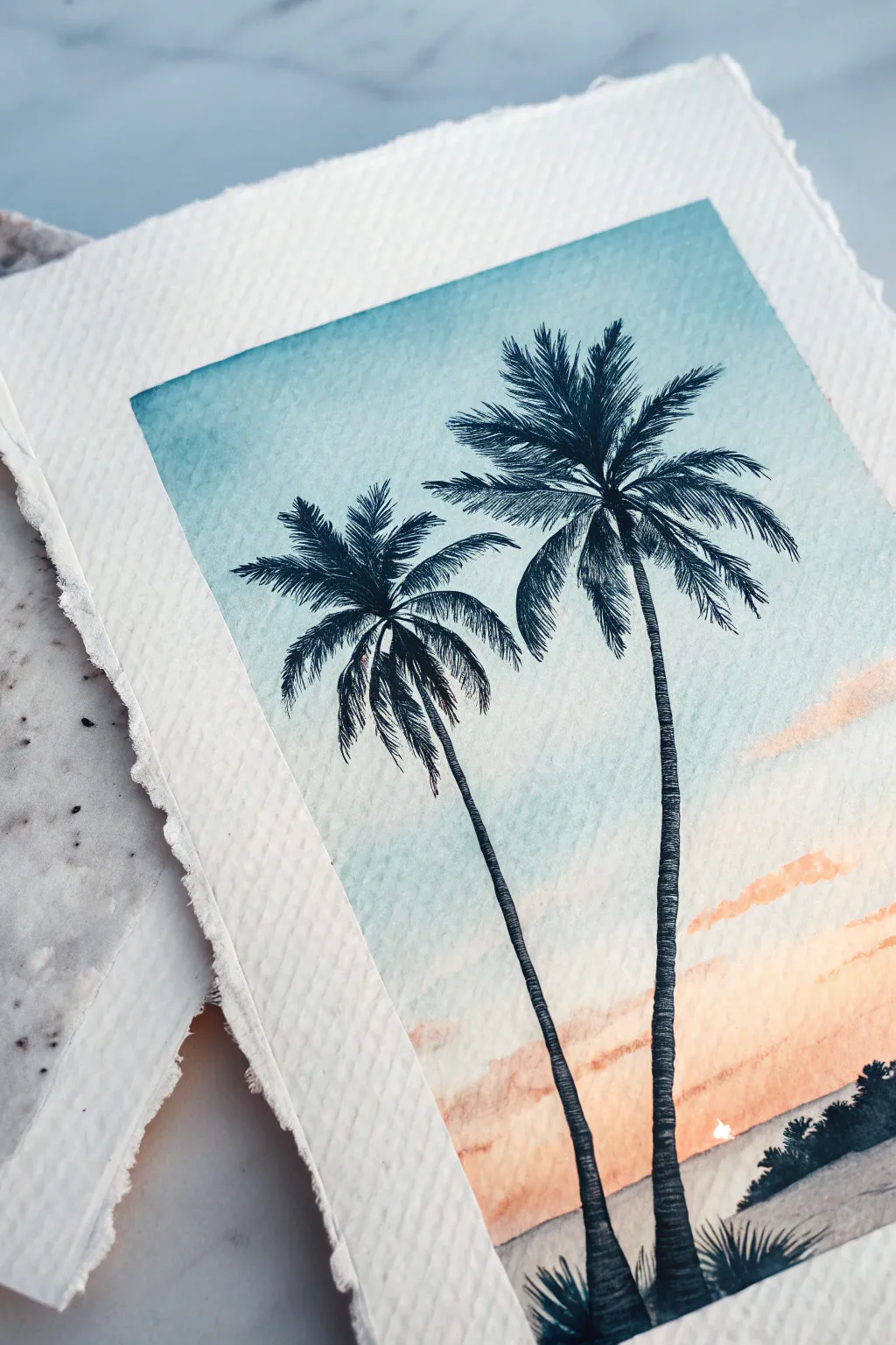
Capture the serene ending of a beach day with this elegant watercolor study featuring two swaying palms against a gradient sky. The contrast between the soft, blended background and the crisp, dark silhouettes creates a striking sense of depth.
How-To Guide
Materials
- Cold press watercolor paper (300 gsm)
- Masking tape or washi tape
- Watercolor paints (Turquoise, Peach/Coral, Payne’s Grey or Black)
- Large flat wash brush (3/4 inch)
- Small round detail brush (size 0 or 1)
- Medium round brush (size 6)
- pencil
- Water cups
- Paper towels
Step 1: Creating the Gradient Sky
-
Tape and Wet the Paper:
Begin by taping down your paper to a board to prevent buckling. With a clean brush, apply a very light, even glaze of clean water across the entire rectangular area where you plan to paint. The surface should glisten but not have puddles. -
Apply the Blue Upper Sky:
Load your large flat brush with a diluted turquoise or cerulean blue. Start at the very top edge and paint horizontally across, letting the color naturally diffuse downwards into the wet paper. -
Fade the Blue:
Rinse your brush slightly so it carries less pigment and drag the blue further down to about the halfway mark. You want the blue to fade into almost white as it nears the horizon line. -
Introduce the Sunset Tones:
Clean your brush thoroughly. Pick up a peach or soft coral color and start painting from the bottom horizon line, moving upwards. Allow this warm tone to meet the fading blue in the middle, creating a soft, neutral transition where they touch. -
Strengthen the Horizon:
While the bottom section is still damp, add a slightly more saturated horizontal streak of coral near the horizon line to simulate low hanging clouds or the sun’s intensity. -
Let it Dry completely:
This is crucial: allow the background to bone dry. Painting sharp details on damp paper will cause the palm trees to bleed and lose their crisp edges.
Master the Flick
Practice your palm frond strokes on a scrap paper first. The motion should be quick and confident—hesitation creates shaky, unnatural leaves.
Step 2: Painting the Silhouettes
-
Draft the Trunks:
Using a very light pencil touch, sketch two curving lines for the palm trunks. Place one slightly higher and to the left, and the other lower and to the right, leaning them slightly towards each other. -
Paint the Trunk Base:
Switch to your small detail brush and load it with a highly saturated dark mix—Payne’s Grey is perfect here as it’s softer than pure black. Paint the trunks, making them slightly thicker at the bottom and tapering as they go up. -
Add Trunk Texture:
Instead of a smooth line, use tiny, choppy horizontal strokes along the edges of the trunk to mimic the rough texture of palm bark. -
Start the Fronds:
At the top of the left tree, paint the central spines (rachis) of the palm leaves arching outward in a starburst pattern. Keep these lines very thin. -
Flick the Leaves:
Using the very tip of your brush, flick quick, short strokes downward from each central spine. These should look like feathery combs. -
Paint the Second Tree:
Repeat the process for the taller right-hand tree. I like to make these fronds slightly larger to suggest it is closer to the viewer, creating perspective. -
Overlap Carefully:
Where the fronds of the two trees intersect, keep your dark paint consistent so they merge into a single silhouette shape.
Step 3: Foreground and Finishing
-
Suggest Distant Foliage:
On the bottom right horizon, dab in some tiny, organic shapes using the tip of your medium brush to represent distant bushes or a tree line. -
Ground the Trees:
At the very base of your palm trunks, add a few small, spiky tufts of grass using upward flicking motions to anchor the trees into the landscape. -
The Deckle Edge:
Once the painting is dry, you can achieve the torn-paper look shown in the photo. Place a ruler along the edge of the paper, wet the fold line with a damp brush, and gently tear the excess paper away.
Muddy Skies?
If the blue and orange mix to create brown in the middle, you didn’t leave enough white space / clear water between them. Keep a ‘buffer zone’ next time.
Now you have a tranquil tropical sunset to remind you of warmer days


Ocean Waves and White Foam
Capture the refreshing energy of crashing waves with this vibrant watercolor study that focuses on translucency and texture. By layering saturated teals against crisp white space, you’ll create a convincing illusion of foamy water rushing toward sand.
Detailed Instructions
Materials
- Cold press watercolor paper (300 gsm or heavier)
- Masking fluid (drawing gum)
- Old paintbrush or rubber shaping tool (for masking fluid)
- Watercolor paints: Phthalo Blue, Viridian Green, Burnt Sienna, Payne’s Gray, and a touch of Ultramarine
- Round brushes (sizes 4, 8, and 12)
- Flat wash brush
- White gouache or white gel pen (optional for extra highlights)
- Paper towels
- Drafting tape
- Board for mounting
Step 1: Preparation and Masking
-
Secure the paper:
Tape your watercolor paper down firmly to a board on all four sides. This prevents warping and creates that clean, crisp white border seen in the final piece. -
Sketch the wave lines:
Using a hard pencil (like an H or 2H), very lightly sketch the horizontal curves of the waves. You want three main sections: the deep ocean horizon, the crashing middle barrel, and the foamy foreground. -
Apply masking fluid:
This is crucial for preserving the bright white foam. Dip an old brush or a rubber shaper into masking fluid and dab it along the crests of your waves. Apply it in jagged, uneven lines to mimic splashing water. -
Splatter for texture:
For the sea spray, flick a stiff-bristled brush loaded with masking fluid over the painting surface, focusing on where the wave breaks. Let this dry completely before touching any paint.
Rubbery Mess?
If masking fluid tears your paper when removing, it was likely removed too soon or the paper is too soft. Always use 300gsm+ paper and ensure paint is 100% dry.
Step 2: Painting the Deep Ocean
-
Mix the horizon color:
Combine Phthalo Blue with a tiny amount of Payne’s Gray to get a deep, intense navy color for the furthest water. -
Paint the background:
Wet the sky and horizon area slightly. Paint a soft gradient for the sky if desired, but focus on a sharp, dark line for the horizon water. Use horizontal strokes that fade slightly as they move closer to the crashing wave. -
Deepen the shadows:
While the paint is still damp, drop clearer Phthalo Blue right under the lip of the furthest wave to create depth.
Step 3: The Middle Barrel
-
Create the teal mix:
Mix Viridian Green with Phthalo Blue to create that brilliant turquoise color. Dilute it with water so it remains translucent. -
Paint the wave face:
Apply this turquoise mix to the curved face of the crashing wave. Use the tip of your brush to drag the paint downward in curved strokes, following the shape of the water as it curls over. -
Add variance:
While wet, drop in pure green or blue in random spots to show how light refracts through the moving water.
Go Bigger
Try sprinkling table salt into the wet turquoise areas before they dry. The salt pushes pigment away, creating incredible sandy textures and natural water blossoms.
Step 4: Foreground and Foam
-
Wet the foreground:
Lightly wet the area closest to the bottom of the paper where the foam meets the sand. -
Paint the sand:
Mix a diluted wash of Burnt Sienna with a tiny touch of blue to dull it down. Paint the bottom strip of sand, letting it bleed upward slightly into the wet paper. -
Shadow the foam:
To make the white foam look 3D, mix a very pale, watery purple-grey using Ultramarine and Burnt Sienna. Paint erratic, squiggly shadows underneath the masked white areas. -
Connect the layers:
Use a damp, clean brush to soften hard edges between the turquoise water and the foam shadows.
Step 5: Finishing Touches
-
Remove the mask:
Ensure the paper is bone dry. Gently rub your finger or a rubber cement pickup tool over the masking fluid to peel it away, revealing the stark white paper underneath. -
Soften harsh edges:
If the white lines look too stiff, take a barely damp stiff brush and gently scrub the edges of the white shapes to blur them slightly into the blue paint. -
Enhance highlights:
If you lost some white during painting, or want sharper sparkles, dots of white gouache can be added to the crest of the wave now. -
Add dry brush texture:
Load a brush with thick turquoise paint, wipe off the excess on a towel, and lightly drag it sideways over the textured paper surface in the water areas. This emphasizes the sparkle of the sea.
Peel off your drafting tape carefully to reveal those crisp edges that make texturted waves pop against the frame
BRUSH GUIDE
The Right Brush for Every Stroke
From clean lines to bold texture — master brush choice, stroke control, and essential techniques.
Explore the Full Guide
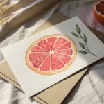
Juicy Citrus Slices
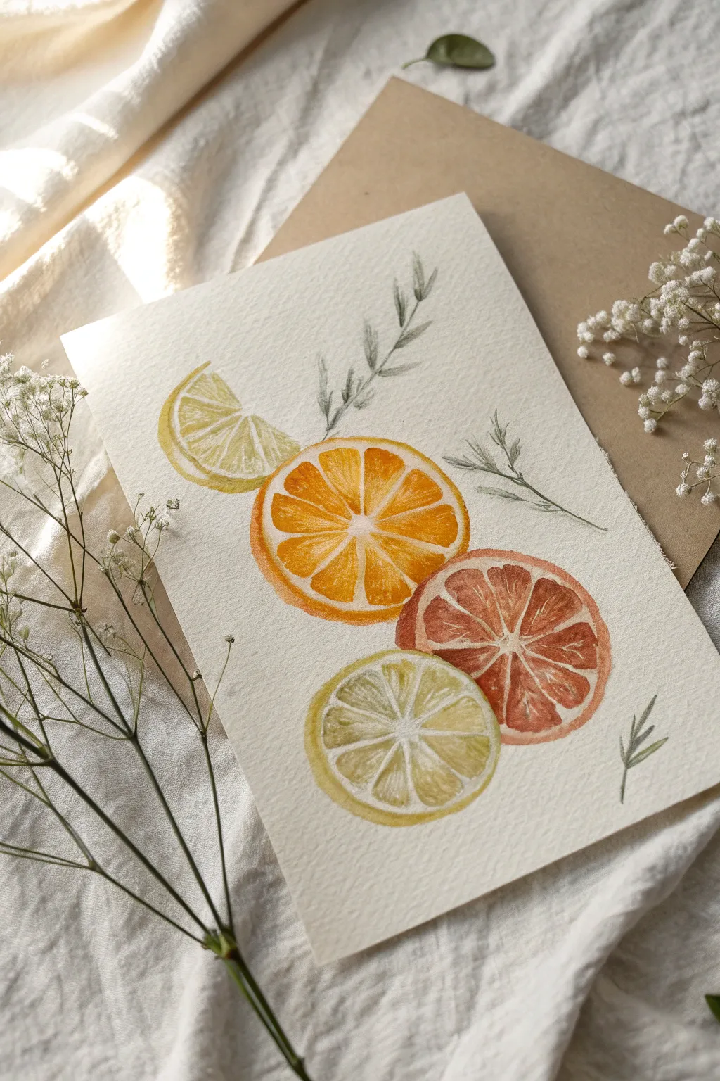
Capture the zest of summer with this vibrant watercolor study featuring a refreshing cascade of citrus slices. The translucent layers and delicate rinds create a bright, airy composition perfect for greeting cards or kitchen art.
How-To Guide
Materials
- Cold press watercolor paper (300 gsm)
- Watercolor paints (Lemon Yellow, Cadmium Orange, Alizarin Crimson, Sap Green)
- Round watercolor brushes (size 2 and 6)
- Pencil (HB or lighter)
- Kneaded eraser
- Clean water
- Paper towels
- White gouache or gel pen (optional for highlights)
Step 1: Sketching the Layout
-
Plan positions:
Lightly mark the center of your paper. You will be stacking four elements vertically, slighting offsetting them for a natural look. -
Draw the circles:
Sketch three circles of roughly equal size in a vertical line. Leave about an inch between them. Add a semi-circle shape at the very top, tilted to the left, for the lemon wedge. -
Detail the segments:
Lightly draw the small triangle shapes for the fruit segments inside each circle. Leave a thin gap between segments to represent the white pith. -
Add foliage:
Sketch delicate, sprig-like leaves between the fruits. Draw one sprig reaching up from the orange slice and another curving out to the right. -
Clean up lines:
Gently roll a kneaded eraser over your sketch to lift excess graphite, leaving only faint guidelines that won’t show through the paint.
Bleeding Colors?
If paints bleed into the white pith areas, wait for it to dry, then lift the color gently with a damp, clean brush or cover it with opaque white gouache later.
Step 2: Painting the Fruit
-
Top lemon wedge:
Start with the top semi-circle. Mix a watery Lemon Yellow and fill in the segment shapes. While wet, drop in a slightly more saturated yellow near the rind edge. -
Orange slice base:
Move to the second fruit. Mix a bright orange using Cadmium Orange and a touch of Yellow. Paint the segments, carefully avoiding the thin white lines between them. -
Blood orange tones:
For the third slice, mix Alizarin Crimson with a little Orange for a blood orange or pink grapefruit look. Paint the segments, letting the color vary slightly in intensity within each triangle. -
Bottom lime slice:
For the bottom slice, mix a pale, yellowish-green using Lemon Yellow and a tiny dot of Sap Green. Keep this wash very watery and transparent. -
First drying phase:
Let these initial washes dry completely. If the paper feels cool to the touch, it’s still wet.
Step 3: Adding Depth and Details
-
Define the rinds:
Using the tip of your size 2 brush, paint the outer rind of each fruit. Use a more concentrated version of the fruit’s color (e.g., deep orange for the orange slice) to create a distinct rim. -
Texturing the orange:
Go back to the orange slice. Add tiny radiating lines or dots inside the segments with a darker orange mix to mimic the juicy pulp texture. -
Deepening the blood orange:
Glaze a second layer of reddish-pink over parts of the blood orange segments, focusing on the outer edges to make the center look glowing and light. -
Lemon details:
Add subtle texture to the top lemon wedge using a slightly darker yellow mix, painting small strokes that follow the curve of the wedge. -
Shadows on the pith:
Mix a very faint, watery gray or beige. Extremely lightly, paint a thin shadow on one side of the white pith lines to give the slices dimension, so they don’t look flat. -
Painting the leaves:
Mix a muted green using Sap Green and a touch of red or brown to desaturate it. Paint the sprigs using swift, light strokes to keep them delicate. -
Final highlights:
Once everything is bone dry, you can use white gouache to tidy up the pith lines or add tiny specular highlights to the juciest parts of the segments.
Make it Sparkle
Sprinkle a tiny pinch of salt onto the wet segments while painting. As it dries, the salt pushes pigment away, creating an amazing natural citrus texture.
Now you have a fresh and zesty piece of art ready to brighten up any space
Watermelon Wedge Study
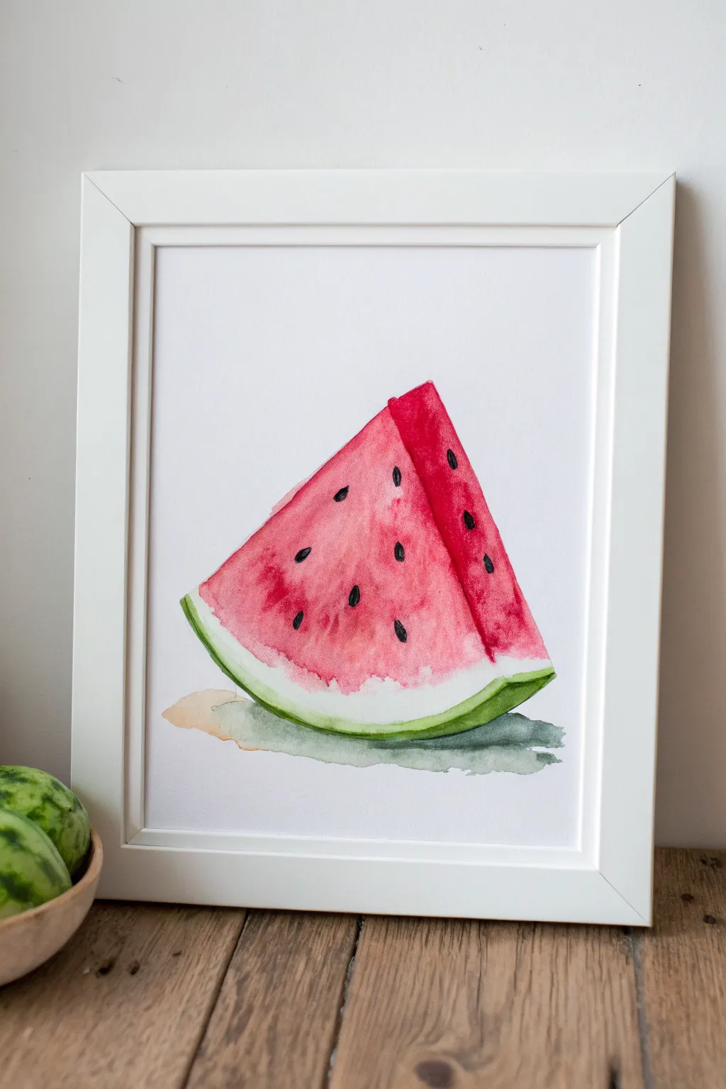
Capture the refreshing essence of summer with this vibrant watercolor study of a watermelon slice. The painting uses wet-into-wet techniques to create soft, juicy gradients of pink and red contrasted against a crisp green rind.
Step-by-Step Tutorial
Materials
- Cold press watercolor paper (300 gsm)
- Round watercolor brushes (size 6 and size 2)
- Watercolor paints: Alizarin Crimson, Cadmium Red, Sap Green, Viridian, Payne’s Grey
- Clean water jar
- Paper towels
- HB Pencil
- Kneaded eraser
Step 1: Sketching the Shape
-
Draw the triangle:
Start by lightly sketching a simple triangle shape in the center of your paper using an HB pencil. Keep your lines very faint so they won’t show through the transparent watercolor later. -
Add dimension:
To give the wedge perspective, draw a second angled line parallel to the right side of the triangle. This creates the side ‘thickness’ of the slice. -
Curve the rind:
Soften the bottom edge of the triangle by curving it slightly upwards, mimicking the natural shape of a melon slice. Draw a second curved line just above it to mark the boundary between the red flesh and the white rind. -
Clean up:
Use a kneaded eraser to gently lift any excess graphite, leaving only the faintest guide lines needed for painting.
Step 2: Painting the Flesh
-
Prepare the wash:
Mix a generous amount of watery Cadmium Red on your palette. We want a vibrant but transparent base layer. -
The first layer:
Using your size 6 brush, apply clean water to the main triangular area of the flesh, avoiding the rind at the bottom and the side panel on the right. Drop in your Cadmium Red while the paper is wet, letting it bloom softly. -
Defining the side:
For the side panel of the wedge, use a slightly more concentrated mix of Alizarin Crimson. Paint this strip carefully on dry paper to create a hard edge between the front face and the side face. -
Deepen the color:
While the main face is still damp but not soaking, dab in concentrated Alizarin Crimson near the bottom and random spots in the center. This creates the uneven, juicy texture of the fruit. -
Feather the edge:
Rinse your brush and use just damp bristles to soften the transition where the red flesh meets the white area of the rind. We want a fuzzy, indistinct border here rather than a hard line.
Bleeding Colors?
If the red bleeds too much into the white rind, your brush was too wet. Use a thirsty brush (clean and damp) to lift the excess red paint away from the white boundary immediately.
Step 3: The Rind and Shadows
-
Base green layer:
Mix a light wash of Sap Green. Paint the curved bottom edge of the rind, leaving a thin white gap between the green skin and the red flesh. -
Darker rind details:
Drop a darker mix of Viridian into the wet Sap Green, concentrating the pigment at the very bottom edge to show roundness and weight. -
The side rind:
Extend the green paint up the small side panel on the right, making this green slightly darker than the front connection to emphasize shadow. -
Cast shadow:
Mix a watery grey using Payne’s Grey and a touch of the dirty water from your rinse jar. Paint a loose, irregular shape underneath the melon, touching the green rind so the colors bleed slightly together. -
Dry completely:
Let the entire piece dry completely before moving on. If you rush this steps, the final details will bleed into the fruit.
Level Up: Salt Texture
While the red flesh area is still wet in the first phase, sprinkle a few grains of table salt on it. Brush it off when dry to create a starry, crystalline texture that looks like sugar.
Step 4: Adding Seeds and Details
-
Mixing black:
Create a thick, creamy mix of Payne’s Grey or Black. It should have very little water so it sits sharp on the paper. -
Paint the seeds:
Using the tip of your size 2 brush, paint small teardrop shapes scattered across the red flesh. Angle them slightly toward the imaginary center of the whole melon. -
Side seeds:
Don’t forget to add a couple of seeds on the darker side panel. These can be slightly narrower to match the perspective. -
Highlights:
If you are precise enough, leave a tiny speck of white paper inside each black seed for a highlight. If that’s too tricky, you can add a dot of white gouache or gel pen later. -
Final texture:
I like to take a nearly dry brush with faint red pigment and dry-brush a little texture near the transition zone to the white rind for extra realism.
Let your artwork dry completely before framing it to brighten up your kitchen or dining area

PENCIL GUIDE
Understanding Pencil Grades from H to B
From first sketch to finished drawing — learn pencil grades, line control, and shading techniques.
Explore the Full Guide
Ice Cream Cone Highlights
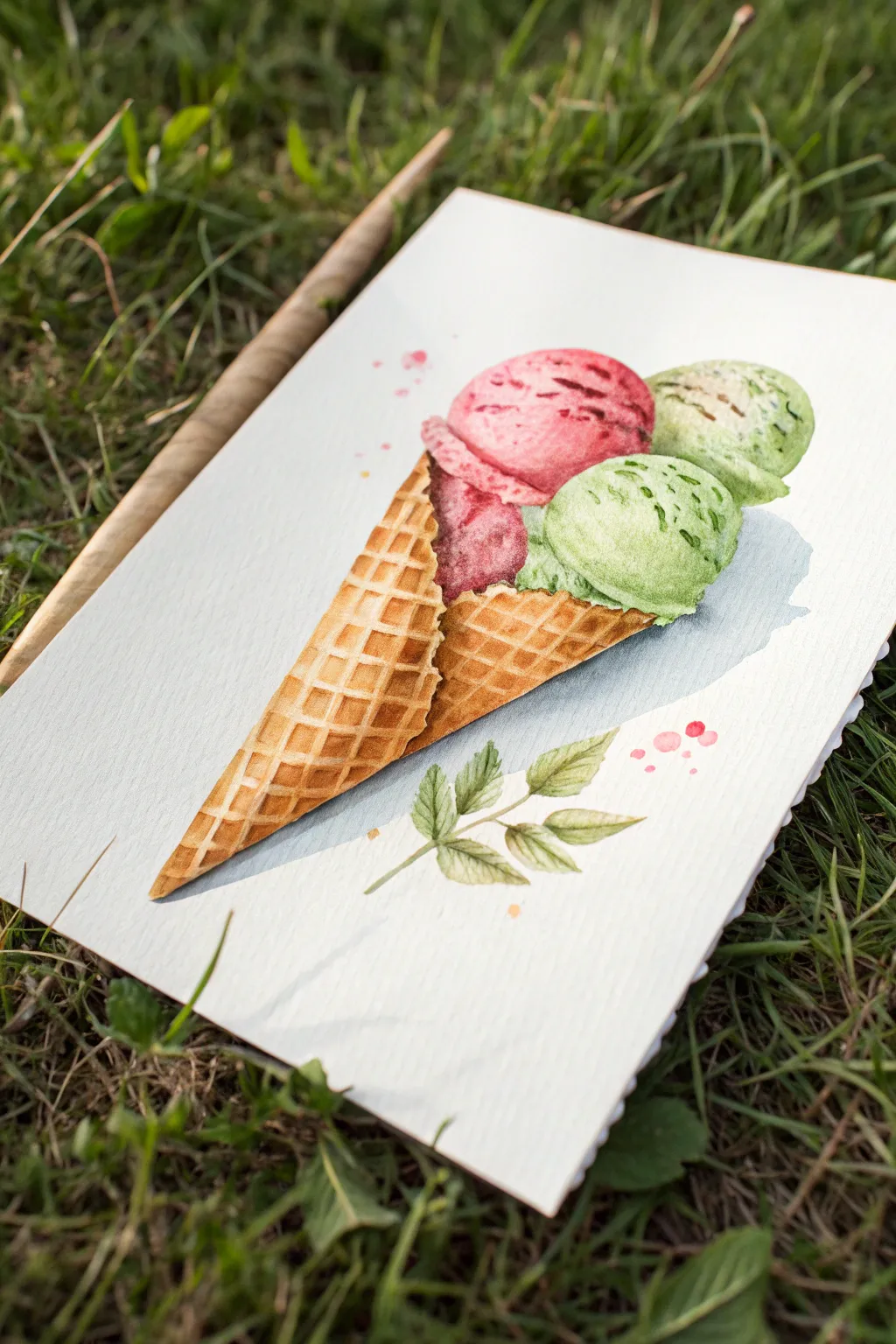
Capture the essence of a refreshing summer treat with this vibrant watercolor ice cream cone. You’ll layer juicy berry reds and creamy pistachio greens against a crisp waffle cone, finishing with a delicate sprig of leaves for an organic touch.
Step-by-Step
Materials
- Cold press watercolor paper (300 gsm)
- Watercolor paints (Alizarin Crimson, Sap Green, Yellow Ochre, Burnt Sienna, Payne’s Grey, Mint Green)
- Round watercolor brushes (Size 4 and Size 8)
- Fine liner brush (Size 0 or 00)
- Pencil (HB) and kneaded eraser
- Paper towels
- Two jars of water
Step 1: Sketching the Sweets
-
Outline the cone:
Begin by lightly sketching a long, narrow triangle for the cone. Angle it diagonally across the page to create a dynamic composition. -
Add the scoops:
Draw three overlapping circles at the top of the cone. Place one slightly larger circle in the back left for the berry flavor, and two smaller circles to the right for the green scoops. -
Define the texture:
Sketch the grid pattern on the waffle cone. Ensure the lines curve slightly around the form to imply roundness rather than a flat triangle. -
Add the garnish:
Lightly pencil in a small sprig of leaves near the bottom right of the cone, balancing the visual weight.
Bleeding Colors?
If your pink scoop is bleeding into the green, the paper was too wet. Let the pink area dry completely before painting an adjacent scoop, or leave a hairline gap of dry paper between them.
Step 2: Painting the Ice Cream
-
First berry layer:
Mix a watery wash of Alizarin Crimson. Wet the pink scoop area with clean water first (wet-on-wet), then drop in the pigment, focusing the saturation on the left side for shadow. -
First green layer:
While the pink dries, mix a pale Mint Green. Apply a light wash to the two right-hand scoops, leaving tiny white gaps for highlights to show the icy texture. -
Deepening the berry:
Once the pink layer is damp but not soaking, mix a thicker, darker red. Dab this into the nooks and crannies of the ice cream’s surface to create dimension. -
Texturing the green:
Using a mix of Sap Green and a touch of blue, dot in darker specks on the green scoops to simulate mint chips or pistachio pieces. Soften some edges with a damp brush. -
Adding shadow:
Mix a tiny bit of Payne’s Grey into your red and green mixes. Paint thin shadow lines where the scoops overlap each other to separate the forms.
Step 3: Crisping the Cone
-
Base waffle color:
Mix Yellow Ochre with a touch of Burnt Sienna. Apply a flat, even wash over the entire cone area. -
Defining the grid:
Once the base is completely dry, use your small round brush and a darker Burnt Sienna mix to paint the lines of the waffle grid. -
Creating depth:
I usually go back into the little squares of the waffle pattern with a slightly darker brown, painting just the top left corner of each square to create a recessed 3D effect. -
Cone shadow:
Run a glaze of cool grey along the entire right side of the cone to round out the form.
Flavor Swap
Customize your painting by changing the color palette! Try Burnt Umber for chocolate, Napthol Yellow for lemon sorbet, or a swirl of purple for lavender honey.
Step 4: Details & Shadows
-
Cast shadow:
Mix a watery, cool blue-grey. Paint a broad cast shadow underneath the cone and scoops on the right side, extending it out to ground the object. -
Painting the leaves:
Use Sap Green to paint the leaves at the bottom. Vary the pressure on your brush to get tapered points. -
Leaf detailing:
Once the leaves are dry, use the fine liner brush and a dark green to draw thin veins down the center of each leaf. -
Splatter texture:
Load a brush with watery pink paint and tap it against another brush handle to create a few playful splatters around the top left. -
Final highlights:
If you lost too many white highlights, use a white gouache or a gel pen to add tiny sparkles to the wettest looking parts of the ice cream.
Allow your painting to dry fully before erasing any remaining pencil lines for a clean finish
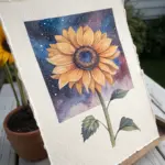
Sunflowers in Strong Light
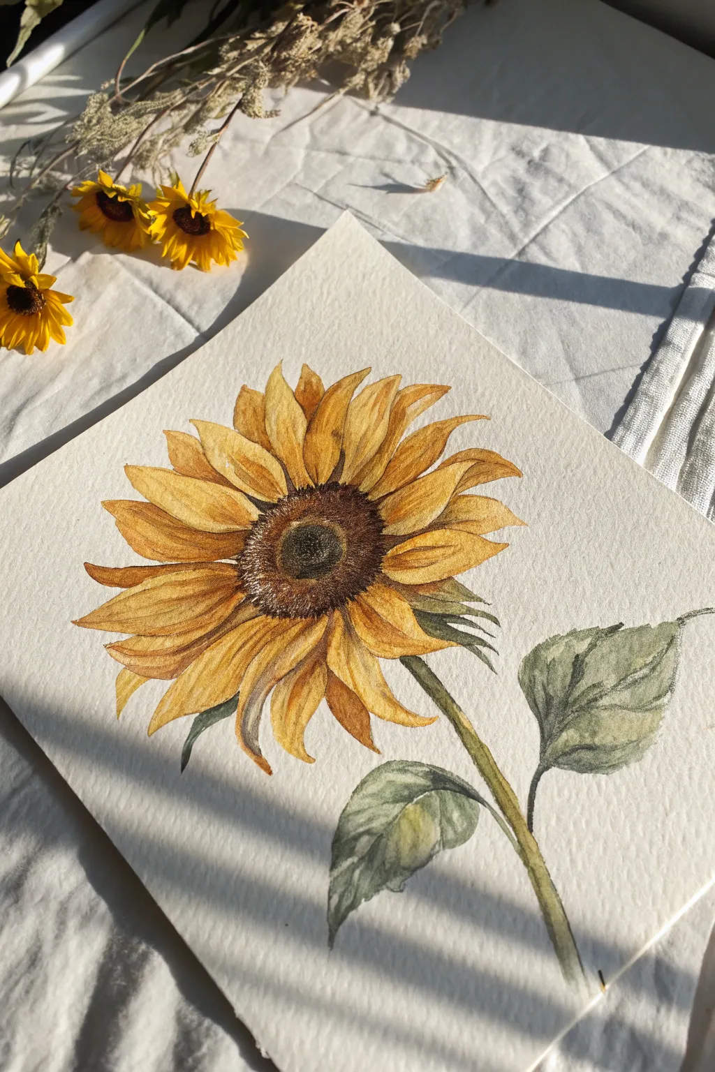
Capture the golden warmth of late summer with this detailed watercolor study of a single sunflower head. By focusing on layering translucent glazes of yellow and ochre, you will build up a realistic depth that makes the petals seem to glow from within.
Step-by-Step Tutorial
Materials
- Cold press watercolor paper (300 gsm)
- Watercolor paints: Cadmium Yellow, Yellow Ochre, Burnt Sienna, Burnt Umber, Sap Green, Payne’s Grey
- Pencil (HB) and kneaded eraser
- Round watercolor brushes (size 4, 8, and a small detail brush like size 0)
- Clean water
- Paper towels
Step 1: Drawing the Base
-
Outline the center:
Begin by lightly sketching an oval shape for the sunflower’s head. It shouldn’t be a perfect circle; tilt it slightly to the left to match the reference’s perspective. -
Sketch the inner ring:
Draw a smaller, slightly offset oval inside your main shape to define the very dark center of the flower disk. -
Add the petals:
Sketch the petals radiating outward. Make them irregular—some curving forward, others twisting back. Notice how the petals near the front appear shorter due to foreshortening, while the side petals are long and flowing. -
Draw stem and leaves:
Extend a thick, sturdy stem curved downwards to the right. Add two large, heart-shaped leaves branching off the stem, keeping the edges slightly jagged. -
Refine lines:
Gently roll a kneaded eraser over your sketch to lift up excess graphite, leaving only faint guidelines that won’t show through the yellow paint.
Sun-Kissed Glow
To make the petals look like they are backlit by the sun, leave the very edges of the petals unpainted or extremely pale yellow.
Step 2: Petal Layers
-
First yellow wash:
Mix a watery wash of Cadmium Yellow. Paint the entire petal area, letting the paint pool slightly at the base of the petals for natural variation. -
Define the shadows:
Once the first layer is dry, mix Yellow Ochre with a touch of Burnt Sienna. Paint the shadows between overlapping petals to separate them visually. -
Add petal texture:
Using a smaller brush (size 4), paint thin, swift lines of the ochre mix starting from the center and flicking outward. This creates the ribbed texture of the petals. -
Deepen the tips:
Add a hint of Burnt Sienna to the tips of the petals and the underside curves to suggest warmth and slight curling.
Step 3: The Flower Center
-
Base layer for the disk:
Paint the entire center disk with a light wash of Burnt Sienna. -
Darkening the middle:
While the base is still damp, drop in concentrated Burnt Umber into the very center ring, letting it bleed softly outward. -
Stippling texture:
Once the center is dry, use a damp, stiff brush or an old brush to stipple (tap repeatedly) a mix of Burnt Umber and Payne’s Grey around the outer rim of the disk. This creates the fuzzy, seeded texture. -
Highlighting:
I like to leave tiny specs of white paper showing through the dark center, but if you covered them, you can lift small dots of pigment with a clean, damp brush.
Level Up: Salt Texture
Sprinkle a pinch of table salt onto the wet center disk paint. Let it dry completely, then brush off. It creates amazing seed-like textures instantly.
Step 4: Greenery and Details
-
Stem base coat:
Paint the stem and leaves with a light wash of Sap Green. -
Leaf details:
While the green is still wet, drop in a darker mix of Sap Green and Payne’s Grey along the veins and the underside of the leaves. -
Adding texture to the green:
Use a dry brush technique (very little water on the brush) to drag texture along the stem, mimicking the hairs found on sunflower stalks. -
Sepals:
Don’t forget the small green sepals peeking out from behind the yellow petals. Paint these with swift, spiky strokes using your smallest brush. -
Final Contrast:
Mix a very dark brown-black. Carefully paint the deepest crevices where the petals meet the center disk to make the flower head pop forward.
Step back and admire the vibrant warmth your sunflower brings to the page


Fireflies in Warm Twilight
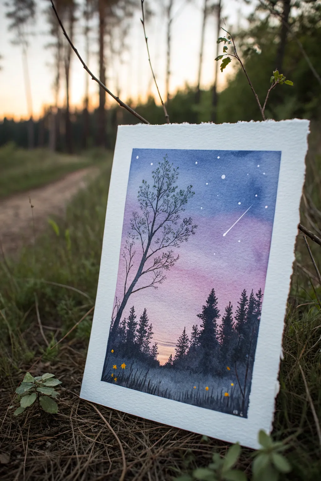
Capture the magic of a warm summer night with this enchanting watercolor landscape featuring glowing fireflies and a serene starry sky. The scene blends a soft violet and blue gradient background with crisp silhouette trees to create depth and mystery.
Step-by-Step Guide
Materials
- Cold press watercolor paper (300 gsm)
- Masking tape
- Watercolors: Indigo, Ultramarine Blue, Purple/Violet, Alizarin Crimson, Lemon Yellow
- White gouache or white gel pen
- Large flat brush or wash brush
- Medium round brush (size 6 or 8)
- Small detail brush (size 0 or 1)
- Old toothbrush (optional for spatter)
- Paper towels
- Two jars of water
Step 1: Setting the Scene
-
Tape edges:
Begin by taping down all four edges of your watercolor paper to a board. This creates the crisp white border seen in the original and prevents the paper from buckling during the wet wash. -
Wet the paper:
Using your large wash brush, apply clean water to the entire surface of the paper. You want an even sheen that is damp but not forming puddles.
Starry Night Tip
When splattering stars, cover the bottom ‘land’ portion of your painting with a scrap piece of paper so the white dots only land in the sky area.
Step 2: Creating the Sky Gradient
-
Deep blue top:
While the paper is wet, load your brush with a mix of Indigo and Ultramarine. Apply this to the top third of the paper, allowing the color to be intense at the very top edge. -
Fade to purple:
Rinse your brush slightly and pick up your Purple or Violet paint. Blend this into the bottom edge of the blue section, pulling the color downwards into the middle of the page. -
Warm horizon:
Clean your brush completely. Pick up a watery mix of Alizarin Crimson or a soft pink. Apply this below the purple, leaving a small gap of very pale, almost white paper near the bottom horizon line to represent the last light of the sun. -
Connect the gradient:
Use a damp, clean brush to gently smooth the transition between the pink and the white strip at the bottom. Tilt the board slightly to encourage gravity to help the colors blend naturally. -
Dry completely:
This is crucial: let the background dry 100%. If the paper is cool to the touch, it’s still damp. Using a hairdryer on a low setting can speed this up.
Level Up: Reflections
Instead of grass at the bottom, paint a flat smooth wash of your sky colors inverted to create a lake, then paint the tree reflections vertically into the ‘water’.
Step 3: Painting the Silhouettes
-
Mix the darks:
Prepare a very dark, saturated mixture. I like to use Indigo mixed with a touch of Violet or Black to get a deep, rich shade that isn’t excessively flat. -
Distant trees:
Using a medium round brush and a slightly diluted version of your dark mix, paint the distant tree line along the horizon. Keep these shapes loose and slightly jagged to mimic fir trees. -
Foreground grass:
Switch to the full-strength dark mixture. Near the bottom edge, use upward flicking motions to create tall grasses and uneven terrain that covers the bases of your distant trees. -
Main pine trees:
Paint the prominent evergreen trees on the right side. Start with a vertical line for the trunk, then use a stippling or dab-and-pull motion to create the needle textures, getting wider as you move down the tree. -
The tall bare tree:
Using your smallest detail brush (size 0 or 1), paint the large deciduous tree on the left. Start with the trunk, which should be thicker at the base and taper as it reaches the sky. -
Adding fine branches:
Extend thin, spindly branches outward from the main trunk. Keep your hand loose and let the lines tremble slightly for a natural, organic look. Ensure the branches reach high into the blue section of the sky. -
Leaves texture:
Mix a semi-transparent dark grey. Lightly dab small clusters of leaves onto the ends of the bare branches. Don’t overdo it; you want the sky to show through.
Step 4: Magic Details
-
Stars:
Load a small brush or a toothbrush with white gouache (or use a white gel pen). Tap the brush against your finger to splatter tiny stars across the dark blue section of the sky. Add a larger dot and drag a tail for the shooting star. -
Fireflies:
Using opaque Lemon Yellow gouache or watercolor straight from the tube, paint small dots in the dark grass area and floating just above the treeline. -
Firefly glow:
For an extra glowing effect, you can gently dab a tiny amount of diluted yellow around a few of the fireflies to create a soft halo. -
Reveal the border:
Once the painting is completely dry, slowly peel off the masking tape at a 45-degree angle away from the painting to reveal the clean edges.
Now you have a serene twilight moment captured on paper to enjoy all year round


Have a question or want to share your own experience? I'd love to hear from you in the comments below!