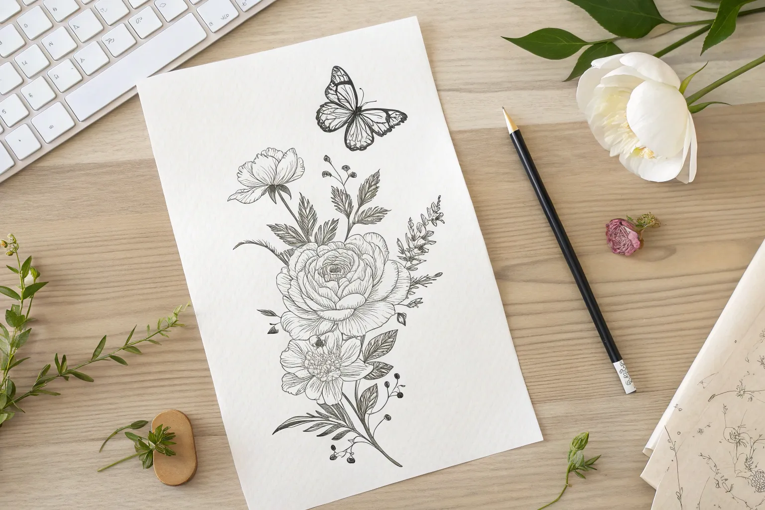
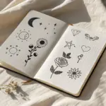
When I’m sketching tattoo ideas for women, I always start by chasing that sweet spot between softness and strength—usually with fine-line details and a little touch of mystery. Here are my favorite tattoo drawing concepts you can use as stencil-style inspiration (or tweak until they feel completely you).
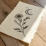
Fine-Line Floral Bouquet Sketch
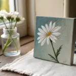
Capture the delicate beauty of a botanical tattoo design with this fine-line ink illustration. This project combines bold outlines with intricate shading techniques like hatching and stippling to create a timeless floral bouquet.
Step-by-Step Guide
Materials
- High-quality smooth bristol board or hot-press watercolor paper
- HB pencil for sketching
- Kneaded eraser
- Fine liner pens (sizes 0.05, 0.1, 0.3, and 0.5mm)
- Ruler (optional for layout)
- Blending stump (optional)
Step 1: Planning and Sketching
-
Composition Layout:
Begin by lightly marking the overall shape of your bouquet on the paper using your HB pencil. Imagine an inverted triangle or diamond shape where the flowers will sit. -
Main Bloom Placement:
Draw a large circle slightly below the center of your page to represent the main open peony. This will be the focal point of the piece. -
Adding Supporting Flowers:
Sketch a smaller circle to the upper left for the side-facing bloom, and a small oval to the right for the tight flower bud. -
Stem Structure:
Connect your flower shapes with gently curving lines that converge towards the bottom. Think about the flow; tattoo designs often follow the natural curve of a body part. -
Defining Petals:
Refine the circles into petals. For the main peony, start with a tightly packed center and draw larger, scalloped petals unfolding outward. Keep the edges slightly ragged for a natural look. -
Adding Foliage:
Sketch in the leaves. Place large, broad leaves at the base of the main flower and smaller, more delicate sprigs extending upward from the top. Vary the leaf shapes—some smooth, some jagged.
Uneven Ink Flow?
If your fine liner skips, don’t press harder! Hold the pen more upright (perpendicular to paper) and slow your drawing speed to let ink flow naturally.
Step 2: Inking the Outlines
-
Bold Outlines:
Switch to your 0.5mm or 0.3mm fine liner. Carefully trace over the outer edges of the main petals and the primary leaves. Use a confident, steady hand for clean lines. -
Delicate Details:
Use a finer 0.1mm pen for the inner petal details and the more delicate upper sprigs of leaves. This variation in line weight adds depth and visual interest. -
Erase Pencil Lines:
Wait until the ink is completely dry—I usually give it at least 10 minutes to be safe—then gently use the kneaded eraser to lift all the pencil sketches.
Step 3: Shading and Texture
-
Inner Petal Shading:
Using your 0.05mm pen, add fine vertical lines (hatching) at the base of each petal, flicking the pen upward to taper the line. This creates the curved dimension of the flower. -
Center Texture:
For the peony’s center, draw tiny circles and stamens. Darken the deepest recesses between these shapes to make the center pop. -
Leaf Veines:
Draw central veins in your leaves. For the larger lower leaves, add shading on one side of the vein using tight diagonal hatching. -
Dark Contrast:
Select a few leaves, particularly those tucked behind the main flower, and fill them in with denser hatching or cross-hatching to create darker values. This pushes the main flower forward. -
Stem Accents:
Thicken the shadow side of the stems slightly with the 0.1mm pen to give them cylindrical form.
Level Up: Vintage Wash
After ink is 100% waterproof dried, brush a light wash of diluted tea or coffee over the paper for an aged, parchment tattoo flash look.
Step 4: Final Touches
-
Atmospheric Stippling:
Take your finest pen (0.05mm) and add a cloud of tiny dots around the perimeter of the bouquet. Concentrate the dots near the leaves and let them disperse as they move outward. -
Review and Refine:
Step back and look at the balance. If an area looks too flat, add a few more hatching lines to deepen the shadow. -
Signature:
Sign your artwork discreetly near the bottom stem or leaf.
Now you have a stunning botanical illustration ready to be framed or used as inspiration for your next ink session
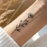
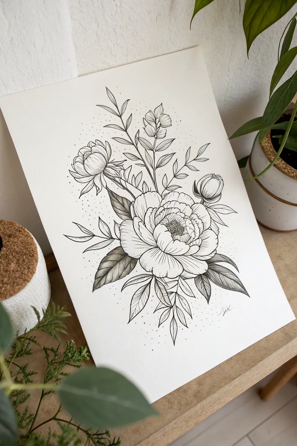
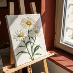
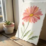
Single Rose With Soft Shading
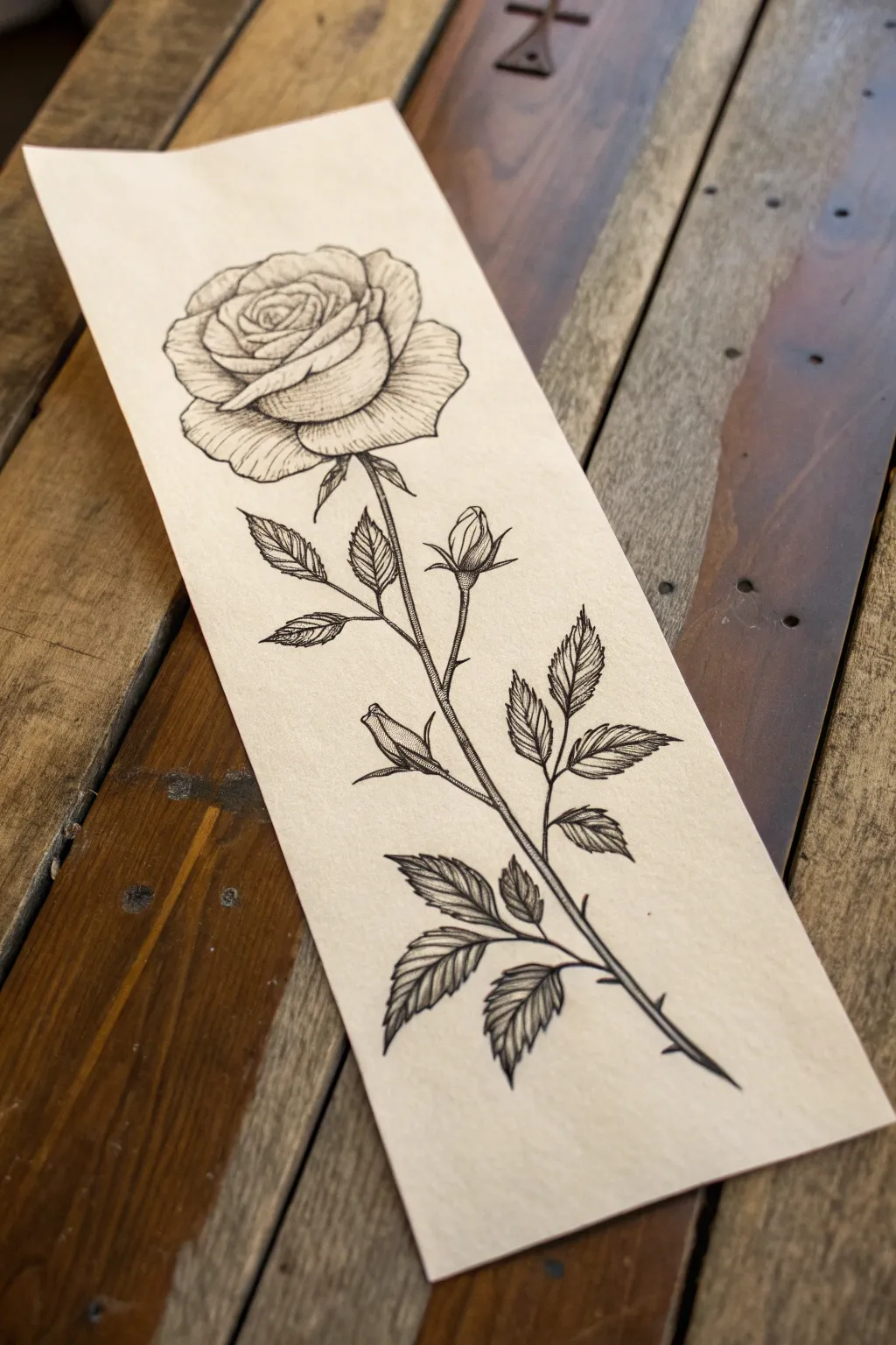
Capture the timeless elegance of a botanical rose using precise linework and delicate texture. This project focuses on building depth through hatching and stippling techniques to create a sophisticated, tattoo-ready design.
How-To Guide
Materials
- Cream or off-white textured heavy paper
- HB or 2H graphite pencil
- Kneadable eraser
- Fine liner pens (sizes 0.05, 0.1, and 0.3)
- Ruler (optional for stem alignment)
Step 1: Planning the Structure
-
Map the stem:
Begin with your graphite pencil. Draw a long, slightly curved line down the center of your page to establish the main stem. Give it a gentle ‘S’ curve to keep it from looking stiff. -
Outline the bloom:
At the top of the stem, lightly sketch an oval shape. Inside this oval, draw a tight spiral to represent the center of the rose bud where the petals are tightly packed. -
Block in outer petals:
Draw larger, looser curved shapes surrounding the central spiral. These should flare outward slightly, mimicking how a rose unfolds. Keep your pencil pressure very light so these guide lines are easy to erase later. -
Add leaves and buds:
Along the stem, sketch the placement of the leaves. Draw them in alternating pairs or singles, pointing upward. Add two small teardrop shapes branching off the main stem to represent the closed buds.
Ink Control
For the finest hatching lines, hold your pen further back on the barrel. This reduces pressure and allows for lighter, more feathery strokes compared to gripping near the nib.
Step 2: Refining the Shapes
-
Detail the petal edges:
Still using your pencil, refine the edges of the petals. Give them slight waves and dips, focusing on the specialized ‘folded over’ look of the outer petals. -
Define the leaves:
Sharpen the outlines of the leaves. Instead of smooth ovals, create serrated (saw-toothed) edges. Draw a central vein down the middle of each leaf. -
Thorns and stem thickness:
Thicken the main stem line, making it slightly wider at the bottom than the top. Add small, sharp triangular spikes periodically for the thorns.
Vintage Vibe
After the drawing is dry, lightly stain the paper with cold coffee or a wet tea bag. This ages the paper instantly, giving your classic rose drawing an antique botanical feel.
Step 3: Inking the Outlines
-
Main outlines:
Switch to your 0.3 fine liner. Trace over your finalized pencil lines for the main contours of the petals, the stem, and the outer shape of the leaves. Use a confident, steady hand. -
Delicate details:
Switch to a thinner 0.1 pen for the inner details, like the tightly coordinating center of the rose and the central veins of the leaves. -
Clean it up:
Wait at least 5-10 minutes for the ink to dry completely to avoid smudging. Then, use your kneadable eraser to gently lift away all original graphite pencil marks.
Step 4: Adding Texture and Shading
-
Hatching the stem:
Using the 0.05 pen, draw very short, vertical lines along the shadowed side of the stem (usually the right or left side consistently) to create cylindrical volume. -
Leaf veins:
Draw fine diagonal lines branching from the central vein of each leaf to the edges. Keep these lines extremely light and thin. -
Leaf shading:
Add density to the leaves by hatching closely near the central vein and leaving the tips lighter. This creates a natural, slightly folded appearance. -
Petal contours:
I like to start shading the petals from the base where they attach to the stem. Use curved hatching lines that follow the shape of the petal, flicking the pen outward to taper the line. -
Deepening shadows:
Identify where petals overlap. Where one petal casts a shadow on another, add cross-hatching or denser lines to deepen the contrast. -
Stippling the buds:
For the small closed buds, use dots (stippling) at the base of the bud to create a soft gradient, transitioning to clear paper at the tip. -
Final petal texture:
Add very subtle, broken lines on the large open petals to suggest the velvety texture of the rose surface. Don’t overdo it; leave plenty of white space for highlights. -
Review and refine:
Step back and look at the overall balance. If any area looks too flat, add a few more hatching lines or dots to increase the contrast and depth.
You now have a beautifully detailed botanical illustration ready for framing or design inspiration


Butterfly With Botanical Accents
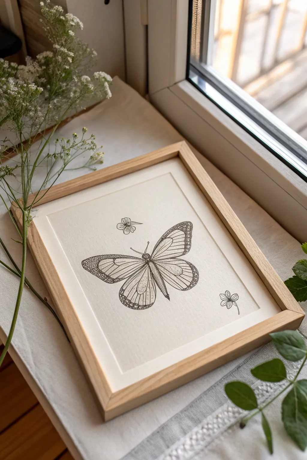
This elegant artwork features a finely detailed monarch-style butterfly accompanied by two simple floral motifs, captured in classic black ink. The result is a clean, minimalist piece that serves as perfect inspiration for tattoo art or simply as a gentle decorative accent.
Step-by-Step Guide
Materials
- High-quality textured art paper (cream or off-white)
- Fine liner pens (sizes 005, 01, and 03)
- HB graphite pencil
- Kneaded eraser
- Ruler
- Light oak wood frame (8×10 or similar)
- Mat board (optional, depending on frame fit)
Step 1: Conceptual Sketch
-
Center layout:
Begin by finding the visual center of your paper. Make a very faint mark with your HB pencil to guide where the butterfly’s body will rest. -
Body structure:
Sketch a sleek, segmented axis for the butterfly’s body. It should be relatively thin, with a slight bulb at the head and tapering at the tail. -
Wing framing:
Lightly draw the upper wing shapes first. They should sweep outward and curve gently at the corners. Follow with the lower wings, which are slightly rounder and meet near the abdomen. -
Internal veins:
Map out the primary veins inside the wings. These lines radiate from the connection point near the body outward toward the wing edges, like the spokes of a wheel. -
Floral placement:
Add the botanical accents now. Sketch a small, four-petaled flower floating above the let wing, and a second one slightly lower to the right of the bottom wing for balance.
Smudged Ink?
If you accidentally smudge wet ink, don’t wipe it. Let it dry completely, then carefully scratch the excess off with a precise X-Acto knife blade.
Step 2: Inking the Outline
-
Primary outlines:
Switch to your 03 fine liner for the boldest lines. Trace the outer perimeter of the butterfly wings. Using confident, single strokes helps prevent shaky lines. -
Body definition:
Carefully ink the central body. Use small stippling dots with an 01 pen on the head and thorax to suggest a fuzzy texture without drawing individual hairs. -
Vein structure:
Go over your pencil sketches for the main wing veins. I prefer using the 01 pen here to keep these lines slightly thinner than the outer border. -
Flower details:
Ink the two floating flowers. Keep these lines very delicate (005 or 01 pen) so they don’t distract from the main butterfly subject.
Step 3: Refining and Texture
-
Wing margins:
Create the signature patterned edge found on monarch wings. Draw a secondary line inside the wing tips and fill the space with a few small white ellipses before coloring the rest black. -
Stippling details:
Using your smallest 005 pen, add tiny dots (stippling) near the base of the wings where they attach to the body. This creates depth and shadow. -
Cross-hatching:
On the lower wings particularly, add very distinct, fine horizontal lines across the veins. This geometric hatching gives the drawing its tattoo-style aesthetic. -
Contrast check:
Look for areas that need more weight. You might want to darken the tips of the upper wings slightly to anchor the composition.
Add Gold Leaf
Make the artwork pop by applying tiny dabs of gold leaf sizing to the circular spots on the wing tips instead of leaving them white.
Step 4: Finishing Touches
-
Erase guidelines:
Wait at least 15 minutes for the ink to fully cure. Gently roll a kneaded eraser over the entire drawing to lift the original graphite sketches. -
Prepare the frame:
Clean the glass of your light oak frame thoroughly on both sides to ensure no dust is trapped. -
Mounting:
Center your artwork on the backing board. If your frame has a mat, secure the drawing behind it using artist’s tape. -
Assembly:
Place the glass, mat, and artwork into the frame and secure the back clips.
Hang your delicate new artwork near a window or give it as a thoughtful, hand-drawn gift


Moon Phases Linework Strip
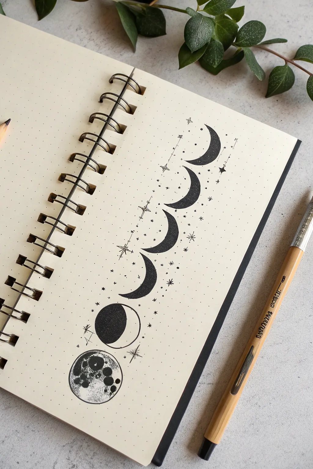
Capture the magic of the lunar cycle with this vertically aligned illustration that blends bold blacks with delicate stippling textures. This tutorial teaches you how to create a balanced strip of moon phases surrounded by whimsical sparkles, perfect for bullet journals or tattoo concepts.
Step-by-Step Tutorial
Materials
- Dot grid notebook or sketchbook
- Fine liner pens (sizes 0.1 and 0.5 or 0.8)
- Pencil (HB or H)
- Eraser
- Circle template (optional but helpful)
- Ruler
Step 1: Planning the Layout
-
Establish the centerline:
Begin by lightly drawing a vertical line down your page using a ruler. This will serve as the anchor for all your moons to ensure they are perfectly aligned. -
Mark phase positions:
Decide on the size of your moons (about 2-3cm in diameter works well). Mark seven evenly spaced points along your vertical line where the center of each moon will sit. Leave slightly more space at the bottom for the larger full moon if desired. -
Sketch the circles:
Using your circle template or drawing freehand, sketch light circles at each marked point. Don’t worry about perfection here; these are just guides.
Step 2: Drafting the Phases
-
Define the crescents:
Starting from the top, sketch the curves inside your circles to define the crescent shapes. The top four shapes should be thin crescents facing upward/right. Variations in thickness add visual interest. -
Draft the gibbous and full moon:
For the second shape from the bottom, draw a curve that leaves more than half the circle empty to create a gibbous phase. For the bottom-most circle, leave it whole for the full moon. -
Sketch decorative elements:
Lightly pencil in tiny stars, four-pointed sparkles, and small dots floating around the moon strip. I like to concentrate them slightly more around the center crescents.
Uneven Dots?
If your stippling looks messy, slow down. Tap the pen straight down rather than at an angle. Angled tapping creates tiny dashes instead of clean round dots.
Step 3: Inking and Stippling
-
Outline the top crescents:
Switch to your thicker pen (0.5 or 0.8). Carefully trace the outline of the top four crescent shapes. Keep your hand steady to get clean, crisp curves. -
Fill with texture:
Instead of coloring them solid black, use a stippling technique. Densely pack dots together on the ‘dark’ side of the crescent and space them out as you move toward the lighter edge to create a gradient effect. -
Ink the gibbous moon:
Outline the gibbous shape (second from bottom). Fill the dark portion solid black with your thicker pen for contrast against the stippled moons above. -
Outline the full moon:
Trace the bottom-most circle. This one requires the most detail, so ensure your outline is clean. -
Create craters:
Inside the full moon, draw several smaller irregular circles of various sizes to represent craters. Some can be clustered together for a realistic look. -
Shade the full moon:
Fill the space *around* the craters with dense stippling or solid black ink, leaving the crater interiors largely white or lightly textured. This inverted shading makes the craters pop.
Add Gold Accents
Once the black ink is fully dry, trace over the stars or fill inside the crater circles with a metallic gold gel pen for a celestial pop.
Step 4: Final Details
-
Ink the stars:
Use your 0.1 fine liner to trace the delicate stars and sparkles. For the four-pointed stars, extend the lines outward from a center point, making the vertical and horizontal lines longer than the diagonals. -
Add cosmic dust:
Dot the pen tip randomly around the moons to create ‘stardust.’ Vary the pressure to create dots of slightly different sizes. -
Erase pencil guides:
Wait until the ink is completely dry—give it a few extra minutes to be safe. Gently erase all vertical lines and circle guides. -
Refine contrast:
Look at the top crescents again. If they look too pale, add more dots to the darkest edges to deepen the black and enhance the 3D form.
Now you have a stunning piece of lunar art that looks beautiful on paper and would make an equally elegant design for skin

PENCIL GUIDE
Understanding Pencil Grades from H to B
From first sketch to finished drawing — learn pencil grades, line control, and shading techniques.
Explore the Full Guide
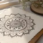
Lotus Mandala Dotwork Design
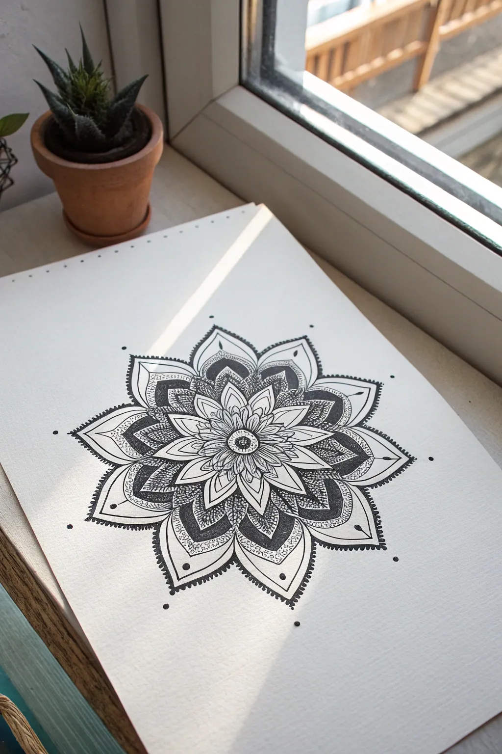
This intricate mandala combines the organic beauty of a lotus flower with the precision of sacred geometry, resulting in a striking piece perfect for tattoo inspiration or meditative art. Using fine liners and patient stippling, you will build layers of depth and texture that make the design pop off the page.
Detailed Instructions
Materials
- High-quality smooth bristol board or heavy drawing paper (A4)
- Pencil (HB or 2H)
- Compass
- Protractor
- Ruler
- Eraser
- fine liner pens (0.05, 0.1, 0.3, and 0.5 mm)
- Clean tissue or scrap paper (to prevent smudging)
Step 1: Setting the Grid
-
Find the center:
Begin by marking the absolute center of your paper. This single point is crucial as the anchor for the entire symmetrical design. -
Draw concentric circles:
Using your compass, draw a series of faint concentric circles radiating from the center point. I refer to these as ‘guideline tracks.’ Space them out roughly 1-2 cm apart, creating about 5-6 distinct rings to house the different petal layers. -
Divide the circle:
Use your protractor to divide the circle into 8 or 16 equal sections. Draw light straight lines through the center to the edge, creating ‘pie slices’ that will help ensure your petals remain uniform in size.
Uneven Dots?
If your stippling looks messy, slow down. Tap straight down rather than at an angle. Angled taps create ‘commas’ instead of round dots, which ruins the texture.
Step 2: Drafting the Lotus
-
Sketch the core:
In the smallest center circle, sketch a simple flower center or seed pod. Around this, draw the first layer of small, tight petals, using your grid lines to keep the tips perfectly centered in each slice. -
Expand the petals:
Moving to the next ring, sketch larger petals that peek out from behind the first layer. The tips of these petals should align with the dividing lines you drew earlier. -
Add the outer bloom:
Continue expanding outward with larger, more pointed lotus petals for the third layer. Give these a slight curve at the edges to mimic organic flow. -
Create the final ornate layer:
For the largest, outermost layer, draw wide, pointed petals that extend to your furthest guideline. Inside these large petals, sketch a slightly smaller internal border or ‘frame’ which will later be filled with complex textures.
Step 3: Inking & Outlining
-
Primary outlines:
Switch to a 0.3 or 0.5 mm fine liner. Carefully trace over your pencil lines for the main petals. Keep your hand steady and rotate the paper as needed to maintain a comfortable drawing angle. -
Fine details:
Use a 0.1 mm pen to add smaller details, such as the internal lines within the petals or the delicate stamens in the very center. -
Erase guidelines:
Once the ink is completely dry—give it a good ten minutes to be safe—gently erase all your pencil grid lines and sketches to reveal a clean framework.
Paper Rotation
Tape your paper to a rotating lazy Susan or simply spin your sketchbook constantly. Keeping your hand in its natural arc position prevents wrist strain and shaky lines.
Step 4: Shading with Dots (Stippling)
-
The dotwork technique:
This is the most time-consuming but rewarding part. Using your 0.05 or 0.1 mm pen, begin applying dots to create shadows. Densely pack dots near the base of the petals (where they meet the center) to create depth. -
Gradient effect:
As you move toward the tip of a petal, space the dots further apart. This creates a smooth gradient from dark to light, making the petals look curved and 3D. -
Texturing the outer petals:
In the large outer petals, fill the ‘frame’ areas with dense, dark stippling or a dark fill, contrasting against the lighter center of the petal. This heavy contrast is key to the tattoo style look. -
Inner petal details:
Add fine linear shading or very light dotwork to the inner sections regarding the middle layers, keeping the center of each petal mostly white for highlights.
Step 5: Final Touches
-
Add floating dots:
around the outer perimeter of the mandala, add single, deliberate dots or small clusters in line with the petal tips. This ‘floating’ ornamentation expands the design without adding visual weight. -
Double-check contrast:
Step back and squint at your drawing. If areas look too flat, go back in with your 0.05 pen and add more dots to the deepest shadows to punch up the contrast. -
Final border pop:
Using your thickest pen (0.5 mm), re-trace the very outer edges of the main petals one last time to give the whole design a bold, sticker-like finish.
Enjoy the meditative rhythm of stippling as your beautiful lotus mandala comes to life.
Sun And Crescent Moon Pair
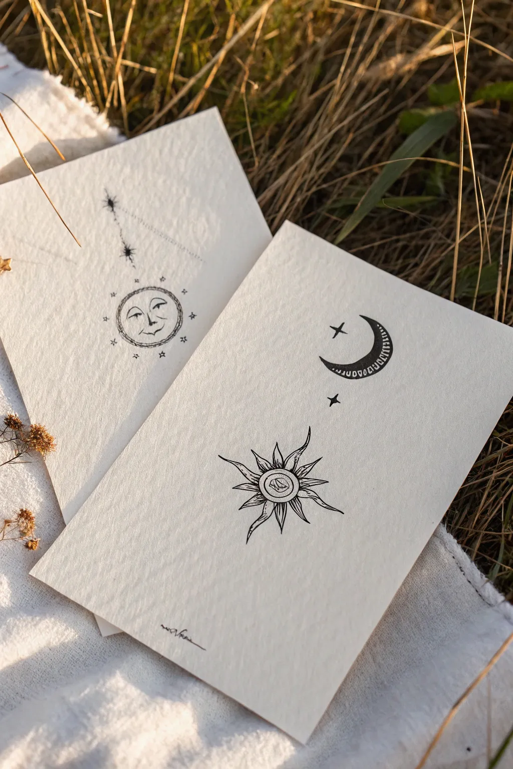
Capture the mystic energy of the cosmos with this set of delicate sun and moon ink illustrations. These minimalist designs mimic the clean, precise aesthetic of fineline tattoos on beautifully textured paper.
Step-by-Step Guide
Materials
- Heavyweight cold-press watercolor paper or textured sketch paper (off-white or cream)
- Pencil (HB or 2H for light lines)
- Kneaded eraser
- Fine liner pen (01 or 03 micron size, black archival ink)
- Ultra-fine liner pen (005 micron size, black archival ink)
- Ruler
Step 1: Preparation & Shapes
-
Select your paper:
Cut two rectangles of heavy, textured paper. The texture is key here—it adds to that organic, vintage feel visible in the photo. -
Draft the moon crescent:
On the first sheet, lightly sketch a classic crescent shape in the upper right quadrant. Keep the inner curve smooth and the points sharp. -
Position the geometric sun:
Below the moon, slightly to the left, sketch a small circle for the center of the starburst sun. Use your ruler to lightly mark a vertical and horizontal axis through the center to help guide the rays later. -
Draft the smiling sun face:
On the second sheet, draw a larger circle in the lower center. Sketch a very faint vertical line rising from the top of the circle to guide the hanging stars.
Ink Smearing?
If you notice ink smudging when you erase, switch to a heat-setting technique or verify you are using pigment-based liners, which dry faster than dye-based inks.
Step 2: Inking the Moon Sheet
-
Outline the crescent:
Switch to your 03 pen. Carefully trace the outline of your crescent moon. Keep your hand steady to maintain a consistent line weight. -
Add the inner pattern:
Draw a secondary curved line inside the crescent, parallel to the outer edge. Fill the space between these lines with small, evenly spaced tick marks or tiny rectangles to create the decorative border. -
Draw the starburst center:
Move down to the sun shape. Ink two concentric circles in the center. Inside the smallest circle, draw a tiny abstract swirl or wave pattern. -
Create the sun rays:
Using the 01 pen, draw the wavy, flame-like rays extending outward. Notice that the rays vary in length—alternate between longer, pointed flames and shorter, curved spikes. -
Detail the rays:
Add a single thin line down the center of each flame ray to give it dimension. -
Add flanking stars:
Draw a simple four-point star (a cross shape with tapered ends) between the moon and sun, and another near the moon’s inner curve.
Step 3: Inking the Sun Face Sheet
-
Define the sun perimeter:
Ink the main circle with the 03 pen. Instead of a single smooth line, try a sketchy, double-pass technique to give the border a rough, rustic texture. -
Draw the facial features:
Using the 005 ultra-fine pen, delicately draw the closed eyes, nose, and slight smile. Add a small curve for the cheek to give the face character. -
Add the crown of stars:
Around the perimeter of the sun circle, draw tiny four-point stars and dots. Space them loosely; they shouldn’t look perfect. -
Ink the hanging constellation:
Follow your guide line above the sun. Draw a larger four-point star at the top, a smaller one below it, and connect them with a faint, broken dotted line. -
Stipple the shading:
Take your 005 pen and add tiny dots (stippling) inside the starburst sun rays on the first sheet and along the shadow side of the moon face on the second sheet for gentle depth.
Age the Paper
Dip the edges of your finished paper into strong brewed tea or coffee and let it dry. This creates a stained, vintage parchment effect that complements the style.
Step 4: Finishing Touches
-
Erase pencil marks:
Wait at least 10 minutes to ensure the ink is completely dry. Gently roll the kneaded eraser over the drawings to lift the graphite without damaging the paper texture. -
Sign your work:
Add a tiny signature or initials at the bottom of the page in your smallest pen size.
Display your beautiful celestial drawings together for a balanced, harmonious look
BRUSH GUIDE
The Right Brush for Every Stroke
From clean lines to bold texture — master brush choice, stroke control, and essential techniques.
Explore the Full Guide
Protective Eye Ornament Sketch
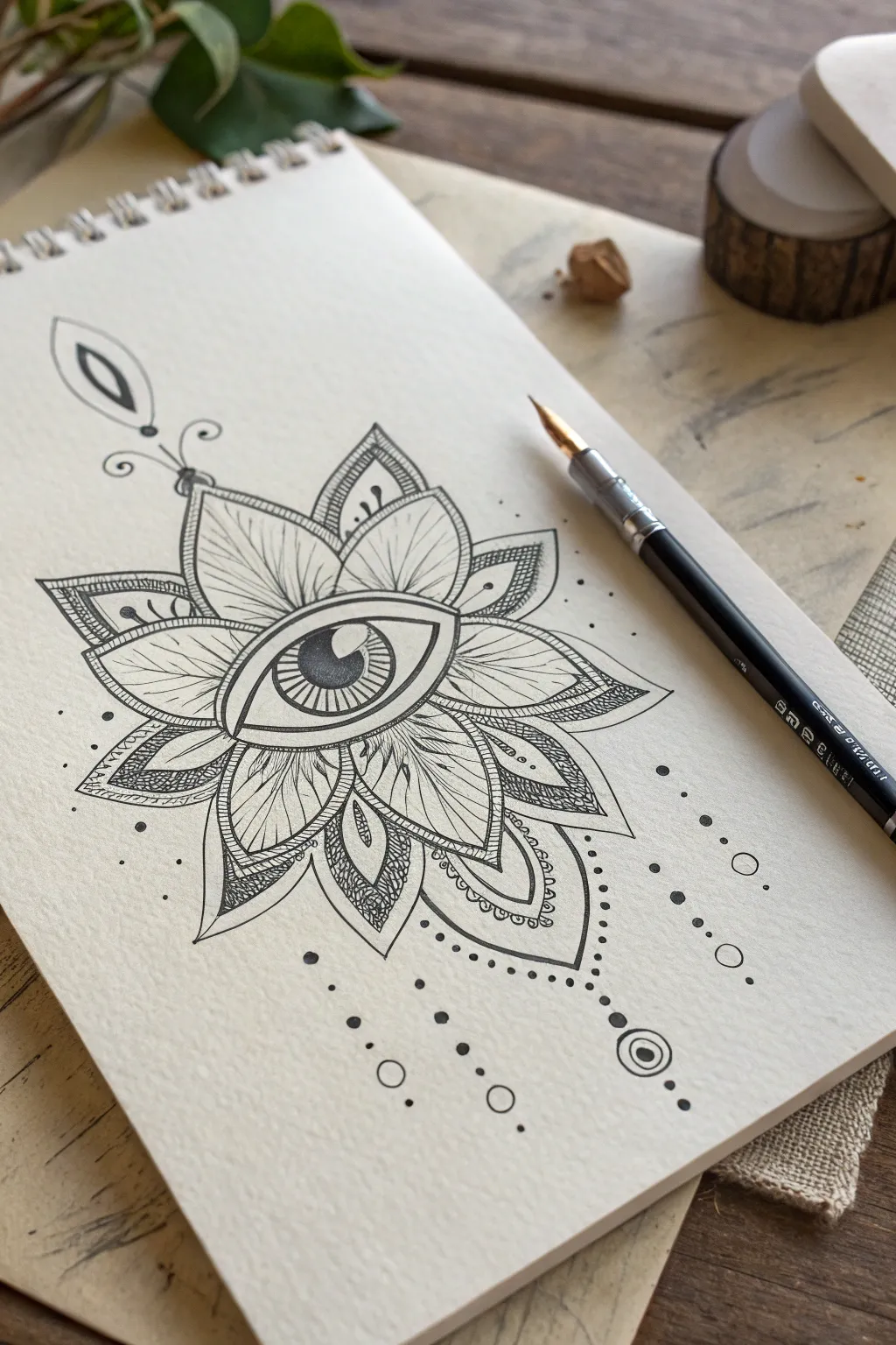
This striking blackwork design combines the symbolism of a protective eye with the organic beauty of a lotus mandala. The intricate line work and stippled shading create a mesmerizing, tattoo-ready piece perfect for practicing your fine motor control.
Step-by-Step
Materials
- Smooth heavyweight drawing paper or cardstock (hot press watercolor paper works well)
- Pencil (HB or 2H for light sketching)
- Eraser (kneaded eraser preferred)
- Fine liner pens (sizes 0.05, 0.1, 0.3, and 0.5mm)
- Ruler (optional, for symmetry)
- Compass (optional to establish the circle)
Step 1: Drafting the Structure
-
Establish the Center:
Begin lightly with your pencil. Find the center of your page and draw a faint horizontal line about 2 inches long. This will be the axis for the eye. Mark the center point of this line. -
Sketch the Eye Shape:
Draw an almond shape around your axis line. Make the upper curve slightly more pronounced than the lower curve to give it a natural but stylized look. Inside this, lightly sketch a large circle for the iris and a smaller one for the pupil. -
Map Out the Petals:
Radiating from the eye, sketch a series of petal shapes. Start with larger, pointed petals at the top, bottom, and sides. Then, fill the gaps between them with secondary, slightly smaller petals to create a full, blooming effect. -
Add Ornamental Details:
Above the top petal, sketch a teardrop shape suspended by a thin line. Below the bottom petals, draft vertical lines of varying lengths where the decorative dots and circles will hang.
Step 2: Inking the Core
-
Outline the Eye:
Switch to a 0.5mm fine liner. Go over the main almond shape of the eye, making the top lash line slightly thicker than the bottom. Carefully outline the iris and pupil circles. -
Iris Detail:
With a finer pen (0.1mm), draw radiating lines from the pupil to the edge of the iris. Leave a small, curvaceous white highlight shape cutting into the pupil and iris for reflection. -
Fill the Pupil:
Using your thickest pen or a black marker, color in the pupil solid black, being extremely careful not to ink over your white highlight area. -
Petal Outlines:
Use a 0.3mm pen to ink the main outlines of the petals. Double the line on the outer edge of the primary petals to create a border effect.
Pro Tip: Line Weight
Vary your pen pressure. Press harder on the outer edges of the petals and lighter on the internal details. This creates depth so the drawing doesn’t look flat.
Step 3: Intricate Detailing
-
Leaf Venation:
Inside the larger petals, draw a central vein line. From this vein, use a 0.05mm pen to flick very light, feathery lines outward to simulate leaf texture. Keep these lines swift and delicate. -
Stippling the Gaps:
Locate the smaller, secondary petals tucked between the main ones. Instead of lines, use stippling (lots of tiny dots) to fill these areas. Start densely at the base near the eye and fade the dots out as you move toward the tip. -
Adding Contrast:
Select specific sections of the petals—like the very tips or inner corners—and fill them with intricate hatch marks or tiny repeating semi-circles to add visual weight and texture. -
Top Ornament:
Ink the teardrop shape above the design. Draw a smaller teardrop inside it and fill the space between them in solid black. Add the two small swirls connecting it to the top petal.
Level Up: Gold Accent
Once the black ink is dry, use a metallic gold gel pen to fill in the pupil’s highlight or trace the inner veins of the petals for a luxurious, mystical touch.
Step 4: Finishing Touches
-
Hanging Decorations:
Moving to the bottom, carefully ink the vertical dotted lines. Use a larger pen size for the main dots and a smaller size for the trailing ones to create a tapered look. -
The Bottom Circles:
At the end of the central hanging line, draw a double circle (a bullseye shape) and fill the center dot. Keep your hand steady here to maintain symmetry. -
Outer Splatter:
Scatter a few tiny dots randomly around the perimeter of the drawing. I like to keep these sparse to give the feeling of energy radiating outward without cluttering the page. -
Clean Up:
Wait at least 10-15 minutes for the ink to cure completely. Then, gently erase all your pencil guidelines with a kneaded eraser to reveal the crisp blackwork.
Step back and admire the balance and symmetry of your stunning new protective talisman artwork
Floral Snake Wrap Concept
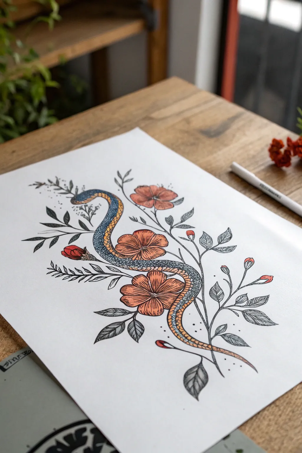
This elegant illustration combines the organic curves of a snake with delicate floral elements, making it a perfect concept for a wrap-around tattoo or framed botanical art. The piece features a textured, pointillism-style snake weaving through linework leaves and bold, rust-colored blossoms.
Detailed Instructions
Materials
- High-quality mixed media or drawing paper (smooth surface)
- HB or 2H pencil for sketching
- Fine liner pens (0.1mm, 0.3mm, 0.5mm) in black
- Colored pencils or alcohol markers (Rust/Terracotta, Mustard Yellow, Slate Blue)
- Kneaded eraser
- White gel pen (optional for highlights)
Step 1: Laying the Framework
-
Establish the curve:
Begin with your HB pencil, lightly sketching a large ‘S’ curve or sine wave in the center of your page. This will be the spine of the snake and defines the flow of the entire piece. -
Flesh out the snake:
Draw parallel lines on either side of your guide curve to create the snake’s body thickness. Taper the shape gently toward the tail and round it off at the head, keeping the width relatively consistent throughout the midsection. -
Position the flowers:
Sketch three large circles along the snake’s body where the main blooms will sit. Place one near the top loop, one in the middle intersecting the body, and one near the lower curve to create balance. -
Draft the foliage:
Extending from the main floral points, draw light stems reaching outward. Sketch simple leaf shapes attached to these stems, varying their angles to make them look windswept and natural.
Uneven Scales?
If your scale pattern gets messy, darken the area with more stippling (dots) to create a shadow. This hides imperfect lines while adding dramatic contrast.
Step 2: Inking the Details
-
Outline the snake:
Using a 0.3mm fine liner, carefully trace the outer contour of the snake. Be sure to stop your line where the flowers or leaves overlap the body, creating a sense of depth. -
Detail the flowers:
Switch to a 0.1mm pen for delicate floral work. Draw the petals with slightly jagged, organic edges rather than perfect circles. Add center lines radiating from the middle of each flower to suggest texture. -
Refine the leaves:
Ink the leaves with the 0.1mm pen. Use short, hatched lines for shading on one side of each leaf to give them dimension without coloring them in solid. -
Erase guidelines:
Once the ink is completely dry—give it a few minutes to be safe—gently roll your kneaded eraser over the entire drawing to lift the pencil sketch.
Add Some Shine
Use a white gel pen to add tiny, sharp highlights on the wettest-looking parts of the snake’s eyes or the center of the darkest scales for a glossy finish.
Step 3: Adding Texture and Pattern
-
Draw the scales pattern:
On the snake’s back (the top surface), draw a grid of small, interlocking diamond shapes. Keep these tight and consistent. -
Define the belly:
Draw the ventral scales (belly plates) as horizontal bands along the underside of the snake’s curves. This differentiation is crucial for showing the twisting motion. -
Apply pointillism:
Using your 0.1mm pen, add tiny dots (stippling) to the darker areas of the snake’s scales—specifically where the body curves away from the light. This creates a shadowed, rounded effect.
Step 4: Color Application
-
Color the belly:
Take a mustard yellow pencil or marker and fill in the belly scales. I like to keep the center of each scale lighter or uncolored to suggest a glossy highlight. -
Shade the snake’s back:
Use a slate blue or grey drawing tool to color the diamond pattern on the back. Apply more pressure near the edges of the snake for a 3D cylindrical look. -
Fill the blooms:
Color the flower petals with a rust or terracotta shade. Use light, sweeping strokes starting from the center and moving outward, leaving the tips slightly paler. -
Add accent buds:
If you sketched small buds at the ends of stems, color the tips of these with a touch of deep red or the same rust color used for the main flowers. -
Final touches:
Add a few scattered dots around the snake and flowers with your black pen to integrate the elements and add a bit of atmosphere to the white space.
Now you have a stunning botanical illustration ready to be framed or taken to a tattoo artist for your next appointment


Feather With Stipple Gradient
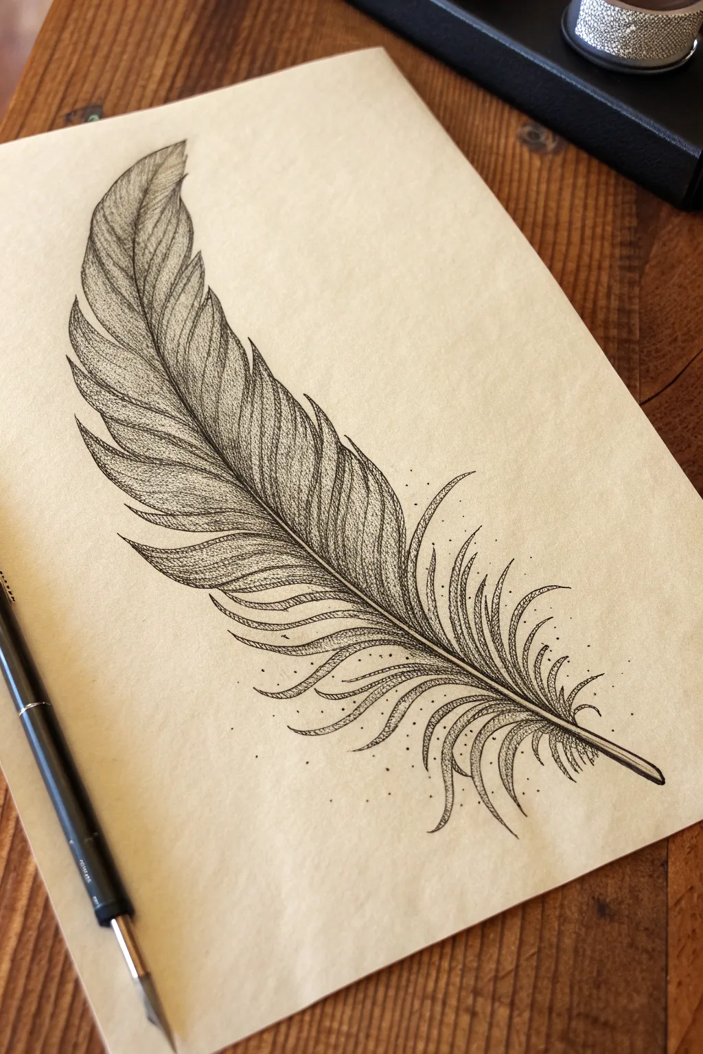
Master the delicate art of stippling with this elegant feather design, perfect for tattoo inspiration or standalone art. By combining fine linework with patient dotwork, you’ll create a beautifully textured gradient that gives the feather airy volume and depth.
How-To Guide
Materials
- Fine-tipped pigment liner pens (sizes 005, 01, and 03)
- Pencil (HB or 2H)
- Smooth bristol board or high-quality illustration paper (cream or tan toned paper works beautifully)
- Kneaded eraser
- Ruler (optional, for finding the center axis)
Step 1: Structural Sketching
-
Establish the Spine:
Begin by lightly sketching a curved line for the quill (rachis). Start from the bottom right and curve gently upwards toward the top left. This line dictates the flow of the entire feather, so keep your stroke fluid and light. -
Define the Outline:
Lightly draw the general shape of the feather’s vane. It should be wider at the base and taper to a point at the top. Don’t worry about perfect edges yet; simply map out the boundaries where the barbs will go. -
Segment the Barbs:
Sketch individual sections of barbs along both sides of the spine. Near the top, these should be tighter and smoother. Towards the bottom, draw them separating and fraying, creating loose, wispy curves that break away from the main shape. -
Refine the Splits:
Go back over your segments and add distinctive V-shaped gaps or splits in the upper part of the feather. This adds realism, as feathers naturally separate over time. Erase your outer boundary lines so only the segment shapes remain.
Keep it Vertical
Hold your stippling pen completely vertical, 90 degrees to the paper. Angled strokes create tiny dashes instead of perfect round dots, which ruins the smooth texture.
Step 2: Inking the Outlines
-
Trace the Quill:
Using your 03 pen (the thickest size), ink the central quill. Make the line thicker at the base and let it taper incredibly thin as it reaches the tip of the feather. -
Ink the Barb Edges:
Switch to the 01 pen. Carefully trace the edges of your barb segments. Use flicking motions at the tips of the frayed bottom sections to keep them looking sharp and hair-like rather than rounded. -
Add Inner Veins:
Draw faint lines running from the central quill outward into each barb segment. These lines should curve slightly upwards, following the direction of growth. Keep these lines broken and organic, not solid straight rulers.
Step 3: Stippling and Shading
-
Start the Darkest Areas:
Switch to your finest pen (005). Begin stippling (dotting) heavily right next to the central quill. This is where the shadow is deepest. The dots should be so close they almost touch, creating a near-black tone. -
Create the Gradient:
As you move outward from the quill toward the edge of the feather, spread your dots further apart. I often find it helpful to work in small circular clusters to avoid creating recognizable grid patterns. -
Shade the Overlaps:
Where one segment of the feather overlaps another (especially near the splits), add a concentrated area of dots on the ‘lower’ segment. This cast shadow creates the illusion of 3D layering. -
Texture the Upper Tips:
At the very top of the feather, use short, fine hatching lines mixed with dots. This indicates the tighter, smoother texture of the tip compared to the fluffy base. -
Detailing the Wisps:
For the loose, curly barbs at the bottom, use sparser stippling. Place dots only on the underside of the curves to give them volume without making them look heavy. -
Add External Particles:
To give the drawing a magical, suspended quality, add tiny dots floating around the loose bottom feathers. Vary their spacing to make it look like dust motes or pollen catching the light.
Uneven Gradients?
If your shading looks blotchy, don’t add more dark dots. Instead, add widely spaced dots into the lighter areas to bridge the gap and smooth the transition.
Step 4: Final Touches
-
Deepen Contrast:
Step back and assess your drawing. Look for areas that look too flat. Go back in with the 005 pen and add more dots to the deepest shadows near the spine to increase the contrast. -
Clean Up:
Once the ink is completely dry (give it a few extra minutes to be safe), gently erase all remaining pencil marks with the kneaded eraser. Roll the eraser over the paper rather than scrubbing to protect the paper tooth.
You now have a delicately detailed feather illustration ready to be framed or used as a reference for your next tattoo appointment
Feminine Profile With Flowers
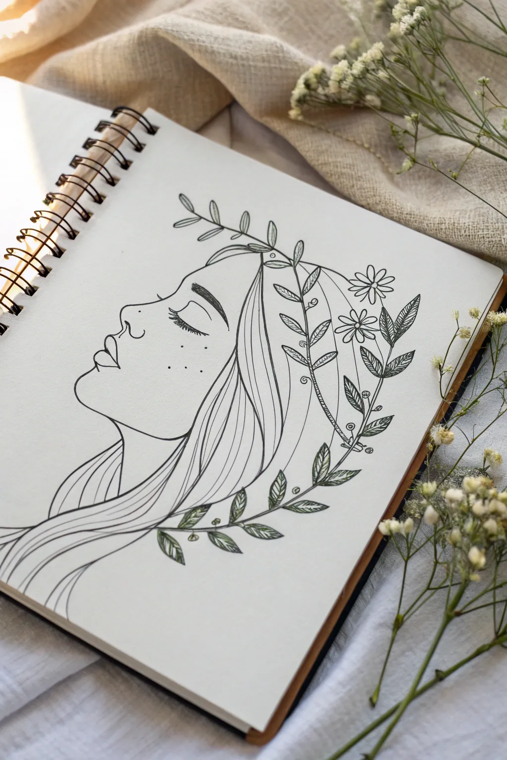
Capture quiet elegance with this delicate line art piece featuring a woman’s profile entwined with nature. Combining crisp ink work with subtle touches of color, this tutorial guides you through creating a peaceful, tattoo-style illustration perfect for your sketchbook.
Step-by-Step Guide
Materials
- Sketchbook or heavyweight drawing paper
- HB or 2B pencil for initial sketching
- Kneaded eraser
- Fine liner pens (sizes 0.1, 0.3, and 0.5)
- Green colored pencils (light sage and darker olive tones)
- White gel pen (optional for highlights)
Step 1: Sketching the Bones
-
Outline the profile:
Begin with a very light pencil sketch of the face profile facing left. Start with the forehead, curving gently down into the bridge of the nose. Keep your lines faint so they are easy to erase later. -
Define facial features:
Sketch the small upturn of the nose tip and the curve of the nostril. Move down to draw the lips, keeping them slightly parted or relaxed, and trace the curve of the chin flowing into the neck. -
Place the eye and brow:
Draw a closed eyelid as a simple, curved line halfway down the face. Add a few tiny lashes pointing downward. Position the eyebrow above it with short, feathery strokes to suggest texture. -
Map out the hair volume:
Lightly sketch the general shape of the hair. It should flow back from the forehead and sweep down the neck, framing the face without covering the profile.
Keep it Fluid
For smoother hair lines, draw from your shoulder rather than your wrist. This creates long, confident strokes instead of shaky, short ones.
Step 2: Inking the Portrait
-
Trace the profile line:
Switch to your 0.3 fine liner. Carefully ink the profile line you sketched, using a smooth, continuous stroke for the forehead, nose, and lips to keep it looking clean. -
Detail the face:
Switch to a delicate 0.1 pen for the finer details like the eyelashes and the small freckles on the cheek. I find that dotting the freckles randomly makes them look more natural. -
ink the hair strands:
Use the 0.5 pen for the main hair outlines to give them weight. Then, use the 0.3 pen to draw long, flowing lines inside the hair mass, curving them to show movement and volume.
Uneven Ink Flow?
If your fine liner skips, wipe the tip on a scrap paper. Avoid pressing down hard, as this damages the nib; hold the pen vertically for consistent flow.
Step 3: Adding the Botanical Elements
-
Sketch the floral crown:
Go back to your pencil. Draw a vine arching over her head and another sweeping below her hair. Add small leaf shapes along these stems and two simple daisy-like flowers near the back of the head. -
Ink the stems and flowers:
Use your 0.3 pen to trace the stems. For the flowers, draw clean petals radiating from a center circle. Don’t worry if they aren’t perfectly symmetrical; organic shapes look better. -
Detail the leaves:
Ink the leaf outlines. Inside each leaf, draw a central vein and add tiny hatching lines or texture to give them depth. Vary the leaf shapes—some rounded, some pointed—for visual interest. -
Erase pencil guides:
Once the ink is completely dry (wait at least 5 minutes to avoid smudging), gently erase all visible pencil lines with your kneaded eraser.
Step 4: Finishing Touches
-
Apply base color:
Take a light sage green pencil and shade the leaves gently. Don’t press too hard; you want a soft, washed-out look rather than intense saturation. -
Add depth with shading:
Use a darker olive green pencil to shade just the base of each leaf where it meets the stem. This gradient effect adds dimension to the flat line work. -
Refine the hair:
Check the hair lines. If some areas look too empty, add a few more ultra-fine strands with the 0.1 pen to bridge any gaps. -
Final assessment:
Step back and look at the balance. If the drawing needs more contrast, darken the main profile line slightly with the 0.5 pen to make the face pop against the delicate flowers.
Enjoy the calm feeling that comes with completing this serene nature-inspired portrait
Lioness With Floral Mane
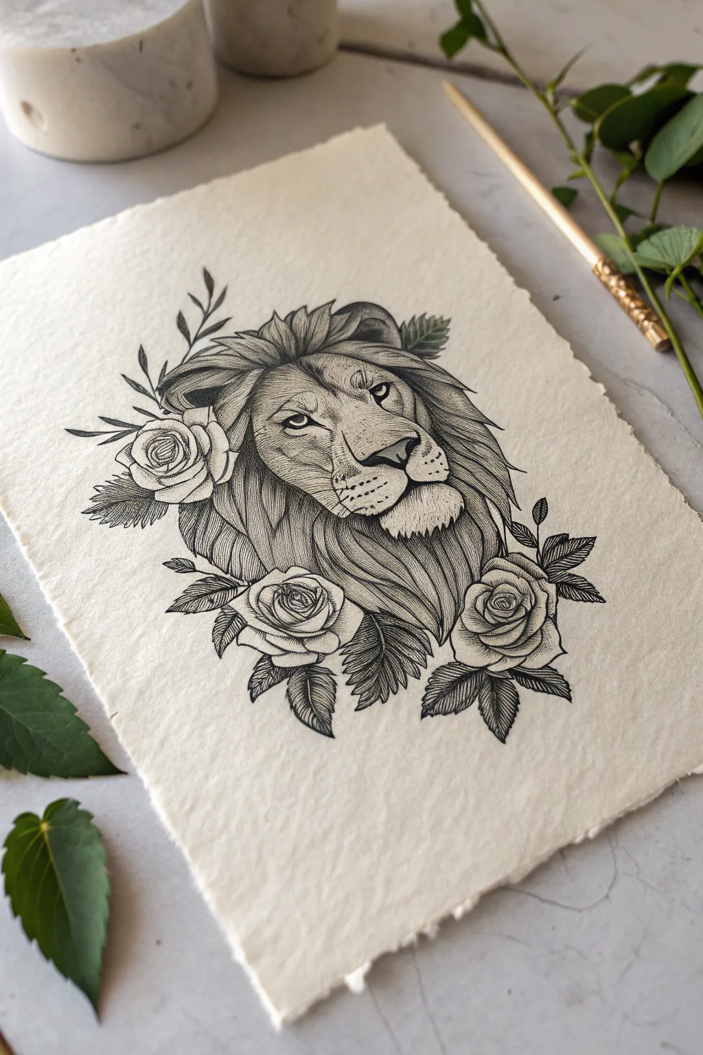
Capture the regal elegance of a lion intertwined with delicate roses in this intricate ink illustration. Using fine line work and stippling techniques on textured paper, you will create a piece that perfectly balances ferocity with floral softness.
How-To Guide
Materials
- Cold-pressed watercolor paper with deckle edge (approx. 300gsm)
- HB graphite pencil
- Kneaded eraser
- Fineliner pens (sizes 0.05, 0.1, 0.3, and 0.5)
- Ruler (optional for centering)
- Reference photo of a lion and roses
Step 1: Drafting the Composition
-
Establish the centerline:
Begin by lightly drawing a vertical centerline on your textured paper to ensure symmetry. Sketch a large oval for the lion’s head in the center, leaving ample space around the edges for the floral elements. -
Map facial features:
Divide the oval with horizontal guidelines for the eyes, nose, and mouth. Sketch the basic shapes of the eyes—almond-shaped and slightly angled—and place a triangle for the nose bridge leading down to the nose. -
Block in the mane:
Loosely sketch the flowing shapes of the mane surrounding the face. Focus on big, sweeping curves rather than individual hairs at this stage to establish the volume. -
Position the florals:
Indicate the position of the three main roses: one tucked behind the ear on the upper left, and two larger blooms framing the bottom of the mane. Sketch simple circles to represent their placement. -
Detail the sketch:
Refine your pencil sketch. Define the lion’s pupils, nostrils, and muzzle texture. Then, draw the petals of the roses, starting from the tight center spiral and working outward to larger, unfolding petals. Add leaf shapes peeking out from behind the flowers.
Uneven Stippling?
If your dots look messy or clumpy, slow down. Keep your pen vertical to the paper and touch down lightly. Don’t press hard or drag the nib, as this creates comma shapes instead of dots.
Step 2: Inking the Lion
-
Outline the eyes:
Switch to a 0.1 fineliner. Carefully outline the eyes and pupils, leaving a tiny white highlight in each pupil to bring the lion to life. Darken the upper lash line to add intensity. -
Define the face structure:
Use the 0.1 pen to trace the nose and muzzle. Use broken, short lines for the bridge of the nose to suggest short fur rather than a solid hard line. -
Shade the face with stippling:
With a 0.05 pen, add shading to the muzzle and around the eyes using stippling (tiny dots). Concentrate the dots under the eyes and on the sides of the nose to create depth. I find this patience-testing step crucial for a realistic texture. -
Ink the mane’s contours:
Using a slightly thicker 0.3 pen, draw the main flowing locks of the mane. Use long, confident strokes that taper at the ends to mimic hair. -
Create hair texture:
Switch back to the 0.1 pen to fill in the mane sections. Use hatching—closely spaced parallel lines—following the curve of each lock of hair. Leave some areas sparse to represent distinct highlights.
Step 3: Inking the Florals
-
Outline rose petals:
Use the 0.3 pen to outline the roses. Keep your lines slightly organic and wavy to mimic the soft nature of petals, avoiding rigid geometric curves. -
Shade the inner petals:
With the 0.05 pen, add delicate hatching marks at the base of each petal where it overlaps with another. These lines should flick outward and fade, showing the curvature and depth of the bloom. -
Ink the leaves:
Outline the leaves with the 0.3 pen. Draw a central vein down each leaf, then add serrated edges if your specific leaf typeres requires it, or keep them smooth. -
Detail leaf shading:
Use the 0.1 pen to fill the leaves with fine, diagonal shading lines. Make one half of the leaf slightly darker than the other to simulate light hitting the surface.
Mastering Fur Texture
Always pull your pen strokes in the direction the hair grows. Lift the pen at the end of every stroke to create a tapered, natural-looking hair tip rather than a blunt line.
Step 4: Final Touches
-
Deepen the shadows:
Take your 0.5 fineliner and identify the darkest areas: inside the nostrils, the deep crevices of the mane, and the spaces between the leaves and roses. carefully fill these in solid black to make the drawing pop. -
Refine whisker spots:
Add the whisker spots on the muzzle using the 0.3 pen. You can add faint, long whiskers with a quick flick of the 0.05 pen, but be careful not to overdo them. -
Clean up:
Once you are absolutely certain the ink is dry (wait at least 15 minutes), gently erase all underlying pencil marks with the kneaded eraser to reveal the crisp black and white contrast.
Frame this regal piece or gift it to someone who embodies the lion’s strength and beauty.
Bee And Wildflower Mini Tattoo Sketch
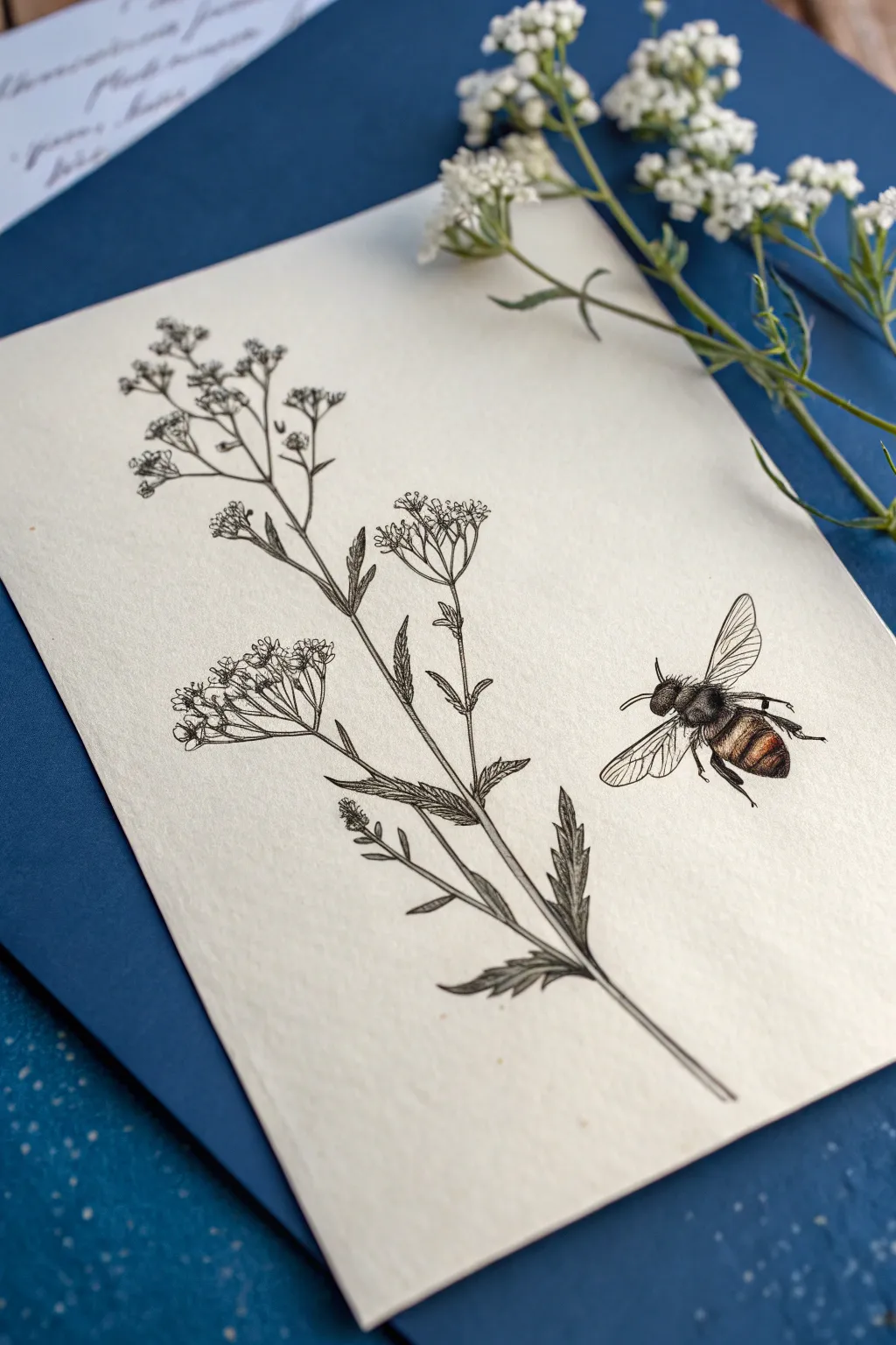
Capture the delicate beauty of meadow flora with this refined ink illustration featuring a sprig of wildflowers and a detailed honeybee. The stark black striations contrast beautifully with the warm, subtle coloring of the insect, making it perfect for tattoo inspiration or framed art.
Detailed Instructions
Materials
- Cream or off-white textured cartridge paper (A5 size)
- Fine liner pens (sizes 0.05, 0.1, and 0.3mm)
- H or HB pencil for sketching
- Kneadable eraser
- Watercolor pencils (burnt sienna, golden yellow, black)
- Fine detail brush or water brush pen
Step 1: Drafting the Composition
-
Establish the stem line:
Begin by lightly sketching a long, slightly curved diagonal line from the bottom center toward the top left. This serves as the main stem of your wildflower. Add minor branching lines shooting off to the sides where the flower clusters will sit. -
Rough in the flower heads:
At the ends of your branches, sketch loose inverted triangle shapes or umbrellas. These don’t need to be detailed yet; they are just placeholders for the umbel flower structures. -
Outline the leaves:
Draw jagged, fern-like leaf shapes lower down on the stem. Keep the lines faint so they can be easily adjusted or erased later. -
Position the bee:
To the right of the main stem, sketch an oval for the bee’s thorax and a slightly larger, pointed oval for the abdomen. Add the wings extending upwards and back, checking the proportions against your flower sketch.
Steady Hand Trick
To prevent smudging your fine linework, place a scrap piece of paper under your drawing hand. Only lift it when you move to a new area.
Step 2: Inking the Wildflower
-
Detail the flower clusters:
Using a 0.05mm fineliner, start inking the tiny individual blooms within your umbrella shapes. Draw small, four or five-petaled circles clustered together. Keep them loose and slightly imperfect for a natural look. -
Connect the stems:
Switch to a 0.1mm pen to draw the stems connecting the flower clusters to the main stalk. Use broken or slightly wavy lines to suggest texture, rather than a single rigid stroke. -
Ink the leaves:
Outline the jagged leaves with the 0.1mm pen. Add a central vein to each leaf segment, but don’t connect it all the way to the tip—let the line fade out. -
Add texture and shading:
Using the 0.05mm pen again, add hatch marks (very fine parallel lines) to the underside of the leaves and the shaded side of the stem. This stippling effect creates volume and depth. -
Darken the main stalks:
Go over the main stem once more with a 0.3mm pen on the shadowed side only to give it weight and ground the plant.
Step 3: Bringing the Bee to Life
-
Outline the bee anatomy:
Trace your pencil sketch of the bee with the 0.05mm pen. Be extremely delicate with the legs; use tiny segments to show the joints. -
Texture the fur:
Instead of solid lines, use rapid, short flicking motions to ink the thorax (the middle section). This mimics the fuzzy texture of a bumblebee. -
Detail the wings:
Draw the main veins of the wings with steady, long strokes. Add very faint, thinner veins branching off. I like to keep the wing outline slightly broken to suggest transparency. -
Color the abdomen:
Lightly shade the stripes on the bee’s abdomen using burnt sienna and golden yellow watercolor pencils. Do not press hard; you want a wash of color, not a waxy layer. -
Activate the color:
Use a barely damp brush to blend the watercolor pencil pigment. Drag the color slightly into the uncolored areas to create a round, highlighted 3D effect. -
Final contrast:
Once the watercolor is dry, use the 0.3mm pen to darken the black stripes on the bee and the eyes. This high contrast makes the insect pop off the page.
Vintage Vibe
Stain your paper with strong black tea and let it dry before starting. This creates an aged, botanical textbook look that suits this style perfectly.
Now you have a timeless botanical study ready to be transferred to skin or framed on a wall
Birth-Flower Stem Lineup
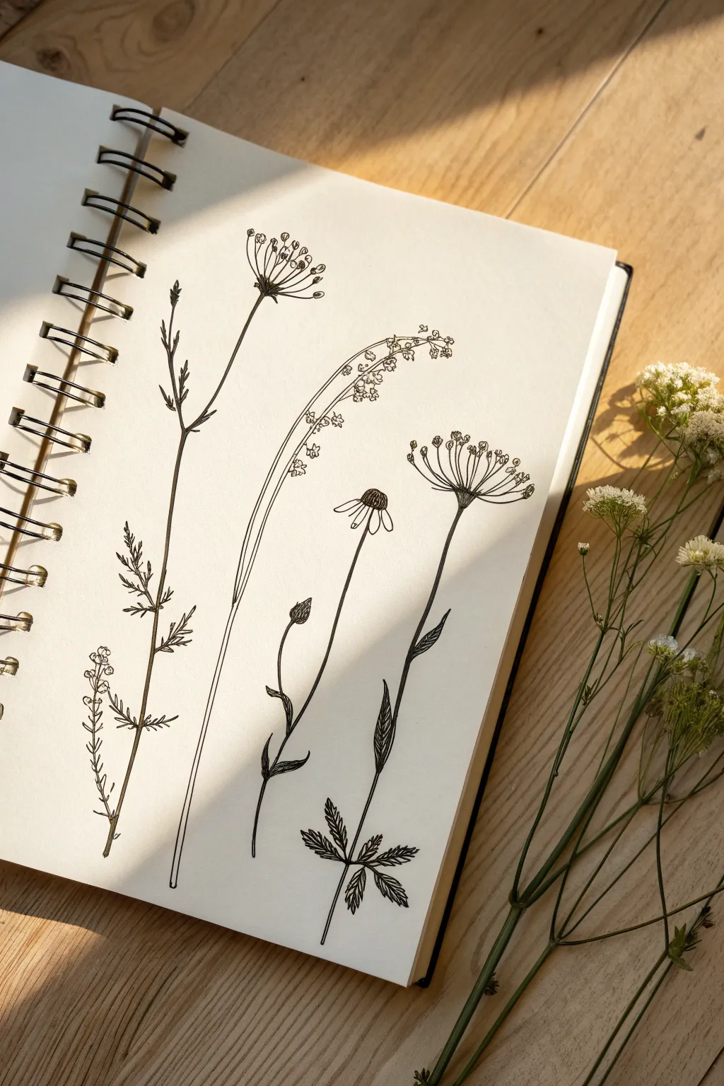
This elegant botanical spread captures five distinct wildflowers in fine black ink, creating a minimalist yet detailed composition perfect for tattoo inspiration. The high-contrast black lines against the cream paper offer a timeless aesthetic that celebrates the delicate structure of stems and petals.
Step-by-Step
Materials
- Fine liner pens (sizes 0.05, 0.1, and 0.3mm)
- Pencil (HB or 2H for sketching)
- Kneadable eraser
- Smooth bristol or mixed media paper sketchbook
- Ruler (optional for spacing)
Step 1: Planning the Composition
-
Map out the stems:
Begin by lightly sketching five vertical guide lines with your pencil. Vary their heights and curvatures slightly—make the second stem from the left the tallest and straightest, while curving the third stem dramatically to the right to create a natural, organic flow. -
Mark flower heads:
At the top of each stem line, sketch rough geometric shapes to indicate where the flower heads will go. Use circles for the first and last flowers, a fan shape for the second and fifth, and a drooping curve for the middle stem. -
Indicate leaf placement:
Lightly mark small dashes along the stems where leaves will branch out. Keep the spacing irregular to mimic nature; cluster more foliage near the bottom of the first and last stems.
Uneven Lines?
If your long stem lines are wobbly, don’t worry. Natural stems aren’t perfect pipes. Simply thicken the line slightly at the ‘wobble’ point to simulate a natural knot or bump in the plant stem.
Step 2: Inking the First Two Stems
-
Stem 1: Lower foliage:
Using a 0.1mm pen, draw the leftmost stem. Start at the bottom with the tiny, clustered leaves. Use short, disjointed strokes to create a texture that looks like heather or lavender foliage. -
Stem 1: Upper details:
Extend the main line upward, drawing thin, jagged branches. The top should remain relatively sparse with just a few vertical shoots. -
Stem 2: The Umbels:
Move to the second stem. Draw the main stalk with a steady hand. For the flower head, draw several straight lines radiating from a single point like an umbrella frame. At the end of each spoke, add tiny circles or clusters of dots to represent the florets. -
Stem 2: Leaves:
Add the leaves lower down on the second stem. These should be thin and lance-shaped, pointing upwards.
Step 3: Inking the Central & Right Stems
-
Stem 3: The droop:
Draw the third stem with a long, graceful curve bending right. This is a grass-like plant, so keep the stem very thin. I usually carefully double the line here to give it just a hint of thickness without making it heavy. -
Stem 3: Texturing:
Along the curved upper section, add tiny clusters of flowers using a loose stippling motion. These should hang downwards from the main stem. -
Stem 4: The Daisy:
For the fourth flower, draw a distinct oval center first. Fill it with tiny cross-hatching to create a seed texture. Draw simple, slightly drooping petals radiating downward from this center. -
Stem 4: Curving the stem:
Draw the stem for the daisy with a slight S-curve. Add a single bud halfway down by drawing a small teardrop shape with a textured top. -
Stem 5: The final bloom:
The last flower on the right reflects the second one but is lower. Draw the radiating ‘umbrella’ spokes again. At the base of the spokes, darken the junction with a little extra ink to show depth. -
Stem 5: Base leaves:
At the very bottom of this final stem, draw palmate leaves (shaped like a hand). Use jagged edges on the leaves to give them a realistic, serrated look. Shade the center of these leaves with fine hatching lines.
Level Up: Vintage Feel
To give the drawing an old-school field guide look, write the Latin scientific name of each flower in small, cursive script horizontally at the base of each stem.
Step 4: Refining and Finishing
-
Weight variation:
Switch to your 0.3mm pen. Carefully re-trace the shadow side (usually the right side) of the main stems to add subtle weight and dimension. This prevents the drawing from looking too flat. -
Clean up:
Wait for the ink to dry completely—give it at least 10 minutes to avoid smudges. Then, gently erase all your pencil guides with the kneadable eraser. -
Final assessment:
Look for any gaps in your lines or areas that need a bit more contrast. You might add a few extra dots to the flower centers or darken the connection points where leaves meet stems.
You now have a beautifully composed botanical study ready for framing or your next tattoo consultation
Negative-Space Leaf Silhouette Sketch
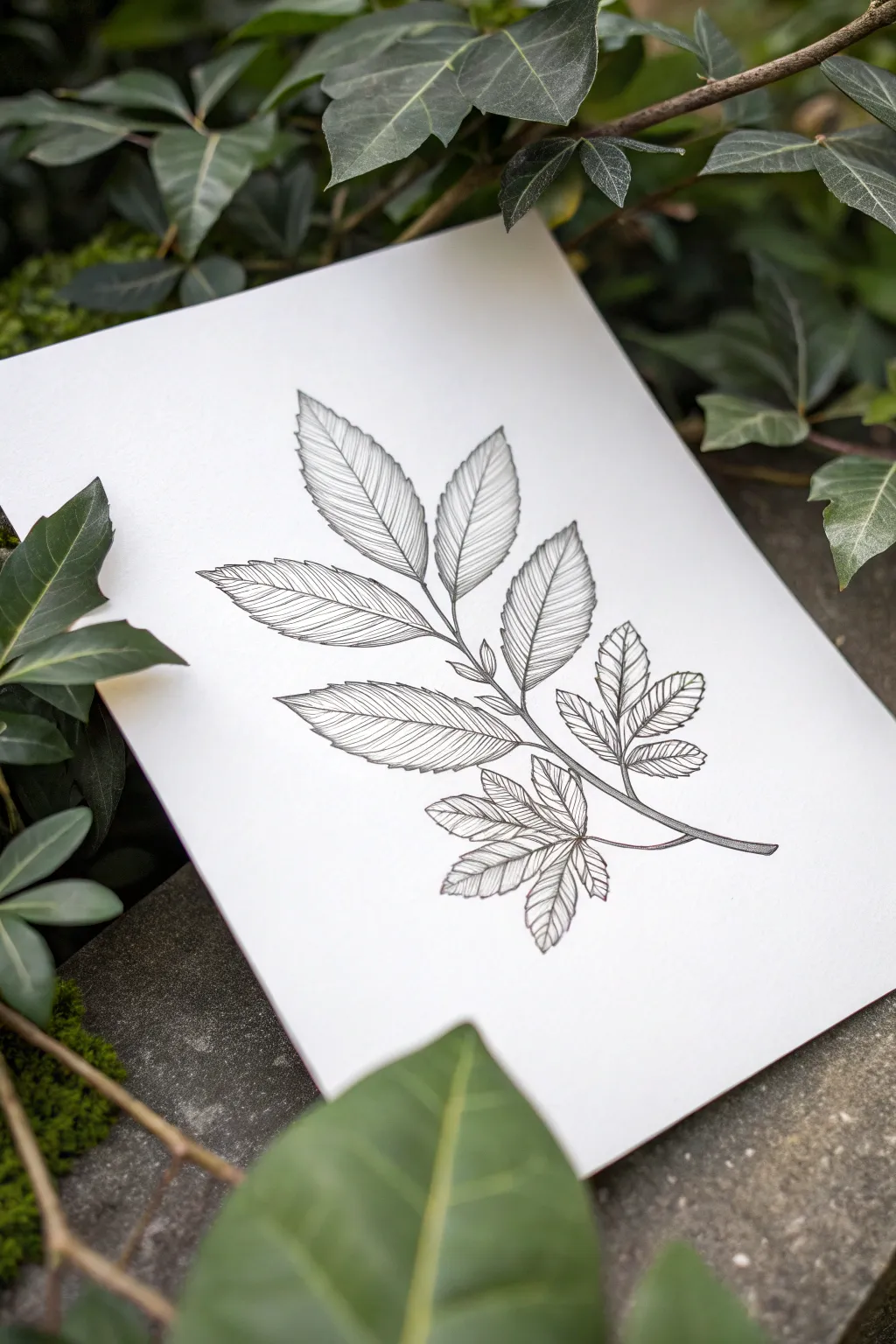
Capture the delicate structure of nature with this refined ink leaf study. Using precise hatching techniques and varying line weights, this project creates a sophisticated botanical illustration perfect for framing or as a tattoo concept.
Detailed Instructions
Materials
- High-quality Bristol board or smooth drawing paper
- HB graphite pencil
- Kneaded eraser
- Fine liner pens (sizes 0.05, 0.1, and 0.3mm)
- Ruler (optional for stem alignment)
- Reference photo of a compound leaf (ash or walnut)
Step 1: Structural Sketching
-
Establish the axis:
Begin by lightly drawing a curved central line to serve as the main stem (rachis). The curve should be gentle, creating a feeling of natural movement rather than a stiff straight line. -
Map the leaflets:
Along this central axis, mark pairs of points where the individual leaflets will attach. For this compound leaf structure, you will want roughly five to seven leaflets, with a single terminal leaflet at the very tip. -
Outline the leaflet shapes:
Using your HB pencil, sketch the basic almond or lanceolate shapes of the leaves. Keep your hand loose; these are just guides. The leaves near the base can be slightly smaller or angled downwards. -
Refine the serrations:
Go back over your smooth outlines and add the serrated (toothed) edges. Make these teeth small and consistent, pointing toward the tip of each leaf. This creates the realistic botanical texture. -
Draw the veins:
Lightly sketch a central vein down the middle of each leaflet. Then, indicate the secondary veins branching off towards the edges. Don’t press too hard, as these graphite lines will be erased later.
Ink Smearing?
If your hand drags ink, place a clean scrap piece of paper under your drawing hand. Work from left to right (if right-handed) to keep your palm off fresh lines.
Step 2: Inking the Outline
-
Main stem inking:
Switch to your 0.3mm pen. Carefully trace the main stem, thickening the line slightly at the base where it would attach to the branch. This heavier line weight anchors the drawing. -
Outline the leaflets:
Using a 0.1mm pen, trace the serrated edges of each leaflet. The line should be clean but can have tiny breaks or variations to suggest light hitting the edge. Avoiding a perfectly uniform wire-like line adds organic character. -
Erase pencil guides:
Once the ink is completely dry—I usually wait at least five minutes to be safe—gently roll your kneaded eraser over the drawing to lift all the graphite marks. This leaves you with a clean slate for texturing.
Step 3: Texture and Shading
-
Understanding the texture:
The unique look of this drawing comes from the shading style. Instead of solid shading, you will use fine, closely spaced parallel lines (hatching) that follow the direction of the veins. -
Start the hatching:
Switch to your finest pen, the 0.05mm. Start with the top terminal leaf. Draw very fine lines branching from the central vein out to the leaf edge, mimicking the angle of secondary veins. -
Build density:
Group these fine lines closely together. In the reference image, the lines are straight and parallel to each other within each section of the leaf blade. This creates a striated, almost engraving-like effect. -
Create depth:
Where the leaf should be darker (near the central vein or where one leaf overlaps another), simply place your hatching lines closer together. You don’t need to cross-hatch; density alone will create the shadow. -
Leaves on the left:
Work your way down the left side of the stem. Ensure your hatching lines follow the curve of the leaf surface. If a leaf twists slightly, your lines should curve slightly to match that volume. -
Leaves on the right:
Repeat the process for the right-side leaflets. Pay special attenton to the smaller, bottom-most leaves. These often look more detailed because they are closer to the viewer’s eye level in a botanical study. -
Stem detailing:
Return to the main stem with your 0.05mm pen. Add tiny stippling dots or very short dashes along one side of the stem to give it roundness and cylindrical volume. -
Final assessment:
Step back and look at the overall contrast. If some leaves look too ‘flat,’ go back in with the 0.05mm pen and add a few more lines in the deepest shadow areas to increase the contrast range.
Add a Splash
Scan your drawing and print it onto watercolor paper. Add a loose wash of green watercolor over the ink for a mixed-media botanical art piece.
You now have a crisp, elegant botanical illustration that showcases the beauty of simple line work
Sketchy Clock With Florals
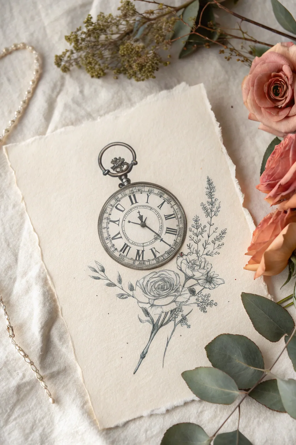
This tutorial guides you through creating an elegant, tattoo-style illustration featuring an ornate pocket watch resting atop delicate floral blooms. Using fine liners on textured paper, you’ll achieve that classic, illustrative look perfect for tattoo inspiration or framing.
Step-by-Step
Materials
- High-quality textured paper (e.g., cold press watercolor paper or handmade cotton paper)
- HB or 2H graphite pencil for sketching
- Kneaded eraser
- Fine liner pens (sizes 0.05, 0.1, 0.3, and 0.5)
- Ruler
- Compass or circle template
Step 1: Laying the Foundations
-
Map the composition:
Start by lightly marking the center of your paper. Draw a vertical line to help align the watch stem with the flower stem below. -
Create the watch circles:
Using a compass, draw two concentric circles for the watch body. The gap between them should be wide enough to house the Roman numerals later. -
Add the inner detail circles:
Draw a smaller third circle inside the face for the minute track, and a tiny central circle where the hands will originate. -
Sketch the watch hardware:
At the top of the outer circle, sketch the winding stem base and the ornate loop (bow). Keep the lines loose; we will refine the metallic texture later. -
Block in the florals:
Below the watch, sketch a rough oval for the main rose head and smaller circles for the buds on the right. extend sweeping lines downward for the stems and leaves to establish flow.
Ink Smearing?
Work from the top left to bottom right (if right-handed) to avoid smudging wet ink. If unsure, place a piece of scrap paper under your hand.
Step 2: Detailed Pencil Sketching
-
Draft the numerals:
Use your ruler to mark twelve evenly spaced points on the dial track. Lightly sketch in the Roman numerals (I through XII), focusing on consistent height and vertical alignment. -
Place the hands:
Draw the hour and minute hands. For visual interest, I like setting them to a time that doesn’t obscure the numerals too much, like 10:10 or roughly 8:20 as shown. -
Refine the rose petals:
Flesh out the main rose by drawing spiral-like shapes from the center outward. Add layers of overlapping petals that unfurl naturally. -
Add floral accents:
Detail the smaller buds and sprigs of leaves on the right side. Add texture to the leaves with jagged edges and central veins.
Step 3: Inking the Watch
-
Outline the rim:
Switch to a 0.5 pen for the watch’s outer rim. Use broken lines or cross-hatching to suggest a metallic texture rather than a solid black line. -
Ink the numerals:
Using a 0.3 pen, carefully trace the Roman numerals. Add small serifs to the ends of the strokes for a classic typography look. -
Draw the hands:
Fill in the watch hands with the 0.5 pen. Make the shapes ornate, perhaps adding a small diamond shape near the tip of the hour hand. -
Create the minute track:
With your finest 0.05 pen, add the tiny tick marks between the numerals and the inner circle. -
Shade the metal:
Add shading to the loop and stem using fine, closely spaced parallel lines (hatching) to create the illusion of rounded, shiny metal.
Adding Dimensions
Use a diluted grey watercolor wash or alcohol marker over the shadowed areas of the rose to give the tattoo sketch a 3D pop.
Step 4: Inking the Florals & Finishing
-
Outline the petals:
Use a 0.1 pen for the flowers. Keep your hand loose and let the line weight vary; slightly wobbly lines look more organic and petal-like. -
Add depth to the rose:
Use stippling (lots of tiny dots) or very fine hatching with the 0.05 pen at the base of the petals and deep in the rose center to create shadow. -
Detail the foliage:
Ink the leaves and stems. I suggest using a single, confident stroke for the main stem, then using short, quick strokes for the feathery details on the smaller sprigs. -
Connect the elements:
Ensure the bottom of the watch visually rests on the rose by darkening the shadow where they overlap. -
Erase and assess:
Wait for the ink to be completely dry. Gently erase all pencil guidelines with the kneaded eraser to reveal the clean illustration.
Now you have a stunning, intricate design that captures the beauty of time passing.
Have a question or want to share your own experience? I'd love to hear from you in the comments below!