If you’re in the mood to draw something sweet and meaningful, teacher drawing ideas are the perfect mix of simple shapes and big-hearted symbolism. I love how a few classic classroom icons can instantly say thank you in a way that feels personal.
Teacher at the Board Mini Portrait
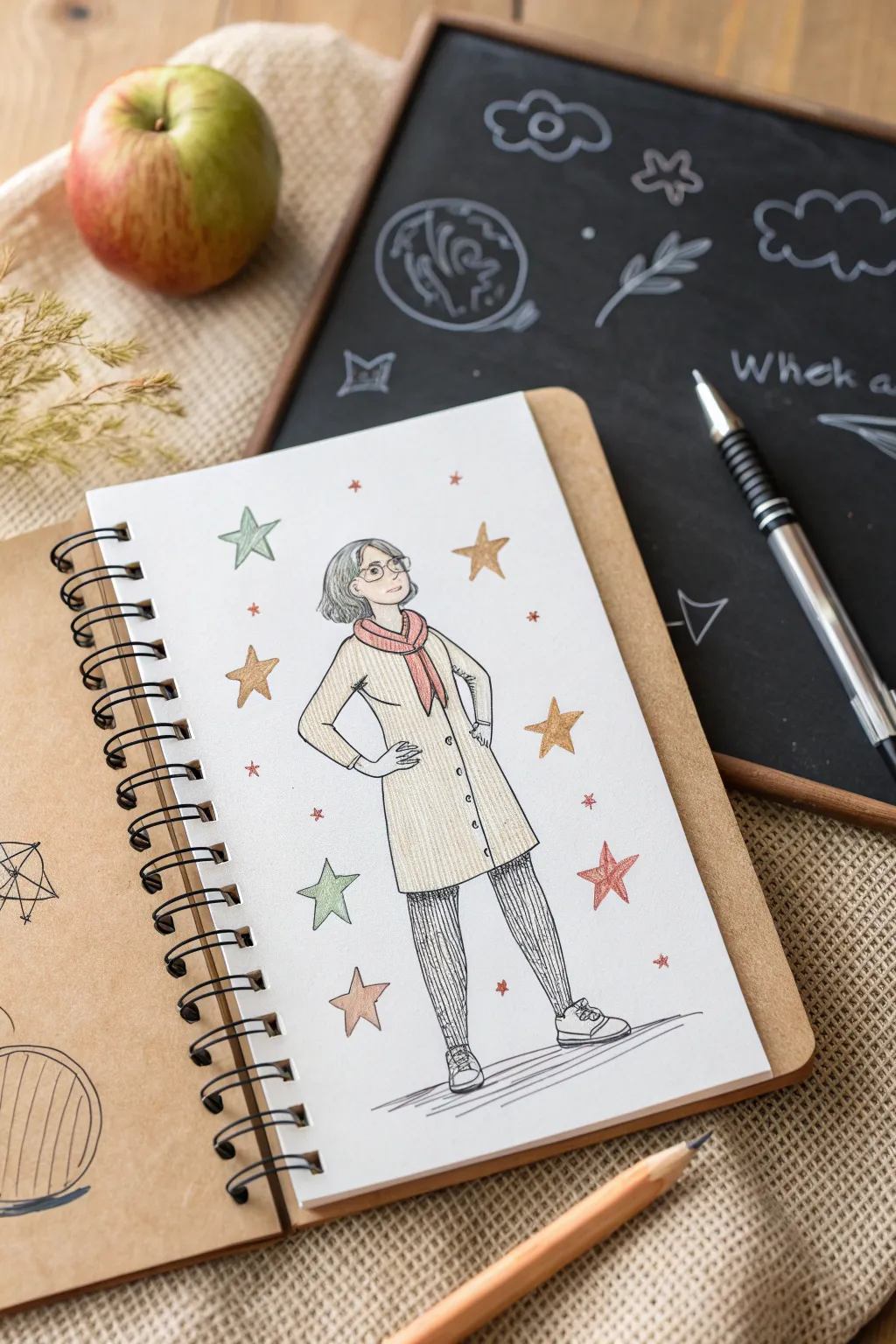
Celebrate an educator’s influence with this charming, slightly whimsical full-body portrait sketch. Using simple colored pencils and ink, you’ll capture a confident pose surrounded by a constellation of colorful stars.
How-To Guide
Materials
- Spiral-bound sketchbook with tan/kraft paper cover
- HB graphite pencil
- Eraser
- Fine-liner pen (0.3mm or 0.5mm, black)
- Colored pencils (cream/beige, salmon pink, grey, olive green, muted gold/yellow, teal)
- White or light grey paper (smooth texture)
Step 1: Drafting the Figure
-
Establish the pose:
Begin lightly with your HB pencil. Draw a central vertical line to help with balance. Sketch a simple oval for the head near the top third of the page, leaving plenty of room above for stars. -
Map the body structure:
Sketch a trapezoid for the torso and connect it to the head with a short neck. Draw the arms clearly: place hands on the hips to create triangular shapes with the elbows. This ‘power pose’ gives the teacher character. -
Add the legs:
Extend two lines downward for the legs. Keep them straight but slightly parted for a stable stance. Sketch simple oval shapes for the shoes at the bottom. -
Define the clothing:
Layer the coat over the torso. Draw the hemline falling just above the knees. Add a collar and a scarf wrapped loosely around the neck. Don’t worry about buttons yet; focus on the silhouette. -
Detail the face and hair:
Sketch a bob haircut that frames the face. Add round glasses and simple facial features—a small nose and a confident, slight smile.
Step 2: Inking the Lines
-
Outline the main figure:
Switch to your black fine-liner. Trace your pencil lines with confident strokes. For the coat, use slightly looser lines to suggest fabric movement. -
Add clothing details:
Ink the buttons down the center of the coat. Add small fold lines at the elbows and where the hands meet the hips to show the fabric bunching slightly. -
Texture the pants:
Instead of solid black, use vertical hatching lines to shade the pants. This gives them a textured, perhaps tweed or corduroy appearance, contrasting with the smooth coat. -
Draw the shoes:
Outline the sneakers carefully, adding laces and the rubber sole detail. -
Ground the figure:
Sketch horizontal, scratchy lines beneath the feet to create a shadow and floor, so the figure isn’t floating in space. -
Erase pencil marks:
Once the ink is completely dry/set, gently erase all the underlying graphite sketch lines to leave a clean drawing.
Uneven Ink Lines?
If your hand shakes or lines look wobbly, embrace it! A shaky line adds organic, hand-drawn character. Just thicken the line slightly in that spot to hide unintentional jogs.
Step 3: Adding Color
-
Color the coat:
Use a cream or beige colored pencil to fill in the coat. Use vertical strokes to mimic the weave of the fabric, keeping the pressure even but light. -
Fill the scarf:
Apply a salmon pink or soft red to the scarf. You can press a bit harder here to make it a focal point against the neutral coat. -
Shade the hair and pants:
Lightly go over the hair with grey, leaving a few white spots for highlights. Add a very light wash of grey over the inked pants to darken them slightly without obscuring the ink texture. -
Add skin tones:
lightly fill in the face and hands with a skin-tone pencil suitable for your subject.
Pro Tip: Color Harmony
Limit your color palette to 4-5 shades. reusing the scarf color for some of the stars ties the foreground figure to the background elements, making the piece feel unified.
Step 4: Starry Embellishments
-
Draw the stars:
Using your fine-liner again, draw several five-pointed stars scattered around the figure. Vary their sizes—some large, some tiny specks. -
Color the stars:
Select a palette of muted gold, olive green, teal, and the same pink from the scarf. Fill in the stars, distributing the colors randomly so no two same-colored stars are right next to each other. -
Final touches:
Re-assess the drawing. If the coat looks too flat, I sometimes add a second layer of beige just on the sides to create a subtle shadow effect.
Now you have a whimsical, personalized teacher portrait ready to gift or display


Hand-Lettered Teacher Appreciation Card Layout

Create a heartfelt keepsake for your favorite educator with this clean and charming hand-lettered card design. Featuring playful serif typography surrounded by simple line-art foliage and fruits, this project balances rustic warmth with a polished, professional look.
Step-by-Step Tutorial
Materials
- White cardstock or heavyweight mixed media paper (5×7 inches folded)
- Pencil (HB or similar for sketching)
- Kneaded eraser
- Fine liner pens (Black, 0.3mm and 0.5mm)
- Colored markers or brush pens (Navy Blue, Rust Red/Burgundy, Sage Green, Golden Yellow)
- Ruler
Step 1: Planning and Layout
-
Prepare the card base:
Begin by folding a piece of high-quality white cardstock to your desired size, typically 5×7 inches. Ensure the crease is crisp by running a bone folder or the back of a spoon along the fold. -
Establish the baselines:
Using your ruler and a pencil with very light pressure, draw two horizontal guidelines in the center of the card. These will serve as the baselines for the words ‘BEST’ and ‘TEACHER’. -
Sketch the typography:
Lightly pencil in the word ‘BEST’ on the top line. Aim for a classic serif font style where the letters are slightly widely spaced. Center this word horizontally. -
Add the second line text:
Below the first line, pencil in ‘TEACHER’ in a slightly larger serif font. Ensure the letters are evenly spaced and that the entire word extends wider than the word ‘BEST’ above it, creating a pleasing visual hierarchy.
Step 2: Inking the Lettering
-
Outline the top text:
Switch to your navy blue marker or fine liner. Carefully trace over your penciled ‘BEST’ letters. I like to thicken the downstrokes slightly to give the letters more weight and a traditional serif feel. -
Outline the bottom text:
Using a rust red or burgundy marker, trace the word ‘TEACHER’. Make these letters bold and confident, adding distinct serifs (the little feet) at the ends of the strokes. -
Add decorative dots:
Between the two text lines, use a fine-tip pen (gold or light brown works well) to create a horizontal row of small, evenly spaced dots. Add a second row of dots directly below the word ‘TEACHER’ to frame the text block. -
Erase guidelines:
Wait until the ink is completely dry to avoid smudging. Then, gently use your kneaded eraser to lift away the pencil guidelines and sketch marks from the text area.
Keep It Loose
Don’t worry about perfect symmetry. Wobbly lines on the apples and leaves add hand-drawn charm that makes the card feel warmer.
Step 3: Drawing the Illustrations
-
Sketch the main icons:
Lightly pencil a few key shapes around the text: an apple outline to the left of ‘BEST’, another apple to the right, and a small pumpkin in the bottom right corner. -
Add foliage shapes:
Fill in the empty white space with simple leaf outlines. Draw oval shapes with pointed tips above the text and near the bottom left corner. Vary their angles to create movement. -
Ink the apples:
Use a fine liner (brown or heavily muted red) to draw the apple outlines. Instead of perfect circles, give them slightly bumpy, organic shapes. Add a small stem and a single leaf to each. -
Detail the pumpkin:
For the bottom right pumpkin, use the rust red marker to draw a solid, rounded shape. Add curved white lines (or leave negative space) to suggest the ribs of the pumpkin, and top it with a tiny stem. -
Draw the leaves:
Go over your pencil leaf sketches with a sage green or teal fine liner. Draw a central vein down the middle of each leaf, followed by diagonal veins branching out to the edges. -
Add floral elements:
In the bottom left, draw a simple five-petal flower with a circular center. Outline it in deep red or burgundy. Add a small stem with leaves extending from it. -
Create scattered sprigs:
Draw a few bare branches or sprigs with tiny leaves using a brown or dark red pen. Place these in the gaps between the larger illustrations to connect the composition. -
Fill the gaps:
Look for any awkward open spaces. Add tiny solid dots in orange, red, or blue scattered randomly around the illustrations to act as confetti-like filler. -
Final clean up:
Do one last pass with your eraser to remove any remaining pencil sketches from the illustration phase. Check your lettering for any spots that need a touch more ink opacity.
Add Watercolor
Instead of markers, use waterproof ink for the outlines and fill the shapes with a light wash of watercolor for a softer, artistic vibe.
Now you have a charming, handmade card ready to brighten a teacher’s day
Best Teacher Ribbon Badge Illustration
Celebrate an educator’s hard work with this classic, vintage-style award ribbon illustration. The clean linework and soft, pastel striping give it a charming, hand-crafted feel perfect for greeting cards or sketchbook appreciation pages.
Step-by-Step Guide
Materials
- Sketchbook or drawing paper (heavyweight preferred)
- Pencil (HB for sketching)
- Fine-liner pen (black, 0.5mm)
- Colored pencils or fine markers (classic orange/peach, teal/mint green)
- Ruler
- Eraser
- Compass or circular object (optional)
Step 1: Constructing the Rosette
-
Draw the central circle:
Begin by lightly sketching a perfect circle in the upper middle of your page. This will be the whitespace at the very heart of the badge where you could later write ‘Top Teacher’ or ‘No. 1’. -
Add the inner frame ring:
Sketch a second, slightly larger circle around the first one to create a distinct ring border. Keep the spacing consistent all the way around, about a few millimeters wide. -
Create the pleated zone:
Draw a third, much larger circle around the previous ones. This band needs to be wider than the first ring, as it will hold the decorative tick marks that suggest fabric pleating. -
Detail the pleats:
Inside that wide outer band you just drew, add short, evenly spaced radial lines. These little tick marks shouldn’t touch the inner or outer circles; float them in the middle to mimic the texture of gathered ribbon. -
Sketch the petals:
Around the outermost circle, sketch a series of connected points to form the scalloped, sun-like edge. Think of them as small triangles or pointed petals. I find it helpful to mark the top, bottom, left, and right points first to keep them symmetrical. -
Refine the petal shapes:
Go over your sketch to ensure each ‘petal’ is relatively uniform in size. They should look like a sunflower’s edge surrounding the main badge.
Symmetry Check
Rotate your sketchbook upside down while sketching the initial circles and petals. This trick helps your brain spot uneven areas that you might miss when looking at it straight on.
Step 2: Adding the Ribbon Tails
-
Outline the left tail:
From the bottom left section of the rosette, draw two long lines extending downward. Slightly flare them out so the ribbon gets wider towards the bottom. -
Finish the left tail tip:
Connect the bottom of the two lines with an inverted ‘V’ shape, creating the classic swallowtail ribbon cut. -
Outline the right tail:
Repeat the process for the right tail, angling it slightly away from the left one. Try to keep the length and width balanced with the first ribbon for symmetry. -
Finish the right tail tip:
Close off the right ribbon with another inverted ‘V’ cut, matching the steepness of the angle on the left side. -
Sketch the stripes:
Lightly draw diagonal parallel lines running down the length of both ribbons. Use a ruler here if you want perfect precision, though freehand lines add a nice organic touch.
Wobbly Circles?
If freehand circles are frustrating you, trace a coin, a roll of tape, or a glue stick cap. It guarantees a perfectly round badge without needing a compass.
Step 3: Inking and Coloring
-
Trace with fine-liner:
Carefully trace over your final pencil lines with a black 0.5mm fine-liner. Be confident with your strokes, especially on the long ribbon edges. -
Erase pencil marks:
Wait a moment for the ink to fully set, then gently erase all underlying graphite sketches until the paper is clean. -
Color the inner ring:
Take your orange or peach colored pencil and shade the thin ring surrounding the center circle. Apply the color lightly to keep it soft. -
Color the petals:
Use the same orange hue to fill in the pointed petals on the outer edge. You might press slightly harder at the base of each petal to create a subtle gradient effect. -
Fill the ribbon stripes:
Switch to your teal or mint green pencil. Color in alternating diagonal stripes on the ribbon tails, leaving every other stripe white for contrast. -
Shade the ribbons:
Add a very light layer of the teal color over the white stripes or along the edges to give the fabric a bit of depth and shadow, making it look less flat.
You now have a charming, hand-drawn award ready to be personalized with your favorite teacher’s name.


Looking Sharp Pencil Pun Drawing
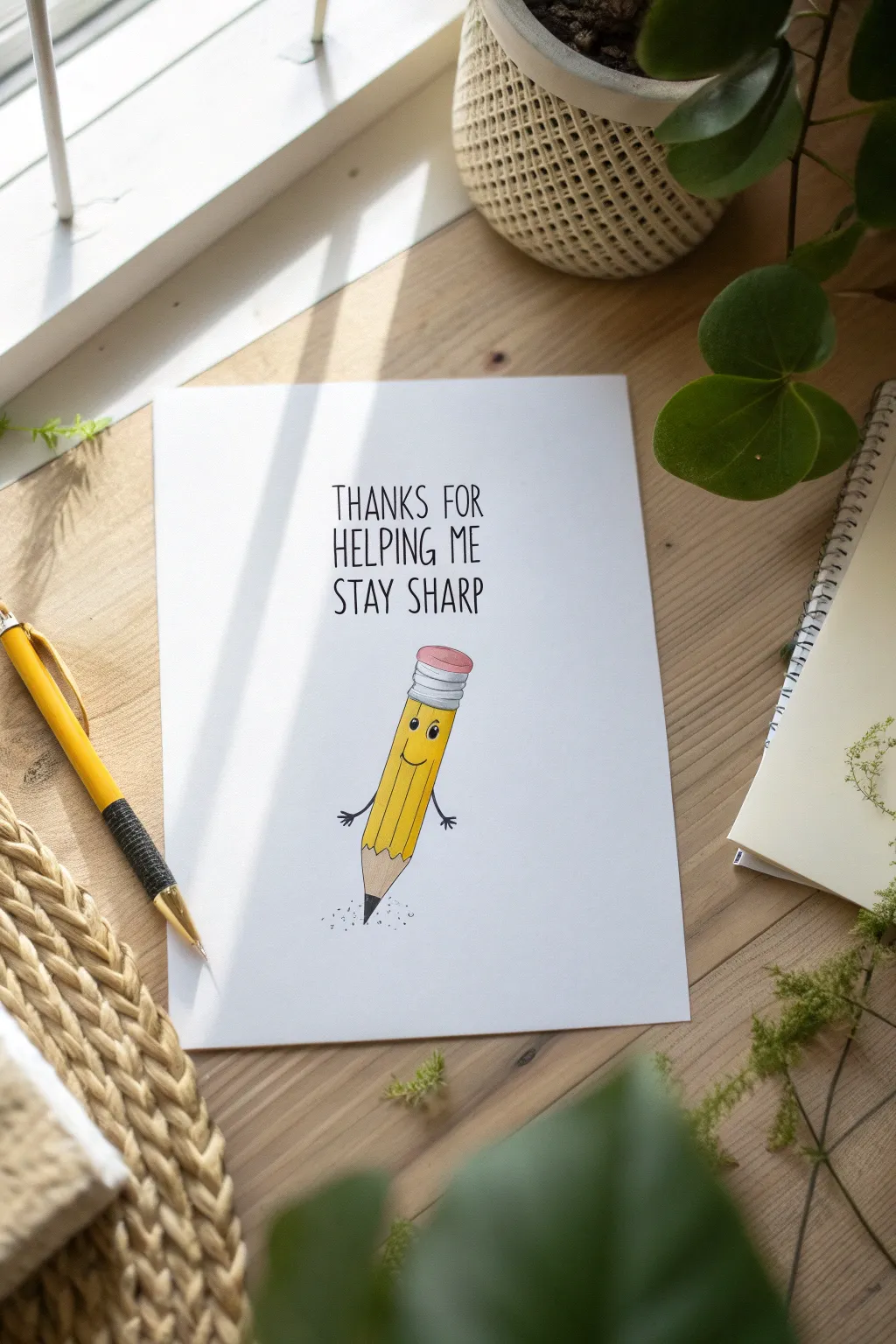
This charming, pun-filled greeting card features a friendly animated pencil character that is perfect for thanking a teacher or mentor. The clean, minimalist design combines simple illustration with neat hand-lettering for a professional yet personal touch.
Step-by-Step Tutorial
Materials
- White smooth cardstock (A5 or 5×7 inches)
- HB pencil for sketching
- Fine-point black fineliner pen (0.3mm or 0.5mm)
- Yellow alcohol marker or colored pencil
- Pink alcohol marker or colored pencil
- Grey alcohol marker or colored pencil
- Tan/Beige marker (for the wood section)
- Ruler
- Eraser
Step 1: Sketching the Layout
-
Center the design:
Begin by finding the visual center of your cardstock. Lightly sketch a vertical centerline to help align the text and the pencil illustration. -
Map out text area:
Draw faint horizontal guidelines in the upper third of the card where your message will go. Leave enough space between lines for a clean, airy look. -
Sketch the pencil body:
Below the text area, lightly draw a long, narrow rectangle at a slight diagonal tilt. This will form the main yellow body of the pencil. -
Add the ferrule and eraser:
On the top end of your rectangle, sketch a smaller, rounded rectangle for the metal ferrule, and top it with a soft gumdrop shape for the pink eraser. -
Form the pencil tip:
At the bottom of the main rectangle, draw a triangle pointing downward. Divide the tip of this triangle to show the lead point versus the exposed wood.
Step 2: Adding Character Details
-
Sketch facial features:
About a third of the way down the yellow body, lightly sketch two small ovals for eyes and a simple U-shape for a smile. -
Give it arms:
Draw two thin lines extending from the side of the pencil body for arms. Add tiny, three-fingered hands at the ends to give the character life. -
Refine the lines:
Go over your sketch to define the ridges of the pencil. Creating faint internal lines running down the length of the body suggests the hexagonal shape of a classic pencil.
Clean Lines Pro Tip
When erasing sketches under ink, hold the paper taut with your other hand to prevent crumpling the cardstock.
Step 3: Inking and Lettering
-
Draft the text:
With your pencil, lightly write ‘THANKS FOR HELPING ME STAY SHARP’ in the guidelines. Use all caps and a tall, narrow sans-serif style to match the modern aesthetic. -
Ink the outlines:
Using your fine-point black pen, carefully trace the outline of your pencil character. Keep the lines crisp and steady. -
Ink the text:
Trace over your pencil lettering with the black pen. I find it helpful to pull the pen toward me for straighter vertical strokes on the letters. -
Add character details:
Fill in the pupils of the eyes, leaving a tiny dot of white for a highlight. Ink the smile and the little arms. -
Erase pencil marks:
Once the ink is completely dry—give it a full minute—gently erase all your graphite guidelines and sketch marks.
Make It Pop
Add a faint grey shadow on the floor under the pencil or a small speech bubble to make the character interact with the text more.
Step 4: Coloring and Finishing
-
Color the body:
Use a yellow marker to fill in the main body of the pencil. If you want depth, add a second layer of yellow on the right side to suggest a shadow. -
Color the eraser and metal:
Fill in the eraser with pink and the ferrule with grey. Add horizontal lines on the grey section to mimic the crimped metal texture. -
Color the tip:
Use a beige or tan color for the sharpened wood section. Use black or dark grey for the very tip of the lead. -
Add grounding details:
Beneath the sharp point, use your black pen to make tiny dots and stipple marks. This grounds the character and looks like little graphite shavings.
Give your completed card to a favorite teacher to brighten their day

PENCIL GUIDE
Understanding Pencil Grades from H to B
From first sketch to finished drawing — learn pencil grades, line control, and shading techniques.
Explore the Full Guide
Button People Teacher-and-Students Line Drawing
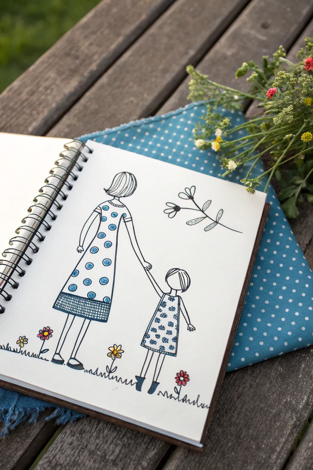
This sweet, illustrative project captures a tender moment between a woman and a child using clean black lines and simple pops of color. The style mimics charming storybook art, making it perfect for a journal cover, a card, or a thoughtful gift.
How-To Guide
Materials
- Spiral-bound sketchbook or heavy drawing paper
- Fine-tip black ink pen (archival quality preferred)
- Medium-tip black marker
- Blue felt-tip marker or colored pencil
- Yellow felt-tip marker or colored pencil
- Pink or red felt-tip marker (for flowers)
- Pencil and eraser for sketching
Step 1: Setting the Scene
-
Lightly sketch the figures:
Begin with a very light pencil sketch to place your characters. Draw a taller figure on the left for the woman and a smaller figure on the right for the child, leaving enough space between them for their arms to reach out and hold hands. -
Outline the heads and hair:
Start defining the forms by inking the heads. For the woman, draw a simple bob hairstyle with curved lines indicating strands. For the child, draw a cute, short haircut with bangs. Keep the faces blank to maintain that stylized, faceless silhouette look. -
Draw the woman’s dress:
Sketch a simple A-line dress shape for the woman. It should have short sleeves and a hemline that falls just below the knees. Draw a horizontal band at the bottom of the dress to create a border section. -
Draw the child’s dress:
Create a similar, smaller A-line dress for the child, sleeveless or short-sleeved, falling to about knee-length. Make sure the proportions look right next to the adult figure.
Variation Tip
Swap the circle patterns for stripes or triangles to change the dress style. Consistency in the pattern is key for a cohesive look.
Step 2: Limbs and Details
-
Connect the hands:
Draw the woman’s arm reaching down and the child’s arm reaching up. Join their hands simply—you don’t need detailed fingers, just a small, interlocking shape to show connection. -
Add remaining arms:
Draw the woman’s other arm resting straight down by her side. For the child, draw the other arm slightly away from the body. -
Draw the legs and shoes:
Use simple straight lines for the legs. At the bottom, draw simple flat shoes for the woman and small boots or shoes for the child. Block these in with your black pen. -
Refine the outline:
Go over your pencil lines with the fine-tip black pen. Use smooth, confident strokes. I find it helpful to rotate the sketchbook slightly to get the best angle for long lines.
Step 3: Adding Patterns
-
Create the polka dots:
On the woman’s dress, draw scattered circles. Inside each circle, use your blue marker to create a swirl or spiral pattern, leaving a tiny bit of white space for texture. -
Detail the hem:
On the bottom border of the woman’s dress, draw a grid or cross-hatch pattern using the fine black pen. This adds visual weight to the bottom of the skirt. -
Decorate the child’s dress:
Draw tiny flower shapes all over the child’s dress using the blue marker. These can be simple clusters of dots or small asterisks to contrast with the mother’s polka dots.
Level It Up
Use a white gel pen to add tiny highlights on top of the blue shoes or the center of the polka dots for extra dimension.
Step 4: Nature Elements
-
Draw the floating branch:
To the right of the woman’s head, draw a floating botanical branch. Use a single curved line for the stem and add a few simple teardrop-shaped leaves and two small flowers. -
Add grass tufts:
Ground the figures by drawing a squiggly, uneven line beneath their feet to represent grass. You don’t need a solid ground line; broken sections work best for this style. -
Sketch the ground flowers:
Populate the grass with a few simple flowers. Draw stems rising from the grass line, topped with primitive daisy shapes—a center circle surrounded by petals.
Step 5: Final Touches
-
Color the flowers:
Use your yellow and pink markers to fill in the flowers on the ground and the floating branch. Keep the coloring loose; it’s okay if it goes slightly outside the lines. -
Add blue accents:
Use the blue marker to color the woman’s shoes and the child’s boots. You can also add a touch of blue to the center of the larger flowers if you wish. -
Erase pencil marks:
Once the ink is completely dry—wait at least a few minutes—gently erase any visible pencil lines from your initial sketch.
Now you have a charming piece of line art that celebrates connection and simplicity
Teacher Nameplate Door Sign Illustration
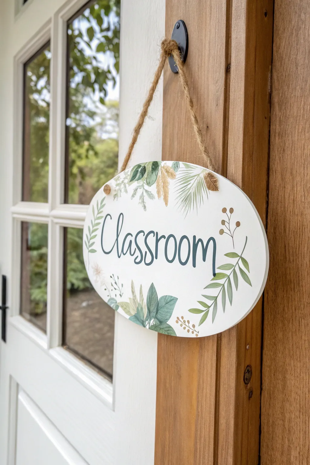
Welcome students with a serene, nature-inspired touch using this beautiful oval door sign featuring watercolor-style foliage and elegant lettering. The muted greens and earthy tones create a calming atmosphere perfect for any learning space.
Detailed Instructions
Materials
- Oval wooden plaque (approx. 8-10 inches wide)
- White acrylic paint or gesso
- Sponge brush or wide flat brush
- Fine grit sandpaper (220 grit)
- Pencil and eraser
- Acrylic paints (muted greens, sage, hunter green, earthy brown/ochre)
- Fine liner brush (size 0 or 00)
- Round brush (size 2 or 4)
- Black or dark grey acrylic paint pen (medium tip)
- Clear matte sealer spray
- Jute twine
- Drill with small bit (if plaque lacks holes)
Step 1: Preparation & Base Coat
-
Prepare the surface:
Even if your wooden plaque is pre-sanded, give it a quick pass with 220-grit sandpaper to ensure a flawlessly smooth surface for painting. -
Apply base color:
Using a sponge brush, apply an even coat of white acrylic paint or gesso across the entire front surface. I usually paint the edges too for a clean finish. -
Dry and sand:
Let the first coat dry completely. Lightly sand away any brush strokes or rough spots, wipe away the dust, and apply a second coat for solid, opaque coverage. -
Drill holes:
If your plaque didn’t come with pre-drilled holes, measure and mark two spots near the top edge, roughly 3-4 inches apart. Carefully drill small holes consistent with the thickness of your jute twine.
Step 2: Painting the Foliage
-
Sketch the layout:
Lightly sketch the word ‘Classroom’ in the center and plan the placement of your leaves around the border. Focus on the bottom center and the areas flanking the text. -
Mix leaf colors:
Prepare a palette of greens. Mix a sage green (green + white + touch of brown) and a deeper forest green. Create a watery consistency for a semi-transparent, watercolor effect. -
Paint large leaves:
Using the round brush, paint the broad, rounded leaves located at the bottom center. Use the sage mix here, allowing the paint to be slightly uneven for texture. -
Add palm fern details:
Switch to a finer brush to create the wispy palm-like fronds near the top right. Use quick, outward flickering strokes with a pale olive green to mimic delicate needles. -
Create structured branches:
Paint the long, slender stems on the right side using a liner brush. Add paired leaves along the stem in a slightly darker green for contrast. -
Add dried floral accents:
Using an ochre or light brown mix, dab in the small, feathery ‘dried grass’ elements near the top. Keep these loose and organic. -
Paint berry stems:
With the finest liner brush and brown paint, draw thin, wiry stems curving outward. Add tiny dots at the ends to represent berries or buds. -
Layering details:
Go back over your larger sage leaves. I like to add a darker vein line down the center or slightly darken the base of the leaf to add dimension without losing that soft look.
Uneven Paint Coverage?
If acrylics look streaky, mix in a tiny drop of water or flow medium. Multiple thin layers always look smoother than one thick, gloopy layer.
Step 3: Lettering & Finishing
-
Outline the text:
Once the foliage is completely dry, refine your pencil sketch for the word ‘Classroom’. Use a playful, bounce-lettering style where the baselines vary slightly. -
Inking the letters:
Carefully trace your letters with a black or dark grey paint pen. Maintain a consistent pressure to get smooth lines. -
Thickening downstrokes:
To create a faux-calligraphy look, go back and thicken specifically the downstrokes (any line where your pen moved downward). Leave the upstrokes thin. -
Clean up:
Check for any pencil marks that are still visible. Erase them gently only after the paint and ink are 100% dry to avoid smudging. -
Seal the artwork:
In a well-ventilated area, apply a clear matte sealer spray over the entire sign. This protects the paint from humidity and handling. -
Attach the hanger:
Thread a length of jute twine through the front of one hole and back out the other toward the front (or simply knot straight through). Tie secure knots on the front side for a rustic look. -
Final adjustment:
Trim any excess twine tails near the knots and hang the sign to ensure it sits level.
Make It 3D
Glue actual dried pressed flowers or tiny faux silk leaves over the painted ones for a stunning mixed-media texture effect.
Now your door is ready to greet students with a warm and artistic welcome
BRUSH GUIDE
The Right Brush for Every Stroke
From clean lines to bold texture — master brush choice, stroke control, and essential techniques.
Explore the Full Guide
Chalkboard Quote for a Favorite Teacher

Show your appreciation with this classic, rustic chalkboard design featuring elegant hand-lettering. The mix of flowing cursive and bold sans-serif fonts creates a balanced, heartfelt message perfect for teacher appreciation week or an end-of-year gift.
Step-by-Step
Materials
- Large framed chalkboard (approx. 18×24 inches)
- White chalkboard chalk (standard)
- Chalk marker (fine tip white, optional for sharper lines)
- Ruler or straight edge
- Microfiber cloth (slightly damp)
- Cotton swabs (Q-tips)
- Pencil sharpener (for standard chalk)
- Piece of paper and pencil (for drafting)
Step 1: Preparation and Layout
-
Season the board:
If your chalkboard is brand new, take the side of a piece of chalk and rub it over the entire surface, then erase it. This ‘seasoning’ process prevents your first design from becoming permanently ghosted onto the board surface. -
Clean the surface:
Wipe the board down completely with a slightly damp microfiber cloth to ensure a dark, clean background. Let it dry completely before starting any writing. -
Sketch the layout on paper:
Before touching the board, sketch your design on a piece of paper to figure out spacing. Note that ‘Thank You’ will be at the top in cursive, and ‘FAVORITE TEACHER’ will take up the distinct middle section in block letters. -
Sharpen your chalk:
Use a large pencil sharpener (the kind with two holes usually fits chalk) to create a fine point on your standard stick of chalk. This is crucial for crisp lettering. -
Mark light guidelines:
Using your ruler and the very tip of your chalk, draw incredibly faint horizontal lines where each row of text will sit. I like to barely graze the surface so these wipe away easily later.
Sharpening Secret
Don’t have a sharpener that fits chalk? Rub the side of the chalk tip against a piece of rough cardboard or sandpaper at an angle to create a chisel edge.
Step 2: Lettering the Script
-
Draft the ‘Thank You’:
Start the top line. Write ‘Thank You’ in a loose, flowing cursive style. Focus on large loops for the ‘T’ and ‘Y’ to give it that elegant calligraphy look. -
Thicken the downstrokes:
Go back over your cursive letters. Everywhere your hand moved downward while writing, draw a second line slightly next to the first and color it in. This technique, faux-calligraphy, mimics the look of a dip pen. -
Refine the edges:
Use a cotton swab to gently smudge or clean up any jagged edges on your cursive curves, ensuring the connections between letters look seamless.
Step 3: Block Lettering
-
Map out ‘FAVORITE’:
Find the center of your board below the script. lightly mark the start and end point for the word ‘FAVORITE’ so it stays centered. Sketch the letters lightly first using simple single lines. -
Build the letter weight:
Go over ‘FAVORITE’ again, this time pressing harder to create a solid, bold monoline stroke. Keep these letters tall and narrow sans-serif style. -
Add spacing decorations:
Place a small, solid dot on either side of the word ‘FAVORITE’, vertically centered with the text, to fill the negative space. -
Map out ‘TEACHER’:
Directly below ‘FAVORITE’, repeat the process for ‘TEACHER’. Ensure the letters align vertically with the word above for a cohesive block effect. -
Even out the strokes:
Check the thickness of your block letters. If some lines look thin, go over them one more time to ensure uniform brightness against the dark board.
Smudge Eraser
If a wet cloth leaves streaks when fixing mistakes, try a Q-tip dipped in a tiny amount of vinegar and water. It cuts through the chalk residue cleanly.
Step 4: Final Flourishes
-
Draw the bottom swirl:
Starting near the center under ‘TEACHER’, draw a loop that resembles a lowercase cursive ‘l’. Extend lines outward from this loop to the left and right, curving upward slightly at the ends. -
Adjust the flourish symmetry:
Step back and look at your bottom flourish. If one side is shorter, extend it gently. It doesn’t need to be mathematically perfect, but visual balance helps ground the design. -
Dust control:
You likely have chalk dust settled on the frame ledges. Use a dry cloth or a small dry paintbrush to sweep this dust away without smudging your art. -
Erase guidelines:
Take a clean Q-tip, slightly dampened if necessary, and precisely erase those faint horizontal guidelines you drew in step one, taking care not to touch your finished letters. -
Final sharpen:
Look for any smudges or faded areas. Use your sharpened chalk or a chalk marker to add one final highlight to the brightest parts of the letters.
Place an apple or a small jar of flowers nearby to complete this charming classroom display.
Classroom Icon Border Around a Thank-You Note
Create a heartfelt keepsake for a favorite teacher with this hand-drawn stationary design. This project features a whimsical border of celestial doodles like planets, stars, and globes, framing a simple message of gratitude.
Step-by-Step Tutorial
Materials
- High-quality white cardstock or thick sketchbook paper
- Kraft envelope (A5 size recommended)
- Fine-liner black ink pen (0.3mm or 0.5mm)
- Pencil and eraser
- Ruler
- Pale watercolor paint or mild highlighter (peach or blush)
- Small paintbrush (optional)
Step 1: Planning the Layout
-
Cut the paper:
Begin by trimming your white cardstock to slightly smaller than your kraft envelope. A standard A5 size works beautifully for this. -
Mark the margins:
Using a pencil and ruler, lightly mark a border about 1 inch (2.5 cm) from the edge on all four sides. This outer area will hold your drawings. -
Draw the inner frame:
Lightly sketch a rectangular box inside your margins where the text will eventually go. Keep these lines very faint so they can be erased easily later. -
Pencil the text:
In the upper center of your inner box, lightly sketch the words ‘Thank You’ in a loose, playful cursive script.
Keep it clean
Place a scrap piece of paper under your drawing hand while working. This prevents oils from your skin transferring to the paper and stops you from smudging fresh ink.
Step 2: Adding the Color Wash
-
Prepare the wash:
Mix a very watery pale peach or blush watercolor paint. If you don’t have paint, a very mild highlighter can work, but paint gives a softer look. -
Paint the background:
Apply a sheer wash of color to the inner rectangle area where you plan to write your message later. You can let the edges be slightly imperfect for an organic feel. -
Outline the inner border:
Paint a slightly more concentrated line of the same peach color along the pencil line of your inner box to create a soft frame. -
Let it dry:
Wait for the paint to dry completely. If the paper buckles slightly, you can press it under a heavy book once dry.
Make it specific
Customize the icons to the teacher’s subject! Add tiny numbers for math, beakers for science, or musical notes for band teachers.
Step 3: Doodling the Border
-
Anchor drawings first:
Switch to your black fine-liner. Start by drawing the larger ‘anchor’ items in the corners and centers of the border to ensure balance. Sketch a globe at the bottom and a simple ringed planet at the top. -
Add celestial bodies:
Draw crescent moons and large, five-pointed stars spaced evenly around the border. Keep the lines clean and simple. -
Incorporate classroom elements:
To tie in the teacher theme, draw a few science-doodle style items like suns with wavy rays, and perhaps a stylized atom or microscope if you’re feeling adventurous. -
Fill the gaps:
Look for empty white spaces between your main drawings. Fill these with tiny circles, dots, and small four-pointed sparkle stars. -
Vary the line weight:
For visual interest, color in small sections of your drawings black, like the shadow of a moon or stripes on a planet. -
Finalize the text:
Trace over your penciled ‘Thank You’ text with the black pen. Use a faux-calligraphy technique by thickening the downstrokes of each letter.
Step 4: Finishing Touches
-
Erase guidelines:
Once you are absolutely certain the ink is dry—I usually give it an extra five minutes just to be safe—gently erase all remaining pencil marks. -
Check balance:
Step back and look at the border. If one side feels too light, add a few more tiny dots or a small star to even it out. -
Pair with envelope:
Place your finished artwork on top of the kraft envelope to ensure the sizing looks correct before writing your personal message inside.
Now you have a charming, hand-crafted card ready for a personalized note of appreciation


One-Line Teacher Silhouette With Apple Accent
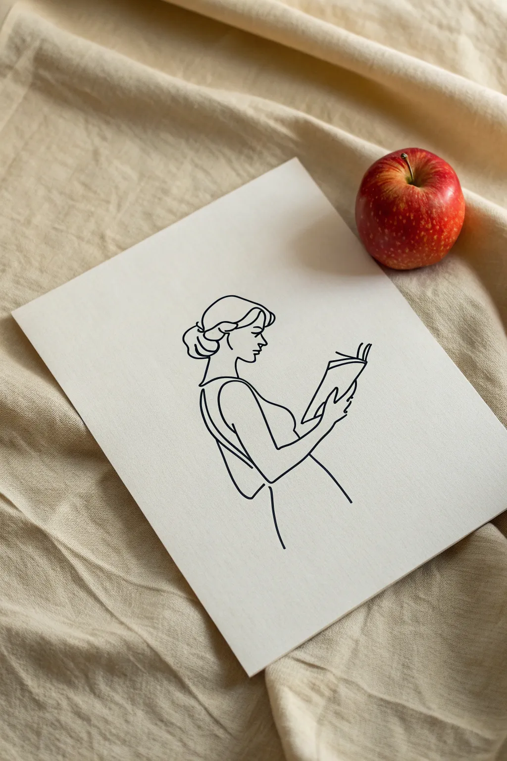
This elegant project captures the essence of a teacher at work using a minimalist, continuous line drawing style on sturdy white cardstock. The simplicity of the black ink against the textured paper creates a sophisticated piece of art that looks deceptively complex but relies on flowing, confident strokes.
How-To Guide
Materials
- Heavyweight white mixed-media paper or canvas board (approx. 8×10)
- Black fine-liner pen (0.5mm or 0.8mm)
- Pencil (HB or 2H)
- Kneadable eraser
- Tracing paper (optional)
- Smooth work surface
Step 1: Planning the Composition
-
Center the Subject:
Begin by lightly marking the center of your paper or canvas board to ensure your figure is balanced. You want the head to be in the upper third, leaving ample negative space around the edges. -
Sketch the Head Shape:
Using your pencil very lightly, sketch a loose oval for the head. Don’t worry about details yet; just establish the tilt of the head looking downward toward the book. -
Draft the Arm Position:
Sketch a sweeping curve originating from the shoulder area, extending forward to hold the book. The key is the angle of the elbow—it anchors the pose. -
Outline the Book:
Draw a simple open book shape in the figure’s hands. Keep the geometry simple: two rectangles joined at an angle.
Step 2: Refining the Sketch
-
Define the Profile:
Now, lightly sketch the facial profile inside your head oval. Focus on a gentle slope for the forehead, a small nose, and a tucked chin. -
Map the Hair and Bun:
Draw the hairline and the low bun at the nape of the neck. In line art, the hair is often suggested by just the outer contour, so keep the internal lines simple. -
Connect the Neck and Shoulder:
Create a smooth transition from the chin down to the neck and shoulder. This line often continues directly into the dress or top. -
Detail the Hands:
Lightly indicate the thumb and fingers gripping the book. You don’t need anatomical perfection, just the suggestion of a grip. -
Review Flow:
Step back and look at your pencil sketch. Does the line flow logically? I usually check if I can trace the path with my finger without lifting it too much, adjusting any awkward disconnects.
Pro Tip: Fluid Motion
Draw from your shoulder, not your wrist. This larger range of motion creates smoother curves and prevents the ‘wobbly’ look common in slow line art.
Step 3: Inking the Lines
-
Confidence check:
Before inking, take a deep breath. Smooth, continuous motion is better than slow, shaky lines. Test your pen on a scrap piece of paper first. -
Start at the Crown:
Begin your final ink line at the top of the head/hair. Pull the pen smoothly around the curve of the bun. -
Trace the Profile:
continue the line from the hairline down the forehead, nose, and lips. Lift your pen only if absolutely necessary to reposition your hand. -
Shoulder and Arm:
Ink the curve of the neck down to the shoulder strap, then flow seamlessly down the arm to the elbow. -
The Book Curves:
Draw the book with confident, somewhat geometric strokes. The straight lines of the book contrast beautifully with the curves of the body. -
Closing the Shape:
Finish by carrying the line from the underside of the book down towards the waist or bottom of the dress, letting the line fade off or stop cleanly to suggest the rest of the body. -
Drying Time:
Let the ink sit for at least 15-20 minutes. Smudging wet ink with an eraser is heartbreaking, so patience is key here.
Level Up: Watercolor Splash
Add a single, loose wash of watercolor behind the figure in a soft pastel tone. It adds dimension without overpowering the minimalist line work.
Step 4: Final Touches
-
Erase Guidelines:
Gently roll your kneadable eraser over the drawing to lift the pencil marks. Avoid scrubbing hard, as this can damage the paper texture. -
Line Weight Variation:
If satisfied, you can go back over certain curves (like the shoulder or bun) to thicken the line slightly, adding subtle depth. -
Optional Staging:
While not part of the drawing, placing a bright red apple nearby for a photo creates that perfect teacher aesthetic.
Now you have a sophisticated piece of minimalist art ready to frame or gift to a favorite educator
Pop-Art Teacher Symbols in Color Blocks
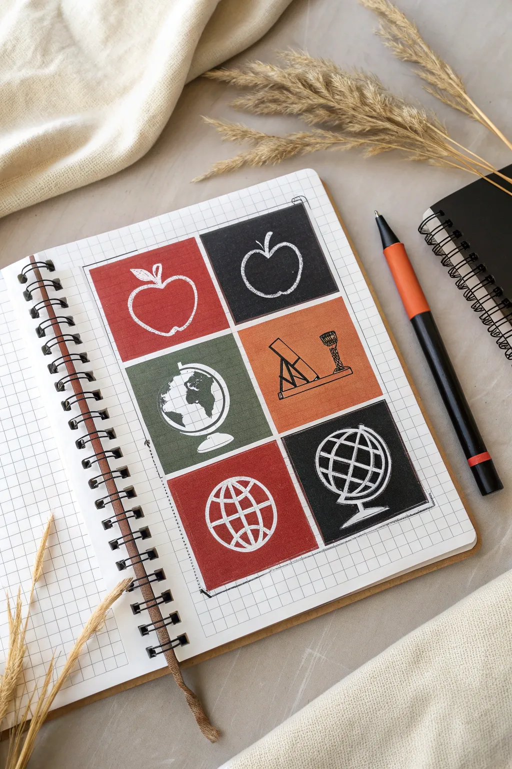
This clean, pop-art style layout uses bold color blocks to highlight classic symbols associated with teaching. By combining solid geometric backgrounds with simple white linework, you create a striking grid that looks professional yet hand-drawn.
Step-by-Step
Materials
- Grid paper notebook or sketchbook
- Ruler
- Pencil (HB or H for light lines)
- Eraser
- Colored markers or brush pens (Red, Black, Olive Green, Burnt Orange)
- White gel pen or opaque white paint marker
- Fine-liner pen (black, optional for outlines)
Step 1: Setting the Grid
-
Define the perimeter:
Start by deciding the size of your total composition. Using your ruler and existing grid lines as a guide, lightly pencil a large rectangle that will contain your six smaller squares. Ensure there is even spacing from the spiral binding. -
Mark the internal grid:
Divide your large rectangle into a 2×3 grid. You need two columns and three rows. Measure carefully so each of the six squares is identical in size. Leave a small gap (about one or two grid squares wide) between each block to create clean separation borders. -
Sketch the borders:
Once your measurements are set, go over the perimeter and the internal division lines with a slightly darker pencil line or a very thin fine-liner to define the boxes clearly before coloring.
Clean Lines Pro Tip
To prevent the white gel pen from picking up the underlying marker color, wipe the tip of the pen on a scrap piece of paper after every few strokes to keep the white ink bright.
Step 2: Blocking in Color
-
Select your palette:
Choose an academic color palette. This project uses a muted red, a deep olive green, a burnt orange, and a solid black to create contrast. Arrange them so no two colors repeat directly next to each other. -
Fill the top left square:
Start with the top-left square. Carefully fill it in with your red marker. Outline the inner edge of the square first, then fill the center to keep the edges sharp. -
Fill the top right square:
Move to the top-right block. Use your black marker here. The dark background will make the white apple pop significantly later on. -
Fill the middle row:
For the middle-left square, use the olive green marker. For the middle-right square, apply the burnt orange color. Work slowly near the edges to maintain square corners. -
Fill the bottom row:
Complete the grid by coloring the bottom-left square in red (matching the top left) and the bottom-right square in black. This creates a balanced diagonal visual rhythm. -
Let it dry completely:
This is crucial. Wait until the marker ink is 100% dry before attempting to draw on top. The white gel pen will muddy or absorb into the paper if the ink is still damp.
Level Up: Subject Swap
Customize this for specific subjects by swapping icons. Use beakers and atoms for science, pi symbols and calculators for math, or open books and quills for literature.
Step 3: Adding the Symbols
-
Draft the apples:
In the top two squares, lightly sketch an apple shape using a pencil. Draw one apple slightly wider and the other perhaps taller or tilted to add variety. Don’t forget the stem and a single leaf. -
Trace the left apple:
Using your white gel pen, trace over your pencil lines for the apple on the red background. Use a sketchy, loose hand—go over the lines twice to make them look like chalk. -
Trace the right apple:
Repeat the process for the black square. The white ink against the black background gives a perfect chalkboard effect. Add a little texture line inside the apple for dimension. -
Draft the globes and science tools:
For the middle row, sketch a globe on the green square and a microscope or telescope setup on the orange square. Keep the shapes simplified and iconic rather than hyper-realistic. -
Inking the middle row:
Trace your middle row sketches with the black fine-liner. I find it helps to add small hatching lines on the continents of the globe to give it visual weight against the green. -
Draft the bottom globes:
In the bottom row, sketch two stylized wireframe globes. Draw latitudinal and longitudinal lines to form the sphere shape. These are more abstract than the realistic globe in the middle row. -
Inking the bottom row:
Go over these bottom sketches with your white gel pen. The thick white lines on the red and black backgrounds reinforce the bold, graphic style of the page.
Step 4: Final Touches
-
Clean up edges:
Check the corners of your color blocks. If the marker bled or the lines are uneven, you can carefully re-outline the boxes with a black fine-liner to neaten the presentation. -
Connect the corners:
Draw small diagonal ticks or corner bracket accents at the very outer corners of the main composition grid to frame the entire piece. -
Erase guidelines:
Once you are certain the white gel ink is fully dry, gently erase any visible pencil marks remaining inside or outside the color blocks.
Now you have a vibrant, organized page that celebrates the tools of the trade
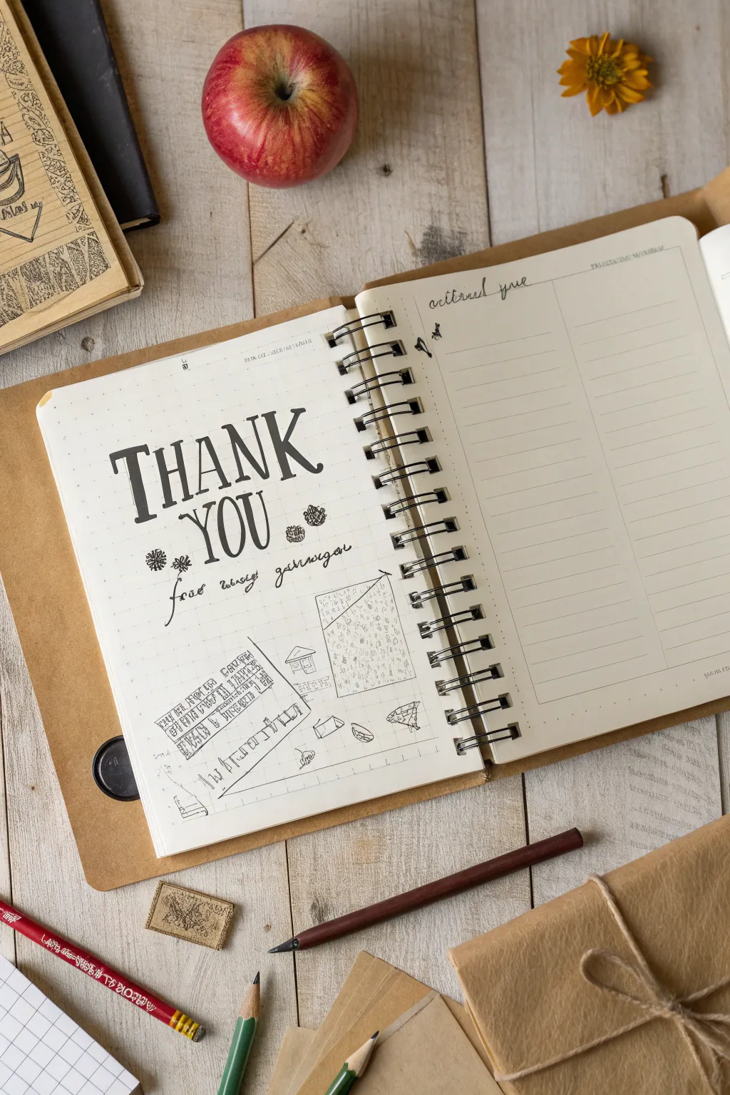
Mixed-Media Thank-You Page of Teacher Memories

Capture heartfelt appreciation with this rustic, hand-lettered notebook spread that combines bold typography with whimsical architectural doodles. This project mimics the charm of a vintage teacher’s logbook, perfect for preserving memories or drafting a thank-you note.
How-To Guide
Materials
- Spiral-bound notebook (dot grid or blank paper)
- Black brush pen or calligraphy marker
- Fine-point black liner pen (01 or 03 size)
- Pencil (HB or 2B)
- Eraser
- Ruler
Step 1: Planning the Layout
-
Pencil Sketching:
Begin by lightly sketching the layout guidelines with a pencil. Mark the horizontal center of the left page to ensure your main text is balanced. -
Drafting Text:
Sketch the words ‘THANK YOU’ in large, capitalized block letters. Position ‘THANK’ on the top line and ‘YOU’ slightly indented below it. -
Adding Grid Lines:
Below the text area, use your ruler to sketch a faint grid section or defined boxes where the doodles will go. This creates a structured ‘blueprint’ look.
Clean Lines Pro Tip
For the crispest block letters, use a ruler to mark the top and bottom height of the text before you start drawing the individual letters.
Step 2: Inking the Typography
-
Main Lettering:
Using a black brush pen or a thick marker, carefully trace over your ‘THANK YOU’ pencil lines. Add slight serifs to the ends of the letters (like the top of the ‘T’ or bottom of the ‘H’) to give it a classic, printed feel. -
Thickening Strokes:
Go back over the downstrokes of each letter to add weight contrast. The vertical lines should be significantly thicker than the horizontal crossbars. -
Subtext Script:
Switch to your fine-point liner pen. Write the phrase ‘for teaching me’ (or your chosen subtitle) in a loose, cursive script directly underneath the main title. -
Decorative Elements:
Draw small floral or gear-like motifs on either side of the subtitle using the fine liner. Keep these simple—just small circles with radiating loops or lines.
Step 3: Doodling the Memories
-
Geometric Borders:
Ink the borders of the grid or box shapes you sketched earlier at the bottom of the page. You don’t need these lines to be perfectly straight; a little wobble adds character. -
Architectural details:
Inside one of the larger geometric shapes, draw a simple house outline with a roof. Add tiny windows and a door using very light strokes. -
Pattern Filling:
Fill another section of your geometric layout with a text-like texture. Don’t write actual words; instead, draw rows of small, illegible scribbles or tiny vertical dashes to mimic the look of an old written document. -
Adding Tiny Objects:
Scatter small doodles around the grid area. Sketch a tiny envelope, a paper plane, or a simple leaf shape. Keep the scale very small compared to the main text. -
Connecting Lines:
Draw a few angled lines extending from your doodles, as if they are architectural projection lines or measurement notes.
Smudge Troubleshooting
If you accidentally smudge wet ink, turn it into a deliberate shadow or doodle over it with a solid geometric shape to hide the mistake.
Step 4: Finishing Touches
-
Opposite Page Header:
On the right-hand page, write a date or a small header like ‘actions queue’ in cursive at the very top right corner. -
Creating the List:
Use a ruler and your fine liner to draw a horizontal line below the header, then a vertical line splitting the page into columns (one narrow, one wide). -
Row Lines:
Fill the rest of the right page with evenly spaced horizontal lines to create a custom checklist or notes area. -
Erasing:
Wait at least five minutes for the ink to dry completely. Gently erase all visible pencil sketching lines to reveal the clean ink work. -
Review and Refine:
Check your lettering for any uneven spots. I sometimes use the fine tip pen to touch up the edges of the big block letters if the marker bled slightly.
Now you have a beautifully personalized page ready to be filled with memories or gifted to a favorite teacher


Have a question or want to share your own experience? I'd love to hear from you in the comments below!