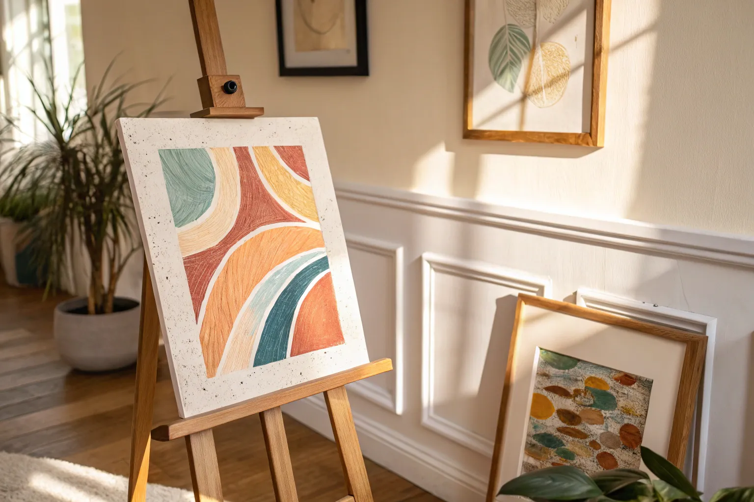
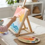
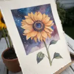
When I want bold color without a lot of fuss, tempera paint is one of my favorite go-tos—especially for quick projects that still look super satisfying. Here are a bunch of tempera paint ideas I’ve seen work beautifully for beginners, kids, and anyone who just wants to play with paint and make something awesome.
Classic Color Wheel Practice
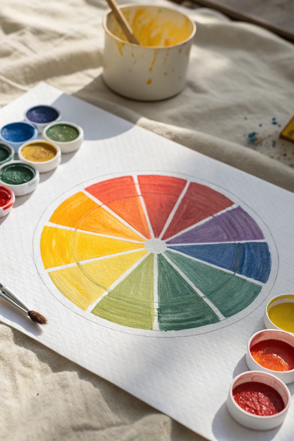
Learn color theory hands-on by creating this crisp, organized color wheel using tempera cakes. This exercise isn’t just educational; the resulting spectrum of blended hues makes for a satisfying and vibrant piece of geometric art.
Detailed Instructions
Materials
- Heavyweight painting paper or watercolor paper
- Tempera paint cakes (red, yellow, blue, green, orange, purple)
- Small round paintbrush
- Compass or round objects to trace
- Ruler
- Pencil
- Cup of water
- Paper towels
Step 1: Drafting the Structure
-
Draw the outer boundary:
Begin by using a compass or tracing a large bowl to draw a perfect circle in the center of your paper. This will define the overall size of your wheel. -
Create the inner ring:
Adjust your compass or find a smaller round object to draw a second, smaller circle inside the first one. Leave a few inches of space between the two lines to create a thick band. -
Find the center point:
Mark the exact center of your circles. If you used a compass, use the pinhole; if you traced, measure carefully to find the middle. -
Divide into quarters:
Using a ruler and pencil, draw a vertical line and a horizontal line through the center point, dividing the wheel into four equal quadrants. -
Create twelve sections:
Divide each quadrant into three equal pie slices. You can use a protractor (30 degrees per slice) or estimate carefully. Draw these lines lightly from the center point all the way to the outer edge. -
Lighten your lines:
Take a kneadable eraser or standard eraser and gently dab your pencil lines until they are faint guides. This ensures graphite doesn’t smudge into your bright yellow or orange paints later.
Muddy Colors?
If your violet or green looks brown, stop and change your water cup. Even a tiny amount of the third primary color (orange residue in blue paint) will turn a mix brown quickly.
Step 2: Painting the Primary Colors
-
Prepare your yellow:
Activate your yellow tempera cake with a wet brush. You want a creamy consistency that is opaque but flows smoothly. -
Paint the yellow sector:
Choose a wedge at the top left (around the 10 o’clock position) and fill it with yellow. Paint carefully within the lines, filling both the inner and outer sections of that wedge. -
Add red:
Count three empty wedges clockwise from yellow. In the fourth wedge, clean your brush thoroughly and paint a solid red section. -
Add blue:
Count three empty wedges clockwise from red. Fill this fourth wedge with pure blue. You now have a triangle of primary colors separated by three empty spaces each.
Crisp Edges
For perfectly straight lines between color wedges, use small strips of masking tape or artist’s tape along the pencil lines, but ensure the paper is completely dry before removing.
Step 3: Mixing and Filling Secondary Colors
-
Create orange:
Mix yellow and red on a palette or simply layer them if your paints allow. Paint the wedge exactly halfway between the yellow and red sections with this orange hue. -
Create green:
Clean your brush well. Mix yellow and blue to create a standard green. Fill the wedge exactly halfway between the yellow and blue sections. -
Create violet:
Mix red and blue to create violet. Paint the wedge halfway between the red and blue sections. I usually test the color on a scrap paper first to ensure it isn’t too muddy.
Step 4: Completing Tertiary Colors
-
Yellow-orange and Red-orange:
The remaining empty spaces are for tertiary colors. Between yellow and orange, paint a yellow-orange. Between red and orange, paint a red-orange. -
Red-violet and Blue-violet:
Fill the space between red and violet with a reddish-purple. Do the same for the space between blue and violet, leaning towards a deep indigo. -
Blue-green and Yellow-green:
Finish the wheel by filling the gap between blue and green with a teal color (blue-green), and the final gap between yellow and green with a lime color (yellow-green). -
Differentiate the rings:
If you want the look from the reference image, wait for the paint to dry slightly. Go back over the outer ring of the wheel with a second coat to make it more saturated, leaving the inner ring slightly more transparent or lighter.
Let your finished color wheel dry completely before displaying it as a handy reference guide for future projects

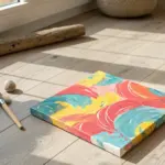
Bold Fruit Still Life Blocks
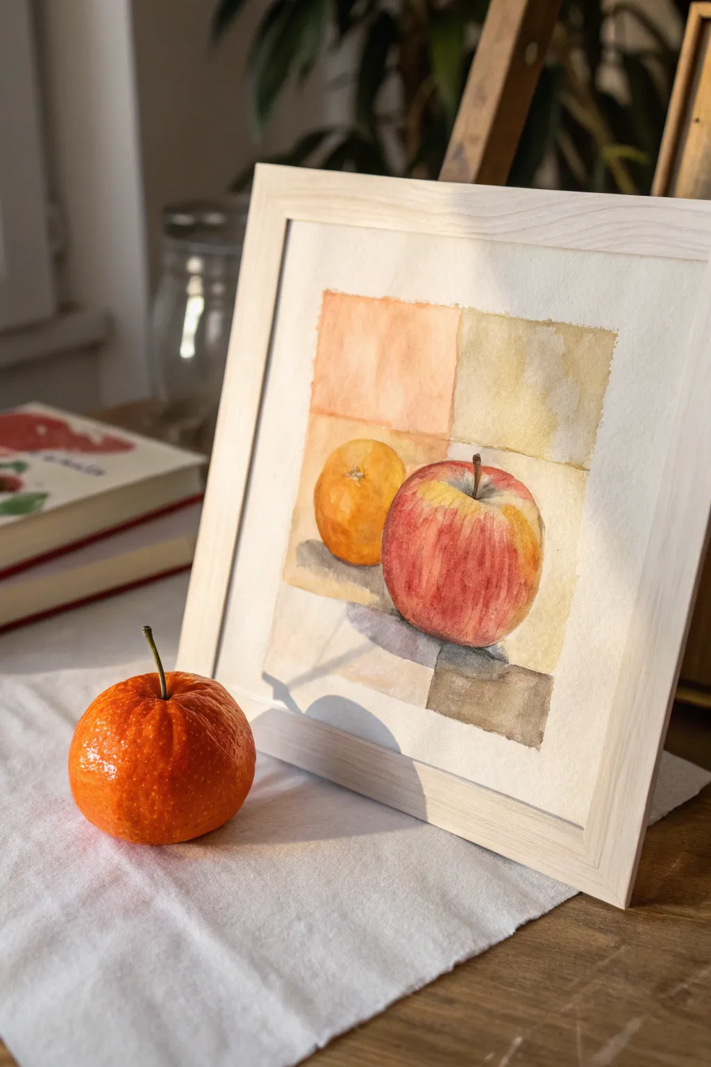
This project combines a classic fruit study with a modern, geometric background for a fresh take on the still life genre. Using tempera’s unique ability to be both opaque and watered down for glazes, you will capture the vibrant skins of an apple and an orange against soft, segmented color fields.
Step-by-Step Tutorial
Materials
- High-quality watercolor paper or mixed media paper (at least 140lb)
- Set of tempera paints (Red, Yellow, Orange, Brown, White, Black)
- Pencil (HB) and soft eraser
- Painter’s tape or masking tape
- Ruler
- Round brushes (sizes 4 and 8)
- Flat brush (size 1 inch)
- Palette for mixing
- Two jars of water
- Paper towels
Step 1: Planning and Sketching
-
Create borders:
Begin by taping down the edges of your paper to a flat board or table. This creates a crisp white border and prevents the paper from buckling when wet. -
Map the grid:
Use a ruler to lightly draw a square in the center of your paper. Divide this main square into four smaller quadrants. These lines don’t need to be perfectly centered; an off-center intersection adds visual interest. -
Place the fruit:
Draw the outline of an apple in the foreground, overlapping the bottom right quadrant lines. Behind it and slightly to the left, sketch a round orange. Make sure both fruits cross over the internal grid lines to integrate the subject with the background. -
Refine the shapes:
Add details like the stem of the apple and the small dimple on the top of the orange. Keep your pencil lines very faint so they won’t show through lighter paint layers.
Step 2: Painting the Background Blocks
-
Mix background washes:
Prepare four distinct but harmonious colors for your background quadrants. Mix a watered-down orange, a pale yellow-ochre, a soft beige, and a very light grey-brown. Tempera can be thinned with water to mimic watercolor for these areas. -
Paint the first quadrant:
Start with the top-left quadrant using the pale orange wash. Use a flat brush to fill the square, carefully painting around the curve of the orange fruit sketch. -
Fill remaining quadrants:
Continue painting the other three quadrants with your prepared colors: yellow-ochre for the top right, beige for the bottom left, and grey-brown for the bottom right. Let each section touch naturally but try to stay within the lines. -
Let it dry completely:
Allow the background grid to dry fully before moving on. This is crucial to prevent the bold fruit colors from bleeding into your soft background washes.
Chalky Finish?
Tempera naturally dries matte and can look chalky. If your colors look dull, brush a thin layer of gloss medium or watered-down white glue over the dry fruit to bring back the shine.
Step 3: Rendering the Fruit
-
Base coat for the orange:
Mix a vibrant orange hue. Using a round brush, paint the base shape of the orange fruit. While the paint is still wet, drop in a slightly darker orange-brown on the bottom right side to suggest shadow volume. -
Base coat for the apple:
Paint the apple’s base with a wash of yellow first. I find that layering red over yellow gives the apple a natural, luminous glow rather than looking like flat plastic. -
Build apple texture:
Once the yellow layer is tacky but not soaked, start applying vertical strokes of red tempera. Follow the curve of the apple’s form, curving your strokes from the stem downwards. -
Deepen the contrast:
Mix a dark red (red with a tiny touch of brown or green) and deepen the shading on the shadowed side of the apple. Leave the top left shoulder of the apple lighter where the light hits. -
Add highlights:
Use a tiny amount of white paint mixed with yellow to gently lift out a highlight on the apple’s shoulder and the orange’s top curve. Alternatively, you can scrub gently with a damp clean brush to lift pigment.
Pro Tip: Soft Transitions
To get that ‘watercolor’ fade with tempera, keep a second brush handy that is just wet with clean water. Use it to soften hard edges immediately after laying down paint.
Step 4: Shadows and Details
-
Ground the objects:
Mix a translucent grey-violet shadow color. Paint cast shadows directly underneath the fruit, extending them slightly to the right to match your light source. -
Define the stem:
Using your smallest round brush and opaque dark brown paint, carefully draw the apple’s stem. Make it thin and slightly curved for realism. -
Texture the orange:
Stipple tiny dots of darker orange and yellow onto the orange fruit skin to mimic its pitted texture. -
Final touches:
Evaluate your painting. If the background looks too flat, add a second, very transparent glaze of color over just one or two quadrants to build depth. -
Remove tape:
Ideally, wait until the paper is bone dry. Peel the tape away slowly at a 45-degree angle to reveal your crisp, clean borders.
Display your finished piece in a simple wooden frame to complement the warm, natural tones of the fruit

Tape-Resist Geometric Shapes
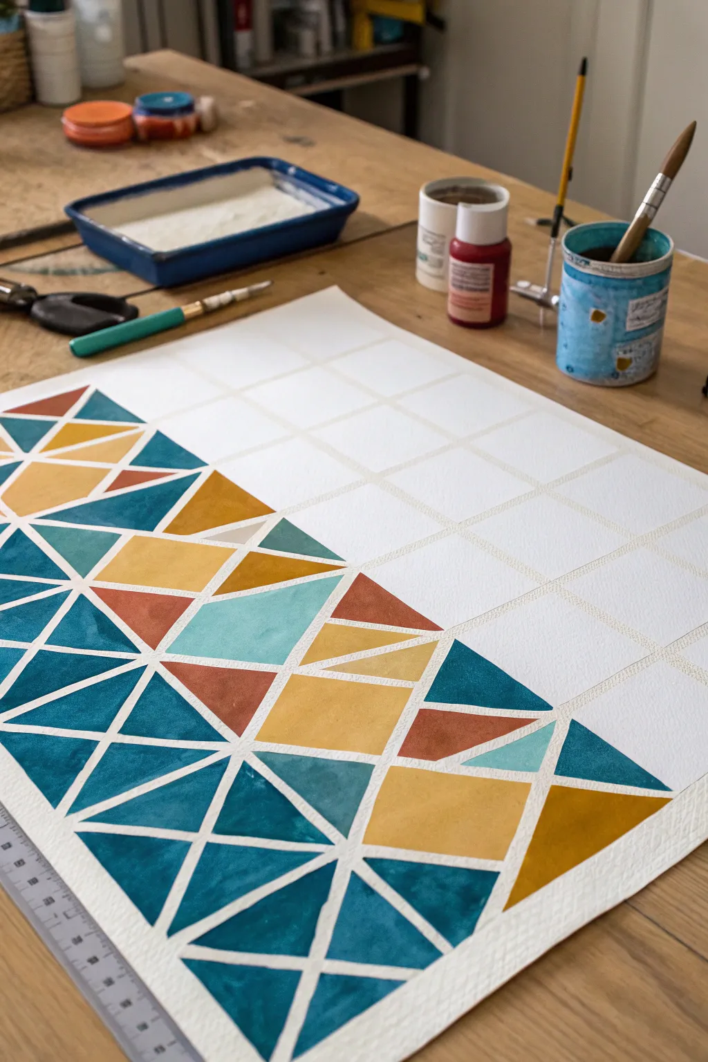
Transform a blank sheet of paper into a stunning piece of modern art using nothing but tape and tempera paint. This project relies on sharp lines and bold blocks of color to create a playful, triangular mosaic that looks surprisingly sophisticated.
Detailed Instructions
Materials
- Thick watercolor paper or mixed media paper
- Painter’s tape or drafting tape (low tack)
- Tempera paint (dark teal, mustard yellow, terracotta orange, light teal)
- Flat shader brushes (medium and large)
- Ruler
- Pencil
- Palette or mixing tray
- Water cup and paper towels
Step 1: Setting the Grid
-
Secure the paper:
Tape down your watercolor paper to a clean, flat work surface using painter’s tape along the very edges. This keeps the paper from buckling when it gets wet and creates a clean border later. -
Measure the grid:
With a ruler and a light pencil touch, measure out a square grid across your paper. The squares in the example look to be about 2-3 inches wide. -
Create the tape grid:
Apply long vertical and horizontal strips of painter’s tape directly over your pencil lines. Press the tape down firmly to ensure no paint can seep underneath. -
Add diagonal divisions:
Now, create triangles by adding diagonal tape lines inside the squares. You don’t need to be perfectly consistent—alternate the direction of the diagonals (some ‘X’ shapes, some single slashes) to create a dynamic, randomized pattern. -
Seal the edges:
Run your fingernail or the back of a spoon over every edge of the tape. This is the secret to getting those perfectly crisp lines.
Step 2: Applying Color
-
Prepare your palette:
Squeeze out your tempera colors. I like to keep the dark teal as the dominant color, then use mustard yellow and terracotta as accent pops. -
Start with the darkest color:
Dip a medium flat brush into the dark teal paint. Begin filling in select triangles, distributing them somewhat randomly across the page but keeping them clustered slightly denser at the bottom left. -
Add the warm tones:
Wash your brush thoroughly and switch to the mustard yellow. Fill in adjacent triangles, trying not to put two yellow shapes directly next to each other unless you want a larger block of color. -
Incorporate the accents:
Paint a few remaining triangles with the terracotta orange and any lighter teal shades you have mixed. Step back occasionally to ensure the color balance feels right to your eye. -
Aim for opacity:
Tempera works best when applied generously. Use smooth strokes to fill the shapes completely, brushing from the tape inward to prevent forcing paint under the adhesive. -
Let it dry completely:
Wait until the paint is visibly dry and matte. If the paper feels cool to the touch, it’s still damp—give it more time or you risk tearing the surface.
Crisp Line Secret
Before painting with color, paint a thin layer of clear matte medium or white paint over the tape edges to seal them perfectly.
Step 3: The Reveal
-
Remove the tape slowly:
Choose a corner and begin peeling the tape back at a sharp 45-degree angle. Pull slowly and steadily away from the painted area. -
Clean up imperfections:
If a little paint bled through, you can gently scrape it away with an X-Acto knife or touch it up with a tiny bit of white opaque paint once everything is dry. -
Erase pencil marks:
Once the tape is gone, check for any visible pencil lines in the white gaps and gently erase them.
Texture Twist
Sprinkle coarse salt onto the wet tempera paint in a few sections to create a speckled, granite-like texture as it dries.
Now you have a striking geometric artwork ready to be framed and displayed


Sponge-Painted Texture Landscapes
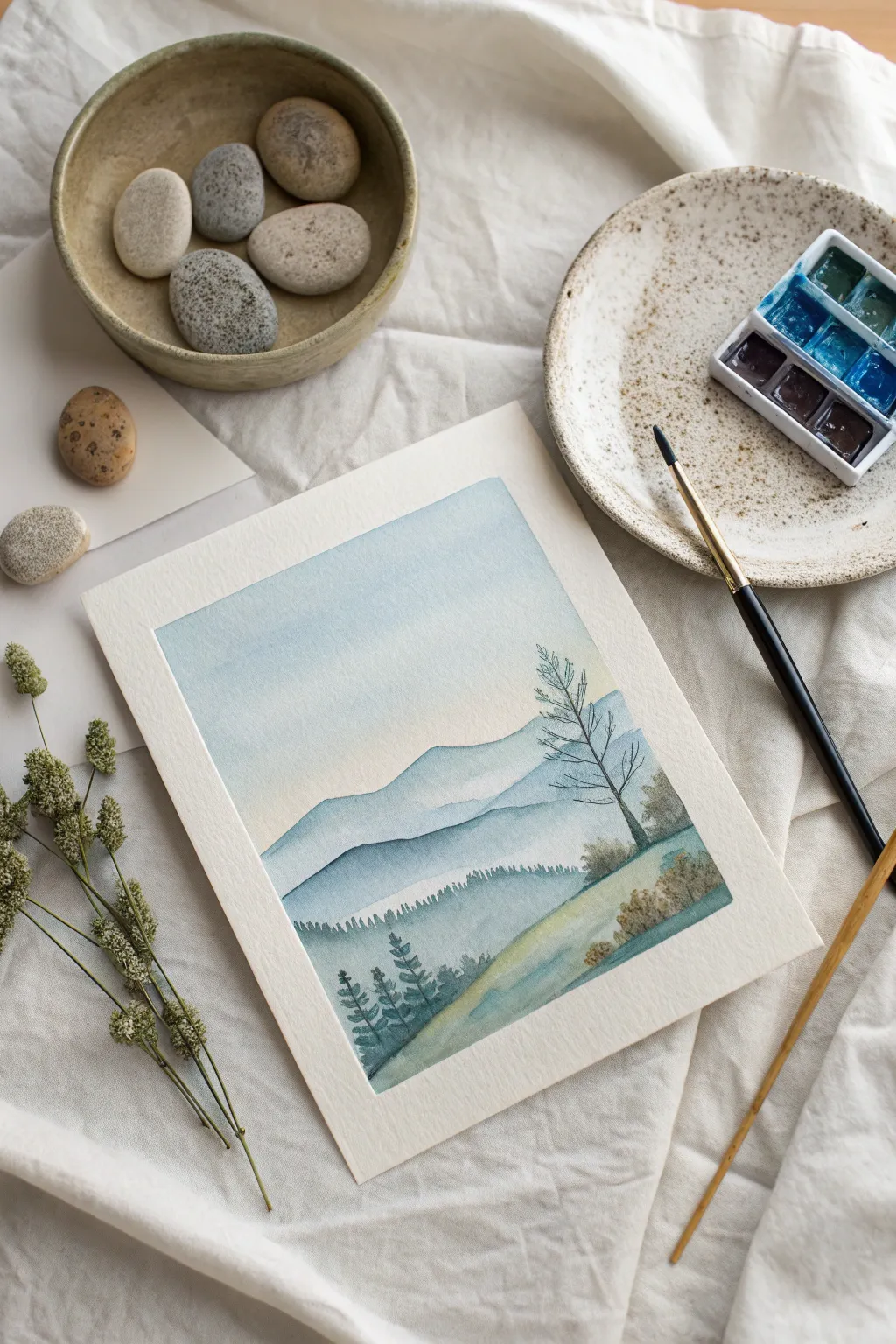
Create a serene, ethereal landscape that captures the softness of distant hills and foggy forests using watered-down tempera. This project mimics the delicate transparency of watercolor while utilizing the accessible, matte finish of tempera paint.
How-To Guide
Materials
- White, blue, and black tempera paint
- Thick watercolor paper or mixed media paper (cold press)
- Small natural sea sponge or cosmetic wedge sponge
- Round synthetic paintbrush (size 4 or 6)
- Fine liner brush (size 0 or 1)
- Palette or mixing dish
- Two cups of water
- Paper towels
- Masking tape (optional, to secure paper)
Step 1: Setting the Sky
-
Prepare your palette:
Mix a very pale blue wash on your palette. Combine a pea-sized amount of blue tempera with a generous amount of white, then add water until it reaches the consistency of skim milk. -
Dampen the paper:
Using a clean sponge or large brush, lightly moisten the top half of your paper with clean water. The paper should look sheen, not soaking wet. -
Sponge the gradient:
Dip your damp sponge into the pale blue wash. Starting at the very top edge of the paper, dab gently and pull the color downwards. -
Fade to white:
Stop sponging about halfway down the page. Use a clean, damp part of the sponge to soften the bottom edge of the blue so it fades seamlessly into the white of the paper.
Fixing Muddy Colors
If colors blend too much and turn grey, let layers dry fully between steps. Tempera reactivates with water, so engage distinct layers.
Step 2: Layering the Mountains
-
Mix a mid-tone blue:
Create a slightly darker blue than your sky color. Add just a touch more blue pigment to your existing mix; keep it watery for transparency. -
First mountain ridge:
Use your round brush to paint a wavy, organic line across the paper, just below where the sky fades out. This is your furthest mountain range. -
Wash downwards:
Immediately after painting the top edge, use a damp brush to pull that color down towards the bottom of the page, letting it fade out as it goes lower. -
Deepen the mix:
Add a tiny dot of black or dark blue to your paint mix to create a deeper, cooler slate blue. -
Second mountain ridge:
Paint a second, more distinct mountain range below the first one. Make the peaks slightly more jagged to show they are closer. -
Create texture:
While the paint is still wet, dab it gently with a dry corner of your sponge or a paper towel to lift a little pigment, creating a misty texture.
Add Winter Frost
Once completely dry, use a dry brush with pure white tempera to lightly skim over the hilltops for a frosty, winter morning effect.
Step 3: Foreground Details
-
Paint the forest line:
Using a slightly thicker mix of dark blue-grey, use the very tip of your round brush to create a jagged ‘toothed’ line along the base of the second mountain range to suggest distant pine trees. -
Foreground slope:
Mix a touch of yellow or ochre (if available) with your blue, or just use a darker grey-blue, to paint the curved hill in the bottom right corner. -
Add grassy texture:
Use a nearly dry sponge with the darker paint to stipple texture onto this foreground hill, suggesting scrubby bushes or rough grass. -
Tree trunk structure:
Switch to your fine liner brush. With a dark, inky consistency paint, draw a thin, vertical line on the right side for the main tree trunk. -
Adding branches:
Flick the brush outwards from the trunk to create delicate, bare branches. Keep your hand loose and let the lines taper off to nothing. -
Tiny foreground pines:
In the bottom left corner, paint three or four small pine trees using short, horizontal dabs that get wider at the bottom. -
Final foliage:
Add small clusters of dots or dabs near the base of the main tree to represent low bushes or fallen leaves. -
Let it dry completely:
Allow the painting to sit flat until fully dry. Tempera dries matte and slightly lighter than it looks when wet.
Enjoy the quiet atmosphere of your delicate mountain landscape
BRUSH GUIDE
The Right Brush for Every Stroke
From clean lines to bold texture — master brush choice, stroke control, and essential techniques.
Explore the Full Guide
Mirror-Fold Blot Paintings
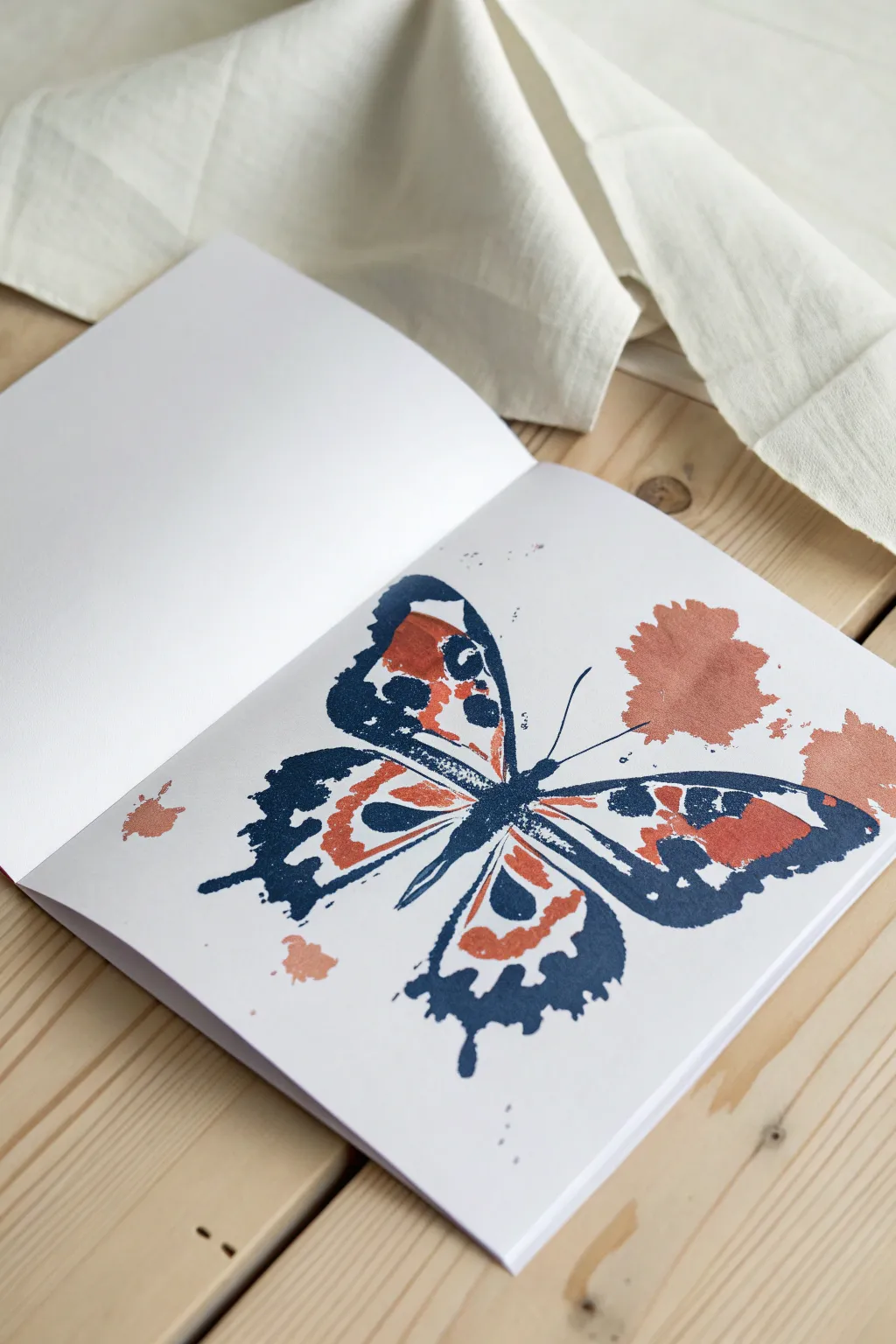
Capture the delicate beauty of a butterfly using the classic mirror-image painting technique. By folding your paper over wet tempera paint, you’ll create a perfectly symmetrical design with a charming, organic texture that looks effortlessly artistic.
Step-by-Step Tutorial
Materials
- Heavyweight white sketchbook or watercolor paper
- Navy blue tempera paint
- Terracotta or burnt orange tempera paint
- Small round paintbrushes
- Palette or paper plate for mixing
- Paper towels
- Cup of water
Step 1: Preparation and Body
-
Prepare your workspace:
Since this project relies on wet paint transferring between pages, ensure you are working on a flat surface. Open your sketchbook to a fresh, double-page spread and smooth down the center crease as much as possible to ensure a clean fold later. -
Plan the centerline:
Visualize the center fold of your sketchbook as the central axis of the butterfly’s body. The paint will need to be applied relatively thickly here to ensure it spreads outward effectively when pressed. -
Paint the thorax and abdomen:
Using your navy blue tempera, paint a thin, elongated oval shape directly along the right side of the center crease. This will form the main body of the butterfly. Don’t worry about perfect edges; the pressing process will soften them.
Step 2: Creating the Wings
-
Outline the upper wing:
While the body paint is still wet, dip your brush back into the navy blue. Draw the sweeping outline of the top wing on the right-hand page, starting from the top of the body and curving outward and upward. -
Add wing details:
Inside this upper wing outline, add smaller blobs or thick gestural lines of blue paint. These will become the structural veins and patterns within the wing once squished. -
Outline the lower wing:
Paint the lower wing shape, extending it downwards from the butterfly’s mid-section. Give it a scalloped or wavy bottom edge to mimic the classic swallowtail shape seen in nature. -
Introduce the secondary color:
Wipe your brush clean or grab a fresh one. Dip it into the terracotta or burnt orange paint. This warm tone provides a beautiful contrast to the deep blue. -
Fill wing gaps:
Apply generous dabs of the orange paint into the empty negative spaces inside both the upper and lower blue wing outlines. You want the paint to be wet and somewhat thick so it moves easily. -
Add external splatters:
For that artistic, loose look seen in the example, dab a few spots of orange paint completely outside the wing lines. Place a larger splotch near the top right and a smaller one near the bottom left.
Paint Consistency Pro-Tip
Tempera works best here, but if it’s too thick, the print will be blotchy. If it’s too thin, it will run. Aim for a texture like melted ice cream for the cleanest transfer.
Step 3: The Press and Reveal
-
Check paint wetness:
Before folding, quickly verify that all your applied paint is still glossy and wet. If any thin lines have started to dry, re-trace them quickly with a loaded brush. -
Fold the page:
Carefully close the left page of the sketchbook over onto the wet right page. Align the edges of the book to ensure the fold is true to the center. -
Apply pressure:
With the book closed, firmly press down with the palm of your hand. Rub gently in a circular motion, moving from the center crease outward to the edges of your painted design. -
Ensure transfer:
I like to run my thumb firmly along the spine or crease of the book during this step to make sure the butterfly’s body transfers seamlessly across the gap. -
Open the book:
Slowly peel the pages apart to reveal your symmetrical print. Do this steadily to avoid smearing the wet textured ridges that form.
Stuck Pages?
If you close your book before the paint is 100% dry, the pages will glue together. If you’re impatient, place a sheet of wax paper between the pages to protect your artwork.
Step 4: Finishing Touches
-
Assess the symmetry:
Look at your transferred image. It likely has a beautiful, distressed texture. If big gaps are missing on the left side, you can quickly dab wet paint on the right and re-press, though imperfections add charm. -
Add the antennae:
Now that the main pressing is done, use a very fine brush with navy blue paint to draw delicate antennae. Draw one on the right page and a matching one on the left freehand; pressing these lines usually makes them too thick. -
Refine the body:
If the center body looks a bit messy from the fold, you can gently touch up the central line with a little more blue paint to define the head and thorax. -
Let it dry:
Leave the sketchbook open flat to dry completely. Tempera can be thick, so give it at least an hour before attempting to close the book again.
Enjoy the unique patterns and textures created by this simple yet satisfying folding technique
Handprint Creatures and Trees
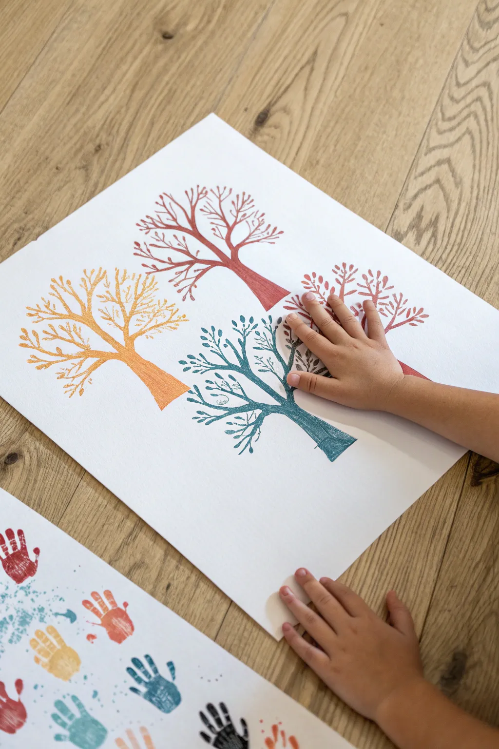
Transform a simple arm trace into a stunning forest of stylized trees representing different colors or seasons. This project combines the personal touch of a body tracing with delicate brushwork to create a modern and clean piece of wall art.
Detailed Instructions
Materials
- Large sheet of heavyweight white drawing paper or watercolor paper
- Tempera paint (Red, Orange, Teal/Blue, Purple/Pink)
- Pencil
- Fine liner brush or small round brush
- Flat brush (medium size)
- Palette or paper plate for mixing
- Paper towels
- Water cup
Step 1: Tracing the Trunk
-
Position the arm:
Place your child’s hand and forearm on the paper. For the first tree, position the arm starting near the bottom edge, angled slightly to the left. Spread the fingers wide to act as the main branches. -
Trace the outline:
Using a light pencil grip, carefully trace around the forearm and individual fingers. You don’t need to trace every fingernail detail; keep the lines smooth to look like organic branches. -
Close the shape:
Remove the arm and draw a straight or slightly curved line at the bottom to close off the trunk shape where the elbow was. -
Repeat the process:
Repeat this tracing process three more times on the paper to create a total of four trees. Vary the height and angle of each arm tracing slightly to create a natural, unregimented forest composition.
Paint too thick?
If your tempera is too thick to paint fine details, mix in a few drops of water. It should flow like heavy cream for those delicate branch lines.
Step 2: Painting the Structure
-
Select your palette:
Prepare four distinct colors of tempera paint. Based on the image, you’ll want a muted red, a bright orange, a deep teal, and a soft purple or pinkish-red. -
Fill the first trunk:
Starting with the orange paint and a flat brush, carefully fill in the first arm tracing. Use long, smooth strokes following the direction of the ‘wood’ grain. -
Paint the fingers:
Switch to a smaller brush to fill in the finger areas (the main branches). Ensure the paint coverage is solid and opaque. -
Paint remaining trunks:
Clean your brushes thoroughly and proceed to paint the other three tree trunks in their respective colors—red, teal, and purple—letting each base layer dry.
Step 3: Adding Delicate Branches
-
Start the branch details:
Once the base trunks are dry to the touch, load a fine liner brush with the same color paint used for that specific tree. -
Extend from the fingers:
Draw thin, extending lines coming off the tips of the ‘finger’ branches. Let these lines curve naturally outward and upward. -
Add secondary twigs:
From those new extensions, add smaller V-shaped twigs. I find that varying the pressure on the brush helps create tapered lines that look more like real growth. -
Create fullness:
Continue adding these fine lines until the canopy looks full and balanced, maintaining the unique color for each individual tree.
Steady Tip
Rest the side of your hand on a clean sheet of paper while painting the detailed branches. This stabilizes your hand and prevents smudging the wet trunk.
Step 4: Leaf Details
-
Dab the leaves:
Using the very tip of a small round brush, create leaves by gently pressing down and lifting up. This creates a small, teardrop or oval shape. -
Distribute foliage:
Scatter these small leaf shapes along the drawn branches. Don’t overdo it; you want the beautiful branch structure to remain visible. -
Vary leaf direction:
Angle the leaves in different directions to simulate natural movement. -
Final touches:
Check for any gaps in the canopy that look too empty and add a twig or leaf there. -
Dry completely:
Let the entire artwork dry flat for at least an hour to prevent the tempera from smudging.
Hang this minimalist forest in a playroom or hallway to celebrate growth and color

PENCIL GUIDE
Understanding Pencil Grades from H to B
From first sketch to finished drawing — learn pencil grades, line control, and shading techniques.
Explore the Full Guide
Dot Painting With Squeeze Bottles
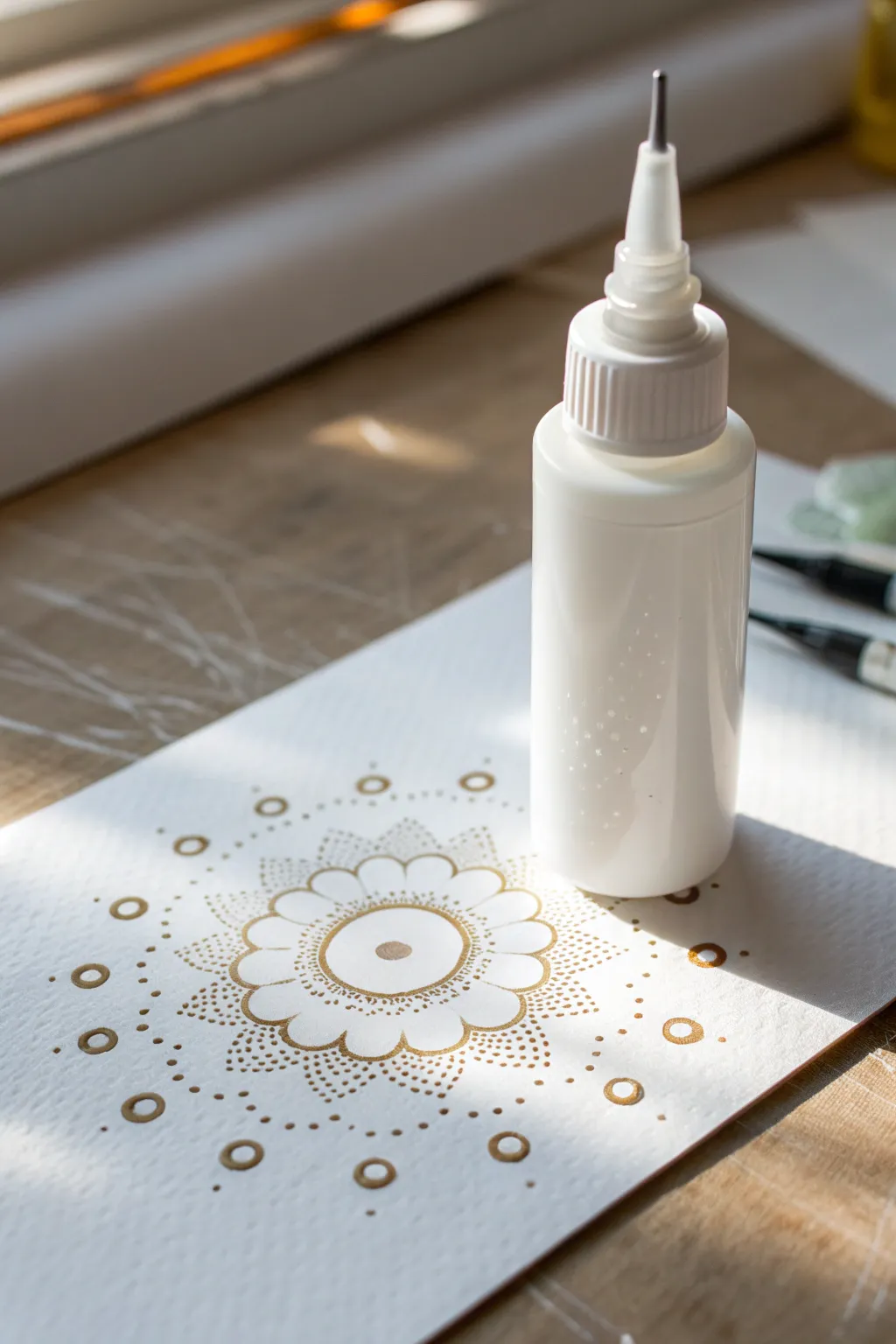
Create a stunning, intricate mandala design using the deceptively simple tool of a squeeze bottle. The metallic gold paint catches the light beautifully against the crisp white paper, resulting in a piece that looks sophisticated yet is calming to make.
Step-by-Step Guide
Materials
- White mixed media or watercolor paper (heavyweight)
- Metallic gold tempera paint
- Fine-tip squeeze bottle (precision applicator)
- Pencil (H or HB)
- Compass
- Eraser
- Scrap paper for testing flow
Step 1: Preparation & Mapping
-
Fill the bottle:
Pour your metallic gold tempera paint into the fine-tip squeeze bottle. Fill it about halfway to prevent air bubbles from getting trapped at the bottom. -
Test the consistency:
Squeeze a test line onto scrap paper. The paint should flow smoothly without breaking, but hold its shape without spreading too much. If it’s too thick, add a drop or two of water and stir inside the bottle. -
Find the center:
Mark the exact center of your paper with a light pencil dot. -
Draw guide rings:
Using a compass, draw several concentric light circles radiating from the center. These don’t need to be permanent; they act as guidelines to keep your symmetry accurate. -
Sketch the petal outline:
Lightly sketch a central circle and a ring of eight to ten rounded flower petals around it. Keep these lines very faint so they are easy to erase later.
Clean Tip Trick
Keep a damp paper towel nearby. Wipe the metal nozzle tip every few minutes to prevent dried paint clumps from ruining your fine lines.
Step 2: The Central Motif
-
Start the center:
Hold the bottle vertically like a pen. Squeeze gently to create a solid gold circle in the very center of your guide. -
Outline the first ring:
Draw a continuous thin ring of gold around your center dot, leaving a small gap of white space between them. -
Outline the petals:
Trace over your pencil sketch for the flower petals. Apply consistent pressure to keep the line width even as you curve around each petal. -
Create inner details:
Inside each petal, trace a slightly smaller petal shape. This creates a double-lined effect that adds visual weight to the center. -
Stipple the center:
I like to add texture here by filling the space between the center ring and the petal base with tiny, dense micro-dots. Use a very quick up-and-down motion.
Step 3: Expansive Dot Work
-
Fill petal tips:
At the outer edge of the petals, add a clustering of tiny dots (stippling) that fades as it moves toward the center of the petal, creating a gradient effect. -
Add floating dots:
Place a medium-sized solid dot in the ‘V’ space between the tips of each petal. -
Create the first outer ring:
Move to your next pencil guide circle. Squeeze small, evenly spaced dots all around this ring. -
Create the heavy ring:
Move further out to the next guide circle, about an inch away from the petals. Create larger, open circles (rings) of gold paint here. These act as anchors for the outer design. -
Connect with stippling:
Fill the negative space between the flower petals and that outer ring of circles with radiating lines of tiny micro-dots. Keep them dense near the center and sparse as they move outward. -
Add final accents:
Place a few stray, tiny dots randomly around the outermost edge to give the design an airy, dispersed look. -
Dry thoroughly:
Let the artwork sit flat for at least 4 hours. Because squeeze bottle paint is applied thickly, the surface may dry before the center does. -
Erase guidelines:
Once you are 100% sure the paint is hard and dry, gently erase any visible pencil marks.
Air Bubble Blasts?
If the bottle ‘spits’ or blasts air, tap the bottom of the bottle firmly on the table to force paint to the tip and air to the top.
Now step back and admire how the light catches the raised texture of your golden creation
Layer-and-Scratch Sgraffito
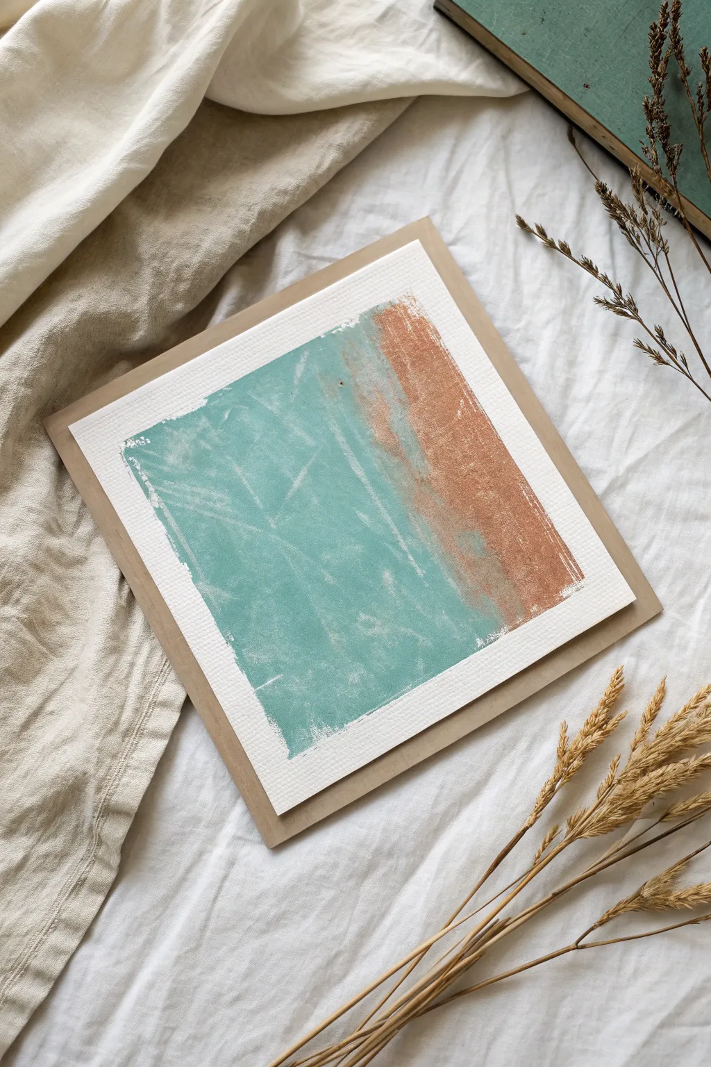
This minimalist project uses the ancient technique of sgraffito to create a textured, abstract composition reminiscent of sand meeting the sea. By layering opaque tempera paint and scratching through it, you reveal hidden depths and create a wonderfully weathered finish.
Step-by-Step
Materials
- Heavyweight watercolor paper or mixed media cardstock (square cut)
- Tempera paint (Teal/Turquoise and Copper/Rust Brown)
- Flat synthetic paintbrushes (medium and large)
- White wax crayon or oil pastel
- Sgraffito tools (toothpick, empty ballpoint pen, or palette knife edge)
- Kraft paper card for mounting
- Paper towels
- Low-tack masking tape (optional)
Step 1: Preparation and Base Layer
-
Prepare your paper:
Cut your heavyweight paper into a perfect square, roughly 5×5 or 6×6 inches. If you want a clean border around the paint like in the example, you can mask off the edges with tape, or choose to freehand the rectangular shape for a more organic look. -
Apply the wax resist (optional but recommended):
For easier scratching later, cover the painting area with a layer of white wax crayon or oil pastel. This acts as a microscopic barrier that helps the paint lift off when scratched. If you skip this, the paint will adhere more strongly to the paper fibers. -
Mix your colors:
Prepare your palette. You need a cool, dusty teal and a warm, earthy copper or rust color. Tempera dries matte, so keep your colors bold. If your copper tempera isn’t metallic enough, you can mix in a tiny drop of metallic acrylic, though classic tempera works beautifully for the matte texture seen here.
Paint Refuses to Scratch?
If the paint is chipping off in chunks rather than scratching smoothly, it dried too much. Try misting it very lightly with water to rehydrate the surface just a tiny bit.
Step 2: Painting the Color Block
-
Start with the teal section:
Using a flat brush, apply the teal paint to the left two-thirds of your square. Don’t worry about perfect smoothness; brushstrokes add character. I like to keep the paint relatively thick here so it’s opaque. -
Apply the copper section:
Immediately paint the remaining right-hand third with your copper/rust tones. Let this color slightly overlap the teal edge to create a soft, blended transition where they meet. -
create a ragged edge:
Ensure the outer edges of your painted rectangle aren’t perfectly straight lines. Use a fairly dry brush to feather the edges slightly, giving it that rough, torn-paper aesthetic. -
Observe the texture:
Look closely at the surface. If the paper is showing through too much, dab a little more paint on. You want a solid block of color to scratch into. -
Let it set briefly:
Allow the paint to dry for just a few minutes. It should be tacky to the touch—not wet, but not bone dry either. This is the sweet spot for sgraffito.
Metallic Shine
For the rust section, mix a pinch of gold mica powder into your tempera paint. When dry, the scratched areas will catch the light beautifully against the matte finish.
Step 3: The Sgraffito Technique
-
Select your scratching tool:
Grab a toothpick, the end of a paintbrush, or an empty ballpoint pen. Sharp tools create fine lines, while duller tools create broader texture. -
Begin scratching (Teal side):
Start on the teal side. Gently scratch chaotic, intersecting lines into the paint. Vary your pressure to remove different amounts of pigment. -
Create the ‘x’ patterns:
Notice the subtle cross-hatching in the original piece. Mimic this by scratching long, diagonal intersecting lines across the large teal area. -
Work the transition zone:
Where the teal meets the rust, use horizontal scratches to blend the two sections visually. This mimics the look of waves washing over sand. -
Texturize the copper side:
On the copper strip, use vertical scratching motions. This difference in direction helps distinguish the ‘land’ from the ‘sea’ in your abstract composition. -
Lift deeper patches:
Use the edge of a credit card or palette knife to scrape away larger, flat patches of paint here and there. This reveals the white paper (or wax layer) underneath, adding that distressed, vintage feel. -
Check density:
Step back. Does it look too solid? Add more scratches. Does it look too busy? You can dab a tiny bit of fresh paint over areas to soften the effect.
Step 4: Finishing Touches
-
Dry completely:
Let the artwork dry fully. Tempera can be brittle, so handle it carefully once dry. -
Flatten the artwork:
If the paint moisture caused the paper to buckle, place the dry artwork under a heavy book overnight to flatten it out. -
Prepare the mount:
Take your slightly larger square of brown Kraft paper or card. Apply double-sided tape or glue to the back of your painted piece. -
Center and mount:
Carefully adhere the painted square onto the Kraft backing, leaving an even border of brown visible on all sides to frame the piece.
Display your abstract seascape on a small easel or mount it in a shadow box to emphasize the beautiful surface texture


Crayon-Resist Night Sky Scenes
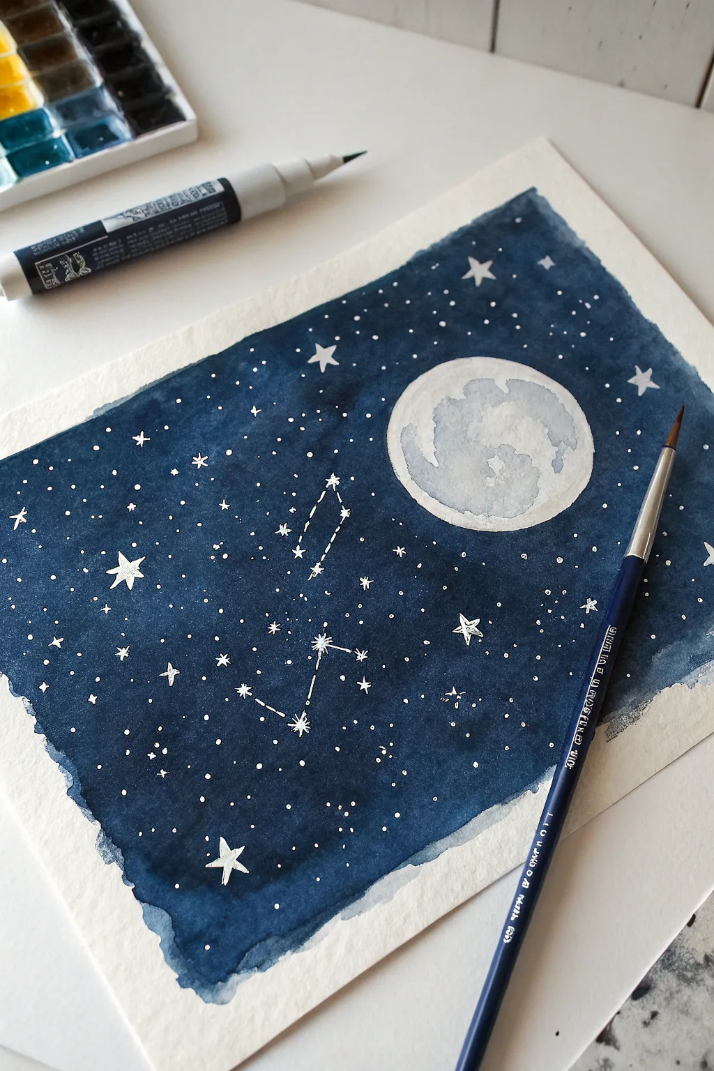
Create a dreamy night scene using the magic of wax resist to make stars pop against a deep blue sky. This project combines simple drawing with satisfying watercolor or tempera washes for a stunning, celestial result.
Step-by-Step Guide
Materials
- Heavyweight watercolor or mixed media paper
- White crayon or white oil pastel
- Dark blue watercolor or tempera paint (indigo or navy)
- Black watercolor or tempera paint (optional for depth)
- Round paintbrush (size 6 or 8)
- Cup of water
- Paper towels
- Small white paint pen or white gouache (for extra stars)
Step 1: Planning and Resisting
-
Prepare your paper:
Start by taping down your paper to a work surface if you are worried about warping, though for this free-flowing edge look, you can leave it loose. -
Map out the moon:
Using your white crayon or oil pastel, draw a large circle in the upper right quadrant of the paper to represent the full moon. Press firmly so the wax deposits a thick layer. -
Add lunar details:
Lightly sketch some craters or texture inside the moon circle with the crayon. Keep these marks lighter than the outline so the paint can settle into the texture later. -
Draw major stars:
Pressing hard again, draw several five-pointed stars scattered across the sky. Make one or two slightly larger to serve as focal points. -
Create a constellation:
Connect small dots or star shapes with thin lines to form a constellation in the center. I like to invent my own star patterns, but you can copy a real one like the Big Dipper. -
Fill the galaxy:
Dot the rest of the empty space with many small speckles using the crayon tip. These will become your distant stars once the paint is applied. Ensure you cover the whole sky area.
Secret to Bright Stars
Press HARD with the crayon! If you don’t use enough pressure, the wax layer will be too thin and the dark paint might seep through, turning your white stars blue.
Step 2: Painting the Night Sky
-
Mix your base color:
Prepare a generous amount of dark blue paint. If you are using tempera, dilute it slightly with water so it flows easily. If using watercolor, activate your indigo or navy pan until it’s rich and dark. -
Create a darker mix:
In a separate spot, mix a little black into your blue to create a ‘midnight’ shade. This will add depth to the corners and edges of your sky. -
Start the wash:
Load your brush with the dark blue paint. Begin painting at the top corner, sweeping the brush across your crayon marks. -
Watch the resist magic:
As you paint over the moon and stars, you will see the white wax repel the water-based paint, revealing your drawing instantly. -
Define the edges:
Keep your edges rough and organic rather than painting a perfect rectangle. Let the brush create a jagged, natural border that frames the scene artistically. -
Blend the colors:
While the blue paint is still wet, drop in some of that darker black-blue mix near the bottom left corner and blending upwards. -
Paint the moon:
Rinse your brush slightly so it has less pigment. Gently wash over the moon area with this diluted, watery blue-gray to give it a shadowed, cratered look without hiding the white wax completely. -
Let it dry completely:
Allow the painting to sit flat until it is fully dry to the touch. The paper may buckle slightly, which is normal for water-based media.
Step 3: Finishing Touches
-
Brighten the stars:
Once dry, take a white paint pen or fine brush with white gouache and add extra tiny dots over the dark blue areas. This creates a layered depth that crayon alone can’t achieve. -
Highlight the constellation:
Trace over the constellation lines with the white pen if the crayon lines look too faint against the dark background. -
Add a crisp border (optional):
If you want the moon to really shine, you can carefully dab a tiny bit of darker paint right around its outer edge to increase the contrast.
Paint Beading Up?
If paint beads up on the plain paper, your paint is too watery. Blot it with a tissue and use slightly thicker paint. If it beads on the crayon, that’s exactly what you want!
Step back and admire your personal slice of the cosmos as it twinkles on the page
Low-Mess Tempera Paint Stick Doodles
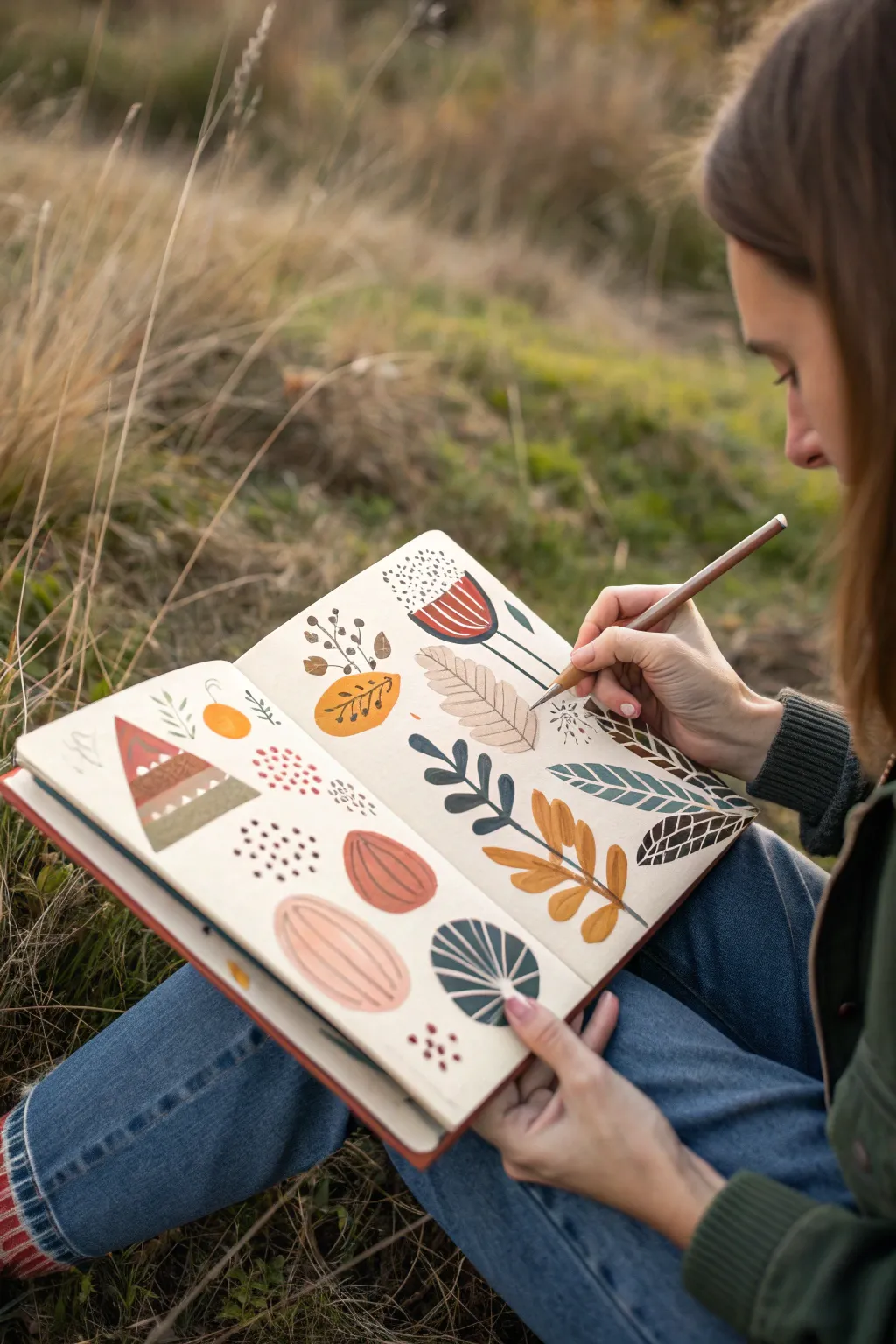
Capture the essence of the outdoors with this relaxed, nature-inspired spread created using tempera paint sticks. The soft, muted color palette and organic shapes make this a perfect low-stress art exercise for your sketchbook.
Step-by-Step Guide
Materials
- Heavyweight sketchbook (mixed media or watercolor paper)
- Tempera paint sticks (earth tones: ochre, rust, sage green, navy, cream)
- Fine liner pens or colored pencils for detailing
- Pencil for light sketching (optional)
Step 1: Planning the Layout
-
Visualize the Composition:
Open your sketchbook to a clean spread. Instead of trying to create a single scene, think of this as a pattern collection. You want to scatter individual elements freely across both pages, leaving plenty of comfortable white space between them. -
Rough Placement:
If you feel nervous about going straight in with color, lightly mark simple circles or ovals with a pencil where you want your main elements to sit. Keep the arrangement loose and random.
Smudged Lines?
Tempera sticks dry fast but can stay waxy. If your pen skips or won’t write over the paint, switch to a soft varying-grade pencil or a standard ballpoint pen instead of a felt tip.
Step 2: Creating the Base Shapes
-
Paint the Triangle Motif:
Start on the left page with a rust-red triangle shape. Use the edge of your paint stick to get somewhat crisp lines, filling in separate bands of color—perhaps rust at the top and stripes of cream and sage green below. -
Add Organic Ovals:
Draw several large, smooth oval shapes using soft pink or cream paint sticks. These will become abstract pods or leaves later. Fill them in solidly so the texture looks creamy and opaque. -
Layering the Leaves:
Using an ochre or yellow-orange stick, draw a solid leaf shape. I like to press a bit harder here to get rich coverage. Add a matching circular fruit shape nearby to balance the color. -
Cool Tones:
Introduce a deep navy or dark teal paint stick to create contrast. Draw a few simple, solid leaf shapes or half-circles. This dark value anchors the lighter, earthier tones.
Sharper Edges
For crisper shapes, use a small flat paintbrush slightly dampened with water to refine the edges of the tempera paint while it’s still fresh on the page.
Step 3: Adding Details & Texture
-
Drying Time:
One of the best things about tempera sticks is how fast they dry. Wait about 60 seconds for the base layers to set so your detailed lines won’t smudge or dig into the paint. -
Stem Work:
Take a brown or black fine liner (or a sharpened colored pencil) and draw the central stems through your leaf shapes. Extend the stems slightly beyond the paint for a sketchy, illustrative look. -
Leaf Veining:
Add veins to your painted leaves. For the ochre leaf, draw simple branching lines. For the large cream ovals, try drawing long, vertical stripes to mimic the texture of a melon or gourd. -
Geometric Patterns:
Return to your triangle motif. Use a white gel pen or a contrasting colored pencil to add zigzag lines or small dots over the dried paint stripes. -
Botanical Doodles:
In the white spaces between your painted shapes, draw delicate sprigs and berries directly on the paper with your pen. These fine lines create a lovely contrast against the chunky paint stick textures. -
Dot Accents:
Using the tip of a paint stick or a marker, cluster small dots together in open areas. Try a group of red dots near the triangle, or black speckles inside a flower shape. -
The Fan Leaf:
Create the striking striped leaf at the bottom right. Draw a semi-circle with dark green, then use a light colored pencil or white pen to draw radiating lines from the center base to the outer edge. -
Final Flourishes:
Look at the spread as a whole. If an area feels too empty, add a small dashed line or a tiny sprig of leaves. The beauty is in the imperfection, so precise lines aren’t necessary.
Enjoy the relaxing process of filling your pages with these nature-inspired forms
Have a question or want to share your own experience? I'd love to hear from you in the comments below!