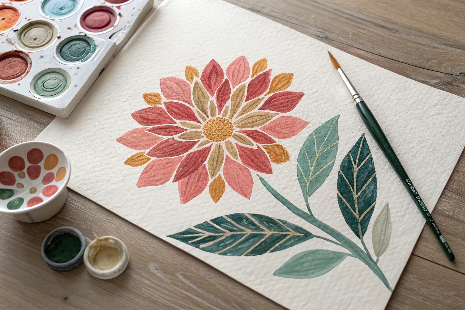
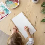
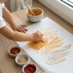
When I want big, bold color without hauling out water cups and brushes, tempera paint sticks are my go-to. Here are my favorite tempera paint sticks ideas—starting with the classics and sliding into the fun, unexpected stuff once you’re warmed up.
Swatch Cards and Color Families With Tempera Paint Sticks
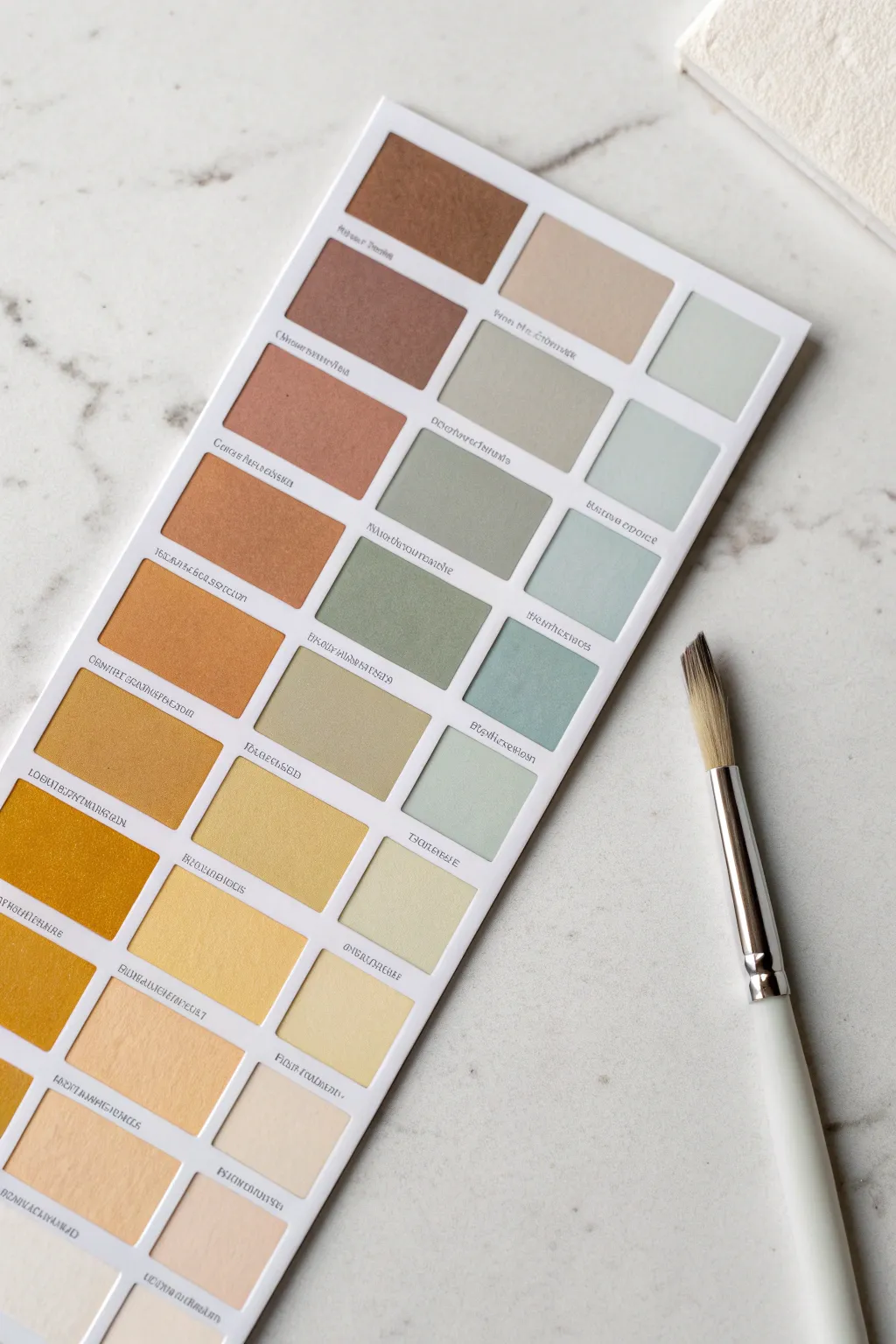
This elegant swatch card showcases the creamy opacity and blending capabilities of tempera paint sticks, organizing colors into harmonious families of warm ochres, muted greens, and soft neutrals. The resulting grid serves as both a beautiful reference tool and a minimalist piece of abstract art.
Step-by-Step Tutorial
Materials
- Heavyweight white cardstock or watercolor paper (A4 or similar size)
- Tempera paint sticks (assorted colors including browns, ochres, greens, blues, white)
- Wide flat synthetic brush
- Ruler
- Pencil
- Washi tape or masking tape (approx 1/4 inch width)
- Black fineliner pen (0.3mm or 0.5mm)
- Paper palette for mixing (optional)
- Craft knife or scissors
Step 1: Preparation & Layout
-
Measure the grid:
Start by deciding on the size of your swatch rectangles. A standard size like 1.5 x 1 inch works well. Use your ruler to mark out a grid on your cardstock that allows for three columns and about eight to ten rows. -
Mask the borders:
To achieve those crisp, clean edges between the color blocks, apply thin washi tape or masking tape along all your pencil grid lines. Press the tape down firmly, especially at the intersections, to prevent paint from bleeding underneath. -
Define the outer edge:
Don’t forget to tape off the outer border of the entire grid area as well. This creates a professional-looking white margin around your finished swatches.
Bleeding Lines?
If paint seeps under the tape, try burnishing the tape edges with a bone folder or spoon before painting. Using less water on your brush also helps prevent capillary action.
Step 2: Mixing & Application
-
Plan your palette:
Organize your tempera paint sticks before you start. You want to create gradients. For the left column, gather your browns, oranges, and yellows. For the middle, look for muted greens and sages. For the right, select cooler greys and pale blues. -
Start with the darkest warm tones:
Begin at the top left with your deepest terracotta or rust color. Scribble the paint stick directly onto a separate palette or scrap paper first to warm it up, then apply it to the first rectangle. -
Smooth the application:
For a flat, even finish like in the photo, I like to scribble the paint stick in the center of the masked square, then immediately use a slightly damp flat brush to spread the pigment to the edges. This eliminates the crayon-like texture. -
Create the warm gradient:
Work your way down the first column. To transition color, mix a little of the previous color with the next one (e.g., rust into ochre). You can blend them directly on the paper while wet or mix them on your palette first. -
Lighten the yellows:
As you reach the bottom of the warm column, introduce white to your yellow tempera stick. Mix plenty of white with a tiny dot of yellow ochre to get those pale, creamy butter tones at the bottom. -
Begin the green column:
Move to the top of the middle column. Start with a brownish-grey or taupe to bridge the gap between families. Apply the paint generously within the masked area. -
Develop sage tones:
Transition into greens by mixing a dark green stick with a significant amount of grey or brown. Tempera sticks are opaque, so you can layer colors to muddy them down into nice earthy sages. -
Lighten to mint:
As you descend the middle column, add progressively more white to your green mix. The bottom squares should be very pale, almost pastel mint or soft pistachio. -
Fill the cool column:
In the third column (if your grid allows), focus on greys and muted blues. Follow the same top-to-bottom gradient principle: darker, stormier colors at the top fading into barely-there tints at the bottom. -
Dry completely:
Let the paint dry fully. Tempera sticks dry quickly, but because we used a damp brush, give it at least 15-20 minutes to ensure the paper isn’t soggy when we remove the tape.
Swatch Secrets
Turn this into a functional tool! Punch a hole in the corner of several cards and bind them with a metal ring to create a portable color mixing guide for your studio.
Step 3: Finishing Touches
-
Reveal the grid:
Carefully peel away the masking tape. Pull the tape slowly at a 45-degree angle away from the painted area to ensure crisp lines and prevent tearing the paper. -
Clean up edges:
If any paint bled under the tape, you can gently scrape it away with a craft knife or cover it with a tiny dab of white acrylic or gouache for a perfect finish. -
Add labels:
Using a fine black pen, write the name of the color or the mixture used directly underneath each rectangle. Use a small, neat font to mimic a commercial swatch card. -
Final trim:
Use your ruler and craft knife to trim the cardstock down to your final desired size, leaving an even white border around your colorful grid.
Now you have a professional-grade color reference sheet that is as pleasing to the eye as it is useful for future projects

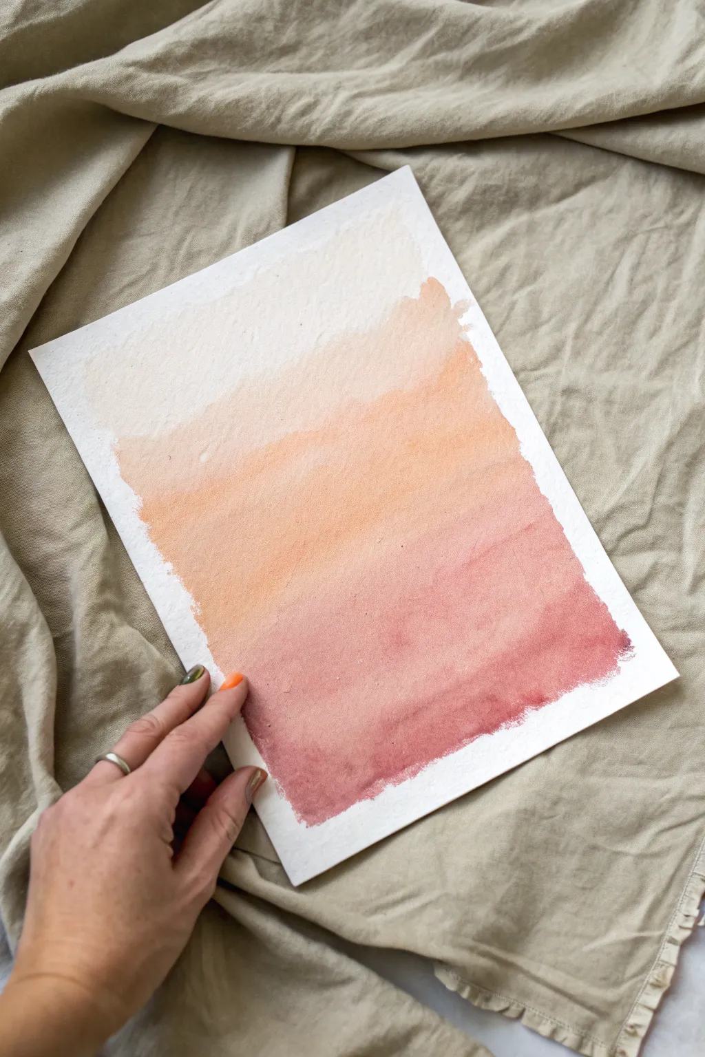
Ombre Skies Using Tempera Paint Sticks
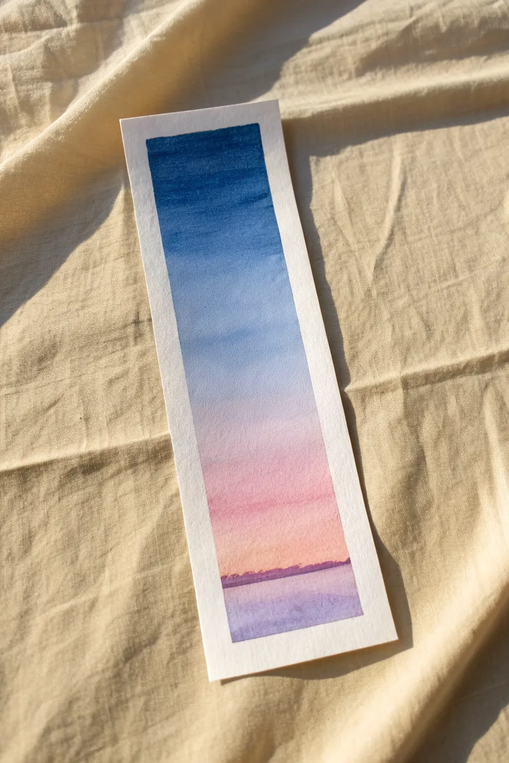
Create a stunning sunset gradient that fits right between the pages of your current read. This project uses the creamy blendability of tempera paint sticks to mimic a soft watercolor effect without the mess of water cups.
Step-by-Step Tutorial
Materials
- Tempera paint sticks (Dark Blue, Light Blue, Pink, Purple)
- Heavyweight watercolor paper or mixed media paper cut into a strip
- Washi tape or masking tape
- A clean finger or a dry foam brush for blending
- Paper towel
Step 1: Preparation
-
Size your paper:
Cut your watercolor paper into a bookmark shape, approximately 2 inches wide by 6 inches tall. -
create a border:
Place your paper strip on a flat surface and use washi tape to tape down all four edges, creating a clean white border frame about 1/4 inch wide. -
Press the edges:
Run your fingernail along the inner edge of the tape to ensure a tight seal, which prevents paint from creeping underneath.
Smooth Blending Trick
Work quickly! Tempera sticks blend best while ‘wet.’ If they dry, scribble a tiny bit of fresh color on top to reactivate the pigment.
Step 2: Sky Gradient
-
Start at the top:
Using your Dark Blue tempera stick, color a thick horizontal band at the very top of the exposed paper area, covering about one-fifth of the length. -
Add the mid-tone:
Directly below the dark blue, apply the Light Blue stick. Overlap the colors slightly where they meet to make blending easier later. -
Transition to sunset:
Leave a small gap of white paper, then apply a band of Pink starting just below the middle point of your bookmark. -
Blend the blues:
Use your finger or a dry foam brush to smudge the boundary between the Dark Blue and Light Blue, working the darker color down into the lighter one. -
Create the fade:
Gently rub the bottom edge of the Light Blue section downward into the white gap, creating a soft, misty transition before it hits the pink. -
Blend the pink:
Smudge the Pink section, pulling the color upward slightly to meet the faded blue, creating a soft lavender transition, and dragging it downward toward the horizon line.
Add Some Sparkle
Once fully dry, use a white gel pen or metallic marker to add tiny stars in the dark blue section or ripples in the water.
Step 3: Horizon and Foreground
-
Draw the horizon:
About one inch from the bottom tape line, use the Purple stick to draw a jagged, uneven line across the paper to represent distant mountains or land. -
Fill the water:
Below the purple horizon line, lightly sketch in some Purple and a touch of Pink to represent the reflection on the water. -
Soften the reflection:
Smudge the bottom section horizontally. I find that using horizontal strokes here helps mimic the look of still water. -
Define the land:
Go back over your horizon line with get gently dabs of the Purple stick to make the silhouette more distinct against the sunset sky. -
Final check:
Look for any harsh lines in your sky gradient and give them one last gentle rub to smooth them out.
Step 4: Finishing Touches
-
Dry time:
Let the tempera paint sit for about 2-3 minutes. Although these sticks dry fast, waiting ensures you don’t smudge the crisp edges when removing tape. -
Reveal the border:
Carefully peel away the washi tape. Pull the tape away from the artwork at a 45-degree angle to keep the paper from tearing. -
Optional hole punch:
If you wish, punch a hole at the top center of the white border and tie a ribbon through it.
Now you have a serene landscape to mark your place in your favorite story
Bold Shape Landscapes With Tempera Paint Sticks
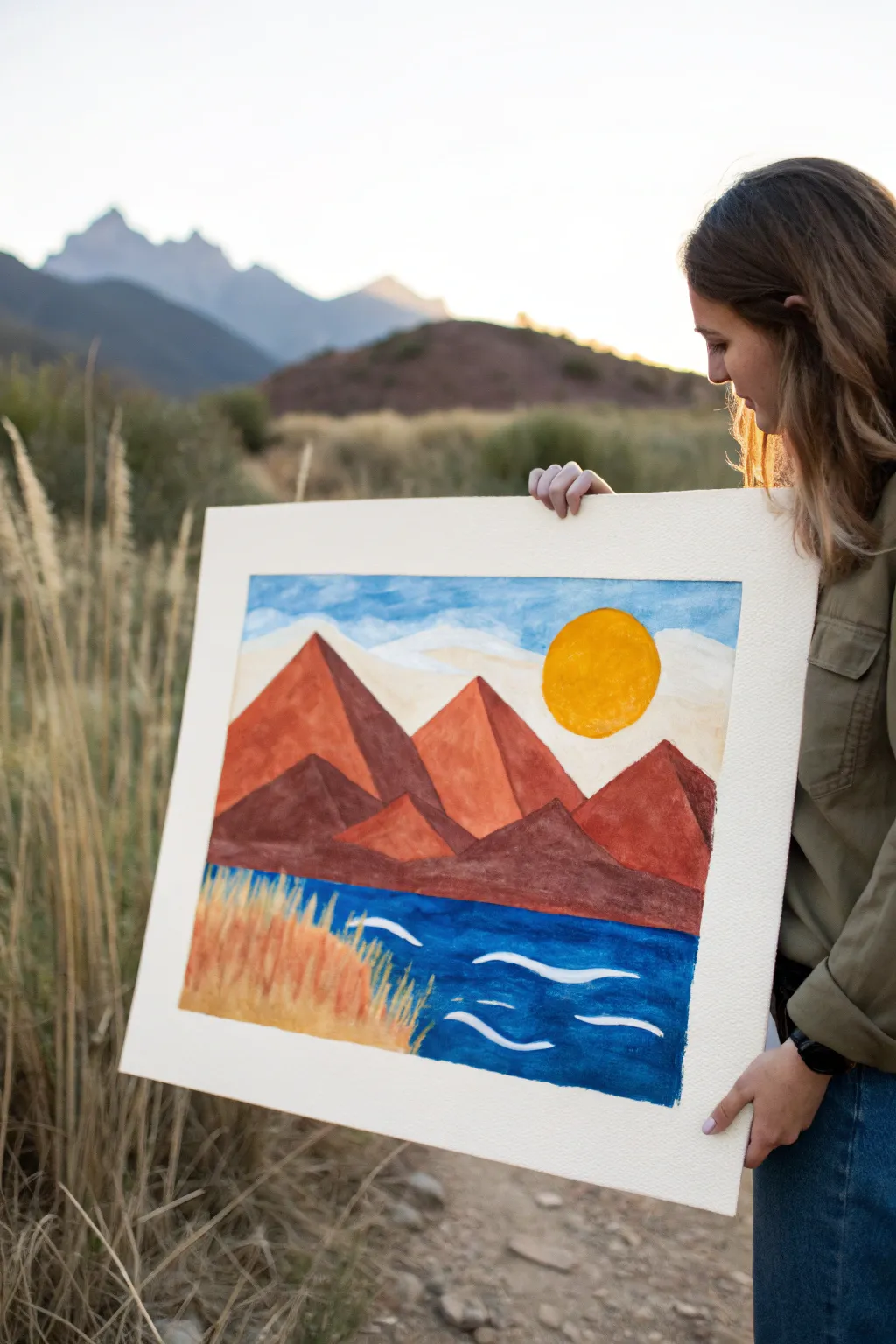
Capture the geometric beauty of a mountain chain using the vibrant, fast-drying power of tempera paint sticks. This project focuses on layering broad shapes and rich earth tones to create a stylized, graphic landscape that pops off the page.
Detailed Instructions
Materials
- Heavyweight watercolor paper or mixed media art board
- Tempera paint sticks (set including brown, ochre, red, blue, white, and yellow)
- Painter’s tape
- Pencil (optional for sketching)
- Paper towel or blending stump (optional)
Step 1: Setting the Scene
-
Tape the borders:
Begin by taping down all four edges of your paper to a flat surface. This creates that crisp, clean white border seen in the final piece and keeps the paper steady while you work. -
Sketch the horizon:
Lightly sketch a horizon line just below the halfway point of your paper. If you feel confident, you can skip the pencil and go straight to painting, but a guide helps keep proportions balanced. -
Outline mountain peaks:
Draw three large triangular shapes for your main mountain range. Vary their heights, with the central peak slightly recessed, overlapping the others to create depth. -
Define the foothills:
Sketch a lower, jagged line across the bottom of the mountains to represent the darker foothills. This separates the majestic peaks from the body of water below.
Step 2: Sky and Sun
-
Paint the sun:
Using a bright yellow paint stick, draw a large circle in the upper right sky. Fill it in solidly, applying extra pressure to make it opaque and vibrant. -
Block in the sky:
Take a light blue stick and color the sky loosely. Leave some white space around the sun and near the mountain tops to suggest light clouds. -
Add cloud texture:
Use a white paint stick to smudge and blend into the blue areas. I like to vigorously rub the white over the blue edges to create a soft, wispy cloud effect. -
Layer cream tones:
If your set has a cream or very pale yellow, add a few streaks horizontally near the horizon line to warm up the sky without overpowering the blue.
Muddy colors?
If colors smear too much, let the first layer dry for 60 seconds. Paint sticks dry fast, but sketching over wet areas can drag pigment.
Step 3: Mountains and Water
-
Color the main peaks:
Fill the large mountain triangles with a terracotta or reddish-orange hue. Apply the color in diagonal strokes that mimic the slope of the mountains. -
Apply shadows:
On the left side of each mountain peak, layer a darker brown or deep red over your base color. This creates a shadow side and gives the mountains a 3D geometric form. -
Fill the foothills:
Color the lower foothill section with your darkest brown. Press firmly to ensure solid coverage that grounds the composition. -
Create the water base:
Fill the entire bottom, water section with a deep blue paint stick. Use long, horizontal strokes to establish the feeling of a flat water surface.
Make it texture-rich
Scrape a toothpick or old credit card through the wet paint on the mountains to create craggy rock textures and physical relief.
Step 4: Foreground Details
-
Add water ripples:
Once the blue base is dry to the touch (which happens quickly with paint sticks), take your white stick and draw bold, wavy horizontal lines. Vary their length to suggest movement in the water. -
Start the grasses:
In the bottom left corner, use an ochre or gold paint stick to draw vertical strokes moving upward. These represent the tall, dry grasses in the foreground. -
Layer grass colors:
Add depth to the grass by layering brighter orange or yellow strokes in between the ochre ones. Flick your wrist upward as you draw to taper the ends of the grass blades. -
Final touch-ups:
Check your edges. If any color needs to be bolder, go over it one last time. The waxiness of the sticks allows for great layering. -
Reveal:
Gently peel away the painter’s tape at a 45-degree angle to reveal your crisp, clean borders and framed landscape.
Step back and admire your vibrant geometric landscape before finding the perfect spot to display it


Tape Resist Geometrics With Tempera Paint Sticks
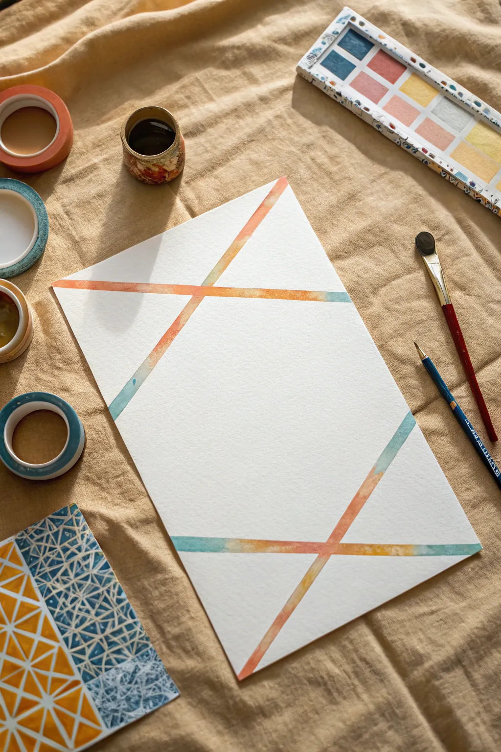
Create a sophisticated, minimalist art piece using the crisp lines of painter’s tape and the smooth blendability of tempera paint sticks. This project highlights negative space to frame soft, translucent gradients of color in a striking geometric pattern.
Detailed Instructions
Materials
- White mixed media or watercolor paper (heavyweight)
- Painter’s tape or washi tape (low tack)
- Tempera paint sticks (orange, teal, yellow)
- Small cup of water
- Flat shader brush (size 6 or 8)
- Round detail brush (size 4)
- Paper towels
Step 1: Planning and Taping
-
Prepare your surface:
Start with a clean, flat surface and lay out your heavyweight paper. It helps to secure the corners of your paper to the table with a tiny bit of tape to keep it from shifting while you work. -
Create the first diagonal:
Visualize a large triangular shape at the top of the page. Place a long strip of painter’s tape diagonally across the upper third of the paper, sloping downward from left to right. -
Complete the top X:
Place a second strip of tape starting from the top right edge, crossing over your first piece to create a wide ‘X’ shape. Verify the tape edges are pressed down firmly to prevent paint bleed. -
Mirror the design:
Repeat this process at the bottom of the page. Lay down two more strips of tape that cross each other, mirroring the ‘X’ shape from the top to create a balanced composition. -
Seal the edges:
Run your fingernail or a bone folder along every edge of the tape. This is crucial for crisp lines later.
Pro Tip: Stickiness
Before applying tape to paper, stick it to your jeans or shirt first. This removes some adhesive so it peels off without tearing your artwork.
Step 2: Applying Color
-
Start with orange:
uncap your orange tempera paint stick. Directly apply a generous amount of pigment onto the tape intersections and slightly onto the open paper areas near the tape lines. -
Add teal accents:
Apply the teal paint stick to the outer edges of your tape design, leaving some space between the orange and teal for blending. -
Introduce yellow:
Fill in the remaining gaps near the tape with the yellow paint stick. Don’t worry about perfect coverage; the water will do the work. -
Activate with water:
Dip your flat shader brush into water. Gently brush over the paint stick marks, turning the solid pigment into a watercolor-like wash. -
Blend the gradients:
Use the wet brush to pull the orange into the teal and yellow areas. I find working quickly here prevents the paint from drying too fast, allowing for smoother transitions. -
Refine the wash:
Continue brushing along the tape lines until you have a continuous, semi-transparent strip of color that follows the geometry of the tape. -
Clean up edges:
If plenty of water was used, dab any large pools with a paper towel to ensure the paper doesn’t buckle too much.
Level Up: Metallic Pop
Once the paint is dry, outline the white negative space with a fine-tip gold paint pen for a touch of elegance and shine.
Step 3: The Reveal
-
Let it dry completely:
Allow the paper to dry fully. Tempera sticks dry fast, but water activation adds time. Wait until the paper is cool and dry to the touch. -
Peel the first strip:
Pick a corner of the top tape strip. Pull it back slowly at a 45-degree angle purely away from the paint to keep the edge sharp. -
Remove remaining tape:
Continue peeling off the rest of the tape strips gently. If the paper starts to lift, pause and peel from the opposite direction. -
Assess the lines:
Check your white lines. If any paint bled under, you can carefully scrape it away with a craft knife or cover it with a white gel pen. -
Final touches:
Use a detail brush with a tiny bit of water to smooth out any rough blending edges within the painted sections, if desired, to perfect that soft watercolor look.
Enjoy the clean, crisp satisfaction of your new geometric masterpiece
BRUSH GUIDE
The Right Brush for Every Stroke
From clean lines to bold texture — master brush choice, stroke control, and essential techniques.
Explore the Full Guide
Sunburst Rays With Tempera Paint Sticks and Tape
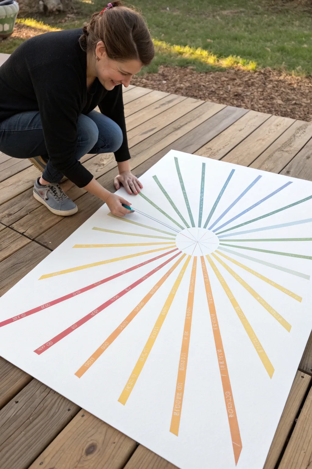
Create a striking piece of oversized art using the magic of painter’s tape and the vibrant coverage of tempera paint sticks. This radial design features crisp white lines bursting through a rainbow gradient, resulting in a modern, geometric look that’s perfect for playrooms or classrooms.
How-To Guide
Materials
- Large white poster board or heavy cardstock (minimum 22×28 inches)
- Set of tempera paint sticks (rainbow colors)
- Painter’s tape or masking tape (1/4 inch width is ideal)
- Pencil
- Ruler or yardstick
- Round object for tracing (like a dinner plate or bowl)
Step 1: Setting the Framework
-
Prepare your surface:
Lay your large poster board on a flat, stable surface like a table or a clean section of decking. If you are working outside, make sure it’s not too windy, or weigh down the corners. -
Mark the center:
Place your round object (like a plate) directly in the center of the poster board and lightly trace around it with a pencil to create the central hub of your sunburst. -
Draw the rays:
Using your ruler or yardstick, lightly draw lines extending from the edge of your central circle all the way to the edges of the paper. Space them out to create wedge shapes. -
Apply the tape:
Carefully place strips of your 1/4 inch tape over your pencil lines. The tape acts as a resist, protecting the white paper underneath. -
Secure the edges:
Run your finger firmly along the edges of every piece to ensure a tight seal so paint doesn’t seep underneath.
Bleeding Lines?
If paint crept under the tape, use a white paint pen or correction fluid to clean up the edges. Next time, burnish the tape edges harder with a spoon back.
Step 2: Adding Color
-
Plan your gradient:
Lay out your paint sticks in the order you want to use them. A rainbow progression (red, orange, yellow, green, blue) usually looks best for a cohesive burst effect. -
Start painting the wedges:
Begin filling in the triangular ‘slices’ between the tape lines. Use the tempera paint sticks to color directly onto the paper. -
Paint over loop lines (optional):
If you want the intricate internal lines shown in the example, apply smaller pieces of tape inside the wedges before painting, or simply paint solid blocks of color for a bolder look. -
Cover the tape:
Don’t be afraid to color right over the tape lines. In fact, ensuring you paint slightly onto the tape guarantees crisp edges later. -
Build the saturation:
Tempera sticks are opaque, but a second pass can make the colors pop even more. I find that going over the lighter colors like yellow twice really helps them stand out. -
Blend transitions:
If you are changing colors within a single ray, slightly overlap the two colors while the paint is still wet to create a soft blend.
Level Up: Hidden Messages
Before painting, write secret words or patterns inside the rays with a white crayon. The wax will resist the paint stick, revealing the message after coloring.
Step 3: The Big Reveal
-
Let it set:
Tempera paint sticks dry very quickly—usually within 90 seconds—but give the project about 5 minutes just to be safe before touching the tape. -
Find the tape end:
Locate the edge of one of your tape strips. You might need to use a fingernail or a craft knife to gently lift the very tip. -
Peel slowly:
Pull the tape back slowly at a 45-degree angle. This angle reduces the chance of ripping the paper underneath. -
Remove all strips:
Continue working your way around the sunburst, removing every piece of tape one by one to reveal the clean white grid lines. -
Clean up the center:
If any paint smudged into the white center circle, you can touch it up with white acrylic paint or simply leave it as a mark of the handmade process.
Enjoy hanging your bright and cheery masterpiece in a spot that needs a little extra sunshine
Texture Samplers: Scribbles, Dots, and Hatching in Tempera Paint Sticks
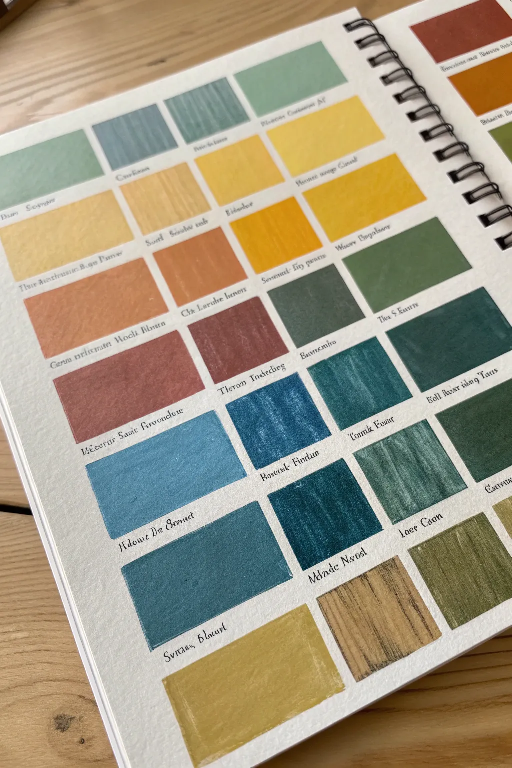
Create a satisfying and organized reference page of colors that doubles as a piece of abstract art. This project explores the creamy, blendable texture of tempera paint sticks arranged in a neat grid of rectangular swatches.
Detailed Instructions
Materials
- Spiral-bound sketchbook (heavy mixed-media paper recommended)
- Set of tempera paint sticks (variety of greens, ochres, blues, and browns)
- Ruler or straight edge
- Light pencil (HB or 2H)
- Fine-point black ink pen (archival quality for labeling)
- Paper towel or tissue (for blending edges)
- Masking tape (optional, for crisp edges)
Step 1: Grid Layout
-
Measure margins:
Begin by deciding on the layout of your page. Leave a generous margin around the edges of the sketchbook page to frame your work. -
Calculate swatch size:
Count how many colors you want to display. For a crowded page like the example, aim for smaller rectangles, roughly 1.5 inches wide by 1 inch tall. -
Draw horizontal guides:
Using your ruler and a very light pencil touch, draw horizontal lines across the page to denote the top and bottom of each row of rectangles. Leave about half an inch of space between rows for text. -
Mark vertical guides:
Mark the vertical spacing. You don’t need to draw full vertical lines if you want a softer look, but light tick marks at the top and bottom of each row will help keep the boxes consistent in width.
Clean Edges Only
For perfectly sharp rectangles, place drafting tape or low-tack washi tape along your pencil lines before coloring, then peel it away for a crisp border.
Step 2: Applying Color
-
Select your palette:
Choose a cohesive color story. The example uses earthy tones: sage greens, slate blues, deep ochres, and terra cottas. Group similar tones together before you start. -
Start the first swatch:
Take a paint stick—let’s start with a pale sage green—and fill in the first penciled rectangle. Apply firm pressure to get an opaque, solid layer of color. -
Refine the edges:
Because paint sticks have broad tips, use the edge of the stick carefully to establish straighter corners, or smooth the pigment slightly with your finger to keep it within the pencil lines. -
Complete the first row:
Move to the next color in your sequence. Try placing contrasting tones next to each other, like placing a slate blue next to a pale green, to make them pop. -
Create texture:
As you fill subsequent rows, experiment with your stroke direction. For some boxes, color vertically; for others, color horizontally. This slight variation adds visual interest to the flat color. -
Layering blending:
If you want a custom shade, this is the time to mix. Apply a layer of one color (like yellow ochre) and immediately layer a second color (like brown) on top while the paint is still creamy. -
Fill the page:
Continue working down the grid, row by row. I find it helpful to wipe the tip of the paint stick on a scrap paper if it picks up residue from a neighboring color. -
Buffing (optional):
For an ultra-smooth finish, you can gently buff the surface of a semi-dry swatch with a clean tissue to remove any waxy crumbs or clumps.
Smudge Prevention
Tempera sticks dry fast but can smear if touched too soon. Place a sheet of clean scrap paper under your hand as you write the labels to protect the art.
Step 3: Labeling and Finishing
-
Dry completely:
Wait for the paint sticks to fully set. Depending on the brand and thickness, this usually takes just a few minutes, but touch a corner to ensure it’s not tacky. -
Prepare for lettering:
Using your ruler again, lightly pencil a baseline about a quarter-inch below each colored rectangle. This ensures your text will be perfectly straight. -
Add color names:
With a fine-point black pen, write the name of the color under the swatch. You can use the official manufacturer name or invent creative names like ‘Mossy Stone’ or ‘Deep Sea’. -
Stylize the text:
To match the vintage botanical aesthetic of the example, try a slightly gothic or cursive handwriting style. Practice on scrap paper first if you are unsure. -
Erase guides:
Once the ink is totally dry, carefully erase any visible pencil lines from your grid or text baselines. be gentle near the paint to avoid smearing.
Now you have a beautiful color reference guide that serves as a piece of art in itself

PENCIL GUIDE
Understanding Pencil Grades from H to B
From first sketch to finished drawing — learn pencil grades, line control, and shading techniques.
Explore the Full Guide
Blend and Buff: Smudged Backgrounds With Tempera Paint Sticks
Capture the warmth of a setting sun with this dreamy, soft-focus gradient technique. By layering and buffing tempera paint sticks, you can achieve a textured, watercolor-like wash without the mess of liquid paints.
Step-by-Step
Materials
- Heavyweight watercolor paper or mixed media paper
- Tempera paint sticks (cream, light peach, orange, and terracotta/deep red)
- Clean, dry paper towels or a soft cotton rag
- Washi tape or painter’s tape (optional)
Step 1: Setting the Composition
-
Prepare your surface:
Start with a sheet of high-quality watercolor or mixed media paper. The texture of the paper is crucial here, as it grabs the pigment and creates that lovely rough edge. If you want a clean border, tape down your edges, but for the organic look shown, leave the paper loose. -
Planning the zones:
Mentally divide your paper into three or four horizontal sections. You don’t need to draw lines; just visualize where your lightest color will transition into the mid-tones and finally the darkest shade at the bottom.
Friction is Friend
Work quickly while blending! The friction from vigorous rubbing warms the wax in the paint sticks, making the gradient significantly smoother and more seamless.
Step 2: Layering the Colors
-
Apply the lightest shade:
Take your cream or palest beige tempera stick and color the top third of the paper. Use broad, horizontal strokes. Don’t worry about complete coverage yet; a little paper showing through adds texture. -
Add the mid-tone:
Below the cream section, apply a band of light peach or soft orange. Allow this color to slightly overlap the bottom edge of the cream section you just painted. -
Introduce the depth:
For the bottom third, apply your deepest color—a terracotta or russet red. Make these strokes confident and bold, anchoring the bottom of the composition. -
Add transition strokes:
Go back and add a few light dashes of orange into the red section, and a few dashes of cream into the peach section to prepare for blending.
Metallic Touch
Once the gradient is fully blended, lightly skim a gold metallic tempera stick over the transition lines to add a subtle, shimmering sunset glow.
Step 3: Buffing and Blending
-
Begin the buffing process:
Wrap a clean paper towel around your index and middle finger. Start at the very top (the lightest section) and rub the paint in circular motions to smooth it out. -
Work downwards:
Slowly move your buffing motion down toward the peach section. As you cross the border between colors, rub horizontally back and forth to merge them. -
Creating the gradient:
Applying firm pressure is key. The friction heats the tempera slightly, making it creamier and easier to push into the paper’s texture. -
Switching spots:
Rotate your paper towel to a clean spot before you start blending the darkest red section. This prevents you from dragging dark pigment up into your pristine light sky. -
Soften the edges:
Buff the middle transition area where the peach meets the red. I find using a small circular motion here creates the most natural, cloud-like fade. -
Refining the borders:
Pay attention to the left and right edges of your painted area. Instead of making a hard line, let your paper towel smudge the paint outward slightly for that rough, organic deckled look.
Step 4: Final Touches
-
Assess the saturation:
Step back and look at your gradient. If the bottom doesn’t feel heavy enough, layer more red tempera stick right over your buffed area. -
The second buff:
Gently buff any new layers you added. The waxier nature of tempera sticks allows for great layering without tearing the paper. -
Texture check:
Look closely at the paper grain. If you want a smoother look, keep buffing. If you like the white specks showing through, stop early. -
Clean up edges:
If you got any stray smudge marks on the white border where you didn’t want them, a clean white eraser can often lift them away effectively.
Your finished piece now glows with a soft, radiant warmth that looks beautiful in a simple frame
Art Journal Pages Built on Tempera Paint Stick Washes
This art journal spread explores the creamy, blendable texture of tempera paint sticks to create soft, geometric color swatches and organic leaf shapes. The result is a soothing composition of terra cotta, sage green, and muted blues that feels both modern and nature-inspired.
Step-by-Step
Materials
- Spiral-bound mixed media sketchbook
- Tempera paint sticks (sage green, muted blue, terra cotta/rust, beige/cream)
- Scrap paper or cardstock (for masking)
- Pencil (optional)
- Small round paintbrush
- Clean water
Step 1: Creating the Grid Layout
-
Preparing the surface:
Begin with a fresh spread in your coil-bound journal. Ensure the paper is heavy enough to handle a bit of moisture, though tempera sticks are famously low-mess. -
Drafting the squares:
Lightly sketch a broad grid on the left-hand page using a pencil. You aren’t aiming for perfect ruler-straight lines; a hand-drawn grid adds character. -
Choosing the palette:
Select your core colors. For this look, stick to an earthy, muted palette: rust orange, dusty blue, soft sage, and a warm cream.
Sticky pages?
If your pages feel tacky even after drying, place a sheet of wax paper between them before closing the book. This prevents the swatches from glueing together.
Step 2: Filing the Swatches
-
Applying the first block:
Start with your terra cotta stick. Color directly onto the paper in one of the grid squares. Apply medium pressure to get good coverage without creating thick clumps. -
Creating the textured edge:
Instead of coloring all the way to the pencil line, stop just short. Use your finger or a dry paintbrush to smudge the edges outward, creating that rough, painterly border. -
Adding contrasting tones:
Move to an adjacent square and switch to the sage green stick. Repeat the coloring and smudging process, ensuring the colors don’t muddy where the squares meet. -
Completing the pattern:
Continue filling the grid, alternating colors to create a pleasing rhythm. I like to let the white of the page show through between the blocks to keep the layout breathing. -
Layering for depth:
If any square looks too sheer, wait a moment for it to set, then gently layer a second coat over the center of the block for added opacity.
Add definition
Once the paint is totally creating a dry surface, use a fine-tip black ink pen to loosely outline the color blocks or add veins to the leaves.
Step 3: The Right Page Botanical
-
Sketching the stem:
On the right-hand page, lightly sketch a simple, curved stem rising from the bottom right corner, branching out toward the page center. -
Leaf placement:
Draw large, teardrop-shaped leaves extending from your stem. Keep the arrangement loose and organic. -
Painting with sticks:
For the leaves, we’ll use a slightly wetter technique. Scribble some pigment from your paint stick onto a separate scrap palette or plastic lid. -
Creating a wash:
Dip a wet paintbrush into the scribbled pigment to create a watercolor-like wash. This allows for more delicate control than the chunky stick offers directly. -
Filling the leaves:
Paint the leaves using this wash method, alternating between your rust, green, beige, and blue tones to mirror the left page’s palette. -
Adding stick details:
Once the wash is semi-dry, take the actual paint stick and gently scuff the very tips or bases of the leaves to add texture and vibrant color pops. -
Adding splatter:
Load your brush with watery rust-colored paint. Tap the handle against your finger over the right page to create fine speckles around the botanical design.
Step 4: Finishing Touches
-
Drying time:
Allow the entire spread to dry completely. Tempera sticks dry quickly, usually within minutes, but the water washes on the right might need a little longer. -
Cleaning up:
If you accidentally smudged color where you didn’t want it, a slightly damp cotton swab can often lift the pigment before it fully cures. -
Closing thought:
Review the balance of the spread. If the left side feels too heavy, try adding a few more speckles or a very faint wash to the background of the right page.
You now have a beautifully textured reference page that celebrates the unexpected versatility of tempera paint sticks


Silhouette Stencils Over Tempera Paint Sticks Color Fields
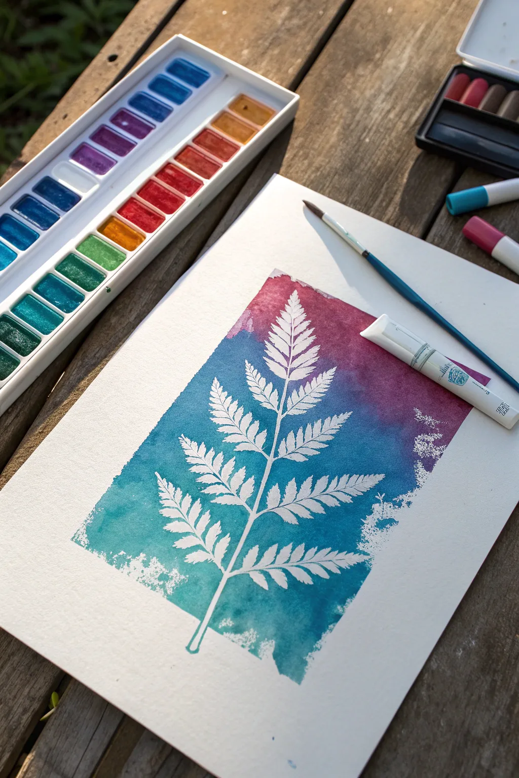
Capture the delicate beauty of a fern frond using a clever resist technique paired with vibrant color blending. This project creates a striking negative-space image where a white botanical silhouette pops against a dreamy, gradient background of teal and plum.
Step-by-Step Tutorial
Materials
- Heavyweight watercolor paper (smooth or cold press)
- Tempera paint sticks (teal/blue, purple/magenta, white/blender)
- Fern stencil or a real pressed fern frond
- Removable stencil adhesive or masking fluid (if using a real leaf)
- Clean water in a spray bottle or cup
- Soft synthetic brush (round or flat)
- Masking tape (optional, for crisp edges)
- A scrap piece of paper (for testing blends)
Step 1: Preparation & Masking
-
Secure your paper:
Begin by taping down your watercolor paper to a board or table surface if you want clean, crisp white borders later, though this is optional. -
Position the fern:
Place your fern stencil or real pressed fern in the center of the paper. If using a real fern, ensure it is completely flat to prevent paint from sneaking underneath. -
Adhere the design:
Lightly apply removable spray adhesive to the back of your stencil or leaf. Press it firmly onto the paper, paying special attention to the delicate tips of the leaves. -
Check the seal:
Run your finger along the central stem and the edges of the fronds again. A tight seal here is crucial for keeping that silhouette distinct and white.
Sticky Situation
Use a low-tack repositionable spray adhesive! If the adhesive is too strong, press the stencil onto your t-shirt first to remove some stickiness.
Step 2: Creating the Color Field
-
Apply the teal base:
Starting at the bottom of the page, use your teal tempera paint stick to draw a thick block of color directly over the bottom third of the stencil and paper. -
Transition to blue:
Moving upward, apply a blue or darker teal shade along the middle section, slightly overlapping the first color block to help with blending later. -
Add the plum top:
Finish the top third of the design with your magenta or purple paint stick, coloring right over the top of the stencil and filling the upper background area. -
Activate the paint:
Dip your soft brush into clean water. I prefer not to soak it, just get it damp enough to move the creamy pigment around. -
Blend the gradients:
Gently brush over the tempera paint, working from the lightest color to the darkest (or bottom to top). Use horizontal strokes to meld the transition zones where the teal meets the purple. -
Smooth the edges:
Allow the wet paint to create a rough, painterly edge on the sides of the rectangle, rather than painting all the way to the paper’s edge, for an artistic look.
Bleeding Lines?
If paint bleeds under the stencil, your brush was likely too wet. Use less water next time, or thicker tempera application.
Step 3: The Reveal
-
Let it dry completely:
Wait until the paint is fully dry to the touch. Tempera sticks dry relatively fast, but if you lift the stencil while it’s wet, the paint might bleed into the white space. -
Lift the stem:
Carefully slide a fingernail or craft knife under the very bottom of the fern stem. lift it slowly. -
Remove the stencil:
Peel the stencil or leaf upward and away from the paper. Do this slowly to ensure you don’t tear the paper surface. -
Clean up edges:
If any color seeped under the leaves, you can gently scratch it away with a craft knife or cover it with a tiny bit of white opaque paint. -
Add texture (optional):
To mimic the speckled edges seen in the example, you can take a nearly dry sponge with a little white paint and dab it lightly around the very outer perimeter of the colored rectangle.
Once peeled, you will have a crisp, brilliant white fern preserved forever in a sea of color
Faux Stained Glass With Tempera Paint Sticks
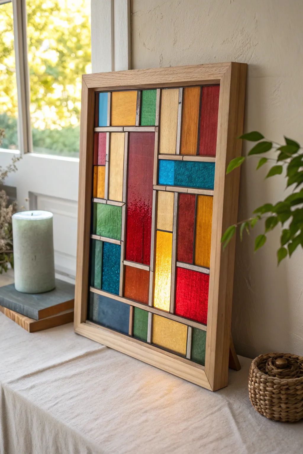
Transform a simple sheet of acrylic or glass into a glowing masterpiece that captures the light just like traditional stained glass. This striking geometric design uses the smooth, vibrant coverage of tempera paint sticks to create translucent blocks of color without the need for soldering or glass cutting.
How-To Guide
Materials
- Tempera paint sticks (assorted colors)
- Clear acrylic sheet or glass form (8×10 or similar size)
- Wooden float frame
- Liquid lead leading strips (or black dimensional puffy paint)
- Ruler or straight edge
- Dry erase marker (fine tip)
- Paper towels
- Cotton swabs
- Graph paper (optional but helpful)
Step 1: Drafting the Design
-
Plan your pattern:
Sketch out a rectangular block pattern on a piece of graph paper first. The design in the image relies on varied rectangle sizes—some tall and thin, others short and wide—interlocking in a grid-like fashion. -
Prepare the surface:
Clean your acrylic or glass sheet thoroughly with glass cleaner and a lint-free cloth. Any oil or fingerprints will make the paint stick adhere unevenly. -
Transfer the grid:
Place your drafted pattern underneath the clear sheet. Using a ruler and a dry erase marker, lightly trace the main structure of your geometric lines onto the front surface of the glass.
Uneven Coverage?
If the paint looks too streaky, let the first layer dry fully. Then, apply a second layer using a cross-hatch motion (perpendicular to the first strokes) for solid coverage.
Step 2: Creating the Lead Lines
-
Apply the leading lines:
Using self-adhesive leading strips or a steady hand with black dimensional paint, trace over your marked grid lines. I find it easiest to do the long vertical lines first, then fill in the horizontal connectors. -
Clean up intersections:
If using liquid paint, use a toothpick to sharpen corners where lines meet. If using strips, press them down firmly to ensure a tight seal against the glass so paint won’t bleed under later. -
Let the borders set:
Allow the leading lines to dry completely. For dimensional paint, this might take several hours; adhesive strips are ready immediately. -
Erase guide marks:
Once the ‘lead’ is secure and dry, gently wipe away any visible dry erase marker lines from the glass surface with a cotton swab.
Step 3: Applying Color
-
Select your palette:
Choose a mix of primary colors (reds, blues) and earthier tones (ochre, amber, olive green) to match the warm aesthetic of the example project. -
Fill the large sections:
Start with the largest rectangles. Uncap a red tempera paint stick and color directly onto the glass within the lines. Use smooth, consistent strokes to minimize streakiness. -
Work in color groups:
Apply one color at a time across the whole piece. Fill all your blue squares, then move to the yellows. This keeps the colors clean and prevents accidental mixing on the glass. -
Layer for opacity:
Tempera sticks are creamy and dry quickly. For a deeper, more saturated look like the dark red sections, wait a minute for the first coat to set and apply a second layer. -
Create texture:
While the paint is still slightly tacky, you can dab it gently with a finger or a bit of texture sponge to give it that uneven, authentic vintage glass appearance. -
Detail the edges:
Use a cotton swab to clean up any paint that accidentally got onto the top of your black lead lines. Crisp black lines are crucial for the stained glass illusion.
Add Sparkle
Mix one metallic or glitter tempera stick into your palette. Painting just 2-3 small rectangles with gold or silver adds a magical shimmer when the sun hits it.
Step 4: Framing and Finishing
-
Allow to cure:
Let the entire piece dry completely. Tempera sticks dry fast, usually within minutes, but give it an hour to fully harden before handling. -
Check transparency:
Hold the glass up to a light source. If any spots look too thin or streaky, touch them up gently with the corresponding paint stick. -
Prepare the frame:
Remove the backing from your wooden float frame. Clean the inside of the frame glass if your frame comes with a secondary protective sheet. -
Mount the artwork:
Carefully place your painted acrylic sheet into the frame. Ensure the painted side is facing inward (protected) or outward depending on your texture preference, though facing inward protects it from scratches. -
Secure the backing:
Close up the frame tabs tight. Place the finished piece near a window where natural light can filter through the tempera colors.
This vibrant piece will brighten up any corner of your room with its warm, glowing colors
Window Drawings Using Tempera Paint Sticks
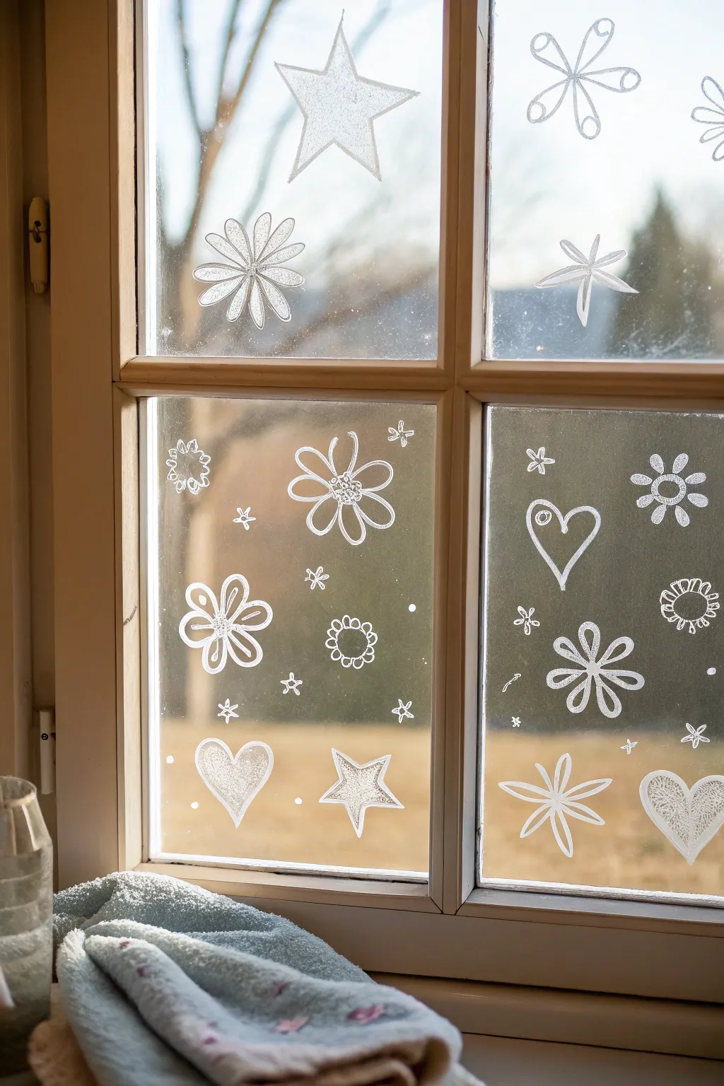
Transform an ordinary view into a winter wonderland using just white tempera paint sticks directly on the glass. These playful, sketched designs create a charming frosted effect that brightens up any room without blocking the daylight.
Step-by-Step
Materials
- White tempera paint stick (solid paint marker)
- Glass cleaner (or vinegar solution)
- Lint-free cloth or paper towels
- Cotton swabs (for corrections)
- Damp rag
Step 1: Preparation & Planning
-
Clean the canvas:
Before you start drawing, ensure your window panes are impeccably clean. Spray them with glass cleaner and wipe them down thoroughly with a lint-free cloth to remove any dust, fingerprints, or grease that might prevent the paint stick from adhering smoothy. -
Dry completely:
Wait a moment for any residual moisture to evaporate. The glass needs to be bone-dry so the tempera doesn’t streak or refuse to stick. -
Test your tool:
Take your white tempera paint stick and do a quick scribble on a corner of the window or a scrap piece of glass. You want to gauge how much pressure is needed to get an opaque white line versus a more translucent, frosty look. -
Map out the space:
Mentally divide your window panes. In the reference image, the top left pane features large stars and flowers, while the bottom panes are denser with smaller hearts and scattered motifs. Deciding on a rough layout beforehand helps avoid overcrowding.
Oops, Smudged It!
Tempera sticks are forgivable. If you make a mistake, wait for it to dry slightly, then use a dry cotton swab to erase the specific line without ruining the surrounding art.
Step 2: Drawing the Key Elements
-
Start with the large star:
Begin in the top left pane. Draw a large, five-pointed star near the center top. Outline the shape first, keeping your lines loose and sketchy rather than ruler-straight. -
Fill the star:
Gently color inside the star using a light, scribbling motion. I like to leave some gaps in the fill to mimic the texture of frost or ice crystals rather than making it a solid block of white. -
Add the corner flower:
Below the star in the same pane, draw a large daisy-like flower. Start with a small center circle, then draw long, looped petals radiating outward. Fill these petals lightly to match the star’s texture. -
Create the top right motif:
Move to the top right pane. Draw a large, six-petaled flower shape near the top. For this one, draw small circles at the end of each stick-like petal to give it a whimsical, almost alien-flower appearance. -
Draw the floating star:
Below that flower, sketch a simple four or five-pointed star shape with thin lines. Keep this one unfilled, focusing just on a clean outline.
Step 3: Filling the Lower Panes
-
Outline the hearts:
In the bottom panes, hearts are a recurring theme. Draw a large heart outline in the bottom right pane, and a filled-in heart in the bottom left pane. Varying between outline-only and filled shapes adds nice visual rhythm. -
Detail the filled heart:
For the solid heart on the bottom left, use the same scribbly fill technique. Try to make the edges crisp but keep the interior textured. -
Add medium-sized flowers:
In the center of the bottom-left pane, draw a bold flower with five distinct, rounded petals. Outline the petals first, then draw a second, smaller shape inside each petal for a decorative touch. -
Sketch the center doodle:
Draw a small, circular flower shape (like a sun with short rays) near the center of the bottom left pane. Keep this one small and compact. -
Draw the large outlines:
On the bottom right pane, add a large six-petaled flower near the bottom. Keep the petals distinct and separated, resembling a starfish. -
Create the patterned heart:
In the very bottom right corner, draw a heart shape and fill it with a delicate pattern—like tiny swirls or cross-hatching—instead of a solid fill. This adds intricacy to the design.
Make It Pop
Trace the inside of your largest shapes (like the big stars) with a silver or light blue liquid chalk marker to add subtle dimension and a hint of icy shimmer.
Step 4: Final Flourishes
-
Scatter tiny elements:
Look at the empty spaces between your main drawings. Fill these gaps with tiny stars (just an asterisk shape), small dots (snow), and miniature flowers. -
Add ‘snow’ dots:
Gently tap the tip of your paint stick against the glass in open areas to create small, solid white dots. This mimics falling snow and ties the whole scene together. -
Refine edges:
Step back and look at your work. If any lines look messy, use a damp cotton swab to sharpen the edges or wipe away stray marks. The paint stick is very forgiving while fresh. -
Let it set:
Allow the drawings to sit for a few minutes. While tempera sticks dry quickly, giving them a moment ensures you don’t accidentally smudge your hard work while admiring the view.
Enjoy your customized, frost-kissed view regardless of the weather outside
Water-Activated Effects With Tempera Paint Sticks
Using tempera paint sticks as a water-soluble medium creates the soft, dreamy translucency of watercolors with vibrant, controlled pigment. This botanical study combines sweeping leaf forms with delicate, dotted blossoms for an elegant page layout.
Step-by-Step Guide
Materials
- Tempera paint sticks (classic and metallic shades)
- Mixed-media sketchbook
- Small round paintbrushes (sizes 2 and 4)
- Small flat brush
- Jar of water
- Ceramic or plastic palette
- Paper towel
Step 1: Preparing the Palette
-
Create pigment pools:
Instead of drawing directly on the paper for this delicate look, scribble your tempera paint sticks onto a ceramic or plastic palette. Scribble a generous amount of burnt orange, olive green, sage green, and brown. -
Activate the paint:
Dip your brush into water and swirl it into the scribbled pigment on your palette. Add enough water to create a fluid, ink-like consistency, turning the creamy tempera into a watercolor wash.
Palette Control
If the tempera dries on your palette, just re-wet it! The paint remains reactivatable almost indefinitely, reducing waste.
Step 2: Painting the Foliage
-
Start the main stem:
Using a size 4 round brush loaded with diluted burnt orange, paint a tall, slender stem on the left side of the page. Let the line be slightly wavy and organic rather than perfectly straight. -
Add teardrop leaves:
Along this orange stem, press the belly of your brush down and lift up quickly to create teardrop-shaped leaves. Alternate sides as you move up the stem. -
Layer in darker foliage:
Mix a bit of brown into your orange wash to deepen it. Paint a second, larger stem slightly to the right of the first, using this richer, rust-colored hue for variety. -
Create fern-like textures:
Switch to your sage green wash. In the bottom right corner, paint a stem with small, jagged leaves that mimic the look of a fern. Use the very tip of your brush to keep the edges crisp. -
Paint long grass blades:
Using long, swift upward strokes with a mix of yellow-green, add several thin blades of grass near the bottom center to fill the gap between the main floral elements.
Step 3: Adding Blooms
-
Position the flower heads:
Identify three spots for your main flowers in the center area. Using a reddish-brown wash, dab small, dense spots of color to form the base of the clover-like flowers. -
detail the petals:
Once the initial spots are damp (not soaking wet), use a brush with less water and more pigment to add tiny vertical lines or dots on top, giving the flower heads texture and definition. -
Connect to the ground:
Draw very thin, delicate green stems connecting these floating flower heads down to the bottom edge of the paper composition. -
Add a golden touch:
Take a metallic gold or yellow tempera stick and scribble it on your palette. Activate it with very little water to keep it opaque. Paint a thin, wheat-like stalk rising up between the rust-colored leaves.
Splatter Texture
Load a toothbrush with diluted paint and flick it over the page for a speckled, organic effect.
Step 4: Refining Details
-
Enhance shading:
Return to your rust-colored leaves. If they have dried too light, glaze over the lower half of each leaf with a slightly darker wash to add dimension and weight. -
Add tiny buds:
Paint minute, closed buds on the tips of the thin grass stems using a mix of brown and green. These small details make the illustration feel complete. -
Soften edges:
If any leaf looks too harsh, run a clean, damp brush along one edge of the shape to bleed the color slightly into the white paper for a softer look. -
Final assessment:
Step back and look at the composition. If the bottom feels empty, add a few more ghostly, pale leaves using very watered-down paint to create background depth.
Allow your sketchbook to remain open until the page is completely cool to the touch and dry
Fast Monoprints From Tempera Paint Stick Marks
Create stunning, abstract monoprints in seconds using the smooth, rich pigment of tempera paint sticks. This technique captures the raw texture and bold strokes of the medium, transferring them onto paper for a unique, organic look.
Step-by-Step Tutorial
Materials
- Tempera paint sticks (in deep blue and rust orange)
- Clear, shallow plastic tray or lid (smooth surface)
- Textured or handmade paper (white or cream)
- Water spray bottle (optional)
- Clean brayer or rolling pin (optional)
- Newspaper or craft mat
Step 1: Preparing the Plate
-
Select your surface:
Choose a smooth, non-porous surface to act as your printing plate. A clean, clear plastic lid from a storage container works perfectly for this method. -
Clean the tray:
Ensure the plastic surface is completely free of dust, oils, or debris. Wipe it down with a damp cloth and let it dry thoroughly to ensure the paint sticks adhere properly. -
Plan your composition:
visualize how you want the stripes to appear on your final paper. Since this is a monoprint, remember the image will be reversed when printed.
Moisture Magic
If the print looks too faint, wipe the plate clean and try again, but this time mist the paper (not the paint) very lightly before printing.
Step 2: Applying the Paint
-
Apply the first color:
Take your deep blue tempera paint stick. Uncap it and twist the base slightly to expose the pigment. -
Create the top stroke:
With firm, even pressure, draw a wide, diagonal or horizontal band across the upper portion of the plastic tray. Don’t worry about making it perfectly solid; the texture of the stroke adds character. -
Add texture:
Go back over the blue area lightly if needed, but leave some of the ‘tooth’ of the stroke visible. This creates that lovely distressed look in the final print. -
Switch colors:
Cap the blue stick and grab the rust orange or terracotta color. -
Apply the second stroke:
Draw a second parallel band below the blue one, leaving a small gap of clear plastic in between so the colors don’t muddy each other. -
Refine the edges:
Use the edge of the paint stick to feather the ends of your strokes slightly, giving them a painterly, brush-stroke appearance rather than a blocky rectangle.
Step 3: Printing the Image
-
Prepare the paper:
Get your sheet of textured paper ready. I find that papers with a bit of surface texture, like handmade or watercolor paper, grab the paint beautifully. -
Mist slightly (optional):
If your tempera sticks are very dry, you can give the plastic plate a tiny, mist-fine spray of water. However, fresh tempera sticks usually transfer well without it. -
Align the paper:
Carefully hover your paper over the painted tray to center it. -
Drop the paper:
Gently let the paper fall onto the paint. Once it touches, try not to shift it sideways or the image will smear. -
Apply pressure:
Press down firmly on the back of the paper with your hands. Rub across the entire surface, paying special attention to where the colored bands are. -
Burnish for details:
For a crisper transfer, use a clean brayer, the back of a spoon, or even a paintbrush handle to rub firmly over the painted areas. -
Lift the print:
Pick up one corner of the paper and slowly peel it back from the plastic tray to reveal your transfer. -
Dry flat:
Lay the finished print face up on a flat surface to dry completely. Tempera sticks dry quickly, so this shouldn’t take long.
Ghost Prints
Don’t wash the tray yet. Press a second sheet of paper onto the leftover residue for a softer, paler ‘ghost print’ that looks great as a background.
Using this simple transfer method opens up a world of textured, painterly possibilities with minimal mess.
Cardboard Builds Decorated With Tempera Paint Sticks
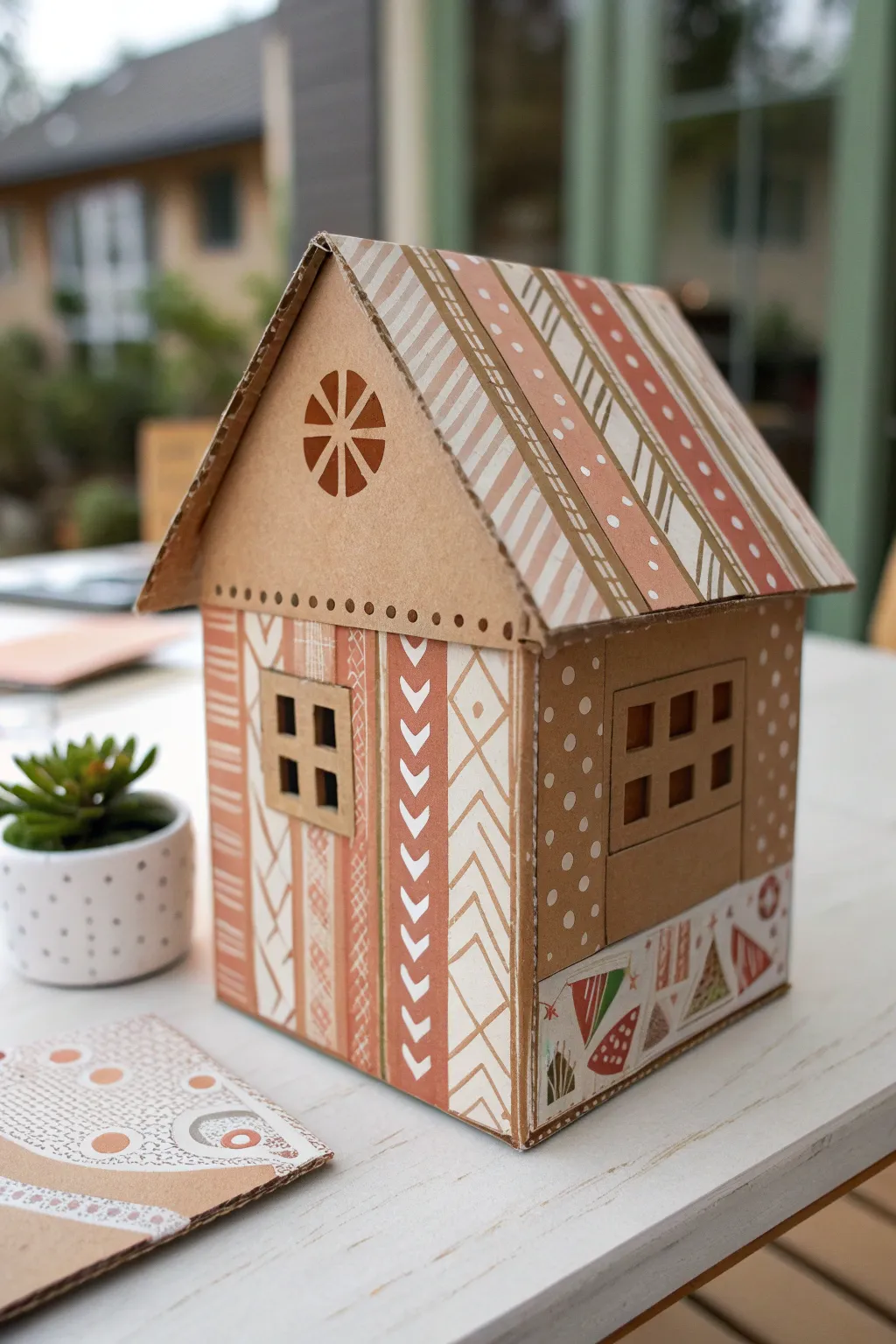
Transform humble recyclable cardboard into this charming architectural model featuring intricate, geometric patterns in a warm, earthy color palette. With the smooth application of tempera paint sticks, you can achieve crisp lines and solid coverage that mimics the look of high-end patterned paper.
Step-by-Step Guide
Materials
- Corrugated cardboard box panels
- Tempera paint sticks (white, rust/terracotta, light brown/tan)
- Craft knife (X-Acto knife)
- Metal ruler
- Cutting mat
- Pencil
- Hot glue gun and glue sticks
- Fine-tip white paint marker (optional, for tiny details)
Step 1: Constructing the Base Structure
-
Draft the Dimensions:
Begin by deciding the size of your house. On your cardboard, draw two identical pentagon shapes for the front and back walls (a square base with a triangle on top) and two rectangular side walls. -
Cut the Main Panels:
Place your cardboard on a cutting mat. Using a sharp craft knife and a metal ruler for safety, carefully cut out these four main body pieces. -
Create the Roof Panels:
Measure the slanted side of your pentagon gable. Cut two rectangular roof panels that are slightly longer than the house’s length and wide enough to overhang the eaves slightly. -
Add Window Openings:
Sketch a square window on the front panel and a larger rectangular window on the side panel. For the side window, you can cut a U-shape and fold the flap down to create a sill texture. -
Assemble the Walls:
Heat up your hot glue gun. Glue the four wall panels together at the corners to form the standing structure, ensuring the corners are square and sturdy. -
Attach the Roof:
Run a bead of hot glue along the top slanted edges of the front and back gables. Press the roof panels in place, meeting at the peak.
Fixing Smudges
Tempera sticks dry fast, but if you smear wet paint, let it dry completely. Then, gently scratch the mistake off with your craft knife to reveal fresh cardboard underneath.
Step 2: Designing the Patterns
-
Base Coat the Roof Stripes:
Starting on the roof, draw thick diagonal stripes using a white tempera paint stick. Leave gaps of raw cardboard between them for a natural look. -
Detail the Roof Stripes:
Alternate with rust and tan paint sticks to fill in parallel stripes. Within the rust stripes, carefully add small white dots or dashed lines for extra texture. -
Decorate the Gable:
On the triangular front gable, locate the center point. Use a rust-colored paint stick to draw a radial flower or sunburst pattern. I find stippling a row of small dots along the bottom edge of the triangle adds a nice finished border. -
Pattern the Front Wall:
Divide the front wall into vertical columns using a pencil lightly. Fill each column with a unique geometric pattern: alternating chevrons, stacked diamonds, horizontal stripes, or cross-hatching. -
Refine the Geometric Lines:
Use the edge of the paint stick—or a fine brush picked up from the tip of the stick—to keep these geometric patterns crisp. The white paint stick is particularly good for the chevron ‘V’ shapes against the raw cardboard background. -
Create the Window Frame:
Cut four thin strips of cardboard. Glue them onto the front window opening to create a four-pane divided light window frame. -
Side Wall Polka Dots:
For the side wall, move away from stripes. Press the circular flat tip of a white tempera stick firmly against the cardboard to stamp varied polka dots all over the surface. -
Base Trim Band:
Cut long, thin strips of white paper or cardstock to wrap around the very bottom of the house. Draw tiny bunting flags, triangles, and abstract shapes on this strip using the rust and tan colors. -
Attach the Trim:
Glue this decorated paper strip around the base of the house, covering any raw corrugated edges from the wall assembly. -
Final White Accents:
Go back over your patterns. If any white lines look too translucent, add a second layer of tempera paint stick to make the design pop.
Pro Tip: Sharp Lines
For super crisp geometric patterns, apply painter’s tape or washi tape to mask off sections. Paint over the edge, then peel while slightly damp for perfect chevrons.
Now you have a stunning, architecturally inspired decoration that proves cardboard is a serious art material.

Have a question or want to share your own experience? I'd love to hear from you in the comments below!