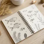
Whenever I need a subject that feels bold and instantly recognizable, I reach for Texas drawing ideas—they’re packed with strong shapes and iconic details. Grab your favorite pencil or pen and let’s build a little visual library of Texas symbols you can remix into sketches, doodles, or finished pieces.
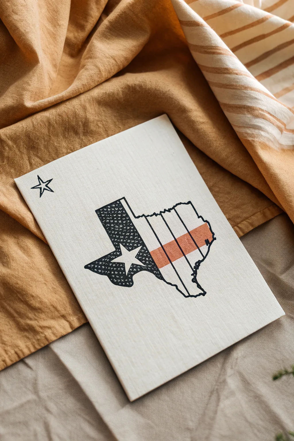
Texas State Outline With a City Star
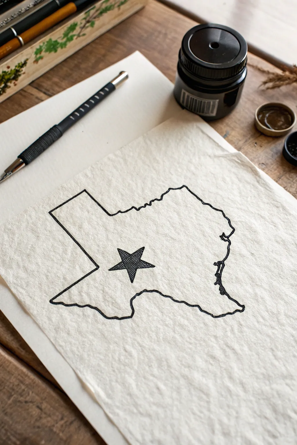
This project features a clean, stylized outline of Texas containing a detailed, textured star on distinctive crinkled paper. The contrast between the crisp black ink and the organic texture of the paper creates a sophisticated, rustic look perfect for framing.
Detailed Instructions
Materials
- Lightweight watercolor paper or textured sketch paper
- Water spray bottle (optional, for aging)
- Black technical drawing pen (0.5mm or 0.8mm)
- Finer black technical pen (0.1mm or 0.3mm)
- Pencil (HB or 2B)
- Eraser
- Printed map of Texas for reference or tracing
- Ruler
Step 1: Preparing the Paper
-
Select your paper:
Choose a paper that has some tooth or texture to it. A lightweight watercolor paper works beautifully, or you can use a high-quality sketch paper in a cream or off-white tone. -
Create texture (optional):
If your paper is too smooth, you can mimic the crinkled look in the reference image. Lightly mist the paper with water, gently crumple it, and then flatten it back out to dry completely under a heavy book. This adds character before you even start drawing.
Step 2: Drafting the Outline
-
Establish the boundaries:
Using a pencil, lightly mark the top, bottom, left, and right limits of where you want the state outline to sit on the page to ensure it’s centered. -
Sketch the Panhandle:
Start at the top. Use your ruler to lightly sketch the straight northern border and the vertical eastern edge of the Panhandle. These straight lines anchor the rest of the shape. -
Draw the western border:
Continue with the ruler for the straight vertical line creating the western edge of the Panhandle, and the diagonal line cutting down towards El Paso. -
Sketch the Rio Grande:
Switch to freehand sketching for the southern border. Follow the meandering path of the river. Don’t worry about capturing every tiny bend, but try to get the major curves accurate. -
Complete the Gulf Coast:
Work your way up the eastern side. This area is tricky because of the bays and inlets. Keep your pencil lines light and loose as you define the curve leading up to the Louisiana border. -
Close the shape:
Connect the eastern wavy line back to the straight edge of the Panhandle you started with. Step back and check your proportions against your reference map.
Ink Bleeding?
If ink feathers on textured paper, your pen might be too wet or the paper too porous. Try a harder lead pencil first or switch to a pigment liner which sits on top of the paper fibers better.
Step 3: The Star Detail
-
Position the star:
Locate the approximate center (or mark a specific city like Austin). Make a small dot with your pencil. -
Draft the star shape:
Lightly draw a five-pointed star around your center dot. It helps to draw a faint circle first to keep the points even, then erase the circle guide. -
Refine the star:
Go over your star sketch to ensure the points are sharp and symmetrical. The star in this project is fairly large and prominent, serving as a focal point.
Add a Location Marker
Make it meaningful by placing the star exactly over your hometown. You can also add a tiny heart inside the star or write the city name in a small serif font underneath.
Step 4: Inking the Design
-
Ink the straight edges:
Take your thicker technical pen (0.5mm or 0.8mm). Use a ruler to ink the straight lines of the Panhandle and western border for a crisp, geometric look. -
Ink the organic borders:
Continue with the same pen for the river and coastal borders. Move your hand slowly to maintain a consistent line weight, allowing the pen to glide over the paper’s texture. -
Outline the star:
Carefully outline the five-pointed star with the thicker pen. I find it helpful to turn the paper as I work so I’m always pulling the pen line towards me. -
Fill the star texture:
Switch to your finer pen (0.1mm or 0.3mm). Instead of coloring it solid black, fill the star with a dense stippling (tiny dots) or a tight cross-hatching pattern. This creates that darker, textured grey value seen in the example. -
Erase pencil marks:
Wait at least 10-15 minutes for the ink to fully dry. Then, gently erase all underlying pencil sketches. Be careful not to snag the eraser on the crinkled texture of the paper.
Step 5: Final Touches
-
Review line weight:
Check if any part of the main outline looks too thin or broken due to the paper texture. Go over those spots again to ensure a solid, continuous black line. -
Flatten (if needed):
If your paper curled during the inking process, place it under a clean sheet of paper and press it under a heavy stack of books overnight.
This classic, understated piece looks wonderful mounted in a simple wooden frame or pinned to an inspiration board

The Lone Star in Bold Variations
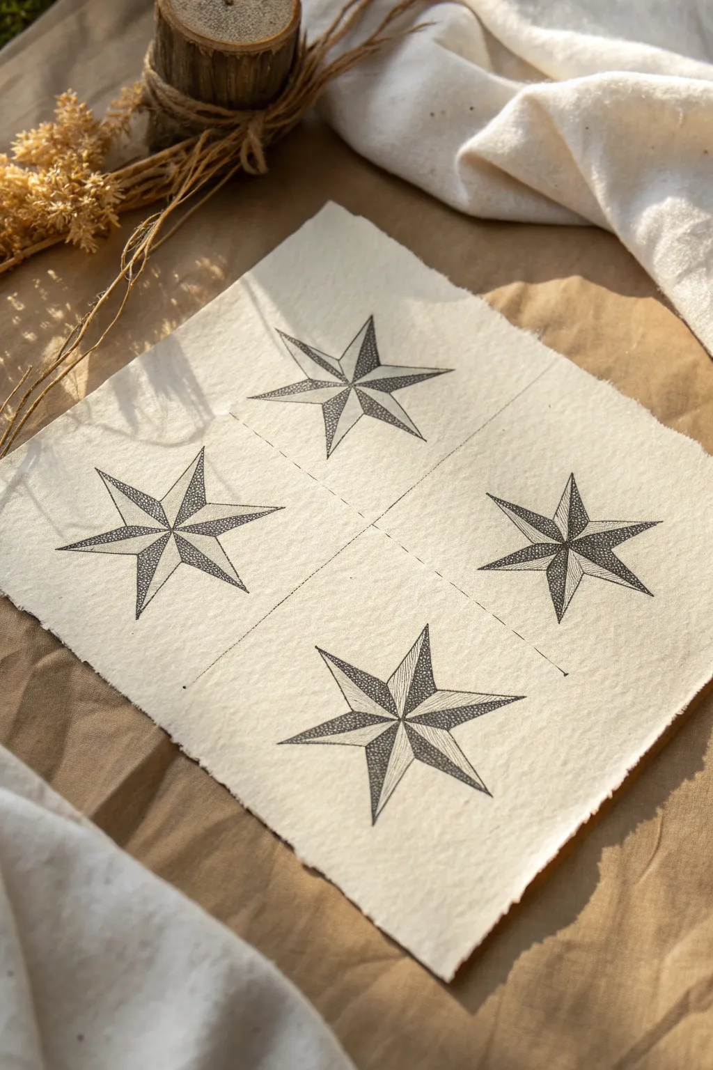
Embrace the spirit of the Lone Star State with this delicate ink drawing project. By combining precise geometry with organic stippling and hatching techniques on textured paper, you will create a rustic yet modern art piece perfect for framing.
Step-by-Step Tutorial
Materials
- Thick, handmade cotton rag paper (approx. 8×8 inches)
- Pencil (HB or H)
- Ruler
- Fine liner pens (sizes 005, 01, and 03)
- Eraser (kneaded eraser preferred)
- Compass (optional, for perfect spacing)
Step 1: Planning and Layout
-
Find the center:
Begin by lightly marking the exact center of your handmade paper with a pencil. This will serve as the anchor point for your four-star grid. -
Create the quadrants:
Using a ruler, draw a very faint crosshair line dividing the paper into four equal quadrants. These guide lines will ensure your stars are evenly spaced. -
Mark star centers:
In the center of each quadrant, mark a dot. These four dots will be the center points for each of your five-pointed stars. -
Draw the star skeleton:
For each star, draw a light five-pointed star shape. Start with an upside-down ‘V’ and cross through. Don’t worry about perfection yet; this is just the skeleton to guide the 3D shape. -
Define the 3D ridges:
To give the stars their distinct bevelled look, draw straight lines from the center point of the star out to each of the five outer tips. Then, draw shorter lines from the center to the inner valleys.
Step 2: Inking the Geometrics
-
Outline the shapes:
Switch to your 03 fine liner pen. Carefully trace the outer perimeter of each star. Keep your hand steady to manage the texture of the paper. -
Draw the internal ridges:
With the same pen, draw the internal lines connecting the center to the outer tips and inner valleys. Your stars should now look like crisp line drawings. -
Erase pencil marks:
Once the ink is completely dry—I usually wait at least 5 minutes to be safe—gently erase all the pencil guidelines with a kneaded eraser to avoid damaging the paper fibers.
Pro Tip: Paper Texture
Handmade paper is bumpy! Pull your pen towards you rather than pushing it away to prevent the nib from snagging on fibers and creating ink splatters.
Step 3: Adding Texture and Depth
-
Understanding the lighting:
Decide on a light source direction (usually top-left). This means alternating facets of the star will be dark (shadow) and light (highlight). -
Start with hatching:
On the ‘shadow’ facets of the top-left star, use a 01 pen to draw tight, parallel lines (hatching). Keep them close together for a dark gray value. -
Stippling the first star:
On the alternate facets of the same star, switch to stippling. Use a 005 pen to tap tiny dots. Keep the dots dense near the center spine and sparse toward the edges to create a gradient. -
Varying the second star:
Moving to the top-right star, try a different texture combo. Use dense stippling on the shadow side (darker) and very light, spaced-out stippling on the highlight side. -
Cross-hatching technique:
For the bottom-left star, employ cross-hatching on the dark facets. Draw diagonal lines one way, then cross them perpendicularly for a deep, rich black tone. -
Mixed media star:
For the final bottom-right star, combine lines and dots. Fill the shadow facets with lines that radiate from the center, and use minimal dots for the light facets. -
Refine the contrast:
Step back and look at the composition. If any ‘shadow’ sides look too light, go back in with your 005 pen and add more dots or lines to deepen the contrast.
Level Up: Gold Leaf
Apply a tiny amount of size (adhesive) to one facet of each star and cover it with gold leaf. The metallic shine contrasts beautifully with the black ink.
Now you have a stunning, geometric quartet that celebrates a classic symbol with artistic flair


Texas Flag Pattern Inside the Outline
Capture the spirit of the Lone Star State with this minimalist and textured mixed-media piece. The design features a simplified flag pattern tucked neatly inside the state outline, accented with a charming hand-drawn star.
How-To Guide
Materials
- Small rectangular wood panel or canvas board (approx 5×7 inches)
- White or cream acrylic paint (matte finish)
- Wide flat paintbrush
- Pencil and eraser
- Fine-tip black permanent marker or drawing pen (0.5mm)
- Dark blue or charcoal texture stamp (or small stencil)
- Rust-colored acrylic paint or marker
- Ruler
- Printed outline of Texas (sized to fit your board)
- Carbon transfer paper (optional)
Step 1: Preparing the Base
-
Prime the Surface:
Begin by coating your wood panel or canvas board with a layer of matte white or cream acrylic paint. Apply it evenly with a wide flat brush to create a smooth, clean background. -
Add Texture (Optional):
If you want that slightly weathered look seen in the photo, dab a clean cloth or dry paper towel over the wet paint to lift small areas, or simply apply a second coat with visible vertical brushstrokes. -
Dry completely:
Let the base coat dry thoroughly before moving on to the sketching phase. This usually takes about 20-30 minutes depending on paint thickness.
Rustic Texture Trick
To replicate the speckled look in the blue section, try using a piece of rough kitchen sponge dipped in dark paint instead of drawing individual patterns.
Step 2: Sketching the Outline
-
Position the Template:
Place your printed Texas outline on the dried board. You want it centered but slightly lower to leave room for the star in the top corner. -
Trace the Shape:
Using carbon paper underneath your printout, trace the state outline firmly with a pencil. Alternatively, cut out the paper shape and trace around it lightly. -
Divide the Flag:
Draw a vertical line separating the left ‘panhandle’ area from the rest of the state. This creates the vertical blue field of the flag. -
Add Flag Stripes:
On the right side of the vertical line, use a ruler to lightly draw a horizontal band across the middle. This will become your colored stripe. -
Sketch the Lone Star:
Draw a large five-pointed star centered within the left vertical section. Make sure the points touch the edges of the section for a bold look.
Step 3: Inking and Coloring
-
Ink the Outline:
Go over your main state outline with the fine-tip black marker. Use a deliberate, slightly jagged line to give it a hand-drawn, rustic feel rather than a perfect vector look. -
Create the Vertical Lines:
Using your ruler and the black pen, draw vertical pin-stripes across the right side of the state (the white and red sections). Space them about 1/4 inch apart. -
Fill the Blue Field:
For the left section (excluding the star), fill the space with a dark texture. You can use a tiny cross-hatch pattern with your pen, or stipple with dark blue paint to mimic the ‘starry’ look in the reference. -
Detail the White Star:
Leave the large star inside the blue field uncolored (white). Outline it boldly with your black pen to make it pop against the dark background. -
Add the Rust Stripe:
Color in the horizontal stripe on the right side using rust-colored paint or a marker. If using paint, apply it thinly so the black vertical pinstripes still show through slightly. -
Adding the Corner Accent:
In the upper left corner of the board, draw a simple, open five-pointed star with your black marker. Keep the lines thin and crisp. -
Final Cleanup:
Once all ink and paint is 100% dry, gently erase any visible pencil marks that strayed outside your ink lines.
Uneven Lines?
Don’t stress about wiggly outlines! The charm of this piece relies on the ‘sketched’ aesthetic. Go over a wobbly line a second time to make it look intentional.
Display your new Texas art on a small easel or shelf to add a touch of Southern charm to your decor

Longhorn Skull With Desert Shadows
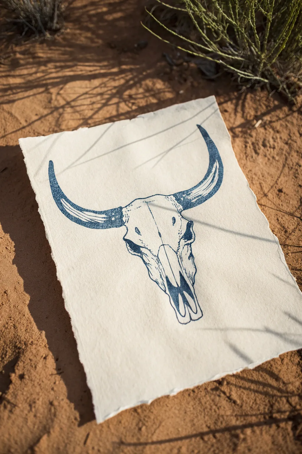
Capture the rugged spirit of the Southwest with this striking monochromatic longhorn skull illustration. Using a single deep blue ink on textured paper recreates the vintage feel of a classic cyanotype or woodblock print.
Step-by-Step Guide
Materials
- Heavyweight textured paper (watercolor or handmade cotton rag)
- Deep Prussian blue or indigo ink pen (felt tip or dip pen)
- Pencil (HB or 2H)
- Kneaded eraser
- Reference photo of a steer skull
- Ruler (optional for symmetry)
Step 1: Drafting the Structure
-
Map the center line:
Start by lightly drawing a vertical line down the center of your paper to ensure the skull remains symmetrical. -
Establish the horn spread:
Draw a wide, gentle curve intersecting the top of your vertical line. This will serve as the guide for the iconic longhorn shape. -
Outline the cranial shape:
Sketch a T-shape below the horn curve. The top bar is the forehead, and the vertical bar tapers down to form the snout. -
Details of the eye sockets:
On either side of the forehead area, sketch the protruding eye sockets. These should look slightly bony and angular. -
Define the nasal cavity:
Towards the bottom of the snout, draw the long, hollow nasal openings. Keep these shapes loose for now. -
Refine the horn curves:
Thicken the initial horn guidelines. Make sure they taper to sharp points at the ends and have a sturdy base connecting to the skull.
Pro Tip: Deckled Edges
To get a perfect torn edge, dampen the crease with a wet paintbrush before ripping the paper. This softens fibers for a feathery look.
Step 2: Inking the Outline
-
Trace the outer edge:
Using your blue ink pen, carefully trace the outline of the horns first. Use a steady hand to create a clean, sharp edge. -
Ink the skull structure:
Move inward to ink the perimeter of the skull. Add slight wobbles or jagged cues to your line work to suggest bone texture rather than smooth plastic. -
Solid black areas:
Identify the deepest shadows, such as inside the eye sockets and the nasal cavity. Fill these in completely solid with your blue ink for high contrast.
Step 3: Adding Texture and Stipple
-
Shading the horns:
Create volume in the horns by adding curved hatching lines. Start from the bottom edge of the horn and flick upward, leaving the top edge white for highlights. -
Stippling the base:
Where the horns meet the skull, use a stippling technique (lots of small dots) to create a gradient shadow. This adds a grainy, realistic texture. -
Cracks and fissures:
Draw fine, jagged lines across the forehead and snout to represent natural bone sutures and weathering cracks. -
Mid-tone shading:
I prefer to use broken lines or loose hatching on the side of the snout to suggest roundness without making the drawing too dark. -
Deepen the contrast:
Go back over your darkest areas. If the blue looks too light, add a second layer of ink to ensure a rich, deep indigo tone.
Troubleshooting: Uneven Ink
If your large filled areas look streaky, switch to a brush pen or a small paintbrush dipped in ink for smoother, solid coverage.
Step 4: Final Touches
-
Erase pencil marks:
Once the ink is completely dry—give it a few extra minutes just to be safe—gently lift off the graphite guidelines with your kneaded eraser. -
Distress the paper edges:
To mimic the reference image, carefully tear the edges of your paper by hand. Pull the paper away from you to create a soft, deckled edge look.
Now your desert-inspired artwork feels like a genuine artifact ready for display

PENCIL GUIDE
Understanding Pencil Grades from H to B
From first sketch to finished drawing — learn pencil grades, line control, and shading techniques.
Explore the Full Guide
Armadillo in Simple Shapes
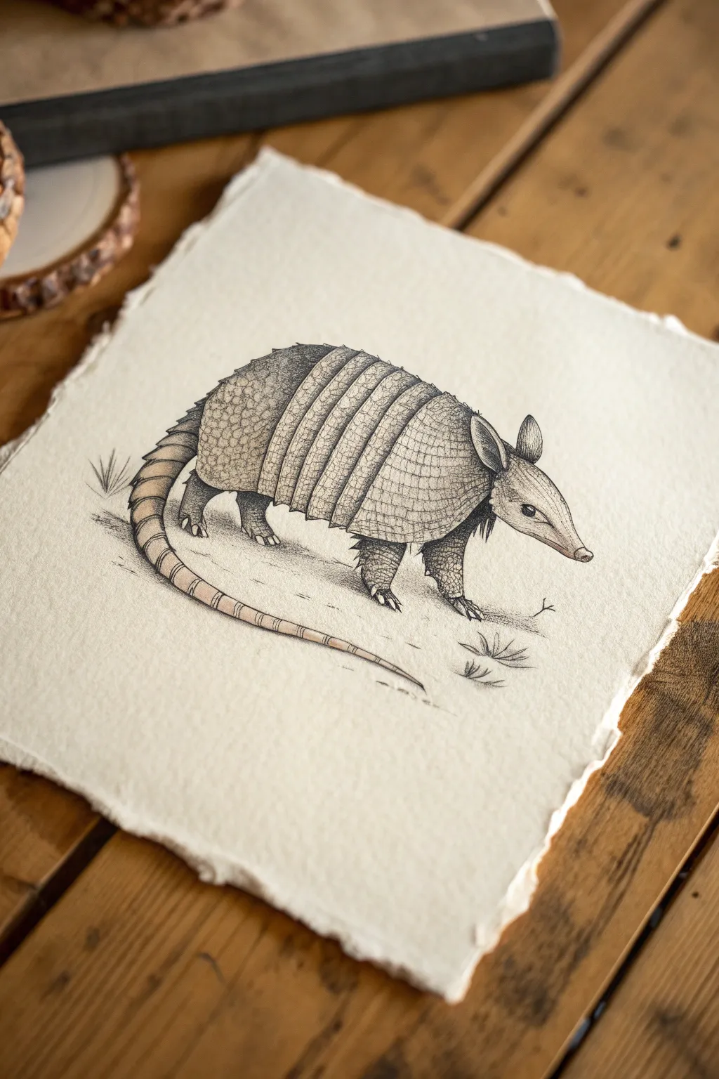
Capture the charm of the Texas state mammal with this detailed ink and wash illustration. This project combines precise linework with subtle shading to emphasize the armadillo’s unique armor plating on beautiful, deckled-edge paper.
Step-by-Step Tutorial
Materials
- Cold press watercolor paper (deckled edge suggested)
- HB graphite pencil
- Kneaded eraser
- Waterproof fine liner pens (sizes 005, 01, and 03)
- Small round watercolor brush (size 2 or 4)
- Diluted sepia ink or watercolor paint (Burnt Umber)
- White gel pen (optional for highlights)
Step 1: Drafting the Shapes
-
Establish the main body:
Begin lightly with your HB pencil. Draw a large oval shape for the body, slightly tilted downwards towards the right to suggest the walking posture. -
Add the head and snout:
Attach a smaller, elongated triangle to the right side of the oval for the head. Refine the tip into a narrow, rounded snout typical of nine-banded armadillos. -
Sketch the tail:
From the lower left of the body, extend a long, tapering curve that sweeps downward and then curls slightly upward at the tip. -
Place the feet:
Sketch four short, sturdy legs. The front legs should angle slightly backward, and the back legs forward, showing a walking mid-stride. Don’t worry about claws yet; just get the positioning right. -
Define the shell segments:
Divide the main body oval into three sections. You need a shoulder shield at the front, a hip shield at the back, and a series of about 7-9 vertical bands in the middle.
Step 2: Detailed Inking
-
Outline the silhouette:
Using an 01 fine liner, carefully trace over your pencil sketch to define the animal’s outline. Use a slightly broken or uneven line for the underbelly to suggest fur texture. -
Detail the head:
Draw the small, almond-shaped eye and the distinct ears. The ears should be large and leaf-shaped. Add a tiny dot for the nostril. -
Ink the bands:
Switch to the 03 pen to outline the vertical bands across the midsection. Make the lines distinct and slightly curved to follow the roundness of the body. -
Texturing the shell shields:
For the front shoulder shield and rear hip shield, switch back to the finer 005 pen. Draw a pattern of small, tessellating scales or irregular polygons. -
Stippling the legs:
Instead of drawing scales on the legs and lower edges, use stippling (lots of tiny dots) to create a rough, textured look. Concentrate the dots on the underside of the legs for shadow. -
Refining the claws:
Draw the sharp, digging claws on the feet using the 01 pen. Make them look sturdy and grounded. -
Adding the tail rings:
Draw segments down the length of the tail. I like to make these segments get progressively smaller as they reach the tip.
Scale Texture Tip
Don’t draw every single scale. Suggest texture by drawing clear scales near the edges and fading into dots or dashes near the highlighted center.
Step 3: Shading and Wash
-
Applying the wash:
Mix a very watery wash of sepia ink or Burnt Umber watercolor. Using your small round brush, gently paint over the shell, head, and tail. Keep the belly slightly lighter. -
Let it dry completely:
Wait for the paper to be bone dry before proceeding. If you ink over wet paper, the lines will bleed and ruin the crisp texture. -
Deepening shadows:
Once dry, use the 01 pen to add hatching lines between the vertical bands of the shell to create depth. Shade underneath the shell where it meets the legs. -
Grounding the subject:
Add a few quick, wispy lines beneath the feet and some sparse grass tufts to ground the armadillo, so it doesn’t look like it’s floating. -
Final clean up:
Erase any remaining pencil marks gently. If you want extra pop, use a white gel pen to add tiny highlights on the top of the shell segments.
Ink Bleeding?
If your fine liner lines are blurring when you apply the wash, your pen isn’t fully waterproof. Test your pen on a scrap piece first.
Now you have a charming, rustic illustration perfect for framing or gifting
Bluebonnet Field Mini Landscape
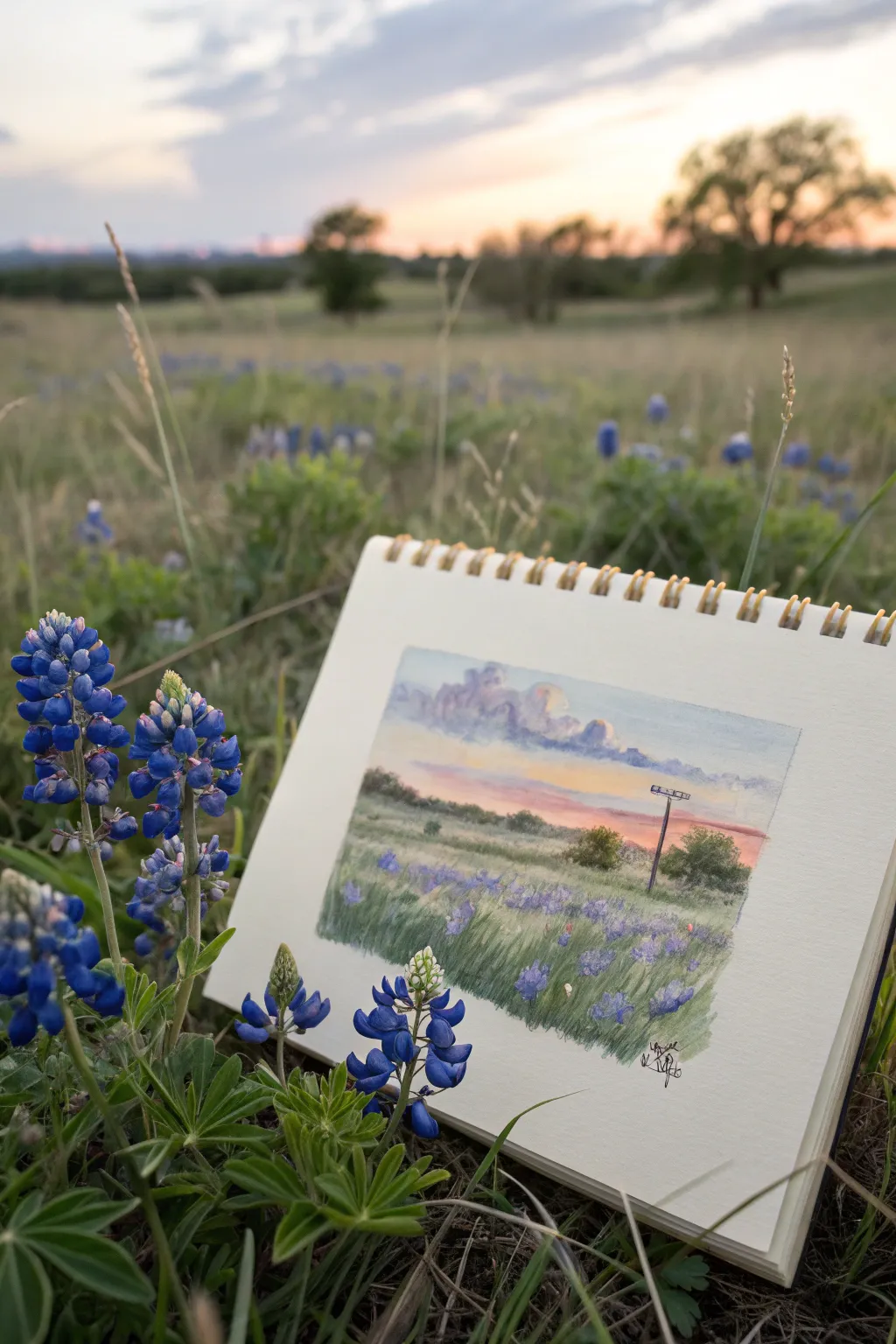
Capture the magic of a Texas evening with this miniature gouache landscape, featuring a vibrant sunset sky and a field of iconic bluebonnets. This project is perfect for sketchbook practice, focusing on atmospheric perspective and layering textures to create depth.
Detailed Instructions
Materials
- Small spiral-bound sketchbook (heavyweight paper essential, 140lb/300gsm ideal)
- Gouache paint set (primary colors plus white, peach, and lavender)
- Small flat brush (size 4 or 6)
- Small round brush for details (size 0 or 1)
- Masking tape or Washi tape
- Palette for mixing
- Cup of water and paper towels
- Pencil for sketching
- Kneaded eraser
Step 1: Preparation and Sketching
-
Tape the borders:
Begin by creating a clean, crisp frame for your painting. Use masking tape to section off a small rectangle in the center of your sketchbook page. Press the edges down firmly to prevent paint from bleeding underneath. -
Establish the horizon:
Lightly sketch a horizon line just below the halfway point of your rectangle. This composition emphasizes the sky, which is a key feature of this landscape. -
Sketch placement elements:
Block in the main shapes lightly with your pencil. Draw faint, fluffy outlines for the clouds, a line of trees on the horizon, and a distinct vertical line for the utility pole on the right side. Keep these marks very faint so they don’t show through the gouache.
Step 2: Painting the Sky
-
Base sky gradient:
Mix a pale blue and start painting the top strip of the sky. While it’s still wet, blend in a soft peach or warm pink tone near the horizon line. Gouache dries fast, so work quickly to get a smooth gradation. -
Cloud shadows:
Mix a soft lavender-grey color. Using the corner of your flat brush or a round brush, dab in the shadow shapes of the cumulonimbus clouds. Keep the edges relatively soft. -
Cloud highlights:
Clean your brush thoroughly. Pick up pure white (or white with a tiny touch of yellow) and paint the tops of the clouds, blending the bottom of the white into the lavender shadows to create volume.
Sticky Situation
To prevent the tape from tearing your paper, stick it to your clothes (like pant leg) once or twice before applying it to the paper. This reduces its tackiness.
Step 3: Midground and Horizon
-
Distant trees:
Mix a muted olive green with a bit of the sky color to push it into the distance. Paint the treeline along the horizon. Use small, uneven dabs to suggest foliage rather than a straight line. -
Midground grass:
Create a lighter visible green for the field directly below the trees. Horizontal brush strokes help lay the land flat and create the illusion of distance.
Golden Hour Glow
Enhance the sunset feel by glazing a very watery layer of neon pink or bright orange over just the horizon line after the sky is dry.
Step 4: Foreground Details
-
Foreground base:
For the closest grass, mix a richer, deeper green. Apply this to the bottom third of the painting using upward, flicking strokes to mimic the texture of tall grass blades. -
Painting bluebonnets:
Load your small round brush with cobalt or ultramarine blue. Paint small, vertical clusters in the grassy area. Make the clusters larger and more defined at the bottom (foreground) and tiny dots as they recede toward the middle. -
Adding definition:
Once the blue patches are dry, dot the very tips of the foreground bluebonnets with a tiny speck of white to represent the ‘bonnet’ part of the flower. This small detail adds immense realism. -
The utility pole:
Using a very fine liner brush and dark brown or black paint, carefully draw the utility pole. Add the crossbar at the top. Keep the line thin and delicate. -
Final highlights:
Add a few stray flicks of very light green or yellow-green in the foreground grass to catch the light. You can also add a faint highlight on the sun-facing side of the utility pole.
Step 5: Finishing Touches
-
Dry completely:
Let the painting sit until completely dry to the touch. Gouache can smudge easily if damp. -
Peel the tape:
Slowly peel away the masking tape at a 45-degree angle away from the painting. This reveals those satisfying, sharp edges that make the artwork pop. -
Sign it:
Use a fine-tip pen or your smallest brush to sign your initials in the bottom corner of the white space or within the painting itself.
Enjoy the satisfaction of peeling that tape and seeing your mini Texas landscape come to life
BRUSH GUIDE
The Right Brush for Every Stroke
From clean lines to bold texture — master brush choice, stroke control, and essential techniques.
Explore the Full Guide
West Texas Horizon With Mesquite
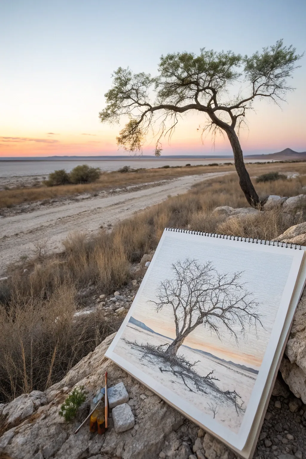
Capture the stark beauty of the West Texas landscape by illustrating a solitary, gnarled mesquite tree against a soft horizon. This mixed-media project combines precise ink work for the complex branches with delicate watercolor washes to evoke the dusty, pale atmosphere.
Step-by-Step
Materials
- Heavyweight mixed-media or watercolor paper (spiral bound sketchbook)
- Fine liner pens (sizes 0.05, 0.1, and 0.3, black)
- Graphite pencil (HB or 2H)
- Kneaded eraser
- Watercolors (Burnt Umber, Yellow Ochre, Ultramarine Blue, Alizarin Crimson)
- Small round brushes (size 2 and 4)
- Cup of water and paper towels
Step 1: Sketching the Bones
-
Establish the horizon line:
Begin by lightly drawing a low horizon line with your HB pencil, placing it about one-third of the way up the page to emphasize the sky. -
Rough in the trunk:
Position the main trunk slightly off-center. Sketch the twisted, leaning posture characteristic of windswept mesquite trees, keeping the base wider where it meets the ground. -
Map the main branches:
Extend two or three major limbs from the trunk. Focus on the sharp angles and jagged turns rather than smooth curves, as these trees often grow erratically. -
Add secondary branches:
Lightly pencil in the smaller branches radiating from the main limbs, creating a dense, web-like canopy shape without worrying about perfect detail yet. -
Ground the subject:
Sketch a few jagged lines at the base of the tree to represent exposed surface roots and the uneven desert floor.
Broken Lines
Don’t draw straight, continuous lines for branches. Lift your pen often and re-start slightly adjacent to the previous line to mimic gnarly growth.
Step 2: Inking the Structure
-
Outline the trunk:
Using a 0.3 fineliner, trace over your pencil lines for the trunk. Use broken, shaky lines to mimic the rough, peeling texture of the bark. -
Draw the main limbs:
Continue with the 0.3 pen for the thickest branches. Vary your pressure to create slightly uneven line widths, which adds organic realism. -
Detail the canopy:
Switch to a 0.1 pen for the secondary branches. Draw these with quick, confident strokes that taper at the ends. -
Add fine twigs:
Use the 0.05 pen for the outermost, finest twigs. These should cross over each other frequently to create that dense, tangled look typical of winter mesquites. -
Texture the bark:
Return to the trunk with the 0.1 pen. Add vertical hatching and small knots to show the grain and shadow on the shaded side of the tree. -
Clean up:
Once the ink is completely dry, gently erase all underlying graphite pencil marks with your kneaded eraser.
Salt Texture
Sprinkle a pinch of table salt onto the wet ground wash. Once dry, brush it off to create a speckled, sandy texture perfect for desert soil.
Step 3: Adding Atmospheric Color
-
Paint the sky gradient:
Mix a very dilute wash of Alizarin Crimson and Yellow Ochre. Paint the lower sky near the horizon, fading it out into clean water as you move upward. -
Cool the upper sky:
While the paper is still slightly damp (but not soaking), introduce a faint wash of Ultramarine Blue at the very top of the page, blending it down toward the warmer horizon tones. -
Tint the ground:
Mix Yellow Ochre with a touch of Burnt Umber. Apply a watery wash to the ground area, leaving some white paper showing to represent bright, sun-bleached patches. -
Shadow the trunk:
Glaze a transparent layer of Burnt Umber over the shadowed side of the tree trunk and main branches to give them volume. -
Paint the distant hills:
Mix Ultramarine Blue with a tiny bit of Burnt Umber to make a cool grey-blue. Paint a low, flat shape along the horizon line for distant mountains. -
Add drop shadows:
Using a slightly darker mix of your ground color, paint cast shadows extending from the trunk and roots across the ground to the right.
Now you have a serene desert landscape that captures the quiet endurance of the mesquite tree
Oil Pump Jack in Ink
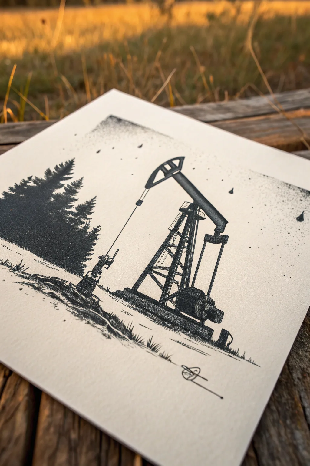
Capture the industrial spirit of the Texas landscape with this detailed ink illustration, balancing the mechanical rigidity of an oil pump against the organic softness of pine trees. The high-contrast black and white style uses stippling and hatching to create a nostalgic, etched appearance perfect for art prints or journals.
Step-by-Step
Materials
- High-quality Bristol board or smooth watercolor paper (square cut)
- Pencil (HB or 2H)
- Kneadable eraser
- Fine liner pens (sizes 005, 01, 03, and 05)
- Ruler or straight edge
- Compass or circular template (optional for arcs)
Step 1: Planning and Sketching
-
Deconstruct the shapes:
Begin by observing the pump jack as a series of simple geometric shapes. The main walking beam is a long rectangle, the Samson post (the A-frame support) is a triangle, and the counterweight at the rear is a heavy block. -
Light pencil layout:
Using your HB pencil, lightly sketch the ground line roughly one-third up from the bottom of the page. Position the pump jack slightly to the right of center to leave room for the trees on the left. -
Construct the A-frame:
Use a ruler to draw the main structural legs (the Samson post) of the pump. These should angle equally inward, meeting near the pivot point at the top. Keep your lines faint so they can be erased later. -
Add the walking beam:
Sketch the large horizontal beam across the top of the A-frame. Angle it slightly upward toward the ‘horse head’ (the curved front part) to capture a moment of motion. Sketch the horse head shape itself. -
Detail the mechanism:
Draw the pitman arm connecting the rear of the beam down to the counterweight crank. Add the small motor box housing near the base structure. I find it helpful to look at reference photos of pump jacks to understand where the bolts and ladders go. -
Sketch the forest background:
On the left side, lightly outline the silhouette of a few pine trees. Make the largest one dominant and overlap smaller ones behind it. Don’t worry about individual needles yet; just get the conical shapes down.
Wobbly Lines?
If your straight lines for the metal beams look too shaky, embrace it. Retrace them loosely once more. This creates a ‘loose sketch’ style that often looks more artistic than perfect rigid lines.
Step 2: Inking the Machinery
-
Outline the structure:
Switch to an 03 fine liner. Carefully trace the straight edges of your pump jack construction. Use a ruler if you want a very technical look, or freehand it for a vintage sketch vibe. -
Add mechanical weight:
Use an 05 pen to fill in the darkest mechanical shadows, specifically under the counterweight, inside the motor housing, and the underside of the walking beam. This establishes your deepest values early. -
Cross-hatching the metal:
With an 005 or 01 pen, create texture on the metal beams. Use tight, vertical hatching lines to suggest the flat metal surfaces of the A-frame legs. Leave small white gaps to indicate highlights where the sun hits the metal. -
Drawing the cable:
Use a ruler and your finest pen (005) to draw the single, thin ‘polished rod’ line dropping straight down from the horse head into the wellhead. Keep this line crisp and unbroken. -
Base and grass:
Ground the machine by sketching the concrete or steel base with horizontal hatching. Add short, flicking strokes around the base to simulate wild grass growing up against the metal.
Level Up: Coffee Stain
For a truly vintage Texas field journal aesthetic, lightly paint a wash of diluted coffee over the finished drawing once the ink is 100% waterproof dry.
Step 3: Organic Details & Atmosphere
-
Inking the trees:
For the pine trees, use a stippling and scribbling technique with an 03 or 05 pen. Start from the center trunk and work outward with dense, dark marks, getting lighter and sparser toward the branch tips. -
Creating depth:
Make the core of the tree silhouette nearly solid black to suggest density. The outer edges should be jagged and uneven to mimic pine needles against the sky. -
Foreground texture:
Use the 01 pen to add erratic, horizontal scratchy lines in the foreground dirt. These shouldn’t be uniform; represent the uneven, rocky Texas terrain. Add a few small pebbles or tufts of grass for scale. -
Atmospheric stippling:
This is the secret sauce. Take your 005 pen and gently stipple dots into the sky area, concentrating them near the horizon line and around the trees. This creates a subtle ‘dusty’ air effect. -
Falling debris:
To add a bit of grittiness, add a few heavier ink splatters or larger dots in the upper corners to frame the composition, giving it an aged or weathered look. -
Clean up:
Wait at least 15 minutes for the ink to fully cure. Gently erase all remaining pencil guidelines with your kneadable eraser, being careful not to buckle the paper. -
Final signature:
Add your signature or a small identifying mark in the bottom corner to claim the work.
Now you have a piece of industrial art that pays homage to the energy of the plains


Space Rocket Over a Texas Skyline
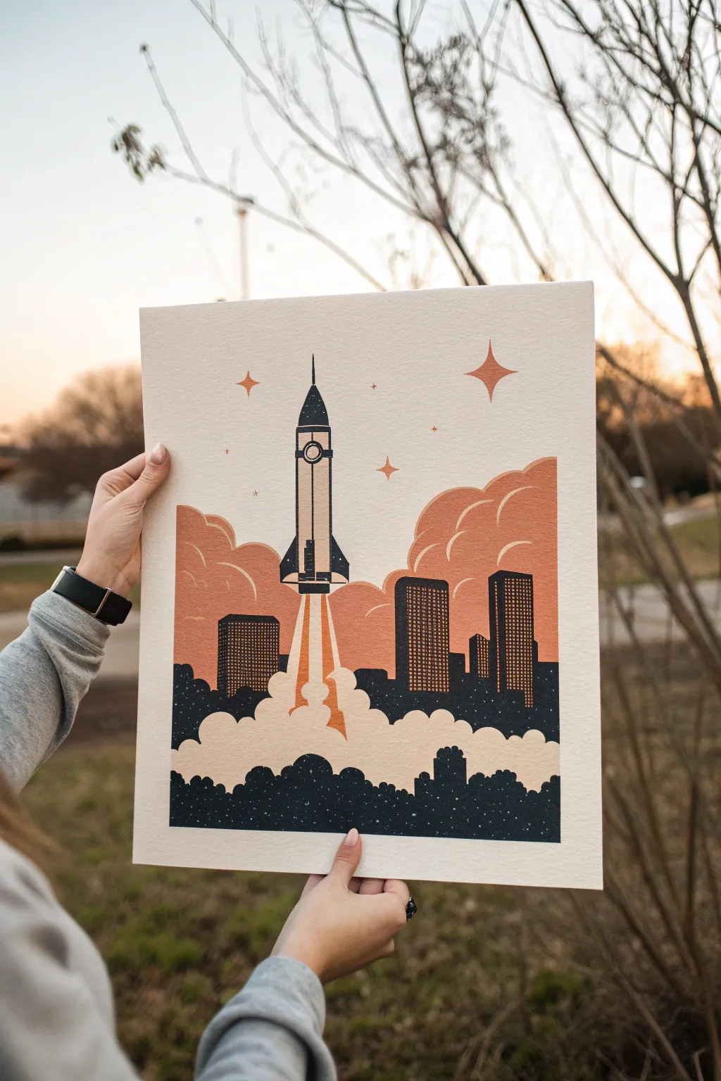
Capture the spirit of exploration with this stylized illustration of a rocket soaring above a city skyline. The design features a limited color palette and a charming, grainy texture reminiscent of vintage screen prints or Risograph art.
Step-by-Step
Materials
- Digital drawing tablet (iPad with Procreate or similar)
- Adobe Illustrator or Photoshop (optional)
- Heavyweight textured fine art paper (cotton rag or cold press)
- High-quality inkjet printer
- Pencil and sketch paper (for initial concepts)
- Optional: Screen printing kit if going analog
Step 1: Drafting the Composition
-
Establish the horizon:
Start by drawing a low horizon line about a quarter of the way up your canvas. This leaves plenty of vertical space for the rocket and smoke trail. -
Sketch the city silhouette:
Block in a simplified city skyline. Use rectangular shapes of varying heights to represent skyscrapers. Since this is Texas-themed, you might look at the skylines of Houston or Dallas for inspiration on specific building shapes. -
Place the rocket:
Draw the rocket centered in the upper third of the composition. Keep the shape simple and retro—a sleek fuselage with a pointed nose cone and small fins at the bottom. -
Outline the smoke clouds:
Create large, billowing cloud shapes originating from the base of the rocket and spreading out behind the city buildings. Use rounded, organic curves to contrast with the sharp lines of the architecture.
Instant Vintage
Use a “halftone” brush for the shadows on the clouds. This dot pattern instantly mimics the look of vintage comic books or newspapers.
Step 2: Applying Color and Shape
-
Select a limited palette:
Choose three main colors to define the retro look: a deep charcoal or midnight blue for shadows, a warm terracotta orange for the sky elements, and the natural cream of your paper (or a very light beige) for highlights. -
Fill the buildings:
Fill the city skyline shapes with your darkest color. Include a foreground layer of tree-like, bumpy shapes in the same dark tone to ground the image. -
Detail the architecture:
Add window grids to the skyscrapers using the terracotta color. Keep these grids simple—just rows of small dots or dashes—to suggest lit windows without overcomplicating the flat style. -
Define the rocket:
Color the rocket body. Use the cream color for the main fuselage and the dark charcoal for the nose cone, fins, and a small circular window. Add thick outlines to make it pop. -
Create the blast effect:
Draw the flame blast directly under the rocket using sharp, angular shapes in terracotta and cream. This connects the rocket visual to the smoke below.
Metallic Pop
After printing, use a gold or silver paint pen to hand-embellish the stars or the sleek lines of the rocket for a mixed-media shine.
Step 3: Adding Atmosphere and Texture
-
Layer the background clouds:
Behind the city, draw large, rolling cloud formations using the terracotta orange. Add white or cream outlines within the orange clouds to give them volume and a stylized, graphic look. -
Create the main smoke plume:
Fill the large smoke cloud at the bottom with your cream or white color. Ensure the bottom edge of this smoke layer sits behind the dark foreground trees but in front of the terracotta background clouds. -
Add celestial details:
Scatter a few retro four-point stars in the upper sky. Vary their sizes, making one or two significantly larger to balance the composition. -
Apply texture masking:
To achieve that vintage print look, apply a ‘noise’ or ‘grain’ texture over the entire image. In digital software, I like to set a grit texture layer to ‘Multiply’ or ‘Overlay’ blending mode. -
Distress the edges:
Use a rough eraser brush to slightly uneven the edges of your solid color blocks. This mimics the imperfect ink registration found in old screen prints.
Step 4: Printing and Finishing
-
Prepare for print:
Export your file at a high resolution (300 DPI or higher). If you are printing at home, check your printer settings to ensure it can handle heavy cardstock. -
Select your paper:
Load your textured cotton rag or cold press paper. The texture of the paper itself will do a lot of work to make the digital print feel authentic and handcrafted. -
Print and inspect:
Print a test sheet first to check color saturation. The terracotta should feel warm and earthy, not neon. Once satisfied, print your final piece. -
Flatten the print:
If the heavy ink coverage causes the paper to curl slightly, let it dry completely and then place it under a heavy book overnight to flatten it out.
Hang your finished print in a simple frame to let the retro colors and bold shapes speak for themselves
Western-Style Texas Hand Lettering
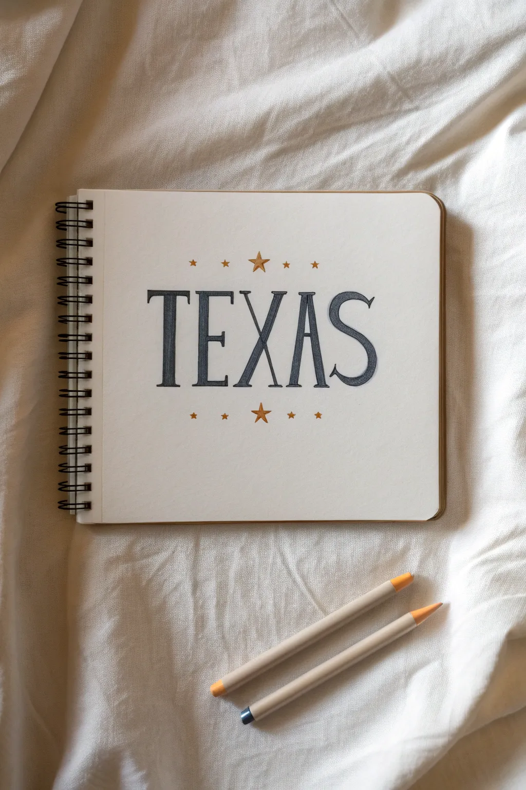
Capture the spirit of the Lone Star State with this clean, western-inspired hand lettering project. Using simple serif forms and gold accents, you can create a striking title page that feels both classic and bold.
How-To Guide
Materials
- Spiral-bound sketchbook or heavy drawing paper
- HB pencil
- Eraser
- Ruler
- Dark grey or slate blue colored pencil (for the letters)
- Gold or bronze metallic colored pencil (for the stars)
- Small blending stump (optional)
Step 1: Planning and Layout
-
Find the center point:
Begin by finding the visual center of your sketchbook page. Use a ruler to lightly mark a horizontal baseline where your letters will sit. This ensures your word ‘TEXAS’ stays straight and true. -
Mark letter height:
Draw a faint top guideline about 2 to 2.5 inches above your baseline. This generous height will give the letters that tall, commanding western presence. -
Space the letters:
Lightly sketch the skeleton of the word ‘TEXAS’ with your HB pencil. Start with the ‘X’ in the exact center, then work outward with the ‘E’ and ‘A’, ending with ‘T’ and ‘S’. Keep the spacing generous. -
Add serifs and weight:
Western fonts are defined by their serifs. Box out the letter forms, adding rectangular slabs at the ends of each stroke. Notice specifically how the middle arm of the ‘E’ sits slightly high and possesses a sharp triangular serif versus the blocky ones elsewhere.
Step 2: Drawing the Letterforms
-
Refine the ‘S’ curves:
Pay special attention to the ‘S’. The spine should be thick and sturdy, tapering into curled terminals. Western ‘S’ shapes often have a slightly flattened top and bottom curve rather than being perfectly round. -
Sharpen the angles:
Go back over your ‘A’ and ‘X’. Ensure the crossbar on the ‘A’ is low, which adds a vintage feel. Make the legs of the ‘X’ symmetrical and sturdy. -
Clean up the sketch:
Once you are happy with the block outlines, gently erase your initial skeletal lines and guidelines, leaving just the faint outline of the final shapes. -
Outline in color:
Take your dark grey or slate blue colored pencil. Sharpen it to a fine point and carefully trace the final outline of each letter. Press firmly enough to create a distinct edge.
Fixing Smudges
If you smudge the dark pencil onto the white paper, don’t rub it! Dab it repeatedly with a kneadable eraser to lift the pigment without spreading the stain further.
Step 3: Shading and Texture
-
Initial fill:
Using the same dark pencil, begin filling in the letters. Don’t press too hard yet; create an even, medium-tone base layer using small circular motions to minimize visible strokes. -
Deepen the fill:
Go over the letters a second time, pressing firmer now to saturate the color. I find that layering the pencil like this creates a rich, matte texture that looks almost like printed ink. -
Refine the edges:
Check the sharp corners of your serifs. If the filling process made them fuzzy, re-sharpen your pencil and crispen up those exterior lines one last time.
Add Depth
To make the letters pop off the page, use a light grey marker or pencil to add a simple drop shadow to the right and bottom of each letter block.
Step 4: Golden Accents
-
Mark star positions:
Using your ruler again, lightly verify the positions for the stars. You want a central star above and below the ‘X’, flanked by two smaller stars on each side. -
Sketch the center stars:
Draw a five-pointed star directly above and below the center of the word. These should be your largest stars, acting as the focal points of the decoration. -
Add the flanking stars:
Sketch the four smaller stars on the top row and the four on the bottom row. Align them horizontally with the center stars for a cohesive look. -
Fill with gold:
Using your gold or bronze metallic pencil, fill in the stars. To make them pop, leave a tiny sliver of white paper in the center of each star to simulate a highlight, or color one half of each point slightly darker. -
Final erase:
Take a large eraser and gently clean up the entire page, removing any stray graphite marks or ruler lines that might still be visible around the lettering.
Now you have a bold, handcrafted title page ready to start your Texas-themed sketchbook journey
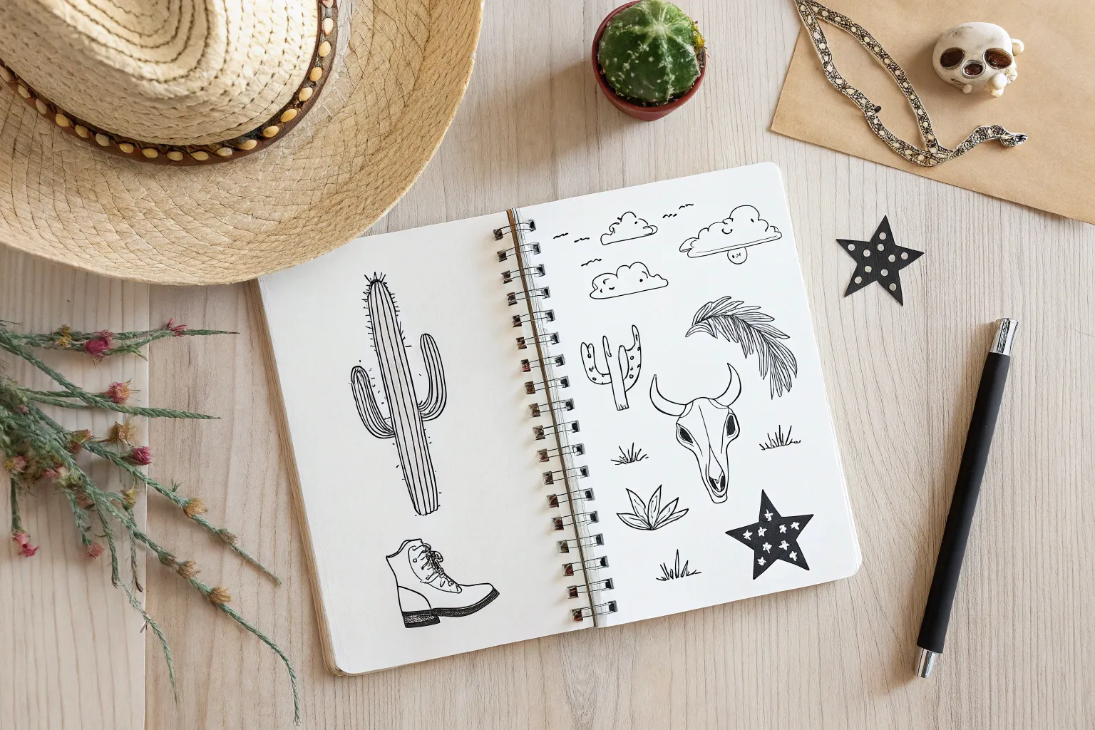
Texas Icon Flash Sheet Collage
Capture the spirit of Texas with this charming collection of minimalist icons, perfect for filling a sketchbook page or creating your own custom sticker sheet. This “flash sheet” style layout combines classic Western imagery with bold line work for a cohesive and striking design.
Step-by-Step Tutorial
Materials
- Spiral-bound sketchbook or dot grid journal
- Fine liner pens (sizes 01, 03, and 05 – black ink)
- Pencil (HB or 2B)
- Soft eraser
- Ruler (optional, for spacing)
Step 1: Planning the Layout
-
Rough pencil sketch:
Begin by lightly sketching the outline of the state of Texas in the upper left quadrant. This is your largest element and will anchor the rest of the composition, so take your time getting the distinctive shape right. -
Mapping the icons:
Lightly pencil in placeholders for the remaining icons. Place a cowboy hat and sun motif to the right of the state outline. Position two stars and a sombrero in the middle row. Reserve the bottom row for the cowboy boot and cacti. -
Spacing check:
Step back and look at your pencil marks. Ensure there is gentle, even breathing room between each drawing so the page doesn’t feel cluttered. Adjust positions now before committing to ink.
Step 2: Drawing the Main Icons
-
Inking the state outline:
Using a size 05 pen for a bolder look, trace over your Texas outline. Inside the shape, switch to a slightly thinner 03 pen to write ‘TEAM’ or ‘TEXAS’ in a bold, serif font. -
The cowboy hat:
Draw the cowboy hat with a smooth, continuous line for the brim. Add a curved line for the crown and a band detail. Keep the lines clean and confident. -
Stylized stars:
Create the two stars in the middle left area. Draw a standard five-point star shape, then draw a smaller star inside it. Fill the space between the two outlines with small stippling dots or tiny geometric patterns to give them a textured, vintage feel. -
The sombrero:
To the right of the stars, ink the sombrero. Focus on the wide brim and the intricate pattern work on the crown. Use vertical lines and small circles to suggest woven straw texture.
Keep it Steady
Pull the pen toward you rather than pushing it away when drawing long curves; this helps maintain consistent line weight and control.
Step 3: Adding Flora and Footwear
-
Cowboy boot details:
Draw the cowboy boot at the bottom center. Use the 05 pen for the outline and the 01 pen for the delicate stitching design on the shaft and the spur strap. -
Saguaro cactus:
On the bottom right, draw two cacti. For the larger one on the far right, fill the interior with horizontal cross-hatching or a grid pattern to mimic spines. Keep the smaller cactus simply outlined. -
Floral fillers:
I like to fill empty gaps with small sprigs of sage or bluebonnet silhouettes. Place one near the state outline, one near the hat, and a small cross near the boot. -
Sunburst windmill:
In the top right corner, draw a semi-circle sunburst that morphs into a windmill base. Use straight, radiating lines for the sun rays.
Make it a Patch
Turn these designs into faux patches by drawing a dashed “stitch” line around the border of each icon, leaving a small white gap.
Step 4: Final Touches
-
Weight variation:
Go back over your main outlines with the 05 pen to thicken the exterior lines of each object, making them pop against the page. -
Texture and shading:
Use your finest 01 pen to add tiny hatching lines for shading—such as under the brim of the hat and at the heel of the boot. -
Clean up:
Wait at least 10-15 minutes for the ink to fully cure to prevent smearing. Once dry, gently erase all visible pencil sketches to leave a crisp, black-and-white finish.
Enjoy your collection of hand-drawn Western motifs as you flip through your sketchbook


Have a question or want to share your own experience? I'd love to hear from you in the comments below!