Travel has this sneaky way of turning ordinary moments into little treasures—especially once you paint them. Here are some travel painting ideas I love for capturing that mix of movement, place, and dreamy “I can’t believe I was there” nostalgia.
Postcard-Style Landmark Sketch
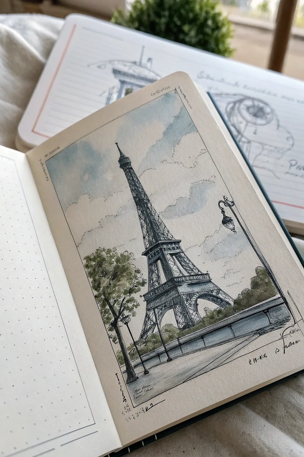
Capture the romance of Paris with this vintage-inspired postcard sketch of the Eiffel Tower. Using a combination of delicate ink lines and soft watercolor washes on cream paper, you’ll create a charming, nostalgic travel memory directly in your sketchbook.
Detailed Instructions
Materials
- Cream or off-white sketchbook paper (mixed media or watercolor weight)
- Fine-liner pens (sizes 0.1, 0.3, and 0.5, black waterproof ink)
- Watercolor paints (Payne’s Grey, Cerulean Blue, Sap Green, Burnt Umber)
- Small round watercolor brush (size 4 or 6)
- Pencil (HB or 2B)
- Kneaded eraser
- Ruler
- White gel pen (optional)
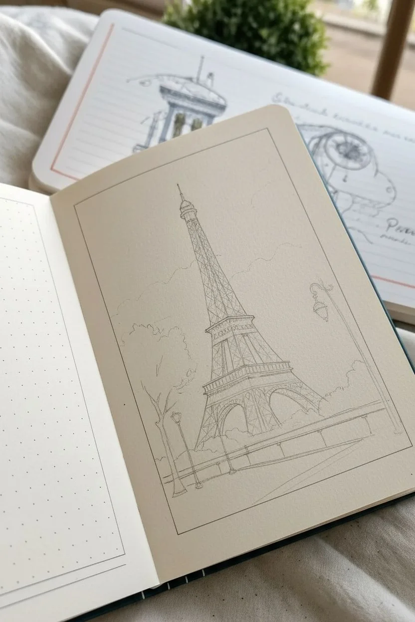
Step 1: Drafting the Composition
-
Define the frame:
Start by lightly drawing a rectangular border on your page with a ruler and pencil. This creates that defined ‘postcard’ boundary that gives the sketch its contained, finished look. -
Establish the horizon:
Draw a low horizon line about one-fifth of the way up from the bottom border. This low angle emphasizes the towering height of the structure. -
Block in the tower shape:
Lightly sketch a tall, slender triangle shape centered in the frame. Divide it horizontally into three sections to mark the tower’s platforms. Don’t worry about details yet; just get the proportions right. -
Add foreground elements:
Sketch the curved bridge railing in the foreground and place a simple tree shape to the left. Add the vintage streetlamp on the right side to balance the composition.
Step 2: Inking the Details
-
Outline the main structure:
Switch to your 0.3 pen. Carefully ink the main vertical curves of the Eiffel Tower. Keep your hand relaxed to achieve slightly organic, wiggly lines rather than perfectly straight architectural drafts. -
Add the cross-hatching:
Using the 0.1 pen, fill in the lattice work. Instead of drawing every single beam, use small ‘X’ shapes and scribbles to suggest the complex metal texture. Darken the areas under the platforms to show depth. -
Ink the surroundings:
Outline the bridge railing with the 0.5 pen for a weightier foreground feel. Draw the streetlamp with fine detail, and use loose, scumbled lines for the tree foliage to differentiate the organic texture from the metal. -
Border and text:
Ink your rectangular border using a ruler or freehand for a looser look. If you like, scribble some illegible text or a date in the bottom corner to mimic a real postcard stamp or caption. -
Erase guidelines:
Wait for the ink to dry completely—this is crucial to avoid smearing. Once dry, gently lift all pencil marks with your kneaded eraser.
Keep it Loose
Don’t try to draw every girder of the tower. Suggesting the texture with zig-zags and dots is often more effective than perfect accuracy.
Step 3: Adding Color Washes
-
Paint the sky:
Dilute Cerulean Blue with plenty of water. Paint a loose wash in the upper sky area, leaving random white (or cream paper) patches to represent clouds. Let the blue fade out as it nears the horizon. -
Color the tower:
Mix a very watery wash of Payne’s Grey with a touch of Burnt Umber. Gently paint the tower, but don’t fill it in solidly. I prefer to dab color into the shadowed areas and leave the lighter sides untouched to let the paper color show through. -
Add greenery:
Mix Sap Green with a little grey to desaturate it. Dab this onto your tree and the bushes behind the railing. Keep the edges soft and indistinct. -
Paint the bridge:
Use a darker mix of Payne’s Grey and Blue for the bridge wall. Paint a horizontal gradient, making the area just under the railing darker to ground the image. -
Final shadows:
Once the first layers are dry, add a second, darker layer of grey to the underside of the arches and the interior of the tree for contrast.
Vintage Vibe
Use a sepia or dark brown fineliner instead of black ink. This instantly ages the drawing and harmonizes beautifully with cream paper.
Close your sketchbook knowing you’ve preserved a beautiful slice of Paris forever


Street Scene From a Cafe Table
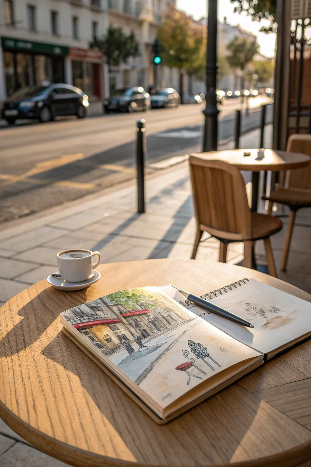

Capture the romantic ambiance of a European street corner directly from your café table with this urban sketching project. Using ink and delicate watercolor washes, you’ll create a lively vignette featuring classic architecture and charming red awnings.
How-To Guide
Materials
- A5 Watercolor sketchbook (hot press or cold press)
- Fine liner pen (waterproof, 0.3mm or 0.5mm, black)
- Watercolor travel set
- Water brush or size 6 round watercolor brush
- HB pencil
- Kneaded eraser
- Paper towel or rag
Step 1: Penciling the Composition
-
Establish the horizon line:
Begin by lightly drawing a horizon line across the left page, roughly one-third up from the bottom. This will anchor your perspective for the street scene. -
Block in major shapes:
Sketch a large rectangle on the left side to represent the main building façade. Use gentle, loose lines to indicate where the sidewalk meets the street, angling lines toward a vanishing point near the center. -
Add architectural details:
Lightly outline the placement of windows and doors on the building. Don’t worry about perfect rulers; a slightly wobbly line adds character to urban sketches. -
Sketch the awnings:
Draw the distinct shapes of the awnings above the shop windows. These are the focal points, so give them a nice, prominent slant. -
Indicate street elements:
Add quick gestural shapes for street lamps, bollards, or small tables on the sidewalk. Keep these very simple at this stage.
Ink Smearing?
If your pen smears when painting, switch to a waterproof pigment liner (like Pigma Micron). Always wait at least 5 minutes before applying water over fresh ink.
Step 2: Inking the Scene
-
Outline the foreground:
Switch to your waterproof fine liner. Start with the objects closest to you or the main building structure. Use a confident, continuous line rather than short, scratchy strokes. -
detail the windows:
Ink the window frames and doorways. I like to thicken the line slightly on the shadowed side of the frames to give them instant depth. -
Texture the awnings:
Draw the stripes on the awnings if visible, or simply outline their scalloped edges. Ink the support poles holding them up. -
Add environment texture:
Use loose, scribbly lines to suggest foliage for any trees in the background. Use horizontal hatching on the street surface to suggest cobblestones or pavement texture without drawing every stone. -
Erase pencil guides:
Once the ink is completely dry—give it a minute or two—use your kneaded eraser to gently lift away the graphite guidelines.
Splatter Effect
Tap a loaded brush against your finger to flick tiny droplets of paint onto the page. This adds kinetic energy and spontaneity to static architectural drawings.
Step 3: Adding Watercolor Washes
-
Paint the sky:
Mix a very diluted wash of Cobalt Blue or Cerulean. Apply it loosely to the sky area, letting it fade out to white near the horizon line to suggest atmospheric depth. -
Warm the building:
Mix a creamy wash of Yellow Ochre or Raw Sienna. Paint the façade of the building, carefully painting around the awnings to keep that paper white for the next step. -
Pop the red awnings:
Load your brush with Cadmium Red or Alizarin Crimson. Paint the awnings boldly. If the paint is too wet, dab it with a paper towel to create a highlighted texture. -
Ground the scene:
Mix a cool grey using Ultramarine Blue and a touch of Burnt Sienna. Apply this to the street and sidewalk area, using horizontal strokes. Let the brush skip a bit to create roughness. -
Deepen shadows:
Using a slightly more concentrated grey-purple mix, paint the shadows under the awnings and inside the window frames. This high contrast makes the bright colors pop. -
Add greenery:
Dab a mix of Sap Green and Lemon Yellow onto the tree areas. Keep it loose and uneven to mimic leaves catching the light. -
Final touches:
If desired, add a very quick companion sketch on the facing page—perhaps a detail of a café chair or a lamp—using just ink and a splash of leftover wash to balance the spread.
Now you have a charming memory of your coffee break captured forever in your sketchbook


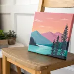
Boat Deck Looking Out to Water
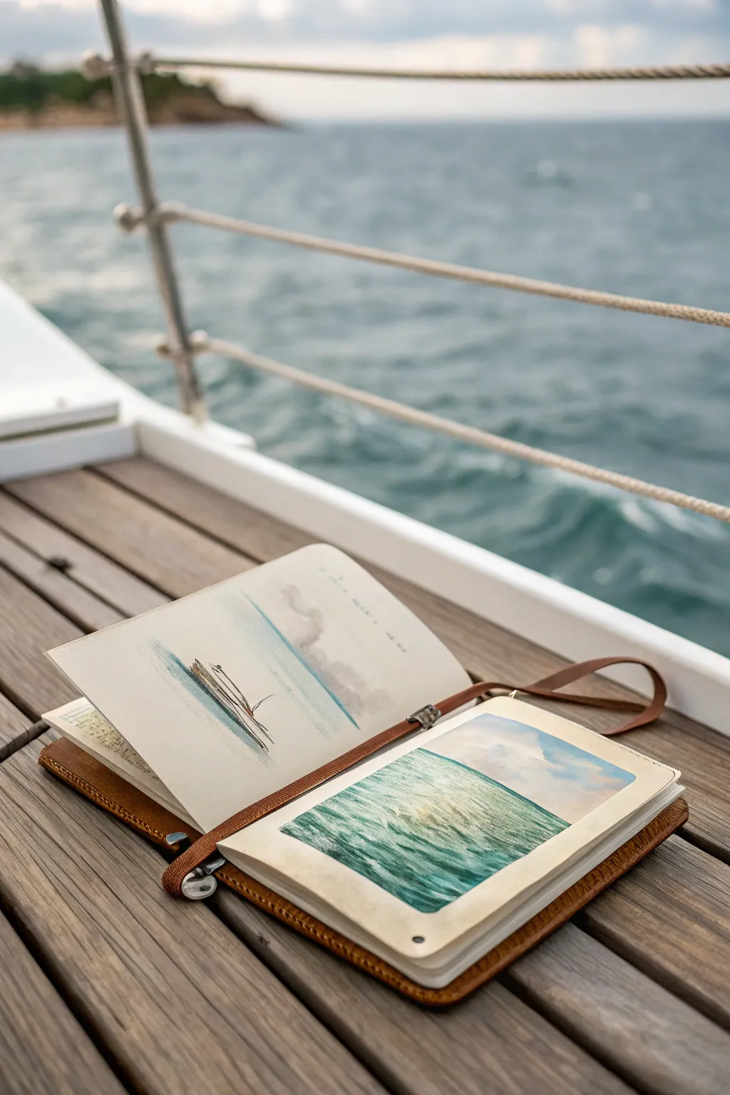
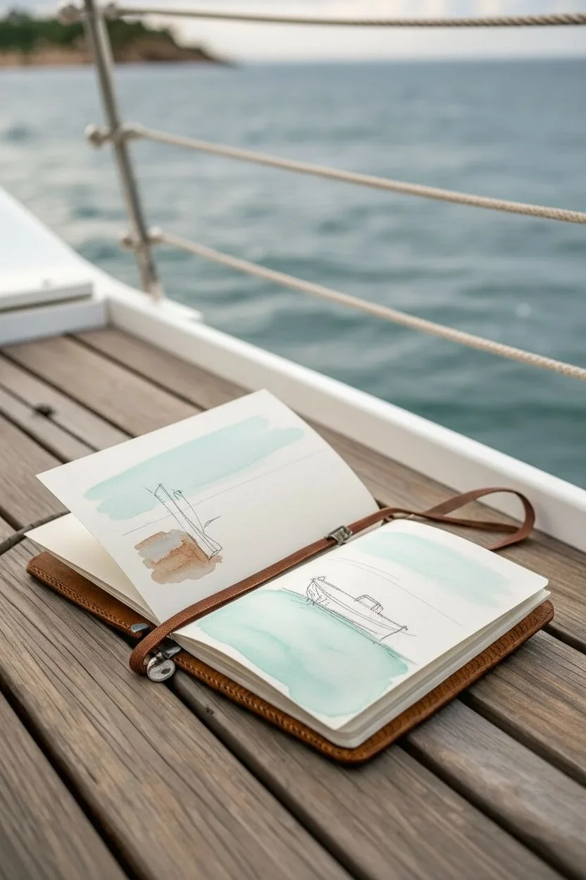
Capture the serenity of the open water with this dual-page sketchbook spread, featuring a minimalist boat study on one side and a textured ocean landscape on the other. This project balances loose, airy washes with richer, layered acrylics or gouache to evoke the feeling of sailing.
How-To Guide
Materials
- Leather-bound sketchbook (heavyweight mixed media or watercolor paper)
- Watercolor paints (Cerulean Blue, Ultramarine, Burnt Sienna, Payne’s Grey)
- Acrylic or Gouache paints (Teal, White, Phthalo Green, Yellow Ochre)
- Round watercolor brush (size 6)
- Flat shader brush (size 8)
- Fine liner or dip pen with waterproof black ink
- Pencil (HB)
- Washi tape or masking tape
- Water container and paper towels
Step 1: Left Page: Minimalist Boat Study
-
Establish the horizon:
Begin on the left page by lightly drawing a horizon line about one-third of the way up the page using your HB pencil. -
Sketch the vessel:
Draw the simple outline of a boat hull or a partial view of a sailboat. Keep the lines faint, focusing on the curve of the hull meeting the water. -
First wash of sky:
Dilute a touch of Cerulean Blue watercolor with plenty of water. Sweep this very pale wash across the top two-thirds of the page, fading it out as you reach the horizon to suggest distance. -
Paint the water base:
Mix a light teal using Cerulean Blue and a tiny dot of Phthalo Green. Apply this horizontally below your horizon line, leaving white space around the boat sketch. -
Define the hull:
Using a slightly stronger mix of Burnt Sienna and Payne’s Grey, carefully paint the shadow side of the boat hull. -
Add ink accents:
Once the paint is completely dry, use your fine liner or dip pen to loosely trace the boat’s essential lines. I like to keep these lines broken and sketchy to maintain a fluid movement.
Step 2: Right Page: Textured Ocean View
-
Tape the edges:
Create a crisp border for the polaroid-style painting on the right page by applying masking tape to define a rectangular area. -
Sky gradient:
Using acrylics or gouache, blend Titanium White with a hint of blue at the top of the rectangle, grading it down to pure white near the horizon line. -
Deep water base:
Mix Phthalo Green, Teal, and a touch of dark blue. Apply this dark mixture at the very bottom of your taped area, stroking horizontally. -
Mid-tone waves:
Lighten your teal mix with a little white and Yellow Ochre. Paint the middle section of the water, blending it slightly into the darker bottom layer. -
Create surface texture:
Switch to a smaller flat brush. Using a dry-brush technique, drag lighter turquoise paint across the water surface to create the look of ripples catching the light. -
Highlight the crests:
Mix white with a tiny amount of yellow. Dab this onto the highest points of your waves in the foreground to simulate sunlight hitting the chopping water. -
Refining the horizon:
Ensure the horizon line where the water meets the sky is perfectly straight and sharp. Use a steady hand and a flat brush edge for this crucial division. -
Soft clouds:
Return to the sky area. If it feels too empty, dry-brush a few indistinct, fluffy white shapes near the top right corner to echo the clouds. -
Reveal the painting:
Wait for the paint to be dry to the touch, then slowly peel away the masking tape at a 45-degree angle to reveal your crisp edges.
Uneven Washes?
If your watercolor sky looks splotchy, wet the paper with clean water first (wet-on-wet technique) before adding pigment. This helps the color spread seamlessly.
Pro Tip: Depth of Field
Make foreground waves larger and more textured, while keeping distant waves near the horizon smaller and smoother. This creates an instant sense of vast distance.
Close your sketchbook and secure the strap, knowing you’ve bottled a piece of the ocean to take home


Inside-the-Tent Camping View
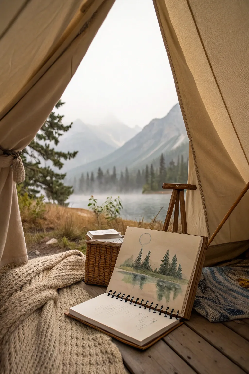
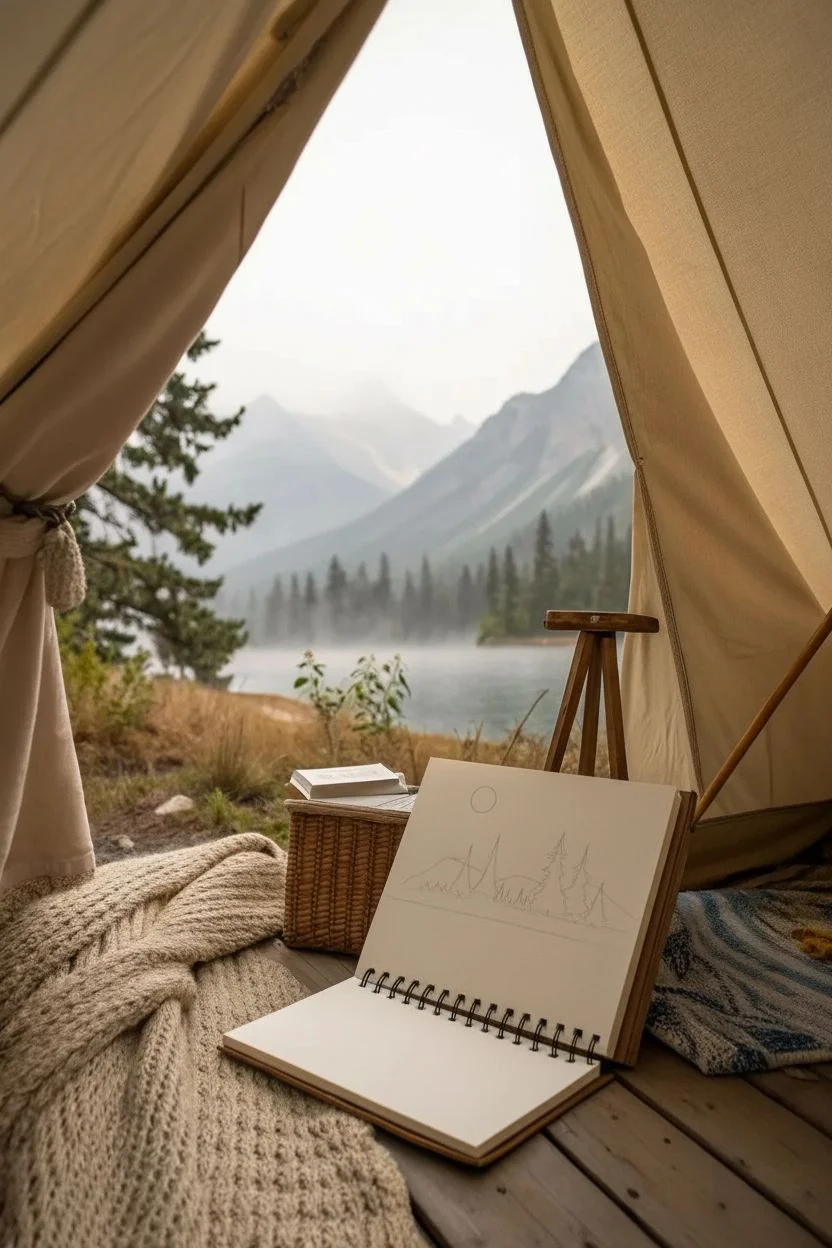
Capture the serene beauty of a foggy morning by the lake with this delicate watercolor study. This project focuses on soft washes and mirroring techniques to create a tranquil landscape straight from your tent view.
Step-by-Step Tutorial
Materials
- Spiral-bound watercolor sketchbook (cold press paper recommended)
- Watercolor paint set (focus on Payne’s Grey, Sap Green, Burnt Umber, and Ultramarine Blue)
- Round watercolor brushes (Size 4 and Size 8)
- Pencil (HB or H)
- Cup of water
- Paper towel or cloth
- Fine liner pen (optional, for notes)
Step 1: Sketching the Scene
-
Establish the Horizon:
Lightly draw a straight horizontal line across the middle of your page with your pencil. This line separates the sky from the water and will serve as the base for your trees. -
Outline the Trees:
Above the horizon line, sketch the rough triangular shapes of three or four prominent pine trees. Vary their heights to keep the composition natural. -
Add Background Elements:
Behind the trees, lightly sketch a sloping hill or mountain shape that fades into the distance. Keep pencil pressure very light so graphite doesn’t smear into the paint later. -
Place the Moon:
In the upper left portion of the sky, draw a simple circle to represent the moon. Don’t worry about perfect geometry; a slightly organic shape adds character.
Muddy Reflections?
If your water reflection looks muddy, you may be overworking the wet paper. Lay down the color in single strokes and let the water do the blending work for you.
Step 2: Painting the Sky and Background
-
Prepare a Light Wash:
Mix a very watery puddle of diluted Payne’s Grey and a touch of Ultramarine Blue. You want a color that looks like morning mist. -
Wash the Sky:
Using your Size 8 brush, apply this pale wash across the entire sky area, carefully painting *around* the circle of the moon to leave it pure white. -
Paint the Distant Ground:
While the sky is still slightly damp, mix a pale green-grey using Sap Green and Payne’s Grey. Paint the low hill behind the trees, letting the edges blur slightly into the sky for depth. -
Background Grasses:
Add a yellowish-green wash along the horizon line itself to suggest the grassy bank where the trees stand. Let this layer dry completely before moving forward.
Step 3: Creating the Trees
-
Mix Tree Colors:
Create a stronger, more saturated mix of Sap Green and Burnt Umber. It should be much darker than your background washes. -
Paint the Central Structure:
With your Size 4 brush, paint the vertical trunk lines for your main pine trees. -
Add Foliage Texture:
Using the tip of the brush, dab irregular horizontal strokes starting from the top of the tree and working down, widening the shape as you go. Leave small gaps between branches to let the sky show through. -
Darken the Base:
Drop a little pure Payne’s Grey into the wet paint at the bottom of the trees to ground them and add volume.
Preserving the Moon
To keep the moon perfectly white without painting around it, apply a small dot of masking fluid before you start. Rub it off only after the sky paint is bone dry.
Step 4: Painting the Reflection
-
Wet the Water Area:
Brush clean water over the bottom half of the page (below the horizon line). The paper should be glisten, but not hold puddles. -
Mirror the Colors:
While the paper is wet, take your tree color mix and paint loose, vertical strokes directly below the reflected trees. The wet paper will naturally diffuse the paint. -
Defining the Reflection:
Add slightly darker pigment just under the horizon line to show where the shore meets the water, pulling the color downward. -
Softening Edges:
If the reflection looks too sharp, I often run a clean, damp brush horizontally across the painted reflection to create a ripple effect. -
Final Details:
Once everything is dry, you can use a fine liner or pencil to outline the moon one more time or add small details to the grassy bank.
Now you have a timeless memory of the peaceful morning view captured right in your sketchbook
BRUSH GUIDE
The Right Brush for Every Stroke
From clean lines to bold texture — master brush choice, stroke control, and essential techniques.
Explore the Full Guide
Souvenir Shelf Memory Painting
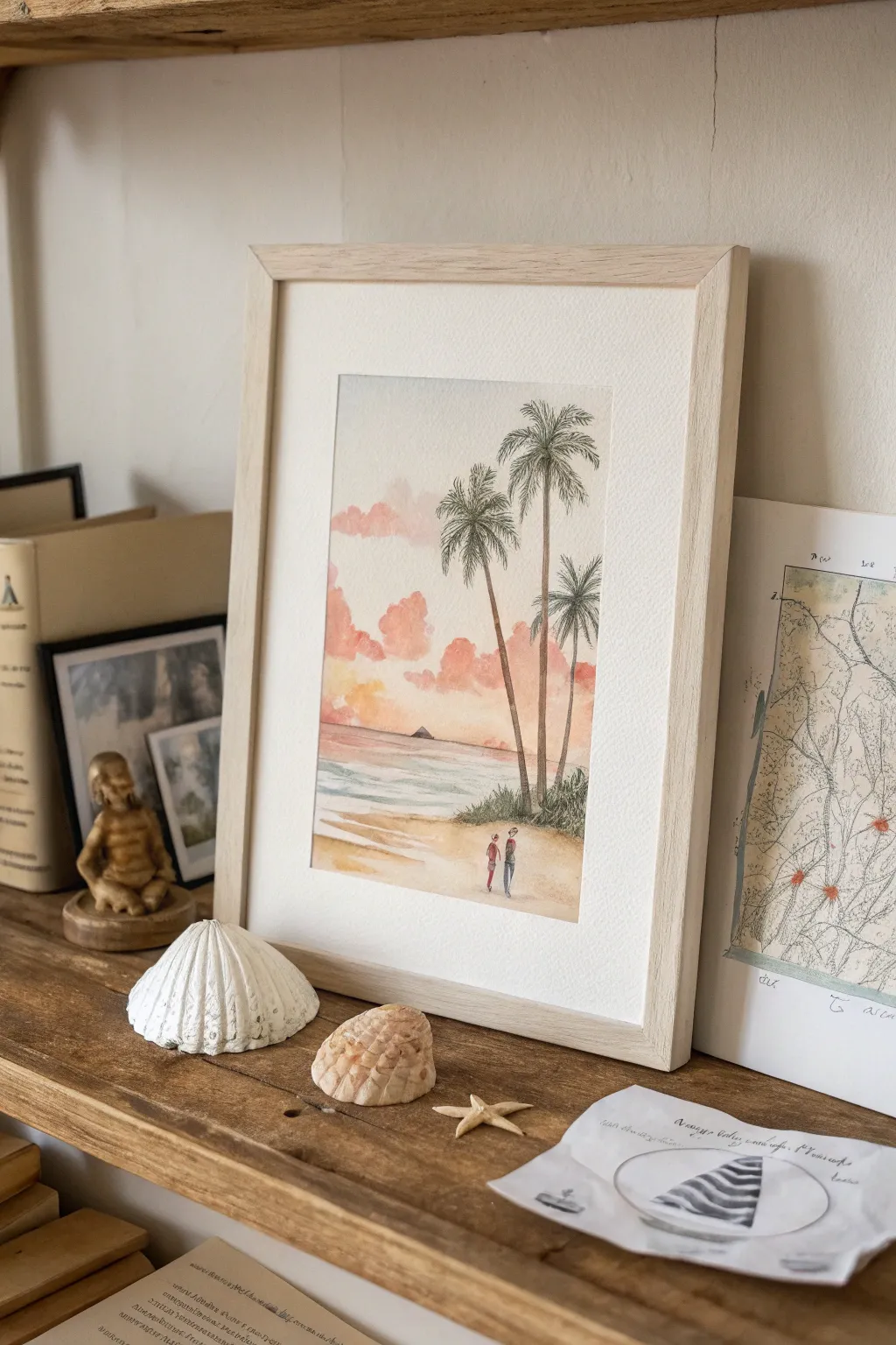
Immortalize a quiet moment from your travels with this serene beachscape, featuring delicate palm trees against a soft sunset sky. This project combines loose watercolor washes with fine ink details to capture the warm, nostalgic feeling of a perfect evening walk.
Step-by-Step
Materials
- Cold press watercolor paper (approx. A4 or 8×10 inches)
- Watercolor paints (Coral, Rose, Yellow Ochre, Cobalt Teal or Turquoise, Burnt Sienna, Sap Green, Payne’s Grey)
- Round watercolor brushes (Size 8 for washes, Size 2 for details)
- Fine liner pen (Black or Sepia, 0.3mm)
- Pencil and eraser
- Painter’s tape
- Wooden frame (light oak finish)
- Masking fluid (optional)
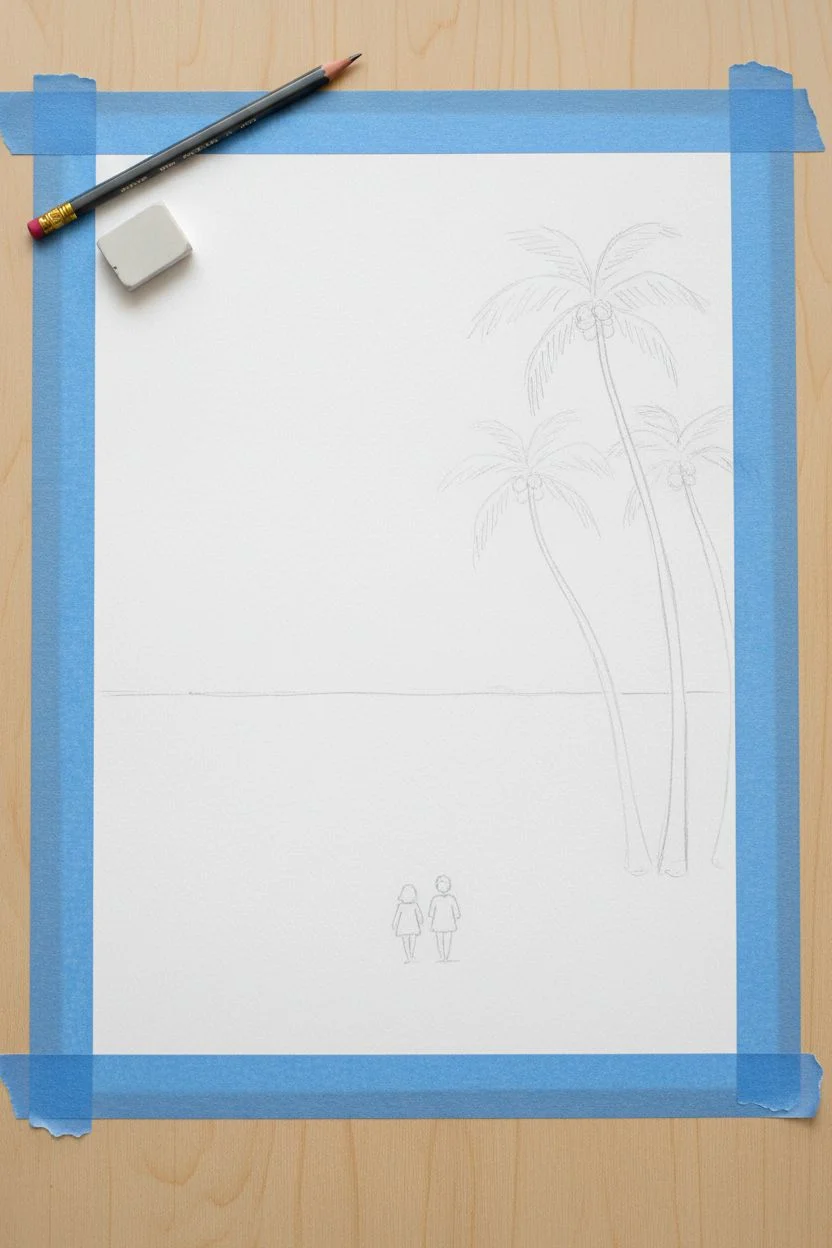
Step 1: Setting the Scene
-
Tape Borders:
Begin by taping down all four edges of your watercolor paper to a board. Use painter’s tape to create a clean, white border about 1 inch wide, which gives that professional framed look straight away. -
Light Sketching:
Using a faint pencil touch, sketch the horizon line about one-third of the way up from the bottom. Mark the positions of three palm trees on the right side—tall, slender trunks slightly curving. -
Figure Placement:
Sketch two tiny, simplified figures near the bottom center. They don’t need detail, just outlines of heads and torsos walking away from the viewer.
Pro Tip: Cloud Control
Work fast with the clouds! If the paper starts drying, stop adding paint or you’ll get ‘cauliflower’ edges. Soft clouds need wet paper.
Step 2: The Sunset Sky
-
Wet-on-Wet Gradient:
Moisten the sky area above the horizon with clean water. Drop in a very dilute wash of Yellow Ochre near the horizon line to represent the fading sun. -
Adding Clouds:
While the paper is still damp, mix a soft Coral or Rose color. Dab this color gently to form fluffy, cumulus-style clouds. Let the pigment bloom naturally into the wet paper for soft edges. -
Upper Sky:
You can leave the very top area plain or add the faintest hint of cool grey. Allow this sky layer to dry completely before touching the trees to prevent bleeding.
Level Up: Handwritten Memory
Use the white border at the bottom to write the location and date in a delicate cursive script using a pencil or fine sepia pen.
Step 3: Ocean and Sand
-
Horizon Wash:
For the distant ocean, mix Cobalt Teal with a touch of Payne’s Grey for a muted sea color. Paint a horizontal band right at the horizon line. -
Shoreline Transition:
As you move closer to the beach, dilute the blue paint significantly. Leave streaks of white paper to suggest gentle waves rolling in. -
Painting the Sand:
Mix Yellow Ochre with a tiny bit of Burnt Sienna. Apply this to the beach area using horizontal strokes, leaving some white gaps for highlights. Darken the tone slightly under the palm trees for shadow.
Step 4: Palm Trees & Vegetation
-
Painting Trunks:
Using your size 2 brush and a mix of Burnt Sienna and Payne’s Grey, paint the tall, skinny trunks of the palm trees. I often drag the brush lightly to create a rough texture. -
Frond Structure:
Switch to a dark Sap Green mix. Paint the palm fronds bursting from the top of the trunks. Use quick, flicking strokes outward to mimic the feathery nature of palm leaves. -
Ground Foliage:
At the base of the trees, dab in some rough bushes using various shades of green. Keep this loose and impressionistic to anchor the trees to the sand.
Step 5: Final Details
-
Refining Figures:
Carefully paint the two tiny figures. Use a pop of red or blue for their clothes to make them stand out against the sand. -
Ink Accents:
Once the paint is bone dry, take your fine liner pen. Add very selective outlines to the palm fronds and the figures to sharpen them up. -
Texture Marks:
Add tiny ink stippling or hatching marks on the trunks and the grassy area at the base for added definition. -
Framing:
Peel off the tape carefully. Place the artwork into a light oak frame, ideally with a mat (mount) to let the painting breathe.
Place your finished piece locally on a shelf alongside sea shells or driftwood to complete the coastal vignette
Vintage Travel Poster Reimagined
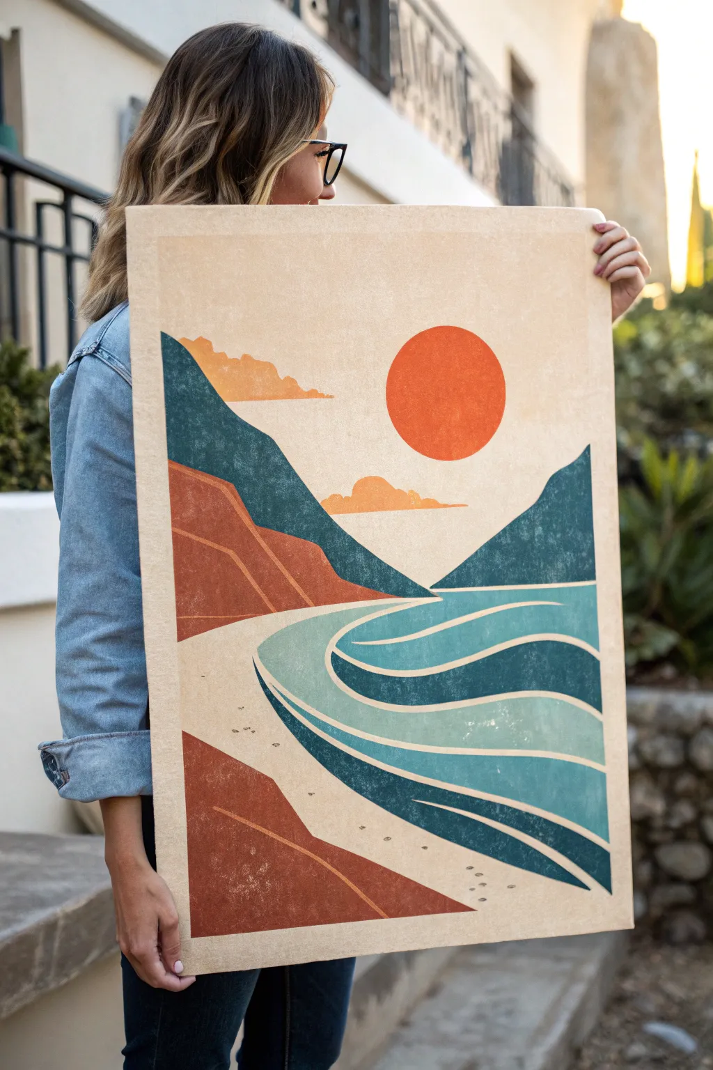
Capture the nostalgic allure of mid-century travel advertisements with this bold, geometric landscape painting. Featuring simplified shapes, warm earth tones, and a distinctive weathered texture, this project transforms a simple canvas into a timeless piece of decor that evokes sunny days by the sea.
Step-by-Step Guide
Materials
- Large canvas or primed wooden panel (approx. 24×36 inches)
- Acrylic paints: Burnt Sienna, Terracotta, Teal/Deep Cyan, Turquoise, Cream/Beige, Bright Orange, White
- Medium and large flat synthetic brushes
- Fine detail brush (liner)
- Painter’s tape (blue or green)
- Graphite paper (optional for tracing)
- Ruler
- Fine grit sandpaper or sanding block (optional for distressing)
- Matte varnish or sealant
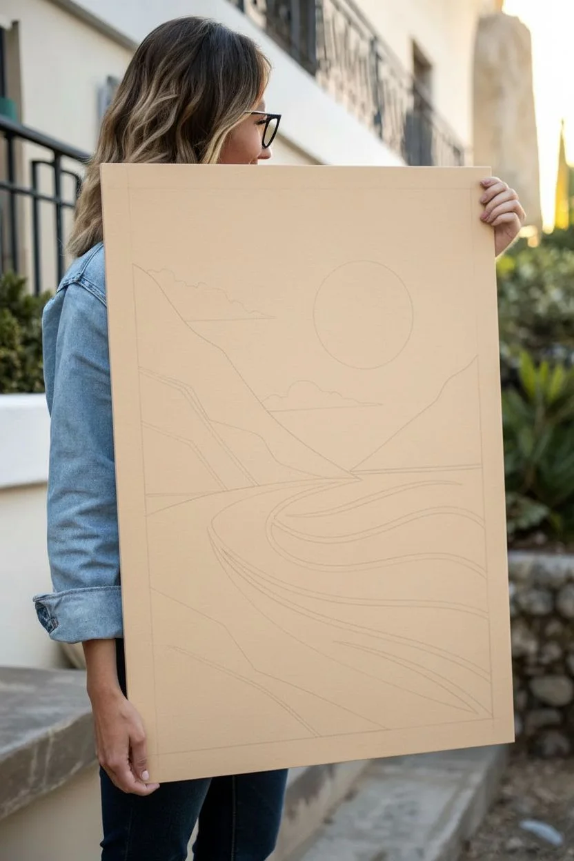
Step 1: Preparation and Sketching
-
Surface Prep:
Begin by ensuring your canvas or panel is clean and free of dust. If you’re using a raw wooden panel, apply a coat of gesso to prime the surface and let it dry completely. -
Establish the Background:
Paint the entire surface with a warm, sandy beige or cream color. This will serve as your sky and sand base color, and allowing it to peek through later layers helps unify the palette. -
Drafting the Design:
Once the base coat is bone dry, lightly sketch the composition. Use a ruler to help visualize where the horizon line would be, though in this stylized piece, the lines are organic. Draw the large V-shape of the valley, the circular sun, and the flowing curves of the waves.
Step 2: Blocking in the Mountains and Cliffs
-
Taping the Edges:
For those sharp, graphic edges characteristic of screen printing, use painter’s tape to mask off the boundary between the sky and the mountains. Press the edges of the tape down firmly to prevent bleeding. -
Painting the Distant Mountains:
Mix a deep teal with a touch of grey to create the color for the farthest mountain range. Apply the paint flatly and evenly within your sketched area. -
Adding the Foreground Cliffs:
Switch to your Terracotta or Burnt Sienna shade. Paint the jagged cliff formations on the left side and the lower foreground section. I find that applying two thin coats gives a smoother, more poster-like finish than one thick coat. -
Defining the Contours:
Within the dark reddish-brown cliffs, add the subtle geometric contour lines using a slightly darker version of your terracotta mix. Keep these lines sharp and angular. -
Remove Tape and Refine:
Carefully peel back the painter’s tape while the paint is still slightly tacky to reveal crisp edges. Use a small flat brush to touch up any imperfections.
Clean Lines Hack
To get razor-sharp lines without tape, paint a thin layer of the background color (beige) over your tape edge first. This seals the gap so your colored paint won’t bleed under.
Step 3: The Ocean and Sun
-
Painting the Sun:
Locate your circle sketch in the sky area. Using a bright, warm orange, carefully paint the sun. If you struggle with freehand circles, trace a plate or roll of tape first. -
Creating the Waves:
The ocean is composed of distinct bands of color. Start with the darkest teal for the deep water sections, following the sweeping curves of your sketch. -
Layering Lighter Tones:
Mix your turquoise with a little white to create a lighter aquatic teal. Paint the alternate bands of water, ensuring the boundaries between the light and dark blues meet cleanly. -
The Whitecaps:
Using a liner brush or a very steady hand with a small flat brush, paint the thin cream or white lines that separate the wave sections. These lines mimic the foam of breaking waves and reinforce the graphic style. -
Adding Clouds:
Using an muted orange or light peach tone, paint the stylized, low-hanging clouds near the horizon line. Keep the bottoms flat and the tops bumpy.
Fixing Uneven Coverage
If your large blocks of color look streaky, don’t keep brushing wet paint. Let it dry completely, then apply a second thin layer perpendicular to the first stroke direction.
Step 4: Texture and Finishing Touches
-
Adding Footprints:
With a fine detail brush and a diluted brown paint, dab small pairs of dots along the sandy beach area to represent tiny footprints leading toward the water. -
Creating the Distressed Look:
To achieve the vintage poster aesthetic seen in the photo, you need texture. Once the painting is 100% dry, take a fine-grit sandpaper block and very lightly scuff the surface, focusing on the edges and large blocks of color. -
Speckling (Optional):
For extra ‘noise’ or grain, you can lightly flick a toothbrush with diluted white or cream paint over the artwork. Keep this extremely subtle. -
Sealing the Artwork:
Finish the piece with a coat of matte varnish. This not only protects the paint but eliminates any glossy glare, ensuring it looks like a printed paper poster.
Hang your new artwork in a sunny spot to bring a permanent vacation vibe to your living space

PENCIL GUIDE
Understanding Pencil Grades from H to B
From first sketch to finished drawing — learn pencil grades, line control, and shading techniques.
Explore the Full Guide
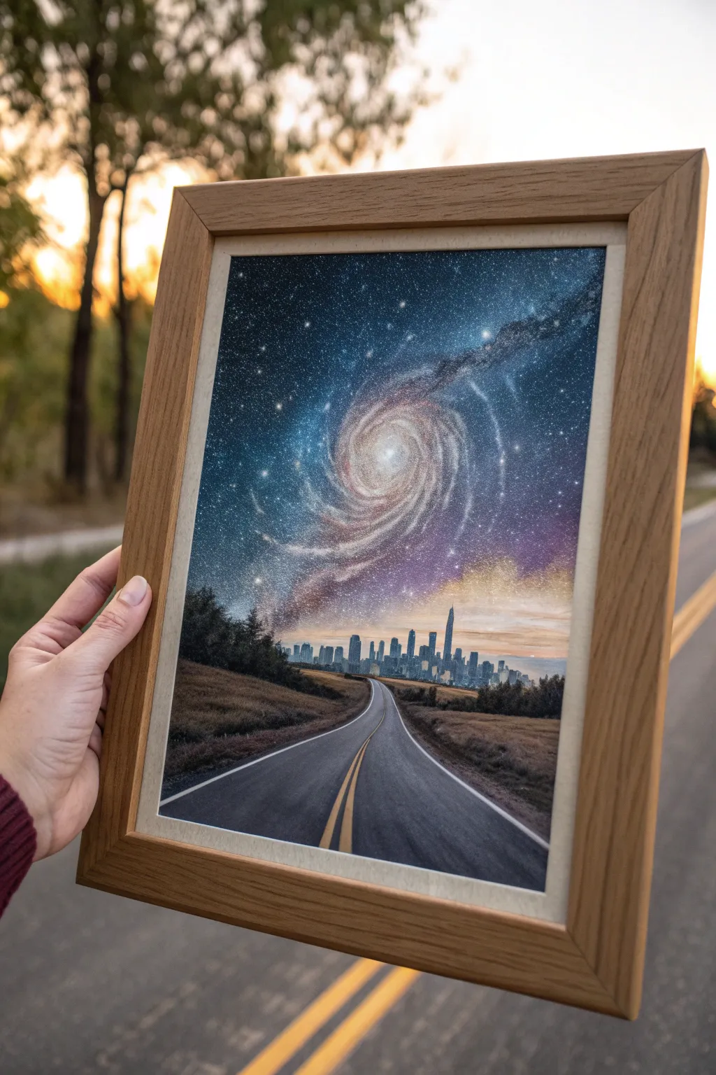
Surreal Journey Into the Cosmos

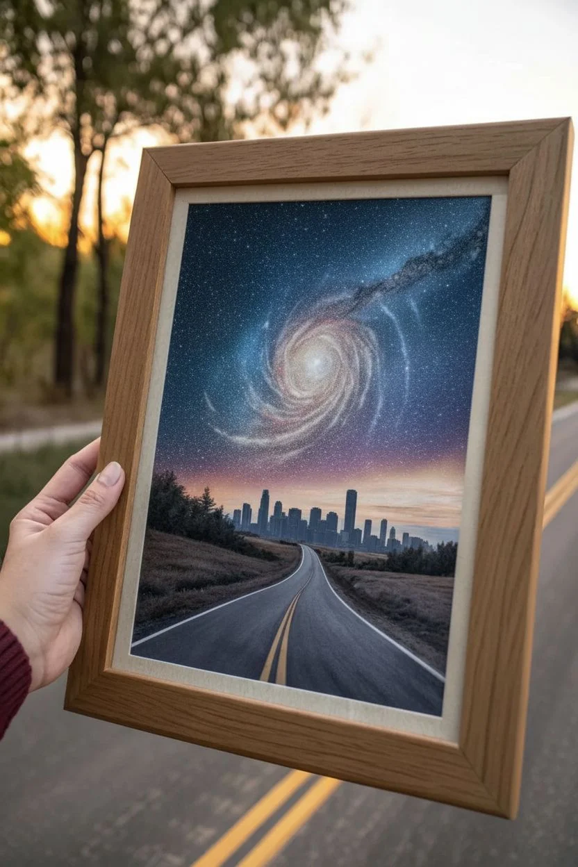
Blend the grounded reality of a road trip with the surreal beauty of deep space in this striking mixed-media piece. By combining photo manipulation techniques with painting or digital blending, you’ll create a seamless transition from asphalt to stardust.
Step-by-Step Tutorial
Materials
- Digital design software (Photoshop, Procreate, or similar) OR high-resolution printed photos for manual collage
- High-quality matte photo paper or cardstock
- Wooden picture frame (light oak finish recommended)
- White mat board (optional, depending on frame)
- Acrylic paints (black, white, ultramarine blue, purple, magenta)
- Fine detail brushes
- Adhesive (artist spray mount or gel medium)
- X-Acto knife and cutting mat
- Star stencil or old toothbrush for spattering
Step 1: Planning and Composition
-
Source Your Imagery:
Find three distinct high-resolution images: a winding highway perspective shot, a modern city skyline silhouette, and a vibrant spiral galaxy. Ensure the lighting direction feels somewhat consistent, or plan to adjust it later. -
Establish the Horizon:
Determine where your city will sit. The highway should lead the eye directly into the city center. Crop the highway image so the road vanishes right at the base of the skyscrapers. -
Soft Blending Construction:
If working digitally, use soft eraser brushes or layer masks to fade the top of the skyline. You want the buildings to look like they are dissolving into the atmosphere rather than having hard edges against the sky.
Uneven Blending?
If the city looks ‘stuck on’ the sky, paint a thin glaze of dark blue over the building tops to push them into the shadowy distance.
Step 2: Creating the Sky Transition
-
Position the Galaxy:
Place your galaxy image so the center spiral acts as the main focal point in the upper third of the composition. The swirl should curve down towards the city. -
Color Grading:
Adjust the color temperature of your city and road. They likely look too ‘daytime.’ Cool them down with blue filters to match the night sky palette, keeping a hint of sunset warmth near the horizon line. -
Merge the Elements:
Create a gradient transition behind the city. I find that a soft purple-to-orange gradient right behind the buildings mimics light pollution and bridges the gap between the dark space and the earthly city. -
Add Atmospheric Haze:
Lightly brush semi-transparent ‘clouds’ or fog at the base of the galaxy where it touches the city. This softens the transition so it doesn’t look like a simple cut-and-paste job.
Glow Up
Mix glow-in-the-dark medium with your white paint for the stars. The galaxy will reveal a hidden magic when the lights go out.
Step 3: Printing and Enhancement
-
Print the Base Layer:
Print your composite image on high-quality matte photo paper. Glossy paper might reflect too much light when framed, obscuring the dark details of space. -
Hand-Painted Details:
Once the ink is fully dry, take your fine brush and white acrylic paint to enhance the center of the galaxy. Add tiny dots of pure white to the brightest stars to make them pop off the paper. -
Refining the Road Lines:
Use a touch of yellow-orange paint to brighten the double yellow lines on the road. This helps lead the viewer’s eye up from the bottom of the frame. -
Star Spatter:
Dip an old toothbrush in watered-down white acrylic. Run your thumb over the bristles to gently spatter tiny stars over the transition area between the city and the galaxy, tying the two worlds together.
Step 4: Framing the Journey
-
Prepare the Frame:
Clean the glass of your light oak frame thoroughly on both sides to remove any dust or fingerprints. -
Mounting:
If your paper is thin, mount it to a sturdy backing board using spray adhesive to prevent wrinkling over time. Smooth it out from the center toward the edges. -
Final Assembly:
Place the artwork into the frame. If using a mat, ensure the horizon line sits comfortably within the window before securing the backing clips.
Hang this piece where it can remind you that every road eventually leads to something infinite


Have a question or want to share your own experience? I'd love to hear from you in the comments below!