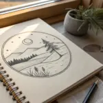
Whenever I feel stuck, I grab one simple triangle shape and let it snowball into a full page of ideas. Triangles can be cozy and recognizable or super bold and abstract, so you can practice skills like shading, patterning, and composition without overthinking it.
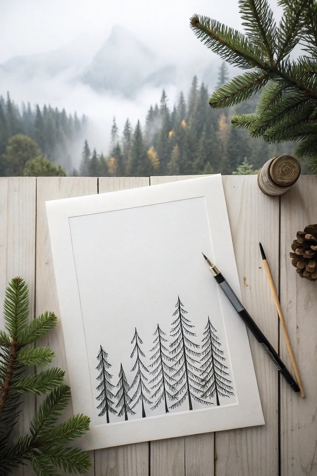
Minimal Mountain Range
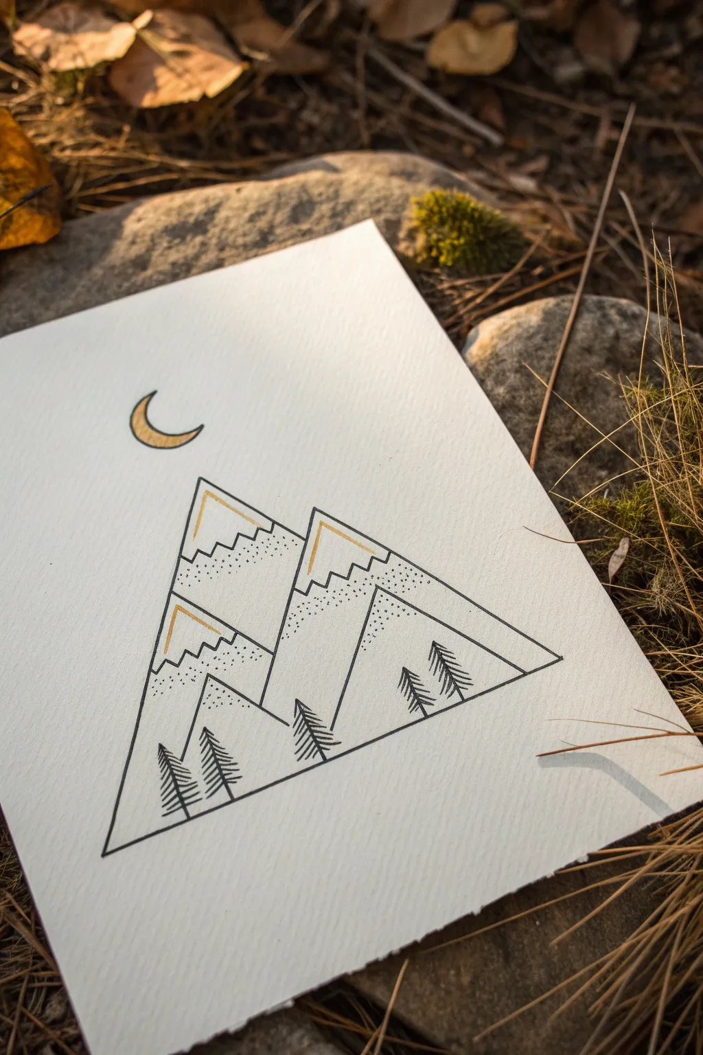
For a striking piece of minimal art, this project combines clean geometry with organic textures to create a stylized mountain scene. The combination of crisp ink lines and gold accents makes it perfect for a modern wall hanging or a personalized greeting card.
Step-by-Step Guide
Materials
- Heavyweight textured paper (watercolor or mixed media paper)
- Fine liner pen (black, 0.3mm or 0.5mm)
- Gold ink pen or metallic gold marker
- Ruler
- Pencil (HB or H)
- Eraser
- Compass or circle stencil (optional for the moon)
Step 1: Drafting the Skeleton
-
Establish the frame:
Begin by using your ruler and pencil to draw a large equilateral triangle in the center of your paper. This will serve as the outer boundary for your entire scene, so ensure the lines are straight. -
Sketch the peaks:
Inside the main triangle, lightly sketch three distinct mountain peaks. Create a large, dominant peak on the left side and a slightly smaller, overlapping peak on the right. Draw a third, smaller peak nestled in the foreground at the bottom. -
Add snow caps:
Near the top of each triangle peak, draw a jagged, zigzag line to represent the snow line. Keep these lines angular rather than curved to match the geometric aesthetic. -
Position the moon:
Directly above the highest peak, sketch a small crescent moon. You can freehand this or use a circle stencil to get the curve just right.
Step 2: Inking the Lines
-
Outline the main shapes:
Switch to your black fine liner pen. Carefully trace over the outer triangle frame, using the ruler again to keep the ink lines perfectly straight and crisp. -
Define the mountains:
Ink the main diagonal lines of the mountain slopes. Be careful where the mountains overlap; the foreground mountain should block the lines of the ones behind it. -
Ink the snow lines:
Trace the jagged zigzag lines defining the snow caps. I prefer to do this freehand rather than with a ruler to give the snow a slightly more natural, rugged look compared to the slopes. -
Erase pencil marks:
Once you are certain the ink is completely dry, gently erase all the underlying pencil sketches to leave a clean black-and-white base.
Ink Smearing?
Wait at least 15 minutes before erasing pencil marks. Fine liners dry quickly, but heavy paper absorbs ink deeply and stays wet longer than you think.
Step 3: Adding Details and Gold
-
Stipple shading:
To create texture, use your black pen to add stippling (tiny dots) along the mountain sides just below the snow line. Concentrate the dots heavily near the zigzag line and space them out as you move downward, creating a gradient effect. -
Draw the trees:
Add small, stylized pine trees at the base of the mountains. Draw a simple vertical line for the trunk, then add downward-slanting hatched lines for branches. Group a pair on the left and a trio on the right for balance. -
Ink the moon:
Carefully outline the crescent moon with your black fine liner. -
Apply gold accents:
Using your gold pen or marker, fill in the interior of the crescent moon. This adds a beautiful focal point that catches the light. -
Highlight the peaks:
Add a thin line of gold parallel to the left slope of each mountain peak, right along the ‘snow’ edge. This subtle shadow line gives the drawing depth and ties it in with the golden moon.
Clean Corners
When inking the large outer triangle, stop your pen briefly at each corner vertex. Lifting the pen ensures sharp points rather than rounded, continuous turns.
Step back and admire how simple lines can build such a serene landscape


Pine Trees Made of Triangles
Create a serene, minimalist landscape by repeating a simple triangular motif to build a dense pine forest. This pen-and-ink drawing captures the crispness of mountain air using clean lines and basic geometry.
Step-by-Step Tutorial
Materials
- High-quality bright white cardstock or drawing paper
- Fine-point black drawing pen or dipping pen with black ink
- Pencil (HB or H)
- Eraser
- Ruler
- Thin paintbrush (optional, for ink fills)
Step 1: Planning Composition
-
Define the frame:
Start by using your ruler and pencil to draw a faint rectangular border on your paper. This inner frame gives the drawing a polished, professional look and helps contain your composition. -
Establish the horizon line:
Lightly sketch a very faint, uneven line near the bottom third of the paper. This doesn’t need to be straight; a slight curve suggests a hillside. -
Place the anchor trees:
Using your pencil, draw vertical lines to mark where your tallest trees will stand. Stagger their heights and spacing so they don’t look like soldiers in a row. -
Sketch the triangular forms:
Lightly outline the general triangular shape of each tree around your vertical lines. Keep them narrow and tall for an elegant look.
Uneven Ink Flow?
If your pen skips, try pulling the nib towards you rather than pushing it away. For dipping pens, clean the nib with alcohol to remove factory oils.
Step 2: Inking the Trees
-
Start the central trunk:
Switch to your black ink pen. Starting with the most prominent tree, draw the very tip of the trunk, tapering it into a fine point at the top. -
Draw the top branches:
Begin adding branches at the top apex. These should be short, downward-curving strokes that mimic the sides of a triangle. -
Create the tiered effect:
As you move down the trunk, make your branch strokes progressively wider. Instead of drawing individual needles, create ‘scooped’ lines that curve downward and out from the center line. -
Overlap the layers:
Ensure each tier of branches slightly overlaps the one below it. This creates density and hides the central trunk line in the thicker parts of the tree. -
Leave negative space:
Don’t fill in every single white space. Leaving gaps between some branches makes the tree look natural and allows ‘light’ to pass through. -
Ground the tree:
Once you reach the bottom of your first tree, let the lowest branches flare out slightly wider to anchor it to your imaginary ground line.
Add Atmosphere
Create a foggy effect by lightly diluting a drop of black ink with water. Paint a faint grey wash across the bottom of the trees to simulate mist.
Step 3: Building the Forest
-
Ink the foreground trees:
Move on to the other large trees in the foreground. I usually like to vary the texture slightly between trees—make one a bit scragglier and another fuller. -
Add depth with smaller trees:
Draw the smaller, background trees behind or between the large ones. Draw these with slightly thinner lines or fewer details to push them into the distance. -
Create overlaps:
Where trees stand in front of others, interrupt the lines of the back tree. Do not draw through the foreground trees; stop your pen when two forms meet. -
Refining the trunks:
For any visible trunk sections near the bottom, thicken the vertical line slightly to show the weight of the wood.
Step 4: Final Touches
-
Check balance:
Step back and look at the group. If a gap feels too empty, add a very small, simple triangular tree peak peeking out from the bottom. -
Erase pencil guides:
Wait until the ink is completely dry—give it a few minutes to be safe. Then, gently erase your initial pencil frame, vertical lines, and triangle guides. -
Re-ink the border (optional):
If you want the border to be permanent, re-trace your initial rectangle with a ruler and pen, or leave it borderless for a more open feel.
Now you have a quiet little forest scene that brings the outdoors onto your desk


Ice Cream Cone Triangle
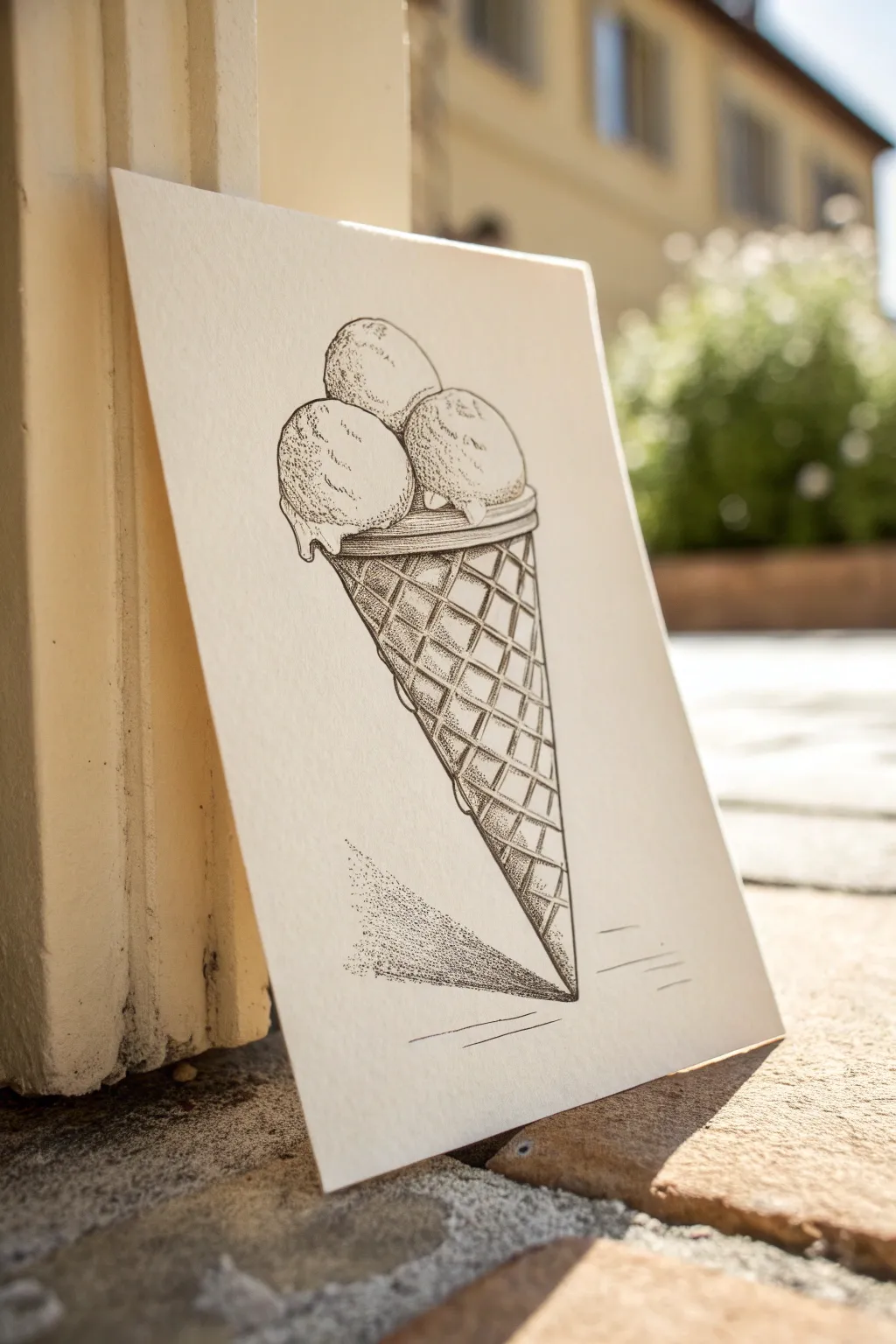
Master the art of texture and shading with this detailed pen and ink drawing of a classic triple-scoop ice cream cone. Using a combination of clean line work and patient stippling, you’ll create a piece that feels both geometric and delightfully organic.
Step-by-Step Tutorial
Materials
- Heavyweight textured paper (cold press watercolor or mixed media paper)
- Pencil (HB or H for light sketching)
- Eraser
- Fine liner pens (sizes 005, 01, and 03)
- Ruler
Step 1: Sketching the Structure
-
Draw the Cone Outline:
Begin by lightly sketching a tall, narrow inverted triangle for the cone using your pencil and a ruler. Make sure the point is sharp at the bottom, and draw a slightly curved line across the top to give the cone volume. -
Add the Waffle Pattern Grid:
Inside the cone shape, sketch a series of diagonal lines crossing each other to form diamonds. These lines should curve slightly to follow the contour of the cone, making it look round rather than flat. -
Outline the Scoops:
Sketch three circles on top of the cone. Place two smaller circles sitting directly on the cone rim, slightly overlapping, and rest a third circle on top of the gap between them. -
Refine the Ice Cream Shape:
Soften the perfect circles into lumpy, organic ice cream shapes. Add a wavy ‘skirt’ at the bottom of the scoops where the ice cream is melting slightly over the rim of the cone.
Ink Blotches?
If you keep the pen tip on the paper too long, it bleeds. Keep your hand moving constantly in an up-and-down tapping motion for clean, sharp dots.
Step 2: Inking the Outlines
-
Inking the Scoops:
Switch to your 01 fine liner pen. Trace over your pencil lines for the ice cream scoops. Use a slightly broken or jittery line rather than a perfect smooth stroke to mimic the rough texture of frozen cream. -
Inking the Cone:
Ink the main outline of the cone with steady, clean strokes. For the rim of the cone, draw a double line to show thickness. -
Defining the Grid:
Carefully trace the diamond grid pattern. Don’t just draw straight lines; try to break them slightly where lines intersect to add a bit of hand-drawn character. -
Cleanup:
Once the ink is completely dry—give it a minute or two to prevent smudging—erase all your visible pencil guidelines.
Add Flavor
Customize your scoops by adding small drawn details like chocolate chips, sprinkles, or a cherry on top before you start the stippling phase.
Step 3: Shading with Stippling
-
Start Stippling the Scoops:
Using the 005 pen, begin adding tiny dots (stippling) to the ice cream scoops. Concentrate the dots heavily on the bottom left sides of the scoops to create shadows, leaving the top right areas largely empty for highlights. -
Building Texture:
Continue adding dots to the mid-tones of the ice cream. The transition from the dense shadow dots to the white paper should be gradual. This takes patience, but the texture payoff is worth it. -
Shading the Cone Grid:
Switch back to the 01 pen for the cone. Shade the individual diamond shapes. I like to fill the upper corners of each diamond with dense cross-hatching or stippling to make the grid look recessed. -
Deepening Shadows:
Use your 03 pen to darken the deepest shadows, particularly right under the rim of the cone where the ice cream overhangs, and in the crevices between the scoops. -
Adding Grid Texture:
Add tiny texture dots inside the waffle grid lines themselves. This subtle noise prevents the cone from looking too smooth and plastic.
Step 4: Grounding the Object
-
Create the Cast Shadow:
Visualize a light source coming from the upper right. Use the 005 pen to create a cast shadow on the ground to the bottom left of the cone. -
Stippling the Shadow:
Build up this shadow using a dense stipple technique. The dots should be very close together near the tip of the cone and gradually spread out as the shadow extends away. -
Final Contrast Check:
Step back and look at your drawing. If the ice cream looks too flat, add more dots to the shadow areas to increase the contrast against the white highlights. -
Ground Lines:
Add a few very sparse, horizontal lines near the shadow to suggest a table or ground surface, anchoring the drawing in space.
Now you have a crisp, intricate illustration that looks delicious enough to eat


Party Hat Triangle Character
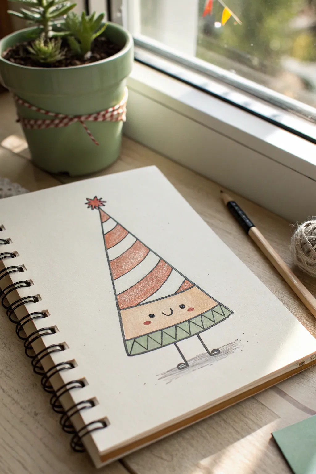
Transform a simple geometric shape into an adorable character ready for a celebration. This kawaii-style triangle personality uses soft pencil shading and bold outlines to jump right off the page.
Step-by-Step Guide
Materials
- Sketchbook or heavyweight drawing paper
- HB Graphite pencil (for initial sketch)
- Fine liner pen (black, 0.5mm or similar)
- Colored pencils (orange/terra cotta, creamy beige, sage green)
- Quality eraser
Step 1: Base Sketch & Outline
-
Establish the framework:
Start by lightly sketching a tall, isosceles triangle in the center of your page. Just make sure the bottom line is slightly curved downward rather than perfectly straight to give the character some volume. -
Add the pom-pom:
At the very peak of the triangle, sketch a small starburst shape. It should look like a little explosion or asterisk to represent a festive pom-pom. -
Divide the hat sections:
Draw three curved lines across the upper portion of the triangle. These should curve downward parallel to the base, creating four distinct stripes for the hat pattern. -
Define the face area:
Leave a significant space below the last hat stripe for the face. Then, draw a straight horizontal line near the bottom to create a separate base section for the feet. -
Create the bottom pattern:
In that bottom-most strip you just created, draw a zigzag line going all the way across. This creates a series of small triangles pointing up and down. -
Attach the legs:
Sketch two simple straight lines coming down from the bottom center. At the end of each, draw a small oval for feet; angle them slightly outward for a cheerful stance. -
Sketch the face:
In the open space below the hat stripes, lightly place two small circles for eyes wide apart. Add a small ‘U’ shape between them for a smile. -
Ink the main lines:
Take your black fine liner and carefully trace over your graphite lines. I like to keep the pressure steady for a clean, consistent look. -
Fill the details:
Use the pen to fill in the pupil of the eyes, leaving a tiny white speck for a highlight if you can. Add the legs and feet now too. -
Erase guidelines:
Wait a moment for the ink to fully set, then gently erase all your pencil sketches so you have a crisp black-and-white drawing.
Uneven Stripes?
If your hat stripes look uneven or wobbly, don’t worry. Just thicken the black outline on the wobbly parts to smooth out the curve visual.
Step 2: Coloring & Shading
-
Color the stripes:
Using an orange or terra cotta colored pencil, color in the first and third stripe of the hat. Use a light circular motion to get even coverage. -
Shade the pom-pom:
Use that same orange pencil to fill in the little starburst shape at the top. -
Color the face:
Take a creamy peach or beige pencil and gently color the face section. Apply it very lightly so the black features stand out clearly. -
Add rosy cheeks:
Press a bit harder with the orange pencil to create two small blushing ovals directly under the eyes. -
Color the bottom border:
Switch to a sage green pencil. Color in the downward-pointing triangles in the bottom zigzag pattern. -
Add texture:
Go back over your colored sections and add a slightly darker layer to the left edge of the triangle shape. This simple shading trick makes the character look rounded. -
Ground the character:
Using a gray pencil or a very light touch with your black pen, scribble a faint shadow horizontally beneath the feet so the character isn’t floating.
Make it Sparkle
Use a white gel pen to add tiny dots or patterns over the colored hat stripes for extra texture, or add glitter glue for real sparkle.
Now your cheerful triangle friend is ready to celebrate on the page

PENCIL GUIDE
Understanding Pencil Grades from H to B
From first sketch to finished drawing — learn pencil grades, line control, and shading techniques.
Explore the Full Guide
Umbrella Canopy Triangle Segments
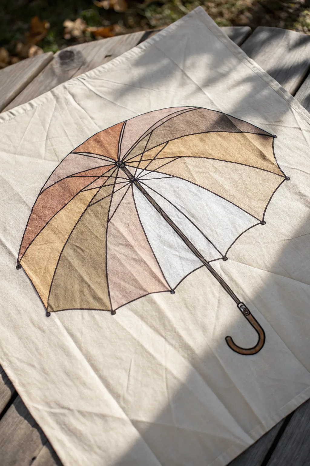
Transform a plain flour sack towel into a stylish piece of kitchen art with this segmented umbrella design. The project uses fabric paints or markers to create soft, translucent triangle shapes that mimic the varied panels of a vintage parasol.
Detailed Instructions
Materials
- Plain cotton or linen tea towel (flour sack style)
- Fabric markers (fine tip black)
- Fabric paints (ochre, burnt sienna, dusty pink, cream, light grey)
- Textile medium (if using acrylics instead of dedicated fabric paint)
- Small round paintbrush (size 2-4)
- Pencil and eraser
- Ruler
- Iron and ironing board
- Cardboard or parchment paper (to protect surface)
Step 1: Sketching the Framework
-
Prepare your surface:
Begin by ironing your tea towel completely flat to ensure a smooth drawing surface. Lay a piece of cardboard or parchment paper underneath the fabric layer you’ll be working on to prevent ink bleed-through. -
Mark the center:
Lightly mark a central point on your towel with a pencil. Draw a small circle here; this will be the ferrule (the top center) of the umbrella where all the ribs meet. -
Draw the main ribs:
Using a ruler, draw straight lines radiating outward from that central circle. Space them slightly unevenly to simulate perspective, making the ‘closer’ ribs wider apart and the ‘farther’ ones closer together. -
Create the canopy edge:
Connect the ends of your radiating lines with curved arcs. These arcs should scallop inward toward the center, creating the classic points of an umbrella edge. -
Sketch the handle:
Extend a straight line down from the center hole for the shaft. At the end, sketch a classic ‘U’ or ‘J’ curve for the wooden handle. -
Outline in ink:
Trace over your pencil lines with a black fine-tip fabric marker. Use a steady hand but don’t worry about perfection; a slightly wobbly line adds to the hand-drawn charm. -
Add rib details:
Thicken the lines of the ribs slightly and add tiny circles at the tips of the canopy points to represent the rib tips.
Bleeding Lines?
If the marker bleeds into the fabric grain, switch to a fabric pen with a pigment-based ink, or lightly spray the area with starch and iron it dry before drawing to stiffen the fibers.
Step 2: Painting the Panels
-
Prepare your palette:
Squeeze out small amounts of your earth-toned fabric paints. If your paints are thick, thin them slightly with water or textile medium to achieve a watercolor-like transparency. -
Paint the first segment:
Select a wedge-shaped segment and fill it with your darkest brown or ochre shade. Keep your brush strokes loose and follow the direction of the ribs. -
Alternate colors:
Moving around the circle, paint adjacent segments in contrasting earthy tones—dusty pink, tan, and light grey. Leave 2-3 segments white or use a very pale cream for contrast. -
Add inner depth:
While the paint is still damp, dab a slightly darker shade of the same color near the center ferrule of each segment. This adds depth and makes the umbrella look concave. -
Paint the mechanism:
Use a dark brown paint for the central ferrule and the handle. Leave a tiny highlight unpainted on the curve of the handle to suggest a glossy wooden finish. -
Draw the stretcher details:
Once the base ribs are dry, use your black fabric marker to draw the ‘stretchers’—the smaller metal bars inside the umbrella that hold the canopy open. These should form a smaller polygon shape near the center. -
Outline the handle:
Go back over the handle with your black marker to define the edges, adding small lines to indicate wood grain or hardware screws. -
Heat set the design:
Allow the paint to dry completely (check manufacturer instructions usually 24 hours). Then, iron the reverse side of the towel on a hot, dry setting to permanently set the ink and paint.
Watercolor Effect
To get that soft, dye-like look, wet the fabric slightly inside a triangle segment with clean water before touching your loaded brush to it. The color will bloom naturally.
You now have a beautifully functional piece of art ready for your kitchen or a thoughtful gift
Fox Face From Triangles
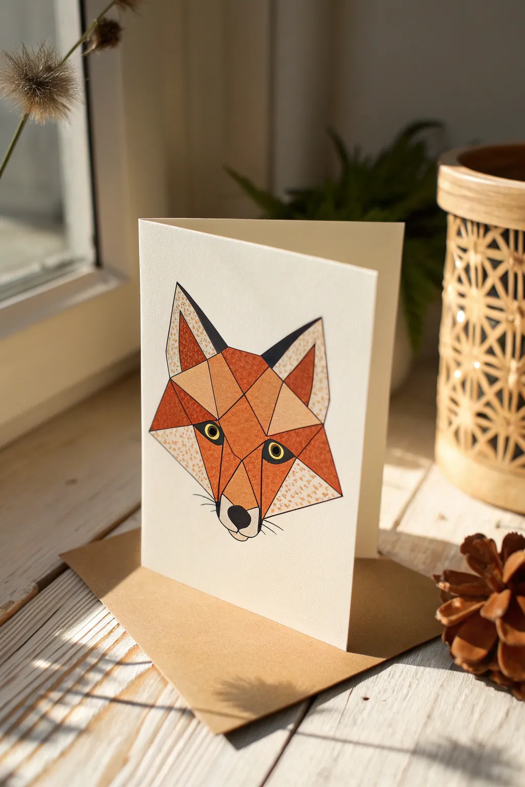
Capture the cunning beauty of a fox with this modern, geometric greeting card design. Using distinct triangular shards of color and texture, you’ll build a striking woodland portrait that pops against a crisp white background.
Step-by-Step
Materials
- Heavyweight white cardstock (folded)
- Pencil (HB or H)
- Fine-point black fineliner pen (0.3mm to 0.5mm)
- Ruler or straight edge
- Colored pencils or markers (Rust orange, dark brown, cream/beige)
- Eraser
- Textured blending paper or sponge (optional for speckle effect)
Step 1: Planning the Geometric Framework
-
Center the design:
Begin by lightly marking the center vertical line of your folded cardstock to ensure symmetry. This fox face relies heavily on balance, so a faint guideline is incredibly helpful. -
Draft the main triangle:
Sketch a large, inverted triangle shape in the center. The top horizontal line will become the ears and top of the head, while the bottom point will serve as the nose area. -
Define the ears:
From the top corners of your main triangle, draw two smaller triangles pointing upward. Keep the outer lines slightly angled outwards to give the fox an alert expression. -
create the snout division:
Draw a V-shape starting from the inner base of the ears down toward the nose point. This separates the orange forehead from the lighter cheek areas. -
Subdivide into shards:
Now, using your ruler, break up the larger shapes into smaller triangles and polygons. Draw lines across the forehead and cheek areas to create that ‘stained glass’ faceted look shown in the image. -
Sketch the eyes:
Place two almond shapes on the angled lines of the snout V-shape. Ensure they are aligned horizontally so the fox doesn’t look askew. -
Refine the noise:
At the very bottom point, round off the tip slightly and draw a small, rounded-diamond shape for the nose leather.
Step 2: Inking and Coloring
-
Ink the outlines:
Take your black fineliner and carefully trace over your pencil lines. The lines should be crisp and consistent. Use the ruler for the straight geometric edges, but freehand the slight curves of the whiskers and nose. -
Add eye details:
Color in the pupils with solid black, leave a tiny white circle for the highlight, and draw a thick black outline around the eye shape. -
Erase pencil guides:
Wait a moment for the ink to fully set, then gently erase all visible pencil marks to leave a clean black framework. -
Base color application:
Select your rust-orange tones. Color in specific geometric segments on the forehead and bridge of the nose. Leave adjacent segments empty for now to plan your texture variation. -
Create the speckled texture:
For the textured segments (like the cheeks and inner ears), I like to use a stippling technique. Lightly tap your marker or colored pencil to create a field of small dots rather than solid color. -
Fill the cheeks:
Use a cream or very pale beige color for the lower cheek triangles. You can keep these solid or add very faint stippling to maintain the style. -
Darken the shadows:
Fill the inner triangles of the ears with a dark charcoal or black to create depth. Do the same for the nose tip. -
Add the whiskers:
Draw three to four very fine, short lines radiating from the muzzle area on each side. Keep these delicate so they don’t overpower the geometry. -
Final inspection:
Check your solid orange sections. If they look streaky, apply a second layer of color to make them bold and flat, contrasting nicely with the speckled areas.
Sharp Edges Tip
When coloring inside the triangles, place a piece of scrap paper over the line you are coloring against. This acts as a mask and keeps your edges perfectly crisp.
Metallic Accent
Trace over just a few random geometric lines with a gold gel pen or thin gold foil tape. It adds a sophisticated shimmer that catches the light.
Now you have a charming, gallery-worthy card ready to be gifted or framed
BRUSH GUIDE
The Right Brush for Every Stroke
From clean lines to bold texture — master brush choice, stroke control, and essential techniques.
Explore the Full Guide
Fish Body Triangle Base
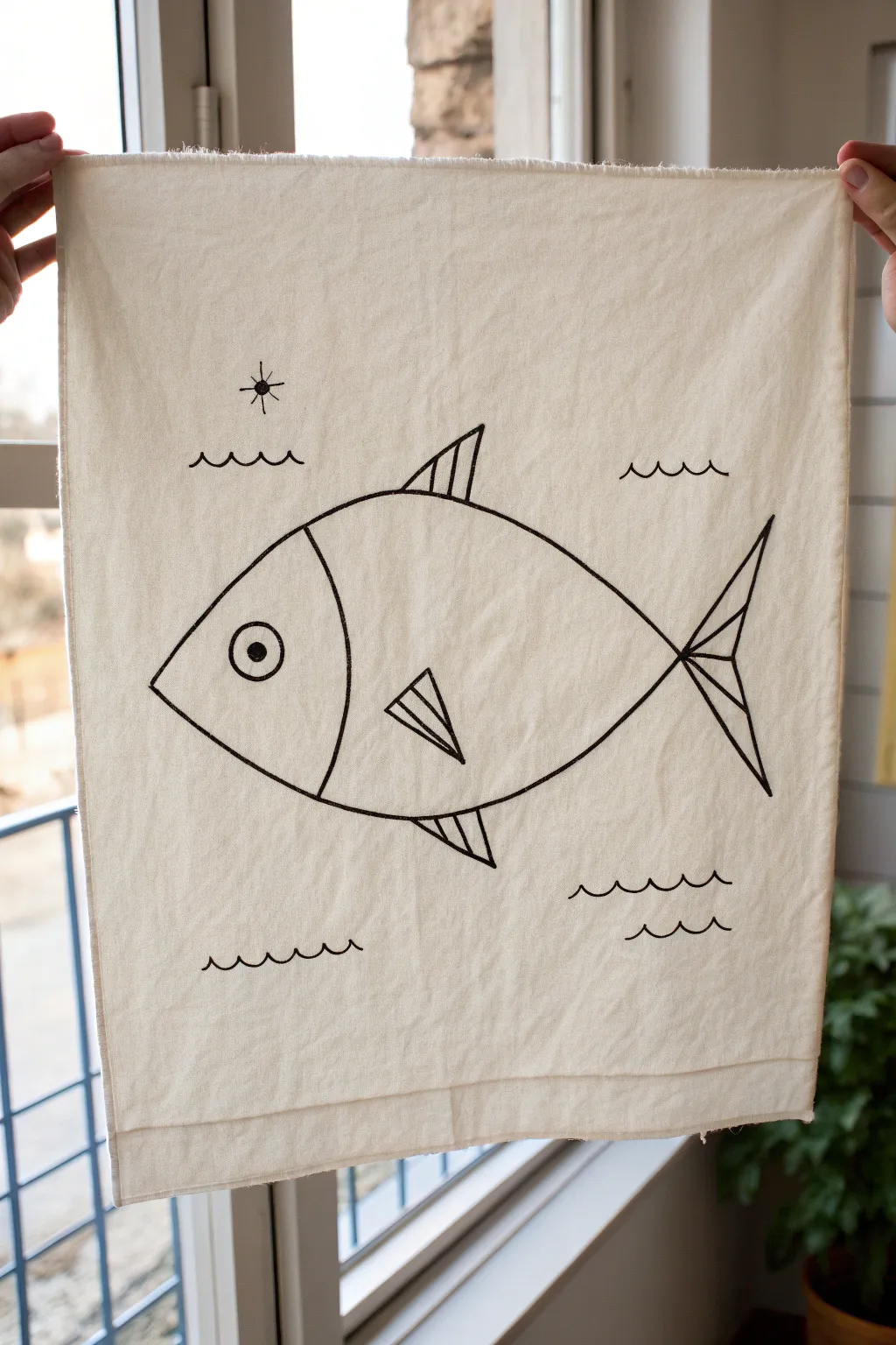
Transform a plain fabric cloth into charming geometric wall art with this simple fish design. By using basic shapes like triangles and curves, you can create a playful nautical illustration that looks polished and modern.
Step-by-Step Tutorial
Materials
- Off-white cotton or linen tea towel (or fabric scrap)
- Black fine-tip fabric marker
- Black medium-tip fabric marker (for bolder lines)
- Pencil for sketching
- Ruler
- Iron and ironing board
- Scrap cardboard or paper
Step 1: Preparation & Sketching
-
Prep the fabric:
Begin by washing and drying your fabric to remove any sizing, which can interfere with the marker ink. -
Smooth the surface:
Iron the fabric completely flat. Any wrinkles now will make drawing straight lines difficult later. -
Protect your surface:
Place a piece of scrap cardboard under the layer of fabric you intend to draw on. -
Sketch the main body:
Using a pencil very lightly, draw a large football shape (an oval with pointed ends) in the center of the fabric. This creates the fish’s main body. -
Define the head:
Draw a curved vertical line inside the left side of the oval to separate the head from the body. -
Add the main triangle fins:
Sketch a triangle pointing upward on the top of the body for the dorsal fin, and a triangle pointing downward on the bottom for the ventral fin. -
Draw the side fin:
In the center of the body, draw a smaller triangle pointing toward the tail. I find placing this slightly lower than center looks best. -
Form the tail structure:
At the right point of the body oval, draw two large triangles flaring out to create the tail fin.
Step 2: Inking & Detailing
-
Add circular eye:
Inside the head section, sketch a medium circle with a smaller circle inside it for the pupil. -
Sketch background elements:
Draw three sets of wavy lines below the fish and two sets above to represent water. Add a small circle with radiating lines for a sun. -
Trace the main outline:
Take your medium-tip fabric marker and carefully trace over the main body oval, head curve, and the outer edges of the fins and tail. -
Fill the details:
Use the marker to draw the vertical stripes inside the top and bottom fins. -
detail the side fin:
Ink the small side triangle and add a diagonal stripe through it for extra geometric interest. -
Complete the tail:
Trace the tail outlines. Draw a horizontal line through the center of the tail, then add diagonal lines connecting the center point to the outer tips. -
Color the pupil:
Fill in the smallest circle of the eye completely with black ink. -
Ink the water and sun:
Trace over your wavy water lines and the sun. These lines can be slightly thinner if you have a fine-tip marker. -
Erase guidelines:
Once the ink is completely dry (wait at least 15 minutes), gently erase any visible pencil marks. -
Set the ink:
Follow the instructions on your fabric marker, which usually involves ironing the reverse side of the fabric to heat-set the design.
Keep the fabric taught
Tape the edges of your fabric to your table or drawing board. Tension prevents the fabric from bunching up under the marker tip.
Add a dowel rod
Sew a simple loop channel at the top edge of the fabric and slide a wooden dowel through it to turn this artwork into a hanging tapestry.
Hang your new maritime artwork in a sunny window or kitchen corner to enjoy the sleek lines.
Mountain Goat With Angular Shapes
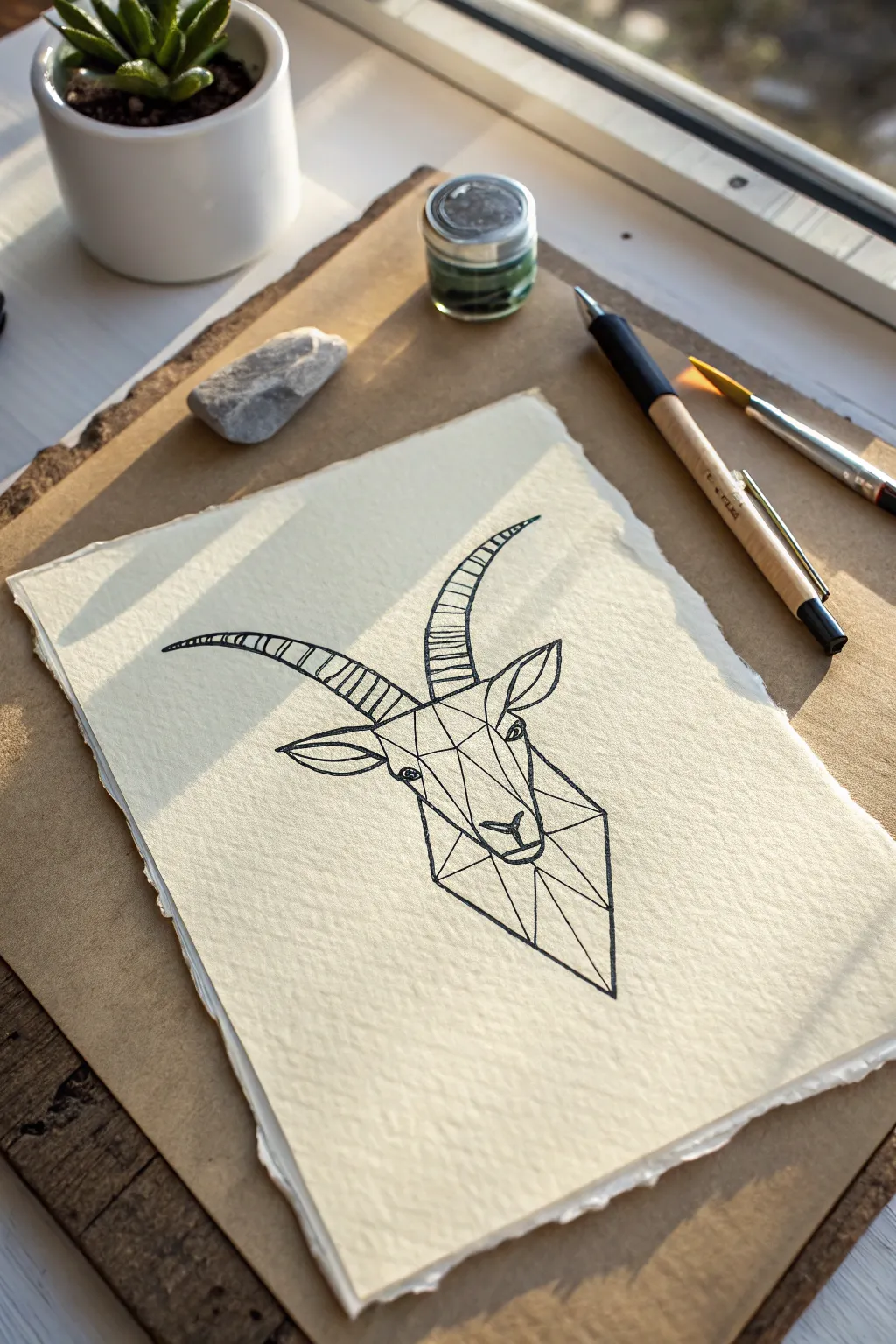
This elegant drawing combines flowing curves with crisp geometric angles to create a stylized portrait of a mountain goat. The contrast between the organic horns and the polygonal face structure makes for a striking, modern minimalist piece.
Step-by-Step Guide
Materials
- Heavyweight, cold-press watercolor paper (300gsm)
- Fine liner pen (0.5mm, black)
- Fine liner pen (0.1mm, black)
- Tearing ruler or straight edge (for deckling)
- H pencil (for sketching)
- Soft eraser
- Ruler or triangle
Step 1: Preparation & Sketching
-
Paper Preparation:
Start by tearing your paper to size rather than cutting it. Use a tearing ruler or the edge of a table to create that soft, fibrous deckle edge seen in the reference image, which adds a beautiful rustic touch. -
Basic Framework:
Using your H pencil very lightly, draw a vertical centerline in the middle of your paper. This will help keep the goat’s face symmetrical as we build the geometry. -
Define the Head Shape:
Sketch an elongated pentagon shape for the main head structure. The chin should point downward sharply, while the top of the head remains relatively flat. -
Sketch the Horn Curves:
Draw two long, sweeping arches originating from the top of the head and curving backward. Capture that iconic ‘scimitar’ shape of an ibex or mountain goat. Try to make the left and right horns mirror each other generally, but slight organic variation is fine. -
Place the Ears:
Add leaf-shaped ears just below the base of the horns. They should angle outwards and slightly downwards, creating a horizontal balance to the vertical face.
Step 2: Geometric Construction
-
Triangulate the Face:
Instead of drawing realistic fur, we are going to break the face into triangles and polygons. Start by drawing a ‘Y’ shape at the bridge of the nose. -
Connect the Planes:
From that central ‘Y’, use your ruler to connect straight lines out to the cheekbones and down to the chin. Imagine paper-folding; you are drawing the creases where the face would fold. -
Draft the Muzzle:
Create a small, flat trapezoid shape at the very bottom for the nose and mouth area. Keep the lines straight and angular to maintain the low-poly aesthetic. -
Draft the Eyes:
Place two small diamond or almond shapes within the geometric framework for the eyes. They should sit on the outer edges of your central face structure.
Wobbly Lines?
If your straight lines aren’t crisp, don’t freehand them! Use a small ruler with a raised edge or tape coins under it to prevent ink bleeding.
Step 3: Inking
-
Outline the Horns:
Switch to your 0.5mm pen only after you are happy with the sketch. Trace the outer curves of the horns with a confident, continuous stroke. Avoid ‘petting’ the line. -
Detail the Horn Ridges:
Using the 0.3mm or 0.1mm pen, draw the transverse ridges across the horns. These are slightly curved hatch lines that give the horns their segmented, ribbed texture. Space them evenly. -
Ink the Geometric Face:
Use your ruler and the 0.5mm pen to ink the straight lines of the face. Press firmly to get a solid, crisp black line. The contrast between these straight lines and the curved horns is key. -
Ink the Ears:
Outline the ears with a flowing line, but add a straight geometric line through the center of each to match the facial variety. -
Define the Eyes:
Carefully ink the eyes. Leaving a tiny speck of white paper inside the pupil will act as a highlight and bring life to the drawing. -
Final Erasure:
Wait at least 10-15 minutes for the ink to fully cure. Taking the time here prevents smudging. Once dry, gently erase all underlying pencil marks. -
Line Weight Check:
Look over the drawing. If the outline of the entire shape feels too thin compared to the internal detail lines, go over the main perimeter silhouette one more time to thicken it slightly.
Level Up
Add a wash of watercolor inside the geometric shapes. Use cool grays or a splash of gold ink for a modern, mixed-media look.
Display your finished geometric goat in a floating frame to show off those beautiful deckled edges


Cozy Cabin With a Triangle Roof
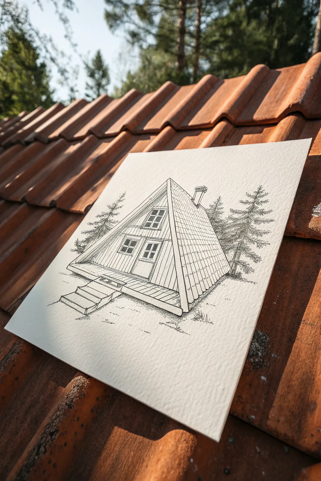
This charming pen-and-ink drawing captures the geometric beauty of a classic A-frame cabin nestled among pine trees. The clean lines and architectural details contrast beautifully with the organic texture of the surrounding forest.
Detailed Instructions
Materials
- Textured watercolor paper or mixed media paper (heavyweight)
- Pencil (HB or 2H for light drafting)
- Fine liner pens (0.1mm, 0.3mm, and 0.5mm)
- Ruler or straight edge
- Eraser (kneaded preferred)
Step 1: Drafting the Structure
-
Establish the horizon:
Begin by lightly drawing a horizon line across the bottom third of your paper. This grounds the cabin and gives you a reference point for the ground level. -
Draw the main triangle:
Use your ruler to draw a large, equilateral triangle centered on the paper. This will be the front face of the A-frame. Make sure the base is slightly elevated above your ground line to allow for the deck. -
Add perspective:
From the peak of the triangle and the bottom right corner, draw diagonal lines extending backward and slightly downward to the right. Connect these with a vertical line to create the side wall/roof plane of the cabin. -
Sketch the deck:
Draw a rectangular platform extending from the base of the front triangle. Adding a small set of three stairs leading down to the ground on the left side adds a welcoming touch. -
Outline windows and door:
Draft a central vertical line on the front face to help align features. Sketch a large rectangular door at the bottom and a set of windows above it, following the slope of the roof.
Clean Lines Tip
When using a ruler with ink, stick a coin or tape under the ruler’s edge. This raises it slightly off the paper and prevents ink from bleeding underneath.
Step 2: Inking the details
-
Ink the main outlines:
Switch to a 0.5mm fine liner. Carefully trace the main structural lines of the roof, the deck, and the stairs. Use the ruler for crisp, clean edges on the architectural elements. -
Detail the siding:
With a 0.1mm or 0.3mm pen, draw vertical lines on the front face of the cabin to represent wood siding. Keep these lines lighter than your main outline. -
Roof texture:
On the side roof plane, draw horizontal lines to suggest shingles or roofing panels. You can add faint vertical dashes periodically to give the roof scale and texture. -
Windows and framing:
Use the 0.3mm pen to ink the window panes and door frame. Add small details like the doorknob and distinct mullions (the bars between window panes). -
Draw the chimney:
On the side roof slope, sketch a small rectangular chimney. Add a tiny cap on top and some texture to make it look distinct from the roof.
Step 3: Adding the Environment
-
Sketch the trees:
Using a loose hand and a 0.3mm pen, draw pine trees on either side of the cabin. Start with a vertical trunk line, then use jagged, scribble-like strokes for branches that get wider towards the bottom. -
Ground the cabin:
Add small tufts of grass and uneven lines around the base of the stairs and deck. This connects the structure to the ground so it doesn’t look like it’s floating. -
Add subtle shadows:
Use fine hatching (closely spaced parallel lines) or stippling on the shadowed side of the chimney and under the eaves of the roof. This gives the drawing depth and dimension. -
Deck texture:
Draw planks on the deck and stairs using straight lines. I usually vary the line weight slightly here to make the wood look natural and weathered. -
Final touches:
Check for any gaps in your lines. Once the ink is completely dry, use your kneaded eraser to gently remove all remaining graphite pencil lines.
Add Weathering
For a rustic look, intentionally break your lines on the siding or roof. Small gaps make the wood look aged rather than brand new construction.
The sharp geometry of the cabin against the loose trees creates a beautiful finished contrast
Geometric Heart Built From Triangles
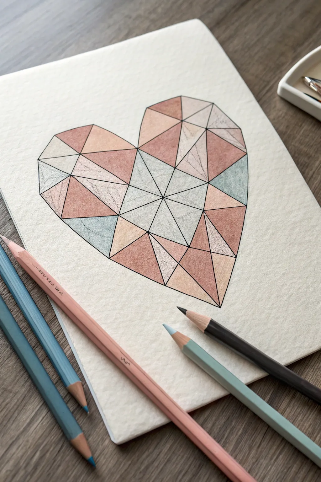
Transform a simple heart shape into a modern, crystalline work of art using just triangles and soft pastel tones. This geometric drawing mimics the look of a faceted gem, blending precise lines with gentle shading for a sophisticated finish.
Step-by-Step
Materials
- Heavyweight textured paper (watercolor or mixed media)
- Ruler
- HB Pencil
- Eraser
- Fine liner pen (black, 0.3mm or 0.5mm)
- Colored pencils (dusty rose, peach, light teal, cream/white)
- Pencil sharpener
Step 1: Drafting the Structure
-
Outline the heart:
Start by lightly sketching a large, standard heart shape in the center of your paper using your HB pencil. Focus on symmetry, but don’t worry if it’s not perfect yet as this is just a guide line. -
Find the center point:
Mark a small dot roughly in the center of the heart. This doesn’t need to be mathematically precise, but placing it somewhat centrally helps balance the facets later. -
Draw primary dividing lines:
Use your ruler to draw straight lines connecting that center dot to the cleft of the heart (top center) and the point of the heart (bottom center). Then draw two lines extending horizontally from the center dot to the left and right edges of the heart. -
Create main facets:
Begin breaking up the four main quadrants. Draw diagonal lines from the center dot out to various points along the heart’s outline. Think of slicing a pizza into irregular slices. -
Subdivide into triangles:
Now, create the ‘low poly’ look by drawing lines connecting the points on the perimeter to each other, or by drawing lines across your existing slices to create smaller triangles. vary the sizes; having a mix of large and small triangles makes the composition more dynamic. -
Straighten the perimeter:
The original heart outline was curved, but a true geometric shape has straight edges. Go around the perimeter and use your ruler to flatten the curves, connecting the points where your interior lines hit the edge. Erase the original curved guide lines.
Smudge Alert?
Place a scrap piece of paper under your drawing hand. This acts as a shield, preventing oils from your skin or graphite transfer from muddying your clean, crisp colors.
Step 2: Inking the Lines
-
Trace with fine liner:
Once you are happy with your web of triangles, carefully trace over all your pencil lines using a black fine liner pen. Keep the ruler firmly pressed to avoid wobbles. -
Clean up intersections:
Pay special attention to where multiple lines meet at a single point (vertices). Ink these carefully so they look sharp and clean, rather than like a messy knot. -
Erase pencil marks:
Wait a minute or two to ensure the ink is completely dry to prevent smudging. Then, gently erase all the underlying pencil graphite until you have a crisp black framework.
Step 3: Adding Color and Depth
-
Select your palette:
Pick out a few complementary pastel shades. For this look, I like using a dusty rose, a soft peach, and a muted teal, saving a cream or white pencil for highlights. -
Plan the color distribution:
Before coloring heavily, make tiny marks in each triangle to designate its color. Try not to have two triangles of the same color touching directly; separate them with a different shade to maintain the faceted effect. -
Base layer:
Start coloring the triangles with a light, even pressure. Fill the shape completely but don’t press too hard yet. -
Add directional shading:
To make the triangles look like flat facets catching the light, shade one side of a triangle slightly darker than the other. Increase pressure near one edge and fade out toward the opposite corner. -
Texture the paper:
If you are using textured paper, let the grain show through slightly. It adds a lovely organic feel to the geometric rigidity. -
Leave some ’empty’ zones:
Leave a few triangles very pale or color them with white/cream. These act as the high-light facets where the ‘light’ hits the gem most directly. -
Deepen the contrast:
Go back over your darker triangles (teals or deep pinks) with a second layer of pencil to increase saturation. This contrast between the pale highlights and saturated shadows creates the 3D volume. -
Final polish:
Take your fine liner one last time and re-trace any lines that might have gotten obscured by waxy colored pencil buildup to make them pop again.
Make It Glossy
For a glassy finish, use a white gel pen to draw tiny reflection lines or dots on the corners of the darkest triangles. It mimics light hitting a polished gemstone surface.
Step back and admire your modern masterpiece, which balances mathematical precision with artistic warmth
Triangle Grid Pattern Sampler
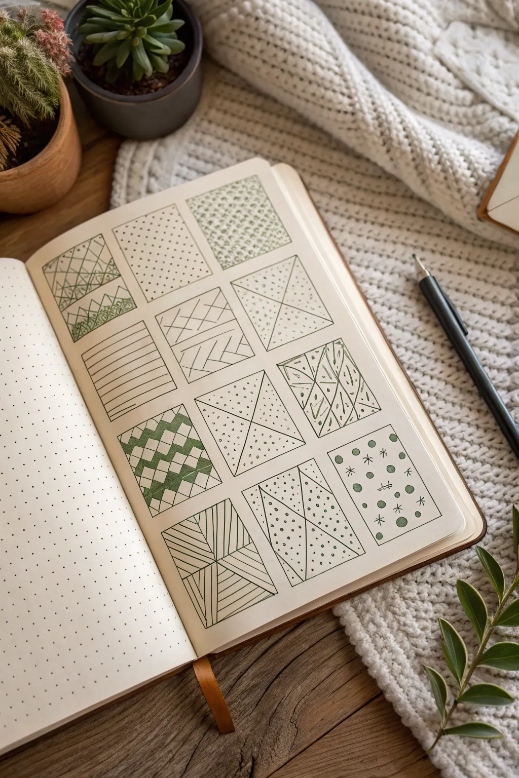
This satisfying project transforms a blank page into a structured gallery of geometric patterns. By dividing simple squares into triangles and filling them with repetitive lines and dots, you’ll create a visually intricate sampler that is perfect for mindfulness and relaxation.
How-To Guide
Materials
- Dotted or grid notebook (A5 size recommended)
- Fine liner pen (black or dark green, 0.3mm or 0.5mm)
- Ruler or straight edge
- Pencil (HB or H)
- Eraser
Step 1: Setting the Grid Structure
-
Define the layout:
Begin by counting the total width of dots on your page. Aim for a 3×4 layout, meaning three columns and four rows of squares. -
Draw the main squares:
Using your pencil and ruler, lightly sketch twelve identical squares. Leaving a gap of one or two dots between each square creates a nice, breathable border. -
Ink the outlines:
Trace over your pencil squares with a fine liner pen. Keep a steady hand, or use the ruler again if you prefer ultra-crisp edges. Allow the ink to dry completely before erasing any stray pencil marks.
Clean Lines
Lift your pen tip straight up at the end of each line stroke rather than flicking it. This ensures your pattern edges stay crisp and don’t trail off into the margins.
Step 2: Creating the Interior Shapes
-
Divide with diagonals:
This sampler relies on triangles, so you need to create them first. In the top-right, middle-center, and bottom-middle squares, draw an ‘X’ from corner to corner to form four triangles. -
Triangle variations:
For variety, try drawing just a single diagonal line in some boxes to make two large triangles. In others, draw lines from the midpoint of one side to the corners. -
Mix up the geometry:
Leave one or two squares as simple rectangles or just divide them horizontally to break up the triangular theme slightly, as seen in the second row.
Add Color Depth
Use a light grey marker to add drop shadows to one side of each box. It makes the grid pop off the page and gives the sampler a 3D effect.
Step 3: Filling with Patterns
-
Mountain peaks:
In the top-left square, draw a series of triangles stacked on top of each other. Fill the bottom section with a dense, scribbly texture to mimic foliage or ground. -
Simple stippling:
For the top-middle square, fill the entire space with small dots. I find that starting with widely spaced dots and filling in the gaps creates a more even distribution. -
Textured triangles:
In the top-right ‘X’ square, fill the top and bottom triangles with tiny circles or stippling to create contrast against the empty side triangles. -
Linear stripes:
Move to the second row. Use your ruler to fill the first square with horizontal lines. In the adjacent square, replicate the ‘X’ division but fill sections with opposing diagonal lines. -
Dotted segments:
In the third square of the second row, define the triangular sections with simple dots. Use a higher concentration of dots near the center intersection to create depth. -
Checkerboard triangles:
For the bottom-left square, draw a chevron or zigzag pattern. Shade in alternating diamond shapes to create a bold, dark contrast. -
Radiating lines:
In the bottom-center square, draw a cross to make four rectangles. Draw diagonal lines radiating from the corners toward the center of each quadrant. -
Abstract organic lines:
In one of the middle squares, draw loose, freehand lines and oval shapes to contrast with the rigid geometric patterns elsewhere. -
Celestial accents:
Finish the sampler with the bottom-right square. Draw circles of varying sizes and add small asterisks or star shapes for a whimsical, night-sky feel.
Now you have a library of patterns ready to use whenever you need a creative spark
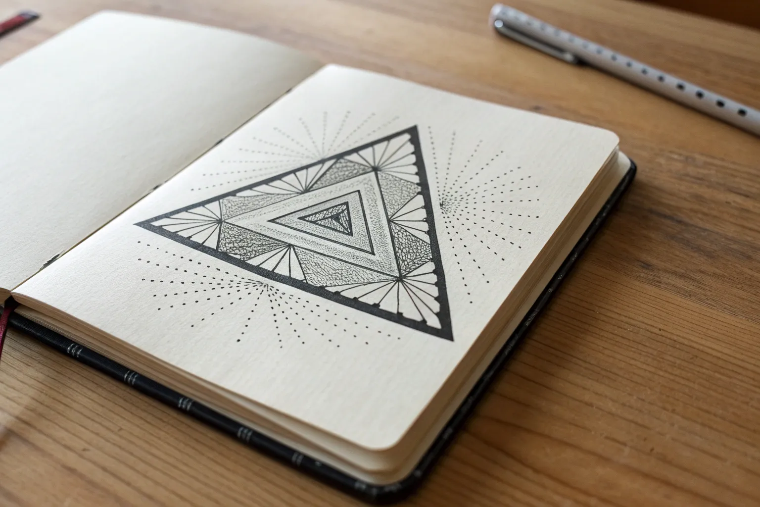
Zentangle Inside a Single Triangle
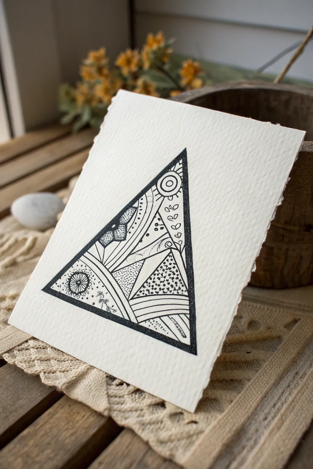
This project combines the clean lines of geometry with the relaxing, organic flow of Zentangle-inspired patterns. The result is a striking black and white design on textured paper that feels both modern and handmade.
Step-by-Step
Materials
- High-quality textured paper (such as cold-press watercolor paper or handmade cotton paper)
- Fine liner pen (black, archival ink, e.g., sizes 01 and 05)
- Ruler
- Pencil (HB or lighter)
- Eraser
Step 1: Preparation & Outline
-
Paper Selection:
Choose a piece of paper with visible tooth or texture. The rough edge (deckled edge) shown in the example adds a lovely artisanal touch, so consider tearing your paper to size rather than cutting it. -
Drafting the Triangle:
Using your pencil and ruler, lightly draw a large equilateral or isosceles triangle in the center of your paper. Keep the lines faint so they can be easily erased later. -
Inking the Frame:
Switch to your thicker fine liner (size 05). Trace over the pencil triangle to create a bold, definitive border. To mimic the example, double this line to create a thick frame, coloring in the space between the double lines solid black.
Step 2: Sectioning the Design
-
Drawing the Primary Curve:
Visualize a sweeping curve starting from the bottom left corner and arching up toward the middle right side. Sketch this lightly with a pencil first to establish the main flow of the composition. -
Creating Sub-Sections:
Divide the interior space further. Draw a few straight lines radiating from the bottom right corner outward, and add a few organic, curved lines intersecting the main arch. You are essentially creating small ‘compartments’ to fill with patterns. -
Ink the Dividing Lines:
Once happy with your layout, trace these internal dividing lines with your thinner pen (size 01). Vary the line weight slightly—make some lines double-thick for visual interest.
Ink Bleeding?
Textured paper is absorbent. Move your pen a bit faster than usual to prevent ink from soaking in deep and creating fuzzy edges (feathering).
Step 3: Filling with Patterns
-
Dotted Stippling:
Identify a triangular section near the bottom right. Fill the top half of this section with dense stippling (dots), fading them out as you move downward to create a gradient effect. -
Parallel Lines:
In the section directly below the stippling, draw a series of parallel curved lines. Keep them evenly spaced to create a striped ribbon effect. You can thicken the gaps between every third line for contrast. -
Organic Leaves:
Locate a long, vertical section (like the one on the right side of the example). Draw a simple vine with small, heart-shaped leaves climbing up the space. -
Circles and Orbs:
Near the top point of the triangle, draw a ‘sun’ motif—a circle with a smaller circle inside, surrounded by small radiating dashes. -
Textured Hatching:
Find a central section and fill it with very fine, short hatching lines. This adds a grey tone without using actual grey ink. -
Floral Accent:
In the bottom left corner, draw a stylized flower or gear shape. A circle with radiating loops works perfectly here. Surround it with tiny scattered dots. -
Butterfly Wing Pattern:
In the upper-middle left section, create a pattern resembling a butterfly wing: a few large, rounded shapes filled with dark shading and white dots.
Add a Spot of Color
Use a metallic gold gel pen to fill in just 2-3 tiny sections or dots. The subtle shimmer against the matte black ink looks incredible.
Step 4: Finishing Touches
-
Reinforcing Contrast:
Look at the overall balance. If an area looks too light, choose a small shape within a pattern and color it solid black. I like to do this sparingly to make the white paper pop. -
Cleaning Up:
Wait at least 15 minutes to ensure the ink is completely dry. Gently erase all remaining pencil guidelines. -
Add Texture:
If your main triangle border looks too flat, stipple slightly over the edges of it to blend it with the paper’s texture, giving it a softer, more organic look.
Display your finished piece on a small easel or frame it to highlight the beautiful texture of the paper and your intricate line work
Negative Space Triangle Cutout
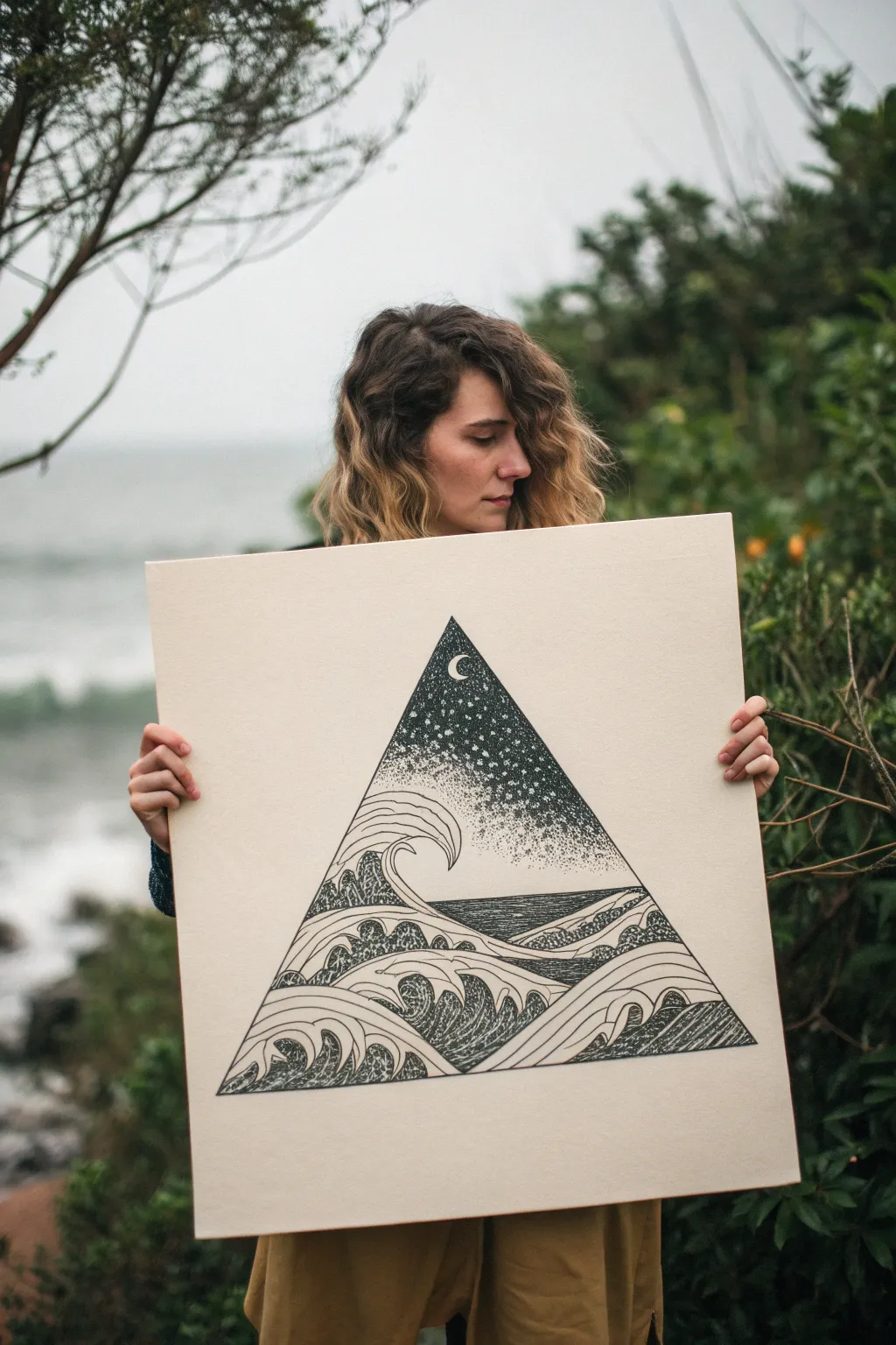
This captivating illustration combines the restless energy of stylized waves with the serene stillness of a stippled night sky, all contained within a sharp geometric triangle. The high-contrast black ink design creates a striking focal point that draws the viewer in, perfect for minimalist decor or a portfolio piece.
Step-by-Step Tutorial
Materials
- Large format smooth Bristol board or hot press watercolor paper (approx. 18×24 inches)
- Pencil (HB or 2H)
- Large ruler or T-square
- Fine liner pens (sizes 005, 01, 03, 05, and 08)
- Compass or circular object (for the moon)
- Masking tape or painter’s tape
- Kneaded eraser
Step 1: Planning the Geometry
-
Measure the center:
Find the vertical center line of your large paper sheet using your ruler. Lightly mark this line with your pencil to ensure your triangle sits perfectly symmetrical. -
Draft the triangle:
Draw a large equilateral or isosceles triangle centered on the page. For the scale shown in the image, aim for a base width of about 14-16 inches. Keep your pencil lines very light so they erase easily later. -
Define the horizon:
Decide where the sea meets the sky. Draw a straight horizontal line roughly one-third of the way up from the bottom of the triangle. This separates the wave section from the celestial section. -
Sketch the moon:
Using a compass or a small circular object, lightly sketch a crescent moon near the apex of the triangle. Position it slightly off-center for a more dynamic composition.
Ink Smearing?
If you are smudging ink, place a clean scrap piece of paper under your drawing hand. This acts as a barrier, protecting your work and keeping oils from your skin off the paper.
Step 2: Drafting the Waves
-
Establish the big shapes:
Sketch the primary wave forms. Start with the largest wave cresting on the left side, curving dramatically inward. Use flowing, S-shaped curves to suggest movement. -
Layer the foreground:
Add layers of rolling water in front of the main wave. Draw them as overlapping mounds that get progressively smaller toward the bottom corners of the triangle. -
Detail the crests:
Refine the tops of the waves. Instead of jagged spikes, think of smooth, claw-like hooks or rolling foam, similar to traditional woodblock print styles.
Add Metallic Flair
Use a gold or silver gel pen to fill in the crescent moon or outline specific wave crests. The metallic sheen adds a magical quality against the matte black ink.
Step 3: Inking the Outlines
-
Bold border:
Using your thickest pen (08 size), carefully trace the main triangular border. Use a ruler here; a crisp, straight edge is crucial for the geometric effect. -
Outline the waves:
Switch to a 05 pen to outline the main contours of the waves. Keep your hand steady and confident. I find it helps to pull the pen toward you rather than pushing it away. -
Define the foam:
Draw the detailed lines inside the waves. Create ribbons of water by drawing parallel curves that follow the shape of the wave, leaving negative space for the foam ‘caps’.
Step 4: Texture and Stippling
-
Shade the water:
Use a 01 or 03 pen to add texture to the dark parts of the water. Use dense hatching or tight squiggles to create the deep, churning look of the ocean between the white foam ribbons. -
Begin the sky gradient:
Start stippling (dotting) the sky area using a 05 pen. Concentrate the dots heavily just above the horizon line and around the edges of the triangle to create deep darkness. -
Fade upward:
As you move up toward the moon, space the dots further apart. Switch to a finer 005 or 01 pen for the upper section to create a smoother, lighter transition. -
Define the moon:
Tightly stipple the negative space around the crescent moon to make it pop. The moon itself should remain pure white paper. -
Add stars:
Leave small, circular areas of the paper blank while stippling the rest of the sky. These negative spaces will become your stars amidst the dotted darkness.
Step 5: Final Touches
-
Deepen the contrast:
Step back and look at the drawing. Go back into the darkest areas of the water and the base of the sky with your 08 pen to make the blacks truly solid and rich. -
Clean up:
Wait at least 30 minutes to ensure the ink is bone dry. Then, gently erase all visible pencil lines with a kneaded eraser.
Now you have a stunning piece of geometric artwork ready to be framed or displayed
Sierpinski Triangle Practice
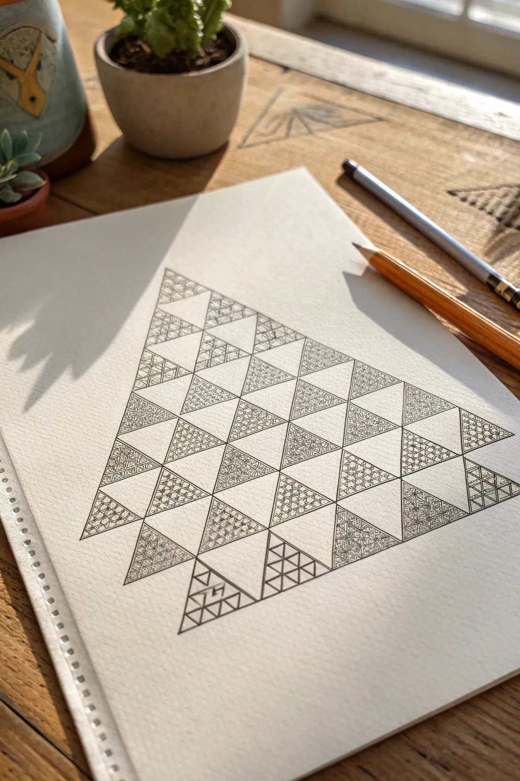
This tutorial guides you through creating a stunning Sierpinski-inspired triangle filled with intricate, zentangle-style patterns. The contrast between the detailed doodle work and the crisp negative space creates a mesmerizing visual rhythm that is deeply relaxing to draw.
Step-by-Step
Materials
- High-quality sketchbook or drawing paper (heavyweight is best)
- Pencil (HB or H for light guidelines)
- Ruler or straight edge
- Fine liner pens (0.1mm and 0.3mm)
- Eraser
Step 1: Laying the Grid
-
Draw the main triangle:
Begin by drawing a large equilateral triangle in the center of your page using a pencil and ruler. Make sure your lines are very light, as some of this outer boundary will need to be erased later. -
Mark the midpoints:
Measure each of the three sides of your large triangle and mark the exact center point of each side with a tiny dot. -
Create the first division:
Connect these three midpoint dots to form a central upside-down triangle. You should now have four smaller identical triangles within your main shape. -
Continue subdividing:
Repeat this process for the three ‘upright’ triangles (the top one and the two bottom corners). Find their midpoints and connect them to form smaller upside-down triangles inside each one. -
Final grid layer:
Perform one final round of subdivision on the remaining upright triangles. You want a grid that consists of four horizontal rows of small triangles. -
Define the working space:
Review your grid. You should see a pattern of alternating upright and inverted triangles. We will be filling specific triangles to create a checkerboard-like effect, but triangular.
Wobbly Lines?
If your straight lines aren’t perfect, don’t re-draw them immediately. Instead, thicken the line deliberately to hide the wobble, making it look like a stylistic choice rather than a mistake.
Step 2: Inking and Doodling
-
Outline the fillable zones:
Using your fine liner, carefully ink the outlines of the triangles you intend to fill. In this design, we are filling the ‘upright’ triangles and leaving the upside-down ones blank. -
Start the bottom row patterns:
Let’s begin at the bottom right. Choose a simple geometric pattern, like intersecting lines or diamonds, and fill the first small triangle using your 0.1mm pen. -
Vary the textures:
Move to the next triangle. To keep visual interest high, switch the pattern type. If the first was straight lines, make this one fluid—loops, circles, or organic swirls. -
Build the middle layers:
Work your way up the pyramid. I find it helpful to rotate the sketchbook occasionally to get better angles for your hand. Try a dense, stippled pattern in the middle row to add weight. -
Add floral elements:
In the central triangles, incorporate floral or leafy doodle motifs. These organic shapes contrast beautifully with the rigid triangular borders. -
Detailing the top:
For the single topmost triangle, choose your most intricate pattern as a crowning detail. Tiny scales or a tight cross-hatch work perfectly here. -
Reinforce the lines:
Once all chosen triangles are filled, go back over the main triangle borders with a slightly thicker pen (0.3mm) to make the shapes pop against the white paper.
Step 3: Finishing Touches
-
Erase guidelines:
Wait at least 10-15 minutes to ensure the ink is bone dry. Then, gently erase all the initial pencil grid lines. Be careful not to smudge your ink. -
Clean up negative space:
Inspect the empty, white triangles. If any pencil marks remain or if a doodle line went astray, use a white gel pen or opaque white gouache to tidy up the edges. -
Optional shading:
If you want more depth, use a very light pencil to add soft shading to one side of each filled triangle, suggesting a light source coming from the top left.
Add Color Pops
Instead of black ink for every triangle, pick three triangles purely at random and fill them with a solid, bright color like gold or teal to create a modern, focal point.
Now step back and admire how simple repeated shapes can build such a complex and satisfying piece of art
3D Pyramid With Dramatic Shading
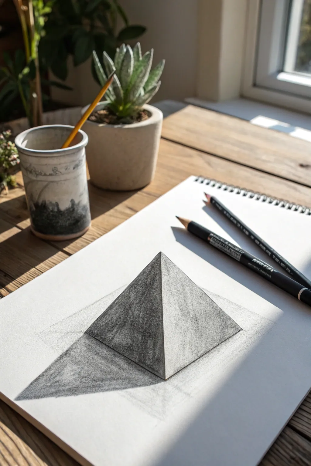
This striking pyramid drawing relies on precise perspective and clever shading to create a convincing illusion of depth. By carefully controlling graphite values, you’ll transform a simple flat shape into a solid form that appears to pop right off the paper.
Step-by-Step
Materials
- Sketchbook or smooth drawing paper
- HB or 2B pencil (for initial outlines)
- 4B or 6B pencil (for deep shadows)
- Fine-point black pen (optional, for crisp edges)
- Ruler or straight edge
- Eraser
- Blending stump or tissue
Step 1: Constructing the Base Form
-
Establish the Horizon:
Begin by lightly drawing a faint horizontal line about one-third of the way up your page. This will help you ground the pyramid, though most of it won’t be visible in the final piece. -
Mark the Base:
Using your ruler, draw a diamond shape (a skewed square) below your horizon line. The front angle should point downward toward you. Keep these lines very light as they are just guides. -
Find the Apex:
Find the exact center of your diamond base. From that center point, draw a vertical line straight up. The top of this line will be the peak of your pyramid. -
Connect the Edges:
Draw straight lines connecting the top of your vertical line (the apex) to the three visible corners of your diamond base. You should now see two triangular faces of the pyramid. -
Clean Up:
Now that the structure is solid, gently erase the internal construction lines—the diamond base and the vertical center line—so only the outer pyramid shape remains.
Keep it Clean
Place a piece of scrap paper under your drawing hand. This prevents your palm from smudging the soft graphite of the shadows onto the clean white paper.
Step 2: Mapping the Light and Shadow
-
Determine Light Source:
For this dramatic look, imagine the light coming from the upper right. This means the right face of the pyramid will be bright, and the left face will be in shadow. -
Outline the Cast Shadow:
From the bottom-left and bottom-center corners of the pyramid, extend two lines angled outward to the left. Connect them to form a long triangular shadow shape stretching away from the light. -
First Layer of Tone:
Using the side of your HB pencil, apply a very light, even layer of graphite over the left face of the pyramid. Leave the right face completely white for now. -
Deepening the Shadow Side:
Switch to your softer 4B pencil. Add a second layer of shading to the left face. I like to press harder near the bottom edge and slightly lighter near the top to suggest reflected light from the table. -
Creating Texture:
Instead of blending perfectly smooth, use small circular or scumbling motions with your pencil tip. This creates the stony, granular texture seen in the reference.
Step 3: Refining and Contrast
-
Shading the Cast Shadow:
Fill in the cast shadow on the table surface. This should be the darkest area of the drawing. Press firmly with your 4B or 6B pencil, making it darkest right where it touches the pyramid’s base. -
Gradating the Cast Shadow:
As the cast shadow extends outward to the left, let your pencil pressure ease off slightly. The shadow should be crisp and dark near the object, and slightly softer at the tip. -
Adding Subtle Tone to the Light Side:
The right face is lit, but it isn’t pure white. Use an H or HB pencil to add extremely faint vertical strokes or texture marks, just enough to show it has surface material. -
Enhancing the Edge:
Sharpen your pencil to a fine point. go over the central vertical line where the two faces meet. Making this line crisp clarifies the corner and separates light from dark. -
Final Contrast Check:
Look at the base where the pyramid meets the ground. Darken this contact line significantly to ground the object and prevent it from looking like it’s floating.
Uneven Shading?
If your pencil strokes look too scratchy, layer cross-hatching in opposite directions to fill gaps, then lightly tap with a kneadable eraser to lift excess graphite.
Now step back and admire how a few simple lines and gradients have created a powerful 3D form
Color Gradient Triangle Tessellation
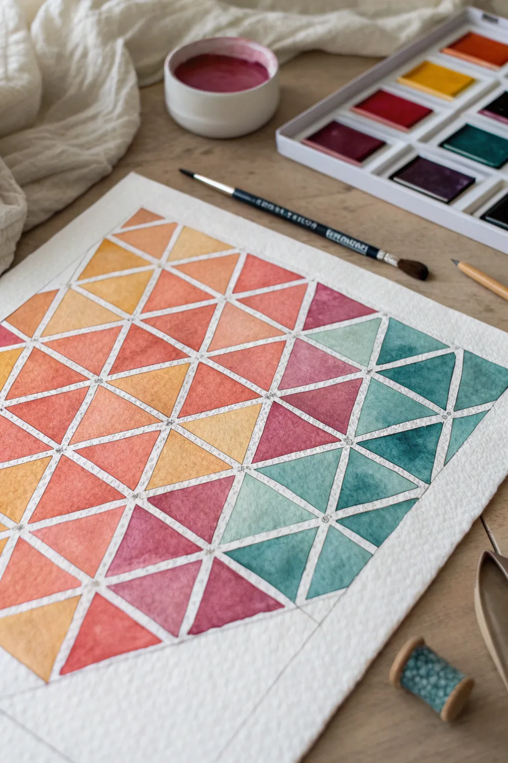
Master the art of simple geometry with this vibrant triangle tessellation that relies on a stunning watercolor gradient. The transition from warm corals and oranges to cool teals creates a mesmerizing visual flow that looks complex but is incredibly relaxing to paint.
Step-by-Step Tutorial
Materials
- Cold press watercolor paper (minimum 140lb/300gsm)
- Watercolor paint set (pan or tube)
- Round watercolor brush (size 4 or 6)
- Pencil (HB or H)
- Ruler
- Liquid masking fluid (optional but recommended)
- Washi tape or painter’s tape
- Two water jars (clean and rinse)
- Paper towels
- Drawing compass (optional for perfect triangles)
Step 1: Preparation & Grid
-
Secure the paper:
Begin by taping down all four edges of your watercolor paper to a hard board or table. This prevents buckling when the paper gets wet and creates a crisp white border around the finished piece. -
Measure the baseline:
Using your ruler and pencil, draw a faint horizontal line near the bottom of your workspace. Mark even intervals along this line—about 1.5 to 2 inches apart works well for this scale. -
Establish the grid:
From your baseline marks, measure upwards to create rows of equilateral triangles. You can use a compass to swing arcs from each point to find the perfect apex, or simply measure carefully with a ruler. The goal is a tessellating pattern where triangles touch but don’t overlap. -
Draw the triangles:
Connect your points lightly with a pencil. Don’t worry if the lines are faint; in fact, lighter is better so the graphite doesn’t smudge into your bright pigments later. -
Create separation (The Gap):
This is crucial for the white grid look: redraw the inner lines of each triangle slightly smaller, leaving a consistent 1-2mm gap between every shape. This ‘channel’ of white space keeps colors from bleeding into neighbors. -
Masking (Optional):
If you are worried about unsteady hands, I usually apply fine lines of masking fluid in those grid channels. Let it dry completely—it should feel tacky and solid before you touch a brush to it.
Bleeding Edges?
If paint bridges the gap between triangles, wait for it to dry, then create a ‘patch’ using opaque white gouache or a white gel pen to redefine the grid line.
Step 2: Planning the Gradient
-
Select your palette:
Choose your gradient colors. For the look in the photo, you will need a deep maroon/violet, a bright coral red, a sunny yellow-orange, and a deep teal or turquoise. -
Pre-mix puddles:
Mix generous puddles of these colors on your palette. You’ll want intermediate shades too—mix a bit of red into your orange, and a bit of purple into your red to bridge the gaps between pure colors. -
Test the transition:
On a scrap piece of paper, paint small swatches in a line to ensure your transition from warm yellow-orange to cool teal feels harmonious and not muddy in the middle.
Add Metallic Flair
Once fully dry, re-paint the white grid channels with gold or silver watercolor paint for a luxurious, stained-glass effect.
Step 3: Painting the Triangles
-
Start with the warms:
Begin at the top left (or whichever corner you want to be yellow/orange). Load your brush with the lightest yellow-orange mix and paint the first few triangles. Keep the paint wet and juicy. -
Shift to coral:
As you move diagonally across the page, start dipping your brush into the coral red mixture. Allow the colors to vary slightly from triangle to triangle; some can be flatter washes, while others can have more concentrated pigment. -
Introduce the pinks:
Move into the middle section using your maroon and violet tones. At this point, ensure you are rinsing your brush thoroughly between distinct color changes to keep the hues bright. -
Transition to cool:
This is the tricky part. As you reach the bottom right section, rinse your brush well and switch to your teal. To bridge the gap with the pinks, you can use a very desaturated purple or a neutral grey-blue in the transition zone. -
Fill the teals:
Paint the final corner with your deep turquoise and teal shades. Vary the water-to-paint ratio here to get some beautiful transparency in the darker colors. -
Create texture:
While some triangles are still damp, you can drop in a tiny dot of clean water or a darker pigment concentration. This creates those lovely ‘blooms’ and textures characteristic of watercolor.
Step 4: Finishing Touches
-
Dry completely:
Wait for the paint to be bone dry. If the paper feels cold to the back of your hand, it’s still damp inside. Patience prevents smudging. -
Remove masking:
If you used masking fluid, gently rub it away with a clean finger or a rubber cement pickup tool to reveal the crisp white lines underneath. -
Erase guidelines:
Gently erase any visible pencil marks in the white channels. Be careful not to rub over the painted areas too vigorously, as some pigments might lift. -
Peel the tape:
Slowly peel off the perimeter tape at a 45-degree angle, pulling away from the artwork to ensure you don’t tear your fresh masterpiece.
Step back and admire how simple shapes create a complex and colorful rhythm.


Have a question or want to share your own experience? I'd love to hear from you in the comments below!