When you get your values working, everything in your painting suddenly feels more real—depth, mood, glow, all of it. Here are my favorite value painting ideas that make light and dark feel super clear and honestly pretty fun to practice.
Paint a Clean Value Scale Strip
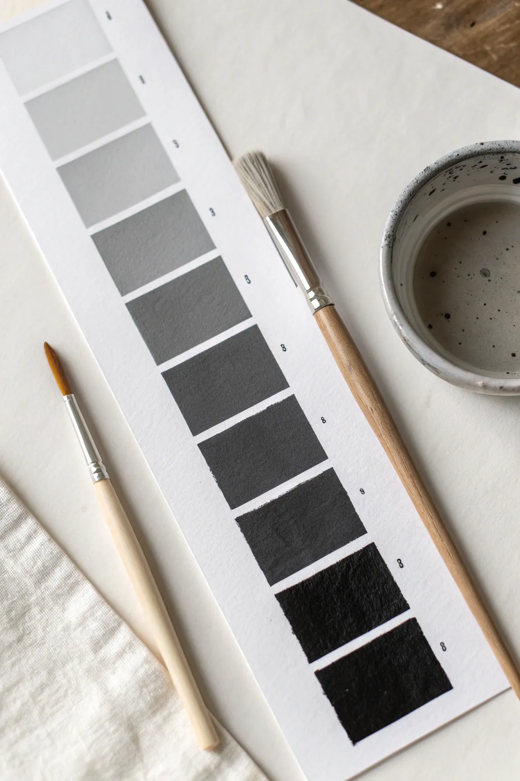
This fundamental exercise creates a crisp, professional-looking gradient strip that transitions seamlessly from the lightest gray to the deepest black. By carefully isolating each tone in neat squares, you will build a reference tool that sharpens your eye for value and contrast.
Step-by-Step
Materials
- Heavyweight watercolor paper or mixed media paper (smooth texture preferred)
- Black acrylic paint or gouache
- White acrylic paint or gouache
- Flat shader brush (size 6 or 8)
- Ruler
- Pencil (HB or 2H)
- Painter’s tape or masking tape
- Palette for mixing
- Palette knife (optional, for cleaner mixing)
- Water cup
- Paper towels or rag
Step 1: Preparation & Layout
-
Cut the paper strip:
Begin by cutting a long, narrow strip of your heavyweight paper. A width of about 3 to 4 inches is ideal, leaving enough room for the value squares and a clean border. -
Mark the margins:
Using your ruler and a light pencil touch, measure a centered column for your squares. Leave at least a half-inch margin on the left and right sides to keep the focus on the value tones. -
Divide the column:
Measure the total length of your column and divide it into 9 or 10 equal sections. Mark these divisions lightly with your pencil. -
Tape the boundaries:
Apply painter’s tape along the long vertical sides of your marked column. Press the edges down firmly to prevent paint from bleeding underneath. -
Separate the squares:
Place thin strips of tape horizontally across the column at your measured division marks. This creates the ‘grout lines’ between your painted squares, ensuring that crisp, separated look shown in the photo.
Squint Test
To check if your value jumps are even, squint your eyes at the strip. This blurs the edges and makes it easier to see if two squares look too similar or if a jump is too drastic.
Step 2: Mixing & Painting
-
Prepare the extremes:
Squeeze out a blob of pure black and a blob of pure white on your palette. Place them far apart to leave room for mixing the gray steps in between. -
Paint the black square:
Load your flat brush with pure black paint. Fill in the bottom-most square completely. Brush horizontally to minimize texture marks, ensuring an opaque, solid dark value. -
Create the darkest gray:
Take a portion of black and mix in a tiny mount of white. You want a color that is just barely lighter than pure black. Paint the square immediately above the bottom one. -
Mix the middle gray:
Now, create a 50% gray by mixing equal parts black and white. Locate the middle square on your strip and paint this neutral tone there next. This acts as an anchor for the rest of your values. -
Fill the dark gradient:
Work your way up from the bottom squares toward the middle gray. Add incrementally more white to your black mixture for each step, aiming for equal visual jumps in lightness. -
Clean the brush:
Thoroughly rinse your brush before moving to the lighter values. Any residual black pigment can muddy the delicate high-key grays. -
Paint the white square:
At the very top square, paint a layer of pure white. Even if the paper is white, painting this square ensures the texture and finish match the rest of the scale. -
Work down the light scale:
For the square just below the white one, mix a tiny dot of black into a pile of white. It should be a very faint, ghostly gray. Paint this second square. -
Complete the gradient:
Fill in the remaining squares between the light gray and the middle gray. Add just a touch more black for each step down, constantly comparing it to the square above and below to ensure a smooth transition.
Paint Bleeding?
If paint bled under the tape, wait for it to dry fully. Then, take a small brush with opaque white paint (or the background paper color) to carefully touch up and straighten the edge.
Step 3: Finishing Touches
-
Let it dry:
Allow the paint to dry completely. Acrylics dry darker and gouache often dries lighter, so the true values will settle after a few minutes. -
Remove Horizontal Tape:
Once dry to the touch, carefully peel away the small horizontal pieces of tape first. I prefer to pull the tape at a 45-degree angle away from the paint to avoid tearing. -
Remove Vertical Tape:
Slowly peel off the long vertical tape strips. Reveal the crisp edges of your value column. -
Label the values (Optional):
If you want to use this as a reference tool later, use a fine-tip pen to number the steps (e.g., 1 for white, 10 for black) next to each square.
You now have a perfect reference tool to help you judge light and shadow in future artwork
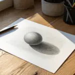
Shade a Sphere With One Light Source
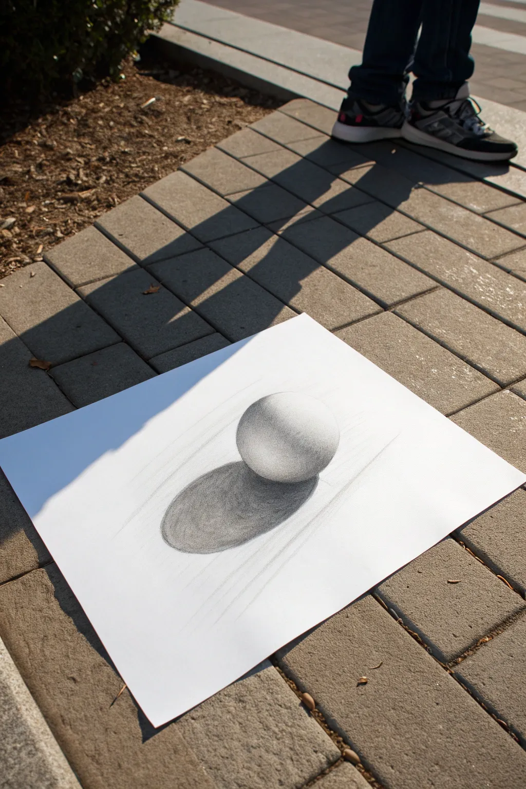
Learn the fundamental skill of creating volume on a 2D surface by drawing a perfectly shaded sphere using just one light source. This exercise focuses on smooth value transitions and realistic cast shadows to make the object pop off the page.
Step-by-Step Tutorial
Materials
- Drawing paper (medium texture)
- Graphite pencils (HB, 2B, 4B)
- Blending stump or tortillon
- Kneaded eraser
- Compass or circular object to trace
- Ruler or straight edge (optional for alignment)
- Pencil sharpener
Step 1: Setting the Composition
-
Define the Light Source:
Before making a mark, decide where your light is coming from. For this project, imagine the light hitting the object from the top right, which means your shadows will fall to the bottom left. -
Draw the Outline:
Use a compass or trace a circular object to draw a perfect circle in the center of your paper. Keep this initial line very light using an HB pencil so it disappears later. -
Map the Shadow Shape:
Lightly sketch an elongated oval shape stretching out from the bottom left of the sphere. This ellipse represents the cast shadow on the ground. -
Mark the Highlight:
Draw a faint, small circle near the top right edge of the sphere. This area will remain the pure white of the paper, representing the direct reflection of the light source.
Don’t Touch!
Place a clean sheet of scrap paper under your drawing hand. The oils from your skin can smear graphite and make it difficult to erase later.
Step 2: Building Values and Form
-
Begin the Core Shadow:
Using a 2B pencil, lightly shade a crescent-moon shape on the bottom left side of the sphere, opposite your light source. This is the beginning of the ‘core shadow’ or the darkest part of the object itself. -
Mid-tone Application:
Using light circular motions, fill in the area between your core shadow and the highlight. Apply very little pressure to create a soft gray tone. -
First Blend:
Take your blending stump and gently smudge the graphite you just laid down. Work in circular motions from the dark areas toward the light areas to start creating a smooth gradient. -
Deepen the Core Shadow:
Switch to a 4B pencil to darken that crescent shape on the shadow side. The darkest part of the sphere isn’t actually the very edge; it’s a band just inside the edge. -
Create Reflected Light:
Leave a thin sliver of lighter value along the very bottom left rim of the sphere. This is ‘reflected light’ bouncing off the ground surface back onto the object. -
Smooth the Transitions:
Use the blending stump again to merge the dark core shadow into the lighter reflected light and the mid-tones. The goal is to eliminate any harsh lines on the sphere itself.
Texture Play
Instead of smooth shading, try using cross-hatching or stippling (dots) to create the values. It changes the style completely while keeping the 3D form.
Step 3: Grounding the Object
-
Fill the Cast Shadow:
Using the 4B pencil, fill in the oval cast shadow on the ground. This needs to be significantly darker than most of the sphere to look realistic. -
Darkening the Occlusion Shadow:
Press harder right underneath where the sphere touches the ground. This is the ‘occlusion shadow’ and should be the absolute darkest black in your entire drawing. -
Soften Shadow Edges:
While the shadow is sharpest near the sphere, let the edges of the cast shadow get slightly blurrier as they move further away from the object. You can achieve this with gentle blending. -
Clean Up Edges:
Use a kneaded eraser to tidy up the outside perimeter of the sphere. A crisp, clean edge is crucial for making the object look solid and manufactured. -
Lift Highlights:
If your main highlight got smudged, press the clean kneaded eraser onto that top-right spot to lift the graphite and bring back the bright white paper. -
Final Contrast Check:
Step back and squint at your drawing. I find this helps reveal if the darks are dark enough; if the sphere looks flat, add one more layer of 4B to the core shadow and occlusion area.
With practice, these simple value principles will be the foundation for drawing complex realistic subjects
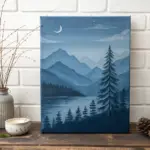
Layer Mountains With Atmospheric Perspective
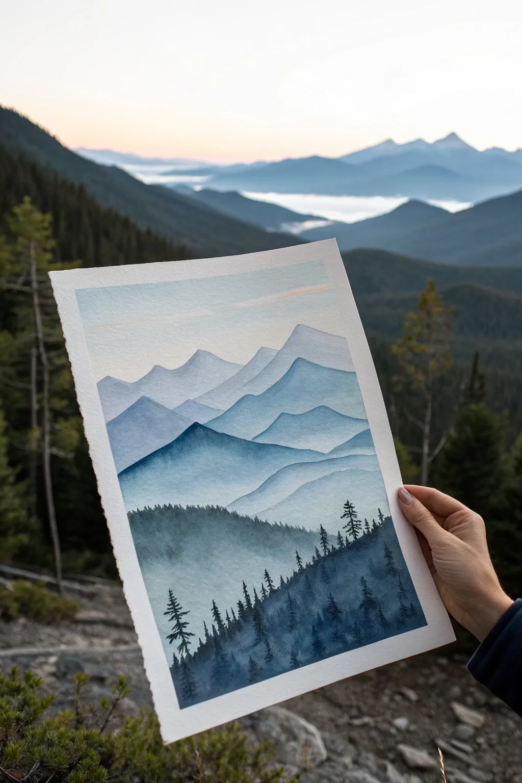
Capture the breathtaking depth of a mountain range using watercolor layers to build form and distance. This project relies on a single color palette, using water to create atmospheric perspective where mountains fade softly into the horizon.
Step-by-Step Guide
Materials
- Cold-press watercolor paper (300 gsm or heavier)
- Indigo watercolor paint (or Payne’s Gray)
- Prussian Blue watercolor paint
- Round brushes (large size 10-12 for washes, small size 2-4 for details)
- Clean water and mixing palette
- Masking tape (optional for border)
- Paper towels
Step 1: Setting the Atmosphere
-
Prepare the paper:
If you want clean edges, tape your paper down to a board. Ensure your surface is flat so water washes pool evenly. -
Mix the sky wash:
Mix a very dilute wash of Indigo with plenty of water. It should look almost transparent on your palette. -
Paint a gradient sky:
Start at the very top of the paper with your dilute wash. As you move down towards the horizon line (about 1/3 down the page), add more clean water to your brush to fade the color out to nearly white. -
Let it dry completely:
This step is crucial. The paper must be bone-dry before starting the mountains, or you will lose your hard edges. Use a hairdryer if you’re impatient.
Step 2: Layering the Mountains
-
Outline the first ridge:
Using a slightly more saturated mix of blue (but still very watery), paint the silhouette of the furthest mountain range. Keep the top edge undulating and uneven to mimic natural peaks. -
Fade the bottom edge:
Immediately after painting the top edge of this first ridge, rinse your brush and drag clean water along the bottom of the painted area to soften it downward, creating a misty effect. -
Dry and darken:
Once the first layer is dry, mix a slightly darker value of your blue. Paint a second mountain range that overlaps the first one slightly lower on the page. -
Repeat the process:
Continue painting mountain layers, moving down the paper. With each new layer, add slightly less water and more pigment to your mix. This ‘value scale’ creates the illusion of depth. -
Add a prominent peak:
About halfway down, paint a more distinct, sharper mountain shape with a medium-dark value. This acts as a focal point before the foreground takes over. -
Check your values:
Pause to look at your progress. The top mountains should be faint and airy, while the ones closer to the bottom should look heavy and rich in color.
Keep it Clear
To prevent ‘cauliflower’ blooms in your smooth mountain washes, always wait for a layer to be 100% dry before painting the next one on top.
Step 3: The Forest Foreground
-
Mix the deepest dark:
Create your darkest value yet—a thick, creamy consistency of Indigo with very little water. It should be nearly opaque. -
Paint the tree line base:
Paint a sweeping, uneven hill shape at the very bottom of the paper. I like to keep the bottom edge solid but leave the top edge rough. -
Add texture to the hill:
While the paint is wet, drop in hints of pure pigment or lift clearer spots with a thirst brush to suggest texture in the dense forest canopy. -
Switch to a detail brush:
Grab your smallest round brush (size 2 or 4) for the tree silhouettes. -
Paint the tree trunks:
Pull thin vertical lines upward from your dark hill base. Vary their heights so they don’t look like a picket fence. -
Detail the branches:
Use the very tip of the brush to tap small, downward-sloping branches onto the trunks. Make the tops pointy and sparse, getting fuller near the bottom. -
Overlap for density:
Create a sense of a dense forest by overlapping trees—some tall and distinct, others shorter and blending into the mass below. -
Final touches:
Let the foreground dry. If the contrast isn’t strong enough, you can glaze one final, very dark wash over the bottom-most area to anchor the painting.
Color Shift
For a magical twilight feel, mix a tiny touch of purple or alizarin crimson into the wash used for the very distant mountain range.
Now you have a serene landscape that perfectly demonstrates the power of value changes

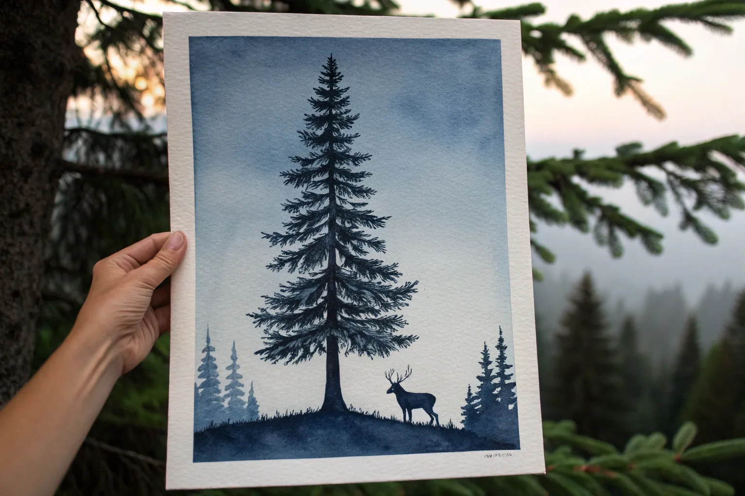
Silhouette Trees Against a Glowing Sky
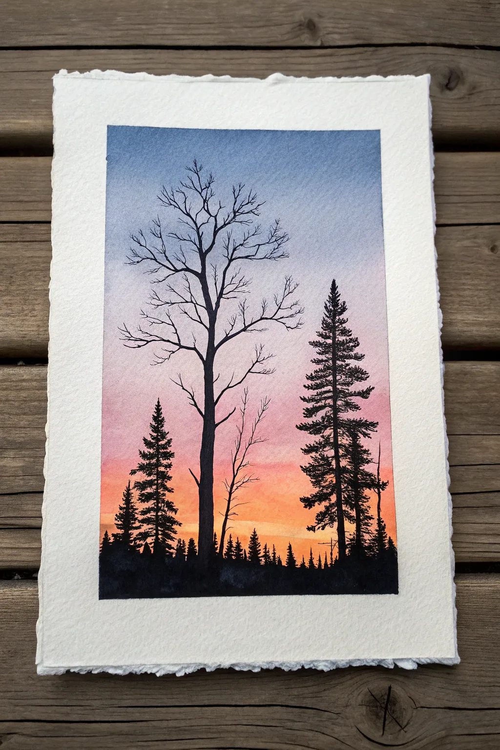
Capture the magic of twilight with this stunning watercolor project that balances vibrant sky gradients with stark, crisp silhouettes. The contrast between the glowing, blended background and the sharp, black trees creates an immediate sense of depth and atmosphere.
Step-by-Step Tutorial
Materials
- Cold Press Watercolor Paper (140lb/300gsm, deckle edge optional)
- Watercolor paints: Indigo, Ultramarine Blue, Alizarin Crimson, Cadmium Red, Cadmium Yellow
- Black ink or Black Gouache (for opaque silhouettes)
- Masking tape
- Large flat wash brush (3/4 or 1 inch)
- Round watercolor brush (size 6 or 8)
- Fine liner or detail brush (size 0 or 00)
- Clean water jar and paper towels
- Hardboard or painting surface
Step 1: Painting the Gradient Sky
-
Prepare your paper:
Tape your watercolor paper securely to a hardboard. If you want the organic deckle edge shown in the reference, tape the paper from the back or float-mount it, but be careful with water control near the edges. -
Wet the surface:
Using your large flat wash brush, apply a generous layer of clean water across the entire area where the sky will be painted. The paper should be glistening but not forming puddles. -
Start with yellow:
Load your brush with a watered-down Cadmium Yellow. Apply this horizontally across the bottom third of the paper, letting it be most vibrant just above the horizon line. -
Introduce red tones:
While the yellow is still wet, mix a bit of Cadmium Red or Alizarin Crimson. Paint a horizontal band immediately above the yellow, allowing the colors to bleed together naturally to create orange hues. -
Blend into purple:
Clean your brush slightly and pick up a cool red or purple mix. Apply this above the red section, gently brushing downward to soften the transition. -
Add the blue sky:
Mix a wash of Ultramarine Blue and Indigo. Apply this to the top third of the paper, pulling the color down to meet the purple. Tilt your board slightly to help gravity smooth the gradient. -
Dry thoroughly:
This is crucial: allow the background wash to dry completely. The paper must be bone-dry and flat before you add silhouettes, or the black ink will bleed into the sky.
Bleeding Edges?
If black ink bleeds into the sky, stop immediately. Your background isn’t dry enough. Let it dry, then fix the blur by painting over it with opaque black gouache to sharpen the edge.
Step 2: Adding the Silhouettes
-
Sketch the layout:
Lightly pencil in the horizon line and the vertical center lines for the main trees. Keep the pencil marks very faint so they don’t show through the sky later. -
Paint the horizon:
Using black gouache or ink and a medium round brush, paint the uneven, jagged horizon line of distant treetops. Vary the heights to suggest a dense forest floor. -
Draft the main deciduous tree:
With your fine liner brush, paint the trunk of the large, leafless tree on the left. The trunk should be thicker at the base and taper significantly as it reaches up. -
Add main branches:
Extend major branches outward from the trunk. Remember that trees are organic; avoid perfect symmetry and let branches twist slightly. -
Refine with twigs:
Switch to your smallest detail brush. Add tiny, delicate twigs to the ends of the branches. I find that holding the brush loosely near the end of the handle helps create natural, shaky lines. -
Start the pine tree:
To the right of the bare tree, paint a straight vertical line for the pine tree’s trunk. It should be slightly shorter than the deciduous tree for balance. -
Paint pine texture:
Use a stippling or dabbing motion to add pine needles. Start narrow at the top and widen the silhouette as you move down, leaving small gaps to show the sky through the branches. -
Add secondary trees:
Paint a smaller pine tree on the far left and a few spindly saplings near the center to fill empty negative space. -
Anchor the composition:
Darken the very bottom of the painting with a solid layer of black to ground all the trees and merge them into the intricate horizon line you painted earlier.
Level Up: Stars
Once the sky is dry but before painting trees, flick a tiny amount of white gouache or opaque white watercolor onto the dark blue section to create a subtle starry night effect.
Step back and admire the stark contrast you have created
BRUSH GUIDE
The Right Brush for Every Stroke
From clean lines to bold texture — master brush choice, stroke control, and essential techniques.
Explore the Full Guide
Paint a Moonlit Lake Reflection Study
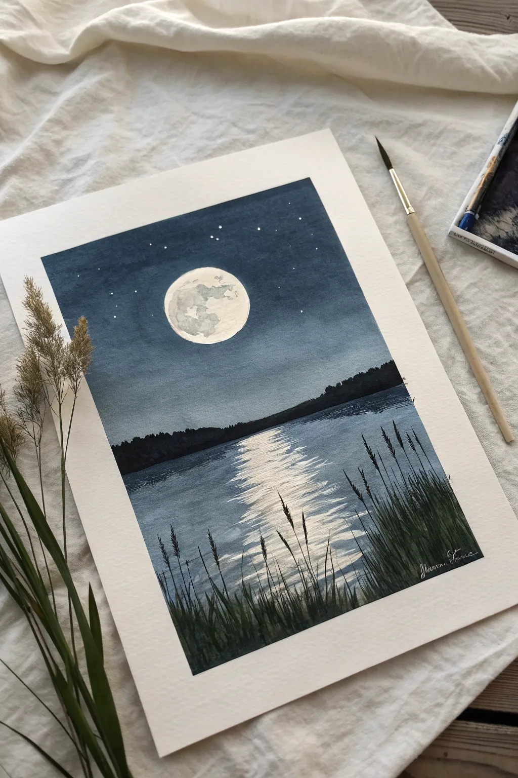
Capture the stillness of a midnight scene with this dramatic value study featuring a glowing moon and its shimmering reflection on calm water. Using a limited palette of deep blues and black, you’ll learn to contrast light and dark to create atmospheric depth.
Step-by-Step
Materials
- Cold Press Watercolor Paper (block or taped down)
- Watercolor Paints (Indigo, Paynes Gray, Lamp Black)
- White Gouache or White Gel Pen
- Masking Fluid (and old brush or applicator)
- Round Brushes (Size 8 for washes, Size 2 for details)
- Flat Wash Brush (1/2 inch)
- Masking Tape
- Clean Water and Paper Towels
- Pencil and Eraser
Step 1: Preparation and Masking
-
Tape boundaries:
Begin by taping down all four edges of your watercolor paper with masking tape to create a crisp, clean border. Ensure the tape is pressed down firmly to prevent paint bleeding. -
Sketch the layout:
Lightly sketch a circle for the moon in the upper center third of the paper. Draw a faint horizon line slightly below the vertical center. -
Protect the moon:
Apply masking fluid carefully inside the moon circle to preserve the white of the paper. Let this dry completely before touching it with any paint.
Uneven Wash?
If your sky wash dries with ‘cauliflower’ blooms, don’t restart. These textures can add atmosphere to a night sky. Just deepen the surrounding areas with a second glaze to blend it in.
Step 2: Painting the Sky and Water Base
-
Sky wash:
Mix a diluted wash of Indigo and Payne’s Gray. Using your flat brush, paint the sky area from the top down to the horizon line. Keep the wash fairly even but slightly darker at the very top. -
Horizon separation:
While the sky is drying, paint the water area below the horizon. Use a slightly lighter wash of the same blue mixture, brushing horizontally to simulate the calmness of the lake. -
Deepen the sky:
Once the first layer is dry, apply a second, more concentrated layer of Indigo to the sky to deepen the night effect. I like to leave the area immediately around the moon ever so slightly lighter to suggest a glow. -
Dry thoroughly:
Allow both the sky and water sections to dry completely. The paper must be bone-dry before proceeding to the next steps.
Silver Moon
For a magical touch, use metallic silver watercolor or ink for the moon’s reflection on the water. It will catch the light beautifully when viewed from different angles.
Step 3: Creating the Reflection
-
Establish the reflection shape:
Mix a semi-opaque white gouache. Using a size 2 brush, paint horizontal, zigzagging strokes directly under the moon area on the water. -
Refine the shimmer:
Make these white strokes wider near the viewer and narrower as they recede toward the horizon. Leave gaps between lines to let the blue water show through. -
Soften the edges:
You can use a clean, slightly damp brush to gently soften the edges of the white paint if the lines look too harsh.
Step 4: Adding Landscape Details
-
Paint the tree line:
Mix a very dark, saturated solution of Indigo and Lamp Black. Paint the distant silhouette of trees along the horizon line. Keep the top edge uneven to represent tree tops. -
Create foreground grasses:
Load a fine detail brush with the black mixture. Starting from the bottom edge, flick the brush upward to create long, slender reeds and grasses on the right and left sides. -
Vary the organic shapes:
Make some reeds thicker and taller than others. Add small seed heads to the tips of a few stalks for texture. -
Layer the foreground:
Add a few more grass blades that overlap the water reflection slightly, helping to push the lake into the background.
Step 5: Revealing the Moon
-
Remove masking:
Gently rub away the dried masking fluid from the moon area using your finger or a rubber cement pickup. -
Paint lunar texture:
Dilute a tiny amount of black or gray paint. Dab subtle, irregular shapes inside the moon to create craters and shadows. Keep these very faint. -
Final stars:
Dip a toothbrush or stiff brush into white gouache and gently splatter tiny stars onto the dark sky area. You can also manually place larger stars with a gel pen.
Peel off the tape carefully to reveal your crisp edges and enjoy the peaceful atmosphere of your night study
Do a Rainy Street With Wet-Pavement Values
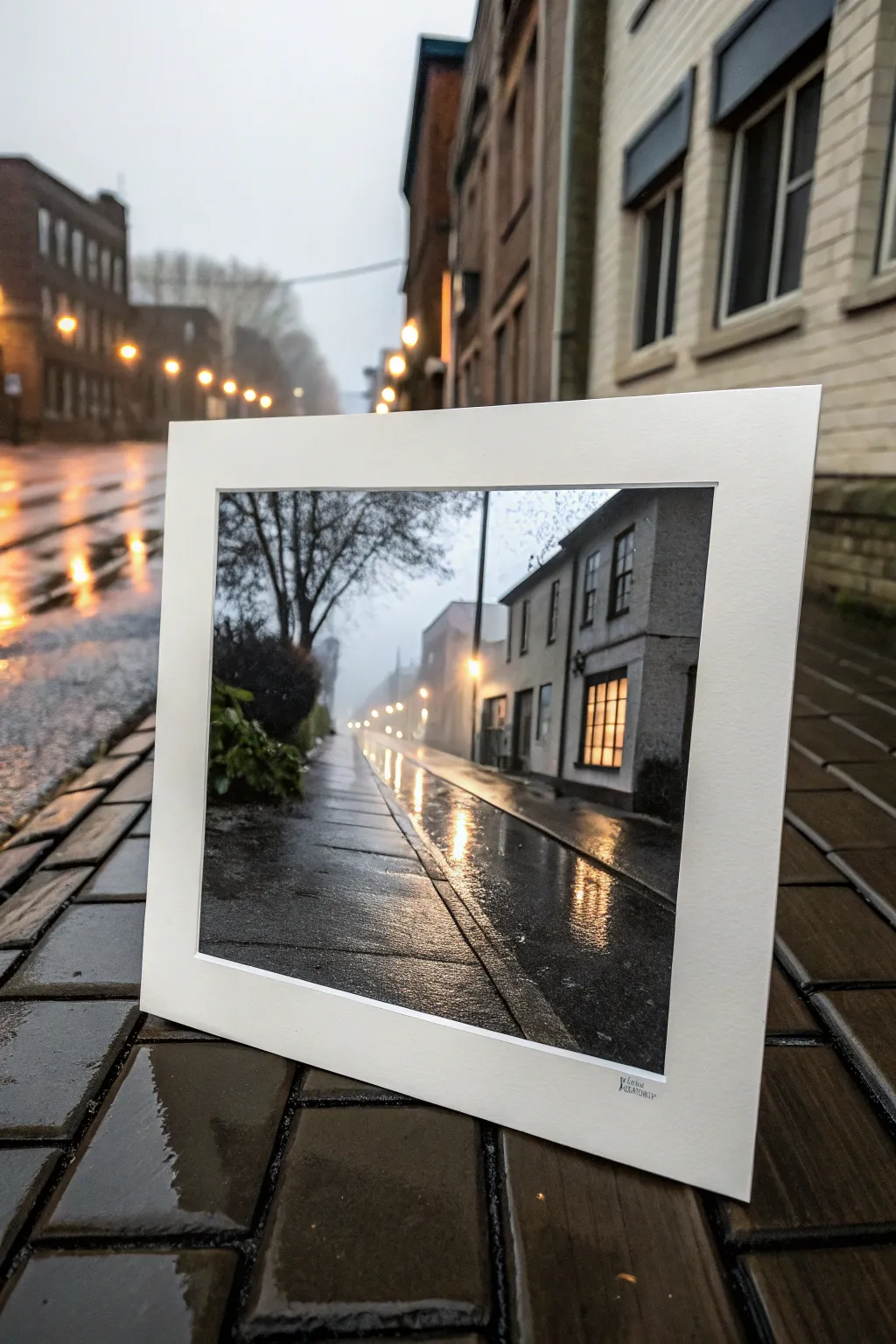
Capture the moody atmosphere of a damp evening by focusing on the interplay of light and dark values on wet pavement. This project teaches you to render believable reflections and depth, turning a grey day into a striking, high-contrast composition.
How-To Guide
Materials
- Heavyweight watercolor paper or mixed media board (approx. 8×10 inches)
- Pencils (HB for sketching, 2B-6B for shading)
- Charcoal or graphite powder (optional for soft backgrounds)
- Black ink or watercolor paint (Payne’s Grey, Lamp Black)
- White gouache or white acrylic ink for highlights
- Assorted brushes: flat wash brush, small round detail brush (size 0 or 1)
- Masking tape
- Ruler
- Paper towels
- Workable fixative (optional)
Step 1: Setting the Scene
-
Prepare the surface:
Begin by taping down your paper to a rigid board to prevent warping. Use a ruler to lightly draw a border about an inch from the edge, creating a clean frame for your composition. -
Establish the horizon:
Lightly sketch the horizon line about a third of the way up the paper. This low angle emphasizes the wet pavement in the foreground, which is the star of this piece. -
Sketch the perspective:
Draw the vanishing point on the horizon line. Sketch the converging lines for the sidewalk curb and the building facades on the right. Keep these lines faint; they are just guides. -
Block in shapes:
Roughly outline the main elements: the row of buildings on the right, the distant streetlights, and the silhouette of the tree on the left. Don’t worry about details yet, just get the proportions right.
Muddy Greys?
If your values are blending into one shade, let layers dry completely between washes. Only work wet-on-wet for the foggy background or soft reflections.
Step 2: Building Values
-
Apply the mid-tones:
Mix a watery, light grey wash using your black paint or ink. Cover the sky area and the distant background, letting it fade slightly as it reaches the bright streetlights. This establishes the ambient fog. -
Darken the buildings:
Once the sky involves is dry, use a darker grey to fill in the buildings on the right. Leave empty rectangular spaces for the windows—we want those to glow later. -
Deepen the shadows:
Switch to a nearly black mix. Paint the darkest areas: the undersides of eaves, the tree trunk on the left, and the deep shadows along the curb line. This high contrast anchors the image. -
Create the wet pavement base:
Brush a medium-dark grey wash horizontally across the foreground pavement. While it’s still damp, lift out some pigment with a clean paper towel to suggest uneven reflection areas.
Level Up: Color Glaze
Once the monochrome painting is dry, apply a very thin glaze of transparent yellow over the lights and a cool blue over the shadows to add temperature.
Step 3: Reflections and Light
-
Paint the window glow:
Using a very diluted warm tone (or leaving the paper white if you prefer a stark look), fill in the window shapes. Contrast is key here; the surrounding value must be dark for the light to pop. -
Streaking the reflections:
Using a flat brush and vertical strokes, pull dark pigment down from the base of the buildings and the tree into the wet pavement area. These are the reflected shadows. -
Adding light pillars:
Clean your brush thoroughly. Now, drag vertical strokes of clean water (or white gouache if the base is too dark) directly below the streetlights and windows. This mimics the light stretching across the wet road. -
Refining the tree:
Use your smallest round brush to add intricate branches to the tree silhouette on the left. Make sure the branches thin out as they reach the sky.
Step 4: Review and Refine
-
Boost the highlights:
Use opaque white gouache or acrylic ink to add the brightest brights: the center of the streetlights and the crispest part of the window reflections on the ground. -
Texture the pavement:
Lightly dry-brush some dark grey texture over the foreground to simulate the rough asphalt grain. I find this helps distinguish the road surface from the smoother water puddles. -
Clean the edges:
Ensure the horizon line is soft and hazy to maintain depth, but keep the foreground curbs sharp and defined. -
Final reveal:
Once completely dry, carefully peel away the masking tape to reveal the clean white border, instantly matting your artwork. -
Mounting:
Place your finished piece into a white mount or adhere it to a larger backing card to replicate the gallery-ready look shown in the reference.
Step back and admire how simple value changes can create such a wet and realistic texture

PENCIL GUIDE
Understanding Pencil Grades from H to B
From first sketch to finished drawing — learn pencil grades, line control, and shading techniques.
Explore the Full Guide
Block In a Portrait With Three-Value Shapes
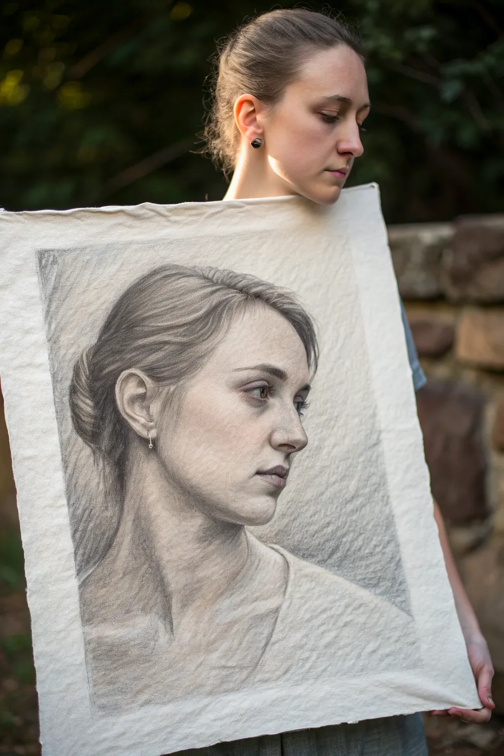
Master the fundamentals of portraiture with this study in light and shadow, capturing a realistic profile view. Using a structured three-value approach helps you break down complex forms into manageable shapes for a deeply dimensional and lifelike result.
Detailed Instructions
Materials
- High-quality charcoal paper or heavyweight drawing paper (creamy or off-white tone)
- Graphite pencils (HB, 2B, 4B, 6B)
- Vine charcoal (soft and medium)
- Kneaded eraser
- Precision eraser (stick or mono zero)
- Blending stump or tortillon
- Soft artist tissue or chamois
- Workable fixative
Step 1: Structural Blocking
-
Establish the Head Structure:
Begin with rigid, straight lines to map out the overall envelope of the head. Avoid curves at this stage; instead, focus on the angles of the forehead, the plane of the face, and the slope of the neck. -
Mark Key Features:
Lightly indicate the placement of the ear, the brow ridge, the bottom of the nose, and the chin line. Use relative measurements—like comparing the ear’s height to the nose length—to ensure accurate proportions before committing to details. -
Refine the Profile:
Develop the contour of the profile more clearly. Pay close attention to the negative space in front of the face to help you judge the complex curves of the nose and lips correctly.
Step 2: The Three-Value Block-In
-
Map Shadow Shapes:
Squint your eyes to simplify the reference into blobs of light and dark. Sketch the boundary lines where light meets shadow (the terminator line) across the cheek, neck, and hair. -
Fill the Darkest Value:
Using the side of a soft charcoal stick or a 4B pencil, fill in all shadow areas with a uniform, flat dark tone. This creates your first major value, leaving everything else the color of the paper. -
Establish Mid-Tones:
Identify the areas that aren’t quite highlights but aren’t deep shadows—specifically the hair mass and the turning planes of the cheek. Lightly hatch or scumble a middle grey tone into these zones. -
Preserve the Lights:
Leave the paper completely bare for your third value: the highlights. These should be reserved for the bridge of the nose, the forehead, and the upper cheekbone.
Squint to Simplify
Struggling to see values? Squinting your eyes reduces color and detail, turning the subject into indistinct blobs. This makes it easier to categorize shapes into simply light, medium, and dark.
Step 3: Modeling and Refining
-
Soften the Transitions:
Take a blending stump or a soft tissue and gently smooth the edges where your mid-tones meet your shadows. You want to create form, turning the sharp shapes into rounded volumes. -
Deepen the Crevices:
Switch to a 6B pencil or compressed charcoal to push the ‘core shadows.’ Focus on the pupil, the corner of the mouth, the nostril, and the deepest folds of the hair bun. -
Define the Ear Structure:
The ear is complex, so treat it as a series of interlocking C-curves. Darken the canal and the shadow behind the helix to make the lighter cartilage pop forward. -
Render the Hair Direction:
Instead of drawing individual strands, look for ribbons of hair. Use long, sweeping strokes that follow the curvature of the skull, adding darker accents only where the clumps of hair overlap. -
Lift Out Subtleties:
Using your kneaded eraser, gently tap or drag through the graphite to reclaim lost lights. I find this especially effective for creating the soft sheen on the hair and the texture of the skin.
Muddy Values?
If your drawing looks flat or gray, you likely lost your pure paper white. Use a clean kneaded eraser to aggressively lift pigment back to the original paper tone in key highlight areas.
Step 4: Final Atmosphere
-
Background Tone:
Apply a soft, hazy layer of graphite or charcoal to the background behind the face. This pushes the profile forward and adds atmosphere. -
Sharpen Edges:
Revisit the profile line with a sharp HB pencil. Crisp up the edge of the nose and lips, but keep the back of the hair and neck slightly blurry to suggest depth of field. -
Add Texture Nuance:
Lightly cross-hatch over the sweater area to suggest the fabric weave without drawing every thread. -
Final Highlight Highlights:
Use a precision eraser or a touch of white charcoal (if working on toned paper) to add the tiniest sparkle to the eye and the tip of the nose. -
Seal the Work:
Once satisfied, spray the drawing with a workable fixative in a well-ventilated area to prevent smudging.
Step back and admire how simple value shapes have come together to form a sophisticated and realistic portrait
Paint Faceted Gems as Value Planes
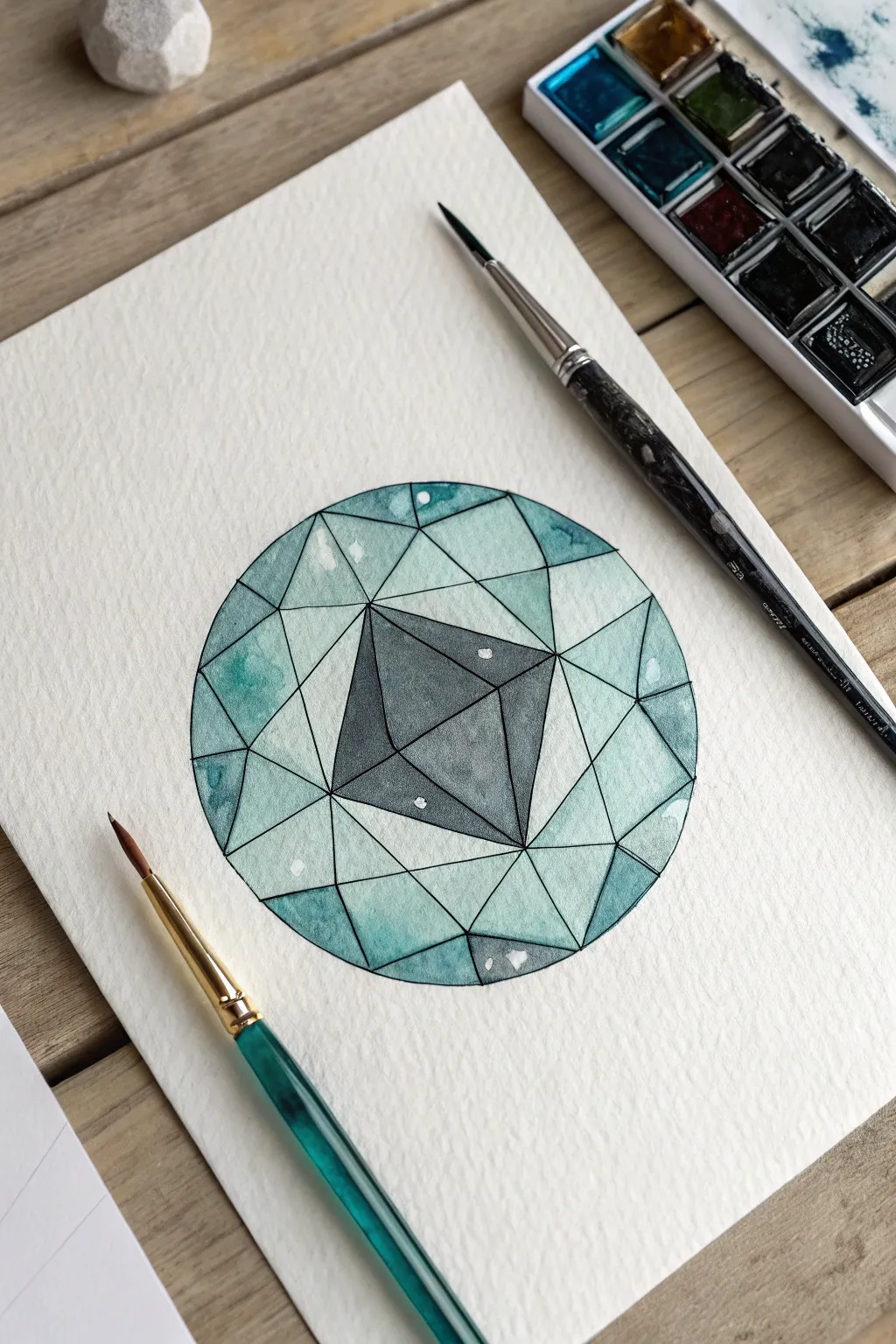
Master the art of illusion by painting a stunning, faceted gemstone that pops off the page using watercolor values. This tutorial breaks down complex light refraction into simple geometric shapes, resulting in a crisp, jewel-like illustration in cool teal and smoky grey tones.
Step-by-Step
Materials
- Cold press watercolor paper (300 gsm recommended)
- Watercolor paints: Teal, Turquoise, Payne’s Grey, and Lamp Black
- Pencil (HB or H)
- Compass or circle template
- Ruler
- Waterproof fineliner pen (0.3mm or 0.5mm, black)
- Round watercolor brushes (size 2 and 6)
- White gouache or opaque white gel pen
- Masking fluid (optional)
Step 1: Designing the Structure
-
Draw the boundary:
Begin by using your compass to draw a perfect circle in the center of your watercolor paper. Keep the pencil pressure light so it doesn’t leave deep grooves. -
Establish the table:
Draw the central table (the flat top face of the gem). For this specific cut, draw a square rotated 45 degrees—essentially a diamond shape—right in the middle of your circle. -
Connect the star facets:
From each point of your central diamond shape, draw a line extending outward toward the edge of the circle. Then, connect these points to create the triangular facets surrounding the center. -
Complete the geometry:
Finish the grid by drawing the remaining angled lines tailored to a brilliant cut pattern. You want to create a network of triangles and trapezoids that radiate from the center. Reference a diagram of a ’round brilliant cut’ if you need help visualizing the facet angles. -
Ink the lines:
Once you are happy with your pencil sketch, carefully trace over all the lines with a waterproof black fineliner. Use a ruler for the straight edges to ensure they look sharp and manufactured. Erase the pencil marks after the ink is fully dry.
Bleeding Lines?
If your black ink bleeds when you paint, stop immediately. Your pen isn’t waterproof. Let it dry 24h, or switch to painting first and inking last.
Step 2: Applying Value and Color
-
Mix your palette:
Prepare two distinct puddles of paint: a watery, transparent teal/turquoise mix and a deeper, more saturated Payne’s Grey. You’ll want variations of these washes ranging from very pale to quite dark. -
Paint the table:
Start with the central diamond shape. Fill it with a medium-dark wash of Payne’s Grey. While it’s still wet, drop in a slightly darker pigment on one side to suggest depth and shadow. -
Map the light values:
Identify the facets that would be catching the most light. Paint these specific triangles with your palest, most watered-down teal wash. I like to leave tiny gaps near the black ink lines to keep the distinct separation clean. -
Add mid-tones:
Move to the adjacent facets. Use a slightly more saturated turquoise mix here. The goal is to ensure that no two touching shapes have the exact same value (lightness/darkness), which creates the 3D effect. -
Deepen the shadows:
Select the facets that simulate deep internal reflection. Fill these with a concentrated mix of teal and a touch of black. These dark shapes provide the necessary contrast to make the gem look shiny. -
Layering for depth:
Once your first layers are dry, glaze over specific sections with a very sheer wash of cool grey to unify the tone without losing the underlying blue. -
Create texture:
While some facets are still slightly damp, drop in tiny blooms of clear water or darker pigment to create the uneven, refractive look of a stone’s interior.
Step 3: Finishing Details
-
Assess the contrast:
Step back and look at your gem. If it looks flat, darken the darkest facets further with a second layer of Payne’s Grey or black to increase the dramatic range. -
Add specular highlights:
Using white gouache or a gel pen, add small, crisp white dots and lines. Place these where light would hit the hard edges of the stone, particularly near the top corners of the central table. -
Soften edges:
If any highlights look too stark, gently tap them with a clean, slightly damp finger to blend them into the watercolor just a tiny bit.
Make it Sparkle
For a magical touch, drag a slightly dry brush with white gouache outward from one highlight to create a faint ‘starburst’ lens flare effect.
Now you have a brilliantly painted gem study that perfectly captures the interplay of light and shadow.


Create an Underwater Value Gradient Scene
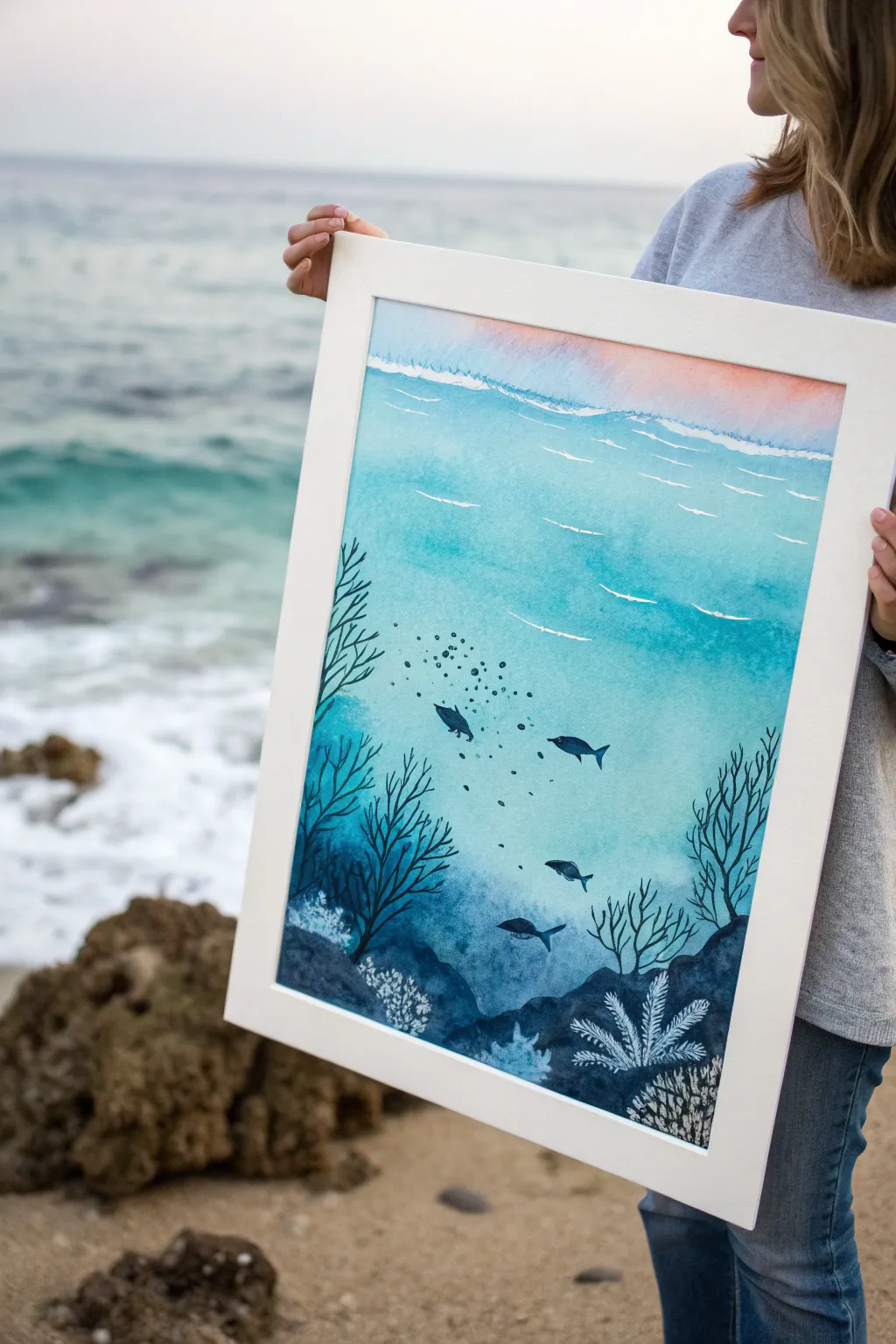
Capture the serene depth of the ocean with this monochromatic watercolor project that focuses on mastering value transitions. By layering washes from a pale, sunlit surface down to a mysterious, inky seabed, you’ll create a stunning underwater environment teeming with silhouette life.
Detailed Instructions
Materials
- Cold press watercolor paper (minimum 140lb/300gsm)
- Watercolor paints (phthalo blue, indigo, prussian blue, touch of warm pink)
- White opacity medium (white gouache, white ink, or white gel pen)
- Large flat wash brush
- Medium round brush (size 6 or 8)
- Fine detail brush (size 0 or 1)
- Masking tape
- Drawing board
- Clean water and paper towels
Step 1: Setting the Atmosphere
-
Secure your canvas:
Begin by taping down all four edges of your watercolor paper to a rigid board. This prevents buckling and creates that crisp, professional white border when you finish. -
Mix your palette:
Prepare a large puddle of light turquoise (phthalo blue with lots of water) and a smaller puddle of a very pale pinkish-orange for the sky reflection. Also prepare deeper blues like prussian blue and indigo for later steps. -
Paint the sky hint:
Using a wet-on-dry technique, paint a thin strip of the pale pinkish-orange at the very top of your paper. Keep this area quite watery and soft. -
Start the gradient wash:
While the pink layer is still slightly damp but not soaking, introduce your lightest turquoise wash just below it. Use a large flat brush and horizontal strokes to blend them gently. -
Deepen the blue:
As you move down the paper, gradually add more concentrated blue pigment to your wash. By the middle of the page, the color should be a vibrant medium turquoise. -
Create the abyss:
For the bottom third, mix in your darkest indigo or payne’s gray. Apply this rich, dark color heavily at the bottom, blending it upward into the medium blue to create a seamless transition from light to dark. Let this base layer dry completely.
Fixing Blooms
If water backflows and creates ‘cauliflower’ blooms in your gradient, wait for it to dry, then gently scrub the edge with a damp stiff brush and blend it out.
Step 2: Defining the Water
-
Add surface movement:
Once the main wash is bone dry, load a round brush with white gouache or opaque white watercolor. Paint thin, varied horizontal lines near the top to suggest waves catching sunlight. -
Paint distant currents:
Using a diluted concentration of your medium blue, paint faint, sweeping curved lines in the middle section. These subtle strokes suggest the movement of water currents without overpowering the scene.
Step 3: Adding Life and Depth
-
Sketch the seabed:
Using your darkest indigo mixture—almost black in consistency—paint the rocky bottom contours. Create undulating organic shapes that rise up from the bottom edge. -
Plant the seaweed:
With a fine liner brush and the dark indigo paint, draw long, flowing seaweed strands rising from the rocks. Use a light hand to keep the tips delicate and tapered. -
Add branching coral:
On the sides of the composition, paint silhouette structures that resemble fan coral or thin branches. Varing the height of these plants adds visual interest and frames the center. -
Paint the school:
Switch to a small round brush to paint the fish silhouettes in the middle ground. Keep their shapes simple and streamlined, ensuring they are facing the same general direction to imply movement. I find painting them in odd numbers usually looks more natural. -
Create bubbles:
Dip a small brush or the end of a paintbrush handle into dark paint and dot clusters of bubbles rising from the fish or plants.
Salt Texture
Sprinkle coarse sea salt onto the wet indigo wash at the bottom. Let it dry completely before brushing off to create natural, rocky textures in the seabed.
Step 4: Final Highlights
-
Add contrast coral:
Using your pure white gouache or ink, paint detailed, fern-like coral shapes directly over the dark rocks at the bottom right. This high contrast makes the foreground pop. -
Highlight the rocks:
Still using white, stipple small dots or textures onto the dark rock formations to simulate coral growth or light hitting the texture of the stone. -
The reveal:
Wait until every element is absolutely dry to the touch. Carefully peel away the masking tape at a 45-degree angle to reveal your clean edges.
Framing this piece in white really emphasizes the depth of the ocean colors you have created
Make a Glowing Jellyfish With Backlighting
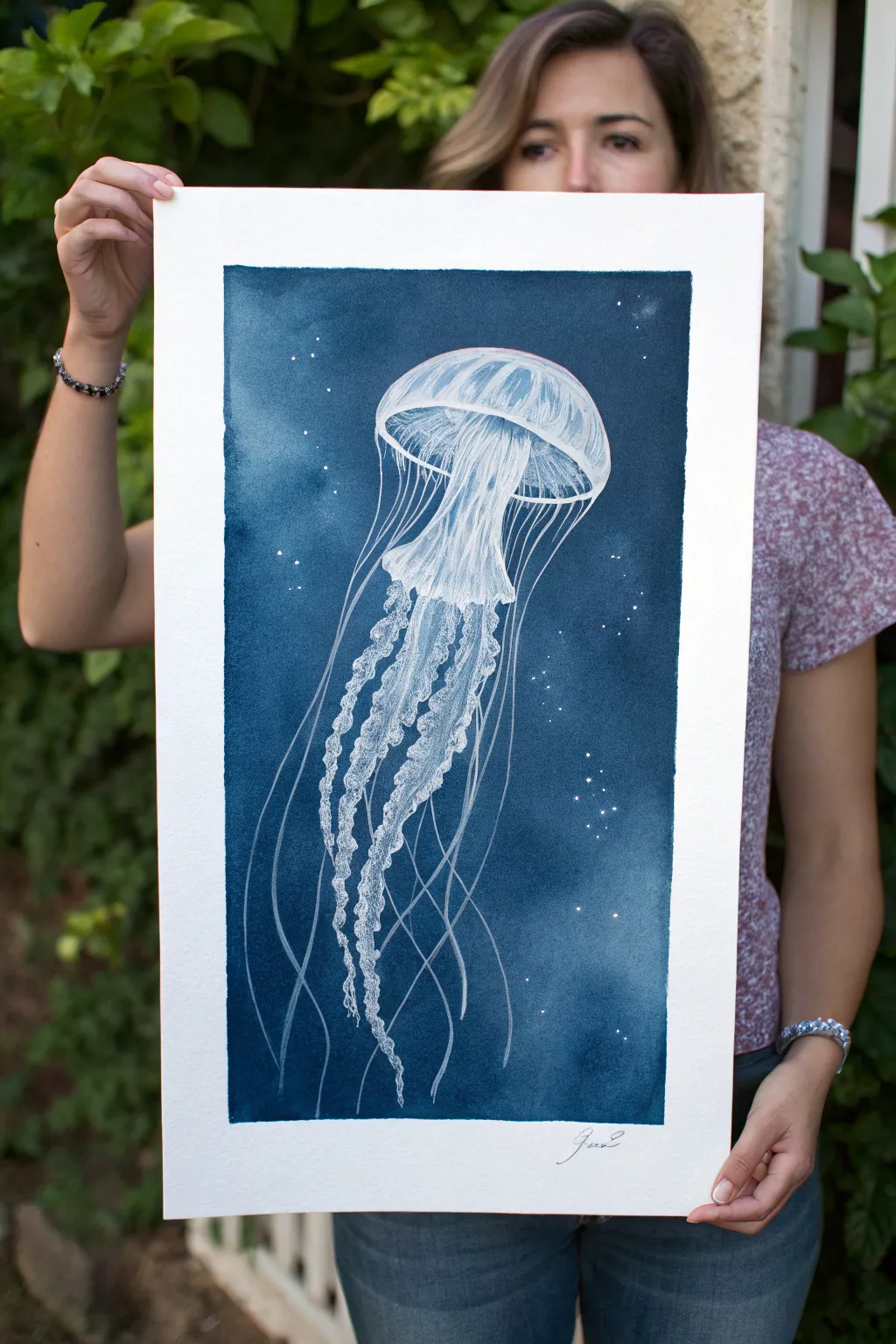
Capture the ghostly beauty of a jellyfish floating in the abyss with this striking mixed-media project. By combining deep, moody watercolor washes with crisp white ink details, you’ll create a glowing effect that makes the creature seem illuminated from within.
Step-by-Step Guide
Materials
- Large sheet of cold-press watercolor paper (at least 140lb/300gsm)
- Indigo and Payne’s Gray watercolor paints
- Large wash brush or hake brush
- White opacity medium (white gouache, white ink, or white gel pens)
- Fine liner brush (size 0 or 00)
- Pencil and eraser
- Ruler or masking tape (for borders)
- Paper towels
- Two jars of water
Step 1: Setting the Scene
-
Tape the edges:
Secure your watercolor paper to a board using masking tape or painter’s tape. Create a distinct border by placing the tape about 2-3 inches inside the paper’s edge to mimic the clean white frame seen in the example. -
Draft the shape:
Lightly sketch the jellyfish’s bell (the mushroom top) and the general flow of the tentacles using a graphite pencil. Keep these lines very faint so they don’t show through later layers. -
Prepare the background wash:
Mix a large puddle of Indigo watercolor with a touch of Payne’s Gray. You want a very saturated, dark mixture to create that deep ocean feeling. -
Negative space painting:
Carefully paint around your jellyfish sketch with the dark blue mixture. Use a smaller brush near the outline for precision, then switch to a large wash brush to fill the rest of the background quickly. -
Texture the water:
While the background is still damp (not soaking wet), dab a clean paper towel or sprinkle a few drops of clean water in random spots. This creates subtle blooms and texture that mimic underwater particles. -
Add bright stars:
Before the background is fully dry, you can flick a tiny amount of white gouache or masking fluid for distinct stars, or simply leave small pinpricks of white paper showing through your wash. -
Let it dry completely:
This is crucial. Wait until the blue background is bone dry before proceeding to the white details. I like to use a hairdryer on a low setting to speed this up.
Pro Tip: Liquid Light
Use Dr. Ph. Martin’s Bleedproof White ink for the brightest highlights. It sits on top of watercolor without reactivating the blue underneath, ensuring crisp, opaque lines.
Step 2: Sculpting the Jellyfish
-
Outline the bell:
Using white gouache or white ink and a fine liner brush, trace the outer curve of the jellyfish bell. Keep the lines delicate. -
Create the internal structure:
Paint the radial lines inside the bell. These should curve gently to follow the dome shape, giving the creature volume. -
Build opacity:
Dilute your white paint slightly to create semi-transparent layers on the bell’s skirt. This transparency makes the jellyfish look gelatinous and ghostly. -
Draw the oral arms:
These are the ruffled, thicker tentacles in the center. Use a stippling or scribbling motion with your brush to create that frilly, textured appearance. -
Highlight the ruffles:
Go back over the ‘frilly’ oral arms with pure, undiluted white to add highlights on the edges. This establishes the glowing effect. -
Add the long tentacles:
using a very steady hand or a white gel pen, draw the long, hair-like tentacles extending downward. Vary the pressure to make some lines thick and others whisper-thin. -
Entangle the lines:
Let the tentacles cross over each other and drift in different directions. Nature is rarely perfectly straight, so allow for some organic waviness.
Troubleshooting: Blue Bleeding
If your white ink turns light blue, the background layer wasn’t fully dry or you overworked it. Let it dry completely, then apply a second layer of white on top to fix it.
Step 3: Final Touches
-
Reinforce the glow:
Add a few extra dots of white ink around the jellyfish to represent bioluminescence or floating particles catching the light. -
Check contrast:
Step back and assess your values. If the background dried too light, you can carefully glaze another layer of blue over the empty space, avoiding your white work. -
Sign and reveal:
Once everything is perfectly dry, sign your name at the bottom in pencil or ink. Gently peel away the masking tape to reveal the crisp white border.
Now you have a stunning piece of deep-sea art ready to be framed
Use Leaves to Practice Negative Space Values
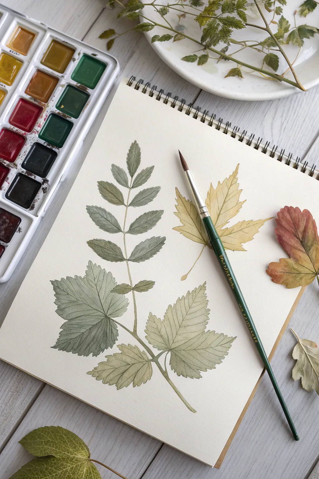
This delicate watercolor study captures the fragile beauty of fall foliage using a muted, natural palette. By focusing on the intricate vein structures and the subtle shifts in green and ochre, you will create a botanical spread that feels both scientific and artistic.
Step-by-Step
Materials
- Hot press watercolor paper (sketchbook format)
- Watercolor paints (Sap Green, Yellow Ochre, Burnt Umber, Indigo, Sepia)
- Round watercolor brushes (size 4 for filling, size 0 or 00 for veins)
- Pencil (HB or 2H)
- Kneaded eraser
- Jar of water
- Paper towels
Step 1: Sketching the Layout
-
Arrange your composition:
Begin by lightly sketching the placement of your three main leaf subjects. Position the large compound leaf (like a rowan or ash) on the left side, curving slightly inward. Place the maple-like leaf in the upper right quadrant. -
Refine the outlines:
Draw the detailed serrated edges of the leaves. Keep your pencil pressure very light so the graphite doesn’t show through the transparent watercolor later. -
Mark the veins:
Lightly sketch the central veins and the primary lateral veins branching off them. These lines will serve as your ‘negative space’ guides—you will be painting around them, not over them. -
Clean up:
Roll your kneaded eraser gently over the entire sketch to lift up excess graphite, leaving just a faint ghost image to guide your brush.
Lost Your White Lines?
If you accidentally painted over a vein you meant to keep white, don’t panic. Use a small flat brush dampened with clean water to gently scrub and lift the paint while it’s still damp.
Step 2: Painting the Compound Leaf
-
Mix your first green:
Create a watery mix of Sap Green with a tiny touch of Indigo to desaturate it. You want a cool, muted woodland green, not a bright lime. -
Paint the top leaflets:
Starting with the top leaflet of the compound leaf, paint the leaf blade but carefully leave the center vein unpainted (white paper). This is the negative space technique. -
Add wet-in-wet variation:
While the paint is still wet on the leaflet, drop in a tiny amount of watered-down Sepia near the base of the leaf to create depth. -
Continue down the stem:
Move to the lower leaflets on the left side. As you descend, slightly warm up your green mix by adding a touch of Yellow Ochre. Remember to leave those thin white lines for the veins. -
Paint the serrated edges:
Use the very tip of your size 4 brush to flick paint into the jagged edges of the leaves, ensuring they look organic and sharp, rather than rounded and blobby. -
Stem work:
Paint the main stem connecting the leaflets using a mix of Yellow Ochre and Sepia. Connect it carefully to the base of each leaflet.
Step 3: The Autumn Maple Leaf
-
Mix an ochre wash:
For the maple leaf on the right, mix a generous puddle of Yellow Ochre with plenty of water. -
Base layer:
Paint the shape of the maple leaf. Unlike the green leaf, you can paint a solid light wash first. Let this layer dry completely. -
Glazing the shadows:
Once dry, mix a slightly darker version of the ochre (add a speck of Burnt Umber). Paint roughly halfway up each leaf lobe, leaving the tips the original lighter color. -
Negative veining:
Using a slightly thicker, darker ochre mix and your smallest brush, paint the spaces *between* the veins, effectively carving out the vein structure with negative space rather than painting lines.
Pro Tip: Organic Edges
Real leaves are rarely perfect. Allow your hand to wiggle slightly when painting the outer edges to mimic natural imperfections and nibble marks, rather than making smooth, ideal curves.
Step 4: The Lower Berry Leaf
-
Gradient wash:
For the large, textured leaf at the bottom, mix a pale green that transitions into a brownish-yellow. I like to load the brush with green for the center and dip the tip in dirty water for the edges to fade it out. -
Section by section:
Paint this leaf in sections defined by the main veins. Paint one section, leave a hairline gap of dry white paper, and then paint the next section. -
Softening edges:
If a hard line forms where you don’t want it, quickly rinse your brush, blot it, and run the damp bristles along the edge to soften the transition.
Step 5: Final Details
-
Deepen the shadows:
Mix a dark green-grey (Sap Green + Sepia). Add tiny accents of this dark color where leaves overlap or where the stem meets the leaf blade to increase contrast. -
Refining veins:
If your white-paper veins look too stark or bright, wait for everything to be bone dry, then glaze a very watery, pale ochre over the entire leaf to tint the white lines.
Step back and admire how your careful negative painting has created a crisp, realistic botanical study full of light and texture
Plan a Painting With a Value Pattern Thumbnail
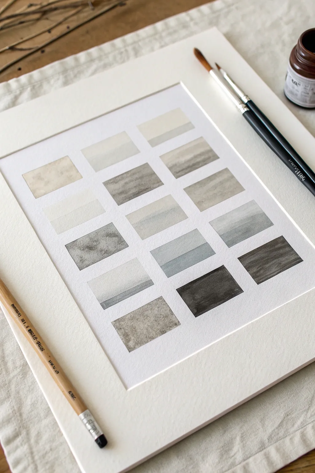
This disciplined exercise involves creating a grid of small, rectangular landscape thumbnails that explore the full range of tonal values using a single color. It serves as both a meditation on light and shadow and a practical tool for planning larger compositions, resulting in a minimalist piece of art suitable for framing.
How-To Guide
Materials
- High-quality watercolor paper (cold press creates nice texture)
- Pencil (HB or 2B)
- Ruler or T-square
- Painter’s tape or masking tape (low-tack)
- Black watercolor paint or black india ink
- Mixing palette with multiple wells
- Round watercolor brushes (sizes 2 and 6)
- Two jars of water (one for rinsing, one for clean water)
- Paper towels
- White mat board (optional, for final presentation)
Step 1: Setting the Grid
-
Paper preparation:
Begin by taping down your watercolor paper to a board or table to prevent buckling. Ensure the paper is perfectly flat before you start measuring. -
Drafting the layout:
Using a ruler and a light pencil touch, measure out a grid of rectangles. Aim for three columns and five or six rows. Leave roughly half an inch of space between each rectangle to keep the compositions distinctive. -
Defining the edges:
Carefully draw the final borders of each rectangle. Alternatively, you can mask off the borders with thin tape if you want extremely crisp, white edges between your studies, though freehanding within pencil lines offers a softer, more organic look.
Keep it Clean
Change your rinse water frequently. Dirty gray water will muddy your lighter washes and ruin the crisp contrast needed for effective value studies.
Step 2: Mixing Values
-
Creating the master wash:
Squeeze a generous amount of black pigment onto your palette. In a separate well, mix a very dark, concentrated wash that is almost pure black. -
Establishing the gradient:
Prepare at least four or five separate puddles of paint, progressively diluting each with more water. Your goal is a step-scale ranging from a tea-stained light gray to the deep midnight black you just mixed. -
Testing the tones:
I always keep a scrap piece of watercolor paper nearby to test these washes. The color will dry lighter than it looks wet, so ensure your darkest darks are truly saturated.
Uneven Drying?
If you get ‘cauliflowers’ or harsh back-runs, you likely added wet paint into a drying wash. Wait for the layer to be fully dry before glazing over it.
Step 3: Painting the Landscapes
-
Planning the horizons:
For each rectangle, decide on a simple horizon line. Vary the placement—some high, some low—to create visual interest across the grid. -
First layer: Sky and distance:
Start with your lightest wash. Apply this to the sky area or the most distant mountains in several of the rectangles. Let gravity help settle the pigment for a smooth gradient. -
Building the middle ground:
Once the first layer is damp (not soaking), introduce a mid-tone wash. Use this to suggest hills or water bodies in the center of the composition. -
Adding texture:
While the paper is still slightly wet in some boxes, drop in clear water or a slightly darker pigment to create ‘blooms’ that mimic clouds or rocky terrain. -
Creating the foreground:
Switch to your darker washes for the foreground elements. Paint broad, confident horizontal strokes to anchor the bottom of the rectangles. -
Dry brush technique:
For a rougher texture resembling dry earth or waves, wipe your brush on a paper towel until it’s nearly dry, pick up thick pigment, and drag it lightly across the paper tooth. -
Varying the contrast:
Ensure no two rectangles are identical. Make some ‘high key’ (mostly light values) and others ‘low key’ (mostly dark values) to explore different moods. -
Deepest darks:
Use your most concentrated black paint sparingly. Add it only to the deepest shadows or nearest compositional elements to create a strong focal point within the tiny frames.
Step 4: Finishing Touches
-
Drying completely:
Let the entire sheet dry naturally. Using a hair dryer can sometimes push the pigment around too much and ruin the subtle granulations. -
Erasing guidelines:
Once the paper is bone dry, gently erase visible pencil lines around the borders, being careful not to smudge the paint. -
Framing:
Place a pre-cut mat board over your work to see how the white space unifies the collection. This grid looks particularly striking when the mat window creates a generous border around the group.
Now you have a comprehensive chart of atmospheric perspectives that demonstrates the power of simplicity.
Paint a Photo as a Value Map Only
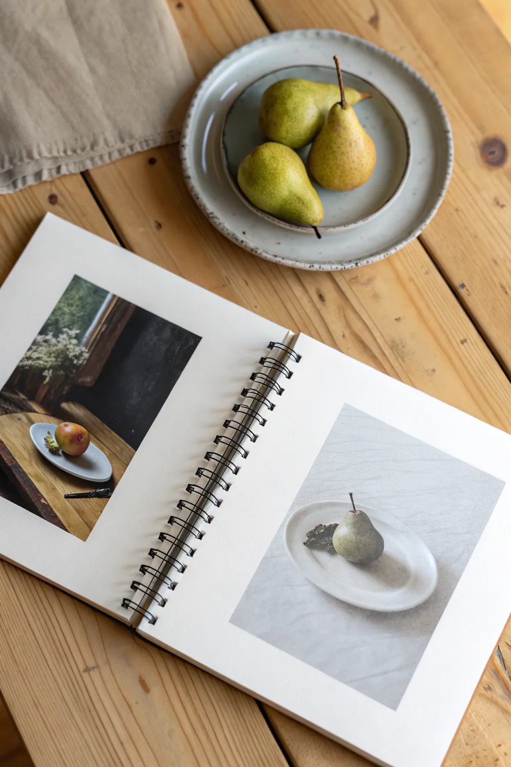
This exercise strips away the distraction of color to focus entirely on light and shadow, resulting in a striking, grisaille-style pear illustration. By painting a ‘value map’ of your subject, you’ll learn to see form through contrast rather than hue.
Detailed Instructions
Materials
- Heavyweight watercolor or mixed media sketchbook
- Pencil (HB or 2B) for light sketching
- Eraser (kneaded is best)
- Gouache or acrylic paint (Black and White)
- Water container and palette
- Flat synthetic brushes (sizes 6 and 10)
- Small round detail brush (size 2)
- Reference photo of a pear (or real pears set up in high contrast lighting)
Step 1: Preparation and Mapping
-
Prepare your workspace:
Set up your reference. If working from life like the photo, place a pear on a small plate near a window to create strong highlights and distinct cast shadows. If using a photo, desaturate it on your phone to see the grayscale values clearly. -
Sketch the composition:
Lightly draw the outline of the pear and the plate onto your sketchbook page. Keep pencil lines faint so they don’t show through later. -
Identify value zones:
Look closely at your reference. Mentally divide the image into three main zones: the brightest highlights, the mid-tone grays, and the deepest blacks. You can even lightly outline where the shadow shapes fall on your sketch.
Squint to See
Struggling to find the values? Squint your eyes tightly when looking at your subject. This blurs the details and color, turning the world into abstract shapes of light and dark.
Step 2: Mixing and Blocking
-
Create a value scale:
On your palette, mix your black and white paints to create four distinct puddles: pure white, light gray, dark gray, and pure black. Having these pre-mixed prevents muddiness later. -
Paint the background:
Using a larger flat brush (size 10), fill in the background area surrounding the plate. I prefer a very light gray wash here to ensure the bright white of the plate stands out. -
Block in the plate:
Paint the plate surface. Use pure white for the rim where the light hits, and a very pale gray for the shadowed side of the plate’s interior. -
Establish the cast shadow:
Switch to a dark gray mix. Paint the shadow cast by the pear onto the plate. Notice how this shadow anchors the object so it doesn’t look like it’s floating.
Step 3: Rendering the Form
-
Base coat the pear:
Apply a mid-tone gray over the entire body of the pear. This local value serves as the foundation for both shadows and highlights. -
Add core shadows:
While the base is still slightly damp (but not wet), use a smaller brush to add dark gray to the side of the pear facing away from the light. Blend the edge where the light meets the shadow for a soft, round appearance. -
Deepen the darkest values:
Use near-black paint for the deepest crevices, specifically right underneath the pear where it touches the plate and any bruising marks on the skin. -
Paint the stem:
Using your smallest round brush (size 2), paint the stem with a dark charcoal mix, adding a tiny sliver of light gray on one side to indicate its cylindrical shape. -
Apply highlights:
Clean your brush thoroughly. Pick up pure white paint and dab it onto the highest point of the pear’s curve. This specular highlight immediately makes the surface look shiny. -
Refine the plate edges:
Use white paint to clean up the edges of the plate rim, ensuring a crisp separation between the dish and the background cloth or table.
Try a Warm Underpainting
Before starting your grayscale painting, cover the paper with a wash of burnt sienna. Letting bits of this warm tone peek through the cool grays adds incredible vibration to the work.
Step 4: Finishing Touches
-
Evaluate contrast:
Step back and squint at your painting. If the pear looks flat, your darks might not be dark enough. Glaze a thin layer of black over the shadow side if needed. -
Add texture:
If your pear has speckles or texture, use a fairly dry brush to stipple tiny dots of dark gray over the mid-tone areas. -
Final drying check:
Let the piece dry completely. Gouache sometimes shifts in value as it dries—darks get lighter and lights get darker—so do one last touch-up if the contrast has faded.
Now you have a sophisticated monochromatic study that captures the weight and volume of the fruit simply through the power of value


Have a question or want to share your own experience? I'd love to hear from you in the comments below!