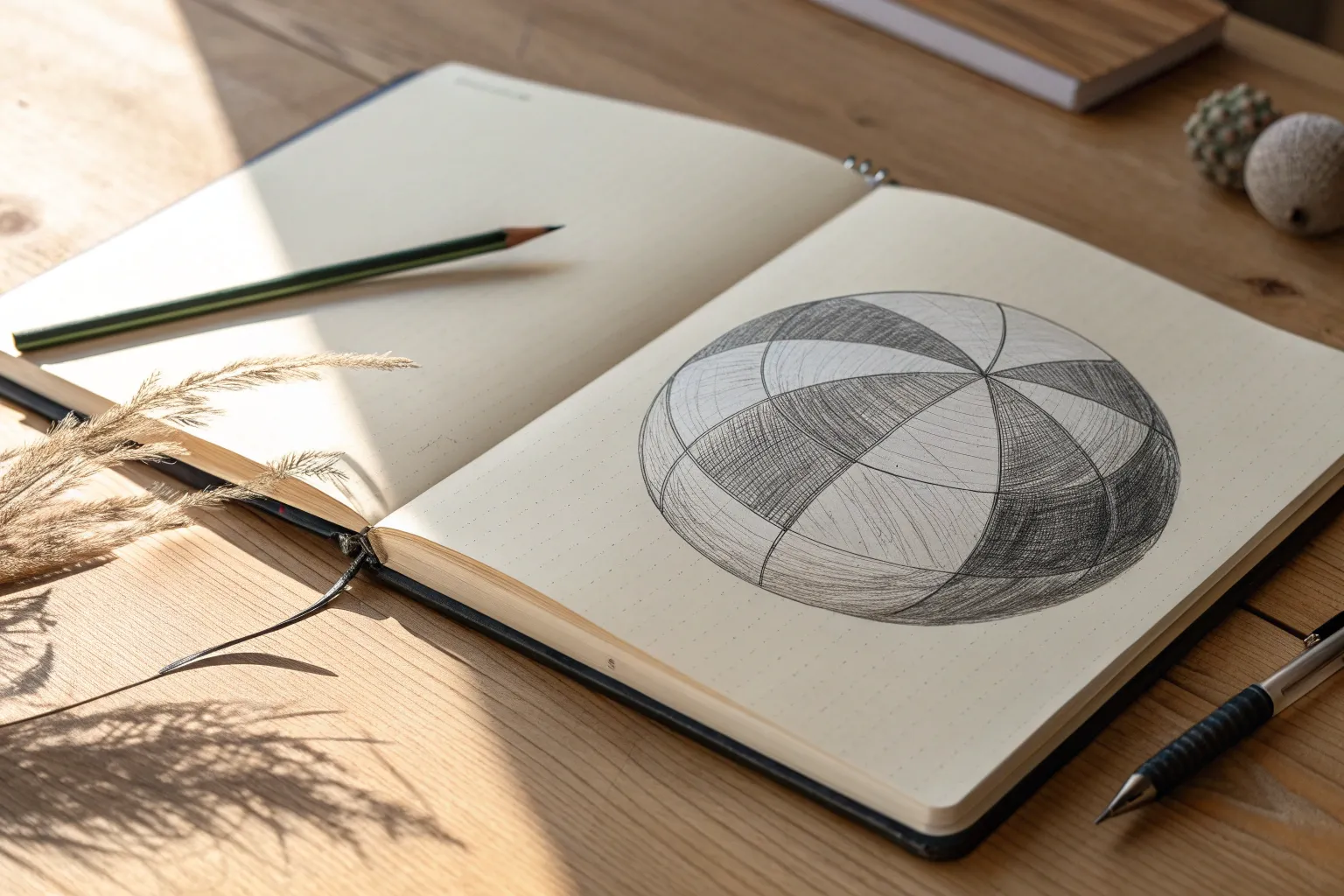
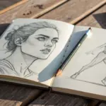
When you can control value from light to dark, everything you draw starts looking more solid and intentional. These value scale drawing ideas are the kind of practice I actually enjoy doing in my studio—structured enough to learn fast, but creative enough to stay fun.
5-Step Value Scale Strip
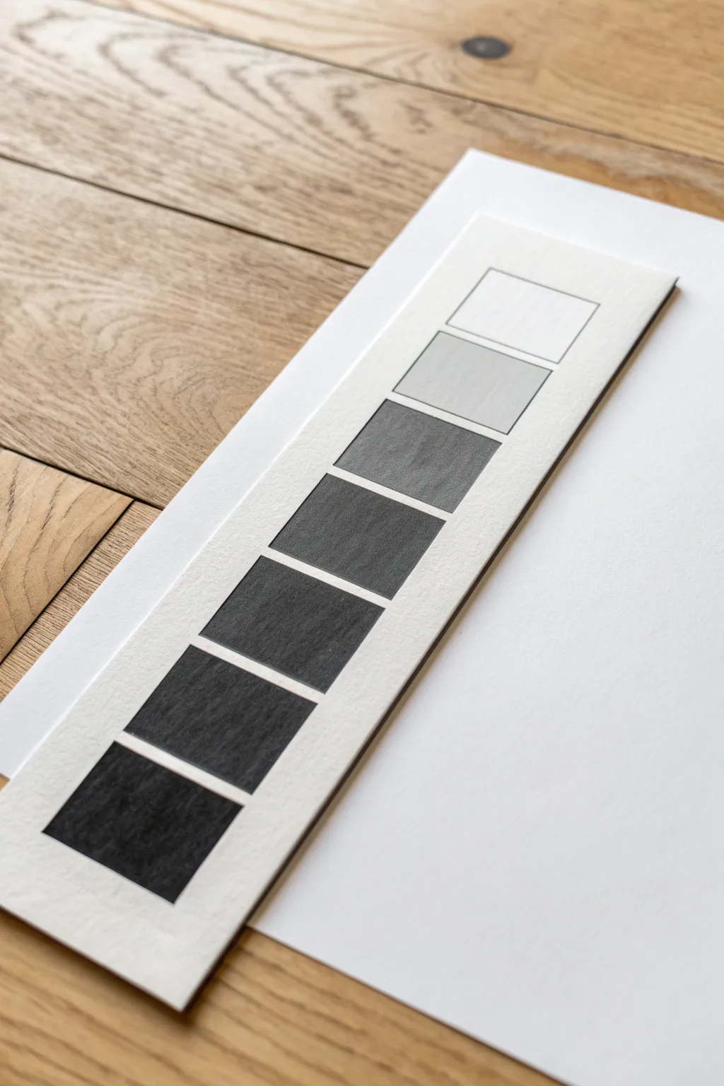
This classic exercise is the cornerstone of realistic shading, creating a clean, vertical gradient from white to black using simple graphite. You’ll produce a professional-looking reference tool on heavy quality paper that helps train your eye to distinguish subtle shifts in value.
Detailed Instructions
Materials
- Heavyweight drawing paper or Bristol board (smooth finish)
- Graphite pencils (HB, 2B, 4B, 6B recommended)
- Ruler
- Pencil sharpener
- Drafting tape or masking tape
- Kneaded eraser
- Drawing board or flat surface
- Paper cutter or scissors
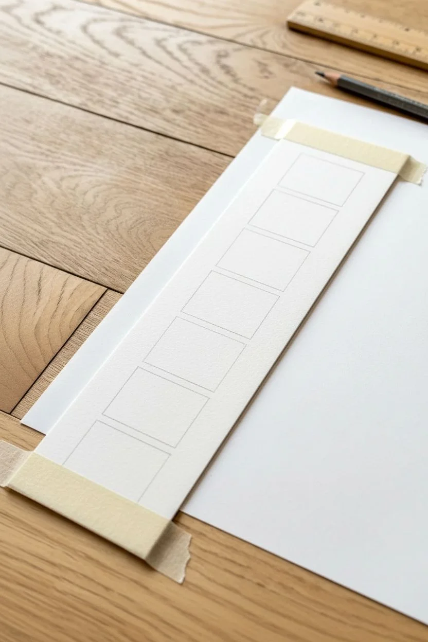
Step 1: Preparing the Base
-
Cut the strip:
Begin by cutting a long, narrow strip of your heavyweight paper. A width of about 2 to 2.5 inches works well, with a length of at least 10 inches to accommodate the scale comfortably. -
Measure the squares:
Using your ruler, lightly mark out seven equal squares down the center of the strip. Leave a small, consistent gap (about 1/8th inch) between each square to keep the values distinct. -
Outline the boxes:
Carefully draw the outlines of your seven squares using a hard pencil like an HB. Keep these lines very faint; you want them to guide you but eventually disappear into the darker shades. -
Clean the edges:
Erase any stray measurement marks outside the boxes so your workspace is clean. I find it helpful to tape the strip to my drawing board at the top and bottom to prevent it from shifting while I work.
Patchy Shading?
If your pencil strokes look uneven or scratchy, try shading in small, tight circles rather than back-and-forth lines. This fills the paper tooth evenly for a smoother texture.
Step 2: Establishing Extremes
-
Preserve the white:
Leave the very top square completely blank. This represents the white of the paper or the highest highlight in a drawing. -
Fill the blackest black:
Move to the bottom square. Using your softest pencil (6B or similar), fill this square in completely. Apply firm pressure, but layer it rather than gouging the paper. -
Layering for density:
Go over the bottom square a second time in a different direction (cross-hatching) to eliminate any white specks of paper grain. This needs to be your absolute darkest value. -
Clean up borders:
Use a straight edge or a piece of scrap paper as a shield to ensure the edges of your black square remain crisp and sharp.
Go Digital
Once mastered, scan your strip and greyscale it in photo editing software. Use it as a digital reference layer when digital painting to check your values accurately.
Step 3: Building the Middle Values
-
Find the middle grey:
Locate the middle square (the 4th one down). This should be a true 50% grey. -
Shade the middle:
Using a B or 2B pencil, lightly shade this square. Aim for a tone that feels perfectly halfway between your white top square and black bottom square. -
Evaluate the step:
Step back and squint at your strip. If the middle square looks too light, add another gentler layer of graphite. If it’s too dark, lift some graphite with your kneaded eraser.
Step 4: Refining the Transition
-
Bridge light to mid-tone:
Now tackle the two squares between white and middle grey. The second square (below white) should be a very faint whisper of grey. Use an HB pencil with light pressure. -
Add the light-mid tone:
Fill the third square. This tone needs to sit exactly between the whisper-grey and your middle grey. Layer gently until the step feels even. -
Bridge mid-tone to black:
Move to the squares between middle grey and black. For the fifth square, darken your pressure slightly using a 2B or 4B pencil. -
Create the dark grey:
Fill the sixth square (the one just above black) with a 4B pencil. It should be very dark, clearly distinct from black but definitely darker than the square above it. -
Uniform direction:
Try to shade all squares using tight, small strokes in one consistent direction—vertical or horizontal—to maintain a neat, unified texture. -
Final check:
Review the entire strip. The transition from white to black should look like a smooth staircase, with no sudden jumps in darkness between neighbors. -
Clean up:
Use your eraser to clean up any graphite smudges on the white border of the strip to make the grid pop vividly.
You have constructed a precise visual tool to reference for future shading projects


10-Step Value Scale Challenge
This fundamental exercise is the backbone of realistic drawing, teaching you to control pressure and understand tonal relationships. You’ll create a clean, vertical strip of rectangular swatches that transition seamlessly from the white of the paper to a deep, rich black.
Step-by-Step Tutorial
Materials
- H lead pencil (or hard pencil)
- HB or 2B graphite pencil
- 4B or 6B soft graphite pencil
- High-quality drawing paper or cardstock
- Ruler
- Eraser (kneaded preferred)
- Scrap paper (for hand rest)
Step 1: Preparation & Layout
-
Measure your column:
Begin by using your ruler to draw a long, vertical rectangle on your drawing paper. A standard size is about 2 inches wide by 10 inches long, but you can adjust this to fit your paper. -
Divide into sections:
Mark off ten equal sections along the vertical length. If you made your strip 10 inches long, mark every inch. -
Create the grid:
Use your ruler to draw horizontal lines across the rectangle at each mark, creating ten stacked boxes. Keep these lines very light so they can disappear or be incorporated later. -
Clean the edges:
Double-check your corners. If any lines extend past the rectangle’s border, gently erase them now to ensure a crisp final look. -
Label your scale:
Lightly number the boxes next to the drawing, starting with ‘1’ at the top (white) and ’10’ at the bottom (black). This helps you stay oriented as you shade.
Patchy Shading?
If your pencil strokes look scratchy, try shading in small circular motions (scumbling) rather than back-and-forth lines. This fills the paper’s ‘tooth’ more evenly.
Step 2: The Lightest Values (Steps 1-4)
-
Leave the top blank:
Box 1 represents the pure white of the paper. Do not make a single mark in this top square. It sets the baseline for your highest highlight. -
Start the second step:
For Box 2, switch to your hardest pencil (H). Holding the pencil far back on the shaft for light pressure, gently stroke across the box. You want a barely-there whisper of grey. -
Build Box 3:
Moving to the third box, apply slightly more pressure or add a second layer of hatching with your H pencil. Ensure strictly vertical or diagonal strokes to keep the texture consistent. -
Establish Box 4:
Continue with the H or switch to an HB pencil. Shade Box 4 so it is distinctly darker than Box 3. Step back often to compare the first four levels relationships.
Try a Seamless Blend
Once comfortable with boxes, try drawing a second rectangle next to it. Recreate the same values, but blend them smoothly without any separating lines.
Step 3: The Mid-Tones (Steps 5-7)
-
Protect your work:
Place a clean scrap piece of paper under your drawing hand. This prevents the natural oils on your skin from smudging the graphite you’ve already laid down. -
Find the middle value:
Box 5 is your ‘true middle grey.’ Using your HB or 2B pencil, layer your strokes. I like to cross-hatch here—going diagonally one way, then the other—to build a solid, even tone. -
Deepen the grey:
For Box 6, increase pressure slightly with the 2B pencil. The jump in darkness should look equal to the jump between the previous squares. -
Transition to darks:
Box 7 requires significantly more graphite. Start laying down a base layer with the HB, then go over it firmly with the 2B to create a dark, stormy grey.
Step 4: The Darkest Values (Steps 8-10)
-
Switch to soft lead:
Pick up your 4B or 6B pencil for the final few boxes. These soft leads deposit more graphite with less effort. -
Shade Box 8:
Fill Box 8 with a heavy application. It should be dark, but you should still be able to go darker. -
Approach near-black:
For Box 9, press firmly. Create a dense, shadowy value that is just one step shy of total blackness. -
Commit to pure black:
In Box 10, use your softest pencil (6B) and apply maximum pressure without breaking the tip. Go over the area multiple times until the paper tooth is completely filled and no white specks remain. -
Refine the edges:
Take your ruler and eraser one last time. erase any smudges outside the main rectangle to make the value scale pop against the white background.
With your finished scale, you now have a customized reference tool to help gauge depth in your future drawings
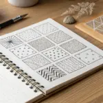
Stippling Value Scale Dots
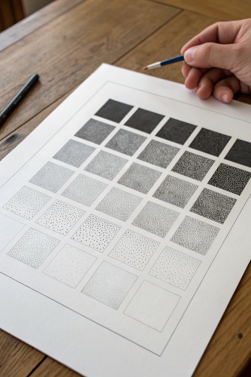
This technical drawing exercise uses the art of stippling—creating images with thousands of tiny dots—to build a comprehensive value scale. The finished piece demonstrates how density creates depth, resulting in a satisfying gradient from airy white to solid black.
Step-by-Step
Materials
- High-quality drawing paper (smooth bristol or hot press watercolor paper recommended)
- Pencil (HB or 2H)
- Ruler or T-square
- Fine liner pens (sizes 0.05, 0.1, 0.3, and 0.5)
- Eraser (kneaded or white vinyl)
- Tape (masking or painters tape)
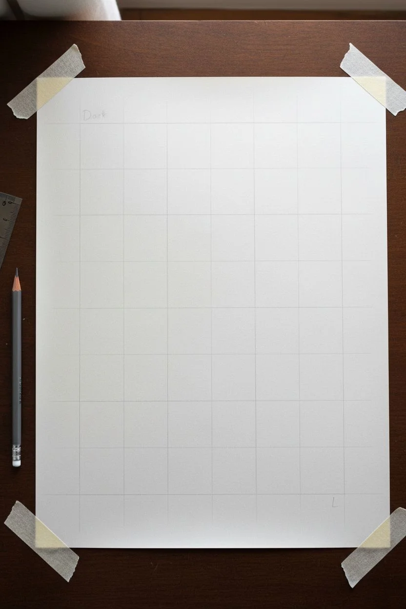
Step 1: Setting the Grid
-
Paper Preparation:
Secure your drawing paper to a flat surface using masking tape on the corners to prevent shifting while you work. -
Margin Measurement:
Using your ruler, measure a generous margin around the edge of the paper to center your work area nicely. -
Grid Layout:
Mark out a large grid structure. Looking at the reference, you want about 25 to 30 squares total, arranged in a neat block. 2×2 inch squares work well for this level of detail. -
Drawing the Lines:
Lightly draw the grid lines using your pencil. Keep the pressure very light, as you will want to erase these graphite lines later without leaving indentations. -
Defining the Scale:
Decide on your gradient direction. The example moves diagonally or in steps from the bottom right (lightest) to the top left (darkest). Lightly mark an ‘L’ for light and ‘D’ for dark in the corner squares as a guide.
Step 2: The Stippling Process
-
Base Layer – Light Tones:
Start with your finest pen (0.05). In the lightest squares, place dots very sparsely. Keep your hand relaxed and try to space them randomly rather than in rows. -
Building Mid-Tones:
Move to the middle section of your grid. Switch to a 0.1 size pen to speed up coverage slightly. Create a moderate density of dots, ensuring white space is still clearly visible between them. -
Developing Shadow:
For the darker squares, increase the density significantly. You want the dots to start clustering close together, but not quite touching yet. -
Creating True Blacks:
In the darkest squares (top left in the reference), use your 0.3 or 0.5 pen. Layer dots repeatedly until they merge into a solid or near-solid black mass. -
Refining the Gradient:
Look at the transition between squares. If the jump in value feels too sudden, go back to the lighter square and add a few more dots to bridge the gap. -
Edge Control:
Pay special attention to the edges of each square. I find that placing dots right along the pencil line helps define the sharp square shape without needing an outline.
Hold It Straight
Keep your pen perpendicular to the paper creates round dots. Angled holding creates tiny ‘ticks’ or dashes.
Step 3: Finishing Touches
-
Ink Drying Time:
Let the drawing sit for at least 30 minutes. Stippling creates pools of ink that take longer to dry than normal writing. -
Erase Grid Lines:
Gently erase the pencil grid lines. Be careful around the darkest squares where the heavy ink might smear if not totally dry. -
Final Assessment:
Step back and squint your eyes at the chart. The values should flow smoothly from light to dark without any jarring visual jumps. -
Touch-ups:
Fill in any white patches in your dark areas or add single dots to light areas that look too empty.
Shape Shifting
Try doing this same value scale inside circles, triangles, or organic blob shapes for a modern art twist.
Now you have a precise reference tool for future ink drawings

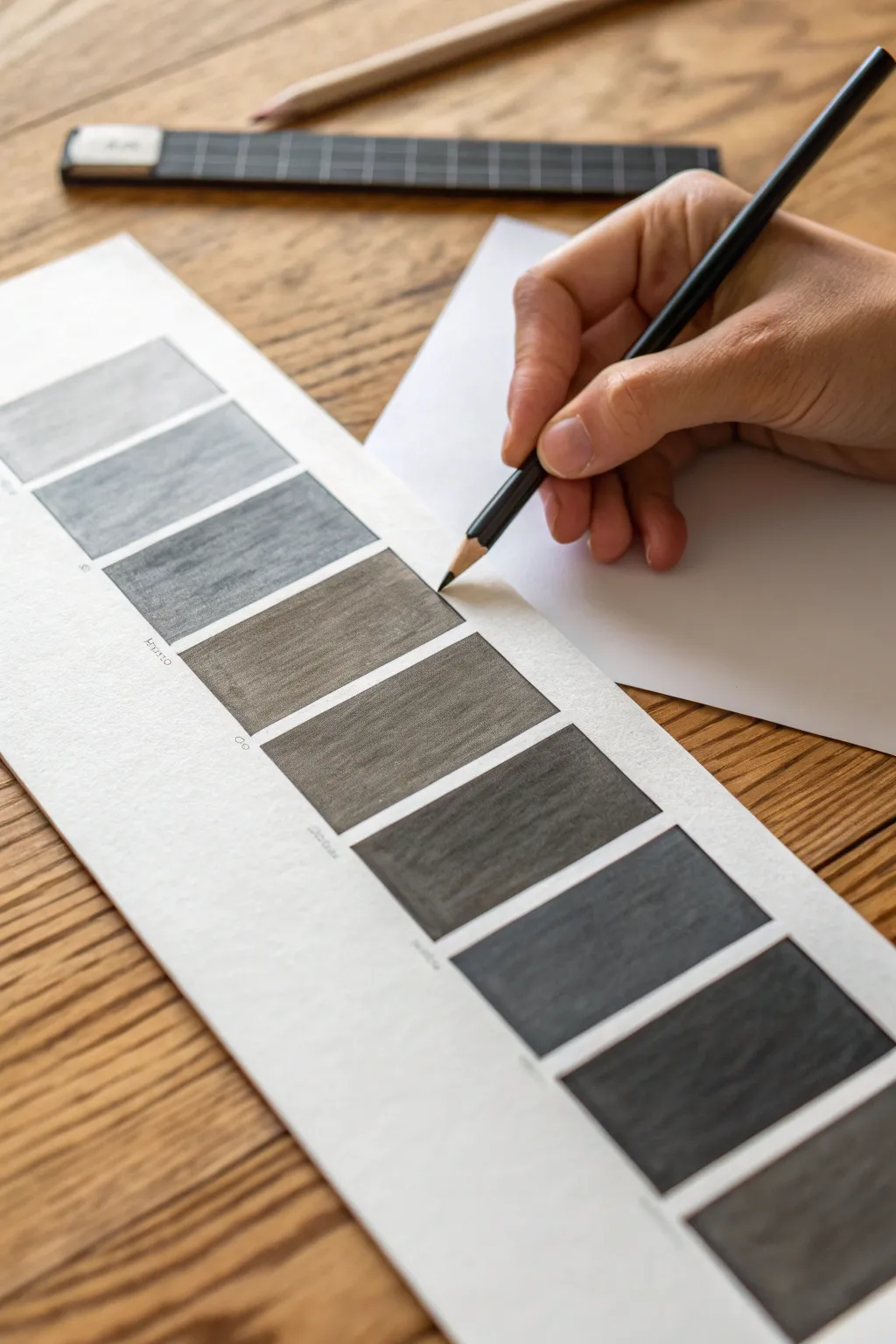
Toned Paper Value Scale (Light and Dark)
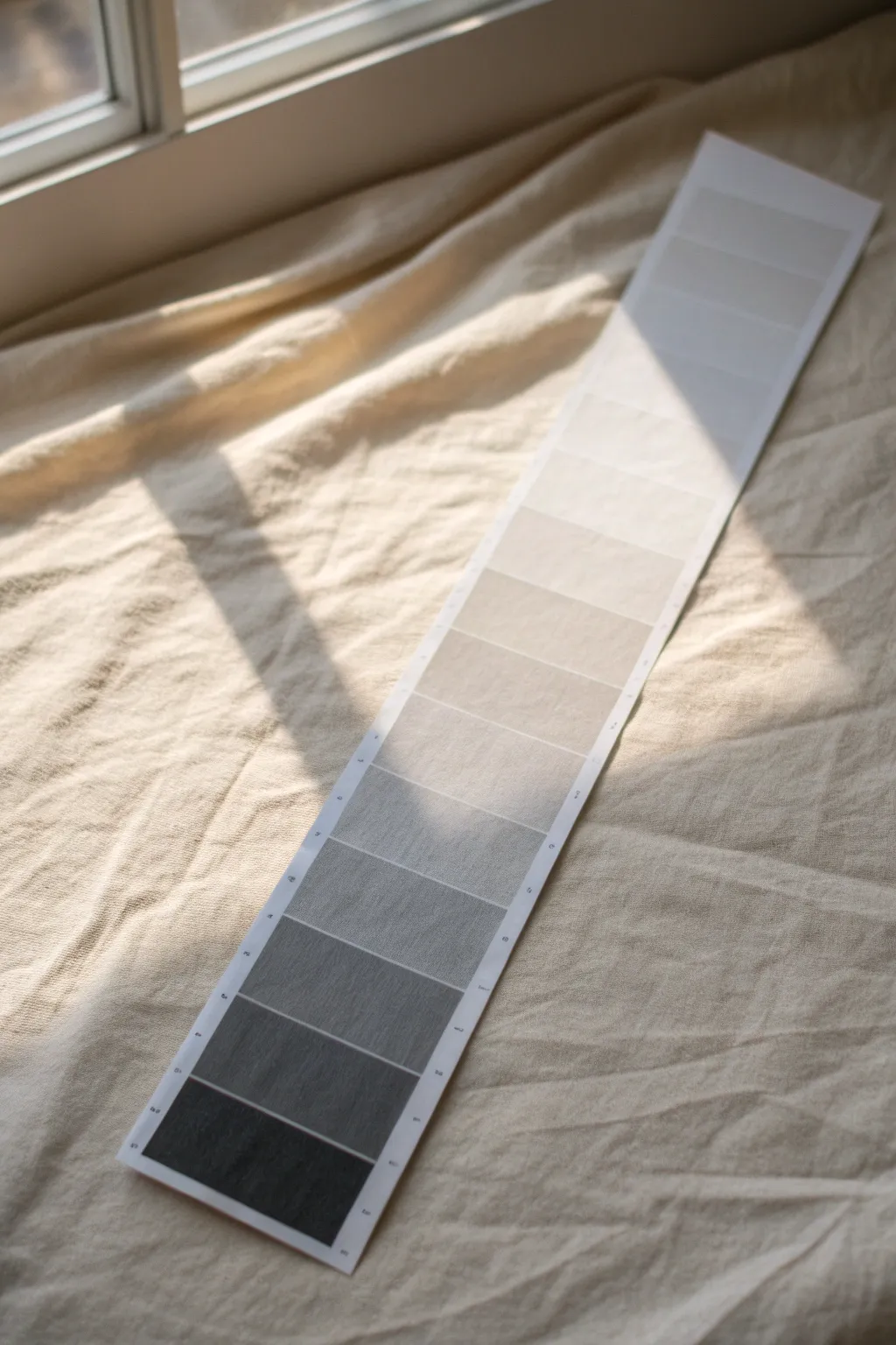
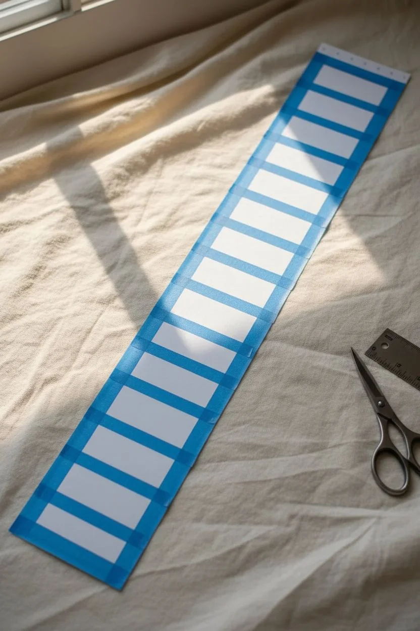
This essential drawing exercise involves creating a precise 10-step value scale on a long strip of paper. The result is a clean, professional gradient tool that helps you understand the full range of light to dark tones in your future artwork.
How-To Guide
Materials
- Heavyweight drawing paper or cardstock (white)
- Ruler
- Graphite pencils (ranging from 6B to 4H)
- Painter’s tape or drafting tape
- Eraser (kneaded)
- Stumps or tortillions (optional for blending)
- Craft knife or scissors
Step 1: Preparation and Layout
-
Cut the strip:
Begin by cutting a strip of your paper to approximately 2.5 inches wide and 12-14 inches long. A craft knife and ruler will give you the cleanest edges. -
Mark the increments:
Using your ruler, lightly mark off ten equal sections down the length of the strip. 1-inch squares work perfectly for this size. -
Tape the borders:
Apply strips of painter’s tape along the long vertical edges of your paper strip. This masking technique ensures crisp, straight borders for your value boxes. -
Create distinct boxes:
If you want white space between each tone, place thin strips of tape horizontally over your pencil marks. Alternatively, you can draw hard lines with a ruler to separate the boxes. -
Label the scale:
Lightly number your boxes 1 through 10 in the margin (on the tape is best), establishing that 1 will be your absolute white and 10 will be your absolute black.
Step 2: Filling the Values
-
Establish the extremes:
Start with box #10. Using your softest pencil (6B or 8B), fill this box completely. Press firmly but avoid tearing the paper to achieve a rich, pitch-black tone. -
Leave the highlight:
Identify box #1; leave this completely untouched to represent the white of the paper. This is your reference point for the lightest light. -
Find the middle grey:
Move to box #5. Using an HB or B pencil, shade this square to a medium grey. It should look perfectly halfway between your blackest black and white paper. -
Fill the darks:
Work backward from box #9 to #6. Gradually decrease the pressure and switch to slightly harder pencils (like 2B or 4B) as you move up the scale away from the black end. -
Check the dark gradient:
Pause to compare neighbors. Box #9 should be just slightly lighter than #10, and #6 should be just slightly darker than your middle grey #5. -
Fill the lights:
Now work from box #2 to #4 using harder pencils (H or 2H). Use a light circular motion to apply graphite without indenting the paper. -
Refine the transitions:
Squint your eyes at the scale. If any two steps look too similar, darken the higher number slightly to increase the contrast. -
Clean up edges:
Carefully peel away the painter’s tape. Pull it away from the drawing area at a 45-degree angle to prevent tearing the paper surface.
Squint Test
To judge values accurately, squint your eyes until the image blurs. This removes detail and lets you see only the light and dark relationships.
Step 3: Refinement
-
Add numbering:
Once the tape is removed, use a fine-tip pen or sharp pencil to neatly number the steps 1-10 in the clean margin alongside each box. -
Erase smudges:
Take your kneaded eraser and dab away any stray graphite thumbprints or dust from the white margins to ensure a professional presentation.
Create a Gradient
Try repeating this exercise but remove the dividing lines completely. Create a smooth, seamless flow from black to white without any visible jumps.
You now have a reliable reference tool to help determine value depth in all your sketches

PENCIL GUIDE
Understanding Pencil Grades from H to B
From first sketch to finished drawing — learn pencil grades, line control, and shading techniques.
Explore the Full Guide
Three-Value Notan Value Scale Sketch
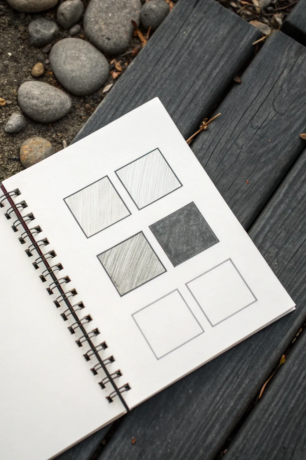
This fundamental exercise explores shading density and tonal values using simple geometric constraints. By filling small squares with varying degrees of graphite, you’ll create a clean, minimalist study that trains your eye to distinguish between light, middle, and dark tones.
Step-by-Step Guide
Materials
- Sketchbook with heavy-weight paper (spiral bound preferred)
- Graphite pencils (HB, 2B, 4B recommended)
- Ruler or straightedge
- Fine-liner pen (black, 0.5mm)
- Kneaded eraser
- Pencil sharpener
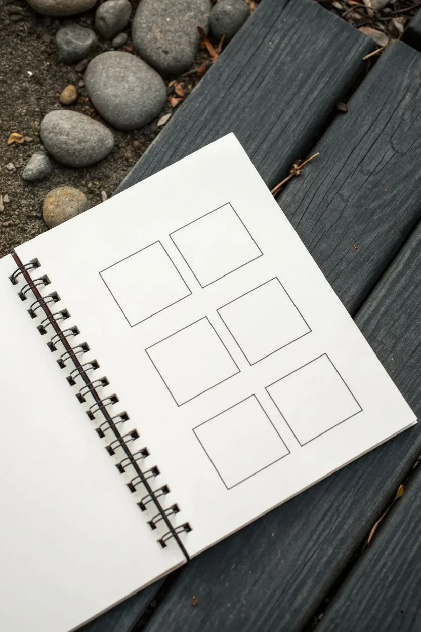
Step 1: Preparation and Layout
-
Open your workspace:
Place your sketchbook on a flat, stable surface. While the photo shows an outdoor setting, ensuring you have a steady hand is crucial for straight lines. -
Measure the grid:
Decide on the size of your squares. A 1.5-inch or 2-inch square works well. You will need to draw six squares in total, arranged in two columns of three. -
Mark the corners:
Using a ruler and a light pencil touch, mark dots where the corners of each square will be. Ensure uniform spacing between the squares—about half an inch looks balanced. -
Draw the frames:
Connect your corner marks using a ruler and a graphite pencil first to ensure they are perfectly square. Start with light pressure so mistakes are easily erased. -
Ink the outlines:
Once satisfied with the positioning, go over the pencil lines with a 0.5mm black fine-liner pen. This creates a crisp borders that will contain your shading. -
Clean up:
Allow the ink to dry completely to avoid smudging, then gently erase the underlying graphite guidelines with the kneaded eraser.
Uneven Shading?
If your pencil strokes look too scratchy, use a paper blending stump or a tissue wrapped around your finger to gently soften the texture for a smoother look.
Step 2: Shading Values
-
Analyze the pattern:
The goal is to leave the bottom two squares completely white (paper white) and fill the others with varying gradients. The top row will be light values, and the middle row will be darker values. -
Start with top-left (Light Value):
Using an HB pencil, apply very light pressure. Draw diagonal hatching lines from the top right to bottom left. Keep significant spacing between lines to keep the value high-key. -
shade top-right (Light-Mid Value):
Move to the square beside it. Use the same HB pencil but slightly increase the density of your hatching lines. They should still be distinct lines, not a solid block, but closer together than the first box. -
Approach the middle-left (Mid-Dark Value):
Switch to a 2B pencil. Begin applying diagonal strokes with moderate pressure. You can cross-hatch here (layering lines in opposing directions) to build up a darker grey tone. -
Refine the mid-tone:
Go back over the middle-left square. Smooth out the texture slightly so it reads as a solid grey rather than just lines. -
Tackle the middle-right (Dark Value):
For the darkest square, use a 4B or 6B pencil. Apply heavy pressure to fill the square completely. The goal is a deep, rich charcoal grey or near-black. -
Solidify the darks:
Layer the graphite in the dark square multi-directionally. I find that moving the pencil in tiny circular motions helps eliminate white paper grain showing through. -
Clean the edges:
Check the perimeters of your shaded squares. If any graphite went outside the ink lines, carefully erase it for a sharp presentation. -
Leave the bottom row:
Ensure the bottom two squares remain pristine and untouched. This negative space is essential for the full value scale comparison.
Level Up: Gradient Flow
Instead of distinct squares, try this exercise again but create a seamless gradient flow from dark to light within a single long rectangle.
Enjoy the satisfying contrast between your crisp geometric lines and the organic textures of the graphite
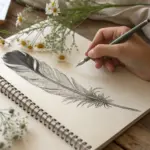
Feather Segments as a Value Scale
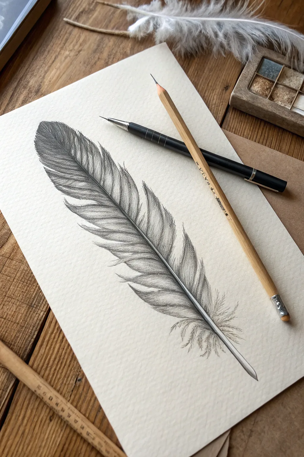
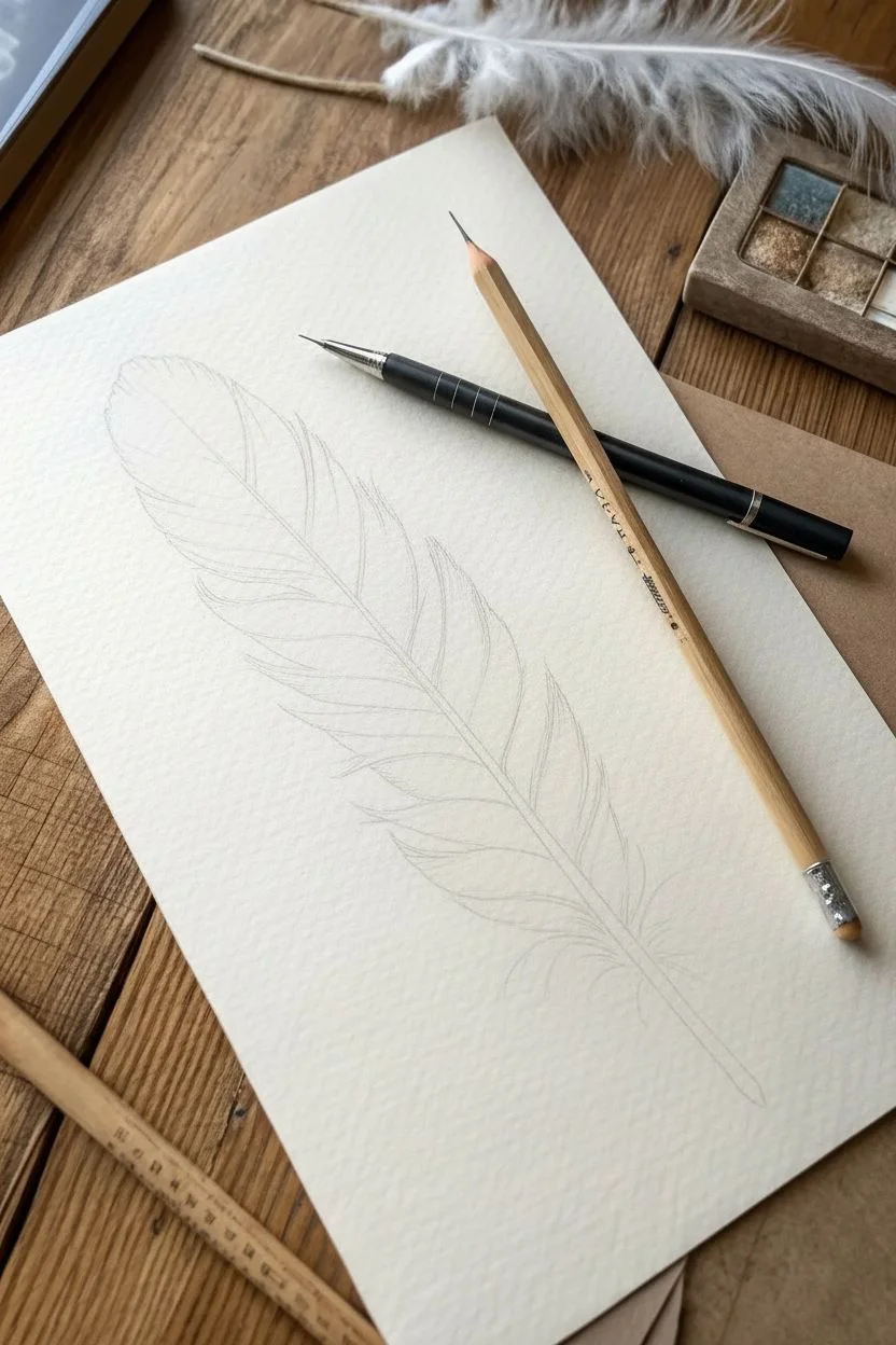
This project transforms a simple natural object into a stunning study of light and shadow, using the segmented barbs of a feather to practice value control. The result is a highly realistic, delicate drawing that looks ready to lift off the page.
Step-by-Step Guide
Materials
- High-quality textured drawing paper (cold press watercolor paper or textured sketch paper works well)
- Graphite pencils (HB, 2B, 4B, and 6B)
- Fine-point mechanical pencil (0.5mm or 0.3mm for details)
- Kneaded eraser
- Blending stump (tortillon)
- Ruler (optional for initial scaling)
Step 1: Laying the Foundation
-
Establish the spine:
Begin by lightly sketching a long, slightly curved diagonal line across your paper. This represents the rachis, or the central shaft of the feather. Make it thicker at the bottom and tapering off to a fine point at the top. -
Outline the silhouette:
Using an HB pencil with very light pressure, draw the outer boundary of the feather. Don’t make it a perfect oval; allow for natural irregularities where the barbs might separate. -
Define the splits:
Identify a few key areas along the edges where the feather naturally splits. Draw these V-shaped notches gently into your silhouette to break up the solid shape.
Keep it clean
Place a scrap piece of paper under your hand while you draw. This prevents your palm from smudging the graphite you’ve already laid down.
Step 2: Building Value and Texture
-
Directional mapping:
Before shading, lightly draw faint guide lines extending from the central shaft to the edge. These lines should curve upward slightly, indicating the direction the barbs flow. -
Start the darks:
Switch to a 4B pencil. Begin at the top left tip of the feather, which is naturally the darkest area in this composition. Lay down strokes following your directional guide lines. -
Create the segments:
Treat each section between your ‘splits’ as an individual value scale. The area closest to the central shaft is generally darker, lightening slightly as you move outward, then darkening again at the very edge. -
Refining the quill:
Darken the central shaft, but leave a thin sliver of white paper running down its length to represent a highlight. This simple trick instantly makes the quill look round and three-dimensional. -
Mid-tone shading:
Transition to a 2B pencil for the middle section of the feather. Use quick, flicking strokes that start firm at the shaft and lift off the paper as you move outward to create a feathery texture.
Step 3: Detailing and Refining
-
Textural layering:
Go back in with your mechanical pencil. Draw individual fine lines over your shaded areas to simulate distinct barbs. I find this creates that believable fibrous look. -
Enhancing contrast:
Take your 6B pencil and deepen the deepest shadows, particularly right next to the central shaft and in the V-shaped splits. High contrast is what makes the drawing pop. -
Softening the down:
At the very base of the feather, the barbs turn into fluffy down. Use a scribbling motion with an HB pencil, keeping the marks loose and chaotic rather than straight and orderly. -
Smooth the transitions:
If any area looks too scratchy, gently use a blending stump to smooth the graphite, but use it sparingly so you don’t lose the texture of the paper.
Too flat?
If the feather looks stiff, check your stroke direction. Every single pencil stroke should follow the curve of the barb, flowing away from the central shaft.
Step 4: Final Touches
-
Clean the edges:
Use your kneaded eraser to dab away any graphite dust that has strayed outside the feather’s silhouette. -
Highlight recovery:
Mold your kneaded eraser into a fine point and lift out tiny highlights along the upper edges of the separate feather segments to suggest light catching the texture. -
Final assessment:
Step back and check your values. Ensure there is a clear difference between your darkest darks at the shaft and the lighter grays at the feathery tips.
Now you have a delicate, realistic feather study that showcases your mastery of value and texture


Have a question or want to share your own experience? I'd love to hear from you in the comments below!