
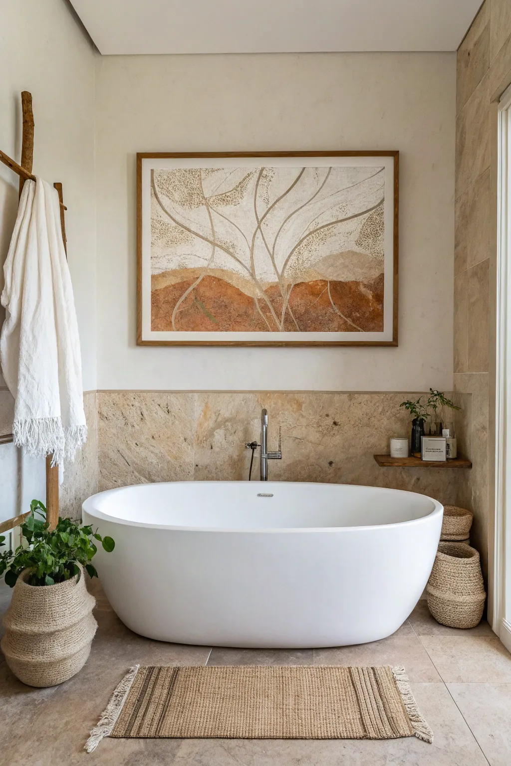
Bathroom walls are the perfect place to sneak in a little art—especially because even tiny changes can make the whole space feel calmer, brighter, and more like you. I’m sharing my favorite bathroom wall art ideas that look great, fit awkward spaces, and can handle those steamy daily routines.
Soft Botanical Prints for a Spa-Like Mood
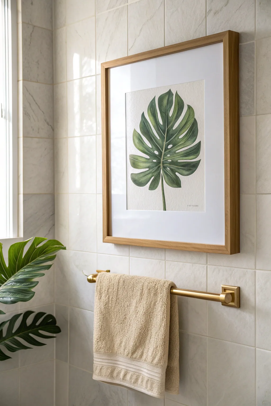
Capture the serenity of a spa retreat with this elegant monstera leaf painting, featuring soft green gradients and realistic veining. This botanical watercolor project uses layering techniques to achieve depth and a professional illustration quality that perfectly complements a calming bathroom aesthetic.
How-To Guide
Materials
- Hot press watercolor paper (140lb/300gsm)
- Watercolor paints (Sap Green, Hooker’s Green, Prussian Blue, Burnt Umber)
- Round watercolor brushes (Size 2, 6, and 10)
- HB Pencil
- Kneaded eraser
- Masking fluid (optional)
- Two jars of water
- Palette
- Paper towels
- Wooden picture frame (light oak finish)
- Mat board (white or off-white)
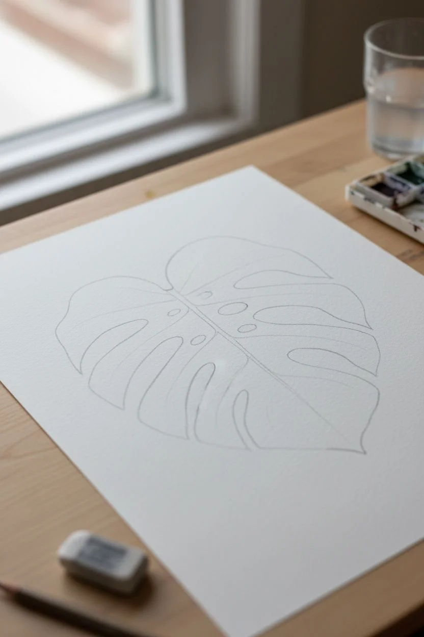
Step 1: Drafting the Leaf
-
Map the central vein:
Start by lightly sketching a curved line down the center of your paper to act as the midrib stem of the leaf. -
Outline the heart shape:
Draw a large heart-like shape around the stem, keeping the lines faint so they don’t show through the paint later. -
Carve the fenestrations:
Sketch the deep splits (fenestrations) characteristic of a monstera leaf, cutting into the heart shape towards the center vein without touching it. -
Add internal holes:
Drawing a few oval holes near the midrib adds variety and realism to the composition. -
Refine the edges:
Go over your outline to finalize the shape, then use the kneaded eraser to lift almost all the graphite until only a ghost image remains.
Vein Precision
If negative painting is tricky, use masking fluid to draw the fine veins first. Rub it off after painting for crisp white lines, then glaze over with pale green.
Step 2: Layering Guidelines
-
Mix your base green:
Create a watery wash of Sap Green with a tiny touch of Burnt Umber to dull the brightness slightly. -
Apply the first wash:
Using the size 10 brush, fill in the entire leaf shape with this tea-consistency wash, working quickly to avoid hard edges. -
Allow to dry:
Let this initial layer dry completely; the paper should feel cool but not damp to the touch. -
Map the veins:
With a very faint pencil line or just brush visualization, mark where the secondary veins will branch out from the midrib.
Level Up: Texture
For a vintage scientific look, use very creamy, thick gouache for the final details to add opaque highlights on the glossy parts of the leaf.
Step 3: Building Depth and Detail
-
Mix a shadow color:
Prepare a darker mix using Hooker’s Green and a little Prussian Blue for the shadowed areas. -
Paint vein sections:
Working on one small section between veins at a time, apply the darker green near the midrib and fade it outward using a clean, damp brush. -
Leave the veins light:
Crucially, leave a thin sliver of the pale first wash unpainted where the veins are; this negative painting technique creates the structure. -
Build saturation:
Continue section by section, adding more pigment to the areas where the leaf dips or overlaps to suggest undulation. -
Softening edges:
I prefer to run a clean, damp brush along the outer edges of the wet paint to ensure the transition to the light vein is soft, not harsh.
Step 4: Final Touches and Framing
-
Darken the deepest shadows:
Mix your darkest green yet and apply tiny accents right next to the central stem and under any overlapping folds for high contrast. -
Paint the stem:
Paint the vertical stem using a gradient, keeping one side lighter to suggest a cylindrical light source. -
Final drying:
Allow the artwork to dry overnight to ensure no moisture remains before framing. -
Matting the artwork:
Place your painting behind a wide white mat board to give it that gallery-style breathing room. -
Mount in frame:
Secure the matted artwork into a light oak wooden frame to match the warm, natural bathroom tones.
This serene piece of greenery will bring a fresh, organic breath of life to your bathroom sanctuary
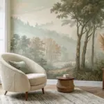
One Oversized Statement Piece Above the Tub
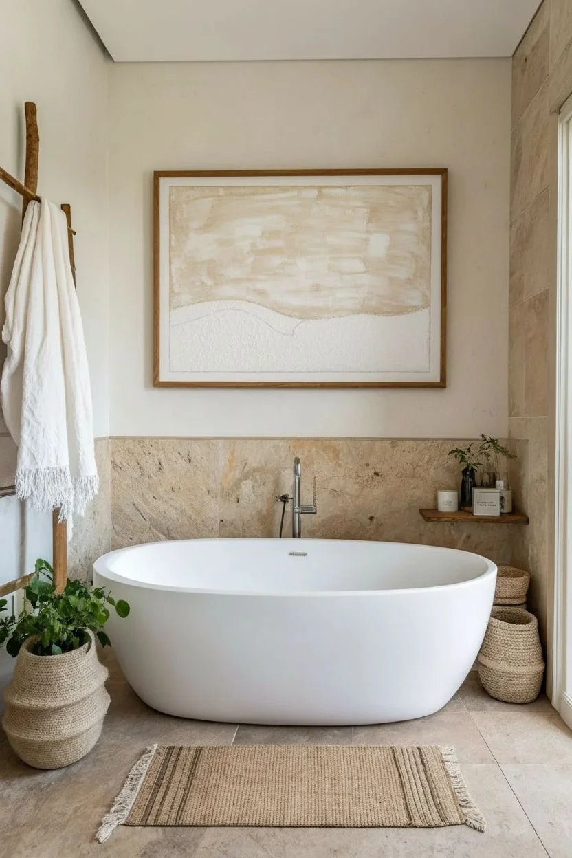
Bring the calming essence of nature into your bathroom with this large-scale abstract botanical piece. Featuring warm terracotta tones, textured neutrals, and flowing organic lines, this artwork mimics the look of a high-end designer print using simple acrylic techniques.
Detailed Instructions
Materials
- Large canvas (e.g., 36×48 inches)
- Acrylic paints (Terracotta/Burnt Sienna, Raw Umber, Titanium White, Cream/Unbleached Titanium, Deep Green)
- Texturing medium or coarse pumice gel
- Large flat brushes (2-3 inch)
- Round synthetic brushes (sizes 4 and 6)
- Sea sponge for texture
- Pencil and eraser
- Palette or large plate for mixing
- Painter’s tape (optional)
- Matte varnish spray
Step 1: Planning and Background
-
Prepare the canvas:
Start by wiping down your large canvas to ensure it is free of dust. If you want a more textured base, mix a bit of texturing medium with white gesso and apply a thin, uneven layer over the entire surface. Let this dry completely before painting. -
Sketch the composition:
Using a light pencil, loosely sketch out the main color zones. Draw a wavy, horizontal horizon line about one-third of the way up from the bottom to separate the ‘earth’ from the ‘sky’. Then, lightly trace the flowing, vine-like branches reaching upward from the center. -
Mix the sky color:
Create a warm, creamy neutral for the upper background. Mix Titanium White with a generous amount of Cream or Unbleached Titanium. You want a color that feels like aged paper or limestone. -
Apply the background wash:
Using a large flat brush, paint the upper two-thirds of the canvas. Don’t worry about perfect coverage; streaks and variations add to the organic aesthetic. I like to dilute the paint slightly with water here to keep it semi-translucent.
Step 2: Creating the Earthy Layers
-
Mix the base earth tone:
On your palette, combine Burnt Sienna with a touch of Raw Umber to create a deep, reddish-brown terracotta shade. This will be the darkest part of the bottom section. -
Paint the lower section:
Fill in the bottom third of the canvas below your horizon line with this terracotta mix. Use broad, sweeping horizontal strokes to suggest rolling hills or layers of soil. -
Add texture with sponge:
While the terracotta paint is still tacky, dampen a sea sponge and dip it into a slightly lighter mix (add a drop of cream to your terracotta). Lightly dab this over sections of the bottom area to create a mottled, stone-like texture. -
Create the middle transition:
Mix a beige tone using Raw Umber and White. Paint a distinct, curvy section just above the terracotta horizon line, blending slightly where they meet to soften the edge. This acts as the mid-ground hills. -
Speckle the sky:
To mimic the grainy texture seen in the inspiration, dip an old toothbrush or stiff bristle brush into a watered-down Raw Umber. Run your thumb over the bristles to flick tiny specks onto the upper beige background, concentrating them near the edges.
Keep it Loose
Don’t try to make straight, perfect lines for the branches. Holding your brush further back on the handle allows for wobbly, more organic marks that look natural.
Step 3: Painting the Botanicals
-
Mix the vine color:
Create a soft, neutral grey-brown for the branches. Mix White, Raw Umber, and a tiny dot of Green to keep it earthy but distinct from the background. -
Outline the main branches:
Using a size 6 round brush, trace over your initial pencil lines for the branches. Start thick at the base near the terracotta section and let the lines taper off as they reach the top of the canvas. -
Add secondary stems:
Switch to a smaller, size 4 brush. Pant smaller off-shoot branches that curve gracefully outward. Ensure the lines flow naturally and aren’t too stiff or straight. -
Create the resist effect:
For the white outline look seen in the photo, take a small brush with pure Titanium White and carefully paint thin highlights along one side of each branch. This gives the illusion that the branches are catching light or are negative space. -
Integrate the base:
Where the branches originating from the terracotta section, create a ‘faded’ effect. Lightly dry-brush some of the terracotta color over the very bottom of the stems so they appear to be growing out of the earth, rather than sitting on top of it.
Add Dimension
Mix fine sand into your terracotta paint before applying it. The grit will catch the light and add a tactile, earthen quality that looks expensive.
Step 4: Finishing Touches
-
Add localized texture:
Identified the ‘dotted’ areas in the original art (upper corners and near the horizon line). Use a stiff brush or stipple sponge with a darker taupe color to dab distinct clusters of texture in these zones. -
Clean up edges:
Step back and look at the composition from a distance. If any branch looks too heavy, touch it up with the background cream color to thin it down. -
Varnish and Frame:
Once fully dry (give it at least 24 hours due to the thick layers), spray the entire canvas with two coats of matte varnish to protect it from bathroom humidity. Frame it in a simple, natural wood floating frame to complete the look.
Hang your masterpiece proudly and enjoy the spa-like atmosphere it creates every time you bathe
A Clean, Balanced Gallery Wall Over the Toilet
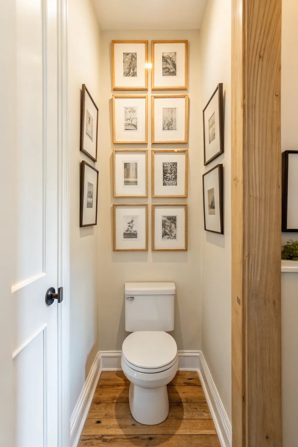
Transform that often-overlooked space above the toilet into a sophisticated focal point with a grid-style gallery wall. This project balances warm wood tones with dark metal accents to frame a cohesive collection of botanical and architectural sketches.
Step-by-Step
Materials
- 8 wooden frames (light oak or pine finish, uniform size)
- 4 dark metal or black wood frames (thinner profile, same size as wood frames)
- 12 matching white mats (pre-cut to fit frames)
- Set of 12 art prints (black and white sketches, botanical or architectural themes)
- Kraft paper or newspaper (for templates)
- Painter’s tape
- Level (2-foot spirit level recommended)
- Measuring tape
- Pencil
- Hammer and nails or picture hanging strips
- Scissors
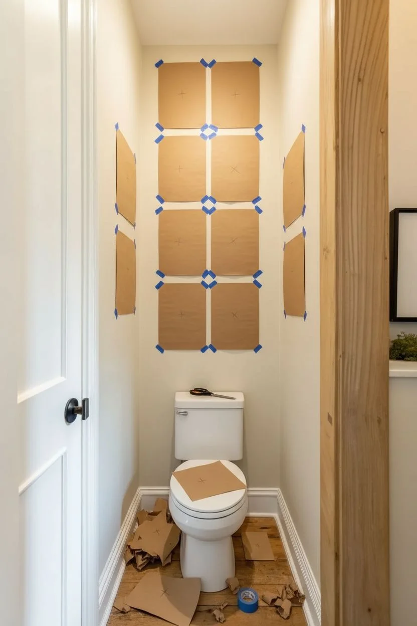
Step 1: Planning the Grid
-
Measure your available space:
Start by measuring the total width and height of the wall space above your toilet tank. You want to leave at least 6-8 inches of clearance between the top of the tank and the bottom row of frames to avoid crowding. -
Define your layout structure:
This look relies on a central column of uniform frames flanked by single columns on either side. Aim for a central grid of 8 frames (2 wide by 4 high) and two side columns of 2 frames each, though you can adjust based on your ceiling height. -
Create paper templates:
Trace your frames onto kraft paper or newspaper and cut out a template for each frame. This is crucial for visualizing the spacing without putting unnecessary holes in your wall. -
Mark hanging points:
Flip your frames over and measure exactly where the hanging hardware is located. Transfer this mark onto your paper templates so you know exactly where the nail needs to go.
Spacer Shortcut
Cut a block of wood exactly to your desired gap size (e.g., 2 inches). Use it between frames as you hang them for mistake-proof, consistent spacing every time.
Step 2: Preparing the Art
-
Curate your collection:
Select black and white prints that share a similar visual weight. I find that mixing organic botanical sketches with structural architectural drawings keeps the eye interested without breaking the cohesive color palette. -
Clean the glass:
Before assembly, clean both sides of the frame glass with glass cleaner and a lint-free cloth. Smudges on the inside are impossible to fix once hanging art is up! -
Mount artwork with care:
Tape your prints to the back of the mats using acid-free artist tape. Ensure the image is perfectly centered in the mat opening; a slight tilt becomes very obvious in a grid layout. -
Assemble the frames:
Place the matted art into the frames. Use the wooden frames for the central two columns to create a warm core, and reserve the dark, thinner frames for the outer flanking positions art.
Step 3: Installation
-
Tape the center templates:
Using painter’s tape, position your paper templates on the wall. Start with the bottom two templates of the central column. Center them over the toilet tank. -
Establish spacing standards:
Maintain a consistent gap between all frames—about 2 to 3 inches usually looks best. Cut a scrap piece of cardboard to this width to use as a quick spacer tool between templates. -
Expand the grid upwards:
Continue taping up the rest of the central templates, double-checking with your level constantly. Vertical alignment is key here; even a small drift will be noticeable. -
Position the side columns:
Place the templates for the dark frames on the side walls if you have a nook like the photo, or flanking the main group if on a flat wall. Align their centers with the gaps or centers of the main grid for visual harmony. -
Install hardware:
Hammer your nails straight through the marked spots on your paper templates. Remove the paper carefully, leaving the nails in place. -
Hang and level:
Hang your frames on the nails. Place your level on top of each frame one last time to ensure perfectly straight lines. -
Secure the corners:
To keep the grid pristine over time, place a small specific deeper of poster putty or a mounting square behind the bottom corners of each frame so they don’t shift when the door closes.
Mat Matters
Swap standard white mats for a creamy off-white or textured linen mat. This subtle shift adds immense warmth and makes budget prints look high-end.
Step back and enjoy the sense of order and calm your new gallery wall brings to the room
Simple Black Frames to Pop Against Light Tile
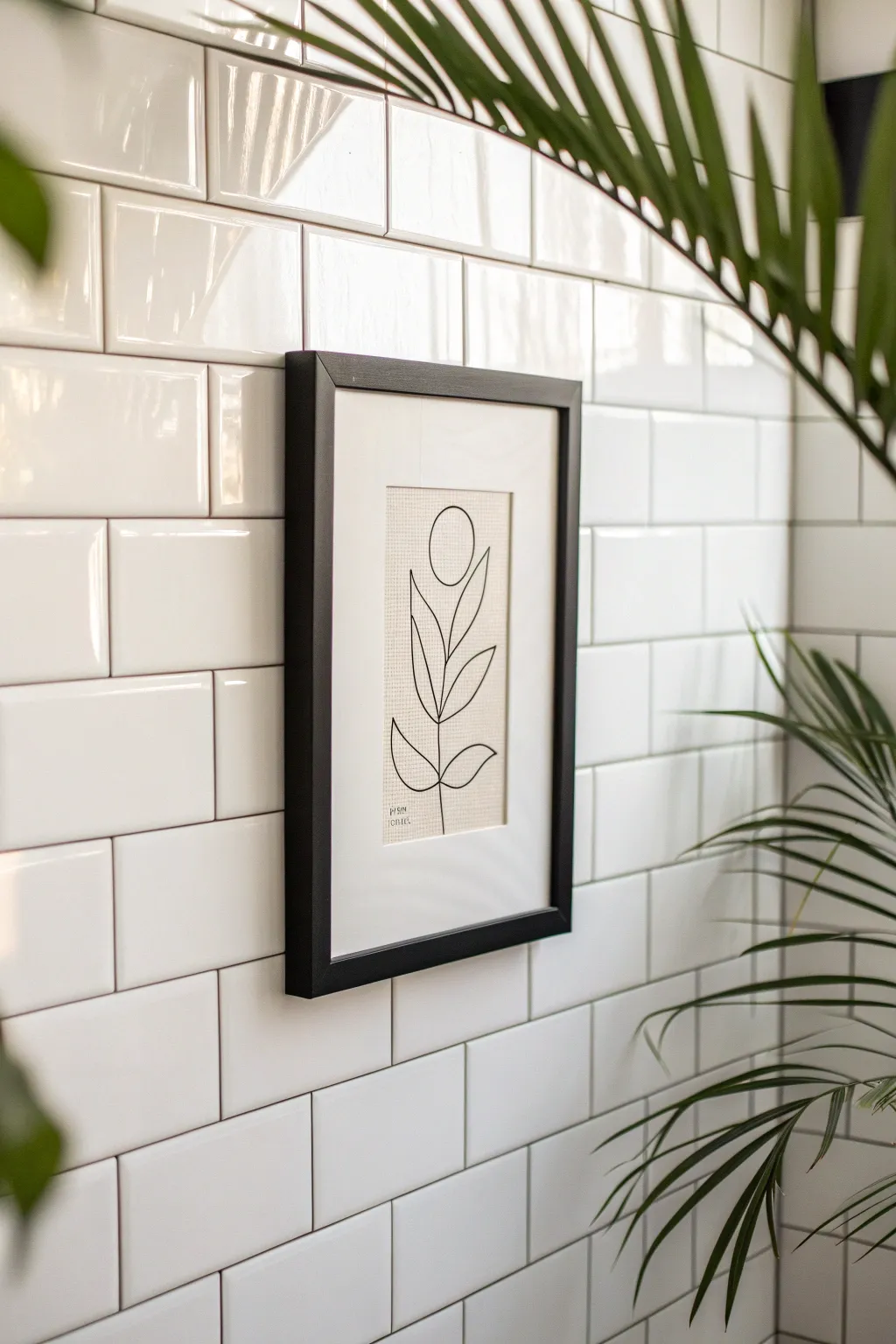
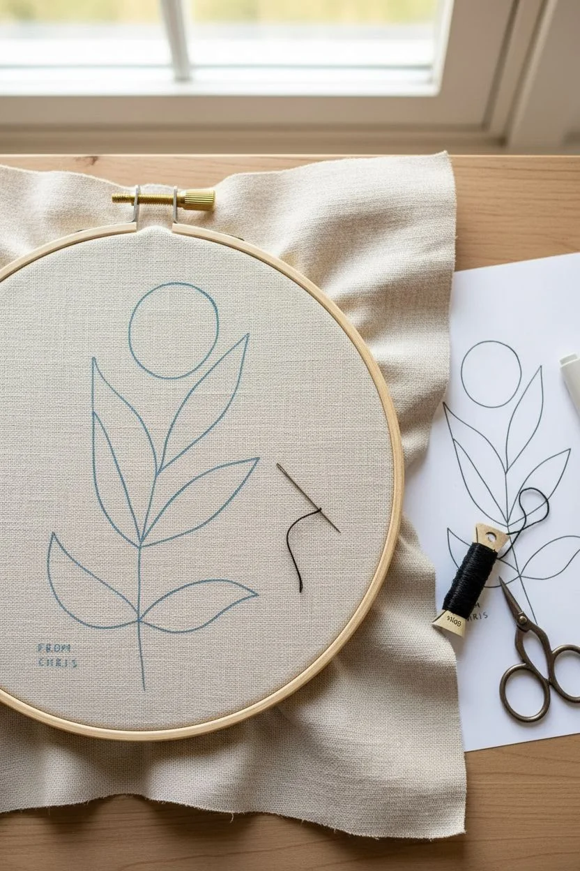
Bring a touch of organic elegance to your bathroom with this simple yet striking embroidered line art. The contrast between the textured linen fabric and the sleek black frame creates a sophisticated focal point against light tiles.
Step-by-Step Guide
Materials
- Light beige or oatmeal linen fabric (medium weight)
- Black embroidery floss
- Embroidery needle
- Embroidery hoop
- Black picture frame (8×10 or similar)
- White mat board (to fit frame)
- Fabric scissors
- Water-soluble fabric marker or pencil
- Paper and pencil for sketching
- Iron and ironing board
- Masking tape or acid-free artist tape
Step 1: Preparation and Design
-
Prepare the fabric:
Cut your linen piece slightly larger than your picture frame opening. I usually add about 2 inches on all sides to make it easier to hoop and mount later. Iron the fabric until it is perfectly smooth. -
Sketch the concept:
On a piece of scratch paper, draw your botanical design. Focus on clean, continuous lines. The design in the image uses a simple stem with paired almond-shaped leaves and a circular bud at the top. -
Refine the scale:
Ideally, the embroidered area should be smaller than the mat opening to create negative space. Measure your mat opening and adjust your sketch so the flower floats comfortably in the center. -
Transfer the design:
Place your paper sketch on a bright window or use a light box, then tape your linen fabric over it. Trace the lines lightly onto the fabric using your water-soluble marker. -
Secure the fabric:
Place the fabric into your embroidery hoop. Pull it taut until it sounds like a drum when tapped. This tension is crucial for smooth stitching.
Uneven Lines?
If your curves look jagged, shorten your stitch length. Smaller stitches navigate turns better than long ones, creating smoother circles and leaf shapes.
Step 2: Stitching the Design
-
Prepare the thread:
Cut a length of black embroidery floss. Standard floss has six strands; separate them and use only two or three strands. This thickness matches the delicate look of the inspiration piece. -
Start the stem:
Thread your needle and knot the end. Begin stitching from the bottom of the stem, bringing the needle up from the back. Use a simple backstitch for a continuous, solid line. -
Stitch the leaves:
Work your way up the stem. When you reach a leaf junction, stitch the outline of the leaf shape using the same backstitch technique, keeping your stitch lengths consistent. -
Create the bud:
The top element is a simple circle. Carefully stitch around your traced circle guide. Smaller stitches here will help create a smoother curve rather than a jagged octagon. -
Add signature details:
In the bottom left corner, stitch a tiny signature or date if desired, as seen in the original artwork. This adds a personalized, artistic touch. -
Secure the thread:
Once the design is complete, bring the needle to the back of the work. Weave the thread through several stitches on the backside to secure it, then trim the excess.
Thread Tension Hack
Don’t pull stitches too tight! This puckers the fabric. Keep tension just snug enough to lay flat against the linen for that clean, professional look.
Step 3: Finishing and Framing
-
Remove guide marks:
Remove the fabric from the hoop. Follow the instructions for your specific marker to remove the visible lines—usually, a dab of water or a quick iron will do the trick. -
Press the artwork:
Place the embroidery face down on a fluffy towel. Iron the back of the fabric gently. The towel prevents the stitches from being flattened while you smooth out the hoop marks. -
Prepare the backing:
Take the cardboard backing or a stiff piece of cardstock that fits your frame. Center your fabric design over this board. -
Mount the fabric:
Wrap the excess fabric around to the back of the board. Pull it tight to ensure no wrinkles on the front, and secure it with masking tape or artist tape. -
Assemble the frame:
Clean the glass of your frame thoroughly to remove dust or fingerprints. Place the mat board into the frame first. -
Insert the artwork:
Place your mounted embroidery behind the mat board. Check the front to ensure the design is centered within the mat window. -
Final closure:
Place the frame backing on and secure the clips or tabs. Use a level to hang your new artwork on your tiled wall.
Your sleek and modern botanical art is now ready to add a refined touch to your bathroom space
BRUSH GUIDE
The Right Brush for Every Stroke
From clean lines to bold texture — master brush choice, stroke control, and essential techniques.
Explore the Full Guide
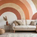
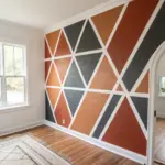
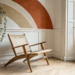
Triptych Sets to Stretch a Long Vanity Wall
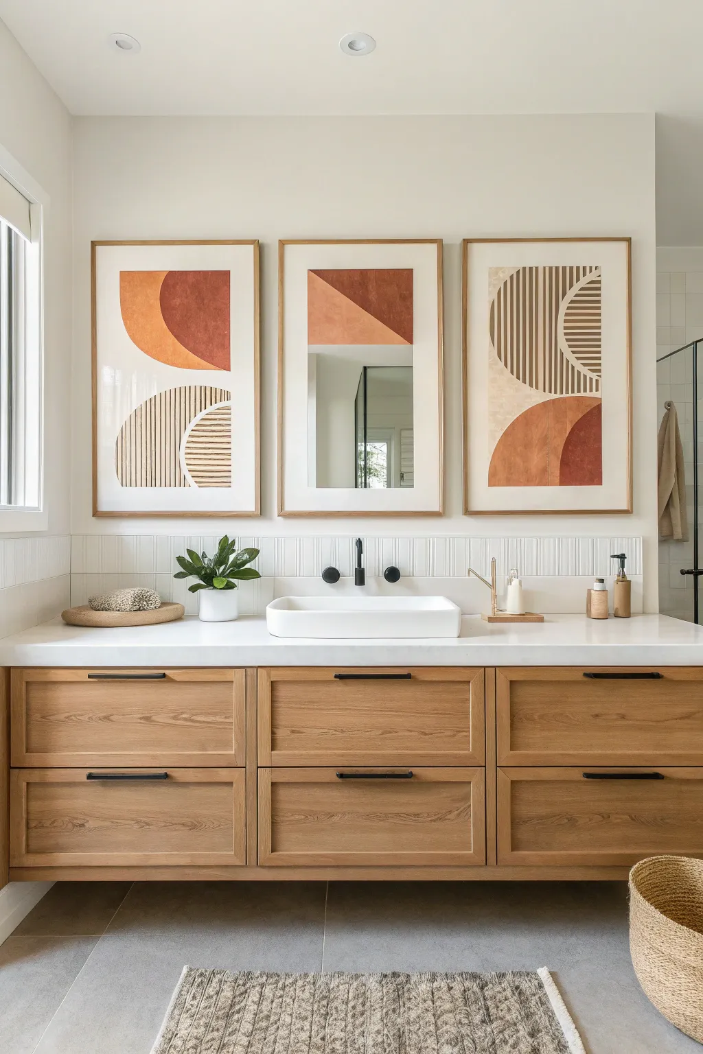
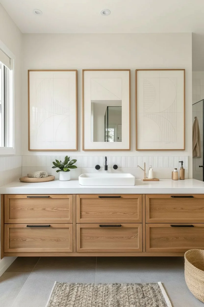
Elevate your bathroom space with this sophisticated set of three modern abstract prints, combining warm terracotta hues with crisp geometric lines. This large-scale triptych uses negative space and bold shapes to create a focal point that visually expands the length of your vanity. By incorporating a mirror into the central panel, you add functionality without breaking the artistic flow.
How-To Guide
Materials
- 3 large wooden frames (at least 24×36 inches) with mats
- Heavyweight watercolor paper or mixed media paper (sized to frame opening)
- Acrylic paints (terracotta/burnt orange, deep rust, cream/off-white, dark brown)
- Masking tape or painter’s tape (various widths)
- Wide flat wash brush (2-inch)
- Medium flat brush (1-inch)
- Thin liner brush for details
- Ruler and pencil
- Compass or circular object (plate/bowl) for tracing curves
- Central mirror piece (sized to fit the middle artwork’s negative space)
- Strong craft glue or mirror adhesive
- Matte spray varnish
Step 1: Planning the Composition
-
Measure and Map:
Lay out your three sheets of paper side-by-side to visualize the continuous flow. Lightly mark the center of the middle sheet where the mirror will eventually go. -
Sketch the Arches:
Using a compass or a large circular plate, lightly pencil the semi-circles and quarter-circles. Ensure the shapes on the left and right panels mirror or complement each other to create balance. -
Define Linear Sections:
For the striped sections shown in the outer panels, use a ruler to draw faint vertical boundary lines where your stripes will be painted later. -
Plan the Middle Panel:
Draft a geometric shape at the top of the middle sheet—like the inverted triangle in the example—leaving a large blank rectangular space below it for the mirror insert.
Step 2: Painting the Color Blocks
-
Mix Your Palette:
Create a gradient of warm tones. Mix a primary terracotta, a deeper rust color by adding a touch of brown, and a lighter cream beige. -
Tape the Edges:
Apply masking tape firmly along the straight edges of your geometric shapes to ensure crisp, clean lines. -
Paint the Solid Shapes:
Using your wide wash brush, fill in the large semi-circles and triangles with your terracotta and rust mixtures. Apply two thin coats for opaque, even coverage. -
Add Texture:
While the paint is still wet, lightly stipple or cross-hatch with a dry brush to give the shapes a slightly organic, weathered look. -
Remove Tape:
Carefully peel back the tape while the paint is still slightly tacky to prevent chipping the dried edge.
Crisp Line Hack
Before painting over tape, brush a thin layer of the *background* paper color over the tape edge first. This seals the gap.
Step 3: Adding Geometric Details
-
Prepare for Stripes:
Once the solid shapes are fully dry, tape off the areas designated for striping. You can either tape each individual stripe (time-consuming but precise) or freehand them with a guided hand. -
Paint the Vertical Lines:
Mix a dark brown or charcoal shade. Using a medium flat brush, paint vertical stripes spacing them evenly. I tend to use a ruler as a hand rest to keep the lines steady. -
Create Horizontal Detail:
For the smaller quarter-circle sections, switch to horizontal stripes using the cream or lighter beige tone to create visual contrast. -
Detail Cleanup:
Use your thin liner brush and the background color (usually white or cream) to touch up any bleeds or uneven edges on your stripes.
Mirror Weight Watch
If your mirror insert is heavy, reinforce the paper backing with a piece of cardboard or mount the artwork directly onto mat board.
Step 4: Assembly and Finishing
-
Seal the Artwork:
Take the artwork outside and spray a light, even coat of matte varnish over all three pieces to protect the paint from bathroom humidity. -
Mount the Mirror:
For the center panel, carefully apply mirror adhesive to the back of your custom-cut mirror piece and press it firmly into the negative space you reserved. -
Frame and Hang:
Place the artwork into the frames behind the mats. Ensure the hanging hardware on the back is level so the triptych aligns perfectly across the wall.
Step back and admire how these warm, geometric forms instantly modernize your space
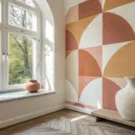
Small Art Vignettes Beside the Mirror
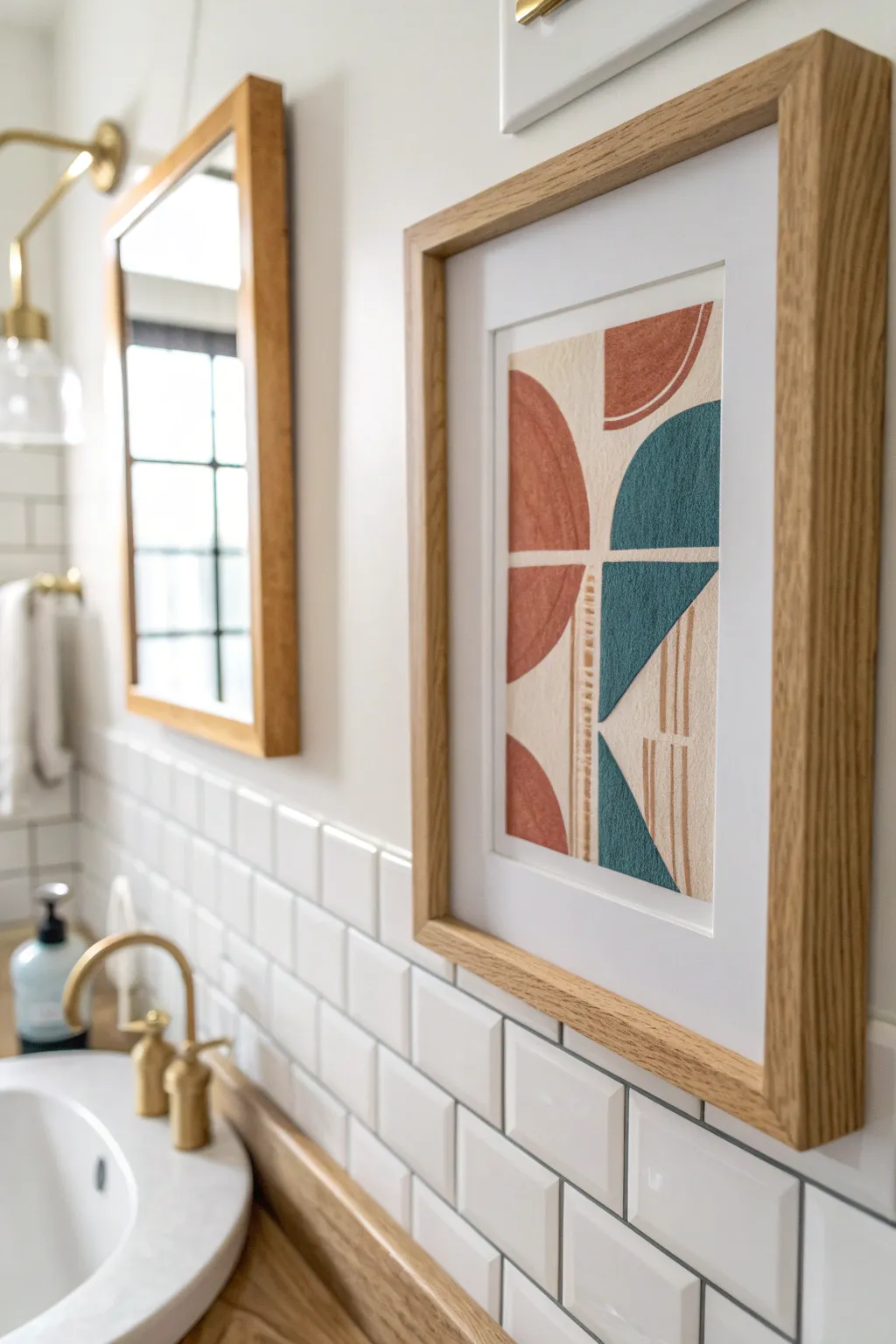
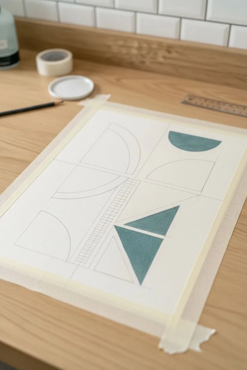
Bring a warm, mid-century modern touch to your bathroom with this abstract geometric print. Featuring textured terracotta and deep teal semicircles intersected by delicate line work, this piece looks incredibly high-end but is simple to recreate at home.
Detailed Instructions
Materials
- Heavyweight textured watercolor paper or cardstock (cream or off-white)
- Acrylic paints (terracotta/burnt sienna, deep teal/petrol blue, cream)
- Flat shader brushes (medium and small)
- Fine liner brush or gold paint pen
- Ruler
- Pencil
- Compass or round objects to trace
- Painter’s tape or masking tape
- Oak or light wood frame with white mat
Step 1: Planning and Sketching
-
Prepare your canvas:
Cut your textured paper to size so it fits perfectly behind your frame’s mat opening. A slightly rougher texture adds to the vintage appeal. -
Mark the center:
Using a ruler and a very light pencil touch, draw a vertical line down the direct center of the paper, and a horizontal line dividing the top and bottom halves. -
Draw the geometric shapes:
Use a compass or trace a roll of tape to create your semicircles. For this design, you want a quarter-circle in the top right, half-circles on the left, and mirrored shapes on the bottom right. Keep them aligned with your center cross-hairs. -
Sketch the negative space:
Draw faint guidelines for the central column where the line work will go. This vertical strip should separate the left shapes from the right shapes.
Clean Lines?
If you struggle with steady hands, use low-tack painter’s tape or washi tape to mask off the straight edges of your semicircles before painting.
Step 2: Painting the Solids
-
Mix the terracotta:
Mix burnt sienna with a touch of white and a tiny dot of yellow to get that warm, earthy clay color seen on the left side. -
Paint the left shapes:
Carefully fill in the semicircles on the left side of your centerline with the terracotta mix. Use a flat brush to keep the straight edges crisp. -
Mix the teal:
Combine a deep blue with emerald green and a hint of black or grey to achieve a moody, desaturated teal. -
Paint the right shapes:
Fill in the quarter-circles and geometric wedges on the right side. Be mindful of the edges where the shapes curve. -
Create texture:
While the paint is still wet, I like to stipple it slightly with a dry brush to mimic a screen-printed or canvas texture rather than a perfectly smooth finish. -
Let it dry completely:
Wait for the paint to fully set. The colors might lighten slightly as they dry, which is expected.
Level Up
Add texture paste to your acrylics before painting to create a raised, relief effect that catches the bathroom lighting beautifully.
Step 3: Adding the Details
-
Paint the vertical stripe:
Mix a light beige or cream color. Paint the vertical strip that separates the left and right painted sections. -
Add horizontal lines:
Using a fine liner brush and the terracotta paint, add small, horizontal dash marks within the vertical cream stripe. -
Draw vertical accents:
In the negative space on the bottom right (inside the u-shape), paint three to four thin vertical lines using the terracotta color. -
Refine the edges:
If your lines look a bit shaky, use the cream background color or a white gel pen to clean up the negative space between the shapes.
Step 4: Framing
-
Erase pencil marks:
Once you are absolutely sure the paint is dry, gently erase any visible pencil guidelines. -
Mount the art:
Center your artwork behind the white mat. Use a small piece of artist tape on the back to hold it in place. -
Final assembly:
Place the matted art into your light oak frame. The natural wood tone complements the terracotta perfectly.
Hang this beside your mirror to create a sophisticated focal point in your bathroom renovation

PENCIL GUIDE
Understanding Pencil Grades from H to B
From first sketch to finished drawing — learn pencil grades, line control, and shading techniques.
Explore the Full Guide
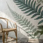
Line Drawings That Keep the Space Feeling Airy
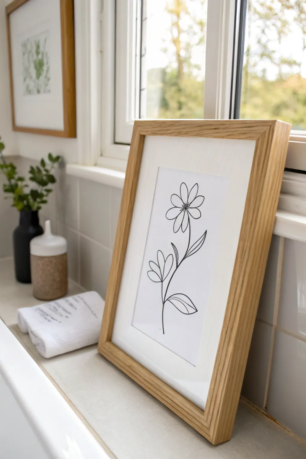
Embrace the effortless elegance of single-line style drawing with this airy floral piece. Perfect for bathrooms, this crisp black-and-white sketch brings a touch of nature indoors without overwhelming the space.
Step-by-Step Guide
Materials
- High-quality white drawing paper or cardstock (A4 or letter size)
- Black fineliner pens (sizes 0.5 and 0.8 recommended)
- Light pencil (HB or 2H)
- Soft eraser
- Ruler
- Light wood frame (A4 or similar)
- White picture mount/mat
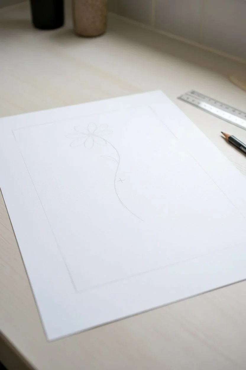
Step 1: Planning the Composition
-
Find the center:
Begin by lightly marking the center of your paper with your pencil to ensure your flower is positioned perfectly. -
Define the boundaries:
Use your ruler to faintly mark where the mount window will sit, so you don’t draw any essential details that will later be hidden. -
Sketch the stem curve:
Draw a faint, gentle ‘S’ curve starting from the lower third of the page, extending upwards. This will be the main stem of your flower.
Wobbly Lines?
If your hand is unsteady, try drawing ‘from the shoulder’ rather than the wrist. Moving your whole arm creates smoother, more confident long lines.
Step 2: Drafting the Flower
-
Outline the flower head position:
At the top of your stem line, lightly sketch a small circle to act as the center of your flower. -
Draft the top petals:
Around the center circle, sketch roughly eight teardrop-shaped petals. Keep them loose and organic looking rather than perfectly symmetrical. -
Add lower leaves:
Move down the stem about halfway. Sketch a pair of leaves branching out to the left side, keeping the shapes simple and pointed. -
Add bottom leaf:
Near the bottom of the stem, sketch one final, larger leaf extending to the right to balance the composition.
Step 3: Inking the Design
-
Prepare your pen:
Take your 0.5 fineliner. I find it helpful to test the ink flow on a scrap piece of paper first to ensure smooth lines. -
Ink the flower center:
Carefully trace the small center circle of the flower head with the 0.5 pen. -
Outline the petals:
Trace your petal sketches. Don’t worry if your hand shakes slightly; little imperfections add to the organic, hand-drawn charm. -
Add petal details:
Draw a single, simple line down the center of each petal to give them a bit of dimension. -
Line the stem:
Switch to a slightly thicker 0.8 pen if you have one, or press slightly firmer with the 0.5 to ink the main stem line for visual weight. -
Trace the leaves:
Ink the outlines of the leaves on the stem, maintaining a fluid motion to keep the lines looking confident. -
Detail the leaves:
Add a central vein line to each leaf, mirroring the style used on the petals.
Try Watercolor
Before inking, add a very pale wash of green watercolor over the leaves or a soft yellow on the petals for a subtle splash of color.
Step 4: Finishing Touches
-
Let the ink dry:
Wait at least 10-15 minutes for the ink to dry completely to avoid any accidental smudging. -
Erase pencil marks:
Gently erase all your initial pencil sketches and guide marks. Hold the paper taut to prevent wrinkling. -
Inspect and refine:
Look over your lines. If any areas look too thin or broken, carefully go over them again to darken the stroke. -
Mount artwork:
Tape your finished drawing to the back of the picture mount using masking tape, ensuring the flower is centered in the window. -
Frame it:
Place the mounted artwork into your light wood frame and secure the back.
Now you have a serene piece of custom art ready to make your bathroom feel like a spa sanctuary
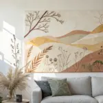
Nature Photography-Style Art for Instant Calm
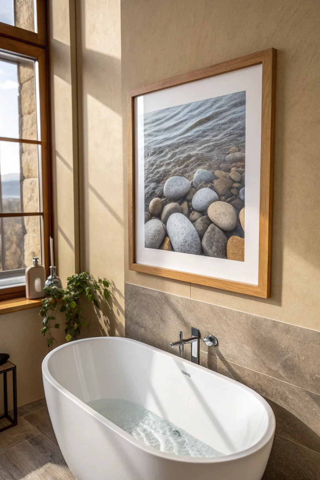
Bring the soothing essence of a rocky shoreline directly into your bathroom with this tranquil, large-scale framed art piece. The cool tones of the water and the textured warmth of river stones create a spa-like focal point that promotes instant relaxation.
Step-by-Step
Materials
- High-resolution digital photo of river stones/water (stock or personal)
- Large format matte photo paper (24×30 inches or similar)
- Light oak or natural wood gallery frame (to fit print size)
- Custom white mat board (2-3 inch border)
- Acid-free mounting tape
- Microfiber cloth
- Glass cleaner
- Picture hanging hardware (heavy duty wire and hooks)
- Level
- Measuring tape
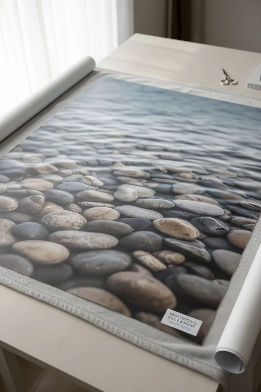
Step 1: Sourcing and Printing the Image
-
Select the right photograph:
Search for a high-resolution image featuring smooth river stones and shallow water. Look for a composition where the water ripples are visible at the top and the stones anchor the bottom, creating visual weight. Stock photography sites are great for this if you don’t have a personal photo. -
Check resolution quality:
Ensure your image is at least 300 DPI (dots per inch) at the size you intend to print. A low-resolution image will look pixelated and blurry when blown up to this large feature scale. -
Edit for tone:
Open the image in photo editing software. I tend to slightly desaturate the colors to give it a more muted, calming aesthetic, ensuring the greys and tans of the stones allow the texture to shine. -
Choose the paper finish:
Select a matte or luster finish photo paper rather than high gloss. Glossy paper will reflect too much light in a bright bathroom, obscuring the image details. -
Order the print:
Send the file to a professional large-format printer. Request a giclée print for the best color accuracy and longevity, especially in a humid environment.
Wrinkled Print?
Humidity can cause paper ripple. If this happens, ensure your frame is sealed tightly. Swapping to an acrylic face instead of glass often insulates the art better against temperature shifts.
Step 2: Framing the Artwork
-
Prepare the workspace:
Clear a large, flat table or clean floor area. Lay down a soft blanket or sheet to protect the frame face from scratches while you work. -
Clean the glass:
Remove the glass (or acrylic glazing) from the frame. Clean both sides thoroughly with glass cleaner and a microfiber cloth to remove all dust, fingerprints, and streaks. Let it dry completely. -
Position the mat:
Place your print face up on a clean flat surface. Lay the white mat board over the image to check the positioning, ensuring the composition is centered exactly how you want it shown. -
Secure the print:
Create a ‘T-hinge’ using acid-free mounting tape. Apply tape to the top back edge of the print, adhering it to the back of the mat board. This allows the paper to expand and contract with temperature changes without buckling. -
Inspect for dust:
Before closing everything up, use a can of compressed air or a clean brush to gently blow away any tiny dust specks trapped between the print and the glass. -
Assemble the frame:
Place the glass back into the frame face-down, followed by the matted print (face down) and the backing board. Secure the backing clips or points firmly.
Pro Tip: Acrylic Glazing
For bathrooms, I recommend using premium acrylic instead of glass. It is lighter, shatter-resistant if it falls, and usually offers better UV protection for your art.
Step 3: Installation
-
Determine placement:
Hold the frame up near the wall to find the ideal height. For a bathroom setting above a tub, aim for the center of the artwork to be at eye level when standing, but high enough to avoid splashes. -
Mark the wall:
Once positioned, lightly mark the top center of the frame on the wall with a pencil. Measure down from the top of the frame to the hanging wire to find exactly where the hook needs to go. -
Install the hardware:
Hammer your heavy-duty picture hook into the marked spot. Using two hooks spaced a few inches apart helps keep large frames level and stable. -
Hang and level:
Carefully lift figure the frame onto the hooks. Place a level on top of the frame and adjust the tilt until the bubble is perfectly centered. -
Final wipe down:
Give the glass one last quick polish to remove any fingerprints from the hanging process.
Now you have a stunning, peaceful window to nature that transforms your bathroom into a private sanctuary


Leaning Frames on Floating Shelves Above the Toilet
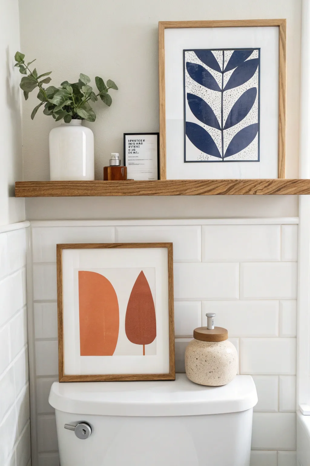
Bring a modern, minimalist touch to your bathroom with this pair of DIY abstract art prints. Featuring bold geometric shapes and organic botanical forms in soothing terracotta and navy hues, these pieces add instant warmth and character to any shelf.
Step-by-Step Tutorial
Materials
- Heavyweight watercolor paper or mixed media paper (11×14 or similar)
- Acrylic paints (Navy Blue, Terracotta/Burnt Orange, White)
- Wide flat brush (1-inch)
- Medium round brush
- Fine liner brush
- Pencil
- Ruler
- Painter’s tape
- Palette or paper plate
- Two wood frames (light oak finish)
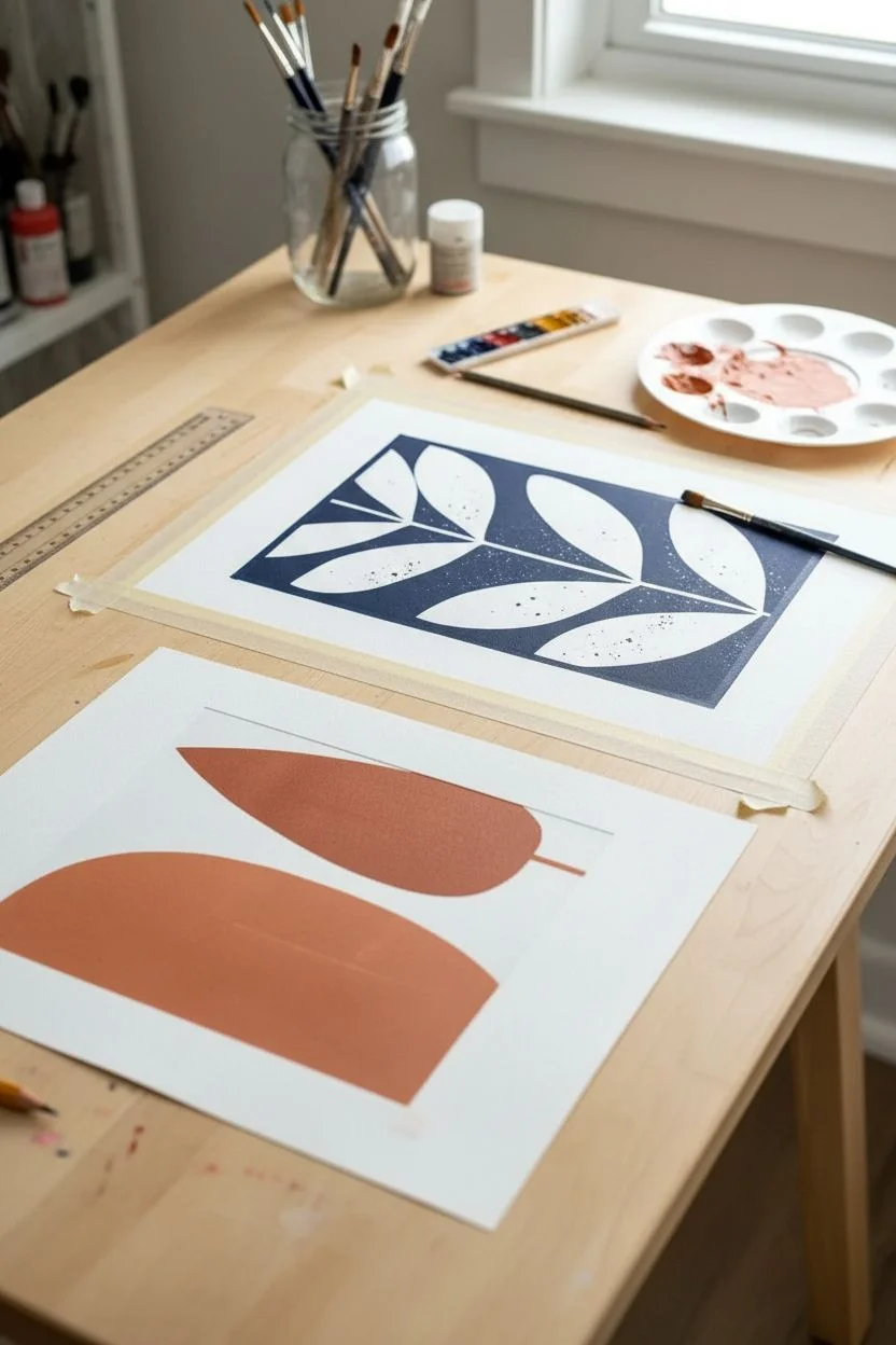
Step 1: Creating the Blue Botanical Print
-
Prepare the paper:
Cut your paper to fit your chosen frame size. If you want a clean white border like the photo, measure in about an inch from each edge and use painter’s tape to mask off a crisp rectangular boundary. -
Mix the navy shade:
On your palette, squeeze out navy blue acrylic paint. If the blue is too bright, mix in a tiny dot of black or burnt umber to deepen it into a sophisticated indigo. -
Draw the central stem:
Using a ruler and a pencil, lightly draw a vertical line straight down the center of your taped area. This will be the spine for your leaf design. -
Sketch the leaf shapes:
Lightly sketch symmetrical, almond-shaped leaves branching out from the center line. Aim for three pairs of leaves moving upward, getting slightly larger towards the top to mimic natural growth. -
Fill in the background:
This design uses negative space, meaning we paint the *background* blue and leave the leaves white. Carefully use your medium round brush to paint the navy blue around your pencil sketches. -
Refine the edges:
Switch to a finer brush to get sharp, crisp lines right up to the edge of your leaf sketches. The contrast between the dark blue and the white paper is key here. -
Add texture (optional):
For the speckled look seen in the photo, dip an old toothbrush or stiff brush into diluted black or dark grey paint. Run your thumb across the bristles to flick tiny specks onto the white leaf areas for a stone-like texture. -
Paint the spine details:
Once the blue background is dry, use a very fine liner brush and navy paint to add the thin central vein line down the middle of each white leaf shape.
Clean Lines Pro-Tip
For the sharpest edges on the negative space painting, use a flat-edged shader brush. It acts like a little squeegee to push paint right to the pencil line without going over.
Step 2: Creating the Terracotta Geometric Print
-
Outline the shapes:
On a second sheet of paper, lightly sketch two main forms side-by-side. On the left, draw a tall, vertical rectangle with a rounded top (an arch shape). On the right, draw a stylized leaf or teardrop shape. -
Mix the terracotta tone:
Create a warm, earthy orange by mixing burnt orange with a little white to soften it, and a touch of brown to ground it. It should look like clay pot material. -
Paint the arch:
Use your wide flat brush to fill in the arch shape on the left. Long, smooth vertical strokes work best here to minimize brush marks and create a flat, graphic look. -
Paint the leaf:
Using the same terracotta mixture, fill in the leaf shape on the right. I find that switching to a round brush helps navigate the curves of the teardrop shape more smoothly. -
Add the stem:
Paint a very thin, simple vertical line extending downward from the bottom of the leaf shape to ground it. -
Erase guidelines:
Allow the paint to dry completely—usually about 20 minutes for acrylics. Once dry, gently erase any visible pencil marks around the edges of your shapes. -
Frame the artwork:
Clean your glass to remove fingerprints. Place your finished dry artworks into the light wood frames, ensuring they are centered. -
Style the shelf:
Lean the larger blue print against the wall on the shelf, and lean the smaller terracotta print slightly in front or on a lower surface to create depth.
Level Up: Texture
Mix baking soda into your terracotta paint before applying. It creates a gritty, plaster-like texture that makes the geometric shapes look more sculptural and high-end.
Now you have a custom gallery display that adds a perfect pop of color to your bathroom sanctuary
Color-Blocking Art That Matches Towels and Rugs
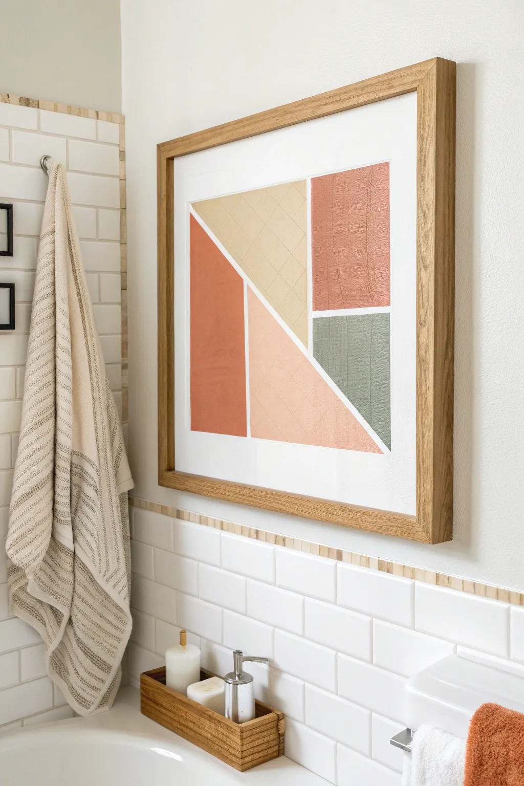
Bring warmth and modern structure to your bathroom with this textured geometric artwork. By using painted fabric or textured paper instead of flat paint, you create a rich, tactile piece that feels high-end and perfectly coordinates with your linens.
Step-by-Step Guide
Materials
- Large square picture frame (wood finish)
- White mat board (custom cut to frame size)
- Heavyweight textured paper, linen fabric, or canvas
- Acrylic paints (Terracotta, Sage Green, Beige, Pale Peach)
- Fabric medium (if painting on fabric)
- Flat paintbrushes (1-inch width)
- Ruler or T-square
- Pencil
- Sharp crafting knife (X-Acto)
- Cutting mat
- Spray adhesive or craft glue
- White backing board
Step 1: Preparing the Colors
-
Choose your base material:
Decide whether you want to use heavy textured watercolor paper or actual linen fabric. The image shows a distinct weave texture, so canvas or linen scraps work beautifully here. -
Mix your palette:
Prepare your acrylic paints. You’ll need four distinct shades: a deep rust/terracotta, a soft sage green, a neutral beige, and a warm pale peach. If you are painting on fabric, mix the acrylics with a fabric medium to keep the texture soft and flexible. -
Paint the substrate:
Paint large swatches of your material with each color. Don’t worry about shapes yet; just cover enough surface area to cut your final pieces later. I like to paint a little more than I think I need just in case of cutting errors. -
Create texture:
For the beige and peach sections specifically, consider adding subtle cross-hatching or lines with a dry brush or a scoring tool while the paint is semi-wet to mimic the texture seen in the original artwork. -
Allow to cure:
Let your painted sheets dry completely flat. If the paper or fabric curls, weigh it down with heavy books once it is dry to touch but before you start cutting.
Step 2: Cutting the Geometry
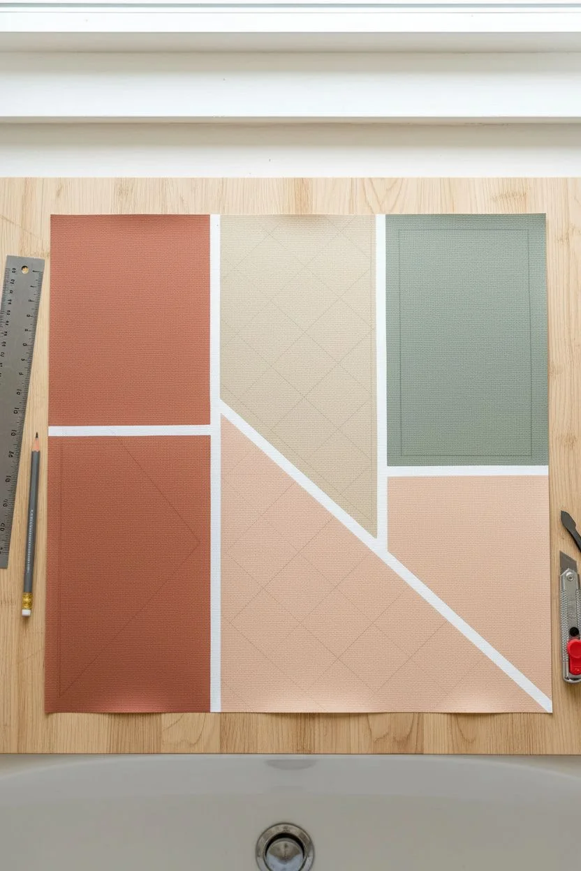
-
Plan the layout:
On a piece of scratch paper, sketch the geometric design. The key components are a large rectangle on the left, a right-triangle in the center, a trapezoid at the top, and two rectangles on the right side. -
Measure your mat opening:
Measure the opening of your picture frame mat. Your final composition needs to fit within this space with a tiny margin for error. -
Cut the Terracotta left panel:
Using your ruler and craft knife on a cutting mat, cut a tall vertical rectangle from the rust-colored sheet. Then, slice the top at a sharp angle downwards to create the trapezoid shape shown on the far left. -
Cut the top Beige shape:
Cut the beige sheet into a shape that mirrors the angle of the terracotta piece on the left, creating an inverted triangle or trapezoid that fits snugly against it. -
Cut the Pink triangle:
From the pale peach sheet, cut a large right-angle triangle. This will sit centrally, anchoring the diagonal line created by the previous two shapes. -
Cut the right-side blocks:
Cut a tall rectangle from the rust/terracotta sheet and a smaller square or rectangle from the green sheet. These will stack vertically on the right side of the composition. -
Dry fit the puzzle:
Lay all your cut pieces onto your clean white backing board without glue. Arrange them to ensure the gaps between shapes are even and white space (the ‘grout lines’) is consistent.
Uneven Gaps?
If your white spacing looks irregular after cutting, don’t reglue. Instead, use a thin strip of white artist tape to cover the uneven edges and create perfect, uniform ‘grout’ lines.
Step 3: Assembly and Framing
-
Mark placement:
Once you are happy with the arrangement, lightly mark the corners of the shapes on the backing board with a pencil so you know exactly where to glue them. -
Apply adhesive:
Spray the back of each geometric cutout with spray adhesive. Spray adhesive provides an even coat that won’t make the paper or fabric ripple like liquid glue might. -
Adhere the shapes:
Carefully press each shape onto the backing board, aligning them with your pencil marks. Smooth them down from the center outward to remove air bubbles. -
Clean up:
Use a good eraser to remove any visible pencil marks from the white gaps between the colored shapes. -
Final framing:
Place the white mat over your artwork to ensure the edges look clean. Place the assembly into the wood frame, secure the back, and it is ready to hang.
Add Dimension
Swap the flat backing board for a piece of foam core. Mount your colored shapes with foam adhesive squares instead of glue to create a shadow-box effect with real depth.
Hang your new masterpiece near your shower to echo the colors of your favorite bath linens
Mini Gallery Strips for Awkward Narrow Wall Columns
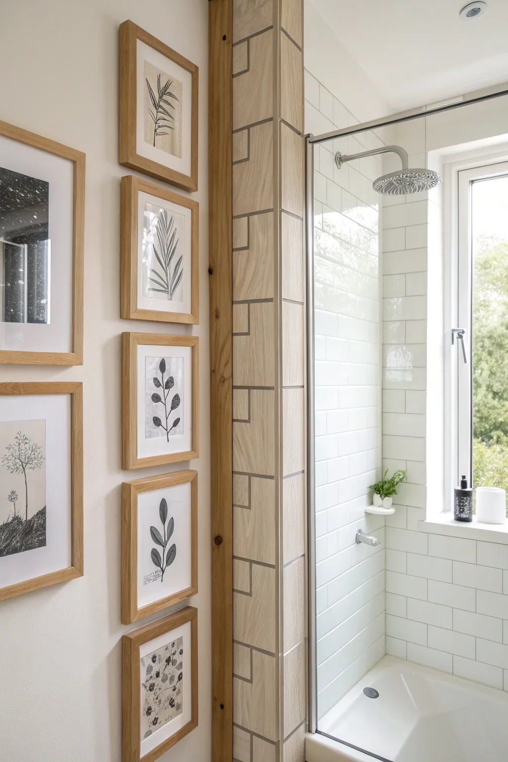
Transform an often-unused sliver of wall space into a sophisticated focal point with a vertical stack of matching botanical prints. This project utilizes simple line art and uniform framing to create visual height and elegance in tight bathroom corners.
How-To Guide
Materials
- 5 matching light wood frames (approx. 5×7 or 6×8 inches)
- Thick white mat board cut to fit frames
- Heavyweight watercolor paper or cardstock
- Fine liner pens (black, sizes 0.3mm to 0.5mm)
- Pencil and eraser
- Ruler
- Level
- Command strips or small picture nails
- Scissors or a paper cutter
- Painter’s tape
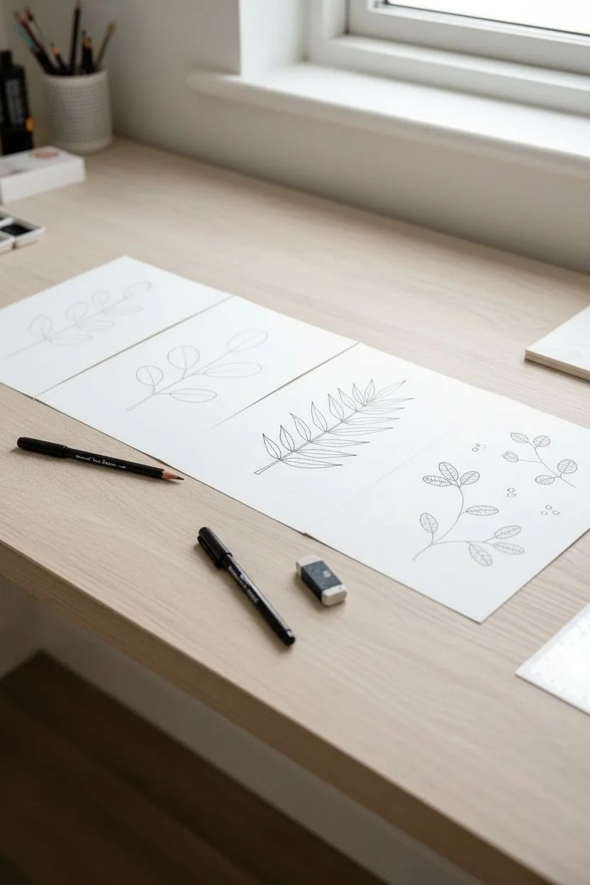
Step 1: Creating the Artwork
-
Paper Preparation:
Begin by cutting your heavyweight paper or cardstock into rectangles that are slightly larger than the mat openings of your frames. This ensures you can tape them securely behind the mat without gaps showing. -
Sketching the Grid:
Lightly sketch a central vertical axis on each piece of paper using a ruler. This faint guide will help keep your leaf stems straight and centered, which is crucial for the uniform look of the stack. -
Drafting the Botanicals:
Using a pencil, draw simple, minimal leaf shapes. Aim for variety within a theme: try one with paired oval leaves, another with long slender fronds, and perhaps one with scattered smaller leaves. Keep the style consistent—clean lines and minimal shading. -
Inking the Leaves:
Trace over your pencil lines with a fine liner pen. I prefer using a 0.5mm tip for the main stems and a slightly thinner 0.3mm tip for leaf veins to add subtle dimension. Use a steady hand and confident strokes. -
Adding Texture:
For some of the leaves, add stippling (tiny dots) or light hatching to create ‘color’ without actually using paint. This black-and-white graphic style mimics the vintage botanical prints seen in the reference. -
Final Cleanup:
Allow the ink to dry completely to avoid smudging. Once dry, gently erase all underlying pencil marks to leave a crisp, clean illustration.
Make Your Own Spacer
Cut a scrap of cardboard to the exact height of the gap you want between frames. Use it as a physical guide while hanging to ensure every gap is identical.
Step 2: Assembly & Installation
-
Mounting the Art:
Place your artwork face down on the back of the mat board. Align the image within the window opening so it is perfectly centered. Secure the paper to the mat using painter’s tape or acid-free artist tape. -
Framing:
Clean the glass of your frames thoroughly on both sides. Insert the matted artwork, add the backing board, and secure the clips. Repeat this for all five frames. -
Determine Spacing:
Measure the total height of your wall space and the total height of your five frames. Calculate the gap you want between each frame; 2 to 3 inches usually looks best for a tight column. -
Marking the Wall:
Start with the center frame. Measure the midpoint of your wall strip and mark it lightly. Position the middle frame here at eye level. -
Hanging the Center Piece:
Install the middle frame first using a level to ensure it is perfectly straight. This will serve as the anchor for the rest of the column. -
Working Outwards:
Measure up from the top of the center frame to mark the position for the next frame above. Repeat measuring down for the frame below. Use a spacer (a piece of cardboard cut to your gap size) to verify the distance quickly. -
Final Alignment Check:
Once all five frames are hung, stand back and check the vertical alignment. Nudge frames slightly left or right if needed to ensure a perfect vertical line.
Frames Won’t Stay Straight?
If frames tilt on a single nail, use a small ball of museum putty or a double-sided adhesive tab on the bottom corners to lock them perfectly in place.
Step back and admire how this clean column of art elongates your space and adds a gallery feel
Monochrome Art to Make Tiny Bathrooms Feel Bigger
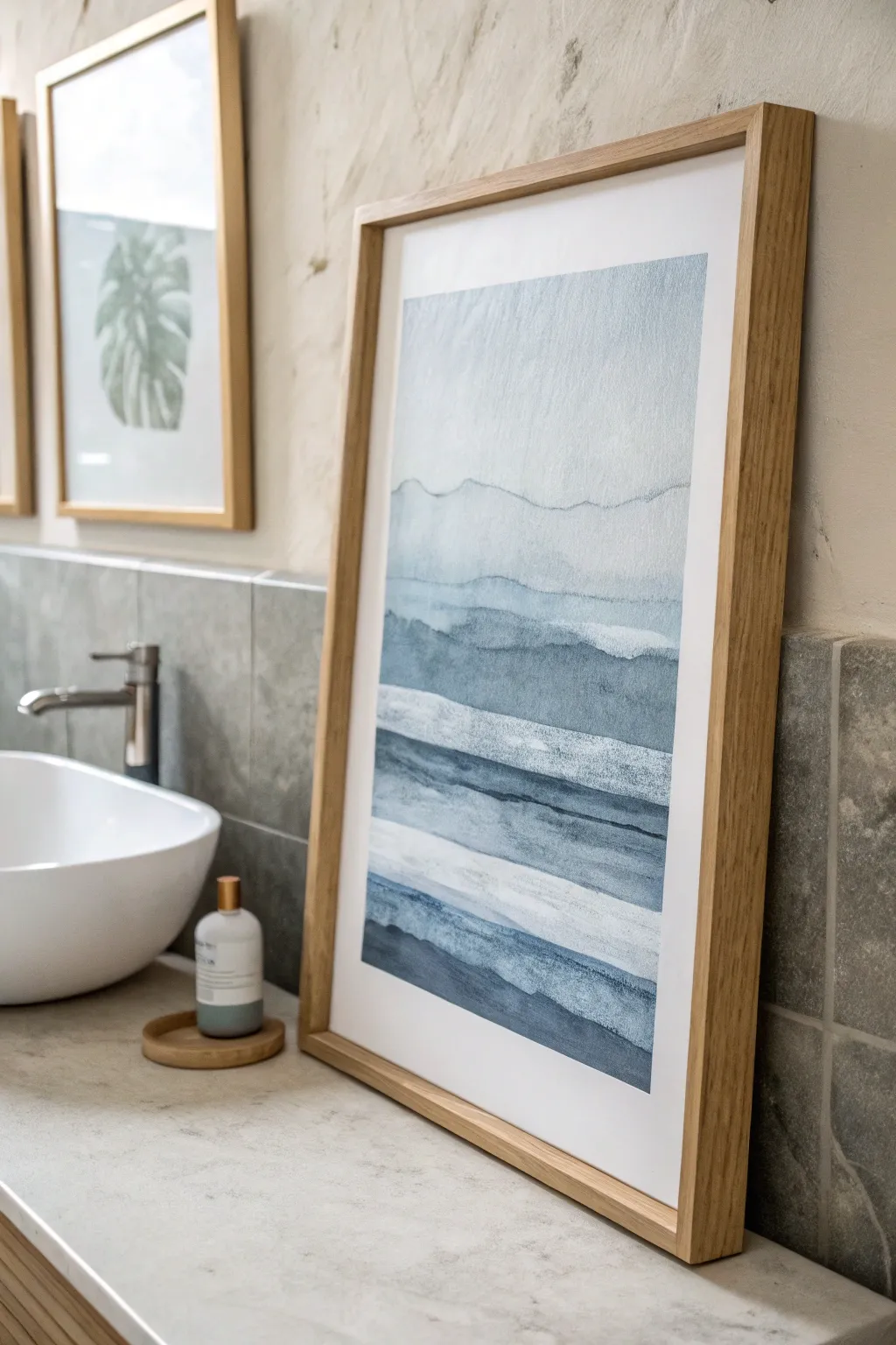
This minimalist watercolor piece captures the calming essence of rolling hills or gentle waves using a monochromatic blue palette. By layering translucent washes, you’ll create a sense of depth and tranquility perfect for expanding the feel of a small bathroom space.
Detailed Instructions
Materials
- Cold press watercolor paper (A3 or 11×14 inches, 300gsm)
- Watercolor paints (Indigo, Prussian Blue, Payne’s Grey)
- Wide flat wash brush (1 inch)
- Round watercolor brush (size 8 or 10)
- Masking tape
- Drawing board or sturdy cardboard
- Two jars of water
- Paper towels
- Palette for mixing
- Light pencil (HB)
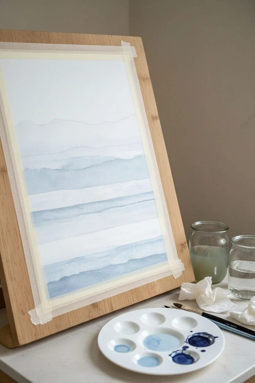
Step 1: Preparation and Planning
-
Secure the paper:
Tape your watercolor paper down to the board on all four sides using masking tape. This creates a clean white border and prevents the paper from buckling when it gets wet. -
Sketch the layers:
Using your pencil very lightly, draw roughly 6 to 8 horizontal, wavy lines across the paper. These do not need to be perfect; let them dip and rise naturally like distant hills or ocean currents. -
Prepare your palette:
Squeeze out your blue paints. You need to create a gradient of intensity, so prepare three separate puddles of blue: one very watery and pale, one medium strength, and one highly saturated and dark.
Clean Water Tip
Keep one water jar for rinsing dirty brushes and a second jar strictly for clean water used to dilute paint. This keeps your light blue washes from getting muddy or grey
Step 2: Painting the Gradient Layers
-
Start at the top:
Dip your wide flat brush into clean water and dampen the top section of the sky area slightly. Load your brush with the scarcest amount of pigment from your palest blue mix. -
First wash:
Apply the pale wash from the top edge down to your first pencil line. Let the paint fade naturally as it moves downward, or add more water to feather the edge. -
Drying time:
Wait for this first layer to be completely dry to the touch. If you paint too soon, the layers will bleed together and you’ll lose the crisp ‘hill’ edge. -
Second layer:
Using the same pale mix but with just a hint more pigment, paint the next section below the first line. Carefully trace the wavy pencil line with the tip of your brush to effect a sharp edge. -
Creating texture:
While the second layer is still wet, you can drop in a tiny bit of darker pigment near the bottom edge of that section to create a soft, cloudy transition. -
Deepening the tone:
Once dry, move to the third section. Switch to your medium-strength blue mix. Paint firmly along the upper edge of this section, letting water pull the pigment down so it looks lighter at the bottom. -
Building the middle ground:
Continue working your way down the paper, section by section. Ensure every previous layer is bone dry before starting the next. Each new layer should be slightly darker or more opaque than the one above it. -
Adding the darkest bands:
For the bottom 2-3 layers, use your most saturated Indigo or Payne’s Grey. These dark bands anchor the composition. Use the round brush here for better control over the wavy top edges. -
Dry brush technique:
On one of the lower middle layers, try dragging a semi-dry brush across the paper texture. This leaves sparkling white gaps that look like sea foam or mist.
Step 3: Finishing Touches
-
Review contrast:
Step back and look at the gradient. I generally find that the bottom needs to be darker than I expected, so don’t be afraid to glaze another layer of dark blue over the bottom-most section if it looks washed out. -
Final dry:
Allow the entire painting to dry completely, preferably overnight to ensure the paper settles flat. -
Remove tape:
Carefully peel away the masking tape at a 45-degree angle, pulling away from the painted area to ensure you don’t rip the paper surface. -
Frame it:
Place the artwork into a light oak or birch frame to complement the cool tones of the blue paint, using a white mat if desired to give it a gallery feel.
Golden Accent Level Up
Once the blue paint is completely dry, use a fine brush and metallic gold watercolor to trace extremely thin lines along just one or two of the ‘wave’ crests for a luxury touch
Hang your new blue gradient artwork in the bathroom to create a window into a calm, misty landscape
Sealed Mixed-Media Pieces That Look Handmade (and Hold Up)
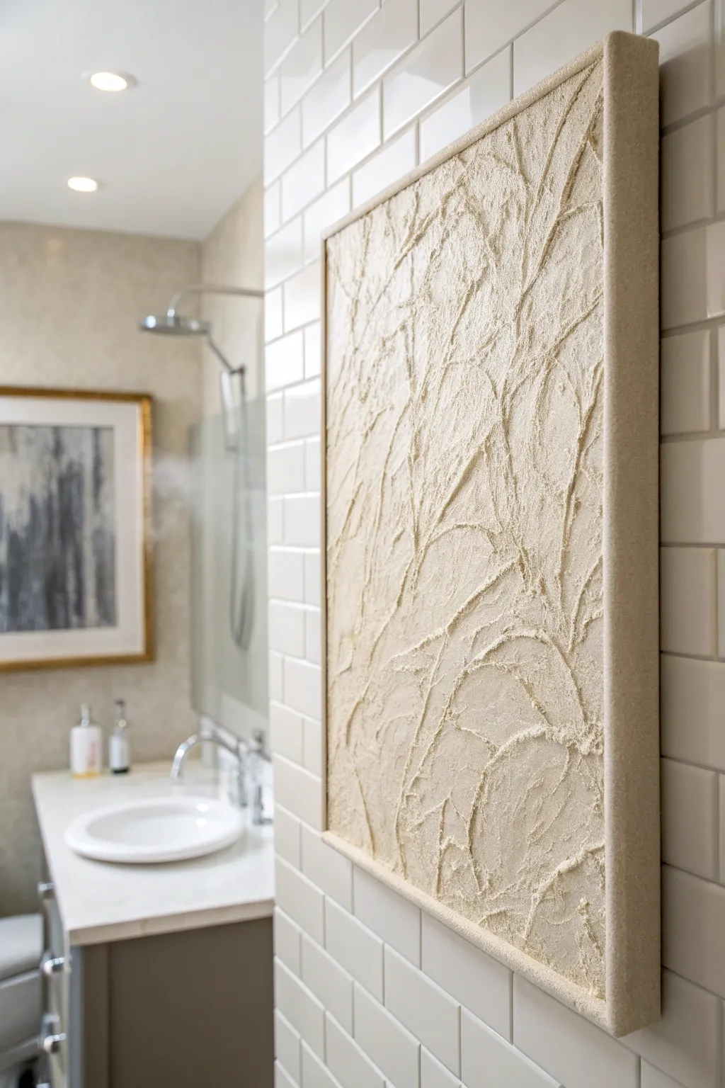
Bring organic warmth to your bathroom with this high-texture, monochromatic art piece that mimics the patterns of sand dunes or veins of marble. By mixing mediums and sealing them properly, create a sophisticated, gallery-worthy relief that withstands humid environments without losing its delicate appearance.
Detailed Instructions
Materials
- Stretched canvas (18×24 or similar)
- Joint compound or modeling paste
- Fine grain sand (white or beige)
- White acrylic paint
- Cream or beige acrylic paint
- Matte spray sealant (water-resistant)
- Piping bag or plastic sandwich bag
- Palette knife
- Wide flat brush
- High-tack craft glue
- Wood lattice strips (for framing)
- Sandpaper (medium grit)
Step 1: Preparation & Base Layer
-
Prime the Surface:
Even if your canvas is pre-primed, apply a thin coat of white acrylic paint mixed with a pinch of sand. This gritty base helps heavy textures adhere better later. -
Mix the Texture Paste:
In a mixing bowl, combine about two cups of joint compound with a tablespoon of white acrylic paint. The paint acts as a binder to prevent cracking as the thick compound dries. -
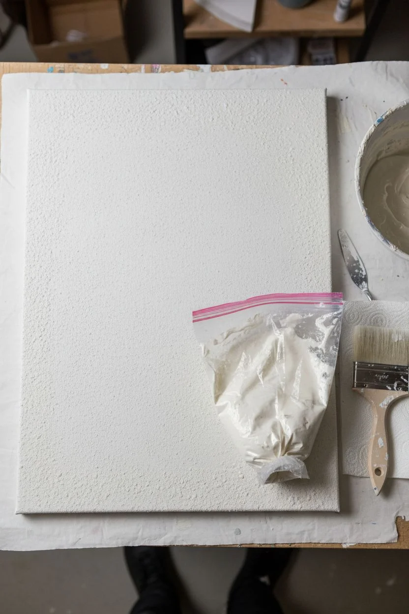
Fill the Applicator:
Spoon your mixture into a piping bag. If you don’t have one, a sturdy sandwich bag works perfectly—just snip a very small bottom corner off, creating an opening about a quarter-inch wide.
Crack Control
If the joint compound cracks while drying, don’t panic. Mix a small slurry of water and compound, rub it into the hairline cracks with your finger, and let dry.
Step 2: Creating the Relief
-
Draw the Primary Veins:
Start at the bottom edge of the canvas. Squeeze the bag with consistent pressure to draw thick, irregular lines that flow upward like growing branches or cracks in stone. -
Branch Outwards:
Connect smaller, thinner lines to your main veins. Let your hand shake slightly as you move; the lack of perfection makes organic patterns look more realistic. -
Flatten and Shape:
While the compound is still wet, take your palette knife and gently press down on parts of the piped lines. Smear some edges outward to blend them into the canvas, while leaving the ridges high in other spots. -
Add the Sand Texture:
While the compound is tacky, sprinkle fine grain sand generously over the raised areas. Press it lightly into the wet paste with the back of a spoon to ensure it embeds deeply. -
First Drying Phase:
Allow this structure to dry completely. Since joint compound is thick, I recommend leaving it overnight to avoid internal moisture getting trapped.
Step 3: Refining & Sealing
-
Remove Excess Sand:
Once fully cured, lift the canvas vertically and tap the back firmly to dislodge any loose sand that didn’t adhere. -
Color Wash Application:
Mix a diluted wash of cream or beige acrylic paint (50% paint, 50% water). Brush this swiftly over the entire canvas, letting the liquid pool slightly in the textured crevices to create natural shadows. -
Dry Brush Highlighting:
Dip a dry brush into unwanted white paint, wipe most of it off on a paper towel, and lightly drag it over just the highest ridges of your texture. This emphasizes the 3D effect. -
Construct the Frame:
Cut your wood lattice strips to fit the outer perimeter of the canvas. Sand any rough edges and apply a coat of color-matched paint or leave raw for a natural look. -
Attach the Frame:
Use high-tack craft glue to adhere the wood strips to the sides of the canvas canvas. Clamp or hold in place until secure. -
Final Waterproof Seal:
This step is crucial for bathroom placement. Spray the entire piece with two to three coats of matte sealant, allowing 30 minutes between coats. This prevents humidity from softening the compound.
Add Metallic Depth
For a luxe touch, mix gold mica powder into your final sealant spray or brush tiny hints of gold leaf along the highest ridgelines.
Hang your new textured masterpiece in a well-ventilated spot and enjoy the spa-like atmosphere it creates
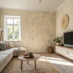
A Painted Accent Wall Mural Behind the Vanity
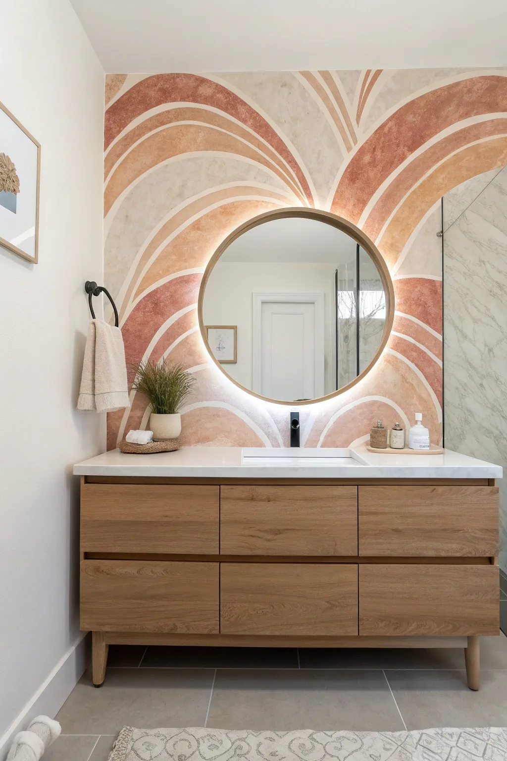
Transform a plain bathroom vanity wall into a warm, artistic statement with this sweeping arch mural. Featuring organic curves and earthy terracotta tones, this project mimics the look of expensive wallpaper using just paint and patience.
Step-by-Step
Materials
- Interior latex paint (base color: cream/off-white)
- Sample pots of latex paint (3-4 shades: terracotta, peach, blush, beige)
- Pencil
- String and pushpin (or a flexible measuring tape)
- Assorted angled sash brushes (1.5 inch to 2.5 inch)
- Small artist brushes (for touch-ups)
- Microfiber cloth
- Painter’s tape
- Drop cloth
- Paper plates or palette for mixing
- Glaze medium (optional, for transparency)
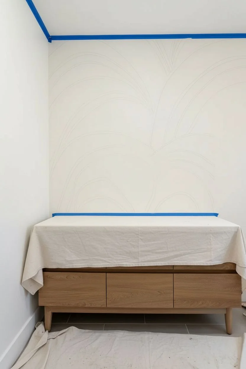
Step 1: Preparation & Mapping
-
Clear and clean:
Remove the existing mirror, sconces, and any hardware from the wall. Wipe the surface down with a damp cloth to remove bathroom dust or residue, ensuring a clean base for adhesion. -
Protect surfaces:
Apply painter’s tape along the ceiling line, adjacent walls, and the top of the backsplash. Lay a drop cloth over the vanity top and floor to catch any drips. -
Apply base coat:
If your wall isn’t already the desired background color, paint the entrie wall with your lightest cream or off-white shade. Let this dry completely, preferably overnight, so your pencil marks don’t dig into soft paint. -
Mark the mirror placement:
Lightly mark the center point where your mirror will hang. This will be the convergence point for your design, ensuring the arches radiate outward naturally from behind the glass. -
Sketch the primary curves:
Using a pencil, freehand the largest flowing curves starting from the bottom corners and sweeping up toward the ceiling. If you struggle with freehanding, pin a string at the imaginary center point and use it as a compass to guide your pencil arcs. -
Define the layers:
Draw parallel lines next to your primary curves to create thick bands. Vary the width of these bands—some wide, some narrow—to keep the design feeling organic and not too rigid.
Textural Depth
Mix a small amount of baking soda or plaster into your paint cups. This thickens the paint slightly, adding a tactile, earthy texture to the wall that resembles real plaster.
Step 2: Painting the Arches
-
Prepare your palette:
Pour your paint colors onto paper plates. For a softer, plaster-like look similar to the photo, I like to mix a small amount of glaze or water into the paints to increase their translucency. -
Detail the edges:
Start with your darkest terracotta shade. Use a high-quality angled sash brush to carefully cut in the edges of a specific band, following your pencil lines steadily. -
Fill the bands:
Once the edges are defined, fill in the rest of that band. Don’t worry about perfect opacity; visible brushstrokes in one direction add to the textured, hand-painted aesthetic. -
Switch colors:
Move to an adjacent band using a contrasting color like peach or blush. Leave a tiny sliver of the base wall color showing between bands if you want a distinct separation, or butt them right up against each other for a solid look. -
Add texture:
While the paint is still wet, you can lightly dry-brush over it with a clean brush to soften the finish and give it that ‘limewash’ effect seen in the inspiration image. -
Repeat the process:
Continue working outward from the center, alternating colors. Step back frequently to ensure the balance of dark and light tones feels right for the space. -
Refine the lines:
After the main bands are filled, use a small artist brush to touch up any wobbly edges or spots where the paint strayed over the pencil lines.
Ombre Effect
Blend colors while wet where two bands meet for a soft gradient transition. This creates a dreamy, sunset-like continuity rather than harsh stripes.
Step 3: Reassembly
-
Remove tape:
Carefully peel off the painter’s tape while the paint is slightly tacky to prevent peeling dry flakes. -
Erase marks:
Once fully dry, gently erase any visible pencil marks that weren’t covered by paint. -
Reinstall fixtures:
Hang your mirror back in place, centering it over the design’s focal point. Reinstall your lighting and admire how the backlight (if applicable) makes the colors glow.
Enjoy the soothing, spa-like atmosphere your new custom mural brings to your daily routine
Have a question or want to share your own experience? I'd love to hear from you in the comments below!