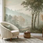
Your living room walls set the whole mood of the space, especially that big stretch above the sofa that begs for a little love. Here are my favorite wall painting ideas for a living room—starting with the classics everyone searches for, then drifting into the artsy, unexpected stuff that makes guests do a double-take.
Oversized Statement Canvas for the Living Room
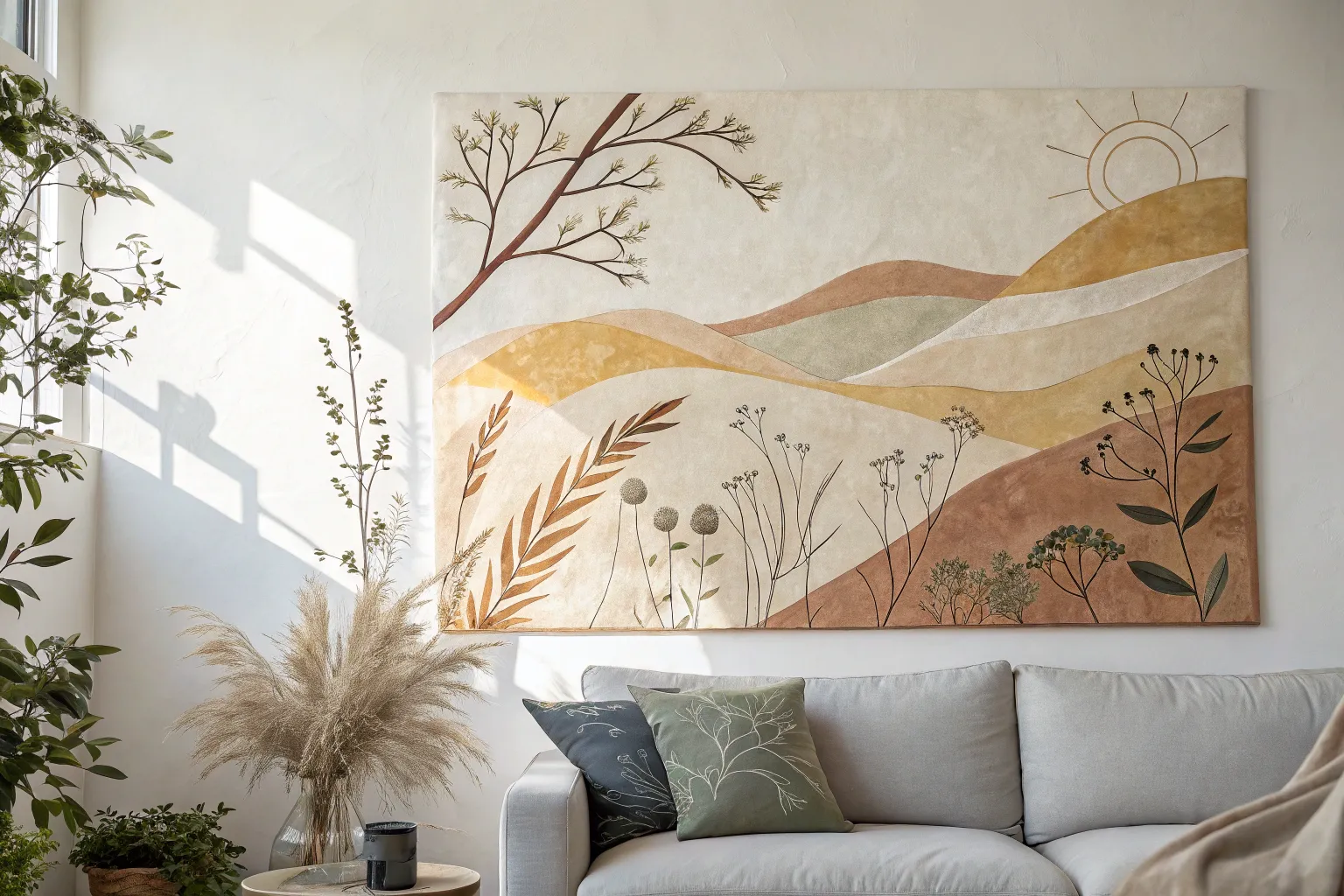
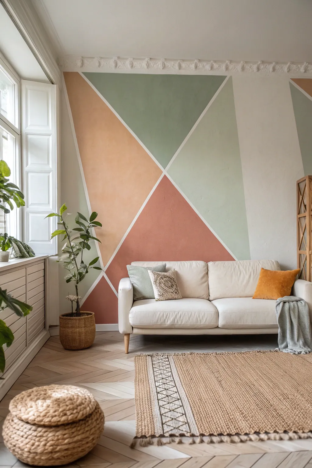
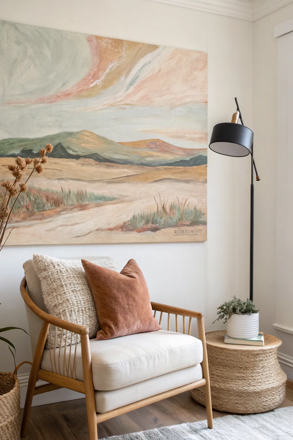
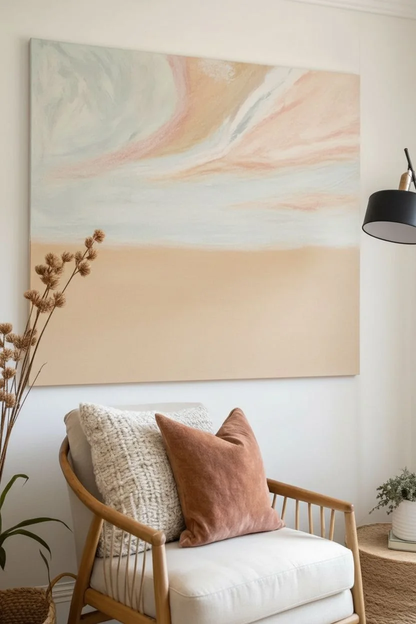
Transform your living space with this sweeping abstract landscape that blends warm terracottas with calming sage greens. This large-scale canvas project uses organic shapes and flat color blocking to create a modern, high-impact focal point that feels both grounded and artistic.
Step-by-Step Tutorial
Materials
- Large horizontally oriented canvas (approx. 36″ x 60″)
- Gesso (white)
- Acrylic paints: Burnt Sienna, Raw Sienna, Terracotta, Sage Green, Titanium White, Unbleached Titanium (Cream)
- Flow improver medium
- Large flat paintbrush (2-3 inch)
- Medium round paintbrush
- Graphite pencil or charcoal stick
- Painter’s tape or masking tape
- Palette or disposable paper plates
- Cup of water and rags
- Floating wood frame (optional, for finishing)
Step 1: Preparation & Sketching
-
Prime the Surface:
Begin by applying a generous coat of white gesso to your entire canvas. Even if the canvas came pre-primed, this extra layer ensures a smoother texture for the large sweeping shapes we will be creating. Let this dry completely. -
Establish the Horizon:
Using a pencil, lightly sketch the dominant curves. Start with the large swoop on the bottom right that curves upwards—this is your anchor shape. -
Map the Main Shapes:
Draw the secondary curves, focusing on the upper left swooping down towards the middle. Keep your wrist loose; these lines should feel organic and fluid, not mathematically perfect geometric arcs. -
Refine the Zones:
Divide the remaining negative space into distinct zones as seen in the reference: a corner circle top right, a wedge on the left, and the background sky areas. Double-check the balance of the composition before you open any paint.
Smooth Operator
Mix a few drops of acrylic flow improver into your paint piles. This helps the brush glide over the large canvas surface without dragging, creating smoother curves.
Step 2: Color Blocking Phase 1
-
Mix the Background Cream:
Combine Titanium White with a touch of Unbleached Titanium. You want a warm, off-white limestone color. Consistency should be like heavy cream. -
Paint the Lightest Areas:
Fill in the large background sections first—the ‘sky’ area in the top left and the curve on the far right. Use your large flat brush for broad, confident strokes. -
Create the Deep Rust:
Mix Burnt Sienna with a dot of red to get that deep, rich rust color. Apply this to the large, dominant curve in the lower right quadrant. -
Add the Upper Arch:
Using a lighter terracotta mix (add some yellow or unbleached titanium to your rust mix), paint the sweeping arch that runs from the top middle towards the left. -
Define the Sage Wedge:
Mix your Sage Green with a little white to soften it. Paint the wedge shape in the bottom left corner, ensuring the edge meets the cream background cleanly.
Step 3: Layering & Texture
-
Second Coat Application:
Once the first layer is touch-dry, apply a second coat to all colored areas. Large canvases often look streaky after one pass; this second layer solidifies the color and adds richness. -
Blend the Transitions:
While the paint is slightly wet, you might want to soften the edges between shapes just a tiny bit so they aren’t razor-sharp, giving it that hand-painted feel. -
Create the Sun Shape:
Mix a vibrant ochre using Raw Sienna and a touch of orange. Paint the semi-circle shape in the top right corner. -
Add Subtle Texture:
I like to take a nearly dry brush with a slightly lighter version of the rust color and scumble it over the dried rust shape. This adds depth and simulates the texture seen in the inspiration piece. -
Refine the White Lines:
Use a smaller flat brush with your cream mixture to tidy up the ‘grout lines’ or separation lines between the colored shapes. These should be fairly consistent in width but follow the natural hand-drawn curves.
Wobbly Lines?
If you struggle with freehand curves, use a piece of string or a flexible strip of cardboard as a guide to trace lightly with chalk before committing with paint.
Step 4: Finishing
-
Final Inspection:
Step back about ten feet to view the canvas. Look for any patches of canvas showing through or uneven coverage and touch them up with the appropriate color. -
Seal the Work:
Once the painting is fully cured (give it at least 24 hours), apply a clear matte varnish. This unifies the sheen of the different paint colors and protects the surface from dust. -
Frame It:
Place the canvas into a light wood floating frame to match the inspiration photo. This specific framing style elevates the piece from a DIY project to ‘gallery’ status.
Hang your massive masterpiece proudly above your sofa and enjoy the visual warmth it adds to the room

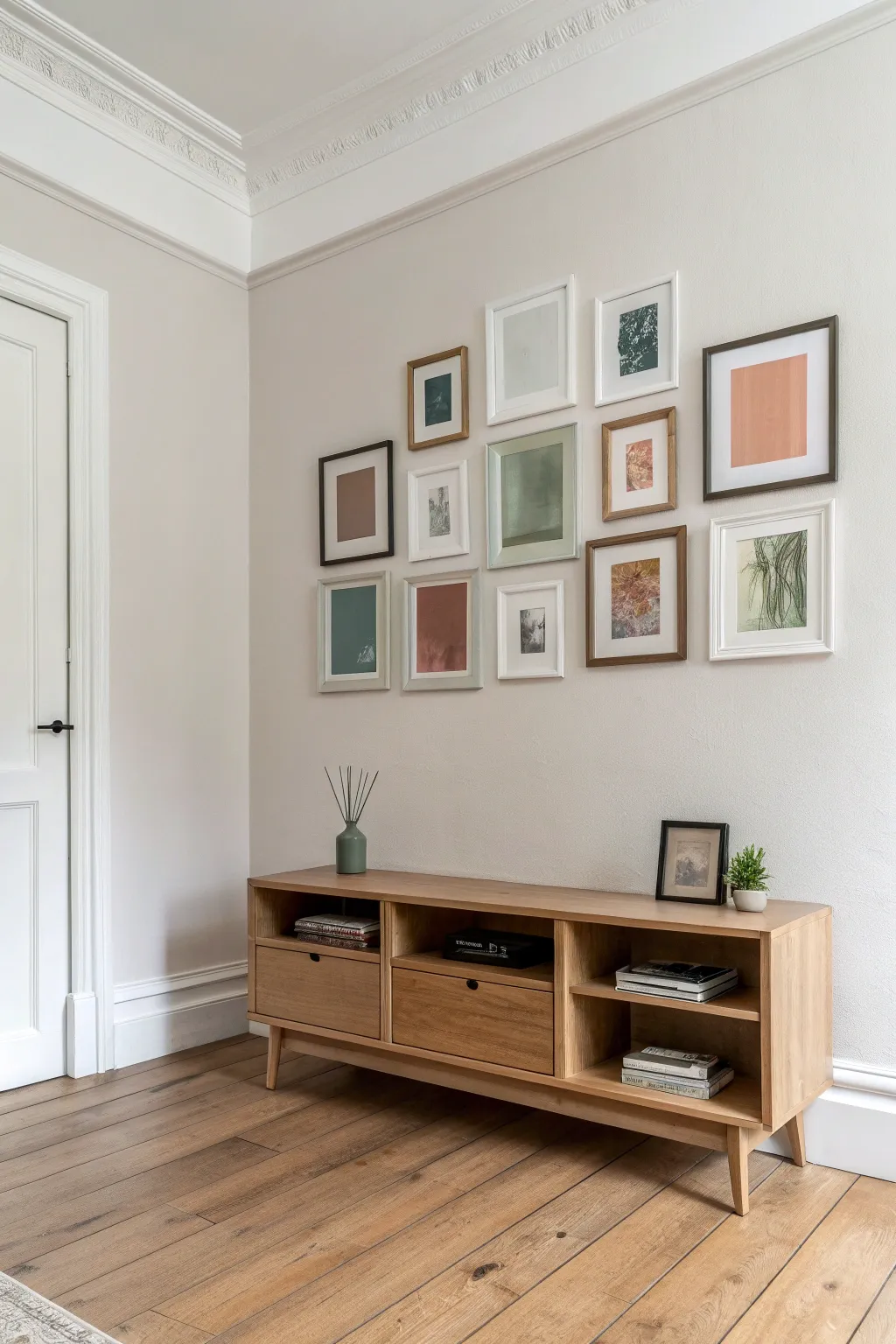
Curated Gallery Wall for the Living Room
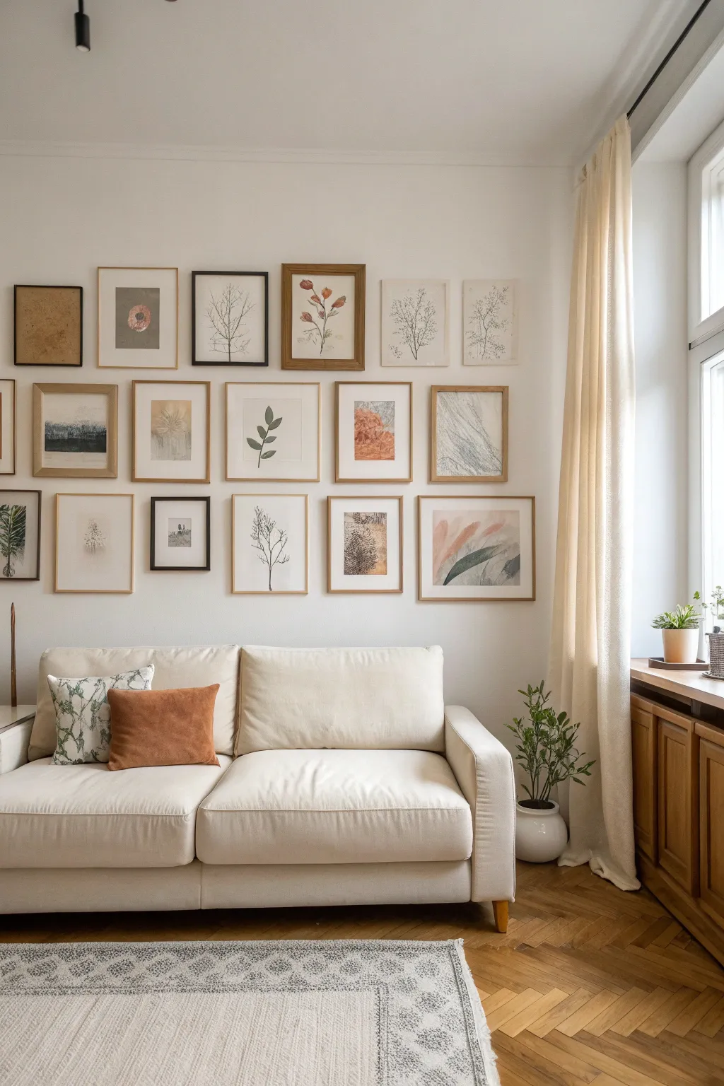
Transform a blank living room wall into a sophisticated focal point with this curated gallery arrangement, featuring a mix of botanical prints and abstract forms in warm, earthy tones. This project balances structured alignment with organic imagery to create a cozy, collected-over-time aesthetic.
How-To Guide
Materials
- A mix of picture frames (approx. 18-20 frames)
- Frame finishes include: black, light oak, medium walnut, and gold/brass
- Various botanical art prints (ferns, branches, flowers)
- Abstract art prints (geometric shapes, textured brushstrokes)
- Kraft paper or newspaper (for templates)
- Painter’s tape or masking tape
- Bubble level or laser level
- Tape measure
- Hammer and picture nails (or Command strips)
- Pencil
- Scissors
Step 1: Curating and Preparing the Art
-
Define your palette:
Begin by selecting artwork that adheres to a strict color story. The image shows a cohesive blend of muted sage greens, terracotta oranges, soft creams, warm browns, and charcoal grays. Avoid bright primary colors to maintain the serene vibe. -
Source your imagery:
Mix different styles of art for a ‘collected’ look. Include literal botanical illustrations (like the branch sketches and pressed flowers), abstract watercolor washes, and textural photography (like the landscape prints). -
Select your frames:
Gather a variety of frames to add depth. You’ll want a mix of thin black metal frames for a modern touch, alongside natural wood frames in both light pine and medium walnut tones to bring warmth. -
Prep the frames:
Clean all frame glass thoroughly on both sides before inserting your art to avoid trapping dust. If using mats, ensure they are a consistent shade of off-white to unify the disparate images.
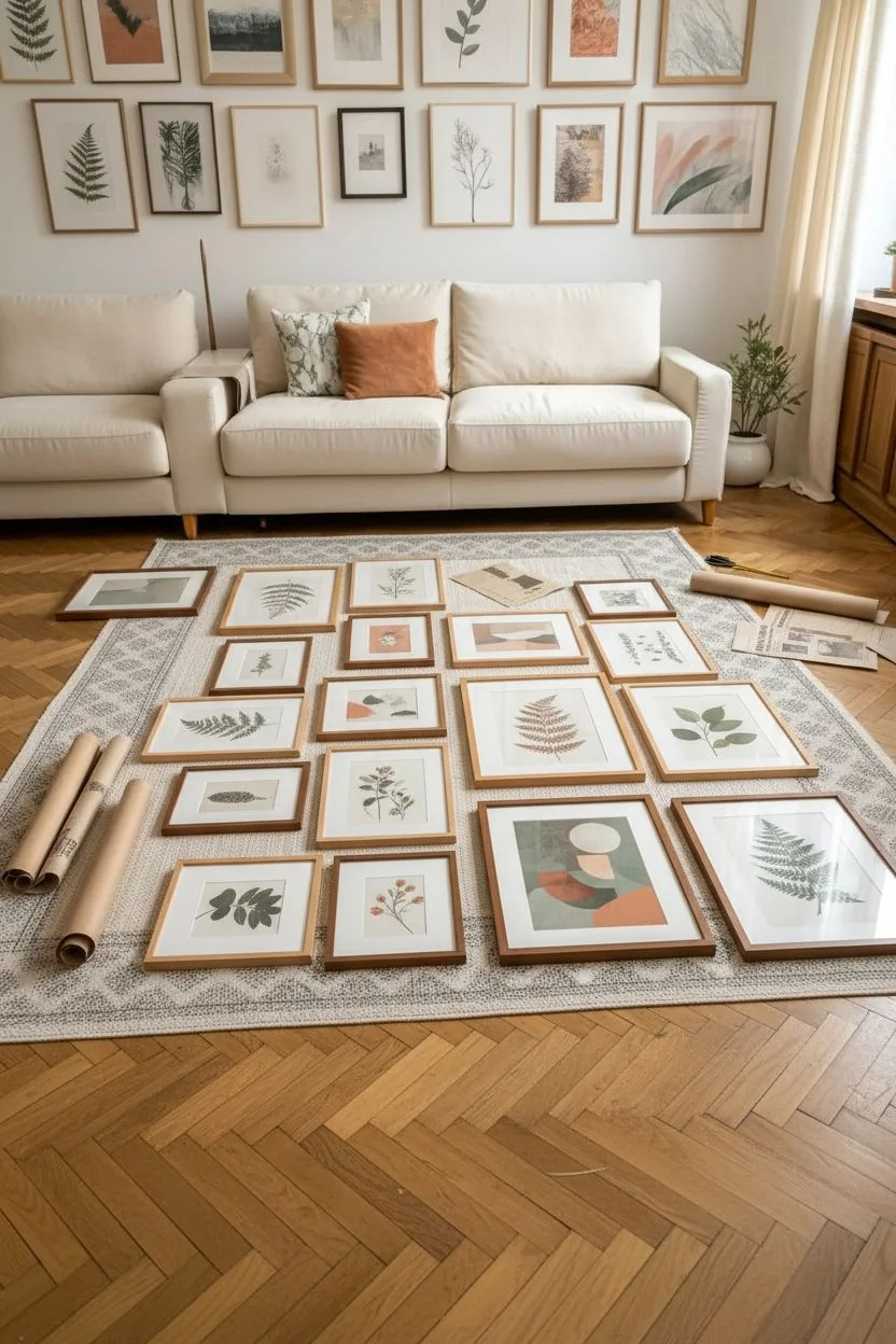
Step 2: Planning the Layout
-
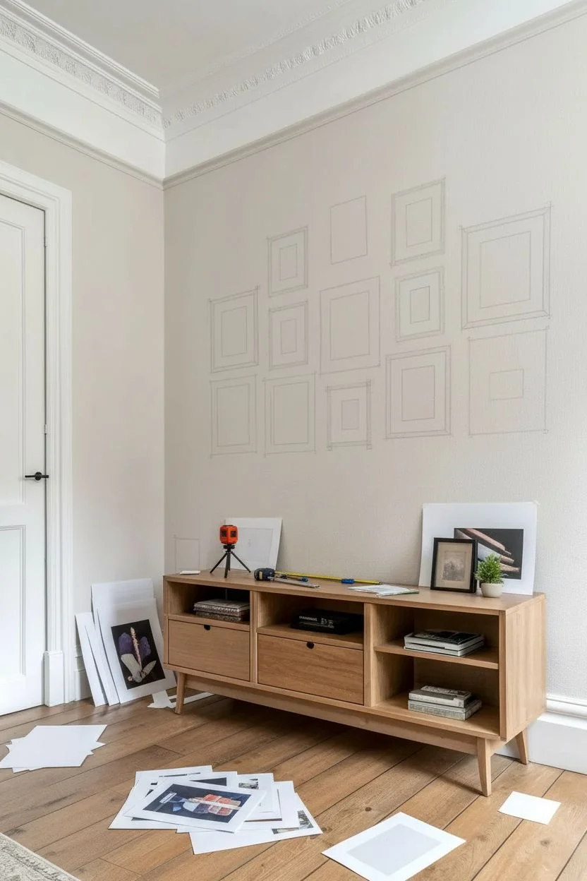
Create paper templates:
Trace every single frame onto kraft paper or old newspaper and cut them out. This is a crucial step I never skip because it saves your walls from unnecessary holes. -
Label the templates:
Write a quick description of the artwork (e.g., ‘large fern’ or ‘abstract orange’) on each paper template so you can visualize the color distribution as you arrange. -
Determine the anchor point:
Identify the center of your wall space above the sofa. Start your arrangement here, roughly 8-10 inches above the top of the sofa back, to ensure the art feels connected to the furniture. -
Arrange on the floor first:
Clear a large space on the floor and lay out your frames. Experiment with spacing here. Aim for a ‘grid-like but loose’ structure, keeping approximately 2-3 inches of space between frames. -
Transfer to the wall:
Using painter’s tape, stick your paper templates to the wall. Start with your central columns and work outward. Step back frequently to check that the visual weight feels balanced.
Visual Weight Balance
Don’t clump all dark frames together. Distribute black frames and wood tones evenly across the layout to keep the eye moving.
Step 3: Executing the Hang
-
Mark your hanging points:
Measure the distance from the top of each frame to its hanging hardware on the back. Transfer this measurement to your paper templates on the wall and mark the spot with a pencil. -
Install the hardware:
Hammer your nails or apply adhesive strips directly through the paper template at your marked spot. This ensures perfect placement every time. -
Remove templates:
Gently tear away the paper templates from underneath the nails or hooks, being careful not to pull off any paint with the tape. -
Hang the frames:
Place each frame on its corresponding hook. Start from the center and work your way out to the edges of the gallery wall. -
Level and adjust:
Place a small level on top of every frame to ensure it is perfectly straight. Use a small bit of museum putty or rolled tape on the bottom corners of frames to keep them from shifting over time.
Uneven Gaps?
If your spacing looks off, cut a ‘spacer’ from cardboard (e.g., exactly 2 inches wide) and use it between frames as you hang for perfect uniformity.
Step 4: Styling the Space
-
Add soft furnishings:
Add a sofa in a neutral cream or beige fabric underneath the gallery wall. This light base allows the artwork to pop without competing for attention. -
Layer in textiles:
Place cushions on the sofa that pull colors directly from the art. A rust-colored velvet pillow echoes the terracotta prints, while a patterned sage pillow ties in with the botanical sketches. -
Incorporate greenery:
Place a potted plant nearby, perhaps on a side table or window sill, to bring the botanical theme of the artwork into the three-dimensional space.
Enjoy the peaceful atmosphere your new personalized art collection brings to the room
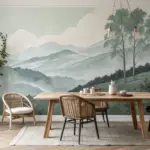
Three-Panel Triptych Painting for the Living Room
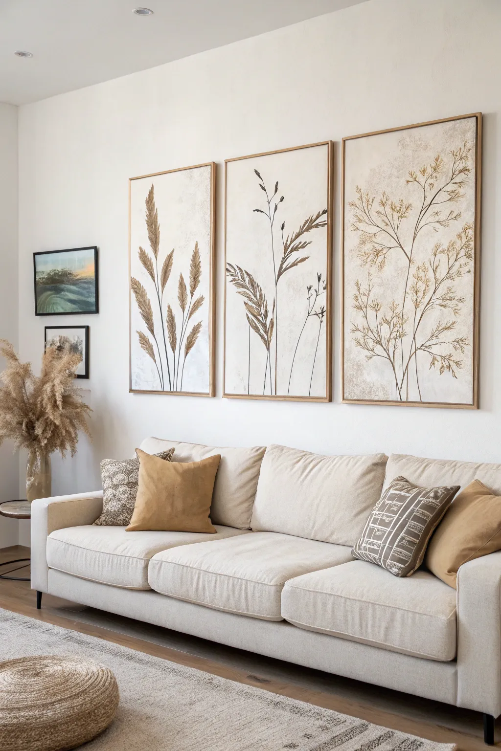
Bring the serene beauty of the outdoors inside with this stunning three-panel botanical art series. Using a soft, neutral palette and organic forms, this triptych creates a cohesive and calming focal point perfect for any modern living space.
Step-by-Step
Materials
- Three large canvases (24×36 or larger)
- Acrylic paints: Titanium White, Unbleached Titanium, Raw Sienna, Burnt Umber, Raw Umber
- Texture paste or modeling paste
- Large flat brush (2-3 inch)
- Medium round brush (size 6 or 8)
- Fine liner brush (size 1 or 2)
- Palette knife
- Pencil
- Matte varnish
- Floating frames (optional)
Step 1: Preparing the Canvas Background
-
Mix the base color:
Start by creating a warm, off-white base color. Mix a large amount of Titanium White with a touch of Unbleached Titanium and a tiny dot of Raw Sienna to warm it up. -
Apply the first layer:
Using your large flat brush, cover all three canvases entirely with this mixture. Don’t worry about perfect smoothness; slight brushstrokes add character. -
Add texture:
While the base coat is still slightly tacky, use a palette knife to scrape on thin patches of texture paste in random areas, focusing on the edges and corners to give it an aged, organic feel. -
Layer muted tones:
Once the texture is dry, mix a watery wash of Raw Sienna and Unbleached Titanium. Lightly glaze this over the textured areas using a damp sponge or rag to create subtle depth and a parchment-like effect. -
Final background blending:
Use a dry brush with a tiny amount of Titanium White to feather over any areas that became too dark, softening the background into a cohesive, cloudy cream surface. Let this dry completely.
Natural Texture
For realistic texture, try mixing actual fine sand or dried tea leaves into your texture paste before applying it to the canvas background.
Step 2: Sketching the Composition
-
Plan the flow:
Line up your three canvases side-by-side. Lightly sketch the main stems with a pencil. I like to have stems leaning slightly inward on the outer panels to guide the eye toward the center. -
Detail the stalks:
For the left panel, sketch tall, wheat-like stalks. For the center, draw taller, thinner grass blades. For the right panel, sketch a branching, airy structure resembling dried fennel or dill.
Step 3: Painting the Botanicals
-
Paint main stems:
Mix a dark brownish-grey using Burnt Umber and a touch of black or blue. With your fine liner brush, paint the thin, delicate lines of the main stems, lifting pressure at the tips for a tapered look. -
Block in seed heads (Left Panel):
Using a mixture of Raw Sienna and Burnt Umber, use a filbert or worn round brush to dab in the shapes of the wheat heads. Use a stippling motion to suggest density. -
Define the grass (Center Panel):
Switch to a lighter mix of Raw Sienna and Unbleached Titanium. Paint the feathery, leaf-like structures on the center panel using long, sweeping strokes that flick outward. -
Create airy branches (Right Panel):
For the right panel, use a very dilute mix of Raw Umber. Paint small, star-like clusters at the ends of the branches to mimic fine seeds or flowers. -
Add highlights:
Mix a light beige (Unbleached Titanium + White). Add highlights to the left side of the stems and the tips of the wheat heads to simulate distinct light source. -
Deepen shadows:
Using pure Burnt Umber, carefully add thin shadow lines on the right side of the main stems and at the base of the leaf joints to create dimension. -
Distress the botanticals:
Once the paint is dry, lightly dry-brush some of your background cream color over parts of the leaves and stems. This makes the plants look faded and integrated into the background.
Golden Hour Glow
Add a few touches of metallic gold paint to the tips of the grasses. It catches the light beautifully and adds a subtle luxury.
Step 4: Finishing Touches
-
Review and refine:
Step back to view all three canvases together. Ensure the horizon lines (where stems start) feel balanced, though they don’t need to be perfectly aligned. -
Seal the artwork:
Apply a coat of matte varnish over the entire surface to protect the paint and texture without adding unwanted shine. -
Frame the triptych:
Install the canvases into minimal light wood floating frames to complete the high-end gallery look shown in the inspiration photo.
Hang your new masterpiece and enjoy the tranquil atmosphere it brings to your home
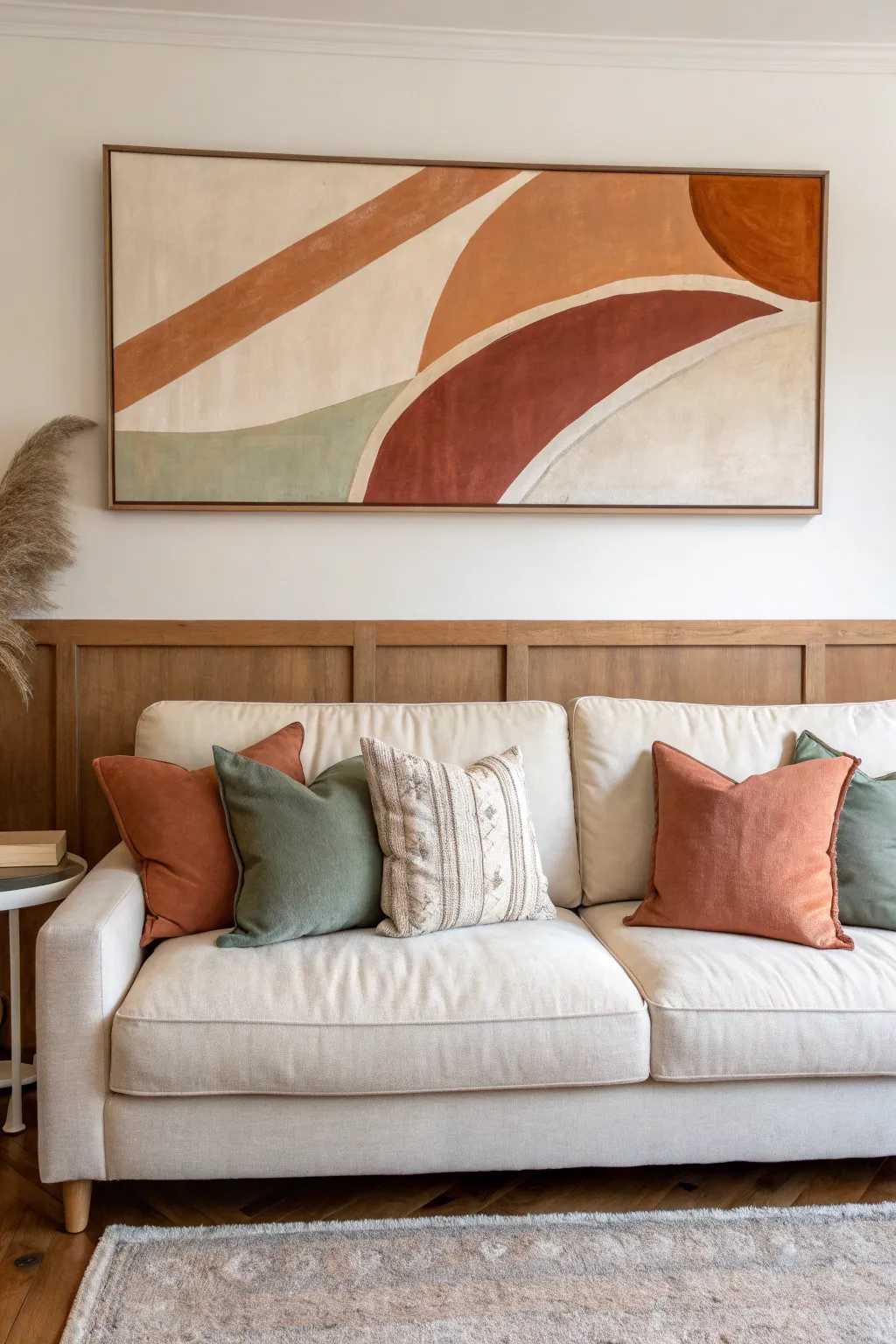
Color-Coordinated Abstract for the Living Room Wall
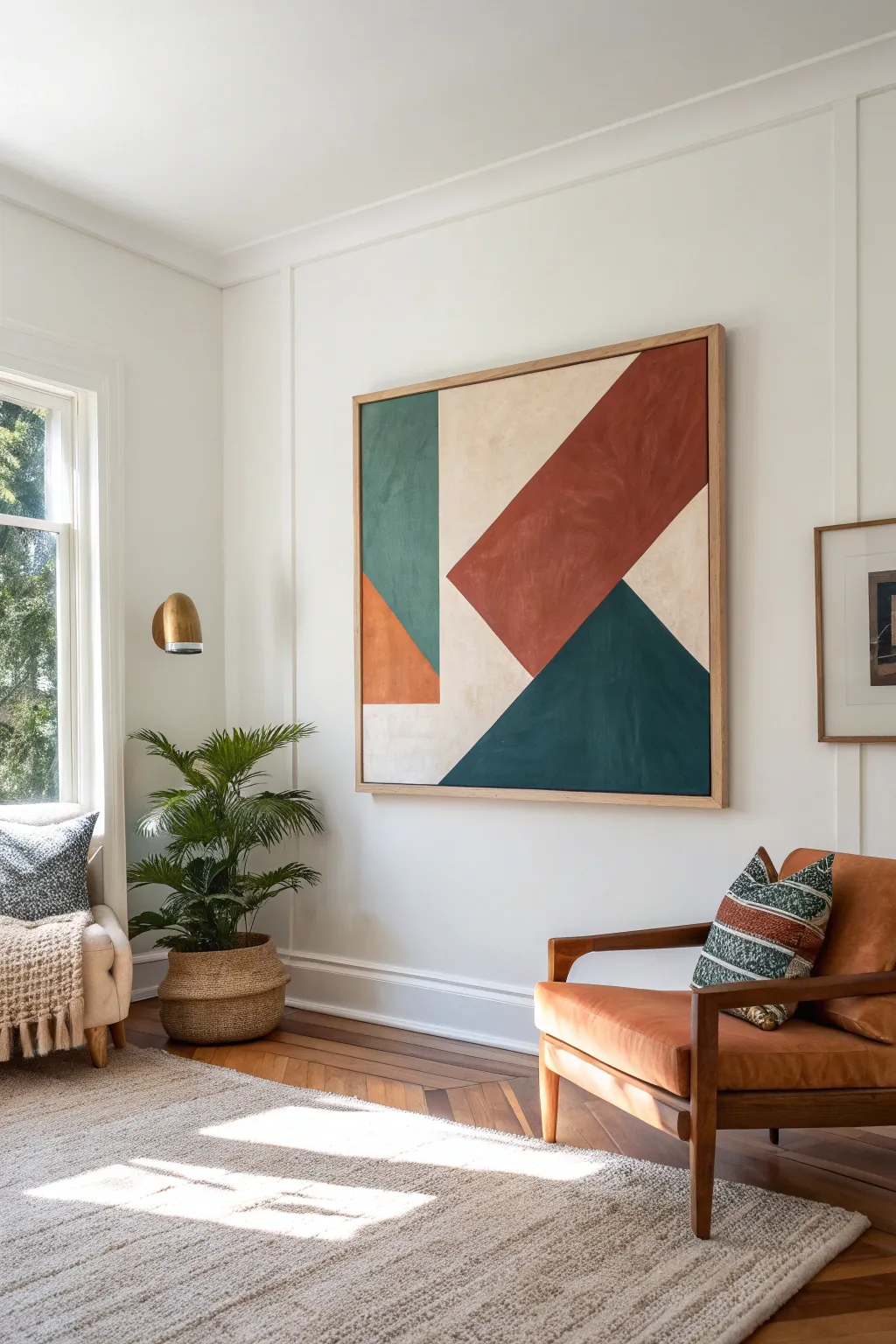
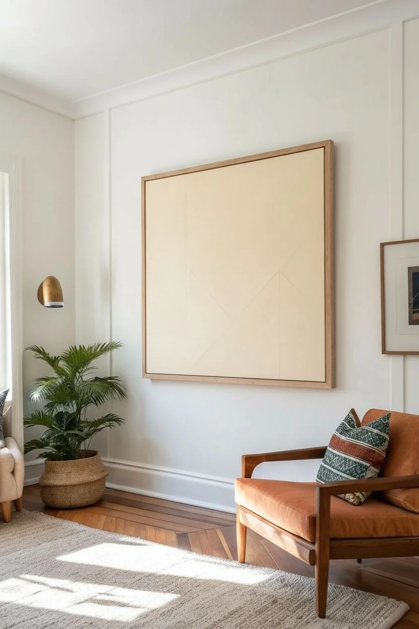
This striking large-scale abstract painting uses bold terracotta, deep teal, emerald green, and cream to create a dynamic interplay of shapes. The clean lines and earthy tones make it a sophisticated yet grounded focal point perfect for anchoring a modern living room.
How-To Guide
Materials
- Large square canvas (approx. 48×48 inches)
- Acrylic paints (terracotta/burnt sienna, deep teal/Prussian blue, emerald green, warm cream/unbleached titanium, burnt orange)
- Painter’s tape (various widths, preferably 1-inch and 2-inch)
- Wide flat synthetic brushes (2-inch to 4-inch)
- Medium flat synthetic brush (for edges)
- Light pencil
- Ruler or yardstick
- Floating wood frame (optional, for finishing)
- Gesso (if canvas isn’t pre-primed)
- Matte varnish
Step 1: Planning and Layout
-
Prime the Surface:
Ensure your large canvas is clean and ready. Even if it is pre-primed, I like to add a fresh coat of gesso to ensure a smooth, uniform tooth for the paint to grip. -
Establish the Base:
Paint the entire canvas with two coats of your warm cream or unbleached titanium color. This will serve as the background color and the light stripes you see in the final design. Let this dry completely overnight. -
Visual Mapping:
Using a pencil and a long straight edge, lightly sketch out the major geometric zones. Start with the large diagonal line that splits the bottom right teal triangle from the rest. -
Refining Shapes:
Draw the secondary diagonal line for the large terracotta rectangle. Notice how it creates a ‘K’ shape or disjointed arrows against the background. Don’t press too hard with the pencil.
Crisp Line Secret
Always pull your tape off while the paint is still slightly damp, not bone dry. This prevents the dried paint ‘skin’ from lifting up with the adhesive.
Step 2: Taping and Painting
-
Masking the First Shapes:
Apply painter’s tape firmly along the OUTSIDE of your pencil lines for the first set of colors you want to paint. It’s best to start with the shapes that don’t touch each other, like the small orange triangle and the large dark teal triangle. -
Sealing the Tape:
To get those razor-sharp lines, brush a very thin layer of your base cream color over the edge of the tape. This seals any gaps and prevents the darker colors from bleeding underneath. -
Mixing the Teal:
Mix a deep teal using Prussian blue, a touch of emerald green, and a tiny bit of black or burnt umber to deepen it. Apply this to the large bottom-right triangle. -
Applying the Orange Accent:
Fill in the small triangle on the left side with a burnt orange color. This small pop of brightness balances the larger visually heavy shapes. -
Wait and Reveal:
Allow these sections to dry until they are touch-dry, then carefully peel back the tape at a 45-degree angle. Let the paint cure fully before taping over any painted sections. -
Masking the Green:
Once the first shapes are dry, tape off the area for the vertical emerald green rectangle on the left. Ensure your tape lines correspond to the initial sketch. -
Painting the Green:
Paint the vertical rectangle with a muted emerald green. Use long, vertical brushstrokes to keep the texture consistent with the shape’s orientation.
Step 3: The Final Layers
-
The Terracotta Section:
Tape off the large diagonal rectangle in the center. This is the dominant shape, so take care with your alignment. -
Adding Texture:
Mix a terracotta shade using burnt sienna and a little cream. When applying this, don’t aim for perfect flatness; subtle brushstroke variations add depth and make it look like a high-end gallery piece. -
Removing Final Tape:
Remove the tape from the terracotta section. You should now see the cream background appearing as ‘negative space’ lines separating all your colored blocks. -
Touch Ups:
Inspect your lines. If any paint bled through, use a small angled brush and your cream base paint to carefully clean up the edges. -
Varnishing:
Once the painting has cured for at least 24-48 hours, apply a layer of matte varnish to protect the surface and unify the sheen of the different colors. -
Framing:
Install the canvas into a simple light wood floating frame. This adds a polished boundary that complements the warm tones in the artwork.
Textural Depth
Mix a small amount of modeling paste into the terracotta and teal paints. This adds a physical texture that catches the light beautifully.
Hang your new masterpiece in a well-lit spot to let the rich earth tones warm up the room
BRUSH GUIDE
The Right Brush for Every Stroke
From clean lines to bold texture — master brush choice, stroke control, and essential techniques.
Explore the Full Guide
High-Texture Neutral Art for the Living Room
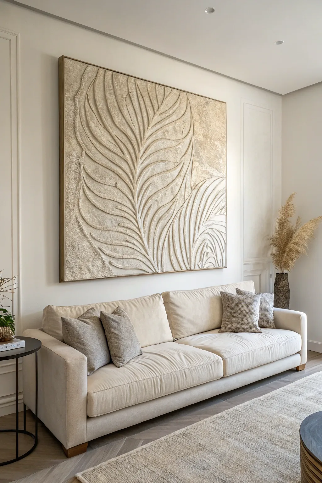
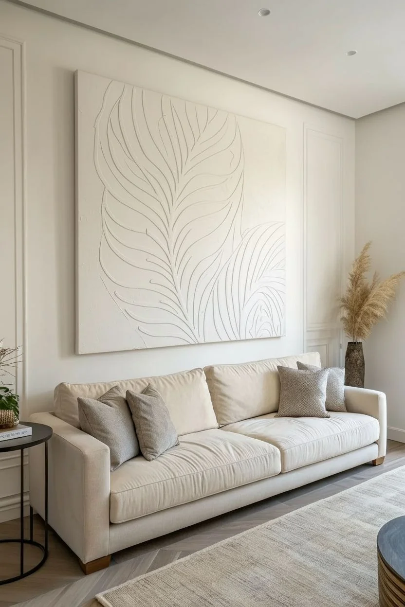
Bring the calming influence of nature indoors with this large-scale textured art piece. By manipulating joint compound or modeling paste, you will create a stunning, dimensional palm frond relief that feels high-end and custom-made.
Step-by-Step
Materials
- Large canvas (e.g., 48×48 or larger) or prepared plywood panel
- Pre-mixed joint compound (lightweight formulation) or acrylic modeling paste
- White Gesso (optional, for priming)
- Wide putty knife or drywall taping knife
- Various sculpting tools (palette knives, clay tools, or even spoons)
- Spray bottle with water
- Sanding sponge (medium grit)
- Acrylic paint (warm white, cream, or light beige)
- Paintbrushes (large flat brush and a smaller detail brush)
- Frame molding (optional, for framing)
Step 1: Preparation & Base Layer
-
Prepare the surface:
Ensure your canvas is taut. If using a wood panel, sand it lightly. Apply a coat of gesso if the surface is raw to help the compound adhere better. Let it dry completely. -
Draft the design:
Lightly sketch the large, sweeping curves of the palm leaf stem and the flowing outlines of the fronds using a pencil. Keep the composition dynamic; let the leaves span almost the entire height of the canvas. -
Apply the base layer:
Using a wide putty knife, spread a thin, even layer of joint compound over the specific area where your first leaf section will be. Work in sections so the compound doesn’t dry out before you sculpt it. -
Build up height:
Apply more compound to the areas inside your sketched leaf outlines. The layer should be about 1/4 inch thick here to allow for deep carving later.
Step 2: Sculpting the Motif
-
Carve the central stem:
Use a palette knife or a rounded clay tool to carve out the central spine of the palm leaf. Drag the tool smoothly through the wet compound to create a clean, recessed line. -
Define the fronds:
Working outward from the stem, use a narrower tool to carve the individual leaf segments. Create sweeping, curved channels that mimic the organic flow of a palm frond. -
Add surface texture:
For the raised parts of the leaves, don’t leave them perfectly smooth. Dab them gently with a sponge or a crumpled plastic bag to create a stone-like, organic texture. -
Refine the edges:
Use a damp brush to smooth out any unwanted sharp peaks or distinct ridges where the leaf meets the background. This softens the transition and makes the relief look more sculptural. -
Create background contrast:
For the negative space around the leaves, apply a thinner layer of compound and roughen it significantly. I like to use a stiff bristle brush and stipple this area to make it look like rough plaster or stone. -
Review and moisten:
If the compound starts dragging or tearing while you work, mist it very lightly with water from your spray bottle to regain plasticity.
Preventing Cracks
Thick compound often cracks as it shrinks. To prevent this, build up height in two thin layers rather than one thick glob, letting the first layer dry completely before adding the second.
Step 3: Finishing Touches
-
Let it cure:
Allow the artwork to dry thoroughly. This is crucial—thick joint compound can take 24 to 48 hours to cure completely. It will turn bright white when dry. -
Sand for smoothness:
Once bone dry, take a medium-grit sanding sponge and very gently sand the high points of the leaf ridges to knock down any dangerously sharp spikes. -
Paint the first coat:
Mix a warm white or creamy beige acrylic paint. Using a large brush, coat the entire piece. Be sure to jab the bristles into the deep crevices of the texture. -
Apply a wash (optional):
To enhance depth, dilute a slightly darker beige paint with water (50/50 mix). Brush this over the textured areas and immediately wipe the high points with a rag, leaving the darker color in the recesses. -
Dry brush highlights:
Load a dry brush with a very light, almost white paint. Lightly skim the surface of the raised leaf veins. This technique, called dry brushing, instantly makes the texture pop. -
Seal the work:
Apply a clear matte varnish spray to protect the surface from dust and moisture, especially if you used joint compound which is porous. -
Frame the piece:
Finish the look by attaching a simple wooden floating frame or nailing thin wood molding strips to the outer edges of the canvas for a polished border.
Level Up: Metallic Glaze
Mix a tiny amount of gold mica powder into your final clear sealant. This adds a subtle, luxurious shimmer that only appears when sunlight hits the texture.
Hang your masterpiece in a spot with good natural light to let the shadows play across the beautiful textures you’ve created
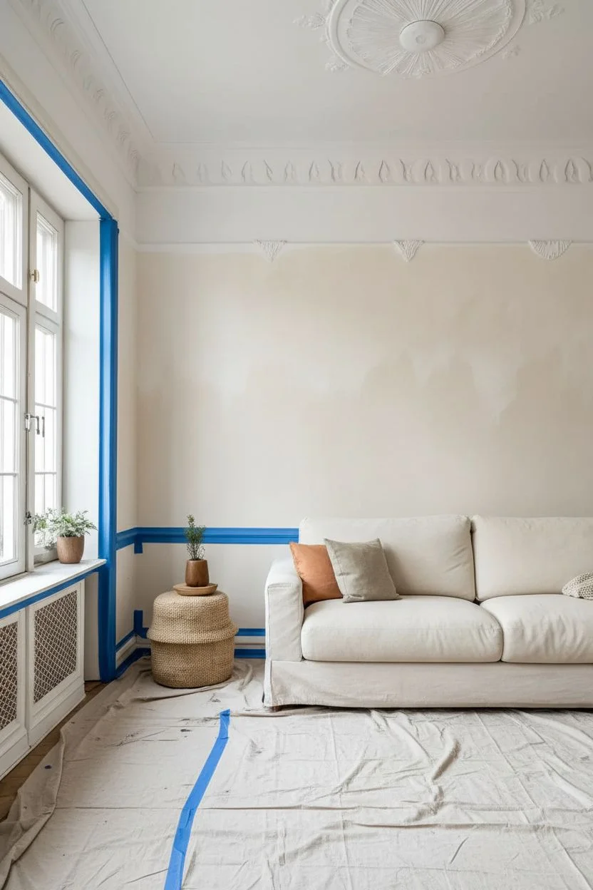
Bold Painted Accent Wall for the Living Room
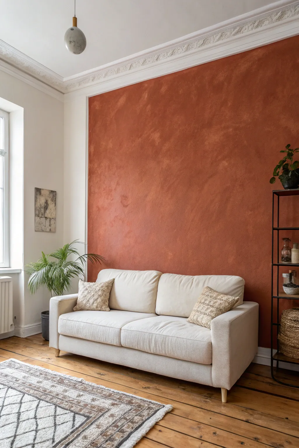
Bring the warmth of the Mediterranean into your living room with this textured accent wall project. Using a limewash or mineral paint technique creates a soft, cloudy depth that feels organic and far more sophisticated than flat latex paint.
Detailed Instructions
Materials
- Terracotta or burnt orange limewash paint (or mineral paint)
- Block brush (wide masonry brush)
- Painter’s tape
- Drop cloths
- Primer specifically designed for limewash
- Paint tray and liner
- Clean bucket for water
- Sanding sponge (fine grit)
- Mixing stick
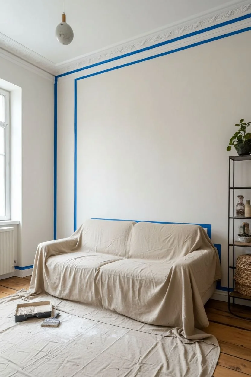
Step 1: Preparation
-
Clear the area:
Move the sofa and any other furniture at least three feet away from the wall to give yourself ample working room. Lay down drop cloths to protect your beautiful wood floors from potential Splatters. -
Prepare the surface:
Inspect the wall for any holes or cracks. Fill them with spackle, let dry, and sand smooth. Since mineral paints reveal texture, make sure the base is as even as possible. -
Tape the edges:
Apply painter’s tape along the ceiling line, baseboards, and adjacent walls. Press the tape edge down firmly with your fingertip or a putty knife to prevent bleed-through. -
Apply the special primer:
This step is critical. Roll on a coat of the mineral-based primer designed for your specific paint brand. Regular primer might not bond correctly with limewash.
Step 2: First Coat Application
-
Stir the paint:
Open your terracotta limewash and stir thoroughly. Mineral pigments settle quickly, so you need to ensure the color is consistent from the bottom of the can to the top. -
Cut in the edges:
Use your block brush to paint a 3-inch border around the perimeter of the wall. Do this in sections rather than doing the whole border at once to keep a wet edge. -
Begin the X-pattern:
Load your large block brush with paint. Starting from the top corner, apply the paint using random ‘X’ or distinct crisscross strokes. Avoid straight vertical or horizontal lines. -
Work in clouds:
Paint in organic, cloud-like patches measuring about 3-4 feet wide. I like to keep the edges of these patches jagged and uneven so they blend better with the next section. -
Maintain a wet edge:
Move across the wall efficiently. You want to blend the new section into the previous one while the paint is still damp to avoid harsh lap lines. -
Finish the first layer:
Continue the crisscross technique until the entire wall is covered. Don’t worry if it looks patchy or sheer right now; transparency is part of the process.
Uneven drying?
Don’t panic! Limewash dries significantly lighter than it looks when wet. If you see dark splotches, wait the full drying time. It often evens out completely as the moisture evaporates.
Step 3: Building Depth
-
Let it dry:
Allow the first coat to dry completely. This usually takes 2-4 hours, though the paint will look significantly lighter as it dries. -
Assess the texture:
Look at your brushwork. If you see unwanted drips or overly thick ridges, lightly knock them down with a fine-grit sanding sponge. -
Apply the second coat:
Repeat the X-stroke application. This layer builds opacity and enhances that cloudy, velvety movement. Vary your starting points so you aren’t repeating the exact pattern of the layer below. -
Feather the strokes:
As your brush runs low on paint, use that ‘dry brush’ to feather out the edges of your strokes. This creates the soft, smoky transitions that define the limewash look. -
Check for holidays:
Stand back and look for any unintended white spots (holidays). Dab a little paint onto these areas and feather it out immediately.
Mist for movement
Keep a spray bottle of water handy. If the paint is drying too fast or you want softer transitions, lightly mist the wall as you brush to extend the working time.
Step 4: Finishing Touches
-
Remove tape carefully:
Ideally, peel off the painter’s tape while the second coat is still slightly tacky to ensure a crisp clean line without peeling paint. -
Final cure:
Let the wall cure for at least 24 hours. The lime will undergo a chemical reaction with the air (carbonation), hardening and deepening the final color bloom. -
Optional sealing:
If this room gets heavy traffic or you have kids, consider applying a matte sealer. However, leaving it unsealed preserves the authentic chalky aesthetic best. -
Style the space:
Move your neutral sofa back into place. The warm terracotta tones look incredible paired with cream, beige, and natural greenery.
Enjoy the cozy, sun-baked atmosphere your new accent wall adds to the room

PENCIL GUIDE
Understanding Pencil Grades from H to B
From first sketch to finished drawing — learn pencil grades, line control, and shading techniques.
Explore the Full Guide
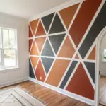
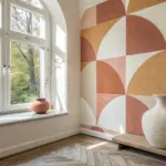
Geometric Color-Block Wall Painting for the Living Room
Transform your living space with this striking geometric accent wall featuring large-scale intersecting triangles in a soothing palette of terracotta, sage, and blush. The crisp white lines defining each shape add a modern structure to the organic, earthy tones, creating a sophisticated focal point.
Step-by-Step
Materials
- Painter’s tape (1.5 – 2 inch width)
- Interior wall paint (Terracotta/Burnt Orange)
- Interior wall paint (Sage Green)
- Interior wall paint (Blush/Peach)
- Interior wall paint (Pale Grey or Mint)
- White wall paint (for base/lines)
- Paint rollers (medium nap) and tray
- Angled sash brush (2 inch)
- Drop cloths
- Ladder
- Pencil
- Level and straight edge (optional)
Step 1: Preparation & Base Coat
-
Clear and clean:
Remove all furniture, rugs, and wall hangings from the working area. Lay down drop cloths to protect your floor, ensuring they are flush against the baseboards. -
Surface prep:
Wipe the wall down with a damp cloth to remove dust. Patch any holes with spackle and sand smooth once dry to ensure a flawless finish. -
Apply base color:
Paint the entire wall with your chosen white base color. This will not only serve as the background but also form the crisp white lines between your colored shapes later. -
Dry thoroughly:
Allow the white base coat to dry completely for at least 24 hours. This is crucial because you will be applying tape directly over it, and fresh paint can peel if not fully cured.
Seal Avoids Bleeding
Before adding color, brush a light coat of your BASE wall color over the tape edges. This fills tiny gaps, ensuring your colored lines stay razor-sharp.
Step 2: Design & Taping
-
Map the design:
Sketch your geometric design lightly on the wall using a pencil. Start with large diagonal lines that intersect to create triangles of varying sizes. -
Apply the tape:
Apply your painter’s tape along the outside of your pencil lines. Remember that the area *under* the tape will remain white, creating the borders shown in the image. -
Seal the edges:
Run a credit card or putty knife firmly along the edges of the tape to secure it to the wall. This prevents paint from bleeding under the tape. -
The sealing trick:
I always paint a thin layer of the *base white paint* over the edges of the tape first. This seals the tape line so any seepage is just white-on-white, guaranteeing razor-sharp lines later.
Step 3: Painting the Shapes
-
Plan your palette:
Mark each taped-off section with a small piece of tape or a sticky note labeled with the color intended for that shape (e.g., ‘sage’, ‘terracotta’) to avoid confusion while painting. -
Cut in the edges:
Using your angled sash brush, carefully paint the edges of your first shape (e.g., the large sage green triangle at the top), brushing away from the tape to minimize buildup. -
Fill the center:
Use a roller to fill in the body of the shape. Apply moderate pressure to ensure even coverage without creating thick texture. -
Switch colors:
Move on to a non-adjacent shape, like the blush pink section, using a fresh brush and roller cover (or washed and dried tools). This prevents accidental smudging of wet paint. -
Continue the pattern:
Proceed to fill in the remaining shapes—the deep terracotta and the pale grey—working systematically across the wall. -
Apply second coat:
Once the first coat is dry to the touch (usually 2-4 hours), apply a second coat to each color block for rich, opaque saturation.
Level Up: Texture
Mix a texture additive like suede or sand into one of the paint colors (like the terracotta) for a tactile, plaster-like finish that adds depth.
Step 4: The Reveal
-
Remove tape:
This is the satisfying part. Remove the tape while the paint is still slightly tacky/damp, not fully dried. Pull the tape slowly at a 45-degree angle away from the painted edge. -
Touch ups:
Inspect your lines closely. If any tiny bleeds occurred, use a small artist’s brush and your white base paint to correct them once the colored paint is fully dry. -
Final cure:
Allow the entire wall to cure for another 24 hours before moving furniture back against it to prevent scuffing the fresh mural.
Step back and admire how this simple taping technique creates a sophisticated architectural feature in your home
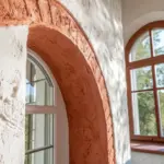
Painted Arch “Headboard” Shape for the Living Room Sofa Wall
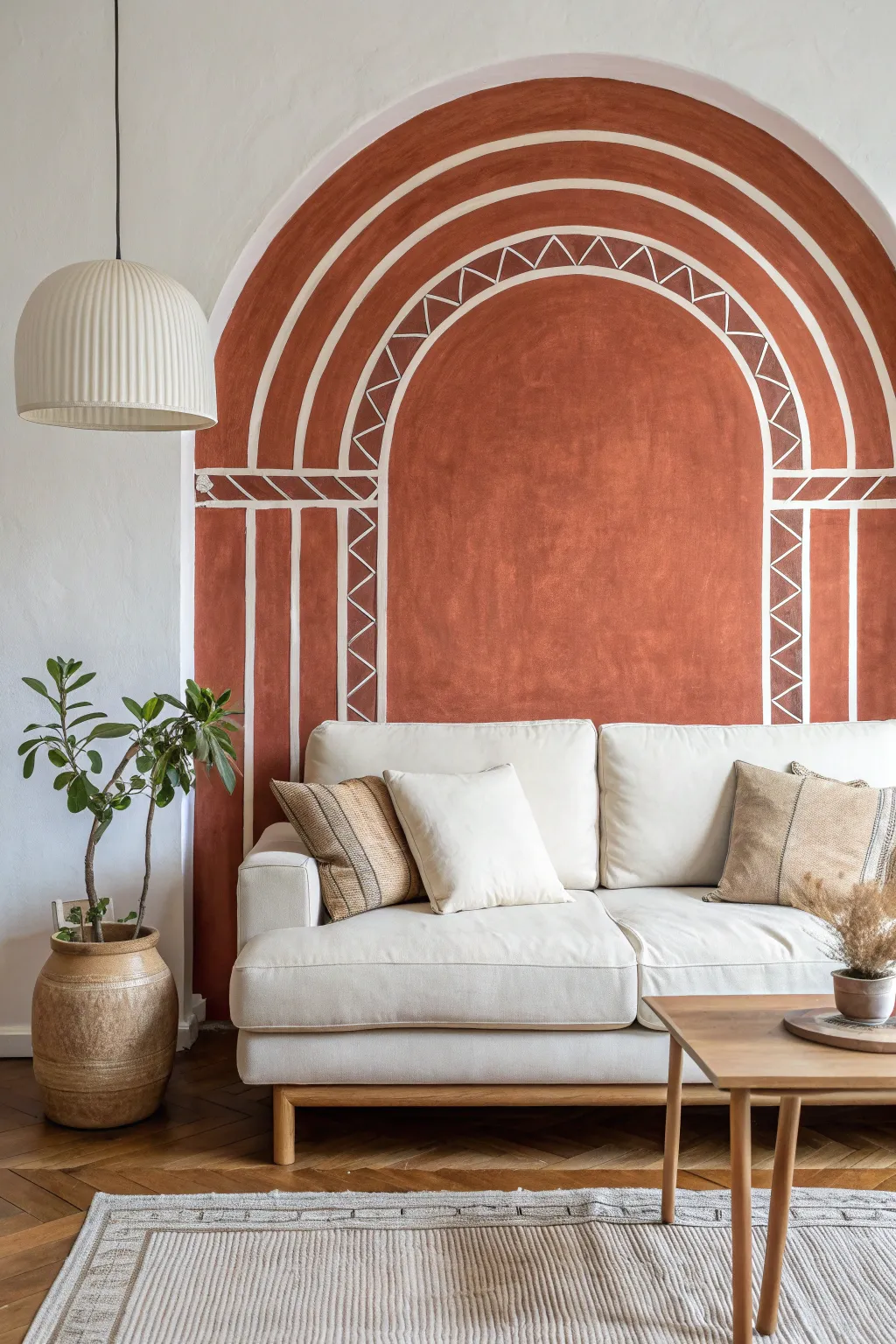
Transform your living room by framing your sofa with a stunning, earthy arch that mimics architectural depth. This terracotta-toned mural features striking white geometric linework, creating a sophisticated focal point without needing actual structural changes.
Step-by-Step Tutorial
Materials
- Terracotta colored interior latex paint (matte or eggshell finish)
- White interior latex paint or thick white paint marker
- Pencil for sketching
- Painter’s tape (multi-surface)
- String and a thumb tack (to create a compass)
- Small angled sash brush (1.5 – 2 inch)
- Medium roller and tray
- Fine detail artist brush (round size 4 or 6)
- Measuring tape
- Long level or straight edge
Step 1: Planning and Sketching
-
Measure and mark the center:
Find the center point of your wall or the exact spot where you want the arch to sit centered behind your sofa. Mark a small ‘X’ at the height where the arch curve will begin (usually about 4-5 feet off the ground). -
Create a string compass:
Tie one end of a non-stretchy string to a pencil and pin the other end to your center ‘X’ using a thumb tack. Adjust the string length to define your outer arch radius. -
Draw the primary arches:
Drawing lightly, swing the pencil to create your outermost semi-circle. Shorten the string by about 4-5 inches and draw a second inner line. Repeat this process until you have four distinct concentric arch lines. -
Extend the lines downward:
Use a long level and a pencil to draw straight vertical lines extending from the ends of your semi-circles down to the floor (or baseboard). These will form the columns of the design. -
Mark the horizontal band:
Measure a horizontal band across the ‘columns’ just below where the arch starts curving. This decorative belt connects the vertical lines to the arch above.
Step 2: Painting the Base Shape
-
Cut in the edges:
Using your small angled brush and the terracotta paint, carefully paint along the outermost pencil line of the arch and the straight vertical sides. A steady hand is key here. -
Fill the interior:
Once the outline is established, use a roller to fill in the entire shape with the terracotta paint. Don’t worry about the white lines yet; paint the whole silhouette as a solid block of color. -
Apply a second coat:
Let the first coat dry completely (usually 2-4 hours). Apply a second coat to ensure a rich, opaque finish that looks like plaster.
Clean Lines Hack
For steadier curved lines, don’t just move your wrist. Lock your wrist and move your entire arm from the shoulder. This creates smoother, more confident strokes.
Step 3: Adding the Details
-
Trace spacing for white lines:
Once the base paint is fully cured (give it overnight if possible), use your string method again to lightly trace the inner arch paths over the dry terracotta paint using a white chalk pencil or faint graphite. -
Paint the concentric stripes:
Using a fine detail brush and white paint, carefully trace over your curved lines. These lines act as barriers between the solid bands and the patterned bands. -
Draft the zig-zags:
In the second band from the center, lightly mark points at equal intervals along the curve. Connect these dots with diagonal lines to create a continuous zig-zag or triangle pattern. -
Paint the decorative triangles:
Go over your zig-zag sketches with the white paint. Keep the paint consistency creamy so it flows smoothly off the brush without dripping. -
Add the horizontal detail:
Paint the horizontal band separating the arch from the columns. Inside this band, add diagonal hash marks to create a rope-like effect. -
Detail the vertical columns:
Continue the pattern down the vertical sides. Paint the long vertical dividing lines first, then add the zig-zag motif to the corresponding outer columns. -
Touch up edges:
Inspect your work from a distance. Use a tiny bit of the terracotta paint to clean up any white lines that got too thick or wobbly.
Textured Effect
Mix a Texture Additive or a cup of baking soda into your terracotta paint for a rough, plaster-like finish that makes the mural look authentically Mediterranean.
Step back and admire how this simple painted feature adds incredible warmth and architectural interest to your room


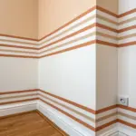
Two-Tone Horizontal Banding for the Living Room Wall
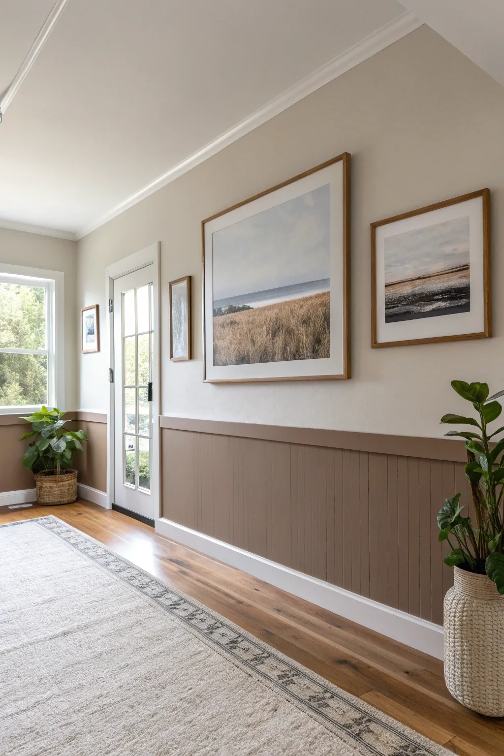
Transform a plain hallway into a textured, gallery-style space with this sophisticated two-tone wall treatment. By combining crisp white wainscoting with a warm, sandy-taupe beadboard, you create a grounding horizontal band that beautifully anchors framed artwork.
Detailed Instructions
Materials
- Beadboard paneling sheets (4×8 feet)
- Top cap trim molding (1×2 or similar)
- Baseboard molding (to match existing or new)
- Construction adhesive (Liquid Nails)
- Paneling nails or brad nails
- Brad nailer or hammer
- Circular saw or jigsaw
- Level
- Stud finder
- Caulk and caulk gun
- Wood filler
- Fine-grit sandpaper (220 grit)
- Painter’s tape
- Primer (if beadboard is unprimed)
- Paint: Warm Taupe/Dark Beige (Satin or Eggshell finish)
- Paint: Warm White (Satin or Eggshell finish for upper wall)
- Paint: Semi-gloss White (for trim)
- Paint rollers (foam for smooth finish) and angled sash brushes
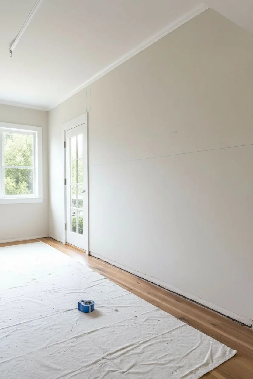
Step 1: Preparation and Wall Marking
-
Assess the Space:
Begin by removing any existing baseboards carefully if you plan to reuse them, though installing new, taller baseboards often looks better with beadboard. Clear the room of furniture and cover floors with a drop cloth. -
Determine Height:
Decide on the height of your beadboard. In the reference image, the wainscoting sits at about one-third of the wall height, roughly 32 to 36 inches. Use a tape measure to mark this height at several points along the wall. -
Draw a Level Line:
Using a long level or a laser level, connect your height marks to create a perfectly horizontal reference line around the room. This line represents where the top of your paneling will sit.
Uneven Seams?
If beadboard seams aren’t flush due to wavy walls, don’t force them. Use a little extra construction adhesive behind the seam and brace it until dry, then rely on wood filler to hide the joint.
Step 2: Installing the Beadboard
-
Locate Studs:
Use a stud finder to mark the vertical studs along your walls. Marking them just above your level line ensures you can see them once the panels are in place. -
Cut Panels to Size:
Measure the distance from the floor to your level line. Cut your beadboard sheets to this height using a circular saw. I like to cut them just *slightly* shorter (about 1/4 inch) to allow for floor unlevelness, as the baseboard will cover the gap. -
Apply Adhesive:
Apply construction adhesive in a zigzag pattern on the back of your first cut panel. -
Secure the Panel:
Press the panel against the wall, aligning the top edge with your level line. Use a brad nailer to secure it into the studs you marked earlier. If you don’t have a nail gun, paneling nails and a hammer work fine. -
Continue Installation:
Repeat the process for the remaining beadboard sections, butting the edges tightly together. If you encounter outlets, measure carefully and use a jigsaw to cut out the openings before installing the panel.
Level Up: Gallery Ledge
Instead of a standard flat trim cap, install a deeper picture ledge molding (2-3 inches deep). This allows you to lean small frames or artwork directly on the wainscoting for flexible decor.
Step 3: Trim and Finish Work
-
Install Baseboards:
Nail your baseboards along the bottom of the beadboard. This hides the gap at the floor and anchors the look. -
Add the Top Cap:
Install the top cap molding along the upper edge of the beadboard. This ledge creates a finished transition between the wood paneling and the drywall above. -
Fill and Sand:
Fill all nail holes and any gaps between panel seams with wood filler. Once dry, sand these spots smooth with fine-grit sandpaper so they become invisible under paint. -
Caulk the Seams:
Apply a thin bead of paintable caulk along the top of the chair rail (where it meets the drywall) and all corners. Smooth it with a wet finger for a seamless professional look.
Step 4: Painting the Two-Tone Effect
-
Prime the Surface:
If your beadboard is raw wood or MDF, apply a coat of primer. If it came pre-primed, you can skip this step, though I often do a quick spot-prime over the wood filler. -
Paint the Upper Wall:
Paint the wall space above the wainscoting first. Use a warm, creamy white colour (like Benjamin Moore’s ‘White Dove’ or similar) to keep the space airy. Cut in carefully around the ceiling and the new top cap. -
Tape the Trim:
Once the upper wall is fully dry, run a line of painter’s tape along the wall just above the top cap molding to protect your fresh paint job. -
Paint the Wainscoting:
Apply your chosen earthy taupe color to the beadboard, baseboard, and top cap. Use an angled sash brush to get into the grooves of the beadboard first. -
Roll the Flat Surfaces:
Immediately follow the brush work with a small foam roller or low-nap roller on the flat surfaces of the panels. This evens out brush strokes and provides a smooth, factory-like finish. -
Second Coat:
Allow the first coat to dry according to the can’s instructions, then apply a second coat for full, rich coverage. Remove the tape while the paint is still slightly tacky to ensure a crisp line.
Step back and admire the architectural depth you’ve added to your home with just a few panels and a splash of color
Painted Faux Paneling for the Living Room
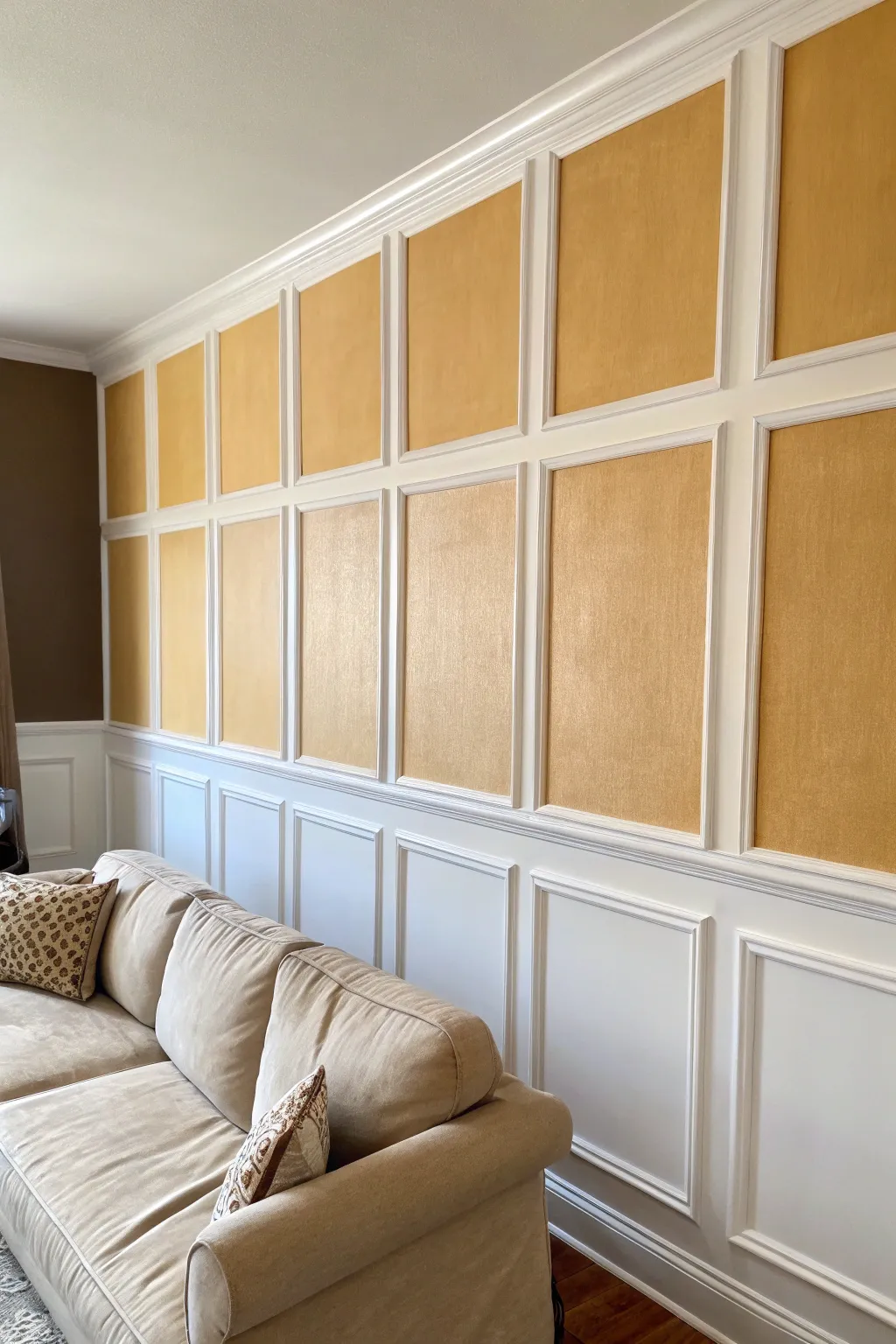
Transform a plain wall into a sophisticated architectural feature by combining crisp white moldings with a metallic gold finish. This project creates a dramatic, high-end grid effect that adds texture and warmth to your living room without the cost of solid wood panels.
Step-by-Step Guide
Materials
- Interior painter’s tape (blue or green)
- Laser level (highly recommended)
- Measuring tape and pencil
- Pre-primed wood or PVC trim molding (1×3 main grid)
- Finishing nails and nail gun (or hammer and nail set)
- Wood filler or spackling paste
- Sanding block (medium grit)
- Caulk and caulking gun
- Primer (stain-blocking)
- Semi-gloss white interior paint
- Metallic gold interior paint (satin or matte finish)
- Angled sash brush (2-inch)
- Small foam roller and tray
- Drop cloths
Step 1: Planning and Layout
-
Measure the Wall:
Measure your wall’s height and width precisely. Decide on the spacing for your grid; in the example, there’s a lower wainscoting section (about 30 inches high) and an upper grid section. -
Calculate Grid Spacing:
Divide the wall width by the number of panels you want to determine the center points. Accounting for the width of your molding strips is crucial here so the inner ‘gold’ squares end up uniform in size. -
Mark the Lines:
Use a laser level to project your horizontal and vertical lines onto the wall. Lightly trace these lines with a pencil to guide your installation.
Clean Lines
For the crispest edges when caulking, keep a damp rag handy to wipe your finger frequently. Excess caulk builds up quickly and ruins the smooth profile.
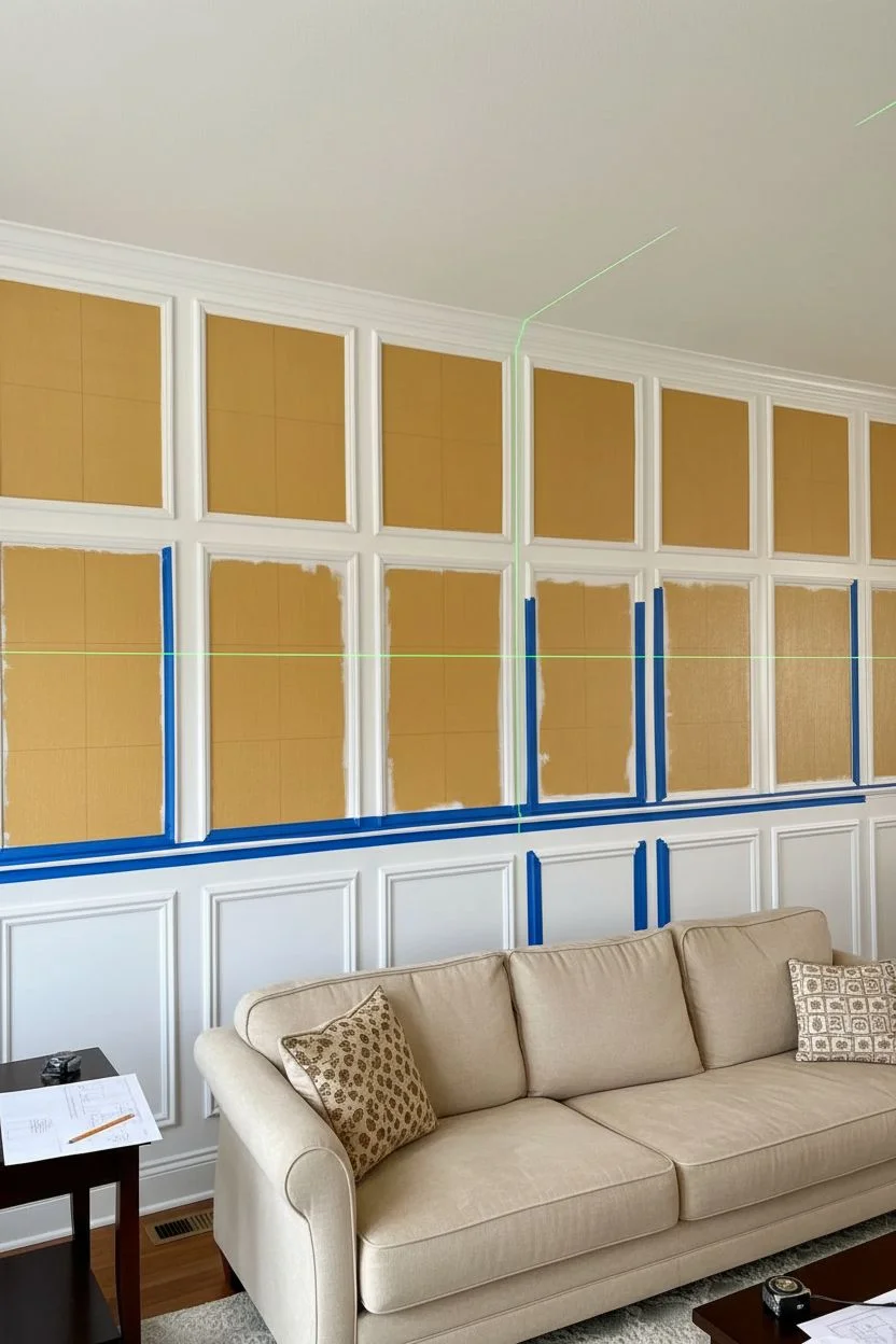
Step 2: Painting the Base Layers
-
Prime the Wall:
Before installing any wood, ensure the wall is clean and primed, especially if you are painting over a dark color. -
Paint the Gold Panels:
It is much easier to paint the gold background *before* the trim goes up. Roll two coats of metallic gold paint onto the areas where the upper panels will be. -
Feather the Edges:
Extend the gold paint slightly past your pencil marks where the trim will cover it. This ensures you won’t have any gaps of unpainted wall showing later. -
Paint the Lower Section:
Apply your semi-gloss white paint to the lower third of the wall where the solid white wainscoting effect will be.
Textured Effect
Instead of flat gold paint, use a textured wallpaper or grasscloth inside the upper panels before framing them. This adds incredible tactile depth.
Step 3: Installing the Trim
-
Install Horizontal Rails:
Cut your molding to length. Install the main horizontal chair rail (dividing the upper and lower sections) first, checking for level constantly. Secure with a nail gun. -
Install Vertical Stiles:
Measure and cut the vertical pieces to fit between your horizontal rails. Install them over your pencil marks, ensuring they are perfectly plumb. -
Create the Inner Frames:
The example image features a thinner molding inside the main grid. Cut mitered corners (45 degrees) for these smaller picture-frame moldings and install them centered inside the lower white panels. -
Add Upper Detail Trim:
Install the thinner detail molding inside the upper gold squares, framing the gold space against the white grid.
Step 4: Finishing Touches
-
Fill Nail Holes:
Go over every piece of trim and fill the nail holes with wood filler. Leave it slightly overfilled to allow for shrinkage. -
Sand Smooth:
Once dry, sand the filler flush with the wood surface. Wipe away all dust with a tack cloth. -
Caulk the Seams:
Run a thin bead of paintable caulk along every edge where the molding meets the wall and where molding pieces meet each other. Smooth it with a wet finger. -
Protect the Gold:
I prefer to use delicate surface painter’s tape to protect the gold paint just inside the trim edges before painting the molding. -
Paint the Trim:
Brush the molding with semi-gloss white paint. You’ll likely need two coats for a solid, crisp finish. -
Final Touch-Ups:
Remove the tape while the paint is still slightly tacky. Use a small artist’s brush to touch up any gold or white lines that aren’t perfectly sharp.
Now step back and admire how this elegant architectural grid adds permanent grandeur to your room
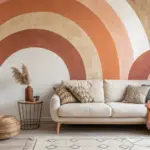
Soft Ombre Gradient Wall for the Living Room
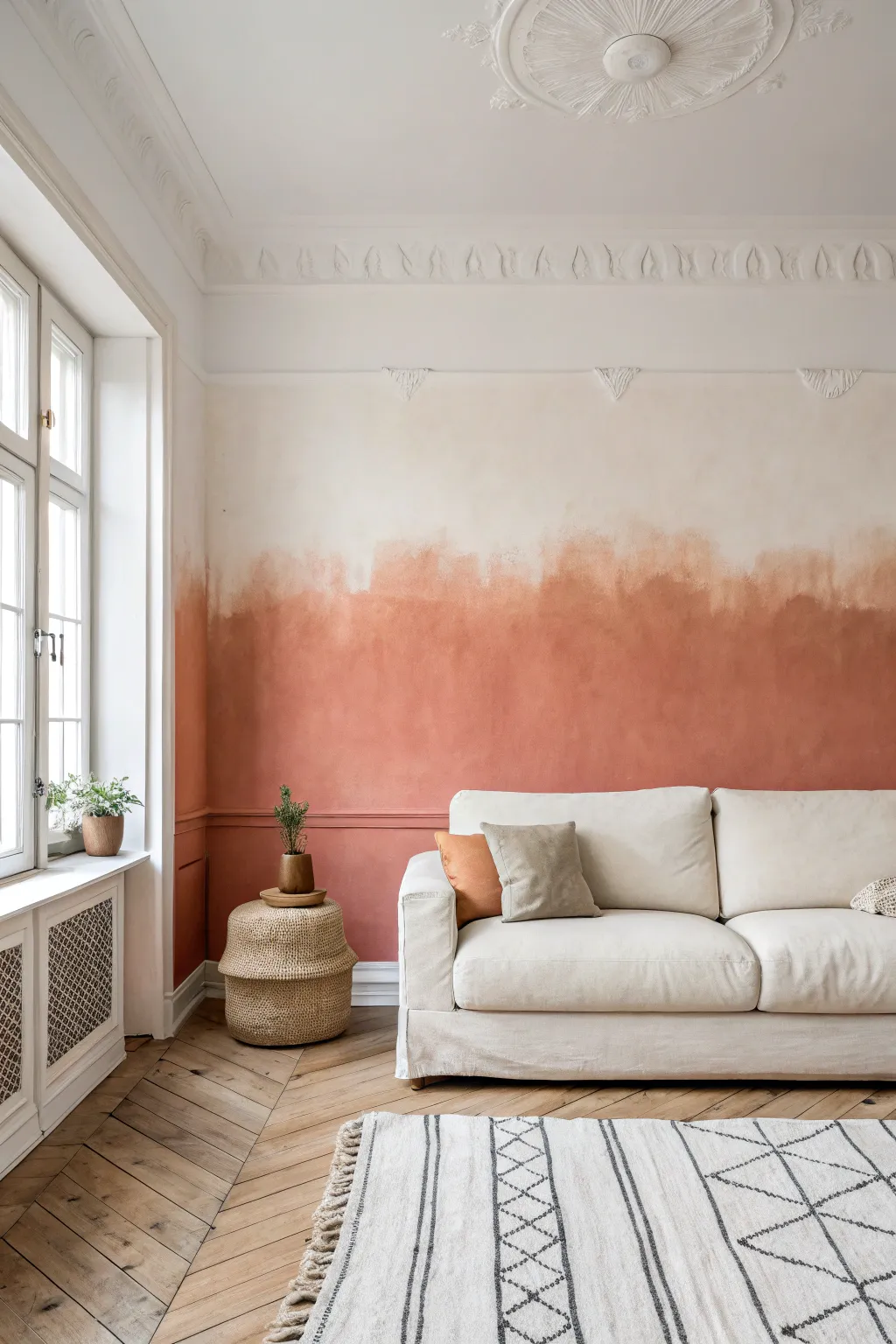
Bring the warmth of a Mediterranean sunset indoors with this soft, painterly ombre effect that blends rich terracotta tones into a creamy white upper wall. This technique moves away from perfect linear gradients, embracing an organic, cloud-like transition that adds incredible depth and texture to your living space.
Step-by-Step
Materials
- Interior latex paint (terracotta/burnt orange shade)
- Interior latex paint (warm cream/off-white shade)
- Slow-drying glazing medium (acrylic or latex based)
- Large paint roller and tray
- Wide painter’s tape
- Drop cloths
- Two large, clean buckets for mixing
- Large sea sponge or wool pad
- 4-inch high-quality blending brush (dry soft bristles)
- Spray bottle with water
- Step ladder
Step 1: Preparation & Base Coat
-
Protect the space:
Begin by clearing the wall area completely. Lay down drop cloths to protect your beautiful herringbone floors and tape off the skirting boards, window frames, and adjacent walls with wide painter’s tape to ensure crisp edges. -
Apply the upper lighter color:
Roll your warm cream or off-white paint onto the entire upper 2/3 of the wall. Don’t worry about a perfect bottom edge; just ensure good coverage on the top section where the color will remain pure. -
Feather the bottom edge:
As you reach the point where you want the transition to start—roughly chest or shoulder height—stop reloading your roller. Let the paint run ‘dry’ on the roller to create a feathery, uneven bottom edge. This dry-rolling technique makes blending much easier later. -
Allow to dry completely:
Wait for the lighter base coat to dry fully according to the manufacturer’s instructions. If the old wall color is showing through, apply a second coat to the top section now.
Paint drying too fast?
If the paint starts dragging or peeling while blending, stop brushing immediately. It’s too dry. Mist heavily with water or add more glazing liquid to your mix for the next section.
Step 2: Applying the Terracotta Base
-
Mix the glaze:
In a fresh bucket, mix your terracotta paint with the slow-drying glazing medium. I find a ratio of 4 parts paint to 1 part glaze works well to keep the color opaque but extend the ‘open time’ for blending. -
Roll the bottom distinct layer:
Using a clean roller, apply the terracotta mixture to the bottom section of the wall, starting from the skirting boards and working your way up. -
Stop short of the transition:
Stop rolling about 6-8 inches below where you want the final fade line to be. You want a solid block of color at the bottom that hasn’t started transitioning yet.
Step 3: Creating the Cloud-Like Transition
-
Prepare the middle mix:
On a large palette or in a tray, mix a small amount of the terracotta glaze mixture with a splash of the cream paint. You aren’t looking for a perfect 50/50 mix, just a slightly lighter version of the base color. -
Apply the transition zone:
Dip a large sea sponge or wool pad into this middle mix. Dab it onto the wall in the gap between the solid terracotta and the cream top, overlapping significantly with the wet terracotta below. -
Create the irregular horizon:
Push the sponge upwards into the dry cream area unevenly. Avoid a straight line; create peaks and valleys like a distant mountain range or rolling clouds. This irregularity is key to the organic look shown in the photo. -
Mist the wall:
Lightly—very lightly—mist the transition area with your water spray bottle. You don’t want drips, just enough moisture to keep the latex paint workable. -
Start the dry brushing:
Take your clean, dry 4-inch blending brush. Using a cross-hatch motion (ticking X shapes), vigorously brush over the boundary where the sponge marks meet the cream wall. -
Soften the edges:
Continue dry brushing, moving the pigment upwards. The goal is to dissipate the harsh edges of the sponge marks into a soft, smoky haze. Wipe your brush on a rag frequently to remove excess paint build-up. -
Add depth variations:
Dip your sponge lightly back into the pure terracotta glaze. Add random, sporadic darker patches within the transition zone to create depth and texture, then soften them again with the blending brush. -
Check from a distance:
Step back frequently. If a section looks too heavy or like a singular blob, mist it lightly and attack it with the cross-hatch brush motion to disperse the pigment. -
Final softening pass:
Once the major blending is done, use a very soft, clean brush to lightly sweep horizontally across the transition area. This knocks down visible brush strokes and unifies the gradient. -
Remove tape while damp:
Carefully peel off the painter’s tape while the bottom section is still slightly tacky to prevent the dried paint film from ripping or cracking at the edges.
Level Up: Texture
For an old-world plaster feel, mix a fine sand additive or texture powder into your terracotta paint before applying. The rougher surface catches light beautifully.
Enjoy the soothing atmosphere of your new watercolor-inspired sanctuary knowing you created this art yourself
Painted Ceiling Moment That Complements the Living Room Walls
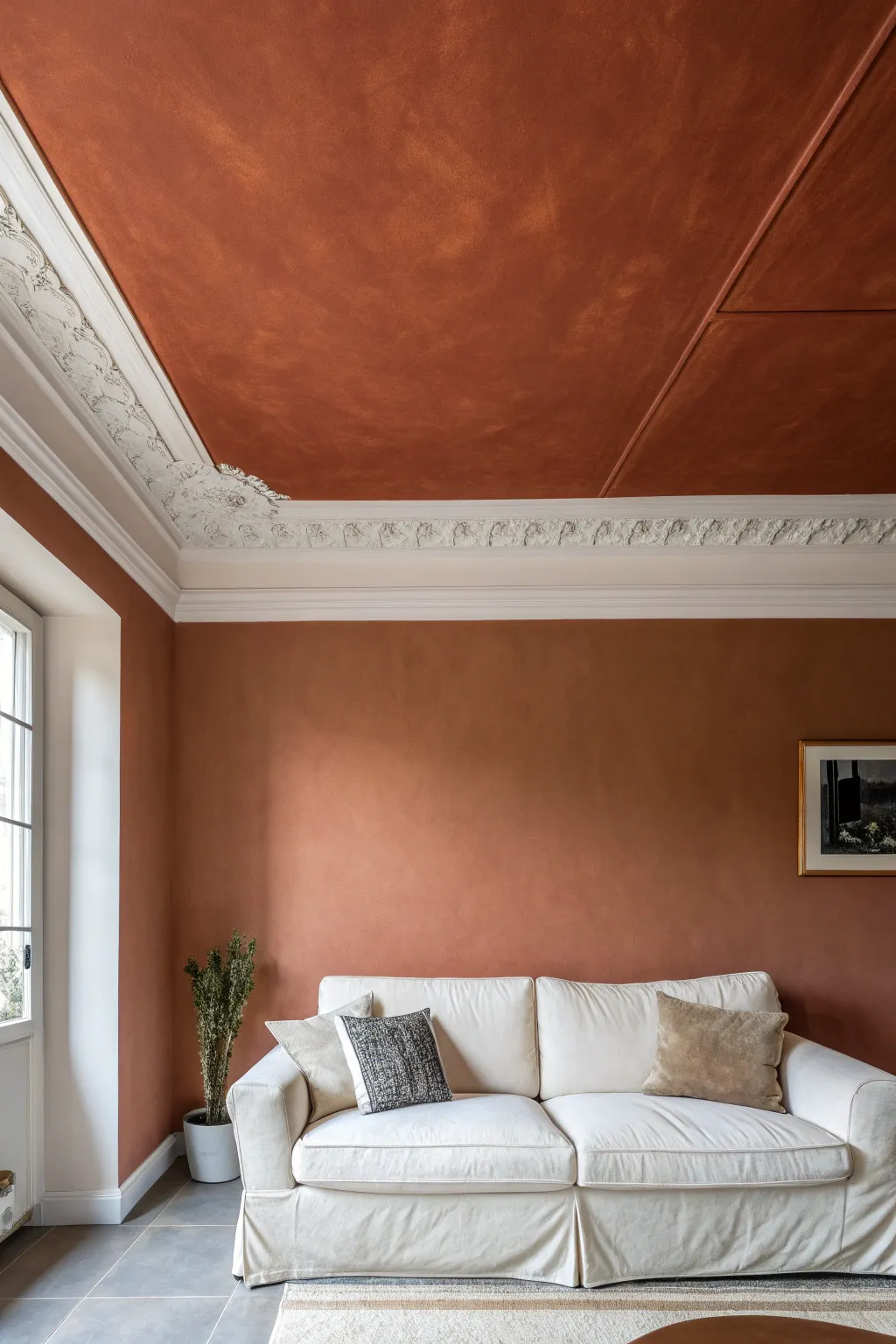
Transform your living space into a warm, Mediterranean-inspired sanctuary by extending a rich, textured terracotta finish from your walls up to the ceiling. This project uses a limewash-style technique to create depth, movement, and an organic, velvety look that feels both historic and modern.
Step-by-Step Guide
Materials
- High-quality interior primer (white)
- Wide block brush (4-6 inches) specifically for limewash
- Limewash paint (terracotta or rust color)
- Painter’s tape (high adhesion)
- Drop cloths
- Extension pole for ceiling work
- Rolling tray
- Standard roller and frame (for priming)
- Ladder
- Small angled sash brush (for cutting in)
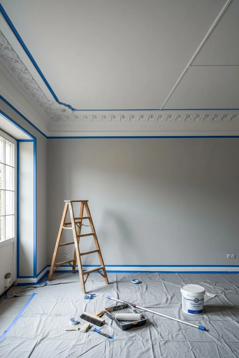
Step 1: Preparation
-
Clear and cover:
Begin by removing all furniture from the room or pushing everything to the center and covering it completely with heavy plastic sheeting. Lay down drop cloths to protect your flooring. -
Inspect the surface:
Check your walls and ceiling for any holes or cracks. Fill these patches with spackle and sand them smooth once dry. Limewash shows texture, so a bumpy underlying wall will be visible. -
Tape the molding:
Carefully apply painter’s tape along the bottom edge of your crown molding where it meets the wall, and the top edge where it creates a border for the ceiling panels. Since we are keeping the intricate molding white, precision here is crucial. -
Protect trim and windows:
Don’t forget to tape off baseboards, window frames, and door casings. Press the tape edge down firmly with a putty knife or your fingernail to prevent bleed-through.
Master the Texture
Work essentially wet-on-wet for softer blends. If an edge dries too fast, spritz it lightly with water before blending the new section.
Step 2: Priming the Base
-
Apply the primer:
Using a standard roller, apply a coat of high-quality interior primer to all wall and ceiling surfaces you intend to paint. This ensures the limewash adheres evenly and the color remains true. -
Let it cure:
Allow the primer to dry completely according to the manufacturer’s instructions, usually at least 4 hours, but overnight is safer for porous surfaces.
Visible Brush Strokes?
If strokes look too forced or straight, go over them immediately with a dry brush in a circular motion to ‘buff’ and blur the directional lines.
Step 3: Painting the Walls
-
Prepare the limewash:
Stir your limewash paint thoroughly. Limewash pigments settle quickly, so I always keep a stir stick handy to mix it every 10-15 minutes while I work. -
Cut in the edges:
Using your block brush or a smaller brush for tight corners, paint a border around the room’s edges, cutting in near the molding. Don’t create a straight line; feather the edges inward so they blend later. -
The ‘Cloud’ technique:
Dip your wide block brush into the paint and apply it to the wall using ‘X’ strokes or random crisscross patterns. Avoid long, straight strokes. You want to create overlapping clouds of texture. -
maintain a wet edge:
Work in manageable sections (about 3×3 feet). Never let an edge dry before you join the next section to it, or you’ll see a distinct line. Move consistently across the wall. -
First coat drying:
Let the first coat dry. It will look much lighter and perhaps patchy when wet, but don’t panic. The magic happens as it cures and when the second coat is applied.
Step 4: Painting the Ceiling
-
Extend upwards:
Now for the dramatic ceiling. Using a ladder or an extension pole with your brush attached, repeat the cutting-in process around the ornate molding’s top edge. -
Apply with gravity in mind:
Paint the ceiling using the same random ‘X’ brushstrokes. Be careful not to overload your brush to minimize drips. I find working in slightly smaller sections overhead helps manage fatigue and drying time. -
Work into the corners:
Pay attention to the corners of the ceiling panels shown in the image. Ensure the brush bristles get right into the groove without pooling paint.
Step 5: Building Depth
-
Second coat application:
Once the first coat is fully dry, apply the second coat using the same crisscross technique. This layer builds opacity and enhances the cloudy, velvet-like texture. -
Spot check:
Step back and look for areas that seem too uniform. You can go back in with a barely damp brush to soften harsh brush marks or add a tiny bit more paint to light spots. -
Remove tape perfectly:
While the paint is still slightly tacky (not soaking wet, but not stone dry), slowly peel away the painter’s tape at a 45-degree angle. This prevents the dried paint from cracking or peeling off with the tape. -
Final cure:
Allow the room to cure fully for 24-48 hours. The color will continue to shift slightly and soften as the lime calcifies.
Enjoy the cozy, enveloping atmosphere your new textured ceiling and walls bring to the space
Mini Mural Corner for the Living Room Conversation Area
Bring the serene warmth of a desert sunset into your living space with this oversized canvas mural. Featuring soft, earthy tones and sweeping brushstrokes, this project captures the tranquil beauty of rolling hills and distant mountains in a dreamy, impressionist style.
Detailed Instructions
Materials
- Large unprimed or primed canvas (approx. 4ft x 5ft)
- Wooden stretcher bars (or MDF panel if preferred)
- Acrylic paints: Titanium White, Unbleached Titanium, Yellow Ochre, Burnt Sienna, Raw Umber, Olive Green, Paynes Gray, Light Blue
- Large flat brushes (2-3 inch)
- Medium filbert brushes
- Sea sponge or rag
- Mixing palette or paper plates
- Water spray bottle
- Drop cloth
- Standard wall hanging hardware
Step 1: Preparation and Sky Layer
-
Prepare the Surface:
If your canvas isn’t pre-stretched, stretch it tightly over your wooden frame or mount it to an MDF board. Ensure the surface is clean and dust-free. -
Prime the Background:
Apply a base coat of Unbleached Titanium mixed with a generous amount of water to cover the entire canvas. This creates a warm, neutral undertone rather than a stark white background. -
Mix Sky Colors:
Create three distinct puddles for the sky: a pale misty blue (White + Light Blue), a warm peach (White + Burnt Sienna + touch of Yellow Ochre), and a creamy cloud color (White + Unbleached Titanium). -
Paint the Upper Sky:
Using a large flat brush, apply the pale blue mixture in the upper left corner and sweeping diagonally across. Keep the paint somewhat thin so the canvas texture shows through. -
Add Cloud Formations:
While the blue is still slightly wet, blend in the peach and creamy cloud colors. Use long, sweeping, diagonal strokes to mimic wispy clouds stretching across the horizon. -
Soften the Edges:
Use a dry brush or a damp sponge to gently blur the transition lines between the peach, cream, and blue tones, creating a dreamy, ethereal sky effect.
Step 2: Painting the Landscape
-
Sketch the Horizon:
Lightly sketch the outline of the distant mountains and rolling hills with a diluted Raw Umber wash. Aim for organic, undulating lines around the middle of the canvas. -
Block in Distant Mountains:
For the furthest mountains, mix Paynes Gray with a lot of White and a touch of Olive Green. Paint these shapes flatly; atmospheric perspective dictates that distant objects appear lighter and bluer. -
Create Mid-Ground Hills:
Mix a warmer, earthier tone using Yellow Ochre and Olive Green. Paint the rolling hills just below the distant mountains, allowing the shapes to overlap naturally. -
Add Shadow Detail:
Add depth to the hills by painting darker patches of Raw Umber and Paynes Gray in the heavy crevices and valleys of the landscape, establishing the shadowed side of the slopes. -
Paint the Foreground Plains:
For the large sandy foreground, use a mix of Unbleached Titanium, White, and a tiny bit of Burnt Sienna. Apply this using horizontal strokes to suggest a flat expansiveness. -
Introduce the Path:
suggest a winding dirt path by using a slightly lighter value (more White) that cuts through the foreground, leading the viewer’s eye toward the mountains.
Dry Brush Magic
Keep your brush mostly dry when painting the sweeping clouds. Minimal paint creates that scratchy, textured look that mimics wind movement perfectly.
Step 3: Detailing and Finishing
-
Add Vegetation Base:
Mix a muted green using Olive Green and a touch of Burnt Sienna. Dab this color randomly along the lower third of the canvas to create patches of scrub brush. -
Refine Grass Texture:
Using a smaller filbert brush, flick upward strokes in the green patches to create individual stalks of desert grass. Vary the pressure to make some thick and some thin. -
Highlights on Vegetation:
I prefer to mix a little Yellow Ochre with White to add sun-kissed highlights to the tips of the grasses. This makes the foreground pop against the sandy background. -
Blend the Horizon Line:
Return to the horizon line where the land meets the sky. Verify the edge isn’t too sharp; mist it lightly with water and use a clean brush to soften it if necessary. -
Final Glaze:
Once fully dry, mix a very transparent glaze of Burnt Sienna and water. Lightly wash it over the transition between the sky and mountains to harmonize the color temperature. -
Mount and Display:
Allow the painting to cure for at least 24 hours. Because this piece mimics a mural, hang it flush against the wall without a decorative frame for a modern, integrated look.
Make it Metallic
Mix a tiny amount of gold leaf paint or mica powder into your sand-colored paint for the foreground to give the desert floor a subtle, shimmering glow.
Step back and enjoy the calming, expansive view you have created right in your own corner
Painted Frame Outlines for a Living Room Wall Gallery Look
Achieve the sophisticated look of a curated gallery wall without buying a single expensive frame by painting modern, colorful outlines directly onto your wall. This clever trompe-l’œil technique creates a customized backdrop for your art prints while adding architectural interest and a pop of color to neutral spaces.
How-To Guide
Materials
- Painter’s tape (various widths: 1-inch, 1.5-inch)
- Laser level or bubble level
- Measuring tape
- Pencil
- Interior wall paint (sample pots in 3-5 complementary muted tones)
- Small angled sash brush (1.5 inch)
- High-density foam roller (4-inch)
- Roller tray
- Art prints or photos
- Double-sided poster tape or adhesive mounting squares
- Eraser
Step 1: Planning and Layout
-
Measure your art:
Gather all the art prints you intend to display. Measure the dimensions of each print carefully. -
Determine spacing:
Decide on the scale of your painted ‘frames.’ I recommend adding a 2-inch to 3-inch border around each print to mimic traditional matting. Add this to your measurements. -
Create a paper template (optional):
Cut craft paper or newspaper to the size of your calculated frame dimensions. Tape these to the wall to visualize the arrangement before committing to paint. -
Mark the wall:
Once you are happy with the layout, lightly mark the corners of each rectangle on the wall using a pencil.
Clean Lines Hack
Paint over your tape edge with the *wall color* first. This seals the tape so any bleed is invisible. Once dry, apply your colored paint for a razor-sharp edge.
Step 2: Taping the Outlines
-
Establish level lines:
Use a laser level or a long bubble level to connect your corner marks. Lightly draw the full boxes. -
Apply base tape:
Apply painter’s tape along the *outside* of your pencil lines. This tape acts as the boundary for your painted shape. -
Define the frame thickness:
Now, decide how thick you want the painted frame to be. For the look in the photo, some frames are solid blocks of color, while others are thin outlines. For outlines, place a second strip of tape inside the first box, leaving a 1-inch to 2-inch gap for the paint. -
Seal the edges:
Run your finger or a plastic credit card firmly over the tape edges to prevent paint bleed. This is crucial for crisp lines.
Add Dimension
For a 3D effect, paint a very thin, darker line along the bottom and right side of each rectangle to mimic a drop shadow.
Step 3: Painting the Shapes
-
Select your palette:
Choose 3-5 muted, earthy tones (terracotta, sage, slate blue, beige) that complement your existing decor. -
Paint the background block (Style A):
For the solid color blocks (where the art sits on top of a colored square), use your foam roller to fill the entire taped area. Apply two thin coats for even coverage. -
Paint the frame outline (Style B):
For the hollow frame look, use the angled sash brush to carefully paint only the gap between your two tape lines. -
Remove tape while damp:
Peel off the painter’s tape slowly at a 45-degree angle while the final coat is still slightly tacky. This prevents the dried paint from cracking or pulling away.
Step 4: Mounting the Art
-
Allow to cure:
Let the paint dry completely for at least 24 hours. The wall needs to be fully cured so the adhesive doesn’t pull the fresh paint off. -
Erase guidelines:
Gently erase any visible pencil marks that weren’t covered by paint. -
Apply adhesive:
Place double-sided mounting squares or poster tape on the back corners of your art prints. -
Center the art:
Carefully adhere the prints into the center of your painted rectangles. Step back frequently to ensure they look centered within the painted borders. -
Final adjustment:
Press firmly on the corners of the prints to secure them against the wall.
Enjoy your totally unique, custom-colored gallery wall that brings personality to the room without the bulk of heavy frames
Trompe L’Oeil Architectural Illusion for the Living Room Wall
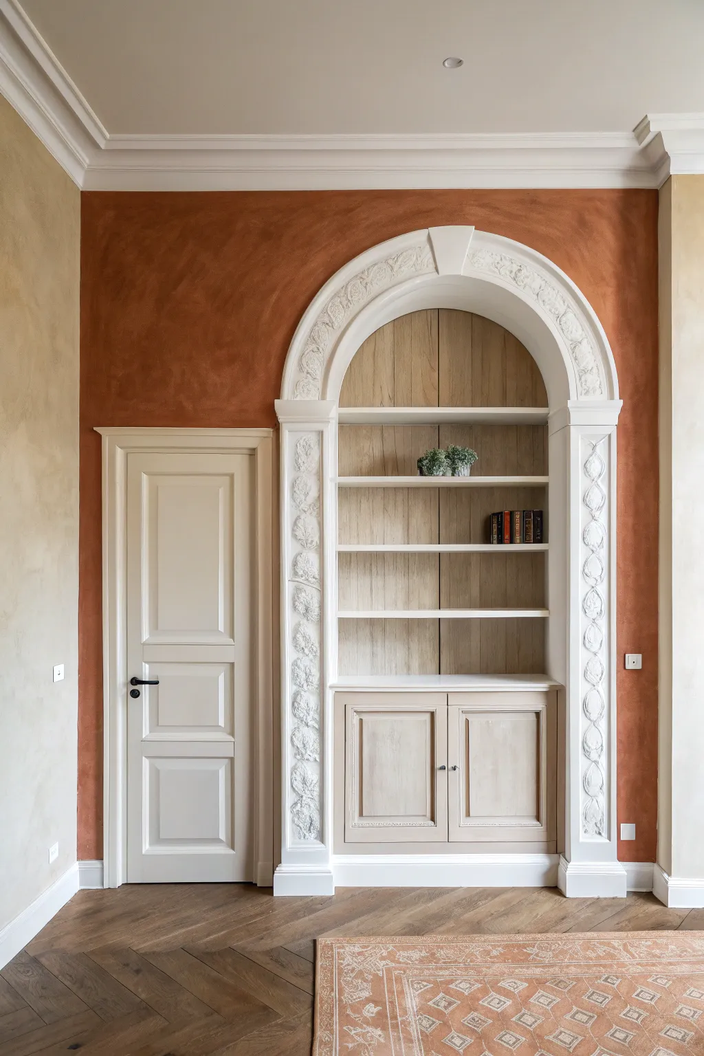
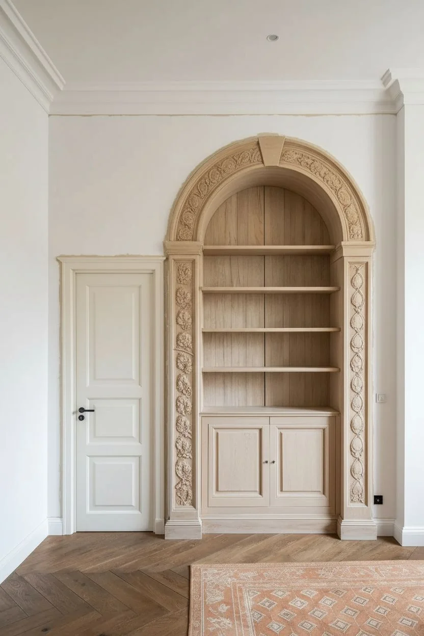
Transform a plain wall into a classical masterpiece by combining real carpentry with clever paint techniques. This project creates the illusion of depth and grandeur using a faux finish terracotta backdrop to highlight a built-in bookcase and doorframe.
Step-by-Step Guide
Materials
- Terracotta or rust-colored lime wash paint
- Large block brush (for lime wash)
- White semi-gloss trim paint
- High-density foam roller and angled sash brush
- Pre-made decorative pilaster trim kits (fluted or floral)
- Flexible arched molding (or MDF to cut custom arch)
- Construction adhesive and finish nails
- Wood filler and caulk
- Fine-grit sandpaper (220-grit)
- Painter’s tape
- Drop cloths
- Level and measuring tape
Step 1: Planning and Carpentry
-
Measure and Mark:
Begin by measuring the full wall space. Determine the center point for your arched bookcase and the placement for the adjacent door trim. Mark these outlines lightly in pencil directly on the wall. -
Install the Pilasters:
Cut your vertical pilaster trim pieces to height. Apply construction adhesive to the back and secure them to the wall on either side of your bookcase opening using finish nails. Ensure they are perfectly plumb with a level. -
Create the Arch:
Install the flexible arched molding above the pilasters to connect them. If you are handy with a jigsaw, you can cut this shape from MDF instead. Secure it well, ensuring the transition from vertical to curved is smooth. -
Add Decorative Appliques:
If your trim is plain, glue on decorative floral or scrollwork appliques now. This raised detail is crucial for the final architectural look. -
Fill and Sand:
Fill all nail holes with wood filler and run a bead of caulk along every seam where the trim meets the wall. Once dry, sand the filler smooth so the trim looks like a single, cohesive unit.
Uneven Texture?
If the lime wash looks too patchy, dampen the wall slightly with a water mister before the next coat. This helps the minerals flow and blend more softly.
Step 2: Painting the Wall Texture
-
Protect the Trim:
Carefully apply painter’s tape along the outer edges of your new molding and the doorframe. Cover the floor with drop cloths. -
Cut in the Edges:
Using a standard brush, paint the borders of the wall with your terracotta lime wash paint. Don’t worry about perfect smoothness here; texture is the goal. -
Apply the First Lime Wash Coat:
Dip your large block brush into the lime wash. Apply the paint to the main wall sections using erratic, X-shaped strokes. I like to work in small 3-foot sections to keep a ‘wet edge’. -
Let it Cloud:
Allow the first coat to dry completely (usually 4-6 hours). Lime wash dries lighter than it looks when wet, creating a cloudy, soft appearance. -
Apply the Second Coat:
Apply a second coat using the same crisscross X-motion. This layer builds the depth and velvety texture characteristic of old-world plaster.
Step 3: Finishing the Architectural Details
-
Remove Tape and Inspect:
Peel off the painter’s tape while the wall paint is still slightly tacky to prevent peeling. Inspect for any bleed-through and touch up if necessary. -
Prime the Trim:
Apply a high-quality bonding primer to all the new white woodwork, including the detailed appliques. -
Paint the Molding:
Using an angled sash brush for crevices and a foam roller for flat spots, paint the molding with white semi-gloss paint. The sheen contrast against the matte wall is vital. -
Highlight the Details:
Go back over the floral reliefs with a smaller brush to ensure paint doesn’t pool in the deep recesses, which would obscure the carving. -
Style the Shelves:
Once fully cured, style the interior shelving with books and pale greenery to complement the warm wall tones.
Pro Tip: Shadow Play
Add a tiny drop of grey paint to your white trim color to paint only the deepest crevices of the molding. This subtle shading makes the carvings pop.
Step back and enjoy the grand, historic atmosphere you’ve brought to your room using just paint and molding
Layered Brushstroke “Energy Wall” Painting for the Living Room
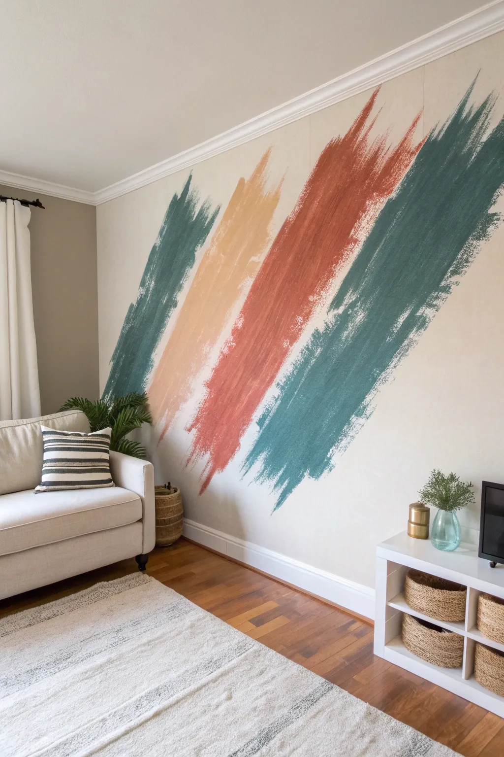
Transform a plain wall into a dynamic focal point with this oversized, abstract brushstroke mural. Using a dry-brush technique, large swathes of teal, peach, and terra cotta create movement and vibrant energy without requiring precise artistic skills.
Step-by-Step Tutorial
Materials
- Interior latex wall paint (Eggshell finish)
- Painter’s tape (high quality)
- Drop cloths
- Pencil and eraser
- Laser level or long spirit level
- Measuring tape
- Colors: Deep Teal, Sandy Peach, Rust/Terra Cotta
- 4-inch flat paintbrushes (cheap, chip brushes work best)
- Rags or paper towels
- Stepladder or step stool
Step 1: Preparation & Layout
-
Clear and clean:
Begin by removing all furniture, artwork, and outlet covers from the wall. Wipe the surface down with a damp cloth to remove dust, as this ensures the paint adheres properly and colors remain true. Lay down your drop cloth to protect the flooring. -
Visualize the flow:
Stand back and look at your wall to determine the angle. This design moves diagonally from the bottom left to the top right. You want the strokes to feel like a continuous burst of energy. -
Mark gentle guidelines:
Using a pencil and a long level, lightly mark faint diagonal lines to represent the center or general path of each stroke. These don’t need to be outlines, just guides to keep your angles consistent so the strokes don’t accidentally drift or cross. -
Check spacing:
Ensure there is breathing room between where you plan each color. The design relies on the negative space (the original wall color) showing between the strokes to make them distinct.
Too Solid?
If your edges look too blocky, simply wait for the paint to dry, then take a small brush with your original wall color and ‘cut back’ into the stroke using the same dry-brush flicking motion.
Step 2: Painting the Texture
-
Load the brush correctly:
Dip your wide 4-inch brush into the first color (start with the left-most teal). Only dip the bottom inch of the bristles. Do not overload the brush; we need a ‘dry’ effect. -
Offload excess paint:
Dab the brush firmly onto a piece of cardboard or paper towel. You want the bristles to separate slightly and hold less paint, which is crucial for achieving that rough, streaky edge. -
Start the stroke:
Beginning at the bottom left area near the baseboard, pull the brush diagonally upward in a swift, confident motion. Don’t worry about full coverage yet; focus on the direction. -
Build the texture:
Working in sections, apply more paint to the center of your ‘stroke’ to make it opaque, but let the brush run dry as you move toward the edges. Feather the edges outward so they look like frayed bristles. -
Extend to the ceiling:
Continue painting diagonally upward until the first teal stripe disappears into the ceiling line or corners. Step back frequently to check the width consistency. -
Apply the second color:
Switch to a clean brush and your sandy peach color. Start this stroke parallel to the first one, leaving a few inches of wall gap. I like to start this one slightly higher off the floor to create a staggered look. -
Create the feathering:
Use quick, flicking motions at the tail ends and edges of the stroke. The faster you move the brush, the more natural the ‘dry brush’ texture will appear. -
Add the third stroke:
Using the rust/terra cotta paint, create the third stripe. This is the central, boldest color, so ensure the pigment in the middle of the stroke is rich and solid, fading out only at the very edges. -
Paint the final stroke:
Apply the final, large teal stroke on the far right. This one is significant in size, dominating the upper right corner. Make sure the angle matches the previous three exactly. -
Refine the edges:
Once the main shapes are block, go back with a very dry brush (almost no paint) and drag it lightly over the edges to extend the scratchy texture further if any lines look too blunt or solid.
Step 3: Finishing Touches
-
Let it cure:
Allow the paint to dry completely for at least 4 hours. Because the layers are thin on the edges, they will dry fast, but the thicker centers need time. -
Check from a distance:
Stand at the furthest point in the room. If any stroke looks too thin or weak, add a second layer to the center of the stroke to boost the color saturation. -
Clean up:
Remove drop cloths and gently erase any visible pencil guidelines that weren’t covered by paint. Replace your furniture and enjoy the new energy in the room.
Metallic Accent
For a glamorous twist, add a very thin, fifth stroke using gold or copper metallic glaze. Keep it subtle and interlaced between two of the matte colors for a shimmering highlight.
This simple technique creates a massive impact that feels both modern and artistically hand-crafted

Have a question or want to share your own experience? I'd love to hear from you in the comments below!