When I need a creative reset, I reach for watercolor because it can be soft and dreamy or bold and graphic in the same afternoon. Here are some watercolor ideas you can jump into right now, starting with the classics and ending with a few fun curveballs.
Loose Wildflower Bouquet
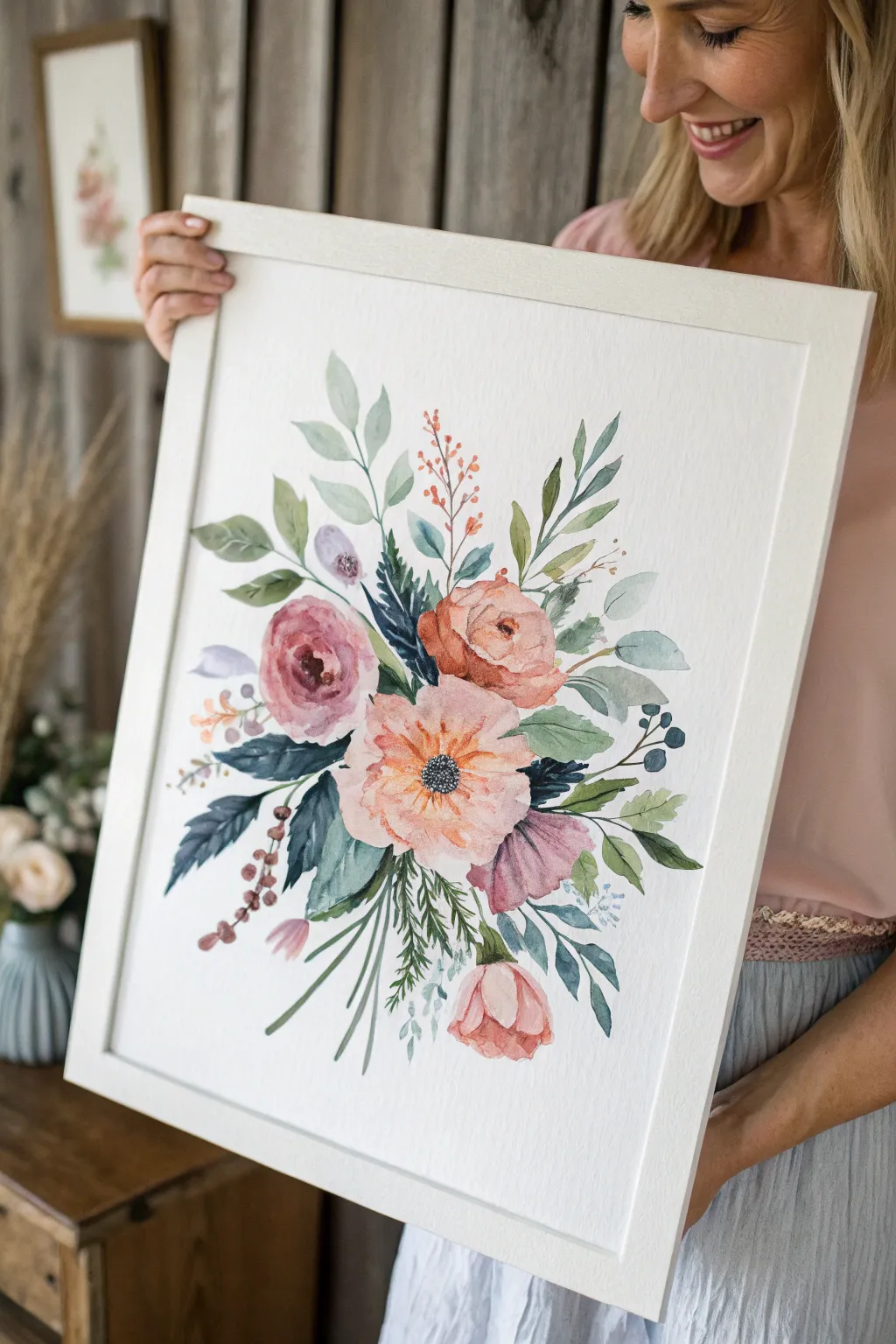
Capture the delicate beauty of a garden-fresh arrangement with this soft, loose watercolor tutorial. This piece focuses on building layers of translucent peach, dusty rose, and varied greens to create a romantic, airy composition.
Step-by-Step Guide
Materials
- Cold press watercolor paper (140lb/300gsm), preferably 9×12 or larger
- Watercolor paints: Peach, Dusty Rose, Indigo, Sap Green, Olive Green, Burnt Sienna, Violet
- Round watercolor brushes: sizes 4, 8, and 12
- Masking fluid (optional)
- Pencil (HB) and kneaded eraser
- Two jars of water
- Paper towels or cotton rag
- Palette for mixing
Step 1: Planning and Sketching
-
Map the Composition:
Begin with a very faint pencil sketch. Draw a loose oval shape in the center of your paper to define the bouquet’s boundaries. Lightly mark circles for the three main focal flowers: the central peach anemone, the upper dusty rose, and the right-side peach ranunculus. -
Add Supporting Elements:
Sketch stems radiating outward from the center, but keep them loose. Indicate positions for the lower drooping tulip, the side buds, and the main clusters of leaves. Keep your pencil pressure extremely light so graphite doesn’t show through the transparent paint later.
Pro Tip: Bloom Control
To get soft, fuzzy edges on your leaves without making a mess, dampen the paper with clear water first, then touch your pigment-loaded brush to the wet area and let it spread naturally.
Step 2: Painting the Focal Flowers
-
The Peach Anemone Center:
Start with the large central flower using your size 8 brush. Mix a watery wash of Peach with a tiny drop of Pink. Paint wide, open petals, leaving white space between them for separation. Keep the edges wet and soft. -
Deepening the Anemone:
While the first layer is still damp, drop slightly more saturated Peach color near the center of the petals to create depth. Leave the very center of the flower unpainted for now. -
Upper Rose and Ranunculus:
Move to the upper left flower. Mix a Dusty Rose shade (Pink + a touch of Violet or Brown). Paint curved C-strokes, starting tight in the center and getting larger as you move outward. Repeat this process for the peachier flower on the right, ensuring the centers are darker than the outer petals. -
Adding the Tulip and Buds:
Paint the downward-facing tulip shape at the bottom right using a mix of Peach and Pink. Paint the smaller purplish bud on the left with a watery Violet wash. Let these initial flower washes dry completely.
Level Up: Metallic Accents
Once the painting is bone dry, add fine lines using a gold watercolor pan or a gold gel pen on the berries and flower centers for a touch of elegant shimmer.
Step 3: Adding Foliage and Filler
-
Base Greenery:
Mix a light, watery Olive Green. Using a size 8 brush, paint the large, rounded eucalyptus-style leaves near the top left. Use a single stroke for each leaf, pressing down the belly of the brush and lifting at the end. -
Contrasting Blue-Greens:
Mix Indigo with Sap Green for a moody, deep teal. Paint the jagged, darker leaves tucked underneath the main pink rose and to the left of the center flower. This dark value will make the pastel flowers pop. -
Ferns and Wispy Stems:
Switch to your size 4 brush. With a grassy green mix, paint fine, fern-like textured stems drooping downwards at the bottom center. Use quick, flicking motions for the pine-needle texture. -
Berry Sprigs:
Mix a warm reddish-brown using Burnt Sienna and Peach. Paint thin stems reaching upward, and dot small circles at the ends for berries. Vary the pressure to make the stems look organic and natural. -
Softening Edges:
If any leaves look too stiff, re-wet a clean brush and gently soften the edges where they meet the white paper. This enhances the loose, illustrative style.
Step 4: Details and Finishing Touches
-
The Dark Center:
Once the central peach anemone is totally dry, mix a dense black or dark indigo. Using the tip of your size 4 brush, stipple tiny dots tightly in the center to create the flower’s dark eye. -
Layering Petals:
go back to the rose and ranunculus. Glaze a second, transparent layer of pink or peach over the shadowed areas of the petals to define their shape better without outlining them. -
Final Stems:
Use a mix of green and brown to paint the main stems gathering at the bottom. Make sure they align logically with the flowers above, crossing slightly for a bundled look. -
Negative Space Check:
Step back and assess your bouquet. If there are awkward large white gaps in the middle of the arrangement, fill them with a very pale, watery blue-green wash to suggest background leaves. -
Splatter Texture:
For a final artistic touch, load a small brush with watery paint (pink or green) and tap it against another brush handle to splatter tiny droplets around the bouquet. This adds energy and looseness.
Frame your botanical masterpiece with a clean white mat to let those delicate colors truly shine


Simple Mountain-and-Lake Landscape
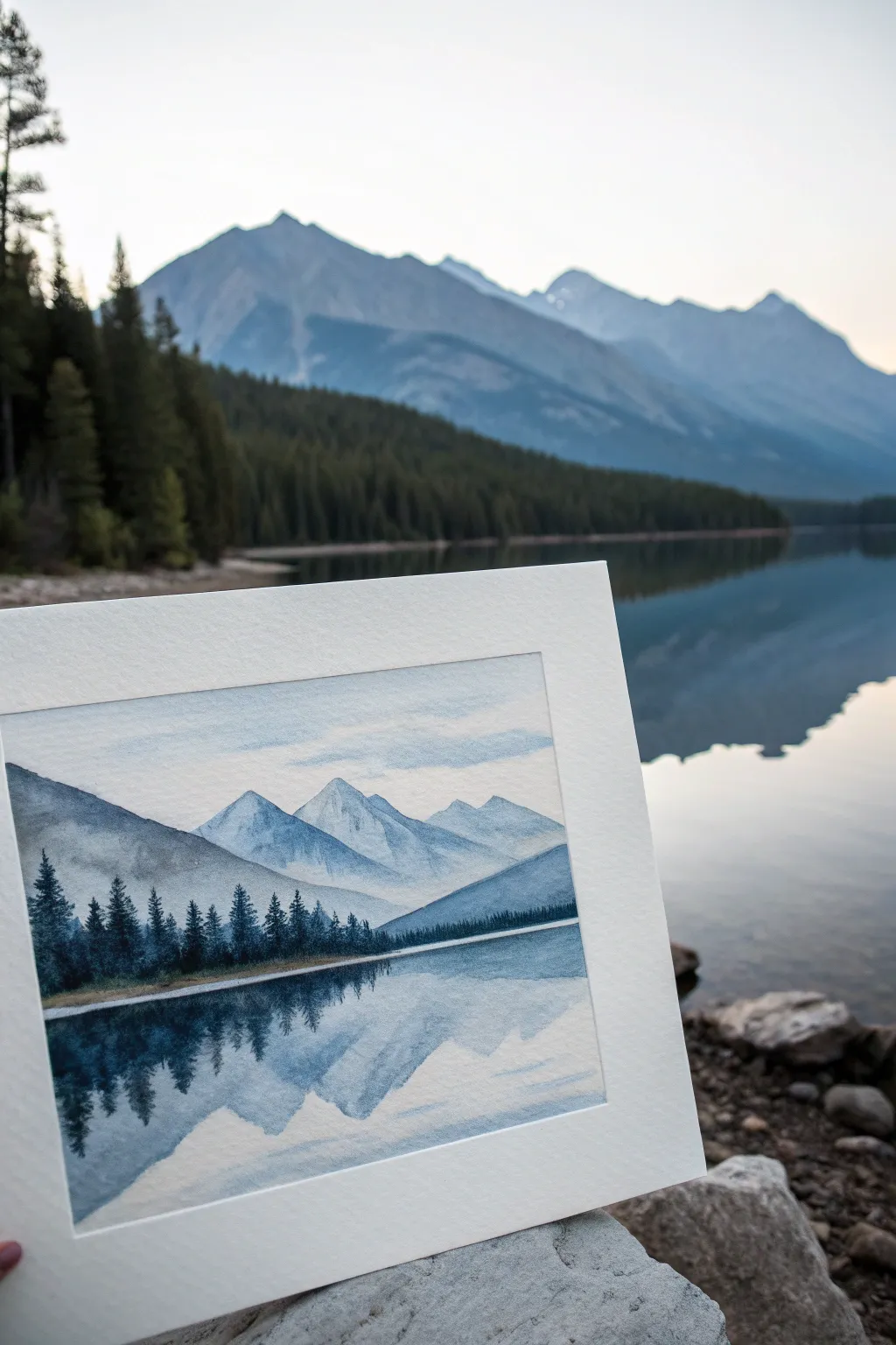
Capture the stillness of nature with this monochromatic watercolor landscape featuring majestic peaks reflecting into a calm lake. Using primarily shades of blue and grey, you’ll learn to layer atmospheric perspective and create convincing water ripples.
Step-by-Step
Materials
- Cold Press Watercolor Paper (approx 5×7 inches)
- Watercolor Paints: Paynes Grey, Indigo, Cobalt Blue, Prussian Blue
- Round Brushes (Size 8 for washes, Size 2 for details)
- Painter’s Tape or Masking Tape
- Two jars of water (one clean, one for rinsing)
- Paper Towels
- Pencil (HB) and Kneaded Eraser
Step 1: Sketch and Sky
-
Tape Contrast:
Begin by taping down all four edges of your watercolor paper to a board. This creates the crisp white border seen in the example and prevents buckling. -
Horizon Line:
Lightly sketch a straight horizontal line about one-third of the way up from the bottom of the paper. This establishes your water level. -
Outline Peaks:
Sketch the mountain ranges. Draw a distant range of peaks in the middle, and then add larger, sloping shapes on the left and right sides to frame the composition. Keep your pencil lines very faint so they disappear under the paint. -
Sky Wash:
Wet the sky area above the mountains with clean water. Drop in a very diluted mix of Cobalt Blue, leaving random white spaces to suggest soft clouds. Let the blue fade out as it approaches the mountain tops.
Step 2: Layering Mountains
-
Distant Peaks:
Once the sky is bone dry, mix a watery, pale blue-grey. Paint the furthest central mountain peaks. The color should be quite transparent to simulate atmospheric distance. -
Mid-Ground Slopes:
Allow the first range to dry completely. Mix a slightly darker, more saturated blue (perhaps adding a touch of Indigo). Paint the large sloping mountain on the left side, ensuring the edge against the distant mountains is crisp. -
Right Slope:
Using a similar medium-strength blue wash, paint the sloping hill on the right side. You can soften the bottom edge of these shapes with a damp brush where they meet the eventual tree line to create a sense of mist. -
Rock Texture:
While the mid-ground shapes are drying, you might add faint, dry-brush strokes in a darker grey on the mountain faces to suggest craggy rock textures, but keep this subtle.
Atmospheric Depth
Remember the golden rule: objects get lighter and bluer as they move further away. Your closest trees should be the darkest, and the distant peaks the lightest.
Step 3: Trees and Foreground
-
Darkest Mix:
Mix your darkest value: a strong concentration of Paynes Grey with Prussian Blue. You want a deep, almost black-blue color. -
Tree Line:
Using the tip of your Size 2 brush, paint a dense forest line across the base of the mountains. Use short vertical strokes to create the jagged tops of pine trees. -
Variation:
Vary the height of your trees, making some taller and some shorter to look natural. Ensure the bottom of this tree line creates a sharp, straight edge against your horizon line. -
Shoreline Accent:
Leave a tiny sliver of unpainted white paper right below the tree line. This negative space acts as the shoreline or sandy beach, separating the trees from the water.
Make it Sparkle
Add a few tiny dots of opaque white gouache or a white gel pen along the shoreline to create the effect of sunlight glinting off the water’s edge.
Step 4: Reflections and Water
-
Mirroring Shapes:
Wet the lake area (bottom third) with clean water. While damp, paint the inverted shapes of the mountains using the same colors you used above, but slightly more diluted. -
Softening Edges:
Because the paper is damp, the edges of the reflected mountains will naturally blur, creating that soft, watery look. -
Tree Reflections:
While the water area is still slightly damp (but not soaking), drop in vertical strokes of your dark tree color directly under the shoreline. Let the pigment bleed downward. -
Interpreting Ripples:
Once the reflections are partially dry, use a clean, slightly damp brush to lift out horizontal lines across the water, or paint thin horizontal lines of white gouache if you lost your highlights. -
Final Contrast:
Strengthen the dark reflection of the trees right at the waterline to anchor the image. -
The Reveal:
Wait until the painting is completely dry to the touch before slowly peeling off the tape at a 45-degree angle to reveal your crisp white border.
Frame your serene landscape or prop it up against a window to admire the calming view you’ve created


Sunset Sky With Dark Silhouettes
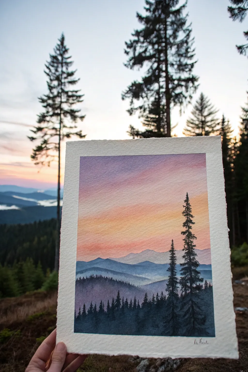
Capture the serene beauty of twilight in the mountains with this layered watercolor landscape. You’ll master smooth sunset gradients and atmospheric perspective to create depth between the misty peaks and sharp pine silhouettes.
Step-by-Step Tutorial
Materials
- Cold press watercolor paper (300 gsm)
- Masking tape
- Watercolor paints (Indigo, Prussian Blue, Payne’s Gray, Alizarin Crimson, Cadmium Yellow, Lavender)
- Large flat wash brush
- Round brush (size 6 or 8)
- Fine liner brush (size 0 or 1)
- Two jars of water
- Paper towels
- Palette for mixing
- Pencil
Step 1: Preparation & Sky Gradient
-
Tape the borders:
Secure your watercolor paper to a board using masking tape on all four sides. This creates a crisp white border and prevents the paper from buckling during heavy washes. -
Sketch the horizon:
Lightly sketch fading mountain ridges. Keep the lines faint; you only need a general idea of where the sky ends and the mountains begin. -
Pre-wet the sky:
Using your large flat brush and clean water, dampen the entire sky area. Ideally, the paper should glisten but not have puddles. -
Apply the top layer:
Start at the very top edge with a wash of Lavender mixed with a touch of Alizarin Crimson for a soft purple hue. Use horizontal strokes across the wet paper. -
Introduce pink tones:
While the purple is still wet, clean your brush slightly and pick up a watery Alizarin Crimson. Blend this just below the purple, letting gravity help them mix naturally. -
Add the sunset glow:
Clean your brush completely. Pick up a diluted Cadmium Yellow (or a soft orange) and blend it beneath the pink. This should take up the largest central portion of the sky. -
Finish the horizon:
For the area just touching the mountain tops, use a very pale, watered-down Prussian Blue to suggest haze. Let this whole sky section dry completely before moving on.
Muddy colors?
If your sunset turns brown, you likely let the yellow and purple mix too much. Keep a strip of pure pink in between them as a buffer zone.
Step 2: Atmospheric Mountains
-
Paint the furthest peak:
Mix a very watery, pale wash of Indigo and Lavender. Paint the most distant mountain ridge. The color should be barely darker than the sky. -
Second mountain layer:
Once the first ridge is dry, mix a slightly more saturated blue-grey using Indigo and water. Paint the next range of mountains, overlapping the first one slightly. -
Building depth:
Continue moving downward. For each closer mountain range, add a tiny bit more pigment and perhaps a touch of Payne’s Gray to darken the value. This creates the illusion of distance. -
Mid-ground texture:
On the ridge immediately behind the foreground, use a size 6 round brush to dab tiny, uneven strokes along the ridge line. This implies a forest of distant trees rather than a smooth rock edge. -
The darkest hill:
For the closest hill (the bottom-most land mass), mix a strong, dark concentration of Indigo and Payne’s Gray. Paint this area solid, ensuring the bottom completely fills the tape line.
Starry Night
Before removing the tape, cover the mountains with paper and flick white gouache over the purple sky section to create early evening stars.
Step 3: Foreground Silhouettes
-
Mix the darkest value:
Create a thick mixture of Payne’s Gray and Indigo. It should have a creamy consistency, almost like ink. -
Paint the main pine:
Using the tip of your round brush or a detailed liner, draw a vertical line for the trunk of the tallest tree on the right side. -
Add tree branches:
Stipple the branches using a tapping motion. Start narrow at the top and flare out wider as you go down. Leave small gaps between branches so the sky peeks through. -
Create the companion tree:
Paint a slightly shorter, thinner tree next to the tall one using the same tapping technique. -
Add the forest line:
Along the bottom ridge, use the fine liner brush to paint tiny vertical spikes varying in height. These are the tops of the distant pine forest. -
Final reveal:
Wait until the paper is bone dry—warm to the touch—then carefully peel away the masking tape at a 45-degree angle to reveal your clean edges.
Frame this piece in a simple white mat to highlight those crisp edges and the vibrant glow of the sky


Misty Pine Forest in Wet-on-Wet
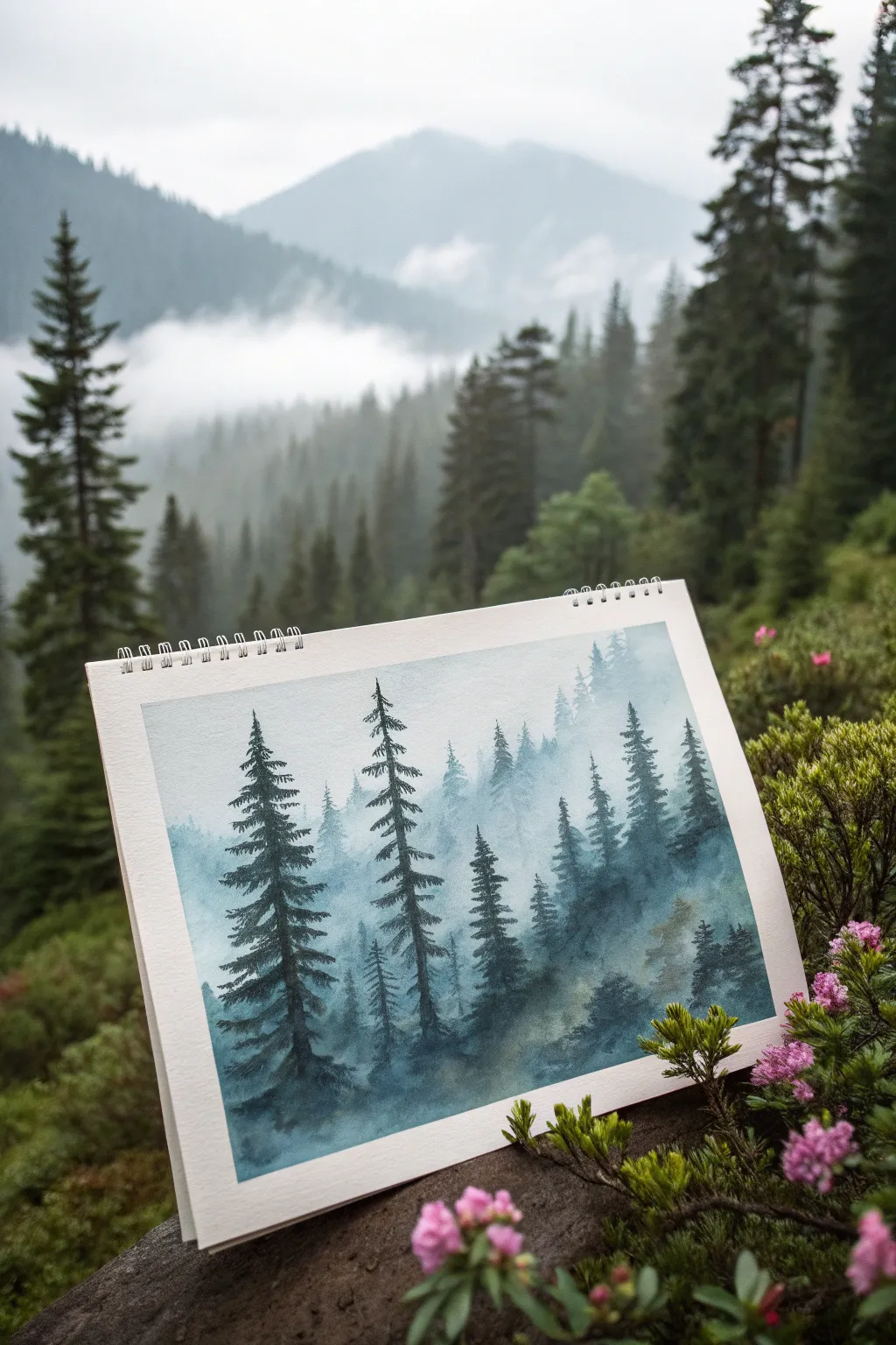
Capture the moody serenity of a mountain forest with this atmospheric watercolor study. Using wet-on-wet techniques, you will build layers of silhouetted pines fading into a soft, foggy background.
Step-by-Step Guide
Materials
- Cold press watercolor paper (140lb/300gsm)
- Watercolor paints: Indigo, Payne’s Grey, Prussian Blue, Sap Green
- Flat wash brush (3/4 inch)
- Round brushes (sizing 4 and 8)
- Rigger or liner brush for fine details
- Clean water containers (2)
- Paper towels
- Masking tape
- Pencil for light sketching
Step 1: Setting the Atmosphere
-
Prepare the surface:
Begin by taping down your paper to a stiff board to prevent buckling. Lightly sketch a very faint horizon line about one-third up from the bottom, though much of this will be covered by paint. -
Pre-wet the paper:
Using your large flat brush, apply a clean coat of water across the entire upper two-thirds of the paper. The sheen should be satin-like, not swimming in puddles. -
Mix a ghostly grey-blue:
Create a very diluted wash of Indigo and Payne’s Grey. You want a color that is barely there, resembling thick fog. -
Apply the background mist:
Drop this pale wash into the wet paper, letting the color bloom naturally. Concentrate slightly more pigment near the top corners to suggest distant mountain shadows, fading to almost pure white as you move downward. -
Paint the distant tree line:
While the paper is still damp (but losing its shine), mix a slightly stronger version of your blue-grey. With a size 8 round brush, dab in vague triangular shapes along the horizon to represent the furthest, mist-obscured trees. -
Soften the edges:
If your distant trees look too sharp, rinse your brush and run a clean, damp edge along their bottoms to blur them into the mist. Let this layer dry completely before moving forward.
Step 2: Building the Mid-Ground
-
Mix a mid-tone forest green:
Combine Prussian Blue with a touch of Sap Green and Payne’s Grey. This color should be darker than your background but not full strength yet. -
Add the middle layer of pines:
On dry paper, paint a second row of pine trees. These should be larger than the background ghosts. Use the tip of your round brush to create the pointy tops, then press down to create wider branches as you move down the trunk. -
Create variation:
Make sure these trees vary in height and spacing. Don’t make them look like a fence; overlap some and leave gaps for others. -
Diffuse the bases:
Before the paint dries on these mid-ground trees, take a damp brush and soften the bottom of the trunks so they seem to disappear into a low-hanging fog bank. -
Splatter texture:
I sometimes flick a tiny amount of clean water onto these drying trees to create ‘blooms’ that look like mist pockets or texture within the foliage.
Mist Mastery
To get perfectly soft fog, lift pigment off damp paper with a thirsty brush or paper towel. This creates negative space that looks like rolling clouds.
Step 3: The Foreground Giants
-
Mix your darkest value:
Create a rich, deep mixture using mostly Indigo and Payne’s Grey, with just a hint of green. This needs to be thick and creamy, with very little water. -
Anchor the composition:
Choose the placement for your two or three main focal trees. In the reference, there are two tall, distinct pines on the left side that anchor the view. -
Paint the main trunk:
Using a liner brush or the fine tip of a round brush, draw a thin, slightly wavering line for the trunk, extending almost to the top of the paper. -
Detail the branches:
Switch to a size 4 brush. Starting from the top, use a zig-zag or stippling motion to paint branches extending outward. Keep the top branches short and facing slightly upward, becoming heavier and drooping downward as you descend. -
Add foliage density:
As you reach the bottom third of the tree, use more pressure to create dense clusters of needles. Leave negative space between branches so the mist shows through. -
Ground the foreground:
Paint some low, dark shrubbery or uneven ground at the very bottom using your darkest mix to connect the foreground trees. This gives them a solid foundation. -
Final dry brushing:
Once the paper is bone dry, you can drag a nearly dry brush with dark pigment lightly over the foreground texture to suggest rough bark or mossy textures.
Muddy Greens?
If your forest looks brown or muddy, you’re likely overworking the layers while they are damp. Let each layer dry completely before adding the next one.
Peel off your tape carefully to reveal those crisp white borders that make the misty atmosphere pop.
BRUSH GUIDE
The Right Brush for Every Stroke
From clean lines to bold texture — master brush choice, stroke control, and essential techniques.
Explore the Full Guide
Ocean Waves and Sea Spray Washes
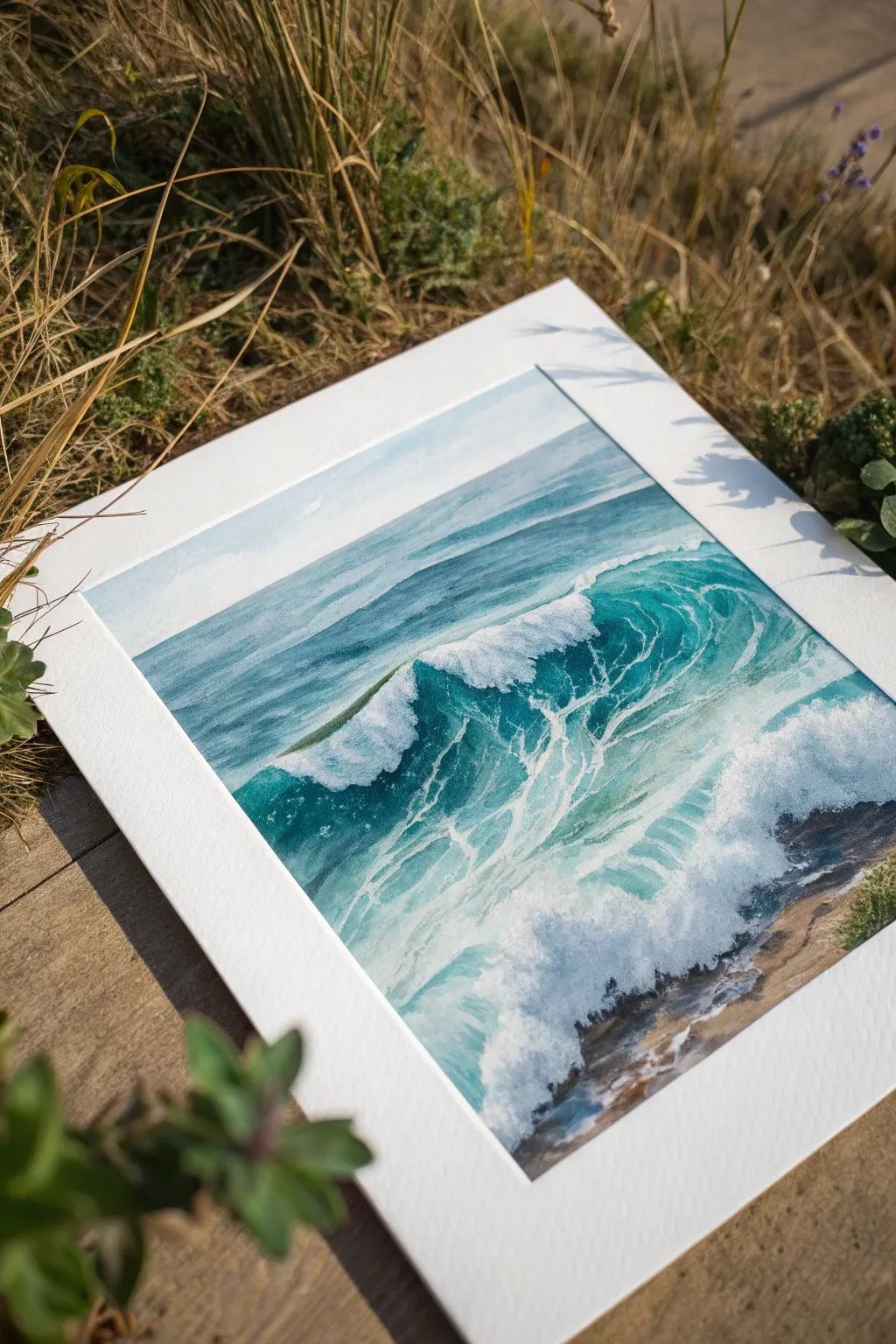
Capture the dynamic energy of a crashing wave using vibrant teals and expert masking techniques. This tutorial guides you through layering transparent watercolors to achieve that foamy, sunlit translucency found in a breaking swell.
Detailed Instructions
Materials
- Cold Press watercolor paper (140 lb / 300 gsm)
- Masking fluid (drawing gum) with an applicator or old brush
- Watercolor paints: Phthalo Blue, Phthalo Green, Indigo, Burnt Umber or a warm Sand color
- Large flat wash brush (1-inch)
- Round brushes (Size 4, 8, and 12)
- White gouache or opaque white watercolor
- Paper towels
- Two jars of water
- Masking tape
Step 1: Preparation and Masking
-
Secure the paper:
Tape your watercolor paper down to a board using masking tape on all four sides. This creates a crisp white border and prevents the paper from buckling during heavy washes. -
Sketch the wave structure:
Lightly sketch the horizon line about one-third down the page. Outline the shape of the main breaking wave, focusing on the curl and the foamy splash zone at the bottom. -
Protect the highlights:
Using masking fluid and an old brush, paint the white caps on the distant waves and the intricate web of foam on the main wave’s surface. Apply erratic, splashing marks near the bottom right to reserve the brightest white spray. -
Let it cure:
Wait until the masking fluid is perfectly dry to the touch. It will turn slightly yellow or gray when ready. Do not rush this, or you risk tearing the paper later.
Step 2: The Sea & Sky Washes
-
Sky wash:
Wet the sky area with clean water. Drop in a very pale, diluted wash of Phthalo Blue, keeping it lighter near the horizon line to suggest atmospheric perspective. -
Initial ocean horizon:
While the sky dries, mix a teal color using Phthalo Blue and Phthalo Green. Paint the flat strip of ocean just below the horizon with a steady hand, ensuring a sharp line against the sky. -
Building the barrel:
Wet the underside of the main wave curl. Drop in your teal mix, letting it be strongest near the top of the curl and fading slightly as it moves down. This creates the illusion of light shining through the water. -
Deepening the tones:
While the curl is still damp, charge in a mixture of Indigo and Phthalo Green into the deepest shadowed areas under the lip of the wave to create volume.
Don’t Ruin Your Brushes
Never use your good Kolinsky or sable brushes for masking fluid! The latex dries instantly and ruins bristles. Use a cheap synthetic brush or a silicone applicator tool instead.
Step 3: Texturing the Water
-
Painting the foreground:
For the choppy water in front of the wave, use loose, horizontal strokes with your medium round brush. Use a mix of teal and a touch of darker blue to suggest movement and pockets of depth. -
Shadows under the foam:
Once the main wash is dry, mix a cool gray-blue. Paint definitive shadows underneath the masked-off foam patterns on the wave face. This gives the ‘netting’ of foam a 3D quality. -
The sandy shore:
In the bottom right corner where the water meets the shore, paint a wash of Burnt Umber or a sandy beige. Start from the corner and fade it out as it meets the foamy white area. -
Refining the sand:
Add touches of Indigo to the shoreline edge to show wet sand and rocks peeking through the retreating water.
Warm Up The Water
To make the water look tropical and sunlit, glaze a very thin, transparent wash of Lemon Yellow over the teal inside the wave’s curl. The underlying yellow makes the green glow.
Step 4: The Reveal and Finish
-
Remove the mask:
Gently rub away the masking fluid with your finger or a rubber cement pickup tool. You will reveal stark white paper underneath. -
Soften harsh edges:
Some of the masked edges may look too sharp. Use a damp, clean brush (a ‘thirsty brush’) to gently scrub and soften select edges of the foam so they integrate naturally with the water. -
Add misty spray:
I like to take a bit of white gouache on an old toothbrush or stiff brush here. Flick fine droplets over the crest of the wave and the crash zone to create a convincing sea spray mist. -
Brighten the foam:
If any foam areas feel too dull, paint over them with opaque white gouache to bring back the brilliant highlights. -
Final dark accents:
Use your strongest Indigo mix to add tiny, high-contrast darks right next to the brightest whites of the breaking wave. High contrast is the secret to sparkling water.
Peel off your tape carefully to reveal the crisp border that makes your seascape look gallery-ready
Water Reflections in a Calm Pond
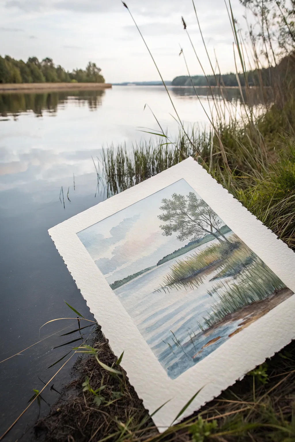
Capture the peaceful essence of a quiet evening by the lake with this soft, atmospheric watercolor landscape. You will learn to balance wet-on-wet techniques for the sky with precise dry-brush strokes for the foreground reeds, creating a beautiful depth of field.
Step-by-Step Guide
Materials
- Cold press watercolor paper (300 gsm)
- Watercolor paints (Ultramarine Blue, Burnt Sienna, Sap Green, Payne’s Gray, Yellow Ochre, Alizarin Crimson)
- Masking fluid (optional)
- Large round brush (size 10 or 12)
- Medium round brush (size 6)
- Rigger brush or liner brush (size 1)
- Board and masking tape
- Two jars of water
- Paper towels
Step 1: Setting the Scene
-
Prepare your surface:
Tape your watercolor paper down securely to a board. This prevents buckling when we apply wet washes later. -
Light sketch:
Using a hard pencil (like an H or HB), sketch the horizon line about one-third of the way up the paper. Lightly outline the mass of trees on the right bank and the distant shore on the left. -
Protecting highlights:
If you want crisp white highlights in the water or sky, apply a tiny bit of masking fluid now. Alternatively, you can simply paint around these areas carefully.
Pro Tip: Deckled Edges
For the authentic look shown in the photo, tear your paper against a ruler instead of cutting it. This creates a soft ‘deckled’ edge that adds rustic charm.
Step 2: The Sky and Distant Shore
-
Wet-on-wet sky:
Wet the entire sky area with clean water using your large brush. While glistening, drop in a mix of Ultramarine Blue and a touch of Payne’s Gray for the upper sky clouds. -
Sunset warmth:
Near the horizon, introduce a very watery wash of Alizarin Crimson or faint Yellow Ochre to hint at the setting sun’s warmth. Let these colors bleed softly into the blue. -
Creating distance:
While the paper is still slightly damp (damp, not soaking), paint the distant tree line on the left horizon using a pale mix of Payne’s Gray and Blue. The dampness will keep edges soft, pushing them into the background. -
Drying time:
Allow this initial layer to dry completely. The paper should feel room temperature to the touch, not cool.
Level Up: Scratching Out
While the dark green paint of the reeds is still wet, scratch thin lines with a credit card edge or fingernail to reveal the white paper, suggesting light-hitting stalks.
Step 3: The Middle Ground and Main Tree
-
Right bank foundation:
Mix Sap Green with a little Burnt Sienna for an olive tone. Paint the grassy bank on the right side, closest to the viewer. -
Mixing deeper greens:
While the bank is drying, mix a darker, stronger green using Sap Green and Payne’s Gray for the foliage of the main tree. -
Stippling foliage:
Using the side of your medium brush, stipple the leaves of the main tree. Leave gaps in the foliage to let the sky peek through; this airiness is crucial for realism. -
Tree trunk structure:
Switch to a smaller brush and a dark brown mix (Burnt Sienna + Ultramarine). Connect the foliage clusters with thin branches, anchoring them to a main trunk that leans slightly over the water.
Step 4: Reflections and Foreground Details
-
Initial water wash:
Wet the water area slightly. Mirror the sky colors upside down—blue at the bottom, fading to pale warmth near the horizon line. -
Soft reflections:
While the water area is still damp, drop in vertical strokes of the olive green and dark tree colors directly below the land masses. Let them blur. -
Defining ripples:
Once the water wash is dry, use a dry-brush technique with a pale blue-grey mix to drag horizontal lines across the water surface. This creates the illusion of gentle ripples. -
Foreground reeds:
Using your rigger or liner brush, mix a thick, creamy consistency of Yellow Ochre and Green. paint quick, confident upward strokes for the reeds in the immediate foreground. -
Shadows and depth:
Add a few darker reeds using a brown mix. I find that varying the pressure on the brush here helps create natural thick-and-thin variations in the grass. -
Darkest accents:
Add the final dark accents at the water’s edge where the bank meets the potential reflection, grounding the land. -
The final reveal:
Once everything is bone dry, carefully peel off the masking tape to reveal your crisp, clean edges.
Step back and admire the tranquil atmosphere you’ve captured on paper.

PENCIL GUIDE
Understanding Pencil Grades from H to B
From first sketch to finished drawing — learn pencil grades, line control, and shading techniques.
Explore the Full Guide
Butterflies With Transparent Wings
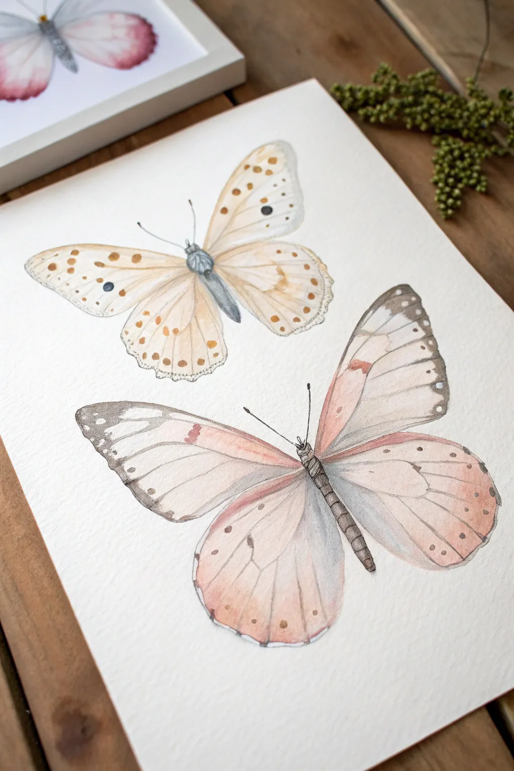
Capture the delicate beauty of fluttering wings with this gentle watercolor study featuring two distinct butterfly species. The translucent layers and soft color bleeds create a stunningly realistic effect that feels light as air.
How-To Guide
Materials
- Cold press watercolor paper (300 gsm)
- Pencil (HB or H)
- Kneaded eraser
- Watercolor paints (Yellow Ochre, Burnt Sienna, Payne’s Grey, Alizarin Crimson, Sap Green)
- Round watercolor brushes (sizes 2, 4, and 0 for details)
- Clean water
- Paper towels
- Fine liner pen (optional, grey or brown)
Step 1: Drawing the Base
-
Sketch basic shapes:
Begin by lightly sketching the central axis for the bodies of both butterflies. Draw an oval for the thorax and a longer, tapered shape for the abdomen. -
Map the wings:
Sketch the forewings (top) and hindwings (bottom) for each butterfly. Keep your pencil lines very faint so they won’t show through the transparent paint later. -
Add wing veins:
draw delicate lines radiating from the body to the wing edges to map out the vein structure. This helps define the segments you’ll paint. -
Refine and lighten:
Once you are happy with the symmetry, roll a kneaded eraser over the sketch to lift up excess graphite, leaving just a ghost image.
Step 2: Painting the Top Butterfly
-
First wash:
Mix a very watery wash of Yellow Ochre. Apply this to the wings, keeping the paint wet and fluid. -
Drop in color:
While the first layer is still damp, touch in a slightly stronger mix of Burnt Sienna near the body and wing roots to create a soft gradient. -
Define the body:
Paint the body using a mix of Payne’s Grey and a touch of blue. Use a size 2 brush to dab the texture into the thorax, making it look fuzzy. -
Add the spots:
Once the wings are completely dry, use a size 0 brush and Burnt Sienna to paint the small dots along the wing edges. Add the single large dark spot on the forewing with Payne’s Grey. -
Vein details:
Using a very dilute brown mix, carefully trace over your pencil lines for the veins with your finest brush.
Control Your Water
To get crisp edges on the wings but soft blends inside them, use the ‘wet-on-dry’ technique for the outline and ‘wet-on-wet’ for the internal color gradients.
Step 3: Painting the Bottom Butterfly
-
Pink wash:
Mix a soft, watery pink using Alizarin Crimson and plenty of water. Paint the lower hindwings first, fading out to almost clear water near the edges. -
Upper wing variation:
Paint the forewings, introducing a touch of Yellow Ochre near the top edge to create that warm, peachy transition seen in the reference. -
Darkening the tips:
While the wings are dry, use a mix of Payne’s Grey and Brown to paint the distinctive dark tips of the forewings. I like to soften this inner edge with a damp brush so it isn’t too harsh. -
Body structure:
Paint the long, slender body with a dark grey-brown mix. Add small horizontal lines across the abdomen to suggest segmentation. -
Antennae and details:
With your size 0 brush and a dark, creamy paint consistency, draw the thin antennae and the small legs near the head. -
Final patterns:
Add the small white or pale spots within the dark wing tips by lifting color or painting around tiny negative spaces. Add the final brown dots on the lower wings.
Add Some Shimmer
Mix a tiny amount of iridescent medium or pearlescent watercolor into your wash for the wings to give them a subtle, lifelike sheen when the light hits.
Now you have a pair of delicate specimens ready to be framed or used in a nature journal
Koi Fish in Flowing Water
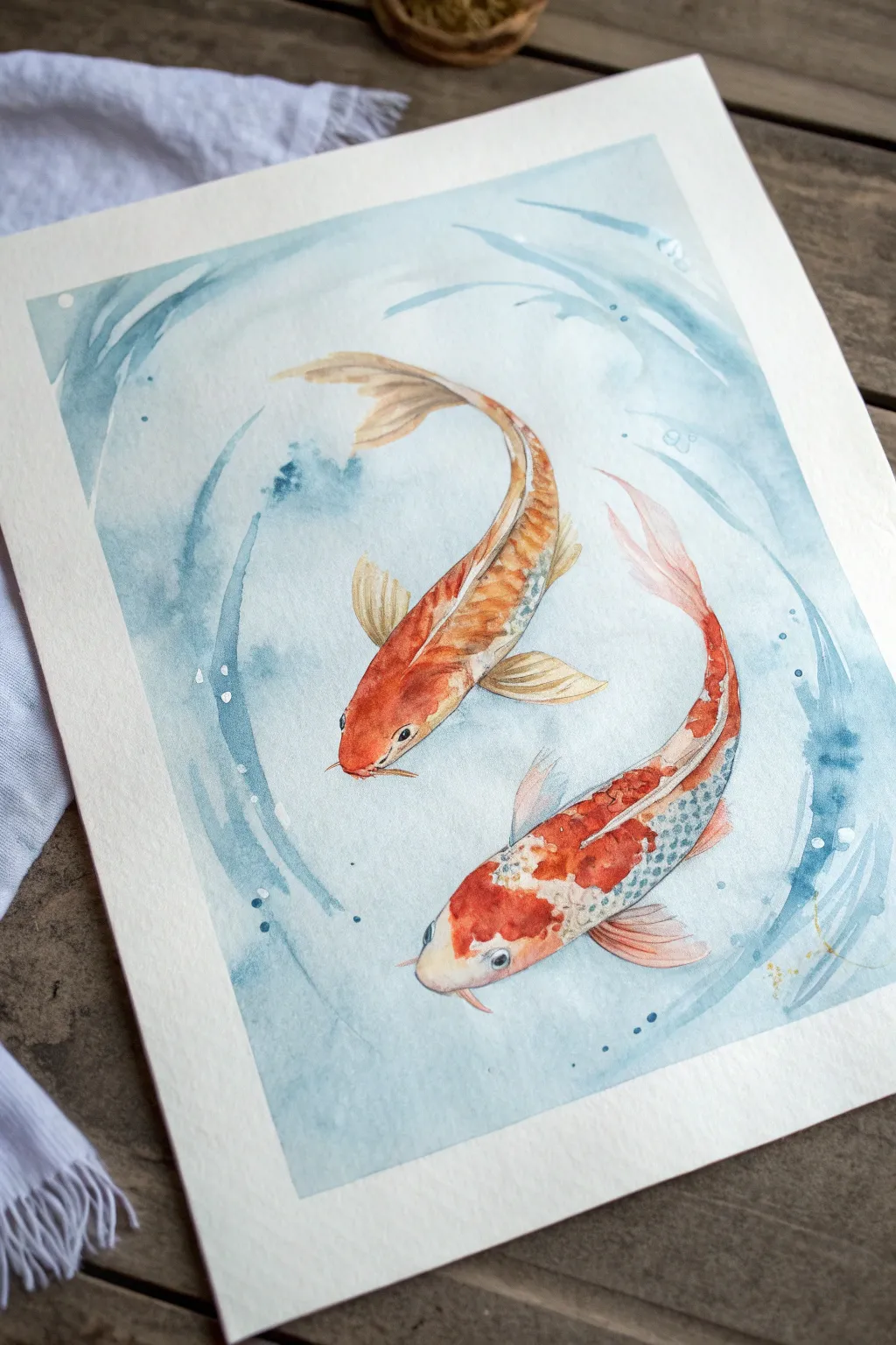
Capture the graceful movement of two koi fish swimming in a harmonious circle with this serene watercolor tutorial. Using soft wet-on-wet techniques for the water and vibrant layering for the fish, you’ll create a balanced composition that feels both lively and peaceful.
Step-by-Step Guide
Materials
- Cold press watercolor paper (140lb/300gsm)
- Watercolor paints (Vermilion, Burnt Sienna, Yellow Ochre, Indigo, Prussian Blue)
- Round brushes (size 4 and 8)
- Fine liner brush (size 0 or 1)
- Pencil (HB or H)
- Kneaded eraser
- Clean water jars
- Paper towels
- Masking fluid (optional)
Step 1: Sketch and Background
-
Outline the composition:
Begin by lightly sketching the outline of two koi fish swimming in a circular formation, head to tail. Keep your pencil lines very faint so they won’t show through the transparent paint later. -
Add fin details:
Sketch the flowing shapes of the fins and tails. Notice how the upper fish has a longer, sweeping dorsal fin curve, while the lower fish shows more of its side profile. -
Establish the water flow:
Draw loose, swirling circular lines around the fish to indicate the movement of the water. These will guide your background painting. -
Wet the water area:
Using your size 8 brush, apply clean water to the background area around the fish, being careful not to get water inside the fish outlines. -
Paint the first ripples:
Drop diluted Prussian Blue into the wet paper, following the circular motion of your sketch. Keep the pigment concentrated near the edges of the paper and lighter near the fish. -
Deepen the swirls:
While the paper is still damp, add touches of Indigo into the wet blue areas to create depth and shadow in the water ripples. Let this background layer dry completely.
Muddy Waters?
If your water swirls look messy, you likely overworked the paper while it was drying. Wait for layers to dry 100% before glazing over them to keep blue tones crisp.
Step 2: Painting the Koi
-
Base wash for the top fish:
Mix a light wash of Yellow Ochre and Vermilion. Paint the entire body of the top fish, leaving tiny slivers of white paper for highlights on the spine or scales. -
Base wash for the bottom fish:
For the bottom fish, apply a patchy wash of Vermilion for the red spots and leave large areas of white paper untouched for the classic Kohaku (white and red) pattern. -
Layering the orange scales:
Once the top fish is dry, use a size 4 brush to dab more concentrated Vermilion along the spine and upper back to suggest scales without painting every single one. -
Detailing the bottom fish:
Add shading to the white areas of the bottom fish using a very watery mix of Indigo and Burnt Sienna to create a soft, cool grey shadow along the belly and tail. -
Painting the fins:
Use a translucent wash of Vermilion for the fins. While wet, streak in lines of darker orange to follow the fin bones. -
Adding the eyes:
With your smallest brush and a thick mix of Indigo, carefully paint the pupil of the eyes, leaving a tiny pinprick of white paper for the reflection. -
Scale texture:
I like to use a mixture of Burnt Sienna and Vermilion on a damp brush to create soft, U-shaped scale indications on the darker parts of the orange bodies. -
Golden accents:
Glaze a little Yellow Ochre over the head and fins of the top fish to give it that warm, golden glow.
Step 3: Finishing Touches
-
Blue water scales:
On the bottom fish’s white areas, paint faint blue-grey scales (using diluted Indigo) to reflect the water color onto the fish’s body. -
Enhancing the water:
Return to the background with a size 4 brush. Paint sharper, dry-brush lines of blue following the swirls to create the illusion of surface tension and movement. -
Splatter texture:
Load a brush with watery blue paint and tap it against your finger to splatter tiny droplets around the fish, mimicking bubbles and splashes. -
Final defined edges:
Use your fine liner to sharpen the edges of the gills and the barbels (whiskers) near the mouth for a crisp finish.
Shimmer Effect
Once fully dry, add tiny touches of iridescent gold watercolor or metallic ink to the scales and fin tips. It mimics how sunlight catches wet fish scales.
Step back and admire the fluid motion you have captured in this tranquil scene


Cute Mushrooms on a Forest Floor
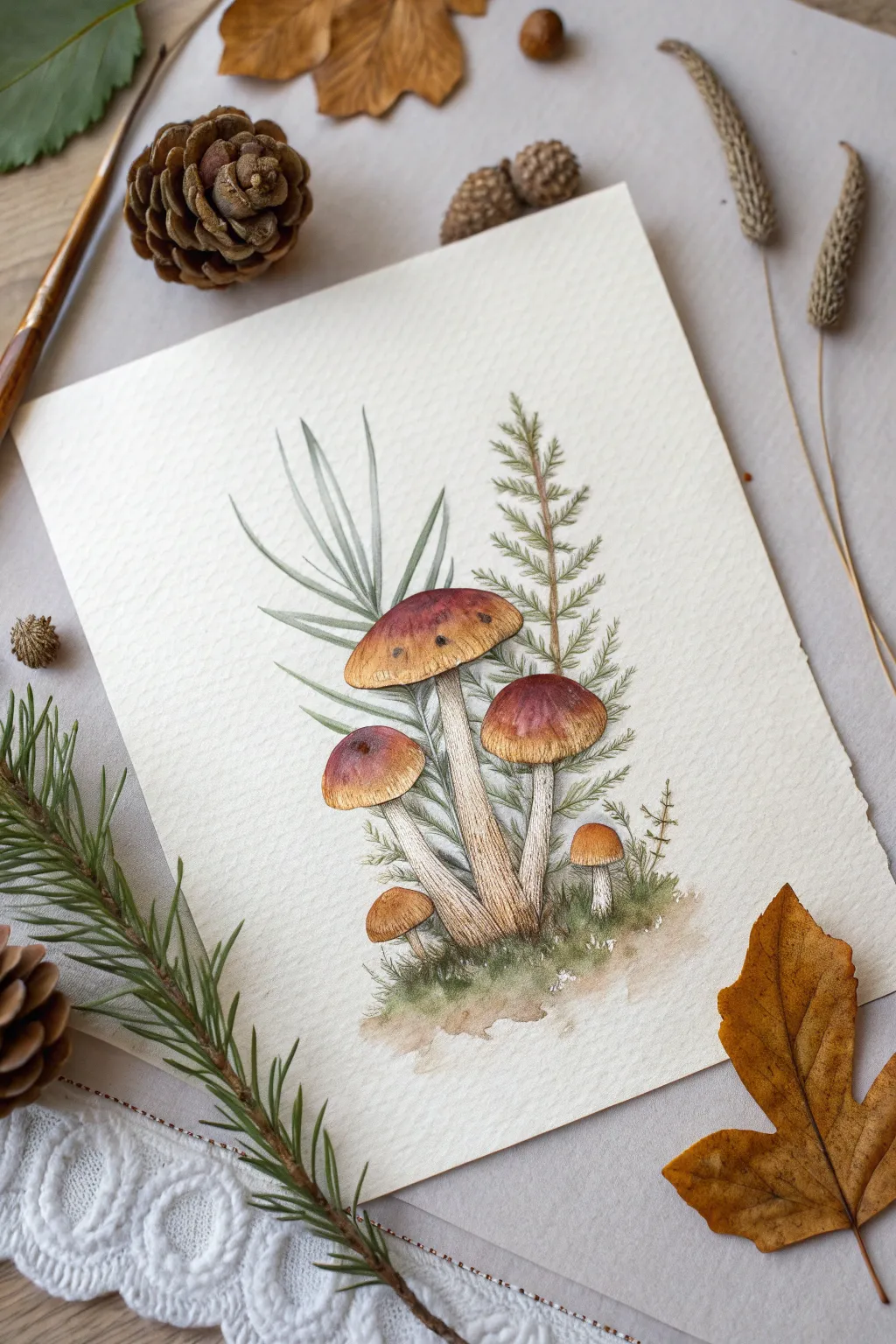
Capture the magic of an autumn forest floor with this detailed watercolor illustration featuring rugged bolete mushrooms nestled among ferns and moss. The piece combines warm earthy tones with delicate botanical greens on textured paper for a cozy, sketchbook aesthetic.
Step-by-Step Tutorial
Materials
- Cold press watercolor paper (300 gsm)
- Watercolor paints (Burnt Sienna, Yellow Ochre, Sepia, Sap Green, Olive Green)
- Fine liner pen (brown or sepia, waterproof) or very fine rigger brush
- Round watercolor brushes (sizes 2, 4, and 6)
- Pencil (HB) and kneaded eraser
- White gouache or gel pen (optional for highlights)
- Paper towels and water jar
Step 1: Sketching the Composition
-
Map out the shapes:
Begin by lightly sketching the three main mushroom caps. Place the largest one slightly left of center, a medium one to its right, and a smaller one tucked on the lower left. Add a tiny baby mushroom peeking out on the far right. -
Add the stems:
Draw the thick, sturdy stems connecting to the caps. Notice how the stems curve slightly; they should be wider at the base where they meet the ground and slightly tapered near the cap. -
Draft the foliage:
Behind the mushrooms, sketch long, sword-like grass blades reaching upward on the left side. On the right, sketch a vertical stem for the fern-like branch, marking where the small offshoots will go. -
Refine the details:
Lightly erase your guide lines until they are faint. Go back over the mushroom contours, adding small imperfections to the caps for realism, and sketch the mossy mound at the base.
Natural Imperfections
Don’t make the mushroom caps perfectly round. Add small indentations or nibble marks on the edges to make them look like they grew in a real forest.
Step 2: Painting the Mushrooms
-
Base wash for stems:
Mix a very watery wash of Yellow Ochre and a touch of Sepia. Paint the stems, keeping the center slightly lighter to suggest roundness. -
First layer on caps:
While the stems dry, wet the mushroom caps with clean water. Drop in Yellow Ochre at the very top highlight area, blending it immediately into Burnt Sienna as you move down the sides. -
Deepening the cap color:
While the caps are still damp but not soaking, add a mix of Burnt Sienna and Sepia to the darker edges and the undersides of the caps to create volume. -
Stem texture:
Once the stems are bone dry, use a size 2 brush with a dilute Sepia mix to paint tiny, vertical striations. This mimics the fibrous texture of wild mushrooms. -
Under-cap shadows:
Paint the sponge-like area under the caps using a darker mix of Sepia and Yellow Ochre. Keep the edge where it meets the stem distinct.
Step 3: Painting the Greenery
-
Fern fronds:
For the pine-like fern on the right, use Olive Green. Paint short, quick strokes outward from the main stem. I like to vary the pressure to make the needles look natural and not too stiff. -
Tall grasses:
Paint the sword-like leaves on the left using a cool, desaturated green (mix Sap Green with a tiny touch of Paynes Grey or Blue). Use long, confident strokes from bottom to top. -
Mossy base:
Wet the area at the bottom of the stems. Drop in Sap Green and Olive Green, dabbing the brush to create a mossy texture. Let the edges bleed out softly into the white paper.
Splatter Effect
Load a toothbrush with dilute brown paint and flick it lightly over the bottom moss area to create the look of dirt and grit.
Step 4: Inking and Final Details
-
Outline work:
Wait until the painting is completely dry—if the paper is cool to the touch, it’s still damp. Use a waterproof brown fine liner or a very fine brush with Sepia ink to outline the mushrooms. -
Detailed hatching:
Add fine hatching lines on the mushroom stems, following the curve of the cylinder. Add delicate veins to the long grass leaves. -
Texture definition:
Use the pen to create stippling (tiny dots) on the mushroom caps to suggest bug bites or natural spotting. Add darker scribbles in the moss to show depth. -
Softening edges:
If any ink lines look too harsh, you can gently glaze a very light wash of the local color over them to integrate the line work with the paint. -
Final highlights:
Use a tiny amount of white gouache to add a dull specular highlight on the smoothest part of the mushroom caps if you lost the white of the paper.
Now you have a charming botanical study ready to be framed or gifted to a nature lover
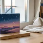
Galaxy Night Sky With Splatter Stars
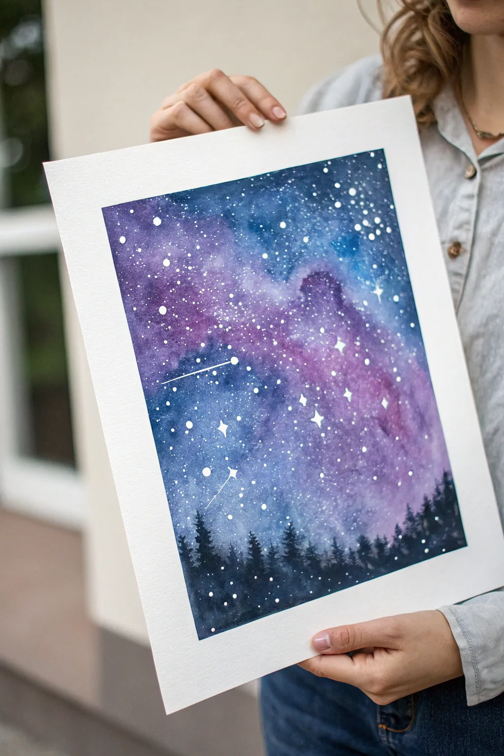
Capture the magic of a starry night with this vibrant watercolor galaxy. By blending deep indigos, purples, and teals, you’ll create a nebulous backdrop for a sparkling constellation and a silhouette forest line.
Step-by-Step Guide
Materials
- Cold press watercolor paper (300gsm, 140lb)
- Masking tape
- Watercolor paints: Indigo, Phthalo Blue, Violet, Magenta, Black
- White gouache or white ink
- Large wash brush (flat or round)
- Medium round brush (size 6 or 8)
- Fine liner brush (size 0 or 1)
- Paper towels
- Two cups of water
- Old toothbrush (optional for splatter)
Step 1: Preparation and Base
-
Secure the paper:
Tape down all four edges of your watercolor paper to a board or table using masking tape. This creates that crisp white border seen in the final piece and prevents the paper from buckling under heavy water usage. -
Wet the surface:
Using your large clean brush, apply a generous wash of water over the entire inner rectangle defined by your tape. The paper should be glistening and wet, but no pools of water should form. -
Start with lighter colors:
Load your medium brush with watery magenta and violet. Drop these colors randomly into the center and upper mid-section of the wet paper, letting them bloom naturally.
Step 2: Creating the Galaxy
-
Deepen the blues:
While the paper is still wet, pick up your Phthalo Blue and Indigo. Paint around the pink/purple areas, gently blending the edges where they meet so there are no hard lines. -
Add darkness:
Mix a very saturated Indigo or Paynes Gray. Apply this to the top corners and the very bottom of the sky area to frame the brighter galaxy center. -
Create texture:
I like to tilt the board slightly to let colors shift, or dab a crumpled tissue on a few spots to lift pigment, creating cloud-like nebulas. -
Let it dry beautifully:
Allow this first layer to dry completely. It must be bone dry before the next step to avoid muddying the sharp details later. You can use a hairdryer on low heat to speed this up.
Bleeding edges?
If paint seeps under the tape, use a slightly damp stiff brush (like a specialized ‘scrubber’ brush) to gently lift the unwanted pigment, or cover it with white gouache.
Step 3: Stars and Details
-
Prepare the stars:
Squeeze a small amount of white gouache or ink onto your palette. It should be creamy—thick enough to be opaque, but thin enough to splatter. -
Splatter large stars:
Load a medium brush with the white mixture. Hold it over the paper and tap the handle against another brush to send droplets falling onto the painting. -
Create fine dust:
For the tiny, distant stars, use an old toothbrush dipped in white paint. Run your thumb across the bristles to spray a fine mist over the darker blue sections. -
Hand-paint hero stars:
Using your fine liner brush, manually paint a few distinct four-pointed stars or larger dots to create focus points. Connect a few with thin lines to suggest shooting stars.
Metallic Magic
Swap standard white gouache for metallic silver or iridescent watercolor medium for the stars. It adds a magical shimmer that changes as you walk past the artwork.
Step 4: The Forest Silhouette
-
Mix the darkest shade:
Combine your black watercolor with a touch of indigo to create a deep, cool charcoal color. It needs to be very concentrated with very little water. -
Paint the tree tops:
Starting about one-fifth up from the bottom, use the tip of your medium brush or a smaller brush to dab vertical textured lines, creating jagged pine tree shapes. -
Fill the horizon:
As you move down from the tree tips, fill in the solid black mass of the forest floor, ensuring it meets the bottom tape line completely. -
Vary the heights:
Make sure your trees are different heights—some tall and sparse, others short and dense—to make the forest look natural and organic. -
Final touches:
If you want depth, you can add a few tiny white dots over the black trees once dry to represent fireflies or low-hanging stars. -
The reveal:
Wait until everything is absolutely dry. Then, carefully peel the tape away at a 45-degree angle to reveal your masterpiece.
Frame your personal slice of the cosmos and enjoy the view
Masking Tape Frame for Crisp Edges
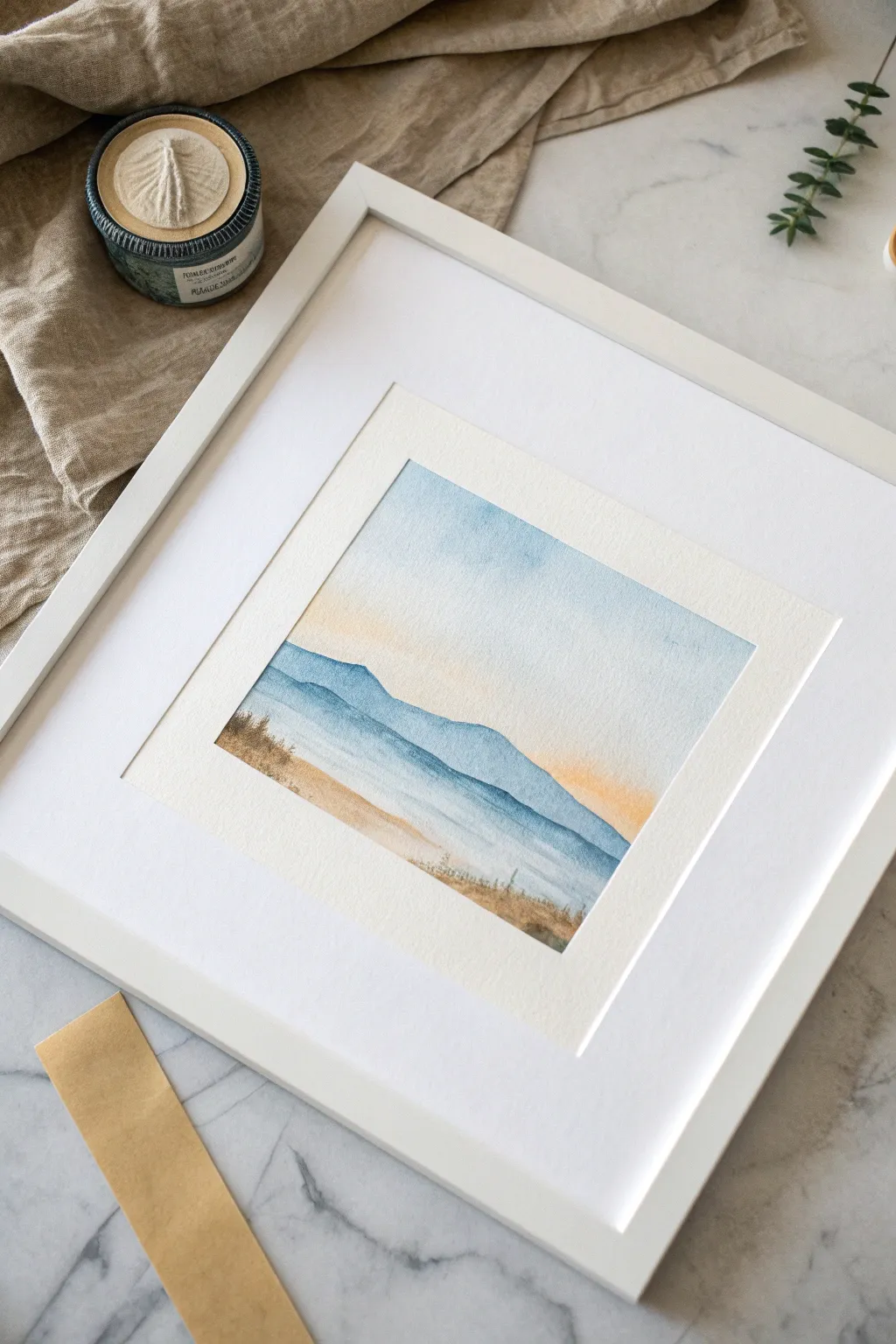
Capture the serenity of distant blue hills and a soft sunset with this simple yet striking watercolor project. By using masking tape, you’ll achieve a perfect, crisp border that makes your finished piece look professional and ready for framing.
Step-by-Step Tutorial
Materials
- Cold press watercolor paper (approx. 140lb/300gsm)
- Painter’s tape or low-tack masking tape
- Watercolor paints (Indigo, Cobalt Blue, Burnt Sienna, Yellow Ochre)
- Flat wash brush (3/4 inch)
- Round brush (size 6 or 8)
- Small detail brush (size 0 or 2)
- Two jars of water
- Paper towels
- Heat tool or hairdryer (optional)
Step 1: Setting the Scene
-
Tape the Border:
Begin by firmly securing your watercolor paper to a hard board or your work surface using painter’s tape. Create a precise square or rectangle opening in the center. Run your fingernail or a bone folder along the inner edge of the tape to ensure a tight seal—this prevents paint from seeping underneath. -
Wet the Sky:
Looking at the top two-thirds of your paper, gently wet the surface with clean water using your flat wash brush. The paper should be glisten with a sheen but shouldn’t have standing puddles of water. -
Paint the Sky Gradient:
Load your brush with a very watery wash of Cobalt Blue. Start at the very top edge and paint horizontally, letting the color fade as you move downward. While the paper is still wet, clean your brush and pick up a pale mix of Yellow Ochre with a touch of Burnt Sienna. -
Blend the Sunset:
Apply this warm yellow-peach mixture near the horizon line (about one-third up from the bottom), letting it touch the fading blue sky. Allow the colors to bleed slightly into each other for a soft transition, but be careful not to overwork it, or you might get green.
Sticky Situation?
To prevent your paper in tearing when removing tape, stick the tape to your clothes first to reduce its tackiness before applying it to your watercolor paper.
Step 2: Layering the Mountains
-
Dry Completely:
Let the sky layer dry completely. This is crucial; if the paper is damp, your crisp mountain edges will blur. I usually check by lightly touching the back of the hand to the paper—if it feels cool, it’s not dry yet. -
First Mountain Range:
Mix a light wash of Cobalt Blue. Using your round brush, paint the silhouette of the furthest mountain range. Keep the top edge undulating and organic. Pull this color down towards the horizon, fading it out with clear water as it reaches the bottom to create atmospheric perspective. -
Dry Again:
Use a hairdryer or wait for this first mountain layer to dry entirely before proceeding. -
Second Mountain Range:
Mix a slightly darker, more concentrated blue (add a touch of Indigo to your Cobalt). Paint a second mountain range slightly lower than the first, overlapping it. Again, keep the top edge sharp and fade the bottom out with water. -
Third Layer:
Repeat the process for a third, nearest hill layer. This should be your darkest value yet, perhaps mostly Indigo. Ensure the previous layer is bone dry so distinct ridges formed.
Step 3: Foreground and Details
-
Create the Water:
Below your mountains, define a straight horizon line for the water. Add a very faint horizontal wash of blue to suggest the lake or sea, leaving some white paper showing for highlights and reflection. -
Paint the Shoreline:
Mix Burnt Sienna with a tiny bit of Yellow Ochre for a sandy color. Paint a strip at the very bottom of the composition for the foreground shore. -
Add Texture:
While the sandy area is slightly damp, drop in concentrated Burnt Sienna or Indigo in random spots to create the look of soil or rocks. -
Grassy Details:
Once the shoreline is dry, switch to your smallest detail brush. Mix a thick, dark brown-grey color. Using quick, upward flicking motions, paint tiny grasses and reeds along the bottom edge and emerging from the sand. -
Final Touches:
Evaluate your painting. If you need more definition in the water, add a few very thin, dry-brush horizontal lines to suggest ripples.
Metallic Magic
Once the painting is dry, use a gold metallic watercolor pen to add tiny highlights to the edges of the mountains or ripples in the water for a magical glow.
Step 4: The Reveal
-
Remove the Tape:
Wait until the painting is 100% dry. This is the most satisfying part! Slowly peel the tape away from the paper at a 45-degree angle. Pulling away from the painted area helps prevent the paper from tearing. -
Frame It:
Place your finished piece into a square frame with a mat to highlight those beautiful crisp edges you just created.
Now you have a serene little window into a peaceful landscape that looks impeccably neat
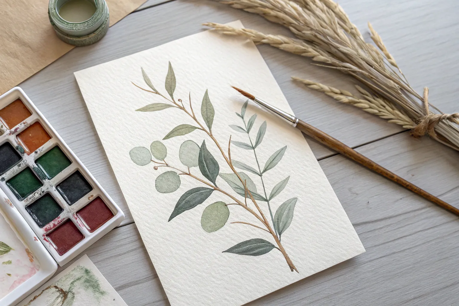
Line-and-Wash Botanical Branch
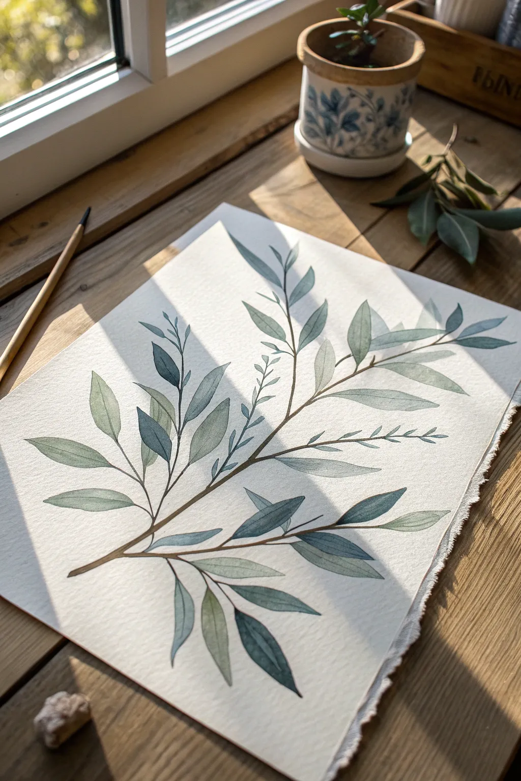
Capture the delicate interplay of light and shadow with this elegant botanical watercolor study. This project focuses on monochromatic greens and subtle layering to create a soft, airy branch that feels like it’s basking in afternoon sunlight.
Step-by-Step Guide
Materials
- Cold press watercolor paper (300 gsm)
- Round watercolor brushes (size 4 and 8)
- Fine liner brush (size 0 or 00) or rigger brush
- Watercolor paints: Sap Green, Payne’s Grey, Burnt Umber, and Indigo
- HB Pencil
- Kneaded eraser
- Two jars of water
- Paper towels
- Mixing palette
Step 1: Preparation & Sketching
-
Analyze your composition:
Before putting pencil to paper, visualize a diagonal line sweeping from the bottom left to the top right. This will be the main spine of your branch, giving the piece dynamic movement. -
Sketch the main stem:
Using an HB pencil with a very light hand, draw the central curved line. Add three or four smaller offshoot branches diverging from this main stem. -
Outline the leaves:
Sketch elongated, lance-shaped leaves attached to the stems. Vary their angles—some facing up, some down, and some slightly overlapping—to create a natural, organic feel. -
Refine the drawing:
I like to gently roll a kneaded eraser over the sketch now. You want the graphite lines to be barely visible, just enough to guide your brush without showing through the translucent paint.
Step 2: Mixing & First Wash
-
Create your green palette:
Mix three puddles of paint: a light, watery ‘tea’ consistency of Sap Green; a medium ‘milk’ consistency mix of Sap Green with a touch of Payne’s Grey; and a dark, cool mix using Indigo and Green. -
Paint the lightest leaves:
Dip your size 8 brush into the lightest green mix. Paint about a third of the leaves, choosing ones scattered randomly across the branch. Use a single stroke from base to tip if possible. -
Drop in color variety:
While these leaves are still wet, touch the very tip of your brush (loaded with slightly darker green) to the base of the leaf. Watch the pigment bloom softly into the damp area. -
Paint the mid-tone leaves:
Switch to your medium green mix. Paint another set of leaves, perhaps overlapping a dry light leaf here and there to create depth. -
Add the cool shadows:
For the leaves that appear ‘behind’ others or lower on the branch, use the cooler, blue-leaning green mix. This variation in temperature mimics natural light filtering through foliage.
Bleeding Colors?
If colors run into each other where leaves overlap, ensure the first leaf is completely dry before painting the neighbor. Use a hair dryer on low to speed this up.
Step 3: Stems & Details
-
Mix the stem color:
Combine Burnt Umber with a tiny bit of Indigo to create a deep, natural brown. Ideally, this should be a ‘cream’ consistency—rich and not too watery. -
Paint the main branch:
Using your fine liner or rigger brush, carefully trace the main stem line. Vary the pressure: press down slightly for the thicker base and lift up for a hairline tip at the end. -
Connect the leaves:
Draw thin, delicate petioles (leaf stems) connecting each leaf to the main branch. Ensure these connections look seamless and flow naturally from the wood. -
Add fine twig details:
In the open spaces between leaf clusters, add tiny, barren twigs or very small budding leaves using the tip of your smallest brush. This adds intricate texture.
Pro Tip: Lost & Found
Don’t outline every single leaf perfectly. Let some edges fade into the white paper or break the stem line occasionally. This ‘lost and found’ edge technique creates elegance.
Step 4: Finishing Touches
-
Evaluate the values:
Step back and look at your painting. If it looks too flat, glaze a second transparent layer of the dark blue-green over the shadowed side of a few leaves to deepen the contrast. -
Add vein details:
Once the leaves are 100% bone dry, use a slightly darker version of the leaf color and your size 0 brush to paint a very faint central vein line on just a few focal leaves. -
Check edges:
If any edges feel too hard, you can soften them with a clean, slightly damp brush, gently scrubbing the edge to blur it into the white paper.
Allow your painting to dry fully before framing it to preserve the delicate watercolor textures
Abstract Watercolor Collage From Painted Scraps

Transform your leftover watercolor experimentations into a stunning piece of modern geometric art. This project creates a mesmerizing, mosaic-like effect by assembling hand-painted paper scraps into a harmonious, radiating puzzle on textured paper.
Step-by-Step
Materials
- Heavyweight watercolor paper (300gsm/140lb) for the base
- Assorted painted watercolor scraps or practice sheets
- Pencil
- Ruler
- Scissors or craft knife
- Cutting mat
- Archival craft glue or glue stick
- Bone folder (optional)
- White or metallic gel pen (optional for detailing)
Step 1: Preparing Your Palette
-
Gather your scraps:
Collect your painted watercolor papers. You’ll want a variety of tones to create depth: deep indigo, burnt sienna, dusty rose, mustard yellow, and sage green work beautifully together as seen in the example. -
Create new sheets (optional):
If you don’t have scraps, paint small swatches of watercolor paper in solid washes. Use wet-on-wet techniques to add subtle texture and let them dry completely. -
Prepare the base:
Tear a piece of heavyweight watercolor paper to your desired size (e.g., 8×10 inches). Creating a torn, deckle edge adds a lovely organic touch that contrasts with the geometric shapes. -
Mark the center point:
On your base paper, lightly mark a focal point with a pencil. It doesn’t need to be dead center; slightly off-center often creates a more dynamic composition.
Sticky Situation
If glue oozes out between shapes, don’t wipe it immediately! Let it become tacky or semi-dry, then gently roll it off with a clean finger or rubber cement pickup.
Step 2: Cutting the Geometry
-
Cut triangular varying shapes:
Take your painted scraps and begin cutting them into acute triangles. They shouldn’t be uniform—make some long and skinny, others wider. Variety is key here. -
Plan the layout:
Before gluing anything, arrange your triangles on the base paper. Start from your marked center point and let the points of the triangles radiate outward. -
Refine the fit:
As you lay out the pieces, you might find gaps. Trim new pieces specifically to fit these spaces, mimicking a stone mosaic. -
Leave breathing room:
Ensure you leave a small, consistent gap of white space (about 1-2mm) between each piece. This ‘grout line’ is essential for defining the shapes and letting the textured base paper peek through. -
Check the balance:
Step back and look at your color distribution. Try not to cluster all the dark blues or bright yellows in one spot; spread them out to keep the eye moving across the piece.
Texture Trick
Use cold press paper for your painted scraps. When the paint settles into the paper’s tooth, it adds a granular texture that makes the flat geometric shapes feel tactile.
Step 3: Assembly and Finishing
-
Begin gluing:
Once you are happy with the arrangement, pick up one piece at a time. Apply a thin, even layer of archival glue to the back. -
Secure the pieces:
Press the piece firmly onto the base paper. I like to use a clean piece of scrap paper over the top and rub with a bone folder to ensure good adhesion without smudging the paint. -
Work outward:
Start gluing the central pieces first and work your way toward the edges. This helps maintain the radial burst design. -
Trim the edges:
Once the glue is fully dry, you have a choice. You can leave the jagged triangle edges for a raw look, or use a ruler and knife to trim the collage into a perfect rectangle within the deckled border. -
Flatten the artwork:
If the paper has buckled slightly from the glue wetness, place the finished piece under a heavy book overnight to flatten it out perfectly.
Frame your geometric mosaic in a simple wood float frame to show off those beautiful edges


Have a question or want to share your own experience? I'd love to hear from you in the comments below!