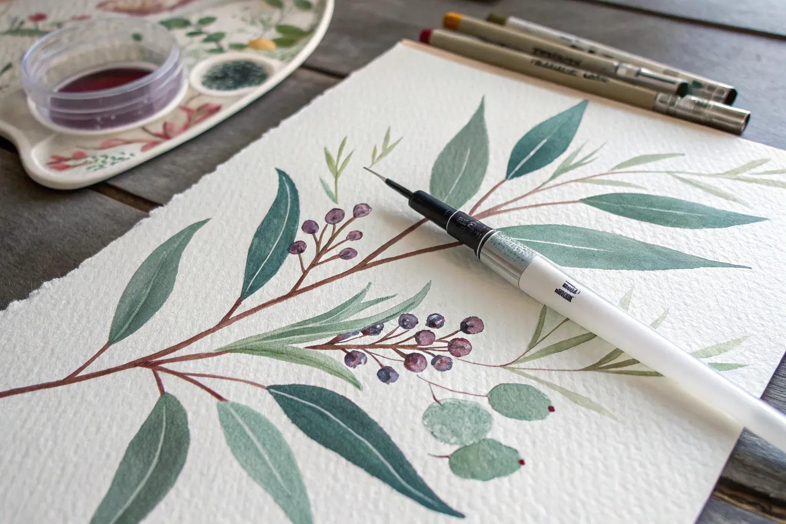
If you’ve got watercolor pens and a little water, you’re holding the best of both worlds: crisp drawing lines and dreamy washes. Here are some of my go-to watercolor pen drawing ideas that feel fun, doable, and seriously satisfying once the color starts to bloom.
Easy Mountain Gradient Landscape
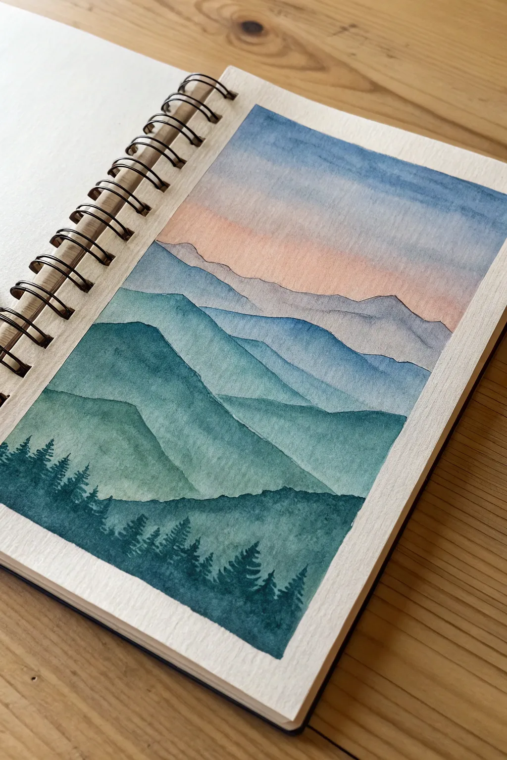
Capture the serene beauty of distant peaks with this atmospheric watercolor landscape. You’ll master the art of layering washes to create depth, fading from an indigo foreground into a soft, peachy sunset sky.
Step-by-Step Guide
Materials
- Cold press watercolor paper or sketchbook
- Watercolor paints (Indigo, Prussian Blue, Payne’s Gray, Peach/light orange, Turquoise)
- Round brushes (large size 8-10 for washes, small size 2-4 for details)
- Pencil and eraser
- Masking tape or washi tape
- Two jars of water
- Paper towels
Step 1: Preparation and Sketching
-
Tape boundaries:
Begin by taping off a clean rectangular border on your sketchbook page using masking tape or painter’s tape. Press down firmly on the edges to ensure crisp lines later. -
Sketch the layers:
Lightly sketch four or five jagged, rolling lines across the page to represent the mountain ridgelines. Keep the lines irregular and ensure they overlap each other to suggest distance. -
Lighten the lines:
Take a kneadable eraser and gently roll it over your sketch. You want the graphite lines to be barely visible so they don’t show through the final translucent watercolor layers.
Wet-on-Dry Precision
For sharp mountain ridges, always wait until the previous layer is 100% dry. If the paper is cool to the touch, it’s still wet.
Step 2: Painting the Sky
-
Wet the sky area:
Using your large clean brush, apply clean water to the sky area, stopping just above the furthest mountain line. The paper should be glistering but not swimming in a puddle. -
Apply the blue gradient:
Load your brush with a watered-down medium blue. Paint a horizontal stroke at the very top of the sky, letting the pigment flow downward into the wet paper. -
Add the sunset glow:
While the paper is still damp but the blue has settled slightly, rinse your brush and pick up a very pale peach or diluted light orange. Apply this near the horizon line, carefully blending it upward to meet the blue without creating a muddy green. -
Let it dry completely:
This is crucial: allow the sky to dry completely before touching the mountains. Usually, 10 minutes is safe, or you can speed it up with a hair dryer.
Step 3: Layering the Mountains
-
Mix the furthest color:
Prepare a very pale, watery mix of blue-grey. This represents the most distant mountain range, which should look faded due to atmospheric perspective. -
Paint the first range:
Fill in the shape of the furthest mountain range. Keep the wash even and flat. Let this layer dry completely. -
Darken the mix:
Add a bit more pigment to your blue-grey puddle to create a slightly darker, more saturated shade for the second mountain layer. -
Paint the second range:
Paint the next mountain shape down, overlapping the first one. Because watercolors are transparent, the layering builds natural depth. -
Introduce teal tones:
For the middle mountain ranges, mix in a touch of turquoise or teal into your blue mixture to differentiate the hills. Paint the middle layer with this richer, medium-tone wash. -
Create the foreground hill:
Mix a strong, dark teal-blue. Paint the large, sweeping hill closest to the bottom, but leave the very bottom strip of paper blank for the tree line. Allow everything to dry.
Starry Night Variant
Swap the peach sky for deep indigo. Once dry, flick white gouache or acrylic ink perfectly over the top for a starry night scene.
Step 4: Adding Foreground Details
-
Mix an ultra-dark shade:
Combine Indigo and Payne’s Gray to create a near-black blue. Use very little water here; you want a creamy, opaque consistency. -
Paint the treeline base:
Fill in the bottom-most area with this dark mixture, creating a solid base for your forest. -
Detail the treetops:
Switch to your smallest round brush (size 2 is ideal). Using the tip, flick tiny vertical lines upward from the dark base. -
Flesh out the pines:
For each vertical line, dab tiny horizontal strokes that get wider as they go down, mimicking the shape of pine trees. Vary the heights so the forest looks organic. -
The Reveal:
Once the paint is bone dry—touch it lightly to check—slowly peel away the masking tape at a 45-degree angle to reveal your clean, crisp borders.
Enjoy the peaceful feeling of your misty mountain landscape as you close your sketchbook


Sunset Wash With Crisp Silhouettes
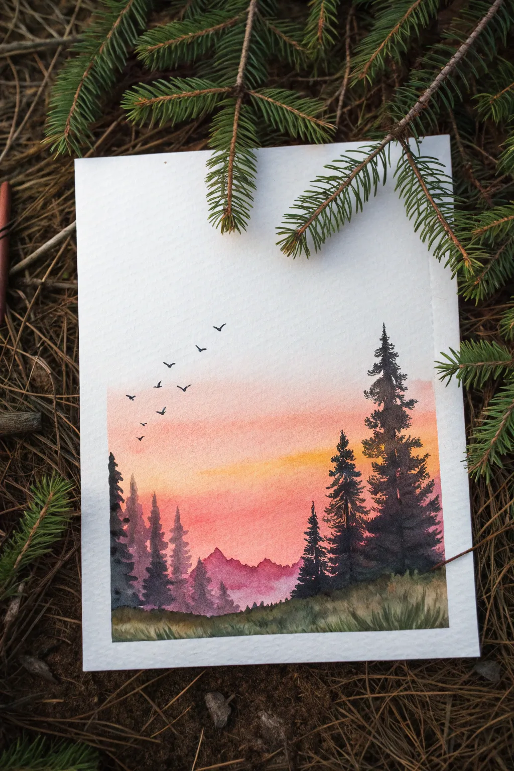
This serene landscape captures the magic of golden hour with a glowing gradient sky and crisp, contrasting evergreens. The soft watercolor wash creates a dreamy backdrop for the sharp, dark silhouettes of the forest.
Detailed Instructions
Materials
- Cold press watercolor paper (300 gsm)
- Watercolor paints (Peach, Orange, Pink, Purple, Dark Green, Black)
- Masking tape
- Flat wash brush (large)
- Round brush (size 6 or 8)
- Fine liner or detail brush (size 0 or 00)
- Jar of clean water
- Paper towel
Step 1: Setting the Stage
-
Tape the edges:
Begin by taping down all four edges of your watercolor paper to a board or table. This creates that crisp, clean white border seen in the final piece and prevents the paper from buckling when wet. -
Pre-wet the sky area:
Using your large flat brush and clean water, gently wet the upper two-thirds of the paper where the sky will be. You want an even sheen, not puddles.
Step 2: The Sunset Gradient
-
Apply the peach tones:
Load your brush with a watery peach or pale orange. Start about halfway down the page and brush horizontally across the wet paper, letting the color bloom softly. -
Deepen the horizon:
While the first layer is still wet, introduce a vibrant pink or coral tone just below the peach section. Blend it upwards slightly so the transition feels seamless and natural. -
Add the golden glow:
For the brightest part of the sunset, drop a concentrated warm yellow or orange right in the center of your gradient. This creates the illusion of the sun just below the horizon. -
Let the sky dry:
Allow the sky wash to dry completely. If you paint the next layers too soon, the sharp mountain edges will bleed into the sky.
Edge Control
To prevent paint bleeding under your tape, press the tape edges down firmly with a bone folder or your fingernail before you start painting.
Step 3: Distant Mountains
-
Mix a hazy purple:
Create a dilute mix of purple with a touch of pink. You want this color to be transparent to suggest distance. -
Paint the mountain range:
Using a round brush, paint a jagged mountain ridge across the lower third of the paper, overlapping the bottom of your sunset wash. -
Fade the bottom edge:
Immediately rinse your brush and drag clean water along the bottom edge of the purple mountains to fade them out into white paper. This creates a misty effect at the base. -
Allow to dry:
Ensure this mountain layer is fully dry before moving to the foreground.
Make it Sparkle
Once dry, use a white gel pen to add tiny stars in the upper, paler part of the sky or highlight tips of the pine trees for a frosty look.
Step 4: Foreground Silhouettes
-
Mix deep forest shadow:
Mix a very dark, saturated color using dark green, indigo, and a touch of black. It needs to be thick and opaque for strong silhouettes. -
Paint the feature trees:
On the right side, paint the trunks of two large pine trees. Use the tip of your round brush for the top and press down harder as you move down the trunk. -
Add pine branches:
Use a dabbing motion to create the texture of pine needles. Start narrow at the top and flare out wider towards the bottom, leaving small gaps to keep the tree looking airy. -
Create background trees:
On the left side, paint simpler, slightly lighter pine shapes. I find varying the height and opacity helps create depth, making some trees look further away. -
Anchor the trees:
Connect the bases of all your trees with a wash of dark green and brown to create the grassy ground layer at the very bottom.
Step 5: Final Details
-
Add grassy texture:
With a damp, stiff brush or a nearly dry round brush, flicker upward strokes from the bottom edge to simulate tall grass blades in the foreground. -
Paint the flight:
Using your smallest detail brush and black paint, add a flock of tiny distant birds in the sky. Keeps the V-shapes varied in size and angle for realism. -
Reveal the border:
Once the painting is bone dry, carefully peel away the masking tape at a 45-degree angle to reveal your clean edges.
Now you have a tranquil sunset scene that brings the calm of the forest right into your home.


Cactus Sketch With Splatter Texture
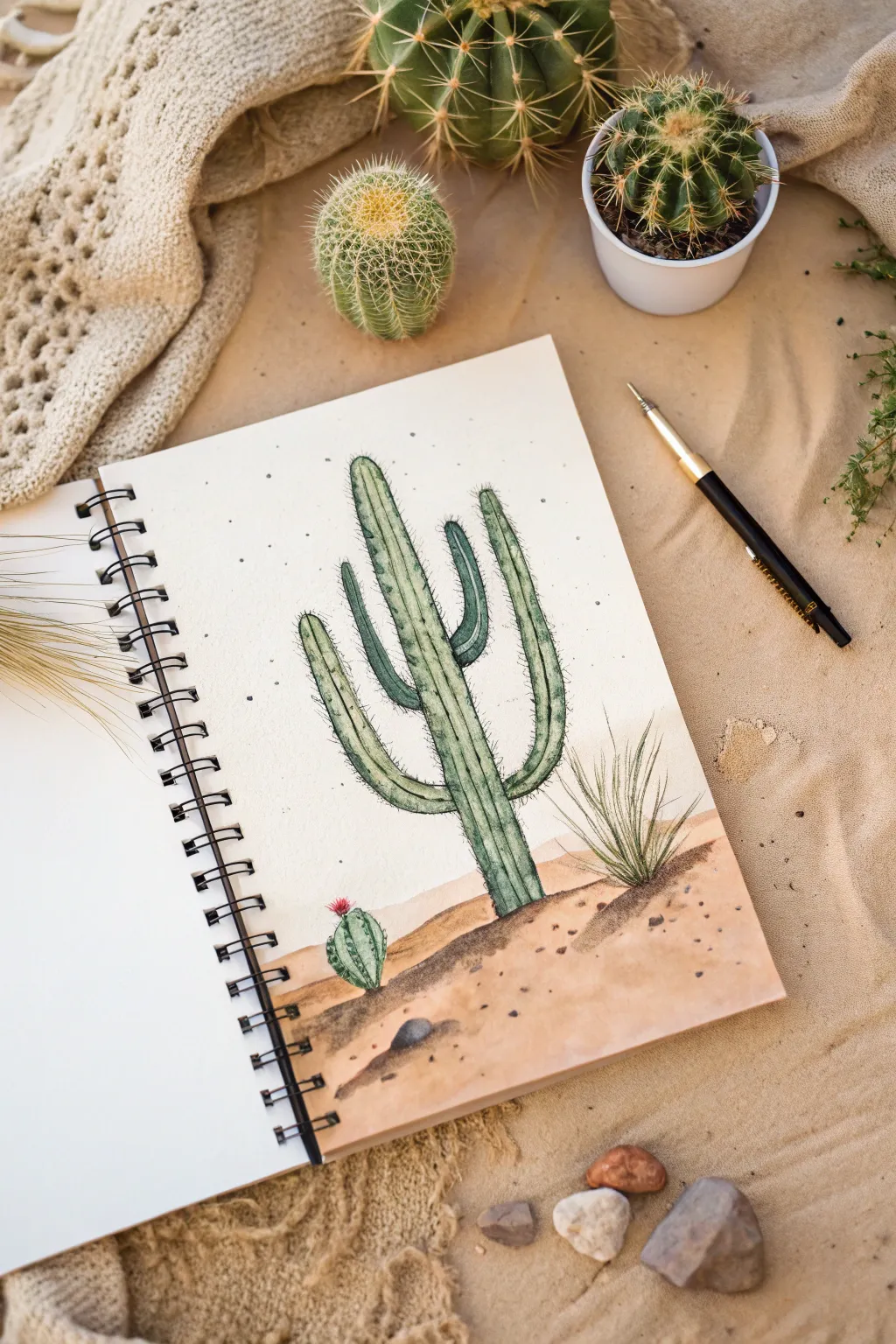
Capture the stoic beauty of the desert with this mixed-media sketch featuring a towering Saguaro cactus. By combining soft watercolor washes with crisp pen lines and delicate splatter textures, you’ll create a piece that feels both illustrative and organic.
Step-by-Step Tutorial
Materials
- Hot press watercolor paper (smooth texture preferred)
- Watercolors (Sage Green, Olive Green, Yellow Ochre, Burnt Sienna, Burnt Umber, Alizarin Crimson)
- Black fineliner pens (sizes 0.1 and 0.5)
- Round watercolor brushes (size 4 and 8)
- Pencil (HB) and eraser
- Old toothbrush or stiff bristle brush (for splattering)
- Water cups and paper towels
Step 1: Sketching and Base Layer
-
Outline the Composition:
Start with a light pencil sketch. Draw a tall, central cactus stem, adding two main arms curving upward on either side—one slightly lower than the other. Add a distinct horizon line about one-third up from the bottom. -
Add Background Elements:
Sketch a small, round barrel cactus near the base on the left side and a tuft of spiky desert grass on the right to balance the composition. -
Paint the Sky Wash:
Mix a very dilute, watery wash of Yellow Ochre or a pale cream color. Apply this to the sky area, keeping it extremely faint to suggest heat and light rather than a blue sky. -
Paint the Sand Dunes:
While the sky is drying, mix Yellow Ochre with a touch of Burnt Sienna. Paint the ground area below the horizon line, allowing the color to be slightly uneven to mimic the texture of sand. -
Deepen the Shadow:
While the sand layer is still damp, drop in a slightly darker mix of Burnt Umber right at the base of the cactus and grass to create a soft, grounded shadow.
Bleeding Lines?
If your ink lines are feathering or spreading into fuzzy spiders, your paper is still damp. Stop immediately and wait—or use a hairdryer on low heat.
Step 2: Painting the Cactus
-
Base Green Color:
Mix a Sage Green or mute a standard green with a touch of red. Paint the entire body of the main cactus. Don’t worry about perfect coverage; a little variation adds character. -
Add Cactus Ribs:
While the base green is still slightly wet (wet-on-wet technique), use a smaller brush to paint vertical stripes of darker Olive Green down the length of the stem and arms. This creates the ribbed structure. -
Paint the Barrel Cactus:
Using the same greens, paint the small barrel cactus on the left. Make the ribs curved to emphasize its round shape. Add a tiny dab of Alizarin Crimson on top for a blooming flower. -
Grass Tuft Base:
For the grass on the right, use quick, upward flicking motions with your brush and a mix of green and brown paint to establish the main clumps. -
Let Everything Dry:
This is crucial. Wait until the paper is completely bone-dry before moving on to the pen work, or your lines will bleed.
Step 3: Ink Detailing and Texture
-
Outline the Form:
Using a 0.5 fineliner, carefully outline the main cactus. Break the line occasionally so it doesn’t look like a sticker; organic gaps make it feel more natural. -
Define the Ribs:
Switch to a finer 0.1 pen. Draw vertical lines following the darker green stripes you painted earlier. These lines define the ridges of the cactus. -
Add Spines:
With the 0.1 pen, draw tiny clusters of thorns along the outer edges of the cactus and periodically along the vertical rib lines. Keep these strokes short and sharp. -
Detail the Barrel Cactus:
Outline the small round cactus and its flower. Add specific curved rib lines and generous thorns to give it a prickly appearance. -
Refine the Grass:
Use the pen to add sharp, individual blades of grass within the painted tuft. Vary the direction slightly to make it look wind-blown. -
Grounding Shadows:
Use hatching (closely spaced parallel lines) or stippling (dots) at the very base of the cactus and grass to anchor them firmly to your sand dune.
Level Up: Highlights
Use a white gel pen to add highlights on the sun-lit side of the cactus ribs and a few sparkles on the sand granules.
Step 4: Final Textures
-
Create Light Splatter:
Cover the cactus part of your drawing with a piece of scrap paper. Load an old toothbrush or stiff brush with watered-down brown paint and flick the bristles to create a fine spray of dots on the sky area. -
Darker Sand Texture:
Remove the mask and repeat the splatter process on the sand area, perhaps using a darker Burnt Umber mix. I like to add a few larger droplets here by tapping a loaded brush against a pencil. -
Draw Small Pebbles:
Using your pen or a small brush with dark brown paint, draw a few specific rocks or pebbles in the foreground sand to create depth. -
Atmospheric Particles:
Finally, add a few widely spaced, deliberate ink dots in the sky area to enhance the dusty, atmospheric look.
Now you have a serene desert scene that captures the quiet warmth of the dunes


Split-Panel Mini Landscapes
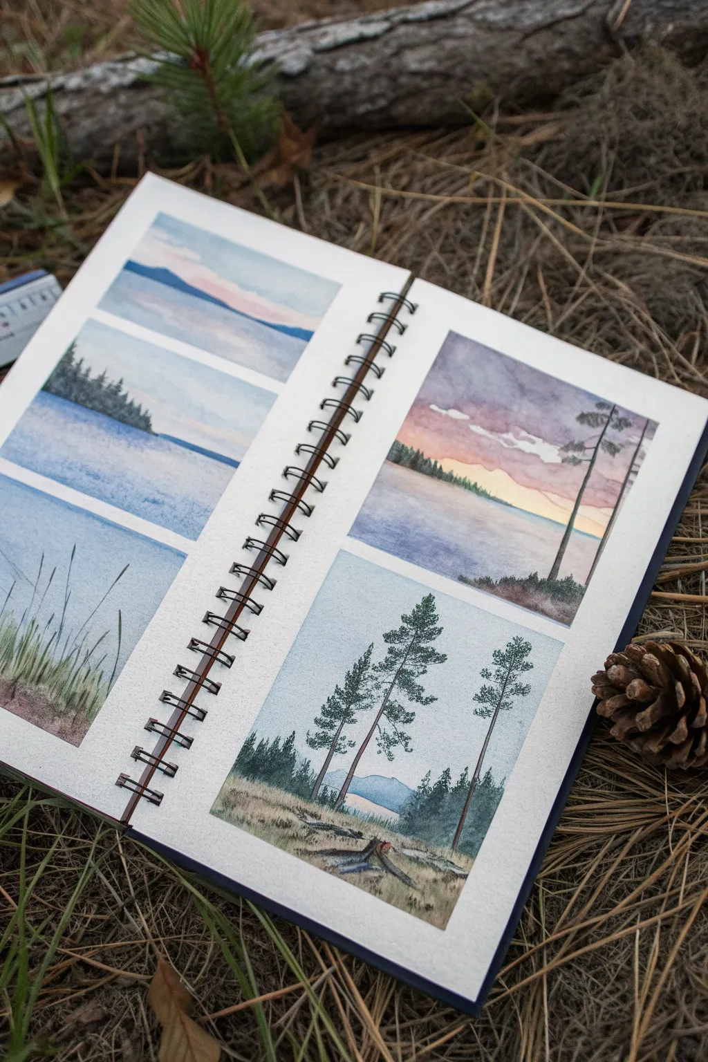
Capture the serene essence of a lakeside forest by breaking a larger scene into five distinct, miniature watercolor panels. This project explores atmospheric perspective, twilight gradients, and delicate pine details, all neatly contained within clean, masked borders.
Step-by-Step Guide
Materials
- Spiral-bound watercolor sketchbook (cold press paper recommended)
- Painter’s tape or washi tape (low tack)
- Watercolor paints (Indigo, Payne’s Grey, Alizarin Crimson, Sap Green, Burnt Sienna, Yellow Ochre)
- Synthetic round brushes (Size 4 for washes, Size 0 or 00 for details)
- Fine-liner pen (black or dark grey, waterproof) – optional
- Paper towels
- Two jars of water
- Pencil and eraser
Step 1: Preparation & Layout
-
Tape the borders:
Begin by taping off your page spreads. For the left page, create three horizontal rectangular boxes of equal height. For the right page, create two larger, vertically-oriented rectangles. Press the tape edges down firmly with your fingernail or a bone folder to prevent paint seepage. -
Sketch the composition:
Lightly sketch the horizon lines in each box. On the left page, keep horizons generally low. On the right page, plan for a dramatic sky in the top box and a tall pine grove in the bottom box.
Step 2: Left Page: Serene Waters
-
Top Panel: Mountain Gradient:
Wet the sky area of the top panel with clean water. Drop in a very pale wash of Alizarin Crimson mixed with plenty of water near the horizon, fading into a light blue at the top. While damp, paint distant mountains using a diluted clear blue-grey mix, letting them soften into the background. -
Middle Panel: Tree Line Wash:
Paint a gradient sky starting with pale blue at the top fading to white. Once dry, mix Indigo and Sap Green for the tree line on the left. Dab the color on to suggest fir textures, keeping the bottom edge straight where it meets the water. -
Bottom Panel: Grass Texture:
Wash the background with a soft blue-grey. Once dry, use your smallest brush to flick upward strokes of green and brown to create tall grasses in the foreground. Vary the pressure to make the tips thin and tapered.
Bleeding Edges?
If paint bled under the tape, wait for it to dry completely. Then, use a white gouache or a white gel pen to cover the mistake and re-establish the crisp line.
Step 3: Right Page: Twilight & Timber
-
Top Panel: Dramtic Sky:
This panel captures a sunset. Wet the paper and apply a distinct gradient: purple-grey at the top, transitioning to pink, and finally a warm yellow ochre at the horizon. Leave irregular white gaps or lift paint with a thirst brush to suggest clouds. -
Top Panel: Horizon & Silhouettes:
Once the sky is bone dry, paint the distant shore with a dark mix of green and purple. Add two tall, slender pine trees on the right side using a liner brush, ensuring their trunks catch the light of the setting sun. -
Bottom Panel: The Pine Grove:
Start with a pale blue wash for the distant hills and sky. Paint the foreground meadow with a mix of Yellow Ochre and a touch of green, using horizontal strokes to suggest dry grass. -
Bottom Panel: Main Trees:
Mix a sturdy pine green color. Paint three prominent pine trees. Start with a thin, vertical line for the trunk, then use a stippling motion to add branches, keeping the foliage sparse and realistic rather than like a triangular Christmas tree. -
Bottom Panel: Foreground Details:
Add darker shadows at the base of the trees and paint a small fallen log or stump in the immediate foreground using Burnt Sienna and Payne’s Grey to anchor the composition.
Pro Tip: Atmospheric Depth
Make distant trees bluer and paler than foreground trees. As objects get closer, add more yellow and darker values to your green mix to create instant depth.
Step 4: Finishing Touches
-
Review contrast:
Check all panels for depth. If the mountains or distant trees look too pale after drying, add a second transparent glaze to deepen the values. -
The Reveal:
Wait until the paper feels cool to the touch and totally dry. Slowly peel the tape away at a 45-degree angle purely away from the art to reveal your crisp white borders.
Now you have a stunning collection of forest vignettes captured forever in your sketchbook
BRUSH GUIDE
The Right Brush for Every Stroke
From clean lines to bold texture — master brush choice, stroke control, and essential techniques.
Explore the Full Guide
Greeting Card Wash Shapes With Pen Details

This charming greeting card combines the looseness of watercolor washes with the precision of fineliner details for a perfectly imperfect look. The soft, earthy tones and delicate stitched outlines give it a warm, handmade feel that is ideal for love notes or wedding stationery.
Step-by-Step Tutorial
Materials
- Cold press watercolor paper (A5 size folded or postcard)
- Watercolor paints (Terracotta, Peach/Blush, Burnt Sienna, Beige)
- Round watercolor brush (size 6 or 8)
- Fine liner pen (Black or Dark Grey, 0.3mm or 0.5mm)
- Pencil (HB)
- Kneaded eraser
- Jar of water
- Paper towel
Step 1: Planning and Sketching
-
Paper preparation:
Begin with a piece of cold press watercolor paper. If you want a folded card, score and fold it now so you can visualize the front panel face. If making a postcard style, simply tape the edges down to your work surface prevents warping. -
Sketch the main hearts:
Using your HB pencil very lightly, draw three large heart shapes. Arrange them in a staggered triangular formation: one at the top right, one bottom left, and one bottom right. Keep the shapes loose and slightly whimsical rather than perfectly symmetrical. -
Add filler elements:
Sketch two small floating hearts in the negative spaces between the large ones. Then, draw simple guidelines for the botanical sprigs: one near the top left heart and another near the center right. -
Lighten the guides:
Take your kneaded eraser and gently roll it over the entire sketch. You want the pencil lines to be barely visible—just faint ghosts to guide your painting. Graphite can smudge under wet paint, so the lighter, the better.
Uneven Drying?
If you get ‘cauliflower’ edges in your paint, you likely added water to a wash that was already halfway dry. Embrace it! In this style, those hard edges add great texture or ‘blooms’.
Step 2: Watercolor Washes
-
Mix your palette:
Prepare three distinct earthy tones on your palette. For the top heart, mix a watery peach or blush tone. For the bottom left, a deeper terracotta or burnt sienna. For the bottom right, a very pale beige or sandy tone. -
Paint the top heart:
Load your round brush with the peach mixture. Paint the top right heart shape. Don’t worry about staying perfectly inside your pencil lines; a little organic wobble adds character. Keep the wash fairly wet. -
Drop in texture:
While the top heart is still damp, touch the tip of your brush (loaded with slightly more pigment) to the left side of the heart. This creates a natural bloom and gradient as it dries. -
Paint the darker heart:
Rinse your brush and switch to the terracotta color. Paint the bottom left heart. This color should be more saturated than the others to anchor the composition. I like to tilt the paper slightly so the pigment pools at the bottom tip for richness. -
Paint the neutral heart:
Use the sandy beige color for the last large heart on the bottom right. Keep this one very translucent to balance the darker terracotta one. -
Fill the tiny hearts:
Using a smaller amount of the terracotta paint, carefully fill in the two tiny hearts you sketched earlier. These act as little accents to tie the color scheme together. -
Let it dry completely:
This is crucial: step away and let the paper dry completely. If the paper is cool to the touch, it’s still damp. Painting ink over damp paper will cause lines to bleed and ruin the crisp effect.
Step 3: Pen & Ink Details
-
Outline the hearts:
Take your fine liner pen. Draw a continuous line around each large heart, leaving a small gap (about 1-2mm) between the paint edge and your pen line. The line intentionally doesn’t touch the paint. -
Add stitched details:
Draw dashes along the continuous line you just made, mimicking a running stitch. These dashes should sit just outside the solid line. Some dashes can even touch the solid line for a hand-sketched feel. -
Draw the botanical sprigs:
Locate the pencil guides for the leaves. Draw a central stem with the pen, then add small, looped leaf shapes branching off. Leave the leaves as open line art without coloring them in. -
Inking the tiny hearts:
For the two smallest painted hearts, do not add an outline. Leaving them as simple paint shapes creates a nice contrast against the outlined larger hearts. -
Final decorative dots:
Add clusters of three tiny dots near the bottom left of the terracotta heart and scattered randomly in the open white space to balance the composition. -
Clean up:
Once you are absolutely sure the ink is dry, gently erase any remaining pencil lines that haven’t been covered by paint.
Testing Transparency
Test your color dilution on a scrap piece of paper first. You want the black ink lines to be clearly visible, so ensure your paint mixes (especially the darker ones) aren’t opaque.
Sign your name in the corner with a flourish and your beautiful boho watercolor card is ready to be shared
Negative-Space Leaves With Water Lifting
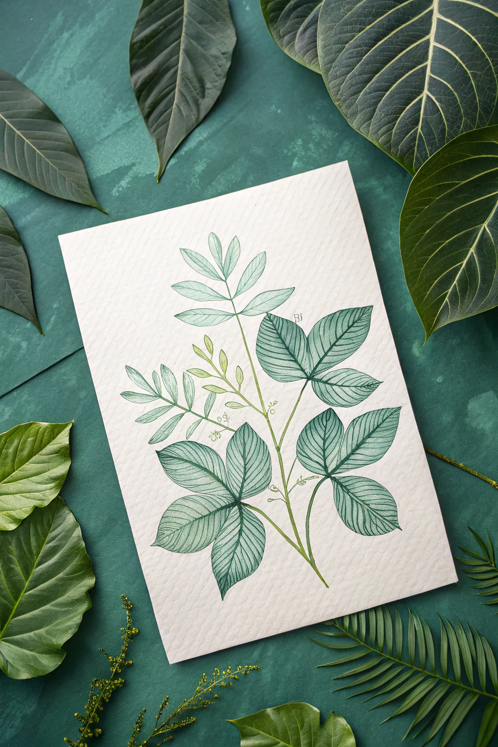
Capture the fragile beauty of foliage with this elegant botanical illustration that combines precise pen work with soft, monochromatic watercolor washes. The result is a vintage-style study featuring intricate vein details and a soothing, natural aesthetic.
Step-by-Step
Materials
- Cold press watercolor paper (fine grain)
- Fine liner pens (sizes 0.1 and 0.3, waterproof ink)
- Green watercolor paint (sap green or similar)
- Small round watercolor brush (size 2 or 4)
- Pencil (HB or 2H)
- Soft eraser
- Clean water jar
- Paper towel
Step 1: Sketching the Structure
-
Map the Main Stem:
Begin by lightly drawing a gently curving central line with your pencil to establish the main stem’s posture. Let it curve naturally to the right to give the branch movement. -
Block in Leaf Groups:
Mark the positions where the leaves will emerge. This plant features compound leaves, meaning groups of three or five leaflets radiate from a single point on the stem. -
Outline Leaf Shapes:
Lightly sketch the teardrop or lance-shaped outlines of the leaves. Keep the lower leaves larger and fuller, tapering to smaller, more delicate buds near the top of the stem.
Step 2: Applying the Watercolor Base
-
Mix a Pale Wash:
Dilute your green watercolor significantly with water. You want a very transparent, pale tea-like consistency for the first layer. -
Paint Individual Leaves:
Carefully fill in each leaf shape with the pale wash. Work one leaf at a time to maintain control over the edges. -
Building Gradient Intensity:
While the paint is still damp on the larger lower leaves, drop in a tiny amount of slightly more saturated green near the base of the leaf. Let it bleed outward naturally for a soft gradient. -
Create Tonal Variety:
Paint the smaller, upper leaves in an even paler shade to suggest they are younger or further away. Leave the tiny buds yellow-green if possible. -
Dry Thoroughly:
Allow the paper to dry completely. This is crucial because drawing with a fine pen on damp paper will cause the ink to bleed and ruin the crisp lines.
Ink Confidence
Don’t worry if your ink line deviates slightly from the paint edge. This ‘offset’ look illustrates the hand-drawn nature and adds artistic charm.
Step 3: Inking the Details
-
Outline the Foliage:
Using the 0.3 fine liner, carefully trace the outer edges of your dried watercolor shapes. Keep your hand loose; a slightly broken or varying line looks more organic than a rigid diagram. -
Draw the Central Veins:
Draw the midrib (central vein) down the middle of each leaf. Ensure the curve of the vein matches the curve of the leaf to show its orientation. -
Add Secondary Veins:
Switch to your finer 0.1 pen. Draw the secondary veins branching out from the center to the edges. Space them evenly, imitating the ribbed texture seen in the reference. -
Stippling for Shadow:
Where leaves overlap or curl, add tiny dots (stippling) or very short hatched lines near the base to suggest depth and shadow without adding more paint. -
Connect the Stems:
Ink the main stem and the smaller petioles connecting the leaves, thickening lines slightly at the joints where branches meet. -
Refining the Top:
For the very top buds and smaller leaves, use fewer ink lines. Suggest the veins rather than drawing them completely to keep the top looking airy and light.
Try Sepia Ink
Swap the black fine liner for a waterproof sepia or dark brown pen. This warmer tone creates an instant vintage botanical aesthetic.
Step 4: Finishing Touches
-
Erase Pencil Marks:
Once you are certain the ink is 100% dry, gently run your soft eraser over the entire drawing to remove the initial graphite guidelines. -
Evaluate Contrast:
Step back and look at your composition. If the lower leaves feel too flat, you can glaze a very thin layer of darker green watercolor over the dried ink to deepen the shadows.
Frame your delicate botanical study in a simple mount to highlight the subtle textures of your line work

PENCIL GUIDE
Understanding Pencil Grades from H to B
From first sketch to finished drawing — learn pencil grades, line control, and shading techniques.
Explore the Full Guide
Salt-and-Splatter Texture Swatch Scenes
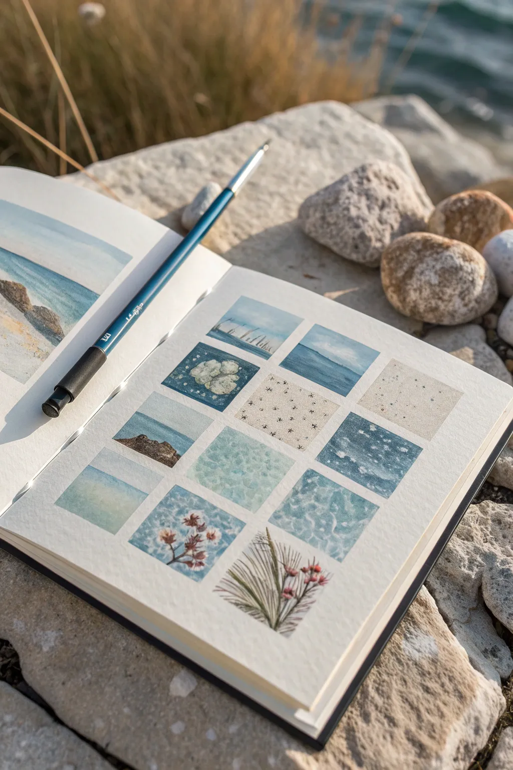
Capture the myriad moods of the seaside by creating a grid of tiny, atmospheric square paintings in your sketchbook. This project focuses on isolating small details—like frothy waves, scattered pebbles, and dune grasses—to practice various watercolor texturing techniques in a manageable format.
Step-by-Step Guide
Materials
- Watercolor sketchbook (cold press paper recommended)
- Watercolor paints (ocean blues, sandy ochres, deep greens)
- Small round brush (size 2 or 4)
- Fine liner brush (size 00 or 0)
- Masking tape or artist tape
- Pencil and ruler
- Clean water and paper towels
- Sea salt or table salt
- White gouache or white gel pen (optional for highlights)
Step 1: Preparation & Grid Layout
-
Draft the grid:
Start by lightly drawing a grid of twelve small squares on your sketchbook page using a pencil and ruler. Aim for squares about 1.5 to 2 inches in size, leaving consistent spacing between them. -
Tape the borders:
Carefully apply masking tape around the outer edges of the entire grid block to keep your margins crisp. If you have narrow tape, you can also tape the spaces *between* the squares, though freehand painting within the pencil lines offers a charming, organic look. -
Pre-wet selections:
Identify which squares will feature wet-on-wet techniques (like the soft sky or deep water squares) and lightly dampen them with clean water.
Step 2: Painting Ocean Textures
-
Create the horizon lines:
For the top row squares depicting distant views, paint a flat wash of pale blue for the sky. While the sky is drying, paint a darker blue strip below it for the ocean, softening the edge where they meet to create a hazy horizon. -
Salt texture for foam:
In the squares designated for churning water or rocky pools, drop in varying shades of turquoise and indigo. While the paint is still wet and glossy, sprinkle a pinch of salt onto the surface. Let this sit undisturbed until completely dry to create star-burst textures. -
Splatter for sand:
Mix a diluted wash of yellow ochre and burnt umber for the sandy squares. Apply the wash, then load your brush with slightly darker brown paint and tap it against your finger to splatter tiny dots across the wet surface, mimicking grain. -
Soft washes for underwater scenes:
For squares representing shallow water, use a variegated wash. Drop distinct blobs of cerulean and teal onto wet paper and tilt the book slightly to let them merge naturally without muddying.
Don’t Rush the Bloom
When using salt for texture, patience is key. If you brush it off while the paper is even slightly damp, the unique crystal patterns will smear and disappear.
Step 3: Adding Flora & Rocks
-
Layering rocks:
Once your background washes are dry, mix a dark grey-brown. Paint the shapes of rocks in the lower squares, keeping the edges rough. I find that lifting a little pigment with a thirsty brush creates natural highlights on the rock surfaces. -
Painting dune grass:
Using your finest liner brush, mix a muted olive green. Use quick, upward flicking motions to paint thin blades of grass in the bottom corner squares. Vary the pressure to taper the ends of the blades. -
Adding floral details:
For the small sea flowers, dab tiny spots of muted pink or rust color at the tips of some grass stems. Keep these loose and impressionistic rather than detailed.
Make it a Travel Log
Dedicate a grid to a specific trip. Instead of random textures, paint 12 specific moments from a single day: your morning coffee, a specific shell, the sunset, etc.
Step 4: Finishing Details
-
Remove the salt:
Check that the salted squares are bone dry. Gently rub the salt crystals off with your finger or a clean tissue to reveal the bloom textures underneath. -
Refine with white:
Use white gouache or a gel pen to add final sparkles to the water surface or foam crests on the waves. A few tiny dots can make the water look glistening and wet. -
Erase guidelines:
Wait until every square is completely dry to the touch. Gently erase the pencil grid lines between the paintings to leave clean, white gutters.
Close your sketchbook on this collection of coastal memories and enjoy the mosaic of textures you have created


Have a question or want to share your own experience? I'd love to hear from you in the comments below!