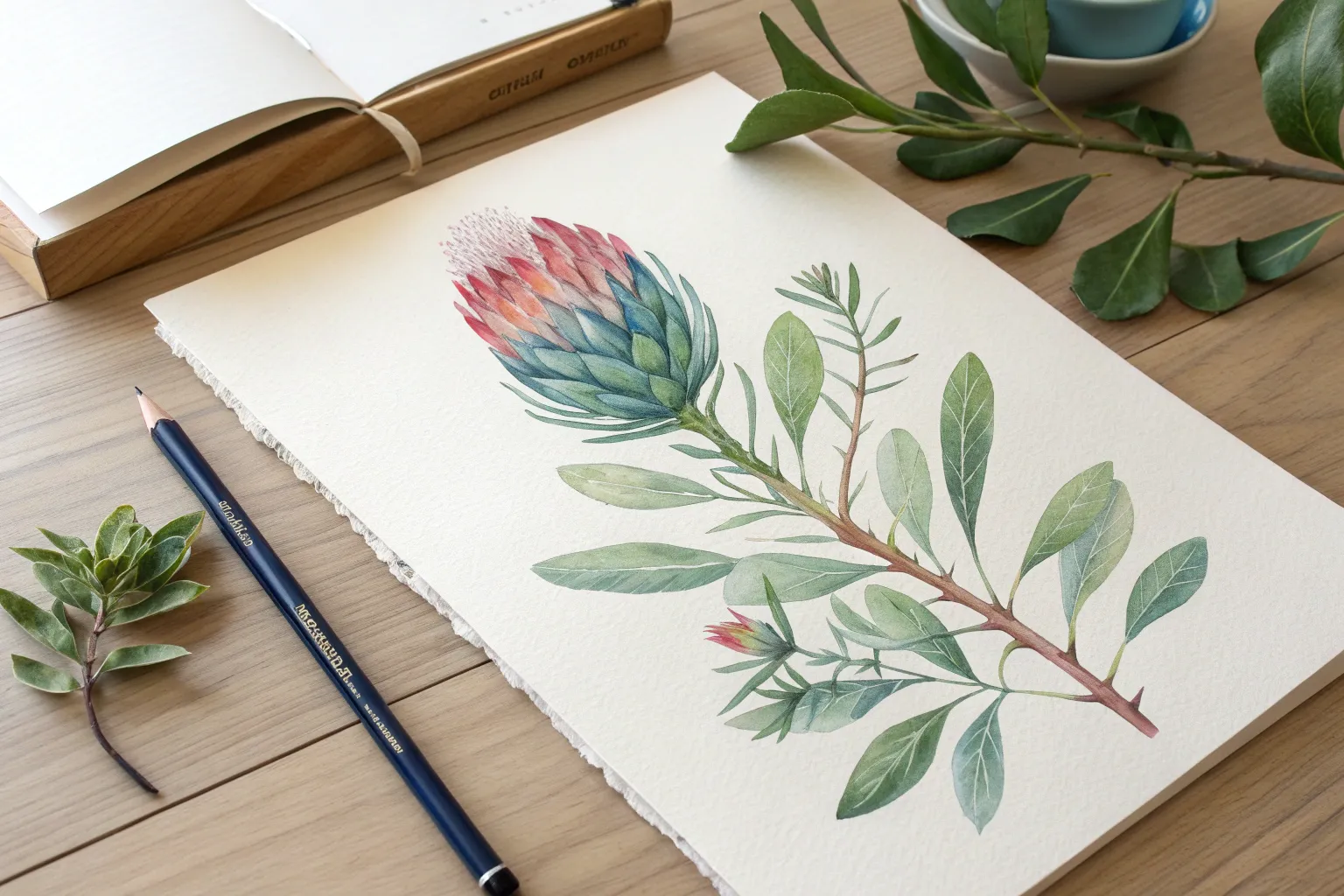
Watercolor pencils are my favorite little magic trick: you get crisp, controlled drawing first, then a soft wash the moment water hits the page. If you’re craving fresh watercolor pencil drawing ideas, here are some fun projects that let you play with both detail and dreamy blends.
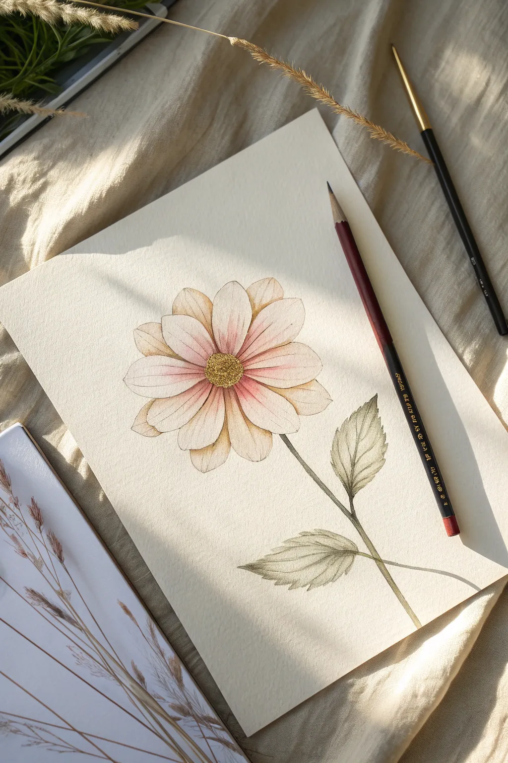
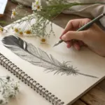
Simple Botanical Study With Soft Wash
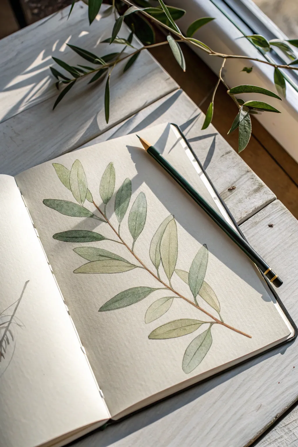
Capture the delicate beauty of an olive branch with this simple yet elegant watercolor pencil study. By combining precise pencil lines with gentle water washes, you’ll create a piece that feels both structured and delightfully loose.
How-To Guide
Materials
- Heavyweight sketchbook or mixed media paper
- HB or 2B graphite pencil (for initial sketch)
- Watercolor pencils (Olive green, sap green, burnt umber/brown)
- Soft round watercolor brush (size 4 or 6)
- Cup of clean water
- Paper towel
- Real olive branch or reference photo (optional)
Step 1: Planning the Structure
-
Observe your subject:
Before putting pencil to paper, take a moment to look at the flow of the branch. Notice how the leaves alternate along the stem and how they tilt at different angles to catch the light. -
Map the central stem:
Using a very light touch with your graphite pencil, draw a single, slightly curved diagonal line across the page. This will be the spine of your branch. -
Mark leaf positions:
Along this central line, make small tick marks where each leaf will originate. Ensure they are spaced somewhat irregularly to mimic nature, rather than perfectly symmetrical. -
Sketch the leaf shapes:
Draw the outline of each leaf using the graphite pencil. Aim for narrow, lanceolate shapes that taper at both ends. Keep these lines faint, as they are just guides for the color.
Muddy Colors?
If your greens turn brown, clean your brush more often. Pigment builds up quickly on the bristles. Rinse between every 2-3 leaves to keep the colors fresh and distinct.
Step 2: Applying Dry Color
-
Outline the stem:
Take your brown watercolor pencil and trace over the central stem line. Press slightly harder at the joints where the leaves attach to create a sense of depth. -
Define leaf edges:
Switch to your darker olive green pencil. Carefully outline the edges of each leaf. Don’t worry if the line breaks occasionally; a broken line adds organic character. -
Add the central vein:
Draw a fine line down the center of each leaf with the green pencil. This vein gives the leaf its sense of direction and curve. -
Shade the shadows:
Lightly shade one side of each leaf with the olive green pencil. I usually choose the bottom or inner side to suggest a consistent light source. -
Layer secondary greens:
Use a lighter sap green pencil to fill in the rest of the leaf area. Keep the shading light and scribbly; you want the texture of the paper to show through slightly. -
Deepen the contrast:
Go back with the brown pencil and add tiny touches of brown at the very base of the leaves where they meet the stem, blending it slightly into the green.
Pro Tip: Shadow Design
Don’t outline every leaf completely. Leaving the ‘sun-hit’ side of a leaf open (no outline) creates a beautiful illusion of bright light hitting the foliage.
Step 3: Creating the Wash
-
Prepare your brush:
Dip your round brush into clean water and dab it once on a paper towel. The brush should be damp, not dripping wet. -
Activate the stem:
Gently run the damp tip of your brush along the brown stem. The harsh pencil line will instantly melt into a smooth, paint-like stroke. -
Wash the leaves individually:
Move to the leaves, painting one at a time. Start from the lighter green area and pull the wet brush toward the darker outlines. -
Blend the gradients:
As the water touches the pencil pigment, encourage the dark and light greens to merge. Leave tiny slivers of white paper dry for highlights. -
Define the vein:
While the leaf is still damp, carefully drag the very tip of the brush down the center vein line to soften it without washing it away completely. -
Let it dry completely:
Allow the page to dry fully. The colors will look slightly softer and more matte once the moisture evaporates.
Step 4: Final Details
-
Re-establish edges:
Once the paper is bone dry, take your sharpest olive green pencil and lightly redefine any edges that got too blurry during the wash. -
Add texture:
Add very faint, hatching lines on the shadowed side of a few focal leaves to bring back some of the drawing’s texture over the watercolor wash.
Now you have a serene botanical study that perfectly bridges the gap between sketching and painting

Line and Wash Everyday Object Sketch
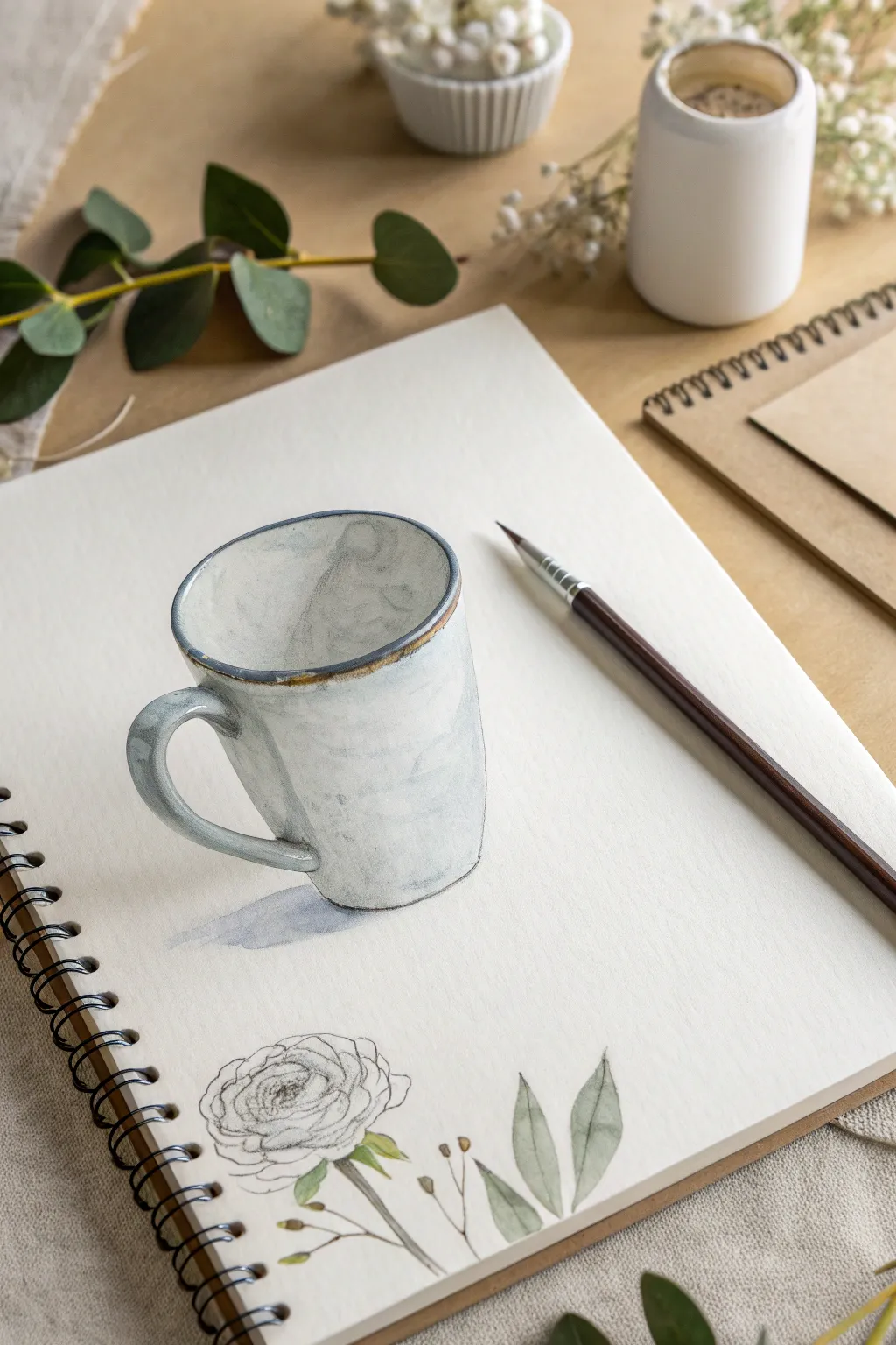
Capture the rustic charm of everyday objects with this delicate line and wash sketch. This project combines loose pencil outlines with soft watercolor washes to create a believable 3D mug alongside a botanical accent.
Step-by-Step Guide
Materials
- Spiral-bound watercolor sketchbook (cold press paper recommended)
- Watercolor pencils (specifically: warm grey, indigo/blue-grey, ochre, olive green)
- Fine liner pen (waterproof, grey or brown preferred) or a sharp graphite pencil
- Small round watercolor brush (size 4 or 6)
- Cup of water
- Paper towel
Step 1: Drafting the Mug
-
Establish the oval:
Begin by lightly sketching an ellipse near the center of your page. This will be the opening of the mug. Keep your pencil pressure very light so you can adjust the perspective. -
Draw the body:
Drop two vertical lines down from the widest points of your ellipse. Curve them slightly inward as they go down to give the mug a tapered look, then connect them at the bottom with a curve that mimics the top ellipse. -
Add the handle:
Sketch a C-shape ear on the left side. Make sure to draw both the inner and outer edge to give the handle thickness. -
Refine the rim:
Go back to the top ellipse and add a second, concentric line just outside the first one. This creates the thick, ceramic rim characteristic of handmade pottery.
Step 2: Adding the Floral Element
-
Sketch the flower head:
Near the bottom of the page, draw a loose, circular shape. Inside, sketch tightly packed wavy lines spiraling outward to represent the petals of a ranunculus or rose. -
Add stem and leaves:
Draw a thin stem extending downward. Add a few simple leaf shapes floating near the stem—don’t worry about attaching every leaf perfectly; floating elements look artistic.
Pro Tip: Bleeding Edges
Don’t try to stay perfectly inside the lines when adding water. letting the grey wash spill slightly outside the mug’s pencil line makes the sketch feel looser and more artistic.
Step 3: Applying Watercolor Pencil
-
Shade the mug interior:
Take a grey or blue-grey watercolor pencil and lightly shade the inside of the mug. Focus the pigment on the left side to show depth. -
Add exterior shadows:
On the outside of the mug, apply the same grey color along the left side and under the handle. Leave the center of the mug white to represent a highlight. -
Rim details:
Use an ochre or brown watercolor pencil to trace the very top rim of the mug. This mimics the raw clay edge often seen on glazed pottery. -
Color the foliage:
Lightly stroke olive green pencil into the leaf shapes. You don’t need to fill them completely; scratchy texture is good here.
Troubleshooting: Muddy Colors
If the ochre rim and grey body mix into a brown sludge, rinse your brush more often. Wait for the grey body wash to be damp-dry before activating the rim color next to it.
Step 4: The Wash Technique
-
Activate the mug shadow:
Dip your brush in water and blot it slightly. Gently run the damp brush over the grey pencil marks on the mug’s body. Pull the color slightly towards the white center to create a smooth gradient, but stop before you cover the whole mug. -
Paint the rim:
Clean your brush, then carefully wet the ochre line on the rim. Let it bleed slightly into the grey for a natural, imperfect blend. -
Create the cast shadow:
While the mug is drying, take your wet brush and pick up a tiny bit of grey pigment directly from the pencil tip. Paint a soft shadow on the ‘table’ surface falling to the left of the mug. -
Wash the leaves:
Touch the wet brush to the green leaf sketches. I like to leave some white paper showing within the leaf boundaries to keep the watercolor looking fresh and airy.
Step 5: Final Definition
-
Enhance the outlines:
Once the paper is completely dry, use a sharpened graphite pencil or a very fine grey pen to re-state the outline of the mug. -
Detail the flower:
Go over the flower petals with your pencil, adding darker definition to the center of the spiral where the shadows would be deepest. -
Final texture:
Add a few tiny stray marks or speckles on the mug using the pencil point to simulate the texture of stoneware speckles.
Now you have a charming sketchbook study that captures the serene feeling of a morning coffee

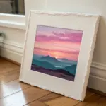
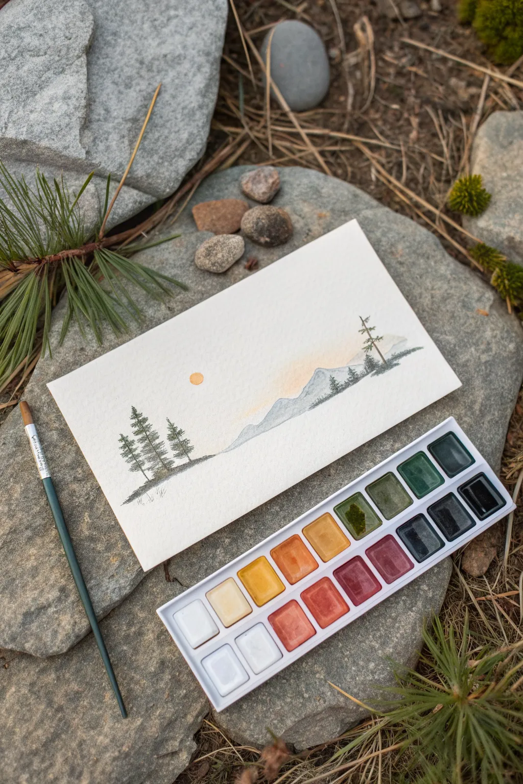
Sunset Gradient With Silhouette Shapes
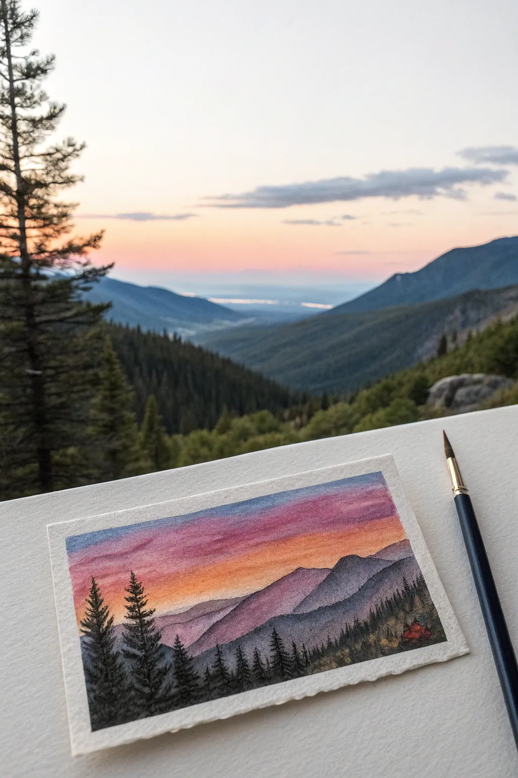
Capture the magic of twilight in the mountains with this stunning gradient study that balances vibrant skies against deep, moody silhouettes. By blending watercolor pencils, you can achieve a seamless transition from day to night, perfectly framing the rugged peaks.
How-To Guide
Materials
- Cold press watercolor paper (approx. 4×6 inches)
- Watercolor pencils (Deep Blue, Violet, Magenta, Orange, Yellow)
- Black watercolor pencil or waterproof ink pen
- Small round brush (size 2 or 4)
- Fine detail brush (size 0 or 00)
- Painter’s tape or masking tape
- Clean water and paper towels
Step 1: Setting the Sky Gradient
-
Tape the edges:
Begin by taping down all four edges of your small paper sheet to a board or table. This creates that crisp, clean white border seen in the example and prevents the paper from buckling when wet. -
Lay down the yellow base:
Starting about halfway down the paper (where the mountains will eventually be), lightly shade a horizontal band of yellow pencil. This will represent the lingering light just above the horizon. -
Add the orange layer:
Directly above the yellow, shade a band of orange. Slightly overlap the yellow area so the colors will mix later. Keep your pencil strokes light and even. -
Introduce the violet tones:
Above the orange, color in a section of magenta or pinkish-violet. This transition area is crucial for that ‘soft sunset’ glow. Try not to press too hard; let the pigment do the work. -
Finish with deep blue:
Fill the remaining top portion of the sky with your deep blue or indigo pencil. Blend it slightly down into the violet section. -
Activate the sky:
Dip your round brush in clean water. Starting from the yellow section (the lightest color) and working upwards, paint over your pencil marks. Wash the yellow into the orange, rinse your brush slightly, then blend the orange into the violet, and finally the blue. This creates a seamless gradient.
Step 2: Layering the Mountains
-
Sketch the distant peaks:
Once the sky involves is completely dry, lightly sketch the outline of the furthest mountain range. This should be positioned right where your yellow sky fades out. -
Color the first range:
Use a light wash of watered-down violet or grayish-purple to fill in this distant mountain shape. It should be faint, simulating atmospheric perspective. -
Define the middle ground:
Draw a second, slightly lower mountain range that overlaps the first one. Use a slightly darker shade of purple-blue here. The contrast between layers adds depth to the scene. -
Create the foreground slopes:
Sketch the closest hill slope descending from the right side. Paint this with a darker mix of blue and gray, but not fully black yet. Let this layer dry completely.
Wet-on-Dry vs. Wet-on-Wet
For the crispest tree silhouettes, ensure the paper is totally dry before painting them. If the paper is damp, the black ink will bleed into the sky.
Step 3: Detailed Silhouettes
-
Prepare the darkest tones:
For the bottom foreground and trees, you need the darkest value. Scribble your black watercolor pencil on a scrap piece of paper to use as a palette, picking up heavy pigment with a wet detail brush. -
Paint the tree trunks:
Using the detail brush, paint simple vertical lines for the tree trunks on the left side and along the bottom ridge. Vary their heights to make the forest look natural. -
Add pine branches:
With the tip of your smallest brush, use a stippling or dab-and-drag motion to create pine needles. Start narrow at the treetop and widen the branches as you move down the trunk. -
Fill the bottom edge:
Use the black mix to fill in the ground beneath the trees, creating a solid base that anchors the composition. You can dab the brush to create a texture that looks like bushes or undergrowth. -
Add the focal point:
If you look closely at the reference, there’s a tiny hint of red (perhaps a tent or cabin) in the lower right. Add a microscopic touch of red here for a pop of interest. -
Remove the tape:
Wait until the painting is bone dry. I prefer to peel the tape away at a 45-degree angle slowly to ensure that crisp white border remains perfect.
Texture Trick
Use a dry brush technique on the mountain slopes. Dragging a brush with little water creates a rough texture that mimics rocky terrain.
Now you have a miniature window into a peaceful twilight world right on your desk


Night Sky Galaxy With Layered Blues
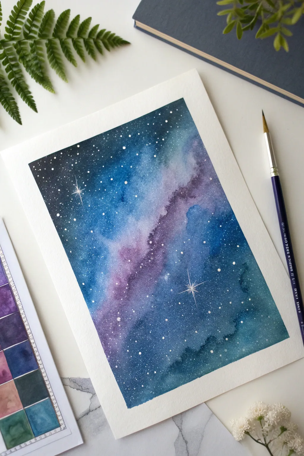
Capture the infinite beauty of the cosmos with this layered galaxy painting, featuring deep indigo voids and ethereal nebulae. This project beautifully demonstrates how wet-on-wet techniques can create seamless, dreamy transitions between teals, purples, and midnight blues.
Detailed Instructions
Materials
- Cold press watercolor paper (300 gsm)
- Masking tape (washi style or artist tape)
- Watercolor paints (Indigo, Prussian Blue, Teal, Purple/Violet, Black)
- Round watercolor brushes (size 8 or 10 for washes, size 2 or 0 for details)
- White opacity medium (white gouache, white ink, or a white gel pen)
- Clean water jars (two: one dirty, one clean)
- Paper towels
- Old toothbrush (optional, for splattering)
Step 1: Setting the Stage
-
Tape the edges:
Secure your watercolor paper to a board or table using masking tape on all four sides. Press the edges down firmly to ensure a crisp, clean border that stops paint from seeping underneath. -
Prepare the palette:
Pre-mix your core galaxy colors in your palette. You’ll need a good amount of fluid indigo, a vibrant bright blue, deep teal, and a rich violet. Adding a little water now makes the next steps smoother.
Pro Tip: Salt Texture
While the first wash of blue and purple paint is still wet, sprinkle a pinch of table salt onto the paper. As it dries, the salt pushes pigment away, creating incredible, star-like textures naturally.
Step 2: Creating the Nebula
-
Wet the paper:
Using your largest round brush and clean water, apply an even layer of water across the entire rectangular area inside the tape. The paper should be glisten but not have puddles. -
Lay the central band:
While the paper is wet, load your brush with the violet or purple shade. Paint a diagonal, irregular band moving from the bottom left toward the top right, letting the edges bloom softly. -
Add lighter blues:
Rinse your brush and pick up the teal or lighter blue. Dab this color along the edges of the purple band, allowing the pigments to touch and mingle naturally on the wet paper.
Level Up: Silhouette
Once your galaxy is finished and dry, paint a solid black silhouette of pine trees or mountain peaks along the bottom edge to give your landscape scale and grounding.
Step 3: Deepening the Darkness
-
Apply the darkness:
Load your brush heavily with indigo or a mix of Prussian blue and black. Start painting the outer corners of the paper—top left and bottom right—away from the central nebula band. -
Blend inwards:
Work the dark paint towards the center, merging it carefully with the teal and purple sections. The goal is to keep the center lighter and the edges extremely dark to create depth. -
Intensify layers:
If the paper is still damp, drop clearer, more concentrated pigment into the very corners to darken them further. This ‘wet-in-wet’ addition creates that velvety, deep space texture. -
Lift color (optional):
If the central band feels too dark or muddy, use a clean, thirsty (slightly damp but paint-free) brush to gently lift some pigment away, revealing a hazy glow. -
Let it dry completely:
This step requires patience. Allow the painting to dry fully until the paper feels room temperature to the touch. It must be bone dry before stars are added.
Step 4: The Field of Stars
-
Prepare the stars:
Dilute a small amount of white gouache or white ink with a drop of water until it has a creamy consistency, like melted ice cream. -
Splatter technique:
Load an old toothbrush or a stiff bristle brush with the white mixture. Hold it over the painting and tap the handle (or flick the bristles) to spray a fine mist of stars across the galaxy. -
Manual placement:
Use your smallest detail brush (size 0) to verify star placement. Add a few distinct dots in the darker corners where the splatter might have missed. -
Create major stars:
Select two or three spots for focal stars. Paint a small, bright white dot, then carefully pull four very thin lines outward to create a twinkling cross shape. -
Add variance:
Vary the size of your manual dots—some should be tiny pinpricks, while others can be slightly larger to represent closer stars.
Step 5: Final Reveal
-
Final dry time:
Wait for the white gouache or ink to dry completely. This usually happens faster than the watercolor base layer. -
Remove the tape:
Gently peel the masking tape away from the paper at a 45-degree angle. Pull slowly to avoid ripping the paper surface, revealing those satisfying crisp white edges.
Now you have a stunning window into deep space ready to display or gift to a stargazer
BRUSH GUIDE
The Right Brush for Every Stroke
From clean lines to bold texture — master brush choice, stroke control, and essential techniques.
Explore the Full Guide
Three Mini Bookmark Landscapes on One Page

Capture the serene beauty of mountain lakes with this vertical layout featuring three distinct miniature landscapes on a single sheet. This project uses watercolor pencils to create soft gradients and distinct horizons, evoking the feeling of a quiet morning by the water.
How-To Guide
Materials
- Heavyweight cold press watercolor paper (cut to a long vertical strip, approx. 3×9 inches)
- Watercolor pencils (blues, teals, pinks, purples, forest green)
- Artist tape or masking tape (1/4 inch width is ideal)
- Small round brushes (size 2 and 4)
- Clean water jar
- Paper towels
- Ruler
- Graphite pencil (HB or H)
- Eraser
Step 1: Preparation and Layout
-
Paper Preparation:
Cut your watercolor paper into a long, slender vertical rectangle. This format mimics a film strip or bookmark style, perfect for vertical stacking. -
Drafting Borders:
Using a ruler and a light pencil, mark out three equally sized rectangles arranged vertically. Leave about half an inch of white space between each frame and around the exterior edges. -
Taping the Borders:
Carefully apply artist tape over the pencil lines to mask off the borders. This is crucial for achieving those crisp, white edges between the paintings shown in the reference. rub the edges of the tape down firmly so water doesn’t seep underneath.
Step 2: Top Landscape: Dawn Mountains
-
Sky Gradient:
For the top panel, start by lightly sketching a rosy dawn sky. Use a soft pink pencil at the top, transitioning into a pale peach near the horizon. Scribble very lightly; you want a wash, not heavy lines. -
Mountain Layers:
Sketch the silhouette of distant mountains using a light blue-grey pencil. Color them in lightly. Below that, add a second, darker mountain range in a deeper slate blue to create depth. -
Activating the Color:
Dip your size 4 brush in water and blot it slightly. Gently wash over the sky area first, blending the pinks and peaches. Rinse, then activate the mountain layers, letting the colors bleed slightly at the edges for a misty feel. -
Water Reflection:
Mirror the sky colors in the water section at the bottom of this frame. Use horizontal strokes with a damp brush to suggest ripples on the lake surface.
Tape Tearing Paper?
If your tape is sticking too much, stick it to your jeans or shirt first to remove some tackiness before applying it to the paper.
Step 3: Middle Landscape: Misty Forest
-
Soft Background:
In the middle panel, create a very pale blue sky that fades into white. Sketch a high, rolling mountain line with a light azure pencil. -
Creating Atmospheric Perspective:
Draw a second, lower ridge of hills in a slightly darker teal. When you activate these with water, keep the pigment thin and watery to make them look far away. -
Forest Foreground:
Once the background layers are dry, take a sharp forest green or indigo pencil. Draw a row of tiny, distinct pine trees along the bottom edge. Vary their heights to look natural. -
Detailing the Trees:
Use a barely damp size 2 brush to touch the trees. Be careful not to lose their shape; just melt the pencil core enough to darken the green without creating a blob.
Dry Pencil Texture
After the paint dries, go back over the water ripples with a dry white or light blue pencil to add sparkling highlights.
Step 4: Bottom Landscape: Sunset Glow
-
Vibrant Skies:
For the final panel, be bolder with your colors. Lay down a stripe of magenta and purple for the sky. This panel represents a later time of day or a dramatic sunset. -
Silhouette & Water:
Draw low-lying dark blue hills and a darker treeline silhouette at the very base. Reflect the pinks and purples of the sky into the water area below the mountains. -
Blending:
Wash over the sky to create a smooth gradient. For the water, use horizontal dragging motions with your brush to mimic the stillness of the lake reflecting the colorful sky.
Step 5: Finishing Touches
-
Drying Time:
Let the entire page dry completely. Check for any damp spots—handling the tape too early can tear the paper. -
The Reveal:
Slowly peel off the tape at a 45-degree angle, pulling away from the painted areas. This reveals the crisp white frames that separate your three miniature worlds. -
Final Definition:
If any horizon lines got too blurry during painting, use a sharp, dry colored pencil to re-establish a few edges or add texture back into the foreground trees.
Enjoy your beautiful set of miniature landscapes, ready to be framed or used as a unique bookmark
Leaf Shading Practice With Scribble Strokes
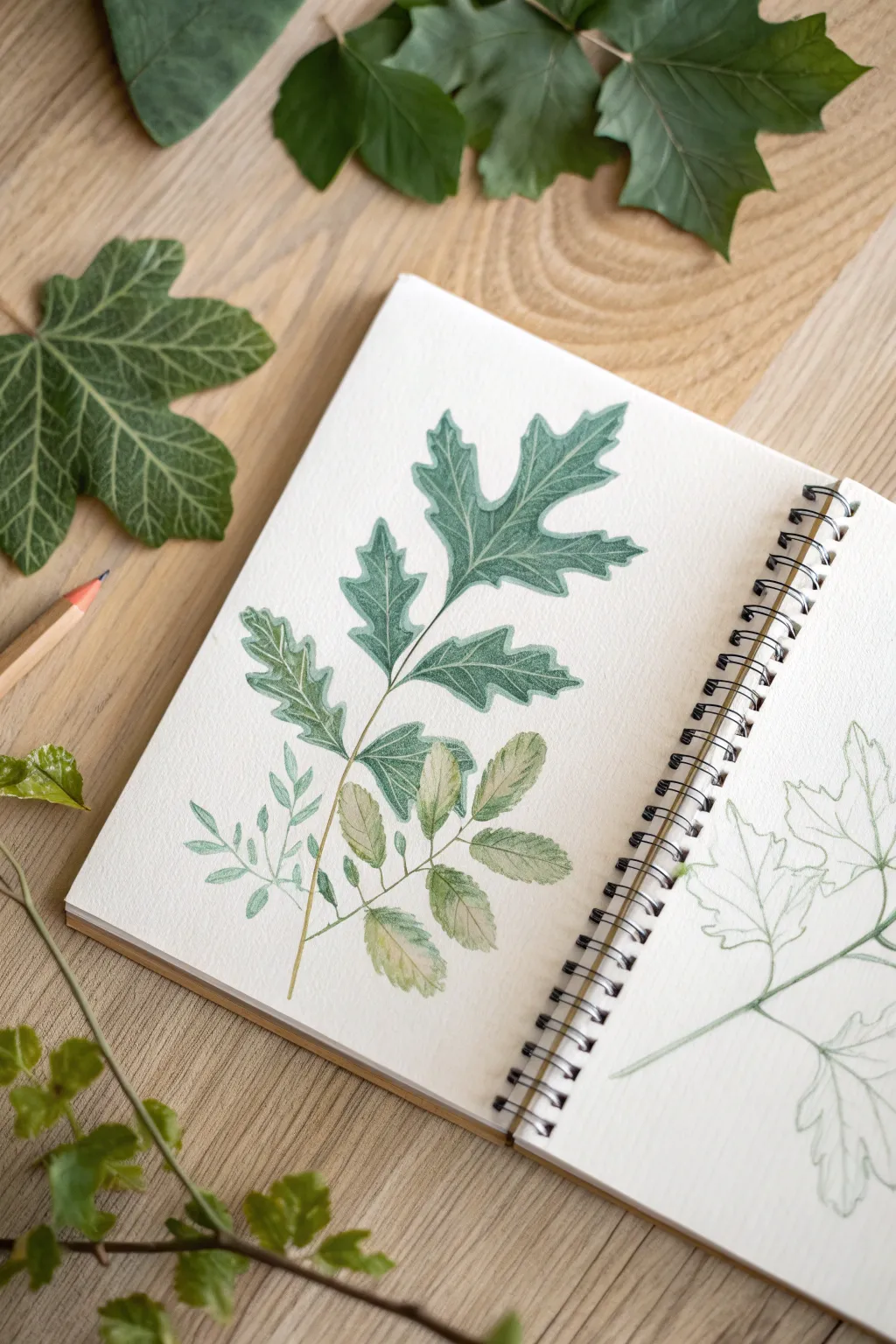
This sketchbook exercise focuses on capturing the delicate veins and serrated edges of various leaf types using a mix of precise outlines and soft shading. By combining watercolor pencils with controlled stroke work, you’ll create a realistic botanical illustration that feels fresh and organic.
Step-by-Step
Materials
- Spiral-bound sketchbook with mixed media or watercolor paper
- Set of watercolor pencils (focus on sap green, olive green, emerald, and brown/ochre)
- Hard graphite pencil (HB or H) for initial sketching
- Fine-point water brush or small round paintbrush (size 2 or 4)
- Clean water jar
- Paper towel
- Real leaves for reference (ivy, oak, or maple)
Step 1: Sketching the Composition
-
Plan the layout:
Begin by lightly marking the central vein lines of your three main subjects. Place a large, lobed leaf near the top center, a cluster of oval leaves at the bottom, and a smaller, fern-like sprig tucked to the left side. -
Draft the large leaf shape:
Using your HB pencil, draw the outline of the main lobed leaf. Focus on the deep dips between the lobes and the pointed tips. Keep your pressure extremely light so the graphite doesn’t show through the color later. -
Add secondary leaf shapes:
Sketch the lower cluster of rounded leaves attached to a single stem. These should look more like rose or ash leaves. Then, add the tiny, delicate fern-like shapes on the left side, keeping them simple and linear. -
Refine the edges:
Go back over your outlines to add characterizing details, such as subtle serrations on the edges of the oval leaves or sharp points on the large lobed leaf.
Muddy Colors?
If colors look dull when activated, rinse your brush more often. Green mixes turn brown quickly with dirty water. Keep a separate jar for rinsing and one for clean water application.
Step 2: Coloring the Large Leaf
-
Outline in deep green:
Take a sharpened teal or deep emerald watercolor pencil. Carefully trace the perimeter of the large top leaf. Apply slightly more pressure at the ‘valleys’ of the leaf lobes to create depth. -
Fill with scribble strokes:
Lightly shade the interior of the leaf using a scribbling motion. Don’t fill it solidly; leave small specks of white paper showing through to simulate texture. Use a lighter olive green for the center areas and the darker teal for the edges. -
Define the veins:
Draw the central vein structure firmly with the dark green pencil. Branch out from the center stem into each lobe tip. Add an extra layer of shading right next to these veins to make them pop. -
Activate with water (optional):
If you want a smoother look, lightly run a damp brush over just the darkest areas of the leaf, blurring the scribble strokes into a wash while keeping the lighter areas dry for texture.
Step 3: Shading the Lower Clusters
-
Layering the oval leaves:
For the bottom leaf cluster, switch to a more earthy palette. Outline the leaves in moss green. Shade the interiors lightly with a mix of sap green and a touch of ochre or light brown to suggest slightly dried or autumnal foliage. -
Creating texture:
Instead of smooth shading, use short, directional hatch marks that follow the shape of the leaf. This mimics the natural grain of the plant matter. -
Detailing the small sprig:
For the tiny fern-like plant on the left, use a sharp sea-green pencil. These leaves are too small for complex shading, so use single, confident strokes to fill them in, pressing harder at the base of each small leaf. -
Connect the stems:
Draw the main stems connecting all your leaves using a golden-brown or light green pencil. Keep the lines thin and elegant, ensuring they taper naturally where the leaves attach.
Texture Tip
Use the texture of the paper to your advantage. By holding the pencil at a low angle and shading lightly, you pick up the paper’s ‘tooth,’ creating natural-looking leaf pores instantly.
Step 4: Final Touches
-
Deepen contrast:
Review your drawing for contrast. I find that going back in with the darkest green pencil to crispen the outer edges of the large leaf really helps lift it off the page. -
Add vein highlights:
If you have a white gel pen or very sharp white pencil, add tiny highlights along the main veins of the lower leaves to suggest a glossy texture. -
Start the sketch page:
To mimic the reference image completely, lightly sketch the outline of a similar leaf on the opposite page using just a green colored pencil, leaving it unfinished as a ‘work in progress’ element.
Now you have a beautifully preserved botanical study that captures the fleeting nature of the seasons

PENCIL GUIDE
Understanding Pencil Grades from H to B
From first sketch to finished drawing — learn pencil grades, line control, and shading techniques.
Explore the Full Guide
Fruit Slice Study With Juicy Color Bleeds
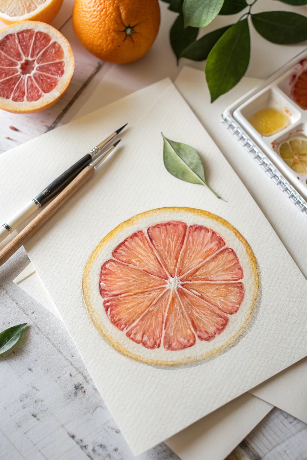
Capture the vibrant translucency of fresh citrus with this detailed study of a ruby red grapefruit slice. By layering warm tones and preserving crisp white highlights, you’ll create a piece that feels juicy enough to eat.
Detailed Instructions
Materials
- Cold press watercolor paper (300 gsm)
- Watercolor pencils (reds, oranges, yellows, and a warm grey)
- Round watercolor brushes (size 2 and size 6)
- Clean water jar
- Paper towel
- Graphite pencil (H or HB)
- Kneaded eraser
Step 1: Sketching the Framework
-
Outline the outer shape:
Begin by lightly sketching a perfect circle for the outer edge of the fruit using your graphite pencil. If you struggle with freehand circles, trace a small bowl or jar lid. -
Define the rind thickness:
Draw a second, slightly smaller circle inside the first to establish the thickness of the pith and rind. Ensure this band is uneven in places to look natural. -
Mark the center point:
Place a tiny dot in the approximate center of your circle. It doesn’t need to be mathematically perfect; organic deviations add realism. -
Divide into segments:
Lightly sketch lines radiating from the center to the inner circle, dividing the fruit into triangular segments. Most citrus fruits have between 10 to 14 segments; vary their widths slightly. -
Soften the corners:
Round off the sharp corners of each triangular segment. Creating a small gap between the segments and the rind allows space for the white pith membranes.
Muddy Colors?
If your segments look muddy, let the paper dry completely. Then, glaze over them with a pure, transparent red or orange watercolor wash to restore brightness without disturbing the pencil work.
Step 2: Base Layers & Rind
-
Activate the rind:
Use a yellow-orange watercolor pencil to color the very outer edge of the rind. Use a damp brush to activate the pigment, dragging it inward slightly but stopping before you hit the segment area. -
Initial segment wash:
Lightly shade the inside of each fruit segment with a pale pink or salmon watercolor pencil. Use a wet brush to melt these lines into a soft, consistent base wash. -
Preserve the pith:
Be very careful to leave the white paper completely untouched for the thin lines separating the segments (the membrane) and the central core. -
Darken the outer skin:
Once the first rind layer is dry, add a thin line of darker orange or ochre pencil along the very bottom edge of the circle to imply shadow and roundness.
Step 3: Building Juicy Texture
-
Define the segment edges:
Take a sharper red-orange pencil and outline the inner shape of each segment. Use a barely damp size 2 brush to soften this line inward, creating a gradient from dark edge to lighter center. -
Add pulp texture:
Draw tiny, radiating lines inside the segments using a mix of red and dark orange pencils. These should fan out from the center towards the rind, mimicking the direction of the pulp sacs. -
Soften with water:
Gently dap these texture lines with your damp brush. You want them to blur slightly but retain their directional energy, looking like suspended juice pockets. -
Layering intensity:
Go back into the corners of the segments (near the center and near the rind) with a deep red pencil. Darkening these nooks adds depth and makes the center of the segments pop. -
Lifting highlights:
If a segment looks too heavy or flat, use a clean, slightly wet stiff brush to lift a tiny streak of pigment from the middle of the pulp, reclaiming a highlight.
Use Salt for Texture
While the pulp area is still wet with a heavy wash, drop a few grains of table salt onto the pigment. As it dries, the salt pushes pigment away, creating incredible organic textures perfect for citrus.
Step 4: Finishing Details
-
Refine the membrane:
If your white dividing lines got messy, use white gouache or a very opaque white gel pen to crisp them up again. Keep these lines thin and broken, not solid outlines. -
Add a shadow halo:
Use a very watered-down grey or cool brown to paint a faint shadow under the fruit slice, mostly on the bottom right side, to ground the object on the paper. -
Texture the pith:
Add extremely faint stippling or tiny dashes to the white pith area with a cream or pale yellow pencil to give it a spongy texture. -
Final vibrancy check:
Assess your colors. I usually find I need one last glaze of pure yellow over the rind and a touch more crimson in the deepest parts of the pulp.
Step back and admire how the simple layering of warm tones brings your citrus slice to life on the page
Texture Rubbing Background With Water Activation
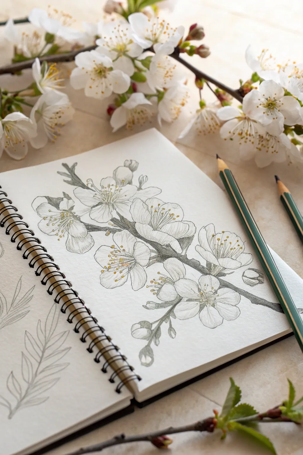
Capture the fleeting beauty of spring with this soft and detailed botanical study of cherry blossoms. This project focuses on delicate line work and subtle shading to create a realistic, airy feel right in your sketchbook.
Step-by-Step Guide
Materials
- Spiral-bound sketchbook (heavyweight mixed media or watercolor paper)
- Graphite pencils (HB and 2B)
- Watercolor pencils (olive green, dark grey/brown, lemon yellow, golden yellow)
- Fine liner pen (optional, for crisp details)
- Small round watercolor brush (size 2 or 4)
- Cup of water
- Paper towel
- Real blossom branch (for reference, optional)
Step 1: Laying the Framework
-
Map the main branch:
Start by lightly drawing a diagonal line across your page to serve as the main branch. Add smaller offshoot lines where you want your flower clusters to sit, keeping the pressure very light so you can erase later. -
Block in flower shapes:
Sketch rough circles or ovals along the branch to indicate where the blossoms will be. Cherry blossoms usually grow in clusters, so group two or three circles together, overlapping them slightly. -
Define the petals:
Refine the rough circles into five-petal flower shapes. Remember that cherry blossom petals often have a tiny notch at the tip. Don’t worry about making them perfect; natural irregularities add realism. -
Sketch the buds:
Add small, teardrop-shaped buds at the ends of the branch tips or nestled between open flowers to balance the composition.
Smudged Drawings?
Place a scrap piece of paper under your drawing hand. This acts as a shield, preventing oils from your skin and friction from smearing your delicate pencil work as you move across the page.
Step 2: Adding Detail and Tone
-
Refine the outlines:
Using a sharpened HB pencil or a very sharp grey watercolor pencil, go over your petal outlines with delicate, broken lines rather than a harsh solid contour. -
Detail the branch texture:
Thicken the branch lines. Use short, jagged pencil strokes to mimic the rough texture of the bark, focusing on the knots where the flowers attach. -
Draw the stamens:
In the center of each open flower, draw fine, radiating lines for the filaments. Add tiny dots at the ends for the anthers. This is the focal point of each bloom. -
Shade the petals:
Use your graphite pencil or a light grey watercolor pencil to add subtle shading at the base of the petals near the center. This creates depth and makes the flower look cup-shaped. -
Shade the leaves and stems:
Lightly shade the stems and any small leaves using an olive green watercolor pencil. Keep the application sheer; we want a translucent look.
Add Soft Pink
For a flush of color, shave a tiny bit of pink pastel or pencil lead onto a separate paper. Pick up the dust with a cotton swab and gently rub it onto the petal tips.
Step 3: Subtle Color & Wash
-
Enhance the branch:
Layer a dark grey or brown watercolor pencil over the shadowed parts of the branch to give it volume and weight. -
Add yellow centers:
Touching just the very center of the flowers, apply a small amount of lemon yellow and golden yellow watercolor pencil to the stamens. -
Activate the darks:
Dip your small brush in water and blot it almost dry. Gently drag it over the branch areas first, melting the pencil lines into a soft wash. -
Activate the greens:
Rinse your brush and repeat the process for the green stems and leaves. I find that using very little water helps maintain control over these tiny areas. -
Soften the petals:
If you used watercolor pencil for the petal shading, lightly touch a damp brush to the grey shadows to blur them slightly into the white of the paper. -
Pop of gold:
Carefully dab the wet brush onto the yellow centers. Let the yellow bleed ever so slightly outward for a glowing effect. -
Final touches:
Once the paper is completely bone dry, use a sharp graphite pencil to re-emphasize the stamen dots and the darkest cracks in the bark for crisp contrast.
Now you have a timeless botanical sketch that captures the elegance of the season


Loose Petal Layering for Realistic Flowers
Capture the delicate warmth of a single daisy bathed in golden light using gentle layering techniques. This project focuses on building soft, realistic petals and creating a textured center that seems to pop off the page.
Detailed Instructions
Materials
- Cold press watercolor paper (fine grain)
- Watercolor pencils (shades of ochre, burnt sienna, dusty pink, olive green, and dark brown)
- HB graphite pencil for sketching
- Soft kneadable eraser
- Round watercolor brush (size 4 or 6)
- Clean water jar
- Paper towel
- Gold glitter pen or metallic watercolor (optional)
Step 1: Sketching the Structure
-
Light Outline:
Begin with a very faint circle for the flower center, placing it slightly off-center on your page for a pleasing composition. Use your HB pencil with barely any pressure. -
Petal Framework:
Draw the elongated petals radiating outward. Notice how the petals in the reference overlap and vary slightly in shape—some are rounded, some have slight notches at the tips. Keep the lines incredibly light so they won’t show through the pigment later. -
Adding the Stem:
Sketch a slender, straight stem extending downwards, and attach two serrated leaves on either side, ensuring they point slightly upward. -
Refining Lines:
Take your kneadable eraser and gently roll it over the drawing to lift up excess graphite, leaving just a ghost of an image to guide your coloring.
Too Much Water?
If a puddle forms or colors bleed too much, dab—don’t rub—the area instantly with a corner of a clean paper towel to lift the excess moisture.
Step 2: Coloring the Petals
-
Base Layer:
Using a pale ochre or cream watercolor pencil, lightly shade the petals. Leave significant white space near the tips and edges to act as natural highlights. -
Inner Radiance:
Switch to a dusty pink or soft coral pencil. Apply color starting from the center of the flower, stroking halfway up the petals. Use flicking motions to create a gradient effect. -
Deepening Shadows:
With a burnt sienna or light brown pencil, add definition between the overlapping petals. Darken the very base where the petals meet the center to create depth. -
Activating the Petals:
Dip your damp brush into water and blot it on a towel so it isn’t dripping. Gently wash over the petal pencil marks, pulling the pigment from the center outward. I find this helps keep the tips light and airy. -
Second Layer Definition:
While the paper is slightly damp (but not wet), use a sharpened darker brown pencil to outline just the shadowed edges of the petals for crisp separation.
Step 3: The Center & Greenery
-
Textured Center Base:
Fill the circular center with a dense layer of yellow ochre pencil. Don’t worry about smoothness here; a little scumbling texture is good. -
Adding Dimension:
Dot in stippled marks using a dark brown pencil on the lower right side of the center disk to suggest a shadow and rounded form. -
Leaf Green Base:
Color the leaves and stem with a light olive green. Apply the pencil lightly, following the direction of the veins. -
Leaf Accents:
Layer a darker moss green along the spine of the leaves and the shadowed side of the stem. -
Washing the Greenery:
Use your clean, damp brush to liquefy the green pigment. Paint carefully within the lines to maintain the serrated leaf edges.
Boost the Contrast
For a more dramatic look, use a fine-liner pen in sepia or dark grey to loosely outline the petals and leaves after everything is 100% dry.
Step 4: Final Details
-
Golden Sparkle:
Once the center is completely dry, dab a small amount of gold glitter pen or metallic paint onto the very center of the disk for that pollen-like texture. -
Vein Work:
Sharpen a dark green pencil to a fine point. Draw delicate veins over the dried watercolor wash on the leaves. -
Petal Texture:
Finally, add very faint, thin lines radiating from the flower center up the petals using a dry brown pencil to mimic the subtle grooves found in nature. -
Shadowing the Stem:
Add a thin line of dark brown or grey along one side of the stem to ground it and make it look cylindrical rather than flat.
Now you have a beautifully layered botanical illustration ready to frame or gift
Ink Accents Over Watercolor Pencil Color
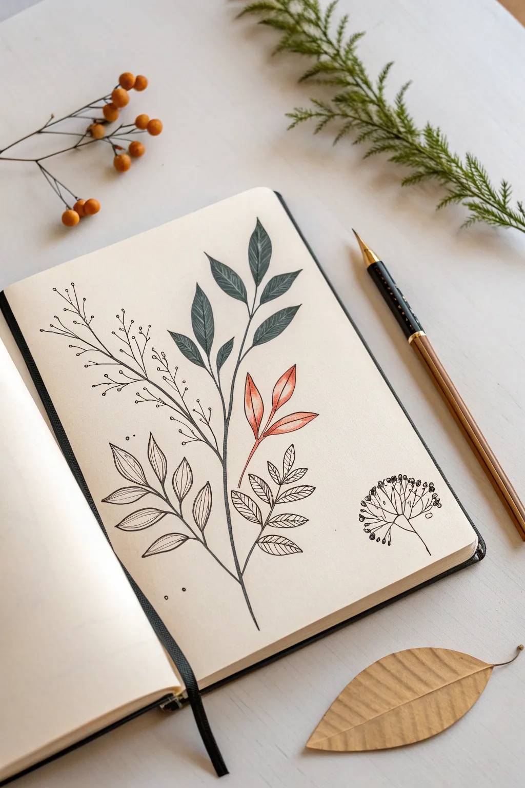
This elegant botanical spread combines the softness of watercolor pencils with the crisp precision of fineliners. It’s a perfect exercise for practicing leaf structures, layering textures, and contrasting filled shapes with delicate line work.
How-To Guide
Materials
- Cream or off-white sketchbook paper (heavyweight, min. 160gsm)
- Dark green watercolor pencil
- Rust or terracotta orange watercolor pencil
- Black fine liner pen (size 0.3 or 0.5)
- Water brush or small round paintbrush
- Pencil (HB for sketching)
- Kneadable eraser
- Paper towel
Step 1: Sketching and Base Colors
-
Plan the Composition:
Begin by lightly sketching a central, slightly curved vertical line with your HB pencil to serve as the main stem. Mark the points where distinct branches will diverge—one high up for the green leaves, one midway for the orange cluster, and lower points for the intricate line-drawings. -
Outline Main Leaves:
Sketch the shapes of the uppermost leaves. These are elongated ovals with pointed tips. Draw five leaves fanning out from the top branch stem. -
Add Accent Leaves:
Sketch a smaller cluster of three tear-drop shaped leaves on the middle right branch. Keep these slightly smaller than the top cluster. -
Apply Green Pigment:
Take your dark green watercolor pencil and color in the top five leaves. Apply heavy pressure near the center vein for depth and lighter pressure toward the edges to create a natural gradient. -
Apply Rust Pigment:
Use the terracotta orange pencil to fill in the middle cluster of three leaves. Similar to the green, concentrate the pigment at the base of each leaf. -
Activate the Paint:
Dip your brush in clean water and carefully paint over the green leaves first. Work from light to dark to avoid muddying the edges. Rinse your brush thoroughly, then activate the orange leaves, blending the pigment smooth. -
Let it Dry:
Allow the paper to dry completely. Since we are adding ink next, any dampness will cause the lines to bleed or feather, ruining the crisp effect.
Bleeding Lines?
If your ink spiders out, the paper is still damp. Stop immediately. Use a hair dryer on a low, cool setting or wait 15 more minutes before resuming.
Step 2: Inking and Detailing
-
Draw the Main Stem:
Using your 0.3 black fine liner, trace over your main pencil stem line. Keep the line steady but allow for natural, organic deviations rather than making it ruler-straight. -
Ink the Colored Leaves:
Carefully outline the dried green and orange painted leaves. Add a center vein line to each one, stopping just short of the leaf tip for a delicate look. -
Create Texture:
On the green leaves only, add very subtle shading lines or tiny stippling near the base of the leaf with your pen to deepen the shadow. -
Draw the Line-Art Leaves:
On the bottom left branch, draw a series of hollow, outlined leaves. Inside each leaf, draw curved veins radiating from the center line to the edges. Do not color these; the contrast comes from the empty space. -
Add Skeleton Leaves:
On the bottom right branch, sketch smaller, serrated leaves. Draw a central vein and branching veins, but leave the leaf ‘flesh’ clear, creating a skeletonized appearance. -
Create the Berry Branch:
On the upper left side, draw a long, thin branch that splits into many fine twigs. At the end of each tiny twig, draw a small open circle to represent berries or buds. -
Detail the Berry Cluster:
In the bottom right corner (detached from the main stem), draw a standalone umbel flower structure—radiating lines ending in small, clustered circles, resembling a dandelion puff or fennel flower. -
Add Floating Dots:
Scatter a few tiny ink dots around the main stem and near the berry branches to add movement and fill negative space without cluttering the composition. -
Final Cleanup:
Wait at least five minutes to ensure the ink is bone dry. Gently erase any visible pencil sketch marks with your kneadable eraser to clean up the page.
Add Metallic Touches
Once the ink is dry, use a gold gel pen to trace the veins of the orange leaves. It catches the light beautifully and complements the warm tones.
Now you have a stunning botanical study that perfectly balances vibrancy with minimalism
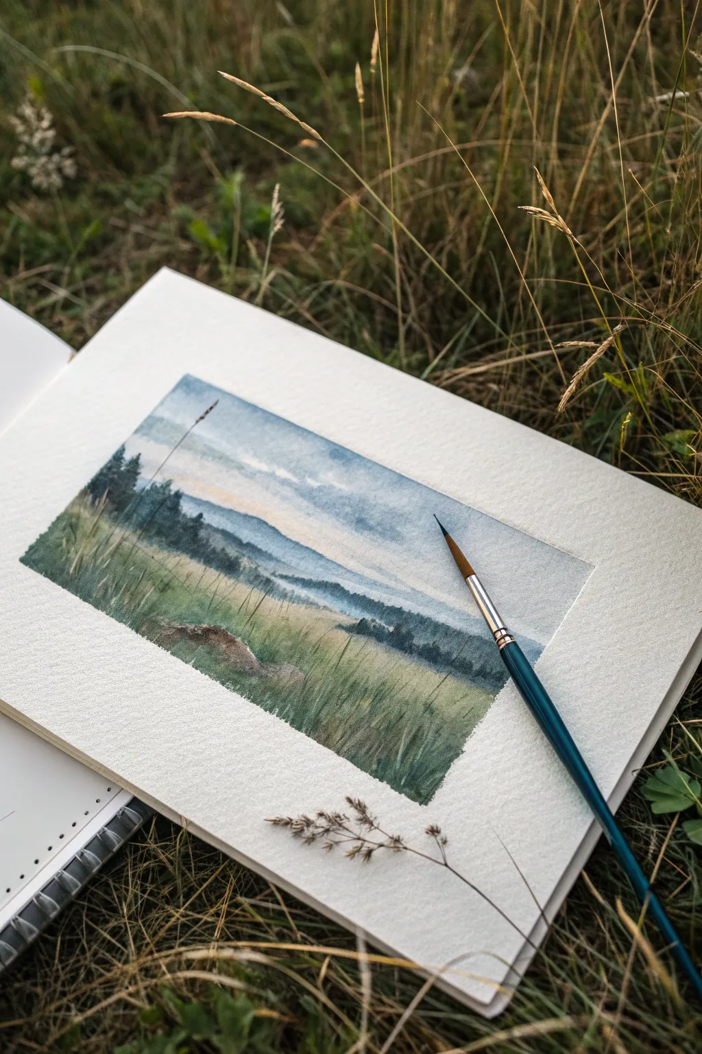
Color Swatch Strips That Turn Into Tiny Scenes
Capture the serene stillness of a mountain morning with this delicate watercolor landscape. Using a limited palette and plenty of negative space, you’ll create a misty, atmospheric scene that feels both expansive and intimate.
Step-by-Step
Materials
- Cold press watercolor paper (cut to a 4×8 inch rectangle)
- Watercolor paints (Payne’s Gray, Sap Green, Burnt Sienna, Yellow Ochre)
- Small round brush (size 2 or 4)
- Very fine detail brush (size 0 or 00)
- Clean water jar
- Paper towel for blotting
- Pencil (optional for light sketching)
Step 1: Setting the atmospheric background
-
Prepare the paper:
Begin with your rectangular strip of watercolor paper. Tape the edges down to a board if you wish to keep it perfectly flat, though for this small size, it’s not strictly necessary. -
Mix a mountain grey:
Create a very diluted wash using Payne’s Gray. You want this to be quite watery—almost transparent—to suggest distance and mist. -
Paint the first mountain ridge:
Using your round brush, paint a jagged, uneven line across the middle right of the paper to form the mountain silhouette. Let the color fade out as it moves towards the bottom, adding a touch of water to soften the lower edge. -
Add a hint of warmth:
While the mountain layer is still slightly damp but not soaking, mix a very faint wash of Yellow Ochre or a soft orange. Gently brush this into the sky area just above and to the left of the mountain peaks to create a soft morning glow. -
Paint the sun:
Load your small brush with a slightly more saturated Yellow Ochre or orange mix. Carefully paint a small, perfect circle in the sky on the left side, balancing the composition against the mountain on the right. -
Let it dry completely:
This is crucial. The background must be bone dry before you add the trees, or the crisp lines will bleed into the mountains.
Fuzzy Trees?
If your tree branches are blooming into blobs, your brush is too wet. Blot it on a paper towel after loading paint to keep strokes crisp and dry.
Step 2: Detailing the foreground trees
-
Mix a deep forest green:
Combine Sap Green with a touch of Payne’s Gray to create a dark, shadowed evergreen color. This needs to be much more pigmented than your background wash. -
Start the left tree cluster:
On the left side of the paper, use your fine detail brush to draw a thin vertical line for the trunk of the tallest tree. -
Paint the branches:
Starting from the top of the trunk, use quick, short horizontal dabbling motions to create the pine branches. Keep the top narrow and widen the tree as you move down, leaving small gaps to keep it looking airy. -
Add companion trees:
Paint two slightly smaller trees next to the first one, varying their heights to make the group look natural. Cluster their bases together. -
Ground the trees:
Use the very tip of your brush with the dark green mix to create a thin, uneven ground line beneath the trees, suggesting a grassy knoll or rocky outcrop. -
Move to the right side:
On the right side, overlapping the base of the faint mountain, paint a single, smaller pine tree. This helps push the mountain into the background and creates depth. -
Add low scrub vegetation:
Dab tiny dots and short strokes along the ground line connecting the right-hand tree to the edge of the paper, mimicking small bushes or rocks. -
Refine the textures:
If your ground line looks too solid, use a damp brush to gently drag some pigment downwards, creating a soft shadow effect on the ‘snow’ or ground. -
Final assessment:
Step back and check the balance. If the sun looks too faint, you can carefully add a second layer of color once it’s dry to make it pop.
Depth Trick
Make the foreground trees much darker and more saturated than the background mountains. This contrast instantly creates the illusion of vast distance.
Enjoy the peaceful simplicity of your new miniature landscape
Scratch-Out Highlights for Grass and Sparkle
Capture the serene beauty of a rolling landscape where grassy fields meet distant, hazy mountains. This tutorial guides you through creating depth with atmospheric perspective and adding realistic texture to tall grasses using scratching techniques.
How-To Guide
Materials
- Cold press watercolor paper (block or sketchbook)
- Watercolor paints (Indigo, Payne’s Gray, Sap Green, Yellow Ochre, Burnt Sienna)
- Round watercolor brushes (size 4 and 8)
- Masking tape
- Clean water and mixing palette
- Paper towel
- Sharp crafting knife or credit card edge
Step 1: Setting the Scene
-
Preparation:
Begin by taping down the edges of your watercolor paper with masking tape. This creates that clean, crisp border seen in the photo and prevents the paper from buckling when wet. -
Sky Wash:
Pre-wet the top third of your paper with clean water. The surface should be glistening but not forming puddles. -
Adding Clouds:
Drop in a very diluted mix of Indigo and Payne’s Gray while the paper is still wet. Leave random patches of white paper untouched to suggest soft, drifting clouds. -
Horizon Haze:
While the sky is still damp, paint a faint, horizontal line of pale blue-gray across the middle to establish the furthest mountain range. Let the pigment bleed slightly upward for a hazy, distant look. -
First Drying Phase:
Allow this initial layer to dry completely before moving forward. The paper must be dry to touch so the next layers don’t bleed into the sky.
Step 2: Middle Ground Mountains
-
Distant Hills:
Mix a slightly darker, cool blue-green using Indigo and a touch of Sap Green. Paint the silhouette of the middle-ground hills, overlapping the faint horizon line you created earlier. -
Creating Fog:
Before this layer dries, rinse your brush and run clean water along the bottom edge of these hills. This softens the transition, creating a misty effect where the hills meet the meadow. -
Tree Line:
Using a thicker mixture of Payne’s Gray and Sap Green, dab in the suggestion of localized trees or forests on the left side of the composition. Keep the shapes organic and slightly uneven.
Timing is Everything
For the scratch-out technique, if the paper is too wet, the paint will flow back into the scratch. If too dry, nothing happens. Practice on a scrap piece first.
Step 3: The Foreground Meadow
-
Base Greenery:
Start the foreground with a wash of Yellow Ochre mixed with Sap Green. Apply this loosely from the bottom of the misty hills down to the bottom tape line. -
Deepening Shadows:
While the meadow wash is wet, drop in darker green shades (Sap Green mixed with Payne’s Gray) near the bottom corners and the left edge to simulate shadows and dense vegetation. -
Adding Warmth:
Touch in small amounts of Burnt Sienna in the lower-left area to represent earth or dried patches of grass, adding variety to the sea of green. -
Define Grass Blades:
Switch to your smaller size 4 brush. With a concentrated dark green mix, paint distinct upward strokes in the foreground to represent individual tall grasses. -
Scratching Out:
Here is the key technique: While the foreground paint is just starting to lose its shine (damp, not soaking wet), take a sharp knife point or the edge of a credit card and scratch thin lines into the paper. -
Revealing Highlights:
Scrape firmly enough to bruise the paper slightly but not tear it. Doing this pushes the pigment aside and creates light-colored blades of grass that look like they are catching the sun. -
Foreground Details:
Add a few very fine, dark lines with the tip of your brush to represent dried stalks or seed heads rising above the main grass level.
Use Nature’s Tools
Make it meta! Use a real dried grass stalk dipped in masking fluid before painting to block out pure white highlights, then rub it off after painting.
Step 4: Final Touches
-
Review Values:
Step back and assess your contrast. If the foreground looks too pale, glaze another layer of dark green over the bottom corners once everything is dry. -
Seed Heads:
Use a relatively dry brush with dark brown paint to tap tiny dots at the top of a few grass stalks, mimicking the texture of the dried plant seen in the reference photo. -
The Reveal:
Wait until the painting is 100% bone dry. Slowly peel away the masking tape at a 45-degree angle to reveal your crisp, white borders.
Now you have a tranquil landscape that captures the quiet mood of a misty morning walk
Abstract Patchwork With Controlled Bleeds
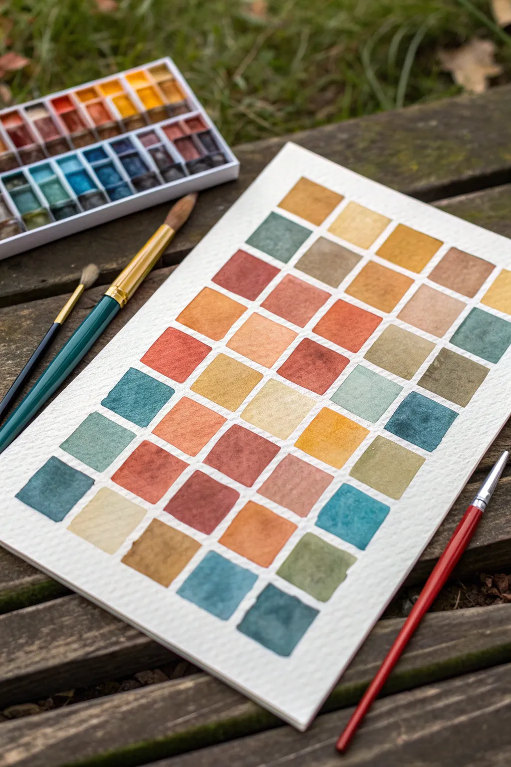
Create a soothing and methodical study of color with this neat patchwork of earthy tones. This grid-based project is perfect for exploring the interaction between warm ochres and cool teals while practicing your brush control and wash consistency.
Step-by-Step Guide
Materials
- Cold press watercolor paper (block or taped sheet)
- Watercolor paints (pan set preferred)
- Flat brush (size 6-8) or large round brush
- Small round detail brush (size 2-4)
- Pencil (HB or lighter)
- Ruler
- Jar of clean water
- Paper towel or cloth
Step 1: Preparation & Layout
-
Prepare your workspace:
Since this project requires precision, tape your watercolor paper down to a board or use a watercolor block to prevent buckling. Ensure your lighting is bright and even. -
Measure the grid:
Use your ruler to lightly mark out a grid of squares on the paper. Aim for squares approximately 1 inch (2.5 cm) in size. -
Add spacing:
Leave a small, consistent gap—about 1/8th of an inch (3mm)—between each square. This negative space is crucial as it acts as a crisp white border, separating the colors cleanly. -
Draw the lines:
With a very light hand, pencil in the squares. Press gently so the graphite lines can be easily erased or covered by the paint later. I like to keep these lines barely visible to avoid smudging.
Step 2: Mixing the Palette
-
Observe the color story:
This piece uses a sophisticated palette of muted earth tones: burnt sienna, yellow ochre, terracotta, moss green, teal, and charcoal blue. -
Pre-mix your washes:
Prepare puddles of your main colors on your palette before you start painting. This ensures you have enough consistent color to fill multiple squares without needing to remix halfway through. -
Create variations:
Mix a few transitional shades. For example, add a touch of burnt sienna to your yellow ochre to create a warm tan, or mix a little green into your blue for a deep teal.
Clean Edge Secret
Turn your paper as you work so your hand is always pulling the brush naturally toward you. It’s much easier to paint a straight line this way than pushing away.
Step 3: Painting the Squares
-
Start with the first square:
Load your brush with a medium-consistency wash—not too watery, but fluid enough to glide. Carefully fill the first square, starting from the center and pushing the pigment toward the pencil lines. -
Define the edges:
Use the tip of your brush to neaten the edges of the square. The goal is a sharp, crisp line against the white paper gap. -
Alternate colors:
Move to a non-adjacent square to paint your next color. Painting next to a wet square risks bleeding if your hand is unsteady, so hopping around the grid is safer. -
Vary the saturation:
Let some squares be more pigmented and opaque, while others can be more diluted and transparent. This variation adds visual texture to the grid. -
Introduce texture:
For a ‘granulating’ effect seen in some of the blue and grey squares, use pigments like ultramarine or burnt umber that naturally settle into the paper’s texture. -
Work methodically:
Continue filling the grid. Try to balance warm and cool tones so that no single area is too heavy with just orange or just blue. -
Watch the dampness:
If a square is too wet, you might get a ‘cauliflower’ bloom. If you see a puddle forming, gently lift the excess water with the corner of a dry paper towel.
Fixing a Bleed
If paint bridges the gap between squares, immediately dry your brush and touch it to the mistake to wick up the excess liquid before it stains.
Step 4: Finishing Touches
-
Fill the final gaps:
Once the initial squares are dry, go back and fill in any adjacent squares you skipped. This ensures crisp separation lines. -
Check for consistency:
Look at your grid as a whole. If any square looks too pale and washed out compared to its neighbors, you can carefully add a second glaze of color once it is bone dry. -
Let it dry completely:
Allow the entire paper to dry flat. Do not touch the squares while they are damp, or you will mar the smooth surface texture. -
Erase guidelines:
Once 100% dry, take a kneaded eraser and gently lift any visible pencil marks from the white gutters between the squares.
Step back and admire how your organized grid creates a calming and harmonious color story
Have a question or want to share your own experience? I'd love to hear from you in the comments below!