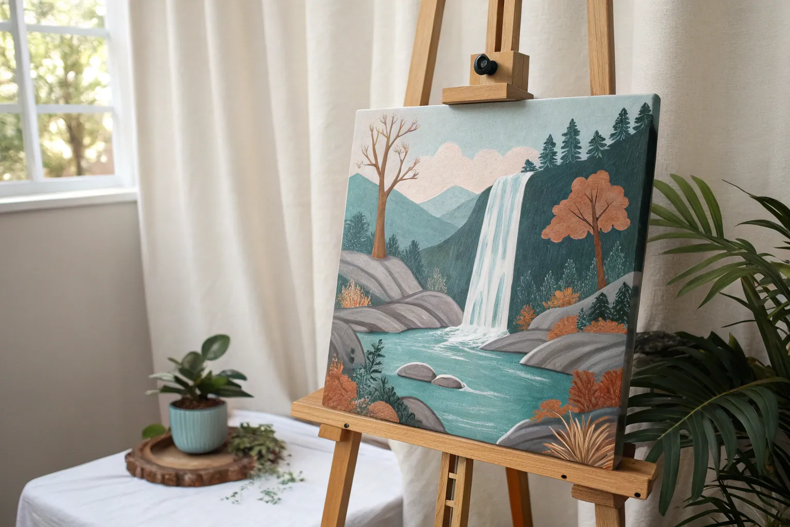
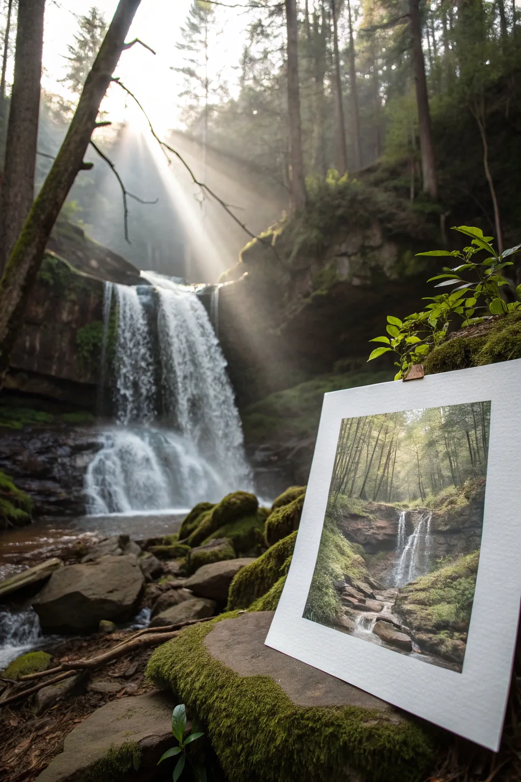
When I’m not sure what to paint, I come back to waterfalls—they’re the perfect mix of structure (hello, rocks) and movement (all that rushing water). Here are my favorite waterfall painting ideas to help you build a scene that feels alive, whether you’re going realistic, dreamy, or totally bold.
Tiered Cascade Waterfall
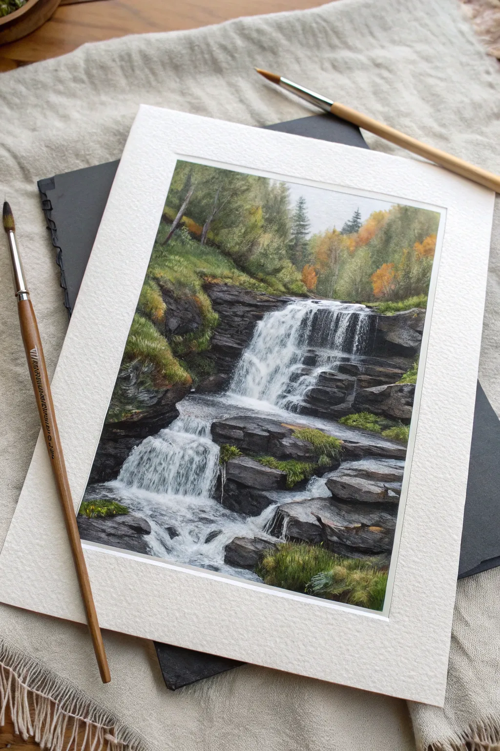
Capture the serene movement of a tiered waterfall surrounded by lush, mossy rocks and a hint of autumnal forest. This intermediate-level project emphasizes varied textures, from the softness of distant trees to the crisp, rushing white water.
Detailed Instructions
Materials
- Cold press watercolor paper (300 gsm), taped down
- Watercolor paints (Sap Green, Hooker’s Green, Burnt Umber, Payne’s Grey, Yellow Ochre, Ultramarine Blue, Burnt Sienna)
- White gouache or opaque white watercolor
- Synthetic round brushes (sizes 2, 6, and 10)
- Rigger brush or fine liner brush
- Masking fluid (optional but helpful)
- Pencil (HB) and kneaded eraser
- Paper towels and two jars of water
Step 1: Planning and Underpainting
-
Sketch the Composition:
Begin with a light pencil sketch. Outline the main tiers of the waterfall, the large rocky shelves, and the general shape of the treeline. Don’t worry about individual leaves or ripples yet; simply block in the major masses. -
Protect the Highlights:
If you are using masking fluid, carefully apply it to the brightest white sections of the falling water. Use an old brush or a dedicated applicator. This preserves your pure whites while you paint the surrounding darks. -
Initial Wash for the Sky and Tops:
Wet the very top area of the paper slightly. Drop in a very pale, diluted mix of Payne’s Grey and a touch of Yellow Ochre for the sky peering through the trees. Keep this soft and indistinct. -
Base Layers for Rocks:
Mix a light wash of Burnt Umber and Ultramarine Blue to create a cool grey-brown. Apply this to the rocky areas, leaving gaps for green patches. Work wet-on-dry to create some initial texture.
Muddy Greens?
If your moss looks dull, you likely overmixed the green on the paper. Let layers dry completely before glazing a fresh, bright yellow-green over the top to revive the vibrancy.
Step 2: Building the Landscape
-
Distant Trees:
For the background forest, mix Sap Green with a little Yellow Ochre. Use a size 6 brush to dab in the foliage shapes. While the green is still damp, drop in hints of Burnt Sienna to suggest turning autumn leaves, keeping edges soft to push them into the background. -
Deepening the Shadows:
The rocks need weight. Mix a stronger, darker grey using Payne’s Grey and Burnt Umber. Paint the crevices and the undersides of the rock ledges where the light doesn’t hit. This high contrast is crucial for making the white water pop later. -
Adding Moss and Grass:
Mix a vibrant green using Sap Green and Lemon Yellow. Stipple this color onto the tops of the rock shelves. Vary the pressure to simulate tufts of grass. Add touches of Hooker’s Green to the base of these tufts for shadow. -
Defining the Pine Trees:
Using a smaller round brush and a darker green mix, paint the specific pine trees near the top of the falls. Use quick, downward flicking motions to mimic pine needle textures.
Scratch It Out
For ultra-fine highlights in the wet rocks or grass, use a sharp craft knife or razor blade to gently scratch the paper surface, revealing the white pulp underneath.
Step 3: The Waterfall
-
Remove Masking:
Once the paper is completely bone-dry, gently rub off the masking fluid (if you used it). You should have stark white shapes reserved for the water. -
Painting Water Motion:
Water isn’t just white; it reflects its surroundings. Use a very watery, pale blue-grey wash to paint vertical strokes connecting the top of the falls to the splash zone. Leave plenty of dry white paper showing for the foam. -
Enhancing the Flow:
Switch to a dry brush technique. Load your brush with slightly thicker grey paint, dab off the excess on a towel, and lightly drag it swiftly down the waterfall area. The texture of the paper will break up the stroke, creating a sparkling water effect. -
The Splash Zones:
Where the water hits a rock, soften the bottom edge of your waterfall stroke with a clean, damp brush. This creates a misty, spray effect.
Step 4: Refining Details
-
Foreground Rocks:
The rocks in the foreground need the most detail. Use a rigger or fine liner brush with dark brownish-black paint to add cracks, fissures, and sharp edges to the stone slabs. -
Foreground Grasses:
Using the same fine brush, flick upward with various green mixtures in the bottom right corner. Make these individual blades of grass distinct, showing they are closest to the viewer. -
Highlighting with Gouache:
Take your white gouache. Use a small brush to paint the brightest, opaque white streaks on the waterfall where the flow is heaviest. You can also spatter a tiny amount of white paint near the base of the falls for droplets. -
Final Adjustments:
Step back and assess your values. If the water doesn’t look bright enough, darken the rocks directly next to it. Contrast is the key to brilliance.
Once dry, carefully remove the tape to reveal your crisp borders and enjoy the refreshing view of your painted cascade


Easy Waterfall Thumbnail Studies
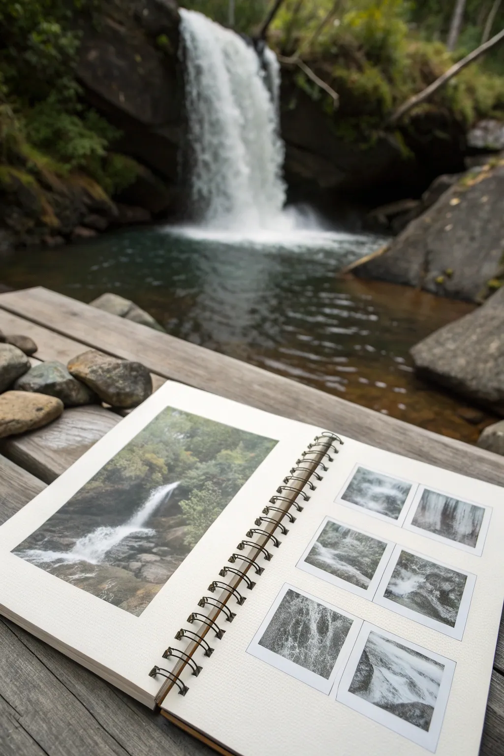
Mastering the movement of water begins with thumbnail studies, capturing the essence of the falls before committing to a larger piece. This project features a sketchbook layout combining a primary color study on the left page with a grid of six smaller, monochromatic focus studies on the right.
Step-by-Step Tutorial
Materials
- Spiral-bound sketchbook (landscape orientation, mixed media paper)
- Graphite pencils (HB, 2B, 4B)
- Watercolor paint set
- Small round watercolor brush (size 4 or 6)
- White gouache or white gel pen
- Ruler
- Masking tape or artist tape
- Palette for mixing
- Water container and paper towels
Step 1: Setting Up the Layout
-
Define the page spread:
Begin with your open sketchbook. Leave the left page blank for now—it will house the main color study. On the right page, you need to create a structured grid. -
Measure the thumbnail grid:
Using a ruler and a light pencil touch, measure out six equal squares on the right-hand page. Arrange them in two rows of three. -
Tape the borders:
Place masking tape around the perimeter of each square and the larger rectangle on the left page. This ensures crisp, professional edges around your studies once the paint dries.
Step 2: The Main Color Study (Left Page)
-
Sketch the composition:
Lightly sketch the main waterfall scene on the left page. Focus on the vertical drop of the water and the surrounding rock formations, keeping details minimal. -
Block in green values:
Mix a muted sap green with a touch of burnt sienna. Wash this over the background foliage areas, keeping it loose to suggest dense trees without painting every leaf. -
Establish the rocks:
Mix a dark grey using ultramarine blue and burnt umber. Paint the rocky cliffs on either side of the falls, ensuring you leave the paper white where the water flows. -
Shape the water:
Use a very dilute wash of indigo or cool grey to shadow parts of the waterfall, defining the cascading motion. The white of the paper is your brightest highlight. -
Deepen the shadows:
Once the first layers are dry, add darker greens and greys to the crevices and undergrowth to make the bright white water pop forward.
Tape Tearing Paper?
If your masking tape is too sticky, stick it to your jeans or shirt once or twice before applying it to the paper. This reduces tackiness and saves your surface.
Step 3: Thumbnail Focus Studies (Right Page)
-
Concept for the grid:
The goal for the right page is not to copy the whole scene, but to zoom in on specific textures of moving water. Select six different sections of the waterfall reference to analyze. -
Sketch the monochromatic base:
Using just black watercolor or diluted ink, paint the dark rock shapes in each small square. These darks act as negative space to define the water’s path. -
Create flow direction:
While the paint is wet in some squares, use a ‘lifting’ technique with a thirsty, clean brush to pull pigment away, creating soft, blurred motion lines. -
Vary the textures:
Experiment in different squares. Make one study about the crash at the bottom, another about the thin veils at the top, and another about turbulent whitewater. -
Add highlights and foam:
Once the dark bases are thoroughly dry, use white gouache or a white gel pen to draw crisp lines of water hitting rocks. Scumble the white paint (dry brush) to create the look of mist and foam. -
Refine the details:
Go back into the thumbnails with a fine liner or dark pencil to sharpen the edges of the wet rocks, increasing the contrast against the white foam.
Pro Tip: Scratching Out
While the watercolor is still damp, use the back of your fingernail or a credit card edge to scrape out white lines for veins of water or highlighted branches.
Step 4: Final Touches
-
Review contrast:
Step back and look at the spread. Ensure the left color study has enough dark values to match the intensity of the black-and-white thumbnails on the right. -
Remove the tape:
Very carefully peel off the masking tape. Pull it away from the painting area at a 45-degree angle to prevent tearing the paper.
Now you have a comprehensive study sheet that captures the energy of the waterfall through both color and focused value sketches


Waterfall Flow Lines and Edges
Capture the raw power and serene atmosphere of nature with this detailed sketchbook study. This project focuses on the interplay between jagged, dark rock formations and the fluid, chaotic movement of rushing water.
Step-by-Step
Materials
- Heavyweight mixed media or watercolor sketchbook (hot press preferred for detail)
- Gouache paints (Titanium White, Lamp Black, Burnt Umber, Yellow Ochre, Ultramarine Blue, Hooker’s Green)
- Set of synthetic brushes (flat shader, small round, and a rigger/liner brush)
- Mixing palette
- Water cups and paper towels
- Masking tape (optional for edges)
- HB pencil for sketching
Step 1: Sketching and Blocking
-
Outline the composition:
Begin with a very faint pencil sketch. Outline the major vertical rock faces on the left and right, leaving a central negative space for the waterfall. Roughly indicate the large boulders at the bottom. -
Establish the background atmosphere:
Mix a pale, milky grey-green using White, a touch of Black, and a tiny bit of Green. Wash this into the top section where the trees are, keeping it very watery and blurry to simulate mist. Let this dry completely. -
Paint the distant trees:
Using a slightly darker grey-green, dab in rough tree shapes over the mist. Keep edges soft; these shouldn’t be detailed, just suggestions of pine shapes in the fog.
Dry Brush for Texture
When painting the waterfall’s main body, wipe most paint off your brush. Dragging a ‘thirsty’ brush creates broken edges that look exactly like aerated, falling water.
Step 2: Building the Rock Formations
-
Mix your darks:
Create a deep, dark slate color using Lamp Black with a touch of Ultramarine Blue and Burnt Umber. It shouldn’t be pure black, but very close. -
Block in the main rocks:
Paint the large rock masses on either side of the falls. Use confident, blocky strokes to mimic the hard facets of stone. Leave the paper white where the water falls. -
Add mid-tones to the stone:
While the dark paint is damp or just after drying, mix a lighter grey-brown. Dry brush this onto the protruding edges of the rocks to create dimension and show where light hits the wet stone. -
Detail the foreground boulders:
Paint the large boulders at the bottom with your dark mix. Focus on their heavy, rounded weight. Add highlights to their tops to show they are wet and reflecting the sky. -
Add hints of moss:
Mix Yellow Ochre with a little Green and White. Stipple tiny patches of moss onto the cliff ledges and the tops of the rocks to break up the grey.
Step 3: Painting the Water
-
Base layer for water:
Mix a very pale blue-grey (mostly white). Paint the vertical column of the waterfall, allowing some of the underlying paper texture to show through for a broken effect. -
Establish the crash zone:
At the bottom of the falls where it hits the pool, scumble pure Titanium White in a circular, cloud-like motion to create the mist and spray. Soften the edges into the surrounding dark rocks. -
Define the flow lines:
I prefer using a rigger or fine liner brush here. With opaque Titanium White, paint vertical streaks down the main waterfall body. Vary the pressure to make thick and thin lines that mimic rushing water. -
Create separation:
Use a diluted grey to paint thin shadows between the streams of water. This visual separation gives the waterfall volume rather than looking like a flat white sheet. -
Paint the river flow:
For the water rushing around the bottom rocks, use horizontal, sweeping strokes. Curve the strokes around the boulders to show the current wrapping around obstacles. -
Add spray details:
Using a relatively dry brush with pure white, tap lightly against the dark rocks near the waterfall’s edge to represent splashing droplets and mist rising up. -
Refine the edges:
Go back with your dark rock color and ‘cut in’ to the white water shapes if they got too wide. This negative painting technique sharpens the water’s edge.
Add Subtle Color
Water reflects its surroundings. Glaze a tiny amount of your mossy green or sky blue into the white foam at the bottom to unify the color palette.
Step 4: Final Touches
-
Deepen the shadows:
Mix your darkest black possible. Glaze this into the deepest crevices of the rocks and right underneath the bottom boulders to anchor them firmly. -
Brightest highlights:
Add final touches of thick, unmixed White to the very crest of the waterfall and the tops of the rapids below for maximum contrast.
Close your sketchbook knowing you’ve captured a dynamic moment of nature’s movement in paint.


Sunbeams Through the Waterfall Canopy
Capture the ethereal beauty of sunbeams cutting through a misty forest canopy in this detailed acrylic landscape painting. You will learn to balance deep shadows with blinding highlights to create a scene that feels both quiet and powerful.
How-To Guide
Materials
- Heavyweight watercolor paper or canvas board (9×12 inch)
- Acrylic paints (Phthalo Blue, Sap Green, Burnt Umber, Yellow Ochre, Titanium White, Mars Black)
- Set of synthetic brushes: flat wash, medium filbert, lush round, fine liner
- Palette knife
- Water cups and paper towels
- Mixing palette
- Masking tape
Step 1: Setting the Scene
-
Tape the borders:
Begin by taping down the edges of your paper to a hard board. This creates the crisp white border seen in the final piece and prevents the paper from buckling under wet paint. -
Sketch the composition:
Lightly sketch the main elements using a diluted mix of Burnt Umber. Place the waterfall slightly off-center to the right, map out the rocky cliffs on either side, and indicate the vertical lines of the trees. -
Block in the background light:
Mix Titanium White with a tiny touch of Yellow Ochre. Paint the upper center area where the sun breaks through, keeping this layer thin and hazy to establish the light source. -
Paint the distant trees:
While the sky is still damp, mix a pale grey-green using Sap Green, White, and a dot of Black. Paint faint, vertical strokes for the farthest trees, letting them fade into the light.
Soften the Beams
To make sunbeams look realistic and not like solid stripes, use a bit of glazing medium with your white paint. It makes the layer transparent and misty.
Step 2: Building the Forest
-
Layer the mid-ground trees:
Deepen your green mixture with more Sap Green and a touch of Burnt Umber. Add the next row of trees, making them slightly more distinct and darker than the background layer. -
Create the rocky cliffs:
Mix Burnt Umber, Mars Black, and a hint of Phthalo Blue for a deep, cool dark tone. Block in the shadowy rock faces on the left and right, scrubbing the paint in to create a rough texture. -
Add mossy highlights:
Mix Yellow Ochre and Sap Green. Lightly stipple this color onto the tops of the rock formations to suggest moss catching the filtered sunlight. -
Define the foreground trees:
Use your darkest mixture (Black and Umber) and a small flat brush to paint the prominent tree trunks on the left. These should be sharp and opaque to create depth.
Muddy Greens?
If your greens look dull or muddy, stop adding black to darken them. Instead, mix Sap Green with Burnt Umber or Phthalo Blue for rich, natural forest tones.
Step 3: The Water and Light
-
Paint the waterfall base:
For the water behind the falls, use a dark grey-blue wash. I like to let this dry fully so the white water we add later stays crisp and bright. -
Create the falling water:
Load a fan brush or dry filbert with pure Titanium White. Drag the brush vertically downward from the cliff edge, lifting pressure as you go to create the broken, misty look of falling water. -
Paint the splash pool:
Where the water hits the bottom, use a scumbling motion with white paint to create the churning foam and mist. Blend this slightly into the surrounding dark rocks. -
Stream and rocks:
Paint the stream flowing toward the viewer using horizontal strokes of brown and grey. Add small, flat rocks in the stream bed using varied brown tones. -
Refine water movement:
Add thin white highlights to the stream water, showing how it rushes over and around the small rocks. Keep these lines horizontal to distinguish the flow from the vertical falls.
Step 4: Atmosphere and Details
-
Enhance the sunbeams:
Use a dry brush with a very small amount of white and glaze diagonal rays coming from the top center down toward the right. Keep this extremely subtle. -
Add foliage details:
Use a liner brush with bright yellow-green to dab small leaves and ferns in the foreground corners. This detail draws the eye and adds realism. -
Final adjustments:
Check your contrast. If the darks have dried too light, glaze over the deepest shadows with a transparent wash of black or dark blue. -
Reveal the border:
Once the painting is completely dry, slowly peel away the masking tape at a 45-degree angle to reveal the clean, sharp edges.
Now you have a serene forest scene that captures the magic of light and water, perfect for hanging in a quiet study or living room
BRUSH GUIDE
The Right Brush for Every Stroke
From clean lines to bold texture — master brush choice, stroke control, and essential techniques.
Explore the Full Guide
Autumn Color Waterfall
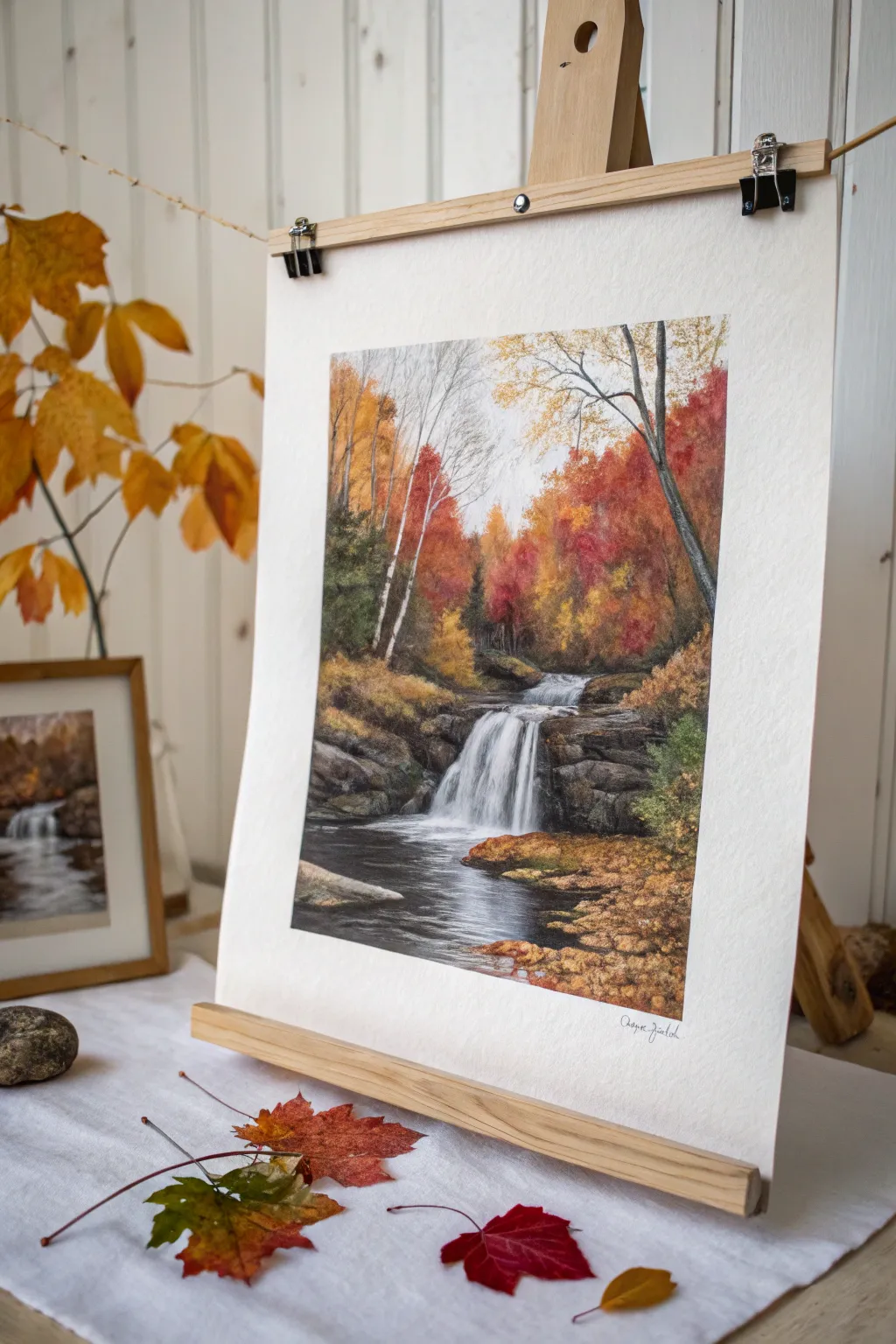
This vibrant watercolor painting captures the fiery essence of autumn forests surrounding a dynamic, rushing waterfall. By layering warm transparent colors against cool, dark rocks, you will create a scene that feels crisp, fresh, and full of seasonal energy.
How-To Guide
Materials
- Cold press watercolor paper (140lb/300gsm)
- Watercolor paint set (essential colors: Burnt Sienna, Cadmium Orange, Alizarin Crimson, Sap Green, Ultramarine Blue, Burnt Umber, Payne’s Gray)
- White gouache paint
- Synthetic sable brushes: Size 10 round (wash), Size 4 round (detail), Size 1 liner
- Painter’s tape and board
- Pencil (HB) and kneaded eraser
- Two jars of water
- Paper towels or cloth
Step 1: Sketching and Initial Washes
-
Structure the Composition:
Begin by lightly sketching the main elements. Draw the vertical lines for the birch trees on the left and the larger darker tree on the right. Sketch the horizontal layers of the rocks and the distinct shape of the waterfall cascade. -
Masking the Whites:
If you struggle to preserve white paper, apply masking fluid to the main waterfall area and the thin birch trunks. Alternatively, plan to paint carefully around them. -
Background Sky and Mist:
Wet the sky area lightly. Drop in a very faint wash of cool gray or diluted blue for the sky, keeping it extremely subtle to suggest an overcast autumn day. Let this dry completely. -
Distant Foliage Base:
Mix a soft, diluted wash of yellow ochre and burnt sienna. Apply this comfortably to the background treeline area, keeping the edges soft and blurred to create depth.
Muddy colors?
If your autumn foliage turns muddy, let the paper dry completely between your yellow and red layers. Mixing these wet-on-wet can sometimes turn brown unexpectedly.
Step 2: Building Autumn Foliage
-
Layering Warm Tones:
Once the base is dry, start stippling in brighter colors. Use a size 10 round brush to dabbing mixtures of cadmium orange and alizarin crimson into the mid-ground trees. Leave pockets of the lighter underpainting visible. -
Deepening the Reds:
While the previous layer is damp but not soaking, drop in richer reds and touches of burnt umber near the bottom of the tree clusters to imply shadow and density. -
Foreground Right Foliage:
On the immediate right bank, use sharper, more defined dabs of yellow, brown, and sap green. This area is closer to the viewer, so the leaf shapes should suggest more texture than the background blur. -
Painting the Birches:
For the birch trees on the left, carefully paint the negative space behind them with dark greens and browns. If you didn’t mask them, be very precise. Add tiny horizontal striations on the white trunks using a liner brush and diluted gray.
Add Crisp Texture
For realistic rock texture, sprinkle a tiny pinch of table salt onto the damp rock paint. Brush it off once fully dry for a pitted, stone-like effect.
Step 3: Rocks and Water
-
Rock Foundations:
Mix a dark slate color using ultramarine blue and burnt umber. Paint the rocky ledges flanking the waterfall. Use horizontal strokes to emphasize the geological strata. -
Creating Rock Texture:
While the rock wash is drying, lift out a few highlights with a thirsty brush or paper towel to give the rocks form. deepen the crevices with a near-black mixture (Payne’s gray). -
The Dark Pool:
Paint the water in the foreground using straight horizontal strokes of dark Payne’s gray and brown. Leave very thin white slivers of paper unpainted to represent ripples and movement on the surface. -
Reflections:
While the water area is wet, drop in some vertical strokes of the foliage colors (orange and rust) near the banks to suggest reflection, letting them blur naturally into the dark water.
Step 4: Final Details
-
The Waterfall Cascade:
Remove masking fluid if used. Soften the edges of the white waterfall with a clean, damp brush so it doesn’t look like a solid cutout. Add very faint streaks of pale blue-gray within the white water to show motion. -
White Highlights:
I like to use a touch of white gouache on a liner brush here. Add crisp white highlights to the top of the waterfall where the water crests, and create foam patterns where the water hits the pool below. -
Tree Branches:
Using your liner brush and a dark ink-like consistency of paint, draw the fine branches connecting the autumn leaves. Ensure these lines are thin and broken, not solid heavy outlines. -
Foreground Leaves:
Dab a few distinct spots of burnt orange and ochre floating on the dark water surface in the foreground to connect the water to the land.
Sign your name in the corner and verify your contrast levels one last time to finish the piece
Winter Ice Waterfall
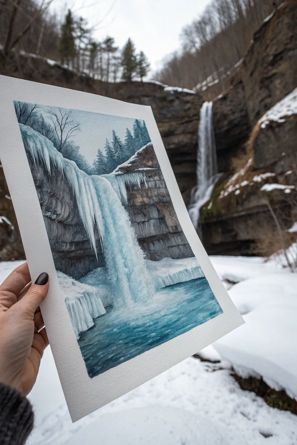
Capture the stark beauty of a frozen winter landscape with this detailed watercolor tutorial. You will learn to balance the fluidity of falling water with the sharp, crystalline structures of hanging ice against a moody cliffside.
Step-by-Step Guide
Materials
- Cold press watercolor paper (140lb or 300gsm)
- Watercolor paints (Indigo, Prussian Blue, Burnt Umber, Payne’s Gray, Turquoise)
- White Gouache (for opaque highlights)
- Masking fluid
- Round brushes (sizes 2, 6, and 10)
- Fine detail liner brush
- Pencil and eraser
- Two water jars and paper towels
Step 1: Preparation and Sketching
-
Establish the composition:
Begin with a light pencil sketch. Draw the vertical drop of the waterfall slightly off-center to the left. Sketch the horizontal layers of the rock face on either side, and outline the chunky accumulation of ice at the top edge and the pool at the bottom. -
Protect the whites:
Apply masking fluid carefully to the areas that need to remain brilliant white: the hanging icicles at the lip of the falls, the foamy splash zone at the bottom, and the snowy ledges on the rocks. Let this dry completely before painting.
Step 2: Painting the Background and Rocks
-
Sky wash:
Mix a very pale wash of Payne’s Gray and a touch of Turquoise. Apply this to the sky area, keeping it light and misty to suggest a cold winter day. As you move lower towards the trees, you can slightly darken the value. -
Distant trees:
While the sky is still slightly damp (but not soaking), paint the distant pine trees using a cool mixture of Indigo and Payne’s Gray. Use the tip of your brush to create spiky tree tops that fade into the mist. -
Rock base layers:
Mix Burnt Umber with Indigo to create a deep, brownish-grey. Paint the rock formations, using horizontal strokes to mimic the sedimentary layers. Leave gaps for where the snow and ice will sit. -
Detailing the cliffs:
Once the base rock layer is dry, use a smaller brush with a darker, more saturated mix of the rock color to add cracks, crevices, and shadows under the ledges. This creates the texture of the stone.
Muddy Ice?
If your ice shadows look dirty, your water might be murky. Change your water jar before painting the delicate blue glazes on the ice to ensure crisp, clean colors.
Step 3: The Waterfall and Ice
-
Water underpainting:
For the main body of the waterfall, wet the paper where the water flows. Drop in streaks of Turquoise and Prussian Blue, leaving vertical white streaks to show movement. The color should be deeper at the edges and lighter in the center. -
Deepening the pool:
Paint the pool at the bottom with a rich gradient of Turquoise and Prussian Blue. Make the water darkest at the bottom corners and lighter near the splash zone to create depth. -
Remove masking:
Once the paper is bone dry, gently rub away the masking fluid. You will be left with stark white shapes that now need definition. -
Sculpting the ice:
I find that ice isn’t just white; it reflects the sky. Use a very diluted wash of Turquoise and Payne’s Gray to paint shadows on the icicles. Paint vertical lines on the hanging ice to give them a cylindrical, 3D form. -
River motion:
Add motion lines to the pool using horizontal strokes of the blue mix, ensuring the water looks like it is rippling away from the falls.
Add Sparkle
Sprinkle a pinch of salt onto the wet paint in the icy pool area. As it dries, it creates crystal-like textures perfect for frozen water surfaces.
Step 4: Refining and Gouache Highlights
-
Enhancing contrast:
Assess your darks. Glaze a transparent layer of Indigo over the deepest shadows in the rocks to make the white ice pop even more. -
Gouache splashes:
Take your white gouache and a small round brush. Stipple (dot) thick white paint at the base of the waterfall to create the churning mist and foam. -
Icicle highlights:
Use the liner brush and thick white gouache to add crisp, opaque highlights down the center of the main water flow and along the sharpest edges of the hanging icicles. -
Foreground snow:
Paint the snowy banks in the foreground with white gouache if you lost the paper white, or simply add blue-grey shadows to the existing white paper to give the snow volume and form. -
Final tree details:
Use a dry brush with dark grey paint to add a few sharp, distinct branches to the bare trees on the left side, letting them overlap the sky area slightly.
Step back and admire the cool, crisp atmosphere you have captured in your winter scene

PENCIL GUIDE
Understanding Pencil Grades from H to B
From first sketch to finished drawing — learn pencil grades, line control, and shading techniques.
Explore the Full Guide
Tropical Jungle Waterfall
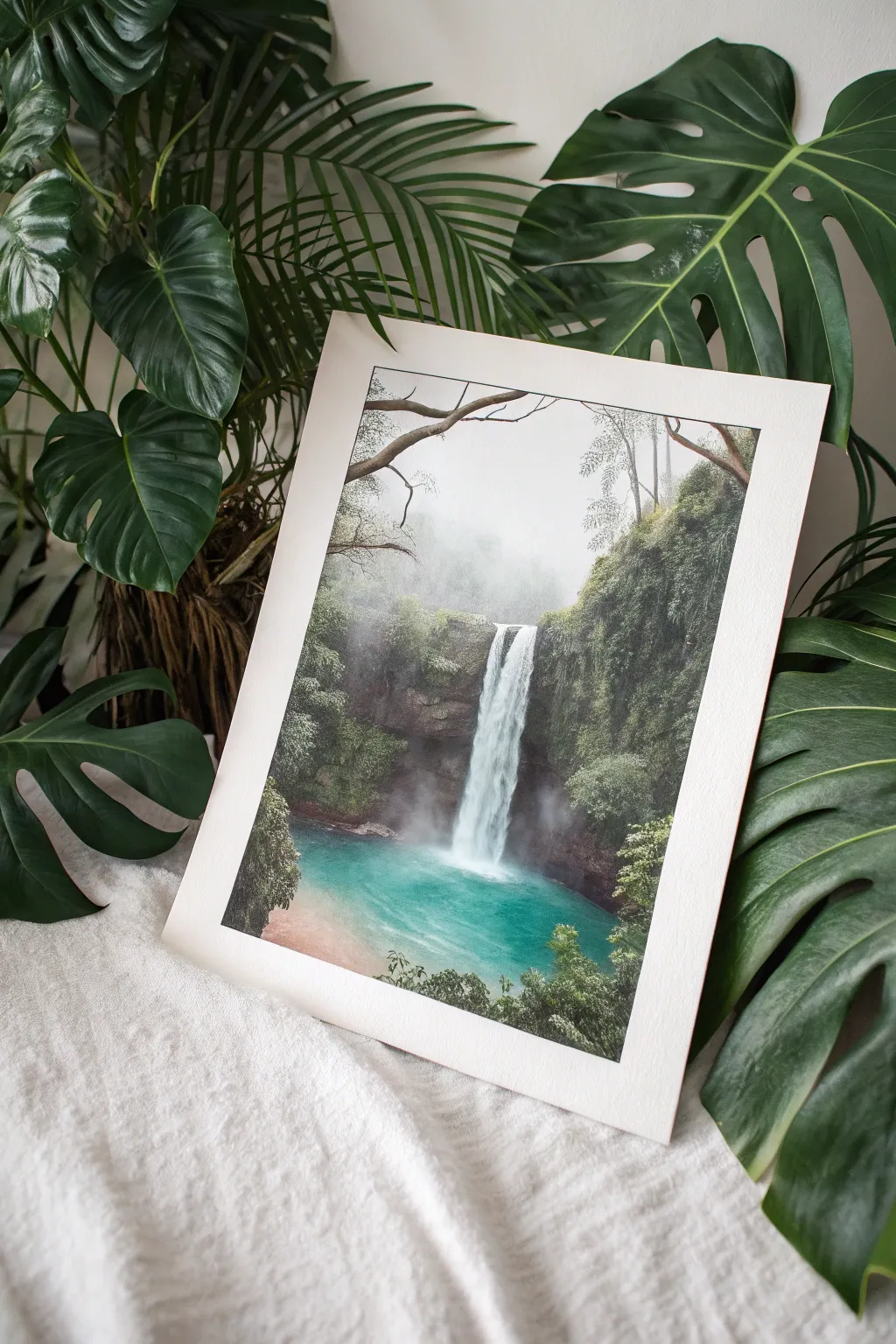
Capture the serene beauty of a jungle oasis with this watercolor tutorial, focusing on the interplay between mist, vibrant turquoise waters, and lush cliffside vegetation. This project uses wet-in-wet techniques to create a dreamy, atmospheric depth that makes the central waterfall pop against the darker foliage.
Step-by-Step
Materials
- Cold press watercolor paper (300 gsm or higher)
- Pencil (HB) and kneaded eraser
- Masking fluid and an old synthetic brush
- Watercolor paints (Phthalo Blue, Phthalo Green, Sap Green, Burnt Umber, Payne’s Grey, Indigo)
- White Gouache (for mist and highlights)
- Brushes: Large mop brush, medium round (size 8), small detail round (size 2), and a rigger brush
- Palette
- Two jars of water
- Paper towels or cotton rag
- Masking tape
Step 1: Preparation and Sketching
-
Secure the paper:
Tape your watercolor paper down firmly to a board on all four sides. This creates that clean, crisp white border visible in the final piece and prevents the paper from buckling under heavy washes. -
Lightly sketch the composition:
Using your HB pencil, draw the basic shapes. Outline the cliff edges, the path of the waterfall (vertical column), the pool at the bottom, and the foreground branches at the top. Keep the lines faint so they don’t show through the transparent paint later. -
Apply masking fluid:
Carefully paint masking fluid over the main waterfall column and the brightest white splash zone at the bottom. This preserves the absolute white of the paper. Use an old brush you don’t care about, as masking fluid ruins bristles.
Bleeding Colors?
If your cliffs are bleeding too much into the waterfall area, your paper is too wet. Let it dry completely, then re-wet only the specific area you want to work on with clean water.
Step 2: Building the Atmosphere
-
Wet the sky area:
Once the masking fluid is bone dry, wet the entire upper section of the paper with clean water, stopping just above the pool line. -
Create the misty background:
Drop in a very dilute wash of Indigo and a touch of Sap Green into the wet paper. Keep it pale and undefined to represent distant, fog-covered trees. Let the colors bleed softly. -
Deepen the mid-ground cliffs:
While the background is still slightly damp but not soaking, mix a stronger green using Sap Green and a bit of Payne’s Grey. Paint the cliff shapes on either side of the waterfall, letting the edges blur slightly into the background for a sense of distance.
Pro Tip: Softening Falls
Don’t outline the waterfall! Water moves fast and blurs. Soften hard pencil lines with an eraser before painting, and use a damp brush to blur the edges of the falling water into the rock.
Step 3: The Pool and Falls
-
Paint the turquoise pool:
Mix a vibrant turquoise using Phthalo Blue and Phthalo Green. Wet the pool area and drop this color in, making it darker and more saturated at the base of the cliffs and lighter towards the center splash zone. -
Add pool depth:
While the pool is wet, drop in hints of Indigo near the edges to suggest depth and shadow. -
Remove masking fluid:
Wait for everything to dry completely. Gently rub away the masking fluid to reveal the crisp white paper of the waterfall. -
Detail the waterfall:
The uncovered white shape will look too harsh. Use a clean, damp brush to soften the edges. Lightly drag a very pale blue-grey mix vertically down the white column to simulate falling water texture, leaving gaps of pure white.
Step 4: Foreground Foliage and Details
-
Cliff texture:
Mix a dark, rich green using Sap Green and Indigo. With a size 8 round brush, stipple dot-like marks onto the cliffs to simulate heavy leaf coverage. -
Add reddish rocks:
Paint the exposed rock faces near the waterfall base using Burnt Umber mixed with a tiny bit of red. Keep these shapes rugged and irregular. -
Foreground trees:
Using your darkest green (almost black), paint the distinct trees and bushes in the immediate foreground at the bottom. I find creating sharp, detailed leaf shapes here helps push the misty background further back. -
Overhanging branches:
With a rigger brush and a mix of Burnt Umber and Payne’s Grey, paint the delicate, twisting branches coming from the top corners. Add tiny leaves to these branches.
Step 5: Final Touches
-
Mist effect:
Take your white gouache and dilute it slightly. Gently dry-brush or dab it at the base of the waterfall where the water hits the pool to create a rising mist effect. -
Highlighting foliage:
Mix a bit of white gouache with light green and add tiny highlights to the tips of the foreground leaves to catch the light. -
Remove tape:
Ensure the painting is 100% dry. Peel the masking tape away slowly at a 45-degree angle to reveal your clean border.
Frame this piece behind glass to protect the delicate watercolor surface and enjoy your personal jungle escape
Still Pool Reflections Below the Waterfall
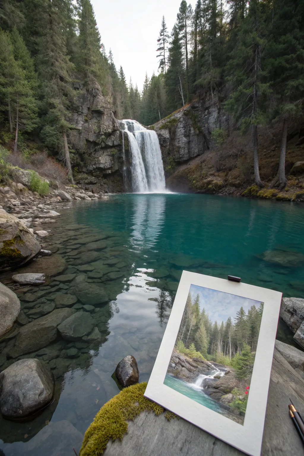
Capture the serenity of a flowing forest stream with this watercolor landscape study. This project focuses on layering techniques to create depth between the towering pines and the rushing water over rocky steps.
Step-by-Step Guide
Materials
- Cold press watercolor block (9×12 inches)
- Watercolor paints (Sap Green, Hooker’s Green, Burnt Umber, Payne’s Grey, Cerulean Blue, Indigo)
- Round watercolor brushes (Size 4, 8, and 12)
- Rigger brush for fine details
- Masking fluid (optional)
- Painter’s tape
- Pencil (HB)
- Two water containers
- Paper towels
Step 1: Sketching and Sky
-
Tape edges:
Begin by taping down all four edges of your watercolor paper to create a crisp white border. This also helps keep the paper flat during wet washes. -
Light sketch:
Use your HB pencil to lightly map out the composition. Draw the vertical lines for the tree trunks, the horizontal breaks for the rocks, and the flowing S-curve of the stream. -
Optional masking:
If you want to preserve pure white for the brightest water foam, apply small dots of masking fluid where the water crashes over rocks. Let it dry completely. -
Sky wash:
Wet the sky area with clean water. Drop in a very dilute wash of Cerulean Blue, leaving some white paper showing for soft clouds.
Dry Brush Magic
Use a brush with very little paint and almost no water to drag across the paper’s texture. This perfectly mimics the rough, jagged surface of granite rocks.
Step 2: Establishing the Forest
-
Background trees:
While the sky is still slightly damp, mix a pale, watery grey-green using Sap Green and Payne’s Grey. Paint the distant tree line softly so edges blur slightly, creating atmospheric perspective. -
Mid-ground texture:
Once the first layer is dry, mix a stronger green. Use the side of your size 8 brush to scumble in the texture of pine needles for the trees in the middle distance. -
Tree trunks:
Take a mix of Burnt Umber and a touch of Indigo. With a size 4 brush or rigger, paint fine vertical lines for the tree trunks. Vary the pressure to make them look organic, not like fence posts. -
Foreground foliage:
For the closest trees on the right and left, use your darkest, most saturated Hooker’s Green. Use a stippling motion to suggest dense bunches of needles.
Step 3: Rocks and Water
-
Rock base layer:
Mix a warm grey using Burnt Umber and Cerulean Blue. Wash this over the rock forms in the foreground, leaving the water areas white for now. -
Rock shadows:
While the rocks are damp, drop in stronger Burnt Umber or Payne’s Grey into the crevices and undersides of the stones to give them volume and weight. -
Water tinting:
I like to use a very diluted turquoise or Cerulean Blue for the water. Glaze over the flat pools of water, avoiding the white cascading areas. -
Motion blur:
To show movement in the waterfalls, take a slightly damp, clean brush and gently drag the paint downwards at the edges of the falls, softening the transition from water to foam. -
Deepening contrast:
Mix a dark green-black. Paint the deep shadows under the heavy vegetation on the banks and behind the rocks. This high contrast makes the water look brighter.
Splatter Effect
Tap a wet brush loaded with clean water or white gouache against your finger over the waterfall area to create a fine mist spray effect.
Step 4: Final Details
-
Remove masking:
If you used masking fluid, rub it away gently with your finger or a rubber cement pickup once the paint is bone dry. -
White highlights:
If you lost your whites, use a small amount of white gouache to add sparkles to the water or redefine a lost edge on a rock. -
Foreground texture:
Add tiny specks of color for moss or small wildflowers on the rocks using the tip of your smallest brush. -
Final assessment:
Step back and look at your tonal values. If the background trees look too light, add another thin glaze of cool green to push them back further. -
Reveal:
Carefully peel away the painter’s tape at a 45-degree angle to reveal your clean edges.
You now have a serene forest scene that captures the movement of water and the stillness of the trees


Moonlit Waterfall With Silver Highlights
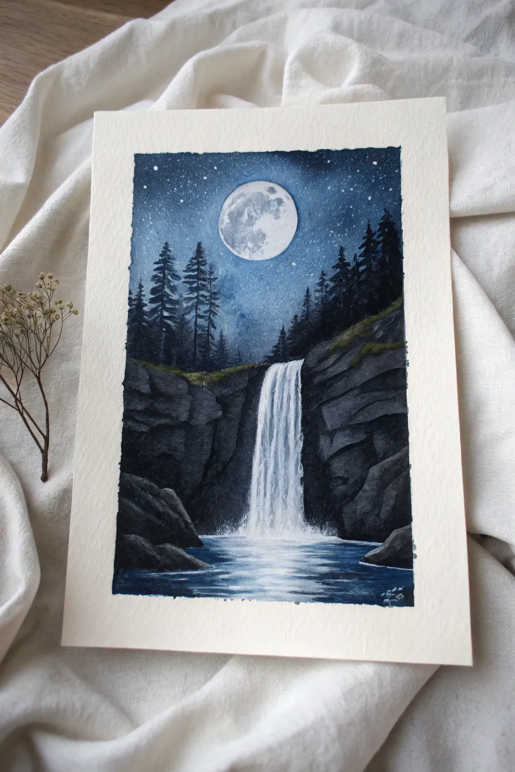
Capture the serene magic of a moonlit night with this atmospheric painting that balances deep, velvety shadows against brilliant celestial light. Using a limited palette of midnight blues and stark whites, you’ll create a glowing waterfall scene that feels both peaceful and dramatic.
Step-by-Step Tutorial
Materials
- Heavyweight watercolor or mixed media paper (300 gsm)
- Gouache paints (Prussian Blue, Black, Titanium White)
- Small amount of silver metallic watercolor or silver gouache (optional)
- Flat shader brush (size 6 or 8)
- Small round brush (size 0 or 1)
- Old toothbrush (for stars)
- Masking tape
- Palette for mixing
- Paper towels and water cup
Step 1: Setting the Scene
-
Secure the paper:
Begin by taping down all four edges of your paper to a sturdy board using masking tape. This creates that clean, crisp border seen in the final piece and prevents the paper from buckling under wet washes. -
Sketch the layout:
Lightly sketch the position of the moon near the top center. Draw a rough jagged line for the top of the waterfall cliffs about halfway down, and mark the vertical path of the water. -
Paint the night sky:
Mix Prussian Blue with a touch of Black to create a deep navy. Start painting at the very top corners, making it darkest at the edges. As you move down toward the horizon and inward toward the moon, dilute the paint slightly or add a tiny bit of white to create a glowing gradient effect around the moon.
Muddy colors?
If your white waterfall turns blue from the background, let the background dry completely first. Gouache re-wets easily, so use quick, confident strokes and don’t scrub the paper.
Step 2: The Moon and Stars
-
Define the moon:
Using thick Titanium White gouache, carefully fill in the moon circle. Don’t worry about texture yet; just get a solid base opacity. -
Add lunar crater details:
Once the white base is dry, mix a very pale grey. Dab this onto the moon’s surface in irregular splotches to mimic craters. Keep the edges of the moon crisp against the dark sky. -
Create the starry field:
Dilute some white paint with water until it’s the consistency of ink. Dip an old toothbrush into it and run your thumb across the bristles to flick tiny specks across the sky section. Keep the spray mostly in the upper sky area.
Step 3: Trees and Terrain
-
Block in the background trees:
Using a dark blue-black mixture (more black than the sky), paint the silhouettes of pine trees along the horizon line. Use the tip of your small round brush to tap in the pointy tops and irregular branches. -
Paint the cliff face:
Mix a dark grey-blue for the rocks. Paint the large rock masses on either side of the waterfall area. While the paint is still slightly wet, streak in darker black lines to suggest cracks and crevices in the stone. -
Add mossy highlights:
Mix a tiny bit of yellow or green with your grey (or use a muted olive green if you have it) and dab it along the top edge of the cliffs where the water spills over. This suggests moss or grass illuminated by moonlight.
Dry Brush Magic
For realistic falling water, the brush must be ‘thirsty’—loaded with pigment but very little water. Practice on scrap paper; you want a scratchy texture, not a solid blob.
Step 4: The Waterfall and Reflections
-
Establish the water base:
Load your flat brush with pure white gouache. However, wipe most of the paint off so the brush is fairly dry. Drag the brush vertically from the cliff edge down to the pool to create the streak effect of falling water. -
Build water intensity:
Layer more white paint in the center of the falls to show the volume of water. Leave the edges slighty translucent so the dark rock shows through slightly. -
Paint the plunge pool:
At the bottom of the falls, use horizontal strokes of dark blue for the water surface. Then, switch to white and add horizontal zig-zag strokes directly under the waterfall to show the reflection and foam spreading out. -
Add the mist:
Dab a dry brush with white paint gently at the bottom of the waterfall where it hits the pool. This creates the misty spray effect.
Step 5: Final Details
-
Enhance rock texture:
Use your smallest brush with watered-down black to deepen the shadows in the rock cracks. I find this really adds the necessary dimension to make the cliffs look heavy and solid. -
Add foreground rocks:
Paint a few jagged rock shapes in the bottom foreground corners, silhouetted against the water reflection. -
Apply silver highlights:
If using metallic paint, add very thin touches to the edges of the moon, the tips of the pine trees, and the brightest ripples in the water for a magical shimmer. -
Reveal the border:
Wait until the painting is completely bone-dry. Slowly peel away the masking tape at a 45-degree angle to reveal your clean white edges.
Step back and admire the cool, tranquil glow of your nighttime landscape.
Aurora-Lit Waterfall Night
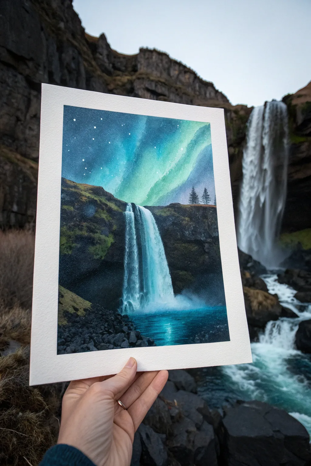
Capture the magic of an Icelandic night by combining the rush of tumbling water with a celestial light show. This watercolor and gouache project balances deep, shadowy rocks with vibrant, luminescent greens for a truly atmospheric landscape.
Step-by-Step Guide
Materials
- Cold press watercolor paper (140lb/300gsm)
- Masking tape
- Watercolors: Indigo, Phthalo Blue, Prussian Blue, Hookers Green, Burnt Umber, Lamp Black
- White Gouache (for opacity)
- Flat wash brush (3/4 inch)
- Round brushes (sizes 4 and 8)
- Detail brush (size 0 or 00)
- Old toothbrush (for stars)
- Paper towels
- Two cups of water
Step 1: Planning and Sky
-
Composition Sketch:
Begin by taping down all four edges of your paper to a board to create a clean white border. Lightly pencil in the horizon line about two-thirds down the page. Sketch the rough vertical shape of the waterfall and the rocky cliff edges, keeping the lines faint so they disappear later. -
Wet-on-Wet Sky Base:
Wet the entire sky area with clean water using your flat brush. Avoid the cliff edges, but don’t worry if you overlap slightly as the dark rocks will cover it later. You want the paper glistening but not swimming in puddles. -
Aurora Colors:
While the paper is still wet, drop in a diagonal swath of bright teal or turquoise mixed with a little green where the aurora will be. Let the paint bloom naturally. Surround this with deep indigo and Prussian blue at the top corners, blending carefully towards the lighter center. -
Deepening the Night:
To make the aurora pop, you need contrast. Add a second layer of indigo mixed with a touch of black to the very top corners and edges of the sky. Feather this dark paint downwards, stopping before you hit the bright green streak. -
Starry Splatter:
Once the sky layer is bone dry—and I really mean completely dry—mix white gouache with a tiny bit of water. Dip an old toothbrush in it and flick the bristles to create a field of stars. Focus the stars mostly on the darker blue areas.
Clean Edges
To prevent paper tearing, heat the masking tape with a hair dryer for a few seconds before peeling it off. This softens the adhesive gently.
Step 2: Rocks and Landscape
-
Cliff Undertones:
Mix a dark, earthy grey using Burnt Umber and Prussian Blue. Paint the basic shapes of the cliffs and the foreground rocks. Use a fairly watery mix first to establish the lighter values of the stone. -
Adding Vegetation:
While the rock base is damp, dab in touches of Hookers Green and a bit of olive on the tops of the cliffs. This implies mossy growth clinging to the damp stones. Let it bleed slightly into the grey for a soft, cohesive look. -
Deep Shadows:
Mix a dense black using your darkest blue and brown (or just Lamp Black). Use a smaller round brush to paint the cavernous area behind the waterfall and the darkest crevices in the foreground rocks. This high contrast is crucial for depth. -
Distant Trees:
Using the tip of your smallest brush or a rigger, paint tiny pine trees on the horizon line to the right of the falls. Keep them sharp and silhouetted against the aurora to give the scene scale.
Level Up: Silhouette
Paint a tiny silhouette of a person standing on the rocks near the waterfall base. It adds an immense sense of scale and wonder to the landscape.
Step 3: The Waterfall
-
Dry Brush Texture:
For the waterfall itself, dampen your brush slightly with white gouache (or very pale blue watercolor) but wipe most of it off on a towel. Drag the bristles vertically down the waterfall shape. The tooth of the paper will catch the paint, leaving gaps that look like breaking water. -
Defining the Plunge:
Add a few solid white streaks near the top lip of the falls where the water is thickest. As you move down, fan the strokes out slightly. -
Mist and Spray:
At the bottom where the water hits the pool, use a clean, damp brush to soften the bottom edge of your white paint, creating a misty, cloud-like effect. You can lift a little pigment here to enhance the foggy look. -
Water Reflection:
Paint the pool at the bottom using a horizontal motion with teal and deep blue. While wet, lift out a vertical line directly under the waterfall to show the reflection of the falling water.
Step 4: Final Details
-
Foreground Texture:
Return to the foreground rocks on the bottom left. Use thick, dark paint to articulate individual boulders or jagged edges. A few deliberate strokes define the rocky shoreline. -
Bright Highlights:
With pure white gouache and your detail brush, add tiny highlights to the wettest rocks near the waterfall base and a few sharper stars in the sky if the splatter was too faint. -
The Reveal:
Wait until the painting feels cool to the touch (indicating it’s totally dry) before carefully peeling off the masking tape at a 45-degree angle to reveal those crisp white borders.
Step back and admire how the dark cliffs frame the glowing sky in your finished piece
Abstract Waterfall Motion With Bold Color
Capture the raw power and serene beauty of a towering waterfall with this realistic acrylic painting project. This large-scale piece focuses on the contrast between dark, textured cliffs and the ethereal, silky motion of falling water.
Step-by-Step Guide
Materials
- Large stretched canvas (at least 24×36 inches)
- Acrylic paints: carbon black, burnt umber, raw sienna, titanium white, phthalo blue, emerald green, Payne’s grey
- Large flat brush (2-inch)
- Medium filbert brush
- Small round detail brush
- Fan brush (optional)
- Palette knife
- Water spray bottle
- mixing palette
- Paper towels
Step 1: Blocking the Composition
-
Prime the Surface:
Ensure your canvas is clean and taut. Apply a thin wash of neutral grey (mix white with a tiny dot of black) over the entire surface to kill the stark white of the canvas. Let this dry completely. -
Sketch the Layout:
Using a diluted burnt umber and a small brush, lightly sketch the main vertical lines of the waterfall. Position the falls slightly off-center for a dynamic composition. Mark the horizon line near the top third for the cliffs. -
Map the Shadows:
Identify the darkest areas of the rock face. Mix carbon black with burnt umber to create a deep, warm dark value. Block in the cliff sides on the left and right, leaving the center blank for the water.
Pro Tip: Mist Control
Keep a spray bottle handy. A light misting of water on the canvas before blending the waterfall mist helps create a soft, seamless fog effect without harsh brushstrokes.
Step 2: Painting the Rocky Cliffs
-
Establish Mid-Tones:
Mix Payne’s grey with a touch of raw sienna. Apply this to the rocky areas, blending gently into the dark shadows you previously painted. Use a scumbling motion to create rough texture. -
Add Rock Texture:
Load your palette knife with a mixture of grey and white. Lightly drag the knife over the textured canvas surface on the cliffs. The paint should catch only on the high points, mimicking rough stone. -
Introduce Greenery:
Mix emerald green with a bit of burnt umber for a mossy tone. Dab this onto the ledges and crevices of the cliffs using an old, splayed brush to simulate clinging vegetation. -
Deepen the Shadows:
Go back in with your darkest black-brown mix and reinforce the deepest crevices and overhangs to maximize the 3D effect of the rock face.
Step 3: Creating the Waterfall
-
Base Layer for Water:
Start the waterfall area with a pale blue-grey (white + phthalo blue + tiny black). Paint vertical strokes from top to bottom, following the gravity of the fall. -
Building Volume:
Mix a slightly lighter value. Add more vertical strokes, but leave some of the darker base layer showing through. This creates depth within the water column. -
Pure White Highlights:
Load a clean flat brush with pure titanium white. Paint confident, long vertical strokes from the top edge down. Keep your hand loose to capture the rush of water. I find that holding the brush further up the handle helps with fluidity. -
Use the Fan Brush:
If you have a fan brush, lightly drag it vertically with white paint to create fine, mist-like strands of water near the edges of the main flow.
Level Up: Texture Gel
Mix heavy body texture gel into your white paint for the waterfall. Apply it thickly with a palette knife to physically build up the water volume for a 3D relief effect.
Step 4: The Pool and Mist
-
Paint the Deep Water:
For the pool at the bottom, mix phthalo blue with black for a deep teal color. Paint horizontal strokes, getting darker as you move away from the waterfall’s impact zone. -
Create the Crash Zone:
Where the water hits the pool, create mist by dabbing pure white with a dry brush. Soften the edges with your finger or a dry cloth to make it look airy and vaporous. -
Add Water Ripples:
Using a small round brush and light teal (white + phthalo blue), paint thin, wiggly horizontal lines on the dark water surface to show ripples and movement. -
Blend the Transitions:
Glaze a very thin, watery layer of white over the bottom of the falls where it meets the mist to unify the vertical falling water with the horizontal pool.
Step 5: Final Details
-
Highlight the Rocks:
Add sharp, small highlights to the wettest rocks near the waterfall using pale grey. This makes them look slick and wet. -
Refine the Moss:
Add touches of yellow-green to the mossy areas where sunlight might catch them, bringing life to the dark cliffs. -
Paint the Sides:
Don’t forget to paint the edges of your canvas black or continue the image around the sides for a professional, frameless finish. -
Varnish:
Once fully dry (give it 24 hours), apply a satin or gloss varnish to deepen the dark colors and protect the surface.
Step back and admire the powerful movement and stillness you have captured on your canvas


Have a question or want to share your own experience? I'd love to hear from you in the comments below!