Sometimes the hardest part of drawing is just choosing a subject that feels fun and doable. Here are my favorite what to draw ideas to get you moving, from classic sketchbook staples to a few weird, wonderful prompts that always spark something new.
Draw a Simple Mountain Range With Line Work
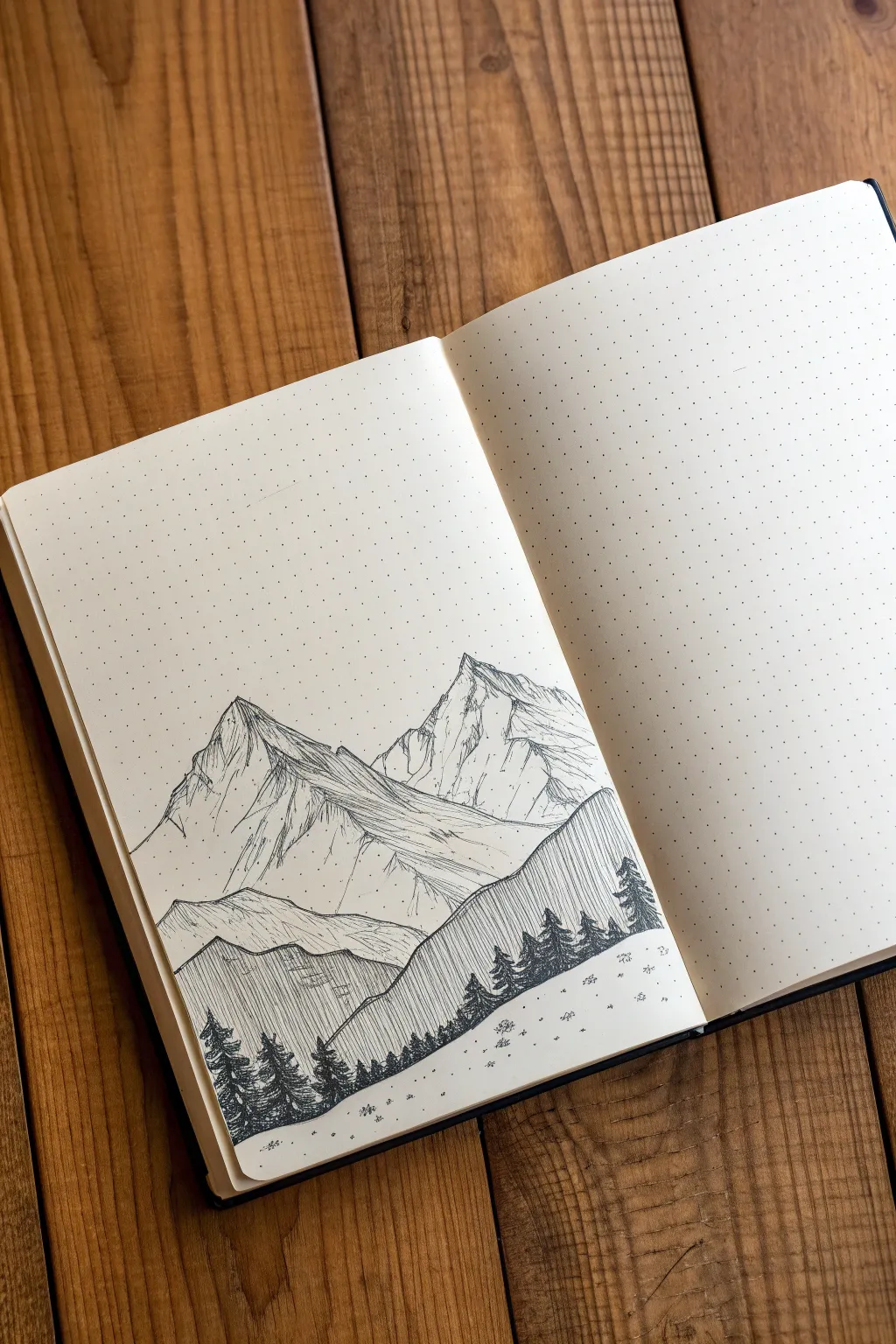
Create a serene alpine landscape using simple pen strokes and shading techniques in your dot grid journal. This project focuses on capturing the rugged texture of mountains through directional lines and hatching.
Step-by-Step Guide
Materials
- Dot grid notebook or loose dot grid paper
- Fine liner pen (0.1mm or 0.3mm)
- Pencil (HB or H)
- Eraser
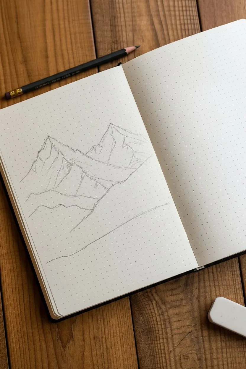
Step 1: Sketching the Outline
-
Establish the horizon:
Begin by lightly sketching a pencil line across the bottom third of your page. This doesn’t need to be perfectly straight, as it will represent the sloping foreground where the trees reside. -
Map the main peaks:
Lightly sketch two large triangular shapes in the upper half of the page to form the main mountain peaks. Make the peak on the left slightly lower than the one on the right for visual balance. -
Add secondary ridges:
Sketch jagged, uneven lines connecting the peaks and creating smaller ridges in the foreground. These lines should overlap to give the mountains a sense of depth and three-dimensionality.
Step 2: Inking the Mountains
-
Ink the outlines:
Using your fine liner, go over your pencil lines for the mountain peaks. Use a shaky, jagged motion with your hand rather than straight lines to mimic the texture of natural rock. -
Define the shadows:
Decide on a light source (e.g., coming from the top right). Mark the left sides of the peaks as the shadowed areas by drawing a central ridge line down each mountain. -
Hatching the peaks:
On the shadowed side of the leftmost peak, use long, vertical strokes that are closely spaced. These lines should follow the downward slope of the mountain face. -
Adding texture:
For the lighter side of the peak, use sparser, broken lines. I find that keeping these lines minimal helps the highlighted side look distinctly brighter. -
Detailing the right peak:
Repeat the process for the larger right peak. Use tighter, denser hatching near the ridges and crevices to create deep contrast. -
Create lower slopes:
Below the main peaks, draw sweeping, curved horizontal lines to suggest the rolling foothills. Keep these lines lighter and more fluid than the jagged peaks above. -
Refining the rock face:
Add small, random scumble marks or dots near the ridge lines to simulate loose rocks and rough terrain.
Grid Guide
Use the dots in your notebook as coordinates. Ideally, count 5 dots up for the foothills and 15 dots up for the highest peak to keep proportions steady.
Step 3: Adding the Foreground
-
Ink the treeline slope:
Draw the bold outline of the foreground slope that cuts diagonally across the bottom right of the composition. -
Fill the slope:
Fill this entire foreground slope with uniform vertical hatching. The lines should be straight, parallel, and closely packed to create a darker value than the mountains. -
Drawing pine trees:
Along the top edge of this slope, draw small silhouettes of pine trees. Use tiny zig-zag motions to create the branches, making them wider at the bottom and pointy at the top. -
Adding foreground trees:
Draw a few larger, more detailed pine trees in the bottom left corner to create a sense of scale. Darken these heavily so they stand out as the closest objects. -
Ground details:
Dot the empty white space at the very bottom with tiny specks and small clusters of grass to suggest a snowy or grassy meadow. -
Clean up:
Wait at least five minutes for the ink to dry completely, then gently erase all your initial pencil guidelines.
Ink Smearing?
If you are left-handed or using a juicy pen, work from right to left (or vice versa) to avoid dragging your hand through fresh ink.
Now you have a crisp mountain landscape that fits perfectly in your minimalist journal spread


Sketch a Rose Using Simple Shapes First
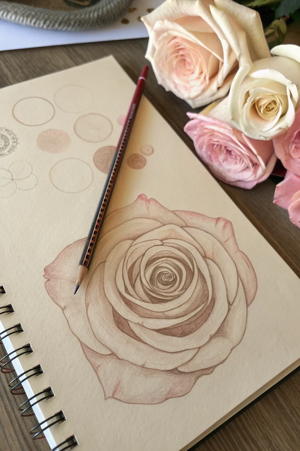
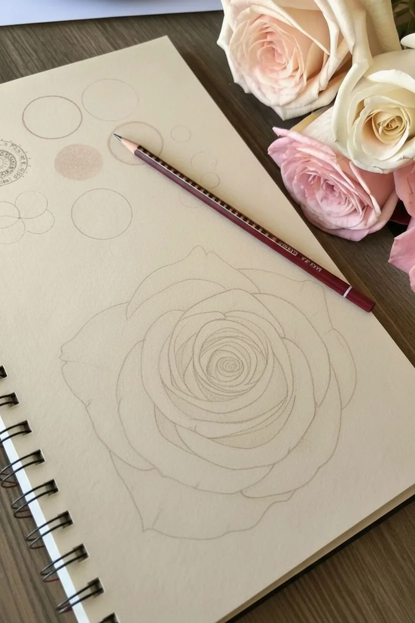
Capture the delicate beauty of a blooming rose by working on toned tan paper, which allows for instant mid-tones and dramatic highlights. This project focuses on building layers from soft outlines to deep, rich shadows.
How-To Guide
Materials
- Tan or beige toned sketchbook paper
- Graphite pencil (HB or 2H)
- Kneaded eraser
- Red-brown or terracotta colored pencil
- Dark sepia or chocolate brown colored pencil
- White colored pencil or pastel pencil
- Pencil sharpener
Step 1: Planning and Foundation
-
Analyze the shapes:
Before putting pencil to paper, look at your reference rose. Break the complex flower down into basic circles for the overall shape and the tight center bud. -
Initial sketch with circles:
Using your graphite pencil very lightly, draw a large circle to define the outer boundary of the rose. Add a smaller, slightly off-center circle inside for the core of the petals. -
Define the spiral:
Inside that central circle, lightly sketch a spiral shape. This will guide the tightly packed inner petals of the rose. -
Map the petals:
Surround the center spiral with interlocking ‘U’ and ‘V’ shapes to represent the unfolding petals. Keep your lines incredibly faint so they don’t show through later. -
Refine the outline:
Go over your geometric shapes and soften them into organic petal curves. Pay attention to the jagged ‘teeth’ on the edges of the outer petals for realism. -
Lighten the graphite:
Take your kneaded eraser and roll it gently over your entire sketch. You want to lift up almost all the graphite, leaving only a ghost image to guide your colored pencils.
Step 2: Color and Shading
-
First color pass:
Switch to your red-brown or terracotta colored pencil. Very gently trace your faint graphite lines, establishing the permanent outline of the flower. -
Establish the core shadows:
Using the same red-brown pencil, start shading the deepest crevices of the spiral center. Use light pressure to build up color gradually rather than pressing hard immediately. -
Mid-tone shading:
Work your way outward to the larger petals. Shade the areas where one petal overlaps another, creating a cast shadow effect that defines the separation between layers. -
Deepen the contrast:
Switch to your dark sepia or chocolate brown pencil. Go back into the absolute darkest points—the very center of the spiral and the deepest corners under the petals—to add depth. -
Soften the transitions:
Return to the lighter terracotta pencil. Use it to blend the edges of your dark sepia shadows out into the tan paper, creating a smooth gradient. -
Adding texture:
Use a sharp tip on your red-brown pencil to add very fine, faint texture lines running vertically up the petals, mimicking the natural veins of the flower.
Fixing Muddy Colors
If your shadows look messy, you may be pressing too hard too soon. Lighten up your hand or use an eraser to lift excess pigment before layering again.
Step 3: Highlights and Final Touches
-
Identify light sources:
Decide where the light is hitting your rose (usually the top edges of the petals). Plan where your white highlights will go. -
Apply white highlights:
Using your white pencil, gently color the tips and curled edges of the petals. The tan paper acts as your middle value, so the white will pop immediately. -
Blend the light:
Fade the white pencil softly toward the center of each petal, letting it disappear into the tan tone of the paper before it hits the shadow areas. -
Refine edges:
Check the outer silhouette of the rose. If any edges look too fuzzy, sharpen your pencils and give them a crisp, clean line. -
Final assessment:
Step back and look at the drawing. Strengthen any shadows that look washed out and brighten any highlights that need more punch.
Dew Drop Detail
Add a realistic dew drop by drawing a tiny circle, darkening the top edge, and adding a speck of pure white on the bottom curve to simulate refraction.
Enjoy the dimensional look your rose has now achieved thanks to the toned paper foundation


Draw a Cute Fruit Doodle With a Tiny Face
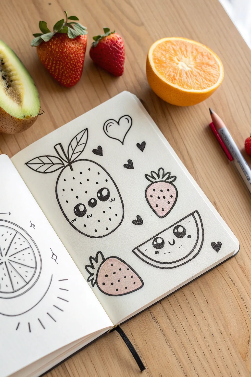
Brighten up your sketchbook with this adorable collection of fruit doodles featuring sweet, expressive faces. The thick outlines combined with soft blush accents create a charming kawaii style that is simple yet incredibly eye-catching.
Detailed Instructions
Materials
- Sketchbook with smooth, heavy paper
- HB Pencil
- Eraser
- Fine liner pen (Black, waterproof, e.g., 0.5 or 0.8mm)
- Light pink marker or colored pencil (for cheeks and fill)
Step 1: Drawing the Base Shapes
-
Sketch the kiwi:
Start with your pencil to draw a large, vertical oval shape on the left side of your page. This will be the main kiwi character. -
Add the stem:
At the top center of the oval, draw a small vertical stick. -
Create the leaves:
From the base of that stem, sketch two wide, pointed leaf shapes extending outward to the left and right, like a propeller. -
Draft the strawberries:
To the right of the kiwi, draw two rounded triangle shapes for strawberries—one upright and one resting on its side near the bottom. -
Top the berries:
Add the leafy calyx to each strawberry by drawing three small, rounded bumps at the top of the triangles. -
Outline the melon slice:
In the lower right corner, draw a semi-circle shape tilted slightly upwards to create a watermelon wedge. -
Draw the heart accent:
Sketch a simple, floating heart shape near the top center of the page to balance the composition.
Step 2: Bringing Faces to Life
-
Place the kiwi’s eyes:
Inside the large oval, drawing three circles in a horizontal row. The outer two are eyes, and the middle one is a mouth or nose depending on how you see it—classic kawaii style. -
Detail the kiwi face:
Inside the eye circles, add a small white highlight near the top. Add tiny ‘w’ shapes under the eyes for cheeks. -
Create the melon face:
On the watermelon slice, draw two wide-set circles for eyes with highlights, and a small ‘u’ shape between them for a smile. -
Sketch mini hearts:
Scatter a few tiny, solid hearts around the empty spaces of the page to act as cute confetti.
Uneven Eyes?
If your eyes turn out different sizes, embrace it! Simply thicken the outline of the smaller one slightly or add eyelashes to distract from the asymmetry.
Step 3: Inking and Details
-
Trace the main lines:
Switch to your black fine liner. Go over the outer edges of all your fruit shapes with a confident, steady hand. I like to make the outer lines slightly thicker for a sticker-like effect. -
Ink the faces:
carefully fill in the black parts of the eyes, being extremely careful to leave those tiny white circles empty for the sparkle. -
Add texture to the kiwi:
Dot small stippling marks all over the kiwi’s body to suggest its fuzzy texture. -
Seed the strawberries:
Draw small dots or tiny vertical dashes across the strawberry bodies to represent seeds. -
Define the melon rind:
Draw an inner curve on the watermelon slice to separate the flesh from the rind. -
Erase pencil marks:
Wait until the ink is completely dry—give it a full minute—then gently erase all your underlying pencil sketches.
Add Dimension
Use a white gel pen after coloring to add extra highlights on the black eyes or shiny spots on the fruit skin for a glossy, sticker-style finish.
Step 4: Adding Pops of Color
-
Color the strawberries:
Using a light pink marker or colored pencil, gently fill in the body of the strawberries. Keep the coloring soft rather than fully saturated. -
Apply blush:
Add small circles of pink to the ‘cheeks’ of the watermelon to make it look extra sweet. -
Fill the heart icons:
Use your black pen to fully color in the tiny confetti hearts scattered around the fruits.
Now you have a page full of friendly fruit ready to brighten your day


Illustrate Your Favorite Snack in Realistic vs Cartoon Styles
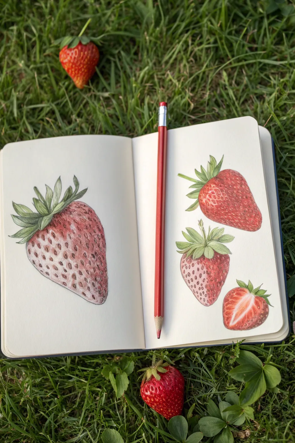
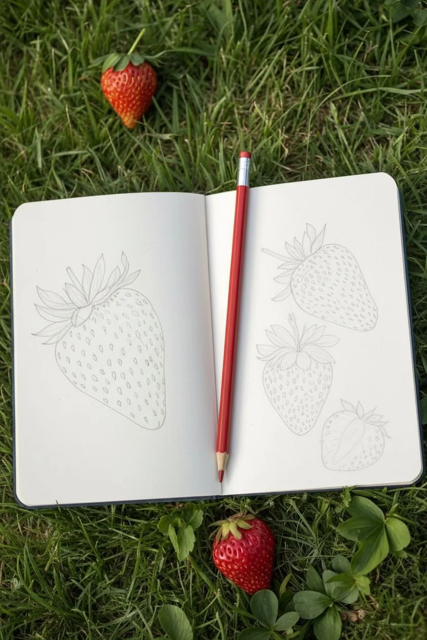
Capture the delicate details of fresh strawberries with this colored pencil study, focusing on rendering the complex texture of seeds and the smooth, juicy interior. This project explores observing one subject from multiple angles and scales in a sketchbook spread.
Step-by-Step Tutorial
Materials
- Sketchbook with smooth, heavy paper
- Graphite pencil (HB or H)
- Kneaded eraser
- Colored pencils (Quality wax or oil-based)
- Colors: Deep Reds, Bright Scarlets, Pinks, Greens (Olive & Lime), Yellow Ochre, Dark Umber, White
- Pencil sharpener
Step 1: Planning and Sketching
-
Layout guidelines:
Begin by lightly marking the placement of your four strawberries across the spread. Place a large, dominant strawberry on the left page, taking up about half the paper. On the right page, arrange three smaller studies: one large berry near the top, a smaller one below it, and a slice at the bottom right. -
Outline the forms:
Sketch the basic heart-shaped outline of the berries with your graphite pencil. Keep your pressure extremely light so the graphite doesn’t show through the colored pencil later. -
Detail the leaves:
Add the crown of leaves (the calyx) to the top of each whole berry. Observe how the jagged leaves curl upwards or hug the berry; avoid making them look stiff or uniform. -
Mark seed placement:
For the seed pockets (achenes), draw tiny, tear-drop shapes in a diagonal grid pattern that wraps around the form. These act as placeholders for later. I find it helpful to curve these lines to emphasize the roundness of the fruit.
Burnishing Technique
To get that glossy, juicy look, use a white colored pencil to blend (burnish) over your red layers. This smooths the grain without lightening the color too much.
Step 2: Coloring the Left Page
-
Base layer for the large berry:
Start coloring the large strawberry on the left. Apply a very light wash of pale pink or salmon across the entire body, but leave tiny white halos around the seed markings you sketched. -
Deepen the shadows:
Using a darker red or alizarin crimson, begin shading the bottom and right edges to build volume. The light source should come from the top left, so keep that area lighter. -
Define the seeds:
Use a yellow ochre or golden brown sharpened to a fine point to color inside the seed indentations. Add a teeny dot of dark umber at the top of each seed for depth. -
Refine the texture:
Go back in with your bright red pencil, pressing harder now to burnish the color around the seeds. This pushes the pigment into the paper tooth and makes the fruit look solid.
Step 3: Coloring the Right Page
-
Top berry base:
Move to the top right strawberry. This one is fully ripe, so start with a more vibrant scarlet red base layer, skipping the pale pink stage. -
Contrasting light:
As you layer the reds, leave a strip of the paper white or very pale pink on the upper left shoulder of the berry to represent a glossy highlight. -
Smaller berry texture:
For the middle strawberry, focus on the pitted texture. Use a darker red to shade ‘pockets’ around each seed, making the surface look bumpy rather than smooth. -
Coloring the leaves:
Fill in the green tops on all berries. Use a lime green for the lit areas and an olive or forest green for the undersides where the leaves cast shadows on themselves. -
The sliced berry interior:
For the cut berry, outline the white core first. Color the flesh with a gradient from white (center) to pink, then bright red at the skin’s edge. Radiating white lines act as veins. -
Final leaf details:
Sharpen your dark green pencil and add fine veins to the leaves. Add a tiny shadow under the leaves onto the red fruit skin to ground them. -
Clean up:
Use your kneaded eraser to lift any graphite smudges or stray pigment dust from the white background to keep the study looking crisp.
Level Up: Dew Drops
Add tiny water droplets by leaving small white circles uncolored. Add a dark red shadow on one side of the drop and a tiny white highlight on the opposite side.
Now you have a refreshing spread of botanical studies ready to be admired
BRUSH GUIDE
The Right Brush for Every Stroke
From clean lines to bold texture — master brush choice, stroke control, and essential techniques.
Explore the Full Guide
Draw a Cozy Pet Portrait With Soft Texture
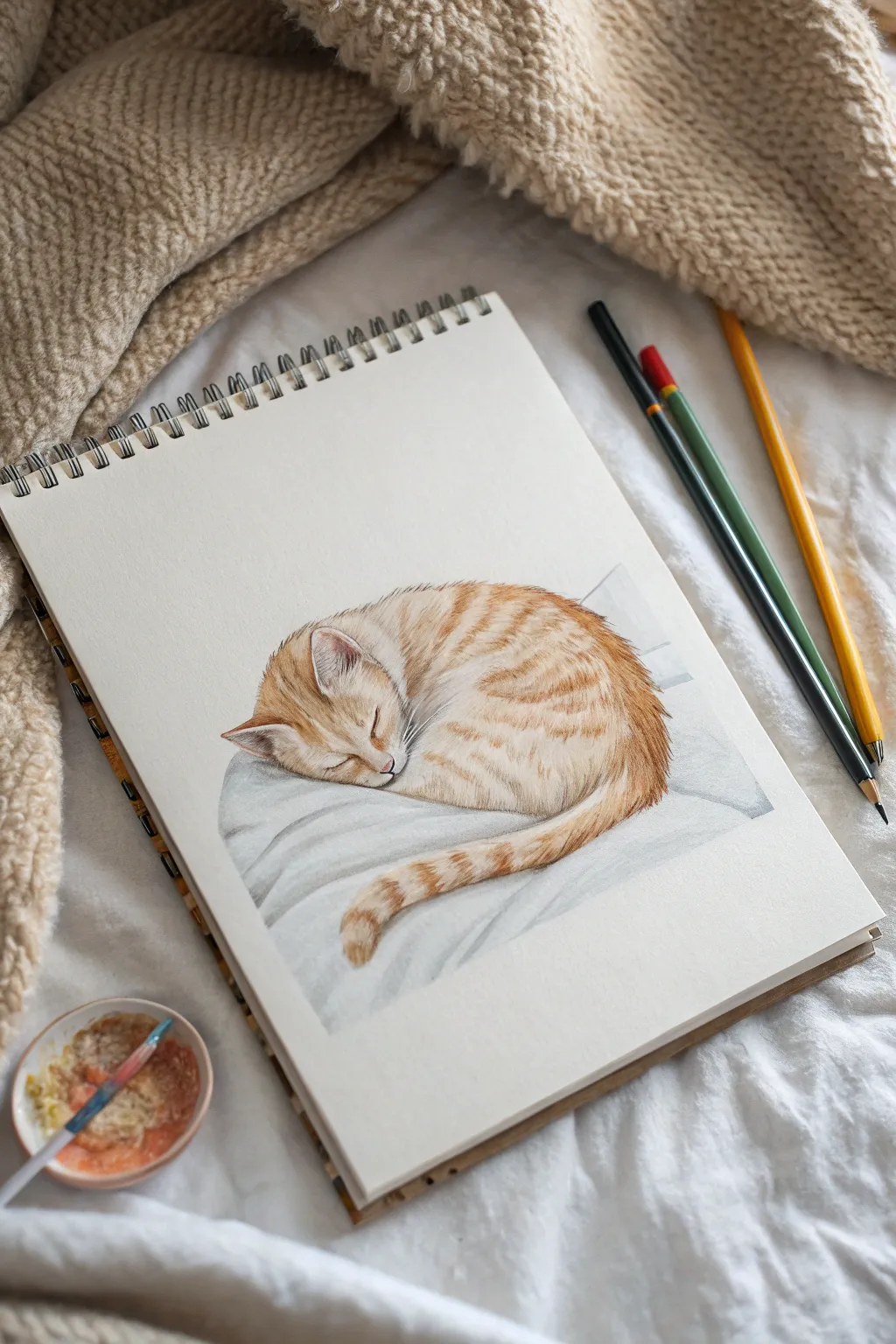
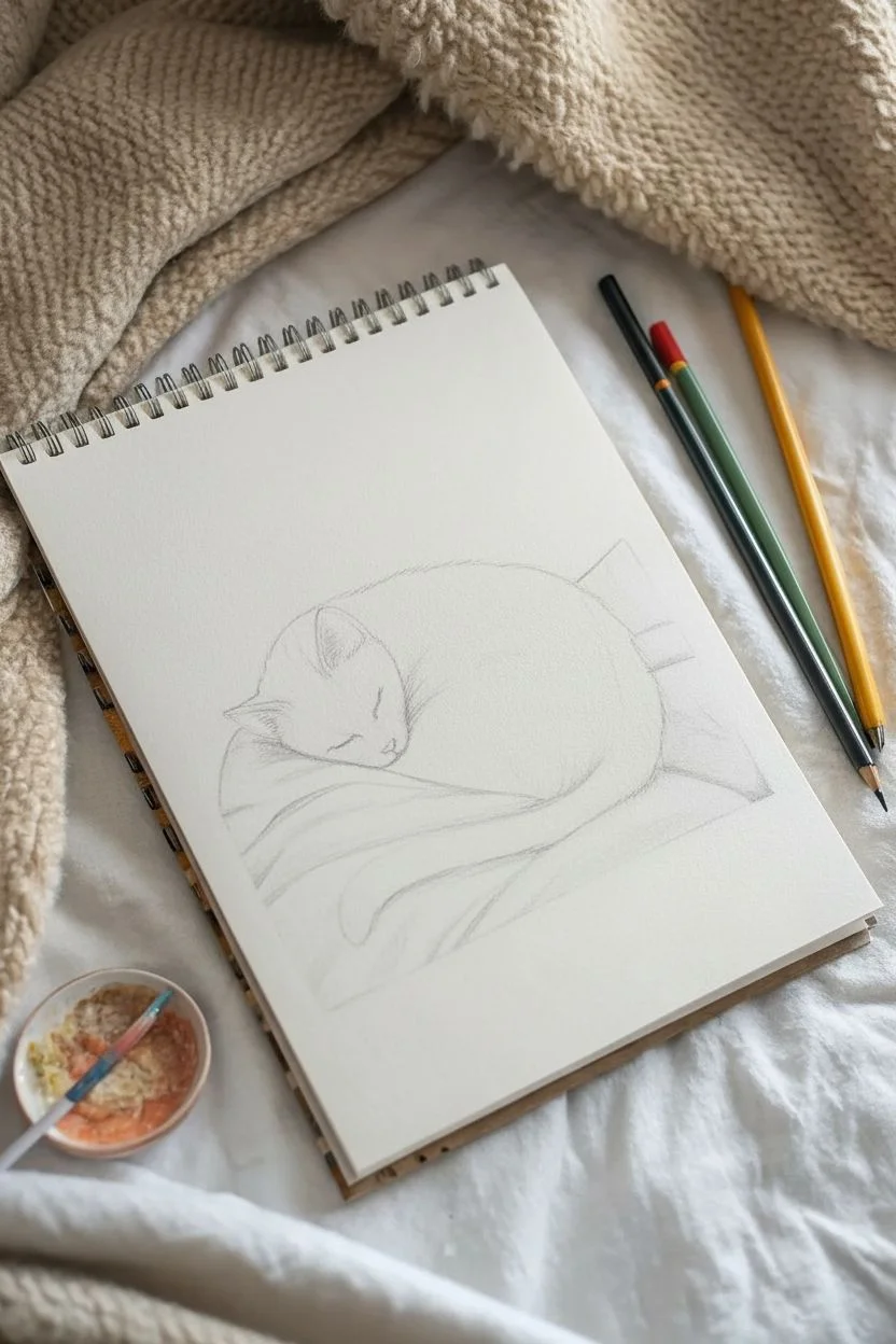
Capture the serene beauty of a napping pet with this gentle study of a ginger tabby cat curled up on a soft pillow. Using a combination of delicate linework and layered fur textures, you’ll create a heartwarming and realistic illustration that feels cozy just to look at.
Detailed Instructions
Materials
- Heavyweight sketchbook paper (min. 180gsm, cold press texture preferred)
- HB or 2B graphite pencil for sketching
- Watercolor pencils or soft colored pencils (Ochre, Burnt Sienna, Dark Brown, White, Cool Grey, Indigo)
- Small round paintbrush (size 2 or 4)
- Clean water in a small dish
- Kneaded eraser
Step 1: Structural Sketching
-
Map the main shapes:
Begin lightly with your graphite pencil. Draw a large, slightly flattened oval for the body and a smaller circle nestled into the top left of that oval for the head. -
Position the pillow:
Sketch a softly curved, uneven line underneath the cat’s body to represent the contour of the plush pillow or blanket it is sleeping on. -
Refine the pose:
Add triangles for the ears. The left ear should feel slightly flattened against the bedding. Sketch the curve of the spine and the tail wrapping around the front of the body. -
Detail the face:
Place the sleeping eye as a simple, curved slit. Draw a tiny ‘Y’ shape for the nose and mouth. Keep these lines exceptionally faint so they don’t show through the color later. -
Lighten the lines:
Take your kneaded eraser and gently roll it over the entire sketch. You want the graphite to be barely visible, just enough to guide your coloring.
Step 2: Building the Fur Base
-
Apply base color:
Using an ochre or light orange watercolor pencil, lightly shade the entire cat, avoiding the white areas like the chin, muzzle, and inside the ears. -
Activate the base:
Dip your damp brush into water and gently wash over the pencil sketch. This creates a smooth underpainting that eliminates the paper texture early on. Let this dry completely. -
Start the stripes:
With a sharpened Burnt Sienna pencil, begin drawing short, directional strokes to mimic the tabby stripes. Follow the curve of the body—curving down the flank and wrapping around the tail. -
Detail the head:
Use short, flicking strokes on the forehead to create the classic ‘M’ shape. Darken the fur around the ears and add tiny strokes on the bridge of the nose. -
Deepen the shadows:
Switch to a Dark Brown pencil. Add depth where the body parts meet, specifically under the chin, behind the ear, and where the tail overlaps the leg.
Fur Direction Tip
Always stroke your pencil in the direction the fur grows. On the back, it flows toward the tail; on the face, it radiates outward from the nose.
Step 3: Soft Textures & Finishing
-
Refine the tail:
The tail should look fluffy. Use loose, outward flicking strokes along the edges of the tail to make the fur look soft rather than contained by a hard outline. -
Ear details:
Use a touch of pink or light terracotta inside the ears. Add fine white pencil strokes over the top to suggest the long, wispy hairs growing from the inner ear. -
Shade the bedding:
Using a Cool Grey or diluted Indigo, gently shade the pillow underneath. Focus on the crevices and folds to show weight where the cat’s body sinks into the fabric. -
Soften the edges:
If any pencil lines look too harsh, you can use slightly damp brush (blotted almost dry) to gently smudge and soften the fur transitions without losing the detail. -
Add whiskers:
Using a very sharp white pencil or a tiny brush with white gouache, add the whiskers. Use quick, confident strokes starting from the muzzle fanning outward over the darker pillow area. -
Final highlights:
Add tiny touches of white on the ridge of the nose and the top of the paw to suggest light hitting the softest fur.
Level Up: Texture Pop
Use a white gel pen for only the brightest whiskers and ear tufts. It sits on top of the colored pencil better than white pencil for crisp details.
Now step back and admire the peaceful, cozy atmosphere you’ve captured on paper
Practice a Realistic Eye With a Tiny Reflection Scene
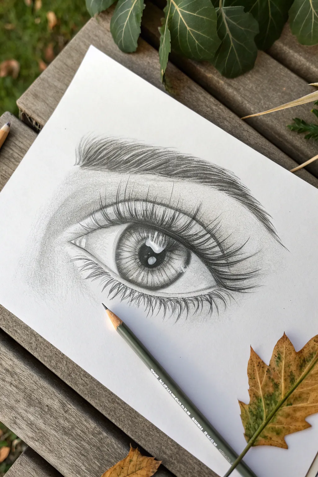
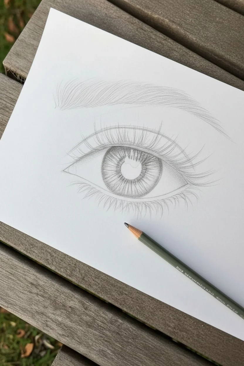
Master the art of hyper-realism with this detailed study of a human eye, featuring a captivating reflection within the pupil. This project focuses on texture, specifically the contrast between coarse eyebrow hairs, feathery lashes, and the glassy smoothness of the eyeball itself.
Step-by-Step Tutorial
Materials
- Smooth bristol or heavyweight drawing paper
- Set of graphite pencils (HB, 2B, 4B, 6B)
- Mechanical pencil (0.5mm, 2B lead)
- Kneaded eraser
- Fine-tip eraser (tombow mono zero or similar)
- Blending stump or tortillon
- Soft brush for wiping eraser crumbs
Step 1: Outlining & Iris Base
-
Light sketch:
Begin with a very faint HB pencil outline. Draw the almond shape of the eye, the circular iris, the pupil in the center, and the tear duct area. Mark the crease of the eyelid above the eye. -
Mapping the reflection:
Inside the pupil and upper iris, lightly outline the shape of your ‘tiny scene’ reflection. In the reference, this looks like a window or skylight shape with some organic shapes inside. This area must remain pure white. -
Darkening the pupil:
Using a 4B or 6B pencil, fill in the pupil around your reflection shape. Press firmly to get a deep black, ensuring the edges of the reflection stay crisp and clean. -
Iris spokes:
With a sharp 2B pencil, draw lines radiating from the pupil outward toward the iris edge. These shouldn’t be perfect straight lines; make them look like organic fibers. -
Defining the limbus:
Darken the outer ring of the iris (the limbus) with a 4B pencil. Shade inward slightly so the ring isn’t a hard line but blends softly into the iris fibers.
Keep it Sharp
For crisp eyelashes and eyebrow hairs, rotate your pencil slightly after every few strokes. This keeps the lead point sharp and prevents fuzzy, thick lines.
Step 2: Shading & Skin Texture
-
Shading the sclera:
The white of the eye isn’t actually flat white. Using an HB pencil, lightly shade the corners of the eyeball and under the upper eyelid to create a spherical form. I like to use a blending stump here to make it incredibly smooth. -
Tear duct detailing:
Define the fleshy area of the tear duct on the left. Use small, curved strokes and leave tiny spots white to simulate moisture and wetness. -
Eyelid crease shading:
Deepen the crease above the eye with a 2B pencil. This should be a soft, blended shadow that fades upward toward the brow bone. -
Skin tone base:
Lightly shade the skin surrounding the eye. Use the side of your pencil lead and smudge it with a tissue or stump to create a soft, pore-less skin base. -
Adding skin depth:
Darken the area right under the eyebrow and the inner corner near the nose (left side) to build the facial structure.
Step 3: Hairs & Final Details
-
Eyebrow foundation:
Map out the direction of the eyebrow hairs using light strokes. Notice how they grow upward at the start, then curve outward. -
Drawing eyebrow hairs:
Using a sharp mechanical pencil or freshly sharpened 4B, draw individual brow hairs. Vary the pressure—start the stroke firmly and flick it up to taper the end. -
Layering the brow:
Add more hairs over the first layer, crossing some slightly to look natural. Make the hairs denser in the center of the brow and sparser at the tail. -
Upper eyelashes:
Draw the long, upper lashes with a 4B or 6B pencil. These should originate from the upper waterline. Group them in small clumps rather than spacing them perfectly evenly. Ensure they curve dramatically. -
Reflecting lashes:
I find that adding a faint reflection of the eyelashes onto the glossy highlight in the eye adds an extra touch of realism. -
Lower lashes:
Draw the lower lashes. These are shorter, thinner, and more sparse than the upper ones. Use a lighter touch here. -
Highlight boosting:
Use your fine-tip eraser or an electric eraser to lift out clean white highlights on the lower eyelid rim (waterline) to make the eye look wet. -
Final contrast check:
Go back with your darkest 6B pencil and reinforce the darkest areas: the pupil, the base of the upper lashes, and the heavy crease.
Customize the View
Change the reflection scene! Instead of a window, try drawing a tiny silhouette of a person, a tree line, or a city horizon inside the highlight.
Take a moment to admire the depth you’ve created with just simple graphite tools

PENCIL GUIDE
Understanding Pencil Grades from H to B
From first sketch to finished drawing — learn pencil grades, line control, and shading techniques.
Explore the Full Guide
Draw Your Hand Holding Something Simple
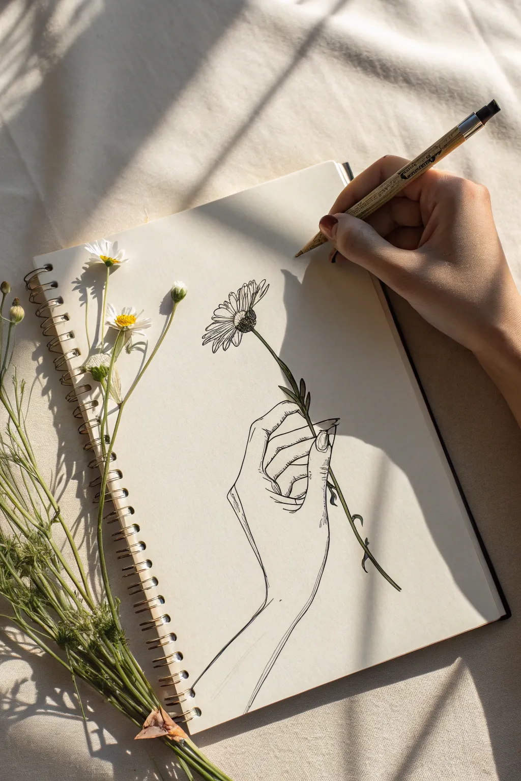
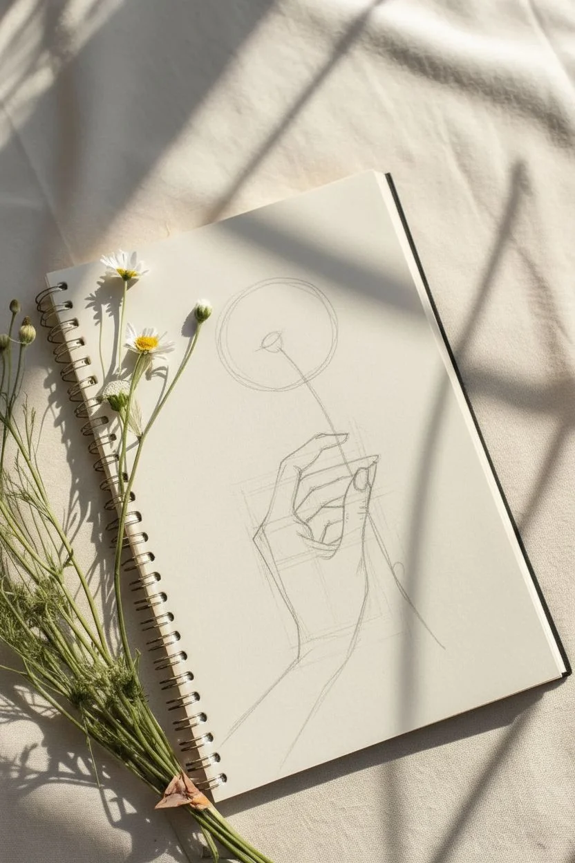
Capture the delicate beauty of nature with this elegant line drawing featuring a hand gently holding a daisy stem. The style emphasizes clean contours and minimal shading, creating a sophisticated illustration perfect for sketchbook practice.
Detailed Instructions
Materials
- Spiral-bound sketchbook with cream or off-white paper
- HB or 2B pencil for initial sketching
- Fine-point black drawing pen or micron pen (0.3mm or 0.5mm)
- Kneaded eraser
- Real or reference daisy for observation
Step 1: Planning and Structure
-
Lightly sketch the hand structure:
Start by using your pencil to lay down the basic geometric shapes of the hand. Draw a trapezoid for the palm and guidelines for the fingers. Position the wrist coming up from the bottom left corner, angling slightly toward the center. -
Outline the fingers:
Sketch the thumb pressing against the side of the index finger. The index finger should be slightly curled, creating a pinch grip. Let the other fingers curl naturally underneath, showing just the tips and knuckles of the middle and ring fingers. -
Add the flower stem guide:
Draw a single, gently curved line representing the stem. It should pass through the pinch of the thumb and index finger, extending upwards toward the top left of the page and downwards past the wrist. -
Sketch the flower head:
At the top of your stem line, draw a small oval for the flower’s center. Radiating outward from this center, lightly sketch a larger, rough circle to define the outer limit of the petals.
Wobbly Lines?
If your hand shakes, try drawing ‘from the shoulder’ rather than the wrist. Locking your wrist and moving your whole arm creates smoother, more confident strokes.
Step 2: Refining the Pencil Sketch
-
Define the hand contours:
Go over your geometric hand shapes, smoothing them into organic lines. Pay attention to the subtle curves of the wrist bone and the webbing between the thumb and index finger. I find it helpful to look at my own hand in a mirror for this part. -
Detail the fingernails:
Sketch the fingernail on the thumb and the visible part of the index finger. Keep them relatively short and natural-looking to match the simplicity of the style. -
Draw the petals:
Within your petal guide circle, start defining individual petals. Daisies have long, thin petals that sometimes overlap or curl. Vary their lengths and widths slightly to keep it looking organic rather than perfectly symmetrical. -
Thicken the stem:
Turn your single stem line into a tube by adding a second parallel line. Add a couple of small leaves near where the hand is gripping the stem.
Step 3: Inking the Drawing
-
Begin the final outline:
Switch to your fine-point black pen. Start tracing over your refined pencil lines, beginning with the flower head. Use deliberate, confident strokes rather than short, scratchy ones. -
Ink the flower center:
For the center of the daisy (the disk florets), use small stippling dots or tiny circles to create a textured, fuzzy appearance. Make the texture denser on the shadowed side (usually the bottom right) to give it volume. -
Ink the hand:
Carefully trace the hand. Use a slightly lighter touch for the inner details like the creases on the knuckles and palm lines, and a firmer line for the outer silhouette. -
Add minimal shading:
Instead of full shading, use hatching (parallel lines). Add a few small hatched lines on the underside of the wrist, beneath the thumb, and on the stem where the fingers cast a shadow. -
Texture the arm:
Draw very faint, sparse lines on the forearm to suggest muscle tone or tendon structure without overworking it. Less is more here. -
Let the ink dry:
Wait at least 5-10 minutes to ensure the ink is completely dry. Smudging fresh ink is heartbreaking after doing good line work. -
Erase pencil marks:
Gently rub your kneaded eraser over the entire drawing to lift the graphite guidelines, leaving only the crisp black ink work behind.
Natural Petals
Don’t make petals perfect. Add tiny notches at the tips and let some twist or flop downwards. Imperfections make flowers look real and full of character.
Now you have a timeless botanical sketch that captures a quiet moment of connection with nature
Fill a Page With Moon Phases
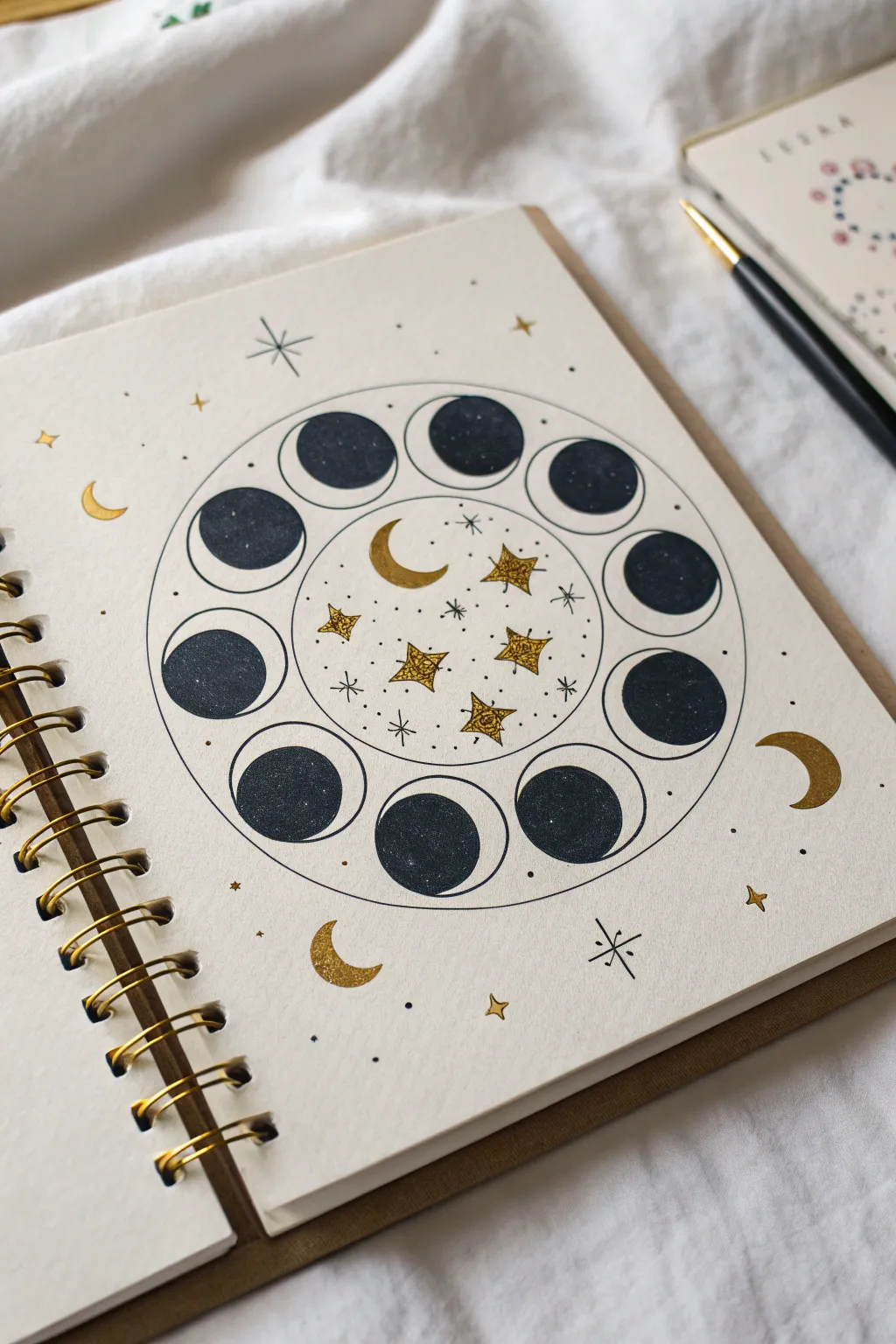
Capture the magic of the night sky with this elegant celestial chart featuring moon phases arranged in a perfect circle. The contrast between deep black moons and sparkling gold stars creates a sophisticated, mystical illustration perfect for a bullet journal or art diary.
Step-by-Step Tutorial
Materials
- Spiral-bound sketchbook or mixed media paper
- Compass or circle maker tool
- Pencil and eraser
- Black fineliner (05 or 08 size)
- Black gouache paint or black brush pen
- Gold metallic paint pen or gold gel pen
- Ruler
Step 1: Setting the Framework
-
Find the center:
Begin by locating the approximate center of your page to ensure your composition is balanced. Mark this spot lightly with a pencil. -
Draw the main orbits:
Using a compass set to about 5-6 cm (2 inches), draw a large circle lightly in pencil. Keep the compass point in the same center hole and draw a second, slightly smaller circle about 1.5 cm inside the first one to create a ring. -
Create the moon guides:
Inside the ring you just created, you need to space out 12 small circles for the moon phases. Imagine the face of a clock and lightly sketch a circle at 12, 3, 6, and 9 o’clock first to establish symmetry. -
Fill the gaps:
Sketch two evenly spaced circles between each of your ‘clock’ points until you have 12 circles total within the orbital ring. -
Define the phases:
Now, sketch the crescent shapes inside each small moon circle. The moons should wax and wane as they move around the circle—start with a full dark circle at the top, transitioning to thinner crescents, and then back again.
Step 2: Inking the Details
-
Outline the ring:
Use your black fineliner to carefully trace over the large inner and outer circles that form the main ring. Keep your hand steady or use the compass with a pen adapter if you have one. -
Outline the moons:
Ink the outer edge of each of the 12 small moon circles. Don’t fill them in yet; just establish the clean, round border for each one. -
Fill the dark phases:
Switch to a black brush pen or a small brush with black gouache for rich, opaque coverage. Fill in the ‘shadow’ part of each moon phase, leaving the crescent slivers white as the paper. -
Add detail to the darks:
While the black ink is drying, look closely at the reference. The artist has left a tiny sliver of white space between the black fill and the outline on the crescent side to add dimension. Try to replicate this separation. -
Erase pencil lines:
Once you are absolutely certain the black ink is dry, gently erase all your pencil guidelines to reveal a clean structure.
Pro Tip: Perfect Circles
If you don’t own a compass, trace household items! A mason jar lid usually works great for the outer ring, and a small glue stick cap is perfect for the 12 individual moons.
Step 3: Gold and Stardust
-
Centerpiece stars:
In the very center of the chart, use your gold metallic pen to draw a collection of four-pointed stars. Vary their sizes, making the central ones slightly larger. -
Golden crescents:
Draw a small gold crescent moon in the center cluster. Then, add three or four larger gold crescent moons floating in the empty corners of the page outside the main ring. -
Connect the stars:
Using a very fine black pen (01 or 02), draw tiny crosses and dots around the gold stars in the center to create a dense galaxy effect. -
Orbits and accents:
Draw faint, dashed lines or tiny dots connecting some of the gold stars in the center, giving the impression of constellations. -
Outer atmosphere:
Scatter small details around the outside of the main ring. Draw delicate four-pointed stars using fine black lines, and mix in simple gold dots. -
Adding sparkle:
intersperse tiny gold four-pointed stars among the black inked stars on the outer edges to balance the metallic elements across the page. -
Final touches:
Review the composition. Add tiny black stipple dots in the negative space to make the page feel full and magical without looking cluttered.
Troubleshooting: Smudged Ink
If you accidentally smudge the black ink, turn it into a ‘nebula’ cloud by stippling more black dots around it, or cover it with a slightly larger gold star.
Step back and admire your personal galaxy, noting how the gold catches the light when you turn the page


Do a Leaf Study Focused on Veins and Edges
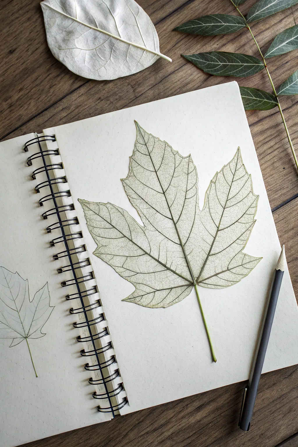
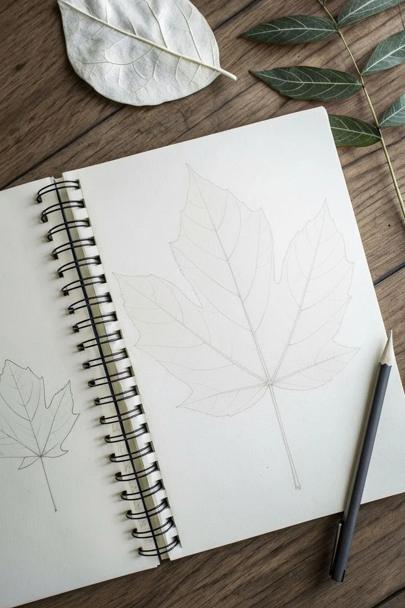
Capture the fragile beauty of a leaf’s internal structure with this detailed botanical study. Using fine graphite lines, you will recreate the intricate network of veins and serrated edges that give nature its unique character.
Step-by-Step Guide
Materials
- Spiral-bound sketchbook (cream or off-white paper)
- Graphite pencils (HB for outlines, 2H for fine veins, 2B for depth)
- Fine-point mechanical pencil (0.3mm or 0.5mm) – optional but helpful
- Kneaded eraser
- Real maple or sycamore leaf (fresh or pressed) for reference
- Pencil sharpener
Step 1: Planning and Layout
-
Observe your subject:
Begin by closely examining your reference leaf. Notice the main central stem and how the primary veins branch out to the tips of each lobe. -
Lightly mark the boundaries:
On your sketchbook page, barely graze the paper with an HB pencil to mark the top, bottom, and side limits of where the leaf will sit. This ensures you don’t run off the page. -
Draw the central axis:
Sketch a gentle, vertical curve to represent the main stem and the central vein running to the top of the leaf. -
Map the primary veins:
From the base of that central axis, draw the primary veins that extend into the left and right lobes. These should fan out like the palm of a hand.
Step 2: Drafting the Contour
-
Sketch the lobes:
Lightly sketch the general shape of the five main lobes around your primary veins. Don’t worry about the jagged edges yet; just capture the overall silhouette. -
Refine the serrated edges:
Go back over your silhouette and carefully draw the characteristic sharp teeth along the margin. Keep your pencil pressure light so you can easily correct angles. -
Check proportions:
Step back and compare your drawing to the reference. Ensure the lobes are balanced and the stem isn’t too thick or thin relative to the leaf blade. -
Clean up guidelines:
Using a kneaded eraser, dab away any heavy construction lines, leaving only a faint ghost of your refined outline.
Pro Tip: Keep it Clean
Place a scrap piece of paper under your drawing hand while you work. This prevents the graphite delicate vein lines from smudging and keeps the background paper pristine.
Step 3: Drawing the Vein Network
-
Define the main veins:
Switch to a sharpened HB or a mechanical pencil. Go over the primary veins with a confident, clean double-line to give them a tiny bit of width, tapering to a single line at the tips. -
Add secondary veins:
Draw the secondary veins branching off the main ones. Look at how they curve toward the leaf edges and connect to the points of the serrations. -
create the tertiary network:
This is the most time-consuming part. With a 2H pencil, lightly draw the ‘netting’ or reticulate venation between the larger veins. These lines should be very faint and delicate. -
Vary line weight:
I find it helpful to occasionally press slightly harder at the junctions where veins meet, creating natural little shadows that add dimension.
Level Up: Ghost Leaf
Draw a miniature version of the leaf on the opposite page, as seen in the photo. It creates a beautiful spread that looks like a progressive botanical study.
Step 4: Shading and Texture
-
Add subtle tone:
To make the leaf look translucent like the reference, lightly shade some of the spaces between the veins, leaving the veins themselves the color of the paper. -
Enhance the stem:
Use a 2B pencil to darken the shadowed side of the stem, giving it a cylindrical form rather than a flat look. -
Sharpen the edges:
Refine the outer perimeter of the leaf with a crisp, dark line to separate it clearly from the background paper. -
Final assessment:
Look for areas that need more contrast. If the veins look too flat, darken the negative space immediately next to them to make them ‘pop’ forward.
Now you have a timeless botanical sketch that celebrates the intricate geometry of nature
Create a Portrait With Flowers in the Hair
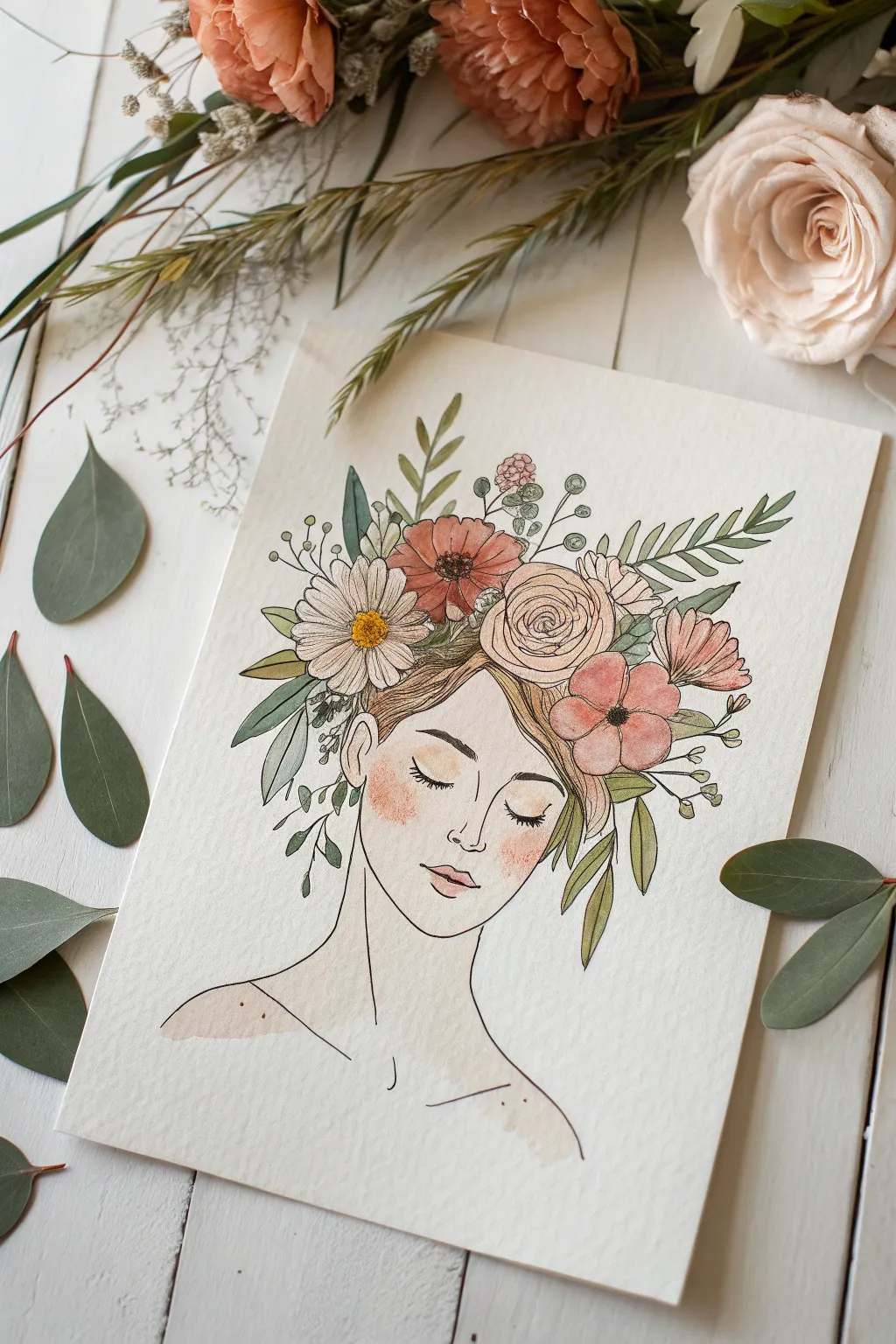
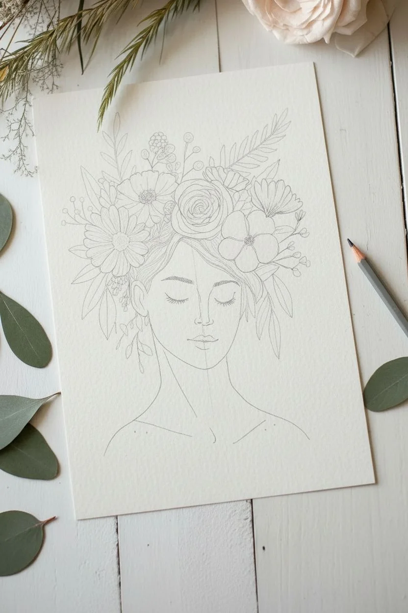
Capture serenity and natural beauty with this delicate mixed-media portrait, featuring fine ink lines and soft watercolor washes. This project combines botanical illustration with portraiture to create a dreamy, ethereal piece perfect for framing.
Detailed Instructions
Materials
- Hot press watercolor paper (smooth texture)
- Fine liner pens (sizes 005, 01, and 03, black water-proof ink)
- Watercolor paint set (focus on muted pinks, greens, ochre, and skin tones)
- Round watercolor brushes (sizes 2 and 6)
- H or HB pencil
- Kneaded eraser
- Paper towel
- Jar of clean water
Step 1: Planning and Sketching
-
Composition outlines:
Begin with a very light pencil sketch on your hot press paper. Draw a simple oval for the face and mark the vertical center line to help align the features. -
Sketch features:
Position the eyes just below the halfway point of the face, drawing them as simple curved lines for closed eyelids. Add a small curve for the nose and fuller lips below. -
Outline the wreath:
Instead of drawing the top of the head, sketch a voluminous floral arrangement. Start with the largest blooms—a rose and a poppy—positioned slightly off-center. -
Fill the foliage:
Surround the main flowers with smaller daisies, filler flowers, and variety of leaf shapes extending outward. This creates the ‘crown’ shape. -
Refine the neck:
Sketch a long, elegant neck and the hint of shoulders. Keep the lines simple, as the focus will be the face and flowers.
Ink Smearing?
Even ‘waterproof’ pens can smudge if the paper is saturated too quickly. Ensure ink is bone dry before painting, and apply water gently rather than scrubbing the paper.
Step 2: Inking the Lines
-
Main contours:
Using your 01 pen, carefully trace over your pencil lines. Start with the facial features to ensure they remain delicate. -
Inking flowers:
Ink the large flowers, using slightly disjointed or wavy lines to mimic soft petals. Don’t close every shape perfectly; let the lines breathe. -
Adding details:
Switch to a 005 pen for the fine details, such as the eyelashes and the intricate veins in the leaves. Add small stippling dots to the center of the daisy. -
Erase guidelines:
Once the ink is completely dry (give it a few minutes to be safe), gently lift all pencil marks with a kneaded eraser.
Step 3: Watercolor Application
-
Skin tone base:
Mix a very watery, pale skin tone. Using the size 6 brush, apply a light wash to the face and neck, leaving the highlight areas (nose bridge, forehead) almost white. -
Rosy cheeks:
While the skin wash is still slightly damp, drop in a touch of diluted pink or coral on the cheeks to create a soft, natural blush. -
Floral base colors:
Paint the large rose with a pale dusty pink and the poppy with a muted terracotta or coral. Keep the washes sheer; you can always add more color later. -
Contrasting centers:
Use a warm yellow ochre for the daisy center. It adds a nice pop of brightness against the muted pinks. -
Leaf variety:
Mix two shades of green: a sage green and a deeper forest green. Alternate these colors when painting the leaves to create visual interest and depth. -
Hair wash:
Paint the visible hair sections with a light brown or ochre wash. I like to keep this very loose so it doesn’t distract from the floral crown. -
Layering petals:
Once the first layer on the flowers is dry, add a slightly darker shade of the same color to the inner petals to create dimension. -
Final accents:
Add tiny touches of brown or dark green to the stems and stamens using the tip of your size 2 brush.
Use Negative Space
Don’t feel the need to fill every single leaf with green paint. Leaving white gaps near the tips or edges makes the watercolor look fresher and more light-filled.
Now you have a serene, botanical portrait ready to be displayed on your wall or given as a card
Design a Page of Easy Patterns You Can Repeat
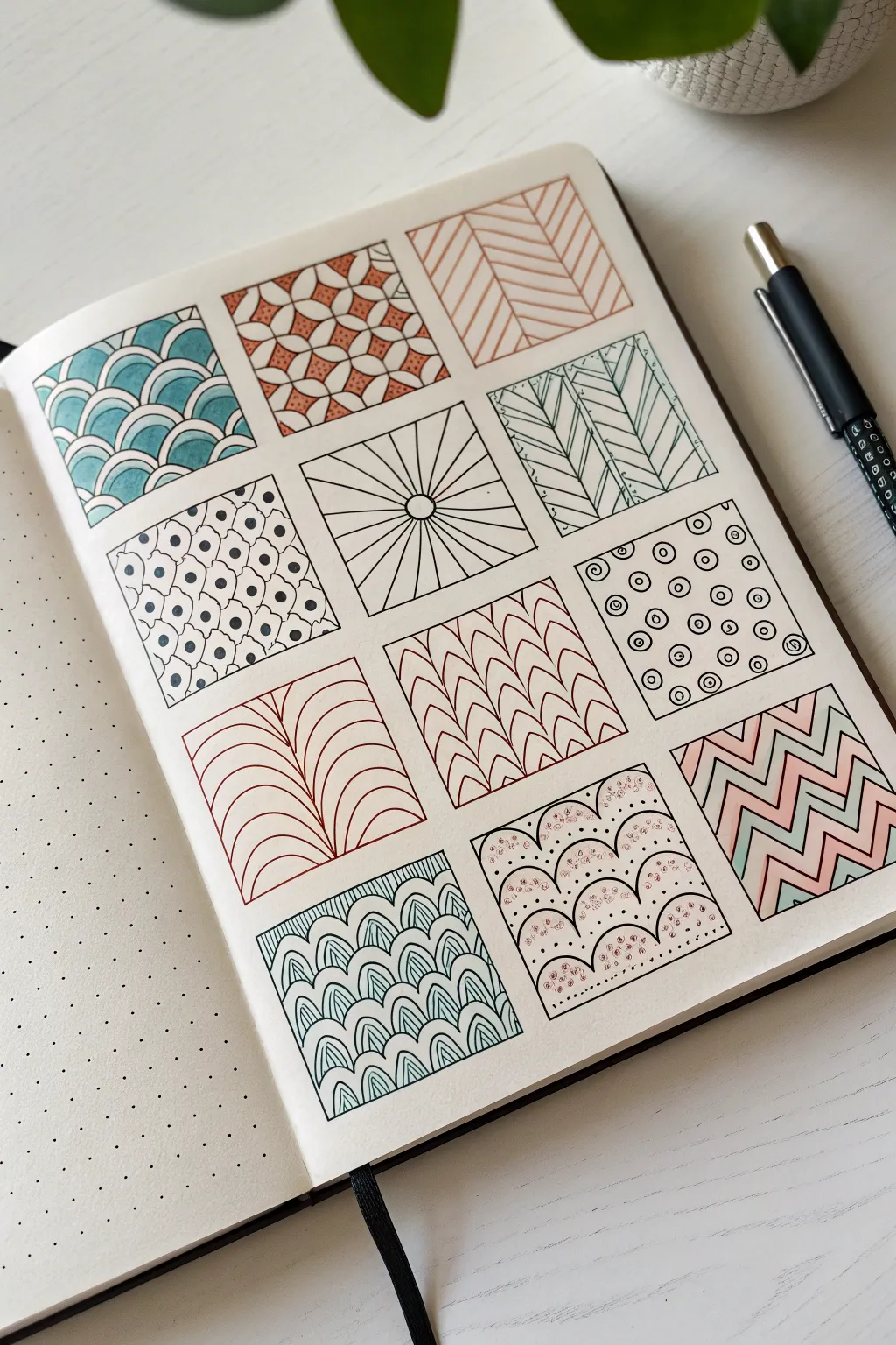

Transform a blank bullet journal page into a mesmerizing gallery of geometric designs with this organized grid layout. This project balances structured linework with soft touches of teal and terracotta for a clean, modern aesthetic.
Step-by-Step
Materials
- Dotted or grid notebook (A5 size recommended)
- Fine liner pen (0.3mm or 0.5mm, black)
- Ruler
- Pencil and eraser
- Colored markers or brush pens (teal, terracotta, light pink/blush)
Step 1: Setting the Grid
-
Measure the layout:
Start by counting the dots on your page to center your design. You will need space for a grid of 12 squares (3 columns wide by 4 rows high). -
Mark the corners:
Using your pencil, lightly mark the corners of each square box. Aim for squares that are approximately 4×4 cm or 5×5 cm, leaving a small, consistent gap of about 0.5 cm between each box. -
Ink the frames:
Once satisfied with the spacing, use your ruler and black fine liner to draw the outlines of the 12 squares. Make these lines crisp and firm. -
Clean up:
Wait a moment for the ink to set, then gently erase all visible pencil guidelines to leave a clean 3×4 grid.
Step 2: Row 1: Geometric Basics
-
Create the teal scales:
In the top-left square, draw repeating overlapping semi-circles (scales). Fill alternating sections with a teal marker, leaving white borders for contrast. -
Draw the geometric flowers:
For the middle square, sketch interlocking petals using four curved lines meeting at center points. Color the negatives (the star shapes between petals) with terracotta. -
Draft diagonal chevrons:
In the top-right square, use a ruler to draw a central vertical line, then fill both sides with diagonal lines meeting in the middle to form a herringbone pattern in terracotta.
Keep it Steady
Rotate your notebook as you draw tricky curves or angles. It is much easier to pull a pen stroke toward your body than to push it away at an awkward angle.
Step 3: Row 2: Radial and Dotted Designs
-
Sketch the dotted waves:
In the first square of the second row, draw undulating, wavy lines. Fill the spaces with alternating patterns of small dots and tiny circles. -
Construct the sunburst:
In the center square, draw a small circle in the exact center. Use a ruler to radiate straight lines outward from this circle to the edges of the box. -
Ink the leaf veins:
For the right square, draw vertical columns. Within each column, draw upward-angled lines resembling leaf veins or feathers, alternating direction for each column. Outline in black, then trace over selected lines with green or teal.
Metallic Magic
Add a touch of luxury by tracing over specific accent lines—like the center of the sunburst or the dots in the wave pattern—with a gold or silver gel pen.
Step 4: Row 3: Arches and Circles
-
Draw flowing curves:
In the left square, create a central stem and draw symmetrical curved lines arching outward and downward, resembling a fountain or palm frond, using terracotta ink. -
Create the woven texture:
In the middle square, draw vertical columns of stacked ‘U’ shapes (scales). Invert the ‘U’ shapes in alternating columns to create a woven texture using red or brown ink. -
Populate the circle grid:
In the right square, draw evenly spaced small circles. Draw a larger concentric circle around every other dot to create a rhythm.
Step 5: Row 4: Scallops and Zigzags
-
Detail the ornate scales:
In the bottom-left square, draw standard fish scales (overlapping arches). Inside each scale, draw a smaller, parallel arch to add depth and detail in teal. -
Create dotted mounds:
In the center square, draw rows of semi-circles. Instead of solid lines, use stippling (lots of tiny dots) to fill the inside of every other row with pink ink. -
Finish with colorful zigzags:
In the final bottom-right square, draw sharp zigzag lines horizontally across the box. Fill stripes with alternating teal/green and light pink, leaving some white stripes for breathing room.
Now you have a stunning reference sheet of patterns ready to decorate future journal spreads
Sketch an Animal Doing a Human Chore
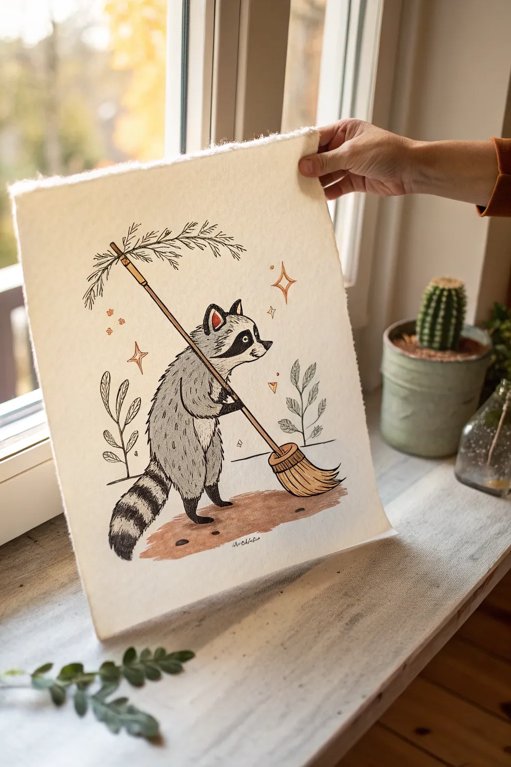
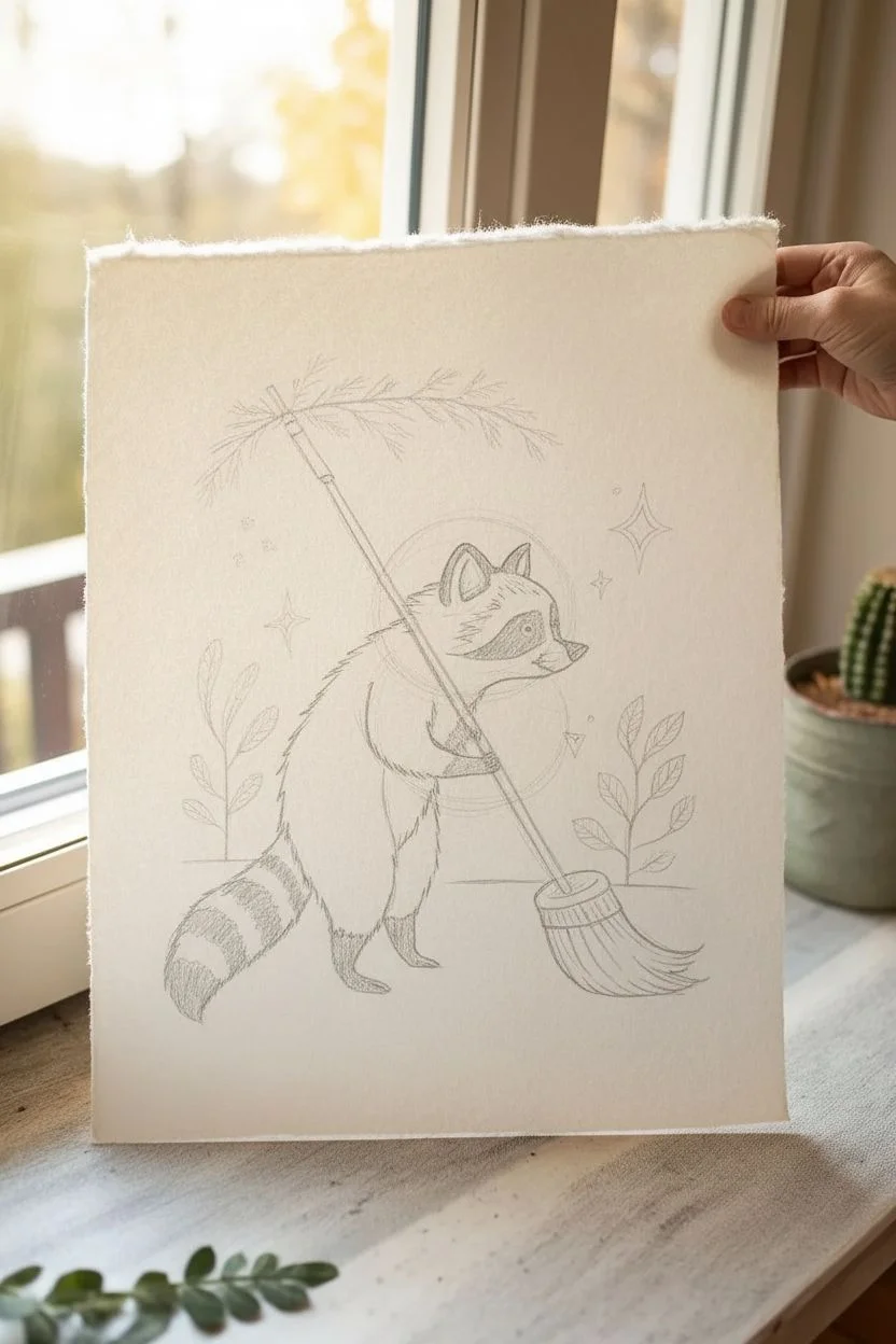
This charming project combines crisp ink linework with soft watercolor washes to create a whimsical scene of a raccoon doing its chores. The artwork features a lovely textured finish thanks to high-quality paper, making it the perfect addition to a cozy wall gallery.
Step-by-Step Guide
Materials
- Heavyweight cold press watercolor paper (deckle edge preferred)
- Pencil (HB) and eraser
- Fine liner pens (black, sizes 01 and 05)
- Watercolors (Lamp Black, Burnt Sienna, Yellow Ochre, Ultramarine Blue, Venetian Red)
- Round watercolor brushes (sizes 2 and 6)
- Masking tape
- Hardboard or sketchbook backing
Step 1: Pencil Sketching
-
Establish the pose:
Begin by lightly sketching a diagonal line for the broom handle first, as this anchors the composition. Build the raccoon’s body around it, using an oval for the torso and a circle for the head, ensuring the hands grip the handle naturally. -
Refine the raccoon features:
Add the triangular ears, the pointed snout, and the signature ‘mask’ shape around the eyes. Sketch the striped tail curling down towards the left corner for balance. -
Detail the broom:
Draw the bristles at the bottom of the stick, fanning them out slightly. At the top of the broom handle, sketch a decorative pine or evergreen sprig attached to the tip. -
Add background elements:
Lightly place two simple leafy plants on either side of the raccoon to frame the character. Include a few diamond-shaped ‘sparkle’ stars in the background space.
Step 2: Inking the Lines
-
Outline the main form:
Using a size 05 pen, ink the main outlines of the raccoon. Use short, jagged strokes for the fur to give it a scruffy texture, avoiding perfectly smooth lines. -
Ink the broom and plants:
Switch to a size 01 pen for the broom bristles and the delicate leaves of the plants. Keep the lines organic and slightly loose. -
Fill the dark areas:
Use the thicker pen to color in the nose, the dark mask around the eyes (leaving small white circles for highlights), and the dark stripes on the tail. Leave the alternating tail stripes white for now. -
Erase pencil marks:
Once the ink is completely dry—give it a good five minutes to be safe—gently erase all the underlying graphite sketch lines.
Use The Right Paper
For that professional art print look, use paper with a ‘deckle edge’ (ragged border). If you don’t have it, tear your paper against a metal ruler instead of cutting.
Step 3: Watercolor Washes
-
Mix the grey fur tone:
Dilute a tiny amount of Lamp Black with plenty of water to create a pale transparent grey. If it looks too cool, add a speck of warm brown. -
Paint the body:
Wash this light grey over the raccoon’s body and the white stripes of the tail. I find leaving small patches of white paper shows off the texture and acts as a highlight. -
Add fur texture:
While the grey is still slightly damp, drop in slightly darker pigmented grey near the edges and shadow points, like under the arm and chin. -
Color the broom:
Mix Yellow Ochre with a touch of Burnt Sienna for a golden wood tone. Paint the broom handle and the bristles. Use a slightly darker mix of brown to add lines to the bristles for definition. -
Paint the ground:
Mix a reddish-brown earth tone using Burnt Sienna and Venetian Red. Paint an organic, cloud-like shape beneath the raccoon’s feet to ground the figure. -
Add spot colors:
Use a pop of rust orange or red for the inner ears and the decorative sparkles floating around the head. -
Paint the plants:
Mix a very desaturated sage green for the side plants. Keep this color watery and subtle so it doesn’t distract from the main character.
Ink Smearing?
Assuming your ink is waterproof is risky. Test your pen on a scrap piece of watercolor paper, modify it with water, and see if it bleeds before working on the final art.
Step 4: Final Touches
-
Deepen shadows:
Once the first layers are dry, use a small brush to add deeper grey shadows to the feet and under the tail to give the figure weight. -
Enhance texture:
Take your fine pen again and add tiny hatching lines over the dried watercolor on the broom bristles and the raccoon’s belly to emphasize the fur direction. -
Final check:
Look for any areas that need more contrast. If the eyes look dull, reinforce the black ink or add a teeny dot of white gouache for a sparkle.
Now you have a whimsical little friend ready to help tidy up your art collection
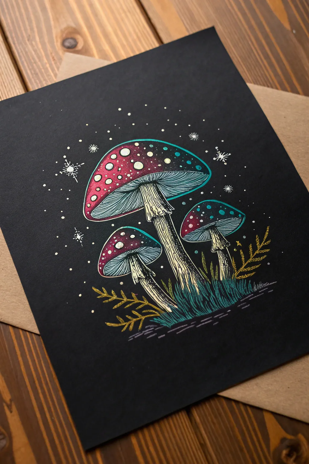
Draw Something That “Glows” on Dark Paper With Bright Accents

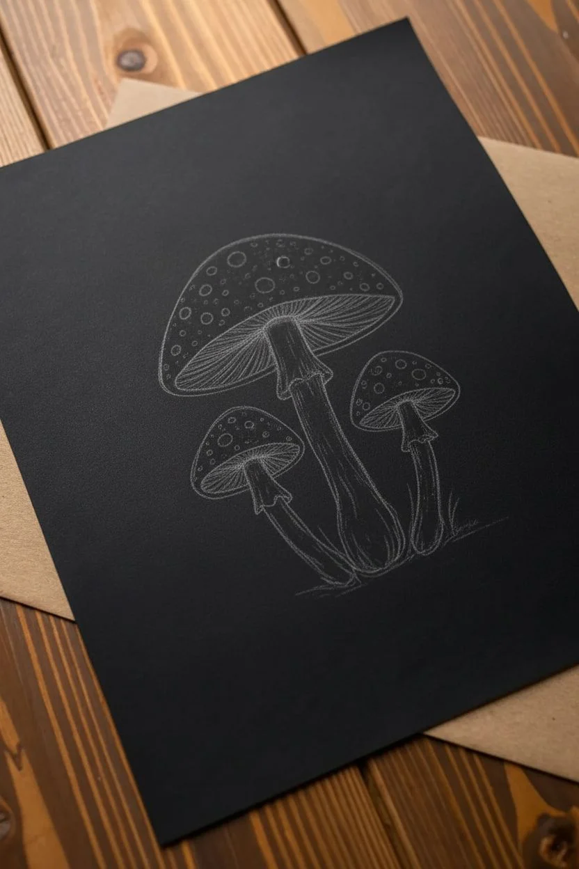
Capture the magic of bioluminescence with these ethereal mushrooms drawn on rich black cardstock. Using metallic or gel pens along with colored pencils creates a stunning glowing effect that makes the fungi pop against the dark background.
Step-by-Step Tutorial
Materials
- Black cardstock or mixed media art paper
- White gel pen (fine and medium points)
- Colored pencils (Magenta/Red, Teal/Turquoise, Pale Yellow/Cream, Gold)
- Metallic markers or pens (optional for extra shine)
- Pencil for sketching (preferably white or a light pastel color)
- Eraser
Step 1: Sketching the Composition
-
Draft the shapes:
Begin by lightly sketching the outline of three mushrooms using a white or light gray pencil. Place a large central mushroom slightly off-center, with a smaller one tucking in on the left and another on the right. -
Define the caps:
Refine the mushroom caps to have a classic rounded shape. The central one should be the widest, while the side mushrooms can be slightly more bell-shaped. -
Add the stems:
Draw the stems extending downwards. Give them a slightly organic, twisted look rather than perfectly straight lines. Add a ‘skirt’ or ring near the top of the stems where they meet the underside of the caps.
Pro Tip: Primer Layer
If your colored pencils look dull on black paper, lay down a layer of white pencil first, then color over it. This acts as a primer and makes the colors vibrant.
Step 2: Adding Color & Gradient
-
Base layer for caps:
Start coloring the top of the mushroom caps with a magenta or deep red colored pencil. Press firmly to get opaque coverage on the black paper, but fade the pressure as you move toward the rim of the cap. -
Create the gradient:
On the lower rim of the caps, blend in a teal or bright turquoise pencil. Overlap this slightly with the red section to create a seamless transition from warm to cool tones. -
Highlighting the gills:
Underneath the caps, use the teal pencil to draw fine, curved lines representing the gills. Leave some black paper showing between the lines for contrast. -
Coloring the stems:
Use a pale yellow or cream colored pencil to fill in the stems. Use vertical strokes to mimic the texture of mushroom stalks, leaving small gaps for shadow.
Level Up: Metallic Pop
Trace the outer edge of the mushroom caps and the fern leaves with a metallic gold gel pen. When the light hits the drawing, the gold outlines will shimmer.
Step 3: Inking & Detailing
-
Outline the stems:
Using a fine-point white gel pen or a very sharp black pen (if your pencil layer is thick), outline the stems. Add vertical hatching lines to emphasize the fibrous texture. -
Add the glowing spots:
This is the fun part. Use a medium-point white gel pen or paint marker to dot the red upper sections of the caps. Make these dots various sizes—some large circles, other tiny specks. -
Enhance the rim:
Outline the very bottom edge of the caps with a thin line of teal or white to define the separation between the cap and the gills. -
Draw the grass:
At the base of the stems, use teal and blue pencils to draw upward, grassy strokes. Layer a few gold or yellow fern-like leaves on the sides for variety.
Step 4: Final Magical Touches
-
Add ‘star’ dust:
Scatter tiny white dots all around the background of the black paper to look like spores or stars. Concentrate them more heavily near the mushroom caps. -
Draw sparkles:
Select a few of the background dots and turn them into four-pointed stars or sparkles using your white gel pen. This amplifies the magical atmosphere. -
Ground the image:
Lightly sketch some horizontal hatch marks under the grass with a dark purple or grey pencil to suggest the ground, so the mushrooms don’t look like they are floating. -
Review contrast:
Step back and look at your drawing. If the color needs to pop more, go over the brightest parts of the gradient (the teal rim) one last time to ensure it glows against the black.
Now you have a mystical forest scene that truly shines against the dark backdrop


Have a question or want to share your own experience? I'd love to hear from you in the comments below!