Whenever I’m stuck on what to draw, I come back to the yin yang because it’s basically an instant composition lesson in balance. Let’s turn that classic symbol into something personal with contrasting themes, textures, and tiny scenes you’ll actually enjoy drawing.
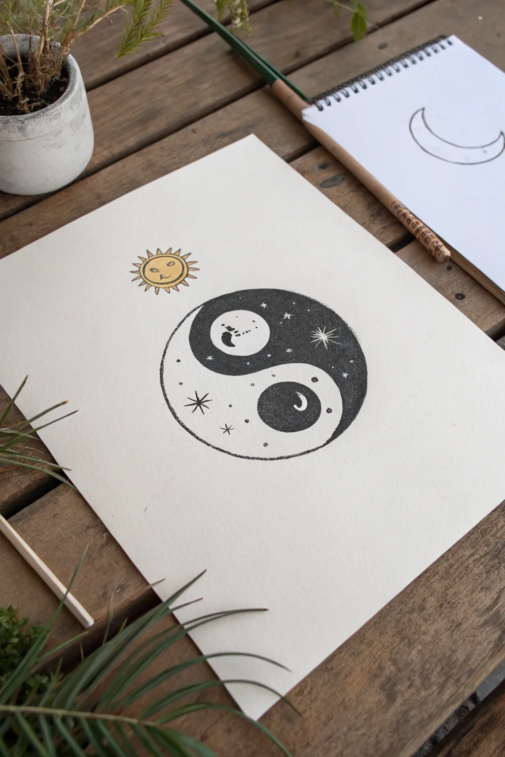
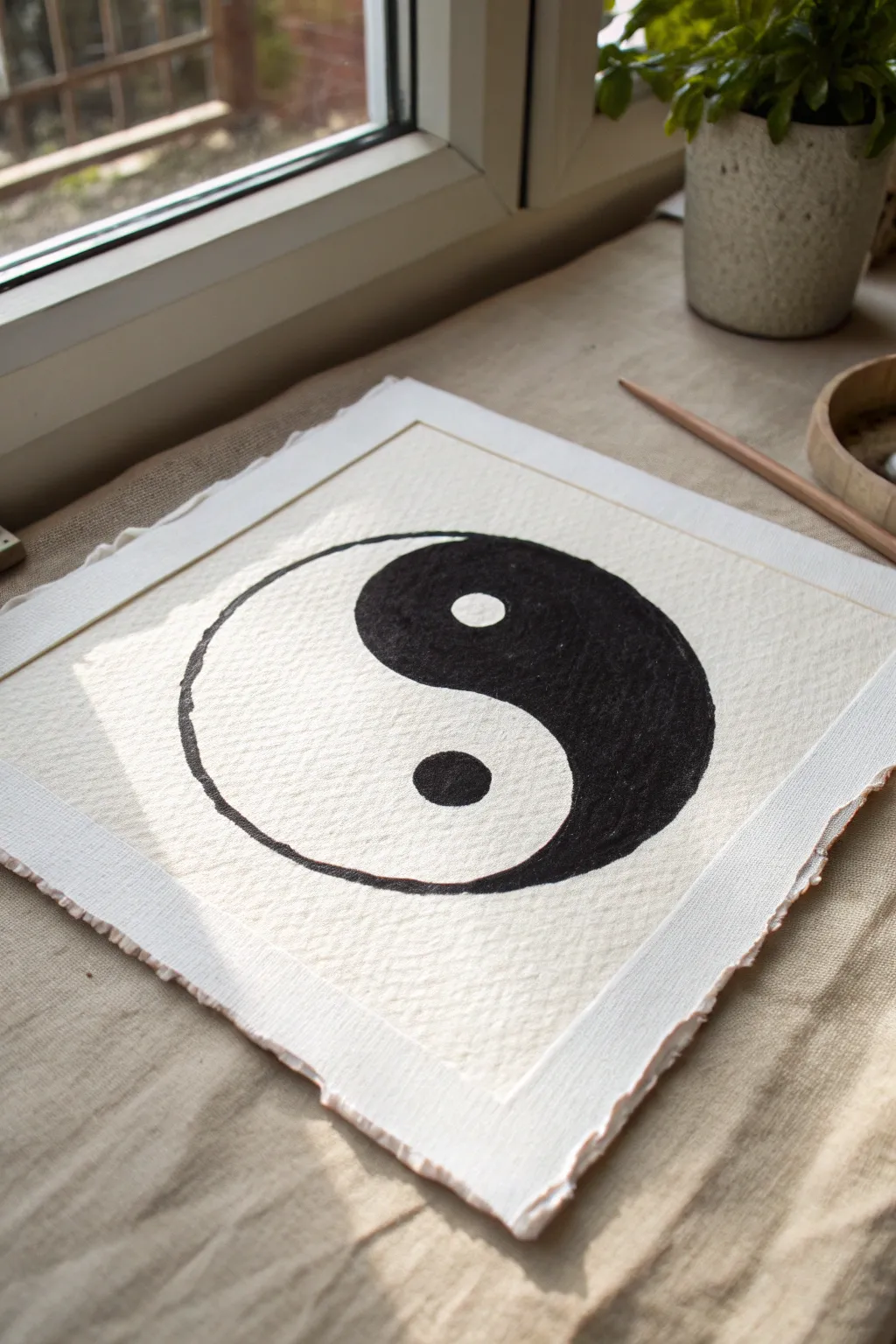
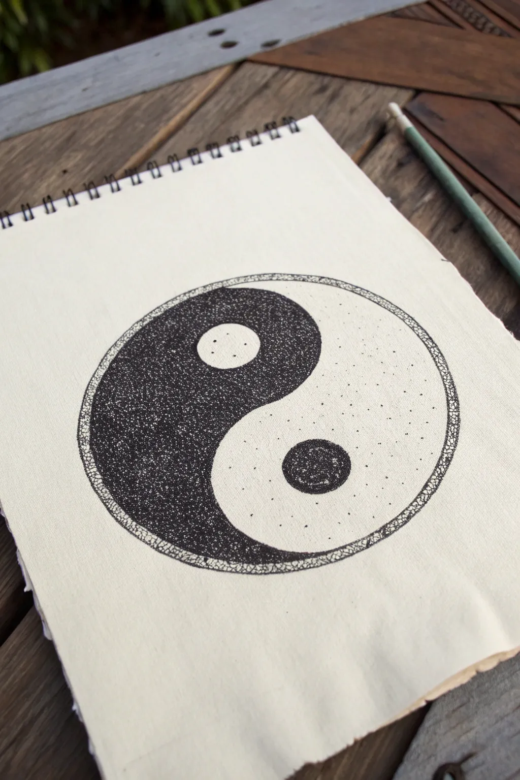
Classic Black-and-White Clean Line Yin Yang
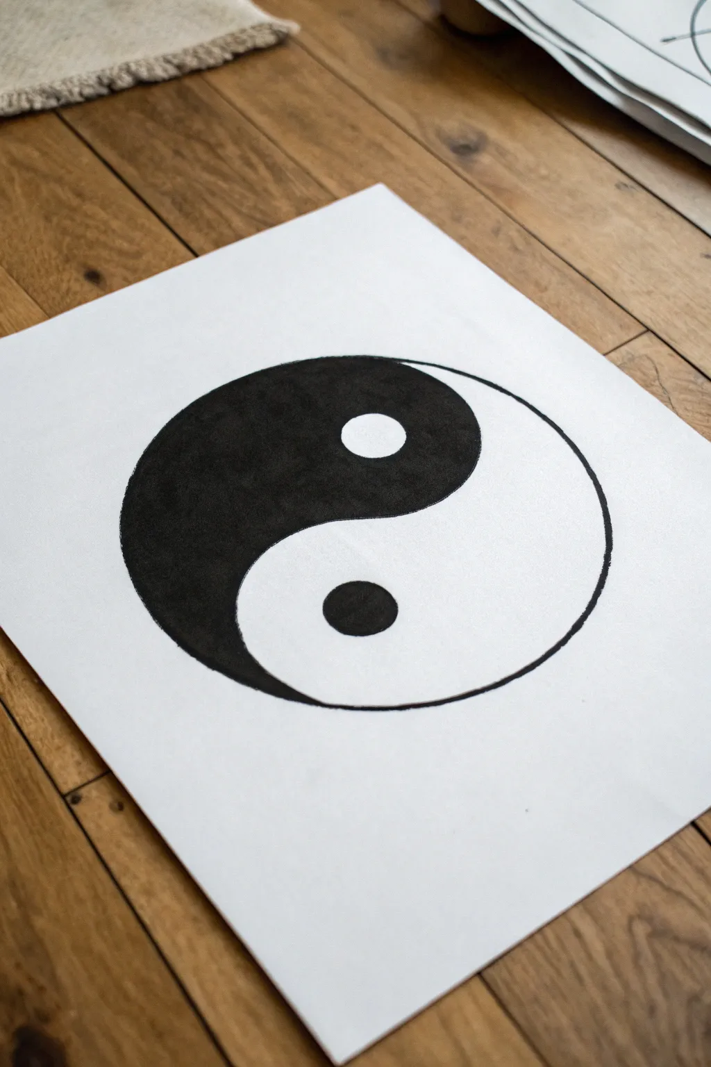
Master the art of equilibrium with this bold, high-contrast drawing that captures the essence of duality. The result is a striking, minimalist piece with clean curves and deep, saturated blacks that pop against white paper.
Detailed Instructions
Materials
- High-quality white drawing paper (A4 or A3)
- Pencil (HB or 2B)
- Eraser
- Compass (or circular templates like bowls/cups)
- Black permanent marker (broad tip for filling)
- Fine-liner pen (black, 0.5mm or similar)
- Ruler
Step 1: Drafting the Geometry
-
Find the center:
Begin by lightly marking the center point of your paper with a pencil to ensure your composition is balanced. -
Draw the main circle:
Set your compass to your desired radius—large enough to fill the page nicely—and draw the primary outer circle from your center point. -
Create the vertical axis:
Using a ruler, draw a very faint vertical line strictly through the center point, intersecting the top and bottom of the circle. -
Mark the sub-centers:
Find the midpoint between the main center and the top edge of the circle along your vertical line; mark this spot. Repeat for the bottom half. -
Form the S-curve:
Place your compass point on the top midpoint you just marked. Set the pencil lead to touch the main center and draw a semi-circle to the right. Repeat on the bottom midpoint, drawing a semi-circle to the left to complete the ‘S’ shape. -
Draft the inner circles:
Keep your compass planted on those same top and bottom midpoints. Shrink the radius significantly to draw two small, equal-sized circles inside each teardrop shape.
Ink Saturation Tip
If your marker leaves streak marks, let the first layer dry completely, then apply a second layer of ink using strokes in the opposite direction (horizontal over vertical).
Step 2: Inking and Definition
-
Outline the perimeter:
Switch to your fine-liner pen. Carefully trace the large outer circle first, moving slowly to keep the line steady and smooth. -
Trace the internal wave:
Go over the central ‘S’ curve with the fine-liner, connecting the top and bottom seamlessly. -
Define the dots:
Ink the outlines of the two small inner circles. Be careful not to smudge the wet ink. -
Erase guidelines:
Once the fine-liner ink is completely dry, gently erase all pencil marks, including the vertical axis line and center points.
Level Up: Texture
Instead of a solid black fill, try filling the dark teardrop with intricate Zentangle patterns, stippling dots, or parallel hatching lines for a modern twist.
Step 3: Filling the Void
-
Identify the Yin:
Mark the left side (the teardrop shape curving downward) to be filled in black. Remember, the small circle inside this dark side must remain white. -
Outline the fill area:
Using your thicker marker, trace just inside the lines of the area you intend to fill. This creates a safety buffer so you don’t accidentally color outside the fine lines. -
Fill the small Yang dot:
Move to the white side (right side). Fill in the small inner circle completely with black. -
Fill the main body:
Using broad, consistent strokes with the marker, fill in the large left teardrop shape. I find vertical strokes help maintain a uniform texture. -
Refine the edges:
Go back with your fine-liner to sharpen any corners or edges where the marker fill meets the outline, ensuring distinct separation. -
Check for gaps:
Hold the paper up to the light to spot any white streaks in the black areas and touch them up for a solid, opaque look.
Step back and appreciate the simple harmony of your newly created symbol
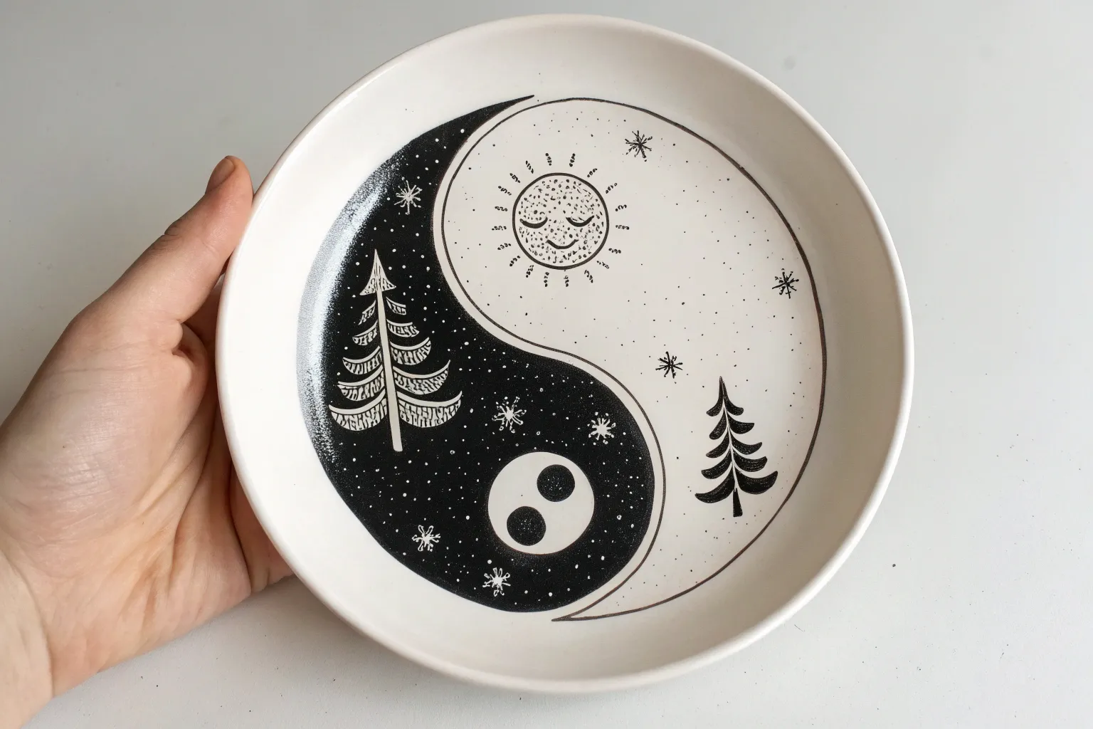
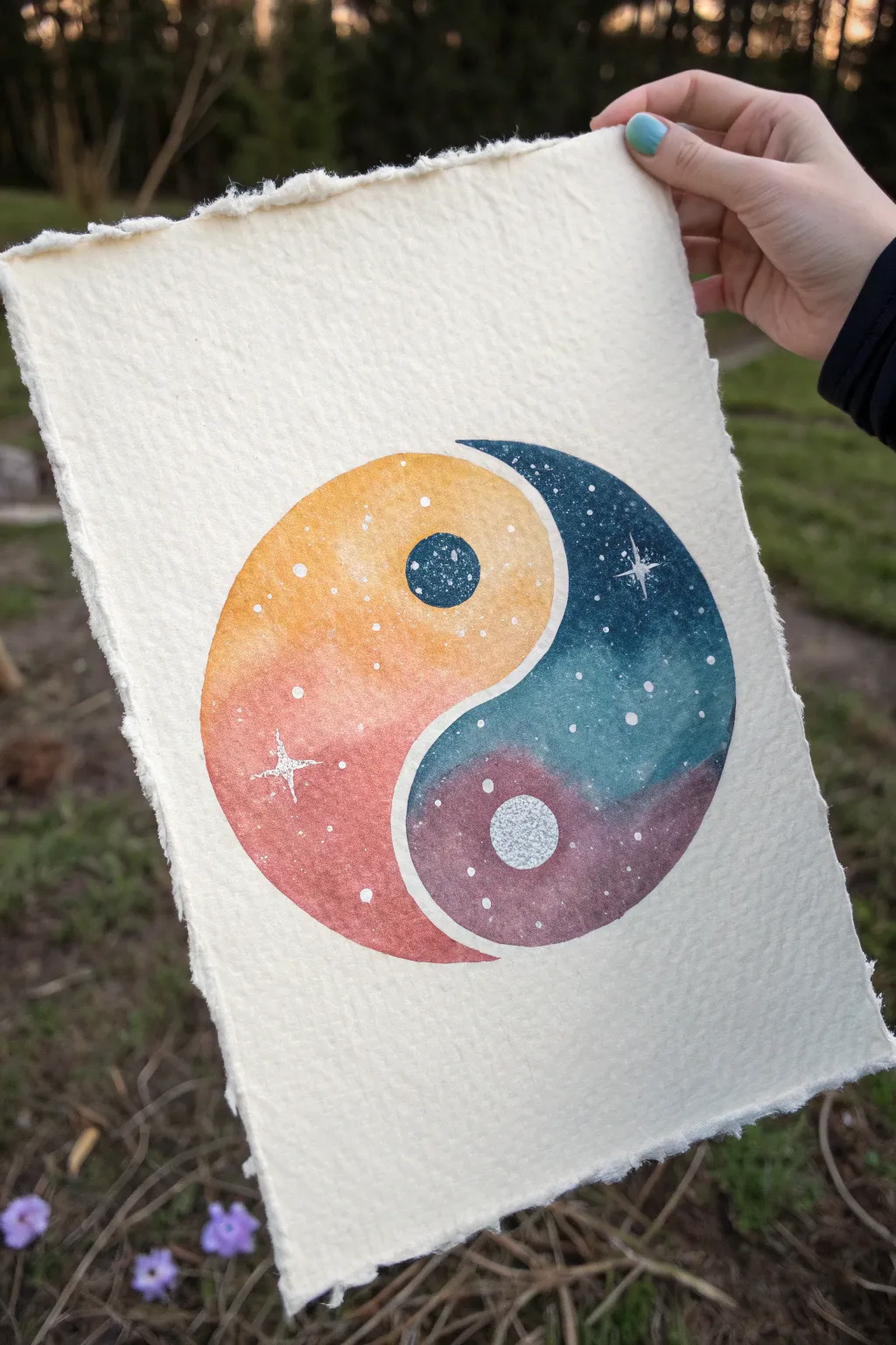
Day and Night Landscape Yin Yang
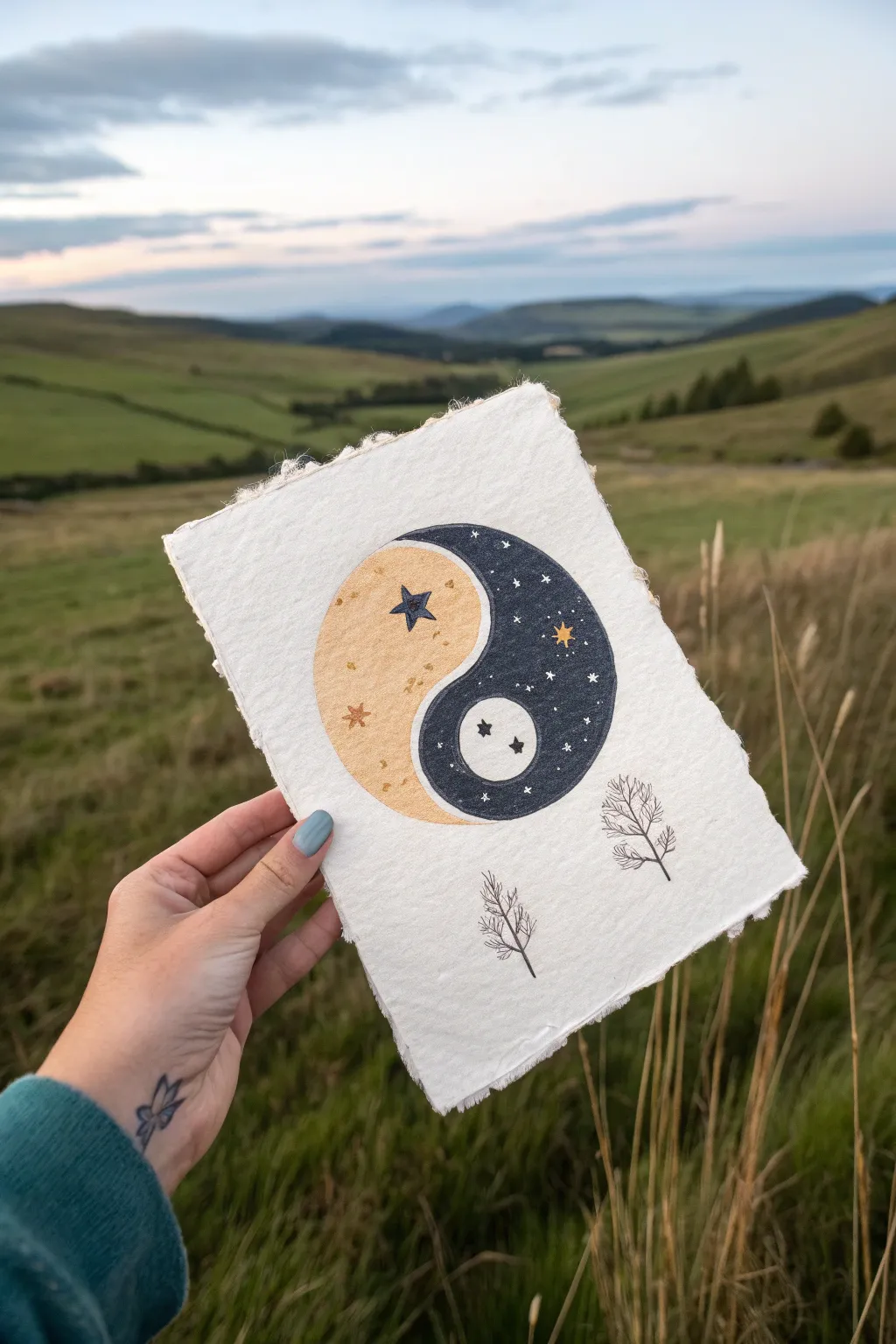
Capture the harmony of contrasting worlds with this celestial-themed yin yang illustration. Drawn on beautifully textured handmade paper, this piece blends sun-bleached tones with deep midnight blues to create a balanced, nature-inspired artwork.
Step-by-Step Tutorial
Materials
- Heavyweight handmade paper with deckled edges (A5 or 5×7 size)
- Pencil and eraser
- Compass or circle stencil (approx. 3-4 inches diameter)
- Black fineliner (0.1mm and 0.3mm)
- Gold jelly roll pen or metallic paint marker
- White gel pen
- Navy blue marker or colored pencil
- Beige/tan marker or colored pencil (alcohol markers work well for texture)
- Dark grey or black colored pencil for shading
Step 1: Laying the Foundations
-
Prepare your paper:
Begin with a sheet of thick, handmade paper. If your paper doesn’t have deckled edges naturally, you can carefully tear the edges against a ruler to create that rustic, organic look. -
Draw the main circle:
Center your compass or stencil on the paper. Lightly sketch a perfect circle in pencil. This will form the boundary of your yin yang. -
Sketch the dividing wave:
Lightly draw the classic ‘S’ curve down the middle of the circle. Start from the top center, curve out to the left, cross the middle, curve to the right, and end at the bottom center. Take your time to get the flow smooth. -
Position the inner elements:
Instead of the traditional small dots, you will be drawing celestial bodies. In the top ‘day’ section (the left, lighter side), sketch a small five-pointed star where the dot would typically go. In the bottom ‘night’ section (the right, darker side), sketch a small circle for the moon.
Pro Texture Tip
Handmade paper is very absorbent. Apply marker layers quickly to avoid streaks, or use colored pencils for a softer, grainier texture that complements the paper.
Step 2: Coloring the Elements
-
Color the ‘Day’ side:
Fill in the left teardrop shape with a soft beige or tan marker. Be careful to work around the star shape you sketched earlier; leave it blank for now. -
Add the stars:
Using a navy blue marker or pen, carefully fill in the five-pointed star on the beige side. Then, use a gold metallic pen to draw smaller four-pointed stars and tiny dots randomly across the beige area. -
Color the ‘Night’ side:
Now, fill in the right teardrop shape with your deep navy blue marker. Similar to the first side, outline your moon circle carefully and fill in the rest of the teardrop with dark ink. -
Detail the moon:
Leave the moon circle predominantly white (the color of the paper). You can add tiny crater details or small stars inside it using a fine black pen. -
Add the night sky:
Once the navy ink is dry, use a white gel pen to dot small stars and tiny crosses over the dark background. Use a gold pen to draw one larger feature star for contrast.
Go Metallic
For a magical touch, outline the entire circle and the ‘S’ curve with gold leaf paint or a thick gold marker instead of black ink.
Step 3: Refining and embellishing
-
Define the outline:
Take a black fineliner (0.3mm) and carefully trace the outer circle and the central ‘S’ curve. Maintain a steady hand to keep the line crisp against the textured paper. -
Sketch the trees:
Below the main circle, lightly pencil in two small, leafless trees. Space them slightly apart and vary their heights for a natural look. -
Ink the trees:
Go over your tree sketches with a 0.1mm fineliner. Use quick, jittery strokes for the branches to mimic the fine, brittle look of winter twigs. I find that lifting the pen quickly at the end of each stroke creates a nice taper. -
Add subtle texture:
Use a colored pencil in a slightly darker shade than your beige marker to add faint texture or shading to the ‘Day’ side, giving it a bit of depth. -
Final touches:
Check your white stars on the dark side—sometimes the ink sinks in. Re-apply a second layer of white gel pen to make them pop brightly against the navy background. -
Clean up:
Wait for all ink to be completely dry, then gently erase any remaining pencil marks, being careful not to rub the paper texture too hard.
Display your finished piece in a floating frame to show off those beautiful deckled edges


Sun and Moon Swapped Dots
This celestial take on the classic Yin Yang symbol swaps traditional dots for detailed moon motifs, creating a harmonious balance between light and dark. Using stippling techniques, you’ll create texture and depth in this simple yet striking ink illustration.
Step-by-Step
Materials
- Smooth bristol or drawing paper
- Compass or circle template
- Fine liner pens (0.1mm, 0.3mm, 0.5mm)
- Pencil (HB or 2H)
- Eraser
- Gold or yellow marker/colored pencil
Step 1: Drafting the Layout
-
Draw the main circle:
Start by using your compass to draw a perfect circle in the center of your paper. Keep the pencil pressure light so it’s easy to erase later. -
Plot the S-curve:
Lightly sketch the S-shaped line that divides the Yin Yang. Find the vertical center, measure halfway up the top radius and halfway down the bottom radius to mark the centers for your inner curves. -
Add the celestial “dots”:
Instead of small circles, these will be larger orbs. Draw a medium-sized circle in the top teardrop shape and another identical one in the bottom teardrop shape. -
Sketch the sun:
To the top left of your main circle, sketch a smaller circle for the sun’s face. Add wavy or triangular rays around its perimeter.
Clean Circles
Use a circle template or masking tape roll instead of a compass if you want to avoid the center pinhole damaging the paper.
Step 2: Inking the Celestial Bodies
-
Detail the top moon:
In the top circle (which will sit inside the dark half), sketch a cratered moon surface. Use a 0.1mm pen to stipple tiny dots, creating shadow craters on the left side. -
Ink the bottom moon:
For the bottom circle (inside the white half), draw a small crescent moon shape. Fill the rest of this circle with black ink using a 0.5mm pen, leaving only the crescent white. -
Add the Sun’s features:
Give the sun a sleepy or calm face with two eyes and a small mouth. Ink the outline of the sun and its rays with a 0.3mm pen. -
Color the Sun:
Use your gold or yellow marker to fill in the sun’s face and rays. I prefer to do this before the heavy black inking to avoid smudging dark ink with the yellow marker.
Cosmic Glow Up
Dilute white acrylic paint or white gouache and flick it over the dark section with a toothbrush to create a realistic, unplanned galaxy effect.
Step 3: Filling and Stippling
-
Outline the Yin Yang:
Go over the main outer circle and the central S-curve with your 0.5mm pen to establish a solid boundary. -
Start the dark section:
The top half of the Yin Yang is the dark side. Begin filling the space around the moon orb with black ink. Don’t make it solid black yet; we want a textured look. -
Create the stipple texture:
Use a heavy density of dots (stippling) to fill the dark section. Make the dots very close together near the edges and slightly looser near the center to simulate a night sky texture. -
Add stars:
While inking the dark section, leave tiny shapes un-inked to represent stars. You can also draw small four-pointed star shapes and carefully ink around them. -
Texture the light section:
For the bottom (white) half, use sparse stippling. Add a few dots near the outer edge and near the inner orb to give it subtle volume without darkening it. -
Detail the open stars:
Draw a few large, four-pointed star shapes floating in the white section of the Yin Yang using a fine 0.1mm pen.
Step 4: Finishing Touches
-
Refine the edges:
Go back over the perimeter of the main circle. If your stippling made the edge look fuzzy, a crisp line will clean it up. -
Erase pencil lines:
Wait until the ink is completely dry—give it a few extra minutes to be safe. Then, gently erase all visible pencil sketches. -
Check the balance:
Look at the overall contrast. If the dark side looks too grey, add another layer of stippling to deepen the black tones.
Now you have a beautifully balanced piece of art that reimagines an ancient symbol
Mountains and Ocean Coastline Yin Yang
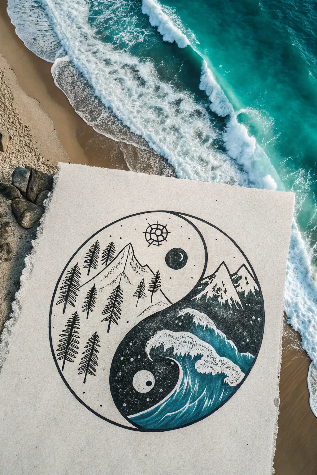
Blend the calm of the forest with the power of the ocean in this striking ink and paint illustration. By balancing stark linework mountains against a deeply pigmented wave scape, you’ll create a piece where nature’s dualities meet perfectly.
How-To Guide
Materials
- Heavyweight mixed media or watercolor paper
- Compass or large circular object (e.g., dinner plate)
- Pencil and eraser
- Fine liner pens (0.3mm and 0.8mm, black)
- Dark indigo or navy acrylic paint
- Teal or seafoam green acrylic paint
- White gel pen or white acrylic paint with fine brush
- Ruler
- Small round paintbrush
Step 1: Laying the Foundations
-
Draw the main circle:
Start by positioning your compass or round template in the center of the paper. Lightly trace a large, perfect circle with your pencil to define the boundary of your world. -
Create the S-curve:
Lightly sketch the classic Yin Yang S-curve. Start from the bottom center, curve up towards the left, cross the middle, and curve down towards the right to separate the two halves. -
Place the celestial bodies:
In the upper (white) section, sketch a smaller circle for the sun where the ‘dot’ usually goes. In the lower section, mark a circle for the moon or pearl. -
Sketch the mountains:
In the upper left section, lightly draft the jagged peaks of a mountain range rising from the S-curve border towards the center. -
Outline the wave:
In the lower right section, sketch a crashing wave shape. Let the foam curve inward, mimicking the swirl of the Yin Yang ‘dot’ area.
Step 2: Inking the Mountain Side
-
Outline the circle:
Use your 0.8mm fine liner to trace the main outer circle and the central dividing S-curve. Keep your hand steady for a clean, bold line. -
Ink the trees:
Switch to a 0.5mm or 0.3mm pen. Draw vertical lines for pine trunks along the left curve. Add jagged, downward-sloping scribbles for the pine needles, getting wider at the base of each tree. -
Detail the mountain peaks:
Trace your mountain sketches with broken, jagged lines. Add small vertical hatching or stippling on the shaded sides of the peaks to give them dimension without filling them in. -
Draw the geometric sun:
Ink the sun circle near the top. Add a small grid pattern or crossed lines inside it, and draw simple radiating lines around the perimeter for a stylized compass look. -
Erase pencil guides:
Once the ink is completely dry, gently erase the pencil marks in the top section to leave a crisp, high-contrast look.
Uneven Circle?
If your hand-traced circle is wobbly, use a thick-rimmed bowl or a roll of masking tape as a physical guide for your pen, rather than just tracing the pencil mark freehand.
Step 3: Painting the Ocean Depths
-
Block in the dark water:
Mix a deep indigo acrylic paint. Carefully fill the background of the lower right section, painting around your sketched wave foam and the moon circle. I like to keep this opaque for maximum contrast. -
Add teal gradients:
While the dark paint is still slightly workable or after it dries (depending on your preference), blend in streaks of teal or seafoam green near the base of the wave to show water movement. -
Define the wave foam:
Use white paint or a white gel pen to fill the crashing foam of the wave. Create distinct, bubbly textures by using small circular motions or stippling. -
Detail the water flow:
With a very fine brush and teal paint, add thin, flowing lines inside the dark water area that follow the curve of the ocean, mimicking currents. -
Create the spray:
Dip a stiff brush or toothbrush in diluted white paint. Gently flick it over the dark water area to create a spray of stars or sea mist. -
Finish the moon connection:
Paint the small circle in the lower section. You can leave it stark white or add a tiny black dot to mirror the sun above, tying the duality together.
Metallic Magic
Replace the white gel pen with silver or gold leaf paint for the wave foam and the sun symbol. This adds a shimmering, luxurious element to the artwork.
Step back and admire how the simple lines and deep colors balance each other perfectly on the page

PENCIL GUIDE
Understanding Pencil Grades from H to B
From first sketch to finished drawing — learn pencil grades, line control, and shading techniques.
Explore the Full Guide
Fire and Water Element Yin Yang
Capture the opposing forces of nature with this vibrant Yin Yang design, transforming the traditional symbol into a dynamic dance of fire and water. The sketch combines fluid waves and crackling flames within the classic circular balance, rendering them in warm oranges and cool blues.
Step-by-Step Guide
Materials
- Spiral sketchbook (heavyweight paper)
- Pencil (HB or H for sketching)
- Compass or circular object for tracing
- Fineliners (Black, 0.3mm and 0.5mm)
- Colored pencils (Warm hues: Orange, Red-Orange, Yellow; Cool hues: Light Blue, Deep Teal)
- Eraser (kneaded preferred)
Step 1: Laying the Foundations
-
Draw the main circle:
Start by drawing a perfect circle in the center of your page using a compass or by tracing a round object like a bowl or large tape roll. Keep your pencil pressure light so lines are easy to erase later. -
Sketch the dividing S-curve:
Draw the classic ‘S’ curve through the center of the circle to separate the two halves. Instead of a stiff geometric line, give it a slightly organic flow, preparing to turn the top section into fire and the bottom into water. -
Outline the inner circles:
Place two smaller circles within the teardrop shapes—one in the upper ‘head’ and one in the lower ‘head’—just like the traditional symbol. These will act as focal points for the elemental details.
Uneven Circle?
If your hand-drawn circle looks lopsided, thicken the outer perimeter line intentionally with your pen. A bolder, heavier outline hides minor wobbles better than a thin one.
Step 2: Designing the Fire (Yang)
-
Create the flames:
On the top perimeter of the circle, sketch flickering flame shapes extending upwards. Let them break the boundary of the main circle, reaching out with sharp, varied points to create energy. -
Fill the upper section:
Inside the top half of the Yin Yang, draw curved, radiating lines that mimic the flow of heat. I like to make these lines originate from the small inner circle, sweeping outward towards the flames. -
Detail the fire core:
Inside the small upper circle (the ‘eye’), sketch a tiny, organic swirling motif, almost like a little sun or spark, to differentiate it from the rest of the fire section.
Metallic Magic
Use a gold gel pen for the lines in the fire section and a silver pen for the water droplets. The metallic sheen will catch the light and make the elemental contrast pop.
Step 3: Designing the Water (Yin)
-
Sketch the waves:
In the bottom half, draw fluid, crashing wave shapes. Let the tips of the waves curl upwards, mimicking the classic Japanese ‘Great Wave’ style, creating a sharp contrast to the jagged flames above. -
Add floating droplets:
Draw several small water droplets floating freely around the wave crests. These add movement and help fill the negative space within the lower curve. -
Flowing background lines:
To mirror the fire side, fill the empty space behind the waves (the right side of the S-curve) with smooth, undulating parallel lines that suggest a current or wind.
Step 4: Inking and Coloring
-
Ink the outlines:
Using a 0.5mm fineliner, carefully trace over your pencil lines. Use a steady hand for the main circle, but allow your hand to be looser and more gestural for the flames and water swirls. -
Erase pencil guides:
Wait a few minutes to ensure the ink is completely dry, then gently erase all visible graphite marks with a kneaded eraser to leave a clean black-and-white base. -
Color the fire base:
Start coloring the top section with a bright yellow base. Apply it lightly to the center of the flames and the inner section to create a glowing effect. -
Develop fiery depth:
Layer orange and red-orange colored pencils over the yellow, focusing on the tips of the flames and the outer edges of the curves. Press harder near the perimeter to create a gradient. -
Color the water:
For the waves in the bottom half, start with a light blue base. Leave the very tops of the wave crests white or extremely pale to represent sea foam. -
Shade the waves:
Use a deep teal or darker blue to shade the underside of the waves and the bottom of the circle. This adds volume and makes the water look heavy and powerful. -
Color the contrasting textures:
For the lined section on the right (part of the upper tear-drop shape but flowing downward), use a soft sandy beige or pale orange to bridge the gap between the two elements without overpowering them. -
Final touches:
Review your drawing for contrast. If the flames need more punch, go back in with a red pen or pencil to deepen the darkest crevices. Add tiny blue dots or bubbles near the water for extra texture.
Now you have a balanced masterpiece that visually represents the powerful duality of nature’s elements
Two Koi Fish Yin Yang
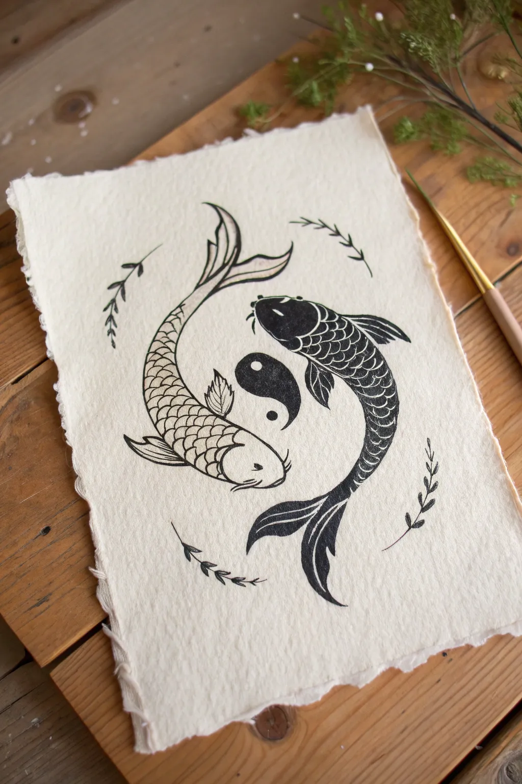
Capture the delicate balance of light and dark with this elegant ink illustration featuring two swimming koi fish. The textured, handmade paper adds an organic, timeless feel to the high-contrast design, making it a beautiful piece for meditative art practice.
Step-by-Step Tutorial
Materials
- Sheet of white handmade or watercolor paper with deckled edges
- Pencil (HB or 2B)
- Kneaded eraser
- Fine liner pens (sizes 0.1, 0.3, and 0.5)
- Black brush pen or India ink with a small round brush
- Compass or circular object for tracing
Step 1: Drafting the Composition
-
Establish the circle:
Begin by lightly tracing a circle in the center of your paper using a pencil. This will serve as the boundary and guide for the flowing movement of the fish, ensuring the yin yang balance is maintained. -
Map the S-curve:
Draw a gentle ‘S’ curve cutting through the center of the circle. This line defines the spine of the composition, separating where the white fish and black fish will swim. -
Outline the fish bodies:
Sketch the teardrop shapes of the koi bodies. Position the top fish (which will be black) curving downwards to the right, and the bottom fish (white) curving upwards to the left. Their heads should be the widest part, tapering smoothly into the tails. -
Add fin details:
Lightly sketch the pectoral fins fanning out from behind the gills and add the dorsal fins along the backs. Sketch the long, flowing tail fins to follow the curvature of the circle’s edge. -
Place the yin yang symbol:
In the negative space exactly between the two fish, sketch a small, traditional yin yang symbol. Ensure it’s centered to act as the focal point. -
Draft the botanical accents:
Draw four small, curved sprigs of leaves around the perimeter of the invisible circle boundary. These should follow the rotational energy of the piece.
Step 2: Inking the White Fish
-
Outline the contours:
Using a 0.3 fine liner, carefully trace the outline of the bottom fish. Keep your hand steady but allow the line weight to vary slightly for a natural look. -
Draw the scales:
Starting near the head, draw rows of ‘U’ shaped scales down the body. I find it helpful to stagger the rows like bricks to create a realistic texture. -
Detail the head and fins:
Add the eye and whiskers (barbels). Use fine lines to striate the fins, showing the delicate ribbing. -
Ink the dorsal fin:
The dorsal fin on this fish has slightly darker accents. Use a 0.5 pen to thicken the top edge of this fin.
Mastering the dark scales
For the black fish, draw the scales in pencil first. Then, color *around* the pencil lines with black ink. Erasing the pencil later reveals perfect white scales.
Step 3: Inking the Black Fish
-
Define the shape:
Outline the top fish with your pen. Don’t worry about the internal scales yet; focus ongetting the silhouette correct. -
Fill the body:
This is the boldest step. Use a brush pen or brush with ink to fill the body solid black, but—crucially—leave thin white lines to represent the scales. Essentially, you are drawing white scales on a black background by using negative space. -
Refine the negative space:
Go back with a 0.1 fine liner if needed to sharpen the edges of the white scale outlines inside the black body, ensuring they look crisp against the dark ink. -
Complete the black fins:
Fill the fins with black ink, leaving white streaks to mimic the fin rays, mirroring the style of the body.
Add a splash of serenity
Use diluted watercolor to add a localized wash of soft blue or gold behind the fish before inking, giving the illusion of water without overpowering the line art.
Step 4: Final Details
-
Ink the central symbol:
Fill the top half of the small central yin yang symbol with black ink, leaving the dot white. Outline the bottom half and fill its dot with black. -
Trace the leaves:
Go over your pencil sketches for the surrounding botanical sprigs with a 0.1 or 0.3 pen. Keep these simple and elegant. -
Erase pencil marks:
Wait until the ink is completely dry—textured paper can hold moisture longer than you think. Gently erase all underlying pencil guidelines with a kneaded eraser to avoid damaging the paper fibers.
Now you have a serene, balanced artwork that celebrates harmony and contrast.
BRUSH GUIDE
The Right Brush for Every Stroke
From clean lines to bold texture — master brush choice, stroke control, and essential techniques.
Explore the Full Guide
Interlocking Wolves: Quiet and Wild
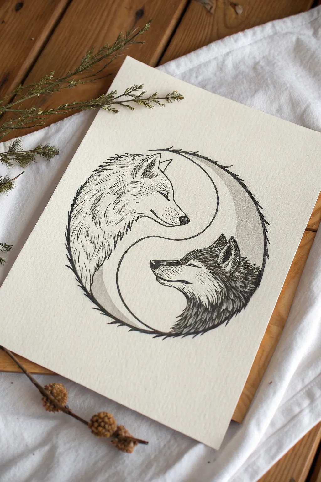
Balance the fierce with the serene in this stunning ink illustration that reimagines the classic Yin Yang symbol using wolf profiles. By using stippling and directional fur strokes, you’ll create a harmonious flow between the light and dark halves of the circle.
Step-by-Step Guide
Materials
- High-quality mixed media or Bristol paper (smooth surface ideal for ink)
- HB or 2H graphite pencil
- Kneaded eraser
- Compass or circular object (approx. 6-7 inches diameter)
- Fine liner pens (sizes 0.05, 0.1, 0.3, and 0.5)
- Ruler
Step 1: Drafting the Yin Yang Structure
-
Establish the outer circle:
Begin by lightly tracing a perfect circle in the center of your paper using a compass or a bowl. This will be the boundary for your entire composition. -
Mark the center division:
Lightly sketch the S-curve that divides the Yin Yang. Instead of a standard curve, imagine where the snouts will go: the top curve should dip to accommodate the white wolf’s muzzle, and the bottom curve should rise to fit the dark wolf’s muzzle. -
Map out the wolf profiles:
Sketch the basic triangular shapes for the wolf heads within their respective halves. The top wolf faces right (drooping slightly downward), and the bottom wolf faces left (looking slightly upward). -
Refine the features:
Add details to your sketch, defining the ears, the slope of the noses, and the closed or squinting eyes. Ensure the curve of their necks follows the original outer circle line to maintain that round silhouette.
Step 2: Inking the Outlines
-
Define the perimeter:
Using a 0.3 pen, carefully ink the outer edge of the circle. However, don’t draw a solid line; instead, use jagged, fur-like strokes that point outward to suggest the texture of the wolves’ coats merging with the border. -
Ink the facial features:
Switch to a 0.1 pen for the delicate areas like the eyes, noses, and mouths. Keep the lines crisp but not too heavy, especially on the white wolf. -
Create the central division:
Ink the S-curve separating the two animals. On the white wolf’s side, this line should be smooth. On the dark wolf’s side, allow some fur texture to break the line slightly. -
Erase pencil guides:
Wait for the ink to dry completely to avoid smudging, then gently gently rub your kneaded eraser over the entire drawing to lift the graphite sketches.
Don’t Smudge the Ink
Place a scrap piece of paper under your drawing hand. This acts as a shield, preventing oils from your skin from staining the paper and stopping accidental ink smears.
Step 3: Texturing the Light Wolf (Yang)
-
Directional mapping:
Observe the direction of wolf fur: it flows back from the nose and creates a ruff around the neck. Use a 0.05 pen to start marking these directions lightly. -
Sparse fur detailing:
For the white wolf, less is more. Use very fine, broken strokes to suggest fur texture along the neck and cheek without filling the space. Leave large areas of white paper untouched to represent the light coat. -
Add depth to the ears:
Darken the inside of the white wolf’s ear using hatching strokes with a 0.1 pen, creating a focal point of contrast on the lighter side.
Add a Cosmic Touch
Use white gel pen or gouache on the dark wolf’s fur to add tiny stars or constellations, reinforcing the night-sky theme of the Yin side.
Step 4: Shading the Dark Wolf (Yin)
-
Layering the base tone:
The dark wolf needs density. Start with a 0.1 pen and create uneven layers of hatching following the curve of the face and neck. I prefer to build this up slowly rather than coloring it solid black immediately. -
Building contrast:
Switch to a 0.3 or 0.5 pen to deepen the shadows. Concentrate the darkest ink around the eye mask, the back of the neck, and the nose tip. -
Defining individual tufts:
As you darken the fur, leave thin slivers of white space between clumps of fur strokes. These negative spaces act as highlights and give the dark coat recognizable volume and texture. -
Balancing the composition:
Look at the drawing as a whole. You may need to add a light gray wash or very subtle stippling to the background of the white wolf’s section (the ‘moon’ shape) to make the white fur pop, just like in the reference image.
Step back and admire how the two opposing forces create a perfect, circular whole on your page
Mandala Details on One Half
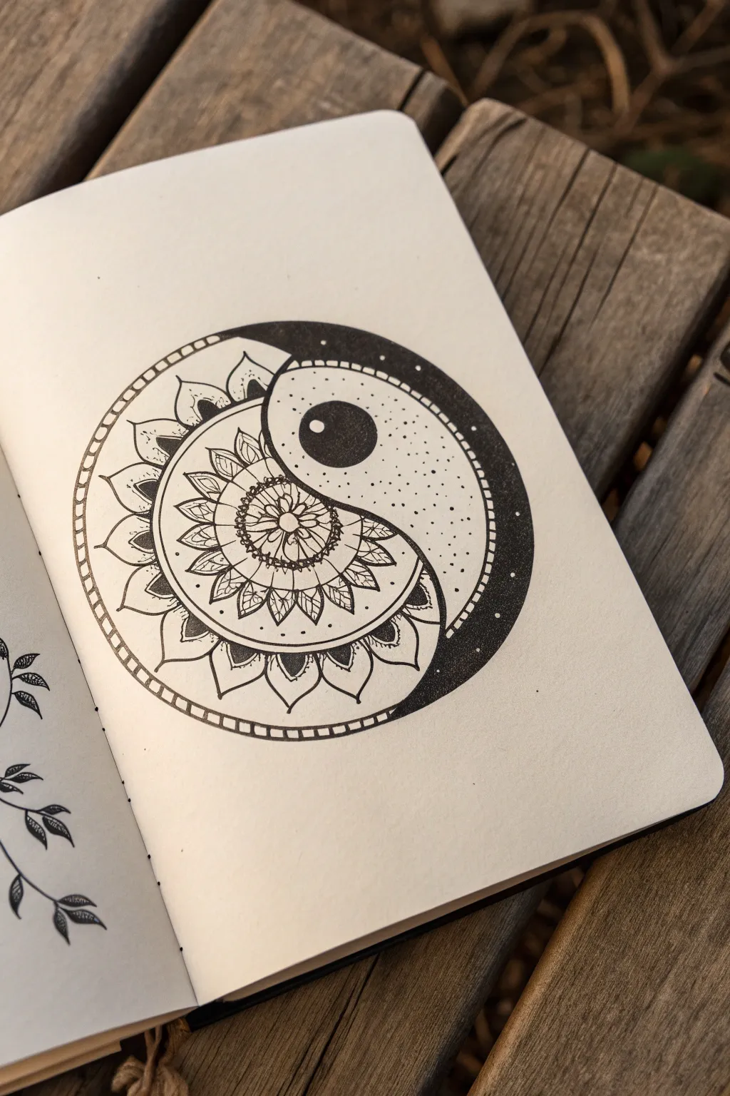
This striking pen-and-ink drawing fuses the classic balance of the Taoist Yin Yang symbol with the intricate, repetitive beauty of a mandala. The result is a harmonious contrast between deep, stippled shadows and delicate floral line work that pops off the sketchbook page.
How-To Guide
Materials
- High-quality sketchbook or Bristol paper
- Compass
- Pencil (HB or H)
- Eraser (kneadable preferred)
- Ruler
- Fine liner pens (sizes 005, 01, 03, and 05 or 08)
- Protractor (optional)
Step 1: Drafting the Foundations
-
Establish the outer circle:
Use your compass to draw a perfect circle in the center of your page. This will be the main boundary for the entire design. Keep your pencil pressure light so it’s easy to erase later. -
Mark the center line:
Lightly sketch a vertical line passing through the center point to divide the circle in half. Then, find the halfway point on the upper radius and the halfway point on the lower radius to mark the centers for the inner curves. -
Form the ‘S’ curve:
Place your compass point on the upper halfway mark and draw a semicircle touching the top edge and the center point. Repeat on the lower half, flipping the direction, to create the classic ‘S’ curve that separates the Yin and Yang halves. -
Outline the inner circles:
While you have the compass out, lightly draw the smaller circles inside the two teardrop shapes—one in the upper section and one in the lower section—ensuring they are centered within their respective lobes.
Uneven Petals?
If your mandala petals look lopsided, draw faint radial lines (like pizza slices) lightly with a pencil first. This creates a grid to keep petal widths consistent.
Step 2: Building the Mandala Structure
-
Draw concentric guides:
Focusing on the left ‘white’ half of the Yin Yang, use the main center point of the large circle to draw 3-4 concentric semicircles. These will serve as guidelines for the layers of flower petals. -
Sketch the center flower:
In the very center of the mandala side (the main circle’s center), sketch a small six-petaled flower pattern. This acts as the seed from which the rest of the pattern radiates. -
Add petal layers:
Working outward from the center flower, sketch rows of petals. The first row should be small and pointed; the next row slightly larger and rounder. I find it helps to stagger the tips of the new petals between the peaks of the previous row. -
Create the outer border:
Sketch a double rim around the outermost edge of the main circle. Divide this rim into small, even segments to create a ‘ladder’ or ‘railroad’ style border.
Step 3: Inking the Mandala side
-
Outline the petals:
Switch to a 01 or 03 fineliner. Carefully trace over your pencil sketches for the mandala petals. Use a steady hand and pull the pen toward you for smoother curves. -
Detail the center:
Using a 005 pen, add tiny details inside the central flower, such as small stamen lines or dots, to give it texture without overwhelming the small space. -
Texturize the middle rings:
For the middle layers of the mandala, add internal petal details like a central vein or tiny hatching near the base of each petal to create depth. -
Fill the outer leaves:
Ink the largest, outermost row of petals. Add a small triangular black fill at the base of these petals where they meet the previous row to increase contrast. -
Ink the border:
Ink the double lines of the outer rim. Carefully draw the small perpendicular lines connecting them to finish the ladder border effect.
Level Up: Gold Leaf
Apply gold leaf or metallic gold ink to the ‘white’ circle inside the dark side, or strictly to the center of the mandala flower for a luxurious pop.
Step 4: Inking the Dark Side
-
Outline the main shapes:
Use a thicker pen, like an 05, to trace the main ‘S’ curve and the outer boundary of the right side. Trace the circle within the upper lobe. -
Fill the inner circle:
Color in the small circle in the top lobe completely black using an 08 pen or a brush pen, leaving a tiny speck of white as a highlight if desired. -
Stipple the gradient:
This is the patience test. Using a 01 or 03 pen, begin stippling (dotting) the area around the black inner circle. Make the dots very dense near the circle’s edge and gradually spread them out as you move toward the ‘tail’ of the Yin shape. -
Solidify the outer edge:
On the far right outer edge of the dark side, fill in a crescent shape with solid black. Blend this solid black into the rest of the shape using a dense gradient of stippling, fading from solid black into scattered dots.
Step 5: Final Touches
-
Erase pencil lines:
Wait at least 10-15 minutes to ensure the ink is completely dry. Gently erase all underlying graphite structure lines with a kneadable eraser to avoid smudging. -
Refine contrast:
Look at the drawing as a whole. Create deeper contrast by thickening the partition line between the mandala and the stippled side, making the separation crisp and distinct.
Enjoy the meditative process of watching the two opposing styles come together into a perfectly balanced whole.


Negative Space Yin Yang Illusion
Learn to capture the balance of light and dark with this textured ink painting on heavyweight paper. The charm of this piece lies in its visible brushstrokes and the organic, deckled edges of the paper, creating a meditative and rustic finished work.
Step-by-Step Guide
Materials
- Heavyweight cold-press watercolor paper (300gsm or higher)
- Black India ink or concentrated black watercolor
- Painter’s tape or low-tack masking tape
- Round watercolor brush (size 6 or 8)
- Small detail brush (size 0 or 2)
- Pencil (HB or lighter)
- Compass or two round circular objects (one large, one small)
- Ruler
- Eraser
- Palette or small dish for ink
- Water container and paper towels
Step 1: Preparation and Sketching
-
Prepare the paper:
Begin by tearing your watercolor paper to size if it isn’t already. To achieve the soft, deckled edge look shown in the photo, place a ruler down and tear the paper against the sharp edge rather than cutting it with scissors. -
Create the border:
Tape down all four sides of your paper onto a flat surface using painter’s tape. Create a border about 1 to 1.5 inches thick. Press the tape edges down firmly to ensure crisp lines later. -
Mark the center:
Find the exact center of your square working area using a ruler. Make a tiny, faint mark with your pencil. -
Draw the main circle:
Using a compass set to your desired radius (leaving some breathing room from the tape), draw the main outer circle. Keep your pencil pressure very light so graphite doesn’t show through the finished paint. -
Draft the S-curve:
Bisect the circle vertically. Find the midpoint of the top radius and the bottom radius. Place your compass point on these midpoints to draw two semi-circles—one curving left, one curving right—to form the classic ‘S’ shape. -
Add the dots:
Using the same midpoints you just found, draw a small circle in the center of the top tear-drop shape and another in the bottom tear-drop shape. These will be the contrasting dots.
Bleeding Lines?
If ink bleeds under the tape, your paper might be too textured. Burnish the tape edge tightly with a spoon before painting, or use a thicker medium like acrylic.
Step 2: Inking the Dark Side
-
Outline the black section:
Dip your detail brush into the black ink. Carefully trace the outline of the ‘yin’ (the dark side), including the curve and the outer edge. Do not outline the small circle inside; you need to preserve that white space. -
Outline the lower dot:
Switch focus to the ‘yang’ (white) side. Carefully outline the small circle that sits in the lower half. This will eventually be filled with black. -
Fill the large area:
Switch to your larger round brush. Load it with ink and begin filling in the large shapes you just outlined. I like to work wet-on-dry here to get that lovely texture where the paper grain shows through. -
Refine the edges:
As you fill, use the tip of the brush to smooth out any nervous lines from your initial outlining, ensuring the curves look fluid and continuous. -
Fill the isolated dot:
Carefully fill in the small circle on the white side with solid black ink.
Texture Play
Sprinkle fine salt onto the wet black ink before it dries. The salt absorbs pigment, creating a starry, speckled texture that mimics a galaxy effect.
Step 3: Defining the White Side
-
Outline the white section:
Even though the white side is unpainted, you need to define its outer boundary. Using a very dry brush with a tiny amount of ink (or a fine liner pen if you prefer control), create a deliberate, slightly rough outline for the outer circle of the white side. -
Add texture (optional):
If the outline looks too stark, you can use a mostly dry brush to feather the black line slightly inward, giving it an organic feel similar to the reference image. -
Erase guidelines:
Wait until the ink is completely bone-dry. Gently erase any visible pencil marks in the white areas. Be careful not to smudge the black ink.
Step 4: Finishing Touches
-
Review contrast:
Step back and look at the black areas. If the coverage looks too patchy or gray, apply a second layer of ink to deepen the black tones. -
Reveal the border:
Once you are certain the artwork is 100% dry, slowly peel back the painter’s tape. Pull it away from the paper at a 45-degree angle to prevent tearing the surface. -
Final smooth:
If the tape pulled up any paper fibers, gently smooth them down with the back of your fingernail or a bone folder.
Display your new artwork on a flat surface or frame it to highlight those beautiful rough edges
Hatching vs. Stippling Texture Yin Yang
This meditative drawing exercise transforms the classic Yin Yang symbol into a textured masterpiece using the art of stippling. By varying the density of thousands of tiny ink dots, you will create depth and contrast without drawing a single solid line.
Step-by-Step
Materials
- Sketchbook with smooth, heavy paper (mixed media or bristol)
- Pencil (HB or H for light lines)
- Compass or two circular objects of different sizes
- Ruler
- Eraser (kneaded preferred)
- Fine liner pens (0.1mm, 0.3mm, and 0.5mm sizes)
Step 1: Drafting the Structure
-
Draw the main circle:
Begin by using your compass to draw a large circle in the center of your page. If you don’t have a compass, trace a bowl or large lid. Keep your pencil pressure very light so these lines can be erased later. -
Define the S-curve:
Locate the center point of your large circle. Lightly sketch a vertical line through the center to help guide you. Mark the midpoint of the upper radius and the midpoint of the lower radius. -
Create the inner curves:
Place your compass point on the upper radius midpoint and draw a semi-circle that touches the top edge and the center. Repeat this on the bottom radius, curving the opposite way, to form the classic ‘S’ shape. -
Add the inner circles:
Draw two small circles of equal size. One goes in the center of the top ‘head’ of the tear-drop shape, and one goes in the bottom. These will become the contrasting dots. -
Draft the border:
Adjust your compass slightly wider than the original main circle (about 5-8mm) and draw a second concentric circle around the entire shape to create a border ring.
Step 2: Inking the Outline and Texture
-
Trace the outline:
Switch to a 0.3mm fine liner. Carefully trace the outer border ring and the main S-curve of the Yin Yang. Do not trace the inner circles with a solid line yet if you want a softer look, though a thin outline is fine for guidance. -
Texturing the border:
Inside the thin border ring you created, draw irregular, organic shapes that resemble cracking earth or reptile scales. They shouldn’t be perfect squares; let the lines wobble and intersect. -
Fill the border gaps:
Once the organic cell shapes are drawn, use your 0.1mm pen to add tiny dots inside the ‘grout’ lines between the shapes. This adds a gritty, stone-like texture to the frame.
Sore Wrist Relief
Stippling takes time. If your hand cramps, try holding the pen more vertically and tapping from the wrist, not the fingers, to reduce strain.
Step 3: Stippling the Dark Side
-
Start the dark section:
Identify the left/top tear-drop shape (the ‘Yin’ or dark side). Using a 0.5mm pen, begin placing dots along the very edge of the S-curve and the outer rim. This establishes your darkest values first. -
Build density:
Work your way inward, clustering dots very close together. They should almost merge but not quite. I find it therapeutic to work in small patches rather than trying to fill the whole space at once. -
Preserve the light circle:
As you stipple the dark side, be careful around the small inner circle. You want the dots to stop abruptly at its edge to create a sharp, distinct white circle amidst the darkness. -
Deepen the black:
Go back over the dark section again. Layer more dots until the area reads as a solid, dark gray or black from a distance. The paper white should barely peek through. -
Dot the dark inner circle:
Move to the bottom (white) tear-drop shape. Locate the small inner circle here and fill it with dense stippling, matching the intensity of the dark side you just finished.
Try a Gradient
Instead of solid black vs. white, stipple the dark side as a gradient, fading from distinct dots at the top to solid black at the bottom.
Step 4: Stippling the Light Side
-
Feather the light section:
Switch to your finest pen, the 0.1mm. On the white tear-drop side, add very sparse, widely spaced dots. Concentrate them slightly more near the outer edges to give the shape a bit of roundness. -
Texturing the white inner circle:
Return to the white circle sitting inside the dark section. Add just a few tiny, faint dots here—maybe only 5 or 6 total—to keep it from looking stark flat white. -
Wait and erase:
Allow the ink to dry completely for at least 30 minutes. Stippling creates pools of wet ink that smear easily. Once dry, gently erase all visible pencil lines. -
Final contrast check:
Step back and squint at your drawing. If the dark side looks patchy, go back in with the 0.5mm pen and add more dots to even out the tone.
Now you have a beautifully textured symbol of balance that showcases your patience and precision
Sunset vs. Galaxy Color Yin Yang
Blend the warmth of a sunset with the mystery of a galaxy in this celestial-themed yin yang painting. Using watercolor wet-on-wet techniques on lovely textured paper creates soft transitions that make the two halves feel unified yet distinct.
Detailed Instructions
Materials
- Heavyweight textured watercolor paper (preferably cotton rag with deckled edges)
- Watercolor paints (Yellow, Orange, Red, Indigo, Teal, Purple)
- Painting masking tape or masking fluid (optional but helpful)
- Round watercolor brushes (Size 4 and Size 8)
- White gel pen, white gouache, or white acrylic paint
- Pencil and eraser
- Compass or two round objects of different sizes
- Jar of water
- Paper towels
Step 1: Sketching the Structure
-
Draw the main circle:
Begin by lightly tracing a large circle in the center of your paper using a compass or a round bowl. Keep the pencil pressure extremely light so the graphite won’t show through the watercolor later. -
Divide the circle:
Sketch a gentle ‘S’ curve starting from the top center edge, flowing through the middle, and ending at the bottom center edge. This creates the classic two teardrop shapes of the yin yang. -
Add the inner circles:
Place a smaller circle in the center of the top bulbous area and another in the bottom bulbous area. These will become the contrasting focal points of your celestial design.
Step 2: Painting the Sunset Half
-
Wet the paper:
Focus on the left-side teardrop shape (the ‘head’ of the S-curve usually on the left/top depending on orientation, but here it’s the warm side). Use a clean brush to apply a layer of clear water inside this shape, avoiding the small inner circle. -
Drop in yellow:
Load your brush with a bright, sunny yellow. Touch it to the top part of this wet shape, letting the pigment bloom naturally into the moisture. -
Transition to orange:
While the yellow is still wet, introduce a vibrant orange below it. Gently nudge the colors together where they meet to create a soft, seamless gradient. -
Finish with red:
At the bottom narrow tail of this shape, paint in a warm red or pinkish hue, blending it upward into the orange. This creates a beautiful sunset gradient from light to dark. -
Paint the contrasting dot:
For the small circle sitting inside this warm gradient, paint it with a deep indigo blue. This connects it visually to the galaxy side we will paint next. -
Allow to dry:
Let this section dry completely before moving on to prevent the colors from bleeding into the next area.
Bleeding edges?
If colors bleed across the center line, lightly dab with a clean, dry tissue immediately. Wait for the first half to be bone-dry before starting the second to keep lines crisp.
Step 3: Painting the Galaxy Half
-
Wet the galaxy side:
Now apply clear clean water to the opposing teardrop shape, being careful not to touch the dry edge of the sunset side you just finished. -
Start with deep blue:
At the top (narrow tail) of this side, drop in a deep indigo or navy blue. Let it flow down into the wet paper. -
Blend into teal and purple:
As you move into the wider bottom part of the shape, mix in teal and deep purple. Don’t overmix; let the colors swirl slightly to mimic nebulas and cosmic dust. -
Darken the edges:
I find that dabbing a bit of concentrated indigo or black just along the outer curve adds nice depth and dimensionality. -
Leave the inner dot blank:
For the small circle on this dark side, leave the paper bare or fill it with a very faint wash of gray, as we will turn this into a bright moon later. -
Final drying:
Allow the entire painting to dry completely. The paper should feel room temperature to the touch, not cool.
Metallic Magic
Mix a tiny bit of metallic gold watercolor into the sunset side or use silver on the galaxy side for a subtle shimmer that catches the light when viewed at an angle.
Step 4: Adding Celestial Details
-
Prepare splatter:
Dilute a small amount of white gouache or acrylic paint with a tiny drop of water on your palette until it has a milky consistency. Cover the empty white space of your paper with scrap paper to protect it. -
Create stars:
Tap your brush against a finger or another brush handle over the painted areas to create a splatter of tiny white stars. Let them fall across both the sunset and galaxy sides. -
Draw larger stars:
Using a white gel pen or a fine liner brush with white paint, draw a few four-pointed stars or ‘glints’ on each side for extra sparkle. -
Detail the moon:
Fill the white circle on the galaxy side with white paint if you haven’t already, perhaps stippling it slightly to give it a cratered moon texture. -
Detail the sun-side void:
If needed, retouch the dark circle on the sunset side with more stars so it looks like a portal into the night sky.
Once dry, display your beautiful cosmic balance piece where it can remind you of the harmony between day and night
Melting Ink Yin Yang Drip Effect
Embrace the textured beauty of relief printing with this rustic Yin Yang project. Using soft-cut linoleum and rich block printing ink, you’ll create a bold symbol on deckled-edge paper that perfectly balances sharp design with organic imperfections.
Step-by-Step
Materials
- Soft-cut lino block (roughly 4×6 inches)
- Linocut carving tools (V-gouge and U-gouge)
- Black water-soluble block printing ink
- Rubber brayer (roller)
- Sheet of heavy glass or acrylic (for inking)
- Heavyweight printmaking paper or watercolor paper
- Metal ruler
- Pencil and eraser
- Tracing paper
- Baren or wooden spoon
Step 1: Design & Transfer
-
Prepare the paper:
Start by tearing your paper down to size rather than cutting it. Use a heavy metal ruler as a straight edge and gently tear the paper against it to create that soft, fibrous deckled edge seen in the photo. -
Sketch the circle:
On a piece of tracing paper, draw a perfect circle using a compass or by tracing a round object like a jar lid. This will be the boundary of your Yin Yang. -
Draw the S-curve:
Find the center of your circle. Sketch a smooth, flowing ‘S’ curve that passes through the center point, dividing the circle into two teardrop shapes. -
Add the dots:
Place a small circle in the center of the widest part of each teardrop. Remember, the top section (usually white) gets a black dot, and the bottom section (usually black) gets a white dot. -
Transfer to block:
Place your tracing paper face-down onto the lino block. Rub the back firmly with a bone folder or spoon to transfer the graphite image onto the rubber surface.
Patchy Prints?
If your black areas look speckled (salty), you likely didn’t use enough ink or pressure. Apply a tiny bit more ink to the brayer and press harder with your spoon.
Step 2: Carving the Block
-
Outline the shapes:
Use your finest V-gouge tool to carefully carve around the perimeter of the circle. Then, carve the S-curve line and outline the two small inner dots. -
Clear the negative space:
Switch to a wider U-gouge to remove the material outside the main circle. You don’t need to make this perfectly smooth; leaving small ridges creates ‘chatter’ marks that add character to the print. -
Carve the white teardrop:
Carve away the material inside one of the large teardrop shapes (the ‘Yang’ side), but be careful to leave the small inner dot untouched and raised. -
Carve the eye of the black teardrop:
On the opposite side, leave the main teardrop surface flat and uncarved, but carefully scoop out the material inside the small inner circle. -
Clean up debris:
Brush away any loose bits of linoleum. I like to run a soft brush over the surface to ensure no crumbs get stuck in the ink later.
Step 3: Inking & Printing
-
Roll out the ink:
Squeeze a small amount of block printing ink onto your glass slab. Use the brayer to roll it out until you hear a consistent ‘velcro’ sizzling sound, indicating an even thin layer. -
Ink the block:
Roll the inked brayer over your carved block. Apply two or three thin layers rather than one heavy glob, ensuring the uncarved surfaces are fully glistening black. -
Position the paper:
Carefully lay your torn-edge paper on top of the inked block. Once the paper touches the ink, do not shift or slide it, or the image will smudge. -
Burnish the back:
Using a baren or the back of a wooden spoon, rub the back of the paper firmly in circular motions. Apply extra pressure around the edges of the circle to get a crisp border. -
The reveal:
Gently peel one corner of the paper up to peek at the transfer. If it looks spotty, lay it back down and rub some more. When satisfied, peel the paper completely off the block. -
Dry and flatten:
Place the wet print face-up in a safe area to dry for at least 24 hours. If the paper curls, you can weigh it down under a heavy book once strictly dry.
Make it messy
To mimic the photo’s vibe, flick a stiff-bristled brush loaded with watery ink onto the wood surface around your drying print for accidental ‘splatter’ art.
Frame your handcrafted print to show off those beautiful, ragged paper edges
Geometric vs. Organic Pattern Clash
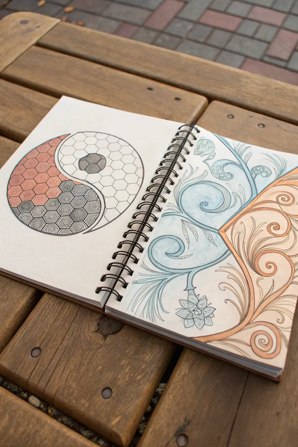
This striking yin yang concept contrasts rigid, structured hex tiling with free-flowing floral swirls, creating a dynamic balance between two vastly different artistic styles. The split-page layout invites the viewer to see how disparate elements can complement each other across a central divide.
How-To Guide
Materials
- Spiral-bound sketchbook (heavyweight paper essential)
- Pencil (HB or 2B) and eraser
- Compass for circles
- Ruler
- Fine-point black ink pens (0.1mm, 0.3mm, 0.5mm)
- Colored pencils (terracotta/rust, slate blue/grey, sage green)
- White gel pen (optional for highlights)
Step 1: Drafting the Framework
-
Divide the space:
Begin by opening your sketchbook to a fresh spread. Lightly draw a vertical line down the gutter (where the spiral binding is) to mentally separate the two halves, though the design will flow across the visual gap. -
Draw the main circle:
On the left page, use your compass to draw a large, perfect circle. This will serve as the container for the yin yang symbol. -
Create the S-curve:
Sketch the classic S-shaped curve through the center of the circle to divide the yin and yang sections. Ensure the curve is smooth and balanced. -
Mark the contrasting right side:
On the right page, ignore the circle boundary. Instead, lightly sketch a diagonal line coming from the center of the binding toward the top right corner. This separates the blue organic section from the orange organic section.
Grid Master Tip
For the hexagon grid, draw a series of parallel lines first, then cross them at 60-degree angles. This is much faster than drawing individual hexagons one by one.
Step 2: The Geometric Left (Yin Yang)
-
Grid the hexagon pattern:
Inside the entire yin yang circle, lightly pencil a hexagonal grid. It helps to use a ruler to keep your lines parallel and spacing even. Don’t worry about boundaries yet; just fill the circle with the grid. -
Outline the hexagons:
Switch to a 0.3mm pen. Ink the hexagon shapes, but only those that fall fully or partially inside your main circle boundary. -
Detail the ‘Yin’ (Dark Side):
In the bottom section of the S-curve, fill each hexagon with a concentric spiral pattern using a 0.1mm pen. This tight, repetitive line work creates density and darkness without using solid black ink. -
Color the ‘Yang’ (Light Side):
The top section remains lighter. Leave the hexagons fundamentally empty, but ink their outlines cleanly. Add a small central hexagon cluster instead of a standard dot, shading it completely black or cross-hatching it densely. -
Add the rust accent:
Using a terracotta or burnt orange colored pencil, gently shade the hexagons in the upper-left quadrant of the circle. Fade the color out as you move toward the center line for a gradient effect.
Uneven Spiral Fix
If your spirals in the dark section look messy, don’t erase. Just darken that specific hexagon completely with ink. A few solid black hexes add great texture.
Step 3: The Organic Right (Floral Flow)
-
Sketch the primary scrolls:
On the right page, pencil in large, sweeping acanthus-style scrolls. Create one main vine flowing upward in the blue section and another flowing downward in the orange section. -
Refine the leaves:
Add elaborate details to your scrolls. Draw curled tips, secondary vines, and jagged leaf edges. Aim for fluidity here to contrast the stiffness of the left page. -
Ink the organic lines:
Use a 0.5mm pen for the main stems to give them weight, and a 0.1mm pen for the delicate interior leaf veins and tendrils. Vary your line weight to make the drawing feel alive. -
Add color washes:
Take your slate blue pencil and shade the upper section. Apply more pressure near the spine and the stems, fading out toward the paper edges. Repeat this process with the terracotta pencil for the bottom section. -
Highlight and shadow:
Go back in with your pencils to deepen the shadows where leaves overlap. I find that adding a tiny bit of white gel pen on the highest curves of the scrolls adds a nice pop of dimension. -
Connect the halves:
Finally, look at the spread as a whole. Ensure the color tones on the right match the hues used in the geometric left to visually tie the two disparate styles together.
Close your book knowing you’ve successfully merged mathematical precision with botanical beauty in one cohesive spread.
Hidden Message Yin Yang Lettering Twist
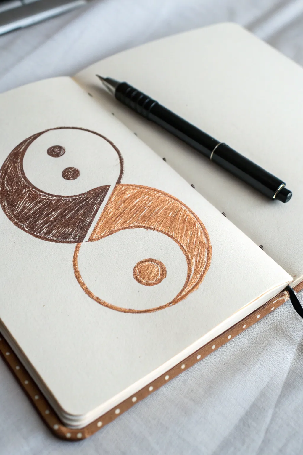
This unique take on the classic Yin Yang symbol softens the usual sharp contrast with warm earthy tones and a playful, creature-like twist. Using simple colored pencils or pens, you’ll create interlocking organic shapes that feel both balanced and full of character.
Detailed Instructions
Materials
- Sketchbook or drawing paper (cream or off-white works best)
- Pencil (HB or lighter for sketching)
- Eraser
- Dark brown fineliner or gel pen (0.5mm)
- Bronze or light brown gel pen or colored pencil
- Dark brown colored pencil or marker
Step 1: Drafting the Shapes
-
Visualize the layout:
Visualize a diagonal line running from the top left to the bottom right of your page; your shapes will flow along this axis rather than sitting perfectly vertical. -
Sketch the upper curve:
Using a light pencil, draw the top shape first. Think of a large comma or a tadpole shape swimming downwards to the left. The hea should be large and round, tapering into a tail that curves underneath. -
Sketch the lower curve:
Draw the opposing shape starting from the bottom right. This should mirror the first one, like a tadpole swimming upwards to the right. Its tail should tuck into the curve of the top shape’s head. -
Refine the gap:
Check the space between the two shapes. Unlike a traditional Yin Yang where they touch seamlessly, leave a deliberate, consistent white gap between them to separate the forms clearly. -
Add the details:
Inside the top (left) shape, lightly sketch two small circles side-by-side near the top, giving it a face-like appearance. In the center of the bottom (right) shape’s head, draw one larger circle.
Step 2: Inking and Coloring
-
Outline the top shape:
Take your dark brown fineliner or gel pen. Carefully trace over your pencil lines for the top shape, including the two small eye circles inside. -
Fill the top shape:
Using the same dark brown pen or a matching colored pencil, begin filling in the top shape. Use diagonal, hatch-like strokes that follow the curve of the form. -
Detail the eyes:
When coloring around the two small circles in the top shape, leave the circles themselves empty for now to keep them distinct. -
Fill the top eyes:
Now, fill in the two small eye circles with the dark brown, but make them solid and dense compared to the hatched texture of the body. -
Outline the bottom shape:
Switch to your bronze or light brown tool. Trace the outline of the bottom shape and the large circle inside it. -
Fill the bottom shape:
Fill the body of the bottom shape using the lighter brown. Again, use vigorous, sketchy directional strokes to create texture rather than a solid block of color. -
Color the bottom circle:
Fill in the single large circle in the bottom shape with the light brown. I like to press a little harder here to make the circle slightly darker than the surrounding area. -
Erase guidelines:
Wait for the ink to dry completely to avoid smudging. Then, gently erase any visible pencil marks from your initial sketch. -
Strengthen the darks:
Go back to the top shape with your dark brown pen. Go over the outline again to make it slightly bolder, reinforcing the contrast against the lighter shape. -
Add final texture:
If the bottom shape looks too pale, add a second layer of hatching in the deepest part of the curve to add a bit of dimension.
Uneven curves?
Turn your sketchbook upside down to check the symmetry of your curves. Viewing drawing from a new angle often reveals wobbly lines you missed before.
Add metallic flair
Use a metallic gold or copper gel pen for the lighter bottom section. It creates a beautiful shimmer against the matte dark brown.
Now you have a charming, textured piece of art that reinterprets balance in a warm, organic style
Have a question or want to share your own experience? I'd love to hear from you in the comments below!