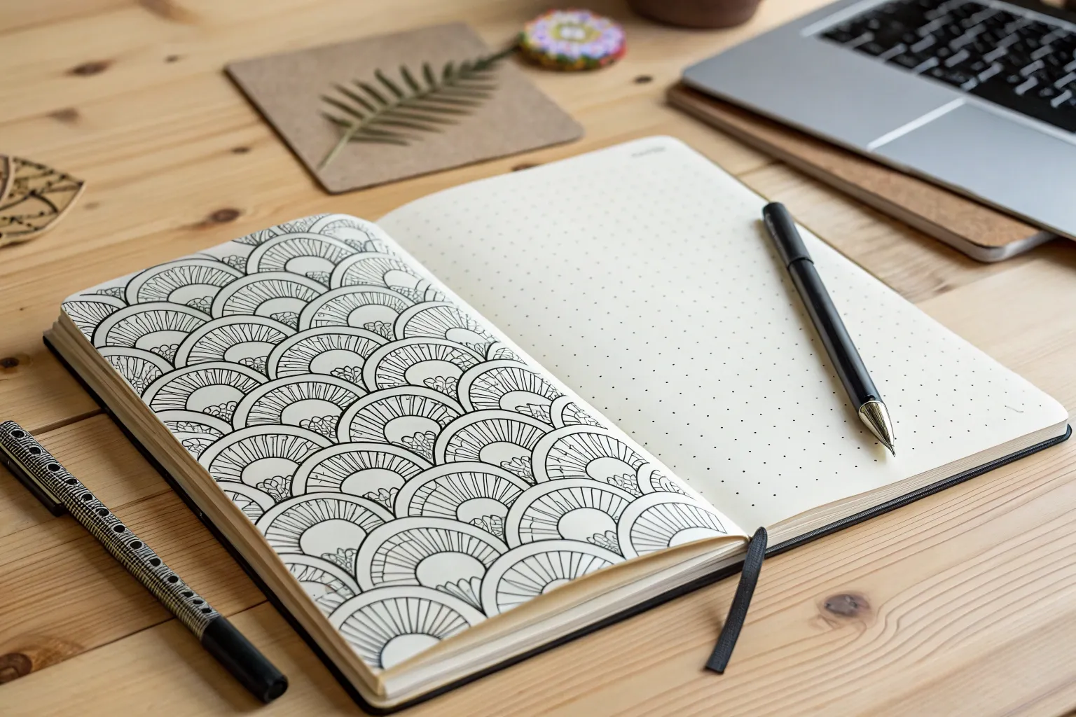
When I need my brain to quiet down, I reach for zen doodle patterns—those soothing, repetitive lines that let your hand do the thinking. Here are my favorite zen doodle ideas to spark that calm, focused flow (whether you’ve got five minutes or an entire afternoon).
Build a Beginner-Friendly Pattern Grid
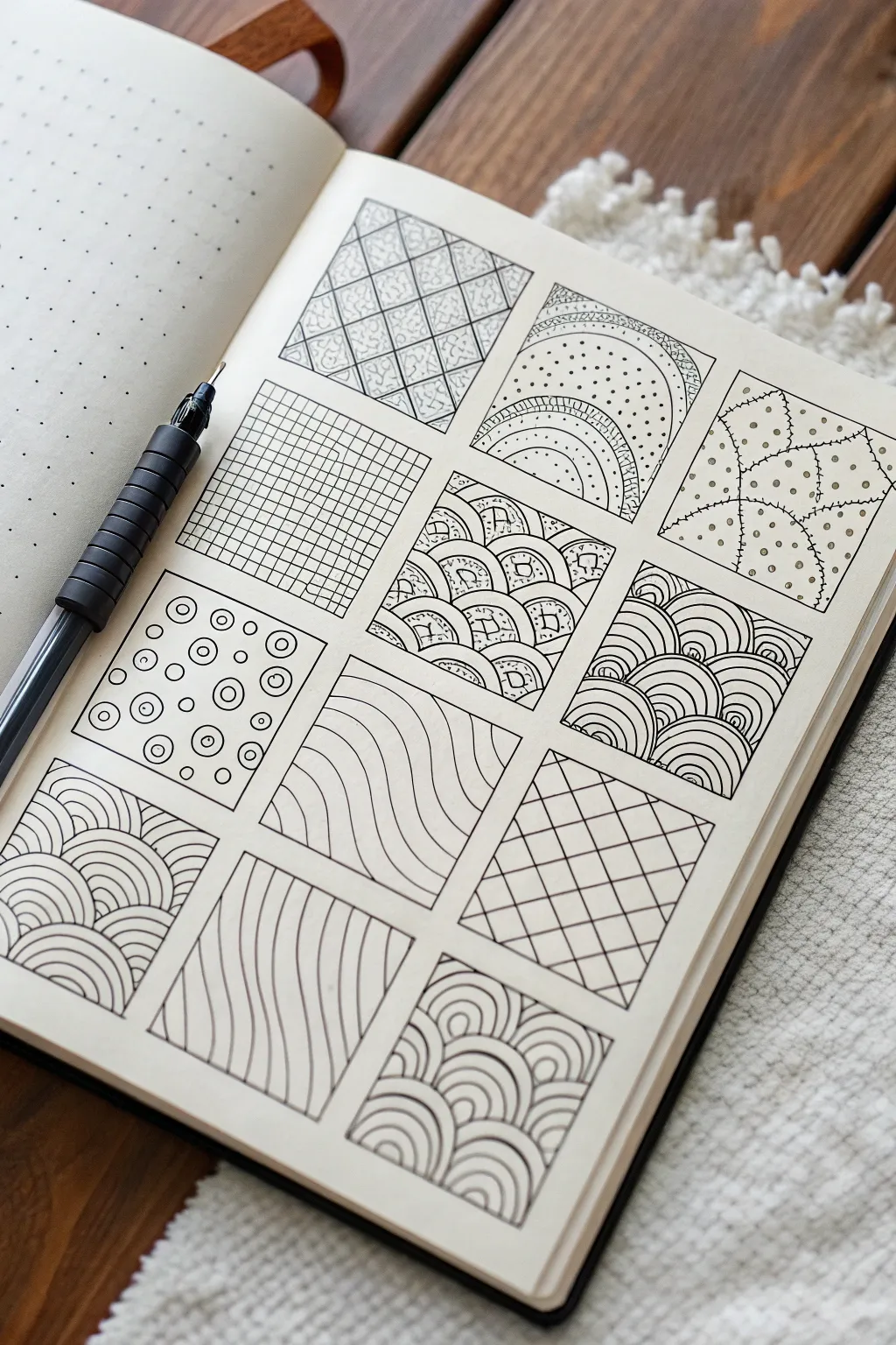
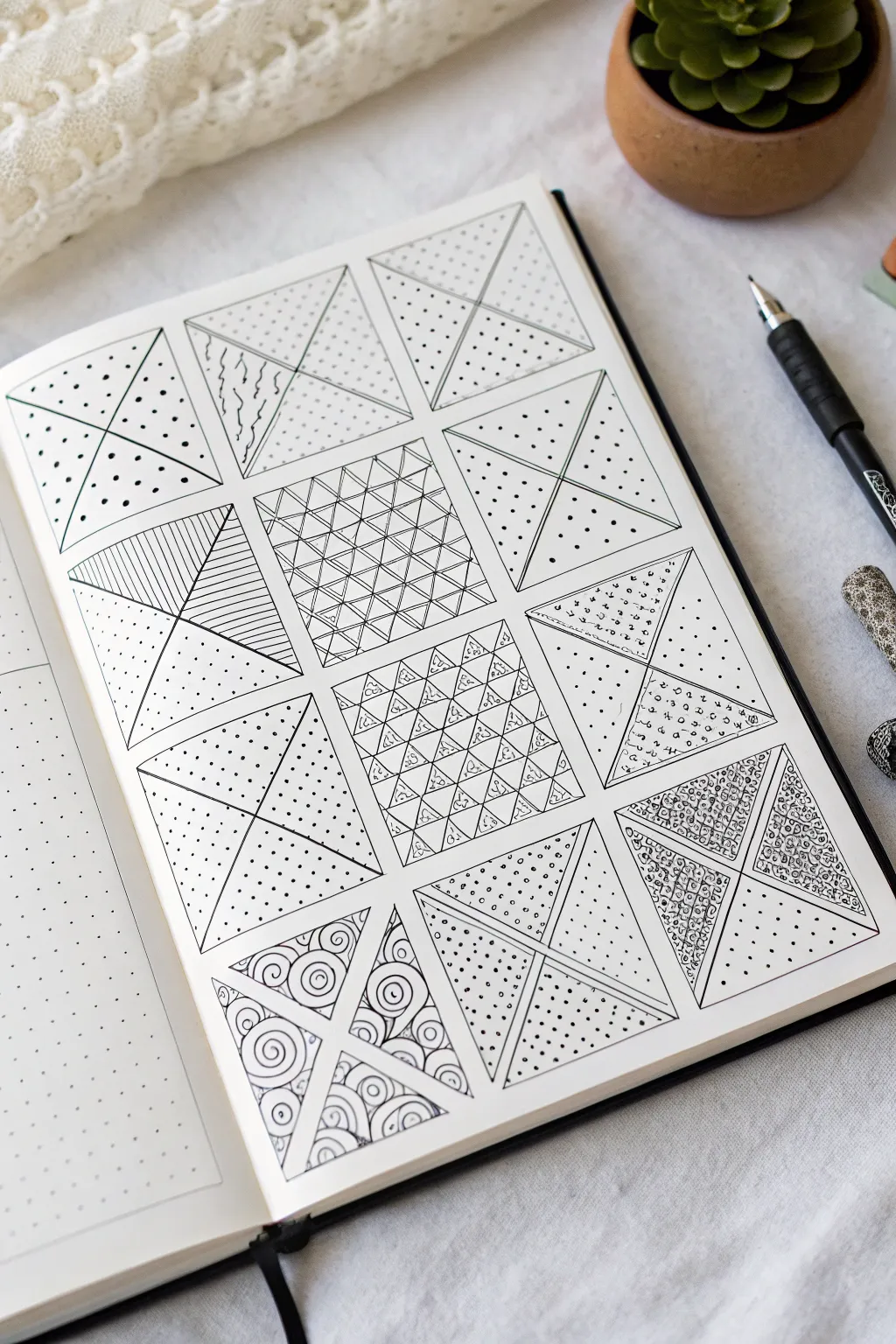
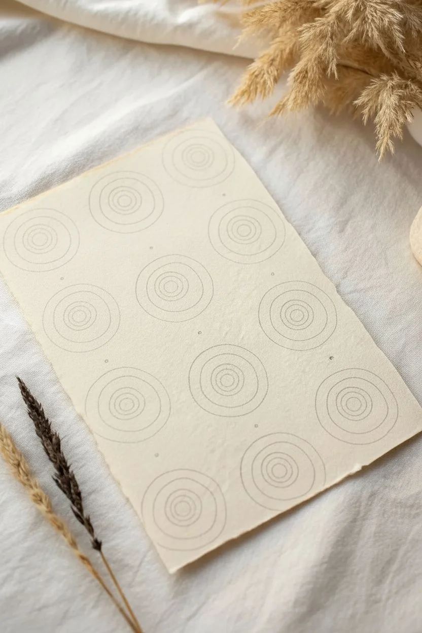
Embrace the meditative quality of line drawing with this structured yet relaxing pattern grid. Featuring twelve distinct designs ranging from organic waves to strict grids, this project turns a blank notebook page into a sampler of focus and creativity.
Step-by-Step Tutorial
Materials
- A5 Dot grid notebook (or blank paper with a ruler)
- Fine liner pen (0.3mm or 0.5mm tip, black ink)
- Ruler
- Pencil (HB or 2B)
- Eraser
Step 1: Preparation & Layout
-
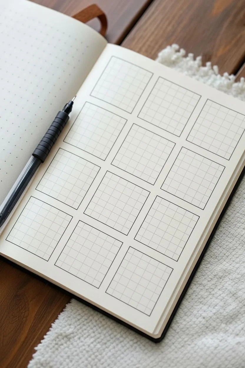
Define the Grid:
First, map out the structure. Using your ruler and pencil, lightly draw a sequence of twelve squares arranged in a 3-column by 4-row layout. Leave a small, uniform gap between each square to let the designs breathe. -
Square Dimensions:
If using dot grid paper, I find that squares measuring 8×8 dots or 10×10 dots work perfectly. This size is large enough for detail but small enough not to feel overwhelming. -
Outline in Ink:
Once you are happy with the penciled symmetry, carefully go over the perimeter of each square with your black fine liner. Keep the pressure even for a crisp border.
Ink Confidence
Don’t worry about shaky lines. The beauty of zen doodles is in the imperfections. If a line goes astray, just thicken it slightly to hide the wobble.
Step 2: Geometric Patterns (Top Block)
-
Pattern 1: Diamond Quilt:
In the top left square, draw diagonal lines in one direction, then cross them in the opposite direction to form diamonds. Fill every other diamond with a subtle scribbled texture for contrast. -
Pattern 2: Dotted Rainbows:
Move to the top middle square. Draw concentric arches starting from the bottom edge. Alternate between drawing solid lines, lines filled with tiny vertical dashes, and bands filled with stippled dots. -
Pattern 3: Stitched Patches:
In the top right square, draw random curved lines to segment the box like a puzzle. Along each line, add tiny perpendicular dashes to mimic stitching. Fill the negative spaces with evenly spaced dots. -
Pattern 4: The Micro-Grid:
For the first square in the second row, simply fill the box with a tight, straightforward grid of vertical and horizontal lines.
Add Depth
Use a light grey marker or a soft graphite pencil to add shading where the lines overlap. This creates a subtle 3D effect that makes the pattern pop.
Step 3: Structured Waves & Circles (Middle Block)
-
Pattern 5: Scale Texture:
Next, in the center square of the second row, draw overlapping semi-circles like fish scales. Inside each ‘scale’, draw smaller concentric semi-circles, adding a few tiny dots for detail. -
Pattern 6: Overlapping Arches:
In the rightmost square of the second row, create stacks of rainbows that appear to tuck behind one another. Keep the lines consistent and close together. -
Pattern 7: Bubble Wrap:
Start the third row with the left square. Draw various circles in different sizes. Inside each circle, draw a smaller circle offset slightly to the top-left to create a highlight effect, then add a center dot. -
Pattern 8: Flowing Lines:
In the middle square of the third row, draw a series of parallel, wavy lines flowing diagonally from the top left to bottom right.
Step 4: Woven & Organic Flows (Bottom Block)
-
Pattern 9: Angled Grid:
For the right square in the third row, replicate the micro-grid from Pattern 4, but tilt the whole design at a 45-degree angle to create diamonds. -
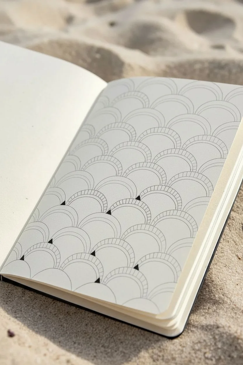
Pattern 10: Seigaiha Waves:
Begin the final row on the left. Draw concentric arches stacked directly on top of each other, similar to traditional Japanese wave patterns. -
Pattern 11: Vertical Flow:
In the middle square of the bottom row, draw vertical wavy lines. Unlike Pattern 8, keep these lines running generally up and down, but allow the spacing to compress and expand organically. -
Pattern 12: Echoed Arches:
Finish with the final bottom-right square. Draw random semi-circle mounds along the bottom edge, then draw ‘aura’ lines (echoing lines) around them until the box is filled. -
Cleanup:
Wait at least 5-10 minutes to ensure the ink is totally dry. Gently erase all initial pencil guidelines to reveal your high-contrast grid.
Now you have a reference sheet of patterns ready to be expanded into larger artworks


Fill Random Geometric Sections for Instant Structure
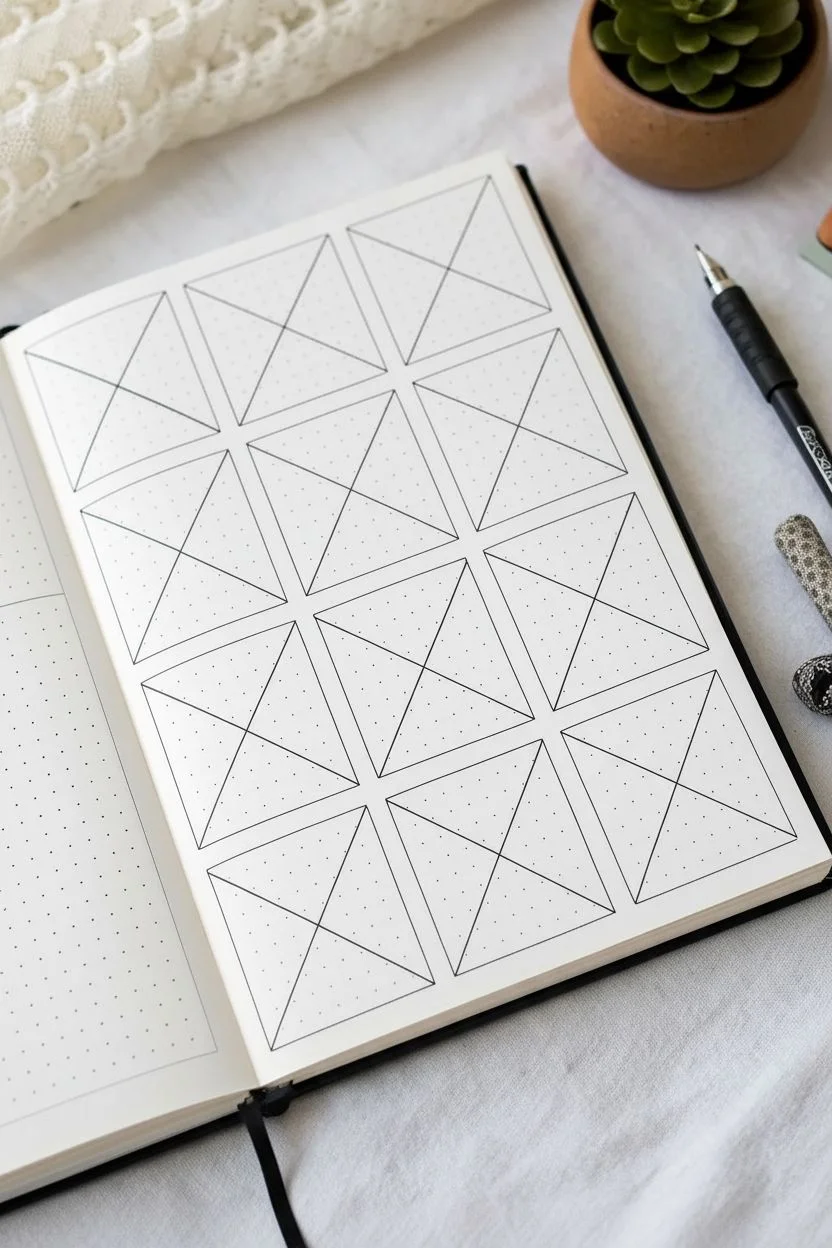
Transform a simple grid into a mesmerizing tapestry of patterns by filling geometric sections with repetitive line work. This structured approach takes the pressure off freehand drawing, allowing you to focus purely on the meditative rhythm of filling each space.
Step-by-Step
Materials
- Dot grid journal or notebook
- Fine liner pen (black, 0.3mm or 0.5mm)
- Ruler or straight edge
- Pencil (optional for grid lines)
- Eraser
Step 1: Setting the Structure
-
Define the main grid:
Start by drawing a series of squares on your dot grid paper. Aim for a 3×4 or 4×5 layout depending on your page size. Using a ruler ensures crisp, clean edges, but freehand lines add organic charm. -
Create the X divisions:
Inside most of your squares, draw two diagonal lines from corner to corner, creating a large ‘X’ that divides the square into four triangular sections. Leave a few squares empty or split them differently for variety.
Step 2: Patterning: Dots and Dashes
-
Simple stippling:
Choose a triangle section within a square and fill it entirely with small, evenly spaced dots. This creates a light texture that contrasts well with heavier lines. -
Graduated stippling:
In an adjacent triangle, try clustering dots densely near the center point where the lines meet, spreading them out as you move toward the outer edge to create a shading effect. -
Tiny circles:
Fill another section with small, open circles instead of solid dots. Keep them loose and slightly varying in size for a bubbly texture.
Ink Smearing?
Place a clean scrap piece of paper under your drawing hand. This acts as a shield, preventing oils from your skin from warping the paper and stopping your hand from dragging wet ink.
Step 3: Patterning: Lines and Grids
-
Parallel lines:
Select a new triangular section and fill it with straight lines running parallel to one of the outer edges. Closer lines appear darker; wider spacing keeps it light. -
Directional contrast:
If you fill two touching triangles with lines, draw the lines in opposing directions (vertical vs. horizontal) to distinguish the shapes clearly. -
Miniature grid:
Create a cross-hatch pattern in a section by drawing a grid of vertical and horizontal lines. You can leave the tiny squares empty or fill them with a checkerboard pattern. -
Triangle scales:
Draw rows of small triangles within a section. I like to stack them like bricks, ensuring the tip of one triangle rests between the bases of the two above it. -
Inside-out triangles:
Inside a pattern triangle, draw a smaller triangle, then another inside that one, repeating until you reach the center.
Add Dimension
Use a light gray marker or a soft pencil to add shadows where the lines intersect. This simple trick makes the triangles look like 3D pyramids popping off the page.
Step 4: Patterning: Organic Shapes
-
Squiggles and waves:
Break the rigid geometric feel by filling a section with wavy lines or random squiggles that resemble flowing water. -
Swirls and spirals:
Dedicate a square to curves. Draw large, bold spirals that originate from the corners or the center, filling the negative space with smaller curves. -
Floral fills:
Draw tiny, tightly packed flower shapes or petals in one of the triangular zones to add a botanical touch.
Step 5: Finishing Touches
-
Review and refine:
Scan your page for any gaps. If a pattern looks too light, go back and thicken the lines or add more dots to increase the contrast. -
Erase guidelines:
If you used a pencil to sketch your initial grid, verify the ink is completely dry before gently erasing the graphite marks.
Enjoy the satisfying sense of order your finished geometric spread brings to your notebook


Create a Simple Mandala With Repeating Rings
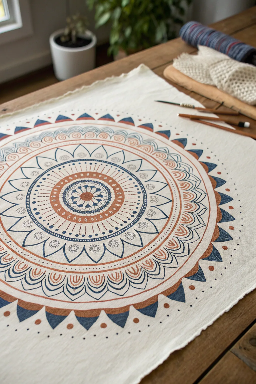
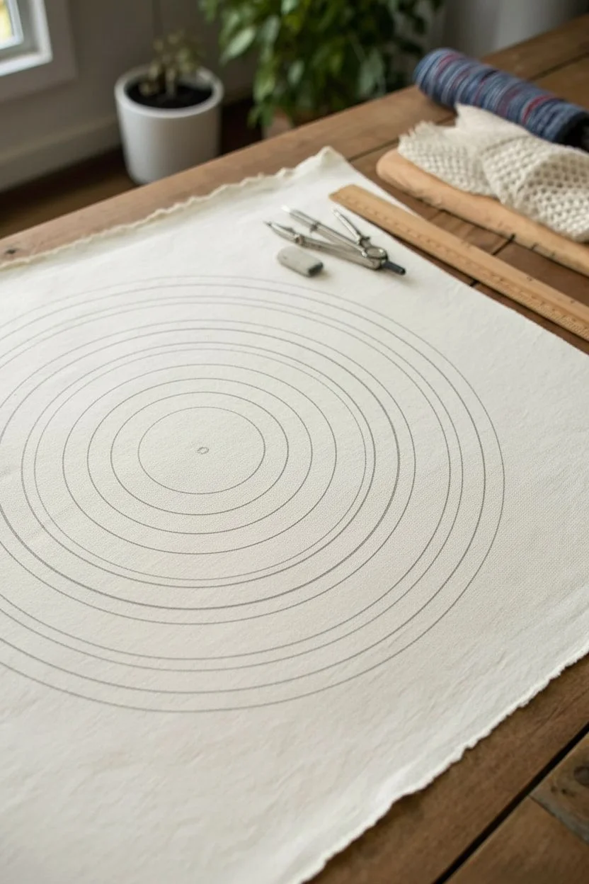
Transform plain fabric into a mesmerizing work of art with this intricate mandala design. Featuring a soothing palette of rust, indigo, and cream, this project combines mindful repetition with bold geometric precision to create a stunning centerpiece.
Step-by-Step
Materials
- Cotton or linen fabric square (placemat size)
- Fabric markers or fabric paint pens (Rust, Navy Blue, Light Blue)
- Pencil (light graphite or water-soluble fabric pencil)
- Compass for drawing circles
- Ruler
- Eraser
- Flat work surface
- Iron (for setting the ink)
Step 1: Setting the Foundation
-
Prepare the fabric:
Begin by washing and ironing your fabric piece to ensure it is completely flat and free of sizing chemicals, which helps the ink absorb evenly. -
Find the center:
Fold the fabric in half and then in half again to lightly crease the exact center point, or measure with a ruler to mark the middle with a small dot. -
Draw the guide rings:
Using your compass and a pencil, draw a series of concentric circles radiating from the center. Space them variably—some close together for detailed bands, others wider for larger petals—until you reach a diameter of about 12-14 inches.
Step 2: The Core Design
-
Create the central flower:
In the very center circle, draw a small eight-petaled flower using your navy blue marker. Fill the center dot with rust. -
Add first petal layer:
Surround the central flower with a ring of larger, rounded petals in navy blue, adding small internal lines for texture. -
Draw the rust ring:
Move to the next band and fill it with a solid rust color, leaving small white oval negatives spaces evenly spaced around the ring. -
Detail the sunburst layer:
In the next narrow band, use the navy marker to draw small, distinct dots or short dashes that radiate outward like sun rays.
Pro Tip: Steady Hands
Rest your wrist on a clean sheet of scrap paper while drawing. This prevents your hand from smudging wet ink on the fabric and keeps oils from your skin off the cloth.
Step 3: Expanding the Pattern
-
Draft the large petals:
In the widest open band, sketch large, pointed petal shapes with your pencil first to ensure symmetry, then trace over them with the navy blue marker. -
Decorate the petals:
Inside each large pointed petal, draw a small spiral or floral motif at the base using a fine-tipped pen. -
Add the scalloped border:
Draw a double scallop pattern around the outside of the pointed petals using the rust marker, filling in the thicker lines to add visual weight. -
Create the arch layer:
Draw a series of connecting arches in the next ring. I like to double-line these arches to give them a bit more definition. -
Fill the arches:
Inside each arch, draw a small teardrop shape in rust orange, nesting it perfectly in the curve.
Troubleshooting: Bleeding Ink
If ink bleeds into the fabric grain, your marker tip might be too thick. Switch to a finer tip or move the pen faster across the surface to deposit less ink at once.
Step 4: The Outer Edge
-
Draw the sawtooth border:
Create the final significant ring by drawing a sawtooth (triangular) pattern. Alternate the colors of the triangles between solid navy blue and solid rust. -
Add floating dots:
Just outside the sawtooth border, place single navy blue dots at the tip of each triangle to expand the design into the negative space. -
Erase pencil marks:
Allow the ink to dry completely—wait at least an hour to be safe—then gently erase any visible pencil guidelines. -
Heat set the design:
Iron the reverse side of the fabric on a high setting (no steam) for several minutes to make the design permanent and washable.
Enjoy the calm rhythm of creating this mandala and display your finished textile art with pride


Layer Petal Flowers With Repeat Strokes
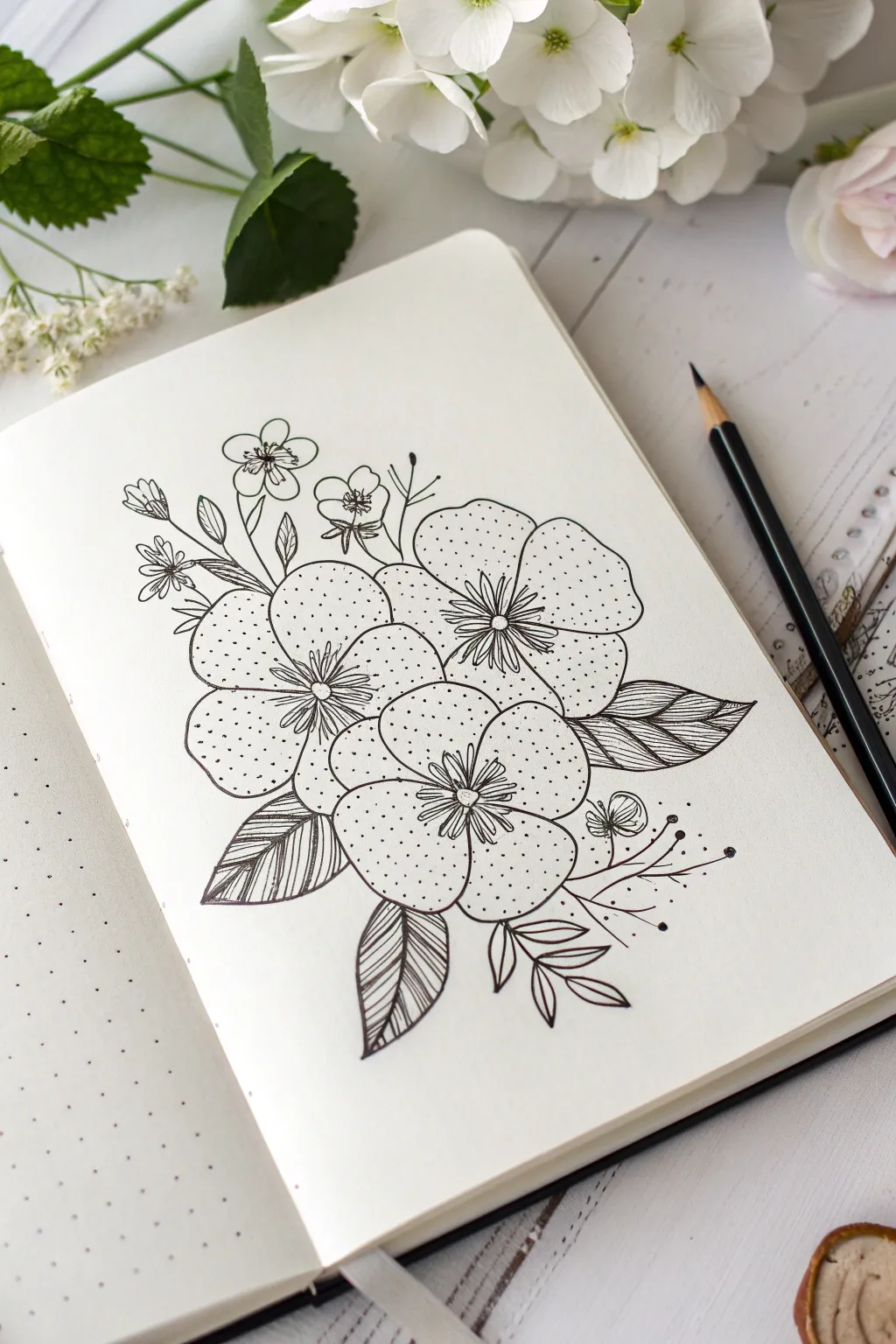
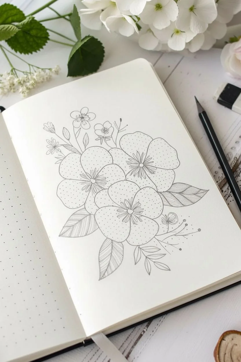
This relaxing doodle project brings together simple botanical shapes with meditative patterns. The focus is on large, overlapping floral heads filled with tiny stippling dots to create texture and depth without needing complex shading.
Step-by-Step
Materials
- Dotted journaling notebook or sketchbook
- Black fine liner pen (size 03 or 05)
- Black fine liner pen (size 005 or 01 for details)
- Pencil (HB or 2B)
- Eraser
Step 1: Sketching the Composition
-
Map out the flower centers:
Begin by lightly sketching three small circles in a triangle formation with your pencil. These will be the centers of your three main blooms. Place one slightly higher than the other two to create a balanced cluster. -
Draw the petal outlines:
Around each center circle, sketch five large, rounded petals. Let the petals touch and slightly overlap each other. The flower in the foreground (bottom) should look complete, while the ones behind it can have petals partially hidden. -
Add the leaf shapes:
Draft the shapes of leaves tucked behind the flowers. Sketch two large, pointed leaves on the right side and two distinct leaves near the bottom left. Keep the lines loose and flowing. -
Include buds and stems:
Sketch a few thin stems rising from the top left, ending in small five-petal buds. Add a few more decorative sprigs and curved lines on the right side to balance the arrangement.
Keep the Rhythm
When stippling (dotting) the petals, try to tap the pen in a random rhythm rather than rows. This creates a more organic, natural texture.
Step 2: Inking the Outlines
-
Outline the main petals:
Switch to your thicker fine liner (03 or 05). Carefully trace over your pencil lines for the large flower petals, using a confident, continuous stroke for each curve. -
Ink the overlapping sections:
Pay attention to where flowers overlap. Draw the full outline of the front-most flower first to ensure you stop the lines of the background flowers correctly. -
Define the leaves:
Trace the leaf outlines. Draw a central vein line down the middle of each leaf. -
Draw the smaller elements:
Ink the delicate stems, the small buds at the top, and the decorative curved sprigs. For the tiny buds, keep the lines simple and cute. -
Erase pencil guides:
Once the ink is completely dry—I usually wait at least two minutes to prevent smudging—gently erase all the underlying pencil sketches to leave a clean black-and-white base.
Uneven Ink Lines?
If your long petal strokes feel shaky, try moving your entire arm rather than just your wrist. Faster strokes are often smoother than slow ones.
Step 3: Adding Details and Texture
-
Create the flower centers:
In the center of each large bloom, draw a small circle. Radiating outward from that circle, draw several short, straight lines like spokes on a wheel. Add a second, slightly longer set of lines in between the first set. -
Stipple the petals:
Using your finest pen (005 or 01), begin adding dots inside the petals. Concentrate the dots more densely near the flower center to suggest shadow and depth. -
Fade the stippling:
As you move toward the outer edges of the petals, space the dots further apart. This gradient effect gives the flat drawing a sense of volume. -
Striping the leaves:
Return to the leaves and fill them with fine diagonal lines. On one side of the central vein, draw lines angling down; on suitable leaves, vary the direction or curve the lines slightly to follow the leaf’s shape. -
Add leaf vein details:
For the leaves on the right, you can alternate straight lines with small, curved segments to create a ribbed texture. -
Decorate the sprigs:
On the floating curved stems to the right, add tiny solid black dots at the ends of the lines to create abstract botanical stamens. -
Detail the buds:
Add tiny lines inside the small flower buds at the top left to show where the petals separate. -
Final touches:
Review your drawing for any gaps. If a line looks too thin, go over it once more to bold it up, particularly on the outer perimeter of the main cluster.
Now you have a charming botanical illustration that perfectly balances bold lines with delicate texture

PENCIL GUIDE
Understanding Pencil Grades from H to B
From first sketch to finished drawing — learn pencil grades, line control, and shading techniques.
Explore the Full Guide
Make Waves, Ripples, and Water-Like Lines
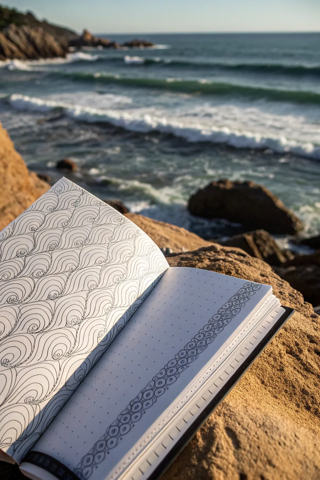
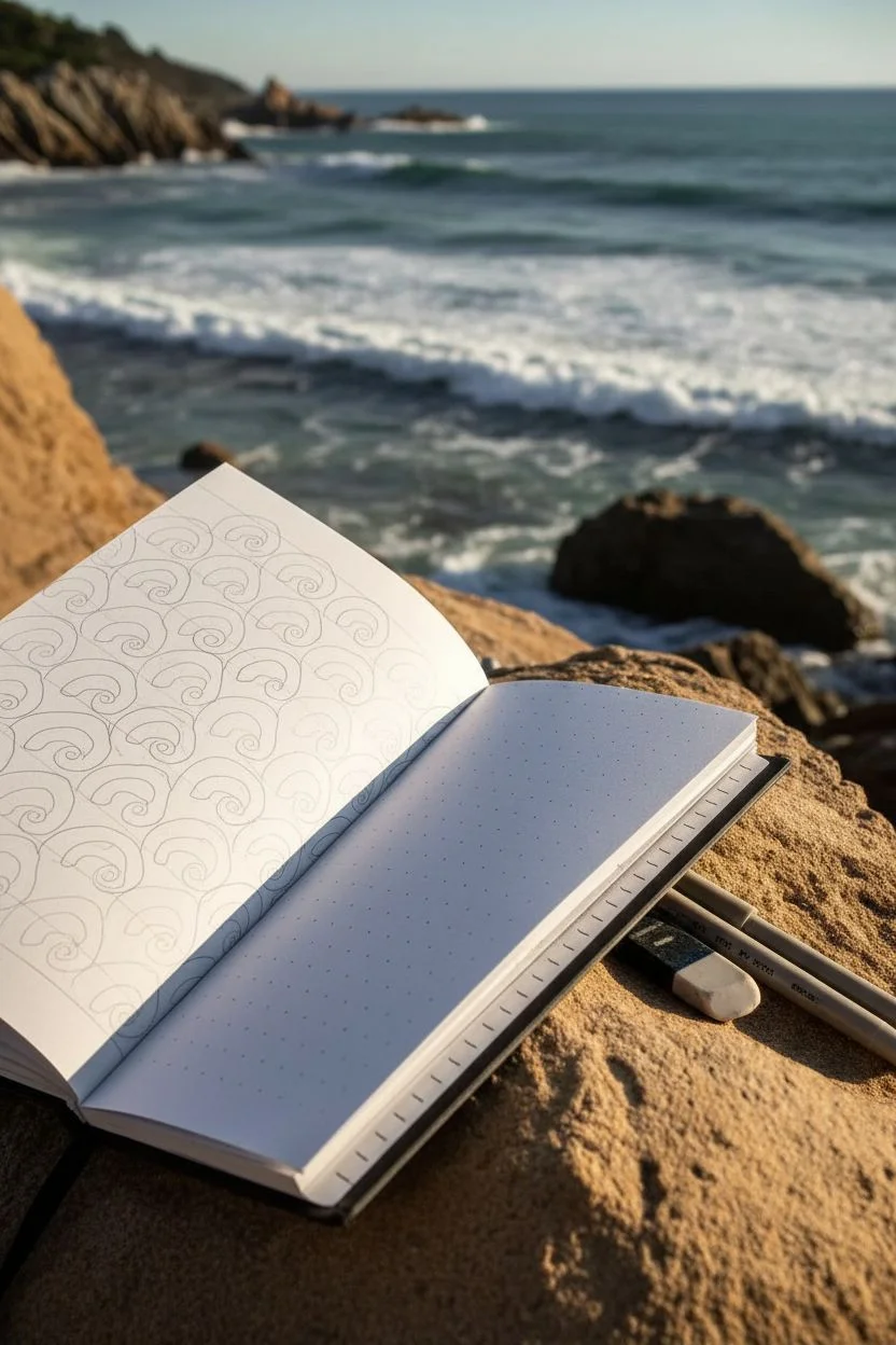
Capture the rhythmic motion of the ocean with this soothing, repetitive wave pattern. Using simple curved lines and consistent spacing, you’ll fill an entire page with a mesmerizing design that mimics the flow of water.
How-To Guide
Materials
- Sketchbook or art journal (dotted or blank pages work well)
- Fine liner pen (0.3mm or 0.5mm, black)
- Pencil (HB or 2B)
- Eraser
- Ruler (optional, for guidelines)
Step 1: Setting the Foundation
-
Prepare your workspace:
Find a flat surface or a comfortable spot where you can focus. If you’re working outdoors like in the photo, ensure your sketchbook is stable against the wind. -
Draft the initial rows:
Lightly sketch horizontal guidelines across your page using a pencil. Space them about 1.5 to 2 inches apart to determine the height of your wave rows. These lines will help keep your pattern uniform. -
Sketch the primary wave shape:
Starting on the bottom guideline, draw a series of large, cresting wave shapes. Imagine a simple hook or a fern frond curling over to the left. The base of each wave should touch the line below it, and the crest should touch the line above. -
Repeat the motif:
Continue sketching these wave outlines across the entire row. Try to keep the width of each wave roughly consistent. It is okay if they vary slightly; organic irregularity adds character. -
Stack the rows:
Move to the row immediately above. Offset the waves so the bottom of the new wave nestles into the dip between the two waves below it, creating a brick-lay or scale-like pattern.
Step 2: Inking the Outline
-
Trace the main curves:
Switch to your fine liner pen. Carefully trace over your pencil sketches for the main wave outlines. Use a confident, smooth stroke rather than short, scratchy lines to maintain fluidity. -
Add the spiral detail:
At the crest of each wave, curl the line inward into a tight spiral. This small detail gives the impression of a crashing wave. -
Erase pencil marks:
Once the ink is completely dry—give it a minute or two to prevent smudging—gently erase your pencil guidelines and sketch marks to reveal a clean framework.
Fixing Wobbly Lines
If a line goes astray, don’t panic. Simply thicken the line slightly to mask the wobble, or turn the mistake into a new, smaller wave crest.
Step 3: Filling with Flowing Lines
-
Start the interior lines:
Inside one of your wave shapes, begin drawing lines that follow the curve of the outer outline. Start from the bottom right of the shape and sweep upward and to the left. -
Maintain consistent spacing:
Draw 4 to 6 parallel curved lines inside each wave shape. I like to keep the spacing relatively tight to create density and contrast against the white space. -
Follow the curl:
As your lines approach the spiral at the top, let them curve along with it, becoming shorter as they tuck into the center of the swirl. -
Repeat for all waves:
Methodically work your way through each wave shape on the page. This is the meditative part of the process, so take your time and enjoy the repetition. -
Check for gaps:
Look for any awkward empty spaces between the rows. You can add small curved lines or tiny triangles of ink to bridge gaps and make the pattern feel seamless.
Add Depth with Shading
Use a light grey marker or a soft pencil to shade the underside of each wave curl. This simple addition makes the pattern pop with a 3D effect.
Step 4: Optional: Border Accent
-
Create a border strip:
On the adjacent page, draw a diagonal band about an inch wide. Use your ruler if you want perfectly straight edges, or freehand it for a looser look. -
Fill with scales:
Inside this band, draw rows of small, overlapping semicircles or ‘U’ shapes. These look like fish scales or smaller ripples. -
Detail the scales:
Add a small dot or a tiny spiral inside each scale for extra texture, mirroring the theme of the main wave page.
Now you have a sketchbook filled with the calming rhythm of the sea, ready for your next doodle session
Play With Checkerboards and Alternating Blocks
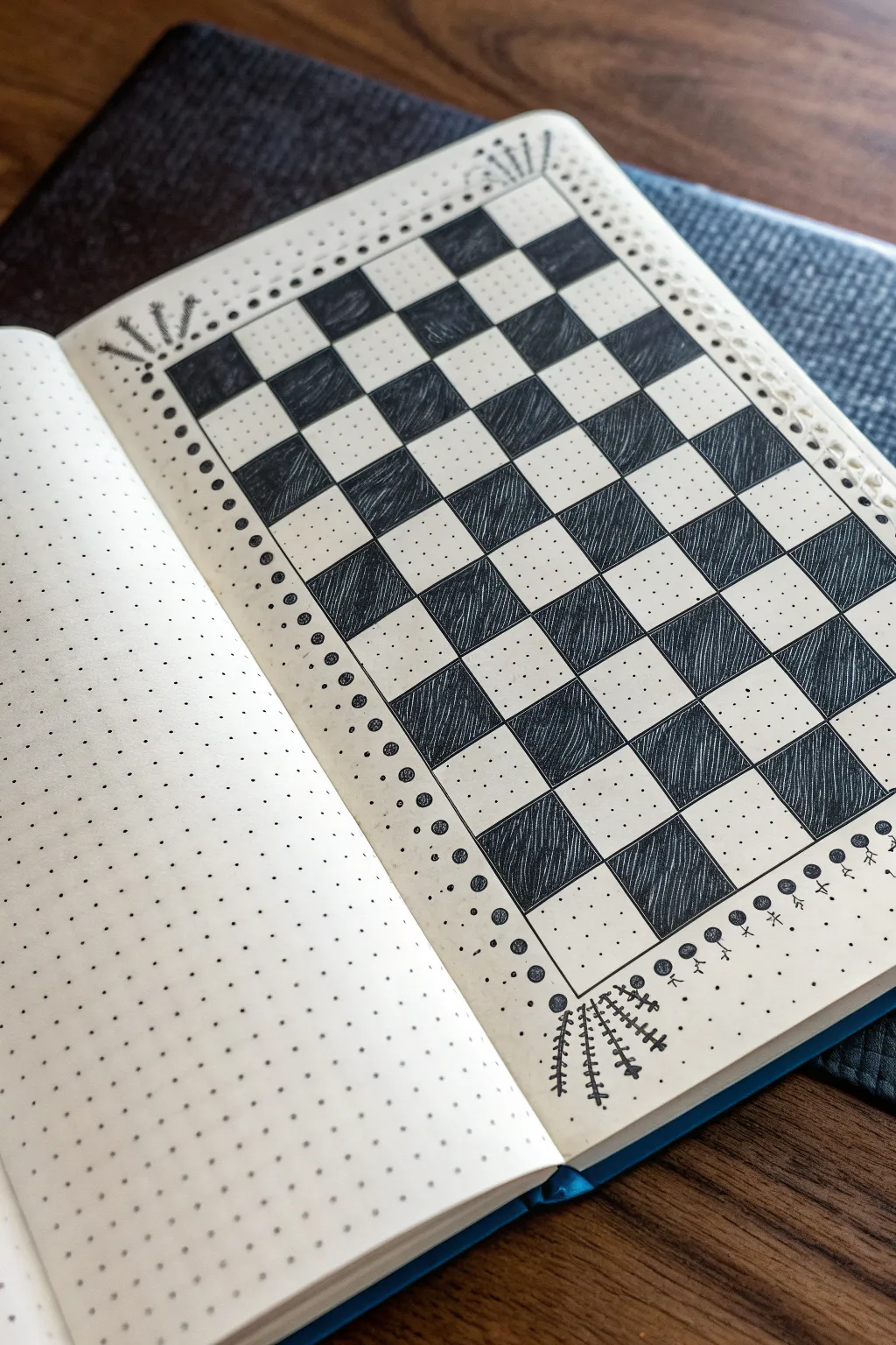
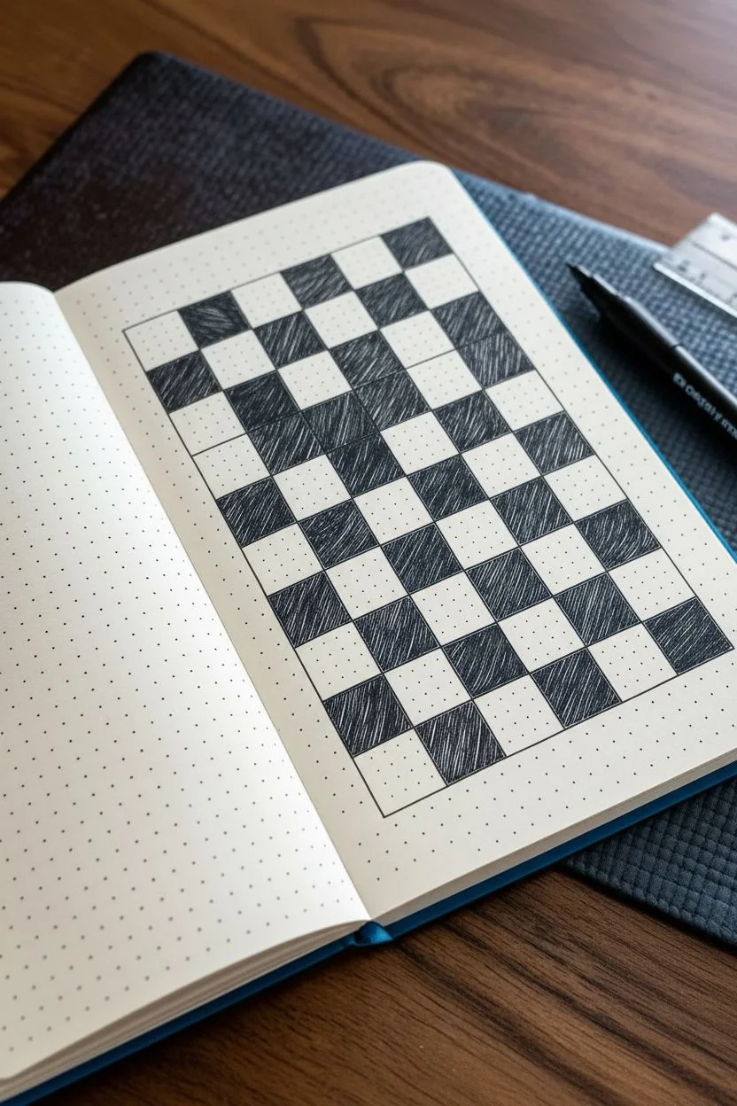
Transform a standard bullet journal page into a playful piece of geometric art with this hand-drawn checkerboard. The imperfect, sketchy fill lines combined with delicate organic borders give this rigid structure a relaxing, soft aesthetic.
Detailed Instructions
Materials
- A5 Dot grid notebook or bullet journal
- Black fine liner pen (0.3mm or 0.5mm)
- Ruler or straight edge
- Pencil and eraser
Step 1: Setting the Grid
-
Define the perimeter:
Begin by deciding the size of your board. In a standard dot grid notebook, count out an 8×8 block of squares. I like to leave a generous margin of dots around the outside for the decorative border later. -
Mark the corners:
With your pencil, lightly mark the four corners of your large square. This helps visualize the space before you commit to ink. -
Draw the main grid lines:
Using your ruler and the fine liner, draw the outer boundary box. Then, draw the vertical and horizontal lines to create the inner grid, spacing them evenly based on your dot count (usually 3 or 4 dots per square works well depending on page size).
Step 2: Filling the Pattern
-
Identify the black squares:
Before coloring, place a tiny pencil dot in every alternating square that needs to be filled. This simple check prevents the dreaded mistake of accidentally coloring two adjacent squares. -
Outline the first dark square:
Starting in the top left corner (if that represents a ‘black’ square on your board), trace just inside the lines of that specific square with your pen to create a crisp edge. -
Fill with texture:
Instead of coloring it in solid black, fill the square with closely spaced diagonal hatching lines. Keep the lines somewhat loose and quick to maintain that hand-drawn ‘zen’ feel. -
Complete the first row:
Move across the top row, skipping every other square, and fill the alternating blocks with the same diagonal hatching technique. -
Continue the pattern:
Process the remaining rows one by one. Remember that if a row started with a dark square, the next row below it must start with a white square. -
Erase pencil marks:
Once the ink is completely dry, gently erase any pencil guide dots you made earlier to keep the page clean.
Ink Advice
Use a pen with waterproof ink if possible. This prevents smudging if your hand drags across the hatching while working on the lower sections.
Step 3: Adding the Decorative Borders
-
Draw the border dots:
On two opposing sides of your checkerboard (let’s say left and right), draw a series of small, solid black circles. Place one circle aligned with the center of each grid row. -
Add floating dots:
Draw a secondary line of much smaller dots just outside the solid circles, adding a delicate ‘dusting’ effect to the edge. -
Create the top flourishes:
At the top corners, draw three small lines radiation outward like a firework. Add tiny dots at the end of each line. -
Detail the bottom flourishes:
For the bottom corners, create a small ‘fern’ or ‘wheat’ embellishment. Draw three curved lines extending outward, and add tiny hash marks along their stems. -
Anchor with shapes:
Along the bottom edge, below the main grid, draw a row of lollipop-like shapes or small circles on sticks to ground the design.
Level Up
Try cross-hatching (lines going both ways) for darker squares, or use a metallic gold pen for the decorative border elements.
This meditative pattern is a perfect way to practice precision while allowing yourself the freedom of texture and doodles
BRUSH GUIDE
The Right Brush for Every Stroke
From clean lines to bold texture — master brush choice, stroke control, and essential techniques.
Explore the Full Guide
Draw Scale Patterns for a Cozy, Tactile Look
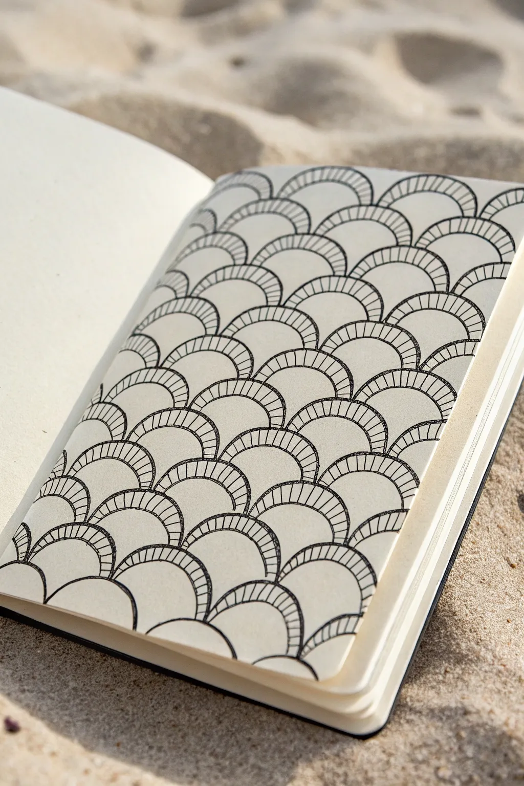
Embrace the repetitive rhythm of the sea with this calming scale pattern that builds row by row into a cohesive, textured surface. The simple combination of sweeping arcs and straight hatch lines creates a surprisingly dimensional effect that looks great on any sketchbook page.
Step-by-Step Guide
Materials
- Sketchbook with cream or off-white paper (smooth texture preferred)
- Fine liner pen (size 01 or 03), black ink
- Pencil (HB or 2H)
- Eraser
Step 1: Planning the Grid
-
Mark the edges:
Start by lightly marking the left and right boundaries of your drawing area with your pencil. This doesn’t need to fill the whole page; leaving a border of negative space, like in the example, frames the work nicely. -
Draft the first row:
At the very bottom of your page, lightly sketch a horizontal row of semi-circles (arches). Aim for them to be roughly the width of your thumb. -
Stack the subsequent rows:
Sketch the next row of arches directly above, positioning the peak of each new arch so it sits centered over the valley between two arches below. This brick-lay or staggered pattern is key to the scale look. -
Continue upward:
Fill your designated space with these lightly penciled rows of interlocking arches until you reach the top of your page.
Step 2: Inking the Structure
-
Trace the main curves:
Switch to your fine liner pen. Beginning at the bottom, carefully trace over your pencil arches with a steady hand. Ensure the lines connect cleanly at the corners where the scales meet. -
Add the inner arches:
Inside each scale, draw a second, slightly smaller arch. This creates a double-line effect. Keep the spacing consistent—about 2-3mm from the outer line represents the thickness of the rim. -
Watch the connections:
When drawing that inner arch, make sure the line stops cleanly at the scale below it. It shouldn’t cross over into the next row. -
Complete the outlines:
Work your way up the page, inking all the double-hump shapes. I find it easiest to work row by row to prevent smudging fresh ink with my hand. -
Erase pencil guides:
Once the ink is completely dry—give it a minute or two—gently erase the original pencil sketches so only the crisp black lines remain.
Clean Lines
To keep your hand from smudging the ink as you move up the page, place a scrap piece of paper under your drawing hand to act as a protective barrier.
Step 3: Adding Texture
-
Start the hatching:
Now comes the meditative part. Go back to the bottom row. Inside the narrow channel created by your double lines, draw small, straight hatch lines connecting the inner arch to the outer arch. -
Find a rhythm:
Draw these little lines perpendicular to the curve of the arch. They should fan out like sun rays as they move around the semi-circle. -
Maintain spacing:
Keep the distance between each hatch mark relatively consistent, but don’t stress about perfection; slight variations add to the hand-drawn charm. -
Work left to right:
Complete the hatching for one full row before moving up to the next. This helps you track your progress and keeps the pattern uniform. -
Hatch upward:
Continue this process for every single scale, filling that rim space with texture all the way to the top of your drawing. -
Handling the edges:
For the partial scales cut off at the left and right edges or the very top, simply hatch whatever portion of the rim is visible. -
Fill the gaps:
There are small triangular voids where three scales meet. Color these in solid black with your pen to add contrast and depth to the lattice. -
Final check:
Scan your drawing for any missed hatch lines or triangular gaps that haven’t been filled, touching them up as needed to finish the uniform look.
Go Bolder
Try thickening the very outer line of each scale with a slightly heavier pen (like an 05) to make the individual shapes pop out from the background more.
Now you have a full page of rhythmic texture that feels both ordered and organic
Use Paisleys and Teardrops as Pattern Containers
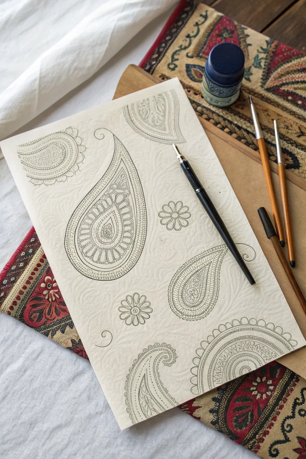
Discover the meditative joy of filling classic paisley teardrops with intricate, repetitive patterns. This project creates a stunning, monochromatic study of line work that balances organic curves with geometric precision.
How-To Guide
Materials
- Textured cream or off-white drawing paper (heavyweight)
- Black dip pen holder
- Fine nib for drawing
- India ink or quality black drawing ink
- Pencil (HB or 2H)
- Kneaded eraser
- Optional: Fine liner pans (black, various sizes)
Step 1: Planning the Layout
-
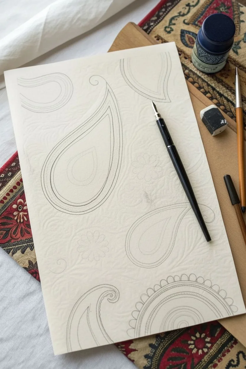
Sketch the main shapes:
Start with a light pencil sketch to establish the composition. Draw several large, sweeping teardrop (paisley) shapes of varying sizes across the page, rotating them so they curve in different directions. -
Add floral accents:
In the negative spaces between the large teardrops, sketch simple six-petaled flowers or small circles to balance the layout without overcrowding it. -
Create distinct outlines:
Using your dip pen or fine liner, carefully trace the outer perimeter of each paisley shape. I prefer to use a slightly bolder line weight here to clearly separate the shape from the background. -
Double the contour:
Draw a second line just inside the main outline, creating a narrow border. This double-line technique acts as a frame -
Erase pencil guides:
Once the foundational ink outlines are completely dry, gently gently lift away the initial graphite sketch with a kneaded eraser.
Steady Your Hand
Rest your wrist on a clean scrap sheet of paper while drawing. This prevents hand oils from getting on the art paper and stops you from smudging wet ink.
Step 2: Filling the Teardrops
-
Define the core:
Inside the largest paisley, locate the rounded bulbous end and draw a smaller, central teardrop shape. This will be the focal point of your internal pattern. -
Draw radiating petals:
Around that central core, sketch a ring of elongated petal shapes that radiate outward, filling the rounded belly of the paisley. -
Add detail to the petals:
Inside each radiating petal, draw a smaller matching shape or a simple line. Repeat these tiny details to build density and visual interest. -
Extend the tail:
Follow the curve up into the narrow tail of the paisley. Fill this channel with climbing patterns like stacked chevrons, small circles, or a simple ladder design. -
Hatching and shading:
Use very fine parallel lines (hatching) to darken specific areas, such as the space between petals or the very center of the core.
Ink Bleeding?
If your ink feathers or bleeds, your paper might be too absorbent. Try switching to smoother Bristol board or hot-press watercolor paper for crisp lines.
Step 3: Pattern Variation
-
Second paisley style:
Move to a different paisley shape. For this one, try a scalloped edge design. Draw small semi-circles along the inner border of your double outline. -
Grid fill:
Fill a section of this second paisley with a tiny cross-hatch or grid pattern. The contrast between organic curves and rigid grids looks fantastic. -
Floral fills:
In another paisley, fill the interior with climbing vines or small leaf shapes that follow the sweeping curve of the outline. -
Scalloped borders:
On one of the shapes, add an external decoration by drawing tiny loops or scallops along the very outside edge of the main teardrop. -
Final touches:
Ink the small standalone flowers scattered in the background. Keep these simple—just a center circle and open loop petals—to let the intricate paisleys shine.
Step back and admire the complex tapestry of lines you have created from simple repeating shapes


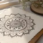
Turn Spirals Into Full Page Tangled Fields
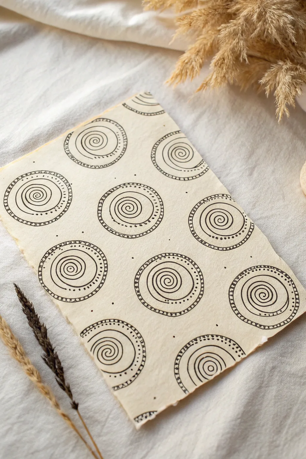
Transform a simple spiral into a mesmerizing, full-page meditative pattern. This project focuses on the rhythmic repetition of circles and swirls on textured paper to create a soothing, organic design that looks complicated but is surprisingly simple to execute.
Detailed Instructions
Materials
- Textured cream or off-white paper (heavyweight, with deckle edge if possible)
- Black fineliner (0.3mm or 0.5mm)
- Pencil (HB or 2H)
- Eraser
- Ruler (optional, intended for spacing only)
Step 1: Planning the Layout
-
Prepare your paper:
Start with a piece of quality, textured paper. If your paper has straight edges and you want the rustic look shown in the example, gently tear the edges against a ruler or just freehand to create a deckled effect. -
Visualize the grid:
Imagine a grid of 3 columns and 4 rows on your paper. You don’t need to draw straight lines, but lightly mark the center points where your main circles will sit using a pencil. Stagger them slightly if you want a more organic feel. -
Sketch the boundaries:
Lightly sketch circles around your center points with a pencil. These don’t need to be perfectly round; a little wobble adds to the hand-drawn charm. Aim for circles about 1.5 to 2 inches in diameter.
Wobbly Lines?
Don’t stress about perfect circles! If your hand shakes, embrace it. Retrace the line loosely once or twice to turn a mistake into an intentional ‘sketchy’ style.
Step 2: Drawing the Spirals
-
Start the center spiral:
Switch to your black fineliner. Choose a circle to start with—I often start near the top left—and place your pen tip in the very center. -
Wind outwards:
Draw a continuous line spiraling outward from that center point. Keep the distance between the lines relatively consistent as you grow the spiral. -
End the spiral:
Stop the spiral line before you hit your pencil boundary. Leave a distinct gap of negative space between the last loop of your spiral and the outer edge of the circle. -
Add the center accent:
Go back to the very start of your spiral line in the center and thicken it slightly, creating a tiny, bold dot or bulbous beginning. -
Repeat the process:
Move to the next pencil guide and repeat these steps. Fill the entire page with these core spirals first, ensuring they are all roughly the same size.
Add Dimension
Use a light gray marker or very diluted watercolor to add a shadow under just the right side of each medallion. It will make them look like they are floating.
Step 3: Building the Borders
-
Draw the inner ring:
Draw a solid ink circle around your spiral. This line should be close to the outer edge of the spiral but not touching it. -
Create the heavy border:
Draw a second circle outside the one you just made. Leave a gap of about 3-4mm between these two lines. This channel will house our pattern detail. -
Add dividing lines:
Inside that new channel, draw tiny straight lines perpendicular to the curves. Space them out slightly, creating small rectangular segments like a ladder or railroad track. -
Alternative detail:
Notice how some circles in the reference have dots instead of hatch marks? For variation, fill the channel of every other circle with a row of small, evenly spaced ink dots instead of lines. -
Outer framing line:
Draw one final, thin circle around the entire patterned border to seal the design.
Step 4: Finishing Touches
-
Fill the gaps:
Look at the empty spaces between your large medallions. Add tiny, random ink dots in the background negative space. Keep them sparse; just a few here and there to break up the emptiness. -
Partial circles:
If you have large gaps near the edges of the paper, draw partial semi-circles appearing to go ‘off the page’ to make the pattern feel infinite. -
Erase guidelines:
Wait at least 5-10 minutes for the ink to be completely dry to the touch. Gently erase any visible pencil marks from your initial layout. -
Review and refine:
Scan your drawing for any lines that need thickening or dots that need roundness. A quick touch-up can make the whole piece pop.
Enjoy the meditative rhythm of these spirals as your page fills up with pattern
Carve Out Negative Space Silhouettes With Patterns
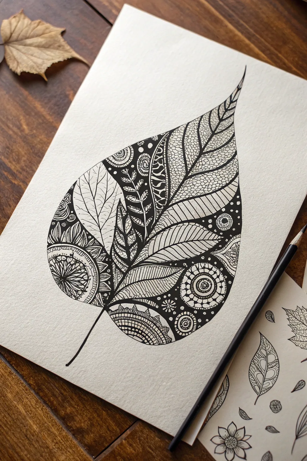
This striking Zen doodle project transforms a simple natural form into a complex tapestry of ink. By dividing a large leaf silhouette into smaller sections and filling each with unique contrasting patterns, you’ll create an intricate illustration that balances dark density with delicate line work.
Step-by-Step
Materials
- Heavyweight drawing paper or Bristol board (smooth surface recommended)
- Pencil (HB or 2B)
- Eraser (kneaded or high-polymer)
- Fine liner pens (sizes 005, 01, 03, and 08 or 1.0)
- Real leaf for reference (optional)
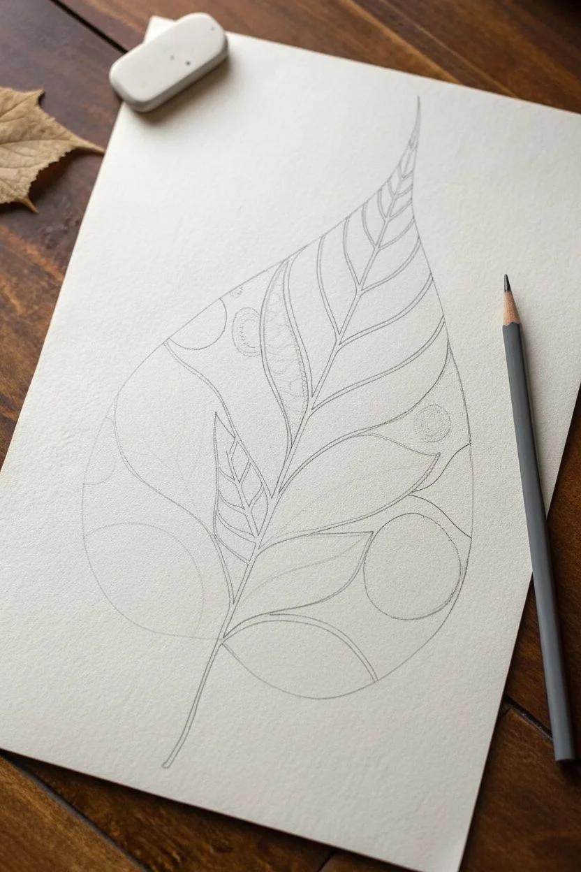
Step 1: Planning the Silhouette
-
Draw the outline:
Start with a light pencil sketch of a large, teardrop-shaped leaf. Give it a gentle curve at the pointed tip to make it feel organic, and extend a thin stem from the rounded bottom. Keep your lines faint so they are easy to erase later. -
Define the sections:
Inside the leaf shape, lightly sketch a central vein that mimics the curve of the outer edge. From there, draw dividing lines branching out to the edges, creating distinct segments. Think of these like stained glass panes—each one will hold a different pattern. -
Ink the boundaries:
Using an 03 fine liner, trace over your main pencil outline and the internal section dividers. You want these structural lines to be clear but not overpowering, as they will guide your pattern placement.
Ink Smudging?
Work from top-left to bottom-right (if right-handed) to avoid dragging your hand through wet ink. Place a clean scrap of paper under your hand as a guard.
Step 2: Adding Light Patterns
-
Create the scale texture:
Choose a large section on the right side of the leaf. Using your 005 pen, draw small, stacked semi-circles to create a fish-scale or roof-tile texture. Keep spacing consistent for a uniform look. -
Draw internal veins:
In the large, clear section on the top left, draw delicate branching veins. Unlike the main structural lines, these should be wispy and fine. Don’t let them touch the outer borders; leaving a tiny gap makes the section feel airy. -
Fill a striped section:
Select a narrow, curved segment and fill it with closely spaced diagonal lines. Varying the pressure slightly can add a nice sense of depth to this simple pattern. -
Add a petal burst:
In a lower-left section, draw petal shapes radiating from a corner point. Detailed lines inside each petal add texture without making the area too dark.
Pattern Fatigue
Don’t feel pressured to invent new patterns for every section. Repeating a pattern in a non-adjacent section creates visual rhythm and unifies the piece.
Step 3: Adding Dark & Dense Patterns
-
Establish a black background:
Identify a section near the top center for high contrast. Using your thickest pen (08 or 1.0), color the background solid black, leaving small, circular or fern-like shapes white. This negative space technique defines the focal points. -
Create the circular mandalas:
In the bottom right area, draw two or three concentric circle motifs. Start with a central dot, add rings, and fill the space between rings with dots, dashes, or solid black ink. I find drawing these elements slowly helps maintain symmetry. -
Fill the ‘grid’ section:
At the very bottom tip of the leaf, draw a curved grid. Thicken the intersection points of the grid lines to create rounded squares, adding weight to the base of the leaf. -
Incorporate leaf-within-a-leaf:
Find a central section and draw smaller leaf shapes inside it. Fill the negative space around these small leaves with solid black ink or tight stippling to make them pop.
Step 4: Detailing and Refining
-
Enhance the borders:
Go back over the main section dividers with an 05 or 08 pen. Thickening these lines separates the busy patterns and gives the eye a place to rest. -
Add dots and stippling:
Look for areas that feel too empty or unbalanced. Add tiny clusters of dots or ‘stippling’ along the edges of the lighter sections to create a gradient shadow effect. -
Refine the dark areas:
Check your solid black areas for any white specks and fill them in completely. A rich, deep black makes the delicate lines look much crisper. -
Thicken the stem:
Go over the stem line again, making it slightly thicker at the base where it joins the leaf and tapering it off into a fine point at the end. -
Erase pencil guides:
Wait at least 10-15 minutes to ensure all ink is completely bone dry. Gently erase all remaining pencil marks to reveal the clean contrast of the ink.
Take a moment to admire how the different textures and weights come together to form a cohesive, botanical masterpiece
Add Simple Shadows for a Subtle 3D Illusion
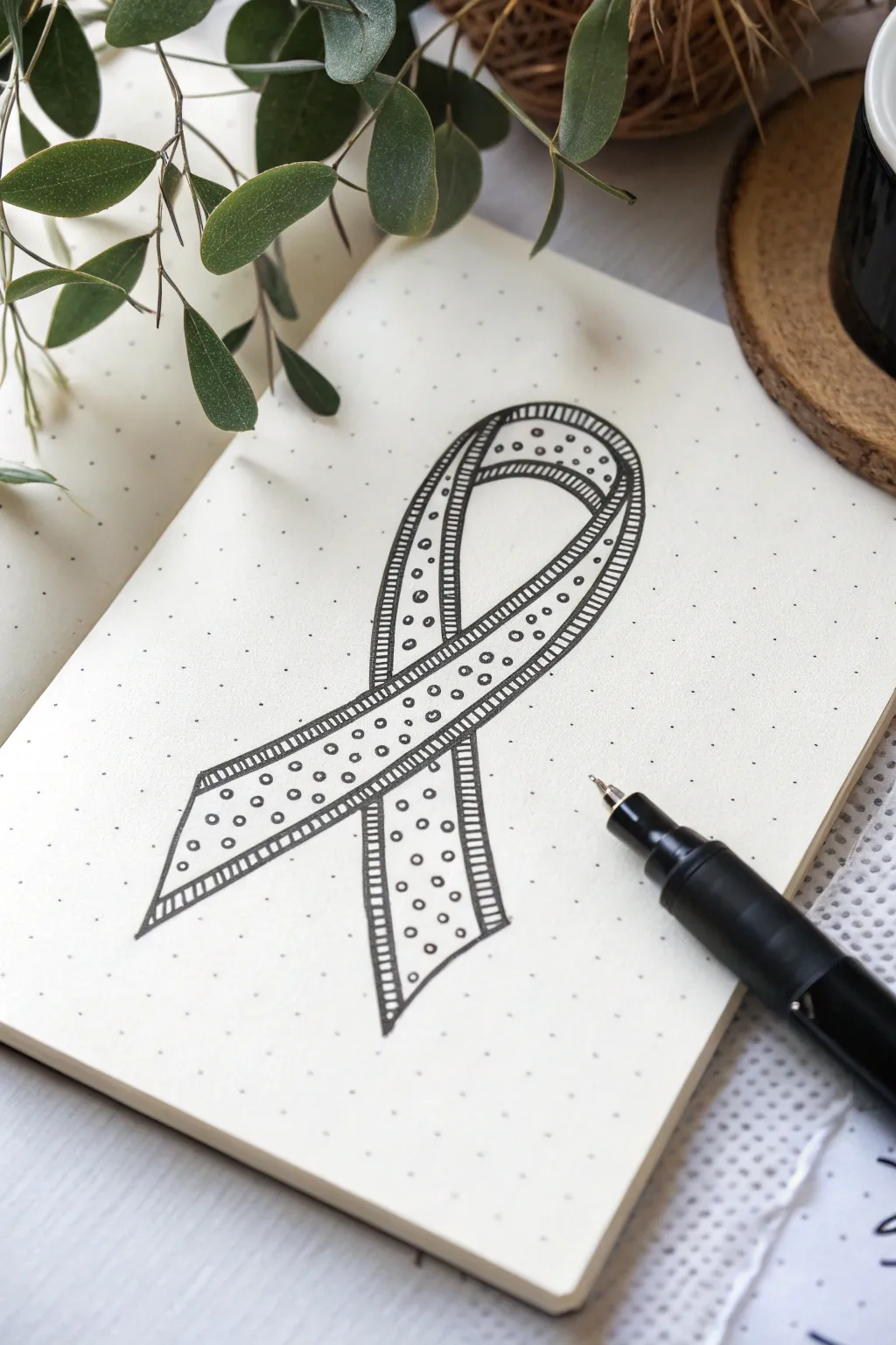
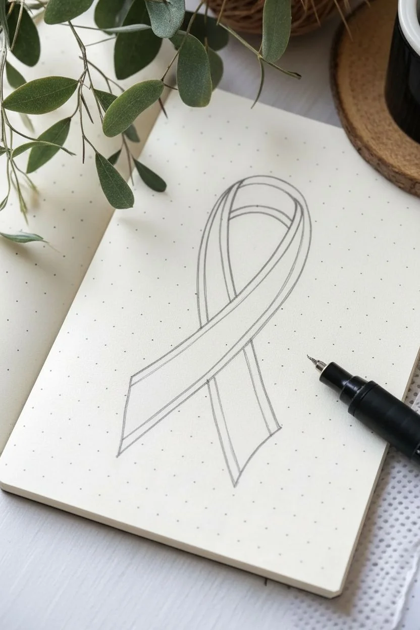
Transform a simple awareness ribbon shape into a piece of art using Zen Doodle techniques. This design combines structured bold stripes with delicate stippling for a balanced, eye-catching look on dot grid paper.
Step-by-Step Guide
Materials
- Dot grid notebook or paper
- Pencil (HB or lighter)
- Eraser
- Black fine-liner pen (0.3mm or 0.5mm)
- Thicker black marker or brush pen (optional, for filling)
Step 1: Drafting the Shape
-
Map the loop:
Start by locating the center of your page. Using a pencil, lightly sketch the top loop of the ribbon. Let the curve be generous and round, occupying about a third of your intended total height. -
Draw the crossing point:
Bring the left side of the loop down and across to the right, and the right side down and across to the left. The lines should cross slightly below the middle of your drawing area. -
Extend the legs:
Continue drawing the two ‘legs’ of the ribbon downwards. Let them flare out slightly at the bottom differently; one can be a bit shorter or curved differently to look natural. -
Create the thickness:
Draw an inner line parallel to your first outline to give the ribbon width. Keep the distance between lines consistent, about 1-1.5 cm wide, to allow space for the patterns inside. -
Close the ends:
Connect the inner and outer lines at the bottom of the legs with a slightly angled straight line to finish the ribbon shape.
Wobbly Lines?
If your long curves are shaky, try moving your entire arm from the shoulder rather than just your wrist. Draw faster for smoother lines.
Step 2: Inking the Outline
-
Trace outer edges:
Take your black fine-liner and carefully trace over your pencil sketch of the ribbon’s main outline. Focus on making the curves smooth and continuous. -
Add the inner border:
Draw another line inside the clear ribbon shape, heavily hugging the outer edge. This creates a thin ‘frame’ or border within the ribbon itself, separating the edge from the central pattern area. -
Erase pencil marks:
Wait a moment for the ink to dry completely to avoid smearing. Then, gently erase all the underlying pencil sketch lines.
Color Pop
Use colored fine-liners for the internal patterns. A red ribbon with black outlines creates a striking, meaningful contrast.
Step 3: Adding Patterns
-
Stripe the borders:
In the thin border channel you created in the previous phase, draw small, evenly spaced perpendicular lines. Work your way around the entire perimeter of the ribbon, creating a railway-track effect. -
Start the polka dots:
Move to the large central white space of the ribbon. Begin drawing small, open circles. I find it easiest to start drawing them in a loose line down the center of the shape first. -
Fill the space:
Continue filling the ribbon with these small circles. Stagger them slightly so they don’t look like a perfect grid, giving a more organic, playful feel. -
Check consistency:
Ensure the circles are roughly the same size, but don’t worry about perfection; slight variations add to the hand-drawn charm.
Step 4: Shading and Depth
-
Identify overlap:
Locate where the ribbon parts cross over each other. The front section casts a shadow on the back section. -
Draw the shadow line:
On the section that is ‘underneath,’ draw a line very close to the edge of the top ribbon section. -
Hatch the shadow:
Fill this small sliver of space with dense diagonal hatching lines or solid black ink. This creates a cast shadow effect, instantly adding depth. -
Refine the edges:
Go back over the outermost contour of the entire ribbon one last time with a slightly heavier hand or a thicker pen to make the shape pop off the page.
Now you have a beautifully patterned ribbon that leaps off the page with simple dimensional tricks

Have a question or want to share your own experience? I'd love to hear from you in the comments below!