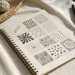
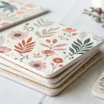
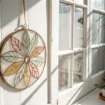
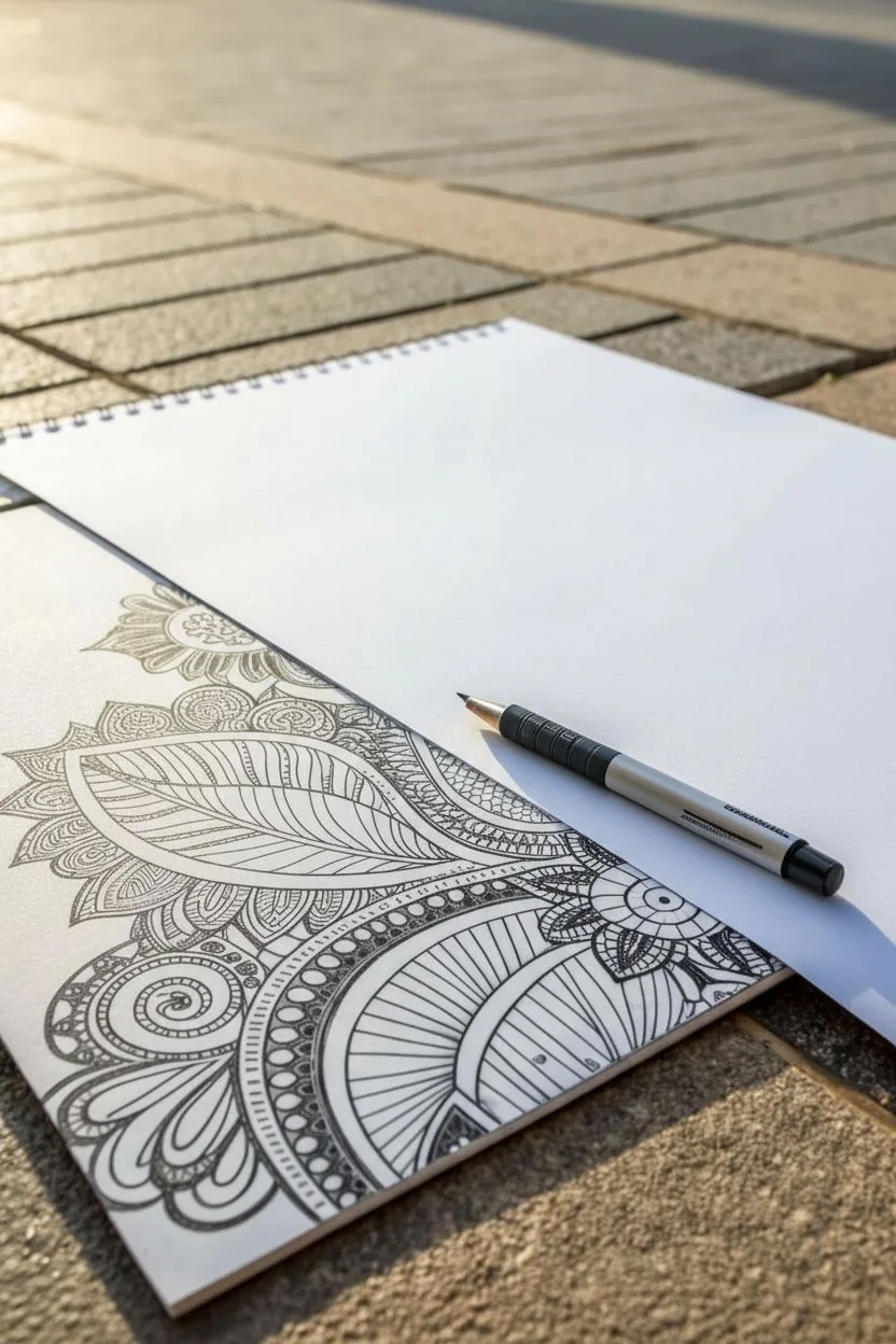
Whenever I need a creative reset, I reach for Zentangle patterns because they’re calming, structured, and still leave tons of room for your personality. Here are my favorite zentangle ideas—starting with the classic go-to approaches and drifting into the fun, unexpected twists.
Build a Grid-Based Tangle Library

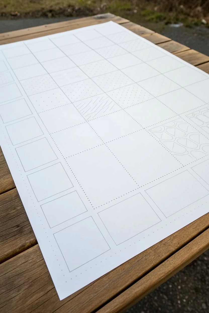
Master the fundamentals of pattern drawing with this organized library sheet. By laying out a clear grid, you create a structured space to practice and reference essential Zentangle motifs like waves, zigzags, and geometric fills.
How-To Guide
Materials
- Large sheet of sturdy white paper (A3 or 11×17 recommended)
- Black fine liner pen (01 or 03 nib size)
- Pencil (HB or 2B)
- Long ruler
- Eraser
Step 1: Setting the Structure
-
Establish margins:
Begin by using your ruler and pencil to mark a small margin around the entire perimeter of your paper, about 1 inch from the edge. This frames your work beautifully. -
Draw vertical columns:
Divide the width of your working area into equal vertical columns. For the layout shown, aim for about 5 or 6 columns. Draw these lines lightly with pencil. -
Create horizontal rows:
Measure down the side and mark equal intervals to create square boxes. Draw horizontal lines across the page to complete your grid. You should end up with a checkerboard of faint pencil squares. -
Ink the main grid (optional):
If you want a permanent frame, trace over your long grid lines with a fine liner. However, leaving them in pencil allows the patterns to float more freely.
Steady Your Hand
Turn the paper, not your hand! If you find drawing diagonal lines difficult, rotate the entire sheet so you are pulling the pen comfortably towards your body.
Step 2: Creating the Dot Guides
-
Select the dot grid zone:
Locate the central columns on your paper. In the reference image, the middle section relies heavily on dot grids to guide patterns. -
Mark spacing:
Inside these central squares, use your ruler to mark points every 5mm or 1/4 inch along the top and side edges. -
Fill with dots:
Carefully place small ink dots at the intersection of these invisible lines within several squares. I find it helpful to ink the corners first to keep the spacing even.
Add Shading Depth
Use a soft graphite pencil and a blending stump (tortillon) to add shadows where your lines overlap. This makes flat patterns look 3D instantly.
Step 3: Drawing the Patterns
-
Start with zigzags:
In the bottom left column, draw a series of parallel zigzag lines. Keep the angles sharp and try to maintain consistent spacing between each ‘v’ shape as you move down the box. -
Add diagonal stripes:
In a nearby square, draw straight diagonal lines from the bottom left to the top right corner. Use a ruler if you want perfection, or freehand it for a more organic feel. -
Create curved waves:
Find a square with a dot grid. Connect the dots horizontally using gentle ‘S’ curves. In the row below, mirror the curve to create an interlocking wave effect. -
Draft the grid-fill pattern:
For the diamond pattern shown on the left, start by drawing a grid of squares. Draw an ‘X’ inside every other square to create a faceted look. -
Draw circle clusters:
dedicating one square to simple circles. vary their sizes slightly but keep them touching or floating near each other without overlapping. -
Sketch the ‘Rice’ shape:
In another box, draw long, flowing, intersecting curves that create almond or rice-grain shapes. Focus on smooth, continuous lines that span the whole box. -
Experiment with dashed lines:
For texture practice, fill a square (like the top left area) with rows of short, dashed lines or stippling effects to see how density changes the look.
Step 4: Refining and Organizing
-
Vary line weight:
Go back over specific patterns, such as the perimeter of certain geometric shapes, with a slightly thicker pen to add depth and visual interest. -
Leave breathing room:
Don’t feel pressured to fill every single square immediately. Leave the top right section with just the faint pencil grid or dot guides, ready for future inspiration. -
Erase guidelines:
Once the ink is completely dry—give it a few minutes to be safe—gently erase the underlying pencil grid lines to reveal your clean black-and-white library.
You now have a personalized reference sheet ready to inspire your future art projects
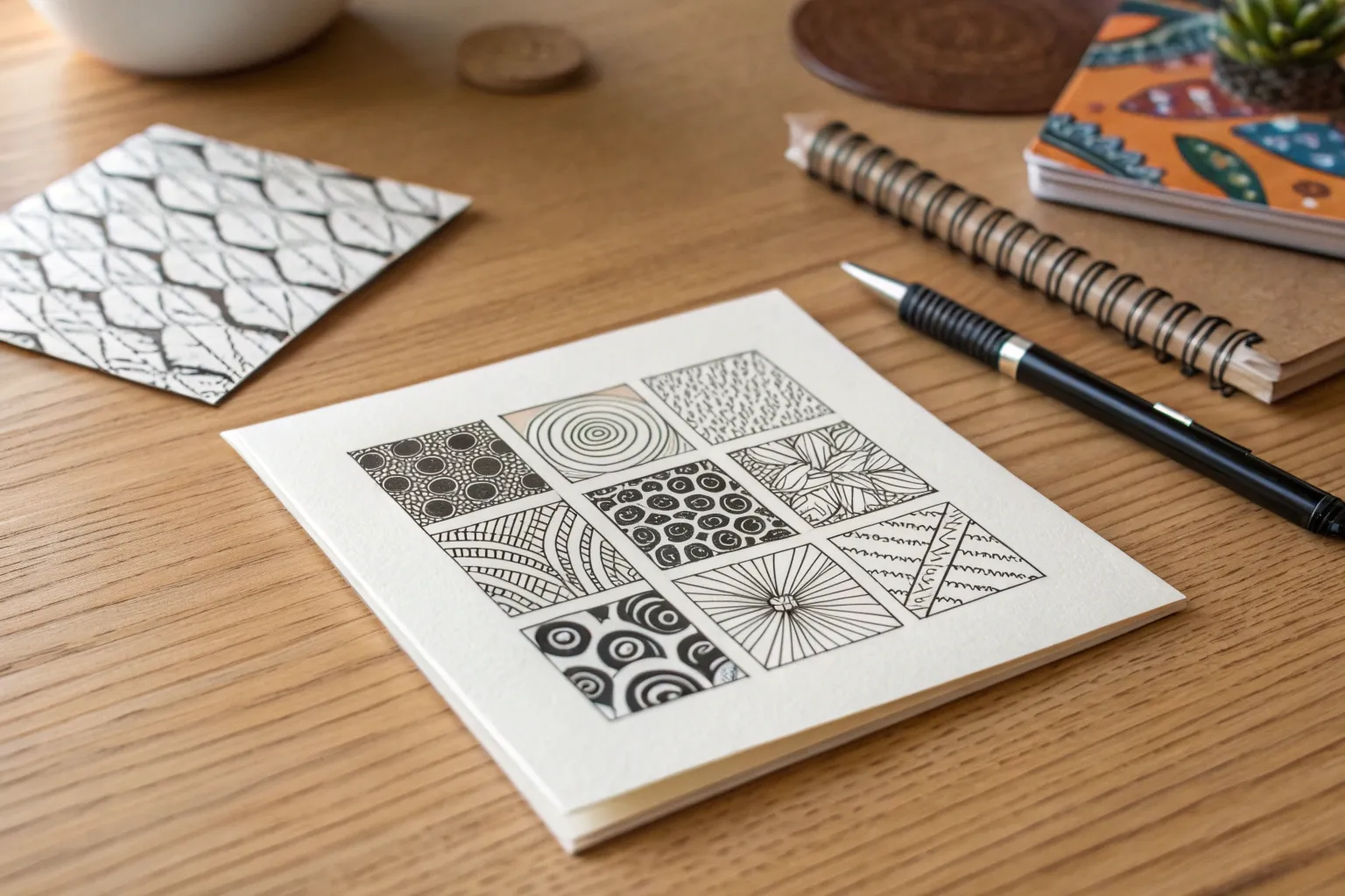
Use Simple Strings to Divide a Tile
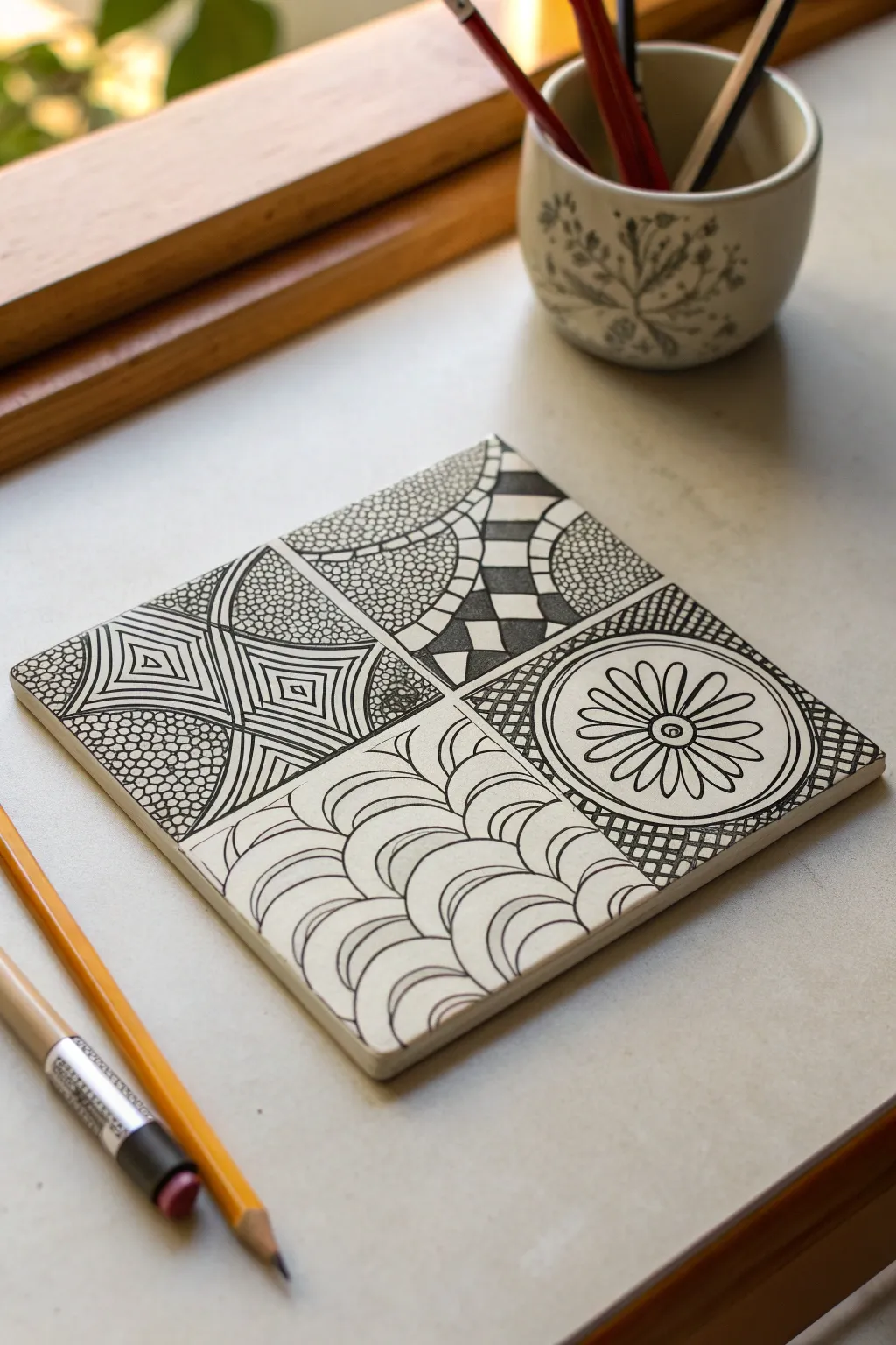
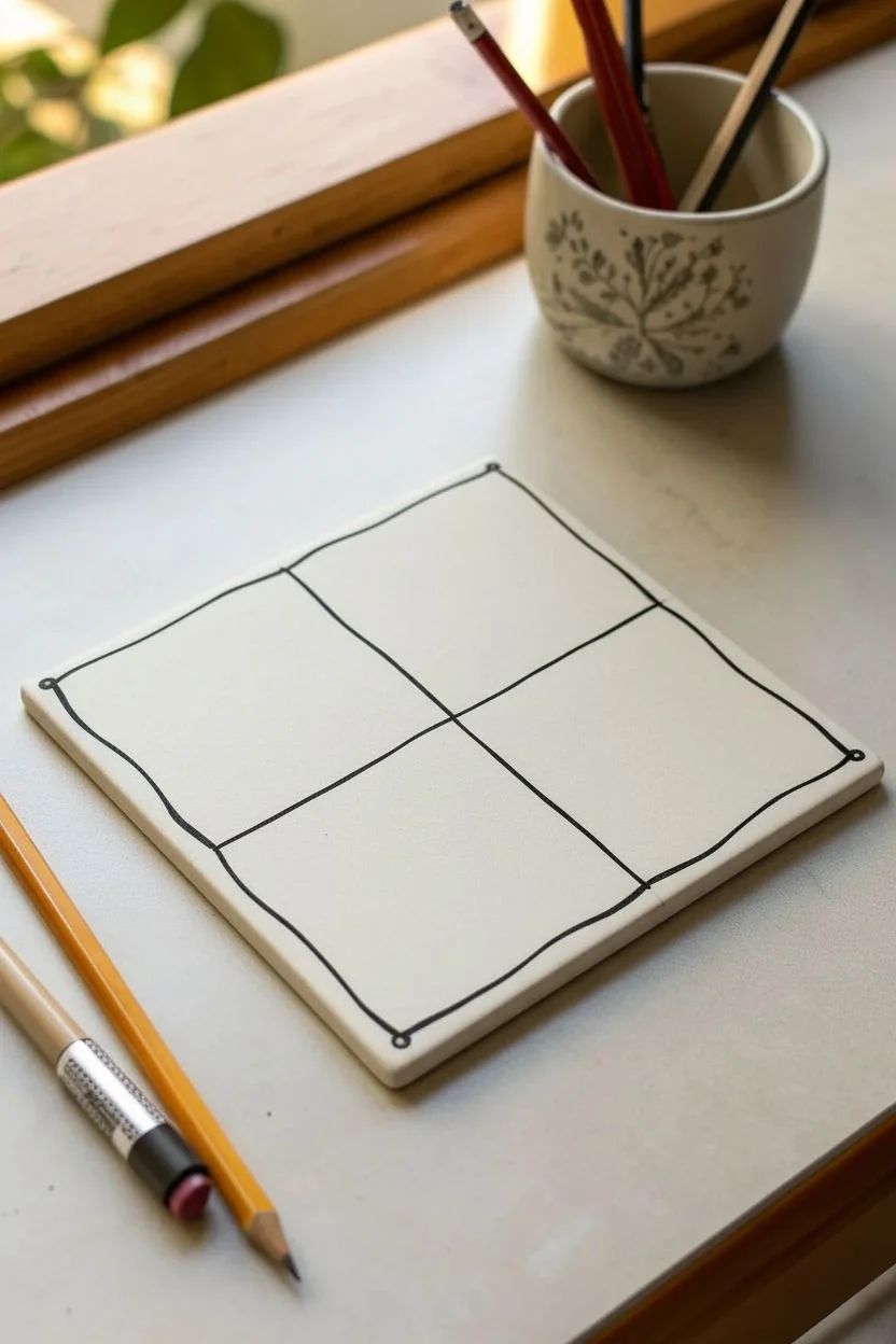
This classic Zentangle project demonstrates how a simple pair of intersecting lines can transform a blank tile into a structured canvas for creativity. You will fill four distinct quadrants with contrasting patterns involving waves, grids, organic textures, and geometric shapes.
Step-by-Step Guide
Materials
- Square white Zentangle tile (3.5 inch, artist paper or cardstock)
- Black micron pen (01 or PN size)
- Graphite pencil (HB or 2B)
- Tortillon or blending stump
Step 1: Setting the Structure
-
Draw the border:
Using your graphite pencil, lightly place a dot in each of the four corners of your tile. Connect these dots with a gentle, hand-drawn line to create a border frame. -
Create the string:
Draw a cross ‘string’ to divide the tile. Still using the pencil, draw a line from the center left to center right, and another from top center to bottom center. These lines don’t need to be perfectly straight; a little curve adds character. -
Re-ink the main divisions:
Switch to your black micron pen. Trace over your pencil string lines to permanently divide the tile into four clear quadrants.
Ink Flow Tip
Keep your pen nearly vertical for the most consistent line weight. If filling large dark areas like the diamond ribbon, switch to a slightly thicker nib to save time.
Step 2: Tangle 1: Geometric Diamonds (Top Right)
-
Draw the ribbon:
In the top right quadrant, draw a curved, ribbon-like band that flows diagonally across the space. Make it wide enough to hold a pattern inside. -
Fill the ribbon:
Inside this band, draw a checkerboard pattern but warp the squares slightly to follow the curve of the ribbon, creating a diamond effect. Fill alternating shapes with solid black ink. -
Add texture:
Fill the remaining areas outside the ribbon with a ‘tipple’ pattern—small, tightly packed circles that resemble pebbles.
Step 3: Tangle 2: Radial Flower (Bottom Right)
-
Center the design:
In the bottom right quadrant, draw two concentric circles in the middle of the space. Add a small dot in the very center. -
Petal formation:
Draw long, looping petal shapes radiating outward from the inner circle to the outer circle edge. They should touch each other, filling the circular band completely. -
Background grid:
Outside the flower circle, fill the corners of the quadrant with a simple diagonal cross-hatching grid to make the central design pop.
Level Up: Color Accents
Once the black ink is fully dry, use watercolor pencils to add a sheer wash of a single color (like teal or gold) to just one element, like the flower petals.
Step 4: Tangle 3: Layered Arches (Bottom Left)
-
Foundation arches:
Start at the bottom corner of this quadrant. Draw a series of humps or arches stacking on top of each other, similar to a fish-scale pattern. -
Add dimension:
Inside each individual arch, draw 2-3 smaller curved lines (auras) that follow the shape of the main arch. This creates a ripple effect. -
Continue upward:
Repeat this pattern until the entire bottom-left quadrant is filled with these flowing, overlapping scales.
Step 5: Tangle 4: Structured Perspective (Top Left)
-
Corner radiation:
Draw lines radiating out from the center intersection of the tile into the top-left corner, dividing that quadrant into triangular wedges. -
Geometric fill:
Inside some wedges, draw nested squares or diamonds that get smaller toward the center point. I find this creates a nice sense of depth. -
Textural contrast:
In the alternating wedges, fill the space with the same small pebble circles used in the first quadrant to tie the whole piece together.
Step 6: Finishing Touches
-
Shade with graphite:
Using the side of your pencil, add graphite shading to the edges of the quadrants where the lines meet. -
Blend the shadows:
Use your tortillon to smudge the graphite softly inward, creating a 3D effect that makes the panels look like they are curving downward. -
Sign and date:
Add your initials or signature discreetly into one of the patterns or on the back of the tile.
Now you have a balanced composition showing how simple strings can organize complex patterns into a cohesive piece of art
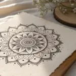
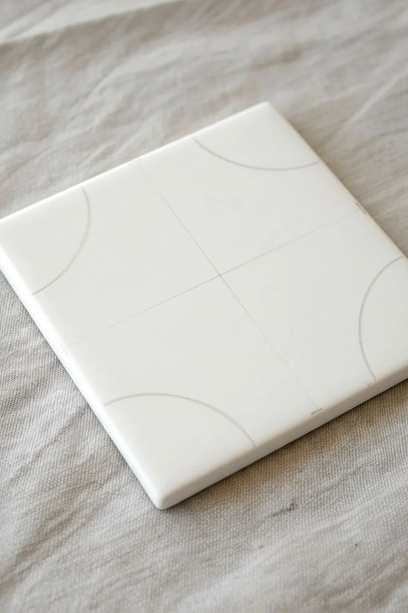
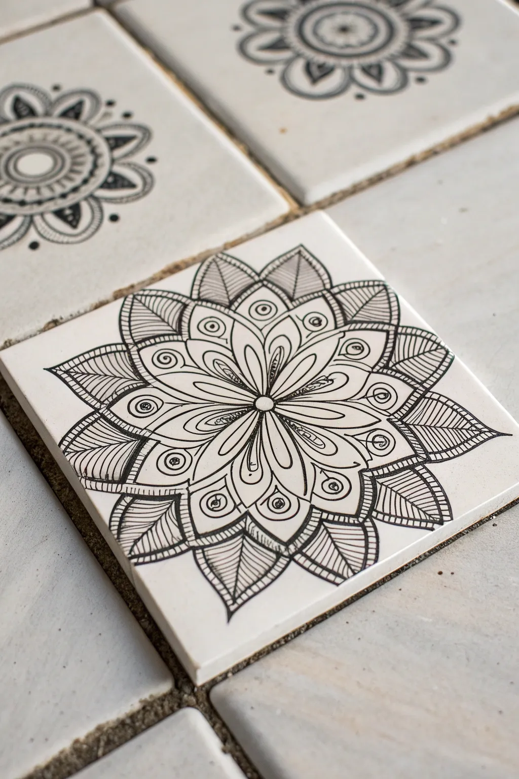
Try a One-Pattern Monotangle
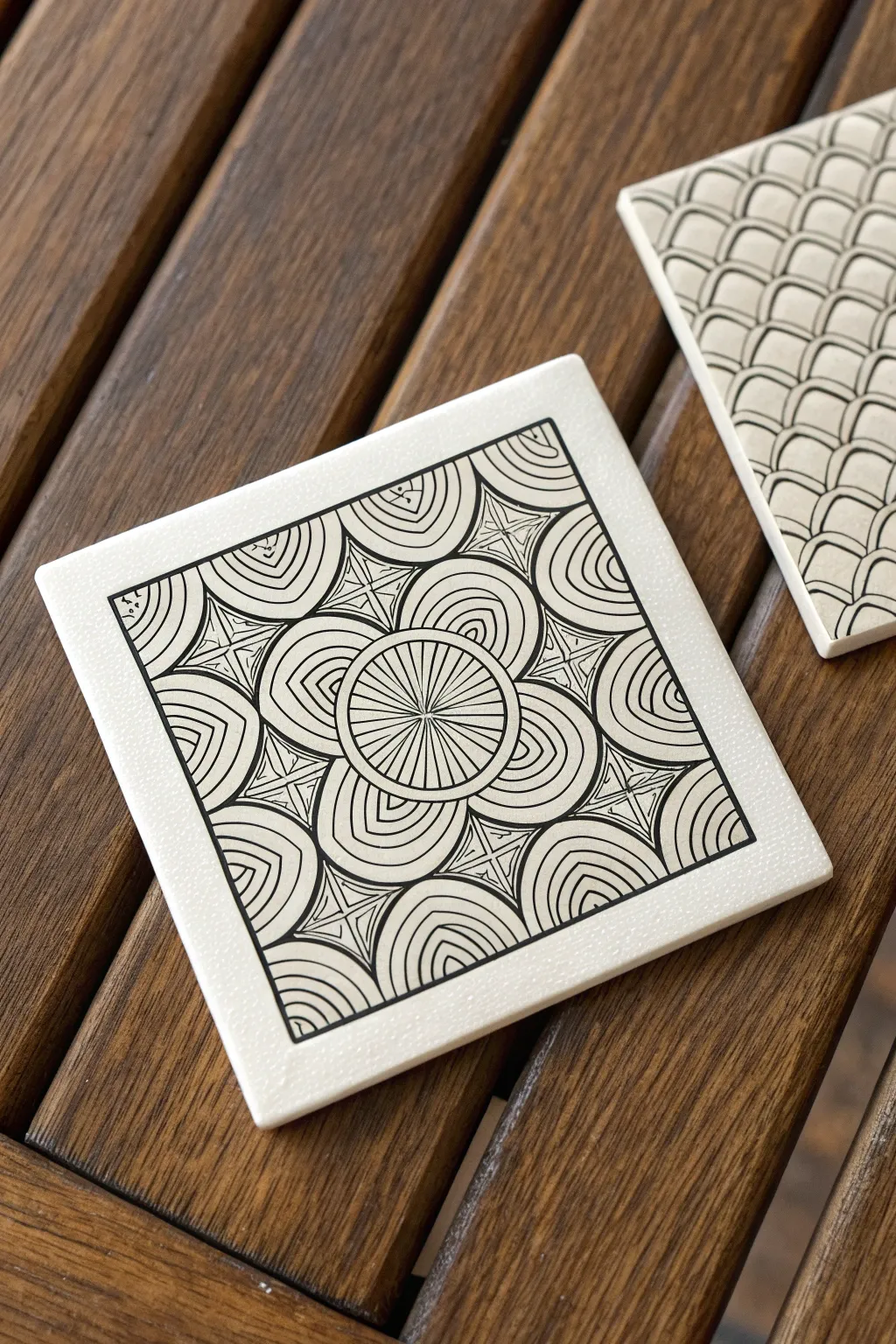
Transform a plain ceramic tile into a sophisticated piece of functional art using a single, repetitive pattern. This monotangle design builds outwards from a central focal point, creating a mesmerizing mandala effect that looks intricate but relies on simple, deliberate pencil strokes.
How-To Guide
Materials
- 4-inch square white bisque or ceramic tile (unglazed or matte finish preferred)
- Black fine-liner drawing pen (0.3mm or 0.5mm, like Micron 05)
- Pencil (HB or 2B) for layout lines
- Ruler or straight edge
- Compass or circle template (optional but helpful)
- Eraser (kneaded eraser works best)
- Work surface protector
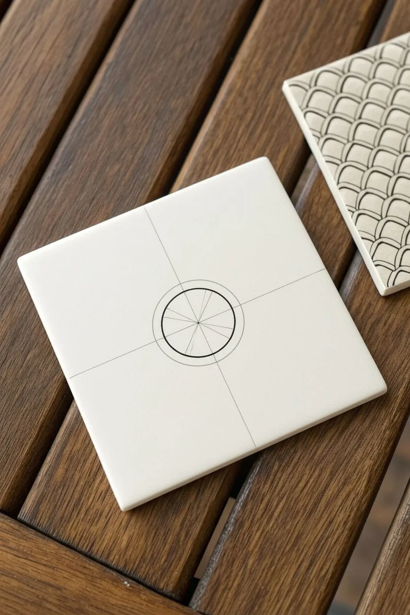
Step 1: Setting the Framework
-
Clean surface:
Begin by wiping down your ceramic tile with a dry cloth to ensure there is no dust or oil that might resist the ink. -
Define the border:
With your fine-liner pen, draw a square border about a quarter-inch inward from the edge of the tile. Don’t worry if the line has a slight wobble; the hand-drawn quality adds character. -
Find the center:
Use your ruler and pencil to lightly mark an ‘X’ by connecting opposite corners. The intersection point indicates the exact center of your tile. -
Draw the central spoke wheel:
Switch back to your pen. Draw a circle in the center, roughly 1.5 inches in diameter. Inside this, draw a slightly smaller concentric circle. -
Add radiating lines:
Draw a tiny dot in the absolute center. Using your pen, draw straight lines radiating from this dot out to the inner circle edge, creating a wheel-spoke effect.
Step 2: Building the Pattern
-
Create the first petal layer:
around the central wheel, draw four large semi-circles attached to the outer rim. Position them at the top, bottom, left, and right (like a compass). -
Add corner semi-circles:
Draw four more semi-circles in the corners, bridging the gaps between the first four. These should touch the border of the central wheel. -
Echo the curves:
Start ‘auraing’ (drawing parallel lines) inside each of these eight semi-circles. Draw 3-4 curved lines inside each shape, following the contour of the original arc. -
Extend to the corners:
Move to the four corners of your square border. Draw a quarter-circle arc radiating from each corner tip inward toward the center. -
Fill the corner arcs:
Just as before, fill these corner quarter-circles with concentric curved lines (auras) until they reach a similar density to your central shapes. -
Fill the edge gaps:
Locate the remaining open triangular spaces along the four straight edges of your border frame. Draw semi-circles here, originating from the border line and curving inward. -
Aura the edge shapes:
Fill these new semi-circles with the same echoing curved lines used throughout the rest of the design.
Steady Hand Trick
Turn the tile as you draw, not your hand. Keeping your wrist in a comfortable, fixed position while rotating the artwork results in much smoother, more consistent curves.
Step 3: Detailing and Finishing
-
Connect with starbursts:
You will now see diamond-shaped gaps between all your curved clusters. Inside each gap, draw a small four-pointed star shape that connects the rounded edges. -
Add internal definition:
Draw a small ‘X’ inside each of these four-pointed stars to give them dimension. -
Thicken key lines:
Go back over the main structural lines—specifically the outlines of the major semi-circles and the central wheel—to make them slightly bolder than the interior detail lines. -
Ink the corners:
Find the tiny triangular spaces left in the extreme corners of the border frame (outside the quarter-circles). Fill these tiny voids with solid black ink or small dots for texture. -
Check for gaps:
Scan the design for any unfinished lines. Sometimes I find a spot where an aura line didn’t quite touch the edge; connect these now for a polished look. -
Erase guidelines:
Allow the ink to dry completely (wait at least 15 minutes to be safe). Gently erase your initial pencil ‘X’ from the center using a kneaded eraser. -
Seal the artwork:
If you plan to use this as a functional coaster, spray it with a clear acrylic fixative or sealant to protect your drawing from moisture.
Color Pop
Once the black ink is fully dry, use watercolor markers or diluted acrylics to tint specific sections, like the central wheel or the starburst connectors.
Place your finished tile on your coffee table and enjoy the satisfaction of using your own art every day

Start With the Five Basic Strokes Challenge
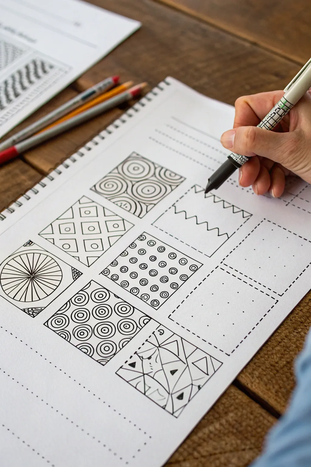
This practice exercise breaks down complex Zentangle art into manageable squares, helping you build muscle memory and pattern recognition. By filling a grid of pre-defined boxes with distinct designs, you create a cohesive reference library of textures and strokes that looks impressive on the page.
Step-by-Step Guide
Materials
- Spiral-bound sketchbook or heavy drawing paper
- Fine-liner pen (black, 0.3mm or 0.5mm)
- Pencil (for grid layout)
- Ruler
- Eraser
- Pre-printed practice worksheet (optional)
Step 1: Setting Up the Grid
-
Create the layout:
If you aren’t using a pre-printed workbook, start by drawing a 3×3 grid of squares on your page using a pencil and ruler. Each square should be roughly 1.5 to 2 inches in size to allow enough room for detail. -
Add separation lines:
Leave a small gap or gutter between each square so the patterns remain distinct and don’t bleed into one another visually. -
Outline the boxes:
Go over your pencil grid lines with your fine-liner pen to create crisp boundaries for your patterns. You can use dotted lines for empty squares you haven’t filled yet, or solid lines for a bolder look.
Step 2: Drawing Radial Patterns
-
Start the wheel:
For the bottom-left square, draw a small circle in the absolute center. Extending from this center point, draw straight radial lines outward to the edges of the box, like spokes on a bicycle wheel. -
Add the rim:
Where the spokes hit the box edge, you can subtly thicken the lines or add small triangular details in the corners to give the design weight and finish.
Uneven Lines?
Don’t stress if your lines aren’t perfectly straight. In Zentangle, a slight wobble adds ‘organic’ character. Focus on the deliberate start and stop of each stroke rather than speed.
Step 3: Creating Geometric Textures
-
Draw the grid:
In the middle-left square, sketch a simple diagonal diamond grid. Draw parallel diagonal lines one way, then cross them with parallel lines in the opposite direction. -
Insert focal points:
Inside each diamond shape formed by the grid, draw a small circle. Keep these consistent in size to maintain a clean, orderly appearance.
Rotate the Page
Turn your sketchbook as you draw. Your hand has a natural arc that is easier to maintain if you rotate the paper to meet your hand, rather than twisting your wrist.
Step 4: Developing Swirls and Curves
-
Draft the concentric circles:
Move to the center box of the bottom row. Draw several sets of concentric circles (a bullseye pattern) scattered randomly throughout the square. -
Fill the gaps:
Once your main circles are placed, fill the negative space between them with partial curves that echo the shape of the circles, creating a dense, packed look. -
Try the larger spiral:
For the top-middle square, mimic this technique but use much larger, bolder spirals that touch the edges of the box, creating a rolling wave effect.
Step 5: Practicing Repetitive Elements
-
Dot mapping:
In the center square, create a grid of small uniform dots. I prefer to space these carefully to ensure the pattern stays aligned. -
Encircle the dots:
Carefully draw a small circle around each dot. This simple repetition is excellent for practicing pen control and steadiness.
Step 6: Executing the ‘Zig-Zag’ Stroke
-
Prepare the box:
Select an empty square (like the one shown being drawn in the reference). Ensure the borders are defined, perhaps with a dashed line if you are following a workbook style. -
Begin the line:
Starting from the top left corner, draw a continuous angular line. Move diagonally down-right, then sharply up-right to create a ‘V’ shape. -
Continue the pattern:
Repeat this up-and-down motion across the top of the box to create a saw-tooth or zig-zag pattern essentially forming a row of triangles. -
Add definition:
Once the basic line is down, you can choose to double the line for thickness or add stripes inside the triangles to increase the complexity.
Step 7: Abstract Fractures
-
Draw random lines:
In the bottom-right square, draw several long, straight lines that intersect randomly across the box, creating irregular shards or polygon shapes. -
Detail the shards:
Select a few of the resulting triangular shapes and black them out completely, or fill them with tiny stripes. Leave others white for high contrast.
Now you have a completed sampler page that serves as both a practice run and a reference guide for future doodles

PENCIL GUIDE
Understanding Pencil Grades from H to B
From first sketch to finished drawing — learn pencil grades, line control, and shading techniques.
Explore the Full Guide
Create a Border-First Zentangle Frame

Transform a plain white ceramic tile into a sophisticated piece of decor using simple geometric repetition. This design features four identical corner motifs that frame negative space in the center, creating a striking optical illusion of a circle.
Step-by-Step Tutorial
Materials
- 4×4 White ceramic tile (glossy or matte)
- Black oil-based paint pen (fine point)
- Black oil-based paint pen (extra fine point)
- Pencil
- Ruler
- Paper towel or rag
- Rubbing alcohol
- Oven (optional, for curing)
Step 1: Preparation & Layout
-
Clean surface:
Begin by wiping down your ceramic tile with rubbing alcohol and a paper towel. This ensures no oils from your fingers interfere with the paint adhesion. -
Mark the center:
Using a ruler and a pencil very lightly, find the exact center of the tile. You might also want to mark the midpoint of each of the four sides to help guide your arcs. -
Draw guide arcs:
Lightly sketch a large quarter-circle arc in each corner using your pencil. These arcs should curve inward toward the center but not quite touch, leaving a diamond-like white space in the middle.
Step 2: Main Floral Structure
-
Ink the main arcs:
Using the fine point paint marker, trace over your pencil arcs to define the outer boundary of your four corner designs. Work slowly to keep the lines smooth. -
Create the petal base:
Starting in one corner, draw a smaller semi-circle at the very tip of the corner. Then, draw two large petal shapes extending from that corner outward toward your main arc line. These look a bit like large leaves or rabbit ears. -
Outline the petals:
Draw a second line around the interior of those large petals to create a double border. This adds visual weight to the main shapes. -
Add radiating lines:
Inside the very tip of the corner (between the two large petals), draw three or four straight lines fanning outward like sun rays. -
Draw scalloped edges:
Along the outer curve of your large petals, draw a series of small, connected loops or scallops. These should look like the ruffled edge of a flower. -
Fill the scallops:
Draw straight lines inside each of those small scallop loops, extending from the base of the loop to the curved top. This texture makes them look distinct from the other shapes.
Steady Hands
Rest your pinky finger on a dry section of the tile while drawing. This acts as a pivot point, stabilizing your hand for smoother curves and straighter lines.
Step 3: Details & Determining Space
-
Create outer separation:
Switch to your extra-fine point pen for delicate work. Draw a thin line paralleling the main large arc you drew in step one, creating a narrow channel between the floral design and the rest of the tile. -
Add the dot border:
On the outside of that new thin line (toward the center of the tile), add a series of evenly spaced black dots following the curve. This stippled effect softens the transition to the white negative space. -
Detailed line work:
Look at the empty spaces between your large petals and the main arc border. Fill these triangular gaps with thin, radiating lines that fan out toward the arc. -
Add floating dots:
Place a few small dots inside the radiating lines you just drew to add density and interest to the pattern. -
Corner accents:
In the very corner area where you started, add three distinct dots arranged in a triangle or arc formation to anchor the design.
Go Cork
Glue a square of cork sheet or felt to the bottom of the finished tile. This turns your art piece into a functional, non-scratch coaster instantly.
Step 4: Finishing Touches
-
Repeat for all corners:
Rotate the tile and repeat the exact same process for the remaining three corners. Rotating the tile makes it much easier to keep your hand steady without smudging previous work. -
Clean up:
Once the paint is completely dry to the touch (give it at least 20 minutes), gently erase any visible pencil marks. -
Bake to set:
To make the design permanent and scratch-resistant, place the tile in a cold oven. Set temperature to 350°F (176°C) and bake for 30 minutes. Let it cool completely in the oven before removing.
Now you have a stunning, hand-drawn coaster that looks intricate but is built from simple, manageable strokes
Fill a Circle With Ring-by-Ring Tangling
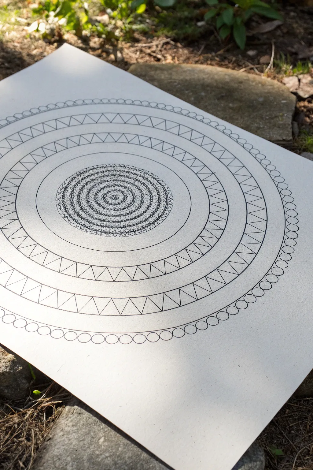
This meditative drawing exercise builds a complex mandala-style piece from simple, repetitive geometries. Starting with a dense, energetic center, it expands outward into crisp, clean bands of triangles and delicate orbs.
Step-by-Step
Materials
- High-quality white drawing paper or cardstock
- Compass for drawing perfect circles
- Pencil (HB or lighter)
- Fine liner pen (black, 0.3mm or 0.5mm)
- Thinner fine liner pen (black, 0.1mm) for details
- Eraser
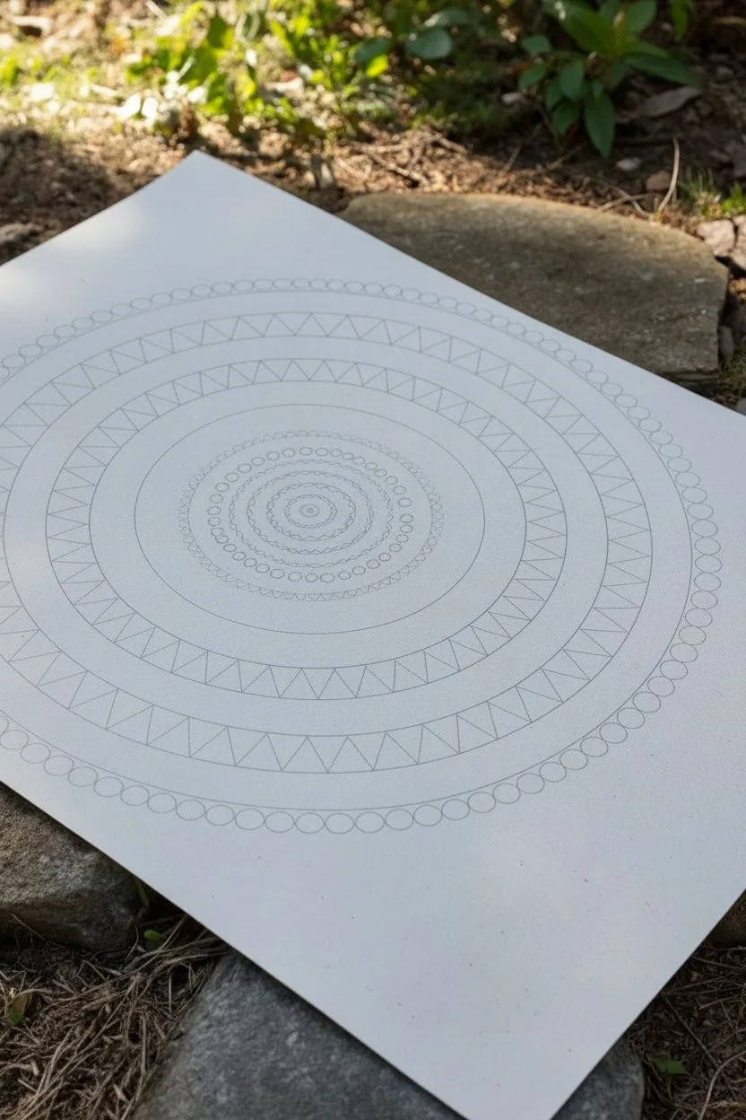
Step 1: Setting the Foundation
-
Find your center:
Begin by placing your compass point firmly in the exact center of your paper. This point will anchor the entire piece, so press just hard enough to stay stable. -
Draw the pencil guides:
Using your pencil and compass, lightly draw a series of concentric circles radiating outward. You don’t need to measure exact distances, but try to vary the gaps between rings—some wide, some narrow—to create visual rhythm. -
Create the central zone:
Draw about 5 or 6 small, tightly spaced circles right at the center. This will be your dense focal point. -
Map the outer bands:
Continuing outward, create two wider bands separated by a narrow gap. Further out, add a thin band that will eventually hold the circle chain pattern.
Steady Hand Trick
Rotate the paper constantly as you draw the circles and zig-zags. Drawing lines ‘away’ from your body is often steadier than drawing sideways or towards you.
Step 2: Inking the Core
-
Start the center spiral:
Switch to your 0.1mm fine liner. Starting at the very center point, begin drawing a tight, freehand spiral. Let the line be a bit shaky or textured; it adds organic character. -
Add texture to the rings:
Fill the first few small pencil rings with dense, scribbled loops or tiny hatching marks. The goal is to create a darkened, textured core that contrasts with the clean outer lines. -
Define the boundary:
Use your thicker 0.5mm pen to trace over the outermost pencil line of this central ‘textured zone,’ creating a solid barrier before the open space begins.
Uneven Spacing?
If your zig-zag pattern doesn’t meet up perfectly at the end, slowly adjust the width of the last 5-10 triangles, slightly narrowing or widening them to bridge the gap.
Step 3: Building the Geometric Bands
-
Trace the main rings:
Carefully ink over your larger pencil circles with the 0.5mm pen. Keep your hand steady and rotate the paper helps maintain a smooth curve. -
Begin the zig-zag pattern:
In the first wide band outside the open space, start drawing a continuous zig-zag line. The points of the triangles should touch the top and bottom ink lines of the band. -
Complete the first triangle ring:
Continue the zig-zag all the way around. Try to keep the width of each ‘V’ shape consistent, but don’t worry if they vary slightly—it shows it’s hand-drawn. -
Draw the second triangle ring:
Move to the next wide band outward. Repeat the zig-zag process. I find aligning the points of this outer ring with the valleys of the inner ring creates a pleasing, interlocking effect. -
Refine the lines:
Go back over the zig-zag lines if any look too thin, ensuring the geometric shapes feel bold and deliberate.
Step 4: Adding the Final Details
-
Create the orb chain:
Locate the thin outer band you penciled earlier. Using the 0.3mm pen, draw small circles side-by-side within this track. -
Connect the circles:
Ensure each small circle touches its neighbor and the boundaries of the track, creating a continuous chain of pearls. -
Erase guidelines:
Once the ink is completely dry—give it a few minutes to be safe—gently erase all visible pencil marks. -
Review and touch up:
Examine your lines. If the ink skipped anywhere or a connection isn’t quite closed, use your thinnest pen to make tiny repairs.
Now you have a structured framework ready for shading or leaving as a stark, high-contrast design
BRUSH GUIDE
The Right Brush for Every Stroke
From clean lines to bold texture — master brush choice, stroke control, and essential techniques.
Explore the Full Guide
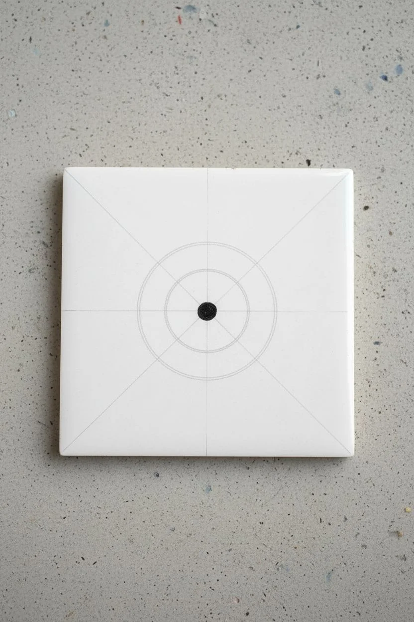
Go Mandala-Style With Radial Symmetry
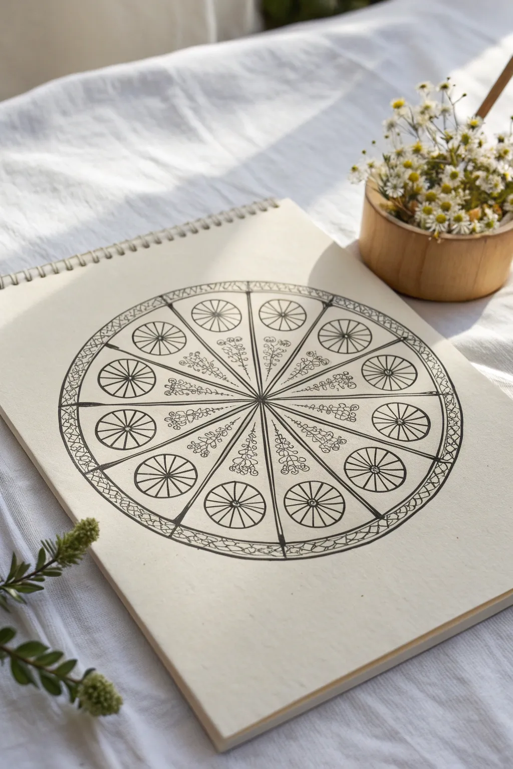
This elegant radial design combines the mechanical precision of a wheel with delicate, organic floral elements. It features twelve distinct segments radiating from a central point, anchored by circular motifs and enclosed within a textured border.
Step-by-Step Tutorial
Materials
- Sketchbook with smooth, heavy drawing paper
- Compass
- Protractor
- Ruler or straight edge
- Pencil (HB or 2H)
- Fine liner pen (01 or 03 size, black)
- Thicker graphic pen (05 or 08 size, black)
- Eraser
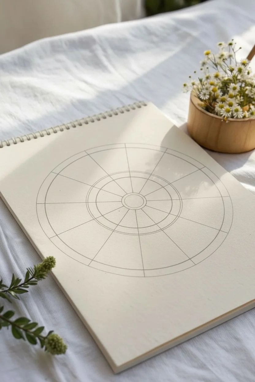
Step 1: Setting the Structure
-
Find the center:
Begin by marking the absolute center of your page to ensure your mandala has plenty of breathing room. -
Draw the main circles:
Using your compass, draw a large circle that will serve as the outer boundary. Inside this, draw a slightly smaller circle to create the rim of the wheel. -
Add inner circles:
Draw a much smaller circle near the center for the hub, and another concentric circle about halfway between the hub and the outer rim. Keep these pencil lines light. -
Divide the wheel:
Use your protractor to divide the circle into 12 equal sections (every 30 degrees). Use a ruler to draw straight lines from the center point out to the edge of the largest circle, creating twelve pie slices.
Step 2: Drawing the Motifs
-
Ink the main spokes:
Switch to your thicker graphic pen (05 or 08). Carefully trace over the twelve straight radiating lines (spokes) and the outermost circular boundary. -
Define the rim:
Ink the inner circle that forms the rim just inside the outer boundary. This creates a distinct band around the edge. -
Create the mini-wheels:
In the outer half of each pie slice, draw a medium-sized circle using the fine liner. Center it well within the slice boundaries. -
Spoke the mini-wheels:
Inside each of these twelve medium circles, draw small radiating lines from their individual centers to their edges, creating mini wagon wheel shapes. -
Draw the floral stems:
Moving to the inner half of the design (closer to the center), draw a wavy, vertical line in the specific sections shown in the reference. Notice that the floral pattern alternates: one slice has a flower, the next is empty, and so on. -
Add floral details:
On these wavy stems, use your finest pen to draw tiny clusters of loops and circles to represent small blossoms or buds climbing up the stem.
Clean Circles Pro-Tip
If you struggle to draw perfect small circles freehand, use a circle template or a stencil ruler for the twelve internal ‘mini-wheels’ to keep them uniform.
Step 3: Finishing Touches
-
Detail the border:
Return to the outer band created in the first phase. Draw a zig-zag or braided pattern within this narrow channel using the fine liner. -
Thicken accent lines:
Go back over the main dividing spokes with your thicker pen. I find that broadening the line slightly right at the center hub adds visual weight and stability. -
Refine the connections:
Look at where the circles intersect the spokes. Add tiny curved brackets in the corners to soften the geometric feel and integrate the shapes. -
Clean up:
Wait at least ten minutes for the ink to dry completely to prevent smudging. -
Erase guidelines:
Gently erase all remaining pencil marks, leaving only the crisp black ink.
Troubleshooting Smudges
If your ruler drags ink while drawing the spokes, tape a penny to the underside of the ruler. This lifts the edge off the paper, preventing ink smears.
Now you have a structured yet organic piece of art that invites calm and focus
Mix Geometric Grids With Organic Flow
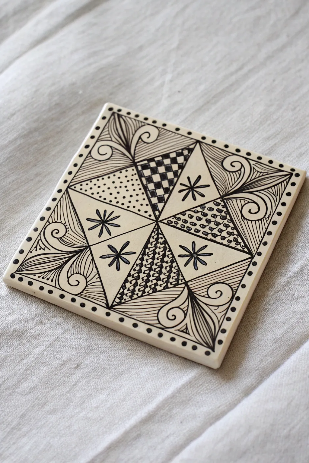
This elegant Zentangle design balances rigid geometric triangles with soft, organic curves, creating a striking pinwheel effect. Using fine liner pens on a standard tile, you’ll learn to juxtapose structured grid patterns against free-flowing botanical motifs.
How-To Guide
Materials
- Square Zentangle tile (3.5″ x 3.5″) or heavy cardstock
- Fine liner pen (Black, size 01 or 03)
- Thicker nib pen (Black, size 05 or 08 for filling)
- Pencil (HB or 2B)
- Tortillon or blending stump
- Ruler (optional, but helpful for the initial grid)
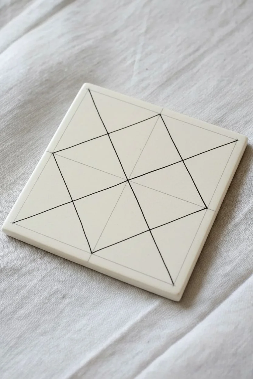
Step 1: Setting the Framework
-
Corner dots:
Begin by placing a small pencil dot just inside each of the four corners of your tile. Connect these dots lightly with a pencil to create a border frame. -
The central cross:
Using your pencil (and a ruler if you prefer precision), draw a straight line connecting the top midpoint to the bottom midpoint. Repeat horizontally to create a large ‘plus’ sign dividing the tile into four equal quadrants. -
Diagonal division:
Draw faint diagonal lines connecting the opposite corners of the inner frame, creating an ‘X’ shape. You should now have eight triangular sections radiating from the center point. -
Creating the star:
Switch to your fine liner pen. Ink the diagonal ‘X’ lines, but stop short of the corners. Connect the ends of these lines to form a large diamond shape in the center of the tile. This creates the main eight-triangle pinwheel structure.
Ink Flow Tip
Rotate your tile constantly as you draw. Pulling the pen towards your hand usually creates smoother, more consistent lines than pushing it away.
Step 2: Filling the Geometric Pinwheel
-
Checkerboard triangle:
Select the top vertical triangle within your central diamond. Draw a small grid inside it. Fill alternating squares with black ink to create a classic checkerboard pattern. -
Stippled triangle:
Move clockwise to the next geometric triangle (on the left). Fill this space with small, evenly spaced dots (stippling). Keep the dots distinct and not touching. -
Plain starbursts:
The next triangle clockwise is left mostly white. In the center, draw a simple six-petaled asterisk or flower shape using clean, straight strokes. -
Bubble texture:
For the next triangle, fill the space with tightly packed small circles. Darken the tiny interstitial spaces between the circles with ink. -
Repeat patterns:
Locate the triangle directly opposite the checkerboard one (at the bottom). Fill it with a wavy, scale-like pattern and darken the negative spaces. Then, fill the remaining three triangles with the asterisk motif, creating an alternating pattern of texture vs. white space.
Make It Yours
Try swapping the checkerboard or stippling for your favorite tangle patterns. A spiral ‘Printemps’ or woven ‘Keeko’ would work beautifully in the wedges.
Step 3: Adding Organic Corners
-
Corner stems:
In the four outer corners of the tile (outside the central diamond), draw a curved line extending from the corner inward toward the diamond’s point. This forms the central stem. -
Petal shapes:
Draw two large, leaf-like petal shapes branching off each central stem. Make them curvy and fluid to contrast with the sharp geometric center. -
Spiral accents:
Add small, playful spirals curling outward from the base of the petals. These fill the awkward gaps near the border line. -
Aura lines:
Inside the petal shapes, simple curved lines follow the contour of the leaf. I like to keep these lines fairly close together to add shading and visual weight. -
Textured background:
Behind the petals in each corner, draw fine, straight parallel lines (hatching). This pushes the floral elements forward visually.
Step 4: Final Details
-
The beaded border:
Go back to your initial pencil border frame. Ink over it carefully. Then, add a series of small, evenly spaced dots all along the outside of this frame. -
Clean up:
Once the ink is completely dry, gently erase all original pencil guidelines to reveal the crisp contrast of the black ink. -
Shading:
Using a pencil and tortillon, add soft graphite shading to the edges of the central diamond to make the pinwheel look slightly raised.
Now you have a beautifully balanced piece of art that blends structure with nature


Practice Bold Negative Space Blocks

This striking Zentangle project transforms a simple ceramic coaster into a work of art by balancing intricate line work with heavy blocks of black ink. The design plays with negative space and geometric divisions, creating a sophisticated look that is surprisingly achievable for beginners.
Step-by-Step
Materials
- 4×4 inch white ceramic glazed tile
- Alcohol ink marker (black, fine tip)
- Alcohol ink marker (black, broad or chisel tip)
- Pencil (HB or 2B)
- Ruler
- Paper towel or rag
- Rubbing alcohol (for cleanup)
- Clear acrylic sealant spray (optional)
Step 1: Setting the Structure
-
Clean surface:
Begin by wiping down your ceramic tile with a bit of rubbing alcohol and a paper towel to remove any oils or dust. This ensures your ink adheres smoothly. -
Draw the main divider:
Using your ruler and pencil, lightly draw a diagonal line from the top-left corner to the bottom-right corner. -
Complete the X:
Draw a second diagonal line from the top-right to the bottom-left, creating a large ‘X’ that divides the tile into four equal triangular quadrants. -
Ink the boundaries:
With your fine-tip marker, carefully trace over your pencil lines. I prefer to rotate the tile as I go to keep my hand in a comfortable position for straight lines.
Ink Flow Tip
Ceramic surfaces are slippery! Draw slower than you would on paper to allow the ink to flow consistently without skipping.
Step 2: Designing the White Quadrants
-
Left quadrant Arcs:
Looking at the left triangle, draw three large, curved lines nested inside each other, originating from the left corner. These should look like rainbows. -
Detailed nodes:
At the points where these arcs intersect the main diagonal divider, draw small semi-circles filled with tiny texture dots to anchor the curves. -
Right quadrant dots:
Move to the right triangle. Instead of solid lines, create a single line of graduated dots running vertically near the right edge. Start with tiny dots at the top and make them progressively larger toward the bottom. -
Add subtle texture:
In the remaining open space of the right triangle, add very sparse, tiny stippling dots just to break up the stark white slightly.
Level Up: Color Pop
Before sealing, use alcohol inks or sharpies to fill the white ‘scales’ in the bottom quadrant with a gradient or single bright color.
Step 3: The Complex Quadrants
-
Top quadrant blocks:
In the top triangle, draw two smaller triangles in the upper corners. Use your broad-tip marker to fill these in completely black. This creates the bold ‘negative space’ anchors. -
Top quadrant patterns:
Between those black blocks, draw a horizon line. Above it, fill the space with a loose, organic organic stippling or leafy pattern. Below it, draw nested semi-circles (rainbow shapes) with vertical hatching lines. -
Bottom quadrant border:
Move to the bottom triangle. Replicate the black corner blocks you did at the top: draw triangles in the bottom-left and bottom-right corners of this section and fill them solid black. -
Central scalloping:
In the center of the bottom triangle, draw a stack of rounded scales or ‘dragon scales’ reaching upward toward the center of the X. -
Side fan details:
Flanking the central scales, draw quarter-circle fans emerging from the black blocks. Fill these fans with straight radiation lines to create contrast against the round scales. -
Lower border detail:
At the very bottom edge connecting the two black blocks, draw three small semi-circles. Fill the outer two with radiating lines and the center one with stippling dots.
Step 4: Finishing Touches
-
Refine lines:
Go back over your main divider lines (the X) with the fine marker to ensure they are crisp and consistent in thickness. -
Stipple detail:
Add a dashed or dotted line texture along the inner edge of the main X diagonals where they touch the white quadrants, adding a subtle stitched effect. -
Erase guidelines:
Once the ink is completely dry—give it a few minutes to be safe—gently erase any visible pencil marks. -
Clean up:
If you smudged any ink, use a Q-tip dipped in rubbing alcohol to carefully clean up the edges. -
Seal (Optional):
If you plan to use this as a coaster, take it outside and spray a light cost of clear acrylic sealant to protect your work from moisture.
Now you have a stunning, high-contrast decorative tile that demonstrates the power of bold black fills in your pattern work
Add Simple Shading for Instant Dimension
This intricate Zentangle-inspired design combines organic leaf motifs with bold geometric arcs to create a mesmerizing black-and-white composition. The interplay between the delicate interior patterns and strong outlines makes this a perfect exercise for practicing line weight and shading.
How-To Guide
Materials
- High-quality sketchbook paper (heavyweight)
- Black fineliner pens (0.1mm for details, 0.5mm for outlines)
- Mechanical pencil (HB or 2B)
- Soft white eraser
- Tortillon or blending stump (optional)
Step 1: Establishing the Framework
-
Draft the main arcs:
Start by lightly sketching a large, sweeping arc in the lower right corner of your page using your mechanical pencil. This will become the geometric border section. -
Sketch the leaf shape:
Draw a large, elongated teardrop shape extending from the center towards the left side, hovering above your initial arc. This forms the primary organic element. -
Add secondary curves:
Pencil in a few smaller swirl shapes and petal-like forms clustering around the base of the large leaf to balance the composition. -
Define the boundaries:
Once you are happy with the layout, go over your main structural lines with a 0.5mm fineliner to create a bold, definitive boundary for your patterns.
Smudgy Shadows?
If your pencil shading looks messy, clean your tortillon on scrap paper first. Rest your hand on a clean sheet of paper while shading to prevent transferring graphite across the page.
Step 2: Filling the Organic Elements
-
Divide the leaf:
Inside the large leaf shape, draw a central vein line. From this vein, draw slightly curved lines extending to the edges, creating segments like a simplified fern. -
Texture the segments:
Switch to your 0.1mm pen. In every other segment of the leaf, draw tightly packed, curved parallel lines to create a striated texture. -
Create the aura:
Draw a second outline around the entire leaf shape, keeping a consistent distance of about 3mm from the original edge. This ‘aura’ technique highlights the main subject. -
Detail the surrounding petals:
Fill the smaller petal shapes near the top left with concentric arcs, mimicking tiny rainbows or scales. -
Draw the spirals:
For the swirl shapes at the bottom left, start from the center and spiral outwards with a medium-weight line, then add small details like dots or tiny triangles in the negative spaces.
Step 3: Executing the Geometric Border
-
Create the double rim:
Return to the large arc at the bottom right. Draw a second parallel line inside the first one to create a thick band. -
Add the orb pattern:
Inside this thick band, carefully draw a row of circles (orbs). Fill the tiny triangular gaps between the circles with black ink to make the white circles pop. -
Structure the fan shape:
Below the orb band, draw straight lines radiating outward from a central point (off the page), creating a fan or sunburst effect. -
Embellish the rays:
Add perpendicular cross-hatching or small curved lines inside a few of these radiating sections to add variety and texture to the geometric area.
Boost the Contrast
Make your drawing pop by re-tracing the outermost perimeter of the entire design with a slightly thicker pen (like a 0.8mm). This ‘weighting’ technique separates the art from the page.
Step 4: Shading and Depth
-
Identify overlap points:
Look for areas where shapes appear to tuck under one another, such as where the leaf overlaps the background petals. -
Apply graphite:
Using the side of your pencil lead, gently lay down graphite along the inner edges of the leaf veins and the outer rim of the geometric arc. -
Soften the shadows:
Before the graphite sets, I usually take a tortillon or my finger to smudge the pencil lines outward, fading them into the white paper for a soft gradient. -
Enhance the orbs:
Add a tiny crescents of graphite to one side of each circle in your geometric band to make them look spherical like pearls. -
Final clean up:
Wait for the ink to be totally dry, then carefully erase any remaining visible pencil sketch lines to leave a crisp, high-contrast finish.
Take a moment to admire how simple lines and basic shading have transformed a blank page into a complex work of art
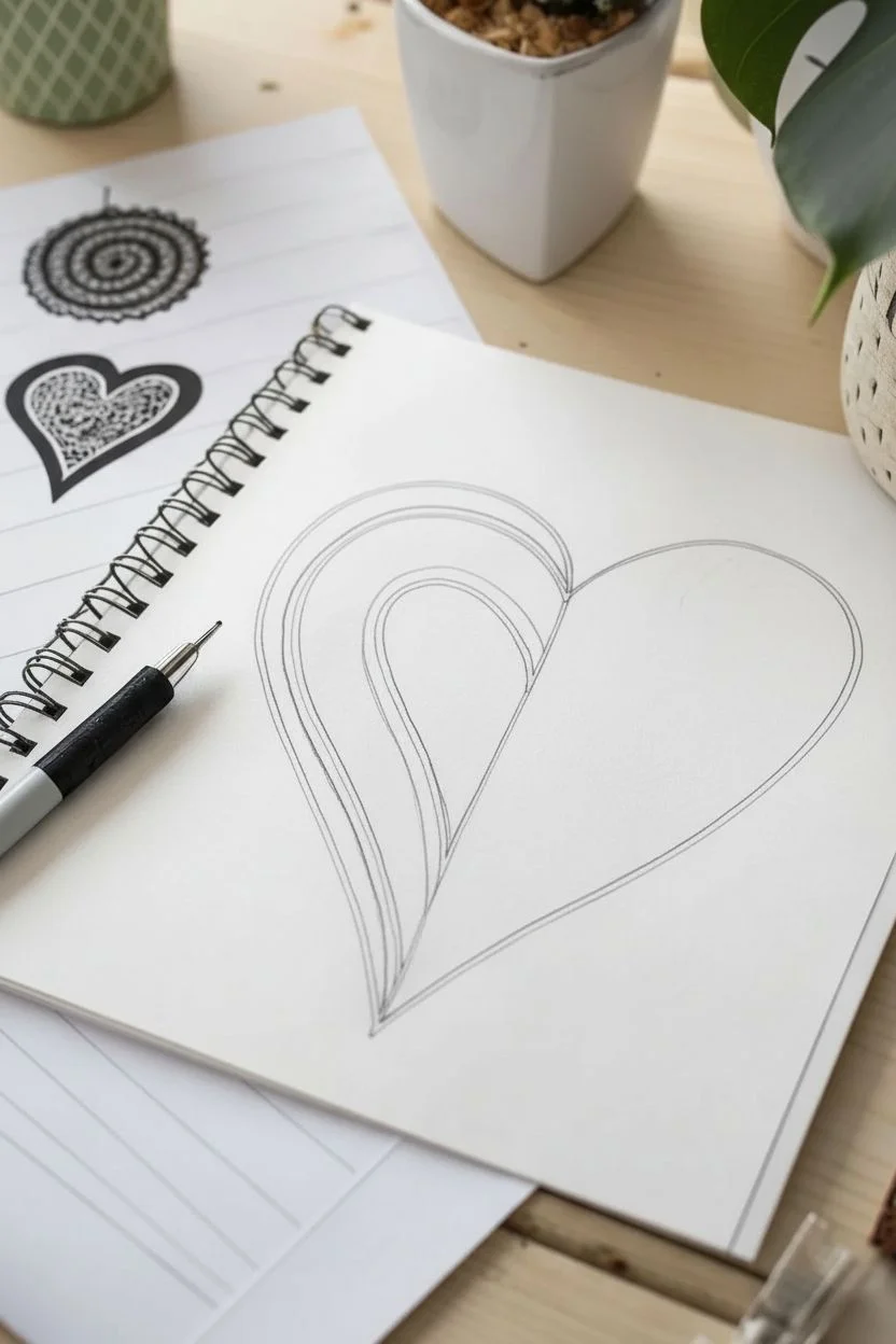
Tangle Inside a Heart Shape
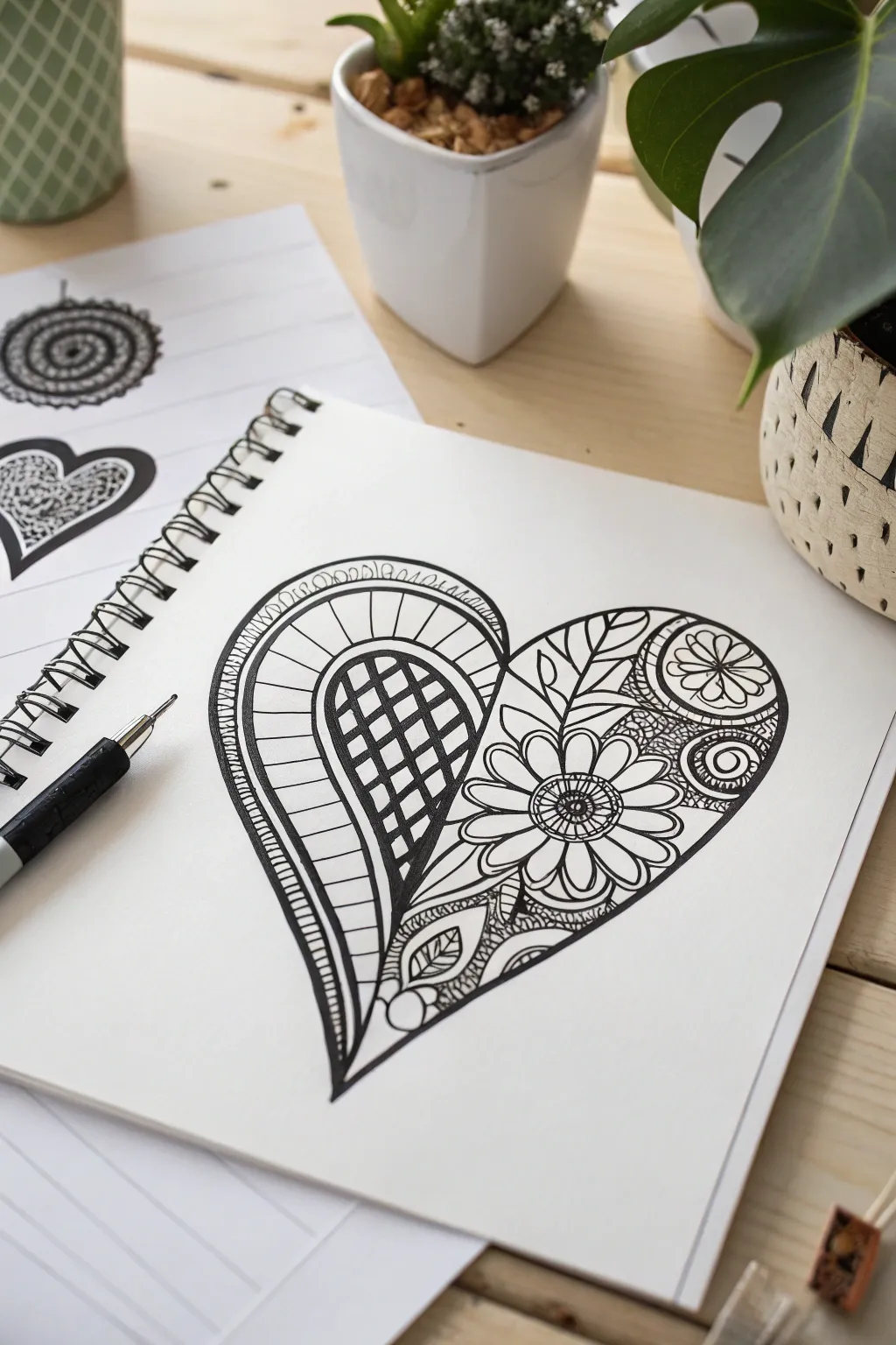
This project combines the simple, universally loved symbol of a heart with intricate botanical and geometric tangles. The result is a striking black-and-white illustration that balances structured lines with organic floral curves.
Step-by-Step
Materials
- White sketchbook paper (smooth bristol or mixed media paper works best)
- Pencil (HB or 2B)
- Eraser (kneaded or vinyl)
- Fine liner pen (black, 0.3mm or 0.5mm)
- Fine liner pen (black, 0.1mm for details)
- Ruler (optional)
Step 1: Basic Shape and Division
-
Draw the heart outline:
Start by lightly sketching a large, balanced heart shape in the center of your page with a pencil. Aim for a slightly elongated, elegant curve at the bottom point. -
Divide the heart:
Draw a curved line starting from the top center indentation, sweeping down towards the bottom left side of the heart as if creating a large inner petal. This splits the heart into a left lobe and a larger right section. -
Create the inner teardrop:
Inside that left lobe section you just created, draw a smaller, nested teardrop shape. This creates a thick border area which we will fill with stripes later. -
Ink the main outlines:
Using your thicker fine liner (0.5mm), trace over the main heart outline and the two dividing curves you just drew. I prefer to thicken the outermost heart line slightly to frame the drawing.
Smudge Alert
Fine liners can smear easily on smooth Bristol paper. Always work from the top left corner down to the bottom right (if right-handed) to keep your hand off wet ink.
Step 2: Left Side Patterns
-
Fill the teardrop grid:
Inside the smallest teardrop shape on the left, draw a grid pattern using diagonal lines crossing each other. Keep the spacing fairly wide. -
Checkered shading:
Color in alternating squares within that grid to create a classic checkerboard effect. Solid black sections give the drawing immediate weight and contrast. -
Stripe the border:
In the gap between the teardrop and the dividing line, draw horizontal curved lines (stripes) bridging the space. Keep them evenly spaced. -
Add the scallop edge:
Along the very outer edge of the left lobe’s curve, draw a series of tiny semi-circles or scallops. Add a small dot inside each scallop for extra detail.
Step 3: Right Side Florals
-
Draw the main flower:
In the lower-central part of the right section, draw a circle for a flower center. Surround it with long, paddle-shaped petals radiating outward. -
Detail the flower center:
Add a smaller circle inside the flower center and fill the ring between them with tiny radiating dashes or shading lines. -
Add the top corner motif:
In the upper right curve of the heart, draw a semi-circle nesting against the edge. Fill it with a simple daisy-like flower pattern. -
Connect with leaves:
Draw sweeping, curved lines connecting the main flower to the top motif. Turn these lines into leaf shapes by adding pointed tips and center veins. -
Fill the gaps:
In the spaces between the leaves and flowers, add small texture details. Tiny circles (tipple) or cross-hatching work well to darken the background and make the white petals pop.
Shading Depth
Use a graphite pencil to gently shade inside the edges of the overlap areas. Smudge it with a blending stump to make the layers look 3D.
Step 4: Bottom Details and Refinement
-
Fill the bottom tip:
At the very bottom point of the heart, draw a few organic, leafy shapes climbing upwards. Fill these leaves with simple veins or small circular patterns. -
Connect the sections:
Ensure the floral elements on the right touch the dividing line of the left section so the composition feels unified. -
Thicken lines:
Go back with your thicker pen and add line weight to the main curves and the edges of the flower petals. This ‘sculpting’ of lines adds dimension. -
Erase pencil:
Wait until the ink is completely dry to prevent smearing, then gently erase all visible pencil sketches.
Now you have a beautifully intricate heart design that looks great in a sketchbook or framed on a wall
Create Decorative Letters Filled With Tangles
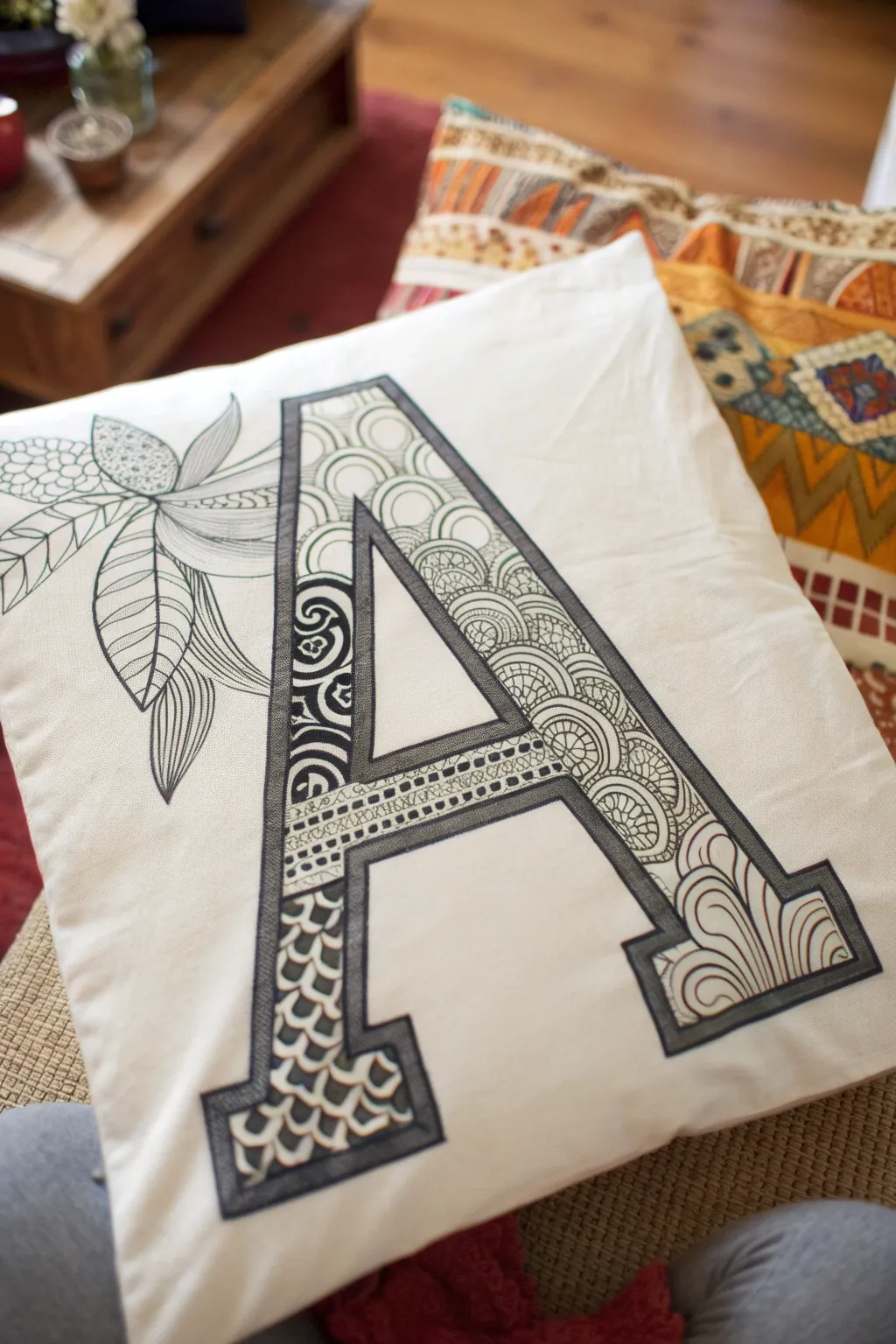
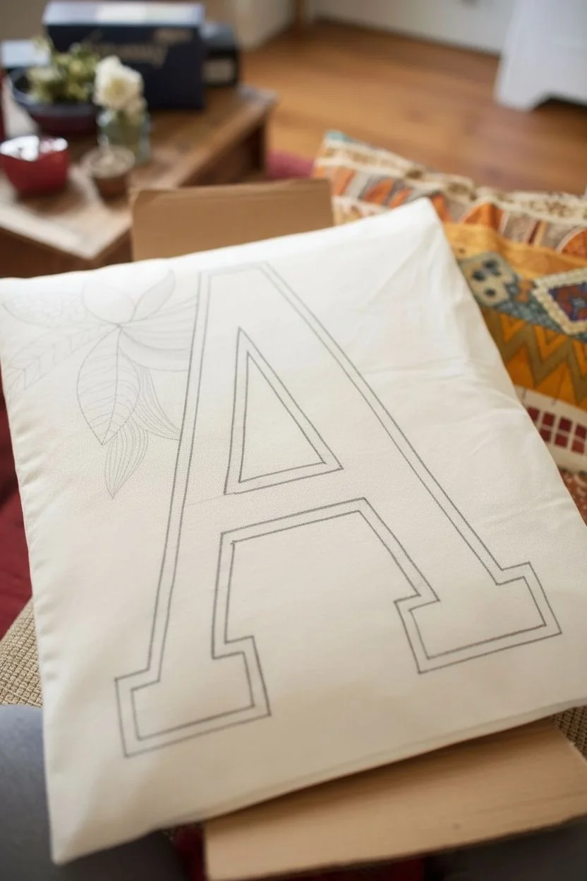
Transform a plain pillowcase into a personalized statement piece with this meditative drawing project. By filling a large, serif letter with intricate repeating patterns, often called Zentangles, you create a striking contrast between structured typography and organic doodles.
Step-by-Step Tutorial
Materials
- Plain white or cream cotton pillowcase
- Pencil and eraser
- Ruler
- Fabric markers (fine tip, black)
- Fabric markers (medium tip, black)
- Piece of cardboard (to fit inside pillowcase)
- Iron (to set the ink)
Step 1: Preparation & Outlining
-
Prepare your surface:
Before starting, ensure your pillowcase is washed, dried, and ironed smooth to remove any sizing or wrinkles. Slide a piece of cardboard inside the pillowcase directly under where you plan to draw; this prevents the ink from bleeding through to the other side. -
Sketch the letter:
Using a pencil and a ruler, lightly sketch a large, block-style serif letter ‘A’ in the center of the fabric. Aim for the letter to be quite thick—about 1.5 to 2 inches wide—to provide ample space for your patterns. -
Add floral elements:
To soft the look, sketch a stylized flower and leaves peeking out from behind the left side of the letter. Draw large, simple leaf shapes and a few petals; keep the lines light so they can be easily adjusted. -
Outline the main structure:
Once you are happy with the placement, trace over your pencil lines with a medium-tip black fabric marker. Draw a double border for the letter ‘A’ to create a thick frame, which will neatly contain your doodles.
Ink Control Pro Tip
Fabric markers can bleed on certain weaves. Test your pen on a hidden hem or inside seam first. If it bleeds, move the pen faster and apply lighter pressure.
Step 2: Patterning the Letter
-
Section the letter:
Divide the interior of the letter ‘A’ into smaller, manageable sections using your fine-tip marker. You don’t need straight lines; curved or diagonal dividers add visual interest. -
Start with fish scales:
In the bottom left leg of the ‘A’, draw a repeating fish-scale or scallop pattern. Stack small arches on top of each other, filling the entire section. -
Add detail to scales:
darken the small triangular spaces between the arches to make the white scales pop. This high-contrast technique is key to the Zentangle look. -
Create a spiral section:
Moving up the left leg, fill a rectangular section with tight, decorative spirals. I like to alternate the direction of the spirals occasionally to keep the texture dynamic. -
Pattern the crossbar:
For the horizontal crossbar of the ‘A’, draw two parallel lines filled with tiny dots or small vertical dashes. This creates a ‘stitched’ ribbon effect. -
Draw circle stacks:
On the long right diagonal of the letter, draw a pattern of stacked semi-circles or ‘rainbows’. Layer them closely so they resemble overlapping roof tiles. -
Fill the circles:
Inside each semi-circle band, add different textures—some can be filled with tiny circles, others with cross-hatching, and leave some plain white for balance. -
Finish the bottom right:
In the bottom right serif foot, draw long, flowing wavy lines that mimic hair or wood grain. Add a few small swirls at the ends of the lines to fill the corners.
Troubleshooting Mistakes
Made a stray mark? Don’t panic. Transform the mistake into a new pattern element like a solid black geometric shape or a new organic vine to cover it up.
Step 3: Finishing Touches
-
Trace floral details:
Switch back to the floral sketch on the left. Outline the leaves and petals with your fine-tip marker. Instead of solid coloring, use fine lines to draw the veins inside the leaves. -
Add texture to the flower:
Fill the center of the flower or certain petals with a simple stippling (dotting) pattern or small circles to distinguish it from the leaves. -
Thicken the frame:
Go back over the main outline of the letter ‘A’ with a medium-tip marker to thicken the border. A bold, heavy outline helps separate the busy patterns from the white background. -
Erase pencil guides:
Allow the ink to dry completely for at least an hour. Once dry, gently erase any visible pencil marks, being careful not to pull on the fabric. -
Heat set the ink:
To make your design permanent and washable, heat set the fabric. Follow the instructions on your markers, which usually involves ironing the reverse side of the fabric on a high cotton setting for several minutes.
Now you have a custom, hand-drawn accent pillow that adds a cozy, artistic touch to any room
Make a Zentangle Bookmark Strip
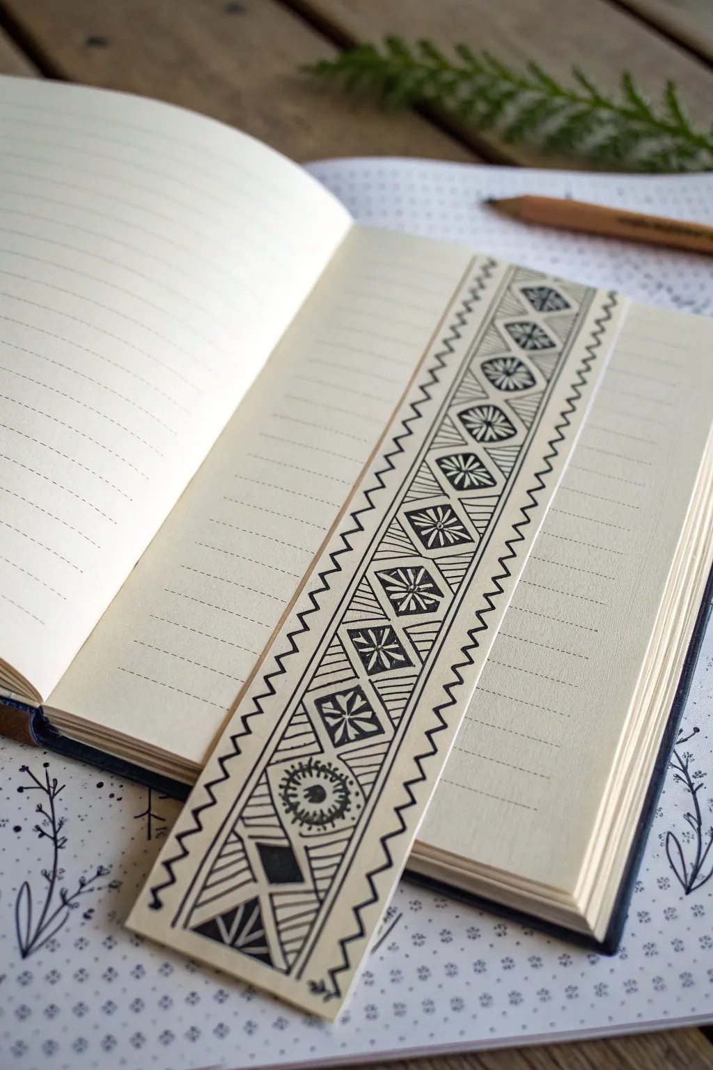
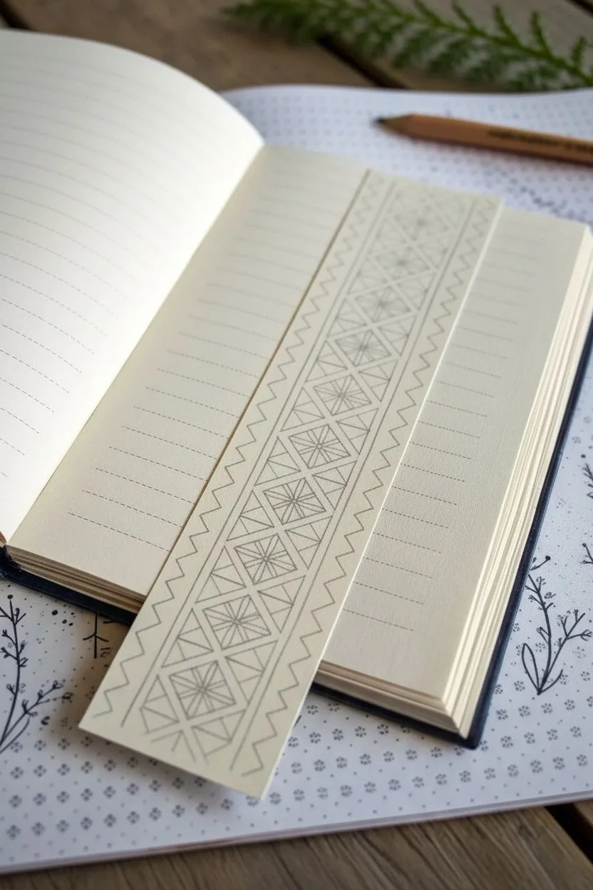
Transform a simple strip of paper into a striking placeholder with this geometric-inspired Zentangle design. The combination of rigid diamond shapes and flowing floral centers creates a beautiful contrast flanked by classic zig-zag borders.
Step-by-Step
Materials
- High-quality cardstock or heavy drawing paper (cream or white)
- Fine-liner pen (0.3mm or 0.5mm, black)
- Ruler
- Pencil (HB or 2B)
- Eraser
- Scissors or paper trimmer
Step 1: Preparation & Grid
-
Cut the strip:
Begin by cutting a strip of your cardstock to approximately 2 inches wide by 6-8 inches long. It should fit comfortably within the height of your notebook. -
Draw the main columns:
Using your ruler and pencil, lightly draw two parallel vertical lines down the length of the bookmark. This divides the strip into three sections: a wider central column for the main pattern and two narrower side columns for the borders. -
Create the diamond grid:
In the central column only, draw a series of stacked diamond shapes. Use your ruler to ensure the tops and bottoms of the diamonds touch, creating a continuous chain. -
Add dividing triangles:
The spaces left between your diamonds and the vertical border lines will naturally form triangles. This completes your pencil grid structure.
Step 2: Inking the Center Patterns
-
Outline the diamonds:
Switch to your fine-liner pen. Carefully trace over the diamond shapes you sketched in the center column. -
Add inner frames:
Inside each diamond, draw a smaller diamond shape, leaving a consistent gap between the outer and inner lines to create a frame effect. -
Draw the center motifs:
Inside the smaller diamonds, draw a simple floral or starburst shape. I like to alternate between an eight-pointed star and a rounded wheel with radiating lines for variety. -
Fill the starbursts:
For the star style, darken the sections of the star petals to create high contrast. If doing the wheel style, add a small dot in the very center. -
Stripe the triangles:
Move to the triangular spaces along the edges of the diamonds. Fill each triangle with straight, parallel lines running perpendicular to the diamond’s edge. -
Vary the triangle fills:
To keep it interesting, you can occasionally fill a triangle with solid black or leave a small section open for a different texture. -
Ink vertically:
Go over the two main vertical lines that separate the center column from the side borders, creating a solid boundary for your artwork.
Steady Tip
Turn the paper as you draw parallel lines inside the triangles. Pulling the pen toward your body is often steadier than pushing it away.
Step 3: Border & Finish
-
Start the zigzag:
In the left-hand narrow column, draw a continuous zigzag line from top to bottom. Try to keep the peaks and valleys evenly spaced. -
Repeat on the right:
Do the same for the right-hand column, mirroring the zigzag pattern down the length of the bookmark. -
Add bottom details:
At the very bottom of the central column, you can break the pattern slightly with a larger geometric focal point, like a bold chevron or a unique circular motif. -
Erase pencil guides:
Allow the ink to dry completely to avoid smudging. Then, gently erase all visible pencil lines from your initial grid. -
Clean up edges:
If your zigzags drifted slightly or the edges look rough, use a paper trimmer to slice a sliver off the sides for a crisp finish.
Level Up
After the black ink dries, use watercolor pencils to add a soft gradient of color inside the central diamond motifs for a pop of vibrancy.
Slide this crisp, custom-made marker into your current read and enjoy the intricate details every time you open the page
Tangle in Your Sketchbook Margins

Transform plain sketchbook pages into an elegant journal spread by creating an intricate, patterned border. This zentangle-inspired frame uses repetitive floral and organic motifs to create a classic, sophisticated look that invites you to fill the blank space inside.
Step-by-Step Guide
Materials
- Hardbound sketchbook (blank pages)
- Fine liner pen (01 or 03 size, black)
- Thicker marker pen (05 or 08 size, black)
- Pencil (HB or 2B)
- Ruler
- Eraser
Step 1: Setting the Boundaries
-
Define the outer edge:
Begin by deciding how thick you want your border to be. Using your ruler and pencil, lightly draw a rectangle on both the left and right pages, spaced about 0.5 inches from the outer edge of the paper. -
Create the inner frame:
Measure inward about 1 to 1.5 inches from your first line and draw a second, smaller rectangle inside the first. This creates the ‘track’ where your pattern will live. -
Connect the spine:
Ensure the lines meet neatly near the center spine of the book so the border looks continuous across the spread, though drawing deep into the crease can be tricky, so precise measurement helps here. -
Ink the structure:
Take your thicker marker pen (05 or 08) and trace over your pencil lines to create the solid black boundary lines. Use the ruler again if you want a crisp finish, or freehand it for an organic feel.
Step 2: Drafting the Pattern
-
Divide the space:
Lightly sketch diagonal pencil lines or gentle curves through the border space to break it into manageable sections. This prevents the pattern from becoming uneven as you work your way around. -
Sketch main motifs:
Pencil in the primary shapes. For this specific design, draw large, curling paisley shapes and circular floral heads at regular intervals within the border. -
Add connecting vines:
Draw winding stems that connect your main floral shapes, allowing them to flow naturally from one corner to the next. -
Fill the gaps:
Identify the negative spaces between your main vines and flowers. Sketch in smaller leaves, buds, or simple circles to ensure the design looks dense and lush.
Uneven Spacing?
If your pattern gets too crowded in one spot and sparse in another, simply fill the empty areas with tiny black orbs or solid black triangles to balance the visual weight.
Step 3: Inking and Detailing
-
Outline main shapes:
Switch to your finer pen (01 or 03). Start by carefully outlining the large floral heads and paisley curls you drafted, keeping your hand steady. -
Add petal details:
Inside the floral shapes, draw smaller petals or concentric circles. I find that varied line weight adds depth, so press slightly harder on the outer curves. -
Texture the leaves:
Fill the leaf shapes with simple veins or split them in half with a single line. You can color every other section black for a bold contrast. -
Cross-hatch areas:
Select specific elements, like the centers of flowers or the background of certain curves, and add tiny cross-hatching or stippling (dots) to create shading. -
Darken negative space:
Use your thicker pen to fill in the tiny gaps between the vines and the border lines with solid black ink. This ‘black background’ technique makes the white pattern pop instantly. -
Refine the corners:
Pay special attention to the corners of the page. Ensure the pattern wraps around smoothly; add an extra leaf or swirl if the corner looks too empty.
Add a Pop of Color
Once the black ink is dry, use watercolor pencils or mild highlighters to tint just the floral elements, leaving the background black and white for a stunning effect.
Step 4: Final Touches
-
Let it dry:
Wait at least 5-10 minutes to ensure the ink is completely dry to the touch to prevent smudging. -
Erase guidelines:
Gently erase all remaining pencil marks, including the initial structural lines and the sketching within the pattern. -
Assess contrast:
Step back and look at the spread. If any areas look too light, go back in with the fine pen and add more hatching or thicken the outlines.
You now have a beautifully framed canvas ready for your next journal entry or sketch
Build a Mosaic of Mini Tiles
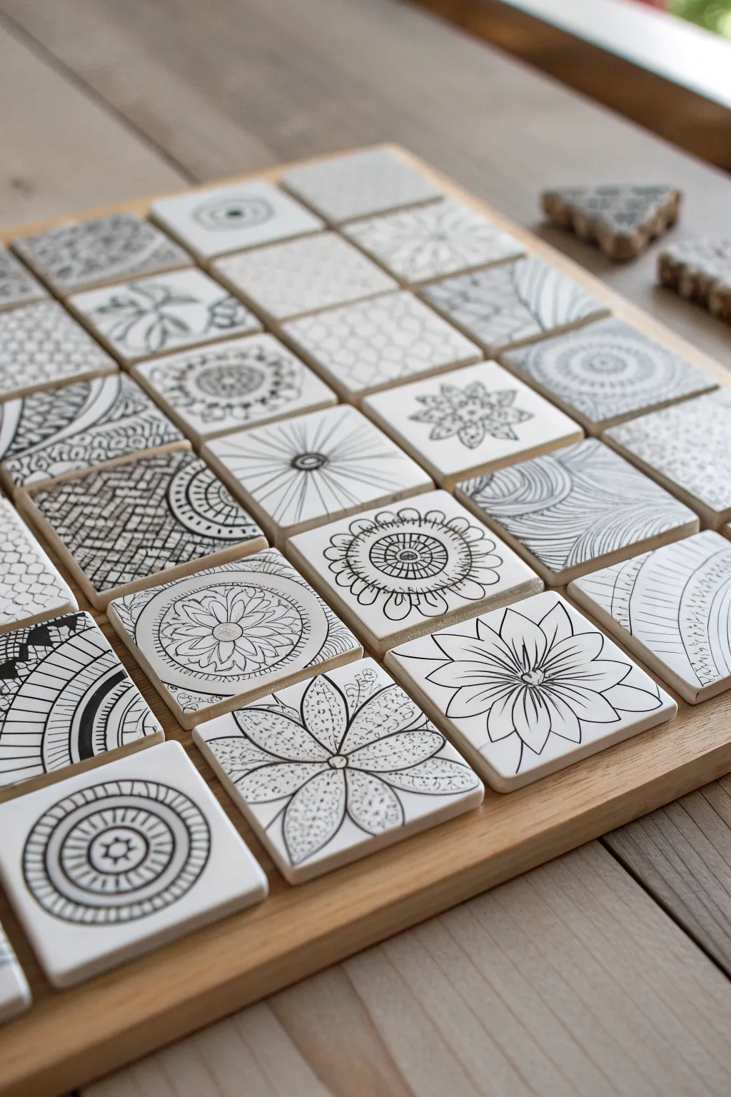
Transform a collection of individual doodles into a stunning, cohesive mosaic that feels grander than the sum of its parts. This project arranges small, square tiles featuring diverse black-and-white botanical and geometric patterns onto a simple wooden tray for an eye-catching display.
Detailed Instructions
Materials
- 20-25 small white square tiles (approx 2×2 inches), either bisque ceramic or heavy mixed-media paper
- Fine-point black drawing pens (Micron 01, 03, and 05 sizes)
- Graphite pencil (HB or 2B) for sketching
- Blending stump (tortillon)
- Wooden serving tray or shadow box frame (sized to fit your tile grid)
- Ruler
- Eraser
- Double-sided mounting tape or craft glue (optional for permanent display)
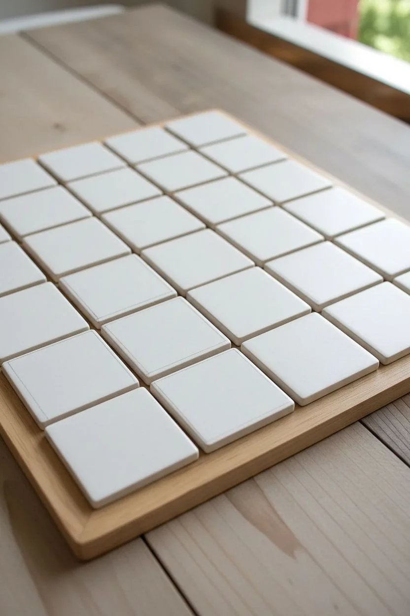
Step 1: Planning the Grid
-
Measure the Display Base:
Begin by measuring the interior dimensions of your wooden tray or shadow box. This will determine how many tiles you need to create and whether you will have a border gap. -
Test the Layout:
Place your blank tiles into the tray to ensure a good fit. You want a snug grid, 4 tiles wide by 5 or 6 tiles long depending on your tray’s shape. Remove them once you have confirmed the count. -
Pencil Borders:
Taking one tile at a time, use your pencil and ruler to lightly mark a very faint border about 1/8th of an inch from the edge. This ‘string’ acts as a boundary for your creative patterns.
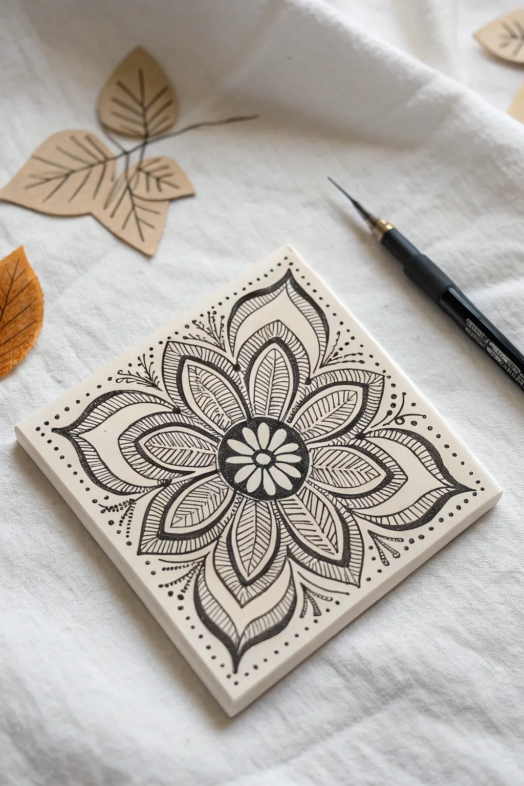
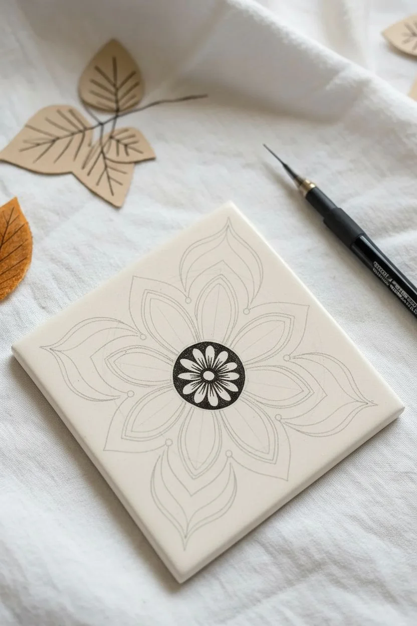
Step 2: Drawing the Patterns
-
Select Flower Motifs:
Choose about 5-6 tiles to feature large, central floral designs. Sketch a central circle and radiating petals in pencil first to establish symmetry. -
Ink the Florals:
Using a size 05 pen for bolder lines, trace your floral outlines. Switch to a fine 01 pen to add delicate interior details like veins in leaves or stippling in the flower centers. -
Draft Geometric Designs:
For the next batch of tiles, focus on geometric repetition. Sketch grids, concentric circles, or radiating lines. These provide visual structure to balance the organic flower shapes. -
Texture with Pattern:
Fill the geometric sections with diverse tangles. Try ‘scales’, tight cross-hatching, or repetitive swirls. I like to alternate between heavy black fill and light line work to create contrast. -
Create Abstract Flows:
On the remaining tiles, draw free-flowing curves that go from edge to edge. Imagine lines that might connect one tile to another, although perfect alignment isn’t necessary. -
Add Depth with Shading:
Use the side of your graphite pencil to add shading where lines overlap or tuck under others. This creates dimension and makes the flat drawings pop. -
Blend the Shadows:
Take your blending stump (tortillon) and gently smudge the graphite shading to smooth it out, creating a soft gradient from dark grey to white. -
Erase Guidelines:
Once the ink is completely dry—give it a few minutes to be safe—gently erase any remaining pencil border lines or sketches, being careful not to smear the graphite shading.
Uneven Grid Gaps?
If your tiles don’t fit the tray perfectly, cut a piece of black cardstock to fit the tray bottom exactly. Center your tile grid on top of it to create a deliberate detailed border.
Step 3: Assembling the Mosaic
-
Dry Run Arrangement:
Lay all your finished tiles on a table. Shuffle them around to find a pleasing balance. Try to separate dark, heavy tiles with lighter, airier designs. -
Check for Connections:
Look for happy accidents where lines from one tile seem to flow into the next. Rotate tiles 90 degrees to see if you can create interesting visual paths. -
Place in Tray:
Transfer your final arrangement into the wooden tray, starting from the top left corner and working your way down row by row. -
Secure the Tiles (Optional):
If you want this to be a permanent artwork rather than an interactive puzzle, apply a small dot of craft glue or a square of mounting tape to the back of each tile before pressing it into place. -
Final Polish:
Check the grid for alignment one last time. If using ceramic tiles, a quick wipe with a dry cloth will remove any fingerprints from handling.
Variation in Line Weight
Don’t use just one pen size. Using a thick 08 pen for outer shapes and a 005 for tiny details creates professional-looking depth and visual interest across the mosaic.
Now you have a dynamic gallery of miniature art pieces that works beautifully as a table centerpiece or wall hanging
Use One Tiny Pop of Color as an Accent
Create a stunningly intricate mandala on a crisp white ceramic or paper tile, featuring a bold central flower that radiates outward. The design balances heavy black ink work with delicate stippling and line hatching for a mesmerizing, high-contrast effect.
Step-by-Step Tutorial
Materials
- Square white tile (ceramic or heavy paper smooth cardstock, approx. 3.5 inches)
- Fine liner pen (black, size 03 or 05)
- Ultra-fine liner pen (black, size 01)
- Pencil (HB for sketching)
- Eraser
- Ruler (optional)
Step 1: Setting the Foundation
-
Establish the center:
Begin by finding the approximate center of your square tile. Lightly pencil a small circle, about the size of a dime, in the middle to serve as your anchor point. -
Draft the petals:
Sketch a larger circle around your center point, roughly 1.5 inches in diameter. Inside this guide, lightly draw eight evenly spaced large petals radiating from the center. -
Add the outer layer:
Sketch a second tier of petals peeking out from behind the first set. These should be larger and point towards the corners and flat sides of the tile, creating a star-like silhouette. -
Ink the central bloom:
Switch to your 05 fine liner. Draw a small, eight-petaled flower inside your initial center circle. Leave the petals white but fill the negative space around them with solid black ink for high contrast.
Ink Smearing?
If you notice ink smudging when your hand moves, place a scrap piece of paper under your drawing hand to act as a shield while you work.
Step 2: Building the Layers
-
Outline the main petals:
Use your 03 pen to trace over the eight main petals surrounding the dark center. Give them a double outline to create a distinct border. -
Create the inner teardrops:
Inside each of these eight main petals, draw a smaller, teardrop shape that echoes the outer contour. This creates a framed effect within each petal. -
Fill with hatching:
Inside the teardrop shapes you just drew, use the ultra-fine 01 pen to effect delicate horizontal sketching lines. Keep them close together but distinct. -
Detail the petal tips:
At the pointed tip of each main petal, darken the small triangular area with solid black ink. This adds weight and definition to the flower’s edges.
Color Pop
Though the example is monochrome, try filling just the central tiny flower petals with a bright gold or deep crimson ink for a striking focal point.
Step 3: Expanding and Embellishing
-
Outline the outer tier:
Trace the large, outer tier of petals with the 03 pen. These shapes should be broad and curve elegantly toward the corners of the tile. -
Add internal contours:
Draw an inner line within each of these large outer petals, mirroring the shape just like you did with the first layer. -
Shade with stippling:
I prefer to use stippling here for texture. Take your 01 pen and add tiny dots inside the tips of these outer petals, concentrating them near the point and spacing them out as you move inward. -
Leaf vein details:
Draw a central line down the middle of each outer petal. Add angled hatching lines on either side of this center line to resemble leaf veins. -
Darken the negative space:
Identify the small gaps between the inner flower and the outer petal layer. Fill these triangular gaps with solid black ink to make the white petals pop.
Step 4: Final Flourishes
-
Corner sprays:
In the four corners of the tile, draw simple, curved stems extending outward. Add tiny dots or small leaves to the ends of these lines. -
Add directional dots:
Using the 03 pen, place a series of dots leading from the petal tips toward the edge of the tile. Start with larger dots and make them progressively smaller. -
Border framing:
Create a loose frame by placing dots along the very edge of the tile, spacing them evenly to contain the energy of the mandala. -
Erase guidelines:
Wait for the ink to be completely dry—give it a few minutes to be safe. Gently erase all your visible pencil marks. -
Final inspection:
Look for any lines that need thickening or gaps in your solid black areas. Touch up these spots to ensure a polished look.
Now you have a beautifully balanced mandala tile ready to display or gift to a friend
Layer New Tangles Over a Finished Tile
Transform a plain ceramic coaster into a stunning piece of functional art using intricate Zentangle-inspired patterns. The high contrast of black permanent ink against glossy white tile creates a crisp, sophisticated look that is surprisingly achievable.
Step-by-Step Tutorial
Materials
- 4×4 white ceramic tile (bisque or glazed)
- Black permanent marker (fine tip, e.g., Sharpie Fine Point or Micron PN)
- Pencil (HB or 2B)
- Eraser
- Ruler
- Compass (optional but helpful)
- Spray sealant (clear acrylic or fixative)
- Self-adhesive felt backing pads
Step 1: Setting the Foundation
-
Clean the surface:
Wipe down your white ceramic tile thoroughly with rubbing alcohol or soapy water to remove any oils or dust. Let it dry completely to ensure the ink adheres properly. -
Find the center:
Using a ruler and a light pencil touch, draw diagonal lines from corner to corner to locate the exact center of the tile. This is crucial for symmetry. -
Draw guide circles:
With a compass or by tracing small circular objects, lightly sketch three concentric circles starting from the center point. These will act as boundaries for your petal layers. -
Create the central hub:
Using your black permanent marker, draw a small, bold circle right at the center point. This anchors the entire mandala design.
Smudge Prevention
Ceramic surfaces are slick! To avoid smearing wet ink with your hand, place a clean sheet of scrap paper under your drawing hand as you work across the tile.
Step 2: Drawing the Inner Layers
-
Draft the first petals:
Around the central black dot, draw eight narrow, tear-drop shaped petals. They should all radiate outward and touch the central dot. -
Add secondary definition:
Draw a thin aura line inside each of these first eight petals. This double-line effect adds immediate complexity without much effort. -
Bridge the gaps:
Between the tips of these first petals, draw a small curved line connecting them, creating a gentle scalloped edge around the first layer. -
Create the second tier:
Draw a larger set of eight petals behind the first set, positioning the points of these new petals so they fall directly between the inner petals. -
Detail the second tier:
Inside this second row of petals, draw a small circle near the tip. Add a smaller dot inside that circle to mimic a bead or eye. -
Add flowing lines:
Draw two curved lines extending from the ‘bead’ down to the base of each petal, creating a V-shape that leads the eye toward the center.
Oven Curing
For extra durability on glazed tiles, bake the finished piece at 350°F (175°C) for 30 minutes before sealing. Put the tile in a cold oven to start to prevent cracking.
Step 3: The Outer Expansion
-
Outline the large leaves:
Sketch the largest, outermost layer of leaf-like shapes. These should be wide and pointy, extending almost to the straight edges of the tile. -
Create the spine:
Draw a central vein line down the middle of each large outer leaf. This divides the space for further patterning. -
Fill with texture:
Fill the left and right sides of these large leaves with closely spaced, curved hatching lines. This creates a shaded, textured look contrasting with the open white spaces. -
Interlock the layers:
Look for the triangular negative spaces between the large outer leaves. Draw a small, peaked shape in these gaps to make the design feel continuous and solid. -
Add the final border:
If desired, trace a thin line around the very outer perimeter of your mandala shape to unify the design.
Step 4: Finishing Touches
-
Erase guidelines:
Wait at least 15 minutes for the ink to cure fully. Gently erase any visible pencil marks from the center finding and circles. -
Seal the artwork:
To protect your design from spills or scratches, take the tile to a well-ventilated area and apply a light coat of clear spray sealant. -
Add protection:
Once the sealant is dry, stick felt pads or a cork square to the bottom of the tile to prevent it from scratching your furniture.
Now you have a durable, custom coaster that adds a touch of zen to your coffee table
Have a question or want to share your own experience? I'd love to hear from you in the comments below!