Both calligraphy and lettering turn written words into visual art—but they do so in very different ways. Understanding these differences can help you find which approach best fits your creative rhythm and artistic goals.
Understanding the Foundations

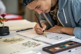
Calligraphy is the art of writing with rhythm and precision. It relies on controlled strokes created with specialized tools like dip pens or brushes. Every letter is produced in a continuous motion, meaning it’s written, not drawn.
Lettering, by contrast, is a form of drawing—each letter is constructed, outlined, and refined. Artists often sketch their letters first, then adjust shapes and proportions before inking or coloring. In essence, calligraphy is handwriting elevated, while lettering is illustration through text.
| Aspect | Calligraphy | Lettering |
|---|---|---|
| Core activity | Writing | Drawing |
| Tools | Nibs, brushes, ink | Pencils, markers, digital tablets |
| Process | Fluid, continuous strokes | Layered construction |
| Focus | Line quality, rhythm | Composition, design |
| Typical look | Elegant, organic | Bold, graphic |
Tools and Materials to Begin

For calligraphy, precision tools make all the difference. A pointed pen nib or a flexible brush lets ink respond to pressure, varying line thickness naturally. Beginners can practice with brush pens, which provide more control and less mess while still developing stroke sensitivity.
For lettering, the essentials include graphite pencils, fine liners, and smooth paper. A drawing compass or grid layout can help maintain consistency. Digital tools can also support the process—many lettering artists transfer sketches to digital tablets to refine details and composition.
Technique and Mindset

When practicing calligraphy, focus on consistency of angle and stroke pressure. Letters should flow like a practiced dance, where each motion connects to the next. Warming up with simple line exercises—loops, ovals, and parallel strokes—conditions hand muscles to move fluidly.
Lettering requires a builder’s mindset. You start with basic shapes, refine spacing, and balance each word visually. Think in terms of graphic weight rather than motion. Sketch lightly at first, then trace and thicken key lines to establish hierarchy and style.
Here’s a simple way to compare the two methods in practice:
- Write the word “breathe” using a brush pen—one continuous pass.
- Then sketch the same word using a pencil—outline each letter’s shape before filling.
- Observe which process feels more natural to you: flowing movement (calligraphy) or planned construction (lettering).
When Style Meets Personality

Over time, nearly everyone develops a personal style rooted in their creative temperament. Calligraphy tends to appeal to those who enjoy meditative repetition and elegance through control. It suits crafts like wedding invitations, journaling, or fine-art prints.
Lettering attracts visual thinkers who like composition, structure, and experimentation. It lends itself to poster design, mural art, or digital graphics. Some artists enjoy merging both—writing a calligraphic base, then turning it into a more sculpted lettered piece.
From my perspective, calligraphy feels like conversation—you guide the line fluidly across the page, responding to every motion. Lettering feels like architecture—every line drawn, adjusted, and perfected. Both carry beauty; choosing one depends on what gives you creative satisfaction.
DIY Practice Plans

You can develop either discipline—or both—through consistent, structured practice. Try these:
For Calligraphy
– Warm up daily with 5 minutes of pressure-control drills.
– Copy an alphabet repeatedly, focusing on stroke rhythm, not speed.
– Practice connecting letters into smooth words.
– Gradually introduce new script styles (Italic, Copperplate, Modern).
For Lettering
– Sketch one word per day in different styles or shapes.
– Experiment with letter weight, spacing, and perspective.
– Start with pencil outlines before adding ink or color.
– Study typography to understand proportions and visual balance.
Each technique improves with muscle memory and visual awareness. Keep samples of your work to track progress—the smallest refinements often show how your “hand” matures over time.
Choosing Your True Style
The most reliable way to discover your natural style is through experience. Dedicate a few weeks to one form, then switch. Notice which practice energizes you more—steady flow or detailed design. Your preference might also shift depending on mood or medium.
In the end, calligraphy and lettering are two languages of expression. One thrives in motion; the other in structure. Both reward patience, attention, and practice. Whether you write or draw your letters, what matters most is cultivating a mindful connection between hand, eye, and thought.