Color is the quiet power behind every memorable piece of art. When the right palette is chosen, even simple shapes gain depth, emotion, and presence.
Understanding the Science of Color Harmony

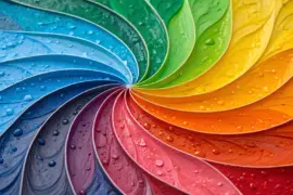
Every vibrant piece begins with an understanding of color relationships. At its core, color theory explains how hues interact based on their positions on the color wheel.
- Complementary colors sit opposite each other—blue and orange, for instance. Their contrast creates visual energy and draws immediate attention.
- Analogous colors lie side by side, such as yellow, yellow-green, and green. These palettes feel harmonious and natural, often used to evoke calm.
- Triadic schemes use three hues evenly spaced on the wheel, like red, blue, and yellow. They strike a balance between contrast and cohesion.
- Monochromatic palettes rely on one hue in varied tints and shades, giving a design depth through subtle tonal shifts.
Light, wavelength, and saturation affect how the eye perceives harmony. A high-saturation color placed next to a muted one always dominates the composition. That’s why balancing bold tones with neutrals is critical.
Emotional Weight of Color

Before selecting a palette, it helps to decide what emotion the artwork should express. Color influences mood at a subconscious level:
- Warm tones (reds, oranges, yellows) stimulate energy and warmth.
- Cool tones (blues, greens, purples) calm and recede visually.
- Neutrals (grays, browns, beiges) ground a composition and help vivid hues stand out.
As an artist, I think about how each hue “feels” before choosing it. A crimson accent can suggest intensity in an otherwise quiet landscape; a muted teal softens the viewer’s emotional response. This psychological interplay can transform even a minimal composition into something resonant.
Building a Palette Step by Step

A clear method keeps your experimentation structured and repeatable.
- Define your dominant hue. Start with one color that captures the mood of the piece—perhaps moss green for a nature study or indigo for something meditative.
- Add balancing tones. Use the color wheel to locate complementary or analogous hues. Adjust brightness and saturation until the combination feels balanced.
- Incorporate neutrals. Whites, grays, or soft browns create breathing space and prevent color fatigue.
- Test small swatches. Paint 2×2 inch patches on scrap paper or canvas and place them together. Observe them under daylight and evening light; perception changes with illumination.
- Refine proportions. Use large areas for subtle tones, and reserve intense colors for accents. A rough guide is 60% main hue, 30% secondary, 10% accent.
Once this structure is in place, compositions start to breathe naturally, and the eye moves through the artwork without confusion.
Classic Palettes That Never Fail

Every art style benefits from tried-and-true color systems that balance vibrancy with elegance. Below are examples adaptable across media—from acrylics to digital work.
| Palette Name | Main Hues | Mood/Effect | Where It Works |
|---|---|---|---|
| Coastal Calm | Seafoam green, sand beige, pale coral | Airy, serene | Minimal landscapes, interior-inspired art |
| Urban Rust | Burnt orange, slate gray, deep navy | Industrial warmth | Abstracts, architectural subjects |
| Vintage Bloom | Dusty rose, sage, cream | Romantic nostalgia | Botanical prints, still lifes |
| Desert Dusk | Terracotta, taupe, lilac-gray | Earthy and modern | Portraits, boho-style decor |
| Northern Light | Ice blue, soft mint, silver-white | Crisp and refreshing | Winter scenes, geometric art |
Each of these sets works because they balance temperature (warm vs. cool) and value contrast (light vs. dark) in a way the human eye finds satisfying.
Creating Energy with Contrast

Contrast is what makes an artwork “pop.” The brain is wired to notice differences in color, brightness, and temperature.
- Value contrast: Light against dark. This is the strongest visual cue and defines depth. For instance, ultramarine beside pale yellow immediately attracts attention.
- Temperature contrast: Warm against cool. An orange teapot painted in front of a blue background feels dynamic even without extreme brightness differences.
- Saturation contrast: Pure hues against muted ones. A bright red daisy among faded greens appears almost luminous.
When working on a composition, I often ask, “What’s my highest contrast point?” That’s usually where I want the viewer’s eye to linger first. The rest of the palette then supports that focal area.
Enhancing Dimension and Balance
Beyond picking colors that complement one another, think about how pigment interacts with perceived depth and form. Lighter hues appear to advance; darker tones recede. Transparent glazing can enhance this illusion—thin layers of paint let underlying hues modulate subtly, creating complex color fields.
A useful exercise involves painting the same subject twice: once in low contrast and once with pronounced color variation. Seeing how luminosity shifts teaches more than any textbook definition of chroma.
Balance depends on rhythm too—the spatial distribution of hues. If every area bears equal visual weight, the piece feels static. Strategic repeats of color across the canvas create harmony, like notes in a well-composed melody.
Adapting Palettes to Medium and Surface
Different materials demand different behavior from color.
- Watercolor requires restraint: colors mix readily, and excessive layering can muddy the hues. Transparent harmonies work best.
- Acrylics deliver strong opacity and quick drying, perfect for crisp complementary designs or geometric work.
- Oils lend subtlety; they allow gradual blending, giving room for nuanced tonal transitions.
- Digital media introduces additive color mixing (RGB). Values of light rather than pigment define contrast, so adjusting brightness matters more than brushstroke texture.
Surfaces also affect vibrancy. Matte paper absorbs pigment and softens contrast, while primed canvas or glossy mediums intensify it. In modern DIY decor projects, experimenting with unexpected bases—such as terracotta or wooden panels—can yield surprisingly rich results.
When to Break the Rules
While theory provides the framework, intuition keeps your palette alive. Occasionally a deliberate mismatch creates personality. A streak of lavender through a neutral scheme or a single electric turquoise highlight against beige resonates for emotional, not logical, reasons.
One guideline I use during final adjustments is stepping back every thirty minutes. Distance helps identify overworked sections and ensures colors retain independent energy. When a painting looks balanced both up close and from across the room, the palette has achieved harmony.
Simplifying the Overwhelmed Palette
It’s tempting to add “just one more color,” but too many hues can dilute impact. To regain clarity:
- Identify the three dominant tones that hold the composition together.
- Subdue competing elements by applying a translucent glaze or neutral wash.
- Use white or negative space intentionally; color needs air to shine.
This approach brings coherence back without repainting the entire piece. Even advanced artists revisit this step when a work starts feeling disjointed.
Seasonal and Trend Inspiration
Nature offers ever-changing color lessons. Observing how light shifts across seasons can inspire combinations impossible to invent artificially.
- Spring palettes: Soft greens, pinks, butter yellows – ideal for bright, optimistic energy.
- Summer palettes: Coral, turquoise, lemon – vibrant and playful.
- Autumn palettes: Ochre, rust, plum – grounded and nostalgic.
- Winter palettes: Charcoal, navy, ivory – elegant and cool.
Trends in home design often mirror these seasonal tones. Incorporating them into framed art or wall decor can subtly tie an artwork to its environment without making it feel forced.
Practical Exercise: Building a Palette from Observation
The most reliable way to internalize harmony is through observation. Here’s a structured exercise:
- Choose a photograph or natural scene with appealing colors—a market stall, sunset, or still life.
- Identify five main hues. Mix or sample them precisely.
- Arrange these hues in order of dominance and tint one or two with white or gray.
- Apply the scheme to a small abstract study (8×8 inches).
Focus less on accuracy and more on balance. You’ll quickly sense which combinations feel too crowded or dull, and which sing.
Final Touches: Making Colors Sing Together
In finished artwork, the “pop” rarely comes from brightness alone—it’s from how colors reflect and deepen one another. Slight adjacent shifts, such as moving from warm violet to cooler magenta, create sophistication. Small white highlights or metallic touches can function as punctuation marks, ensuring the viewer’s attention lingers.
As an artist, I treat color not as decoration but as dialogue—each hue answers the next. The most successful palettes invite the eye to wander without confusion, surprise without clashing, and rest without monotony.
Color mastery isn’t about memorizing formulas; it’s about repeated, mindful experimentation. Keep testing how one tone transforms another, keep revisiting natural light, and let observation guide intuition. With time, your palette choices won’t just make artwork pop—they’ll make it feel alive.