Art has a way of translating emotion into form. Painting your mood is more than color on canvas—it’s a process of interpreting feeling into visual rhythm and texture.
Understanding the Language of Emotion in Art

Every painting begins with a state of mind. Emotional art is not about perfection or traditional composition; it’s about resonance. When we talk about painting our mood, we’re actually exploring a combination of visual psychology, color theory, and intuitive mark-making.
Colors trigger predictable physiological responses—warm tones often raise energy; cool hues can calm the nervous system. But these associations are never static. A deep crimson might feel freeing one day and overpowering the next. Learning to note those shifts helps anchor your creative choices in real emotional awareness.
Before mixing pigment, pause to identify your current emotional temperature. Try defining it with a single word—restless, lighthearted, hesitant, or hopeful. That word becomes a baseline for your visual decisions: palette, brush pressure, shape rhythm, and motion.
Setting the Stage: Space, Light, and Atmosphere

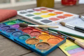
Mood painting benefits from an environment that encourages reflection. A calm, clutter-free space allows emotions to move freely onto the surface without constant visual distraction.
Consider these practical setups:
| Element | Purpose | Tips |
|---|---|---|
| Light | Affects color perception and energy level | Use natural light when possible; warmer bulbs soften the tone of late-evening sessions. |
| Music or silence | Shapes pacing and emotional focus | Instrumental or ambient music fosters flow; silence enhances sensory awareness. |
| Surface choice | Dictates how paint absorbs and reacts | Canvas for open expression, wood panel for layered texture, watercolor paper for bleeding effects. |
I prefer morning sessions. The daylight feels neutral and helps separate genuine emotion from late-night intensity. Others paint best at dusk, when shadows guide the imagination. Try both to observe how your inner environment changes with external light.
Finding an Emotional Palette
Color choice sits at the heart of mood painting. Rather than relying solely on theory, use color as emotional shorthand—a direct link between feeling and hue.
1. Warm Emotions
Joy, passion, and confidence often express through the red–orange–yellow spectrum. Use these for expansive gestures and assertive strokes. Layering transparent glazes of cadmium or ochre creates pulsing warmth.
2. Cool Emotions
Tranquility, sadness, or introspection emerge from the blue–green–violet range. Thin washes and diluted pigment mimic the gentler pace of subdued feelings. Mix complementary undertones (for instance, ultramarine with touches of umber) for depth and realism.
3. Neutral and Transitional States
Emotions rarely stay singular. Gray mixtures, muted earth tones, and desaturated colors capture transitional moods—reflection, fatigue, or quiet contentment. They also serve as grounding tones between intense contrasts.
A good exercise is to create a “mood swatch board”: a series of color fields corresponding to recent emotions. Date and label them. Over time, patterns will appear—a visual diary of emotional cycles.
From Concept to Canvas: Translating Emotion Into Motion

When beginning an emotionally driven piece, focus less on representation and more on movement. Gesture and rhythm are what give visual form to feeling.
Step 1: Ground Your Surface
A tinted background sets emotional tone immediately. Use diluted pigment and a large brush or sponge to create a field of color (for instance, a muted sienna for nostalgia or a pale green for calm anticipation).
Step 2: Express Through Gesture
Load your brush loosely and move from the shoulder instead of the wrist. This transfers physical emotion directly into the stroke. Fast, angular movements can signal frustration or urgency; broad, curved strokes often convey ease or openness.
Step 3: Layer and Respond
Let each layer inform the next. Instead of planning composition strictly, allow instinct to guide where shapes or marks accumulate. Use glazing or scumbling to soften transitions or to represent emotional fading.
Step 4: Evaluate Through Distance
Periodically step back several feet from your work. Emotional art is most truthful when viewed as an overall atmosphere, not a compilation of details. Assess how the piece “feels” rather than how it looks.
Texture as Emotional Language

Texture influences how a painting communicates at a sensory level. Thick impasto conveys tension or exuberance; transparent washes feel transient and reflective.
Here are practical techniques to align texture with emotion:
- Dry brushing: Use minimal paint for fragmented, hesitant emotion.
- Palette knife layering: Builds dramatic contrast, ideal for power or conflict.
- Soft rag blending: Suggests gentleness or reconciliation.
- Sgraffito (scratching through layers): An honest way to reveal buried energy beneath polished surfaces.
Oil and acrylic media emphasize texture differently, but even simple materials—tempera, watercolor, or diluted ink—respond distinctly to pressure and dilution. Adjusting viscosity and drying time tunes how emotion reads through surface buildup.
Composition and Visual Balance

While emotional art leans toward intuitive flow, balance still matters. A powerful emotional expression can lose clarity if spatial tension becomes chaotic.
Think of composition as emotional choreography:
- Center-weighted: Stable, introspective moods.
- Asymmetrical movement: Dynamic, unresolved emotions.
- Minimal negative space: Density and intensity—use for emotional saturation.
- Open, airy zones: Peace, relief, or acceptance.
Balancing contrast, value, and rhythm allows emotional abstraction to stay visually harmonious, even when the subject feels turbulent.
Layering Emotion Over Time
Emotions shift, and returning to a painting days later reveals new layers of meaning. Drying intervals are opportunities to evaluate rather than obstacles.
When revisiting a partially finished work:
- Identify whether your current feeling complements or contrasts the earlier mood.
- Introduce new marks only if they enhance the emotional dialogue.
- Keep some original rawness visible; honesty matters more than refinement.
I often leave traces of old gestures underneath transparent veils of color. These hidden marks work like memories—faint but essential to the piece’s emotional ecology.
Translating Emotion Into Abstract Form
Abstract painting allows emotion to manifest without literal storytelling. Shapes and spatial rhythm replace subject matter.
Try assigning form principles to emotions:
| Emotion | Suggested Form | Visual Behavior |
|---|---|---|
| Calm | Circular, flowing structures | Gradual transitions between tones |
| Anxiety | Jagged, fragmented geometry | Repetition and sharp value contrast |
| Contentment | Balanced symmetry | Subtle chromatic variation |
| Desire | Expanding radial energy | Layered warm hues with progressive movement |
| Melancholy | Descending vertical patterns | Gradual color desaturation |
When treated this way, the composition itself becomes emotional logic. Abstract painting reinforces the idea that art doesn’t explain—it reveals.
Reflecting and Learning From Your Own Process
The act of observing your creative reactions teaches emotional literacy. Rather than judging the final painting, look for connections between your technique and state of mind.
Ask reflective questions:
- Did brush pressure correspond with tension or release?
- Were colors intuitive or analytical choices?
- Which areas feel unresolved, and what emotion lingers there?
Keeping a small sketchbook beside the easel helps track these discoveries. Note experiments with dilution, temperature, or rhythm along with emotional keywords. Progress in expressive painting often comes from re-examining the relationship between mark and mood.
Displaying or Preserving Emotional Work
Whether you hang your piece or store it flat, presentation affects how emotion transmits to the viewer. A painting representing vulnerability may feel strongest when unframed, edges visible—while structured compositions can gain strength from clean, defined borders.
Protective varnish changes not only color saturation but emotional tone: glossy finishes enhance vitality; matte surfaces create distance and introspection. Let your intent decide which serves best.
Treat every finished work as a dialogue rather than a statement. The emotional energy embedded in pigment and motion remains receptive to new interpretation each time light touches it.
Recommended Short Practice
To begin integrating these ideas without pressure, set aside 30 minutes for a small “emotion study.”
- Choose one emotional adjective that feels present.
- Select a limited palette of three hues—dominant, secondary, and neutral.
- Paint continuous forms for the entire session without pausing to correct.
- Step back and identify tension, balance, and flow.
- Note in writing any parallels between mark behavior and emotion.
This direct practice develops fluency—the ability to translate emotional nuance into visual movement as easily as speaking a thought aloud.