Even the most chaotic doodle can become a balanced, striking artwork. The key lies not in erasing imperfections but in reimagining them through composition, color, and technique.
Seeing Potential in Imperfection
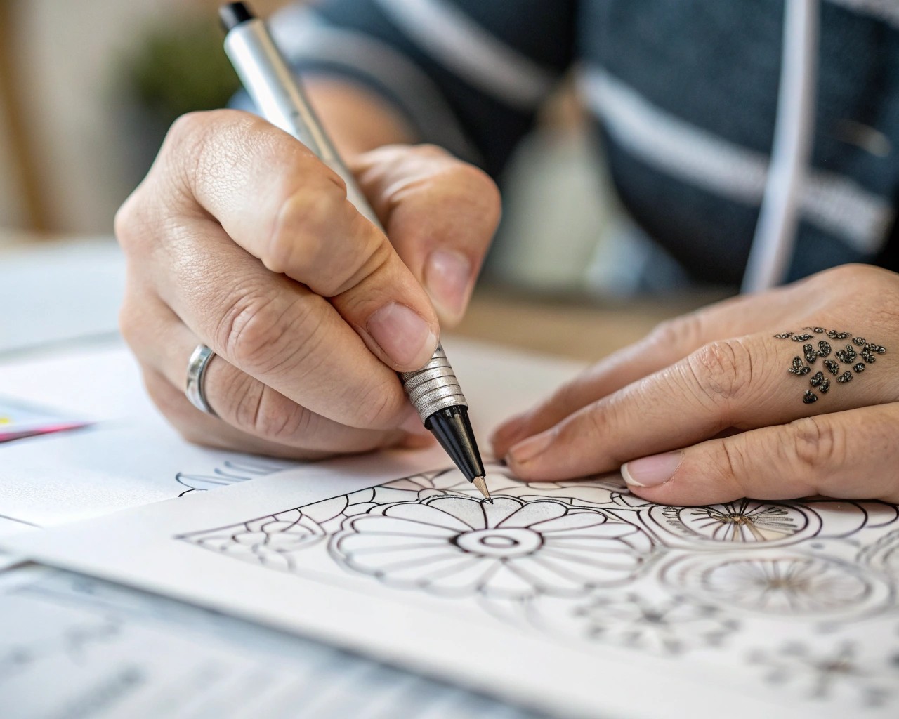
Every doodle begins with a gesture — a loose, impulsive movement that captures rhythm or emotion. What looks messy at first often contains visual energy worth refining. Instead of judging the result, step back and look for natural focal points: intersecting lines, recurring shapes, or rhythmic patterns that could anchor a composition.
I often begin by tracing over the most interesting lines with a thin mechanical pencil or fine‑liner, reducing visual noise while keeping the original spirit intact. This preliminary “clean-up” helps me decide what to emphasize and what to let fade into the background.
Assessing and Preparing Your Work
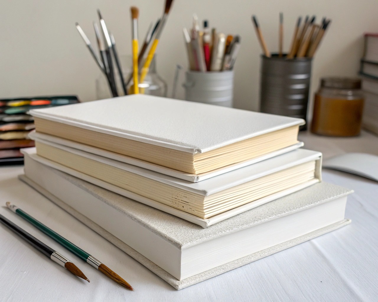
Before editing, allow your doodle to rest for a day. Looking at it fresh helps you see beyond your initial impression.
Essential materials:
| Step | Purpose | Example Material Alternatives |
|---|---|---|
| 1 | Clean tracing or refining | Lightweight sketch paper or tracing paper |
| 2 | Layering and protection | Mixed media paper or smooth watercolor paper |
| 3 | Fine detailing | Micron pens, technical fineliners, or pigment liners |
| 4 | Final framing | Archival mat, simple wood or metal frame |
Flatten your paper if it’s warped by storing it between clean sheets under a book stack for a day. Once it’s smooth and dry, photograph or scan your doodle in natural light. High‑resolution scanning allows for digital editing, color testing, or composition trial without damaging the original.
Transforming Line Work Into Art
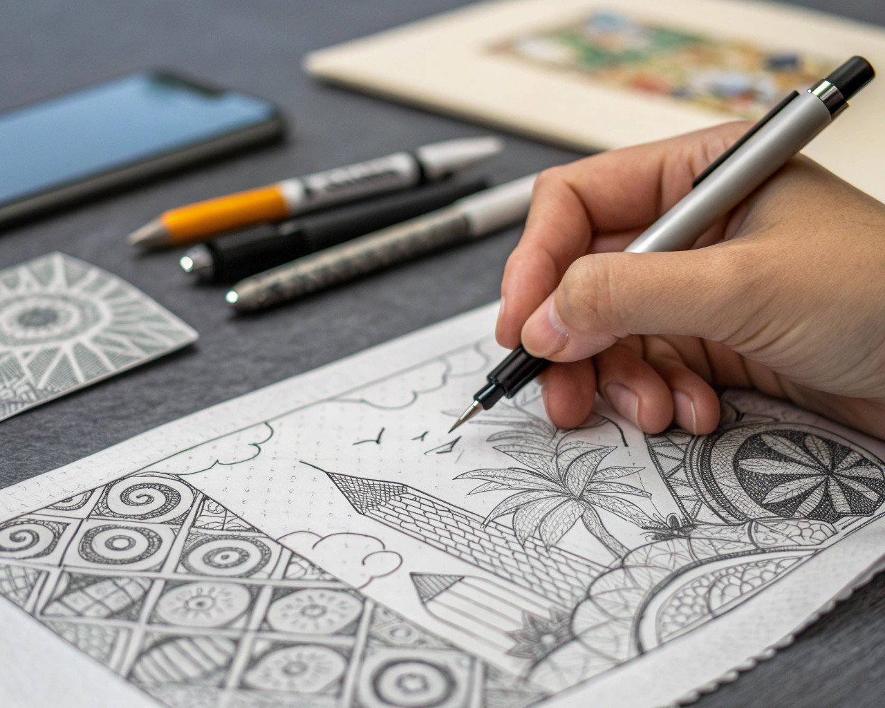
What separates a doodle from finished art often lies in refinement rather than reinvention. A few technical approaches can elevate your drawing:
- Line hierarchy. Strengthen dominant outlines with consistent thickness. Keep secondary or background lines lighter or broken to enhance visual depth.
- Controlled repetition. Echo certain motifs (circles, arcs, cross-hatching) to create rhythm. This introduces harmony across the page.
- Negative space. Leave intentional blank areas to guide the eye. Well-balanced empty space gives visual rest and depth.
- Direction and symmetry. Realign key elements along informal axes (central, diagonal, or radial) to bring equilibrium without rigid geometry.
I often print a grayscale version of a scanned doodle and overlay tracing paper to experiment with different refinements before committing to ink.
Introducing Color, Texture, and Layer
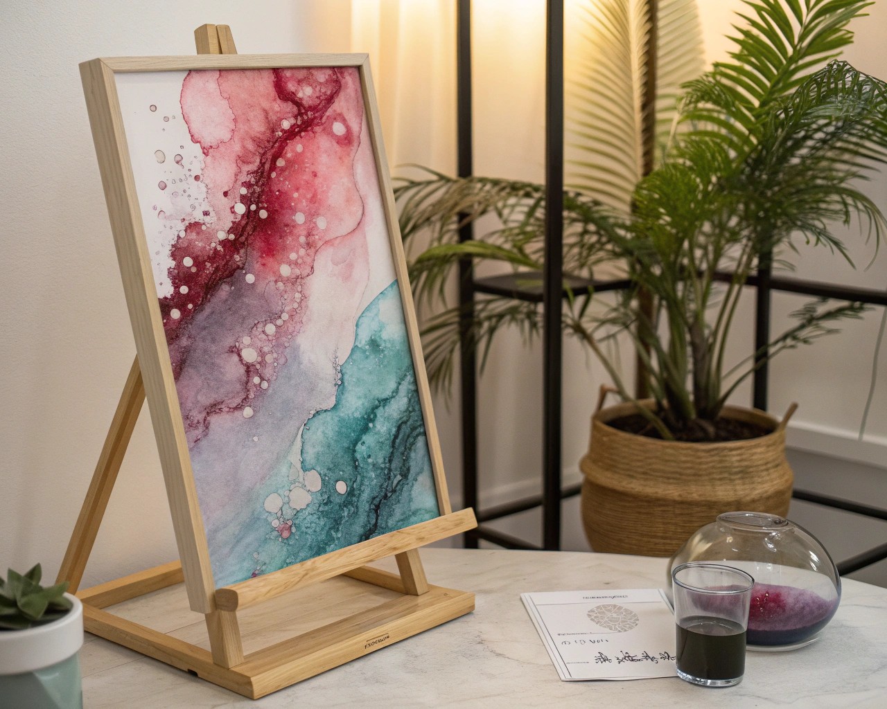
Once the lines read clearly, consider color interaction. The goal isn’t realism but cohesion through value and contrast.
Try this process:
- Define three or four dominant color zones. Use warm–cool pairings like ocher vs. ultramarine, or analogous tones (mint, teal, cobalt) for harmony.
- Start with translucent washes using gouache, watercolor, or a diluted acrylic medium.
- Add targeted accents with mechanical shading or ink stippling.
- Leave sections monochrome to maintain contrast and preserve the energy of the original line work.
Color can transform a childish doodle into modern abstract art if applied with restraint. Slight unevenness in pigment coverage or brush fade often enhances authenticity.
From Page to Frame
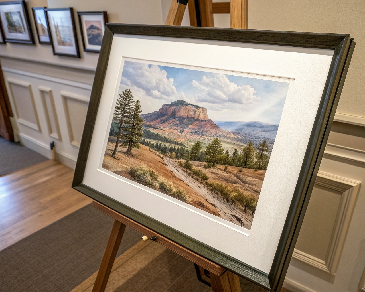
Presentation determines perception. Simple, neutral framing focuses attention on form and color rather than decoration.
Professional framing principles:
- Use a clean white or off-white mat with a 2–3 inch border.
- Choose UV-protective glass if the piece includes water-based pigment.
- Mount on acid-free backing to prevent yellowing over time.
- Label discreetly on the reverse with the title and date for archival reference.
If you’re preparing digital reproductions, adjust brightness and contrast conservatively. Printed on matte fine art paper, even a once-random notebook sketch can look deliberate and composed.
Practical Finishing Techniques
Here are a few techniques professionals use to give casual artwork polish:
| Technique | Purpose | Application Tip |
|---|---|---|
| Graphite burnishing | Adds soft tone and texture | Rub lightly with paper stump or soft cloth |
| Dry brush | Creates broken texture in color wash | Use near-dry pigment brush across surface |
| Ink lifting | Reveals lighter areas | Blot gently with damp brush or tissue before full drying |
| Edge fading | Softens frame boundary | Apply diluted wash along outer edge |
| Spray fixation | Preserves graphite and pastel lines | Use short, even bursts from 12–16 inches away |
Each of these can subtly refine surface character without losing the spontaneity of your original doodle.
Bringing It All Together
Transforming messy doodles into frame-worthy art isn’t about perfection. It’s about recognizing value in spontaneity and refining that energy through deliberate technique. When you allow randomness and structure to coexist, the result carries both discipline and personality — qualities shared by every memorable piece of art.
