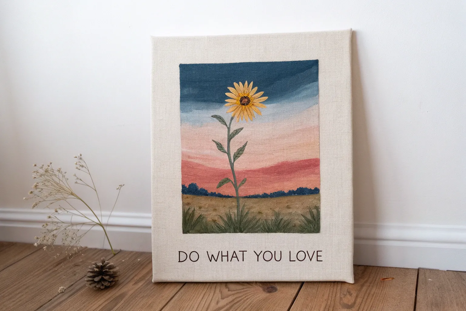
When I’m craving a little lift, I love making art that feels like a visual deep breath—bright, hopeful, and kind to look at. These positive painting ideas are meant to be approachable mood-boosters, whether you want calming symbolism, happy color, or a gentle message you can hang up and actually believe.
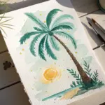
Sunrise Horizon of New Beginnings
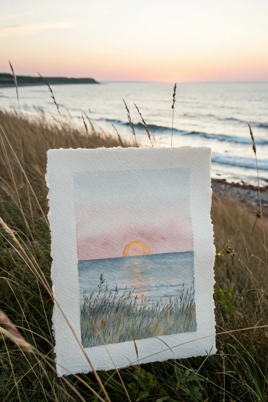
Capture the serenity of a quiet morning with this gentle watercolor horizon. This project plays with soft wet-on-wet gradients for the sky and water, layered with crisp grassy details for depth.
Step-by-Step Tutorial
Materials
- Cold press watercolor paper (300 gsm)
- Masking tape
- Soft round watercolor brushes (size 8 and size 2)
- Watercolor paints (Cerulean Blue, Rose Madder or Pink, Cadmium Yellow, Indigo, Sap Green)
- Jar of clean water
- Paper towels
- Pencil (HB)
- White gel pen (optional for highlights)
Step 1: Setting the Scene
-
Prepare the paper:
Begin by taping down your watercolor paper to a board or hard surface. This creates the crisp white border seen in the example and prevents the paper from buckling when wet. -
Sketch the horizon:
Lightly draw a straight horizontal line across the lower third of the paper to separate the sky from the sea. Add a small semi-circle resting on this line for the rising sun. -
Pre-wet the sky:
Using your larger round brush and clean water, gently wet the entire sky area above the horizon line. The paper should be glistening but not forming puddles.
Fixing “Cauliflowers”
If you see blotchy edges in the sky, you added water to drying paint. Don’t scrub it! Use a damp brush to gently smooth it out perfectly.
Step 2: Painting the Sky and Sun
-
Lay down the blue:
Load your brush with a watery Cerulean Blue. Start at the very top of the sky and paint horizontally, letting the color fade naturally as you move downward. -
Introduce the pink:
While the paper is still damp, pick up a soft pink or Rose Madder. Blend this into the lower part of the sky, stopping just above the horizon line to leave a small gap. -
Paint the sun:
Clean your brush thoroughly. Use pure Cadmium Yellow to paint the sun semi-circle. While the sky is damp, carefully touch the yellow to the pink area so they bleed slightly without turning muddy. -
Soften the edges:
If the sun’s edge looks too sharp against the sky, use a clean, slightly damp brush to gently soften the outline, creating a glowing effect. -
Let it dry:
Allow the sky section to dry completely before moving on. This is crucial to keep a sharp horizon line later.
Add Magic
For extra sparkle, use a white gel pen to add tiny highlights on the wave crests or little dots of morning dew on the grass blades.
Step 3: Creating the Sea
-
Define the horizon:
Using a slightly stronger mix of Cerulean Blue and a touch of Indigo, paint a straight line directly under the sky section to establish the horizon. -
Wash the water:
Dilute the blue mixture with more water and pull the color down to the bottom of the page. Keep your strokes horizontal to mimic calm waves. -
Add the reflection:
While the sea wash is wet, lift out a vertical strip of color directly under the sun using a thirsty (clean, dry) brush. Drop in a tiny bit of watery yellow here. -
Deepen the foreground:
Mix a darker blue-grey using Indigo. Add this to the very bottom of the water area to create a sense of depth and closeness. -
Dry completely:
Wait until the entire painting is bone dry. If the paper feels cool to the touch, it is still damp.
Step 4: Foreground Details
-
Mix foreground greens:
Create a dark, natural green using Sap Green mixed with a little Indigo or brown. The paint consistency should be thicker, like milk. -
Paint tall grasses:
Switch to your size 2 brush. Starting from the very bottom edge, flick the brush upward to create thin, tapering blades of grass. -
Vary the strokes:
Make some grass blades tall and others short. Cross them over each other occasionally to make the growth look wild and natural. -
Add seed heads:
At the tips of the tallest stalks, use small dabbing motions to paint simple seed heads, mimicking the silhouette of the real grass in the reference. -
Layer for density:
Once the first layer of grass dries, I like to mix an even darker, more opaque green-grey and add a second layer of grass at the very bottom for density. -
Reveal the border:
Once you are happy with the foreground and the paint is fully set, carefully peel away the masking tape at a 45-degree angle.
Enjoy the calm feeling your new sunrise painting brings to the room
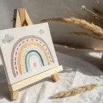
Rainbow Gradient as a Mood Booster
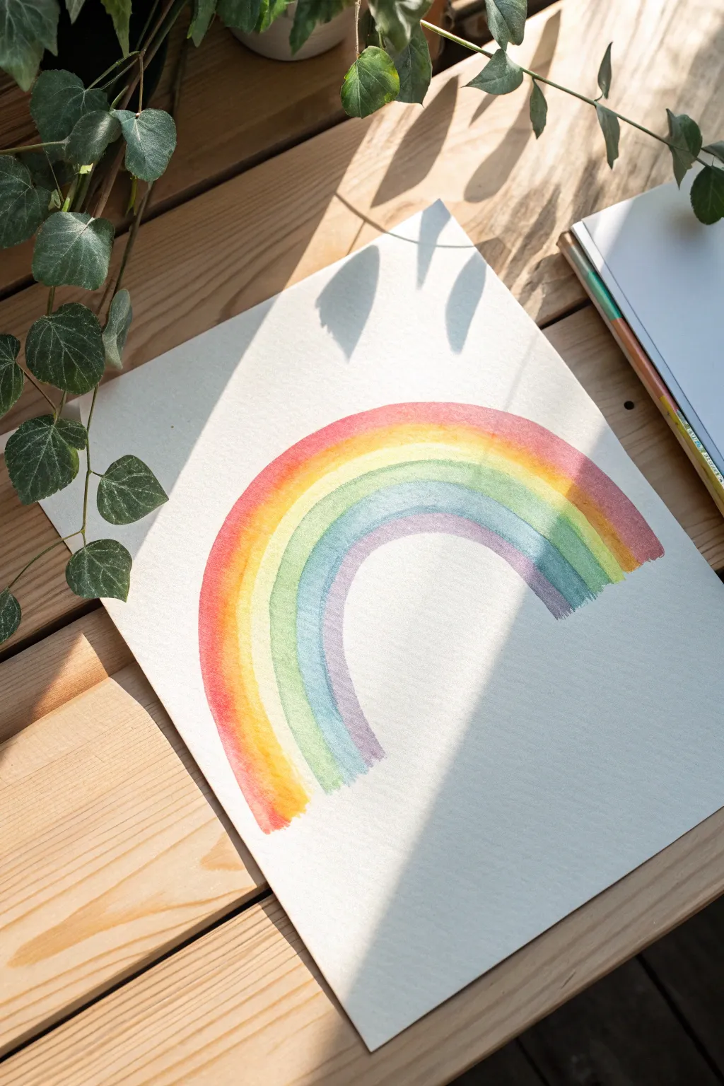
This joyful project captures the gentle serenity of a rainbow using soft watercolor washes that blend seamlessly into one another. The result is a translucent, airy arc on textured paper that feels both modern and timeless.
Detailed Instructions
Materials
- Cold press watercolor paper (A4 or similar size)
- Watercolor paints (tube or pan set)
- Round watercolor brush (size 10 or 12)
- Clean water jar
- Paper towels
- Pencil (HB or lighter)
- Large compass or circular objects to trace
Step 1: Preparation & Sketching
-
Prepare your workspace:
Clear a flat surface in a well-lit area. Because watercolors rely on transparency, natural light is ideal for judging your color layers. -
Taping the paper:
If you are using a loose sheet, tape the edges of your watercolor paper down to your table or a board with masking tape to prevent buckling when wet. -
Visualize the arc:
Decide on the placement of your rainbow. The example shows a centered arc that leaves plenty of negative space around it for a clean, minimalist look. -
Trace the outer curve:
Using a compass or a large bowl, lightly draw the outermost curve of the rainbow with your pencil. Keep this line extremely faint so it won’t show through the paint. -
Trace the inner curve:
Adjust your compass or use a smaller bowl to draw the inner boundary of the rainbow arc, creating a wide band where your colors will live.
Fixing “Blooms”
If water back-runs into drying paint creating cauliflower shapes, wait until it’s dry, then scrub gently with a damp stiff brush to soften the hard edge.
Step 2: Painting the Gradient
-
Mix your red:
Load your brush with water and pick up a vibrant red or warm pink pigment. Test the opacity on a scrap piece of paper; you want a balance of vibrancy and transparency. -
Start the first band:
Starting at the left base of the outer curve, paint a stripe of red following the pencil guide. Don’t worry about perfect edges; a slightly wavy edge adds character. -
Transitioning to orange:
While the red edge is still damp, rinse your brush slightly and pick up orange paint. Apply it right next to the red, allowing the wet edges to touch and blur slightly. -
Blending the warm tones:
Use a clean, damp brush to gently stroke the boundary between the red and orange if they haven’t blended naturally on their own. -
Adding the yellow:
Clean your brush thoroughly and pick up a bright lemon yellow. Paint the next stripe, letting it kiss the wet orange edge to create a soft, glowing gradient. -
Mixing a fresh green:
I like to mix a sap green with a touch of yellow for this next step. Apply the green stripe next to the yellow, watching as they merge to create a lime-green transition. -
Cooling down with blue:
Move into your cool tones with a sky blue or cerulean. Paint this band next to the green, keeping the stripe width relatively consistent with the previous colors. -
Applying the indigo:
Deepen the gradient with a darker indigo or blue-violet shade. Apply this next to the blue, darkening the tone slightly to add visual weight to the inner bands. -
Finishing with violet:
Complete the arc with a soft violet or purple stripe along the very inner curve guideline you drew earlier. -
Softening the bottom edges:
Check the bottom ends of the rainbow legs. If the paint pooled too heavily, lift a little pigment with a thirsty (dry) brush to give it a faded, dreamy look.
Level Up: Sparkle
Once fully dry, add tiny dots of metallic gold watercolor or gold ink over the bands to make the rainbow shimmer in the sunlight.
Step 3: Refining & Drying
-
Blotting excess water:
If you see any puddles forming that might create hard “bloom” lines, gently touch the corner of a paper towel to the puddle to absorb the excess liquid. -
Erasure check:
Once the painting is 100% bone dry, you can gently erase any visible pencil marks, though usually, the paint covers them or they become part of the charm. -
Flattening the paper:
If your paper rippled despite taping, place the dry artwork under a heavy stack of books overnight to flatten it perfectly.
Hang your finished piece in a sunny spot to let the natural light enhance those translucent layers
Soft Clouds With a Brighter Silver Lining
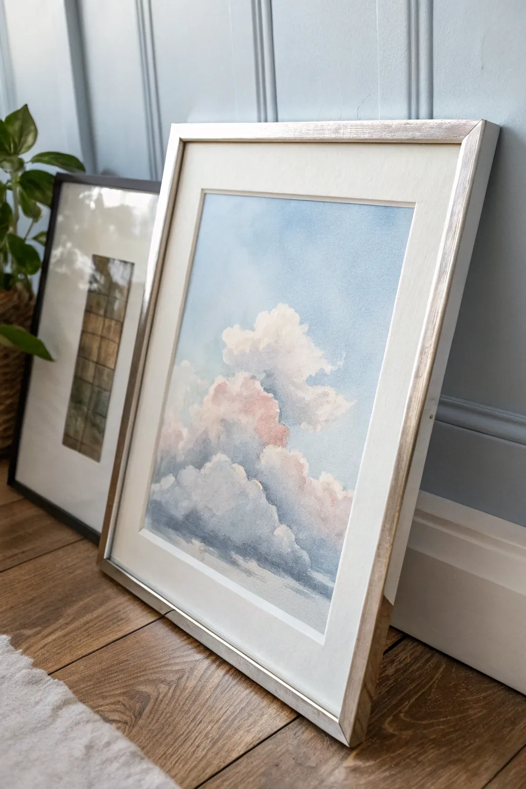
Capture the serenity of a drifting afternoon sky with this fluffy cloud study that balances soft washes with defined edges. Using watercolor, you will build up layers from delicate pink highlights to deep shadowed bases, creating a dreamy piece perfect for a modern silver frame.
Step-by-Step
Materials
- Cold press watercolor paper (140lb/300gsm)
- Watercolor paints (Cerulean Blue, Ultramarine Blue, Alizarin Crimson, Burnt Sienna, Payne’s Grey)
- Clean water and two jars
- Round brushes (sizing 4, 8, and 12)
- Flat wash brush (1 inch)
- Painter’s tape or masking tape
- Drawing board
- Paper towels or cotton rag
- Silver or champagne-colored frame with mat
Step 1: Preparation and Sky Wash
-
Secure the paper:
Tape your watercolor paper down firmly to your board on all four sides. This prevents buckling when the paper gets wet and creates a crisp white border for easier framing later. -
Sketch the cloud shapes:
Using a very hard pencil like a 4H, lightly maintain the composition. Sketch organic, bubbling shapes in the lower center, keeping the top area clear for the blue sky. Keep lines faint so they disappear under the paint. -
Mix the sky color:
Prepare a generous puddle of Cerulean Blue with a touch of Ultramarine for depth. The consistency should be like tea, very fluid and transparent. -
Wet the sky area:
With your flat wash brush, apply clean water only to the sky area, carefully painting around your pencil sketch of the clouds. This ‘wet-on-wet’ technique ensures a smooth gradient. -
Apply the blue gradient:
Load your brush with the sky mix and apply it starting from the top. Let the color fade slightly as it nears the cloud tops. The paint will naturally stop where the dry paper begins, creating soft white edges.
Fixing Hard Edges
If paint dries with a harsh line inside a cloud, re-wet the edge with a damp, clean brush and gently scrub (very lightly) to reactivate and smooth the pigment
Step 2: Building the Cloud Forms
-
Mix shadow tones:
While the sky dries, mix a soft purple-grey. I like to use a combination of Ultramarine Blue, a tiny dot of Alizarin Crimson, and Burnt Sienna to gray it down. Make a separate, warmer mix with very watered-down Alizarin Crimson for the highlights. -
Apply warm highlights:
On dry paper, brush the pale pink wash onto the upper-left portions of the cloud puffs where the sun would hit. Keep this extremely subtle; it should look like a glow rather than a solid color. -
Soften the edges:
Immediately rinse your brush, damp it slightly, and run it along the edge of the pink paint to feather it into the white of the paper. This avoids hard lines within the soft cloud. -
Paint the first shadow layer:
Using a size 8 round brush, apply your light lavender-grey mix to the bottom and right sides of the cloud formations. Follow the rounded curves of your sketch. -
Blend the mid-tones:
While the shadow paint is still wet, introduce a slightly darker grey mix into the bottom third of the clouds. Let the colors bleed together naturally on the paper to create volume.
Silver Lining Accent
Once fully dry, use a metallic silver watercolor pan or gouache to add a thin, shimmering rim light to the very top edges of the highest clouds
Step 3: Deepening Values and Finishing
-
Create deep contrast:
Mix a stronger shadow color using Payne’s Grey and a touch of blue. Use a smaller size 4 brush to paint the deepest crevices and the heavy undersides of the clouds. -
Lift out highlights:
If any area looks too heavy, pinch a clean, damp brush and gently lift pigment away from the top edges of the cloud puffs to regain the bright white paper. -
Add lower atmospheric haze:
At the very bottom of the composition, dilute your grey mix significantly with water. Paint horizontal, streaky strokes to suggest distant, flatter clouds or a horizon line fading away. -
Final assessment:
Step back and look at the whole piece. If the clouds look too disjointed, use a clean, damp brush to gently soften the transition between the shadow and light areas. -
Dry and frame:
Allow the painting to dry completely flat for several hours. Once dry, carefully peel off the tape at a 45-degree angle. Place the artwork into a mat and silver frame to complement the cool tones of the sky.
Hang your finished sky study in a well-lit corner to bring a breath of fresh air into your home
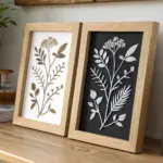
Heart Icons as a Playful Pattern
Embrace the imperfect beauty of hand-painted motifs with this charming watercolor heart pattern. By mixing warm terracottas, dusty pinks, and peaches, you will create a cohesive yet varied sheet of artwork perfect for framing or scanning for digital designs.
Detailed Instructions
Materials
- Cold press watercolor paper (140lb/300gsm)
- Watercolor paints (Alizarin Crimson, Burnt Sienna, Yellow Ochre, White Gouache or heavy white watercolor)
- Round watercolor brushes (Size 4 and 6)
- Mixing palette
- Jar of clean water
- Paper towels
- Pencil (HB or lighter)
- Optional: Metallic gold paint or ink
Step 1: Preparation & Color Mixing
-
Prepare your paper:
Start with a high-quality sheet of cold press watercolor paper. The texture is crucial for that classic watercolor look. Tape the edges to a board or table if you want to prevent buckling, though for small motifs like this, it isn’t strictly necessary. -
Lightly valid layout:
Using a very light touch with an HB pencil, sketch a few heart shapes scattered across the page. Don’t aim for a grid; a randomized, drifting arrangement feels more organic. Vary the sizes slightly and rotate the angles. -
Mix your palette:
Create a few puddles of color on your palette. Mix Alizarin Crimson with a touch of Burnt Sienna for a deep rusty red. Dilute pure crimson for a soft pink. Mix Yellow Ochre with a tiny drop of red for a warm peach. -
Test your consistency:
Before painting on the final sheet, test your colors on a scrap piece of paper. You want a ‘tea-like’ consistency—fluid enough to flow but pigmented enough to be vibrant.
Fixing Muddy Colors
If colors look dull or brown, stop mixing over three pigments together. Stick to two analogous colors (like red+orange) to keep washes bright and clean.
Step 2: Painting the Hearts
-
Paint the first solid hearts:
Load your size 6 brush with the dusty pink mixture. Paint a few hearts by pressing the belly of the brush down to form one lobe, lifting, and repeating for the other side. This single-stroke technique keeps them looking fresh. -
Create wet-on-wet blends:
While a heart is still wet, touch the tip of your brush loaded with a slightly darker red or terracotta into the wet paint. Watch the color bloom and spread naturally. This creates that lovely gradient effect seen in the reference. -
Paint the ‘striped’ hearts:
For the striped hearts, switch to your smaller size 4 brush. Paint the heart shape in horizontal lines rather than filling it solid. Leave slivers of white paper showing between the strokes to create the pattern. -
Vary paint opacity:
As you move across the paper, vary how much water is on your brush. Paint some hearts with very watery, pale pigment and others with more saturated, creamy paint to create depth. -
Add ‘blooming’ texture:
On a few semi-dry hearts, drop in a tiny droplet of clean water or a different color. This pushes the pigment toward the edges, creating the hard outlines and ‘cauliflower’ blooms characteristic of watercolor.
Step 3: Adding Details & Cutouts
-
Paint the terracottas:
Mix a stronger Burnt Sienna ratio for the darker, earthier hearts. Place these strategically next to lighter pink hearts to create contrast. -
Tilt the paper:
I like to occasionally tilt the paper while the paint is wet, encouraging the pigment to pool at the bottom of the heart, which dries into a beautiful gradient. -
Let the sheet dry completely:
Allow the entire sheet to air dry. Do not use a heat gun if possible, as it can flatten the texture of the washes. -
Paint a separate scrap sheet:
On a separate piece of watercolor paper, paint a large area of solid dusty pink or terra cotta wash. Let this dry thoroughly. -
Cut out individual hearts:
From your painted scrap sheet, use sharp scissors to cut out three or four small heart shapes. These will be your loose ‘confetti’ hearts. -
Arrange the cutouts:
Place the cut-out hearts loosely near the bottom corner of your main artwork. You can adhere them with double-sided tape for a 3D effect or leave them loose for photography.
Pro Tip: Hard Lines
Love the hard, dark edge on some hearts? Let a puddle of very watery paint sit and dry undisturbed. The pigment naturally migrates to the edge as it dries.
Once dry, you will have a beautiful pattern ready to frame or turn into custom greeting cards
BRUSH GUIDE
The Right Brush for Every Stroke
From clean lines to bold texture — master brush choice, stroke control, and essential techniques.
Explore the Full Guide
Bright Wildflower Bouquet of Good Energy
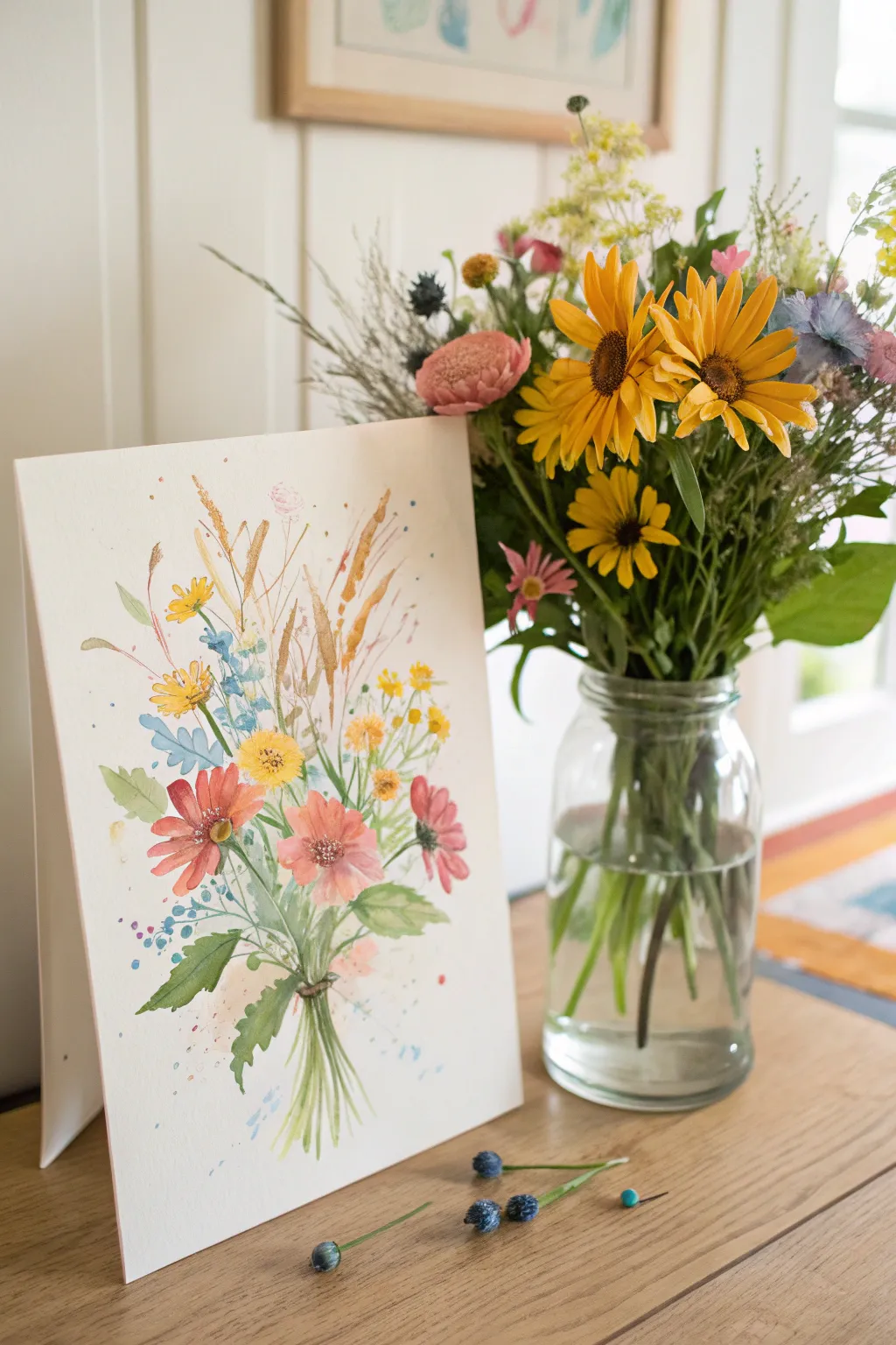
Capture the untamed beauty of a summer meadow with this vibrant, loose watercolor bouquet. This project focuses on playful shapes and warm colors to create a piece that radiates positivity and light.
Step-by-Step Tutorial
Materials
- Cold press watercolor paper (300 gsm)
- Watercolor paints (Yellow Ochre, Sap Green, Burnt Sienna, Cadmium Orange, Alizarin Crimson, Cerulean Blue)
- Round brushes (sizes 2, 6, and 10)
- Gold ink or metallic watercolor paint
- Masking fluid (optional)
- Graphite pencil (HB) and eraser
- Jar of water
- Paper towels
Step 1: Sketching and Composition
-
Light Framework:
Begin by lightly sketching the general shape of your bouquet with an HB pencil. Instead of drawing every petal, focus on marking the position of the main flower heads—three larger ones near the bottom and smaller clusters floating above. -
Stems and Movement:
Draw faint lines indicating the stems. Allow them to curve and cross over each other naturally, gathering at a central point near the bottom of the page to create the ‘hand-tied’ look.
Muddy Colors?
If your greens meet your reds and turn brown, let the flower heads dry completely before painting adjacent leaves. Patience creates clean edges.
Step 2: Painting the Blooms
-
Yellow Centers:
Load your size 6 brush with a mix of Yellow Ochre and a touch of Cadmium Orange. Paint loose, circular shapes for the centers of the main flowers. -
Main Petals:
While the centers are still slightly damp, use Alizarin Crimson mixed with a drop of orange to paint the petals of the lower flowers. Use quick, outward strokes, leaving small gaps of white paper between petals to keep them airy. -
Filler Flowers:
Switch to a smaller size 2 brush. Mix a bright yellow and dab small clusters of dots for the upper wildflowers, mimicking goldenrod or mustard flowers. -
Blue Accents:
Using a watered-down Cerulean Blue, add small, abstract bell-shaped flowers or scattered dots among the yellow clusters to provide a cool contrast to the warm palette.
Step 3: Adding Foliage
-
Leaf Base:
Mix Sap Green with a little Yellow Ochre for a warm, natural green. Paint the broad leaves near the bouquet’s base using the belly of your size 10 brush, pressing down and lifting up to create a tapered shape. -
Connective Stems:
Using the tip of your size 2 brush and a watery green mix, draw thin lines connecting your floating flower heads to the main bunch. Let the lines create a tangled, organic feel. -
Grassy Textures:
Add tall, thin blades of grass shooting upwards from the bouquet using quick, flicking motions. Vary the green shades by adding Burnt Sienna to your mix for dried, autumnal stalks.
Loose Styling
Hold your brush further back on the handle. This reduces control slightly, encouraging looser, more organic strokes that look natural for wildflowers.
Step 4: Details & Splatter
-
Defining Centers:
Once the flower centers are dry, add tiny dots of dark brown or concentrated Burnt Sienna to the middle of the yellow disks for texture. -
Metallic Magic:
Dip a fine brush into gold ink or metallic watercolor. Paint thin, wispy stems and accent lines throughout the top half of the bouquet to mimic sunshine catching the dried grasses. -
Controlled Chaos:
Load a brush with watery blue or pink paint and tap the handle against your finger to create a gentle splatter effect around the bouquet. This adds energy and breaks the stiffness of the white background. -
Creating the Tie:
At the gathering point of the stems, paint a horizontal band using brown paint to represent twine or ribbon holding the bouquet together. -
Stem Ends:
Finish by painting the cut ends of the stems below the twine. Keep these strokes loose and slightly varying in length.
Step back and admire how a few simple splashes of color have bloomed into a cheerful, permanent garden.
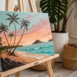
Calm Ocean Wave With a Peaceful Palette
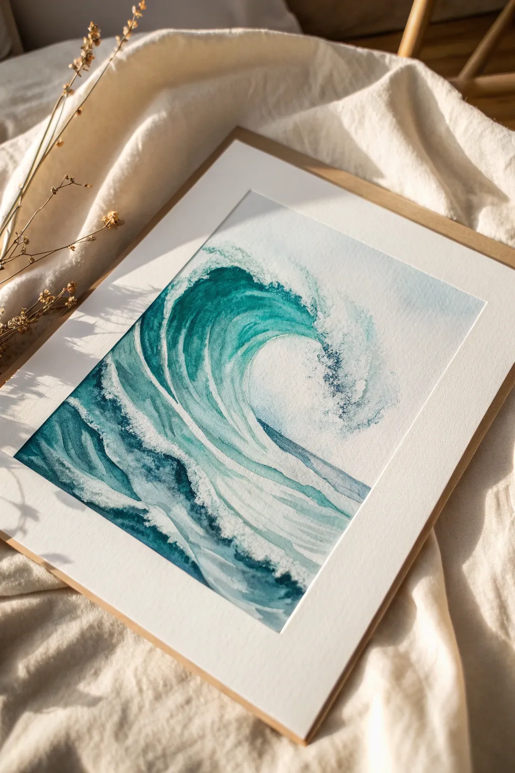
Capture the tranquil power of the ocean with this refreshing watercolor study. Using a limited palette of cool blues and sea greens, you’ll learn to build up layers of transparent color to create depth, movement, and the illusion of crashing foam.
Step-by-Step
Materials
- Cold press watercolor paper (300 gsm)
- Watercolor paints (Phthalo Blue, Viridian Green, Prussian Blue, Indigo)
- Round brushes (sizes 4, 8, and 12)
- Masking fluid or white gouache (optional)
- Painter’s tape
- Pencil (HB or H)
- Two jars of water
- Paper towels
Step 1: Sketch and Preparation
-
Secure the paper:
Begin by taping down all four edges of your watercolor paper to a board or table. This prevents buckling when the paper gets wet and creates a crisp white border for framing later. -
Outline the wave:
Lightly sketch the main curve of the wave using a hard pencil like an H or HB. Keep your lines very faint; you just want to map out the ‘C’ shape of the curl and the rolling foreground water, leaving plenty of open space for the foam. -
Protect the highlights:
If you are using masking fluid, apply it now to the brightest white areas where the wave breaks and creates spray. Splatter small dots near the crest for a mist effect. Let this dry completely before painting.
Pro Tip: The thirsty brush
To fix mistakes or soften a hard line, rinse your brush, dry it thoroughly on a towel, and lift the wet paint off the paper while it’s still damp.
Step 2: First Wash: The Underpainting
-
Mix your base teal:
Create a watery mix of Phthalo Blue and a touch of Viridian Green. You want a light, translucent turquoise color. -
Define the wave’s interior:
Using your size 12 brush, paint the inside curve of the wave. Start from the left side and sweep upward into the curl, lifting your brush as you reach the top to let the color fade naturally into the white of the paper. -
Paint the foreground swells:
Apply the same light wash to the bottom section of water. Use horizontal, slightly wavy strokes, leaving random gaps of white paper to suggest foam patterns on the surface. -
Soften the edges:
While the paint is still damp, rinse your brush and run clean water along some of the hard edges to soften them, creating a misty transition between the water and the sky area.
Step 3: Building Depth and Contrast
-
Deepen the color mix:
Add more pigment to your teal mix, introducing a bit of Prussian Blue for a darker, richer ocean tone. -
Shadow the curl:
Paint wet-on-dry inside the darkest part of the wave’s tunnel. Focus this darker color near the top left under the crest, following the curve of the water downward. -
Create striations:
Use a size 8 brush to paint long, sweeping lines that follow the cylindrical shape of the wave. These lines simulate the movement of water being pulled up into the swell. Leave gaps of the lighter underpainting visible between these strokes. -
Darken the foreground:
Paint choppy, darker shapes in the foreground water. Concentrate the darkest values at the bottom of the swells, leaving the tops of these smaller waves lighter. -
Enhance the crash:
Use a dry brush technique near the breaking lip of the wave. Load your brush with concentrated paint, blot off the excess moisture, and drag it lightly over the paper’s texture to create a broken, sparkly look that resembles spraying water.
Level Up: Salt texture
While the paint in the foreground is still wet, sprinkle a pinch of table salt onto the paper. As it dries, the salt pushes the pigment away, creating incredible organic foam textures.
Step 4: Details and Final Touches
-
Mix the darkest shadow:
Combine Indigo with your blue mix to create a near-black, deep blue. This is for your highest contrast points. -
Define the lip:
Carefully paint the underside of the wave’s lip where it turns over. This sharp, dark edge helps the white foam above it pop forward. -
Refine the foam patterns:
Switch to your size 4 brush. If you didn’t use masking fluid, you can now use white gouache to paint delicate lacy patterns of foam trailing off the back of the wave. -
Add texture to the spray:
With a damp (not wet) brush, gently scrub or ‘lift’ some pigment on the right side of the crash to blur the paint, making the mist look soft and airy. -
Remove masking:
If you used masking fluid, wait until the paper is bone dry, then gently rub it away with your finger or a rubber pickup tool to reveal the pristine white paper beneath. -
Final assessment:
Step back and check your values. If the wave feels flat, add one final glaze of pure turquoise over the mid-tones to unify the shadows and highlights.
Now that your ocean wave painting is dry, peel off the tape to reveal that satisfying crisp border and find the perfect spot to display your slice of the sea

PENCIL GUIDE
Understanding Pencil Grades from H to B
From first sketch to finished drawing — learn pencil grades, line control, and shading techniques.
Explore the Full Guide
Butterflies as a Symbol of Change
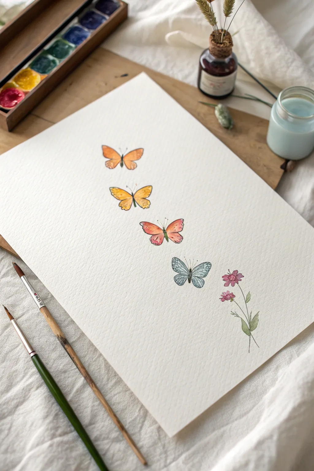
Capture the delicate beauty of transformation with this vertical watercolor study featuring four butterflies and a gentle floral accent. The design moves through a warm-to-cool color spectrum, creating a sense of movement and harmony on the page.
Step-by-Step
Materials
- Cold press watercolor paper (A4 or similar size)
- Watercolor paints (pans or tubes in orange, yellow, pink, blue, magenta, and green)
- Fine liner pen (black or dark grey, waterproof)
- Small round watercolor brushes (sizes 2 and 4)
- HB pencil and eraser
- Jar of clean water
- Paper towel
Step 1: Sketching the Layout
-
Plan the composition:
Lightly mark a vertical centerline down your paper to help align the butterflies. Leave roughly equal spacing between four invisible anchor points where the butterflies will rest. -
Draw the wing shapes:
Starting from the top, sketch the first butterfly with simple, rounded triangular wings. Vary the wing shapes slightly as you move down—make the second one slightly more open, the third a bit wider, and the fourth showing both upper and lower wings clearly. -
Add the floral element:
To the right of the bottom blue butterfly, lightly sketch a slender stem with two small blooms and a few leaves. Keep the pencil lines very faint so they won’t show through the paint later. -
Refine the outlines:
Go back over your butterfly sketches to add slight curves and scallops to the wing edges, giving them a natural, organic feel rather than perfect geometric shapes.
Wet-on-Dry Precision
For this illustrative style, paint on dry paper. This gives you crisp edges that stay within your sketch lines, unlike the unpredictable flow of wet-on-wet.
Step 2: Painting the Butterflies
-
Paint the top butterfly:
Mix a soft tangerine orange. Apply a wash to the top butterfly wings, keeping the color slightly translucent. While wet, drop a tiny bit of darker orange near the body for depth. -
Create the yellow butterfly:
For the second butterfly, use a sunny yellow. I like to add a touch of ochre or light brown to the tips of the wings while the yellow is still damp to create a subtle gradient. -
Paint the pink butterfly:
Move to a soft coral or salmon pink for the third butterfly. Paint the wings, blending a little yellow into the centers and a touch of rose red at the very edges. -
Paint the blue butterfly:
For the final butterfly, use a diluted cerulean or steel blue. Keep this wash very watery and light, as you will want the ink details to stand out clearly against this cool tone later. -
Paint the flower:
Use a dusty magenta or purple-pink for the flower petals. Using the very tip of your brush, paint the stem and leaves with a muted olive green. -
Paint the bodies:
Using a dark brown or grey mix, carefully paint the slender thoraxes and abdomens of each butterfly. Let all the paint dry completely before moving to the next phase.
Step 3: Adding Details and Ink
-
Outline the wings:
Take your waterproof fine liner pen. Gently trace the outer edges of the painted wings. Use a broken line technique—lifting the pen occasionally—to keep the look delicate rather than cartoonish. -
Add wing veins:
Draw thin lines radiating from the butterfly bodies toward the wing tips. These veins add structure and realism to your colorful shapes. -
Detail the blue butterfly:
The bottom blue butterfly has a specific pattern; draw intricate, lace-like webbing or small cells inside the wings to mimic detailed insect anatomy. -
Detail the other wings:
Add small dots or speckles to the orange and yellow butterflies near the edges of their wings to suggest pattern and texture. -
Draw antennae:
With a steady hand, draw two very fine, curved lines extending from the head of each butterfly for their antennae. -
Outline the flora:
Lightly outline the flower petals and leaves. Add a few quick, sketchy lines inside the petals to suggest their curve and center. -
Final touches:
Erase any remaining pencil marks once the ink is totally dry, revealing a clean and bright illustration.
Uneven Watermarks?
If you get hard edges inside the wings (blooms) where you don’t want them, soften them with a barely damp, clean brush while the paint is still slightly tacky.
Display your artwork in a simple frame to remind yourself that change is a beautiful and natural process
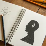
Colorful Mind Silhouette With Blooming Thoughts
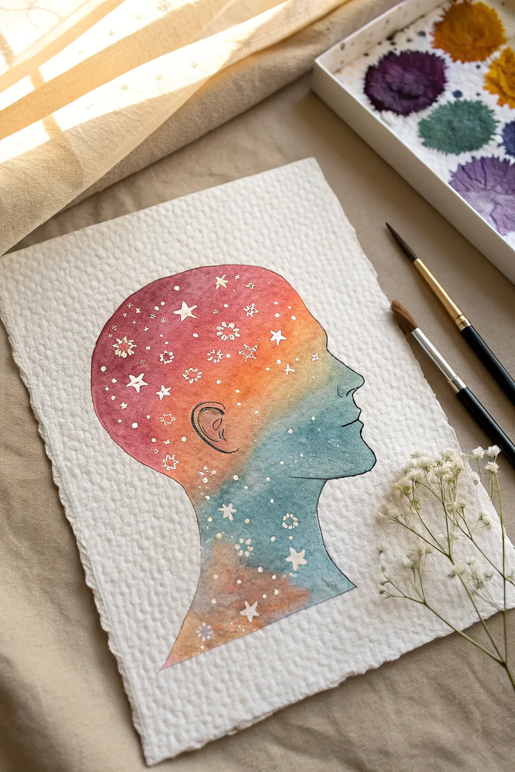
Capture the infinite universe within thoughts using this vibrant watercolor silhouette technique. By blending warm sunsets into cool teal nebulas inside a delicate profile, you create a stunning visual metaphor for a blooming mind.
How-To Guide
Materials
- Cold press watercolor paper (300gsm, rough texture preferred)
- Watercolor paints (Alizarin Crimson, Cadmium Orange, Teal or Turquoise, Indigo)
- Masking fluid (drawing gum) and old brush or silicone applicator
- Pencil (HB or lighter)
- Round watercolor brushes (Size 4 and Size 8)
- Clean water jar
- Paper towels
- Fine liner brush or white gouache (optional for corrections)
- Artist tape (optional)
Step 1: Preparation and Sketching
-
Prepare the paper:
Begin with a sheet of textured cold press watercolor paper. If you want that specific artisanal look, you can carefully tear the edges against a ruler to create a deckled edge effect before you start. -
Draft the silhouette:
Lightly sketch the side profile of a human head in the center of your page. Focus on the curve of the forehead, the nose, lips, chin, and neck. Keep your pencil pressure very light so the graphite won’t show through the translucent paint later. -
Define the ear:
Add a simple contour line for the ear within the silhouette. This helps ground the abstract cosmic fill with a touch of anatomical reality. -
Apply masking fluid stars:
Using an applicator or an old brush you don’t care about, dot masking fluid inside the head shape. Create a variety of shapes: simple dots for distant stars, small four-pointed stars, and tiny clusters or flower-like bursts. -
Let it cure:
Allow the masking fluid to dry completely. It should feel rubbery and not tacky to the touch. This step is crucial; if it’s wet, it will ruin your brushes and smear.
Starry precision
Use a toothpick or a stylus tool instead of a brush to apply the masking fluid for the tiniest star dots. This gives you perfect circles.
Step 2: Painting the Galaxy
-
Pre-wet the shape:
With a clean size 8 brush and clear water, wet the entire inside area of the silhouette. Be careful to stay exactly within your pencil lines. The paper should glisten but not have puddles. -
Start with warmth:
Load your brush with Cadmium Orange and a touch of Alizarin Crimson. Drop this vibrant mix into the upper back portion of the head and the forehead area. Watch it bloom on the wet paper. -
Transition the colors:
While the orange is still wet, rinse your brush slightly and pick up your Teal or Turquoise. Apply this to the jawline, chin, and lower neck area. -
Blend the gradient:
Gently nudge the teal paint upward to meet the orange. Let them mix naturally on the paper to create interesting neutral tones where they overlap, rather than overworking it with the brush. -
Deepen the contrast:
While everything is still damp, drop concentrated Indigo or deeply saturated Teal into the bottom edge of the neck and the very front of the face to add weight and dimension. -
Add berry tones:
Intensify the top of the head with a richer red or berry color. I like to tap in extra pigment here to make the ‘universe’ feel denser at the crown. -
Outline definition:
While the paint is wet, use a fine, damp brush to carefully trace the very edge of your pencil line if you missed any spots. This ensures a crisp, sharp silhouette against the white paper. -
Wait for drying:
Let the painting dry completely. The paper must be bone dry before the next step, or you risk tearing the surface.
Step 3: Finishing Touches
-
Remove the mask:
Gently rub your finger or a rubber cement pickup eraser over the dried masking fluid to peel it away. This reveals the stark white paper underneath. -
Refine the stars:
If any stars look too rough or jagged, you can touch them up with a tiny bit of white gouache or a white gel pen to make them crisp. -
Detail the ear:
Using a very fine liner brush and black watercolor (or a waterproof ink pen), carefully outline the ear and add the inner ear details. Keep the line weight thin and delicate. -
Outline the profile:
With that same fine liner, trace the entire perimeter of the silhouette. This thin black line seals the shape and gives it a finished, illustrative quality. -
Final assessment:
Erase any stray pencil marks outside the silhouette that might still be visible.
Add metallic magic
Once the paint is dry, paint over some of the white stars with metallic gold watercolor for a shimmering effect that catches the light.
Now you have a serene, colorful portrait that perfectly balances structured lines with the wild flow of watercolor


Dandelion Seeds Turning Into Birds
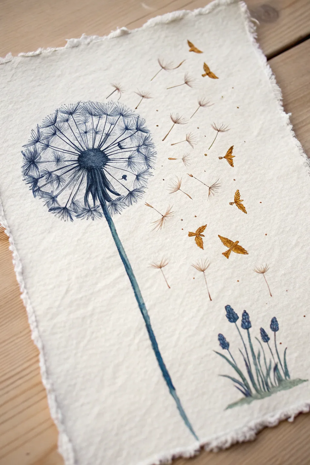
This delicate watercolor illustration captures the magical transition of dandelion seeds transforming into golden birds mid-flight. The textured deckle-edge paper adds a rustic, organic charm that perfectly complements the fine lines of the botanical elements.
Step-by-Step Tutorial
Materials
- Cold-pressed, deckle-edge watercolor paper (300 gsm)
- Watercolor paints (Indigo/Prussian Blue, Burnt Sienna/Gold, Sap Green)
- Fine liner or micron pen (Dark Blue or Black, 0.1mm and 0.3mm)
- Fine-point round brushes (Size 0 and 2)
- Pencil (HB) and kneaded eraser
- Clean water and paper towels
Step 1: Preparation and Sketching
-
Paper selection:
Choose a watercolor paper with a pronounced texture and deckled edges. This rough surface is crucial for achieving the vintage, organic look seen in the example. -
Light sketching:
Using a light hand and an HB pencil, sketch the central stalk and the round shape of the dandelion seed head on the left side of the paper. -
Mapping the flight path:
Draw faint directional lines curving upward and to the right to map out where the dispersing seeds will float. -
Bird transformation:
Sketch small seed shapes along the flight path, gradually morphing the shapes into simple bird silhouettes as they move further to the right. -
Adding the ground flowers:
In the bottom right corner, lightly sketch a small cluster of vertical stems for the secondary flower grouping to balance the composition.
Use a Rigger Brush
For the ultra-fine radiating lines of the dandelion, a long-bristled ‘rigger’ or liner brush holds more paint and creates smoother continuous lines than a standard round brush.
Step 2: Painting the Dandelion
-
Stem base layer:
Mix a watery wash of Indigo and a touch of Sap Green. Paint the long, slender stem of the dandelion, letting the color be slightly uneven for texture. -
Seed center:
Use a more concentrated Indigo mix to dab in the dark, dense center of the flower head. Keep the edges ragged and irregular. -
Radiating lines:
Switch to your finest brush or a dark blue fine liner pen. Draw very thin, straight lines radiating outward from the dark center to form the structure of the seed head. -
Seed details:
At the end of each radiating line, add tiny V-shapes or tufts to represent the fluff of individual seeds. Keep these loose and overlapping. -
Deepening contrast:
Go back into the center of the dandelion with your darkest blue mix, adding small dots and strokes to create depth where the seeds are densely packed.
Metallic Magic
Swap the burnt sienna paint for a metallic gold watercolor pan. The birds will shimmer when the light hits the paper, enhancing the magical transformation theme.
Step 3: The Floating Seeds and Birds
-
Floating seeds:
Using a dilute wash of brown or sepia, paint the detached seeds floating away. Use simple, thin strokes for the stems and delicate feathery touches for the tops. -
Transition to gold:
As you move to the ‘bird’ shapes, switch your color to a warm Burnt Sienna or Gold oxide. Paint the bird silhouettes, ensuring distinct wing shapes. -
Adding movement:
Add tiny dot accents around the birds and seeds using the gold paint. These ‘dust motes’ create a sense of movement and magic. -
Wing details:
Once the gold paint is dry, use a very fine brush with a slightly darker brown to add minimal lines on the wings for definition.
Step 4: Finishing Touches
-
Grape Hyacinth stems:
Paint the stems of the bottom-right flower cluster using a mix of Sap Green and Indigo. Keep the strokes upward and sweeping. -
Blue buds:
Dab small, bead-like shapes of Indigo blue at top of these stems to create the look of grape hyacinth or muscari buds. -
Grounding wash:
Add a very faint, watery wash of green horizontal strokes at the base of the small flowers to ground them. -
Final assessment:
Review the entire piece. If the dandelion stem looks too flat, I like to run a thin line of darker blue along one side to suggest a shadow.
Let the painting dry completely before erasing any visible pencil marks to avoid smudging your delicate work
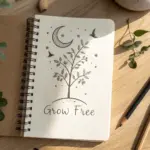
Lightbulb With a Growing Tree Inside
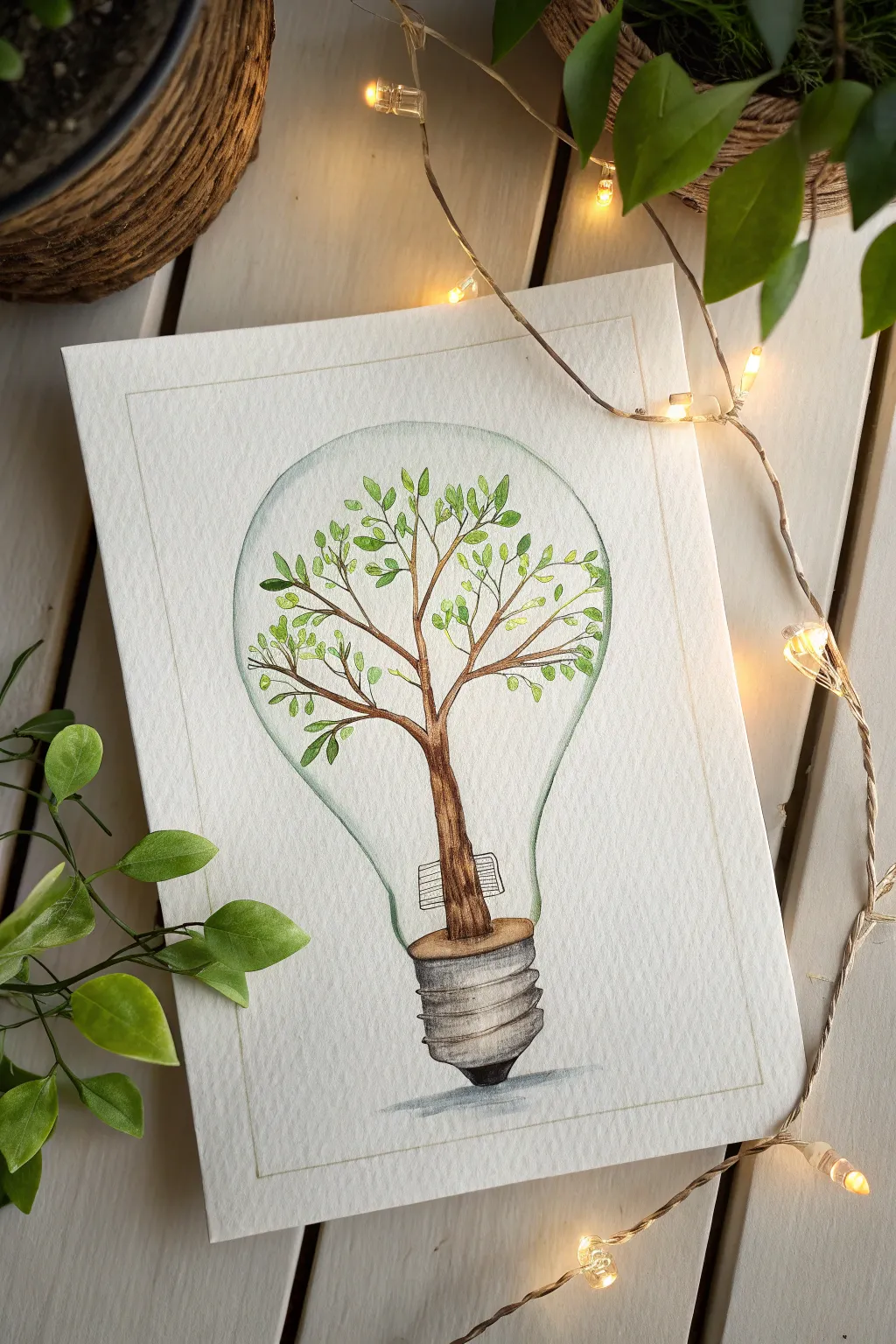
Capture the essence of growth and inspiration with this delicate watercolor illustration featuring a sturdy tree sprouting from within a classic lightbulb. This project combines precise fineliner work with soft washes of green and brown to create a whimsical, conceptual piece perfect for framing.
Detailed Instructions
Materials
- Cold press watercolor paper (A5 or similar size)
- Pencil (HB or H for light sketching)
- Kneadable eraser
- Waterproof fineliner pens (0.1mm and 0.3mm, black)
- Watercolor paints (Sap Green, Olive Green, Burnt Umber, Burnt Sienna, Payne’s Grey, and a touch of Cerulean Blue)
- Round watercolor brushes (Size 2 and 4)
- Ruler
- Jar of water and paper towels
Step 1: Drafting the Foundations
-
Positioning the Bulb:
Begin by lightly sketching a central vertical line on your paper to act as a guide. This will help keep your lightbulb and base symmetrical. -
Sketching the Shape:
Around the centerline, draw the classic pear shape of a lightbulb. It doesn’t need to be geometrically perfect; a slight hand-drawn wobble adds charm, but try to keep both sides relatively balanced. -
Adding the Base:
At the bottom of the bulb, sketch the metal screw base. Draw a rectangular shape with rounded edges, then add slightly curved horizontal lines across it to represent the threads. Add the small rounded tip at the very bottom. -
Drafting the Tree Trunk:
Inside the bulb, start the tree trunk rising directly from the flat top of the screw base. Sketch a sturdy trunk that splits into two main branches about halfway up the bulb. -
Branching Out:
Extend smaller branches outward toward the glass walls. The branches should fan out naturally, filling the upper space of the bulb without feeling overcrowded.
Keep it Light
For the glass effect, less is more. Use a lot of water and very little pigment. You can always add more color, but it’s hard to take away.
Step 2: Inking the Details
-
Outlining the Glass:
Using a 0.1mm waterproof fineliner, carefully trace over your pencil lines for the bulb’s glass outline. Keep your hand loose; thin, slightly broken lines can make the glass look more delicate. -
Defining the Screw Base:
Switch to a slightly thicker 0.3mm pen for the metal base to give it weight. Ink the threads, emphasizing the shadow areas between the ridges. -
Inking the Tree:
Ink the tree trunk and branches. Add small textural lines along the trunk to suggest bark. I find that lifting the pen at the end of branch strokes creates a nice tapering effect. -
Drawing the Leaves:
Use the 0.1mm pen to draw small, oval-shaped leaves along the branches. Cluster them slightly towards the tips, but leave plenty of negative space. -
Erasing Guides:
Once the ink is completely dry (wait at least a few minutes to avoid smudging), gently erase all pencil marks with a kneadable eraser.
Step 3: Bringing it to Life with Watercolor
-
Painting the Glass:
Mix a very dilute wash of Cerulean Blue or watery Grey. Paint a thin strip along the inside edge of the glass bulb to suggest volume and reflection, keeping the center paper white. -
Coloring the Base:
Paint the screw base using a mix of Payne’s Grey and a tiny bit of Burnt Umber. Apply darker pigment to the left and right edges and leave the center lighter to create a cylindrical 3D form. -
Painting the Trunk:
Use Burnt Umber for the tree trunk. While the paint is still wet, drop in a little Burnt Sienna or darker brown on the shadowed side of the trunk to add depth. -
First Layer of Leaves:
Mix a light Sap Green. Using the tip of your size 2 brush, dab color into about half of the drawn leaves. It’s okay if the color doesn’t perfectly fill the lines; the looseness looks artistic. -
Adding Variation:
While the first leaves dry, mix a darker Olive Green. Paint the remaining leaves with this shade. This variation makes the foliage look lush and natural. -
Grounding Shadow:
Mix a watery grey wash. Paint a small, horizontal cast shadow underneath the tip of the lightbulb to ground the object so it doesn’t look like it’s floating. -
Final Borders:
As a finishing touch, use a ruler and pencil (or light grey paint) to draw a simple rectangular border around the illustration to frame the composition neatly.
Uneven Ink Lines?
Don’t worry if your bulb shape isn’t perfectly round. Going over the line a second time loosely can make it look like a purposeful sketch style.
Now step back and admire how a simple idea can grow into a beautiful piece of art.
Mountain Path With a Tiny Distant Summit
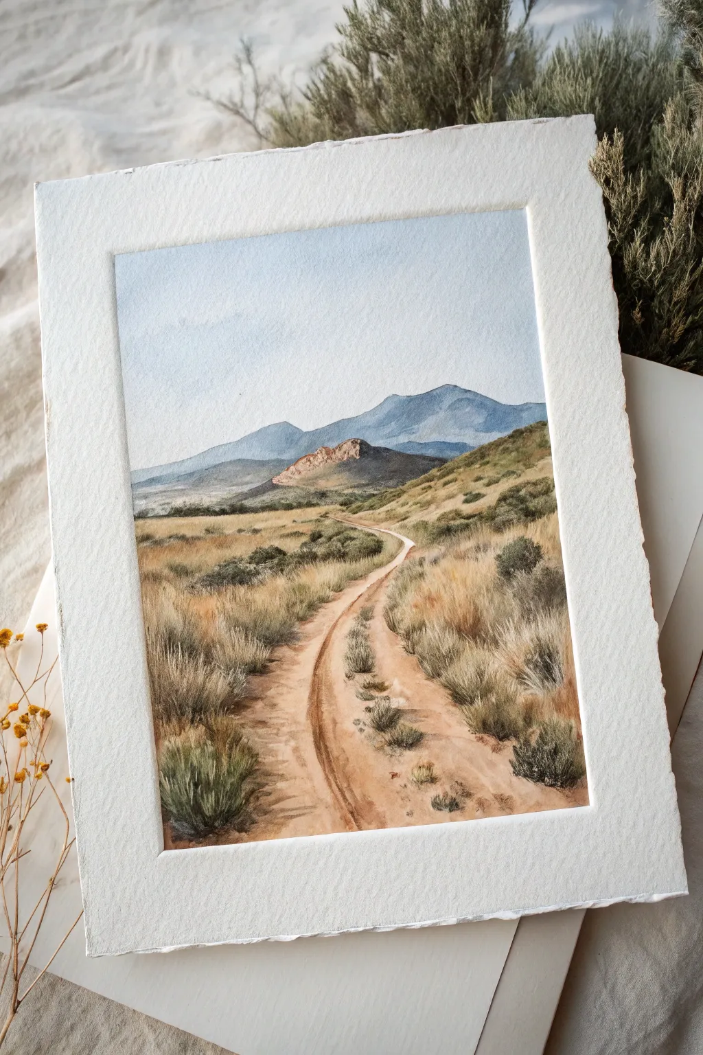
This serene watercolor landscape captures the feeling of a bright, open day with a dusty trail leading toward blue-hued mountains. Using soft washes and dry-brush textures, you will build depth from the distant peaks to the grassy, detailed foreground.
Step-by-Step Guide
Materials
- Cold Press Watercolor Paper (140lb/300gsm, 100% cotton recommended)
- Watercolor Paints (Cerulean Blue, Ultramarine, Burnt Sienna, Yellow Ochre, Sap Green, Burnt Umber)
- Round Brushes (Size 8 and 12 for washes, Size 2 or 4 for details)
- Pencil (H or HB for light sketching)
- Kneaded Eraser
- Two jars of water
- Paper towels or a cotton rag
- Painter’s tape or masking tape
Step 1: Preparation and Sky
-
Tape and sketch:
Secure your paper to a board using painter’s tape to create a clean border. Lightly sketch the horizon line about 2/3rds up the paper, the outline of the distant mountains, and the winding S-curve of the dirt path leading from the bottom center. -
Wet the sky:
Using your largest brush, apply clean water to the sky area above the mountain line. The paper should be glisten but not have standing puddles. -
Paint the gradient:
Mix a very dilute wash of Cerulean Blue. Start at the top edge of the paper and bring the color down, adding more water as you approach the horizon so the blue fades almost to white near the mountains. -
Let it dry:
Allow the sky to dry completely before touching the mountains. If the paper is cool to the touch, it is still wet.
Muddy colors?
If your greens look dull, stop mixing all colors on the palette. Let colors mix on the paper instead by dropping wet paint into wet washes for vibrant variation.
Step 2: Mountains and Mid-ground
-
Distant peaks:
Mix a cooler, slightly darker blue using Ultramarine and a touch of Burnt Sienna to gray it down. Paint the furthest mountain range with a flat, even wash to suggest atmospheric perspective. -
Middle mountain contour:
While the first mountain layer is drying (or just after it dries for a hard edge), paint the closer, smaller mountain peak. Use a warmer mix by adding a tiny bit of Yellow Ochre to your blue, hinting at the sunlight hitting the rock face. -
Base layer for the ground:
Mix a large puddle of Yellow Ochre with a touch of Burnt Sienna. Apply a light, varied wash over the entire grassy area and the path, leaving some paper white in the path for highlights. -
Adding green tones:
While the ground wash is still damp, drop in small amounts of watered-down Sap Green into the areas surrounding the path where the grass will be thicker. Let this softer layer dry completely.
Add life
Use an opaque white gouache or gel pen to add tiny highlights to the tips of the foreground grass or small white wildflowers for extra sparkle.
Step 3: The Path and Texture
-
Define the dirt path:
Mix Burnt Sienna with a little Burnt Umber. Using a size 8 brush, paint the shadowed sides of the path. Keep your strokes loose and follow the curve of the road. -
Create wheel tracks:
Use a smaller brush to paint thin, broken lines down the center and edges of the path to suggest tire tracks or ruts. Soften some edges with a damp brush so they aren’t too harsh. -
Dry brush texture:
Load a brush with concentrated Burnt Sienna, dab it on a paper towel to remove moisture, and lightly drag it across the path area. This creates the grainy texture of dirt and gravel.
Step 4: Foreground Details
-
Distinguish the grasses:
Mix a variety of greens using Sap Green and Burnt Umber for darker, dried vegetation. Start painting specific clumps of grass in the mid-ground using short, upward flickering strokes. -
Build foreground density:
In the immediate foreground (bottom corners), use a darker, richer green mix. Paint larger clumps of sagebrush or bushes to frame the path, giving the viewer a sense of standing right there. -
Add dried grass details:
Take a fine detail brush (Size 2) with a mix of Yellow Ochre and Burnt Umber. Add individual tall stalks of dried grass overlapping the green bushes to add realism and layering. -
Cast shadows:
Mix a shadowed purple-grey glaze. Apply this transparently under the bushes and along the right side of the path to indicate the direction of the sunlight. -
Final touches:
Evaluate the painting for contrast. Darken the deepest shadows in the foreground bushes if necessary to push the distant mountains further back. -
Revealing the border:
Once the paper is bone dry, carefully peel away the painter’s tape at a 45-degree angle to reveal the crisp white edge.
Step back and admire the depth you’ve created, inviting the viewer to walk down that quiet mountain path
Constellation of Your Favorite Affirmations
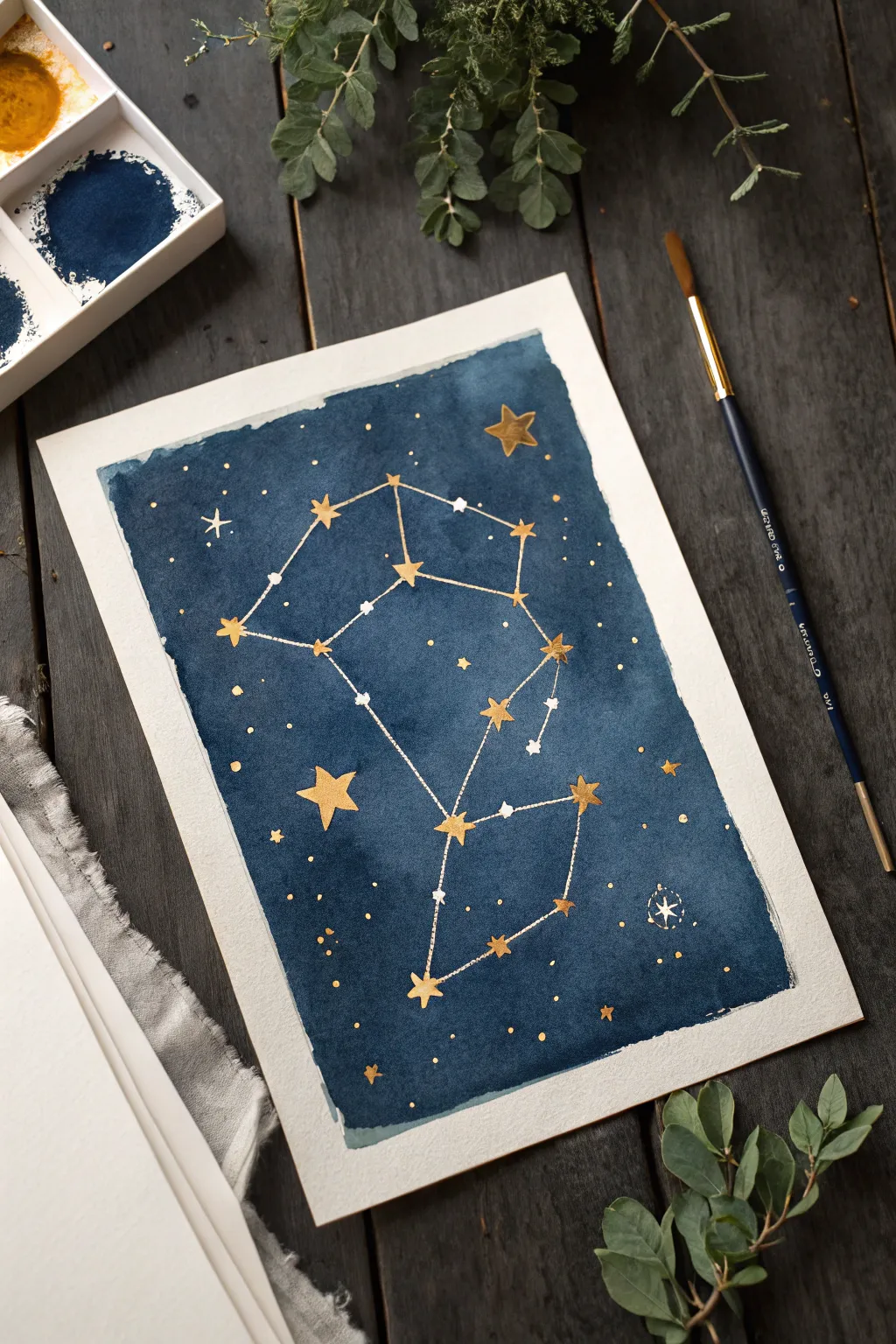
This project combines the meditative quality of watercolor washes with the sharp, graphic elegance of celestial mapping. You will create a deep indigo night sky canvas, punctuated by sparkling gold stars connected by delicate lines to form a constellation of your own design.
Step-by-Step
Materials
- Cold press watercolor paper (300 gsm or heavier)
- Deep indigo or Payne’s gray watercolor paint
- Gold gouache or metallic gold watercolor paint
- White gel pen or fine white gouache
- Medium round brush (size 8 or 10)
- Fine detail brush (size 0 or 1)
- Masking tape
- Ruler
- Pencil (HB)
- Water jars and paper towels
Step 1: Setting the Night Sky
-
Paper Prep:
Begin by taping down your sheet of watercolor paper to a board or table. This will prevent buckling when we apply the heavy wash and ensures crisp, clean borders around the edge of the artwork. -
Mixing the Void:
Prepare a large puddle of your dark blue paint. Aim for a mixture that is rich in pigment but fluid enough to move. I like to mix a little Payne’s Gray into my indigo to make the night sky feel deeper and more mysterious. -
Laying the Wash:
Using your medium round brush, load it with the dark blue mixture and begin applying it in the center of your page. Work outward, but consciously stop about an inch from the taped edges to create that jagged, organic border seen in the example. -
Adding Variation:
While the wash is still wet, drop in slightly more concentrated pigment in random areas to create subtle cloud-like textures in the darkness. Let the water do the work here. -
Drying Time:
Allow the background wash to dry completely. This is crucial; if the paper is even slightly damp, your fine gold lines will bleed. You can use a hair dryer on a low setting if you’re impatient.
Star Shine Strategy
For the brightest stars, apply a tiny dot of white gouache first, let it dry, and then paint the gold star over it. This makes the metallic pigment truly pop against the dark blue.
Step 2: Mapping the Stars
-
Reference Points:
Lightly sketch the positions of your main stars with an HB pencil. You can choose a real zodiac sign like Gemini or create an abstract shape representing your favorite affirmation. -
Painting Gold Stars:
Using your fine detail brush and the gold medium, paint the largest stars first at your marked points. Use a classic five-point shape, keeping the lines crisp. -
Connecting the Dots:
Switch to a ruler if you aren’t confident in your freehand lines. Connect your gold stars with thin, straight lines using the very tip of your detail brush or a gold gel pen. -
Adding Minor Stars:
Scattered around the main constellation, paint smaller gold dots and tiny four-point stars. These represent distant galaxies and add depth to the composition. -
White Highlights:
To make the constellations pop, add tiny white dots near some of the gold lines using white gouache or a gel pen. This creates a sense of twinkle and dimension against the dark background. -
The Compass Star:
In the lower right corner, paint a small, specialized star symbol or a tiny compass rose in white and gold to act as a signature or anchor for the piece. -
Splatter Effect:
Cover the main constellation with a scrap piece of paper. Load a stiff brush with gold paint and flick the bristles to create a fine mist of gold dust across the dark background.
Crystal Embellishments
Glue tiny flat-backed Swarovski crystals or rhinestones onto the centers of the major stars for a mixed-media piece that literally catches the light.
Step 3: Finishing Touches
-
Refining Edges:
Check the edges of your blue wash. If you want more definition, you can dry-brush a little extra dark pigment along the very rim of the wash shape. -
Final Inspection:
Look for any stars that need a second coat of gold to be truly opaque. Metallic watercolors often look better with two light layers rather than one thick glob. -
The Reveal:
Once everything is bone dry, carefully peel away the masking tape. Pull the tape away from the center of the paper to avoid ripping the fibers.
Hang your celestial map somewhere prominent to remind you that your aspirations are written in the stars
Have a question or want to share your own experience? I'd love to hear from you in the comments below!