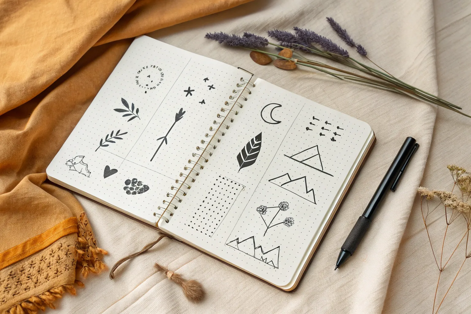
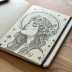
When I want a sketchbook page to feel instantly cool, I lean on simple shapes, bold outlines, and a little quirky attitude. These easy hipster drawing ideas are all about capturing a vibe fast—no perfection required.
Mustache and Round Glasses Doodle

This minimalist line art sketch combines a pair of classic round spectacles with a perfectly groomed handlebar mustache. It creates a whimsical, hipster-inspired motif that looks fantastic on the dotted grid of a bullet journal or sketchbook.
Step-by-Step Tutorial
Materials
- Dotted grid notebook or sketchbook
- Fine liner pen (black, 0.5mm tip)
- Pencil (HB or lighter)
- Eraser
- Ruler (optional)
- Compass or circle stencil (optional)
Step 1: Drafting the Shapes
-
Establish the center:
Begin by finding the center of your page. Mark a faint dot with your pencil; this will be the midpoint of the nose bridge connecting the glasses. -
Position the lenses:
Using the grid dots as a guide, lightly sketch two circles of equal size on either side of your center point. If you want perfect symmetry, count the grid squares—try a diameter of about 6-8 squares for each lens. -
Connect the bridge:
Draw an upward-curving arc connecting the two circles. It should look like a small inverted ‘U’ resting on the inner edges of the lenses. -
Outline the mustache base:
Below the glasses, lightly pencil the basic shape of the mustache. Start with a small teardrop shape in the center, then extend two large, swooping curves outward that curl up at the tips like ocean waves.
Step 2: Inking the Glasses
-
Trace the frames:
Take your black fine liner and carefully trace over your pencil circles. Go slowly to keep the line weight consistent. I find it helpful to turn the notebook as I draw the curve to keep my hand comfortable. -
Double the rim:
To give the glasses some thickness and style, draw a second circle just slightly inside the first one. This creates the illusion of a wire or plastic frame. -
Ink the bridge:
Trace the nose bridge arc with a single, confident line connecting the outer rims of both lenses. -
Add reflection lines:
Inside each lens, draw two short, diagonal parallel lines near the upper right or left side. This simple detail suggests light reflecting off the glass. -
Detail the hinges:
Add tiny little rectangular nubs on the outer edges of the frames where the earpieces would attach.
Wobbly Circles?
If freehand circles are tricky, trace a coin, a bottle cap, or the inside of a washi tape roll. This guarantees perfectly round lenses every time without needing a compass.
Step 3: Detailing the Mustache
-
Define the outer shape:
Ink the outline of your mustache. Make the tips curl tightly upward into spirals for that classic handlebar look. -
Create inner volume:
Draw a second line inside the mustache shape, following the contour of the outer line but stopping before you reach the spiral tips. This adds depth to the hair volume. -
Add hair texture:
Fill the space between your inner and outer lines with flowing, curved hatch marks. Follow the sweep of the mustache to simulate strands of hair. -
Thicken the shadows:
Go back over the bottom curves of the mustache with your pen to thicken the line slightly. This adds weight to the bottom of the drawing.
Make it Pop
Use a light blue highlighter or watercolor wash inside the lenses (avoiding the reflection lines) to make the ‘glass’ look real and distinct from the page background.
Step 4: Finishing Touches
-
Erase guidelines:
Once the ink is completely dry—give it a good minute just to be safe—gently erase all your pencil marks so only the crisp black lines remain. -
Add decorative stars:
Scatter a few small five-pointed stars around the glasses. I like to balance them by putting a couple on the top right and a few on the bottom left. -
Sprinkle dots:
Fill in the empty space around the stars with random ink dots of varying sizes to create a magical, stardust effect.
Now you have a charming, vintage-style doodle ready to decorate your next journal spread.


Hand-Lettered Word With Arrows
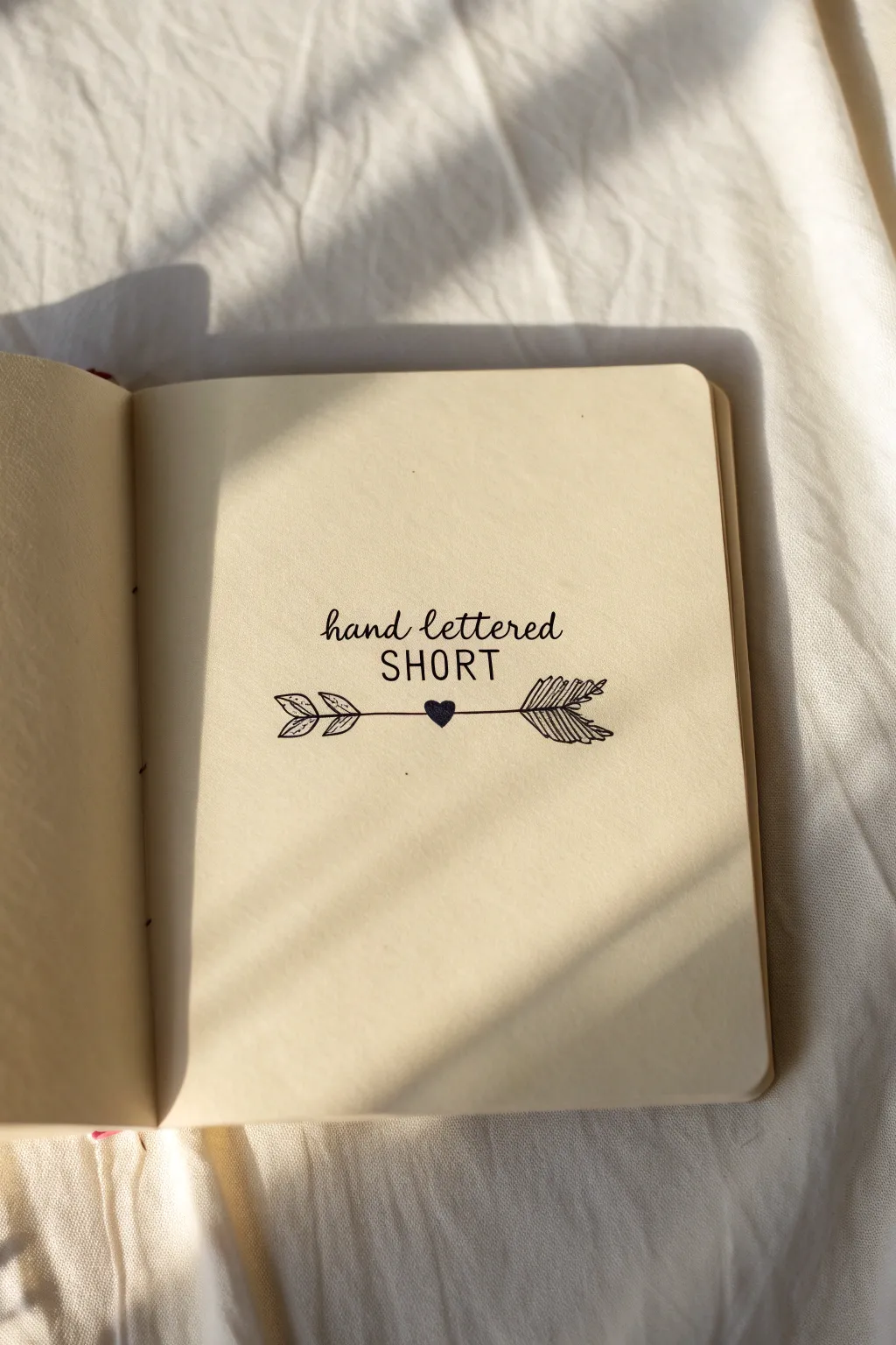
Capture a simple, minimalist aesthetic with this clean typographic design featuring mixed fonts and a decorative arrow. The contrast between the flowing script, bold sans-serif, and the detailed rustic arrow creates a perfectly balanced composition that looks great in any sketchbook.
Detailed Instructions
Materials
- Sketchbook with cream or off-white paper
- HB pencil
- Kneadable eraser
- Ruler
- Fine liner pen (0.3mm or 0.5mm, black)
- Small heart stamp or thick marker (optional)
Step 1: Drafting the Layout
-
Mark your center:
Begin by lightly finding the center of your page with a ruler. Draw a faint vertical line to help align your text, ensuring the design sits squarely in the middle of the paper. -
Draw writing guides:
Sketch three horizontal guidelines. The top line is for the script text, the middle area is for the block capitals, and the lowest line will serve as the path for your arrow shaft. -
Draft the script:
Lightly pencil in the words ‘hand lettered’ on the top line using a cursive style. Keep the letter height small and unintrusive, focusing on fluid connections between the characters. -
Draft the block text:
Below the script, pencil in the word ‘SHORT’. Space these letters out slightly more than usual (kerning) to give them a modern, airy feel. Use simple, monoline strokes for this draft. -
Sketch the arrow spine:
On your bottom guideline, draw a straight horizontal line for the arrow’s shaft. Leave a small gap in the exact center for a heart accent. -
Detail the arrowhead:
On the left side of the shaft, sketch a simple triangular arrowhead. Add a second, slightly smaller V-shape inside it to give it dimension. -
Outline the fletching:
On the right end, sketch the fletching (feathers). Draw a rough leaf shape pointing away from the center, detailing it with diagonal lines to mimic feather texture.
Straight Arrow Tip
If you struggle drawing long straight lines freehand, place a ruler down but don’t touch your pen to it—just use the edge as a visual guide while you draw nearby.
Step 2: Inking the Design
-
Trace the script:
Using your fine liner, carefully trace over ‘hand lettered’. Maintain a consistent pressure so the line weight remains uniform, which mimics a monoline script style. -
Ink the block letters:
Go over the word ‘SHORT’. To get that confident look, try to pull each straight line in a single, steady stroke rather than sketching feathery lines. -
Draw the arrow shaft:
Ink the horizontal lines of the arrow. I find it helpful to pull the pen toward me rather than pushing it sideways to keep the line straight. -
Ink the heart center:
Fill in the small gap in the arrow shaft with a solid black heart. You can draw the outline and color it in, or use a small heart stamp if you have one. -
Define the arrowhead:
Ink the arrowhead on the left. Add two small leafy shapes behind the main point to make the arrow look more rustic and hand-carved. -
Texture the feathers:
Ink the fletching on the right. Instead of solid lines, use quick, short diagonal hatching strokes inside the outline to create that dense, feathery texture shown in the reference.
Step 3: Finishing Touches
-
Erase pencil marks:
Wait until the ink is completely dry—usually about five minutes to be safe. Gently roll your kneadable eraser over the entire design to lift the graphite without damaging the paper surface. -
Thicken select lines:
To add subtle weight, go back over the downstrokes of the word ‘SHORT’ just once more to make them slightly bolder than the script text above it. -
Assess heavy areas:
Check the arrow feathers. If they look too light, add a few more hatching lines to darken the tail, balancing the visual weight against the bold text.
Make It Yours
Swap the heart in the center for a different symbol like a star, diamond, or small flower to change the vibe while keeping the layout intact.
Now you have a charming piece of typography art that adds a touch of personality to your journal pages

Minimal Mountain Range and Sun
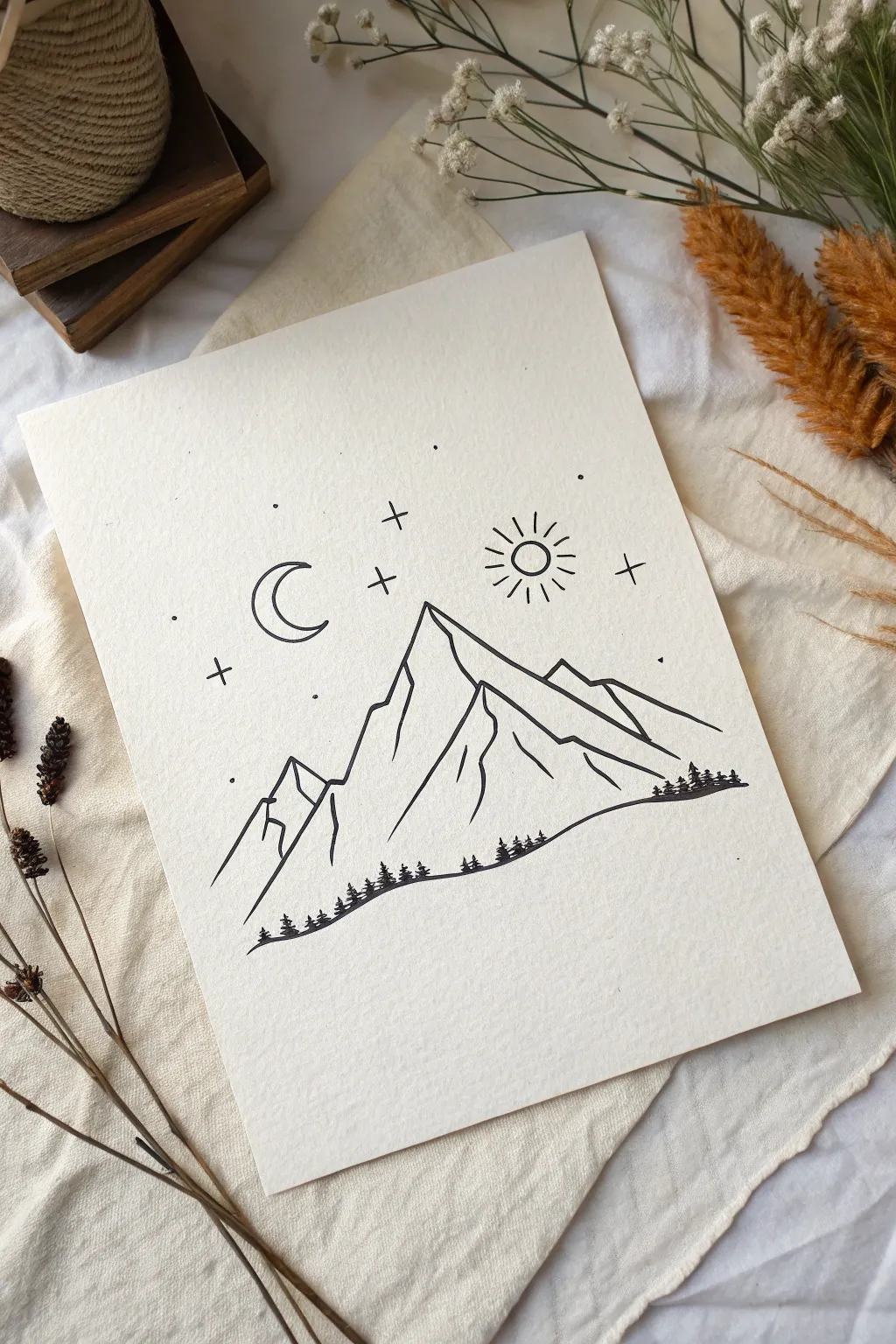
Capture the serenity of the outdoors with this minimalist line drawing that balances rugged peaks with celestial charm. Using simple geometric forms and clean ink lines, you’ll create a polished piece of art that looks perfect on textured paper.
Step-by-Step
Materials
- Textured off-white art paper (mixed media or watercolor)
- Pencil (HB or H for light sketching)
- Eraser (kneadable preferred)
- Fine-liner pen (0.5mm, black)
- Fine-liner pen (0.1mm or 0.3mm, black)
- Ruler (optional)
Step 1: Sketching the Peaks
-
Establish the horizon:
Start with a pencil to lightly mark where the bottom of your mountain range will sit. Instead of a straight line, sketch a gentle, rolling slope that angles slightly upwards from left to right. -
Draw the main peak:
Identify the center of your paper and sketch a tall, sharp triangle. The peak should point slightly to the left, with the right slope being longer and less steep than the left side. -
Add secondary peaks:
To the left of the main mountain, add a smaller, jagged peak that connects lower down. On the right side, sketch a series of two descending ridges that create depth. -
Define the ridge lines:
Draw jagged internal lines running down from the peaks. These shouldn’t be straight; wobble your pencil slightly to mimic rock faces and crevices, giving the mountains dimension.
Step 2: Inking the Landscape
-
Outline the main shapes:
Switch to your 0.5mm pen. Carefully trace over your pencil lines for the outer silhouette of the mountains. Keep your hand steady but allow for slight organic imperfections. -
Ink the internal ridges:
Using the same 0.5mm pen, go over the internal jagged lines. I find it helpful to lift the pen slightly at the end of these strokes to taper the lines as they vanish into the mountain. -
Create the treeline base:
Draw the rolling ground line at the bottom. This should be a continuous line that serves as the foundation for your forest. -
Draw miniature trees:
Along this bottom line, draw tiny vertical dashes. Add tiny horizontal scribbles or triangles to these dashes to create miniature pine trees. Vary their height slightly for realism. -
Cluster the trees:
Group the trees together in small patches rather than spacing them perfectly evenly. Place a few larger ones on the far right and left edges to frame the scene.
Wobbly Lines?
Don’t panic if your hand shakes. Embrace the jitters! Wobbly lines actually make mountain ridges look more rocky and realistic than perfectly straight ruler lines.
Step 3: Adding Celestial Elements
-
Position the moon:
In the upper left sky, use your pencil to sketch a ‘C’ shape. Refine it into a crescent moon, ensuring the inner curve matches the arc of the outer curve. -
Ink the moon:
Trace the moon with your 0.5mm pen. If you want a cleaner look, you can use a circle stencil, but a hand-drawn curve adds to the rustic aesthetic. -
Draw the sun:
On the upper right side, draw a small circle with the 0.5mm pen. Add short, straight rays radiating outward, keeping them evenly spaced but varying slightly in length. -
Scatter the stars:
Switch to your finer 0.1mm or 0.3mm pen. Draw small ‘plus’ signs (+) to represent twinkling stars. Place a few near the moon and sun. -
Add stardust dots:
Using the fine pen, gently tap the paper to create tiny stippled dots around the sky. Focus these clusters loosely around the larger stars and celestial bodies.
Golden Hour Glow
Add a splash of color by painting a simple watercolor circle of gold or muted yellow behind the sun, or a soft grey wash behind the mountains for shadow.
Step 4: Final Touches
-
Let the ink set:
Wait at least 5-10 minutes for the ink to dry completely. This is crucial to prevent smudging your crisp lines. -
Erase pencil guides:
Gently rub your kneadable eraser over the entire drawing to lift the graphite sketches. Be extra careful near the tiny trees. -
Touch up lines:
Inspect your drawing for any faint areas. If the black ink looks grey in spots, go over it once more to ensure a bold, high-contrast finish.
Your minimalist mountain scene is now ready to be framed or gifted to a nature lover

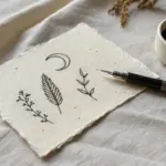
Vintage Instant Camera Sketch
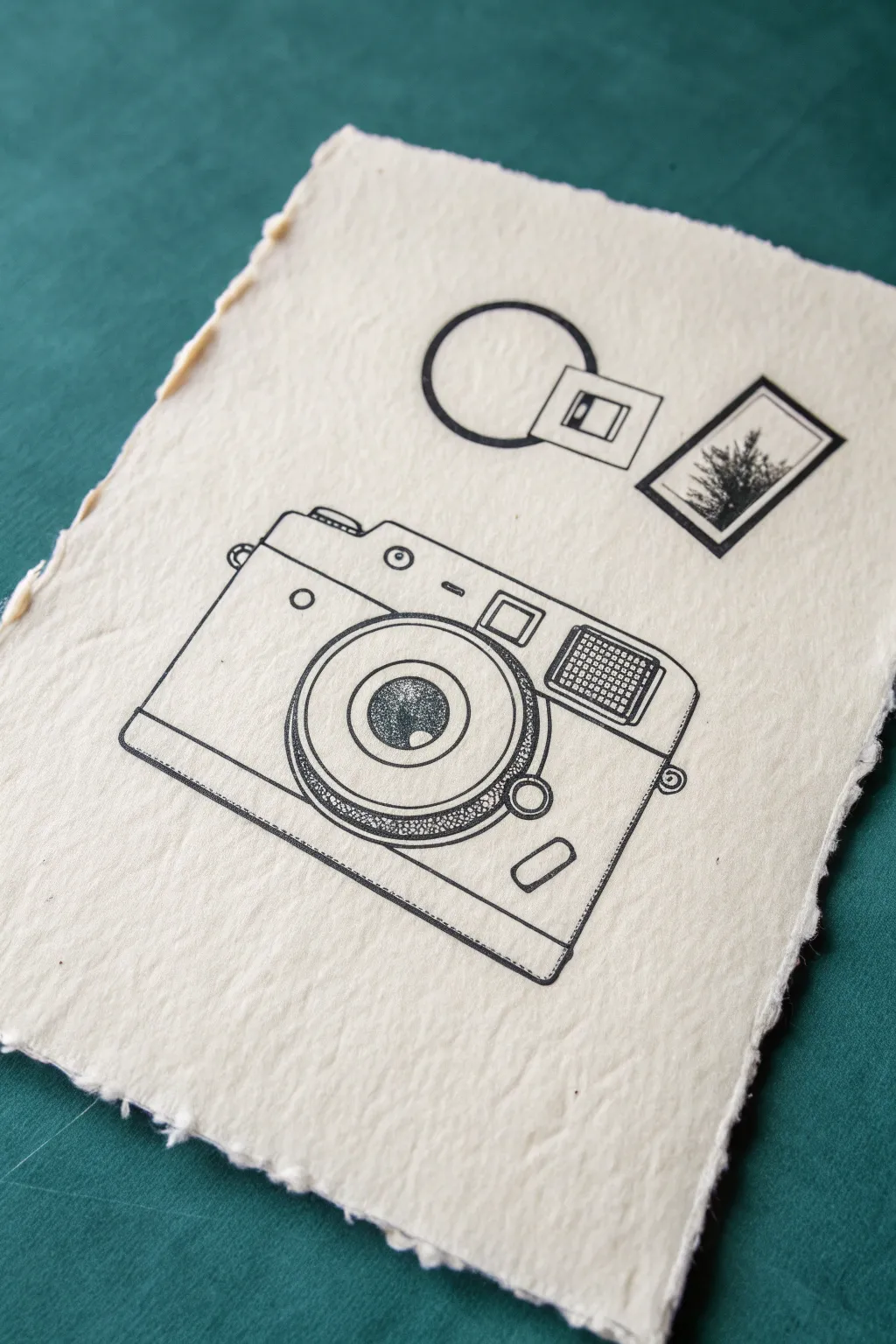
Capture the charm of analog photography with this minimalist line drawing on beautiful handmade paper. The stark contrast of black ink against the textured, deckled-edge surface gives this piece a distinctly vintage and tactile feel.
Step-by-Step Tutorial
Materials
- Handmade cotton rag paper (deckled edge)
- Pencil (HB or 2H)
- Kneadable eraser
- Fine liner pens (sizes 005, 01, 03, and 05)
- Ruler or straight edge
- Compass or circle template
Step 1: Planning and Foundation
-
Paper preparation:
Begin by selecting a high-quality sheet of handmade paper. Since the texture is rough, lightly brush off any loose fibers that might catch on your pen tip later. -
Basic framing:
Using your pencil and ruler, lightly sketch a rectangular box in the lower two-thirds of the paper. This will be the main body of the camera. Keep your lines incredibly faint, as erasing on this paper can sometimes disturb the surface fibers. -
Lens placement:
Find the center of your rectangle and draw a slightly offset circle for the lens housing. It should sit more towards the left side of the body than the right. -
Adding top details:
Sketch the top plate of the camera, adding small rectangles for the shutter button, dials, and the distinct viewfinder window on the right side. -
Floating elements:
In the open space above the camera, lightly sketch a circle intersecting a small square (for the lens cap/strap attachment concept) and a separate rectangular polaroid-style frame.
Handling Texture
Handmade paper has “hills and valleys.” Hold your pen more upright than usual to help the ink flow into the texture without snagging the nib.
Step 2: Inking the Structure
-
Main outlines:
Switch to a size 03 or 05 fine liner. Carefully trace the outer perimeter of the camera body. I find it helpful to pull the pen slowly on this textured paper to ensure a solid black line without skipping. -
Defining the lens:
Use a circle template or compass if possible to ink the concentric circles of the lens. Use a slightly thicker line weight for the outermost ring to give it depth. -
Bottom plate:
Draw the strip along the bottom of the camera, adding the small rounded rectangle detail in the corner. -
Viewfinder and flash:
Ink the small square windows on the top right. For the flash unit, draw a grid pattern inside the rectangle using a 005 pen to simulate the texture of the glass. -
Top dials:
Ink the shutter release button and the small dials on the top plate. Keep these shapes clean and geometric.
Step 3: Adding Texture and Detail
-
Stippling the grip:
The camera lens ring has a textured grip. To recreate this, use your 005 pen to create a dense field of tiny dots (stippling) inside the focused ring area. Pack them tighter at the edges for shadow. -
Lens reflection:
Inside the innermost circle of the lens (the glass itself), add dense stippling, but leave a distinct white crescent or circle shape completely empty to represent a light reflection. -
Camera strap lug:
Add the small loops on the sides of the camera body where a strap would attach. Use small circles with a center dot. -
Inking the floating art:
Ink the circle and square design above the camera. Use a bold line for the circle. -
Miniature landscape:
For the rectangular frame above, ink the border, then use quick, scratchy vertical strokes to create the silhouette of pine trees or abstract foliage inside.
Creative Twist
Instead of black ink for the floating landscape photo, use a tiny splash of watercolor or a sepia fine liner to distinguish the ‘photo’ from the camera.
Step 4: Final Touches
-
Cleanup:
Allow the ink to dry completely. Since the paper is absorbent, give it an extra 5-10 minutes. Gently dab—don’t rub—with a kneadable eraser to lift any visible pencil guidelines. -
Checking line weight:
Look over the drawing one last time. If the rough paper caused any lines to look broken or faint, go back over them carefully to ensure solid blacks.
Frame your finished piece in a floating glass frame to show off those lovely deckled edges

PENCIL GUIDE
Understanding Pencil Grades from H to B
From first sketch to finished drawing — learn pencil grades, line control, and shading techniques.
Explore the Full Guide
Simple Bicycle With a Flower Basket
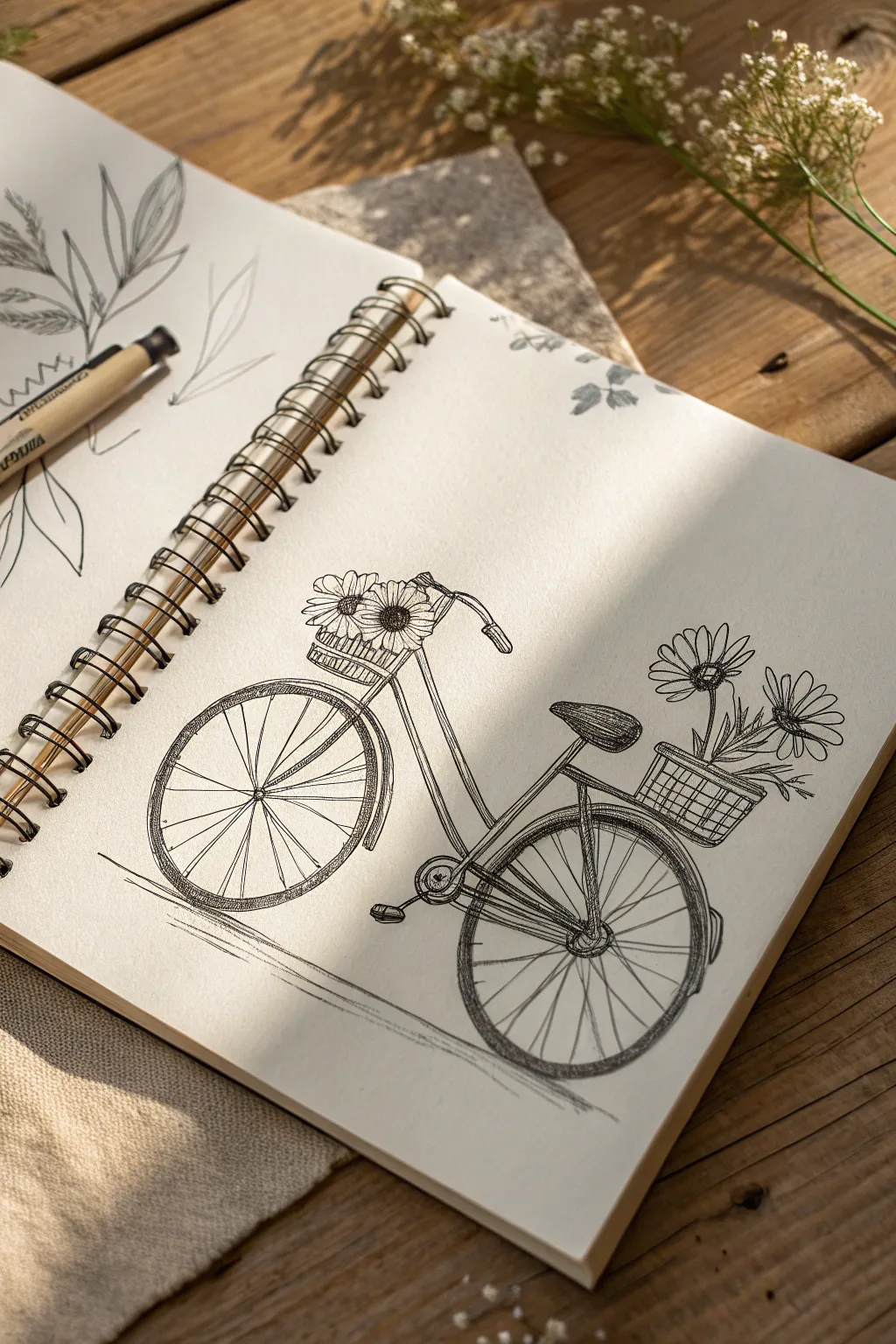
Capture the charm of a lazy Sunday afternoon with this delicate line drawing of a vintage bicycle adorned with fresh blooms. The loose sketch style and cross-hatching details give it a wonderful, airy hipster aesthetic that looks great in any sketchbook.
Detailed Instructions
Materials
- Spiral-bound sketchbook (medium textured paper)
- Fine-liner pen (0.3mm or 0.5mm, black)
- Graphite pencil (HB or 2B for initial sketch)
- Kneaded eraser
Step 1: Setting the Framework
-
Establish the Wheels:
Begin with your pencil by drawing two large circles for the wheels. Space them apart so that the distance between them is slightly less than the width of one wheel. -
Draft the Frame:
Connect the wheels with a simple frame geometry. Draw a diagonal line angling up from the back wheel hub to the seat post area, and another diagonal line from the front wheel hub up to the handlebars. -
Add Handlebars and Seat:
Sketch a curved line for the handlebars at the top of your front diagonal. For the seat, add a rounded triangular shape atop the rear post. -
Block in the Baskets:
Lightly sketch a rectangular box hanging from the handlebars and another sitting over the rear wheel fender. These will be your flower homes.
Wobbly Wheels?
Perfect circles are hard! If freehand sketching feels too risky, trace a small coin or a bottle cap for the wheels, then ink loosely over it for that hand-drawn look.
Step 2: Inking the Structure
-
Outline the Wheels:
Switch to your fine-liner pen. Carefully trace over your pencil circles. It doesn’t need to be perfect; a slightly wobbly line adds character. -
Draw the Frame Tubes:
Ink the frame structure, adding parallel lines to give the tubes thickness. Include the straight bar connecting the seat post to the front fork. -
Detail the Handlebars:
Ink the curved handlebars, adding a small grip at the end. Don’t forget the vertical stem connecting it to the front wheel fork. -
Define the Seat:
Outline the saddle shape. Use small, curved hatching lines on the side of the seat to suggest a leather texture and rounded form. -
Draw the Spokes:
Draw radial lines from the center hub to the tire rim on both wheels. I find it easiest to draw 12-16 spokes per wheel to keep it simple but recognizable. -
Add the Fender and Chain Guard:
Draw curved lines hovering just above the tires for fenders. Add a small circle near the pedals for the crankset and a connecting chain line.
Step 3: Adding the Flora
-
Front Basket Weave:
Draw the front basket using a simple grid pattern. Add a few vertical lines crossed by horizontal ones to simulate a wire or wicker texture. -
Front Flowers:
Draw two or three large daisy-like flowers peeking out of the front basket. Give them large, round centers and simple, looped petals. -
Rear Basket Details:
Ink the rear basket with the same cross-hatch grid pattern as the front one to maintain consistency. -
Rear Bouquet:
Sketch taller daisy shapes extending from the back basket. Let the stems show slightly, angling them as if they are leaning back in the breeze.
Make It Yours
Customize your bike by varying the flowers. Try drawing overflowing lavenders, hanging ivy vines, or even a baguette sticking out of the rear basket alongside the blooms.
Step 4: Shading and Finishing
-
Shadow the Tires:
Add thickness to the tires by drawing a concentric circle inside the rim. Fill this thin gap with dense hatching or dark ink to weigh the drawing down. -
Cross-Hatch Shading:
Add small diagonal hatch marks on the lower parts of the frame tubes and the undersides of the fenders to create depth and volume. -
Flower Centers:
Darken the centers of your daisies with tight stippling (lots of little dots) to give them texture. -
Grounding Lines:
Sketch a few quick, horizontal lines beneath the wheels. This shadow grounds the bike so it doesn’t look like it’s floating in space. -
Cleanup:
Once the ink is completely dry, gently erase all your underlying pencil guides to reveal the crisp ink work.
Now you have a charming piece of art that perfectly captures the simple joy of a bicycle ride
Boho Hoop With Feathers and Beads
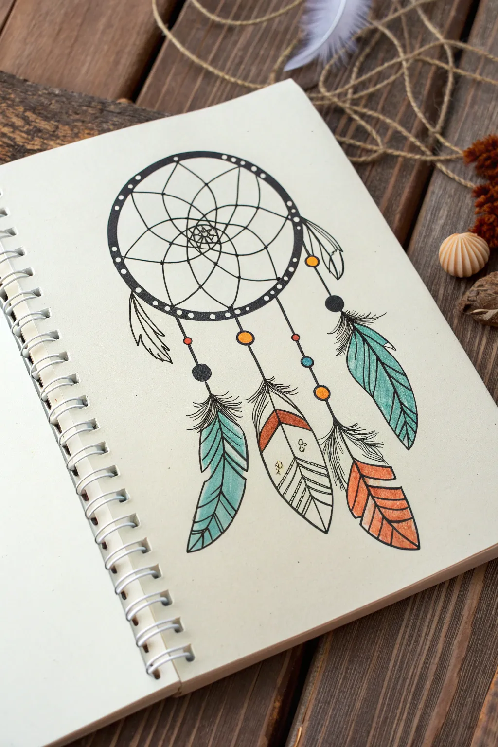
This whimsical dreamcatcher sketch captures the free-spirited boho aesthetic with delicate line work and pops of turquoise and terracotta. It’s a relaxing drawing project that combines geometric patterns with organic feather textures.
Step-by-Step
Materials
- Sketchbook or heavyweight drawing paper
- Pencil (HB or 2B)
- Eraser
- Fine liner pens (0.1mm, 0.3mm, and 0.5mm)
- Colored pencils or markers (teal/turquoise, orange/terracotta)
- Compass or circular object to trace
Step 1: Drawing the Base Structure
-
Outline the main hoop:
Start by drawing a perfect circle in the upper center of your page. You can use a compass or trace a lid or cup to get a clean shape. Draw a second, slightly smaller circle inside the first one to create the thickness of the hoop. -
Add the hoop details:
Along the band created by your two circles, draw small, evenly spaced dots. These represent the wrapping or decoration on the dreamcatcher’s frame. -
Create the web anchor points:
Mark 8 to 10 points evenly around the inner circle. These will be where your web starts. -
Sketch the first web layer:
Connect these points with curved lines that drape slightly inward, creating a petal-like shape all around the inside edge. -
Build the inner web:
From the center of each curve you just drew, draw another curved line connecting to the center of the next curve. Repeat this process, spiraling inward until you reach the center, creating a flower-like mandala pattern. -
Draw the center detail:
In the very middle where the lines converge, draw a tiny flower or star shape to anchor the design.
Step 2: Adding Hanging Elements
-
Plan the strings:
Lightly sketch three main vertical lines dropping from the bottom of the hoop. The center one should be the longest, with the two side strings slightly shorter and angled outwards. -
Sketch the beads:
Along these strings, draw small circles to represent beads. Vary the spacing, placing some near the top and some further down to act as stoppers for the feathers. -
Outline the feathers:
At the end of each string, sketch the basic leaf-shape of a feather. Make them various sizes; the center feather can be more geometric, while the side feathers can curve naturally. -
Add side feathers:
Draw two additional, smaller feathers directly attached to the sides of the hoop itself, rather than hanging from long strings.
Wobbly Web?
If your web lines look uneven, don’t erase! Simply thicken the lines slightly at the connection points to mask the wobble and add organic character.
Step 3: Inking and Coloring
-
Ink the hoop and web:
Using a 0.5mm fine liner, trace over your main hoop circles. Switch to a finer 0.1mm or 0.3mm pen for the delicate webbing inside to keep the lines crisp and airy. -
Ink the feathers:
Go over your feather outlines. Use jagged, quick strokes for the edges to simulate the texture of barbs separating. Draw a central spine down each feather. -
Fill in the blacks:
Use your thicker pen to color in the small beads black, leaving a tiny white dot in some to suggest a highlight. Darken the connection points where the strings meet the hoop. -
Add feather details:
Inside the feathers, draw fine diagonal lines extending from the spine to the edge. Don’t make them too perfect; slight variations make them look more realistic. -
Apply teal accents:
Take your teal or turquoise pencil. Color the leftmost hanging feather and the high right-side feather. Shade lightly at the top and press harder near the tips for a gradient effect. -
Apply terracotta accents:
Use the orange or terracotta color for the far right feather’s tip and the band on the center feather. I like to add color to just a few specific beads on the strings to tie the palette together. -
Final touches:
Once the ink is completely dry, gently erase all your pencil guides. If any lines look too thin, thicken them slightly to add weight to the drawing.
Add Sparkle
Use a white gel pen to add tiny dots or stars over the black beads and colored feathers to make the dreamcatcher look magical.
Your finished dreamcatcher is now ready to ward off bad vibes and look great in your sketchbook
BRUSH GUIDE
The Right Brush for Every Stroke
From clean lines to bold texture — master brush choice, stroke control, and essential techniques.
Explore the Full Guide
Moon Phases in a Row
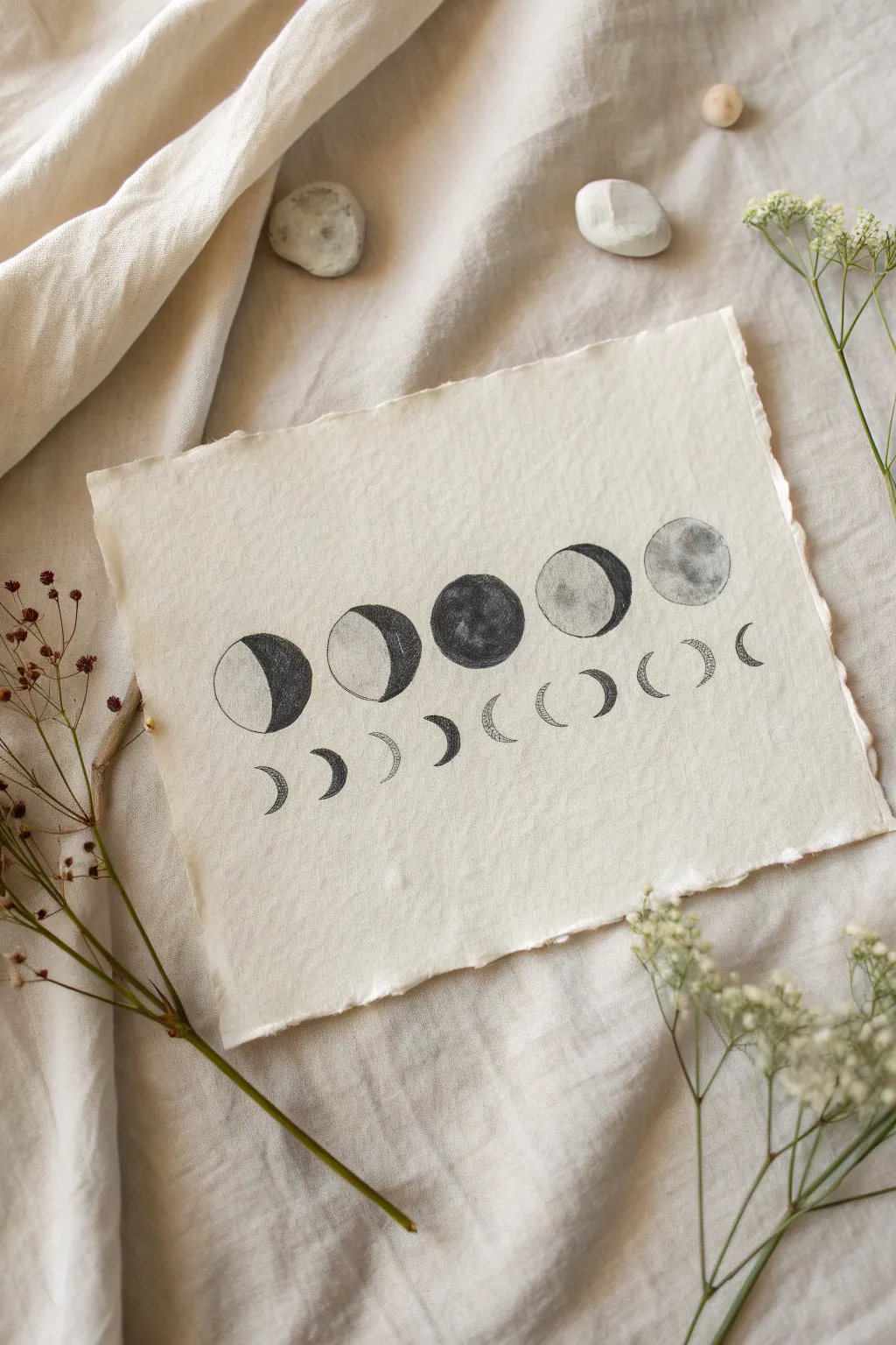
Capture the mystic beauty of the lunar cycle with this minimalist drawing on frayed cotton paper. The soft charcoal textures against the creamy, handmade surface create a piece that feels both vintage and modern.
Step-by-Step Guide
Materials
- Heavyweight cotton rag paper or handmade paper
- Charcoal pencils (soft, medium, and hard grades)
- Graphite pencil (HB or 2B)
- Circle template or compass
- Ruler
- Kneaded eraser
- Blending stump or tortillon
- Spray fixative (matte finish)
Step 1: Planning the Layout
-
Prepare the paper:
Begin by gently tearing the edges of your cotton paper if it came in a standard sheet. Using a ruler against the paper edge helps guide the tear to create that desirable deckled, organic look. -
Mark the horizon line:
Use a ruler and your HB pencil to very lightly draw a horizontal line across the middle of the page. This will serve as the anchor for your main row of moons. -
Outline the main moons:
Using a circle template or compass, draw five evenly spaced circles along your guideline. Ensure the spacing between them is consistent for a balanced composition. -
Sketch the lower crescents:
Below the main row, lightly sketch a series of smaller crescent shapes. These should be arranged in a gentle U-curve or smile shape, mirroring the cyclical flow of the phases above.
Step 2: Drawing the Main Phases
-
Define the phases:
Inside each of your five main circles, lightly sketch the curve that separates the light side from the dark side. Remember to mirror the shapes: waxing crescent on the left, full moon in center, waning crescent on the right. -
Base shading:
Using a medium charcoal pencil, begin filling in the dark sections of the outer moons. Use soft, circular strokes rather than harsh lines to build up the initial darkness. -
Deepen the blacks:
Layer a soft charcoal pencil over the darkest areas to create a deep, rich void. The contrast is key here, so don’t be afraid to press firmly in the shadowed regions. -
Texture the full moon:
For the central moon and the lit portions of the others, use a hard charcoal pencil to lightly stipple and smudge small crater details. Keep this subtle; you want texture, not heavy darkness. -
Blend for atmosphere:
Take your blending stump and gently smudge the charcoal in the dark areas, pulling just a tiny amount of the gray dust into the texturing of the ‘lit’ sides to create a cohesive, dusty look. -
Clean the edges:
Use your kneaded eraser to lift any stray charcoal dust from outside the circle borders. Keeping the edges crisp against the creamy paper makes the drawing pop.
Clean Edges Trick
Cut a circle out of a sticky note and place it over the area you want to keep white. This acts as a mask, letting you shade vigorously without going outside the lines.
Step 3: Adding the Lower Details
-
Outline the crescents:
Go back to your lower row of small crescents. Firm up the outlines with a sharp graphite pencil or a hard charcoal pencil for precision. -
Fill the crescents:
Carefully fill these shapes using short, hatched strokes. I find that leaving tiny gaps of white paper showing through the hatching adds a nice textural element. -
Refine the curve:
Check the alignment of your bottom row. If any crescent feels out of place, use the kneaded eraser to adjust its position so the ‘smile’ curve feels fluid.
Add Metallic Flair
Once the charcoal is set, use a gold leaf pen or metallic watercolor to trace the thin crescent edges for a subtle shimmer that catches the light.
Step 4: Final Touches
-
Erase guidelines:
Gently erase your initial horizontal guide line and any remaining spacing marks. Be extremely careful not to smudge your charcoal work. -
Enhance contrast:
Take a step back and look at the main moons. If the dark sides look washed out, apply one final layer of soft charcoal to make them pitch black. -
Set the drawing:
Take the paper outside or to a well-ventilated area. Hold a can of matte fixative about 12 inches away and mist the drawing lightly to prevent the charcoal from smearing over time.
Display your celestial study in a floating frame to show off those beautiful deckled edges
Geometric Owl Face
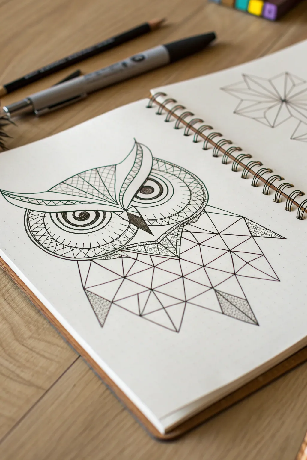
This striking drawing combines the intense gaze of a realistic owl with abstract, polygonal feathers for a modern, hipster aesthetic. It balances organic curves in the face with sharp geometric lines in the body, creating a captivating contrast that looks complex but is built from simple shapes.
Step-by-Step Tutorial
Materials
- Sketchbook with smooth paper
- HB graphite pencil
- Eraser
- Fine-point black drawing pen (0.3mm or 0.5mm)
- Ultra-fine black drawing pen (0.1mm)
- Ruler or straight edge
Step 1: Planning the Face
-
Establish the centerline:
Begin by lightly drawing a vertical line down your page to ensure symmetry. Mark a horizontal line across the upper third where the eyes will sit. -
Shape the eyes:
Draw two large, almond-shaped outlines for the eyes, resting on your horizontal guide. Leave a gap between them for the beak. Within each almond, draw a perfect circle for the iris. -
Initial beak placement:
Sketch a sharp, downward-pointing triangle directly between the eyes. The top corners of the triangle should connect to the inner corners of the eye shapes. -
The brow line:
Create the signature owl ‘horns’ or brow by drawing a wide V-shape that starts above the beak and sweeps out and up over each eye, curving slightly at the tips.
Uneven Eyes?
If your owl eyes look wonky, use a coin or a circle template to trace the initial iris circles. Perfect circles anchor the realism, making the rest easier to freehand.
Step 2: Drafting the Geometric Body
-
Define the outer shape:
Below the head, lightly sketch the outer boundary of the body. Instead of curves, use straight lines to create a jagged, wide shape that suggests folded wings. -
Create the grid:
Using your ruler, start dividing the body area into triangles. Draw irregular lines connecting various points on the outline to a central vertical axis. -
Refining triangles:
Subdivide larger shapes into smaller triangles. Aim for variety in size; some should be large and open, others smaller and clustered, particularly near the neck area.
Add Pop Color
Leave the majority black and white, but use a gold or teal gel pen to fill in just 3-4 specific triangles in the body grid for a modern accent.
Step 3: Inking the Details
-
Outline the main features:
Switch to your 0.5mm pen. Carefully trace over the main lines of the eyes, the brow, the beak, and the primary geometric grid of the body. -
Detail the eyes:
Using the 0.5mm pen, thicken the upper eyelid line. Draw the pupil in the center of the iris, leaving a small white highlight circle to make the eye look alive, then fill the pupil black. -
Internal eye patterns:
Draw concentric circles inside the iris area. Add radial lines (like sun rays) between some of these circles to create depth and texture. -
Patterning the brow:
Inside the swept-back brow shape, draw a grid pattern on one side and perhaps a scalloped or curved line pattern on the other for asymmetry, or mirror them if you prefer balance. -
Texturing the face rings:
Around the outer edges of the eyes, draw large semi-circles to frame the face. Fill these bands with different patterns: cross-hatching, zig-zags, or small scales. -
Darkening the beak:
Fill in the beak triangle with close, vertical hatching lines to make it distinct from the rest of the face.
Step 4: Final Touches
-
Stippling shadows:
Select a few specific triangles in the body, particularly at wing tips or near the neck. Fill these chosen shapes with stippling (tiny dots) to add shading without solid black. -
Enhancing intersections:
Go back to the geometric body grid. Add small, dark triangles at the intersections where multiple lines meet to emphasize the structure. -
Clean up:
Wait at least five minutes to ensure the ink is completely set. Gently erase all your pencil guidelines to reveal the crisp black and white contrast.
Enjoy the sharp, modern look of your finished geometric owl creation


Light Bulb With Wildflowers Inside
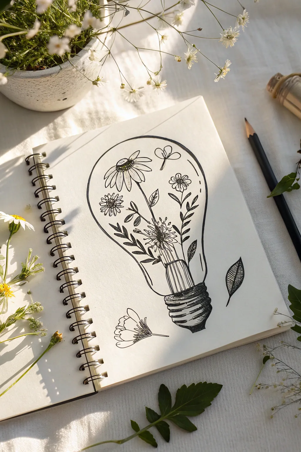
Capture the delicate beauty of nature within an industrial silhouette with this whimsical ink drawing. This “hipster” aesthetic combines rigid glass contours with organic floral shapes, perfect for your sketchbook practice.
Detailed Instructions
Materials
- Spiral-bound sketchbook or drawing paper
- Pencil (HB or 2B)
- Eraser
- Fine liner pen (black, approx. 0.3mm)
- Thicker marker or brush pen (black, for shading)
- Real wildflowers (optional, for reference)
Step 1: Drafting the Structure
-
Outline the Bulb:
Start with a light pencil sketch. Draw a large, inverted pear shape that forms the main glass body of the light bulb. Keep your lines loose so you can adjust the symmetry. -
Add the Base:
At the bottom narrow point of the bulb, sketch a cylindrical shape with rippled edges to represent the metal screw base. Add a small rounded tip at the very bottom where the electrical contact would be. -
Define the Filament Stem:
Draw the internal glass stem rising up from the base into the center of the bulb. This will act as the ‘vase’ or anchor point for your flowers.
Don’t Be Too Perfect
Wobbly lines actually help here! A slightly imperfect contour on the petals or leaves makes the drawing feel more illustrative and whimsical.
Step 2: Sketching the Flora
-
Placement of Main Bloom:
Sketch a large daisy-like flower head in the upper left quadrant of the bulb. Angle it slightly downward as if it’s naturally drooping. -
Adding Smaller Flowers:
To the right, sketch a smaller, simple five-petal flower and a few floating petals or seeds near the top to fill the negative space. -
Drawing Stems and Leaves:
Connect your flowers to the central filament stem using long, slender lines. Sketch various leaf shapes—fern-like fronds and simple oval leaves—sprouting outward to fill the lower half of the glass shape.
Step 3: Inking the Outlines
-
Trace the Bulb:
Switch to your fine liner pen. Carefully trace the outer contour of the glass bulb. You can break the line slightly in a few places to suggest light reflection and sleek glass. -
Detail the Metal Base:
Ink the screw base using varying line weights. Use curved horizontal lines to show the threading, ticking the ends upward slightly to clearly define the cylindrical volume. -
Ink the Flowers:
Go over your floral sketches with the pen. For the petals, don’t close every shape perfectly; leaving small gaps adds to that sketched, organic feel. -
Layering the Foliage:
When inking overlapping leaves, draw the ones in front first. I usually stop my pen line where a leaf passes behind a stem to create depth without needing shading.
Symmetry Check
If your lightbulb shape looks lopsided, turn your paper upside down. Looking at the shape inverted makes it much easier to spot and fix imbalance.
Step 4: Refining and Shading
-
Add Texture to the Base:
Use your thicker marker or multiple passes with the fine liner to darken the shadowed areas of the metal base. Leave thin strips of white to act as high-contrast highlights. -
Detail the Daisy Center:
Fill the center of your main flower with tiny stippling dots or tight scribbles to replicate the texture of pollen. -
Leaf Veins and Texture:
Draw thin central veins on the larger leaves. Add small hatching lines on one side of the leaves to suggest shadow and curvature. -
Internal Reflections:
Add a few very faint vertical lines on the glass stem inside the bulb to make it look transparent. -
Floating Elements:
Ink a single leaf falling outside the bulb on the right, and a flower head resting on the ‘table’ surface to the left, grounding the composition. -
Final Cleanup:
Once the ink is completely dry—give it a minute to be safe—gently erase all the underlying pencil sketch marks to reveal the crisp black lines.
Now you have a charming botanical illustration ready to frame or enhance your journal spread
Melting Clock Sketch
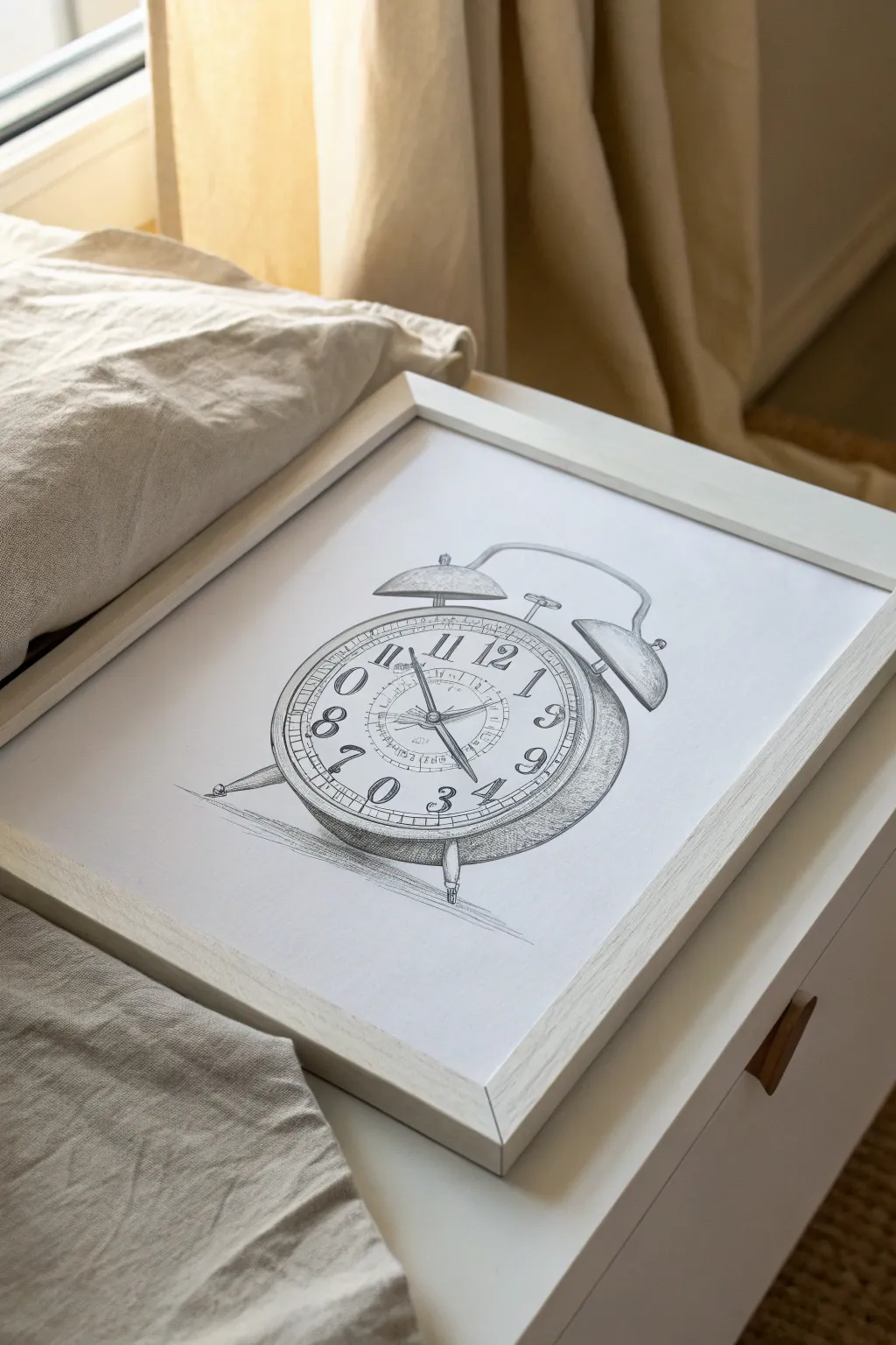
Capture the charm of a bygone era with this clean, illustrative pencil sketch of a classic twin-bell alarm clock. The precise linework and soft shading create a piece that feels both nostalgic and modern, perfect for framing in a minimalist bedroom.
Step-by-Step Guide
Materials
- High-quality drawing paper (smooth or medium tooth)
- Set of graphite pencils (HB, 2B, 4B, 6B)
- Kneaded eraser
- Precision vinyl eraser
- Ruler or straight edge
- Compass (optional, for perfect circles)
- Blending stump or tortillon
- Pencil sharpener
Step 1: Constructing the Framework
-
Establish the main circle:
Begin by drawing a large circle in the center of your page to represent the face of the clock. You can use a compass for precision or freehand it for a looser, more artistic feel. Keep your pressure very light with an HB pencil. -
Add depth lines:
create the 3D effect of the clock’s casing by drawing a second, slightly flattened curve running parallel to the bottom right edge of your main circle. Connect this back to the main shape to form the thickness of the body. -
Draft the bells:
Sketch two semi-circles on top of the main body for the bells. Position them symmetrically, slightly tilted outward. Add the small stem and handle connecting them in the center. -
Position the legs:
Draw two peg-like legs at the bottom roughly at the 5 o’clock and 7 o’clock positions. Angle them outward slightly to show they are supporting the weight of the clock. -
Define the face rings:
Inside the main circle, draw two inner concentric circles. The outer ring will house the numbers, while the innermost ring will contain the branding text and hand mechanisms.
Step 2: Adding Details and Numerals
-
Mark time positions:
Lightly mark twelve evenly spaced ticks around the number ring to ensure your hours are positioned correctly before committing to the numbers. -
Refine the bells and hammer:
Flesh out the bells, giving them a rim at the bottom. Draw the small hammer mechanism between the bells and the small ring handle at the very top. -
Draw the serif numerals:
Carefully draw the numbers 1 through 12. Use a classic serif font style to enhance the vintage vibe. Notice how the numbers at the bottom (like the 6) are often inverted or rotated to follow the curve. -
Create the clock hands:
Draw the hour and minute hands originating from the center. Make them stylized with pointed tips or decorative ends. Set the time to whatever you like—10:10 is a classic choice for visual balance. -
Add inner details:
sketch the smaller second-hand dial or alarm-setting dial within the center circle if desired, adding tiny tick marks for seconds.
Keep it Sharp
For the tiny tick marks and serif numbers, ensure your pencil is freshly sharpened. A dull point will smudge the numerals and make the text illegible.
Step 3: Shading and Finalizing
-
Inking or darkening lines:
Switch to a darker pencil (2B or 4B) or a fine liner if you prefer ink. Go over your initial construction lines, making them confident and defined. Vary your line weight—thicker on the shadowy side (bottom right) and thinner near the light source. -
Clean up:
Once your definitive lines are down, take your kneaded eraser and gently lift away the initial light construction guides so the drawing looks crisp. -
Shade the casing:
Using a 2B pencil, add simple hatching shading to the side of the clock body. Follow the curve of the metal with your strokes to emphasize the round form. -
Detail the bells:
Add shadows to the underside of the bells and the handle. Leave small white areas to represent highlights where the metal catches the light. -
Shadow the face:
I like to add very subtle shading just inside the rim of the glass face to show that the glass is concave and set slightly deeper than the rim. -
Ground the object:
Draw a cast shadow underneath the legs of the clock. Use horizontal hatching strokes that fade out as they move away from the object to anchor it to the surface. -
Final touches:
Use your darkest 6B pencil to deepen the darkest crevices—like where the legs meet the body or under the bells—to pop the contrast.
Add Surrealism
Want to match the ‘Melting Clock’ theme more? Warp the bottom of the circle into a drip shape and stretch the numbers downward like Salvador Dalí.
Now pop your finished sketch into a simple white frame to admire your timeless creation
Mushroom Cottage Scene
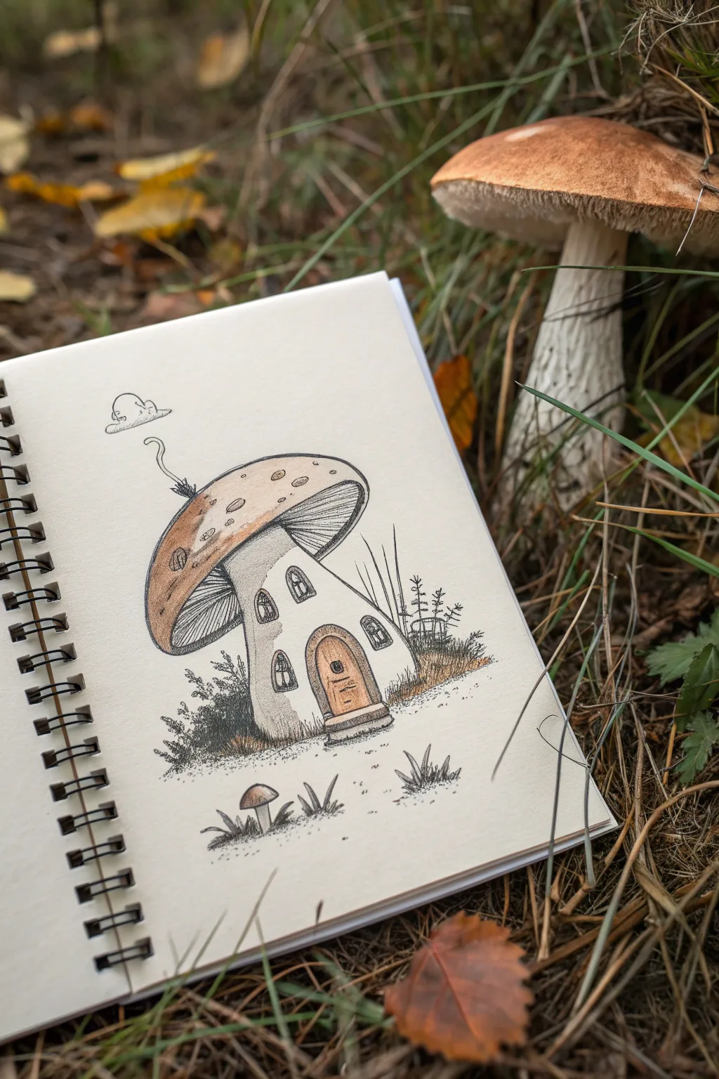
This charming sketch turns a simple fungus into a cozy fantasy home, complete with miniature windows and a detailed wooden door. Using fine liners and soft washes of color, you’ll capture a rustic, fairytale vibe perfect for a nature journal.
Step-by-Step
Materials
- Spiral-bound sketchbook (mixed media paper preferred)
- HB pencil and eraser
- Fine liner pens (sizes 005, 01, and 03 in black)
- Colored pencils (muted browns, tans, and faint gray values)
- Optional: White gel pen for highlights
Step 1: Penciling the Structure
-
Map the cap shape:
Start lightly with your HB pencil. Draw a large, tilted ellipse for the mushroom cap. It doesn’t need to be perfectly round; a slightly organic, lopsided shape looks more natural. -
Add the stem housing:
Draw the stem emerging from the center of the ellipse, flaring out significantly at the bottom to create a stable base for the cottage. This stem will serve as the walls of the house. -
Sketch the inner gills:
Create a second, smaller curved line inside the cap’s bottom edge to indicate where the gills will be deeply shadowed later. -
Outline architectural features:
Place a rounded arch frame at the base of the stem for the door. Sketch small, irregular arch shapes higher up the stem for windows, varying their heights for a playful look. -
Add environmental details:
Rough in the suggestion of grass clumps around the base and a tiny secondary mushroom sprouting to the left. -
Draft the whimsical chimney:
On the top left of the cap, draw a tiny squiggly line rising up to a small puff shape, representing a chimney pipe and a cloud of smoke.
Ink Smudging?
If your fine liners smear when you color over them, let the ink dry for at least 15 minutes before erasing pencil lines or applying colored pencil.
Step 2: Inking the Lines
-
Outline the main shapes:
Switch to your 03 fine liner. Trace the main outline of the cap and the stem walls. Use a slightly shaky or broken line to give the texture of organic matter rather than smooth plastic. -
Detail the door:
Use the 01 pen to draw vertical planks on the door. Add a tiny circle for the knob and outline the stone step at the threshold. -
Define the windows:
Carefully ink the window frames. Draw simple crisscross patterns inside for the panes. -
Texture the gills:
With your finest 005 pen, draw very closely spaced lines running from the stem to the outer edge of the cap’s underside. These lines should curve slightly to follow the mushroom’s volume. -
Add cap texture:
On the top of the cap, use the 01 pen to draw a few small, scattered ovals and speckles to suggest natural imperfections.
Pro Tip: Organic Lines
Don’t try to make your lines perfectly straight. A slightly wobbly hand actually helps the mushroom look more natural and rustic.
Step 3: Shading and Coloring
-
Stipple the ground:
Using the 01 pen, create clusters of dots (stippling) around the base of the house to ground it. Add short, quick flicks for blades of grass. -
Apply base color to the cap:
Take a light tan or camel colored pencil. Gently shade the top of the mushroom cap, pressing harder on the left side to create a shadow and leaving the center lighter for a highlight. -
Darken the gills:
Use a darker brown pencil or a cool gray to shade the gill area underneath the cap. This depth is crucial for making the cap look like it overhangs the house. -
Color the woodwork:
Fill in the door with a warm honey-brown pencil. I like to add a second layer of brown just at the edges of the door planks to make them pop. -
Shade the walls:
Lightly shade the stem walls with a very pale gray or cream, focusing widely on the left side to indicate volume and roundness. -
Enhance the grass:
Add touches of dark gray or black pencil into the stippled grass areas to deepen the shadows near the ground. -
Final ink touches:
Once the color is down, go back with your 03 pen and re-darken any crucial outlines that got faded by the wax of the pencils, especially the bottom of the door frame.
Now you have a cozy little dwelling ready for a forest sprite to move into
Cute Robot Couple Doodle

This adorable doodle features two retro-style robots sharing a moment of connection amidst a flurry of hearts. It’s a perfect beginner-friendly project for your bullet journal, using simple geometric shapes to build character.
Step-by-Step Tutorial
Materials
- Dotted or blank journal paper
- Black fine-liner pen (0.3mm or 0.5mm)
- Orange colored pencil or marker
- Teal or light blue colored pencil or marker
- Red colored pencil or marker
- Pencil and eraser for sketching
Step 1: Sketching the Orange Robot
-
Head start:
Begin on the left side of your page. Draw a medium-sized square for the robot’s head, tilting it slightly to the right for a playful look. -
Body block:
Draw a rectangle directly below the head for the torso. Make it slightly taller than the head but about the same width. -
Joint connection:
Connect the head to the body with a very short neck rectangle. -
Limbs and details:
Sketch segmented arms and legs using small stacked rectangles. Add U-shaped claws for hands and trapezoids for feet. Top the head with a small antenna—a line with a circle on top.
Wobbly Lines?
Don’t stress about perfect straight lines! A little wobble adds to the hand-drawn doodle charm. If a line goes astray, just thicken it slightly to mask the error.
Step 2: Sketching the Blue Robot
-
Positioning the partner:
On the right side, draw a second robot slightly taller. Start with a rectangular head that is wider than it is tall. -
Torso time:
Add a square body below the head, connecting them with a short neck piece similar to the first robot. -
Extending the limbs:
Draw long, thin segmented legs and arms. This robot is standing straighter, so keep the vertical lines parallel. Add simple claw hands and flat rectangular feet. -
Tech features:
Draw a large circle in the center of its chest and a small antenna on its head made of a line with rays bursting from the top.
Step 3: Inking the Lines
-
Outline the shapes:
Using your black fine-liner, trace over your pencil sketches. I like to keep the pressure even for a clean, consistent look. -
Facial expressions:
Ink two large circular eyes for the orange robot and give it a small, curved smile. For the blue robot, draw two smaller eyes and a simple smile. -
Adding texture:
Add the segmentation lines on the arms and legs of both robots now. Draw the ground line connecting their feet. -
Chest details:
On the orange robot, draw a square panel on the chest with diagonal lines inside. On the blue robot, ink the circular dial and add small buttons or knobs alongside it. -
Erase guidelines:
Wait a moment for the ink to dry completely, then gently erase all visible pencil marks to clean up your drawing.
Custom Circuitry
Personalize the chest plates with different gauges, buttons, or even initial letters to represent you and your partner or friend.
Step 4: Coloring and Embellishing
-
Orange warmth:
Color the orange robot’s body and head with your orange pencil or marker. Leave the face area (the rectangle containing the eyes) white or very light gray. -
Blue cool:
Color the right robot using teal or light blue. Shade the sides of the head and body slightly darker to suggest 3D depth. -
Metallic accents:
Use a grey marker or light pencil shading on the arms, legs, and neck joints to give them a metallic feel. -
Romance in the air:
Draw a scattering of hearts floating between and above the robots using red. Vary their sizes for interest. -
Final touches:
Add scribble shading inside some of the larger hearts to make them pop. Draw small ‘radiating’ lines around the orange robot’s antenna to show it’s transmitting love.
You now have a charming mechanical pair that adds a touch of whimsy to any page layout


Have a question or want to share your own experience? I'd love to hear from you in the comments below!